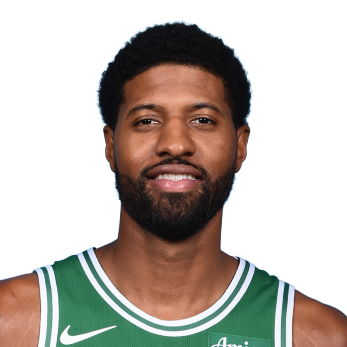
Paul George’s tattoos are easy to spot in a game, but a few quick photos only show part of the collection. His arms carry animals, dates, hometown references, chess pieces, faith lettering and family tributes. Some designs read from the stands; others sit between the larger pieces.
Paul George tattoos mix his identity off court with the competitive player he wants to be. The lion and tiger on his hands connect to his court persona, while forearm lettering points to faith, Los Angeles and family. The work doesn’t form one matched sleeve. It has grown in chapters as his life and career moved from Palmdale to the NBA.
George has said that some of his best-known tattoos carry personal meaning. That matters when you’re planning a larger piece: the visual style counts, but a person, place or idea you still care about can give the design its staying power.
Game photos can hide smaller tattoos behind wristbands, jerseys or the angle of his arm. Looking at each area on its own makes the details easier to see; stepping back afterward shows how they sit together. It also keeps the guide grounded in tattoos that are actually visible.
Paul George’s hand tattoos use a lion and a tiger
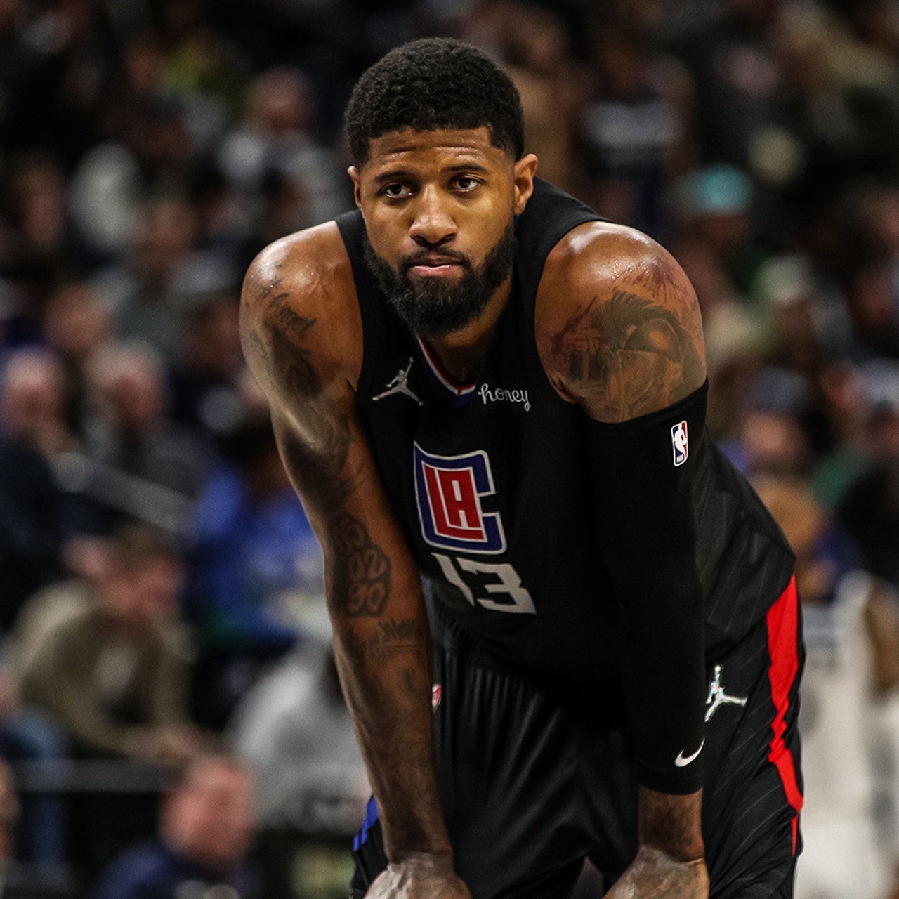
The lion and tiger on George’s hands are among the most noticeable pieces in his collection. One animal sits on each hand, drawn with sharp expressions and heavy shading. Their placement makes them hard to cover, so they’re part of his everyday look, whether he’s in a jersey or a vest.
George has called the animals two of his favourites and linked them to his personality on the court. Their alert faces and dark outlines hold up in action photos. They don’t sit quietly in a corner of the design.
Hand tattoos get a lot of movement, sunlight, washing and friction. If you like the idea, keep the main shapes bold and leave room around the details. A hand tattoo has to work at a glance. A clear animal face or simple symbol is easier to read over time than a crowded miniature scene.
The guardian angel tattoo covers his shoulder
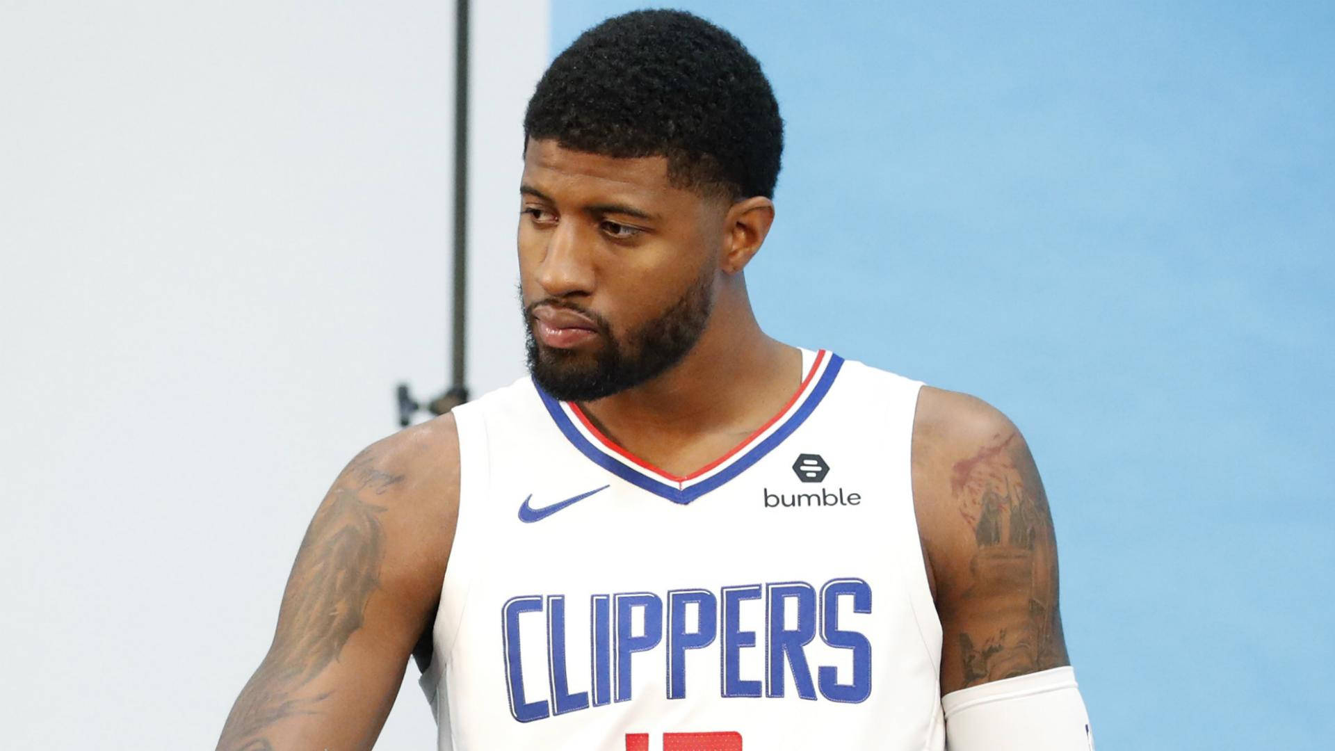
George’s right shoulder carries a large guardian angel, one of the clearest pieces on his upper arm. Its wings and figure sit above smaller forearm lettering and numbers, giving that side of his body a long shape that remains visible from the side.
The words tied to the design are My Guardian Angel. George hasn’t explained every part of the surrounding image, so it’s best to stick to what’s visible: the angel is clear, while the story behind every nearby shape is his to tell.
For a shoulder piece, plan the main silhouette before adding background texture. Wings can follow the curve of the shoulder, but check the stencil with the arm both relaxed and raised. The best large shoulder tattoos follow the body instead of fighting its movement. Look from behind and rotate your arm to make sure the design stays balanced.
Crown Me and chess tattoos bring a competitive edge
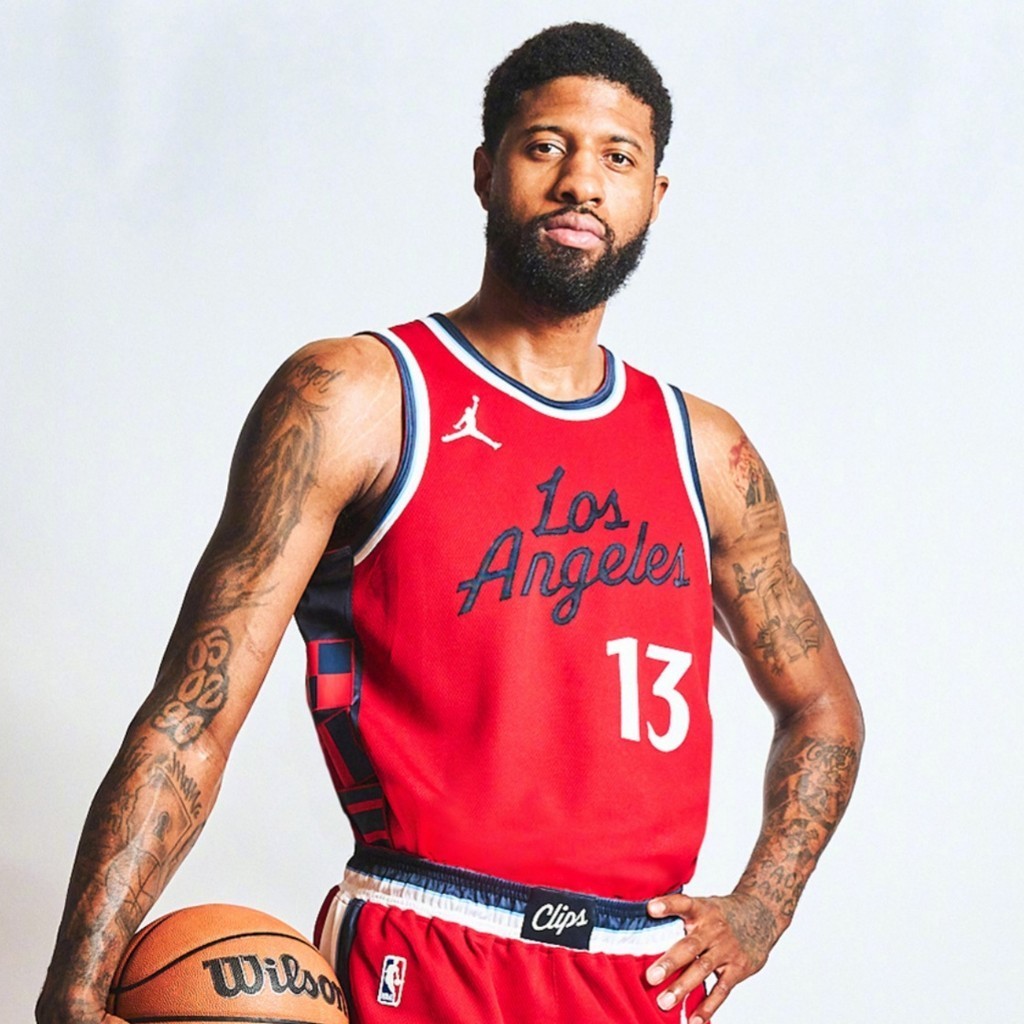
On George’s left forearm, the words Crown Me sit among chess pieces. The king is the main image, and the mix gives the tattoo a competitive feel without using a basketball logo. Chess brings in ideas of planning and control as well as winning.
The phrase catches your eye first; the chess pieces add detail when you look closer. That balance keeps the design readable from a distance while giving the arm more to take in up close.
When you pair lettering with an image, decide which one should lead. If the surrounding icons are just as large and dark as the words, the phrase can get lost. Let the king, a date or a short line take focus, then keep the supporting details smaller. Hierarchy keeps a busy arm from turning into visual noise, especially if you plan to add more tattoos later.
Faith lettering gives the arm tattoos a quieter side
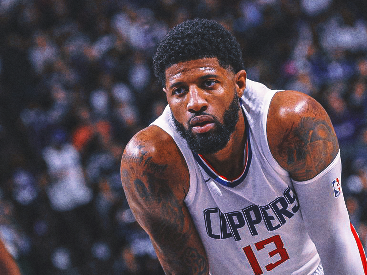
George’s collection also has quieter designs. Walk by Faith runs along his inner forearm, where the script is easy to miss when a sleeve or wristband covers it. It shows more clearly when he turns his arm toward the camera.
With faith lettering, choose words that matter to you rather than copying a font just because it looks good in a photo. Test the phrase at full size. Thin script can be hard to read once healed, while a little more weight and space between letters can help it hold up.
The inner forearm gives the words a natural reading line, though the skin bends and catches sun. Have your artist check the stencil with your wrist straight, relaxed and turned outward. It can keep a private phrase close while still letting you show it when you want. Good lettering should feel natural on the arm before it ever reaches the skin.
Dates, city and Mama tattoos connect the ink to home
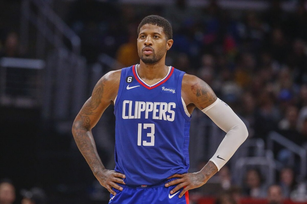
Some of George’s smaller tattoos refer to home. The numbers 05, 02 and 90 are widely read as his birth date, May 2, 1990. Other forearm designs include route and street-sign references, along with the words City of Dreams. Ordinary dates and places become personal markers in this part of the collection.
The word Mama, a basketball and a lock-and-keyhole design also appear on his forearm. These details draw less attention than the animals on his hands, but small symbols can carry a lot of meaning without taking over the whole arm.
If you want a number tattoo, settle on what it means before deciding where it goes. A birthday, road, area code or family date can all work, but knowing the reason keeps the design from feeling random. Leave enough room around a family name or symbol so it stays clear as you add more ink.
His back tattoos add scale beyond the sleeves
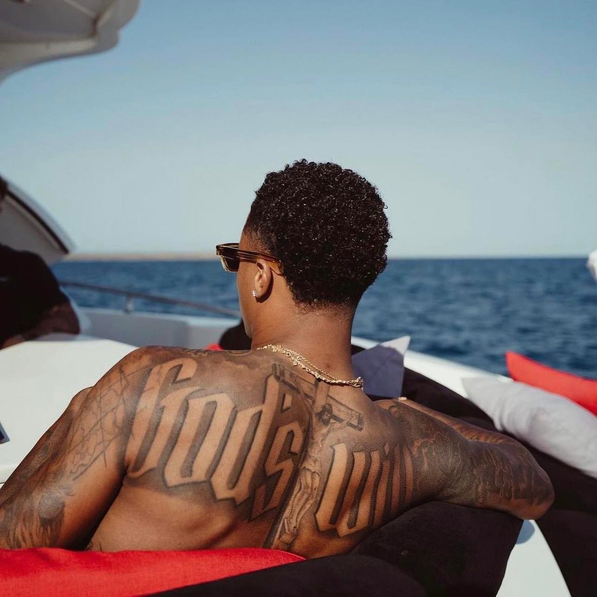
Photos away from the court show larger tattoos across George’s back, beyond the forearm pieces. Shaded artwork and lettering spread over the shoulders and toward the middle of his back, where there’s room for shapes that would be cramped on a wrist or hand.
Posture changes how a back piece looks. The shoulders widen when relaxed and shift when the arms move forward, so check a stencil from several angles. The artist also has to account for the shoulder blades, the curve beside the spine and folds in the skin when you sit.
The back can hold a large design without making it visible in every outfit. George’s arm tattoos are easy to see; the bigger back pieces give the collection a different scale. Use the back for the idea that needs room, and let nearby work support it instead of filling every space at once.
George’s collection links his playing identity to home and family: the animals on his hands, the guardian angel and faith lettering, and the dates and hometown references. If you’re borrowing an idea from his work, start with a person, place or belief you want to carry with you. Then choose a style and placement that suit it.