
Lily Collins tattoos have a quiet, personal feel. They are mostly fine line, easy to miss at first glance, and tied to ideas like love, family, self-belief, and growing into your own skin. The collection is not built around one huge sleeve or one loud visual theme. Instead, small placements do the work. A phrase sits below the neck, a rose follows the curve of the foot, and a little butterfly rests near the wrist.
That subtle scale is part of what makes Collins’s ink interesting. The designs are delicate, but they are not empty or random. Her back piece combines words with a small figure and floral detail. Her foot piece mixes a rose with a short line of writing. A butterfly feels like a private sketch, while the Peter Pan image adds a playful storybook note. Together, the pieces feel collected over time rather than planned as one matching set.
Photos do not explain every meaning, so it is better to stay close to what the ink actually shows. The clearest Lily Collins tattoos are romantic, readable, and placed where they can stay personal when she wants them to. They also offer useful ideas if you like small tattoos but still want each one to have a clear shape and a little room around it.
Lily Collins’s back script tattoo pairs a phrase with a delicate figure
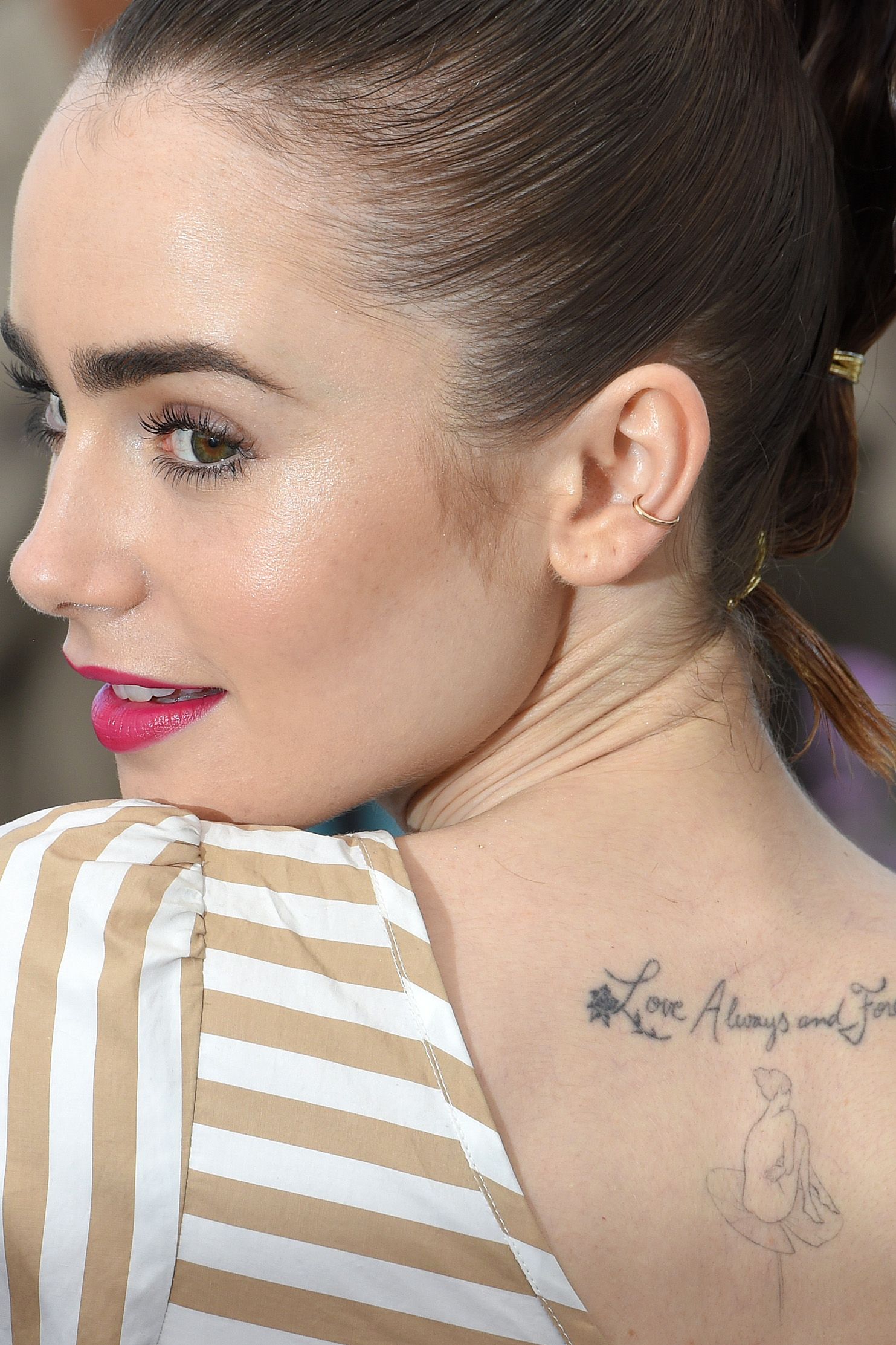
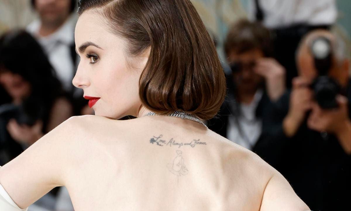
The back piece is the design most people recognise first. It sits high on the upper back, just below the neck, and starts with a small floral mark before moving into cursive lettering. The words read “Love Always and Forever.” Beneath the script is a fine-line figure seated on a lily pad, which gives the design a second focal point instead of leaving the lettering on its own.
Seen from a distance, the tattoo looks like a narrow horizontal line. A closer photograph tells a different story. The letters have a loose handwritten rhythm, while the figure below adds a little vertical movement. The design follows the natural space between the shoulder blades without trying to fill the whole back. That restraint keeps it light and makes the tattoo work with open dresses, straps, and one-shoulder tops.
The phrase has an obvious romantic tone, but the design is more than a block of text. The flower and lily imagery soften the words, and the small figure makes the tattoo feel like a scene. This is a useful lesson for anyone who wants script but does not want a plain sentence. A tiny illustration can give the lettering an anchor and stop it from looking like it was simply typed onto the skin.
Placement changes how the tattoo reads. Because it sits high on the back, Collins can show it in a red-carpet pose without making it the only thing people see. Turning one shoulder toward the camera reveals the ink gradually. It feels like a detail discovered by the viewer rather than a design that demands attention from across the room.
The best part of the back piece is the balance between words and breathing room. The script is readable, but there is enough skin around it to keep the fine lines from becoming a dark patch. If you are planning something similar, bring several type references to your artist and test the size on the actual curve of your back. A phrase that looks tiny on paper may need more height to stay clear as it ages.
The rose on Lily Collins’s foot tattoo works with a longer line of script
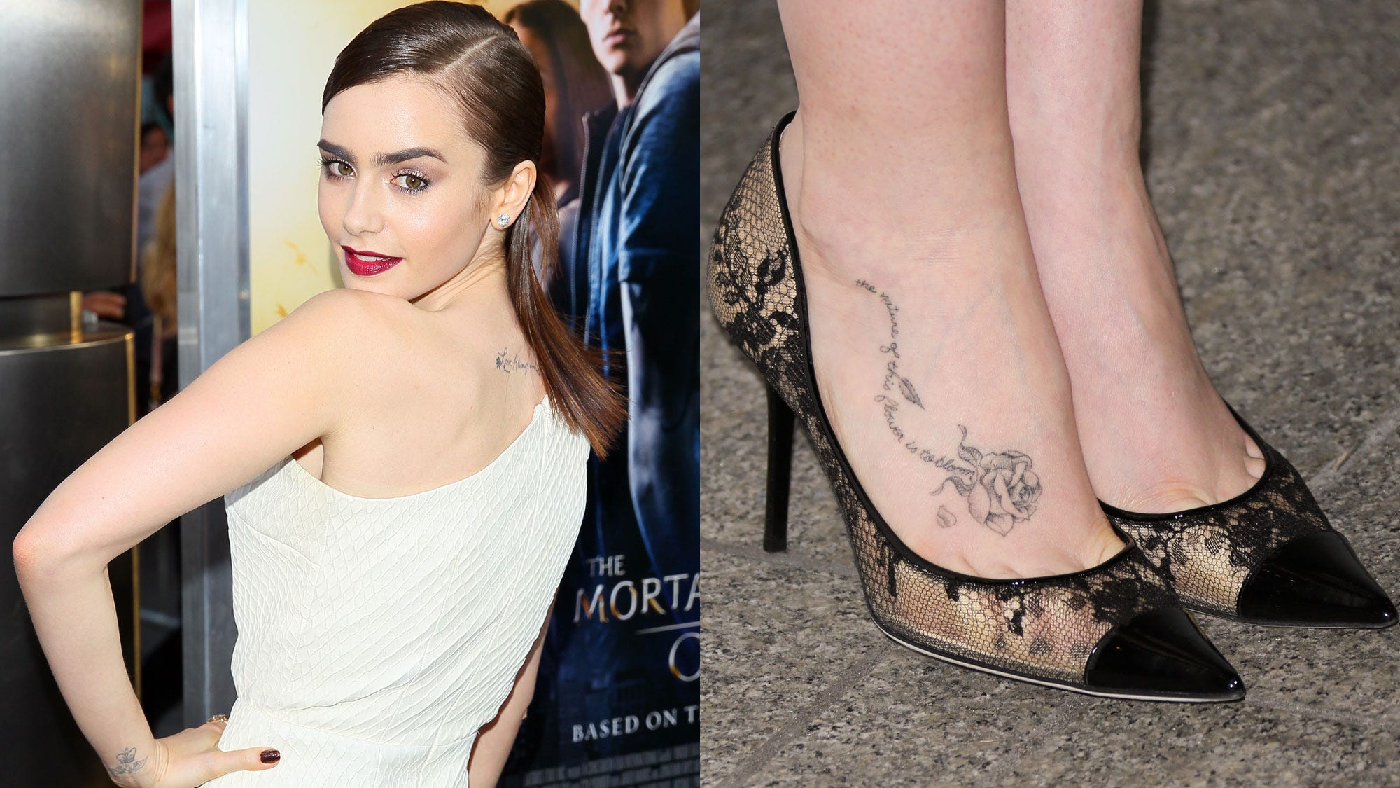
Collins’s foot piece has a classic floral feeling. A shaded rose sits across the top of the foot, with leaves and petals spreading along the skin. A line of cursive writing runs beside it and follows the shape of the flower. The tattoo is delicate, but the rose gives it enough weight to remain visible beside open shoes.
Foot tattoos can be difficult to photograph well. Straps cover parts of the design, bright carpets create harsh contrast, and the angle of a shoe can make the skin look flat. In the clearer images, you can see the outline, the soft gray shading, and the way the writing curves beneath it. The details are not perfectly heavy, which gives the piece a slightly worn-in, lived-with character.
The phrase is linked with the idea that a flower’s nature is to bloom. That wording suits the design because the rose is not shown as a single isolated icon. It has a stem, leaves, and movement around it. The image suggests growth without needing a large botanical sleeve. A small foot piece can carry that same feeling if the shape has a clear direction and the lettering is given enough space.
There is also a practical style choice here. The rose is placed where the shoe will frame it, not hide it completely. The black straps become part of the picture, almost like a border. Clothing and accessories will appear beside the ink for most of its life, so the design can be planned with those everyday details in mind.
Fine floral work looks strongest when the petals stay open and the writing is not squeezed into every gap. Collins’s piece leaves enough skin between the flower and the surrounding edges. That helps the tattoo keep its shape when the foot bends or the camera catches it at an angle. If you want similar ink, ask your artist how the design will move when you walk, stand, and point your toes.
A second foot view shows the rose’s placement more clearly
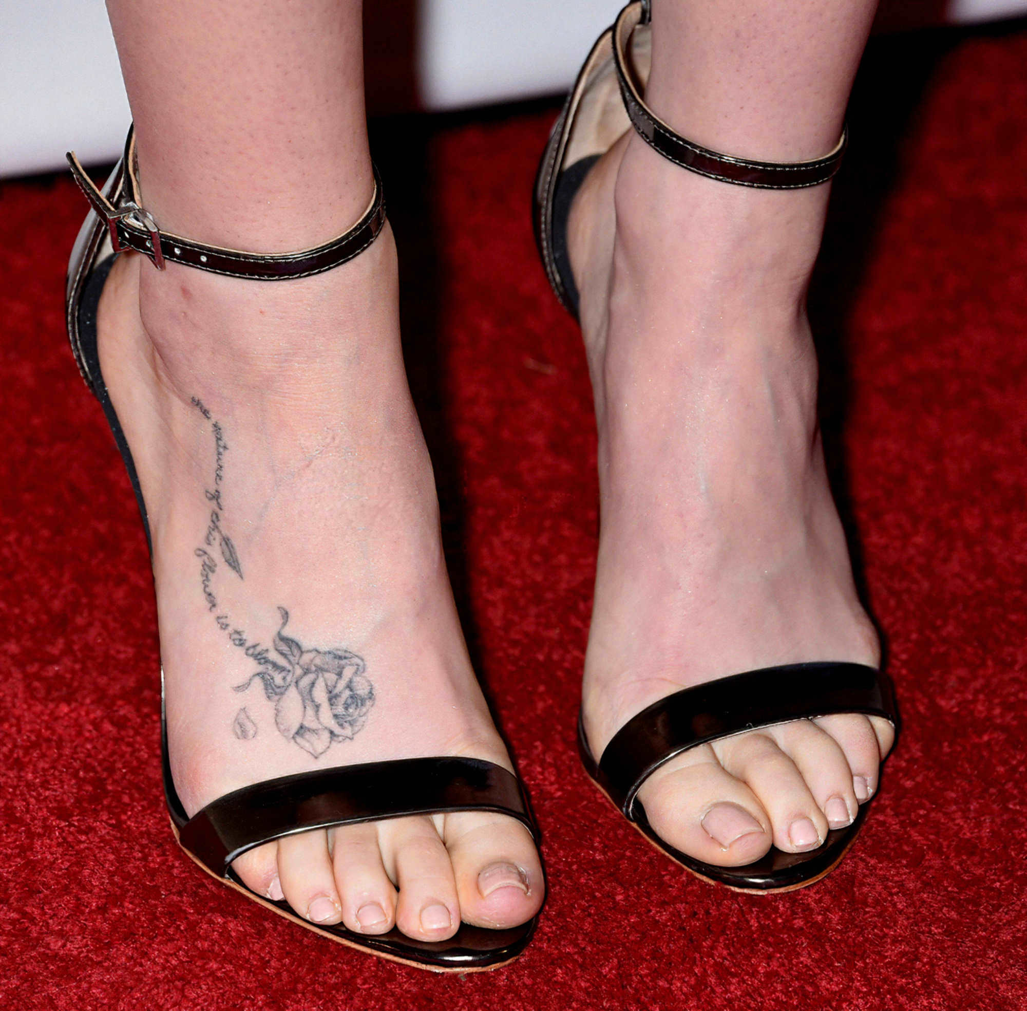
Another clear foot photograph gives a closer look at the same floral work from a different angle. The rose sits on the upper side of the foot, while the script travels along the arch and toward the ankle. Seeing the piece without a full-body pose makes the placement easier to understand. It is not a tiny mark tucked beside the shoe. It has enough width to be read as one connected composition.
The close view also shows why the piece has a gentle look rather than a bold traditional one. The petals are shaded with fine gray lines instead of packed black. The lettering is narrow and slightly loose, and the small falling petal adds motion. The result feels romantic without becoming overly formal.
Using two elements together can make a small piece feel complete. A rose on its own is familiar, and a quote on its own could disappear into the skin. The combination gives both parts context. The flower carries the image, while the words give it a personal voice. That is a useful approach if you want something meaningful that still looks calm and wearable.
Foot placement needs more care than people expect. The skin rubs against socks and shoes, and fine lines can fade or soften faster than they would on a protected part of the body. A clear reference photo shows how much scale is needed. Collins’s rose is not enormous, but it is large enough for the flower and script to keep their separate shapes.
When a piece has both an image and a quote, let each part have its own lane. The rose should be recognisable before the viewer reads the words. The lettering should remain legible without cutting through the petals. That simple separation makes the whole foot look cleaner and gives the design a better chance of aging well.
The butterfly near Lily Collins’s wrist ink feels like a private little sketch
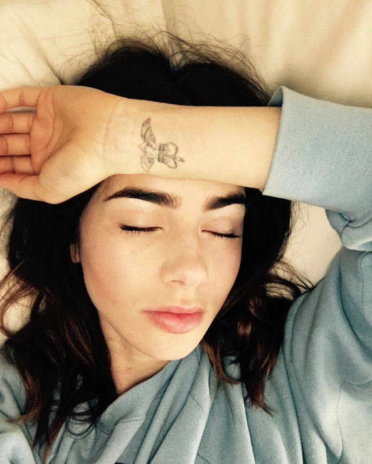
The butterfly is much smaller and more casual than the back and foot pieces. In a relaxed photograph, Collins rests her forearm across her face and the fine-line butterfly appears near the wrist. The image is simple, almost like a quick personal snapshot, which suits the scale of the mark.
Small butterflies can become generic if their outline is too heavy or their wings are packed with detail. This one keeps a light shape. The wings are readable, but the mark does not try to imitate a full natural-history illustration. It looks more like a little emblem, which is why it can sit comfortably near the hand without competing with rings, sleeves, or movement.
The wrist is useful for anyone who wants a piece they can see often. It is visible when the hand is relaxed, but it can be covered by a watch or cuff when needed. The placement makes the butterfly feel like a reminder rather than a display piece. It is close enough to the wearer to be personal, even when other people only catch a glimpse.
There is a nice contrast between this mark and the script on Collins’s back. The back piece is carefully staged in formal portraits. The butterfly shows up in a quieter, everyday frame. Both are delicate, but they work in different moods. A collection does not need every piece to have the same level of polish or visibility.
If you like the idea of a small wrist piece, keep the silhouette clear. Tiny interior shading can disappear quickly, especially on a moving joint. A clean outline, a little open skin, and a size that suits the wrist usually give the design more staying power than a miniature scene with too many details.
The Peter Pan design gives the collection a playful storybook edge
One of Collins’s most playful pieces is a small Peter Pan figure on the upper back. The character is shown in a light, fine-line style, close to the phrase and floral details already in that area. It gives the collection a little bit of childhood wonder without changing the overall delicate look.
The figure is easy to miss because it is not a solid black silhouette. It has a soft outline and sits in open skin, so it becomes clearer when the hair or clothing moves away. That subtlety is part of its charm. It feels like an illustration tucked into the larger back area instead of a separate graphic stamped onto the body.
Storybook pieces work best when the reference is recognisable but not overloaded. Peter Pan is a strong choice because the flying pose carries the idea even at a small scale. Collins does not need a full scene with a skyline, stars, and several characters. One figure and a few fine lines are enough to suggest the story.
It also shows how an existing area can grow. The original script, flower, and figure read together as one composition. Adding a small character does not require a full redesign of the back. The newer detail can sit beside older lines as long as the scale and line weight stay compatible.
A tiny character needs clear movement more than tiny detail. When the pose is easy to understand, the piece keeps its personality even if some finer lines soften over time. That is useful for anyone considering a favourite book, film, or childhood image in a small format.
Why the collection feels balanced even though the pieces are small
The collection has a consistent mood without repeating one exact style. The back and foot pieces use delicate script and floral imagery. The butterfly keeps the wrist light. The Peter Pan figure brings in a little narrative. These choices are different enough to be interesting, but they share fine lines, open skin, and a preference for images that can be read without taking over the body.
Placement does a lot of the organising. The back pieces sit high and stay close to the centre of the body. The foot rose follows a long horizontal line created by the shoe and the arch. The butterfly stays near the hand, where it can be seen in everyday moments. Each piece has its own small stage, which stops the collection from looking crowded.
There is also a clear balance between visible and private work. A red-carpet pose can reveal the upper-back phrase, but a jacket can cover it completely. The foot rose appears with sandals and disappears under closed shoes. The wrist butterfly is visible during ordinary gestures, yet it is still small enough to feel personal. That flexibility may be part of why the pieces continue to suit different versions of Collins’s style.
The collection is a good example of how a plan can grow without becoming a full-body project. You can start with a phrase, add a flower later, then choose a tiny symbol that carries a different kind of meaning. The pieces do not need to match perfectly. They only need enough shared line quality and scale to sit comfortably beside one another.
Small pieces work best when the idea is specific and the artwork is allowed to stay simple. Collins’s ink shows that a short phrase, a rose, a butterfly, or a storybook figure can carry real personality when the placement is chosen carefully. The goal is not to fill space. It is to give each piece enough room to be itself.
Planning a small idea with the same calm feeling
If you like this look, begin with the story rather than the picture. Decide whether you want a phrase, a flower, a symbol, or a character. Then think about the body area and how often you want to see it. A wrist piece can act as a daily reminder. A back piece can stay more private. A foot piece can work with your shoes and change when you move.
Use reference photos that show the actual skin and placement, not just a cleaned-up drawing. Fine-line work needs realistic sizing. The phrase might look elegant on a screen but become unreadable if it is reduced too far. The rose might need more space between its petals than you expect. Your artist can adjust the drawing so it remains clear after healing.
It is also worth leaving room for the collection to change. Collins’s pieces show how a small illustration can be added beside older lettering without making the area feel overloaded. You do not have to plan every future piece today. Choose a strong first design, protect the surrounding skin, and let later ideas arrive when they make sense.
Delicate does not mean disposable. Fine-line work still needs thoughtful placement, careful aftercare, and realistic expectations about fading. Shoes, sun, friction, and moving joints all affect how ink settles. The quiet look works because the pieces are clear, not because they are careless.
Watch Lily Collins talk about her style and creative work
Collins’s interviews offer a little extra context for the thoughtful, detail-focused style that also comes through in her body art.