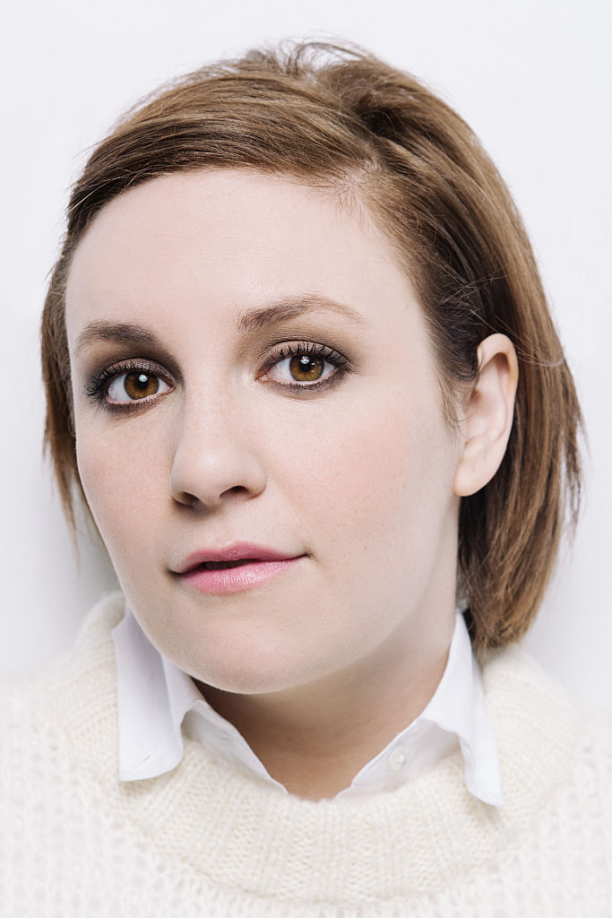
Lena Dunham’s tattoos don’t look like one matching sleeve planned in a single sitting. There’s a storybook bull, a row of houses, a detailed floral piece, direct lettering and smaller marks on her chest and hand. Each has its own mood; the way they sit on her body gives the collection some order.
It helps to follow the placements rather than count the tattoos. Illustration runs along the arm, the flowers spread across the upper arm, the houses sit on her back and the lettering stays easy to spot. The designs feel personal because each one has a different job.
The Ferdinand bull tattoo brings a storybook drawing onto the upper arm
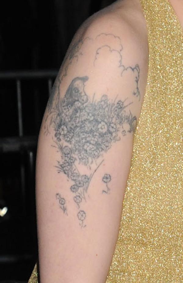
The Ferdinand bull is one of the clearest personal references in Lena Dunham’s collection. A fine-line drawing sits on her upper arm, with flowers and soft shading around it. It comes from The Story of Ferdinand, the book about a bull who would rather smell flowers than fight.
The close-up shows why the light linework holds together. The bull’s profile is easy to recognize, the flowers frame it and open skin keeps the picture from turning into a gray patch. It looks more like an illustration placed on the body than a design picked from a flash sheet.
The upper arm gives the drawing a gentle curve without making it wrap too far. Flowers fill the space around the bull and stretch the design beyond a small emblem. The nearby marks on her hand and wrist still have room to read on their own.
A personal reference works best when its main shape stays clear. The book connection makes the bull meaningful without needing a caption in ink. Leave some open skin around the figure, then use smaller details to frame it.
A floral upper-arm tattoo packs detail into one clear shape
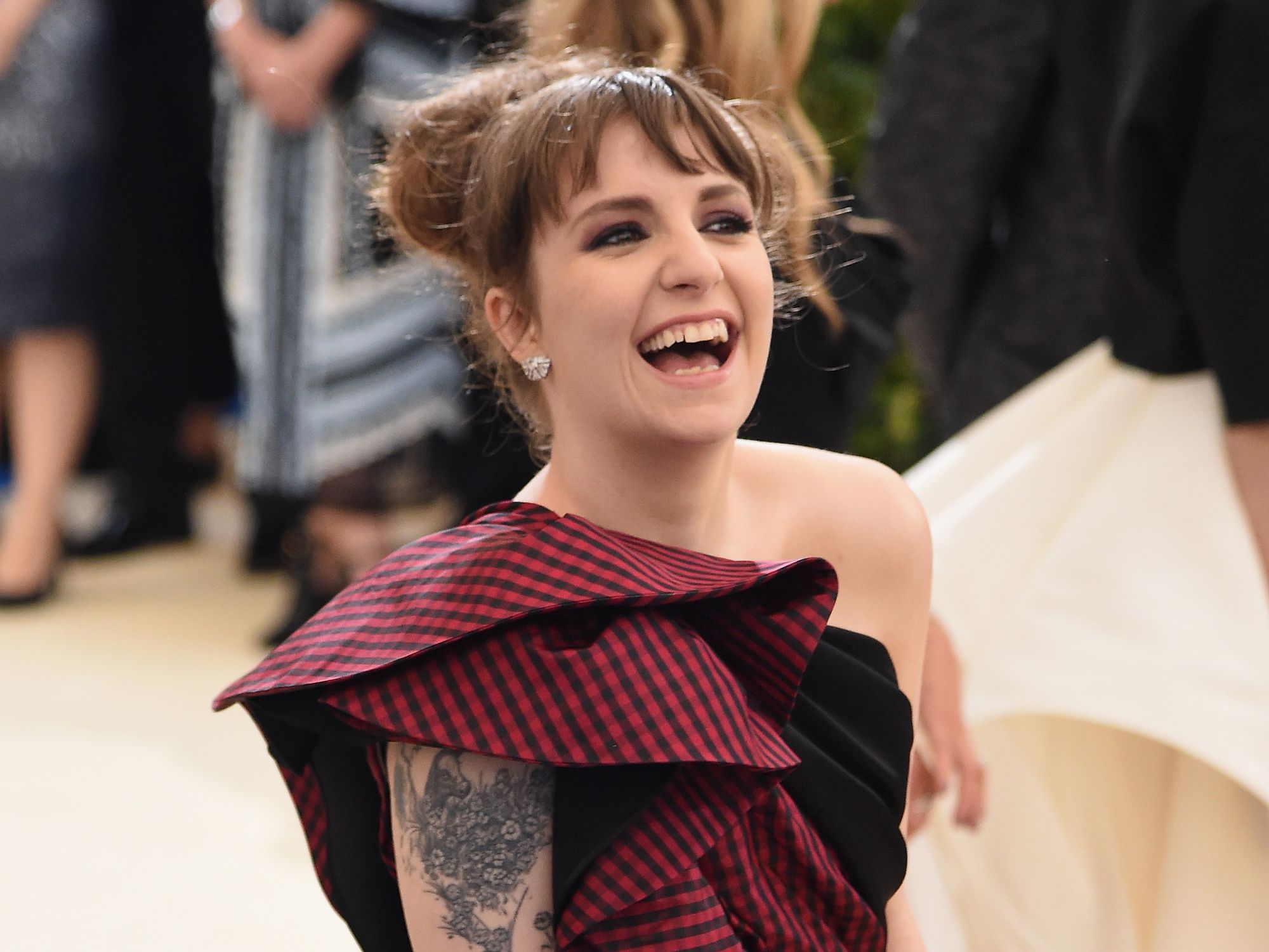
One of Lena’s floral tattoos shows how a dense design can still have a clear outline. The black-and-gray work fills the space below her shoulder, with petals, leaves and smaller marks packed into one piece.
It has more visual weight than the Ferdinand bull, but it follows the shape of her arm instead of sitting there like a sticker. The shoulder lets the upper edge spread out, then the design narrows as it runs down the arm.
The red-carpet photo shows the tattoo in an ordinary pose. You can see how it sits beside her clothes, how the darker areas read from farther away and how the lighter details come through when you look closer.
Detailed flowers still need a strong outer shape. Texture can fill the petals and leaves, but the tattoo should read as one idea before anyone studies the fine marks. That keeps an arm piece from becoming a blur.
The chest tattoo stays small while the surrounding placement does the talking
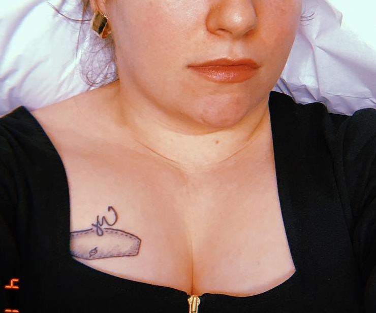
The small chest tattoo is easy to overlook, so the close-up helps. It sits near Lena’s neckline and just above the black fabric. The mark is compact, but its position makes it feel chosen rather than hidden. You notice it after the larger arm and back designs.
The chest moves with the collarbone, clothing and folds of the skin. A small tattoo works there when its edges stay clear; it doesn’t need to cover the whole area to belong.
That scale adds variety to Dunham’s tattoos. The bull is an illustrated arm piece, the floral work is denser, and the chest mark gives the eye a short pause. A collection feels more individual when each tattoo isn’t trying to be the main event.
Small doesn’t mean unimportant. A compact chest tattoo can be a pause between larger designs. Place it where clothing and nearby ink won’t swallow its outline.
The house tattoos turn Lena Dunham’s back into a small piece of architecture
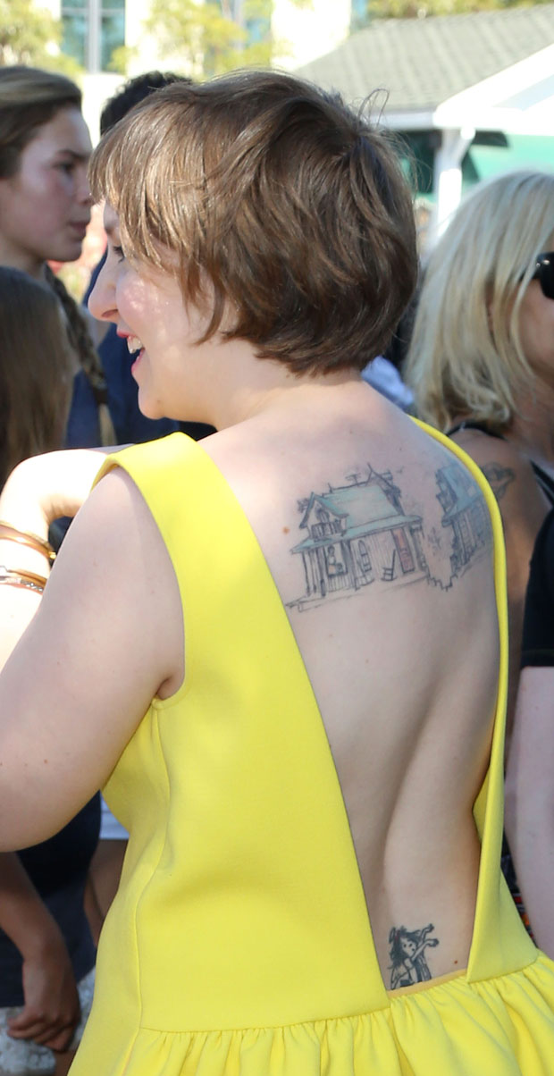
The two houses across Lena’s upper back are among her most recognizable tattoos. Their windows, roofs and uneven lines give them the feel of small architectural drawings. A separate figure sits lower on her back, with open space between the designs.
The red-carpet photo shows how the houses sit on her back. Her dress exposes the shoulder blades without turning the tattoos into one large panel. They feel like private illustrations that appear when an outfit happens to reveal them.
The houses suggest home without spelling out a long explanation. Their hand-drawn lines keep them from feeling like a logo. The small windows reward a closer look, while the larger outlines remain clear from a few steps away.
The back gives architectural drawings room to breathe. Squeeze the houses between the shoulder blades and the small details would lose their charm. Here, the roofs, windows and open gaps stay distinct.
The LOVE ME heart and arm script make the collection feel direct
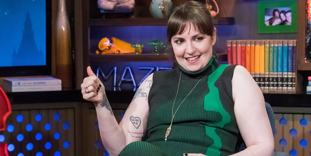
The LOVE ME heart on Lena’s arm has a different feel from the bull and the houses. It’s blunt, small and easy to read. Nearby script follows the arm in a looser line, so the two marks sit together without becoming one dark block.
The talk-show portrait catches the tattoos in a normal seated pose. The heart is on her arm, the script runs below it and the older upper-arm piece is still visible higher up. Nothing depends on a dramatic photo angle.
That mix of lettering and illustration sums up the collection. Some tattoos use a clear phrase; others rely on a character, a house or flowers. The variety keeps the designs from falling into one predictable style.
Simple words work best when they have room to speak for themselves. The heart doesn’t need a long explanation. Its size, placement and outline make the point, while the script nearby feels more handwritten.
The collection has a rhythm, even as the styles change. Larger illustrations invite a closer look, small words read quickly and open skin keeps the designs apart. That balance matters more than making every tattoo use the same line weight.
A drawing can carry a private reference and still be easy to recognize. The Ferdinand bull connects to the book, but the picture makes sense on its own. The houses suggest home while keeping their own simple visual language.
The floral work takes another route. Flowers are a familiar subject, but the shoulder placement and shifts in line weight give this piece its own character. A common design can feel specific when its size and position suit the person wearing it.
Back tattoos need their own kind of planning. The houses need a broad enough area for their small details, and the lower figure benefits from the space below them. Packed into one rectangle, the drawings would lose their sketchbook feel.
The arm’s curve adds movement to its tattoos. The bull and the LOVE ME heart change a little when Lena bends her elbow or turns her wrist. That’s fine; a well-placed design moves with the body rather than pretending skin is paper.
Lettering deserves a close check before it’s inked. Read the words from a normal distance, see how they sit when the arm hangs naturally and leave space around them. Clean letters stay easier to read than a crowded line of tiny details.
If you like Lena Dunham’s tattoos, take note of how each idea has its own place. Use a broader area for an illustration, keep a short phrase clear of busy edges and let the open skin around a house or flower become part of the design.
You don’t have to copy the bull, heart or houses to get a similar feel. The better inspiration is the mix of direct and unusual choices. A collection can hold a book reference, a plain phrase and a familiar flower without losing its point of view.
For more actor ink ideas, browse the site’s actor tattoo guides and compare how performers use the back, arm and chest. Dunham’s collection shows that a group of tattoos doesn’t need one perfect theme to feel complete.