codex

Victoria Beckham Tattoos: Hebrew Script, Family Stars and the Ink She Removed

Victoria Beckham’s tattoo history is easier to understand through older photographs than through her current public style. Her earlier collection included fine script, family stars and small initials, many linked to David Beckham and their children. Some designs faded or were removed, so old photographs shouldn’t be mistaken for a current inventory.

Victoria Beckham’s Hebrew spine tattoo
Victoria Beckham tattoos: inline tattoo evidence

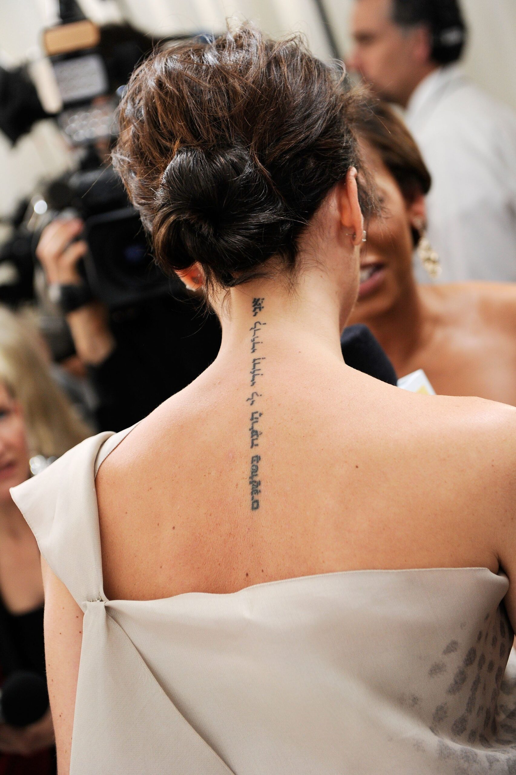
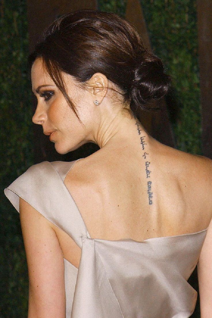
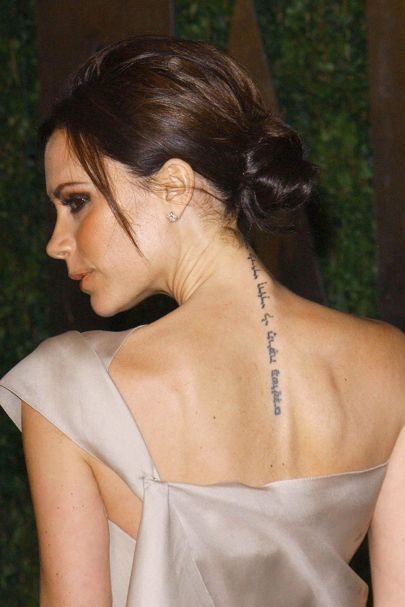
One of the best-known designs in Beckham’s earlier collection ran from the nape down her upper spine. The Hebrew phrase is commonly translated as “I am my beloved’s and my beloved is mine,” from the Song of Solomon. In photographs, the narrow lettering follows the line of her back and can be covered by her hair or clothes.

Close-ups show hand-drawn lettering rather than a rigid geometric font. The ink looks darker in some images and softer in others, so photographs don’t establish exactly how it looked at every stage.

The delicate back-script tattoo and what it says about placement
Victoria Beckham tattoos: inline tattoo evidence

This view shows the same script beginning at the nape and reaching toward the shoulder blades. It can be seen when Beckham wears her hair up or a low-backed dress. Some photos make the fine lines look crisp; in others, they appear faded. The lettering’s placement is part of the design: it stays close to the body and doesn’t compete with her clothes.

If you’re considering a phrase in a narrow space, check the translation and allow enough room between characters. Fine script can lose contrast over time, and a phrase that looks delicate on a screen may need a little more line weight on skin.

Victoria Beckham’s five-star family tattoo
Victoria Beckham tattoos: inline tattoo evidence

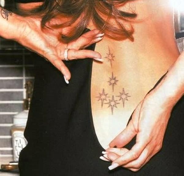
Beckham had five outlined stars clustered on her lower back. Tattoo references describe them as representing Victoria, David and their three sons at the time: Brooklyn, Romeo and Cruz. The stars were unfilled and arranged in a small group, with a few near the centre and others branching out.

The design used symbols rather than names or dates. It followed the curve of the lower back, and the light outlines gave it a different look from the darker script elsewhere in her collection.

The DB wrist tattoo and why it became a removal story
Victoria Beckham tattoos: inline tattoo evidence

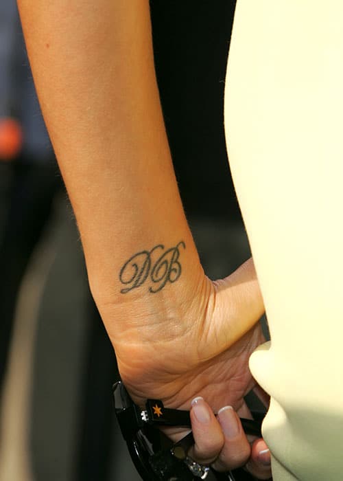
The cursive “DB” on Beckham’s wrist stood for David Beckham. Its placement made it easy to see in photos when she held a clutch or raised her hand.

By 2022, the initials looked much lighter. Beckham said the tattoo had become thick and less delicate than she wanted, and described removal as an aesthetic decision, not a sign of trouble in their marriage. The wrist is exposed to sun, washing and friction, which can affect fine lettering. Laser removal may take several sessions, and the ink can look uneven as it fades.

Her other small wrist tattoos and the softer side of the collection
Victoria Beckham tattoos: inline tattoo evidence

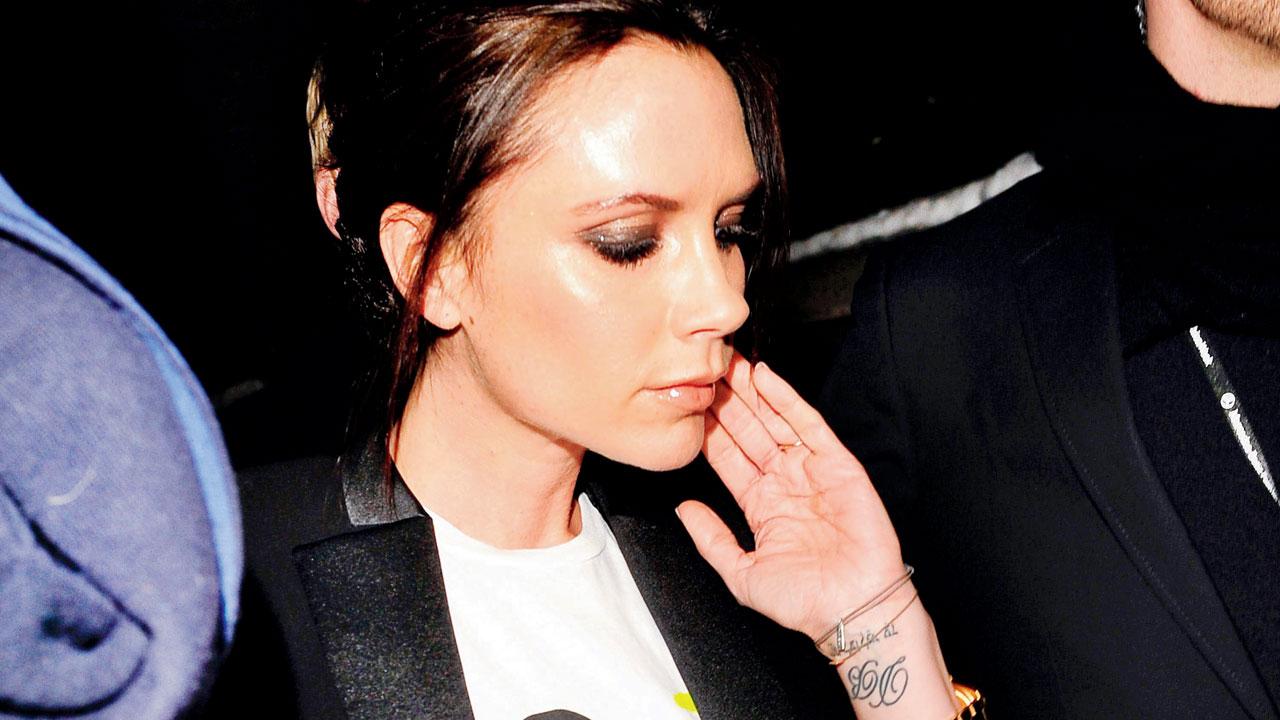
Older photographs show other small scripts and symbols on Beckham’s hands and wrists, some connected to family milestones. The images don’t make every letter or mark clear, so it is better to leave those details unidentified than guess at them.

Some of her tattoos faded or were removed as her style changed. That doesn’t erase what they meant to her when she chose them; it shows that a person can value a memory and still change how they want to carry it.

Making personal design choices
Victoria Beckham tattoos: inline tattoo evidence

Beckham’s earlier tattoos shared a few traits: fine script, small symbols and family references in places that could be covered or shown. If you’re drawn to lettering, verify the language and wording before choosing a design, then work with an artist who can get the characters and spacing right. Think about how exposed the placement will be and how the lines may change over time.

You can admire the design without copying it exactly. A tattoo should fit the person wearing it, and changing your mind later doesn’t make the original choice meaningless.

More musician tattoo guides

Lucas Hernandez Tattoos: Achilles, Family Names, Krieger and His Black-and-Grey Sleeve

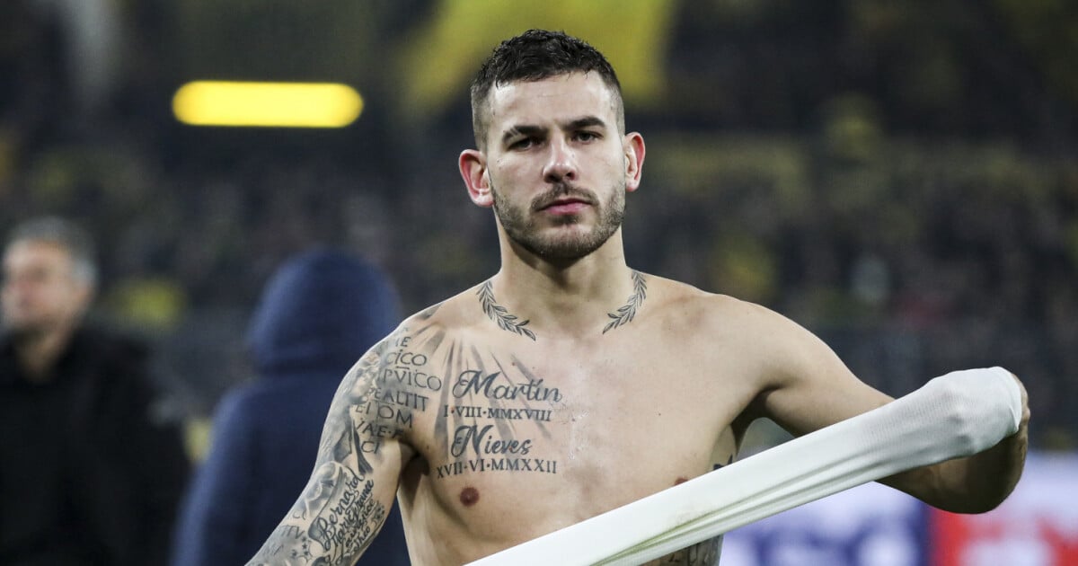
Lucas Hernandez’s tattoos cover his arms, shoulders, chest, side, back, hands and legs. The black-and-grey collection mixes classical figures, family names, lettering and career references, and has grown over time rather than following one matching design.

Hernandez has explained some of the larger pieces himself. In a Bayern interview, he identified Achilles and Julius Caesar on his arm and said he sees himself as a warrior on the pitch. Other details come from photos or tattoo reference pages, so those should be treated with more caution.

The right arm is built around Achilles and Julius Caesar

Lucas Hernandez tattoos: inline tattoo evidence

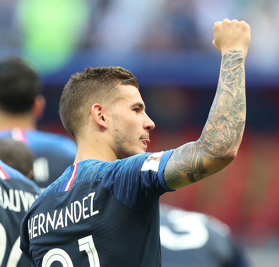
Hernandez’s right arm is filled with shaded figures, classical faces, lettering and Roman-style details. He has said that its two central figures are Achilles and Julius Caesar: one a Greek warrior, the other a Roman general and statesman. The rest of the sleeve includes numerals, architectural details and smaller marks that are hard to separate in a single photo.

From a distance, the darker shading makes the arm read as one piece. In close-ups, the lighter gaps reveal separate faces and details.

The staircase and Achilles piece feels like a scene, not a flash tattoo

Lucas Hernandez tattoos: inline tattoo evidence

Above the elbow, a staircase or shrine-like section sits beside the Achilles figure on Hernandez’s forearm. The image shows architecture, a classical body and parchment-style lettering, arranged so the eye travels up the arm. Hernandez’s own explanation is direct: Achilles represents the warrior spirit he identifies with.

The staircase follows the limb toward the elbow while the figure uses the wider forearm area. The components have room to read when his arm is straight or bent.

The guardian angel tattoo sits above the warrior imagery

Lucas Hernandez tattoos: inline tattoo evidence

On the upper arm, a statue-like angel is surrounded by script. Hernandez has described it as a guardian angel and a symbol of protection for him and his family. Its carved, classical style fits with the Achilles and Caesar imagery, while its stated meaning brings the focus back to the people close to him.

Family names run through the upper-arm work

Lucas Hernandez tattoos: inline tattoo evidence

Names including Bernard, Marie France, Laurence and Theo appear around Hernandez’s upper arm. He has explained that they refer to family members: Laurence is linked to his mother and Theo to his brother. The names sit within the larger sleeve, beside shading and figures, rather than in a separate panel.

The side tattoo brings a different mood to the collection

Lucas Hernandez tattoos: inline tattoo evidence

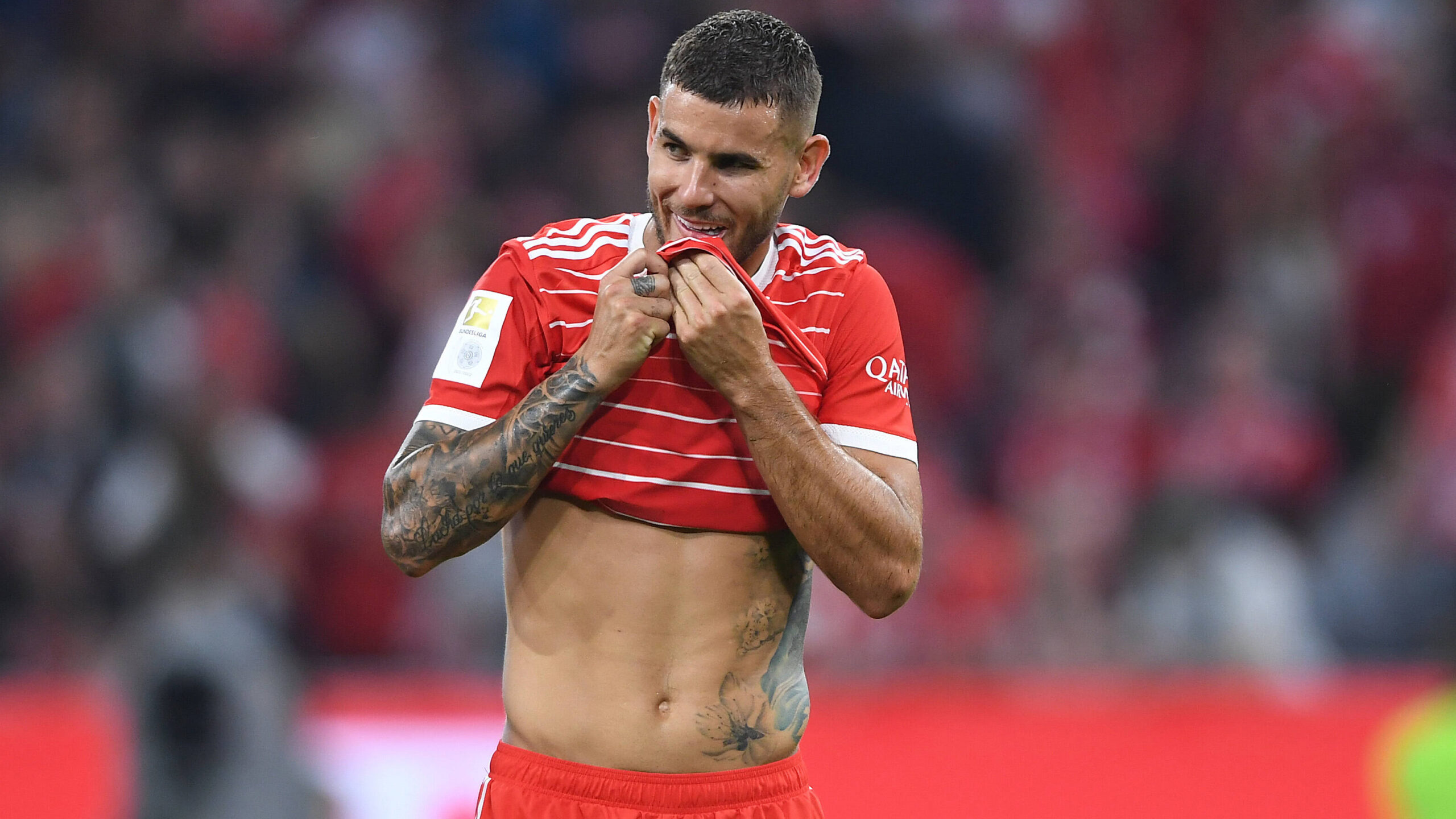
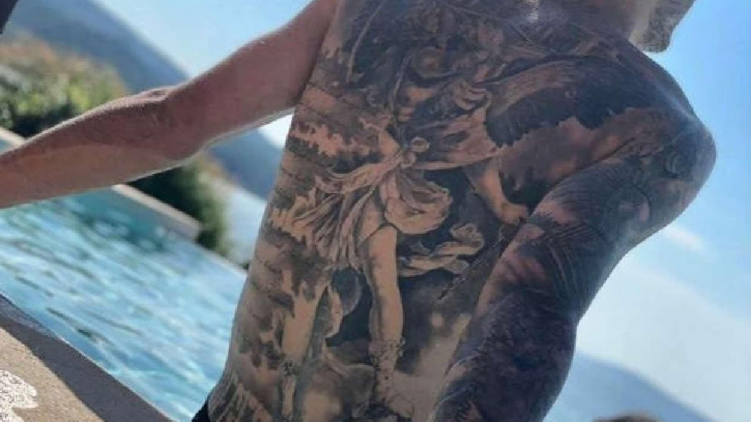
A large portrait of a woman, flowers and script cover part of Hernandez’s side. Tattoo reference pages identify it as a geisha-style design and connect it to his wife, Amelia Ossa Llorente. The photo itself shows the portrait and surrounding details, but cannot confirm that explanation on its own.

The side piece is more private than the arm work and appears when his shirt is lifted. Its outline is softer, and it follows the curve of his ribs and torso.

The back tattoo adds a full-scale layer behind the sleeve

Lucas Hernandez tattoos: inline tattoo evidence

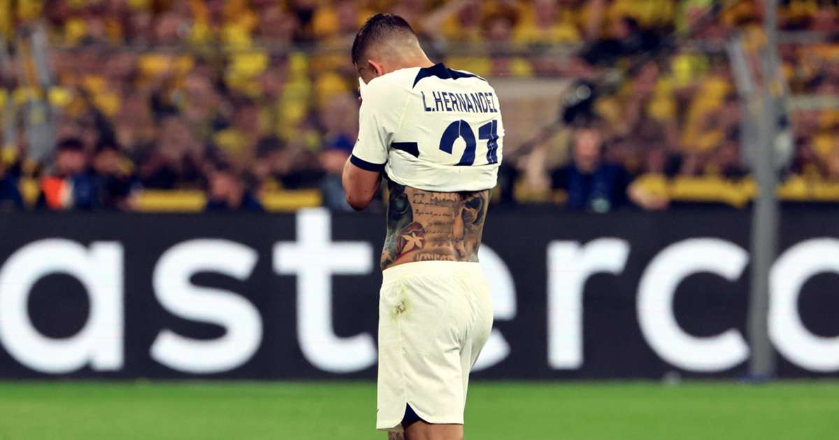
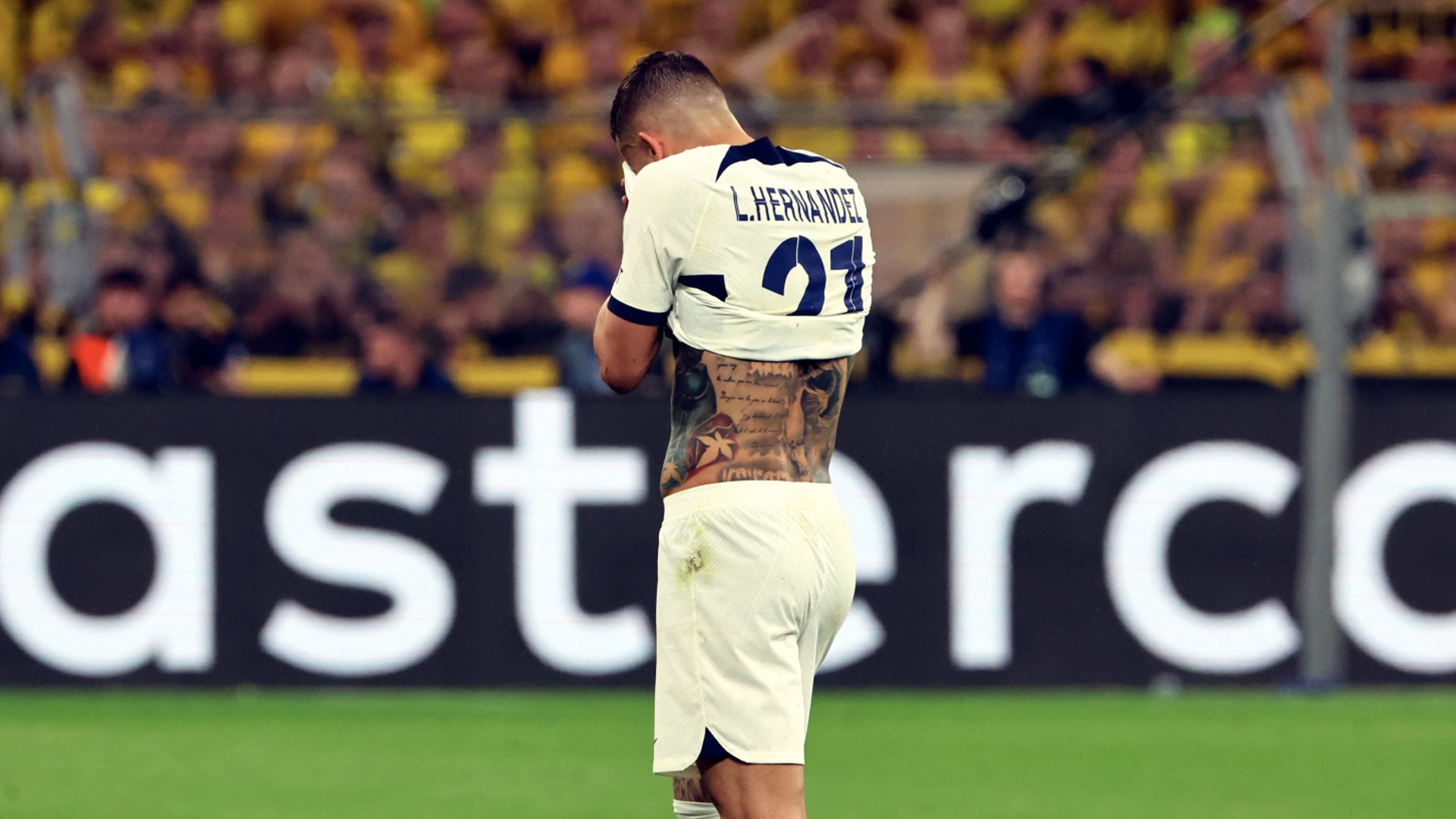
A licensed match photo from behind shows a large black-and-grey composition across Hernandez’s shoulders and toward his lower back. It includes figures, lettering and heavy shading, though the details are difficult to identify from this single view. Similar shading connects the sections while leaving different figures and text visible.

The chest tattoos keep family dates close to the centre

Lucas Hernandez tattoos: inline tattoo evidence

In a front-facing match photo, the names Martin and Nieves appear across Hernandez’s chest, each paired with a Roman-numeral date. Smaller script continues the black-and-grey work around them. The image supports the names and dates; it does not spell out who they refer to.

The “Krieger” tattoo marks a chapter in Germany

Lucas Hernandez tattoos: inline tattoo evidence

Krieger means “warrior” in German. Reports connected the back tattoo to Hernandez’s time at Bayern Munich, when he was recovering and working to return to the team. His tattoo artist said it referred to the support Germany had shown him and his fight for the club.

The word sits beside an image described as the Archangel Gabriel fighting a demon. The reported combination connects the work to recovery and struggle, but the attribution belongs to the tattoo artist’s account.

What makes Lucas Hernandez’s ink work

Hernandez’s collection brings together the arm figures, guardian angel, family names, chest dates and back piece. Reports also identify a 15/07/18 World Cup date among the designs, though the available images don’t pin it to a specific piece. The tattoos span public areas such as the arm and private ones such as the ribs and back; some details remain hard to identify.

More athlete tattoo guides

Laura Jane Grace Tattoos: Blackwork, Cover-Ups, and Ink That Keeps Changing

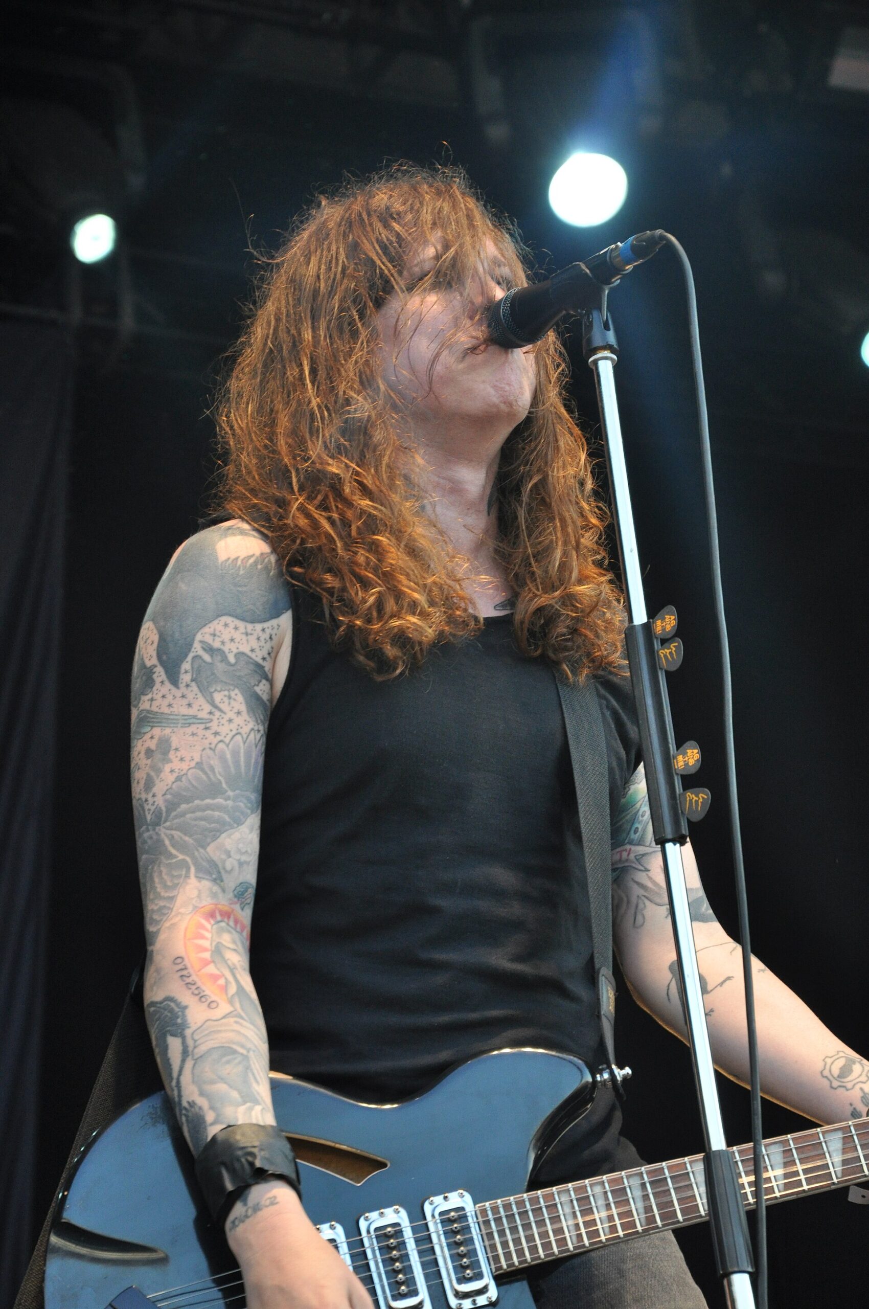
Laura Jane Grace’s tattoos have changed alongside her. Older illustrations and lettering sit beside newer blackwork, and some earlier pieces have been covered or marked through. Her arms draw the most attention, but photographs also show tattoos on her hands, neck and chest.

Grace has spoken about tattooing as a way to change how she sees her body. That context helps explain the revisions, though it doesn’t assign one meaning to every design.

Laura Jane Grace’s sleeve tattoos are built around change

Laura Jane Grace tattoos: sleeve composition

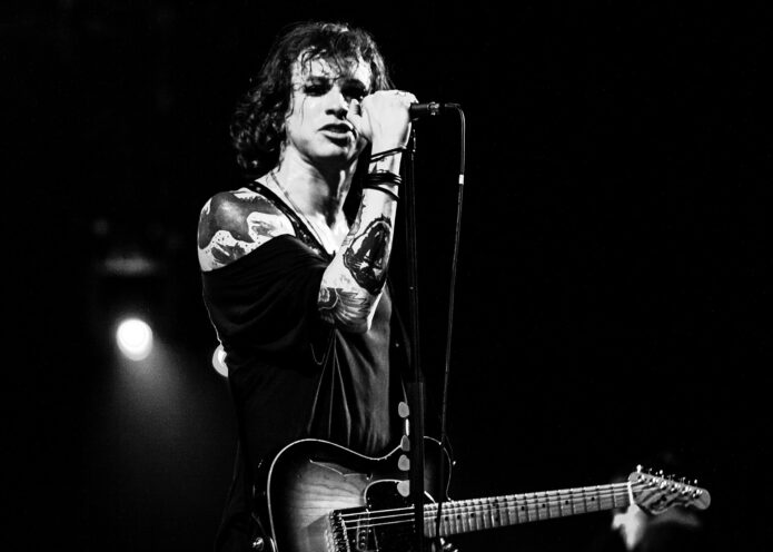
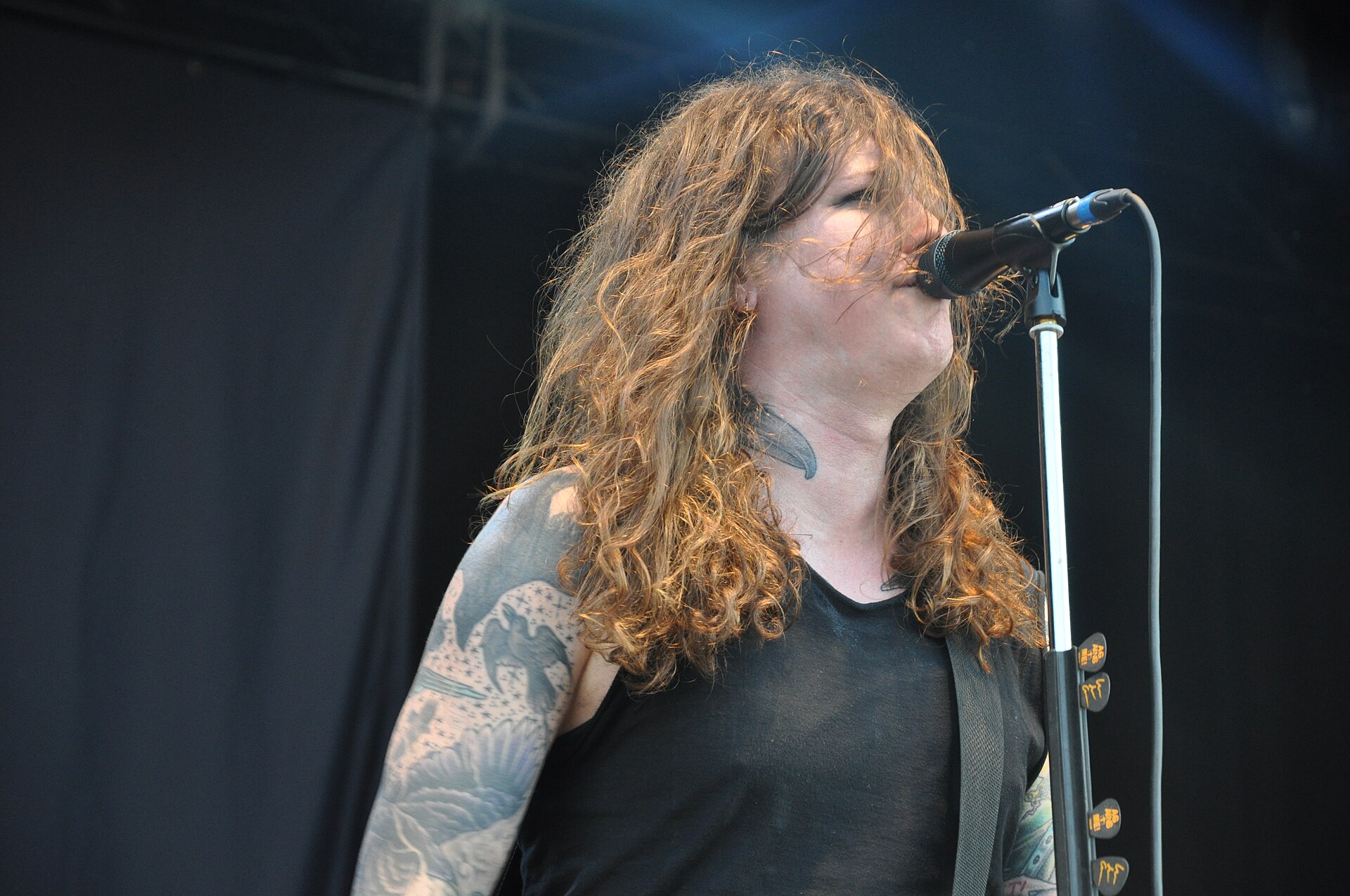
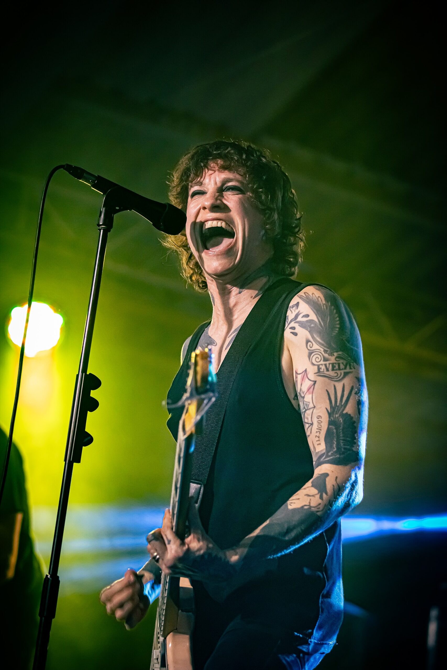
Performance photos show large illustrative shapes and grey shading on Grace’s upper arm, with smaller marks, lettering and darker sections toward the forearm and wrist. The pieces vary in age and condition; it is not a uniformly packed sleeve.

Grace has described tattooing as a way to take control of her body and change her self-image. Her sleeves also show how later work can alter the balance of older tattoos: a piece may remain visible, sit beside new work or be covered by blackwork.

The arm tattoos mix old illustrations with Japanese-influenced blackwork

Laura Jane Grace tattoos: hand and arm layering

Grace’s later work is associated with Japanese tattoo artists Gakkin and Kenji Alucky. Her official biography describes years of black-heavy bodywork by both artists, and Grace has discussed working with Gakkin on her hands and on a blackout cover-up.

Her hands extend the dark work beyond the sleeves, alongside older lines and lettering that are not all clear in photographs. The mix is not a traditional full bodysuit; it leaves room for personal designs and changes made over time.

Her chest tattoos carry the most personal-looking revisions

Laura Jane Grace tattoos: neck and chest placement

Grace has discussed an older tattoo connected to Béatrice Mireille Martin. Rolling Stone Canada reported that, after the relationship ended, Grace drew a black line through the piece. The mark remains part of the image, but the revision is visible too.

Performance photos also show dark tattoos along the side and front of her neck. They connect the chest and arms visually, though a microphone, collar or angle can hide part of them. The photographs show fragments rather than a complete inventory.

The arm blackout is not just a trend piece

Laura Jane Grace tattoos: blackout cover-up

In an interview with Out, Grace said that changing how her arms looked changed her self-image. She also described the blacked-out right arm as part of her transition. That is her account of the decision, not an interpretation drawn from the photograph.

In a later interview, Grace spoke about disliking an older Virgin Mary tattoo and wanting it covered. She discussed the shop environment, the trust involved in giving an artist a broad idea and the long sessions needed for large areas of blackwork. Cover-up work has to account for old pigment, skin tone, the new design and how the skin heals.

The blackout gives the arm a clear dark silhouette, while older illustrations remain visible elsewhere. Grace’s arm is a cover-up built on an existing tattoo history, not simply a new black panel chosen for effect.

Live photos show Laura Jane Grace in motion

Laura Jane Grace in a contextual photograph: live-performance context; not tattoo evidence

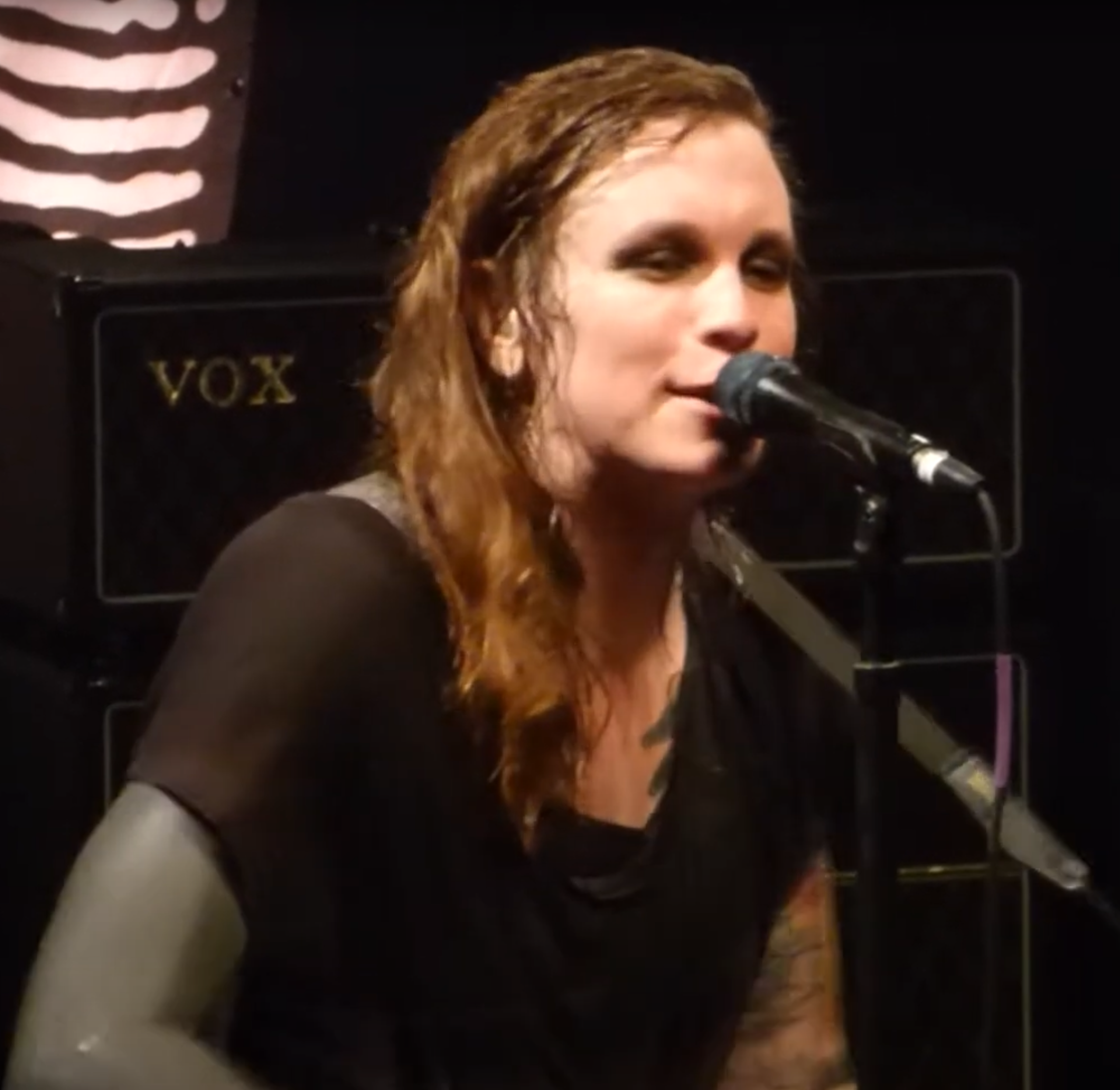
Many photographs catch Grace singing or playing guitar rather than posing to show her tattoos. Her elbow bends, her shoulder turns and a guitar strap crosses her chest, so the visible designs shift with the performance.

Stage lighting, motion and clothing can also make details hard to read. Blackwork may look blue or green under coloured lights, while a microphone or shirt can hide parts of the neck and chest. A single image is not a full record of the collection; comparing photos across years gives a clearer view of what changed.

Why this collection is worth studying

Grace’s tattoos show a collection that has been revised rather than kept fixed. Some designs remain, some were covered, and one was marked through. The older work and later blackwork sit together as visible records of those choices.

The useful detail is not a template to copy. It is how the collection makes room for change while keeping earlier marks in view. Grace has spoken about the decisions herself; where the photographs or reporting do not identify a piece, its meaning should stay open.

More musician tattoo guides

Tyler Herro Tattoos: No Work, No Check, Jersey Tributes and More

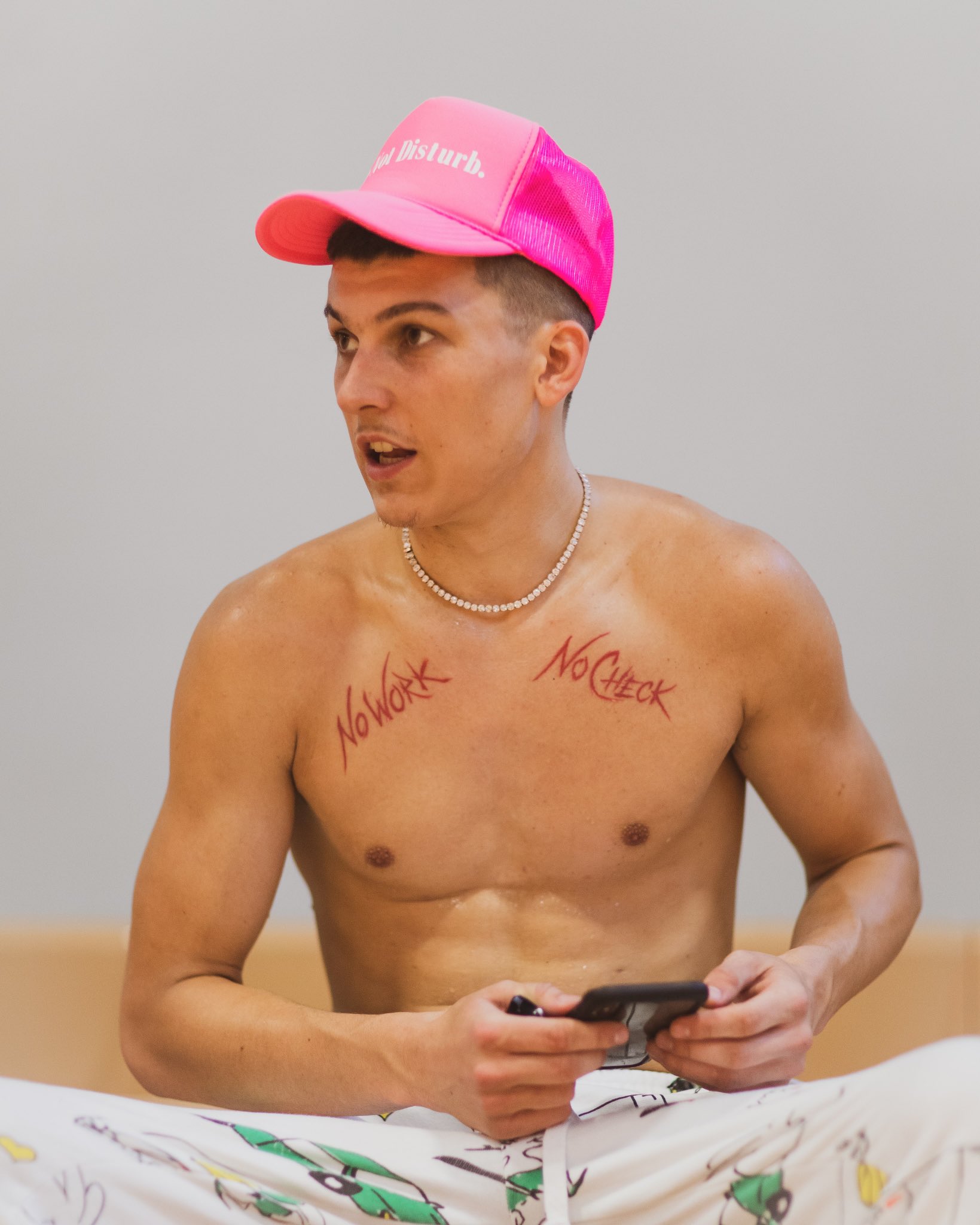
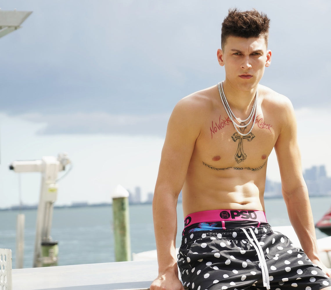
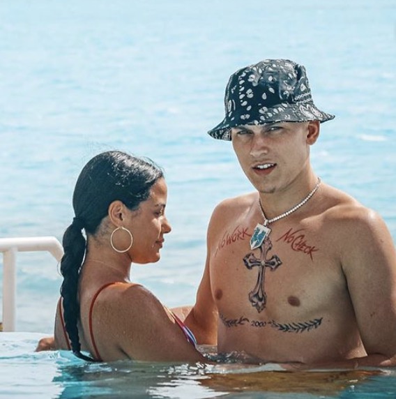
Tyler Herro’s tattoos are mostly hidden by his basketball uniform. In photos without a shirt, red “No Work” and “No Check” lettering sits above a cross and the year 2000 with laurel branches. Lower on his stomach are jerseys for Whitnall, Kentucky and Miami, surrounded by a lion and other graphics.

Some details have been connected to his career in coverage; others are simply visible in photos. Here’s what the sources support without assigning a private meaning to every shape.

The chest lettering: “No Work” and “No Check”

Tyler Herro tattoos: Tyler Herro's early No Work and No Check chest lettering

An early photo in Kentucky Sports Radio’s coverage shows the red script split across Herro’s upper chest: “No Work” on one side and “No Check” on the other. Together, the phrase reads as a blunt link between effort and pay. The lettering has a loose, handwritten look and stretches across the chest instead of sitting in a small outlined design.

The cross and the 2000 mark

Tyler Herro tattoos: Tyler Herro's cross and 2000 chest design

Later photos show a larger piece down the center of his chest. A decorative cross sits above “2000,” framed by laurel branches. Sport and Faith groups the cross with Christian imagery seen on other basketball players, so the religious visual language is clear. The coverage doesn’t quote Herro on the year or the leaves, and their personal meaning remains unknown.

The jersey tattoos turn his career into a timeline

Tyler Herro tattoos: Tyler Herro's Whitnall, Kentucky and Miami jersey tattoos

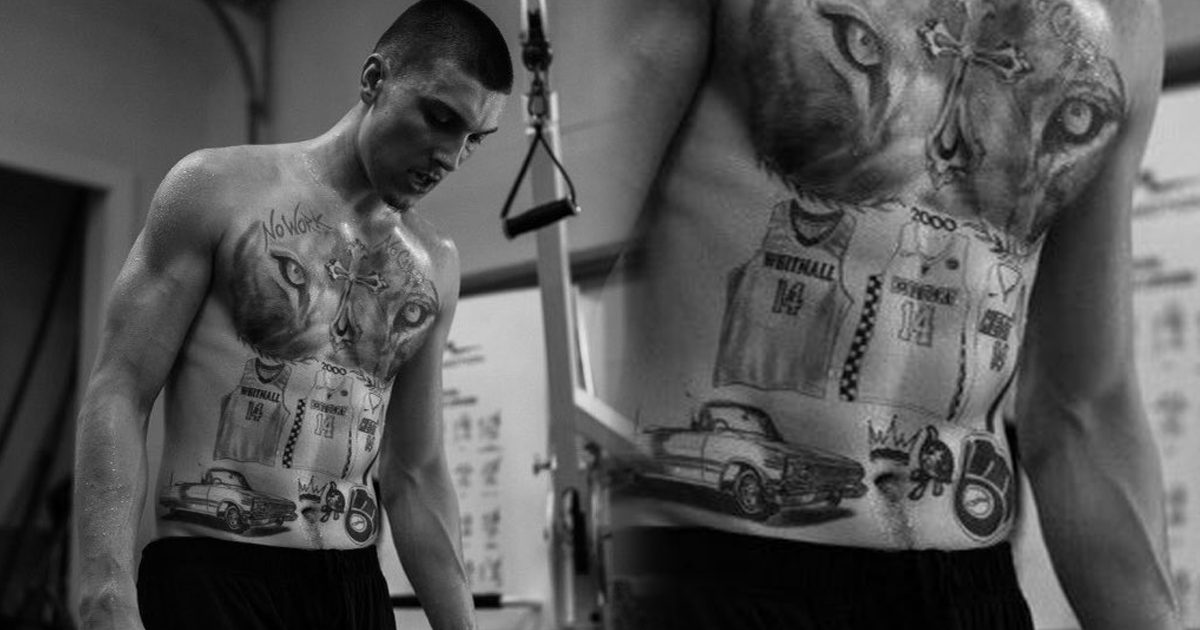
Photos published in 2024 show three jerseys across Herro’s stomach: Whitnall High School, the Kentucky Wildcats and the Miami Heat. Each has the number 14, tying the designs to the teams and stages of his basketball career, from high school to college and the NBA club that drafted him.

The surrounding close-ups also show a lion, a crown, a classic car, a fleur-de-lis shape and another “2000.” They add to the collage, but the available reports don’t explain each one.

The upper-body collage: lion, cross, and jersey art

Tyler Herro tattoos: A candid view of Tyler Herro's documented chest tattoos

A later view shows a large lion’s face between the chest lettering and the lower designs. The collection brings together several styles: red script, a dark ornamental cross, a portrait-style lion and jersey lettering. The torso gives them one shared canvas, even though the pieces don’t match.

A candid look at Tyler Herro away from the court

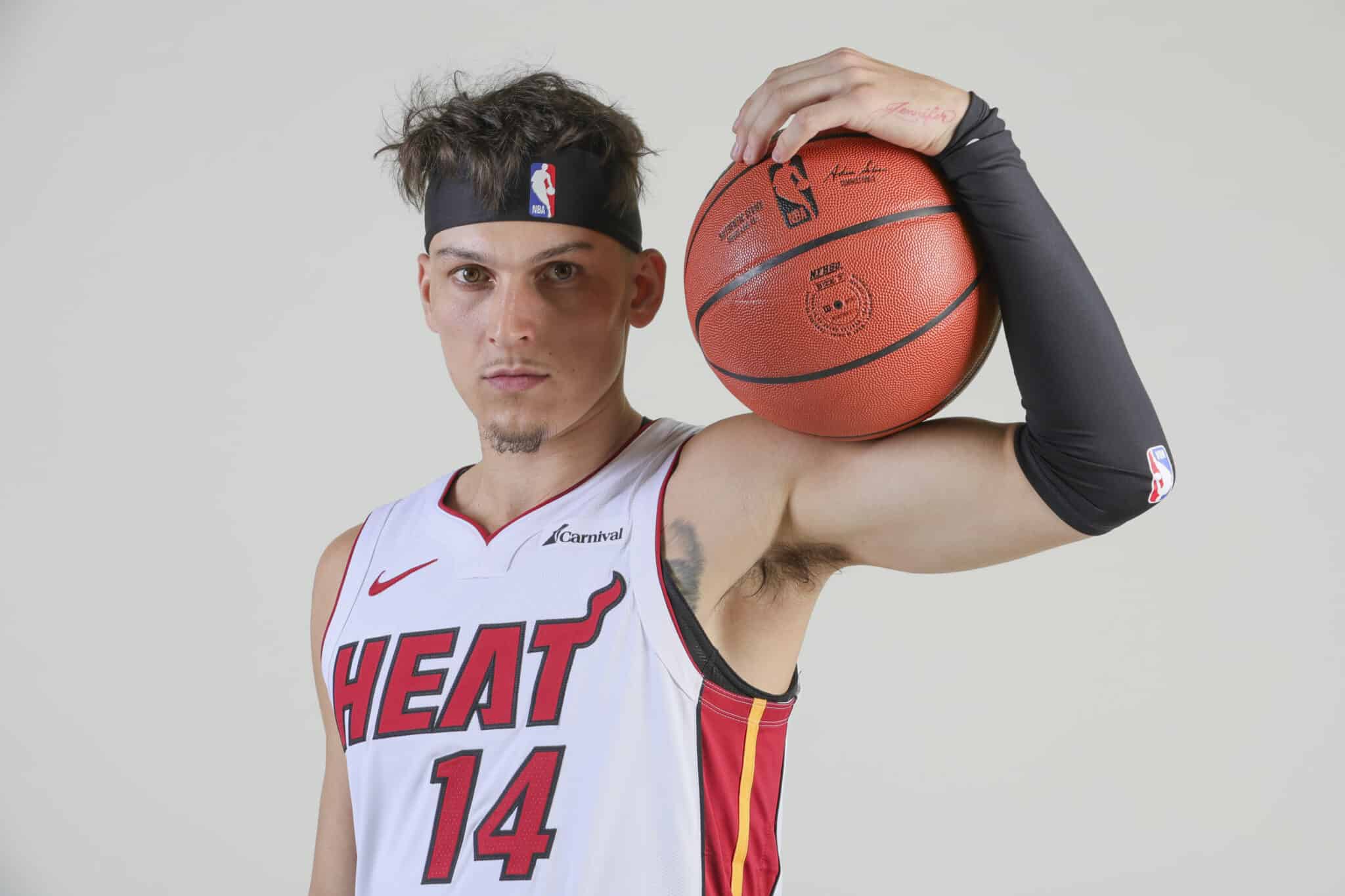
Tyler Herro in a contextual photograph: Contextual game portrait of Tyler Herro; not tattoo evidence; not tattoo evidence

This game-day portrait is included for context, not as evidence of a tattoo. The clearer photos above show the ink itself. In other settings, lighting, posture and crop can change how much of a chest design is visible.

What is confirmed, and what is only visible?

Early coverage shows the “No Work No Check” phrase, and reports connect the three number-14 jerseys to Whitnall, Kentucky and Miami. The cross, year, lion and surrounding graphics can be described from photos, but the sources here don’t establish Herro’s personal meaning for each one.

It’s also worth separating his tattoos from fan-made images. A portrait tattoo of Herro may appear in a search about him, but it isn’t part of his own collection.

How to borrow the ideas without copying the layout

Herro’s tattoos point to personal milestones: a phrase, a year and teams he played for. If you’re considering a similar approach, start with the parts of your own life you want to remember, then decide how each symbol can represent them.

Several large pieces need room around them. An artist can plan the gaps, account for how the torso moves and keep lines from crowding together. Herro’s red lettering also sits apart from the black-and-gray work; color and line weight are choices to settle before adding a new piece.

Use a celebrity photo as a reference, not a template. The lighting and pose affect what you see, and the final design should fit your own body and story.

The short version

Herro’s torso brings together the “No Work No Check” phrase, a cross, “2000” with laurels, and jerseys for Whitnall, Kentucky and Miami. The career links are reported; the private meaning of several other symbols isn’t. The photos show a bold collection that doesn’t need every detail explained.

More athlete tattoo guides

Mon Laferte Tattoos: Spiders, Storybook Ink and Old-School Color

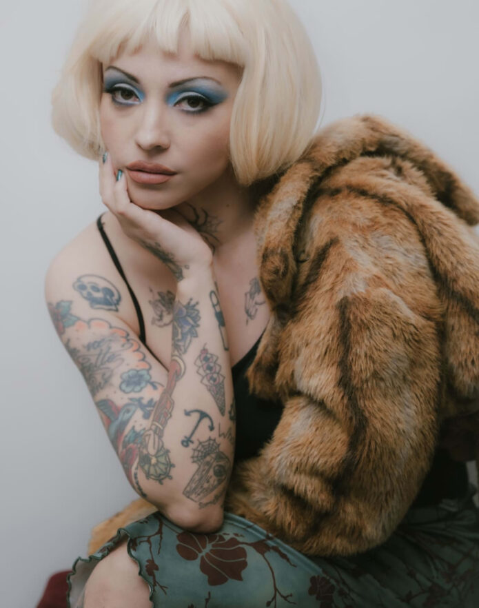
Mon Laferte’s tattoos span several styles: old-school color, storybook figures, lettering and a guitar with a face. The neck spider is the piece she has discussed most recently. In a 2025 Billboard en Español interview, she said she wanted a neck tattoo after thyroid cancer surgery and chose the spider partly to cover the scar. She also said she doesn’t need a grand story for every tattoo; sometimes she simply likes the design.

Some details have a reported explanation, while others are best described from photographs. That distinction matters in older or tightly cropped images, where a small tattoo can be hard to identify.

The bird, rose, and Mary lettering tattoo

Mon Laferte tattoos: genuine tattoo photograph showing the bird, rose and Mary lettering

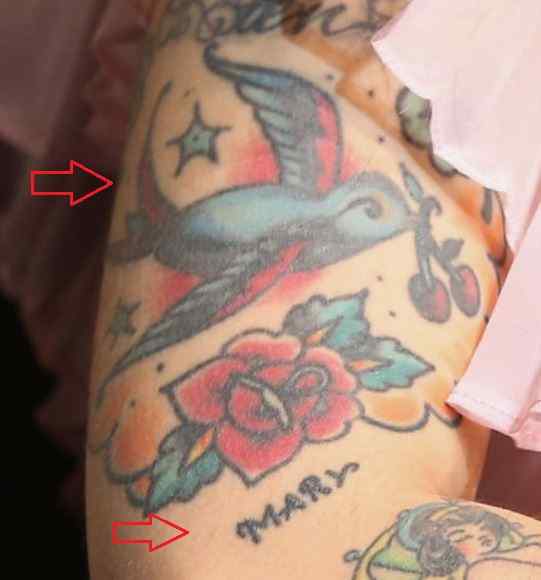
The close-up shows a blue-gray bird above a red rose and green leaves, with small stars around it and “Mary” written below in loose script. The colors have softened, but the old-school layout is still clear. The bird, flower and lettering sit together as a patchwork piece rather than separate designs.

The photo doesn’t explain who Mary is, so there’s no reason to assign the name a family or romantic story. The smaller lines have blurred with time, which is common in older color tattoos. If you’re planning a piece with this much detail, spacing and line weight matter as much as the subject.

The woman with the umbrella tattoo

Mon Laferte tattoos: genuine tattoo photograph showing the woman with umbrella

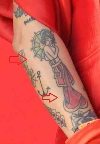
A long-dressed woman stands with an umbrella in this narrow, vertical design. The dress flows into a darker lower section, and a rounded, leafy detail frames the upper body. An anchor-like shape appears lower on the arm. The red clothing in the photo is background; it isn’t part of the tattoo.

Body Art Guru reads the woman as a symbol of beauty, desire, empowerment and independence. That’s the publication’s interpretation, not a direct explanation from Laferte. Visually, the figure has the look of a character from an old poster. A forearm suits the tall shape, though an artist would need to plan around the wrist and elbow so it stays clear when the arm bends.

The cat and unicorn tattoo

Mon Laferte tattoos: genuine tattoo photograph showing the cat and unicorn design

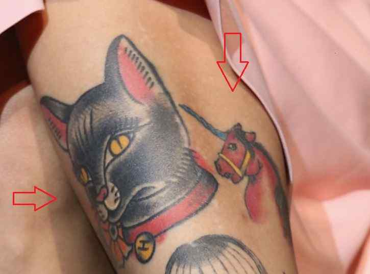
The cat’s head is large and dark, with bright eyes and a heavy outline. A smaller, more colorful unicorn sits beside it, and yellow details break up the darker area. Both figures are surrounded by other ink, so they read as part of a sleeve.

The close crop doesn’t show the boundaries of the surrounding designs, so it can’t tell us exactly where one tattoo ends and another begins. The pairing works visually because the cat has a strong silhouette and the unicorn adds a lighter note. That contrast helps a busy section stay readable.

The mermaid tattoo on the arm

Mon Laferte tattoos: genuine tattoo photograph showing the mermaid design

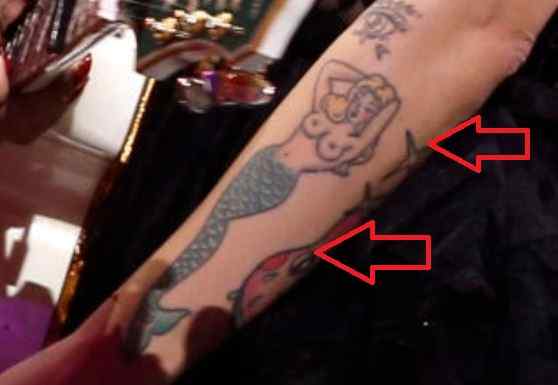
The visible section shows a small face framed by curling hair and a blue-green tail covered in scales. A red flower sits nearby. The lines are looser than the bold outline around the cat, and the angled photo shows how the tail follows the length of the arm.

There’s no confirmed public explanation for the mermaid. The photo is enough to describe the large figure, its cool colors and the way it fits among the other character designs. The curved tail gives the piece movement, while the scales add texture without filling every gap with background detail.

The face guitar tattoo and surrounding stars

Mon Laferte tattoos: genuine tattoo photograph showing the face guitar and stars

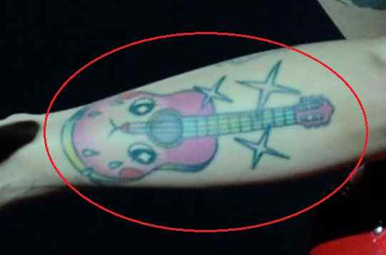
The guitar has a pink body, a face worked into its shape and stars around it. Body Art Guru connects it to her music: Laferte began her career young and has spoken about the instrument’s place in her life. The exact story behind this drawing is hers to tell.

The stars turn the instrument into a small scene instead of leaving it on its own. If you want a tattoo tied to your work or interests, an object can carry that connection without spelling it out with a name or date. It can be drawn plainly or given a character of its own, as this guitar is.

Context around the collection

BioBioChile reported that Laferte called a lower-back tattoo her first in a 2019 Instagram post. She joked that the style was considered cool in the early 2000s. The photo showed only the upper points of what looked like a pair of wings, not the full design.

That’s all the image supports. It gives the tattoo a place in the collection’s history, but not enough detail to map the whole piece or assign it a meaning. Her comment also anchors it to the time she got it without turning the tattoo into a punchline.

A newer chapter in the story

The neck spider is the newest tattoo she has discussed publicly. In the Billboard interview, she said she had wanted ink there after surgery for thyroid cancer and chose from designs her artist showed her in Mexico City. The placement helped cover the scar. She also said she chose the spider because she liked how it looked.

Both reasons can be true: the area has personal history, and the drawing appealed to her. The spider is a dark, graphic mark in a visible spot. Her own explanation says more than a stock claim about what spiders are supposed to symbolize.

What makes the collection work

There isn’t one style tying the tattoos together. The collection moves from old-school color to lettering, animals, storybook figures and music imagery. The pieces can sit alongside one another without matching exactly.

The photos also show how much placement and angle change what’s visible. A forearm bends, a neck tattoo changes a portrait, and an older lower-back design may appear only in a cropped image. Looking across the collection, the clearest thread is the illustrated subjects and the way each piece occupies its own part of the body.

More musician tattoo guides

Collin Gosselin Tattoos: The Sleeve, Forearm Ink and What Photos Show

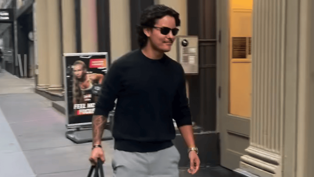
Recent photos show substantial ink on one arm, including a dense forearm pattern with geometric or ornamental shapes. Coverage around Collin Gosselin’s memoir and television work has made it easier to see. The artist, dates and personal meanings haven’t been reported.

These photos show scale and placement, not a full catalogue. A cropped pattern doesn’t tell us why he chose each design.

The sleeve photo that started the conversation

Collin Gosselin tattoos: genuine tattoo photograph showing a substantial exposed section of the arm

Us Weekly’s June 2026 coverage showed Gosselin walking in New York ahead of his memoir’s release. He wore a dark long-sleeved top and sunglasses, with only part of one arm exposed. The outlet described the work as a full tattoo sleeve. The photo clearly shows a large section of ink extending past the cuff, but it doesn’t show the whole arm.

“Sleeve” can mean an arm covered in ink or a large connected group that looks like one in a particular frame. This crop supports the second description; it can’t map where the designs begin and end. The lines look dark and compact, but there isn’t enough detail here to assign a specific style. The cuff hides most of the work; the tattoo becomes more noticeable when he rolls the sleeve up.

The forearm tattoo in the interview frame

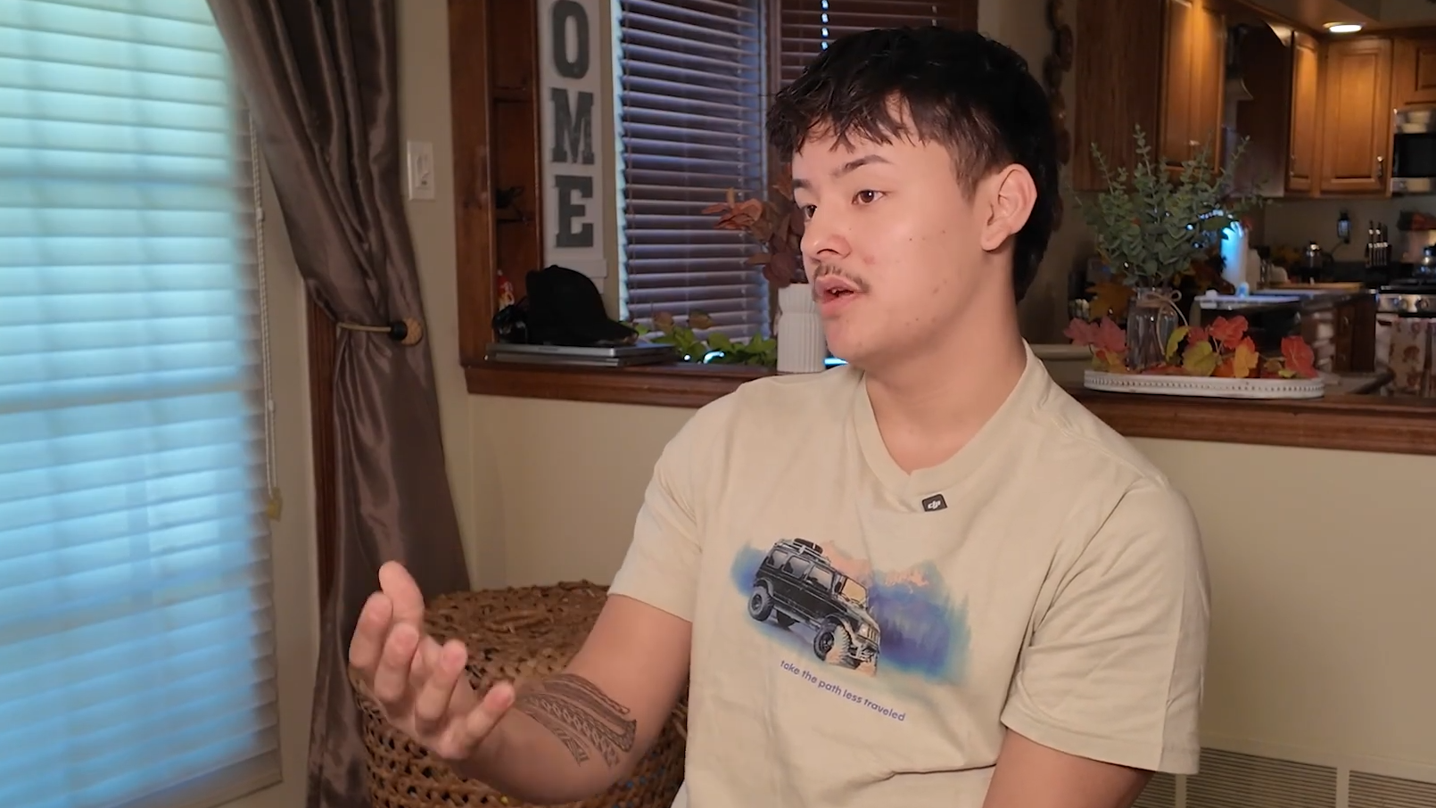
Collin Gosselin tattoos: genuine tattoo photograph showing the visible forearm pattern

This interview image gives a closer view of the forearm. It shows dark bands, repeated shapes and tight linework. Seen as a whole, the pattern has a geometric or ornamental feel, though the source doesn’t identify individual symbols. Some areas are heavier than others, leaving narrow lines between solid patches of black.

The design changes as the arm turns. In the interview, the pattern faces the camera; in a walking shot, movement, shadow and fabric break it up. Neither image gives a meaning, date or link to the memoir. The forearm piece is dense and high-contrast.

How interview photos frame the subject

Collin Gosselin in a contextual photograph: contextual interview photograph; explicitly not separate tattoo evidence; not tattoo evidence

Here, the arm is visible but isn’t the focus. The face, clothes and room take up more of the frame, so the ink reads as part of his outline rather than a design to study. That’s how most people will see it in interviews or candid photos: they can tell there’s a lot of work on the arm, but not name each shape.

This image gives context, not tattoo detail; the close-up is better for linework.

A different public image

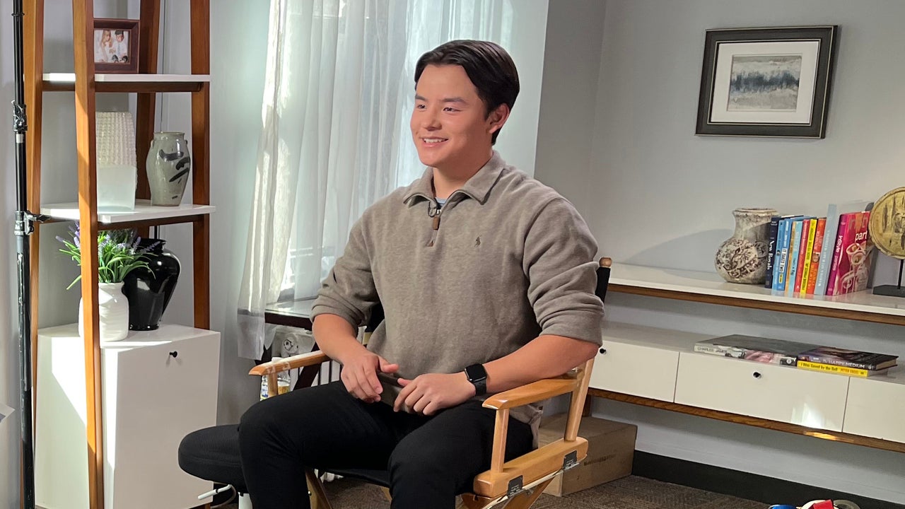
Collin Gosselin in a contextual photograph: contextual editorial collage; explicitly not tattoo evidence; not tattoo evidence

An earlier interview image places the attention on Gosselin’s face and posture in a bright, lived-in room. It gives a quieter impression than the New York street photo, but it doesn’t establish when the tattoos were added. The available coverage shows the ink in 2026, not a date-by-date record.

Clothing can hide a large design or bring it into view. The New York shot shows only what extends beyond the cuff; this interview image doesn’t offer a fuller view.

Memoir-era context

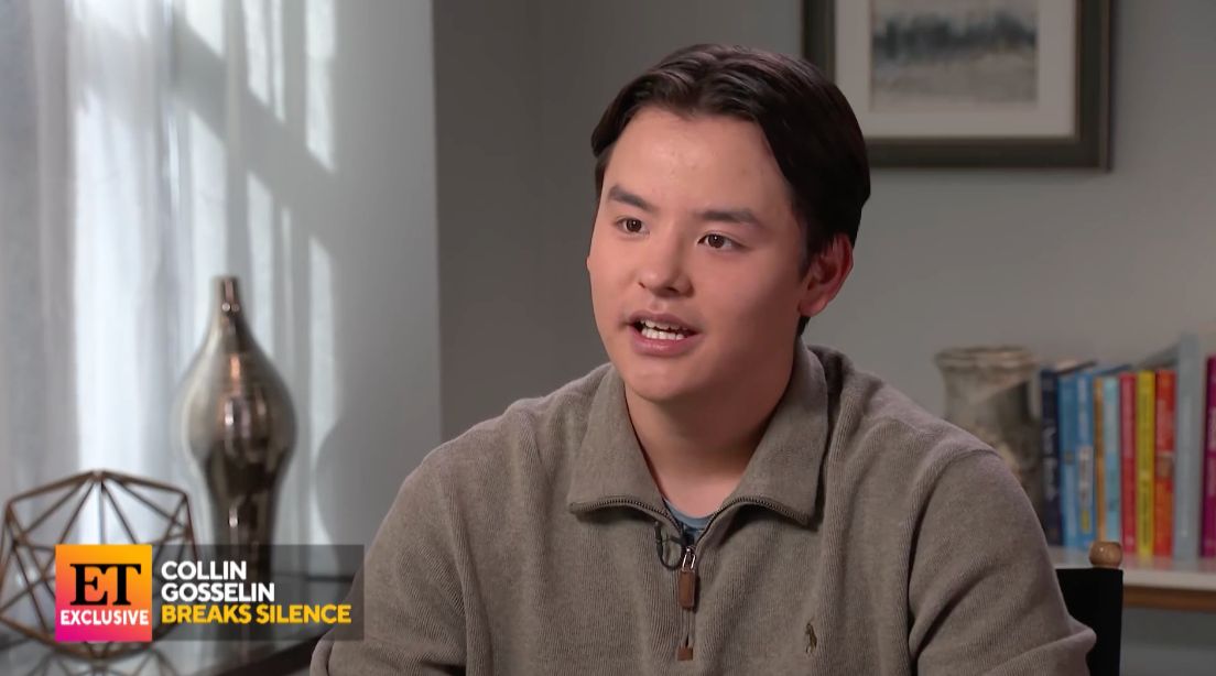
Collin Gosselin in a contextual photograph: contextual interview portrait; explicitly not tattoo evidence; not tattoo evidence

This Radar portrait is a cleaner view of Gosselin’s face, not a tattoo close-up. It introduces the person behind the coverage; the forearm image is the one to use when discussing the ink. Keeping those roles separate avoids treating a contextual portrait as proof of a new design.

What the photos actually confirm

The coverage shows a large tattooed section on one arm and a forearm with dense, dark patterning. It doesn’t establish a full list of motifs, the artist, exact dates or a total number of tattoos. None of the cited images connects a particular symbol to his memoir, so that meaning should remain open unless he explains it.

A practical visual takeaway

The close-up shows how repeated bands and dark shapes can give separate parts of an arm a shared look. If you’re planning a sleeve over several appointments, a consistent line weight or limited palette can connect different subjects without making every tattoo identical.

Plan for the arm in motion, not just as a flat stencil. The forearm bends and rotates, and a cuff can cover part of the design. Leaving breaks between darker areas helps the pattern stay legible from more than one angle.

A collection that’s still being documented

These are editorial and interview photos, not a full record of the tattoos. They show different parts of the arm in different settings, but leave gaps in the timeline and in the designs themselves. That’s the limit of what the current images can tell us.

More celebrity tattoo guides

Lunay Tattoos: Be The Light, Family Ink and the Stories Behind His Designs

Lunay’s tattoos mix lettering, portraits, symbols and dense arm work. He has discussed a portrait of his mother, made in Ibiza, and a Martian on his hand that represents his team and the El Niño era. Other designs are visible in photographs, but their meanings aren’t always known.

That distinction helps make sense of the collection. Some stories come from Lunay himself; the rest can be described from what the images show without guessing at a private meaning.

The Be The Light tattoo

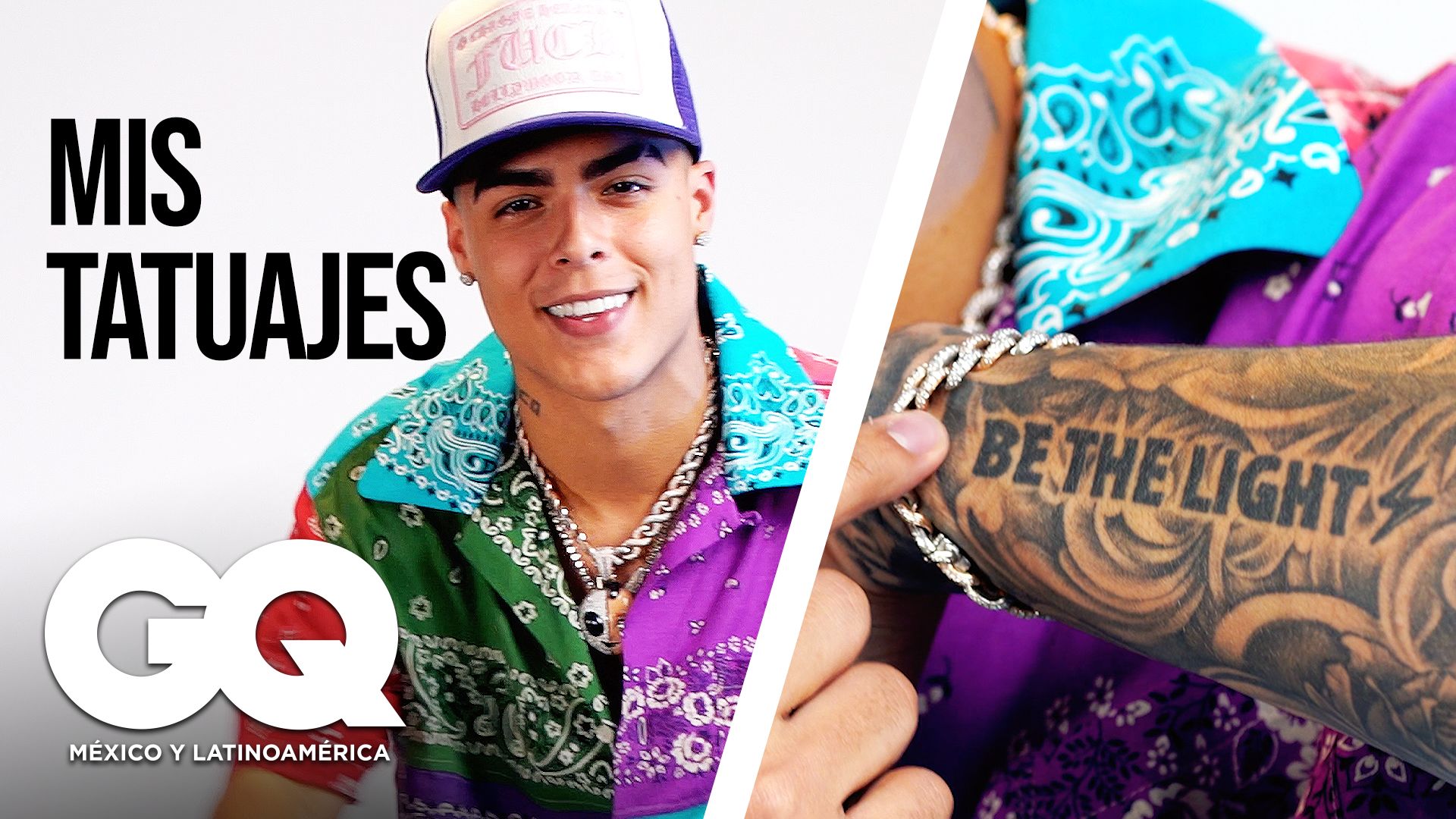
Lunay tattoos: The Be The Light tattoo

“Be The Light” runs across the arm in large lettering. The words are the design, easy to read even from a distance. Their placement gives the arm a strong horizontal line, with darker work around them.

If you’re thinking about a text tattoo, a short phrase can work without an elaborate frame. Let the lettering follow the shape of the arm and choose words that read naturally at a glance.

Tattooed arms in the editorial portrait

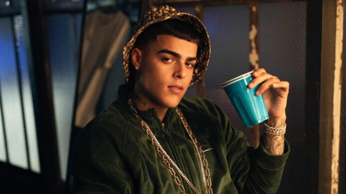
Lunay tattoos: Tattooed arms in the editorial portrait

Lunay has said the portrait of his mother was done in Ibiza. In photos, it sits among other tattoos, so the surrounding blackwork can change how the face reads as the light shifts. It isn’t isolated on a blank patch of skin.

For a family portrait, give the tattooer a clear reference and enough room for the features to stay legible. A face that’s too small can lose its expression as it heals. Scale and contrast matter as much as the idea behind the image.

Geometric and ornamental arm tattoos

Lunay tattoos: Geometric and ornamental arm tattoos

On his tattoo tour, Lunay mentioned a tiger, roses, a clock and Roman numerals. Those subjects can be drawn in very different ways: a tiger might be realistic or graphic, while roses can be light and illustrative or shaded in black and gray. The pieces don’t form one matching set; they have the layered look of tattoos added over time.

A clock doesn’t automatically stand for time, or a rose for love. The photographs show the designs, but don’t confirm a personal explanation for each one. It’s better to keep the familiar symbols from turning into assumed facts.

The eye and portrait upper-arm tattoo

Lunay tattoos: The eye and portrait upper-arm tattoo

Other photos show an eye and portrait work on the upper arm, along with a lightning motif and ink connected to family names. The sharper bolt adds a diagonal line among the larger images, while names make the collection more personal.

Names are hard to borrow from someone else. If you like the idea, use your own handwriting, a family nickname or a word with meaning in your circle. The point is the connection, not matching Lunay’s lettering. A small lightning shape can also break up a crowded sleeve without adding another large image.

Large arm tattoos in a performance view

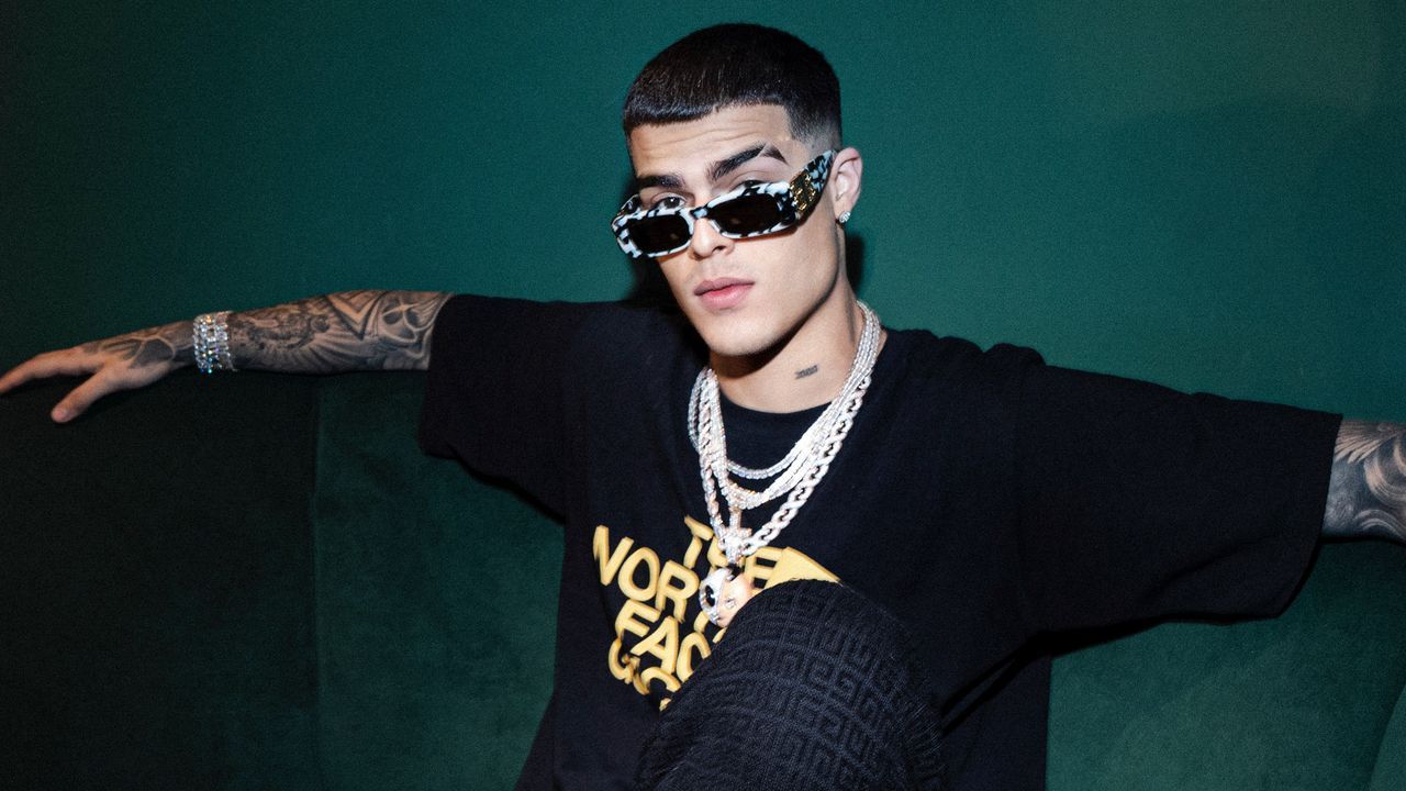
Lunay tattoos: Large arm tattoos in a performance view

Lunay has described the Martian on his hand as a symbol for his team and the El Niño era. Hand tattoos stay in view during ordinary gestures, close-ups and performances, unlike designs that sit under a sleeve.

That visibility is part of the decision. Hands get frequent sun, washing and friction, so the ink may need more upkeep than a tattoo in a protected area. If you want a team symbol, a mascot or a small emblem can carry the same idea without copying his character.

How the pieces work together

The collection shifts between large portraits, small symbols, words and darker areas of ink. Open skin and lighter details keep the arms from reading as one solid block. No single style has to tie every tattoo together.

Lighting changes what a photo reveals. A stage shot can make the same ink look darker than an outdoor portrait, while a close-up shows lines that disappear in a wider frame. For a reference folder, keep one close image for detail, a wider one for placement and a clear photo in ordinary light.

What to take from the style

A phrase, a portrait and a symbol can sit together if their size and placement are planned. Pick subjects that matter to you, then work with a tattooer to fit them to the way your arm or hand moves. A screenshot can inspire the idea, but the finished design should be drawn for your body and the space you have.

More musician tattoo guides

Paul Anthony Kelly Tattoos: His Misfits 138 Ink, Chest Tattoo and Arm Work

Paul Anthony Kelly’s tattoos are easy to miss when he’s dressed for a role. In Love Story, he played John F. Kennedy Jr. with a polished, old-school look. Away from the set, GQ reports that he has about 30 tattoos, including pieces he now finds too aggressive and one he plans to keep. The collection grew through different periods: punk music, modeling, travel and relationships.

The quick version

Kelly has said his “138” tattoo refers to the Misfits song “We Are 138.” He has also talked about regretting some older tattoos and considering removal. That mix of attachment and second thoughts is part of the story.

Photos show a chest tattoo peeking above a robe and larger pieces across both arms. They offer a few clear views, not a complete catalogue of every design.

The chest tattoo that peeks out of the robe

Paul Anthony Kelly tattoos: genuine tattoo evidence

A GQ Italia portrait shows a dark design high on Kelly’s chest, just above the neckline of a white robe. The crop only reveals part of it, so the full image and meaning can’t be identified. The dark lines break through the pale robe and chest hair. The placement can stay covered under ordinary clothes and show when he wears an open shirt or loose neckline.

The piece fits beneath a polished public look without disappearing from his own life. A chest tattoo can offer that choice, though the center of the chest is a sensitive spot for many people.

The arm tattoos are where the collection gets louder

Paul Anthony Kelly tattoos: genuine tattoo evidence

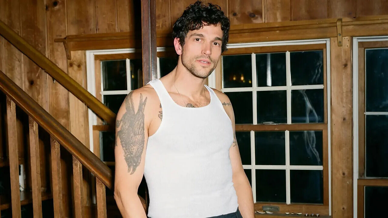
In a Zoom TV portrait, Kelly wears a white tank top that reveals a large shaded piece on one upper arm, with more ink on the other arm and upper chest. The main design is dark and graphic, with enough contrast to read from a distance.

If you’re planning a large arm piece, check how it looks from the front, side and back. The shoulder cap and tricep can change the shape once the design wraps around muscle; a flat reference won’t show that.

What “138” means to Kelly

“138” is the tattoo Kelly has singled out by name. It refers to the Misfits song “We Are 138,” a connection to the goth-punk music he has said he grew up loving. He has said he plans to keep this one.

A number can hold a private reference without spelling it out for everyone else. If you’re considering one, choose a date, song or other detail that already means something to you; the shape of the digits can come second.

The television role and the makeup chair

Paul Anthony Kelly in a contextual photograph: contextual only; not tattoo evidence; not tattoo evidence

This shirtless Love Story still is context, not a clear view of Kelly’s tattoos. It does show why the makeup team had work to do: his body art had to disappear when he played JFK Jr.

Covering dark ink for a period drama takes more than painting over it. The makeup artists had to neutralize the pigment, match his skin tone, blend the edges and make the cover-up hold under lights, movement and sweat. Kelly has described the process as a major part of his time in the makeup chair.

The career behind the look

Paul Anthony Kelly in a contextual photograph: contextual only; not tattoo evidence; not tattoo evidence

Kelly worked as a model for years before becoming widely known as an actor. In GQ, he described a goth-punk side—tight jeans and eyeliner—and the pressure to fit the image other people expected. The tattoos were one way to push back.

He has also said some pieces feel too aggressive for who he is now. Both can be true: a tattoo can belong to a real period in your life and later stop feeling like you. There’s no need to give every old decision a grand explanation.

Directions worth borrowing

  • A hidden chest tattoo: choose a spot that stays covered under everyday clothes and shows with an open neckline.
  • A bold upper-arm piece: let one design carry the weight if you plan to add more later.
  • A number with a real backstory: use a song, date or place you already care about.
  • A music reference: borrow the connection, not someone else’s exact tattoo or album art.
  • Room for change: leave space for future work and accept that your taste may shift.

What to ask for at the studio

Bring a clear idea of the subject and placement, then let the artist adjust it to your body. Ask to see how the design wraps around the muscle. Also ask how the lines and details may look as the tattoo ages; dense black areas can hold their shape, while tiny details may blur together.

If it’s a cover-up, show the artist what’s underneath and bring a healed photo if you have one. Be clear about why you want the new piece. Kelly’s “138” comes from his music history, but your reference should be yours.

Room for contradiction

Paul Anthony Kelly in a contextual photograph: contextual only; not tattoo evidence; not tattoo evidence

Kelly’s screen image can be a tuxedo, a sweater or a period costume; the tattoos belong to a different side of his life. He has talked openly about keeping some and regretting others. A person can change without every old tattoo becoming meaningless.
The photos don’t explain every design. Kelly’s own comments supply the clearest meaning; the rest can stay an open question.

More actor tattoo guides

Ivy Wolk Tattoos: Hollywood Forever, Courtney Love and Her Personal Ink

Actor and comedian Ivy Wolk’s tattoos suit her public style: a little theatrical, a little funny, and personal without looking like one planned set. A 2026 profile and photo essay show a star-and-script piece across her upper back, a Courtney Love portrait on her arm and smaller marks that aren’t clear enough to identify.

Ivy Wolk’s Hollywood Forever back tattoo

Ivy Wolk tattoos: inline

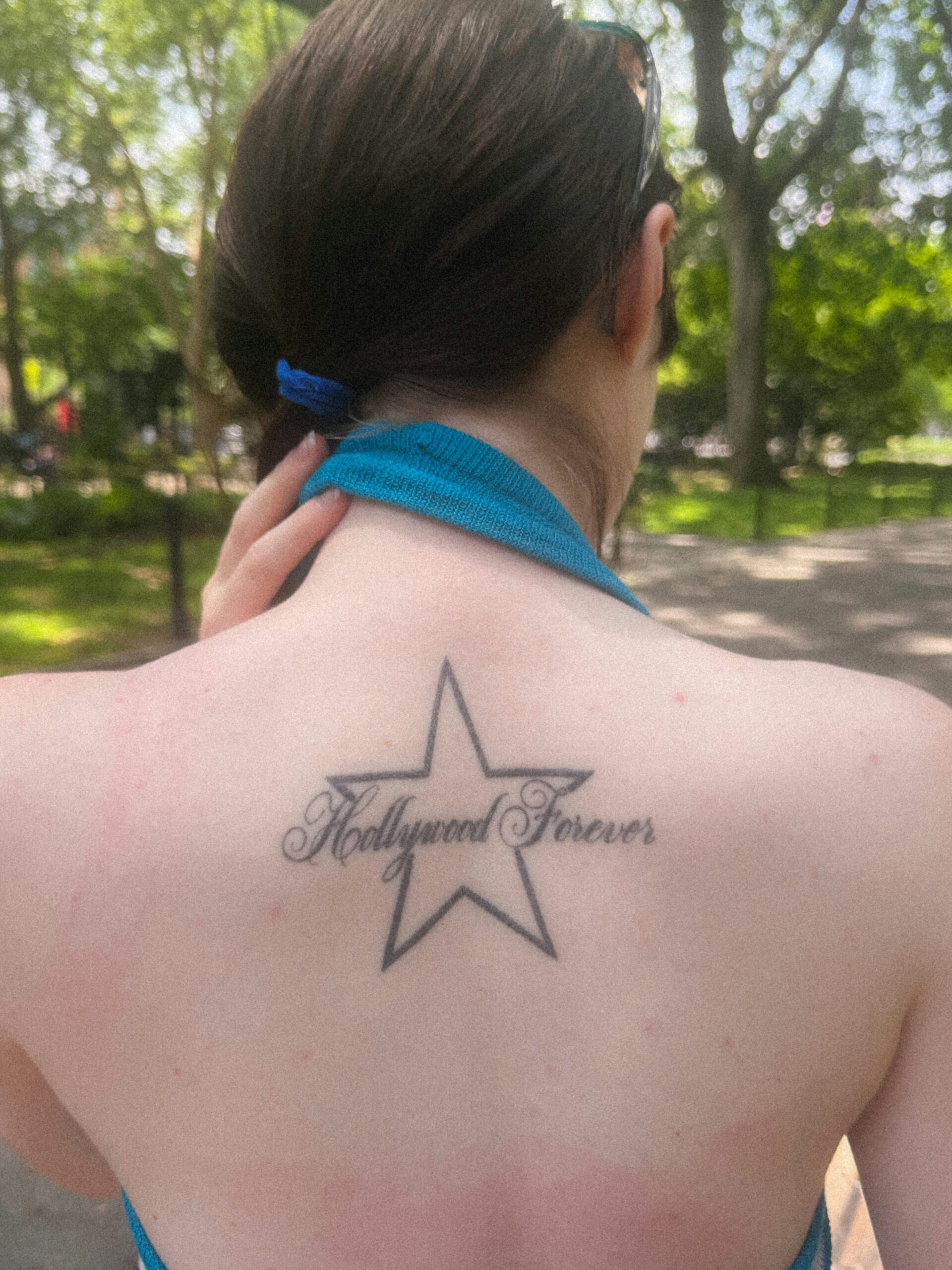
A black-outlined five-point star sits across Wolk’s upper back, with “Hollywood Forever” written through the center in loose script. The star gives the piece a simple shape; the words make the reference specific.

It sits high enough to show with an open or off-shoulder top and disappear under an ordinary shirt. The star has a slightly faded, lived-in look; its bold outline sits against softer lettering. If you like the layout, use a shape and phrase that mean something to you, and give the script enough room to stay legible.

How Wolk keeps the composition open

The star is uncomplicated, and the center isn’t filled with extra detail. That leaves room for the lettering and keeps the design easy to read. A back tattoo also shifts as the shoulders move, so the phrase should be sized for the body, not only for a flat reference image.

The Courtney Love portrait on her arm

Ivy Wolk tattoos: inline

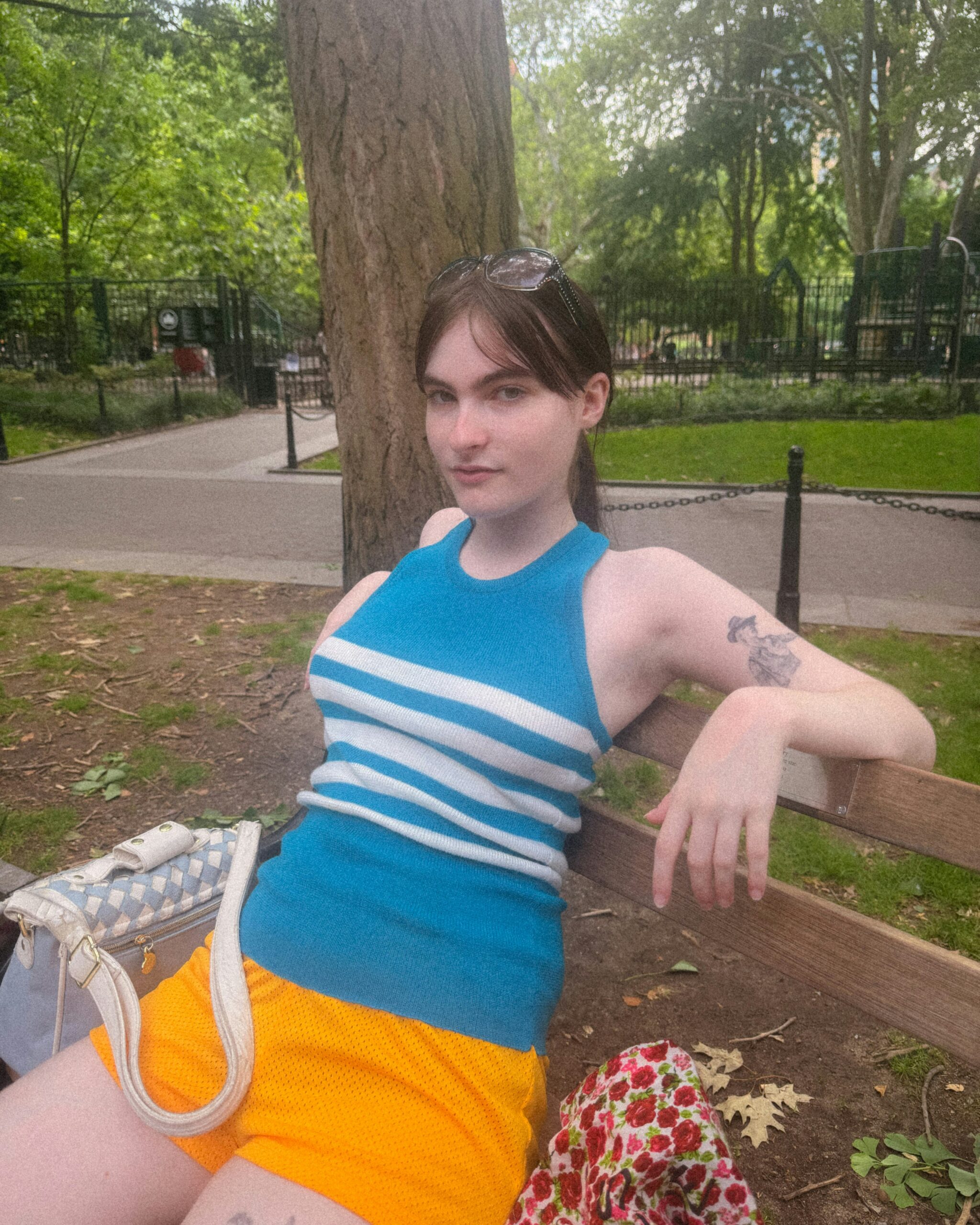
In a park photo, a black-and-gray portrait of Courtney Love sits on Wolk’s upper arm. It’s compact rather than a full celebrity sleeve. The image reads as a fan tattoo, but the portrait gives it a more personal feel than a piece of band merchandise.

Love fits the women Wolk has discussed in her work and interviews: funny, messy, polarizing and hard to ignore. Portraits need enough space for the eyes, mouth and hair to stay recognizable as the ink ages. A clear reference and a workable size matter more than squeezing in every detail.
A relaxed photo shows her everyday style

Ivy Wolk in a contextual photograph: inline; not tattoo evidence

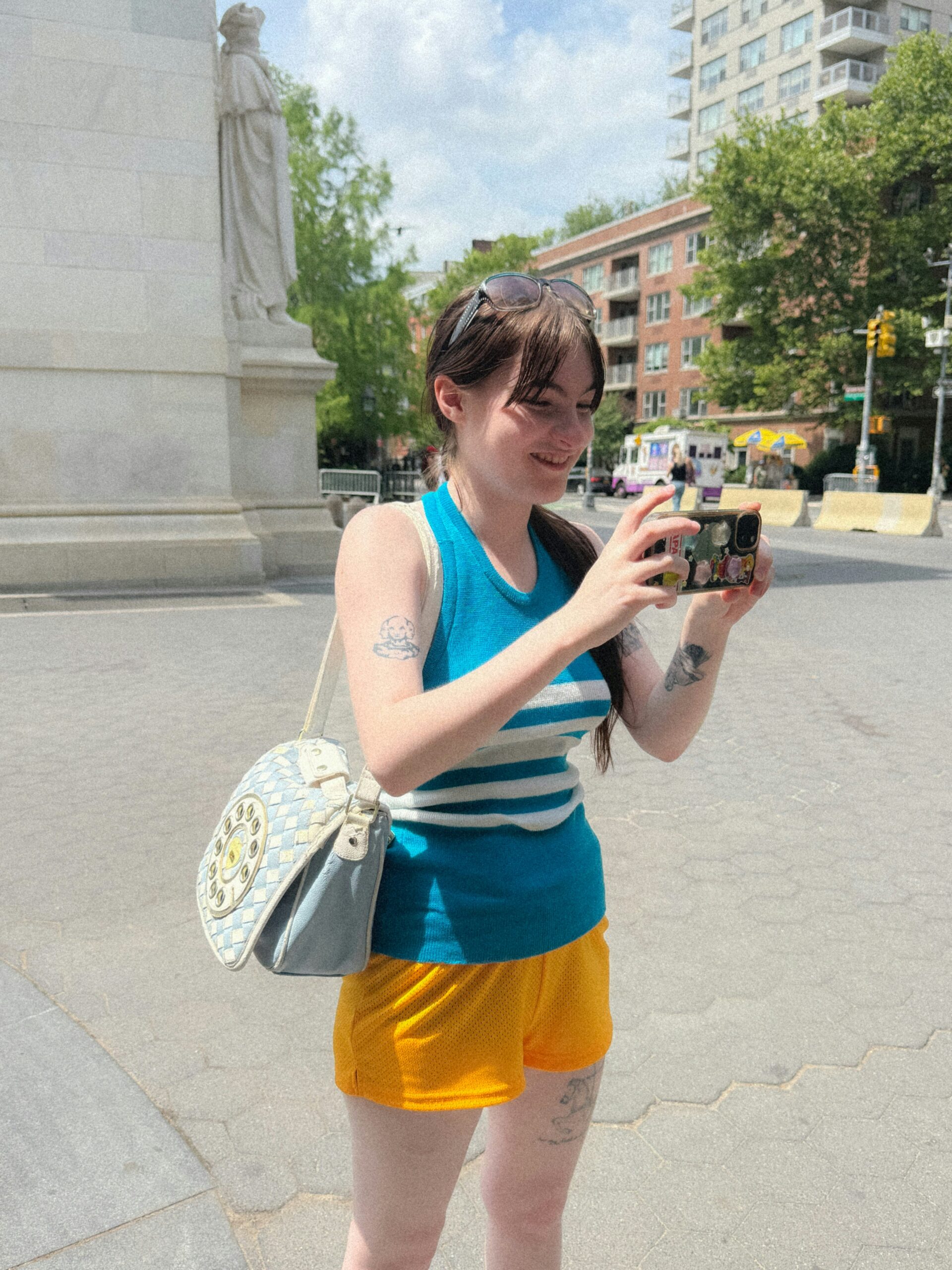
This street photo shows ink on both arms, but it isn’t a tattoo catalogue. Wolk is holding her phone in a bright blue-and-white top; some marks are clear, while others disappear into the pose and edge of the frame. It gives a wider sense of how the tattoos sit in an everyday outfit.

The arm work doesn’t look like one planned sleeve. It has the feel of separate pieces added at different times, with room for more if she chooses.

New York is part of the visual mood

Ivy Wolk in a contextual photograph: inline; not tattoo evidence

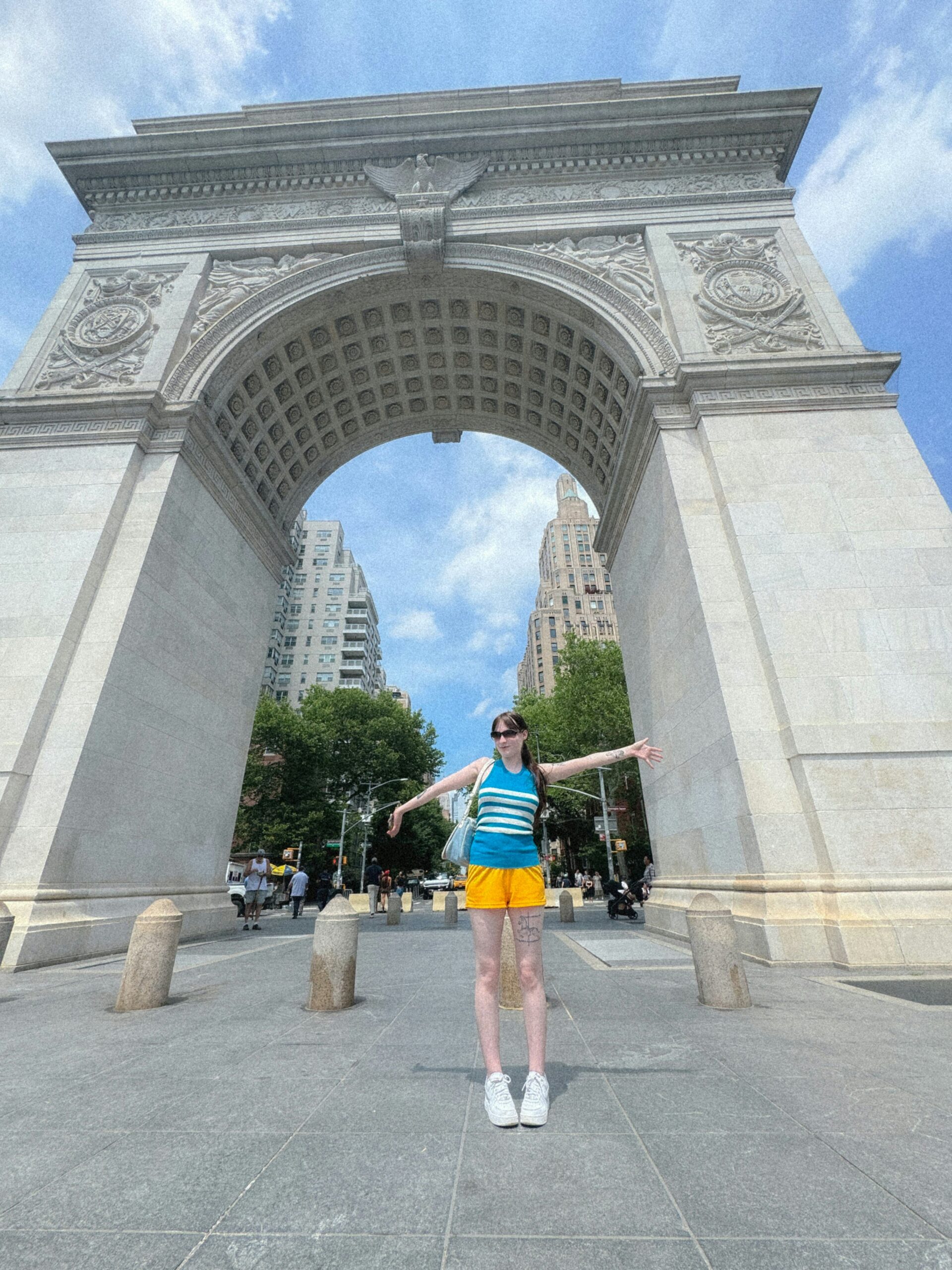
The photo essay was shot around New York. In this frame, Wolk stands under Washington Square Arch in the same sporty outfit. The image is context, not evidence of another tattoo.

The setting suits the casual tone of the pictures, which move between downtown comedy, internet culture and acting. Her tattoos appear in that mix without needing to coordinate with one look or career.

The smaller marks are harder to identify

Ivy Wolk in a contextual photograph: inline; not tattoo evidence

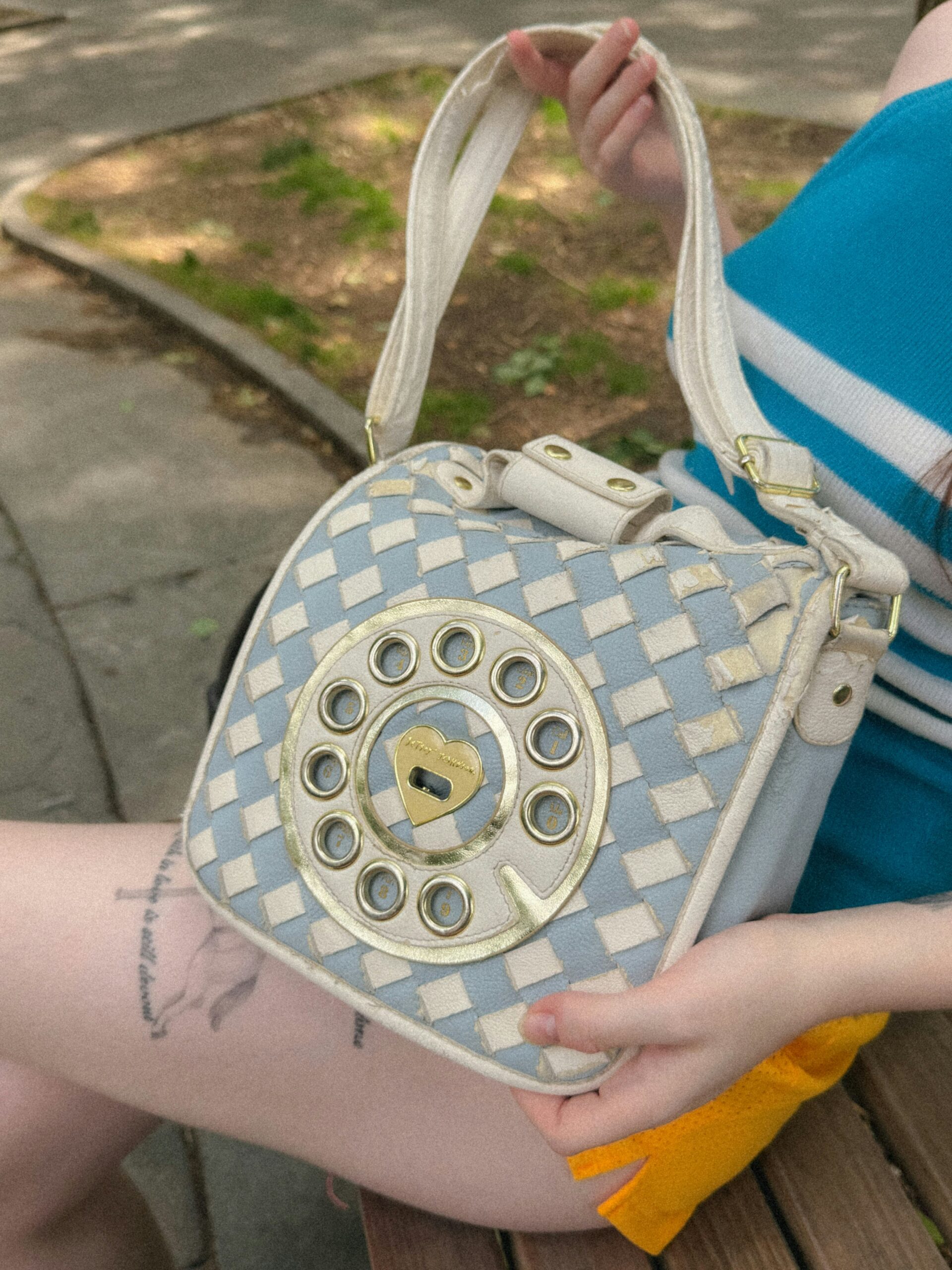
This close photo focuses on Wolk’s bag and hands. A few marks appear near the edge, but the crop doesn’t show enough to name them. They’re best left as unidentified details unless a clearer photo or a direct explanation turns up.

What the collection says about influence

The two clearest references point in different directions: “Hollywood Forever” names a place, while the Courtney Love portrait points to a person. That mix of words and images lets a collection reflect several interests without asking every tattoo to match the others.

You can borrow the idea with a place, lyric, image or object tied to your own life. It doesn’t have to be famous to be specific.

Borrowing the same easygoing attitude

Start with where the tattoo will sit and how often you want it seen. The upper-back star can stay under a shirt; an arm portrait is harder to hide. Show the artist the placement as well as the reference so the design can be adjusted for your shoulder width, elbow and the way your arm turns.

Keep the scale realistic. Script needs space between letters, and a portrait needs room for the face to read. A reference image can guide the idea, but it shouldn’t be traced as a stencil.

The short version

The best-documented pieces are the Hollywood Forever star across Wolk’s upper back and the Courtney Love portrait on her arm. The photo essay also shows other ink on her arms and hands, but not clearly enough to name. The collection’s variety is part of its look.

More celebrity tattoo guides

Kriti Sanon Tattoos: The Meaning Behind Her First Ink

Kriti Sanon had no tattoos until September 2025, when she got a small bird-in-flight design on her inner ankle. It combines fine lines, a dotted sun and a long curved tail. She connected it to Mimi, the 2021 film that brought her a National Award and changed how she saw her career.

Sanon called the tattoo a promise fulfilled and a reminder to fly higher.

The hummingbird ankle tattoo

Kriti Sanon tattoos: Close-up evidence of the fine-line bird, dotted sun, and curved tail on the inner ankle.

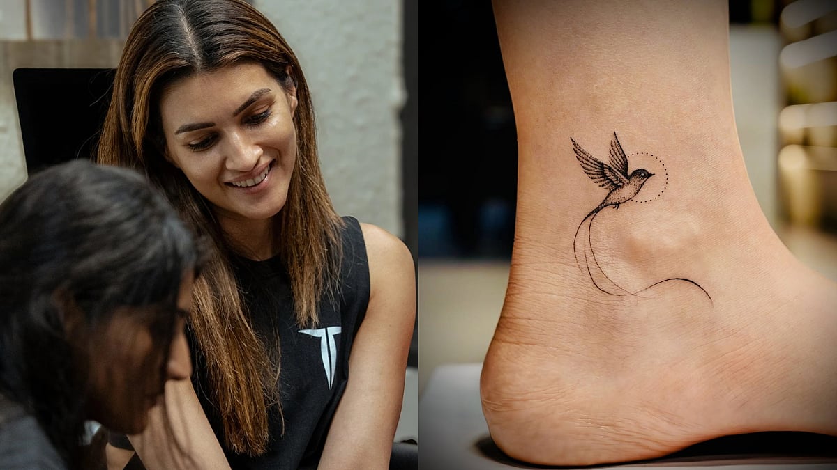
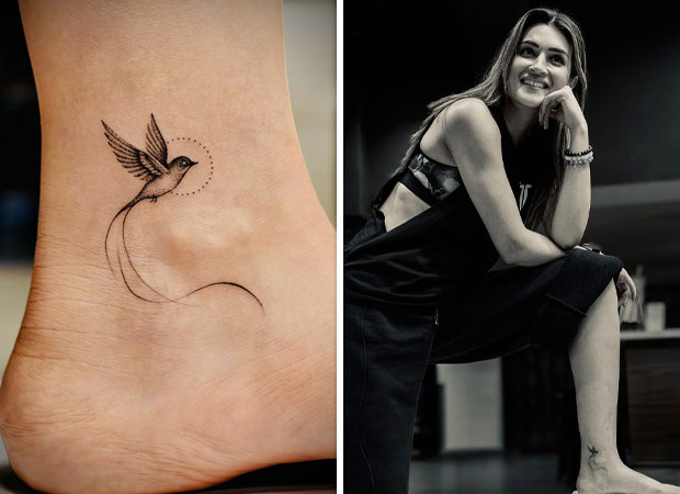
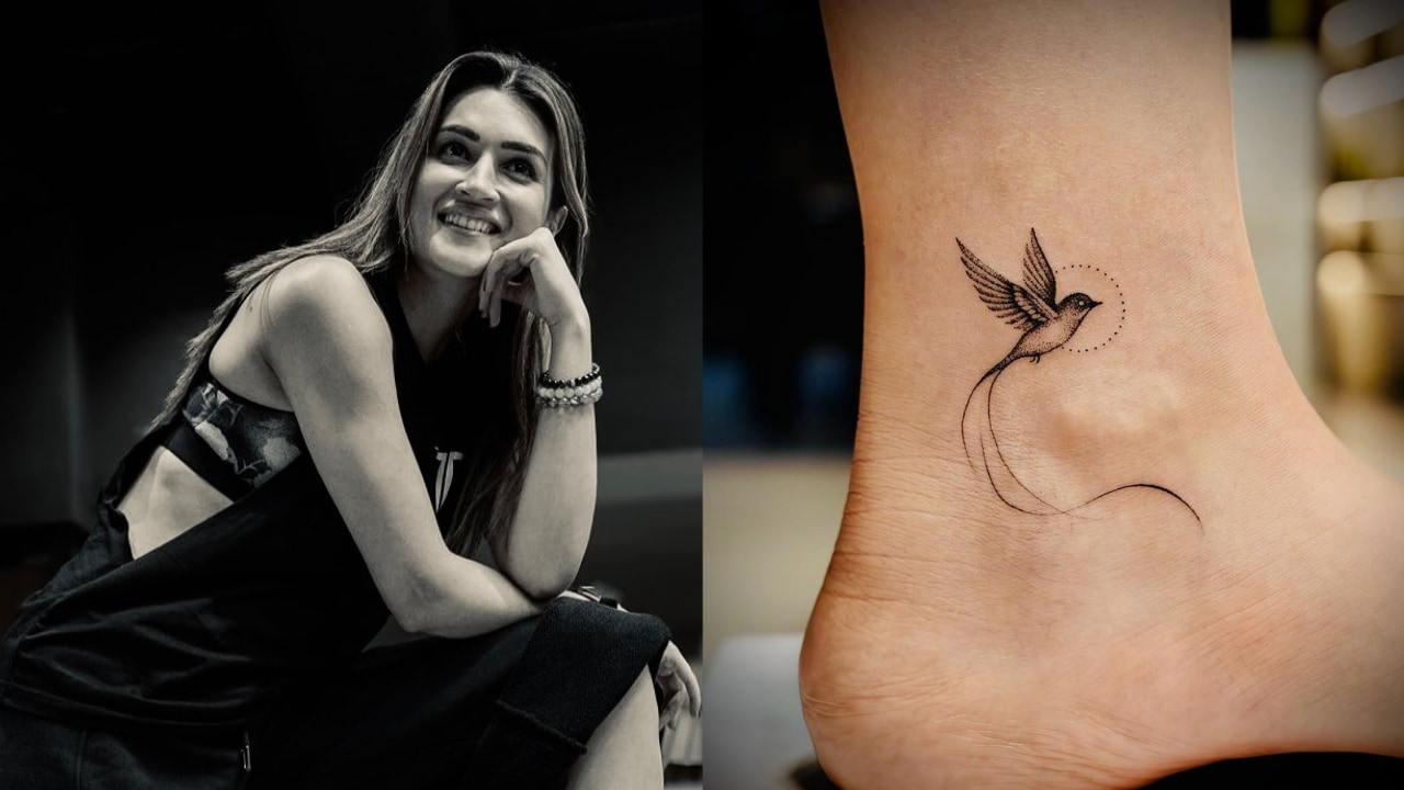
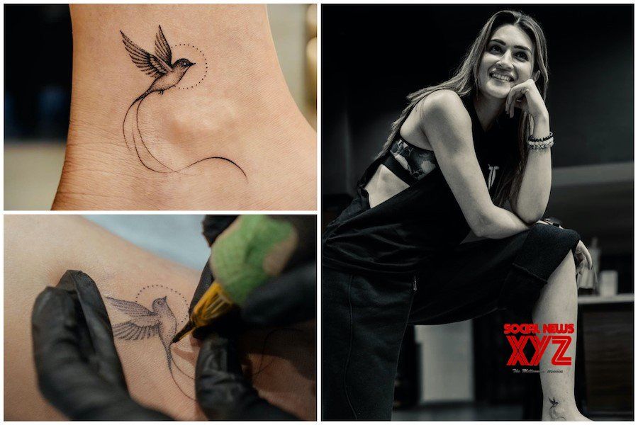
Some reports call the bird a hummingbird; others describe a bird in flight. The photos don’t make the species clear, so “bird” is the safer description. Its open wings angle upward, with a dotted circle or sun nearby and a long line curving below it.

The fine lines show the feathers and small head without turning the ankle into a dark patch. The inner ankle is narrow and curved, so the vertical layout gives the bird room and lets the tail continue the sense of movement. The design can show with sandals or cropped trousers and disappear under socks or longer clothes.

Why the bird connects to Mimi

Kriti Sanon tattoos: Tattoo evidence showing the ankle placement and the bird design in context.

Sanon’s story starts with filming Mimi. The character faces difficult choices and tries to build a better life. During that period, Sanon made herself a promise: if the film reached people, she would carry its impact with her.

The pandemic changed the release she had imagined. Mimi went to streaming instead of opening in cinemas, but it found an audience and later earned her the National Award. The tattoo marks that uncertain stretch of work, recognition and relief.

In her caption, Sanon said she hadn’t expected to get tattooed, then described the piece as a promise kept and a reminder to move toward the sunrise. She also encouraged people with dreams to take a leap and find their own rhythm.

What the sun and flowing lines add to the tattoo design

Kriti Sanon tattoos: Wide tattoo evidence showing the face-visible subject and readable ankle close-up.

The dotted sun gives the top of the design texture without filling it in. Below the bird, the long lines curve through open skin. Sanon and the studio have connected them to the stops, struggles and progress behind her story.

That layout gives the eye somewhere to travel without crowding the ankle. One clear image, a small supporting mark and a line that carries movement can work with other subjects too. The exact symbols matter less than leaving enough open space around them.

The tattoo session was planned carefully

Kriti Sanon tattoos: Finished and in-progress views documenting the artist session and fine linework.

Aliens Tattoo says the design went through more than a week of sketches and refinements. The Times of India named Sunny Bhanushali and the studio team, with Grishita transferring the final artwork to skin. The tattoo was done in a quiet late-night session; coverage described Sanon as calm and thoughtful while the artists worked.

Fine-line work leaves little room for changes at the last minute. The bird, sun and tail have to fit the ankle’s curve and still read when the foot moves. A simple design can take planning: a heavy wing, crowded dots or a short tail would change its balance.

The quiet studio setting

Kriti Sanon in a contextual photograph: Contextual studio portrait for the session-setting section; not tattoo evidence.; not tattoo evidence

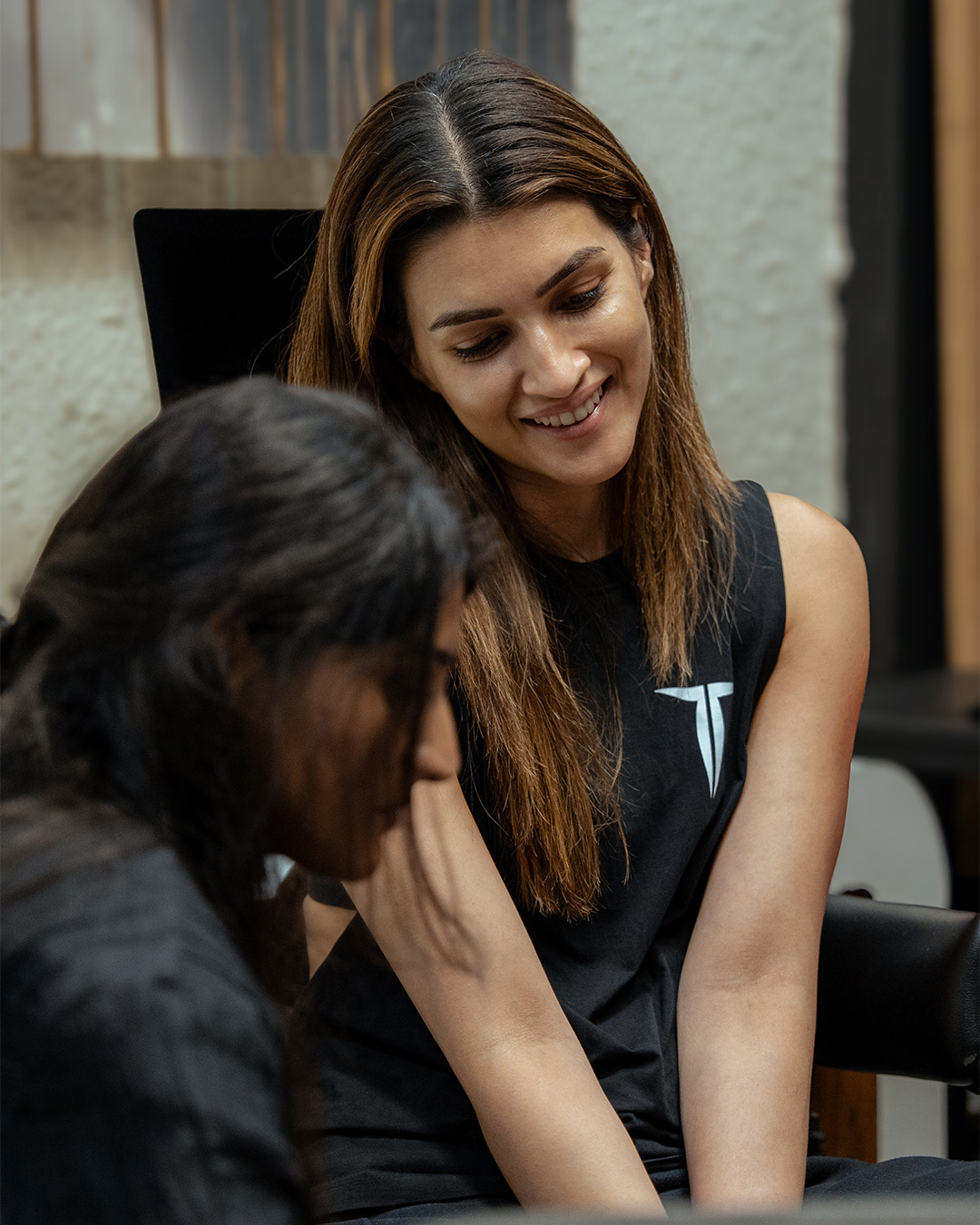
These wider studio photographs show Sanon during the appointment and the artists at work. They add context, but the close-ups are the evidence for the tattoo and its placement. In the studio images, the mood is relaxed rather than staged as a big reveal.

Ideas to borrow without copying

The bird is the most obvious element to copy, but the more useful idea is to choose one image that can carry a personal memory. Sanon’s bird points back to a role, a film and a promise she made during that period.

Think about the image’s direction and where it will sit. The bird angles upward; the tail keeps that movement going. An inner-ankle tattoo can feel private and still appear in everyday moments. A wrist or hand piece will be harder to keep covered. Let the placement fit how often you want to see it.

Final thoughts

Before choosing an ankle design, look at it at its actual size and against the curve of your own leg. Shoes and socks rub the area, and the skin sees sun when uncovered. Follow the artist’s aftercare advice, avoid picking at peeling skin and protect the healed tattoo from strong sunlight.

Sanon’s first tattoo keeps its design simple: a bird, dotted sun and rising line. The link to Mimi gives those marks their personal weight without asking the ankle to hold a title or long quote.

More actor tattoo guides