codex

Andra Day Tattoos: Faith Foot Script and Her Temporary Film Tattoo Story

Andra Day’s most clearly documented permanent tattoo is a small black-script word, “faith,” on her right foot. She has spoken about faith as a source of grounding, and the lettering stays understated alongside her music and acting work. There’s a separate story, too: a temporary tattoo made for a film reportedly remained visible two years later. It shouldn’t be confused with the permanent foot piece.

The word on Andra Day’s foot
Andra Day tattoos: Genuine tattoo evidence photograph

The close photo shows the word faith in compact, handwritten script across the top of Day’s right foot. The letters have a slight slant and movement, without a heavy outline or decorative frame. She has spoken publicly about prayer, God and belief as part of how she stays steady. The tattoo’s full origin hasn’t been documented, so the connection to her public comments is the clearest context available.

Why the placement works

A foot tattoo can be covered by shoes or a longer hem and seen in sandals or close-up photos. It also gets friction from footwear and moves as the wearer walks, so the lettering needs enough space to remain legible. Anyone considering this location should discuss scale and aftercare with the tattoo artist, especially if shoes will rub the area while it heals.

A separate film story

A People exclusive, syndicated through Yahoo, reported that Day received temporary ink for a film and was still dealing with it two years later. That’s a different story from her permanent “faith” tattoo: the movie design was made for a role, but the mark stayed visible beyond its intended use.

The distinction matters in photos. Temporary makeup, stage details and permanent tattoos can look alike in a still image. In Day’s case, the right-foot script is the documented permanent piece; the film tattoo belongs in its own category. A temporary design can help someone try out an idea, though it can’t predict how permanent ink will heal or age.

Andra Day keeps her look understated
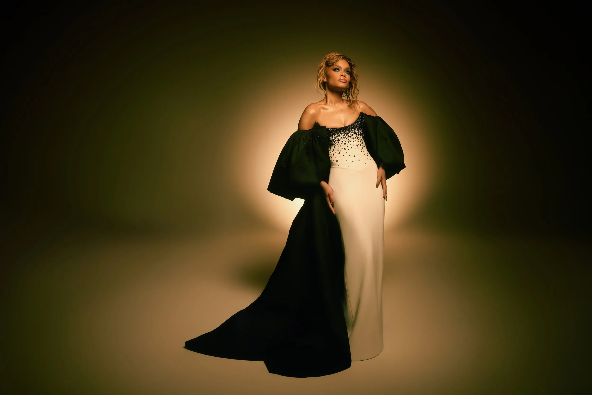
Andra Day in a contextual photograph: Contextual portrait; not tattoo evidence; not tattoo evidence

This editorial portrait shows Day in a dark gown against a soft spotlight, not the foot tattoo. The small script doesn’t compete with her more dramatic styling; it becomes visible when the outfit or camera angle allows it.

The meaning sits beneath the style

Day’s breakthrough song “Rise Up” became associated with resilience, and playing Billie Holiday required her to inhabit a difficult story. Neither fact proves that the foot tattoo was chosen for a particular career moment. She has spoken about faith as a grounding force and about growing through mistakes; those comments provide context for the word without inventing a backstory.

That’s what makes a short word meaningful: the wearer has a relationship with it beyond its appearance. In Day’s case, “faith” connects with ideas she has discussed in her own interviews.

Three ways to plan a small piece

First, choose a word that matters in your own life, not only one that looks good in a reference photo. Second, let the placement determine the size; letters need enough room to stay open as they age. Third, resist adding borders or symbols unless they add something you want to keep. Day’s tattoo leaves the word to carry the idea.

Her red-carpet images show the quieter side

Andra Day in a contextual photograph: Contextual portrait; not tattoo evidence; not tattoo evidence

This image comes from the same editorial shoot. The strong light and black outfit give it a stage-like mood, but the tattoo isn’t visible here. Some photos show the ink itself; others simply place it within Day’s broader public style.

The full-length look keeps the focus on her presence
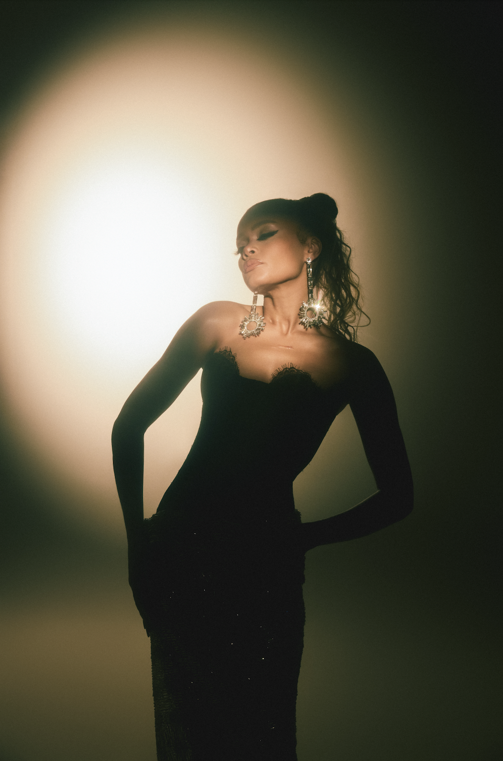
Andra Day in a contextual photograph: Contextual portrait; not tattoo evidence; not tattoo evidence

The full-length portrait shows Day in a long black look with her arms raised. It’s contextual, not evidence of the foot tattoo. Posture, light and clothing carry the image; the small script remains one detail among her music, acting and style.

How to adapt the idea without copying it

If you’re drawn to a word tattoo, write it by hand a few times and take the versions you like to your artist. Talk about line weight, spacing and how the lettering will sit with the movement of your foot. A temporary version can help you decide whether the location feels natural, but it can’t guarantee how a permanent tattoo will heal or fade.

The quiet detail that lasts

Andra Day in a contextual photograph: Contextual portrait; not tattoo evidence; not tattoo evidence

The documented permanent piece is a clear word on Day’s right foot, while the movie-related tattoo was temporary and stayed visible longer than expected. The design is small enough to sit quietly in her overall look, but it connects with the faith she has discussed publicly.
More musician tattoo guides

Pragathi Mahavadi Tattoos: The Sunburst Scar Cover-Up and Its Meaning

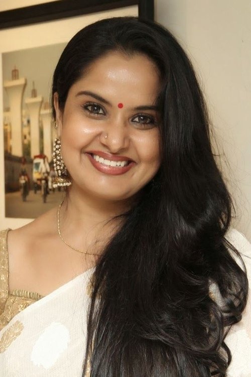
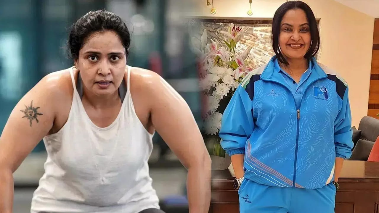
Pragathi Mahavadi has said she got the sunburst tattoo on her upper arm to cover a childhood scar from a vaccination complication. She was tired of people asking about the mark. After the tattoo, the questions shifted to the artwork instead. The change gave her more say in how people saw the area.

Pragathi Mahavadi’s scar-cover tattoo

Pragathi Mahavadi tattoos: inline

The clearest photo shows a dark, sunburst-like design on Pragathi’s upper arm: a round center with pointed rays spreading outward. Its lines have a slightly weathered, hand-drawn look. Her account explains the cover-up, but doesn’t identify the artist or assign a meaning to the sunburst itself, so the shape is best described by what the image shows.

The radial design has a strong outline and gives the eye a clear focal point. It’s a bold piece, but it doesn’t extend into a full sleeve. The design can be appreciated on its own as well as understood in the context of the scar underneath.

Why the reason behind the cover-up matters

Pragathi has described the original scar as the result of a septic complication after a childhood vaccination. The repeated questions about it made her uncomfortable. She said that after covering it, people asked about the tattoo and complimented the artwork instead.

The tattoo didn’t erase what happened. It changed the conversation and became part of her identity. A cover-up can be art and a way to set a boundary around a personal history; the wearer doesn’t owe strangers an explanation of the scar.

The image is bold without being oversized

The central circle and outward rays make the tattoo easy to recognize without taking over the whole arm. The dark linework creates a strong silhouette, and the upper-arm placement leaves room around it. There’s no reported artist or confirmed symbolic meaning beyond the cover-up, so the sunburst should not be given a deeper story on her behalf.

Pragathi’s powerlifting chapter

Pragathi Mahavadi in a contextual photograph: inline; not tattoo evidence

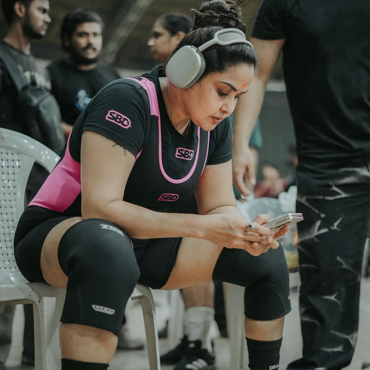
In this venue portrait, Pragathi sits in a black-and-pink lifting kit with headphones on and her phone in hand before the competition. She has earned medals in national and international events, including the 2025 Asian Open and Masters Powerlifting Championship in Turkey. The photo gives context for her sporting life; it isn’t a close view of the tattoo.

Training gives the story a different setting

Pragathi Mahavadi in a contextual photograph: inline; not tattoo evidence

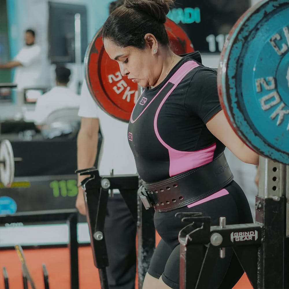
Here, Pragathi is under a loaded bar with a lifting belt secured around her waist. The frame is about the equipment and her concentration, not the tattoo. It shows a different setting for the same arm: sportswear, plates and the demands of training rather than an interview or posed close-up.

A competition moment beside the bigger story

Pragathi Mahavadi in a contextual photograph: inline; not tattoo evidence

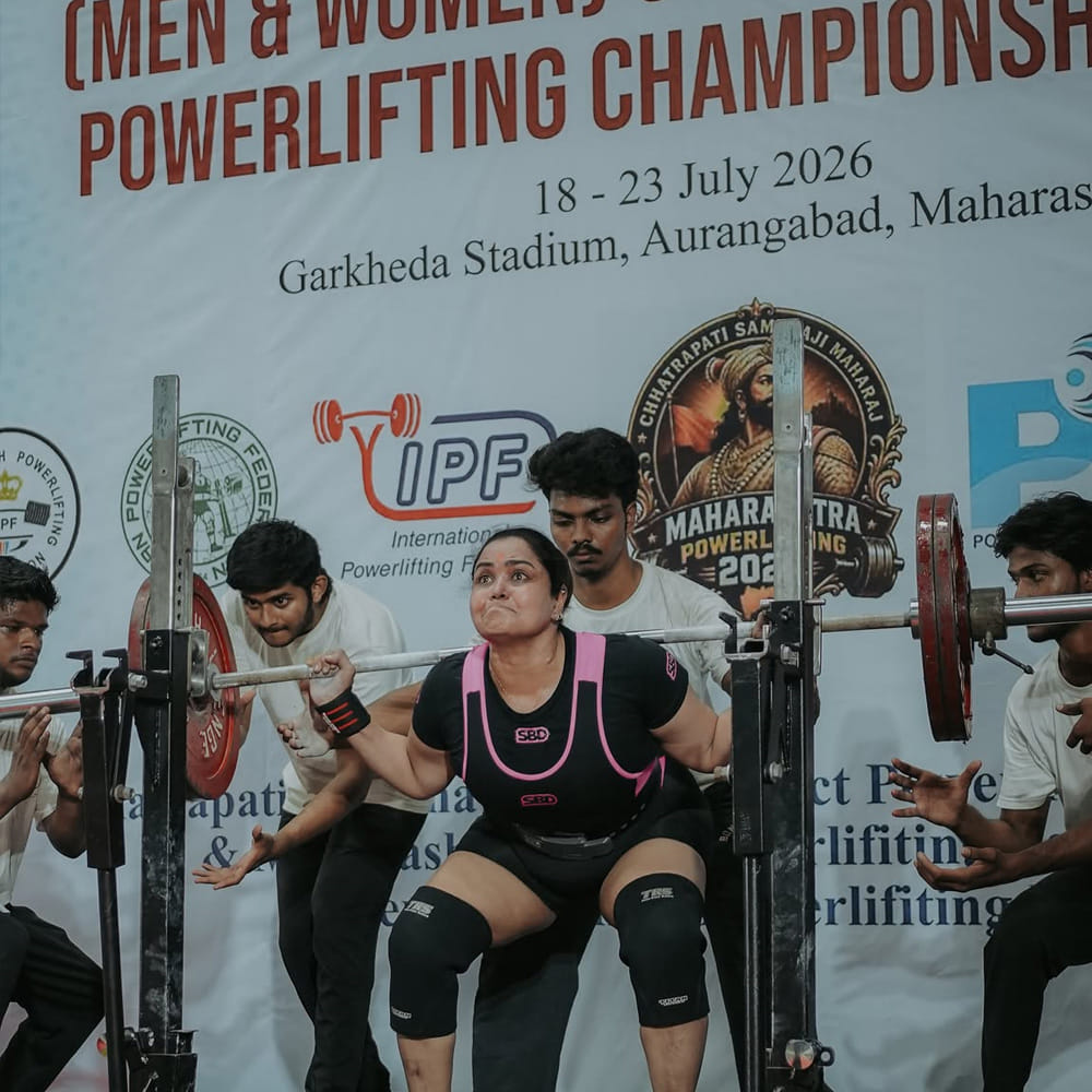
Spotters surround Pragathi as she reaches the bar in this competition shot. The image doesn’t confirm tattoo details, but it places the arm piece in a scene from her athletic life. A tattoo first chosen to cover a scar can take on other context as the wearer’s life changes.

The balance between strength and softness

Pragathi Mahavadi in a contextual photograph: inline; not tattoo evidence

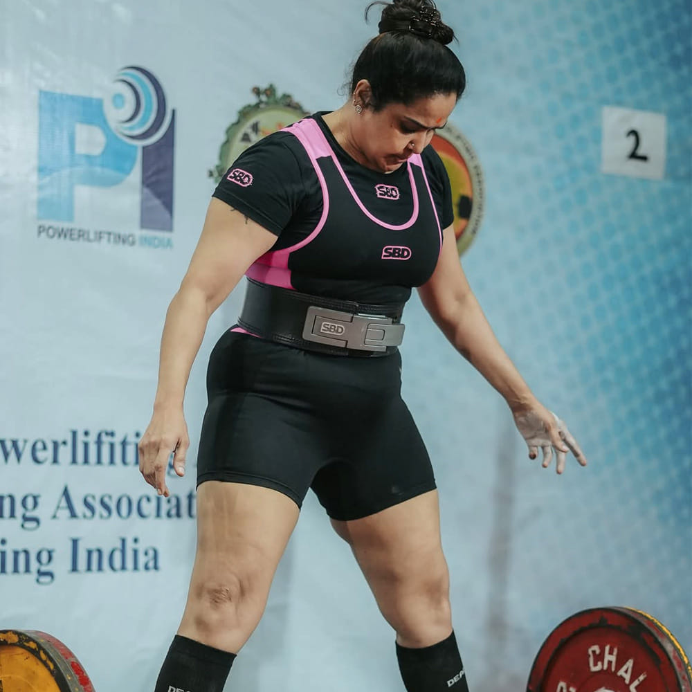
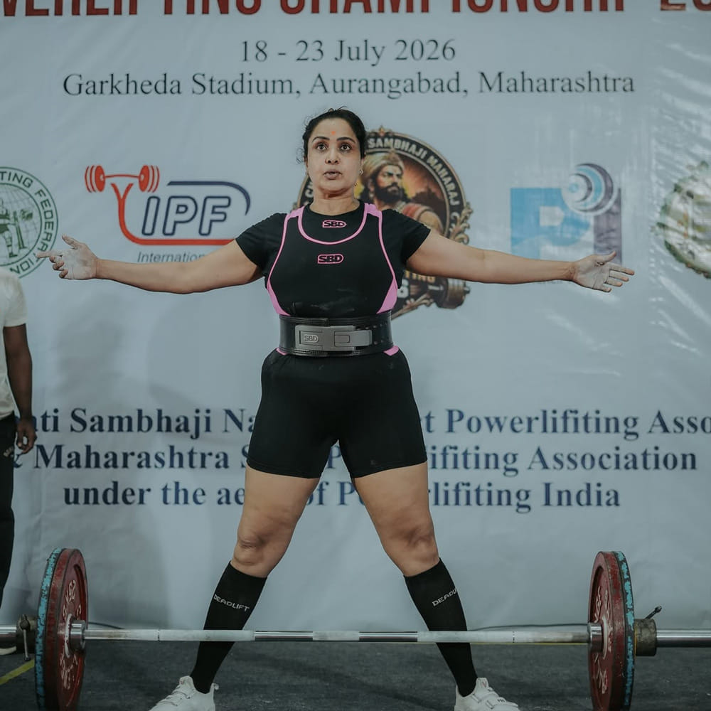
Pragathi stands at the venue with her arms out and a barbell at her feet. The image is contextual rather than a close-up of the tattoo, but the pose shows her at ease in the competition setting. A radial design like hers gives an artist a strong center and lines that can be adapted to the shape of an existing scar.

Pragathi Mahavadi in a contextual photograph: inline; not tattoo evidence

This final venue photo adds more context to Pragathi’s powerlifting chapter; it doesn’t provide another view of the tattoo.

What to ask before covering a scar

A scar can be raised, sunken, shiny, tight or uneven, and the skin may feel different from the area around it. Before booking, ask an experienced tattoo artist whether the tissue is suitable for the design and whether they have worked with similar scars. If you have questions about the scar’s condition, talk with a qualified medical professional rather than treating tattooing as medical care.

Explain whether the area is painful, numb or sensitive, and give the artist time to adapt the design to the skin. A reference photo can start the discussion, but the final shape may need to be widened, simplified or turned to fit the scar.

It’s also worth asking whether you’d still want the design if the scar weren’t part of the decision. A cover-up can solve a practical problem, but the new artwork should be something you’re happy to keep.

Why Pragathi’s choice feels personal

Pragathi’s story doesn’t need an invented legend: a childhood injury, unwanted questions and a decision to change what people noticed first. The sunburst covers the old mark, but it also works as a design in its own right.

Her acting and powerlifting put her in public view in different ways. The tattoo appears alongside both, no longer only as a response to the scar. Its meaning includes the choice she made about how to present that part of herself.

More actor tattoo guides

Shardul Pandit Tattoos: His Mother’s Name and Angel Wings

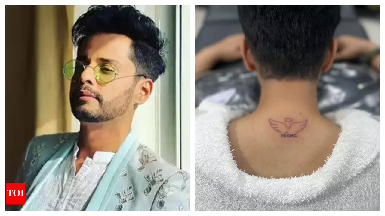
Shardul Pandit’s first tattoo, which he got in 2025, is a tribute to his late mother Veena: her name beneath a pair of angel wings at the back of his neck. He has said that he’s nervous around needles, so the decision carried extra weight for him. The design stays small and direct, without turning the memorial into a display.

Shardul Pandit’s first tattoo: his mother’s name and angel wings

Shardul Pandit tattoos: inline

The photograph shows the design high on Shardul’s neck, just below the hairline. “Veena” sits beneath simple wings, with a small circular detail above them. The name is the focal point; the wings frame it and the open skin keeps the compact design from feeling crowded.

Shardul described the tattoo as a way to keep his mother close. The report doesn’t identify the artist or explain every visual detail, and there’s no need to invent a hidden code. The name and wings are enough to understand the tribute.

The actor behind the tribute

Shardul Pandit in a contextual photograph: inline; not tattoo evidence

Pandit works as an actor and radio presenter. Television viewers may know him from Bandini, Godh Bharaai, Kitani Mohabbat Hai 2, Kuldeepak and Siddhi Vinayak. Those roles give context to his public career, but the tattoo’s meaning comes from his family life.

A quieter public moment

Shardul Pandit in a contextual photograph: inline; not tattoo evidence

This is Pandit’s first reported tattoo. He said he was afraid of needles and didn’t use numbing cream; he described the pain as bearable. That’s his experience, not a promise about how a neck tattoo will feel for someone else.

The account is a reminder that a first tattoo can be both a new experience and a personal decision. In Pandit’s case, he chose a compact design for a specific family tribute.

The look he carried on screen

Shardul Pandit in a contextual photograph: inline; not tattoo evidence

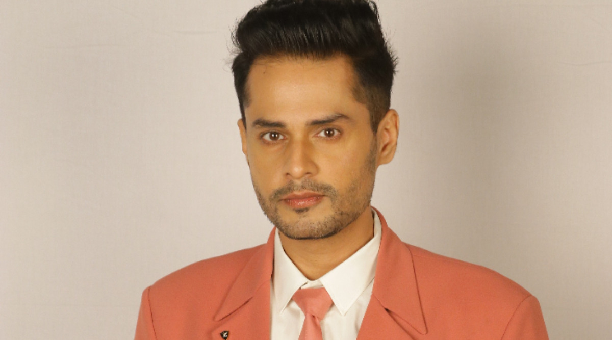
Pandit’s work has put him in different settings, from television sets to public appearances and photo shoots. This portrait is contextual rather than evidence of the neck tattoo. Clothes, hairstyles and camera angles affect how visible the name will be; the close image above is the one that clearly shows the design.

Radio, television, and a changing life

Shardul Pandit in a contextual photograph: inline; not tattoo evidence

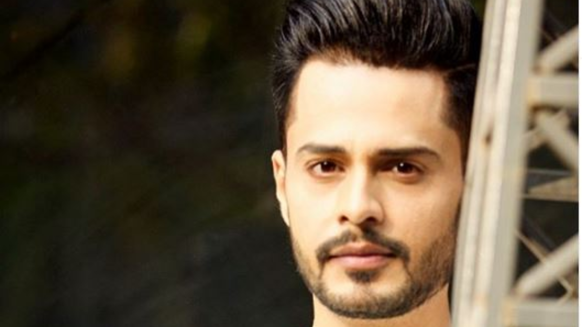
Radio and television have made Pandit a familiar voice and face to different audiences. The images in this section show him in public life, not close views of the tattoo. They also show why a neck piece can be partly hidden by collars or appear when clothing shifts.

The tribute itself remains a family story. His work explains why the image drew public interest, but it doesn’t replace the reason he gave for choosing his mother’s name.

Why a first personal choice can matter

Shardul Pandit in a contextual photograph: inline; not tattoo evidence

A first tattoo doesn’t have to be a test of how much ink someone can take. Pandit chose a person and a memory he wanted to carry. Putting Veena’s name first makes the tribute specific; the wings support the lettering without taking over.

The back of the neck offers a balance of visibility and privacy. Other people may see the design when he turns, while hair or a collar can cover it. The neck can also be sensitive, and pain varies by person, so a reputable artist should discuss the placement, hygiene and aftercare before starting.

Three ideas worth carrying forward

For a family tribute, decide what should read first. Write the name in different styles, then check the lettering at the intended size instead of relying on a phone screen. Script can feel personal but may need more spacing; a small symbol can add context if it supports rather than crowds the name.

Ask the artist how the piece will look when you turn your head and how collars, hair and sun exposure may affect it. The interview video below offers more context on Pandit’s public work; the tattoo itself is best seen in the close-up photograph.

More actor tattoo guides

173 container

Maura Higgins Tattoos: The Star Neck Ink, Back Tattoo and More

Maura Higgins’ tattoos include a fine star trail across her upper back, a small Rihanna-inspired star on her neck and a red pair of lips. She has also said she regrets several older pieces and would like them removed. Her comments are unusually candid: not every tattoo has remained a favorite.

Maura Higgins’ back tattoo and the star trail

Maura Higgins tattoos: inline tattoo evidence

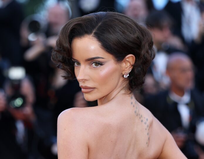
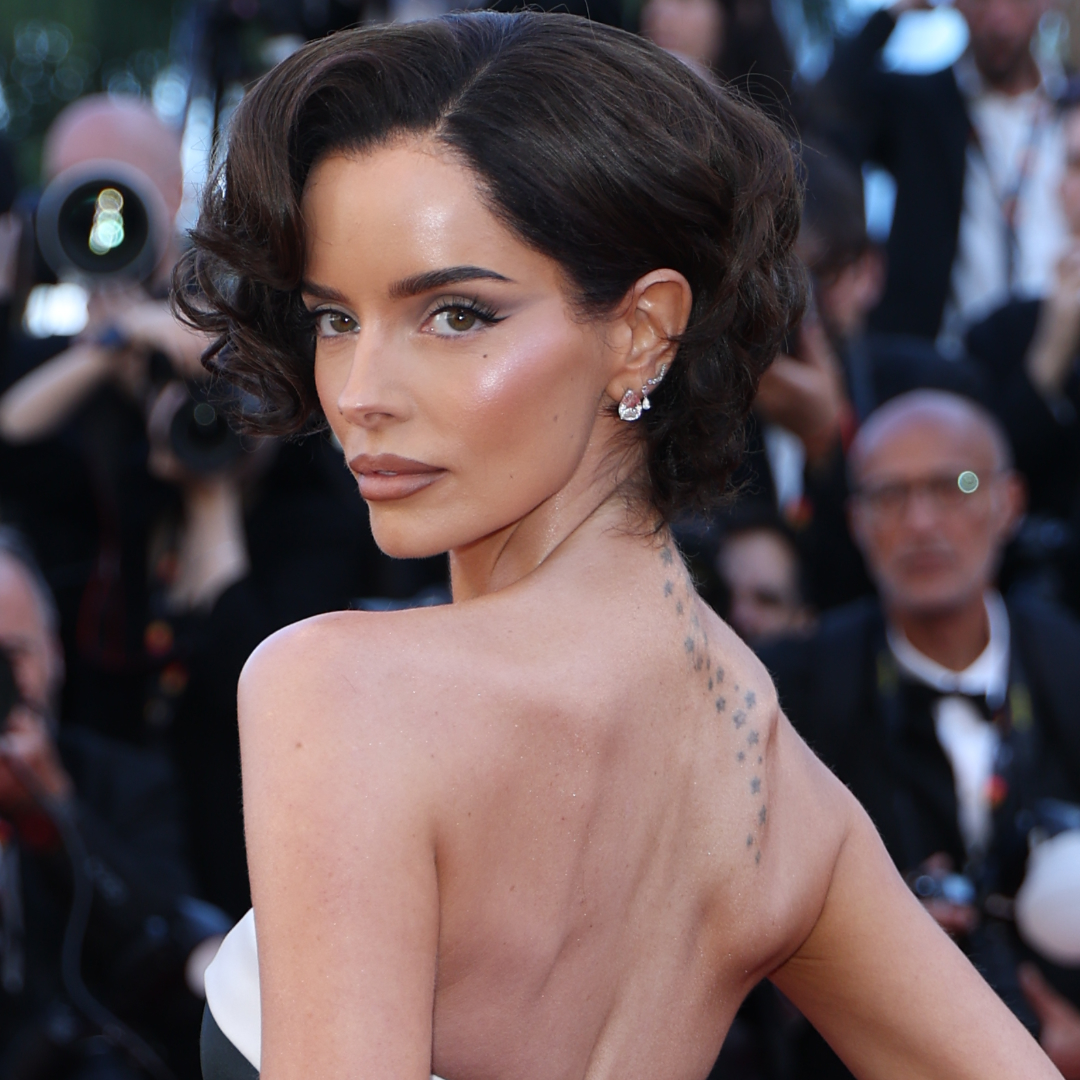
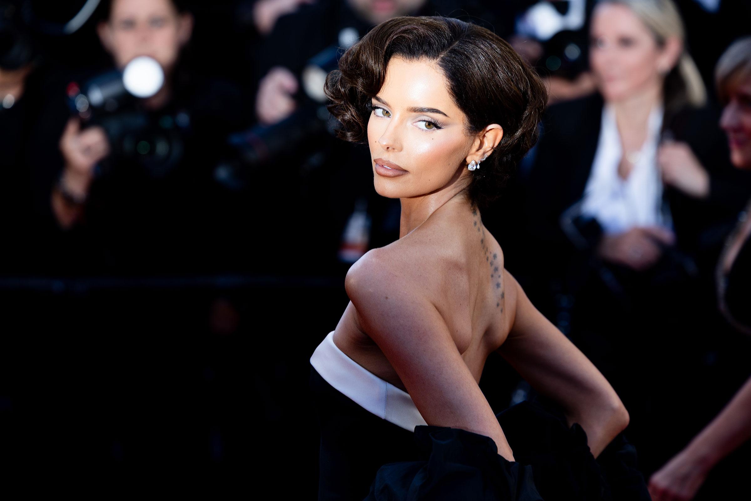
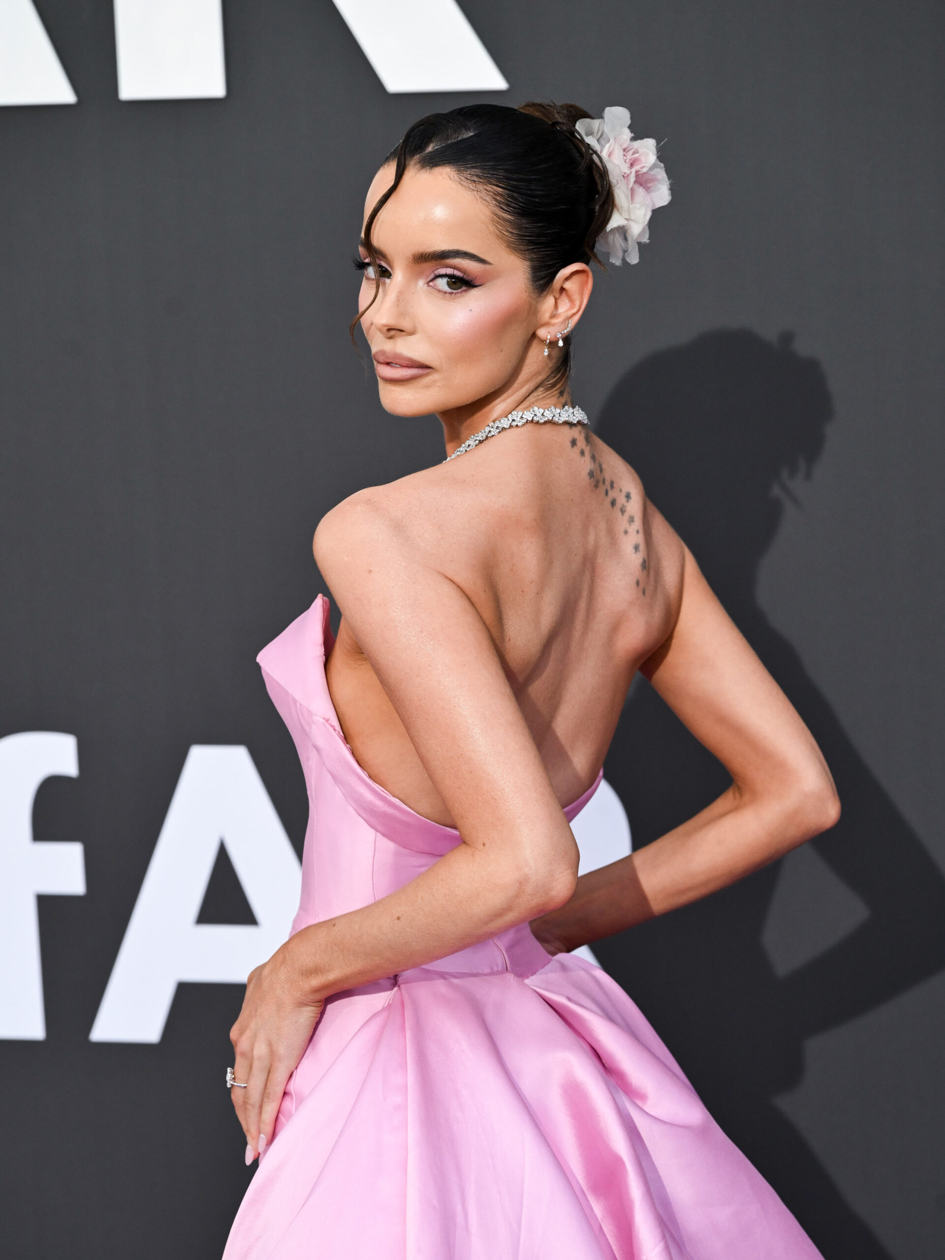
At the 2026 Cannes Film Festival, Higgins wore a black-and-white gown with an open back, showing a narrow trail of fine black stars along her upper back and neck. The marks are spaced apart, so the design stays light rather than becoming a solid band.

The photographs show the star pattern, but Higgins hasn’t explained its meaning in the sources covering the look. It’s best described as a vertical arrangement that follows the line of her back; assigning a story to each star would be guesswork.

A red-carpet moment

Maura Higgins in a contextual photograph: contextual portrait, not tattoo evidence; not tattoo evidence

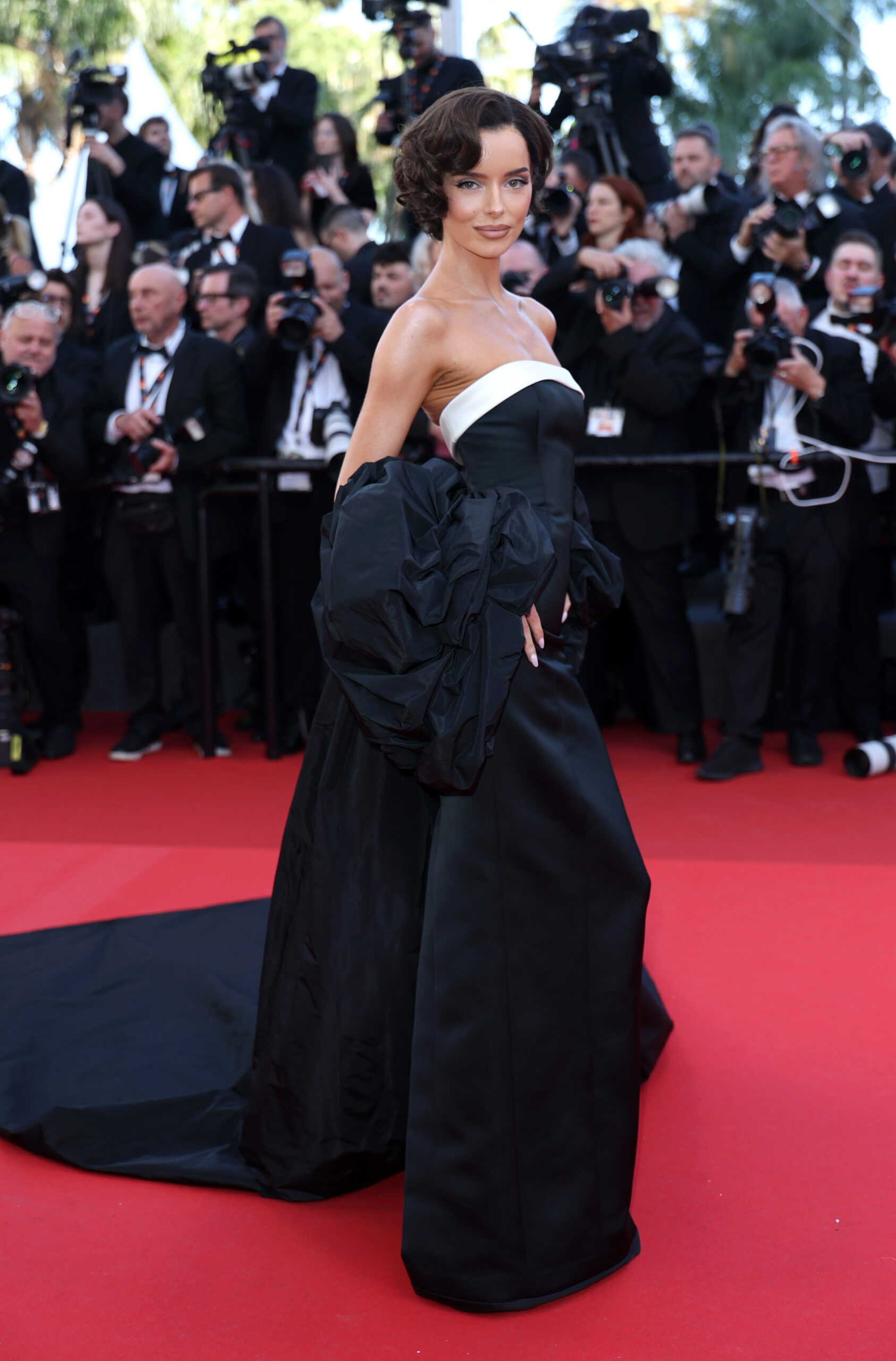
The red-carpet photo shows how an open-back dress can bring the star trail into view without making it compete with the gown, jewelry or hair. The older star on Higgins’ neck is a separate tattoo; the reporting doesn’t say the two designs were planned as one set.

The Rihanna copy she wishes she had skipped

In a 2026 interview with Interview Magazine, Higgins said she copied Rihanna’s neck star and now wants it removed. She called the choice impulsive and said she still loves Rihanna. She had also considered copying Rihanna’s finger tattoo, but decided it wouldn’t suit her.

Her comments draw a useful line between influence and duplication: a design that works for someone else may not feel right on your own body. The neck is also visible in many photos and everyday settings, which makes it worth taking time over.

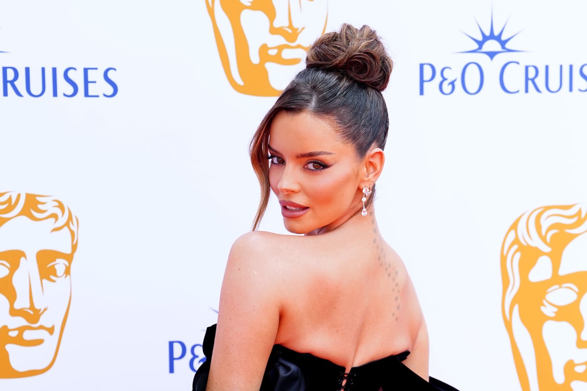
Maura Higgins in a contextual photograph: contextual portrait, not tattoo evidence; not tattoo evidence

The BAFTA red-carpet image is contextual; it doesn’t provide a clear close-up of the neck tattoo. Higgins’ account is the source for the Rihanna connection and her regret.

The red lips on her bum

Higgins’ small red lips tattoo was noticed in Love Island coverage in 2019. Reports described it as parted lips on her buttock. The bright color and private placement make it playful, but the sources don’t give it a deeper meaning.

The pink-gown photo below is contextual rather than close evidence of the tattoo. The lips are known from earlier coverage and appear only when clothing or camera angle reveals them.

Maura Higgins in a contextual photograph: contextual portrait, not tattoo evidence; not tattoo evidence

Her ankle, hip, and the pieces she wants gone

In the same 2026 interview, Higgins said she wants all her tattoos removed, calling them “terrible tattoos” from when I was young. She named the ankle piece as the one she most wants gone, partly because it hurt the most. She has put off removal because she worries it will hurt.

She also mentioned a hip tattoo, but hasn’t provided a reliable description of either design. The event photo below is contextual and doesn’t establish what those pieces look like.

Maura Higgins in a contextual photograph: contextual event image, not tattoo evidence; not tattoo evidence

Why the placement changes the whole mood

The same small star can feel different on the neck than along the back. The red lips stay private until a swimsuit or camera angle reveals them, while an ankle tattoo is easy to cover but, in Higgins’ account, was painful to get. Visibility, clothing and comfort all affect how a piece fits into daily life.

Those are useful questions to settle before choosing a location: how often you want the design seen, whether collars or shoes will rub it, and whether you’re comfortable with it in work or formal settings. Placement is part of the decision, not a detail to add later.

Her television chapter

Higgins became widely known through Love Island, where swimwear and evening looks sometimes revealed the red lips tattoo. Later, appearances on The Traitors and red carpets brought different views of the back and neck stars. The styling changed; the photos still don’t explain every tattoo.

Maura Higgins in a contextual photograph: contextual portrait, not tattoo evidence; not tattoo evidence

Her willingness to say she regrets some designs is part of the story, too. A tattoo doesn’t have to remain a carefully curated favorite just because it’s visible in a photograph.

What to take from Maura Higgins’ collection

Higgins’ tattoos are a mix of fine stars, a cheeky red design and older pieces she’d rather remove. If you’re drawing inspiration from them, borrow the simplicity or placement, not the exact Rihanna copy. Give yourself time to decide whether a reference still feels like yours, and be honest about what remains unknown from photos.

More celebrity tattoo guides

Queen Camilla Tattoos: The Reported Couture Brow Look

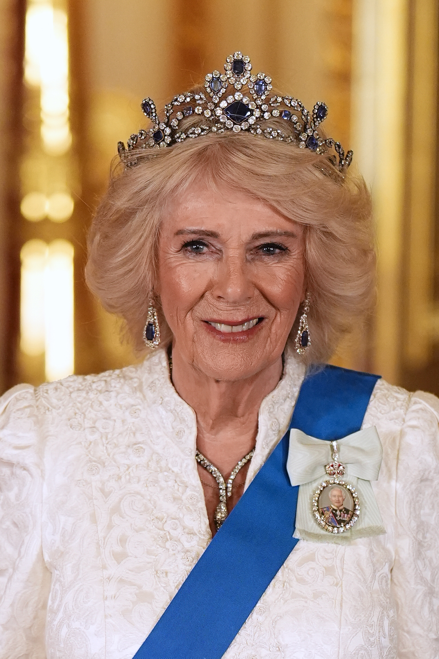
Camilla’s beauty style is usually understated: familiar hair and makeup, with changes that tend to stay within that look. So when her brows appeared fuller and more defined in 2026, the difference drew notice. It is a small change, but one that sits at the centre of the face.

Reports linked the look to a semi-permanent cosmetic treatment called Couture Brow, associated with London brow specialist Suzanne Martin. Martin appeared to confirm that Camilla had the treatment. Buckingham Palace has not given a detailed account, so it is best described as a reported treatment rather than an official announcement.

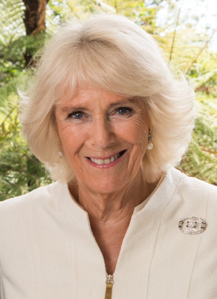
In recent photographs, the brows have a clearer arch and a little more weight. They change the eye area without turning the look into a dramatic piece of body art.

Queen Camilla eyebrow tattoos: the reported treatment

Queen Camilla tattoos: primary tattoo evidence

Martin described blending pigment with a fine needle to create strokes that resemble individual brow hairs. That puts Couture Brow in the same broad category as microblading and other semi-permanent brow treatments. The aim is to add fullness without drawing a solid line above the eyes.

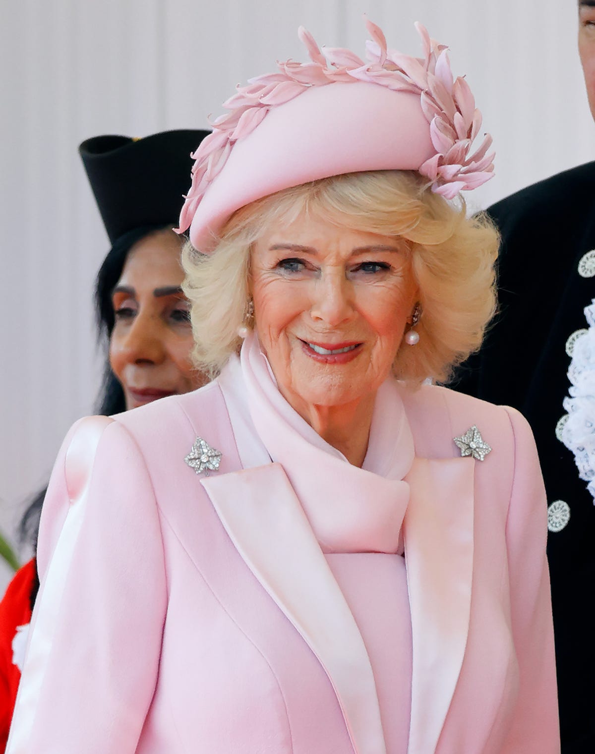
The photographs show a soft result: the colour is more noticeable, but the shape follows the brow area rather than sitting like a block on top of it. With cosmetic brow work, small choices such as the darkness of the pigment and the shape at the front can change how natural it looks.

Brow definition can also hold up through long days and changing makeup, though it doesn’t remove the need for grooming. The treatment is about adding pigment beneath the skin, not creating a finished makeup look that never needs attention.

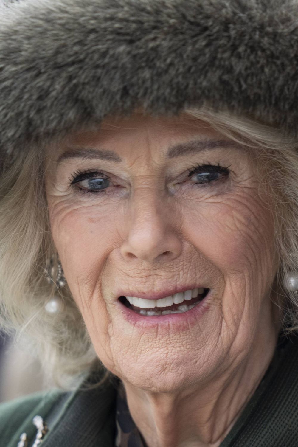
Queen Camilla tattoos: second tattoo-evidence view

Camilla’s restrained eye makeup leaves the brow line easy to see. There is no heavy contour or smoky eye competing with it, so the added definition stands out without changing the rest of her look.

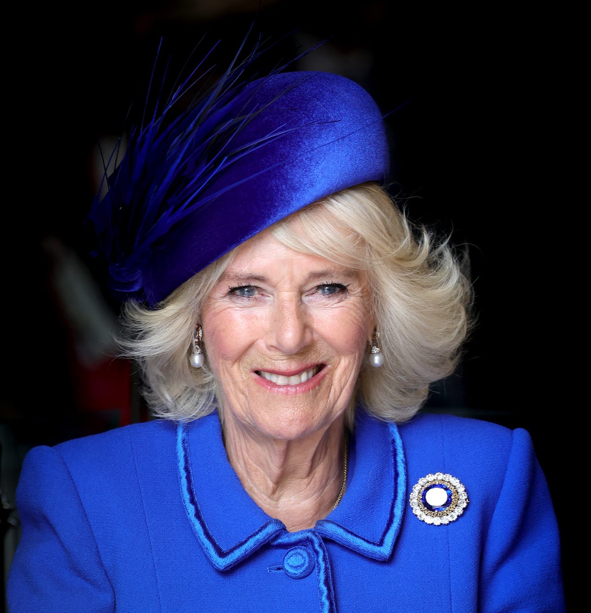
Queen Camilla tattoos: third tattoo-evidence view

The brows drew wider notice during the 2026 Nigeria state visit. Formal events, several press photographs and different angles made the shape easier to compare than a single casual picture would.

The look before the change

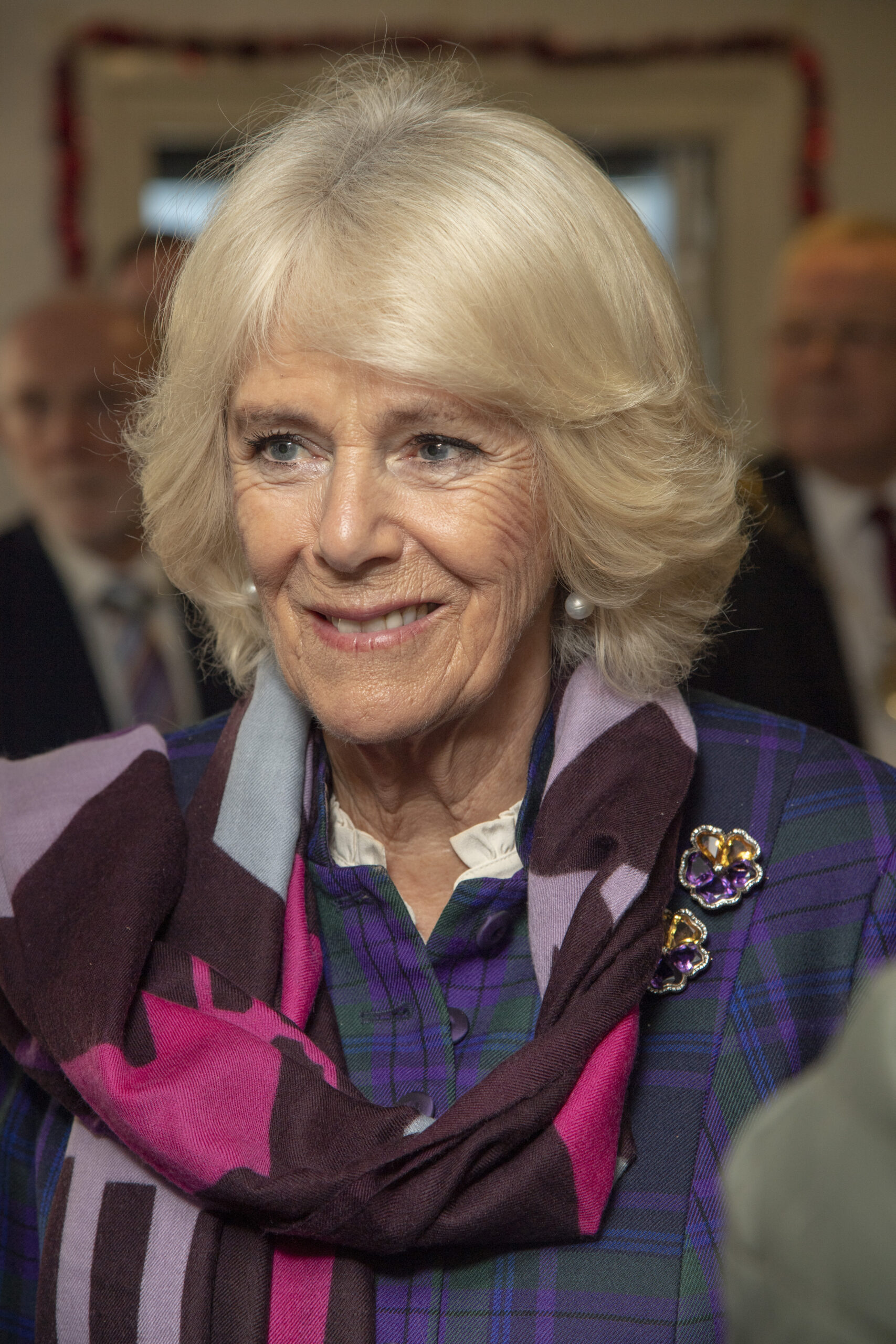
Queen Camilla in a contextual photograph: contextual before-treatment comparison; not tattoo evidence

In earlier photographs, Camilla’s brows often look lighter and less structured. The comparison suggests that much of the visible difference comes from a more defined arch, a fuller tail and a more even line. It cannot show exactly what was done during a treatment.

Semi-permanent pigment can soften as the skin heals and the colour fades. The finished look depends on the pigment, technique, practitioner, skin and the shape chosen in consultation. A brow has to suit the forehead, eyelids, cheeks, hair colour and the person’s natural expression; the same outline won’t work on every face.

A longer-running royal style

Queen Camilla in a contextual photograph: contextual earlier royal portrait; not tattoo evidence

Camilla’s hair, makeup and clothes vary with the occasion, but her overall style has changed gradually. A brow treatment can make a visible difference while leaving that familiar look intact.
For anyone choosing a brow reference, it helps to look at the whole face, not just the brow. The arch, starting point and tail all affect the expression; a shift of a few millimetres can make a face look more stern or more surprised. A practitioner has to plan those details instead of simply making the colour darker.

Why this kind of brow work feels subtle

The reported effect comes from hair-like strokes, blended colour and a shape that follows the existing brow. The photos can look different under indoor light, daylight and event photography, so a reference should show whether the work is fresh or healed. Semi-permanent pigment may appear stronger at first and settle as the skin heals.

The word tattoo covers very different procedures. A brow treatment uses pigment and needles, as do decorative tattoos, but the placement and design demands are not the same. Brows sit in a highly visible area, where a heavy line or uneven arch can change the face’s expression.

What the reporting actually confirms

Coverage in 2026 linked Camilla’s fuller brows to Suzanne Martin and her Couture Brow method, describing semi-permanent pigment applied in fine, hair-like strokes. The change was visible in photographs from royal engagements, including the Nigeria visit.

There is no public treatment diagram, consultation record or detailed statement from Camilla explaining what she requested. The exact pigment shade, number of passes and expected lifespan have not been reported. The photographs show the change in shape; they do not establish a personal meaning or provide details that Camilla has not shared.

A small detail with a big visual effect

The main point for anyone considering similar work is proportion. Bring reference pictures that suit your own face, ask to see healed results and discuss how the colour and shape may change as the pigment settles. A brow that works on someone else may not suit your features.

More celebrity tattoo guides

Borja Silva Tattoos: Snake, Sun and the Story Behind His Ink

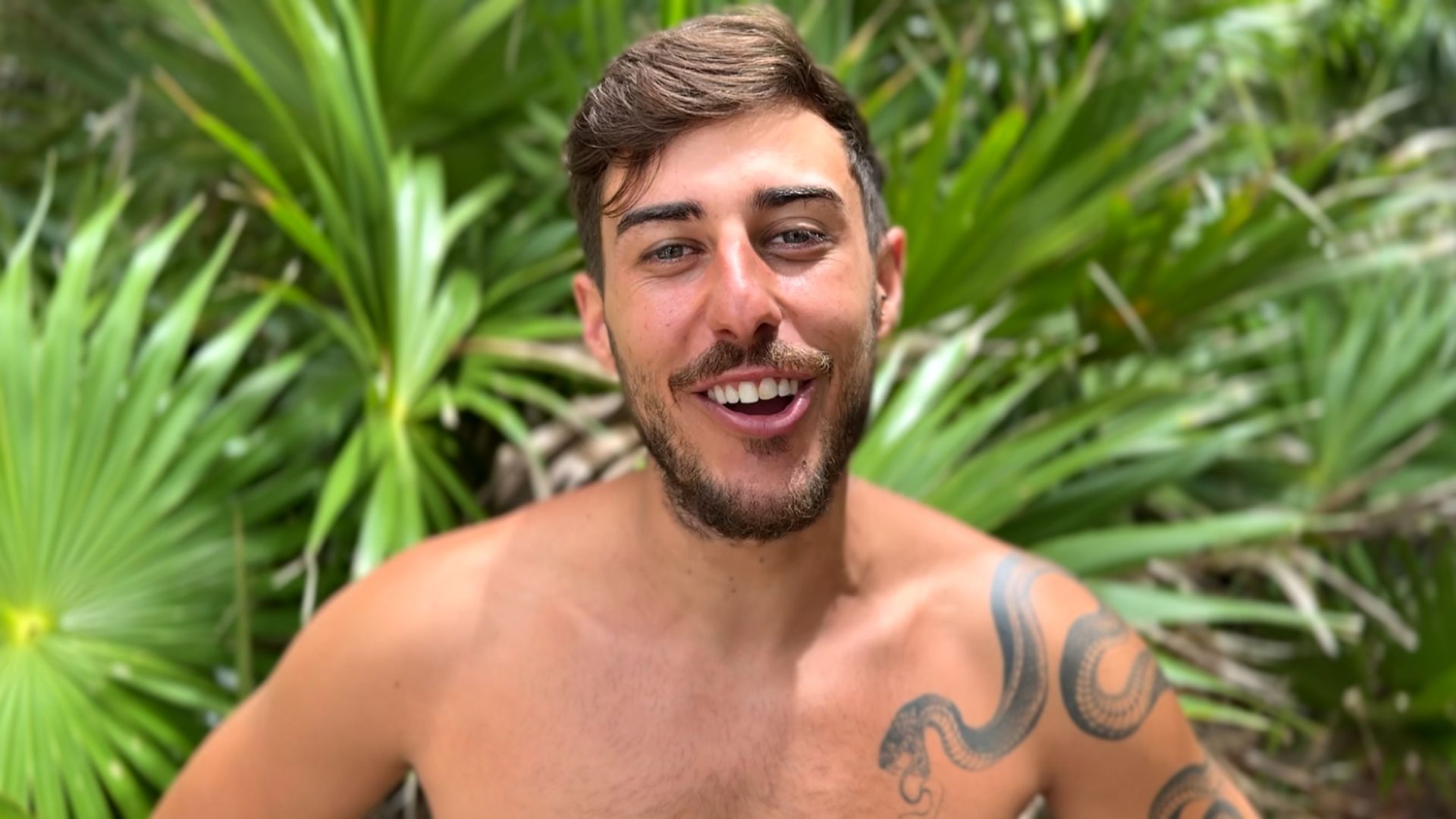
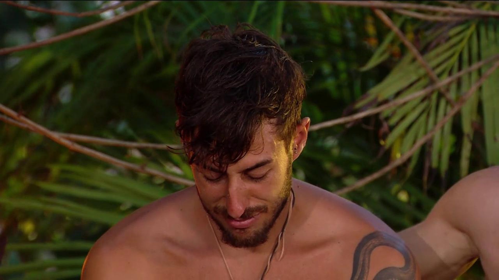
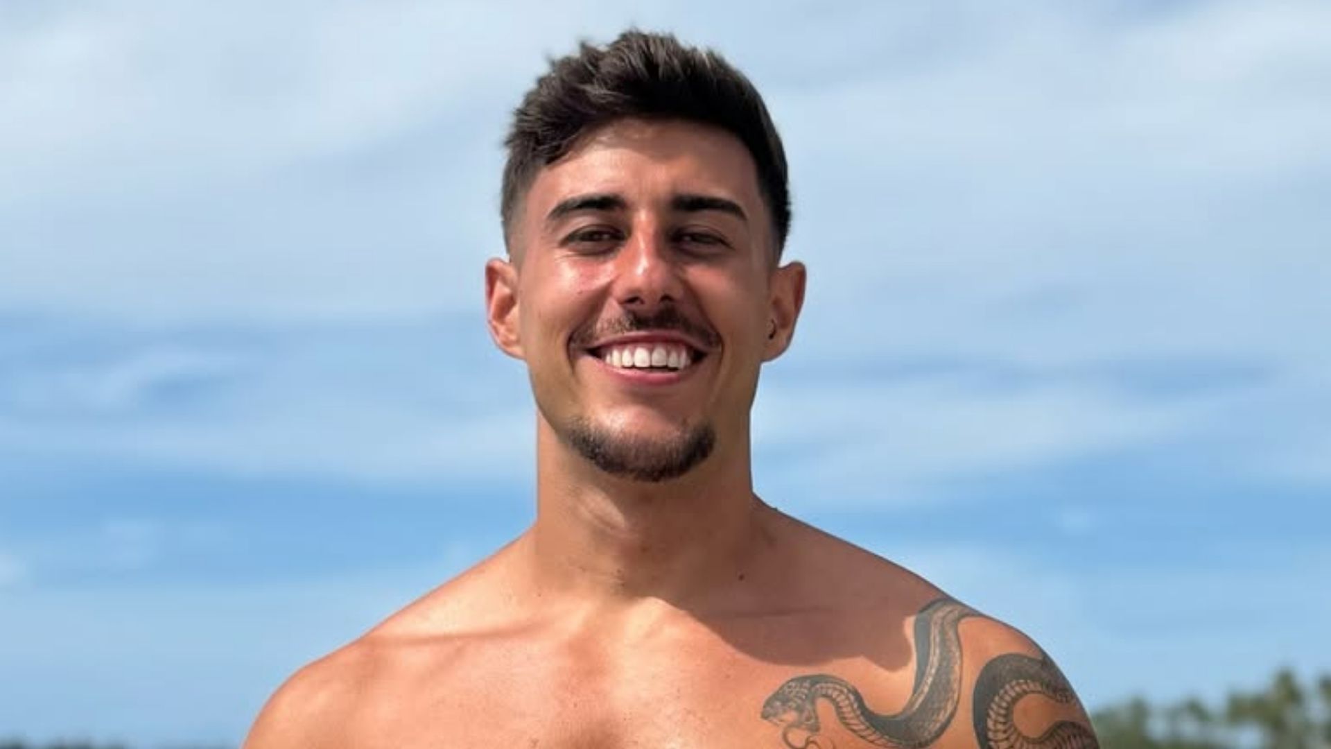
On Spanish reality television, Borja Silva is often seen with his upper body uncovered, so the long snake tattoo over his right shoulder and down his arm is hard to miss. A round sun on his forearm and a small line of script across his side appear in other photographs.

In a Telecinco feature connected with Supervivientes, Silva spoke about what his tattoos mean and the experiences behind them. Later coverage linked the snake to a matching design made for him by Almudena Porras and mentioned the number six. Those reports give some context, but they do not explain every mark visible in photographs.

Borja Silva’s snake shoulder and arm tattoo

Borja Silva tattoos: inline

The snake runs from the right side of Silva’s chest and shoulder over the upper arm. Repeated scale details fill its long curve, with the head closer to his chest. A jungle photograph shows the design clearly despite the leaves and uneven light.

The same outline appears in beach and television images, where it shifts with his posture. That makes it easier to see how the tattoo follows the shoulder rather than sitting as a flat picture on the arm.

Later reports connect the snake with Almudena Porras, who is said to have the matching design. The coverage also mentions the number six, but the exact date and private details around the tattoo are less clear. The reported connection is to their relationship; there is no reason to assign a meaning to every nearby mark.

Borja Silva’s sun tattoo on the forearm

Borja Silva tattoos: inline

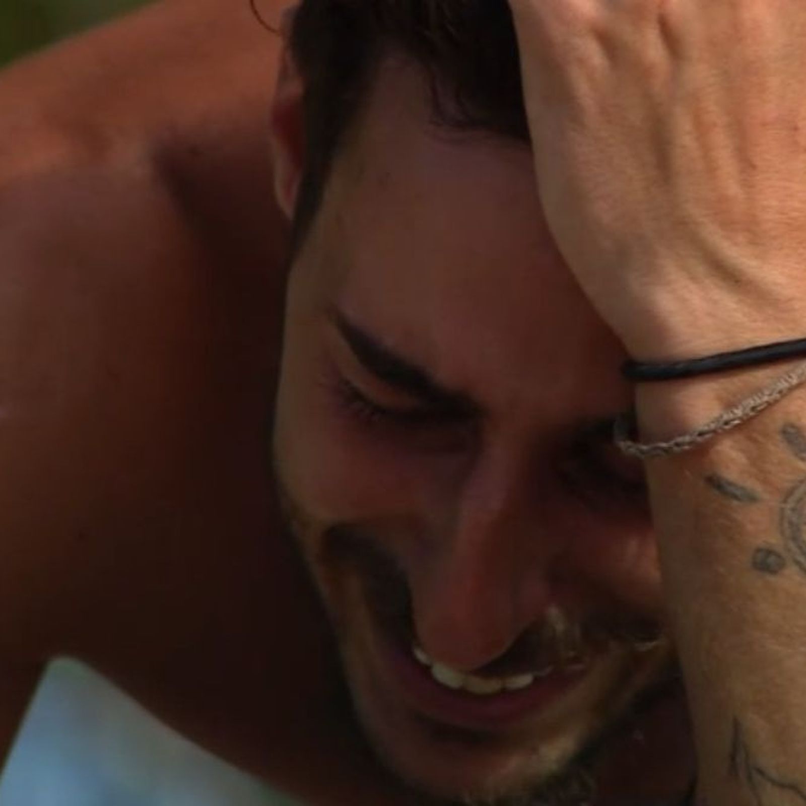
In this photo, Silva leans forward with one hand against his head, leaving a circular sun tattoo in the middle of his forearm in view. It has a round centre, rays and smaller marks around the edge. The photograph shows the design, but the coverage reviewed here does not explain what it means to him.

Unlike the snake, the sun is a compact emblem. Its position keeps it visible when he lifts or bends his arm, and its shape is clear enough to describe without guessing at a personal story.
The snake, script and arm tattoos work together

Borja Silva tattoos: inline

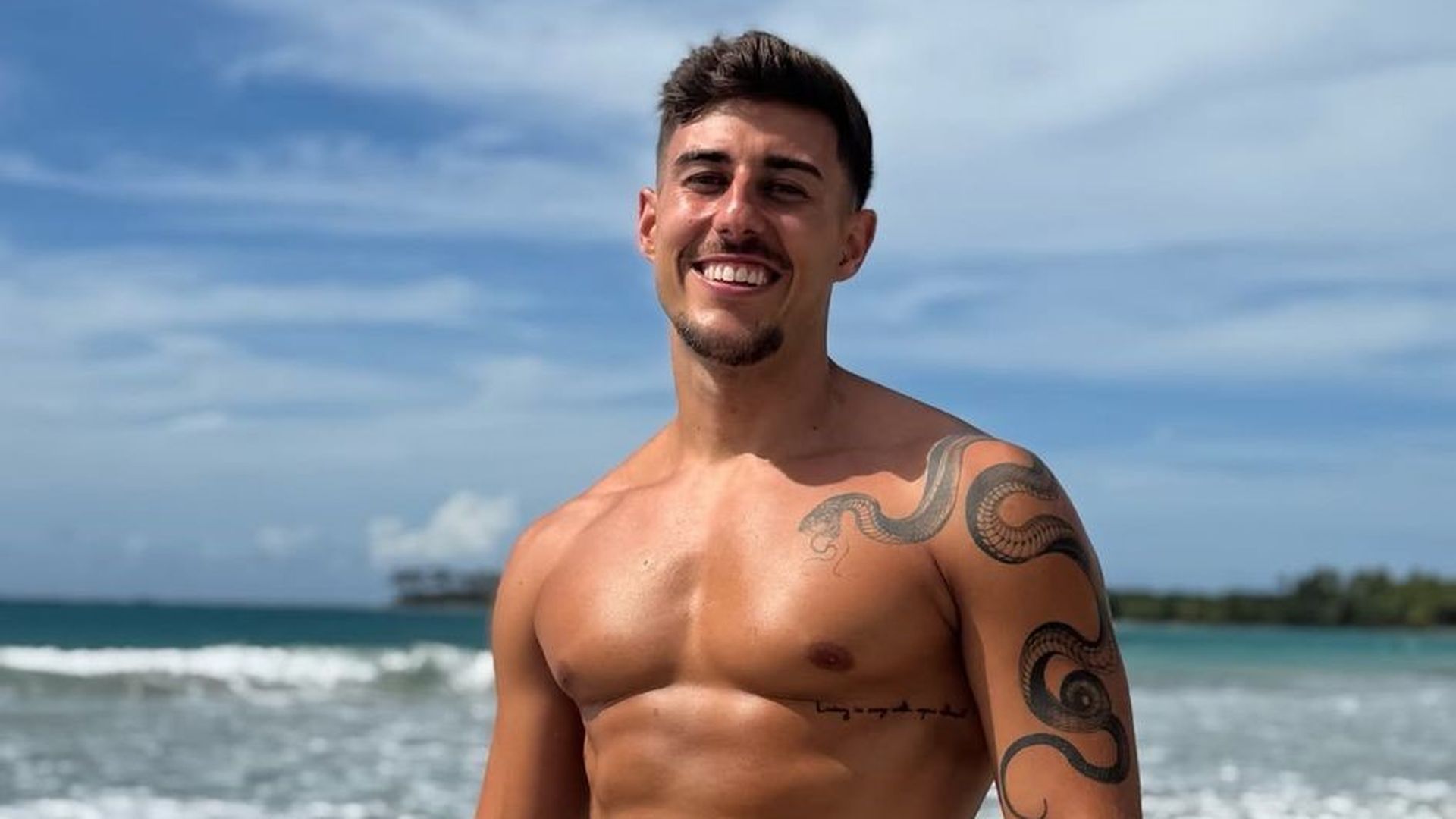
A beach photograph shows the snake from another angle, along with a small script tattoo below Silva’s chest and more dark linework around his arm. The pieces have different shapes and placements, so they read as a collection rather than one continuous sleeve.
The script is visible, but the letters are too indistinct in this image to quote or translate. It appears when his clothing or pose leaves his side exposed, while the larger snake is easier to see in public photographs.

Borja Silva’s snake tattoo in a reality-show close-up

Borja Silva tattoos: inline

This reality-show frame shows the same tattoo in darker light, with the snake still visible across Silva’s right shoulder and upper arm. The surrounding chest remains mostly uncovered, making it easier to distinguish the snake from the other marks.

The number six and the matching snake tattoo

Telecinco’s later coverage connects the matching snake with Porras and mentions a significant number six. It does not map every smaller mark in the photographs or give enough detail to say where each version appears. The number belongs to the reported story, but guessing at its exact placement or design would go beyond what the source confirms.

The reports describe the snake as a shared silhouette, though that does not establish that the tattoos are identical in size or position. Silva has also spoken about the experiences behind his tattoos; the coverage gives some relationship context without explaining every detail of the private story.

Another clear look at the snake tattoo

Borja Silva tattoos: inline

In this beach portrait, the light makes the snake’s outline easy to follow from the upper chest, across the shoulder and down the arm. Compared with the darker television frame, the ink looks sharper, but the placement is the same. The two views support describing it as one continuous shoulder-and-arm tattoo.

Silva discussed his tattoos before travelling to Honduras for Supervivientes. Viewers already knew him from relationship-focused programmes; the Telecinco feature added his account of the personal experiences behind some of the ink, including relationships and family loss. It did not provide a full inventory or explain every design.

Why the collection feels bold without being a full blackout style

The photographs show a mix of large and smaller pieces: the snake is the darkest, the forearm sun is more open, and the script is a separate detail. Skin remains visible between them, so the collection does not read as one uninterrupted sleeve. The overall contrast also changes between bright beach light and shaded television shots.

What Borja Silva’s tattoos say about placement

The designs occupy different levels of visibility. The shoulder snake appears in shirtless photos and television footage, the forearm sun shows when he gestures, and the script is more easily covered. The photos also show why posture matters: the snake’s curve follows the shoulder and upper arm as Silva sits, leans or turns. The useful idea is to plan for how a design will look in movement, not just in a still reference.

The honest limit of what we can confirm

The photographs show the snake, forearm sun, side script and additional arm ink. Reports connect the snake with Porras and mention the number six. The script is not clear enough to translate, and no reliable source in the coverage explains the sun’s meaning. Those limits are part of the account: visible ink can be described without inventing a story for it.

More model tattoo guides

Reuben Kaye Tattoos: Portraits, Sailor Ink and the Meaning Behind His Arm Art

Reuben Kaye’s tattoos sit alongside the theatrical style he brings to his work as an Australian cabaret performer. Onstage he is often in bright clothes and makeup; offstage, photographs show a collection of portraits, symbols and dark linework across his arms.

The clearest image is a large portrait of a dark-haired man with heavy brows and red lips. Another tattoo, a sailor based on the work of queer artist Tom of Finland, has a meaning Kaye has discussed: he described the sailor as someone who is never quite sure where home is. He has worked between Australia, London and touring stages, but the other designs do not all have public explanations.

Reuben Kaye’s arm tattoo is the clearest starting point

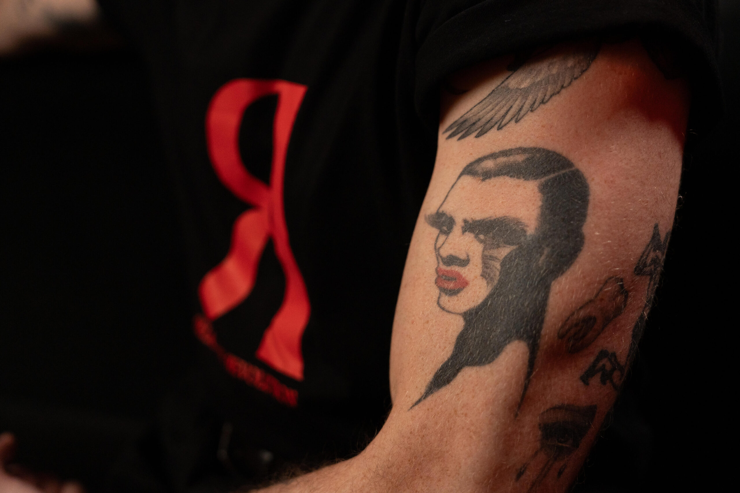
Reuben Kaye tattoos: upper-arm portrait tattoo close-up

The close-up shows a stylised face rather than a photorealistic portrait. Dark blocks define the swept hair and brows, while the red lips draw the eye. A winged or feathered shape sits above it, with other dark designs continuing down the arm; the crop hides some of the smaller details.

The portrait has a stage-like quality, but there is no confirmed identification of the person shown. Its graphic face and contrast are what the photo establishes. It stands out without the arm being covered in one solid sleeve.

The sailor tattoo on Reuben Kaye’s forearm

Reuben Kaye tattoos: Tom of Finland sailor tattoo on the forearm

Kaye’s forearm sailor comes from the art of Tom of Finland, whose drawings of muscular men became influential in queer visual culture. Kaye has described the figure as someone who doesn’t quite know where home is. That gives the image a personal connection to travel and belonging, rather than leaving it as a vintage-style sailor alone.

A wider seated portrait also shows circular or linked-line marks near the wrist, alongside the forearm sailor and the upper-arm portrait. The sailor isn’t equally clear in every photo, and Kaye’s account does not explain the rest of the collection.

Reuben Kaye’s tattoos work as a collection of faces and symbols

Reuben Kaye tattoos: chest and arm tattoo collection in a wider portrait

This wider view shows the portrait on the upper arm, more linework on the forearm and small circles near the wrist. Open skin separates the pieces, so the arm reads as a group of designs rather than a filled-in sleeve. The winged shape also has a different texture from the face below it.

In the photograph, a red detail on Kaye’s shirt echoes the portrait’s red lips. That is a visual coincidence, not evidence that the clothes were chosen to match the tattoo. The image does show how the designs sit alongside his personal style.

Bold doesn’t have to mean crowded. The portrait’s strong contrast makes it easy to notice, while the space around the other pieces keeps them distinct.

Reuben Kaye’s tattoos in a close portrait

Reuben Kaye tattoos: forearm tattoos in a close portrait

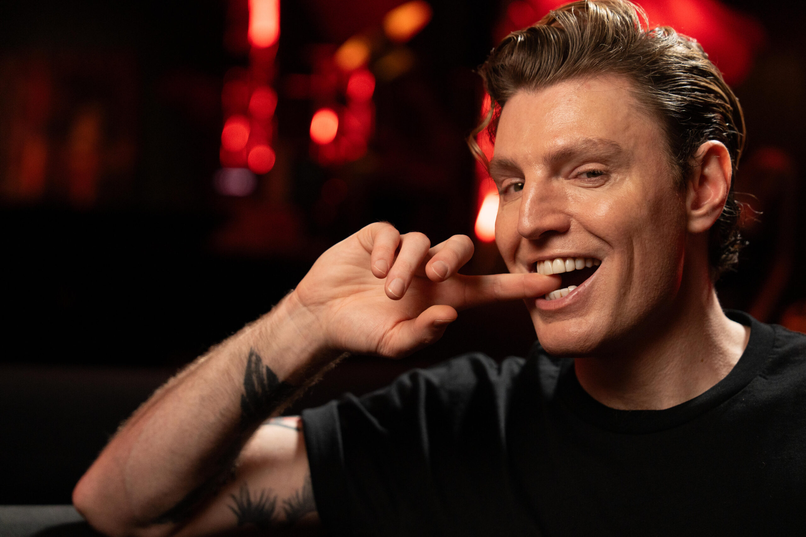
This is a general portrait, not a dedicated tattoo shot. Kaye is smiling in a black T-shirt, with one forearm raised; dark ink is visible lower in the frame. The pose makes it possible to compare where the forearm designs sit against the upper-arm portrait.

Some smaller shapes are partly covered or too indistinct to identify. The photo supports a broad description of the layout, but not a complete inventory or a story for every mark. Away from stage makeup and costumes, the tattoos remain part of his everyday appearance.

A quieter look at Reuben Kaye away from the stage lights

Reuben Kaye in a contextual photograph: offstage cafe portrait context; not tattoo evidence

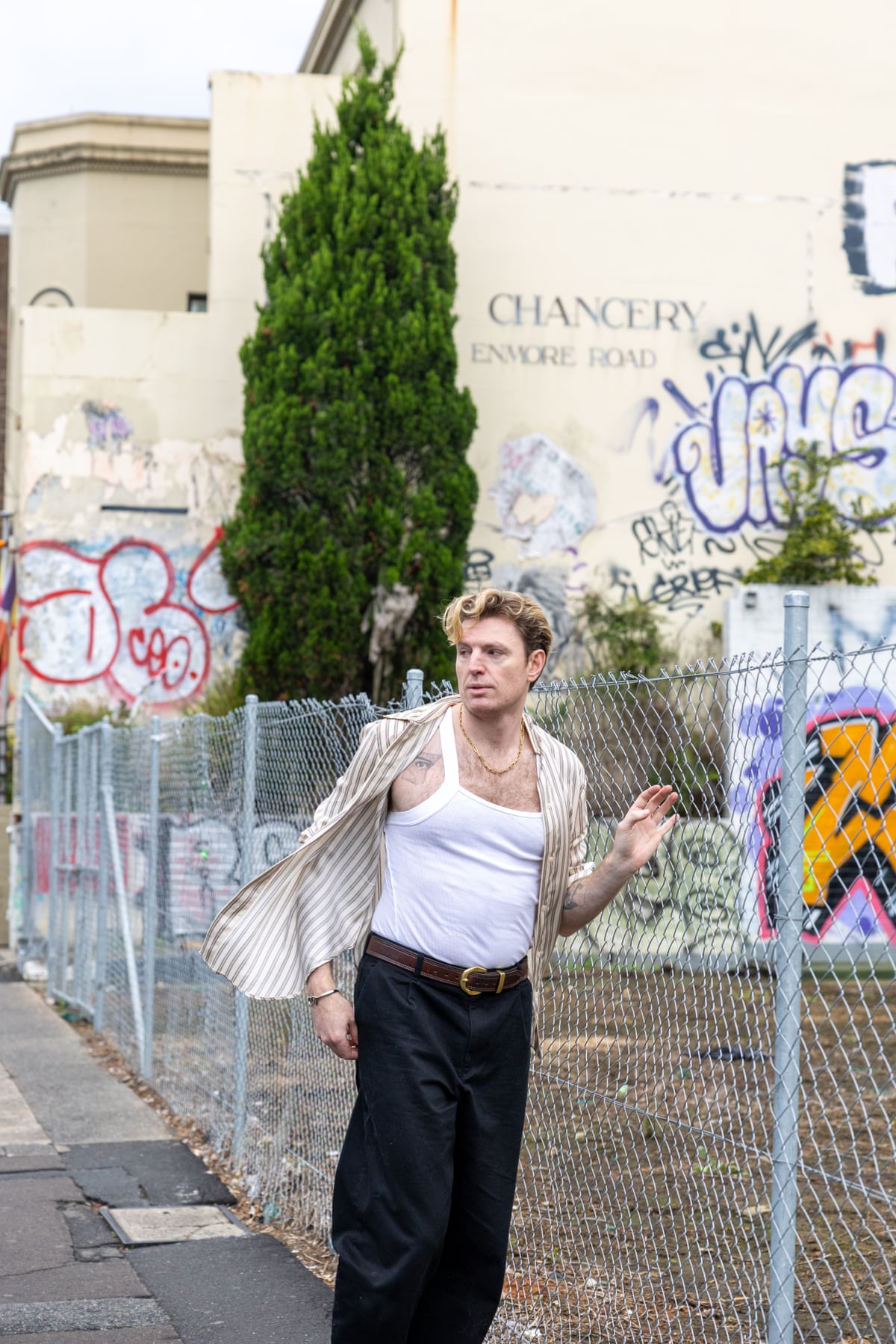
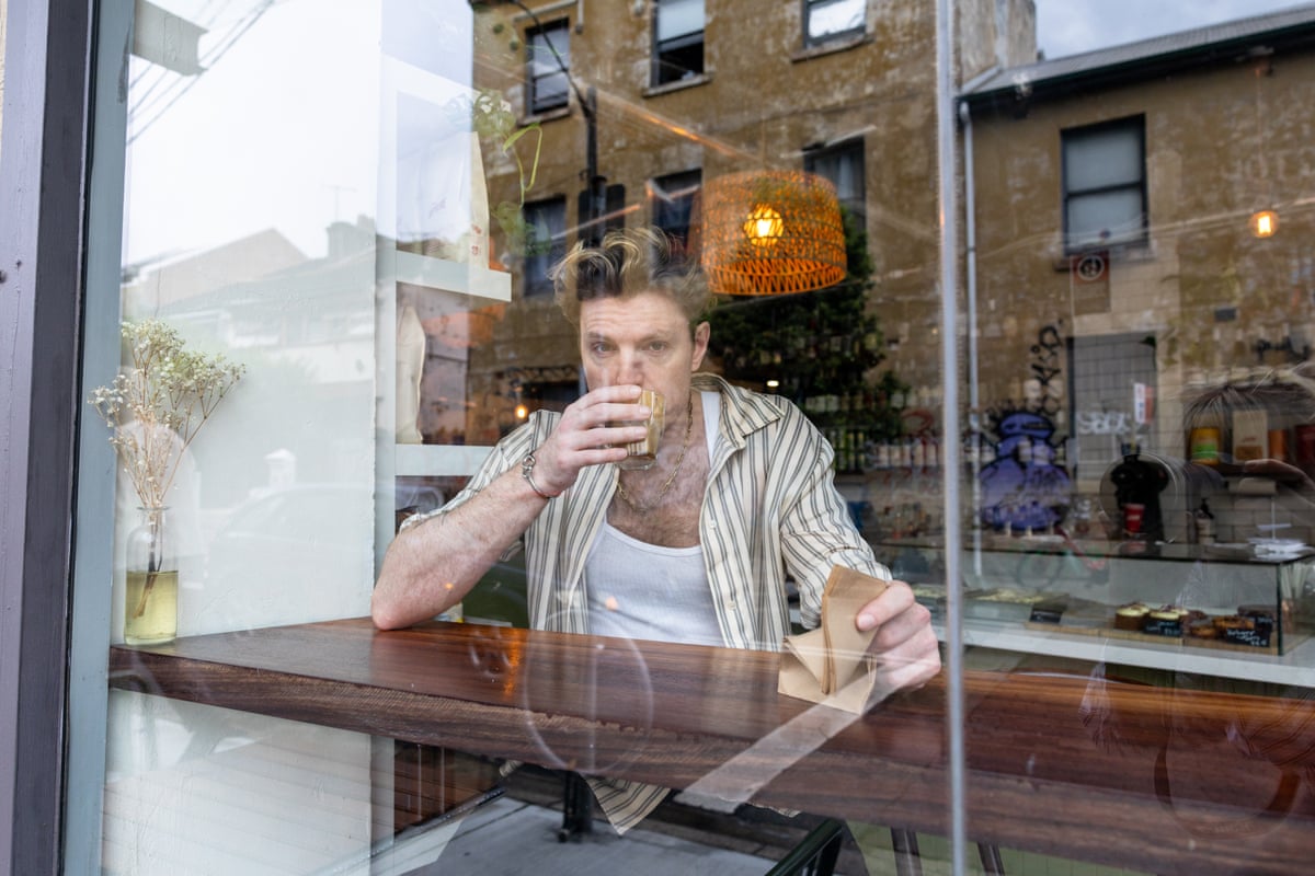
The cafe portrait puts Kaye in an ordinary street setting, behind a window with a drink in his hand. It is context for the person who wears the tattoos, not evidence for small designs the image does not show. His public style moves between drag, bright clothes, theatre lighting and quiet moments offstage; the ink is present in more than one setting.

The best reading is the simplest one: Kaye has shared the meaning of some tattoos, including the sailor, but he hasn’t publicly explained every mark.

What Reuben Kaye’s ink can teach about tattoo planning

The arm portrait has enough room for its dark shapes to read clearly. The sailor sits on the forearm, where a sleeve can cover it or leave it visible. Different placements give the wearer options without requiring the designs to share one theme.

The open skin between the pieces also helps keep each image distinct. That balance matters more than filling every gap, especially when a collection grows over time. Personal meaning and visual impact can sit together, but a viewer may know the first only when the wearer chooses to explain it.

Reuben Kaye’s stage energy in the wider picture

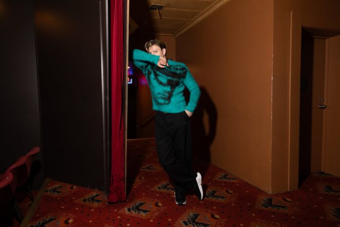
Reuben Kaye in a contextual photograph: theatre movement portrait context; not tattoo evidence

This theatre portrait is included for context, not as tattoo evidence. It shows the performance style—posture, clothes and expression—that sits alongside Kaye’s ink. The sailor and portrait do not create the same effect on their own; their placement and Kaye’s wider visual style are part of how they read.

More musician tattoo guides

Maja Chwalinska Tattoos: Free, Courage and the Small Ink She Keeps Personal

Maja Chwalinska’s tattoos are small enough to disappear in match photos: “Free” on her left hand, a flower near her wrist, “Courage” on her forearm and a few symbols on her right hand. They form a scattered collection rather than one large design.

At a 2026 press conference, a journalist asked about “Free.” Chwalinska declined to explain it and said people could make up their own minds. She has confirmed she has several tattoos, but their meanings are not all public.

The small tattoos Maja has actually discussed

Maja Chwalinska tattoos: reported hand, wrist and forearm tattoo evidence

The word “Free” is on Chwalinska’s left hand. It can show in close-up match or interview photos, then disappear when she grips her racket or wears a wristband. Reports also identify a group of small symbols on her right hand, though they are difficult to make out in most match pictures.

Chwalinska hasn’t said what “Free” means to her. She has spoken about a difficult period away from competition, but published reporting doesn’t connect that period to the tattoo. The word is visible; its meaning remains hers.

A small arm tattoo appears in match photos

Maja Chwalinska tattoos: unidentified small upper-arm tattoo glimpse

A WTA match photo shows a small, dark tattoo on Chwalinska’s upper arm. The published coverage doesn’t identify the design, so the image can confirm its size and placement, not its subject or meaning. It appears compact and can be covered by a sleeve or sports top.

Match photos can distort small details through lighting, sweat, shadows and fabric. This image is a useful reference for where the tattoo sits, but not a clear enough view to identify its motif.

Why “Free” stays a little mysterious

Chwalinska didn’t set out to turn “Free” into a public puzzle; she simply chose not to explain it. There’s no basis for assigning it a specific message. A tattoo can have a private meaning without needing a caption for other people.

If you’re considering lettering, look at the word at its actual size and in more than one font. Hands move and bend, and fine spacing can become hard to read as a tattoo ages. An artist can help adjust the line weight and placement.

Roland-Garros gave fans a closer look

Maja Chwalinska in a contextual photograph: breakthrough-season context portrait; not tattoo evidence

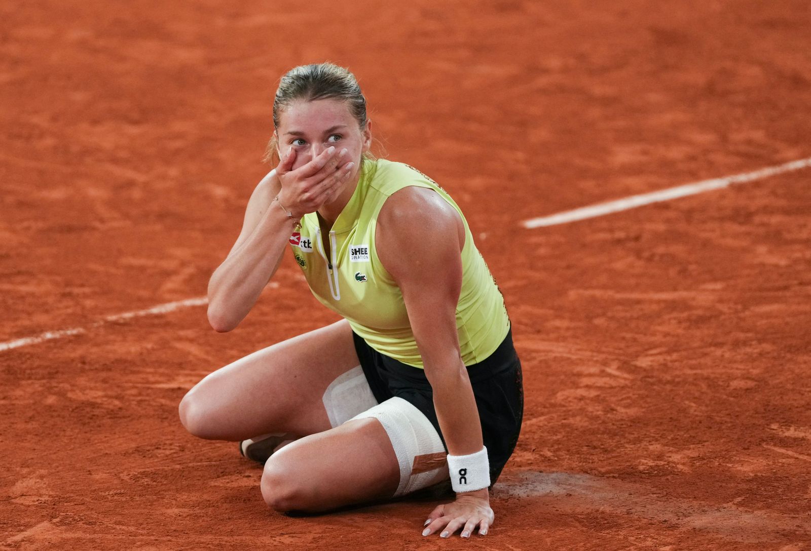
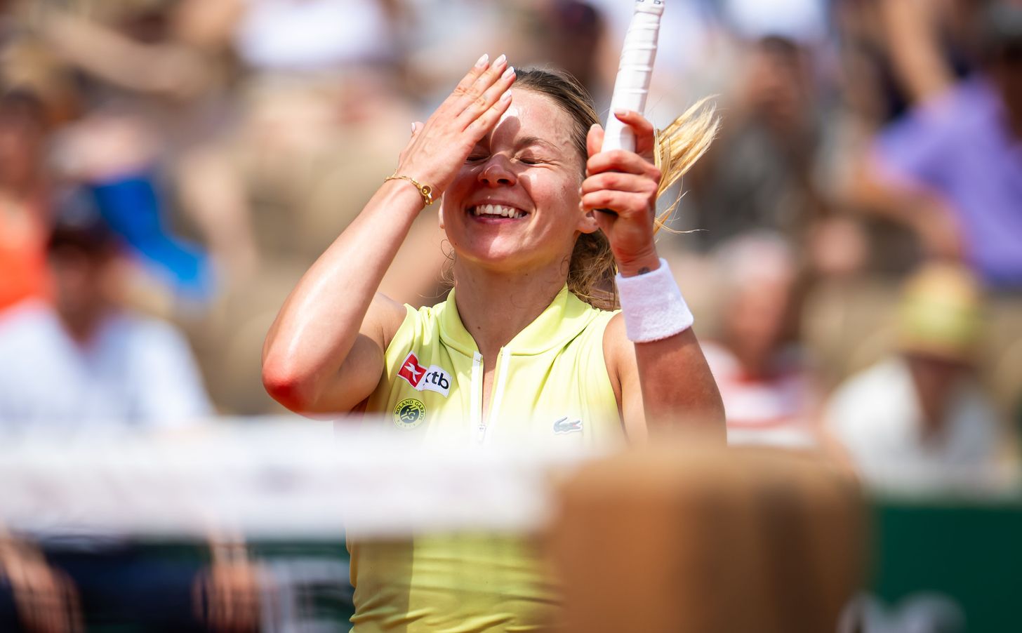
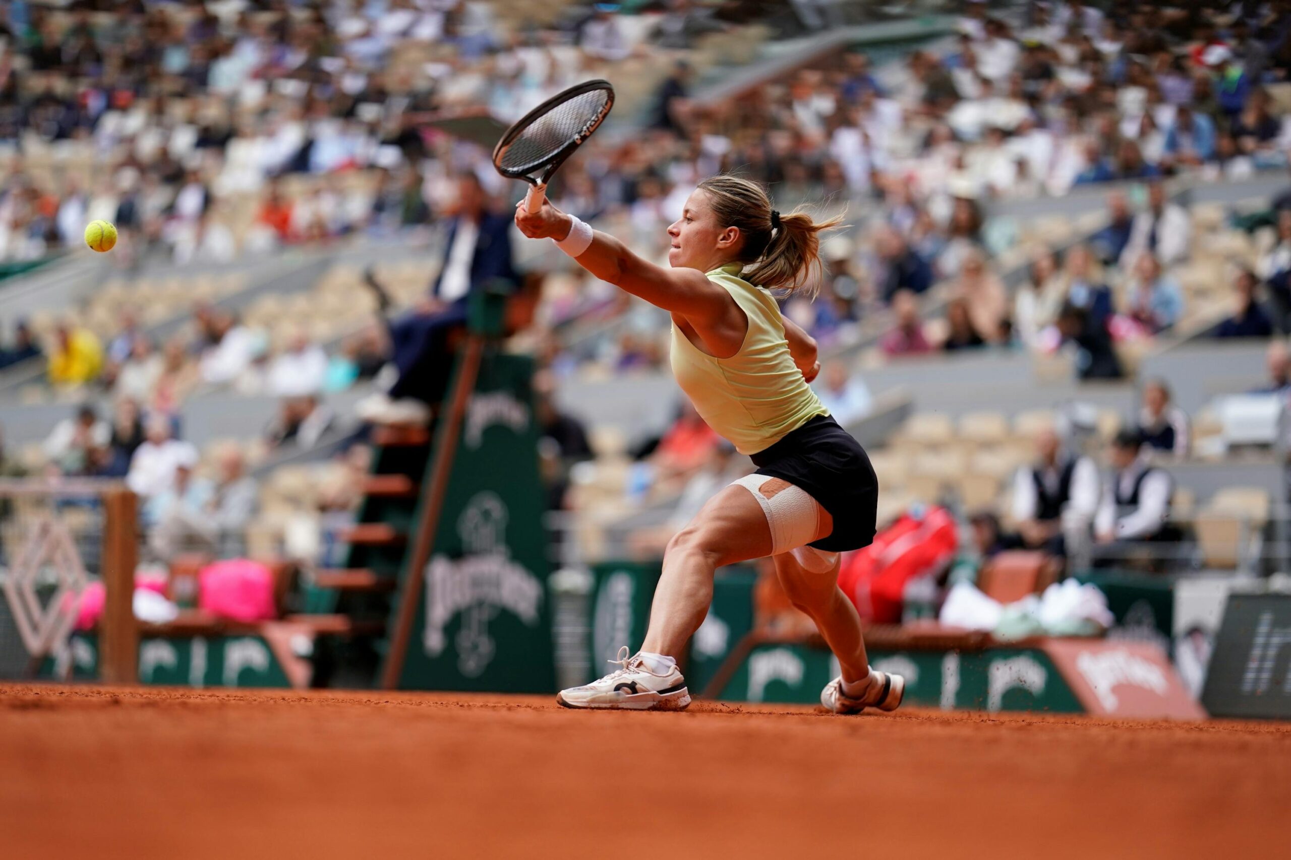
Chwalinska came through qualifying and reached the 2026 Roland-Garros final, bringing more interviews and close-up photos than a normal tournament run. Match images catch details in passing: “Free” when she raises a hand, the flower when a wristband shifts, or the forearm lettering from the side. None gives a full view of the collection.

The flower is reported to sit partly beneath a terry wristband. It appears when the band moves, so it is often hidden. That placement is a reminder that not every tattoo is meant to be on display all the time.

Her game has its own rhythm

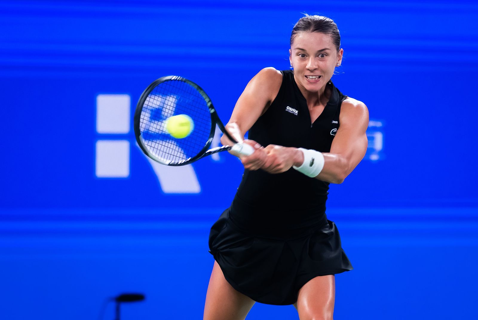
Maja Chwalinska in a contextual photograph: later-season hard-court context; not tattoo evidence

Chwalinska uses slices, changes of height and soft hands to disrupt an opponent’s rhythm. She absorbs pace, changes direction and makes opponents play another ball. Her tattoos are similarly varied: a word, a flower, “Courage” on the forearm and symbols on the right hand. They sit together without forming one declared theme.

The pieces are spread across her hands, wrist, forearm and upper arm. Each has room around it, so the smaller designs don’t crowd one another.

The French Open images that put her in focus

Maja Chwalinska in a contextual photograph: Roland-Garros match context; not tattoo evidence

In 2026, Chwalinska became the first qualifier to reach the Roland-Garros final, with wins over higher-ranked opponents along the way. The run brought a much larger audience to her matches and interviews. Fans were seeing familiar small tattoos in more photographs; the collection hadn’t suddenly appeared.

A hand word or small flower can become part of someone’s public image simply because it recurs in close-up photos. The image here gives tournament context, not a new tattoo detail.

A new chapter on hard courts

Maja Chwalinska in a contextual photograph: Roland-Garros reaction context; not tattoo evidence

Her later 2026 results brought more photos from hard-court events. Different outfits and lighting can make the same small tattoo easier or harder to see; a mark that stands out in a sleeveless top may be covered in another match kit.

For a tattoo reference, it helps to compare images from more than one setting. A still photograph can’t show exactly how a design looks in motion, or how often clothes cover it.

Ideas to borrow

Chwalinska’s “Free,” “Courage,” flower and hand symbols offer different lettering and small-design references. If one appeals to you, use the photo to show an artist the scale or placement you like; don’t ask them to copy a blurry match image as an exact stencil.

Test lettering in several fonts at actual size, and choose a placement that fits how you move and dress. A small group of symbols can share a visual weight without copying someone else’s personal choices. A flower can be fine-line, bold or more abstract depending on the design.

Let the meaning stay yours

Chwalinska has left the meaning of “Free” private. The flower is often hidden under a wristband, and the small symbols are visible without becoming a public statement. The reported “Courage” lettering is direct; the photographs don’t tell us what it means to her.

A tattoo can be personal without an explanation for everyone who notices it. The wearer gets to decide what to share.

More athlete tattoo guides

Jodie Marsh Tattoos: Sleeves, Portraits, Wolf Hand and Shin Temple

Jodie Marsh’s tattoos cover her arms, hands, back, stomach and legs. The collection mixes portraits, lettering, flowers, animals and smaller personal details. In a Guardian interview, Marsh described her sleeve as a record of people, places and events in her life.

The reported count depends on the source: Body Art Guru lists 28 designs and placements, while 8days wrote in 2018 that she had passed 20 after adding a large shin tattoo. The numbers differ, but the range is clear, from music portraits and a wolf hand to a floral temple design and family tributes.

Jodie Marsh’s early sleeve shows how much detail can fit in one arm

Jodie Marsh tattoos: early right-arm sleeve and shoulder coverage

This early black-and-white photo shows layered figures, curved lines and shading wrapping over Marsh’s upper arm and shoulder. Body Art Guru describes a large geometric and floral design on the right forearm and a bow on the back of the right upper arm. It also lists the names Lyla and Paddy below the elbow, a small elephant inside the wrist and geometric marks on the fingers.

A sleeve has to work when the arm is down, lifted or turned. This three-quarter view shows how the ink wraps around the shoulder. For a large arm project, it helps to plan the full area first and leave space for smaller pieces you may want later.

The left-arm tattoo mixes a pin-up with objects from her world

Jodie Marsh tattoos: left-arm pin-up and surrounding personal-object tattoos

The left-arm sleeve centres on a large pin-up figure, with smaller objects around it. Body Art Guru identifies a candle, mirror, makeup brush, dice and underwear, plus a vodka bottle and magazine cover higher on the arm. The source reads the group as a portrait of Marsh’s lifestyle and interests; the objects are visible, though that interpretation is theirs.

The main figure gives the sleeve a focal point while the smaller shapes fill in its surroundings. That hierarchy keeps the arm from becoming one dark block. If you’re planning a similar collection, choose objects with a personal connection instead of adding details just to fill gaps.

Her arm portraits turn the sleeve into a personal music wall

Jodie Marsh tattoos: left-arm portrait, lettering and full-sleeve coverage

Body Art Guru identifies Michael Jackson on the side of the left forearm and Buddy Holly and Chuck Berry on its inner side. The same source lists “Rock n’ Roll” near the wrist and “My Crazy Life” on the upper arm. The lettering breaks up the portrait work and ties the pieces to Marsh’s musical interests.

Portraits need enough room for faces to stay readable. Marsh’s sleeve places them among text and other designs rather than crowding them into one image. The useful idea is to plan how the elements will sit together, not to copy the exact portraits or layout.

The wolf hand tattoo and small lettering change how the collection reads

Jodie Marsh tattoos: right-arm full sleeve in a different pose

Body Art Guru describes a wolf’s face on Marsh’s left hand, which makes the coverage look different from a sleeve that stops at the wrist. The source also lists “Only God Can Judge Me,” a carrot, dollar sign, club sign and strawberry on her left forearm. These details sit alongside the larger portraits and symbols.

Hand and finger tattoos are exposed to frequent washing, sun and friction, so fine lines may soften faster than on less exposed skin. The photo shows a bold focal point near the hand; it doesn’t make every smaller detail easy to identify.

The right-shin temple tattoo is a clear example of a planned new piece

Jodie Marsh tattoos: right-shin black-ink floral temple tattoo

Marsh added this black-ink floral design to her right shin in 2018. Its flowers and pointed forms rise in a tall, symmetrical pattern toward the knee, unlike the looser mix in her sleeves. 8days reported that Lee Dobbs of Artoria Tattoos in Braintree made it to resemble a temple. Marsh livestreamed the session and later said she was happy with the result.

Marsh’s back and leg ink adds the quieter details.

Body Art Guru lists a cow skull and lettering on the upper back, a bird lower down, a crowned woman’s face and a nude figure on the left side, and a winged skull on her stomach. The same source describes a dog portrait on the right thigh covering an earlier Freddie Mercury tattoo.

On the back of her left leg, a shield reading “Little Nan” was reported to contain some of her grandmother’s ashes. Other listed designs include a skull inside a flower, a cross, stars, a tribal piece, a fairy and “Heart Breaker” above the left ankle. The collection places memorial work beside decorative tattoos without relying on a single style.

For a tall leg design, the shin gives the composition a natural vertical line. It’s useful to check a stencil while standing, since a design can look different when the knee and ankle carry weight.

Jodie Marsh’s collection has grown over time rather than following one fixed theme. The portraits, family and pet pieces, lettering and floral work reflect different interests and moments, and not every tattoo has a public explanation.

Here’s a tattoo interview with Marsh discussing her ink and the decisions behind it.

More celebrity tattoo guides

Dele Alli Tattoos: 33 Pieces, Cartoons, Gaming Ink and Football References

Dele Alli’s tattoos mix cartoon characters, playing cards, lettering, football references, symbols and other pop-culture designs across his arms and body. Some are easy to see; others appear only when his sleeves move or he turns his hand toward the camera.

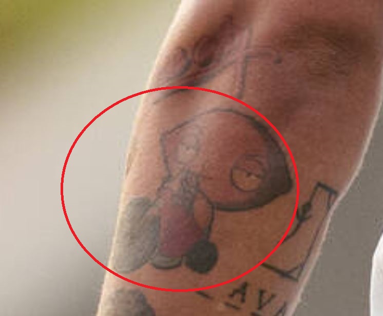
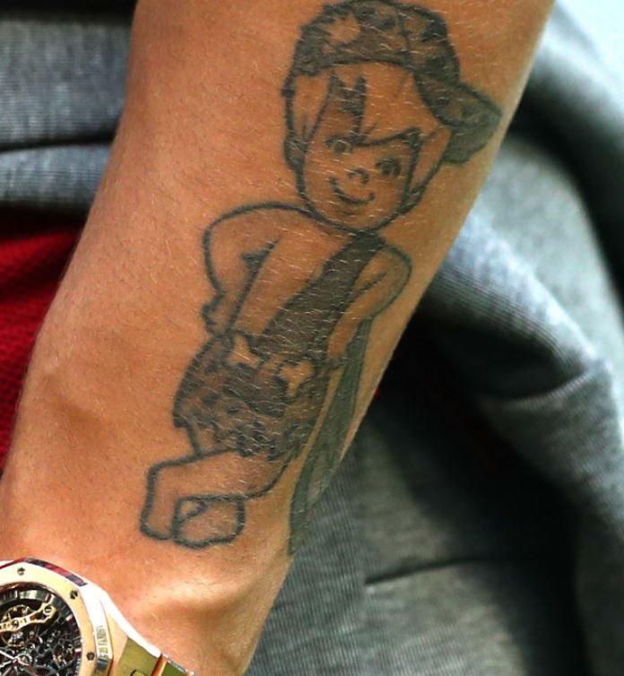
Body Art Guru lists 33 tattoos, though a count can change as pieces are added or covered. Its list includes an Avengers logo, an Aries symbol, Stewie from Family Guy, Rick and Morty, Mario, Grand Theft Auto’s Vice City lettering and the number 96. The Standard also reported a Bamm-Bamm Rubble tattoo in a 2018 interview. The collection moves between cartoons, games, football, lettering and religious imagery rather than following one style.

Dele Alli’s upper-arm “96” tattoo is small but easy to miss

Dele Alli tattoos: inline tattoo evidence

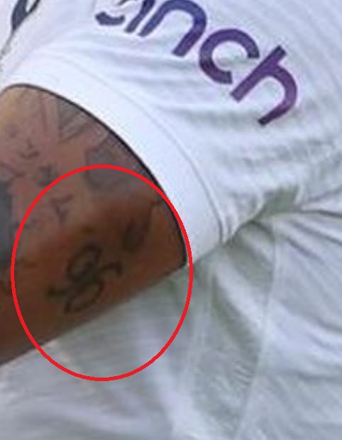
The number 96 sits high on Alli’s right upper arm. He was born in 1996, which gives the number a direct connection to his life. It is one of the quieter designs in a collection that also includes larger portraits and cartoon figures, and can be hidden by a football shirt.

A short number leaves room for a growing collection, but Alli’s specific design is simple enough to stand on its own.

The Avengers “A” tattoo gives his arm a clean graphic mark

Dele Alli tattoos: inline tattoo evidence

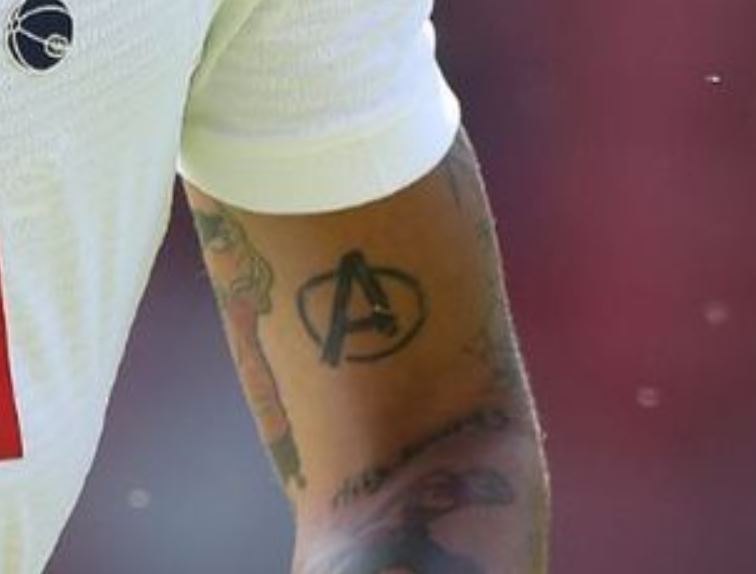
Alli’s Avengers tattoo is a bold letter A inside a circle. The outline carries the design, so it reads differently from the more detailed characters in his collection.

A logo can stay clear without much shading, but a flat screen image may need changes to fit a curved arm. A tattoo artist can adjust spacing and shape for the placement rather than trace it exactly.

The Bamm-Bamm and cartoon tattoos keep the collection playful

Dele Alli tattoos: inline tattoo evidence

Body Art Guru identifies Stewie from Family Guy, Rick and Morty, Ed, Edd n Eddy and other animated references. The Standard’s 2018 report adds Bamm-Bamm Rubble. The close-up shows a cartoon figure with a rounded head, a simple outfit and a dark outline, though it doesn’t identify every detail.

These characters need enough room for their faces and poses to stay recognisable. The photo shows a different approach from the clean Avengers logo: a collection can mix graphic marks and detailed characters without making them match.

The Bamm-Bamm-style forearm pieces work best when the pose has room

Dele Alli tattoos: inline tattoo evidence

Another forearm close-up shows a cartoon character among smaller designs and lettering. The pieces remain separate instead of merging into one image. Body Art Guru also lists “VICE CITY,” Chinese characters, a “Why so serious?” reference and a “LOSER” tattoo later changed to “LOVER.”

Lettering can bend or stretch around an arm, and small spacing affects how easy it is to read. The photos show the words and their placement, but don’t explain the meaning behind each one. The mix gives the forearm a scrapbook quality, with references that have their own tone.

The back tattoo shows the collection isn’t only about sleeves

Dele Alli tattoos: inline tattoo evidence

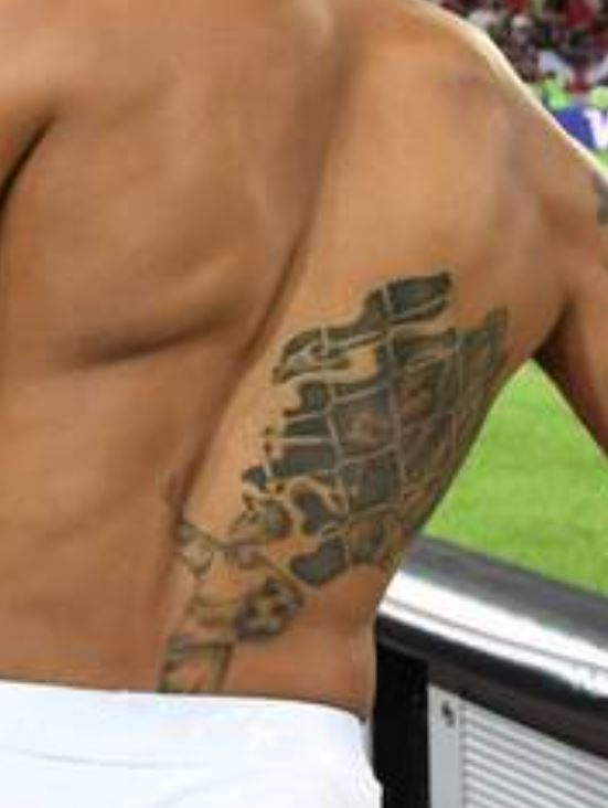
Body Art Guru describes a boy holding a football on Alli’s back. The photo shows a larger design across the upper side of his torso, with more room than the smaller pieces on his arm.

The same source lists an eye, crosses, a feather and other symbols on his right hand, plus Latin writing on the back of his neck. Those placements are more exposed than the upper arm or back. Hands can fade faster, and neck lettering is harder to cover.

A later reported addition is a matching red ring on the little finger, which Alli got with Cindy Kimberly. That detail shows the collection has continued to change. It includes pieces connected to football, entertainment, symbols and relationships without a single theme tying all of them together.

More athlete tattoo guides