codex

Daisy May Cooper Tattoos: Don’t Be Afraid, Forearm Ink and the Grace Neutral Session

Daisy May Cooper’s tattoos appear in fragments rather than as one coordinated sleeve: a phrase on her wrist, a small symbol above it and older ink along her forearm. The clearest story belongs to the wrist lettering. An episode of Under Your Skin with Grace Neutral adds context, though not every mark in the wide footage can be identified.

The “Don’t be afraid” wrist tattoo
Daisy May Cooper tattoos: inline

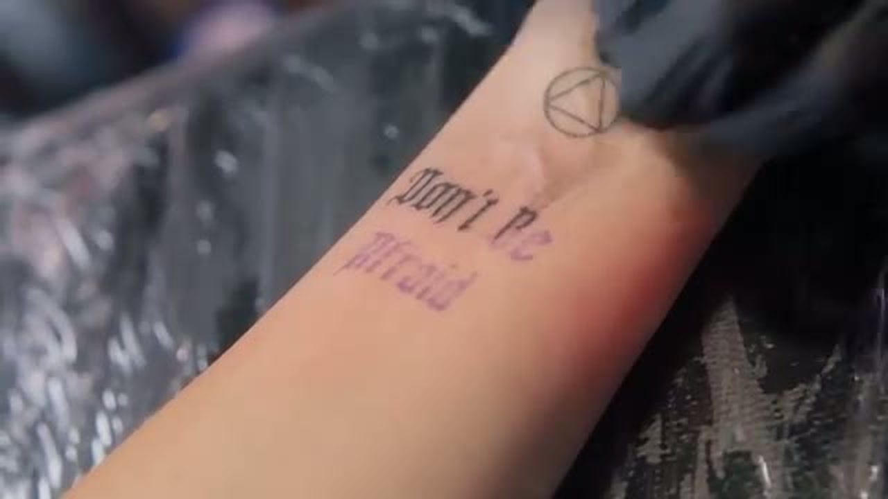
Cooper’s best-known recent piece is the two-line phrase “Don’t be afraid” on her inner wrist. The narrow, blackletter-style letters sit close to the hand. The Guardian reported that Cooper heard a little girl’s voice say the words while she was in hospital with viral meningitis after her daughter’s birth. She described the tattoo as a reminder she could look at when she doubted herself.

The close-up shows the lettering clearly, including its slightly rough edges. A short phrase suits the compact area, but wrist skin moves and gets regular washing and sun exposure, all of which can soften fine lines over time. The two-line layout leaves space around the words without needing a frame or extra decoration.

The small circular symbol above the lettering
Daisy May Cooper tattoos: inline

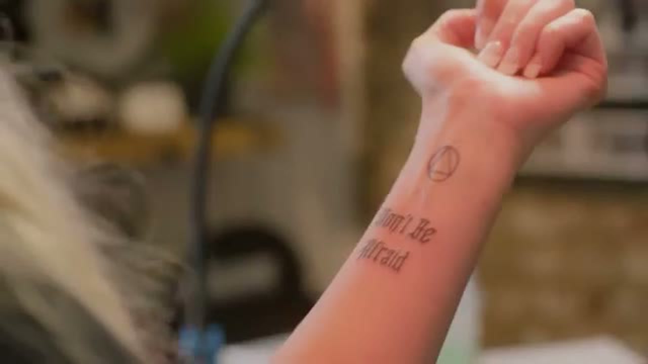
An outlined circle with intersecting lines sits above the phrase. The photos show its shape, but Cooper hasn’t publicly confirmed a name or meaning for it. It’s safest to describe it as a small geometric mark rather than assign it a specific symbolism.

The gap between the circle and the lettering keeps the two elements distinct. One is an open outline; the other is a block of narrow text. They don’t match exactly, but their simple black lines give the wrist a small cluster without crowding it.

The older tattoos along her forearm
Daisy May Cooper tattoos: inline

Cooper had other tattoos along her forearm before the wrist phrase drew attention. The studio side view shows a dense, uneven group of dark marks, but the image isn’t clear enough to identify each design. It does show that the new lettering sits beside older work rather than on an otherwise bare arm.

That matters when reading the photos: the wrist phrase is one part of a collection, not a standalone quote. The forearm pieces have their own history, and the available image doesn’t tell us what each one means. The older forearm ink is visible; details beyond that would be guesswork.

What the Grace Neutral session adds
Daisy May Cooper in a contextual photograph: inline; not tattoo evidence

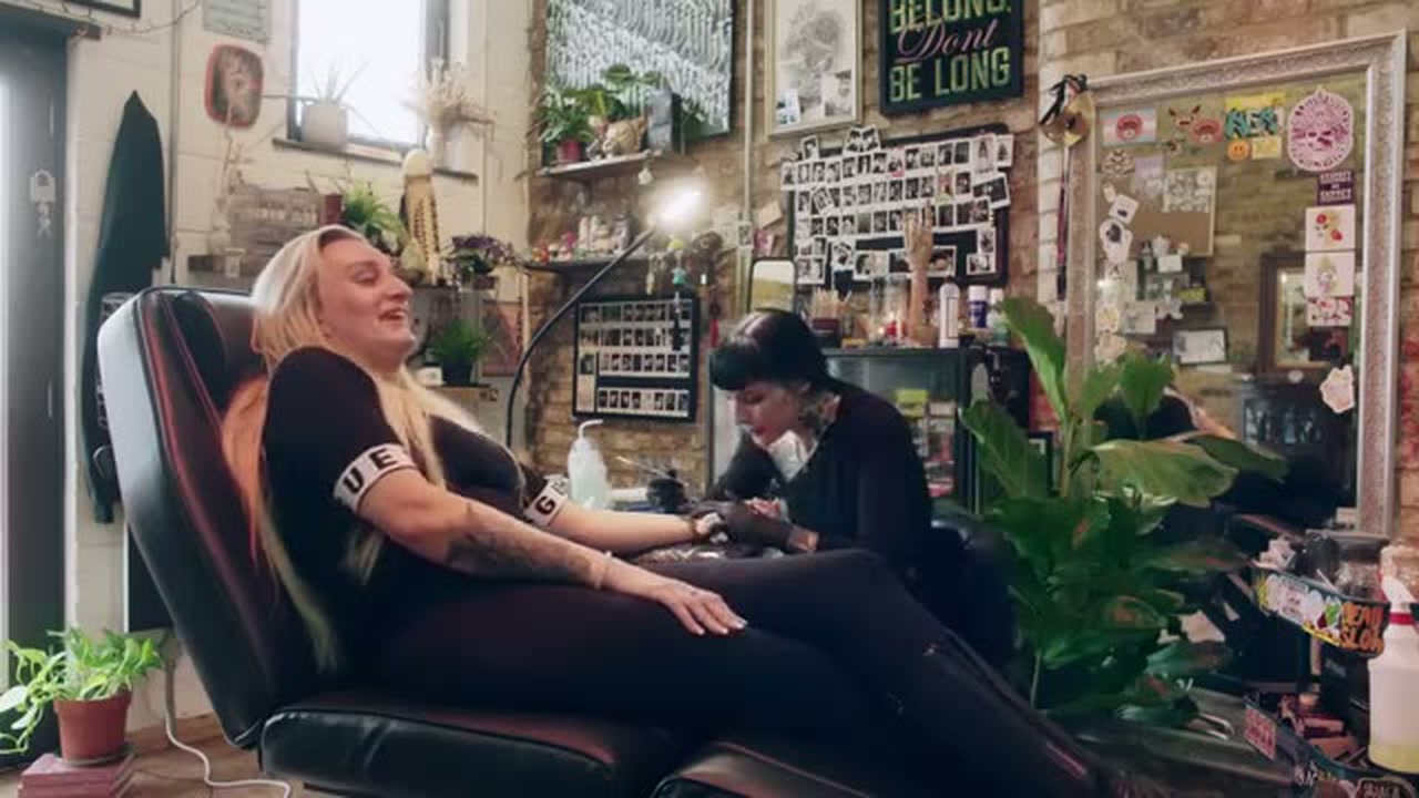
The Under Your Skin episode shows Cooper in a hand-poke studio with Neutral. They talk about ghosts and the experience behind the tattoo while the session is underway. This wide photograph records the setting and the people in the room; it isn’t a close view of the finished design.

The footage helps explain how the appointment unfolded, while the wrist close-ups are the better evidence for the lettering and symbol. Keeping those images’ roles clear avoids treating a contextual shot as proof of details it doesn’t show.

The studio conversation after the appointment

Daisy May Cooper in a contextual photograph: inline; not tattoo evidence

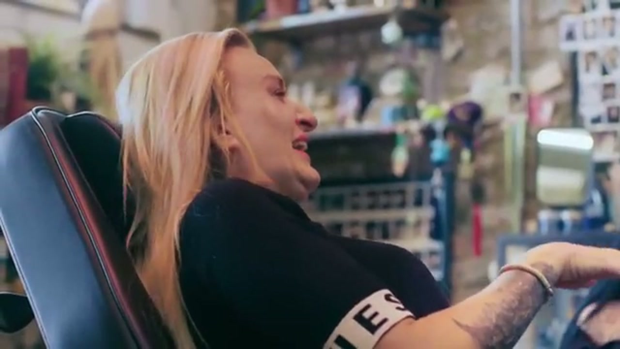
A second frame from the episode shows Cooper and Neutral together after the session, with Cooper’s forearm resting across the chair. It gives a sense of scale: the new wrist piece is small in relation to the rest of the arm. Like the previous image, it documents the session rather than the tattoo’s fine details.

Earlier coverage and changing timelines

The Mirror reported that Cooper’s first tattoo was the name Ryan on her wedding finger, referring to her relationship with Ryan Weymouth. The report also described later photographs showing tattoos on both sides of her forearm. That provides an earlier timeline, but it doesn’t establish how she feels about the name tattoo now or whether every older design remains unchanged.

The finger placement is very visible despite the small size of the lettering. It’s a different choice from the inner-wrist phrase and the forearm group, and each piece comes from separate reporting or photographs. Keeping those accounts distinct avoids forcing them into one story.

Why the collection feels personal without looking overworked

Cooper’s visible tattoos don’t all share one subject or style. There’s a phrase tied to a hospital experience, an unexplained geometric symbol and older forearm work. The session gives the newer piece a documented setting, while the earlier report adds a separate detail about the name on her finger.

For a tattoo idea, start with one element that matters to you and consider how it will sit beside anything already there. A short phrase needs room to stay legible; a simple symbol can remain unexplained. Photos can show placement and linework, but personal meaning comes from what the person has actually shared.
Axelle Fescia Tattoos: Old-School Ink, Illustrative Pieces and Personal Stories

Axelle Fescia’s collection mixes old-school references, dark illustrations, lettering and smaller flashes. Regional coverage has described roughly 50 tattoos built up over about a decade. She became interested in tattoo culture as a teenager, and has described the finished collection as an autobiography of people, interests and different moments. Not every piece has a public explanation, and the designs don’t need to match to belong together.

Axelle Fescia’s Chest Tattoos

Axelle Fescia tattoos: Show the main illustrated chest composition and the mixed tattoos running down both arms.

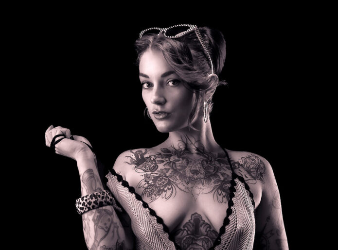
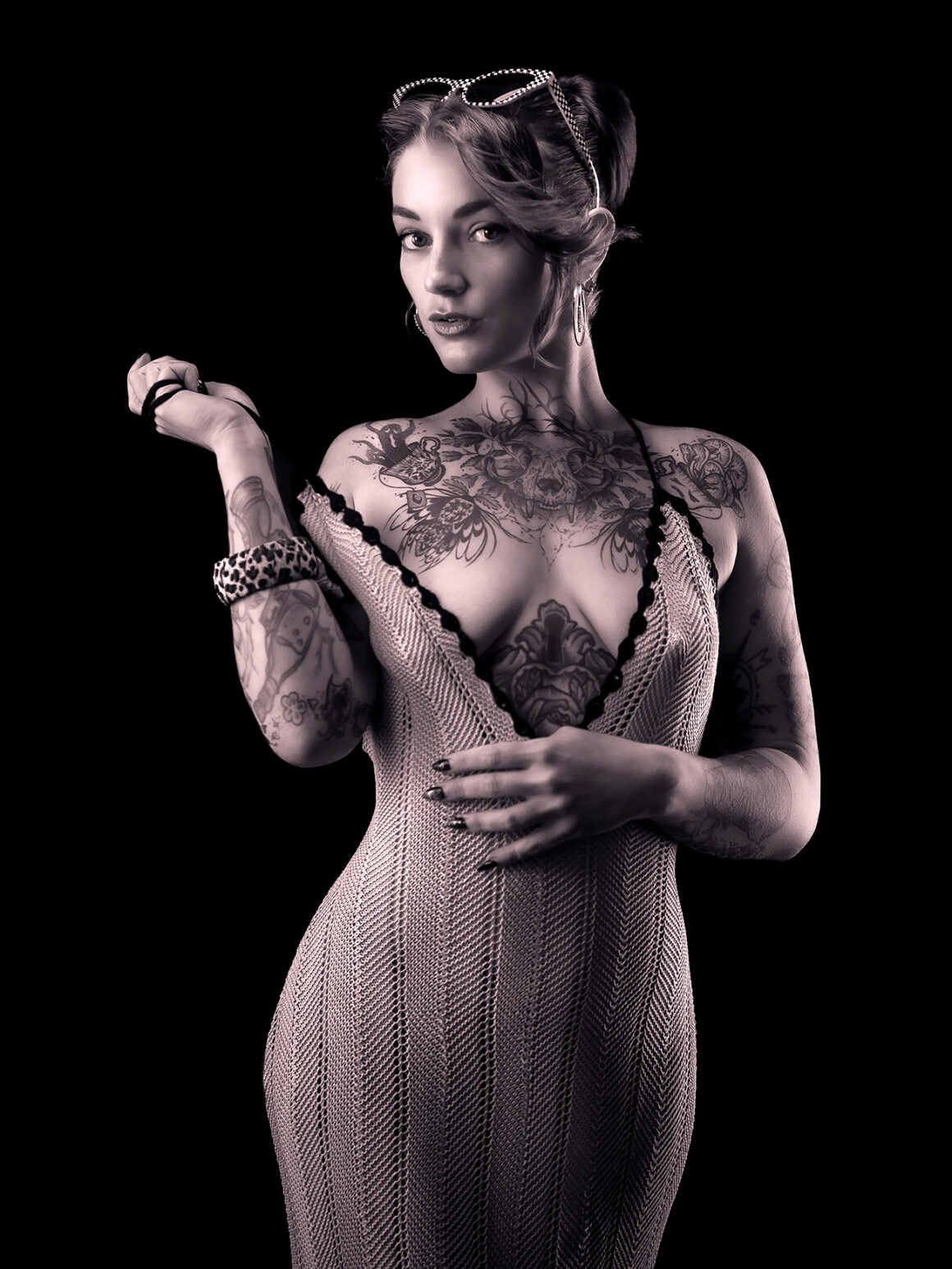
The chest piece is the first detail that stands out in most photographs: a skull-like central figure framed by leaves, flowers and curling ornamental lines. A small leopard-patterned creature sits on the left, while a floral shape balances the other side. The heavy outlines keep the composition readable; softer shading and small breaks of skin stop it from becoming a solid dark panel. Its upper edge can read like a collar in a close portrait, while wider views show the separate stomach design below.

The mix of old-school shapes and illustrative shading fits the style attributed to Fescia, though this isn’t a simple flash design. The piece spreads across the chest without forcing a perfectly mirrored arrangement.

Axelle Fescia’s Arm Ink

Axelle Fescia tattoos: Give a second, closer body view of the mixed illustrative and shaded arm work.

Her arms hold a closer-spaced mix of outlined drawings, shaded figures, symbols and lettering. Some areas are busy; others leave skin visible between pieces. The photos show their range in size and style, but don’t identify every small motif, so it’s better to describe what’s visible than guess at a partly covered design’s meaning.

The arm collection has developed in layers rather than as one continuous sleeve. Small and medium tattoos sit alongside one another, with changes in outline and shading still visible.

Axelle Fescia’s Stomach and Body Tattoos

Axelle Fescia tattoos: Show the central stomach tattoo beneath the wider chest composition and its placement relationship.

A dark, compact ornamental design sits on the stomach’s center line beneath the wider chest composition. The two pieces differ in shape, but their placement gives the front of the body a clear structure: the chest opens outward, while the stomach tattoo draws the eye back toward the middle.

Fescia has described her tattoos as a kind of autobiography, with family, life events and interests appearing across the collection. She hasn’t explained every image, so a symbolic-looking design shouldn’t be assigned a private story without her confirmation. The reported comment, “I just wanted something right there,” is a reminder that a tattoo can begin with a simple preference even when it later becomes part of a larger arrangement.

Axelle Fescia’s Thigh and Leg Tattoos

Axelle Fescia tattoos: Show the mixed tattoo collection continuing across the thigh and down the leg.

The photographs show separate tattoos at different angles across her thigh and down her leg, from darker pieces to smaller traditional-style marks. Regional reporting has also identified a Jack Skellington tattoo among the leg designs, in keeping with the collection’s playful, darker imagery. Together the pieces use the length of the leg without reading as one continuous mural.

Some tattoos appear to cover or work around natural marks in the skin. The leg views also show why placement matters: a design changes as it follows a curved surface toward the knee or calf.

Axelle Fescia’s Sleeve and Forearm Tattoos

Axelle Fescia tattoos: Provide a close color view of the layered forearm and upper-arm tattoo details.

Close photographs show linework and shading on the forearms that are hard to make out in full-body shots. The pieces keep distinct outlines, with open skin between some of them. Tattoo Life names Sailor Xa, Otium Tattoo, Yuno the Mist, Oculus Animae, Esmee Tattoo and Loth’art among artists connected with Fescia’s work. Their varied styles remain visible across the collection rather than being blended into a uniform sleeve.

What Axelle Fescia’s Style Says About Personal Choice

Fescia’s reported first tattoo was an Oscar Wilde quotation translated into German. Regional coverage says she leaves her face and hands untattooed, despite having extensive ink elsewhere. That choice is part of the collection too; a heavily tattooed person doesn’t have to fill every visible area.

Reports have also mentioned a planned neck design featuring symmetrical carnivorous plants and a larger back project. Those are future plans, not completed tattoos, so they shouldn’t be counted as part of the current collection.

A Few Final Notes on Axelle’s Approach

Her tattoos share a preference for strong outlines, illustration, old-school references and dark, playful imagery, but they don’t all repeat one subject. Large pieces give the chest and stomach a central structure; smaller tattoos and open skin keep the arms and legs from reading as one block. The collection remains a record of different choices, artists and periods, and future projects may change how those pieces sit together.

More model tattoo guides

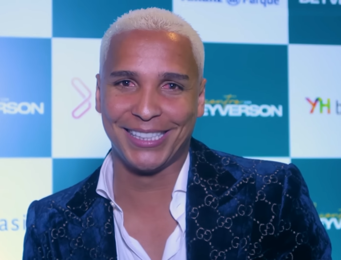
Deyverson Tattoos: The Song Lyric, Football Tributes and Personal Meaning

Deyverson’s tattoos point to a handful of specific things in his life: a song by his then-partner, two Palmeiras titles, fourteen friends, a favorite comedy and a celebratory kiss for his family. He’s explained several of the references himself, which makes their meaning clearer than guessing from a match photo.

After Palmeiras won the 2021 Copa Libertadores, he tattooed the trophy and his best-player award alongside Predestinado (“predestined”). He had scored the extra-time winner against Flamengo in Montevideo. When the wording was later linked to Gabigol, Deyverson said he chose it because people had used the word about his goal, not to provoke another player. In June 2021, he also marked Palmeiras’ 2018 Brazilian championship, where he scored the title-clinching goal. In August 2020, he shared a photo of fourteen friends’ names tattooed on his left leg.

Other pieces show a more playful side: the Chaves line Ninguém tem paciência comigo (“Nobody has patience with me”) and a kiss near his waist. He said the latter was for family members watching in the stadium after an Alavés goal in 2017.

The song-title lettering on his right forearm

Deyverson tattoos: The song-title lettering on his right forearm

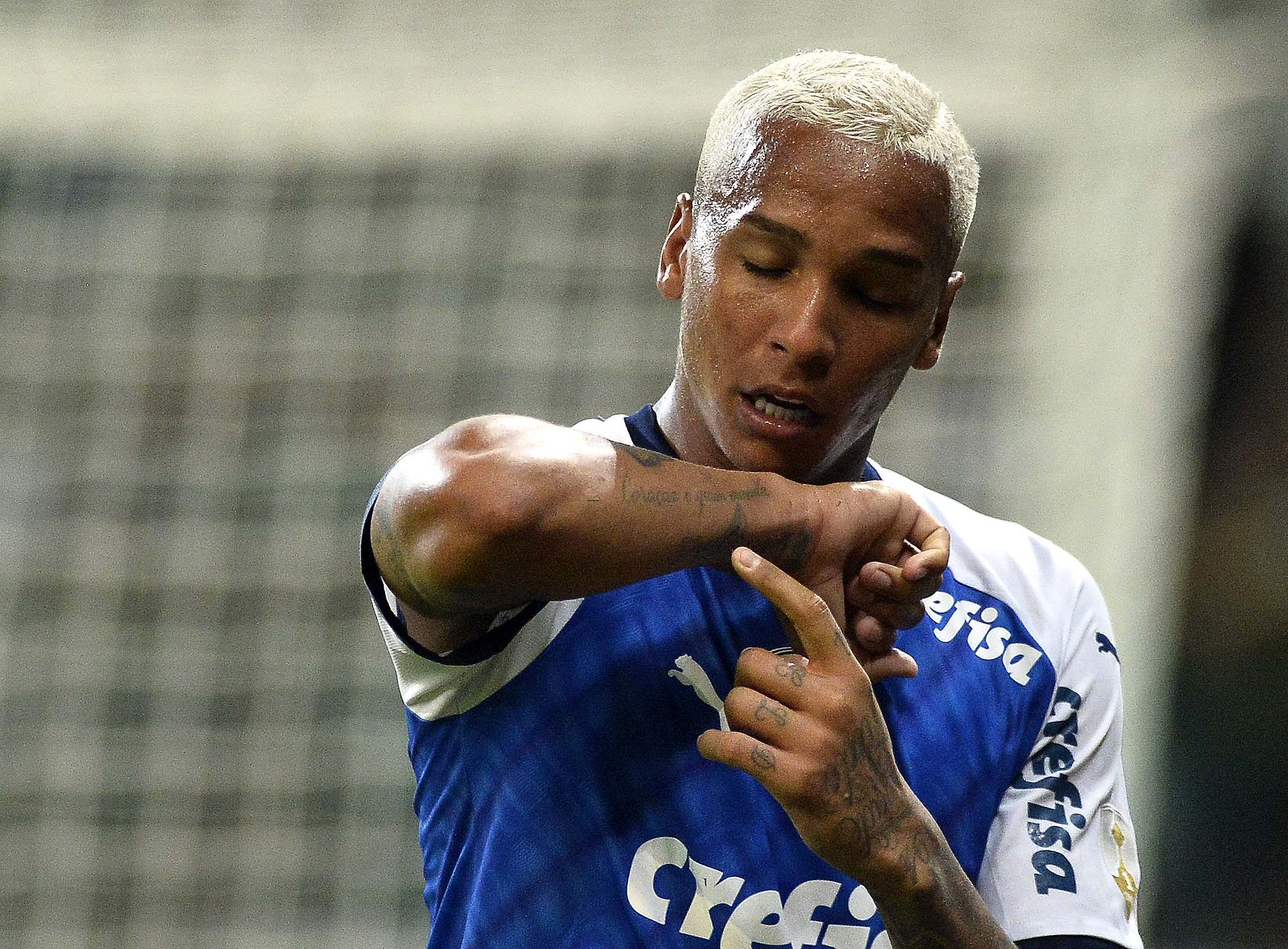
After scoring for Palmeiras against Melgar in March 2019, Deyverson pointed to Coração é quem manda on his right forearm. The title translates loosely as “The heart is in charge” and belonged to a song by his then-partner, singer Camila Nogueira.

The photograph shows him holding out the arm and pointing directly at the lettering. It’s a clear reference, not a mark that needs to be decoded from a distant view. The image documents what the tattoo meant to him at that time; it doesn’t establish whether it has since changed or what he thinks about it now.

Love and football in 2019

Deyverson in a contextual photograph: Love and football in 2019; not tattoo evidence

Palmeiras beat Melgar 3-0, with Deyverson scoring the third goal after a spell out of the side. In another frame from the celebration, he makes a heart with his hands. He later spoke about people who had supported him and about learning from mistakes that had affected the team. The tattoo point and the heart gesture both make sense as personal messages inside a public match celebration.

The personality behind the celebrations

Deyverson in a contextual photograph: The personality behind the celebrations; not tattoo evidence

Deyverson’s celebrations are expressive: he points, gestures and plays to the cameras. His affection for Chaves, a Mexican comedy popular with Brazilian audiences, also comes through in the line he chose for a tattoo.

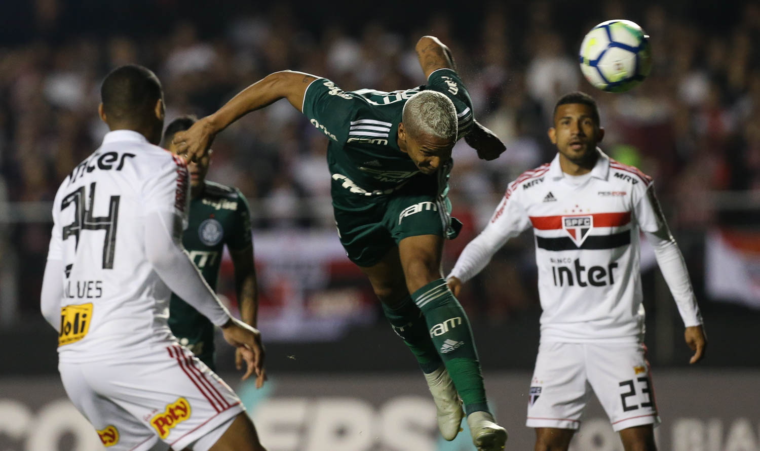
In a 2018 interview after a win over São Paulo, he joked that people had no patience with him and admitted he sometimes needed to rein himself in. He also apologized to children who might copy his behavior. The humor and the acknowledgment of his mistakes were both part of what he said.

The night in Montevideo

Deyverson in a contextual photograph: The night in Montevideo; not tattoo evidence

In the 2021 Libertadores final, Palmeiras and Flamengo were level after normal time. Deyverson came on in extra time and scored the 2-1 winner. In September 2024, playing for Atlético-MG, he again came off the bench to score twice, this time against Fluminense as his side reached the semifinals.

The photograph above is from a separate Palmeiras match in October 2018, not the final in Montevideo. It captures the same kind of open celebration, while the final remains the night most closely tied to his Libertadores tattoo.

A player in motion

Deyverson in a contextual photograph: A player in motion; not tattoo evidence

Against São Paulo, the photograph catches Deyverson airborne and watching the ball. It gives a different view from the relaxed featured portrait: he’s a center-forward in the middle of a physical contest.

When Palmeiras signed him in 2017, he called the move the realization of a dream. The tattoo stories and dramatic goals sit within that longer working life, alongside ordinary matches and decisions about selection. The interview below, recorded after Cuiabá beat Flamengo in 2023, gives a sense of his post-match manner in his own words.

More athlete tattoo guides

Rúben Neves Tattoos: The Diogo Jota Tribute on His Leg

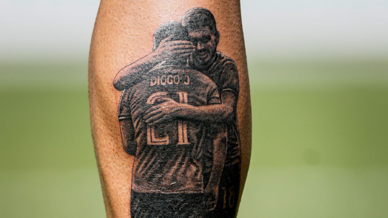
Rúben Neves already had visible tattoos before he added a tribute to Diogo Jota, his close friend and former teammate. The black-and-gray image shows the two men embracing on Neves’ left lower leg. He revealed it around Portugal duty. The shirt reads “Diogo J.” and “21,” linking the tattoo to the number Neves later wore for Jota with the national team.

The Diogo Jota memorial tattoo on his leg

Rúben Neves tattoos: The Diogo Jota memorial tattoo on his leg

The realistic scene sits on Neves’ calf. The embrace is the focus, with the shirt marking “Diogo J.” and “21” identifying Jota and tying the tattoo to Portugal’s tribute. Soft shading separates the faces, shirts and arms, giving it the tonal look of a small photograph. The vertical placement gives the figures room without turning the piece into a full-leg design.

Why the moment matters

Neves and Jota shared club and international football, and their friendship was visible in the way they spoke and appeared together. The tattoo shows both men rather than using a solo portrait of Jota. It makes the relationship part of the image: one embrace, kept as a personal memorial.

The design also stays focused on that moment. There’s no list of dates or extra symbols competing with the figures. The pose carries the connection, while Jota’s name and number provide a clear reference.

The Wolves chapter

Rúben Neves in a contextual photograph: The Wolves years and the player behind the ink; not tattoo evidence

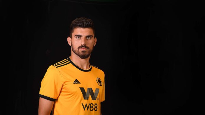
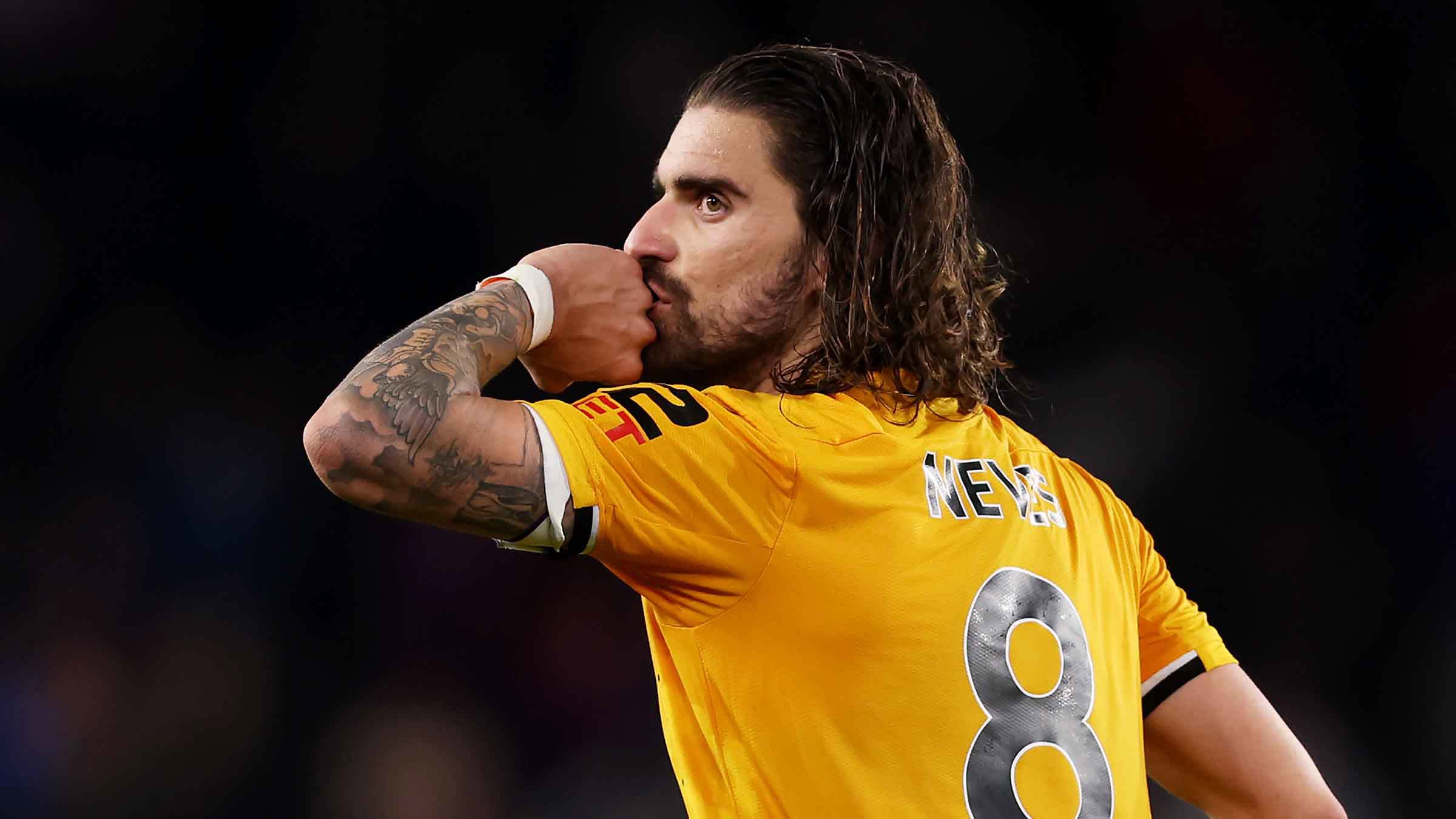
At Wolverhampton Wanderers, Neves became known for long-range passing and calm control. His hair and visible tattoos were also part of the look supporters recognized. Jota played for Wolves before moving to Liverpool, while Neves became one of the club’s defining midfielders. Their shared time there is part of the story behind the tribute.
Before the tribute

Rúben Neves in a contextual photograph: A footballer whose arms already carried stories; not tattoo evidence

Match photos show Neves’ arm tattoos, but they don’t explain every design in his collection. The Jota piece is different because its subject and occasion are known: it marks a friend and a specific memory.

For a memorial tattoo, a shared scene can say more than a name or date alone. Neves chose an embrace that puts both people in the design, rather than relying on a set of symbols to explain the relationship.

Al Hilal and the next chapter

Rúben Neves in a contextual photograph: Life after Wolves in Al Hilal blue; not tattoo evidence

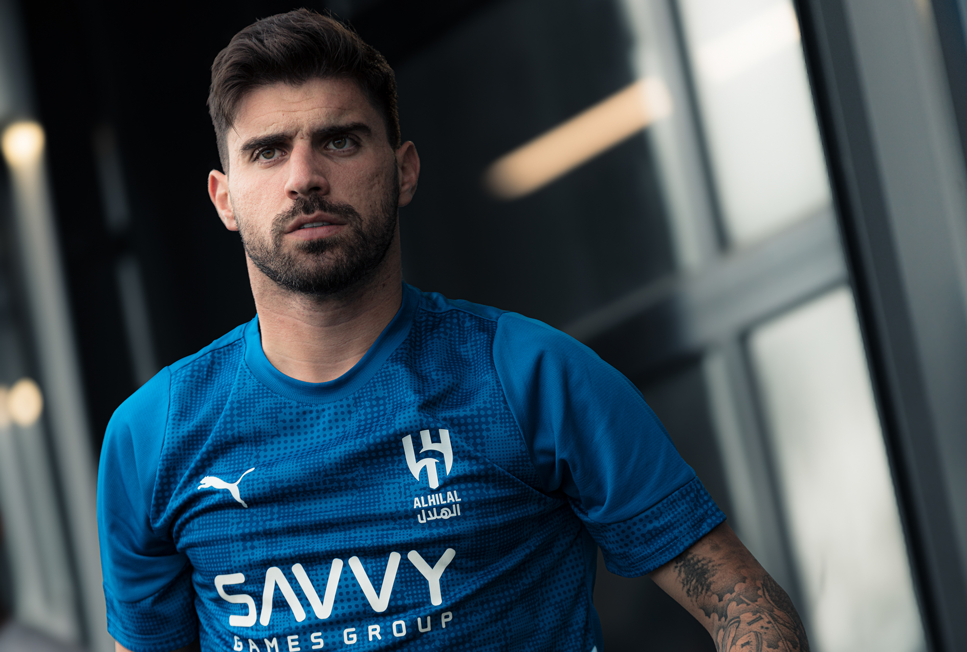
At Al Hilal, the blue kit makes Neves’ darker tattoos easy to see in training photos. The club setting has changed, but the tribute still points to Jota. It doesn’t depend on a Wolves or Liverpool badge; the embrace keeps the focus on the two friends.

The calf placement also means the image travels with Neves through different teams and stages of his career. The subject stays the same even as the shirt changes.

Portugal together

Rúben Neves in a contextual photograph: Portugal, friendship and the number 21; not tattoo evidence

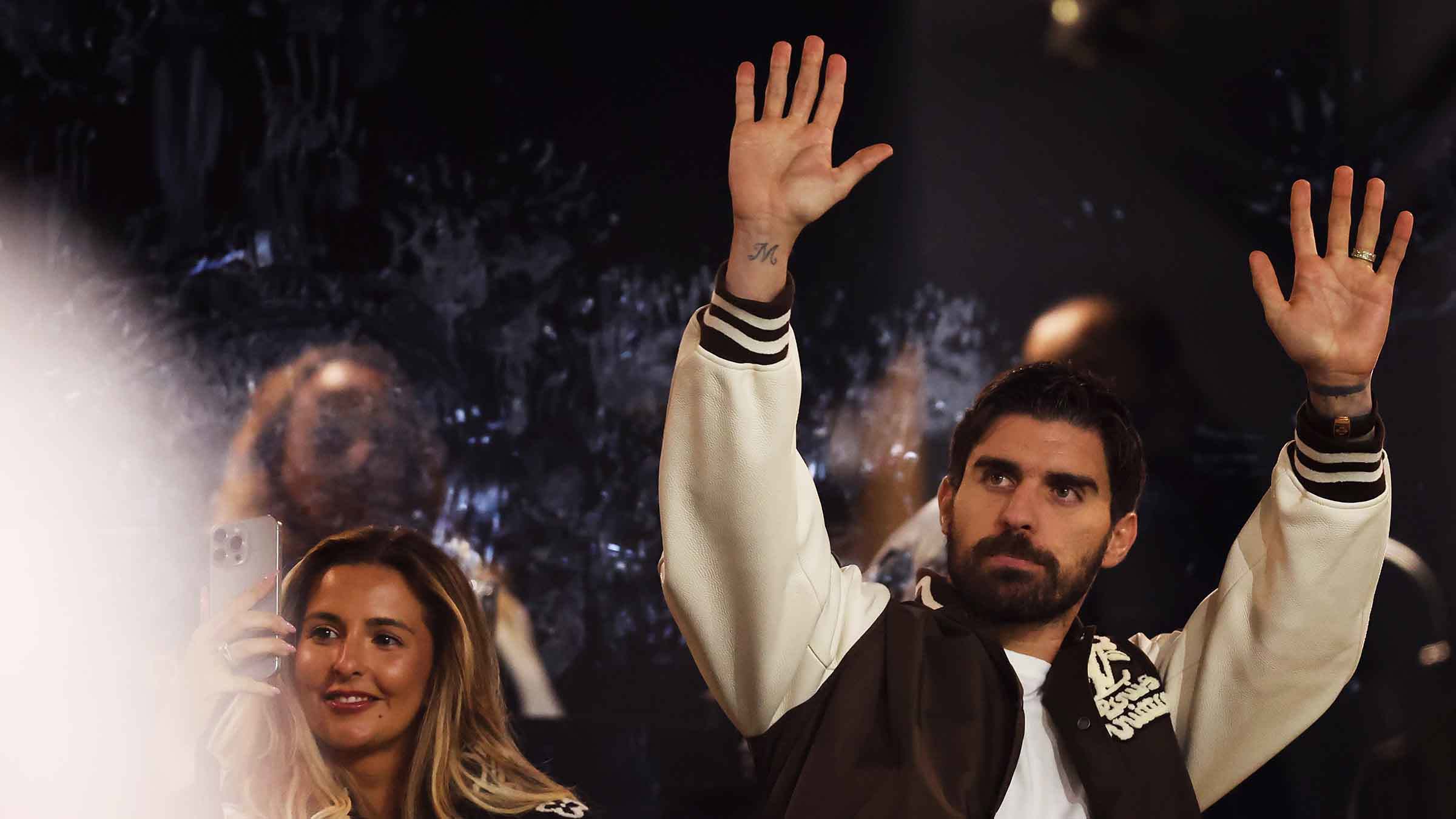
Neves and Jota shared Portugal’s national team. After Jota’s death, Neves wore his number 21 for the side, making the number part of a public tribute as well as the tattoo. The piece was revealed around teammates who had known Jota; supporters could recognize the shirt detail and the embrace.

That gives the tattoo both public context and a personal meaning for Neves. The story can be recognized by fans, while the image remains a private memorial he carries with him.

The lasting connection

The tattoo brings together three clear details: the embrace, Jota’s name and the number 21. Its black-and-gray shading keeps attention on the two figures, and the calf gives the scene enough room to read. Neves already had other tattoos; this one adds a specific memory without turning his collection into a single theme.

If you’re planning a tribute of your own, a moment shared with the person may carry more than a crowded set of symbols. Neves chose an embrace, and the connection is easy to see.

More athlete tattoo guides

Luísa Sonza Tattoos: The Meaning Behind Her Most Personal Ink

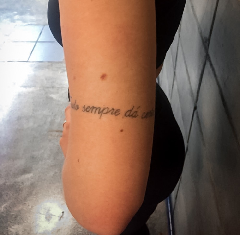
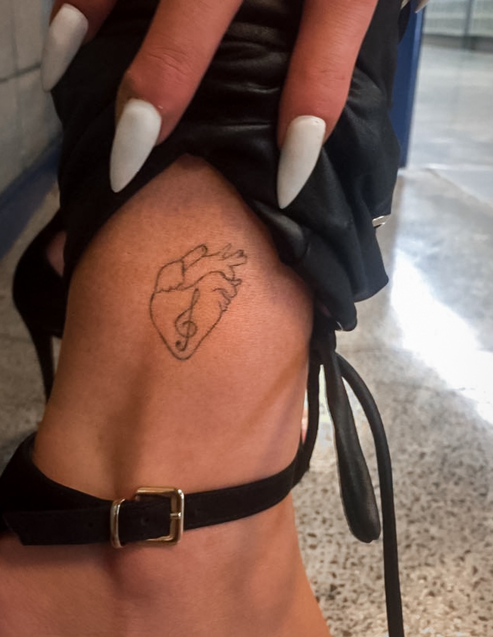
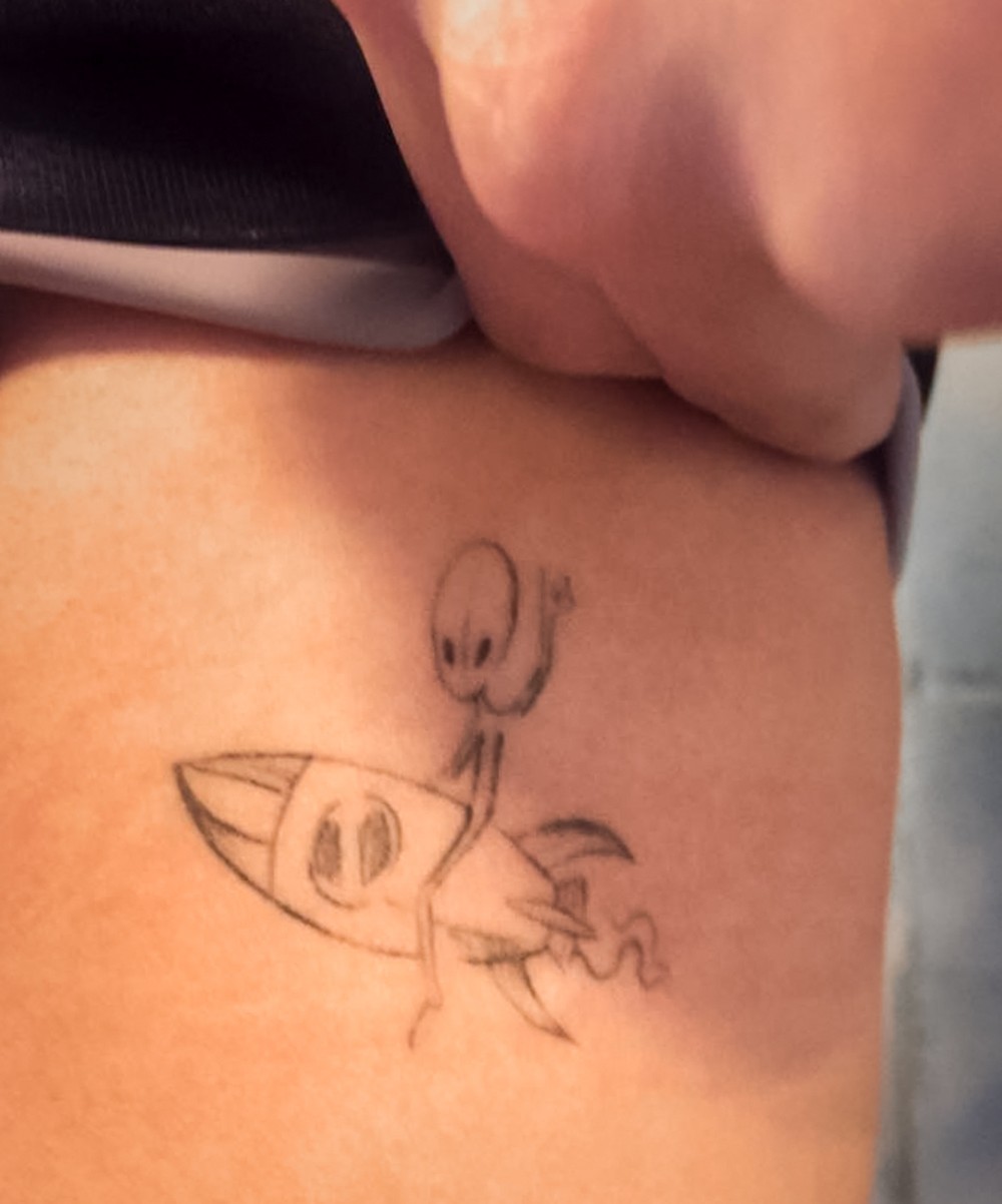
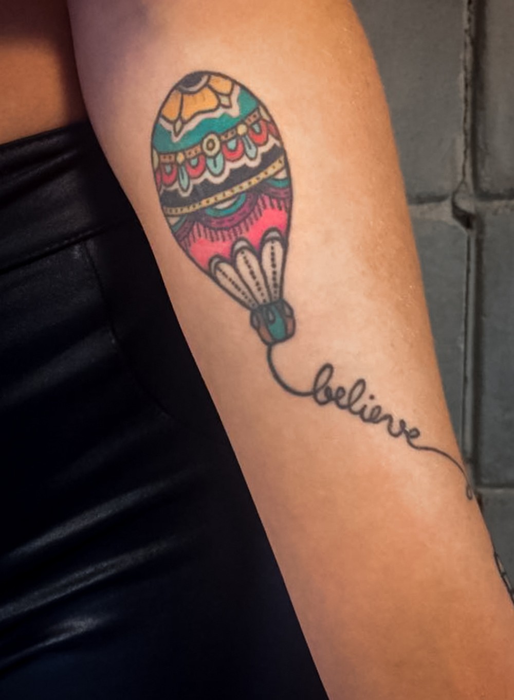
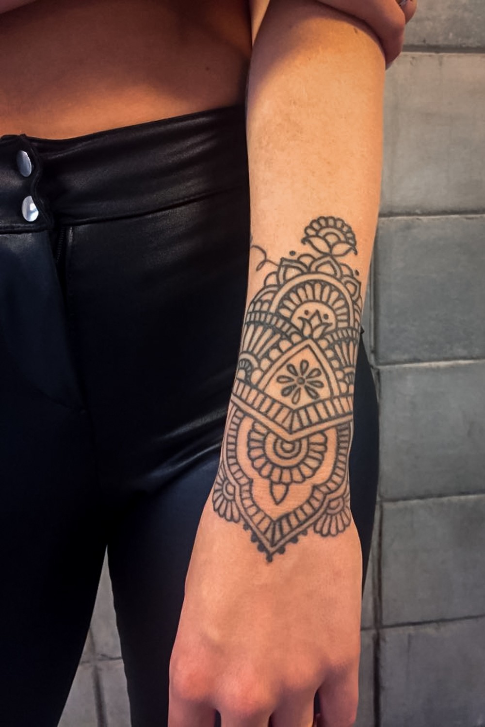
Luísa Sonza’s tattoos range from fine script to bright colour and dense blackwork. In a Gshow interview, she explained five designs: a phrase from her parents, a heart with a music note, an ET in a rocket, a balloon with “believe,” and an ornate forearm piece. The close-up photos show the tattoos themselves, so their meaning doesn’t have to be guessed from a distant red-carpet shot. They look like separate choices gathered over time, rather than one planned set.

Onstage, Sonza’s styling can be high-gloss. The tattoos in the close-ups are often simpler: thin lettering, clean outlines and a few vivid colours. Here’s what she has said about the designs.

The family phrase on her arm

Luísa Sonza tattoos: The family phrase on her arm

The script around Sonza’s upper arm reads “Tudo sempre dá certo,” or “everything always works out.” She told Gshow that her parents used to say it to her and that it became a personal mantra.

The thin, loose lettering follows the arm like a bracelet, with enough space between the words to keep them readable. It feels more like handwriting than a formal slogan, which suits a phrase she grew up hearing.

The heart with a musical note

Luísa Sonza tattoos: The heart with a musical note

A fine-line heart and musical note sit on Sonza’s upper thigh. She said the tattoo represents her love for her profession, rather than a particular song. The two parts are small but easy to distinguish: the heart gives the design its feeling, while the note points to music.

The little ET in a rocket

Luísa Sonza tattoos: The little ET in a rocket

The ET riding in a rocket is the most playful of the five. The small cartoon sits near Sonza’s ribs, with a loose, sketch-like outline rather than realistic detail. She said it represents having the courage to face the unknown. The rocket gives that idea a direction; the little alien keeps it light.

The balloon and the word believe

Luísa Sonza tattoos: The balloon and the word believe

A coloured balloon on Sonza’s forearm has patterned panels in yellow, red and teal, with “believe” written below in a loose script. She connected it to believing she could build a life in music. The balloon gives the word a picture to sit beside, and the forearm’s length lets the two elements move vertically together.

The bolder forearm work

Luísa Sonza tattoos: The bolder forearm work

This close-up shows a denser black ornamental design, with repeated shapes, curved borders and a central geometric form. Its mirrored flourishes give the pattern a clear centre, unlike the finer script and line work elsewhere in the gallery.

The Gshow feature describes one of Sonza’s five tattoos as a dinosaur drinking wine. This crop doesn’t show a small animal clearly enough to identify the image that way, so the design is best described by what is visible: an ornate forearm pattern. That distinction matters when a photo can’t support a more specific label.

Why the collection feels balanced

The five designs don’t share one style: there’s fine script, a tiny music symbol, a cartoon, colour and ornamental blackwork. Their link is personal meaning. The family phrase, music references and rocket each point to something Sonza has explained, while the forearm piece adds a different scale and texture.

Their placements also vary. The arm tattoos appear more readily in photos, while the rib and upper-thigh designs are seen in closer images or particular outfits. That gives the collection room to be both visible and private.

Ideas worth taking to your appointment

If one of Sonza’s tattoos catches your eye, start with the idea behind it rather than copying the image. A phrase you actually hear, a lasting interest or a small joke tied to a memory will mean more than a design chosen only because it photographs well.

Think about size and placement together. Fine lettering needs room to stay legible; a detailed pattern needs a broader, flatter area; and a vertical image can follow a natural line on the body. Sonza’s collection works because the designs don’t all have to match. Each has its own reason and its own place.

More musician tattoo guides

Piquerez Tattoos: The Stories Behind His Arm Ink

Joaquín Piquerez’s tattoos hold onto people and memories from before his football career took him from Uruguay to Brazil. In a GE interview, he explained six drawings on his arm. The stories include a dog from his teenage years, tributes to his parents and family, and a line of advice he still carries. The interview photos show only parts of the work clearly, so the meanings below follow his explanations rather than guesswork.

Piquerez’s arm stories

Piquerez tattoos: Genuine tattoo evidence under the tattoo-specific arm section

GE reported that Piquerez shared six drawings across the same general area of his arm. One recalls Tavo, the dog who was with him during adolescence. Another is an eye representing his mother. He also described a scene of his family sheltering from the rain and a drawing of his father holding his hand as he took his first steps.

Above the images is the phrase “I can teach you to fly, but I can’t follow you in the flight.” Piquerez translated it that way and connected it to the support parents give as a child grows more independent. Leaving Uruguay to build a career elsewhere gives the line a personal context, too. Together, the drawings point back to family and home rather than one single tattoo style.

The footballer behind the images

Piquerez in a contextual photograph: Contextual photograph for the non-tattoo section: The footballer behind the images; not tattoo evidence

Piquerez is a Uruguayan left-back at Palmeiras. The position asks him to cover ground, track opposing wingers and decide when to join an attack. Those match photos show the player at work; they aren’t close-up evidence for each tattoo.

The contrast is striking: football requires quick decisions, while the images on his arm record people and earlier parts of his life. In the GE interview, he explained the drawings himself rather than leaving viewers to infer their meaning from a photograph.

A career built in Brazil

Piquerez in a contextual photograph: Contextual photograph for the non-tattoo section: A career built in Brazil; not tattoo evidence

Moving from Uruguay to Brazil meant building a career in a different country and football culture. Palmeiras’ official profile covers his professional role; the GE interview gives his own account of the memories behind the tattoos. The images here are contextual portraits, not detailed views of individual pieces.

What the interview reveals

Piquerez in a contextual photograph: Contextual photograph for the non-tattoo section: What the interview reveals; not tattoo evidence

The stories are direct: a dog from his adolescence, his mother, his family and a memory with his father. They don’t rely on an elaborate code. Piquerez’s explanation gives each drawing its context, while the photographs alone cannot show every detail clearly.

The collection also has a softer side than the toughness often emphasized in football coverage. A family under the rain and a parent helping a child walk are about care, not bravado.

Why the details matter

Piquerez in a contextual photograph: Contextual photograph for the non-tattoo section: Why the details matter; not tattoo evidence

The line about teaching someone to fly captures the difference between support and control: a parent can help a child prepare, but can’t take the next step for them. Piquerez’s move from Uruguay to a career in Brazil gives that idea a real connection to his life.

If you’re choosing a tribute design, start with the memory or person you want to keep close. A portrait, animal, small scene or a few words can all work; what matters is that the choice means something before it becomes a tattoo.

A collection with a clear point of view

The drawings are figurative and easy to recognize, but their personal context comes from Piquerez’s account. That makes the collection accessible without turning every piece into a public statement. The available images offer only partial views, so some visual details remain uncertain.

The themes don’t depend on a particular club, kit or season. They come from family relationships and memories that were part of his life before Palmeiras.

What Piquerez’s collection gets right

Piquerez’s examples show how different images can share a personal thread without matching in style. If you’re collecting ideas, choose a detail you’ll still care about years from now, then work with a tattooer on a scale and placement that suit it. Keep the difference clear between what the person has explained and what a photo merely suggests.

More athlete tattoo guides

Giovani Lo Celso Tattoos: The Football, Debut Date, and Argentina Ink

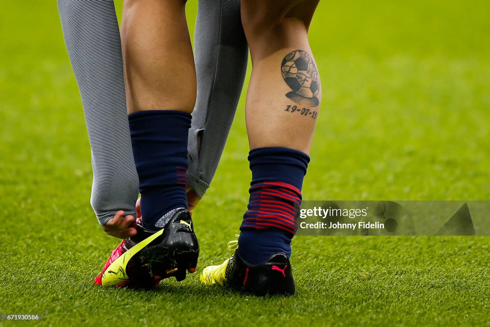
Giovani Lo Celso’s clearest documented tattoos mark two points in his football life: his Rosario Central debut and Argentina’s Copa América wins. A cartoon-style ball and the date 19-07-15 sit on his right calf; on the other side, a Copa América is wrapped in the national flag. The published photos show some pieces more clearly than others, so the descriptions here stay with what has been reported and can be seen.

Lo Celso’s right-calf football tattoo

Giovani Lo Celso tattoos: Genuine tattoo evidence under the only tattoo-specific section

A close photo shows the tattoo on Lo Celso’s right calf, with his sock pulled down during a match. It’s a football made from black-and-white sections, drawn in a chunky, old-school cartoon style. The date 19-07-15 sits underneath and matches the reported date of his Rosario Central first-team debut.

The ball is a familiar image; the date makes it specific to him. The calf gives the compact design room to follow the shape of the leg, while a football sock can cover it during a game. Its heavier shading and simple outlines keep it readable without adding extra symbols.

The player behind the shirt

Giovani Lo Celso in a contextual photograph: Contextual football portrait under the player background section; not tattoo evidence

Lo Celso was born in Rosario and came through Rosario Central before moving through clubs in France, England and Spain and representing Argentina. His right-calf date points to the start of that path, before the major clubs and international honors.

He plays in midfield, where the game is a constant series of decisions: when to pass, move forward or recover. The available match photos show that working life, but they are contextual images rather than close evidence of each tattoo.

Argentina and the Copa América memory

Giovani Lo Celso in a contextual photograph: Contextual match photograph under the Argentina section; not tattoo evidence

The second reported design sits on the left side of Lo Celso’s lower body. It shows the Copa América wrapped in an Argentina flag. He won the tournament with Argentina in 2021 and 2024, so the image links the trophy to the national team rather than showing it as a standalone prize.

The public material doesn’t establish extra lettering or hidden symbols, and there’s no need to add them. The documented elements—the competition and the flag—are enough to show what the tattoo celebrates.

A career that keeps moving

Giovani Lo Celso in a contextual photograph: Contextual celebration photograph under the career section; not tattoo evidence

Lo Celso’s career has taken him through different clubs and leagues, but the debut date still points back to Rosario. The Argentina tattoo holds a different kind of reference: a national-team achievement rather than a step in his club career.

The action photos show the public side of football—teammates, supporters and club shirts. The close calf image is the useful one for reading the tattoo itself. Keeping those roles separate avoids treating every match photo as proof of a design detail.

The part worth remembering

Giovani Lo Celso in a contextual photograph: Contextual training portrait under the closing inspiration section; not tattoo evidence

The numbers 19-07-15 could be mistaken for a birthday or another date without context. The football image and the reported Rosario Central debut give them a clear reference. Together, the ball and date make a short record of where his professional career began.

For a commemorative tattoo, one clear image and a date that means something to you can carry more than a long explanation. The date matters because of the event behind it, not because numbers alone make a design personal.

The national-team idea has a different feel

The right-calf tattoo is anchored to an individual milestone; the Copa América design represents a national-team success. That difference gives the two pieces distinct jobs. The first looks back to Lo Celso’s start at Rosario Central, while the second connects him to Argentina and two tournament wins.

A small collection with a clear point of view

The confirmed designs are simple to name, but their references are personal: a debut date and a trophy tied to Argentina. They make a compact timeline without requiring a connected sleeve or a list of club symbols. The public images don’t reveal every detail, so some parts of his collection remain unknown.

What to take from Lo Celso’s collection

If you’re considering a sports tattoo, think first about the memory you want it to hold. It might be a first appearance, a team or a tournament; choose an image that reads clearly, then add a date only if it carries meaning for you.

Placement can help the design stay legible. The calf gives a small ball and date room to sit together, and a sock can cover the piece when needed. A tattooer can adapt the scale to the leg instead of copying a photograph exactly.

More athlete tattoo guides

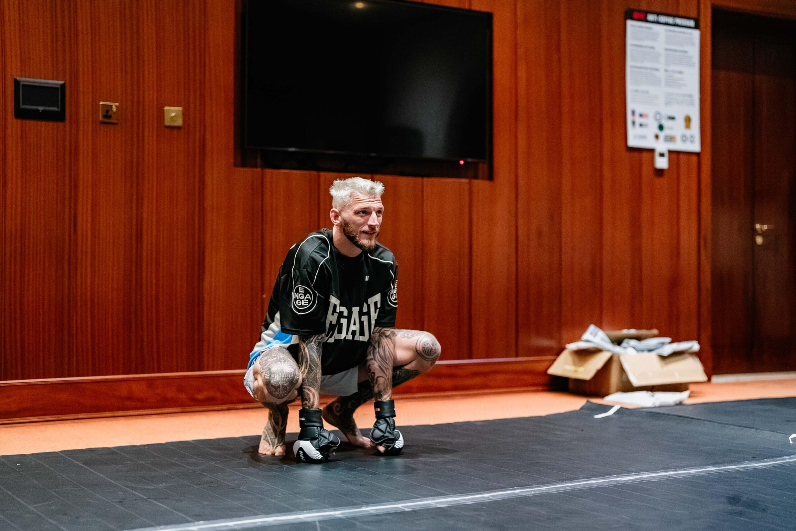
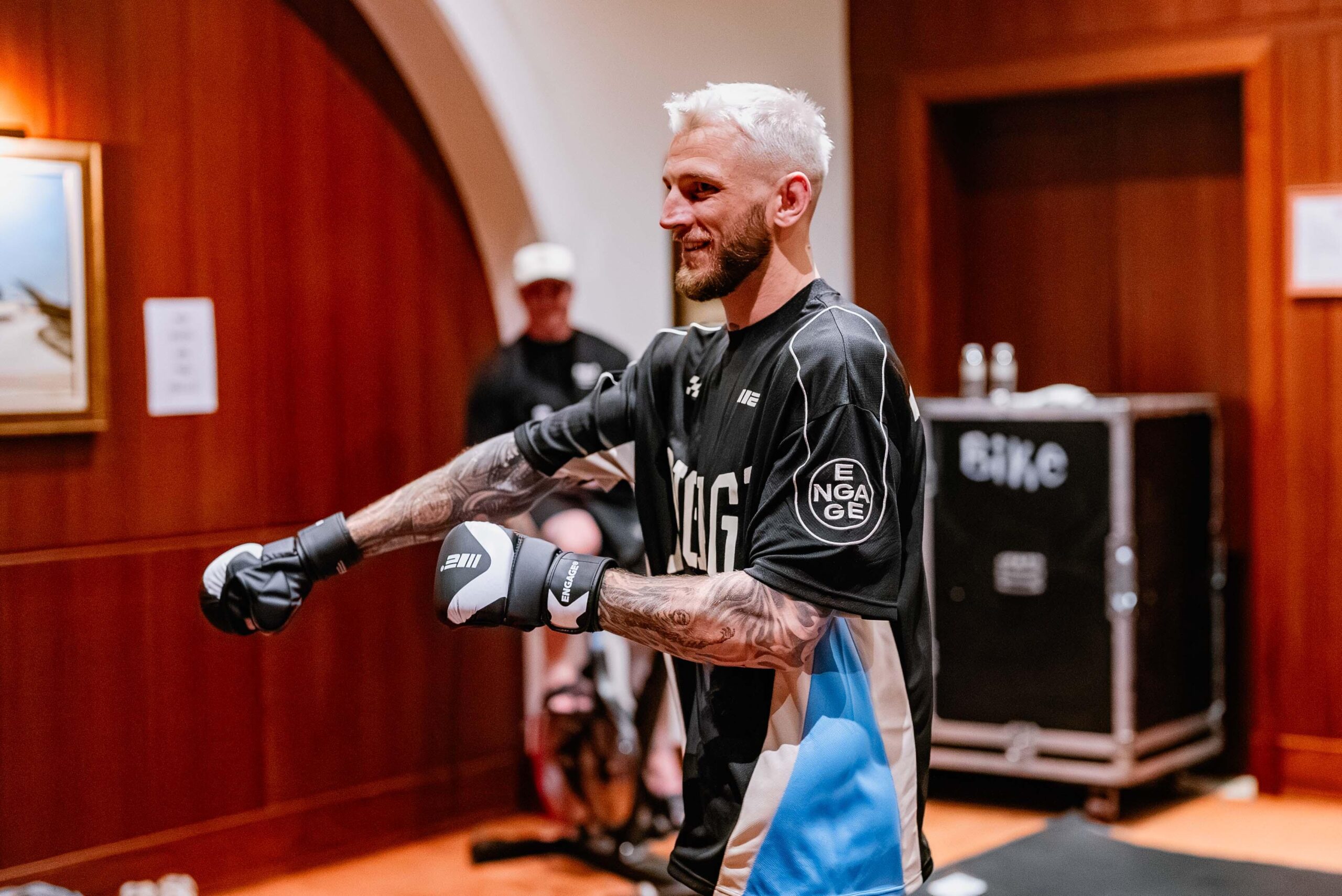
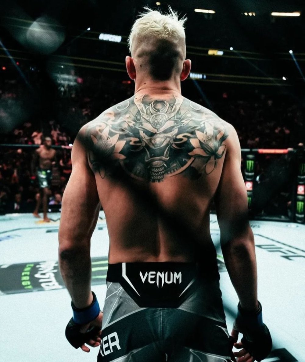
Dan Hooker Tattoos: Samurai Back Piece, Leg Patterns and Sleeves

Dan Hooker’s tattoos changed his appearance quickly: a large armored face across his back, patterns down his legs and sleeves across his arms. He has described the process plainly: time between fights gave him room to get work done, he liked the sessions, and he wanted the separate pieces to come together. The overall look mattered to him, without a grand explanation for every image.

The change people noticed

Dan Hooker in a contextual photograph: The change people noticed photograph; not tattoo evidence

In a July 2023 interview with UFC.com, Hooker linked his changed look—new leg tattoos and blonde hair—to a fresh feeling about fighting. An injured hand had also pulled him away from his usual routine. He called himself impulsive rather than presenting the change as a carefully planned reinvention.

He liked the idea that people watching old footage would recognize a different phase of his career. The Las Vegas photo captures the period, with the bleached hair as noticeable as the tattoos. Seeing pictures in order makes the change easier to follow than comparing two years and guessing at what happened in between.

The samurai back tattoo

Dan Hooker tattoos: The samurai back tattoo photograph

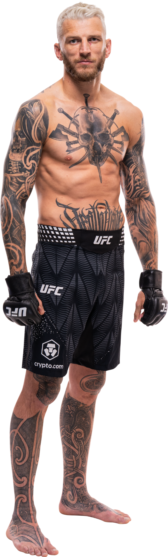
A samurai-style helmet and armored face fill the space between Hooker’s shoulders. The top reaches toward the base of his neck; the mask extends down his back. Flowers spread toward the shoulders, their softer petals set against dark shading and the hard lines of the armor. Up close, the crest and details around the eyes and mouth come through; from farther away, the helmet holds the design together.

MiddleEasy reported the reveal in February 2023, citing Hooker’s Instagram post. Its description also mentioned a lion-like face, a reminder that stylized armor can be read in more than one way. The photograph shows the overall shape, but Hooker has not provided a detailed explanation for every element.

He told Fighters Only that a canceled flight home after a cyclone sent him to the Gold Coast. A friend offered to help while he was there, and a tattoo appointment followed. Hooker said a substantial part of his back was done soon afterward; he also recalled going to New Zealand for more work and ending up with more than the small addition he first had in mind.

The patterned leg tattoos

Dan Hooker tattoos: The patterned leg tattoos photograph

Hooker’s lower-leg work uses broad curves and dark panels that wrap around the shins and continue onto the feet. Pale channels break up the black shapes. The standing training photo shows how the pattern runs down both legs, while the crouching view reveals how the work sits around bent knees and moving joints.

Dan Hooker tattoos: The patterned leg tattoos photograph

Fighters Only described the shin and foot pieces as Māori-style designs and reported that Hooker found the sessions painful. That style description doesn’t establish a specific family or cultural meaning for each curve, so it’s better to leave those interpretations open. The coverage works as a continuous pattern rather than a small, isolated patch.

The forearm tattoos and sleeves

Dan Hooker tattoos: The forearm tattoos and sleeves photograph

The sleeves use different imagery. One forearm has large dark fields edged by pale, sweeping lines; the other has a robed, human-like figure in softer grey shading. The moving training photo doesn’t show every small detail clearly, but the contrast between the two arms is apparent.

In a January 2024 interview with The Mac Life, reported by MMASucka, Hooker said that getting one leg or arm done made him want to complete the other so the overall arrangement felt balanced. He called it “art, man,” not a need for identical designs. He also described an unfinished stage where the full picture was clear to him even if other people couldn’t see it yet.

Long sessions and a changing routine

In an interview with She Loves The Gloves, Hooker said tattoos hadn’t interested him much before he had time between fights. He found he liked big pieces and long appointments, despite the cost and discomfort. He described sitting for eight or ten hours as a mental challenge when he couldn’t train or compete.

That’s his account of the process; it doesn’t require a hidden personal crisis to explain the collection. His comments are about time, the sessions and the look he wanted. The amount of coverage may appeal in a photo, but the size, darkness and placement still need to make sense for the person getting the work.

His own taste comes first

Dan Hooker in a contextual photograph: His own taste comes first photograph; not tattoo evidence

Hooker told She Loves The Gloves that he loved the work and didn’t put much weight on other people’s opinions. The collection is conspicuous, but his explanation stays matter-of-fact: he likes large pieces and seeing them come together. The back, legs and sleeves each create a different effect, from the samurai face to the wrapping patterns and contrasting arm imagery.

The public-workout photo in Qatar shows him in a training setting rather than a posed tattoo reveal. His shirt covers much of his torso, while the arm work remains visible. The video below has Hooker discussing both the tattoos and his fighting career.

More athlete tattoo guides

173 container

Chaeyoung Tattoos: A Playful Patchwork of Color and Fine Line Ink

Chaeyoung’s tattoos make a patchwork of small drawings, fine lines and a few bright colors. She’s a South Korean singer, rapper and songwriter with TWICE, and her interest in drawing comes through in the designs. Some pieces are well documented; others appear only in quick or unclear photos, so their exact shape or meaning isn’t always certain.

The arm collection is the main event

Chaeyoung tattoos: inline

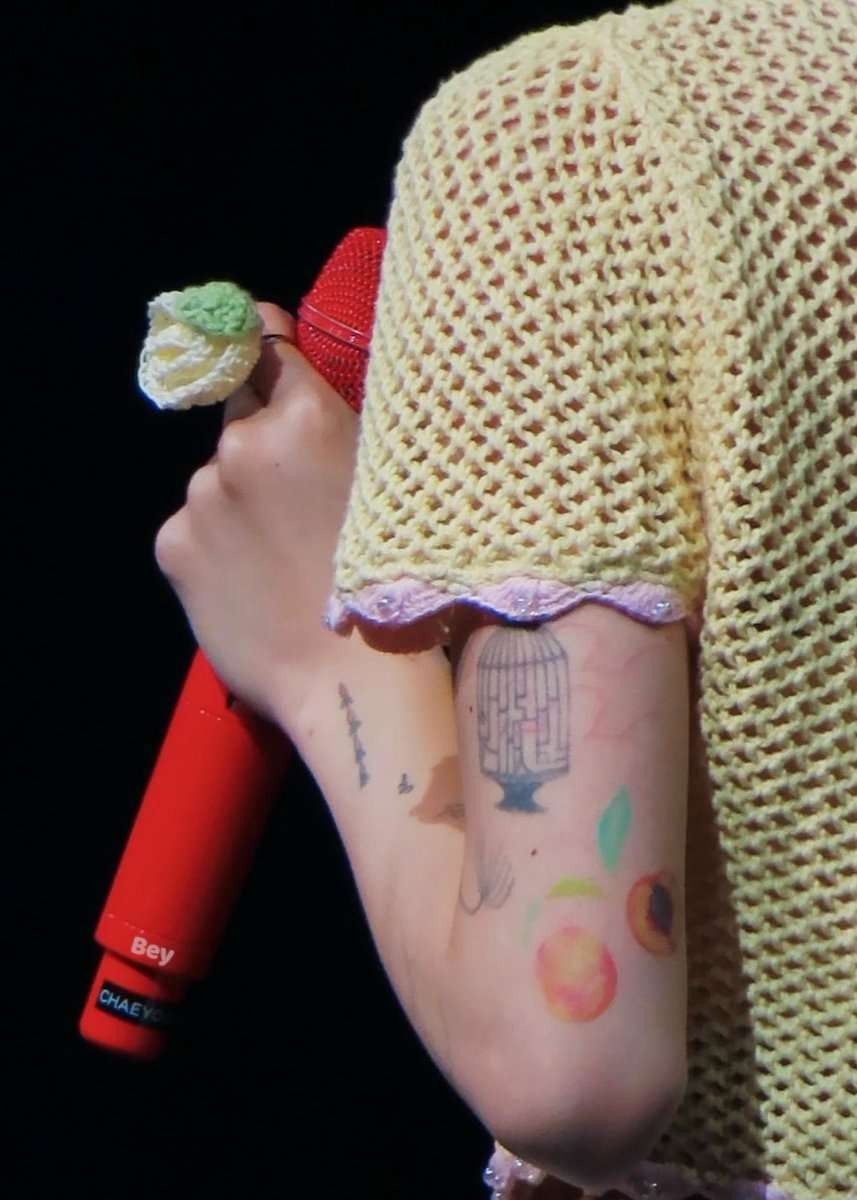
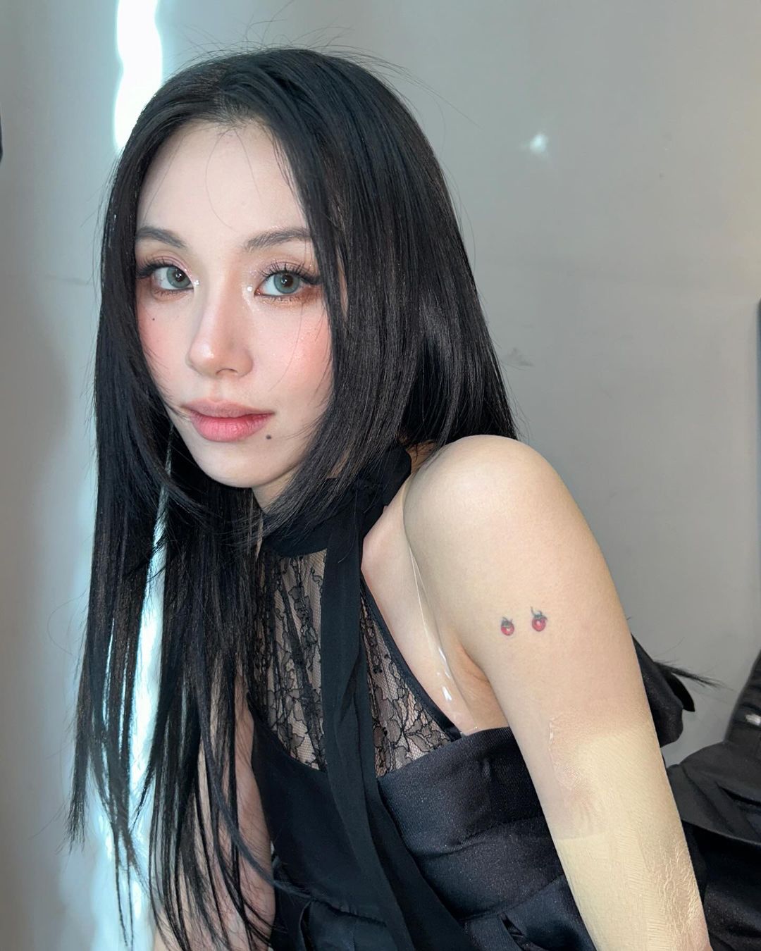
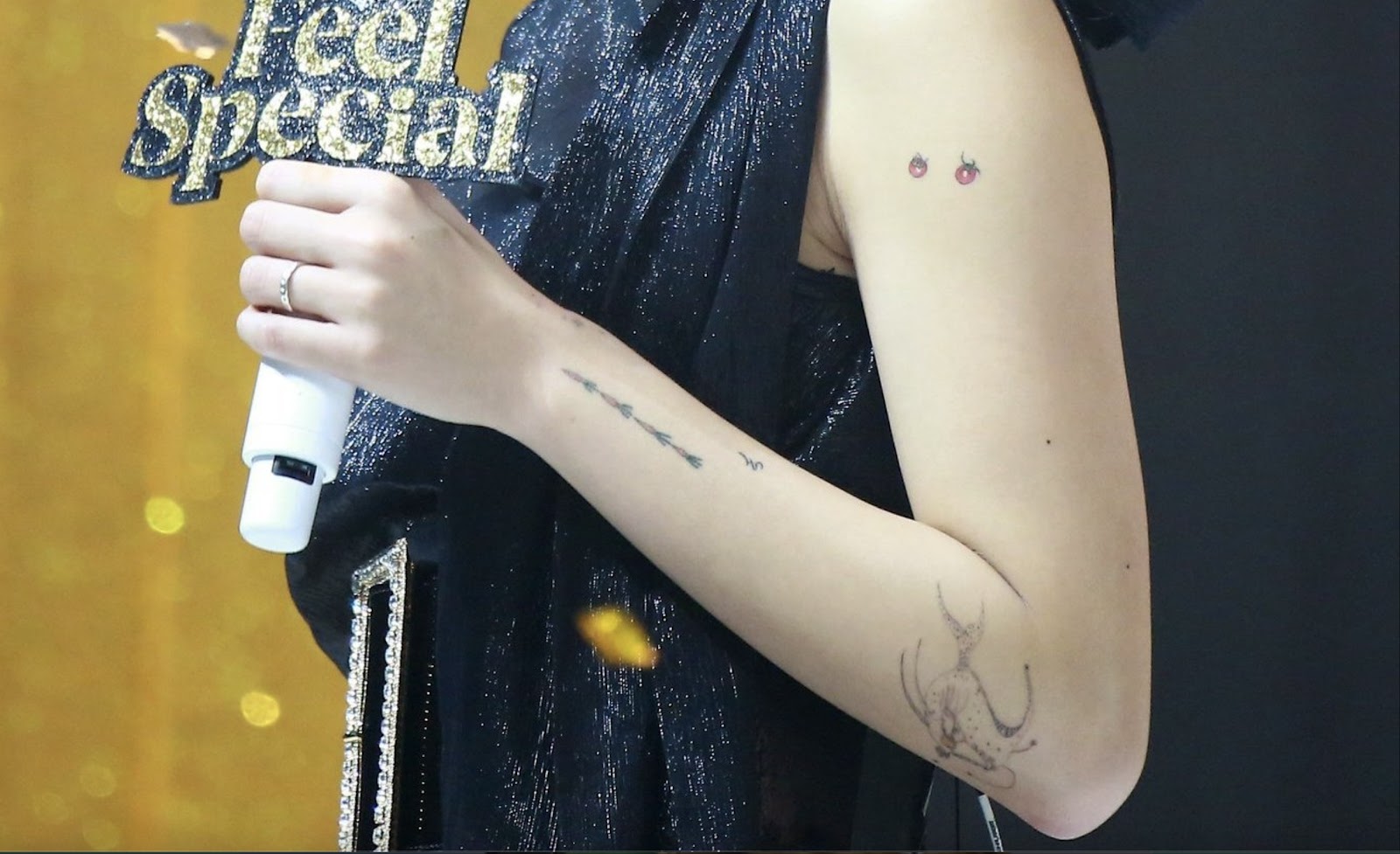
Her arm holds the largest mix: food drawings, music notation, a fish, a birdcage, flowers and longer line work. Rather than one continuous sleeve with a background, the tattoos sit as separate illustrations with skin between them. That open spacing lets each design read on its own and leaves room for the collection to change over time.

Chaeyoung’s playful food tattoos

Chaeyoung tattoos: inline

A small group of carrots above her hand is drawn more like a notebook doodle than a realistic vegetable. Nearby, a tiny cherry tomato shows up in some airport and casual photos; its red color makes it easier to spot when her arm turns toward the light.

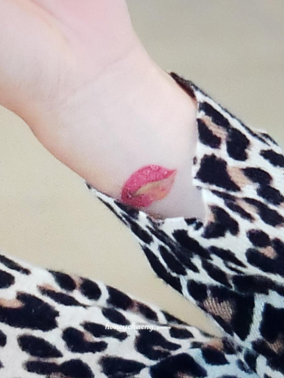
She also has colorful lips on her wrist, in apricot and neon magenta. Fans have linked those colors to TWICE’s official palette, but Chaeyoung hasn’t confirmed that meaning. The mix of a few colored motifs with black linework gives this part of the arm contrast without making it crowded.

The fish she designed herself

Chaeyoung tattoos: inline

Chaeyoung confirmed to fans that she drew the fish herself. It sits near her elbow, with loose proportions and an illustrated look rather than smooth realism. Knowing it came from her own drawing makes the uneven lines feel like part of the design, not an attempt at a polished flash image.

If you’re inspired by it, the useful idea is to bring your own sketch to an artist and ask them to keep some of its character while adapting it for skin.

Birdcage, linework and the more delicate side

Chaeyoung tattoos: inline

The birdcage stands out from the loose drawings. Its vertical bars and clear outline give it a more structured shape, which sits alongside the smaller, softer marks in the magazine photos. A cage can invite symbolic readings, but Chaeyoung hasn’t supplied one here. What’s visible is a fine-line cage that follows the curve of her arm.

The musical symbol and the long forearm mark

Chaeyoung tattoos: inline

Just above the carrots is a small musical symbol, often identified as a quarter rest. It’s a compact mark that fits between the larger drawings without competing with them.

A longer fine-line design runs along the forearm in the same performance image, but its softer details aren’t clear enough to name confidently. Its length adds movement to the patchwork, balancing the colored tattoos higher on the arm. The image shows placement and general form; it doesn’t confirm every small shape.

The hand details: flowers, butterfly and tiny marks

Chaeyoung tattoos: inline

Small flowers and a butterfly appear around Chaeyoung’s hands and fingers. The colors are soft—pink, blue and yellow—and the details are easier to see in close-ups than in full-body stage photos. Hand tattoos also face more sunlight, washing and friction than pieces under clothing, so tiny details may soften over time.

Behind her ear is a heart with an arrow. Its simple outline is easy to recognize, while the placement lets hair cover or reveal it. It’s a different kind of visibility from the arm pieces.

The larger back tattoo and what we can’t confirm

Chaeyoung tattoos: inline

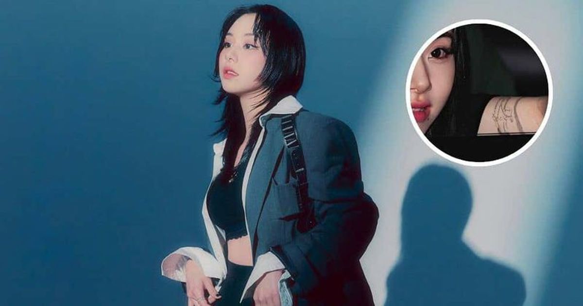
Chaeyoung has also appeared in photos with a larger back tattoo. In some images, clothing, shadows and the angle make it hard to separate ink from the rest of the scene. Fans have offered different descriptions, but the exact design isn’t clear enough in every shot to identify confidently.

The back piece appears broader than the small arm drawings, giving the collection another scale. Photobook images show several arm tattoos together in a controlled setting, but styling, lighting and pose can change how much of any tattoo is visible. Repeated views are more useful than one dramatic frame.

Why her tattoo style works

The collection mixes fine lines, playful subjects and color without forcing them into one uniform sleeve. The skin left between the drawings keeps the arm from feeling heavy. The carrots, lips and fish also reflect a personal drawing style rather than a set of matching symbols.

If you like the patchwork approach, start with one image that means something to you and leave it room. You can add another later if the first still feels right. A small palette can help a few color pieces stand out without making every tattoo compete for attention.

Chaeyoung tattoo ideas worth borrowing

Borrow the approach rather than tracing her designs: collect a few images tied to your own interests, and keep them simple enough to read at the size you want. Wrist and forearm placements suit small marks you want to see often; behind the ear keeps a strong outline partly private; an upper arm or back gives a larger illustration more room.

Ask an experienced tattoo artist how fine lines and hand or finger designs may age. And keep uncertain details uncertain. The confirmed fish, carrots and other visible pieces are interesting on their own; there’s no need to invent a story for every tattoo.

More musician tattoo guides

Han Ye Seul Tattoos: Her Snake, Three Swords and Geometric Back Piece

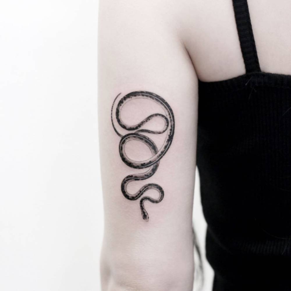
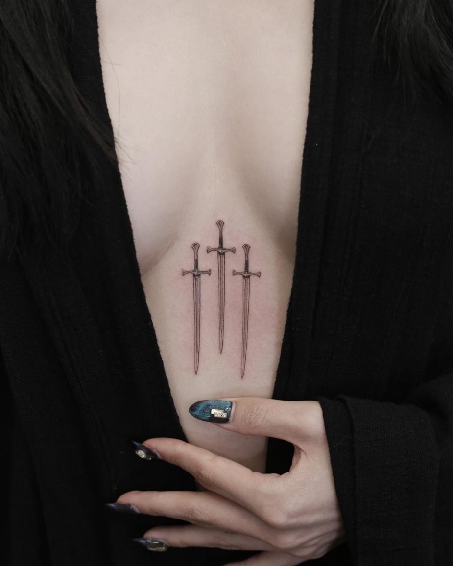
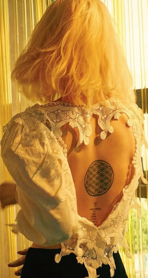
Han Ye Seul has described her tattoos in videos she shared in 2019. Three designs are especially easy to recognize: a looping snake on her upper arm, three fine swords at the center of her chest and a circular geometric pattern on her back. Her explanations connect the snake to change and the swords to strength and protection. The lettering below the back design is harder to read in the available photos, so its exact wording remains uncertain.

The snake on the back of her upper arm

Han Ye Seul tattoos: The snake on the back of her upper arm

The black-and-grey snake folds into broad loops on the back of Han’s upper arm, tapering toward its head. Crisp outlines define the body, with darker patches adding texture. The open spaces inside the coils keep the shape readable; larger loops narrow as the body turns.

In a video covered in December 2019, Han connected the snake with shedding skin, starting again and wisdom. The gallery credits the work to Doy Seoul and places it on her tricep. It’s visible when she turns or lifts her arm, while a straight-on portrait can hide most of it.

Three fine swords at the centre of her chest

Han Ye Seul tattoos: Three fine swords at the centre of her chest

Three outlined swords point down the center of Han’s chest. The middle handle sits a little higher than the two outer ones, and the gaps keep the narrow blades distinct. She described them as symbols of strength, courage and protection.

The fine lines give a hard-edged subject a lighter look. In the photograph, dark clothing frames the vertical strip of skin and lets the swords follow the body’s shape. Han’s explanation gives the design its purpose; there’s no need to attach it to an unreported event.

The geometric Flower of Life on her back

Han Ye Seul tattoos: The geometric Flower of Life on her back

The circular back tattoo is made of overlapping curved lines that form a dense, repeating pattern. Reporting identifies it as the Flower of Life. Beneath it is a separate line of lettering; later coverage calls it a Bible verse she values, but this image doesn’t show enough to transcribe the words confidently.

The lace top frames the orderly circle with a softer, uneven edge. The back gives the pattern room to read as a whole, then reveals the smaller intersections as you look closer. The photo’s angle and the curve of her body affect the view, so it’s best for understanding the composition rather than measuring exact proportions.

How she wears the collection

Han Ye Seul in a contextual photograph: How she wears the collection; not tattoo evidence

This seated portrait is about Han’s clothes and expression, not a full inventory of tattoos. Some pieces are covered by a sleeve or neckline; others appear when she moves. The designs remain part of her style without needing to be visible in every photograph.

The snake, swords and geometric circle each have a clear outline, so they’re recognizable even when a photo offers only a partial view. Their meanings add context, but the compositions can be appreciated on their own.

Personal style without guessing at every detail

Han Ye Seul in a contextual photograph: Personal style without guessing at every detail; not tattoo evidence

A mirror photo shows Han in a dark off-shoulder outfit with floral decoration around the chest. Contemporary coverage raised the possibility that the flowers were temporary, so they shouldn’t be counted as confirmed permanent tattoos. Clothing, shadows and pose can make a photograph hard to read, especially when it is reposted without its original context.

Han has explained the snake and swords, but that doesn’t mean every mark needs a private story attached. If you’re taking inspiration from her work, focus on concrete choices—open spacing, fine lines or a placement that can be covered—then develop a design of your own with an artist. The collection is interesting without guessing at the unclear details.

For a closer look at Han discussing her choices, watch the video below.

More actor tattoo guides