codex

Shiwani Chakraborty Tattoos: The Pink Lotus and the Meaning Behind Her Ink

Shiwani Chakraborty has described her tattoos as personal markers tied to spirituality, astrology, family and her own life. Her newest piece is a pink lotus on her upper back.

She has said the lotus represents purity and has become meaningful to her. She also connected the design with the sun, moon and stars, and with ideas of balance.

Shiwani works on television, where makeup sometimes has to cover tattoos before filming. She has mentioned the last-minute scramble when she forgets, but that hasn’t made her stop getting ink.

Shiwani Chakraborty’s pink lotus
Shiwani Chakraborty tattoos: pink lotus tattoo section

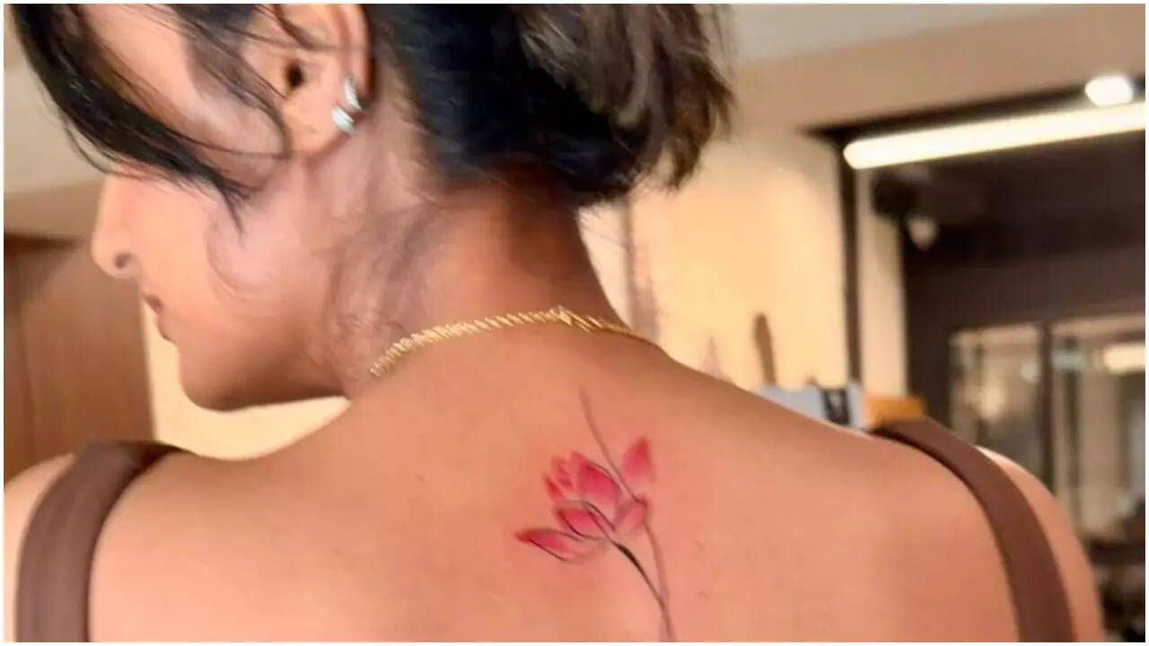
The new tattoo is a small pink lotus on her upper back, with a long, narrow stem and fine dark lines around the petals. The color is soft rather than bright, and the drawing leaves open space around the flower.

The upper-back placement keeps it covered by ordinary clothes and lets Shiwani show it when she wants to.

In a February 2026 Times of India report, Shiwani said she consulted an astrologer before choosing the lotus. She connected it with her planets and stars, as well as purity, balance, abundance and prosperity. She also linked the design to her acting career and skincare brand.

The pink and open linework give the flower room to read without turning it into a dark block.

Shiwani has described the sun, moon and stars as part of the thinking behind the tattoo. The lotus remains the main image; the wider symbolism doesn’t need to be drawn around every petal.

The tattoo appointment behind the new piece
Shiwani Chakraborty tattoos: tattoo process and artist section

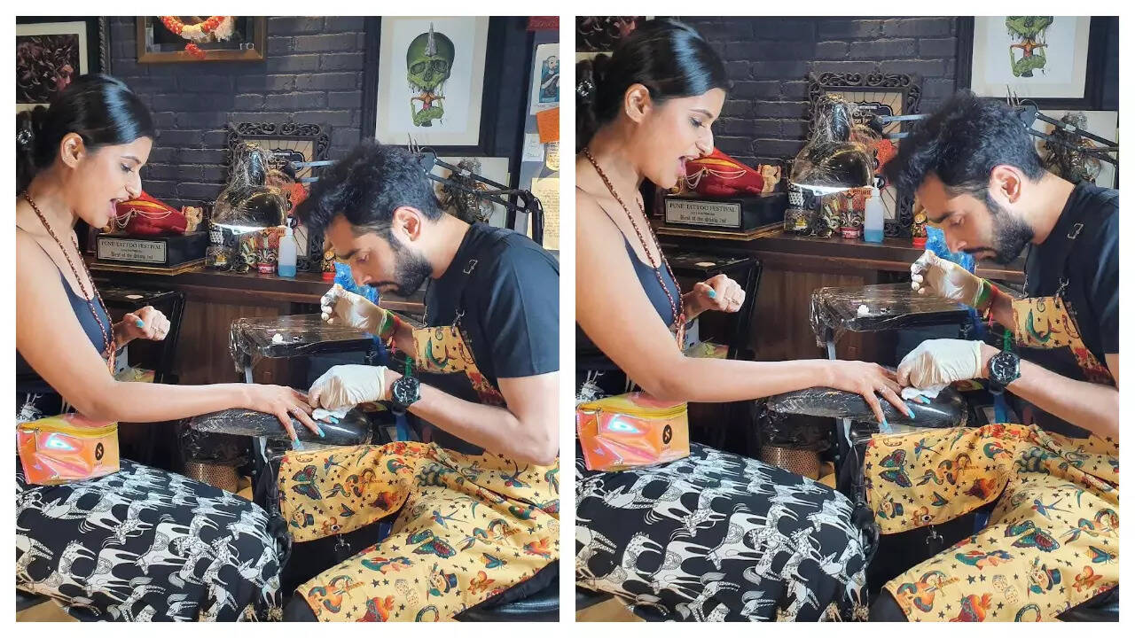
Another Times of India photo shows Shiwani at an earlier tattoo appointment. It records the session, not a clear view of a finished design.

She has said her first tattoo came with a fever and described the pain as real but worth it. That was her experience; it doesn’t predict how someone else will feel.

Her advice is to choose a good artist and follow the precautions. A meaningful idea still needs a clean studio, sensible aftercare and time to heal.

Shiwani has described talking through her ideas with an artist, who helped turn them into an original drawing. The reference can start the conversation; the final design should fit the person and placement.

A collection built from small choices

Shiwani Chakraborty in a contextual photograph: spiritual meaning context section; not tattoo evidence

Before the back lotus, Shiwani described four tattoos. Her first combined a peacock feather and flute connected to Brahma, Vishnu and Mahesh. She later got a lotus on the index finger of her right hand during Durga Puja, drawing on the flower’s spiritual importance in her tradition.

She also has three stars on the right collarbone. Shiwani said an astrologer advised the design because she identifies with the moon and likes looking at it; she got the stars in Goa and called them lucky. Three flying birds on her ankle were done the same day.

The designs sit on a finger, collarbone, ankle and back. They don’t form one continuous composition; each marks its own idea and place.

The early tattoos were closely tied to deities, astrology and spiritual practice. The later lotus also connects with her skincare brand and acting work, adding another layer rather than replacing the earlier meanings.

Why the images need context
Shiwani Chakraborty in a contextual photograph: career and personal style context section; not tattoo evidence

Some of the photos show Shiwani away from a studio and don’t reveal a tattoo. They provide context, but a portrait shouldn’t be used as proof of ink that isn’t visible.

Her tattoos sit alongside her public work as an actor, as well as traditional and everyday photos. They’re part of her life, not a summary of it.

The upper back can be covered for a role and shown when she chooses. That gives the lotus more flexibility than a tattoo that stays visible in every costume.

Shiwani has noted that actors sometimes need makeup to cover their tattoos, and forgetting can cause a last-minute problem before a shot. Wardrobe and filming schedules are worth considering when choosing a visible placement.

What she might choose next
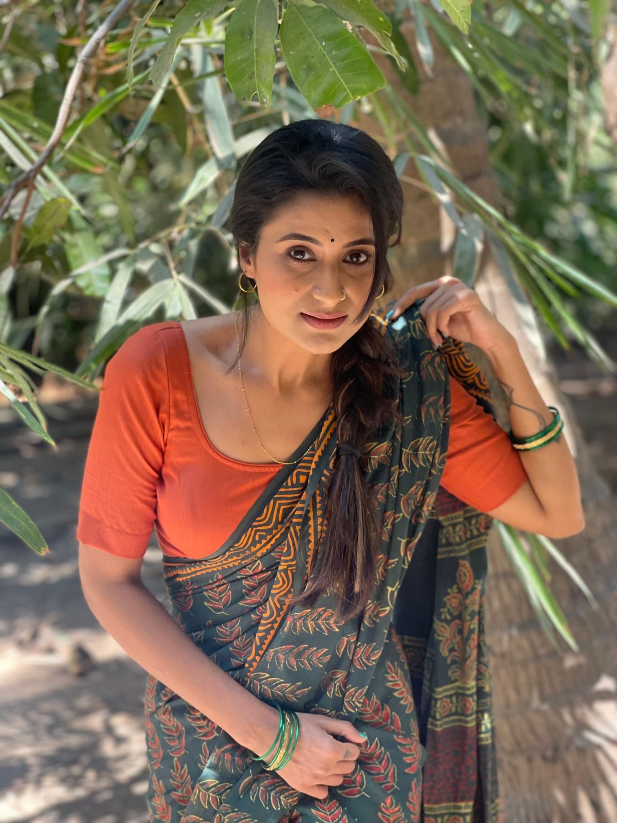
Shiwani Chakraborty in a contextual photograph: future tattoo context section; not tattoo evidence

In a 2024 interview, Shiwani said she wanted a tattoo for her late father using the Bengali word “Baba.” She spoke about their connection and feeling that she still carried his blessings. The interview records an intention, not confirmation that she later got the piece.

A Bengali tribute would bring another kind of lettering into the collection. Anyone considering text in a language they don’t speak should check the wording with a fluent reader before the stencil is applied.

Her comments show that she takes time to connect a design to a meaning and asks for guidance before settling on the image. Whether she chooses the “Baba” tattoo or something else remains open.

More actor tattoo guides

Samantha Ruth Prabhu Tattoos: YMC, Chay and the Arrow Designs Behind Her Ink

Samantha Ruth Prabhu’s three best-documented tattoos—“YMC,” “Chay” and a double arrow—began around her first film and relationship with Naga Chaitanya. She has since said she regrets tattoos tied to a past relationship.

The designs haven’t all changed, but their place in her life has. The story is about what they meant when she got them and how she feels about permanent ink now.

The YMC tattoo at Samantha’s neck

Samantha Ruth Prabhu tattoos: YMC tattoo section

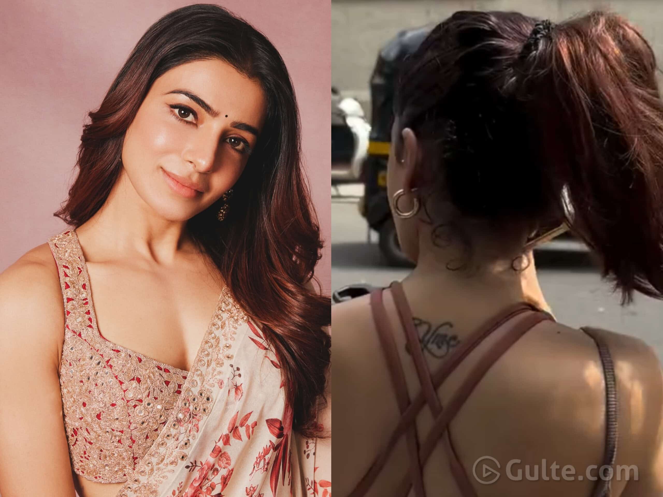
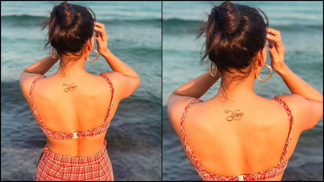
“YMC” refers to Ye Maaya Chesave, the 2010 film that marked Samantha’s lead-acting debut and paired her with Naga Chaitanya. The small script sits at the nape, just below the hairline.

Photos show compact lettering, often easiest to see when her hair is up or her outfit leaves the back open. It’s a reference she can reveal without having on display every day.

When she got it, the initials pointed both to a career milestone and to the relationship that grew around the film. That overlap helps explain why the tattoo became linked to Chaitanya, even though “YMC” names the movie.

In 2025, India Today noted that the tattoo appeared to be missing in one video, prompting fan questions about removal. A later Instagram story seemed to show it again.

The public images don’t establish that the tattoo is permanently gone. Its appearance has varied from post to post, so it’s safer to describe what each photo shows than to infer a removal.

A second view of the YMC design

Samantha Ruth Prabhu tattoos: YMC tattoo status section

A second image pairs a portrait with a back view, where the lettering can be matched to the same nape placement. It isn’t a close-up, but the mark is visible.

The script is fine and delicate against the upper back. A design this small depends on spacing and line weight to stay legible.

The nape gives a short title a natural frame and lets hair or clothing cover it. If you’re considering a similar reference, think about whether it will still feel like yours if the project or relationship around it changes.

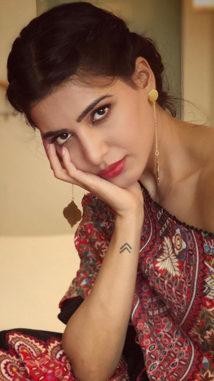
Samantha’s wrist tattoo is a small double arrow. Times of India described it as two arrows and quoted her explanation: “create your own reality.” She also said she got it with Chaitanya.

The arrow tattoo on her wrist

Samantha Ruth Prabhu tattoos: arrow tattoo section

In photos, the mark reads as two dark, upward-pointing chevrons. The lines are simple and small enough to sit above the wrist without taking over the area.

The phrase gives the symbol an optimistic meaning, while its matching origin ties it to a shared period in their lives. A design can keep that history and still take on a personal meaning later.

The wrist keeps the arrows in view, though sleeves, bracelets or a watch can cover them. It also gets sun and friction, so simple lines leave fewer tiny details to blur.

A closer photo shows the arrows clearly on her wrist. It documents the design at that moment, but doesn’t establish its current condition.

The word “Chay,” Naga Chaitanya’s nickname, is tattooed on Samantha’s right ribcage. A published photo shows the script in a circular inset beside a portrait of her in a pink embroidered outfit.

The inset makes the small letters easier to read. The ribcage keeps the tattoo private under most clothes, but the curve of the body affects how the writing sits.

The “Chay” tattoo on her ribcage

Samantha Ruth Prabhu tattoos: Chay tattoo section

Rib skin moves with breathing and can be tender during a session and while healing. The artist needs to account for that curve when laying out the word.

For small script, check the spelling, size and direction on the body before the stencil is applied. The words should stay readable without crowding the letters.

The public discussion has focused on the divorce and what “Chay” means now. Samantha has spoken about regretting tattoos tied to a past relationship, but that doesn’t tell us what she plans to do with this piece.

A separate close crop shows the double arrow with its two chevrons evenly spaced and no extra color or shading. The clear shape is why it remains legible in a closer view.

Simple geometry still needs careful alignment. A little space around the arrows helps keep them from reading as one dark patch on the narrow wrist.

How the arrow design looks in a different photo

Samantha Ruth Prabhu tattoos: arrow detail section

The arrows can suggest direction or progress to someone else, but Samantha’s own explanation is the one documented here. A similar shape doesn’t need to carry the same story for another person.

One portrait in the article shows Samantha but no visible tattoo. It gives the reader context; it shouldn’t be treated as evidence of ink that the photo doesn’t show.

Samantha’s career spans Telugu, Tamil and Hindi projects. The tattoos are one part of her public life, not a substitute for the work that made them a subject of coverage.

The images need some honesty around them

Samantha Ruth Prabhu in a contextual photograph: career context section; not tattoo evidence

In a fan Q&A reported by Times of India, Samantha said she would tell her younger self never to get tattoos. She was reflecting on permanent designs linked to a relationship that later changed, not saying that every tattoo is a mistake.

A tattoo can be sincere when chosen and still feel complicated later. Regret doesn’t mean the original feeling was false; it can mean the person or circumstances have changed.

Her advice to her younger self

Samantha Ruth Prabhu in a contextual photograph: reflection section; not tattoo evidence

The three pieces carry different parts of the story: a film title at the nape, a shared phrase on the wrist and a partner’s nickname on the ribs.

If you’re considering similar ink, ask whether the design would still belong to you if the other person were no longer part of the story. If you’re unsure, give the decision more time.

Samantha’s “YMC,” “Chay” and arrow tattoos are visually simple, but each points to a different memory. She has also said she regrets relationship-linked ink, so the images should be read alongside her later comments.

The nape can be hidden by hair, the wrist keeps a reminder in view, and the ribcage lets script stay private. Those placements suited the choices she made at the time; they aren’t a template for everyone.

The practical takeaway

Before committing, check the wording, placement and how the tattoo might fit your work and life as they change. A permanent mark can outlast the moment that inspired it without fixing you in that chapter.

More actor tattoo guides

Milania Giudice Tattoos: Baby V Wrist Tribute and More

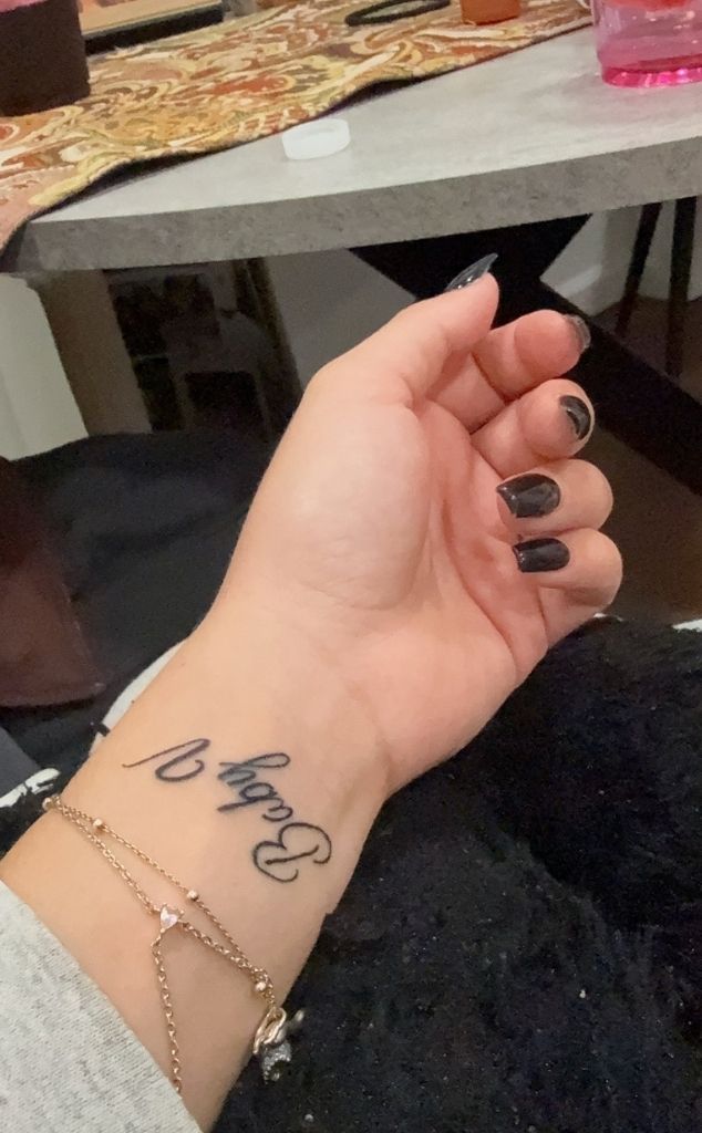
The small script on Milania Giudice’s inner wrist reads “Baby V”, a tribute to her late friend Victoria Zardoya. Its handwritten look keeps the message close and personal without a frame or extra ornament.

Small lettering leaves little room for error. The spacing, letter shapes, line weight and placement all affect readability. Milania’s wrist photo shows how a short phrase can fit while leaving enough open space around it.

The Baby V wrist piece

Milania Giudice tattoos: inline

The tattoo sits on the inside of her wrist and uses loose, handwritten script rather than formal calligraphy. The words aren’t stretched across the arm, and nothing decorative competes with them.

Milania shared the image after Victoria’s death. Reports describe Victoria as a longtime friend and identify the wrist tattoo as a memorial; Milania captioned the reveal, “Always my baby V.” That context explains why the phrase carries the tribute without a date, portrait or longer quote.

As a reference, the useful detail is the scale: a short name or nickname can fit on the wrist if the lettering stays clear and has room around it.

Memorial tattoos can become hard to read when names, dates, symbols, flowers, initials and long phrases all compete for space. Milania’s piece keeps the message short and lets the friendship supply its meaning.

A small tribute can still show personality through the handwriting. Rounded letters, a slightly uneven line or the choice of the inner wrist can make it feel like a note. The placement keeps it in view for Milania while making it easy to cover when she wants privacy.

“Baby V” is short enough to read at a glance. With small script, the artist needs to leave enough space between letters so they remain legible as the tattoo heals and ages.

Bravo reported that Milania has an inner-lip tattoo reading “F–k off” and an ankle tattoo reading “I love you” with a heart, after a friend wrote out the message for her. The same report described a matching rib tattoo shared with her sisters.

The reported designs use different locations: the inner lip is hidden, the ankle message can stay discreet, and the rib tattoo is shared with her sisters. The new wrist lettering is easier to see, but remains small.

Placement changes how a tattoo feels. Before choosing a spot, consider whether you want the design mostly for yourself, easy to show, or shared with someone else. The artwork doesn’t need to be large to make that choice matter.

Copying a celebrity tattoo word for word can miss what makes it personal. “Baby V” has a specific connection to Milania’s life. Someone else might choose different words, a symbol or another placement that reflects their own relationship.

Public-style reference photos

Milania Giudice in a contextual photograph: inline; not tattoo evidence

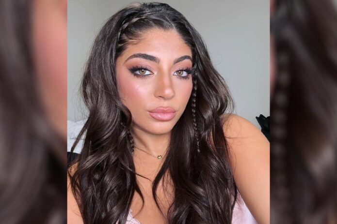
The public photos show Milania in dressed-up, casual and relaxed settings. A small wrist tattoo can sit alongside jewelry without becoming the focus of every look.

Milania Giudice in a contextual photograph: inline; not tattoo evidence

Fine script may disappear beneath stacked bracelets and show again when the wrist is bare. That makes it easy to wear with a watch or rings without building every outfit around the tattoo.

Milania Giudice in a contextual photograph: inline; not tattoo evidence

A regular event photo doesn’t confirm a small tattoo when the wrist is out of frame or obscured by clothing, jewelry, lighting or angle. A close-up is more useful for studying the lettering.

The letters move naturally but still have space around them. That matters on a wrist, where the skin curves and the hand is often moving. The phrase reads as one thought, with the words carrying the weight.

If you like this style, write your phrase by hand a few times. Try a fine pen and a softer marker, then notice how the letters connect. An artist can refine your draft into a stencil while keeping its personal feel.

Check the smallest letters before settling on a size. An uppercase initial can dominate a short phrase, while lowercase script may need extra room for its loops and joins. The right scale depends on the words, your skin and how visible you want the tattoo to be.

Think about how the phrase will read from different angles. It can face you when your arm is down or face outward for others to see; the choice depends on whether it’s mainly a private reminder.

Milania’s short phrase identifies Victoria in a way their friends would understand. Adding symbols just to fill the space could make the design busier without making it more personal.

A tribute might use an initial, a small flower, a familiar object or a date tucked into the lettering. Someone else may prefer a full name or a small drawing. Let the relationship guide the choice rather than trying to make the tattoo look impressive in a photograph.

A memorial tattoo doesn’t have to look somber. A bright color, familiar nickname or playful handwriting can hold affection and grief together. It can reflect how someone is remembered, not only that they’re gone. Meaning comes before decoration.

Before booking, tell the artist what the words mean to you and what feeling you want the lettering to have. That context can guide whether it should look gentle, bold, private or direct.

Wrist lettering needs room to stay readable. The area is washed, rubbed, exposed to sun and moved often; very fine lines can soften, and tiny gaps may close. An artist may recommend a larger size or simpler lettering.

Follow the artist’s aftercare instructions: keep the fresh tattoo clean, don’t pick at the skin, and limit friction while it heals. The first few days can include redness, swelling and peeling, so wait until the tattoo settles before judging the final lines.

Once healed, protect the tattoo from prolonged sun exposure if you want the fine lines to stay clear. An artist may also recommend a slightly heavier line than the fresh reference appears to show.

Milania’s “Baby V” tattoo keeps the words close, gives the script room to read and leaves the emotional meaning in the phrase. Her other reported pieces also use personal placements rather than one large, coordinated design.

If you’re planning a meaningful tattoo, start with the memory, words or symbol you want to keep close. Then choose a style and placement that support that idea; a simple design can still matter deeply.

Use the details that make the idea yours: the wording, handwriting, space around the letters and how the placement feels in daily life. Those choices are a better starting point than copying someone else’s tribute.

More celebrity tattoo guides

Seth Meyers Tattoos: The Matching Star With Dua Lipa

Seth Meyers had never had a tattoo before a Late Night segment with Dua Lipa. They planned a matching dot each; by the end, both had a small star.

His first tattoo came from that one-off on-air moment rather than a plan to build a collection.

Seth Meyers’s matching star tattoo

Seth Meyers tattoos: inline

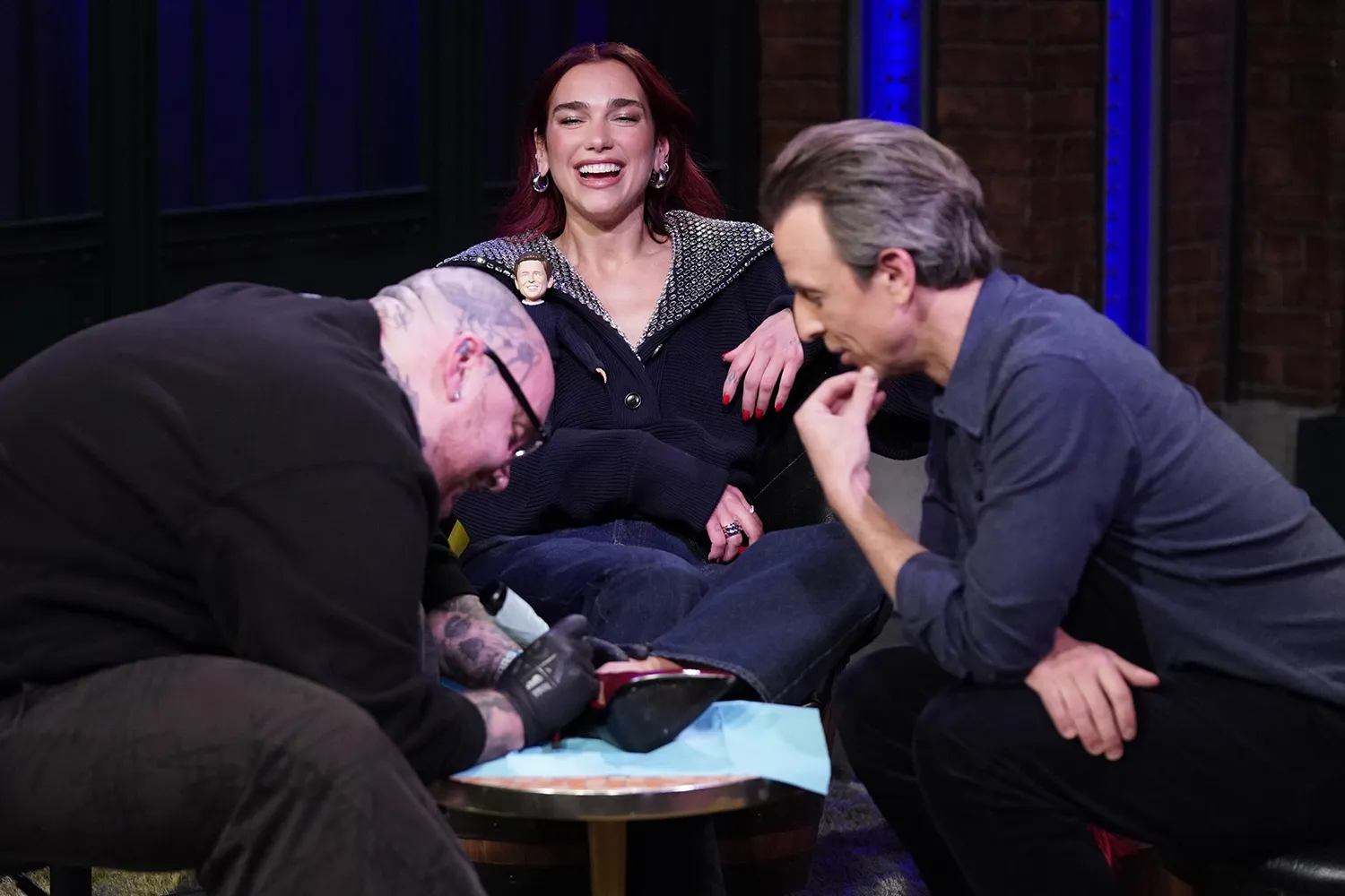
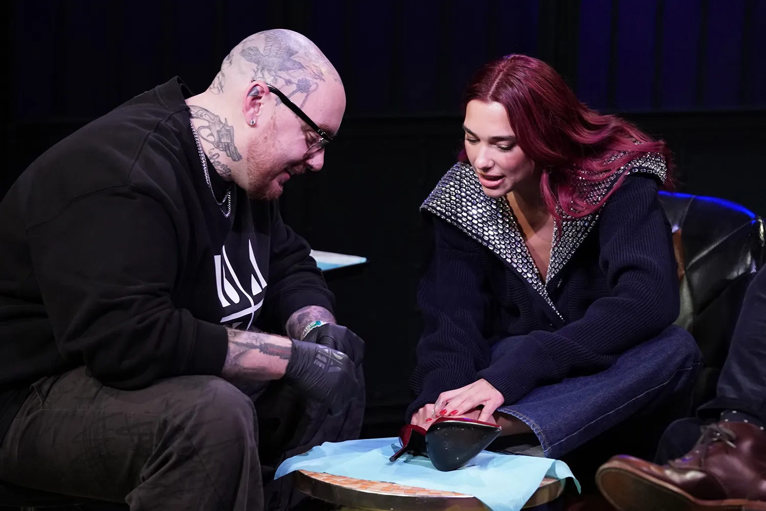
Meyers’s confirmed tattoo is a small star on his leg. Lipa’s matching star is on her foot, and Keith “Bang Bang” McCurdy did both. Session photos show Meyers seated with his lower leg extended as Bang Bang works near the ankle; Lipa is beside them. They show the process more clearly than the finished star.

The reports identify the design as a star, but the photos don’t establish its exact points, line weight or size. There’s no public evidence of lettering, extra shading or a symbol inside it, so there’s no reason to add those details.

PEOPLE reported that Meyers chose his leg because he wanted the option to forget about the tattoo. Lipa’s was placed on her foot. Meyers wasn’t looking for a prominent statement; he wanted a small reminder of a night he found memorable.

A star is easy to recognize at a small scale and doesn’t rely on tiny lettering. Its size can be adjusted to the body, rather than forcing a fixed graphic into a particular spot.

How the tattoo happened on Late Night

Seth Meyers tattoos: inline

The tattoo came out of a “Day Drinking” follow-up with Dua Lipa on Late Night with Seth Meyers. They had agreed to matching tattoos, but the starting idea was a plain dot. Keeping the design small made sense for Meyers, who had never had a tattoo before.

Lipa suggested changing the dot to a star. Meyers joked that she was trying to talk him into something bigger, though the finished design stayed small. Bang Bang tattooed Lipa first, then Meyers, with the studio audience watching.

This story comes with more context than a typical photo: reports name the artist, explain why Meyers chose his placement and describe how the pair settled on the star.

There’s a separate distinction between the permanent star and the marker tattoos Meyers wore in an earlier segment with Post Malone. PEOPLE reported that Malone drew a Pittsburgh Steelers logo, a Flash logo and a picture of Meyers’s Italian Greyhound, Frisbee, on his face. Those were part of a comedy bit, not permanent tattoos.

A small symbol with a shared meaning

Seth Meyers tattoos: inline

A matching tattoo can share a symbol without placing it in the same spot. Lipa chose her foot; Meyers chose his leg. The star connects the two designs, while each placement suits the person wearing it.

The star can call back to their friendship, the television appearance or the night itself. The people who were there know the full story; everyone else can still read the image without a long explanation.

Names and dates make a memory explicit, but they can tie a tattoo to one moment. A simple symbol leaves more room for the meaning to evolve while keeping the design easy to read.

If you’re planning matching ink, decide what should be shared and what can remain individual. You might use the same symbol in different places or vary the line and color.

Why the leg placement makes sense

Seth Meyers in a contextual photograph: inline; not tattoo evidence

A leg piece is easier to cover than a hand, neck or forearm tattoo. Meyers could show it when he wanted, then keep it out of sight. That made it a practical choice for a first tattoo and for someone who wasn’t already covered in ink.

The leg gives a small design a little more room than a finger or the side of a wrist. An artist can size the star so its points stay distinct instead of crowding them together.

A leg tattoo sits between highly visible arm ink and a placement that is usually covered, such as the ribs. It may show with shorts or at the beach, but it doesn’t have to be part of every interview or photograph.

That discretion suits a tattoo tied to one public night.

Seth Meyers’s on-screen style

Seth Meyers in a contextual photograph: inline; not tattoo evidence

Most photos of Meyers focus on his desk, monologue, studio or guests. A small tattoo on his leg stays out of those shots and doesn’t compete with his work on screen.

A familiar star shape can read quickly, even in a passing glimpse. Its clear outline is part of why a simple design can work at a small size.

If you like the idea, decide how you want the star to look: a fine outline, a heavier line or a filled shape. View it at the size you’d actually get; details that look clear when enlarged can blur when reduced.

What to ask for if you like the idea

The points also change the feel. A symmetrical star looks crisp, a hand-drawn one feels looser, and five-point, eight-point and sparkle designs each read differently. Bring references, then let the artist draw a stencil for your body.

If you’re getting matching tattoos, talk through what needs to match before choosing the final details. A shared design can still reflect each person’s taste and fit a different placement; the connection matters more than identical copies.

Check the placement with your leg relaxed, bent and standing. Skin shifts as you move, so a design that looks centered while seated may sit differently when you walk. An artist can help find a spot that keeps the shape balanced.

Small tattoos still need careful aftercare. Follow the artist’s cleaning and moisturizing instructions, don’t pick at peeling skin, and give the area time to settle before judging the result. Fresh ink can look darker and sharper than healed ink.

Clothing, chairs and exercise can rub a leg tattoo while it heals, so loose, breathable clothes may feel more comfortable. Once it’s healed, sun protection helps limit fading. A simple design has few details to hide softened lines, so basic care matters.

Don’t assume a small tattoo will be quick or painless; placement, skin sensitivity and the artist’s process all affect the appointment. The Late Night segment made the moment playful, but the work still calls for a clear stencil, good hygiene and realistic expectations.

Meyers and Lipa’s matching idea began as a dot, became a star and ended up in two different placements. Bang Bang did the tattoos during a very public segment, while Meyers kept his on his leg so he could cover it.

The takeaway isn’t that everyone needs the same star. Meyers’s tattoo fits a shared memory and stays discreet when he wants it to. A small design can carry a specific story without changing someone’s whole look.

Borrow the approach if it suits you: choose a symbol with personal meaning, pick a place you’ll be comfortable wearing it, and let an artist adapt the design to real skin scale.

undefined

Becky G Tattoos: Familia, Dragonfly and the Ink Behind Her Music

Becky G’s tattoos are modest in size, but their stories connect to family, grief, faith and music. Most sit on her wrists, ribs or spine, where clothing can cover them until an outfit or photo reveals the ink.

Some pieces have a clear public explanation; others have only been partly documented. The dragonfly, “Familia,” the spine numerals, “Faith” and the dollar sign have reported context. A 2021 session showed newer work on her wrist, neck and shoulder, but she didn’t give a full explanation for each design.

A careful look separates what Becky has shared from what a photo alone can’t establish. Her collection is a group of smaller pieces, each tied to a different part of her life.

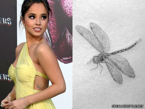
The dragonfly tattoo on her side

Becky G tattoos: The dragonfly tattoo on her side

The dragonfly sits on the left side of her ribs. Fine black-and-gray lines form its narrow body and wings; Dr. Woo is credited with the tattoo.

Becky has connected the dragonfly to her cousin Ceci, who died when Becky was young. She has described Ceci as a guardian-angel presence and said she notices dragonflies at moments when she needs a reminder of her cousin. The design is a memorial with a personal story behind it.

The rib placement keeps it mostly private, though an outfit that leaves her side exposed can show it. Its narrow shape follows the curve of the ribs, with the wings extending out from the body.

The insect carries the idea without a frame or lettering around it. If you like fine-line memorial work, pay attention to how much space the wings need; crowding the lines can make them harder to distinguish.

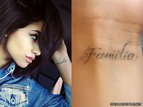
The “Familia” wrist tattoo

Becky G tattoos: The “Familia” wrist tattoo

Becky wears “Familia” in black cursive on her left wrist. The word follows the wrist in a soft script, with a small flourish on the capital F.

The Spanish word means family. Becky has spoken about her Mexican-American roots and the family history and traditions that shaped her. “Familia” connects the tattoo to that background in a way the English word might not.

Dr. Woo did the piece in 2016, around the time of the dragonfly. Reports say Becky had considered the word for a while before the appointment. Its inner-wrist position lets her cover it with a bracelet or turn it outward to show it.

A family word can be written in the language that feels right to you, but small cursive needs room between letters. An artist should size the script for skin rather than simply shrink a font.

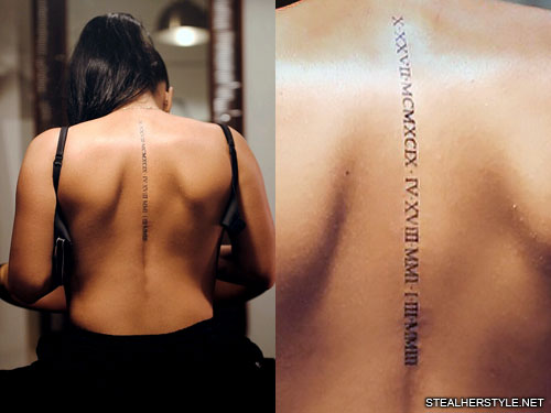
The Roman numeral spine tattoo

Becky G tattoos: Roman numerals running down her spine

Her spine piece is a vertical column of Roman numerals for the birthdays of her three siblings. The narrow serif lettering reads like a private record rather than a decorative pattern.

The dates are for her brothers Frankie and Alex and her sister Stephanie. Becky is the oldest of four, and the column brings their birthdays together without a row of names or portraits.

Roman numerals keep dates compact and create a clear vertical line. They also need careful checking: one wrong character changes a date, and the spacing must stay readable as the skin moves.

The spine is usually covered, then becomes visible with an open-back outfit. If you’re planning date ink, bring the dates in standard numerals and the intended Roman version; check each character on the stencil while standing naturally.

The small “Faith” wrist tattoo

Becky G tattoos: The small “Faith” script on her right wrist

Becky also has “Faith” in small cursive on the inside of her right wrist. The dark but fine lettering is easiest to make out in a close photo.

Dr. Woo is also credited with this tattoo, which was reported in 2018. Unlike the dragonfly and “Familia,” it doesn’t have a detailed public explanation. The word is clear, but Becky hasn’t publicly tied it to a specific event or story in the reporting cited here.

An inner-wrist word can serve as a reminder the wearer sees throughout the day. The inside of the wrist sees sun and daily friction, so line weight, a clear stencil and good aftercare matter.

The dollar sign tattoo for “Dollar”

Becky G tattoos: The dollar sign for “Dollar”

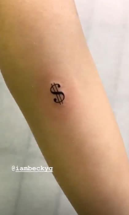
In 2019, Becky got a small dollar sign on her inner forearm to mark the release of her song “Dollar.” The simple black design is more visible than the rib and spine pieces.

The tattoo was done at Bang Bang in New York; Becky credited Ms. Santana in the post she shared at the time. The timing links the symbol to the single’s release, and she showed it while celebrating the track.

It can also read as a compact graphic on its own. If you choose a tattoo tied to a song or project, consider whether the symbol will still feel personal after the release has passed.

Tiny symbols need open space around their lines. A lot of shading or miniature lettering can make them harder to read. The inner forearm keeps this piece more visible than the rib or spine tattoos without covering the whole arm.

What Becky G’s collection has in common

Becky’s collection moves between fine-line memorial work, cursive words, family dates and a music reference. Family appears in “Familia,” the sibling birthdays and the dragonfly tribute; “Faith” adds another word, while the dollar sign marks a song release.

The pieces feel related through their personal context, not because they share one style. Each has a different role, and several are placed where they can stay private most of the time.

If you want a similar approach, start with the detail you want to remember: a family word, a few dates or a symbol tied to an event. The design doesn’t have to copy Becky’s motifs.

Ideas worth borrowing from Becky G’s style

Use placement to decide how often the tattoo will show. A memorial can sit somewhere covered, while a word you want to see may fit on a wrist. A line of dates can run down the spine if you prefer to keep it out of view.

Becky’s wrist pieces can sit beneath jewelry, her spine tattoo stays under a shirt, and the side dragonfly appears when clothing leaves it uncovered. That gives her some choice over when the designs are visible; privacy doesn’t make a tattoo less meaningful.

Before choosing tiny script, view the stencil at the size you intend to get. Check it with your wrist bent and your arms relaxed, and give the letters enough space to stay clear over time.

undefined

More musician tattoo guides

Emma Roberts Tattoos: Tiny Ink, Good Luck and Personal Details

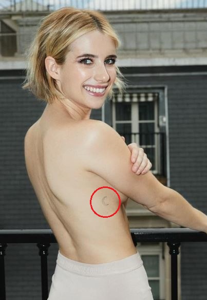
Emma Roberts’s tattoos are small linework pieces rather than large sleeves. They tend to appear when a dress shifts, her hand moves or a photo catches the right angle. Their scale gives each design a little personality without making it the focus of her look.

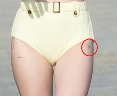
The best-documented pieces are a crescent on her ribs, curved “GRACE” lettering, a small horseshoe beside “hold me,” and a hollow star on her thigh. Some meanings are reported; others come from tattoo-site interpretations, not a statement from Roberts. It helps to separate what the photos show from what has been attributed to the designs.

Roberts has said at least one tattoo was spontaneous. In a Refinery29 interview cited by Bustle, she recalled getting tattoos on a whim in New York with a best friend. Her collection seems to include both considered choices and ones made in the moment.

Emma Roberts Tattoo: The Crescent Moon

Emma Roberts tattoos: genuine tattoo photograph showing Emma Roberts' crescent moon on the right rib area

The crescent is one of her most recognizable designs. In the clearest photo, Roberts is turned away with one arm across her chest, leaving her right ribs visible. The moon is a light, unshaded outline with no stars or other decoration; its curve does the work.

Steal Her Style places the crescent on the right side of her ribcage, and Teen Vogue and Bustle also list a rib tattoo. Body Art Guru reads the moon as a symbol of growth and change, drawing on its phases. That is a reported interpretation, not a meaning Roberts has confirmed in the sources cited here.

The rib placement keeps the tattoo mostly covered, even though a particular outfit can reveal it. The crescent’s open shape follows the curve of the body without needing extra detail.

If you’re considering a similar design, decide how open you want the crescent and how strong its outline should be. A fine line gives a softer look; a heavier one reads more clearly.

“GRACE” and the Curved Lettering Tattoo

Emma Roberts tattoos: genuine tattoo photograph showing the curved GRACE lettering and dotted outline

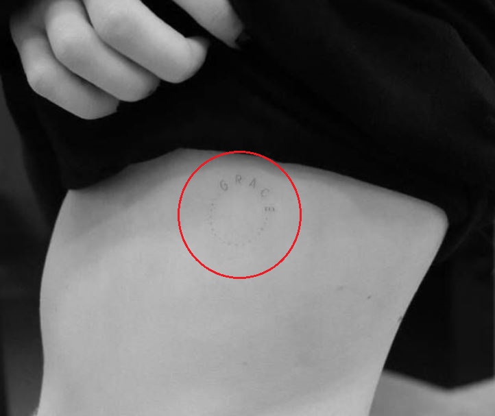
The “GRACE” tattoo curves around the left side of Roberts’s body. Body Art Guru describes a semicircular arrangement with small dots below it. The black-and-white photograph is faint, but the letters and dotted detail are visible.

Body Art Guru reports that the name refers to Roberts’s younger sister, Grace Nickels. That family connection is attributed to the report rather than a direct interview statement. The curved layout also makes the name feel more like a small emblem than a straight label.

A short name can follow the shape of the body instead of sitting in a straight line. Small dots add detail and movement, but the curve already gives the lettering its shape.

Fine lettering needs enough space to stay readable as it ages. Roberts’s script is light and compact; if you take inspiration from it, ask an artist to size the design for skin rather than shrink a typeface.

The Tiny Horseshoe Tattoo and “Hold Me”

Emma Roberts tattoos: genuine tattoo photograph showing the horseshoe beside hold me lettering

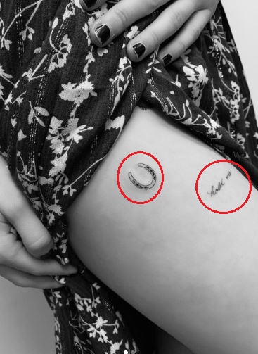
Teen Vogue reported the small black horseshoe on Roberts’s upper thigh beside an older cursive tattoo reading “hold me.” Bustle also described the horseshoe as a good-luck charm and credited Los Angeles tattoo artist Daniel Winter, known as Winterstone.

The photo shows both pieces together: a compact horseshoe outline beside looser, handwritten words. They don’t have to be a matching set; each keeps its own shape and feel.

When Roberts posted the horseshoe, she captioned it “Little luck from the best.” That is the clearest public clue to its good-luck meaning. The symbol is familiar, and the caption supplies the personal context without a longer explanation.

The “hold me” script has a softer, note-like feel. If you’re choosing a short phrase, try it in a few handwriting styles and see whether you want it neat, romantic or more casual.

Emma Roberts Tattoo: The Small Star

Emma Roberts tattoos: genuine tattoo photograph showing the small hollow star on the left thigh

Tattoo roundups also show a small hollow star on the outer side of Roberts’s left thigh. In the close crop, it appears near the edge of her shorts. It’s an open outline, not a filled star.

Body Art Guru interprets the star as protection and good luck, but Roberts hasn’t confirmed that meaning in the sources used here. The image shows its shape and placement, not what it means to her.

A small hollow star reads differently from a large nautical star. Its open center keeps the mark light, and its size lets it sit beside other pieces without turning them into a planned set.

One appeal of this collection is that the tattoos don’t need one theme. A moon, family lettering, horseshoe, short phrase and star can each stand on their own.

Why the Collection Feels So Easy to Wear

Emma Roberts in a contextual photograph: contextual photograph for the closing style section; not tattoo evidence; not tattoo evidence

The pieces are mostly small black linework in places that clothes can cover. That makes them easy to live with day to day; they can show when an outfit reveals them without defining every look.

There’s a mix of symbols, names and words. “GRACE” is reported as a family name, “hold me” is a short phrase, the horseshoe carries the caption “Little luck from the best,” and the moon and star are familiar shapes. They needn’t share one style to sit together.

If you want several small tattoos, begin with one that has a reason to be there. Later pieces can follow when they feel right. They can relate through scale or linework without being forced into a single theme.

Fine-line work can look very light when fresh, but the artist still needs to leave room for the lines to remain distinct. Ribs and upper thighs move and rub against clothing; an artist can advise when a design needs a little more size or weight.

Roberts’s collection shows how small tattoos can feel personal without dominating a photo. Some appear only when a pose or outfit reveals them; others are recognizable motifs placed on their own.

The known context ranges from a spontaneous appointment with a friend to a horseshoe captioned as a bit of luck. Other meanings are reported by tattoo sites, and some may be private. A tattoo doesn’t need a public explanation to matter to the person wearing it.

undefined

More actor tattoo guides

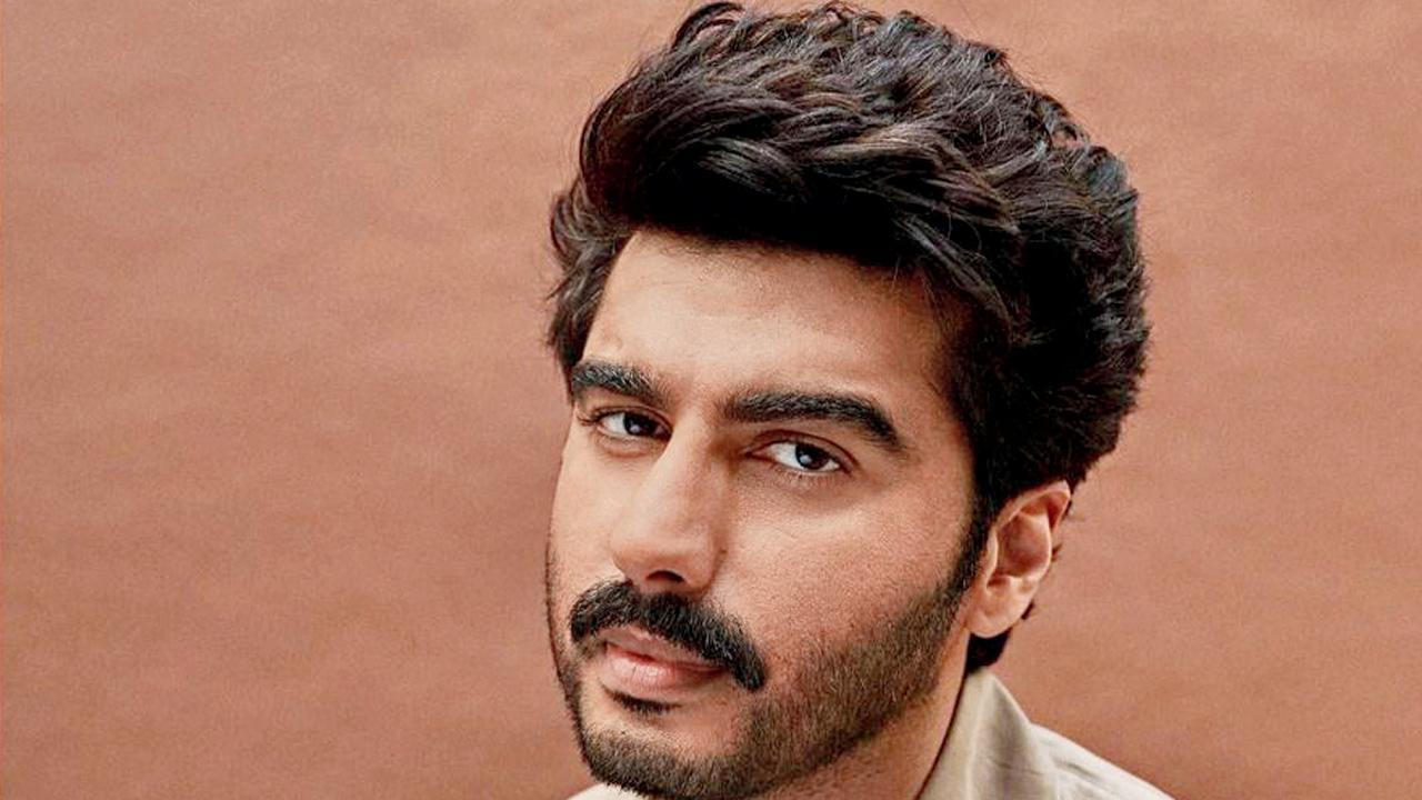
Arjun Kapoor Tattoos: SM:)E, Maa and Personal Ink

Arjun Kapoor’s tattoos range from family tributes to a playful word on his hand. They use different placements and lettering, but most point to a person or idea he has discussed. His hand piece spells “SM:)E,” with the face standing in for a letter.

Kapoor has called tattoos a form of expression and said he wants them to feel personal. Some meanings come from his own comments; others are reported by entertainment outlets or inferred from photos. Keeping those sources distinct gives a clearer picture of what is known.

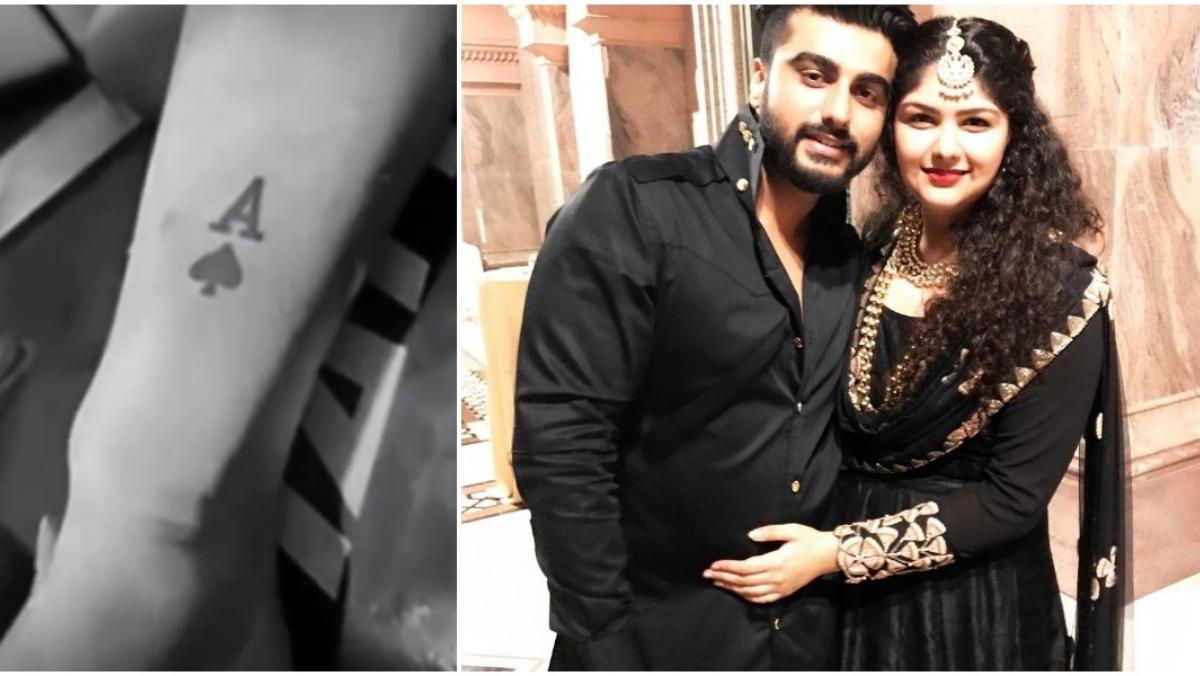
Four designs have the clearest public context: the newer “SM:)E” hand tattoo, Hindi “Maa” on his wrist, “Per Ardua Ad Astra” on his inner arm, and an A with an Ace of Spades associated with his sister Anshula. They don’t form one planned sleeve; each stands on its own.

Arjun Kapoor’s New SM:)E Hand Tattoo

Arjun Kapoor tattoos: Genuine tattoo evidence for the newer hand lettering.

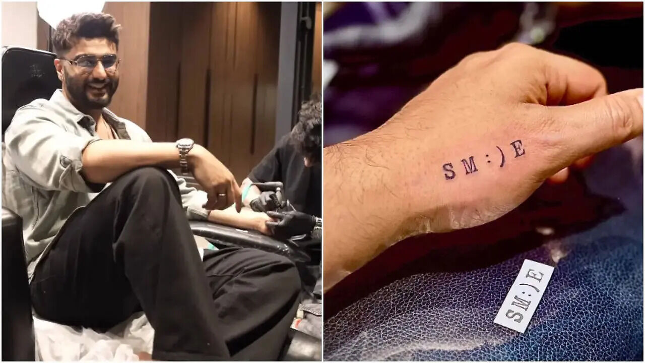
In June 2025, around his 40th birthday, Kapoor shared a video of himself getting “Smile” tattooed on his hand. He styled it as SM:)E, using a smiley face in place of the usual letters.

That small change gives the word its playful look. Kapoor said he was getting it because people often call him grumpy and say he doesn’t smile enough. He also described it as a reminder to become more cheerful, so the meaning comes from his own explanation.

The design is compact black lettering across the back of his hand. The gaps keep the word readable, and the simple face is not crowded with extra detail. Hands move often and meet friction, washing and sunlight, so a small design there needs clear spacing.

A hand tattoo stays in view during ordinary gestures, without a pose or mirror. For Kapoor, that makes the placement fit the reminder he described.

If you’re adapting a word into a symbol, make sure the altered letter still reads at a glance. Leave room around the face and the other letters; extra decoration could muddy the idea.

The “Maa” Wrist Tattoo for His Mother

Arjun Kapoor tattoos: Genuine tattoo evidence for the Hindi wrist tribute and number detail.

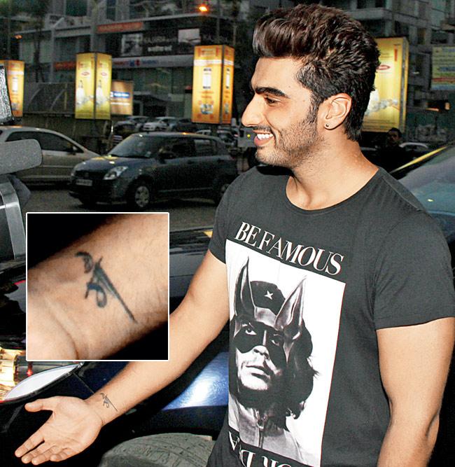
The Hindi word “Maa” sits on Kapoor’s wrist. Mid-day describes it as a tribute to his mother, Mona Shourie Kapoor, and connects the number eight in the design to his June 26 birthday. The cited photograph shows the lettering as he extends his arm.

The wrist is easy to cover with a watch or bracelet, yet it appears in view when someone moves their hands. That keeps the word close without making it a large arm piece.

The photo is a candid outdoor shot, not a studio portrait: Kapoor wears a graphic T-shirt, with traffic and city lights behind him. The setting shows the tattoo as it appears in an ordinary moment.

A single Hindi word carries the tribute without a portrait or longer memorial design. Mid-day’s reported number detail adds another reference while keeping the tattoo compact.

When choosing a family word in another script, check the spelling and spacing with someone who knows the language. The stencil should also look balanced on a relaxed wrist.

Per Ardua Ad Astra on the Inner Arm

Arjun Kapoor tattoos: Genuine tattoo evidence for the Latin phrase on the inner arm.

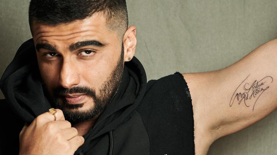
“Per Ardua Ad Astra” runs in cursive along Kapoor’s inner arm. He has translated it as “through adversity to the stars” and said the phrase felt accurate and personal. He connected it to career obstacles and continuing despite other people’s doubts.

The words are stacked and angled in loose script rather than the clean lettering of “SM:)E.” The smaller first line leads into the larger final words, following the shape of his arm.

The inner-arm placement can face Kapoor or show when he lifts his arm. It is less exposed than the hand and gives the longer phrase room to read.

Kapoor has also described tattoos as a way to imprint part of a person’s soul on the body. Here, he tied the phrase to his own setbacks and persistence rather than leaving its meaning to a generic translation.

Fine cursive can blur if it is too small. An artist may adjust spacing or simplify flourishes so the words stay readable; the phrase matters more than copying every loop.

The A and Ace of Spades Tattoo for Anshula

Arjun Kapoor tattoos: Genuine tattoo evidence for the A and spade design linked to Anshula.

The A and spade tattoo is linked to Kapoor’s sister, Anshula. India Today describes it as a sibling tribute and connects the ace to the phrase “ace up his sleeve.” The small design places the letter A above a spade on his arm.

Unlike the Latin motto, this piece uses a letter and symbol instead of a sentence. The initial points to Anshula; the ace reference gives the tribute a lighter touch.

The A and spade need enough separation to read as two marks, not one dark shape. In the photo, the initial appears first and the card symbol sits below it.

A close crop shows the design clearly; a wider photo of Kapoor with Anshula places it in the relationship behind it. The context matters as much as the small graphic.

The Actor Off Camera

Arjun Kapoor in a contextual photograph: Contextual portrait only; not tattoo evidence.; not tattoo evidence

His pieces don’t need one visual theme: “Maa” and the A with a spade point to family, the Latin phrase to persistence, and the hand tattoo to a lighter reminder to smile.

The wrist and hand tattoos can show during conversation, while the inner-arm phrase takes a deliberate movement or sleeveless outfit to reveal. Their different placements let Kapoor choose how much is visible at a given moment.

The source photos vary: polished portraits, street shots, tattoo-session footage and close views. A flash can flatten the linework, while movement or a tight crop can hide the placement. Looking across the different images gives a fuller view than relying on one photo.

His collection is connected by personal meaning rather than a single style. Some pieces are sentimental, one is motivational, and the hand design is playful; they don’t need to match to belong together.

If you’re taking inspiration, start with what the design means to you. Check a family word carefully, proofread a quote or translation, and give a small symbol enough room to stay legible. Keep a playful idea simple enough to read.

Some explanations come directly from Kapoor; others are supported by reporting and photos. Those distinctions leave room for a private meaning without guessing at every line.

His tattoos hold space for family, ambition and self-mockery. The newer hand piece adds a lighter note alongside the older designs, each keeping its own story and style.

undefined

More actor tattoo guides

Kelly Rizzo Tattoos: Sicily, a Skull and a Birthday Story

Kelly Rizzo’s latest tattoos are small, fine-line designs that show more clearly when she turns her arm. One is tied to her family background; the other is a skull she has not publicly explained in detail.

Rizzo shared the appointment in a short reel from a 46th-birthday getaway with Breckin Meyer. The new pieces were an outline of Sicily and a delicate skull. She said she’d wanted both for a long time, so the trip brought two existing ideas together rather than introducing a last-minute theme.

The public account makes a useful distinction: Rizzo explained the Sicily tattoo’s family connection, while she hasn’t given the skull the same personal context.

Kelly Rizzo’s Sicily tattoo has a family tie

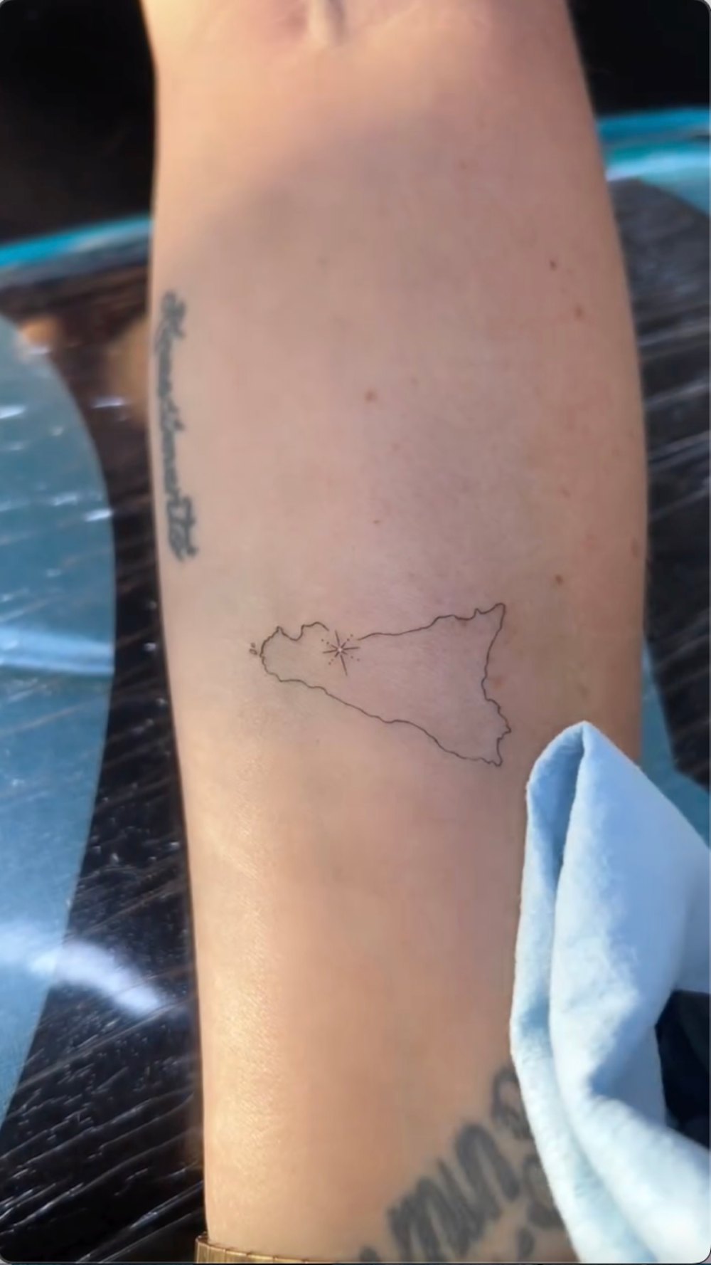
Kelly Rizzo tattoos: Kelly Rizzo's Sicily tattoo has a family tie

The Sicily outline follows the island’s shape in a light, unfilled line. A small star-like mark sits inside it. It reads as a map without added labels or a dense travel scene.

When a commenter asked why she chose Sicily, Rizzo said she is Sicilian and her father was born there. That gives the outline a direct family connection. The spare linework keeps the design from becoming a crest or a larger memorial piece.

A small mark inside the outline gives the eye one place to land, but its exact location isn’t explained in the report. Leaving it at that keeps the description with what the image shows.

For a place tattoo, a recognizable silhouette can do most of the work. Start with the outline, then add one detail that matters to you rather than crowding the map with labels or coordinates.

The arm is a practical place for a small map: Rizzo can see it, but it doesn’t take over every photo.

The delicate skull tattoo keeps the pair from feeling too sweet

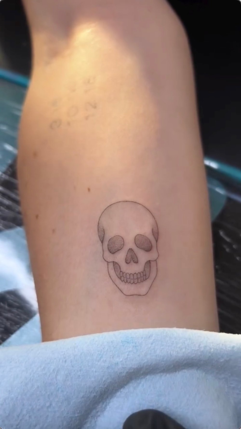
Kelly Rizzo tattoos: The delicate skull tattoo keeps the pair from feeling too sweet

The second tattoo is a small skull, drawn with fine outlines and light shading. The eye sockets are softly filled, the nose is darker, and the teeth are picked out individually. Its tidy shape avoids cracks, flames or crossbones.

A skull can carry many meanings, but Rizzo hasn’t assigned this one a specific story in the birthday coverage. It is safer to describe the design and leave its private meaning open.

Both tattoos use fine linework, but the Sicily outline is wider and horizontal while the skull is more compact. There’s no report that they were intended as a matching set; they simply share a light treatment.

The shading gives the skull a face without turning it into a dark patch. With a small design, too much fill can swallow detail; too little can flatten the features.

If you like a skull tattoo, decide first how you want it to read—playful, gothic, understated or anatomical—and show the artist references for that mood.

A very good birthday setting

Kelly Rizzo in a contextual photograph: Birthday context around Kelly Rizzo's new tattoos; not tattoo evidence

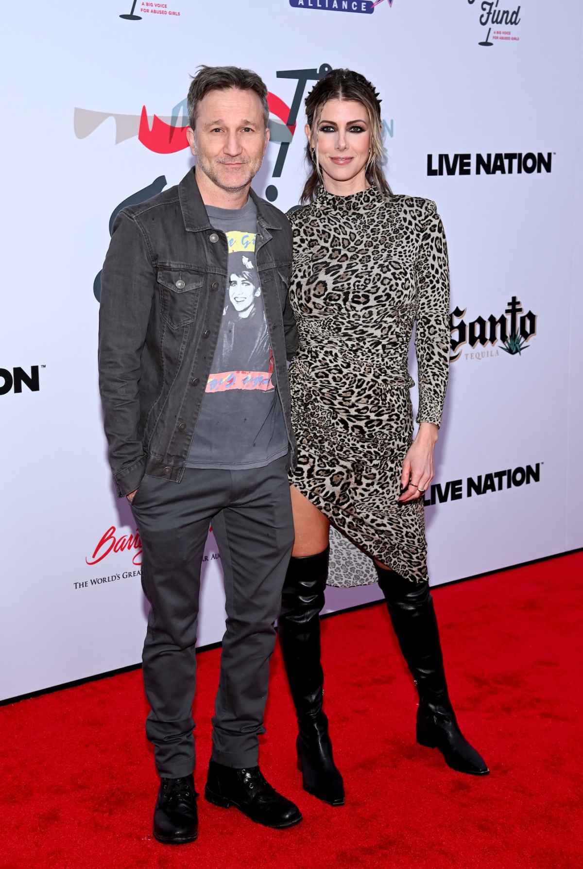
This image shows Rizzo and Meyer at an event, not either finished tattoo. The birthday reel provides the close-up evidence for the new designs; this photo only gives a sense of their public style.

The report places the appointment on a birthday trip near the ocean. Rizzo’s caption mentioned tattoos, beaches, boats, food and gratitude. The private studio was near the water, and tattoo artist Rick Coury worked on the pieces.

The tattoos mark the trip without trying to illustrate it. The Sicily outline carries a family connection, while the skull was an idea Rizzo had wanted for years. Neither needs a wave, palm tree or birthday number beside it.

A red-carpet photo and a tattoo appointment show different sides of the same person. One is styled for a camera; the other is an artist working close to the skin. The new pieces can belong to both settings without being designed to perform in either.

Context photos can show the occasion, but they don’t confirm a tattoo unless the mark is clear. The Sicily close-up does that; a couple portrait does not.

Kelly Rizzo has a strong Italian thread

Rizzo has discussed other Italian references in a Women’s Health Body Scan interview, including an Italian flag, Italian wording and a flight path between Palermo, Chicago and Los Angeles. She also said her father was born in Schiavi di Abruzzo. That earlier interview adds background to the new Sicily outline; it doesn’t establish a meaning for the skull.

Her older tattoos include words, symbols and a travel reference rather than one repeated design. The new map can sit with them without looking like it was added to complete a planned sleeve.

A heritage tattoo doesn’t have to be a map. It might be a family name, a food, a flower from a hometown or an object tied to a relative. The most useful detail is one you can explain plainly, as Rizzo did when she said she is Sicilian.

A map’s outline has to remain recognizable on curved, moving skin, so an artist may simplify small coastline details. Rizzo’s version stays light and open.

Kelly Rizzo off camera

Kelly Rizzo in a contextual photograph: Kelly Rizzo off camera; not tattoo evidence

This older event image shows Rizzo and Meyer before the birthday appointment. Their relationship became public in 2024, after they had been dating since 2022; that timeline gives background to the later birthday reel.

Rizzo’s public work spans food, travel, lifestyle and personal stories. A tattoo linked to Sicily fits topics she already discusses, but the design itself is a small family reference rather than a statement about her whole public image.

The skull doesn’t need to share the same backstory. Rizzo said she had wanted it for years, and that may be the full explanation. People can choose one tattoo for family and another simply because they keep returning to the image.

The personal context around Kelly Rizzo’s latest pieces

Kelly Rizzo in a contextual photograph: Personal context around Kelly Rizzo's latest pieces; not tattoo evidence

This event photo supplies personal context, not evidence of the new tattoos. It shows Rizzo and Meyer together; it should not be used to identify the Sicily outline or skull. Rizzo has also spoken publicly about love, loss and moving forward, but the image doesn’t prove a specific meaning for either design.

A heritage tattoo can carry family history without requiring the wearer to tell the whole story. The visible design is only part of it; sometimes the simplest description is the most respectful.

The Sicily outline has a public explanation and a clear shape. The skull is visible, but its personal meaning remains open. Together they look considered without needing a shared theme.
If you’re drawing from the pair, choose a place that matters to you or a symbol you’ve wanted for a while. Keep the lines open and let the artist fit the design to your arm; the goal is a tattoo that still feels personal after the trip or trend has passed.

For more context on Rizzo’s earlier Italian and tribute tattoos, the Women’s Health Body Scan interview walks through pieces she has discussed on camera.

More celebrity tattoo guides

David Eason Tattoos: Home Sick Knuckles and Personal Ink

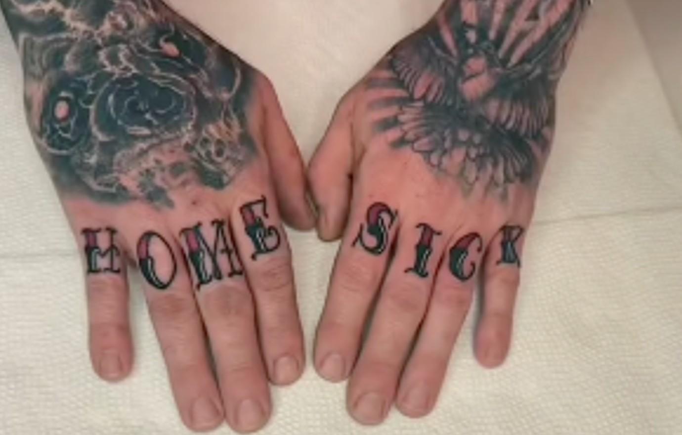
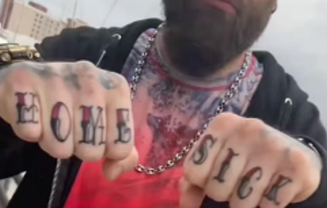
A short phrase across the knuckles is hard to miss. David Eason’s best-known hand tattoo reads HOME on one hand and SICK on the other, in black lettering with red shading. Other work is visible on his fingers, hands, neck and chest, though the available photos don’t document every piece clearly. It helps to separate what was reported about the tattoos from what can only be made out in the images.

David Eason’s “Home Sick” Knuckle Tattoo

David Eason tattoos: Opening visual for the reported HOME SICK knuckle lettering.

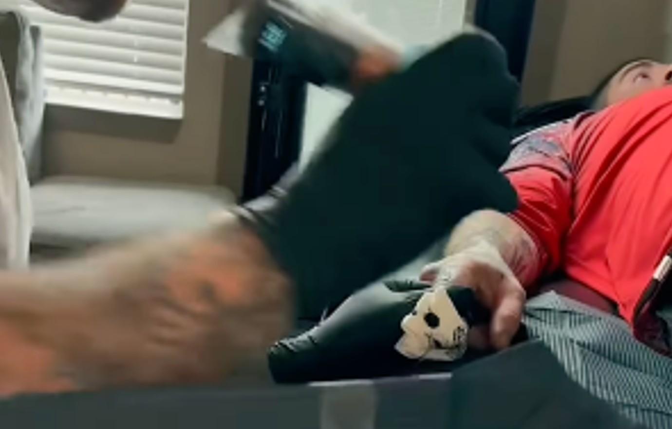
The HOME SICK lettering is tall and heavily outlined, with red worked into parts of the black design. OK! Magazine reported that Eason got it in late March 2024 from the artist credited as @slowdownlouu. The outlet shared a reveal video and follow-up photos, including views of the fresh tattoo and its healing stages.

Eason’s reported caption linked the words to feeling homesick after leaving the nest and to memories of being 12, when life felt easier. That gives the phrase a personal context, but it doesn’t explain every mark around it. The connection to home comes from the caption; the meaning of the other tattoos remains unclear.

The Setting Around the Appointment

David Eason in a contextual photograph: Process/context visual showing the hand and forearm work in the report.; not tattoo evidence

There’s no banner, frame or central symbol around the words. The design relies on contrast: black outlines keep the letters defined, while red adds color without obscuring them. The two hands aren’t perfectly matched, but HOME SICK reads as one phrase when they’re brought together.

Hand tattoos move with the skin and take daily wear. A layout that looks balanced on paper can shift when the fingers bend, so spacing and line weight matter. Short words, clear gaps and lines that can hold their shape are more practical here than a long sentence squeezed onto the knuckles. The split also gives each hand its own design while keeping the phrase easy to read as a pair.

What the Close-Up Tattoo Photos Show

David Eason tattoos: Close-up reference for the HOME SICK lettering and surrounding hand tattoos.

The close-ups show shaded shapes and darker linework around the knuckles alongside the lettering. Some details are visible, but the crops, lighting and video quality don’t support confidently naming every symbol.

The photos are useful in different ways: one shows the fronts of the fingers, another the side of the hand, and a third how the letters sit when the hand is relaxed. That makes multiple angles a better reference than a single filtered close-up, especially when discussing how a design wraps over a knuckle.

The Other Hand and Finger Ink

David Eason tattoos: Alternate angle for the lettering, hand coverage, and upper-body ink.

Other letters and symbols appear on the fingers, with denser work across the hands and upper body. The images show a mix of lettering and darker pieces, but they don’t establish the meaning of each one.

The composition is busy around the phrase, so the lettering has to stay distinct. Keep the words readable before adding more detail. Anyone considering hand text should also think about how visible it will be in everyday settings; even small lettering is difficult to cover. Here, HOME and SICK form a pair, while each hand still carries its own surrounding work.

The Other Commitment Behind the Collection

David Eason in a contextual photograph: Context for the relationship-related section; this image is not used as tattoo proof.; not tattoo evidence

Us Magazine separately reported on a name tattoo connected to Eason’s girlfriend at the time, Kenleigh Heatwole. That report described a different kind of commitment from the HOME SICK phrase: one tied to a relationship. It also noted that viewers questioned the decision. Those reactions are part of the public discussion, but they don’t tell us what the tattoo meant to Eason.

For anyone planning a tribute, a name and a phrase carry different risks. A name records a particular relationship; a shared reference or symbol may leave more room for interpretation as circumstances change. The choice is personal, and the reporting doesn’t establish more than the connection it describes.

Why the Placement Feels So Personal

The knuckles are a conspicuous place for a message. The words appear in ordinary gestures, so HOME SICK is seen by other people as well as by the person wearing it. Eason’s caption supplies a link to home and childhood; beyond that, it’s better not to assign the phrase a more specific story than the public record supports.

How to Read the Photos Without Overclaiming

The clearest reported details are the wording, its placement, the artist credit and the explanation attached to the reveal. The surrounding tattoos are visible in photographs, but their exact symbols and meanings aren’t confirmed in the same way. Keeping those two kinds of evidence separate makes the images easier to read without turning guesses into biography.

For a tattoo consultation, the photos can show scale, contrast and how the lettering follows the fingers. The personal meaning can guide the conversation, while the artist works out what will fit the hand.

What Makes the Collection Stand Out

What stands out is the blunt lettering set against denser work nearby. The knuckle phrase is designed to be read, and its position makes it part of everyday interaction. The photos give a clear view of that choice; they leave the stories behind the surrounding symbols open.

More celebrity tattoo guides

Riley Keough Tattoos: Tiny Symbols, Family Tributes and a Growing Scrapbook of Ink

Riley Keough’s tattoos read like a collection gathered over time: a few small symbols, a family memorial, music references and marks she hasn’t publicly explained. The pieces show up in different places, from her wrist and finger to her foot and collarbone, and the photos catch them at different angles.

She has described getting tattoos around film shoots, nights out and trips, then forgetting about them until makeup artists need to cover them. Published galleries don’t always agree on the total, and older pictures can make a small mark look like a shadow or a bracelet. The clearest account sticks to what the photos show and to meanings Keough or reliable coverage have actually supplied.

The bracelet tattoo on her wrist

Riley Keough tattoos: inline

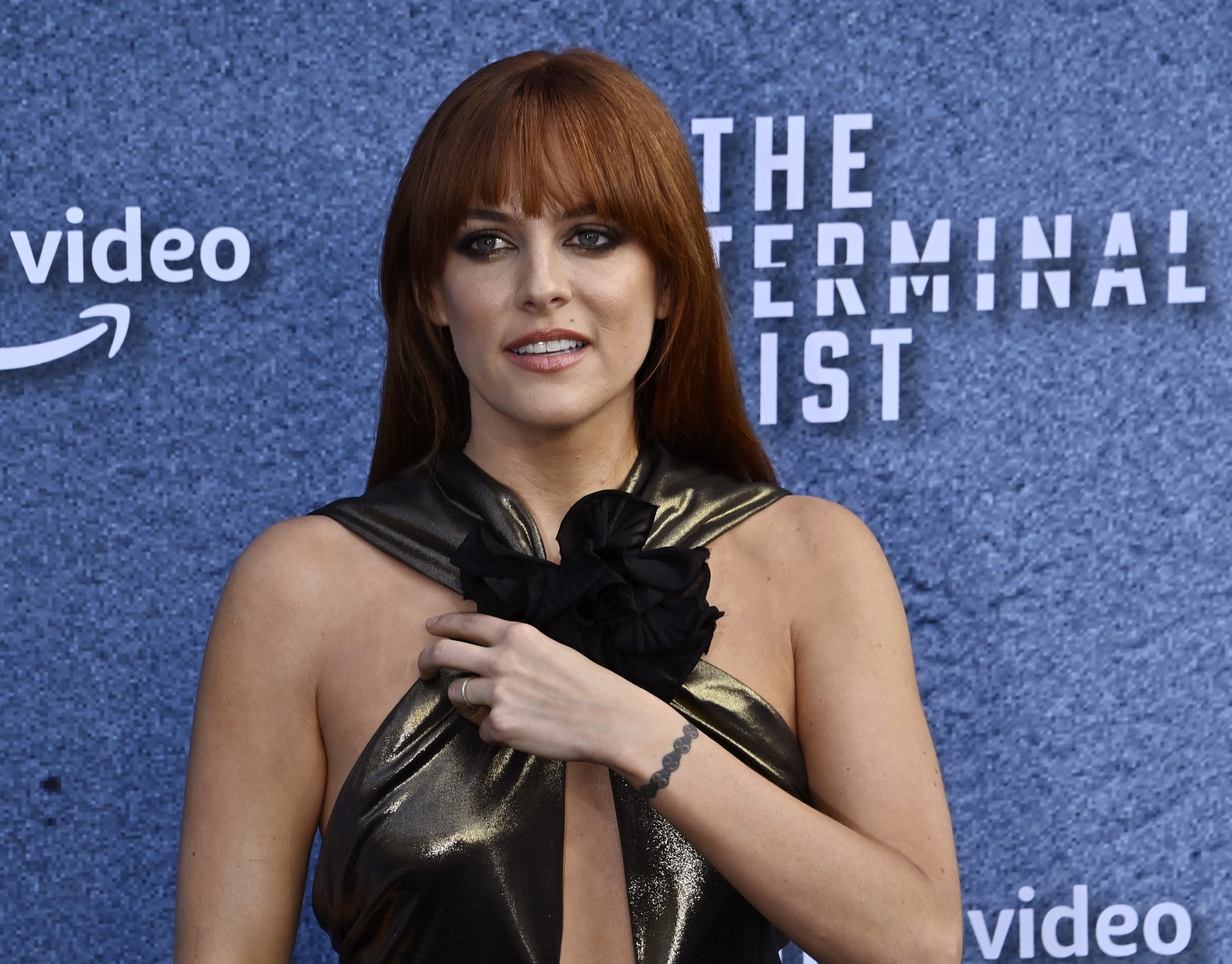
A dark, linked pattern circles Keough’s wrist like a narrow bracelet. Repeating round details give it texture, while the gaps keep it from reading as one solid band. In the red-carpet photo, it sits near the metallic fabric and oversized black bow without getting lost in the outfit.

Keough hasn’t publicly explained what the design means. The image supports a description of its shape and placement, but not a story about why she chose it.

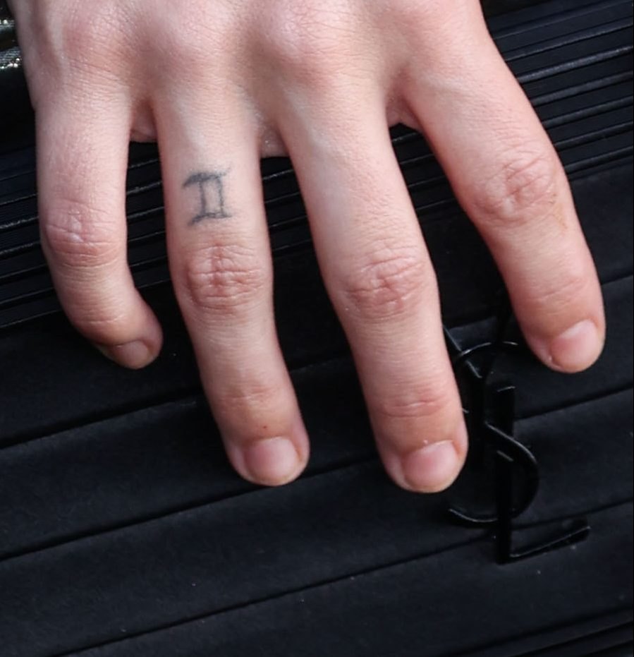
The Gemini symbol tattoo on her ring finger

Riley Keough tattoos: inline

A small Gemini symbol sits on Keough’s ring finger. Life & Style has connected it to her birth sign. The black lines have softened with time, but the symbol remains recognizable in the close-up.
Finger skin gets frequent movement and friction, which can make fine tattoo lines fade sooner than ink elsewhere. Here, the worn edges are visible; there’s no need to read more into them than age and placement.

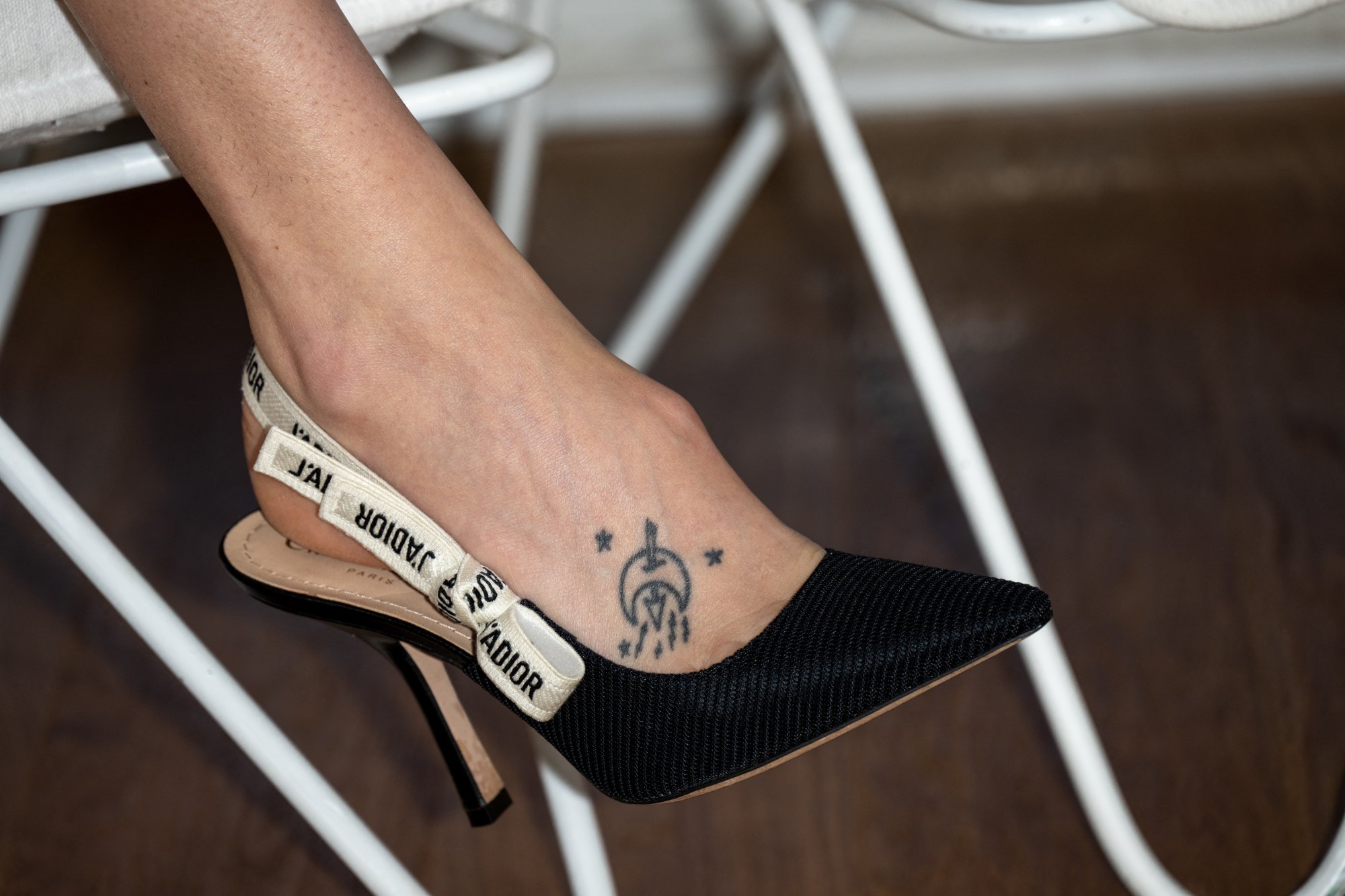
The moon-and-stars tattoo on her foot

Riley Keough tattoos: inline

On her right foot, Keough has a small cluster that appears to combine a crescent or moon, an arrow and tiny stars. It sits high on the foot, where it can show above a shoe or sandal.

She has described getting a foot tattoo with her husband in Australia before they married. They were drinking beer at the beach and decided to get tattooed. That account gives the piece a setting, but she hasn’t assigned a separate meaning to each part of the design.

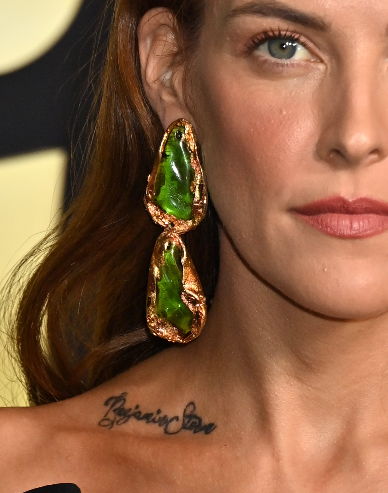
The Benjamin Storm collarbone tattoo

Riley Keough tattoos: inline

The cursive Benjamin Storm lettering along Keough’s collarbone honors her younger brother, Benjamin Keough. Coverage at the time noted that he had her name in a corresponding placement. The script follows the line of her collarbone and is large enough to read in a portrait without covering the whole area.

Harper’s Bazaar reported that Keough has eight tattoos and that the makeup team on Daisy Jones & The Six airbrushed them out for the role. The collarbone piece is especially visible, so keeping it covered consistently would have been part of the work across repeated scenes.

When a role calls for a clean look

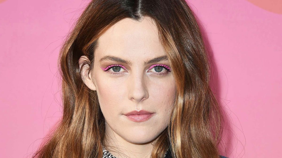
Riley Keough in a contextual photograph: inline; not tattoo evidence

Keough has joked that every new tattoo means an earlier call time because there is more to conceal. It points to a practical part of acting work: body makeup has to match her skin and stay consistent through movement and scenes shot out of order.

The portrait here provides context, not close-up evidence of a tattoo. Editorial portraits identify the person; clear tattoo photos are needed to discuss a design’s shape and placement.

Other small pieces that appear in photos

Life & Style also documents a “Nope” tattoo on her right wrist and a small 071 beneath her right elbow. The number’s meaning hasn’t been confirmed. Photos show dots and a square Keough discussed around the time of Mad Max: Fury Road, as well as a symbol associated with Led Zeppelin.

Keough has also talked about a Mayan-calendar tattoo representing her birthday and another connected with her father. Because the details come from different interviews and photo galleries rather than one official list, sites count the marks differently. The collection includes pieces linked to family, music, travel and specific periods in her life, but some remain unexplained.

Design lessons from the collection

These tattoos vary in scale and placement, from a finger symbol to collarbone script. For a design of your own, think about how the area moves and how visible you want it to be. Keough has shared the meaning of some pieces and kept others private; a photograph alone doesn’t tell the whole story.

More actor tattoo guides