
A short phrase across the knuckles is hard to miss. David Eason’s best-known hand tattoo reads HOME on one hand and SICK on the other, in black lettering with red shading. Other work is visible on his fingers, hands, neck and chest, though the available photos don’t document every piece clearly. It helps to separate what was reported about the tattoos from what can only be made out in the images.
David Eason’s “Home Sick” Knuckle Tattoo

The HOME SICK lettering is tall and heavily outlined, with red worked into parts of the black design. OK! Magazine reported that Eason got it in late March 2024 from the artist credited as @slowdownlouu. The outlet shared a reveal video and follow-up photos, including views of the fresh tattoo and its healing stages.
Eason’s reported caption linked the words to feeling homesick after leaving the nest and to memories of being 12, when life felt easier. That gives the phrase a personal context, but it doesn’t explain every mark around it. The connection to home comes from the caption; the meaning of the other tattoos remains unclear.
The Setting Around the Appointment
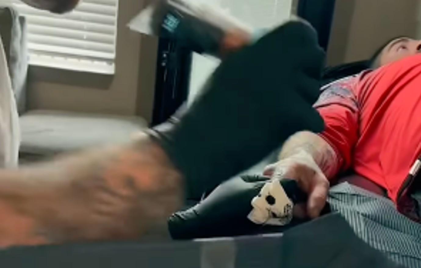
There’s no banner, frame or central symbol around the words. The design relies on contrast: black outlines keep the letters defined, while red adds color without obscuring them. The two hands aren’t perfectly matched, but HOME SICK reads as one phrase when they’re brought together.
Hand tattoos move with the skin and take daily wear. A layout that looks balanced on paper can shift when the fingers bend, so spacing and line weight matter. Short words, clear gaps and lines that can hold their shape are more practical here than a long sentence squeezed onto the knuckles. The split also gives each hand its own design while keeping the phrase easy to read as a pair.
What the Close-Up Tattoo Photos Show
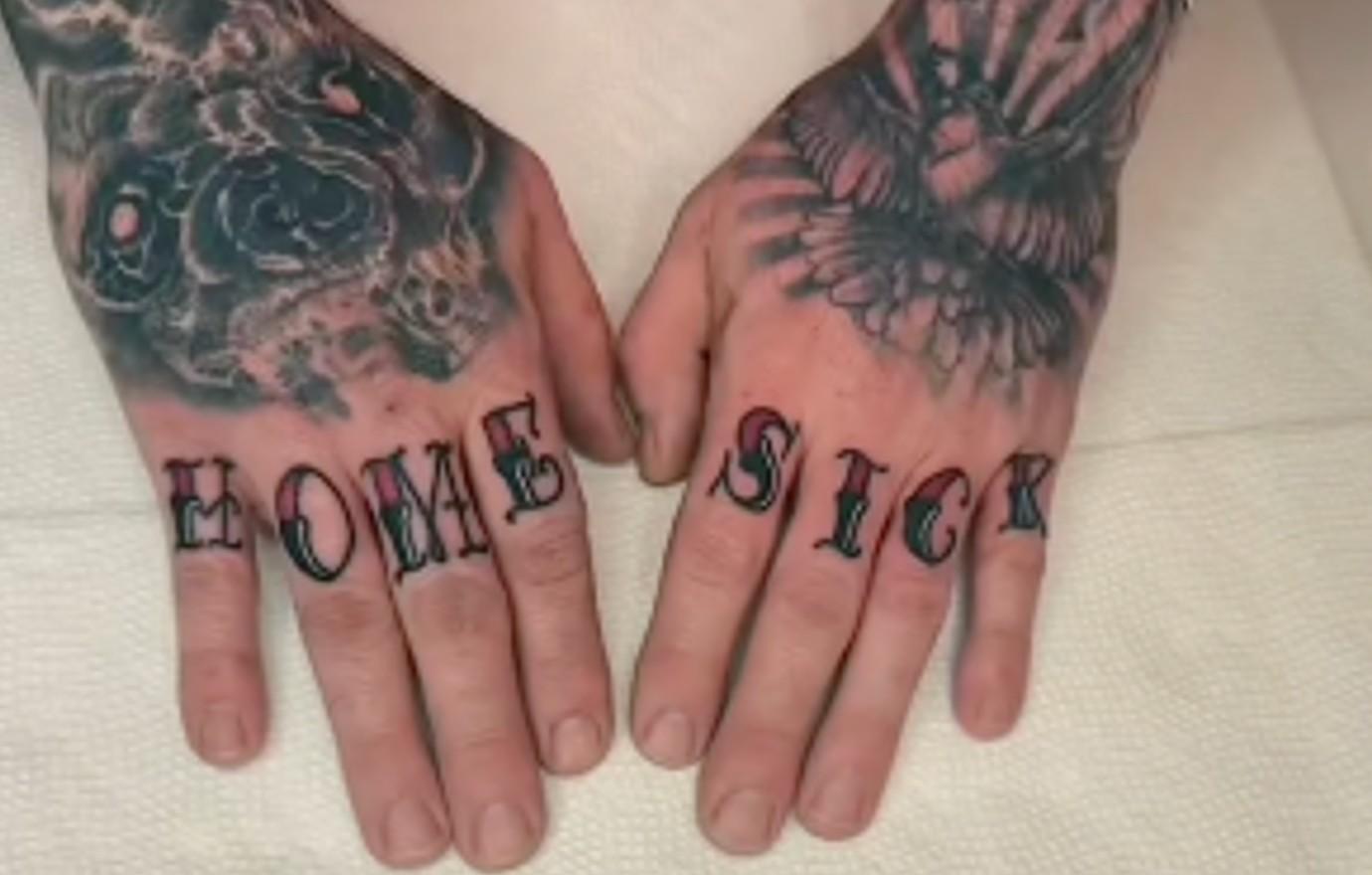
The close-ups show shaded shapes and darker linework around the knuckles alongside the lettering. Some details are visible, but the crops, lighting and video quality don’t support confidently naming every symbol.
The photos are useful in different ways: one shows the fronts of the fingers, another the side of the hand, and a third how the letters sit when the hand is relaxed. That makes multiple angles a better reference than a single filtered close-up, especially when discussing how a design wraps over a knuckle.
The Other Hand and Finger Ink
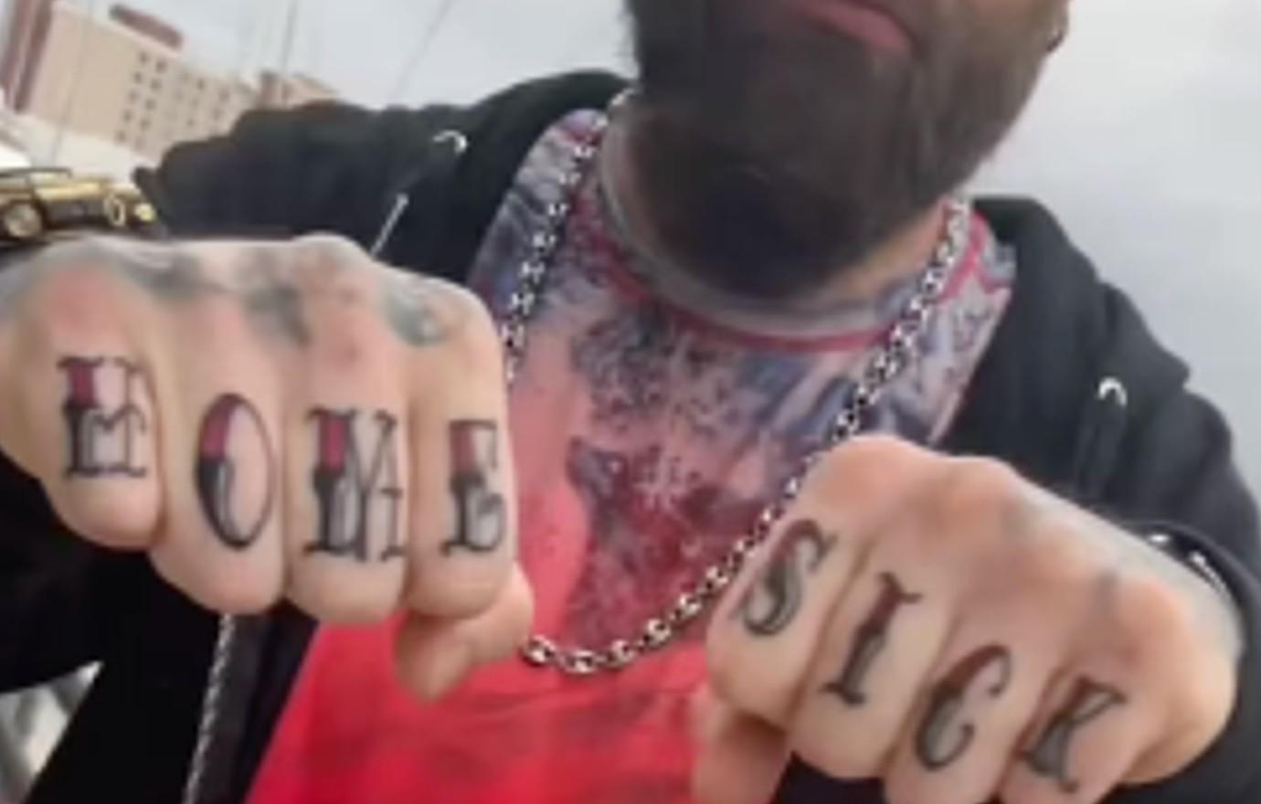
Other letters and symbols appear on the fingers, with denser work across the hands and upper body. The images show a mix of lettering and darker pieces, but they don’t establish the meaning of each one.
The composition is busy around the phrase, so the lettering has to stay distinct. Keep the words readable before adding more detail. Anyone considering hand text should also think about how visible it will be in everyday settings; even small lettering is difficult to cover. Here, HOME and SICK form a pair, while each hand still carries its own surrounding work.
The Other Commitment Behind the Collection
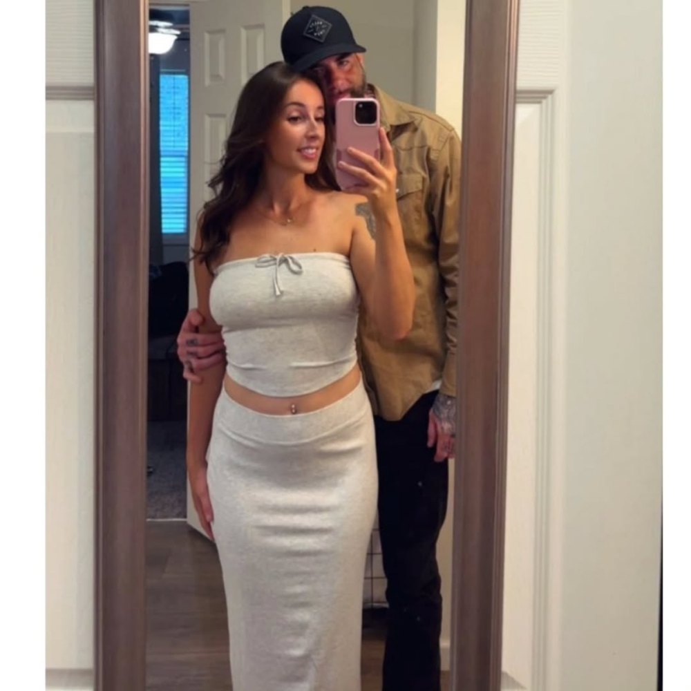
Us Magazine separately reported on a name tattoo connected to Eason’s girlfriend at the time, Kenleigh Heatwole. That report described a different kind of commitment from the HOME SICK phrase: one tied to a relationship. It also noted that viewers questioned the decision. Those reactions are part of the public discussion, but they don’t tell us what the tattoo meant to Eason.
For anyone planning a tribute, a name and a phrase carry different risks. A name records a particular relationship; a shared reference or symbol may leave more room for interpretation as circumstances change. The choice is personal, and the reporting doesn’t establish more than the connection it describes.
Why the Placement Feels So Personal
The knuckles are a conspicuous place for a message. The words appear in ordinary gestures, so HOME SICK is seen by other people as well as by the person wearing it. Eason’s caption supplies a link to home and childhood; beyond that, it’s better not to assign the phrase a more specific story than the public record supports.
How to Read the Photos Without Overclaiming
The clearest reported details are the wording, its placement, the artist credit and the explanation attached to the reveal. The surrounding tattoos are visible in photographs, but their exact symbols and meanings aren’t confirmed in the same way. Keeping those two kinds of evidence separate makes the images easier to read without turning guesses into biography.
For a tattoo consultation, the photos can show scale, contrast and how the lettering follows the fingers. The personal meaning can guide the conversation, while the artist works out what will fit the hand.
What Makes the Collection Stand Out
What stands out is the blunt lettering set against denser work nearby. The knuckle phrase is designed to be read, and its position makes it part of everyday interaction. The photos give a clear view of that choice; they leave the stories behind the surrounding symbols open.
One thought on “David Eason Tattoos: Home Sick Knuckles and Personal Ink”