codex

Graham Platner Tattoos: The Celtic Knot Cover-Up Explained

The covered-up Celtic knot and dog tattoo
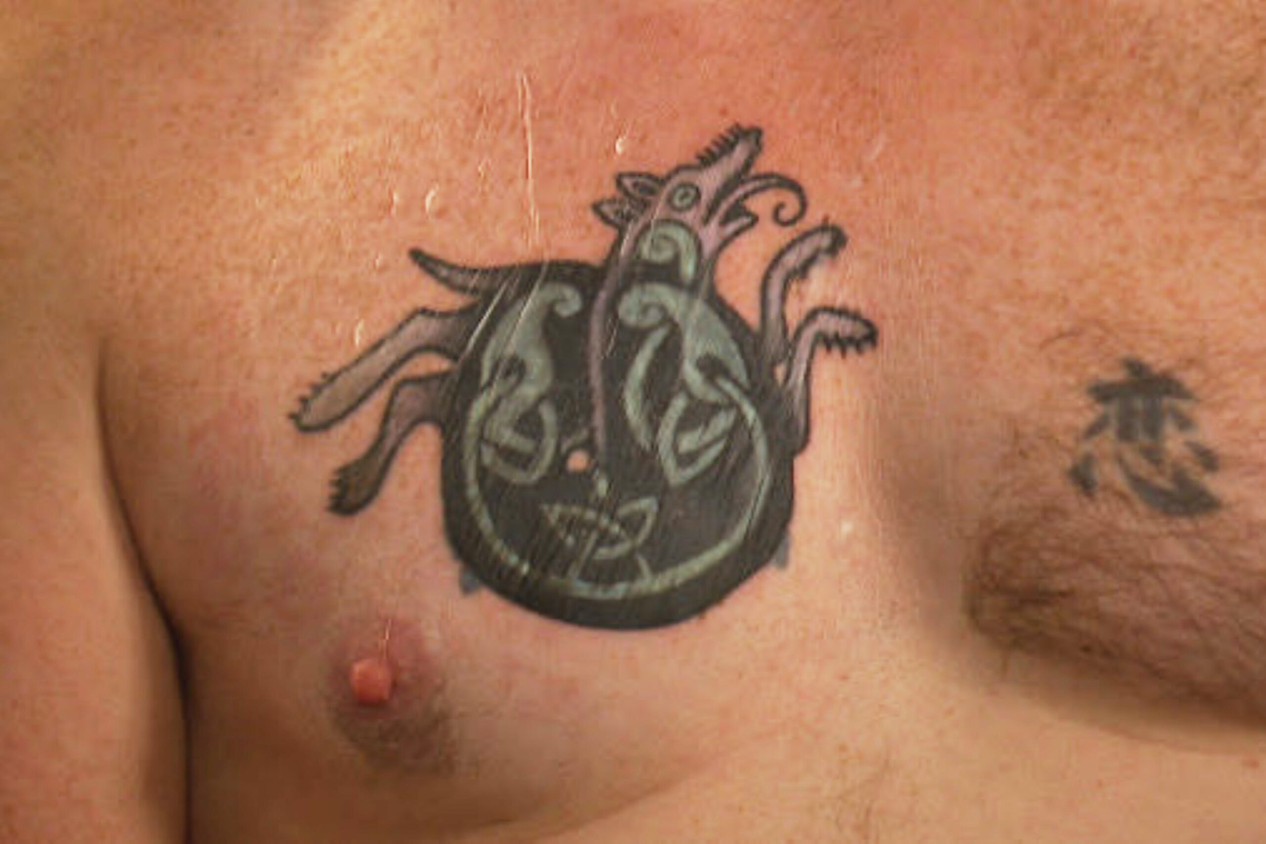
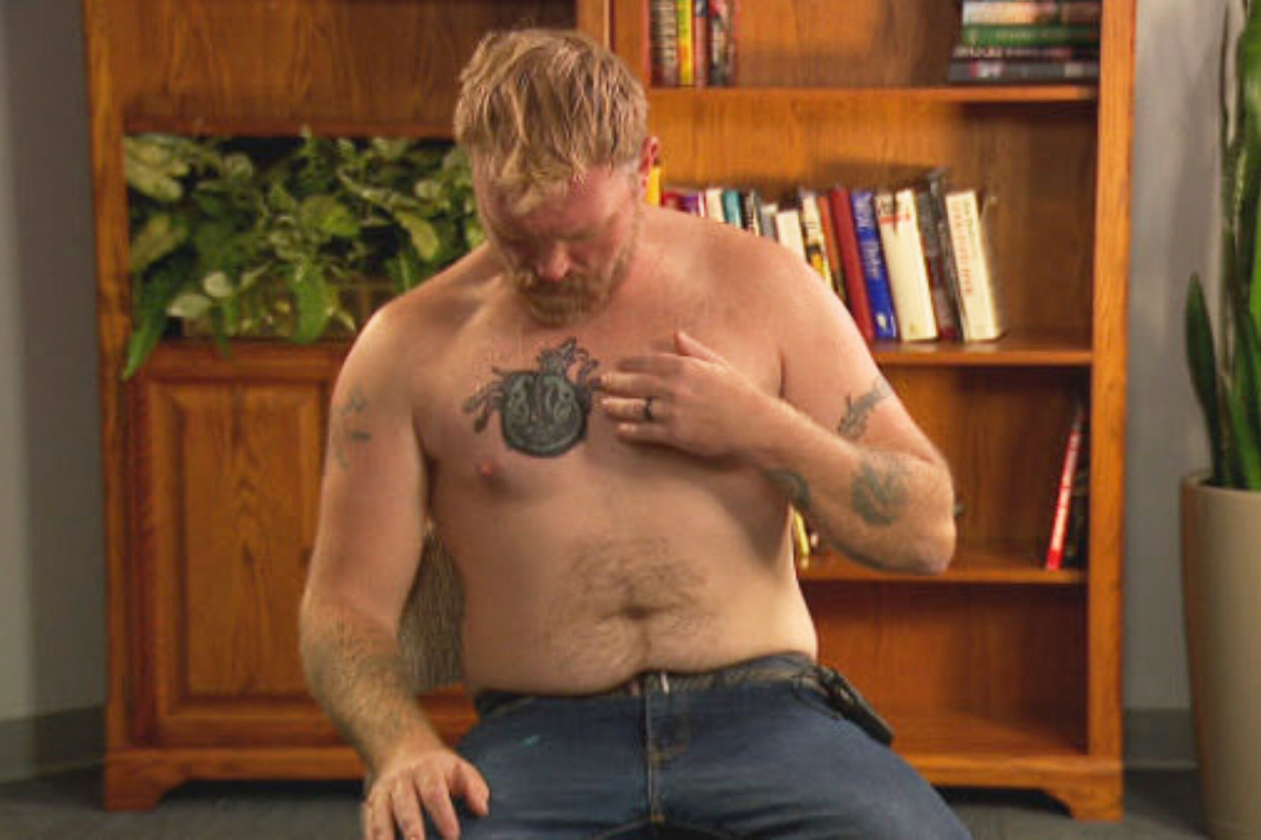
Graham Platner tattoo evidence: original chest tattoo close-up.
Graham Platner tattoo evidence: Celtic knot and dog-like cover-up tattoo shown during the AP-reported interview.

In October 2025, Maine Senate candidate Graham Platner showed a chest cover-up after his earlier tattoo drew attention for resembling Nazi imagery. The replacement is a dark Celtic knot with a dog-like figure and green details, placed high on the chest over the old design.

Platner told the Associated Press that he got the original skull-and-crossbones tattoo in 2007, while in the Marine Corps and on leave in Croatia, without knowing its connection to Nazi police. He first discussed removal, then said a cover-up was more practical because removal could take years and the tattoo was large.

The knot’s interlocking bands create areas for strong outlines and dark coverage. AP described the animal as having four long legs, an elongated head and a curly tongue. The dense shapes help the new design cover the old ink.

Most of the piece reads as black, with green in the knotwork. That color helps distinguish the looping bands from the central figure without making the whole tattoo bright.

The design spans the upper chest where the earlier tattoo sat. A piece this large has to follow the sternum, collarbones and pectoral muscles; here it reads as one broad panel rather than several smaller patches.

Who is Graham Platner?
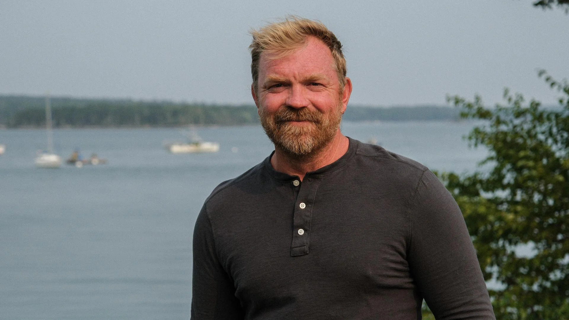
Graham Platner in a contextual photograph: Contextual portrait, not tattoo evidence.; not tattoo evidence

Platner is a Maine political candidate and former Marine. That background is relevant to how the original tattoo entered the public record, but contextual portraits aren’t close evidence for the cover-up’s details.

The original symbol became controversial because it resembled Nazi imagery. Platner said he hadn’t known that association when he chose it. Researching an image’s history and current use before getting it can prevent that kind of discovery later.

Platner said he wanted the old image off his body. The replacement keeps the chest placement but changes the design. The visible knot and dog-like figure can be described without assigning them a private meaning he hasn’t shared.

His working-life context
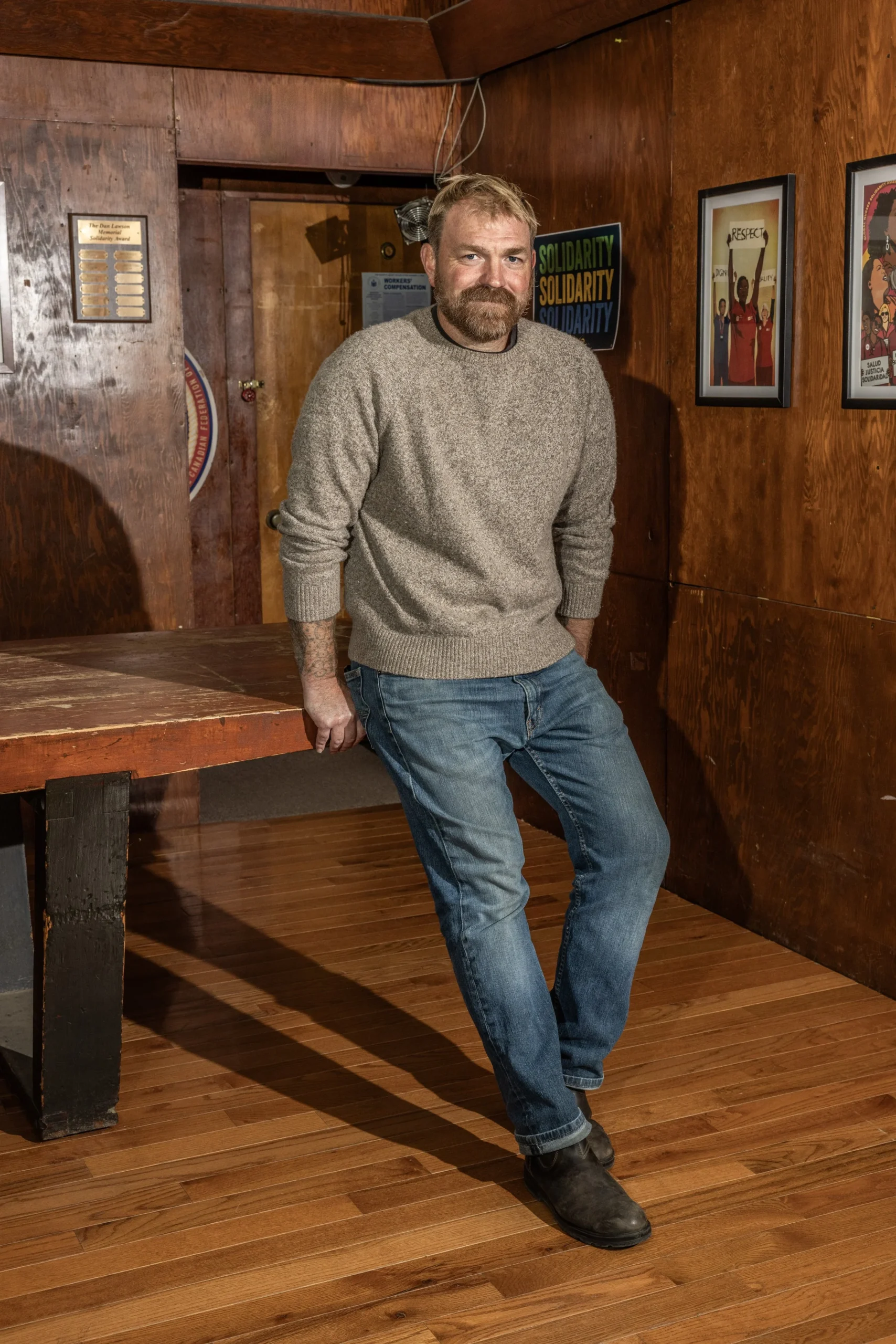
Graham Platner in a contextual photograph: Contextual editorial portrait, not tattoo evidence.; not tattoo evidence

If you like knotwork, open spacing and simpler curves can make a smaller version easier to read. Tightly packed fine lines may blur over time, especially on an area that bends and moves.

Cover-ups need enough dark or layered detail to work with the ink beneath them. A clear photo in even light helps an artist assess what can show through and whether fading or a different design could help.

Contextual images show tattoos on Platner’s arms and his overall, casual look, but not every detail. The two AP images used as direct evidence show the original chest tattoo and the later interview photo of the cover-up.

The story reaches the campaign
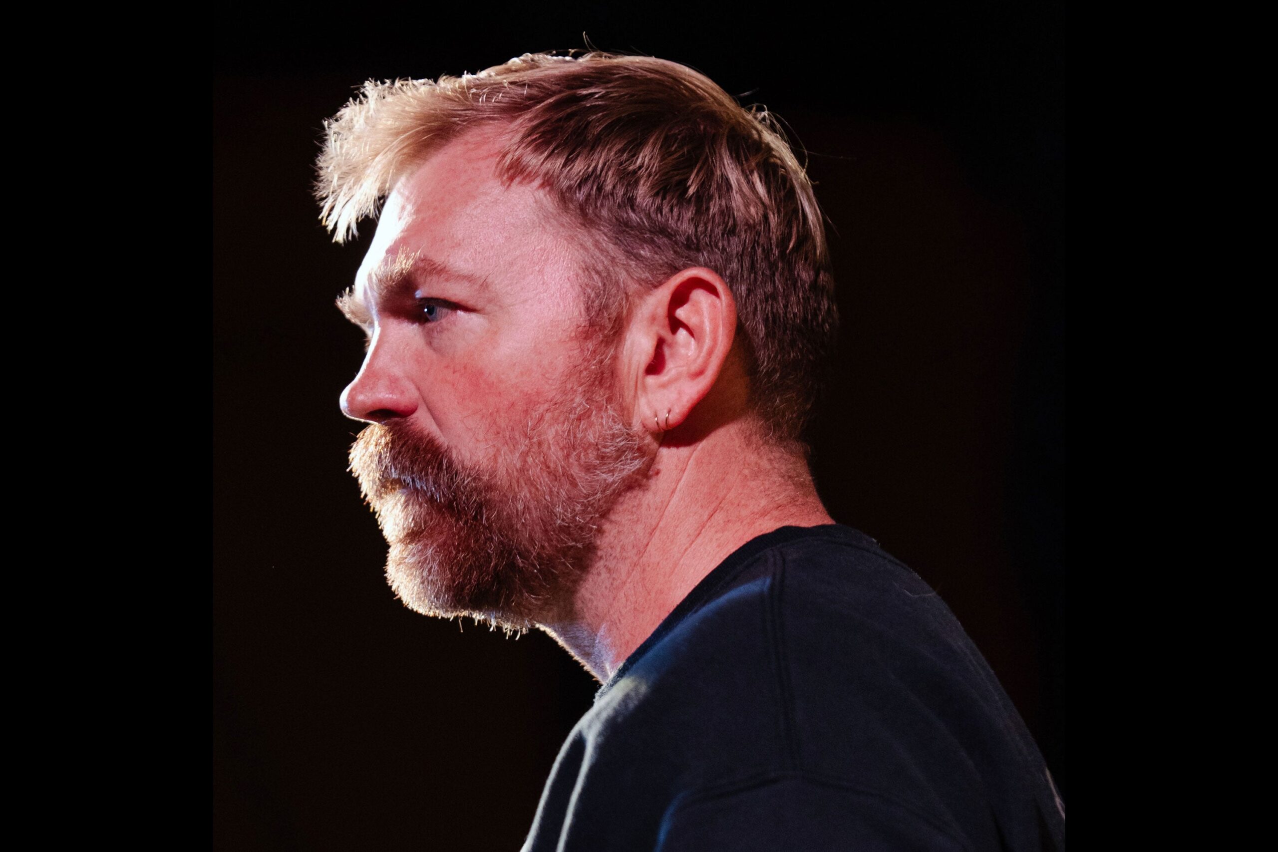
Graham Platner in a contextual photograph: Contextual speaking portrait, not tattoo evidence.; not tattoo evidence

The design balances a regular frame with an irregular figure: the knot gives it structure, while the animal keeps it from reading as a repeated border. That contrast is a clear feature of this particular piece.

Before committing to a cover-up, ask to see healed work and discuss how the old ink may affect the new colors. An artist can talk through a full cover, a partial laser fade or another approach based on the actual tattoo.

What the public photos show
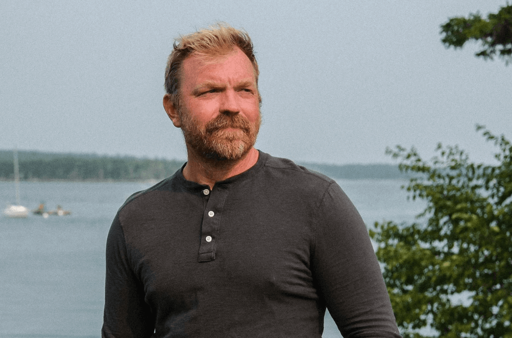
Graham Platner in a contextual photograph: Contextual lake portrait, not tattoo evidence.; not tattoo evidence

The replacement’s main design choices are its broad chest placement, dark coverage, strong outline and central figure. It was built around the existing tattoo, not simply placed over blank skin.

The original controversy is part of the record: the tattoo was reported to resemble a Nazi symbol, Platner said he didn’t know that history, and he later covered it. The design can be discussed without turning the harm behind the association into a novelty.

For a chest piece, use the photos to study scale and coverage, then bring knotwork or animal references separately to an artist. A custom design should follow your body and the ink it must cover, rather than copy Platner’s exact solution.

Lydia Ko Tattoos: The Olympic Skyline Ink and the Meaning Behind It

Lydia Ko’s tattoos are small and specific. The design that drew attention in 2025 links her three Olympic medals to the cities where she won them.

Ko won silver in Rio de Janeiro in 2016, bronze in Tokyo in 2021 and gold in Paris in 2024. She worked with her regular artist in South Korea on a fine-line skyline built from those places.

The Olympic skyline tattoo

Lydia Ko tattoos: Olympic skyline tattoo close view

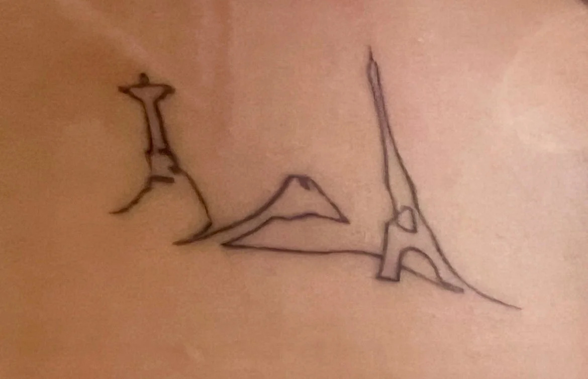
The arm design uses Christ the Redeemer for Rio, Mount Fuji for Tokyo and the Eiffel Tower for Paris. Each landmark is sized to match the medal: Rio is smallest, Tokyo sits between it and the largest Paris landmark, which marks her gold.

The differing sizes give the sequence a clear order without turning it into a scorecard. At first it reads as a small landscape; the medal story comes through when you recognize the landmarks.

The line is light and sketch-like. Christ the Redeemer is a narrow silhouette, Fuji a low triangle and the Eiffel Tower an open outline. The shapes reward a closer view rather than relying on heavy detail.

First marks

Lydia Ko in a contextual photograph: Lydia Ko contextual photograph - not tattoo evidence; not tattoo evidence

Ko got her first tattoo at 16 after winning her first LPGA Tour event. Roman numerals on her right wrist mark the victory date, tying the design to a specific milestone without spelling it out.

She got the Olympic rings after her first Games in 2016. The skyline extends that idea: it connects the three Olympic chapters and the cities where they happened.

The pieces stay small, with open space around them. Ko’s collection uses fine lines and restrained placement rather than a dense sleeve or large scene.

On the course

Lydia Ko in a contextual photograph: Lydia Ko contextual photograph - not tattoo evidence; not tattoo evidence

Ko turned professional as a teenager, became the youngest amateur winner in LPGA history, reached world number one at 17 and became the youngest player to qualify for the LPGA Hall of Fame under the criteria cited in the article.

Those are major milestones, but the tattoos remain compact. The skyline doesn’t need a date beneath every landmark; Ko knows which Games each one represents.

Using the cities keeps the design tied to more than medal symbols. Each place stands for a trip and competition as well as a result, without writing out every detail.

The sequence

Lydia Ko in a contextual photograph: Lydia Ko contextual photograph - not tattoo evidence; not tattoo evidence

Christ the Redeemer marks Rio and the silver, Mount Fuji marks Tokyo and the bronze, and the Eiffel Tower marks Paris and the gold. The left-to-right sequence reads like a small timeline.

The landmarks are simplified rather than drawn as detailed postcards. At this scale, clear outlines and space between them help the design stay legible.

For a travel-inspired tattoo, three recognizable silhouettes connected by one line can carry a larger story without turning into a full map. Ko’s larger Paris landmark also gives the sequence visual balance.

A closer look

Lydia Ko in a contextual photograph: Lydia Ko contextual photograph - not tattoo evidence; not tattoo evidence

The piece avoids the obvious shorthand of medal-colored circles, a large 2024 or a golf club. It uses landmarks that are specific to Ko’s Olympic history.

The skyline sits beside her Olympic rings and the Roman-numeral date. Together, the tattoos mark a first win, her Olympic debut and the three-Games medal sequence.

The landmarks are familiar, but their order gives them a private reference. In Ko’s design, Paris means the gold that completed the set; the context changes what the image says.

Ideas to borrow without copying

If you like this structure, start with three places that matter to you and choose one clear landmark from each. An artist can arrange them to follow the curve of your arm.

A commemorative tattoo doesn’t need to look like a plaque. A date, a few numerals or a line of landmarks can hold a long memory without displaying every detail.

Fine-line outlines need enough room between shapes. Discuss viewing angle, size and how much detail can remain readable as the arm bends and moves.

Ko’s sequence has a clear beginning and end. If your own places don’t form a timeline, an artist can balance them by height or visual weight instead.

For Ko, one line links Rio, Tokyo and Paris with silver, bronze and gold. The skyline records the route as well as the results.

The medals were won in public; the tattoo stays understated. The landmarks are widely recognized, but the sequence belongs to Ko’s three Olympic experiences.

Ayesha Curry Tattoos: Family Symbols, Faithful Script and Tiny Personal Ink

Ayesha Curry’s tattoos are small and mostly fine-line, placed across her arms, wrist, thumb and ankle. They include family references, faith, her cooking work and matching pieces with Stephen Curry.

The designs range from a tiny kitchen whisk to forearm lettering and geometric symbols. Each points to a different part of her life, without filling the skin with large illustrations.

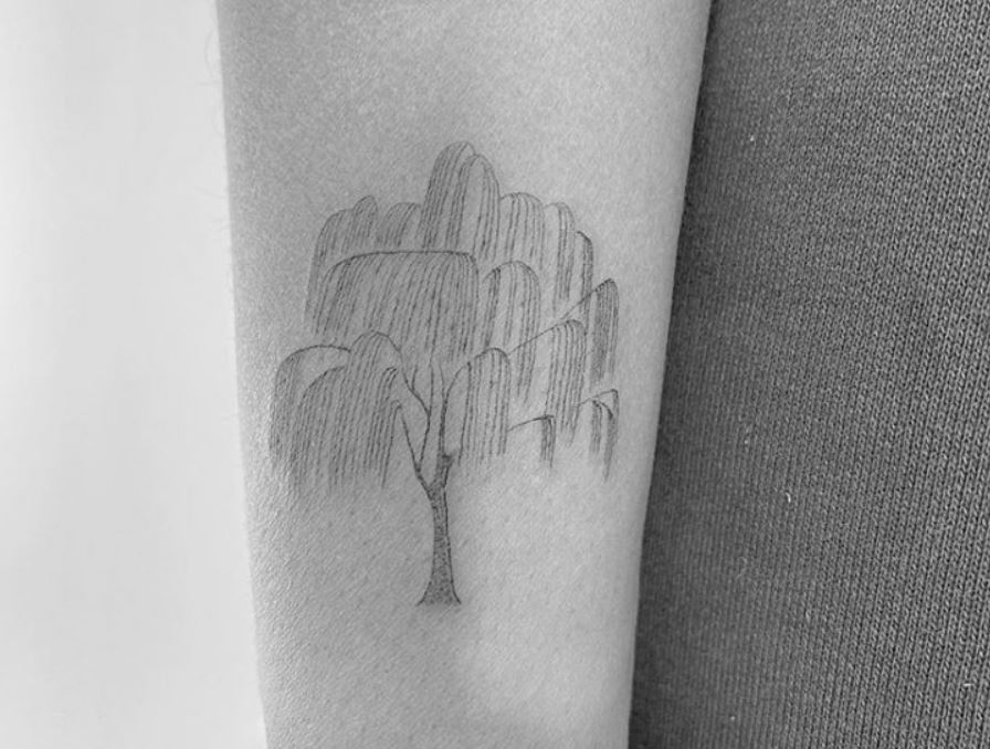
The willow tree on Ayesha Curry’s arm

Ayesha Curry tattoos: close-up willow tree linework

The willow is one of the more detailed pieces: a narrow trunk, spreading branches and loose leaves, drawn in soft lines on her arm.

Winter Stone shared the tattoo. Tags around the post referred to strength, love and family; the image itself stays understated, more like a small emblem than a large statement.

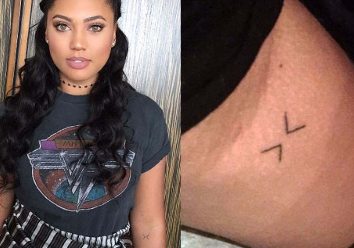
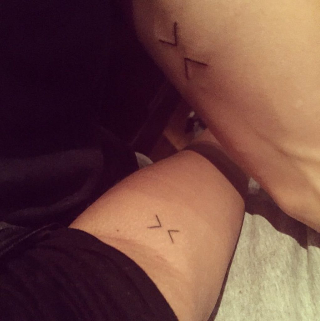
The matching greater-than and less-than symbols

Ayesha Curry tattoos: matching present-moment arm symbol
Ayesha Curry tattoos: second matching symbol view

Ayesha and Stephen have matching greater-than and less-than symbols, turned toward each other. The idea is to stay with the present rather than get pulled into the past or future.

Stephen has described touching or slapping the matching tattoos before games. The small design is part of a shared pregame routine as well as a reminder.

For matching ink, simple symbols can keep the layout open and readable. The important choice is what the marks mean to the people wearing them.

Her “faithfully” forearm tattoo

Ayesha wears “faithfully” in slim cursive along her forearm. The script follows the arm, with a light loop at the start and an open final stroke.

Jon Boy tattooed the word at West 4 Tattoo in 2016. Ayesha said it reflects giving glory to God and trying to live with grace and passion; she described it as a personal cue rather than decoration.
The letters need room to stay distinct. With small script, spacing matters as much as the font, especially as the ink settles and ages.

The three family symbols

Ayesha Curry tattoos: three geometric family symbols

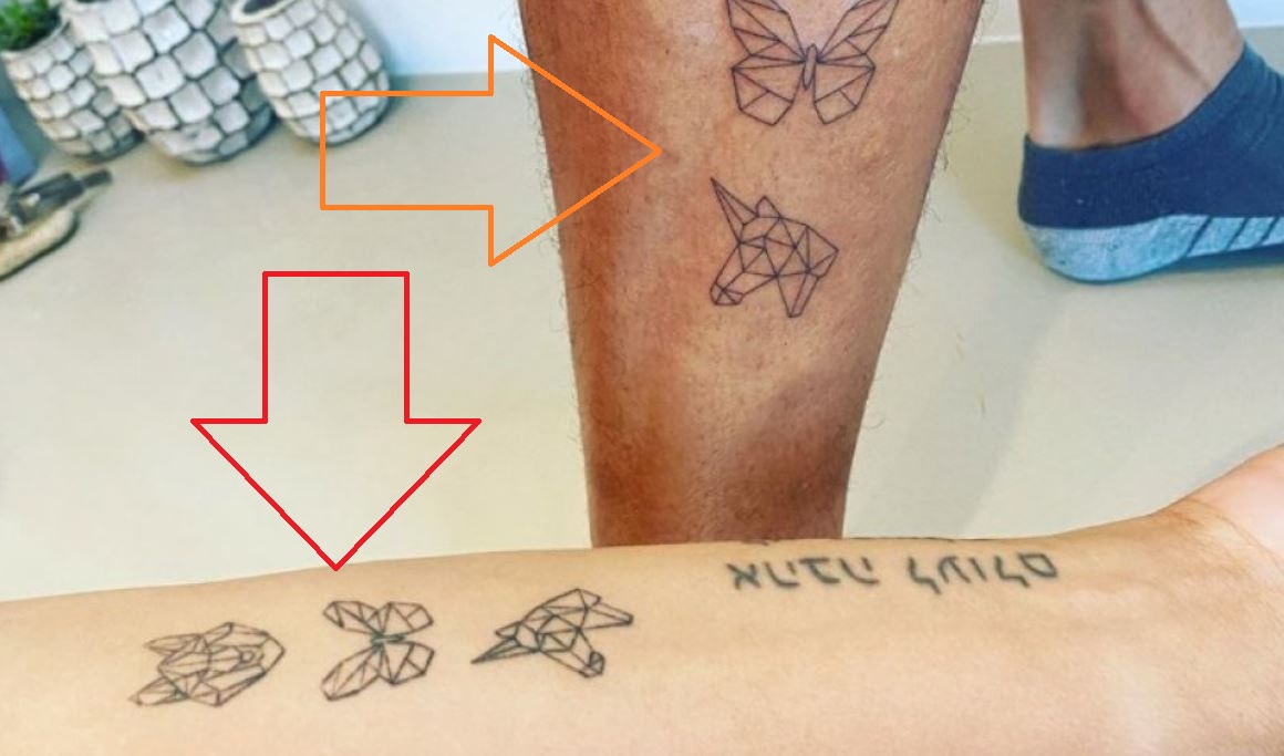
Ayesha’s three geometric designs represent her children, Canon, Ryan and Riley: a young wolf for Canon, a butterfly for Ryan and a horse or unicorn for Riley’s free spirit.

The thin angular lines give the three animals a shared look without making them identical. The butterfly is open, the wolf compact, and the horse-like figure has a more moving outline.

Winter Stone made the family tattoos. Ayesha shared them with a caption about each child; the animal symbols carry that meaning without using names or portrait likenesses.

The tiny whisk on her thumb

The small whisk near Ayesha’s thumb or knuckle is a direct nod to her work with food. Close up, its fine line reads as a kitchen whisk; at a glance it becomes a simple mark.

Jon Boy did it in 2016, around the time Ayesha was expanding into food television, cookbooks and Gather. The tool says more about that work than a larger chef-themed image would.

Small hand tattoos can soften with friction and movement. The whisk works as a simple outline; extra crossbars could make such a tiny design harder to read.

The Hebrew lettering she shares with Stephen

Ayesha and Stephen also have matching Hebrew lettering along the forearm. Tattoo coverage translates the phrase as “love never fails to be”; that translation is how it has been reported.

The Hebrew text is language, while the greater-than and less-than symbols are abstract. Both are matching pieces the couple can see and share.

If you choose lettering in a language you don’t read, check it with a fluent speaker and a tattooer who can reproduce it accurately. Confirm direction as well as spelling before the appointment.

The pineapple at her ankle

Ayesha’s small black pineapple outline sits on the inside of her right ankle. Its leafy top and rounded body give it a lighter feel than the family and faith designs on her arms.

The pineapple is associated with a Curry family tattoo gathering after Golden State won the 2017 NBA championship. Nino Lapid tattooed several family members. It’s often linked to the celebration and the Warriors, while pineapple imagery can also suggest welcome and hospitality.

The ankle keeps a small design visible with sandals and covered by most shoes. It’s an easy place for a personal mark that doesn’t dominate the collection.
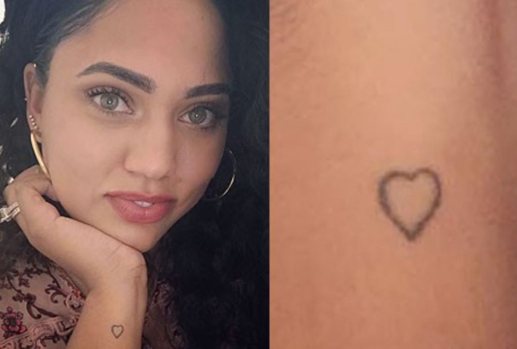
The outlined heart on her wrist

Ayesha Curry tattoos: outlined wrist heart

The small wrist heart is an open outline, not a filled shape. Its slightly hand-drawn edge keeps the design simple beside her more geometric symbols and lettering.

The heart sits close to the hand, where it appears in ordinary gestures. There’s no need to add extra shading or decoration to make it readable.

Putting the collection together

Scale is one thread across Ayesha’s collection. Even the willow stays light, and the smaller pieces leave room for other designs without competing for attention.
Family runs through the tree, the children’s animal symbols and the matching tattoos with Stephen. “Faithfully” reflects her stated faith; the whisk points to her food work; and the pineapple is tied to a family gathering.
For inspiration, start with a detail from your own life rather than copying the willow or family animals. A tool, symbol or word can carry a personal reference without a long caption.

Ayesha’s designs stay small, but their references are specific: her children, faith, cooking and a pregame ritual with Stephen. The photographs show the ink; her own explanations give several of the pieces their context.

More celebrity tattoo guides

Aitana Ocaña Tattoos: The Meanings Behind Her Minimalist Ink

Aitana’s tattoos are mostly small, fine-line designs. Some mark career moments; others point to family, friends or her dog Sopa. Their meanings range from well documented to private, and not every tattoo has a confirmed story.

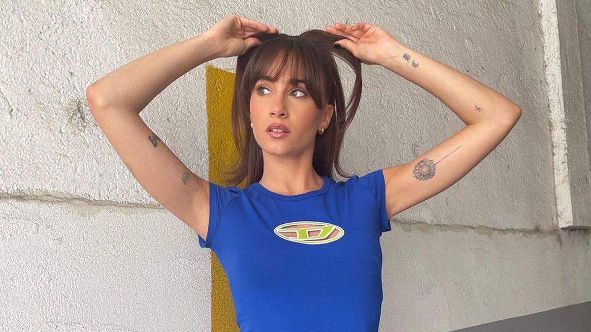
Over the years she’s worn tattoos on her arms, wrists, forearms and ankle. Photos catch some clearly; others appear only when her arm turns or her clothes leave them visible. Many are discreet, with the personal reference carrying more weight than the size.

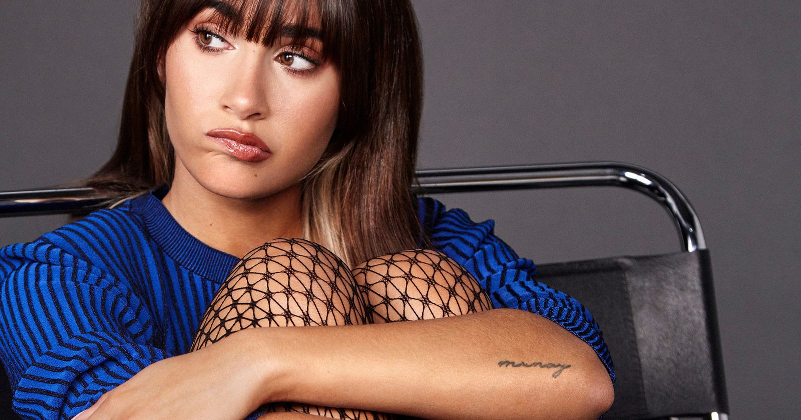
The Munay tattoo

Aitana Ocaña tattoos: Munay forearm lettering

The word Munay sits on Aitana’s left forearm in slim, handwritten lettering. It was the first tattoo she discussed publicly. She has said it expresses love for herself, her family, everything around her and life itself. She shares it with her cousins, so the word connects her to a wider family circle.

The left forearm keeps the script in view without making it the focus of her whole look. Its light lettering suits a reminder she can see herself.

The story matters more than the typeface. Before getting a word in another language, check its meaning with a reliable speaker; delicate lettering can’t fix a bad translation.

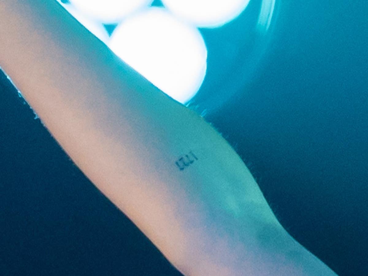
1727: the number that started everything

Aitana Ocaña tattoos: 1727 inner-forearm number tattoo

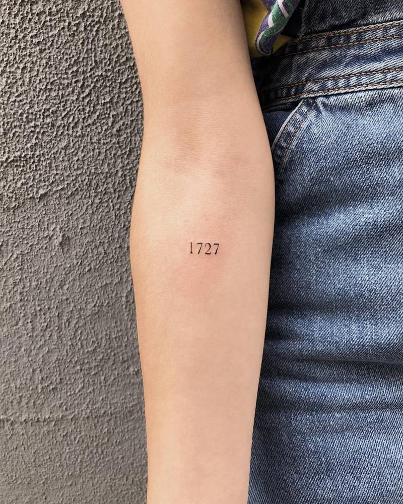
Aitana’s 1727 tattoo goes back to her Operación Triunfo audition in 2017. Contestants were assigned numbers during casting, and she has said that period changed her life.

The inner-forearm design is just four black digits, with no frame or extra symbol. To anyone else they are four digits; for Aitana, they point back to the audition, the waiting and the start of a new career chapter.

She has also spoken about the number seven appearing often in her life. The 27th is tied to both her birthday and her mother’s, adding another personal link to the digits.

The sunflower she shares with her best friend

Aitana Ocaña tattoos: sunflower friendship tattoo in a wider arm view

The sunflower on Aitana’s arm is a matching tattoo with her longtime friend Marta. They got it around the time Aitana left Barcelona for Madrid. She has described the flower as a symbol between them: sunflowers turn toward the sun, and share its energy when it disappears.

The petals give this piece a clearer outline than the small lettering elsewhere on her arm. It’s still compact, so the flower doesn’t take over the space.

The shared meaning is the friendship and the move that left them living farther apart. The tattoos don’t need to be exact copies to mark the same bond.

Aitana’s small spider tattoo

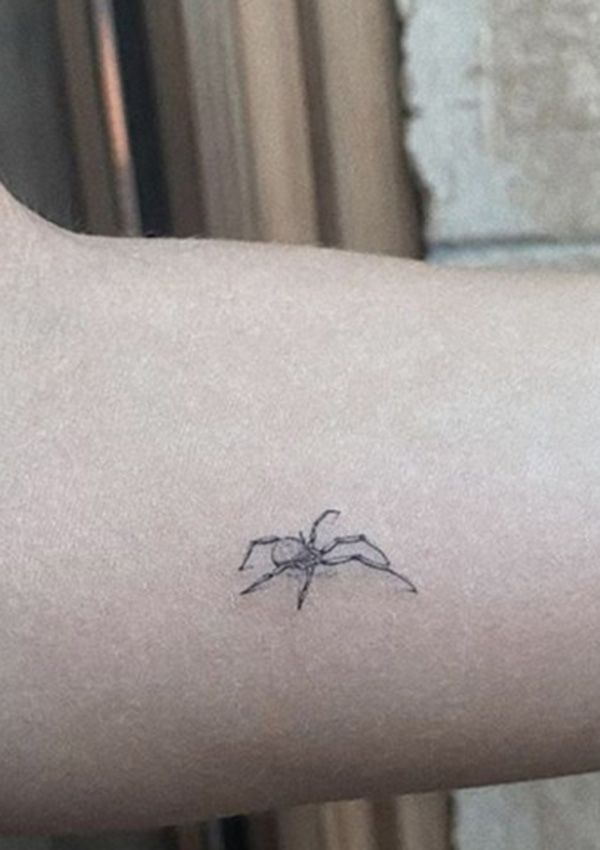
Aitana Ocaña tattoos: small minimalist spider tattoo

Aitana has a small spider in black ink on her forearm. Its compact body and long, fine legs make it look like a sketch from a distance; up close, the shape is easier to read.

Aitana hasn’t confirmed what the spider means. Some coverage has linked it to her father’s fear of spiders, but that remains speculation, not her explanation.

The fine lines give the legs movement without heavy shading. At this size, the artist has to leave enough space for the shape to stay legible.

Aitana’s soup-bowl tattoo

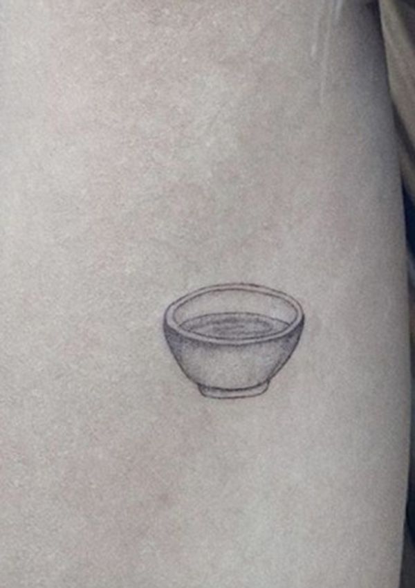
Aitana Ocaña tattoos: small soup-bowl tattoo for Sopa

The small bowl on Aitana’s arm is a tribute to her dog, Sopa. Instead of a portrait or paw print, she chose the bowl of soup that connects directly to the dog’s name.

Light lines and soft shading make it read as a bowl while keeping the look closer to a little illustration than a stock symbol. The everyday object keeps the tribute warm and specific.

The two faces on her right arm

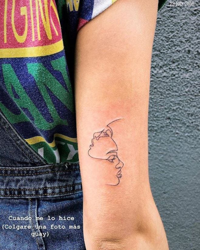
Aitana Ocaña tattoos: two opposing faces line tattoo

Above Aitana’s right elbow, two faces look in opposite directions. The design has been described as a marker of the change between her life before Operación Triunfo and what followed: one face looks back, the other forward.

The horizontal space above the elbow lets both faces read clearly. The image also shifts as her arm bends, separating the two profiles before they line up again when she straightens it.

Aitana has a bee near the back of her right ankle. When she shared it, she used the words “placeres de la vida,” or “pleasures of life.” Fans have linked the bee to her love of honey, but she hasn’t confirmed that meaning.

The back of the ankle is easy to cover, though shoes and socks can rub against it. For a fine-line design there, placement and aftercare are worth discussing with the tattoo artist.

The other tattoos in the collection

Aitana Ocaña tattoos: fairy and newer butterfly context

Other tattoos she has worn include a moon-phase design made with family in Ibiza, a second butterfly, and a friendship tattoo connected with her childhood friend Marmi. She also has her parents’ initials, Belen and Cosme, on her left wrist.

A first butterfly sits above the 1727 tattoo, though she hasn’t said much about it. A private initial on her chest drew attention after her relationship with Miguel Bernardeau; fans later connected it to lyrics on her Alpha album, but that doesn’t confirm the tattoo’s full story.

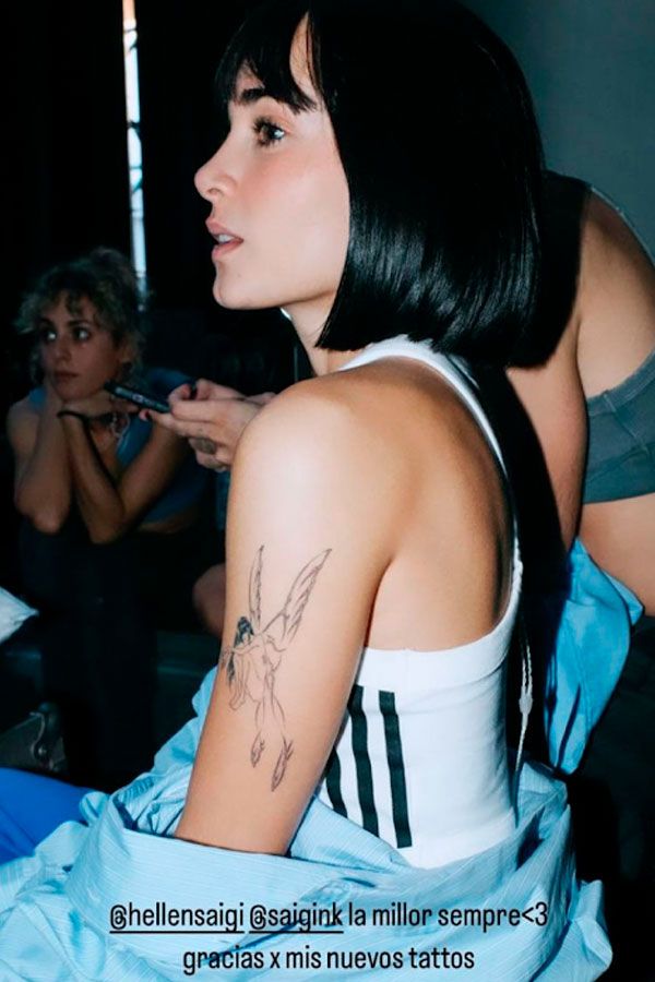
Photos from November 2023 showed a fairy on her left arm, with fine wings, long hair and knees drawn toward the chest. Another butterfly appeared around the same time.

At a concert in Bilbao in September 2026, Aitana said she was having many of her tattoos removed. She still likes tattoo art, she said, but several pieces no longer feel like her. She expected the process to take about two years and planned to keep some of them.

Older photos show how the tattoos looked at the time; they don’t establish which designs are still visible now. Laser removal can take time; some tattoos may look lighter or partly covered while the process continues.

The design lesson in Aitana’s tattoos

Aitana Ocaña tattoos: distinct close-up of the 1727 forearm tattoo for design discussion

Aitana’s tattoos start with concrete references: a career number, a shared move, a family gathering, or an object tied to a pet. The design can stay small because the story is already specific.

That’s a useful order to work in if you’re planning a tattoo: begin with the person, place or moment, then decide what image can carry it. A symbol chosen only because it’s popular may not feel connected once the trend passes.

Final look

Her collection has changed along with her. Aitana’s update puts the older designs in context: they belong to different periods of her life, and some will remain while others are removed.

More musician tattoo guides

Matty Matheson Tattoos: Eagles, Lettering and Full-Body Ink

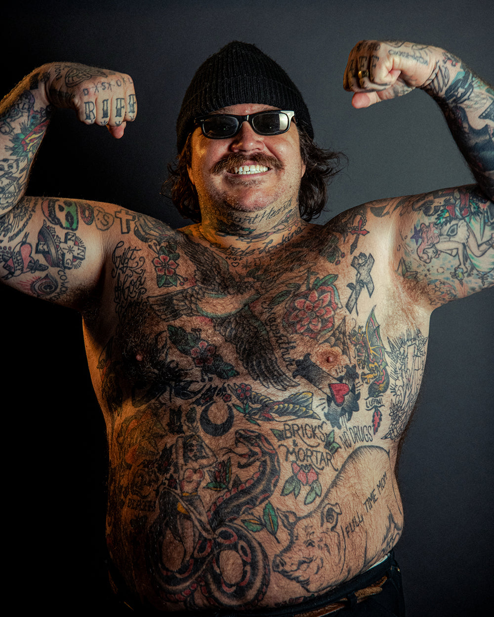
Matty Matheson’s tattoos cover much of his body: eagles, flowers, crosses, lettering, portraits, animals and smaller oddities. The pieces don’t follow one matching style; they’ve accumulated over time.

His sleeves are dense, and a close photo won’t always show how each tattoo sits in the larger collection. This guide describes visible details and keeps reported meanings separate from what can be seen.

Matheson is known for food and television, and he also plays in the hardcore band Pig Pen. Revolver has written about the band and his tattooed sleeves alongside his work in music, cooking and clothes.

Matty Matheson tattoos: Inline genuine tattoo photograph

The right shoulder and upper arm hold an eagle, a nearby mask and snake, and a growling face below. Above the snake is a cross with the letters “TS” inside a heart.

The eagle spreads across the rounded shoulder; the mask and snake make a tighter cluster below it, and the darker face adds weight at the bottom. Each image has its own outline, so the arm reads as several connected pieces.

The shoulder and elbow turn as he moves, which changes what a photo can show. One angle gives only part of the composition.

The arm work and chest lettering

Matty Matheson tattoos: Inline genuine tattoo photograph

Another right-arm piece combines an intricate cross, a red eye and a daggered heart. The cross carries the letters “NNG”; a banner around the heart reads “SHAT”, according to the documented inventory.

The eye, heart, cross and dagger each pull the design in a different direction: a focal point, a curved shape, a vertical line and a sharp edge.

A daggered heart has familiar associations, but that doesn’t establish Matheson’s personal reason for getting it. The image confirms the shapes and placement, not a private story.

The rounded bicep gives the design a clear surface from the front. When the elbow bends, part of the image turns away.

The roses and script around his neck

Matty Matheson tattoos: Inline genuine tattoo photograph

On Matheson’s right forearm, an eagle sits above a rose, with chain detail and the letters “JS” inside it. The eagle and rose form the larger shapes; the chain closes the lower part of the design.

The forearm moves into view during ordinary gestures, so the piece is visible without needing to be shown off.

Eagles appear more than once in the documented collection, but their scale and surrounding details change from one placement to another. The repeated subject doesn’t read like a single logo.

Busy doesn’t have to mean cramped. Around this forearm piece, the skin between motifs gives the eagle, rose, chain and letters room to read.

The wide portrait of his upper-body ink

Matty Matheson tattoos: Inline genuine tattoo photograph

Matheson’s hands carry a butterfly on the left, small knuckle marks and finger lettering: “RIFF” on one hand, “RAFF” on the other. The documented inventory also includes “ENDLESS LOVE” and other letters and symbols.

The words break across separate fingers and come together when the hand opens. As the fingers bend, the lettering shifts with them.

The butterfly adds a lighter outline to the same area, beside the blockier finger lettering.

Hands are exposed to washing, friction, sunlight and constant movement. Small lines can soften, and a design that crosses knuckles may be difficult to touch up.

The full-body tattoo coverage

Matty Matheson tattoos: Inline genuine tattoo photograph

A Jesus portrait sits on Matheson’s upper arm, with red flowers beneath it. The face carries most of the attention; the flowers add color and follow the shape of the arm.

The upper arm gives the portrait room for its features, while the flowers soften its lower edge. Small changes to a face can alter its expression, so the reference drawing matters.

The portrait sits beside crosses and other faith-related imagery in the collection. The visible subject is clear, but the image alone doesn’t explain Matheson’s personal reason for choosing it.

The red flowers are the strongest color in an otherwise mostly black-and-gray group of tattoos.

Closing thoughts

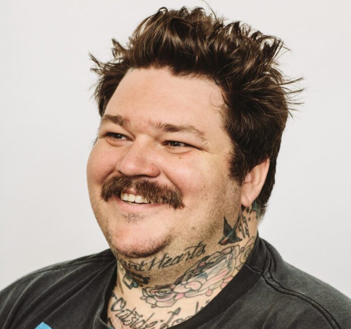
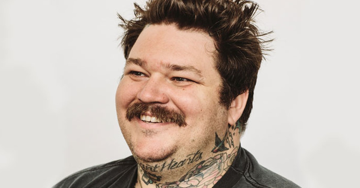
On Matheson’s neck are the words “Defiant Hearts” and “The Outside Looking,” alongside a small cross, a heart and floral details around the throat.

Neck lettering is hard to miss: the words sit close to the face and can be more or less visible depending on a collar or open shirt.

The artist also has to account for how the skin turns when the head tilts. A phrase that looks balanced in a stencil may feel crowded once the neck moves.

The placement makes the words public, but it doesn’t tell us whether they are a private reminder, a statement or simply lettering Matheson liked.

A collection built for movement

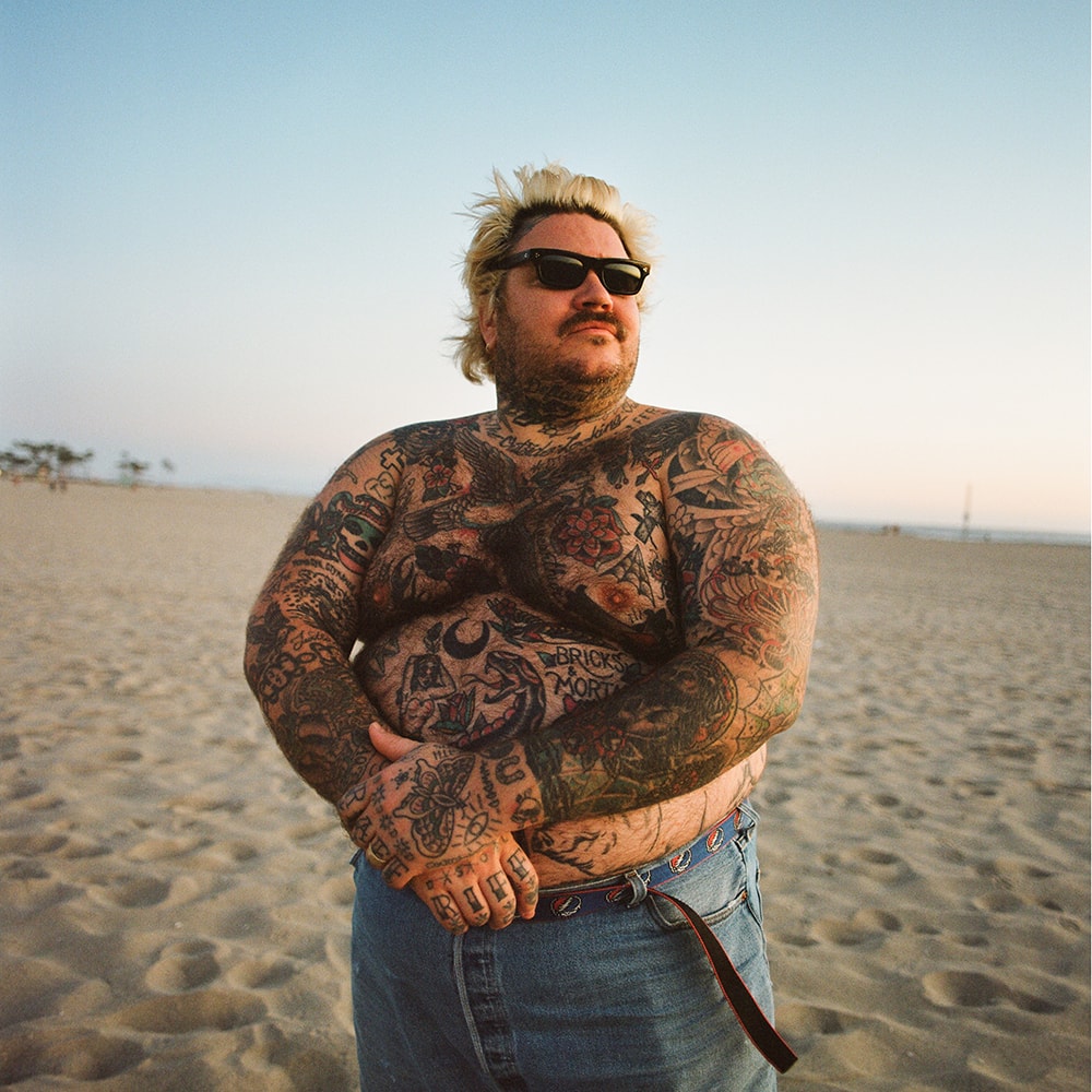
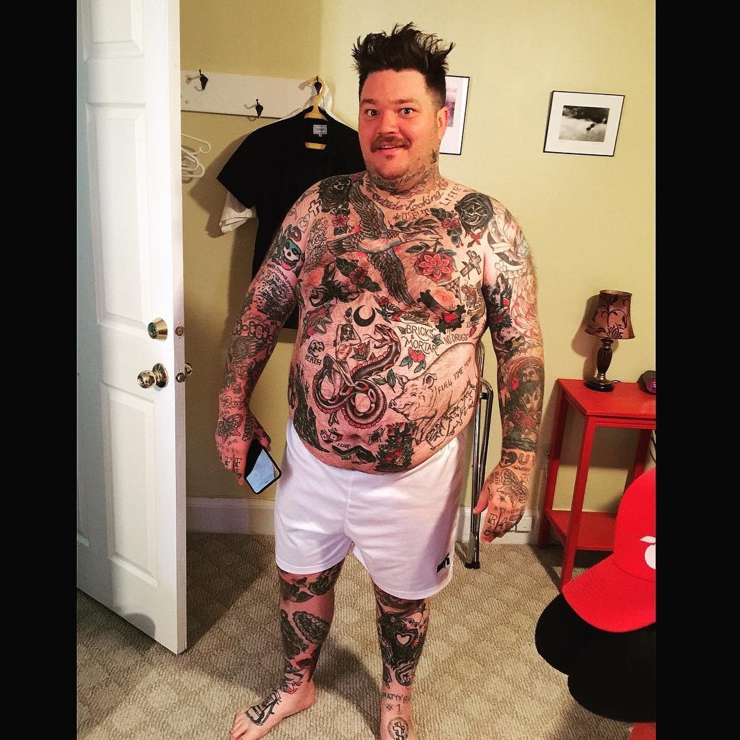
Across Matheson’s arms, hands, neck and torso, the collection uses different styles and scales. It reads as a group of separate scenes rather than one continuous sleeve.

His work has moved through restaurants, television, cookbooks, online videos and music. The tattoos can sit alongside those different chapters without needing to represent just one job.

A close photo helps identify one design; a wider portrait shows how it sits beside the rest. The shoulder eagle, for example, reads differently once the neck and chest tattoos enter the frame.

A large collection doesn’t have to be finished in one style. Traditional portraiture, lettering and small hand pieces can coexist, with the wearer’s taste providing the connection.

How to borrow the useful parts

Matheson’s tattoos are useful as references for scale and placement, not as a list to copy. Look at how each image fits its part of the body and how much skin is left around it.

Decide how visible a tattoo should be before settling on the detail. A hand stays in view through daily tasks; a back piece is easier to keep private.

For lettering, keep reported readings qualified. One inventory links the hand design to “RIFF RAFF”, while not every photo makes each letter equally clear.

A final look at Matheson’s style

There isn’t one motif tying every piece together. The collection leaves room for traditional images, religious references, lettering and jokes to keep their own character.

Sarper Güven Tattoos: The Red Lips Neck Tattoo and What It Means Now

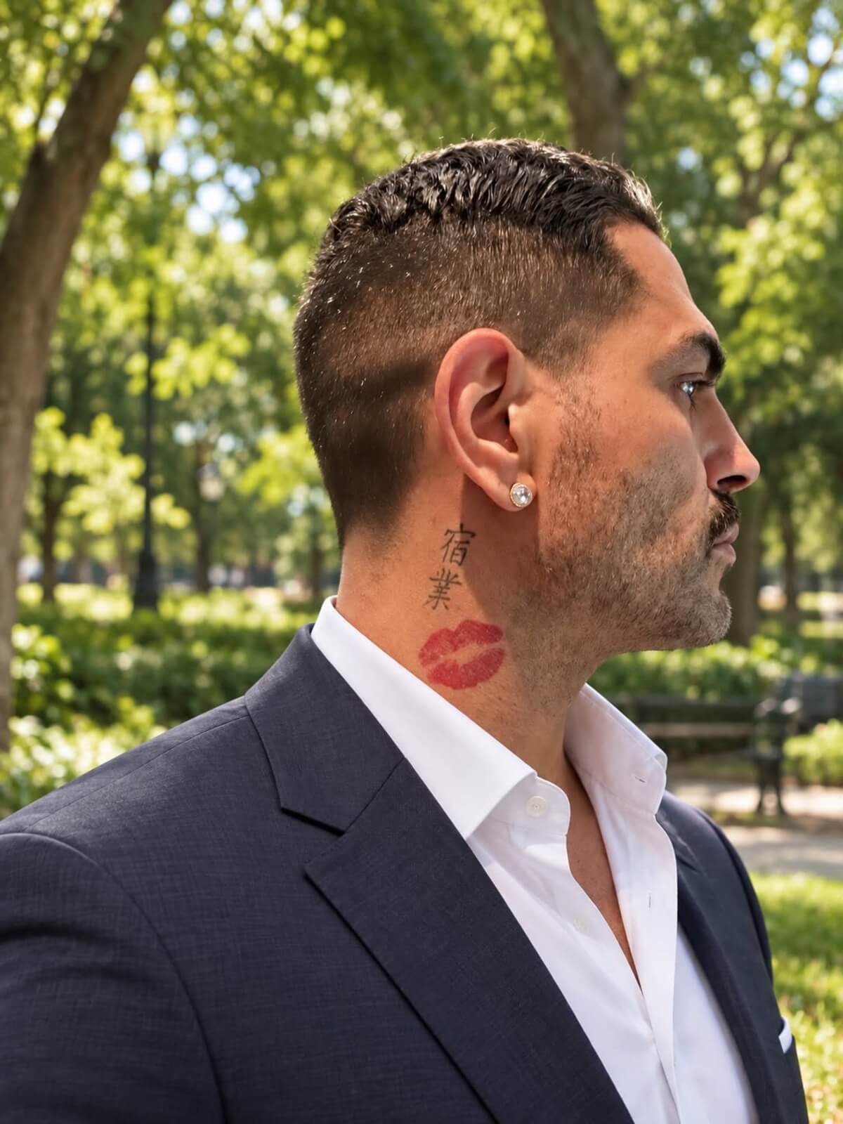
Sarper Güven’s neck tattoo was hard to miss on 90 Day Fiancé: a large set of red lips linked to his relationship with Shekinah. He later said he wanted the tattoo gone, though he wanted to keep the memories from that time.

That leaves two separate questions: what he thinks about the relationship, and whether he still wants this particular design on his neck.

The red lips tattoo on Sarper’s neck

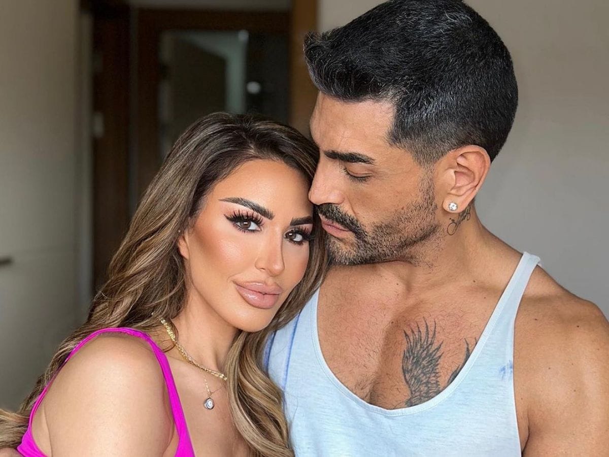
Sarper Güven tattoos: red lips neck tattoo

The large pair of red lips sits on Sarper’s neck. Inked reported that the design was modeled after Shekinah, making it personal before it reads as decoration.

Sarper connected the red with lips, love and passion. He also joked that red can signal danger, giving the bright color a second edge.

He said he chose his neck because he wanted people to see the commitment. On an upper arm, the same image could be more private; on the neck, it became part of his public image.

The bold shape and strong color help the design read quickly. Its placement also means it moves with his jaw and sits among beard lines, shadows and clothing.

Why the placement mattered so much

Sarper Güven in a contextual photograph: visible neck placement; not tattoo evidence

Neck placement brings attention, but it leaves the wearer less control over when others see the tattoo. That was part of Sarper’s choice at the time.

After the relationship changed, the same visibility began to tell a different story. A tattoo that once showed a commitment can become a reminder of the past, and a prompt for questions from people who know nothing else about the wearer.

If you’re considering a neck tattoo, check the design in a mirror at real size and with the clothes you wear most. If it’s tied to another person, ask yourself whether you’d still want it if the relationship changed.

That doesn’t make relationship tattoos a bad idea. Dates, initials, names and shared symbols can mark a moment that matters. A visible placement simply makes a private feeling public.

A relationship story made public

Sarper Güven in a contextual photograph: relationship context; not tattoo evidence

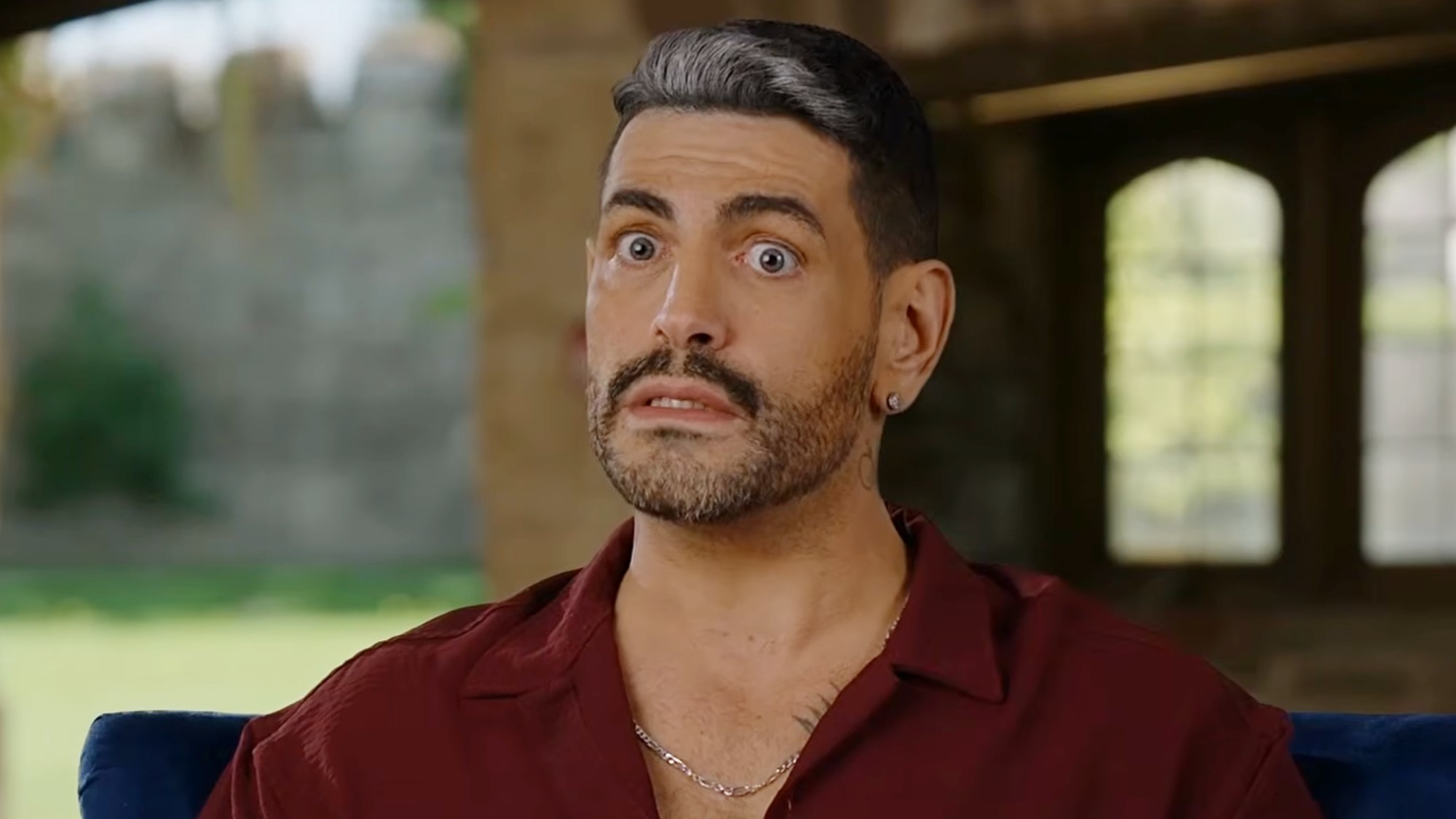
Sarper and Shekinah’s relationship played out on 90 Day Fiancé, where arguments, reunions and romantic gestures became part of the show. A neck tattoo from that relationship was never likely to stay a private keepsake.

Viewers saw the design alongside the relationship story, so its meaning in public changed as their story changed. The tattoo artist may have focused on line, color and placement; the audience also saw the person it represented.

Sarper has said he doesn’t regret loving Shekinah, while also wishing the tattoo had been smaller. Those can both be true: he can value the relationship and decide the bright neck design no longer suits him.

Removal, cover-up, or leaving it alone?

Sarper Güven in a contextual photograph: career context; not tattoo evidence

Sarper has talked about looking for specialists who can treat the red ink. The pigment, saturation, age and location all matter, so an experienced removal professional can assess the tattoo better than a social-media before-and-after.

He has also resisted rushing into a cover-up. The original tattoo is already large and visible; another heavy design might hide the lips but create a different problem. Red ink can also affect which colors or shapes will work. A cover-up is a redesign, not a quick way to erase the past.

Keeping the tattoo is another option. Some people come to see old relationship ink as a timestamp: “This happened,” not “This is still my life.” Sarper’s comments suggest he’s weighing the memory separately from the design.

If you’re facing the same choice, give yourself time before booking anything. Get a removal consultation and ask a tattoo artist what a cover-up would involve, then decide whether to remove, redesign or leave it.

Sarper’s next chapter

Sarper Güven in a contextual photograph: next chapter context; not tattoo evidence

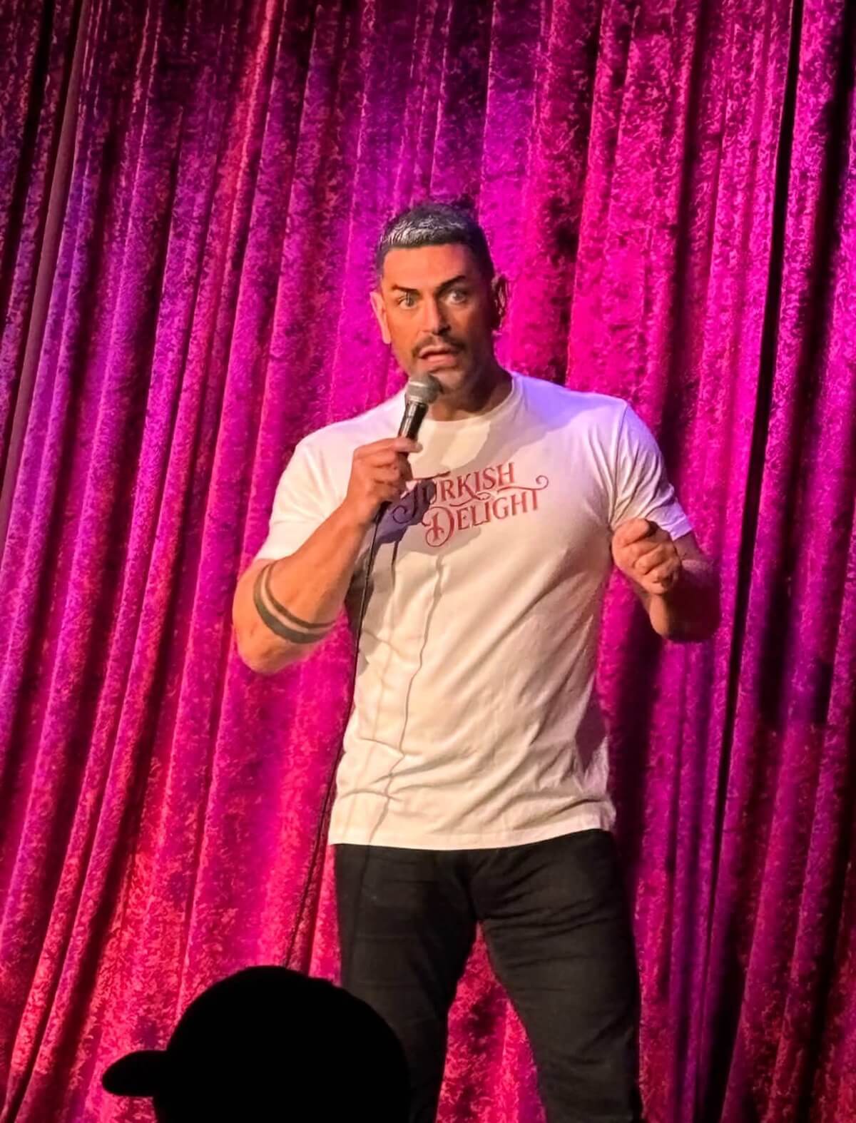
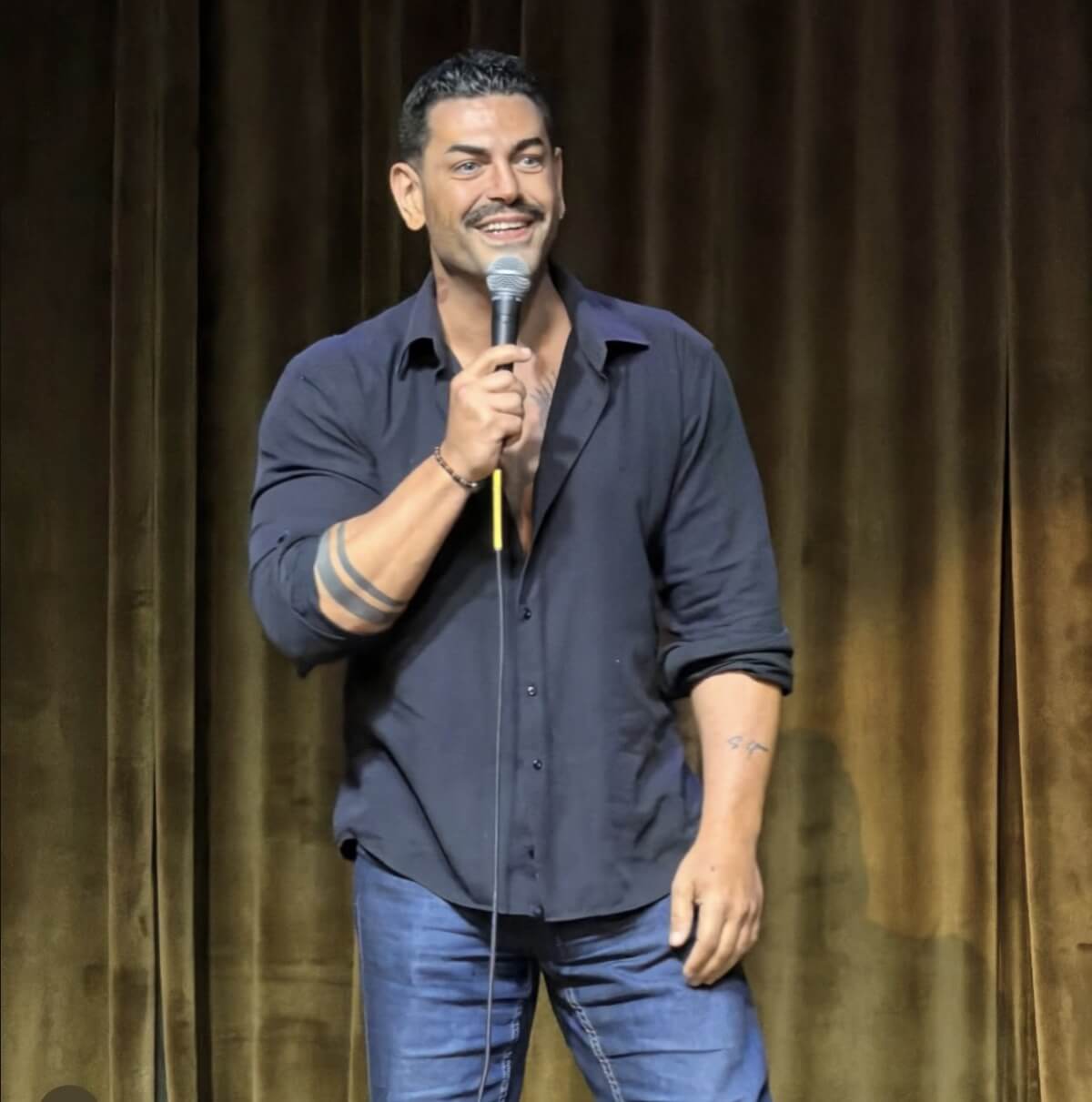
Sarper is known from reality television, but he has also presented himself as a fitness figure and stand-up comedian. That newer work gives the tattoo a different setting from the relationship that first made it famous.

He has said he wants audiences to see another side of him. The lips can now become a joke, a question or an awkward reminder of a decision he is still carrying.

The design itself is simple, but its impact comes from the red color, scale, placement and timing. Change any one of those and the tattoo would read differently.

For an artist, the practical question is what the client wants the tattoo to do: draw attention, stay under clothing, or work mainly as a personal image. Sarper’s choice was made to be seen.

A practical takeaway

A lips design can be adapted without copying Sarper’s neck piece. Smaller lips on an arm, shoulder, hip or chest would be less exposed; fine lines would feel lighter than a bold outline and packed color.

Choose placement to match how public you want the tattoo to be. If the design refers to another person, a shared color or object can keep the memory without making a portrait the only possible meaning.

Sarper’s tattoo shows that a sincere choice can become complicated later. That’s a reason to be clear about the size and visibility you want, not to avoid meaningful ink altogether.

The red lips remain one of Sarper Güven’s best-known tattoos. Whether he removes, reworks or keeps them, they have already made a private commitment visible.

More celebrity tattoo guides

Tom Schwartz Tattoos: Arm Ink, Bubba, LVP and More

Tom Schwartz has joked that his arm is a “tourist trap,” packed with little pieces that reward a closer look. The collection has grown by addition, not around one planned sleeve.

There’s no single style tying it together: pale outlines, red lettering, script and small symbols sit side by side. Schwartz has explained some of these tattoos himself; for the rest, the photos only confirm what they show.

Bravo has documented several designs, and Schwartz has discussed others on the show and in interviews. The images don’t show every mark clearly, so this guide sticks to those sources.

Tom Schwartz’s “tourist trap” arm

Tom Schwartz tattoos: forearm collection

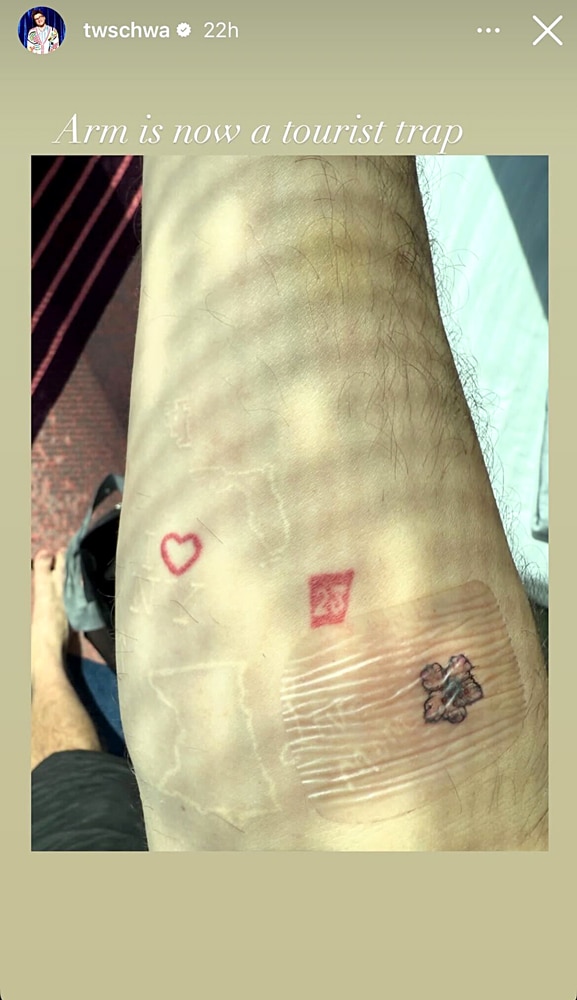
A close-up of Schwartz’s forearm shows an “I” and heart-style New York reference, white outlines of Minnesota and Florida, the red number 23, a faint red heart and a darker mark near the wrist. The red marks pull the eye first.

The pale outlines almost disappear in ordinary light, while the red stays visible. Together they give the arm a patchwork look without every tattoo competing for attention.

Schwartz is from Minnesota and has a connection to Florida; Bravo has tied the two state outlines to his life. Their simple shapes sit among the smaller lettering and symbols without taking over the arm.

The New York and number 23 details

Tom Schwartz tattoos: arm close-up

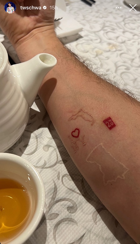
A second forearm photo, taken beside a teapot, shows the New York mark, red 23 and pale state outline at a more natural angle. It also shows how the older tattoos have settled into the skin.

Bravo says the meaning of 23 is unknown. Schwartz hasn’t explained it publicly, so the number is best described without guessing at a date or lucky meaning.

The forearm bends and creases, so the same small designs shift with the viewing angle. That’s one reason a real placement photo can tell you more than a flat digital mock-up.

The “Bubba” tattoo stayed put

Tom Schwartz tattoos: Bubba tattoo

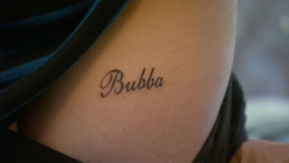
Schwartz got “Bubba” in script on his right butt cheek while he and Katie Maloney were together. It was the nickname they used for each other, and the placement made the gesture funny, private and a little ridiculous.

After their divorce, he said he kept the tattoo and had no plan to remove it. Keeping the word doesn’t mean the relationship stayed the same; it marks a chapter he chose to carry with him.

The design is simple, dark script with no frame or extra symbol. The story gives the nickname its meaning; the tattoo doesn’t need to spell it out.

Its hidden placement also lets Schwartz decide when to share it. A private tattoo can matter just as much as one that’s visible every day.

The red “LVP” tattoo

Tom Schwartz tattoos: LVP tattoo

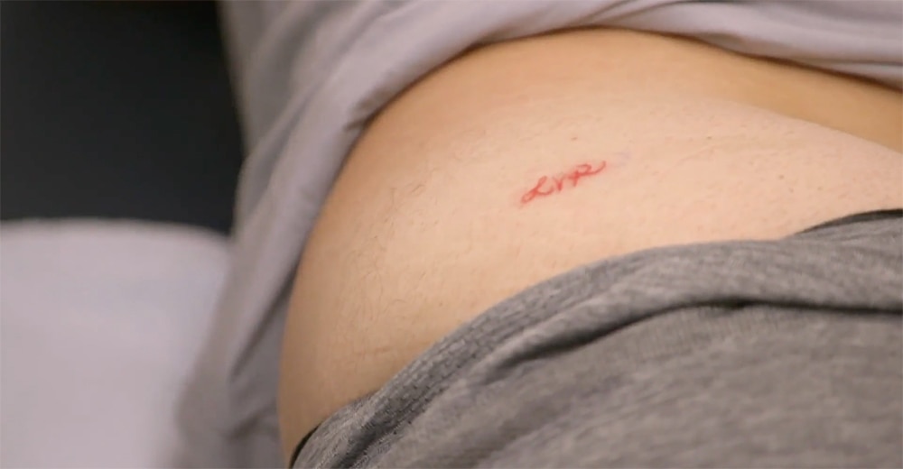
His other well-known butt tattoo reads “LVP,” Lisa Vanderpump’s initials. Bravo reported that Schwartz got the red lettering after losing a ping-pong bet with her.

The red ink makes the small letters easy to spot. There’s no portrait or crest: three letters and the bet behind them are enough.

The story explains why those initials are on him; without it, the letters alone wouldn’t tell us much.

A work-in-progress photo

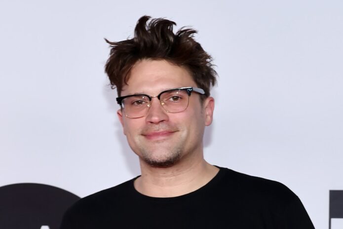
Tom Schwartz in a contextual photograph: tattoo session context; not tattoo evidence

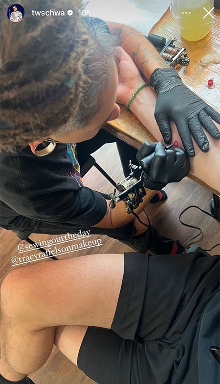
This photo shows Schwartz at a tattoo appointment, with the artist working on his arm. It documents the process and placement, not a finished design.

Bravo later reported another small piece: a lemon tattoo honoring his girlfriend, Kiana Carroll. It fits the collection’s habit of turning a person or moment into a direct, playful image.

What makes the collection feel like Schwartz

Schwartz’s tattoos move between place outlines, small numbers, pale ink, script, relationship tributes and jokes. They don’t share one polished aesthetic; most are small enough to sit beside each other as separate references.

Minnesota, New York, Florida, “Bubba,” “LVP” and the lemon point to different people, places and moments. The links between them come from his life, not a repeated visual formula.

If you’re building a collection, start with the memory and then choose an image. Decide whether you want a tattoo you see every day or a private detail, and leave some skin open instead of filling every gap.

Some of Schwartz’s pieces began in relationships that have since changed, but he has chosen to keep them. His collection reads like a record of those chapters rather than a set that has to stay perfectly coordinated.

More celebrity tattoo guides

Gypsy Rose Blanchard Tattoos: Phoenix Back Ink, Forearm Script and More

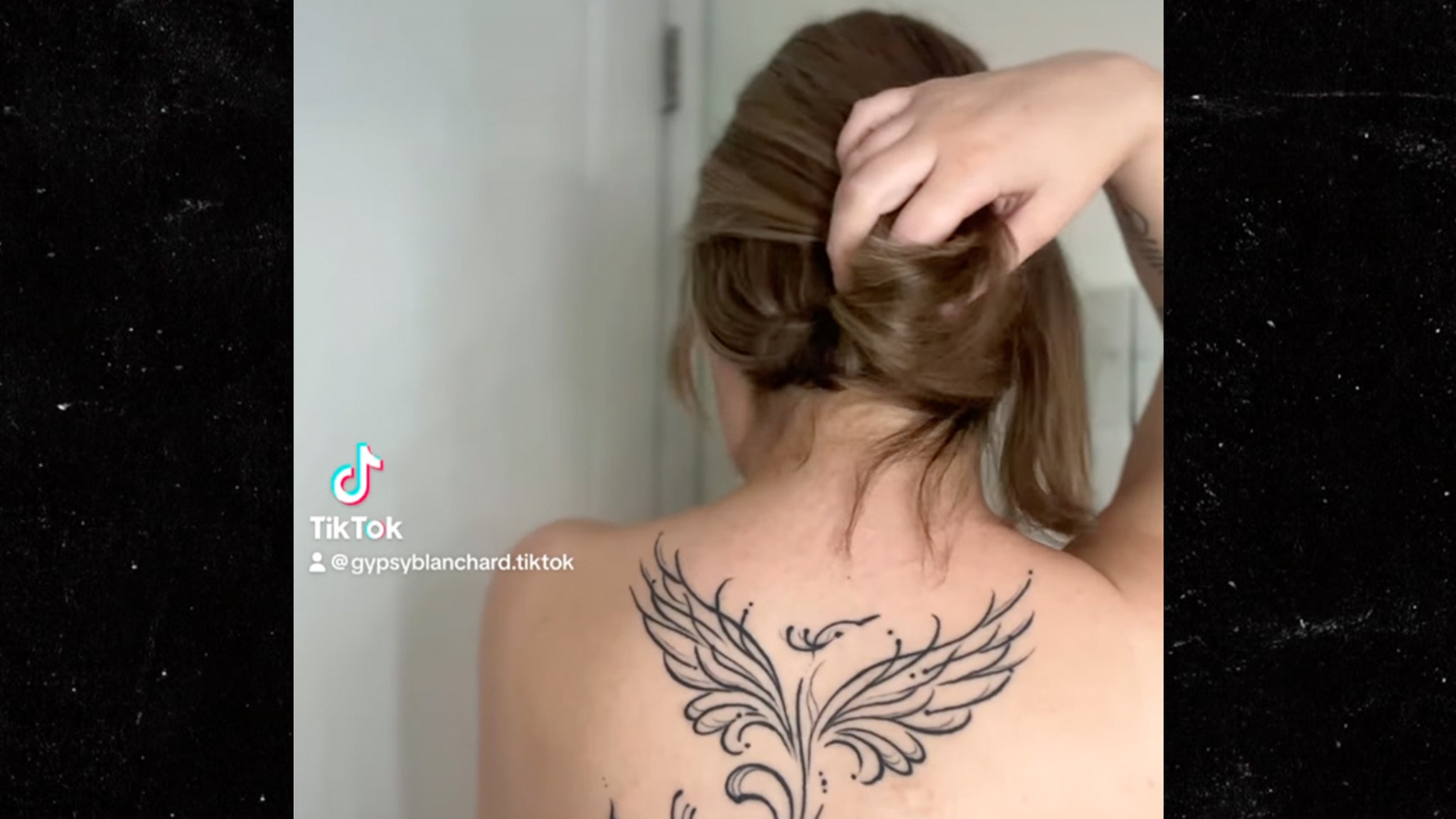
Gypsy Rose Blanchard has a large phoenix across her upper back, alongside smaller pieces such as vertical forearm script and relationship ink. The designs vary in size and visibility.

They appeared at different points in her life, not as one planned set. Photos show the ink, while interviews and coverage supply some of the context; the two shouldn’t be confused.

Gypsy Rose Blanchard’s phoenix back tattoo

Gypsy Rose Blanchard tattoos: phoenix back tattoo

The phoenix is the clearest centerpiece. It spans her upper back, with wings spreading from a central body and a long, curling tail below. Fine black lines shape the feathers.

The drawing relies on contour and symmetry instead of dense shading. The wings register first in a quick photo; the curls and small dots take a closer look. Open skin keeps the image light.

Phoenixes are often associated with rebuilding or starting over, but that general symbolism doesn’t confirm Gypsy’s own reason for choosing this one. The design is specific in its wings, tail and ornamental lines.

The upper back gives the wings room to spread around a centerline. The gaps between the feather lines help keep the large image readable and give it space to age.

The smaller forearm tattoo

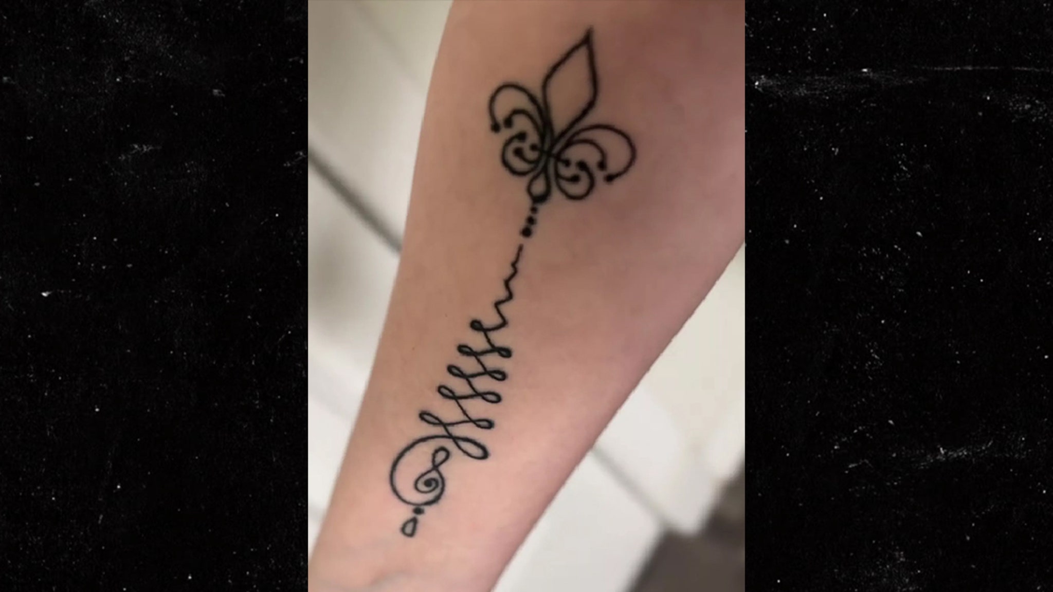
Gypsy Rose Blanchard tattoos: forearm script and flower tattoo

Her forearm tattoo is a narrow column of black script with a small outlined flower near the top. The lettering runs along the arm, and the flower breaks up the line of text.

The looping strokes make the script softer than block lettering. Spacing and line weight matter here as much as the words, though the text itself isn’t clear enough in the available photos to quote.

The phoenix reads as an image from a distance; the smaller forearm piece asks you to look closer. It’s visible, but its scale gives it a more personal feel.

The design follows the length of the forearm and doesn’t need much width. Inner or outer placement would change how often it appears in view.

Life outside the frame

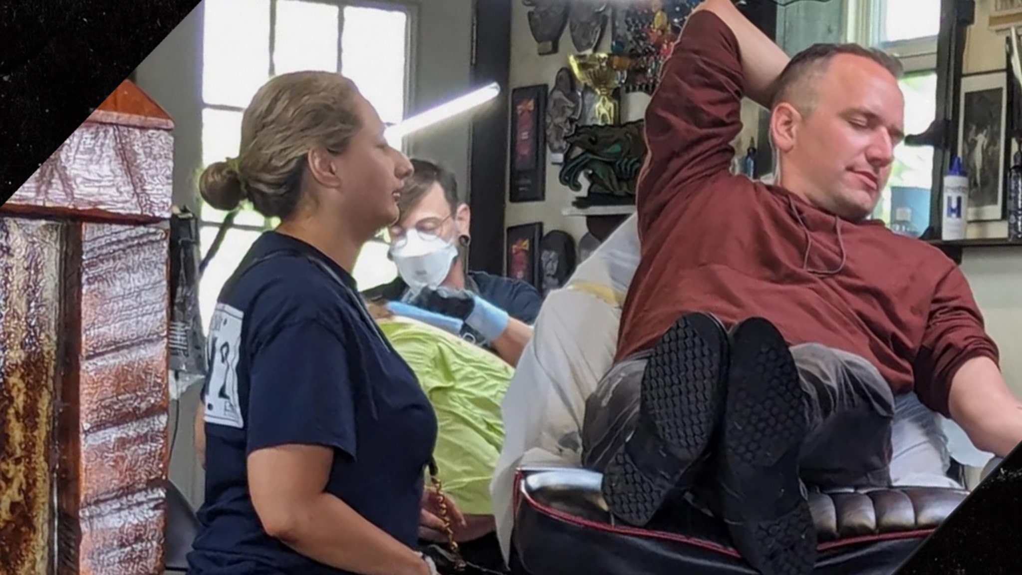
Gypsy Rose Blanchard in a contextual photograph: tattoo-session context; not tattoo evidence

Coverage has also reported that Gypsy got a matching husky tattoo with Ken Urker. Their relationship later changed, but the tattoo can still mark a real period of her life.

The photo here shows a tattoo session, not a finished design. It confirms the studio visit, not which tattoo was being done.

Before getting a matching tattoo, ask whether you’d still want it if you were the only one wearing it. That question doesn’t predict what will happen; it helps make sure the design has meaning for you on its own.

A shared animal, flower or object can carry a connection without using a name or portrait. It leaves room for the wearer to decide what the tattoo means later.

A collection that changed in public

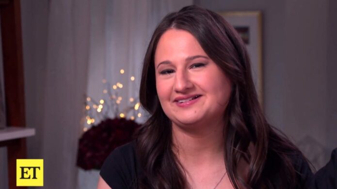
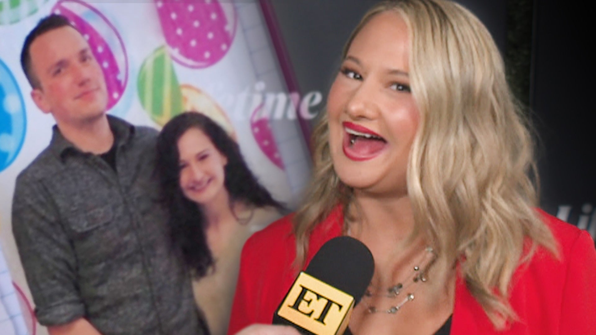
Gypsy Rose Blanchard in a contextual photograph: interview context; not tattoo evidence

Gypsy has discussed her tattoos as her public life changed after prison. Photos, interviews and relationship updates became part of how people read the designs.

The phoenix and forearm script are visible in the available images, and coverage has described the husky as a matching relationship tattoo. A blurry frame or a guess isn’t enough to assign another meaning.

A back tattoo can stay covered until the wearer chooses to show it. Forearm ink is part of everyday gestures, so the two placements make different demands on the person wearing them.

The placement is part of the point

Gypsy Rose Blanchard in a contextual photograph: public-life context; not tattoo evidence

The phoenix uses the width of the upper back; the script runs down the forearm. Each placement suits a different scale, and the collection doesn’t need one style to make those choices feel personal.

The collection mixes fine-line imagery, script and relationship designs. It feels connected through Gypsy’s choices, not one repeated style.

Before choosing a design, consider how visible it should be, whether you want it read from a distance or up close, and how its shape will sit on the body. Those questions matter more than copying a screenshot.

What to take to a consultation

A consultation can start with the detail you actually like: the open linework in the phoenix, the vertical script or the use of an animal to mark a relationship. Bring that reference and let the artist fit it to your body and preferred style.

For a phoenix, discuss how much feather detail and shading can remain clear at the size you want. For script, view the lettering at actual scale and on the chosen part of the arm; a screen mock-up can hide crowding.

A matching design should work on each person by itself. That might mean using the same subject in different placements or adjusting the drawing to suit each body.

Gypsy’s visible tattoos range from a broad phoenix to forearm script and relationship ink. Their placement and timing give each piece a different role in the collection.

More celebrity tattoo guides

Kim Kardashian’s Tattoos: The Hidden Infinity Symbol Inside Her Lip

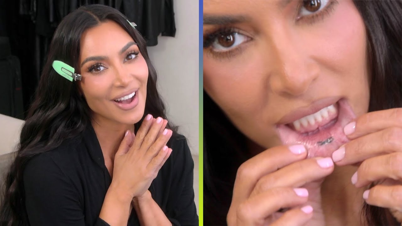
For years, Kim Kardashian said tattoos weren’t for her, once comparing one to a bumper sticker on a Bentley. In October 2021 she made an exception: a tiny black infinity symbol inside her lower lip.

That keeps the exception out of sight most of the time.

She got it after hosting Saturday Night Live. Friends were getting matching infinity tattoos on their hands, but Kim didn’t want visible ink. The inside of her lip let her join them while keeping the design mostly out of sight.

Kim Kardashian’s hidden inner-lip tattoo

Kim Kardashian tattoos: inner-lip infinity tattoo

The tattoo is a small black infinity symbol inside her lower lip. In the reveal footage, Kim pulls the lip down so the mark can be seen.

There are no dates, initials or flourishes around it. The simple, dark shape is easy to recognize once you know where to look.

On a wrist, an infinity sign would be familiar and visible. Inside the lip, it stays private unless Kim decides to show it.

She has said she sometimes forgets the tattoo is there, and once noticed it while flossing. It isn’t in her everyday line of sight.

That doesn’t make the ink less permanent; it changes how she lives with it. The mark can hold the memory of that night without becoming part of every outfit or introduction.

A private choice in a public life

Kim Kardashian in a contextual photograph: interview context; not tattoo evidence

Kim’s public life happens in front of cameras, but this is a piece she controls. She can reveal it on a show, mention it in an interview or keep it to herself.

Placement can determine who sees a tattoo. A hand or neck piece is hard to miss; an inner-lip tattoo appears only in a very specific moment.

The inside of the mouth heals differently from arm skin. Anyone considering that spot should discuss healing, aftercare and how long the ink is likely to last with an experienced tattoo artist.

The compact infinity sign fits the small area. A larger or more detailed image would be harder to read as the lip moves; here the design follows the limits of the placement.

The day it became part of the story

Kim Kardashian in a contextual photograph: GMA interview context; not tattoo evidence

Most celebrity tattoos are visible in photos. This one became a story partly because it usually isn’t: it’s a keepsake from the night Kim hosted SNL and joined friends in getting matching ink.

The symbol is shared, but the placement is hers. That let Kim take part in the group tattoo without choosing the same visible location as her friends.

The hidden location adds a little humor: she got a tattoo most people wouldn’t see unless she chose to show it.

The meaning is in the choice

Kim Kardashian in a contextual photograph: ABC interview context; not tattoo evidence

Kim has linked the infinity sign to the matching tattoos she and her friends got after SNL. The symbol can suggest continuity or friendship, but she hasn’t needed to attach a grander story to it.

Sometimes the reason is simple: friends are doing something together, and you want to join them in a way that feels right for you.

If you’re borrowing anything from her choice, think about how public you want the design to be and whether the symbol still works at that size. That’s more useful than choosing an infinity sign because it’s familiar.

One exception to the rule

Kim Kardashian in a contextual photograph: Tonight Show context; not tattoo evidence

Kim got one small tattoo; she didn’t turn it into a new personal style. A single piece can stand on its own without committing you to a collection.

You still need to choose the specific design and placement carefully, but you don’t have to decide whether you’ll want more ink later.

What makes this tattoo memorable is the contrast: someone who had said she wouldn’t get ink found a way to join her friends while keeping the mark mostly private.

More celebrity tattoo guides

Sarah Paulson’s Tattoos: The Stories Behind Her Personal Ink

Sarah Paulson’s tattoos are small references to people and moments in her life. They include initials for a friend and her dogs, a lyric, and a starburst on her foot.

Her newest piece is a tiny “DK” on her forearm, a tribute to Diane Keaton, her friend and former co-star in The Other Sister. Paulson has spoken about the tattoo with the same directness and humor she brings to her older ink.

The DK forearm tattoo

Sarah Paulson tattoos: Genuine tattoo evidence for the Diane Keaton tribute section.

Paulson showed the “DK” initials in a January 2026 tribute to Keaton, whose 80th birthday would have been that month. Keaton died in October 2025; she and Paulson had worked together on The Other Sister in 1999.

The two letters are small, black and plain. There’s no portrait or frame—just a mark near the wrist that carries a full friendship for Paulson.

In her tribute, Paulson recalled traveling with Keaton, laughing until they cried, watching many movies and eating French fries. She thanked Los Angeles artist Daniel Winter, known as Winterstone, for a “forever reminder” of one of her “forever people.”

With just two initials, their spacing and line weight do most of the visual work.

A small mark with a big reason

Sarah Paulson in a contextual photograph: Contextual portrait; not tattoo evidence.; not tattoo evidence

Their connection went beyond sharing a film credit. The initials leave the story with Paulson: other people may see two letters, while she knows the years behind them.

A line she values

Sarah Paulson in a contextual photograph: Contextual portrait; not tattoo evidence.; not tattoo evidence

Paulson also has a longer forearm tattoo with a line from Stephen Sondheim’s Sunday in the Park with George: “Anything you do, let it come from you then it will be new.” The hosts read it aloud during her appearance on SmartLess.

Inked reported that she got it from Winterstone for her 45th birthday in 2019. The single-needle lettering stretches across much of the forearm but remains fine and delicate.

The lyric comes from a musical about making art and living with what has already been made. Paulson has worked in theater, television and film, often taking very different roles; the line suits that career, though she hasn’t said it was chosen for that reason.

A long quote needs room for its line breaks. Paulson’s fine lettering gives the words direction across the forearm without turning them into a heavy block.

The people behind the mark

Sarah Paulson in a contextual photograph: Contextual portrait; not tattoo evidence.; not tattoo evidence

Older interviews and profiles have identified the initials of Paulson’s dogs, Alice and Millie, on her inner wrist. It’s a spot she can see often while keeping the tattoo mostly to herself.

The reported pieces don’t share one visual style: a friend’s initials, a lyric and the dogs’ names. What connects them is the people and ideas they point back to.

Small initials need clear shapes and enough space to stay readable as they age.

A lighter note

Sarah Paulson in a contextual photograph: Contextual portrait; not tattoo evidence.; not tattoo evidence

On SmartLess, the hosts also mentioned a starburst tattoo on Paulson’s right foot. It’s a simpler, lighter image than the “DK” tribute or the lyric.

The foot is easy to cover with shoes and visible in sandals. A small starburst can read as a playful graphic without needing a specific explanation.

Shoes rub and feet bend, so an artist may keep a foot design clear and uncomplicated.

The common thread

Paulson’s documented tattoos point to Diane Keaton, a Sondheim lyric, Alice and Millie, and a starburst on her right foot. They show that a meaningful tattoo can be a memorial, an idea she values, a reminder of home or simply a shape she likes.

If you’re planning your own piece, start with what you want to remember and decide how much of that story needs to appear in the design. Initials may be enough for a private reference; a few words can make a connection clearer to other people.

The “DK” doesn’t try to sum up Keaton’s life or the whole friendship. It keeps one name close, and two letters are enough for that.

More actor tattoo guides