codex

Jonathan Haggerty Tattoos: Roman Numerals, Neck Ink and Fight Photos

Jonathan Haggerty’s tattoos are modest compared with the fight photos around them. The clearest is a line of Roman numerals across his upper chest; some images also show fine lettering along the left side of his neck.

The same chest design appears in several photos, so its placement and shape are easy to confirm. The images and public coverage don’t explain what the numerals mean, and the smaller neck lettering isn’t clear enough to transcribe.

Jonathan Haggerty’s Roman-Numeral Chest Tattoo

A front-facing photo shows the inscription running in a shallow line below the collarbone. The black characters are narrow and evenly spaced, with small gaps between groups.
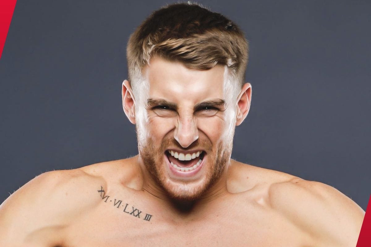
Jonathan Haggerty tattoos: front view of the documented chest lettering

The lettering stays legible without a banner or heavy background. In some frames it nearly disappears into shadow; that changes with the light, not the tattoo.

What the Chest Lettering Looks Like

Close views show thin, dark strokes with serif-like shapes. The inscription sits high on the chest and leaves space around the characters. It may look like a date or a sequence, but the photos don’t identify it.
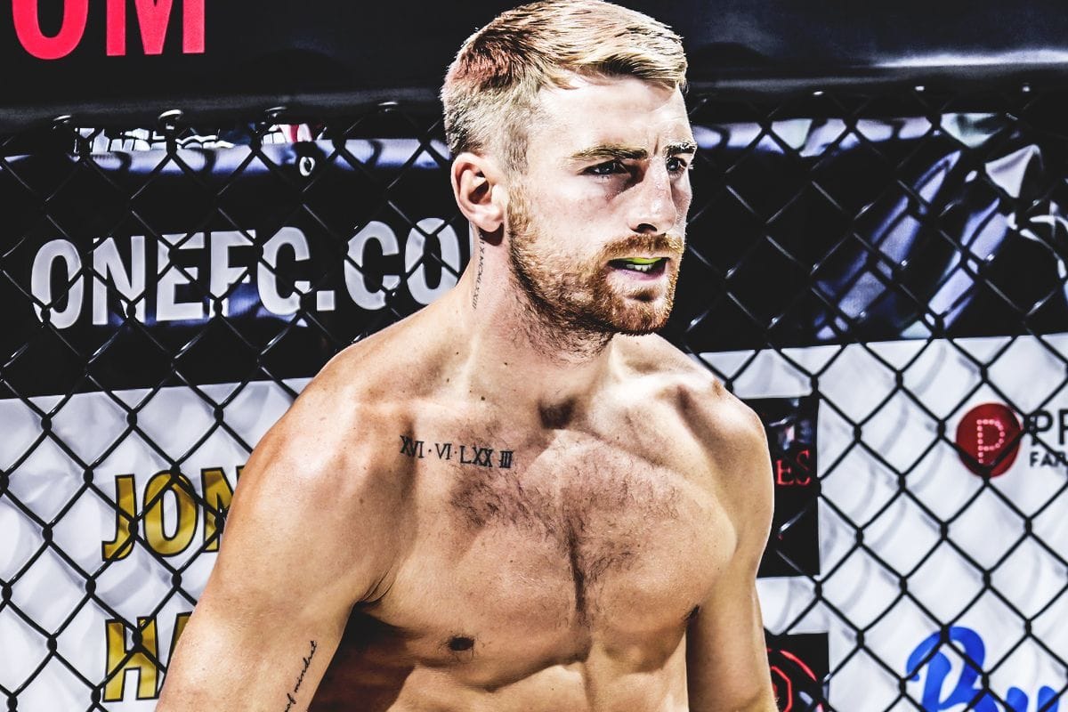
Jonathan Haggerty tattoos: three-quarter cage view of the same chest design

When Haggerty turns toward the camera, one side of the lettering can look darker than the other. The skin curves away from the lens and arena lights fall unevenly; the design itself remains the same.

The Tattoo Seen in the Cage

Cage photos show the numerals under different postures and lighting. A lifted shoulder can make the line look shorter, and a torso turn can tilt it in the frame. Comparing several images gives a better view than relying on one crop.
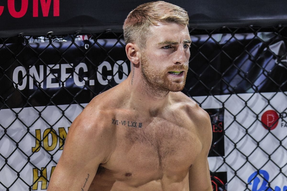
Jonathan Haggerty tattoos: second cage view showing the chest and side detail

The cage images also place Haggerty in recognizable ONE Championship settings. That helps confirm the subject, while the repeated views show the same chest piece rather than a new design.

Side-Angle Views and Smaller Lettering

A side-angle image shows fine vertical lettering near the left side of Haggerty’s neck and upper shoulder. It is much smaller than the chest inscription, and the available angle and resolution don’t make every character clear enough to quote.

Jonathan Haggerty tattoos: side-angle post-fight view of the chest and neck lettering

The neck lettering follows the side of the body, while the chest numerals run horizontally. A collar or a turn away from the camera can hide the smaller piece. Other possible marks in training or backstage photos aren’t clear enough to add to a reliable inventory.

Why Different Fight Tattoo Photos Matter

The photos differ in angle, lighting and moment: a front portrait, cage-side views and post-fight frames. Across them, the chest tattoo stays in the same place. What changes is the amount of the chest visible and the way the light falls.

That comparison is useful because a shadow, tape or background line can look like ink in a single frame. Here, the repeated views make the main design easy to recognize.
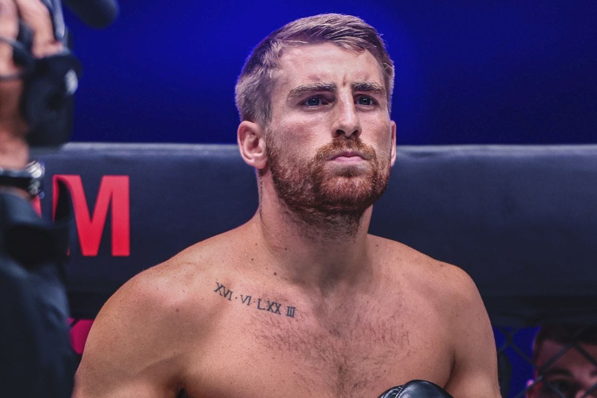
Jonathan Haggerty tattoos: ring-side portrait of the same chest tattoo

Most of the pictures come from the spaces around a fight: the cage, bright arena lights and post-fight moments. Haggerty’s shoulders move and his breathing changes the shape of his chest, so the lettering can look different from frame to frame.

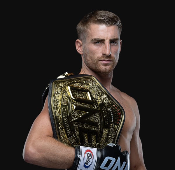
The featured portrait of Haggerty holding a ONE Championship belt introduces the athlete; it isn’t evidence for a tattoo. The inline photos show the chest and neck details.

A Fighter’s Competition Photography

The photographs confirm a black Roman-numeral inscription across Haggerty’s upper chest and fine lettering near the left side of his neck. They don’t confirm the meaning of the numerals or a full reading of the smaller script.

That leaves the private explanation with Haggerty. A useful description can give the placement, lettering style and what remains uncertain without guessing at a date or message.

What the Photos Can Confirm

The video below puts the still images back into motion. Haggerty’s shoulders turn, and the chest design appears and disappears with the angle. The footage adds movement, but it doesn’t explain the private meaning of the tattoo.

Watch Jonathan Haggerty in the Ring

Kirsty Gilmour Tattoos: Olympic Rings, Croissant and Career Ink

Badminton player Kirsty Gilmour’s tattoos mark tournaments, places and private reminders: Olympic rings and medal dots, a Scottish landscape, a croissant, short phrases and a few smaller symbols. In a 2026 Outlook India interview, she explained several of them; where she hasn’t given a meaning, the photos are all we have.

What is actually documented

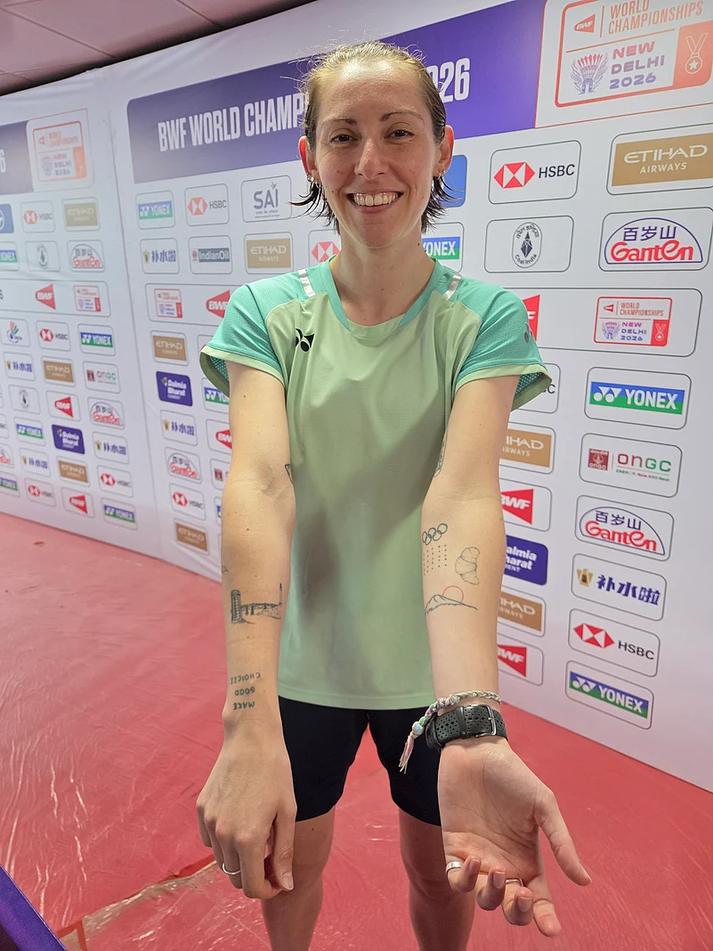
That interview identifies the main pieces: “make good choices” lettering, a north-coast Scottish landscape, Olympic rings and medal dots, Mount Fuji, a croissant, a Commonwealth Games design, a plant pot, an infinity sign and “it’s gonna be okay.” Some are easy to see during a match; others sit on her ribs or ankles.

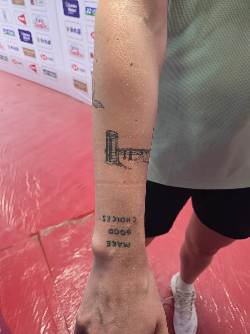
The upside-down make good choices tattoo

Gilmour said the phrase is oriented for her to read, so it appears upside down to other people. She connected it to the 2019 film Little Women, especially Saoirse Ronan’s necktie and collar.

Kirsty Gilmour tattoos: full collection reference for the upside-down lettering section

The orientation makes the reminder personal rather than a message arranged for an audience. The close photographs also show how the phrase sits among the other arm tattoos.

Kirsty Gilmour tattoos: bridge and lettering close-up for the text-tattoo section

Gilmour described a north-coast Scottish landscape near Lossiemouth: a phone box on the bridge that leads to the beach. The small details make it a particular memory rather than a generic coastline.

The Scottish landscape arm tattoo

Fine lines reduce the bridge, phone box and horizon to a small scene on her arm. Up close, the individual details become easier to see.

Kirsty Gilmour tattoos: separate arm close-up for the Scottish landscape section

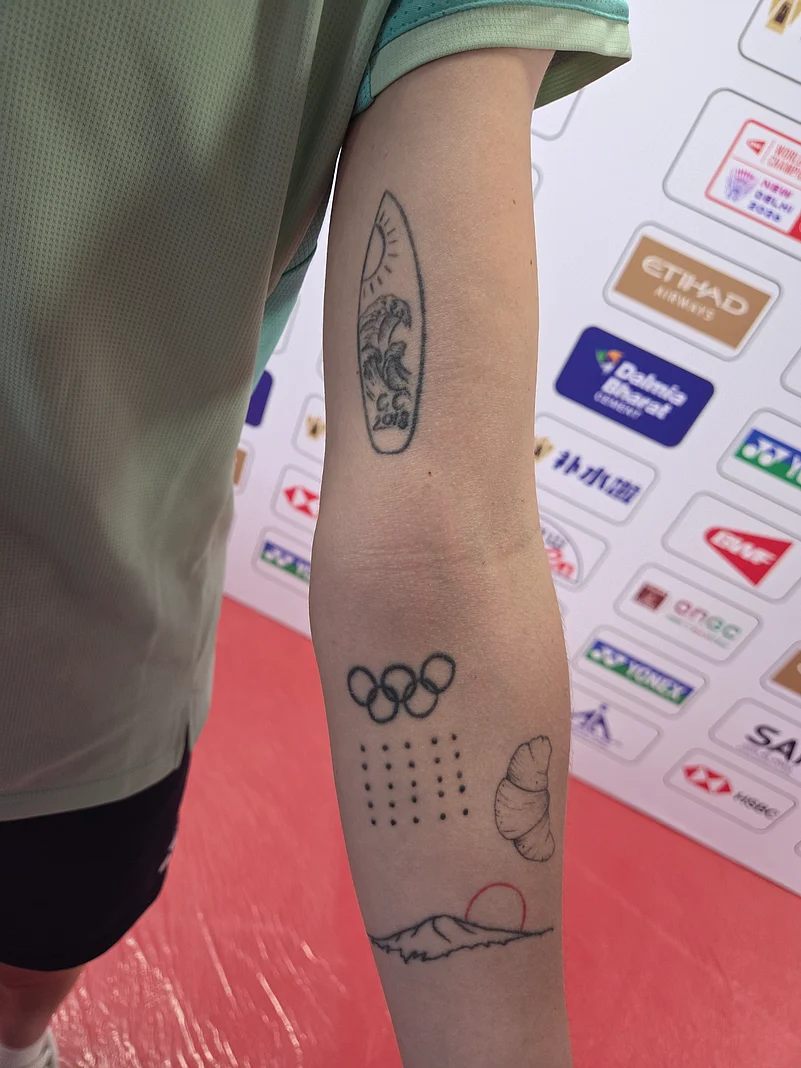
The Olympic rings mark Gilmour’s experience at Rio. She said the nearby dots keep a record of major medals and titles.

Olympic rings and medal-dot arm tattoos

The dots give her a compact tally that can grow with her career. They don’t need to be a large trophy image; each mark has a place in the sequence she remembers.

Kirsty Gilmour tattoos: upper-arm cluster close-up for the Olympic rings section

Gilmour also has a Mount Fuji design connected to Tokyo 2020. A close photo shows the mountain with sun and wave shapes. It points to the place without looking like an event logo.

A simple outline keeps the mountain readable at a small scale, while the surrounding shapes make it a scene rather than a standalone peak.

Mount Fuji for Tokyo 2020

The croissant marks Paris 2024. Gilmour said the small pastry represents that period, using an everyday image rather than a landmark or Olympic emblem.

It also gives the collection a playful note beside the rings, dates and landscapes.

The croissant that marks Paris

A small tattoo marks the bronze medal Gilmour won at the Gold Coast Commonwealth Games. The available coverage describes the link to the medal, though not every detail of the design.

The Gold Coast piece and career milestones

On her ribs, Gilmour described a plant pot and an infinity sign as the more stereotypical pieces in her collection. They’re less tied to a named tournament than the Olympic and travel references.

The rib placement keeps them mostly covered by training clothes, and the designs appear in photos only when she chooses to show that area.

A private rib detail

Gilmour has “it’s gonna be okay” tattooed on her ankles. Long socks usually cover the words, making them the most private pieces she discussed.

The phrase is short and direct. Its placement means she can carry the reminder without turning it into a message for everyone watching.

The ankle reminder that stays mostly private

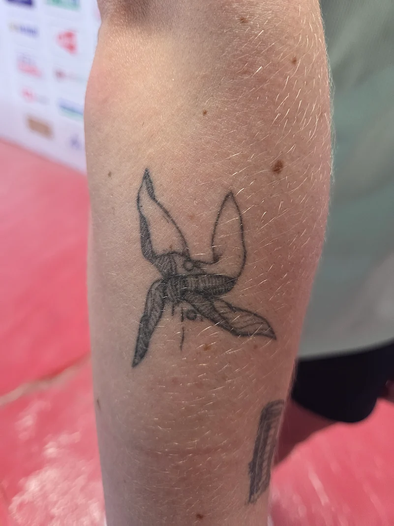
The close photos from the Outlook India interview show the arm designs at a useful distance. One frame gives a broader view; others bring out the landscape, lettering and Olympic cluster.

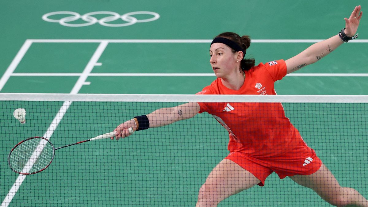
Wider match photos serve a different purpose. They show Gilmour on court, moving in competition kit, but don’t provide the same detail about her tattoos.

How the photographs help without inventing anything

Kirsty Gilmour in a contextual photograph: contextual match photograph; not tattoo evidence; not tattoo evidence

Across the collection, the designs point to Rio, Tokyo, Paris, the Gold Coast and the Scottish coast, along with phrases she chose for herself. Some marks record career milestones; others hold a personal or playful memory.

Why the collection feels like a career map

A competition portrait puts the tattoos back in the setting where fans usually see Gilmour. It shows her on court, not a new design or a close reading of small ink.

Kirsty Gilmour in a contextual photograph: contextual competition photograph; not tattoo evidence; not tattoo evidence

Gilmour’s approach is to choose details with a real connection: a view she knows, a tournament, a phrase or an object from a trip. A small mark can carry enough meaning without becoming a large sleeve or matching set.

The photos and her own comments give a clear account of several tattoos. The pieces she hasn’t explained can stay undescribed; the documented ones already make a varied record of her career and memories.

Ideas to borrow without copying

The collection has no single visual theme, but each piece has a specific anchor: a film detail, a phone box, a medal, a destination or a phrase. That keeps the tattoos personal without forcing them into one style.

The honest takeaway

Paul Mescal Tattoos: The Swallow, Stag and Fine-Line Ink

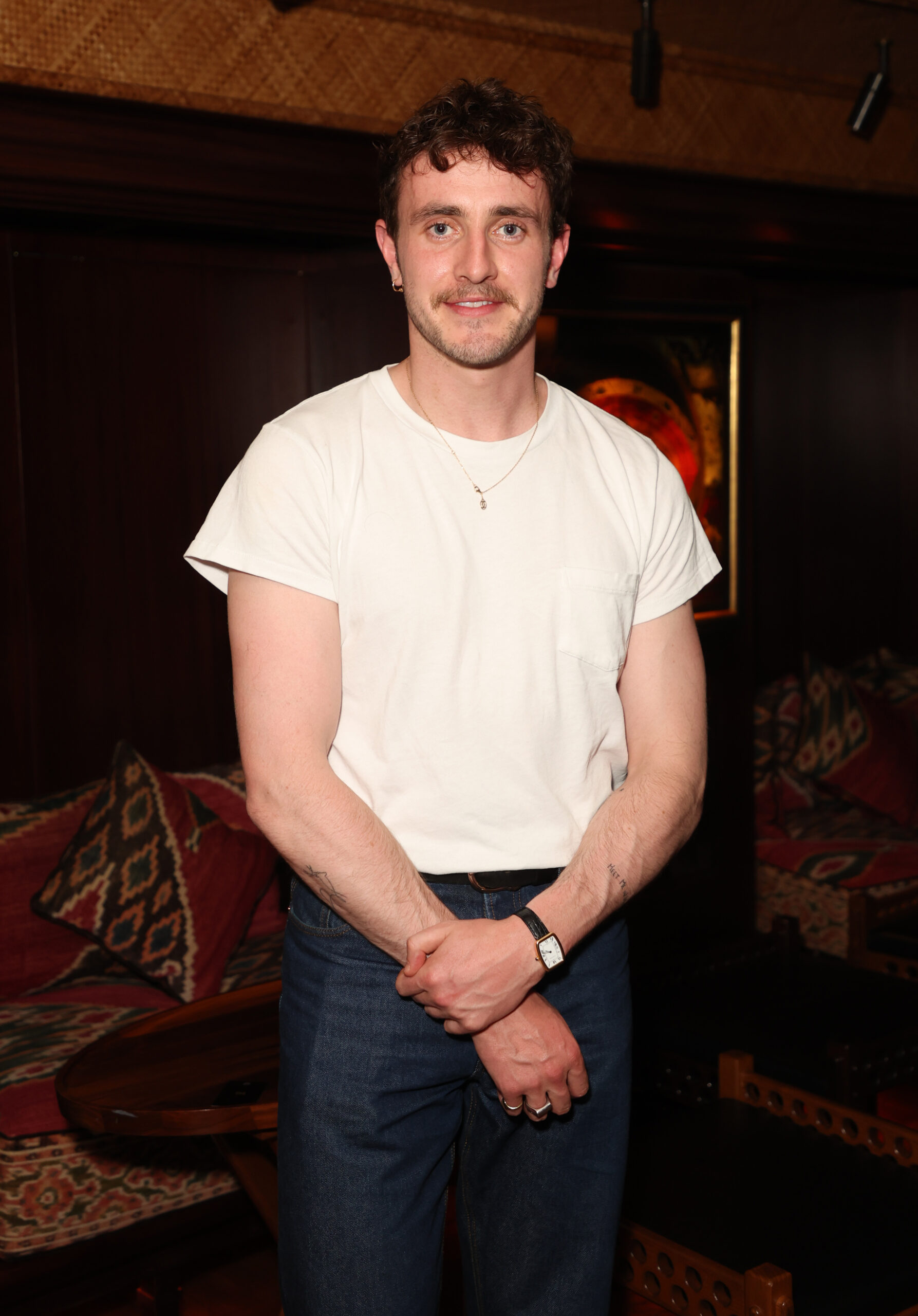
Paul Mescal’s tattoos are small and easy to miss in red-carpet photos. He has spoken about a swallow on his upper left arm, a stag on the other arm and a design inside his left elbow. A more recent forearm inscription has been reported, though its reading and meaning remain less certain.

The pieces are best described through what Mescal has said and what the photos show. The swallow has a family memory behind it; the stag is linked to Normal People; the elbow design was one he simply liked.

What is actually documented

Mescal showed several tattoos in a British GQ interview. He said the swallow on his upper left arm is tied to springtime memories with his father: each March, they would go into the garden to look for the first swallows.

The swallow on his upper left arm

The small bird is drawn with a light line. Its simple outline keeps the shape readable without taking over the arm. The meaning Mescal gave it is specific to that family ritual, not a general symbol of freedom.

Paul Mescal tattoos: high-resolution swallow tattoo evidence

Mescal said the stag is connected to Normal People, but he didn’t give a fuller explanation. The novel and its deer imagery have led to interpretations, but those should stay separate from what he confirmed.

The stag linked to Normal People

A small deer design leaves room for different treatments: the antlers can be a few fine lines, with the body reduced to a simple outline. The photos show a stag-related tattoo; the private reference belongs to Mescal.

Paul Mescal tattoos: high-resolution deer tattoo evidence

Mescal also pointed out a design inside his left elbow. When the interviewer suggested a possible symbol, he said it didn’t have a particular meaning—he simply liked the design.

The small design inside his left elbow

The inner elbow bends and stretches with the arm. A design there changes shape as the arm moves, so spacing and placement matter as much as the flat drawing.

Paul Mescal tattoos: visible inner-elbow tattoo

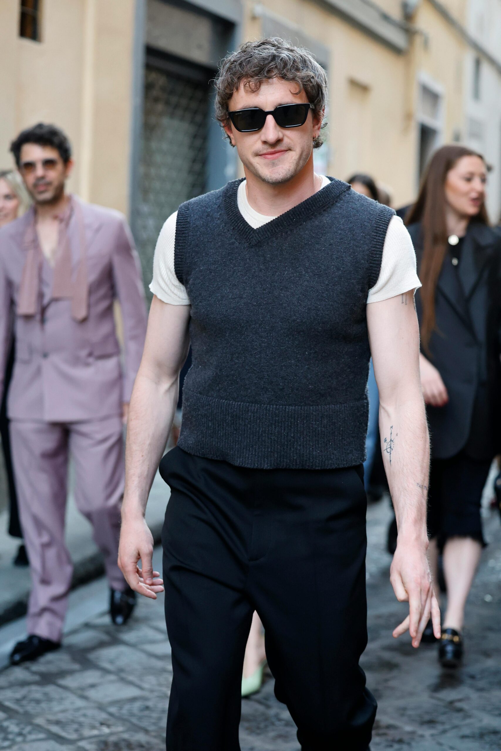
In 2024, Capital reported a fresh forearm tattoo visible beneath second skin after Mescal appeared on Capital Breakfast. The outlet read the lettering as “Meet me at Montauk,” a phrase from Eternal Sunshine of the Spotless Mind. That reading was reported by Capital, not confirmed by Mescal.

The newer forearm lettering

The phrase is longer than the swallow or stag and uses more of the forearm. Fresh ink can be partly covered or photographed at an angle, so the visible letters may not be equally clear in every image.

Paul Mescal tattoos: high-resolution forearm lettering evidence

Photos help establish placement, but they can make a fine line look darker or hide part of a tattoo under a sleeve. Comparing different angles is more useful than treating every appearance as a separate design.

What the photographs really show

The documented pieces share a restrained scale. The swallow and stag are recognizable subjects without large traditional compositions; the elbow design is small, and the reported lettering is narrow.

Why the collection feels understated

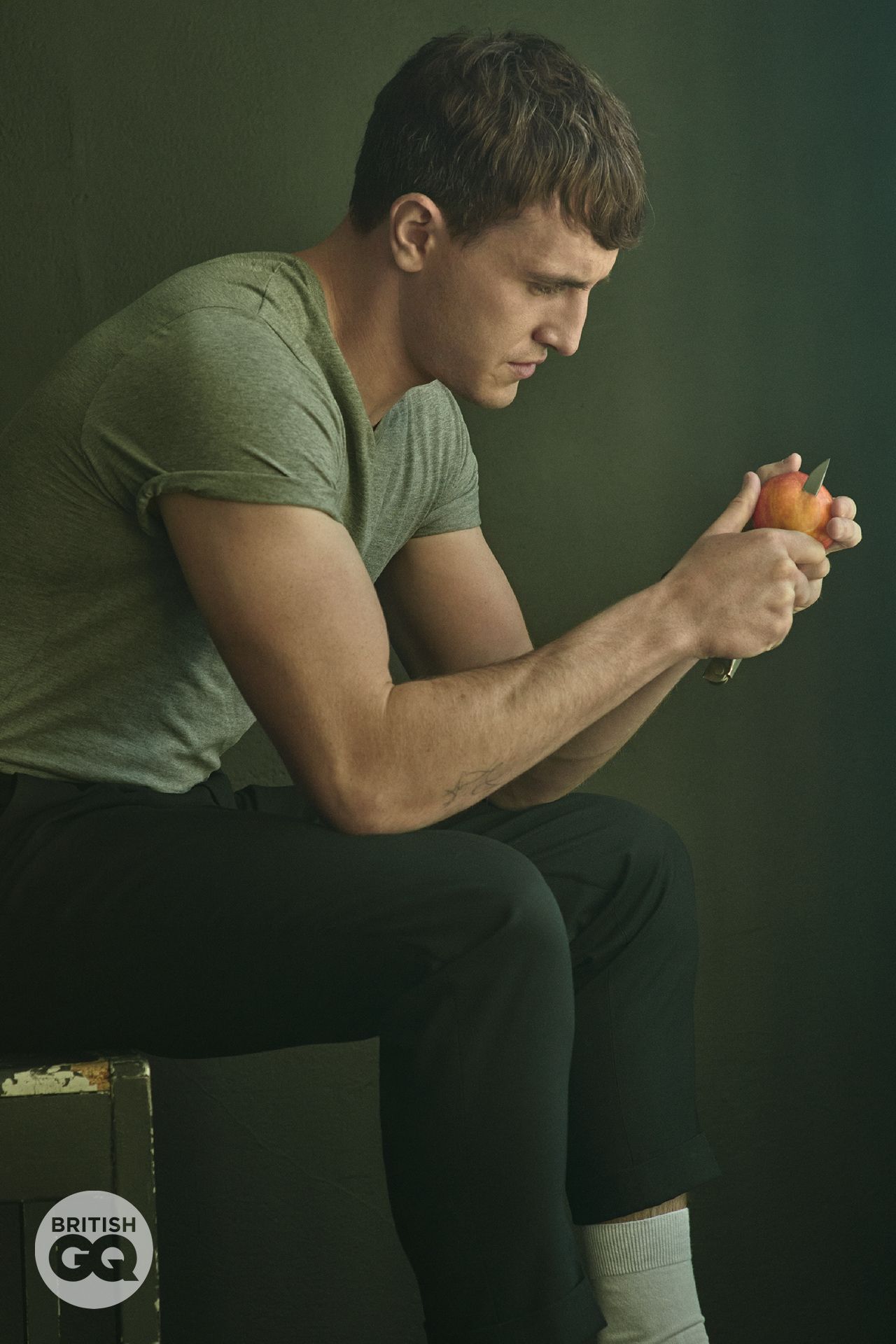
A contextual portrait shows Mescal’s understated style, but it isn’t tattoo evidence. The closer views are the ones that help with the ink itself.

Paul Mescal in a contextual photograph: contextual portrait showing his understated style; not tattoo evidence; not tattoo evidence

The collection suggests a few ways to think about a small design: use a memory that belongs to you, choose a subject you want to keep close, or pick a shape simply because you like it. The reason doesn’t have to sound profound to matter.

Design ideas without copying the tattoos

The swallow, stag and elbow tattoo all fit in relatively small areas. If you’re considering fine-line work, talk with an artist about size and spacing so the image remains readable as it heals and ages.

Paul Mescal tattoos: visible arm ink in a real-world setting

Placement affects how often a tattoo is seen. An inner-arm design may sit under a sleeve, while forearm lettering is easier to notice. Choose a spot that suits how visible you want the mark to be.

Placement, scale and ageing

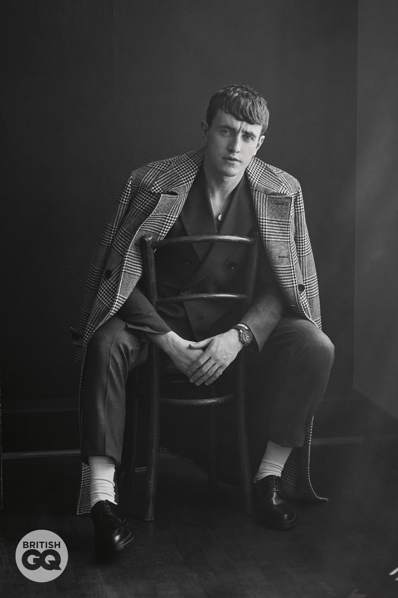
A separate portrait shows Mescal with his arm visible in a real-world setting. It offers another view of how small tattoos sit alongside clothing and movement, without establishing a new design.

Paul Mescal in a contextual photograph: contextual portrait for placement discussion; not tattoo evidence; not tattoo evidence

Mescal’s examples are personal in different ways: a family ritual, a connection to a role and a design he chose because he liked it. The strongest references come from the wearer’s own life, not from copying a celebrity’s tattoo.

How to keep the reference personal

The swallow has a clear story; the stag’s fuller meaning hasn’t been shared; and the reported forearm phrase remains an outside reading. That is enough to describe the collection without turning uncertainty into fact.

The honest takeaway

The video interview adds another view of Mescal discussing his work and roles. It sits alongside the photos as context, while the tattoo details stay grounded in what he said and what the images show.

Nico O’Reilly Tattoos: Designs, Meanings and Photo Guide

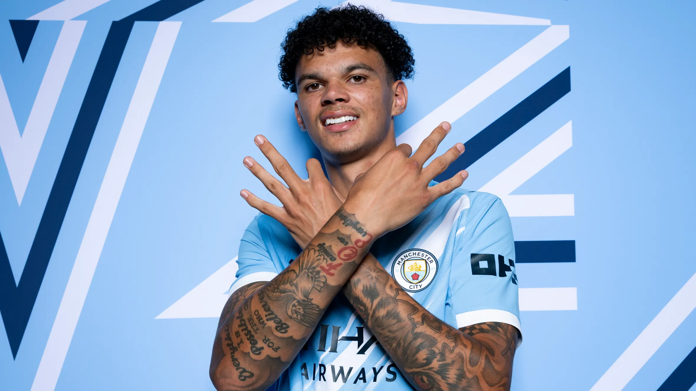
Nico O’Reilly’s arm tattoos are often visible in a Manchester City shirt. The lettering points to Manchester, football and a few personal reminders. The collection seems to have grown piece by piece rather than as one planned sleeve.

Some details are clear in photographs; others have only been mentioned. This guide sticks to what the pictures show and what O’Reilly has said. Smaller shapes remain unidentified where the evidence is unclear.

Nico O’Reilly’s 0161 Tattoo Starts With Manchester

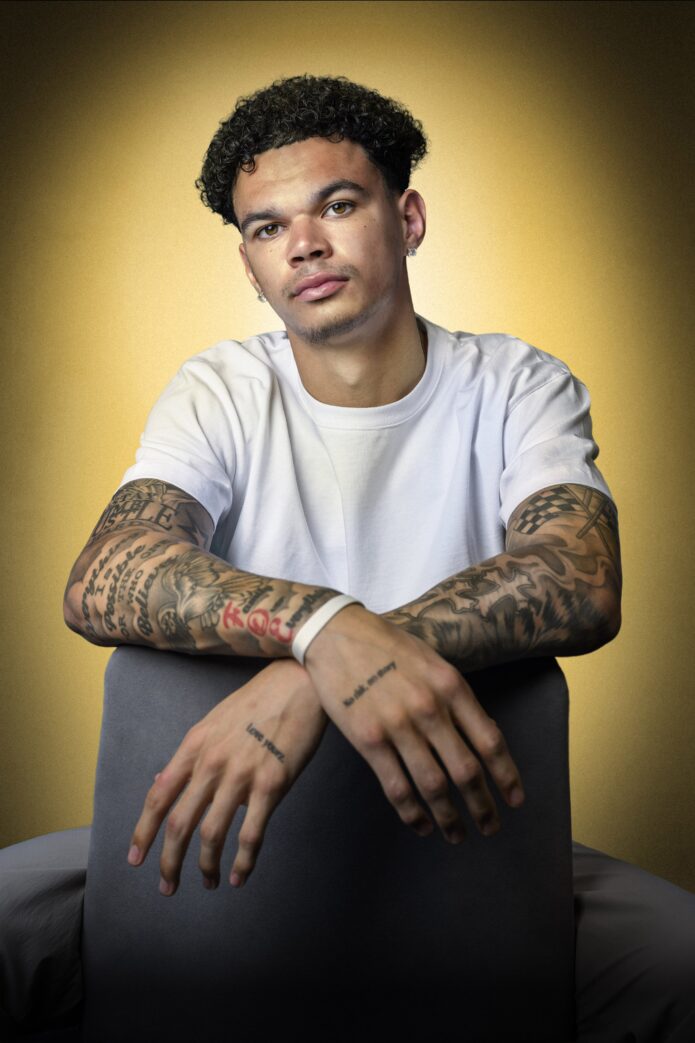
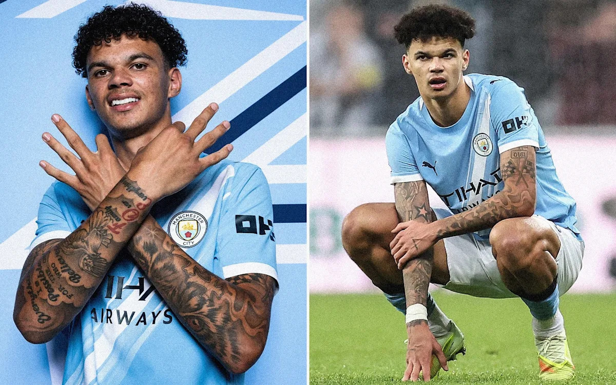
Nico O'Reilly tattoos: Broad visual introduction to Nico O'Reilly's documented arm tattoos

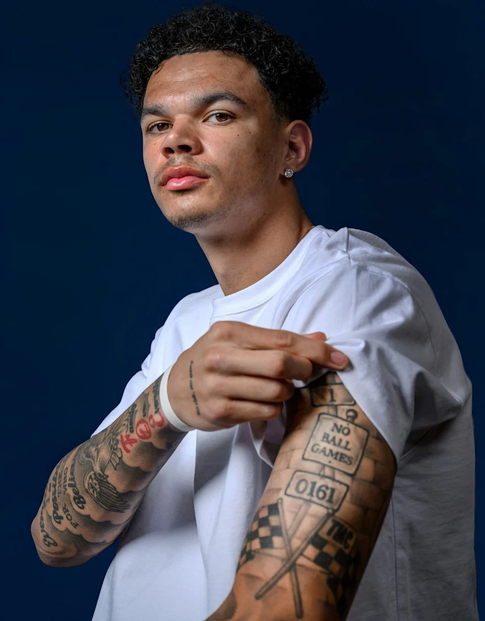
The boxed 0161 on O’Reilly’s left arm is his clearest local reference. It’s Manchester’s telephone area code, linking the tattoo to the city where he came through City’s academy and built his career.

In wider photos, the number can get lost among the surrounding work. A close-up shows its squared frame and the contrast between its straight edges and the shading around it.

Among the lettering, 0161 is the most direct marker of Manchester and O’Reilly’s connection to the city.

The No Ball Games Tattoo Adds Another Local Detail

Nico O'Reilly tattoos: Close evidence for the NO BALL GAMES and 0161 pieces

Beside it, a sign-style NO BALL GAMES tattoo sits on his left bicep. In the close-up, he has lifted the sleeve of a white shirt, revealing the words inside a border like a street notice.

The phrase has the tone of a familiar British warning sign. On a footballer’s arm, it also carries an obvious joke: O’Reilly’s job revolves around ball games.

The close photograph makes the border and all three words legible. That gives this piece firmer footing than shapes that are only partly visible elsewhere.

STAY HUMBLE HUSTLE HARD Sits on His Right Bicep

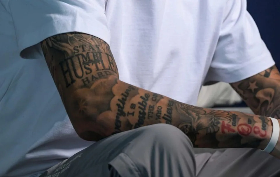
Nico O'Reilly tattoos: Direct visual evidence for the STAY HUMBLE, HUSTLE HARD phrase

On his right bicep, O’Reilly has STAY HUMBLE HUSTLE HARD in large, stacked capitals. The lettering spreads across the upper arm like a short reminder.

Shading and smaller designs sit around the phrase, but its heavy lettering keeps it easy to read and makes it the arm’s main focal point.

The words suggest a familiar balance: stay grounded and keep working. There’s no need to assign them a more elaborate meaning than the phrase itself gives.

Love Yourz Hand Tattoo Keeps Family Close

Nico O'Reilly tattoos: Wider view showing how the lettering and shaded pieces sit across both forearms

Love Yourz appears on the front of O’Reilly’s left hand. It’s smaller than the bicep lettering and easier to see when his hands are raised or held across his chest.

The phrase is commonly read as a reminder to value your own life instead of measuring it against someone else’s. O’Reilly hasn’t given a long public explanation for this tattoo, so that reading should stay with the wording rather than be treated as a confirmed backstory.

A red detail near his wrist stands out against the black-and-grey work. Small differences in colour, lettering and scale keep the arm from reading as one solid block of ink.

Comparing the Photographs

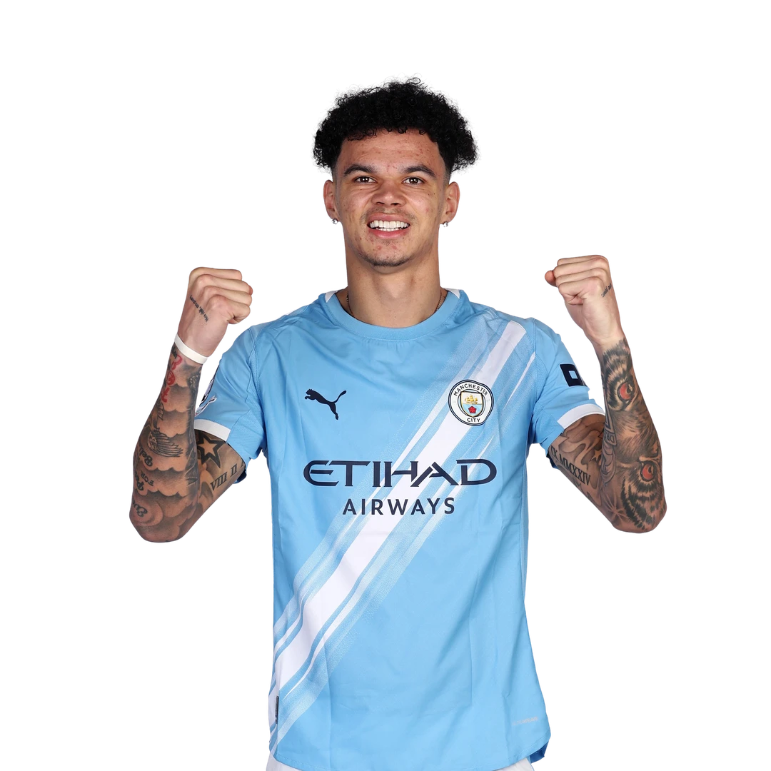
The photos offer different views: an arms-crossed studio portrait shows how the pieces sit together, an interview close-up reveals the left-bicep signs, and a crop makes the right-arm phrase easier to read. A UEFA portrait shows both forearms raised.

Those changes in angle and lighting affect what appears in each picture. The 0161 code may look different in a close crop, but it remains on the left arm; the photos show changing views, not a changing placement.

Much of the collection is lettering and shaded work, but some smaller details are partly covered or too indistinct to name. It’s better to leave those pieces unidentified than to guess from a blurred image.

A Clean Full-Body Tattoo View of Nico O’Reilly

Nico O'Reilly tattoos: Clean official comparison view of both tattooed forearms

The official UEFA portrait shows O’Reilly from the waist up with both arms raised. The left arm carries the clearest Manchester references and sign lettering; the large motivational phrase is on the right.

It’s a useful comparison image, not a close-up of the fine script. The clean background and unobstructed arms make it easy to see how much of the ink extends below a short-sleeved shirt.

That placement keeps the tattoos visible when O’Reilly is playing or celebrating. The photographs show their public visibility, while the meaning of individual pieces remains personal unless he has explained it.

Why the Collection Feels Personal

The best-supported themes are place and personal reminders: 0161 points to Manchester, Love Yourz is often read as self-worth, and STAY HUMBLE HUSTLE HARD is a direct maxim. No risk, no story has also been reported, though its exact placement isn’t clear in the photos reviewed here.

O’Reilly has also spoken about adding a maxim on the left side of his chest after the Carabao Cup final. A clear photo isn’t available here, so its design and precise placement can’t be confirmed.

The images show the scale and style of the visible tattoos; O’Reilly’s comments add context to a few of them. Anything beyond that can remain private.

Reading the Collection Without Overdoing It

For inspiration, the useful ideas are simple: a local area code in a clean frame, a familiar phrase treated like a sign, or bold lettering balanced with smaller work. You can borrow the approach without copying his exact tattoos.

Placement changes how a phrase reads. The bicep suits stacked lettering, a hand keeps a short line in view, and a forearm gives longer script room to run. A tattooist can adapt those choices to a different story or preferred level of visibility.

If you like an idea here, it’s the format—a place code or a short maxim—not a need to reuse O’Reilly’s wording. The strongest design is one that belongs to the person wearing it.

The Story Is Still Growing

The collection may still change. It already covers both arms and one hand, and the chest piece has been reported. New photos or an interview could clarify the smaller designs and phrases that aren’t clear now.

The clearest pieces are the 0161 code, NO BALL GAMES on the left bicep, STAY HUMBLE HUSTLE HARD on the right and Love Yourz on the left hand. Together with the other script and shading, they fill both arms without every photo showing the same details.

Taken together, the visible tattoos connect Manchester and football with a few short reminders. The photos confirm the placements; where O’Reilly hasn’t shared more, the details can stay open.

Mae Whitman Tattoos: Small, Personal Ink

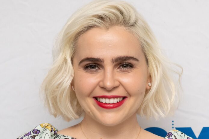
Mae Whitman’s tattoos tend to sit under a sleeve; the arm photos show small black designs spaced across both arms. They’re easy to miss at an event, but the collection doesn’t depend on one large centerpiece.

Whitman has described a sheep looking up at a star, inspired by a favorite children’s book. Photos shared while she promoted Up Here, including the images discussed by Allure, show more small marks: wrist script and a tiny face that looks alien-like. The pictures don’t reveal every detail, so those readings stay tentative.

That mix of one personal story and several small visible designs is useful if you prefer subtle tattoos. The appeal is in their scale and spacing, not in copying a particular mark.

The tiny tattoos are easy to miss until you see the arm photos

Mae Whitman tattoos: Small black forearm tattoos and visible wrist-area marks

In arm photos from a TV appearance, Whitman’s sleeves stop above the elbows and both arms are visible. Small black designs sit apart instead of forming one large focal piece.

There’s clear space between the marks. In these photos, that separation helps each one read on its own; a tighter cluster could look darker as the ink softens.

The designs vary. Some look like symbols, some like lettering, and others have the loose quality of a doodle. Together they give the arms a collected feel rather than a matched set.

If you’re planning a similar layout, think about legibility as well as size. Fine lines need enough contrast and room to hold their shape. An artist can help place several designs without crowding them.

A personal detail behind the collection

Mae Whitman in a contextual photograph: Context around Mae Whitman’s understated personal style; not tattoo evidence

The clearest story is the sheep looking up at a star. Whitman told Glamour it was connected to a favorite children’s book. The image is simple, but the reference gives it a personal history.

Without that context, someone else might see only an animal and a star. The meaning comes from the book Whitman had in mind, not from a complicated design.

A small symbol can work when its story matters to the person wearing it. There’s no need to fit the whole explanation into the image.

For a sheep-and-star design, a few clear lines may matter more than extra detail. Keeping the composition simple leaves room for the image to remain readable as the ink ages.

The details that give the collection personality

Mae Whitman in a contextual photograph: Context around Mae Whitman’s understated personal style; not tattoo evidence

Allure’s look at the arm photos also notes cursive lettering around Whitman’s wrist and a tiny face with an alien-like expression. A bracelet partly covers the face, so the picture doesn’t support a more exact description. The marks look small and playful.

Wrist script needs room between letters to stay legible. A fresh close-up can make fine writing look crisp, but the tattoo should also be considered at its real size and after the ink settles.

The little face has a different feel from the sheep and star. It reads more like a doodle than a formal portrait, though the bracelet hides part of it.

The collection can hold both sentimental and playful designs. A personal symbol doesn’t have to match a joke or a favorite character for them to sit well together.

Why camera angles change the read

Mae Whitman in a contextual photograph: Context around Mae Whitman’s understated personal style; not tattoo evidence

Small tattoos can look different from one photo to another. A close shot may show a line that disappears when the arm turns; sleeves, bracelets, shadows and clothing can obscure other details.

That helps explain why viewers notice different marks. One photo draws the eye to the wrist lettering, another to the tiny face. Those views can complement each other without proving every detail.

When saving reference images, keep both close-ups and wider portraits. A close view shows line work; a wider one shows how a design sits beside the rest of the collection.

Check placement with the arm relaxed and moving, not just in a straight-on mirror view. A mark can shift with the elbow or wrist, so the everyday view matters too.

A scattered look can still feel intentional

Mae Whitman in a contextual photograph: Context around Mae Whitman’s understated personal style; not tattoo evidence

Whitman’s tattoos aren’t a matching set, but their small scale and mostly black line work give them a loose connection. The subjects vary, which keeps the arms from looking overly coordinated.

If you want several tattoos but aren’t ready for a sleeve, leave room for future pieces. It’s easier to add ink later than to recreate open space once it’s filled.

A few anchor placements can help: perhaps one near the wrist and another higher on the forearm. The rest can follow as the collection grows; it doesn’t need a rigid grid.

The gaps don’t have to be identical. Slight changes in spacing can make separate tattoos feel less like a pattern, especially when they were added at different times.

Why restraint suits Mae’s style

Small tattoos can stay private beneath a sleeve and show when Whitman chooses a sleeveless look. The ink is there without taking over the outfit.

That restraint leaves room for the rest of her style, whether she’s wearing a dress, a suit or a T-shirt. The tattoos become one detail among many.

The sheep and star carry a specific story; the wrist lettering and the partly obscured face add different textures. The marks don’t all need the same kind of meaning.

If you’re choosing a small tattoo, start with what you’d still want when nobody else sees it. A personal reference or a drawing you like can matter more than how it photographs.

Planning a collection with room to grow

Start with one image that has a clear connection for you. Whitman’s sheep and star work as a simple picture tied to a favorite book; your idea could come from a place, object, animal or story.

Then decide how visible you want it to be. A wrist is easy to see and moves often; the forearm gives more room; the upper arm can keep a design more private.

Check the design at the size you’ll actually get. A stencil can show whether lettering feels cramped or a small face still reads. Simplify or scale it before the session if needed.

Plan the empty space, too. You don’t need to map every future tattoo, but leave room if you want the collection to grow. The gaps are part of how these small pieces sit together.

The photos show a handful of small marks with space around them. The sheep and star have a story Whitman has shared; the other details can be described as far as the pictures allow.

Hunxho Tattoos: The Ink, the Heart, and the Details You Can Actually See

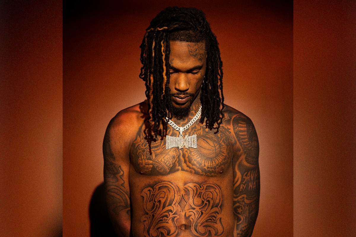
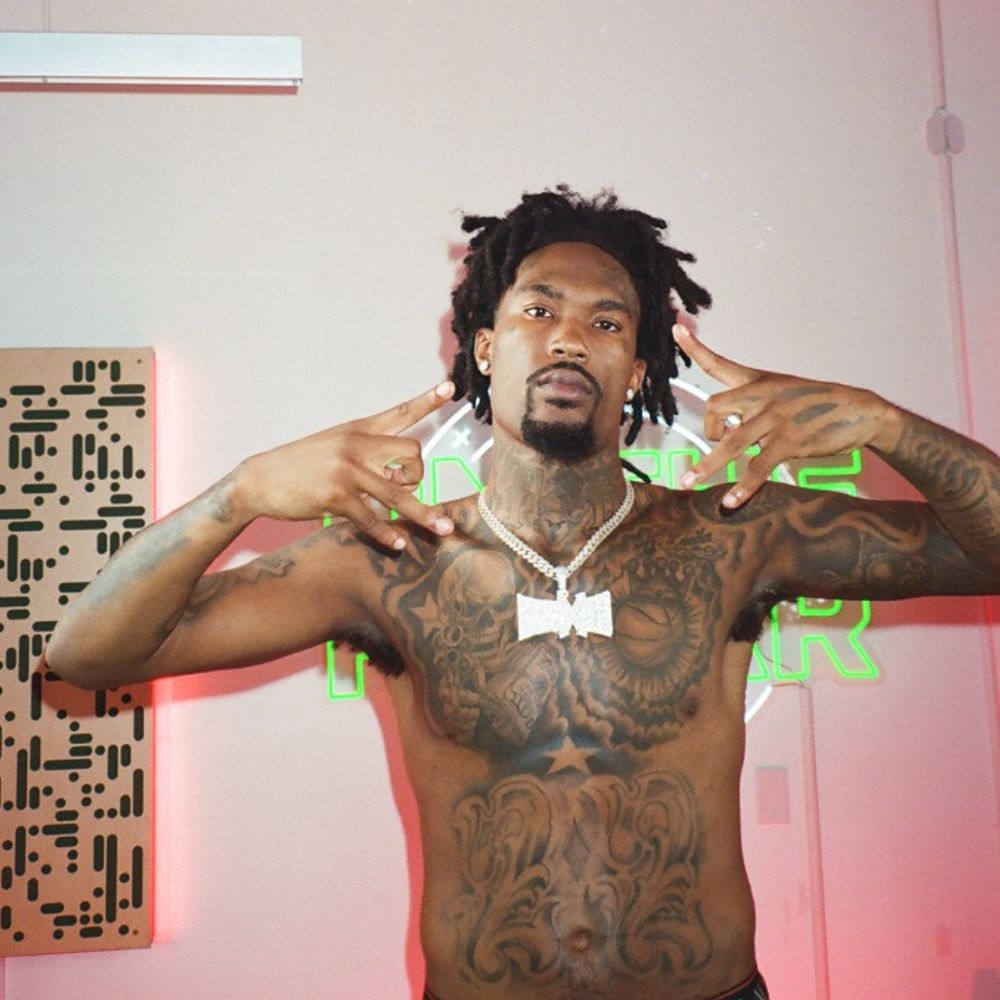
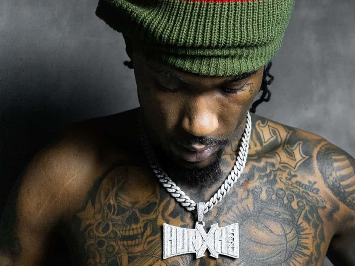
Hunxho’s tattoos cover his face, neck, chest, stomach and arms. In photos, the collection reads as dense, layered coverage rather than a few isolated pieces. Some designs are clear; others depend on the angle, lighting or whether his hair is in the way.

A portrait shows only part of the collection. Shirtless and side views reveal more of the torso and how it meets the arms. These are different views of the same tattoos, not evidence that every crop shows a new piece.

The overall look of Hunxho’s tattoos

Hunxho tattoos: inline

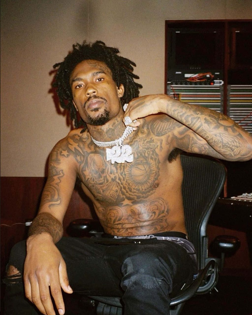
The broadest coverage is across Hunxho’s chest and stomach, where large shapes and shaded sections sit beside smaller designs on both arms. The pieces overlap visually, giving the upper body a compact, layered look.

The face tattoos change a portrait more immediately than the larger work hidden by a shirt. The contrast between those small marks and the broader body coverage is one of the collection’s clearest visual features.

Chains and pendants appear in several photos and help show the scale of the work. The tattoos continue below the necklace line, down the sternum and onto the stomach.

The chest and stomach pieces

Hunxho tattoos: inline

The chest combines curved forms, shaded panels and lettering around a central area. The designs continue toward the stomach, where the linework looks more ornamental and tightly packed.

From a distance the chest can read as one dark piece. Close photos separate the heavy outlines from lighter grey shading; there is little open skin, but the area isn’t one solid block.

A straight-on shirtless photo shows the central symmetry and density. A three-quarter view shows the work wrapping toward the shoulders and joining the arm coverage. Neither angle shows everything.

Hunxho hasn’t publicly explained every shape. The photos support a description of extensive black-and-grey work across the torso, added in separate sections; they don’t confirm a meaning for each line.

The facial tattoos and the healed heart

Hunxho tattoos: inline

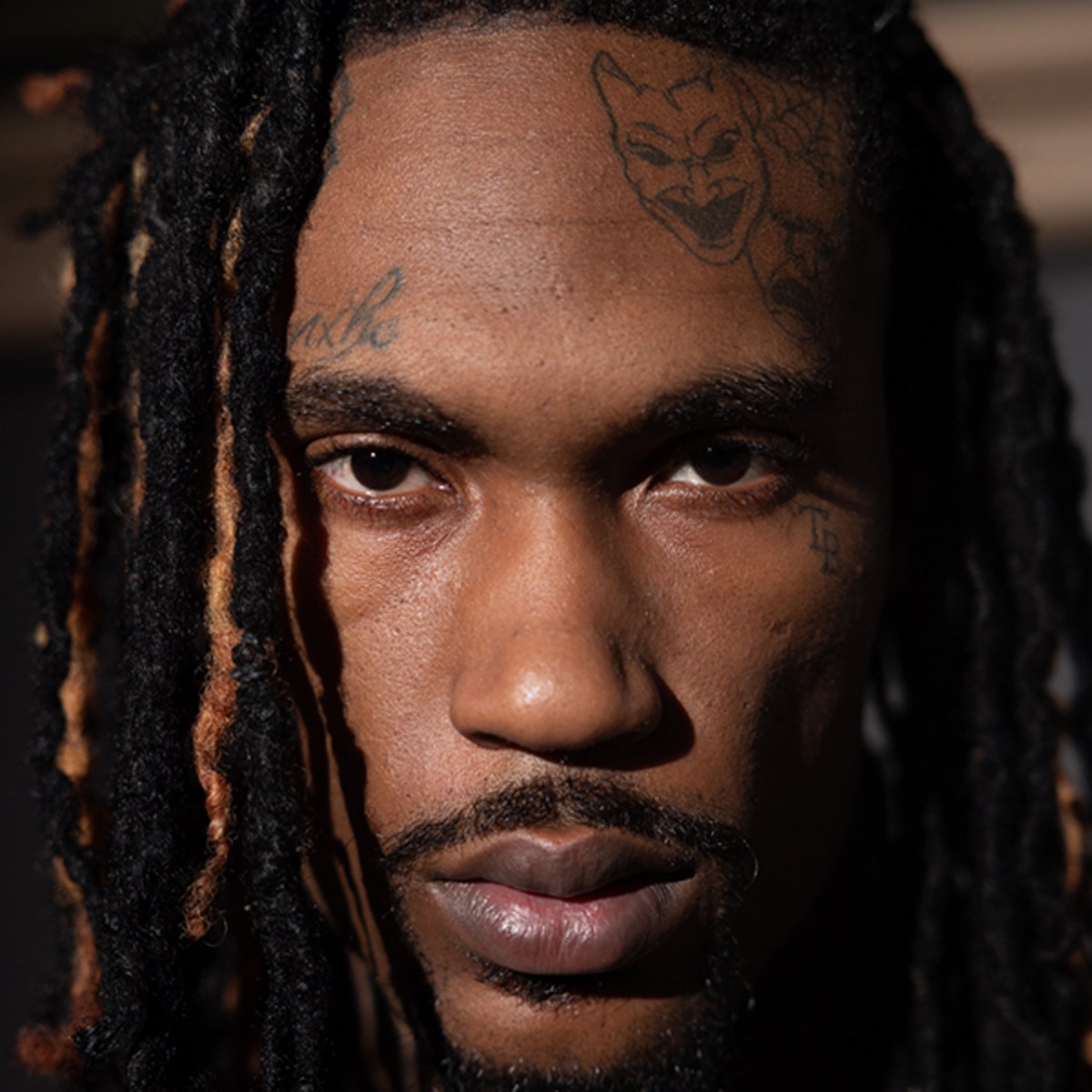
The marks on Hunxho’s forehead and around his eyes are small compared with the torso work, but their position makes them prominent. The close-up also shows the tattoos continuing down his neck.

Photos have shown a shattered-heart design on his forehead, followed by a version that appears healed or reworked. The images document a visible change, though they don’t establish exactly how it was made.

Fine marks near the brow and cheek are easier to see in a sharp close-up. Hair, lighting and image compression can blur lines, so a single unclear photo isn’t enough to identify another tattoo.

The neck work and the upper-arm lettering

Hunxho tattoos: inline

The neck work sits beneath the jaw and along the sides, then meets the upper chest. In profile, the smaller marks near his head give way to broader shading toward the shoulder.

The word “SAVAGE” is visible high on Hunxho’s upper arm in several photos, including a darker portrait with a rose. Its size and repeated appearance make it one of the easier details to confirm.

The lettering can look compressed when his arm is flexed and more spread out when it’s relaxed. A change in how it reads across photos doesn’t necessarily mean the tattoo itself changed.

The arm coverage

Hunxho tattoos: inline

Both arms carry heavy outlines, shading and smaller designs between larger forms. Some details show from the outside of the arm; others appear when he turns toward the camera.

The arms aren’t mirror images in the photos. Their balance comes from the amount of ink, while the lettering and shaded sections differ from one side to the other.

A performance photo with both arms raised makes the inner sections easier to see and follows the coverage from shoulder toward forearm. It still can’t serve as a map of every tattoo.

Why the photos look so different

Lighting changes how the ink reads. Studio portraits soften the shading, bright stage lights can flatten it, and a tight crop can make facial marks look darker than they do in a wider shot.

Clothing and posture matter too. A shirtless image shows the chest and shoulders; a dressed portrait may reveal only the neck and upper arm. Twisting the torso can also change how wide a design appears.

The clearest repeated details are the forehead heart, the upper-arm lettering, the broad chest coverage and the neck placement. Those provide useful reference points without requiring a guess about every blurred area.

What Hunxho’s style says about placement

Placement gives the collection different visual effects: the face is always in view, the chest carries a wider composition, and arm designs shift as he moves.

The photos show lighter shading and small gaps between some designs. A large area doesn’t have to be filled with the darkest ink everywhere to read as a complete composition.

Hunxho’s look is built around extensive upper-body coverage, strong outlines and the contrast between small face marks and larger torso work. Planning how separate pieces meet is especially important across the chest, stomach and neck.

How to use these references without copying the collection

The useful reference is the mix of scale: a small face detail, a larger chest arrangement and arm lettering. You can study that layout without reproducing his specific designs.

Face and neck tattoos stay visible in portraits and are difficult to cover. The chest and upper arm allow more room and can be hidden by clothing. The right placement depends on how visible you want your own design to be.

Bring your artist clear reference photos and separate what’s confirmed from what you simply like. Hunxho’s pictures show how light and posture affect a tattoo; an artist can adapt a layout to your body rather than copy his exact one.

The clearest features are the forehead heart, neck work, “SAVAGE” lettering and broad torso coverage. The photos show where the ink sits; where Hunxho hasn’t explained a symbol, its story can remain open.

Cleo Tattoos: Designs, Meanings and Photo Guide

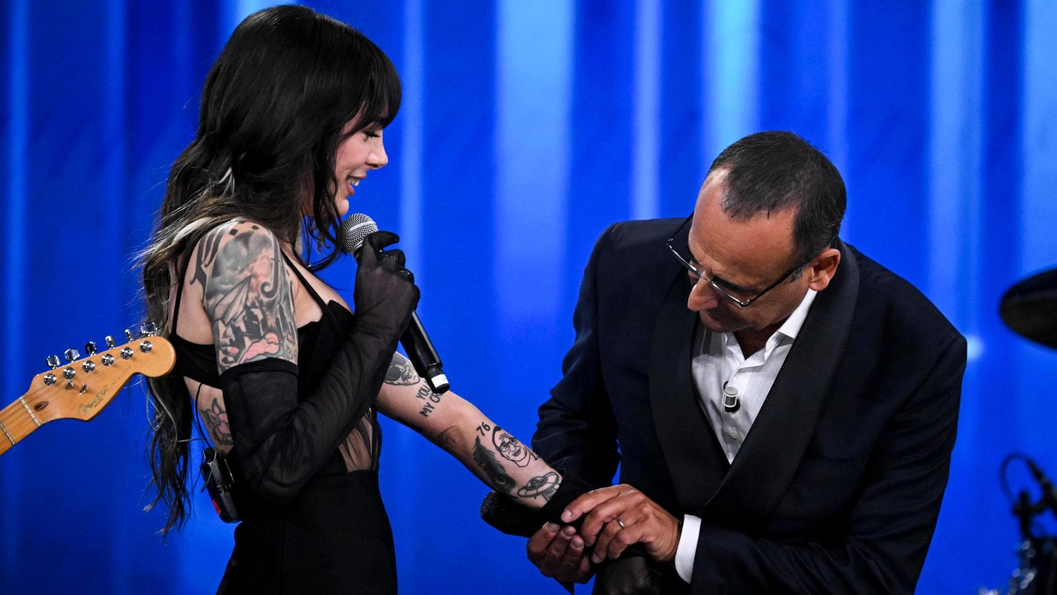
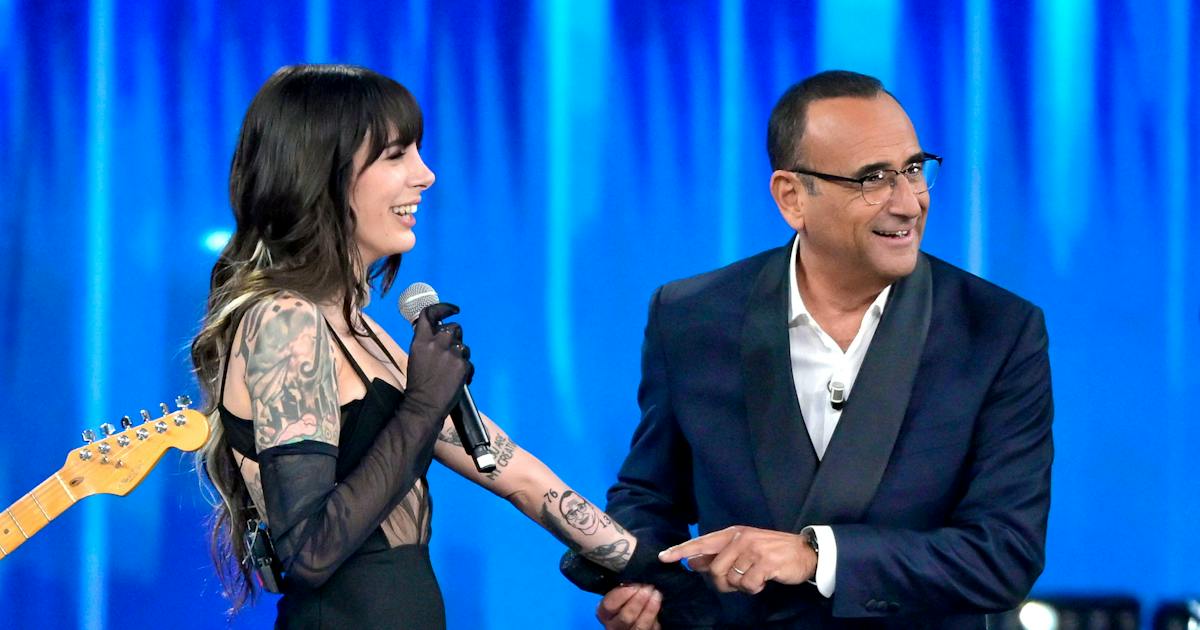
Cleo’s newest documented tattoo is a forearm portrait of Carlo Conti, shown in close photographs after Bambole di Pezza’s Sanremo Top appearance. It sits within an older black-and-grey sleeve, so the view changes with the camera distance.

The portrait and the visible 76 and 13 numerals can be described from the photos. The meaning of the numbers and the details of every older mark have not been publicly established.

Cleo’s arm is the starting point

Cleo tattoos: existing black-and-grey sleeve and forearm tattoos at the Sanremo Top appearance
Cleo’s existing black-and-grey sleeve and forearm work in a genuine tattoo photograph.

A wider photograph shows the arm as part of Cleo’s overall look. Black-and-grey shading runs across the sleeve and forearm; stage lighting and clothing hide some edges, but the coverage is clear.

The Carlo Conti portrait isn’t on an empty forearm. It shares space with older ink, which makes it stand out in a close crop and blend into the sleeve from farther away.

The new tattoo is a portrait of Carlo Conti

Cleo tattoos: separate published view of the tattooed arm and Carlo Conti forearm portrait
A separate genuine tattoo photograph shows the Carlo Conti portrait on Cleo’s forearm.

Reports around Bambole di Pezza’s Sanremo Top appearance identified the portrait as a new tattoo. The close photo shows a face rendered as a portrait, rather than a simple outline or symbol.

Up close, the face is the arm’s focal point. At a wider distance it merges with the surrounding black-and-grey work. Both views help explain how the portrait sits in the sleeve.

The visible 76 and 13 numerals

The visible numbers 76 and 13 frame the portrait. They are part of the design, but the photos and reporting don’t establish what they refer to.

A number can look personal without its meaning being public. The grounded description is that 76 and 13 appear beside the portrait; a birthday, date or private code would be speculation.

One new tattoo, several photographic views

The images show the same arm at different distances and in different settings. Compare the portrait, numerals and sleeve edge to follow one tattoo across the views, rather than counting each angle as another piece.

Older black-and-grey tattoos surround the portrait. Some shapes remain visible, but the photos don’t show enough to name every motif with confidence.

The older black-and-grey sleeve around it

The new portrait draws attention because it sits against a substantial existing sleeve. That context affects both its contrast and the amount of open skin around it.

Cleo, whose full name is Martina Cleo Ungarelli, is the lead vocalist of the Italian band Bambole di Pezza. The tattoo appeared in performance and interview coverage, not just a posed studio shot.

Cleo away from the close-up

Cleo in a Bambole di Pezza public context; contextual photograph, not tattoo evidence
Cleo with Bambole di Pezza in a contextual photograph; this image is not tattoo evidence.

A contextual image helps identify Cleo and the setting; it isn’t evidence of another tattoo. The ink details come from the close and wider arm photos.

The Sanremo Top appearance brought the portrait into wider view. Reports said Cleo revealed the fresh piece after a pre-show promise connected to Carlo Conti; that explains the timing without adding a private motive.

Why the Sanremo Top appearance matters

Cleo during the Sanremo Top performance context; contextual photograph, not tattoo evidence
Cleo during the Sanremo Top performance context; contextual photograph, not tattoo evidence.

Stage lights flatten some shading, movement changes the forearm angle, and clothing covers parts of the sleeve. A close frame is best for the portrait; a performance shot shows the occasion.

Wider photographs confirm that the portrait belongs to a heavily tattooed arm. They show its scale within the sleeve, not a complete catalogue of Cleo’s ink.

What the wider photographs actually confirm

Distance softens smaller details and some parts are covered. The photos support a clear account of the portrait and surrounding coverage, rather than a name for every mark.

On stage, movement and uneven light make the sleeve read as a field of dark and light before individual details stand out. The portrait is clearer when the camera moves closer.

How the sleeve reads on stage

Cleo with Bambole di Pezza in a live performance context; contextual photograph, not tattoo evidence
Cleo with Bambole di Pezza in a live setting; contextual photograph, not tattoo evidence.

The performance photos help with placement and scale, but they don’t show another tattoo. They show the same arm in motion and alongside Cleo’s stage clothes.

The available record confirms the Carlo Conti portrait, 76 and 13, and older black-and-grey work. It doesn’t identify the artist, the date of each earlier piece or a private meaning for every shape.

What remains unknown about the older ink

Those gaps are normal when tattoos are documented through scattered performance photos. A close angle may clarify one design while hiding another; a full inventory would need clearer images.

The forearm gives a portrait room to read while keeping it connected to the sleeve. The close view isolates the face; the wider view shows how it sits in the surrounding shading.

What the placement says about the composition

That balance can be useful when planning a portrait tattoo: it can remain legible without looking separate from older work. In Cleo’s photos, the contrast makes the face stand out while the sleeve ties it in.

For inspiration, focus on the relationship between the portrait and existing ink rather than copying the exact design. Its visibility changes with distance, but the placement works in both close and wide views.

The cleanest way to read Cleo’s tattoos

Start with the sharpest photo to identify the portrait and numbers. Then use a wider arm view to see how they meet the old sleeve, and performance images for setting rather than extra tattoo claims.

That sequence keeps the evidence straight: close views show detail, wider views show placement, and contextual images show the event where the tattoo became public.

The short version

The clearest account is a Carlo Conti forearm portrait framed by visible 76 and 13 numerals, added to Cleo’s older black-and-grey sleeve. The photos show how the piece reads at different distances.

The numbers’ meaning and the finer details of earlier tattoos remain unexplained in the available record. The guide can leave those questions open and still show how the portrait fits the arm.

Fabio Silva Tattoos: The Designs, Stories and Details Shown in Photos

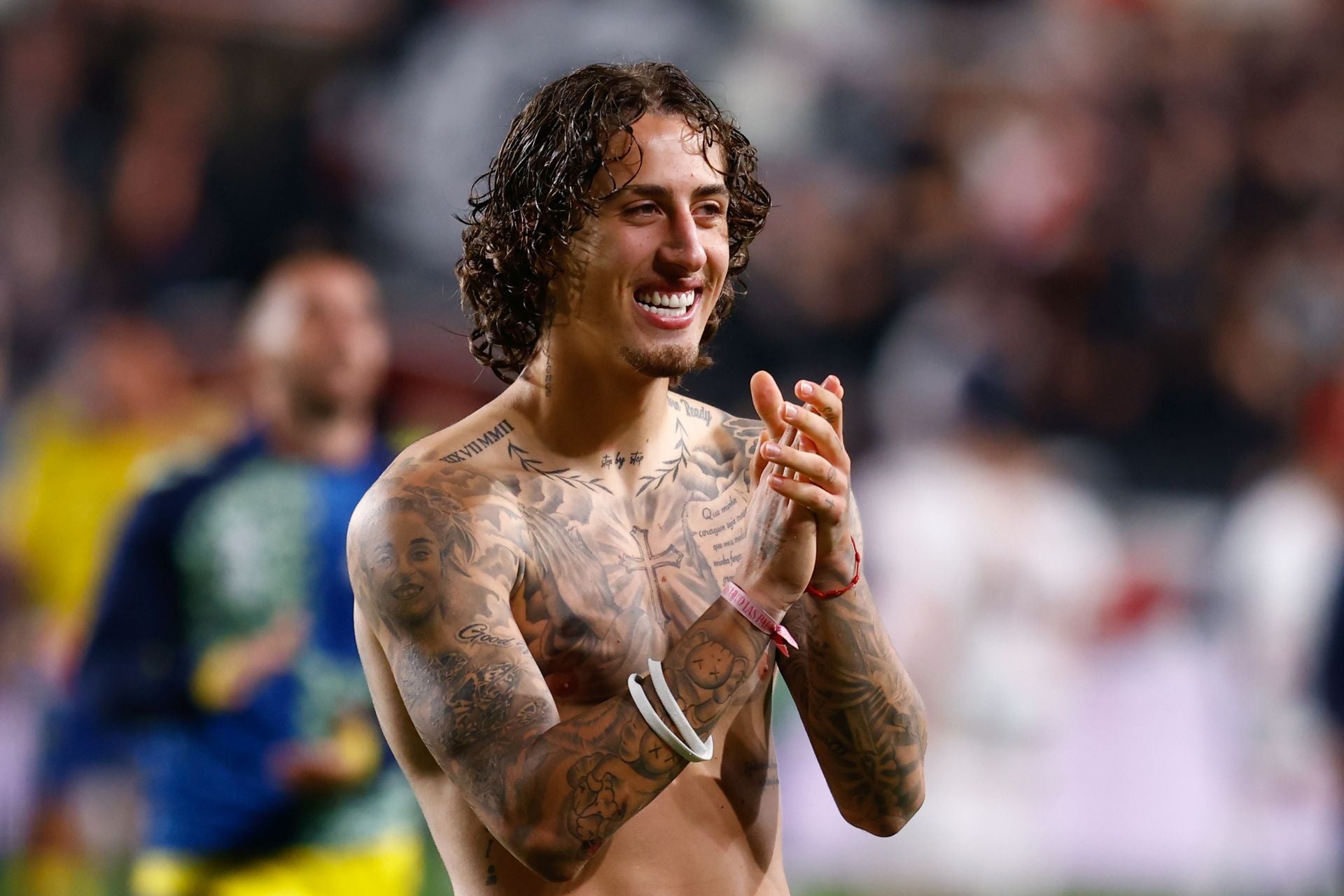
Fabio Silva has described starting his tattoos at 17; Borussia Dortmund has also described him as heavily tattooed. The photos show work across his arms, chest and neck, but they don’t explain every design. This guide sticks to what’s visible and to details he or the reporting has shared.

Close tattoo photos show the ink; wider public photos help with identity, posture and scale. A sleeve can look like one dark block from a distance, while a closer view separates the pieces. The two kinds of images serve different purposes.

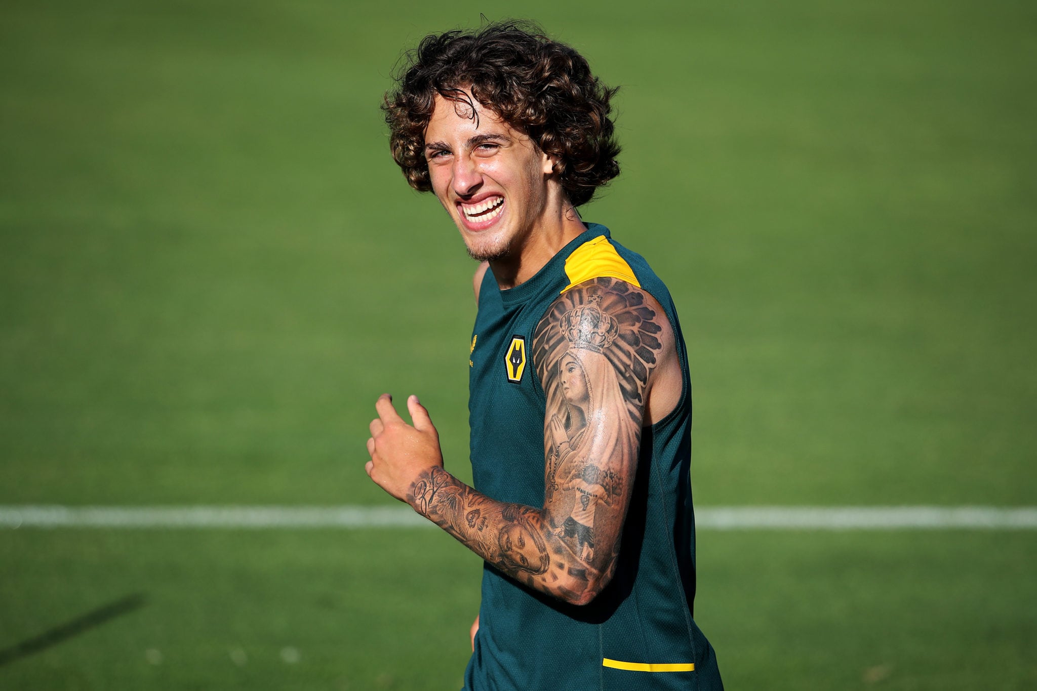
Fabio Silva right arm tattoo sleeve

Fabio Silva right arm tattoo sleeve in a genuine tattoo photograph

The most prominent coverage is on Silva’s right arm. A portrait-led design fills the upper arm, with shading and smaller pieces across the forearm. It reads as a dense black-and-grey sleeve, though the images don’t establish when each part was added.

The portrait stands out when the arm faces the camera; the forearm details become clearer when he turns it. A bent elbow or a different angle can change what the photograph emphasizes, so the sleeve makes more sense across several views.

Silva has said he began getting tattoos at 17 and continued adding to the collection. That gives the sleeve a timeline without assigning a separate meaning to every shape. The photos show a mix of focal work, shading and smaller details.

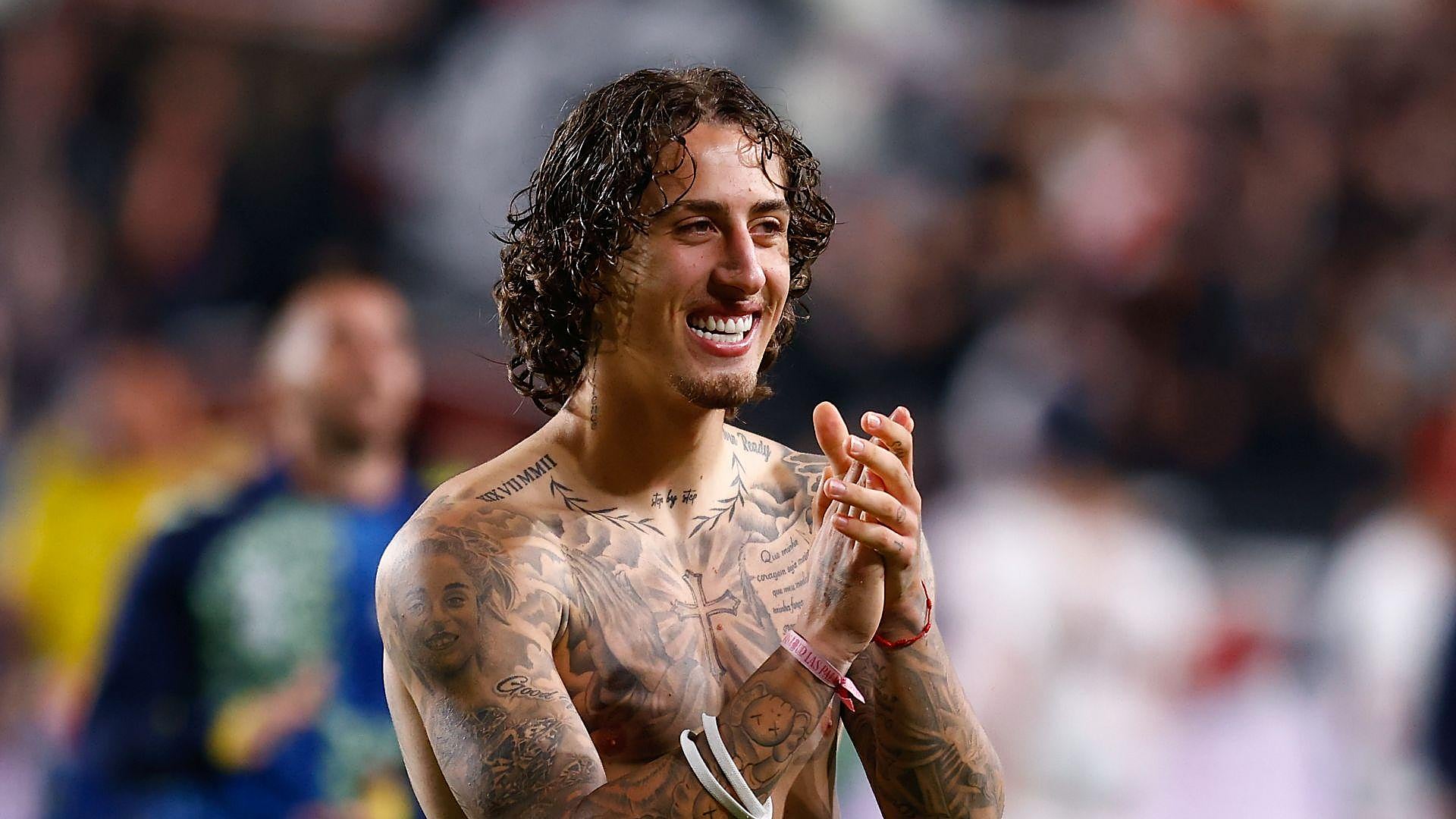
Fabio Silva chest and torso tattoos

Fabio Silva chest and torso tattoos in a genuine tattoo photograph

Shirtless photographs show lettering and a cross on Silva’s chest, with more work across the upper body. Clothing, posture and lighting obscure some edges, so the visible placement and black-and-grey style are clearer than any private explanation.

The cross and lettering give the torso distinct points for the eye, while surrounding tattoos fill the upper chest and shoulders. A wider view shows how those pieces meet the neck and arms; it doesn’t prove they share one theme.

Forearm designs are easy to lose in a full-arm shot. Closer images separate some smaller pieces from the shading, while others blend together at a distance. Photos from different dates and lighting conditions can make the line work look different.

Fabio Silva chest and forearm tattoos

Fabio Silva chest and forearm tattoos in a genuine tattoo photograph

Reports have also mentioned character and pop-culture designs, including a kneeling football celebration and Harry Potter and Ninja Turtles imagery. Those are reported parts of the collection; the close photos here support only the details they show clearly.

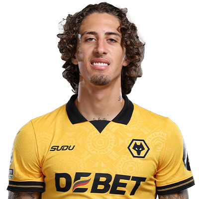
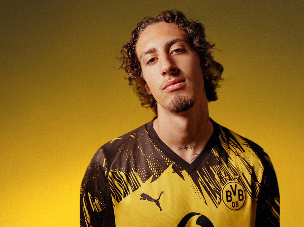
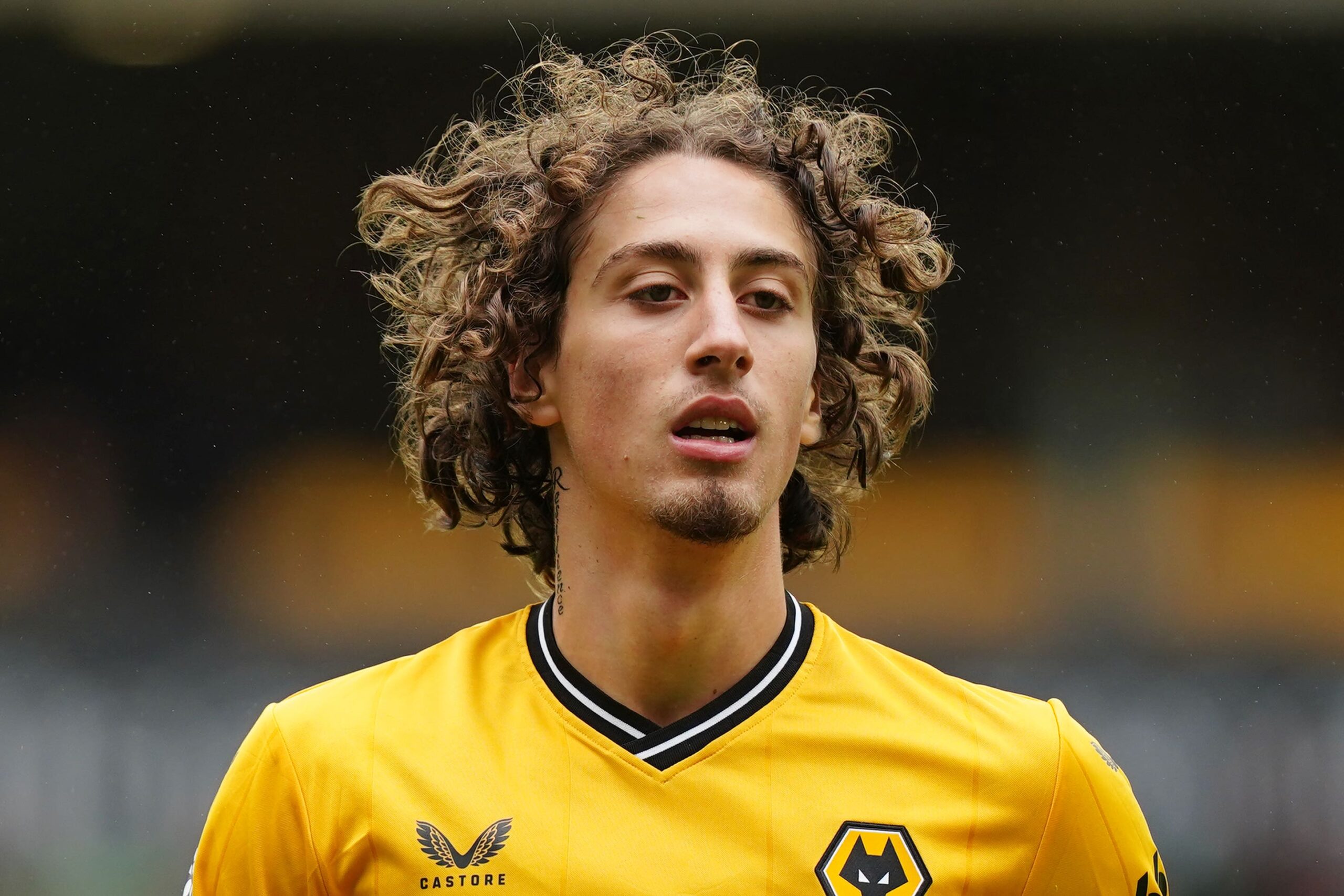
Silva also has visible ink around his neck and upper body. The featured Wolves portrait shows only a little near the collar and arms, so it helps identify him but doesn’t replace the closer tattoo photographs.

Fabio Silva in public photos

Fabio Silva in a contextual public photograph; this image is not tattoo evidence
Fabio Silva in a contextual public photograph (contextual photo, not tattoo evidence)

Match-day and training photos show the tattoos with football clothing and movement. They help with scale and context, but a covered or distant detail isn’t proof of a new design.

Across the collection, the right sleeve is mostly black and grey, the chest combines lettering and a cross, and smaller pieces add variety. The reported character designs bring a different visual note; no single photo captures the whole collection.

Fabio Silva match-day portrait

Fabio Silva in a contextual match-day photograph; this image is not tattoo evidence
Fabio Silva in a contextual match-day photograph (contextual photo, not tattoo evidence)

To compare images, look for the same landmarks: the portrait-led upper arm, forearm coverage, chest lettering and cross. If those positions line up, the photos may simply show one tattoo from different angles.

Starting at 17 means the tattoos could have been added at different times in Silva’s career. Some may relate to family, football or milestones; others may simply be designs he liked. Unless he has explained a piece, its visible form is all we can confirm.

For inspiration, notice how the sleeve varies in detail and how the chest combines lettering with a larger symbol. Close photos reveal the line work; public portraits show how the pieces sit with clothing and movement. Placement and contrast matter as much as subject.

The photos show an evolving collection across Silva’s right arm, chest, torso and neck, with additional pop-culture designs reported elsewhere. He has said he started at 17 and kept adding ink. The meanings of individual pieces remain open unless he has discussed them.

Logic Tattoos: The Stories Behind His Hand and Wrist Ink

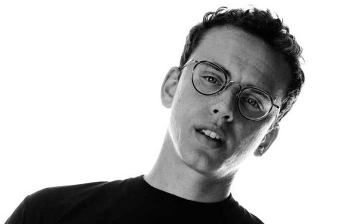
Logic’s tattoos read like a record of his music, books, films and personal reminders. The collection mixes hand lettering, album symbols, Japanese characters and character art rather than following one sleeve design.

Several pieces have explanations because he discussed them in GQ’s Tattoo Tour. Those comments help distinguish a confirmed story from a guess based on how a mark looks.

The left-hand phrase “Happy Wife, Happy Life” was Logic’s first tattoo, which he got before he married. He described it as a reminder that success means less if there’s no one to share it with.

His first tattoos are the hand-lettered reminders

Logic tattoos: inline

“Balance Yourself” is on the other hand. Logic has said he can take on too many projects; he treats the phrase as a prompt to slow down before work takes over.

The useful idea is to choose a short line that matters in your own life. The point is the reminder, not the exact wording or its appearance in a reference photo.

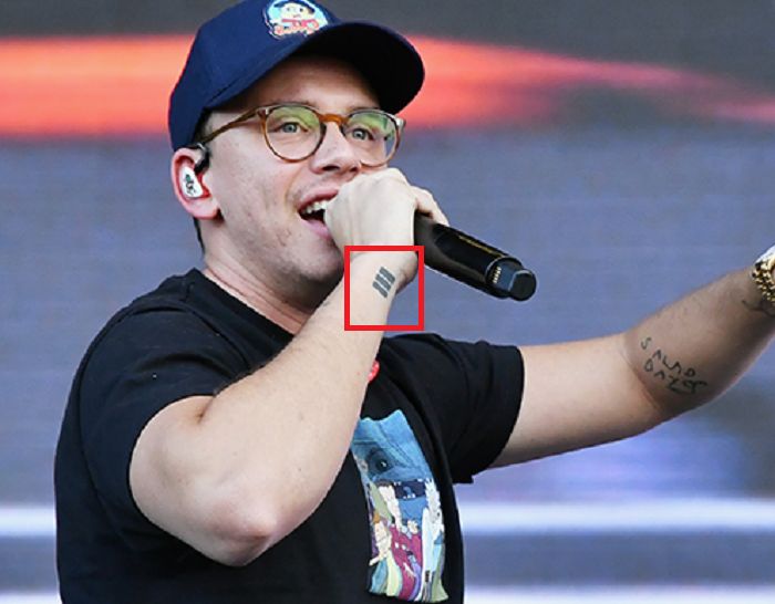
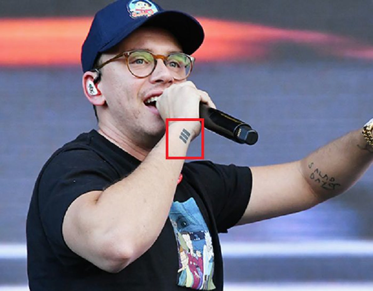
Logic explained that the emblem associated with his album Everybody can read as an E; turned sideways, it resembles the Roman numeral three. The compact shape works as both a graphic and an album reference.

The album reference

An emblem can point to an album without spelling out its title. Logic’s example keeps the connection specific while letting the mark stand on its own.

The design is small compared with a portrait or album-cover tattoo. If you’re adapting the idea, choose one detail from a record—a number, icon or piece of lettering—and make it work as a tattoo, not just merchandise.

The Japanese characters on Logic’s wrist are connected to Kill Bill. He has called Quentin Tarantino a favorite writer and director and linked the film to discovering hip-hop through RZA’s score.

The Kill Bill kanji is tied to a favourite film

In his account, Kill Bill led him to RZA, then Wu-Tang Clan and a wider world of rap. The tattoo marks that chain of interests, not only a favorite movie.

If you choose lettering in a language you don’t read, check it with a qualified speaker and an artist who can reproduce the script accurately. A personal reference still needs to be correct.

Another Japanese-character tattoo on Logic’s wrist refers to Ultra 85. He said he got it in Japan while he was working toward the project, so it records an album in progress rather than only a finished release.

Ultra 85 keeps a future goal close

A tattoo about a goal can keep the work in view. Plans can change, though; a symbol for the idea may last better than a title or date tied to one particular outcome.

Several pieces in Logic’s collection relate to projects he was making or ideas he wanted to keep close. The stories he has shared give those designs context without assigning a meaning to every mark.

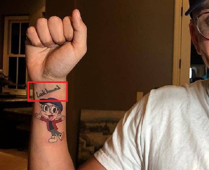
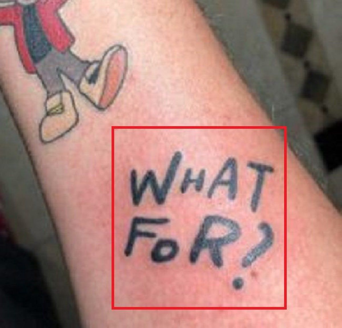
Photos show additional forearm references: Supermarket, the title of his novel; What For?, linked to Toro y Moi’s album; Salad Days, associated with Mac DeMarco; and Bobby Boy imagery connected to Logic’s creative identity.

His forearm tattoos bring music, books, and inside references together

Logic tattoos: inline

Together they read like a record of what he was writing, hearing and building: a book, other artists’ records, and the identity around his own music.

Lettering can be personal without being generic. A title can stay recognizable while the artist gives it character through placement, scale or line weight. Decide whether you want the reference to read immediately or remain more private.

The colored Bobby Boy design stands apart from the mostly black hand and arm tattoos. It shows the animated version of Logic and connects the ink to the character world around his music.

The Bobby Boy tattoo adds a bit of colour

Logic tattoos: inline

Character work needs enough room for its lines and colors to remain clear. If you choose a mascot, let it carry the design instead of crowding it with tiny text.

Logic has explained several pieces: the hand phrases are reminders, the album emblem marks Everybody, and the film reference ties to music that shaped his listening. Other work points to books, records and Bobby Boy.

Why Logic’s collection feels personal instead of random

Not every tattoo has a public explanation. A photo can show placement, but it can’t confirm a private meaning Logic hasn’t discussed. It’s better to leave those details open than invent a story.

The collection doesn’t rely on one style to hold together. Lettering, kanji, an album symbol, character art and forearm text connect through relationships, creative work and culture that mattered to him.

Borrow the thinking rather than the exact art: choose a phrase you want to remember, turn a book or album reference into a symbol, or connect a film to a personal memory. Verify any foreign-language script and give character designs room.

A few lessons from the collection

Hand tattoos stay visible, which suits a reminder you want in front of you. Wrists and forearms offer more cover and room for detail. Match the placement to how often you want to see the piece.

Logic’s tattoos keep track of people, ideas, films, records and goals. They don’t need to form one perfect image; their connection comes from the stories he has shared about them.

The GQ Tattoo Tour below is where Logic explains several of these designs.

Ryan Caldwell Tattoos: Carefree, No Love and the Ink Behind His Rugby Story

A heavily marked rugby life

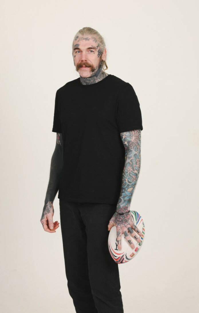
Close photos from Ryan Caldwell’s Guardian interview show tattoos across his hands, face, neck and arms. He says most of his body is tattooed, but he hasn’t given a full inventory or meaning for every design.

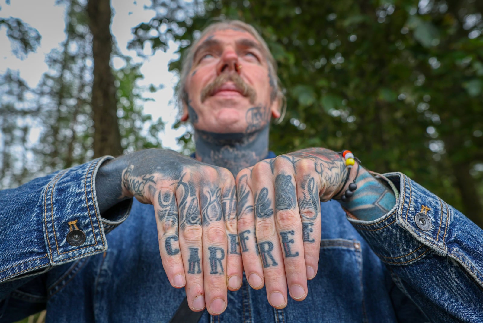
Caldwell has explained a few pieces directly: Carefree across his fingers, No Love above an eyebrow, and a Sanskrit tattoo he described as “strength.” The sleeves are clear in photos; their individual motifs aren’t all identified.

The useful reference is both the bold lettering and the way the collection has changed with him. The photos show real placement and scale, not a catalogue of confirmed stories.

Carefree across the fingers

Ryan Caldwell tattoos: close-up of Carefree finger lettering

Carefree is written across Caldwell’s fingers. In the close view, the dark, traditional lettering sits among other hand tattoos and reads as part of a larger collection.

He told the Guardian the word felt almost at odds with difficult periods in his life. Caldwell has spoken about addiction, depression, prison and rebuilding; the contrast gives the simple phrase its weight.

Finger lettering moves across knuckles as the hand opens and closes. The straight-on photo shows the word clearly, but the spacing also has to work when the hands relax.

The face lettering and the limits of a photograph

Ryan Caldwell tattoos: face and neck tattoo portrait

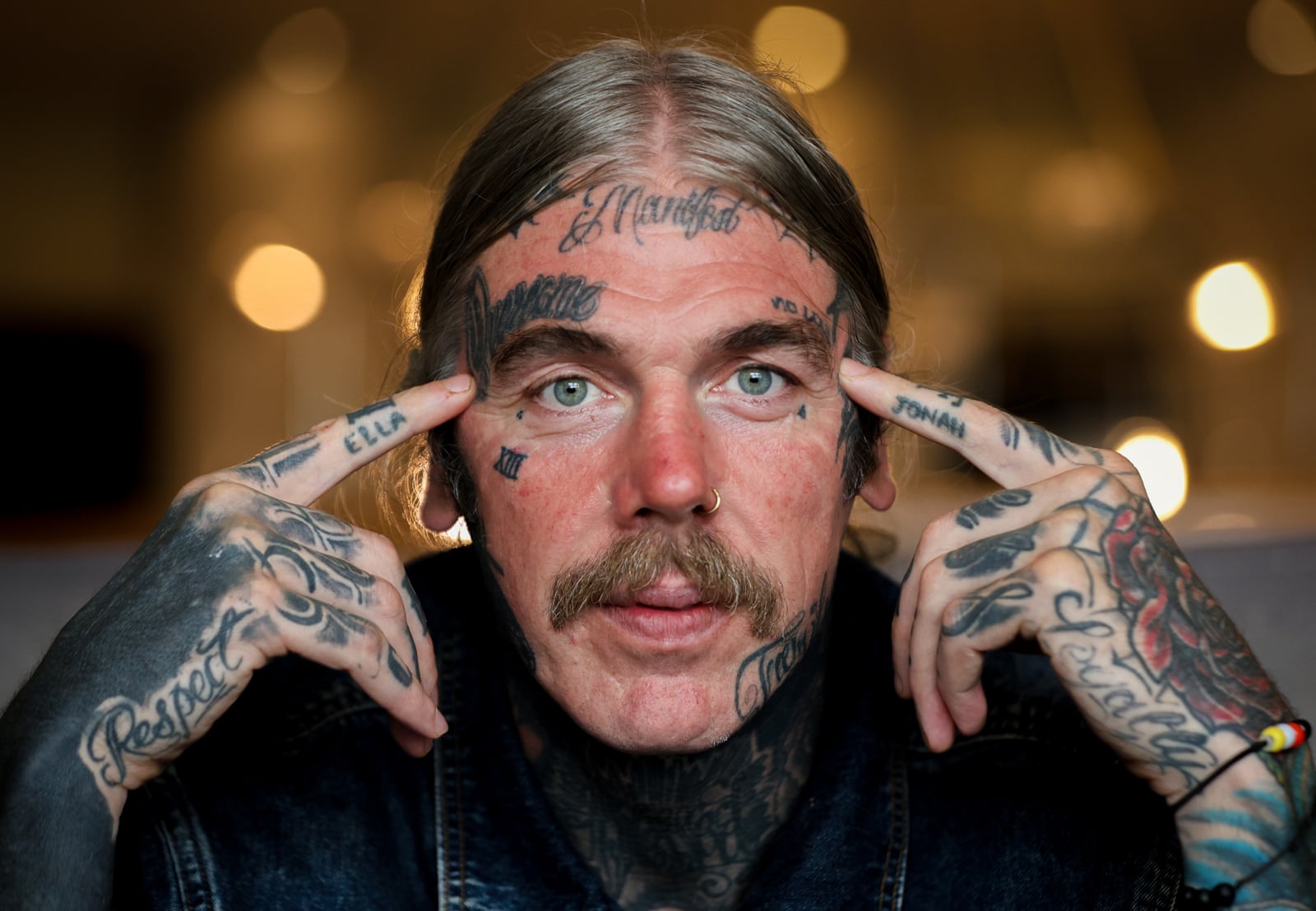
Caldwell has No Love tattooed above an eyebrow. He explained that it came from a time when he felt he had no love for himself; that context comes from him, not from a guess based on the words.

The close portrait also shows small marks around the eyes and forehead and heavier work down the side of his face and neck. The interview doesn’t explain each detail, so they remain visual descriptions.

Unlike an arm tattoo, the eyebrow lettering can’t be covered by a sleeve. It stays in view in portraits and daily conversation, a visible choice Caldwell has discussed in the context of his past.

The early years

Caldwell told the Guardian his first tattoo, at 18, was Sanskrit for “strength.” The interview doesn’t give its exact placement or lettering, so the photographs can’t be used to identify it.

He connects the word to his life and rugby career. It’s a personal account, not a meaning inferred from an unidentified patch of ink.

If you’re considering lettering in Sanskrit or another language, check the spelling and script with a qualified source before tattooing it. The same care applies to any permanent text.

The sleeves that came through in rugby photographs

Ryan Caldwell tattoos: rugby-era sleeve reference

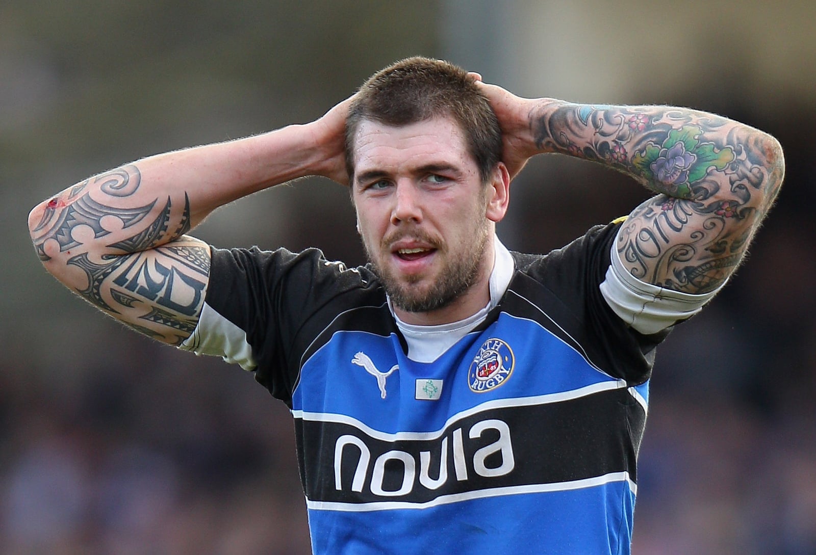
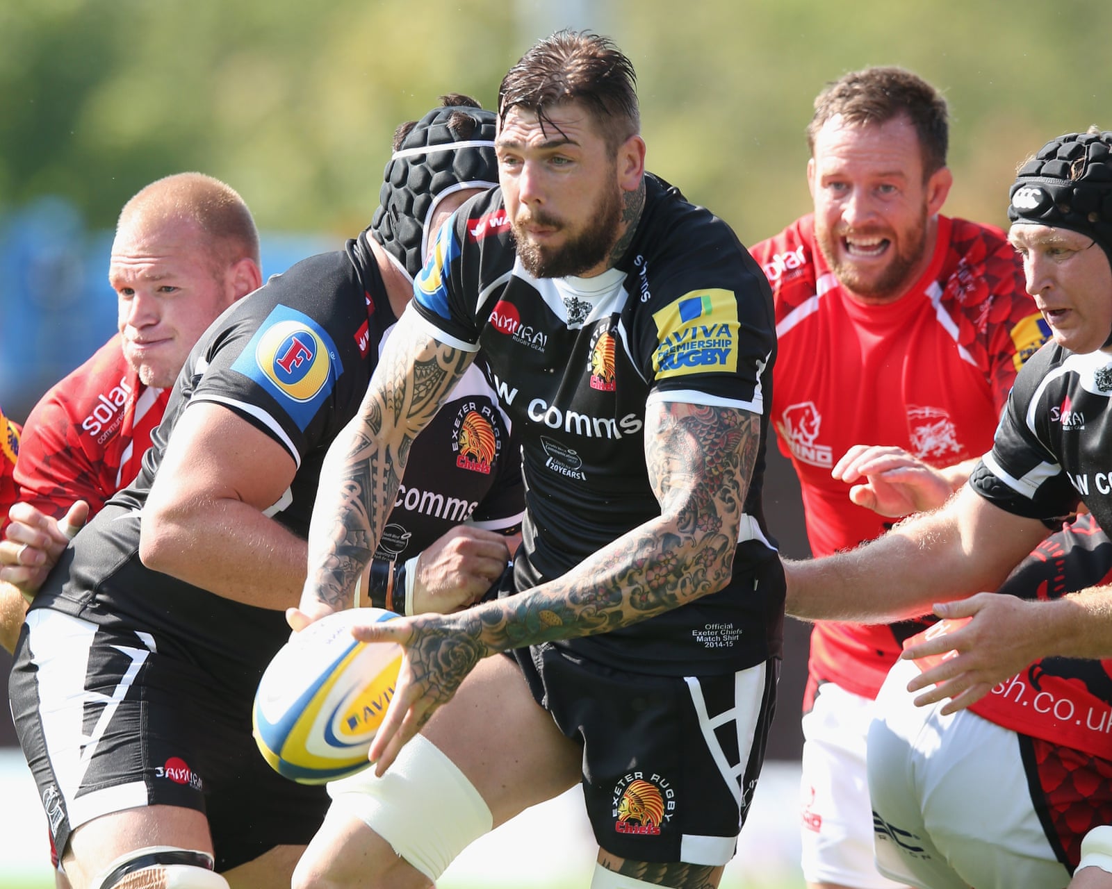
Older rugby photos show dense, colourful sleeves from upper arm to forearm, with black outlines, ornamental shapes and larger illustrative sections. The work varies instead of following one uniform pattern.

The collection appears to have accumulated over time. Some sections are darker and fuller; others leave more skin visible, with later designs meeting earlier ones.

In match photos, jerseys, movement and changing light make details harder to read. Those images show the scale of the sleeves; the close Guardian portrait is better for the finger lettering.

A wider look at the body ink

Ryan Caldwell tattoos: wide tattooed-arm coverage reference

An Exeter photograph with Caldwell’s arms raised shows the sleeves across both sides and how the designs break into panels as his body bends. It confirms the extent of the arm work, not every individual tattoo.

A sleeve has to read from more than one angle. Elbows crease and muscles flex; the larger shapes carry the image at a distance, while smaller details add texture up close.

Caldwell describes the tattoos as part of his life, not a finished matching set. A sleeve can grow and age while still feeling connected through its coverage and darker outlines.

A wider setting

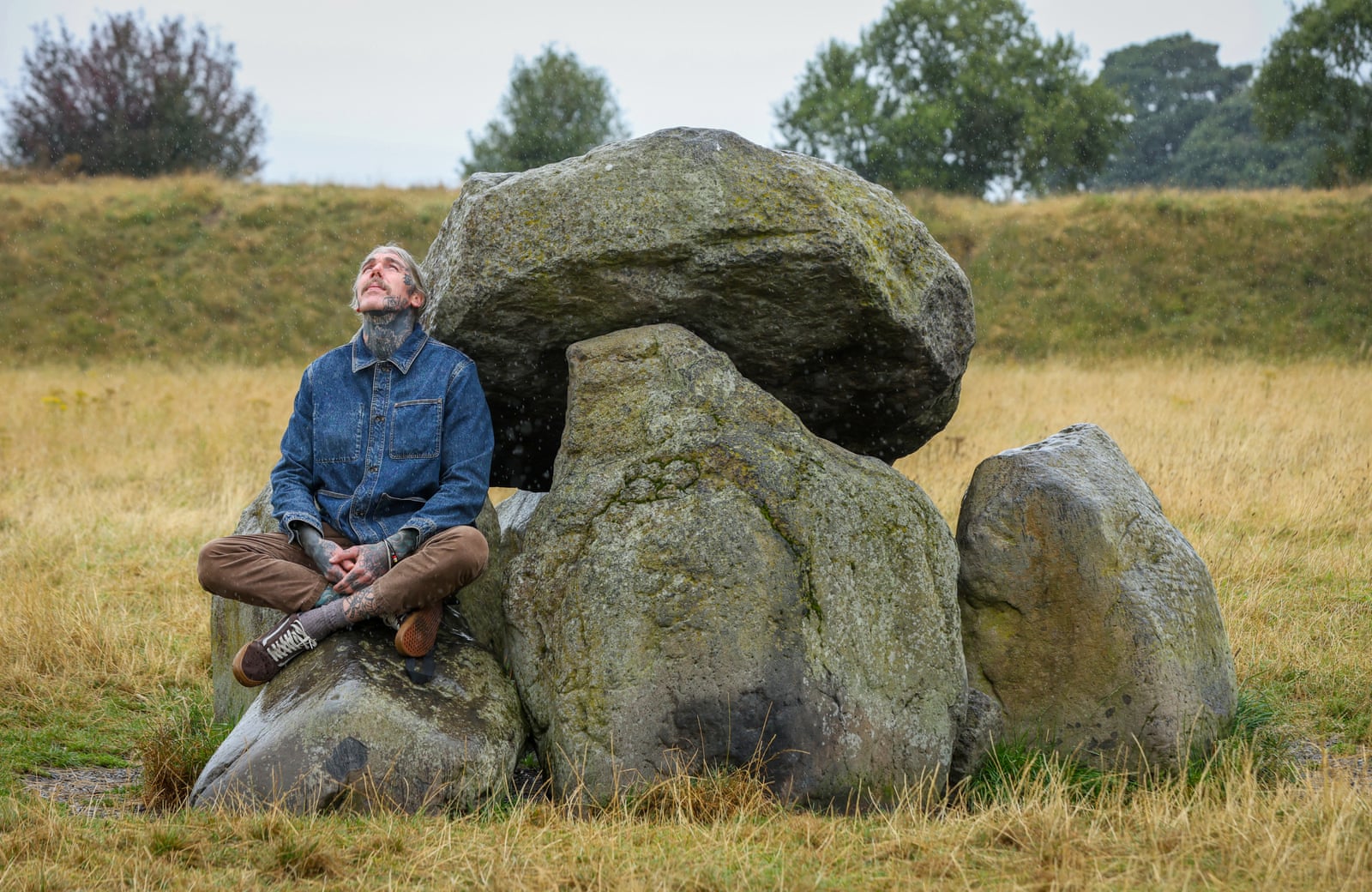
Ryan Caldwell in a contextual photograph: contextual portrait at the Giant’s Ring; not tattoo evidence; not tattoo evidence

The Giant’s Ring portrait is outdoors and shows ink on his hands, neck and lower arms. It adds a sense of setting and of Caldwell after rugby, rather than a close view of any one tattoo.
That distinction keeps the evidence clear. The image shows he is heavily tattooed, but it doesn’t establish a symbol’s meaning or reveal details hidden by distance.

The strongest confirmed descriptions remain Carefree, No Love and the reported Sanskrit word for strength. The remaining work can be described by placement and style until a clearer source adds more.

The takeaway

Finger and face lettering are prominent placements; the sleeves carry their impact through dense colour and repeated outlines. The designs needn’t match for the collection to feel cohesive.

Caldwell’s own explanations establish the meaning of a few pieces. Photos add what those words can’t: the weight of the lettering, sleeve colour and how the ink sits in sport and portrait settings.

For your own tattoo, be clear about whether you’re choosing a phrase for its meaning or a design for its look. Placement, contrast and how the ink moves matter either way; there’s no need to invent a story.

Caldwell’s collection spans difficult periods, rugby and life after the sport. What’s clearly documented is the finger lettering, eyebrow phrase and broad sleeves; the rest of the private meanings stay his to explain.