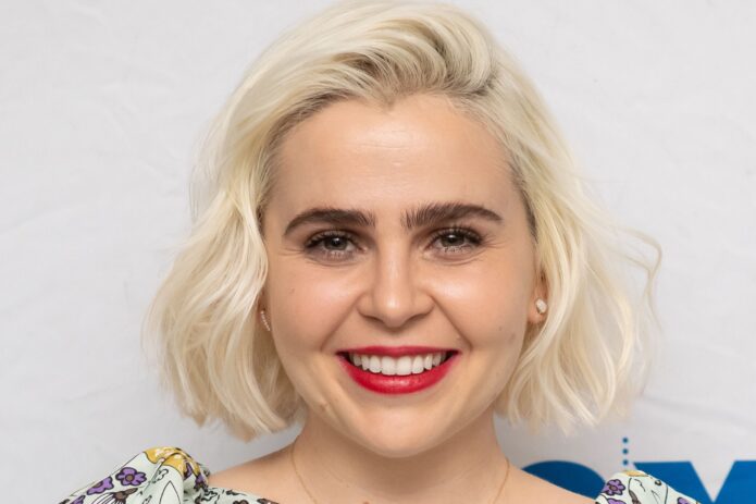
Mae Whitman’s tattoos tend to sit under a sleeve; the arm photos show small black designs spaced across both arms. They’re easy to miss at an event, but the collection doesn’t depend on one large centerpiece.
Whitman has described a sheep looking up at a star, inspired by a favorite children’s book. Photos shared while she promoted Up Here, including the images discussed by Allure, show more small marks: wrist script and a tiny face that looks alien-like. The pictures don’t reveal every detail, so those readings stay tentative.
That mix of one personal story and several small visible designs is useful if you prefer subtle tattoos. The appeal is in their scale and spacing, not in copying a particular mark.
The tiny tattoos are easy to miss until you see the arm photos
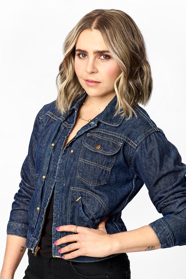
In arm photos from a TV appearance, Whitman’s sleeves stop above the elbows and both arms are visible. Small black designs sit apart instead of forming one large focal piece.
There’s clear space between the marks. In these photos, that separation helps each one read on its own; a tighter cluster could look darker as the ink softens.
The designs vary. Some look like symbols, some like lettering, and others have the loose quality of a doodle. Together they give the arms a collected feel rather than a matched set.
If you’re planning a similar layout, think about legibility as well as size. Fine lines need enough contrast and room to hold their shape. An artist can help place several designs without crowding them.
A personal detail behind the collection

The clearest story is the sheep looking up at a star. Whitman told Glamour it was connected to a favorite children’s book. The image is simple, but the reference gives it a personal history.
Without that context, someone else might see only an animal and a star. The meaning comes from the book Whitman had in mind, not from a complicated design.
A small symbol can work when its story matters to the person wearing it. There’s no need to fit the whole explanation into the image.
For a sheep-and-star design, a few clear lines may matter more than extra detail. Keeping the composition simple leaves room for the image to remain readable as the ink ages.
The details that give the collection personality
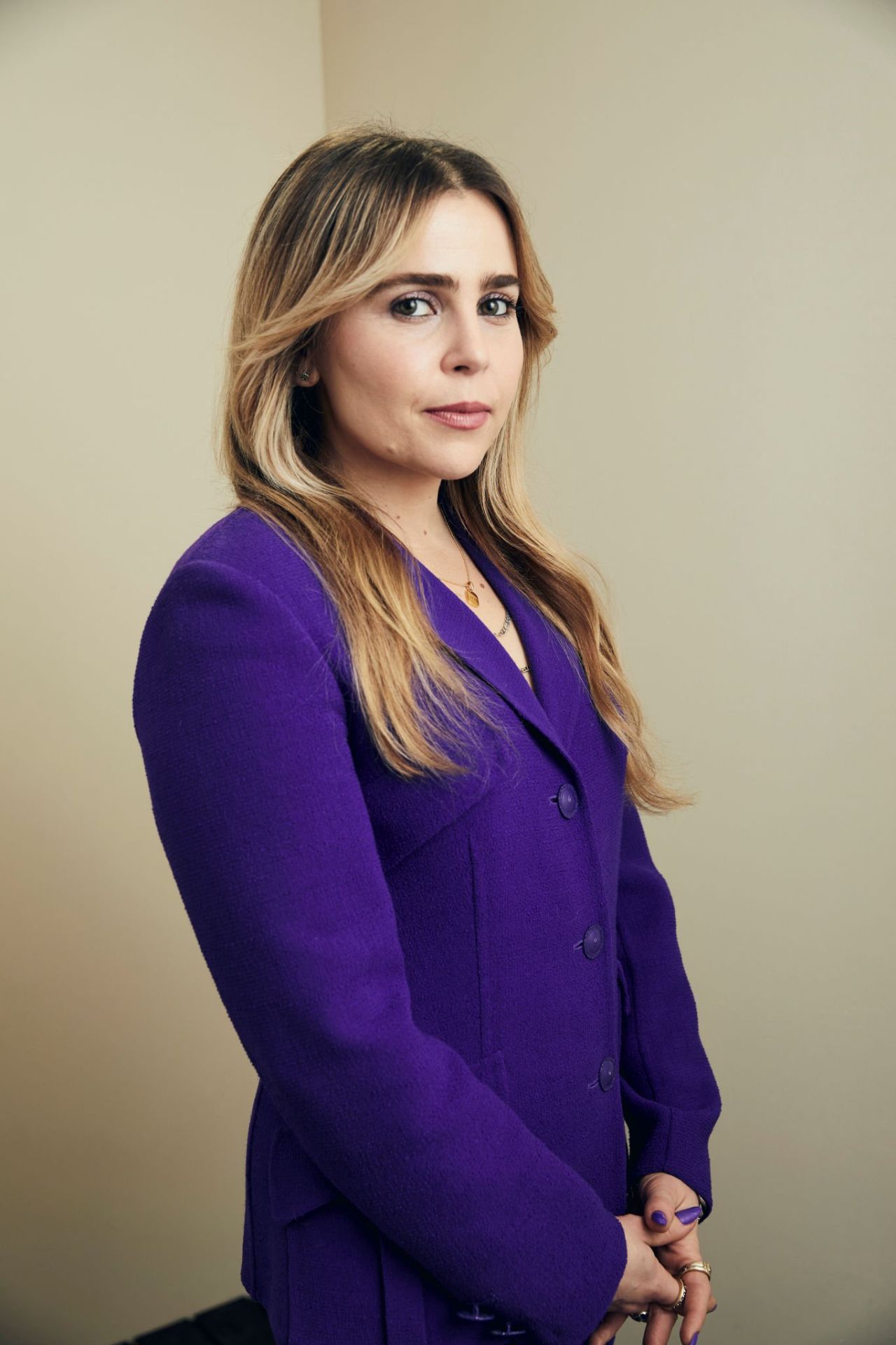
Allure’s look at the arm photos also notes cursive lettering around Whitman’s wrist and a tiny face with an alien-like expression. A bracelet partly covers the face, so the picture doesn’t support a more exact description. The marks look small and playful.
Wrist script needs room between letters to stay legible. A fresh close-up can make fine writing look crisp, but the tattoo should also be considered at its real size and after the ink settles.
The little face has a different feel from the sheep and star. It reads more like a doodle than a formal portrait, though the bracelet hides part of it.
The collection can hold both sentimental and playful designs. A personal symbol doesn’t have to match a joke or a favorite character for them to sit well together.
Why camera angles change the read

Small tattoos can look different from one photo to another. A close shot may show a line that disappears when the arm turns; sleeves, bracelets, shadows and clothing can obscure other details.
That helps explain why viewers notice different marks. One photo draws the eye to the wrist lettering, another to the tiny face. Those views can complement each other without proving every detail.
When saving reference images, keep both close-ups and wider portraits. A close view shows line work; a wider one shows how a design sits beside the rest of the collection.
Check placement with the arm relaxed and moving, not just in a straight-on mirror view. A mark can shift with the elbow or wrist, so the everyday view matters too.
A scattered look can still feel intentional
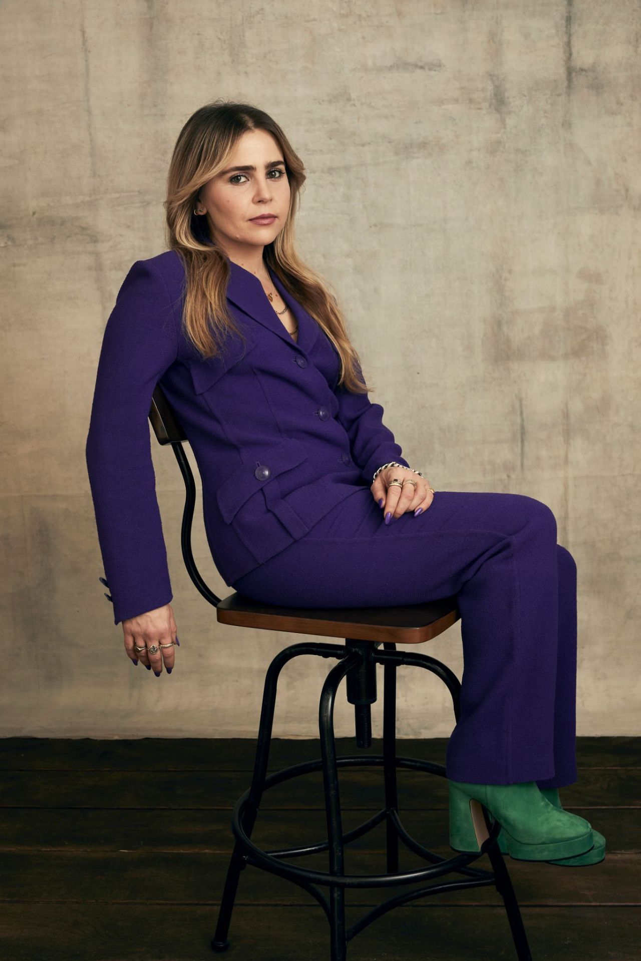
Whitman’s tattoos aren’t a matching set, but their small scale and mostly black line work give them a loose connection. The subjects vary, which keeps the arms from looking overly coordinated.
If you want several tattoos but aren’t ready for a sleeve, leave room for future pieces. It’s easier to add ink later than to recreate open space once it’s filled.
A few anchor placements can help: perhaps one near the wrist and another higher on the forearm. The rest can follow as the collection grows; it doesn’t need a rigid grid.
The gaps don’t have to be identical. Slight changes in spacing can make separate tattoos feel less like a pattern, especially when they were added at different times.
Why restraint suits Mae’s style
Small tattoos can stay private beneath a sleeve and show when Whitman chooses a sleeveless look. The ink is there without taking over the outfit.
That restraint leaves room for the rest of her style, whether she’s wearing a dress, a suit or a T-shirt. The tattoos become one detail among many.
The sheep and star carry a specific story; the wrist lettering and the partly obscured face add different textures. The marks don’t all need the same kind of meaning.
If you’re choosing a small tattoo, start with what you’d still want when nobody else sees it. A personal reference or a drawing you like can matter more than how it photographs.
Planning a collection with room to grow
Start with one image that has a clear connection for you. Whitman’s sheep and star work as a simple picture tied to a favorite book; your idea could come from a place, object, animal or story.
Then decide how visible you want it to be. A wrist is easy to see and moves often; the forearm gives more room; the upper arm can keep a design more private.
Check the design at the size you’ll actually get. A stencil can show whether lettering feels cramped or a small face still reads. Simplify or scale it before the session if needed.
Plan the empty space, too. You don’t need to map every future tattoo, but leave room if you want the collection to grow. The gaps are part of how these small pieces sit together.
The photos show a handful of small marks with space around them. The sheep and star have a story Whitman has shared; the other details can be described as far as the pictures allow.
2 thoughts on “Mae Whitman Tattoos: Small, Personal Ink”