codex

RM Tattoos: The BTS 7 and His New ‘a human’ Bicep Ink

RM’s confirmed tattoos are small: a “7” on his right ankle and the words “a human” on his bicep. The first was reported in 2022 and linked to BTS’s seven members; the lettering appeared years later during the group’s September 2026 Los Angeles concerts. Photos have prompted guesses about other marks, but unclear or mirrored images aren’t enough to confirm them.

The newest reveal

The newer tattoo is the fine cursive phrase “a human.” RM showed it during BTS’s Los Angeles concerts, and Dr. Woo’s studio coverage later showed it in close-up. The lowercase lettering sits on his upper arm near the bicep and looks handwritten rather than heavy or blocky.

RM hasn’t publicly explained its exact meaning. The words may invite a personal reading, but connecting them to his work as a songwriter, reader or art lover is interpretation, not a confirmed account from him. Visually, the phrase does not need extra decoration: the lettering itself carries the design.

The small “7” on RM’s right ankle

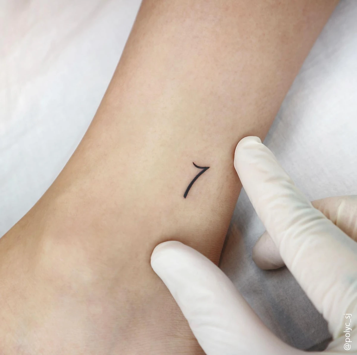
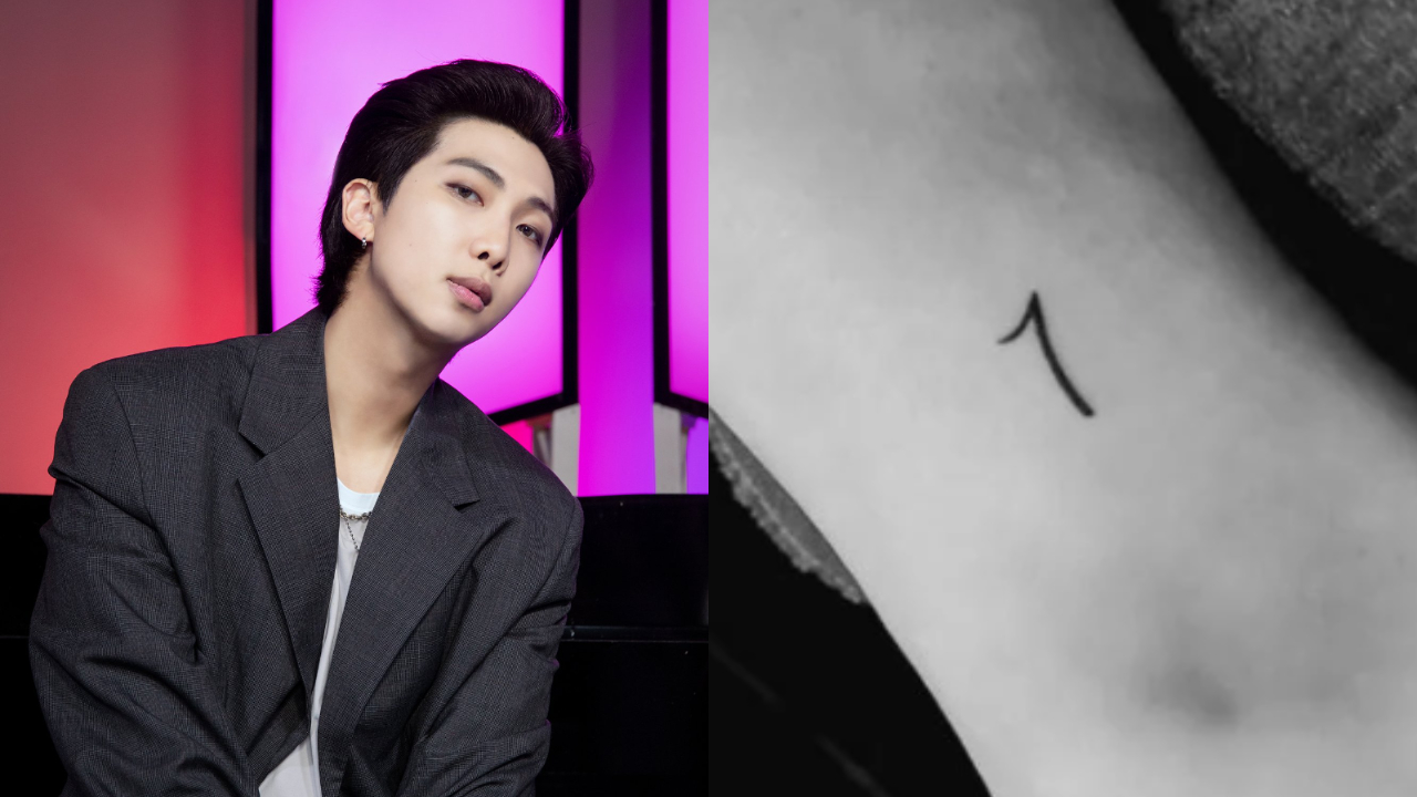
RM’s first widely reported tattoo is a small black 7 on his right ankle. He revealed it in 2022, around BTS’s Proof era. Reports connected the number to matching tattoos chosen by the group’s seven members, with each person placing it in a different spot.
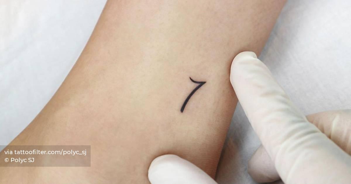
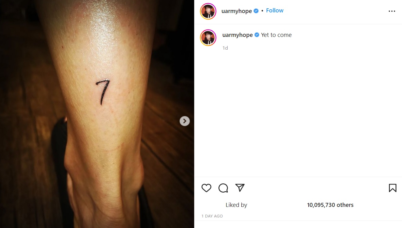
RM tattoos: close-up of the minimalist 7 on RM's right ankle
RM tattoos: distinct close-up view of the minimalist 7 on the right ankle
RM tattoos: clean studio close-up of the small 7 on RM's ankle
RM tattoos: high-resolution editorial view of the 7 tattoo on RM's right ankle

The number sits just above the ankle. Its single-line shape has a slight bend at the top, giving it a handwritten look without shading or a frame. The photos show the same tattoo from different angles; some are mirrored, which can make its placement seem inconsistent.

The group connection is the reported meaning here. It’s a compact design that points to BTS without turning the number into a uniform logo.

Two different moods

The tattoos don’t match in style. The “7” refers to a shared connection with BTS, while “a human” is a phrase whose personal meaning RM hasn’t explained. One is a number; the other is a short line of script.

That difference lets each tattoo stand on its own. A collection doesn’t need one visual theme to feel considered, and there’s no need to assign a private story to the newer phrase.

Keeping the look understated

The confirmed pieces are small and easy to cover. The ankle tattoo sits below a trouser leg, while the bicep lettering can be hidden by a sleeve or seen with a tank top.
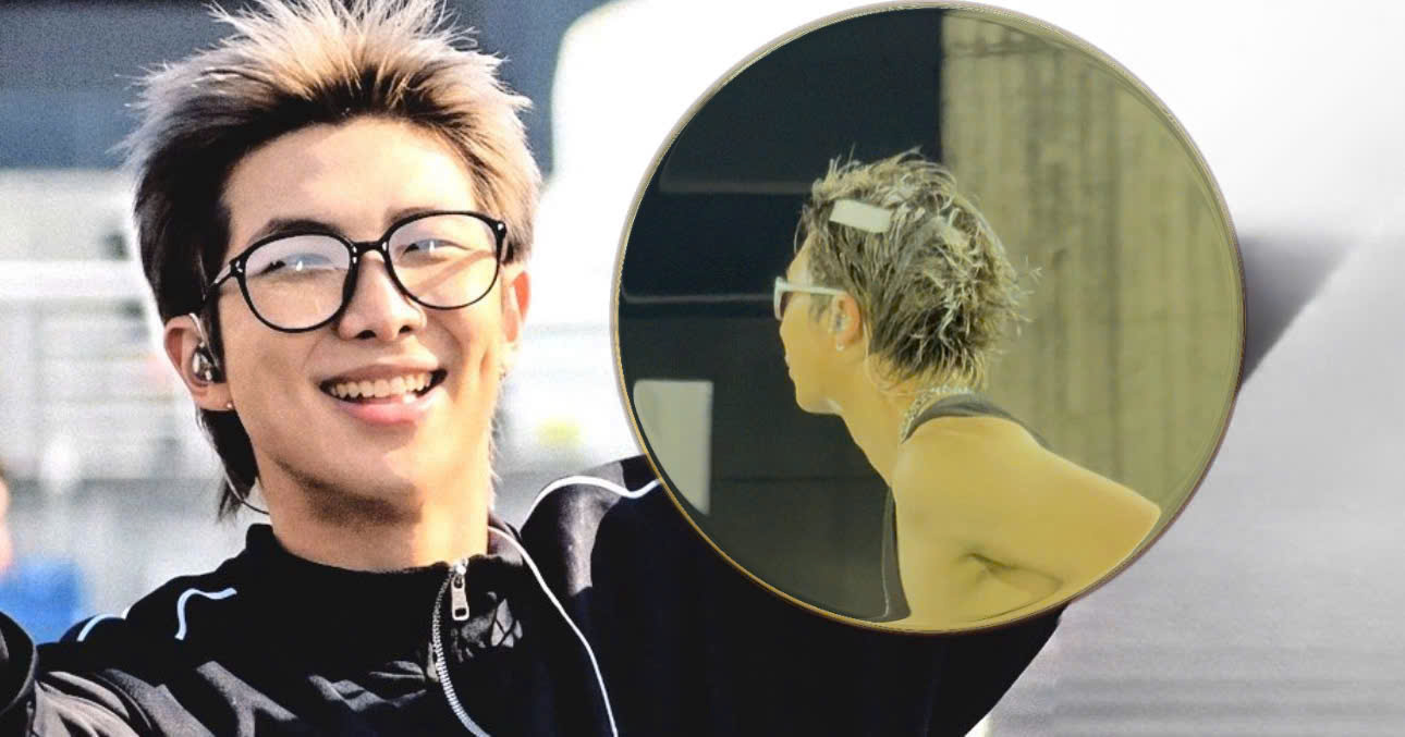
RM in a contextual photograph: contextual RM image for the section about keeping the collection understated; this is not tattoo evidence; not tattoo evidence

Fine lettering needs careful line weight and spacing to stay readable at a small scale. If you’re considering a short phrase or number, placement and how the design moves with the body matter more than adding decoration.

How to read uncertain photos

Some photos have led fans to suggest RM may have other tattoos on his wrist, arm or back. They can be blurry, mirrored or taken from video, and they don’t establish what a mark is. This guide sticks to the right-ankle 7 and the bicep phrase “a human,” which are clearly shown and reported.

When checking another image, look for the original and see whether it has been mirrored. Separate what RM has said from what viewers infer; resemblance alone doesn’t confirm a symbol or its meaning.

What comes next

There’s no reliable basis for predicting whether RM will add more tattoos or what they might look like. The current confirmed pieces are two small designs at different points in time: the BTS-linked 7 and the newer “a human” lettering.

A collection that leaves room to breathe

One sits above RM’s right ankle, the other near his bicep. Both leave plenty of open skin around the design, and neither depends on a large illustration to be legible.

Listen along

The official video for “Around the world in a day,” featuring Moses Sumney, is embedded below.
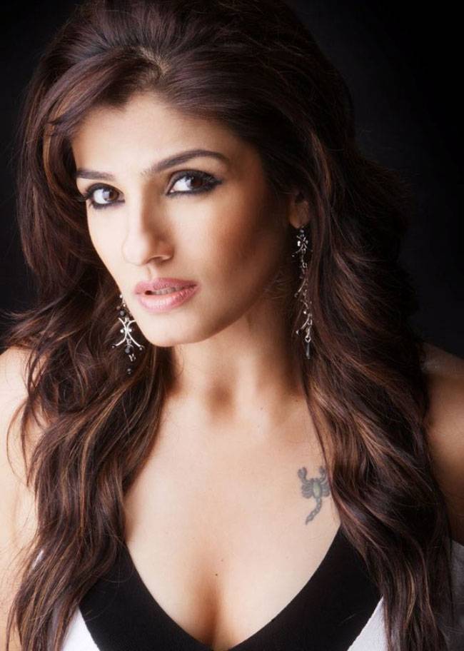
Raveena Tandon Tattoos: Scorpion, Family Names and Paw Prints

Raveena Tandon has spoken about three personal tattoos: a scorpion near her heart, her children’s names across her back and paw prints for the animals she loves. She discussed them while talking about her daughter Rasha’s own tattoo and recalled the odd start to the scorpion story: an artist mistook her newspaper sketch for a prawn.

The scorpion near her heart

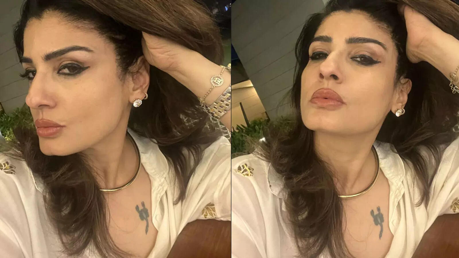
Raveena Tandon tattoos: Raveena Tandon scorpion tattoo evidence

The small scorpion sits on the upper left side of Raveena’s chest, just below the collarbone. She has connected it to her Scorpio sign and has described the tattoo as emotional.

Raveena said she took a scorpion picture from a newspaper to a parlour that mostly did eyebrow tattoos. When she asked where the design should go, the artist apparently thought she meant a prawn. She had to explain that it was a bichhu, not a zhinga. She later had the tattoo done in Los Angeles in 1992.

The story is part of what she has shared about the piece; the visible design is compact and easy to read. The open skin around it keeps the scorpion distinct without turning it into a large chest composition.

The names on her back

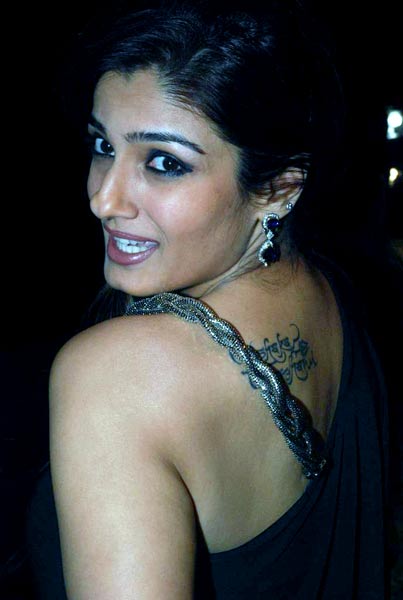
Raveena Tandon tattoos: Raveena Tandon back lettering tattoo evidence

Raveena has said her children’s names are tattooed across her back. An older photograph shows script high on the back near the shoulders. It’s a family tribute in a place that can stay covered, and the image doesn’t make every letter easy to read.

Script lettering needs enough room to follow the body without crowding. Here, the visible writing has a light, handwritten look. Raveena has spoken about her children’s names together, making this a family piece rather than a single-name tribute.

Paw prints for the animals she loves

Raveena Tandon in a contextual photograph: Context for Raveena and Rasha discussing tattoos; not Raveena tattoo evidence; not tattoo evidence

Raveena has described her paw prints as a tribute to the animals she loves. She hasn’t tied them to one specific pet; the idea is about animals in her life more generally.

That gives the piece a different focus from the scorpion and the names: one is linked to her zodiac sign, one to her children, and the paws to her affection for animals. The meanings are distinct even though the designs are all simple.

A family conversation

Raveena Tandon in a contextual photograph: Context for Raveena’s love of animals; not tattoo evidence; not tattoo evidence

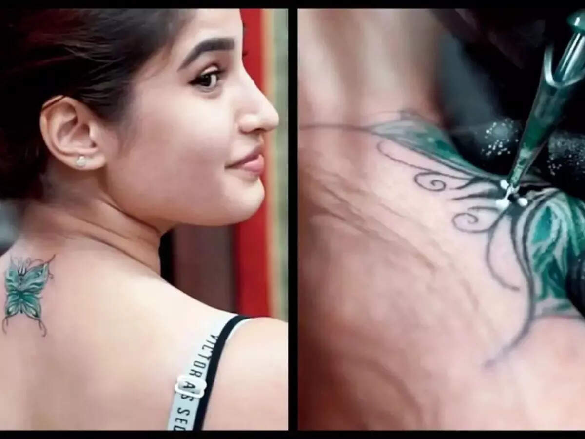
Rasha’s butterfly tattoo is not one of Raveena’s tattoos, but it came up in the same family conversation. Rasha’s design has a trident at its centre. Raveena described the butterfly as connected to the memory of Rasha’s grandfather, with religious meaning attached to the colours and symbols.

Their tattoos aren’t matching designs. Raveena’s are small symbols and lettering; Rasha’s is more elaborate and spiritually specific. The conversation shows how each chose a different way to carry family meaning.

A second look at the family story

Raveena has also appeared with mehendi designs on her hands that reference family. Henna is temporary and can mark a celebration; her tattoos are permanent. The two forms can use similar fine lines or motifs, but a mehendi pattern shouldn’t simply be copied as a tattoo stencil. A tattoo artist needs to adapt a design for skin and how it will age.

Why the collection feels connected

Raveena Tandon in a contextual photograph: Contextual portrait only; not tattoo evidence; not tattoo evidence

The designs use different forms: a scorpion, script and paw prints. What connects them is the meaning Raveena has given each one: her zodiac sign, her children and her love of animals. There’s no need to assign a larger story to details she hasn’t explained.

Making the idea yours

If you’re considering a family, pet or zodiac tattoo, start with the connection that matters to you. Think about placement as well as the design: a chest piece can be easy to show or cover, while back lettering has room for names. Bring references to an artist, but ask for a version drawn for your body rather than a copy of someone else’s tattoo.

Even small designs need room to stay clear over time. Ask how the line weight and lettering may age before settling on a size.

The short version

Raveena Tandon’s tattoos are a scorpion linked to her Scorpio sign, her children’s names and paw prints for the animals she loves. She has also shared the story of the scorpion sketch and how it was finally tattooed in Los Angeles in 1992.

Ademola Lookman Tattoos: Upper-Back Reveal and Shoulder Ink

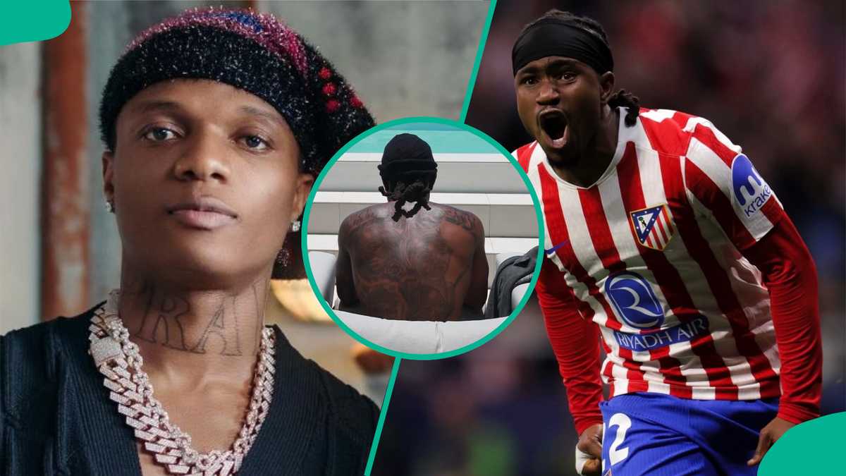
For most of his career, Ademola Lookman’s tattoos were rarely visible in public photos. That changed in June 2026, when the Atlético Madrid winger shared holiday pictures that showed a large tattoo across his upper back and shoulders, with more ink reaching toward his arm. The photos drew attention, but Lookman hasn’t publicly explained the design’s meaning, artist or appointment date.

The upper-back tattoo is the big reveal

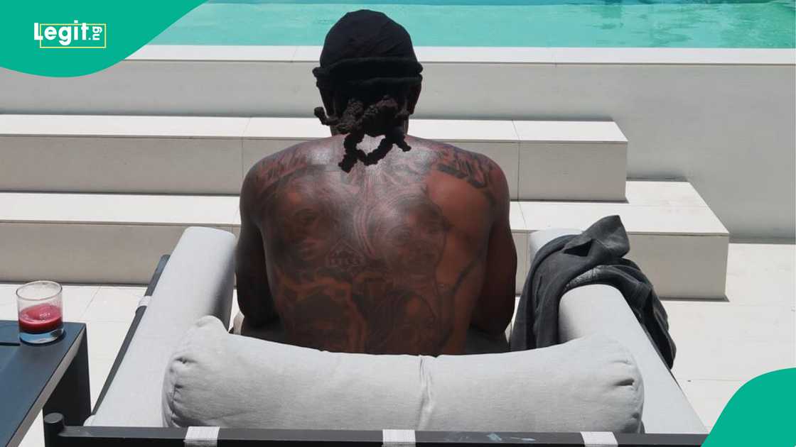
Ademola Lookman tattoos: Genuine tattoo evidence showing the upper-back design

The clearest photo shows Lookman seated beside a pool, facing away from the camera. The tattoo covers much of his upper back, stretching across the shoulders and down toward his torso. It reads as a broad, dark composition, though the image isn’t clear enough to identify each figure or symbol.

His seated posture affects how the piece looks; the photo doesn’t show it as a flat, fully extended design. What it does establish is the scale and placement. It’s a large back tattoo, not a small mark tucked near one shoulder.

A closer look at the shoulder and arm

Ademola Lookman tattoos: Genuine tattoo evidence showing the shoulder and arm area

A collage pairs a portrait, Lookman in an Atlético shirt and a closer crop of the tattoo. That crop shows the work reaching toward his shoulder and upper arm, rather than ending in the middle of his back. The available image doesn’t show enough detail to describe the exact linework or colors.

The collage offers more than one angle, but it still can’t tell us whether this is a finished, self-contained piece or part of a larger plan. We can see where the ink reaches; the rest would be guesswork.

The timing made the reveal feel casual

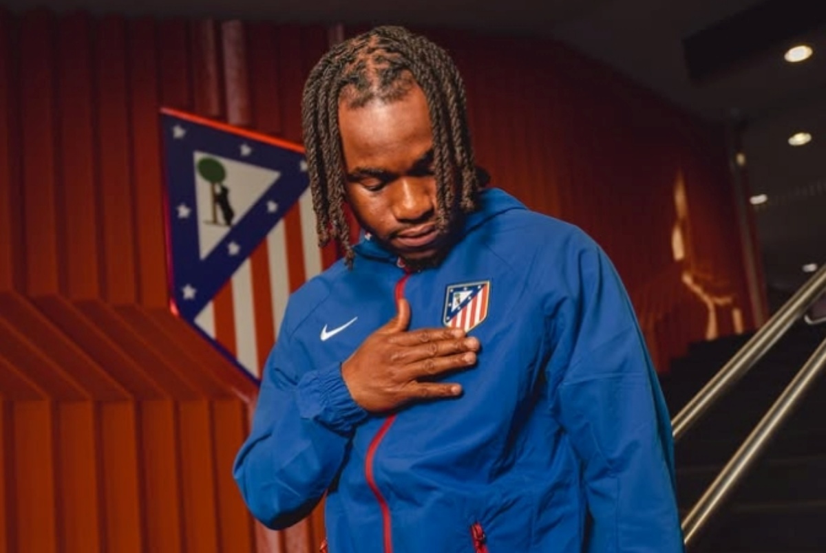
Ademola Lookman in a contextual photograph: Context for Lookman’s new Atlético Madrid chapter; not tattoo evidence; not tattoo evidence

The tattoo came into view in holiday photos, not through a formal reveal or a tattoo interview. Reports noted that fans were surprised because Lookman had rarely been seen with visible ink. The photos don’t show when he got the tattoo, or connect it to a particular match, transfer or personal event.

A first clear public look also isn’t proof the tattoo was new at the time. It only tells us when the photos made it visible to a wider audience.

Lookman’s new club chapter

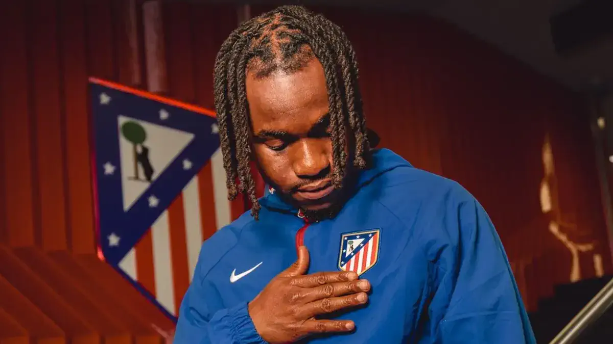
Ademola Lookman in a contextual photograph: Context for Lookman’s Atlético Madrid transfer; not tattoo evidence; not tattoo evidence

The Atlético presentation photos show Lookman in the club’s red-and-white shirt. They provide context for his new team, but they aren’t evidence about the tattoo and don’t establish that the ink is connected to the move. The holiday image shows the back piece; the club photos show a different side of his public life.

Lookman in context

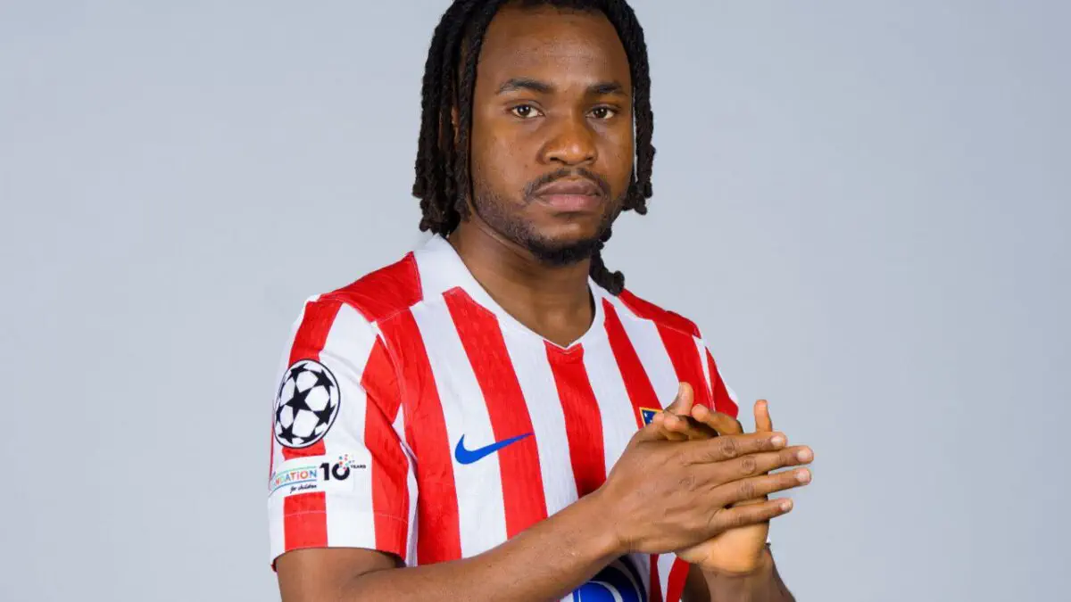
Ademola Lookman in a contextual photograph: Contextual football portrait; not tattoo evidence; not tattoo evidence

An older Atalanta portrait shows Lookman from the front in a team shirt. It gives background on the player, but it doesn’t show the back tattoo. Keeping that distinction clear helps readers tell a contextual photo from evidence of the design.

For now, the public images show a large upper-back tattoo that extends toward the shoulder and arm. They don’t identify its subject or meaning, the artist, or when Lookman sat for the session.

Practical placement notes

Lookman’s photos show how a large back piece can stay covered under ordinary clothes and become visible in a shirtless photo. If you’re planning work that crosses from the back over a shoulder, ask the artist to consider how it will look from the side and front as well as from behind.

Use a reference photo to explain the scale or placement you like, not as a template. The design should be drawn for your own body. In Lookman’s case, the photos don’t give a confirmed meaning to borrow; there’s no need to invent one to describe what’s visible.

The short version

Lookman’s June 2026 holiday photos revealed a large tattoo across his upper back, with additional ink reaching toward the shoulder and arm. The design’s specific imagery, meaning, artist and date remain unconfirmed in the available reporting.

Joe Talbot Tattoos: IDLES Ink, Otis Redding and Hand Details

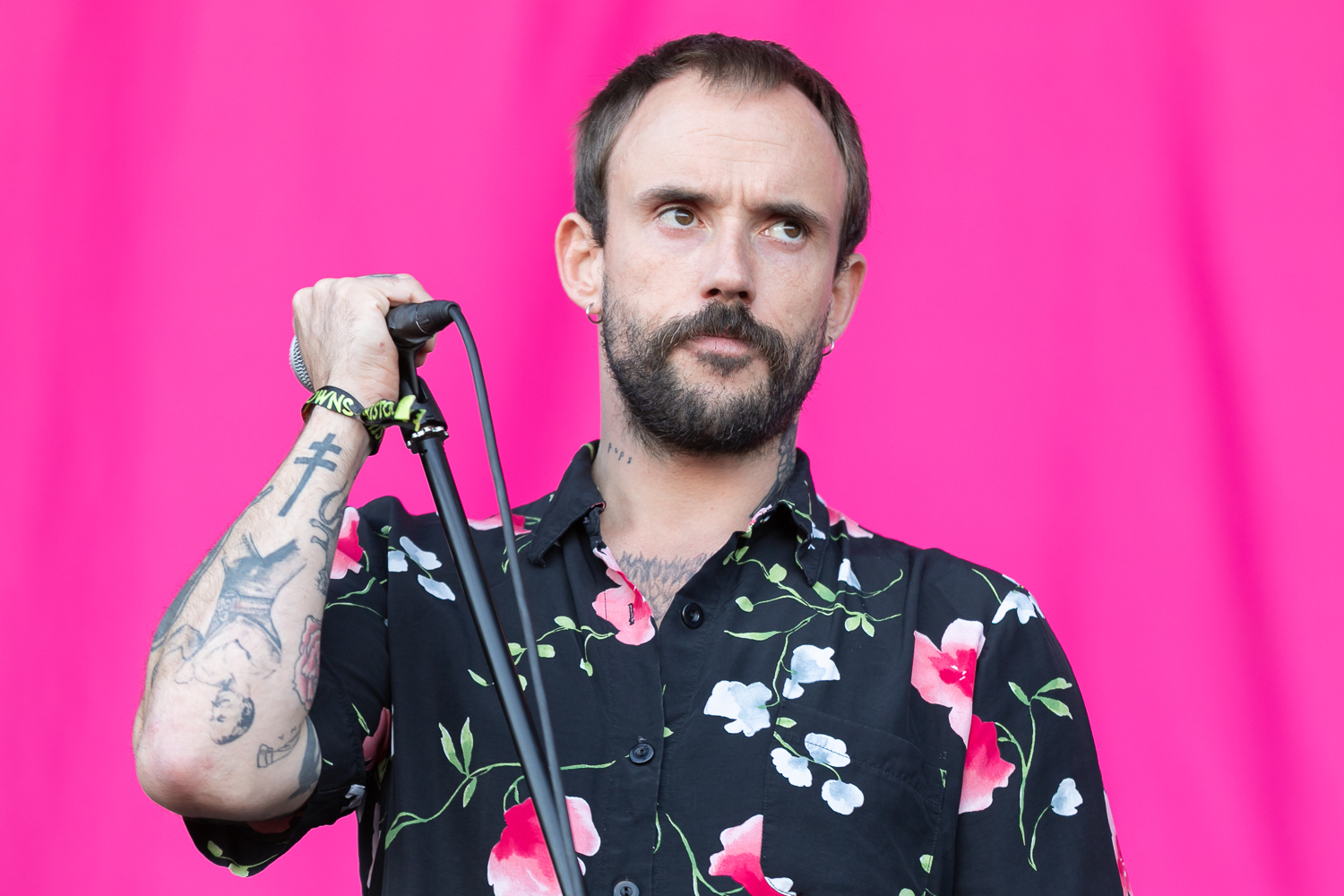
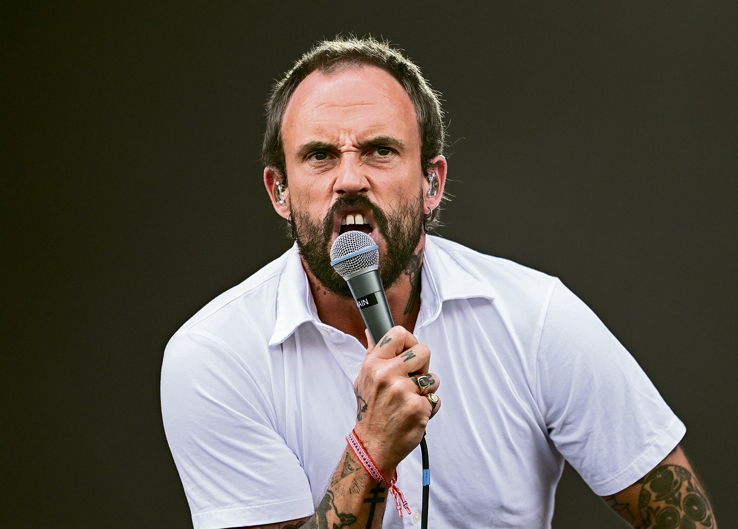
Joe Talbot’s tattoos look like a collection built one choice at a time. Photos show dense black-and-grey work on his arms, hands and neck, with portraits, lettering and smaller symbols rather than one coordinated sleeve.

In a GRAMMY.com interview, Talbot named several pieces: Otis Redding, a chair, Biggie Smalls, Frida Kahlo on his left hand, Bill Murray’s face and “pops” on his neck. The interview gives those designs names; photos show their placement and style. Other shapes are harder to identify.

Joe Talbot’s arm tattoos

Joe Talbot tattoos: genuine tattoo photograph showing Talbot's arm and hand work

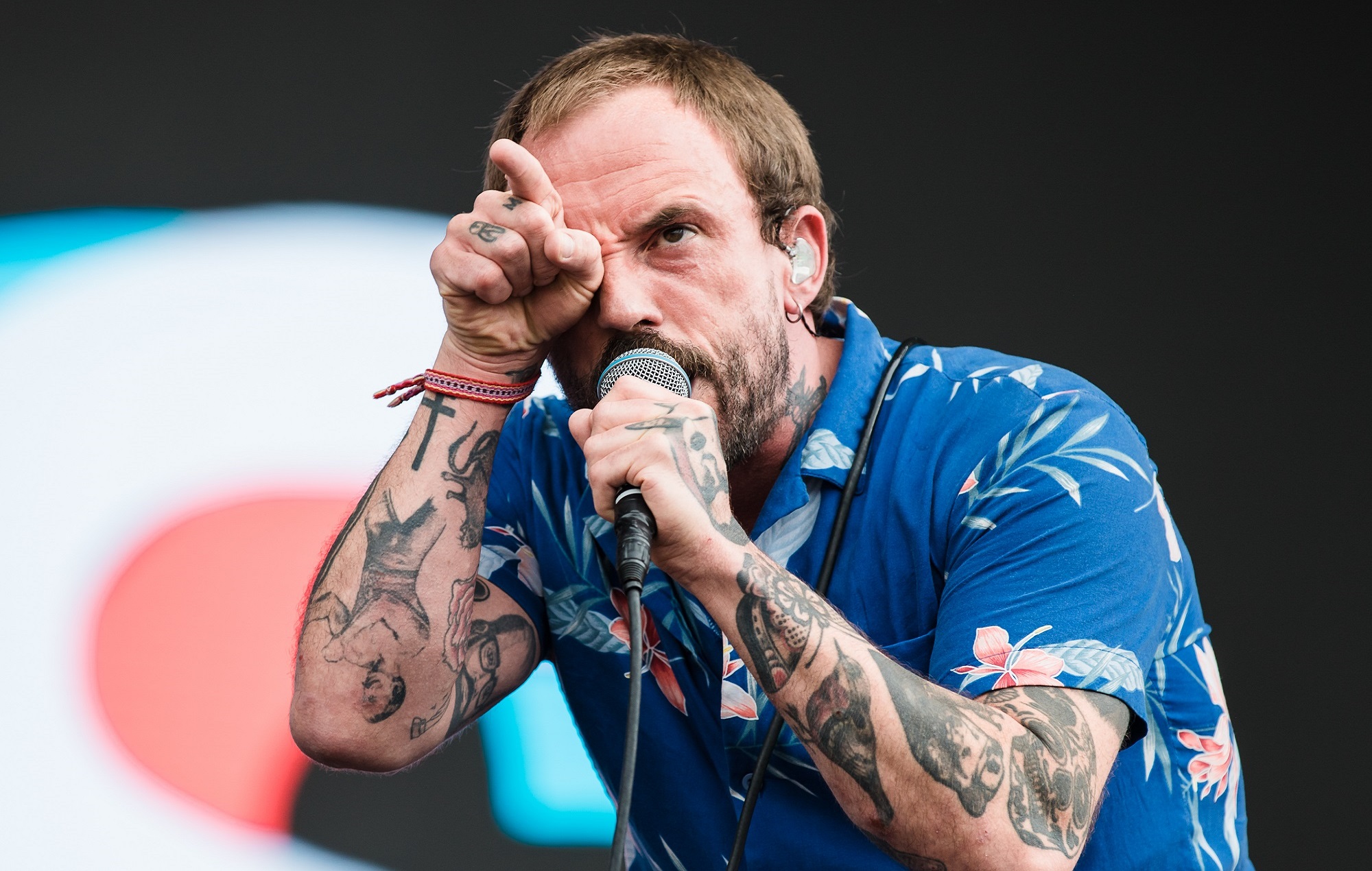
The arms carry most of the visible work. In this close live photo, shaded portraits, lettering and smaller designs sit close together. A different angle brings the hand or neck into view.

The ink is mostly black and grey. Faces and graphic shapes sit beside lettering, giving the collection a patchwork feel instead of the look of one planned sleeve. The photo shows placement and style, but it doesn’t confirm the subject or meaning of every mark.

The Otis Redding tattoo and the musical side of the ink

Joe Talbot tattoos: genuine tattoo photograph showing the arm and neck placement

Talbot told GRAMMY.com that he has Otis Redding tattooed on his arm. He mentioned it while discussing “Beachland Ballroom,” an IDLES song shaped by his interest in soul music. That’s the connection he gave; there’s no need to add a meaning he hasn’t shared.

Concert photos can make a portrait hard to read. A microphone or stage light may cover part of it, so the interview identifies Redding while the image shows where the tattoo sits.

A few personal references

The same interview names a chair, Biggie Smalls, Frida Kahlo on Talbot’s left hand and Bill Murray’s face. It also mentions “pops” on his neck; Talbot has explained the family connection behind that word. The references range from music and art to film and family.

They don’t share one visual theme, and they don’t need to. A portrait can sit beside a small object or a short word because each piece has its own reason for being there. “Pops” is often visible above a shirt collar, while the hand tattoo appears in some photos.

Why stage photos reveal more than a list

Joe Talbot in a contextual photograph: contextual IDLES stage portrait; not tattoo evidence; not tattoo evidence

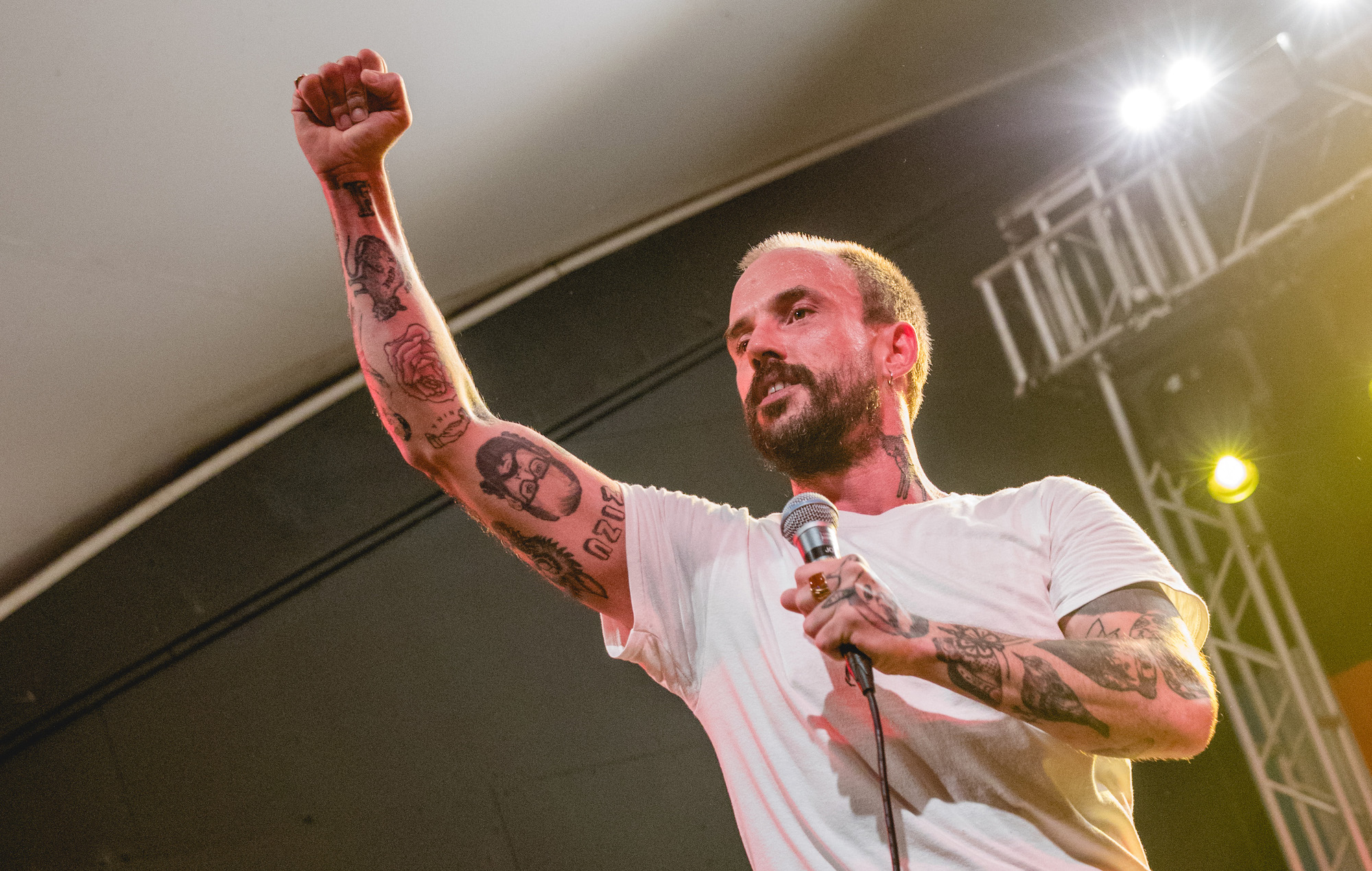
IDLES shows are physical: Talbot moves around, grips the microphone, raises an arm and leans toward the crowd. A still catches one moment. A sleeve, cable or bent arm can hide a tattoo that appears in another frame.

These photos confirm that his arms are tattooed and show the general style. Unless Talbot or a reliable source names a design, a blurred shape is best left unidentified.

A closer view of the festival frame

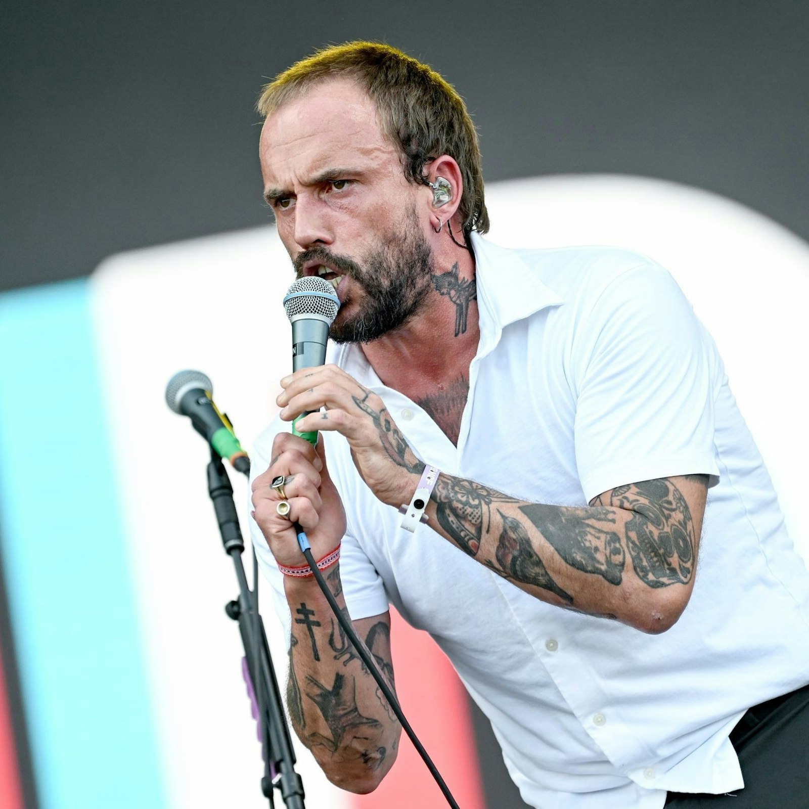
Talbot’s hand and neck tattoos are harder to hide than pieces under a shirt. “Pops” sits at the neck, and the interview identifies Frida Kahlo on his left hand.

The festival frame gives a sense of scale as he moves. It shows where the ink appears beside his gestures, but it doesn’t add a new explanation of what the designs mean.

Joe Talbot in a contextual photograph: contextual festival portrait; not tattoo evidence; not tattoo evidence

Joe Talbot’s public image away from the microphone

A wider performance portrait shows how the tattoos sit with Talbot’s clothes and stage gear. It gives context for his public look, but it isn’t close enough to identify another design.

Clothing and lighting change how much of the collection is visible. One photo may reveal a familiar tattoo from a new angle rather than show a new addition.

Joe Talbot in a contextual photograph: contextual performance portrait; not tattoo evidence; not tattoo evidence

GRAMMY.com is the source for Talbot’s own list: Otis Redding on his arm, a chair, Biggie Smalls, Frida Kahlo on his left hand, Bill Murray’s face and “pops” on his neck. Photos show dense black-and-grey work across his arms, hands and neck.

The reporting doesn’t give a full count, dates or an artist credit for every tattoo. The interview can identify a design; the photos can show its placement and appearance. Unclear shapes should stay unnamed.

What the confirmed sources actually tell us

Talbot’s collection shows how tattoos can grow without a single motif. A portrait can sit beside a small object or a word if each one matters to the person wearing it. It helps to think about why a reference matters and whether it will still feel right years later.

Placement deserves the same thought. Hand and neck tattoos are visible in everyday settings, while an upper-arm design is easier to cover. An artist can help plan spacing if the collection will keep growing.

Ideas to borrow from the collection

The interview names Talbot’s references; the photographs show the dense arm, hand and neck work. Where a design’s meaning hasn’t been explained, it’s better to leave it open than turn a guess into fact.

Final thoughts

Christian Pulisic Tattoos: Tiger Sleeve, Eagle, Quote and Personal Ink

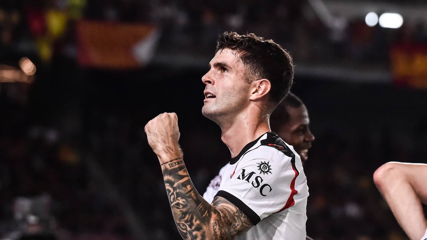
Christian Pulisic’s left sleeve has one detail that has become part of his goal celebration: a tiger tattoo aligned with his eyes. Pulisic says the celebration came later. The pose grew out of a moment during the tattoo session, when he lifted his arm and saw how the tiger’s eyes lined up with his own.

The tiger is the best-known design, but the sleeve also includes Roman numerals, an eagle, a Philly crown, a quote, a chess queen and Mike Wazowski. Pulisic has explained some of them himself; the photos show how the pieces sit on his arm.

Christian Pulisic’s tattoo sleeve in one look

Christian Pulisic tattoos: genuine tattoo evidence

Tattoo evidence: Christian Pulisic’s left sleeve is clearly visible in this match photograph, including the tiger and darker forearm work.

Most of Pulisic’s visible tattoos are on his left arm. The sleeve mixes larger black-and-grey images with lettering and smaller designs, so it reads as a group without looking like one continuous picture.

The tiger faces outward on his forearm. In the goal celebration, he turns it toward the camera; a lowered arm or a different angle shows other parts of the sleeve. The photos give different views of the same collection.

Introduction

Pulisic has said tigers were a favorite animal, he admired Tiger Woods, and he was born in the Year of the Tiger. He got the tattoo as a teenager while playing for Borussia Dortmund.

The alignment was noticed during the session. His artist asked him to raise his forearm, and the tiger’s eyes met his own. Pulisic later used the pose after goals, and it became known as the “Eye of the Tiger” celebration.

What remains uncertain

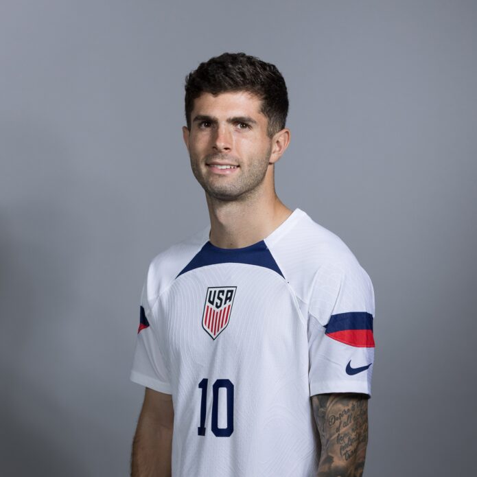
Christian Pulisic in a contextual photograph: contextual fallback; not tattoo evidence; not tattoo evidence

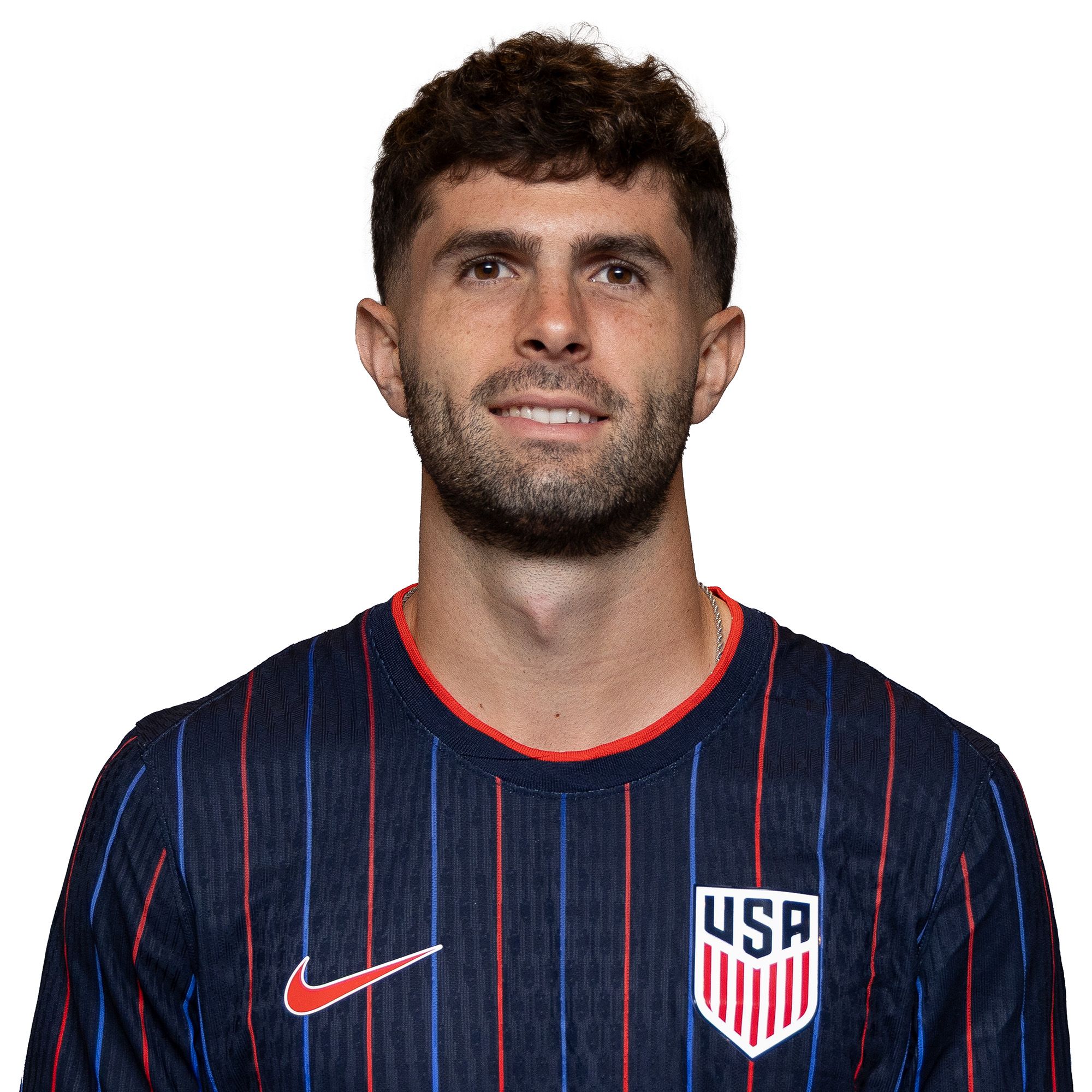
Contextual celebrity photograph from an official U.S. Soccer portrait session, included for football setting.

Below the tiger, the Roman numerals read XII XIII MMXIII. They refer to December 13, 2013, when Pulisic scored and assisted against Brazil for the United States under-17 team. He was 15.

The numbers can be hard to read when his wrist turns or is partly covered. The date itself has been reported; other small shapes in match photos are less certain and shouldn’t be named from a guess.

How the collection changed

Higher on the arm is a bald eagle with an American flag behind it. The national imagery sits alongside Pulisic’s career with the U.S. team.

Another design pairs a crown with the word “Philly.” Pulisic was born in Hershey, Pennsylvania, and has a connection to Philadelphia sports, including the 76ers. The crown and lettering bring a regional reference into the sleeve.

The eagle and flag fill more space on the upper arm, while the crown and text make a smaller mark. They give the sleeve a few different scales without requiring every tattoo to match.

Sources

Christian Pulisic in a contextual photograph: contextual fallback; not tattoo evidence; not tattoo evidence

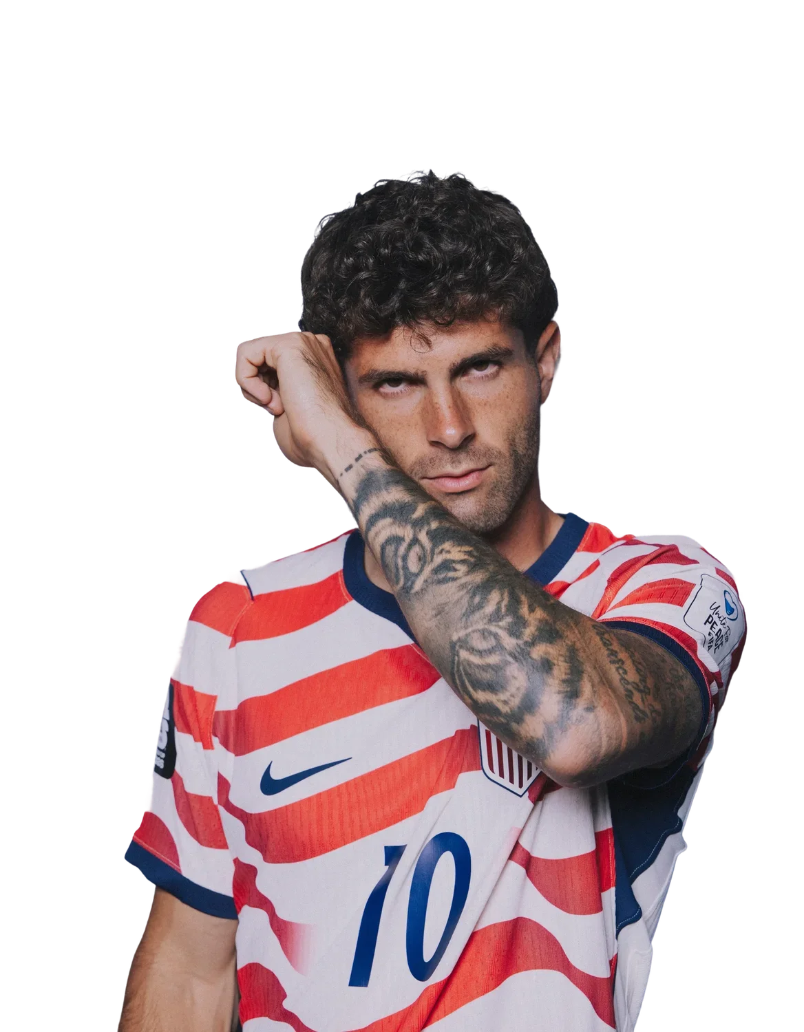
Contextual World Cup portrait showing Pulisic in a national-team setting.

A long Napoleon Hill quote runs along Pulisic’s arm: “Desire is the starting point of all achievement, not a hope, not a wish, but a keen, pulsating desire which transcends everything.” The lettering adds a different texture from the shaded images around it.

The words are about ambition and achievement. That reading is clear from the quote itself; Pulisic hasn’t given a fuller explanation of why he chose it.

Final thoughts

Christian Pulisic in a contextual photograph: contextual fallback; not tattoo evidence; not tattoo evidence

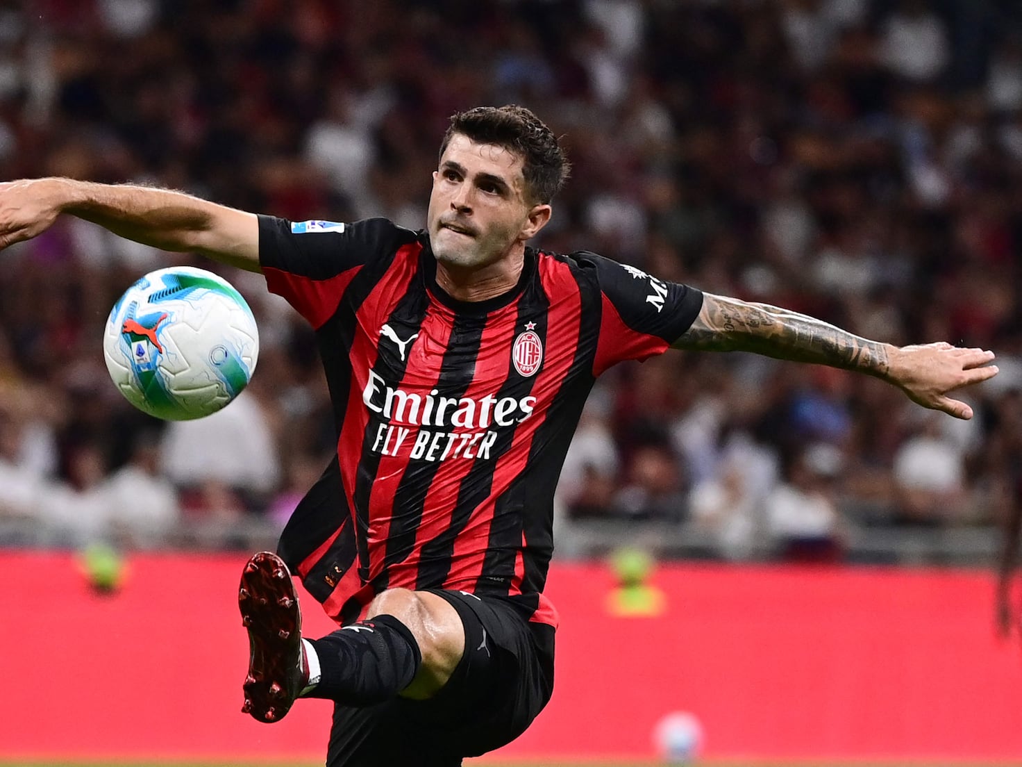
Contextual AC Milan action photograph showing how Pulisic’s movement changes the view.

The chess queen on Pulisic’s left forearm has the word “Mate” beside it. He has spoken about playing chess with N’Golo Kanté during lockdown. “Mate” also connects to his grandfather’s name and Pulisic’s middle name, Christian Mate.

The design brings the game and the family reference together in a small space, alongside larger images such as the tiger and eagle.

Conclusion

Christian Pulisic in a contextual photograph: contextual fallback; not tattoo evidence; not tattoo evidence

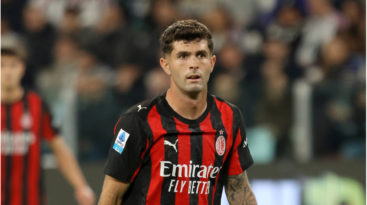
Contextual Italian league action photograph included for football setting.

Pulisic also has Mike Wazowski from Monsters, Inc. standing on a Champions League ball. He has talked about enjoying the film. The ball ties the character to football, including Chelsea’s 2020–21 Champions League win.

The cartoon is a lighter image among the darker, more realistic pieces. It gives the sleeve another personal reference without needing to fit the same visual style.

Ideas to borrow without copying

The sleeve brings together dates, lettering, national and regional references, sport and a favorite film character. A similar collection doesn’t need one theme, but it helps to choose pieces for reasons that will still matter to you and leave room for the design to grow.

Placement changes how a tattoo reads. A forearm design can face outward when the arm turns; long lettering follows the arm; upper-arm work changes the balance of a sleeve. An artist can help plan spacing around movement and the tattoos already there.

Evanilson Tattoos: The Family Messages Behind His Ink

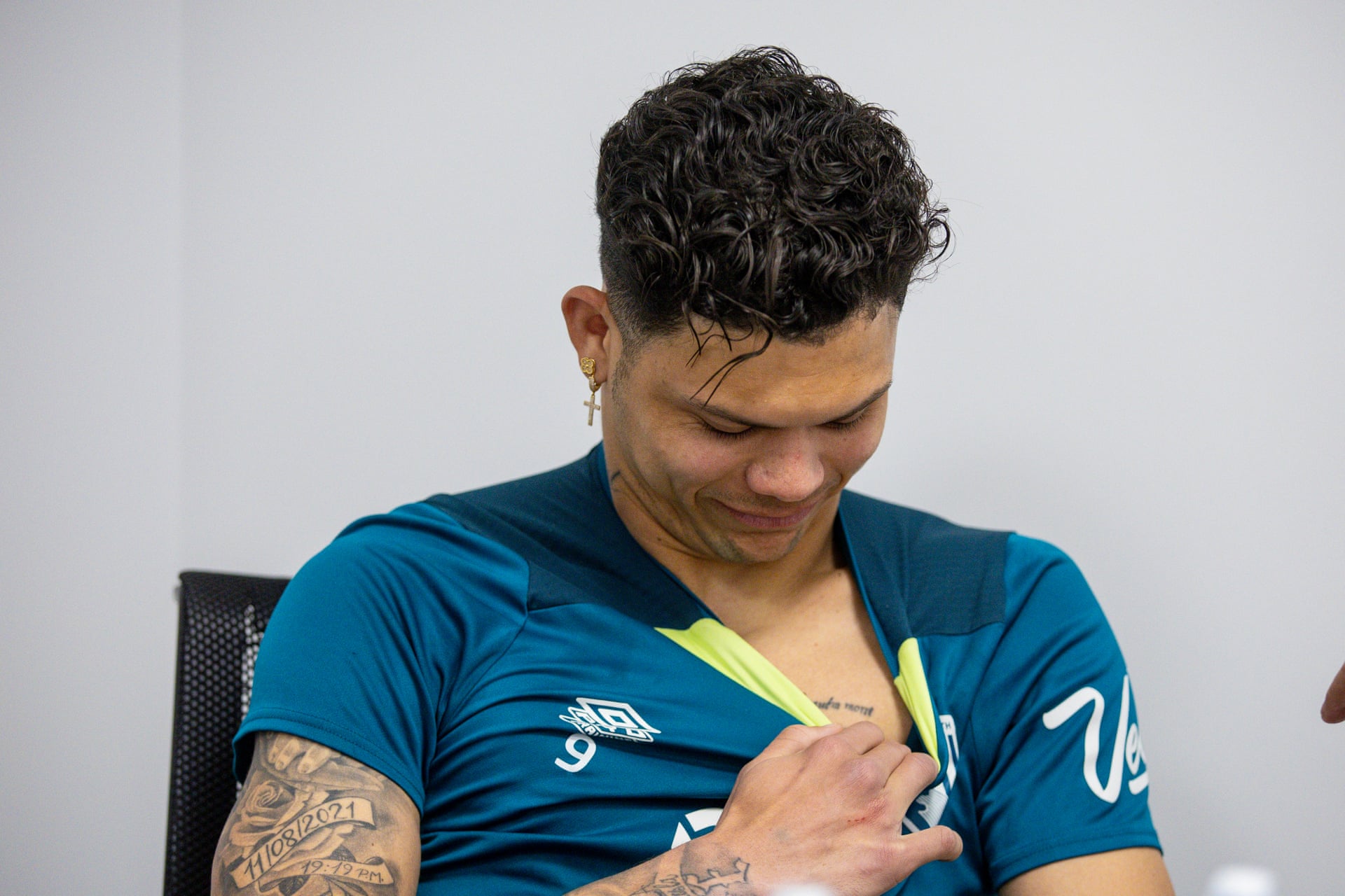
Most of Evanilson’s tattoos are out of view during matches. The clearest image comes from a Guardian interview: he lowers his shirt to show lettering on his left chest dedicated to his mother, Madalena.

He has also been described with the word “Blessed” around his neck and a portrait of himself holding his daughter as a baby on his right shoulder. The interview gives the chest piece the clearest context; the other details are reported, but less visible in photos.

Evanilson’s chest tattoo dedicated to his mother

The lettering sits on Evanilson’s left pectoral, just below the collarbone. He explained that the message is for his mother and reflects the idea that she remains in his heart.

Evanilson tattoos: genuine tattoo evidence

The Guardian interview photograph is the genuine tattoo evidence: Evanilson shows the chest lettering dedicated to his mother.
Madalena died when he was 17, before his professional career had properly begun. Evanilson connected the tattoo to that loss and to his decision to keep playing. The image doesn’t show enough to transcribe every word or describe the full design, but its placement and subject are clear.

The chest is easy to keep covered. Evanilson chose to show the tattoo during the interview, when he was ready to talk about it.

The memory behind the piece

He said his mother’s death affected him deeply. At the time, he returned to Fortaleza because he didn’t want to continue playing in Rio. That period came before the career he later built.

The Guardian conversation took place at Bournemouth’s training complex and also covered adapting to England, learning from Pepe and settling at a new club. When the subject turned to Madalena, Evanilson showed the chest lettering. The interview connects the tattoo to his own account rather than asking readers to infer a story from the photograph.

A short public message

The Guardian report also identifies the word “Blessed” around Evanilson’s neck. It is more exposed than the chest inscription, though distance and lighting can make lettering hard to read in ordinary portraits.

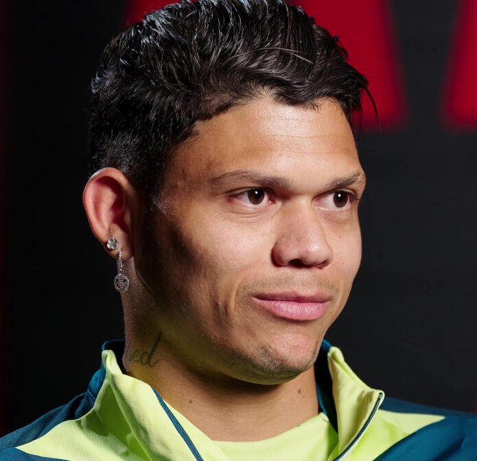
Evanilson in a contextual photograph: contextual training-ground portrait; not tattoo evidence; not tattoo evidence

This training-ground portrait is useful context for Evanilson’s public look; it is not used to claim extra detail about the chest inscription.
The interview gives the word and its placement, but it doesn’t identify a tattoo artist, date or a larger set of religious symbols. There’s no reason to add details the source doesn’t provide.

How the photographs frame the story

The surrounding photos show Evanilson in training, club and match settings. They help place the tattoos within his football life, but they don’t replace the close image of the chest inscription.

Evanilson in a contextual photograph: contextual Slovakia career photograph; not tattoo evidence; not tattoo evidence

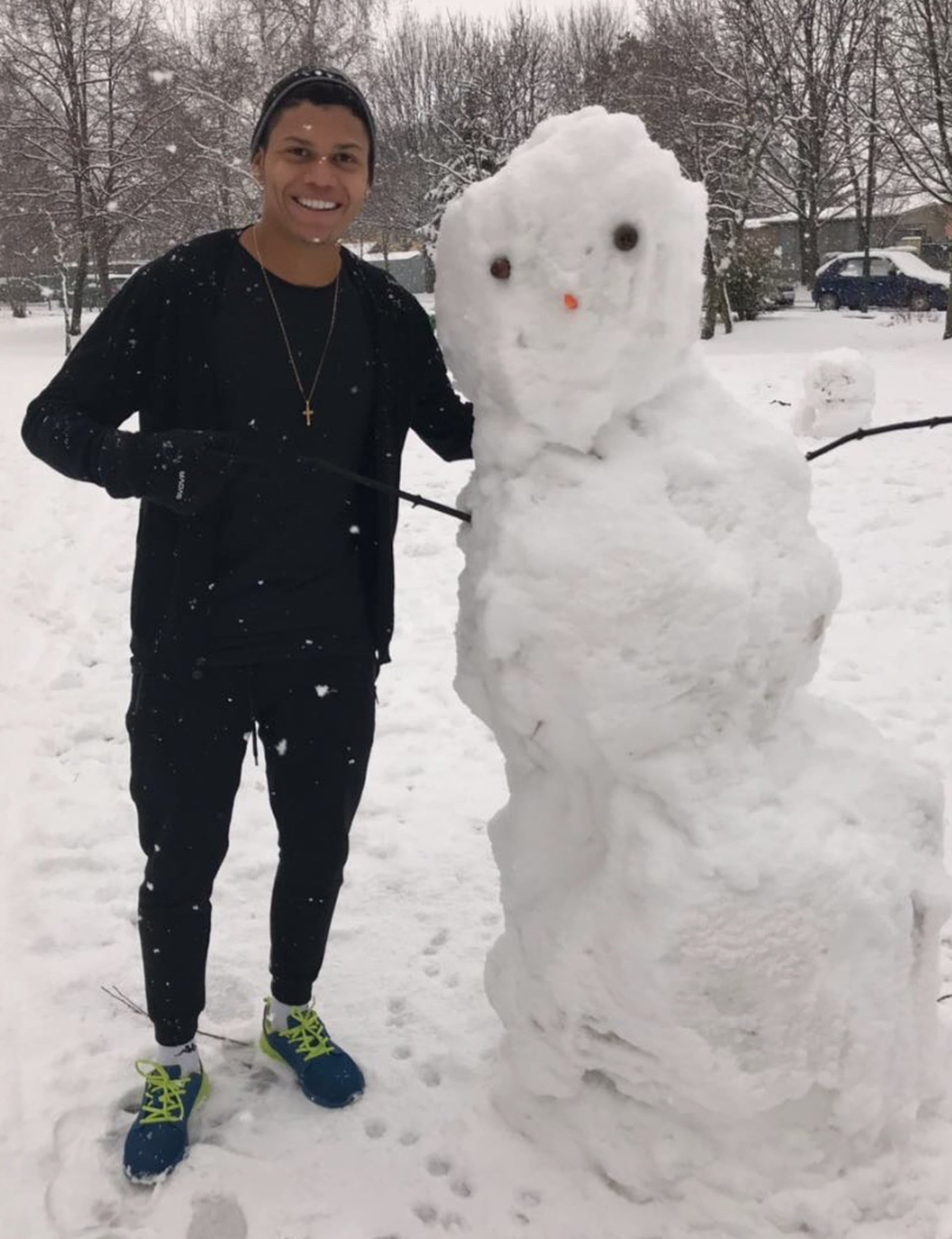
The snowman photograph comes from the period Evanilson described as a major adjustment from Brazil to European football, so it works as career context rather than a close view of his ink.
A winter photo from his time in Slovakia shows him beside a snowman. He described moving from Brazil to the cold and struggling through his first training session there. A cross necklace is visible in the frame; the chest tattoo isn’t.

From Fortaleza to Bournemouth

Evanilson grew up in Cajazeiras, a district of Fortaleza, where his father was his first football coach. He joined Fluminense as a teenager, spent time in Slovakia, then moved to Porto. Bournemouth signed him as a record addition for the club, and his first Premier League season put him in a new public setting.

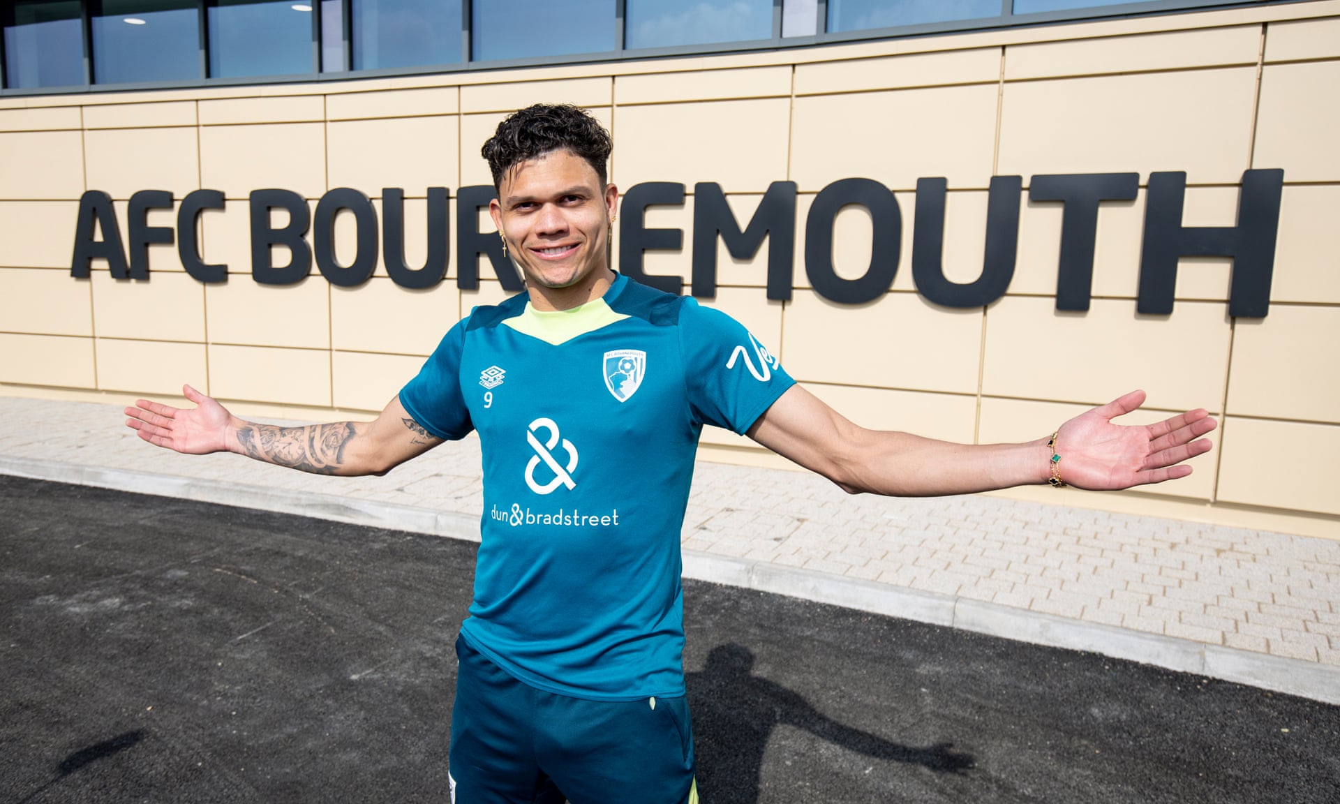
Evanilson in a contextual photograph: contextual Bournemouth match photograph; not tattoo evidence; not tattoo evidence

This Bournemouth training photograph shows Evanilson in the club environment that surrounded the interview and the public discussion of his family tribute.
Those moves provide context for his career, but the chest tattoo is about his mother, not a map of his transfers. The interview also reports a portrait of Evanilson holding his baby daughter on his right shoulder. Available photos don’t give a close view, so that detail should stay attributed to the report.

What the public photos can and cannot prove

The chest inscription is supported by both Evanilson’s account and the Guardian photograph. The neck word and the shoulder portrait are described in the report; other marks remain unidentified.

Evanilson in a contextual photograph: contextual matchday portrait; not tattoo evidence; not tattoo evidence

This match-day photograph places Evanilson in the football setting that made the interview relevant, but the group action frame is contextual and does not support reading small ink details.
The match-day image shows him celebrating with teammates, but it was taken to capture the football moment, not his ink. It can show the setting around his career, not the design on a distant arm or covered chest.

Ideas to borrow without copying

A memorial inscription works best when the words still matter to the person wearing them. Decide what you want to remember before settling on a font, and think about whether you’d rather keep the design private or show it often.

Placement changes that choice. A chest tattoo can stay under a shirt, while neck lettering is visible in ordinary photos. For small text, ask an artist about size, line weight and how it may look as the skin moves and ages.

Evanilson’s designs belong to his own family story. The useful idea is to choose a reason and placement that fit your life, not to copy the exact tattoos.

Final thoughts

The chest message for Madalena is the clearest part of Evanilson’s tattoo story: the interview explains why it is there, and the photograph shows where it sits. The neck lettering and reported shoulder portrait add context, while other details remain unconfirmed.

Henare Tattoos: His Facial Mataora and Māori Identity

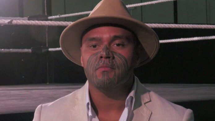
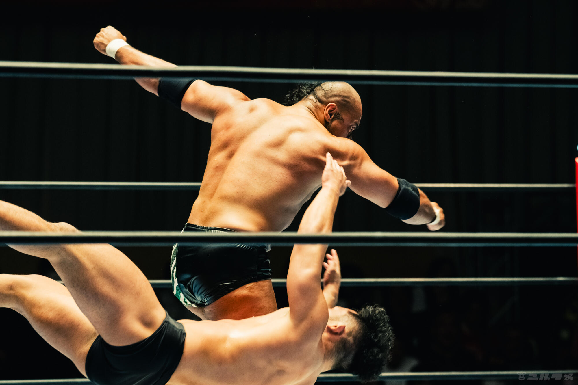
Henare’s facial markings are visible in the ring, but he has described them as mataora tied to his Māori identity and whakapapa. Calling them only a wrestling character detail misses what he has said about them.

Photos show the pattern; his interviews give the personal context. The lines can be described, but a match photograph can’t tell us the meaning of each mark.

Henare’s face tattoo: his mataora

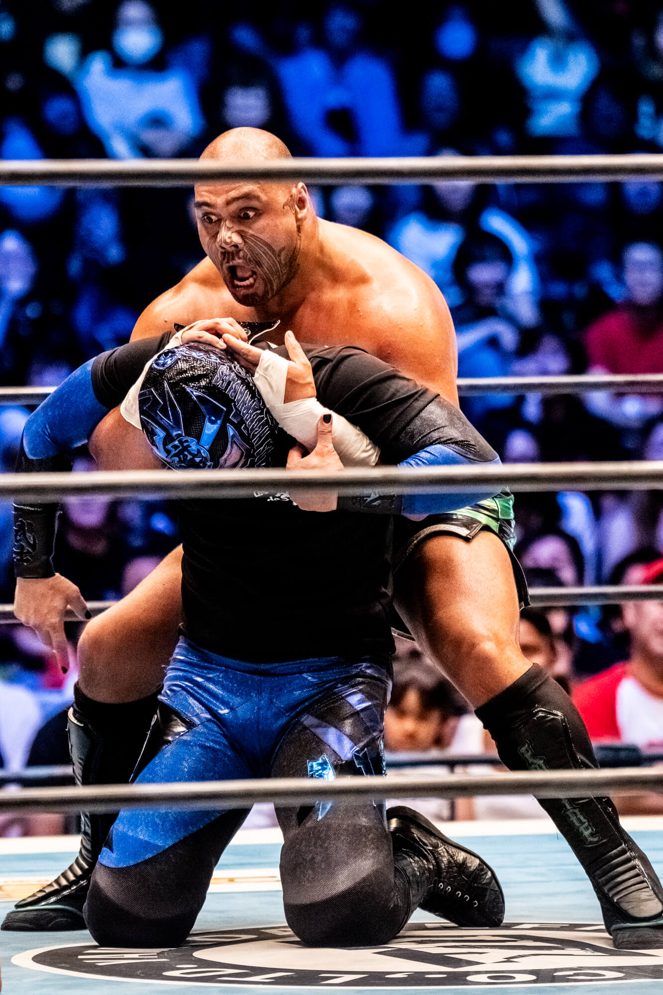
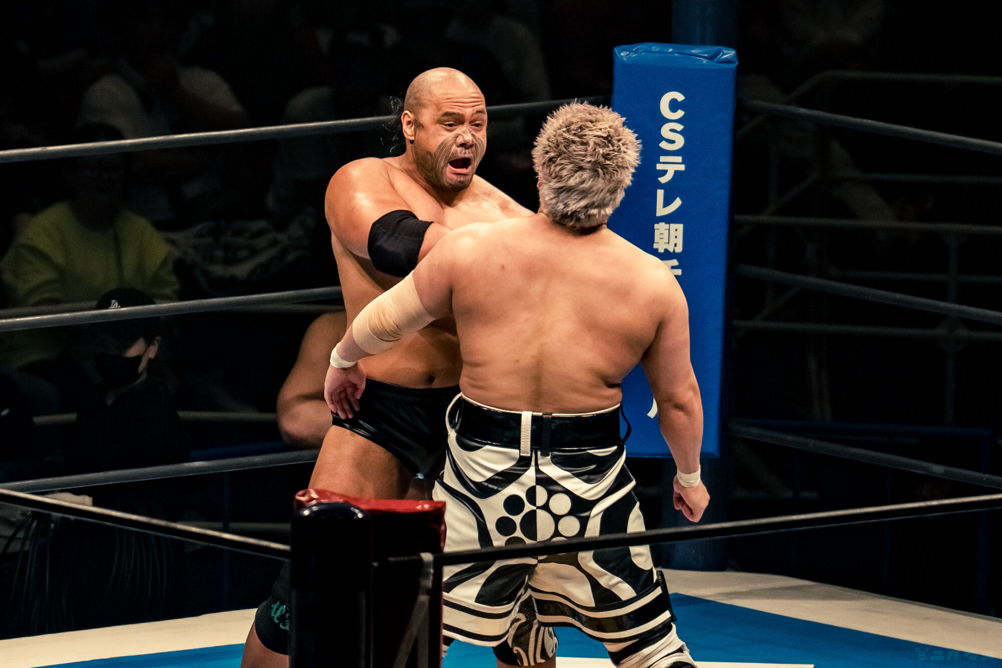
Henare tattoos: Henare’s face tattoo: his mataora

The mataora covers the lower half of Henare’s face. Dark curves run across his cheeks and around his mouth, continuing toward the jaw and chin. Smaller marks sit around the nose and connect the areas.

The lines follow the shape of his face rather than sitting on it like separate images. In this match photo, his head is tilted and his mouth is open, yet the pattern is still visible. A close image shows detail; a distant one shows the broader shape.

Henare identifies the work as mataora. Its placement may overlap the area where facial hair grows, but that doesn’t make “beard tattoo” an accurate description. The name he uses is the right place to start.

A personal identity beyond the character

Henare in a contextual photograph: A personal identity beyond the character; not tattoo evidence

A wrestler’s appearance can be read as part of a character. Henare gave a different explanation in a Monthly Puroresu interview, speaking about genealogy and ancestry. He also corrected the assumption that “Kiwi” was the identity he preferred and described his connection to being Māori and Ngāpuhi.

The action photo puts him back in the ring, where many viewers first see him. His performance and personal identity can be present at the same time; one doesn’t explain away the other.

Returning home for the work

Te Ao Māori News reported that Henare received his mataora on June 23, 2023, at Rotokura/Cable Bay. Kaitā Raniera McGrath did the work, and Henare’s whānau were there.

That gives the decision a place, date, artist and family context. The finished pattern is public, but the occasion was a personal family experience. There’s no need to turn it into a spectacle or guess at meanings he hasn’t shared.

Naming McGrath matters too. The wearer is not the only person involved in a tattoo, and the artist’s work shouldn’t disappear from the account.

How he reads in the ring

A match photo gives less time to study the lines. Ropes, movement and other wrestlers fill the frame. From a distance, Henare’s dark lower-face pattern is easy to recognize; closer up, its individual curves are easier to follow.

Expression and head position change how the same design looks. An open mouth pulls the skin differently from a relaxed expression, and arena light can deepen the shadows. Those changes don’t mean the tattoo has changed.

Henare in a contextual photograph: How he reads in the ring; not tattoo evidence

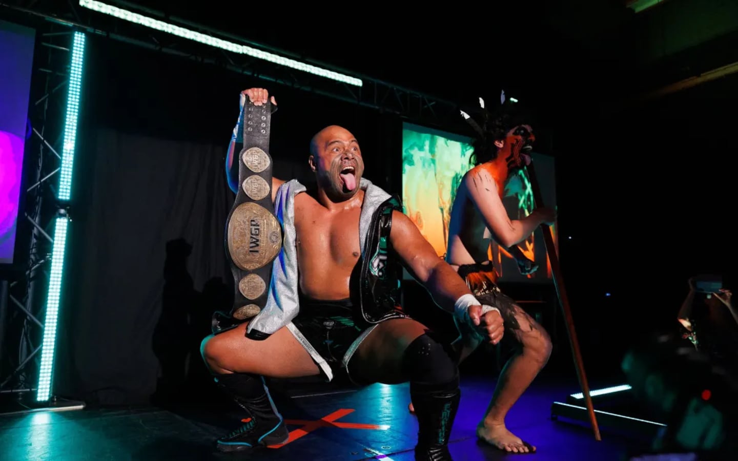
The homecoming photo shows Henare with a championship belt onstage, alongside another performer. It’s a wider view of the event, with the celebration taking up more of the frame than the facial details.

In a later 2023 interview with Te Ao Māori News, Henare spoke about bringing Māori culture to an international wrestling audience and described a positive response from people around him. That is his account of his experience; it shouldn’t be stretched into a claim about every fan or venue.

Bringing home into the public space

A full-length portrait shows Henare standing with his belts against the entrance backdrop. The mataora remains part of his appearance, but the wider image also shows his stance, gear and surroundings.

A close-up helps with the lines; a wider frame gives context. Neither view tells the whole story by itself, and the tattoo doesn’t need to become the only thing a viewer notices.

Henare in a contextual photograph: Bringing home into the public space; not tattoo evidence

It’s possible to admire the precision and visual force of Henare’s mataora without treating it as a design to copy. These markings are connected to his ancestry and identity; his public appearance doesn’t make their meaning available to everyone.

If the way the lines follow the face interests you, talk with an artist about composition and movement in a design that fits your own background. Use the name Henare uses, credit Raniera McGrath, and leave personal meanings to the people who can explain them.

The interview below lets Henare speak about the experience in his own words.

Seeing the whole person

Henare in a contextual photograph: Seeing the whole person; not tattoo evidence

Appreciation without copying

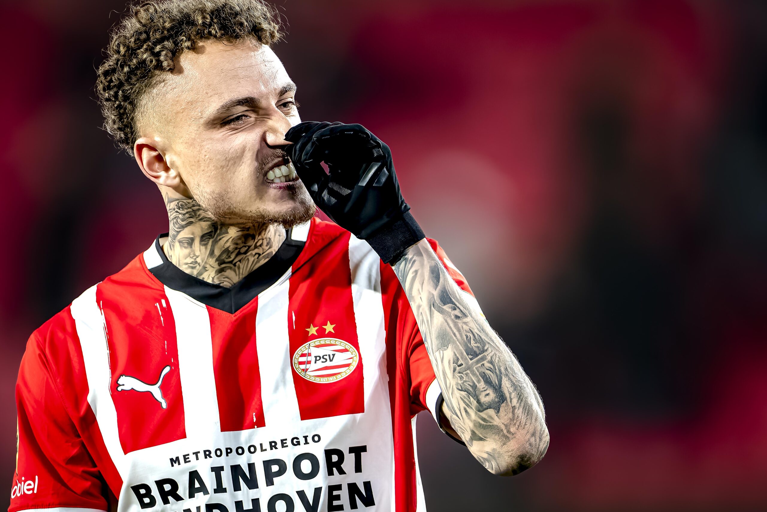
Noa Lang Tattoos: Neck Ink, Chest Work and the Portrait Pieces on His Legs

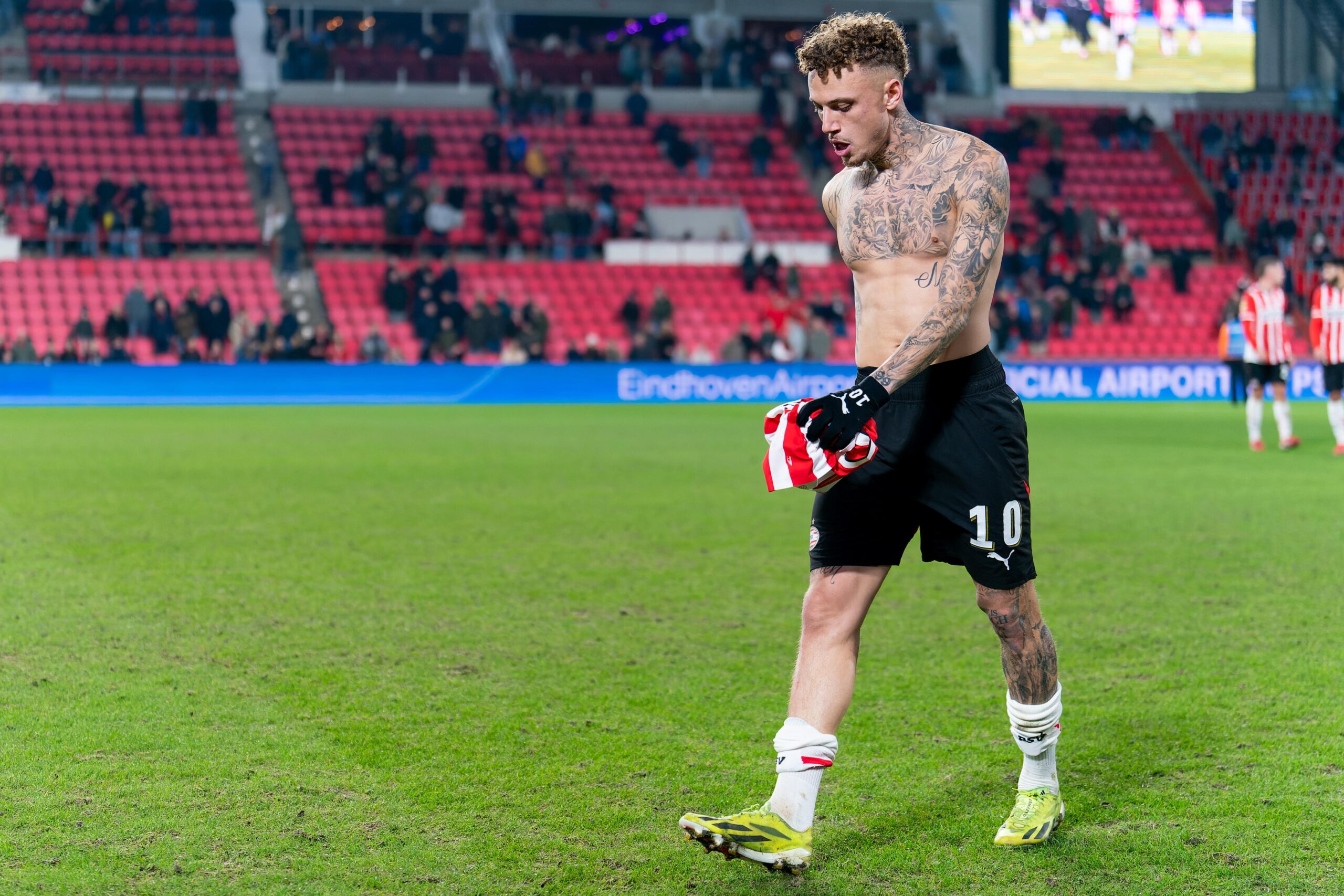
Noa Lang’s tattoos cover his chest, arms, neck and legs. Photos show dense black-and-grey work, large script and portrait pieces, but they don’t explain the reason behind every design.

Some details have been reported directly: “Fear God” lettering above his ear, portraits of Nelson Mandela and Muhammad Ali on his left leg, and “Aiden,” his son’s name, on the right thigh. For the rest, the clearest account sticks to what the photographs show.
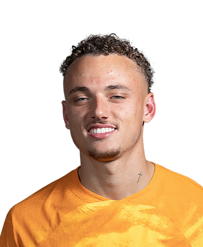
Noa Lang’s tattoo collection in one look

Noa Lang tattoos: Overall tattoo collection

The upper-body image shows heavy coverage across Lang’s chest and arms. Large script anchors the torso, with shading, faces and smaller details filling the surrounding space. The separate pieces sit close together without becoming one flat field of black.

The neck adds another visible area, while the arms change as Lang turns them. The photographs give different views of the same collection; they don’t necessarily show new tattoos each time.

The chest and arms carry the loudest visual weight

Noa Lang tattoos: Neck lettering and upper-neck placement

Lang’s chest and arms use dense black-and-grey shading, with enough open skin to keep the outlines and separate images readable. The sleeves aren’t identical: the coverage changes toward the elbows and wrists, and the angle determines which pieces are visible.

Large script takes up more room on the torso; portraits and shading sit around it. The images show the overall arrangement, but not every individual shape is clear enough to name.

The neck tattoos change the whole silhouette

Noa Lang tattoos: Forearm and front-neck detail

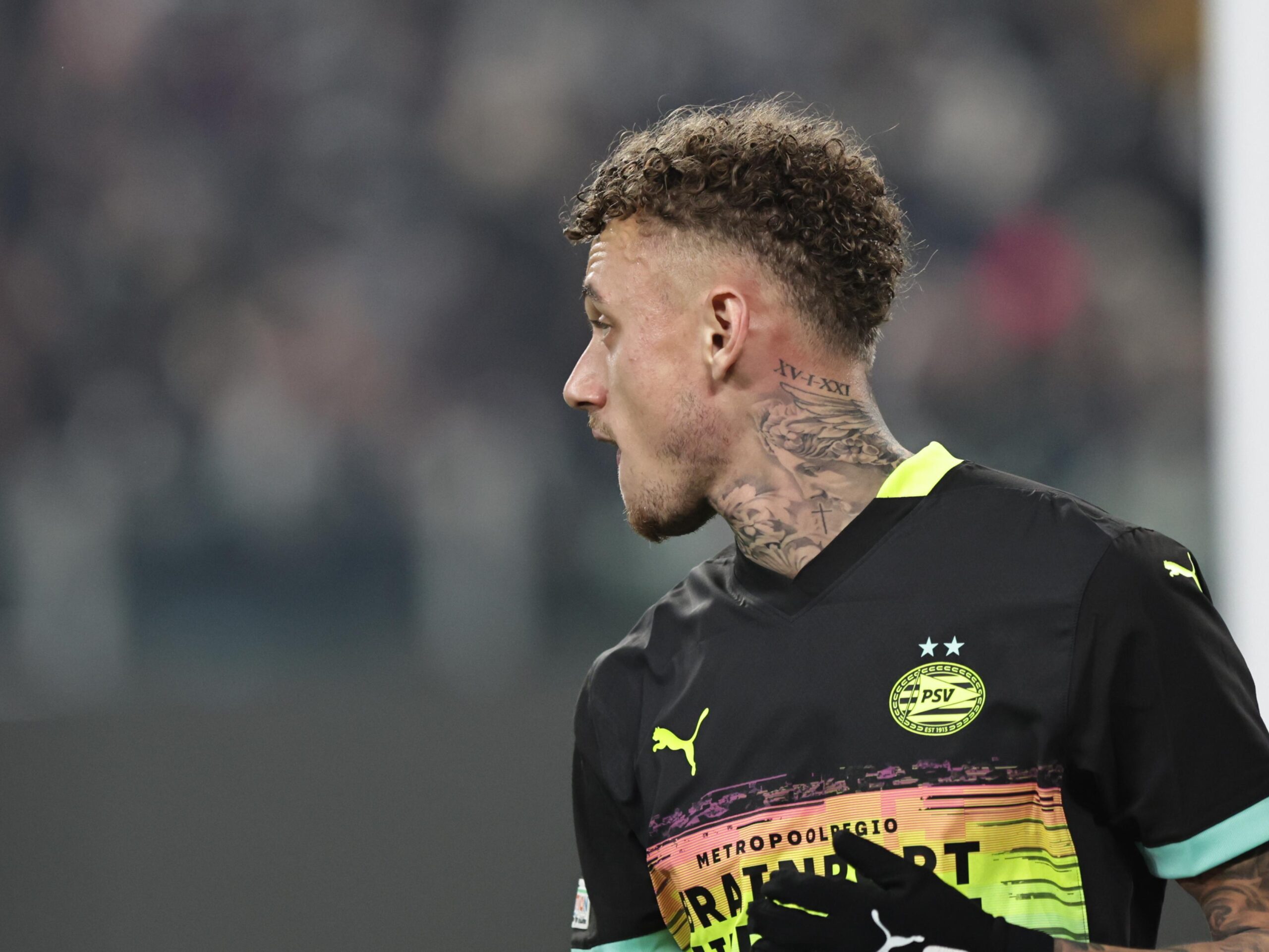
In a rear view, lettering sits below Lang’s hairline and the work continues toward his shoulders. A three-quarter view shows how the ink wraps around the neck rather than stopping at one flat panel.

Soccernews reported in May 2025 that Tattoo Chybs worked on a new piece above Lang’s ear and identified the words “Fear God.” The same report noted Lang’s objection to calling it a face tattoo. That preference matters when describing the placement.

The ink beside his ear is visible when his hair is short and changes the outline of his face. The report names the words and artist; it doesn’t give a fuller explanation of the phrase.

The forearm work reads as a dense sleeve

Noa Lang tattoos: Leg coverage and full-body scale

Lang’s forearm work wraps around the limb. A front view catches the designs facing the camera; a side angle reveals more of the coverage. The same piece can look different as he bends or turns his arm.

The photos show lettering, portraits and shading across the arm, but don’t provide exact dates for each tattoo. It’s safer to describe the overall coverage than to label a piece new because it looks darker in one image.

The leg portraits add a more personal note

Noa Lang tattoos: Profile view and neck detail

An Area Napoli report described a portrait of Nelson Mandela and one of Muhammad Ali on Lang’s left leg, running from the shin toward the knee. The report also identified “Aiden” on his right thigh as his son’s name.

The portraits have strong public associations, but the available account doesn’t establish Lang’s personal explanation for choosing each subject. “Aiden” is a family reference the report does explain. Training photos, where socks are lower than in match coverage, make these leg pieces easier to see.

Why the photographs matter more than guesses

A single photo can’t serve as a complete inventory. A shirt can cover the chest, a turned head can hide the neck, and socks can obscure leg work. The overall image shows the upper body; closer views show the ear and neck; training photos make the portraits easier to spot.

The reports identify the “Fear God” lettering and the leg portraits. Other marks can be described by placement and style without assigning them a made-up subject or meaning.

A few visual ideas worth borrowing

Lang’s tattoos show how a collection can spread across different body areas without using one motif. If you’re planning several pieces, think about how they’ll look as your arm or head turns, and how large images and lettering will sit together.

Personal references can share space with portraits and decorative work. Choose the details for your own reasons, and ask an artist to plan the layout around movement and the tattoos already there.

Marco Materazzi Tattoos: Colorful Sleeves, Wings and Personal Ink

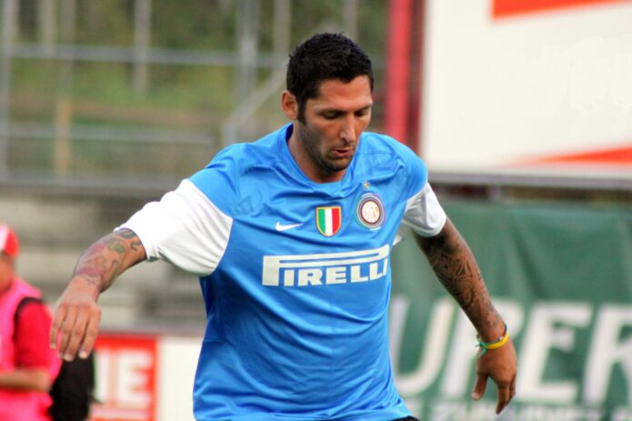
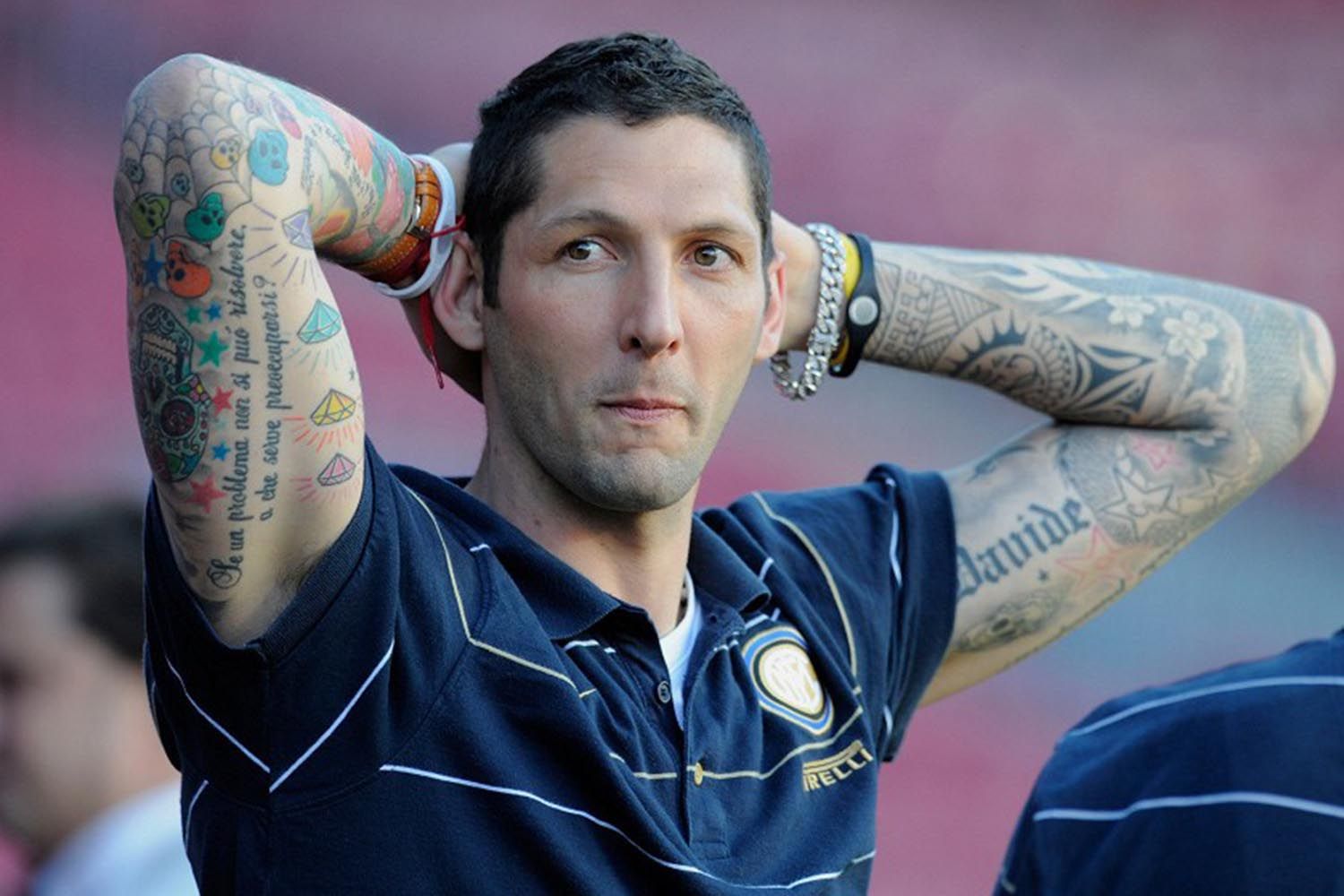
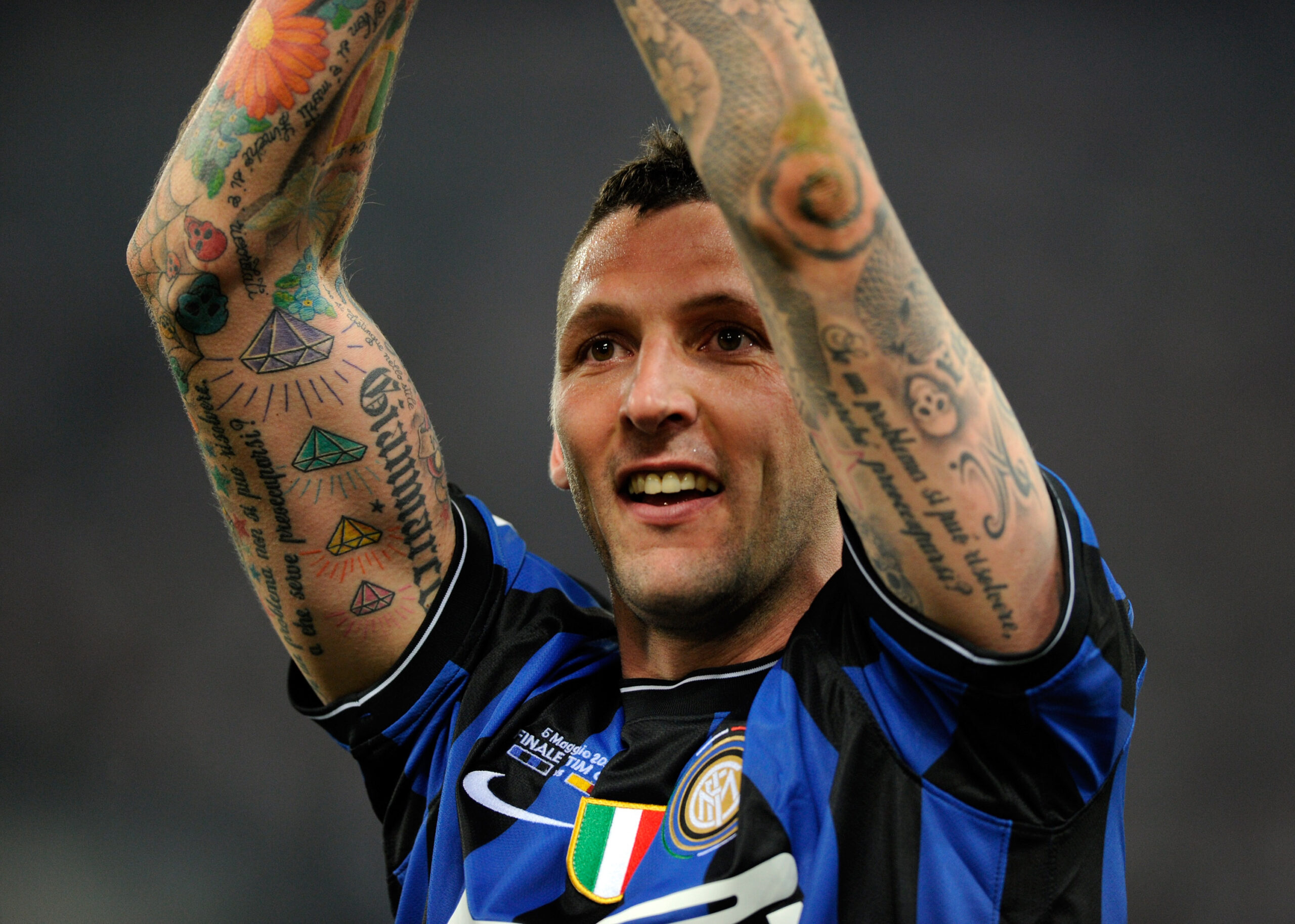
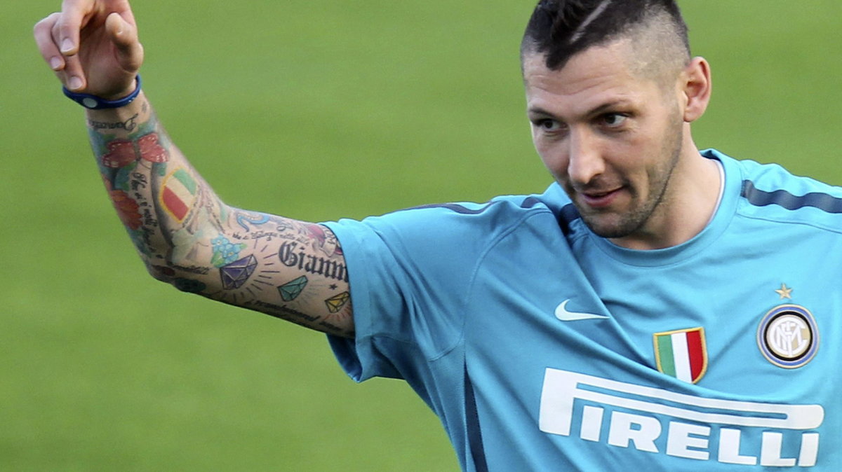
Marco Materazzi’s tattoos are easy to spot in football photos: color on his forearms, script along his arms and legs, and a large pair of wings across his back. The collection looks like it grew over time rather than following one theme.

He has spoken about tattoos connected to people close to him, including “Marco” and “Davide,” and said he wanted a Japanese geisha drawn by his friend John Richmond. Photos show other designs, but they don’t explain why he chose each one.

Marco Materazzi’s tattoo collection in one look

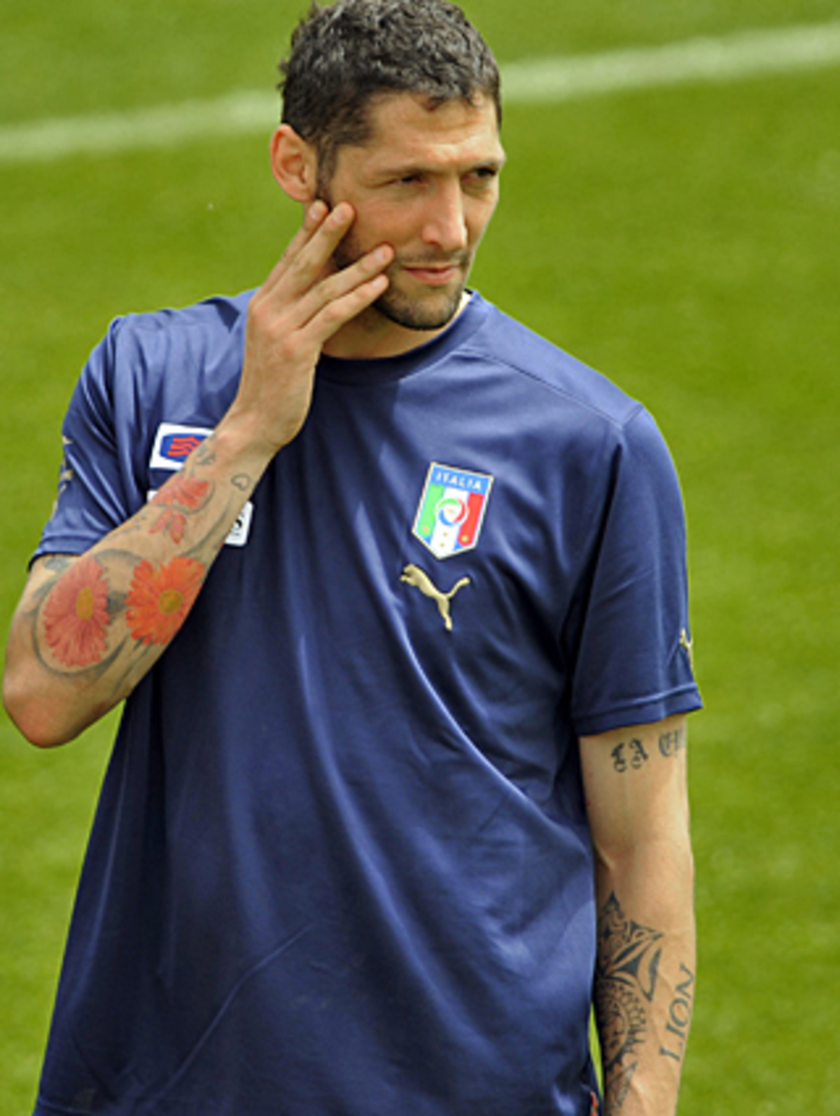
The forearms carry much of the color. One training photo shows an orange flower near the elbow, smaller motifs below it and script alongside. The other arm has darker lettering and outlines; the sleeves are full but not mirror images.

The word “LION” is visible on the inner arm in a well-known football photo. Nearby, a row of diamond shapes with small rays adds a sharper, more geometric pattern beside the flowers and script.

Marco Materazzi tattoos: Close training view of the colorful forearm work

This photograph is a genuine tattoo view of Materazzi during an Italy training session. The colorful flowers and dense arm work are clear, while the face and national-team shirt keep the image in football context.

The forearms carry the loudest visual weight

The photographs show the difference between the two arms. One leans toward colored symbols and script, while the other has heavier shading and larger lettering. Both have enough detail to read up close.

Marco Materazzi tattoos: Single-player view of both tattooed arms and readable script

Here the camera catches both forearms at once. The image is useful because it shows the balance of the collection: one side leans into colorful symbols and script, while the other has heavier shading and larger lettering.

The personal side of the collection

Materazzi has named some of the references himself. Reports place “Marco” above his right knee and “Davide” on his right calf. In a FourFourTwo interview, he also mentioned tattoos connected to friends, music, Valentino Rossi, José Mourinho and Michael Jordan, as well as the geisha he wanted John Richmond to draw.
Those details come from his comments and published reports. The rest can be described by what appears in a photo: a name, flower, diamond or line of script, without assigning it a private story.
The back piece changes the scale completely

The wings across Materazzi’s upper back create a much larger image than the arm work. In a shirtless photograph, they spread over the shoulder blades, with other tattoos continuing down the sides.

The back piece changes how the collection reads: from behind, the wings become the focal point; in match photos, the forearms tend to draw the eye first.

Marco Materazzi tattoos: Close celebration view of both raised tattooed forearms

This close celebration photograph shows the tattooed arms in motion. It isn’t a studio tattoo shot, but the raised-arm angle gives a clear view of the forearm lettering, diamond motifs and the way the sleeve bends at the elbow.
A close portrait makes the forearms look larger because they fill the frame. A full-body shot gives a different sense of scale, and a rear view shows the wings. Shirts, shorts, socks, lighting and movement can hide pieces or change how strongly the colors appear.

Why different photographs show different tattoos

This wider match photo gives context for the visible arm coverage, but it isn’t as useful for reading small designs. Close views show detail; broader frames show how the tattoos sit with Materazzi’s football kit and movement.

Marco Materazzi tattoos: Wide stadium context showing tattooed arms in motion

This wider match photograph is contextual rather than a close-up tattoo study. It still provides genuine visual evidence of Materazzi’s identity and the visible arm coverage, while the wider frame shows how the tattoos sit against the Inter shirt and stadium setting.
The collection mixes flowers, geometric diamonds, script and darker outlines. Each type reads differently: color draws the eye, lettering creates a line across the arm, and larger images carry weight through their size. That variety keeps the sleeves from becoming one dark surface.

If you’re planning a larger piece, consider how the design will look as the arm turns and bends. Leave room around lettering and larger images so the separate parts remain readable from more than one angle.

The collection mixes color, script and heavy outlines

Marco Materazzi tattoos: Side training view showing the sleeve wrapping around the arm

The side-on view shows how the arm coverage wraps around the limb. Details disappear toward the back of the arm, then return as the player turns. That changing view is part of the tattoo, not a flaw in the photograph.
The lower-body tattoos are easier to miss in football photos. Reports identify “Marco” above the right knee and “Davide” on the right calf; older images also show larger designs around the calves and thighs. The names are simpler than the colorful forearm work, and the leg gives each a longer vertical space.

Socks and shorts can cover much of the legs, so training photos may reveal work that match images don’t. That change in view doesn’t mean the tattoo is new.

The lower-body work is easy to miss

Materazzi’s collection includes several kinds of reference: people close to him, football figures, music and designs chosen for their appearance. A single theme isn’t needed to make the pieces feel connected.

Contrast helps the eye move through a sleeve. Plan for how it looks from the front and side, and think about how new work will sit beside older pieces. Personal names and larger designs can share space without matching in subject or size.

The photos show the colorful arm work, readable names and winged back piece. Where Materazzi hasn’t explained a design, its appearance is enough; the reason can remain his.

Three layout ideas worth keeping

Nadine Lustre Tattoos: Lotus, Dragon, Lyrics and Minimalist Ink

Some of Nadine Lustre’s tattoos are small enough to miss; others, like the dragon on her right shoulder and upper arm, cover more space. She has described tattoos as art and as notes to herself.

Her collection includes a song lyric, flowers, a moon, Japanese lettering, short calf phrases and the dragon. She has explained some of the meanings in interviews; the photos show the placement and appearance of the rest.

The Tadhana Lyric on Her Forearm

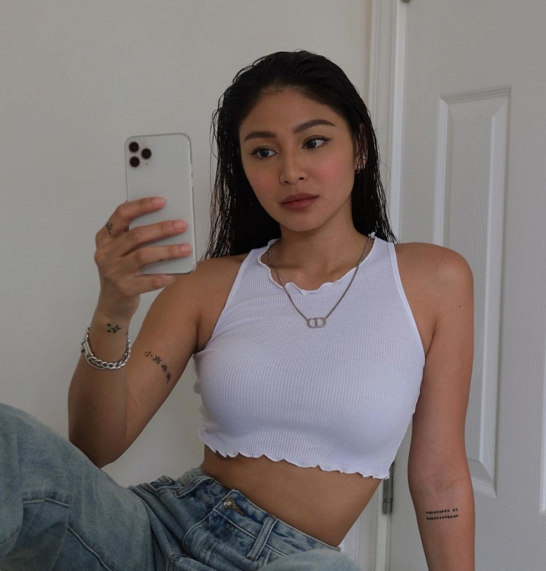
The words on Nadine’s inner forearm are “Nakayapak at Nahihiwagaan,” a lyric from Up Dharma Down’s “Tadhana.” She said the song was a favorite of her late brother and that she got the line around the anniversary of his death. She has also connected it with childlike innocence.

Nadine Lustre tattoos: close view of the documented forearm lyric tattoo

The small black lettering sits where she can see it during the day. The reason she gave for choosing it is more specific than the photo alone: it’s tied to her brother, the song and that anniversary.

The Lotus on Her Upper Arm

Nadine told Dr. Aivee Teo that the lotus’s growth through mud and water reminded her of moving through difficult periods and finding light. She described it as a reminder to rise above trials.

Nadine Lustre tattoos: clear upper-arm view of the documented lotus tattoo

The shaded flower sits high on her upper arm. Its layered petals make a compact design that can stand on its own, while the placement lets it show with a sleeveless top or disappear under a sleeve.

The Rose and Her Smaller Wrist Ink

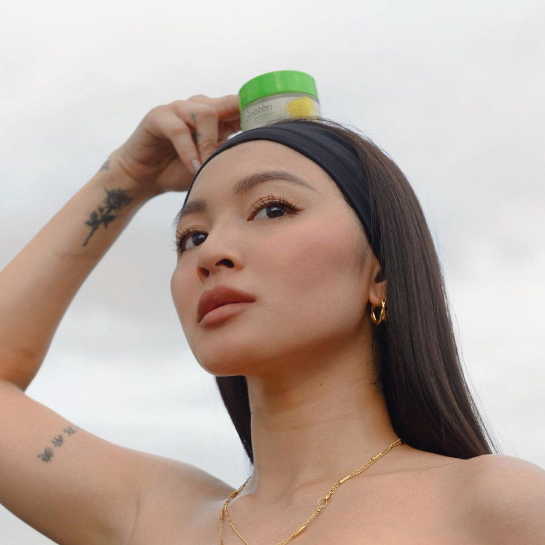
The rose on Nadine’s wrist was one of her first tattoos. She has described it as an act of self-love: a way of giving herself a flower when she was struggling to love herself.

Nadine Lustre tattoos: wrist and arm view of the documented rose tattoo

The photo shows the flower among other small marks on her arm. It can look softer at a casual angle than in a close view, but the rose and its wrist placement match the published account. Its size is small; the meaning she gave it is not.

The Crescent Moon Wrist Tattoo and Japanese Name

A crescent moon sits on the wrist opposite the rose. Nadine has connected it with Coldplay’s “Everglow” and remembering people close to her who have passed away.

The same relaxed portraits show lettering on her arm and marks on her fingers. She explained that the Japanese characters refer to “Nozomi Komiya,” a name tied to her family history. “Nozomi” means hope, like her own name; “Komiya” was the family name carried by her great-great-grandfather before it changed.

Nadine Lustre tattoos: mirror-selfie view of the documented crescent moon and arm lettering

In 2021, Nadine added “That’s it” to one calf and “It is what it is” to the other. She said the first phrase came from a meaningful trip to La Union with a close friend she considers like a brother. She was recording her album Wait for Me at the time, and the tattoo reminds her of what they learned together.

She has explained the second phrase as a way to accept what is outside her control. The matching scale and plain lettering make the two pieces feel like a pair, though each has its own story.

How the Rest of the Collection Fits Together

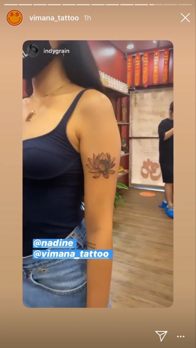
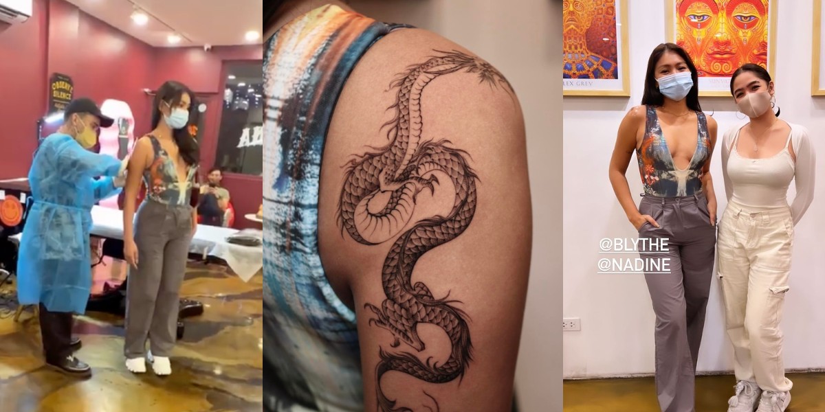
PhilSTAR Life reported that the dragon runs from Nadine’s right shoulder toward her upper elbow. It was her first large, prominent tattoo. Vimana Tattoo shared images of the session, and the published coverage credits artist Indygrain.

Nadine Lustre’s Dragon Tattoo

The long design follows the curve of her shoulder and upper arm, making it more visible than the fine-line pieces. The reports identify the tattoo and its placement, but don’t confirm a private reason for choosing a dragon. Any symbolism beyond what Nadine has said would be speculation.

Nadine Lustre tattoos: session and close-up view of the documented dragon tattoo on the upper arm

The smaller tattoos remain part of the story even beside the dragon. The forearm lyric, lotus, rose, moon and calf lettering sit in different places and carry different memories; none needs to be treated as a footnote to the largest design.

Their placements also let Nadine choose when to show them. Wrist and finger marks are easy to see, upper-arm pieces can be covered, and the calf phrases appear when she wears clothing that reveals them.

Why the Smaller Pieces Still Matter

The photographs show the lotus, rose, moon, forearm lyric, calf phrases and dragon, but not always in the same frame. Interviews supply the meanings Nadine has shared. Later removal coverage suggests some older, heavier lines may have changed or softened over time, so the photos are not a permanent, complete inventory.

A close crop can make a small mark easier to see; a casual portrait shows how the tattoos sit in everyday life. Both are useful, as long as a shadow or blurred line isn’t turned into a new design without evidence.

What Nadine’s Photos Can Actually Confirm

Nadine discussed her tattoos with Dr. Aivee Teo and described them as art and stories tied to the person wearing them. The conversation gives her own context for the lotus, rose, moon and forearm lyric; the dragon is documented in separate coverage, without a confirmed personal explanation.

Taken together, the pieces range from a family memory to short phrases and a larger arm design. They don’t have to share one style to feel personal.

Seeing the Collection in Motion