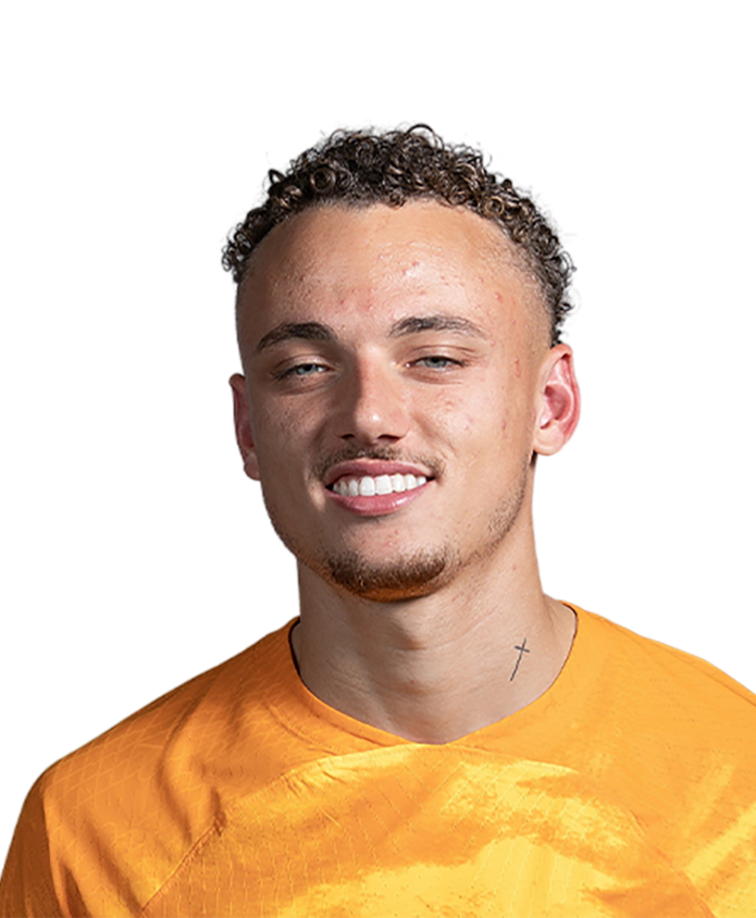
Noa Lang’s tattoos are hard to miss once he takes off the long socks and stops moving for a second. The PSV and Netherlands forward has built a collection that runs across his chest, arms, neck and legs, with portraits, lettering and dense black-and-grey work all sharing the same canvas. It isn’t a neat little set of matching symbols. It feels more like a visual scrapbook that has grown with him.
There are a few details we can describe with confidence, including the words “Fear God” above his ear and the portraits reported on his left leg. Other pieces are easier to see than to explain. That difference matters. A clear photograph can prove where an image sits, but it can’t automatically reveal what Lang was thinking when he chose it.
Noa Lang’s tattoo collection in one look
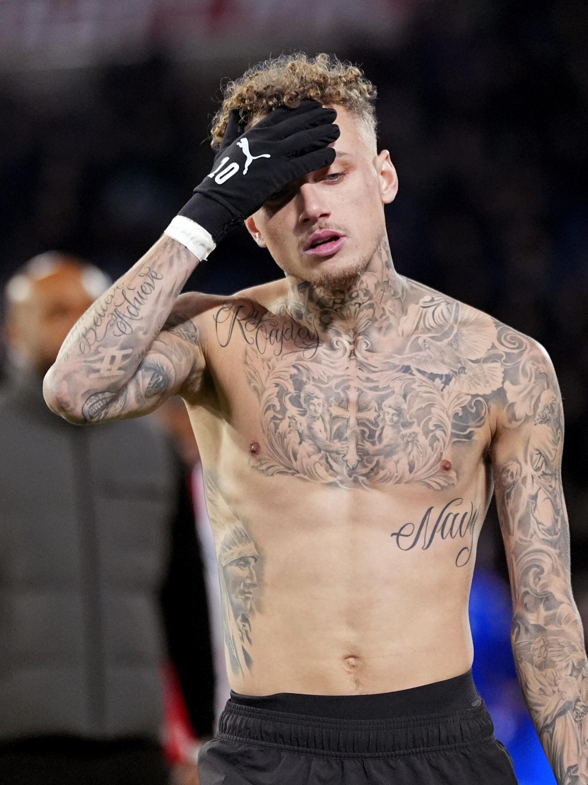
The strongest overall view shows a heavily tattooed upper body. Lang’s chest is covered with layered black-and-grey work, while both arms carry enough ink to read as serious sleeve coverage. Large script across the torso gives the eye a recognisable anchor, but the surrounding work is what creates the bigger effect: shading, faces, ornamental lines and smaller details packed close together without looking like one flat block.
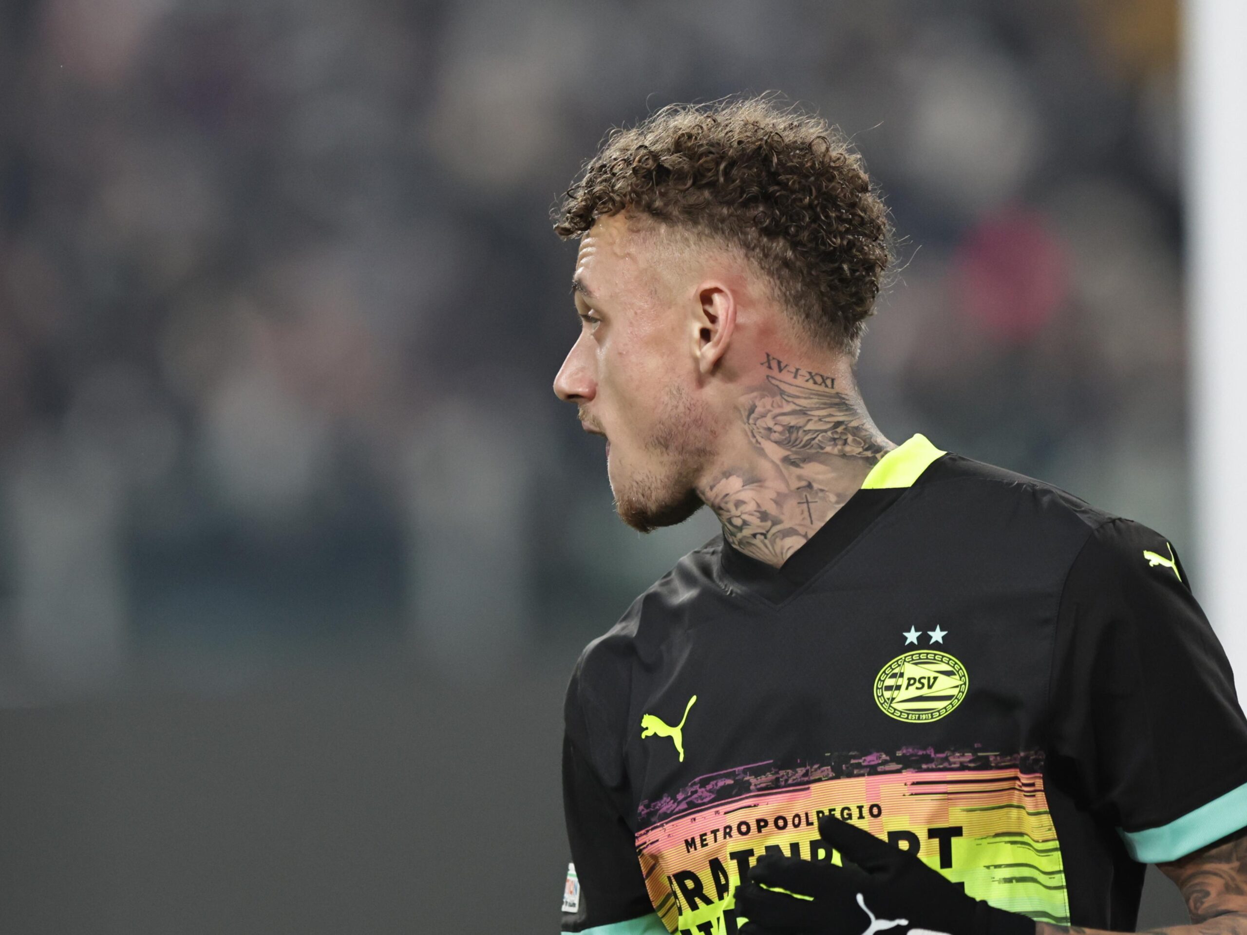
His neck adds another focal point. The ink climbs from the shoulders toward the sides and front of the neck, so it stays visible even when a shirt covers most of the chest. That placement changes the silhouette more than a hidden rib or back tattoo would. It is also why different photographs of Lang can look completely different. One pose puts the chest first. Another turns the neck into the main subject.
The collection works because it has several scales at once. There are broad areas that carry the visual weight, medium-sized images that fill the spaces around them and smaller marks that only show up in a closer frame. That mix keeps the body art from reading like a single wall of black.
The chest and arms carry the loudest visual weight
Lang’s chest and arm work are the parts most people notice first. In a close photograph, the shading is dense but not completely opaque. Skin breaks keep the individual elements readable, while the darker outlines stop the whole thing from fading into grey. The result is a classic black-and-grey look with a lot of movement across the body.
His arms don’t look like identical sleeves. The coverage changes as it travels toward the elbows and wrists, and the photographs show different sections depending on how he holds them. That makes the collection feel lived in rather than designed as a one-day matching set. A tattoo can be part of a sleeve without needing to copy the image beside it.
The large script on the torso is another useful example of scale. It takes up enough room to be noticed at a distance, but the surrounding portraits and shading keep it from feeling isolated. If you’re planning a large chest piece, that balance is worth thinking about. A single word can be the centre of attention, or it can become one layer in a much bigger composition.
It would be easy to turn every visible shape into a confident identification, especially when a photograph is cropped or the light is poor. The safer read is broader: Lang has extensive chest and arm coverage, and the images show a mixture of lettering, portrait-style work and ornamental shading. That is enough to understand the style without inventing a catalogue.
The neck tattoos change the whole silhouette
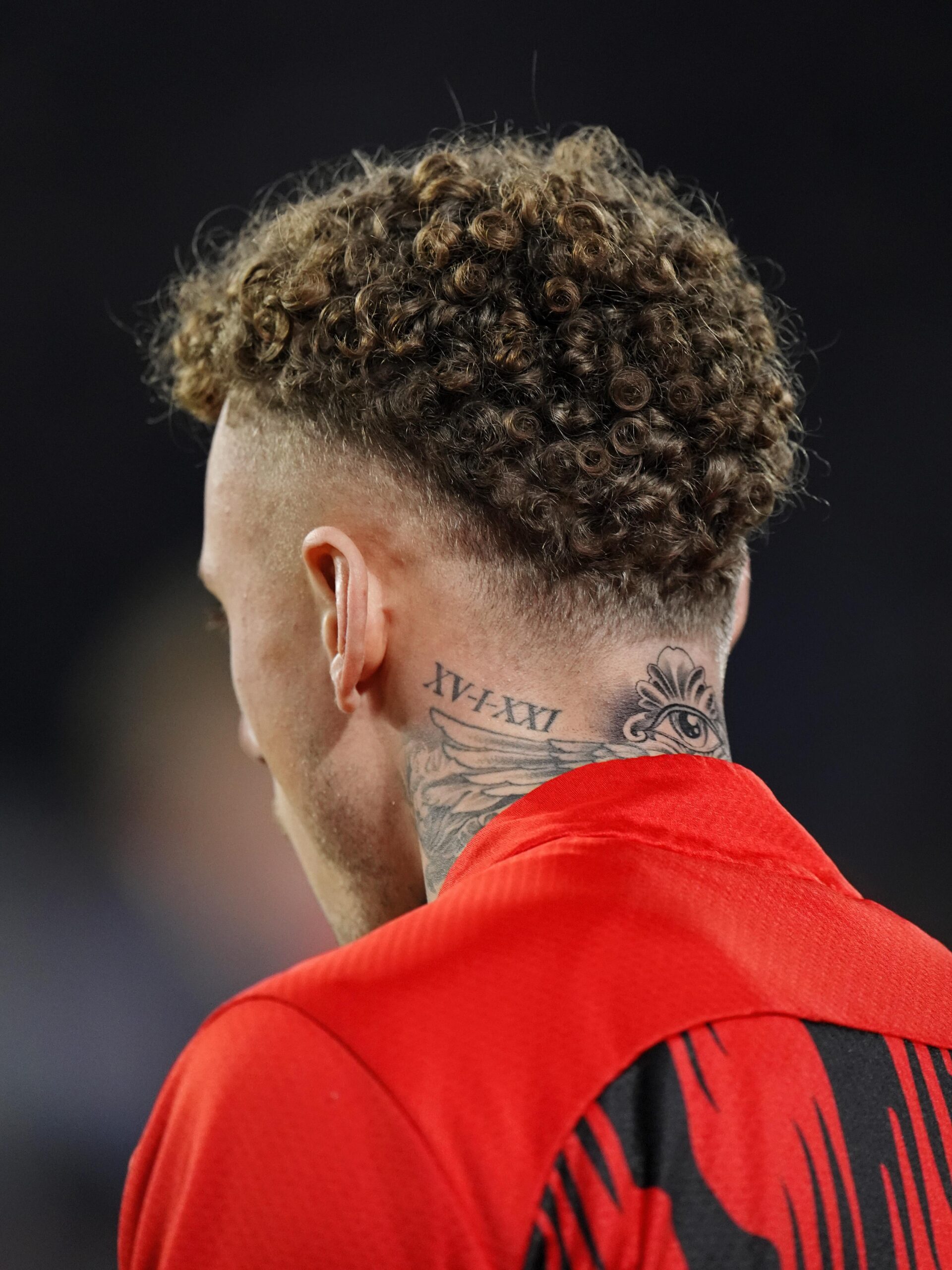
Neck tattoos are rarely quiet, and Lang’s are no exception. One of the clearest views comes from behind, where lettering sits below the hairline and outlined work continues down toward the shoulders. A second angle shows how the ink wraps around rather than stopping at a single flat panel.
This is where comparing photographs really helps. The rear view makes the lettering easier to see. The front three-quarter view brings the neck portraits and front-of-neck lines into play. They aren’t necessarily different tattoos just because the angle changes. They are different pieces of evidence for the same area.
In May 2025, Soccernews reported that Tattoo Chybs had worked on a new piece above Lang’s ear. The report identified the words “Fear God” and also included Lang’s objection to calling it a face tattoo. That small exchange is useful because it shows how a placement can be described differently by the artist, the wearer and the people looking at a photograph.
Whatever label you use, the location makes the piece unusually visible. Ink beside the ear appears whenever the hair is short, and it sits close enough to the face to affect the entire look. It also joins the neck work without requiring a full blackout or a single connected design.
The forearm work reads as a dense sleeve
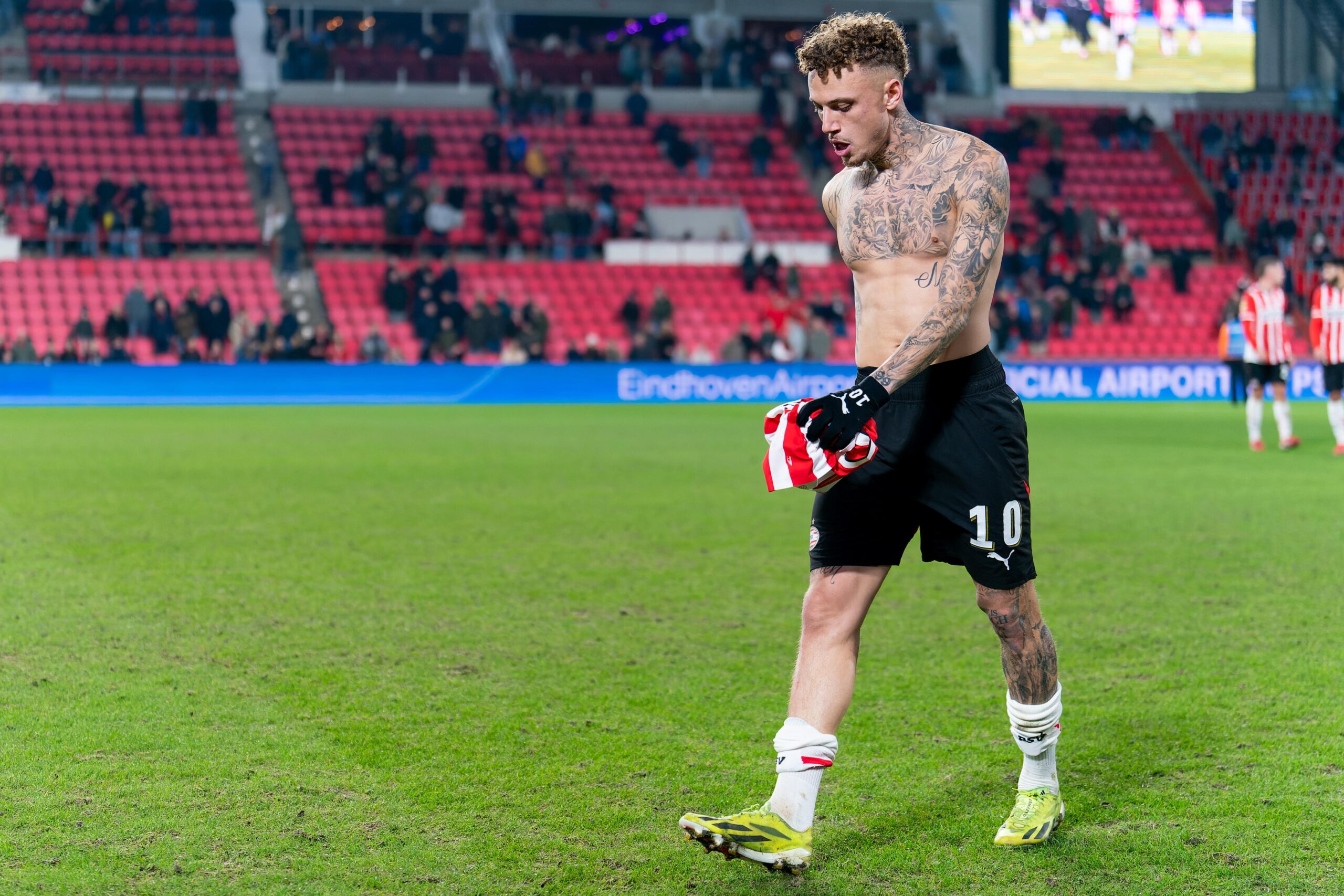
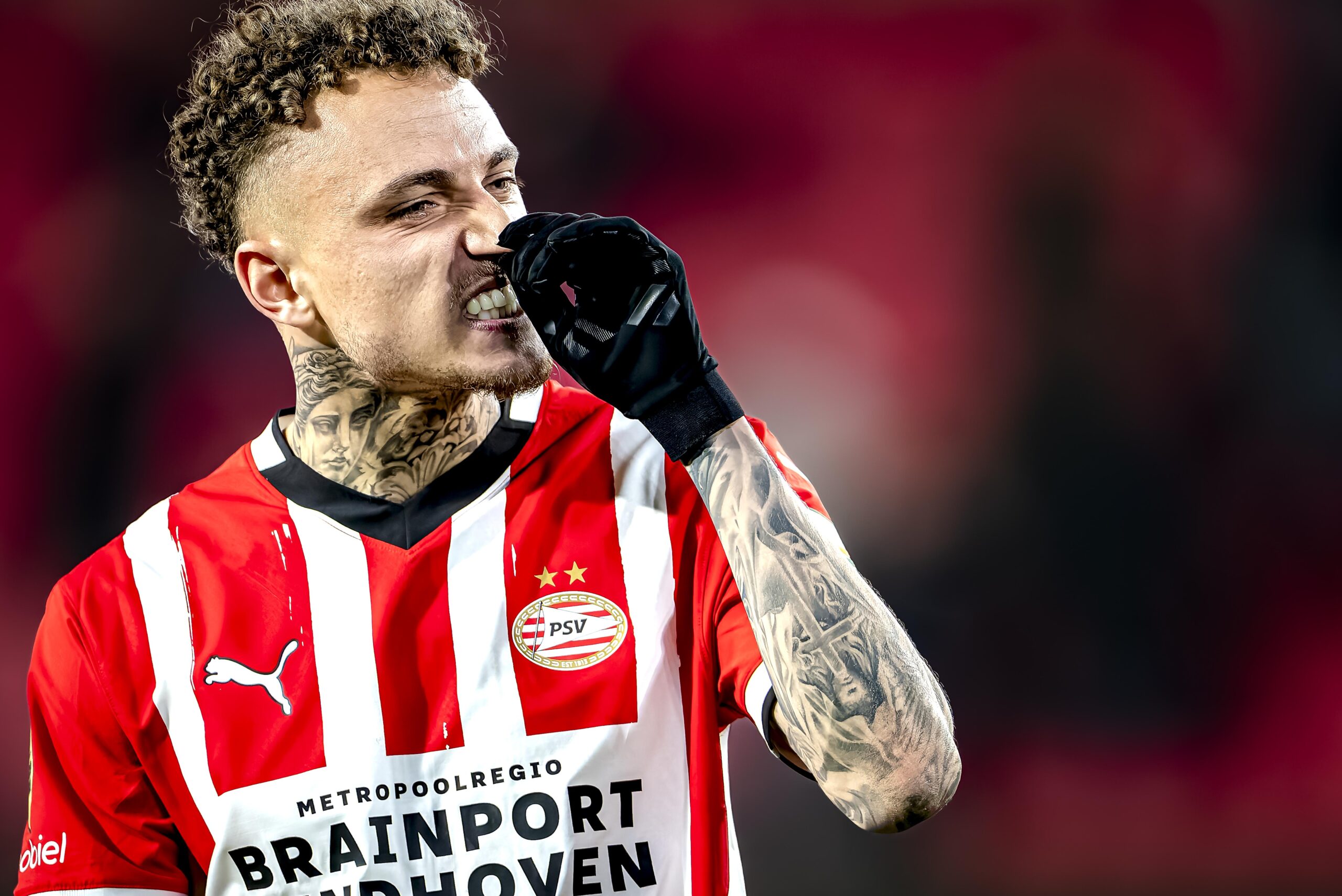
Lang’s forearms show why sleeve tattoos need to be studied in motion. A front-facing image catches the pieces that sit toward the camera. A side view reveals the wrap. When his arm bends or he raises a glove, different sections disappear and return. The collection isn’t one poster pasted onto the skin; it follows the shape of the limb.
That makes the arm work a useful reference for anyone thinking about a sleeve. Start with the flow around the arm, not just the design on a phone screen. Portraits, script and shading need to leave enough room for the body to turn. If every important line is aimed straight ahead, the tattoo can look unfinished from the side.
The visible photographs also show the difference between an older piece and a new addition without pretending to know exact dates for every tattoo. Some parts appear softer and more settled. Others have stronger contrast or stand out because the angle catches them. Ink changes with time, skin, light and distance. A collection should be read across several photographs, not judged from one perfect-looking crop.
There is a relaxed, slightly rebellious quality to the whole arrangement. The pieces don’t seem chosen to make the body look untouched except for one carefully isolated symbol. They are allowed to overlap visually, and that gives the sleeves a more personal feel. The consistency comes from the black-and-grey treatment and the way the work follows the arms.
The leg portraits add a more personal note
Recent training photographs gave a clearer look at Lang’s legs than match-day images usually do. An Area Napoli report described a portrait of Nelson Mandela and a portrait of Muhammad Ali on the left leg, with the work running from the shin toward the knee. The same report identified “Aiden” on the right thigh as a reference to his son.
Those names give the lower-body ink a different feel from the more decorative chest and arm coverage. Portraits of Mandela and Ali carry obvious public associations with resilience, courage and resistance, but we should stop short of claiming a private explanation Lang hasn’t given. The visible subjects are documented. Any deeper personal meaning belongs to him.
The “Aiden” lettering is simpler and more direct. Names are one of the most common tattoo choices for a reason: they don’t need a complicated symbol to be personal. On the thigh, the word has room to sit clearly and remain readable when the leg is moving. It also adds a softer family reference to a collection that can look intense at first glance.
Leg tattoos are easy to miss in football coverage because socks and shorts create hard boundaries. Training is different. When the socks drop, the pieces become part of the visible outfit. That change in context doesn’t make the tattoos new, but it does make their scale easier to understand.
Why the photographs matter more than guesses
Celebrity tattoo coverage often gets messy when one photograph is treated as a complete inventory. A chest piece can disappear under a shirt. A neck tattoo can look like a new design when the head turns. A full-leg portrait may be hidden for an entire match. When those images appear months apart, it is tempting to count every change in angle as a new addition.
Lang’s collection rewards a slower approach. Use the close chest photograph to understand the density of the upper body. Use the rear view to study the neck lettering. Use the front action shot for the forearms. Use the training image for the leg portraits and the name on the thigh. Each picture adds something different, even when some of the same ink appears in more than one frame.
Visible does not always mean fully explained. That is the most useful rule here. We can describe the “Fear God” lettering because it was reported. We can identify the portraits because the later report names them. We can describe the shape, placement and tone of the other work without turning an unclear detail into a made-up symbol or a confident story.
A few visual ideas worth borrowing
The first lesson is to think in body zones. Lang’s chest, arms, neck and legs each have their own rhythm, but they still feel like one collection because the treatment stays mostly dark, detailed and portrait-led. You don’t need one giant piece covering everything to get that effect.
The second is to plan for movement. A tattoo on the neck or forearm will be seen from several directions. Before committing to a design, look at the reference with the arm down, bent and turned. The best sleeves keep their balance even when the wearer isn’t standing square to a camera.
The third is to let personal and visual tattoos sit together. A name like “Aiden” can share space with a historical portrait. Script can sit beside ornamental shading. The pieces don’t have to use the same subject to belong to the same body. Placement, contrast and the artist’s linework can do the connecting.
Finally, don’t force an explanation where none is public. A tattoo can be a tribute, a private reminder, a design someone simply liked or a choice that made sense on the day. Lang’s photographs already give us plenty to look at: the chest coverage, the wrapping sleeves, the neck lettering, the ear piece and the leg portraits. That’s a strong collection without pretending to know what he has kept to himself.