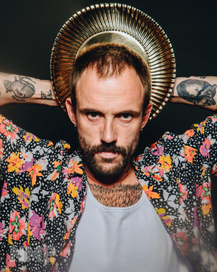
Joe Talbot’s tattoos suit the way he performs with IDLES: direct, busy, a little rough around the edges and full of references that mean more when you know where they came from. The singer’s arms, hands and neck carry a mix of lettering, portraits, symbols and small marks. They don’t look like one carefully planned sleeve built around a single theme. They look collected over time, with each piece adding another bit of history to the person standing at the microphone.
The clearest reporting comes from a GRAMMY.com interview in which Talbot talks about several pieces himself. The list includes an Otis Redding tattoo on his arm, a chair, Biggie Smalls, Frida Kahlo on his left hand, Bill Murray’s face and the word “pops” on his neck. That is enough to build a useful picture without pretending that every line visible in a concert photograph has a confirmed explanation.
Photos add the visual side of the story. Talbot’s tattoos are easiest to see when he is wearing a short-sleeved shirt and moving around onstage. A microphone, raised arm or bright light can reveal one design while hiding another. The photographs below are arranged to keep the documented pieces separate from wider portraits that simply show Talbot in his IDLES setting.
Joe Talbot’s arm tattoos
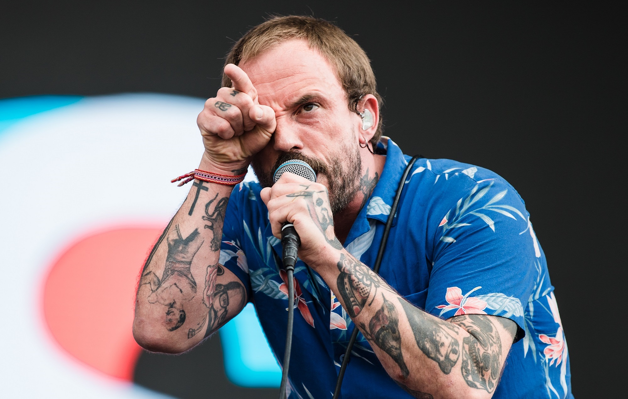
The most obvious part of Joe Talbot’s collection is the work running across both arms. In the close live photograph, the forearms show black-and-grey images, lettering and smaller designs packed together without a lot of empty skin. His hands add their own marks, while the neck tattoo rises above the collar line. It is the kind of collection that changes depending on the angle: a front-facing portrait makes the hand work stand out, while a raised arm brings the outer forearm into view.
That photograph is strong visual evidence for the presence, placement and general style of the ink. It does not establish the meaning of every portrait. The useful description is therefore fairly simple: Talbot wears a dense collection of traditional-looking black outlines, shaded figures, lettering and symbols across his arms and hands. The shapes are readable as tattoos, but a close visual match is not the same thing as a confirmed backstory.
There is a nice contrast between the variety of the designs and the limited colour palette. The tattoos stay mostly dark against the skin, so a rose, face, cross or block of lettering can sit beside another piece without looking like it belongs to a different person. The result is not a blank-space minimalist approach. It is more like a scrapbook, where the value comes from the number of small references gathered together.
The Otis Redding tattoo and the musical side of the ink
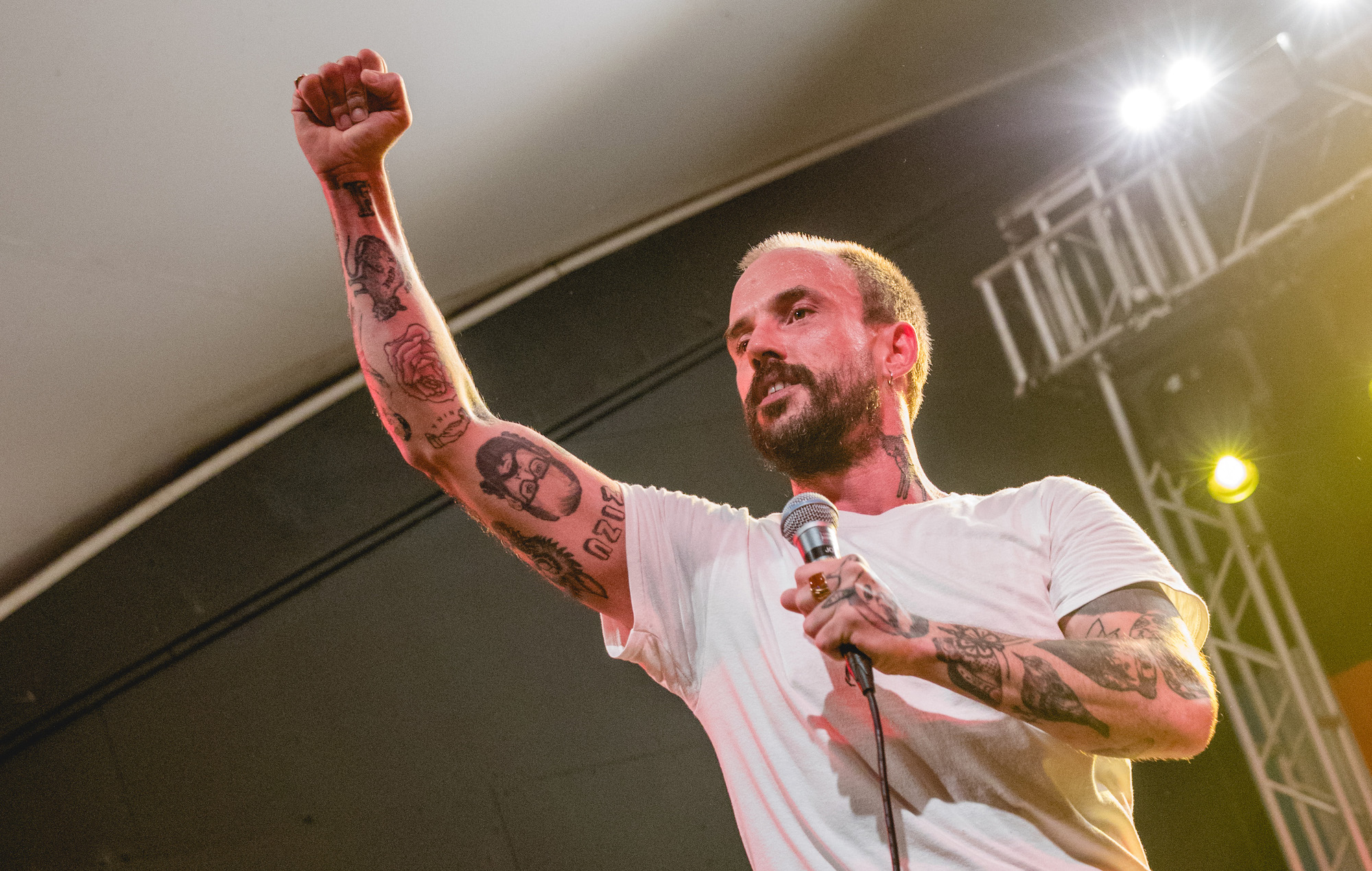
Talbot specifically told GRAMMY.com that he has Otis Redding tattooed on his arm. That detail gives one of the visible portrait-style pieces a firm identity. It is not just an anonymous face in a photograph; it is a tribute to a singer whose music matters to Talbot and to the way he thinks about soul, performance and emotional honesty.
He brought up the tattoo while discussing “Beachland Ballroom”, an IDLES song shaped by his love of soul music. That link is useful because it shows how the ink sits beside his creative life. The tattoo is not presented as a piece of band merchandise or a random celebrity portrait. It connects a musician he admires with the sound Talbot was trying to make.
Portrait tattoos can be difficult to read in a moving concert image. A microphone may cover the lower face, stage light can flatten the shading and a bent arm can distort the proportions. The photograph still shows that Talbot’s arm contains portrait-led work, while the interview provides the name Otis Redding. Those two forms of evidence work together without requiring an exaggerated claim about the exact size or position of every line.
If you like the idea of a portrait tattoo, the lesson is to choose the person before choosing the pose. A favourite musician, writer or family member brings a reason to the design. The face then becomes part of a larger memory rather than a picture chosen only because it looks impressive in a reference folder.
A few personal references
The GRAMMY interview names several more pieces: a chair, Biggie Smalls and Frida Kahlo on Talbot’s left hand. It also mentions Bill Murray’s face and the word “pops” on his neck. That is a surprisingly personal combination. Some references point toward music, some toward film or art, and some seem to carry a more private joke or family connection.
A collection like this is a good reminder that celebrity tattoos do not always follow a tidy visual brief. Talbot’s arm can hold a portrait of a soul singer next to a simple object, while the hand carries a cultural figure and the neck uses a short word. The designs don’t need to match in style to belong together. The common thread is the person choosing them.
The word “pops” is especially easy to notice because neck lettering has a different relationship with clothing. It can appear above a T-shirt collar, disappear under a buttoned shirt and become part of a face-on portrait even when the rest of the arm work is hidden. Talbot explained the family connection behind that piece, which makes it more useful to discuss as a specific mark rather than call it generic neck script.
Why stage photos reveal more than a list
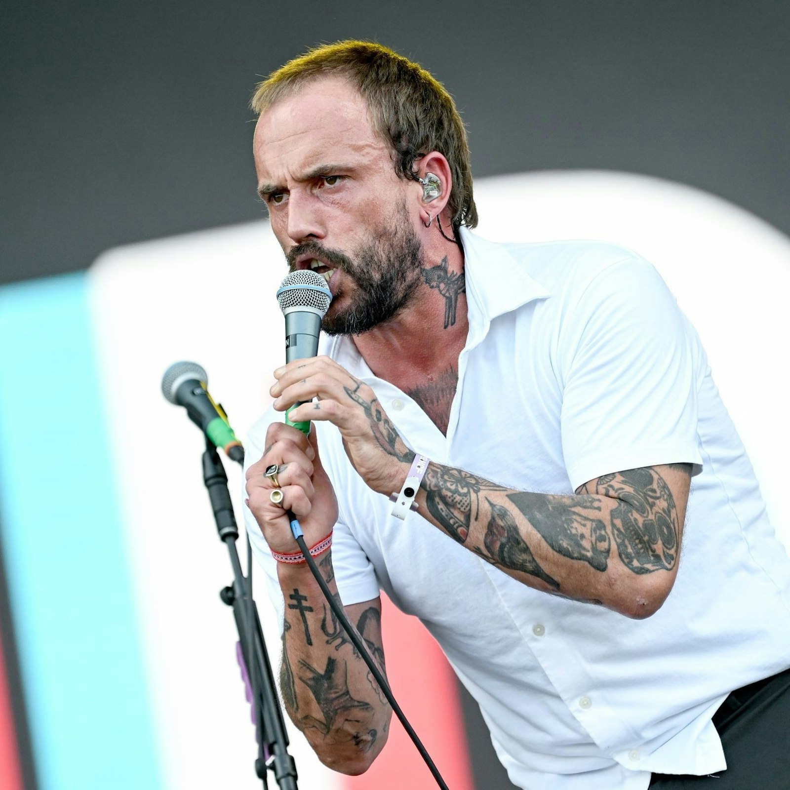
Concert photographs are a big part of Talbot’s tattoo record because IDLES shows are so physical. He leans into the crowd, grips the microphone, throws an arm up and changes direction constantly. A still image catches one arrangement of the body. In the next frame, the same tattoo may be hidden by a sleeve, a hand or a cable.
This square stage portrait is useful for context. It shows Talbot’s face, clothes and performance posture, and the neck and arm work are visible in the wider scene. It is not a close enough frame to name a new design with confidence, so the confirmed descriptions stay with the pieces identified in the interview.
That distinction matters when building a tattoo guide from public images. A photograph can prove that a person was at a concert, wearing a particular shirt or showing a tattooed arm. It cannot automatically prove that a blurred shape is a portrait, a word or a particular symbol. Keeping those jobs separate makes the article more believable and gives readers a better idea of what they are actually looking at.
A closer view of the festival frame
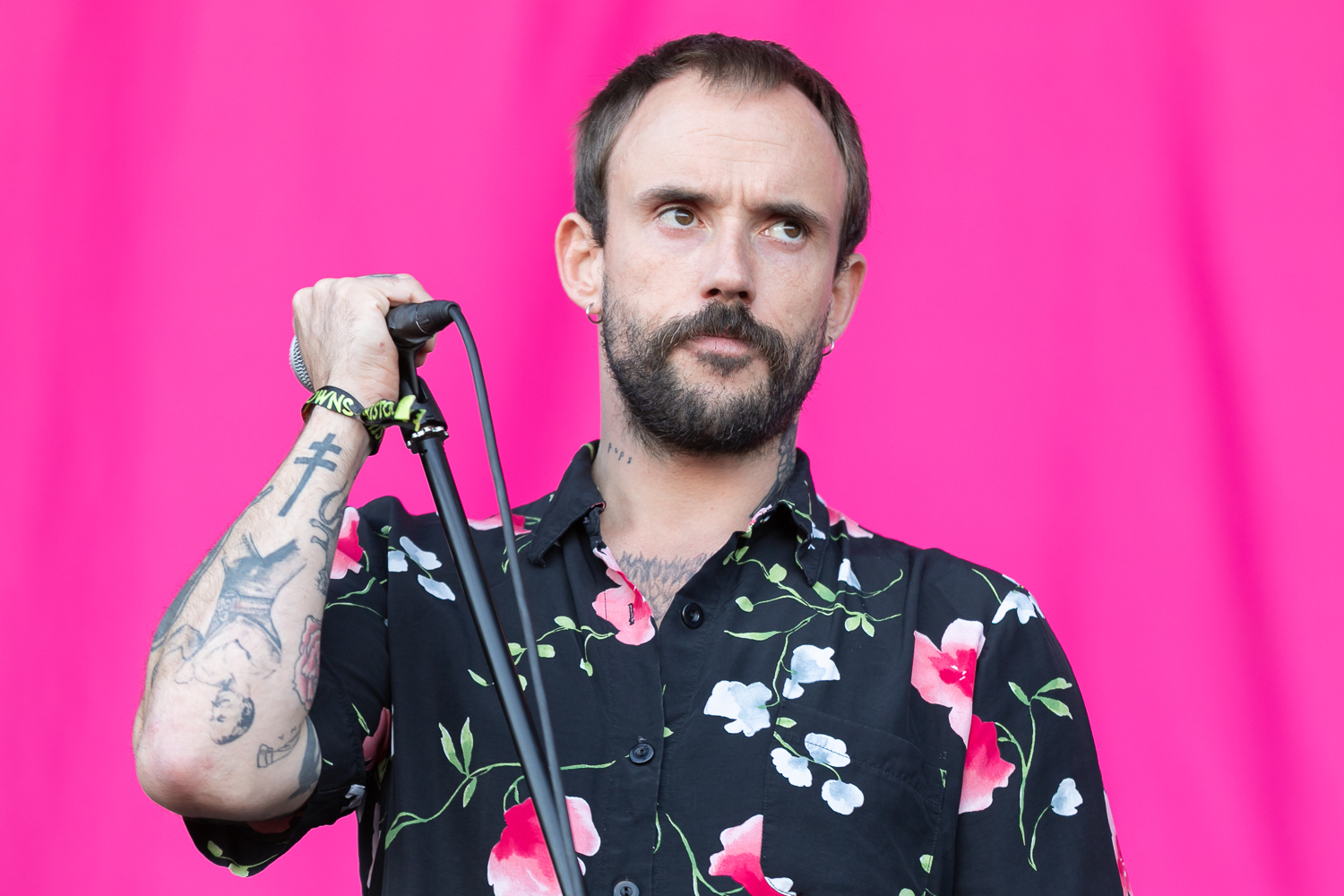
Talbot’s neck and hands change the feel of the collection. Arm tattoos can disappear when a shirt is rolled down, but hand and neck pieces stay closer to the face. That makes them part of his everyday public image, not only something visible during a shirtless photograph or a tattoo reveal.
The “pops” lettering around his neck is the clearest named example. The GRAMMY interview also identifies Frida Kahlo on his left hand, a detail that makes sense beside the singer’s wider interest in art and cultural references. The pieces do not need a matching border or colour scheme. Their connection is the meaning Talbot gives them and the way they sit on areas that are hard to hide.
The festival image gives a useful sense of scale. Talbot’s neck work appears above the shirt, while the raised hand and forearm show how close the designs are to his gestures. When he holds a microphone, the hands become part of the performance language. A tattoo that might look small in a still portrait can become very noticeable when the same hand is lifted toward a crowd.
Joe Talbot’s public image away from the microphone
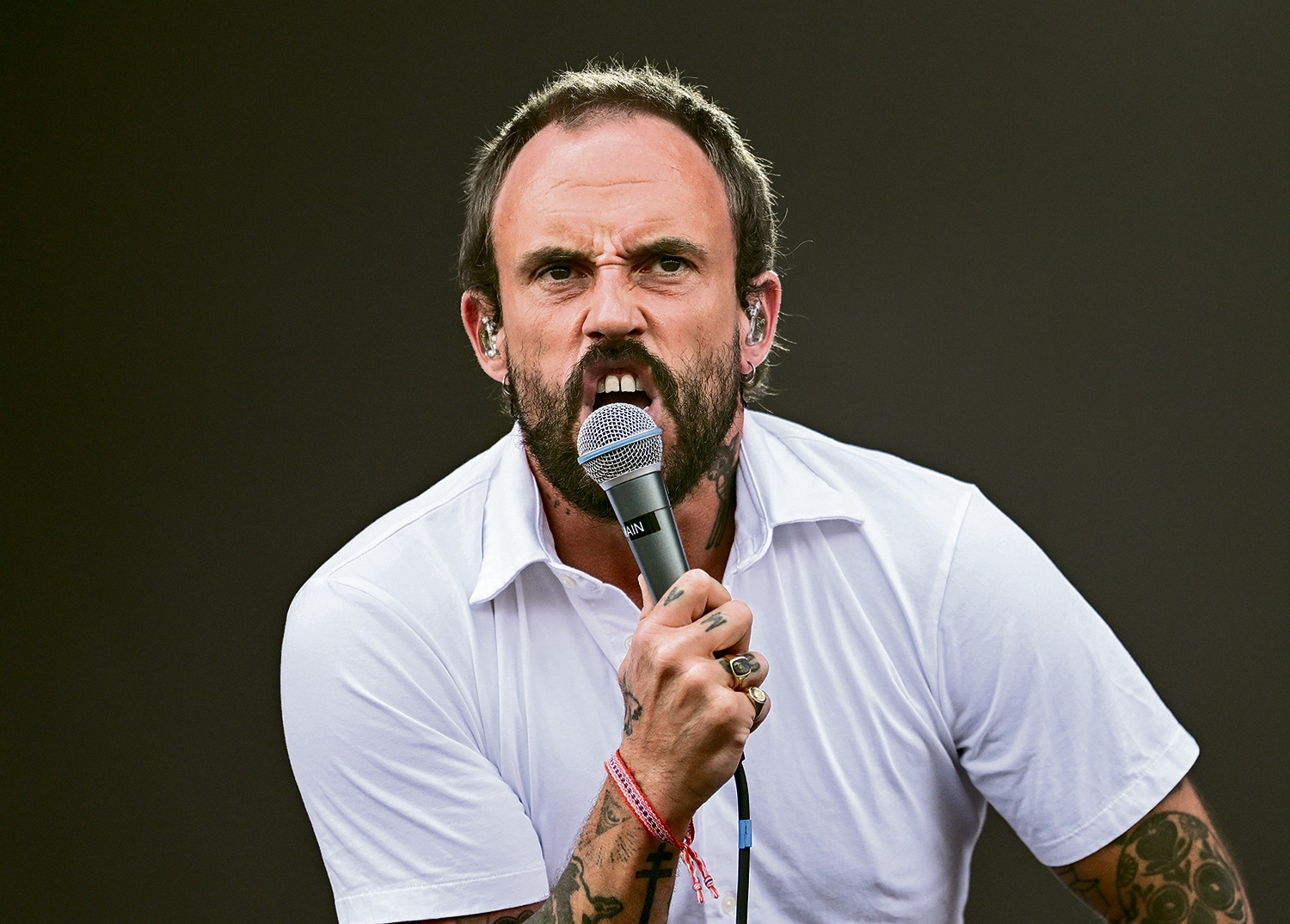
Talbot’s image is usually tied to intensity: a shouted lyric, a tense expression or a shirt sleeve pushed back while he moves through a song. A more straightforward performance frame softens that impression and shows how the tattoos sit on the body when he is not caught in a dramatic pose.
The arm work remains prominent, but it is no longer the only thing competing for attention. The shirt, microphone and stage lighting give the photograph a setting, while the ink becomes one part of a recognisable silhouette. That is how most people see celebrity tattoos in real life. They are glimpsed during a performance, a television appearance or a quick photograph rather than presented like a catalogue of finished flash designs.
It also explains why different photos can look as if they show different collections. Talbot’s arms bend, rotate and overlap. The same portrait may be visible in one image and hidden in another. Clothing, light and distance change the apparent weight of the ink without changing the tattoos themselves.
What the confirmed sources actually tell us
The strongest facts are the ones that can be tied to a direct statement or a clear photograph. Talbot has an Otis Redding tattoo on his arm. The GRAMMY feature also names a chair, Biggie Smalls, Frida Kahlo on the left hand, Bill Murray’s face and “pops” on the neck. The photographs show extensive arm, hand and neck work in a black-and-grey style.
Available reporting does not provide a complete numbered inventory, a full artist credit for every design or a reliable date for each addition. It would be easy to turn the visible tattoos into a long list and attach a meaning to every shape. That would make the article sound more certain while making it less accurate.
For readers comparing images, the best approach is to treat each frame as a snapshot. Look for the same large shape across more than one photograph. Notice whether a design moves with the skin as the arm turns. Use the interview for names and meanings, and use the image for placement and appearance. Those simple checks are enough to avoid confusing a new view of the same tattoo with a brand-new piece.
Ideas to borrow from the collection
Talbot’s collection offers a few useful design ideas without asking anyone to copy the exact pictures. The first is to choose references that genuinely belong to your life. An admired musician can be a strong subject, but the reason should survive after the moment has passed. If you only like the image, a poster or print may do the job better. If the person changed how you think or helped you through a difficult time, a tattoo can carry that connection in a more lasting way.
The second idea is to let a collection grow. Not every tattoo needs to be planned as part of a full sleeve. Small references can sit alongside larger portraits when the wearer is comfortable with a less uniform look. A good artist can still help with spacing, line weight and future plans so the result feels intentional without becoming overly matched.
Finally, think carefully about visibility. A neck or hand tattoo will enter conversations more often than an upper-arm design. That can be exactly what you want, but it is worth considering work, family, ageing and the way a design will look when the skin moves. Talbot’s tattoos feel natural because they are part of his public life, but the right placement for a performer is not automatically the right placement for everyone.
Final thoughts
Joe Talbot’s tattoos are most interesting when the images and the reporting are allowed to do different jobs. The photographs show a heavily tattooed performer with dense arm work, visible hand marks and neck lettering. The interview adds the names and references: Otis Redding, Frida Kahlo, Biggie Smalls, Bill Murray, the chair and “pops.” Together, they create a grounded picture of a collection built from music, art, family and the odd detail that only makes sense to the person wearing it.
There is no need to invent a master plan for the whole body. The collection works because it feels lived in. Some pieces are easy to recognise, some are only clear in the right light, and some will stay unexplained. That mix is part of what makes the tattoos feel like Joe Talbot’s rather than a generic punk-rock sleeve.