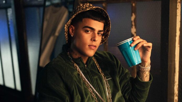
If you only catch the tattoos in a quick performance clip, they can look like one big block of black ink. Slow down and the collection gets much more interesting. There are words, faces, symbols, and little details spread across his hands and arms, with some pieces tied to music, family, or the people around him.
That mix is what makes the collection worth looking at. It isn’t built around one giant centerpiece. Instead, the designs sit together like a visual scrapbook: one piece catches your eye, then another starts to make sense once you know what Lunay has said about it. The safest way to read the work is to separate the tattoos he has actually explained from the details fans and image captions have guessed about over the years.
The Be The Light tattoo
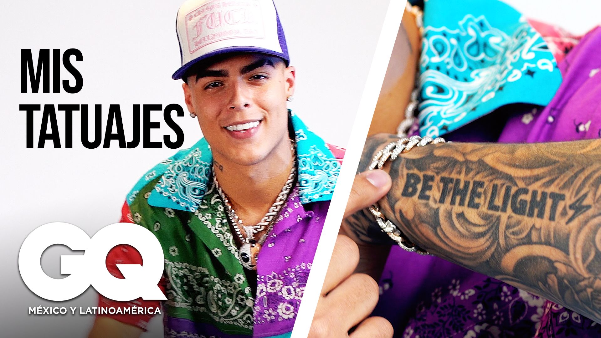
The clearest starting point is the Be The Light tattoo. The lettering runs across the arm in a way that feels almost like a statement on a sign: easy to read, hard to miss, and built to work from a distance. It isn’t trying to hide inside a fine-line design. The words are the design.
That kind of phrase also explains why the tattoo has stayed so recognizable in photographs. A lot of celebrity ink disappears when a person changes clothes or turns away from the camera. This one keeps its shape. The heavy lettering gives the arm a strong horizontal line, while the darker surrounding work keeps it from looking like an isolated sticker.
There is a useful lesson here if you’re collecting ideas for your own piece. Text tattoos don’t need a complicated frame to feel personal, but the placement matters. A short phrase can become a visual anchor when it follows the natural length of the arm. Choosing a phrase with a clear rhythm helps too. You want something that reads quickly without looking like a sentence pasted onto skin.
Tattooed arms in the editorial portrait
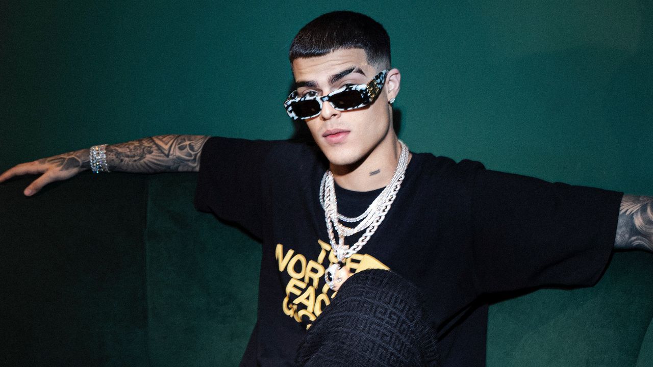
Another tattoo he has discussed is a portrait of his mother, made in Ibiza. That detail matters because it gives the piece a real origin instead of leaving it as a vague claim attached to a random photograph. Portrait tattoos live or die on expression, proportions, and the little areas of light around the eyes and mouth. When the reference is someone close to you, the emotional pressure is even higher.
In the photographs, the portrait sits among other work rather than floating on a blank patch of skin. That makes it harder to isolate every line, but it also gives the tattoo its proper setting. The surrounding blackwork changes how the face reads depending on the light. In one image you notice the outline first; in another, the shadows and darker shapes around it do more of the work.
For anyone considering a family portrait, this is the part to take seriously: bring a tattooer a strong reference image and be realistic about scale. A tiny face can lose its expression as it heals. A little extra room lets the artist build contrast without turning every feature into a dark smudge. The sentimental idea is only half of the job. The other half is giving the design enough space to stay recognizable.
Geometric and ornamental arm tattoos
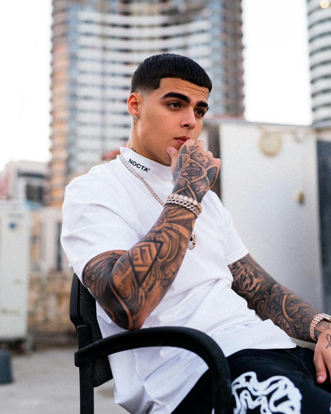
His tattoo tour also mentions a tiger, roses, a clock, and Roman numerals. Those are familiar tattoo subjects, but familiar doesn’t mean interchangeable. A tiger can be treated as a realistic portrait, a sharp graphic head, or a full-body animal that wraps around the arm. Roses can be soft and illustrative or packed into heavy black-and-gray shading. A clock can feel ornate, plain, broken, or almost hidden inside a larger sleeve.
That variety shows up in the way the pieces sit together. The arms don’t read like a single matching set. They have the layered look you get when someone adds meaningful pieces over time, with different sizes and visual weights sharing the same space. The Roman numerals add a more structured shape, while the floral work breaks up the harder lines.
It is tempting to assign a private meaning to every familiar symbol. A clock must represent time, a tiger must mean strength, and roses must stand for love, right? Maybe, but those meanings aren’t automatically confirmed just because the imagery is common. With celebrity tattoos especially, a caption can turn a visual guess into a fake fact very quickly. The designs are clear. The personal explanations are more limited, so it is better to keep that distinction intact.
The eye and portrait upper-arm tattoo
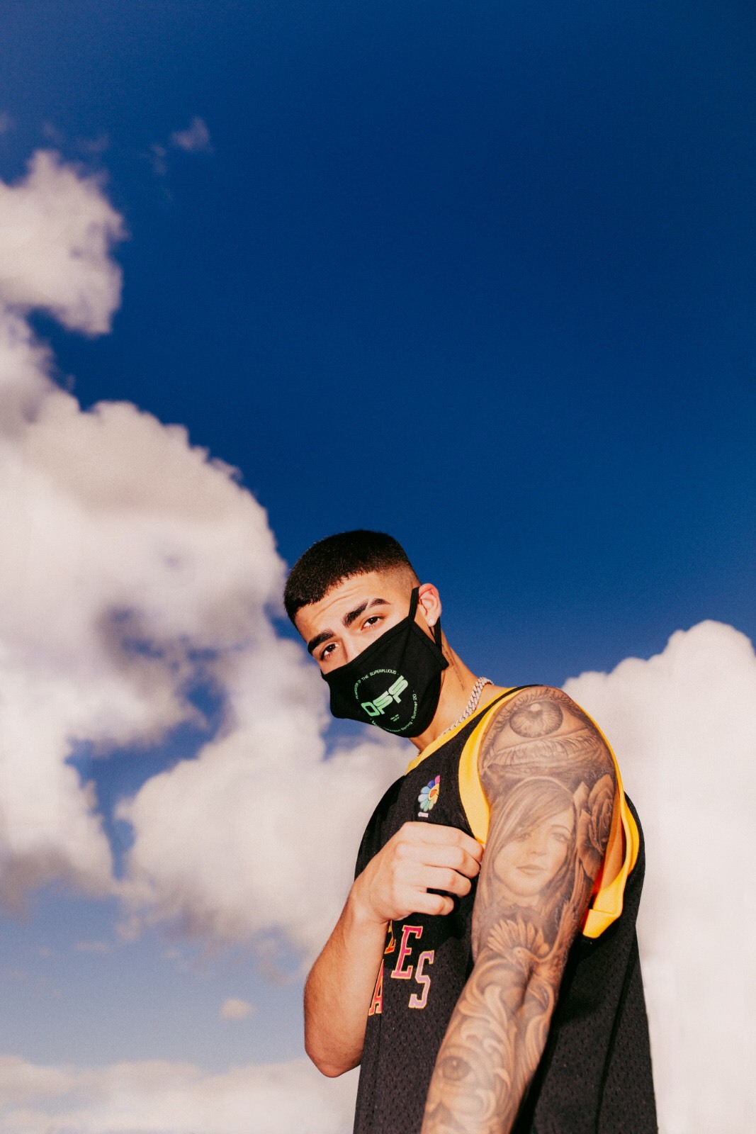
There is also a lightning motif and ink connected to family names. These smaller or more graphic elements help explain why the collection can look busy without losing its personality. A lightning shape gives the eye a quick diagonal movement. Names bring the design back to something direct and personal. Together, they stop the larger images from making the whole arm feel like one dense wall of shading.
Names are one of the hardest tattoo choices to copy from a celebrity. The visual idea is simple, but the reason behind it belongs to the person wearing it. If you like that approach, the better move is to use your own handwriting, a family nickname, or a word that only makes sense inside your own circle. The point isn’t to reproduce the exact lettering. It is to borrow the honesty of the idea.
The same goes for lightning. It can be drawn as a clean single line, a jagged traditional bolt, or a dark shape tucked between other tattoos. In a sleeve, it can act like punctuation. It gives the eye a break, then sends it toward the next design. That small bit of movement is often more useful than adding another large image.
Large arm tattoos in a performance view
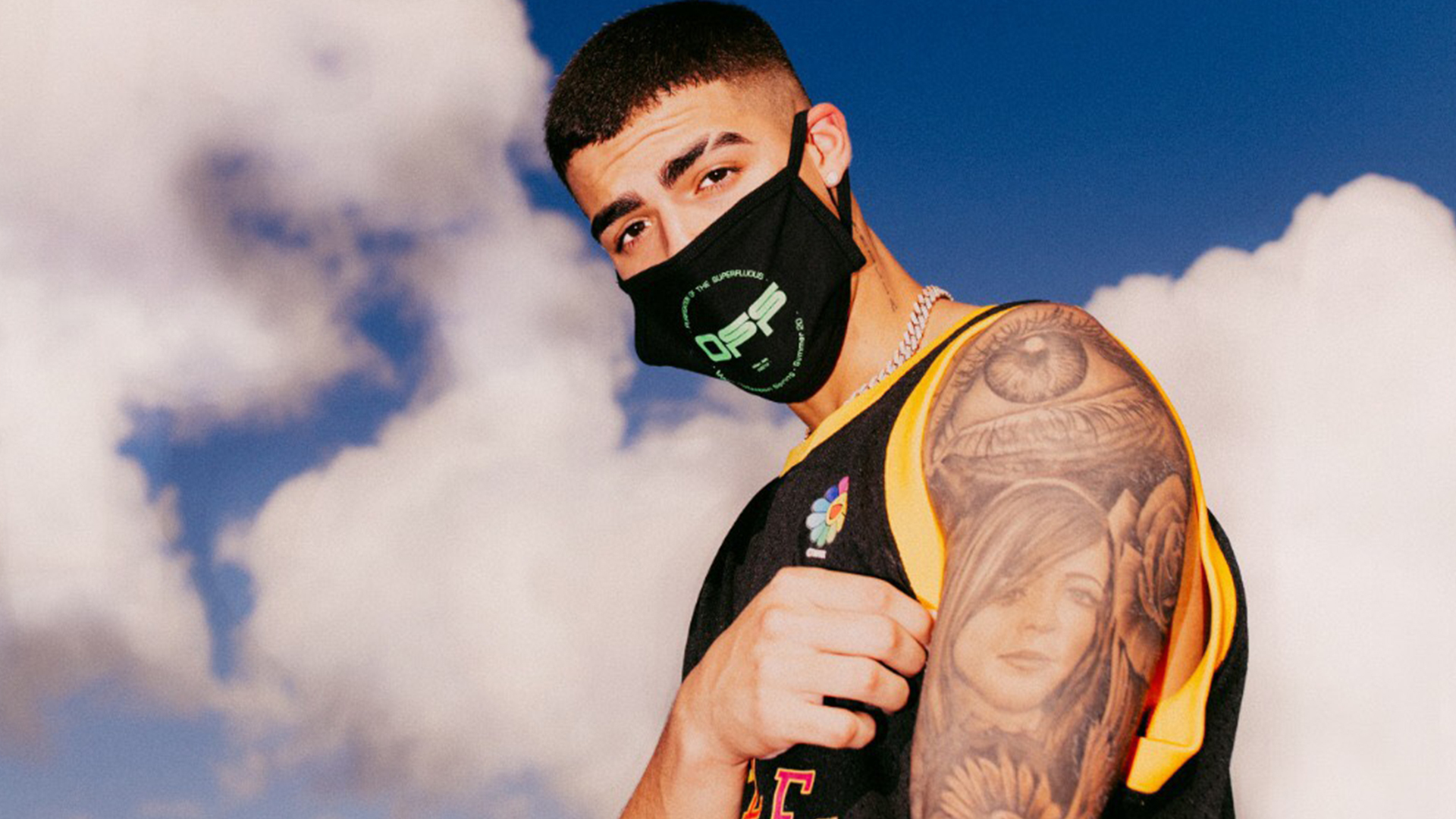
One of the more specific pieces he has explained is a Martian tattoo on his hand. He described it as representing his team and the El Niño era. Because the tattoo is on the hand, it shows up often in close-up photos, microphone shots, and performance images. Hand ink is exposed in a way arm tattoos aren’t. It becomes part of the person’s everyday gestures.
The design also feels different from the larger arm pieces. A character or figure has an immediate silhouette. You don’t need to study a full sleeve to understand what you’re looking at. That is useful placement-wise, but it comes with a practical warning: hands get a lot of sun, friction, washing, and movement. Even a well-done hand tattoo can need more maintenance than ink in a protected spot.
If the appeal is the idea of a team symbol, there are plenty of ways to make it yours without copying a Martian. A mascot, a tiny emblem, or a character with one unmistakable feature can carry the same group identity. The strongest version will connect to your actual people or project, not just the look of a design that photographed well on someone else.
How the pieces work together
The best thing about the collection is the contrast. Big portrait work sits near small symbols. Heavy black areas share space with open skin and lighter details. Words give the eye something immediate to read, while the images take longer to unpack. That push and pull keeps the arms from becoming visually flat.
Photos also change the impression. An outdoor portrait can make the tattoos look softer because the light spreads across the skin. A stage photograph, with strong colored lights and movement, makes the same work look darker and more dramatic. A close-up from a tattoo video reveals lines that disappear in a full-body shot. None of those views is the complete collection by itself.
That is worth remembering when you are building a reference folder. Don’t save only the most dramatic crop. Keep a close-up for line and shading ideas, a wider image for placement, and a plain-light photograph for the way the ink actually sits on the skin. A good tattooer needs all three kinds of information. The flashy picture might be what catches your attention, but the boring, well-lit one is often the useful reference.
What to take from the style
There are a few easy takeaways here without turning the whole thing into a copy job. First, personal tattoos don’t have to share one style. A phrase, a portrait, a symbol, and a character can live together when the placement is planned well. Second, scale does a lot of the organizing. A big piece can carry the visual weight while smaller marks fill gaps and create movement.
Third, meaning works best when it is specific. Family is a broad idea. A particular name, a shared symbol, or an image linked to a real memory gives the tattoo more weight. You don’t need to explain that meaning to everyone who sees it, either. Some of the best pieces are readable as images but private as stories.
Finally, let the tattooer solve the skin instead of treating a screenshot as a blueprint. Arms bend, hands move, and older ink changes the available space. A good artist can keep the spirit of a reference while adjusting the design for your body, your skin, and the way the piece will age. That is the difference between inspiration and imitation.
What makes this collection memorable isn’t one perfect tattoo. It is the way the pieces build a record of the people, music, and periods that matter to him. Some meanings are clearly documented, some details are visible without explanation, and some claims should stay marked as guesses. Keeping those categories separate makes the story more honest, and gives you better ideas to work with if you’re planning ink of your own.