
Tyler Herro’s ink is mostly hidden when he’s in uniform, which is probably why the collection can feel like a surprise. Take the shirt off and there’s a whole visual timeline across his chest and stomach: a blunt work ethic, a cross, the year 2000, a lion, and jersey tributes tied to the places that shaped his basketball career.
It isn’t a delicate little set of fine-line symbols. The work is bold, crowded, and very much part of the way Herro presents himself away from the court. Some of the designs have a clear explanation behind them. Others are simply visible details in photos, so they deserve a description rather than a made-up backstory.
That distinction matters here. His tattoos have been covered in sports and lifestyle reporting, but not every symbol has a public meaning attached to it. The safest way to read the collection is as a mix of motivation, faith, hometown pride, and a willingness to let the torso become its own kind of scrapbook.
The chest lettering: “No Work” and “No Check”
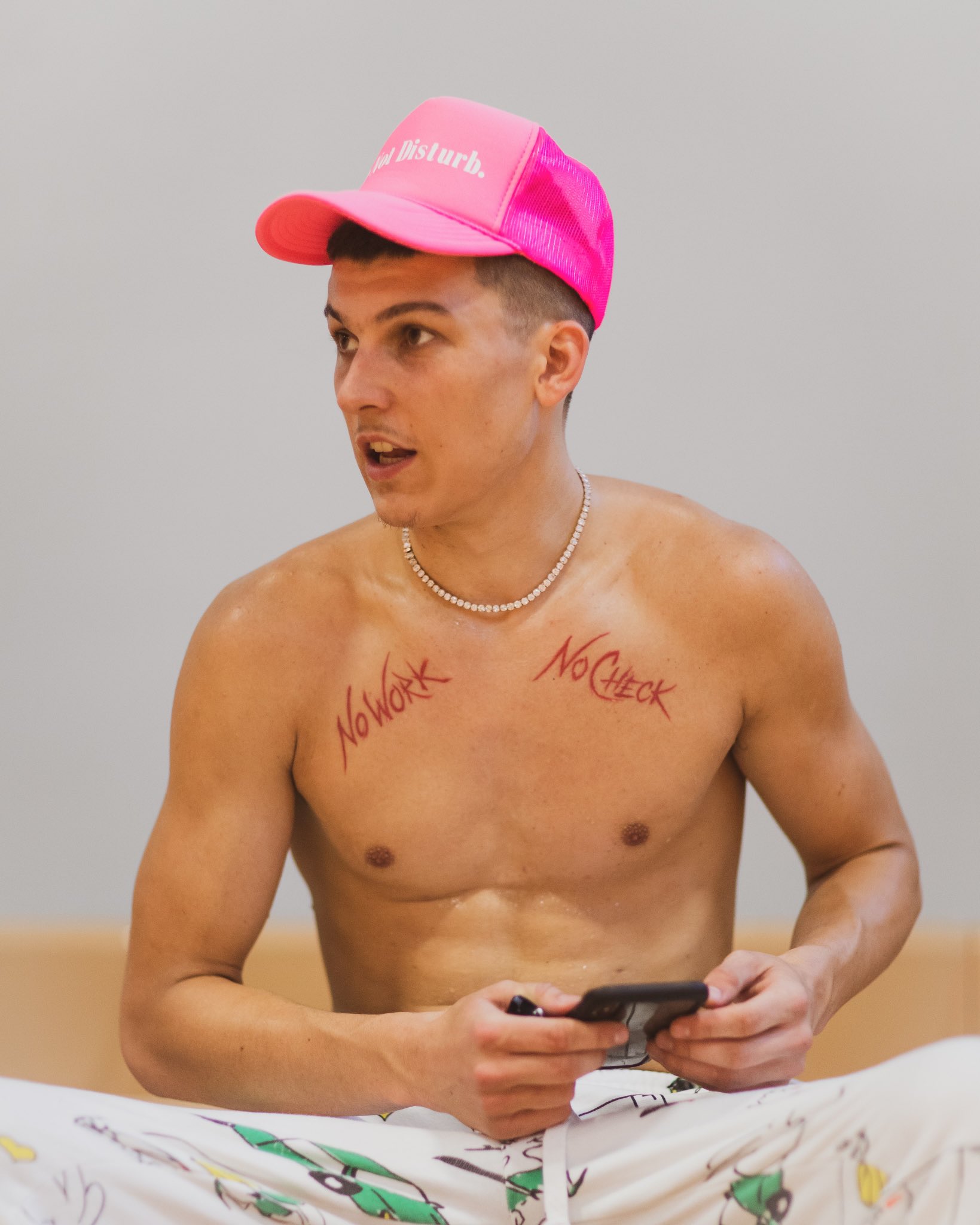
The chest lettering is the easiest place to start. In an early photo from the Kentucky Sports Radio coverage, Herro is shirtless with two red script tattoos split across the upper chest. One reads “No Work” and the other reads “No Check.” Put together, the phrase is a short, direct reminder that money and results are supposed to follow effort.
The lettering has a loose handwritten feel, with tall strokes that stretch across the muscle instead of sitting inside a neat little box. It looks more like a statement scrawled onto the body than a polished emblem. That raw quality fits the message. “No Work No Check” isn’t trying to be mysterious or decorative; it reads like a rule.
The placement also gives the words some attitude. They’re high enough to appear when an open shirt hangs loosely, but low enough to disappear under a basketball jersey. Most fans won’t see them during a game. When they do show up in a shirtless photo, the phrase lands before the rest of the artwork does.
For tattoo inspiration, the useful bit isn’t copying the exact lettering. It’s the idea of making a short phrase carry the whole piece. If the words matter, they need room to breathe. Tiny script packed too tightly can turn muddy quickly, while a larger, less fussy treatment stays readable as the skin moves and ages.
The cross and the 2000 mark
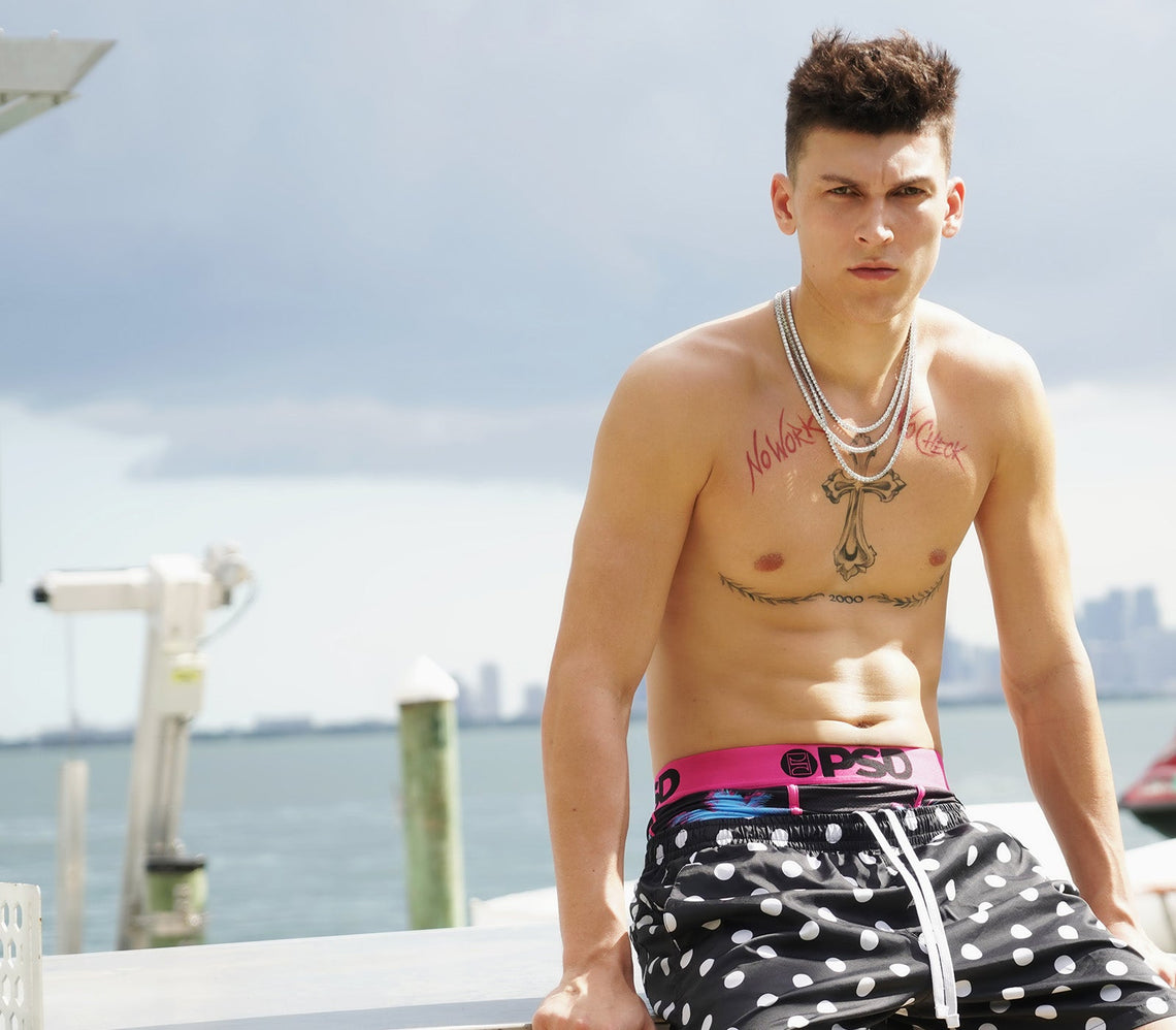
Later views show a much larger design running down the center of Herro’s chest. A cross sits between the red lettering, and the number “2000” appears lower down with laurel branches spreading out on either side. The cross is the visual anchor. It gives the chest a strong vertical line, while the year and leaves keep the composition moving across the torso.
The design is not tiny or hidden once the shirt is open. It has a traditional tattoo presence, with heavier outlines and enough black detail to hold up from a distance. The cross has decorative edges rather than a plain two-line shape, and the lower laurel element makes the number feel framed instead of randomly dropped beneath it.
Coverage from Sport and Faith groups the cross with Christian imagery seen on other basketball players. That supports describing the tattoo as faith-inspired, but it doesn’t give us a direct quote from Herro explaining every part of it. So the responsible read is simple: the cross is clearly religious in its visual language, while the personal meaning of the year and leaves stays with him.
There is a practical design lesson in the way this piece sits between the chest text. Strong central imagery can make a group of tattoos feel connected even when the elements were added at different times. The cross gives the words a middle point, and the “2000” creates a lower edge. Without that structure, the lettering might look like two separate marks floating on the pecs.
The jersey tattoos turn his career into a timeline
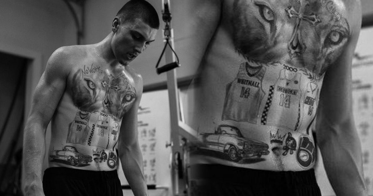
The biggest jump in the collection came with the body art tied to Herro’s basketball path. Photos reported in 2024 show three jersey designs across his stomach: Whitnall High School, the Kentucky Wildcats, and the Miami Heat. Each one carries the number 14, the number associated with his playing career at those stages.
That idea is more personal than a generic team logo. The jerseys point to actual stops in his life: the Wisconsin high school where he became a major prospect, the college program he played for, and the NBA team that drafted him. The tattoos work like a timeline you can read from the body, even though the lettering and graphics are intentionally loud.
The surrounding artwork makes the whole section feel less like a clean display case and more like a collage. The close-up views show a lion, a crown, a classic car, a fleur-de-lis shape, and the number 2000 around the jerseys. Some of those objects are easy to identify visually, but public reports don’t establish a confirmed meaning for each one. They should be treated as parts of the composition, not assigned symbolism just because they look familiar.
There is also something funny about putting school and pro jerseys on the stomach. It is a very visible commitment when the shirt comes off, but it stays completely private during most games. The placement turns the torso into a personal locker room wall: the milestones are there, but only people close enough to see them get the full story.
If you like the idea of a career timeline tattoo, the strongest takeaway is to use the real sequence of your own life. A club, a school, a job, or a place can be represented with a small visual shorthand. The important part is making the symbols mean something to you before they become decoration for somebody else’s story.
The upper-body collage: lion, cross, and jersey art

Another view shows how much the collection changed after the first chest lettering. The upper torso now has a large lion face, with the eyes and mane sitting between the chest text and the lower artwork. It is a much heavier image than the original red script. The lion pulls the eye toward the center and makes the whole layout feel more dramatic.
It is easy to invent a meaning for a lion tattoo. People usually reach for words like courage, leadership, or strength. None of those ideas should be attributed to Herro without a source. What can be said from the photo is that the lion has been used as a bold central graphic, and that it balances the more literal jerseys below it.
The contrast between the pieces is part of what makes the collection interesting. The chest phrase is thin red writing. The cross is dark and ornate. The lion is a large portrait-style image. The jerseys use lettering, numbers, and recognizable uniforms. Instead of one uniform style, Herro has let several tattoo languages sit beside each other.
That can be tricky to pull off. Different styles need some shared structure or the body can start to look visually noisy. Here, the chest and stomach naturally create one long canvas. The central placement of the cross and lion helps the heavier pieces talk to each other, while the words and laurel branches provide horizontal movement.
A candid look at Tyler Herro away from the court
A poolside photograph gives a different view of the same chest work. The angle is less controlled, the lighting is brighter, and another person is standing beside him, but the red lettering, cross, and 2000 laurel mark are still easy to make out. That kind of casual image is useful because tattoos don’t live on a blank studio backdrop in real life.
Body position changes everything. A chest tattoo can look spread out when the shoulders are relaxed and compressed when the arms move forward. Sunlight can soften the contrast, while a close crop can make the lettering look much larger than it does at normal distance. When you’re studying a celebrity tattoo for inspiration, it’s worth looking at more than one angle before deciding that a design will work the same way on your own body.
The candid photo also makes the placement feel more wearable. The design is dramatic, but it doesn’t stop him from swimming, training, or moving around normally. A tattoo can be bold without controlling every outfit. That is one reason chest work remains popular: it offers plenty of room for a substantial design while still being easy to cover.
What is confirmed, and what is only visible?
Herro’s tattoo coverage shows a useful line between reporting and guesswork. The phrase “No Work No Check” is visible in early coverage. The later jersey tattoos are tied to Whitnall, Kentucky, and Miami in multiple reports. The cross, 2000, lion, and surrounding graphics can be described from clear photos. Beyond those points, the personal reasons behind individual symbols aren’t fully documented.
That doesn’t make the collection less interesting. In fact, the gaps are part of the appeal. Tattoos don’t have to come with a public press release. A sports fan can recognize the jersey numbers, but the wearer may have a completely different private association with a crown, car, or flower. Good tattoo writing should leave room for that privacy instead of turning every shape into a claim.
It is also smart to separate permanent tattoos from temporary or fan-made images. Herro’s own torso tattoos are visible in the sources used here. A fan tattoo of Herro’s face, even if it appears in an article about him, is not part of his collection. That sounds obvious, but celebrity tattoo searches mix those things together surprisingly often.
How to borrow the ideas without copying the layout
If you like Herro’s body art, start with the personal structure rather than the surface details. A phrase can represent a work ethic. A year can mark a turning point. A jersey, badge, or uniform can stand in for a place that changed your life. Those ideas are more durable than copying a lion or a cross because they come from your own history.
Think about how separate designs will sit together before you book the appointment. The torso has plenty of room, but room disappears quickly when every element is large. A tattooer can help you plan the negative space between pieces, the way the body bends, and which lines need to stay heavier so they don’t blur.
Color matters too. Herro’s red chest lettering has a very different energy from the black-and-gray cross and lion. That contrast can be exciting, but it needs to be deliberate. If you want one bright accent, decide where it should lead the eye. If you prefer a more unified collection, keep the palette and line weight closer across each new addition.
Finally, don’t treat a celebrity photograph as a blueprint. Lighting, editing, body position, and the tattooer’s own choices all affect what you see. Take the idea to an artist, explain what the symbol means to you, and let them redraw it for your skin. The result will be better when it belongs to your life instead of looking like a duplicate of somebody else’s torso.
The short version
Tyler Herro’s tattoos read like a loud, personal record of where he has been. The chest motto sets the tone: effort first, reward later. The cross and “2000” add a strong center. The Whitnall, Kentucky, and Miami jerseys turn the stomach into a career timeline, while the lion and surrounding graphics give the whole collection more weight.
Some meanings are supported by reporting, and some details are simply visible in photographs. Keeping that line clear makes the tattoos more interesting, not less. They don’t need a full explanation to work. They already have a clear point of view: big symbols, real milestones, and enough room for the wearer to keep a few parts private.