admin

Blackbear lets his tattoos tell the story

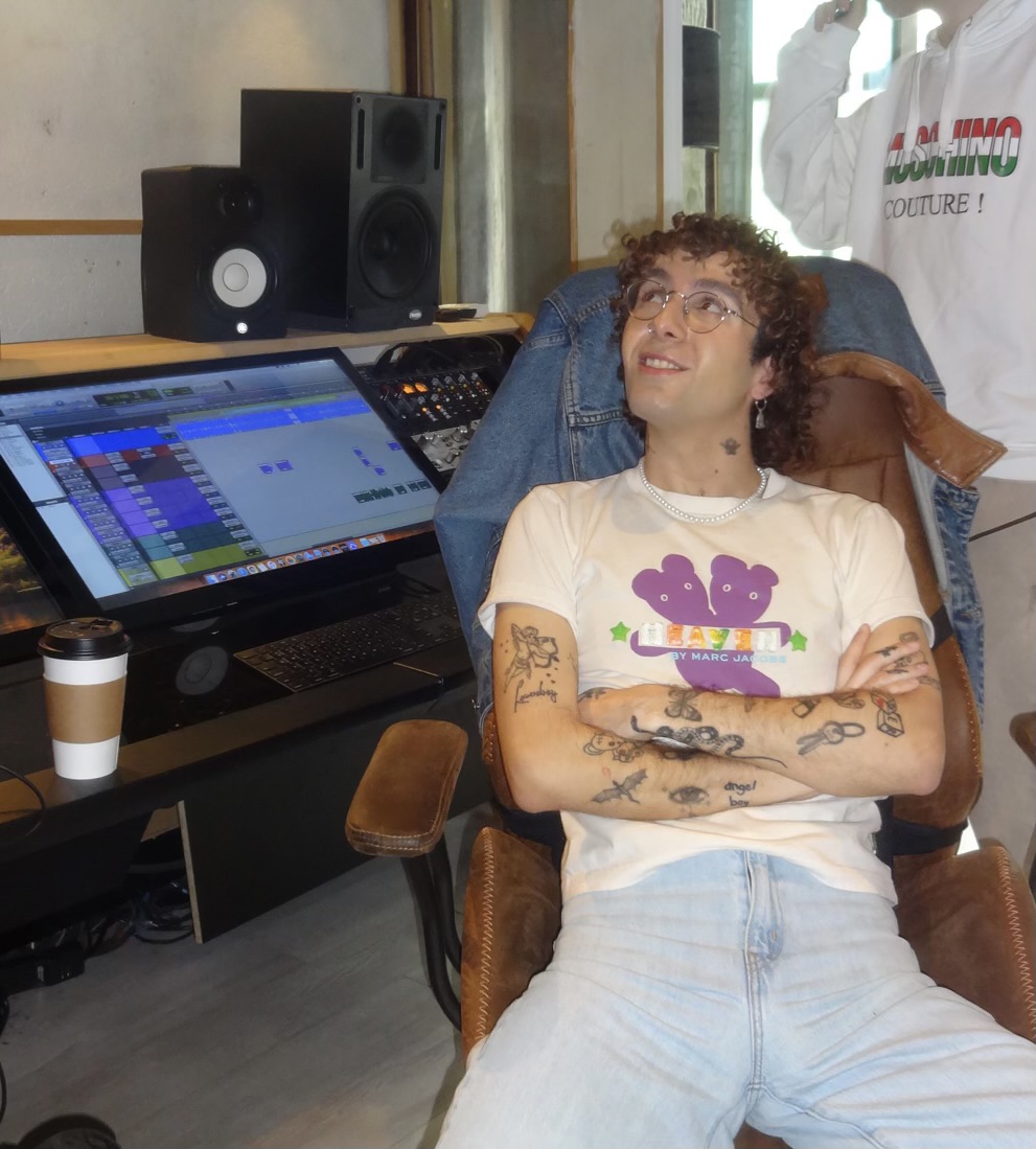
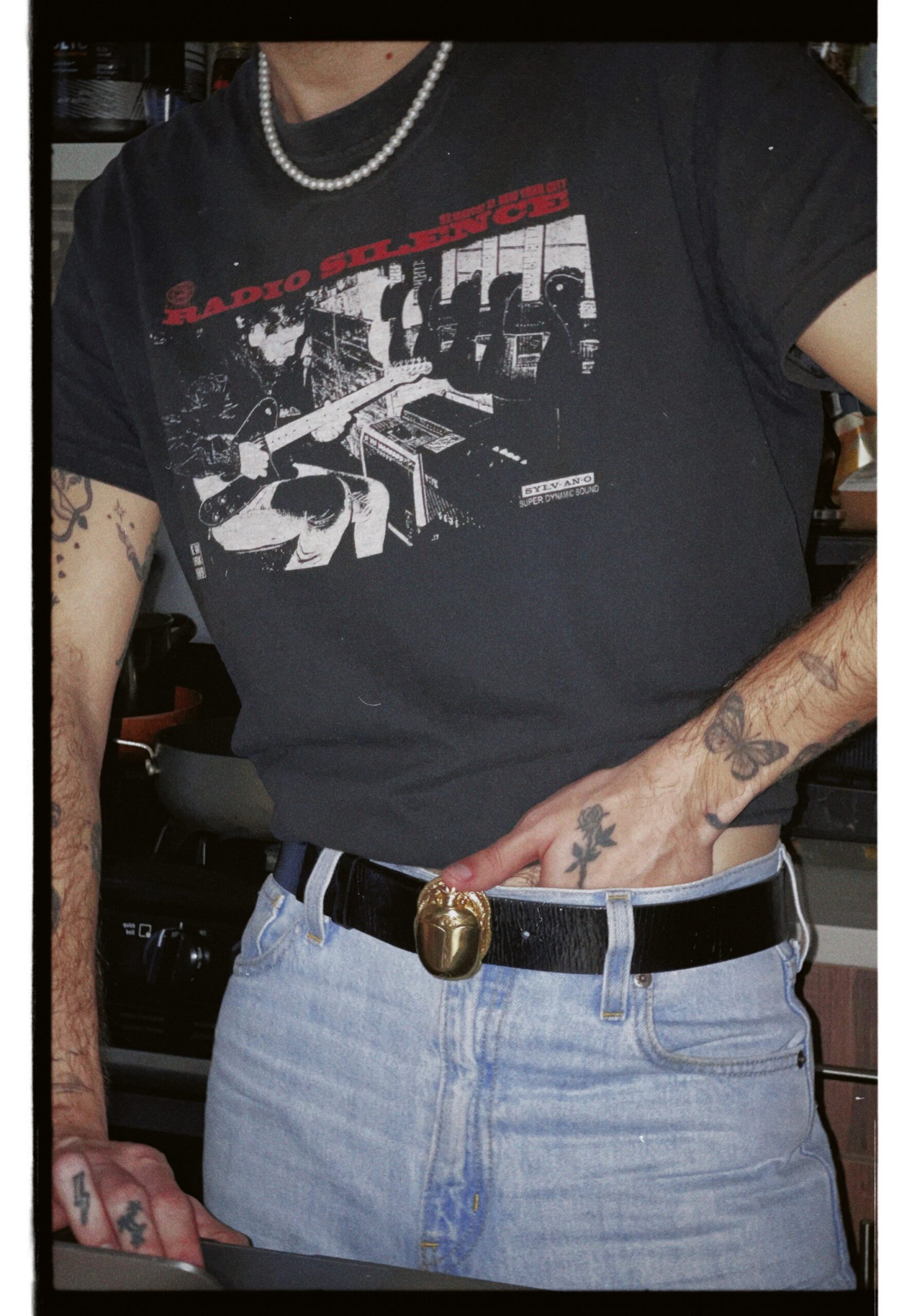
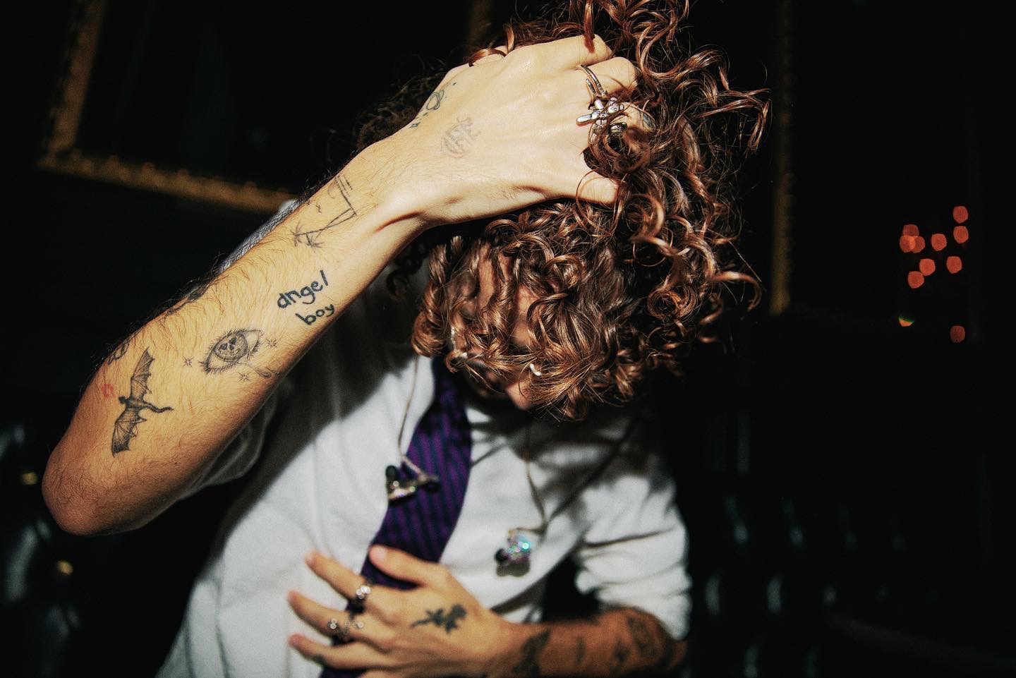
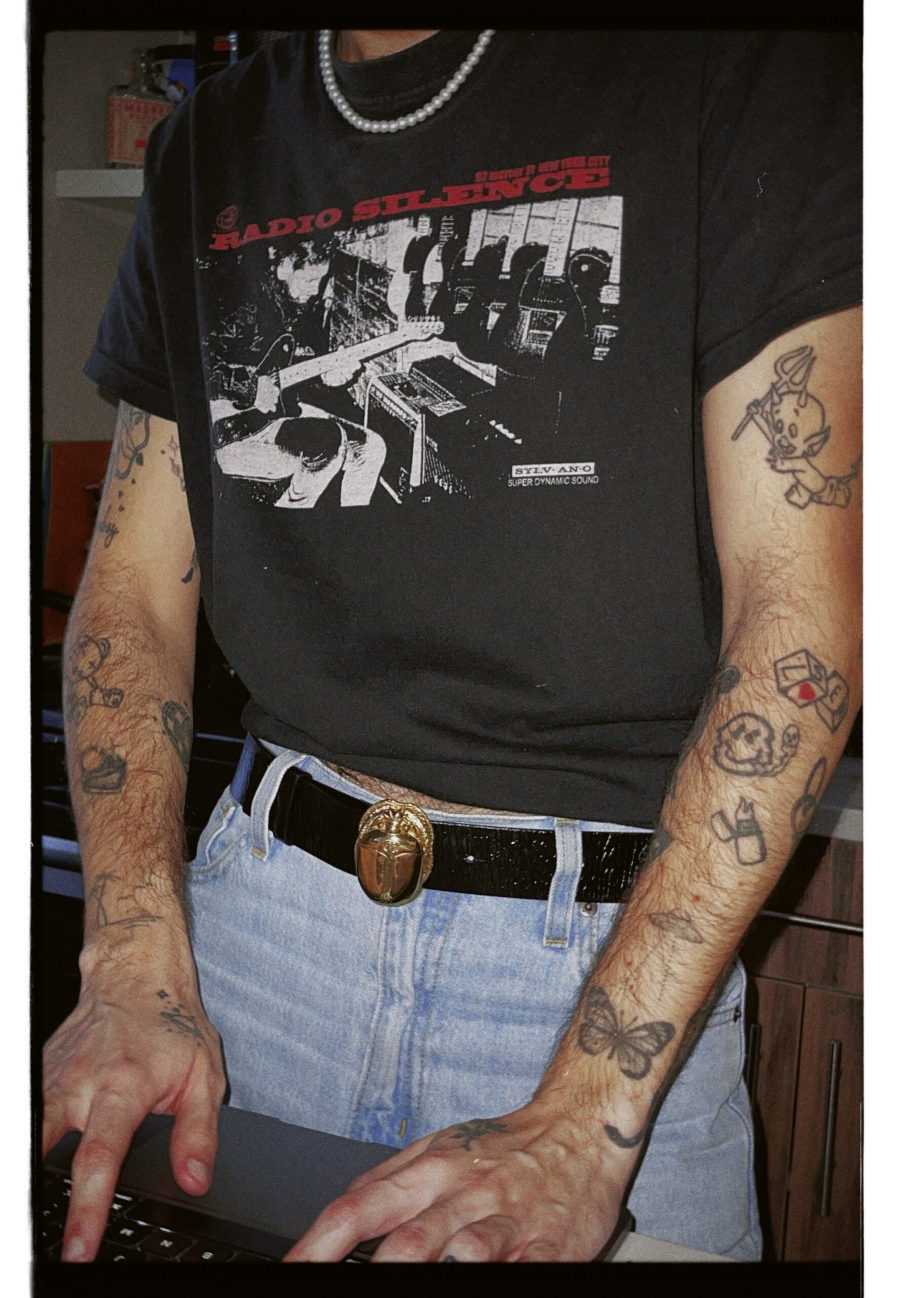
Blackbear’s tattoos aren’t just decoration; they feel like a notebook he’s kept on his body. Music, friendships, bad decisions, private jokes and ideas he returns to all show up in the mix. Some pieces are easy to spot from the stage, while others make more sense once he explains where they came from.

His collection includes face ink, bold lettering across his chest, flowers around his neck, hand tattoos and designs tied to people in his life. He has also let friends and other artists add their work, which gives the collection a lived-in feel instead of one carefully planned style. It’s personal without asking every tattoo to carry a grand explanation.

The chest carries the biggest statements
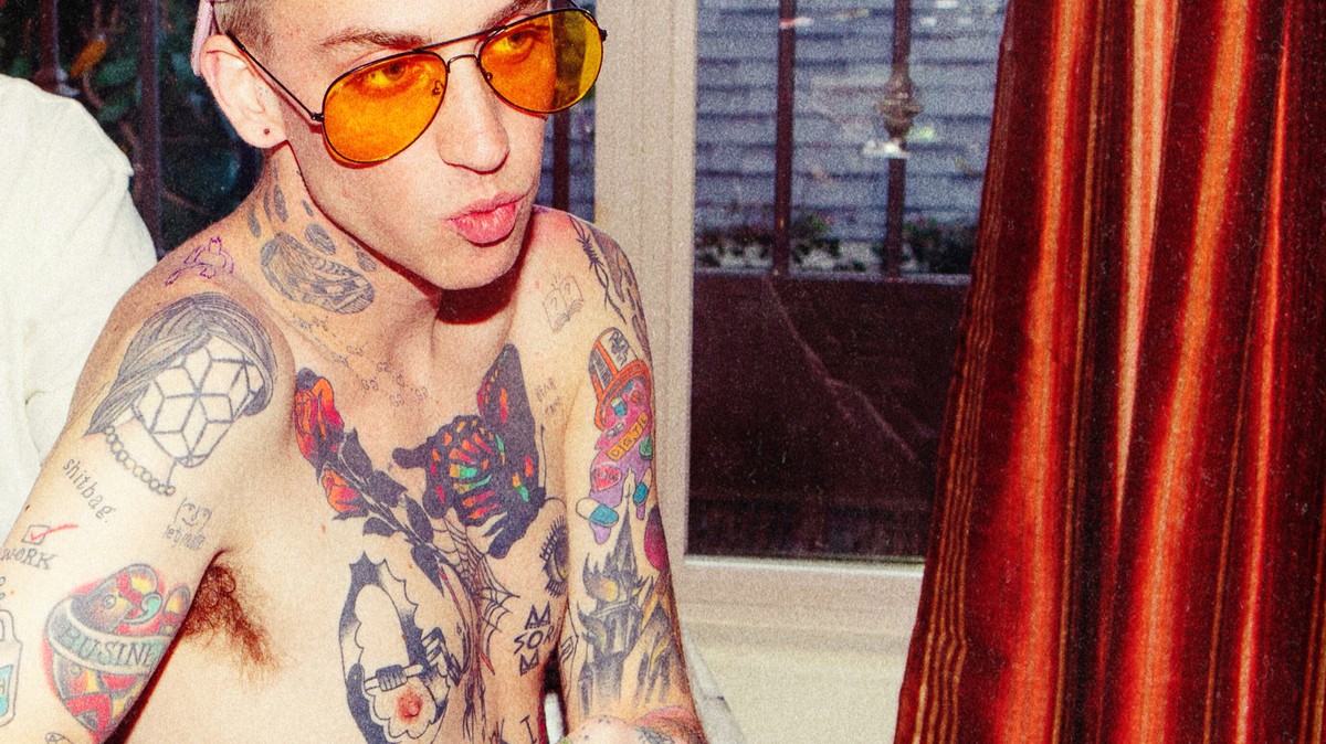
Blackbear the chest carries the biggest statements

Blackbear’s chest feels like the most crowded page in that notebook. Large lettering and dark shapes sit close together, with words such as WORK, BUSINESS and “shitbag” visible in photos. They’re blunt, funny and fit an artist whose music moves between confession and attitude. It might be tempting to read the chest as one polished statement, but it looks more like ink gathered over time: one phrase could be a joke, another a reminder, another a piece of the persona he was building.

The placement is part of the effect. These tattoos shift as he moves, and look different under stage lights than in an everyday photo. A design can feel loud in one setting and almost private in another. It’s best to stick to what’s visible and avoid assigning meanings he hasn’t confirmed. The uncertainty is part of what makes the collection feel real.

His face tattoos changed the first impression
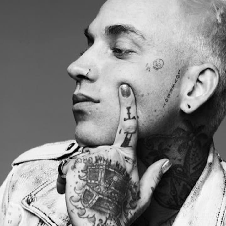
Blackbear his face tattoos changed the first impression

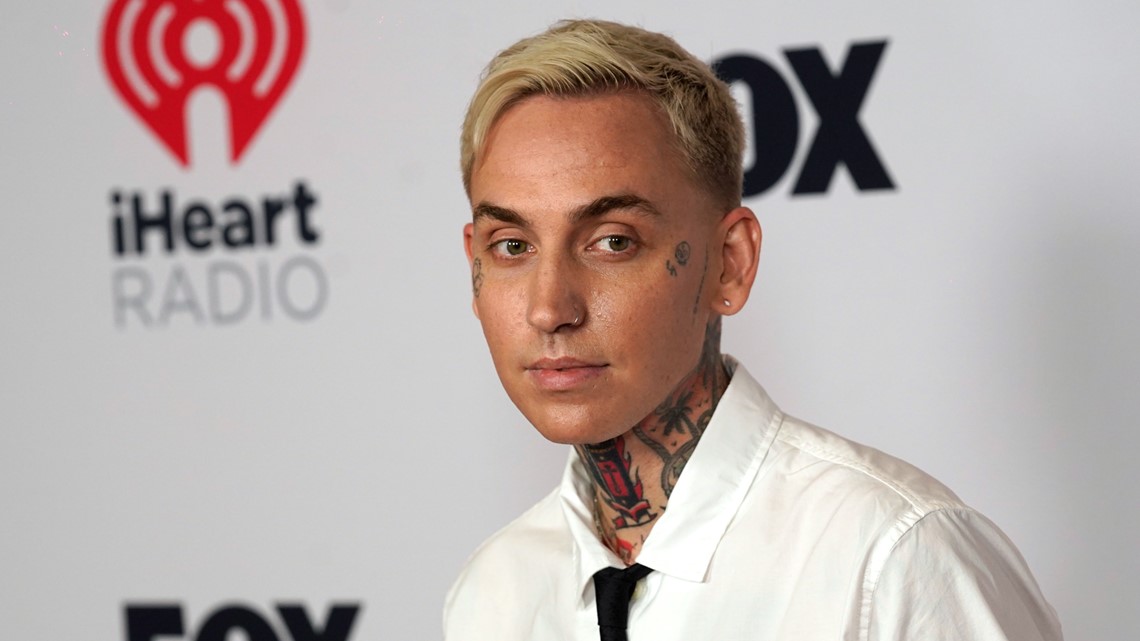
Face tattoos are hard to keep private. Small marks around Blackbear’s eyes and cheek sit alongside piercings and changing hair colours. One visible phrase has been described as sry i suck—a self-deprecating line that doesn’t take up much space. Here, the serious look of face ink meets a dry sense of humour. The marks change the first impression, while the wording keeps the mood from getting too grand.

That contrast is part of what makes the face pieces stand out. They are visible wherever he goes, but their meanings aren’t always public. In photos, the marks can read as styling; the words add a more personal, wry note without making every detail easy to interpret.

The neck pieces bring in flowers and scenery
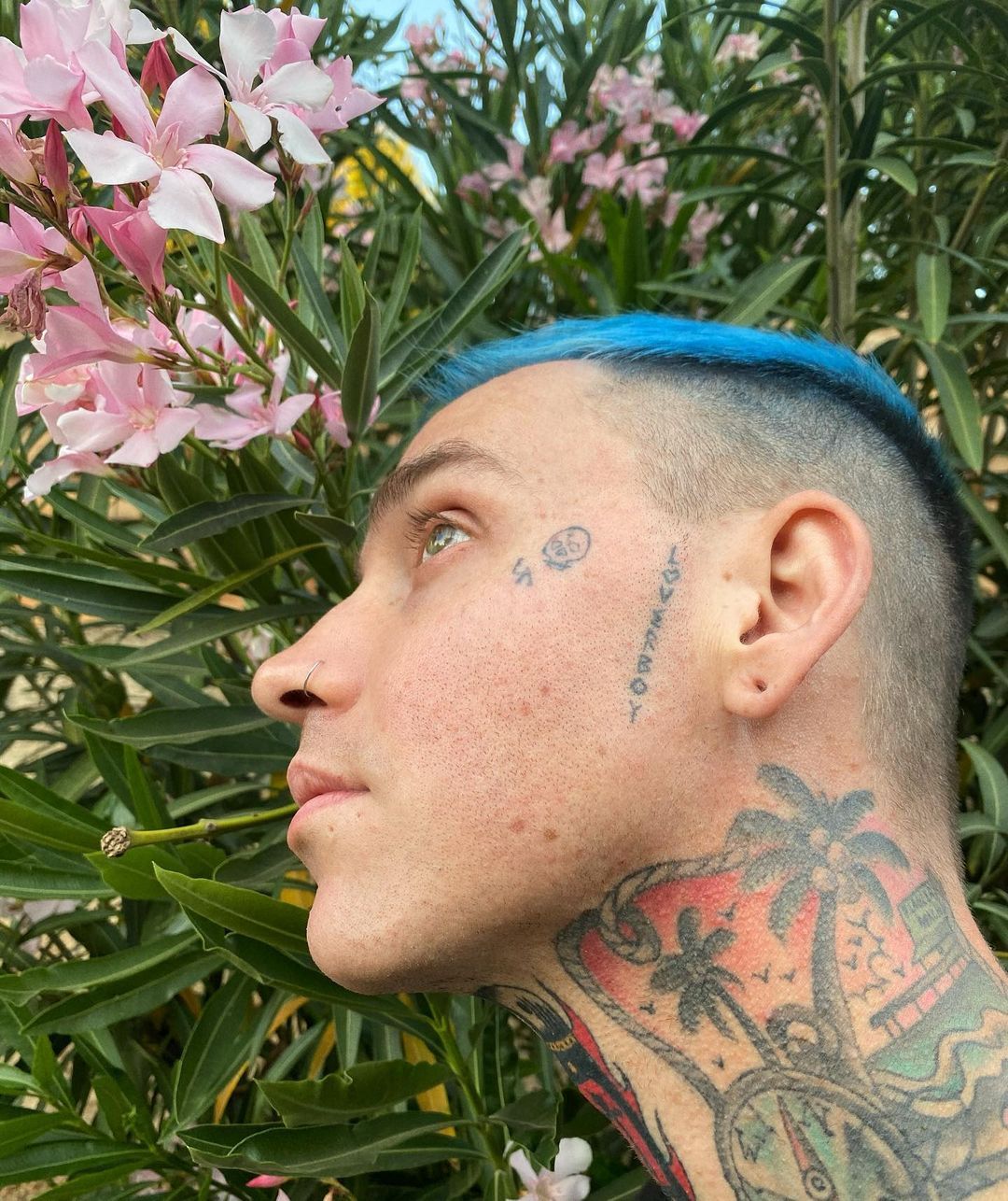
Blackbear the neck pieces bring in flowers and scenery

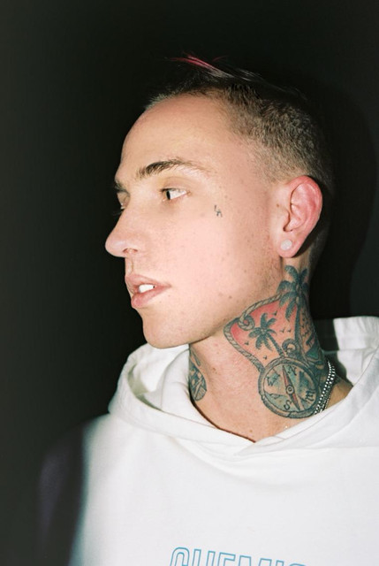
Flowers and a broader scenic design make Blackbear’s neck one of the most distinctive parts of the collection. The botanical shapes soften the heavier lettering, while the dark outlines keep the look from feeling too polished. In profile, the ink frames his face. It brings atmosphere to the neck while the words elsewhere can feel like something written on a dressing-room mirror. They don’t have to match.

The neck work also changes with the angle. From the side, it reads almost like a frame around his face; in other photos, parts disappear beneath clothes or hair. The overall look is clear, even if there’s no public explanation for every detail.

A compass tattoo points toward movement
Blackbear a compass tattoo points toward movement

A compass-style design near Blackbear’s neck brings in a familiar tattoo idea: finding direction. Its position close to his face and throat makes it part of the look people recognise first. It reads as one piece in a larger map, not necessarily as a single grand symbol. Blackbear’s career has moved through songwriting, producing, pop collaborations and darker solo work, so the image fits the broader picture, though he hasn’t publicly explained every line.

There’s no need to turn the compass into a definitive statement about his life. It’s a clear image in a prominent spot, and it sits among other pieces that have their own stories—or no public story at all.

His hands make the collection feel close-up and physical
Blackbear his hands make the collection feel close-up and physical

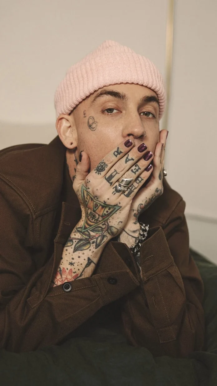
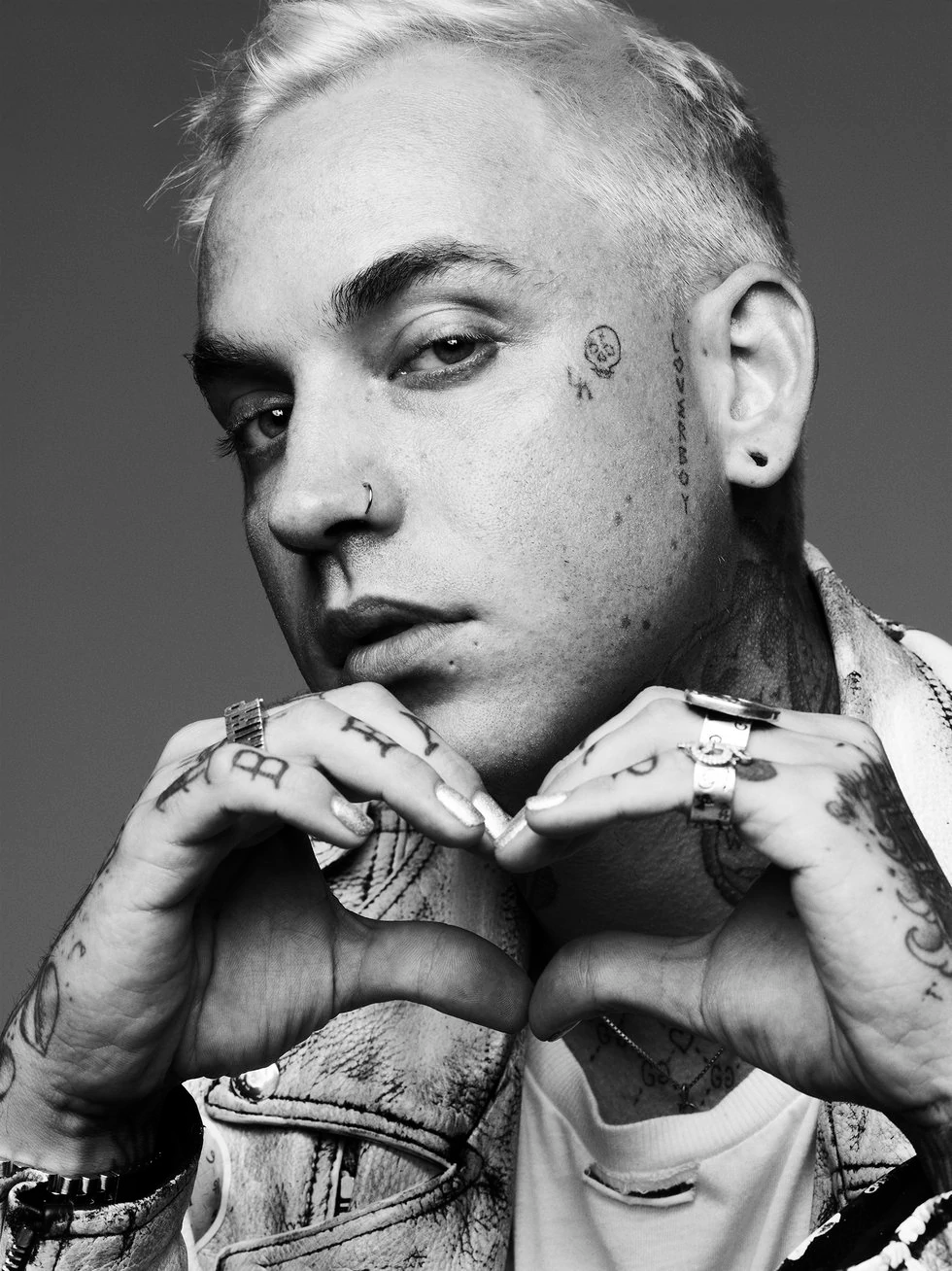
Hand tattoos are difficult to hide. Blackbear often shows his while holding a microphone, signing something or posing for a close-up. In one striking portrait, his tattooed hands form a heart, with rings and dark nail polish finishing the look. The hands draw the eye, and the softer gesture sits unexpectedly well beside the darker work on his face and chest. The collection can be sweet without turning sentimental.

These tattoos are especially visible in photos because his hands are often in the frame. The heart gesture softens the image, while the designs and rings still feel like part of his usual style. No extra backstory is needed to see the contrast.

Artists and friends are part of the story
Blackbear artists and friends are part of the story

Blackbear has talked about working with tattoo artist Kelly Scott Orr and using Photoshop to picture how designs might look on his body. He has also mentioned tattoos connected to other creative people, including a drawing by Halsey and work by Coco Capitán. The Halsey piece feels collaborative, rather than like a design picked from a catalogue. A friend’s drawing brings its own history, and that is part of what makes it meaningful.

Those connections give the collection another layer. It’s not only a record of images Blackbear chose for himself; some pieces came from people he knows and works with. The designs carry those relationships along with them.

The hand portrait shows how many layers sit together
Blackbear the hand portrait shows how many layers sit together

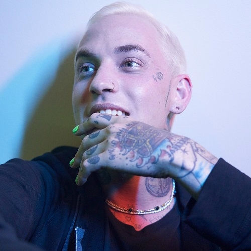
Close-up portraits reveal details that can disappear in a wide stage shot: marks around the fingers, darker work across the hand and smaller facial tattoos. Here, the collection starts to look dense. You might first notice one bold word on his chest, then see the smaller pieces filling the surrounding space. That doesn’t mean it was all planned at once. Tastes change, bodies change, and new tattoos find room beside older ones.

From a distance, the bolder pieces take the lead; up close, the smaller details start to add up. The hand portrait makes that layering easy to see, without telling us when each tattoo was added or what every one means.

The collection keeps changing with the person
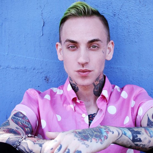
Blackbear the collection keeps changing with the person

Blackbear’s tattoos don’t look like they came from one flash sheet. They read as a record of changing moods, friendships and work. The face and neck make the first impression; the chest and hands reveal more the longer you look. Any inventory should separate documented details from guesses. Placement is visible, but personal meaning isn’t always public. What comes through is his taste for ink with attitude, humour and, sometimes, a sincere connection.

That’s why the same design can feel very different under stage lights or in a close portrait. Tattoos move with the body and the setting, and a small mark can be easy to misread when the photo is blurry or cropped. Leaving some things unexplained feels truer than filling every gap with a theory.

Across the collection, public image and private history sit side by side. A word on the chest may be visible to an audience but have started as a private joke. A small face tattoo can look like styling until you learn it has a specific story. Photos from different years matter too: hair, clothes and lighting can hide the same piece or bring it into view. The collection is broad and layered, and small images can be misleading.

Overall, Blackbear’s ink feels casual in the best way. It isn’t trying to be a museum exhibit or follow one theme. The thread is the person wearing it: someone comfortable with sentiment, sarcasm, collaboration and a bit of visual chaos. The tattoos don’t all say the same thing, because he hasn’t been the same person in every song, year or photo.

Watch blackbear explain the ink himself
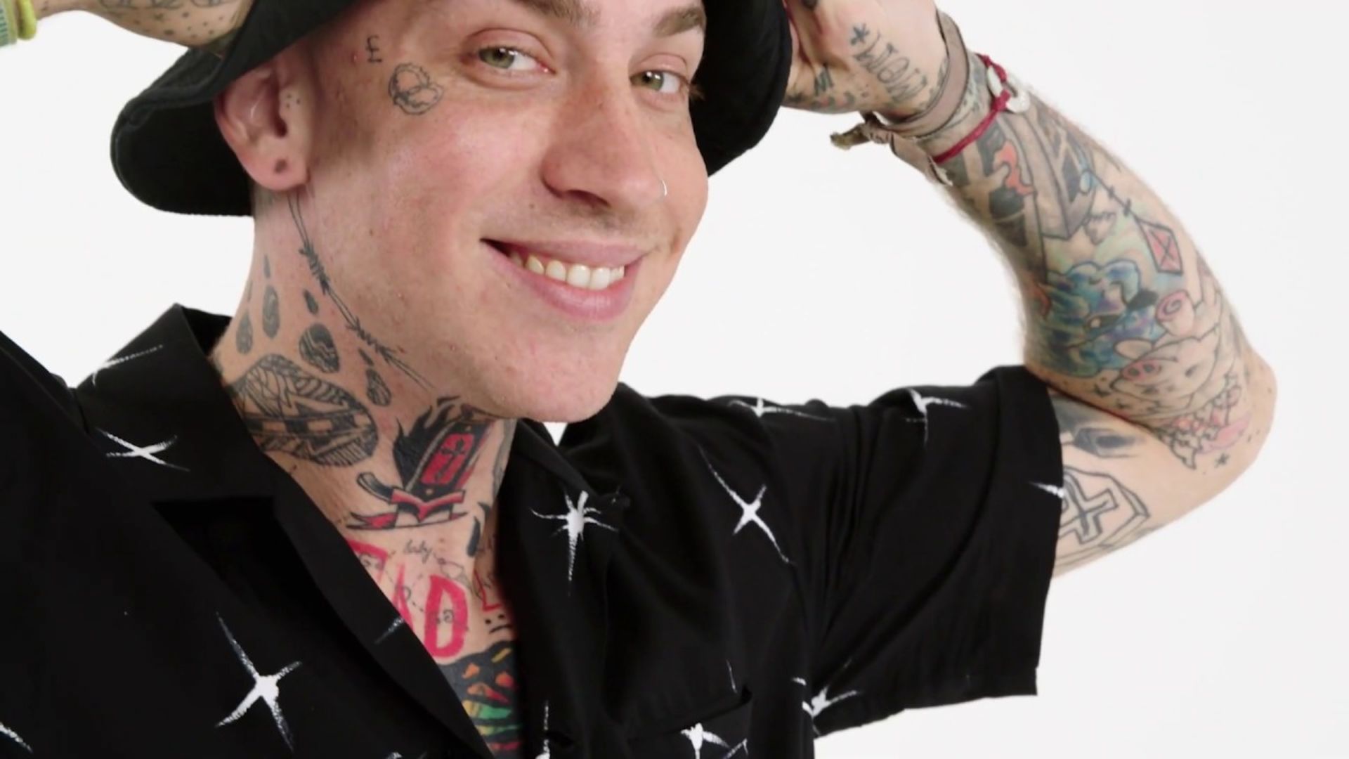
Blackbear GQ tattoo tour tattoos

For a closer look at the designs and their backstories, start with blackbear’s GQ tattoo tour. He talks through several pieces on camera, including work connected with Halsey and Coco Capitán. The video is more helpful than trying to guess from a cropped concert photo, especially when it’s easy to misread small tattoos on his face or hands. He offers context about the artists and the permanence of the work, and distinguishes tattoos that are simply visible from those with a story attached.
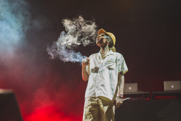
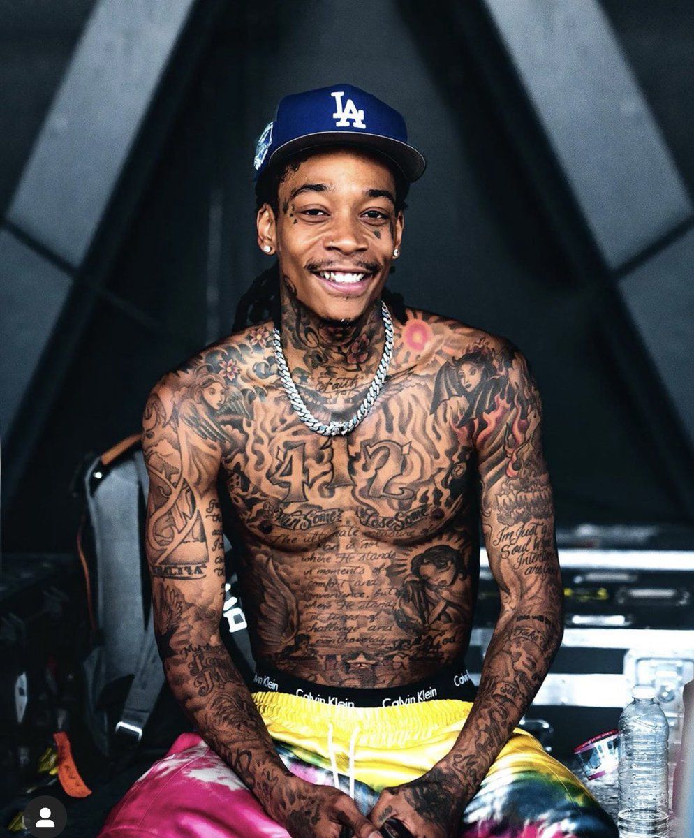
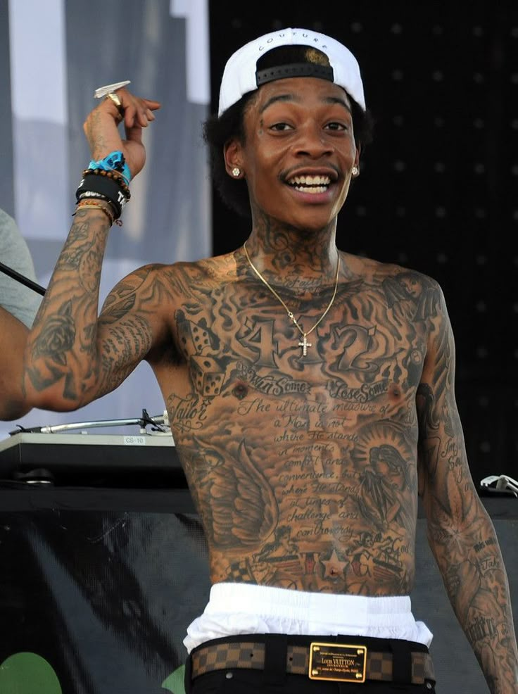
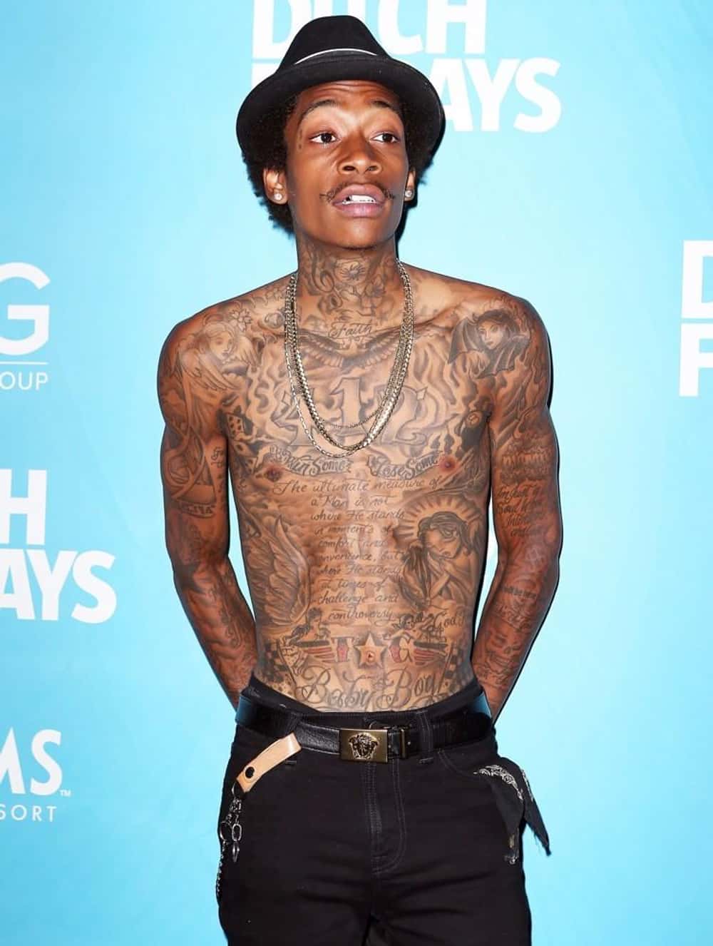
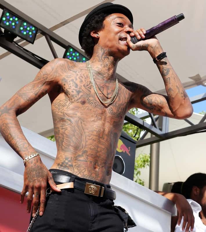
Wiz Khalifa built a diary out of tattoos

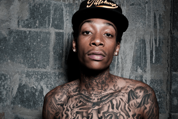
Wiz Khalifa has talked about getting covered in tattoos since he was a teenager, and he has followed through. The ink runs across his arms, chest, stomach, back, neck and face. It’s not one tidy sleeve with a single theme; it feels more like a diary that keeps gaining pages as his life changes.

A simple count doesn’t tell much of the story. Wiz has said he wants his tattoos to mean something, while still leaving room for new ideas and people. Some pieces bring him back to Pittsburgh; others connect to family, Taylor Gang, music or the name his grandfather gave him. And some are best left as images, without trying to force a grand explanation onto them.

Here’s what’s documented, with a distinction between what Wiz has explained himself and what can be identified clearly in photographs.

The first tattoo was personal before the fame arrived

Wiz Khalifa chest and arms tattoos

Wiz has given different ages for when he started getting tattoos, but the basic story is consistent: he was young, around 16, and his mother took him to get his first piece. In an interview with Interview, he said it’s on his left arm and carries the name of his first rap group. He has kept the group’s name private because it belongs to his family and early life.

That’s a revealing place to begin. The tattoo belongs to Cameron Thomaz, before the major tours, label records and face ink. It also sits on the left arm, a part of the body that later filled in around it.

Wiz has described his skin as a record of his trials and tribulations. He wants the tattoos to mean something, but he doesn’t talk as if each one needs a dramatic announcement. The first tattoo matters partly because he has kept its name private. It shows the collection began with people close to him, not as an attempt to create a public image.

Wiz on his arm came from a family name

Wiz Khalifa backstage tattoos

One of Wiz’s best-known early tattoos is his stage name, “Wiz Khalifa,” inked on his arm for his 17th birthday. The story behind it is more than a branding choice. He has said his grandfather gave him the name Khalifa. In the Muslim tradition he grew up with, he connected the word to spreading a message and making an impact on people.

“Wiz” came from wisdom and the nickname Young Wiz. He has said he was good at many things when he was younger, so the name stuck. Making it permanent at 17 was a confident decision, especially while his career was still taking shape. He wasn’t putting a logo on an established brand; he was backing a name he hoped would last.

The tattoo also shows why the collection is more thoughtful than the weed-and-party shorthand often attached to Wiz. It’s a name tattoo, but also a family tattoo and a statement of belief. It links his public identity to his grandfather, his faith and the idea that music can leave a mark on people.

The Martin Luther King Jr quote takes over his stomach

Wiz Khalifa stage lettering tattoos

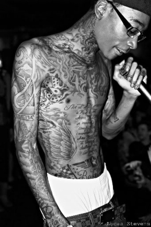
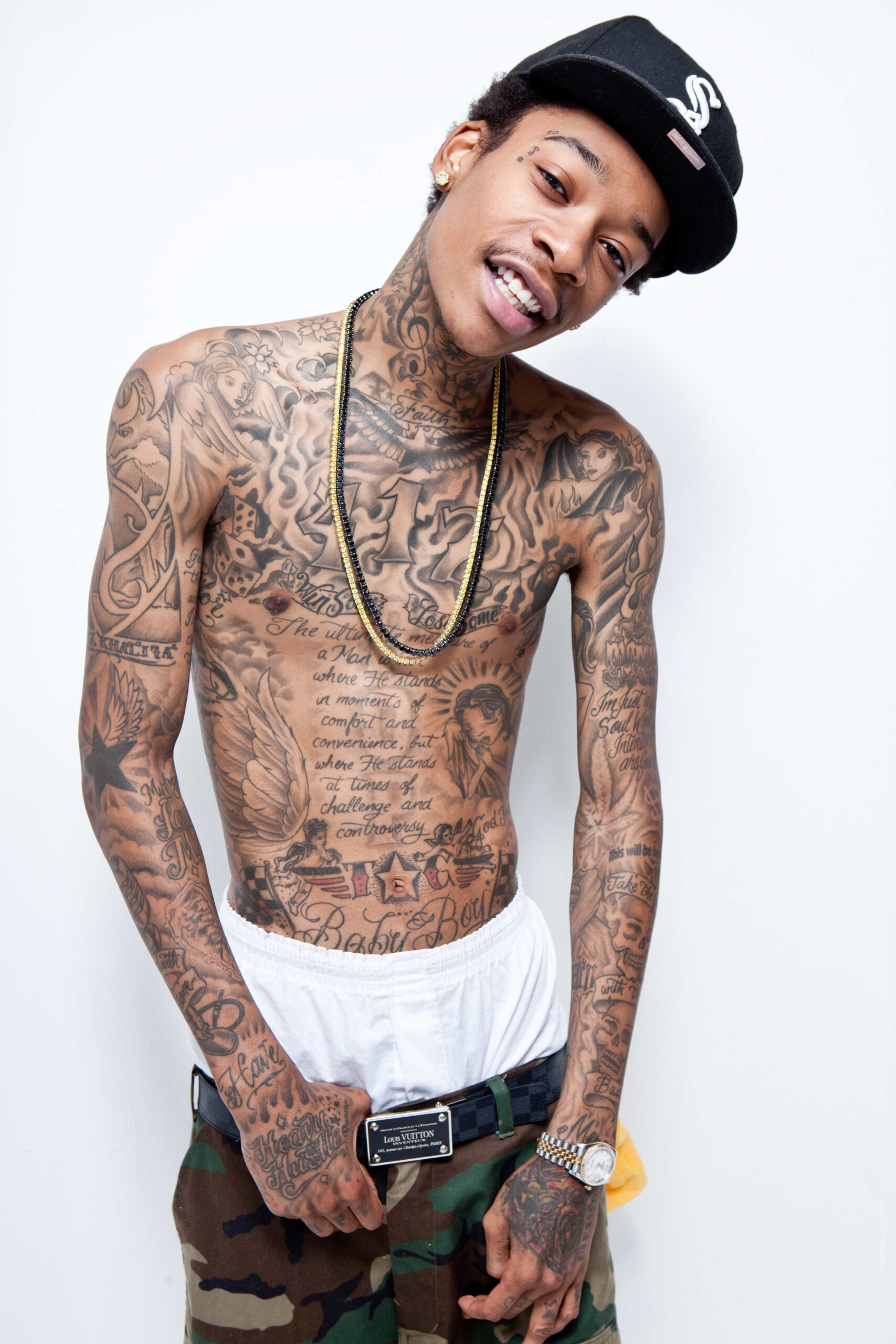
One of the clearest pieces with a documented meaning is the Martin Luther King Jr. quote across Wiz’s stomach: “The ultimate measure of a man is not where he stands in moments of comfort and convenience but where he stands at times of challenge and controversy.” BET has called it one of his most meaningful tattoos.

It’s a long quote, and it changes the shape of his torso. Instead of filling the area with a portrait or symbol, Wiz chose a sentence about character under pressure. That fits with how he has discussed his tattoos over the years: he often returns to the idea of recording what he has learned.

The quote has a different feel from the shorter lettering on his hands and arms, which can read like slogans. This one takes a moment. The stomach tattoo asks to be read slowly; its placement gives the words room to stretch across his body instead of disappearing into a small patch of skin.

His Pittsburgh roots show up in numbers and lettering

Wiz Khalifa angel chest tattoos

Wiz’s connection to Pittsburgh shows up in the imagery around his tattoos, especially the 412 area code reported on his chest. It points to the city that became home after his family moved around during his father’s military service.

Photos also show Pittsburgh references in his clothes, performances and the way he presents himself. An old portrait with a black Pittsburgh cap might look like it reveals a tattoo, but clothing and ink aren’t the same thing. The confirmed tattoo is the number; the broader Pittsburgh identity comes through in the rest of his public image.

A hometown marker makes sense alongside the quote and his first group tattoo. The collection isn’t only about who Wiz wants to become; it keeps a link to where he learned to make music and where people first knew his name. The city stays in the picture, even when the tattoo is small.

Taylor Gang and the family names sit close to the body

Wiz Khalifa live ink tattoos

Some of Wiz’s smaller tattoos connect to his inner circle and work. The initials “TG” have been identified as a nod to Taylor Gang, the crew and label world that became central to his career. Names tied to family and important relationships also appear around his body, including the widely reported “Bash” on the right side of his forehead, for his son Sebastian Taylor.

Older reports also mention “Baby Boy” on his stomach and “Win Some, Lose Some” across his abdomen. These pieces can be harder to date because the quality and angles of public photos vary over the years. They belong in a documented list, but shouldn’t be described as if every detail came from one official tattoo tour.

Wiz has said some tattoos include names of people he has met and people he has lost. A name or a couple of letters may look simple from a distance, while the reason behind them stays private. The collection feels crowded because there are so many relationships in it: family, music friends, collaborators and people who knew him before the fame.

His sleeves mix symbols with old school rap imagery

Wiz Khalifa Pittsburgh cap tattoos

Photographs are the easiest way to take in the variety on Wiz’s arms. Script, women, flames, stars, a microphone and other traditional-style images run together across the sleeves. Reports also identify “Heavy Hustle” on his right hand, along with phrases such as “Live Now” and “Self Made.”

There’s no need to force every piece into one meaning. “Self Made” fits his career story, while “Live Now” reads more like a reminder. The microphone connects directly to music; the flames, stars and portrait-like shapes can work as visual texture as much as autobiography. With little bare skin left on his arms, the sleeves read as collages rather than separate stickers.

Wiz has also been associated with tattoo artist Tuki Carter, who has worked on Wiz and other Taylor Gang figures. That helps explain the shared visual feel in some of the work, and points to the music and touring community around the tattoos.

The back piece and the face tattoos changed the scale

Wiz Khalifa wings and dice tattoos

A large shark on Wiz’s back is among the biggest designs reported in the collection. Back pieces are difficult to document because clothes cover them and photos rarely show them straight on, but the shark has been described often enough to include. It adds a bold image to an area that can otherwise be easy to miss.

Wiz was once known for keeping his face mostly clear, but that changed over time. Recent portraits show small tattoos around his eyes and forehead, while his neck has visible lettering such as “Faith.” Some symbols are too small to identify confidently in every photo, so it’s safer to describe the face as lightly tattooed than to invent a list of tiny designs.

The shift shows how far the original plan evolved. Wiz has said he wanted to be covered and to keep getting tattooed forever. In 2023, he told Men’s Health he had inked nearly every fun spot, with his butt as the main area left. By then, the joke wasn’t whether he had too many tattoos; it was whether any blank space was left.

Wiz treats the whole body like a living diary

Wiz Khalifa neck lettering tattoos

Wiz’s tattoos can look both planned and spontaneous because the unifying idea isn’t a single style; it’s continuity. The first group’s name stays on his arm. His grandfather’s word became a stage name. Pittsburgh appears in the area code and his clothes. The King quote crosses his stomach. Taylor Gang initials and family names fill smaller spaces, while sleeves grow around them with symbols, flames, stars, music references and portraits.

That’s a lot of ink, but Wiz hasn’t described it as a costume. He talks about the pieces as meaningful, even when he keeps the private details to himself. The collection can hold a serious quote and a simple slogan without one cancelling out the other.

The best way to read Wiz Khalifa’s tattoos is as an ongoing record, not a finished design. He keeps adding chapters instead of closing the book. Photos show how much ground the ink covers; interviews explain the pieces that matter most to him. The rest can stay a little mysterious, which may be how he likes it.

Watch the tattoo artists behind Wiz’s ink

Wiz has worked with tattoo artists in the Taylor Gang orbit, including Tuki Carter. The interview below focuses on Tuki’s work and the tattoos he did for Wiz, adding context without pretending to be a complete inventory.

More musician tattoo guides

Nicolas McCoppin treats his tattoos like a second album

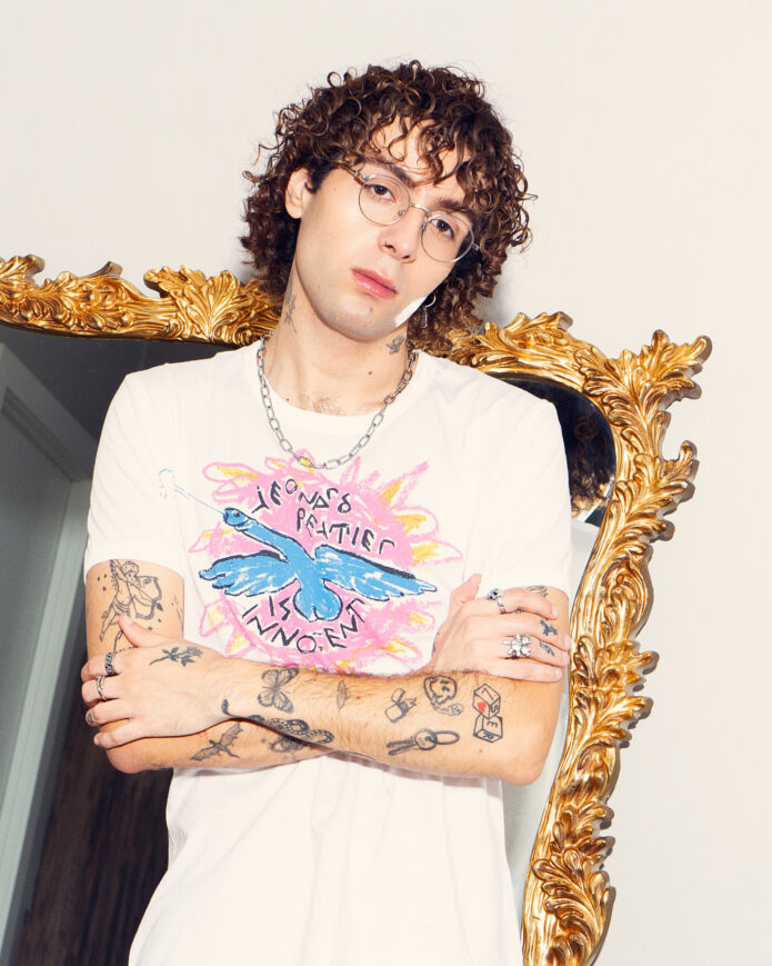
Nicolas McCoppin talks about his tattoos as a project still in progress, more like an album being made than a finished collection on a wall. The New York pop artist has 37 tattoos, and he sees the patchwork as another creative outlet: personal pieces, visual ideas and small details that make sense when you look at them together.

That approach makes his ink fun to follow. There’s no single sleeve or theme running from shoulder to wrist. Instead, he has small hearts, hand tattoos, music references, cartoon characters, fine-line drawings and darker blackwork. Some mark an era in his music; others were simply designs he wanted to keep. The overall effect is more scrapbook than matching set.

In a detailed tattoo interview with V13, McCoppin discussed where he began, how his style changed and why his body art stays connected to his music. Here’s what’s documented about the designs that can be clearly identified.

His first tattoos started with a rose, a heart and a moon

Nicolas McCoppin studio portrait showing arm and hand tattoos

McCoppin got his first three tattoos at 18, all on his hands: a rose, a heart, and a moon with stars. He says they were outlines, which fits the open, light look of much of his early work. The heart meant the most to him. Before making it permanent, he tried the same design in henna on the same finger while he was still in high school.

That little test says something about how he thinks about tattoos. He wasn’t picking random flash just to have ink; he wanted to see if the image would still feel right after the novelty wore off. It did. He still talks about those first hand pieces with affection, and the heart became a quiet thread running through the rest of the collection.

The placement helps explain why his tattoos show up so clearly in photographs. Even in a T-shirt or sitting in a studio, his fingers, hands and wrists are on display. These aren’t hidden away; they’re part of how he gestures, performs and moves through a room.

The tiny hearts became an ongoing game

Nicolas McCoppin forearm tattoos including eye and lettering designs

The heart from his first session didn’t stay on its own. McCoppin told V13 he now has more than 70 tiny hearts tucked into different tattoos. They aren’t necessarily 70 separate appointments or matching little stamps; they recur within larger designs wherever they work visually.

He describes the hearts as a kind of game between him and his artist. That takes the collection out of the solemn territory of the usual celebrity tattoo story. Some hearts are personal; others may be there because the shape has become part of his own visual language. Once you know to look for them, they turn into a small scavenger hunt across his arms and hands.

The repeated shape also gives a rhythm to a collection full of one-off images and music references. The hearts are the closest thing the patchwork has to a chorus. Since they grew out of his first hand tattoo, they make the collection feel as if it developed naturally instead of being planned from the start.

Music is drawn directly onto his skin

Nicolas McCoppin hand and chest tattoos in a close portrait

McCoppin likes dedicating tattoos to music. One clear example is the cover art for Loverboy, his first project, which he had reproduced on his right arm. The release became something he could carry on his skin, and he used the tattoo reveal to tease the project’s name before the music came out.

That’s a more personal connection to an album than putting the title on merchandise. The design becomes part of his own timeline; in a photo, it’s both an image and a piece of career history. The right arm is a fitting place for something he wants people to see when he’s performing or posing.

He kept the tradition going. In the interview, McCoppin says he would tattoo a new record onto himself before its release. At the time, he had another album on the way and was still deciding what the next piece would look like. Since he didn’t describe the finished design, it’s best to leave that chapter open rather than guess.

The Dangerous Woman character sits on his chest

Nicolas McCoppin full arm tattoo coverage with hand designs

One of McCoppin’s more specific pop-culture pieces is a cartoon version of Ariana Grande’s Dangerous Woman character on his chest. Grande is one of his favourite people, so it’s a personal reference, not just a random celebrity portrait. The character connects to Grande’s appearance in a Final Fantasy game in 2017, though McCoppin says he has never played it.

It’s a good example of why a full tattoo guide needs more than a quick image search. A photo can show a cartoon figure, but it can’t tell you why it’s there. Here, the meaning comes from McCoppin’s admiration for Grande and his liking for the character’s look. It’s playful, a little niche and typical of how he turns pop imagery into something personal.

The chest gives the character a more deliberate spot than a small hand or wrist mark. It has a central place in the patchwork even as the rest of the collection stays mixed. It may look like a fan tattoo, but McCoppin talks about it with the same care as his music-related pieces.

McCoppin describes his style as a mix of blackwork and fine line. For years he mostly chose fine-line designs; a first blackwork piece with Nico Delgrosso shifted the balance. The lighter outlines let the patchwork breathe, while blackwork adds weight. Since 2020, he has worked exclusively with Nico Delgrosso in Brooklyn, and says the artist takes his ideas and elevates them. It feels less like ordering a design and more like building a visual record together.

The arms and hands carry most of the visible map

Nicolas McCoppin reclining portrait showing both arm tattoos

In the available portraits, the arms and hands are the easiest places to follow the collection. Outlines, small symbols, lettering, hearts, figures and heavier patches appear on both sides. Close-ups show how the pieces sit beside one another instead of merging into a single sleeve. Some areas are busy; others leave enough bare skin for each design to stand out.

The hands remain important because they hold the earliest tattoos: the rose, heart and moon with stars. The forearms add later layers, including music-related work and the darker style he adopted over time. His neck is tattooed too, and he has said it and his chest were the most painful places to work on. That gives the placement choices a physical side: the patchwork is shaped by how each session felt, not just the finished look.

McCoppin hasn’t covered anything up so far. He likes the tattoos he has, with one possible exception: a design from a $50 flash spot in Brooklyn that healed blown out. Even then, he talks about it with humour instead of regret. The collection can include polished ideas, spur-of-the-moment choices and imperfect results without losing its personality.

What the collection says about Nicolas McCoppin

It would be easy to turn 37 tattoos into a list of objects, but the more interesting story is how McCoppin uses them. His body art holds career milestones, favourite characters, recurring hearts and experiments he wants to keep close. It also records the shift from fine-line work toward blackwork and his long-running partnership with Nico Delgrosso.

Some details are clear: the first three hand tattoos, the Loverboy cover art on his right arm, the Dangerous Woman character on his chest, the 37-tattoo count and all those tiny hearts. Other parts remain less specific. Not every mark has a published explanation, and a photo alone doesn’t justify inventing one.

That restraint fits McCoppin’s own description of the collection as an art project. Some pieces are deeply personal; others are there because they look good or connect to a song or album. Together, they form a visual diary that can keep changing as the music does.

His tattoos don’t look like a finished identity. It feels as if the next track is always waiting.

Watch Nicolas McCoppin talk about his music and creative life

Louis Tomlinson’s tattoos grew with the music

Louis Tomlinson’s tattoos don’t look like a perfectly matched set, and that’s part of their appeal. They came together in different places and at different points in his life: some connect to One Direction, others to home and family, and a few were chosen simply because they seemed fun. The result feels lived in, not designed for one big reveal.

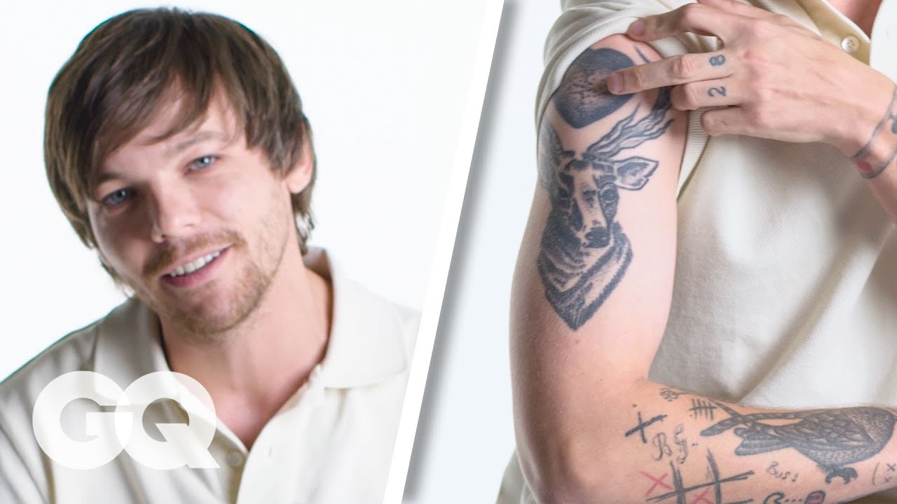
In his GQ tattoo tour, Louis walks through the collection with the dry humour he brings to interviews. He’ll talk about the sentimental pieces, but he’s just as ready to admit when one came from a silly idea, a late night or a decision that made sense at the time. That mix of sincerity and self-awareness is the key to his ink.

The screws and The Rogue keep him grounded

Louis Tomlinson The Rogue ankle tattoo

One of Louis’s earliest documented ideas sits across his ankles. He has a tiny screw on the inside of each ankle, a design shared by the One Direction members. The explanation is simple: the screws are there to keep the group grounded, even as their careers became much bigger than anyone expected.

Above the ankles, The Rogue is written on his legs. Louis has said the phrase refers to a school performance group he belonged to before One Direction. It nods to the five boys who performed together in assemblies, preserving a version of his life from before the stadiums and screaming crowds.

The placement gives the message a private feel. An ankle tattoo isn’t usually the first thing anyone sees, which suits a design about staying connected to an earlier life. It’s a small reminder tucked below his clothes, not a declaration across his chest. Together, the screws and The Rogue make a quiet opening chapter in the collection.

The stag and heart mark his right arm

Louis Tomlinson stag heart tattoo

On Louis’s right upper arm, a large stag sits beneath a heart that originally held a pair of earphones. The heart began as a visual take on listening to your heart, while the stag gives the piece a bolder outline. The design has changed over time, so older and newer photos can look different; it’s useful to check when each image was taken.

The stag is one of the easiest pieces to recognise because its size makes it stand out among the smaller doodles. It also shows why Louis’s tattoos don’t read as one continuous sleeve. Separate images, symbols and lettering overlap to make the arm feel busy and personal.

Louis has always had a playful way of using symbols. A heart with headphones is a joke and a statement at once: it points to music without needing a microphone or lyric, and fits the period when almost every part of his life revolved around the band. The meaning is direct, but the drawing doesn’t take itself too seriously.

It Is What It Is sits across the chest

Louis Tomlinson chest quote tattoo

It Is What It Is runs across Louis’s chest. It’s a familiar phrase, but on him it reads as a compact bit of attitude. Depending on the day, it can sound resigned, practical or quietly stubborn—which may be why it has remained useful as his career has changed.

On the left side of his chest is 78, which Louis has connected to his grandparents’ house number. The simple digits carry a warm family meaning; they’re not a lucky number or football reference. They point back to a place and to people he has spoken about with real affection.

The chest is more exposed than the ankles, so these tattoos are easier to spot in photos and on stage. They sit near each other without becoming one picture: the phrase gives his upper body a clear line of text, while 78 is a private detail fans may miss unless they know its story.

Far Away is a small title with a big feeling

Louis Tomlinson bird arm tattoo

Far Away is tattooed on Louis’s right bicep. He has said the phrase is about leaving family and friends behind when One Direction took him around the world. Being away from home, he explained, didn’t make those people any less a part of him.

It’s a very Louis kind of tattoo: simple to read, with a more complicated feeling underneath. Touring brought the opportunity and success he wanted, but it also meant missing ordinary days at home. The lettering holds both sides of that experience without trying to smooth them out.

It also fits with the other pieces. The screws are about staying grounded, 78 points back to family, and Far Away marks the cost of leaving. Taken together, they show a musician who has spent years moving between home and the road, using tattoos to keep both places close.

The spider web, bomb and match live on the inner arm

Louis Tomlinson GQ tattoo tour showing his arm tattoos

Louis’s inner arm has a cluster of small illustrations: a spider web, a bomb and a lit match. The web stands out because it seems to shoot outward like a projectile. Louis has linked the image to his love of Spider-Man, giving it a comic-book edge instead of making it a simple sign of danger.

The bomb and match add a few more visual jokes. They’re the kind of drawings you can enjoy for their shape before asking for a serious explanation. Treating every tattoo as a deep confession would miss that point; some are simply fun images that work well beside each other.

Photos from different years and angles help here. An inner-arm tattoo can disappear when Louis turns his wrist or bends his elbow, and it may look darker in a close portrait than under concert lights. You need a few clear views to get a sense of the sleeve; it isn’t a flat poster.

The skateboard, horseshoe and compass point toward his life before fame

Louis Tomlinson GQ tattoo tour showing his arm tattoos

There’s a stick figure skateboarding on the inside of Louis’s arm. He has described skateboarding as one of his hidden talents, so it’s a small nod to something he enjoyed away from the more obvious music story. Above it is a horseshoe tied to the mascot of a Doncaster football team that Louis once owned and supported.

The horseshoe is easy to misread as a general symbol of luck, but Louis’s explanation is more specific. It belongs to a football memory and the place he came from, which gives the shape more weight than a generic lucky charm.

A compass and paper airplane add another note of travel. One suggests direction; the other, movement and a life spent touring. Neither needs a definitive meaning forced onto it. They sit naturally beside the other tattoos because Louis’s collection returns to roads, distance, home and the places music has taken him.

The arm ends up feeling like a loose timeline: designs from school, references to Doncaster, images connected to music and reminders of the One Direction years. It has no dates printed beside each piece, but the ideas build up the way memories do. The old doodles remain even as newer work gets bigger.

The bird flock and camera capture the One Direction years

Louis Tomlinson 28 chest tattoo

Louis has a flock of birds on his arm to represent the five members of One Direction. The image reflects the group’s sense of family and teamwork, making it more affectionate than a standard band logo. It holds on to the people around him during the years that changed all of their lives.

He also has a camera tattoo connected to the constant photography that came with One Direction. Louis has said cameras were always around, documenting the group’s movements and making privacy difficult. There’s a little irony in turning that unavoidable part of fame into something he chose to carry.

The chest number 78 and the arm designs tell related stories in different ways. One points to his grandparents, another to his bandmates, and the camera acknowledges the attention that followed them. They aren’t interchangeable, but together they show how much of his early ink grew out of people, places and the speed of the band’s rise.

What makes Louis’s collection worth following is how it holds different moods at once. There are tender pieces about family and friendship, practical reminders of being away from home, and funny little drawings he seems to have chosen simply because he liked them. A tattoo can matter without being solemn.

The designs also show how a person changes. The boy who chose small symbols tied to school, football and One Direction is not exactly the same person touring as a solo artist. The older pieces remain, but now they sit inside a wider story. That’s what makes the collection feel honest instead of carefully branded.

Louis has dozens of tattoos, but not every small design has a confirmed explanation. The responsible way to describe them is to separate what he has said from what a photo merely shows. The stag, Far Away, 78, the screws, The Rogue, the bird flock, camera, compass, skateboarder, horseshoe, spider web, bomb and match are all documented. The rest is better described carefully than dressed up with invented meaning.

His ink looks like a scrapbook grown on skin. It carries home, bandmates, travel, football, music and a willingness to make fun of himself. The collection doesn’t pretend one artist designed every inch; it looks as if Louis kept adding chapters whenever life gave him a reason.

Watch Louis explain his tattoos

In GQ’s tattoo tour, Louis talks through the collection himself, including the first pieces, the compass, the skateboarder and the birds.

More musician tattoo guides

Tove Lo’s tattoos carry a whole career

Tove Lo’s tattoos are a bit like her songs: direct, funny, sometimes provocative and often more personal than they first seem. The Swedish singer’s small but recognisable collection covers her chest, arms and hand. Some designs mark a particular point in her career; others go back to childhood, her first band or an animal she has loved since she was young.

At least five pieces are clearly documented: a scorpion under her right collarbone, a girl riding a bee on her upper arm, a flaming heart with an eye on her forearm, a vagina symbol on her upper arm and a large lynx on the back of her microphone hand. The stories behind them make the collection more than a list of pictures.

Here’s what the sources say, with confirmed details kept separate from guesses.

The scorpion was her first tattoo

Tove Lo scorpion tattoo under her right collarbone

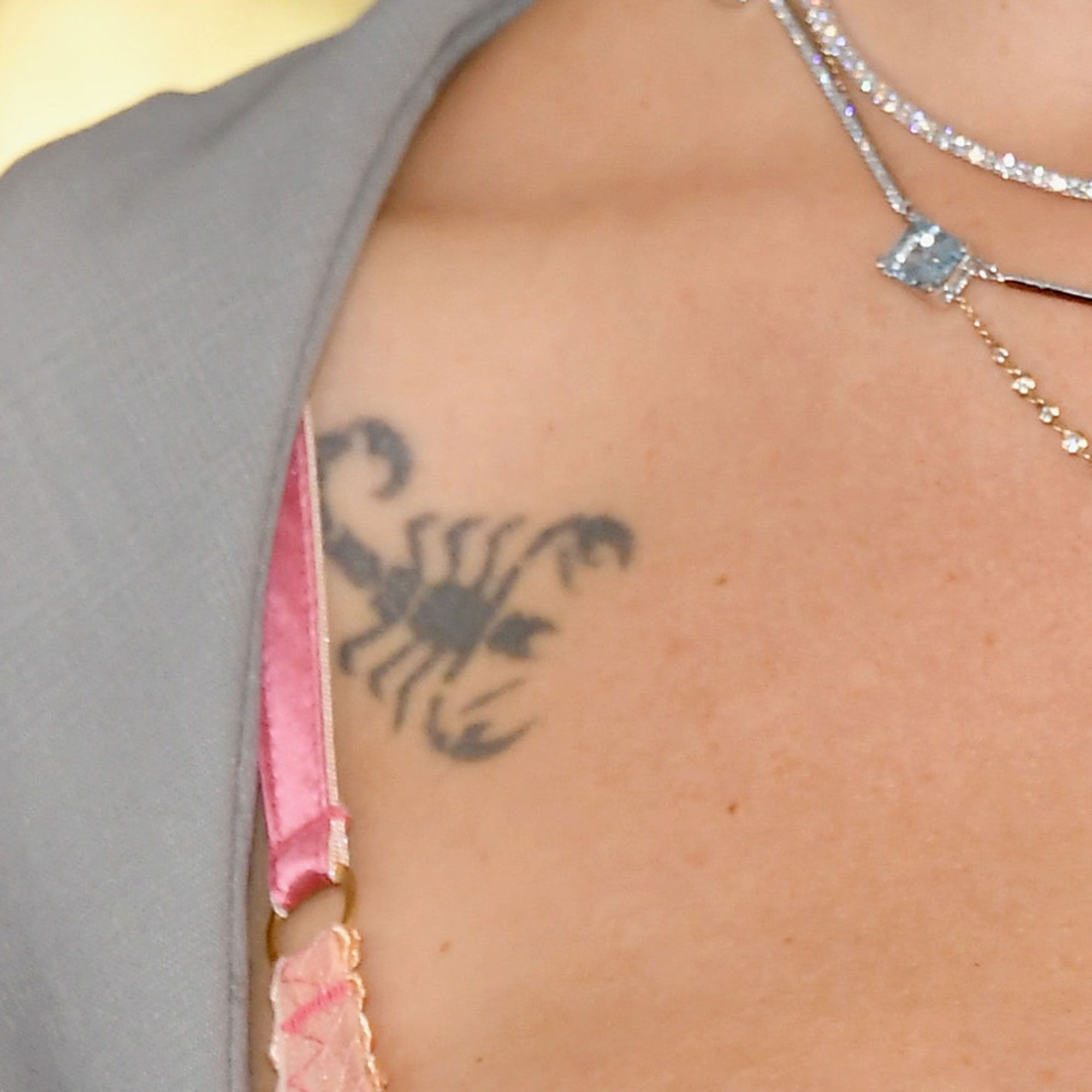
Tove Lo got her first tattoo at 17: a scorpion beneath her right collarbone. It has never been her favourite. In an interview cited in tattoo coverage, she called it a “little super ugly scorpion” and said she wasn’t sure what to do with it now that it was part of her.

There’s something refreshing about that honesty. Celebrity tattoo stories often turn every design into a meaningful emblem, but Tove Lo is happy to say that an early choice didn’t age well in her eyes. The scorpion matters simply because it was first. It marks the moment she decided to make something permanent.

The placement keeps it fairly contained. It shows in lower-cut clothing and close-up photos without taking over her chest, and sits apart from the much larger arm pieces she got later. It feels like a reminder of an earlier Tove Lo, not a polished logo for who she became.

Her father was reportedly upset when she got it, which became part of the story. Whether she still finds it embarrassing or it has simply become familiar, the scorpion has stayed with her throughout her career.

The girl riding a bee connects to her first band

Tove Lo girl riding a bee tattoo on her upper arm

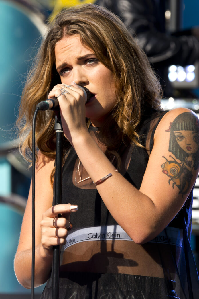
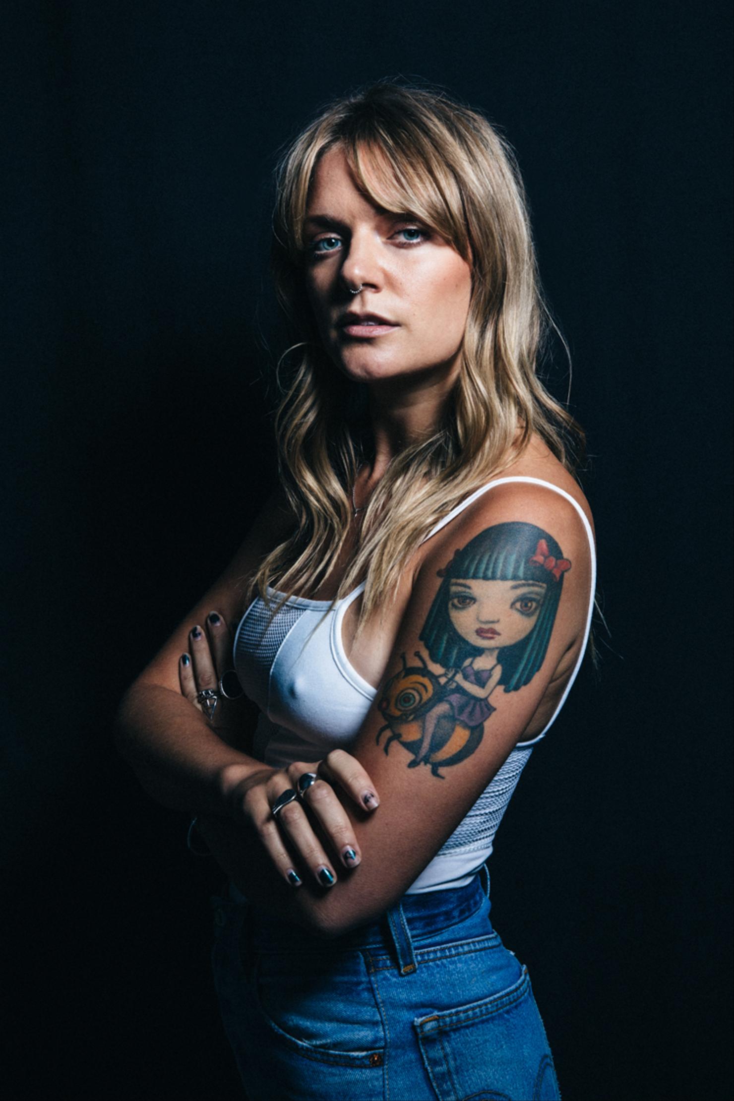
One of Tove Lo’s biggest early tattoos is a girl riding a bumblebee on her upper arm. The image comes from a painting by Mark Ryden and dates back to her first band, Tremblebee. She has said the group mattered to her because it was where she played her first gigs.

There’s a twist to the picture’s history. It was created for the cover of Jack Off Jill’s album Clear Hearts, Grey Flowers, though Tove Lo says she didn’t know that when she chose it. She was responding to the image itself and what it stirred in her, not setting out to pay tribute to the album.

She has described finding the painting and feeling that it went straight to her heart. Moving from the small scorpion to an image across her arm was a big leap. In a vlog, she remembered seeing the finished scale and thinking, “Fuck. What did I just do? It’s over my whole arm.” Years later, it had become part of her.

That change over time is worth noticing. It started as a dramatic decision and became familiar through years of living with it. The bee and rider hold memories of Tremblebee, early gigs and a younger creative life; the size shows she was ready to make a bold commitment before knowing exactly how it would feel years later.

The flaming heart came from Mark Ryden paintings

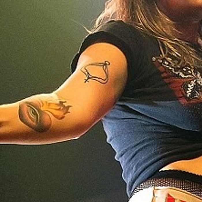
Tove Lo eye and flaming heart forearm tattoo

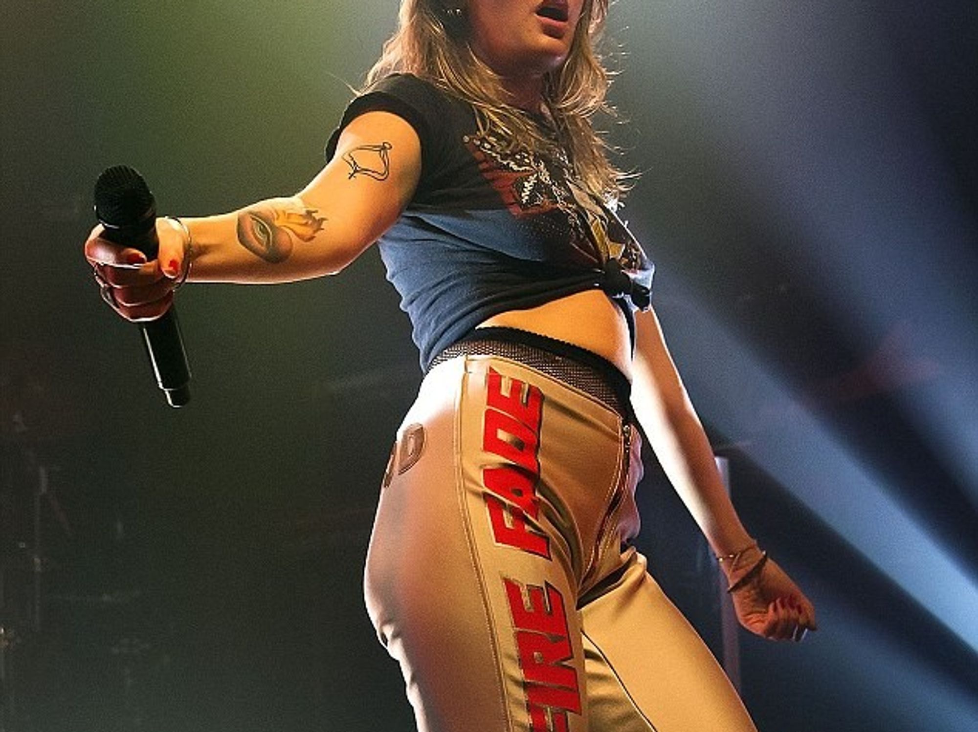
On Tove Lo’s right forearm is a heart with an eye in the middle and flames rising from the top. She has said the design draws on Mark Ryden’s paintings: the eye comes from Sophia’s Mercurial Waters, and the flames resemble details from Swap Meet Man.

That makes it more specific than a generic heart-and-flames tattoo. The design combines images she already loved and turns them into something that can stand on its own. She has said the eye looked small in the paintings, so she made it much bigger because she liked it.

The tattoo was done at Infamous Studio in Stockholm. It’s busy but easy to read: the heart sits at the centre, the eye draws focus and the flames push upward. From a distance it might look romantic; closer up, the eye makes it feel surreal.

The piece has been visible for much of her career. It appeared in an Instagram photo in 2012, though the exact date she got it isn’t certain. It bridges familiar pop imagery with the odd, unsettling details she enjoys.

The vagina symbol belongs to the Lady Wood era

Tove Lo Lady Wood vagina symbol tattoo on her upper arm

During the Lady Wood album cycle, Tove Lo got a minimalist vagina symbol on her upper arm. Tattoo artist Mark Lonsdale drew the outline from the album’s logo, where it stood in for the letter O. Her tour crew wore matching vagina jackets too.

Tove Lo has explained the meaning herself. She said the tattoo reminds her not to make herself smaller, especially when women are expected to be quiet or agreeable. For her, it’s about claiming space and pursuing things that are frightening as well as exciting.

That context changes how the simple outline reads. It carries a direct message about confidence, sexuality and refusing to soften herself for other people. Although it began as an album symbol, it also works as a personal reminder beyond the campaign.

Unlike the scorpion, this isn’t a tattoo she has described with regret. It’s deliberate, graphic and tied to a time when she made her body part of the conversation around the music. It’s branding, autobiography and a feminist message in one small image.

The lynx on her microphone hand has a personal origin

Tove Lo lynx tattoo on the back of her hand

Tove Lo’s large lynx on the back of her microphone hand is one of the most personal pieces in her collection. Lynxes are her favourite animal, and “Lo” connects to the Swedish word for lynx. As a child, she was struck by a lynx named Tova at a zoo; her family began calling her Tove Lo because of it.

The name stayed with her as a writer and solo artist, making the animal more than a striking image. She has described the lynx as a kind of spirit animal because it has been a favourite since she was little. The design is tied to her identity, not just a passing aesthetic.

In September 2016, while touring with Maroon 5, she visited Alex McWatt, founder of Three Kings Tattoo in New York City. The placement was practical as well as symbolic: she wanted it on the hand that holds her microphone so it would show when she performs.

She has also said she didn’t overthink the finer details. The tassels on the animal’s ears were enough to make the design feel right. That easygoing approach differs from the grand meanings often attached to tattoos afterward. She knew the animal mattered, knew where she wanted it, and let the artist build the image.

Taken together, the tattoos mark different eras. The scorpion goes back to being 17 and making an early permanent choice. The girl on the bee recalls Tremblebee and those first gigs. The flaming heart draws on Mark Ryden, while the Lady Wood symbol turns an album logo into a message about taking up space.

The lynx brings the story back to her name and childhood. It’s personal, but placing it on the microphone hand also makes it part of the performance. That combination runs through the collection: private history set somewhere the public can see it.

There’s no need to pretend these tattoos were planned as one unified sleeve. They come from different times, artists and moods. Some are provocative, some sentimental, and one she has openly called ugly. That mix is what makes the collection believable. Real collections hold both the tattoo you’d choose again and the one you simply learned to live with.

Tove Lo’s best-known pieces stand out because their stories are unusually specific: a first band, an accidental album-art connection, a feminist symbol, a childhood animal and an early scorpion all share the same body. The result is messy in the best way: honest, memorable and unmistakably hers.

For a look at Tove Lo discussing tattoo work in Melbourne, watch this tattoo-focused video:

More musician tattoo guides

Kasia Smutniak’s Back Tattoo Tells a Bigger Story

Kasia Smutniak’s tattoos can be easy to miss in a quick red-carpet photo. She often keeps them under simple, dark clothes, then lets them show in an open-back dress or a low side cut. There’s a lot to see when the ink is visible: an older neck tattoo, a personal line of writing, a butterfly and a large myth-inspired design across her back.

The newest piece draws the most attention, but it seems to have changed the story of the older tattoos too. It covers or reworks an earlier design, making the result feel like a new chapter rather than a random cover-up. Here’s what can be established from Kasia’s public photos and the reporting around them.

The big Garuda and Pixiu tattoo covers the right side of her back

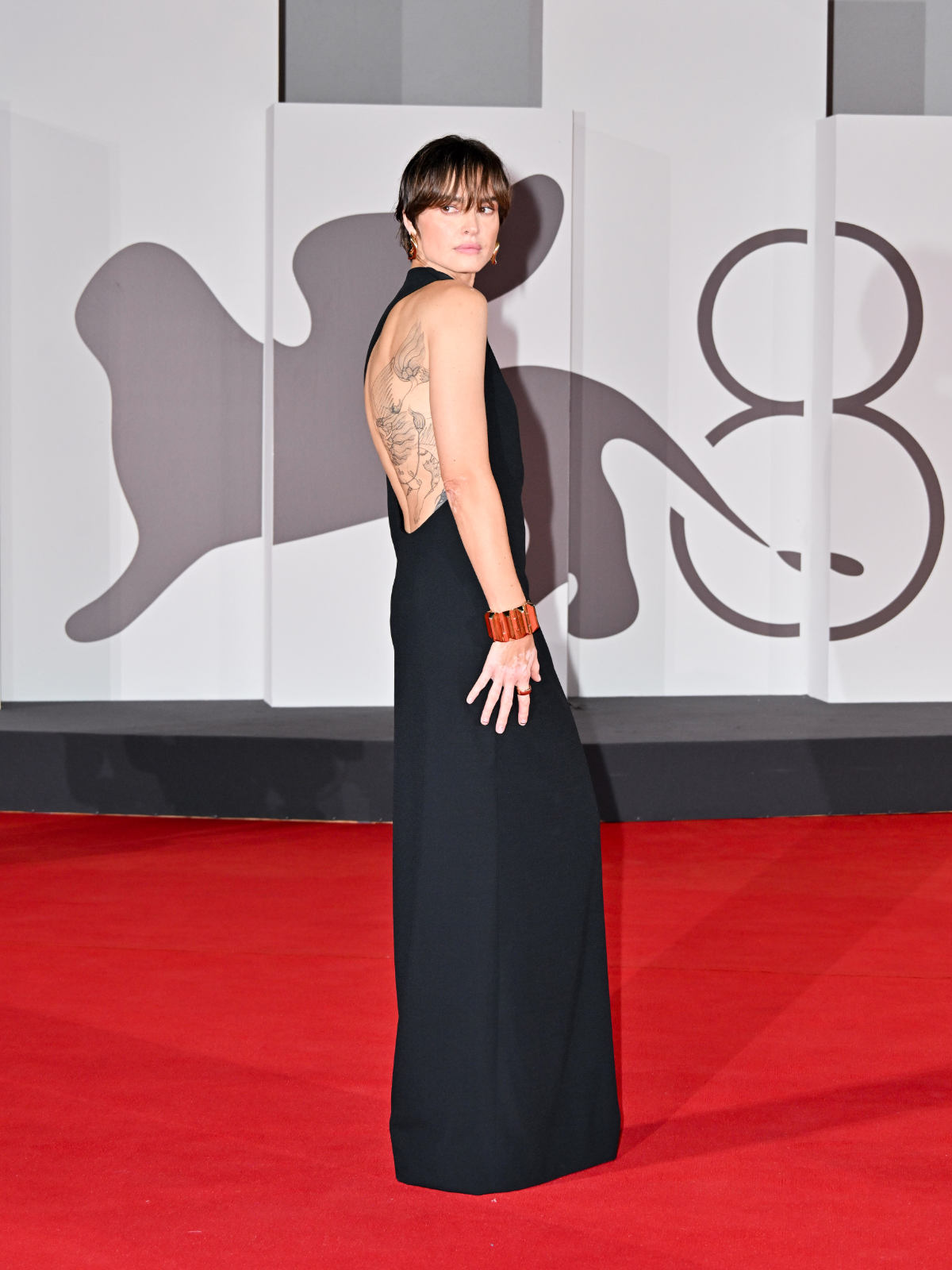
Kasia Smutniak Pixiu back tattoo at Venice Film Festival

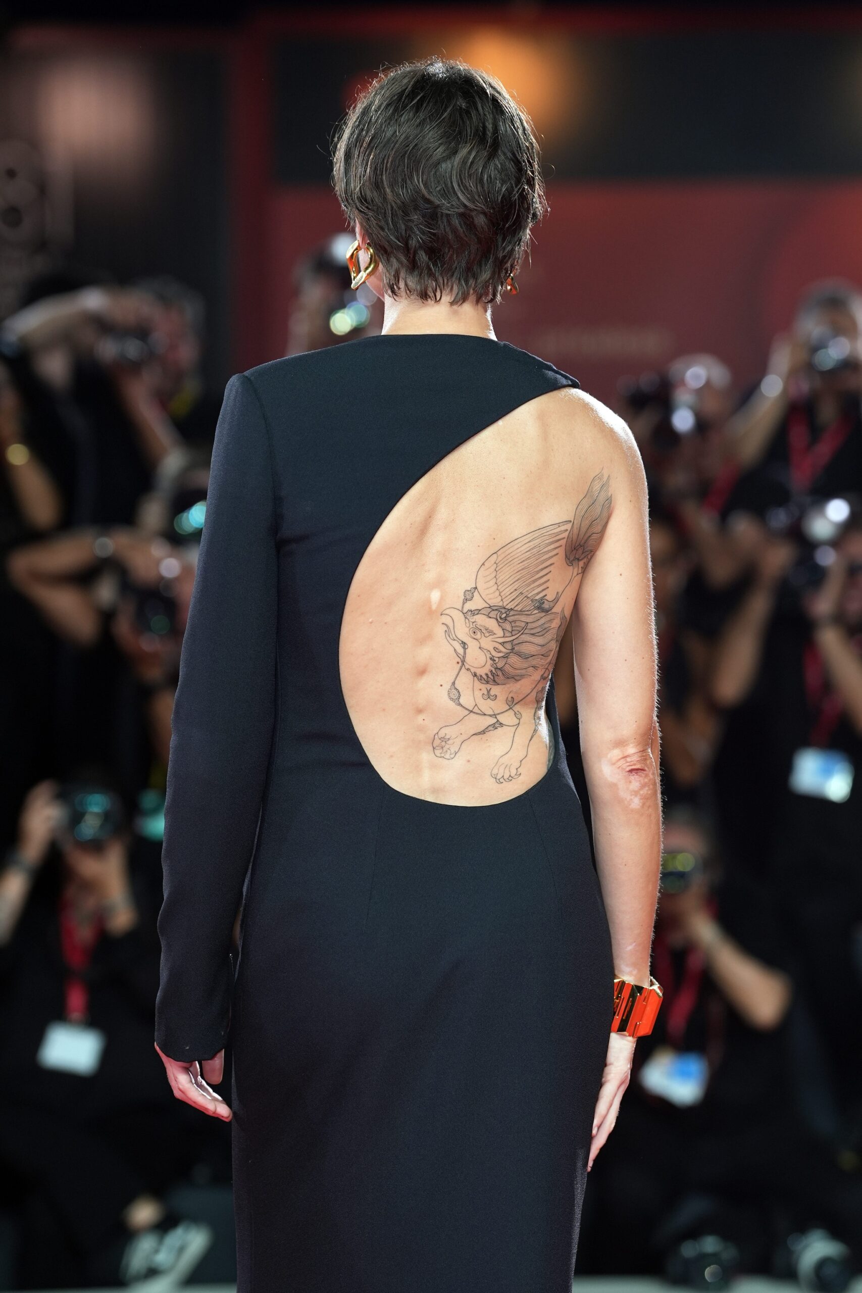
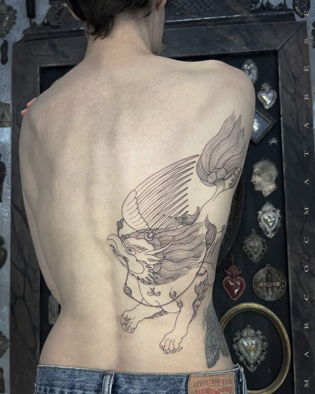
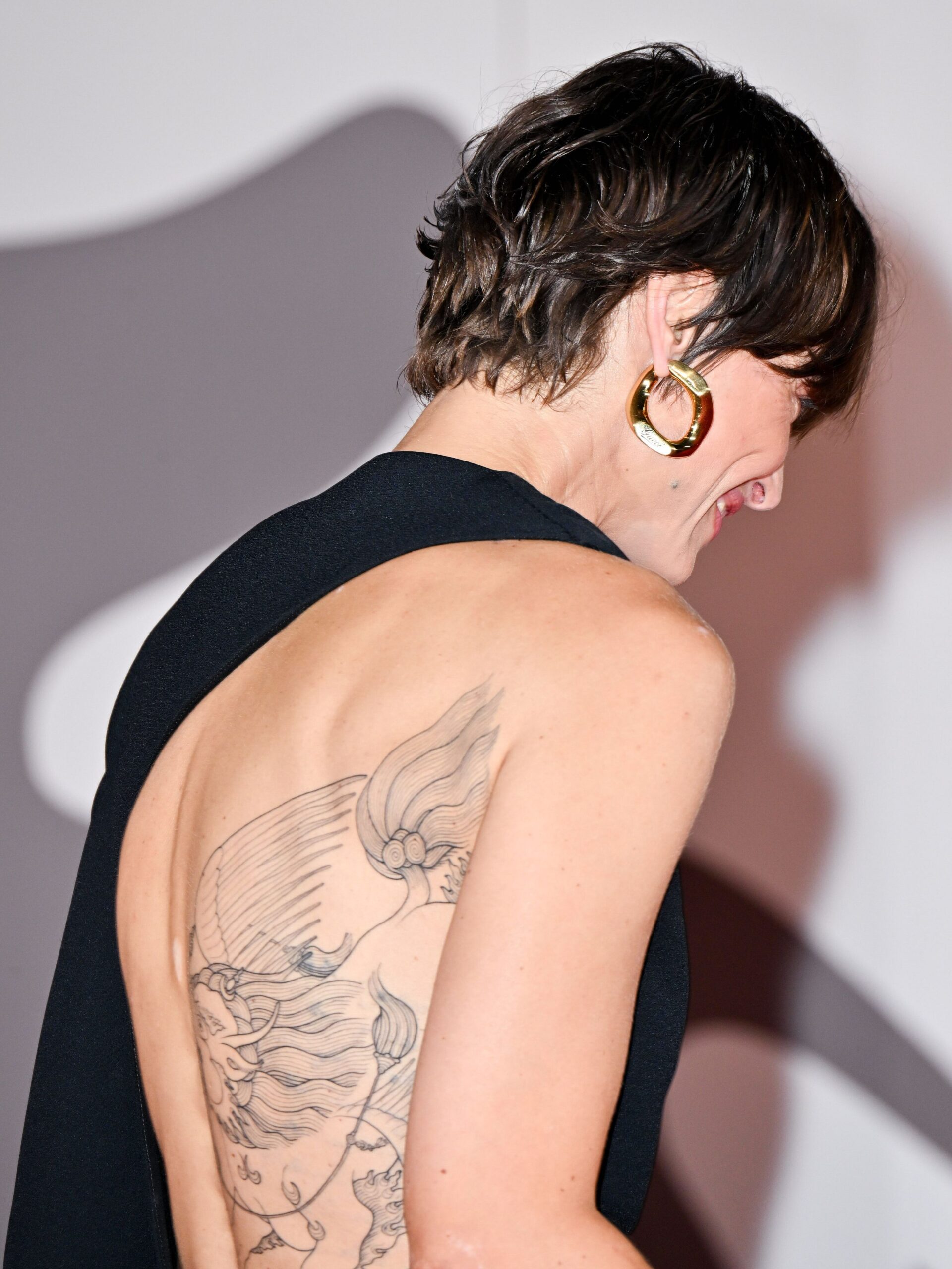
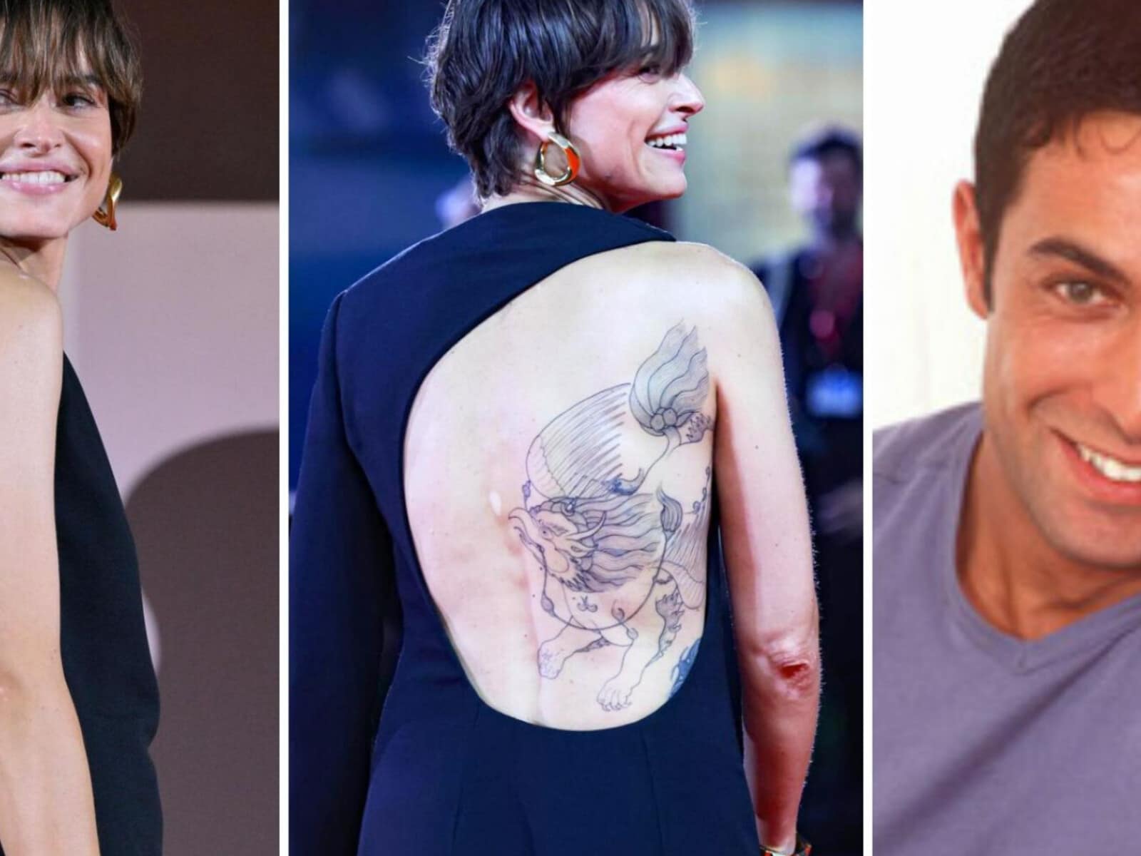
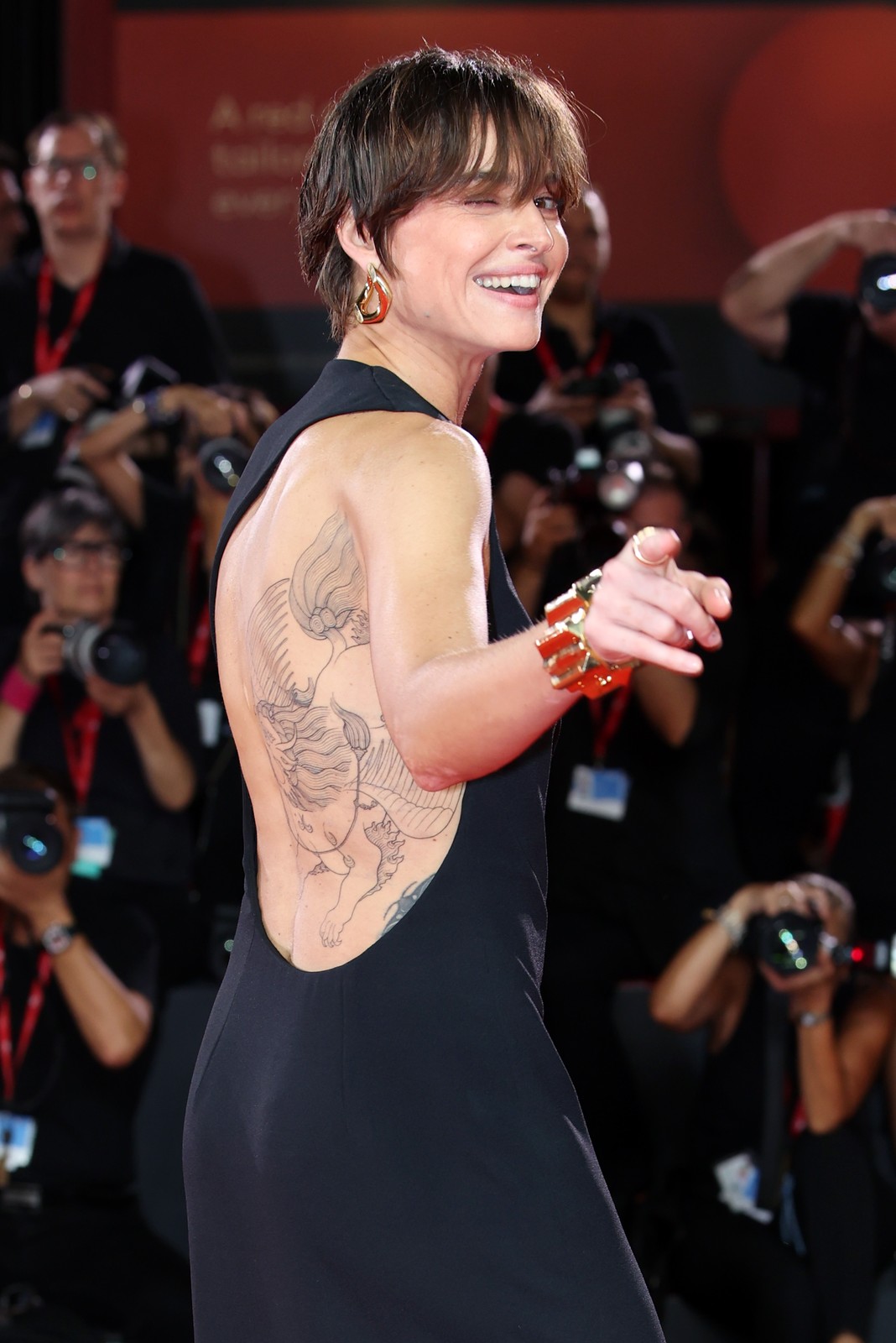
Kasia’s main tattoo is a large black-and-grey design that runs down the right side of her back and around toward her side. It has a winged shape, a strong animal head, sweeping lines and plenty of fine detail. Reports around the 2024 Venice Film Festival described it as a Pixiu, a Chinese mythological creature often shown with a lion-like body and a dragon’s head.

There’s another layer to the imagery. Kasia shared words connected to Garuda, the powerful bird-like figure in Hindu and Buddhist traditions, and wrote “il guerriero”, or “the warrior.” It’s safer to describe the tattoo as drawing on several references than give it one tidy label. Coverage points to the winged-lion and warrior ideas, but the design is personal and she hasn’t explained every symbol publicly.

The placement is part of the effect. A backless dress reveals the tattoo in one sweep, while an ordinary top hides it completely. In the Venice photos, the open gown almost makes the ink look like part of the dress. The lines follow the curve of her body instead of sitting in a small, separate patch.

What Pixiu means in the tattoo’s visual language

Kasia Smutniak winged lion tattoo across the shoulder and back

Pixiu is commonly associated with protection and good fortune, and is often described as a guardian. A tattoo of the creature can suggest strength or keeping bad energy away. That reading fits the way Kasia’s design looks: it isn’t delicate from a distance. The wings and heavy body give it a sense of movement and force.

Still, it’s best not to overstate the meaning. Kasia hasn’t shared a detailed official explanation of every part. The clearest public clues are the wording around the warrior and the descriptions that appeared at the time. Anything beyond that is interpretation, not a confirmed statement from her.

That distinction matters because the tattoo has attracted dramatic guesses. Some reports wondered whether it was connected to Pietro Taricone, Kasia’s former partner and the father of her daughter. The design may hold private memories, but the public record doesn’t establish a direct dedication. What we can say is that it replaced or covered earlier work, and Kasia chose to show it when the warrior imagery was easy to notice.

The tattoo was still being finished when she first showed it

Kasia Smutniak Garuda and Pixiu back tattoo

Photos from the reveal suggest the back piece was still in progress. The linework is already substantial, but some details appear sharper in one photo than another, partly because of lighting and partly because the images were taken at different stages. That’s normal for a large tattoo, which may take several sessions and look different as it heals.

Italian coverage named the artist as Marco C. Matarese, a Milan-based tattoo artist. Knowing who made the new piece helps explain its style, but it doesn’t mean he did every tattoo Kasia has. The older designs seem to belong to a different period and a simpler visual language.

The back and side also give an artist room to build one connected composition. Instead of a row of small designs, Kasia now has a broad image with wings, a creature’s body and long, flowing lines. Even when a photo shows only part of it, the tattoo reads as a single scene.

The old neck tattoo is a small tribal design

Close view of Kasia Smutniak Pixiu tattoo

Before the large back piece, one of Kasia’s documented tattoos was a small tribal-style design behind her neck. It’s far more compact than the Pixiu and sits high enough to show when her hair is short or pulled back. A gallery article from 2018 identified it as her first tattoo.

“Tribal” is a broad description of the visual style, not a precise cultural identification. The public source uses the term for the shape and look; there’s no reliable explanation linking it to a particular people or tradition. The safest description is a small black tattoo behind the neck, made of curved, graphic lines.

The placement helps explain why it has stayed relatively private. Hair, a collar or a high neckline can cover it. Compared with the newer back piece, it feels almost like a signature: small, easy to hide and visible when Kasia wants it to be.

She has a line of writing across the upper body

Kasia Smutniak large back tattoo at a red carpet event

Another older tattoo described in the public gallery is a line beginning “Se Dio mi regalasse…”, which translates as “If God were to give me…” The phrase is associated with a piece across her bust or upper torso; the gallery also describes a butterfly flying along her side.

The available descriptions leave the sentence unfinished, so it’s better not to turn it into a made-up quote. We can say the tattoo pairs handwritten text with a butterfly. That gives it a different mood from the heavy mythological creature on her back: the writing feels intimate and open-ended, while the butterfly adds a small sense of movement.

It also shows that Kasia’s tattoos haven’t followed one strict style. The older pieces are personal and relatively light; the new back design is dense, dark and expansive. They can look like they belong to different people, which is why the collection reads as a timeline rather than a matching set.

The butterfly and the writing are easy to miss

Kasia Smutniak back tattoo visible in a Gucci gown

Most photos of Kasia focus on her face, clothes or film work, so the older torso tattoo isn’t as well documented as the newer back piece. It tends to appear only when a dress reveals the side of her body. That limited visibility may be why some online descriptions reduce her collection to one large back tattoo and leave out the earlier work.

The butterfly is worth including because it changes the feel of the design. Butterflies are familiar tattoo images, but here one sits beside a sentence rather than on its own. It almost works like punctuation at the edge of the writing. Without a clear, full view, its exact size and direction are hard to confirm.

The same caution applies to the older design that the new tattoo seems to cover. Some reports connect the change to a past relationship, but that remains speculation. What the photos show is enough: earlier work has been absorbed into a much larger composition, and the new image now carries most of the visual weight.

Every known Kasia Smutniak tattoo, at a glance

Based on the public documentation available, the collection includes:

  • A tribal-style tattoo behind the neck, described as her first tattoo.
  • Writing across the upper body beginning “Se Dio mi regalasse…”
  • A butterfly near the side, visually connected to the writing.
  • A large winged creature on the right back and side, described with Pixiu and Garuda references.
  • The word or idea “guerriero”, meaning “the warrior,” associated with the newer design.

That’s the documented list, not proof that Kasia has no other private or rarely photographed tattoos. The available material shows a handful of clear pieces, but it doesn’t support a huge catalogue of small symbols. It’s better to leave uncertain areas out than to call every dark mark in a red-carpet photo permanent ink.

Why the collection feels personal instead of planned

Kasia’s tattoos look as if they were added at different points in her life. The neck design is compact; the writing and butterfly feel reflective. The new back tattoo is more confident and theatrical, but it still draws on a personal vocabulary of protection, strength, flight and the idea of a warrior.

That variety is what makes the collection interesting. The tattoos don’t all deliver the same message or share one polished studio style. Some are private reminders that disappear under clothes; one is a large statement that takes over a red carpet. The collection feels lived in, not designed for a single photo shoot.

A cover-up doesn’t erase the past entirely. Even when the old design is hard to see, it has shaped the size and placement of the new one. Kasia’s back tattoo is now the piece most people talk about, but the smaller neck and torso tattoos give the story its earlier chapters.

Watch Kasia talk about the tattoo

There’s no need to pretend every detail has been explained in a caption. In this tattoo-focused interview, Kasia discusses the large back piece and its story:

Kasia Smutniak’s ink is a good example of why tattoo coverage needs more than a cropped red-carpet photo. The Pixiu- and Garuda-inspired piece is the headline, but the older neck tattoo, unfinished line of writing and butterfly fill in the picture. Together, they show a collection that has changed over time without losing its personal edge.

More actor tattoo guides

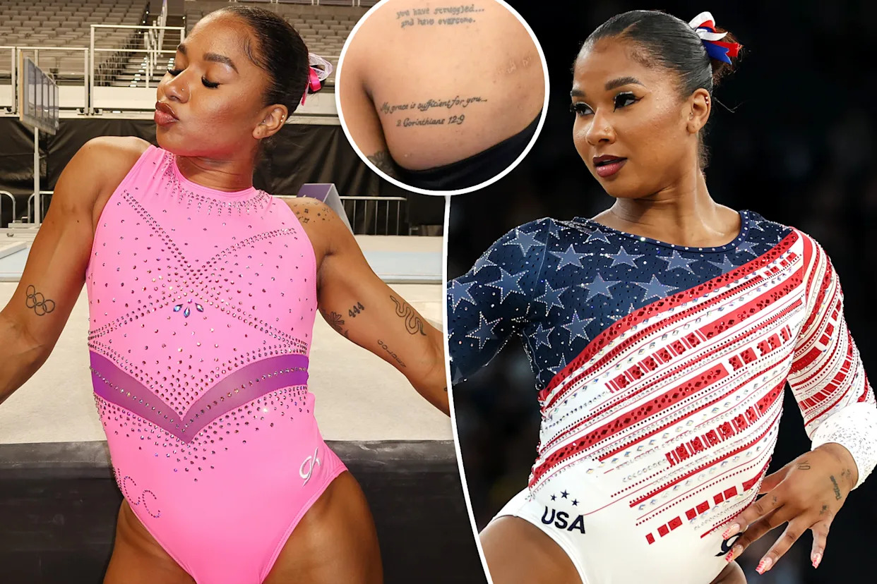
Jordan Chiles Keeps Her Biggest Stories in Ink

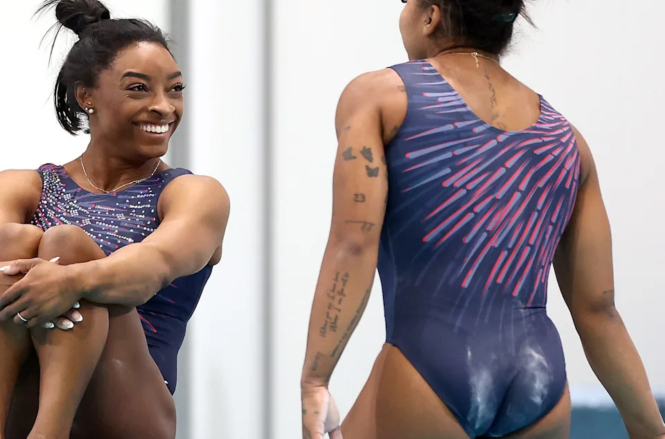
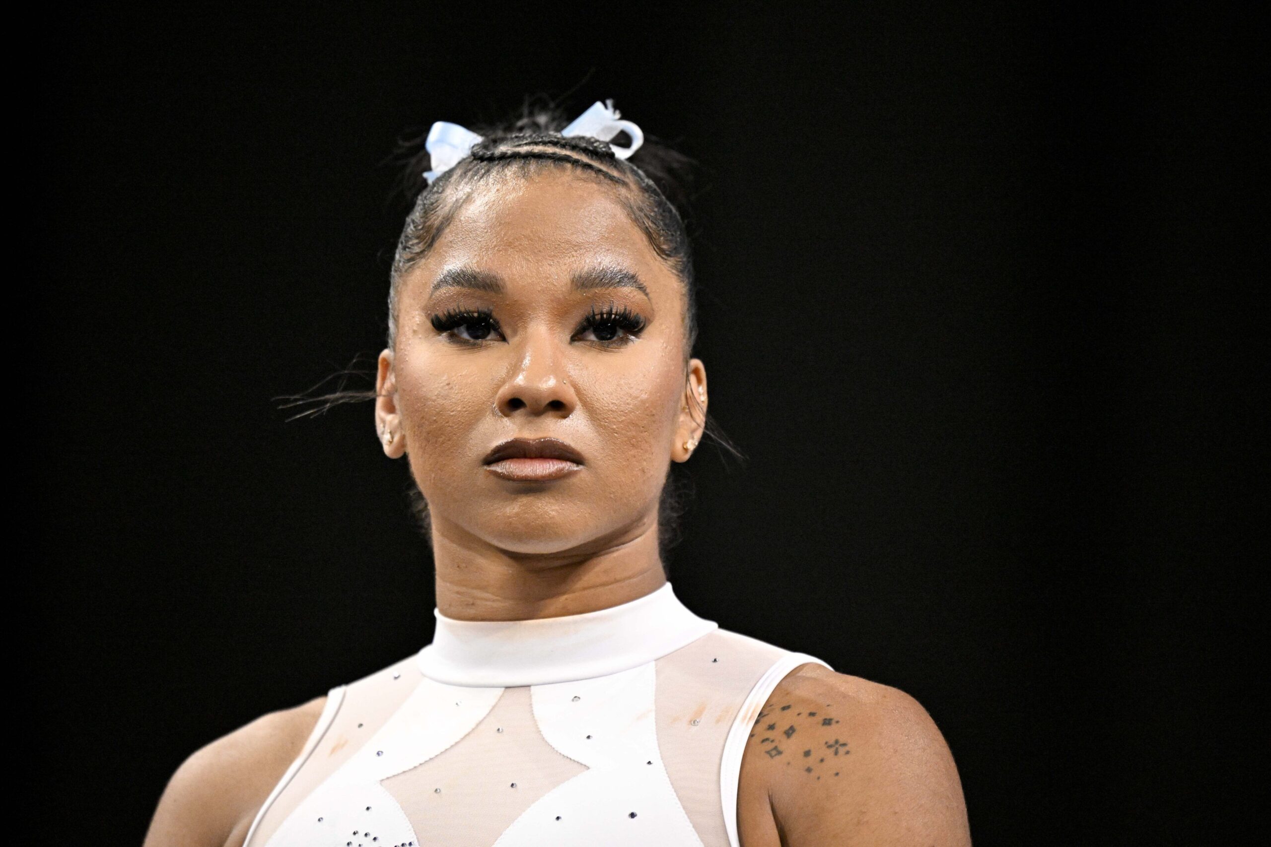
Jordan Chiles has never treated tattoos as background decoration. She has more than 20, many tied to people, turning points, faith or getting through a hard stretch. There’s ink on her arms, hands, back and along her spine. She has described the right side of her body as “shield and armor,” while the left carries more of the imperfections and personal reminders she lives with.

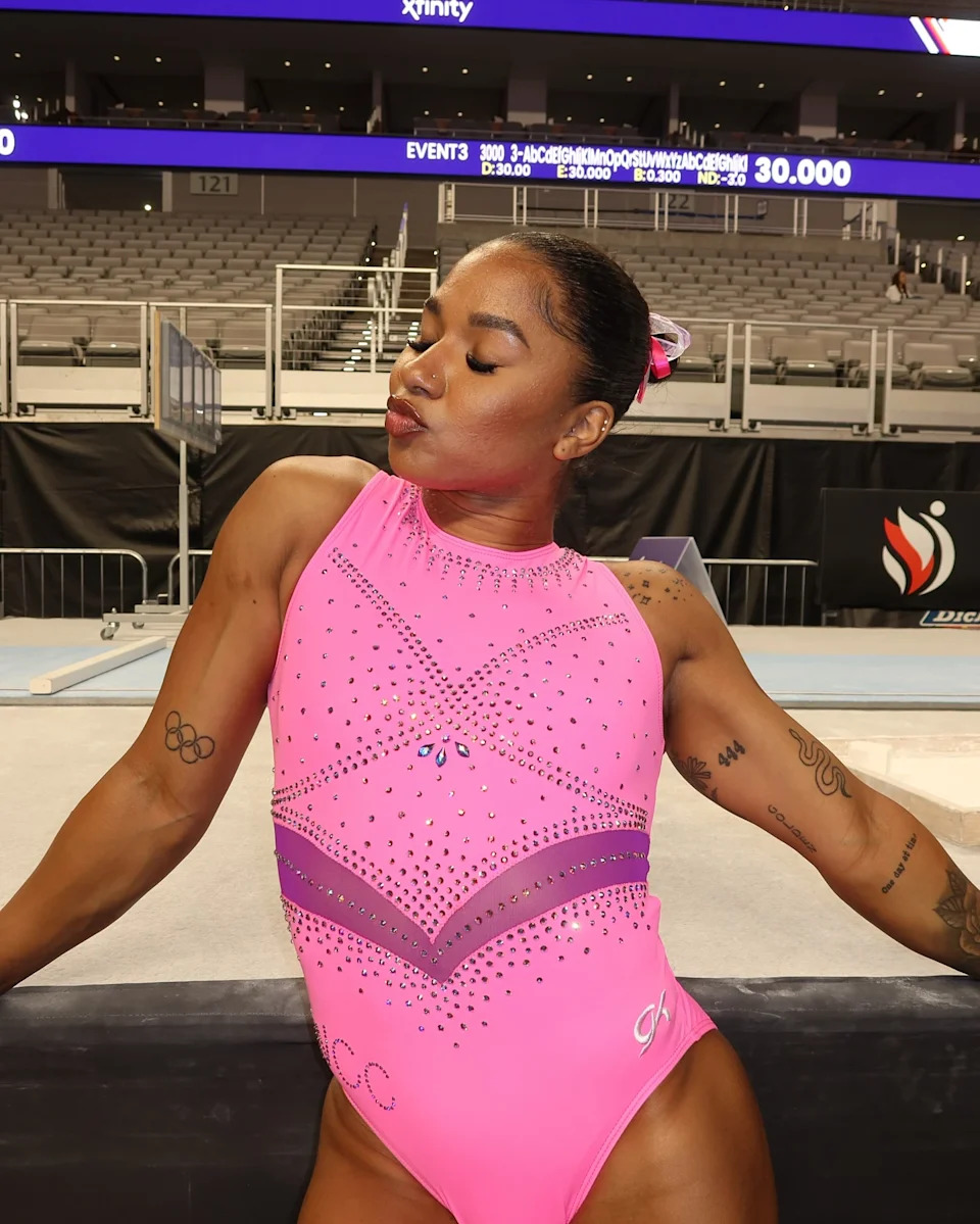
That makes her collection feel more like a scrapbook than one matching sleeve. There are Olympic rings, a family tribute, scripture, koi fish, a rose, a snake and smaller designs connected to milestones beyond gymnastics. Some show during competition; others only appear when she turns her hand or wears an open-back outfit.

Jordan Chiles’ Olympic rings are her reminder

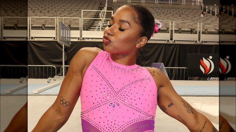
Jordan Chiles Olympic rings arm tattoo

The Olympic rings on Jordan’s arm are probably the first design many fans notice. She got them after the 2020 Tokyo Games, where she made her Olympic debut. The placement has a personal purpose too: she has described the right side of her body as a kind of shield, so the rings sit somewhere that feels protective rather than random.

Jordan has also called the tattoo a reminder of what she has already accomplished. Gymnastics moves quickly, and it’s easy to focus on the next routine instead of the years that led there. The rings give her a lasting nudge: you really are an Olympian. In coverage of her tattoos, she joked that they can remind her when she forgets the scale of her achievement.
They’re connected to Simone Biles as well. The two gymnasts got matching Olympic-ring tattoos after Tokyo, turning one career milestone into a shared memory. It’s a small design, but the story behind it is much bigger than the logo itself.

Her “Golden” tattoo connects her to Simone Biles

Jordan Chiles forearm tattoos during vault

Jordan and Simone also have matching “Golden” tattoos, linked to the Gold Over America Tour. The word fits the tour’s message, but Jordan has described its meaning more broadly: everyone has something bright in them, even if it doesn’t look like a medal from the outside.

That makes it more than a victory stamp. It’s also about recognising your own value before anyone else does. In Jordan’s collection, the word sits alongside tattoos about family, faith and resilience, so it feels like part of a larger theme instead of a slogan on its own.

A quote for her grandfather sits close to her arm

Jordan Chiles practice tattoos

One of Jordan’s most personal tattoos is a line from her grandfather, Gene Velasquez: “Where you are, I have been. Where I am, you will be.” She got it in 2023, two days after he died. The timing makes clear why it matters. It wasn’t a design chosen for a photo; it was a way to keep his voice close as she entered the next part of her life.
The words work in both directions. They sound like an older relative speaking to Jordan, but they also become something she can carry forward. She has described tattoos as reminders, and this one is direct: family history she can take with her to every gym, meet and new chapter.
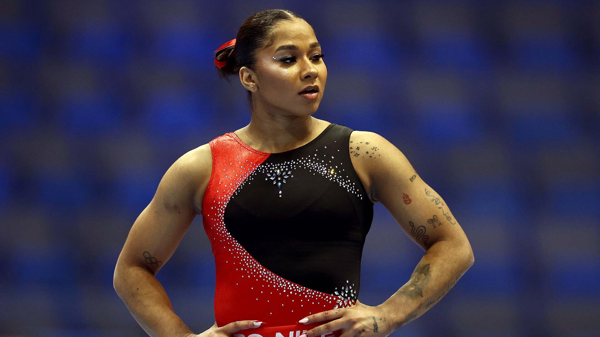
It’s also a good example of the difference between being visible and being meaningful. The quote may show when she competes, but it isn’t there to perform grief for the crowd. It’s there because someone important said it to her, and she wanted that connection to stay with her.

The koi fish on her back are about balance

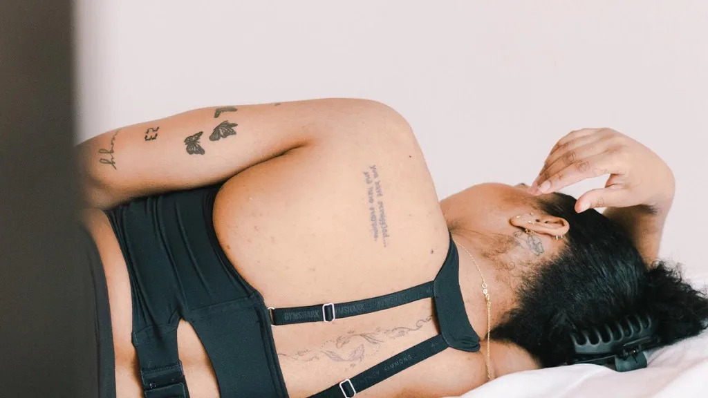
Jordan Chiles back koi fish and scripture tattoo

Jordan’s back tattoo is more detailed than the quick glimpses fans get during a routine. At its centre are yin-yang koi fish, a pairing associated with balance and harmony. The design follows her spine, running down the centre of her back rather than sitting to one side.

Words around the koi add to the message. One line reads, “you have struggled… and have overcome.” Another refers to 2 Corinthians 12:9, with the phrase “My grace is sufficient for you.” The imagery and scripture make the back piece feel like a private pep talk that becomes visible when she wears an open-backed leotard.

There’s a useful contrast between the movement of gymnastics and the steadiness of the design. Koi suggest persistence; the yin-yang shape brings the idea back to balance. Jordan’s career has had major highs and painful stretches, and the tattoo doesn’t pretend the difficult parts weren’t there. It suggests they became part of her strength.

Scripture and faith show up in more than one place

Jordan Chiles shoulder script tattoo

The Corinthians reference isn’t the only faith-related detail in Jordan’s ink. Philippians 4:13 has also been identified among the scripture tattoos connected to her collection. The verse is familiar to many athletes, but here faith sits alongside names, dates and reminders specific to Jordan’s own life rather than feeling like a generic sports accessory.

That mix keeps the collection from looking too polished. One tattoo might mark a public achievement; another may be a sentence she needs to carry with her. Jordan has said tattoos should mean something and that people shouldn’t get them just for the sake of it. Her choices reflect that: even the more decorative designs sit beside pieces tied to people and personal milestones.

Her arm and hand tattoos carry smaller reminders

Jordan Chiles Patience hand and Olympic rings tattoos

Jordan’s arms and hands make the collection feel like it grew with her life, rather than arriving as one carefully planned project. There’s a cursive “Patience”, ornamental work and small symbols around the larger designs. Some are easy to miss without a close-up, which suits pieces that don’t need to announce themselves.

She also has a “23” tribute to Michael Jordan, along with a rose, a snake and the angel number 444. The designs appear in photos taken from different angles, so their exact alignment can vary. What links them is that each connects to something: a sports hero, growth, courage or a number she finds meaningful.

The rose, snake, and 444 tattoo add a different mood

Jordan Chiles rose snake and 444 tattoos

The rose and snake bring a slightly darker, more traditional tattoo feel. A rose can suggest beauty, love or courage, while a snake is often associated with change and renewal. Jordan hasn’t given every symbol a detailed public explanation, so it’s better not to force one meaning onto the design. These pieces sit alongside the more literal Olympic and family tattoos without looking out of place.

The 444 tattoo is another small detail fans have spotted on her arm. Angel numbers are personal, and Jordan hasn’t needed to turn this one into a public statement for it to matter. It works as a quiet marker in the middle of a more visible collection.

There are more than 20 tattoos, but not every design has a public explanation

Jordan Chiles arena tattoos

Reports put Jordan’s total at more than 20. Some photo features count even more, depending on whether each tiny symbol or separate piece of script is treated as its own tattoo. A complete list is hard to pin down: designs are partly covered during competition, and newer photos can reveal ink that was hidden the last time someone tried to catalogue it.

The main documented group includes the Olympic rings, “Golden,” her grandfather’s quote, the koi and scripture back piece, Philippians 4:13, “Patience,” the rose, the snake, 444 and the number 23 linked to Michael Jordan. Other small floral, script and ornamental pieces appear in close-ups, but Jordan hasn’t publicly explained all their names or meanings.

That openness suits her approach. She doesn’t seem interested in turning each tattoo into a press release. Some designs mark public milestones; others are simply hers. The collection can be read as a timeline and still have room for another chapter when she finds one worth keeping.

Jordan Chiles’ tattoos keep the hard parts in view

Jordan’s ink is bold, but the stories behind it are grounded. The rings remember Tokyo; “Golden” connects her to Simone and the tour. Her grandfather’s words keep family close, while the koi and scripture acknowledge struggle without making it the whole story. Numbers, flowers and smaller script fill in the rest.

That’s why the collection feels more personal than promotional. Some tattoos celebrate a win; others remember grief, patience, faith and the work it took to keep going. They’re not there just to fill empty space. Even when Jordan hasn’t explained every detail, the broader picture is clear: she carries her biggest stories with her and leaves room for the next one.

Watch Jordan Chiles talk about her tattoos

Aryna Sabalenka Lets One Tiger Do the Talking

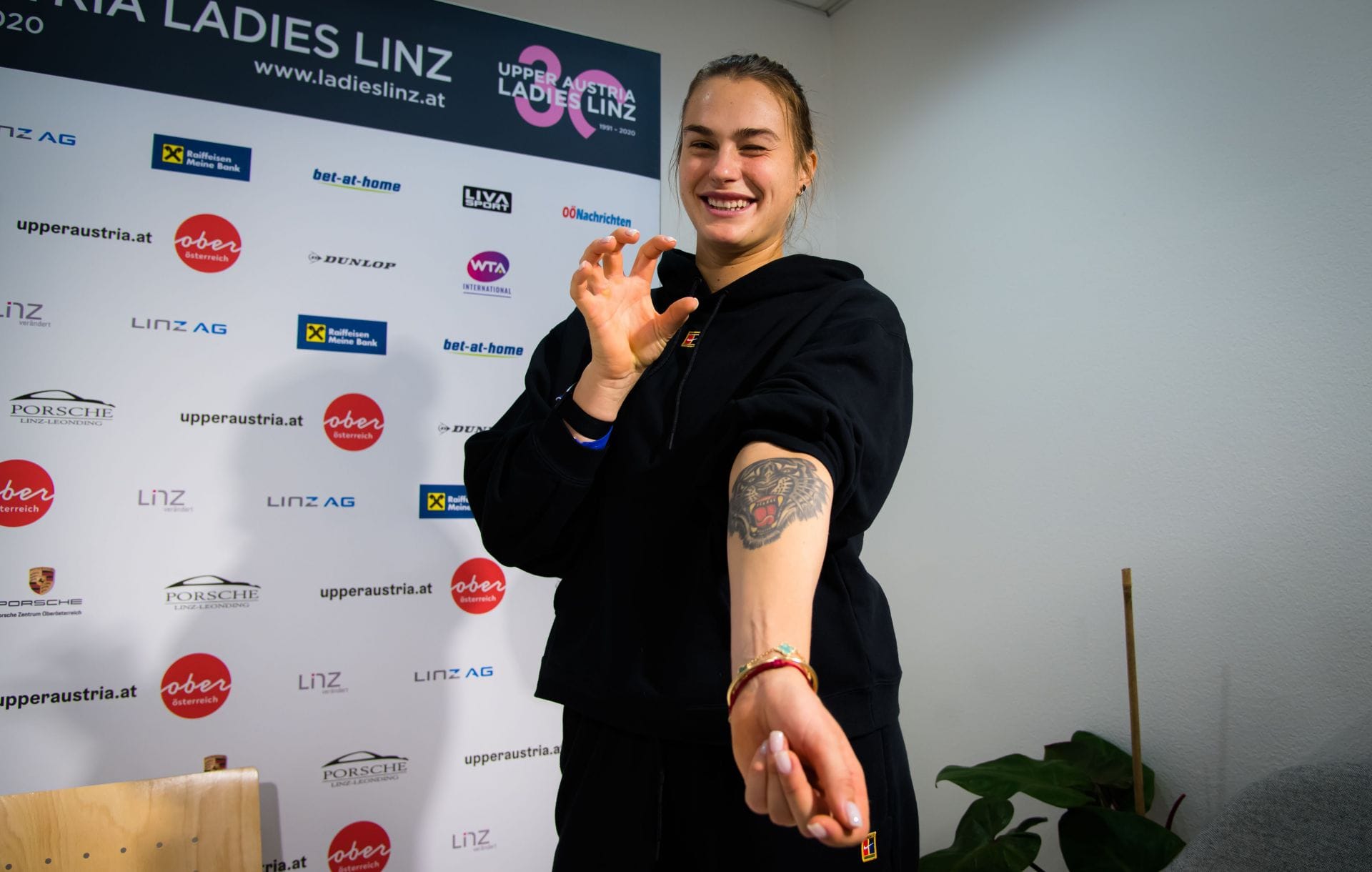
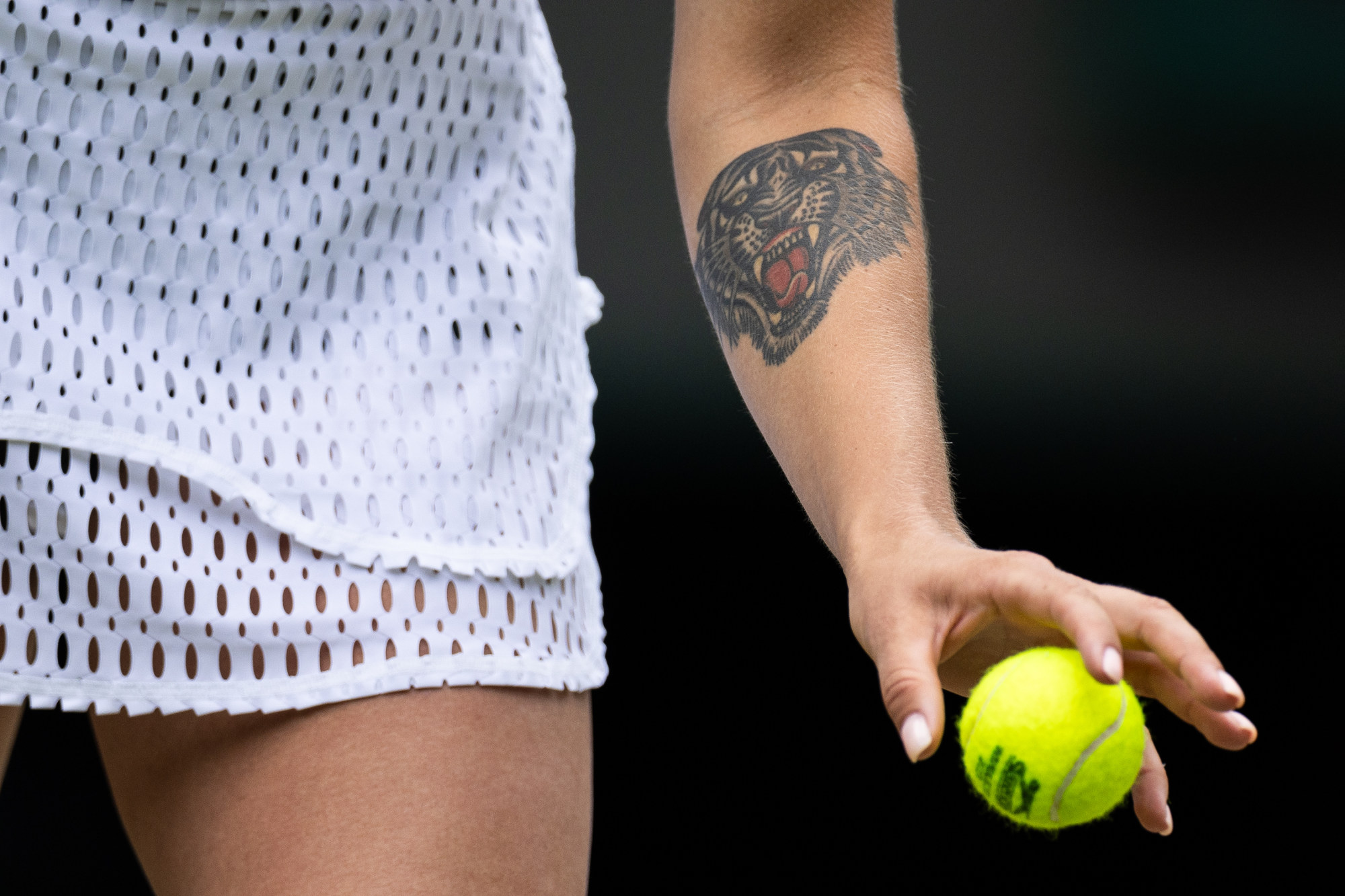
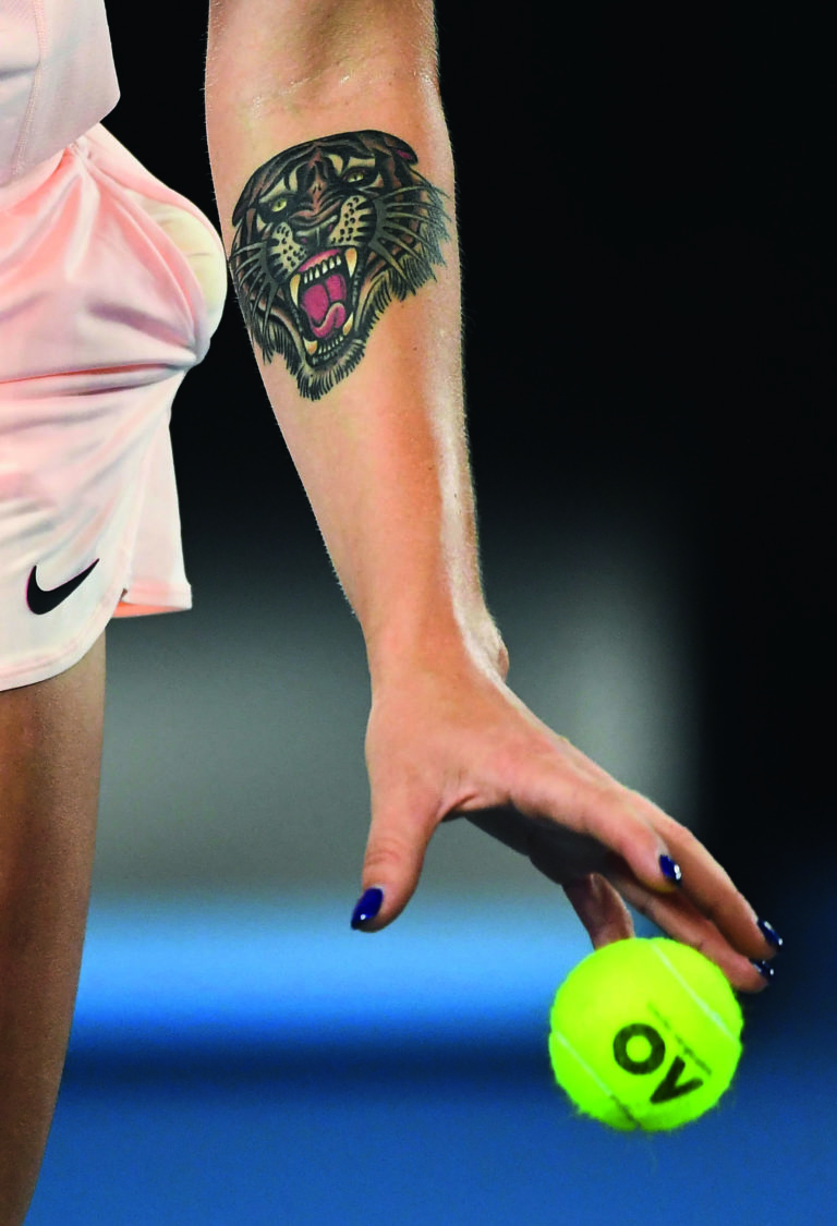
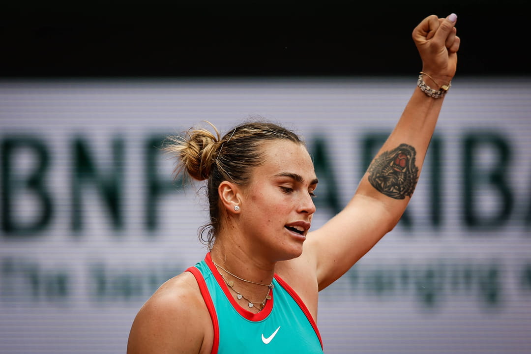
Aryna Sabalenka doesn’t need a lot of tattoos for one design to feel like part of her identity. The Belarusian tennis star has a bold tiger on her left forearm, and it has become almost as recognisable as her scream, powerful serve and tour nickname: “The Tiger.”

The choice makes sense. Sabalenka plays with force, but the tattoo is more than tough-looking artwork. She was born in 1998, the Year of the Tiger in the Chinese zodiac, and got the design at 18. She has said it represents strength and determination, linking her birth year to the way she sees herself on court.

Public coverage focuses on one reliably documented permanent piece: the tiger on her left forearm. Temporary tiger tattoos have appeared on her team after big wins, but that’s a separate bit of tennis fun, not extra permanent ink to add to her collection.

The tiger on her left forearm is Sabalenka’s signature ink

Aryna Sabalenka tiger tattoo on left forearm

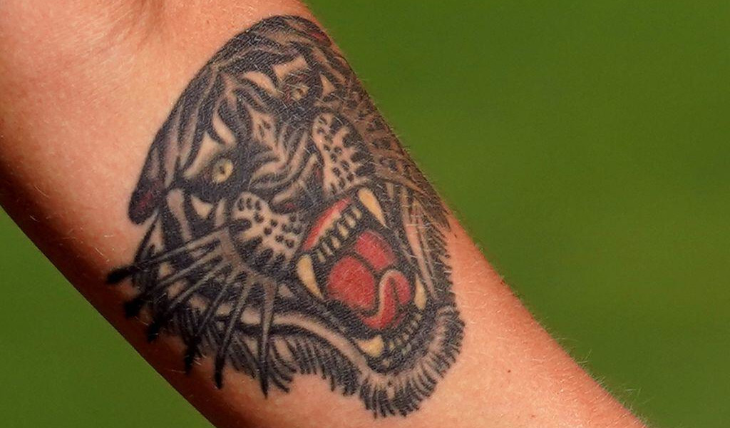
Sabalenka’s main tattoo is a tiger’s head on her left forearm. It’s black and grey, with a fierce expression, and shows whenever she raises her racket, tosses the ball or celebrates a big point. That visibility has made it part of her sporting image without feeling like a logo or a branding exercise.

She has explained that the tiger connects to her Chinese zodiac sign. Born in 1998, she shares the year with the animal. She got the tattoo at 18, at a time when she was becoming an adult and shaping the identity that would eventually take her to the top of women’s tennis.

Her parents weren’t entirely ready for the decision. Reports say her father laughed when he saw the tattoo, while her mother stayed quiet for about a week. That makes the story feel real: this wasn’t rolled out as part of a polished image campaign. A young Sabalenka made a permanent choice, then waited to see how her family would react.

Why the tiger suits her tennis game

Aryna Sabalenka tiger tattoo on left forearm during serve

Sabalenka’s game is built around aggression. She hits hard, takes risks and often tries to turn a rally into a test of nerve. That’s why the tattoo gets noticed: tigers are known for speed, power and danger, qualities people also bring up when they talk about her tennis.

The tiger has appeared in interviews and coverage for years, becoming a nickname as well as a tattoo reference. It doesn’t explain every side of Sabalenka—off court she can be playful and warm—but in a tight match it gives fans and commentators an easy image for the player who refuses to back away.

The forearm is a visible choice. The design stays in view through warm-ups, serves and the moments when she has to reset after a mistake. Whether she actively thinks about it or not, it’s always there. It can look like a warning to an opponent, but just as easily serve as a reminder to herself.

The tattoo became part of her “Tiger” nickname

Aryna Sabalenka tiger tattoo on left arm during match

Sabalenka’s “Tiger” nickname didn’t come from a marketing team inventing a character. It grew out of the tattoo, her birth year and the way she plays. The WTA has referred to the design in player material, and tennis coverage often points it out when the cameras catch her left arm.

The details make it specific: a tiger tied to 1998, to a choice she made at 18 and to the way she has learned to compete. The tattoo now belongs to the story people tell about her, but its origin was personal rather than purely theatrical.

It also gives her a visual constant across the tour. Tennis takes her to different countries, surfaces and uniforms, but the tiger remains the same. It shows up at Wimbledon, Roland-Garros, the Australian Open and the US Open. Even as the scene changes, that piece on her forearm stays familiar.

Sabalenka got the tattoo when she was 18

Aryna Sabalenka tiger tattoo close-up

The timing matters. Sabalenka got the tiger at 18, before she had become a Grand Slam champion or a fixture at the top of the world rankings. She was still working her way through professional tennis, and the tattoo became an early statement about who she hoped to be.

It would be too neat to rewrite the story as if the tiger predicted everything. The tattoo didn’t make her powerful or guarantee later wins. It gave her a symbol she could grow into. As her career developed, the design gathered more context.

That’s often how a tattoo works: the picture stays fixed while the person changes around it. The tiger Sabalenka chose at 18 is the same one she wears now, but it has lived through junior matches, Grand Slam wins, hard losses and the pressure to dominate. Its meaning has had time to gather new layers.

The temporary tiger tattoos are a different story

Aryna Sabalenka tiger tattoo on left arm during celebration

After Sabalenka won the 2024 US Open, members of her team got tiger tattoos too. Her fitness trainer, Jason Stacy, wore one on his forehead after promising to do it if she reached the final. Sabalenka later clarified that the design was temporary, and said other team members wore smaller versions.

It’s worth keeping that separate from her permanent forearm piece. The team tattoos were a celebration and a joke after a major win, not a new batch of permanent ink for Sabalenka. The temporary versions were funny in part because they borrowed the symbol people already associate with her.

Sabalenka even joked that the tiger should have been lower on Jason’s forehead. It says something about how she treats the image: she takes it seriously as a symbol of her game, but can laugh when friends turn it into an over-the-top group ritual.

What is actually documented in Aryna Sabalenka’s tattoo collection?

The safest inventory is short: one prominent permanent tiger on her left forearm. It appears consistently in match photos, interviews, tennis profiles and close-ups. Other posts may suggest additional small designs, but there isn’t the same reliable, repeated documentation for a larger permanent collection.

That distinction matters. A player might wear temporary art, body paint, tape or jewelry, or a design that shows up in only one photo. None should automatically be treated as a permanent tattoo. Sabalenka’s tiger is well established, as are the team’s temporary tigers; anything else needs stronger evidence before it can be stated as fact.

If you’re expecting a full sleeve-by-sleeve breakdown, there isn’t one to catalogue. Her tiger does a lot on its own: it connects her to her birth year, her family’s reaction, her nickname and the aggressive style that made her one of tennis’s most recognisable players.

The tiger is still the whole point

Sabalenka’s forearm tattoo is memorable because it doesn’t need a dozen other pieces around it. It’s clear, easy to recognise and attached to a story she has carried from her late teens into the biggest matches of her career. The animal represents the strength she wants on court, while the birth-year connection keeps it personal.

That balance is probably why it has stayed so visible. It’s bold without being complicated. The tiger can look intimidating during a serve, funny when a teammate copies it, and personal when you remember Sabalenka chose it long before the trophies piled up. One tiger, one arm, and a good explanation for why the nickname stuck.

It also sidesteps a familiar problem with sports tattoos: trying to fit an entire career into one crowded collage. Sabalenka’s tiger is open-ended. It can stand for the teenager who chose it, the player who pushed through tough matches or the champion now defending the reputation that came with it. The image has stayed the same as the pressure around it has changed.

Watch the story behind Aryna Sabalenka’s tiger tattoo

More athlete tattoo guides

Malaika Arora’s Tattoos Hold on to Love, Change and Gratitude

Malaika Arora’s tattoos are understated, but the stories behind them are personal. She has said she chooses ink at important turning points, not on a whim. Each piece keeps a memory or idea close.

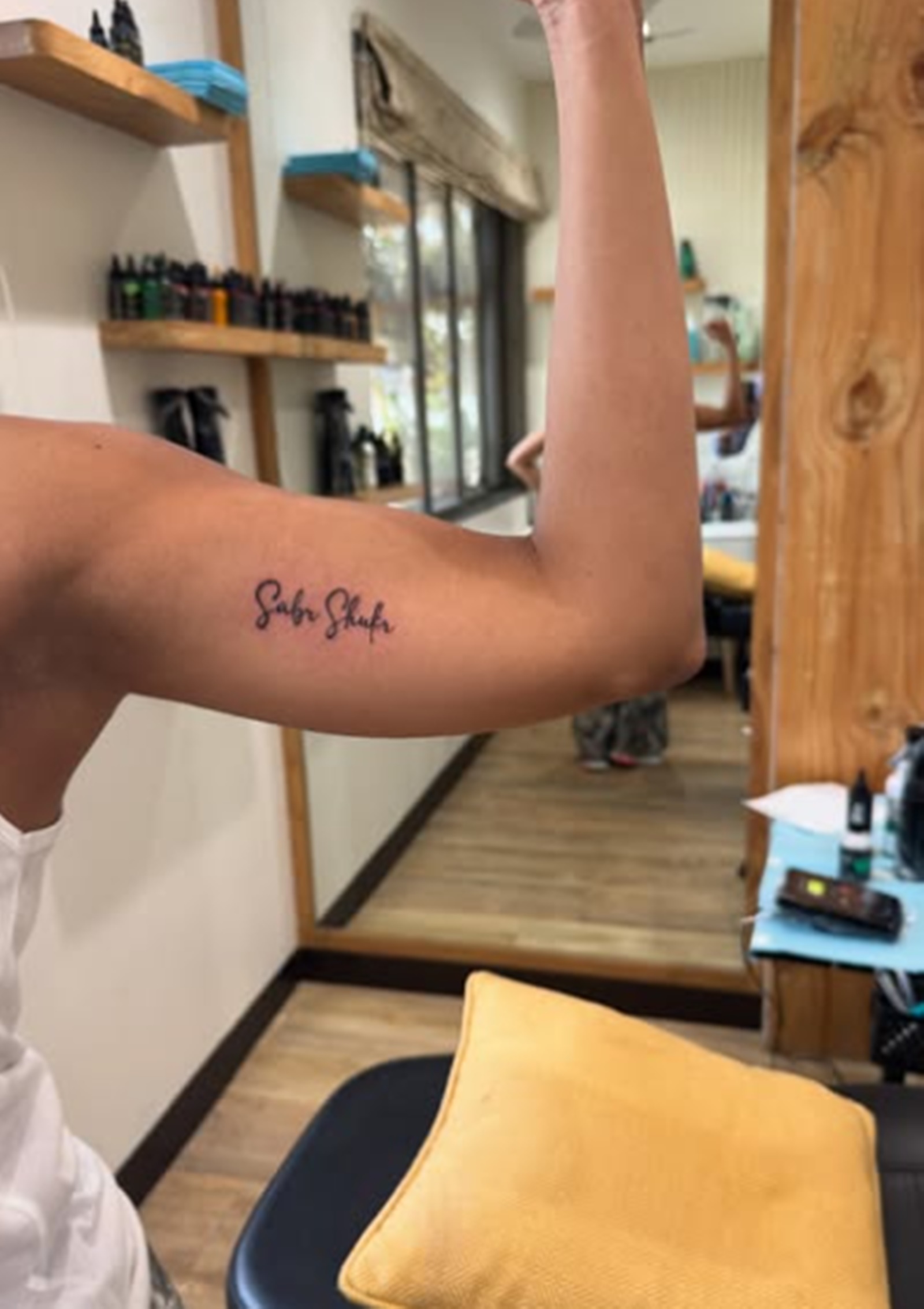
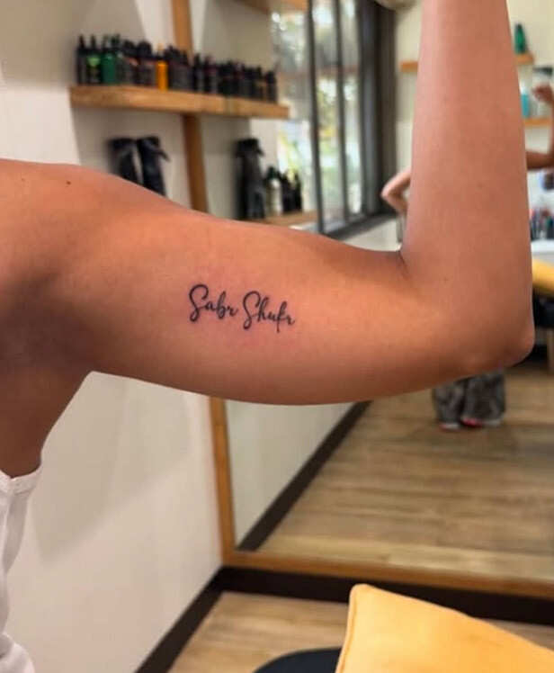
Her latest tattoo, “Sabr, Shukr,” sums up that approach. The Arabic phrase means patience and gratitude. Malaika has linked it to a difficult year and the steadier place she found afterward. It joins older designs: “Love,” three birds in flight, a butterfly, her name and a pair of wings.

There is no confirmed total for Malaika’s tattoos, so a precise count would be guesswork. Photographs and her own comments document several designs and what some of them mean. Taken together, they read as reminders tied to different points in her life.

“Sabr, Shukr” marks a difficult year

Malaika Arora Sabr Shukr arm tattoo

The tattoo that put Malaika’s ink back in the spotlight reads “Sabr, Shukr.” The Arabic words mean patience and gratitude. She revealed the piece after an emotional stretch, explaining that it spoke to the whole year she had been through rather than one isolated event.

She has described the phrase as comforting when she compares where she is now with a year earlier. It doesn’t ask her to act as if everything is fine. For her, it’s a cue to be patient, notice what remains good and give difficult feelings time.

Malaika has said she gets tattooed at major turning points, not just for the sake of it. “Sabr, Shukr” fits that pattern: a small, discreet piece carrying a meaning much larger than its lettering.

The new ink came after a period of change

Malaika Arora Sabr Shukr tattoo close-up

Malaika has tied the tattoo to finding steadier ground after a hard year. Her father, Anil Mehta, died in September 2024, after her relationship with Arjun Kapoor had ended shortly beforehand. She has not described the ink as a response to one headline or rumour; she spoke about a longer process of reaching a better headspace.

She framed it as something personal. Patience can mean letting grief and change take their time; Gratitude can mean holding on to people, work and small moments when life feels uncertain. The two words make room for both.

The tattoo was spotted in a red-carpet photo, but Malaika’s explanation stayed grounded in the year she had lived through. The setting was glamorous; the meaning she gave it was private and rooted in how she feels now.

Three birds represent a new phase

Malaika Arora birds waist tattoo

Malaika has given the three birds in flight tattoo one of the clearest backstories. She said she got it about eight years before talking about “Sabr, Shukr,” following her divorce from Arbaaz Khan. The birds marked the start of a new phase, and their movement says enough without a complicated explanation.

Birds are often read as a sign of freedom, but Malaika’s own account gives this design a more specific meaning: it belongs to a change she had already lived through. The tattoo marks moving ahead, building a new routine and letting life take a different shape.

She has it near her waist, where it can stay private beneath clothing and appear when she wants to show it. That suits a design tied to a personal turning point. Its story comes first; the photo appeal is secondary.

“Love” sits on one of her fingers

Malaika Arora Love finger tattoo

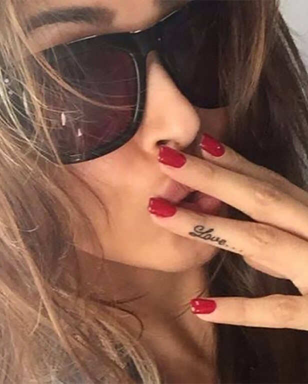
The word “Love” inked on one finger is another clearly documented piece. Malaika has said it reflects her love for herself, her loved ones and life in general. A few letters are enough to carry that idea.

A finger tattoo is hard to keep out of view: she sees it as she gestures, works out or picks up her phone, and it often appears in photos. That everyday visibility makes “Love” feel like a reminder she carries through ordinary moments.

There is no elaborate image to interpret. The single word sits where Malaika can see it, and it has remained part of her public image for years. Among tattoos tied to personal turning points, “Love” is her most direct message.

The butterfly tattoo is placed behind her neck

Malaika Arora butterfly neck tattoo

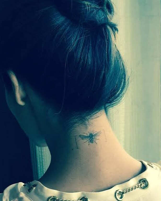
Malaika also has a butterfly tattoo on the back of her neck. Her hair can cover it, while an updo or open neckline shows it. The placement gives it a different presence from the lettering on her finger and arm.

The photos identify the butterfly, but Malaika has not offered a detailed explanation for it in the sources covering her tattoos. So the grounded description is straightforward: a butterfly at the nape of her neck, one of several pieces she has kept over the years.

The butterfly and the three birds both suggest movement and change, while “Sabr, Shukr” gives those changes a more direct emotional language. The pieces need not have been planned as a set; each can belong to a different chapter.

Her name and wings connect identity with freedom

Malaika Arora name and wings tattoo

Older accounts also mention Malaika’s name and a pair of wings. Her name is associated with angels, which may explain the connection drawn between her name and the wings in her collection.

The record is incomplete. Photographs show the designs, and older interviews discuss the link between her name and wings, but there is no full timeline. Some tattoos may be retouched, partly hidden or photographed from another angle, so the available evidence leaves details open.

The pairing has an intuitive appeal: the name connects to identity, while wings evoke movement, independence and rising above a hard period. Those images sit comfortably alongside her recent focus on patience and gratitude.

Malaika’s collection is about memories, not quantity

Malaika has never published a final count or walked through every mark in a full tattoo tour. Rather than guessing, the clearest account sticks to the pieces she has discussed and the meanings she has shared.

Among them are the birds she got after her divorce, the “Love” finger tattoo, the butterfly at her neck, her name and wings, and the newer “Sabr, Shukr” lettering. The designs recall different things: a fresh start, love, identity, freedom and patience with life.

Older photos may show other small details, but there is no basis for assigning names or meanings Malaika has not confirmed. It is more useful to separate what is documented from what remains a guess, and let the tattoos speak for themselves.

Why the new tattoo feels like a continuation

The new phrase adds context to the older pieces. The birds marked a new phase; “Sabr, Shukr” reflects on the years since and what they taught her. The story runs from beginning again to understanding the journey so far.

The phrase resonated because its meaning is simple and demanding. Patience and gratitude are not always glamorous emotions. Both take practice. Wearing the words gives Malaika a reminder to return to when life gets loud.

Her tattoos have accumulated over time rather than forming a matching set: a word on one finger, birds in flight, a butterfly, designs linked to her name and wings, and a phrase about a difficult year. Together, they hold thoughts she wants close.

Watch the story behind Malaika Arora’s Sabr Shukr tattoo

More actor tattoo guides

Churandy Martina’s Tattoos Keep Time With His Olympic Journey

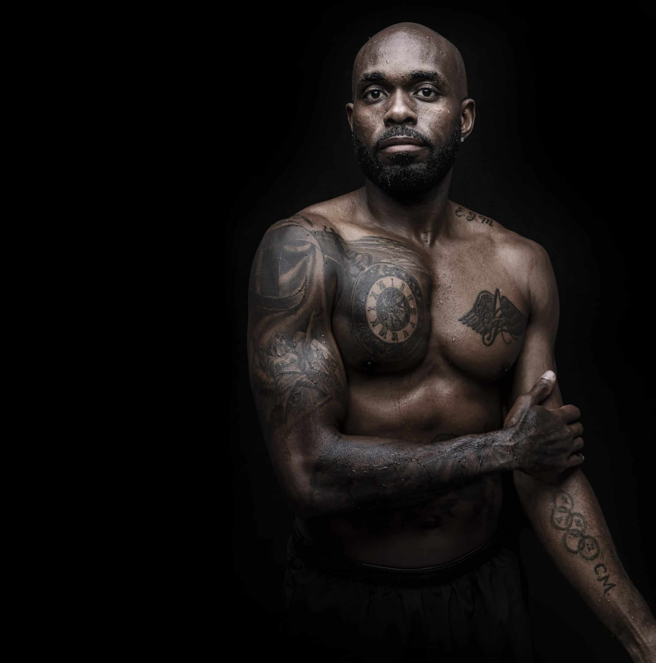
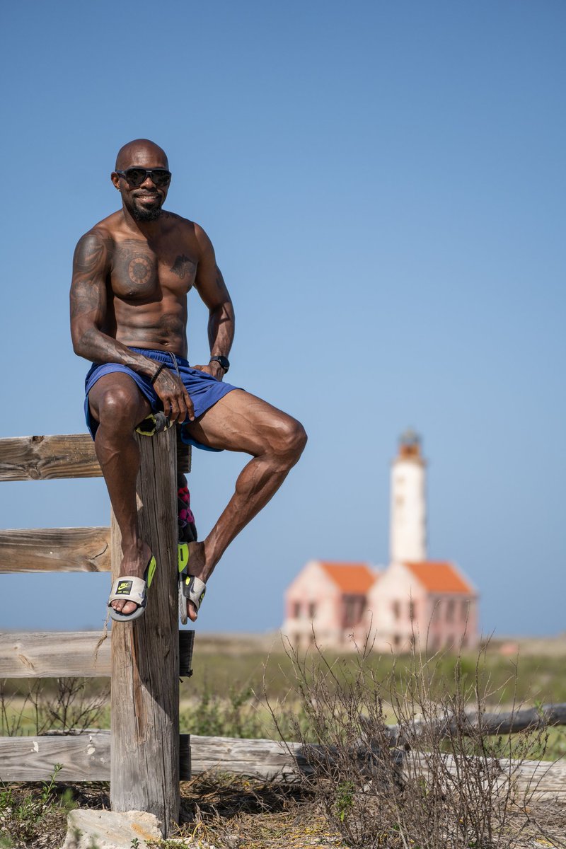
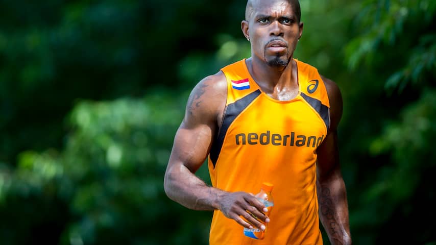
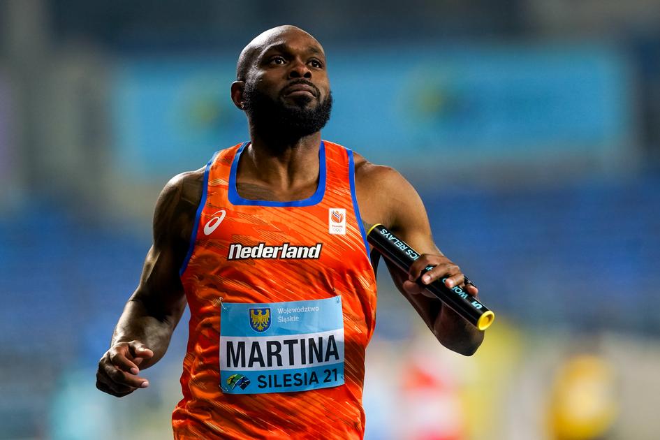
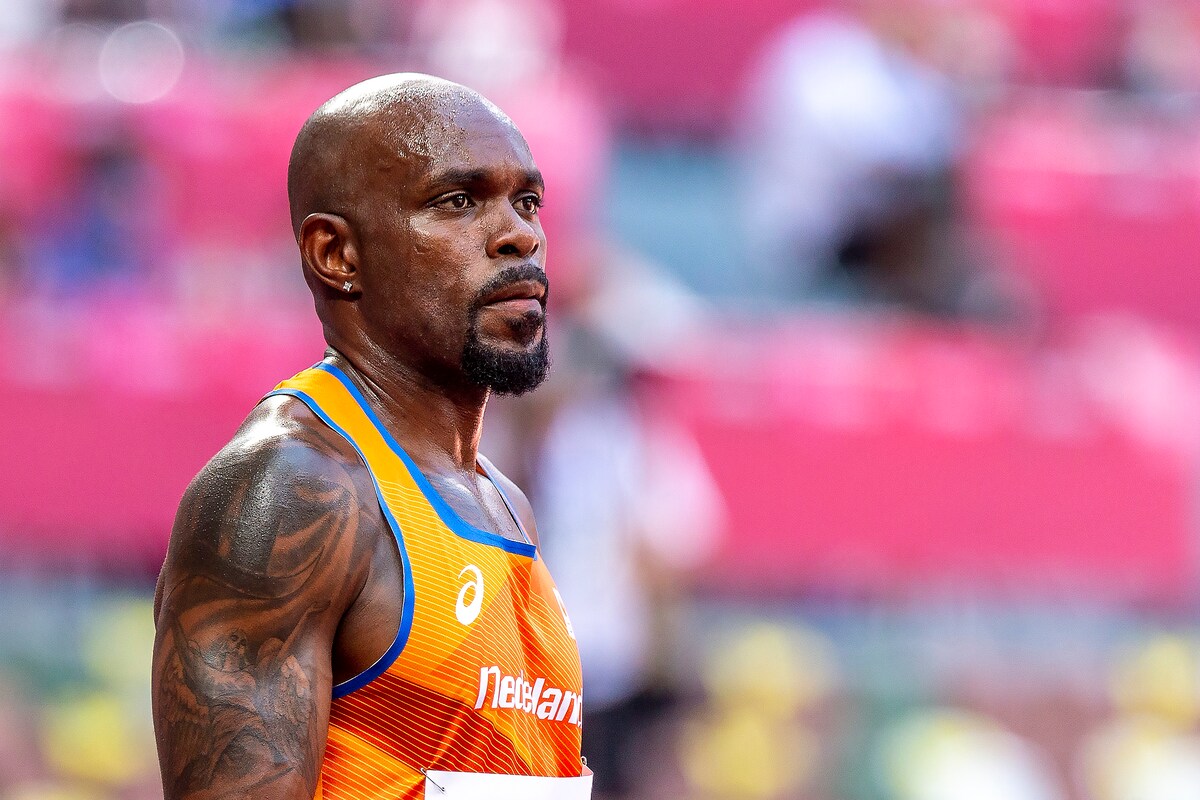
Churandy Martina’s tattoos have the feel of someone who has spent a long time moving forward. The Curaçao-born sprinter has ink across his chest and arms, including Olympic rings, a clock, wings and other bold pieces that show in race photos and shirtless portraits.

There isn’t an official guide explaining every line, so it would be pointless to invent one. The clearest documented designs mark athletic milestones or stand out consistently in photos. The biggest story is the Olympic rings with the years of his Games. Martina has competed at six Olympics, and after Paris the tattoo was so full that he asked the public for ideas for what to add next.

That says a lot about how he uses ink. The tattoos aren’t just there to make a portrait look dramatic. They hold dates and memories, the physical record of a career that has stretched over more than two decades.

The Olympic rings carry his whole career

Churandy Martina chest and Olympic rings tattoos

The most significant design in Martina’s collection is the five Olympic rings on his body, marked with the years he competed. By his sixth Games in Paris, he had used up the space he’d set aside for them.

That’s different from getting the rings once and leaving the meaning there. Martina’s version works like a career timeline, with a place for each Games. Athens, Beijing, London, Rio, Tokyo and Paris aren’t just stops on a results page; each is a chapter in his life.

In 2024, he joked that the tattoo had become a problem because there was no obvious room for another year. In an interview, he asked fans to send suggestions through social media and said he would choose the best one. That leaves the story open-ended: the original design may be full, but the tattoo doesn’t feel finished emotionally.

Many athletes get the rings to mark one huge achievement. Martina’s design shows the other side of elite sport: coming back, again and again. The years are the point. They turn the rings into a record of longevity as much as a symbol of Olympic status.

The clock adds a sense of time

Churandy Martina arm tattoo on track

Photos of Martina’s chest and arms show a clock face among the larger designs. No widely available source gives a personal explanation or identifies a specific time, so it would be wrong to attach an event to it. Still, the image fits with the other tattoos in an obvious way.

Sprinters spend their careers measuring time. A hundred metres can come down to hundredths of a second, and a career may be remembered by a few numbers on a results sheet. A clock beside the Olympic rings naturally brings those ideas together, though that’s an interpretation, not something Martina has confirmed.

The image also sits beside the usual athlete focus on staying young. Martina has talked about enjoying life and continuing because he loves the sport. A clock can suggest time passing, but it can also mark how much each season counts. There’s no need to freeze one perfect moment when the story is the journey.

Wings bring a lighter shape to the chest pieces

Churandy Martina arm and chest tattoos

Another noticeable design is a winged emblem across Martina’s upper body. Wings can suggest freedom, protection, speed or a connection to something larger. Martina hasn’t explained every image, so the surest thing to say is that the wings form part of a bigger chest composition rather than a small, isolated symbol.

It’s easy to see why the shape might appeal to a sprinter. Wings suggest lift and lightness, while sprinting is about moving the body efficiently at speed. But the design doesn’t have to be a literal statement about running. It may simply be an image he liked enough to carry.

How it sits with the other pieces matters too. His chest doesn’t look like one flat logo; it has layers of images and lines, giving it the feel of a traditional tattooed-athlete collection. It looks lived in, not designed in one afternoon for a photo shoot.

Race-day photos show how much ink he carries

Churandy Martina tattoo during race

On the track, Martina’s tattoos usually appear in glimpses. A sleeveless kit shows his arms, while the chest designs disappear under his uniform. Depending on the angle, a photo may catch the clock, one ring or part of the wings; another may show the opposite side.

That’s why one photograph can give the wrong impression of the whole collection. Martina has been photographed in orange Netherlands kits, relay uniforms, training gear and shirtless portraits, and each setting reveals a different area. The pictures aren’t duplicates just because he’s in them; they show different parts of the layout.

There’s also a contrast between the serious look of the tattoos and Martina’s public personality. He’s known for smiling, joking and talking about enjoying the moment. The ink may look intense, but he doesn’t seem interested in acting intimidating all the time.

Six Olympic appearances changed the tattoo’s meaning

Churandy Martina Olympic tattoo relay photo

The Olympic tattoo means more because Martina’s career kept going. He debuted in Athens in 2004, then competed in Beijing, London, Rio, Tokyo and Paris. That’s an unusually long run for a sprinter, and the rings with their dates make his longevity visible.

Paris brought a disappointment: Martina didn’t get the relay result he wanted. Still, making the team for a sixth Games was an achievement in itself. He later called taking part the “cherry on the cake,” even though he didn’t get that final cherry. It’s a very Churandy response—frustrated about the result, but grateful for the whole experience.

That changes how the tattoo reads. It isn’t a trophy wall carved into skin; it includes successful meets, difficult ones and all the years he kept coming back. The tattoo records the work, not only the medals.

Some designs are visible, but their meanings stay private

Churandy Martina tattoo focus photo

Martina clearly has more than rings, a clock and wings, but public sources don’t reliably name or explain every small piece. Some photos show additional script and decorative work on his arms and chest. It’s fair to describe what’s visible, but not to invent a tribute for every shape.

That’s especially important with older sports photos. Shadows, compression, sweat or a uniform can obscure the ink. A design that looks like a word in one image may turn out to be a pattern in another. Unless Martina or a dependable interview identifies it, it belongs in the “visible but unexplained” part of the inventory.

That doesn’t make the tattoos less interesting. The gaps make the collection feel human. People don’t always get ink so they can explain it years later. Some pieces are for family, some for a memory, and some are simply designs that felt right at the time.

The tattoos match Martina’s long view of sport

Martina has often sounded more interested in the life around athletics than in letting one result define him. He talks about loving sport, enjoying the chance to compete and staying young in spirit. His tattoos fit that outlook because they keep the past close without trapping him in it.

The rings hold the Olympic timeline. The clock suggests time passing. The wings bring movement and freedom. Smaller pieces fill out the story without needing a public explanation for every one. It doesn’t feel like a random checklist.

There’s a relaxed confidence in that. Martina doesn’t need to turn every tattoo into a grand statement. The designs can be bold and meaningful, and he can still laugh about needing help to find room for a sixth Olympic year. That mix of pride and humour may be the most Churandy part of the collection.

What is confirmed about Churandy Martina’s tattoos?

The clearest documented pieces are the Olympic rings with the years of his Games, the clock face and the winged chest emblem. Additional ink on his arms and chest appears in photos, but not every name or meaning has been explained publicly. The Olympic tattoo is the strongest confirmed story because Martina discussed its limited space and asked for suggestions after his sixth Games.

So the honest answer isn’t a forced list of twenty designs. It’s a collection with one clear centre: a sprinter who marked time by returning to the Olympics. The other tattoos add texture, but the rings carry the biggest story.

Watch Churandy Martina’s sprinting story

More athlete tattoo guides