admin

Lautaro Martínez Tattoos: Family, Faith and Football Memories

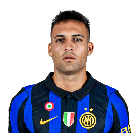
Lautaro Martínez’s tattoos read like a family album with his football career threaded through it. Ink covers his arms, back and forearms, and the designs point to relatives, faith, dates and reminders he has carried since he was a teenager.

A few pieces stand out in shirtless goal celebrations: the lion and cub across his back, script on his arm, the name Néstor and a football holding important dates. The collection also includes his parents’ names and references to his children, brothers and grandparents.

Martínez has explained many of the tattoos himself, so their stories are more than guesses from match photos. There is no single style tying the whole collection together. The common thread is the people and moments he wants to keep close.

The lion and cub on his back represent his children

Lautaro Martínez lion and cub back tattoo after a match

The largest piece is the lion scene across Martínez’s back. He has said the adult lion represents him and the cub stands for his two children. A jungle and road fill out the image, suggesting a father protecting his children and guiding them forward.

He has also said he would not add another cub if he has more children. One cub represents them together, keeping the design as a single scene instead of turning it into a running count. It is a considered choice that lets the image stay whole.

The lion fits the way Martínez talks about being a father. It is not simply a family portrait; it carries a sense of responsibility. The road gives the scene a direction, with the parent out front and the children close behind.

This is the clearest example of Martínez using a tattoo to express both love and responsibility. The back piece is large, but its message is direct.

The name Néstor was his first tattoo
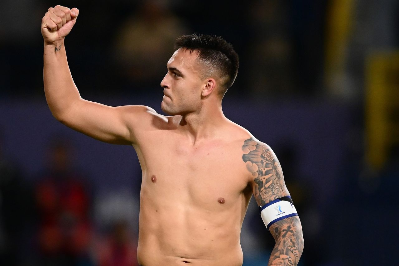
Lautaro Martínez Néstor name tattoo on his forearm

Martínez got his first tattoo at 14: the name Néstor, in memory of his grandfather. Néstor died when Lautaro was two. His mother did not want him tattooed so young, so Martínez persuaded her by explaining that he wanted to carry her father’s name with him.

That makes the tattoo more than a first piece or a fashionable choice. It is a way of keeping close to a grandfather he lost before he was old enough to know him well.

The name sits on his right forearm, where it appears in match photos among the other designs. The arm can look busy, but the story behind this first tattoo is simple: it became the starting point for the rest of the collection.

There is a little teenage determination in the way Martínez tells the story. He knew his mother would object, then found the reason that mattered most to her. His tattoo began with a family memory and a young person’s effort to get permission.

His parents and wider family appear in the details

Lautaro Martínez arm tattoos with family names and symbols

The names of Martínez’s parents, Mario and Karina, are part of the collection. He also has tattoos connected to his children, brothers and grandparents. Rather than choosing one family tribute, he has let the references accumulate as small pieces.

One design combines his parents’ names with praying hands, bringing faith and protection into the family theme. Around it are names, images, dates and symbols with their own tones. Nothing needs to compete with the larger tattoos.

That variety can make the arm look crowded in a close-up. Each piece holds its own story, and different angles reveal different details. The collection is not arranged like a gallery; it has grown as his life has moved from one chapter to the next.

His children are part of it too, linking the older tattoos to the family he has now. The collection continues to take shape as he moves through adulthood, fatherhood and football.

The family details keep the collection from feeling like a generic footballer’s sleeve. The symbols belong to a particular person and his history.

The Luján Virgin reflects his faith
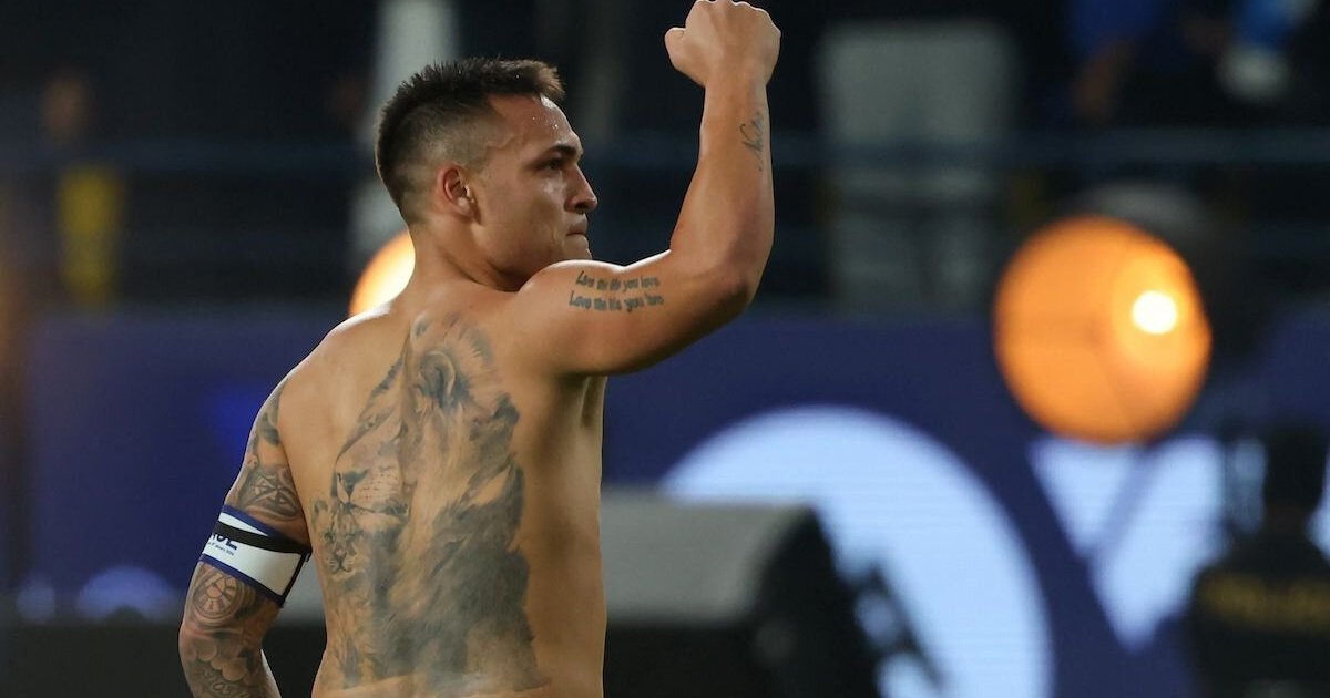
Lautaro Martínez religious tattoo and arm ink

Martínez has an image of Our Lady of Luján, a Catholic symbol from Argentina. He has said he is a believer and that the Virgin is always with him. The tattoo brings faith into a collection otherwise dominated by family and football.

The image connects his religious life with his country, though its meaning for Martínez is personal. He sees it as something that stays with him as his career changes and takes him from place to place.

Beside the names and praying hands, the Luján Virgin adds to a cluster of tattoos about protection, belief and family. They are not there to put on a show. They are reminders that happen to be visible when he plays.

That same idea runs through many of Martínez’s explanations. The tattoos matter because of the people and beliefs behind them, as much as the image itself. What they carry is more important than how they look in a photo.

The compass, clock and quote keep him moving
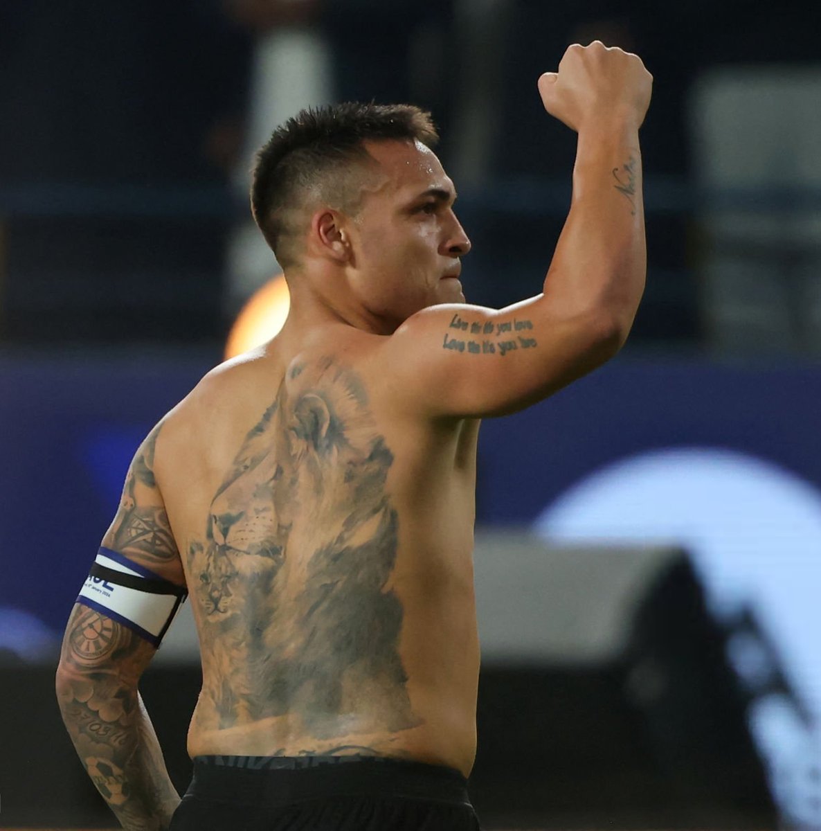
Lautaro Martínez back tattoos with compass clock and quote

Martínez has a compass, a clock and the phrase “What doesn’t kill me makes me stronger” on his back. He has described them as daily reminders: the compass suggests direction, the clock marks time, and the quote speaks to getting through hard moments.

Those ideas have a place in a football career shaped by travel, injuries, selection decisions and matches that can change a player’s confidence. The tattoos cannot make those difficulties disappear, but they give Martínez images and words to return to when things get tough.

He plays with visible emotion and has spoken about the pressure of important games. The line about growing stronger through hardship fits someone who has had to fight for his place and lead both Inter and Argentina.

Together, the compass, clock and phrase make a kind of map. It is not only about enduring pain; it is also about finding direction and remembering that time keeps moving, even when a season feels stuck.

A football design holds two dates that changed his career. One marks Martínez’s first professional match for Racing Club on 1 November 2015; the other records his first Argentina call-up on 27 March 2018. He has described both as major moments in his life.

That small tattoo works like a personal calendar. The lion and cub speak to fatherhood, while the compass and clock point forward. The dates bring him back to the start, before the Inter captaincy and the biggest nights with Argentina. Even the smallest designs have a place in Martínez’s story.

For another footballer whose tattoos bring family and career milestones together, see our guide to Lionel Messi’s tattoos. Martínez’s collection is rougher and more crowded, but the link between family and football feels familiar.

Seen together, the pieces form a personal record. The lion protects his children; Néstor keeps his grandfather close; Mario and Karina appear in the family designs. The Luján Virgin reflects his faith, and the compass, clock and quote point to direction and resilience. The football holds the dates that shaped his career.

That is why the collection feels like a record of his life rather than a fashion statement. It has room for new memories, but its centre is already clear. Martínez carries the people and moments that shaped him into every new match.

Watch the related tattoo video below for more on Martínez’s family ink and the stories behind it.
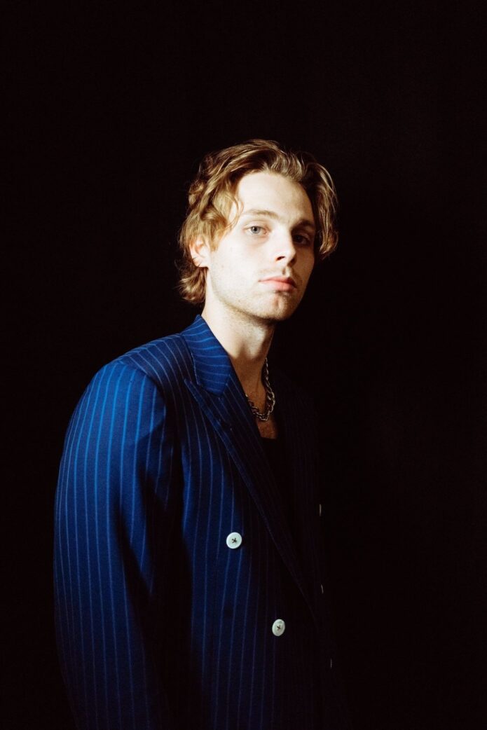
Luke Hemmings keeps his ink small but meaningful

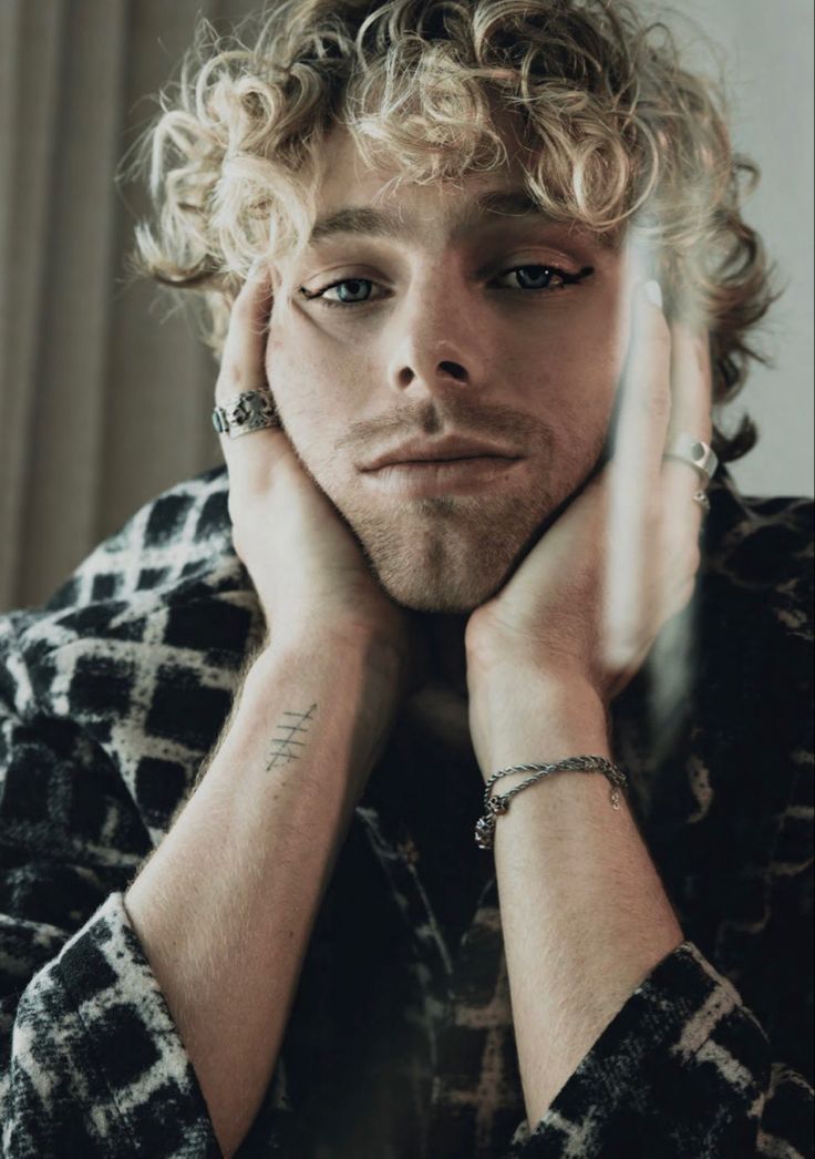
Luke Hemmings’ tattoo collection is compact, especially compared with some rock stars, but the pieces mark different chapters of his life with 5 Seconds of Summer. There is a small bird near his right side, tally marks on his wrist and other ink on his arms that is easiest to catch onstage or in an open shirt. The overall look feels casual rather than planned as one big project.

Interviews and tattoo tours show some of the designs, while sharp performance and portrait photos help confirm others. When Luke has not given a meaning, it is better to stick to what the picture shows. His tattoos feel lived in: small reminders and style choices that have accumulated as his music career has grown.

Luke’s small bird tattoo sits high near his right side

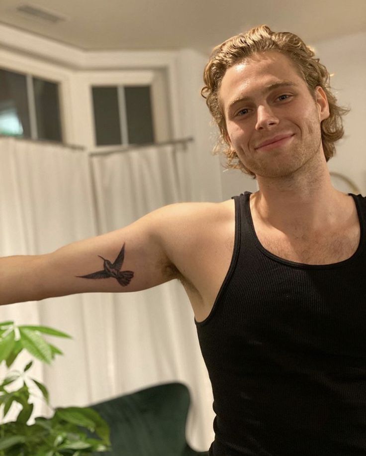
Luke Hemmings hummingbird tattoo near his right side

The bird near Luke’s right armpit and upper side is one of his most recognisable tattoos. In close-ups, it looks like a fine-line bird or hummingbird, much lighter than the bolder traditional designs some bandmates wear. Its tucked-away placement lets it disappear under a T-shirt, then show when he performs in a vest or open shirt.

Several write-ups call it one of Luke’s standout pieces, but he has not consistently explained its symbolism. The visible details tell us more than a guessed backstory would: it is small, finely drawn and placed somewhere that feels personal rather than made for the cameras.

There is a nice contrast between the delicate design and the scale of a 5SOS show. From the crowd it can be hard to spot; a close-up turns it into one of the clearest details in Luke’s collection.

The wrist tally marks are one of his easiest tattoos to spot

Luke Hemmings tally mark tattoo on his wrist

Luke also has a small set of tally marks on his wrist. In a distant photo they can look like a few stray lines, but a closer image shows the repeated strokes. The placement is easy for him to see and just as easy to cover with a cuff or watch.

The public record does not confirm a count or a private story behind the marks, so it is best to leave their meaning open. What is clear is how minimal the design is. It does not compete with a concert outfit, and it sits naturally beside the rest of his smaller tattoos.

Fans may wonder whether the tally records something from the band’s long run of tours and releases. It is a fair question, but it remains a guess unless Luke confirms it. The tattoo itself is what the evidence gives us: a neat group of lines on his wrist.

His arm ink is easiest to read in performance photographs

Luke Hemmings tattoos visible on his arm in portrait

Luke’s arm tattoos are less about one giant sleeve and more about smaller designs that appear from different angles. A clear portrait shows ink around his forearm and upper arm; a stage photo may reveal only part of it, with lighting, microphones and clothes hiding the rest. One picture alone can give a misleading sense of how much work is there.

The pieces have a fine, almost sketchbook quality. They sit easily with Luke’s relaxed clothes instead of filling the arms into a solid block. There is room for future additions without making the existing tattoos look unfinished.

His tattoo history overlaps with the band’s public timeline, but that does not make every design a 5SOS reference. The arm reads more like a personal mix: some pieces may date from touring years, others from a particular design he liked. A tattoo can matter to someone even when they have not explained it publicly.

5 Seconds of Summer made tattoo tours part of the story

Luke Hemmings in the 5 Seconds of Summer tattoo tour

Luke’s ink sits alongside a broader 5 Seconds of Summer tradition. The band’s tattoo-tour interviews put their collections in the same conversation, even though each member has a different amount of ink and a different way of talking about it. Luke’s smaller designs stand out because he does not frame them as one dramatic transformation.

The GQ tour footage is useful because it shows the band discussing their tattoos in a relaxed setting. It also helps identify designs that are faint or hidden in concert photos: when the camera moves closer and a band member points something out, the details are easier to follow.

Luke’s approach feels understated beside the energy of the band’s music. A tiny bird, wrist marks and scattered arm details are enough to make his collection recognisable without making tattoos his whole identity. They are part of the band’s visual story, but they do not overwhelm him.

The collection has grown in small steps rather than one big session

Luke Hemmings showing tattoos on his balcony portrait

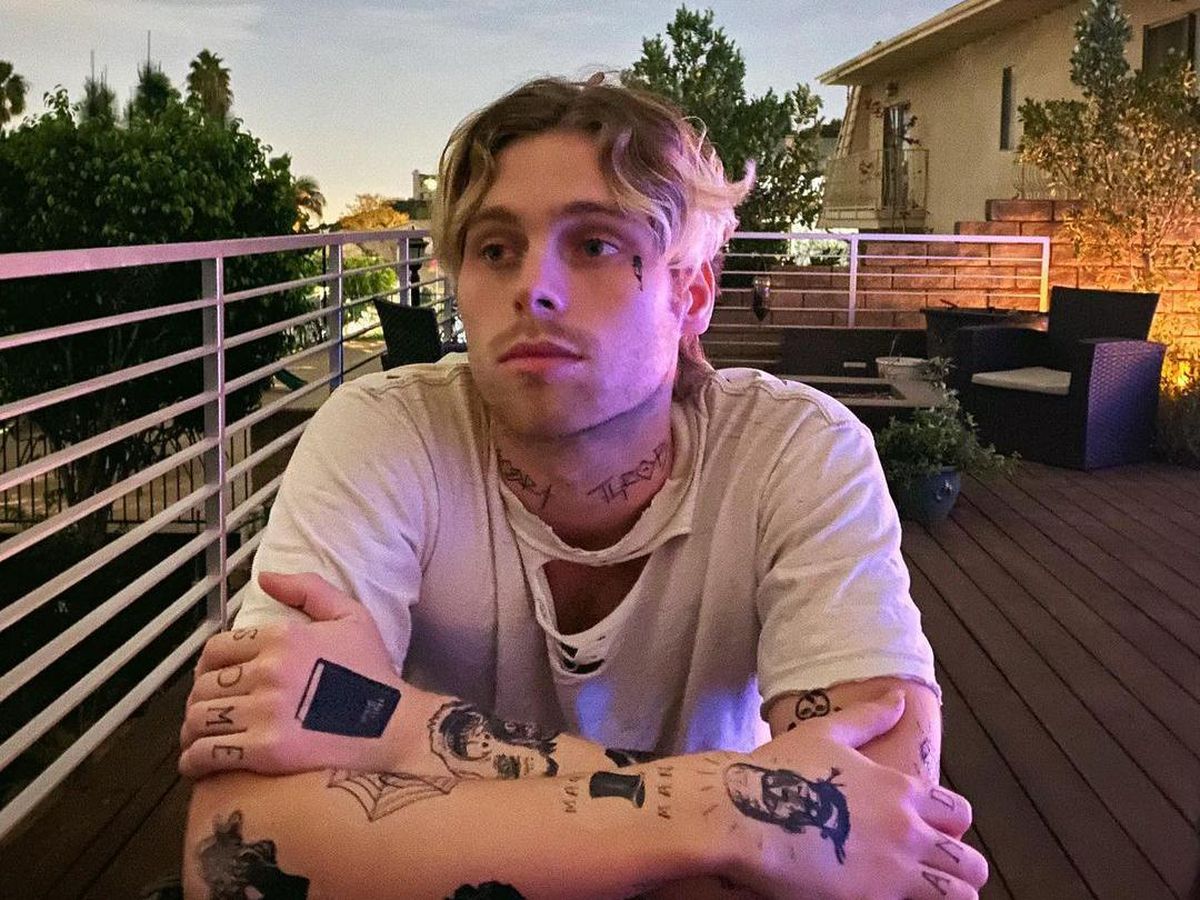
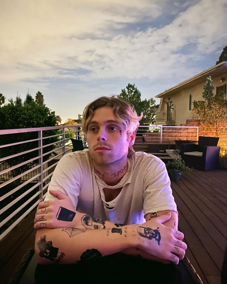
The photos suggest that Luke added tattoos gradually. Rather than one obvious full-back or full-sleeve project, there is a wrist mark, the bird near his side and other arm pieces that appear as his styling changes. The collection feels more like a timeline than a matching set.

That scattered look suits a musician who moves between stage clothes, editorial shoots and everyday outfits. Small tattoos can show when he wants, disappear when he needs them to and still feel like part of his style. They also leave his look room to change with each album cycle.

Luke’s appeal here is not that he has the biggest collection in rock music. He does not. The designs are selective, and a close photo can reveal details that are easy to miss at first.

That difference matters when you compare older and newer pictures. A tattoo may seem to vanish because Luke has a longer sleeve on, turned away from the camera or stood under blue stage lights. It is tempting to count every shadow as a design, but good coverage needs a clearer standard. This guide sticks to pieces that appear repeatedly or show up in a sharp, well-lit image.

Fans may disagree about the total for the same reason. One photo shows only the edge of a piece; another catches a small mark hidden before. Luke does not need to announce each addition for it to become part of his everyday look.

For someone who has spent so much of adult life in front of cameras, that privacy may be part of the appeal. The quieter tattoos leave him room to keep something for himself. They invite curiosity without demanding a full explanation.

That understated quality also keeps the collection flexible. His ink can sit alongside a new haircut, a different stage jacket or another chapter of the band without becoming a costume. It looks like a set of choices he can carry forward.

What can be confirmed about Luke Hemmings’ tattoos

The clearest public details are the bird near his right side, the wrist tally marks and other ink visible across his arms in close photos and performance shots. Some accounts place additions around 2019, but exact dates and meanings vary from one fan page to another.

It is worth being careful with those limits. Tattoo lists often repeat a description until it sounds official, even when the first source was guessing from a blurry image. Luke’s collection is better served by clear labels and honest uncertainty: describe what can be seen, include meanings he has confirmed and leave the rest open.

That balance is part of the collection’s charm. The tattoos connect to years of touring and growing up in public, but they are not presented as a strict autobiography. They are small parts of a bigger story, and Luke seems comfortable letting some of them speak quietly.

Watch the 5SOS tattoo tour

More musician tattoo guides

Bailey Zimmerman’s ink keeps things simple

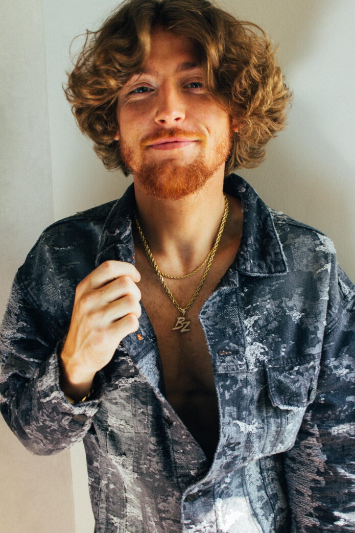
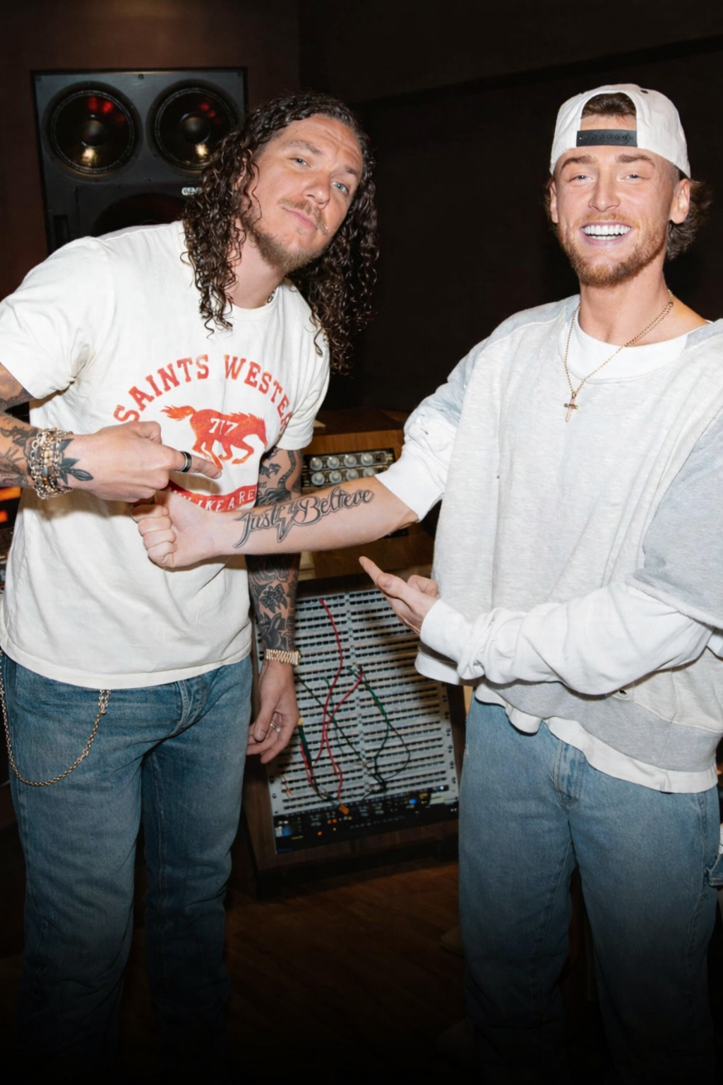
Bailey Zimmerman’s tattoos can be easy to miss under a jacket or in the rush between tour stops. A closer look shows a simple faith message on his arm, smaller pieces in casual photos and a few more designs visible during performances.

There is also a recent tattoo story that is easy to misunderstand. In April 2026, Zimmerman tattooed his own signature onto his artist, Mike Stoll. He had never tattooed someone else before, but that does not mean the singer suddenly covered himself in new ink. The public record of Bailey’s tattoos is fairly limited, so it helps to keep the story straight and stick with what is visible or reported.

“Just Believe” is the clearest documented statement

Bailey Zimmerman Just Believe forearm tattoo

The tattoo most often associated with Bailey is “Just Believe” on his right arm. A cross takes the place of the “i,” making the short phrase a clear expression of faith. There is no elaborate image around the words; the lettering carries the message, with the cross giving it another layer.

Zimmerman showed the tattoo while talking about his song “Religiously,” which made the connection feel natural. His music often moves between belief, heartbreak, home and the effort to hold onto something solid. “Just believe” fits that world without needing a long explanation.

The lettering also feels true to his style. Bailey is more road-worn country-rock than polished fashion editorial: chains, messy hair, clothes that look lived in, and tattoos that show when a sleeve rides up. The arm piece reads like a personal reminder that happens to be visible onstage.

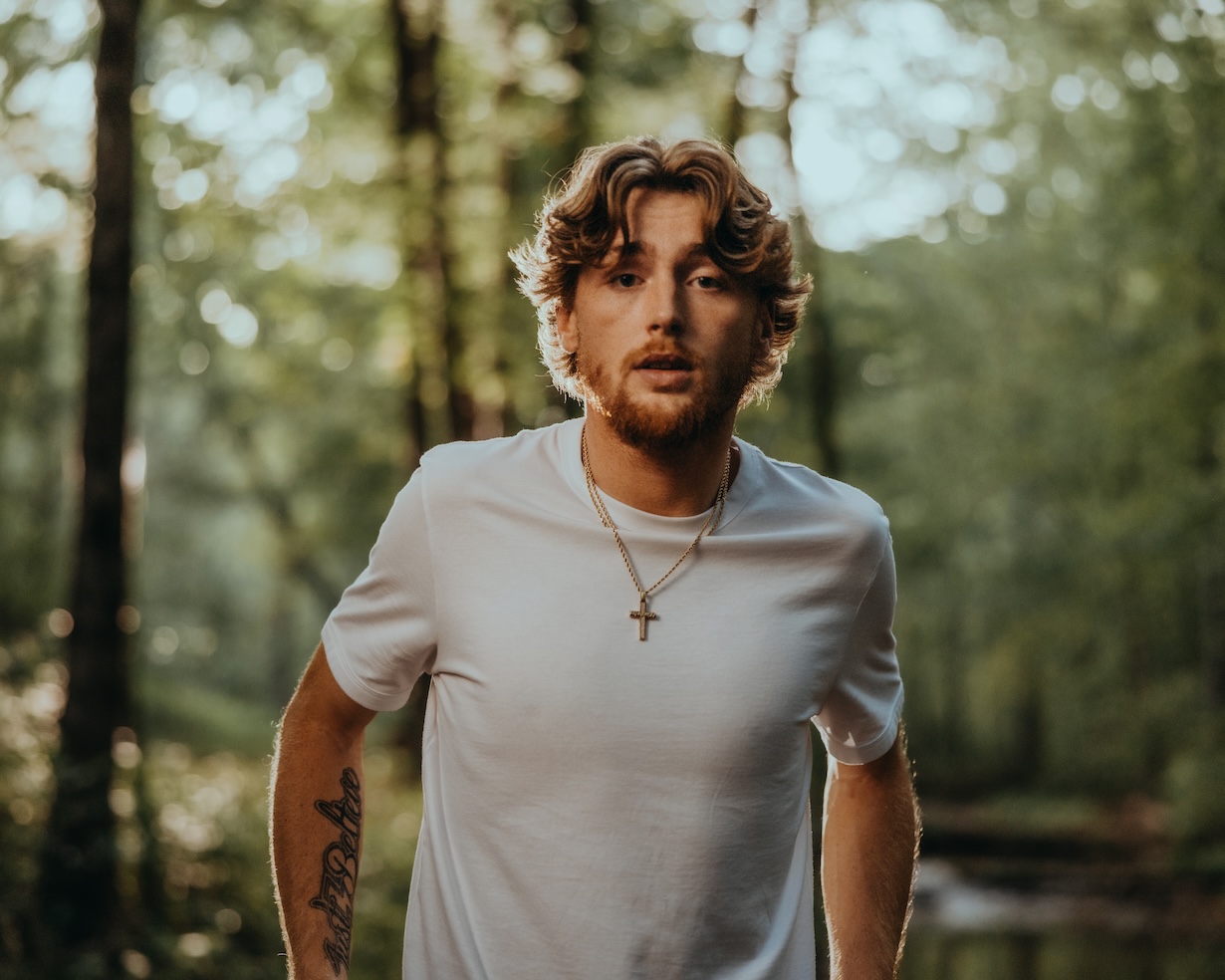
The forearm ink shows up in ordinary pictures

Bailey Zimmerman forearm tattoo in outdoor portrait

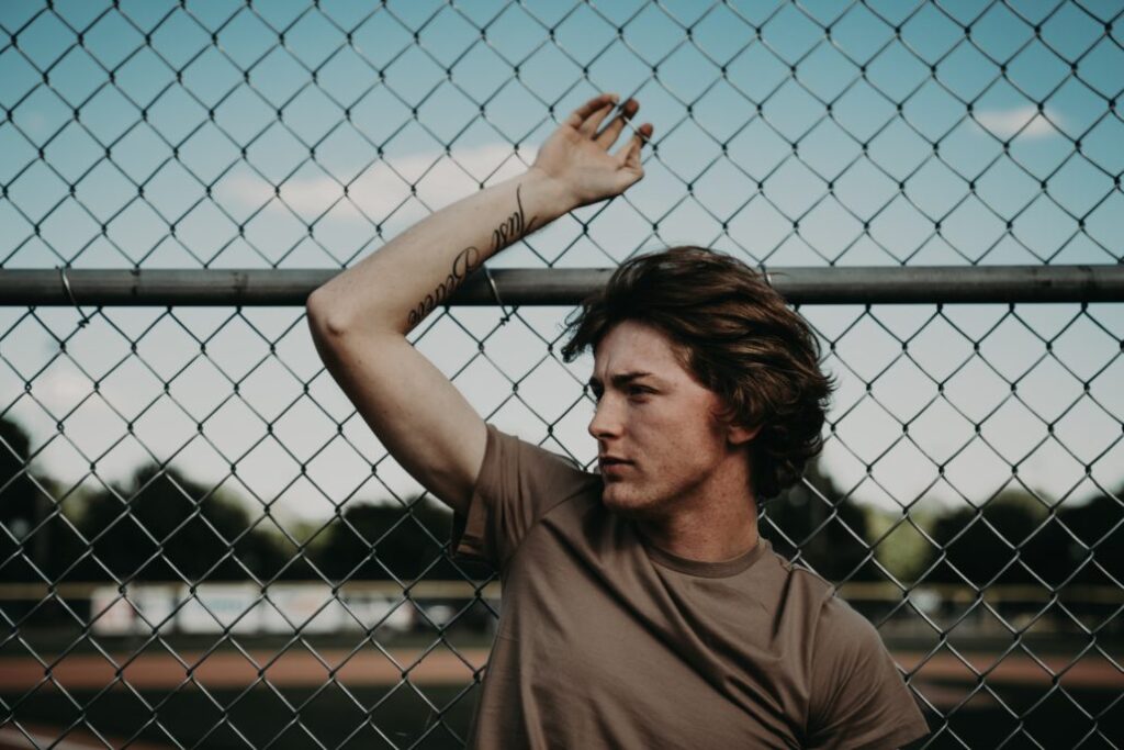
One of the clearest looks at Bailey’s ink comes from a casual portrait, not a planned tattoo reveal. A cursive design runs along his forearm as he leans near a fence. A sharp everyday photo can tell us more than a posed close-up if the arm is uncovered and the writing is in focus.

The cursive appears separate from “Just Believe,” but its full wording is not legible in every picture. It is tempting to guess at the letters or assign them a meaning; the safer description is a cursive forearm tattoo whose text has not been clearly documented.

That leaves a nice contrast in the collection. The larger faith message is public and easy to name. The smaller writing is quieter, something fans notice gradually rather than a design Zimmerman has announced from the stage. It gives the tattoos a personal, unplanned feel.

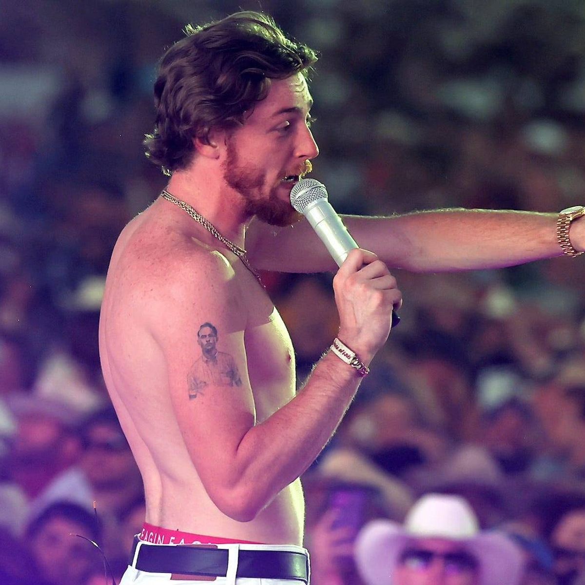
A shirtless stage photo shows the wider collection

Bailey Zimmerman shirtless stage tattoos

Shirtless performance photos give a broader view of the tattoos across Bailey’s torso and arms. They are not sharp enough to support a numbered list of every small symbol, but they do show that his ink goes beyond one neat line of script.

That distinction matters. It is easy for a tattoo page to turn one well-known design into an imagined catalogue. The photos support a few visible areas: “Just Believe,” cursive on the forearm and additional work across his upper body. The shapes and placement show there are several tattoos, but not enough to name each one.

There is nothing wrong with leaving some designs unnamed. They are still real tattoos even if Bailey has not discussed them in an interview. It keeps the account tied to what the images actually show. Visible and documented are two different things.

The artist story is part of Bailey’s tattoo timeline

Bailey Zimmerman portrait showing forearm tattoo

In April 2026, Zimmerman told Taste of Country that he had tattooed Mike Stoll, the professional who tattoos him. It happened backstage before a show, with a portable setup and a bit of downtime on the road.

Bailey said Stoll also works with Morgan Wallen and Hardy. The idea had come up more than once: Stoll had offered to let Zimmerman put his autograph on him. Eventually the singer took him up on it and tattooed his signature on Stoll.

It is a funny reversal. Most musician tattoo stories follow the singer into the chair, then share the design and its meaning. Here Bailey stepped to the other side of the machine. The tattoo is on his artist, not on him, but the story shows how comfortable he is with tattoo culture and the people behind it.

That moment adds a little personality to the timeline: there is the faith phrase on Bailey’s arm, smaller writing in photos, more body ink seen onstage and, later, a backstage signature. None of it needs to be turned into a grand theory. His tattoo story has grown in the same loose way as his career.

What can safely be said about the rest of his ink

Photos suggest Bailey has more tattoos on his arms and upper body, but the best sources do not offer a full tour with names, dates and meanings for every piece. The clearest highlights are the “Just Believe” tattoo with a cross-shaped “i”, the cursive forearm design and other work visible in shirtless stage photos.

Bailey has also reacted to fans who tattoo his image or lyrics on themselves. One fan showed him a large portrait based on his face with “Between a Rock and a Hard Place” worked into the design. That tattoo belongs to the fan, not Bailey, though it does show how closely his music and image have become tied to tattoo culture among listeners.

The same distinction applies to his signature on Stoll. It belongs in the story because it happened in a tattoo studio and says something about Bailey’s humour, but it is not body art he wears. Keeping those lines clear gives readers the actual tattoos, the surrounding context and a fair account of what remains unknown.

Bailey’s tattoos feel more personal than strategic

There is no clear effort to make all of Bailey’s tattoos match. “Just Believe” is clean and readable; the cursive forearm piece is more handwritten; the larger shapes in stage photos are harder to identify. Together, they look like choices made over time rather than a collection designed for one photoshoot.

The faith phrase is the emotional anchor. It connects to the songs that brought Zimmerman attention and to the way he talks about letting life unfold on God’s timing. The backstage signature is lighter: a running joke, a tour memory and an unexpected moment before a show.

That mix feels like Bailey. His tattoos are not a perfectly labelled map. There are a few clear messages, artwork that is only partly visible and personality around the edges. The best way to read the collection is to start with what is known, leave the rest private and enjoy the detour in which he tattooed the person who usually tattoos him.

There is a nice contrast between the rough-and-ready look of the ink and the stories behind it. From a distance, the arm lettering fits a country singer’s road style. Up close, the cross, the handwriting and the backstage story make the collection specific to him. The tattoos can be reminders, a small joke or an expression of faith without needing a dramatic reveal. They look like they belong to Bailey’s actual life, not a branding plan.
Watch Bailey Zimmerman talk about music and the road

This interview offers a little more of Bailey’s personality away from the tattoo photos, with a look at the music and life behind the songs connected to his ink.

More musician tattoo guides

Olivia Wilde lets family and old rebellion share the same skin

Olivia Wilde’s tattoos have changed with her life. Some of the earlier pieces came from a rebellious streak; the newer work is more deliberate and closely tied to family. Rather than a full sleeve, her collection is a mix of fine-line forearm designs, short phrases and older pieces that can be easy to miss.

The clearest recent story is the names of her children alongside their zodiac constellations. Wilde has also described a small “all love, A” tattoo as a tribute to her late uncle, Alexander Cockburn. Older coverage records a Shakespeare quote, a Nietzsche passage, a yin-yang design and a dragon she got when she was young. Some are usually hidden, so it helps to separate the pieces she has explained from the ones only seen in photos.

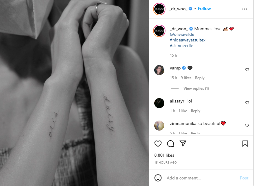
Otis and Daisy sit in matching script on her forearms

Olivia Wilde Otis and Daisy forearm tattoos

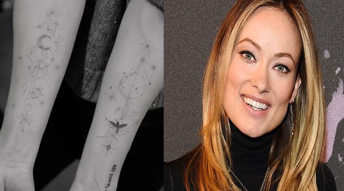
In late 2021, Wilde showed two of her most personal tattoos: Otis on one forearm and Daisy on the other. Dr. Woo wrote the names in fine, graceful script. Her son and daughter are close at hand in a simple pair of designs.

Wilde shared the tattoos with the caption “Mommas love.” It said enough. These are not portraits or elaborate symbols, just the names of the people she wanted to keep close. The matching placement makes the two pieces feel connected without making them identical.

Fine-line lettering keeps the names clear but soft. They sit easily beside her other small tattoos and suit Wilde’s usual style: visible with the right outfit, but easily covered by sleeves.

Forearm placement also means she can see the names herself. They work like a small daily reminder, which gives them a warmth that a generic family design might not have.

The constellation and moon work brings a little sky to her arm

Olivia Wilde constellation and moon forearm tattoo

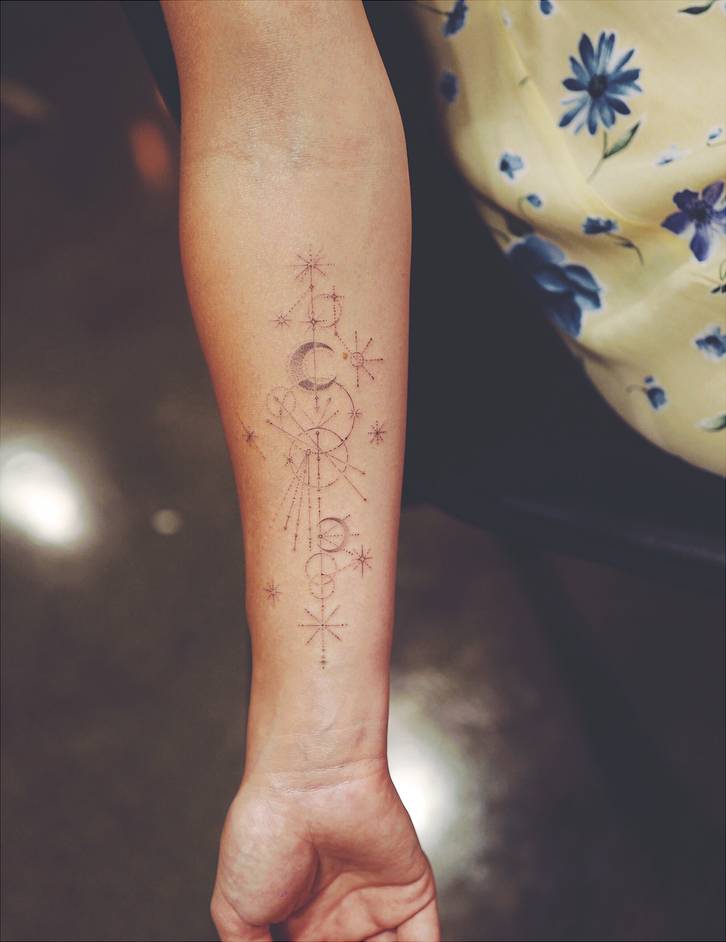
Wilde’s fine-line celestial work includes stars, a moon shape and small geometric details. Dr. Woo’s delicate single-needle style uses fine lines and tiny dots instead of heavy outlines, so from a distance the design can look almost like jewellery.

The constellations connect with her children’s birthdays and zodiac signs. Daisy is a Libra and Otis is a Taurus, giving the stars a family meaning as well as a decorative one.

The design does not need a large zodiac symbol or a full night-sky sleeve to make the connection. Small points and lines leave plenty of open skin, keeping the tattoo light and easy to wear.

This work shows how Wilde’s taste has shifted. Her older pieces were more text-heavy and openly rebellious; the newer ones are quieter and more controlled. The meaning is still personal, but the style feels calmer, like a grown-up version of the same wish to carry important ideas with her.

“All love, A” is a small tribute to Alexander Cockburn

Olivia Wilde all love A wrist tattoo for Alexander Cockburn

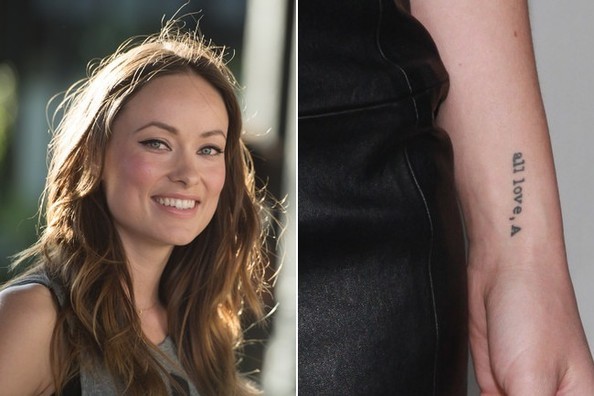
On her left forearm or wrist, Wilde has a small typewriter-style tattoo that reads “all love, A.” The initial refers to her late uncle Alexander Cockburn, a journalist and writer who mattered to her family. Wilde has said it reminds her to love people with the generosity he showed.

The wording feels like the end of a note or a letter, rather than a formal dedication. It does not say “in memory of” or spell out a long tribute. The single initial keeps the reference personal, and the tattoo can pass without explanation when someone sees it.

The typeface has a slightly old-fashioned feel without being ornate. A tiny heart or punctuation mark sometimes visible beside it adds to that handwritten-note impression.

Compared with the children’s names, “all love, A” takes a little longer to understand. Otis and Daisy name their subjects directly; the A leaves a clue, with the story filling in the rest. Some tattoos announce who they honour, while others keep the memory tucked behind a small detail.

The matching celestial pieces were made for her children’s signs

Olivia Wilde celestial forearm constellation tattoos

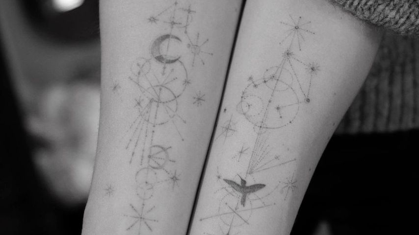
Event photos show how the constellation tattoos sit across Wilde’s forearms. One is linked to Otis’s Taurus sign and the other to Daisy’s Libra sign. They are not mirror images; each has its own arrangement of stars, lines and small shapes, like two portraits drawn in the same visual language.

Dr. Woo’s work often uses fine geometry, tiny dots and open skin, a natural fit for constellation tattoos. The stars need to be recognisable, but they do not have to become a solid picture.

Wilde could have chosen initials, birth dates or hearts. Using zodiac signs connects each child to a particular time of year and leaves a little mystery until you know the story.

The public photos show the tattoos as part of her everyday collection. You can see how they sit beside the names and older marks, and how their visibility changes with the light. A sharp event photo tells more than a blurry repost or tiny crop.

The Libra tattoo is one of Wilde’s most recognisable newer additions

Olivia Wilde Taurus and Libra constellation tattoos

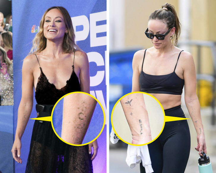
The Libra constellation draws attention because it is connected to Daisy’s birthday and often appears in photos of Wilde’s arm. It is made from small black marks and fine connecting lines rather than a large zodiac emblem. Up close it looks like a little map; from farther away it blends into the rest of the delicate work.

That restraint helps the tattoo sit among her script and older designs without making the forearm feel crowded. The meaning is personal, while the finished piece still reads as clean, modern tattoo art.

Wilde has joked online about “running out of arms” as she adds more ink. The comment gives the process a bit of humour: she likes tattoos, but forearms are a limited canvas. The constellations look planned rather than rushed, with each design considered beside the others.

There is no need to add a hidden message to the Libra tattoo. The family connection already gives it a clear reason to be there: it marks Daisy, her sign and a part of Wilde’s collection that keeps growing.

A newer Libra reveal shows the collection still growing

Olivia Wilde new Libra constellation tattoo

Later photos show Wilde adding to or refining the constellation work. The new Libra reveal makes clear that the collection did not stop when the children’s names first appeared in public. The designs seem to have arrived in stages, with one delicate piece balancing another until both arms feel connected.

Many celebrity tattoo stories centre on one dramatic reveal. Wilde’s collection has grown more quietly: a name, a constellation, a small moon or a short tribute. Each might be photographed separately, but together they make a visual timeline without looking like a planned mural.

Image quality matters with fine-line tattoos. In a blurry event photo, a constellation can look like a scratch or jewellery; in a clear shot, the star points and thin lines come into focus. The work is subtle by design.

The older tattoos are more rebellious and harder to see

Olivia Wilde older upper arm tattoo

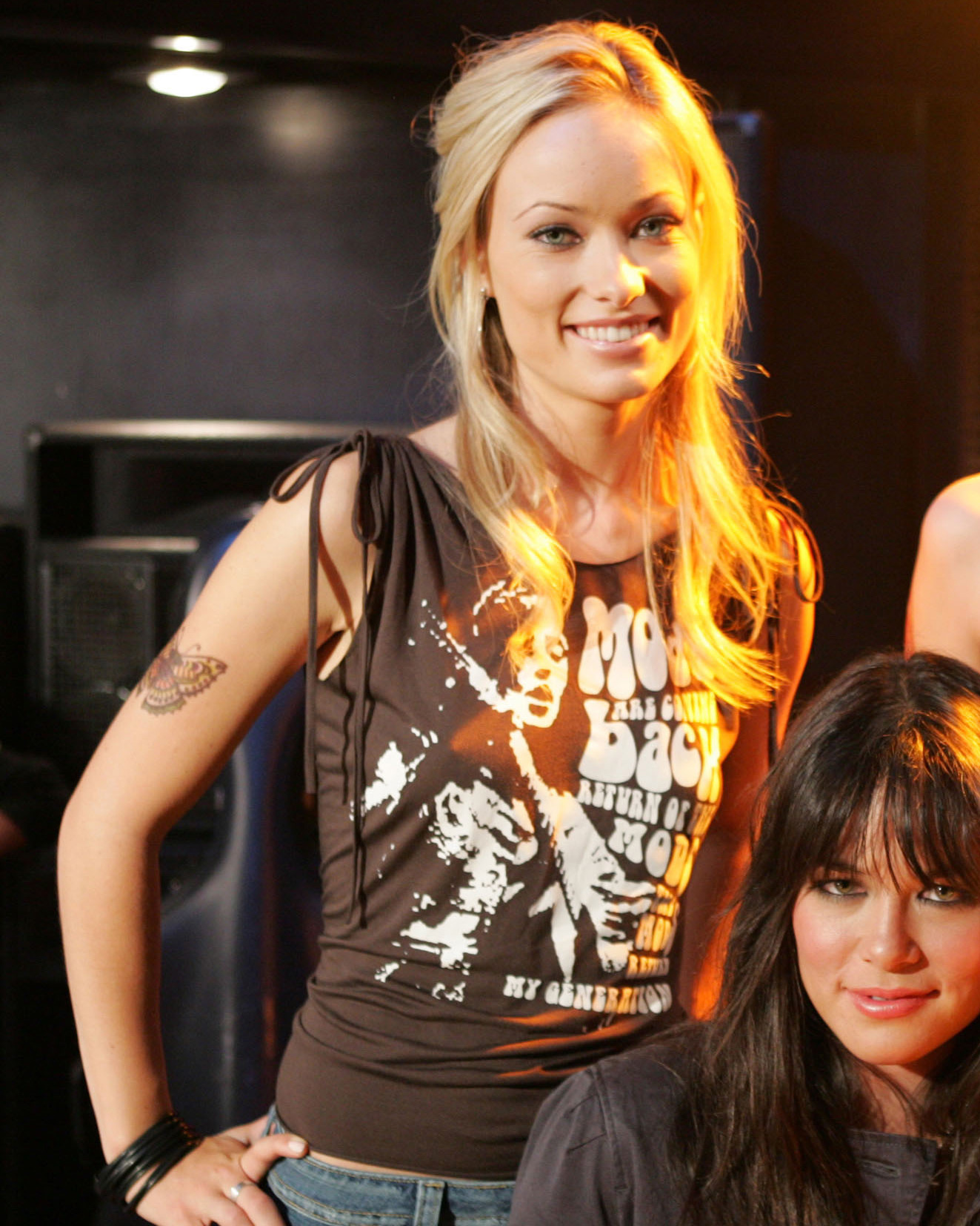
Wilde’s earlier tattoos have a different feel. Older reports describe a line from Shakespeare’s King Lear across her back: “We will all laugh at gilded butterflies.” She has also been associated with a longer Nietzsche passage along her ribs about people who cannot hear the music thinking dancers are insane. Both tattoos use much more text than her recent forearm work.

Wilde has talked about a dragon tattoo on her lower back that she got as a teenager in Dublin. She has joked that it was rebellious and later called it a bad choice. That honesty is part of its story: the tattoo does not have to be presented as perfect art to belong in her history.

Older coverage also mentions a small Chinese character linked with strength, a yin-yang design and symbols that are not always clear in public photos. When a tattoo is hidden or photographed from a distance, it is better to describe it as reported than to assign it a precise meaning Wilde has never given.

The difference between those older pieces and her newer work is the larger story. The earlier tattoos were longer, louder and more defiant; the newer ones are smaller and more specific. Her collection changes shape as her life does.

Wilde’s tattoos bring together early rebellion and present-day affection. The dragon, quotes and symbols point to younger years; “Otis,” “Daisy,” the Taurus and Libra constellations, and “all love, A” keep family and memory close. Some are easy to see, others stay hidden, and a few only make sense once Wilde explains who or what inspired them.

Watch Olivia Wilde talk about tattoos

In this relaxed beauty interview, Wilde talks about her tattoos and the way she approaches personal style.

More actor tattoo guides

Charlie Sheen’s tattoos were always meant to be a little ridiculous

Charlie Sheen’s tattoos have often played out as a side story to his public life. They appear in old red-carpet photos, onstage during the Violent Torpedo of Truth tour and in close-ups where a word on his wrist takes over the frame. The designs are loud, personal and sometimes hard to treat seriously. That was likely part of their appeal when he got them.

Sheen talks about the ink differently now. In a recent interview, he called getting tattoos a terrible, stupid decision and said he has not added any in more than a decade. He has also said some tattoos covered scars from drug use. That changes how the collection reads, though it does not erase what the designs said about the period in which he chose them.

Online lists do not agree on every detail. The pieces seen most often are the Death From Above chest banner, Winning on his wrist, the Cincinnati Reds cover-up, the Charlie Brown design, the cigarette and ashtray, the zipper and eyeball, and a number of smaller jokes and symbols. Here is the clearest account of those tattoos.

Death From Above and the apple drop set the tone

Charlie Sheen Death From Above chest tattoo

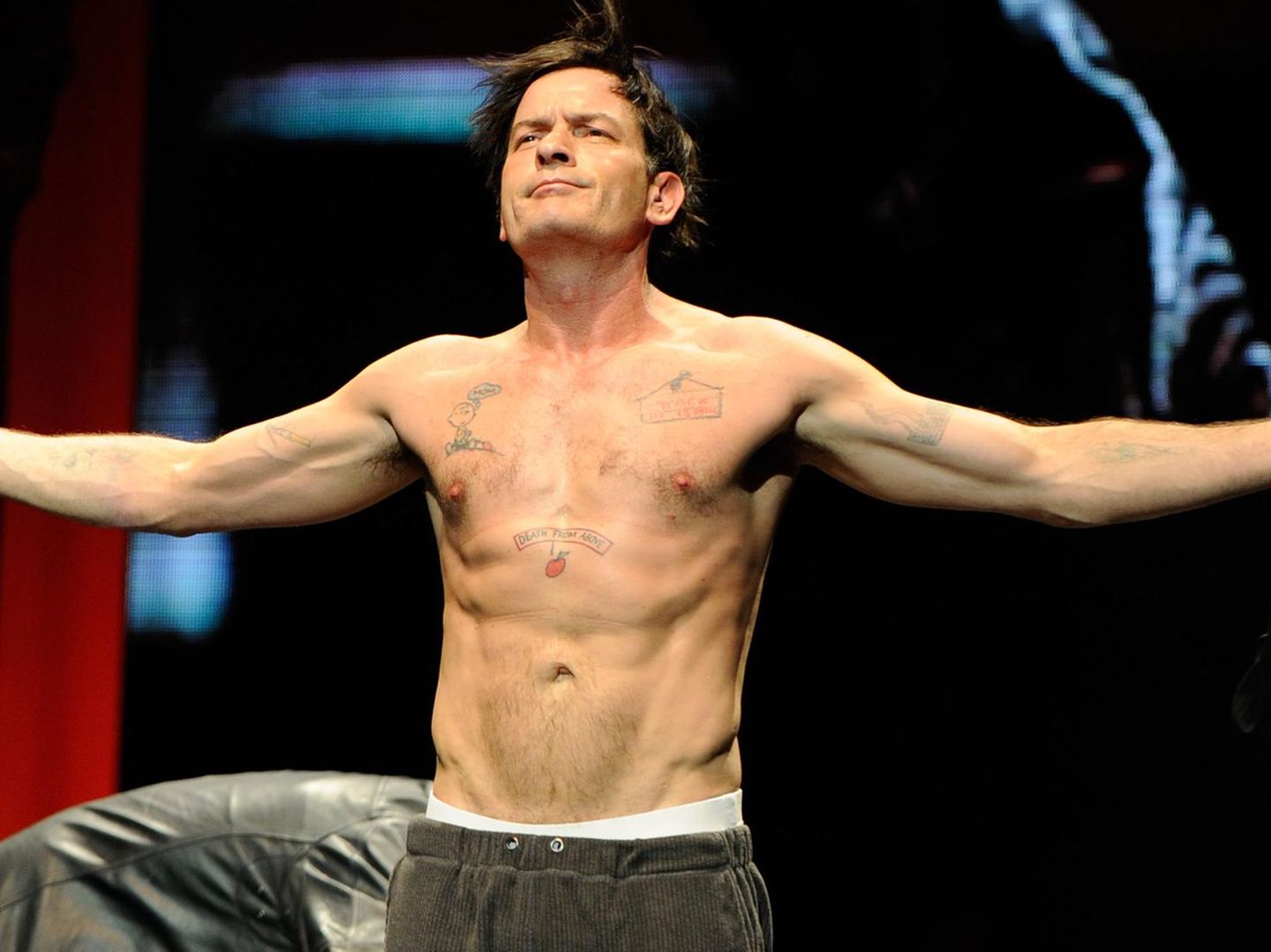
One of Sheen’s most recognisable pieces is the Death From Above banner across his upper chest. The words sit beside an image described as an apple and a falling drop, blending a threat with cartoon logic. It is not minimalist or neatly polished. The design brings together a phrase, a strange image and a little swagger.

Sheen knows how a short phrase can become part of a public character. “Winning” became his catchphrase, while Death From Above feels more like a private slogan that made its way into view. It has the same oversized energy as his stage persona, fixed across his chest.

The placement is hard to miss in shirtless photos. During the 2011 tour, the banner appeared alongside several other tattoos, part of a busy collage rather than a single emblem. It captures the way the collection works: a bold line, an odd image and a punchline that mattered more than visual harmony.

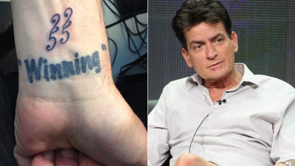
Winning replaced Denise on the wrist

Charlie Sheen Winning wrist tattoo

The wrist tattoo most associated with Sheen’s public image is Winning. It used to say “Denise,” referring to Denise Richards; older coverage shows that name was covered or replaced after their relationship ended. The change is a small piece of tattoo history, but it tracks a much bigger public shift.

By 2011, “winning” was everywhere. Sheen said it in interviews, put it on merchandise and built a stage show around the attitude. The word on his wrist made it feel less like a campaign slogan and more like something he could see whenever he looked down.

The lettering is simple, which is why it reads so clearly in photos. The more complicated story is underneath: a relationship reference became a marker of a very public new chapter. Sheen turned a personal change into part of his mythology.

The cigarette and ashtray joke sits on his forearm

Charlie Sheen cigarette forearm tattoo

The cigarette and ashtray tattoo is tied to Sheen’s hard-living image. Instead of hiding the habit, the design turns it into a visual joke on his arm, something that could only belong to a particular period of his life.

In photos of Sheen smoking, the real cigarette in his hand and the tattoo sit in the same frame. There is a deliberate absurdity to making a habit permanent, as if the image asks whether the joke will still seem funny years later.

His later comments about sobriety and regret give the piece a different weight. What once read as a punchline is now connected to a chapter he was trying to leave behind. That does not make it meaningless; it makes it a clear record of a mood that did not last forever.

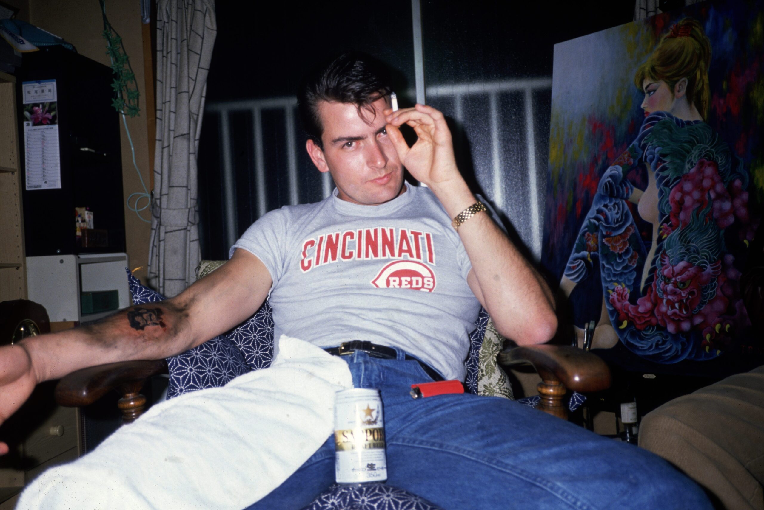
The Cincinnati Reds logo covers an older tattoo

Charlie Sheen left wrist cover-up tattoo

The Cincinnati Reds tattoo has one of the stranger histories in Sheen’s collection. Coverage describes it as a cover-up of an earlier design connected to a Japanese god. The baseball logo is more than a team mark; it also shows that he chose to cover something he no longer wanted.

Cover-ups make the past visible in a different way. People change their minds, a relationship ends, or a symbol stops feeling right. In Sheen’s case, a baseball logo replaced the earlier image, making the change feel both personal and deliberately plain.

The Reds design carries the collection’s mix of sincerity and comedy. A sports logo is straightforward; putting it over a Japanese-inspired design is not an expected choice. It feels like Sheen replacing an image that no longer fit with something familiar to him.

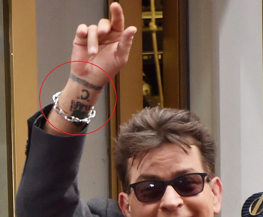
The small C on his wrist is easy to miss

Charlie Sheen C wrist tattoo

Tattoo galleries often show a bold C followed by a colourful ring on Sheen’s wrist. It does not have the instant recognition of “Winning,” but it gives a glimpse of how varied the collection is. Some designs are not headlines; they sit beside a watch or bracelet and wait for a clear photograph.

The letter has been linked to Charlie, though reports are less consistent about its story than they are for “Winning” or the Reds cover-up. It is safest to describe what is visible without assigning it a grand meaning.

That pattern runs through the collection. Some tattoos come with an obvious story; others only became notable after the person wearing them became famous. The wrist C is recognisable, but still a little mysterious.

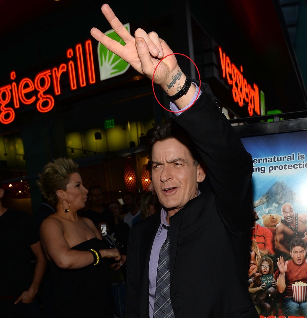
Other wrist ink adds to the running joke

Charlie Sheen public wrist tattoo

Photos show several more designs around Sheen’s wrists, including words and small symbols beside the larger tattoos. Reported pieces include a 22/55 marking, a shield-like design with the letters “MLBCES,” and other lettering that can be hard to read in every image. Some lists also mention a diaper pin with an S and a small stingray.

Those details are best kept separate from the tattoos that can be identified clearly. A blurry picture can make a shape look like something else, especially when Sheen’s wrist is turned away from the camera. The stronger approach is to name the confirmed words and visible symbols, then mark other details as reported.

What is clear is that Sheen liked tattoos that started a conversation. Wrist designs show when he reaches for a drink, gestures in an interview or waves to a crowd. His ink did not grow into one polished sleeve; it accumulated in separate choices, each adding to the running joke.

The chest and torso hold some of the more surreal pieces. Coverage describes a Charlie Brown figure with a speech bubble saying “MOM,” a zipper opening around an eyeball and a sign that reads Back in 15 minutes. Other descriptions mention a dragon head, a stingray, a burning cigarette and a Snoopy or Peanuts-related image.

The cartoon references keep the collection from looking like a standard tough-guy set of skulls, flames and military symbols. Even when the subject is dark, Sheen often undercuts it with something silly. A cartoon or visual gag lets a tattoo carry meaning without becoming a solemn monument.

Some of these designs are hard to inspect individually because the clearest photos show several tattoos at once. A broad torso shot helps show where the pieces sit, but it cannot confirm every small detail. The overall collection is documented; the exact wording or placement of every minor tattoo is not always clear.

There is a more serious story underneath the jokes. Sheen now describes the tattoos as a permanent record of a time when he was dealing with pain, projecting confidence and trying to control the public story. That can make the collection seem funny and sad at once. The designs belonged to a version of him who has since changed.

His tattoos are not a neat success story, and they were never meant to be. They make a messy timeline of relationships, catchphrases, sports, cigarettes, cartoons and choices that once felt right. “Winning” may be the most famous word, but his regret is now part of the story too. Permanent ink can outlast the version of yourself that chose it.

Watch Charlie Sheen talk about regretting his tattoos

Sheen has spoken directly about his tattoos and why he would not make the same choices today. The video below focuses on the ink and the regret he has attached to it.

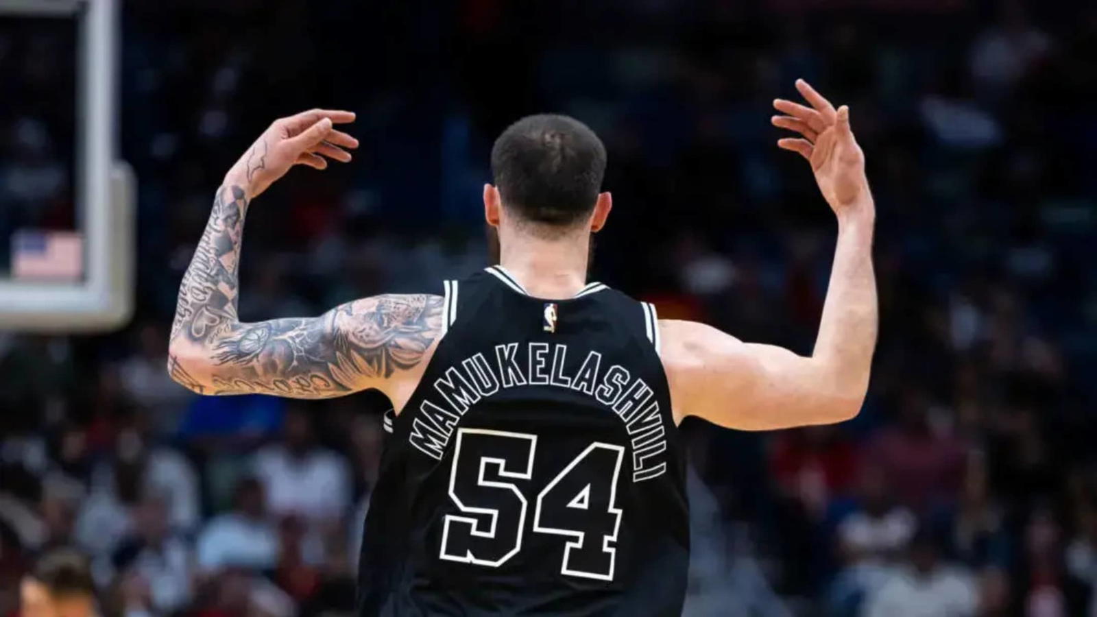
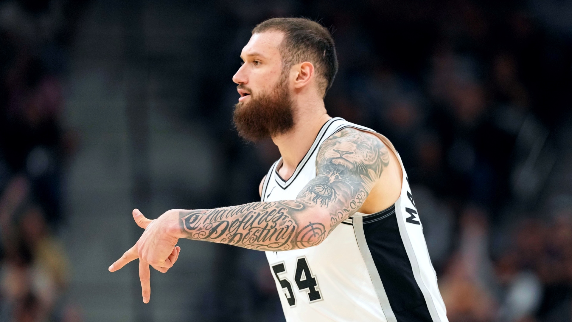
Sandro Mamukelashvili’s ink mixes family, Kobe and a little Kung Fu Panda

Sandro Mamukelashvili treats tattoos as more than decoration. His ink gives him a way to talk about family, art, basketball and the places that shaped him in Georgia, Italy and the United States. He got his first tattoo at 16 and kept adding to the collection, including sleeves, leg work and a large back piece with artist Zac “Lefty” Colbert.

The collection does not follow a standard athlete’s checklist. It includes a sun on his thigh, Mary and Jesus based on a figurine from his mother, the myth of Icarus, honeycomb, a bull, doves and work connected to Kobe Bryant’s Mamba Mentality. He has also drawn inspiration from Michelangelo, Leonardo da Vinci and Kung Fu Panda.

The designs cover different subjects, but there is a clear thread: tattoos can hold several chapters at once. Some pieces honour family, others remind him about ambition, and some are images he simply liked enough to keep. Here is what he has explained about them.

The sun on his thigh was the first tattoo

Sandro Mamukelashvili arm tattoos in action

Mamukelashvili got his first tattoo at 16, during a trip to Croatia. It is a sun on his thigh, and his stepfather got the same design. That makes it more than a first experiment with ink: it is a shared mark from a trip and a family relationship.

He has said his parents were strict about tattoos, so he hid it from his father for months. The story gives the sun some teenage mischief. It was not a carefully planned public image; he made the decision while travelling, then tried to keep it under wraps when he got home.

A thigh tattoo also let him keep the choice private under everyday clothes. The rest of his collection eventually became harder to hide, but the sun remains the first page in the timeline.

Mary and Jesus connect his ink to his mother

Sandro Mamukelashvili tattooed arm

One of Mamukelashvili’s most personal designs is an abstract image of Mary and Jesus, based on a figurine his mother gave him. That starting point matters more than whether every line in the finished tattoo is easy to identify. The image began with an object already tied to home, faith and family.

He has described the tattoo as something more specific than a religious design picked from a wall. It came from something his mother gave him, and the artist turned that keepsake into a more graphic image. The tattoo carries the memory of the gift while leaving room for an artistic interpretation.

It also shows why he talks about tattoos as a way to stay authentic. The crowd may see one image; for him, it has a much more direct connection. That private meaning is part of the design’s appeal.

Icarus gives the collection its warning about ambition

Sandro Mamukelashvili tattoo sleeve

Another important piece draws on Icarus, the figure in Greek myth who flew too close to the sun despite being warned not to, then fell when his wings melted. Mamukelashvili has described the lesson simply: do not get too high or too low. That idea can be useful in a sports career that swings between big wins, injuries, selection decisions and uncertain stretches.

The tattoo is not only about failure. It also speaks to ambition, risk and keeping perspective when life starts moving quickly. Confidence helps in basketball, but it can turn into carelessness if a player stops paying attention.

The myth adds an old story to a modern collection. Mamukelashvili has spoken about classic artists and historic images, so Icarus fits his interest in art that carries meaning across time. The tattoo can serve as a reminder without spelling out the moral in words.

Honeycomb ties the arm pieces together

Sandro Mamukelashvili celebration sleeve tattoos

When Mamukelashvili had more work done by Zac “Lefty” Colbert, a honeycomb pattern was added to his left arm to bring older pieces together. It is a practical way to connect separate tattoos, and it reflects how the collection actually grew: individual images came first, then the honeycomb helped them work as a sleeve.

The pattern can bend around existing designs without making the gaps look accidental. It gives the arm some structure while letting the family, mythology and basketball pieces keep their own meanings.

In interviews, Mamukelashvili has also credited Pasha Ink for much of his newer work and talked about the skill it takes to handle colour and detail. He pays attention to how the composition works, not just which symbols it contains.

The Kobe tribute is built around Mamba Mentality

Sandro Mamukelashvili Mamba Mentality tattoo action

Mamukelashvili has a tattoo connected to Kobe Bryant’s Mamba Mentality. Bryant’s example influenced him during his college years, as he watched, learned and worked out his own approach to the game.

It is more than a famous player’s name on an arm. The phrase stands for preparation, focus and accepting the work that comes before the result. For someone who moved between countries and levels before reaching the NBA, that message has a natural place in the collection.

The tattoo also connects Mamukelashvili to a generation of players who treated Kobe’s approach as a language of its own. It speaks directly to basketball while fitting his wider habit of choosing designs that represent a way of thinking, not only a particular event.

The back piece honours the women in his life

Sandro Mamukelashvili lion arm tattoos

In 2024, Mamukelashvili returned to Colbert for a large back piece. He described a woman giving birth while holding her child, with two midwives or protectors above. The image includes doves, a woman or angel holding the key of life, two protective faces and a mother with her baby.

He said the design came from a painting he saw in a gallery and was meant to honour his mother, aunties and grandmothers. The symbols become clear with that explanation: the doves represent compassion and love, the women above the central scene protect it, and the mother and child bring the piece back to the people who cared for him.

A bull was also added to his upper back as a reference to his Taurus sign. It is a smaller idea inside a much larger image, but gives the whole piece a personal detail. This is not realism added just to fill space; it is a family story built into a full composition.

The back tattoo shows the difference between choosing a design because it looks striking and choosing one because it has somewhere to go in your life. Mamukelashvili cares about the art, but the meaning came first.

Kung Fu Panda and classic artists keep it playful

Sandro Mamukelashvili tiger and script tattoos

Not all of Mamukelashvili’s tattoos are serious family tributes. He has also talked about Kung Fu Panda tattoos, which bring a lighter note. The film is funny and warm, but it also plays with identity, discipline and growing into a role you did not expect.

That mix suits his collection. A family image can sit beside a cartoon character, a basketball tribute and a myth about flying too close to the sun. They do not need to share a subject if they share a feeling; each design belongs to a particular part of his life.

Mamukelashvili has also named Michelangelo and Leonardo da Vinci as inspirations. His interest in drawing, composition, colour and the artist’s skill comes through in the way he talks about the tattoos. They are personal, but he also wants them to work as art.

Curiosity ties the collection together better than any one style. A Croatian sun, a family figurine, Icarus, honeycomb, Kobe, a bull, doves and Kung Fu Panda all share the same space. The pieces have accumulated over time without feeling random.

He is building a scrapbook on skin. Some pages are about where he came from, others about the people who helped him, and a few are there because an image made him smile. That is more interesting than a standard list of NBA tattoos: you can follow a life through the designs, even when a piece is playful.

Watch Sandro Mamukelashvili explain the ideas behind his ink

Mamukelashvili has talked about his first tattoos, the artists he admires and the family, mythology and Kung Fu Panda pieces. The video below is the closest match for a tattoo-focused look at his collection.

More athlete tattoo guides

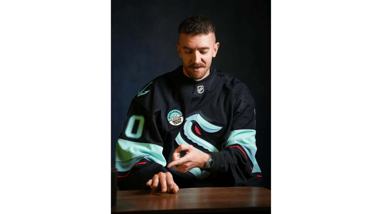
Matt Murray keeps his biggest moments close in ink

Matt Murray does not have a large collection, but each tattoo has a clear reason behind it. The Seattle Kraken goaltender has used ink to mark two Stanley Cup wins, keep his wife close and carry a reminder of how he wants to handle pressure.
There is no full sleeve here. The numbers on his fingers sit beside his championship rings, the tattoo for his wife rests under a watch, and “The Man in the Arena” sits on his left bicep, mostly out of sight during games.

Murray has spoken about what the tattoos mean without turning each one into a public statement. They are a few permanent reminders that fit into everyday life.

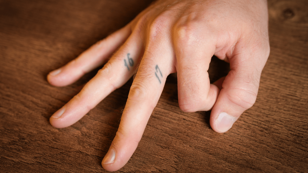
The 16 and 17 finger tattoos remember Pittsburgh’s Cup runs

Matt Murray 16 and 17 championship finger tattoos in an official close-up
Matt Murray showing the 16 and 17 finger tattoos during the Deep Ink feature
Matt Murray wrist and hand tattoos shown during the NHL Deep Ink feature

An official close-up shows how small the numbers on Murray’s fingers are. They sit beside the creases of his hand, so they can disappear in a game photo but line up with the rings he won in those seasons.

Murray’s first tattoo marked two of the biggest achievements early in his NHL career. He has a 17 on the inside of his right middle finger and a 16 on the inside of his right ring finger. They refer to the Pittsburgh Penguins’ back-to-back Stanley Cup wins in 2016 and 2017, when Murray helped the team reach the top.

The placement was deliberate. Murray said the tattoos sit on the same fingers where he wears his championship rings. They work as quiet reminders alongside the physical trophies; he even joked that the rings are different sizes, so he knows which number goes with which finger.

They feel less like a display and more like a private filing system. A fan might notice the numbers in a close-up, but they are easy to miss during a game. Murray can look down and remember those seasons without a date or trophy taking over his arm.

The timing matters too. Murray said he got his first tattoo in 2018, after he had already experienced the two Cup runs. He did not rush to mark the wins while everything was still unfolding. The design came later, once the achievements had settled into his life.

The numbers look simple enough to be mistaken for ordinary finger ink, which is part of why they work. They point to two seasons and let the memory do the rest. Some of the most personal sports tattoos look almost meaningless to everyone else.

They also sit in the hands that matter so much in hockey. A goaltender depends on repetition, small movements and focus. The tattoos share space with the rings and gloves, close to the hands that helped make those memories.

A C, rose and crown keep his wife close

Matt Murray during the official Deep Ink tattoo feature
Matt Murray alternate close-up of the C, rose and crown wrist tattoo

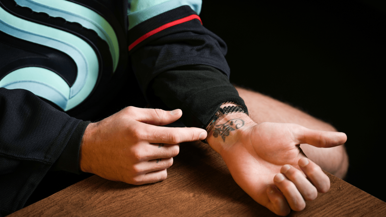
After getting the championship numbers, Murray returned to the tattoo shop for a design dedicated to Christina, who was his girlfriend at the time and later became his wife. The tattoo includes a C for her name, a rose and a crown. Murray called it a tribute to her and said the crown represents her being the queen.

It sits on the inside of his left wrist. Murray has said he chose the spot because he wanted to glance down and see it when he was thinking about her, not because of a complicated placement rule. That direct reason gives the tattoo its charm.

The rose and crown make the design easy to recognise, but the C is what makes it personal. Anyone can read the flower as a love symbol; the initial points to one particular person.

Murray also said the tattoo fits neatly beside his watch. It was not placed for dramatic photographs; it works with something he already wears and stays close to his routine.

There is a quiet contrast between this wrist piece and the numbers on his other hand. The finger tattoos mark public achievements, while the rose and crown point toward home. One set remembers the seasons that shaped his career; the other keeps someone close while he is away playing.

The tattoo also came together with care. Murray went to an artist recommended by former Penguins teammate Kris Letang, then asked Christina what she might like. It was meant as a surprise and a tribute, but he wanted the final design to reflect her taste too.

The Man in the Arena sits on his left bicep

Murray’s most openly motivational tattoo is on his left bicep. It reads “The Man in the Arena,” a phrase from Theodore Roosevelt’s 1910 speech “Citizenship in a Republic.” Murray first noticed the phrase on LeBron James’s sneakers, then looked up the speech it came from.

The passage praises someone who steps into the arena, risks failure and keeps trying, rather than watching from a safe distance. For a professional goaltender, that idea fits. Every game brings pressure, mistakes and criticism, but Murray can only make a save by staying involved.

He has said the tattoo reminds him to dare greatly and not dwell on the people watching. A person in the arena may lose, but there is value in being the one who showed up and tried. That makes the piece more specific than a generic motivational phrase.

The left bicep is a practical place for those words. They can stay under a jersey, but Murray can still see them when he wants to. The tattoo is private first and public second; fans know about it because he chose to explain it, not because it is always visible on the ice.

It rounds out the other pieces. The 16 and 17 look back at what Murray achieved, the Christina tribute keeps someone close in the present, and “The Man in the Arena” sets a standard for what comes next.

Why Murray’s small collection still tells a full story

Murray has said that after getting his first tattoo, he understood why people often want more. Even so, the pieces he has discussed remain a controlled collection. He has talked about adding his children’s names and birthdays one day, perhaps alongside something based on the first family picture they draw. That would continue the family theme without changing the feel of the existing work.

Very little of the collection is there simply to be shown off. The finger numbers are subtle, the wrist tattoo was placed for a quick private glance, and the bicep quote stays covered during games. None needs to dominate a photograph to matter.

That does not make the tattoos dull. Each has a clear subject and a reason Murray has shared. They are not a catalogue of passing trends; they are reminders of people and moments he wants to keep close.

There is an easygoing quality to the way he talks about them. Murray has laughed about not remembering his first artist’s last name, said the pain was less than he expected and left room for future ideas. He enjoys tattoos without needing every piece to carry a dramatic life lesson.

In the end, the ink is about the things Murray wants nearby: two championships, his wife and a reminder to step into difficult moments. It is a small collection, but the reasons behind it are easy to see.

Swae Lee’s tattoos leave plenty of room for space

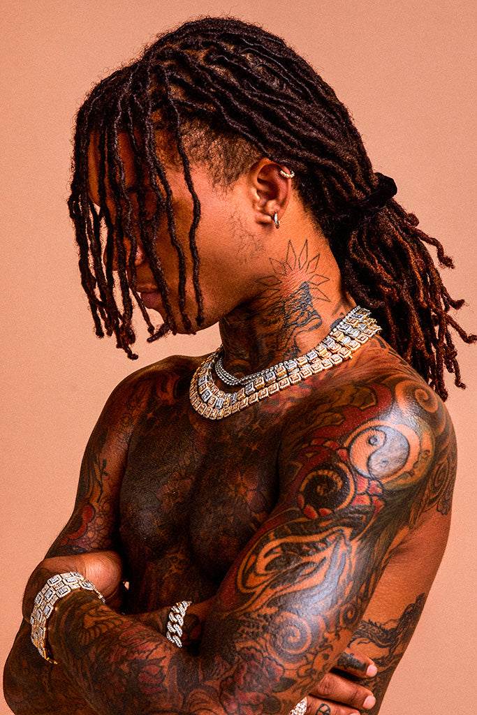
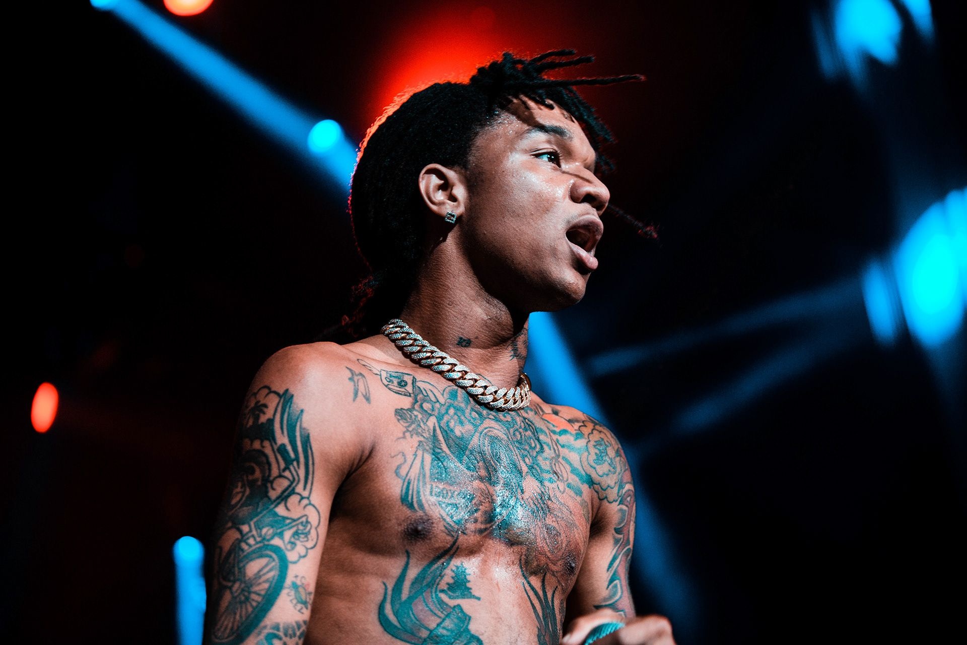
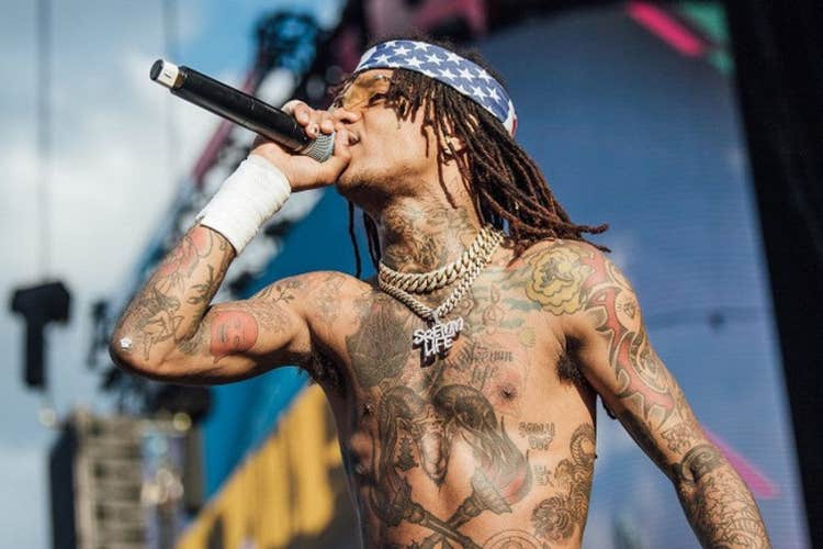
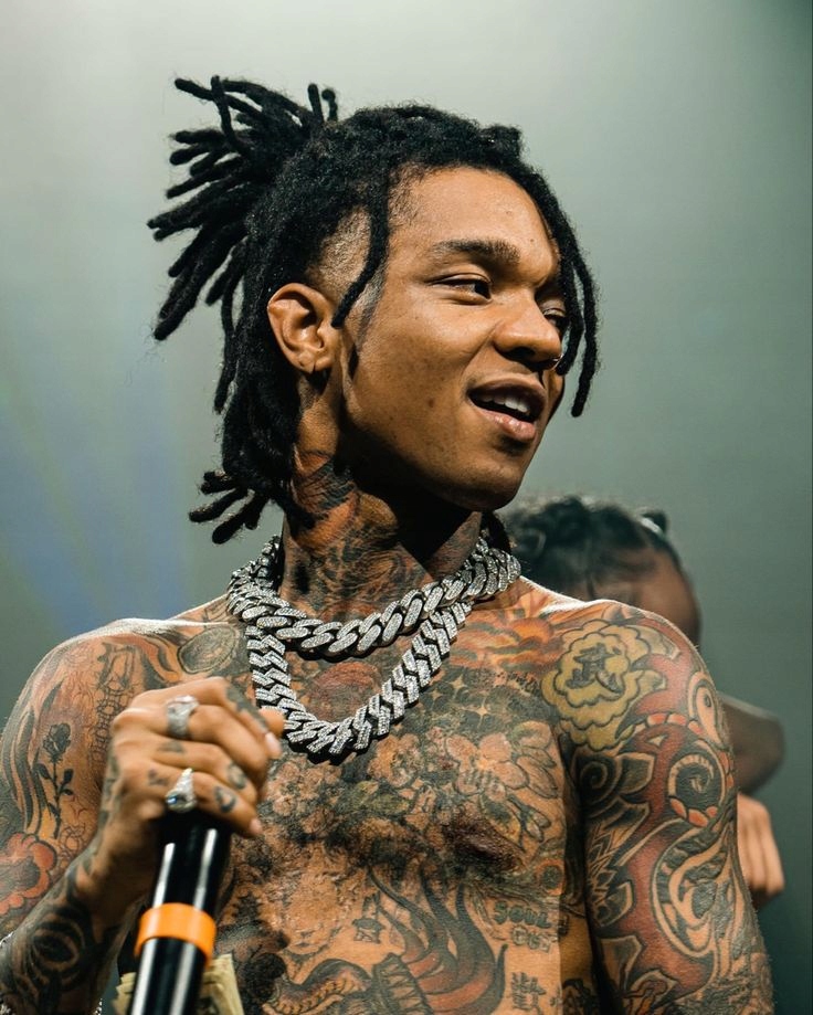
Swae Lee’s tattoos feel like they’ve grown alongside him rather than been designed as one matching set. Space imagery sits beside flowers, family references, symbols, faces and animals, with each piece seeming to belong to a different point in his life. There’s a lot of ink, but it feels personal instead of carefully branded.

A few stories behind the tattoos are especially clear. The wolf stands for strength, a chest cover-up gave him room for a fresh idea, and his back piece took about six hours while still needing more colour. Even the smaller marks on his hands and fingers make the collection feel like a record of life as it happened.

Swae Lee’s wolf tattoo is about strength

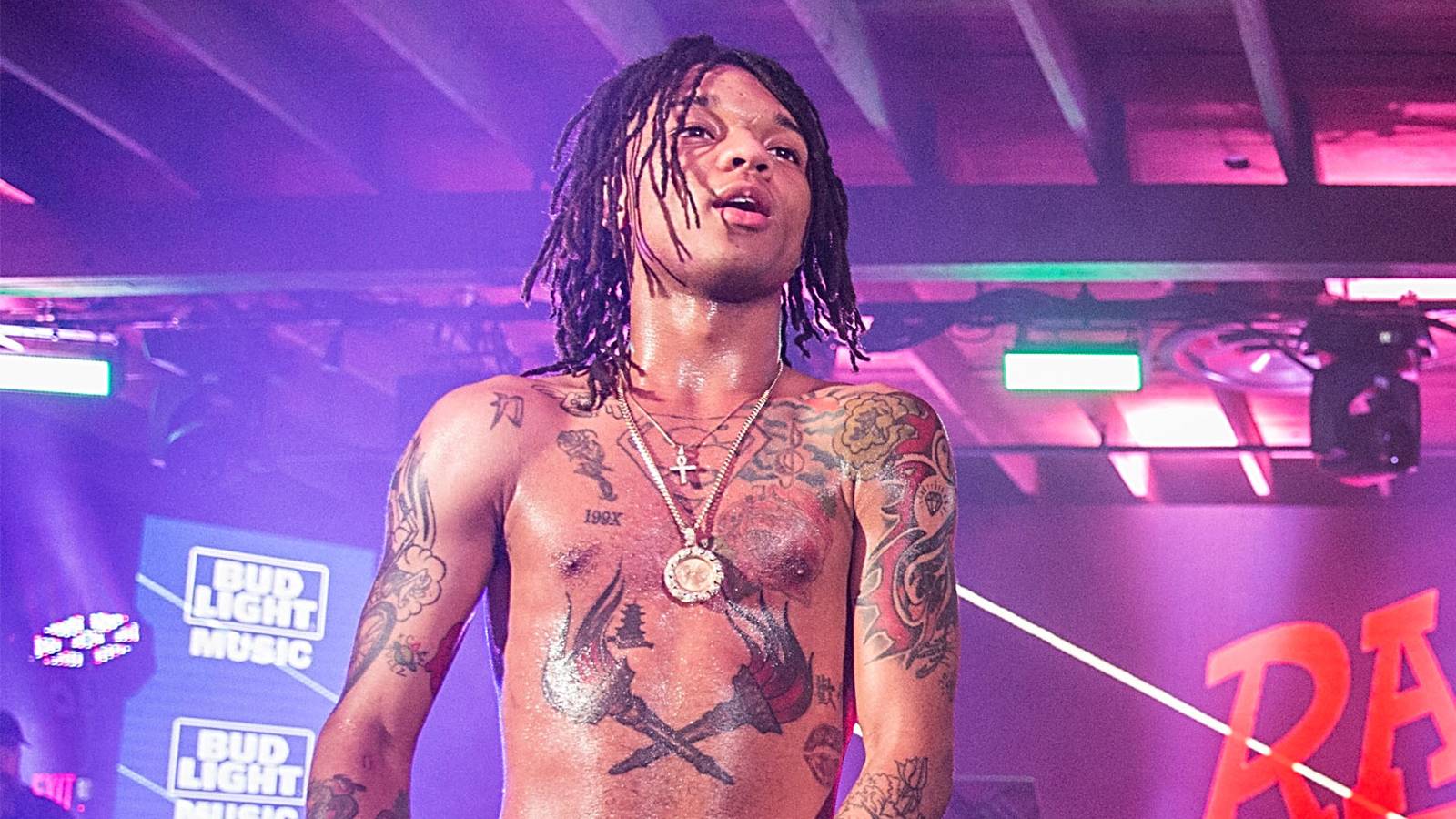
Swae Lee shirtless live portrait showing chest and arm tattoos

The wolf on the inside of Swae Lee’s right forearm is one of the most straightforward pieces in his collection. It represents strength and power, giving the tattoo a clear meaning even as the rest of the sleeve moves into more decorative territory.

It’s a fitting spot for that message. The forearm is easy to see and always in motion, so the wolf feels like a reminder he carries through everyday life, not just something brought out for a photo. It also anchors the collection: some of the other designs are surreal or playful, while this one stays bold and familiar.

The wider right-arm work includes a crown, flowers and vines. The crown suggests confidence and status; the botanical details make the sleeve feel softer. Rather than standing alone, the wolf sits in a mix of authority, nature and ornamental work. It’s a little self-belief, drawn as a wolf.

Motorcycles, planets and a rose on fire bring the chaos

Swae Lee cosmic chest tattoo with planets, flowers and space imagery

Another cluster of tattoos is all about movement and space: a motorcycle on fire, a planet or Saturn, sacred geometry and a rose surrounded by flames. The mix feels restless, calling up speed, travel, heat and the pull of somewhere beyond the everyday.

The motorcycle is the easiest image to read at a glance. It has the familiar association with freedom, but the flames give it a more intense edge than a simple road scene. The space imagery shifts the mood again: a ringed planet turns the body into a small night sky, and the sacred geometry adds a more measured pattern to the sleeve.

The rose on fire is a good example of Swae Lee taking a familiar tattoo symbol somewhere less predictable. Roses can stand for romance, beauty or memory; add flames and the meaning opens up. It could suggest passion, pressure or change, or simply a beautiful image with some heat behind it. The designs connect visually without needing to share one message.
The snakes and lamp point toward healing and rebirth

Swae Lee high-resolution stage portrait with visible chest and arm tattoos

Swae Lee also has tattoos featuring snakes and a lamp, images associated with healing and rebirth in descriptions of his work. They bring a quieter feeling to the collection than the motorcycle and flame designs.

Snakes can suggest change because they shed their skin. They may look dangerous, but they’re also linked with survival and renewal. A lamp adds the idea of light: direction, clarity or a way through a hard stretch. Together, the designs read as getting through something and coming out changed.

That theme sits comfortably alongside the darker pieces elsewhere, including demons, a Baphomet image and a tiger with a dagger. The snake and lamp add a sense of repair without glossing over the difficult imagery. The whole collection doesn’t have to sit in one mood.

His chest cover-up made space for a new idea

Swae Lee performance photo showing his chest and arm tattoos

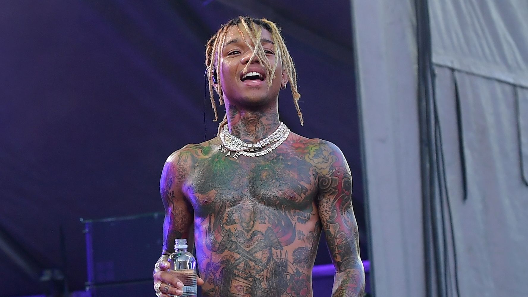
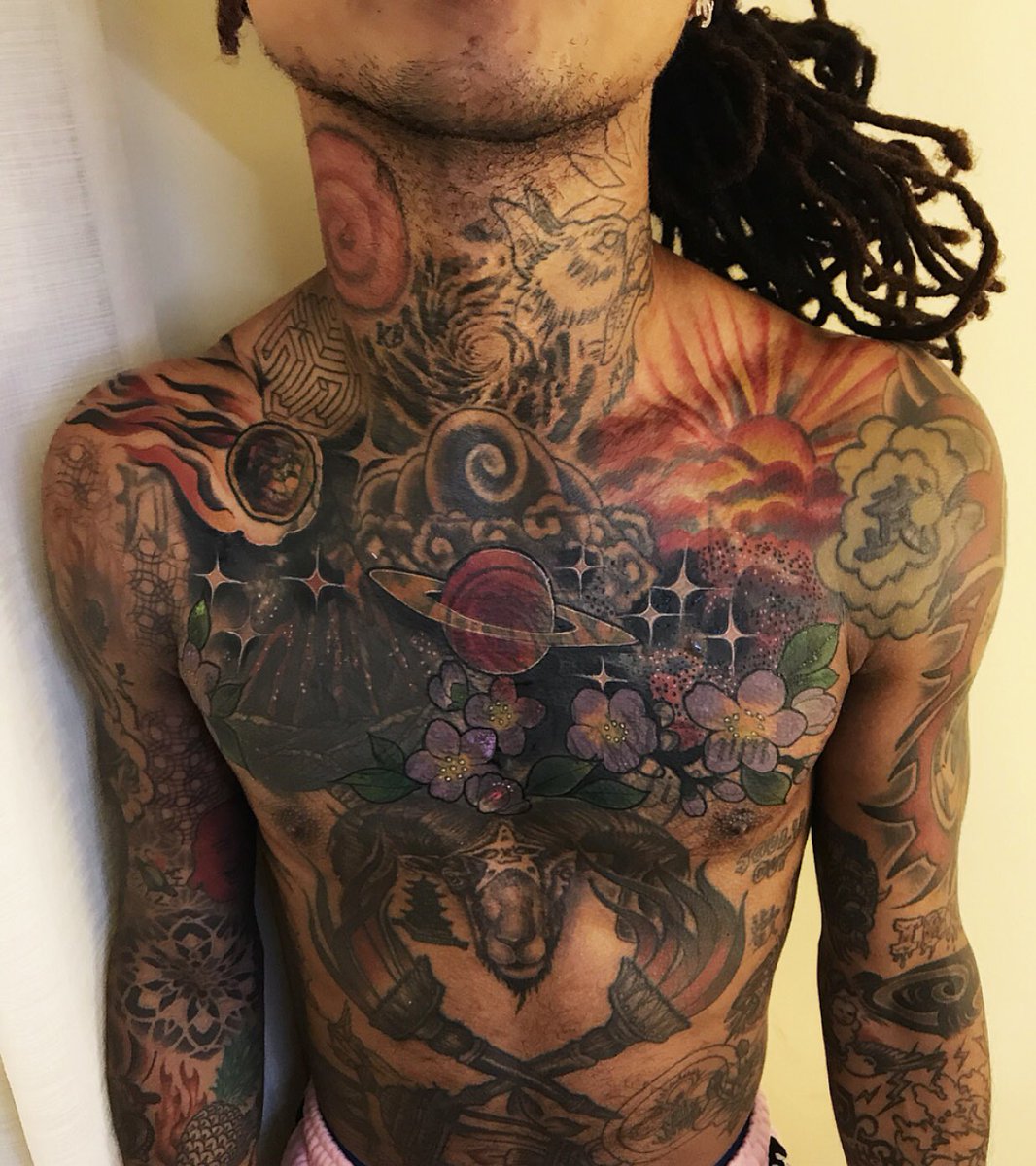
Swae Lee’s chest is one of the busiest parts of his collection. The design includes a meteor, a sunrise, stars, Saturn, flowers and a Chinese character. The space theme ties it together, and Swae Lee has talked about reworking the chest piece. He captioned the result: “I finally fixed my chest tattoo…. needed my own space.”

That line says plenty without spelling out every detail. The new artwork is a cover-up, hiding a design he no longer wanted while giving the whole area a different feel. Meteors and stars make it look like a personal sky has taken the place of the old tattoo.

The sunrise warms up all that cosmic imagery. Flowers keep it from feeling too mechanical, and Saturn gives the eye a rounded shape to settle on. The Chinese character is a small, distinct mark within a much larger scene. There’s a lot going on, but the repeated curves help the elements sit together.

Cover-ups can be practical, but this one also feels like a reset. The line about needing his own space is casual, almost funny, while pointing to the personal reason for changing the tattoo. Sometimes you just want to leave an old image behind and make room for something that fits who you are now.

Neck and stomach tattoos keep the space theme moving

Swae Lee live performance with visible chest, neck and arm tattoos

The space theme carries on beyond the chest. Around Swae Lee’s neck are designs that suggest a sphere or supernova, along with a wolf, a galaxy and a maze. They help link the upper body together instead of making every tattoo feel separate. The wolf echoes the one on his forearm, while the galaxy picks up the cosmic imagery from his chest.

A maze makes sense beside those designs. It brings in the feeling of searching, losing your way and finding a route through. Next to the stars and galaxies, it suggests the collection is just as interested in complicated paths as it is in looking up at the sky.

Other tattoos include a Buddha, a pineapple and a Japanese yen symbol. The Buddha brings a calmer spiritual image; the pineapple feels playful and welcoming, and the yen sign adds money and ambition to the mix. They don’t need to share a single meaning. The contrast shows how easily Swae Lee’s visual language shifts from serious to lighthearted.

Torches, Baphomet and SOUL’D OUT make the darker side obvious

Swae Lee face-visible portrait with chest and arm tattoos

Some of the most striking designs bring together fire, darker imagery and music. Swae Lee has crossed torches, a lantern, a Baphomet or Sabbatic Goat, a tiger with a dagger, flowers and the words “SOUL’D OUT”. The lettering links his tattoos directly to his music history.

The torches and lantern continue the collection’s play between light and shadow. Depending on the design, a flame can suggest guidance, energy or destruction. The Baphomet pushes the mood in a more confrontational direction, while the tiger and dagger have a classic sense of danger and protection.

Then the flowers soften the scene again. They keep the darker pieces from blending into one note. The words can work as a music reference, a statement of identity or a marker of a period when that phrase meant something to him. The designs don’t need to match to sit together.

Hands, face and fingers hold the smaller personal marks

Not all of Swae Lee’s tattoos are big sleeve or chest pieces. There’s a rose under his right eye, a dragon on the left side of his face, a spiderweb on his hand and stars or other symbols across his fingers. Because they’re in hard-to-hide places, these smaller designs change the way the whole collection comes across.

His fingers also carry peace and heart symbols, along with names. Those marks feel more intimate than the larger fantasy imagery. A heart or a name can speak for itself, while a peace symbol can reflect something he wants to keep close. They may be small, but he sees them all the time.

One especially personal detail is “IBIN” with a diamond. IBIN refers to his middle name, giving the tattoo a family connection as well as a decorative look. It can be easy to miss in a photo, but it offers a glimpse of the more personal side of his ink.

The rose on his face makes a statement from the first impression, while the hand and finger pieces mix symbols and names. Together, they show he’s comfortable with both a visible tattoo that people notice straight away and a tiny detail that rewards a closer look.

The dreamcatcher and peacock are his favourite back piece

One of the biggest designs sits across Swae Lee’s back: a dreamcatcher with a peacock. He has described it as his favourite tattoo, and the session lasted about six hours. The colour work is still unfinished, so even though it’s already a major piece, there’s more to come.

Dreamcatchers are often associated with protection, sleep and filtering out bad energy. A peacock brings colour, display and renewal, and its feathers give an artist plenty of room to work across the back. The combination is more decorative than the wolf or meteor, but it still touches on ideas of protection and change that show up elsewhere in the collection.

The six-hour session is a reminder of the physical side of a tattoo that can look effortless in a finished photograph. Large pieces take time, patience and a willingness to sit through discomfort. With the colour still to be completed, this design has another chapter ahead.

That unfinished quality is part of what makes it feel real. A tattoo doesn’t have to be a perfectly closed story. The image can already mean something while the work is still underway.

Swae Lee’s tattoos feel collected rather than planned

Together, the tattoos form a loose visual autobiography. The wolf is about strength; the chest cover-up made room for a new idea; and the snakes and lamp point to healing and rebirth. The “IBIN” and diamond connect the ink to his middle name, while the dreamcatcher and peacock show how much space he’ll give a single design.

Space imagery runs through the collection, but it shares the stage with flowers, fire, animals, music lettering, family references, spiritual images and small symbols. The variety suggests the tattoos came at different times, rather than following one long visual plan.

Some pieces are bold, others feel private, and a few are just fun. They look lived in. Swae Lee’s arms, chest, neck, hands, face and back have become a loose record of different interests and moments. The result is casual, imaginative and a little chaotic, much like the music.

For a closer look at Swae Lee talking through his ink, watch this tattoo tour:

More musician tattoo guides

Roman Kemp’s tattoos carry grief, friends and a lot of ink

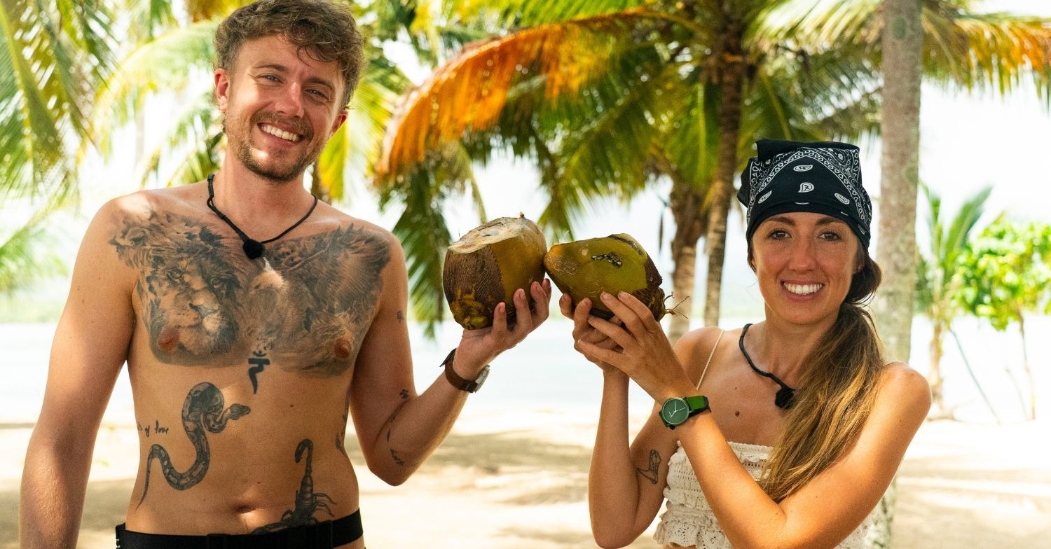
Roman Kemp has never treated tattoos as background decoration. He talks about them as part of his life, and it shows in the stories spread across his chest, stomach, arms, back and legs. There’s a large eagle, a lion, an anchor wrapped with a lizard, a shark, a swallow with a rose, plus smaller pieces tied to friends, music and old jokes.

Some of the ink carries real weight; some of it is meant to be funny. That mix is what makes Roman’s collection feel like his own. He has joked that he’s addicted to getting tattooed, even though he still hates the pain. He also tries to keep new work in places that won’t complicate his television jobs.

The eagle across his chest is the main event

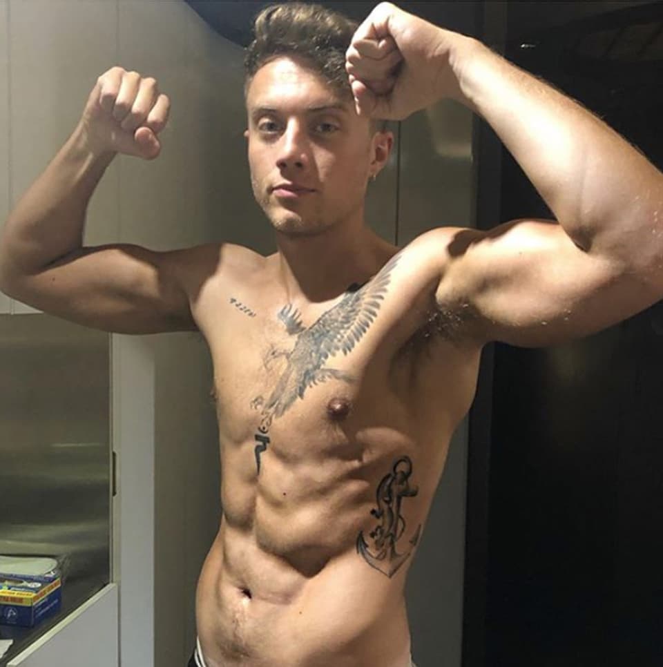
Roman Kemp eagle chest tattoo and anchor with lizard on his ribs

The first tattoo most people notice is the large eagle spread across Roman’s chest. Its wings reach toward his shoulders, making it far more prominent than a small chest emblem. The bold, traditional style is made to read from a distance, and gives the front of his torso a clear focal point.

The eagle also helps make sense of the rest of his ink. There are plenty of small bits of lettering and personal details, but this is the piece that brings the upper body together. In shirtless photos, its wings frame the chest as other designs fill the space around them.

There’s no need to assign it a complicated meaning. Roman has spoken openly about his tattoos, but there isn’t one definitive explanation in the public record for every line of the eagle. What’s clear is that it’s a big, confident image and one of his signature pieces.

The lion and eagle beach tattoo shows how dense the collection is

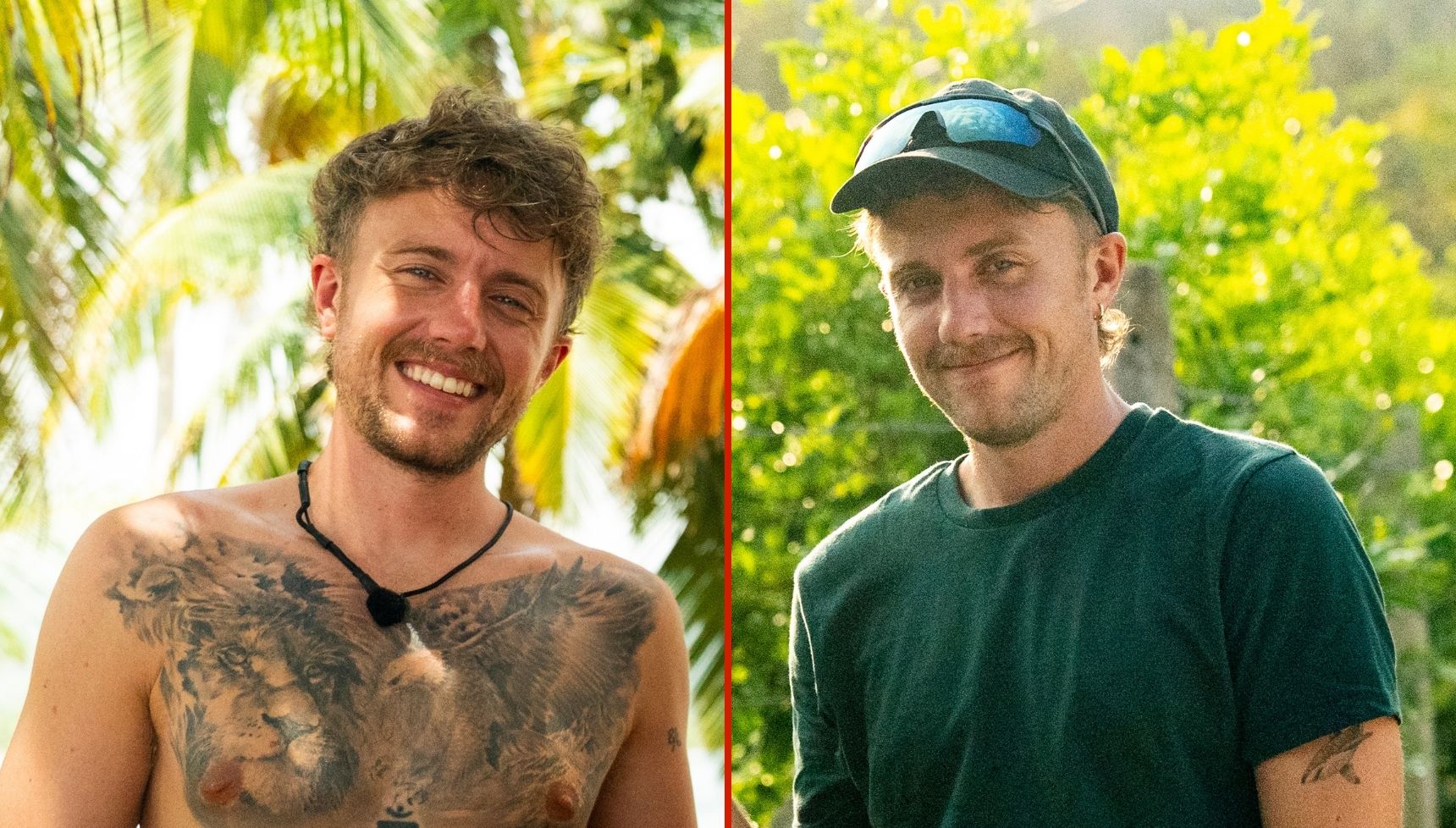
Roman Kemp lion and eagle chest tattoos during Celebrity Race Across the World

Recent TV footage gave viewers a better look at the tattoos covering Roman’s torso. A lion and eagle design spans his chest, with more ink running down his stomach and around his sides. Seeing the wider area makes a difference: in close-up portraits the tattoos can look like separate pieces, but from farther back they form a much larger picture.

That picture includes a snake and a scorpion on his stomach, as well as smaller marks on his arms. Footage from Celebrity Race Across the World also shows how the placement shifts as Roman moves. A tattoo hidden under a shirt can come into view when he reaches or turns to the side.

The chest work feels darker and heavier than some of his smaller lettering. It anchors the overall look, while the little details keep the collection from seeming like one perfectly planned sleeve.

The swallow and rose are a tribute to Joe Lyons

Roman Kemp swallow and rose forearm tribute tattoo for Joe Lyons

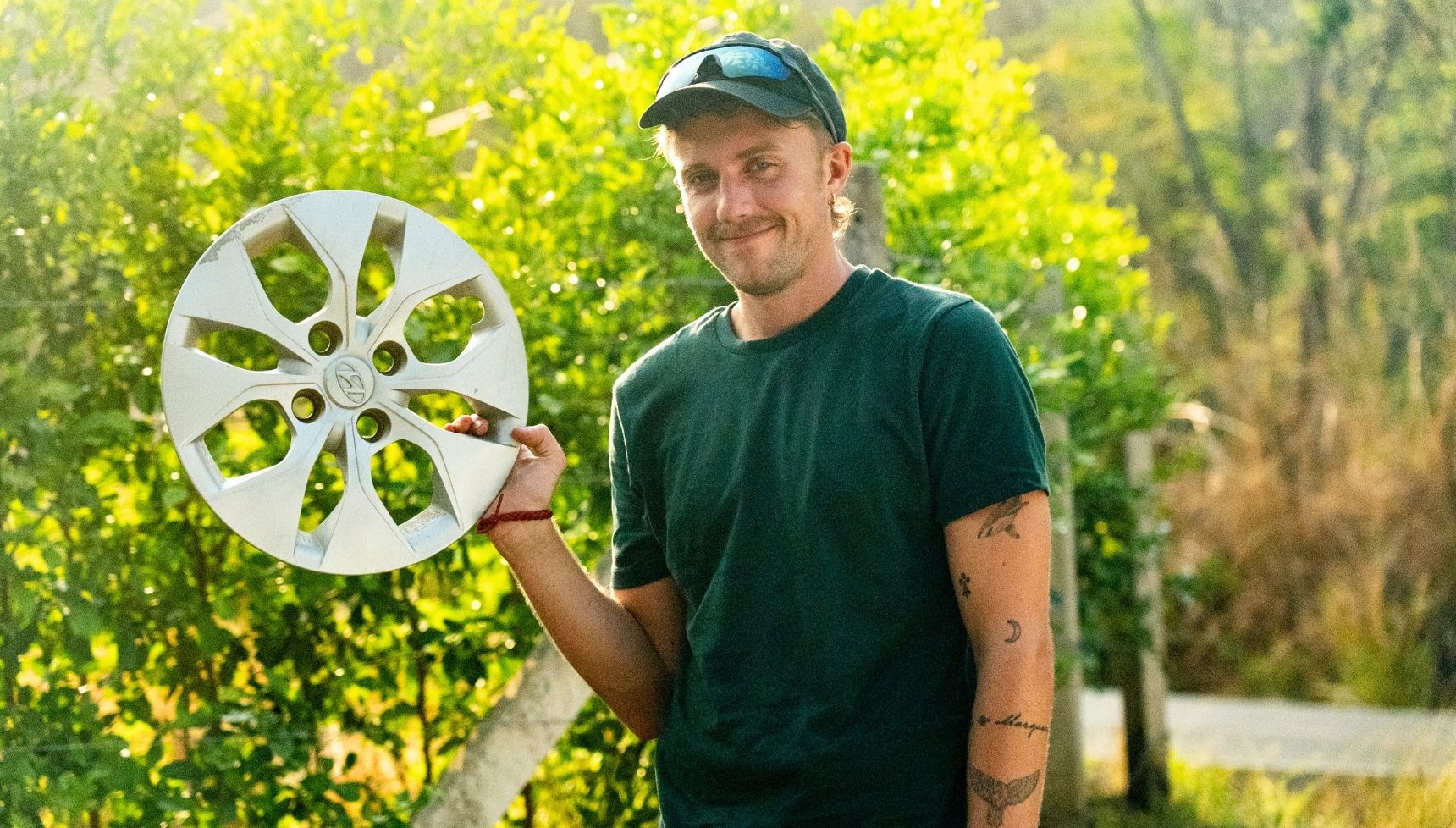
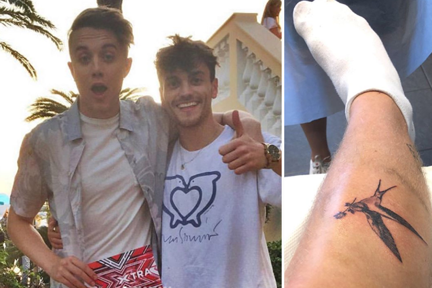
One of Roman’s most meaningful pieces is a swallow holding a rose on his forearm. It matches a tattoo his friend and producer Joe Lyons had. Joe died in 2020, and Roman has spoken about his loss and his efforts to encourage more open conversations about men’s mental health.

It’s a familiar tattoo pairing, but the story behind it is particular to them. Roman didn’t choose the swallow just because it looked good on an arm; it’s a shared design that keeps a friendship close. The rose softens the bird, and the placement makes it easy for him to see.

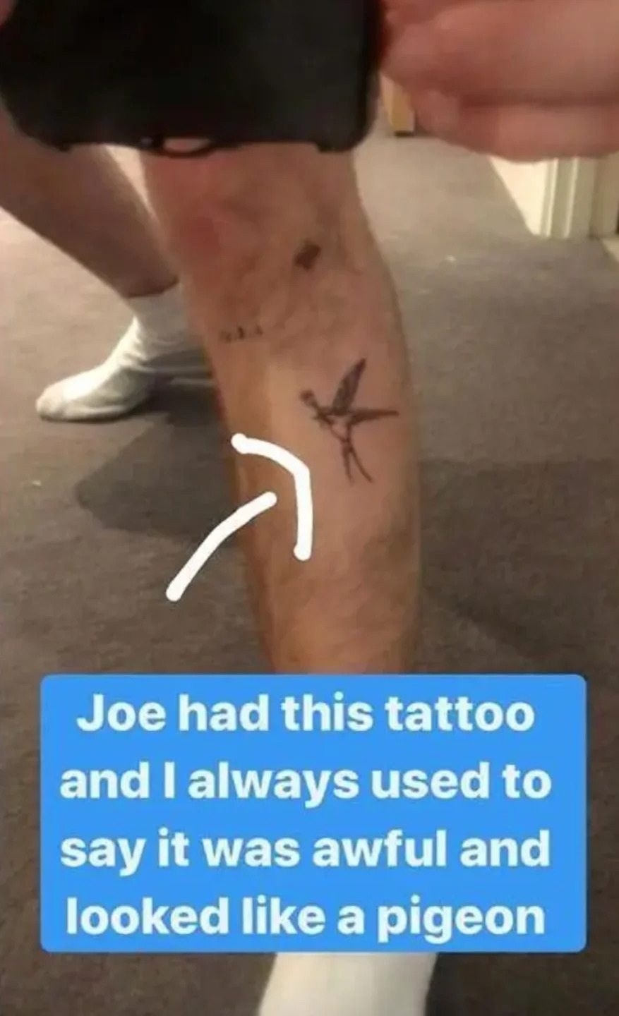
He later joked about another bird tattoo linked to Joe, saying he used to tease his friend because it looked like a pigeon. That humour belongs to the story too. Roman’s tattoos don’t turn memories into something overly polished; they leave room for affection, grief and the jokes that stay with you after someone is gone.

The snake and scorpion sit on his stomach

Roman Kemp snake and scorpion tattoos visible on his torso

Two of the bolder designs on Roman’s stomach are a snake and a scorpion. They’re easy to miss when he’s dressed, but stand out in beach photos that show his torso. Their darker, traditional style sits alongside the funny lettering and jokes from friends elsewhere in the collection.

The snake runs down the side of his body, with the scorpion lower on his stomach. They work with the shape of his torso instead of looking like separate stickers, and add a different kind of movement to the collection. The eagle spreads across his chest; the snake and scorpion draw the eye lower.

Roman hasn’t described the two designs as part of one symbolic statement, so it’s best to stick with what’s visible. They’re striking pieces and help explain why his tattoos look so extensive whenever he takes his shirt off.

The tiny bird tattoo turned a private joke into a tribute

Roman Kemp small bird tattoo matching his late friend Joe Lyons

Roman also got the small bird tattoo Joe had on his leg. He said he used to make fun of it, calling it an ugly pigeon. After Joe died, that same image became a way to remember him. The change in how he sees the tattoo says a lot about the way his collection has grown with his life.

It’s not a large piece, and it isn’t trying to compete with the eagle or lion. Its meaning comes from the story: a small outline connected to a friend, a running joke and the loss of someone important.

It also shows why a list of Roman Kemp’s tattoos is about more than naming the animals. The images matter, but so do the relationships behind them. For Roman, a bird can be a joke, a tribute or both at once.

Ed Sheeran and Niall Horan left their marks too

Roman Kemp Ed Sheeran tattoo on his shin

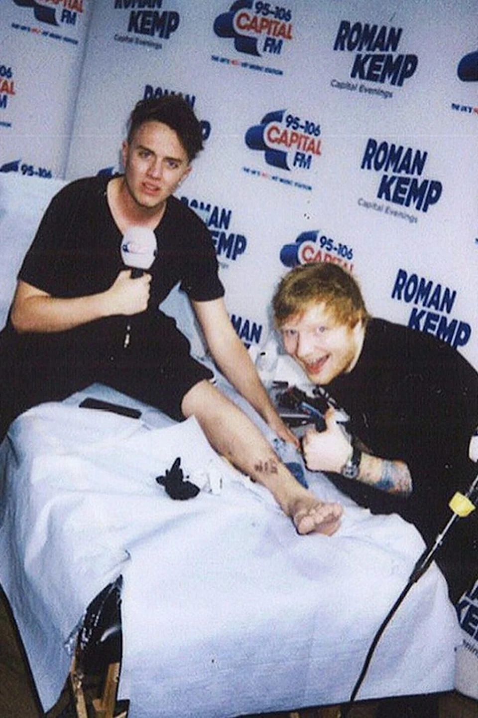
Roman has let famous friends tattoo him, with some pretty mixed results. Ed Sheeran wrote “Ed woz ’ere 2k7” on Roman’s shin, and Niall Horan added the words “Nice to melt ya”. Horan meant it as a play on his song “Nice To Meet Ya”, but the typo stayed on Roman’s leg.

These fit the more playful side of the collection. They were never meant to be perfect lettering; they’re keepsakes from friendships and moments when someone picked up a tattoo machine and left a permanent punchline.

Roman has also been photographed with Bart Simpson tattooed on his leg. It’s another detail that stops the collection from taking itself too seriously. Beside the memorial swallow, the chest eagle and the stomach designs, Bart adds a bit more personality.

Roman says the collection is still growing

Roman Kemp swallow tattoo tribute to Joe Lyons

Roman got his first tattoo at 17 and has kept adding to the collection since. He’s said the process can feel addictive, though he now uses numbing cream because he doesn’t want to sit through hours of pain. He has joked about running out of real estate on his body, a funny way to say there isn’t much bare skin left.

That helps explain why the tattoos feel like a patchwork. They weren’t all mapped out as one big project; they came at different times and connect to different people and chapters. The result has a strong visual centre, meaningful tributes and plenty of room for jokes.

Roman Kemp’s tattoos make the most sense as a scrapbook. The eagle and lion give his chest its scale; the snake and scorpion add drama. The swallow and bird keep Joe’s memory close, while the Ed Sheeran and Niall Horan pieces hold onto friendships in a deliberately messy way.

It feels lived in, which may be why there are still new chapters to come.

Watch Roman talk about his tattoos

Austin Rivers built his tattoo sleeve one story at a time

Austin Rivers’ tattoos don’t look like one coordinated set. They’ve come together piece by piece: some designs connect to family, some to basketball, and others were picked because the image appealed to him at the time. That makes the collection feel more personal than a perfectly planned sleeve. You can see how he has used tattoos to record parts of his life while leaving room for whatever comes next.

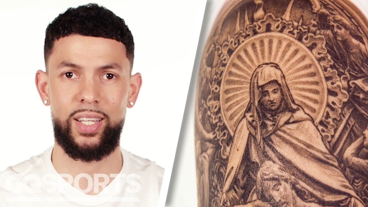
One of the clearest looks at his ink came in a GQ tattoo tour, where Rivers talked about several pieces and what went into them. He also spoke about Wiz Khalifa’s influence on his early interest in tattoos, and getting his first one while he was still in ninth grade. By the time Rivers reached the NBA, those early experiments had grown into a much larger collection across his arms, chest and upper body.

The Jesus Christ tattoo that started the collection

Austin Rivers Jesus Christ arm tattoo close upAustin Rivers tattooed arm during a game

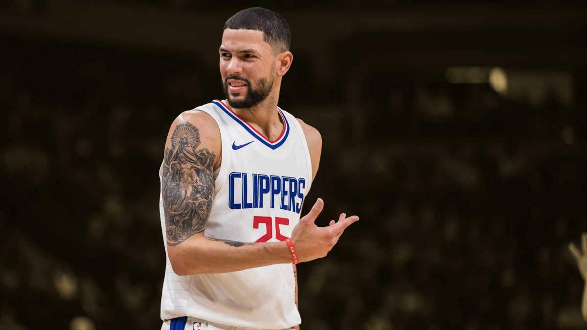
The Jesus Christ tattoo on Rivers’ arm is one of the most recognisable pieces in his collection. He has said he got it when he was young, so it belongs to the early part of his tattoo story, before he was famous. That gives it a different feel from a lot of celebrity ink: it wasn’t a branding move or a carefully staged reveal, but a teenager making a lasting choice.

Rivers has joked that the face looks a bit like Johnny Depp’s character from Pirates of the Caribbean. That kind of self-deprecating comment suits him. He can take a religious image seriously and still admit that tattoos don’t always turn out exactly as an artist first imagines. The joke doesn’t take away from the meaning; it makes the story feel more candid.

The arm is a natural place for it on a basketball player. It shows in games, practices and photos, but the design doesn’t define his whole look. Rivers can cover it with a sleeve if he wants, or let it show on court. It now sits among other pieces as part of a sleeve that has grown over time.

Starting young also helps explain why the collection doesn’t follow a single visual style. A tattoo chosen in ninth grade comes from a different place than one picked later in a professional career. As Rivers got older, the work became larger and more layered. On his arm, an early personal image now sits within later additions that make the whole area feel fuller.

The sleeve grew around basketball and everyday life

Austin Rivers tattoo sleeve portrait

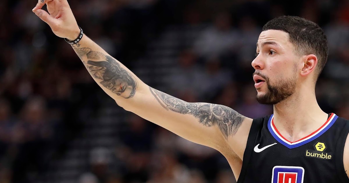
Rivers’ arm is best read as a sleeve that’s still developed over time. Photos show dense black-and-grey work running from the upper arm toward the forearm, with individual designs close enough to read as one broader composition. Not every symbol has a confirmed explanation, so it helps to separate what Rivers has actually discussed from what viewers might be guessing.

That distinction matters with a collection this full. Fans often give a meaning to every small mark, but Rivers hasn’t published a definitive inventory of all his tattoos. The Jesus image and other visible work are documented; for the rest, it’s better to describe what can be seen than to present a guess as fact. A good tattoo guide leaves room for uncertainty instead of inventing a backstory for every line.

The sleeve also reflects the rhythm of his career. Basketball involves constant travel, long seasons and physical work. Tattoos can hold memories without following a timeline: one session might mark a belief, another could be inspired by a friend, and another may simply fill an open patch of skin. With time, those choices make a visual record even if there was never one master plan.

Rivers has talked about how other artists shaped his taste, especially Wiz Khalifa and his heavily tattooed look. That doesn’t make Rivers’ sleeve a copy; it gave him room to experiment. The work shares some familiar ground with basketball and hip-hop tattoo culture, but the mix of pieces is his. It feels collected rather than arranged, which suits him.

In photos, the tattoos look different depending on the light, angle and what Rivers is wearing. A close portrait brings out the density of the ink; an action shot shows how naturally it has become part of his public image. The collection isn’t posed like a museum display. It moves with him.

The chest quote connects his ink to leadership

Austin Rivers tattoo sleeve visible in a reaction portrait

Another documented piece is a Vince Lombardi quote across Rivers’ chest. Lombardi is one of the most quoted figures in American sports, so the choice brings in ideas of discipline, standards and leadership. The chest offers a different canvas from the arm: it’s broad, usually private under everyday clothes, and suits a statement as well as an image.

A quote across the chest can serve as a personal rule, there before the cameras and still there after a game. For an athlete whose career depends on repetition, that placement feels apt. Training, recovery and competition all ask for commitment, and a short line of text can be a reminder when motivation fades.

It also adds variety to the collection. The arm is dense with imagery, while the chest tattoo brings in words. Rivers’ tattoos aren’t only portraits and illustrations; some are phrases he has chosen to keep close to the centre of his body. That contrast keeps the collection from feeling one-note.

Rivers speaks about his tattoos without turning every choice into a grand statement about destiny. That relaxed tone comes through in the mix: some pieces have a clear emotional or spiritual anchor, while others seem to be part of the fun of building a sleeve. Meaning and style can sit side by side.

What the public record tells us and what it does not

Austin Rivers tattoos portrait

Rivers has enough visible ink that online galleries sometimes describe every detail as if he has officially explained it. He hasn’t. The clearest sources are his own comments in the tattoo tour and interviews, along with photos where the designs are easy to see. Those support the early Jesus Christ piece, Wiz Khalifa’s influence, the chest quote associated with Vince Lombardi and the broader story of a growing sleeve. Smaller designs can be described by appearance, but their personal meanings shouldn’t be called confirmed unless Rivers has said so.
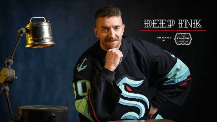
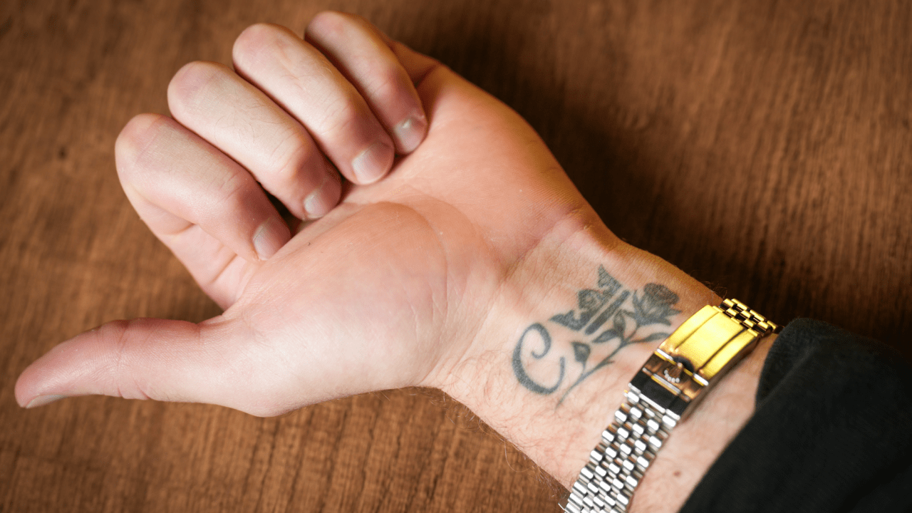
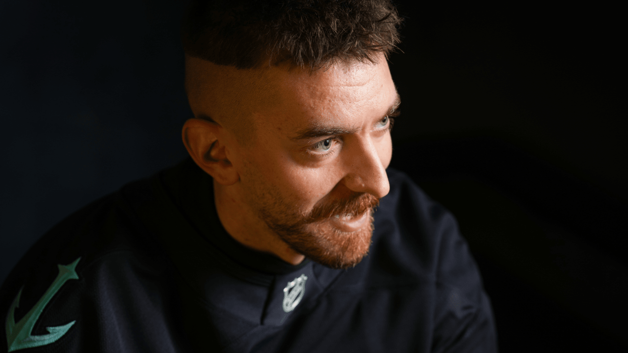
One photo also can’t tell the whole story. His arm appears at different angles in games, portraits and interviews, with each view showing a little more. A front-facing shot may reveal the sleeve’s overall flow, while an action photo can show the outer forearm or how a design wraps around the arm. Several views from different occasions give a better sense of the collection than repeating one cropped image.

The photos show how the tattoos have changed over time, too. Rivers’ collection has grown with his career, so an older image may show bare skin that was later filled in. That doesn’t make the earlier photo wrong; it captures the sleeve while it was still taking shape. Tattoos record a timeline as well as a finished look.

If you’re trying to catalogue Rivers’ ink, it helps to group what’s known by body area. Start with the arm, where the Jesus image and sleeve work are easiest to see. Note the chest quote separately. Then add other designs only when they’re clearly visible and the source supports the description. That keeps a tattoo guide from turning into a list of guesses.

What makes Rivers’ ink appealing is that it doesn’t look planned for a single photo shoot. It feels lived in. The early religious tattoo, the basketball-minded writing on his chest and the expanding sleeve come from different moments, and they’re allowed to look that way. Some pieces are polished, others feel more personal, and the collection works because it doesn’t pretend every choice came from one plan.

There’s something familiar in the path from influence to ownership. Rivers saw tattooed artists and athletes, found a style that spoke to him, then built around his own experiences. The result isn’t just decoration: it reflects taste, faith, sport and a willingness to keep adding as life changes.

If he continues the sleeve, new work may make the existing designs harder to distinguish. That’s not necessarily a problem; collections can become more personal as they grow less tidy. The pieces that are clearly documented already suggest the main themes: belief, ambition, basketball culture and a willingness to laugh at the imperfect parts. Austin Rivers’ tattoos carry meaning without taking themselves too seriously, and that gives them their character.

Watch Austin Rivers talk through his tattoos

GQ’s tattoo tour is the best place to hear Rivers explain the early pieces and the ideas behind his collection.