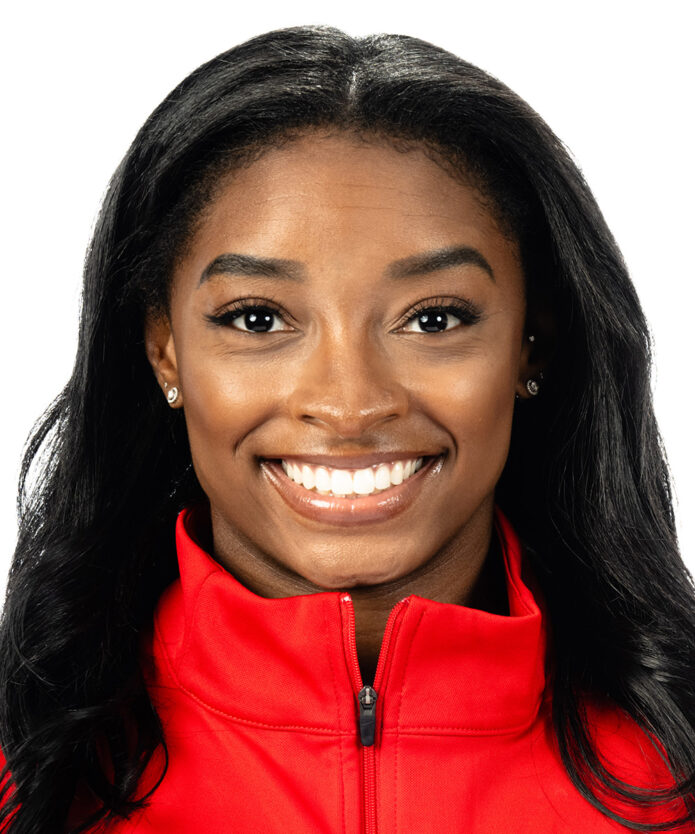
Simone Biles doesn’t cover herself in ink, but the tattoos she has chosen feel personal rather than random. There’s a tribute to the biggest stage in her sport, a line of poetry she has spoken about, and a few smaller pieces that mark family, identity and the life she’s built away from the mat. Together, Simone Biles’ tattoos read like small reminders of the things she carries with her.
Some designs are easy to spot in a competition photo. Others only show up when she shares a close-up or talks about them herself. Here’s what’s been reported, what Biles has explained in her own words, and where the details are still private.
Simone Biles’ Olympic rings tattoo
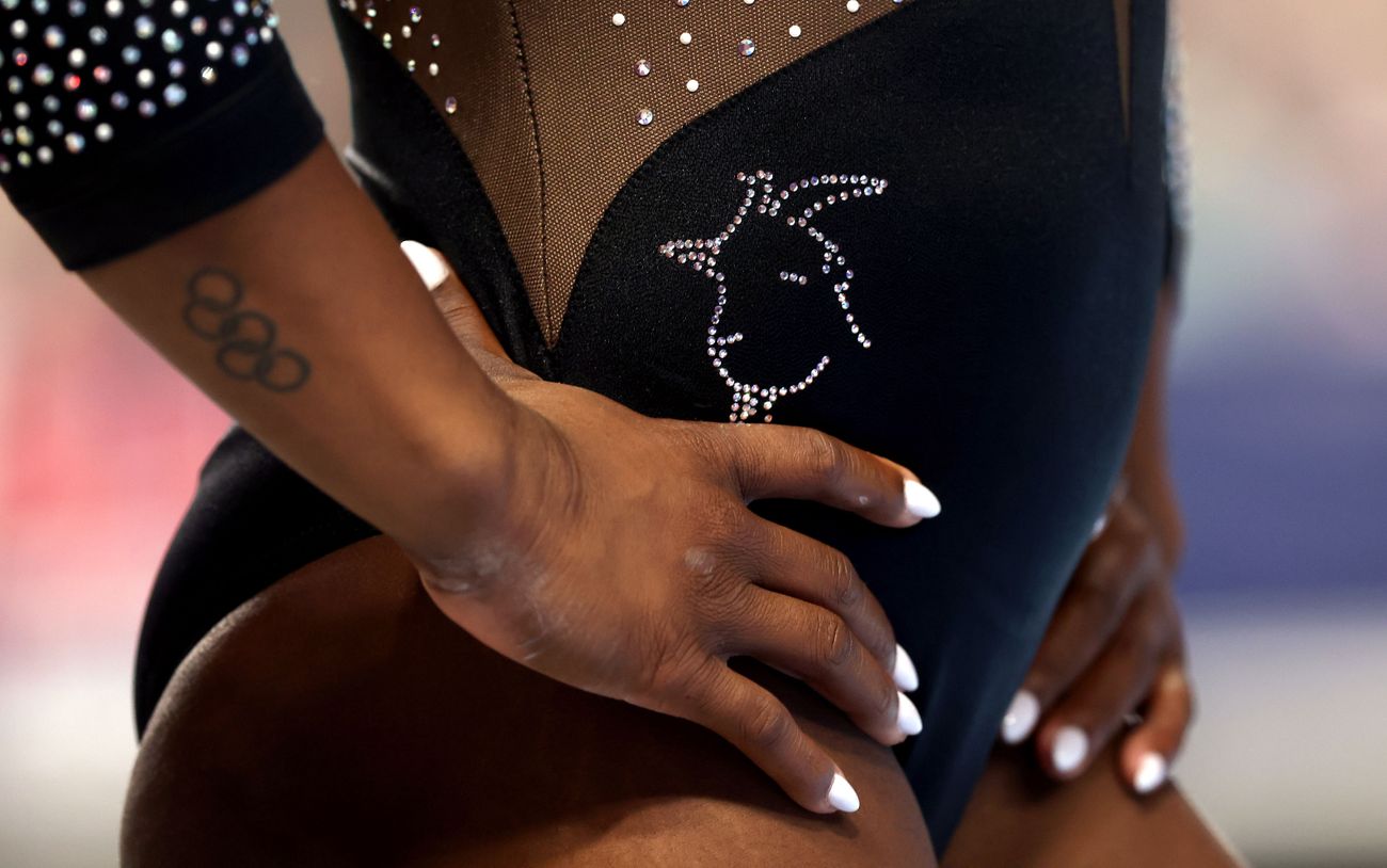
The Olympic rings are the clearest link between Biles’ ink and her career. She got the tattoo after the 2016 Rio Games, when she was already a household name but still at the start of an extraordinary run. The small black rings sit on her right forearm. It’s a simple design, yet the timing gives it plenty of weight: it marks the first Olympic chapter that changed her life.
Biles has joked that she waited until after the Games to get the rings. That choice makes sense for an athlete whose schedule is tightly managed around training and competition. Instead of a huge piece, she picked a compact symbol that works on its own and doesn’t need much explaining. It’s a milestone tattoo, not a full sleeve or an attempt to turn her look into a statement.
In photos where her arm is relaxed, the rings can be subtle. In competition, they’re easier to notice when her forearm turns toward the camera. The design also has a built-in connection to other athletes who earn the right to wear the same symbol, so it feels rooted in the shared experience of the Games as much as in Biles’ own medal count.
Her choice is also a neat example of how a small design can hold a huge memory. The rings don’t list medals or dates; they point to the event itself. For someone whose career keeps adding new chapters, that makes the tattoo feel open-ended rather than locked to a single result. It can recall Rio and still make sense after every meet that followed.
Lettering and personal symbols in Simone Biles’ tattoos
Biles’ most discussed phrase sits along her collarbone: “And still I rise.” The words nod to Maya Angelou’s poem, but Biles has also connected the line to her own ability to come through difficult stretches. In the Netflix series about her return to competition, she talks about how the phrase fits her life. It’s not hard to see why the short line has become one of her most recognizable tattoos.
The lettering is fine and understated. It follows the collarbone, so it tends to appear in portraits or open-neck clothing rather than in every gym photo. The placement keeps the phrase close without making it the first thing people see. That quiet placement matches the way Biles talks about it: meaningful, but not something she needs to explain every time she walks into a room.
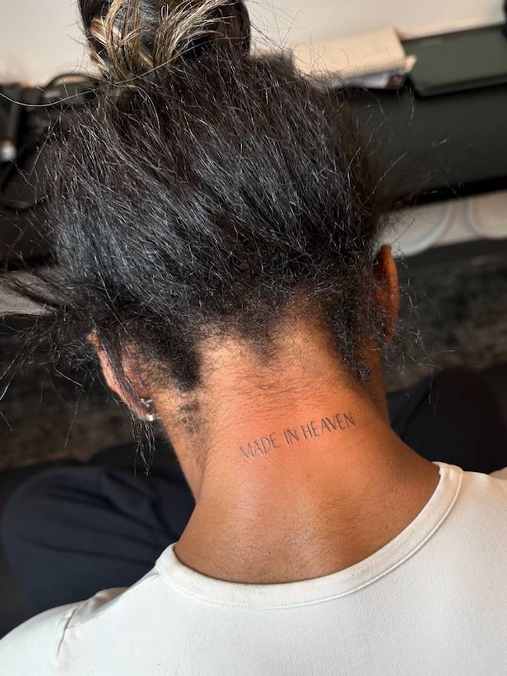
In 2024, Biles added “Made in Heaven” to the back of her neck. The lettering is small and neatly spaced. She also got a single “J” on her ring finger, a tribute to her husband, NFL player Jonathan Owens. The two pieces arrived around the same time, but they have different feels: one is a phrase at the nape, the other a tiny personal initial that stays close to her hand.
Small lettering can be easy to miss in a fast-moving photo, so close, clear images matter. The nape is visible when Biles wears her hair up, while the finger initial is easiest to see in a relaxed portrait. Those placements give the pieces a low-key feel: they’re there, but they don’t take over her appearance. The J is especially direct, a tiny mark with a clear person attached to it.
Other reported designs include “1997,” placed above her elbow, and “Golden” in cursive on her inner wrist. The first points to her birth year; the second is a word Biles has shown off, though she hasn’t shared a detailed explanation that calls for a bigger interpretation. There’s also a small “XO” inside her lower lip. She has said she always wanted a lip tattoo, which is a good reminder that not every tattoo needs a grand backstory. Sometimes a person simply likes the idea.
Allure has also reported a butterfly design on the back of Biles’ hand. It’s one of the pieces that can be difficult to make out in action shots because the hand is moving, wrapped, or turned away. A careful close-up is more useful than a distant competition frame, and it’s best not to confuse a fleeting glimpse with a definite description of fine details.
Beyond the competition floor
Not every useful photo of Biles is a tattoo photo. Most of her public images are about gymnastics: a landing, a leap, a medal, a team moment. Those pictures add context to her life and career, but they don’t prove what a tattoo looks like. Keeping that distinction clear matters, especially when the designs are small and a photo is taken from across an arena.
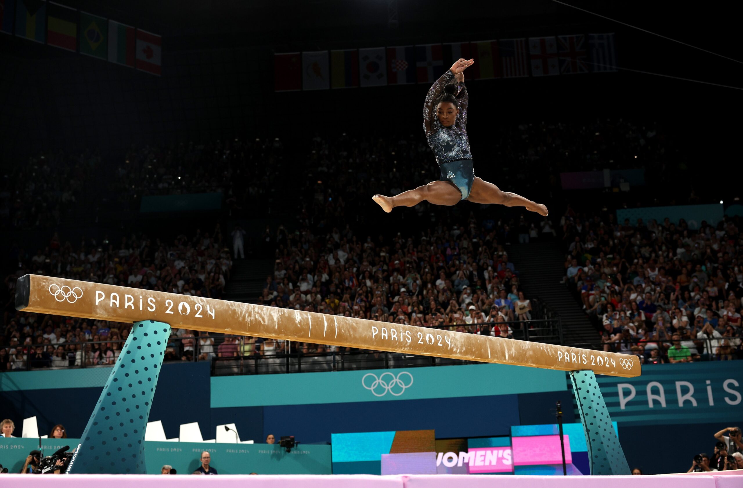
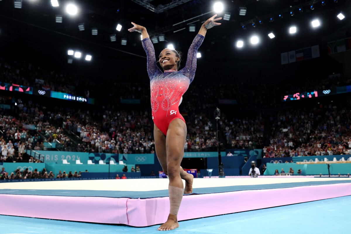
Her floor routines show the athletic side of her story. Biles’ powerful tumbling and control have made even a single routine feel like a full performance, and the competition setting is a reminder that her body is first and foremost an athlete’s body. A contextual image like this one belongs alongside career discussion, not as evidence for a specific tattoo.
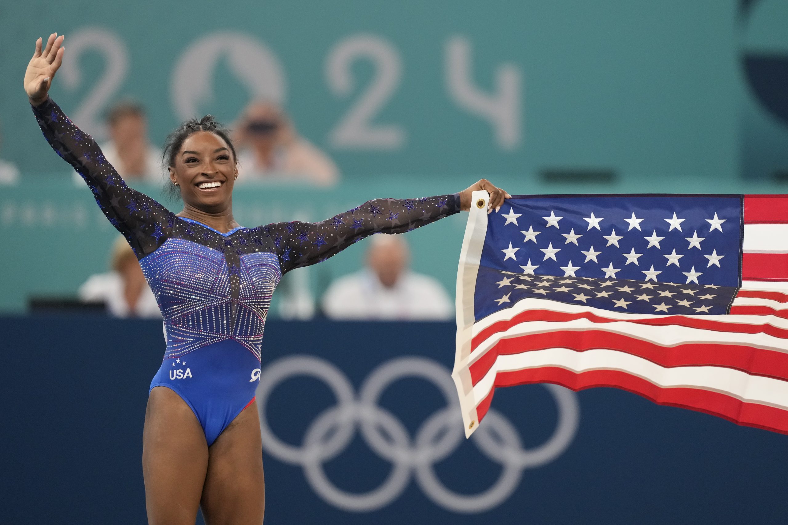
The medal ceremony offers a different kind of context: the culmination of years of work, teammates, coaches and support. Biles’ tattoos are personal marks within that much larger story. They don’t explain every part of her career, and they don’t need to. The small pieces can sit beside the bigger achievements without competing with them.
A personal collection shaped by life and sport
There isn’t one visual style tying all of Biles’ tattoos together. The Olympic rings are a familiar emblem; the collarbone phrase is fine lettering; the neck and finger pieces are compact and personal. The reported butterfly and small wrist word add different shapes and placements. What they share is scale. None of the pieces overwhelms her look, and most can disappear under training clothes or show only in the right portrait.
That makes the collection feel like a set of private markers rather than a planned visual theme. Some are tied to public milestones, while others are about relationships or simple personal preference. Biles hasn’t assigned a public explanation to every design, so it’s worth leaving a little room for that privacy instead of filling in the blanks with guesses.
Her tattoos also show how a design can hold a specific memory without needing to be large. The rings recall one defining moment. The Angelou line speaks to resilience in her own life. The “J” is a direct nod to someone close to her. Even the tiny “XO” is a reminder that a tattoo can be chosen because it makes the wearer smile.
Finding your own meaningful idea
If Biles’ ink inspires you, borrow the personal approach rather than copying a design just because it belongs to a champion. A symbol connected to your own turning point will usually mean more years from now than a trend picked in a hurry. Think about placement, size and how visible you want the tattoo to be in daily life. Fine lettering, for example, needs room to remain legible as it ages, and a hand or finger tattoo is harder to hide than a small piece on the upper arm.
For a phrase, sit with the words for a while and make sure the spelling, line breaks and language are right. For a symbol, ask whether it still feels like yours outside the moment that first inspired it. A good artist can help adjust the scale and placement so the design suits your body instead of forcing a copy of someone else’s tattoo onto it.
Biles’ collection is a good example of keeping things meaningful without making them complicated. Her tattoos reflect sport, love, poetry and personal taste, each in a small way. The best takeaway isn’t that you need the same rings or lettering. It’s that the strongest tattoo is often the one whose story still feels true when the cameras are gone. Let your own reason lead the design, and the finished piece will feel more like you.
It’s also worth remembering how much the finished look depends on the artist’s choices. A fine-line phrase needs even spacing and a placement that follows the body naturally; the same words can feel very different on a wrist, shoulder or collarbone. Tiny lettering should be discussed honestly, too, because ink can soften over time and very small details may blur together. Biles’ pieces are modest in scale, but they still benefit from thoughtful placement and clear line work. If you’re considering something similar, bring a few references to a consultation, explain what the idea means to you, and let the artist draw a version made for your proportions. The point is to keep the personal meaning while making the final piece your own.
Simone Biles explains her inspiration
In this short clip from Simone Biles Rising, Biles explains the phrase that inspired one of her best-known tattoos.