codex

2pac Tattoos: Thug Life, Cross and Heartless Ink

Tupac Shakur’s tattoos were part of his public image. The Thug Life lettering across his stomach, the cross on his back, Makaveli on his neck and the Heartless design on his arm are easy to pick out in photographs, though each has a different scale and feel.

The photos show where the tattoos sit and what they look like. Some meanings have been widely reported; others remain unconfirmed. I’ll stick to what the images and published accounts support instead of assigning a story to every mark.

The five article photos show different views: Tupac’s back, his face and arm, a close view of his chest and arms, a front portrait and a separate torso shot. The featured portrait is a separate image, so each photo has its own purpose.

Tupac’s back tattoo cross carries the heaviest visual weight
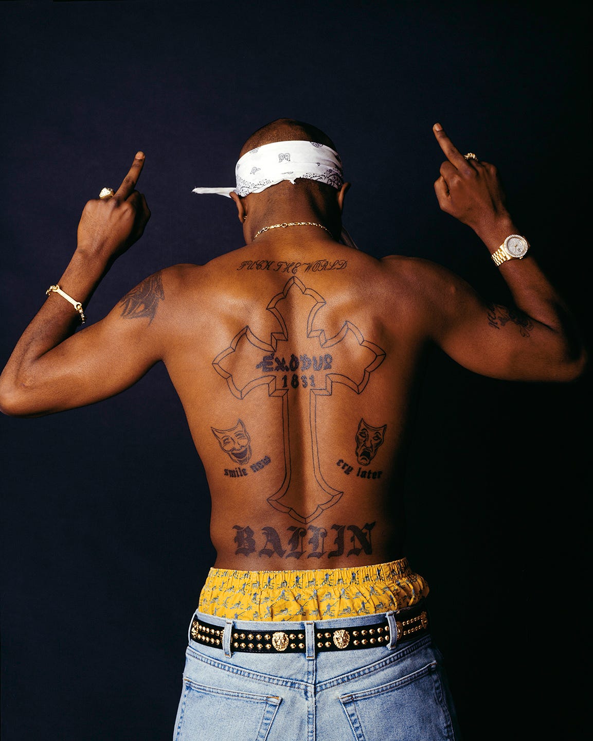
Tupac Shakur tattoos: high-resolution Chi Modu back portrait showing the large cross, Exodus lettering, theater masks and Ballin tattoo

The large cross on Tupac’s back fills most of the space between his shoulders and waist. Its outline leaves the inside relatively open, and the words Exodus 1831 run through the center. Around it, lettering and small drawings turn the cross into part of a larger design.

The Chi Modu photograph shows the full layout. Tupac stands with his back to the camera and his shoulders turned slightly toward it. “Fuck the World” stretches across his shoulders, “Ballin” sits near his waist, and theater masks flank the cross. The words “smile now and cry later” appear below the masks.

The arrangement reads from top to bottom: shoulder lettering, the long cross, the masks and lower lettering. The spine gives the composition a natural center, while the smaller details keep the sides from feeling empty.

A back piece this large needs room for its separate parts. Here, the cross, phrases and masks have space around them, so the design can be read as a whole. Anyone planning a large back tattoo can use the photograph to study how the elements follow the body before focusing on individual symbols.

Makaveli and Heartless tattoos make the neck and arm read together
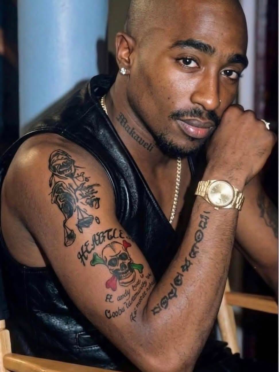
Tupac Shakur tattoos: sharp face-visible photograph showing the Makaveli neck tattoo, Heartless skull and script on the arm

A face-and-arm photograph catches details that can disappear in a full-body shot. “Makaveli” runs along Tupac’s neck. On his upper arm, the Heartless skull sits among lettering, flowers and smaller marks. Together, the tattoos create a visible line from the jaw to the bicep.

The neck piece uses a narrow strip of skin. Its lettering follows the side of the neck instead of spreading across the whole area. The arm design has more going on: a skull and crossed bones, decorative shapes, color and script share the space.

The two placements have different textures. Makaveli is dark lettering against a slim area of skin; the arm has rounded shapes and more open space between its elements. That gives the arm ink a collected look instead of making it read as one solid band.

The photograph shows the names and shapes clearly, but it doesn’t explain every mark. There’s no need to guess at those stories to describe the design. The neck lettering is immediately visible, while the arm reveals more detail when you look closer.

The chest and arm tattoos show how many ideas share one canvas
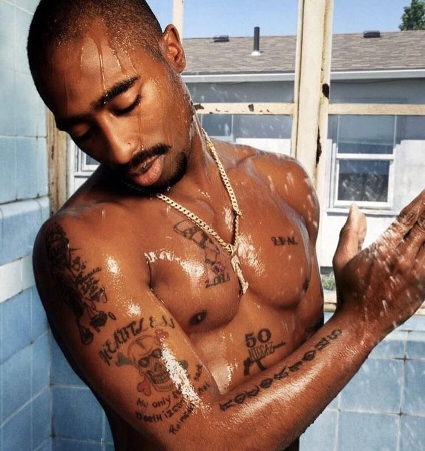
Tupac Shakur tattoos: clear shower portrait showing chest marks, the Nefertiti piece, the Heartless skull and arm lettering

This color photograph, taken in a shower setting, shows several tattoos across Tupac’s upper body. “2PAC” and a Nefertiti portrait sit on his chest beside smaller marks. His arm has the Heartless skull, script and other symbols. The close view makes the lines easier to see than they are in a distant performance photo.

The Nefertiti portrait gives the chest a focal image, while “2PAC” is a simpler piece of lettering on the opposite side. One side is built around a face; the other around a name. They share the same area without repeating the same treatment.

On the arm, the skull and flowers form a compact image, with script beneath them. The pieces don’t have to be read as a single sleeve. They look like separate choices added over time, each fitting beside the existing ink.

A collection can hold together without every tattoo sharing the same subject or line weight. In these photos, the common ground is placement and contrast, with enough open skin to keep the images distinct. Lettering, portraits and symbols sit side by side without being forced into one style.

The Thug Life tattoo turns the stomach into a statement piece
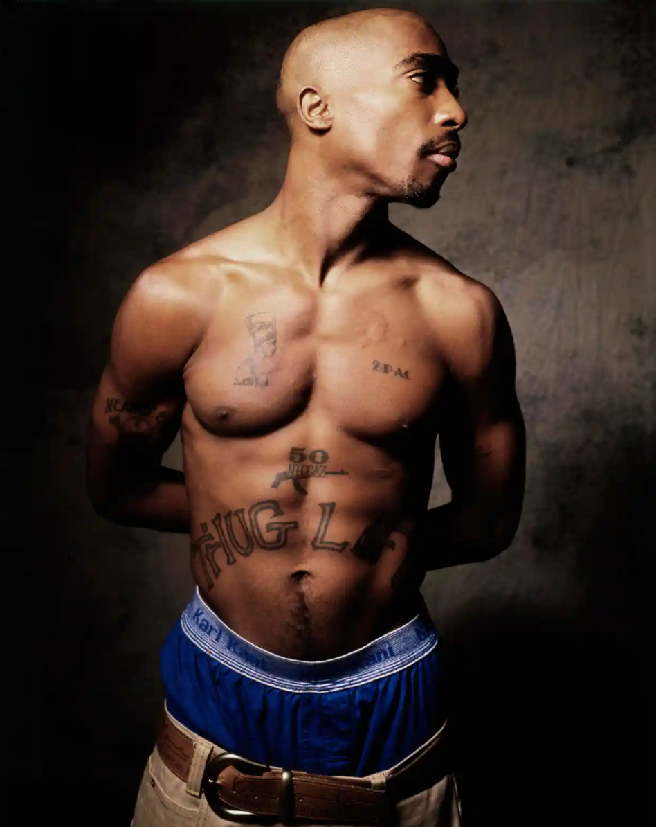
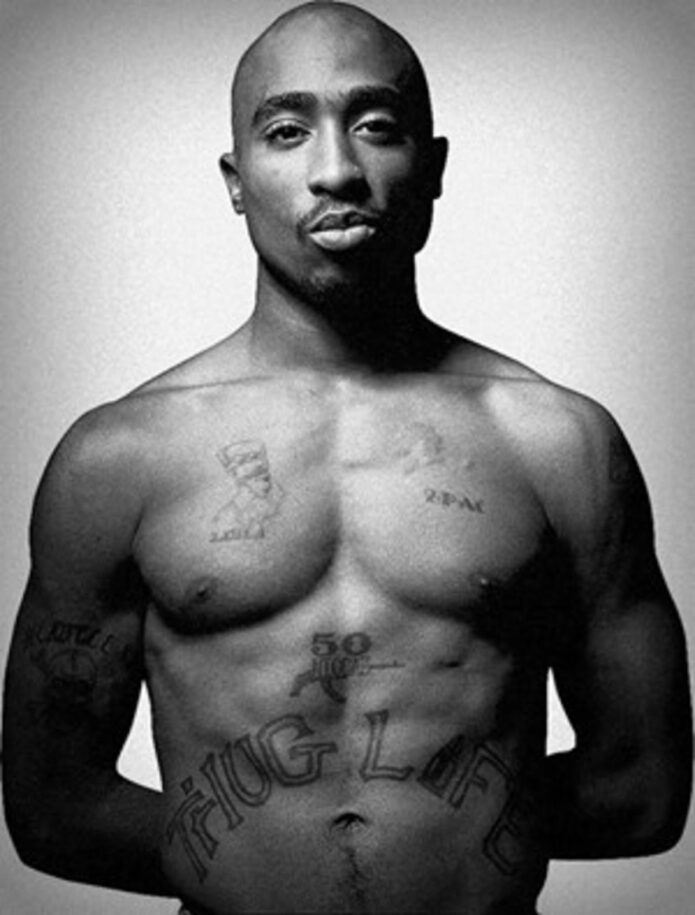
Tupac Shakur tattoos: large, clean front portrait showing the Thug Life stomach lettering, 50 Niggaz mark and chest tattoos

The large “Thug Life” lettering across Tupac’s stomach is the clearest statement in this front view. The outlined letters curve with his abdomen. Above them are the smaller “50 Niggaz” mark and the chest tattoos, so the lettering anchors the lower half of the composition.

The phrase was closely tied to Tupac’s music, public identity and writing about social conditions. It is often discussed as an acronym. In the photograph, its size and placement are clear even before considering those associations: it can be read from a distance and becomes part of his silhouette when he performs without a shirt.

The outline style leaves skin visible inside the letters instead of filling them in as a solid black block. The baseline curves across the abdomen, following the body rather than sitting like a straight banner. Both choices help the large design stay readable as the body moves.

The photograph is useful for studying the relationship between size, placement and legibility. A phrase across the stomach needs enough space to follow the body’s curve. Here, the broad lettering has room to do that.

The torso tattoo view connects 50 Niggaz to the larger Thug Life design
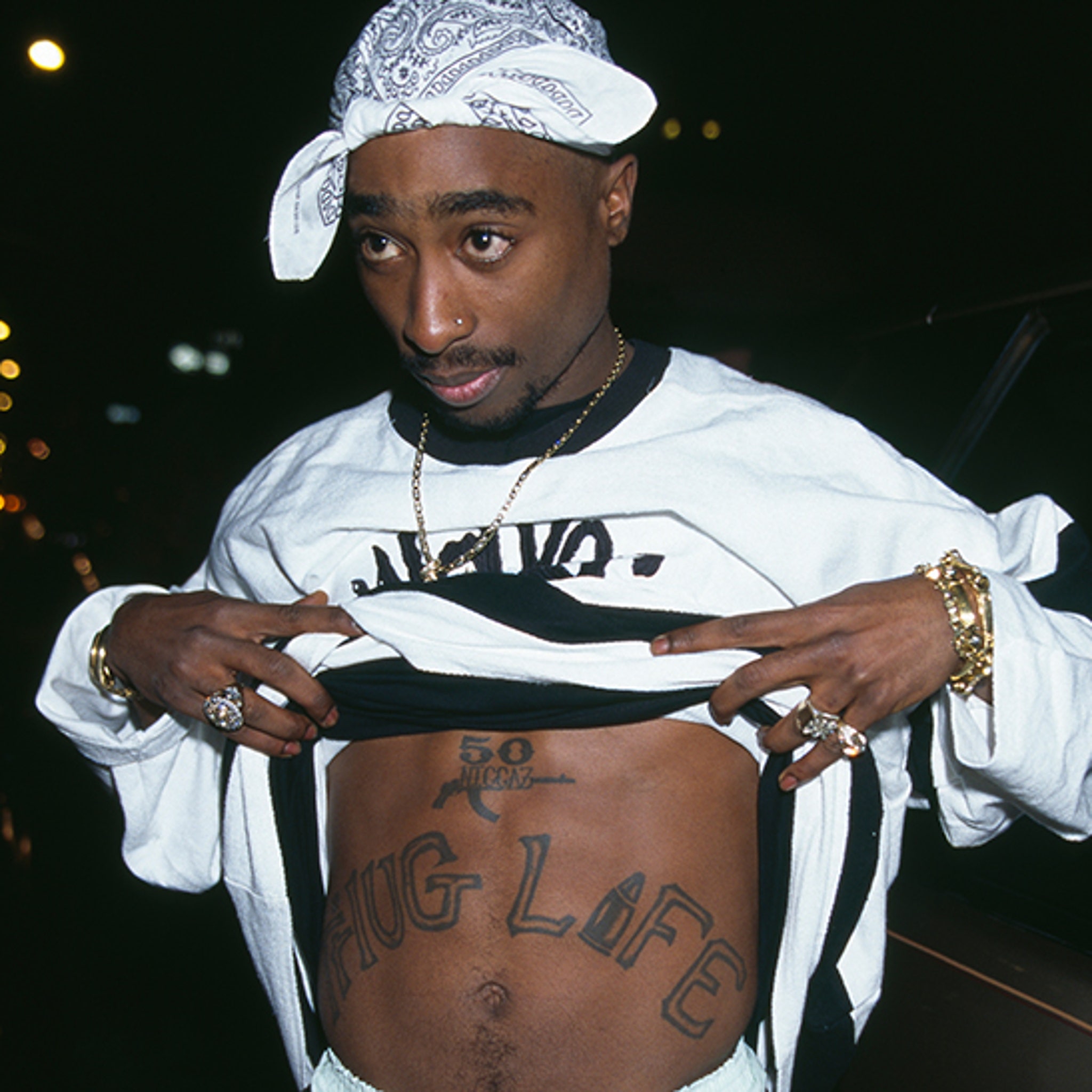
Tupac Shakur tattoos: high-resolution nighttime torso photograph showing the 50 Niggaz mark and the full Thug Life lettering

This nighttime torso photo gives another view of the front tattoos. Tupac lifts his shirt to show the “50 Niggaz” mark above the larger “Thug Life” lettering. The first sits higher and takes up less space; the second spreads across his stomach.

The shirt, chain and hands remain in frame, but the words are still easy to read. The image shows the tattoos in a casual pose rather than a clean studio view, with clothing partly covering the body.

“50 Niggaz” reads as a compact emblem with a small graphic element. “Thug Life” stretches across the abdomen and draws the eye from side to side. Their different scales let each mark occupy its own space.

Seen alongside the other photos, this frame helps explain why the collection is recognizable. Large placements make the words and symbols visible, while smaller pieces fill nearby areas. It’s a group of tattoos tied to identity, music and belief, rather than one matching sleeve.

The contrast between public statements and smaller details runs through the collection. “Thug Life” can be read from a distance. “Makaveli” sits close to the face, and the cross and theater masks form one scene across the back. The Nefertiti portrait and chest lettering add more detail to the front.

Photographs can confirm placement and visible lettering; they can’t settle every meaning. Published tattoo coverage discusses the main pieces in connection with Tupac’s music, beliefs and public life. Smaller marks are less certain, so they’re best described by what can actually be seen.

The back is the clearest example of a design built across a large area. The cross runs down the center, masks sit at its sides, and words above and below frame it. The shapes follow the body without needing perfect symmetry.

The front uses scale differently. “2PAC” is small on the chest, while the Nefertiti portrait carries more detail. The “50 Niggaz” mark sits above “Thug Life,” which spreads across the lower torso. Each piece has a separate area.

The arm photos show a collection that doesn’t rely on a matching sleeve. The Heartless skull, flowers and script each keep their own shape, and Makaveli remains separate on the neck. That leaves room for tattoos to accumulate over time.

Lettering appears on the neck, shoulders, back, arms, chest and stomach, but it changes to suit each spot. Smaller areas use compact words; the abdomen carries wide outlined letters. The photos make a practical point about text tattoos: scale the lettering to the body area.

A face portrait alone can’t show how the cross sits across the back or how “Thug Life” curves over the stomach. These five images give those placements room to be seen, and each adds a different view instead of repeating the same portrait.

If you’re looking at Tupac Shakur’s tattoos for ideas, study the placement before the symbols. Decide whether words need to be readable across a room or are meant for a closer look. Leave space around a large piece, and sketch the full flow of a back design before adding its smaller details.

For more musician ink with clear placement photos, see the site’s musician tattoo guides. Keep confirmed stories separate from guesses when you use any celebrity tattoo as a reference.
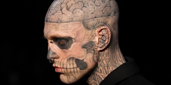
More musician tattoo guides

Rick Genest Tattoos: Zombie Boy’s Skull and Full-Body Ink

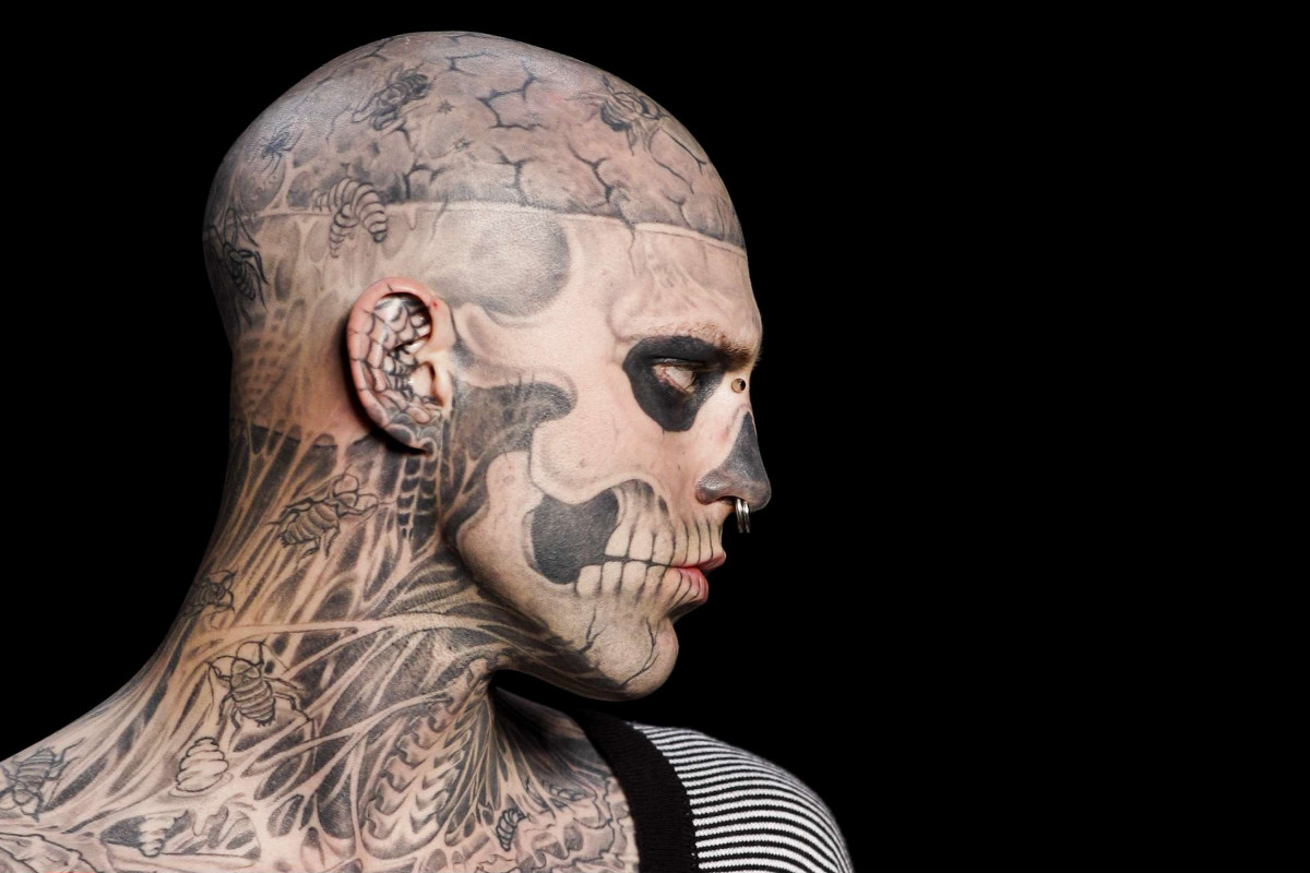
Rick Genest, known as Zombie Boy, covered most of his body in black-and-grey tattoos that follow the human skeleton from his scalp to his feet. A skull shapes his face; ribs and vertebrae run over his chest and back; insects fill some of the spaces between the larger forms.

Genest said his first tattoo was a skull and crossbones on his shoulder. In interviews, he also said Frank Lewis tattooed much of his head and torso during the main period of the project. The designs are easy to describe from photos, but those images don’t tell us the private meaning of every small mark.

The five body photos show different parts of the work: his face and neck, the scalp, chest, arms and hands, and the full back. The featured portrait is a separate face-visible image used for the post header.

The face and neck tattoos create Rick Genest’s living-skeleton illusion

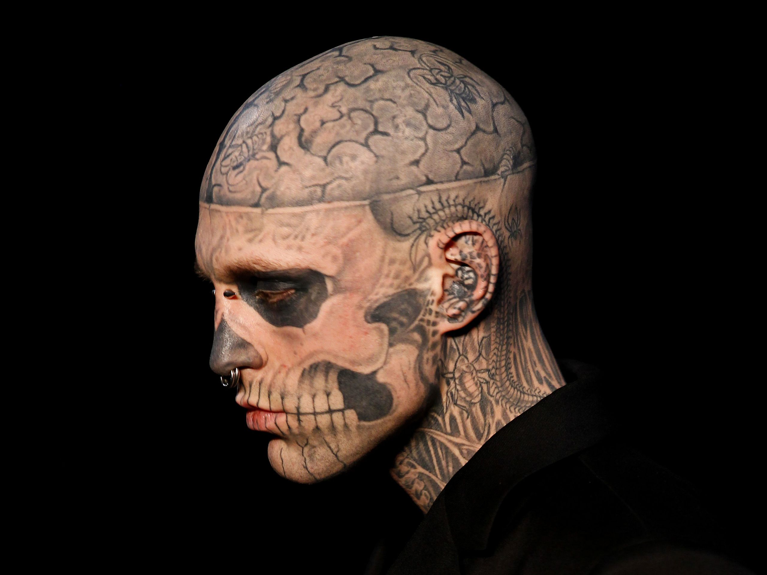
Rick Genest tattoos: clean high-resolution side profile showing the skull face, cracked scalp, insects and neck anatomy tattoos

Genest’s face is the first thing most people notice. The dark eye sockets, shaded nose, cheekbones and teeth are arranged to resemble a skull, with lines that follow the planes of his face instead of sitting on top like a mask.

The side view shows how the design continues toward his ear. Lettering and teeth run along the jaw, while ribs, tendons and shadow fill the neck. The skull remains the focal point; the neck gives it a path down into the rest of the body suit.

The eye sockets carry most of the effect. Their solid black shapes stay recognisable even from a distance. Thinner lines around them suggest cracks and bone edges, and small insects sit among the details. Open skin between the dark areas keeps the face from becoming a single block.
The tattoo also changes with his expression. When Genest smiled, looked serious or turned his head, the design moved with him. That’s part of what makes face placement demanding: lines need to work with the face’s existing features and movement.

The brain and insect tattoos turn the scalp into a second layer

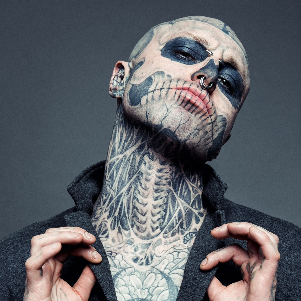
Rick Genest tattoos: large studio close-up showing the brain, temple, ear, eye socket and jaw tattoo details from a different angle

Genest’s scalp carries a large brain design above a horizontal skull band. In a close photograph, the winding lines look like an anatomical drawing. Open areas between the folds keep the shape legible against the dark bands around it.

Small insects appear around the scalp and neck. Some look like flies or beetles; others blend into the bone work and are harder to identify. Their fine shapes add detail to the head and sit beside the broader skull forms.

The scalp brings different shapes together. The brain uses rounded lines and softer shading, the skull band runs horizontally, and the insects add small marks with wings and legs. They share a limited area without all using the same scale.

Genest said Frank Lewis tattooed much of his head and torso during the main period of the transformation. The many separate designs were made over time, but the repeated anatomy and black-and-grey palette connect them.

The chest tattoos extend the skeleton idea below the jaw

Rick Genest tattoos: sharp front portrait showing the jaw, neck, chest ribcage, insects and central body tattoo work

This front portrait traces the design from Genest’s jaw down to his torso. Teeth meet the neck, which gives way to ribs and tendons across the chest. The tattoos leave skin visible between the bones, so the chest doesn’t read as a solid black panel.

A central body design sits within the ribs, insects and darker areas. From a distance, the chest looks like one skeletal section. Closer up, the separate marks come into view. Lighting and camera distance can make the same area look quite different.

The chest links the upper and lower parts of the suit. Lines from the neck continue into the ribs, which widen across the torso before narrowing toward the stomach. The drawing changes scale as the body changes shape.

The tattoo’s consistent subject doesn’t depend on repeating one image everywhere. Anatomical lines carry the idea from face to chest, while insects and smaller symbols fill some gaps. The visible skin is part of the design too.

The arms and hands carry the smaller tattoos that make the suit feel lived in

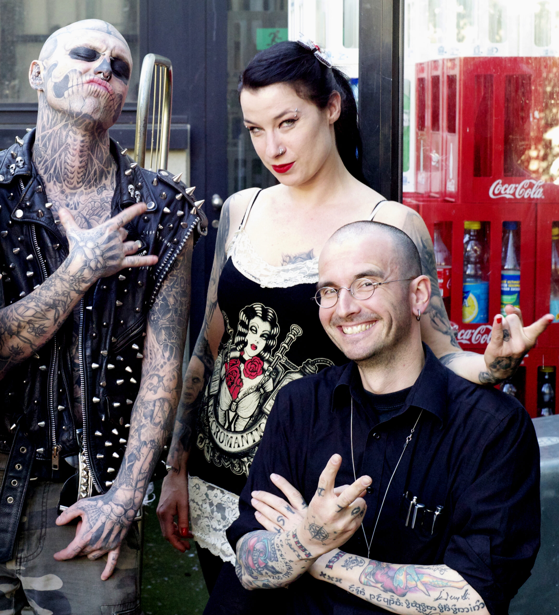
Rick Genest tattoos: high-resolution documentary photograph showing the tattooed forearms, hands, fingers, neck and skull face in a public setting

This public photograph from Zurich shows Genest’s arms and hands outside a studio portrait. Bones, insects, lettering and smaller symbols cover the forearms. His fingers are tattooed as well, and the marks are easier to see when he reaches toward the camera.

The arms are darker and busier than the face. That contrast leaves the skull readable while giving the forearms room for clusters of smaller pieces. Differences in line weight also make the collection look like it developed over time.

The hand marks are difficult to pin down from one image. Finger tattoos are exposed, small and constantly moving with the hand. Some shapes aren’t clear enough to name, so it’s better to describe their placement and appearance than to assign them a private meaning.
The smaller pieces add detail before the eye returns to the larger skeletal design. An insect, a bone or a short line of lettering can stand out on its own, even though it belongs to the broader body suit.

The back tattoo follows the spine like an anatomical map

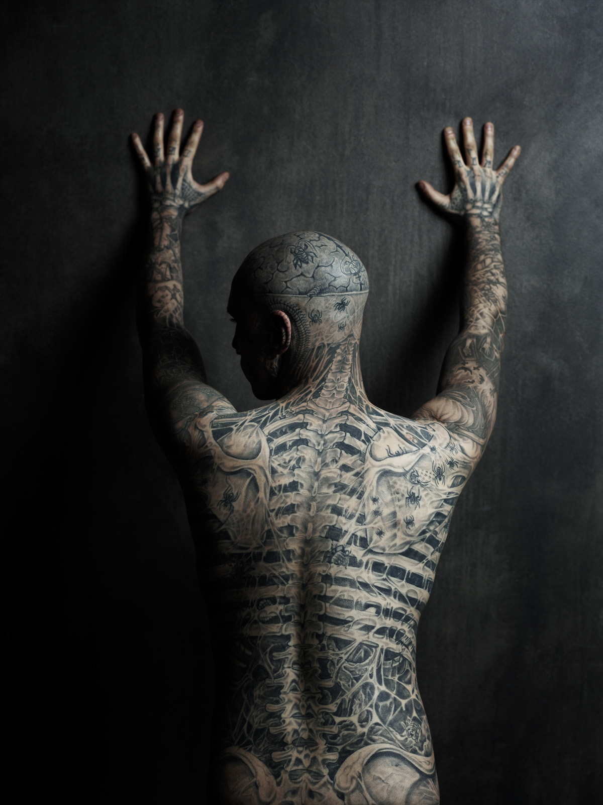
Rick Genest tattoos: distinct high-resolution rear studio view showing the spine, ribs, pelvis, shoulders, arms and back insects

This rear studio photo gives the clearest single view of Genest’s back. He faces the wall with his hands raised, showing the skull at the back of his head, vertebrae down the neck and a long ribcage design. The spine anchors the composition, while the bones and insects around it keep the drawing from feeling like a straight diagram.

The shoulder blades form part of the upper skeleton. Ribs spread out from the spine and narrow again near the waist. The ink continues down the arms and into the hands, joining the back piece to the rest of the suit.

The design follows a body that bends and changes width. Genest’s spine gives the artist a centre line; the ribs and shoulders follow the body’s curves. The photo shows the overall arrangement even though he isn’t standing perfectly straight.

Photos from different years can vary as tattoos age and lighting changes the balance between skin and black shading. The same central idea remains visible here: bones, insects and skull imagery are arranged to suggest the body beneath the skin.

The collection uses one visual language across different areas. Skull shapes sit beside brain folds, ribs beside insects, and small marks fill gaps around the larger forms. The black-and-grey palette ties them together, while each area has its own scale and layout.

Zombie Boy became a public identity attached to Genest’s appearance, but the photographs also show a person making choices about his skin. His face drew attention first; the arms, chest and back show how much of the project extended beyond that first view.

Genest spoke about his first skull and crossbones tattoo and identified Frank Lewis as a major artist on the head and torso work. That doesn’t mean every small insect or bone fragment has a documented explanation. Where the reporting leaves a gap, the photos can still show the design without filling in a story.

News, tattoo and fashion coverage discuss the body suit from different angles. The images show the bones and insects; fashion photographs show how the work changed the way he was presented. The tattoos were often the focus of the camera because they covered so much of his body.

If you’re using Rick Genest’s tattoos for inspiration, study how one theme changes scale across a body. The face has a clear focal design, while smaller marks continue the idea onto the hands, neck, ribs and back.

Placement matters as much as the drawing. The eyes, nose and mouth guide the face design; the spine anchors the back; the ribs widen the chest. Those landmarks help the ink follow the person instead of sitting on a flat surface.

The photos work as a set because some are close enough to show the lines and others show where the designs sit. A headshot can’t explain how the work moves across the torso, so the chest, arm and back views fill in that picture.

For more musician and performance-world ink, see the site’s musician tattoo guides. Use photos for visible placement and rely on a clear interview or source before assigning a tattoo a meaning.

More musician tattoo guides

Anthony Loffredo Tattoos: Black Alien Face and Full-Body Ink

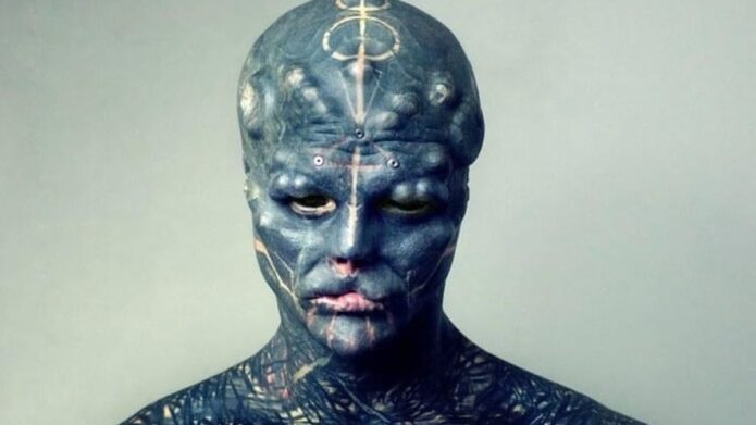
Anthony Loffredo’s Black Alien Project covers his face, scalp, neck, torso, arms and legs in dark tattoo work. Pale lines and geometric marks break up the black fill. In photos, the face draws the eye first, then the ink continues from the neck across the rest of his body.

Loffredo is also known for body modifications, including changes to his nose, ears, lips, tongue and fingers. Those procedures are part of the public project, but they are separate from the tattoos. This guide focuses on the ink that can be identified in the photographs.

The five body images show a close face view, the torso and arms, a side profile, details around the forehead and neck, and a wider view of the full-body coverage. The featured portrait is separate and appears in the post header.

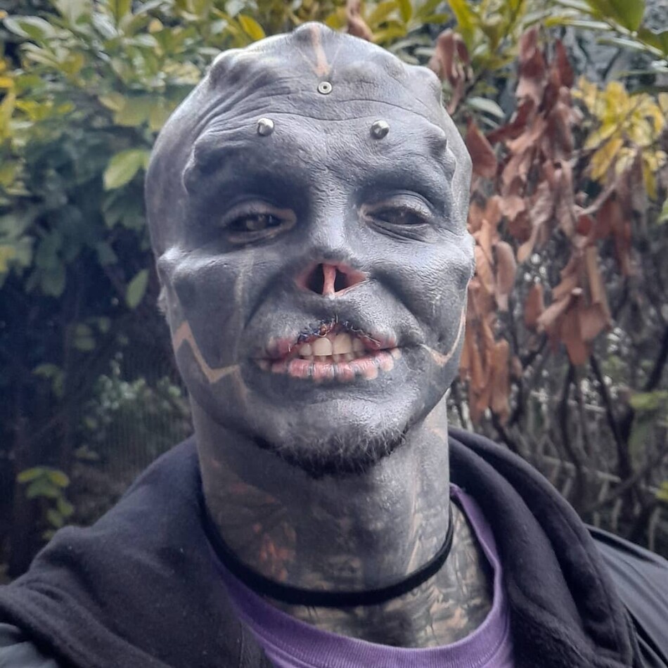
Black Alien’s face tattoos use blackout ink and pale linework

Anthony Loffredo tattoos: sharp close-up showing the black face tattoos, pale geometric lines, scar-like texture and head implants

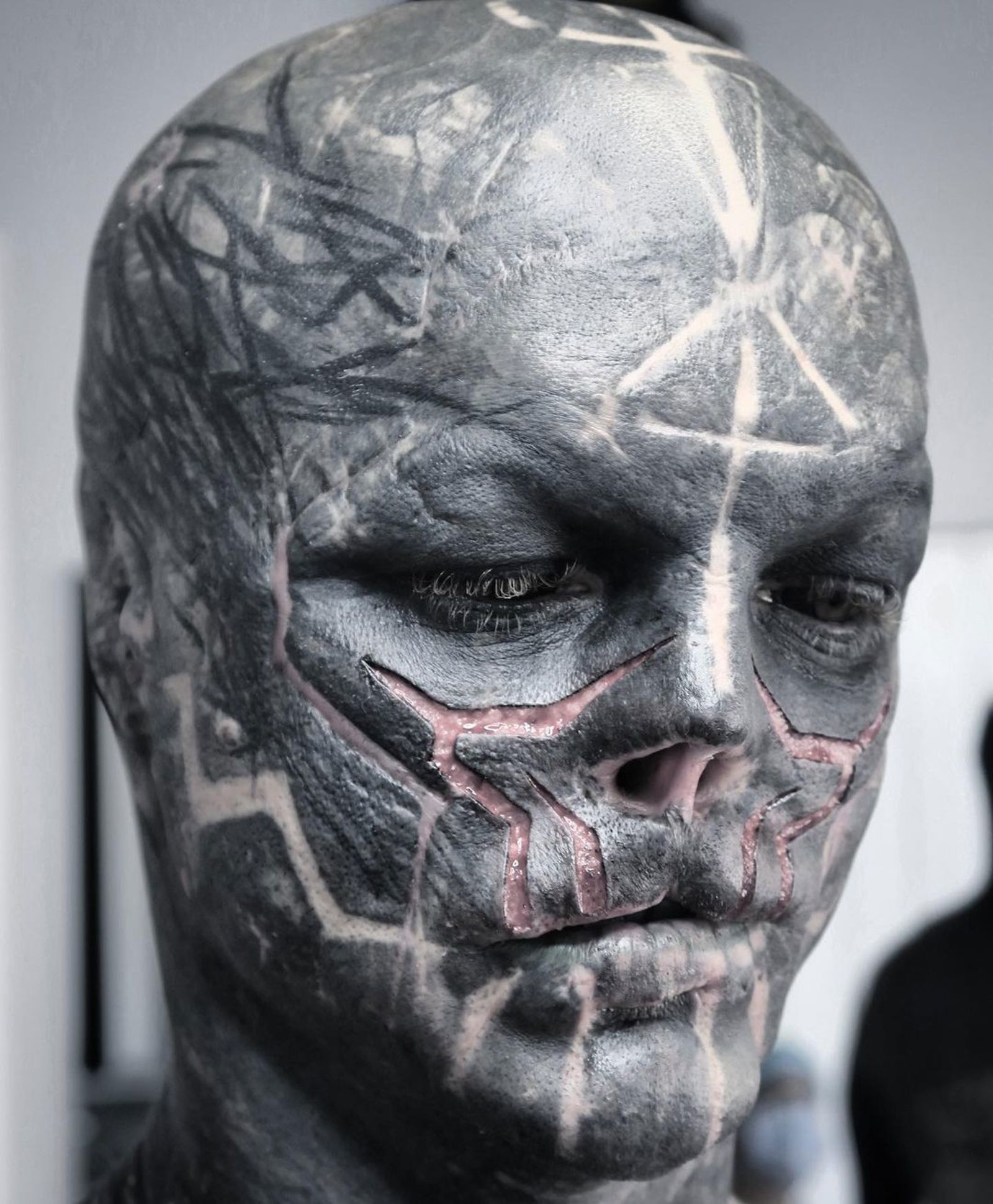
Loffredo, known online as Black Alien, has almost completely covered his face in dark ink. Pale lines cross the cheeks, temples and brow. In a close photo, those marks give the blackout a shape instead of letting it read as one flat field.

The forehead, eyelids, nose area and jaw have different textures. Some sections are smooth and dark; others show fine geometric lines or raised, scar-like detail. The contrast gives the face structure even where the ink is dense.

The face relies on contrast. Broad black areas define its outline, while lighter marks direct the eye across the brow and cheeks. The smaller lines become clearer when you look closely.

Tattoos and body modifications appear together in these portraits, but they are different parts of the project. The face includes pale ink lines as well as changes to the nose, ears, lips and tongue. The photographs show where those details sit; they don’t make them the same procedure.

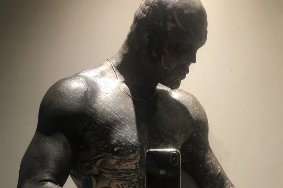
The torso and arm tattoos make the blackout work feel continuous

Anthony Loffredo tattoos: mirror photograph showing the blackout torso, patterned chest, tattooed arms and hand details

The mirror photo shows the design beyond Loffredo’s face. Dark ink covers the chest, stomach and shoulders, with lighter patterns breaking through the field. His arms use the same visual language, so the torso and head don’t look like separate pieces.

More pattern is visible on the chest than on the forehead. Marks continue down the arms toward the wrists and hands. The phone blocks part of the mirror image, but the surrounding ink still shows how the work is placed.

The edges matter in a blackout project. The shoulder, armpit, wrist and neck all bend and move. The dark fill crosses those areas, while lighter lines help keep the different sections legible.

The fingers and backs of the hands carry the pattern farther down the arms. In this photo, glare and the mirror angle make some of those details hard to see, but the hands clearly extend the design beyond the forearms.

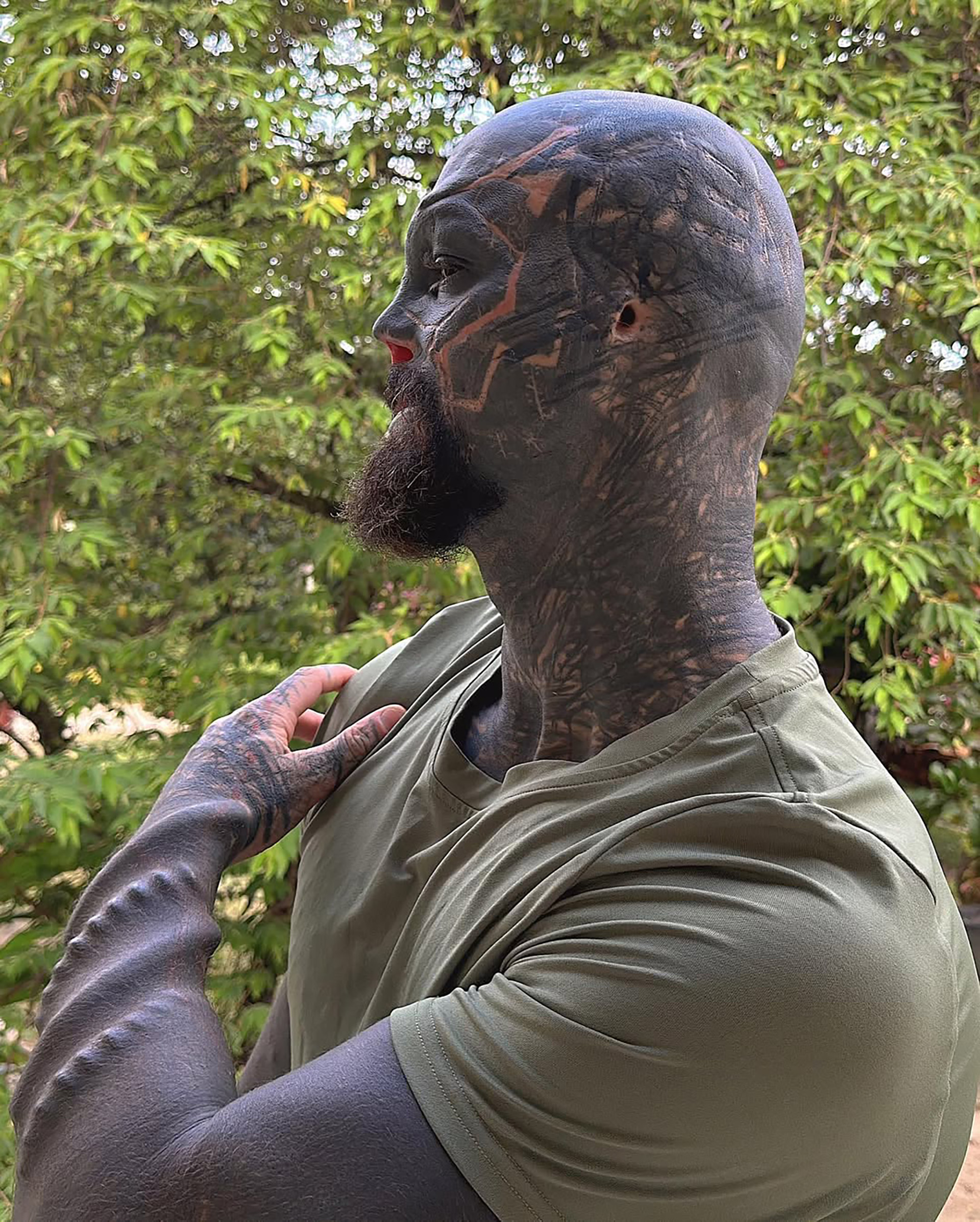
The side profile shows how the ink follows the skull, neck and shoulder

Anthony Loffredo tattoos: large side profile showing the head, neck and upper-arm tattoos with geometric pale lines across the dark fill

The side profile shows the depth of the coverage. Ink reaches across the forehead, crown and back of the head, then continues down the neck to the shoulder and upper arm. Pale lines curve around the head and help set the direction of the design.

The photograph also separates the scalp from the neck. The head has broad dark coverage; the narrower neck introduces denser marks and different angles before it opens into the shoulder.

The look is dramatic, but the placement follows the body’s shape. The skull is rounded, the neck is narrow and mobile, and the shoulder widens into the arm. Each area needs a different layout even when the palette stays mostly black.

Photos from different dates show the project at different stages. Some areas appear darker or more finished, and lighting changes how much of the pattern comes through. It’s safer to describe what each image shows than to call the design complete.

The forehead and neck details keep the dark tattoo style readable

Anthony Loffredo tattoos: clean square portrait showing the forehead studs, facial blackout, white geometric cheek lines and neck tattoos

This square portrait brings the smaller face details into view. Raised metal studs sit across the forehead, while pale angular lines mark the cheeks and jaw over dark ink. Clothing and the camera angle partly cover the neck pattern.

The lines around the cheeks add another texture beside the forehead hardware. The studs are body modifications, not tattoos, so the portrait shows several kinds of detail together: dark fill, fine lines and physical changes.

The finer marks give the blackout definition. Lines around the brow, cheekbones, mouth and jaw follow features that already shape the face. Even a small mark can change how the larger dark area reads.

The image doesn’t explain why Loffredo chose each stripe or shape. It does show their placement and contrast, which is enough to describe how they work with the rest of the face.

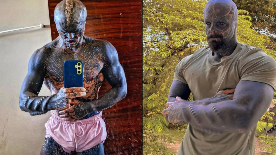
The full-body tattoo views show the scale of the Black Alien project

Anthony Loffredo tattoos: clean two-view source image showing the tattooed torso, arms, legs and outdoor full-body silhouette

This two-view image shows the coverage from head to legs. The upper body is dark from the head through the chest and arms, and the outdoor view shows the ink continuing down the legs. It’s a full-body project rather than a set of isolated tattoos.

The outdoor frame makes the proportions easier to read. The face is still the first focal point, but the shoulders, torso and limbs carry the same dark weight. The small lines become clearer when the camera moves closer.

The full-body design repeats a few choices across different areas. The blackout palette and geometric marks connect the sections; the body’s curves, poses and changing light keep them from looking identical.

Loffredo has described the work publicly as an ongoing transformation. These photos record particular stages. Later images may show new coverage or modifications, while older ones still show what was there at the time.

The same dark palette appears across very different parts of the body. The face uses blackout fill and pale geometry, the torso has a wider field of ink, and the limbs carry the design as they move. The details change with the placement.

That’s why it helps to look at the photos together. A face close-up shows how dense the head work is, but it can’t show where the shoulder or leg coverage begins. A full-body view gives the scale and loses the small cheek and eye-area marks.

Black Alien is a public name associated with Loffredo and the body-modification project. The tattoos are part of that image, but a photo doesn’t establish a personal meaning for every line. The visible blackout, geometry and placement are clear enough to describe on their own.

Lighting changes how the blackout looks. In sunlight, pale lines and scar-like details can stand out; indoor photos may make the same area appear almost solid. Comparing clear photos helps show which details belong to the pattern.

If you’re using Black Alien tattoos for ideas, pay attention to how the design crosses the head, neck, shoulder and arm. Those areas curve and move, so the line direction and amount of fill change with each surface.

Black is the dominant colour in the visible tattoo work. Pale skin and lighter marks provide contrast. With this much dark coverage, an even fill and legible linework matter as the tattoos age.

The close and wide photographs answer different questions. A face shot shows fine detail; a torso or leg view shows scale and how the ink sits on the body. Together, they give a clearer picture than one dramatic crop.

For more celebrity and public-figure ink, see the site’s celebrity tattoo guides. Use clear tattoo photos and reliable interviews to separate visible details from claims about meaning.

More celebrity tattoo guides

Robb Flynn Tattoos: Machine Head Arm Ink and Sleeve Details

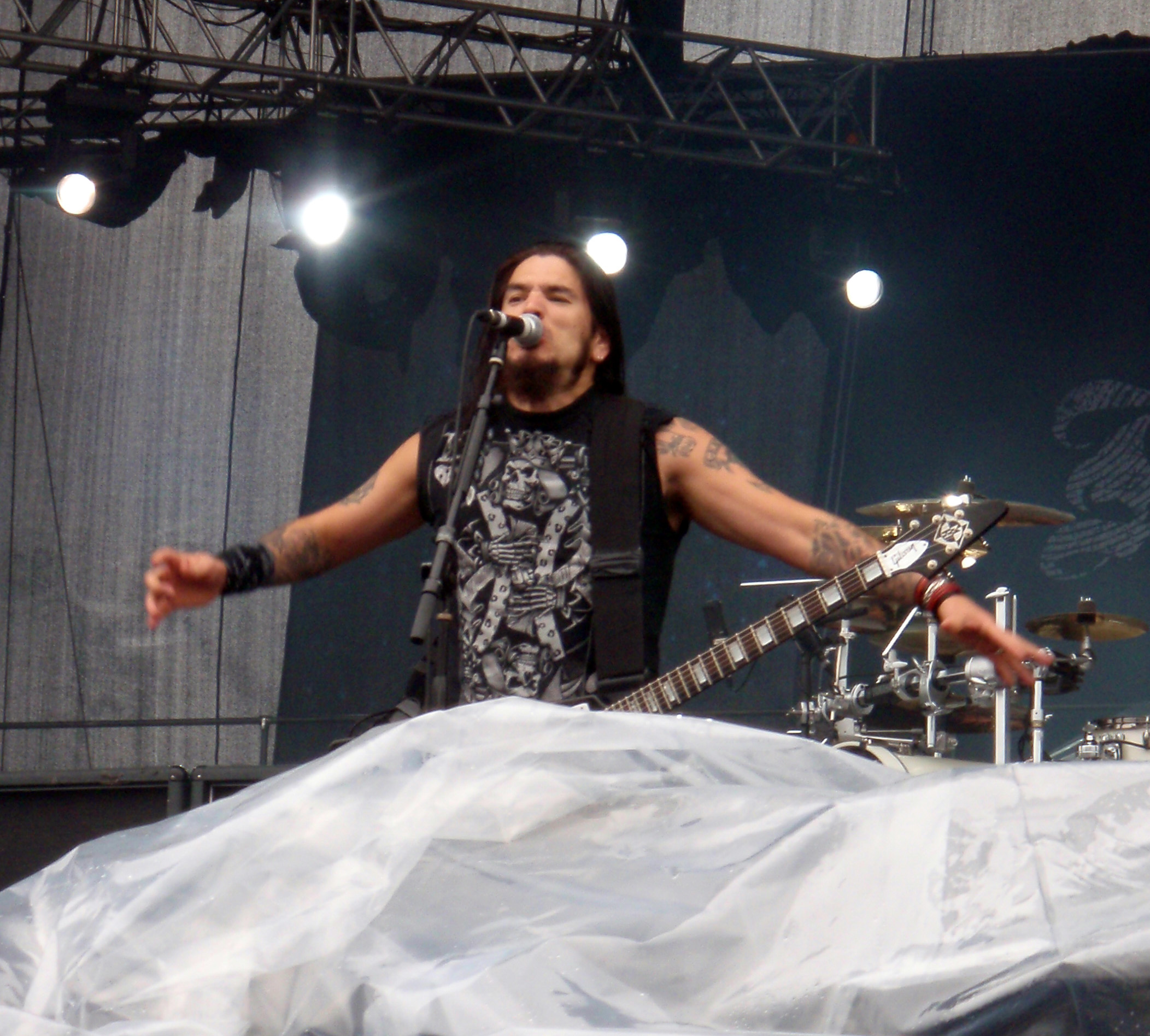
Robb Flynn’s tattoos cover both arms, with large pieces on the upper arms and denser work down the forearms. As Machine Head’s vocalist and guitarist, he’s usually photographed mid-performance: playing, leaning into a microphone or lifting his arms. Those pictures show how the ink sits when his arms are moving, which a posed portrait can’t quite capture.

Across the clearest shots, the tattoos mix black, grey and some colour. A large emblem-like panel stands out on an upper arm; tighter lines and shaded designs fill the forearms. Flynn hasn’t publicly explained the meaning of every piece, so this guide sticks to what the photos show: placement, colour, coverage and how the designs follow his arms.

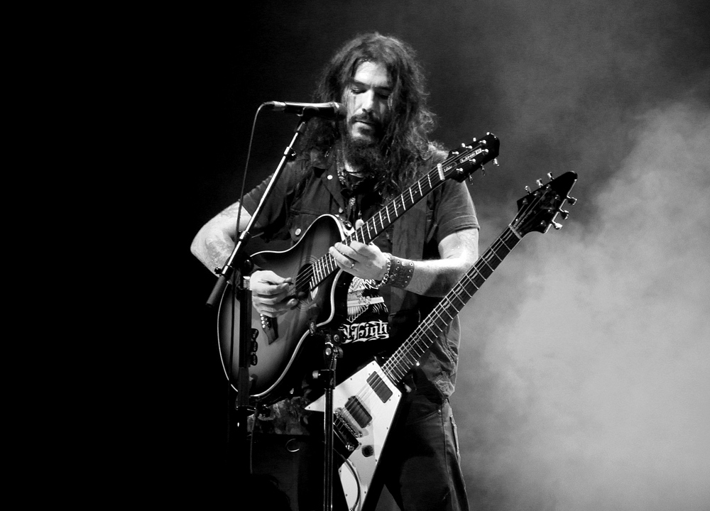
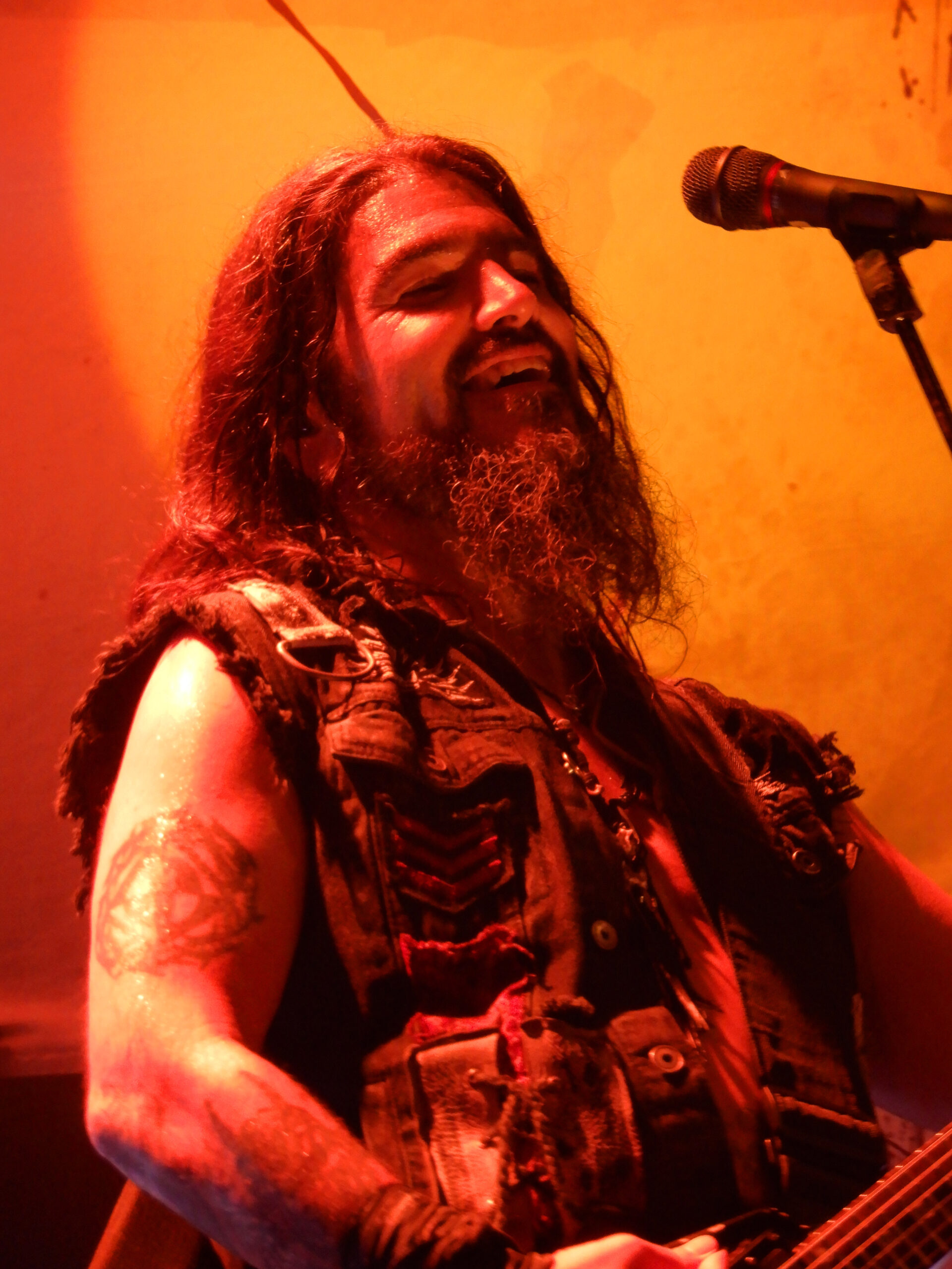
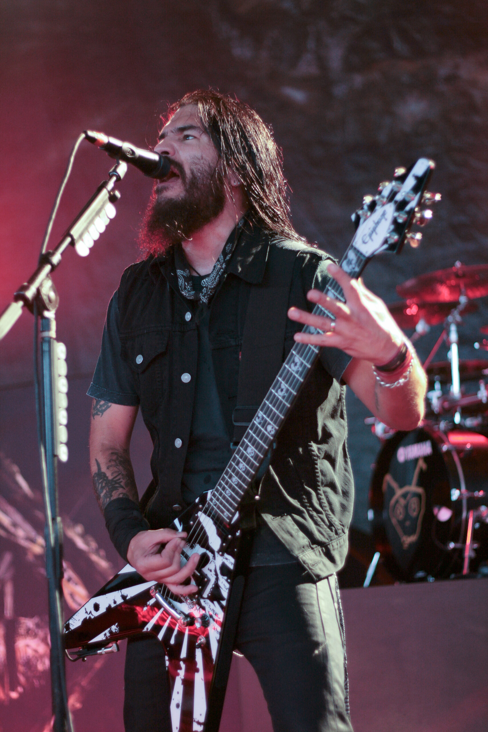
The five body images below offer different views. The featured portrait is separate. Together, the photos show raised arms, close performance angles, upper-arm placement, forearm detail and an older stage shot.

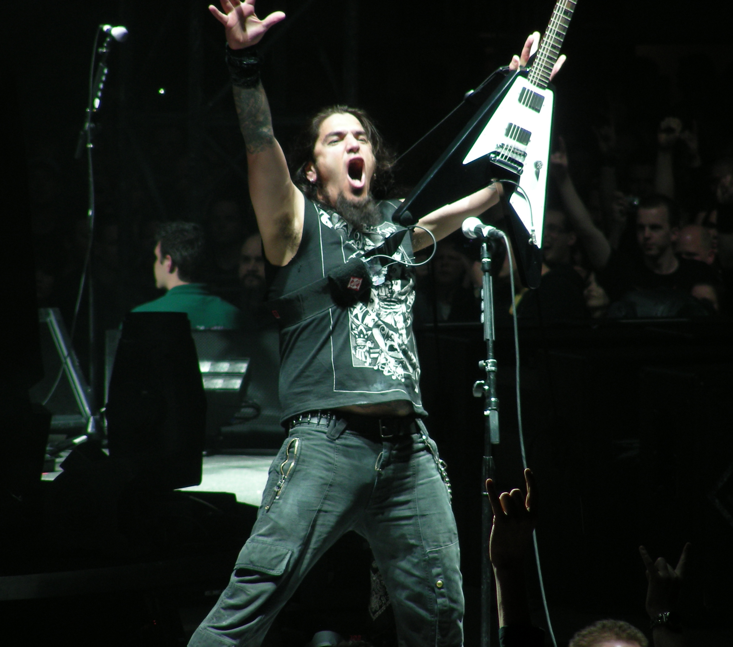
Robb Flynn’s upper-arm tattoos are easiest to read in live photos

Robb Flynn tattoos: high-resolution live photograph showing the dense upper-arm and forearm tattoos as Flynn raises his guitar

The upper-arm pieces are easiest to see when Flynn raises his hands on stage. In this shot, dark shapes and lighter gaps run from the shoulders toward the elbows. It isn’t one solid blackout sleeve: separate designs sit at different densities, with patches of open skin between them.

A change in pose can make familiar ink look different. When Flynn flexes, the skin turns away from the camera; red stage lights can flatten grey shading and make outlines seem heavier. The broad layout stays consistent across the photos, though: both arms have substantial coverage, and the upper-arm pieces give the eye a place to start.

The placement is clear; the meaning isn’t always documented. The photos don’t explain every symbol. They do show separate upper-arm panels, darker sections on the forearms and artwork arranged around the elbows.

Robb Flynn’s forearms mix dense linework with larger colour blocks

Robb Flynn tattoos: high-resolution stage photograph showing the geometric forearm work, upper-arm colour and layered sleeve coverage

This performance photo brings the forearms into view. Lines and dark shapes cluster around the wrist and lower arm, while broader colour and black sections sit higher up. The designs are close together, but their different sizes keep them from reading as one blur.

Concert lighting can hide some of the colour. Red shows around the shoulder and upper arm, with black and grey filling the space nearby. Lower down, linework and shading become more prominent. Looking from shoulder to wrist makes the change in scale easier to see than treating the whole arm as one repeated pattern.

Density gives the sleeves much of their impact. The ink reads from across a stage, while lighter lines add edges in a closer shot. If you’re using the photos for sleeve ideas, notice how the larger filled areas sit beside detail that remains visible in motion and changing light.

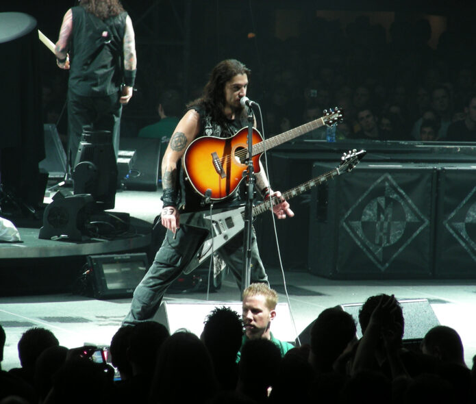
The upper-arm panel gives Flynn’s tattoos a strong visual anchor

Robb Flynn tattoos: clear concert photograph showing the large upper-arm panel, lower-arm imagery and wrist area without a generic portrait crop

A side view isolates one of Flynn’s most recognisable areas. His upper arm has a large circular, emblem-like design, outlined in dark ink with lighter shapes inside. Below it is a separate group of imagery, giving the arm distinct upper, lower and wrist areas.

The panel remains visible when Flynn wears a vest or plays guitar. It sits on the exposed upper arm and reads as a large shape before the smaller details come into focus. That’s a practical spot for a musician who’s moving, holding an instrument and turning toward the crowd.

The tattoos share the frame with the performance. These aren’t catalogue poses: the guitar, microphone and changing lights are part of the photographs. Even so, the upper-arm design stays clear enough to compare across years.

The separate arm pieces stay readable when Flynn is playing guitar

Robb Flynn tattoos: high-resolution live photograph showing the separate upper-arm emblem and the dense lower-arm tattoo work

This live photo shows how the tattoos sit while Flynn plays. His wrists and forearms bend as he frets and picks, but the larger upper-arm design still faces the camera. Farther down, dark pieces and curved lines follow the arm toward the wrist. It gives a better sense of the wrap than a shot with the arm held flat.

The coverage isn’t perfectly even. Some areas have heavier fill; others leave skin between the designs. That spacing helps the pieces stay distinct when a bracelet, guitar strap or microphone enters the frame, and it gives the sleeves the look of work added over time.

More than one pose helps explain the layout. A straight-on portrait can show surface detail, while a playing shot reveals how the ink follows the arm and slips out of view when Flynn turns his elbow.

Older performance photos show the same arm layout in a different light

Robb Flynn tattoos: large vertical concert photograph showing the upper-arm emblem, forearm coverage and tattoo placement around the guitar strap

The vertical Blackening-era photo has dark, warm stage lighting, which changes how the tattoos read. The upper-arm emblem remains visible; the forearm looks like a dense mix of black, grey and soft-edged shading. Compared with daylight, the image is less crisp, but the overall layout is still easy to follow.

It also shows the ink alongside clothing and gear. The guitar strap crosses Flynn’s torso rather than his arm, leaving the main pieces visible. A bandana covers part of the wrist, so this photo can’t tell us exactly what the tattooing looks like across the whole hand or lower forearm.

Age and lighting matter when comparing photos. Ink can look softer, darker or more faded depending on the camera and conditions. The details that recur across several shots are the safest to describe: heavy arm coverage, a large upper-arm emblem, dense work lower down and colour in parts of the sleeves.

Across the photos, Flynn’s tattoos cover the arms without turning them into one flat block. The upper arms hold the largest shapes; smaller marks and darker shading fill the forearms. That contrast gives the eye somewhere to land, while a close shot can reveal lines that disappear in a wide concert frame.

The pose changes what you can see. When Flynn lifts an arm, the upper-arm panel faces the camera and the forearm lengthens. While he plays, the wrist bends and some of the lower-arm designs turn away. Each angle shows a different part of the same work.

Lighting shifts the details too. Bright, neutral light makes colour and lighter shading easier to pick out. Red or blue stage lights push the ink toward a darker silhouette. Comparing different kinds of photos helps avoid mistaking a lighting change for a new tattoo or a grey area for solid black.

Clothing and instruments also affect the view. Flynn’s vests leave his upper arms exposed; guitar straps cross his torso, and bracelets can cover the wrists. The larger designs remain visible because of where they’re placed, even while he’s performing.

There’s no need to guess at a backstory to describe the visible work. The upper-arm emblem, black and grey forearm pieces and flashes of colour already give the collection a distinct look. When a tattoo’s meaning hasn’t been made public, describing its design is more accurate than supplying a story.

For sleeve inspiration, the photos show how a larger upper-arm piece can sit beside tighter forearm work, with open skin separating denser sections. They also show how the layout changes when an arm bends. Anyone drawing on the same approach should work with an artist on scale and flow around the elbow and wrist.

Machine Head fans know Flynn through the band’s lyrics and album art, and he has talked about seeing listeners tattoo those words and images. That’s separate from the record of his own tattoos, but it helps explain why his arms draw attention in performance shots: the ink is visible alongside the music and artwork people associate with him.

The clearest picture comes from looking across several photographs. A raised-arm shot shows the coverage; a close performance angle reveals linework; an older image helps with comparisons over time. Each adds something without asking one frame to show everything.

For more real celebrity and musician tattoo guides, visit the site’s celebrity tattoo section. As with this guide, the useful details are the ones a photograph supports: show the tattooed person, keep the featured image separate and describe what can actually be seen.

More musician tattoo guides

Malakai Black Tattoos: Dark Chest, Arm and Back Ink

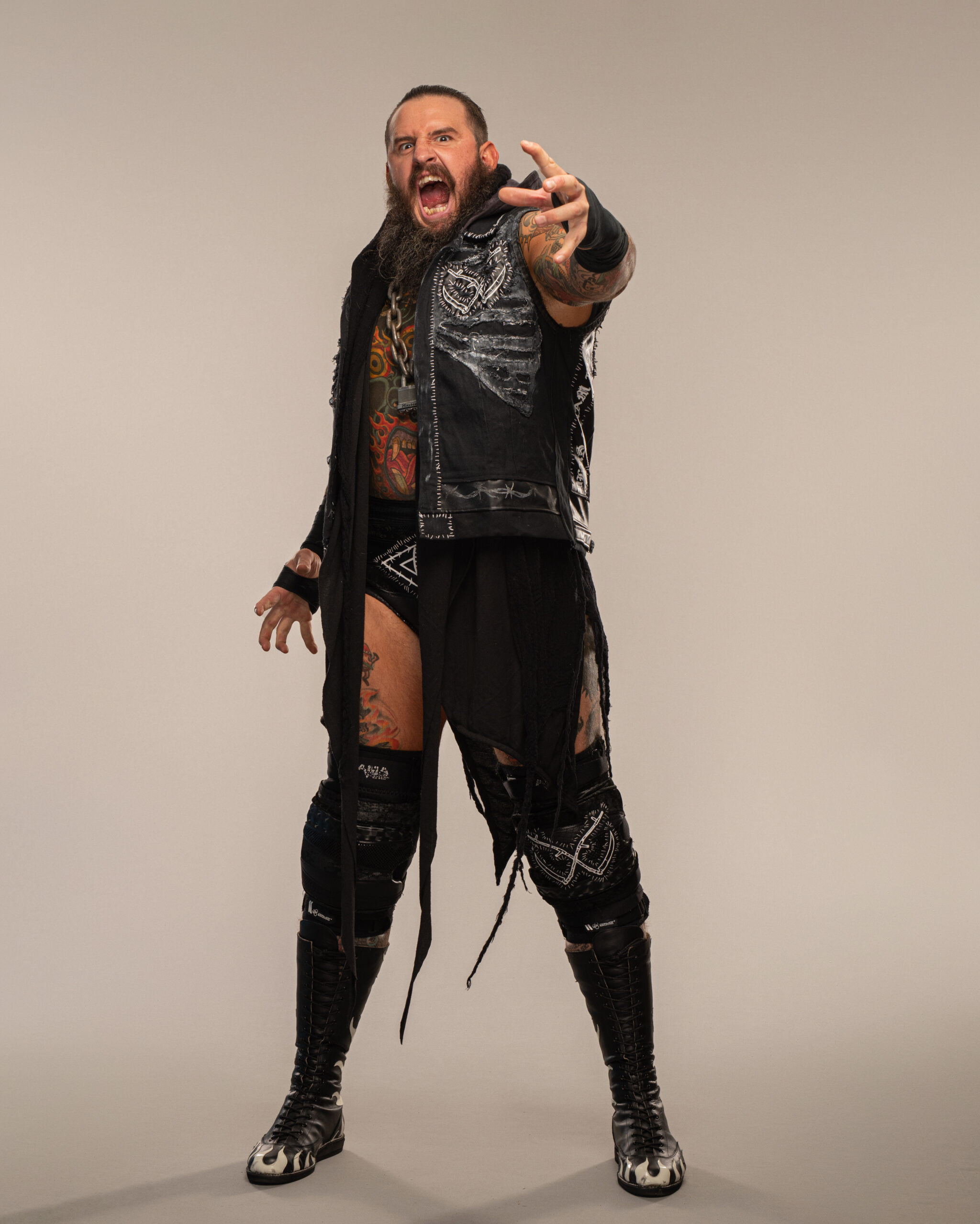
Malakai Black’s tattoos extend well beyond his arms. Wrestling photos show large pieces across his back, chest, shoulders and thighs, with smaller details on his hands. Black also wrestled under the name Aleister Black, so older images use that name for the same person.

The clearest references are the shots where the ink can actually be seen. A distant entrance photo may show who’s in the ring, but it won’t tell you much about tattoo detail. The five images here focus on his arms, chest, back or legs. The featured image is a separate portrait and doesn’t appear again in the article.

Some coverage of Black’s tattoos links them to dark, surreal and mythological ideas. That doesn’t establish the meaning of every symbol, though. Here, I’ll stick to visible placement, colour, scale and style rather than fill in a private story.

Malakai Black’s back piece carries the heaviest coverage

Malakai Black tattoos: high-resolution wrestling photograph showing Malakai Black's large back tattoo and upper-arm coverage from behind

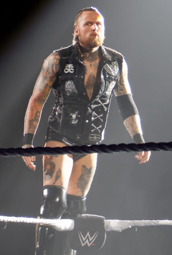
The back is a useful place to start. In this rear view, the tattooing covers most of Black’s upper back and reaches across both shoulders. It takes up far more space than a small mark between the shoulder blades. Dark outlines and lighter gaps break up the larger shapes as they continue toward the arms.

That angle fills in what a front portrait can’t show. Black’s chest and arms are usually more visible in the ring, but the back adds another large area of work. From a distance, the pieces read as a connected field. Closer in, you can make out separate faces, curves and shaded sections.

We can describe the coverage without assigning each figure a meaning. Some tattoo coverage discusses dark, surreal imagery, but this photograph doesn’t establish what every part represents. It does show broad back coverage, substantial shading and artwork that follows the shoulders instead of ending in a neat rectangle.

The chest and legs make the collection feel connected

Malakai Black tattoos: large vertical ring photograph showing the chest, arms, legs and neck tattoos in one clear front-facing view

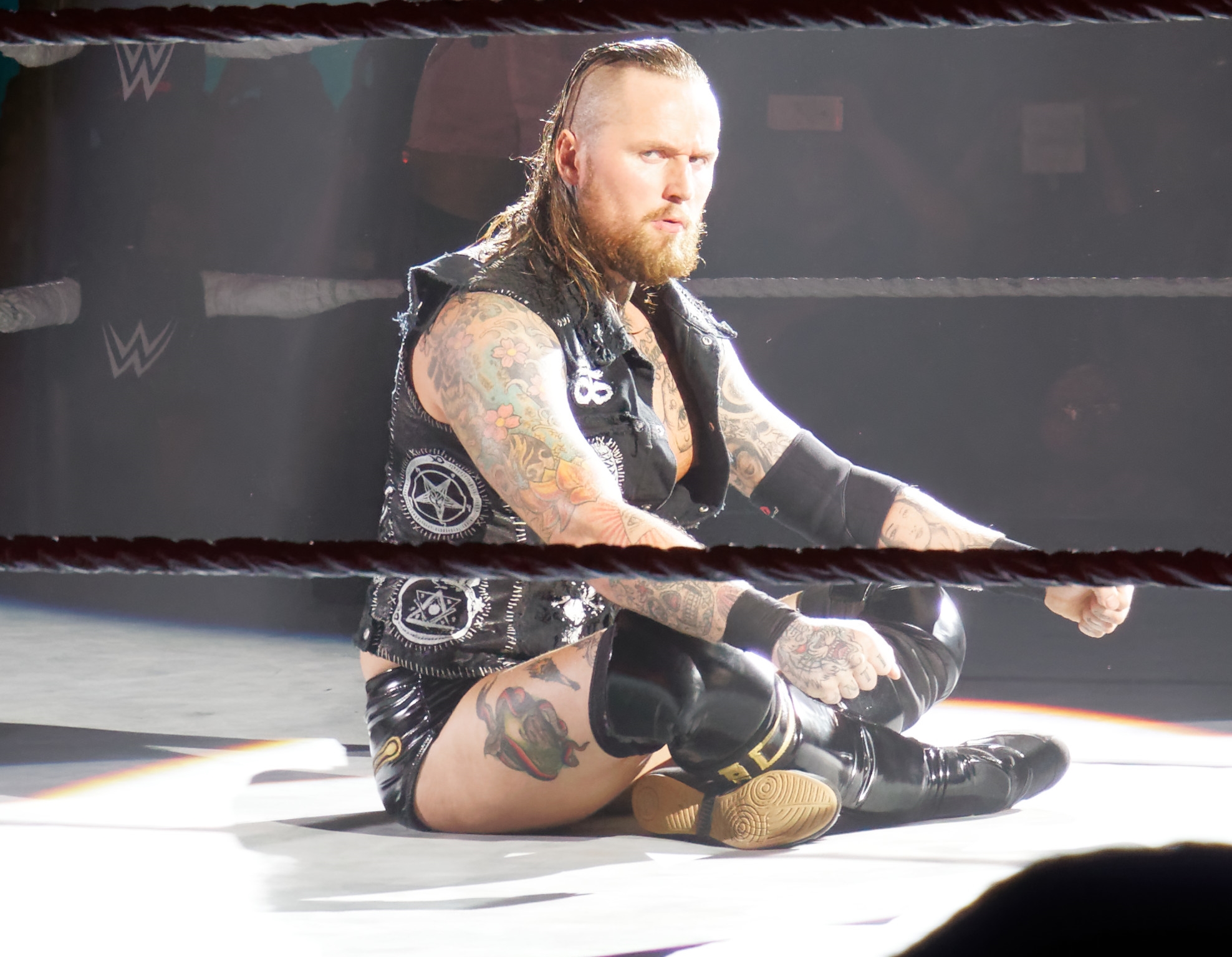
This front-facing ring photo shows how far the tattoos extend below the neckline. Ink crosses Black’s chest and shoulders, runs down both arms and appears again on his thighs. The pieces vary in scale: some are compact and detailed, while larger dark shapes remain easy to see from across the ring.

The thigh work can disappear in tighter photos of the upper body. Here, the ring gear leaves more of it visible around the thighs and knees. It gives the collection a more complete outline and shows how much a head-and-shoulders portrait leaves out.

Look at how the pieces are placed. The chest anchors the front, the arms hold a dense mix of details and the thighs have their own larger panels. The layout moves from small marks around the hands to bigger forms across the back, torso and legs.

The arm work mixes flowers, symbols and dense shading

Malakai Black tattoos: close high-resolution ring photograph showing floral, geometric and shaded tattoo work across both arms and chest

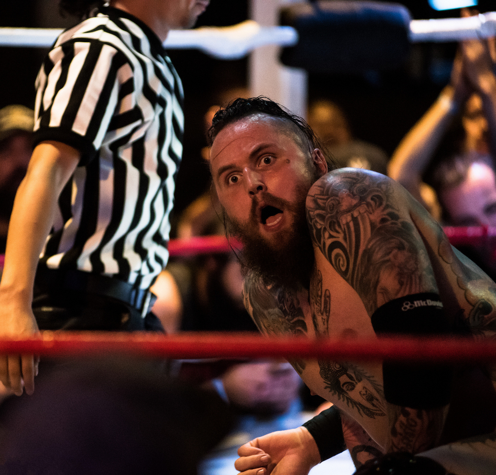
This closer ring shot makes the arm work easier to read than a wide entrance photo. Floral forms sit beside dark outlines, small symbols and shading that wraps around the biceps and forearms. There’s a lot on each arm, but the variation in scale keeps it from becoming one solid dark area.

The details shift as Black turns his arm. Larger images stand out on the outer biceps; lines and grey shading are more noticeable inside the arm and farther down the forearm. Smaller marks appear around the hands and wrists when he sits or leans toward the camera.

The ring is still in the frame, but this photo lets you study the ink. The ropes and vest belong to the scene; they don’t obscure the tattoos. That’s a more useful view for detail than a distant entrance shot, where the same work would be hard to distinguish.

Black-and-white photos show how the ink works with his entrance look

Malakai Black tattoos: high-resolution black-and-white stage photograph showing the tattooed arms, hands and legs beneath the House of Black costume

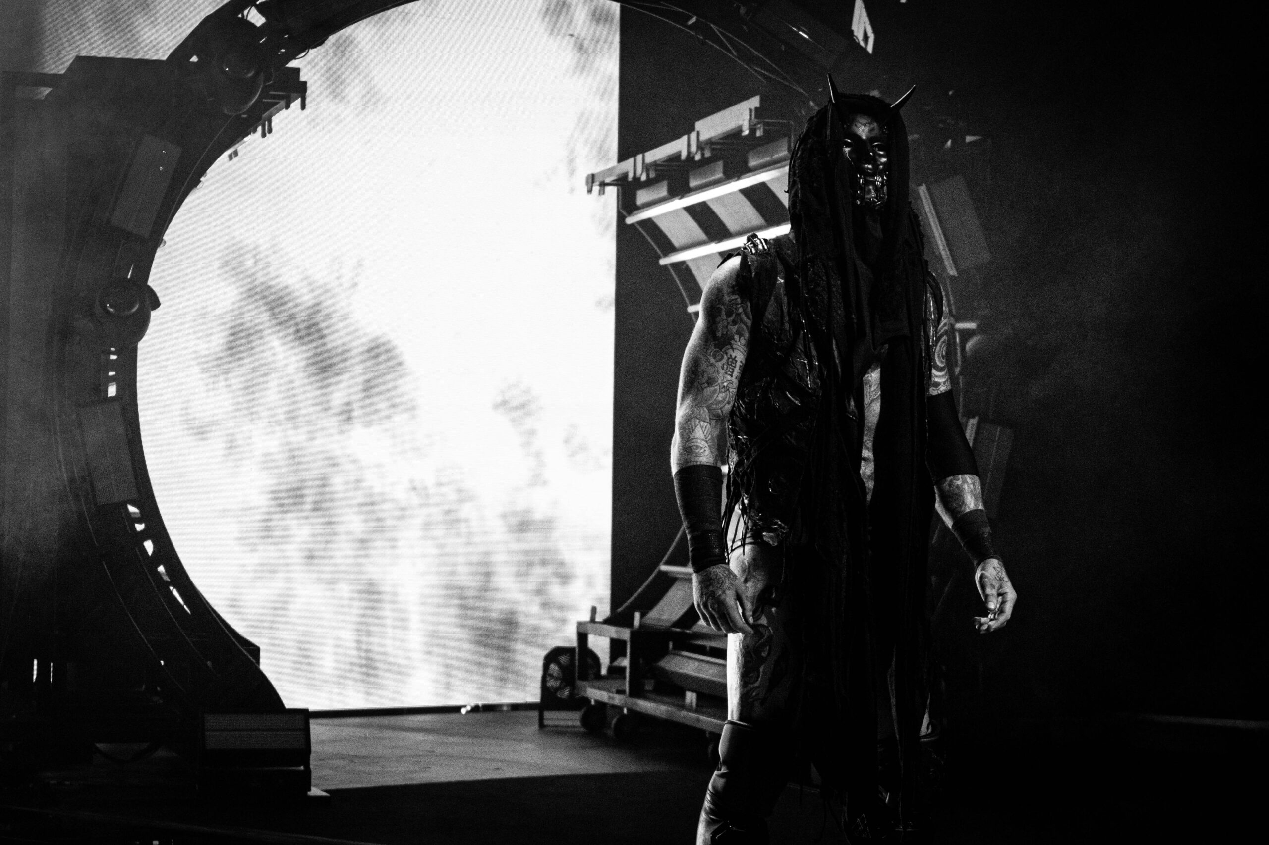
Black’s House of Black entrances often use dark clothing, smoke and low light. In this black-and-white event photo, the tattoos take on a more graphic look. The exposed arms and legs stand apart from the costume, and pale highlights help separate some of the ink from the deeper shadows.

That makes the photo useful for seeing contrast. Dark clothes can hide an arm, but where the skin is exposed, lighter areas and outlines still help define the designs. The tattoos complement the costume; they aren’t the same thing. They remain on Black’s body when the hood, vest or face paint changes between appearances.

Contrast keeps the larger designs visible from a distance. The outlines and shifts in tone hold up under difficult lighting. Anyone planning a large dark tattoo would still need to consider skin tone, spacing and how the ink may age, but these images show why clear edges help.

Older Aleister Black photos reveal the shoulder and thigh layout

Malakai Black tattoos: clear action photograph showing the shoulder, arm and thigh tattoos around the wrestling gear

Older photos from Black’s Aleister Black years show plenty of body art before the House of Black presentation. In this action shot, the shoulder and arm work is visible, along with tattoos on the thighs below the trunks. The photo records the layout without later hooded entrance gear covering the same areas.

In this light, the work looks more colourful and open than in some of the later black-and-white images. Larger figures sit beside smaller script and linework. The arm pieces cross the rounded shoulder rather than stopping at the sleeve edge, and the thighs have separate designs of their own.

The older and newer images are useful for comparing placement, not guessing intent. Black’s ring name and presentation changed, but the photographs show the same broad approach: large areas, strong outlines, mixed shading and designs that follow the body.

Across the clearest photos, black and grey form much of the base, with colour in several of the larger pieces. Broad areas cover the back and chest. The arms have the widest mix of small and large marks, including flowers, symbols, faces and shading. The thigh pieces add coverage below the waist.

The placement also has to work in motion. Black’s shoulders roll as he wrestles, his elbows bend and his wrists turn as he grabs an opponent. A piece can look flat in a posed photo, then wrap around the arm in an action shot. Comparing angles makes the layout easier to understand.

Lighting changes the mood, but the basic placement stays put. Bright ring light brings out colour and fine lines. Smoke, shadows and dark clothing make the same tattoos look heavier. Both kinds of photograph help: one brings out detail, the other shows how the designs read from farther away.

Older Aleister Black photos also help separate the body art from the character styling. His name, entrance gear and face paint can change; the tattoos remain on the same shoulders, arms, chest and legs. Those earlier shots are especially useful where a newer hood or vest hides part of the body.

The main zones are distinct. The back piece is broad and dense. Chest and shoulders anchor the front. The arms carry the most varied detail, while separate thigh pieces appear when the ring gear leaves them uncovered. Smaller marks on the hands and neck are easiest to spot in close shots.

For tattoo ideas, the layout offers more than a set of designs to copy. Large pieces need room, especially where the shoulder meets the ribs. Smaller symbols can bridge gaps if they still have space to read when the skin bends. An artist can plan the flow across those surfaces before settling on the final artwork.

The overall look has a dark, surreal feel, but a photo doesn’t need a guessed explanation. A face, flower, geometric mark or shaded figure can be described by what it looks like. If Black hasn’t confirmed a particular meaning, it’s better to leave that part open.

The tattoos are visible even as Black’s wrestling presentation changes. He may appear shirtless or wear a vest, hood and face paint; the ink still sits alongside the character look. That’s one reason brief entrance shots draw the eye, even when they don’t reveal every detail.

The clearest record comes from several views together: the back photograph shows the large rear piece, a front-facing ring shot shows the chest and arms, and a closer pose reveals smaller forearm and hand details. The black-and-white entrance photo shows how the contrast reads on stage, while the older Aleister Black image adds the thighs and shows the coverage over time.

For more real celebrity and wrestler tattoo articles, visit the site’s wrestler tattoo section. Use photos that clearly show the person and the ink, keep the featured portrait separate and describe only what the image supports.

More wrestler tattoo guides

Brody King Tattoos: Colourful Chest, Sleeve and Leg Ink

Brody King’s tattoos cover his chest, arms, back and legs. Bright colour sits alongside dark outlines and dense shading. King is an AEW wrestler and the vocalist of God’s Hate; photos from both settings show the same extensive body art, not just a generic wrestling portrait.

The five body images here show different parts of the work. One brings the chest and sleeves into close view, another shows the thighs, and a stage photo catches the forearms in motion. A rear view shows the back tattoo. The featured image is a separate portrait and doesn’t appear in the article body.

There’s also video of King getting a demonic leg tattoo from Paul Booth. It’s embedded at the end. The photos and video show the placement, colour, scale and linework; they don’t establish a private meaning for each design.

Brody King’s chest and sleeves carry the brightest colour

Brody King tattoos: high-resolution action photograph showing the chest panel, both sleeves and a large thigh piece without a generic portrait crop

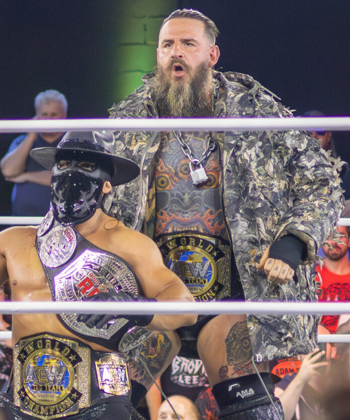
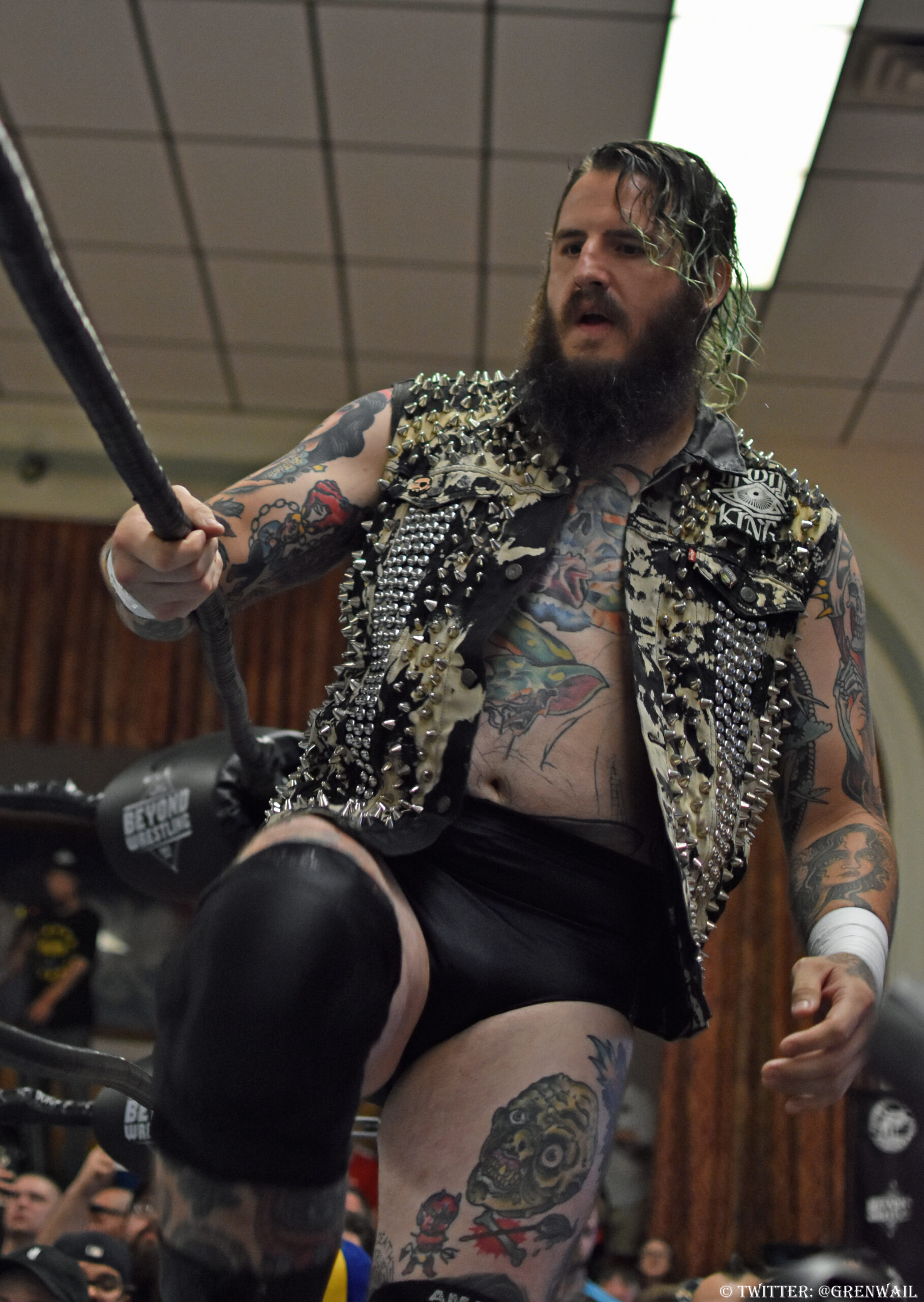
In this 2018 photo, a large design sits at the centre of King’s chest while ink runs from both shoulders down the arms. Red, yellow and blue remain visible alongside the dark shading; the arena lights haven’t washed them out.

The arms read as sleeves, but the skin isn’t filled with one uninterrupted block of black. Separate faces and shapes sit beside small open spaces, with the outlines helping each piece stand apart. Your eye can follow the designs from shoulder to wrist without losing track of the individual images.

Contrast is what holds the pieces together. Larger colour areas sit beside smaller black-and-grey details. The thigh has its own design, so the lower body draws attention in its own right rather than looking like a continuation of one pattern.

The chest design gives the collection a clear centre

Brody King tattoos: large ring photograph showing the chest design, forearm coverage and thigh tattoos in a clear full-body view

This full-body ring shot shows the chest work below King’s beard and above his waist. The central image is large enough to read from a distance, and smaller marks fill the surrounding torso. Ropes, belts, lights and another wrestler are in the frame, but the chest piece still stands out.

The same photo catches the forearms and thighs, so you can see how those areas relate to the chest. The ink doesn’t stop at the torso: it continues across the arms and down toward the knees.

The placement gives the collection its order. The chest catches your eye first, the sleeves carry the design across the shoulders and the thigh pieces extend it below the ring gear. That layout stays visible during matches, when King’s torso and arms are often exposed.

The forearms stay visible even in a moving entrance

Brody King tattoos: high-resolution stage photograph showing the dense forearms and chest ink as King walks beside the ring

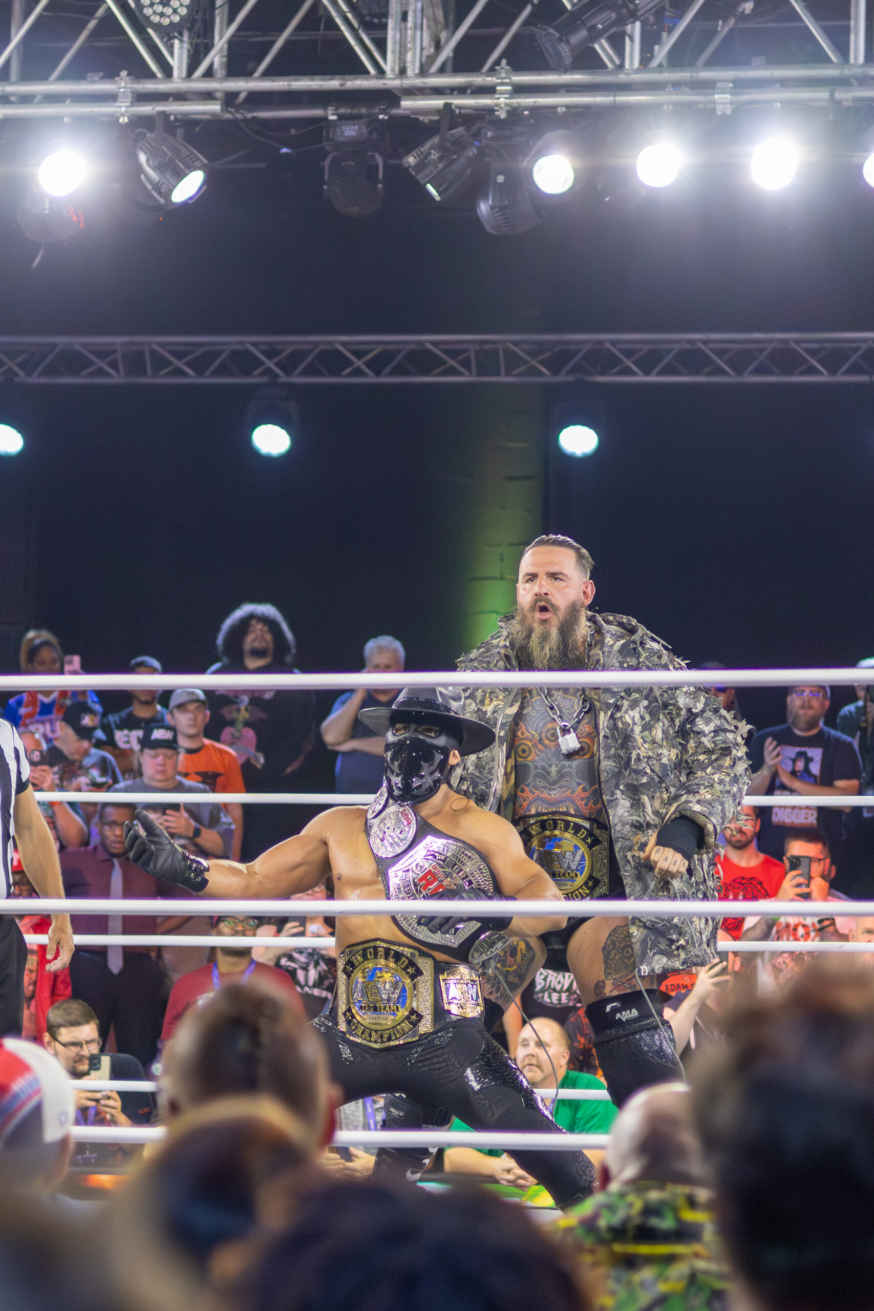
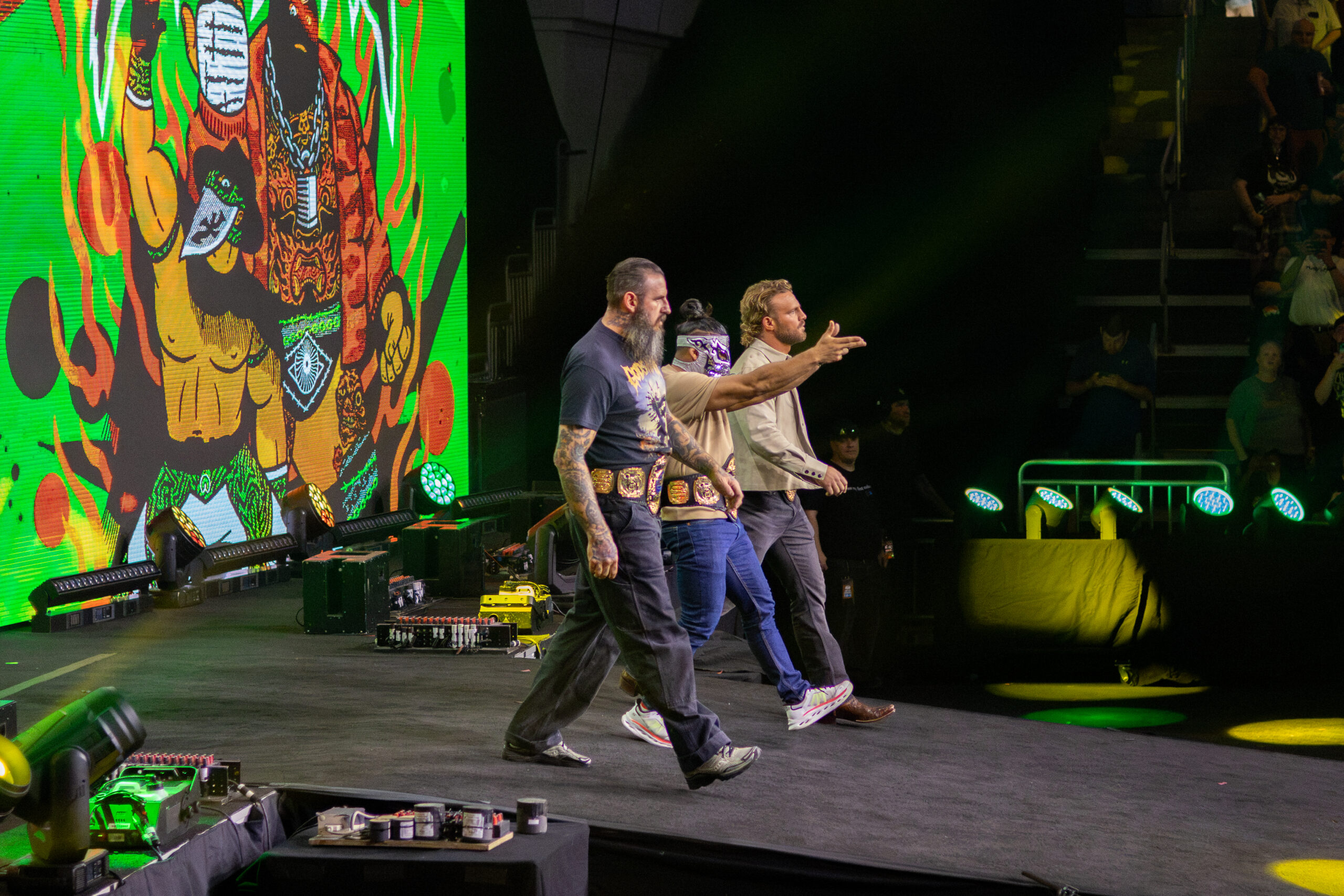
In this stage photo, King walks with the House of Black. His forearms are close to the camera, making the coverage easy to see even though he’s in the middle of an entrance. The opening in his shirt reveals part of the chest design; his hands and wrists come in and out of shadow as he moves.

A photograph doesn’t need to be posed in a studio to show how the ink sits. Here, you can see the elbows bend and the wrists turn as King walks. The scene also shows which areas remain visible while he’s moving, speaking or carrying a belt.

The ring setting is part of what makes this reference useful. The lights and crowd show how the colours and outlines look in the places fans usually see King, rather than in an isolated crop of his face.

The back tattoo reads as a large single field from a distance

Brody King tattoos: high-resolution event photograph showing the large back tattoo from behind during the House of Black entrance

This rear view shows a large tattoo across King’s upper back and shoulders. From farther away, the ink reads as one broad, connected area. The wide photo doesn’t make every small shape easy to distinguish, but the scale is unmistakable.

Back pieces rarely appear in front-facing wrestling photos, which makes this angle useful. The design spreads across the body rather than sitting in a small patch between the shoulders. The shoulders and upper arms frame it, while the densest ink sits across the back.

This photo shows the coverage, not the private meaning. We can describe the size, direction and density without claiming to know the story behind every symbol. That’s also the most useful information here for anyone studying how the piece is placed.

The leg tattoo designs add a separate layer below the ring gear

Brody King tattoos: studio-quality photograph showing colourful arm and leg pieces with the face clearly visible while keeping the tattoo work readable

King’s legs have large pieces of their own. In this studio photo, a colourful tattoo covers part of the thigh, with more ink visible below the shorts. The 2018 ring image shows another leg design: a face-like figure surrounded by smaller marks and red accents.

Long trousers, ring gear or a championship belt can hide this work. With more of the leg exposed, its scale is easier to judge. These aren’t small additions; the designs have room to read as King’s knee bends and he moves across the mat.

The thigh pieces balance the work above the waist. The chest and sleeves usually get the first look, but the leg tattoos extend the composition below the ring gear. They also show King uses more than one body area for large, colourful designs.

Colour is a defining part of King’s tattoo style. Reds, yellows, blues and warm orange appear across the chest and arms, with black outlines keeping the images distinct. The mix stays legible under arena lights, even when the rest of the scene is dim or crowded.

The sleeves are dense, but the pieces are still separated. Larger images occupy the upper arms; smaller marks fill spaces around the elbows and forearms. That gives each design room to read when the arm bends, instead of turning the whole sleeve into a blurred band.

The chest anchors the collection. Its central design is broad enough to show through an open shirt, vest or entrance jacket. The shoulder and arm pieces carry that visual weight outward. In the 2018 image, the chest, sleeves and part of the thighs all appear in one frame.

The back adds another large surface. From behind, it forms a darker field across the upper back and shoulders. The wider event photo doesn’t reveal every small detail, but it shows how much skin the piece covers. A closer rear portrait would show more linework; this shot makes the overall scale clear.

The leg tattoos can be hidden by ring gear and then become a focus when King’s thighs are exposed. The photos show large designs with colour and heavy outlines, giving the lower body a visual weight that matches the chest and arms.

The moving entrance shot is a useful reference for how the ink looks outside a posed photo. King is walking, his arms are down and the lighting changes, yet the forearm tattoos remain visible. It shows more than a close face crop would: the ink in the setting where many fans see him.

The Paul Booth video offers another view of the collection. Booth is known for dark, surreal and black-and-grey work, and the clip shows him tattooing King’s leg. It documents that session; it doesn’t tell us the story behind every other design.

It’s tempting to supply a meaning for every monster, skull, face or symbol in a wrestler’s photos. We don’t need to. The images already show King’s preference for large areas, strong outlines, repeated colour and dense arm coverage.

For inspiration, pay attention to how the designs flow. A large chest or shoulder piece affects how a sleeve travels around the biceps and elbow. Ring gear and straps can cover some areas, so placement matters too. An artist can map the larger shapes first, then decide whether smaller marks fit around them. The thigh or calf can be a separate project if the upper body is already full.

No single dramatic entrance photo captures the whole collection. The 2018 close-up shows colour and linework; the full-body ring shot connects chest, arms and thighs; the stage image catches the forearms in motion; the rear view records the back. The studio portrait gives a clean face-visible image for the featured photo.

For more real celebrity and wrestler tattoo articles, visit the site’s wrestler tattoo section. Use clear photos of the person and the ink, keep the featured portrait separate and describe only what the photograph supports.

More wrestler tattoo guides

Loredana Tattoos: Bold Lettering, Hand Ink and Arm Designs

Loredana’s tattoos combine bold lettering, dates, small hand symbols and larger designs on her arms. The Swiss-Albanian rapper often uses short words and phrases rather than filling an entire arm with one connected sleeve. Photos show ink across her chest, hands, neck and arms.

The six images below show different parts of the collection: a mirror view of the chest and arms, a close-up of the hand and forearm, a face shot, the lettering on her neck, a side view of the deer tattoo and a second portrait showing the neck and collarbone. The featured image is a separate portrait for the post header.

Some meanings have been reported by outlets that covered the tattoos; others can only be described by what the photographs show. I’ll keep those apart and leave guesses about private symbols out of it.

Loredana’s chest and arm lettering tattoos set the tone

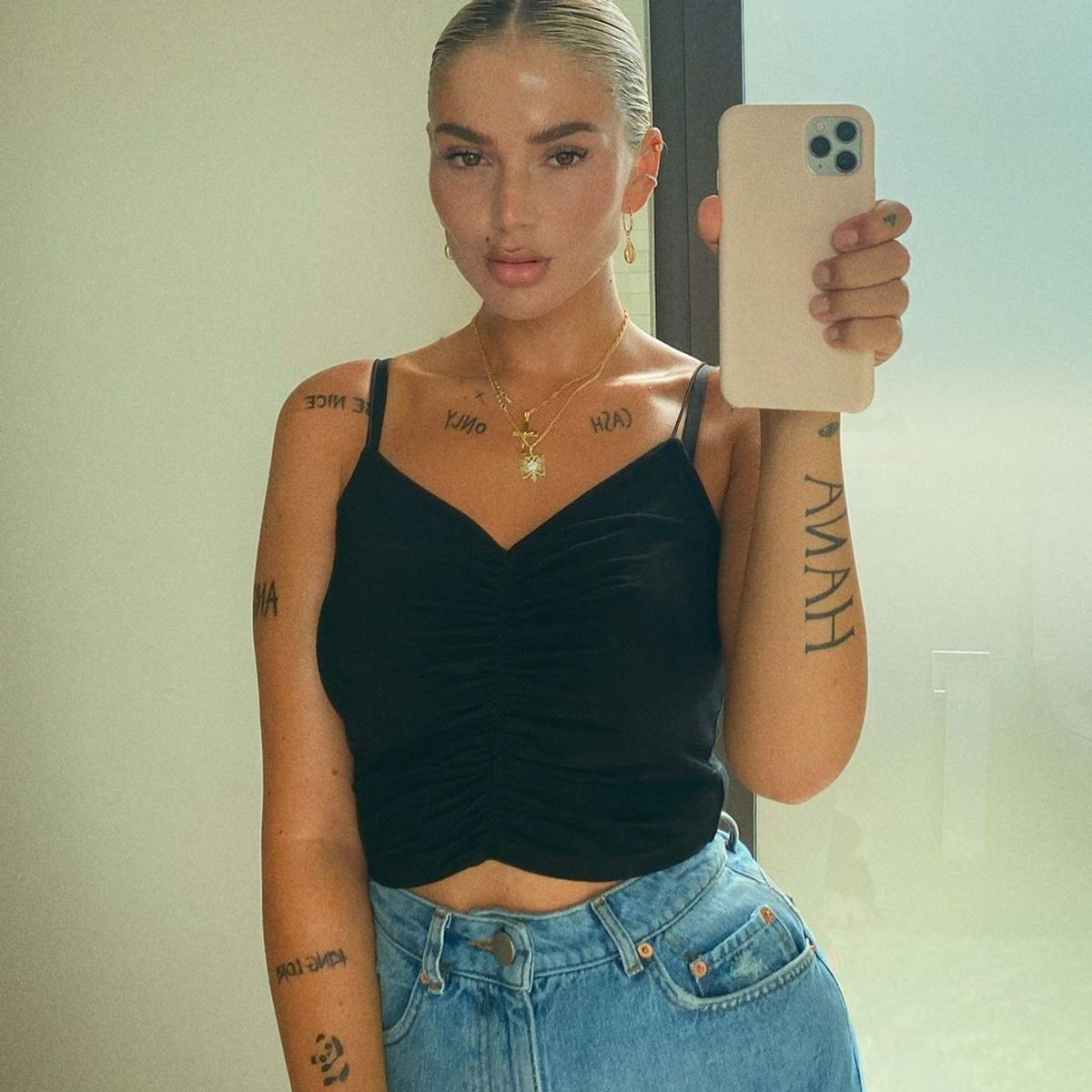
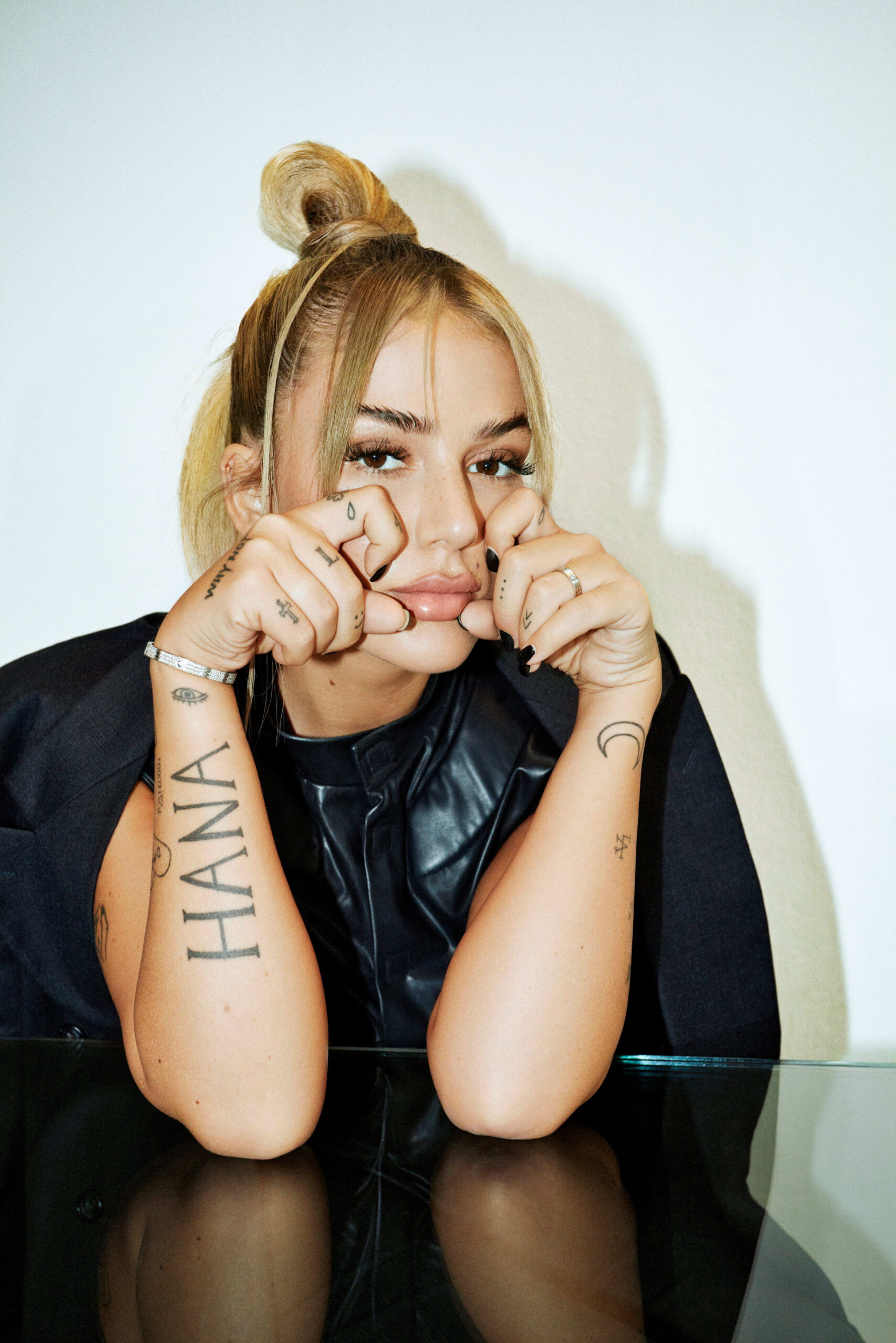
Loredana tattoos: clear mirror portrait showing CASH ONLY across the collarbone, HANA on the arm and large vertical lettering on the opposite arm

Words, dates and small symbols are a big part of Loredana’s collection. In this mirror photo, lettering crosses the collarbone and both arms, including CASH ONLY and HANA. The dark text stands out against her skin and gives the tattoos a graphic, easy-to-read look.

The words are placed in separate areas instead of running together as one large block. That leaves each phrase room to show clearly across the chest, while the longer lettering on the arm draws the eye down the limb.

There’s a consistent approach across the pieces. Loredana uses short phrases as visible marks, with larger designs appearing alongside them. The result feels personal while keeping the clear, fashion-forward look seen in her music photos.

The hand and finger tattoos keep the lettering compact

Loredana tattoos: high-resolution portrait showing the large HANA forearm lettering, finger symbols, wrist eye and crescent tattoos

The closer view brings out the hand tattoos. Large lettering crosses the back of the hand beside a year mark, while small symbols sit on the fingers, including a clover, a cross and other simple shapes.

Hands bend and turn throughout the day, so small tattoos need space to stay legible. Loredana’s marks sit across different planes; the words change direction as she turns her hand. A wide portrait would miss those fine details, which makes this close shot useful.

The hand puts the lettering in motion. Rings, phones and microphones naturally draw attention to it during everyday gestures and performance.

The teardrop finger tattoo changes the mood of the close portraits

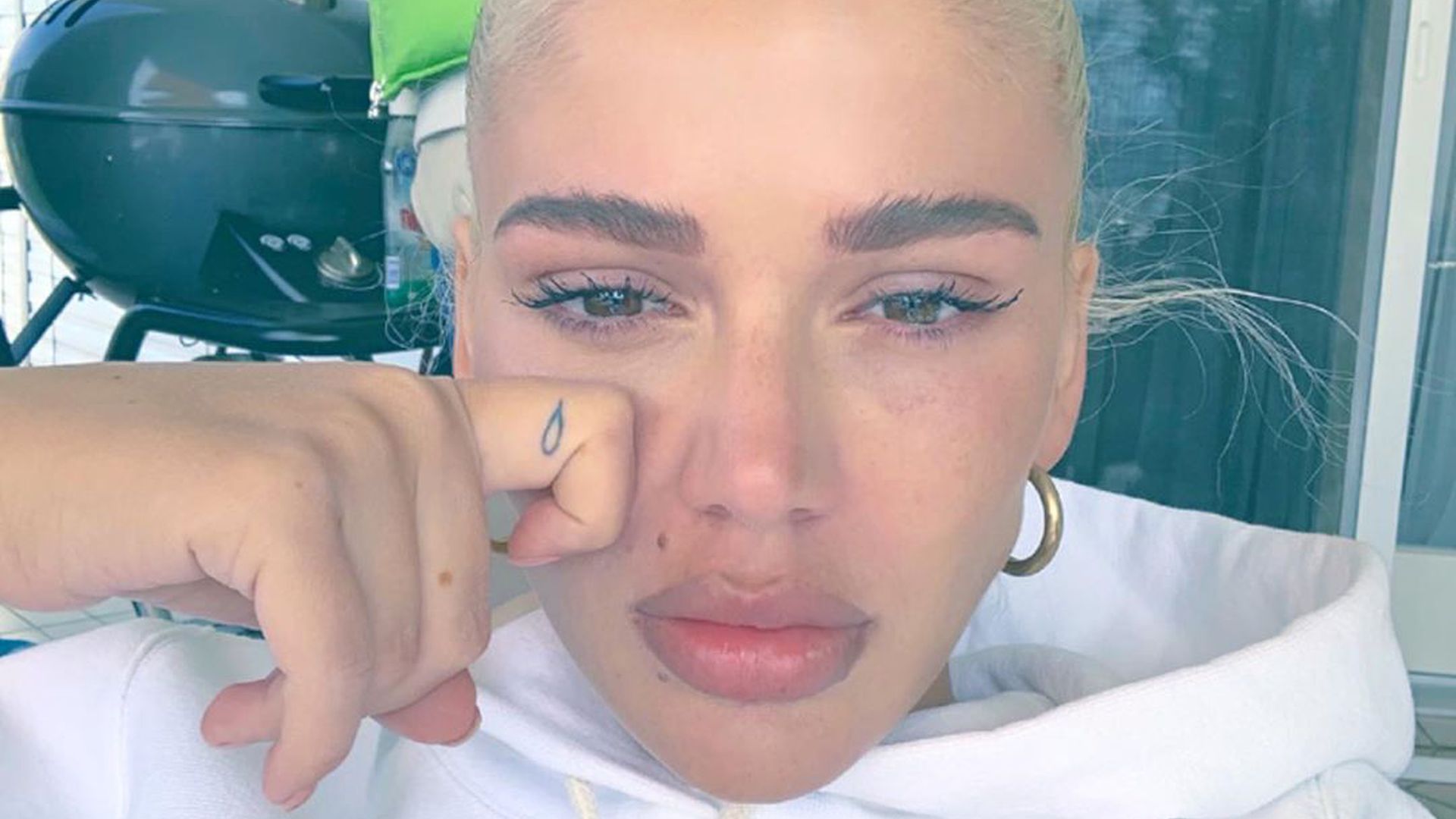
Loredana tattoos: high-resolution close portrait showing the teardrop finger tattoo beside Loredana's face

In this close selfie, one of Loredana’s smallest tattoos sits beside her face. A teardrop appears on the finger resting near her cheek; the pose hides part of the hand but leaves that mark visible.

The photograph has a different feel from the brighter mirror shots. The tattoo itself is tiny, yet its dark outline stands out against the softer portrait.

A small mark can change what you notice first. Finger tattoos show up in selfies, gestures and stage photos, so they become part of how a person moves through the frame.

The Selfmade Millions neck tattoo is a bold statement

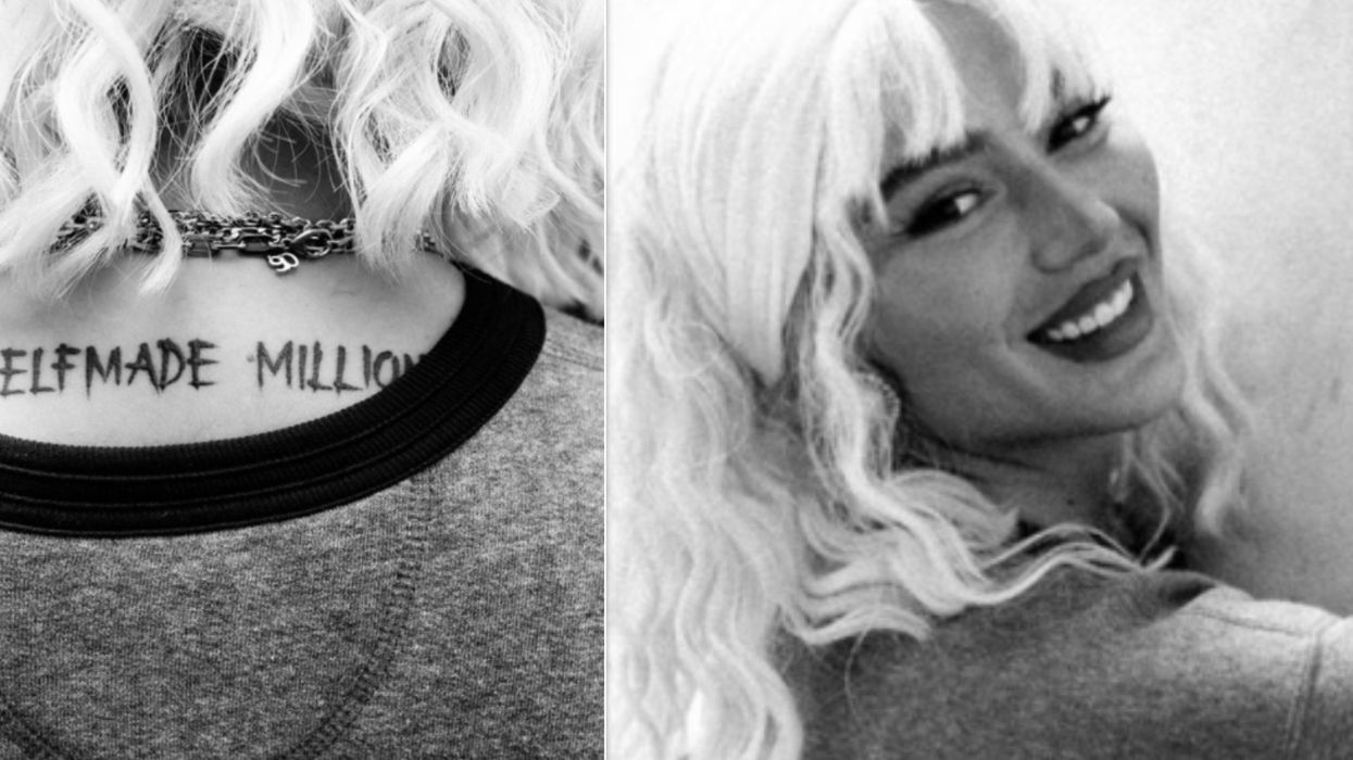
Loredana tattoos: high-resolution two-panel photograph clearly showing the Selfmade Millions neck lettering and Loredana's face

The Selfmade Millions lettering crosses the back of Loredana’s neck just below the hairline. It’s easy to see when her hair is tied up or swept aside, so it appears in photos where a less exposed tattoo might stay hidden.

The source image includes a second panel with her face visible, but the lettering remains the focus. Dark letters stand out against her skin and hair, making the phrase readable.

Where a phrase sits changes how visible it is. A tattoo on the back or thigh can stay under clothing. Neck lettering is harder to cover and becomes part of the public image.

The deer and upper-arm tattoos bring in larger artwork

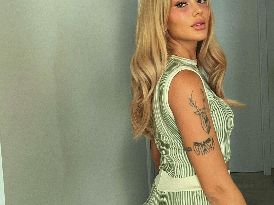
Loredana tattoos: sharp side portrait showing the deer head and layered black linework on the upper arm

The side portrait shows a different kind of tattoo: a deer head on the upper arm, with another dark, layered design beneath it. Both pieces take up more space than the small phrases on her fingers and wrist.

The deer gives the upper arm a clear focal point. Its antlers angle upward, while the lower design fills the space below and follows the curve of her arm.

That combination adds variety. Lettering sets a rhythm across the collection; the deer and linework bring shape, texture and movement.

The smaller neck and collarbone tattoos fill the gaps

Loredana tattoos: high-resolution portrait showing visible neck and collarbone lettering against a clean red outfit

This portrait shows a small cluster of tattoos near Loredana’s neck and collarbone. The marks sit close to the neckline, so different tops can reveal or cover them.

They fill the space between the face and the larger arm work. The arms hold the strongest shapes, while the smaller lettering adds detail without turning the upper body into one solid field of ink.

The clean portrait helps here: wide performance photos rarely show these marks clearly. This one leaves enough room to see them while keeping Loredana’s face and styling in view.

Across the collection, language is a recurring element. CASH ONLY, HANA, Selfmade Millions and the phrases on her legs are readable statements. They don’t need a large scene around them; simple lines and deliberate placement carry the words.

The hand tattoos bring that lettering into a smaller space. Larger words sit on the back of the hand, while smaller symbols fit across the fingers. Together, they add layers without filling the hand with a single dark patch.

Those small symbols leave room around the text. The teardrop on a finger, a crescent near the wrist and the other marks can be picked out in close shots without competing with the larger HANA lettering.

Selfmade Millions stands apart because it’s on the neck. It follows the line below the hair and becomes part of Loredana’s silhouette. That placement is visible in photos, on stage and with everyday clothes.

The deer and layered arm pieces keep the collection from being all lettering. The deer has a clear outline, and the darker image below it adds weight. Together, they give the upper arm a focal point that short phrases can’t provide.

Some of Loredana’s tattoos have reported connections to family and identity. HANA has been described as a dedication to her daughter, and tattoo outlets have covered dates on her hands and wrists. The photos show where those marks sit; any personal meaning should be attributed to its source.

For inspiration, look at the change in scale. A large arm piece can anchor a design, with smaller marks on the hand or wrist adding detail. Words can follow the collarbone, neck or leg, but the lettering needs to stay readable as the body moves.

Placement is part of the design. Collarbone lettering follows a shallow horizontal line. HANA runs along the forearm. A finger has very little room, so a simple symbol is easier to read as the skin flexes.

The photos also show why different views help. A mirror selfie reveals how the tattoos sit with clothes and jewellery. A close portrait catches the hand ink, and a side view shows the size of the deer and the artwork below it.

Together, the images show a range from tiny finger marks to broad arm lettering and an exposed neck phrase, balanced by names, dates and larger symbols. The collection is legible in close shots and still recognisable on stage.

The angle and light affect which details stand out. A mirror view shows the chest and arms; the hand portrait records small symbols; the neck-and-collarbone shot picks up the finer marks; the side portrait gives the larger upper-arm design its proper scale.

The result is a direct mix of statements, personal references and bold black shapes. Some pieces are small; others are hard to miss. Together they make Loredana’s tattoos easy to recognise without needing to guess at meanings that haven’t been confirmed.

For more real musician tattoo guides, visit the site’s musician tattoo section. Use clear images of the artist, keep the featured portrait separate and describe only what the photographs support.

More musician tattoo guides

James Rodríguez Tattoos: Family Names, Faith and His Full Arm Ink

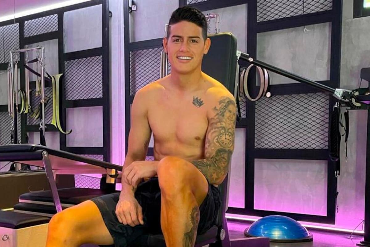
James Rodríguez’s tattoos are mostly hidden under a football shirt. In clearer training and holiday photos, the collection opens up: names and portraits on his arms, a small crown near his collarbone, and larger images on his legs. The flower sleeve is the most visible piece, but the lettering and portraits give the tattoos their personal thread.

The work has built up over time, so no single photo shows everything. Some meanings have been reported alongside the tattoos; others are only visible as shapes in a photograph. I’ll keep those apart and describe the design where Rodríguez hasn’t explained it publicly.

James Rodríguez’s flower sleeve brings his arm tattoos together

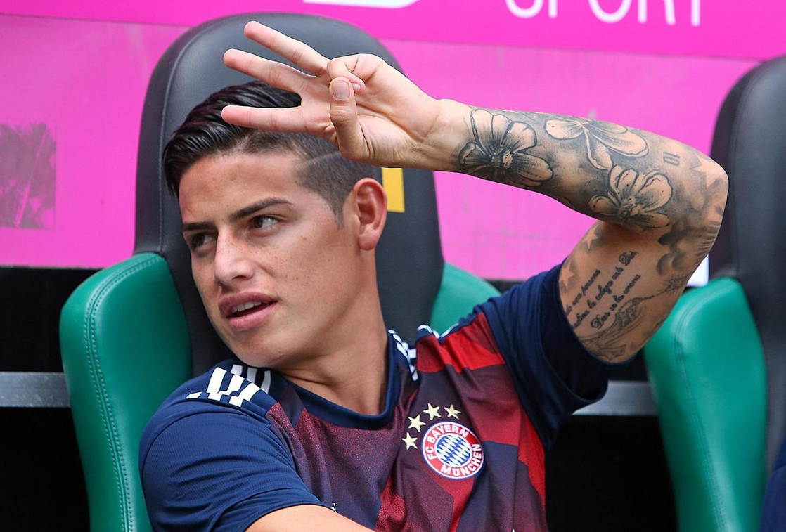
James Rodríguez tattoos: clear close-up of James Rodríguez’s flower-heavy arm sleeve

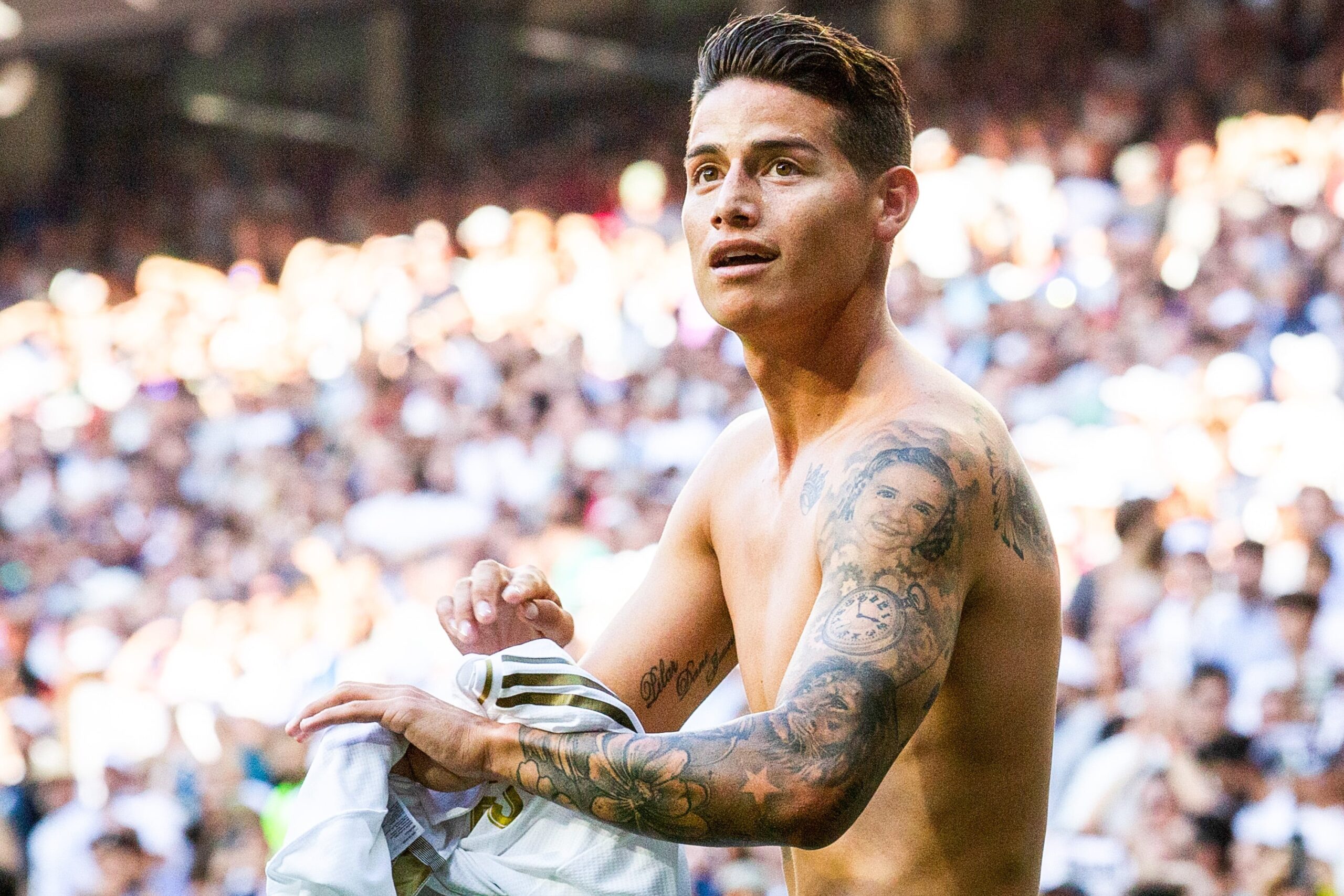
The flower sleeve runs from Rodríguez’s upper arm toward his forearm. Broad petals and dark outlines sit among softer shading, leaves and filler. The flowers are distinct, but the darker work links them and follows the shape of his arm.

It’s easiest to see when he raises his arm or rests a hand behind his head. In those poses, the light separates the blooms. Smaller lettering and symbols sit among the larger work, so it looks like a sleeve built from connected pieces rather than one uniform panel.

The photographs show a black-and-grey floral design. They don’t establish why Rodríguez chose those particular flowers, so there’s no need to assign them a meaning. The sleeve’s scale also sets it apart from the names and smaller marks nearby.

The flowers wrap around the arm instead of forming a narrow strip. That gives them room to move with the muscles and leaves space for the smaller tattoos to stay visible when his elbow bends.

The Pilar, Daniela and Juana lettering keeps family close

James Rodríguez tattoos: shirtless gym view showing Rodríguez’s arm sleeve and leg ink

The lettering on Rodríguez’s arm reads “Pilar Dani Juana”. The names refer to his mother Pilar, his former wife Daniela Ospina and his sister Juana. It became visible in match photos when he lifted his shirt to celebrate, and it remains one of the collection’s clearest family references.

The script sits along the inner arm. It’s simple and readable, which helps it stand out against the denser shading around it. Even in a photo where the sleeve falls into shadow, the names make a clear line.

Rodríguez still wears the tattoo after his relationship with Daniela ended. The names can remain part of his family story without needing a bigger explanation; the visible detail is that the lettering is still there.

Its narrow placement keeps the words from competing with the flowers. Anyone considering script can see how much the open space around a tattoo matters: the letters have room to read beside the larger work.

His chest crown is a small tattoo with a strong outline

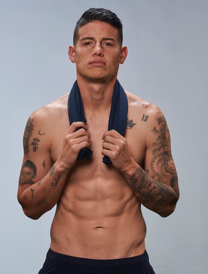
James Rodríguez tattoos: high-resolution shirtless view of the crown and upper-arm portrait work

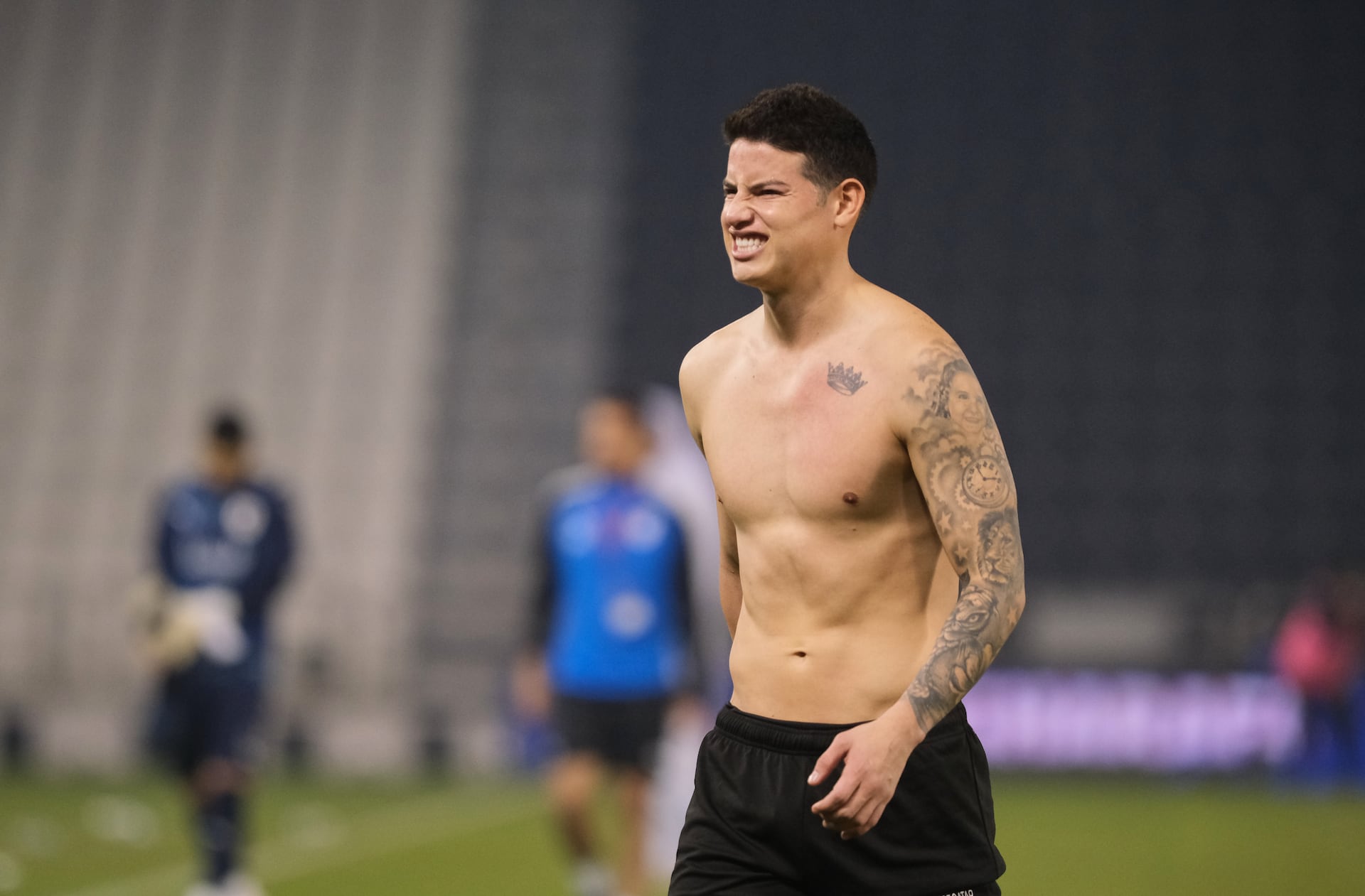
A small crown sits high on Rodríguez’s chest, close to the collarbone. Its dark outline and compact shape make it easy to pick out in shirtless photos, especially against the open skin around it.

The crown is much smaller than the portraits and symbols on his arms. That breathing room helps it hold its own without adding another large panel across his chest.

Crown tattoos can suggest many things, but Rodríguez hasn’t given a definitive public explanation for this one. The image confirms its shape and placement; it doesn’t tell us what he had in mind.

It shows how a small mark can anchor a part of a collection. The crown gives the chest a point of focus while leaving the heavier work to his arms.

Portrait and clock details cover the upper arm

James Rodríguez tattoos: high-resolution shirtless view of the portrait and clock details on the arm

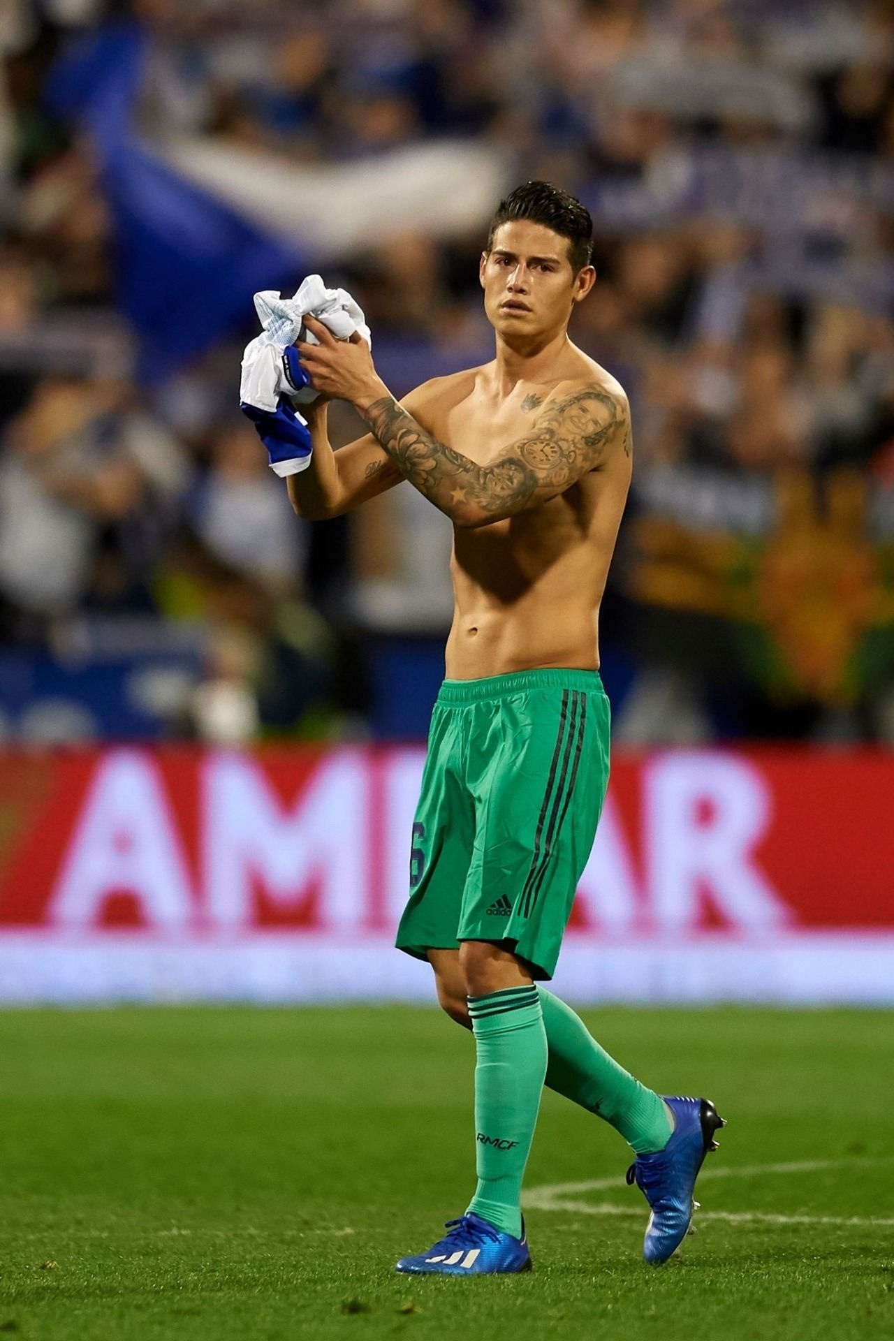
A face appears within the darker work on Rodríguez’s upper arm, with a clock or circular timepiece lower down. The portrait gives the sleeve a vertical shape; the clock adds a round one beside the softer lines of the flowers.

The face is hard to make out from a distance. In the closer view, you can see the eyes, hairline and surrounding shade. The piece relies on black-and-grey contrast rather than bright colour.

A clock can mark a date or memory, but Rodríguez hasn’t confirmed a specific story for this one. It’s safest to describe what the image shows and leave the meaning open.

The sleeve brings several shapes together: portrait, clock, flowers, stars and script. Darker shading ties them into the arm, while the smaller marks fill some of the gaps.

Stars and script fill the spaces around the sleeve

James Rodríguez tattoos: full-height match photo showing the connected black-and-grey arm work

Smaller stars, words and fine lines sit around the larger tattoos on both arms. They’re easy to miss in a full-length photo, but they keep the sleeve from reading as a handful of separate images.

Some script runs along the inner arm, where it bends with the body. The stars add brief points of contrast against the black-and-grey shading. This is one way a sleeve can grow over time: larger pieces first, with smaller designs added around them.

The photographs don’t always show enough detail to transcribe every word or explain each star. What they do show is a mix of script and small motifs around the portraits, clock and flowers.

Those lines change shape as the arm moves. A mark that looks straight at rest curves around the muscle when Rodríguez bends his elbow, so the placement is part of how the sleeve reads.

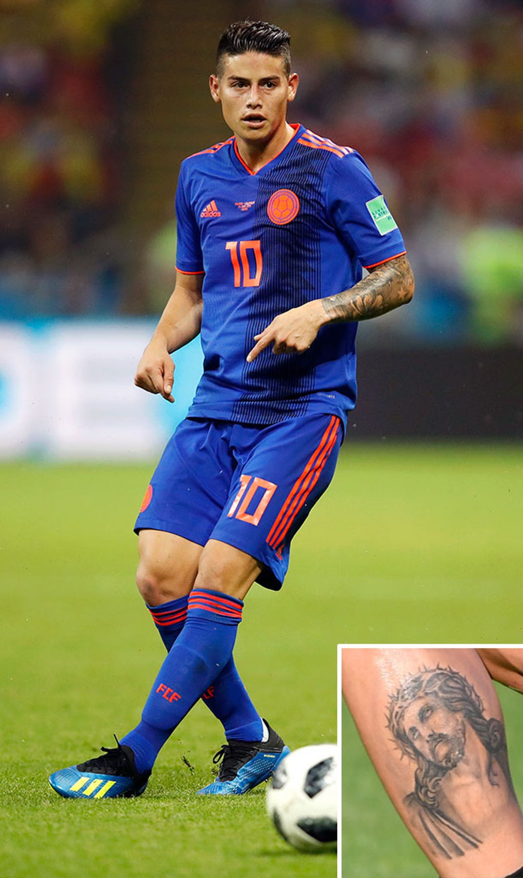
Rodríguez’s Jesus calf tattoo is his clearest faith image

James Rodríguez tattoos: close-up of Rodríguez’s Jesus portrait tattoo on the calf

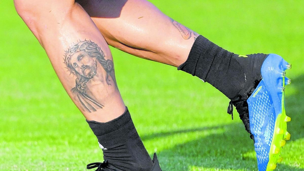
A portrait of Jesus covers much of Rodríguez’s calf. The face, crown of thorns and shaded forms below it are clear in the close-up. It’s one of the larger religious images in the collection and shows when his lower legs are uncovered.

The calf gives the portrait a tall space, with the face above the longer forms and shading. Football socks usually cover it during a match; training and holiday photos show more of the design.

The subject is clear, but that alone doesn’t explain Rodríguez’s personal beliefs or the reason he chose the image. It’s fair to call it a religious portrait and leave the rest to what he has said publicly.

The mood differs from the arm work. The calf portrait has space around the face, while the upper-arm pieces are layered with flowers, lettering and a clock.

Golden boot tattoo and football memories appear on his lower leg

James Rodríguez tattoos: high-resolution match view with a clear inset of the Jesus calf tattoo

Rodríguez also has a golden-boot design on his lower leg, a reference to his 2014 World Cup Golden Boot. He scored six goals for Colombia at the tournament, so the tattoo points to a specific career milestone.

Match and training photos sometimes show it near the Jesus portrait. They’re separate designs, but both sit on the lower leg and make that part of the collection a record of football and faith.

The boot’s outline makes the reference readable even in a less clear photograph. The career connection is public; there’s no need to read a hidden message into every line around it.

The lower-leg pieces complete a collection spread across his body: names and portraits on the arms, a crown by the collarbone, and religious and football images on the legs. One photo rarely catches it all.

How James Rodríguez’s style has changed over time

Earlier photos show names, small symbols and portraits. Later ones show the fuller flower sleeve and darker shading connecting more of the arm. The older pieces are still there; the newer work fills in around them.

The collection mixes small marks with larger projects. A crown or star can sit on open skin, while a portrait or sleeve needs more room. The contrast is part of what makes the tattoos work together as they’ve accumulated.

Some references have a public explanation, including the family names and the Golden Boot tattoo. Other designs are visible without a confirmed story. That distinction is worth keeping: a tattoo can matter to the person wearing it even when they haven’t explained it publicly.

For someone planning a similar mix, the photos offer practical details: script needs room to be read, portrait shading needs contrast, and floral work can follow the shape of an arm. Rodríguez’s pieces have come together over time, with enough space for each one to remain visible.

James Rodríguez’s tattoos bring family, faith, football and personal style together. The flower sleeve, family lettering, chest crown, portraits and lower-leg designs each have a different scale and feel. As the collection has grown, the newer work has joined the older pieces without erasing them.

For more athlete ink, browse the athletes tattoo archive for other footballers and sports figures.

Video reference:

More athlete tattoo guides

Rodrigo De Paul Tattoos: Tiger Back, Butterfly and the Stories in His Ink

Rodrigo De Paul’s tattoos spread across his chest, arms and back. In match photos, most are covered by his shirt; clearer portraits show the family lettering, relationship names, religious details and larger artwork. The photos make it easier to judge where each piece sits and how much space it takes up.

The featured portrait is separate from the six tattoo photos below. Together, those images show the chest, sleeves and tiger back piece from different angles. Where De Paul hasn’t explained a symbol, I’ll stick to what the photograph shows.

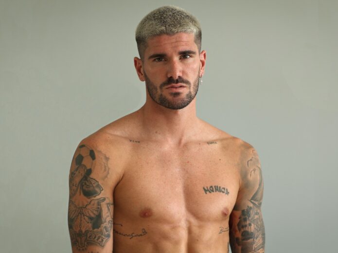
Rodrigo De Paul’s Monica lettering keeps family close

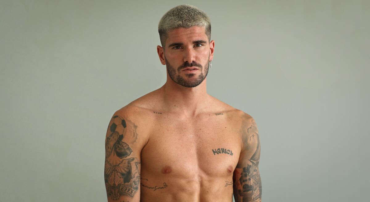
Rodrigo De Paul tattoos: clean shirtless portrait showing the butterfly on the chest, Monica lettering and tattoo coverage across both arms

In this front-facing photo, the word Monica is one of the easiest pieces to read. It sits among smaller marks on De Paul’s chest and arms, with a butterfly and darker linework nearby.

The lettering is fine and open, while the surrounding tattoos use heavier shading and outlines. The mix looks like it took shape over time, rather than being planned as one continuous design.

The Monica lettering stands out in a regular portrait. The surrounding work frames it, so the name feels part of a larger collection instead of a single isolated word.

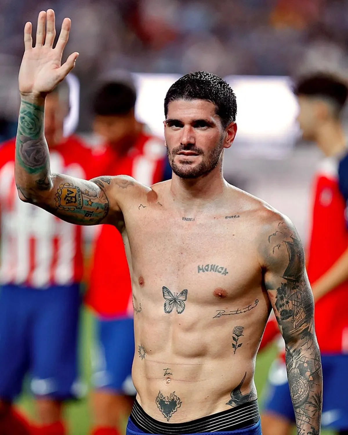
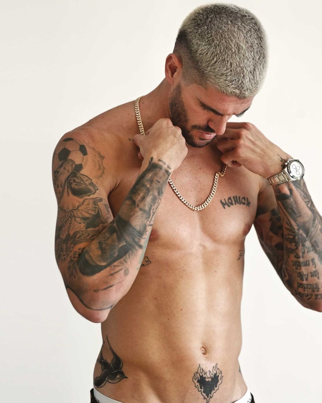
The butterfly on his chest is one of his clearest symbols

Rodrigo De Paul tattoos: separate sharp shirtless photograph showing the chest symbols, lettering and dense arm work from a different angle

The butterfly sits high on De Paul’s chest. Its wings give the front a softer shape beside the lettering, while the darker arm work makes the design easier to pick out.

The second photo catches the chest from another angle. As his shoulders turn, the light falls differently across the shading, and lines that disappear in a straight-on crop become clearer. The tattoos follow a surface that moves, so no one view captures them all equally well.

The butterfly gives the front some open space. His arms carry denser work; the lighter chest image keeps the torso from reading as one dark block.

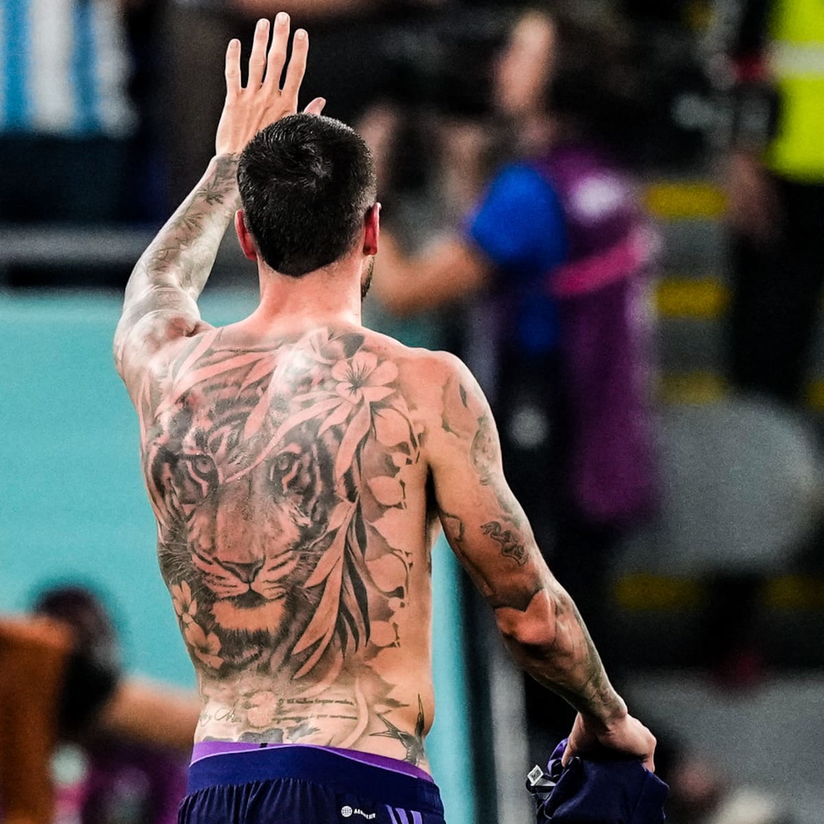
A tiger covers De Paul’s back

Rodrigo De Paul tattoos: clean rear-view photograph showing the large tiger and flower back tattoo across the shoulders and full back

A large tiger with flowers around it covers much of De Paul’s back. The rear-view photo shows the piece across the shoulders and down the middle of his back, where the animal gives the design a clear centre.

Most football photos show De Paul from the front, and a shirt hides this work during a match. The back view fills in what those pictures miss: the collection includes a large piece behind the chest and sleeves.

The tiger changes the scale of the collection. The names and smaller marks sit up close; the animal and its stripes can still be made out in a phone-sized photo.

His sleeves mix football, faith and family details

Rodrigo De Paul tattoos: clean studio portrait showing the sleeves, chest lettering, religious details and newer relationship tattoo in full resolution

De Paul’s sleeves combine lettering, shaded images and small religious details. The two arms don’t look like matching panels: some areas are packed with ink, while others leave skin showing between pieces.

A studio portrait makes the upper arms easier to see without a football shirt covering them. Names, compact symbols and darker shapes run from shoulder toward forearm, with each arm arranged a little differently.

Family and faith references sit alongside the football context. The photos don’t explain every mark, so the description can stay with the visible mix of script, shading and smaller symbols.

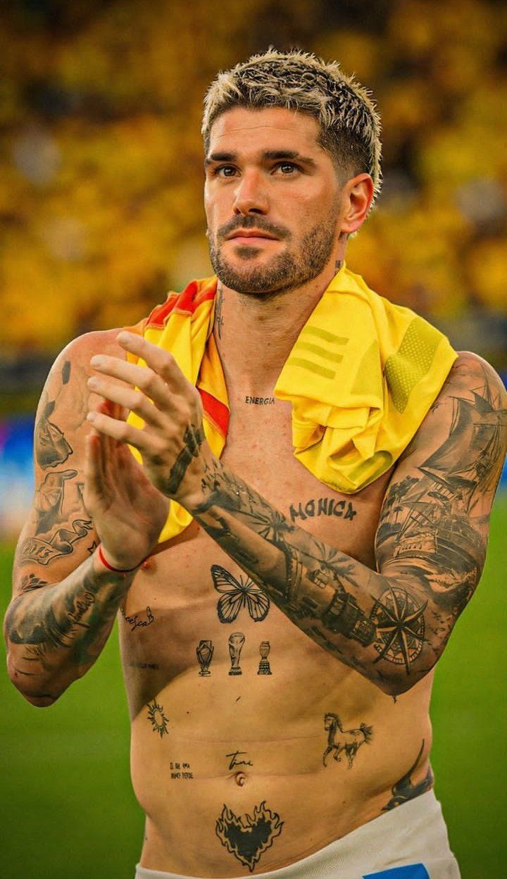
The Tini lettering became a very public tattoo story

Rodrigo De Paul tattoos: wide clean torso photograph making the Monica script, chest marks and layered arm designs easy to compare

The Tini lettering drew attention while De Paul’s relationship with Tini Stoessel was widely discussed. News coverage focused on the name and its timing. The torso photo also shows how the lettering fits among the tattoos already on his chest and arms.

It sits near the Monica script, the butterfly and other smaller marks rather than on a blank patch of skin. In that view, the newer letters become one part of a layered collection.

“Tini” is easy to read in the photograph. The image shows its placement and scale; it doesn’t confirm every claim made about the tattoo or the relationship.

Compass, trophies and small symbols fill the gaps

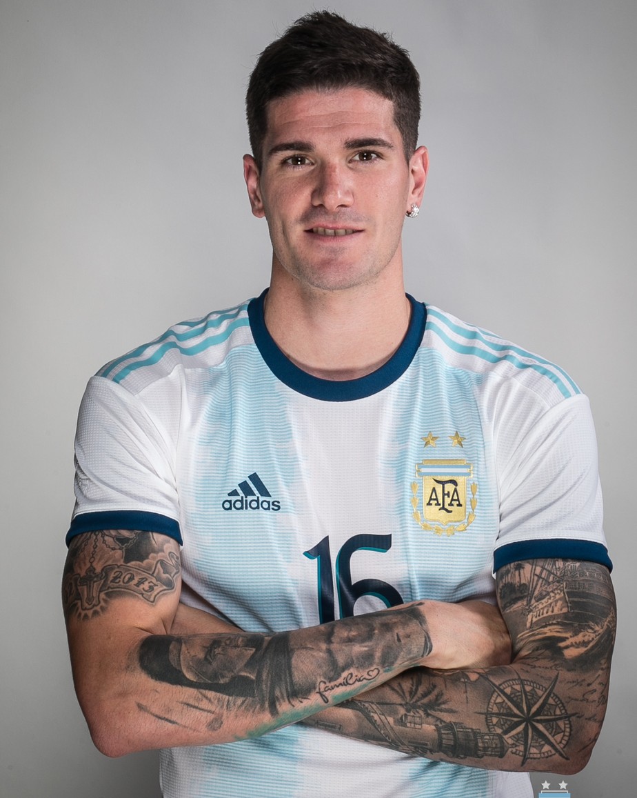
Rodrigo De Paul tattoos: clean face-visible Argentina portrait showing the compass-like chest work, forearm marks and footballer context

Smaller pieces sit between the larger tattoos: compass-like shapes on the chest, football references and marks around the forearms. They link the chest and sleeves without taking up the same space as the tiger or the heavier arm work.

The Argentina kit photo shows how the tattoos appear in the setting fans usually see. His shirt covers part of the chest, but the forearm ink remains visible. The face is also clear, making this a useful view alongside the shirtless portraits.

Compass, football and family motifs add detail around the larger designs. The photos show their placement, even when they don’t reveal a confirmed meaning for every small mark.

How the different pieces sit together

The tiger takes up the back; the butterfly and names are visible from the front; the sleeves carry the densest mix of smaller designs. When De Paul is dressed for a match, some forearm tattoos are still visible while the chest and back are covered.

The collection doesn’t follow one subject. Relationship lettering sits beside family references, religious details and football-related imagery. Placement brings the pieces together: each design follows the body, changing shape as the shoulders turn and the arms bend.

The photos show how the collection has grown. New lettering sits among older work, and the large back tattoo gives the overall outline a different scale from the names and symbols on the front.

Some visual details are clear—Monica, Tini, the butterfly, tiger, script and religious marks. The photos don’t explain every small symbol, and there’s no need to supply a story for the ones De Paul hasn’t discussed.

Clear photos matter here. The rear view shows the full back piece; the close chest shots make the lettering easier to read; the Argentina portrait shows what remains visible in a match shirt. Together they give a fuller view than one generic portrait could.

For more athlete tattoos, browse the site’s athlete tattoo section. This guide uses the featured portrait separately and describes the tattoo details visible in the images.

More athlete tattoo guides

Dani Alves Tattoos: Jesus, Sleeves, Olympic Rings and More

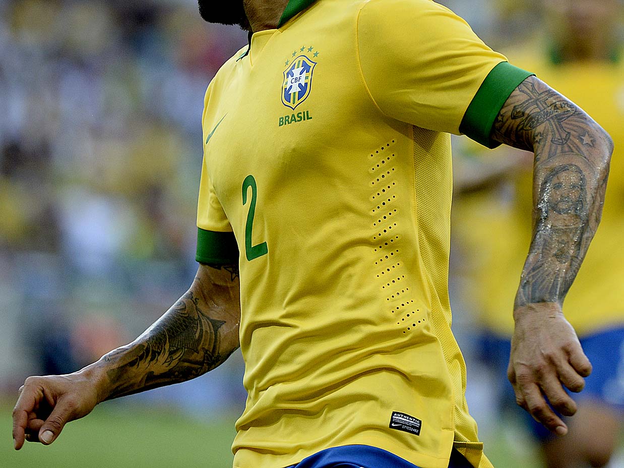
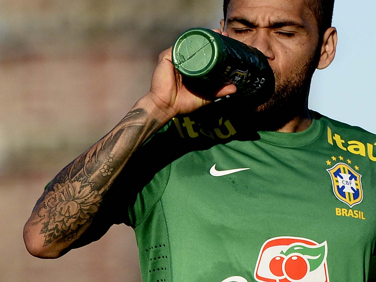
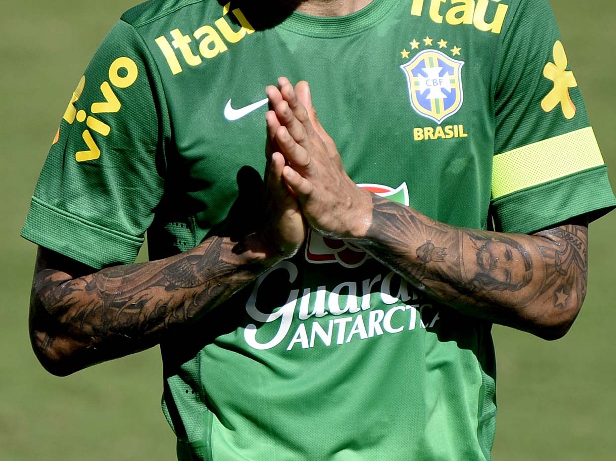
Dani Alves has tattoos across his arms, chest, neck, hands and torso. Photos show religious figures, names, dates, Olympic references, lettering and larger shaded designs. Most are easy to miss in a match shirt, so the close-up and shirtless pictures are useful for seeing how the pieces sit on his body.

The five tattoo photos below show different parts of the collection; the featured portrait is separate. I’ll describe details visible in the images and keep reported meanings distinct from what the pictures show.

Dani Alves’ Jesus and cross tattoos fill the left arm

Dani Alves tattoos: sharp close photograph of Dani Alves showing the religious arm tattoos, cross work and detailed sleeve linework

A close Terra photograph shows the religious work on Alves’ arm, including a Jesus figure and cross among the darker shading. The pieces sit close together, but the outlines keep the main image readable.

The Jesus tattoo gives the sleeve a centre. Smaller marks run around it, and the linework changes from bold areas to finer detail as it moves down the arm. Those smaller sections come through best when the photograph is close.

The Jesus figure and cross use most of the arm. The work runs across the upper arm, elbow and forearm, so its shape changes when Alves bends his elbow. This photo shows the actual sleeve in detail, rather than a general portrait.

His other arm mixes Japanese linework with smaller symbols

Dani Alves tattoos: separate close image showing the opposite arm, Japanese-inspired shapes and compact marks around the forearm

The other arm has a different feel. A second Terra photo shows curved lines and shaded shapes running from the shoulder toward the forearm, with a look the source describes as Japanese-inspired. It isn’t a mirror image of the religious sleeve.

Smaller marks sit near the wrist and forearm. Some open skin remains between the larger pieces, which helps the shapes keep their edges instead of merging into one dark patch.

The two arms use different visual languages. One centres on religious figures; the other relies more on pattern, line and flow. They belong to the same collection without needing to match.

The chest carries family dates, names and a bright heart

Dani Alves tattoos: clean high-resolution shirtless football photograph showing chest lettering, dates, the compass-like torso piece and both arms

A shirtless UOL match photo gives a clear view of Alves’ chest. Large lettering crosses the upper torso, with dates below and a compass-like geometric design at the centre. A crown and other small marks sit lower down; both arms carry denser work.

The pieces have different shapes. The dates run horizontally, the central design is rounder and the crown sits beneath them. Together they make the chest feel arranged, even if the tattoos were added at different times.

Names and dates give the chest its personal detail. The arm work frames the lettering without covering it. Tattoo coverage has also reported a bright heart, which would add a lighter touch to the darker designs.

A flower and fine linework break up the arm coverage

Dani Alves tattoos: separate sharp photograph showing the flower, lettering and layered forearm work while Alves drinks from a bottle

In this close photo, Alves is drinking from a bottle and the floral work on his forearm is easy to see. Large petals and leaves sit among lettering and smaller shapes. The arm fills the frame, so the fine details don’t disappear into the background.

The flower softens the denser shading elsewhere in the collection. It also follows the bend of the arm: when Alves turns his wrist, the petals shift around the curve rather than sitting flat in a crop.

The flower, lettering and fine lines are all visible here. Alves has filled much of the arm, but the separate outlines keep it from becoming one solid shape.

The full sleeves stay visible in football photographs

Dani Alves tattoos: clean high-resolution football photograph showing the dense sleeve, hand tattoo and face in a real trophy celebration

A high-resolution trophy-celebration photo shows both sleeves with Alves dressed. Dark shapes and lettering reach close to the shirt sleeves, and the hand tattoo is visible. The face is clear, but the arms remain the main detail for this guide.

The tattoos show around a short sleeve and still read against the blue shirt. That gives a different view from the shirtless pictures: it shows what remains visible in the football setting where many fans see him.

The photos support the visible details: dense arm coverage, religious imagery and family lettering. Smaller symbols can be located in the images, but their private meanings shouldn’t be guessed at when Alves hasn’t explained them.

How the different pieces work as one collection

The arms make the strongest visual link. One carries religious imagery; the other has different linework and symbols. The chest sits between them, with names, dates and a geometric design across the front.

The collection brings together family, faith, Brazil, football and Olympic references. The designs sit in different areas, so smaller marks can be added without rebuilding an entire sleeve.

Placement matters throughout. A large religious figure needs room around its face and hands. Script needs a surface where it stays readable as the arm moves. On Alves’ chest, the broad space lets names and dates run across the torso.

The photos each answer a different question. The Terra close-ups show the arm details; the shirtless match photo reveals the chest layout; the trophy-celebration picture shows how the sleeves look in a shirt. Together they offer a fuller view than repeated portraits would.

Some details are harder to see every time, including the Olympic rings, hand lettering and small marks on his neck. A change in angle can hide them. That’s why close photos matter when the design is small.

Alves’ collection combines religious imagery, lettering, symbols, geometric shapes and football memories. There isn’t one style across the body. The common thread is how much space the tattoos use, with each piece still distinguishable when the image is clear.

The chest photo shows the overall scale: wide lettering above, dates below, a central round design and a crown lower down. The arms carry heavier shading, leaving the centre readable. It’s easier to see that arrangement in a front-facing shirtless shot than in a tight crop of one forearm.

His hands and fingers add another layer. The marks are easy to miss in a match photo, when he is moving or celebrating, but closer views separate them from the shading near his wrists. They link the sleeve work to the smaller lettering and symbols around it.

Faith-related images share space with family dates, Olympic references and geometric pieces. That variety keeps the collection from reading as one theme repeated across the body. The shirtless view also shows the contrast between the darker arms and the more open chest.

For more athlete tattoos, browse the site’s athlete tattoo section. The guide keeps the featured portrait separate and describes details visible in the tattoo photos.

More athlete tattoo guides