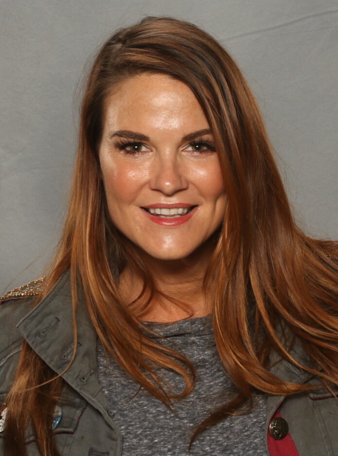
Amy Dumas is better known to wrestling fans as Lita, but her tattoos have always been part of the look rather than a small extra detail. Her arm work is bright, busy and easy to recognise, with skull imagery, rounded shapes, darker outlines and splashes of colour that travel from the shoulder toward the forearm. The collection feels built over time, which is why different photos bring out different parts of it.
There is also a useful difference between what can be seen and what has actually been explained. Some designs are widely identified in tattoo references, while the personal story behind every small mark is not public. Amy Dumas tattoos are best read visually: start with the large shoulder piece, follow the sleeve down the arm, then look for the smaller details that keep the whole thing from feeling like one flat block of ink.
Her own interviews add a little context too. Dumas has spoken about getting her first tattoo and about the gap between Amy and the Lita character. That makes the collection interesting without needing to invent a meaning for every line. The photographs below focus on the designs that are actually clear enough to study.
Amy Dumas’s colourful arm tattoos are the best place to start
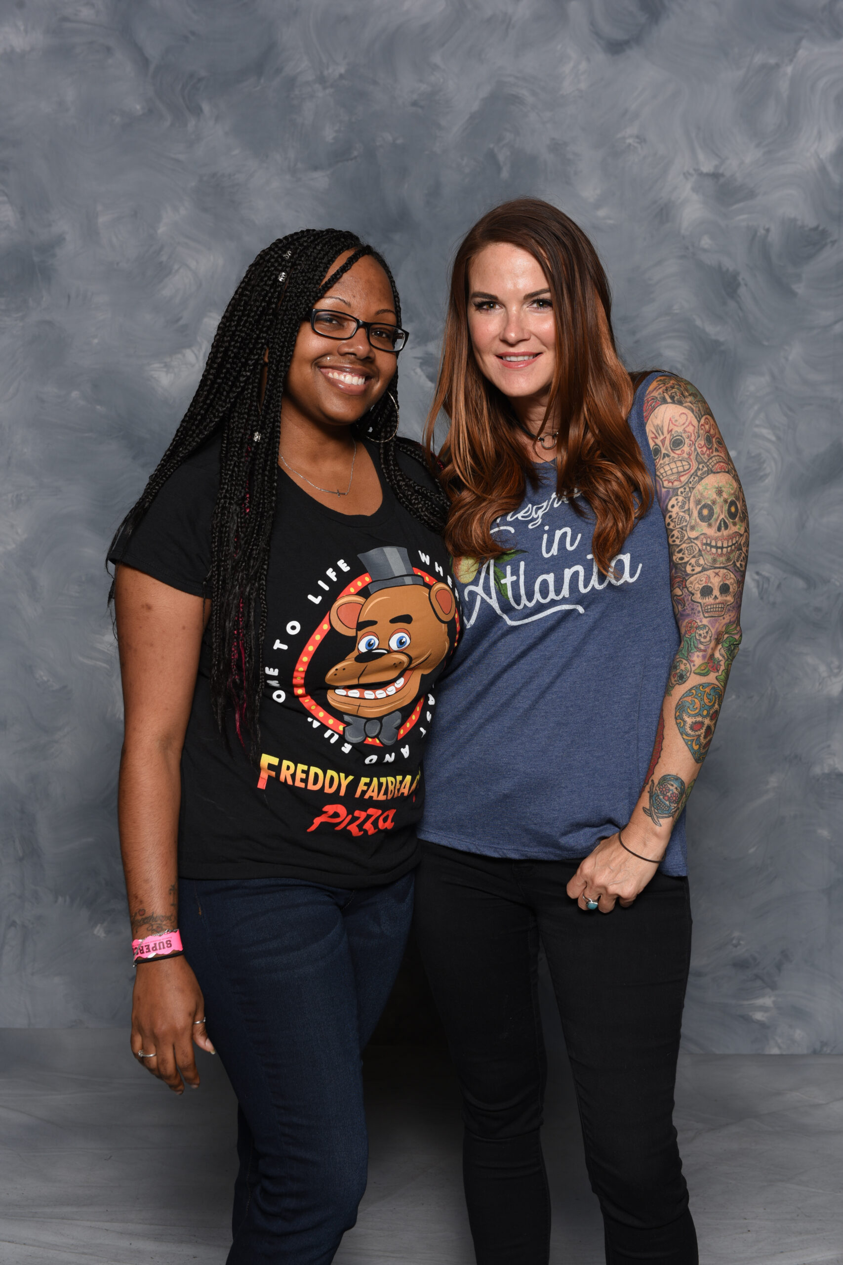
The first thing you notice is colour. Dumas’s arm is not built around plain black fill alone. The larger shapes use green, red, yellow and warm flesh tones, while darker outlines keep the busy artwork readable from a distance. That colour gives her tattoos a lively, almost illustrated feel, which fits the energy of her wrestling persona without making the designs look like costume graphics.
The arm also shows why a good photo matters. A quick stage shot can make the sleeve look like one dark shape, but a close, well-lit frame separates the outlines and lets you see the smaller pieces around the main artwork. Her shoulder and upper arm carry most of the visual weight, while the forearm gives the colour room to stretch and change.
If you like tattoo ideas that feel personal instead of perfectly matched, this is a strong example. The designs do not need identical borders or one strict theme. They work because the palette and line weight create a loose connection across the whole arm.
The left arm sleeve is packed with colour and rounded shapes

A side view brings out the way the sleeve wraps around the arm. The shoulder sits high and rounded, then the artwork drops into the upper arm instead of stopping at a clean horizontal edge. You can see separate shapes touching and overlapping, which makes the collection feel more like a real sleeve built over years than a single piece planned in one sitting.
The rounded forms are important to the overall look. Skulls, curved faces and shaded shapes soften the transition between larger designs. There are hard edges in the outlines, but the colour keeps the mood from becoming too severe. That balance is one reason Lita’s tattoo style still stands out in old wrestling photos.
Placement-wise, the upper arm gives the boldest statement while still being easy to cover with a shirt. The design becomes visible as soon as the sleeve lifts, which is a practical choice for anyone who wants a large tattoo without putting it on the hands or face.
The skull sleeve gives Amy Dumas’s ink its signature edge

Skulls are the part of the collection most people remember, but they are not all presented in the same way. Some are larger and easier to read, while others sit inside the wider colour field. The repeated skull shapes give the sleeve a clear identity, yet the different expressions and levels of shading stop it from looking like a row of copied flash designs.
The close view also shows how the artwork uses negative space. Small gaps between lines let the skin breathe, and the darker borders help each skull hold its shape when the arm bends. That matters on a working arm because a tattoo is constantly moving. A design that looks clear when the arm is straight still needs enough structure to survive changing angles.
There is a punk feel to the imagery, but it is not just shock value. The colour, cartoon-like faces and layered placement make the sleeve playful as well as dark. That mix is a big part of why Lita’s arm tattoos remain so recognisable.
The three-eyed shoulder tattoo is the visual anchor

The shoulder piece acts like the opening scene for the rest of the sleeve. It is larger, more central and easier to spot than the small forearm details. The eye-like feature gives the design a strong focal point, while the surrounding shapes pull it down toward the upper arm. From the side, the tattoo follows the curve of the shoulder instead of sitting like a flat sticker.
That placement is doing a lot of work. A shoulder design can be shown when the wearer is in a vest, but it can disappear under a regular T-shirt. It also gives the tattoo a natural frame: the round muscle creates an edge at the top, and the rest of the sleeve can grow below it.
Descriptions of Dumas’s tattoos often call this a three-eyed demon or gargoyle-style piece. The exact label matters less than the visual effect. It is a high-contrast character design that makes the whole arm feel intentional, even though other pieces are smaller and more varied.
Her forearm tattoos keep the colour moving down the arm

The forearm is where the collection becomes more detailed. It carries smaller shapes, colour changes and pieces that are easier to miss when the camera stays on the shoulder. The strawberry and climbing-plant design is one of the named details connected with her forearm, and the close photos show why this area deserves its own look.
Forearm tattoos are naturally more exposed than upper-arm work. They appear when the sleeves are short, during a wrist lock or even when the arm rests on a table. Dumas’s designs use that visibility well. The artwork is colourful enough to catch attention, but the lines still give it structure when seen from a few steps away.
This is also the section to study if you are planning a sleeve gradually. A forearm does not need to copy the shoulder. It can carry smaller motifs, use a different balance of colour and still connect through outlines and repeated shapes. That approach leaves room to add later without forcing every tattoo into the same size.
The full arm layout shows how the separate tattoos work together

Step back from the details and the collection makes more sense as one long route from the shoulder to the wrist. The upper arm has the biggest visual anchor, the middle section carries the skull-heavy density, and the forearm adds smaller colour notes. None of those areas needs to be identical for the arm to look complete.
That is the main lesson in Amy Dumas’s tattoo layout. It has a clear personality, but it does not look over-designed. The artwork has room for old pieces, new additions and changes in scale. The result is busy in a good way: there is always another line or colour patch to notice, but the main shapes do not disappear.
Photos from different years also remind you that tattoos are snapshots. Ink can soften, colours can age and clothing can hide a whole section. The safest descriptions stick to what the image shows. In Dumas’s case, that is more than enough: a memorable shoulder design, a colourful skull sleeve, detailed forearm work and a collection that became part of Lita’s identity.
At the bottom of the article, the interview clip gives a little more of Dumas’s own voice. It is a useful companion to the images because tattoo photos show the artwork, while her words explain the person behind the character.
The collection also works because it has different levels of distance. From across a room, the shoulder and skull shapes create the first impression. Up close, the smaller colour patches, fine outlines and separate forearm motifs make the arm feel much more personal. That is a useful way to look at any sleeve: notice the silhouette first, then study the details that give it character.
The photos show why a tattoo guide should use more than one angle. A front-facing portrait can hide the outer shoulder, while a side view may show the full wrap but lose the hand or wrist. Dumas’s set gives both kinds of information. One frame explains the main composition, another shows the three-eyed focal point, and the closer arm views make the smaller designs easier to separate.
The shoulder is the anchor, the skulls are the repeated rhythm, and the forearm colour keeps the design moving. That simple structure stops the sleeve from becoming visual noise. It also leaves a little breathing room between the largest pieces, so each tattoo can keep its own personality.
There is a practical lesson here too. If you want a bold upper-arm tattoo but still need flexibility, the shoulder and sleeve route gives you options. You can show it in a vest, cover most of it with a short sleeve, or build it gradually as your taste changes. Dumas’s arm does not look like a catalogue of identical designs, and that is exactly what makes it useful inspiration.