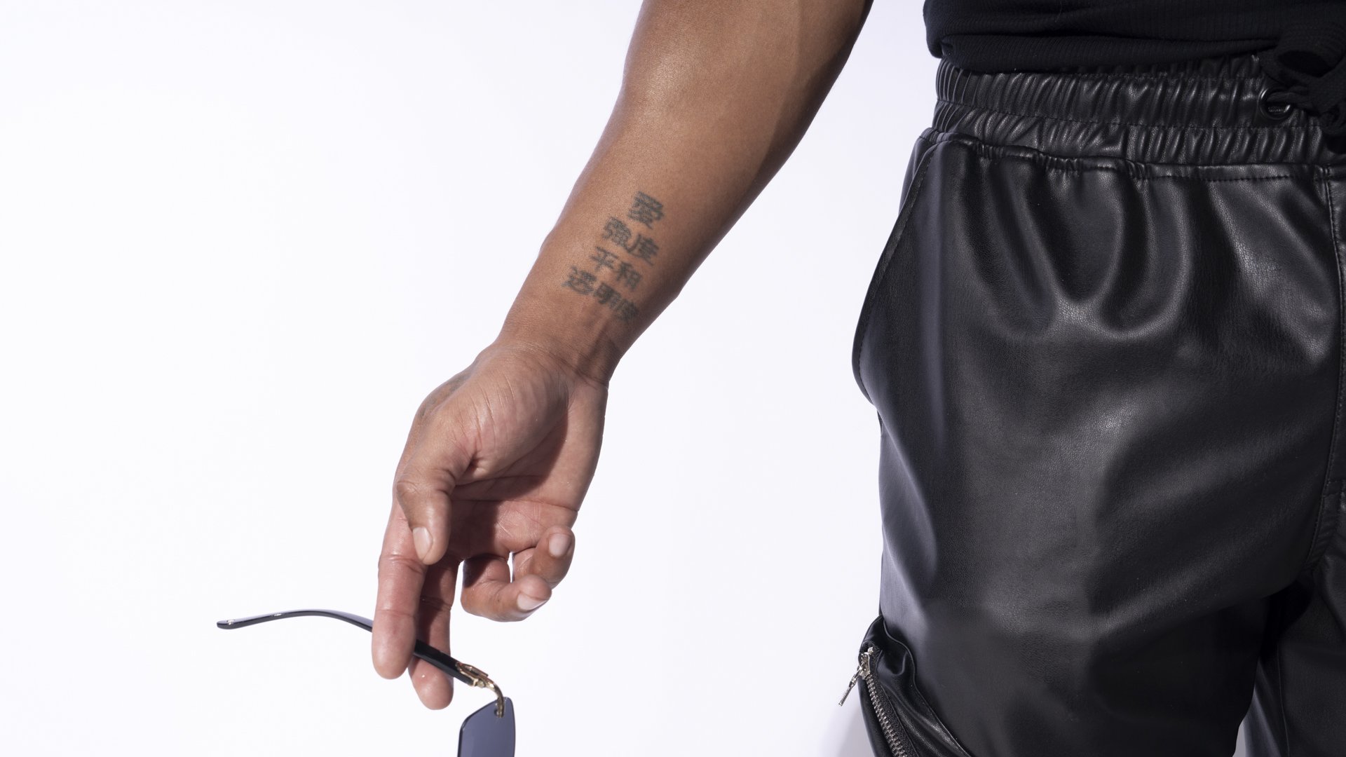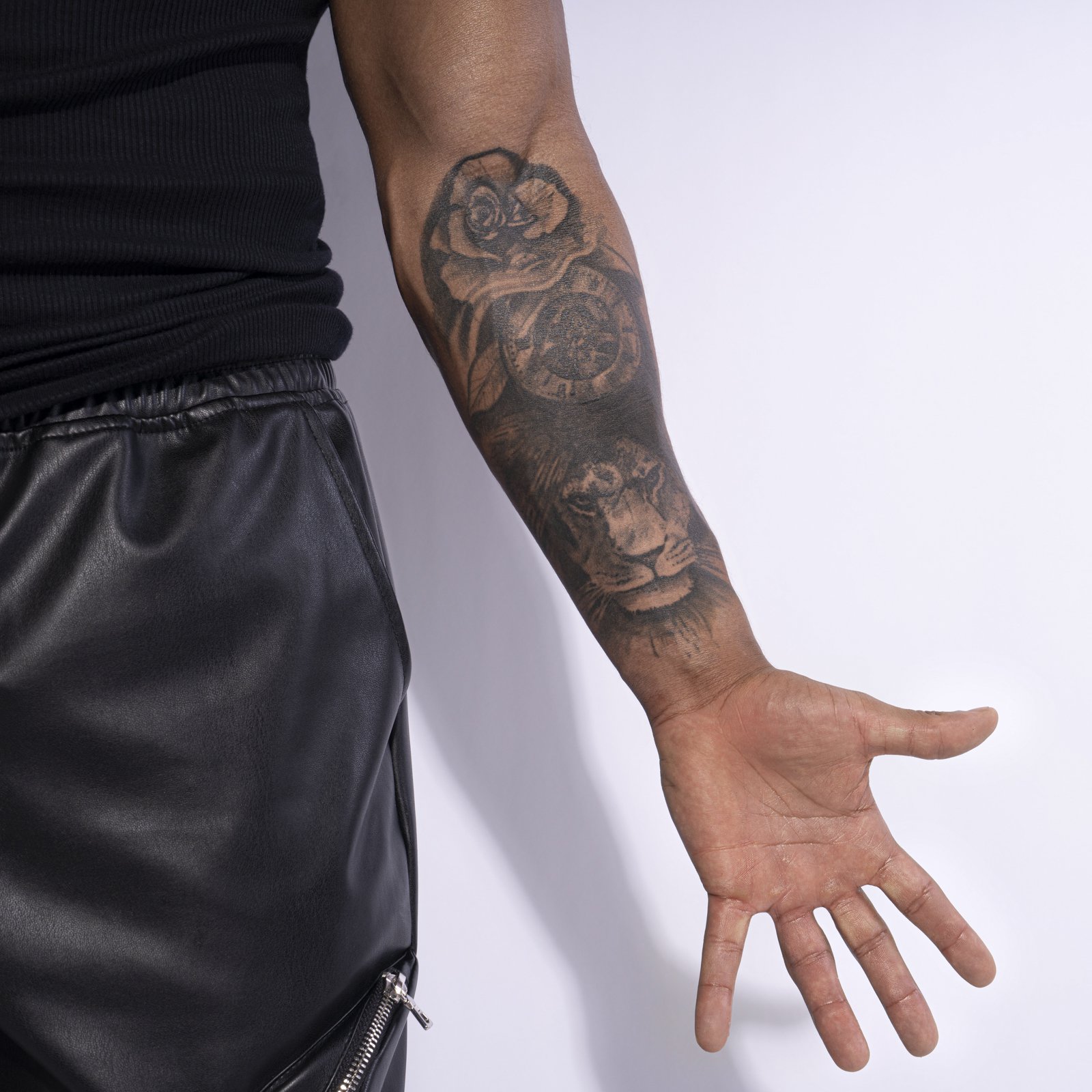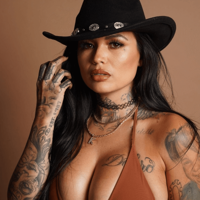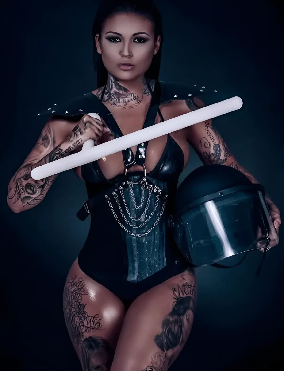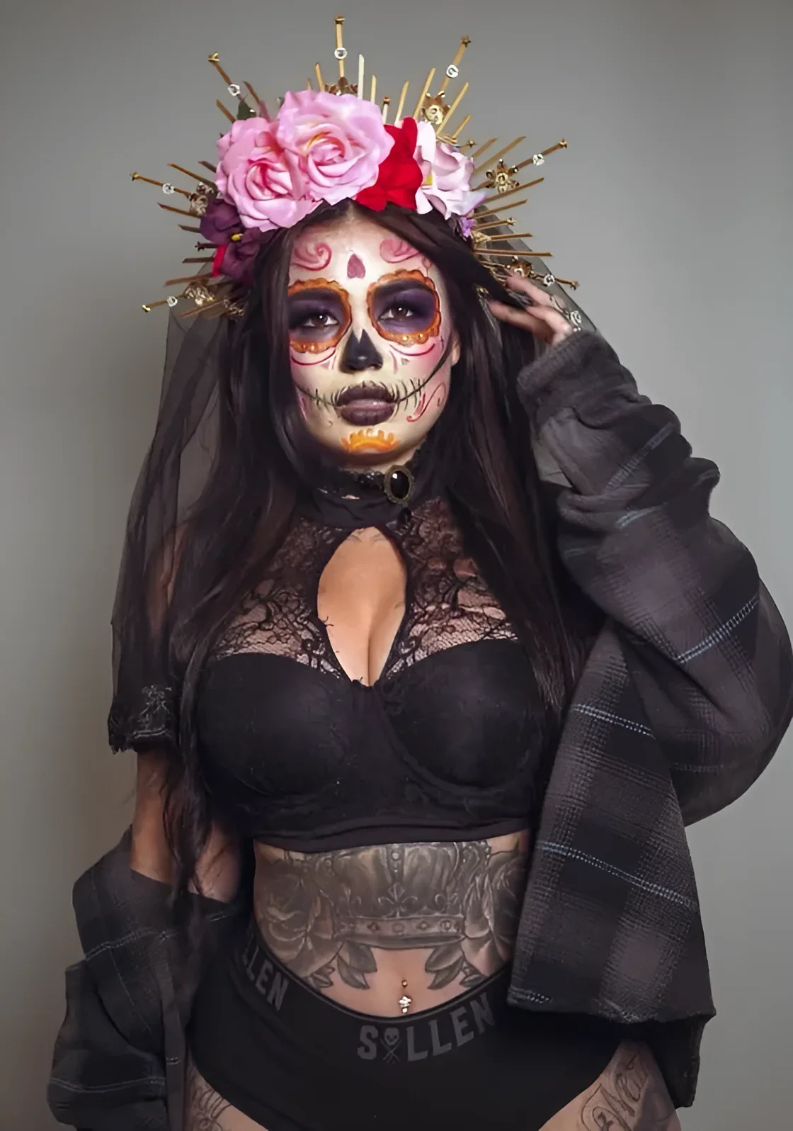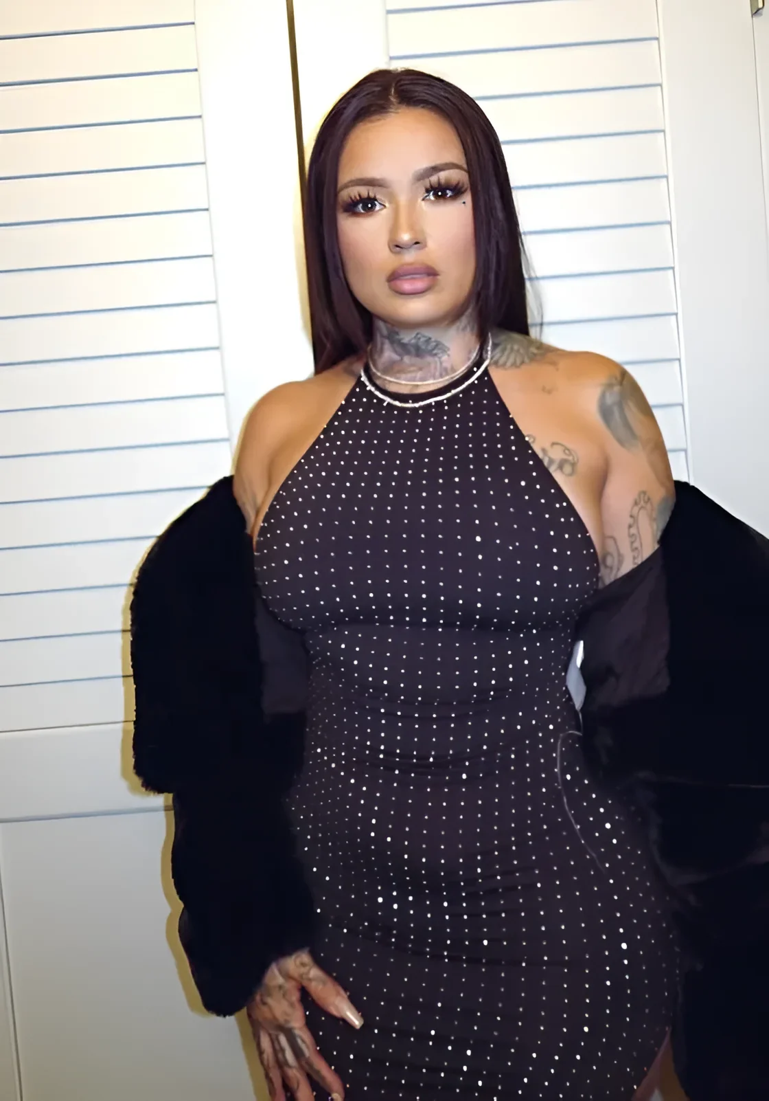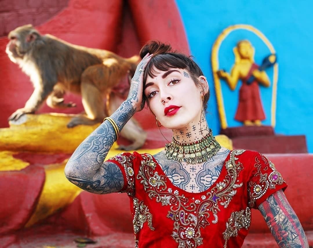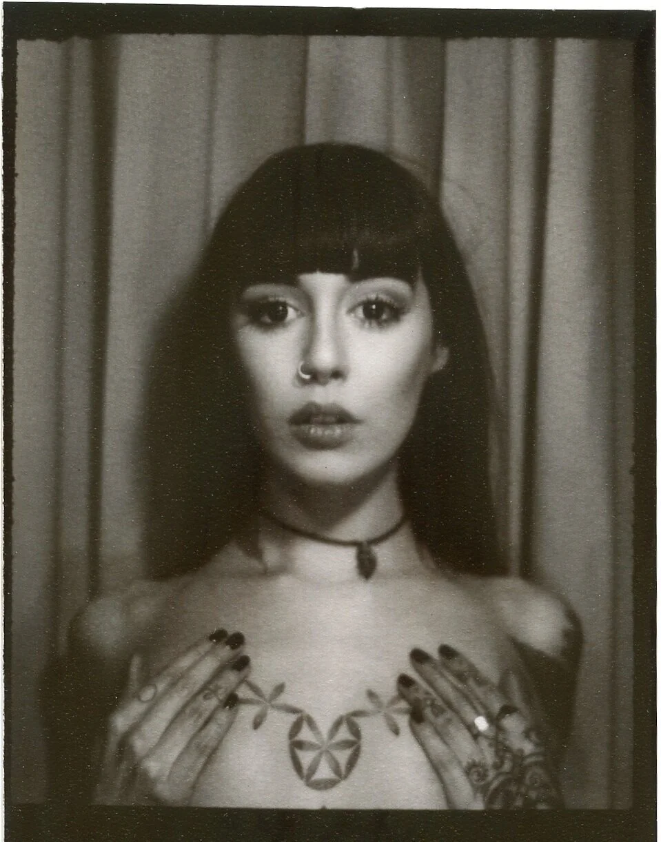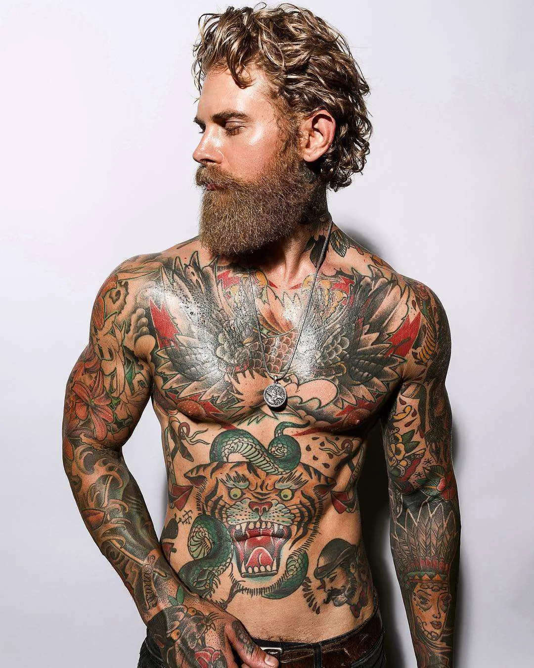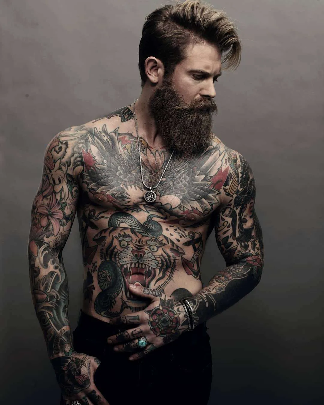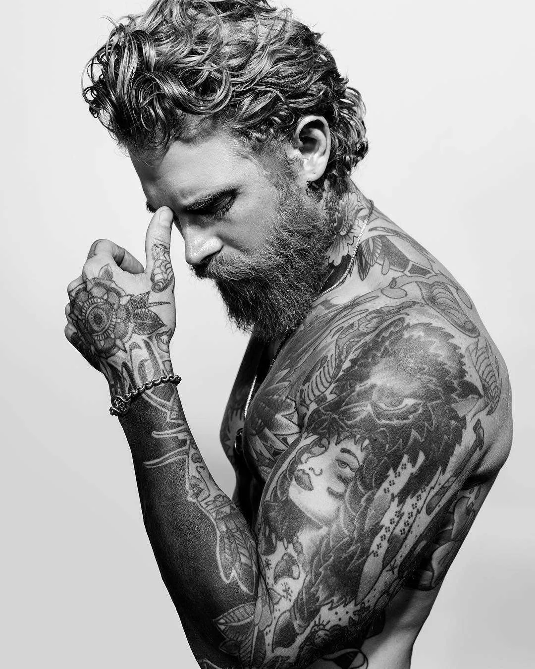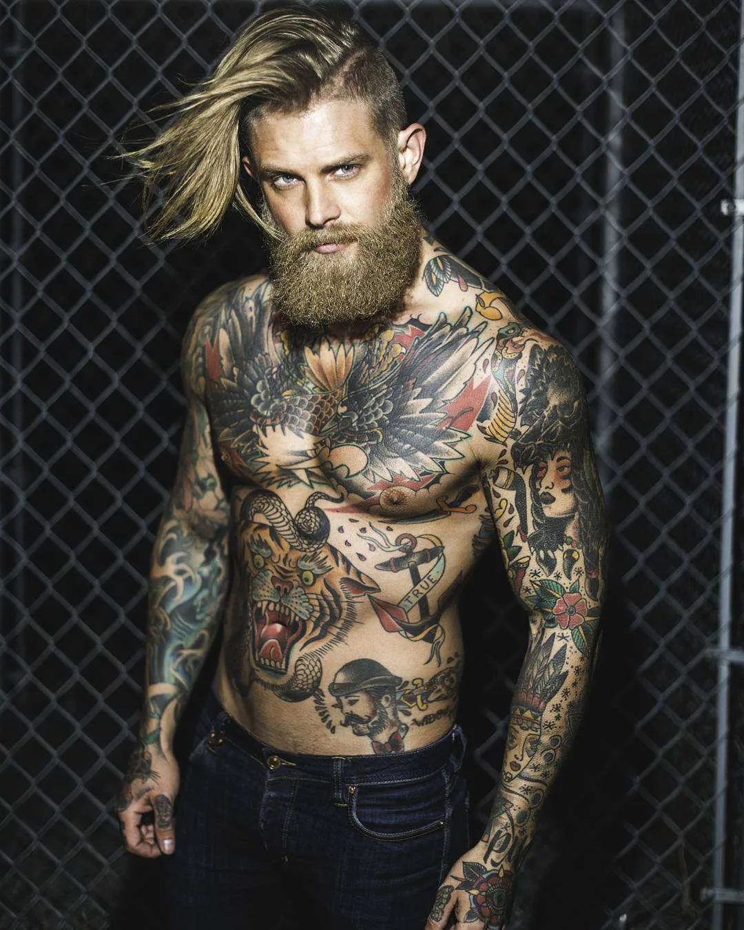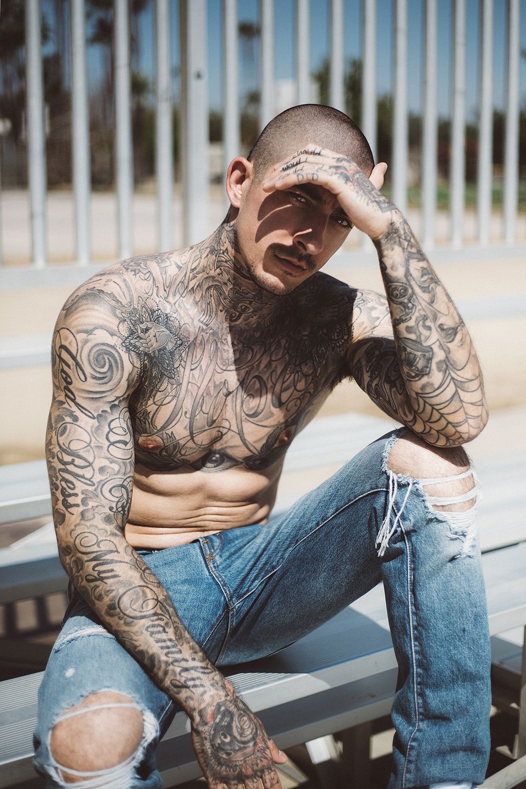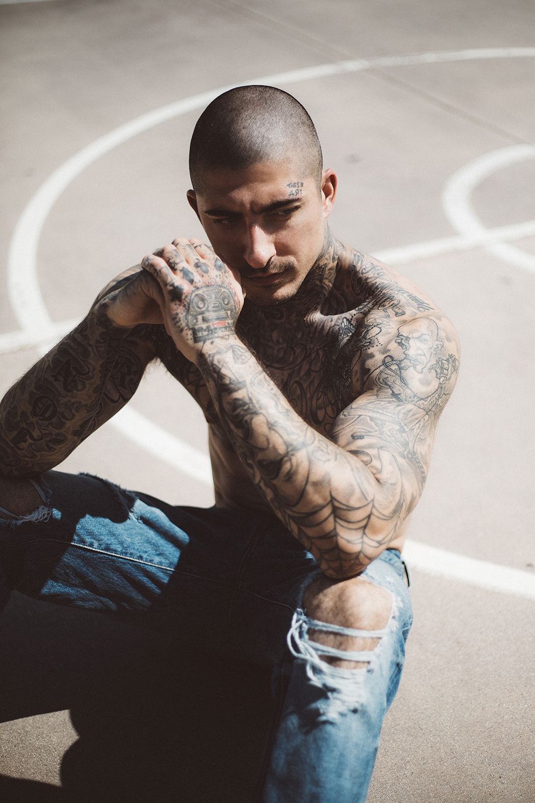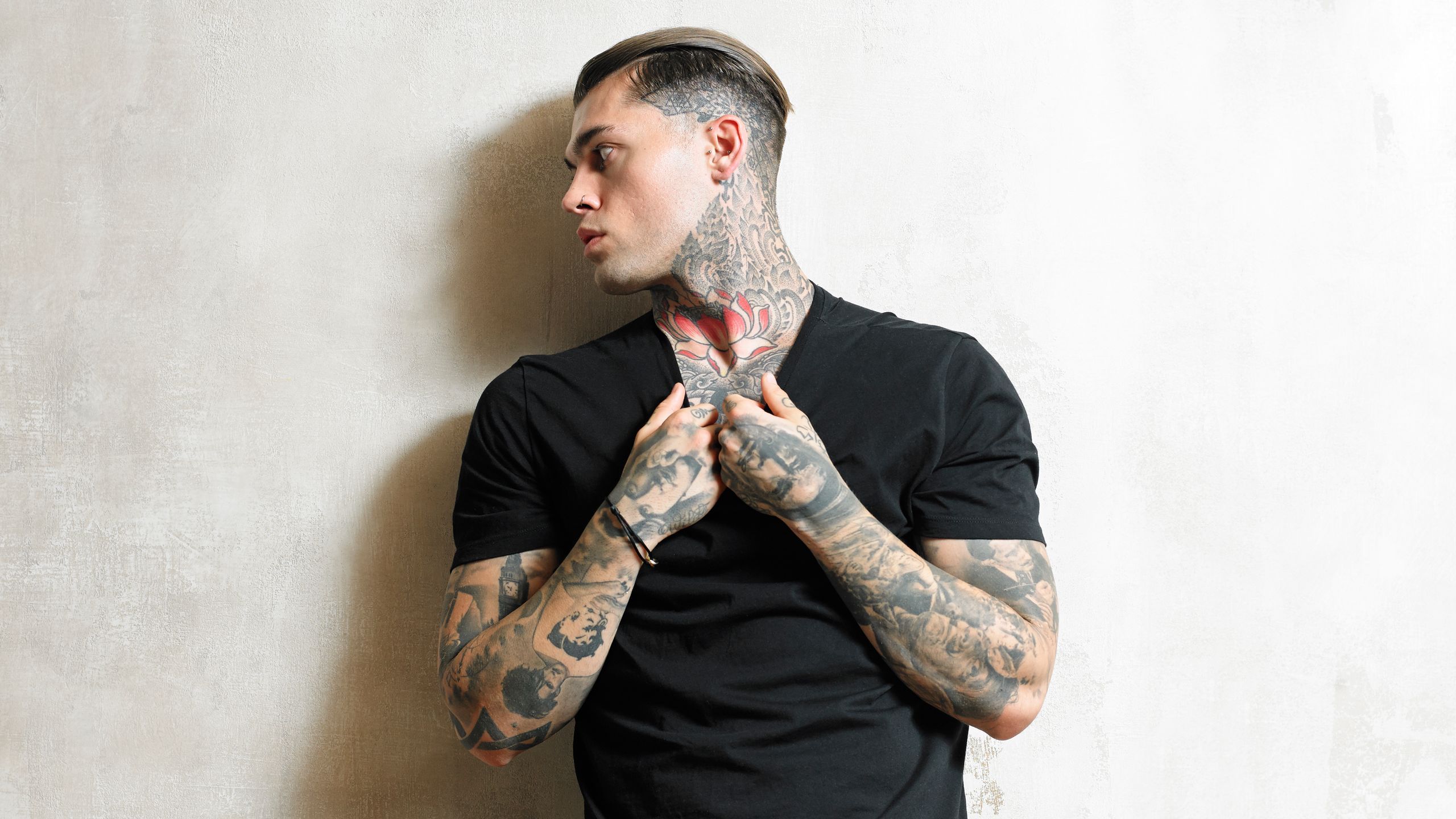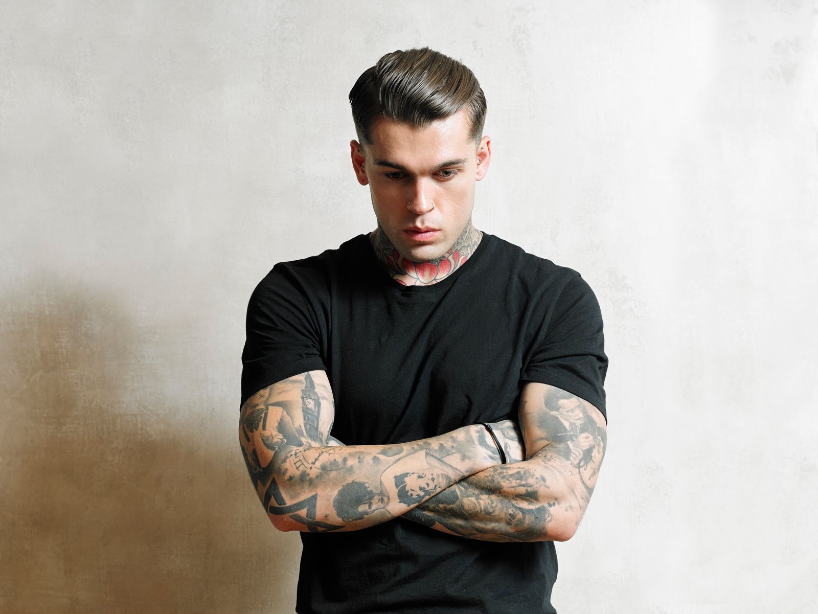
Sierra Ferrell’s tattoos sit across her hands, arms and face, with loose black lines that suit her old-time country look. Her ink appears in glimpses beside a hat brim, under a sleeve or between rings and bracelets. Flowers, leaves and short lettering give the collection a hand-drawn feel.
The pieces don’t follow one matching flash style. Some are small enough to miss in a stage photo; others are easy to spot when she reaches for her instrument or turns toward the camera. Together they look collected over time, rather than planned as one full-body design.
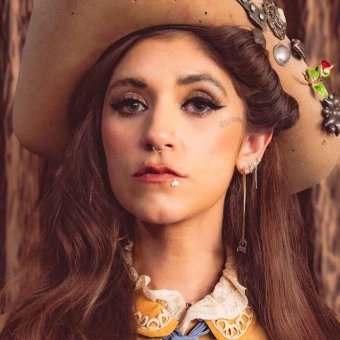
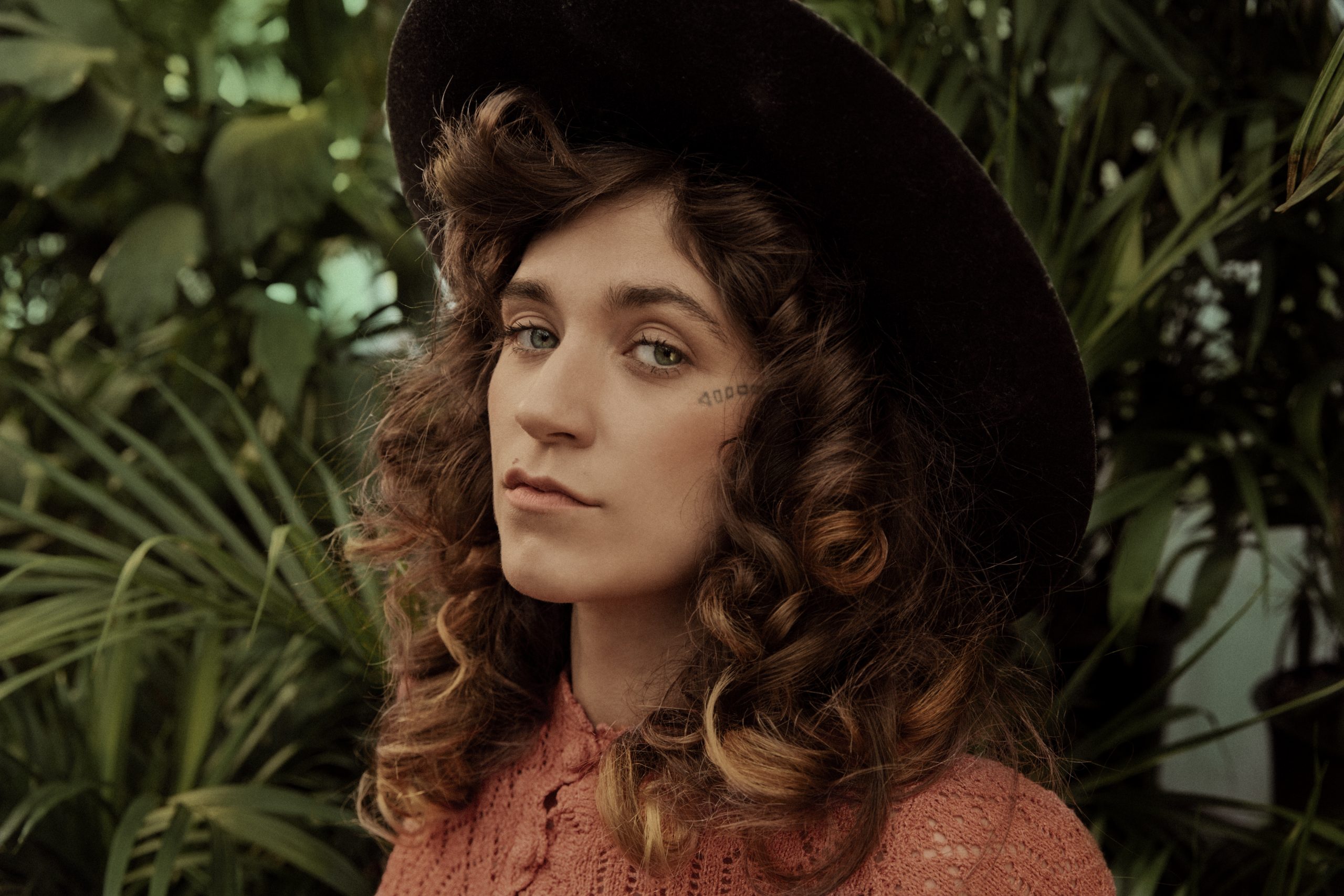
Sierra Ferrell’s face tattoo is small, clear and instantly recognisable
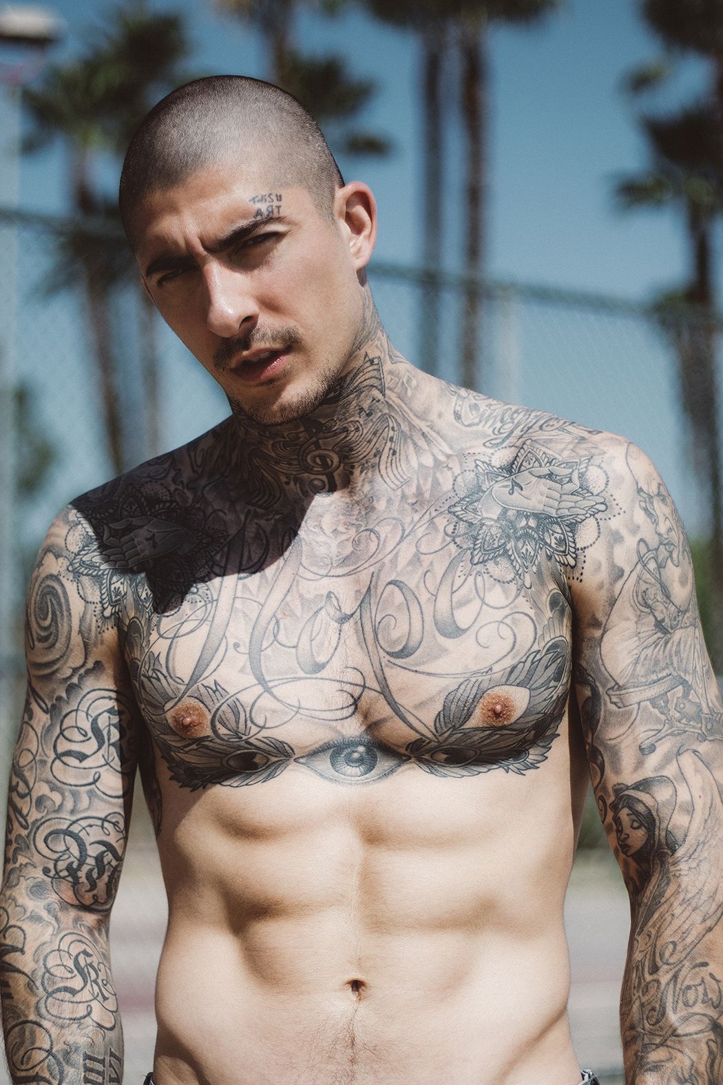
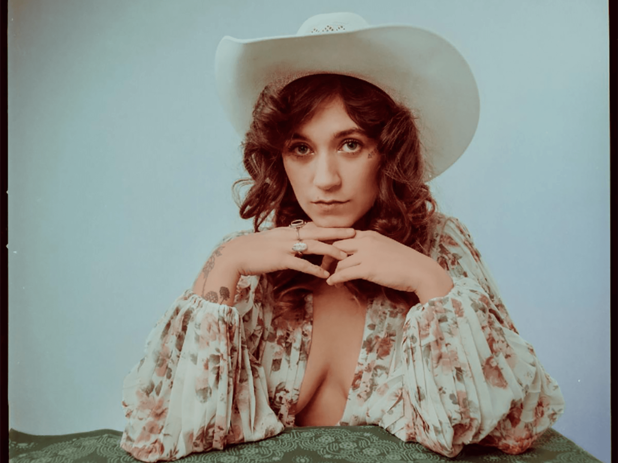
A short line of block lettering sits beside Ferrell’s eye, close to the cheekbone. Its dark, simple shape stays legible in portraits, even when her curls or a wide hat frame her face.
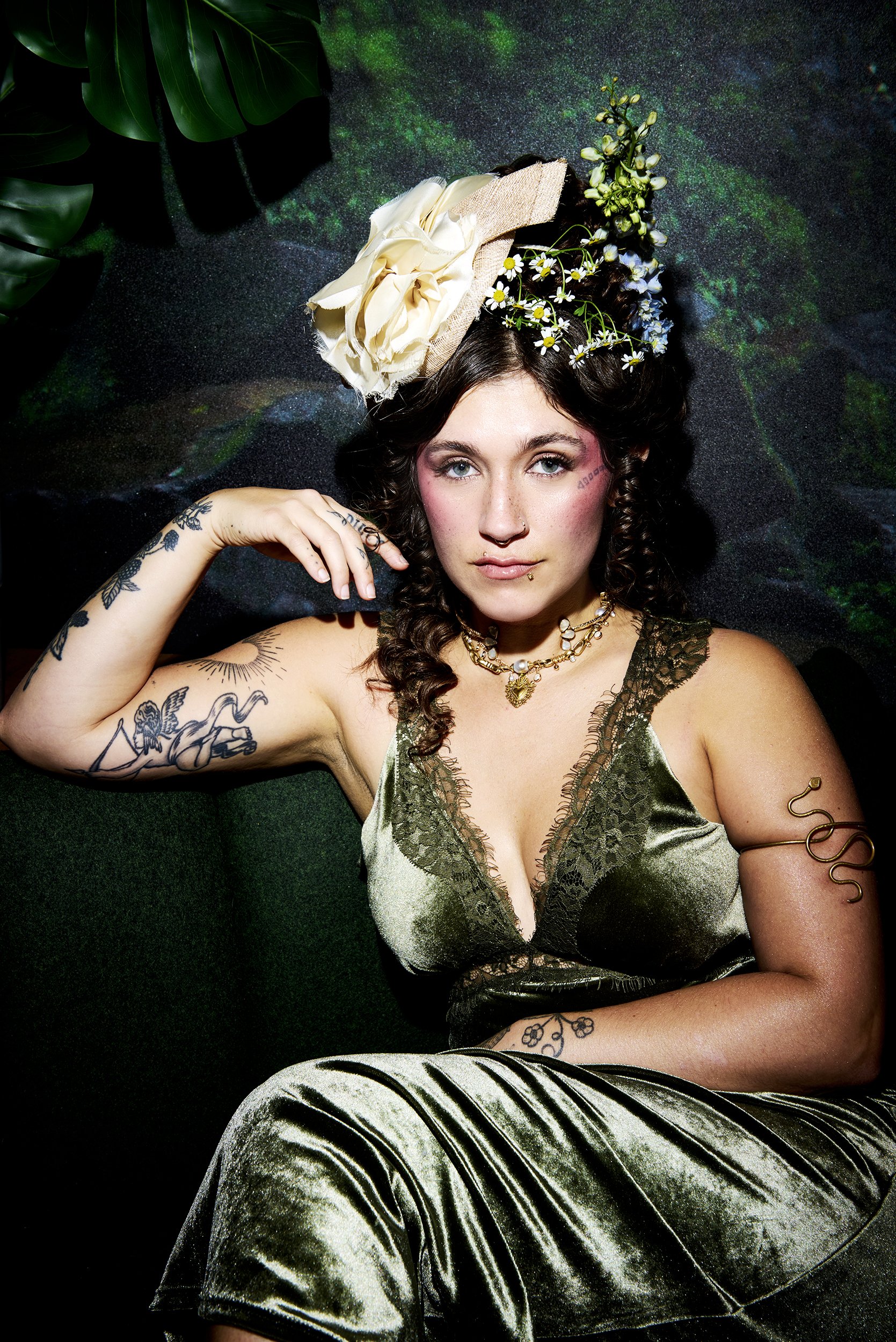
This photo turns to the botanical work on her arm. The finer lines have more room there than the lettering beside her eye. Face tattoos are harder to keep private, so placement and scale deserve thought before settling on a design.
Her floral hand tattoos bring a soft detail to a working musician’s look
In a close concert shot, Ferrell grips her instrument with flowers and a strawberry-like shape visible across her hand. Rings and bracelets frame the ink, but the rounded outlines still read under the stage lights.
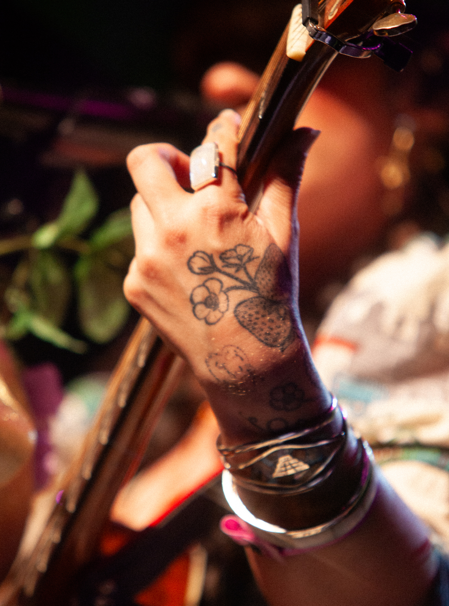
The small drawings have a folk-art feel: simple petals and rounded forms, with space between them. Hand tattoos take more wear from sun, washing and friction than ink in protected spots, so keeping the main shapes clear can help them stay readable.
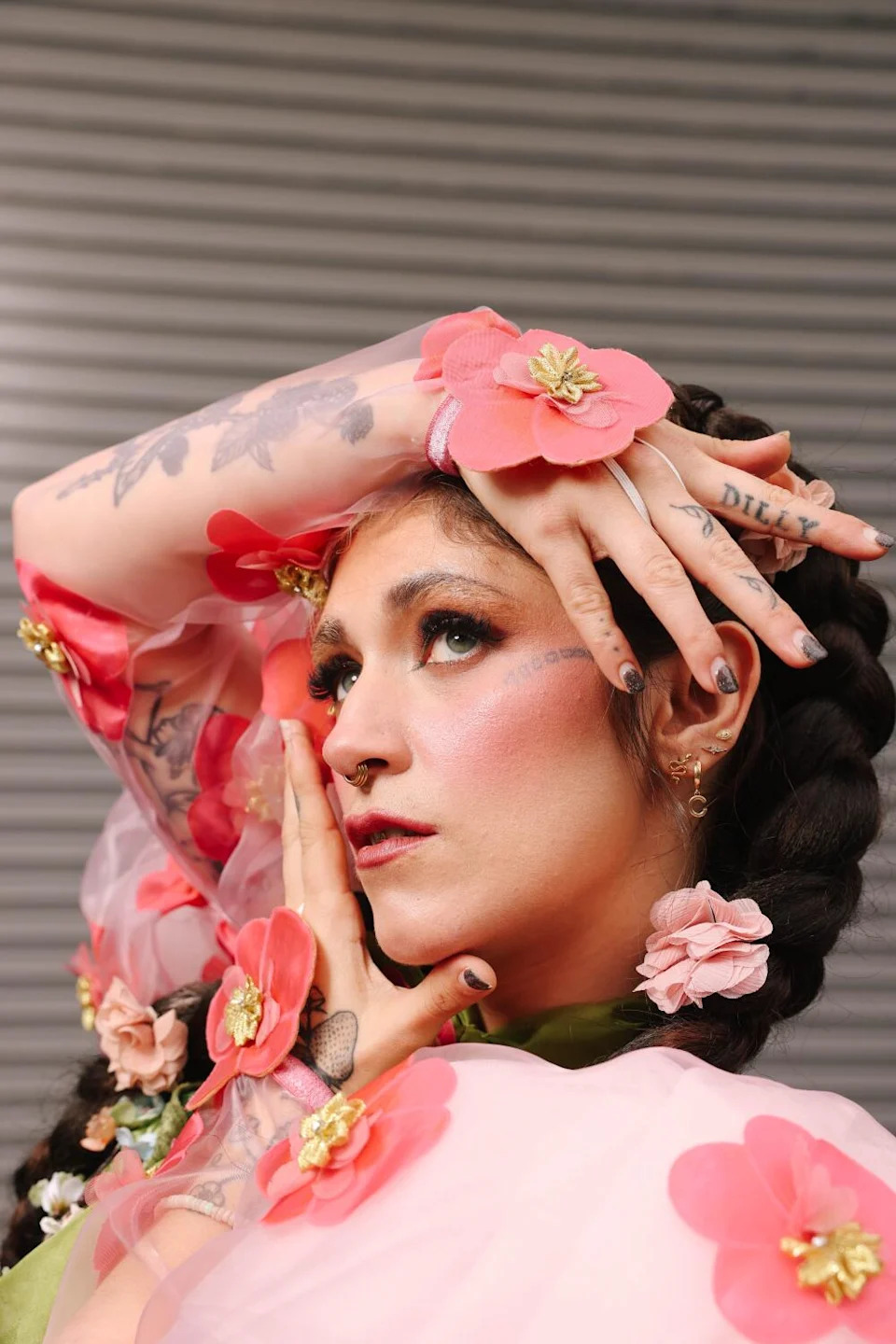
Loose arm linework gives her tattoos an old-timey botanical mood
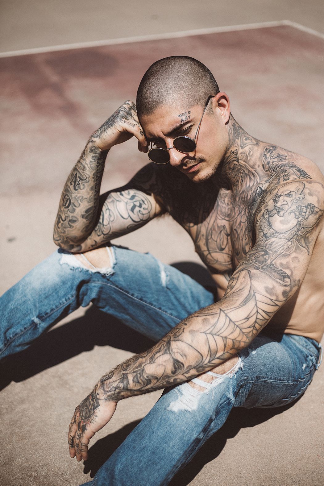
A portrait with a flower crown shows leaves and blooms scattered across Ferrell’s arms. They don’t form a solid sleeve; open skin separates the pieces and keeps the arrangement light.
The botanical lines sit naturally with her vintage clothes, but don’t depend on them. The gaps matter as much as the flowers. If you’re planning several small designs, leaving room between them can keep each one distinct instead of filling every space with background.
Her hand lettering adds a little attitude without taking over the design
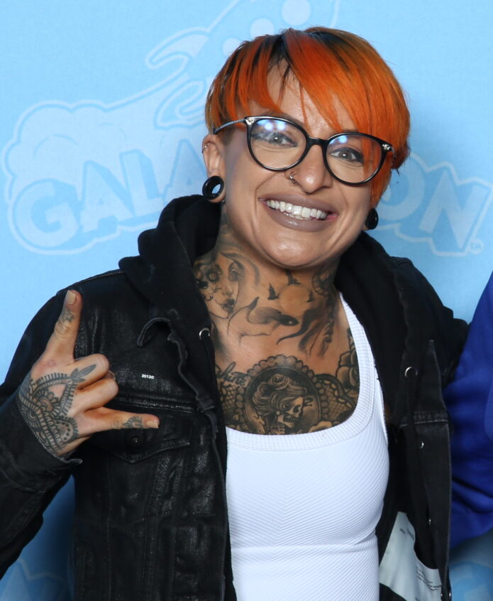
Another close view shows compact lettering across Ferrell’s fingers as she holds her hand near her face. The letters have an informal, slightly rough look rather than the feel of a polished logo.
The words sit beside the floral pieces, so the hand mixes lettering with softer shapes. Finger ink can blur or fade faster than designs in less exposed areas; short text and clear spacing give small letters a better chance of staying legible.
The face, hand and arm pieces work because they share a loose line quality
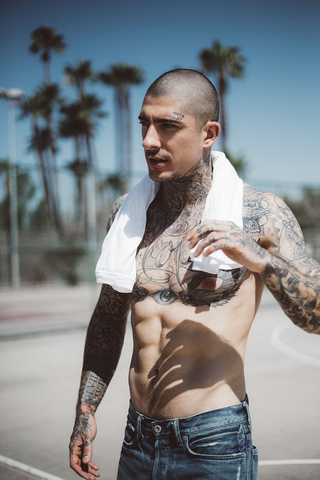
A wider portrait brings several areas together: the face lettering, smaller hand designs and open artwork on her arms. The pieces don’t match exactly, but their simple outlines give them a common feel.
Stage clothes, jewelry and lighting change from photo to photo. The tattoos remain a mix of larger figures, small marks and open linework rather than one continuous sleeve. That variety is part of how the collection reads as personal.
A relaxed way to build a personal collection
Ferrell’s ink leaves room for different subjects to sit together. The link between them is loose linework, not a single theme. If you like that approach, start with a design that matters to you and choose an artist whose work suits its scale and placement.
Take time between pieces and consider how the lines may age and heal. The collection feels unforced because each tattoo has space around it, and no one design has to explain all the others.