
Hannah Snowdon tattoos are a great reference point if you like blackwork that feels personal without looking crowded. Her collection moves between bold sleeves, small hand marks, dark chest work and a larger back piece. The common thread is clear contrast, strong placement and a willingness to let one idea take up the space it needs.
Snowdon is known as a tattoo artist, so her own ink is especially useful to study. You can see how she balances heavy black areas with open skin, how a small mark can sit beside a much larger design, and how a tattoo can follow the shape of the body instead of fighting it. The result feels lived-in rather than staged.
If you are collecting ideas, start with placement and visible design instead of copying one exact picture. Think about whether the arm, chest, neck, hand or back gives a piece enough room. Her tattoos show why the same symbol can look quiet on a finger and much stronger when it becomes part of a sleeve.
Hannah Snowdon’s blackwork sleeve shows how her collection starts in the arm
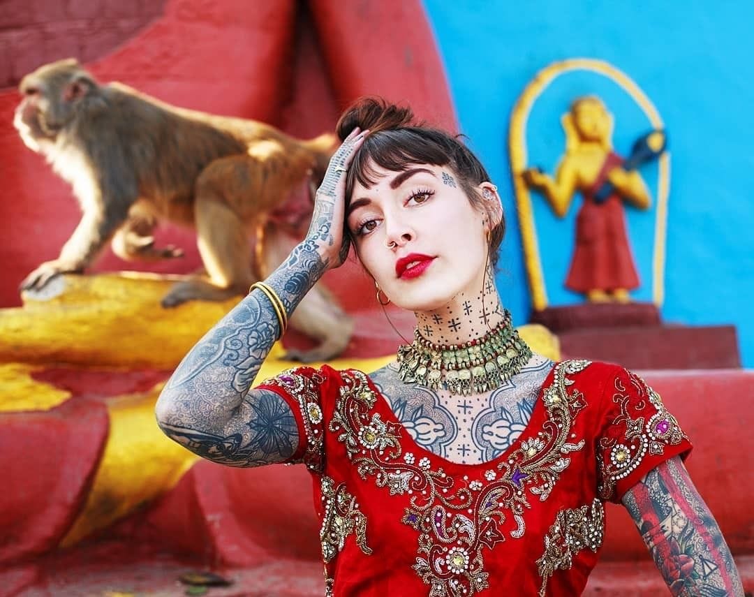
Snowdon’s arms show the appeal of a sleeve built in layers. Some areas read as dense blackwork while others leave enough skin open for the shapes to breathe. That contrast keeps the arm from becoming one flat block. It also gives each older tattoo a chance to remain visible as newer work grows around it.
The upper-arm pieces have a strong graphic quality. They are easy to read from a distance, but the closer view brings out small lines, dots and changes in texture. That is a useful lesson for anyone planning a sleeve: the main silhouette should work first, then the smaller marks can reward a closer look.
A blackwork sleeve does not have to be a single connected picture. Snowdon’s collection shows how separate designs can still feel like one group when they share a dark palette and similar line weight. Leaving small gaps between elements can make the finished arm look deliberate rather than unfinished.
Her arm tattoos also show why placement matters as much as the drawing. A design that wraps around the outside of the arm will read differently from one placed on the inner forearm. Before booking, look at the tattoo while the arm is relaxed, bent and turned. The best arm placement keeps the shape clear in normal movement.
For a Snowdon-inspired sleeve, keep the main idea simple and let the black do the heavy lifting. A bold flower, animal, architectural shape or ornamental panel can anchor the arm. From there, smaller dotwork or fine-line details can fill selected spaces without making every inch compete for attention.
The chest and neck tattoos build a dark geometric centre
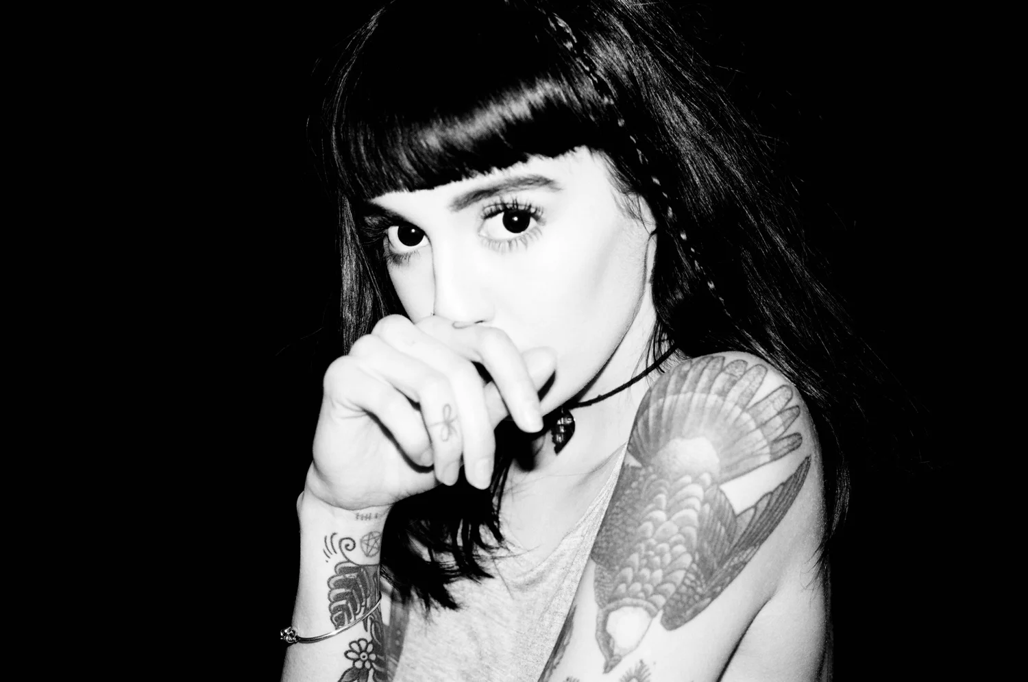
The chest and neck work gives Snowdon’s collection a darker centre. These areas are close to the face and naturally draw attention, so a design has to sit comfortably with the body’s movement. The pieces look intentional because the shapes follow the collarbone, sternum and neck instead of sitting like stickers on top of them.
Neck tattoos are hard to hide and even harder to place well. Snowdon’s examples show the value of a clear outline and a strong overall shape. Fine details can be added inside that shape, but the outside edge still needs to look good from across a room. This is one reason simple blackwork often ages well in a visible area.
The chest gives more room for a design to spread. It can hold a symmetrical image, a central figure or a piece that reaches toward both shoulders. Snowdon’s chest ink uses that space without losing focus. If you are planning similar work, decide whether you want the image to face straight forward or follow one side of the body.
Dark chest tattoos can look heavy, but open skin around them changes the mood. Snowdon’s work is a reminder that the negative space is part of the design. A little breathing room around the collarbone or shoulder can make the black look richer and keeps the piece from closing in on the neck.
The strongest takeaway is to treat the chest and neck as connected zones. A small neck mark may look isolated if the chest is left completely blank, while a heavy chest panel can make a tiny neck tattoo feel deliberate. A good artist can map the two areas together before any needle work starts.
Hannah Snowdon’s hands and fingers carry tiny high-contrast details

Hand and finger tattoos are among the smallest marks in Snowdon’s collection, but they carry a lot of visual weight because the hands are always moving. Tiny symbols can flash into view when she reaches, gestures or holds a tool. That makes the design feel active instead of locked into one posed photograph.
Small hand tattoos need clean decisions. There is not much room for extra shading, so the outline, spacing and direction have to be right. Snowdon’s high-contrast details show how a simple black shape can stay readable when the hand is turned or when the tattoo is seen from a few steps away.
Finger tattoos also come with practical limits. Skin in this area gets washed, rubbed and flexed constantly, so very fine details may soften over time. A simple mark with enough room around it can age more gracefully than a tiny drawing packed with texture. Snowdon’s collection makes that restraint look like a style choice.
The hand pieces work well beside larger arm tattoos because they do not try to imitate the sleeve. They act like punctuation. That is a smart approach if you already have heavy work on the forearm and want to add something new without creating another large focal point.
If you like this part of her look, bring several size options to your consultation. A design that looks perfect on paper may need to become slightly bolder once it is placed on a finger or the back of the hand. The goal is not the tiniest possible tattoo. The goal is a mark that still looks crisp and intentional later.
Her back piece covers the old horseshoe with a larger design
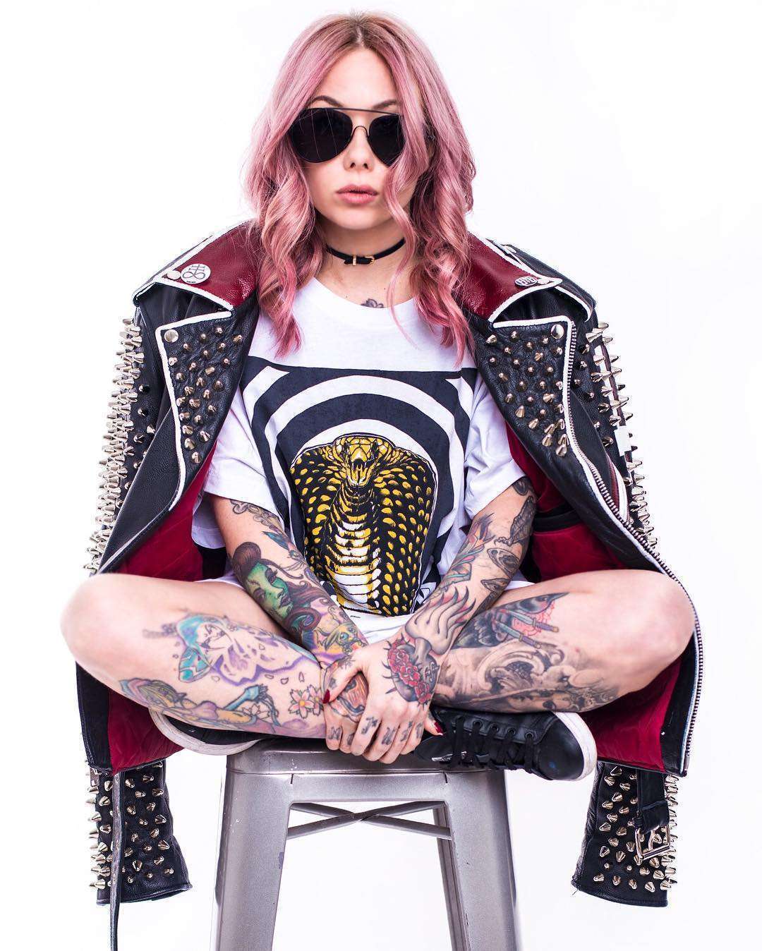
Snowdon has spoken about covering an early horseshoe-and-roses tattoo with a larger back piece. That story matters because cover-ups work best when the new design is planned around the old ink rather than placed on top of it as an afterthought. The finished piece can feel like a new chapter instead of a patch over a mistake.
A back piece has room for scale, movement and darker areas that would overwhelm a wrist or forearm. It can follow the spine, spread across the shoulder blades or reach up into the hairline. Snowdon’s larger design shows how a cover-up can use those broad surfaces to turn an old small image into part of a much stronger composition.
Cover-up planning usually starts with the darkest parts of the old tattoo. Those areas may become shadow, hair, feathers, leaves or another solid section in the new design. The artist then uses lighter details and open skin around them to keep the result from becoming one dense rectangle.
The back is also a good place for a tattoo that you want to feel more private. Unlike a hand or neck piece, it can disappear under normal clothes and then become a full statement when shown. That change in visibility gives the design a different kind of presence from Snowdon’s everyday hand and arm marks.
If you are considering a cover-up, take clear photographs of the old tattoo and be honest about how much darkness is already there. A skilled artist can tell you whether the piece needs laser lightening, a larger scale or a different subject. Snowdon’s back piece is a useful reminder that the best cover-up may need more space than the original.
Black ink, dotwork and sacred geometry tie the collection together
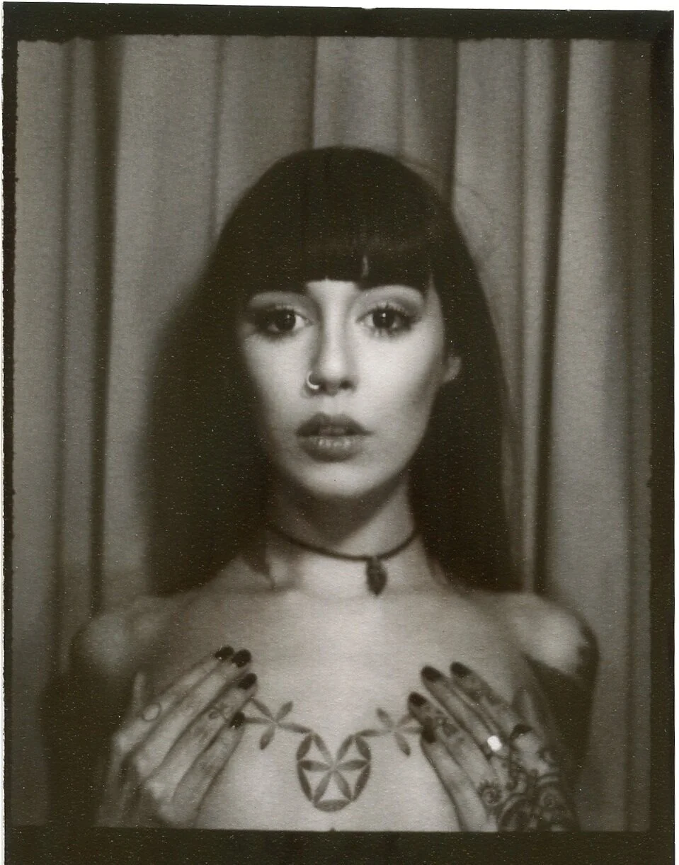
Across Snowdon’s tattoos, black ink does most of the talking. That does not mean every piece is solid black. Dotwork, fine lines and changes in density create rhythm inside the darker forms. The eye moves between a heavy patch, a quiet gap and a small detailed section, which keeps the collection from feeling flat.
Dotwork can also soften a design without making it pale. A field of dots gives the artist room to fade an edge, suggest texture or build a shadow gradually. In a collection with bold blackwork, that softer transition helps separate neighboring pieces and makes the whole sleeve easier to follow.
Sacred geometry and architectural ideas fit naturally with this approach because they depend on balance and repetition. They can be made sharp and graphic, or they can be broken up with softer shading. Snowdon’s style shows that geometry does not have to look cold. The placement and the surrounding body lines give it a more personal feel.
Ancient references and religious shapes can add meaning without needing a long explanation. A building, ornament or symbol may connect to travel, family or a private memory. What makes Snowdon’s collection interesting is that the designs still work visually even when you do not know the backstory.
The overall lesson is to choose a visual language before collecting random images. Decide whether you prefer heavy black, airy dotwork, sharp geometry or a mix. Then let each new tattoo add something different while keeping the line quality and contrast close enough that the collection feels like yours.
Snowdon’s tattoos also show the value of patience. A collection does not need to be planned as one giant project, and it does not need to follow a single trend from shoulder to ankle. Let the placement guide the scale, let the artist protect the readable parts of older work, and leave room for the next idea to arrive naturally.
For a similar mood, ask about blackwork, dotwork, ornamental shapes and body-led placement. Bring references for the feeling you want, but leave the final drawing to an artist who can make it fit your anatomy. Snowdon’s collection feels convincing because the tattoos belong to the body, not because every design follows a strict formula.
The best Hannah Snowdon tattoo ideas are not copies. They are reminders to use contrast, give important areas enough room and choose symbols that still matter after the first excitement fades. Start with one placement you can live with, pick a clear subject, and build from there. This is the body-led part of tattoo design that makes a collection feel personal.
To hear Snowdon talk about tattooing and her approach, watch the conversation below.