
Baron Corbin’s tattoos are hard to miss once he takes off the vest. Two birds stretch across his chest, stars sit near his shoulders, and colorful clocks run through his left sleeve. Turn him around and there’s a much darker scene across his back. The designs don’t all follow one style, which is part of what makes his collection interesting.
Fans have seen him wrestle as the Lone Wolf, King Corbin and Happy Corbin. The names and outfits have changed, but his ink gives you a familiar way to pick him out. A close view also shows how much gets lost in a quick entrance shot. The red and green on his chest, the shading around his clocks and the small details in his sleeve deserve a slower look.
Some of his most personal tattoos aren’t the ones that dominate his ring photos. He’s spoken about portraits of his father and grandfather on his thigh, saying, “Family is very important to me”. That gives his collection a personal side beyond the wolves and darker imagery. Here’s a closer look at five visible parts of his ink, with a clear separation between what the designs show and what he’s actually explained.
Birds and heart chest tattoo
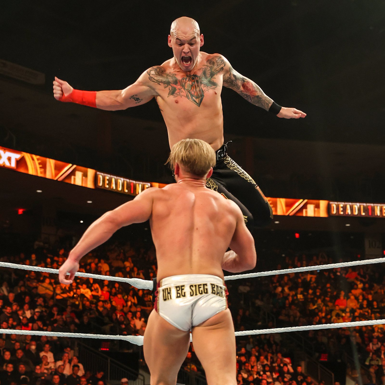
The two chest birds are among Corbin’s easiest tattoos to recognize. Their spread wings follow the width of his upper chest, with a red bird on one side and a green bird on the other. Between them sits a heart inside a pointed, geometric shape. The straight edges around that center piece give it a very different outline from the curved wings.
There’s a lot happening here, but the layout is easy to follow. Your eye goes to the middle first, then out toward the birds and up toward the shoulders. The wings leave enough open skin around the edges that the design doesn’t turn into one solid patch of color. Even during a match, you can usually make out the basic arrangement before you notice the smaller lines.
The birds have the spread-wing shape people often associate with traditional chest pieces. Corbin’s version uses contrasting colors to keep the two sides distinct. They work as a pair without being identical. The heart adds another familiar tattoo motif, while its angular surround makes the center feel more structured than the feathers around it.
It’s tempting to give the birds a tidy meaning about freedom or the heart a specific love story. The design alone doesn’t establish either. Corbin’s comments about family help explain why personal subjects matter to him, but they don’t automatically explain this particular chest piece. You can appreciate the bold color and placement without attaching a story he hasn’t told.
For anyone looking at chest tattoo layouts, the useful detail is how this one uses the body. The central shape anchors the design above the stomach, while the birds carry it toward the shoulders. It’s a broad composition made from recognizable parts, rather than a single image stretched to fill the whole chest.
Outlined shoulder star tattoos
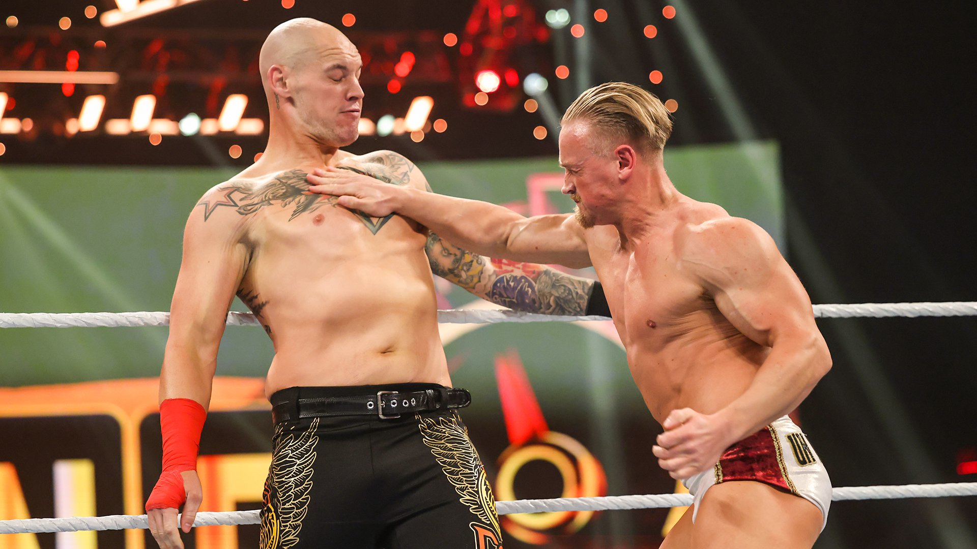
Corbin has large outlined stars near his shoulders. They sit above the busiest part of the chest artwork and use a much simpler shape. In the close match view, the dark outer lines and reddish inner edging are visible against his skin. The open middle helps the stars hold their shape beside the more detailed birds.
These aren’t tiny accents tucked into empty spaces. Their size gives them a place in the overall upper-body layout. The points follow the curve where the chest meets the shoulder, so the shape changes slightly as he raises an arm or twists. That’s why a star can look broad in a front view and narrower from the side without being a different tattoo.
The contrast with the birds is a big part of their appeal. Feathers bring lots of short lines and curved edges; the stars bring long, clean angles. Putting those shapes together gives the upper chest some breathing room. There’s enough detail to reward a close look, but also a few clear forms you can recognize across the ring.
A star tattoo can carry all kinds of meanings for different people. Corbin hasn’t supplied a meaning for these stars in the interviews discussed here, so calling them a symbol of ambition or success would be a guess. Their placement and appearance are much easier to describe with confidence than their private significance.
They also show why it helps to look at his chest as a group of separate designs. The stars, birds and central heart share the same area, but they do different visual jobs. The stars mark the upper edges, the birds spread across the middle, and the heart holds the center. You don’t need to treat every visible element as one tattoo with one meaning.
Clock faces on his left arm

A blue-green clock face stands out in Corbin’s left arm work. Roman numerals circle the dial, with ornamental shapes around it. The color gives the clock a different feel from a plain black-and-gray watch tattoo. It’s detailed enough that you can see the face as its own object, even though it belongs to a larger sleeve.
The surrounding curls and shading matter almost as much as the clock. They soften the transition into neighboring designs and stop the dial from looking like an isolated sticker. A round face on a rounded arm can be tricky to read from every angle, but the numerals and outer rim give this one clear boundaries.
Clock tattoos often invite questions about the time shown on the hands. Sometimes that time has a personal meaning, but a photograph isn’t a reliable way to work it out. His arm bends, the dial curves around the skin, and some of the details disappear into the shading. Reading a precise hour from this match shot would be pushing it.
What you can see is how the clock fits into his collection. There’s another clock lower down the sleeve, and an hourglass adds a second kind of timekeeping imagery. Those repeated objects make the arm feel connected without requiring every part to use the same color. The upper dial has a cooler palette than the warmer red elements nearby.
Corbin’s family portraits add context to his wider interest in personal ink, but they shouldn’t be used to invent a dedication for each clock. The strongest description here is the visible one: Roman numerals, cool color, decorative framing and a place within a crowded sleeve. If you’re drawn to clock tattoos, the framing is a useful detail to notice. It gives the face room to stand out while still letting other artwork sit close around it.
Hourglass and colorful forearm sleeve
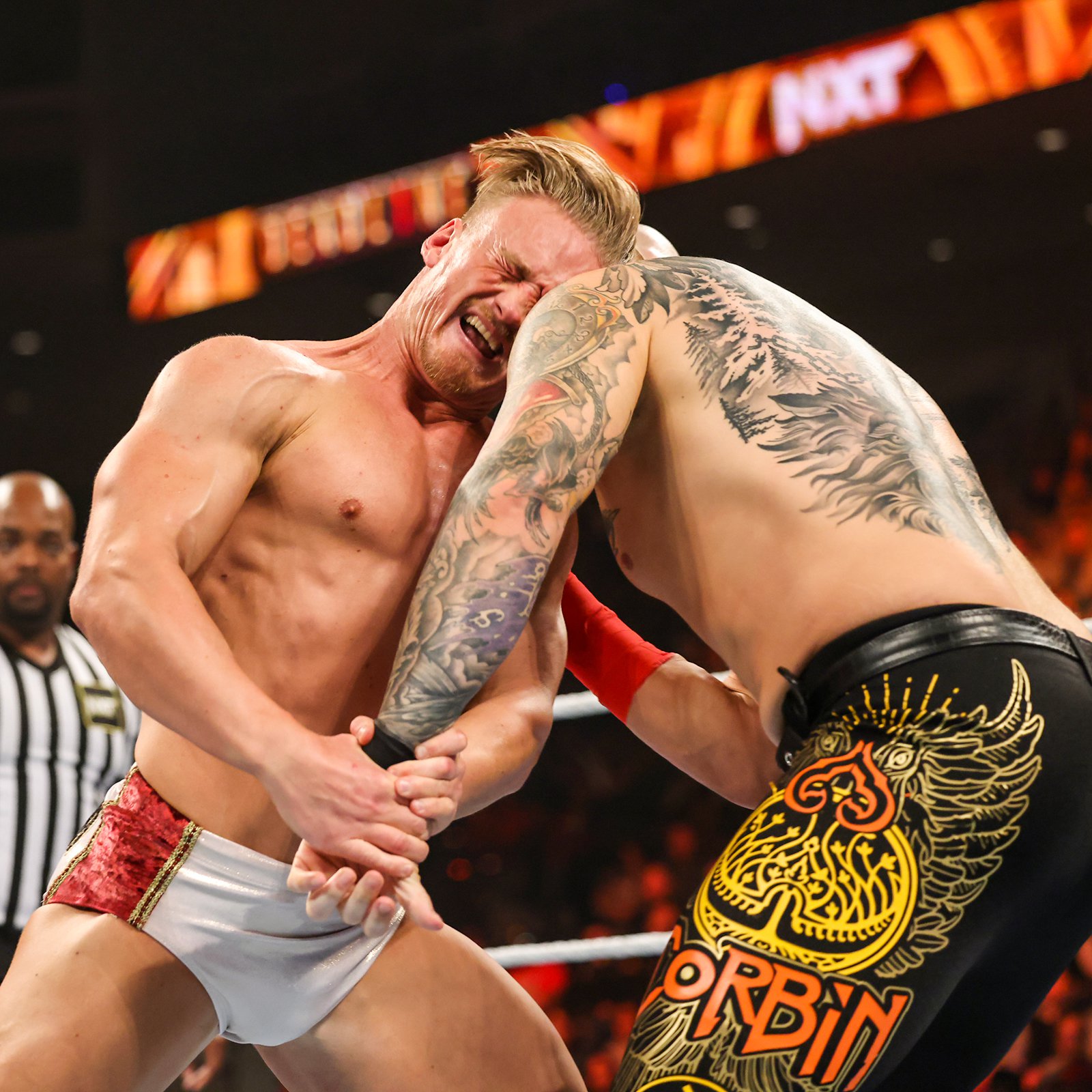
The wider view of Corbin’s left sleeve shows a red hourglass and another clock among the surrounding designs. Lower down, a purple-toned dial adds a fresh patch of color. Curves, feathers and dark shading fill the spaces between the larger objects. It’s a busy arm, but the main shapes still have enough contrast to be picked out.
An hourglass has a different silhouette from a clock face. Its narrow middle and wider ends create a vertical shape, while the dial reads as a circle. That difference helps the sleeve avoid becoming a row of similar round objects. The red also gives the eye a place to stop before moving down toward the forearm.
The sleeve changes as Corbin moves. With his elbow bent, several parts bunch together in a close ring shot. With the arm extended, you get a better sense of the gaps and transitions between them. Neither view tells the whole story on its own. Looking from shoulder to wrist makes it easier to understand how the smaller details connect the larger designs.
If you’ve been looking through Randy Orton’s tattoos, Corbin’s arm offers another way to approach a wrestler’s sleeve. Here, the colored dials and hourglass are especially noticeable. Those separate objects give you several points to follow, instead of asking you to take in the entire arm at once.
The useful takeaway for a sleeve idea is the spacing, rather than copying a particular object. Big recognizable shapes need room to stay readable, and the connecting details shouldn’t swallow them. Corbin’s clocks keep their faces visible while the surrounding ornament ties them together. The result feels full without making every inch equally busy. It’s worth looking at the whole arm before deciding which single detail is your favorite.
Wolf and forest back tattoo

Corbin’s wolf and forest back piece shifts away from the brighter color on his chest and arm. Dark shading, fur textures and pointed tree silhouettes create a much heavier scene. The broad back gives the artwork space to spread, with animal imagery and surrounding shadows filling a large area instead of stopping at a small central emblem.
The wolves fit naturally with the Lone Wolf name fans associate with him. That’s a visual connection, rather than proof that every part of the back piece was designed around that character. WWE has also described a wolf-inspired addition to his collection, but that doesn’t identify the date or meaning of each visible element here.
In this view, the trees help set the scene around the animal shapes. Their narrow points contrast with the softer-looking fur and shaded faces. That mix makes the back feel different from the chest, where the birds and heart are easier to separate against open skin. The back relies more on overlapping dark areas and texture.
Large back tattoos also reveal themselves differently in motion. A forward bend stretches the skin and gives a clearer view of parts that a vest would hide. A standing shot may show the overall outline better, but leave some lower details out of sight. Here, the ring action exposes enough of the design to see its scale and the contrast between the forest shapes and the animal work.
For all that dark imagery, Corbin’s tattoo collection also includes those family portraits on his thigh. He has explained that they remind him where he came from and who he is. That’s a more personal reason than anything you could guess from a wolf’s expression. His ink can look intimidating in the ring while still holding memories that have little to do with playing a villain.
That mix is what makes his collection interesting to look through. The chest brings bold shapes and color, the arm builds around detailed timepieces, and the back gives the darker artwork a much larger space. To hear Corbin talk about the personal side himself, watch his conversation with Corey Graves below.