admin

Phoebe Bridgers Wears Her Weird Little Stories on Her Skin

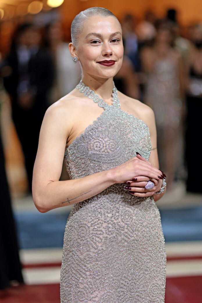
Phoebe Bridgers has a knack for letting small details slip into view. She often wears oversized clothes, and even her red-carpet looks can be fairly covered up. Then a photo catches her wrist, a finger or the edge of her ribs, and there is another bit of ink to notice. Her tattoos do not form one big statement sleeve. They feel more like notes collected from different parts of her life.

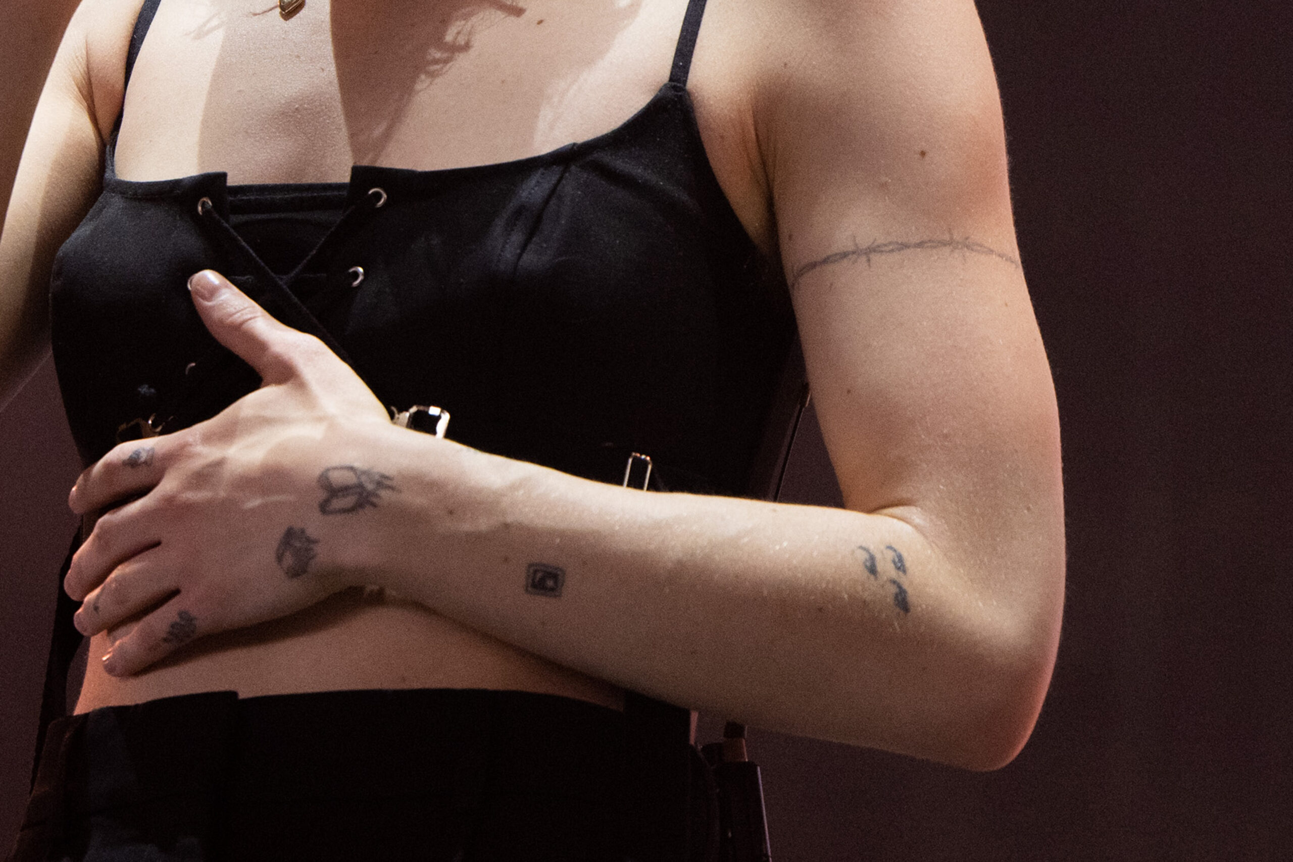
A few designs are easy to spot: a sword through a handwritten note, Dr. Woo’s fine barbed-wire band, a pair of books with flames, and the words drink water on the inside of her wrist. Other pieces are more private or only partly visible. That glimpse-and-miss-it quality is part of their appeal.

This guide focuses on tattoos that have been clearly seen or reported. When a design is only partly visible, I’ll leave it there instead of assigning it a made-up meaning. Bridgers’s ink invites people to imagine the stories behind it, but she has not shared every story herself.

The sword and paper tattoo started with a strange gift
Phoebe Bridgers eyes arm tattoo

One of Bridgers’s best-known designs shows a sword piercing a piece of paper. She said on Instagram that a fan had given her the object, and another person later got a tattoo based on it. It is a very Phoebe sequence of events: an unusual gift, a personal connection and, eventually, a small image with its own story.

The design is easy to read at a glance, but it does not feel generic. The sword goes through the paper instead of sitting beside it, as if something has interrupted the note. That brings the gift, the fan connection and the act of writing together in one image.

It also suits the way Bridgers approaches songwriting. A page can hold something intimate, funny, embarrassing or painful; once it is shared, it can mean something to someone else, too. The tattoo needs no long explanation to make sense. It is easy to see why the object stayed with her. There is a whole little story in the design.

Her barbed wire is delicate, not heavy-handed
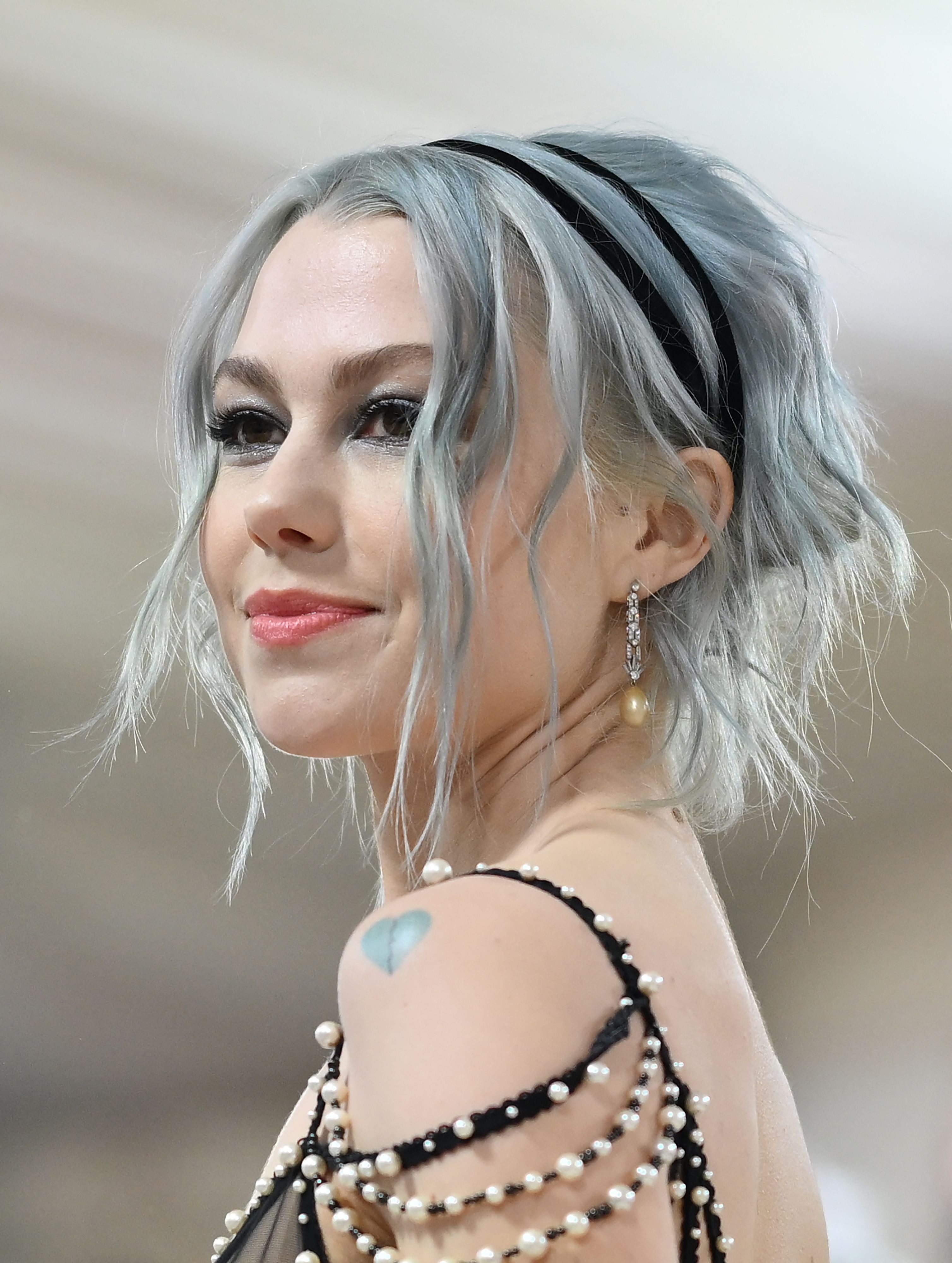
Phoebe Bridgers shoulder heart tattoo

In May 2022, Bridgers got a fine-line barbed-wire tattoo around her upper arm from celebrity tattoo artist Dr. Woo. His thin, precise lines shape the look. Rather than the thick, forceful wire often seen in biker imagery, hers is light and delicate, almost like jewellery drawn onto her skin.

That softer treatment changes the feel of the symbol. Barbed wire often suggests toughness, danger, boundaries or a hint of glamour. Bridgers’s version has more room around it. It circles her bicep without taking over, sitting above older tattoos instead of covering the arm in one theme.

It reads like a band or border around her arm. The line gives the piece presence without turning it into a whole-arm statement. Bridgers has not publicly pinned down one specific meaning for it. She often gives familiar images a softer, slightly unexpected feel.

Her fingers carry tiny drawings with big personality

Photos of Bridgers’s left hand show a cartoon hand pointing up on her index finger, a shooting star on her ring finger and a small vine along the outside of her pinky. Each tattoo is tiny, but they are hard to miss when she plays guitar or reaches for a microphone.

Finger tattoos are difficult to keep out of sight. They show up in videos, press photos and everyday gestures, more like part of someone’s handwriting than hidden diary entries. The designs each have their own mood: the pointing hand is playful, the star feels light, and the vine is quieter.

The three pieces do not match, which is part of why they work together. They look collected over time rather than designed as a set. That same patchwork feeling runs through Bridgers’s collection. It is tempting to attach a lyric or elaborate meaning to every mark, but these may simply be drawings she liked enough to keep in view. A small tattoo does not always need to carry the weight of a song.

The burning books sit close to the wrist

Near her wrist and finger tattoos, Bridgers has a black-ink image of two books that seem to float while burning. At first it looks almost sweet; then you notice the flames. The books bring reading and stories to mind, while the fire gives the image a sharper edge.

She has not needed to offer a long explanation for the tattoo to stick in people’s minds. Books can suggest a private inner world. Set on fire, they might hint at change, loss or the unsettling feeling of watching something important slip away. Those are readings, not meanings Bridgers has confirmed, so there is room to leave the image open.

The contrast between an ordinary object and a dramatic image is what stands out. It is not a skull or a warning sign, just a pair of familiar things made suddenly uncertain. The books can feel like a reminder that stories comfort us and break our hearts, sometimes in the same afternoon.

Drink water is the most practical tattoo in the collection
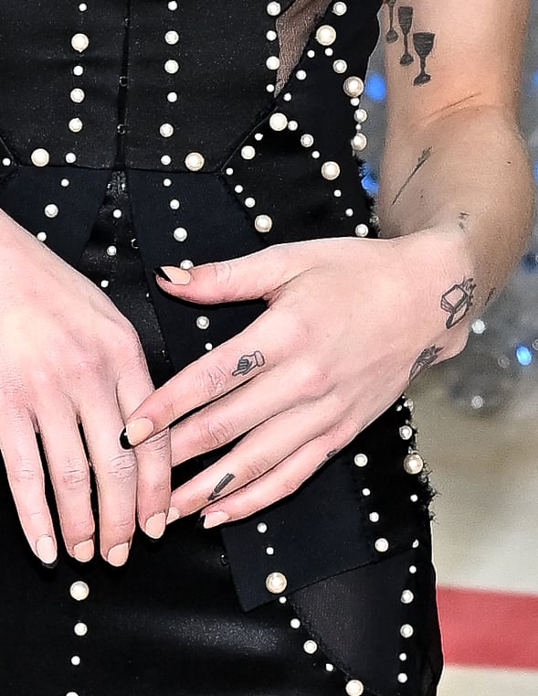
Phoebe Bridgers hand and finger tattoos

On the inside of her wrist, Bridgers has the words drink water. It may be her most straightforward tattoo: no riddle or symbol to decode. It reads like a reminder from a friend, a tour manager or a future version of herself who knows how easily musicians forget the basics when they are tired.

The placement makes practical sense. She can glance at her wrist without making a show of it, and the message can go along to rehearsals, flights and long performances. There is something funny about turning a reminder into permanent ink. People often forget to hydrate minutes after promising they will.

She made that little nudge part of her everyday life. It is not especially poetic, and that is what makes it work. Among ghosts, books, stars and sharp objects, the words bring the collection back down to earth.

The picture-frame tattoo feels like a little window

Bridgers also has a small picture-frame tattoo near her wrist. It looks like a tiny framed scene, the kind of image that is easy to miss unless a photo catches it up close.

A frame suits songs that can feel like snapshots: it holds a moment still while the larger story carries on. That is one way to read the tattoo, though Bridgers has not publicly given it a fixed meaning. It fits naturally among the collection’s other small visual fragments.

The frame gives a little order to an area that might otherwise look like scattered doodles. The wrist becomes a small gallery of books, lettering, a frame and the marks around them. Her best small tattoos have the feel of notes in a book’s margin.

The newer ink brings the collection back into the present

Newer tattoos have added another chapter to a collection that has grown over several years. In September 2026, reports noted a cursive Bobby tattoo beneath her left collarbone, described as a tribute to Bo Burnham and linked to her new track of the same name. The same coverage also pointed out a spiderweb near her elbow, close to the heart tattoo bearing the name Max, her late dog.

These are recent reports, so it is worth being precise about what is known. The Bobby tattoo is the clearest documented addition. The spiderweb has been photographed and described, but Bridgers has not fully explained what it means. Sometimes a new tattoo is news before it becomes a story.

The new work is a reminder of how quickly the collection can change. Some older tattoos have clearer timelines: the sword in 2021, the barbed wire in 2022 and the hip tattoo in 2023. New pieces keep appearing and shifting the picture. It is a bit like an album that gains tracks out of order.

The bigger picture

Bridgers’s tattoos mix jokes, keepsakes, images and reminders. Some clearly connect to a person or moment; others seem to have started with an object that became special because of the story around it. A tiny vine, a star, a frame or an eye may simply be designs she liked.

Part of the appeal is that the collection still feels unfinished. New pieces appear, while older ones fade, sit beneath clothes or show only when she wants them to. There is no final map of her tattoos yet.

That suits an artist whose songs return to memory and contradiction. Her tattoos do not offer one tidy explanation. They leave you with fragments, and that is enough: a sword, a pair of books, a reminder to drink water and a few stories she has not told yet.
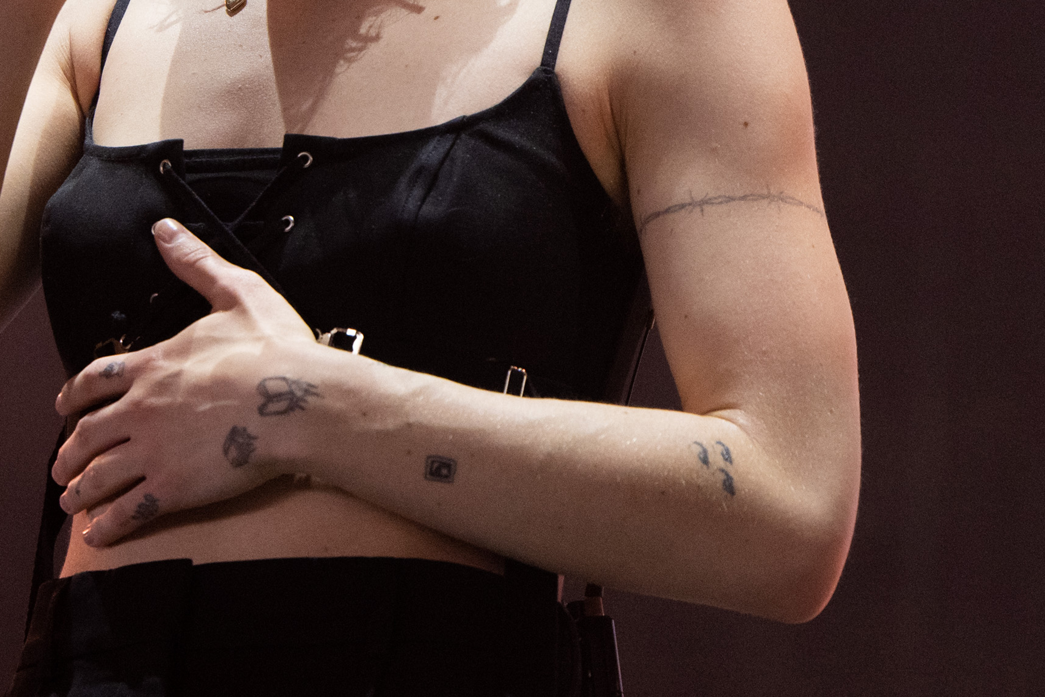
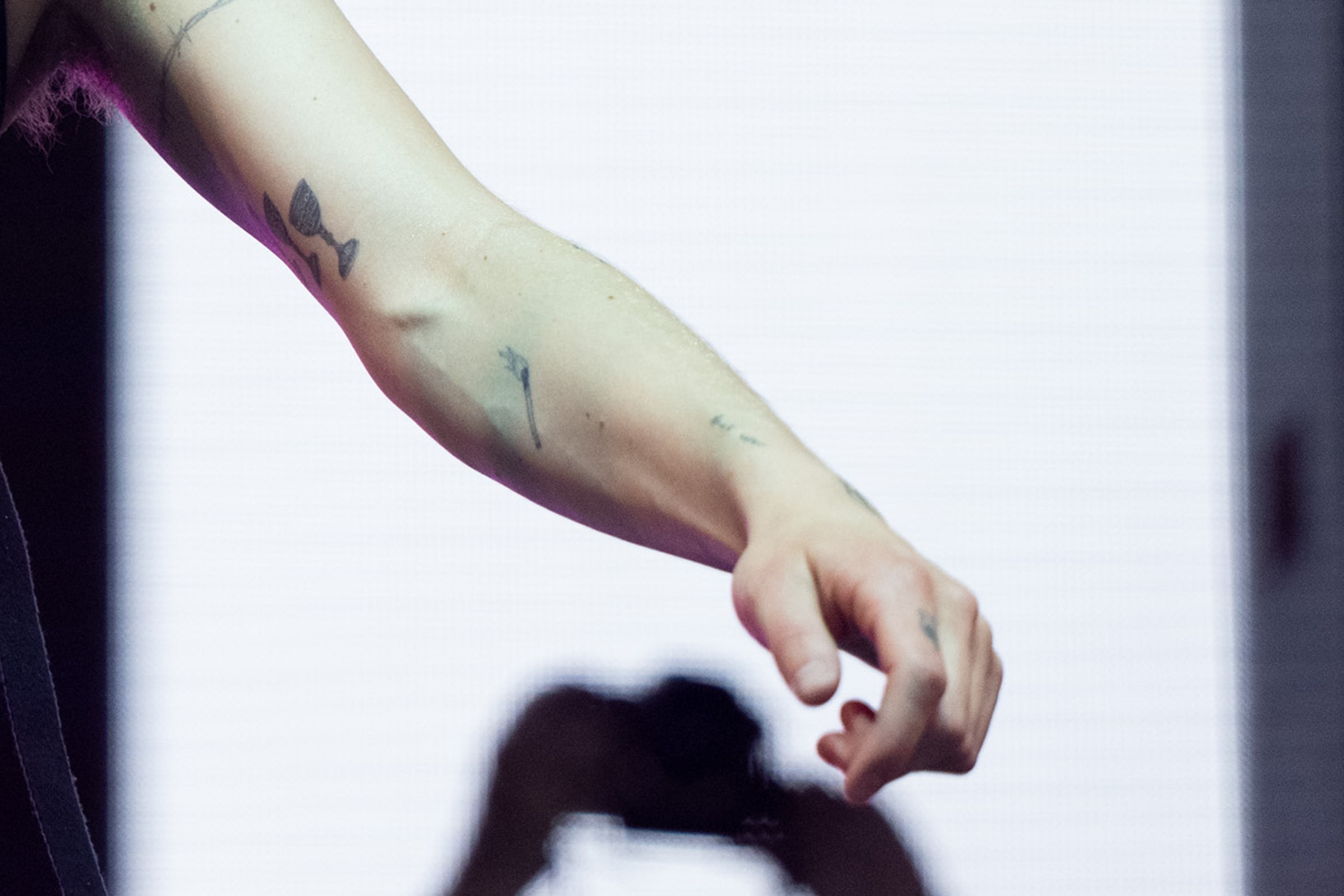
Phoebe Bridgers arm tattoos at Coachella

Phoebe Bridgers forearm and hand tattoos

Watch Phoebe Bridgers talk through her music

There is no reliable tattoo-specific YouTube tour to include here, so this verified MTV interview offers a useful alternative. Bridgers talks in her own voice about the ideas and influences behind Punisher.
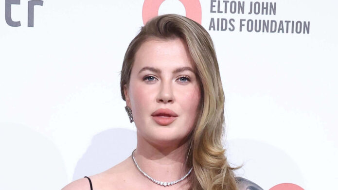
More musician tattoo guides

Ireland Baldwin’s New Ghostface Tattoo Changed the Whole Story

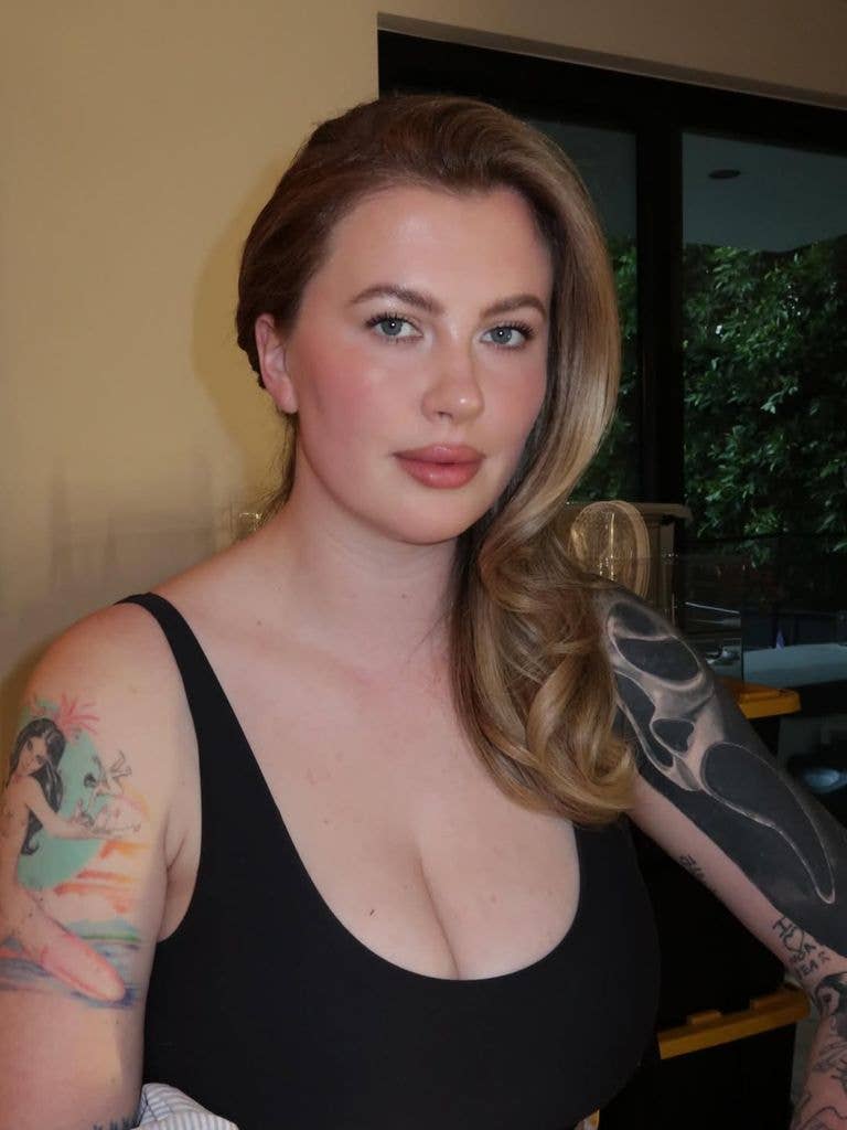
Ireland Baldwin’s tattoo collection has gone through a lot of changes, but the biggest one came when she covered an older David Bowie tribute with a large Ghostface sleeve. The new work runs from her shoulder toward her elbow and gives the collection a darker focal point.

That change also says something about how she feels about old ink. Ireland has at least 24 tattoos, spread across her arms, legs, ribs and other spots. Some are playful, some carry personal meaning, and some were designs she liked at the time. The new piece stands out because it makes a strong visual statement and replaces a tattoo she no longer wanted on her body.

It can be hard to read the full collection from a single red-carpet photo. A black dress can cover most of it; a sleeveless look reveals a jumble of colour, lettering and linework. The collection is still changing, and that is part of what makes it interesting. Ireland has never treated her tattoos as one perfectly planned sleeve. They look more like a record of different eras.

The Ghostface sleeve now dominates Ireland Baldwin’s collection

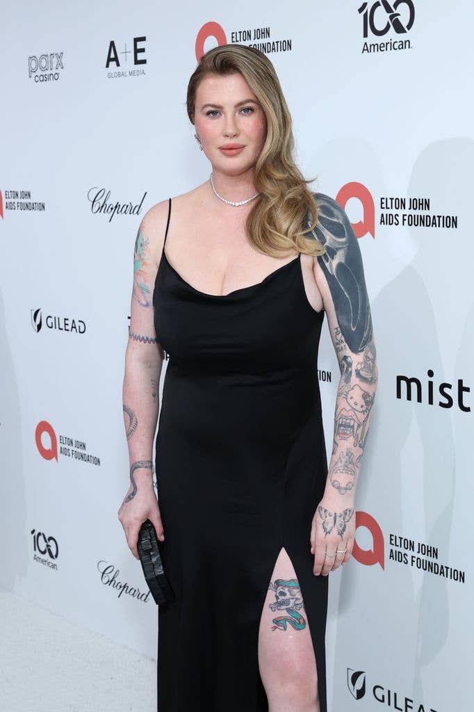
Ireland Baldwin colorful arm tattoos and Ghostface sleeve at red carpet

Ireland showed off the new Ghostface tattoo after getting into the Halloween spirit. It depicts the masked villain from Scream and covers a large part of her upper arm. This is not a tiny reference hidden under a sleeve: the portrait is big enough to stand out in photos, and the surrounding ink makes it feel like a half-sleeve rather than a single flash design.

The tattoo also shows a hand holding a knife, pushing it firmly into horror territory. That detail gives the image a sense of movement. Ghostface is recognisable on its own, but the knife makes the whole composition feel more like a scene.

At the 2026 Elton John AIDS Foundation viewing party, Ireland’s black dress left her shoulders and arms on display. The photos offered a rare clear look at how much space the new tattoo takes up. Her right shoulder has a large, dark abstract section, while older, more colourful designs cover parts of the forearm. The Ghostface piece sits among that existing work rather than replacing the whole map.

She covered an older David Bowie tattoo

Ireland Baldwin earlier colorful arm tattoos and sleeve designs

The Ghostface design covers an older David Bowie tattoo. Ireland said she planned to get Bowie tattooed somewhere else because she no longer wanted the original piece on her body. She was blunt about why: she said the person who gave her that tattoo was a terrible person, and keeping that particular design no longer felt right.

Covering a portrait takes some thought. The new tattoo usually needs enough size, dark shading or careful detail to hide the old lines. That helps explain why the Ghostface sleeve has such a strong presence. It adds a new image and closes the chapter on an older one at the same time.

There is a difference between replacing a tattoo because it feels dated and covering one because the memory behind it has changed. Ireland’s explanation puts this in the second category. The cover-up is more than a style change. It lets her take back a piece of her body she no longer wanted to carry.

The older arm photos help show why the before-and-after matters. Before the cover-up, the sleeve already held a mix of distinct designs: a colourful figure, cartoon-style work, lettering and small black line tattoos. Those pieces remain part of the wider collection, even though the Bowie portrait is now gone.

The older arm pieces are colourful, funny and deliberately mixed

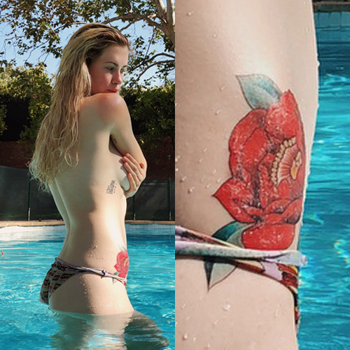
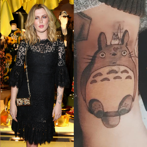
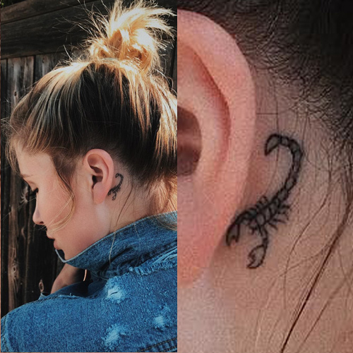
Ireland’s earlier tattoos do not stick to one style. Bright illustrative pieces sit alongside black lettering and more traditional-looking designs. The mix includes a rose on her hip, a lotus flower on her arm, a scorpion behind her ear and the Japanese character for Totoro on her forearm. The placements are scattered, which makes the collection feel personal instead of planned for one photoshoot.

That variety is part of the charm. Many celebrity collections become easy to recognise because they share an artist, colour palette or fine-line look. Ireland’s ink is less uniform. The rose does not need to match Totoro, and the scorpion does not have to echo the lettering on her ribs. Each piece seems to come from a different choice.

Her arms also show writing along her ribcage and forearm, along with small drawings that are easier to catch in close-up photos than on a red carpet. The lettering gives the collection a more personal feel, while the larger illustrations keep it from becoming a wall of text.

The collection also shows how colour affects the way tattoos read over time. Bright designs grab your attention, while black-and-grey linework can fade into the background until the light hits it. An event photo can help show placement, but it may not be clear enough to identify every individual tattoo.

Her tattoos have always been tied to changing phases

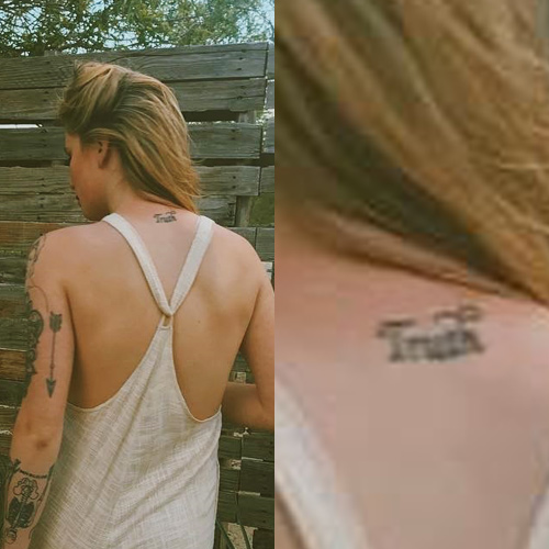
Ireland Baldwin Truth neck tattoo

Ireland has talked publicly about body image, confidence and the strain of being photographed. That context matters when looking at her tattoos. They sit alongside parts of her body she has discussed learning to accept, including stretch marks, curves and eczema.

She has not said that every tattoo is perfect. If anything, her comments suggest the opposite: some pieces reflect an image she wanted at the time, some grew out of a friendship or interest, and others simply looked good in the moment. The collection keeps those changes visible instead of hiding them.

That is why covering the Bowie tattoo feels like a turning point. Ireland did not pretend it had never been there. She explained why she wanted it replaced, then chose something much larger and more theatrical. The sleeve makes the point that a tattoo can change when the story attached to it no longer feels right.

There is a practical side to the decision as well. Cover-ups can limit future options. With a dark portrait and knife scene on her arm, any later work will need to fit around the new design. The Ghostface piece has become the main feature of that arm, whether or not Ireland set out to make it an anchor.
What Ireland Baldwin’s ink looks like now

Ireland’s tattoos now feel like a collection still in progress. The Ghostface half-sleeve is the newest focal point, surrounded by older colourful designs, small symbols and personal lettering. The rose, lotus, scorpion and Totoro are visible in some photos, while other pieces appear or disappear depending on her clothes and the camera angle.

That makes the collection more interesting than a perfectly matched sleeve. It shows how tattoos picked for different reasons can still add up to a recognisable look. Ireland’s arms have a scrapbook feel: bright images, dark patches, small text and references to people or ideas that mattered at different points.

Nothing about the collection feels fixed. The Bowie cover-up shows that even a tattoo with a strong personal or artistic connection can be changed. Ghostface now takes centre stage, but the older tattoos are still part of the story. They show where the collection began and make the new sleeve feel even bolder by comparison.

If you are looking to Ireland’s tattoos for ideas, the useful lesson is not to copy the Ghostface portrait. Think about how a new design will sit beside the ink you already have. A cover-up can solve one problem while creating a new focal point. Different styles can share an arm when their placement works. And a tattoo can mean a lot for years before you decide it is time to move on.

Ireland’s collection is a reminder that tattoo stories do not stop when the needle does. The next chapter might be a cover-up, moving an old idea somewhere else or deciding that the mix of pieces still feels like yours.

Ireland’s tattoo history also shows why photos matter. A list can name a rose, lotus or character tattoo, but pictures show how the designs sit together. The new sleeve does not erase all the earlier work; it shifts the balance between the colourful pieces and the heavier horror image. That contrast is what makes the design interesting. The collection has grown through edits, additions and personal choices, not one session with a fixed blueprint. Her tattoos keep changing as her life does.
Ireland Baldwin red rose hip tattoo

Ireland Baldwin Totoro forearm tattoo

Ireland Baldwin scorpion behind ear tattoo

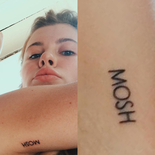
Ireland Baldwin Mosh armpit tattoo

Watch Ireland Baldwin discuss her scary new tattoo

There is no full tattoo tour from Ireland to include, but this verified report covers the new Ghostface piece and the reaction it received.

More actor tattoo guides

Lana Del Rey’s Tattoos Read Like Notes From the Road

Lana Del Rey’s tattoos feel like notes from a notebook she carries from city to city. Most are words, names and references to people or places that matter to her. That makes the collection unusually clear: often, Lana has already said why a phrase is there.
In an interview, she said she likes the idea of carrying someone with her when she is away on tour. That idea runs through nearly every known piece. The tattoos are personal, literary and musical, usually written in delicate cursive instead of arranged as one large sleeve.
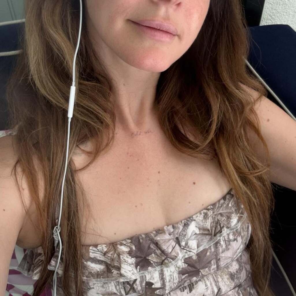
The newest addition has a different tone, though it still fits the collection. In May 2026, Lana revealed a small chest tattoo reading “Cold War.” Inked Magazine reported the phrase but noted that she had not explained what it means. That uncertainty matters: it is easy to build a dramatic theory around two words, but the meaning has not been confirmed.

The new Cold War tattoo is the clearest recent addition

Lana Del Rey Cold War chest tattoo

The Cold War chest tattoo sits high on Lana’s chest in very light script. It is small and easy to miss; in the close-up photo, the lettering is the main focus. That placement fits the rest of her collection. The words are visible when she wants them to be, without reading like a slogan across her body.

Inked described the phrase as something fans were already guessing about, with theories ranging from a lyric to a sign of a new musical era. Those are only theories. Lana has not said whether the words relate to a song, a relationship, politics or a private memory.

The confirmed detail is the phrase itself, not an explanation of its meaning. It adds a cooler, more confrontational note to a collection usually associated with paradise, favourite writers, classic singers and romantic fatalism. The simple design leaves plenty of room for listeners to imagine a story.

The photo shows real ink on her skin, rather than a clothing design, fan edit or embroidered reference. That distinction matters with an artist whose visual world often blends music, fashion and old Hollywood. The tattoo is there; the reason behind it remains private.

Paradise sits on the side of her left hand

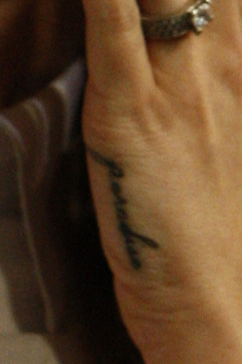
Lana Del Rey Paradise hand tattoo

Lana’s “Paradise” hand tattoo dates to 2012 and is connected to her third studio album. The word is written in cursive along the side of her left hand, where it can show while she holds a microphone or appears in a photo.

In an interview with Der Spiegel, she said death and paradise were linked in her mind. She described paradise as a calm, relaxed place after death, while also saying she simply liked the word. That mix feels very Lana: a big philosophical idea alongside an appreciation for how one word looks and sounds.

The hand placement makes it feel like a private note that happens to be visible. It is not hidden, but it does not take over her look. “Paradise” feels like a destination she keeps close, not a declaration she needs everyone to understand.

Trust No One reflects a harder view of life

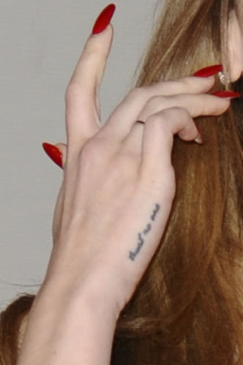
Lana Del Rey Trust No One hand tattoo

On the outside of her right hand, Lana has “Trust No One” in small cursive. She has said it reflects the more cynical view she developed after difficult experiences. In a 2017 interview, she considered removing it, but also said that deep down she still agreed with the message.

That tension makes the tattoo more than a simple slogan. It is a statement she has also questioned. A phrase may fit one chapter of life and feel too blunt later, especially when it sits somewhere as visible as a hand.

The words also balance “Paradise.” One points toward peace and the afterlife; the other warns against trusting people. Together, they capture two moods that often run through Lana’s work: romantic longing, and the knowledge that longing can hurt.

Die Young runs along her right ring finger

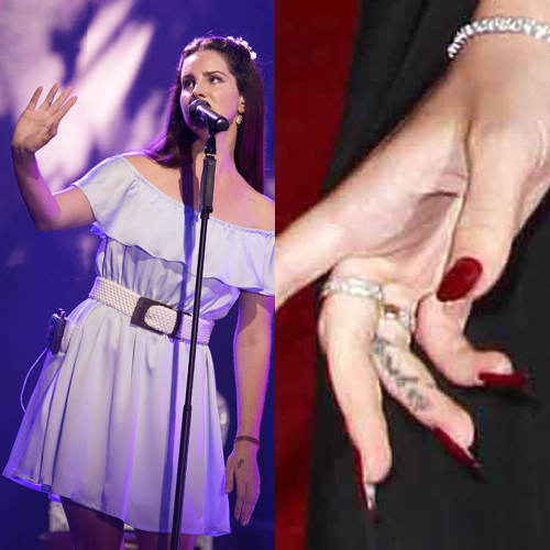
Lana Del Rey Die Young finger tattoo

Lana also has “Die Young” written in cursive along the side of her right ring finger. In a 2014 Guardian interview, she said she was not afraid of dying young in the way some of her heroes had been.

The phrase calls to mind artists such as Amy Winehouse and Kurt Cobain, whose early deaths became part of the mythology around their music. Lana’s tattoo does not necessarily celebrate dying; it reads more like an acknowledgment of the short, intense lives associated with some artists.

Finger tattoos are small, but this one carries more weight than its size suggests. Beside “Trust No One,” it turns the hand into a compact set of ideas about risk, time and getting through hard things.

The M tattoo honours her grandmother

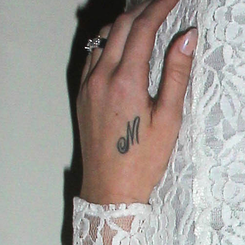
Lana Del Rey M hand tattoo

Near the thumb on the back of her left hand, Lana has a cursive “M” for her grandmother, Madeleine. It is one of her simplest tattoos and one of the most direct: an initial for someone in her family she wanted to keep close.

The letter is easy for Lana to see, and it sits near “Paradise.” On the same hand, an abstract idea and a specific person share space. That personal note keeps the collection from being only a record of artistic influences.
Nabokov and Whitman are written down her right forearm

Lana has “Nabokov” and “Whitman” written vertically in fine cursive on her right forearm. The names refer to Vladimir Nabokov and Walt Whitman, writers she has said she admires. She has explained that seeing their names reminds her that life can be great.

This is a clear example of her preference for script. Instead of a portrait or an illustration from a book, she chose the writers’ names. The tattoo works like a reading list, but a personal one. She is not saying literature makes life painless; she is holding on to the thought that it can still be beautiful. The narrow placement gives it the feel of a note in the margin.
Chateau Marmont brings Los Angeles into the collection

On her left forearm, Lana has another vertical script tattoo: “Chateau Marmont.” It refers to the well-known Los Angeles hotel, which appears in her lyrics, including “Heavy Hitter” and “Off to the Races.”

This one points to a place rather than a person. Chateau Marmont carries associations with old Hollywood, glamour, privacy and the complicated lives of the people who pass through. Those ideas sit naturally beside Lana’s interest in the past.

The forearm placement puts it opposite the Nabokov and Whitman names, creating a loose conversation between writers and a place. One arm carries bookish influences; the other holds a piece of Los Angeles and its mythology.

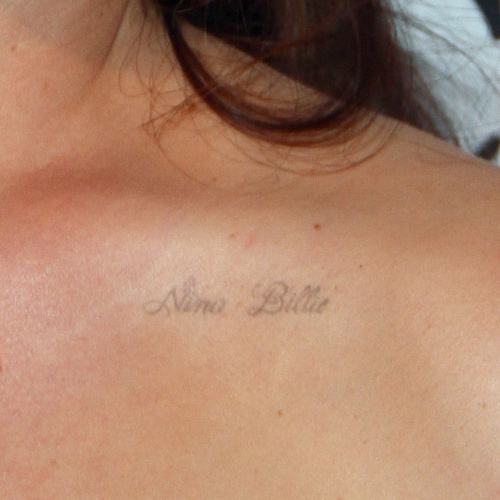
Nina and Billie sit across her upper left chest

Lana Del Rey Nina Billie chest tattoo

On the upper left side of her chest, Lana has “Nina” and “Billie” in light cursive. The names honour Nina Simone and Billie Holiday, singers whose voices and lives have influenced her.

The tribute is specific. Lana has covered Simone’s “Don’t Let Me Be Misunderstood” and “The Other Woman,” and references Billie Holiday in “The Blackest Day.” The names connect directly to music she has brought into her own work.

The light ink and high placement make the tattoos feel like a dedication in the margin of a songbook. They are personal and also say something about the artists who came before her. Lana’s voice sits in conversation with the women named on her chest.

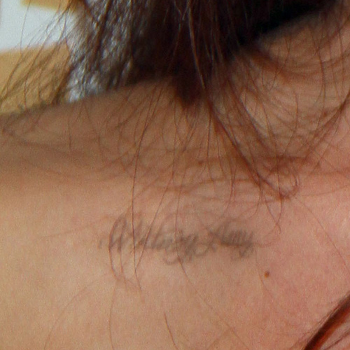
Whitney and Amy honour two more musical heroes

Lana Del Rey Whitney Amy chest tattoo

Across her left collarbone, Lana has “Whitney” and “Amy” for Whitney Houston and Amy Winehouse. She has talked about both artists in relation to her music and has performed the names in the live version of “Get Free.”

These tattoos sit close to Nina and Billie, making her upper chest a small map of the women she hears behind her own work. It is not just a list of famous names; these singers’ voices, lives and public stories have shaped how Lana thinks about performance.

The four names also help explain why the collection feels connected, even though each phrase comes from a different part of her life. They circle the same ideas: home, influence, mortality, art and the people who stay with you while you are travelling.
Why Lana’s tattoos are mostly words

Lana has said she prefers script because she likes the idea of carrying people with her on the road. Her tattoos include writers, singers, her grandmother’s initial, a hotel, a couple of short warnings, an album title and now “Cold War.”

Together, they feel more like handwritten reminders than a collection designed for visual impact. The tattoos are small, but each points to a person, place, book, record or idea Lana wants to keep close. They do not all share a font or placement. What connects them is the attachment behind each one.

Her tattoos give shape to the things she does not want distance to erase. Some references are public and others are private, but the words all have a reason for being there. The new “Cold War” piece follows that pattern without explaining itself yet. Maybe Lana will connect it to a song or record later. For now, it is a new phrase in a collection that treats language like a keepsake.

Watch a Lana Del Rey performance after the tattoo inventory

There is no verified tattoo tour tied to the recent “Cold War” reveal, so this related Lana Del Rey performance is included instead.

Diplo’s Tattoos Tell the Messy Story Behind the Name

Diplo’s tattoos make more sense when you know how he got his name. Before Thomas Wesley Pentz became one of dance music’s best-known figures, he was a kid obsessed with dinosaurs. “Diplo” is short for Diplodocus, and his first tattoo was a dinosaur outline on his right forearm. It is a direct link between a childhood favourite and the stage name that became part of his identity.

The rest of the collection is less orderly. In an Inked Magazine tattoo tour, Diplo talks about pieces tied to the ups and downs of his DJ name, ideas that did not work out, animals he genuinely loves, and tattoos he got because the moment seemed funny. There is a manatee, along with arm tattoos that show up clearly in newer photos. The collection is not trying to make every mark sound serious. Some pieces are personal anchors, some are souvenirs and some are just very Diplo.

His ink feels like a diary of a career that kept changing direction. Here is what the tattoo tour and recent coverage actually show.

The Diplodocus tattoo gave Diplo his name

Diplo Diplodocus dinosaur tattoo on right forearm

Diplo told Jamie Foxx for Inked Magazine that his first tattoo was a black contour of a Diplodocus on his right forearm. It was his favourite dinosaur as a kid, and its connection to his stage name is almost too neat. People found “Diplodocus” difficult to pronounce when he used it to promote music, so he shortened it. The tattoo kept the original idea even as the public name changed.

A first tattoo like that can set the tone for what comes next. It is not trying to look dangerous or expensive: it is a line drawing of a long-necked dinosaur, tied to a childhood favourite and a nickname that grew into a global brand. There is something appealing about the best-known part of the story being so straightforward.

The forearm is a practical place for that memory. Diplo can show it when he wants, but it does not need to dominate every outfit or photo. In the Inked images, the dinosaur sits among other marks instead of standing alone like a logo. It feels like the first page of a notebook, not a finished emblem.

It is also a good reason not to guess at every shape in a photo. The dinosaur is documented. Other black lines and small marks may be visible, but without Diplo identifying them, they should not be turned into made-up symbols. The link between a childhood favourite, a shortened nickname and the start of a long music career is already a strong story.

His second tattoo was tied to the end of the Diplo idea

Diplo arm tattoos from Inked Magazine tattoo tour

Inked’s tattoo-tour clips describe Diplo’s first tattoo as marking the birth of his DJ name, and his second as marking its death. It is a sharp contrast that hints at how quickly his career moved. A name that started as a dinosaur reference became a professional identity, then at some point felt like a version of himself he had to leave behind or reinvent.

The available clips do not give a clear, complete description of every line in the second tattoo. It is better not to invent a symbol or phrase that the source does not identify. What Diplo does explain is the story behind it: one tattoo for the beginning, another for the ending.

That makes the piece interesting even if it is hard to read in a portrait. Musicians often tattoo album titles, labels, logos or dates. Diplo’s story is about a professional identity changing over time, turning his skin into a record of decisions rather than a neat display of permanent branding.

It also leaves room for the memory of an idea that did not work out. Diplo has had plenty of success, but the Inked story includes the messy middle: plans that fell through, a name that needed reshaping, and the winding path from underground mixtapes to major festival stages. A tattoo can hold on to a failed idea as well as celebrate a win.

The manatee is exactly as strange and lovable as it sounds

Diplo manatee tattoo and arm ink

One of the clearest newer stories is the manatee tattoo. In a short Inked video, Diplo is asked why he chose the animal, and his answer is simple: he really loves manatees. There is no need to treat the tattoo like a secret code. An enormous, gentle sea mammal mattered enough to him to earn a permanent place on his skin.

That choice gives the collection some personality. A manatee is an unusual pick for a celebrity tattoo: not a skull, a watch or a grand statement about winning. It is an animal people tend to find odd, calm and a little ridiculous. Diplo clearly enjoys that affection without trying to make it sound profound.

The piece also sits naturally beside the Diplodocus tattoo. Both animals connect to his sense of identity, but they come from different parts of his life. The dinosaur points to childhood and the origin of his name; the manatee seems to come from a later, more personal interest. One helped shape the public persona, while the other appears to be there because he simply likes the animal.

That difference matters. Tattoo writing can try to give every design a grand explanation, but Diplo’s collection does not need one. Some marks point to career milestones, some to family or personal memories, and some are there because an animal makes him happy. Not every tattoo has to sound profound to be worth keeping.

His arms carry the biggest visual weight

Diplo visible arm tattoos in Inked Magazine portrait

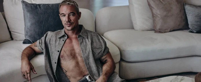
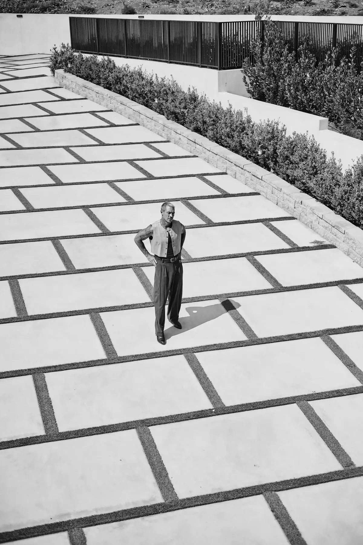
Recent Inked Magazine photos show why Diplo’s arms carry most of the visual weight. In a sleeveless top, the collection is easier to see: lettering, symbols and larger pieces spread across both arms, creating a loose sleeve effect without looking like one planned mural.

The photos help because they show his tattoos on his body, rather than as isolated guesses online. Some pieces are partly hidden by clothing or fall into shadow; others are easier to make out. The placements give the collection an accumulated feel, as if he kept adding tattoos as life moved on instead of booking one weekend to complete a matching set.

The tattoo-tour format suits him for the same reason. Diplo can point to one piece and explain the moment behind it, then move on to something with a completely different mood. His ink does not follow one style: there is the clean dinosaur outline, compact lettering, animal imagery and arm work that stands out in editorial portraits.

There is a difference between a tattoo being visible and its meaning being documented. The photos show that Diplo has substantial arm ink, but they do not identify the story behind every shape. Where a source gives a name or story, this guide keeps it. Where it does not, the honest answer is that the photo shows a tattoo without a confirmed explanation.
The collection follows the career instead of one design style

Diplo’s music career has moved through mixtapes, collaborations, Major Lazer, festival sets, pop production and solo work. His tattoos reflect a similar mix of references. The dinosaur points to a beginning; the second tattoo marks an ending or an earlier version of the name. The manatee is a personal animal story, and the arm pieces show the broader accumulation of years on the road.

There is a useful tension between the public and private sides of that. “Diplo” is known around the world, but the Diplodocus tattoo started with a childhood favourite. The manatee feels even more personal. Between those two are tattoos connected to work, ambition and the need to keep moving when an old plan no longer fits.

His tattoos do not feel like a corporate identity package, even though he has built a huge public brand. They are too odd, too uneven and too tied to different moments. That makes them a good portrait of Diplo: the ink shows his ambition while leaving room for the person who gets a favourite animal tattooed simply because he likes it.
Diplo’s documented ink at a glance

  • Right forearm: a black Diplodocus outline tied to his childhood favourite and the origin of his stage name.
  • Second documented piece: described in Inked’s tattoo-tour clips as marking the end of the DJ name or an earlier version of the dream.
  • Manatee tattoo: an animal design explained by Diplo’s genuine affection for manatees.
  • Arm collection: additional tattoos shown across both arms in recent Inked Magazine photos; the source does not identify every piece’s meaning.

That is the careful version of the list. Diplo has more ink than one dinosaur and one manatee, but the available written coverage does not label every design. The tattoo tour fills in some of the gaps, and the photos show how much work covers his arms. There is no need to turn every blurred line into a confident claim.

What we can say is that the collection returns to names, endings, animals and the odd souvenirs of a career that kept changing direction. His tattoos are less about looking perfectly curated than about keeping the strange parts of the journey.

Watch Diplo explain the animal tattoo

This Inked video focuses on the manatee tattoo and the story behind one of the more unexpected pieces in Diplo’s collection.

More musician tattoo guides

Gary Barlow Wears His Family Close on His Arms

Gary Barlow has never seemed in a hurry to cover every inch of skin. His tattoos are small and personal, easy to miss until a sleeve rides up or a photo catches the light. That understated approach suits him. Take That’s arenas are full of big choruses, but most of Gary’s ink is about the people he wants to keep close while he is on the road.

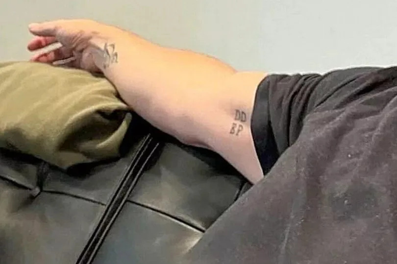
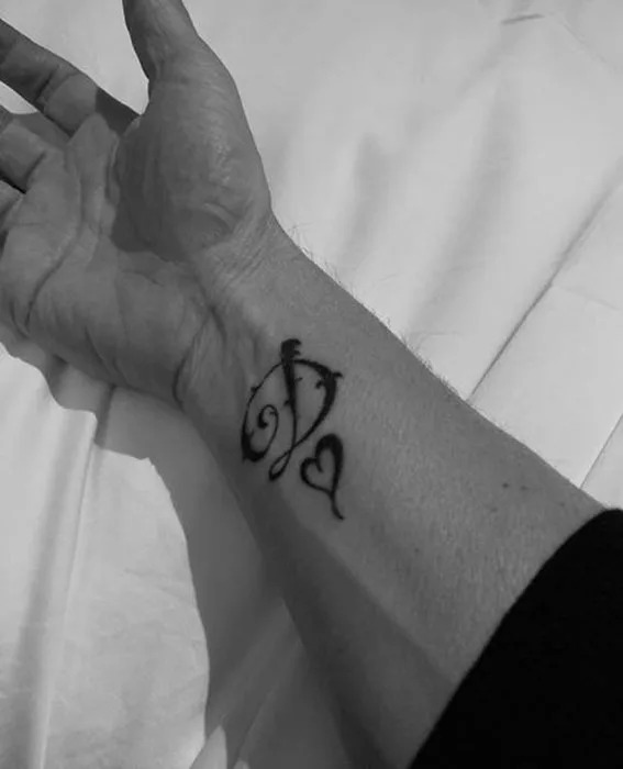
The clearest pieces are his children’s initials on the inside of his right arm, a D and heart for his wife Dawn on his wrist, and a flower on the inside of his left arm. None looks like random flash picked from a wall. They work as small reminders, which may be why they feel more moving than a louder collection would.

There is a sad family story in those initials. Poppy, one of Gary and Dawn’s children, was stillborn in 2012. Her letter appears alongside the others. The tattoo keeps the family together in one line, without turning the design into a public announcement.

The four initials keep his children close on tour

Gary Barlow children initials arm tattoo

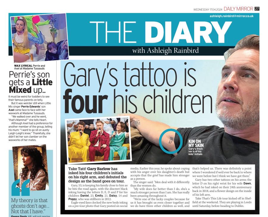
Gary’s newest documented tattoo is a small group of letters on the inside of his right arm. The initials are D, E, D and P for Daniel, Emily, Daisy and Poppy. Fans first noticed the ink in a pre-tour photo of Gary relaxing on a sofa, then shared it online.

The placement makes sense for a musician who spends long stretches away from home. It is small and does not call out from the stage. He can cover it with a shirt and see it when he wants. It is family ink meant as a private reminder, not a design made to become part of the show.

The letters sit together without placing one child above another. Daniel and Emily appear with Daisy and Poppy, whose initial remains there even though she died before the family’s later years. That gives the small group more weight than it might first seem to carry.

Gary has spoken about grief in other settings and about music helping him keep Poppy’s memory alive. The tattoo works in a similar way: quiet, physical and always there. He can look at it without having to explain it to anyone.

Dawn’s initial started the personal tattoo story

Gary Barlow Dawn heart wrist tattoo

Before the children’s initials, Gary got a small tattoo on his right inner wrist: the letter D with a heart. The D stands for Dawn, his wife. He shared the tattoo around the time of their 24th anniversary, and it was described as his first.

There is no elaborate image to decode. A letter and a heart make the message clear. The wrist keeps it near his hand, where he can see it while writing, playing piano or checking his phone between work commitments.

When Gary spoke about the tattoo, he focused less on showing off a new look and more on reminding people to value the person they love. It is a thank-you to Dawn that he can carry with him. That fits with the children’s initials: both tattoos make his private life visible in a quiet, controlled way.

The design also says something about his pace. He did not suddenly become a heavily tattooed performer. He added one meaningful mark, lived with it, then got another when his family story changed. His collection has grown slowly, one piece at a time.

The flower brings a softer shape to the collection

Gary Barlow family tribute tattoo and arm ink

Gary also has a flower tattoo on the inside of his left arm. Public coverage has not given it a detailed meaning, so there is no reason to invent one. It is a documented part of the collection, on the arm opposite his wrist tattoo and children’s initials.

The flower gives the small group of tattoos a different visual note. The letters are compact and typographic; the heart is a simple outline. A flower adds something more organic and open, helping connect the two arms without making them mirror images.

Celebrity tattoo stories often give every flower a universal meaning: love, growth, remembrance or a new beginning. Those interpretations may be possible, but Gary has not confirmed one for this design. The straightforward description is the useful one: it is a flower on his inner left arm, beside his family-related ink.

That restraint is part of the appeal. Not every tattoo needs to become a slogan. Some designs can stay visually pleasant and personally private.
His tattoos stay deliberately understated

Gary’s ink is easy to overlook because it is not arranged into one large sleeve. The initials are small, the wrist piece is compact and the flower can disappear beneath a short sleeve, depending on how he is standing.

That matches the way Gary talks about his life. He can be open about difficult subjects without turning every detail into a performance. The tattoos are there, but they do not ask for the spotlight; the people they represent stay at the centre.

The biggest recent change came when he added the children’s initials before Take That’s 41-date tour. That timing gave the tattoo a practical edge. Touring means hotels, buses, soundchecks and long nights away. The letters offer him a small piece of home as he moves from city to city.

They are also placed where they can be seen casually. A rolled sleeve or a photo from a sofa is enough. Gary does not need a full tattoo tour to make the point.
Family is the thread connecting the pieces

Together, the tattoos have a clear focus. Family is the main subject: Dawn appears in the D and heart, and the children in the four initials. Poppy is there with Daniel, Emily and Daisy, making the newest design feel complete.

The flower is the least explained tattoo, but it still sits within a collection that leans toward affection rather than rebellion. There are no documented images of a huge logo or aggressive statement competing with the personal pieces. The designs are smaller and more domestic.

That does not make the tattoos boring. A small initial can carry more feeling than a large design when you know the person it names. D, E, D and P are four letters with an entire family story behind them. The wrist D is just one letter, but the heart makes its message plain.

There is a useful difference between having tattoos and trying to look tattooed. Gary has the first without chasing the second. His ink records the people in his life, rather than giving him a costume.
The timing gives the newest piece extra weight

Gary’s children’s initials appeared as he prepared to head back on the road with Take That. The design is more than a list of names: it comes as he faces long stretches away from home.

He has written and performed through difficult family memories, including Poppy’s loss. He has also described music as a way to keep her memory present. The tattoo adds another way of doing that, placing her initial beside those of the other children in one small mark.

It is tempting to call it a “tour tattoo,” but that misses the point. The tour is when people noticed it; the names are what give it meaning. The road explains the timing, not the reason.

That is why one small, slightly blurry photo drew so much attention. Fans were not just looking at a new style. They recognised the initials of a family they already knew from Gary’s songs and interviews.
What Gary Barlow’s tattoos say as a whole

Gary’s collection shows that tattoos do not have to be large to be specific. The D and heart mark his relationship with Dawn. The four initials keep his children close, including Poppy. The flower adds a softer visual note without needing a public explanation.

There is no sign that Gary is building a full sleeve or planning to cover his body. If he adds more tattoos, they will probably meet the same test: does the design mean something to him, and can he live with seeing it every day? That is a different question from simply asking whether it looks cool.

For now, the picture is compact but clear: a wrist tribute, the family initials and a flower on the other arm. Gary keeps his family close without making a spectacle of it.
Watch Gary Barlow talk about life, family and Dawn

More musician tattoo guides

Tyler Seguin Keeps His Family Close in Ink

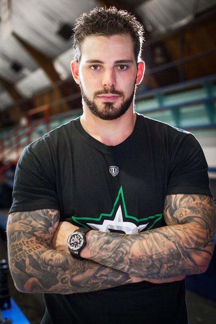
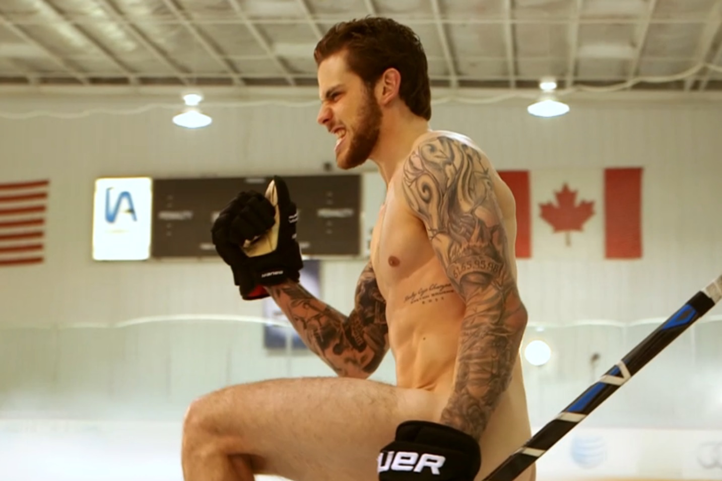
Tyler Seguin’s tattoos feel like they were added one piece at a time, with family in the dates, hockey in the memories and a few choices that are funny because they hurt. His arms do most of the talking, but the chest work matters too: a wolf, a lion and a patch of unfinished skin he has joked about.

Seguin got his first tattoo at 16, just as he was leaving home to play hockey. It was a simple design, and the collection grew as his life got busier. In his GQ tattoo tour, he is candid that not every choice came from a grand plan. Some pieces are personal and quiet, some are bold, and one is basically a painful group joke.

His first tattoo started with his surname

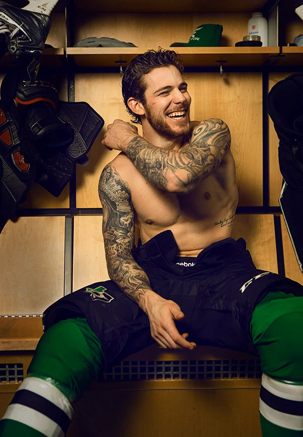
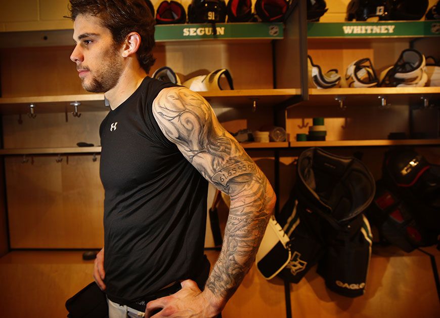
Tyler Seguin tattoos on his arms in a locker room portrait

His first tattoo is a good place to start. At 16, Seguin had his “Seguin” tattooed on his arm. His dad got the same surname inked, turning a teenager’s first appointment into a family moment instead of a random souvenir.

Seguin has said the lettering looks a little crooked because he was trying to avoid leaving a mark on his skin. That detail feels familiar. The tattoo is not presented as perfect, which is part of what makes it feel real. Early ink is often less about planning a future sleeve and more about wanting something permanent right then. This one carries his family name every time he takes off his jersey.

From there, the collection spread across both arms. The surname remains an anchor as larger designs and shaded sections filled in around it. The first tattoo became part of the story, not something he needed to cover up.

A heart on his sleeve keeps family dates close

Tyler Seguin heart and sleeve tattoos visible on the ice

The most direct family tribute is a heart on Seguin’s sleeve that holds the birth dates of his family members. It is more specific than a generic “family first” slogan. The dates make the tattoo personal, turning the sleeve into something like a calendar of the people who shaped him.

The piece also shows how a sleeve can differ from a single tattoo. A heart by itself would be familiar; surrounded by dates, lettering and older work, it becomes a map of relationships. It reads from a distance, but the smaller details reward a closer look.

Family birth dates are among the clearest documented details in Seguin’s collection because he has explained what they stand for. The placement makes practical sense, too. Hockey gear covers most of his arms while he is playing, but away from the rink the sleeve is visible in everyday life, locker-room photos and interviews.

Perseverance and brotherhood run down the arm

Tyler Seguin full sleeve tattoos in a locker room

One arm carries a string of words that read like rules Seguin wants close. The documented phrases include perseverance, brotherhood, family, loyalty and honor. They sit beside a family tree, linking private ideas to the life he has built around hockey.

“Perseverance” suits an athlete, but the group is not only about winning. Brotherhood points to teammates and friends; loyalty and honor sound like standards to hold on to when a season gets hard. The family tree gives the words a centre.

Motivational lettering can feel generic on a wall or in a caption. On skin, the choices stay with you. Seguin lives with them, good or bad, as the years pass. They work as reminders, not a packaged slogan.

The lettering also ties different parts of the sleeve together. The surname, heart, dates, tree and larger images sit within a story about where he came from and the people who helped him reach the NHL.

The shoulder triangles are for his sisters

Tyler Seguin shoulder and arm tattoos in a portrait

Near his shoulders, Seguin has two triangle tattoos for his younger sisters. The shapes are simple, but he has explained why they are there. One triangle is finished because he is the first-born. The other holds a more private meaning he has not gone into publicly.

That difference matters. Tattoo stories do not have to become complete captions. One sister’s symbol comes with a clear detail; the other leaves something just for the family. Together they show how a collection can be open and personal at once.

Triangles can fit neatly into the lines and shading of a sleeve without taking up much room. These are not just geometric filler. His sisters are the reason those shapes are there, which gives them more meaning than the form alone.

A wolf spirit and lion passion sit on his chest

Tyler Seguin wolf and lion chest tattoos in a gym portrait

Two of the clearest chest images are a wolf representing spirit and a lion representing passion. They give his upper body a different feel from the word-heavy sleeve. Instead of dates and values, the animals suggest character.

The wolf and lion are not there only to make the chest look tough. Seguin has described the ideas behind them: the wolf suggests instinct, independence and the drive to keep going, while the lion brings confidence and intensity. Together they feel like two sides of the same athlete: private determination and public force.

He has also joked about the unfinished areas around his nipples while showing off the tattoos. The skin there was left bare, and he said he planned to finish it. Even a heavily tattooed body can have awkward unfinished spots, especially when the work is spread over several years.

The chest pieces broaden the collection. Without them, the tattoos would read mostly as an arm story. The wolf and lion extend the designs across his body and give the sleeve work a larger frame.
One session brought a painful surprise

Every collection needs at least one tattoo that makes people laugh. Seguin’s is a small stick man in his armpit. He got it during a session in Boston when his friends were all getting stick men tattooed. The spot was especially painful, which is exactly why the story stayed with him.

It is not a symbol of a major event or a carefully planned tribute. It is a reminder of a night with friends and a decision that seemed funny enough to justify an awful location. That gives the tattoo a job his larger pieces do not have: it keeps the collection from taking itself too seriously.

Small joke tattoos can become the pieces people remember most. A large sleeve takes time to understand; an armpit stick man is a story you can tell in a sentence. Seguin’s collection includes family dates and serious words, but it also leaves room for pain and bad judgment to become part of the archive.
Hockey is part of the timeline, not just the subject

Seguin’s tattoos connect to hockey even when they do not show a stick, puck or team logo. His first arrived as he left home to play. The Boston session belongs to another hockey chapter. Perseverance and brotherhood fit the demands of a long career, and the collection has grown as he has moved through teams and cities.

That is why the tattoos feel more like a timeline than one visual theme. Some point to family; others mark friendships or the attitude needed to keep working. The different styles are part of the story.

Seguin has called tattoos a form of expression and art, and his collection reflects that. He has left room for more: he has talked about adding his future children’s names or images on his back, and expects more chest work. The story is still open; the current collection is not presented as finished.
What Tyler Seguin’s tattoos say as a whole

Taken together, the tattoos show a player using ink to keep people and ideas close. Family is the strongest thread, running through his surname, birth dates, family tree and sister symbols. The words on his arm add a set of values, while the wolf and lion give his chest a more instinctive edge.

Then there is the stick man, which keeps the collection from turning into a speech. Seguin’s tattoos can mean a lot without becoming precious. Some were planned, some were added with friends, and some still have unfinished sections waiting for another session.

That mix makes the collection feel like a real person’s skin over time, not a mood board put together in a weekend. The next chapter may include children’s names, a finished chest or something unexpected. For now, the record is a blend of family, hockey, personal rules and a few decisions made because the pain seemed worth the joke.
Watch Tyler Seguin explain the tattoos

More athlete tattoo guides

John Stamos Finally Got Ink at 62

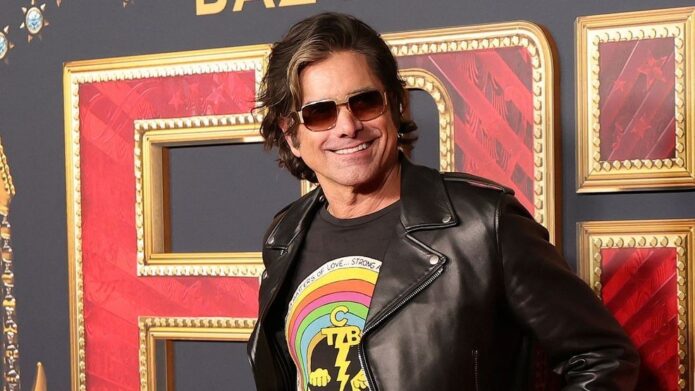
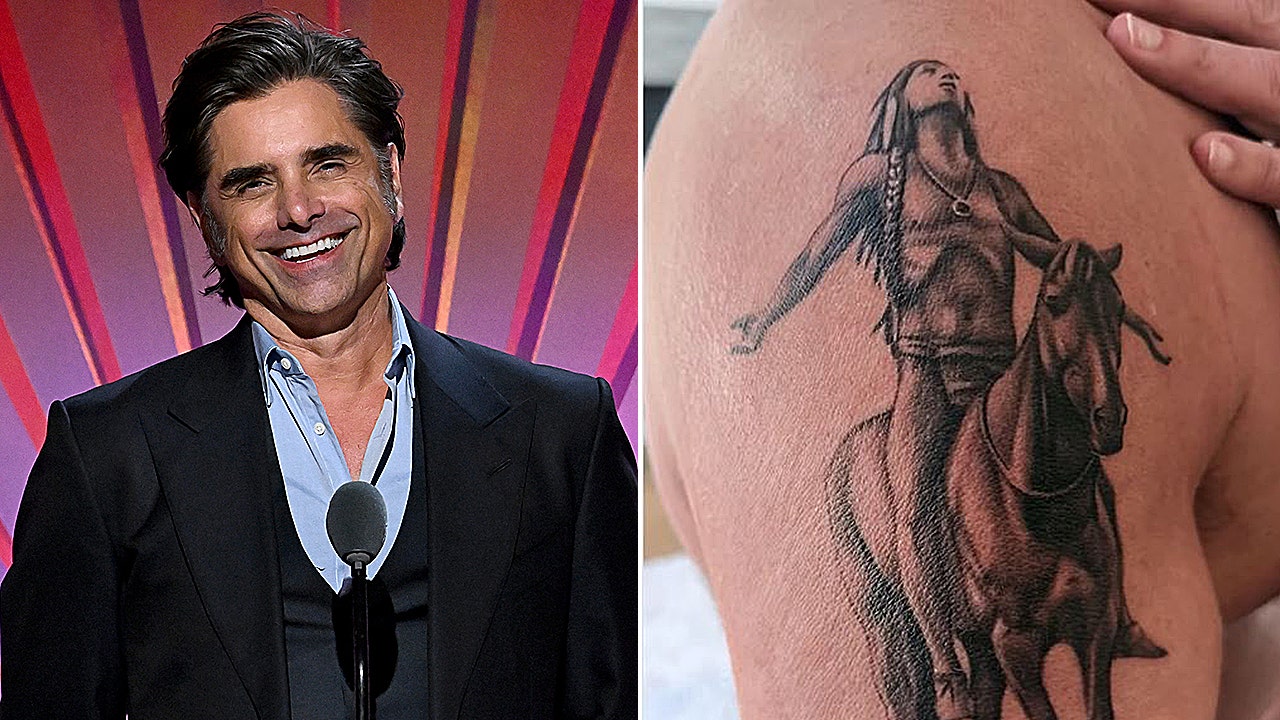
John Stamos waited until he was 62 to get his first tattoo, and the choice turned out to be more than a typical celebrity-ink reveal. It is a Native American rider on horseback, looking up, covering a large area of his upper right arm. The timing is part of the story. After decades on television, onstage and on tour buses, Stamos had never made a tattoo part of his public image. When he finally chose one, he did not go for a tiny symbol near his wrist. He picked a large image tied to music, freedom and the direction he wants his life to take.

This is currently the only publicly documented tattoo in his collection. That makes it easier to separate what is known from rumours. There is no long list to fill out and no reason to suggest the piece belongs to a secret sleeve. Stamos got one major tattoo, explained the choice and shared the process as it happened.

John Stamos’s first tattoo is a Native American on horseback

John Stamos Appeal to the Great Spirit tattoo and portrait

The design shows a Native American rider on horseback, looking toward the sky. It is a large, detailed image rather than a simple outline. In photos from the appointment, it covers a broad stretch of his upper arm, which surprised people expecting a smaller first tattoo.

The composition feels traditional and almost monumental. The rider and horse appear in profile, the figure’s arms raised as the horse moves forward. That gives the tattoo a sense of motion without adding text or extra symbols.

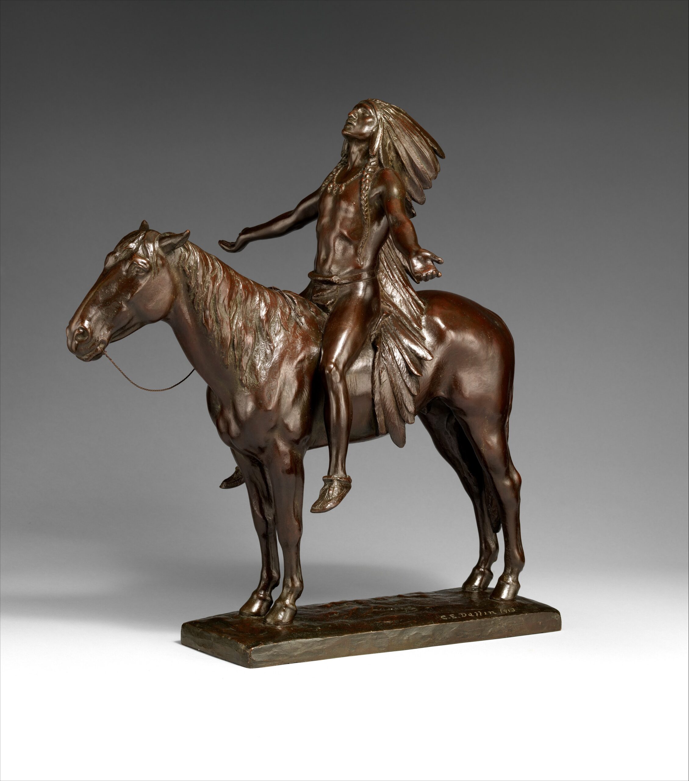
Stamos did not describe it as a random picture picked from a flash book. He connected it to “Appeal to the Great Spirit,” the well-known image the Beach Boys used above the Brother Records logo. That gives the tattoo two layers: a historical-looking figure and a personal nod to a band that has been part of his life for decades.

The design works as a first tattoo because it can carry meaning without a caption. Even in an early process photo, the silhouette is easy to read: the rider looks upward, the horse creates a strong horizontal line, and the placement gives the image room to breathe.
Why Stamos chose to get ink at 62

Stamos described the timing as a decision that finally felt right. He had recently turned 62 and was talking about a new chapter in his career and personal life. Rather than treating the number as a reason to slow down, he framed it as a moment to take bigger chances.

That makes his first-tattoo story different from one driven by youthful rebellion or a desire to shock people. Stamos chose the image after decades of knowing what his public image looked like. The tattoo does not suggest he suddenly became someone else; it makes a change he already felt more visible.

Waiting this long gave the choice a settled confidence. He had years to watch trends come and go and decide whether he wanted a tattoo of his own. By the time he sat in the chair, the decision was about more than novelty.

There is something funny about the scale of the reveal. A first tattoo at 62 could have been a tiny star or a discreet date. Instead, Stamos chose an image that covers much of his upper arm. He was not looking to ease into the idea halfway.

The Beach Boys connection gives the image its meaning

Appeal to the Great Spirit reference for John Stamos tattoo design

Stamos has a long public connection with the Beach Boys. He has performed with the band and often talked about how important music has been in his life. He tied the tattoo to “Appeal to the Great Spirit,” the image the group used for Brother Records as a sign of artistic freedom and trust in a creative path.

That is more specific than saying the tattoo simply stands for strength. The figure is not just there because it looks dramatic. Stamos uses it as a reminder to stay open, keep moving and trust where the work takes him.

He has said he felt the same pull in his own life and wanted the tattoo to remind him to “stay brave, stay open, and trust the direction the art is taking me.” That makes the image feel like a personal note large enough for other people to see.

The piece also brings his acting and music careers together. Many people know Stamos from television, especially Full House, but his relationship with the Beach Boys has kept music close to his public story. The tattoo connects those parts of his life instead of choosing just one.

The process matters as much as the finished design

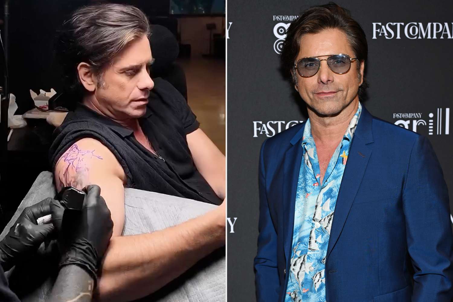
John Stamos getting his first Native American horseback tattoo on his upper arm

Stamos shared a montage of the tattoo being done, giving the first piece more context than a single reveal photo. The video shows the early outline, the artist working across his upper arm and the image gradually taking shape. That is useful with a large tattoo, which can look abstract before the shading is finished.

The first lines do not immediately read as a complete rider and horse. As the shading comes in, the figure becomes easier to recognise. Seeing that change makes the final image feel built over time rather than instantly produced.

The footage also makes the appointment feel less like a publicity stunt. Stamos showed the awkward middle stage, when the design was still underway and the artist was working over his skin. A polished red-carpet photo would hide that part; the montage leaves it in.

For someone getting a first tattoo later in life, that openness matters. A large piece takes time as well as commitment. It asks for planning, patience and a willingness to live with the image while it is still unfinished.
One big tattoo gives him a clear visual starting point

Because Stamos has only one documented tattoo, it immediately becomes the centre of his ink story. No older designs compete with it, and there is no need to explain how it fits into a sleeve. The upper-arm placement can leave room for future work, but the first choice already stands on its own.

That does not mean he is planning a full collection. Stamos has not announced another tattoo, and one design is not evidence that a sleeve is coming. The useful point is that he chose a placement that works by itself.

The tattoo feels complete without closing off the possibility of more. It has a clear subject, enough space and a meaning that does not depend on matching pieces. If Stamos never gets another tattoo, this one still reads as a finished statement. If he adds more later, the upper arm gives him options without dictating a direction.

That balance can be hard to find. A first tattoo can feel too small or leave no room to grow. Stamos landed between the two: one substantial image without committing to a full sleeve.
What John Stamos’s first tattoo says about this chapter

Stamos framed the tattoo around bravery, openness and following the work. Those ideas fit with how he has talked about his life in recent years, including family, sobriety and staying on a healthier path. The design is not a direct memorial to one person, but it connects to choosing a direction and committing to it.

The rider looking upward gives the image a hopeful feel. It is not a skull, a warning or a joke. It is a figure in motion, tied to music history and the idea of taking the next step even when the whole route is not mapped out.

There is no need to make the tattoo more mysterious than Stamos already has. He has explained the reference. The appeal is in the straightforward meaning: a new piece for a new phase, connected to art that has mattered to him and placed where he can see it.

That makes it a fitting first tattoo. It is personal without being too private, dramatic without feeling random, and large without covering his whole body. At 62, Stamos did not need ink to prove he was tough. He used it to mark a decision about where he wants his life to go.

For now, the collection is one design, but it is a substantial one. The rider, horse and upward gaze point back to the Beach Boys reference and the idea of creative freedom. The tattoo is hard to miss, and its story keeps it from feeling like a late-life novelty.

If this remains Stamos’s only tattoo, it still tells a complete story. He waited until the choice felt right, picked an image tied to his musical life and treated the appointment as a reminder to keep moving forward. That is a lot for one tattoo to carry, but it has the scale and backstory for it.

Watch John Stamos get his first tattoo

This verified video report covers Stamos’s first tattoo and the Beach Boys meaning behind the design.

More actor tattoo guides

Willow Smith’s Ink Reaches from Her Hands to Her Shoulder

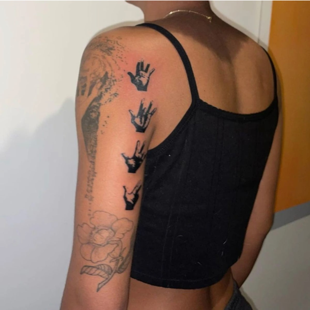
Willow Smith’s tattoos have taken shape in a way that feels like her: curious, a little cosmic and not especially interested in looking like anyone else. The collection ranges from small hand tattoos and finger marks to a larger shoulder piece built around a reaching hand and a galaxy. It also includes flowers, script, repeated hand signs and the figure of Saraswati, the Hindu goddess of knowledge, music, and learning.

Some designs come with clear stories. Others have been photographed enough for their shape and placement to be recognised, even if Willow has not explained every line. That distinction matters: this guide sticks to what can be seen and documented instead of guessing at every symbol.

Willow has moved through different visual eras, so photos do not always show the same tattoos in the same condition. Fresh ink can look darker than older work, and a tank top reveals a different picture than a jacket. Across the available photos, most of the visible pieces sit on her hands, fingers, upper arm, shoulder, and outer arm.

The shoulder piece turns a simple hand into a whole scene

Willow Smith galaxy arm tattoo

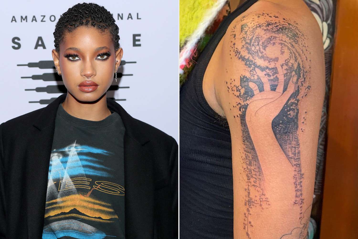
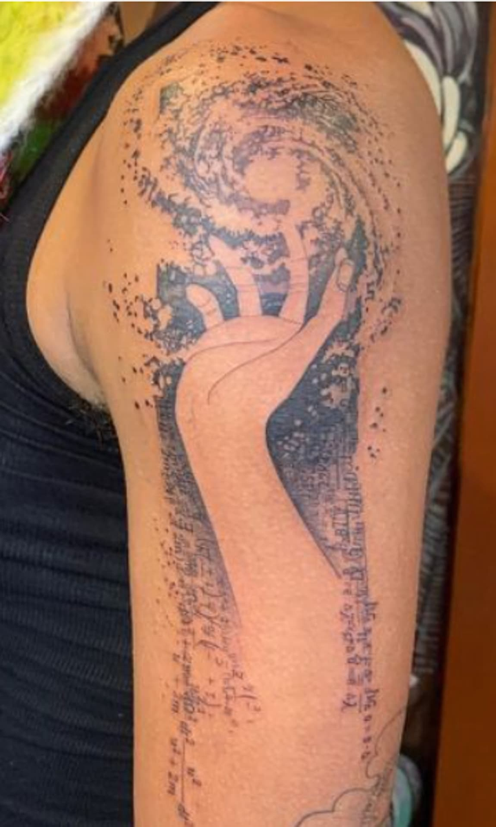
The most striking design is the large tattoo across Willow’s upper arm and shoulder. At its centre is a hand reaching upward, surrounded by a swirling, galaxy-like field. This is not a small outline or a quick flash design. Dotwork, shading, scattered marks and darker patches spread across a broad area, making the arm feel as if it opens into space.

Allure connected the tattoo to Willow’s interest in outer space, offering some context without assigning a meaning to every detail. The hand is easy to read: it reaches into the cosmic pattern rather than sitting inside a neat frame. The loose edge is part of what makes the piece work. Speckles and lines seem to move outward from the central shape.

In photos, the tattoo starts near the shoulder cap and runs down the outside of her upper arm. Because it is mostly black and grey, lighting changes how it looks. A bright close-up brings out the hand and texture; in a darker shot, it can read as a denser area of abstract ink. Either way, it gives the collection its biggest visual anchor.

The scale is what changes the balance of her whole arm. Willow’s smaller tattoos are still there, but this piece can be spotted across a room and rewards a closer look.

Her arm mixes old-school outlines with newer blackwork

Willow Smith arm tattoos

Another photo, taken from the side, makes it easier to see that Willow’s arm is not one seamless sleeve in a single style. Repeated hand-sign designs run down the upper arm. Lower down, a large outlined flower sits near a long curved shape that could be a leaf, ribbon or botanical stem. Older shaded work shares space with newer, darker areas, giving the arm a layered look.

The repeated hand-sign designs are easy to recognise. Set one below another, their bold black silhouettes hold their shape even in a distant photo. They add rhythm to an arm that also has plenty of fine lines. The designs leave open space around them rather than filling every inch with solid black.

Lower on the arm, the fine-line flower is lighter and more open. Its petals are outlined, and the stem curves into the surrounding work. It gives the lower arm a softer section without competing with the larger shoulder piece.

There are also vertical marks along the outer arm. They show up in close photos, but the exact wording is not consistently clear. It is safer to call them fine script-like markings than to guess at a translation. That keeps the description accurate while still acknowledging part of the sleeve.

The hand tattoo is the most personal-looking close-up

Willow Smith hand tattoos

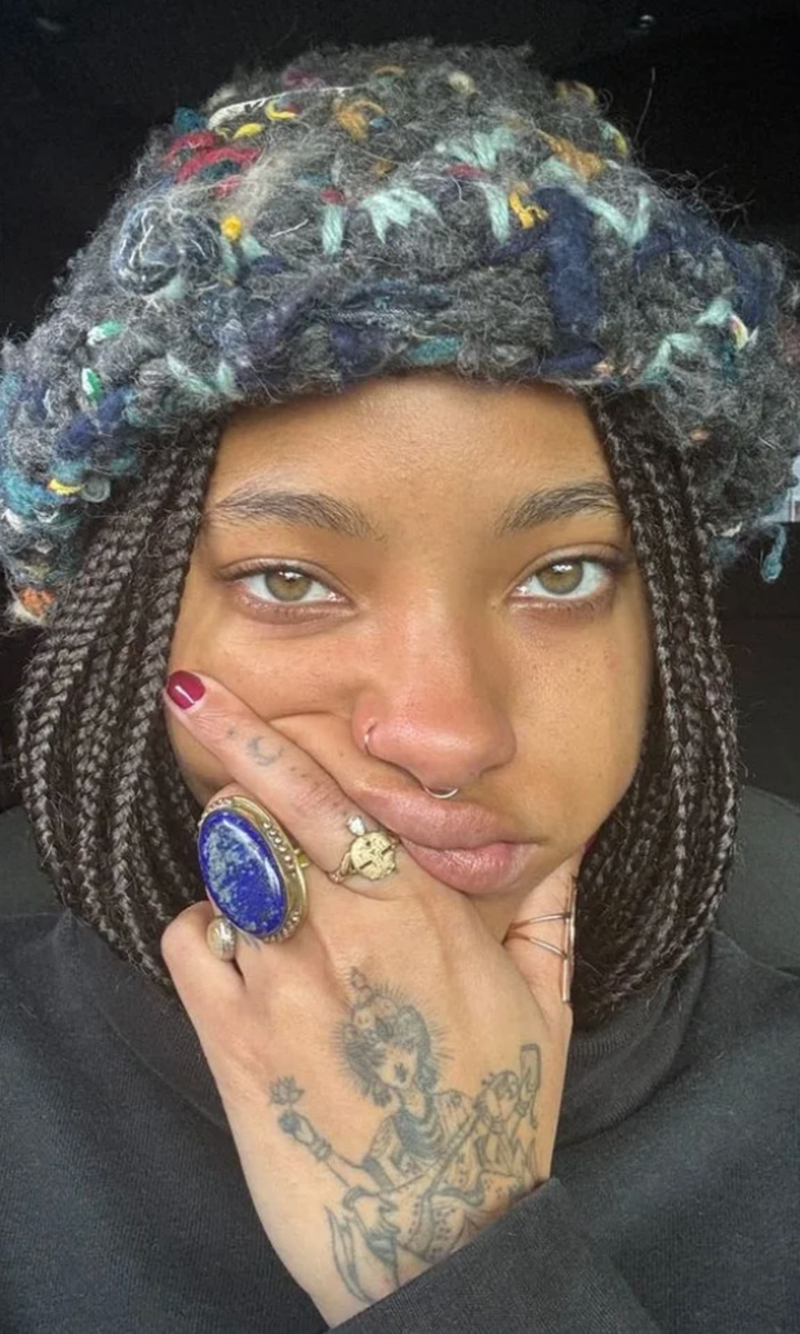
Willow’s hand tattoos are much smaller than the shoulder design, but they often catch the eye because her hands feature in so many portraits. One close-up shows a figure seated across the back of the hand, with an ornate crown or halo, flowing clothing and fine lines around it. A tiny flower-like mark sits to one side, with other small symbols on the fingers and knuckles.

The hand curves and moves, so the design does not read like a flat illustration. Lines bend around the knuckles and fade toward the sides. Rings can cover parts of it, and a selfie angle can make one section look darker, but the central figure is distinct from the smaller marks around it.

Willow’s jewellery and tattoos overlap visually on her hands. Large rings, a nose ring and painted nails may catch your eye first, then the ink underneath. The tattoos show up in ordinary gestures, like resting her chin on her hand or turning her fingers toward the camera, rather than in a formal display.

Not every small symbol has a public explanation. The photos show a detailed hand figure, small botanical marks, finger symbols, and fine lines spread across the hand. That is enough to describe the design without claiming to know what every mark means.

Saraswati appears in a separate hand tattoo story

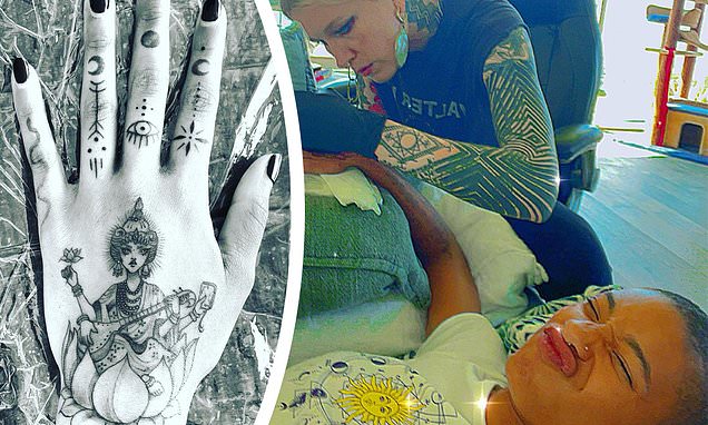
Willow Smith Saraswati hand tattoo

A separate set of photos from the early 2020s shows the hand tattoo more clearly. Coverage identifies the figure as Saraswati, the Hindu goddess associated with knowledge, music and learning. She is shown with multiple arms, an ornate headpiece and what appears to be a musical instrument. The illustration is much more detailed than the smaller finger marks around it.

It is useful to distinguish this from the general phrase “hand tattoos” because the subject has been identified in coverage. The photos support the identification, but they do not include a full statement from Willow about why she chose the image. There is no need to turn the tattoo into a made-up biography.

The figure covers much of the hand, while the fingers carry smaller marks of their own. From a distance, the area can look like one dark patch; up close, the details emerge: curved limbs, jewellery-like lines and smaller shapes around the main figure. It reads more like a miniature illustration than a logo. That is different from the bold hand signs on the upper arm. Willow’s tattoos move between graphic symbols and finely drawn figures without settling on one style.

Finger marks and small symbols keep the collection loose

Willow Smith arm tattoo composite

The smallest tattoos are easy to miss, but they help the collection feel layered instead of planned as one matching sleeve. Close photos show little symbols on the fingers, short marks near the knuckles and delicate shapes around the larger hand figure. Some resemble stars, flowers or geometric signs, though the photo quality and angle do not always make a firm identification possible.

These pieces also change how the hand looks in a photo. A wave can reveal several marks at once, while a hand-to-face pose hides most of them. The collection comes in and out of view with each gesture, which is why quick red-carpet photos rarely tell the whole story.

It can be tempting to attach a meaning to each tiny mark, especially when the larger tattoos have such strong themes. But there is no need to overstate what is known. Willow has visible hand and arm ink, including the Saraswati figure and space-inspired work, alongside small symbols whose individual meanings have not been publicly explained.

What the full sleeve says about Willow’s tattoo style

Seen together, Willow’s tattoos do not look like one session or one artist trying to make every piece match. The collection includes fine-line drawing, dotwork, black silhouettes, botanical outlines, script, and illustrative figures. Older work remains visible instead of disappearing beneath a blackout sleeve, while newer tattoos add darker areas and larger shapes.

The cosmic shoulder piece is the broadest statement, but the smaller designs keep it from becoming the only thing people notice. The hand brings an intimate scale; the flower softens the lower arm; the repeated signs create a pattern; and the Saraswati figure adds a detailed image with a clear name and cultural reference. Together, the pieces feel personal even though not every one has the same kind of explanation.

There is a practical side to how Willow wears the tattoos. A jacket can cover most of the upper arm, while the hand ink remains visible. A tank top shows the shoulder piece, and a close selfie can reveal details that disappear in a full-body event photo. The clothes and camera angle change what you can see, so it takes more than one press photo to get a useful inventory.

Willow Smith’s tattoos are still a work in progress

It would be a mistake to treat this as a final list. Willow keeps changing her hair, clothes, jewellery and body art, and recent coverage shows how quickly the collection can grow. For now, the clearest snapshot includes the galaxy-and-reaching-hand shoulder piece, repeated hand signs, an outlined flower and fine markings on her arm, the Saraswati hand tattoo and smaller finger symbols.

The larger point is that her tattoos do not follow a tidy checklist. They feel like pieces collected over time. Some are bold and graphic, some delicate, and some are hard to identify unless the photo is sharp and close. Her ink does not aim for perfect uniformity; it looks like a record of different ideas arriving at different moments.

For the clearest view, compare the arm and shoulder photos with the hand close-ups. Seeing them together helps show the scale: the galaxy work covers a large area, while the goddess figure and small symbols add detail at the edges. The collection has a visual language of its own, but it is still open to change.

Watch Willow talk about the tattoo story

For a quick look at the coverage and the meaning discussed around Willow’s larger design, watch the feature below.

More musician tattoo guides

Carlos Alcaraz’s Tattoos Keep Score of His Biggest Wins

Carlos Alcaraz does not have tattoos covering every inch of his body. Instead, he has a small but growing group of designs tied to the biggest moments in his tennis career and the people who have shaped him. The best-known is the CCC tattoo on his left wrist, short for cabeza, corazón y cojones—head, heart and guts—a family motto passed down to him.

Grand Slam wins have begun to leave their own marks, too. The tattoos now form a quiet record of milestones, with dates, symbols and new designs appearing after major victories. In 2025 and 2026, attention shifted from the original wrist tattoo to a run of victory pieces, including a kangaroo design connected to his Australian Open win.

That makes Alcaraz’s ink easy to follow. It is not random decoration or a giant sleeve made for show. Each piece has a purpose: remembering a title, honouring a family idea or holding on to a moment that passed quickly on court.

The Three Cs on his wrist

Carlos Alcaraz Grand Slam tattoo

The tattoo most associated with Alcaraz is the Three Cs, usually written as “CCC.” The letters stand for cabeza, corazón, cojones, roughly translated as head, heart and guts. It is a Spanish motto about meeting a hard task with intelligence, feeling and courage. For a tennis player, the idea is direct: think clearly, care about the contest and stay brave when a match gets tight.

Alcaraz has also connected the phrase to his grandfather, which gives the wrist tattoo more weight than a standard motivational slogan. The placement means he sees it often, during warm-ups, changeovers and the pauses between points. It works like a personal reminder that happens to show up in photos.

The design is understated. It does not compete with his kit or racket; the letters are compact, readable and personal. It feels like advice from home that he carries into a very public career.

Dates that turn wins into keepsakes

Carlos Alcaraz tattoo tradition

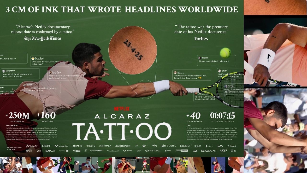
Alcaraz’s later tattoos are often discussed in terms of the dates they preserve. Major wins can blur together when a player is travelling, training and moving straight to the next tournament. A date gives a memory a fixed place. It lets him carry a specific achievement with him instead of just remembering that he won.

Close-up footage and social posts have shown small designs with numbers and dates tied to big moments. Some are easy to read; others are partly hidden by clothing or the camera angle. It is better to describe only the details that can be made out than to turn a blurry number into a definite claim.

The pattern is clear even when every mark is not: Alcaraz uses tattoos as a scoreboard for his career. The point is less to collect designs than to mark the wins that changed how he saw himself. That also explains how his collection can grow after a breakthrough season without seeming careless.

The US Open tattoo and a new chapter

Carlos Alcaraz tattoo meanings

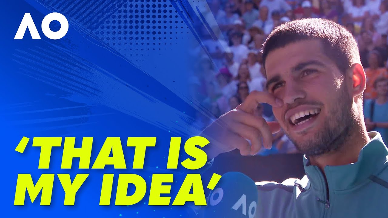
After his US Open win, Alcaraz spoke about new ink connected to the victory. The exact design has appeared in a few glimpses, but the timing is the important part. It was not a tattoo chosen years earlier and given a convenient explanation later. It arrived as a way to remember a specific tournament and the feeling around it.

For a young athlete, that is a natural use of tattoos. A first major title can change your life overnight, but the attention eventually moves on. A date or small symbol gives the moment a permanent place in the story, like a private receipt for the work that came before the trophy photo.

It also fits how Alcaraz talks about his career. He is open about the people around him and the emotional side of competition. His tattoos do not read like a brand campaign; they feel more like a list of things he does not want to forget.

Why the kangaroo matters to him

Carlos Alcaraz kangaroo tattoo

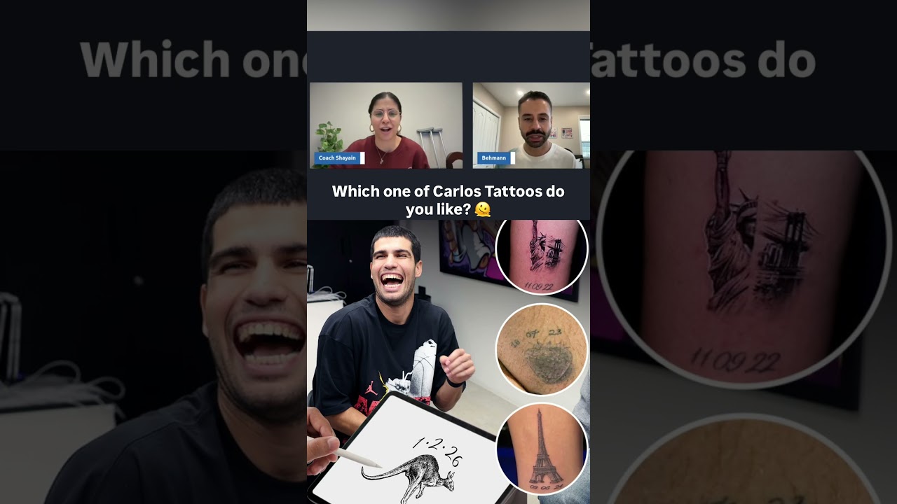
One of the most discussed new designs is the kangaroo tattoo planned after his Australian Open victory. Alcaraz said he already knew which animal he wanted before deciding where to place it. It feels very much like him: playful at first glance, but tied to a major achievement.

The kangaroo is an obvious nod to Australia, though it is more than a travel souvenir. It marks a tournament he had worked toward and a win he wanted to remember. The animal’s lively, slightly cheeky energy also suits the way Alcaraz celebrates when a match turns his way.

Early 2026 coverage described the proposed tattoo as a way to commemorate the Australian Open. Later photos showed the design taking shape. The timeline is clear: he talked about the idea, the win gave it meaning, and the ink followed once the moment had settled.

Small pieces with big context

Carlos Alcaraz new tattoo

Alcaraz’s collection is a reminder that a tattoo does not have to be large to matter. A small mark can hold an entire season. The wrist motto connects him to his grandfather, the dated designs point to particular titles, and the kangaroo links a player to a country, a tournament and a promise he made after winning.

That context is why even simple tattoos attract attention. Fans are not only looking at the shape; they want to know what the tattoo remembers. For Alcaraz, the answer tends to be a person, a win or a moment when his career moved forward.

There is a contrast between permanent ink and the speed of tennis. A point lasts seconds; a final can be decided in a few hours. The tattoo slows the memory down and gives it a place to stay after the travelling, press and next tournament have taken over.

What the tattoos say about his personality

Carlos Alcaraz tattoo interview

Nothing about Alcaraz’s visible ink suggests he is chasing shock value. The designs connect to things he can explain without reaching for a dramatic story. The Three Cs make that especially clear: a family saying, a piece of advice and a practical reminder all at once.

His newer tattoos show someone who can celebrate success while still looking ahead. A Grand Slam design does not mean the journey is over; it marks one part of that journey as worth remembering. He is building a career scrapbook, with the pages on his skin.

That balance matters. A tattoo can be emotional without becoming overly serious, and personal without being hidden. Alcaraz’s collection sits in that middle ground. The designs are visible enough for fans to notice, but the stories behind them keep bringing the focus back to family, effort and memorable wins.

How the collection could grow

Carlos Alcaraz tattoo meanings and placements

If Alcaraz keeps connecting tattoos to Grand Slam milestones, the collection could become a map of his career. More titles could bring more dates, animals, symbols or small references to the places where his biggest wins happened. That does not mean he will necessarily turn his arms into a full patchwork sleeve. So far, his choices leave space around each piece.

The challenge will be keeping the stories clear as the number of tattoos grows. The Three Cs work because the meaning is widely understood. The kangaroo connects quickly to Australia and the Australian Open. Future designs will be strongest when they keep that same link between image and memory.

For now, the collection is easy to read. It includes a family motto, a series of victory markers and a new animal linked to a major Australian title. That is enough to make the tattoos worth following without pretending every glimpse reveals a hidden masterpiece.

The bottom line on Carlos Alcaraz’s ink

Carlos Alcaraz’s tattoos are not a random pile of designs. Together, they form a loose timeline of the person behind the tennis results. The Three Cs point back to his grandfather and the values he grew up with. Dates and symbols preserve the milestones that moved his career forward. The kangaroo adds a newer chapter, connecting a Grand Slam memory to the place where it happened.

What makes the collection appealing is its honesty. Some pieces celebrate success; some serve as reminders. None needs a long explanation to work. They are small marks holding big memories. As Alcaraz’s career develops, his tattoos will likely grow with it, one meaningful win at a time.

Watch Carlos Alcaraz talk about his tattoos

More athlete tattoo guides

Ronnie Radke’s Ink Has a Past Before the Blackout

Ronnie Radke’s tattoos have never faded into the background. They have been part of his look since the early Falling In Reverse years, then became a bigger topic when he blacked out large areas of his collection. Newer work is now showing across his chest, back, side and legs, so the story is not simply that he covered his tattoos. He closed one chapter and began building another.

That change is what makes his ink worth a closer look. Some older pieces still show up in interviews and live footage; others can only be seen in photos from before the blackout. The newer designs feel darker and more deliberate, with larger areas intended to work together instead of reading as separate souvenirs.

This guide sticks to tattoos shown in interviews, video clips, updates or clear photos. If Radke has not confirmed a meaning, it stays unconfirmed rather than being presented as fact.

The first tattoo stories started with smaller pieces

Ronnie Radke octopus shark and old tattoos

In an older Audacy interview, Radke talks through some of his favourite tattoos from before the collection was reworked. He points out an octopus and a shark tattoo, two pieces that show how varied his early ink was.

Those designs belong to a different period from the more connected chest and back work he has now. They look like tattoos collected over time, with different ideas from different parts of his life sitting side by side. That is common for someone who started getting tattooed young, but Radke’s public profile made each change more visible.

He has also talked about favourite pieces in a way that makes the collection feel personal, rather than planned to look perfectly matched. A tattoo can matter because of the memory behind it, even if it is not the most technically elaborate design. That seems to be the feeling behind the older pieces he chose to show in the interview.

The teardrop under his eye became one of his most recognised marks

Ronnie Radke side tattoo update

One of Radke’s most recognisable tattoos is the teardrop under his left eye. It has appeared in photos and performances for years, becoming one of the details fans use to identify him. Teardrop tattoos invite assumptions, so it helps to separate what can be seen from guesses about what it means.

There is no solid basis for attaching the usual prison-tattoo explanation to Radke’s face. Online comments may give it a fixed meaning, but those are not the same as an explanation from him. The mark is visible; its backstory is much less certain.

That uncertainty is part of why face tattoos attract so much attention. A tiny mark can stand out more than a large arm piece because it appears in every interview and close-up. Radke’s teardrop has had that effect even as the rest of his collection has changed.

His face ink sits alongside the forehead lettering and blackout work

Ronnie Radke chest and armpit tattoos

Radke’s face and head have also had lettering and other marks that are hard to read consistently in photos. Short clips show him answering questions about his forehead tattoos, but screenshots and fan captions sometimes identify the design more confidently than the original video does.

The useful point is where the ink sits, not an invented translation. Face and forehead ink helped define Radke’s earlier look, while the blackout changed how much of that work remains visible. Some details still show depending on the light, camera angle and how much of the area was reworked.

This is where the blackout matters. It can cover older lettering, small symbols or filler that used to be easy to see. That does not mean the earlier tattoos never existed. They are part of the history underneath the newer work, and older photos may be the only way to see them.

The blackout was a reset rather than a small cover-up

Ronnie Radke new chest and back tattoos

Radke has been associated with blacking out much of his older collection as part of a personal change. In interviews and discussion around the transformation, he has said he was tired of people focusing on the tattoos first. That sounds like more than covering up one design he regretted; it affected a large part of his body.

A blackout takes time and patience, and it changes the body’s overall silhouette. When broad areas are filled in, small pieces can disappear, open skin closes up, and future work has to fit around large fields of black ink.

Before-and-after photos help tell the story. Older pictures show a busier collection of separate designs; newer ones show a darker base with larger pieces over or beside it. The change is clear even when every individual tattoo cannot be named, which explains why old fan lists may not match what people see today.

New chest work has a much bigger scale

Recent tattoo updates show large designs spreading across both sides of Radke’s chest and into the armpit area. Clips and search results connect tattoo artist Kamil Mocet with some of the newer work, while the videos show the designs without giving a full written inventory of every line.

The main difference is scale. This is not a tiny symbol added between older tattoos; it is a major area of skin, meant to fit into the broader blackout and new-ink plan. The chest gives the artist room to build contrast, pairing dark backgrounds with lighter highlights and detailed figures.

The work may still be developing. A tattoo seen halfway through a session can look different once the shading, highlights and surrounding filler are finished. For now, it is safest to call it new chest and side work, rather than claim to know every figure or symbol from a short clip.

The upper back and side pieces connect the newer look

The newer work also travels around the body. Clips show ink running from the side of Radke’s torso toward his back, making the collection feel more connected than the earlier patchwork arrangement. A side tattoo can look very different with his arm lowered, his body turned or stage lights hitting it.

The recent designs seem to favour dramatic black-and-grey imagery, strong outlines and large shapes that read from a distance. That describes how they are drawn, not what every detail means. As a whole, the newer work has a more unified look than the separate small pieces he showed earlier in his career.

When comparing reference photos, it helps to look at both a straight-on image and a side view. The same tattoo can look like a narrow strip in one shot and a much larger composition in another. Placement changes how a tattoo reads, especially when it wraps around the body.

His leg tattoo adds a separate heavy piece

Ronnie Radke leg tattoo

Radke’s leg gives the collection another surface to work with. Recent footage and social posts show a large leg tattoo by Kamil Mocet, alongside pieces by other artists. It uses the strong contrast of the newer work, with an image that can hold its shape while he moves onstage.

Leg tattoos are often hidden in everyday appearances, then show up in shorts, backstage clips or performances. A piece can be there for a while before fans get a clear look. Radke’s leg work fits the wider shift toward larger, more deliberate compositions.

It is best to describe the documented placement and visible design without assigning it a meaning. The updates support the artist, location and shape; a symbolic explanation would need to come from Radke or the artist.

The old octopus and shark show what changed

Looking back at the octopus and shark helps explain the difference between Radke’s earlier and newer tattoo eras. Those pieces have their own identities. The chest, back and leg work feels more like a visual system, especially after the blackout changed the background.

That does not make the older designs unimportant. They help explain why a reset might have appealed to him. When a collection has accumulated many separate pieces, a large blackout can give an artist a new structure to build on and more control over the overall shape.

Tattoo galleries online often mix pictures from different years. A photo of the octopus or shark may show an earlier version of Radke’s arm, while a newer image may show the same area after blackout work. Check the date before treating two photos as a contradiction.

What is confirmed and what is still fan guesswork

At a broad level, the documented collection includes a teardrop under the left eye, older octopus and shark tattoos shown in coverage, extensive blackout work, newer chest and armpit pieces, side and upper-back additions, and a large leg tattoo. Older photos also show other face and body ink, but not every design has a reliable name or confirmed meaning.

With a collection that changes this much, visibility is not the same as confirmation. A fan may identify a shape in a photo, but that does not prove what it represents. A video title might call something new without showing enough detail to catalogue it.

Radke’s collection is more interesting when the gaps are left open. The blackout is documented, as are the newer placements. The exact meaning of every older symbol is not. Keeping those things separate makes the article more useful for people looking for real tattoo references instead of recycled fan theories.

Why Ronnie Radke’s tattoo story keeps changing

The short version is that Radke had many tattoos, blacked out large areas, then started adding new work. The fuller story has several stages: smaller early pieces, recognisable face ink, a period when tattoos were part of his public image, a major blackout and now more large-scale designs.

That timeline explains why photos from different years can look so different. Tattoo coverage does not stand still. Designs get covered, extended or placed beside new work, and the balance can shift again as the chest and back pieces develop.

For now, the clearest documented themes are change, scale and control over his own image. The earlier tattoos were part of his public look, and the blackout changed how the collection reads from a distance. The newer pieces are giving it another identity.

Watch Ronnie explain his favourite tattoos

The interview below is the most useful companion because Radke talks through favourite pieces while showing the older collection. It helps fill in details that still photos can miss, especially when a tattoo wraps around the arm or sits in a hard-to-see spot.

More musician tattoo guides