admin

Billie Eilish Tattoos: Dragon, Fairy and Hard and Soft Ink

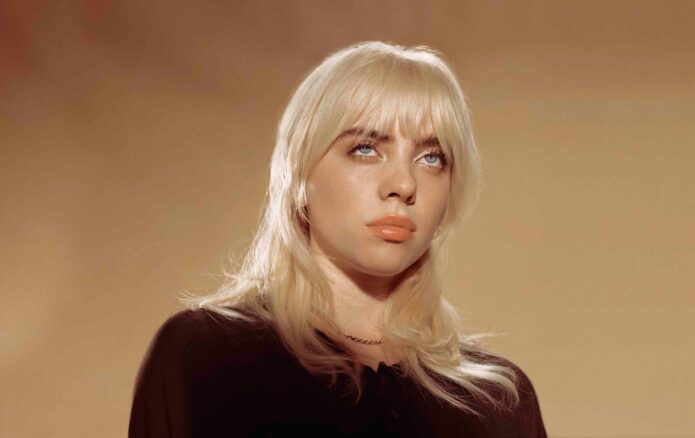
Billie Eilish hasn’t treated tattoos like a public checklist. For years, she told fans they wouldn’t see her body art, then gradually showed pieces that feel personal rather than promotional. A large dragon reaches from her thigh toward her stomach, tiny fairies sit on her hand, and a dark abstract design runs up her back.

Her view shifted as she realized that keeping every tattoo hidden wasn’t the only way to keep it hers. Showing one design in a chosen photo doesn’t mean she has to explain every part of the decision. That distinction runs through the coverage: we can see the work, while much of its meaning stays with the person wearing it.

Now that five major designs have been documented, some patterns are clear. Billie chooses art with a strong silhouette, keeps the explanations close and lets the tattoos sit alongside her changing style. The collection still feels private, even when photos of it are everywhere.

Billie’s dragon tattoo is her biggest statement piece

The dragon changed the conversation about Billie Eilish’s tattoos. It stretches from her upper thigh toward her stomach, covering far more space than the smaller pieces she had shown before. Fans got a clear look in a 2021 British Vogue shoot, where the design appeared under a sheer corset.

The tattoo is hard to miss, but Billie hasn’t given it one fixed public meaning. That’s worth respecting. Dragons are often assigned ready-made ideas like power, freedom, wisdom or strength, but none should be presented as Billie’s own explanation. What we can say is that she liked the artwork enough to give it a major place on her body.

The shape also works with the way she dresses. A high-cut outfit might reveal part of the dragon; a more revealing look can make it the main detail. It’s bold without seeming chosen to win anyone’s approval.
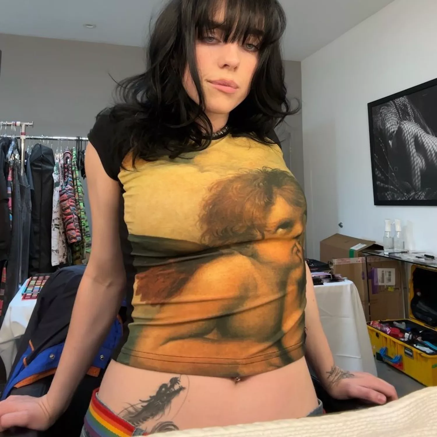
Billie Eilish dragon tattoo stretching from her upper thigh toward her stomach

The fairy tattoo is tied to a childhood favorite

A fine-line fairy sits on Billie’s left hand. It’s much smaller and more delicate than the dragon, making the contrast between the two especially striking. The design can be missed in a full-length photo, but close-ups show the little figure in a place she can see throughout the day.

Billie has explained this tattoo more clearly than most. She connected it to Fairyopolis, a favorite childhood book, and described the figures as little guardian angel fairies. That gives the piece a specific, warm origin rather than a vague story attached after the fact.

The hand is a fitting place for a symbol she wants close. It appears in interviews, performances and red-carpet photos, sometimes among rings or beneath a sleeve. The fine lines suit the idea of a tiny private world, while the placement keeps the memory in view.

Billie Eilish fairy tattoo on her left hand

Her abstract back tattoo refuses an easy label

Billie’s back tattoo is probably the hardest piece to describe. It runs along her spine and has been compared to everything from an oil spill to knots in wood. In the clearest photos, it looks fluid and dark, with shapes that climb toward her neck like flames or liquid.

She showed the tattoo while it was being done in 2023, then later offered a smaller glimpse of the healed part near her neck. That partial view is part of its appeal. Rather than give a definitive explanation, Billie lets the audience sit with the uncertainty.

A spine tattoo is a major commitment: it runs down a central, long stretch of skin that’s hard to avoid seeing in the mirror. The abstract shape makes the design feel even more personal. It isn’t a word, date or recognizable logo. It’s a piece of visual language that belongs to her.
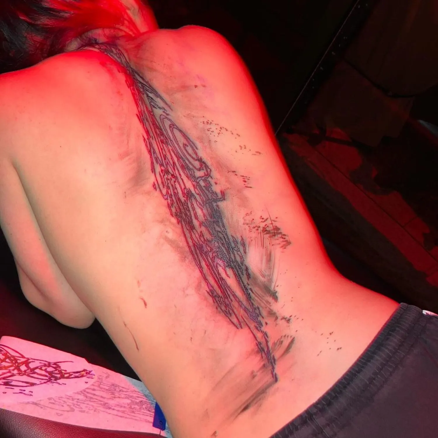
Billie Eilish abstract back tattoo running along her spine

“Hard and Soft” connects directly to her music

On Billie’s lower hip, a script tattoo reads “Hard Soft,” a clear reference to her third album, Hit Me Hard and Soft. The loose cursive makes it look understated at first. Once you recognize the phrase, it becomes one of the more revealing tattoos in her collection.

Billie has talked about being drawn to emotional extremes. She can want intensity and tenderness, strength and softness, without having to choose just one. The tattoo turns that tension into a short phrase she can carry with her.

It also ties her more recent ink to the work she’s making now. Some celebrity tattoos sit apart from an artist’s career; this one brings an album into her body without looking like a large piece of merchandise. The words are simple; the idea isn’t.
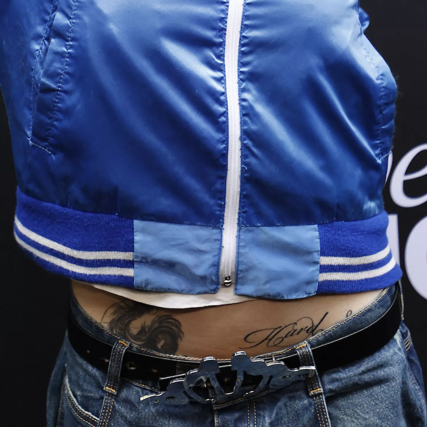
Billie Eilish Hard Soft script tattoo on her lower hip

The Eilish ribcage tattoo is a bold piece of self-love

Billie also has her surname in ornate gothic lettering across her ribcage or chest. It’s large enough to read right away, but she doesn’t show it in everyday outfits. The design became known through a rare photo shared by a friend, which helps explain why it had stayed out of view.

When Billie discussed the tattoo, she joked that it simply meant she loves herself. The line was funny, but it also fits her general approach to body art. She doesn’t seem to choose designs because they’re universally flattering. Her surname is direct, personal and unmistakably hers.

The lettering sits near her ribs and moves with her body, changing with her posture. It has a different feel from the hand fairy or abstract back piece. This isn’t a tiny guardian or fluid shape; it’s Billie’s own name, worn as a statement rather than a label.

Billie Eilish surname tattoo in gothic lettering across her ribcage

What the photos confirm, and what they leave private

These five designs are the clearest ones in the public record, but they may not be the whole collection. Billie has said some tattoos aren’t meant for public viewing, and that boundary deserves respect. A blurry glimpse shouldn’t become a confident claim about a sixth or seventh design.

The photos show how different her choices are: a large figurative piece, a delicate hand drawing, an abstract design along her back, an album-related phrase and dramatic lettering of her name. There isn’t one unifying style; the common thread is control over when each tattoo becomes visible.

That’s why the rare photos are useful. They show more of the artwork without taking away the privacy that has always been part of Billie’s relationship with tattoos. She can reveal a design on her terms and keep its full story to herself.

The images also show why close-ups aren’t always available. Sometimes an arm, hip or shoulder appears for only a second. That makes the confirmed details more valuable and helps distinguish a real tattoo from a fan-made guess.

Why the collection feels so personal

Billie’s body art makes more sense as a set of memories than as a trend board. The fairy reaches back to childhood; the album phrase belongs to her current work. The dragon and abstract back tattoo show she’ll commit to larger designs, while the surname turns identity into something visible.

She also doesn’t explain every detail, which keeps the collection from becoming too tidy. Some tattoos have a clear meaning; others are simply designs she wanted. That feels more believable than insisting every line has a public lesson.

For another musician whose tattoos have a well-documented story, see our guide to Jessie J’s tattoos.
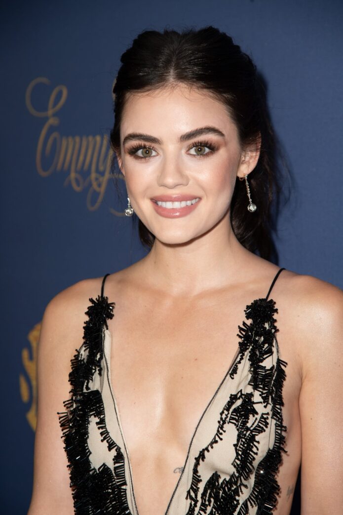
Lucy Hale Tattoos: The Meaning Behind Her Bow, Light and More Ink

Lucy Hale’s tattoos can be easy to overlook at first. Most are fine-line pieces along her neck, ribs, back, arms and ankle, so they may show for a moment in a red-carpet photo and disappear beneath a costume. Look closer and there’s a thoughtful collection: some pieces honor family, some play off her name, and others mark a particular moment.

Her own interviews and published tattoo roundups document a growing group of small designs, including a bow, a light-themed rib tattoo, a sun shared with her sister, an evil eye, a lightbulb, friendship writing and several matching pieces. This guide focuses on the designs with the clearest stories, distinguishing what’s confirmed from what’s simply visible in photos. If you like fine-line work, Hale’s collection shows how a personal idea can stay small without feeling plain.

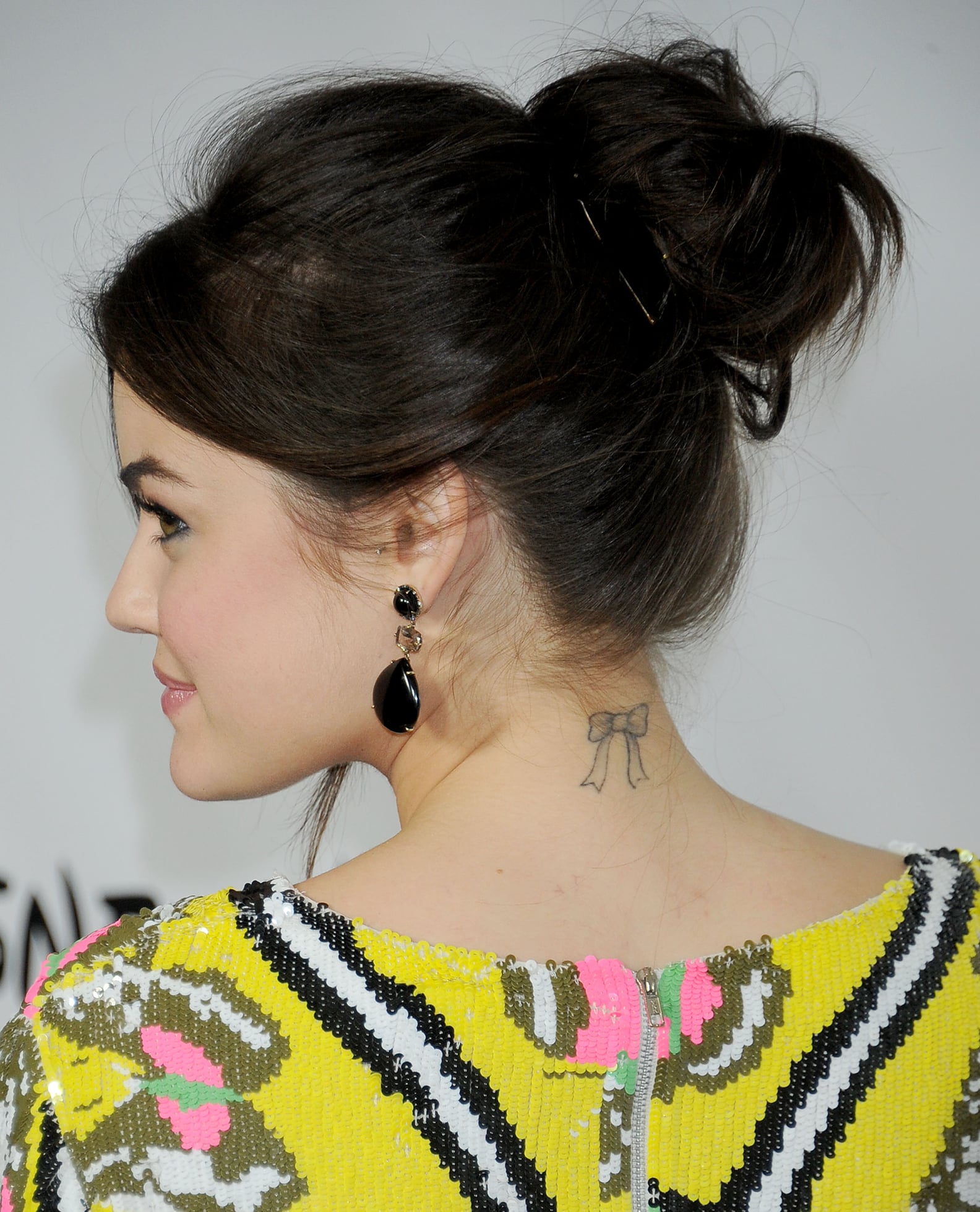
Lucy Hale’s bow neck tattoo

Lucy Hale bow neck tattoo

Hale’s bow is one of her best-known tattoos, placed high on the back of her neck. The outline is light rather than heavy, with two loops and trailing ribbons that read clearly despite the small size. PopSugar’s tattoo roundup says it was her first, done by Dr. Woo at Hollywood’s Shamrock Social Club in 2012.

The story has the same playful edge as the design. Hale has said she wanted something rebellious and a little crazy after a breakup. A tiny bow works well for that kind of moment: it looks sweet at first, but getting it was about making a choice for herself. It also previews a style she would return to—fine lines, a compact shape and a placement she can keep private when she wants.

The neck is an interesting spot for a small tattoo. There’s enough room for a simple shape to breathe without needing a large shaded composition. The clean outline and placement do most of the work.

Lucy Hale’s sun tattoo with her sister

Lucy Hale sun tattoo photo

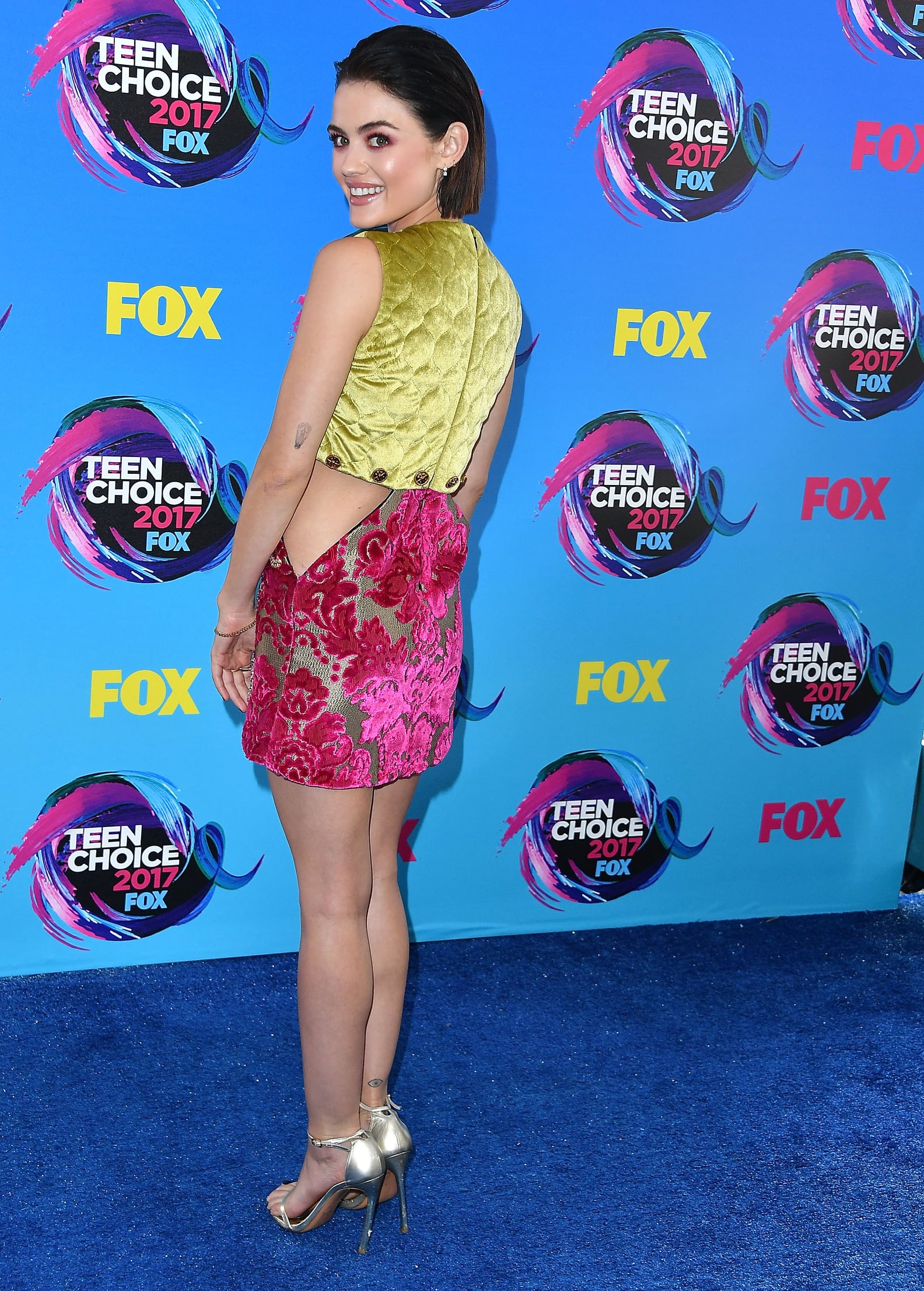
Hale and her sister got matching sun tattoos in memory of their grandmother. Hale explained the meaning in an interview, making it one of the clearest family stories attached to her ink. The design is small and uncomplicated, so the feeling behind it comes through without a detailed illustration.

Matching tattoos don’t need to be elaborate to matter. A simple sun is recognizable to everyone, while its private meaning belongs to the people who chose it. Hale’s collection often works that way: light visual language, with a personal story giving the mark weight.

Published photos place the sun around her back and side. Those areas can be covered or shown without much effort, which gives a shared family tattoo some flexibility. It can stay a quiet keepsake instead of becoming a constant part of her public look.

The evil eye near her ankle

Lucy Hale evil eye ankle tattoo

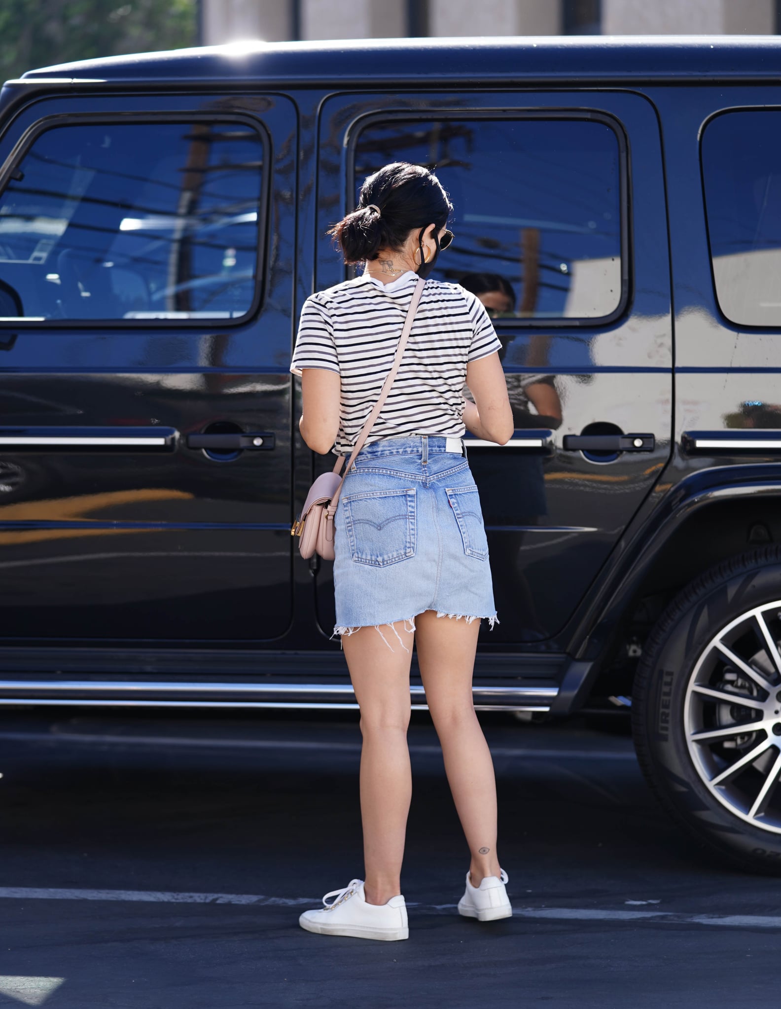
Hale’s evil eye sits near the back of her right ankle. It’s tiny, but the eye shape gives it more detail than a single word or line. Coverage links it to Dr. Woo, who has done several of her fine-line pieces. It shows up in the kind of full-body street photo where an ankle tattoo is easy to miss.

The ankle gives a small tattoo a neat, defined space, though shoes, socks and movement can make fine detail harder to see. Hale’s photo shows why a clear silhouette helps: even from a distance, the mark reads as an eye rather than a dot.

It also brings another mood to the collection. The bow and sun feel soft and personal; the evil eye suggests protection, adding a little edge without needing a large blackwork design. It’s a good example of how a familiar symbol can feel subtle.

Lucy Hale’s lightbulb and light theme

Lucy Hale lightbulb arm tattoo

Hale has described the lightbulb on the back of her left arm, above the elbow, as one of her most meaningful tattoos. It connects to the word “light” on her ribcage, a reference to the Latin meaning of Lucy. The link is straightforward: her name is associated with light, and the bulb turns the idea into an image. The word and picture don’t have to be visible at once for the theme to work.

The upper-arm placement gives the bulb more room than her finger or ankle pieces. It can disappear beneath a sleeve, but there’s enough space for the outline and filament to remain recognizable. In a 2017 PeopleTV interview, Hale explained the personal connection between the design and her name, making this one of the best-documented meanings in the collection.

There’s a useful design idea here: repeat a theme without using the same artwork twice. A word and an image can share a meaning yet remain separate tattoos. That can make a small collection feel connected without making it look like a matching set.

The “Love Her but Leave Her Wild” friendship tattoo

Lucy Hale friendship quote tattoo

Hale and her best friend Annie Leonard share tattoos of the Atticus quote “Love Her but Leave Her Wild.” Reports say they got the lettering in September 2018 from Los Angeles artist Daniel Winter. It’s longer than most of Hale’s tiny designs, showing that she’ll make room for writing when the words matter.

Friendship lettering can get crowded, especially in delicate script on an arm. Photos of Hale’s tattoo show why spacing and a steady hand matter: the phrase needs to stay light enough to fit her style while remaining clear enough to read.

The quote fits Hale’s wider approach to tattoos. Her collection isn’t built around one bold visual style; it’s a set of reminders about family, friendship, identity and moments she wants to keep. That’s more useful than copying the exact phrase. A matching tattoo works best when it already means something to both people before it reaches the skin.

Other small pieces in Lucy Hale’s collection

Lucy Hale small tattoos photo

Tattoo galleries and entertainment coverage document several more small pieces. Hale and her Pretty Little Liars castmates got matching “A” tattoos on the fingers they used to shush, a nod to the show’s central mystery. She also has “Courage, dear heart” beneath her breast, from C.S. Lewis’s The Voyage of the Dawn Treader, and “Catch the foxes for us” from Song of Solomon on her ribcage.

Another tattoo is an elephant connected to a 2018 trip to Cambodia with the charity Ripple Effect. Coverage says Hale visited Bayoon Tattoo while she was there and got the design locally. There’s also an “I love you” in her grandmother’s handwriting, a matching family tattoo that sits alongside the sun. These pieces show how a tiny design can preserve a trip, a person or a particular chapter.

Some newer tattoos are harder to track in a single photograph, so the count can shift. Celebrity tattoo lists change as new work appears, while clothing or makeup can hide older designs. What stays consistent is Hale’s preference for small, fine-line images with a reason behind them.

Why her fine-line style works

Across the collection, Hale returns to a few useful choices: compact designs, light linework and placements that give each mark room without making it compete with the next. That’s how a neck bow, a rib phrase and an ankle symbol can sit together without looking like they belong to different collections.

Meaning comes before decoration in Lucy Hale’s tattoos. That’s the thread connecting them. Her name becomes a word and a lightbulb; a family memory becomes a sun and handwriting; a friendship becomes a line of poetry. Even the bow began as a spontaneous post-breakup decision, but its story gives it more than a pretty outline.
If you’re saving references for a small tattoo of your own, consider the practical details. Fine lettering needs breathing room; tiny symbols need a clean shape; matching tattoos need a meaning that can last even if circumstances change. Most of all, choose a design you can explain without needing a caption. That’s what gives a small tattoo staying power.

A quick video with Lucy

More actor tattoo guides

Mauro Icardi Tattoos: Lion Torso Ink, Family Tributes and His Latest Cover-Up

Mauro Icardi’s tattoos tell a personal story. He has used ink to mark family, love, dates and different chapters of his life, so the collection is more than footballer tattoos meant to catch the eye. Some pieces show during a match; others appear only in close-up photos or when he wears a sleeveless shirt.

Family is a clear thread throughout. Icardi has said he chooses tattoos because they represent something special to him, and a 2017 SoccerBible interview helps explain several of the best-known designs. A large lion and cubs honor his daughters, a wrist number encodes an important date, and portraits and lettering connect the larger pieces to people close to him.

What tattoos does Mauro Icardi have?

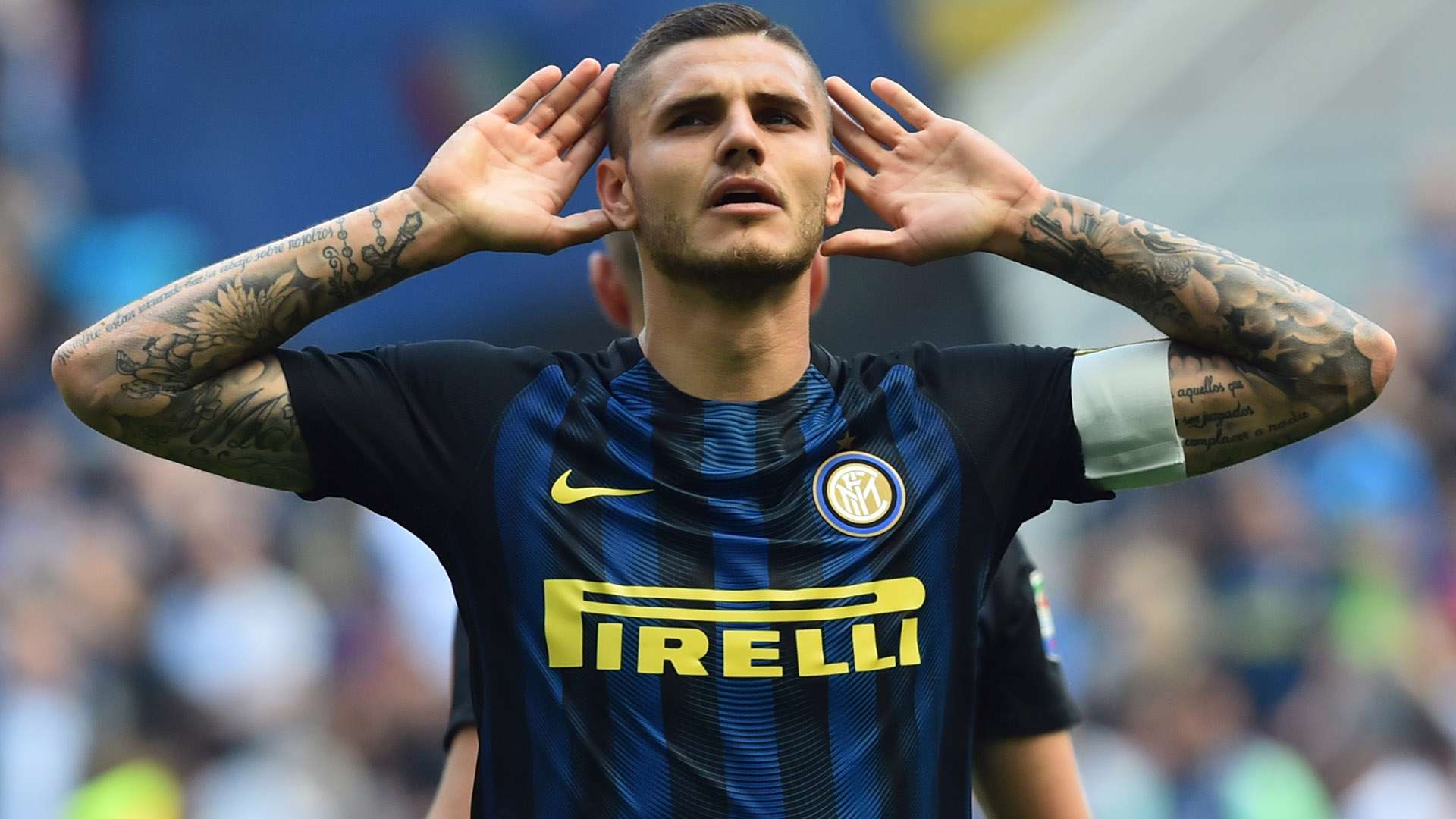
Mauro Icardi showing his visible forearm tattoos in a football kit

In short, Icardi has extensive tattoos across his arms, torso, neck, wrists, hands and lower legs. The clearest photos show black-and-grey work, lettering, portraits, flowers and large illustrations. There isn’t one theme across the whole collection, though family and relationships come up often.

That context matters because online galleries can make a footballer’s tattoos look like unrelated symbols. Icardi has said each one represents something special in his life. Rather than treating every mark as a fashion choice, it’s more accurate to see the collection as a record of people and dates that matter to him.

The larger designs are easiest to spot in match and training photos. His forearms carry dense work that often shows below short sleeves. Other tattoos come through in posed portraits, when the camera catches the side of an arm, his wrist or an ankle. The picture changes with angle, lighting and clothes.

Tattoos can also look different as they heal or grow into larger compositions. A small portrait may end up inside a sleeve, while older lettering can be shaded over. One photo can’t provide a complete map of Icardi’s ink.

The lion and cubs tattoo for Francesca and Isabella

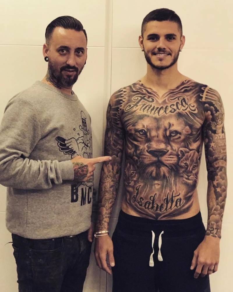
Mauro Icardi's black and grey lion and cubs torso tattoo dedicated to his daughters

Icardi’s most recognizable design is a large black-and-grey lion scene across his torso. Two cubs sit with the lion, and the tattoo is dedicated to his daughters, Francesca and Isabella. Tattoofilter reported that Artur of Holy Koi Tattoo created the piece and travelled to Milan to work on Icardi.

The design took more than one sitting. Coverage in 2017 described it as the third session in five months, with more work planned. That helps explain why photos from different dates can look a little different: shading and background details were added over time, building one family scene rather than a set of separate stickers.

The lion and cubs are direct without feeling plain. The adult lion suggests protection, while the cubs make the family connection clear. The torso gives the artist room to spread the image across the chest and upper abdomen, adding depth to the mane, faces and shadows.

Icardi shared the progress and thanked his tattoo artist after the sessions. Reports called it a full-body or very large project, but the most clearly documented details are its size and its dedication to his family. It remains one of the clearest examples of a private relationship becoming a highly visible image.

The names of his daughters are part of the design too. Francesca is visible across the chest in the clearest photo, while the lion carries most of the emotional weight. The lettering and animal portrait support one another instead of competing for attention.

Mauro Icardi’s wife portrait and number 27 wrist tattoo

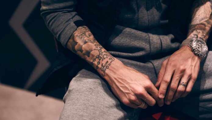
Close view of Mauro Icardi's forearm portrait, roses and lettering tattoos

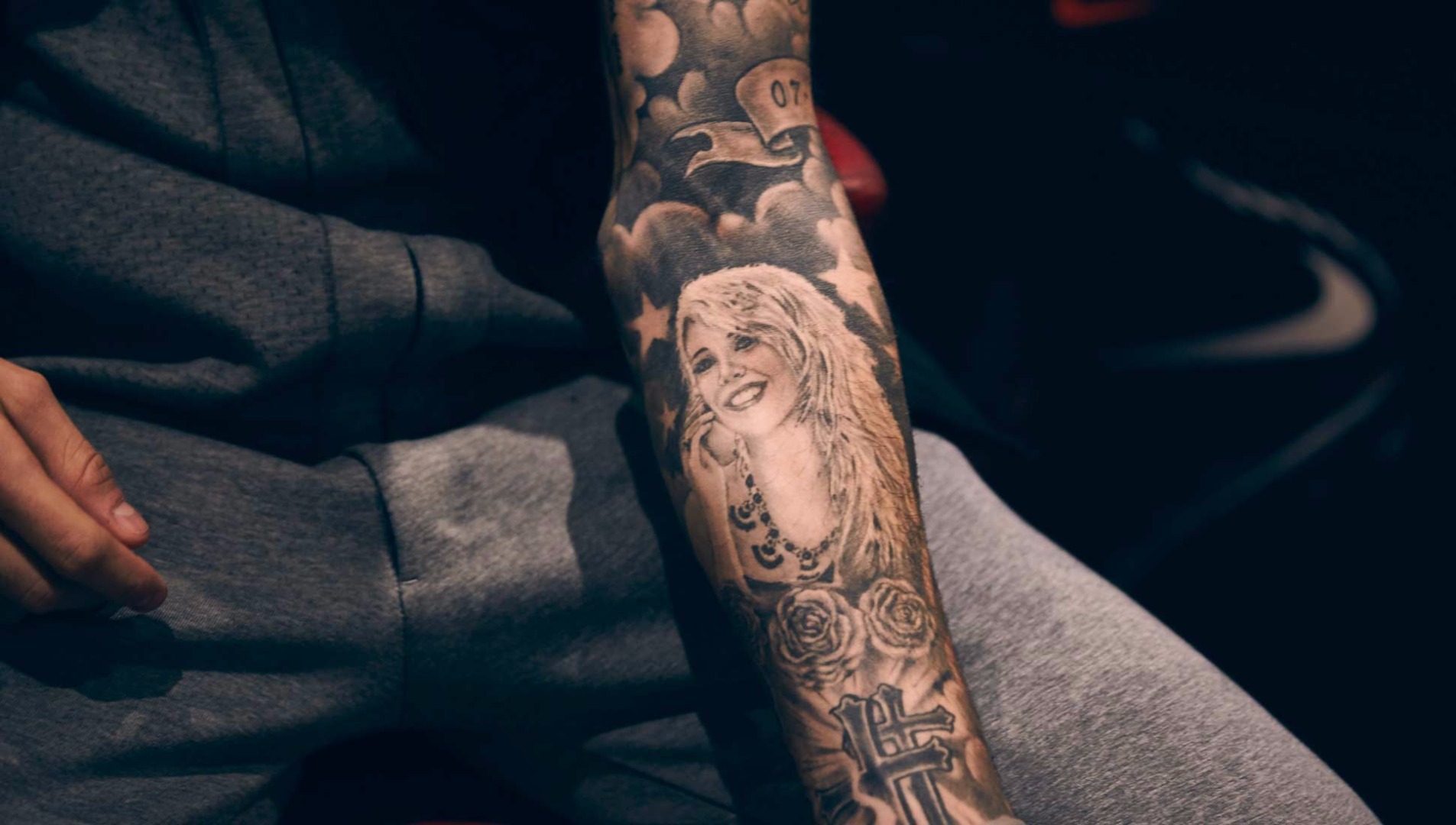
Another important piece is a portrait connected to Icardi’s wife. In the SoccerBible interview, he called the tattoo special and said it was done by a friend from Argentina who lives in Spain. The artist travelled to Milan for the session, a sign of how personal the project was to Icardi.

The photo shows a portrait surrounded by detailed black-and-grey work, including roses and lettering. It’s worth looking at closely: finer lines can vanish when the arm is photographed from farther away. The portrait anchors the design; flowers soften it and help it flow along the forearm.

Icardi also explained the number 27 on his wrist. It marks the date he met his wife. He noted that two plus seven equals nine, connecting the date with the shirt number he wore. It’s a simple code, but it shows the pattern in his tattoos: a visible number can hold a private reference until he explains it.

That’s why careful sourcing matters. Without context, a wrist number could look like a squad number, lucky digit or birthday. Icardi’s interview makes its meaning clearer: the tattoo joins a relationship date with his football identity.

The portrait and number are visually different but tell parts of the same story. One is a detailed tribute to a person; the other is a compact piece of personal code. Both show Icardi choosing ink with meaning, not just generic football imagery.

The ankle, hand and arm tattoos

Mauro Icardi ankle and foot tattoo shown in a close-up photograph

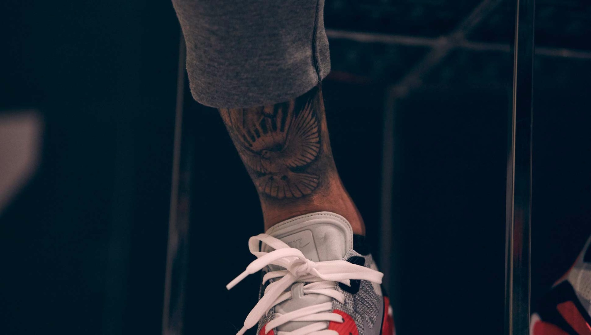
His lower-leg and foot tattoos can be easy to miss because they don’t appear in every football photo. A SoccerBible close-up shows the ankle and foot, making clear that the collection reaches beyond his upper body. Socks and boots can cover the design during matches.

The arms remain the most visible part of the collection. Match photos show dense tattoos across both forearms, with images and lettering meeting along the shape of the muscles. The layered look feels lived in, rather than like one sleeve planned from the start.

Some tattoos are meant to be read; others work more as texture. Names, numbers and words deliver an obvious message. Shading, roses and portrait backgrounds build a mood around the main subject. Icardi’s arms use both approaches, so they can look busy from a distance and still reveal individual details in close-up.

Photos of hands and wrists can be misleading because the angle changes how large a design seems. A tattoo near a knuckle may look like a small symbol in one shot and part of a larger composition in another. The same thing happens when tape, a watch or training clothes hide some of a sleeve.

It’s safest to describe what the photographs actually show: dense arm coverage, a documented wrist number, detailed portrait work on the forearm and a separate tattoo around the ankle or foot. There are many online claims about other symbols, but the clearer evidence already shows the breadth of the collection.

Icardi’s new wolf and Saint Michael cover-up

Mauro Icardi showing detailed arm tattoos in a recent cover-up photo

Recent coverage has focused on a major cover-up on Icardi’s left arm. Tatuantes describes a scene running from the forearm toward the fingers: a wolf emerging from a pine forest, with Saint Michael the Archangel holding a sword over a demon. The article says it covers older references to Wanda Nara, including a name, portrait and initials near his wrist.

Cover-ups are complicated work. The artist has to account for existing dark shapes and lines, so the new image needs enough contrast and movement to cover what’s already there. A wolf, trees, armor and a dramatic figure like Saint Michael offer plenty of shadow to work with. The finished piece can feel like a new scene rather than a basic blackout.

The reported design also shifts the collection’s tone. Earlier tattoos connected Icardi with love, dates and family; the wolf and Saint Michael are more dramatic and symbolic. People may read the scene as protective or confrontational, but the clearest point is that it begins a new chapter and covers older relationship-related ink.

The project was described as still in progress, so recent photos deserve some caution. A tattoo may look unfinished while healing or waiting for another session. The arm images confirm that the area has changed, but not that every line of the final design is done.

This is one of the most interesting developments in Icardi’s tattoo story because it shows the collection isn’t fixed. He has added large pieces, built them over several visits and is now reshaping part of an older story. The cover-up does more than change the artwork; it changes what that space on his arm means.

Why the collection stands out

Icardi’s tattoos pair public images with private references. A lion and two cubs read immediately as a family tribute, while the number 27 needs an explanation. Those different approaches sit together without making the collection feel disjointed.

Scale is another reason the ink draws attention. The torso lion gives a story room to unfold, and the detailed arm work is visible during football appearances. At the same time, there are smaller designs at the wrist, ankle and foot. The collection avoids becoming one giant visual statement.

Black-and-grey work gives the tattoos a consistent base. Portraits, roses, animals and religious images are different subjects, but the shading helps them belong together. Even as a cover-up changes the direction of the artwork, the preference for strong contrast and realistic detail remains.

Most of the documented meanings connect to real events. Icardi’s comments about choosing special tattoos, his explanation of the number 27 and reports about his daughters give the designs a human center. The images can be dramatic, but the reasons behind them often come back to family, love, memory and change.

Watch a tattoo-focused Mauro Icardi video


More athlete tattoo guides

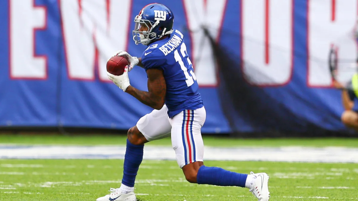
Odell Beckham Jr. Tattoos: Leg Murals, Icons and the Stories Behind His Ink

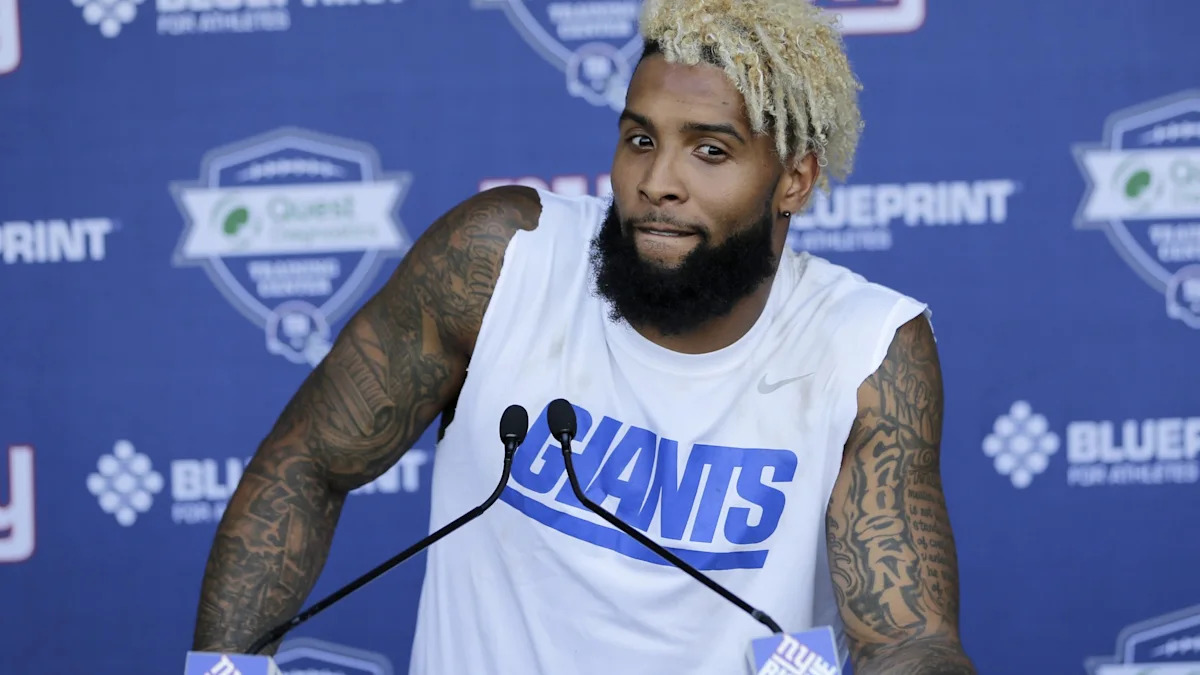
Odell Beckham Jr.’s tattoos are less a random assortment of flash designs than a visual history. Ink covers much of his legs, arms and back, where portraits of famous figures sit alongside music, sport and family references. Some pieces are obvious in football photos; others are easier to make out in close-ups from tattoo sessions.

Beckham has said he knew early on that he wanted a lot of tattoos. In a GQ interview, he recalled drawing on his arms with a Sharpie in high school and getting his first tattoo, “Make dreams reality,” during his senior year. He planned to cover most of his body but stop at his wrists. That helps explain the collection: he wasn’t after one neat symbol, but a body full of reminders.

It also helps separate the real tattoos from social media posts that call every visible mark a new design. The collection has changed over time, and some tattoos overlap within large sleeves. The clearest way to understand it is to look at the main areas one at a time.

Odell Beckham Jr.’s leg sleeve is built like a museum wall

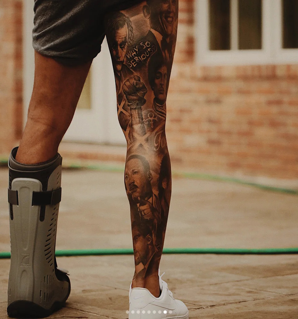
Odell Beckham Jr. leg sleeve tattoo mural with portraits and lettering

The leg sleeve is the part of Beckham’s collection that catches the eye first. Detailed black-and-gray portraits, lettering and layers of shading fill the area. From a distance it reads as one dark mural; closer up, separate faces and scenes begin to emerge. The scale invites you to look for a while, rather than catch a glimpse from the sideline.

One of the clearest figures is Martin Luther King Jr. The words “Why so serious?” sit beside another face, giving part of the composition a comic-book feel even as the larger subject stays serious. Other cultural figures appear throughout the sleeve, too. Beckham hasn’t stuck to one theme; it’s a record of the people, images and moments that stayed with him.

Low-resolution reposts can make the work look muddy. In a small crop, the shading turns into a dark block; a clear close-up brings out the differences between hair, skin, clothing and background. That detail is what makes the Odell Beckham Jr. leg tattoo work.

The other side of the sleeve adds athletes, artists and history

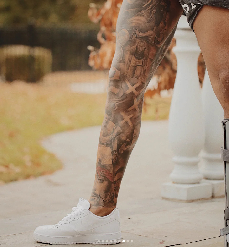
Odell Beckham Jr. detailed leg tattoo sleeve with historic portraits

A second close-up shows how the sleeve changes as it wraps around his leg. The portraits aren’t arranged like framed photographs; smoke, shadows and diagonal forms blend one into the next. That gives the design movement, which suits Beckham as an athlete. The tattoo feels active even when the people in it are standing still.

Published descriptions of the sleeve name Tupac Shakur, Muhammad Ali, Jesse Owens and Allen Iverson, as well as Michael Jackson, Malcolm X, Barack Obama, Prince and the Joker. Not every face is equally clear in every photo, so it’s safer to call it a broad collection of references than to claim one image shows every detail perfectly.

Ali and Iverson connect the sleeve to Beckham’s athletic life; the musicians and civil rights figures widen it beyond football. The mix points to people who shaped popular culture, ambition in sport and ideas about confidence. The tattoos are personal, but they’re made to be seen. That’s why the sleeve becomes a conversation starter when he wears shorts.

His Lil Wayne and Bob Marley thigh tattoo mixes three different worlds

Odell Beckham Jr. showing arm tattoos and the style of his portrait-heavy ink

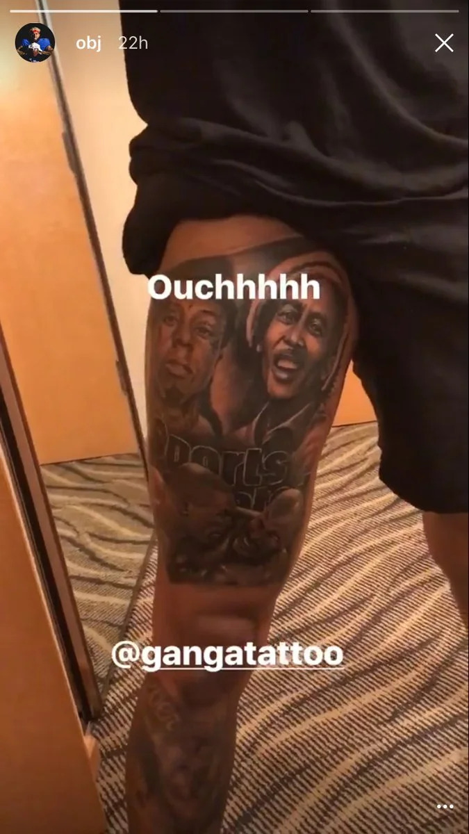
One of Beckham’s most talked-about designs sits on his right thigh. Yahoo Sports described a composition combining rapper Lil Wayne, reggae musician Bob Marley and part of the well-known Sports Illustrated photo of Mike Tyson biting Evander Holyfield’s ear. The combination sounds unlikely until you see Beckham’s wider approach: he brings different cultural memories together on the same canvas.

It isn’t a simple row of celebrity portraits. The faces and references form a collage that keeps the eye moving. Lil Wayne represents a major musical influence, Marley brings a different cultural weight, and the Tyson-Holyfield image recalls one of boxing’s most unforgettable moments.

This design is easier to understand in a photo that shows its full placement. A tight crop may reveal one face but hide how the elements fit together. The wider view shows why Beckham’s tattoos read like murals rather than separate stickers. New work adds a chapter without erasing what came before.

The Michael Jackson portrait is one of his clearest single-subject pieces

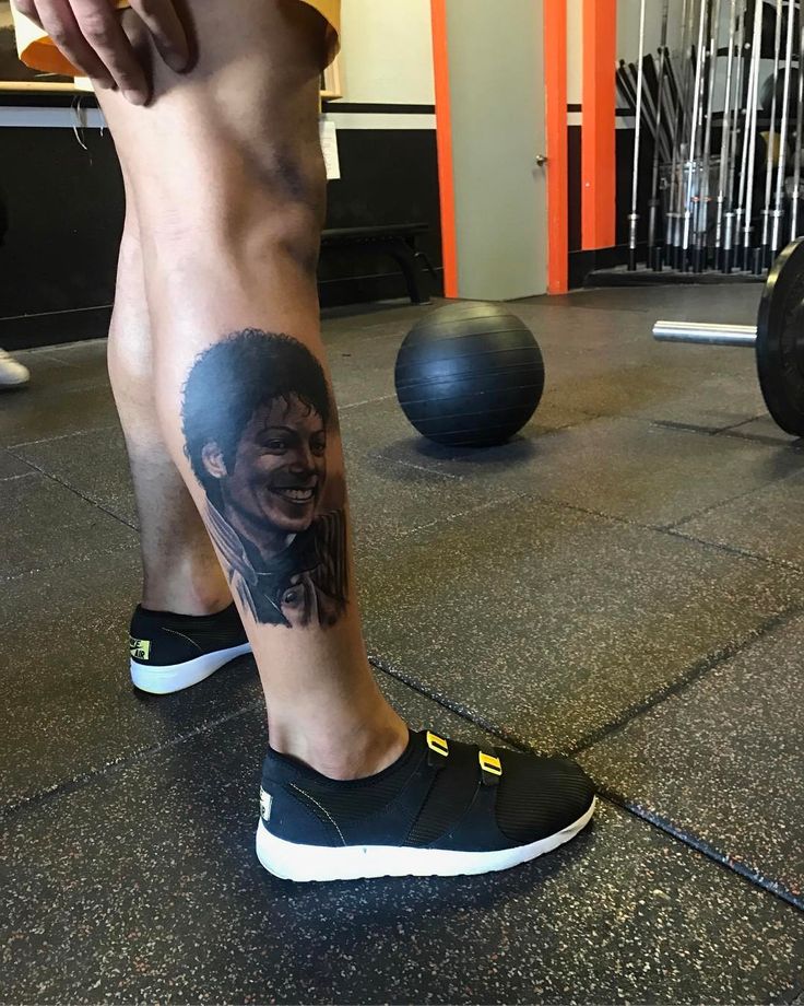
Odell Beckham Jr. Michael Jackson portrait tattoo on his calf

Beckham’s Michael Jackson tattoo is a more straightforward tribute. He’s a longtime fan, and the portrait on his lower leg shows Jackson in the Thriller era. Beckham has brought Jackson’s music and dance into touchdown celebrations, so the design ties his football persona to one of his biggest pop culture influences.

The portrait has room for expression, rather than relying on a name or logo. Jackson’s eyes, hair and smile carry the image, with surrounding shading helping it sit naturally on Beckham’s calf. It’s a good example of the portrait style seen elsewhere in the collection: Beckham chooses figures with a strong visual identity and lets the artist build around it.

It’s worth being precise about dates. Beckham has shown and discussed many tattoos, but the exact session date for every piece isn’t clear in galleries that get reposted. News coverage and video document the Michael Jackson portrait well; smaller additions can be harder to place in time. The safe takeaway is that it’s one of his most recognizable tattoos and a direct nod to his love of performance.

His arms and hands carry the everyday part of the collection

Odell Beckham Jr. visible arm tattoos during his football career

The tattoos on Beckham’s arms show how the collection looks in motion. Football photos often catch them in pieces: one sleeve below a jersey, another design wrapping toward the shoulder. The work is dense enough that a standard action shot can reveal several layers at once. It’s less one headline tattoo than part of his everyday public image.

His hands have become part of the story as well. Beckham has worked with Bang Bang and other well-known artists, and reports on his sessions describe new hand designs as meaningful rather than purely decorative. Since hand tattoos are hard to hide, they show how committed he is to the collection. They appear in interviews, practice clips and photos.

The phrase “Make dreams reality,” his first tattoo, gives the smaller details more context. It’s direct, and it fits the ambition and influence running through the larger portraits. The arms aren’t filler between the leg murals and back piece. They’re where the collection enters everyday life, from press conferences and practice to fashion events.

Why the collection feels more like a story than a checklist

Odell Beckham Jr. close-up of detailed portrait tattoo work

Beckham’s tattoos come into focus when you stop looking for one master list. The portraits point to musicians, athletes, activists and entertainers. The leg sleeve turns those references into something like a history lesson. His arm and hand tattoos show the work continuing, while his back has been described as a large Planet of the Apes-inspired scene—another ambitious project.

The artists help explain the look. Bang Bang is associated with some of Beckham’s hand and body work, while Joaquin Ganga is connected to the large realism portraits and leg sessions. Their work brings deep black-and-gray shading, realistic faces and compositions that need space and time.

Compare this with a newer football tattoo story like our Raphinha tattoos guide, which focuses more on phrases, faith and football milestones. Beckham’s collection is louder and more portrait-heavy. Neither approach is better; they show different ways athletes use tattoos to express identity.

For the main Odell Beckham Jr. tattoos to remember, start with the leg murals, then look for the Lil Wayne and Bob Marley thigh design, the Michael Jackson calf portrait, the hand and arm work, and the large back piece. Together, they show an ambitious collection built around people Beckham respects and images he wants to carry with him.

His ink keeps expanding, but the through line remains: memory, influence and a personal definition of style.

Raphinha Tattoos: Barcelona Ink, Neck Quote and Career Symbols

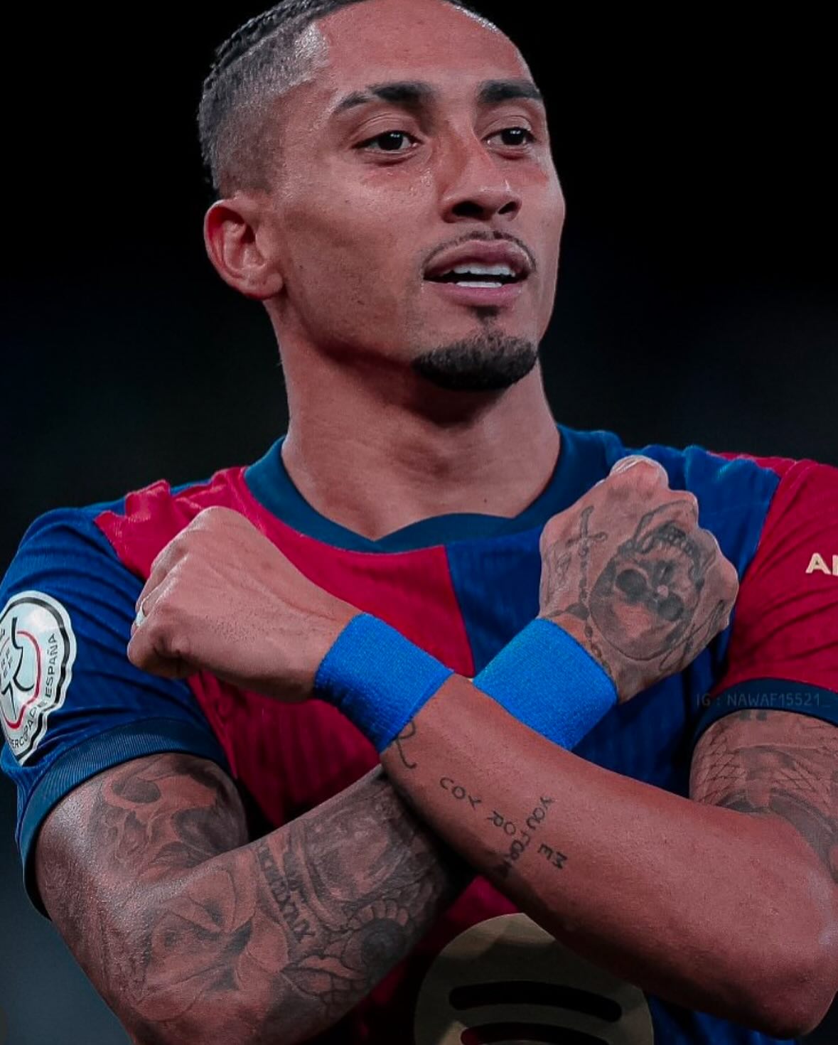
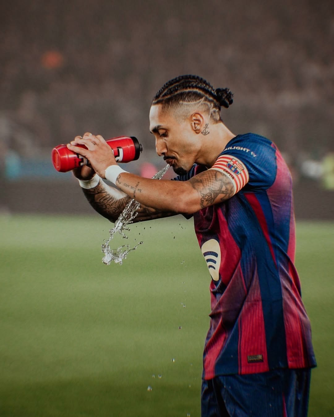
Raphinha’s tattoos aren’t random pieces added to fill space. They trace where he’s been, the people who helped him get there and what still matters. The Barcelona winger has visible ink across his arms, neck and upper body, with designs connected to football, family, faith and the places that shaped him.

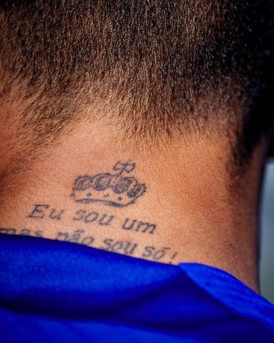
That makes Raphinha tattoos especially interesting to football fans. One neck tattoo reads “Eu sou um mas não sou só,” often translated as “I am one, but I am not alone.” Another says “me for you, you for me,” and a tattoo on his leg marks Barcelona’s 2022/23 La Liga title. He has also said a Champions League trophy could be his next major football tattoo.

The collection is easier to understand as a timeline than a checklist. Its words and symbols link his childhood in Porto Alegre with his rise through European football, his life in Barcelona and the people he keeps close.

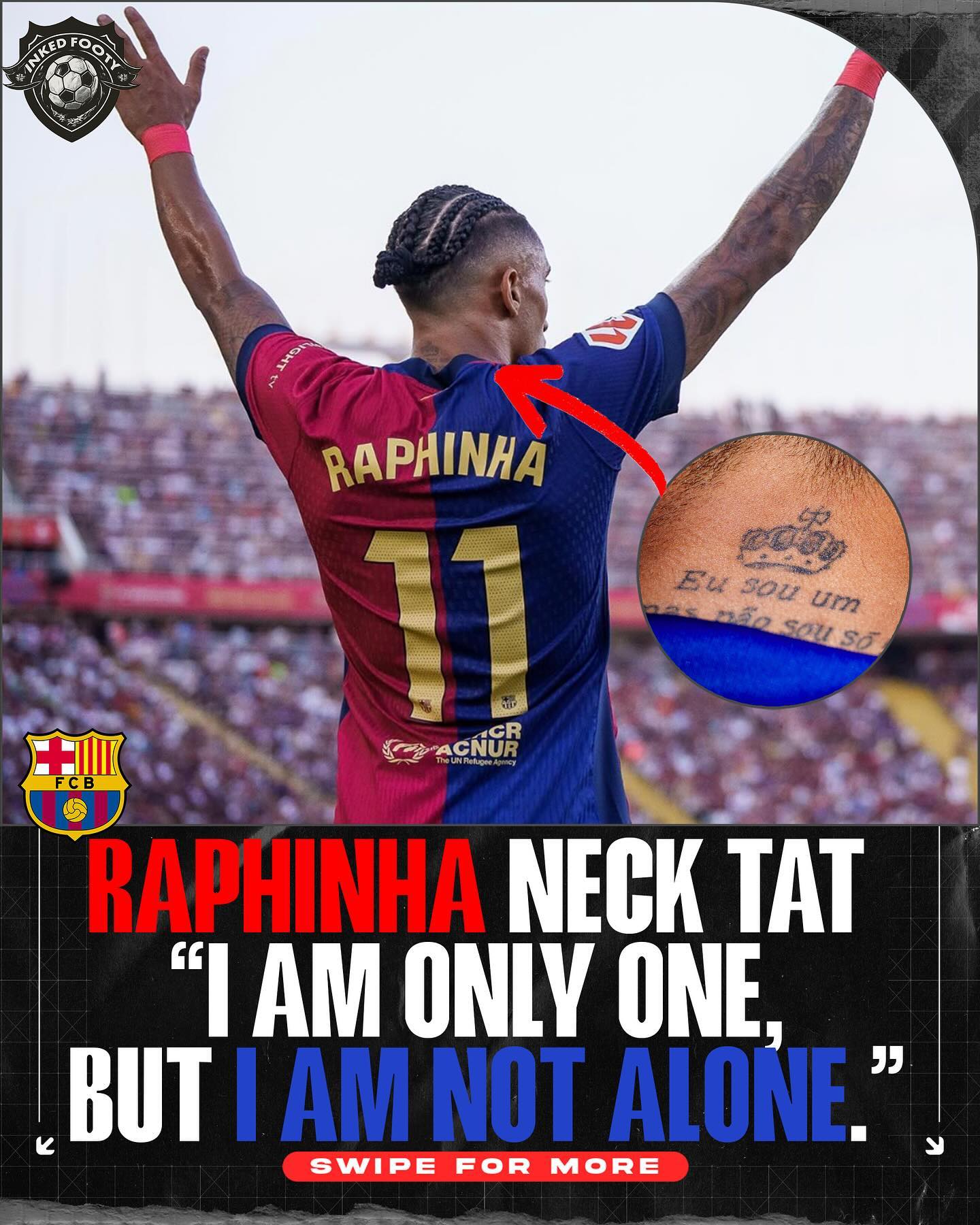
Raphinha’s neck tattoo says he is not alone

Raphinha neck tattoo reading I am one but I am not alone

The neck tattoo that draws the most attention reads “Eu sou um mas não sou só.” The meaning is close to “I am one, but I am not alone.” It’s a short phrase with a clear point: Raphinha may take the shot or wear the captain’s armband, but he sees his career as something built with other people.

The placement makes it hard to miss. A neck tattoo isn’t hidden under a sleeve or kept for private moments; it shows when he turns, celebrates or speaks to a camera. The phrase has a public presence without feeling like a slogan. It reads more like a reminder he chose to keep close.

It also fits the way Raphinha talks about football. Even when an interview is about goals or assists, he often brings up teammates, family, coaches and others who helped him move forward. The tattoo gives that belief a permanent place.

Translations deserve a little care. Fan pages sometimes shorten or slightly alter the English wording, but the central idea stays the same: being an individual doesn’t mean being alone. That’s why the neck piece has become one of the most recognizable in his collection.

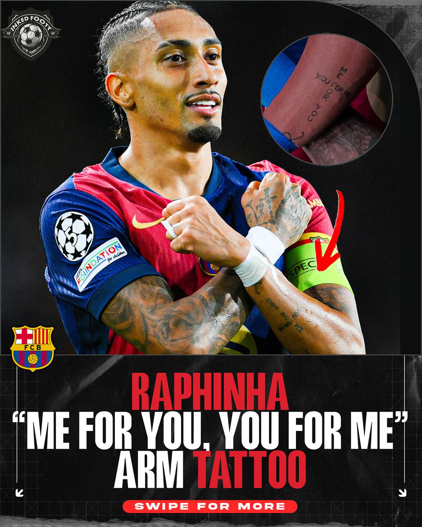
“Me for you, you for me” brings a relationship into the collection

Raphinha arm tattoo reading me for you you for me

Another visible phrase on Raphinha’s arm reads “me for you, you for me.” It feels more like a personal promise than a football statistic. The words are direct, balanced and easy to remember, which helps them stand out among the larger designs around them.

Lettering can look generic when it’s separated from the wearer. Here, the phrase echoes the idea of the neck tattoo. Raphinha can be fiercely individual on the pitch, but the story around him still involves loyalty and give-and-take: someone offers support, someone returns it, and both become part of the journey.

The arm placement keeps the line in motion. It shows when he raises his hands after a goal, points toward the badge or walks through a mixed zone after a match. It’s a short sentence with a surprisingly wide audience.

The surrounding tattoos matter, too. Raphinha has enough work across his arms that no phrase sits alone. Some designs are darker and bolder, while the lettering adds a more personal note. That contrast keeps the collection from feeling like one repeated style.

If you’re considering a text tattoo, this is a good example of how a short line can do more than a paragraph. The words have rhythm, symmetry and a clear emotional point, while leaving room for the wearer’s own meaning.

His faith and mindset show up in “1% chance, 99% faith”

Raphinha tattooed arm with faith and motivational lettering

Another phrase associated with Raphinha is “1% chance, 99% faith.” It feels at home in a footballer’s collection, where careers include unexpected turns. A player may be written off, face a difficult move or enter a match as an underdog, then change the story with one performance.

The wording is about more than confidence. “1% chance” admits that the odds can be rough; “99% faith” describes how he chooses to respond. That feels more grounded than a promise that everything will work out. There’s room for doubt, but belief gets the final word.

Raphinha’s path from Porto Alegre to European football gives the phrase added weight. His rise wasn’t a straight line with every door opening immediately. He moved through different clubs and leagues before becoming an important player at Barcelona. A line about faith fits a career shaped by persistence.

It also shows how sports tattoos can work in different ways. Some players mark trophies, dates or shirt numbers; others choose words to carry into difficult moments. A motivational phrase may be less about proving something to the public and more about what a player returns to when the pressure builds.

This is where Raphinha’s tattoos feel more layered than a gallery of football symbols. They don’t only celebrate what has already happened; some seem to point toward the next challenge.

The La Liga trophy tattoo celebrates Barcelona’s title

Raphinha Barcelona and La Liga trophy tattoo image

Raphinha marked Barcelona’s 2022/23 La Liga win with a trophy tattoo on his thigh. Unlike a phrase, the trophy points directly to one achievement. It turns a season into something he can carry long after the medals and celebrations have been put away.

The choice says something about how he remembers success. Players collect photos, shirts and match balls, but a tattoo becomes part of the body. It can’t be packed away in a box or left in a cabinet. The title becomes a lasting chapter rather than a piece of memorabilia.

The thigh suits a larger design: it gives the tattoo space while still letting him cover it in a kit. That balance matters for an athlete whose working life is public.

The tattoo also links his personal story to the club’s history. Raphinha joined Barcelona in 2022, so the title came during his early period in Catalonia. Marking the win on his skin ties the team achievement to an important stage in his career.

It’s easy to assume every football tattoo is a prediction or a boast, but this one records an event that already happened and mattered to him. The achievement is clear, even if the design doesn’t spell out every detail.

The Champions League trophy could be his next major football tattoo

Raphinha tattooed arms and football themed body art

Asked about a possible future tattoo, Raphinha pointed to the Champions League trophy. It would fit the pattern of marking real career milestones. If Barcelona were to win Europe’s biggest club competition while he is there, it would sit naturally alongside the La Liga tattoo.

Wanting a trophy tattoo isn’t the same as already having one. The Champions League design is still a possibility, not a confirmed piece. That distinction matters because coverage can turn a plan into a finished fact. For now, it’s a goal he has mentioned.

If he gets it, the design would add another layer beside the La Liga trophy: one for domestic success and one for a bigger European stage. Together they could turn his leg—or another area—into a football timeline that grows with his career.

Raphinha already has enough visible ink for a new design to shift the balance of the collection. A trophy wouldn’t be a tiny afterthought; it would become something fans look for when he celebrates or shares a personal photo. The anticipation is part of the story because he has shown that career moments matter to him.

Until that tattoo exists, the accurate description is simple: the Champions League trophy is an idea he has discussed, not a finished design fans can point to.

Raphinha’s tattoos connect Brazil, Barcelona and personal memory

Raphinha visible tattoos across his neck, arms and hands

Look across the collection and movement is the main theme: from Porto Alegre to Europe, personal phrases to club trophies, and private belief to public football history. Those ideas don’t cancel one another out.

The neck phrase is about people; the arm lettering is about mutual loyalty; the faith line is about staying committed when the odds are poor; and the La Liga tattoo marks a Barcelona achievement. The possible Champions League design points toward the next ambition. Different words and images, but a coherent set of ideas.

The tattoos also read well in photos because Raphinha often wears short sleeves at training, during celebrations and on holiday. His arms stay visible, the neck lettering appears in close-up, and larger leg or back designs show in photos taken from behind or during a celebration.

That variety gives fans different ways into the collection. One person may notice the lettering first; another may focus on the trophy or dense arm work. The designs reward a closer look because different photos reveal different areas.

For more football tattoo stories, see our guide to Lionel Messi tattoos. Messi’s collection has a different visual mood, but both players use ink to keep family, faith and career milestones close.

Raphinha’s tattoos make the most sense as a timeline, not a checklist. Some designs mark what he has achieved; others keep the next goal in view. That gives the collection its personality.

The ink keeps moving because his career is still moving.

Brett Young’s Tattoos: 40 Stories in Ink, From Family Heartbeats to Music

Brett Young’s tattoos aren’t random decoration. They read like a scrapbook: part family record, part music map, part reminder of the people and places that shaped him. He has said he has roughly 40 tattoos, each with a meaningful story, so a quick list of body parts doesn’t tell you much.

Some themes are easy to pick out. His arms carry phrases about home and music, while other pieces point to his wife, daughters, faith, California roots and the Nashville life he built after moving on from baseball. That mix feels warm and lived in. It also puts his ink alongside other musicians’ personal timelines, like the family-centered ideas in our Anthony Joshua tattoos guide.

This guide sticks to designs shown or explained in interviews and tattoo-tour coverage. Some smaller pieces are easier to see than to identify, but the larger story is consistent: Young uses tattoos to remember a person, lyric, turning point or chapter he wants to keep close.

It’s most useful to read the collection as a map of choices, not a checklist of pictures.

The “if it feels like home” tattoo follows a music career detour

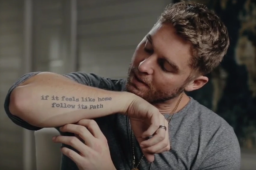
Brett Young forearm tattoo reading if it feels like home follow its path

One of Brett Young’s best-known tattoos is the phrase if it feels like home follow its path on his right forearm. Poet R.M. Drake wrote the line, and it fits Young’s story unusually well. Before country music became his full-time career, he was a serious baseball player. Injuries changed that plan, and music became the path that felt like home.

This isn’t just a motivational quote for social media. It reads like a private instruction Young chose to keep in view. The line runs from near his wrist along his forearm, so it appears in photos when his sleeves are pushed up. Its clean lettering is quieter than the illustrated tattoos elsewhere in the collection.

Placement matters. Forearm writing is visible both to the wearer and to other people, and Young can glance at it while playing guitar, signing autographs or getting ready for a show. It turns an ordinary workday moment into a reminder of the career he chose after the first one was no longer possible.

The phrase balances instinct with action. “Follow its path” sounds active; “if it feels like home” trusts a feeling. Together they describe Young’s move from an expected future in sports toward songwriting and touring. It’s a strong example of a tattoo explaining a life change without needing a portrait or a date.

“Where words fail” turns songwriting into a tattoo

Brett Young showing the Where words fail tattoo on his arm during a tattoo tour

Young has the words Where words fail on his other arm. The shortened phrase echoes “Where words fail, music speaks,” and feels right for a country singer who spends his life turning difficult feelings into songs.

The design is simple, but the idea reaches beyond his career. Music is his work, yet the tattoo doesn’t read like a logo. It could also be about family and relationships, or the moments when a song says what conversation can’t. That gives it a more personal feel than a title tattoo or branding.

In tattoo-tour footage, the phrase sits among other arm designs rather than taking up the whole space. It becomes part of a wider sleeve story. Symbols, lettering and images connected with home, faith and family surround it, so the words almost caption the tattoos nearby.

Young’s tattoos pair plain language with emotional weight. “Where words fail” needs little explanation: anyone who has relied on a song during a difficult time knows the feeling. For a songwriter, it’s also a reminder that music can carry emotion farther than an ordinary sentence.

Brett Young’s compass and anchor tattoos are about finding home

Brett Young compass and anchor tattoos on his tattooed arm

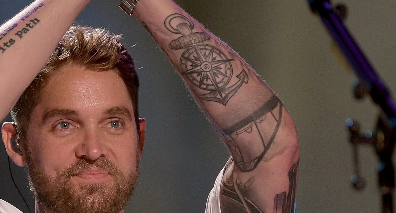
A compass and anchor are among Young’s most recognizable arm symbols. Together they suggest a clear idea: the compass points toward somewhere, and the anchor lets you settle once you find it. In CMT’s tattoo-tour coverage, Young connected the designs with finding where he was meant to be and then anchoring himself there.

That reading echoes the quote on his other arm. The words are about following a path that feels like home; the compass and anchor express the same idea without a sentence. One design suggests moving forward, the other staying put. Together they capture the balance between taking a chance and knowing when to stop searching.

The compass also suits a career spent on the road. Touring musicians move between airports, buses, venues and hotels. An anchor offers a counterpoint to that routine: it can stand for family, a home, a hometown or anything that still feels steady when the schedule changes.

The symbols add shape to a collection with plenty of lettering. In close-up photos, the compass lines and heavy anchor stand out, especially when Young is holding a guitar or sitting for a tattoo session. Each piece is distinct, but they help the arm feel connected rather than like a row of unrelated stickers.

The ring-finger tattoo is small but deeply personal

Brett Young showing small ring finger and hand tattoos

Not all of Brett Young’s tattoos are designed to show from a stage. The ring-finger piece is a small example with a private purpose. In an interview about his hand tattoos, he showed one connected with his marriage and the commitment represented by his wedding ring.

Finger tattoos can be hard to photograph. They often fade faster than larger pieces, and hands are always moving, so a clear close-up is more useful than a red-carpet portrait. That’s why this one is easy to miss if you’re looking only for the bigger forearm work.

The placement turns it into an everyday reminder. A ring can come off while playing an instrument or working out, but the tattoo stays. It’s discreet enough to keep personal, while its location makes the connection clear to Young himself.

The hand ink also changes the pace of the collection. His arms carry long phrases and bold symbols; the finger tattoo is almost a note in the margin. It shows he values both visible statement pieces and tiny marks he can explain when he chooses.

The tattoo tour shows how the larger collection fits together

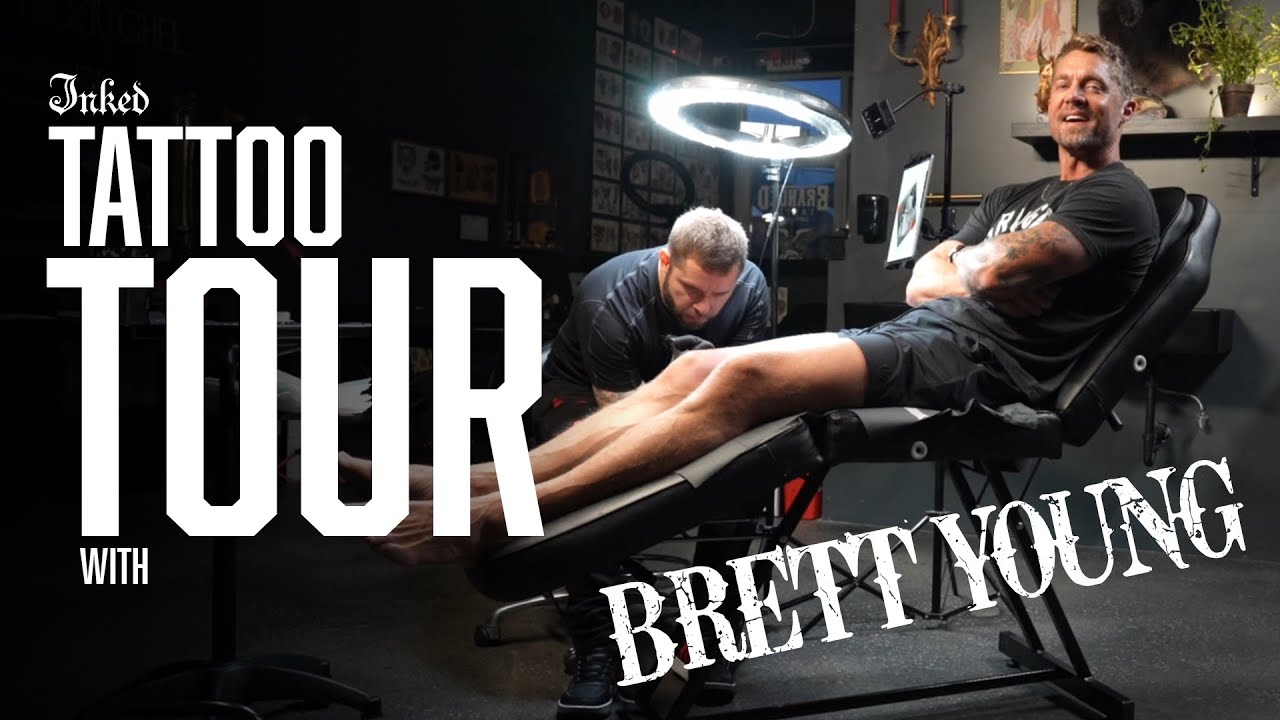
Brett Young in a tattoo session with multiple arm tattoos visible

The wider collection adds family details that make the quotes and navigation symbols feel less abstract. Young has talked about heartbeat tattoos for his daughters, Presley and Rowan, made from recordings of each girl’s heartbeat during an early appointment. A private family moment became something he could carry with him.

He has also shown designs connected to family photos, Bible verses and the people who shaped his sense of home. Other tattoos link his California background to Nashville, including references to the Santa Monica Pier and Nashville skyline. A Gibson Hummingbird guitar, a crown of thorns and other symbols extend the story into music, faith and the places he cares about.

The family pieces help explain how the collection has grown. A new tattoo doesn’t have to replace an old one; it can add another chapter. That’s how a musician’s body becomes an archive: one design marks the road into music, another honors a partner and another records the arrival of a child.

There’s no need to give every small mark a confirmed public story. Young has about 40 tattoos, and interviews naturally focus on the pieces with the clearest meaning. What is clear is that the collection isn’t generic filler. The same ideas keep returning: choose the right path, make room for family, let music speak when conversation can’t, and stay grounded while life moves.

That’s why Brett Young’s tattoos are worth looking at together. The compass, anchor, phrases, hand ink, heartbeat lines, guitar references and family symbols all point in a similar direction. They mark where he came from, what he chose and who he wants close as life moves into another chapter.

Brett Young’s tattoos are personal signposts, not just decoration. They keep his career, faith, marriage, children and sense of home in the same frame, which is what makes the collection feel like a story rather than a trend.

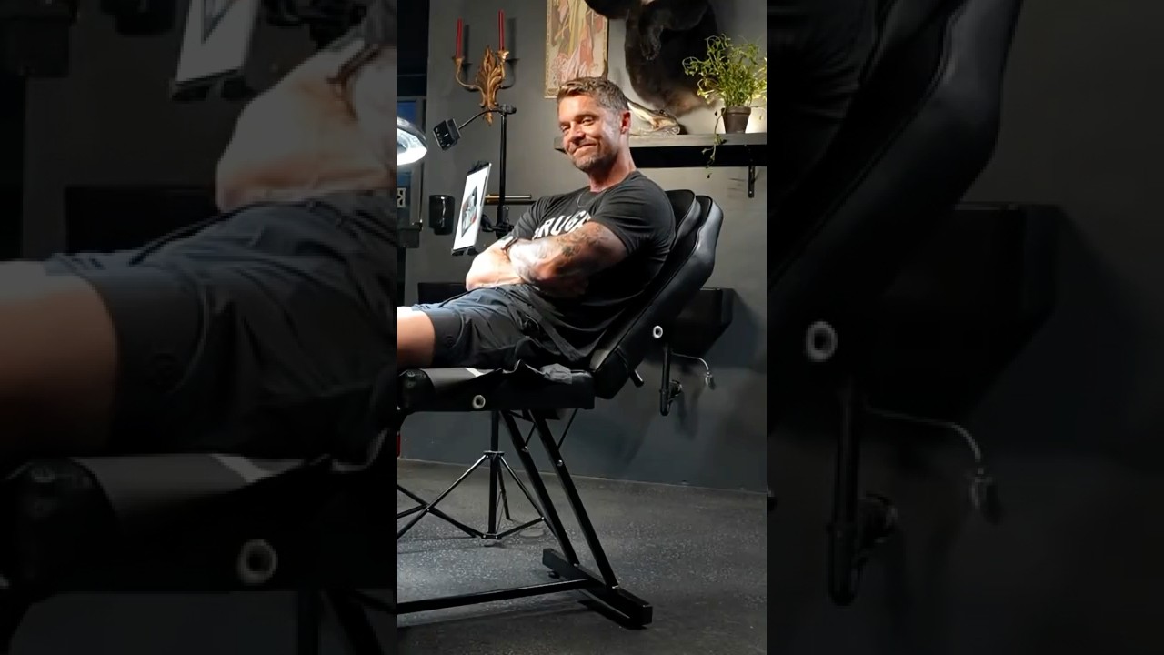
Watch Brett Young explain the stories behind his tattoos

Anthony Joshua’s Tattoos: Wisdom, Africa, Team GB and New Tribute Ink

Anthony Joshua’s tattoos can disappear beneath a robe or behind a microphone. In the ring, they become part of the picture. A Team GB lion sits between his shoulder blades, “Wisdom” leads into an outline of Africa on his right shoulder, and a small hand tattoo turns an old boxing scar into artwork. Recent ink has a heavier story too: tribute lettering for two close friends who died in a car crash in Nigeria.

The collection doesn’t look like random flash designs. Its subjects follow the same threads as Joshua’s life: Nigerian family roots, Olympic ambition, a drive to keep learning and the people who helped him along the way. Here’s what is known about the best-documented tattoos, where they sit and what they mean.

Anthony Joshua’s Team GB lion tattoo

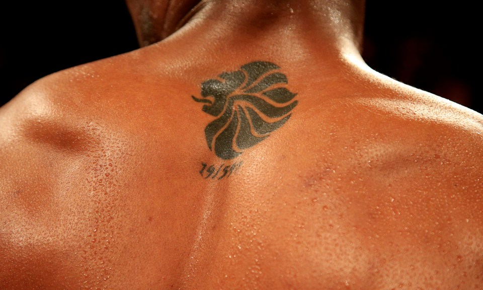
Anthony Joshua Team GB lion tattoo on his upper back

The most recognizable design is the lion emblem across the back of Joshua’s neck and upper shoulders. It’s linked to Team GB and the 2012 London Olympics, where he won super-heavyweight gold. That tournament wasn’t an easy run: in the final, he came back from a three-point deficit against Italy’s Roberto Cammarelle to win.

Joshua has described the tattoo as a reminder of that journey. It’s more than a national-team logo on a famous athlete; it marks the moment a talented amateur handled pressure on a global stage. The placement matters too. It sits high on his back, usually covered by clothes but clear when he trains shirtless or celebrates after a fight.

Many photos show the tattoo as a dark shape from far away. A closer look reveals the lion’s lines and the date beneath it, giving the design a more personal feel than a standard sports logo. It reads like a medal he carries into every training camp and comeback.

The “Wisdom” and Africa shoulder tattoos

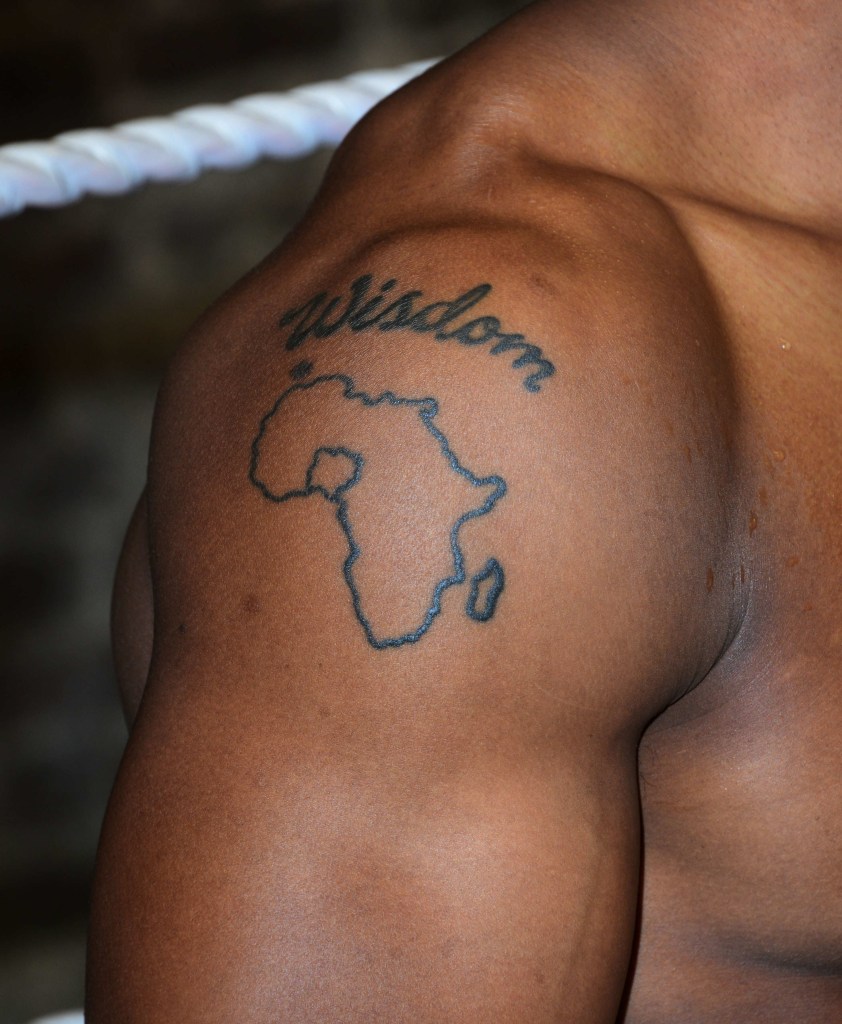
Anthony Joshua Wisdom and Africa shoulder tattoos

Joshua’s right shoulder holds two designs that speak to his interest in learning and his heritage. The word “Wisdom” sits above a simple outline of Africa, forming one connected tattoo rather than two unrelated pieces. It’s one of the clearest examples of him bringing a personal value and family history together.

When he discussed the tattoo around his 2017 fight with Wladimir Klitschko, Joshua said he was always looking for knowledge. He linked the idea to wise characters in old Italian films and to learning from people around him. The placement fits: the word is visible in photos and training mirrors, while the map grounds the idea in the family history behind it.

His mother, Yeta Odusanya, is Nigerian, and Joshua has spoken about learning more about his family’s history as he grew older. Nigeria is marked within the outline, making the tattoo more specific than a map of the continent alone. It points to a place, a family line and a sense of belonging that he carries into his British boxing career.

The style is deliberately simple, without heavy shading or a crowded background. The words and map have space to breathe, keeping the meaning clear even in a quick ringside photo. For a boxer known for power, the shoulder design has a quiet quality.

The lion and forest tattoo on his finger

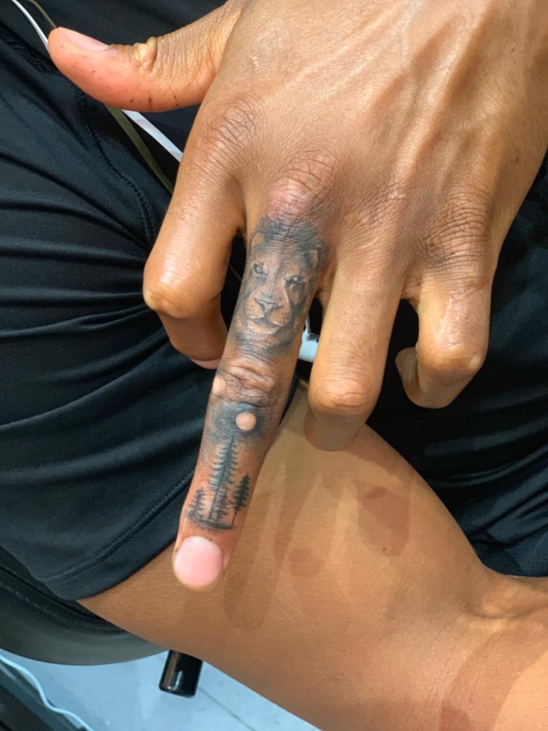
Anthony Joshua lion and forest tattoo on his middle finger

Joshua’s middle-finger tattoo is much smaller than the shoulder work, but it’s one of the collection’s most striking images. A lion’s face sits with a forest scene. He got it after his first professional loss to Andy Ruiz Jr.; the tattoo also helped cover scarring and calluses on a finger that had taken years of boxing punishment.

That history gives the design a different feeling from the Olympic lion. The Team GB piece looks back at a breakthrough. The finger tattoo came during a harder period, when Joshua was dealing with the shock of losing his heavyweight titles. Turning damaged skin into a detailed image feels like a boxer’s response: acknowledge the wear, then make something of it.

The tattoo artist has said that one callus became the moon in the design. It’s an easy detail to miss without a close-up, which is why distant fight photos don’t show the tattoo at its best. Trees frame the lion, and the small scale makes every part of the artwork work hard. It functions as both cover-up and character piece.

Joshua has also talked about possibly adding a lioness and cubs on other fingers. Whether that plan goes ahead or not, the existing tattoo hints at a larger set of images. The story could grow without changing the original design.

How the shoulder ink looks in fight photos

Anthony Joshua shoulder tattoo visible after a boxing match

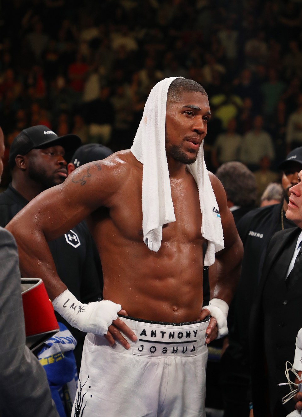
Close-up tattoo photos reveal detail, but ordinary fight photography shows how the ink looks on Joshua in motion. A post-fight image from his earlier heavyweight years catches the shoulder design in the ring, partly framed by the towel around his neck. It’s less polished, but explains why fans often catch the tattoos in passing.

The designs sit where a boxer’s movement keeps changing the view. A raised arm may reveal one part; a towel or a member of his corner can hide it seconds later. The stop-and-start visibility is part of their appeal. They show up in training, at weigh-ins, celebrations and the exhausted minutes after a fight, not only in a studio portrait.

That context keeps the tattoos connected to Joshua’s career. The lion, Africa outline and “Wisdom” aren’t separate decorations in a ringside photo. Together they point to the athlete he has tried to become: sharper, conscious of his roots and willing to learn after setbacks.

More body art and the newer tribute ink

Anthony Joshua tattoos visible during boxing training

Some of Joshua’s other tattoos are harder to catalogue because photos show them from different angles. Training pictures reveal smaller marks on his arms and hands; interviews and weigh-ins show pieces usually covered in public. This isn’t one sleeve, so a good guide needs to distinguish confirmed designs from guesses based on blurry photos.

The latest documented chapter is deeply personal. In February 2026, ESPN and other sports outlets reported that Joshua had the names Latz and Sina tattooed after the two friends died in a car crash in Nigeria. The tribute changes the tone of the collection. Earlier tattoos point to achievement, education, heritage and recovery; this one is about keeping people close after loss.

That’s part of why people keep asking about Joshua’s tattoos. They’re visible on a powerful athlete, but the stories behind them are familiar: a team, a family connection, a hard lesson and friends who mattered. The ink becomes a map of his life alongside the boxing career.
A useful way to read the collection is to start with what Joshua has actually explained. The Team GB lion has a clear Olympic connection; he has discussed “Wisdom” and the Africa outline; the finger piece has a documented cover-up story; and reports describe the tribute names after the tragedy. Other marks may become clearer in future photos, but there’s no need to fill gaps with invented meanings.

Together, the tattoos form a loose timeline. The Olympic lion marks the win that made him a national sports figure. The shoulder designs represent values and heritage. The finger piece records a setback and the choice to turn scars into art. The tribute lettering carries the names of friends who remain part of his story.

That mix also works visually. The tattoos move from bold symbols to small personal details, from the back of the neck to the shoulder and down to the fingers. Some are meant to be read at a distance; others need a clear close-up. Each scale suits the memory attached to it.

For anyone looking to Joshua’s tattoos for ideas, the lesson isn’t to copy the symbols. Give a tattoo a purpose: a word can hold a value, a map can carry family history, and a lion can mark a team or turning point. Even a cover-up can preserve the memory of an injury while changing how it looks. The artwork feels personal because it has a job.

Quick answers

What is Anthony Joshua’s most famous tattoo? Many people recognize the Team GB lion on his upper back and the “Wisdom” and Africa design on his right shoulder.

What does the Africa tattoo mean? Joshua has said it reflects his Nigerian family roots and his effort to learn more about his heritage.

Why does Joshua have a tattoo on his finger? The lion and forest design helped cover scarring and calluses from boxing. He got it after his loss to Andy Ruiz Jr.

Does Anthony Joshua have tribute tattoos? Yes. Reports in 2026 said he added the names Latz and Sina, two friends who died in a car crash in Nigeria.

Anthony Joshua’s tattoos remain a work in progress, like his boxing career. The clearest pieces already tell a story, and new photos may reveal more over time. For now, the confirmed designs show a lion for Team GB, wisdom and Africa for learning and family, a forested lion for scars and recovery, and names for friends he refuses to forget.

More athlete tattoo guides

Hayley Williams let her tattoos change with the seasons

Hayley Williams’ tattoos have never felt like a fixed catalogue. They’ve shifted with her hair, her music and the different versions of Paramore fans have seen over the years. Some pieces are private and tiny, some show clearly from the stage, and some carry stories that change as life does. Her ink feels more like a scrapbook than a brand system.

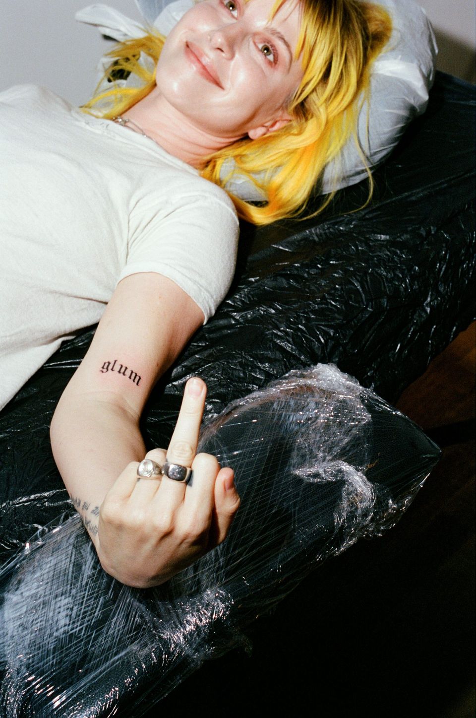
Hayley Williams glum forearm tattoo

Hayley Williams neck tattoo

The tattoos fans know best often connect to people or turning points. Williams once celebrated Valentine’s Day by getting her then-husband’s initials on her hand. After the marriage ended, she covered them with three black squares and joked about the process in an interview. The cover-up is part of the tattoo’s story, not an embarrassing footnote.

That choice says something about how she sees body art. A tattoo can begin as a celebration and later mark a different chapter. The three squares look simple, but behind them is a fuller timeline: love, commitment, separation and the decision to keep moving. Williams has discussed the change with enough humor to make it feel human rather than melodramatic.

Another recognizable piece is the quote on her left forearm: “Accentuate the positive / Eliminate the negative.” It works like a bit of daily advice, but the placement makes it part of a performance too. The words show when she reaches for a microphone or gestures to the crowd. A private reminder becomes a public one.

Williams has also said that a storm-cloud tattoo recalls the strange weather on Warped Tour. It’s a classic tour-memory piece, tied to one stretch of time while still leaving room for new meaning. The cloud doesn’t have to stand for a grand philosophy. Sometimes it simply helps a chaotic season stay memorable.

Family is part of the collection as well. One design represents Williams and her two sisters, with each figure distinct while still growing together. That fits the way she talks about family: connected by a shared history, but not made up of identical people. The tattoo holds closeness without pretending everyone is the same.

Other small pieces connect to music and different Paramore eras. Fans assemble detailed lists from photographs, but those can mix temporary artwork, jewellery, old tattoos and newer additions. The most reliable approach is to keep the stories Williams has confirmed at the center and treat other marks as visible but undocumented until she or the artist explains them.

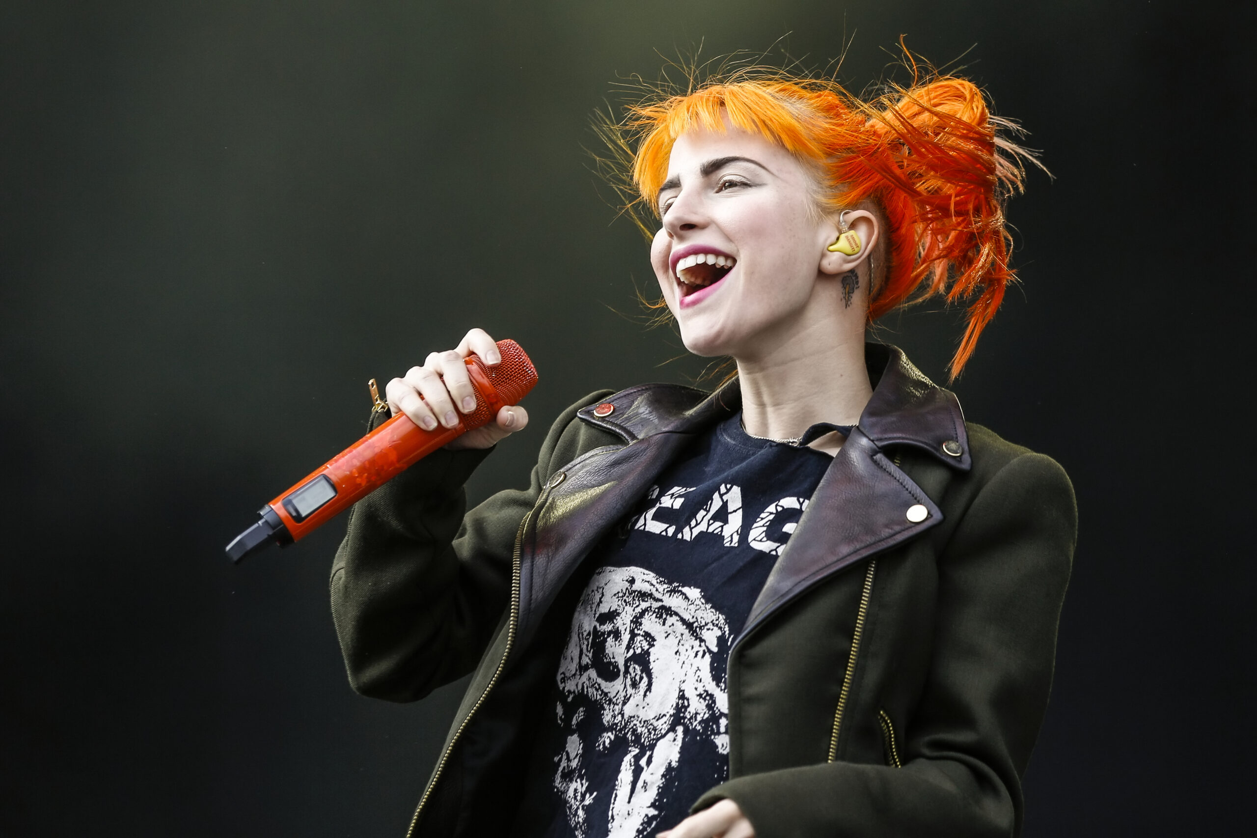
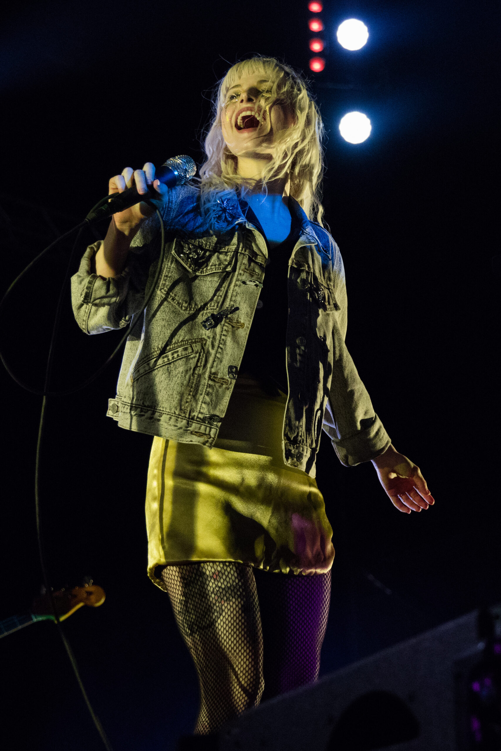
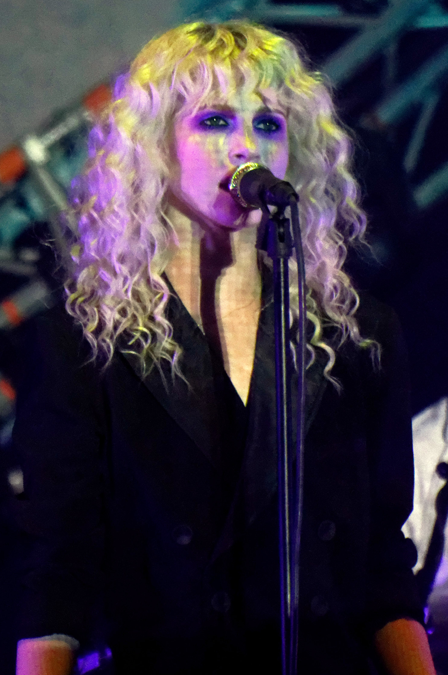
Paramore performance photos show why her tattoos can be difficult to inventory. Stage lights alter ink colors, sleeves cover forearms and camera angles flatten small details. A 2013 festival photo records one moment, not every tattoo added afterward; a 2017 tour shot gives another view. Together the images make a timeline, not a perfect diagram.

That timeline is part of the appeal. Williams never needed every piece to match, because her life hasn’t stayed in one emotional register. A quote can sit beside a cloud, a family design beside a cover-up, and a small symbol beside a bold stage look. The collection makes room for contradiction. It can be hopeful without being naive and sentimental without getting stuck in the past.

Her tattoos also show how a public figure can keep ownership of her image. Williams is recognizable enough that a small mark can become a fan discussion, but its meaning still belongs to her. We can notice a design, trace its history and appreciate the craft without assuming she has shared every private reason. Good tattoo writing leaves space around the person wearing the ink.

The cover-up in particular pushes back on the idea that tattoos must keep their first meaning forever. The black squares don’t just replace the initials; they make the edit visible. The body becomes a document that can be revised. Tattoos aren’t frozen statements; they are choices made at different ages by someone who is allowed to change.

There’s a practical wisdom in the way Williams’ collection has developed. She doesn’t insist that an old tattoo keep the same emotional purpose forever. When life changes, a mark can be covered, reinterpreted or simply sit beside a newer piece. The result feels less like a performance of certainty and more like an honest record of being a person in public.

That openness helps explain why fans have stayed interested in her tattoos. The designs are visible, but their stories don’t collapse into one answer. The quote can be advice, the cloud a tour memory, and the family figures a reminder of connection. Each piece gives the next chapter something to push against.
Even a small tattoo can hold a date or a mood. One photo might show a bare arm, while a later performance reveals new lettering or a changed color. That doesn’t make the record unreliable; it means it’s still growing. Clothing, lighting and time all affect how the tattoos appear.

For readers, the respectful way to follow the collection is simple: start with what Williams has said, compare clear photos, and leave the rest open. Her tattoos don’t need invented symbolism to mean something. The documented stories already connect music, family, weather, love, loss and the freedom to change a decision.

The forearm quote is especially striking in performance. Williams is always moving her hands and arms, so the words appear in fragments: a positive phrase, then a negative one, and sometimes the whole line. The placement makes the tattoo part of the show without turning it into a costume.

The family design works differently. It carries its meaning even when nobody in the audience can make out every line. A tattoo about sisters doesn’t need a stage explanation to do its job. It can stay close to the wearer and still become part of a public image. Some of Williams’ strongest tattoo stories are powerful because they stay grounded in ordinary relationships.

Her cover-up is honest in another way. People often talk about cover-ups as if they erase a mistake, but the black squares don’t erase the earlier choice from her history. Anyone who knows the story can still see the sequence: the initials were there, the relationship mattered, and it ended. The new ink gives the skin a present tense without pretending the past never happened.

The storm cloud is similarly modest and specific. It doesn’t claim to represent every difficult season in Williams’ life. It recalls Warped Tour weather, the demands of travel and the strange details that make a long run of shows feel like its own world. That’s why the design feels warm rather than gloomy: it keeps a peculiar experience close.

Taken together, the tattoos feel unusually human. There isn’t one grand theory behind every line. There are small anchors: her sisters, a tour, a sentence to remember, a relationship that changed and the choice to keep making art. The designs don’t promise that life will stay stable; they show Williams carrying change without letting it define the whole picture.

The collection feels edited, not perfected, which is part of why it remains recognizable. The unfinished quality is a feature of a life still in motion.

A documented inventory of Hayley Williams’ tattoos

Hayley Williams tattoo at hockey event

The clearest public inventory includes the three black squares covering her former hand initials, the “Accentuate the positive / Eliminate the negative” quote on her left forearm, the storm-cloud tattoo connected to Warped Tour weather, and the family design representing Williams and her two sisters. Other small marks appear in photos and fan archives, but their meanings and dates aren’t always confirmed. They’re best left in a visible or reported category rather than given an invented explanation.

Why her ink feels so lived in

Hayley Williams tattoos during 2017 performance

Williams’ tattoos are compelling because they hold both edits and memories. One piece records a relationship and later its ending; another offers daily advice; one keeps a tour season alive; another honors family. Her collection shows how life keeps moving while the marks remain.

Watch Hayley talk about a new tattoo

Hayley Williams tattoos

The short interview below is a useful companion to these stories, especially for hearing Williams discuss the personal side of getting new ink.

More musician tattoo guides

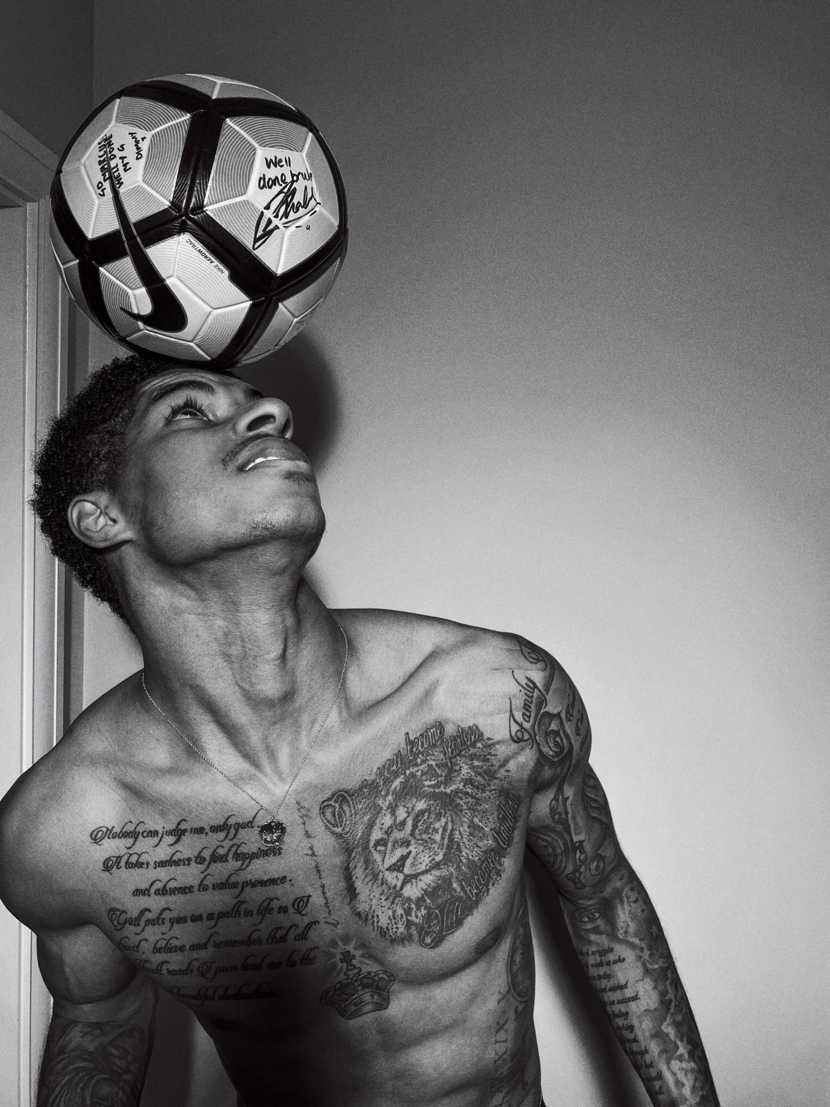
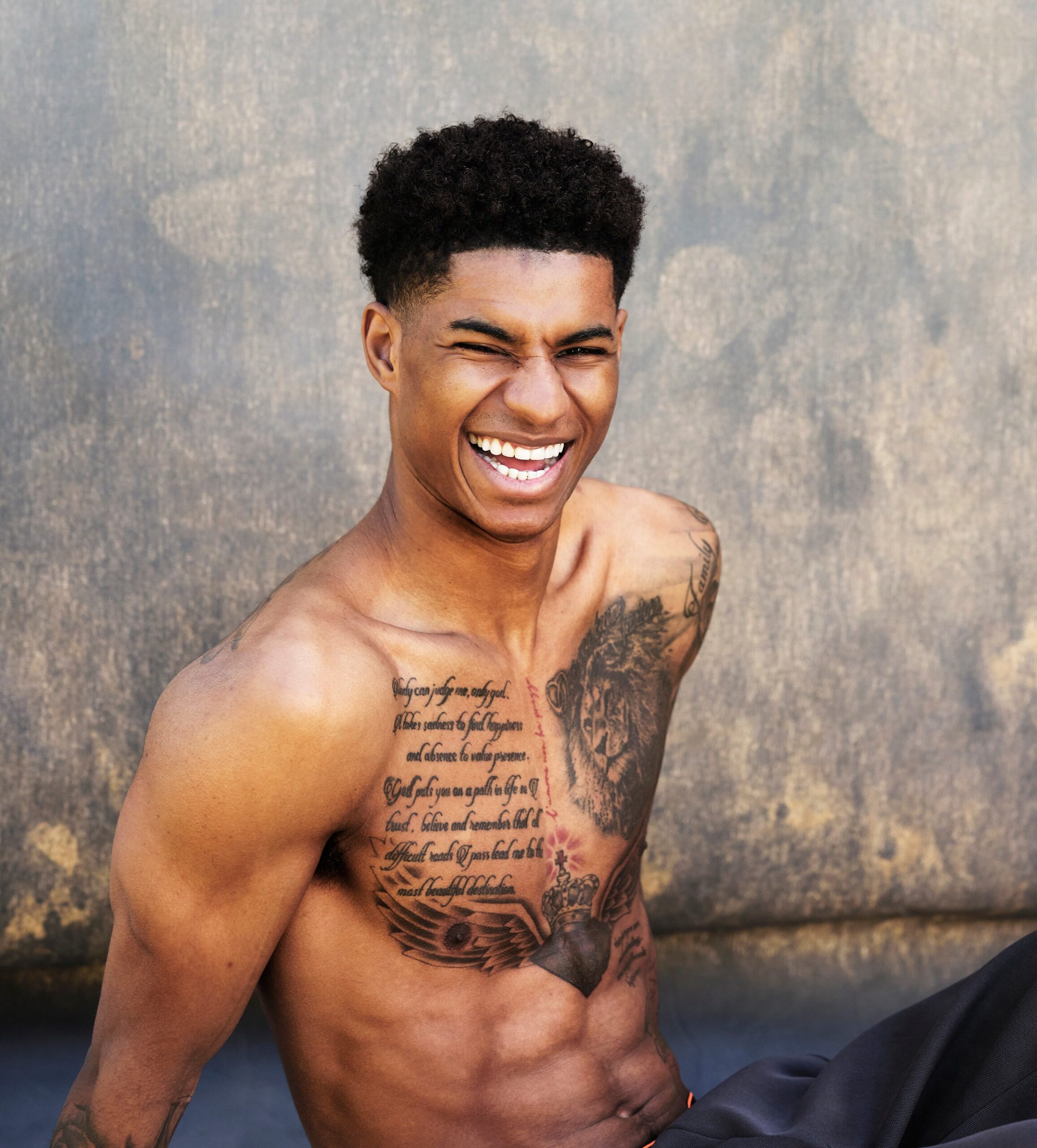
Marcus Rashford Tattoos: Family, Football and the Ink Behind His Story

Marcus Rashford’s tattoos form a visual diary of where he’s come from. The Manchester United forward has used ink to mark family memories, football milestones, faith and people whose words shaped him. Some designs show in match photos; others appear only when he trains shirtless or poses for a campaign.

That range makes the collection more than a string of football numbers or a sleeve from a catalogue. Old shirt numbers sit alongside a dramatic chest lion, script, portraits and symbols connected to his roots. Photos also show the ink changing as his career moves through new clubs, challenges and chapters.

Not every detail has been explained by Rashford, so it helps to distinguish what’s visible from what’s only repeated online. His own photos, tattoo-focused interviews and clear images offer the strongest clues. Here’s what can be documented.

The boyhood football scene on Marcus Rashford’s side

Marcus Rashford boyhood football tattoo

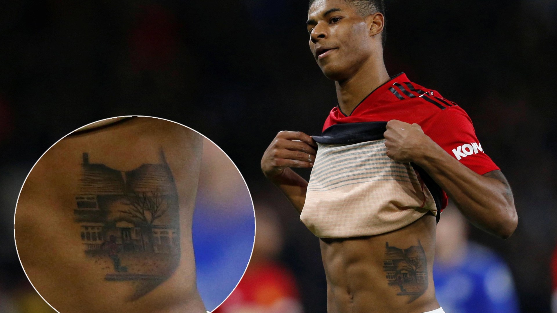
One of the most personal designs is the football scene on Rashford’s side. It shows a young boy with a ball in front of a row of houses and a familiar neighborhood. Rather than a generic football badge or pair of boots, it points back to the child who dreamed of playing and the place that made the dream real.

The torso placement lets the image stay covered beneath a shirt or appear when Rashford lifts his top. That feels right for a piece about memory. It isn’t there just for cameras; it looks back to the starting point, before the stadiums, contracts and international nights.

Photos from when the tattoo was first discussed show a detailed scene rather than a tiny flash design. The houses, the boy and the ball come together as one story. It offers a useful way into the rest of his ink: football is present, but the meaning is tied to people and place rather than team branding.

The chest script and lion carry most of the emotional weight

Marcus Rashford chest lion and script tattoos

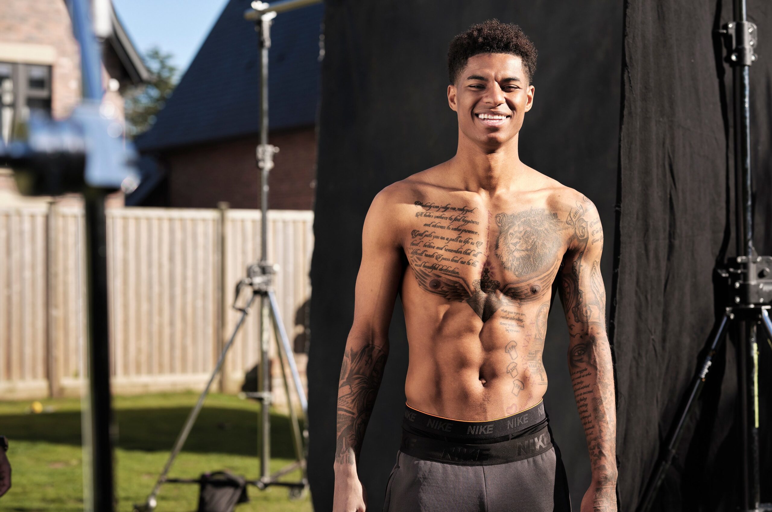
Two tattoos define much of Rashford’s chest. A large lion portrait sits on one side, with flowing script across the other. In clear photos, shading and ornamental details give the lion an old-school portrait feel without making it look flat or cartoonish.

The script appears to describe hardship, faith and continuing forward. Different articles transcribe parts of it slightly differently, so it’s best not to present every word as a definitive quote. The main idea is clear: difficult periods, belief and hope for a better place ahead. That gives the chest design the feel of a personal creed rather than decoration.

The lion dominates in photographs and sits beside the writing instead of replacing it. Together, the animal and script balance strength with reflection: the image suggests confidence, while the words offer some of the mindset behind it.

A Men’s Health interview showed the scale of this work more clearly. The ink spreads beyond one isolated symbol, with smaller details around the main designs. A tight crop of only the lion can be misleading: it anchors the chest piece, but the script and surrounding marks belong to the same composition.

His Manchester United shirt numbers are tattooed as career markers

Marcus Rashford Manchester United shirt number tattoos

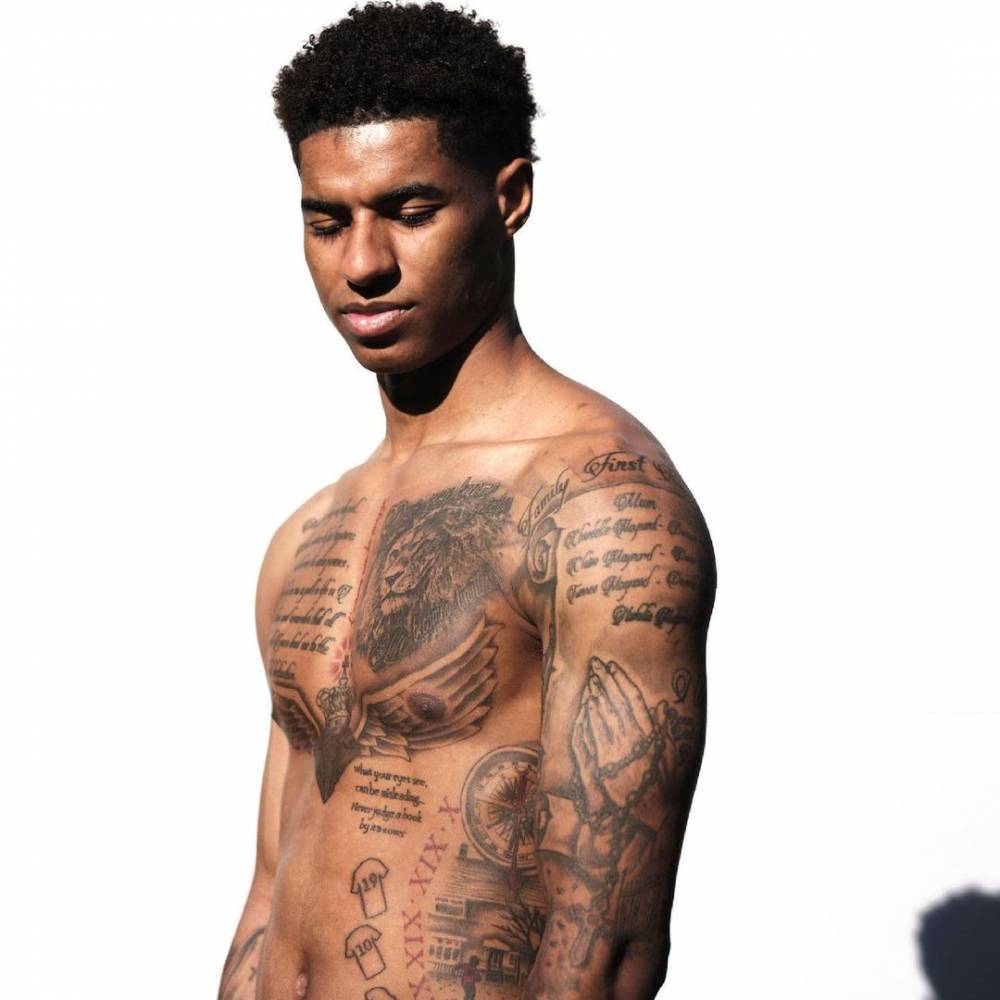
Rashford has also turned his Manchester United shirt history into body art. Small shirt-shaped tattoos on his lower torso mark numbers from different Old Trafford chapters. Earlier photos show 39, 19 and 10—the numbers he wore before becoming one of the club’s senior players.

The idea is simple, but the shirts work like a timeline. Squad numbers usually disappear when a season ends; these designs keep each stage visible. They recall the academy player, the teenager who reached the first team and the forward who became a major attacking figure for United.

More recent reports connect the same design to number 14 from his Barcelona loan and number 9 on his later return to Manchester United. That suggests the tattoo has continued to grow with his career. The numbers aren’t just collectibles; they mark the places and chapters attached to them.

Their placement helps explain why fans miss them. A football shirt hides the whole group, and in training photos shorts or camera angles may cover part of it. When visible, the small jersey outlines make the idea clear: they’re like little football shirts within a larger collection of personal symbols.

Script, prayer and family details run down his arms

Marcus Rashford script and chest tattoos

The chest work gets most of the attention, but Rashford’s arms carry quieter designs too. Shirtless photos show writing across his upper body, small symbols near the ribs and layered black-and-gray work down his arms. Prayer imagery and other details have been linked in coverage to family, faith and the people close to him.

It’s tempting to turn every small mark into a dramatic theory, but the photos don’t always support that. Some designs are too blurred to read; others disappear beneath clothing or movement. The safest conclusion is that his arms have several smaller pieces rather than one clean sleeve with a single public explanation.

That fits with the chest tattoos. Script holds the words he wants to carry, while portraits and symbols add visual weight. The result is busy without being random: open gaps separate the pieces, and darker shading tends to frame the writing rather than swallow it.

The collection can look different from one photo to the next. A match image might show a dark forearm that seems like one solid block. A closer portrait reveals separate letters, figures and lines. His tattoos reward a careful look instead of a quick glance.
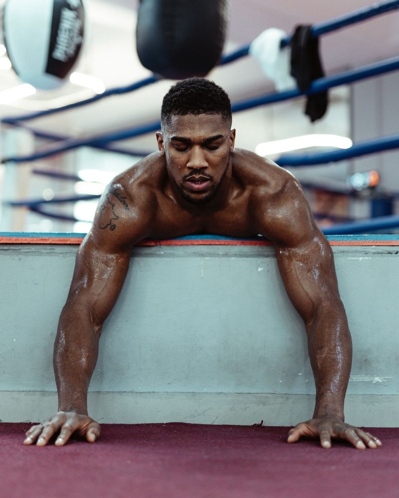
The lion and script connect football success with personal influences

Marcus Rashford chest lion and script tattoos alternate view

Clear, front-facing photos show the chest tattoos working as a group. The lion, long passage of script and smaller marks add up to something larger than any one symbol: a statement about strength, belief and the people or ideas that have helped Rashford keep going.

Coverage of his wider body art also mentions tributes to Nelson Mandela, Malcolm X, Muhammad Ali and Bob Marley. Not every portrait is equally clear in every photo, and some online lists mix confirmed designs with guesses. The broader theme is easier to see: his ink is often linked to courage, social change and self-belief, not only football.

The references to 1968 in tattoo coverage fit that same context. The year is widely associated with Black history and civil rights conversations, alongside the names and messages connected with Rashford’s public work. Even when an individual mark is hard to read, the larger pattern comes through in the chest design: identity matters as much as appearance.

Compare this with another player’s collection, like the large back piece and family ink in our Leroy Sané tattoos guide. Rashford’s designs are less about one giant scene and more about separate memories sitting together.

New additions are best understood as updates to an ongoing record. A change in shirt number can bring a new number tattoo; a move to another club can add a reference. That’s different from completing one sleeve and never returning to it.

There’s a practical point here as well. Older tattoos show up in different light, from different angles and sometimes in low-resolution social posts. A newer image may simply be clearer; it doesn’t always mean the tattoo is new. A careful account shouldn’t count the same design twice because it appears in a different crop.

The through line is easy to see. The boyhood football scene points back to Rashford’s beginnings. The lion and script speak to strength, faith and difficult periods. The shirt numbers mark his development at United. Portraits and historical references show the people and ideas he wants to keep close.

That’s why the collection is more interesting than a simple list. It keeps Rashford’s roots visible as his public life grows. The tattoos may keep changing; the best way to follow them is through clear, dated photos and confirmed reporting rather than treating every social media crop as another design.

Watch a short visual guide to Marcus Rashford’s tattoos

For a quick look at the designs and their football connections, watch the relevant video below.

Rita Wilson’s new back tattoo opens a very different chapter

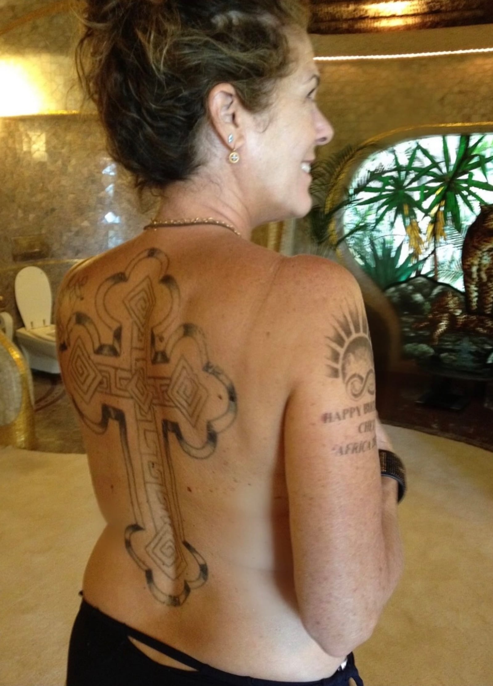
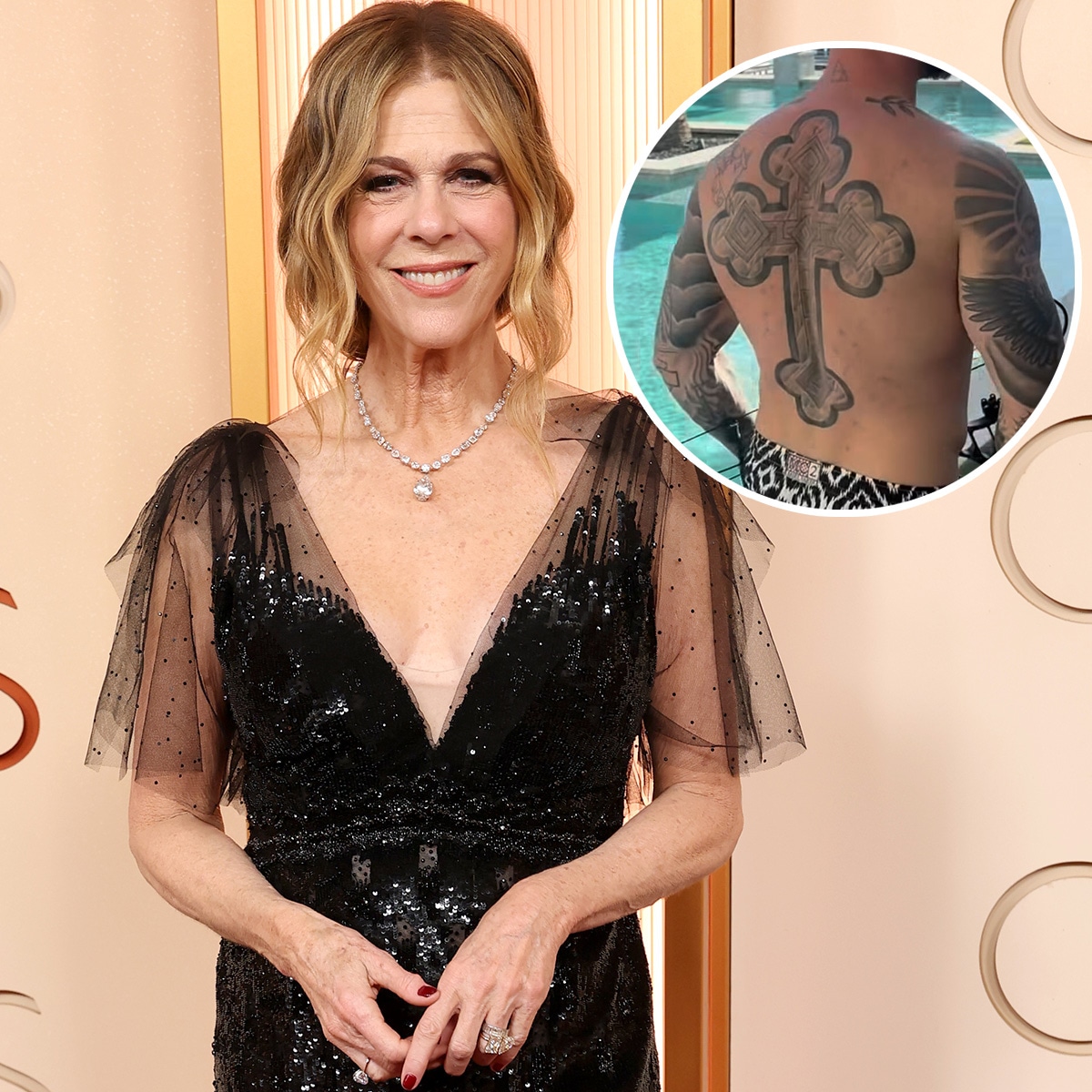
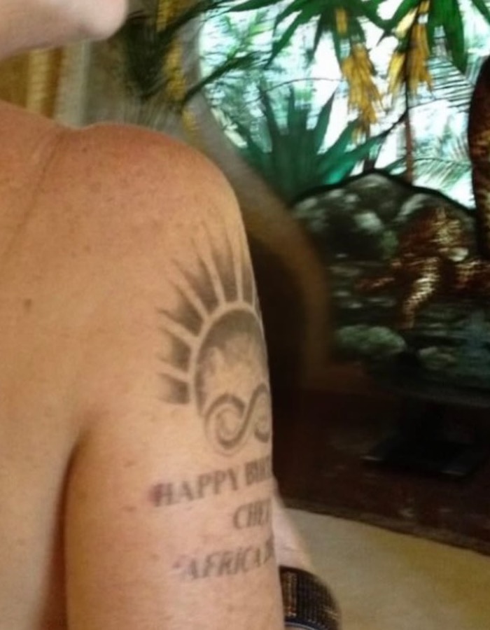
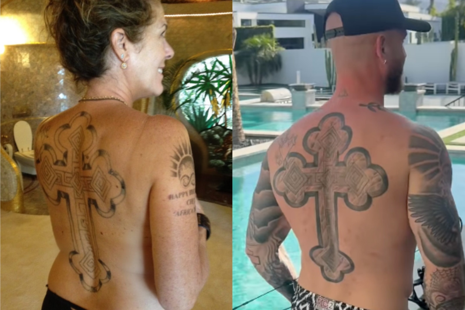
Rita Wilson’s tattoo story changed almost overnight. For most of her career, the singer, actor and producer wasn’t known for showing much body art. Then, in a September 2026 Instagram carousel promoting her song “Stranger with Age,” she shared a photo that revealed a large design across her back. An ornate cross runs from the upper back toward the lower back, with rounded, bud-like details in the design.

The reveal catches the eye, but Wilson’s recent comments about tattoos add context. In an interview with *The Cut*, she recalled growing up with the idea that tattoos belonged to “a thug” or “a bad guy” who went to jail. Talking with a tattoo artist shifted her view: people often choose ink to show who they are. That change in perspective helps frame the new tattoo without pretending she has explained every symbol.

The back cross is the clearest documented tattoo

Rita Wilson back cross tattoo

The back design is the clearest piece documented in current coverage. *The Daily Beast* called it a massive budded cross, while other outlets described it as a large Celtic cross. It runs vertically down the center of Wilson’s back, from near the neck toward the lower back, and dominates the photograph.

It’s best to keep the description specific. Reports support an ornate cross with rounded details and a long central placement. Wilson hasn’t said whether it’s religious, familial, symbolic or simply an image she liked. “Celtic cross” is a visual description used by several outlets, but the intention behind it remains unknown. The design is documented; its private meaning isn’t.

The upper-arm tattoo adds a second visible design

Rita Wilson portrait with Chet Hanks matching cross tattoo

The same Instagram carousel also revealed ink on Wilson’s upper arm or bicep. Close-up coverage describes a sun-like shape with an infinity symbol above lettering that isn’t legible in the photo. The image shows the arrangement, but doesn’t give us a confirmed inscription.

For now, the safest description is three visible elements: a sun-like image, an infinity symbol and text that can’t be read clearly. No reliable source has supplied the words, artist credit or date. That matters because tiny lettering is easy to misread, especially in a social media photo. Unclear text should stay unclear. It shouldn’t become a quote just to make the inventory look complete.

The published reveal keeps the family link visible

Rita Wilson upper arm sun and infinity tattoo

Wilson’s post wasn’t framed as a formal tattoo tour. She used the carousel to promote “Stranger with Age,” joked about getting older and shared photos of herself making funny faces and surfing. The tattoo appeared within a playful post, not as a solemn announcement. That tone is part of the reveal: she was showing something new while having fun with the attention.

Her caption asked, “STRANGER WITH AGE? Who? Me? I’m lovin’ it!” It connects the reveal to the song’s idea of getting more comfortable with change. We can’t say the tattoo was designed specifically for the single; the reports don’t establish that. The timing does place the cross within a public moment about aging, self-acceptance and trying something unexpected.

How Rita Wilson’s cross matches Chet Hanks’s

Rita Wilson and Chet Hanks matching cross tattoos

Several reports say Wilson’s back design matches, or closely resembles, a cross worn by her son Chester “Chet” Hanks. *The Independent* and other outlets made the connection, and a May 2026 Instagram video has been cited as showing Chet with similar back ink. The family link is part of the public conversation, although Wilson hasn’t explained exactly how the designs came about.

There are useful distinctions to keep in mind. A visual match doesn’t prove they were tattooed in the same session or by the same artist. It also doesn’t tell us whether Wilson, Chet or a family conversation first inspired the idea. The supported point is that her cross has been reported as matching or resembling her son’s, giving it a possible family meaning without settling the story.

What the family story adds to the tattoos

In *The Cut* interview, Wilson said her childhood view of tattoos came from a stereotype that people with ink were dangerous or disreputable. Speaking with a tattoo artist changed her mind. The artist explained that people choose designs to show something about who they are.

That comment doesn’t decode the cross or arm design, but it shows how Wilson thinks about tattoos now: as personal expression rather than a warning sign. It also helps explain why the reveal felt like a new chapter at 69. She didn’t become someone else overnight; she felt freer to let another part of herself be seen. Her change in attitude is documented; only she can define the symbols.

What the current evidence confirms:

The public inventory can stay short and accurate. On her back is a large vertical cross with ornate, budded or Celtic-style details, running from the neck area toward the lower back. On her upper arm is a sun-like design, an infinity symbol and lettering that can’t be read in the available photo. The back cross has been reported as matching or resembling Chet Hanks’s tattoo.

That’s enough to describe the reveal without adding guesses. Public reporting doesn’t confirm the artist, exact session date, whether the tattoos are permanent or temporary, or what Wilson says each design means. *The Daily Beast* specifically noted that she hadn’t clarified whether the tattoos were permanent. That uncertainty belongs in the story, especially since the photo came from a promotional Instagram post rather than a tattoo publication.

The design is bold because the placement does the work:

Even without a confirmed explanation, the placement helps show why the back cross drew attention. A vertical design from the neck down the spine changes her silhouette when she turns around. It can stay covered in everyday clothes, then dominate a single photo. That contrast makes the tattoo feel private and public at once.

The arm piece does something different. A bicep tattoo can show casually in sleeveless clothes, beach photos or a gesture. Together, the two placements make a small but noticeable collection: one large design across the back and a smaller group of details on the arm. The photos suggest she chose ink that could become part of how people see her.

Why the reveal landed with fans:

People reacted because the photo challenged an established expectation. Wilson has spent decades in public, but the tattoo hadn’t been part of the familiar red-carpet image. Her marriage to Tom Hanks, film work and music career are well known; the back piece added a striking new detail.

The response also echoed Wilson’s comments about rethinking her assumptions. People described the reveal as freeing, cool and authentic. When one commenter suggested that getting older can mean dropping the mask and showing your authentic self, Wilson replied, “All of the above.” That isn’t an explanation of the tattoo, but it helps us understand the moment she chose to share it.

What remains unconfirmed:

The cross could be religious, cultural, familial or simply aesthetic. The sun and infinity shapes might have a private message; the lettering could be a name, phrase or date. Until Wilson or a reliable source confirms those possibilities, they should stay possibilities. The photos show shape and placement, not the whole story.

That restraint makes the article stronger. Wilson has only recently made the designs public and may explain them later. For now, we can document a large back cross, the upper-arm arrangement, a reported family resemblance to Chet Hanks’s tattoo and a clear shift in how she views body art. The mystery is part of this first reveal.

Rita Wilson’s tattoo chapter is still unfolding:

The new ink looks like a visible sign of personal change. The back cross is bold, the arm tattoo adds another layer, and the resemblance to Chet Hanks’s tattoo gives the story a family connection. Wilson’s own comments make the timing feel natural: she has moved from seeing tattoos through a stereotype to understanding them as a way people show who they are.

There’s no need to assign a final meaning to the designs. The most grounded reading is that Wilson felt ready to share a side of herself that had been private, playful and perhaps still evolving. She may offer more detail later. For now, the record is a large cross, a sun and infinity motif, lettering that can’t be read and a new willingness to be seen differently.

Watch the latest coverage of Rita Wilson’s tattoo reveal: