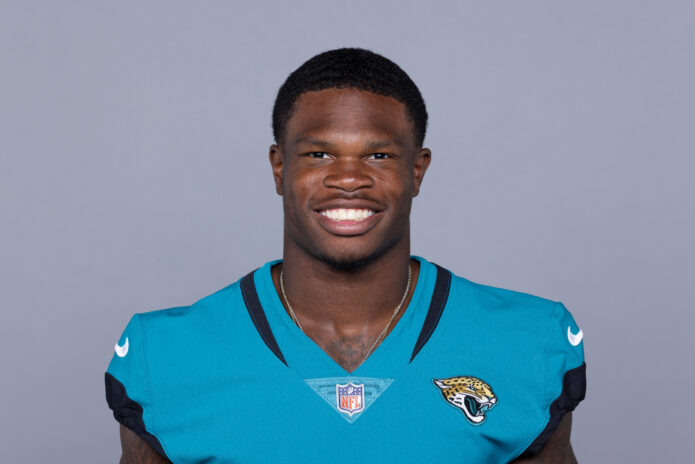
Travis Hunter made plenty of noise on a football field before he ever became an NFL name, but his chest tattoo got a different kind of reaction. In February 2026, photos shared by Leanna Lenee showed a large portrait piece across Hunter’s chest, with his wife and their son represented in the artwork. It was personal, very visible, and impossible to mistake for a small offseason experiment.
That is the interesting part of Hunter’s tattoo story. The chest piece got the headlines, but the public photos also show a player who already had a serious collection of ink across his arms, legs, and torso. The newer tribute sits inside that larger collection instead of appearing on completely blank skin.
The reveal came through a family post rather than a formal tattoo interview. That means some details are clear and some are not. We can talk about what the photographs actually show, where the major piece sits, and how the surrounding tattoos change the look. We shouldn’t invent an artist, a hidden symbol, or a meaning Hunter hasn’t publicly explained.
Travis Hunter’s chest tattoo is the piece everyone noticed
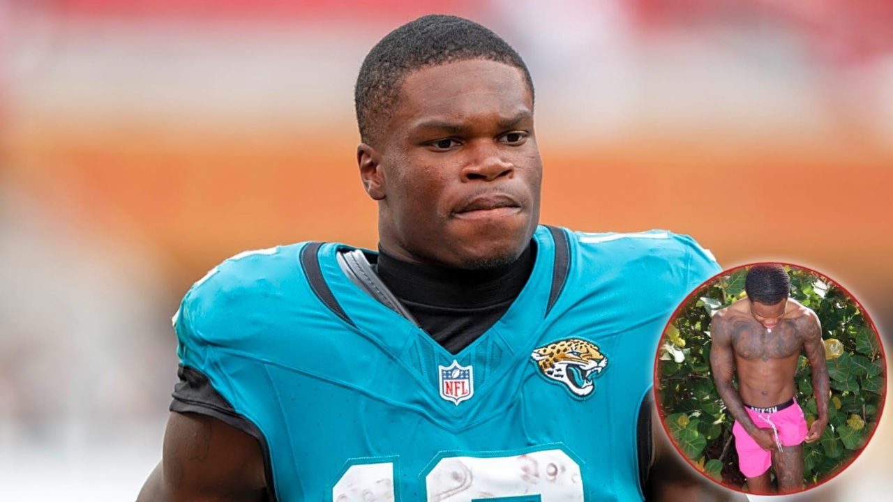
The clearest public reporting describes a large portrait of Leanna Lenee across Hunter’s chest, with their son appearing in the same family tribute. The design takes up a lot of visual space, which is why it became such an immediate talking point. This isn’t the kind of tattoo that disappears under a short-sleeved shirt or only appears when Hunter turns his wrist toward a camera.
Portrait tattoos are demanding even when they are small. On the chest, the artist has to work with a broad surface that moves constantly with breathing, posture, and muscle. A realistic face also needs clean value changes and enough open skin around the features to keep everything readable. Hunter’s piece is presented as a substantial chest composition, not a tiny likeness tucked under a collarbone.
The public images don’t provide a technical breakdown of the stencil, the artist, or the exact date of the appointment. They do establish the main point: Hunter chose an unusually direct family tribute and placed it where it would be seen. That visibility is part of the design choice. The tattoo doesn’t ask people to search for its meaning. The subject is the meaning.
How the rest of the collection changes the look
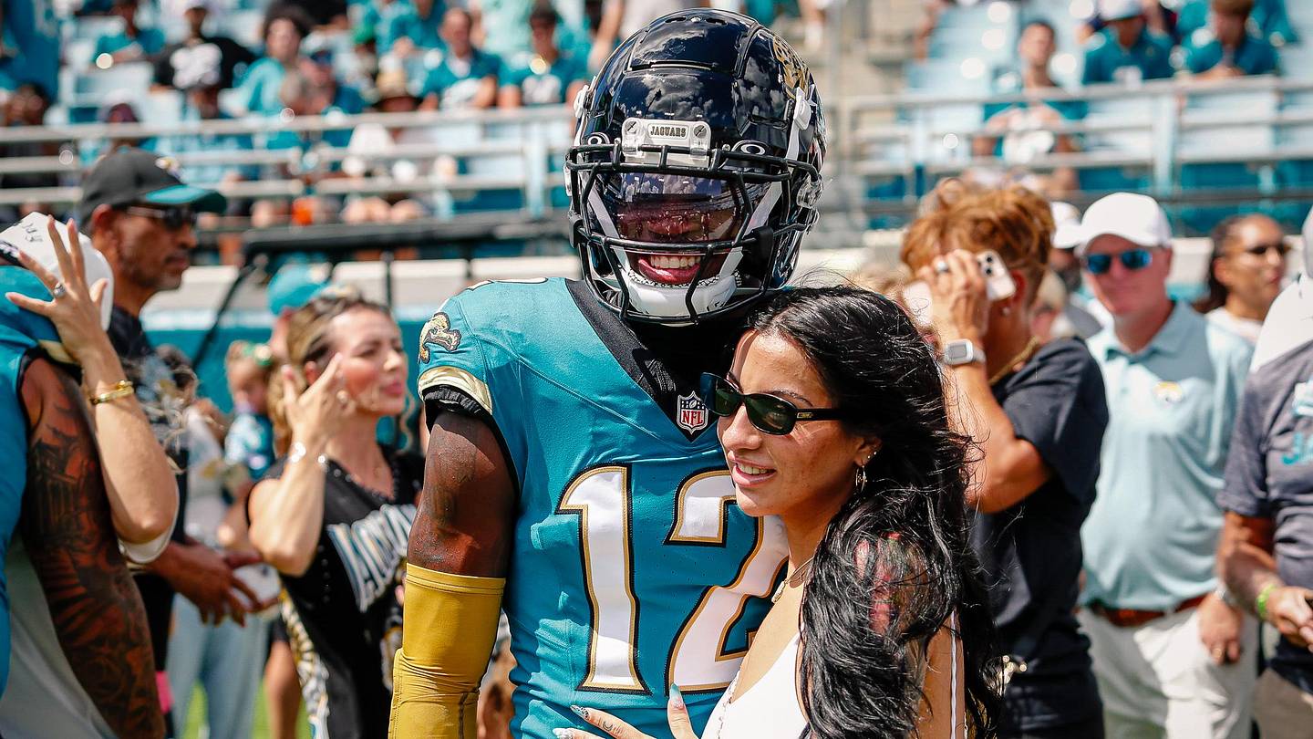
One reason the chest portrait feels so dramatic is that it isn’t sitting alone. Hunter’s public photos show additional work across his torso and arms, with darker pieces building a fuller, more connected look. In some views, the portrait is the first thing your eye catches. In others, the surrounding black and grey work makes the whole upper body read as one large tattoo collection.
That matters when you’re looking at a tattoo for ideas. A portrait can feel very different on untouched skin than it does inside an established collection. Here, the newer family image has to hold its own against existing lines, shading, and larger blocks of ink. It creates a more layered result than a standalone portrait would.
The available photos also show why a single image can be misleading. A shirt, a shadow, or a turned shoulder can hide a lot of the work. The chest tribute is easiest to understand when Hunter is shirtless, but the wider collection becomes clearer in photos where he is standing, moving, or wearing gear that leaves the arms and lower legs visible.
A beach photo made the new piece feel even more personal
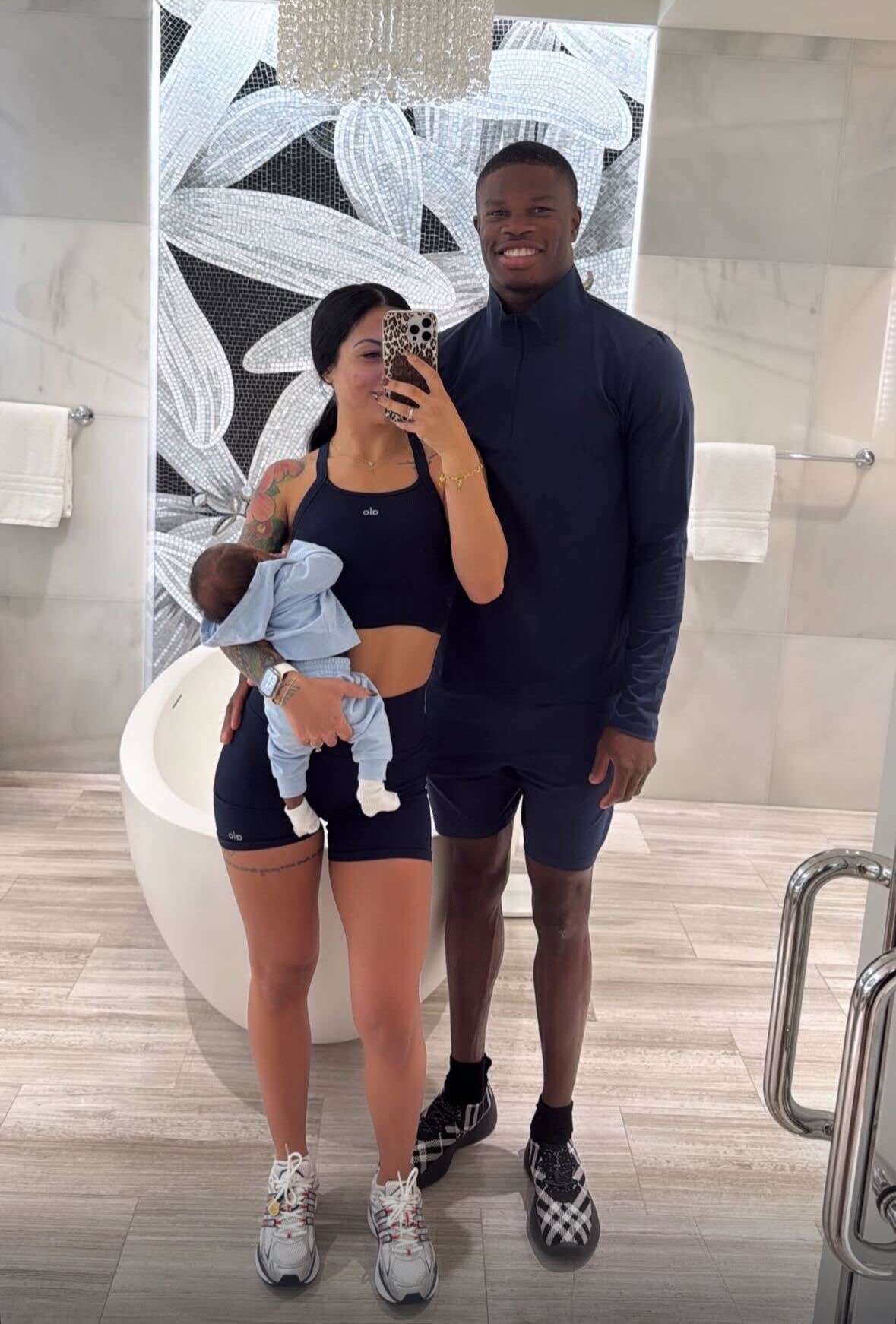
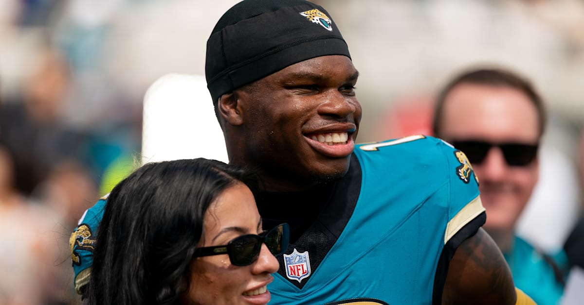
Sports Illustrated covered the reveal through photos of Hunter spending time with Leanna and their baby son. That setting changed the tone of the tattoo. Instead of seeing the piece in a studio or a posed tattoo reveal, readers saw it during a family moment. The image connected the faces in the tattoo with the people Hunter was actually with.
There is a relaxed quality to those photographs. They don’t look like a polished campaign built around the tattoo. Hunter is on vacation, Leanna is beside him, and the family is moving through an ordinary day while the new ink gets attention online. That contrast makes the piece feel less like a stunt and more like a permanent extension of the family photos already filling their social feeds.
It also explains why so many reactions focused on the size of the tattoo. The design is intimate, but it is not private. A chest portrait covering that much space will appear whenever Hunter is shirtless, at the beach, during a training moment, or in any photograph where the top half of his body is exposed. The personal choice and the public placement are tied together.
The family pictures show the life around it
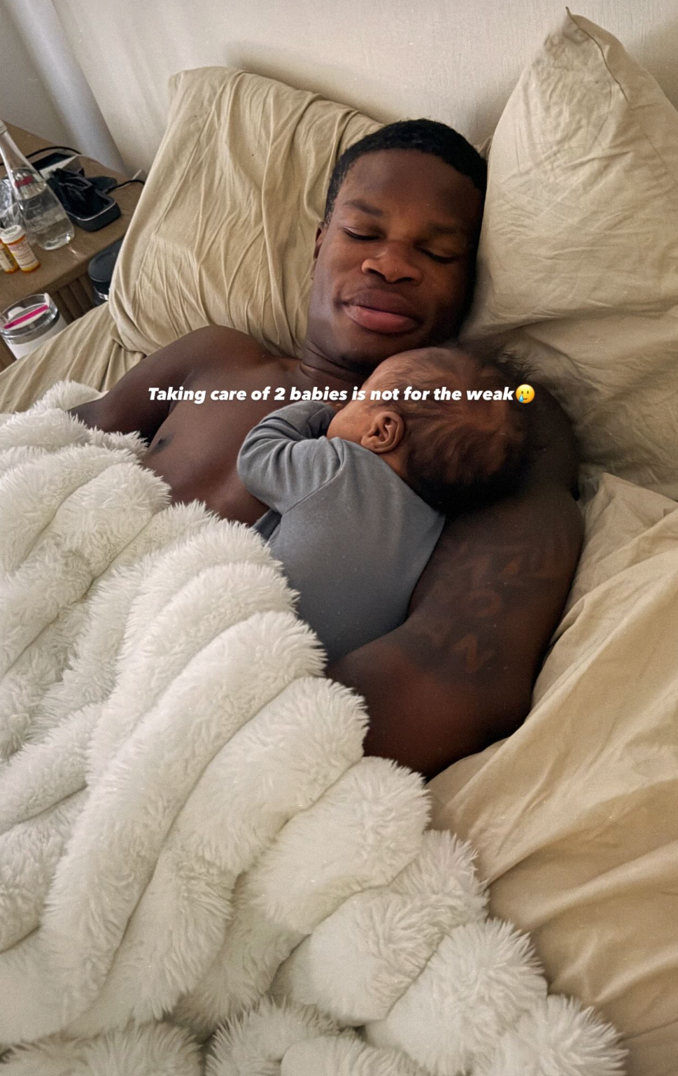
Another useful view comes from a family photograph in which Hunter is holding his son. The tattoo isn’t presented as a close-up, and that is exactly why the image helps. It shows the body art as part of a real scene instead of treating it like an isolated graphic.
You can also see how much the rest of the collection depends on angle and light. The arm work becomes more obvious when his hands and shoulders are relaxed. The chest reads differently when he is leaning forward compared with standing straight. These aren’t changes to the design. They are normal changes caused by body position, something anyone planning a large piece should keep in mind.
For design inspiration, this is a good reminder to think beyond the first photograph. Ask how the tattoo will look when the arm hangs naturally, when the shoulder rotates, or when the person is moving. A composition that looks perfect in a flexed mirror photo may need a different balance when the body is at rest.
Hunter already had a strong collection before the tribute
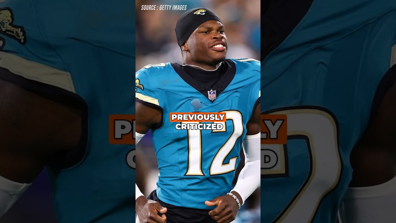
The chest portrait didn’t create Hunter’s interest in tattoos. Earlier images show him with visible work before the new family piece became the headline. The old-versus-new comparison is useful because it keeps the story honest. This wasn’t a clean-slate decision made by someone getting their first tattoo. It was another major addition to a body that already had plenty of ink.
That context changes the way the portrait sits visually. The surrounding tattoos give the design a built-in border, even when there isn’t a literal frame around the faces. Darker areas on the arms and torso pull the eye back toward the center, while the open parts of the chest help the portrait stay readable. It keeps the family portrait at the center without making the rest of the collection disappear.
It also suggests a practical approach for anyone considering a family portrait tattoo. You don’t have to copy the exact scale. The useful lesson is to decide whether the portrait should be the main event or one part of a larger map of tattoos. Hunter’s choice is clearly the main-event version, while the other pieces create the background texture.
Why the main piece gets so much attention
A portrait on the chest carries a different kind of pressure than lettering on an ankle or a small symbol on a hand. The surface is broad, but it is also central. People naturally look toward the chest when a shirt is open or off, so the design becomes part of the first impression.
There is an emotional risk too. A portrait of a partner or child is direct in a way that abstract imagery is not. It tells everyone who the tattoo is about. That can be powerful, but it also means the design has to be chosen with care. Hunter’s piece sits firmly in the bold-tribute category rather than the subtle-memory category.
The size helps the artist include recognizable details, but it also makes aftercare and long-term maintenance more important. Large areas of black and grey need time to settle, and realistic portraits can lose clarity if the original contrast is too soft. Anyone planning similar work should discuss scale, placement, skin movement, healing, and future touch-ups with a qualified artist before booking.
What the public photos prove, and what they don’t
There is enough evidence to describe the chest tattoo with confidence, but there are still limits. The reporting supports the identity of the main subjects and the general placement. Sports Illustrated also points to football-related leg tattoos and a broader collection. The images do not provide a complete inventory of every piece on Hunter’s body, and they don’t give a confirmed explanation for every symbol.
That distinction is worth keeping. Tattoo coverage gets sloppy when a blurry detail is treated like a fact. If a line of lettering can’t be read, it should be called unreadable. If the artist isn’t named in a credible report, we shouldn’t guess. Good tattoo writing leaves room for uncertainty when the picture itself is limited.
In Hunter’s case, the strongest story is already right there. A young two-way football star added a large family portrait to an existing collection, then appeared in public photographs with the people represented in the design. The piece doesn’t need an invented backstory to be interesting.
The video adds a little more context
The video below is specifically about Hunter’s chest tattoo featuring his wife and son, so it belongs with this story. It isn’t a random football highlight or a general celebrity-ink compilation. If you’re studying the idea rather than just looking at the headline, pay attention to how the portrait is positioned against the other work and how much skin the overall composition uses.
The best takeaway isn’t that every family tattoo needs to be enormous. It’s that a personal idea becomes more readable when the scale matches the emotion behind it. A small piece can carry just as much meaning, but Hunter’s choice makes the tribute impossible to miss.
Travis Hunter’s tattoos now have a clear centerpiece: a large chest tribute to Leanna and their son, surrounded by the darker, more established collection he already had. The photos give us a solid look at that balance, while still leaving the details that haven’t been confirmed alone. That is more than enough to make the design memorable.