Musicians

Tattoo guides for singers, rappers, DJs and musicians, with photographs, documented meanings and the stories behind their designs.

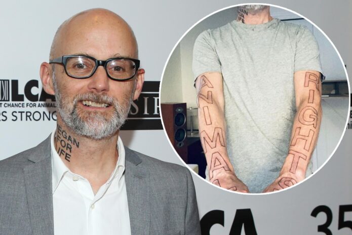
Moby’s tattoos turn vegan activism into a very public message

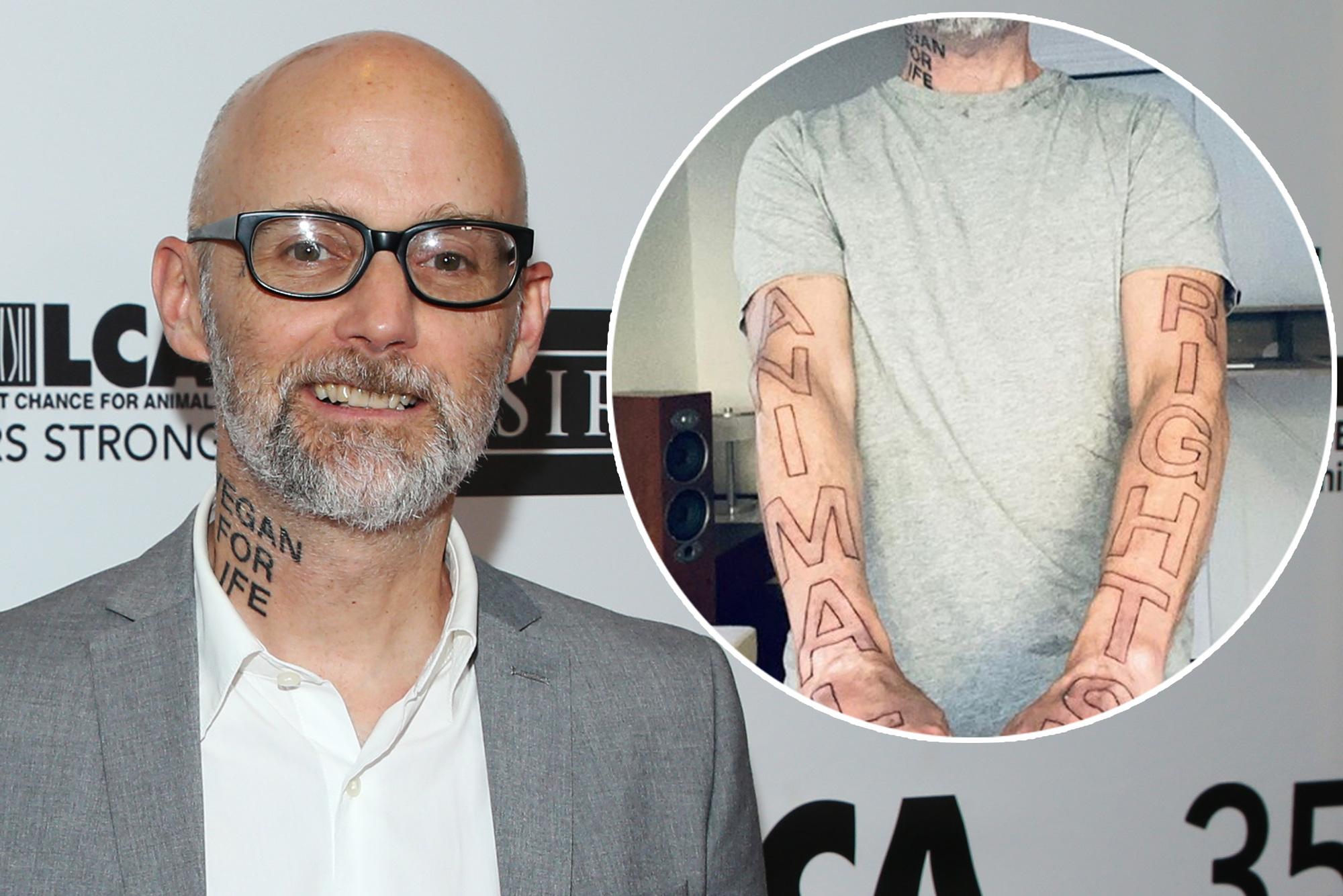
Moby’s tattoos are closely tied to convictions he has discussed for decades. His ink includes a small cross and “LRSC” on his cheekbone, “VEGAN FOR LIFE” on his neck, and large “ANIMAL RIGHTS” lettering across his arms. These designs are meant to be seen; they express how he wants to live.

The collection has grown over different periods and doesn’t follow one style. Some pieces feel personal and almost devotional; others state their message outright. The newer animal-rights tattoos are especially large, turning his body into a public statement about a cause he has supported for years.

Because Moby has explained several designs in interviews, the tattoos can be read as a timeline. The story starts with a black cross from his touring years in the 1990s and continues to the lettering that puts vegan activism front and centre.

The LRSC cheek tattoo is small but deeply personal
Moby tattoos

One of Moby’s best-known tattoos sits on his left cheekbone. It combines a small cross with the letters LRSC, which he has said stand for “love, reason, service and compassion.” Four words of personal principle sit beside his face.

That placement makes the message hard to miss. A cross on an arm can disappear beneath a sleeve; LRSC appears in photos and interviews. The design invites people to ask what the letters mean, and Moby has given them an answer.

The cross gives the acronym a spiritual quality without making it a simple religious label. Love, reason, service and compassion are broad ideals, but also practical ways to treat people and animals.

The tattoo looks modest until you know what each letter stands for. Its size is small; the explanation gives it weight.

A black cross goes back to Moby’s touring years
Moby Vegan for Life neck tattoo

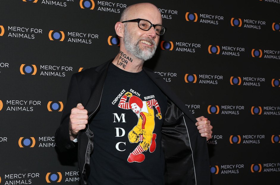
Moby has said he got his first neck tattoo, a black cross, while touring with Lollapalooza in the mid-1990s. He was young and moving through the punk and alternative music scene. That story gives the tattoo a different feel from the protest lettering he added later.

A first tattoo can hold both impulse and identity. At that point, Moby was a touring musician in a scene where tattoos were part of the look. The cross became a marker of that period.

Tattoos can outlast the mood in which they were chosen. Their meaning may deepen or shift while the design stays the same. In Moby’s case, the early cross now sits beside later messages about compassion and animal rights, linking personal belief with activism.

The image is visible, but the story is specific: it came from a particular tour, age and music community, not a random design pulled from a catalogue.

Vegan for Life makes the neck impossible to misunderstand
Moby animal rights arm tattoo

In 2019, Moby added large “VEGAN FOR LIFE” lettering to the side of his neck. The size and placement make the phrase clear. It reads more like a sign than a private symbol.

That directness fits his activism. Moby has been vegan for decades and has spoken about animal rights through music, interviews and public appearances. The tattoo makes the commitment part of his image whenever he speaks.

Neck lettering affects how a person is seen in every setting, from casual meetings to formal events. Putting those words there suggests that Moby values the message being visible more than keeping his appearance neutral.

The design leaves little room for mystery: “Vegan for life” is the explanation. The words are simple and hard to ignore.

Animal rights covers both arms
Moby vegan animal rights tattoo

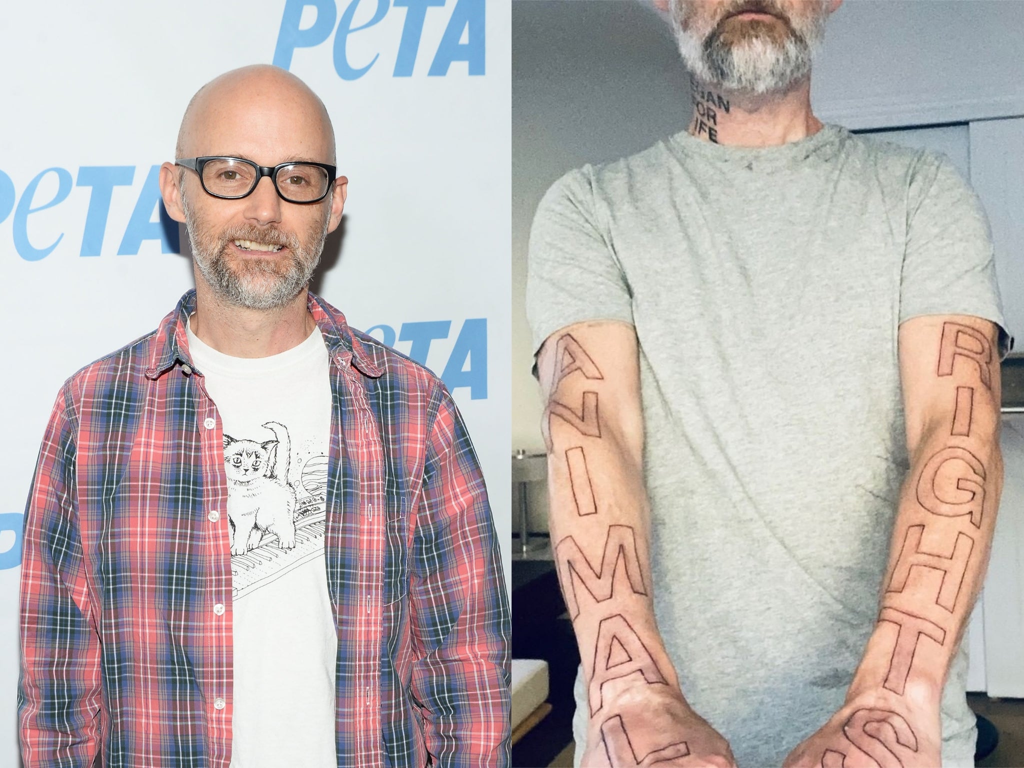
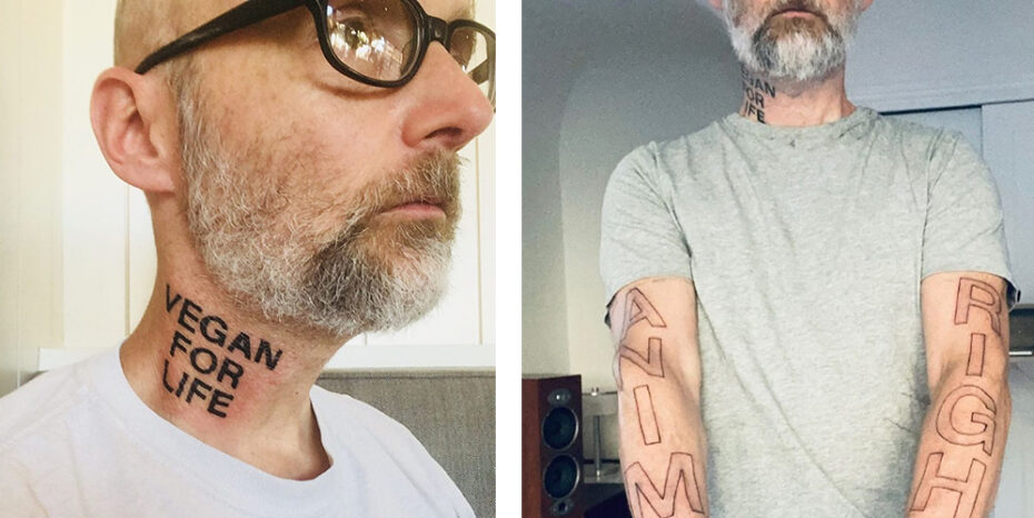
After more than three decades of veganism, Moby had “ANIMAL RIGHTS” tattooed across his arms. The lettering is large and difficult to hide. It’s the clearest example of his body becoming a public activist message rather than a private collection of memories.

The size drew attention. Large words across the arms change how shirts, photos and performances are framed. They become the first thing many people notice, which makes them effective as protest art.

Some coverage focused on the shock of seeing such a blunt phrase on his arms; supporters saw it as a natural extension of his advocacy. That disagreement is part of how a protest message works. It can make people uncomfortable.

The arms and neck carry related ideas. “Vegan for life” states Moby’s personal commitment; “Animal rights” names the cause. One says how he lives, the other what he believes animals deserve.

The tattoos are more than a celebrity image change

The large new tattoos could look like a sudden image shift, but the activism came first. Moby didn’t just discover veganism because bold lettering became fashionable. The tattoos made a long-standing belief more visible.

That distinction matters when looking at body art. A large piece can seem like a branding choice from the outside, but the person’s history can show whether it is a new pose or a continuation. Moby’s interviews and activism make that history clear.

LRSC adds a more personal note. It isn’t a slogan aimed at strangers like “ANIMAL RIGHTS”; it reads as a private code. His collection carries both kinds of message: values he keeps close and an issue he wants others to see.

The cheek tattoo works like a small private compass beside a large public sign. That contrast keeps the collection from being one-dimensional.

What the early punk connection adds

Moby’s first cross and touring story place his tattoos in the alternative music culture of the 1990s. Tattoos could signal independence or belonging, or simply mark a permanent choice made while living an unconventional life.

The newer vegan designs use that same willingness to be visible, but with a more explicit purpose. Instead of a symbol that scene insiders might recognize, Moby chose words anyone can read. The message moved from a scene marker to an activist sign.

That progression feels natural. People often add tattoos as their priorities become clearer. The cross doesn’t have to predict the later “Animal Rights” lettering; it records an earlier part of his life. The newer pieces show where that life led.

A list of symbols alone misses the timeline. The tattoos trace a story about music, travel, personal belief and animal advocacy.

A careful inventory of Moby’s documented tattoos

The best-documented pieces are the black cross from his touring years, the LRSC cheekbone tattoo for love, reason, service and compassion, “VEGAN FOR LIFE” on his neck and “ANIMAL RIGHTS” across his arms. These designs have clear visual evidence and reporting.

Other tattoos may appear in photos, but they can be difficult to identify from a distance. It’s safest to treat the cross, LRSC and large phrases as the core of the collection, and describe other details only when they’re clear.

Those pieces already tell a story. The cross marks an early touring chapter; LRSC puts his values into a personal code; “Vegan for life” states how he lives, while “Animal rights” makes a public appeal.

Moby’s tattoos aren’t meant to disappear. They’re written to be read, and their meaning is clearer when the history behind them stays in view.

Watch Moby explain his vegan neck tattoo

This tattoo interview gives context for the neck design and the activism behind Moby’s most visible ink.
More musician tattoo guides

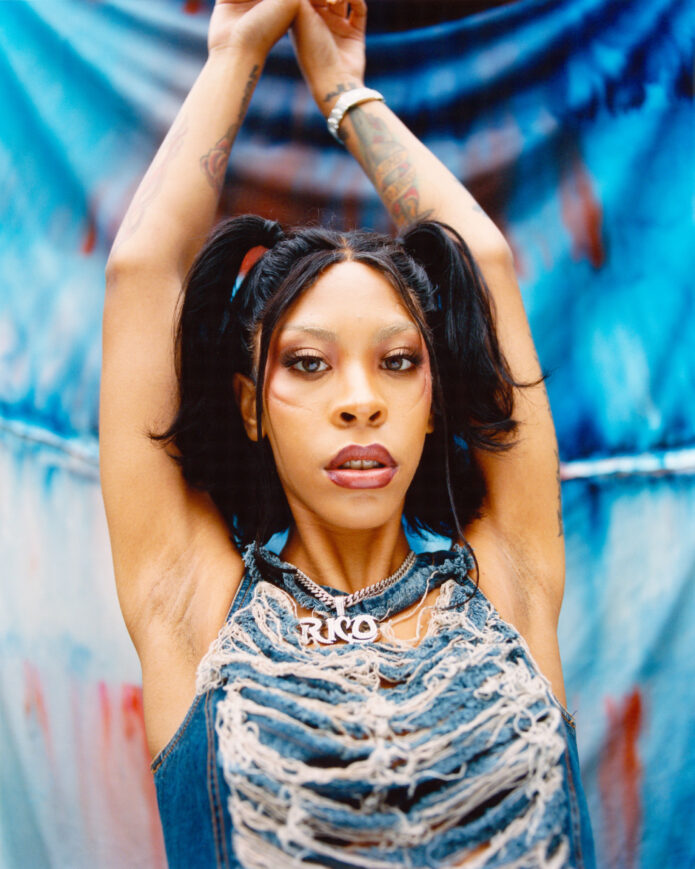
Rico Nasty turns her tattoo collection into a scrapbook

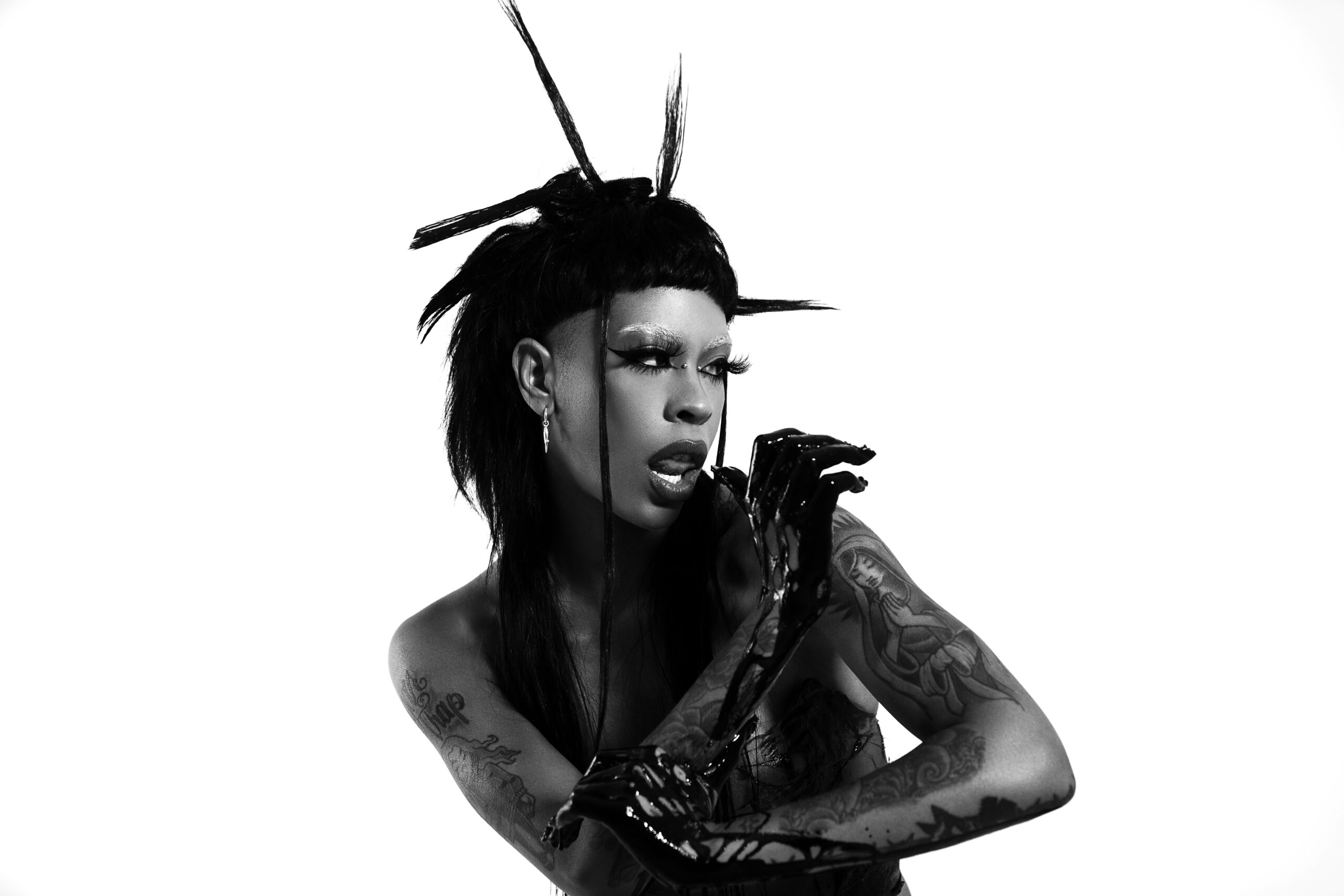
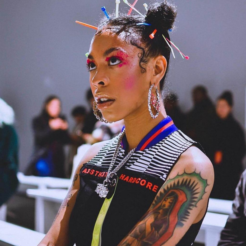
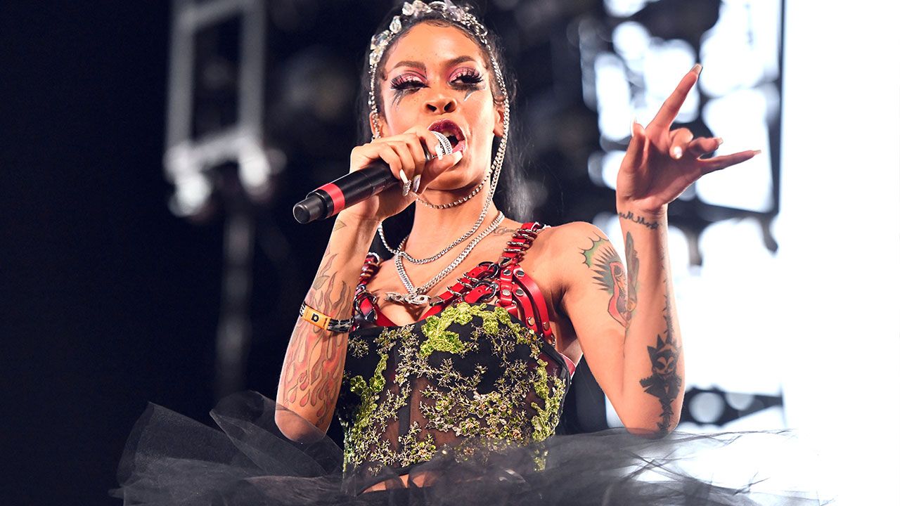
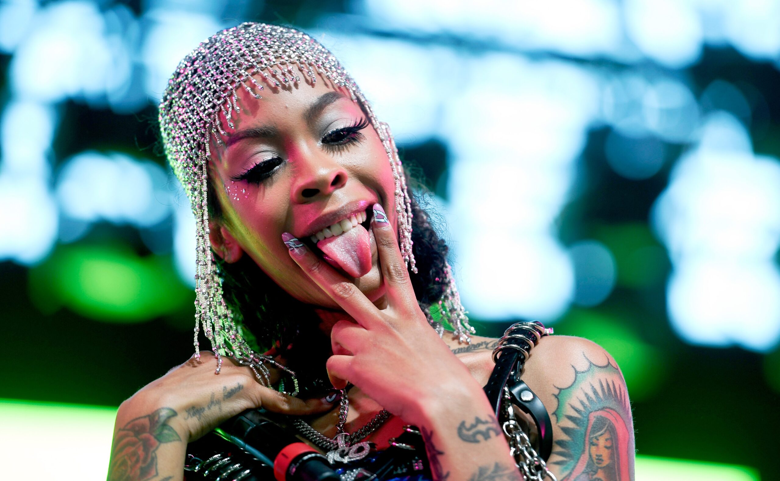
Rico Nasty’s tattoos feel more like a scrapbook carried on her skin than a neat, finished catalogue. She has talked about getting drawings of herself tattooed and wanting to remember certain moments and chapters of her life. That gives us a helpful way into the collection: the pieces connect to memory, personal style and self-image, though Rico has not publicly explained every design.

Photos show a striking mix of bold black ink, portrait-like artwork and smaller personal marks across her arms and upper body. Some are clear in press portraits; others show only briefly beneath stage clothes, changing hairstyles and elaborate looks. Here’s what the public record can tell us, along with what remains for Rico to explain herself.

Rico treats tattoos like reminders of different eras

Rico Nasty tattoos

In a 2021 Inked profile, Rico offered the clearest clue to how she thinks about tattoos. She said she had become obsessed with getting drawings of herself tattooed, tying that habit to memories of particular moments and periods in her life. That tells us more than a roll call of designs: it helps explain why the collection feels like it’s always changing.

A scrapbook gains pages over time. One tattoo can mark a certain chapter, while another stays because the image still feels right years later. Rico’s public style has moved between punk influences, bright fashion, theatrical makeup and dramatic hair changes. Her tattoos belong in that same story of reinvention. They can capture a mood without tying her to just one version of herself.

Rico’s comments are also a good reason to avoid guessing. Saying the tattoos help her remember different phases doesn’t reveal what each phase was. A portrait might hold a memory that matters to her, but only Rico can say which one. The careful approach is to describe the image, where it appears and what the source confirms, while leaving the personal memory hers.

Portrait imagery is part of the visual language

Rico Nasty press portrait with tattoos

Portrait tattoos connected to Rico also appear in the public record. Search results and tattoo community posts have shared artwork based on her likeness, while photos of Rico show portrait-style art fitting naturally into her wider look. Those are separate stories. A fan’s tattoo of Rico is their artwork; a tattoo on Rico’s body is part of her own collection.

That distinction matters because tattoo pages sometimes repost an image without saying who has the design. With Rico, it helps to check whose body is shown and where the photo came from. A press portrait may show her own ink. An artist’s Instagram post might show a fan’s Rico Nasty portrait. Both are worth looking at, but they document different things.

On Rico’s skin, the overall effect is high-contrast artwork that holds its own beside dramatic styling. The tattoos remain part of the picture when she changes her hair or performs under concert lights. Sometimes they stand out; sometimes they’re partly hidden. That range helps the collection feel like a visual diary rather than a conventional sleeve reveal.

Her arm tattoos are the easiest to follow

Rico Nasty tattoo detail

The arms offer the clearest photographic trail. Close-up portraits and sleeveless performances show Rico’s ink again and again, though the angle and lighting vary. That makes her arms the most reliable place to start when describing what’s visible.

Some of the designs are dark and graphic, and their details come through better in certain photos than in others. It can be tempting to identify every partial outline, but a blurry shape is still a blurry shape. Placement is usually easier to confirm than meaning: we can say a tattoo is on her arm without assigning it to a song, a person or a private event.

Clothes affect what we see, too. A cropped top, sleeveless jersey or stage outfit may make one side look busier, while a jacket can hide most of the ink. The collection hasn’t necessarily changed each time its balance looks different; the camera may just be showing us another page.
The collection is connected to performance without being only about music

Rico Nasty stage tattoos

Because the tattoos show up so often in performance photos, it’s easy to treat them as an extension of Rico’s music. That’s only one part of the picture. Her own comments point to memories and personal chapters, not just album promotion. A tattoo can be visible onstage without having anything to do with the set list.

The stage shots do show how the ink contributes to her public image. Rico performs with so much physical energy that details flash past: a hand gesture, a turn of the shoulder, a glimpse of skin between a shirt and glove. The tattoos make those moments feel distinctly hers. They share a visual world with her clothes and makeup, but unlike an outfit, they stay.

It makes more sense to read the look in layers than to take it literally. Against different styling, a dark design might come across as punk, glamorous, playful or confrontational. That doesn’t tell us why she chose it. It does help explain why the tattoos stand out in performance photos.

Rico’s tattoo timeline stays open

Photos can make a collection feel extensive even when only a few designs have been identified by name. The texture, size and placement are still visible. For Rico, the image itself is often the evidence: the arm, the line, the shape and the moment a camera caught it. Anything beyond that needs her own explanation.

Rico Nasty live performance tattoos

Rico’s career has moved quickly, so there’s no reliable final count to give. A photo from an earlier breakout period may show less ink than a later editorial portrait. A newer image may reveal a detail that was always there but hidden before. It’s more useful to treat each clear photo session as a snapshot in time than as a complete inventory.

The 2021 Inked profile gives us a clear reason for her interest in tattooing: she wants to keep reminders of different periods and moments. That makes the timeline meaningful, even though the date of each tattoo hasn’t been published. A design can belong to a particular era without having a publicly announced appointment date.

Later photos continue to show a collection that grows and changes with her. New pieces may be added, older ones covered, and styling can change how much skin is visible. A record that keeps evolving is still an honest story.

A careful inventory of Rico Nasty’s documented tattoos

What we can support is a visual inventory, not a definitive numbered total. Rico has multiple visible tattoos across her arms and upper body, including bold black marks and artwork that looks like portraits or illustrations in some close-up photos. She has also said that getting drawings of herself tattooed helps her hold onto personal moments and phases.

The clearest points are these: multiple arm tattoos appear in press and performance photos; more ink on her upper body is visible or hidden depending on her clothes; and Rico has described wanting drawings of herself tattooed as reminders of particular eras. Black ink features strongly, but not every design has a verified public name.

There is a separate group of Rico-related tattoo images made by fans and tattoo artists. Those portraits are not on Rico and don’t belong in an inventory of her tattoos. Keeping those stories separate respects both the artist and the subject. It also helps readers see whether a photo documents Rico’s own skin or someone else’s admiration.

Why the scrapbook idea fits Rico better than a final total

Celebrity tattoo articles often finish with a number because it gives a tidy answer. Rico’s own explanation suggests a more useful way to look at her collection: as an archive of moments and phases. Some pieces are bold, others private, and some may make the most sense alongside the style and music of the period when they appeared.

That view leaves room for change. Rico isn’t displaying a museum exhibit with labels under glass; she’s an artist whose image keeps moving. A tattoo can become part of a new chapter and still carry a memory of an earlier one. The ink is visible to the public, but its meaning can remain personal.

The strongest conclusion isn’t that every tattoo has been decoded. It’s that Rico uses ink to hold onto versions of herself. The arm tattoos and portrait-like marks catch the eye, while the larger story is about memory, self-image and what she chooses to keep.

Watch Rico Nasty in a recent interview

This interview isn’t a full tour of Rico’s tattoos, but it’s a relevant profile where she speaks for herself. It adds some personality and context after the visual inventory, with the video kept at the end of the article.

More musician tattoo guides

Chappell Roan’s tattoos turn princess energy into something personal

Chappell Roan’s tattoos don’t all tell the same kind of story. Some feel playful and straightforward, others have a soft, storybook quality, and one made headlines after Roan called it a small act of rebellion. The best-documented pieces so far are her “Princess” lower-back tattoo, a swan on her arm, and floral or decorative ink that has appeared in recent photos.

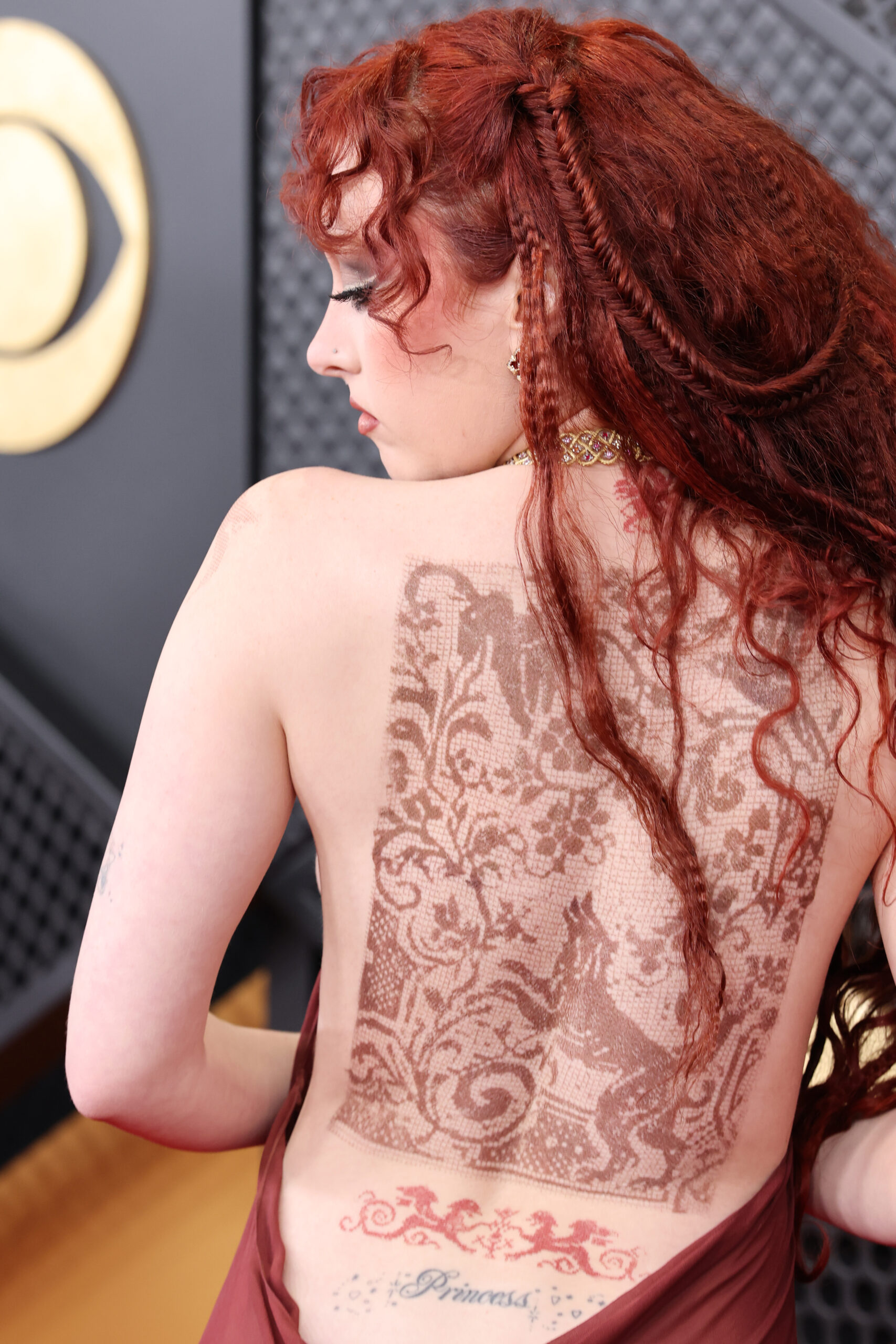
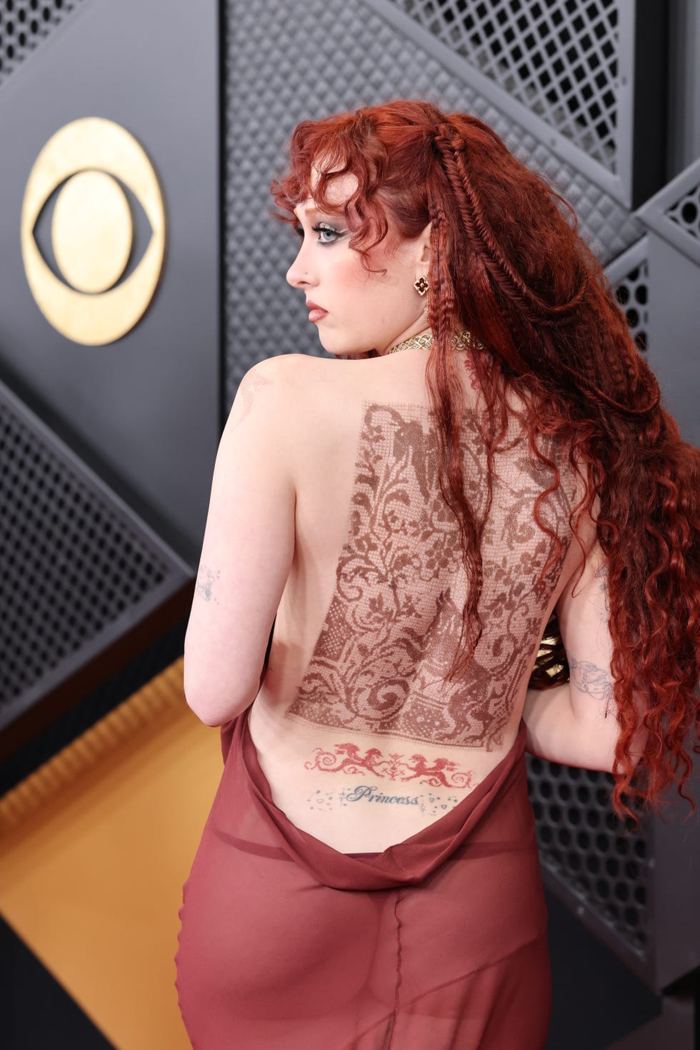
There’s an important wrinkle in Roan’s tattoo history: she also uses theatrical body art. At the 2026 Grammys, she wore a dramatic Mugler look with large faux tattoos printed across her back and torso. They were part of the styling, not new permanent pieces. Telling costume ink apart from real tattoos is key to getting her collection right.

Chappell Roan Grammy tattoos

The Princess tattoo was Chappell Roan’s first

Roan has spoken openly about her first tattoo. In a 2023 Associated Press interview, she laughed: “I have a ‘princess’ tramp stamp, that was my first tattoo.” She said the choice came in part from growing up with conservative Christian ideas about modesty. As she put it, it was a kind of “f– you” to that pressure.

That background gives the lower-back placement more weight than a throwback Y2K joke. The location is cheeky, but Roan’s explanation makes the tattoo a pointed response to rules about how she should look and act. “Princess” isn’t just a pageant word that later attached itself to her stage persona; she chose it for herself after feeling constrained by other people’s expectations.

The tattoo is usually described as lettering across her lower back, or a “tramp stamp.” Some online photos appear to show decorative details around the word, but the word and placement are the most certain parts of the record. The font, artist and appointment date have not been consistently documented, so it’s best to leave those details open.

Chappell Roan Princess tattoo

What the Princess tattoo means to Roan

Roan is one of the few celebrities whose tattoo meaning comes with her own explanation. She linked the design to the “modesty is hottest” attitude she grew up around. Calling it only a “tramp stamp” misses that context: the nickname describes where it is, while Roan has explained what she was pushing back against.

There’s a natural connection between the tattoo and the character she built onstage. Chappell Roan’s public world includes pageants, crowns, camp, glamour and heightened femininity. The lower-back “Princess” tattoo fits that vocabulary, but it began as a personal choice. Her stage persona didn’t create the word; it gave a bigger performance language to something she already carried on her body.

That doesn’t mean every later costume or lyric refers directly to the tattoo. The connection is more about the tension they share. Depending on who uses it, “Princess” can sound sweet, bratty, theatrical or rebellious. Roan has made room for all those readings.

It’s a small tattoo with a surprisingly bold point: the person wearing it gets to decide what femininity means, where it belongs and who gets to judge it.

The swan tattoo on her arm

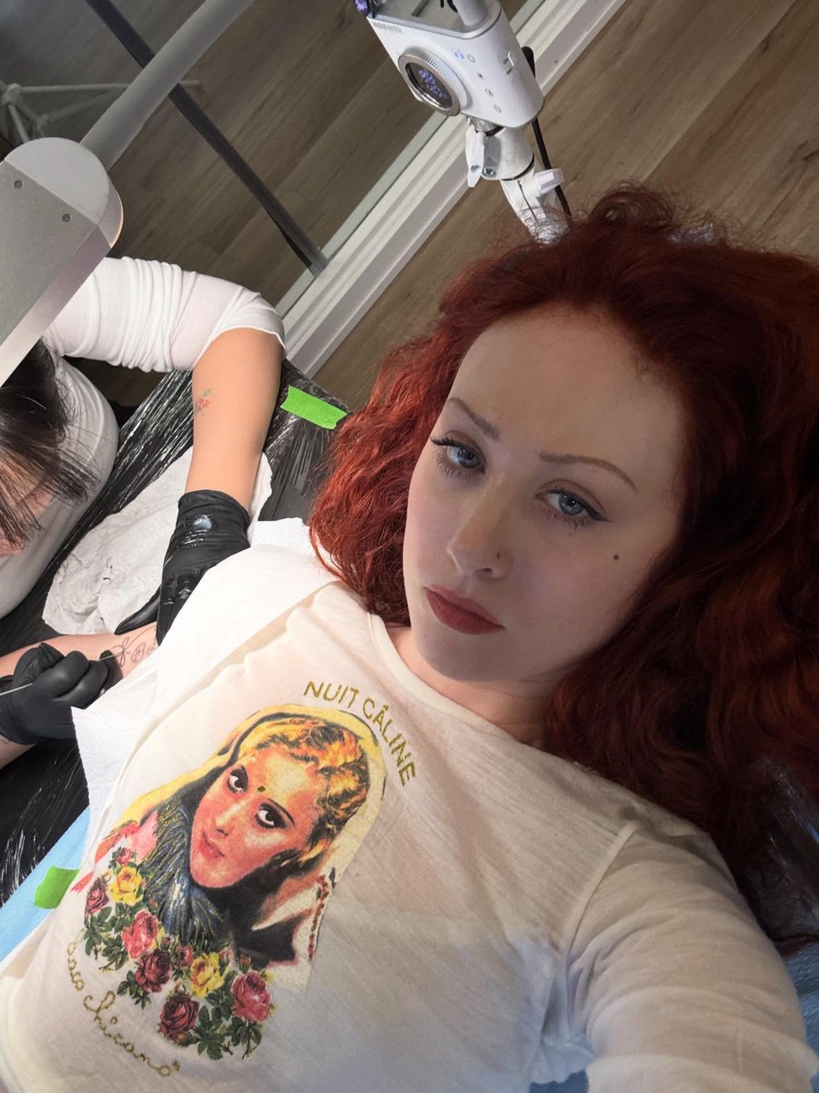
A more whimsical design entered the documented record in late 2025: a swan tattoo on Roan’s arm. Photos from the session show her reclining as a tattooist works on the piece. They’re useful because they show the tattoo in progress, rather than leaving us to rely on a distant red-carpet shot.

The swan suits Roan’s visual world. She often plays with fairy tales, pageants, transformation and the contrast between elegance and something stranger underneath. But a design that fits her look doesn’t automatically come with a confirmed meaning. Roan hasn’t publicly explained why she chose this particular swan, so “whimsical” or “theatrical” is safer than assigning it a private story.

The session photos place it on her arm and show nearby linework and decorative elements. Some accounts also mention celestial or floral details. Since the tattoo was photographed fresh and partly covered by protective film, it’s easier to describe the overall design than to map every small detail.

Flowers and decorative arm ink

Roan’s arm tattoos also include floral or ornamental details. Coverage of her 2026 Grammy look described several permanent designs, including a swan and flowers on her arm. It’s easy to mix those pieces up with the printed tattoos used for the Grammy styling, so the clearest description is that she has permanent arm ink with floral elements—not a definitive catalogue of every petal and leaf.

Photo quality makes a difference here. From a distance, one tattoo can look like a single large medieval composition; a closer view may reveal several separate motifs. Roan’s collection appears to have grown through individual choices rather than one full-sleeve reveal. The pieces may share a visual language, but there isn’t yet a complete map in the public record.

It’s sensible to be cautious with labels like “full sleeve” or “huge back piece,” which can make tattoo coverage sound more dramatic. What the available evidence supports is a permanent “Princess” tattoo on her lower back and arm designs that include the swan and flowers. It doesn’t establish a full count or a hidden meaning for every decorative detail.

Chappell Roan floral arm tattoo

The 2026 Grammy tattoos were mostly costume

Roan’s Grammy appearance is an easy place to go wrong when counting her tattoos. Her backless burgundy outfit revealed a lace-like design across her upper back, with faux ink worked into the medieval styling. Reports described the body art as part of the look, alongside prosthetic nipple jewelry and other theatrical details.

Those designs don’t belong on a list of her permanent tattoos. They were part of the costume and beauty concept, even though they looked convincing in red-carpet photos. That distinction matters because transformation is central to Roan’s fashion work; temporary ink is one of the ways she builds a character for an evening.

The styling also echoed her real “Princess” tattoo, which appeared beneath the temporary design. The overlap made the look feel like a conversation between permanent identity and one-night performance. The lower-back tattoo was still Roan’s; the larger medieval pattern was a visual layer that came and went with the event.

How the tattoos fit the Midwest Princess persona

Roan’s tattoos connect with her music without reading like simple album merchandise. “Princess” is the clearest link, while the swan and flowers add fairy-tale softness, transformation and decorative drama—the same ingredients found in her clothes, choreography and performances.

The word “Midwest” is part of the joke and the point. Roan’s persona isn’t a traditional princess waiting for approval; it’s a pageant title with a wink, glamorous and ridiculous at once. The story behind the lower-back tattoo gives that persona a personal starting point. Roan took a word weighed down with expectations and made it her own.

Still, it would be too tidy to claim every tattoo came from one master plan. People choose tattoos at different times and for different reasons. The first might be defiant, the next simply beautiful, and another just fun. A useful inventory leaves room for all of that instead of forcing one explanation onto the whole collection.

What is confirmed and what remains unknown

The confirmed list is shorter than many social posts suggest. Roan has said that “Princess” was her first tattoo. Recent coverage has documented a swan and floral details on her arm. The extensive faux tattoos at the 2026 Grammys belong to the styling, not her permanent collection.

We don’t yet know the exact number of her permanent tattoos, the complete healed layout of her arm, all the artists involved or the date of every appointment. Photos captured the swan session in late 2025, but that doesn’t establish when each nearby design was added. It’s also unsafe to assume that every tattoo seen in a fashion shoot is permanent.

A partial record is fine. Roan’s public image is theatrical, but some parts of her tattoo story remain private. The “Princess” piece has a clear explanation; the swan and flowers are visible and documented. The rest can stay open unless Roan decides to show or explain more.

Chappell Roan tattoo checklist

  • Lower back: “Princess,” the first tattoo Roan has publicly described. She connected it to pushing back against a conservative culture focused on modesty.
  • Arm: a swan tattoo shown during a session in late 2025.
  • Arm: permanent floral and decorative ink reported alongside the swan.
  • 2026 Grammy look: large faux tattoos used for styling; they are not part of her permanent collection.
  • Exact total: not publicly confirmed beyond the documented designs above.

Roan’s tattoos bring together personal rebellion and theatrical imagination. The “Princess” mark shows where she pushed back; the swan and flowers fold fantasy into her visual language. Her Grammy look, meanwhile, shows how she uses body art as both a lasting choice and a costume. That distinction is the key to reading her ink accurately.

A Chappell Roan interview to watch

This profile offers useful background on Roan’s public persona and the ideas around her music, style and “Midwest Princess” identity.

More musician tattoo guides

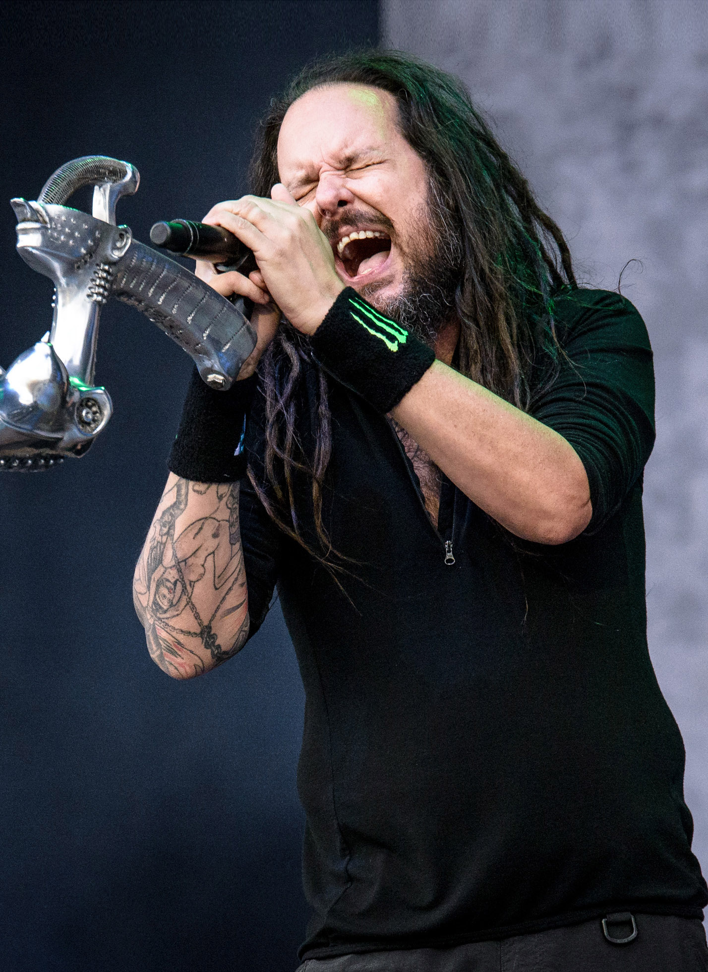
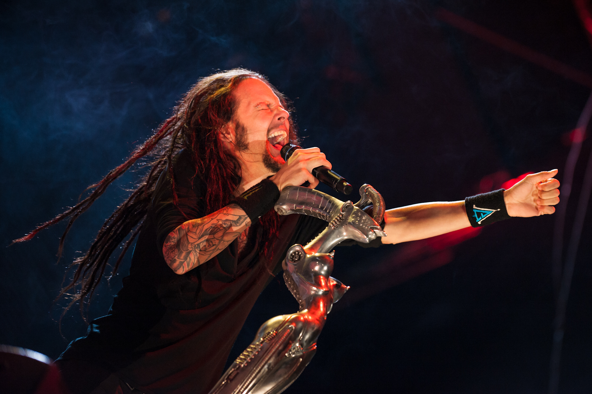
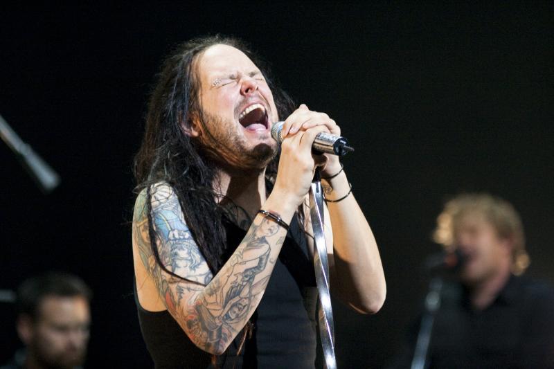
Jonathan Davis wears his darkest ideas where everyone can see them

Jonathan Davis’ tattoos share Korn’s darker instincts: religious imagery, confrontation and deeply personal subjects all sit side by side. Davis has said he is drawn to religious art, while some designs address what he sees as religion’s atrocities. The images carry an argument as much as they decorate his skin.

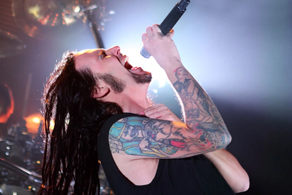
Jonathan Davis tattoos

The best-documented design shows a bishop tearing open his own skin to reveal Christ beneath. Davis has described it as a response to the harm and hypocrisy he associates with organized religion. The image is striking because its central figure is religious, yet the tattoo is also critical of religion. It uses the visual language of faith to ask difficult questions.

Jonathan Davis tattoos

Another much-discussed tattoo reads HIV. Interviews and music coverage have connected it to a painful personal story and to Davis’ use of tattoos to keep difficult memories close. The lettering is plain, almost clinical, which gives it a different impact from the elaborate bishop scene. One speaks in allegory; the other leaves the word stark and exposed.

Jonathan Davis sleeve tattoos

Davis has also said he has other religious tattoos because he appreciates the art. That distinction matters. He can be fascinated by images of saints, Christ, bishops and religious symbols without calling himself conventionally devout. The collection returns to the images people create around belief—and the harm those images can conceal.

That combination makes his tattoos feel at home in Korn’s world. The band has long set beauty beside the grotesque: a vulnerable melody can sit inside punishing sound. Davis’ ink follows a similar pattern. A religious figure may be drawn with care even when the idea behind it is angry, doubtful or wounded. The tension is part of the message.

Jonathan Davis HIV tattoo

Photos from Korn shows catch the tattoos in motion. A sleeve flashes when Davis reaches for the microphone; a symbol appears as he turns. Stage clothes hide one design and expose another, so the public record is made up of glimpses rather than a complete diagram. Any careful inventory has to account for that.

Fans naturally want to know what each tattoo says, but the details aren’t equally clear. The HIV lettering has a documented story, as does the bishop and Christ image. Other religious designs can be seen in photos and fan discussions, but don’t have a reliable explanation. It’s better to describe them as visible or reported than to fill in a meaning by guesswork.

Davis’ interest in religious art also complicates a simple anti-religion reading. He hasn’t abandoned the imagery; he keeps coming back to it because it carries weight. The symbols already have a history before he uses them, and that adds emotional force to the designs. He can value the image while challenging the institution behind it.

The tattoos on his hands and arms take on another quality in everyday gestures. In a still photo they may seem fixed, but onstage they move as he grips the microphone, points to the crowd or wipes his face. His body becomes part of the performance, and the audience sees the ink alongside the voice, clothing and sound.

The collection also has a timeline. Older tattoos belong to earlier Korn years, while newer photos show how everything sits together after years of touring. A person can change without a tattoo losing its original meaning; the mark simply becomes one layer among others. Davis’ body holds the old idea as new experiences gather around it.

That layering keeps the collection personal. A bishop, a Christ figure and blunt lettering may all touch on pain, but each has its own character. Some designs are theatrical, some direct, and others may be images Davis simply wanted to keep close. The collection is held together by its intensity, not by one subject.

The tattoos have also become part of Korn’s visual identity. The band has changed over the years, but its emotional vocabulary still includes shame, rage, vulnerability, faith and the fear of what people do to one another. Davis’ tattoos give those themes a physical presence without turning them into a lyric sheet.

There’s a difference between a tattoo that depicts violence and one that records it. The bishop design is an allegory: a constructed scene meant to express an idea. The HIV lettering sits closer to a real wound and doesn’t make the story comfortable to look at. Both can be honest, but they do it in different ways.

The collection rewards a closer look. A concert photo may show a symbol for only a moment; an interview might explain one tattoo and leave others unnamed. Older coverage may describe a design without showing how it looks now. The record is incomplete, but the confirmed details still make a useful guide.

Jonathan Davis religious tattoos

It’s also fair to leave room for the story to change. Tattoos can be covered, extended or altered, and someone’s relationship with a symbol may shift over time. Davis’ comments make clear that the images matter to him, but they don’t mean every design has one fixed interpretation. The mark stays while the person keeps thinking about it.

Taken together, the tattoos feel like an argument without a final paragraph. Religious art is admired, questioned and put to new use. Personal pain is named without being made neat. Davis carries those ideas onto the stage, where fans can recognize them without claiming to own their meaning.

In interviews, Davis has been willing to talk about the art without pretending every symbol has a simple answer. He likes the forms, their history and the charge they carry. That can be enough. A tattoo can matter because it leaves a question open.

The HIV tattoo is the clearest example. The lettering is spare, but the story behind it is heavy. It turns a medical term into a marker of survival, grief and memory without needing elaborate shading. Its plainness is part of why it stays with you.

The bishop tattoo works in the opposite way. It’s dense with narrative: a religious figure, the act of tearing, the image beneath the skin and the anger behind the scene. It can be studied as an illustration even before its personal message is clear. The composition gives the idea a body.

Davis’ other religious tattoos fall somewhere between those two. Some symbols may be recognizable; others are hard to make out under stage lights. Often the broad description is the most accurate one: religious imagery, dark symbolism and designs connected to subjects he has discussed. That’s better than naming every shadow.

His tattoos also show how musicians can become living visual archives. Album art, years on tour, collaborators and private losses may all leave their mark. Fans encounter that archive in photos, while the wearer experiences it as one continuous body. The image around an old tattoo may change as the music changes, even when the tattoo itself stays put.

That’s the quiet strength of the collection: it keeps the past in view without pretending the past is over. The symbols remain, but their meaning may deepen, darken or soften over time.

The designs don’t feel accidental, even if a particular tattoo began with a passing emotion. Again and again, they return to art, harm, faith and survival.

That’s why Davis’ tattoos still feel alive after years of touring and change.

A documented inventory of Jonathan Davis’ tattoos

The clearest public record includes the bishop tearing open his skin to reveal Christ, the HIV lettering linked to a painful personal story, and other religious or symbolic tattoos Davis has discussed or that are clearly visible in photos. The names and meanings of smaller pieces haven’t all been made public. A careful inventory should mark those as visible or reported instead of inventing a private explanation.

Why the religious imagery stays unsettled

Davis’ tattoos don’t ask viewers to choose between devotion and rejection. They show a fascination with religious art alongside distrust of the harm done in religion’s name. That tension gives the images their force. They draw you in with their beauty, then leave you questioning why.

Watch Jonathan Davis discuss his HIV tattoo

The short interview below focuses on the story behind one of Davis’ most discussed tattoos, making it a useful video companion.

More musician tattoo guides

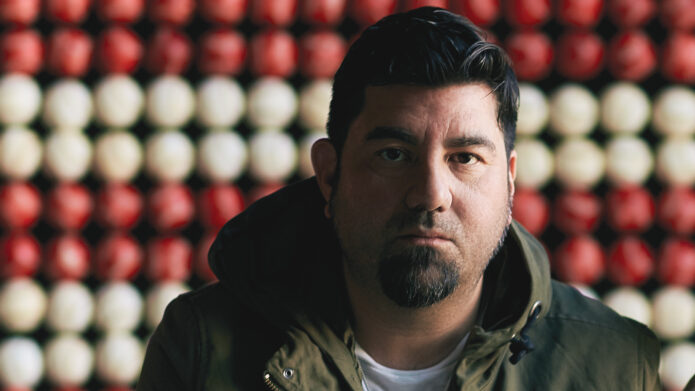
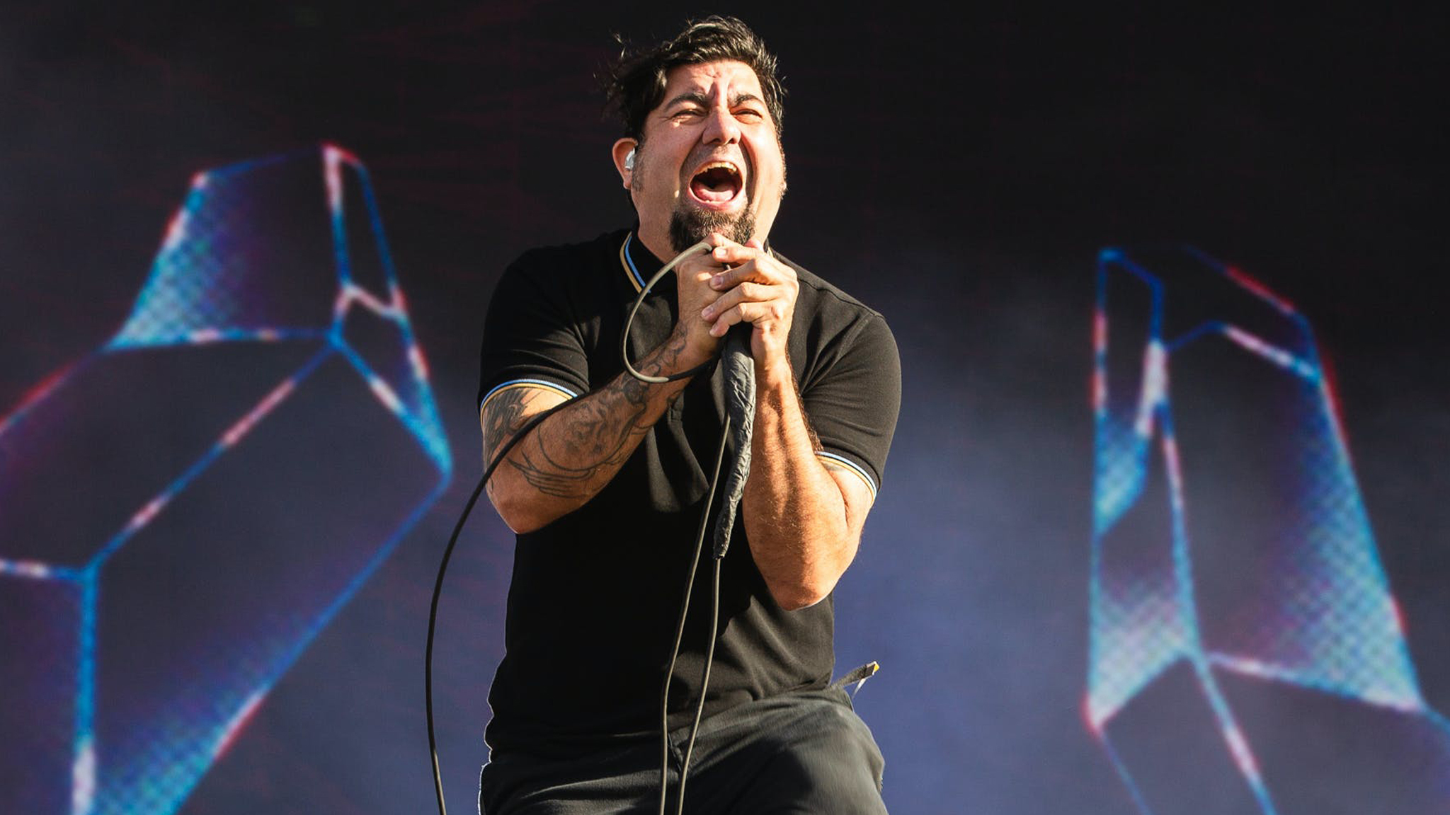
Chino Moreno’s tattoos lean into religious art and darker symbols

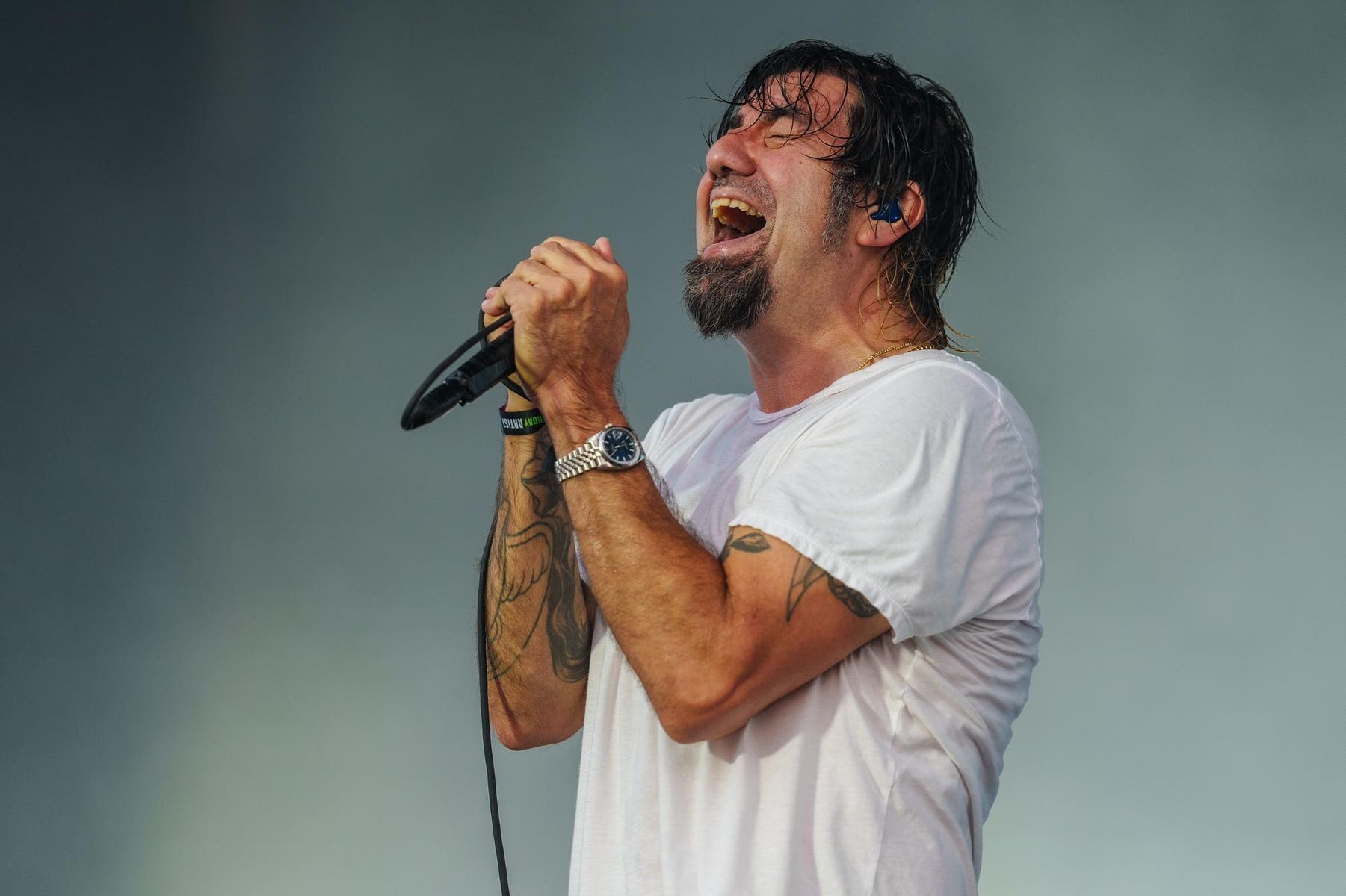
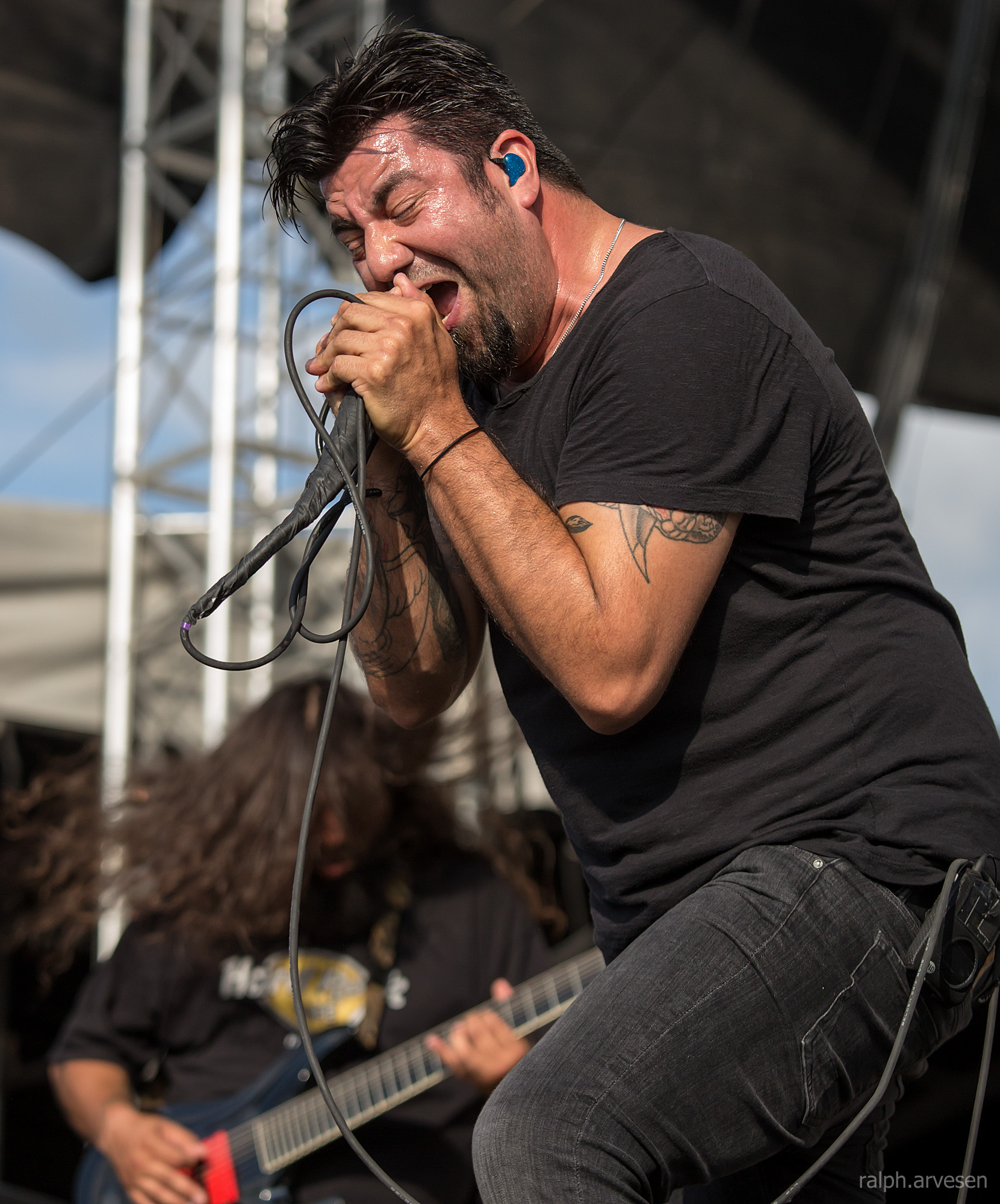
Chino Moreno’s tattoos fit the mood he has carried through Deftones for decades: heavy, romantic, strange and open to more than one reading. He has talked about religious art without presenting himself as conventionally religious, which helps make sense of the ink. He is drawn to sacred and forbidden imagery for its visual force, even when theology isn’t the point.
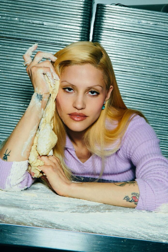
Chino Moreno tattoos

The best-documented piece is the Baphomet tattoo he discussed in Loudwire’s Tattoo Reveal series. Moreno said he wanted a Baphomet, a figure often shown with a horned goat’s head and layers of occult symbolism. It fits his interest in religious art, though he didn’t describe it as a statement of faith. The image can appeal to him as art before it becomes an argument about belief.

Chino Moreno tattoos

That context matters because Baphomet is often reduced to a simple shock symbol. Moreno’s explanation is more easygoing: he likes how religious imagery is drawn, staged and remembered, without adopting every interpretation attached to it. The tattoo sits somewhere between fascination, theatre and personal taste.

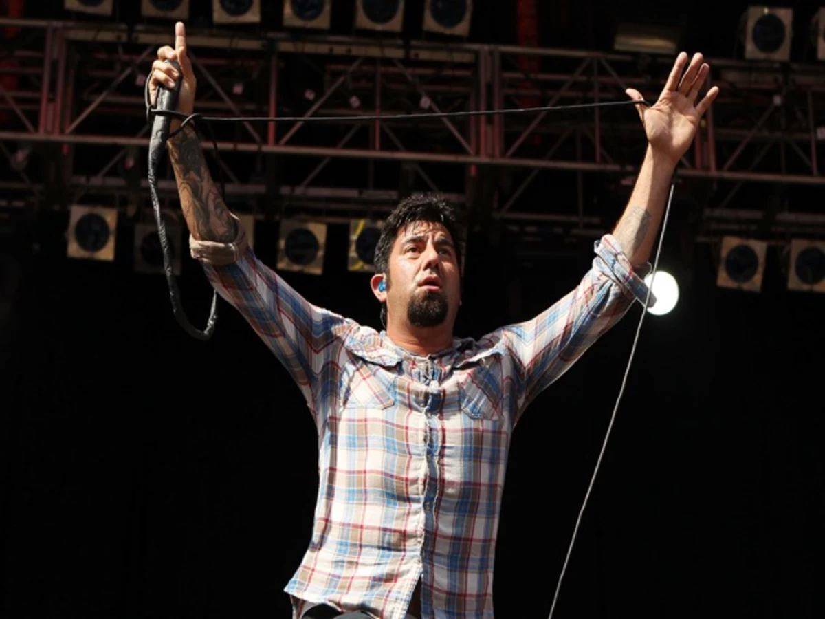
Chino Moreno tattoos

Older interviews fill in a little more about the collection. In a discussion about Deftones, Moreno said he has other religious tattoos and enjoys the art, though the religious meaning itself isn’t especially important to him. That keeps the inventory grounded in his own words. The images matter to him without requiring a literal creed.

Chino Moreno tattoos

It can be hard to catalogue Moreno’s ink from performance photos. Stage lights flatten fine lines, microphones and clothes obscure his arms, and he’s rarely still long enough for a clear tattoo portrait. A festival shot may confirm a design is there without telling us its exact placement or when he got it. It takes several views to be sure of a detail.

Chino Moreno sleeve tattoos

The tattoos also look different across Deftones’ eras. A photo from the 2000s has a different feel from a recent festival portrait, but the ink remains part of the same silhouette. It fits the band because it isn’t too polished: religious figures, dark shapes and illustrative marks can seem tender in one light and menacing in another. That ambiguity is what ties them together.

Fans have pieced together detailed lists from live shots and close-up posts. Some identifications may be right, but the public record doesn’t always name a tattoo, its artist or its story. It’s useful to keep confirmed pieces separate from work that is visible but undocumented. Interviews support the Baphomet and Moreno’s interest in religious art; smaller designs should remain tentative until he or an artist identifies them.

A tattoo’s subject and its meaning to the wearer aren’t necessarily the same. A horned figure may draw on a broad artistic tradition, while its owner may simply love the drawing. A cross or saint might connect to family, art history or a place. Moreno’s comments are a reminder not to force one explanation onto every religious image. The collection can feel spiritually charged without making a doctrinal statement.

That openness connects the tattoos with Deftones’ wider visual world, where beauty and menace often share the same space. Soft vocals can float over crushing guitars; a romantic lyric can sit beside violent imagery. Moreno’s ink follows a similar pattern: it draws the eye with its beauty, then unsettles you.

Mood and evidence make the soundest guide to the collection. Start with the Baphomet he has named, add the religious tattoos he has acknowledged and the importance he places on the artwork, then use photos to note what’s visible. There’s no need to assign meanings that haven’t been made public. This leaves room for the tattoos to stay personal.

Religious imagery also carries a history of its own. A symbol arrives with centuries of associations before the wearer adds anything private. Moreno seems interested in that meeting point: he can use a familiar figure, shift its emotional tone and leave the audience to wonder what comes from the tradition and what comes from him.

Baphomet is especially open to different readings. Depending on the drawing, it can seem threatening, theatrical or almost elegant. That range echoes Deftones’ movement between intimacy and force. The tattoo doesn’t explain the music, but it belongs to the same emotional weather.

There are practical reasons to be cautious with detailed tattoo maps. Performers are often photographed from a distance, and pictures online may be cropped, mirrored or heavily edited. A line that looks like lettering in one shot may be a shadow in another; a sleeve can cover part of a design. The careful record may be less dramatic than a fan theory, but it holds up better.

Moreno hasn’t tried to reduce the tattoos to a slogan. They carry taste, memory and atmosphere, and some may remain undocumented. Still, the confirmed stories give us a glimpse of a musician who likes religious art, darker symbols and the freedom for an image to mean more than one thing.

That art-first approach fits Moreno’s public style. He hasn’t needed every visual choice to serve as autobiography. Sometimes a shape is appealing because it looks right, belongs to a tradition he’s been exploring or gives him a different energy onstage. A tattoo can be personal without being a confession.

That’s why the collection doesn’t settle into a neat religious identity. The images work as references and textures as much as statements of belief. A horned figure can sit beside another sacred image without forming a tidy system. The contradictions are part of what make the tattoos feel like Moreno’s rather than a themed flash sheet.

Fans also see how the ink moves during a performance. When Moreno leans into a microphone, his neck and arms catch the light. Behind a keyboard or drums, a different piece may come into view. The audience gets fragments because his body is always moving. Those glimpses build atmosphere before they build a catalogue.

Deftones’ long history adds another layer. A tattoo in an old photograph may belong to a very different period of Moreno’s life than one seen in a current interview. Without dates, it’s easy to project today’s meaning backward. A good account leaves the timeline a little open.

That uncertainty gives Moreno room to keep parts of the collection to himself while still offering fans a few clear starting points. The Baphomet has a story he has shared; his appreciation for religious art is documented. The other designs can be appreciated as visible work without claiming them as public property. A tattoo doesn’t need a caption to carry weight.

That balance may be the most Deftones-like quality of the collection. The tattoos are heavy without being blunt, beautiful without feeling safe, and personal without being fully explained. Baphomet is the clearest anchor, while the surrounding religious imagery creates a wider emotional field. They reward a second look.

In the end, Moreno’s ink offers invitations rather than a rulebook. The symbols invite curiosity, the artwork invites interpretation and the interviews call for some restraint. That’s enough for a useful tattoo guide: clear facts where they exist, with unanswered questions left as part of the atmosphere.

The collection rewards attention over quick conclusions. It’s dark, artistic and deliberately unresolved.

Even the confirmed Baphomet story leaves room for parts of the rest of his skin to remain private.

A documented inventory of Chino Moreno’s tattoos

The strongest public record includes the Baphomet tattoo discussed with Loudwire, other religious imagery Moreno has mentioned in interviews, and dark or illustrative designs visible in Deftones performance photos. The names, dates and meanings of many smaller pieces aren’t consistently documented. A careful inventory should mark those as visible rather than inventing a private explanation.

Why the religious imagery is more complicated than shock value

Moreno’s comments make the collection less literal. He appreciates religious art and the look of its symbols, but hasn’t described himself as deeply committed to the beliefs behind each one. That tension gives the tattoos their depth. They can be beautiful, eerie and meaningful without serving as a manifesto.

Watch a Chino Moreno interview

The interview below is a useful companion, placing Moreno’s tattoo discussion alongside the wider story of his music and visual identity.

More musician tattoo guides

FKA twigs turns body art into a language of protection

FKA twigs has long treated the body as part of the artwork, which makes her relationship with tattoos different from the usual celebrity ink story. Many designs shared widely in connection with her are temporary, made for a performance or red-carpet appearance rather than meant to last. Body art can carry meaning even when it isn’t permanent.

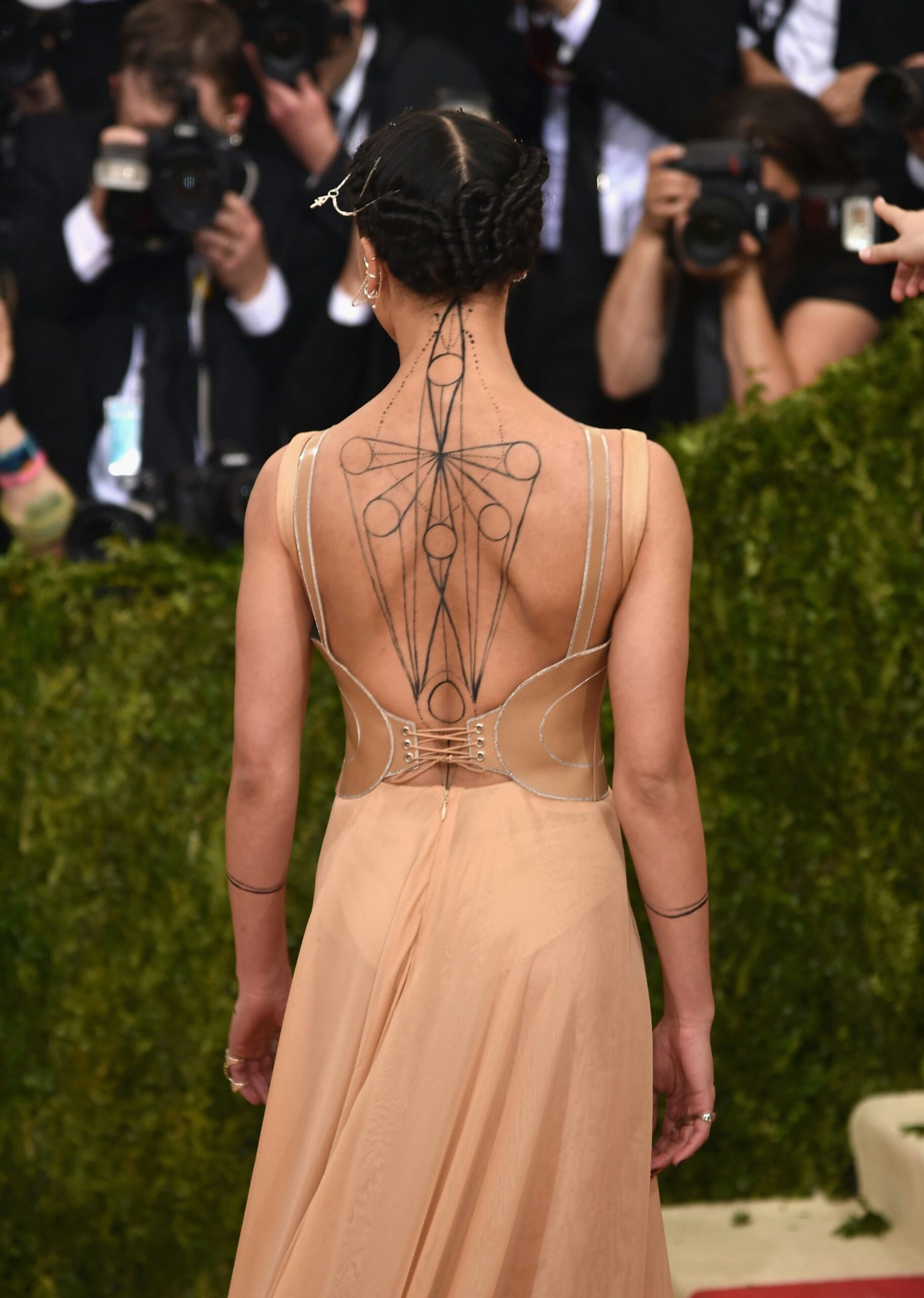
FKA twigs geometric back tattoo

The clearest example is the dramatic design across her back around the 2016 Met Gala. Nylon reported that celebrity makeup artist Anastasia Durasova drew the pattern using TEMPTU. It was based on mental geometry and inspired by protection, ideas that fit the visual worlds twigs builds around movement, ritual and transformation. It looked like a tattoo, but it was temporary artwork made for the event.

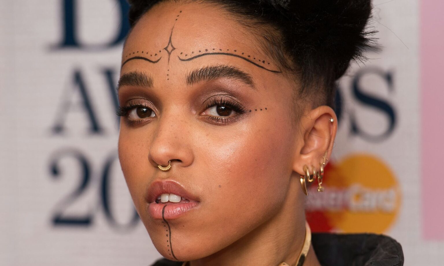
FKA twigs temporary face tattoos

That back design deserves to be considered on its own terms. Rather than a familiar symbol that can be named in a word, its lines formed a map across the skin. Geometry gave it structure; protection gave it an emotional direction. It was less a keepsake from the past than a temporary boundary around the performer in that moment.

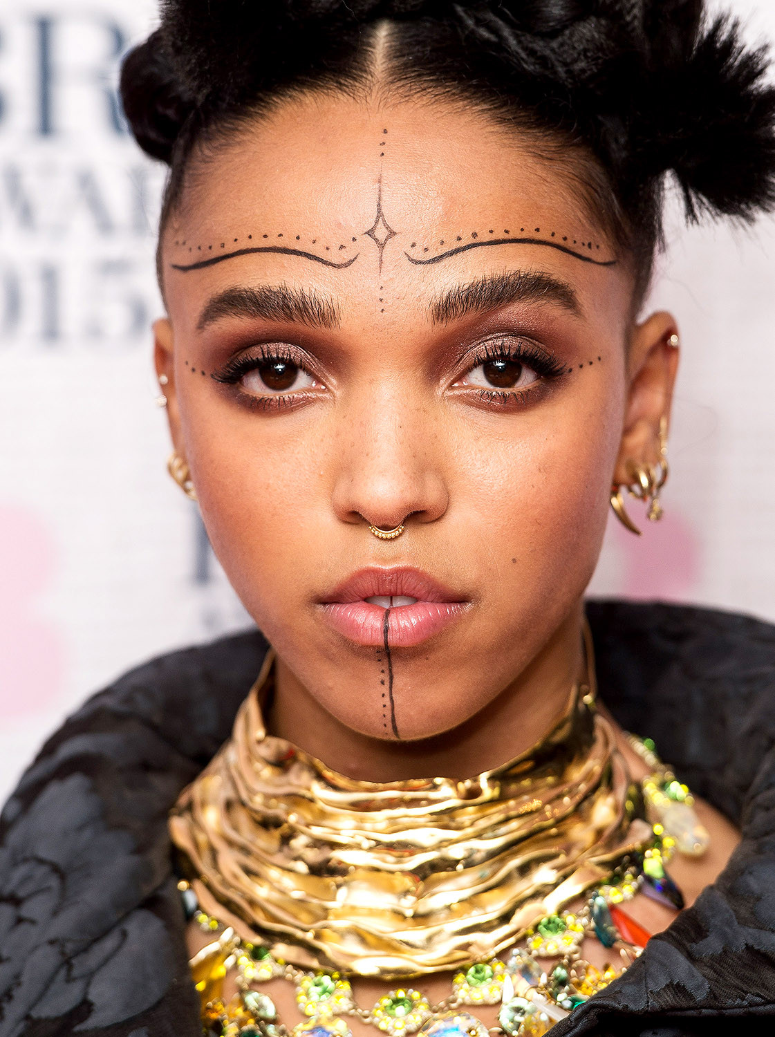
FKA twigs temporary face tattoos

Her interest in mental geometry also echoes the rest of her creative work. Videos, stage shows and fashion appearances often make the body seem to move through a diagram. Lines might suggest energy, architecture, control or escape. The temporary back design carried those ideas without turning into a permanent biography.

FKA twigs performance body art

Photos of twigs performing show how well the design worked. A black pattern across the back can disappear beneath clothing, then fill the frame when she turns her shoulders toward the camera. It’s theatrical, but not empty decoration. The artwork changes how the body reads. Stillness feels deliberate; movement feels choreographed.

Searches also bring up later fashion appearances with temporary face tattoos and other special-effects designs. These shouldn’t be counted as permanent ink. Vogue coverage described intricate face work applied by FX artist Mathilda Mace, while other reports identified fake face and thigh tattoos made for a particular look. They belong in a timeline of body art, not a list of designs she definitely still carries.
That distinction matters especially with twigs because her visual effects can look remarkably real. Makeup, prosthetics, transfers and ink may be hard to tell apart in a still image. A useful account should stick to what its source establishes. If a design was made for a shoot, performance or fashion-week appearance, that context is part of the story.

There are fewer widely documented permanent tattoos to list than an image search might suggest. That’s not a hole in the story; it tells us something about her approach. Twigs can use her body as a canvas without turning every design into a permanent record. A temporary piece can be redrawn, changed or removed when the performance is over. Its short life can be part of its meaning.

FKA twigs live body art

Her work also pushes against the idea that tattoo coverage has to be a catalogue of named symbols. Sometimes the more revealing details are the process: geometric lines, a protective motif, a collaboration with a makeup artist or a design made for a single night. That says more about the image than a vague caption calling it a tattoo.

The photos here come from different appearances, so they help show how her body-art language shifts. A concert shot catches her in motion, a portrait brings the face and neck forward, and an editorial image may show the styling from behind. None proves that every mark in view is permanent.

That’s why her body art feels closer to costume, choreography and set design than to a traditional sleeve. The designs still touch on protection, identity and transformation, but they’re allowed to disappear. Vanishing isn’t a lack of commitment; it’s part of the idea.

This approach also means she doesn’t have to explain every image forever. Permanent ink becomes part of a biography strangers can revisit. Temporary art can belong to one night and then give way to something else. That leaves twigs room to experiment with different symbols, textures and scale. Her body stays central, but it can still surprise.

People often want a yes-or-no answer to whether she has tattoos. The honest answer depends on what they mean by “tattoo.” She has worn designs made to look like tattoos and used body markings in performance and fashion. The public evidence doesn’t support inventing an extensive catalogue of permanent ink. Being precise makes the story more interesting.
The Met Gala design is the clearest case. We know the artist, the method and the stated inspiration—details that are rare enough to matter. Rather than guessing at hidden symbols, we can look at the geometry across her back, the idea of protection and the way it changed how photographs framed her body.

The temporary face designs work in a similar way. A pattern around the eyes or forehead can immediately shift the mood of an image, making a familiar face look ceremonial, unfamiliar or newly constructed. Once the design is removed, the performance is over, but photographs remain as a record of that choice.

There’s a difference between body art that records something from a life and body art that creates a world for an audience. A permanent tattoo often points back to a person, loss, friendship or decision. Twigs’ best-known temporary designs point outward: they create a space around her and give a performance a new set of rules. The idea of protection feels almost architectural—a structure that can be entered, used and then taken down.

Temporary doesn’t mean emotionally slight. A stage set can matter even though it comes down after the show; a costume can mean something even when it goes back in a wardrobe. The geometric design belonged to a moment meant to be photographed, remembered and left behind. Its brief life is part of the artwork’s honesty.

Her public record also shows why tattoo articles need clear language. “Permanent tattoo,” “temporary tattoo,” “makeup transfer” and “special-effects design” describe different processes and relationships to the body. Using the right terms lets us appreciate the work without claiming access to personal history she hasn’t shared.

Seen this way, her documented body art has a consistent feel. The patterns are often bold, the ideas geometric or protective, and the finished image changes how the body moves through a room. This isn’t about collecting symbols; it’s about making the body communicate at a particular speed, under a particular light, for a particular project.

Her body can hold several identities without getting trapped in one. Geometry can make her seem protected, a face design can make her look transformed, and a clean photo can reveal that the image was never meant to last. That movement between permanence and disappearance is one of the most revealing parts of the record. Twigs values the mark and the freedom to make a new one later.

That freedom runs through the work: the body can be a canvas, a costume, a boundary and a place to experiment.

It’s as much an artistic choice as a tattoo choice, and that difference keeps the story honest.

That distinction is worth remembering.

A careful inventory of FKA twigs’ documented body art

The clearest record includes the geometric back design created with Anastasia Durasova and TEMPTU around the 2016 Met Gala; temporary face and thigh designs reported at later fashion appearances; and markings for performances that sources identify as makeup or special effects, not permanent tattoos. A responsible list shouldn’t treat every striking photo as proof of permanent ink. The record is stronger when temporary work is named accurately.
Why temporary tattoos fit her visual world

Twigs’ creative work is built around change. Dance, styling, sound and image can shift from one appearance to the next. Temporary ink lets her place a new idea on her body without closing off the next one. The protective geometry can exist for one event and disappear, while its idea remains in memory. The design is temporary, but the visual language carries on.

Watch the tattoo interview and body-art story

The video below is a useful interview companion for understanding how twigs talks about the visual world around her work.

More musician tattoo guides

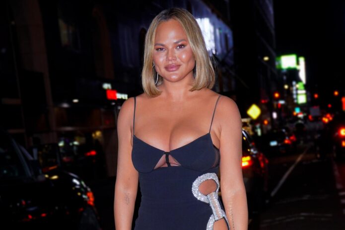
Chrissy Teigen Tattoos: Family Names, Butterfly, Elephant and More

Chrissy Teigen’s tattoos are small and personal, so they can be easy to miss until you know where to look. She hasn’t treated ink as a collection of random decorations. Most of the designs we can see point back to her family, her life with John Legend or a moment she wanted to hold onto. That gives the collection a warm thread, even though the tattoos themselves look quite different.

Her best-known pieces include family names on her forearm, a tiny heart on her finger, a butterfly drawn by Luna, a blue elephant and the words Ooh Laa down her spine. She also has a wrist tattoo honoring her late son Jack. Some are so delicate they disappear in red-carpet photos; others show up clearly in close-ups shared by Teigen, her tattoo artist and entertainment outlets.

Here’s what’s known about the main designs, where they sit and why they matter.

The John, Luna and Miles tattoo keeps her family on her arm

Chrissy Teigen family tattoos on her forearm

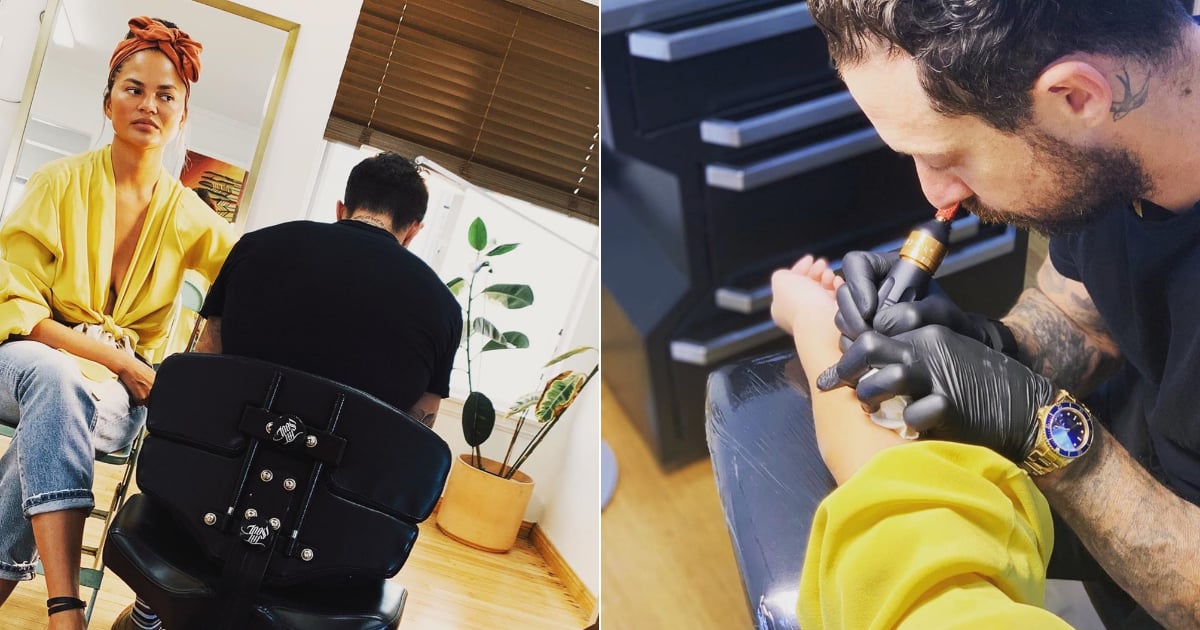
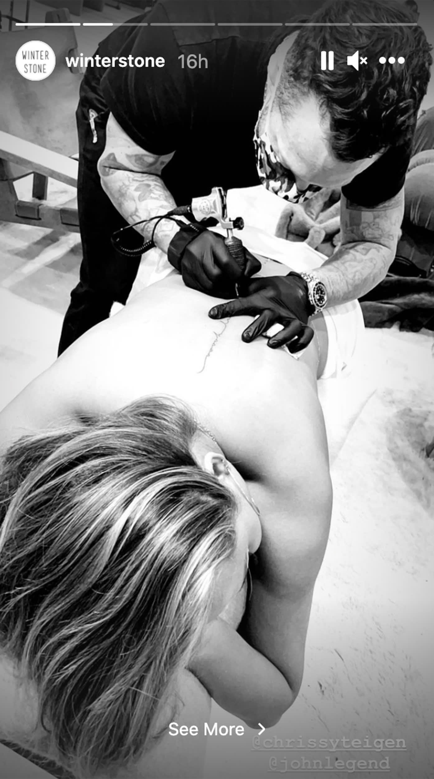
One of Teigen’s most recognizable tattoos is the fine script on her forearm: John, Luna and Miles. The names honor her husband and two of their children. Los Angeles tattoo artist Daniel Winter, known as Winter Stone, did the lettering. John Legend got a matching piece with Teigen’s name in place of his own, making the appointment a shared family marker.

The design is deliberately simple, with no heavy shading or frame around the words. It looks almost like a handwritten note, which suits Teigen’s preference for ink that feels intimate before it feels showy. The inner forearm is also easy to cover for work and easy to reveal by rolling up a sleeve.

Photos from the appointment show the clean, single-needle lines. Each letter has room to breathe, and the names sit in a neat row instead of crowding one another. It’s a good reminder that a small tattoo can carry a lot of emotional weight. The design is quiet, but its message is clear: the people closest to her stay with her.

Teigen later added more family-related ink nearby, turning the forearm into an ongoing record rather than one finished statement. The tattoos have grown along with her family, and that timeline is part of their appeal.

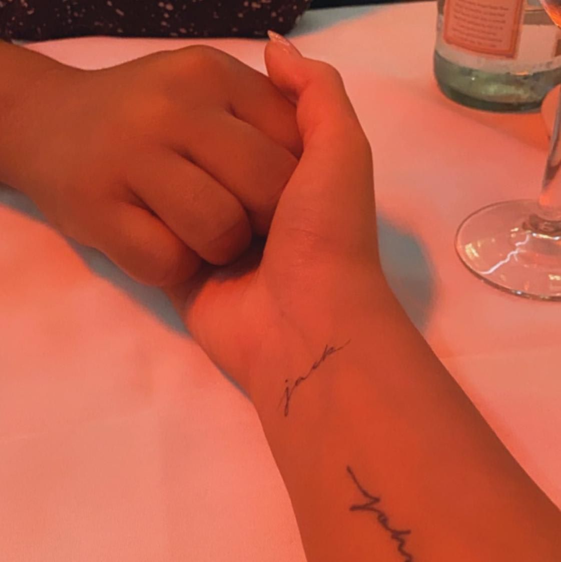
Her Jack wrist tattoo is a private tribute made visible

Chrissy Teigen Jack wrist tattoo

After the loss of their son Jack in 2020, Teigen chose a small script tattoo on her wrist as a memorial. His name sits near the existing family lettering, alongside John, Luna and Miles. It’s a tender choice, and the placement makes the connection easy to see.

The design doesn’t dominate her arm. Its fine lettering looks more like a signature than a bold memorial plaque. That restraint matters: Teigen has spoken publicly about grief, but the tattoo doesn’t turn it into a spectacle. It gives Jack’s name a lasting place while keeping the design close to her body.

Close-up photos show how the new script sits with the older tattoos. The lines are delicate, and the words fit naturally into the forearm collection. It’s also a reminder that the meaning of tattoos can grow as life changes. What began as family names has become a fuller record of the people Teigen carries with her.

A wrist is a fitting place for this kind of tribute: she can see it throughout the day, but it’s easy to cover when she wants. That balance appears often in Teigen’s choices. She picks placements that feel personal first and lets the camera catch them when she chooses.

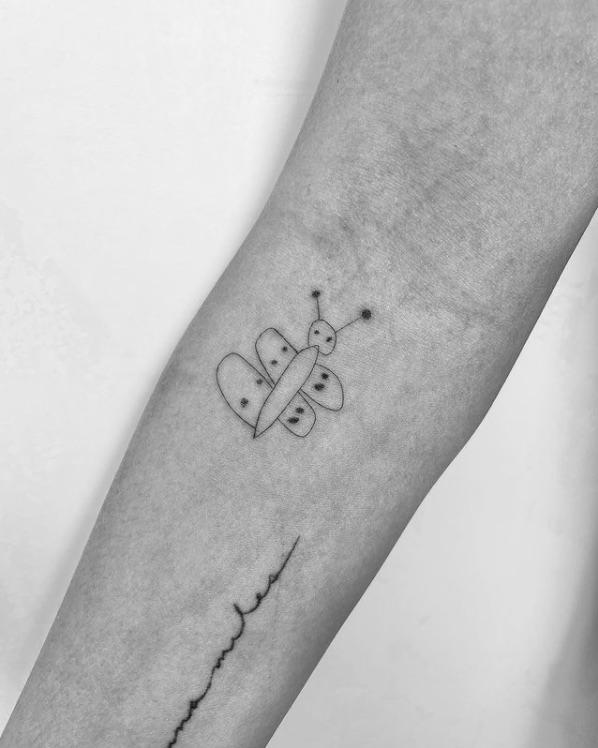
Luna’s butterfly drawing became a real tattoo

Chrissy Teigen butterfly tattoo drawn by Luna

The butterfly is one of the sweetest tattoos in Teigen’s collection because it began as a drawing by her daughter Luna. The shape is intentionally childlike, with uneven wings and tiny antennae instead of polished realism. After Luna’s preschool graduation, Teigen had Winter Stone ink the drawing on her inner forearm.

The finished tattoo keeps the charm of the original sketch. It doesn’t correct the proportions or turn the butterfly into a standard flash design. The imperfect lines are the point: the tattoo preserves Luna’s drawing and gives the little insect more personality than a conventional butterfly might have.

Teigen has called the image close to her heart, and its placement fits. The inner forearm already holds family tattoos, so the butterfly joins the same story. In close-up, you can make out the rounded wings, simple body and dots that make it feel lifted from a child’s notebook.

The design also shows why Teigen’s collection doesn’t need to be large to be memorable. It isn’t technically complicated; its value comes from who drew it and what the moment meant. For anyone thinking about family tattoos, a personal sketch can be more powerful than a perfect symbol when the story behind it is real.

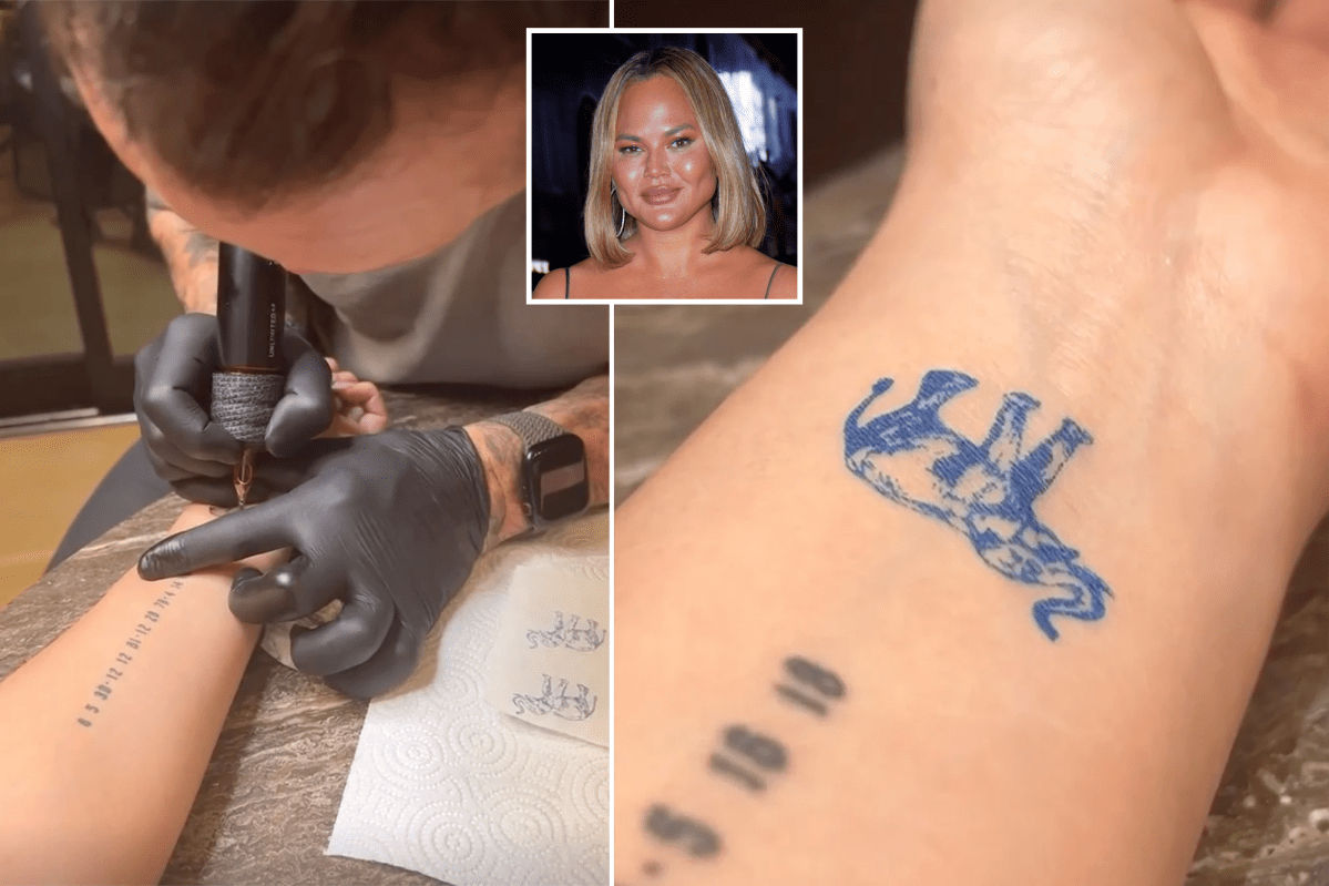
The blue elephant adds a brighter note to her tattoo collection

Chrissy Teigen blue elephant tattoo

In 2022, Teigen showed a new blue elephant tattoo by Winter Stone. It stands apart from her other well-known pieces, which tend to use black or gray fine-line work. The blue gives the elephant a softer, playful feel, and the drawing is loose rather than realistic.

It sits around her wrist and lower forearm, close to the other family designs. In the photo, the blue ink is vivid against her skin and gives the elephant its own character. It feels less like another line of text and more like a small figure joining the collection.

Teigen joked with the artist about the elephant’s details during the session, which matches the relaxed spirit of the tattoo. It feels meaningful without looking solemn. The design also suits the wrist: it can peek out from under a sleeve without taking over her arm.

The elephant makes a nice counterpoint to the butterfly. Both are personal, simple drawings, but they have different moods. Luna’s artwork inspired the butterfly, while the elephant is a colorful standalone image. Together, they show Teigen moving between sentimental family pieces and tattoos that simply make her smile.

Ooh Laa runs down her spine as a John Legend tribute

Chrissy Teigen Ooh Laa spine tattoo

Teigen’s spine tattoo has a more romantic feel. Ooh Laa runs down her back in delicate script, referencing a John Legend song from his album Bigger Love. Winter Stone shared the finished design, and Teigen posted parts of the appointment while Legend stayed close beside her.

The vertical placement makes it different from the family names on her forearm. Instead of reading across her skin like a label, the phrase follows her spine. It can stay hidden under everyday clothes, which makes it feel like a special reveal when she wears an open-back look or shares a photo from behind.

The piece also shows how Teigen and Legend’s tattoos play off their relationship. Their matching family names are direct and practical; the spine design is more private and flirtatious, built around a song with a personal connection to their marriage. It’s like wearing a lyric as a small piece of jewelry on her back.

Clear lighting helps with a fine script tattoo like this. The letters are narrow and light, so they can disappear in a distant red-carpet shot. In close-up, the spacing and placement are easy to see, and the work looks clean without being overdone.

Look across the collection and a pattern emerges: most of Teigen’s tattoos are about people, memories and small expressions of affection. Even the nonverbal designs have personal origins. Luna drew the butterfly; the blue elephant brings color and humor; the spine tattoo points back to Legend’s music. The names and Jack tribute make the family story even more direct.

She also tends to favor fine lines and placements she can show or cover. That makes the tattoos easy to live with and lets each new piece find its place. None looks like it was added just to fill space. The strongest examples are tattoos that would still matter even if nobody else saw them.

For readers looking for celebrity tattoo ideas, Teigen’s collection offers approachable examples. You don’t need a full sleeve to build a meaningful group of tattoos. A handwritten name, a child’s drawing or a lyric can be enough. The key is choosing something that still feels true after its trend has passed.

That family-first approach is why the collection keeps evolving. New ink doesn’t erase what came before; it adds another chapter. If you like tattoo stories rooted in personal history, read our feature on Marlon Vera’s meaningful tattoos for a very different kind of story told through ink.

In short, Teigen’s tattoos combine fine script, small illustrations and tributes to her relationships. The designs are delicate, but the stories behind them aren’t. Each piece has a reason to be there.

Watch the video below for more about Teigen’s butterfly tattoo and the family story behind it.

Gabbriette Tattoos: Stars, Butterflies, Arms and More

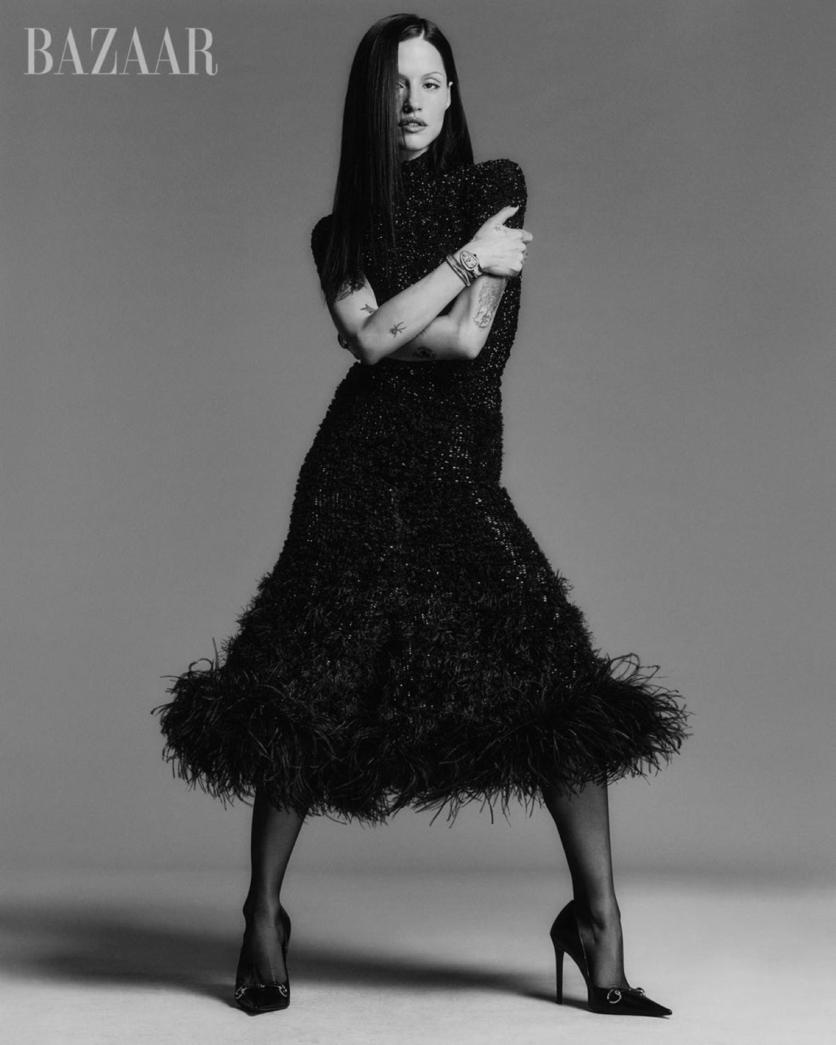
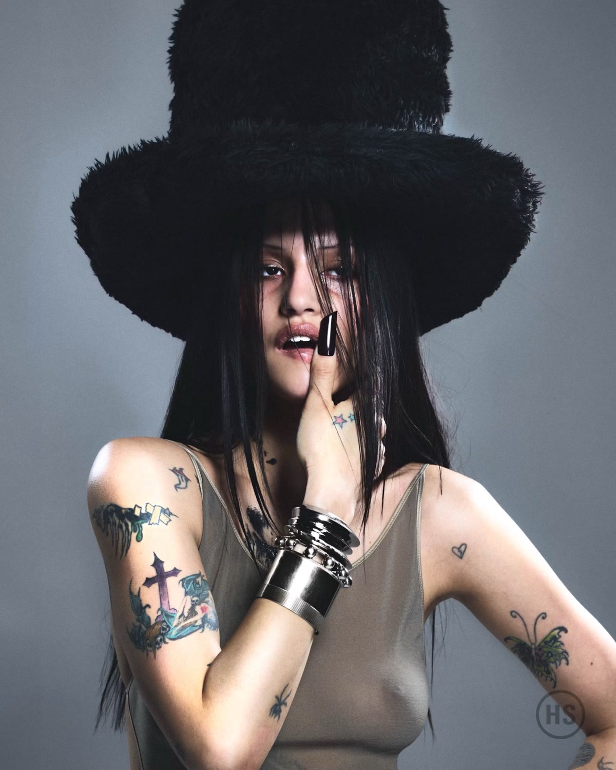
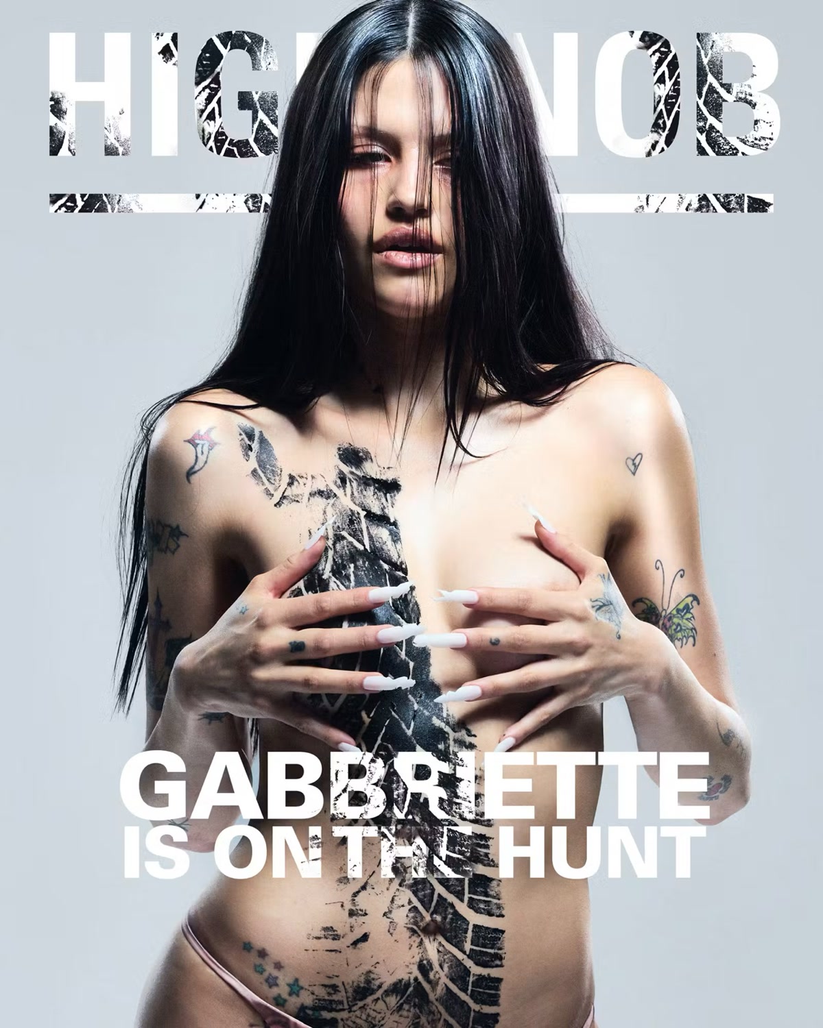
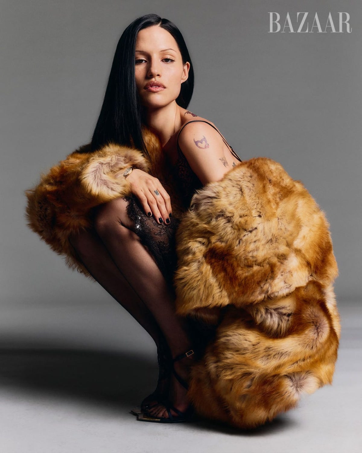
Gabbriette Bechtel’s tattoos feel inseparable from her style. The model and internet personality often wears black and favors dramatic silhouettes, and her ink is just as individual: bright stars, tiny hearts, bold arm designs, hand tattoos and larger pieces that make her skin part of the outfit. Some look carefully planned; others feel spontaneous, playful or a little rough around the edges.

That variety is what makes the collection fun to look at. It isn’t one tidy sleeve or a single theme, but more like a visual diary that has grown with her life, work and taste. Gabbriette has also talked about the tattoo artists and models who inspired her, especially Jane Moseley, whose hand-poked work helped shape her early ideas. Here’s a closer look at the pieces that are clear in photos, what she has discussed and what’s best left as visual detail rather than fact.

Gabbriette’s tattoo collection is built around small symbols

A good place to start is with the smaller marks. Gabbriette’s arms have little stars, hearts, insects and fine-line details that work like punctuation. They break up the larger designs and keep the overall look from feeling too heavy. A tiny tattoo can contribute as much to the mood as a large one, especially beside a bare shoulder or a simple black dress.

Gabbriette Bechtel showing arm and hand tattoos in a feathered dress

In close-up, the small designs sit at different angles, giving the collection a sense of having grown over time instead of being applied all at once. That’s a useful idea for anyone planning several tattoos: repeating one exact style can look polished, but different line weights and shapes often make a personal collection feel more alive.

The hand tattoos follow the same approach. A few marks show around her fingers and the back of her hand, where even a tiny symbol changes the look of jewellery, nails and sleeves. They don’t need a long explanation to register; their placement already does a lot.

The stars and heart tattoos add a softer side

Gabbriette’s stars are among the most recognizable details in the collection. They appear in clusters and different sizes, with a loose, almost sticker-like feel. Stars can be sentimental or decorative, and sometimes both. On her, they suit the contrasts in her look: sweet shapes against dark clothes, fine marks beside bolder blackwork, and playful details in serious fashion images.

Gabbriette Bechtel with colorful arm and hand tattoos

This portrait makes the variety across her arms easy to see. A heart sits apart from the heavier pieces, while stars and darker shapes make the lower section feel busier. There’s some color, but the collection still hangs together because the placement feels considered. Rather than covering her skin with one large design, Gabbriette uses smaller motifs to create movement from shoulder to forearm.

That’s also why the tattoos photograph so well. They’re visible when her arms are bare without taking over the whole image. A design may peek out from a strap, sit against a white top or become part of an all-black look. The collection feels playful without seeming random, and the mix of tiny symbols and larger shaded work gives it a recognizable rhythm.

There’s a practical side to this approach, too. A small heart or star can be a good first tattoo and still leave room to add something larger nearby later. The early design can become part of a composition rather than getting in its way.

Her arm tattoos are where the collection gets bolder

The small symbols set the tone, but Gabbriette’s arms carry much of the visual weight. Some pieces are darker and more illustrative, with a rough-sketch quality; others bring in flashes of green, blue or red. The mix makes the collection feel more like a scrapbook than a traditional sleeve.

Gabbriette Bechtel showing colorful sleeve and chest tattoos

This portrait shows how the arm tattoos became part of her public image. The designs span the upper arm toward the elbow, with separate pieces close enough to feel connected. Her chest and hands have smaller marks as well, so the eye moves around instead of stopping at one isolated tattoo.

Gabbriette has described getting tattoos as part of finding her own style. That helps explain why the collection doesn’t seem designed to please everyone. Some lines are rough, outlines are strong and a few motifs feel unusual. The appeal is personal. Her tattoos look chosen for attitude as much as for decoration.

What she wears changes how the arm pieces read. A sleeveless top makes them the main accessory; a long sleeve can hide most of the collection and leave one small symbol showing. That flexibility likely works well with her modelling career. The ink doesn’t compete with the clothes, but it gives each look a point of view.

Shoulder, collarbone, and upper-body pieces fill the gaps

Not all of Gabbriette’s tattoos are on her arms. Fashion photos show designs around her shoulders, collarbone and upper torso. A jacket or high-neck top can hide them, while a strappy outfit makes them easier to see. Shoulder tattoos also shift with the viewing angle, so the same piece can look different in a front-facing portrait and a side view.

Gabbriette Bechtel showing shoulder and upper arm tattoos

The shoulder design in this image looks softer and more faded than the darker pieces on her arms. That variety is part of the appeal. It suggests tattoos from different times, artists and moods; they don’t all have to match to feel like they belong together.

Small marks around her fingers and hand echo the symbols on her arms. Across the whole collection, those details link separate areas. The eye can travel from shoulder down the arm and toward the hand without needing one continuous sleeve.

Upper-body tattoos also show how placement can work with clothing. A small collarbone design can sit like a pendant; a shoulder motif can frame a bare neckline; a darker piece under sheer fabric becomes part of the texture. Those are styling effects as well as tattoo choices, whether or not each design was planned for a photo shoot.

The meaning is personal, and not every design needs a fixed explanation

Gabbriette’s public image makes people curious about every tattoo and what it means. Some details have been discussed, but many are best described with care. We can identify a star, heart, butterfly or hand-poked shape without claiming to know the private story behind it.

Gabbriette Bechtel standing with visible arm and hand tattoos

This wider photo shows how much the collection depends on placement. The tattoos run across her arms, shoulders and hands while leaving plenty of open skin. That balance works with delicate clothes and gives bolder looks an edge. It also shows why a single close-up can’t tell the whole story.

Gabbriette has described tattoos as self-expression and linked her style to the artists and people who influenced her. That’s a more grounded way to understand the collection than fitting every symbol into one neat story. A tattoo might be a memory, a joke, a design she loved or simply an image that felt right at the time.

Tattoos also change with their wearer. People add cover-ups, let old lines fade or decide a once-important image no longer represents them. Gabbriette’s collection looks open to that kind of evolution. Some designs are crisp and colorful, while others seem older and softer. Together, they show someone comfortable letting her skin keep a record of different eras.

If you like celebrity collections that combine personal symbols with a strong visual identity, compare her layered approach with Halsey’s tattoos. The styles are different, but both show how ink can become part of a musician or model’s image without becoming the whole story.

Why her collection stands out:

The tattoos don’t look overly managed. Fashion photos may be polished, but the ink still feels lived in: tiny stars next to larger colorful work, a delicate heart beside a darker illustration, hand tattoos among rings, long nails and sleeves. That friction gives the collection its personality.

The tattoos also work a bit like a wardrobe. A black dress makes the ink look graphic; a pale dress brings out the color. A close-up can make one small mark the focus, while a full-length photo shows how the designs fit together. The tattoos stay the same, but their role changes with the setting.

For anyone planning a similar collection, the lesson isn’t to copy one design. Think about spacing and scale, and how later work might fit around the first few pieces. Start with images that matter to you, leave some breathing room and don’t worry if every tattoo comes from the same visual style. Gabbriette’s collection works because it feels accumulated, not manufactured.

There’s no need to invent a meaning for every mark. Sometimes a tattoo is simply one that makes you feel more like yourself. Gabbriette’s stars, hearts, arm pieces and upper-body designs create that impression: expressive, occasionally messy and closely tied to how she presents herself. That’s why people keep noticing them, even when the outfit is doing most of the talking.

Watch: Gabbriette spends a day in London in this Vogue video.

Billie Eilish Tattoos: Dragon, Fairy and Hard and Soft Ink

Billie Eilish hasn’t treated tattoos like a public checklist. For years, she told fans they wouldn’t see her body art, then gradually showed pieces that feel personal rather than promotional. A large dragon reaches from her thigh toward her stomach, tiny fairies sit on her hand, and a dark abstract design runs up her back.

Her view shifted as she realized that keeping every tattoo hidden wasn’t the only way to keep it hers. Showing one design in a chosen photo doesn’t mean she has to explain every part of the decision. That distinction runs through the coverage: we can see the work, while much of its meaning stays with the person wearing it.

Now that five major designs have been documented, some patterns are clear. Billie chooses art with a strong silhouette, keeps the explanations close and lets the tattoos sit alongside her changing style. The collection still feels private, even when photos of it are everywhere.

Billie’s dragon tattoo is her biggest statement piece

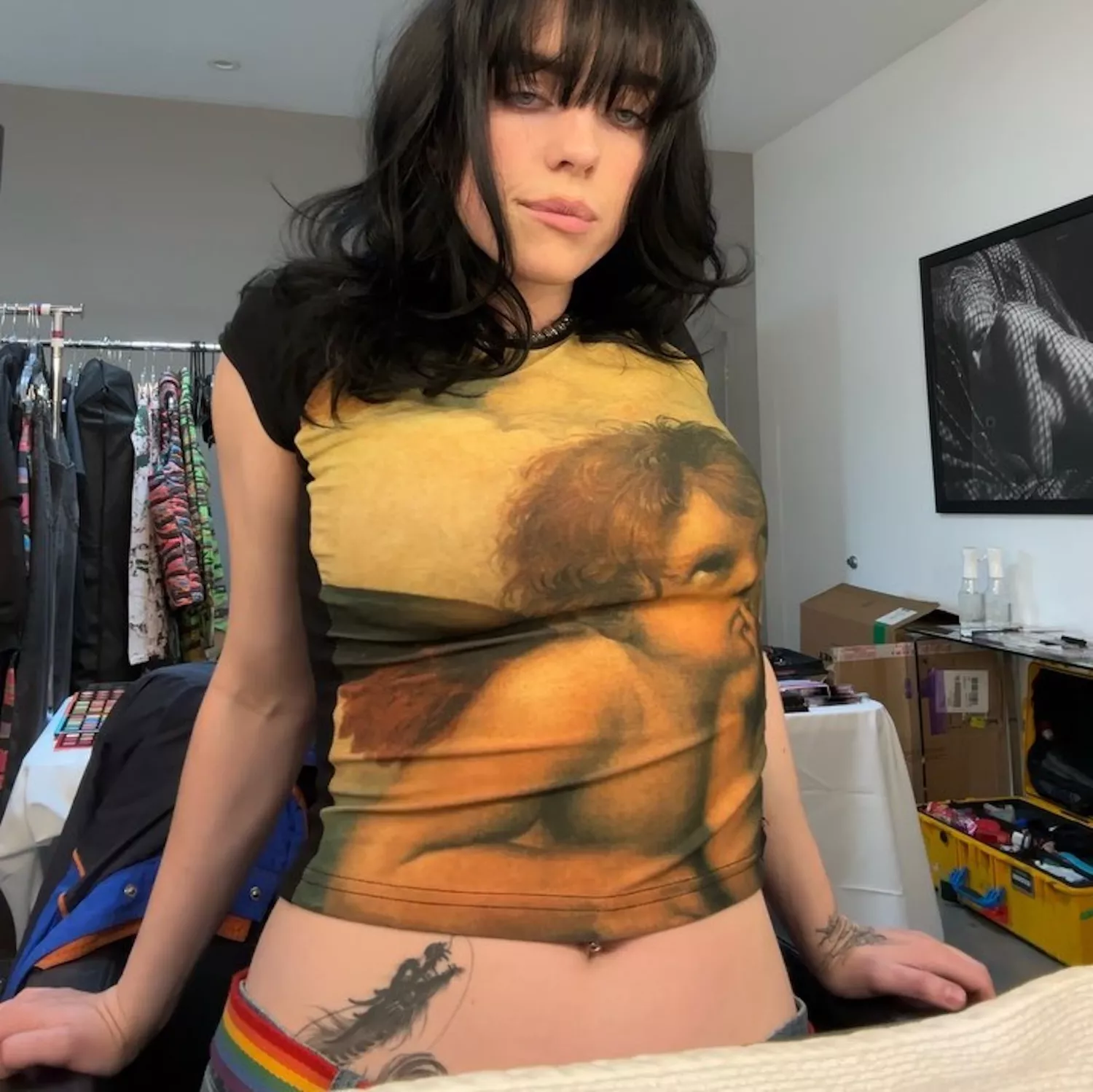
The dragon changed the conversation about Billie Eilish’s tattoos. It stretches from her upper thigh toward her stomach, covering far more space than the smaller pieces she had shown before. Fans got a clear look in a 2021 British Vogue shoot, where the design appeared under a sheer corset.

The tattoo is hard to miss, but Billie hasn’t given it one fixed public meaning. That’s worth respecting. Dragons are often assigned ready-made ideas like power, freedom, wisdom or strength, but none should be presented as Billie’s own explanation. What we can say is that she liked the artwork enough to give it a major place on her body.

The shape also works with the way she dresses. A high-cut outfit might reveal part of the dragon; a more revealing look can make it the main detail. It’s bold without seeming chosen to win anyone’s approval.

Billie Eilish dragon tattoo stretching from her upper thigh toward her stomach

The fairy tattoo is tied to a childhood favorite

A fine-line fairy sits on Billie’s left hand. It’s much smaller and more delicate than the dragon, making the contrast between the two especially striking. The design can be missed in a full-length photo, but close-ups show the little figure in a place she can see throughout the day.

Billie has explained this tattoo more clearly than most. She connected it to Fairyopolis, a favorite childhood book, and described the figures as little guardian angel fairies. That gives the piece a specific, warm origin rather than a vague story attached after the fact.

The hand is a fitting place for a symbol she wants close. It appears in interviews, performances and red-carpet photos, sometimes among rings or beneath a sleeve. The fine lines suit the idea of a tiny private world, while the placement keeps the memory in view.

Billie Eilish fairy tattoo on her left hand

Her abstract back tattoo refuses an easy label

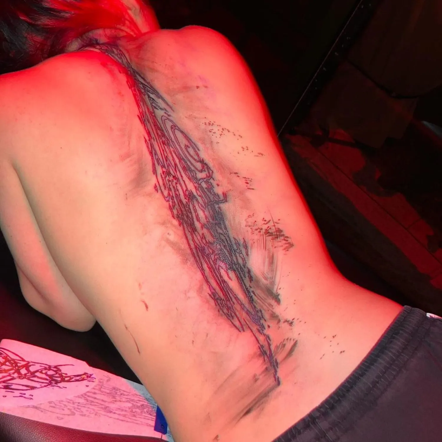
Billie’s back tattoo is probably the hardest piece to describe. It runs along her spine and has been compared to everything from an oil spill to knots in wood. In the clearest photos, it looks fluid and dark, with shapes that climb toward her neck like flames or liquid.

She showed the tattoo while it was being done in 2023, then later offered a smaller glimpse of the healed part near her neck. That partial view is part of its appeal. Rather than give a definitive explanation, Billie lets the audience sit with the uncertainty.

A spine tattoo is a major commitment: it runs down a central, long stretch of skin that’s hard to avoid seeing in the mirror. The abstract shape makes the design feel even more personal. It isn’t a word, date or recognizable logo. It’s a piece of visual language that belongs to her.

Billie Eilish abstract back tattoo running along her spine

“Hard and Soft” connects directly to her music

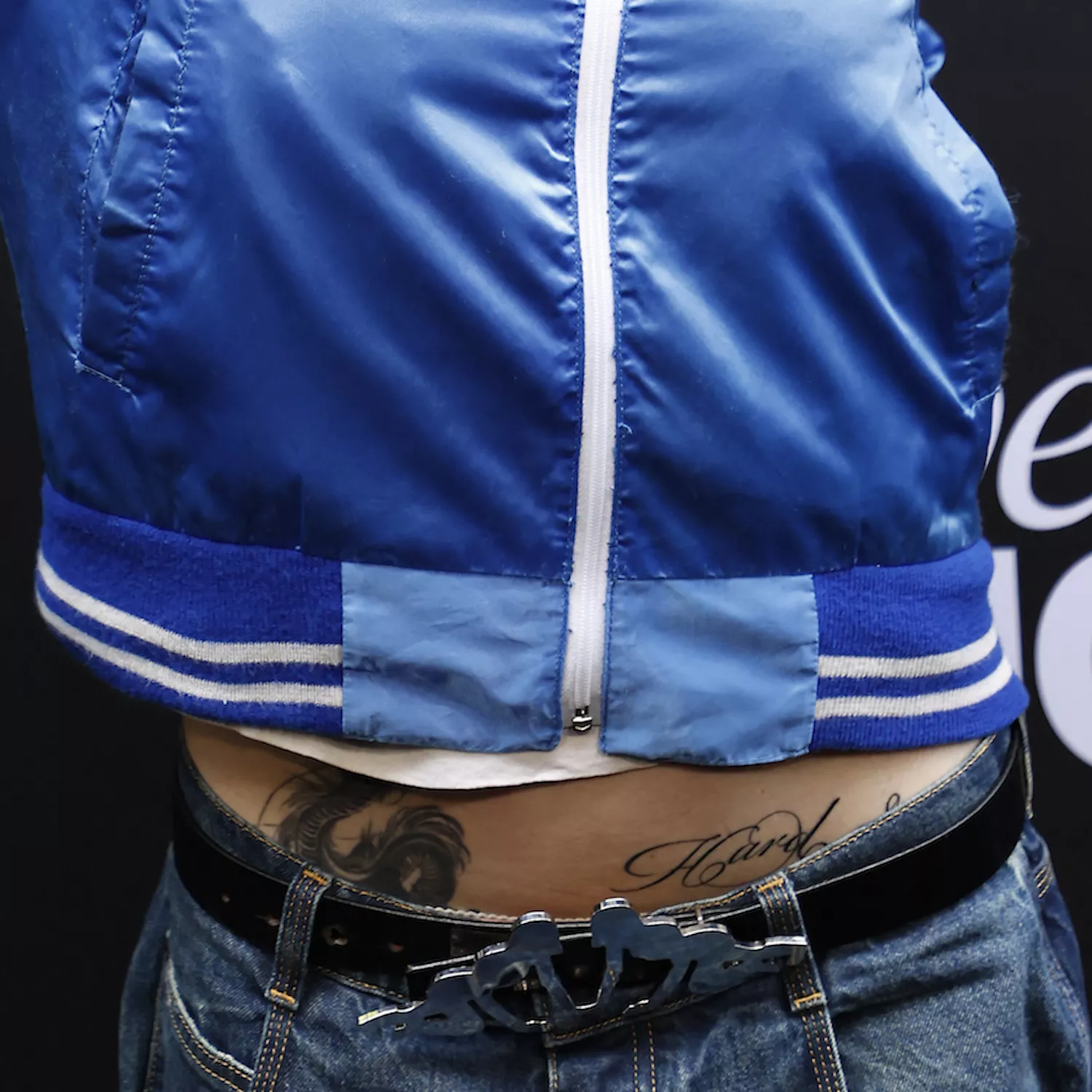
On Billie’s lower hip, a script tattoo reads “Hard Soft,” a clear reference to her third album, Hit Me Hard and Soft. The loose cursive makes it look understated at first. Once you recognize the phrase, it becomes one of the more revealing tattoos in her collection.

Billie has talked about being drawn to emotional extremes. She can want intensity and tenderness, strength and softness, without having to choose just one. The tattoo turns that tension into a short phrase she can carry with her.

It also ties her more recent ink to the work she’s making now. Some celebrity tattoos sit apart from an artist’s career; this one brings an album into her body without looking like a large piece of merchandise. The words are simple; the idea isn’t.

Billie Eilish Hard Soft script tattoo on her lower hip

The Eilish ribcage tattoo is a bold piece of self-love

Billie also has her surname in ornate gothic lettering across her ribcage or chest. It’s large enough to read right away, but she doesn’t show it in everyday outfits. The design became known through a rare photo shared by a friend, which helps explain why it had stayed out of view.

When Billie discussed the tattoo, she joked that it simply meant she loves herself. The line was funny, but it also fits her general approach to body art. She doesn’t seem to choose designs because they’re universally flattering. Her surname is direct, personal and unmistakably hers.

The lettering sits near her ribs and moves with her body, changing with her posture. It has a different feel from the hand fairy or abstract back piece. This isn’t a tiny guardian or fluid shape; it’s Billie’s own name, worn as a statement rather than a label.

Billie Eilish surname tattoo in gothic lettering across her ribcage

What the photos confirm, and what they leave private

These five designs are the clearest ones in the public record, but they may not be the whole collection. Billie has said some tattoos aren’t meant for public viewing, and that boundary deserves respect. A blurry glimpse shouldn’t become a confident claim about a sixth or seventh design.

The photos show how different her choices are: a large figurative piece, a delicate hand drawing, an abstract design along her back, an album-related phrase and dramatic lettering of her name. There isn’t one unifying style; the common thread is control over when each tattoo becomes visible.

That’s why the rare photos are useful. They show more of the artwork without taking away the privacy that has always been part of Billie’s relationship with tattoos. She can reveal a design on her terms and keep its full story to herself.

The images also show why close-ups aren’t always available. Sometimes an arm, hip or shoulder appears for only a second. That makes the confirmed details more valuable and helps distinguish a real tattoo from a fan-made guess.

Why the collection feels so personal

Billie’s body art makes more sense as a set of memories than as a trend board. The fairy reaches back to childhood; the album phrase belongs to her current work. The dragon and abstract back tattoo show she’ll commit to larger designs, while the surname turns identity into something visible.

She also doesn’t explain every detail, which keeps the collection from becoming too tidy. Some tattoos have a clear meaning; others are simply designs she wanted. That feels more believable than insisting every line has a public lesson.

For another musician whose tattoos have a well-documented story, see our guide to Jessie J’s tattoos.

Brett Young’s Tattoos: 40 Stories in Ink, From Family Heartbeats to Music

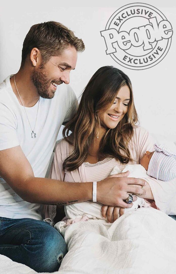
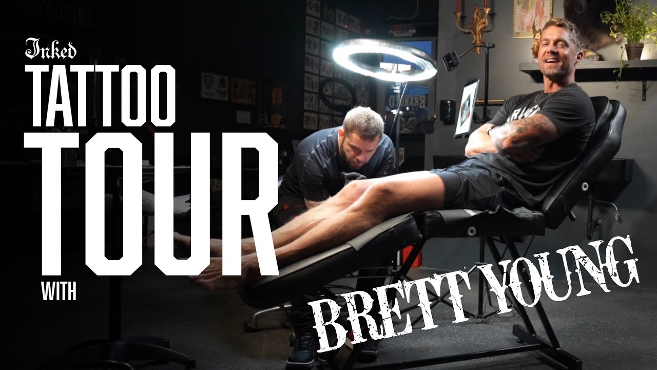
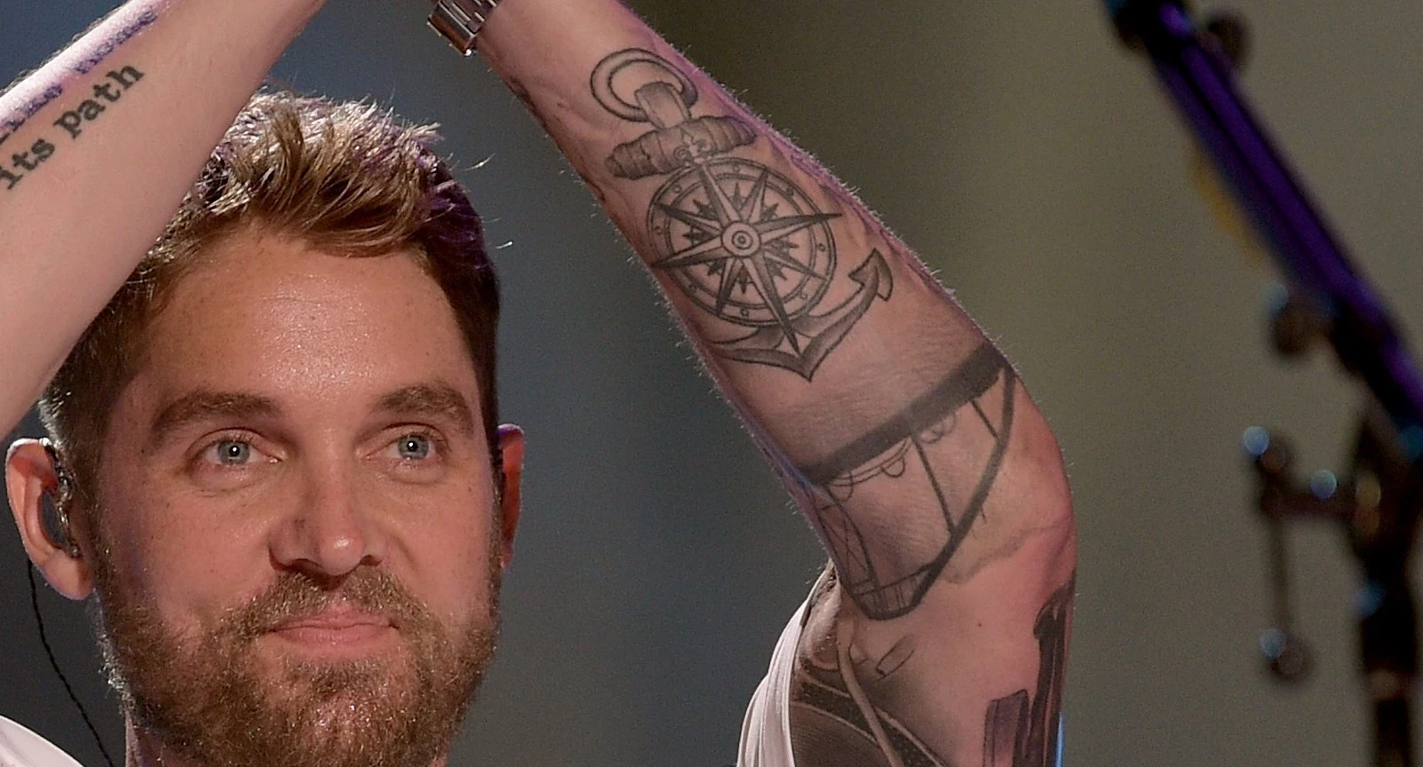
Brett Young’s tattoos aren’t random decoration. They read like a scrapbook: part family record, part music map, part reminder of the people and places that shaped him. He has said he has roughly 40 tattoos, each with a meaningful story, so a quick list of body parts doesn’t tell you much.

Some themes are easy to pick out. His arms carry phrases about home and music, while other pieces point to his wife, daughters, faith, California roots and the Nashville life he built after moving on from baseball. That mix feels warm and lived in. It also puts his ink alongside other musicians’ personal timelines, like the family-centered ideas in our Anthony Joshua tattoos guide.

This guide sticks to designs shown or explained in interviews and tattoo-tour coverage. Some smaller pieces are easier to see than to identify, but the larger story is consistent: Young uses tattoos to remember a person, lyric, turning point or chapter he wants to keep close.

It’s most useful to read the collection as a map of choices, not a checklist of pictures.

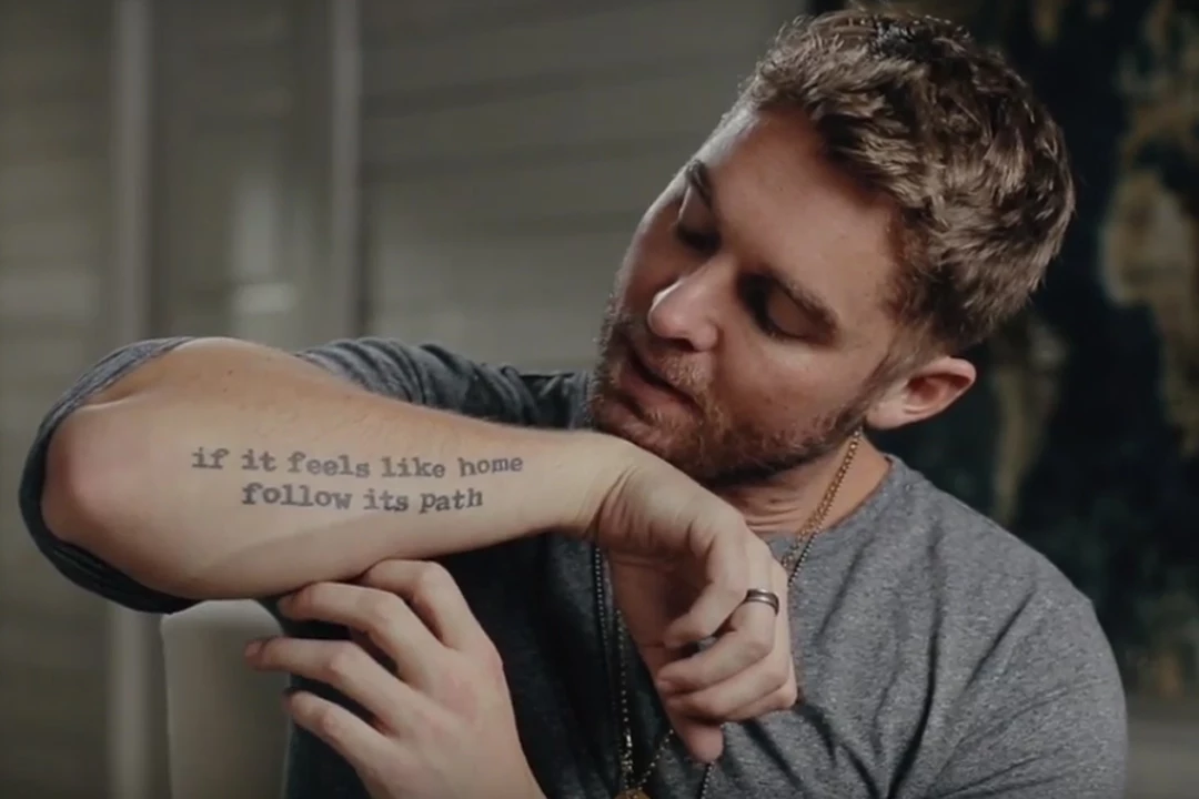
The “if it feels like home” tattoo follows a music career detour

Brett Young forearm tattoo reading if it feels like home follow its path

One of Brett Young’s best-known tattoos is the phrase if it feels like home follow its path on his right forearm. Poet R.M. Drake wrote the line, and it fits Young’s story unusually well. Before country music became his full-time career, he was a serious baseball player. Injuries changed that plan, and music became the path that felt like home.

This isn’t just a motivational quote for social media. It reads like a private instruction Young chose to keep in view. The line runs from near his wrist along his forearm, so it appears in photos when his sleeves are pushed up. Its clean lettering is quieter than the illustrated tattoos elsewhere in the collection.

Placement matters. Forearm writing is visible both to the wearer and to other people, and Young can glance at it while playing guitar, signing autographs or getting ready for a show. It turns an ordinary workday moment into a reminder of the career he chose after the first one was no longer possible.

The phrase balances instinct with action. “Follow its path” sounds active; “if it feels like home” trusts a feeling. Together they describe Young’s move from an expected future in sports toward songwriting and touring. It’s a strong example of a tattoo explaining a life change without needing a portrait or a date.

“Where words fail” turns songwriting into a tattoo

Brett Young showing the Where words fail tattoo on his arm during a tattoo tour

Young has the words Where words fail on his other arm. The shortened phrase echoes “Where words fail, music speaks,” and feels right for a country singer who spends his life turning difficult feelings into songs.

The design is simple, but the idea reaches beyond his career. Music is his work, yet the tattoo doesn’t read like a logo. It could also be about family and relationships, or the moments when a song says what conversation can’t. That gives it a more personal feel than a title tattoo or branding.

In tattoo-tour footage, the phrase sits among other arm designs rather than taking up the whole space. It becomes part of a wider sleeve story. Symbols, lettering and images connected with home, faith and family surround it, so the words almost caption the tattoos nearby.

Young’s tattoos pair plain language with emotional weight. “Where words fail” needs little explanation: anyone who has relied on a song during a difficult time knows the feeling. For a songwriter, it’s also a reminder that music can carry emotion farther than an ordinary sentence.

Brett Young’s compass and anchor tattoos are about finding home

Brett Young compass and anchor tattoos on his tattooed arm

A compass and anchor are among Young’s most recognizable arm symbols. Together they suggest a clear idea: the compass points toward somewhere, and the anchor lets you settle once you find it. In CMT’s tattoo-tour coverage, Young connected the designs with finding where he was meant to be and then anchoring himself there.

That reading echoes the quote on his other arm. The words are about following a path that feels like home; the compass and anchor express the same idea without a sentence. One design suggests moving forward, the other staying put. Together they capture the balance between taking a chance and knowing when to stop searching.

The compass also suits a career spent on the road. Touring musicians move between airports, buses, venues and hotels. An anchor offers a counterpoint to that routine: it can stand for family, a home, a hometown or anything that still feels steady when the schedule changes.

The symbols add shape to a collection with plenty of lettering. In close-up photos, the compass lines and heavy anchor stand out, especially when Young is holding a guitar or sitting for a tattoo session. Each piece is distinct, but they help the arm feel connected rather than like a row of unrelated stickers.

The ring-finger tattoo is small but deeply personal

Brett Young showing small ring finger and hand tattoos

Not all of Brett Young’s tattoos are designed to show from a stage. The ring-finger piece is a small example with a private purpose. In an interview about his hand tattoos, he showed one connected with his marriage and the commitment represented by his wedding ring.

Finger tattoos can be hard to photograph. They often fade faster than larger pieces, and hands are always moving, so a clear close-up is more useful than a red-carpet portrait. That’s why this one is easy to miss if you’re looking only for the bigger forearm work.

The placement turns it into an everyday reminder. A ring can come off while playing an instrument or working out, but the tattoo stays. It’s discreet enough to keep personal, while its location makes the connection clear to Young himself.

The hand ink also changes the pace of the collection. His arms carry long phrases and bold symbols; the finger tattoo is almost a note in the margin. It shows he values both visible statement pieces and tiny marks he can explain when he chooses.

The tattoo tour shows how the larger collection fits together

Brett Young in a tattoo session with multiple arm tattoos visible

The wider collection adds family details that make the quotes and navigation symbols feel less abstract. Young has talked about heartbeat tattoos for his daughters, Presley and Rowan, made from recordings of each girl’s heartbeat during an early appointment. A private family moment became something he could carry with him.

He has also shown designs connected to family photos, Bible verses and the people who shaped his sense of home. Other tattoos link his California background to Nashville, including references to the Santa Monica Pier and Nashville skyline. A Gibson Hummingbird guitar, a crown of thorns and other symbols extend the story into music, faith and the places he cares about.

The family pieces help explain how the collection has grown. A new tattoo doesn’t have to replace an old one; it can add another chapter. That’s how a musician’s body becomes an archive: one design marks the road into music, another honors a partner and another records the arrival of a child.

There’s no need to give every small mark a confirmed public story. Young has about 40 tattoos, and interviews naturally focus on the pieces with the clearest meaning. What is clear is that the collection isn’t generic filler. The same ideas keep returning: choose the right path, make room for family, let music speak when conversation can’t, and stay grounded while life moves.

That’s why Brett Young’s tattoos are worth looking at together. The compass, anchor, phrases, hand ink, heartbeat lines, guitar references and family symbols all point in a similar direction. They mark where he came from, what he chose and who he wants close as life moves into another chapter.

Brett Young’s tattoos are personal signposts, not just decoration. They keep his career, faith, marriage, children and sense of home in the same frame, which is what makes the collection feel like a story rather than a trend.

Watch Brett Young explain the stories behind his tattoos