codex

Tom Grennan Tattoos: The Ink, The Stories and The Pieces You Might Have Missed

Tom Grennan’s tattoos range from a large chest flower and the name Dorothy to small hand marks, neck script and pieces he says he chose on the day. Their stories reach from his music and family to friends and spur-of-the-moment decisions. One fresh forearm tattoo even left him worrying about infection after a birthday festival.

The fresh forearm tattoo
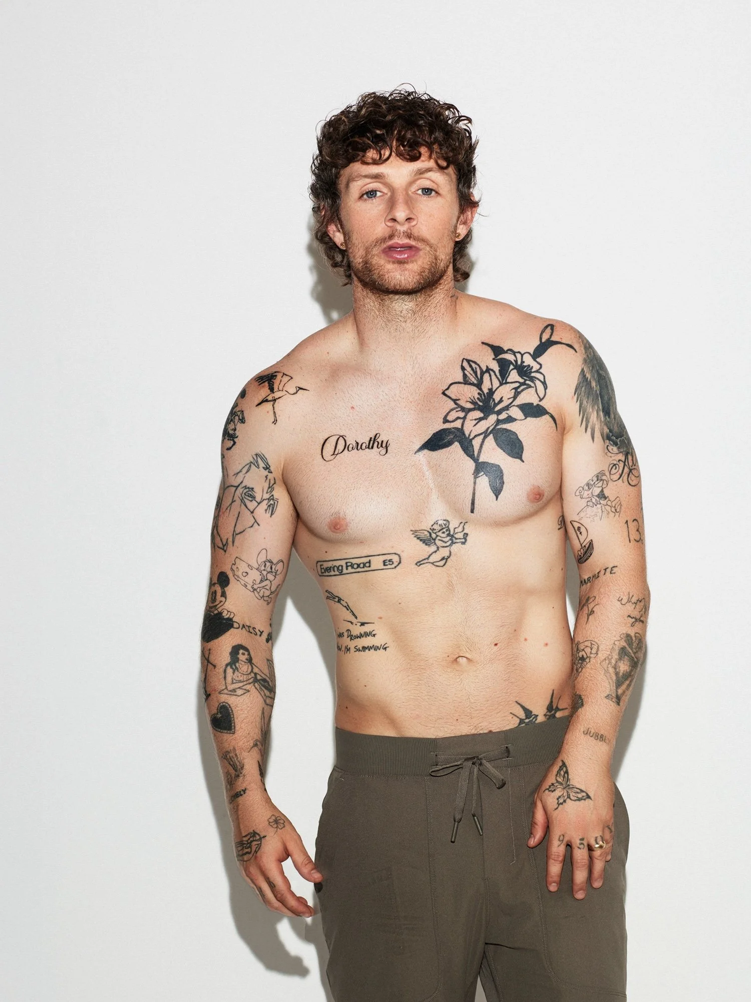
Tom Grennan tattoos: left forearm and hand ink

During an interview about his debut album, Grennan kept looking at a new tattoo on his left forearm. It was red and sore, and he wondered whether it might be infected. The black-and-red piece still had the look of work just finished.

The forearm is easy to show onstage or in a short sleeve, and easy enough to cover when he wants. His collection also shows that a visible piece doesn’t have to fill the whole area: a clear patch of dark ink or a small accent can stand on its own.

The Dorothy chest tattoo
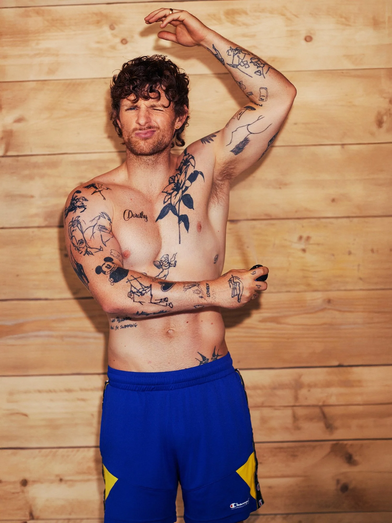
Tom Grennan tattoos: Dorothy script and chest flower

The flower on Grennan’s upper chest sits beside the handwritten name Dorothy. Bold lines and dark leaves give the flower weight; the softer lettering looks more like a note. Smaller pieces sit below them, including a winged figure and a boxed Evering Road E5, a reference to his second album.

The name has space around it instead of being folded into the flower. Together, the larger image and smaller text make a chest composition without forcing every piece into the same style.

The arm collection: flowers, figures and small black marks
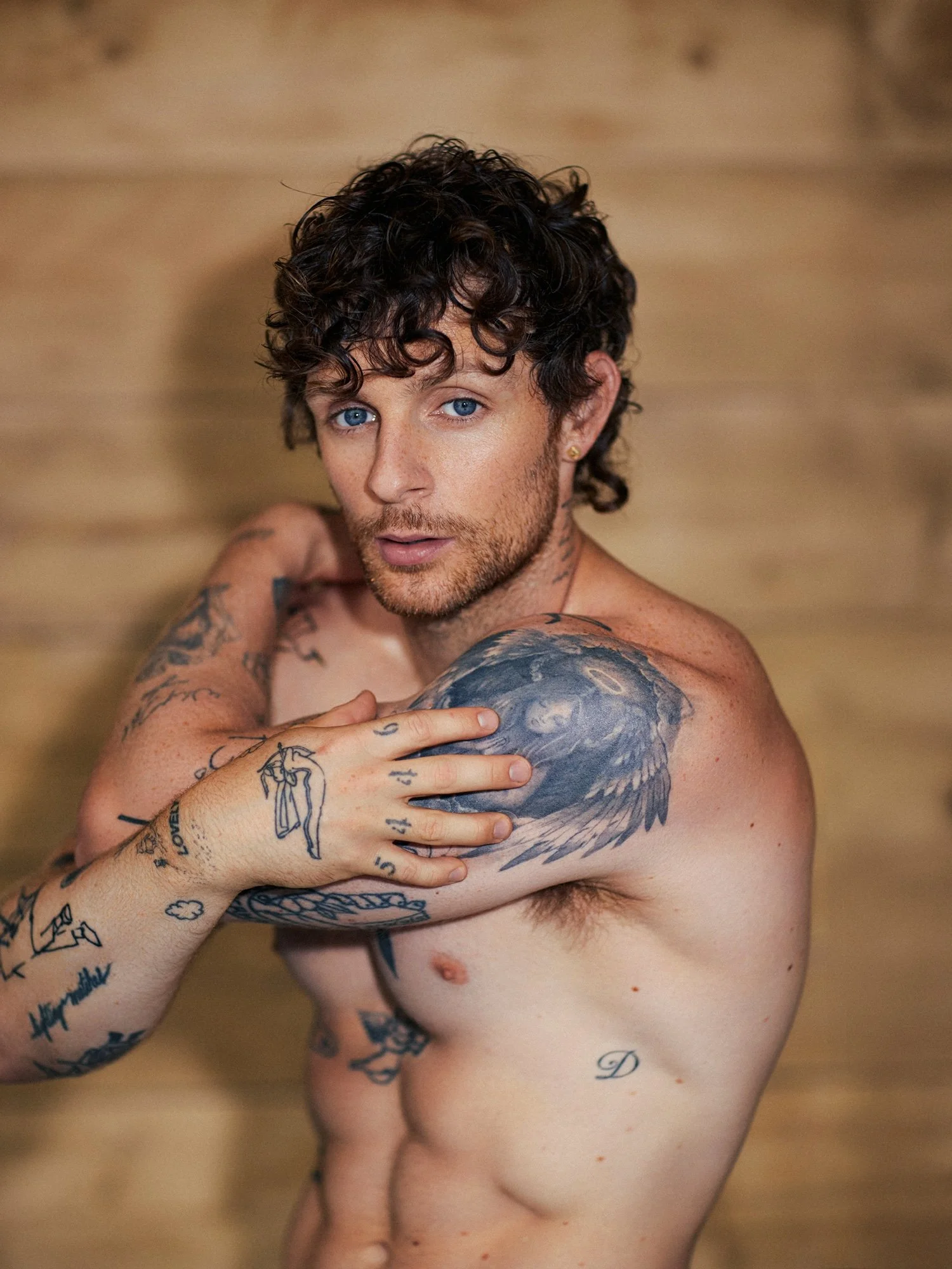
Tom Grennan tattoos: mixed flowers figures and hand marks

Grennan’s arms mix flowers, figures, lettering, dark shapes and quick-looking outlines. Small designs on his hands and fingers show when he raises his arms or turns his palms toward a camera. One hand tattoo also points to his father’s Irish family roots.

The collection grew in different sizes and styles rather than as one planned sleeve. Grennan wears it in motion, reaching for a microphone or guitar and lifting his arms while performing. Some lines look deliberately loose, which gives the mix a less formal feel without making the pieces look unfinished.

The shoulder wing and cross-body ink
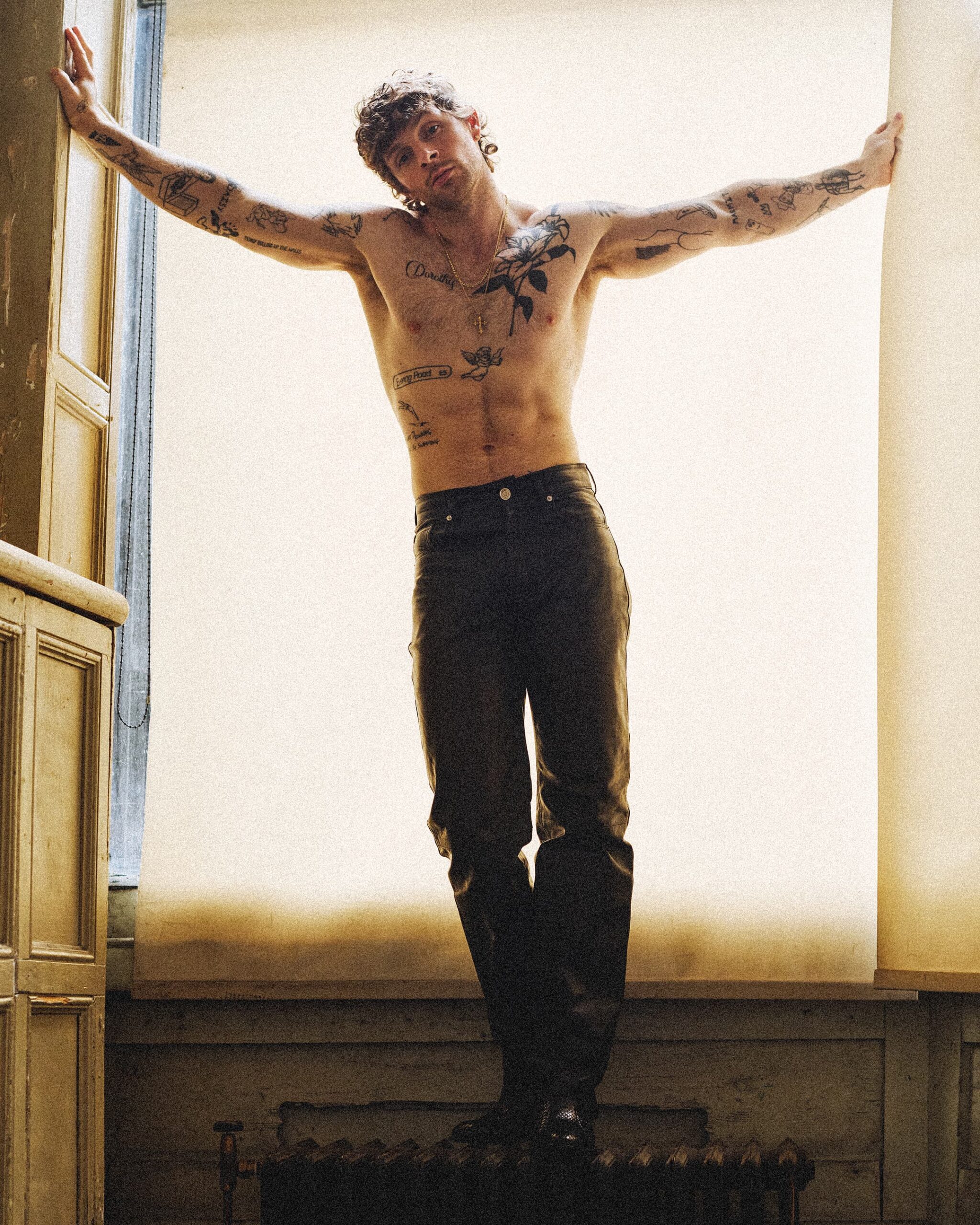
Tom Grennan tattoos: dense shoulder wing and arm linework

A wing-like piece crosses Grennan’s shoulder and upper chest. Dense shading and a broad dark shape give it more weight than the fine lines on his forearms. When his arm is down, it looks compact; as he moves, the design stretches across the upper body.

The darker piece gives the eye a place to land among the smaller tattoos. If you want a collection that grows over time, one larger design can anchor the area while leaving open skin for later work.

The neck script and the little tattoos that finish the look
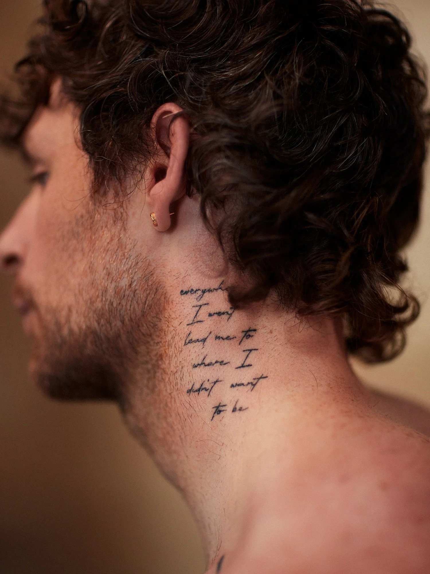
Tom Grennan tattoos: multi-line neck script

Fine script runs in short lines up the side of Grennan’s neck. It reads more like a private sentence than a slogan, and the placement makes it hard to hide completely. Lower down, hand and finger marks fill smaller spaces. He has also described the #1MORE tattoo on his leg as the result of a group decision with friends.

Those pieces don’t all need the same explanation. Some connect to music or family; others mark a joke or a day with friends. That mix is what gives the collection its lived-in look.

If you’re planning your own, take time with the parts that matter to you and let the rest develop gradually. A collection doesn’t have to look finished in one sitting.
More musician tattoo guides

Jaden Smith Tattoos: ERYS Face Marks, Film Memories and Fine-Line Ideas

Jaden Smith’s documented tattoo work ranges from small thigh lettering to scenes connected to The Pursuit of Happyness. Other face and torso marks appeared during the ERYS music-video period. Grace Lovejoy, who worked on the videos, said some marks were created for the project and its character study, so photos from that era don’t establish that every mark was permanent.

Jaden Smith’s ERYS face tattoos

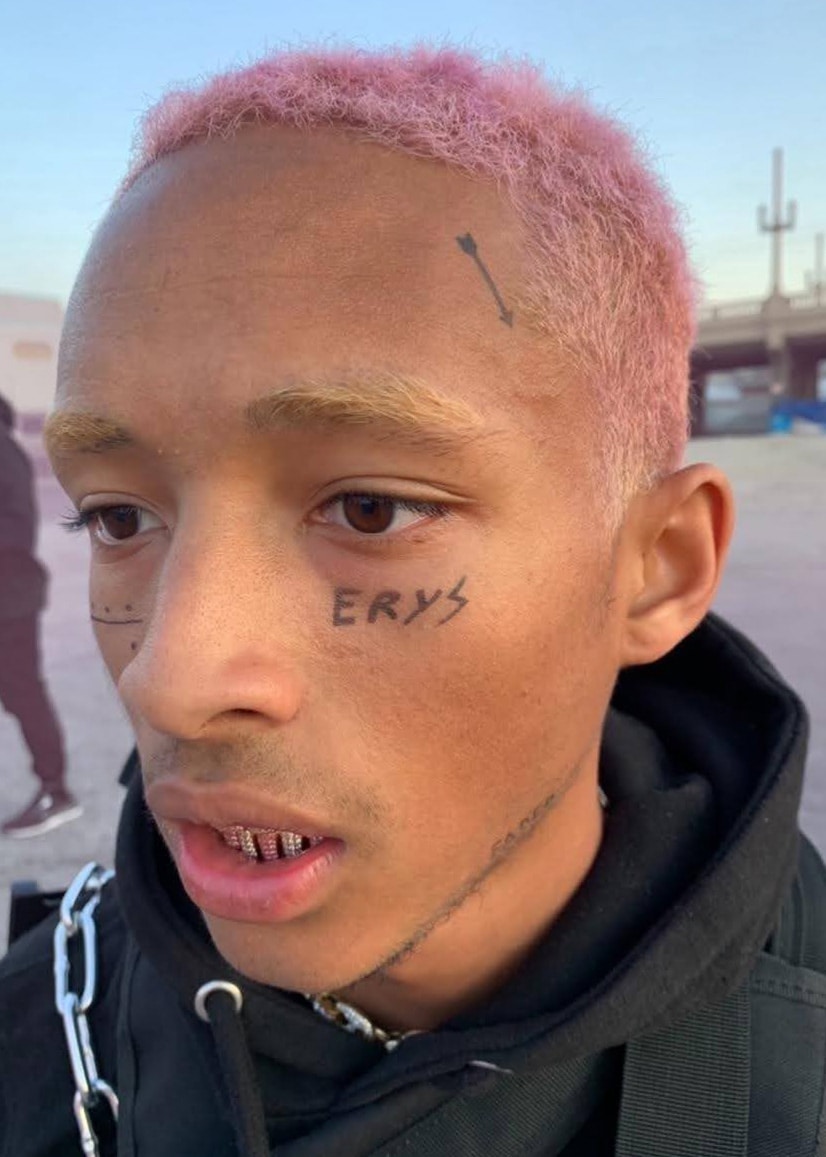
Jaden Smith tattoos: ERYS face and temple marks

In ERYS-era images, “ERYS” appears below one eye, with smaller marks near the other eye and high on the side of his head. A slim arrow runs above the temple, and a fine line follows the jaw toward the neck.

The close crop gives these marks a graphic look, but they should be described as visible in those images rather than assumed to be permanent tattoos. The arrow is a simple detail: its angle follows the temple, so placement does most of the work.

The One World thigh tattoo

Jaden Smith tattoos: One World thigh lettering

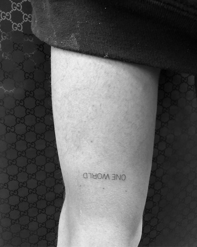
One World is a short line of lettering on Smith’s thigh, shown upside down in a black-and-white close-up. The words are spaced apart, leaving the phrase easy to read as it follows the skin.

The thigh keeps the piece covered much of the time. With lettering this minimal, spacing and a steady line matter more than extra decoration.

The Pursuit of Happyness forearm tattoo

Jaden Smith tattoos: The Pursuit of Happyness inner forearm scene

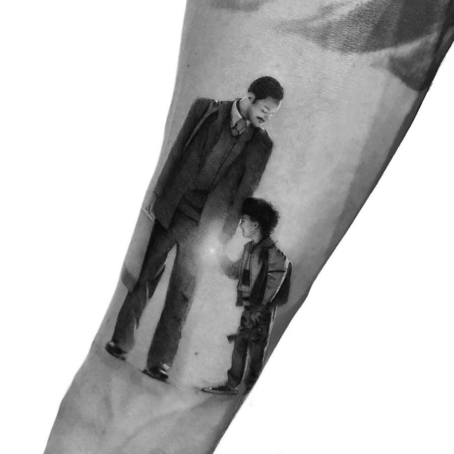
One The Pursuit of Happyness reference is a small black-and-grey scene of an adult and child standing together. The older figure looks down toward the child. Smith made the film with his father, Will Smith; the scene points to that shared project without relying on a portrait.

Soft shading gives the figures depth, while open skin keeps the image from becoming a dark block. A film reference can be a moment or relationship from the story instead of a title or poster.

The Pursuit of Happyness thigh tattoo

Jaden Smith tattoos: The Pursuit of Happyness dream quote scene

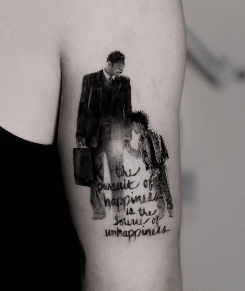
A second film piece sits on the thigh and pairs a suited adult and child with handwritten words beneath them. The quote refers to protecting a dream when others say it can’t happen. Image and lettering run in one vertical line, like a small page kept close to the body.

The writing has room to stay apart from the scene. On a curved area such as the thigh, an artist may need to adjust the proportions so both parts still read when the leg moves.

The Pursuit of Happyness tricep tattoo

Jaden Smith tattoos: The Pursuit of Happyness micro-realistic tricep scene

The tricep version uses the same adult-and-child scene with the quote below it, but in a taller layout. The figures come first; the eye then moves down to the words. Open space helps keep the image and script distinct.

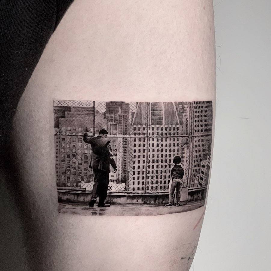
The three film references share an idea without using identical compositions. Crop, scale and placement change with each part of the body.

Style, clothes, and the world around him

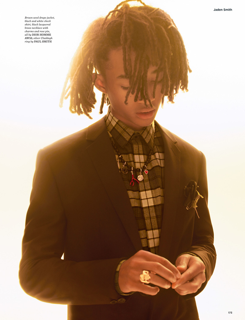
Jaden Smith in a contextual photograph: warm GQ Style editorial portrait and clothing context; contextual only, not tattoo evidence; not tattoo evidence

GQ Style’s ERYS-era portraits show Smith in layered tailoring, jewellery and clothes between formalwear and street style. The warm editorial image gives context for his styling, but it isn’t a close view of a particular tattoo.

His clothes add to the graphic feel of the ERYS marks and fine lettering. In a strong outfit, a small tattoo can stay a quiet detail; a larger image may take focus when more skin is visible.

The visual language around Jaden

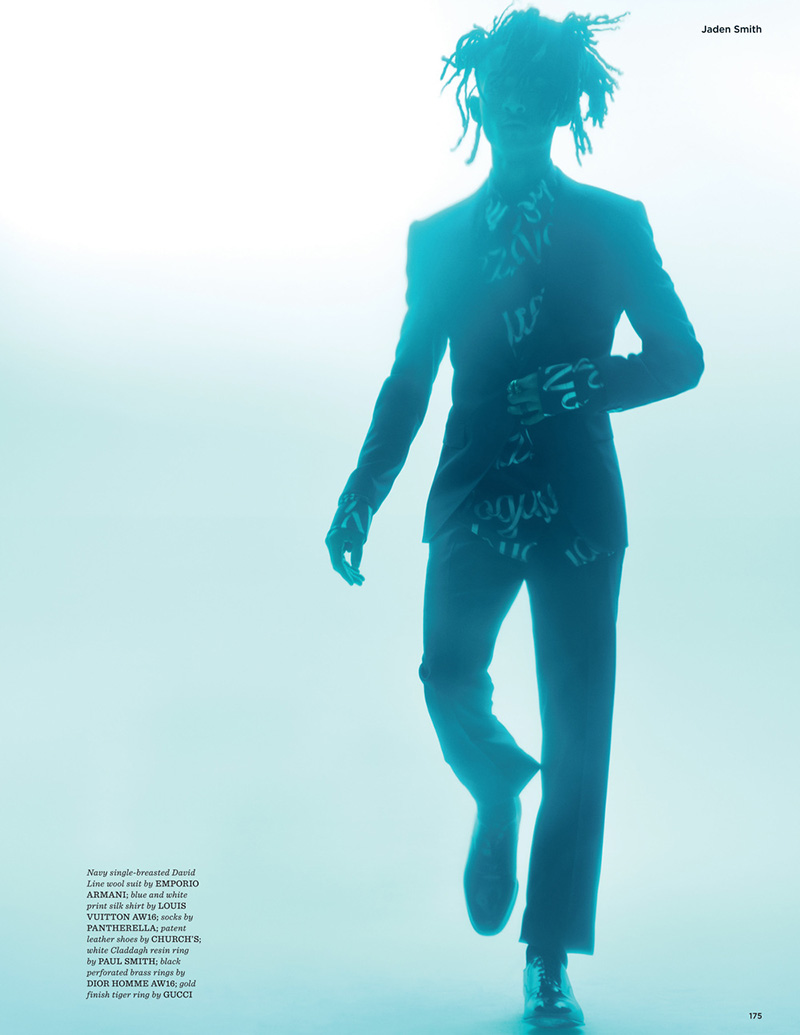
Jaden Smith in a contextual photograph: blue-toned GQ Style editorial silhouette and visual context; contextual only, not tattoo evidence; not tattoo evidence

The second editorial portrait reduces Smith to a blue-toned silhouette. It shows the fashion mood of that period, not a close view of his ink. The ERYS marks, film scenes and One World lettering each come from a different reference.

If you’re developing a design of your own, start with the part of a film, project or phrase that matters to you. Then find an artist whose work fits the style: fine lettering and black-and-grey realism call for different approaches.

What to borrow from Jaden’s approach

Smith’s tattoo references don’t follow one style. The common thread is that each starts with something specific, whether a film scene, a phrase or an album’s visual world. You don’t need to copy the exact image or wording.

Choose the idea first, then work with the artist on scale, placement and detail. And with ERYS-era photos, keep in mind that some face and torso marks were made for the videos rather than confirmed as permanent tattoos.

More musician tattoo guides

Noma Han Tattoos: Kate Moss, Blackwork and the Model-Tattooist’s Collection

Noma Han trained as a tattoo artist in New York while building a career as a model. W Magazine described him as a South Korean model who also worked at Black Fish Tattoo in Koreatown, and reported that he had more than 50 tattoos in his twenties. His collection moves between portraits, pop-culture references, blackwork, lettering and a large Buddhist figure.

“If it’s cool in their eyes, then it’s cool.” The line fits a body of work shaped by different interests instead of one matching plan.

The Kate Moss portrait tattoo

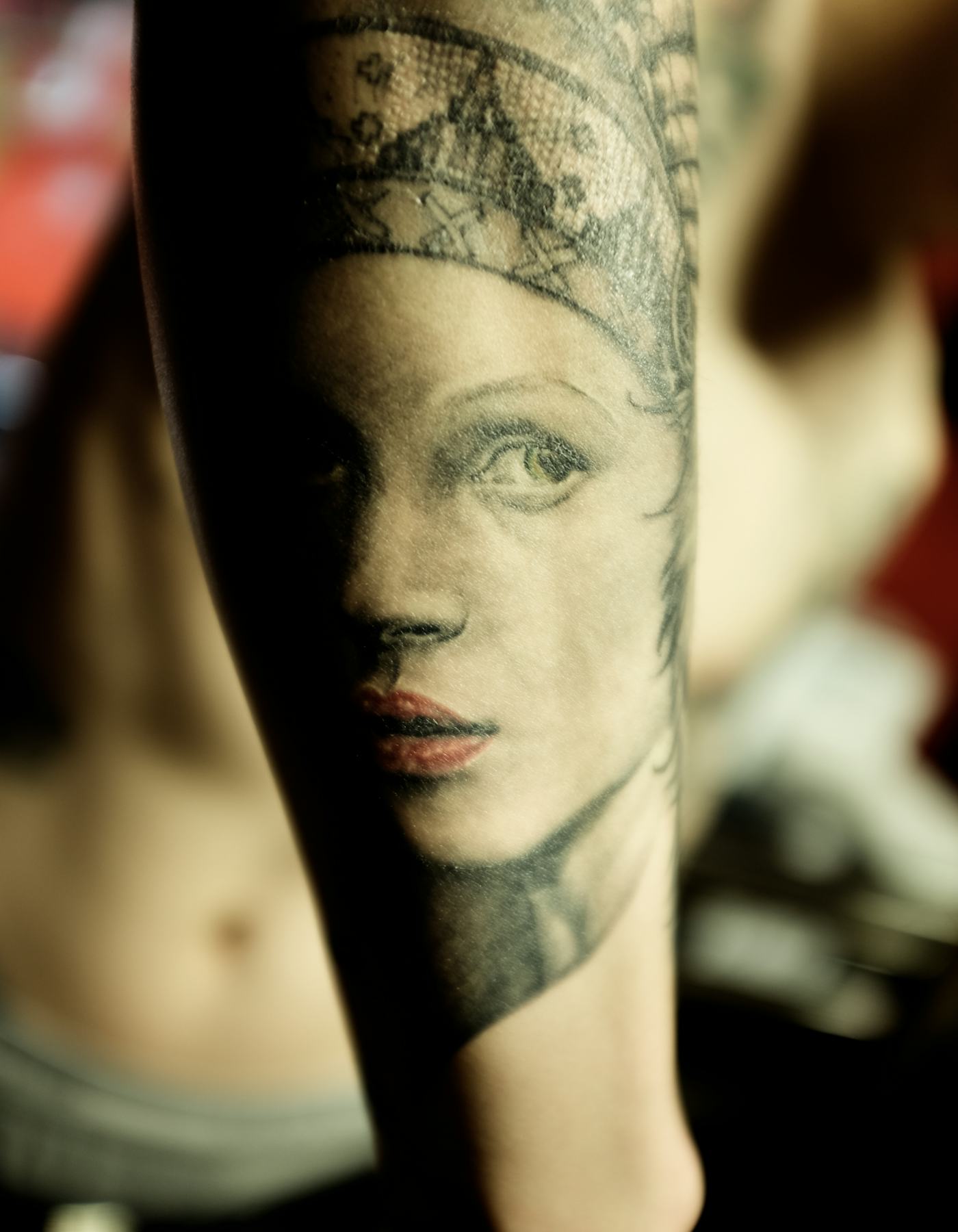
Noma Han tattoos: Kate Moss portrait tattoo close-up

Vogue has described Han’s Kate Moss portrait on his forearm. In the close-up, the face is cropped tightly and softened by warm light, more like an old photograph than glossy colour realism.

The expression remains easy to read among the other marks on his arm. For a portrait reference, bring a clear photograph and let the artist adapt the crop to the curve of the forearm instead of forcing a rectangle onto it.

Why Noma Han’s sleeves feel collected, not planned

Noma Han tattoos: Close tattoo detail from Noma Han's mixed forearm and sleeve work

This editorial image isn’t a close record of a particular tattoo; the sleeve is only visible at the edge of the frame. It does show how Han’s ink can sit within a simple look without taking over the photograph.

His collection mixes portraits and playful characters with fine lines and heavier blackwork. The pieces don’t all share one size or finish, and the open skin between them keeps the arm from reading as one solid block. A sleeve can grow gradually; there’s no need to fill every gap at once.

The Buddhist figure on his back

Noma Han tattoos: Buddhist figure and surrounding back tattoo detail

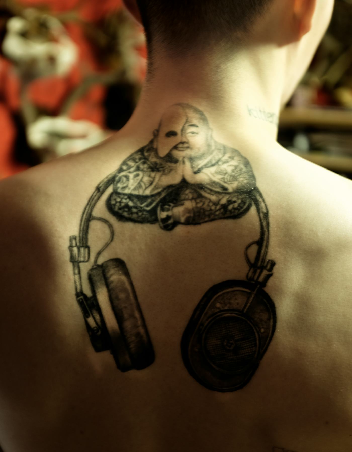
A W Magazine photograph shows a large seated Buddhist figure on Han’s upper back, surrounded by black-and-grey linework and a rounded element lower down. The composition is dense, but the central figure stays clear.

The scale gives the artist room to build around that subject. Before settling a back piece, check how it sits as the shoulders move and where its edges meet the spine and shoulder blades.

The mixed sleeve: portraits, pop culture, and texture

Noma Han tattoos: Layered sleeve and neck tattoos shown during a tattoo session

The sleeve close-up puts a portrait, heavy outlines and graphic marks beside one another. W Magazine has also noted Banksy and Totoro references on the same arm as the Kate Moss portrait.

The subjects differ, but black ink, soft grey shading and a slightly rough treatment give them common ground. A collection can feel connected through a repeated line or texture without making every tattoo match.

The work behind the look

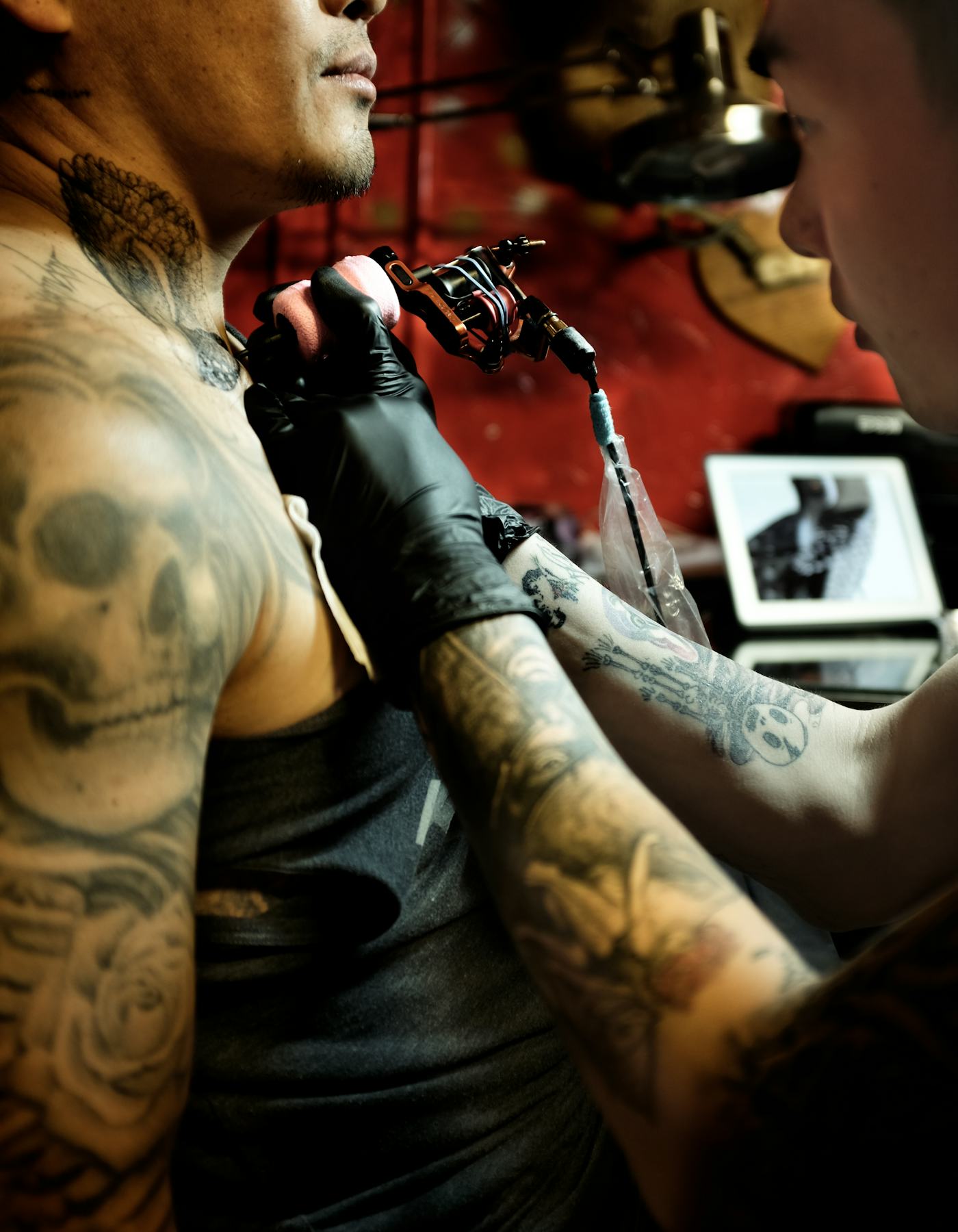
Another W Magazine photograph catches Han tattooing: machine and gloves in the foreground, with a client in the chair. It shows him at work rather than presenting a finished sleeve.

Working as an artist gives him a close view of how lines wrap around moving skin and where contrast gets lost. His own collection also looks like a record of that curiosity: portraits, symbols and experiments chosen at different times. A tattoo that feels rougher than expected can still hold a memory of why you chose it.

Modeling and the same visual instinct

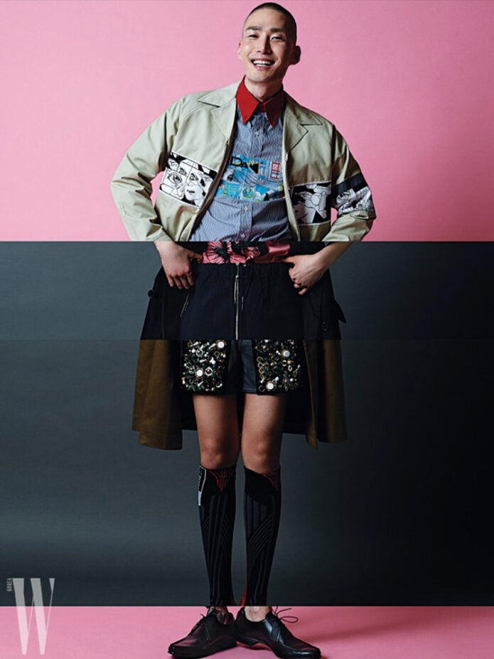
Noma Han in a contextual photograph: Editorial portrait used for Noma Han's modeling and visual style context; not tattoo evidence

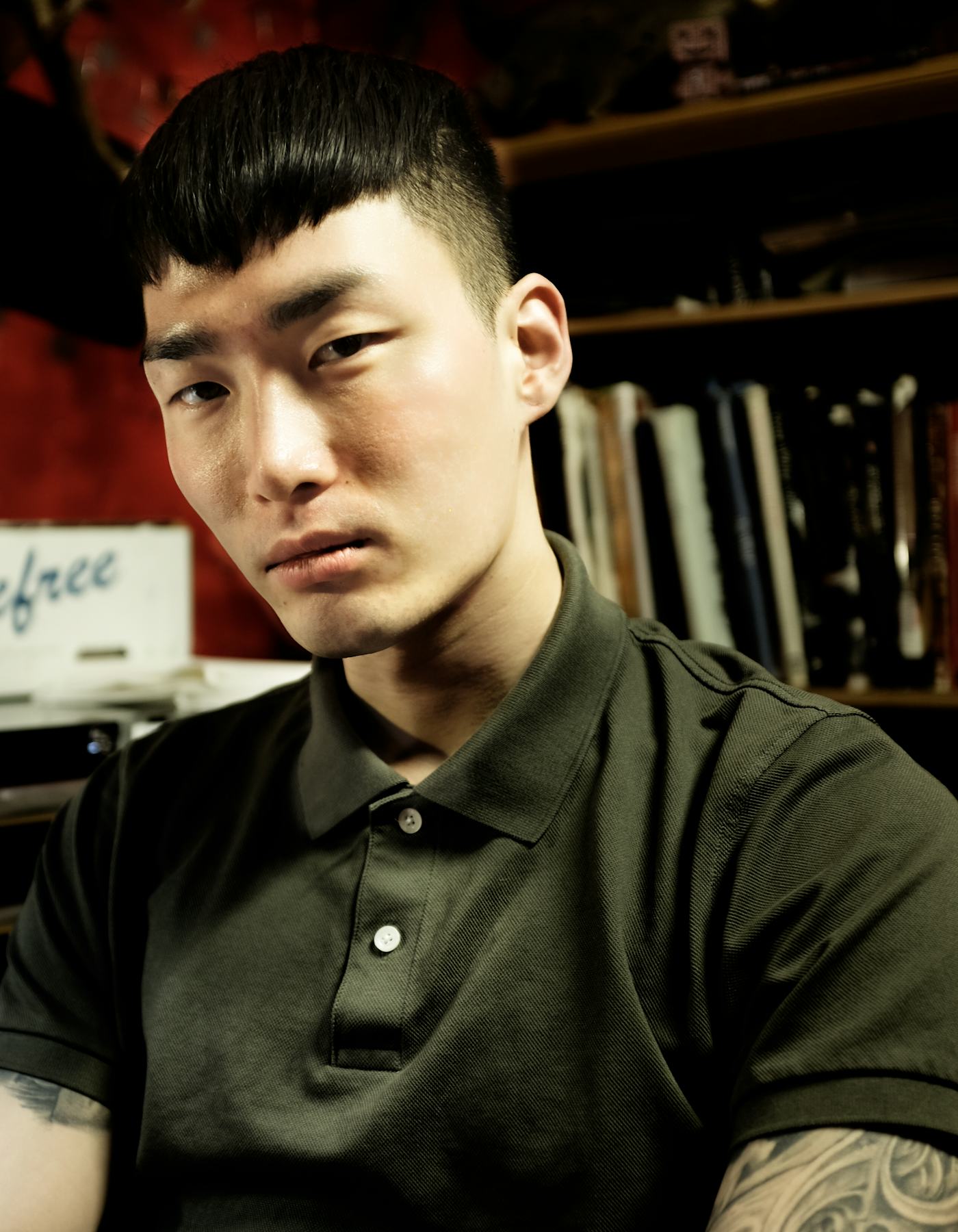
Modeling and tattooing both depend on how the body moves. A portrait on the forearm changes the silhouette; a back piece can affect how a jacket sits. The editorial photo here offers style context, not close evidence of a tattoo.

Visibility and contrast are worth considering before an appointment. A large black design reads differently beside a pale shirt than fine lettering does, while a hand tattoo will be more exposed than one on the thigh. Those effects can help with placement, even if they don’t decide the subject.

What to borrow from Noma Han’s approach

Han’s collection draws on fashion, art, pop culture and tattoo craft without forcing them into one style. Start with the image or phrase you keep returning to, then find an artist who works well in that medium. A portrait, a character silhouette and fine lettering call for different skills.

You can let the rest of a sleeve develop over time. If you want more examples, browse our celebrity tattoo archive and notice the choices behind each piece: scale, line weight, placement and open skin.

More model tattoo guides

Billy Strings Tattoos: Bold Traditional Ink, Song References and a Moving Canvas

Billy Strings has described his body as a canvas and his tattoos as references to songs. The collection mixes traditional flash, large colour work and smaller designs; much of it comes into view when he rolls up a sleeve or takes off a shirt.

In an older interview, he named a cowgirl and John Henry’s nine-pound hammer, and said he might put a banjo on his knee. Not every piece needs a tidy backstory, but those examples show how naturally music and images meet in his tattoo choices.

Billy Strings’ tattoos are a moving songbook

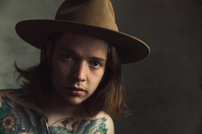
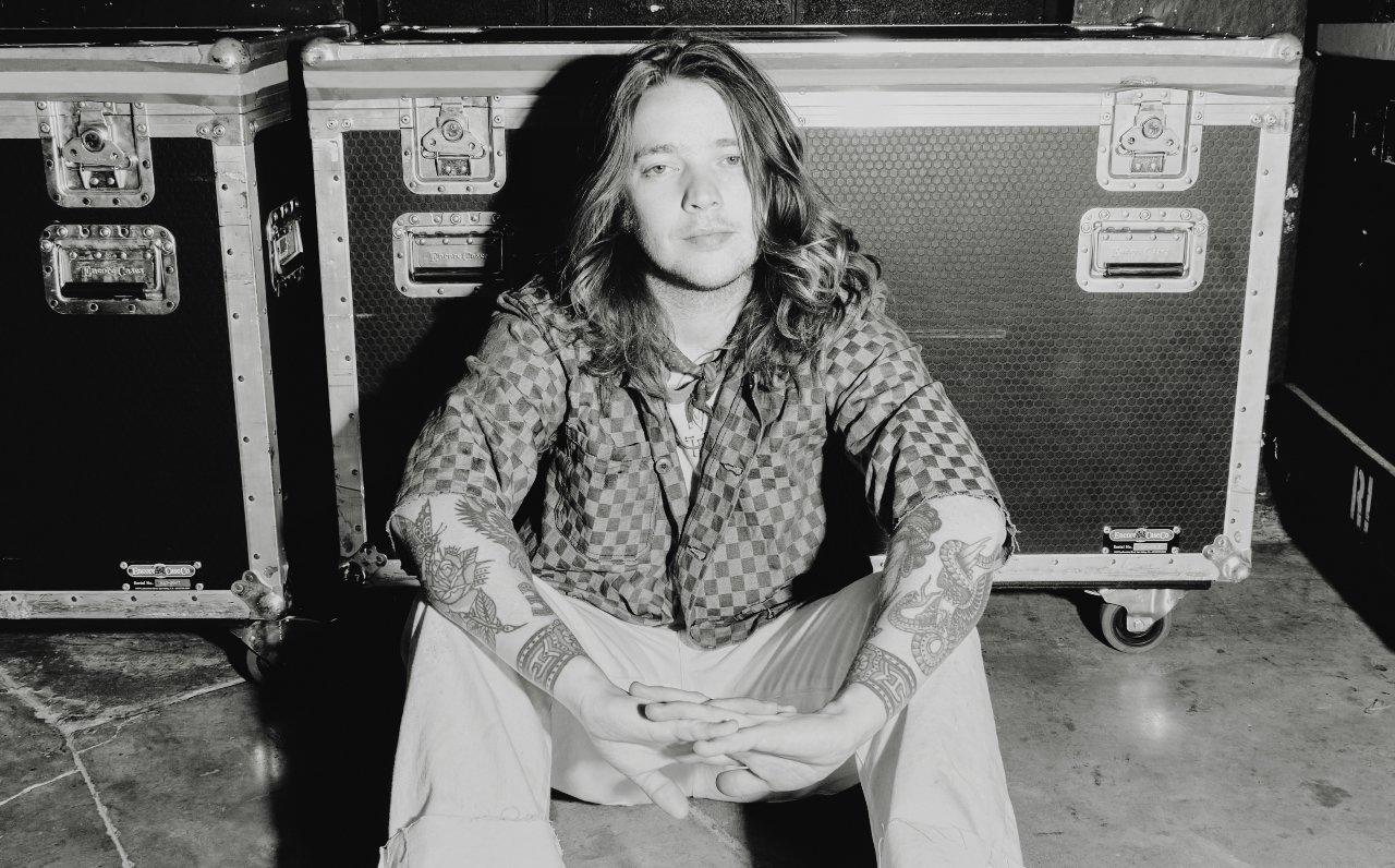
Billy Strings tattoos: inline

Strings has said his tattoos connect to songs. The cowgirl and John Henry references make that link concrete, while the possible banjo piece was an idea he mentioned rather than a tattoo he confirmed.

The rest of the collection moves between bright traditional work, black linework and small flash designs. It doesn’t read like one coordinated sleeve.

The chest tattoos bring the whole collection together

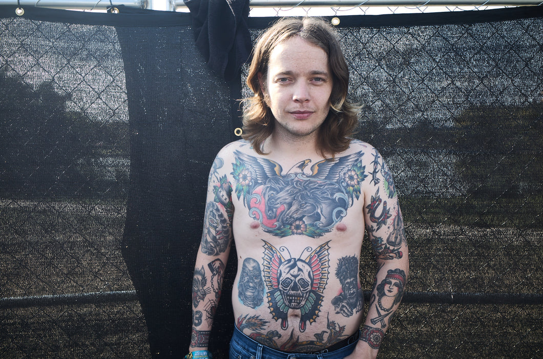
Billy Strings tattoos: inline

Across the chest, wings, flowers, birds and ornamental shapes form a broad composition. From a distance, the large areas read together; closer up, separate figures and pockets of colour come into view.

Bold outlines and solid colour give the traditional imagery weight, while the looser arrangement keeps it from looking like one symmetrical panel.

The winged skull on his stomach is the loudest piece

Billy Strings tattoos: inline

A large skull with wings and a colourful frame sits lower on the torso. Its strong silhouette makes it the first thing many people notice, and the wings spread the design across the body instead of leaving a hard-edged block.

It’s a louder piece than the smaller references on his arms, but that contrast is part of how the designs share space.

His arms look like a collection of old-school flash sheets

Billy Strings tattoos: inline

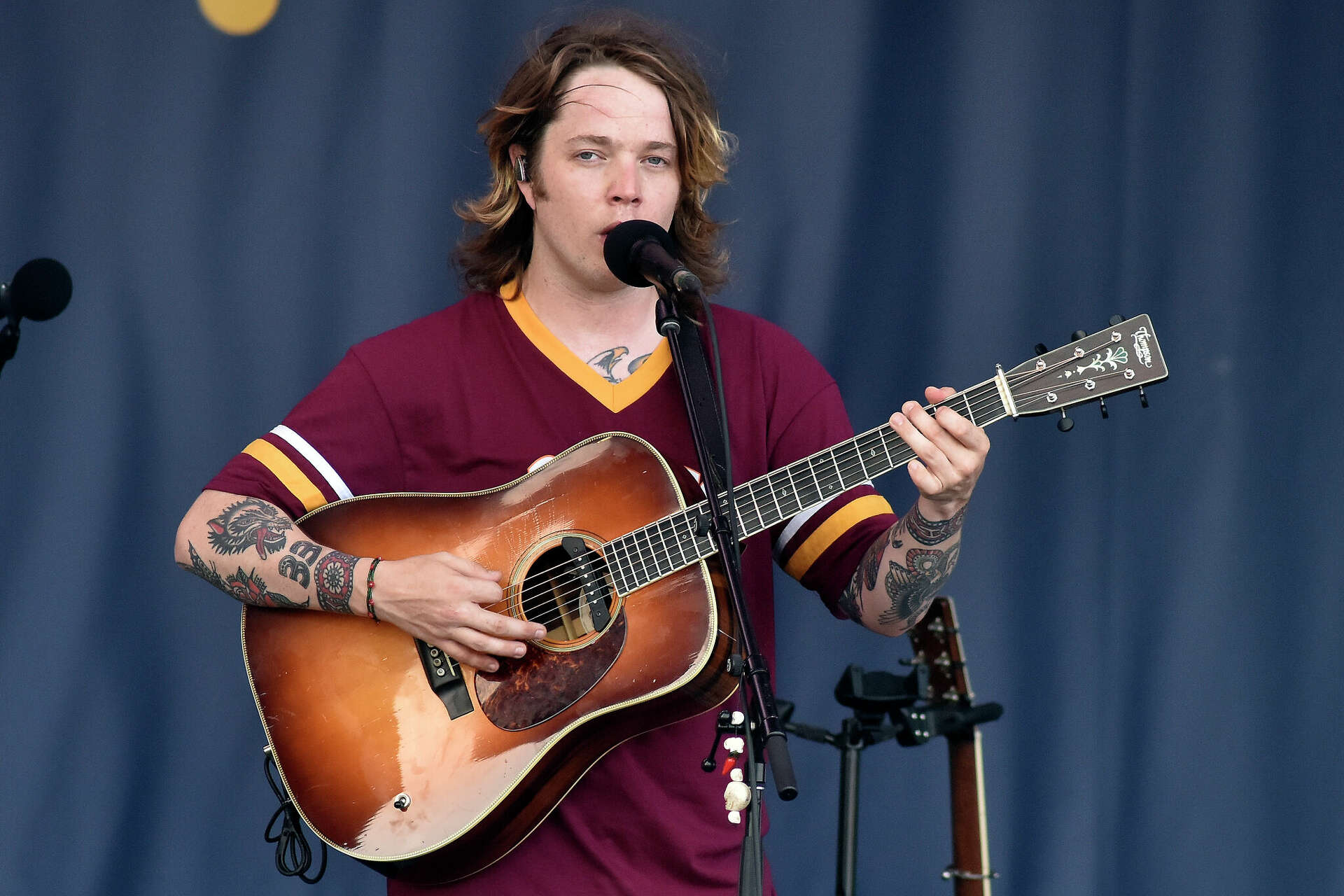
Strings’ arms bring together portraits, flowers, animals, small symbols and patterned bands. Some are bright, old-school designs; others use darker ink and flatter shapes. The pieces differ in colour and line weight, with enough open skin to keep each image distinct.

The forearms show how a sleeve can grow from separate choices. The designs don’t need to match if their placement leaves each one room to read.

The wrist bands add a bit of structure

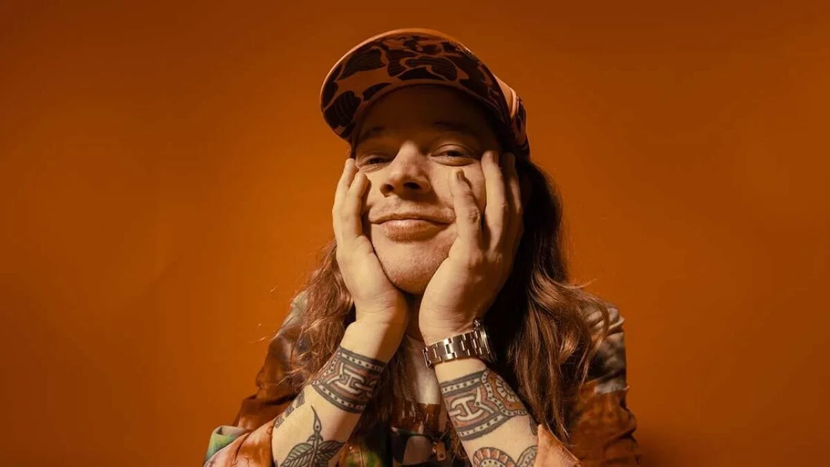
Billy Strings tattoos: inline

The bands around Strings’ wrists work like cuffs, marking a break between his hands and the denser forearm tattoos. They’re easy to spot when he holds a guitar or brings his hands near his face.

A geometric band has to wrap cleanly around a moving joint. Strong contrast helps the lines stay clear in photos and onstage, and the bands give the surrounding flash a little structure.

The forearm pieces are full of little details

Billy Strings tattoos: inline

Close photos reveal compact lettering and traditional motifs tucked beside larger arm pieces. Stage shots show how heavily tattooed he is, but they don’t capture those smaller details.

Some designs appear to have been chosen for the image itself rather than to fit a fixed visual theme. Adding pieces over time leaves room for that kind of choice.

What the visual style gets right

The collection holds together through contrast: broad chest and stomach pieces sit beside smaller flash, and brighter colour breaks up the darker work. It isn’t polished into a single palette or a perfectly balanced layout.

Ideas to borrow without copying the whole sleeve

If you want a song reference, an object or figure can carry the idea without spelling out a lyric. You can also start with one larger chest or shoulder piece, then add smaller designs later. A limited set of bright colours can stand out without filling every open space.

The bottom line on the collection

Strings’ tattoos read like a collection that grew over time: some pieces point back to songs, while others stand on their shapes and colour. That leaves each design room to work on its own, even when the styles differ.

Watch Billy Strings in action:

More musician tattoo guides

Elliot Page Tattoos: The Personal Meaning Behind His Ink

Elliot Page’s tattoos are mostly small pieces of lettering and symbols tied to people, films and specific memories. Some only show in the right photograph, so the collection can be easy to miss. Page has described having nine tattoos, most connected to people in their life; earlier coverage counted eight.

EP PHONE HOME: Elliot Page’s E.T. tattoo

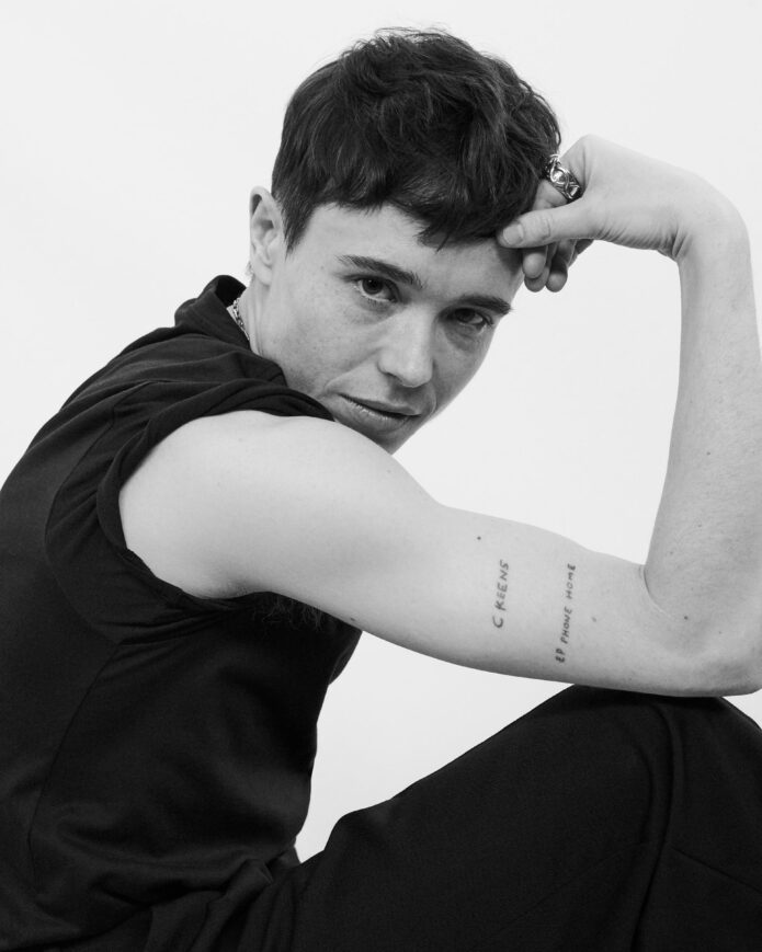
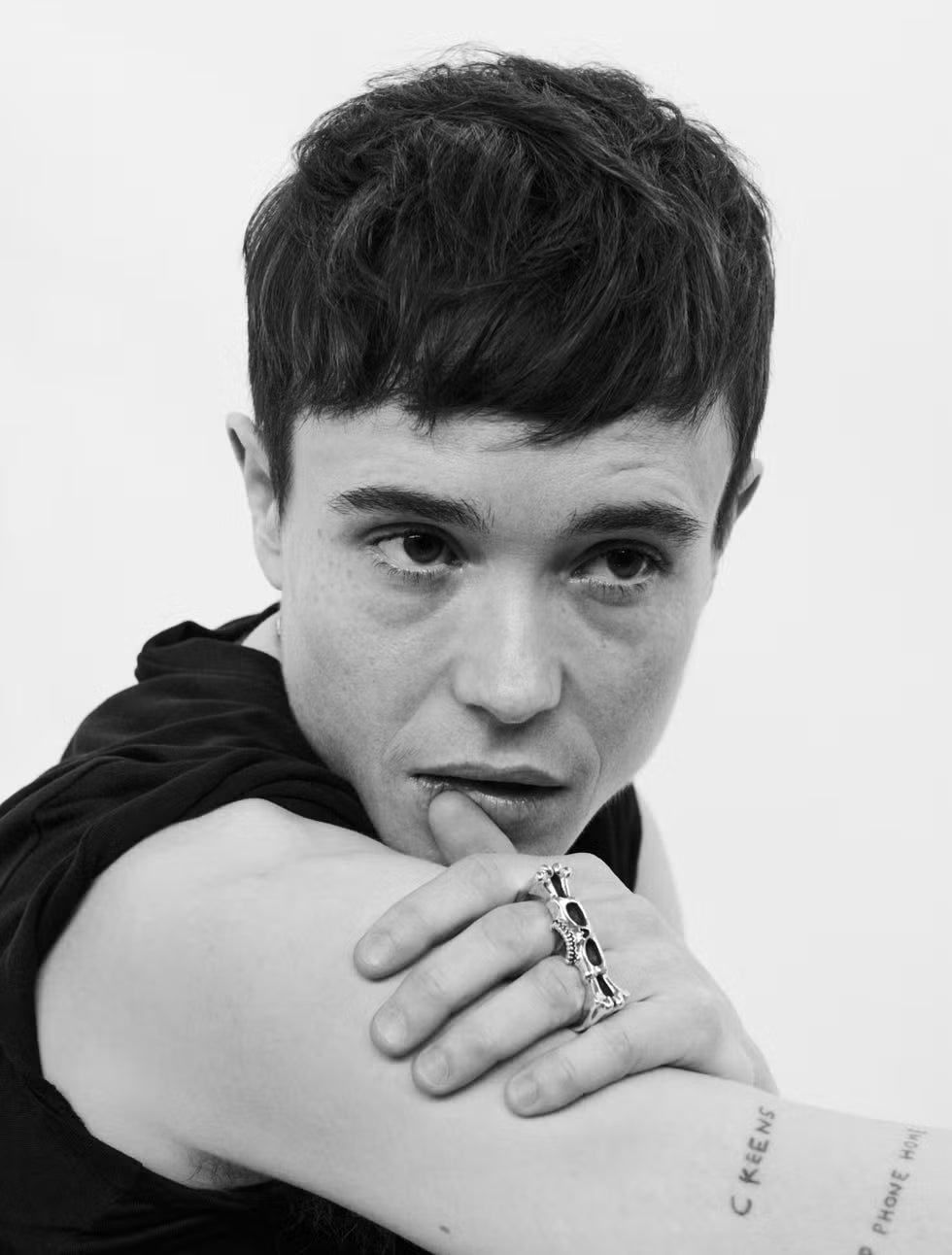
Elliot Page tattoos: Black-and-white portrait with EP PHONE HOME and C KEENS visible on the arm

The best-known design is EP PHONE HOME, Page’s twist on the line from E.T. the Extra-Terrestrial. Page has said they loved the film as a child and wanted to look like the boys in the movies. The character Elliott also helped inspire their name, so the phrase connects the film to something more personal.

Page wrote about the tattoo in Pageboy. They recalled staying in a motel after filming Whip It and finding E.T. on television. The plain lettering leaves the reference to do the work; there’s no extra image or frame around it.

C KEENS: a tattoo for Catherine Keener

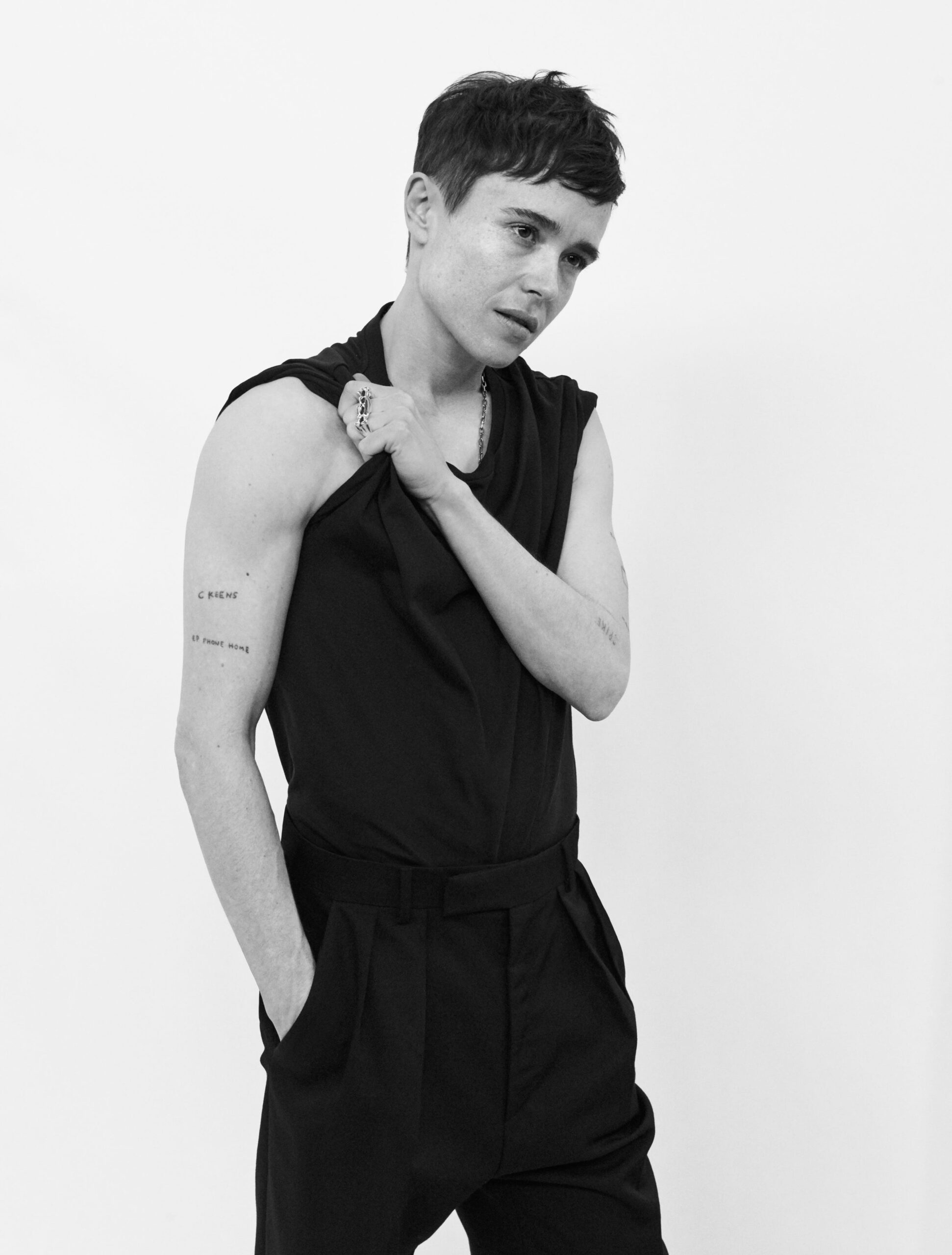
Elliot Page tattoos: Full studio portrait with C KEENS and EP PHONE HOME visible on the right arm

The small C KEENS lettering beneath Page’s right shoulder is a nickname for actor Catherine Keener. Page has called it their first tattoo and said they met Keener at nineteen. They’ve described her as a close, grounding friend.

During the years when Juno brought intense attention, Page faced pressure around clothes, public appearances and other expectations. They’ve credited Keener with helping them stay grounded, live honestly and take care of themself. The short nickname keeps that friendship close without spelling out the whole story.

WIIG: the Kristen Wiig friendship tattoo

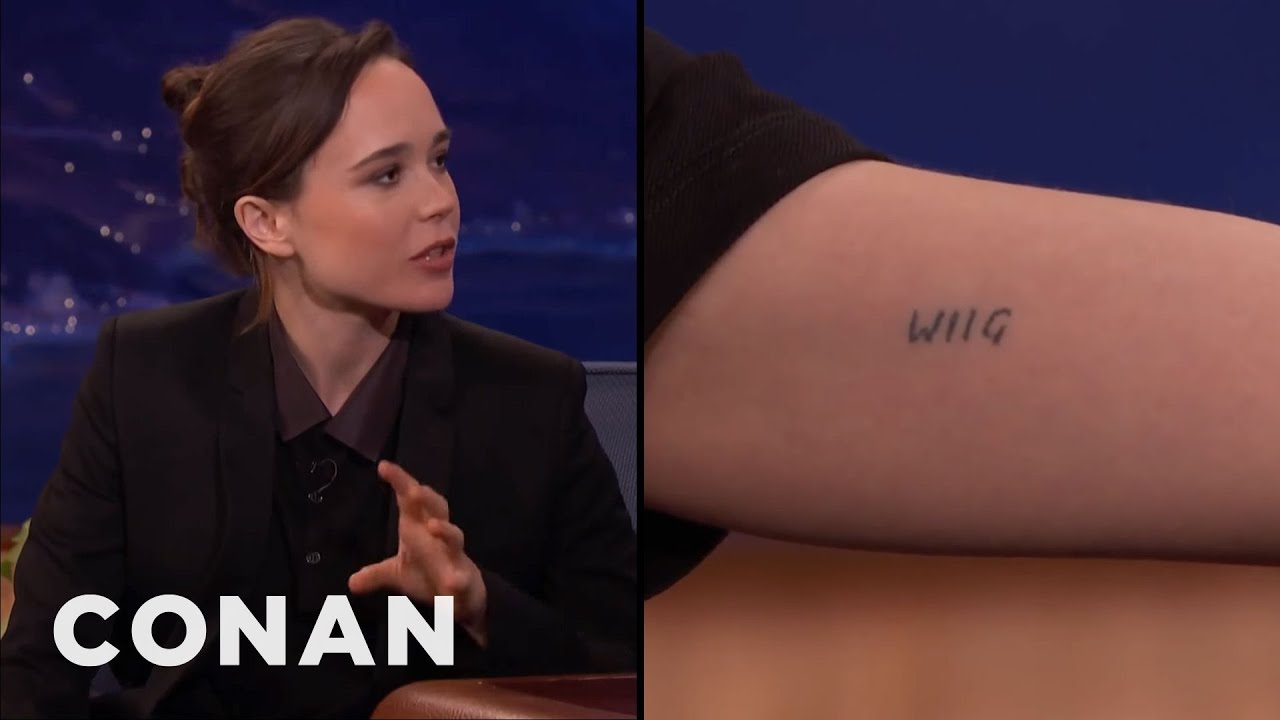
Elliot Page tattoos: Video still showing the WIIG tattoo in close-up

WIIG is Page’s nod to Kristen Wiig. Page showed it during an appearance on Conan, while talking about their friendship and the strange permanence of putting someone else’s name on an arm.

It’s a blunt little word, which suits the affectionate, in-joke quality Page has described. Alongside the other names and initials, it points to people who mattered at a particular time without trying to turn each relationship into a grand symbol.

The coffee cup tattoo shared with Mae Martin

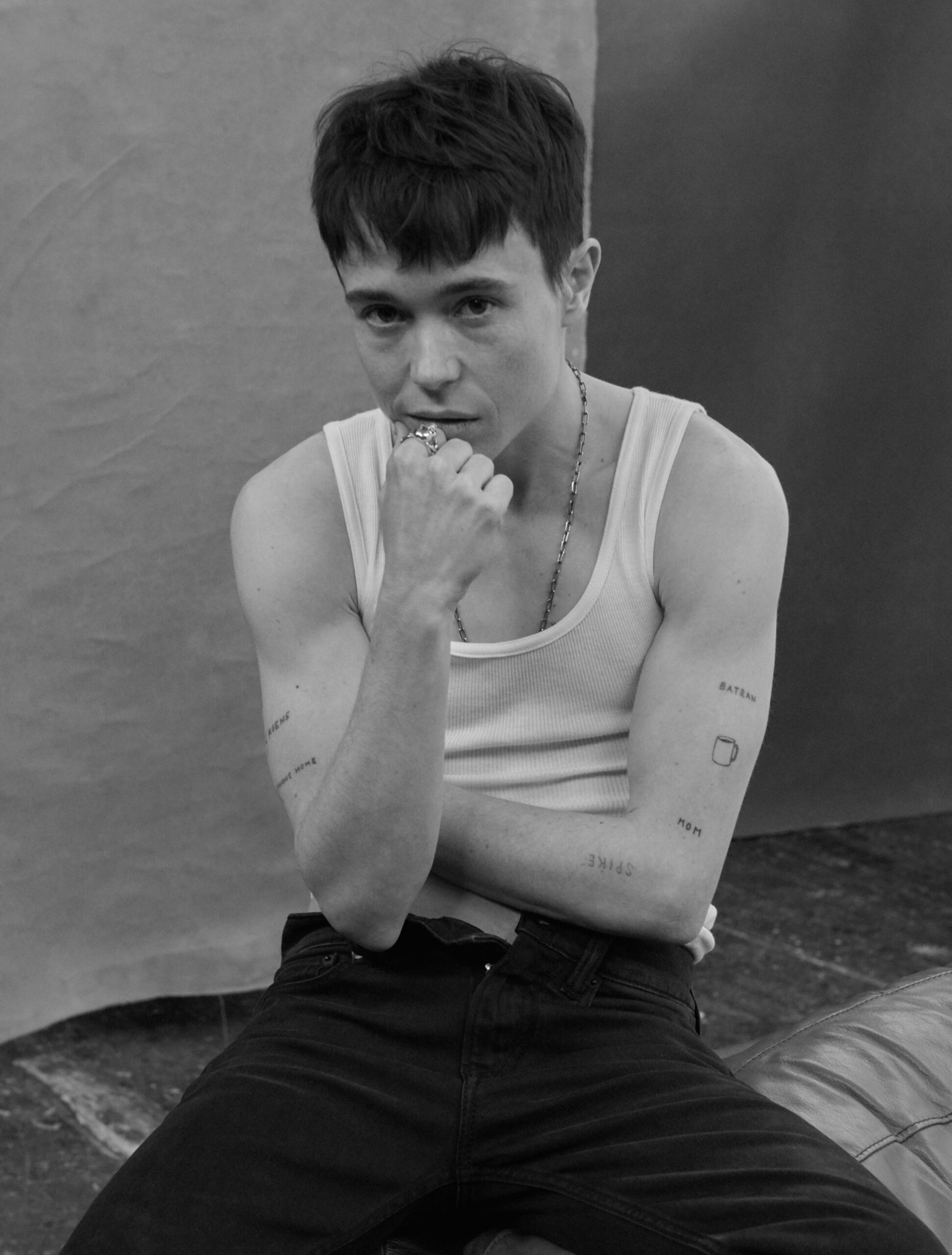
Elliot Page tattoos: Seated studio portrait with the small coffee cup visible on the arm

Page and Mae Martin have matching coffee cup tattoos. Andrew White tattooed them at Midway Tattoo and Piercing in Toronto; Page’s cup is on the right arm. The small design is quieter than the block lettering elsewhere in the collection, but it still marks a shared reference between friends.

Friends’ initials, nicknames, and the word “turtles”

Page has said that other pieces use friends’ initials, nicknames or middle names. They’ve described these tattoos as reminders of people who helped them through periods when getting by felt uncertain. One of the more casual choices is the word turtles: Page has said they love turtles and called the tattoo random.

There are also references connected to Spike Jonze and small marks that are hard to read in available photographs. Rather than guessing at blurred lettering, it’s safer to stick to designs Page has discussed and details that are clear in the images.

MR and YOURS: newer pieces with a softer feel

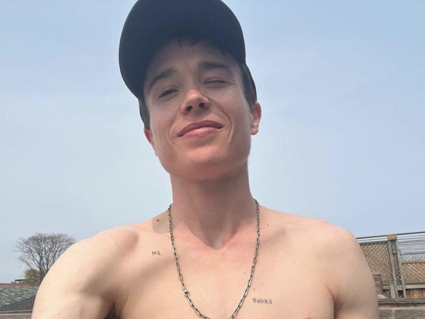
Elliot Page tattoos: Casual portrait with MR and YOURS chest tattoos clearly visible

Later photos show chest lettering that reads MR and YOURS. Page hasn’t publicly explained every small tattoo, so the words should be described without assigning them a specific story. They could have a private meaning, but the article doesn’t establish one.

The chest pieces also appear in different settings from the arm tattoos: they tend to be visible in more relaxed portraits, while the arm lettering often turns up in interviews and public photos.

Why Elliot Page’s tattoos stand out

The collection brings together film references, friends’ names, a shared coffee cup and a turtle tattoo Page chose simply because they like turtles. The designs are small and often plain, but the stories behind several of them are specific: E.T., Catherine Keener, Kristen Wiig and Mae Martin each have a clear place in the account.

For tattoo ideas, Page’s collection is a reminder to start with the connection behind a design, not just its font or placement. You can find more examples in the Celebrity Tattoo Design archive, but the meanings of Page’s smaller pieces aren’t all public, and it’s best to leave those details open.

More actor tattoo guides

Karan Kundrra Tattoos: The Tejasswi Prakash Portrait Explained

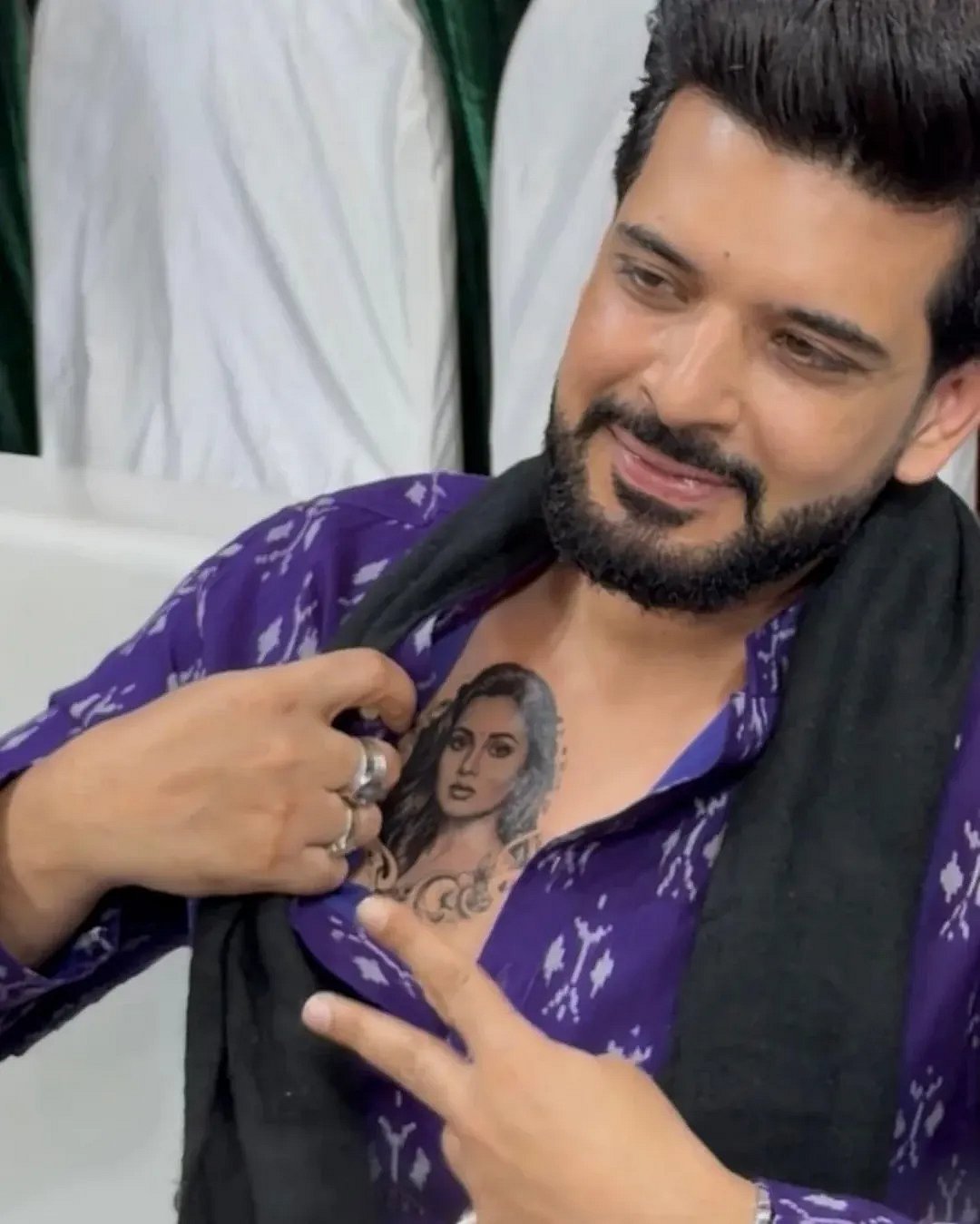
At a Ramzan event in Mumbai in February 2026, Karan Kundrra revealed a portrait of Tejasswi Prakash across his chest.

Karan Kundrra’s Tejasswi Prakash portrait tattoo

Karan Kundrra tattoos: Genuine tattoo photograph showing Karan opening his shirt and pointing to the chest portrait.

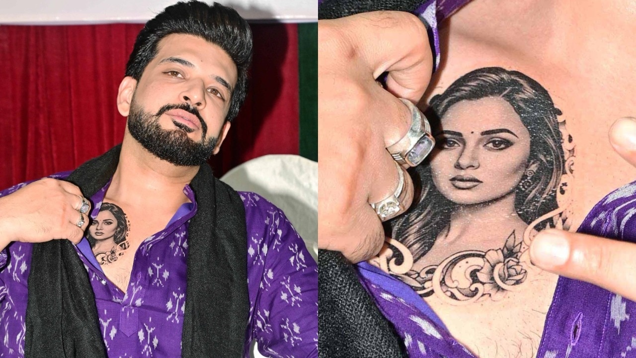
The portrait sits high on Karan’s chest, close to the heart. Tejasswi’s dark hair and defined eyes carry most of the contrast. Soft shading and the ornamental curls below her face spread the design across the chest. It is large enough for the features to read from a distance.

What the chest portrait actually looks like

Karan Kundrra tattoos: Genuine tattoo photograph showing both the wider placement and a closer crop of the portrait.

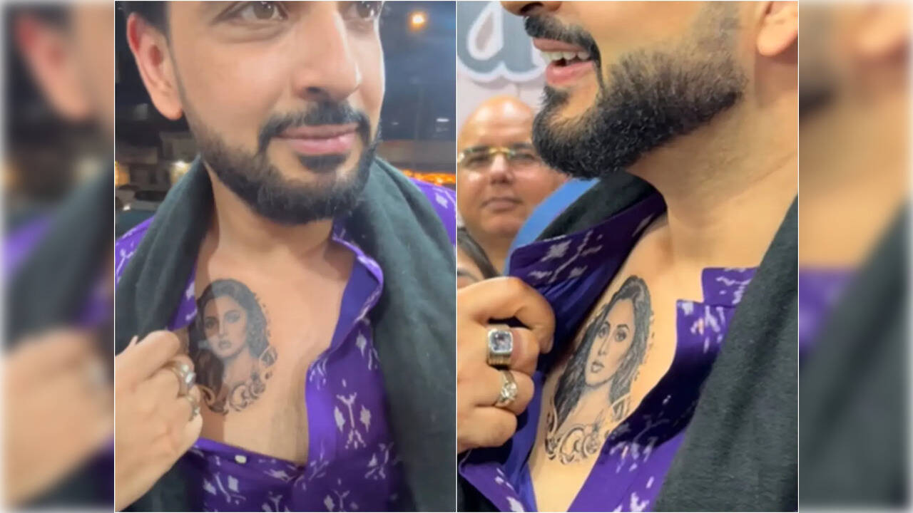
India Today’s event photos pair a waist-up view with a closer crop. The wider shot shows the portrait’s scale and placement; the close view catches the linework and shading. Event lighting, posture and fabric affect what the camera catches. These photos record the reveal, not a clean studio reference.

Why the tattoo caused so much debate

Karan Kundrra tattoos: Genuine tattoo photograph with two closer event views of the portrait.

Early coverage called it a tattoo but did not say whether it was permanent or connected to a promotion. The photos showed the portrait, but not why he was wearing it.

Karan later said it was temporary promotional ink for Tejasswi’s OTT series Psycho Saiyaan, whose character has a tattoo. It was made to promote the show, so the photos should not be read as evidence of a permanent piece.

Who is Karan Kundrra?

Karan Kundrra in a contextual photograph: Contextual portrait for the biography section; explicitly not tattoo evidence.; not tattoo evidence

Karan Kundrra is an Indian television actor and host. His credits include Kitani Mohabbat Hai, reality and dating shows, and work across MTV and Hindi television.

Karan and Tejasswi’s public love story

Karan Kundrra in a contextual photograph: Contextual red-carpet portrait for relationship and public-image context; explicitly not tattoo evidence.; not tattoo evidence

Fans have followed Karan and Tejasswi’s relationship since the two met on Bigg Boss 15, so the portrait could read as a public romantic gesture.

If you’re choosing a partner tattoo, decide whether you want a public declaration or something only the two of you know. A small, private symbol can carry as much meaning as a portrait.

Can you borrow the look?

If you like the layout, borrow its main choices: chest-high placement, strong black-and-grey contrast and ornamental framing. Bring clear reference photos to an experienced portrait artist, and choose a size that leaves room for the features.

Ask how the image may heal and age, and how chest movement could affect it. Temporary ink can help test the scale, but it won’t show exactly how a permanent piece will look on your skin.

The bottom line

Karan’s portrait was temporary promotional ink, but the event photos remain a reference for chest placement and framing.

More actor tattoo guides

Eugenio Franceschini Tattoos: The Shakespeare Quote Explained

Eugenio Franceschini got his Shakespeare tattoo at 17, after a night at Budapest’s Sziget Festival that ended with rain, flooding and a disrupted Metallica set. The lettering isn’t perfect. He has said so himself, and he still likes it because it takes him back to that morning.

Across his left trapezius, it reads a line from The Tempest: “We are such stuff as dreams are made on.” Italian reports give the wording as “Siamo fatti della stessa sostanza dei sogni.”

The story is about a decision made in the moment, and why he has kept the result as it was.

Eugenio Franceschini’s Shakespeare Tattoo

Eugenio Franceschini tattoos: Genuine tattoo photograph showing Eugenio’s upper-back tattoo; not a contextual fallback.

The photograph shows a small black line design on Franceschini’s upper back; reporting identifies it as the quote he has described in interviews. It sits on the left trapezius, where the shoulder slopes into the back.

He has said the words come from Prospero’s speech in The Tempest, his favourite Shakespeare play. The line is often translated as “We are such stuff as dreams are made on,” though versions vary. Franceschini’s own tattoo uses Italian lettering.

There’s no frame or extra imagery around the words. The design stays simple and lets the quote carry the meaning.

A Strange Morning in Budapest

Eugenio Franceschini in a contextual photograph: Contextual editorial portrait for the tattoo backstory; explicitly not tattoo evidence.; not tattoo evidence

Franceschini told Rolling Stone Italia he went to Sziget to see Metallica. Heavy rain and flooding on Óbuda Island disrupted the festival. When the generators stopped, people began making music and dancing in the rain.

The next morning, on his way back to his tent, he got the tattoo. There was no long search for a font or careful design plan. Franceschini has said the lettering wasn’t executed particularly well, and that the uneven result is part of what makes it his.

The story can inspire a spontaneous idea without requiring a rushed appointment. Take time to check the words, artist and placement before making the memory permanent.

A Closer Look

Eugenio Franceschini in a contextual photograph: Contextual press portrait for placement discussion; explicitly not tattoo evidence.; not tattoo evidence

The black-and-white Vogue Italia portraits are editorial images, not close-up evidence of the tattoo. They show Franceschini in tailored clothing and help place the mark near the shoulder line, though the lettering itself isn’t clear.

The trapezius slopes between the neck, shoulder and back, so text there needs to follow the body rather than sit as a straight line. Franceschini’s left-side placement also keeps the quote away from the centre of his back.

The spot is easy to cover under a shirt. If you want lettering that appears in some photos but stays hidden day to day, ask the artist to test it at its actual size and on a body-shaped stencil.

When the Finish Isn’t Perfect

Eugenio Franceschini in a contextual photograph: Contextual editorial portrait for design and career context; explicitly not tattoo evidence.; not tattoo evidence

Franceschini’s account isn’t an argument for careless work. He likes the tattoo despite its uneven execution because it is tied to a night he remembers. A tattooer can still make lettering readable and help it age well.

Small text needs enough space and careful placement. If you’re choosing a line in another language, ask a fluent speaker to check it; Shakespeare translations and editions can differ.

Meaning and craft can both matter. You can keep the personal story while giving the artist time to make the design clear.

Who Is Eugenio Franceschini?

Eugenio Franceschini in a contextual photograph: Contextual face-visible portrait for biography context; explicitly not tattoo evidence.; not tattoo evidence

Eugenio Franceschini is an actor from Verona. His parents worked as performers and puppeteers, and he spent much of his childhood travelling with their company. He later moved to Rome to study at the Centro Sperimentale di Cinematografia.

His work includes Italian film, television and theatre, including I Medici, Sconnessi and Io che amo solo te. He became better known internationally as Marcello in Emily in Paris. The tattoo dates to his teens, years before the role.

Finding Your Own Reference

If you’re considering a quote tattoo, start with a line that means something to you, not one you chose only because a celebrity has it. Read it at the size you have in mind and decide where the line breaks should go.

Ask the artist to fit the lettering to the part of the body. The trapezius slopes, ribs move with each breath and forearms turn; a layout that looks balanced on a screen may shift on skin.

Franceschini’s story began at a concert, but your reason doesn’t need to be dramatic. Choose a moment or idea you’ll still want to carry years from now.

The Bottom Line

Franceschini’s Shakespeare quote sits on his left trapezius. He got it at 17 after the rain-soaked Sziget night, and he has said the imperfect lettering is part of its story. The lasting point is the personal connection; the words and design still deserve careful checking.

If you want to see Franceschini discuss his work and background, the interview below adds context:

More actor tattoo guides

Jonathan Majors Tattoos: The Meaning Behind His Rebirth Neck Ink

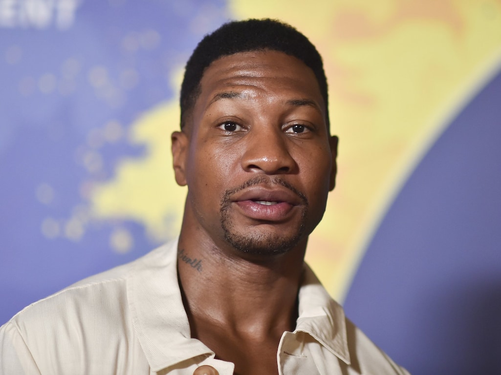
Jonathan Majors’ documented personal tattoo is a cursive word on the left side of his neck: Rebirth. He told Variety and Complex that he walked into a tattoo shop and asked for that word while talking about where he wanted his life to go.

It’s a small design with an exposed placement, and the word is open to interpretation. Majors hasn’t described it as a complicated code, so there’s no need to add extra symbolism to it.

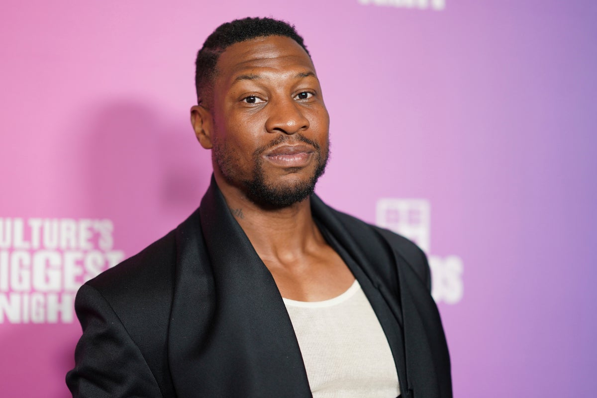
Photos from film roles and editorial shoots can show other tattoos, but they aren’t proof of Majors’ own ink. The clearest starting point is the neck piece he has discussed himself.

Jonathan Majors’ Rebirth Tattoo

Jonathan Majors tattoos: Genuine tattoo photograph showing the documented Rebirth neck tattoo; not a contextual fallback.

The tattoo sits on the left side of Majors’ neck, just below the jaw. In the clearest photographs, the dark cursive letters are loose rather than perfectly uniform.

Majors discussed the word around the release of Magazine Dreams. Variety described it as cursive lettering on his neck, while Complex connected it to the changes he was talking about at the time. That gives the tattoo a clear context without guessing at a more specific meaning.

“Rebirth” can mean different things to different people. For Majors, it’s the word he chose; its placement makes it visible, but the design stays simple.

The Context Around It

Jonathan Majors in a contextual photograph: Contextual formal portrait for biography and career background; explicitly not tattoo evidence.; not tattoo evidence

The tattoo became public during interviews around Magazine Dreams, when Majors was discussing accountability, personal change and continuing his work. That timing is part of the story, though a tattoo alone can’t prove that someone has changed. It can mark a point in time or a decision the wearer wants to remember.

The design doesn’t spell out what “Rebirth” means to him. That leaves room for a personal interpretation without turning the word into a claim about his life beyond what he has said.

A Clean Visual Choice

Jonathan Majors in a contextual photograph: Contextual fashion portrait for visual style discussion; explicitly not tattoo evidence.; not tattoo evidence

The script gives the word a handwritten look, without a frame or added symbols. Lettering still needs careful spacing and enough room to stay readable as skin changes over time.

The neck moves when a person speaks or turns, so an artist should check the stencil from more than one angle. A script that looks straight facing forward can shift when the head moves. The tattoo’s size keeps it within the curve of the neck while leaving the word visible in close photographs.

Character Styling vs. Personal History

Jonathan Majors in a contextual photograph: Contextual film still used to explain the difference between character styling and documented personal ink; explicitly not tattoo evidence.; not tattoo evidence

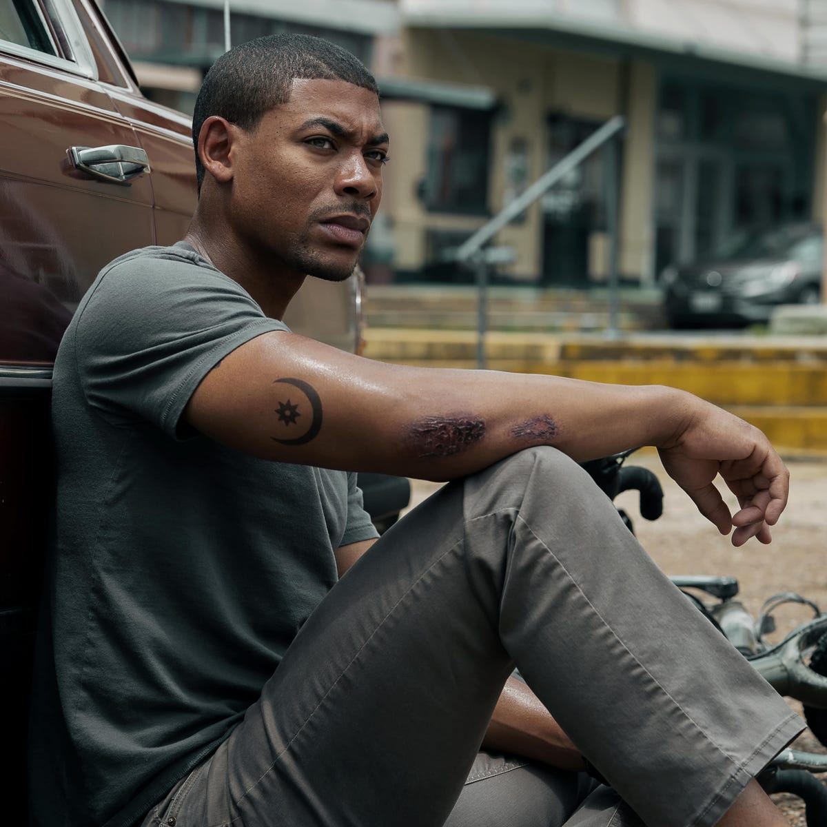
In Gully, Majors’ character wears a crescent-and-star tattoo on his forearm. It’s part of the role, not evidence of a personal tattoo.

Film, music video and editorial tattoos often get mistaken for an actor’s own designs. Unless there’s a direct statement or clear personal photo, they should be described as character or shoot styling. The Gully design can still inspire someone who likes celestial imagery; it just shouldn’t be attributed to Majors himself.

Here, the distinction is straightforward: he has discussed the Rebirth lettering, while the crescent and star belong to a character.

Choosing a Visible Spot

The side of the neck is exposed whenever a collar opens or the wearer turns, even when the tattoo is small. That visibility can be part of the appeal, but it also brings practical questions about work, family reactions and future plans.

The sides of the neck can be painful, and healing takes care around collars, sweat and constant movement. A reputable artist should explain the placement and aftercare before starting. Check the spelling and the stencil at the final size before the session; with a short cursive word, every letter matters.
An Idea With Room to Change

“Rebirth” can fit many different experiences, but that doesn’t make it a universal slogan. If you’re considering a word tattoo, choose language connected to your own life rather than copying a celebrity’s choice.

Write the word in a few styles and let an artist adapt it to your handwriting and the shape of the area. You can keep the simple, one-word approach while choosing a different word, font or placement.

Who Is Jonathan Majors?

Jonathan Majors in a contextual photograph: Contextual industry portrait for career and timing context; explicitly not tattoo evidence.; not tattoo evidence

Jonathan Majors is an American actor whose work includes The Last Black Man in San Francisco, Da 5 Bloods, Lovecraft Country, Creed III and Marvel’s Ant-Man and the Wasp: Quantumania. He also stars in Magazine Dreams, a drama about an isolated bodybuilder seeking recognition.

The Rebirth tattoo drew attention in interviews around the film. Majors has discussed the word, but its full personal meaning remains his to define.

A Visible Personal Choice

You can borrow the idea of a single word without taking Majors’ exact design. If a visible neck tattoo feels like too much, the upper arm, ribs, shoulder or chest can hold lettering with more room to keep it private.

Before committing, verify the spelling, ask how the design will age, and choose an artist with lettering experience. The goal is a word that stays legible and still feels like yours.

The Bottom Line

Majors has discussed one documented personal tattoo: the cursive word Rebirth on the left side of his neck. Other ink shown in films belongs to the characters unless he confirms otherwise. The short word and visible placement make a clear reference; its meaning is personal to him.

The interview below offers more context on the period when Majors spoke about rebuilding and starting over:

More actor tattoo guides

Winnie Harlow Tattoos: The Small Details Behind Her Ink

Winnie Harlow has a few small tattoos that can be easy to miss in photos. The clearest is a line of seven dots on the middle finger of her right hand. A name behind her ear has also been reported, though the available image doesn’t settle the details.

Her vitiligo is separate from tattoo ink. Keeping that distinction clear matters in photos where natural skin patterns and black ink appear together.

The seven dots on her middle finger

Winnie Harlow tattoos: Inline tattoo evidence

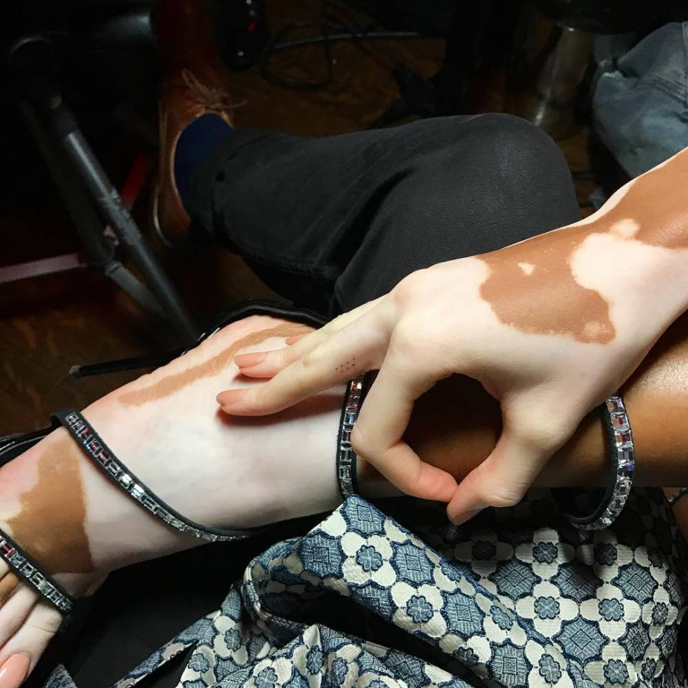
Seven small dots run down the middle finger of Harlow’s right hand. TattooFilter credits the design to Balazs Bercsenyi and describes it as minimalist and geometric. There’s no outline or added image; the spacing is the design.

Some profiles say the dots represent Harlow’s siblings. That explanation is often repeated, but without a direct statement from Harlow it’s better treated as reported, not confirmed. The dots themselves are visible; their private meaning is less certain.

Why the smallest details can work

A finger tattoo shows up when Harlow holds a phone or poses with her hand, then shifts as the finger bends. The seven marks are small enough not to dominate a photo, but close-ups make their spacing clear.

That placement calls for care. Tiny designs leave little room for uneven spacing, and finger tattoos can fade faster because the skin moves and gets frequent friction. Ask an artist how the dots may age before settling on the size.

A model whose skin is part of the picture

Winnie Harlow in a contextual photograph: Inline contextual photo; not tattoo evidence; not tattoo evidence

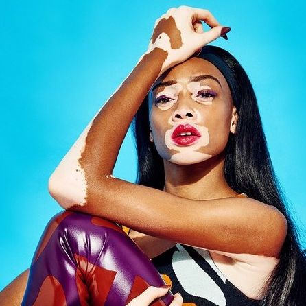
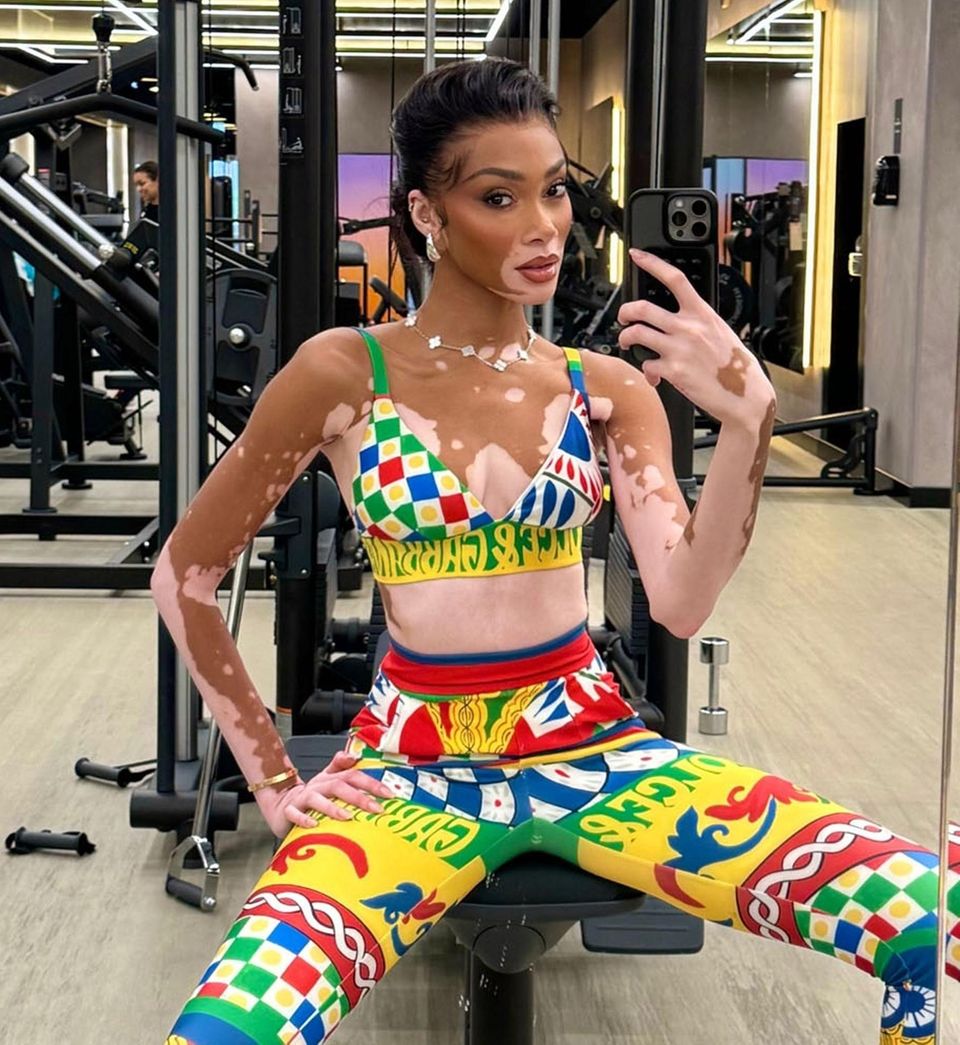
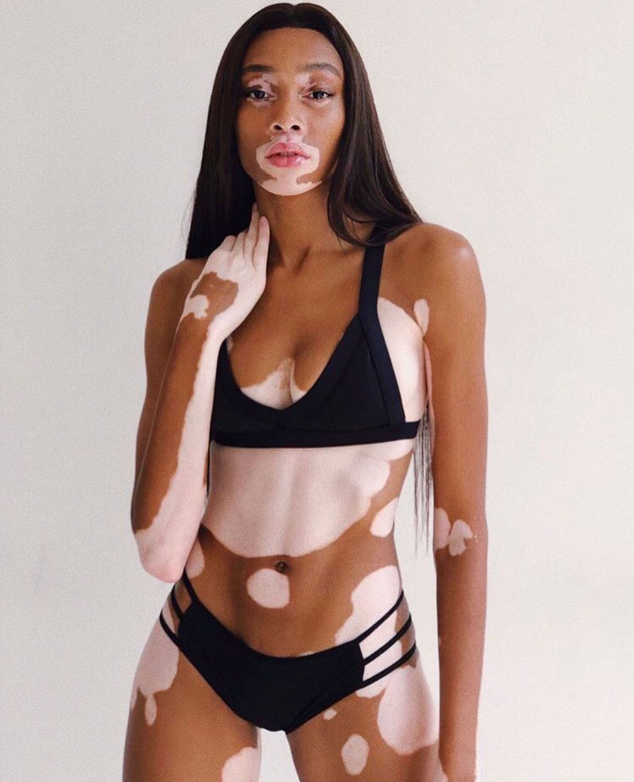
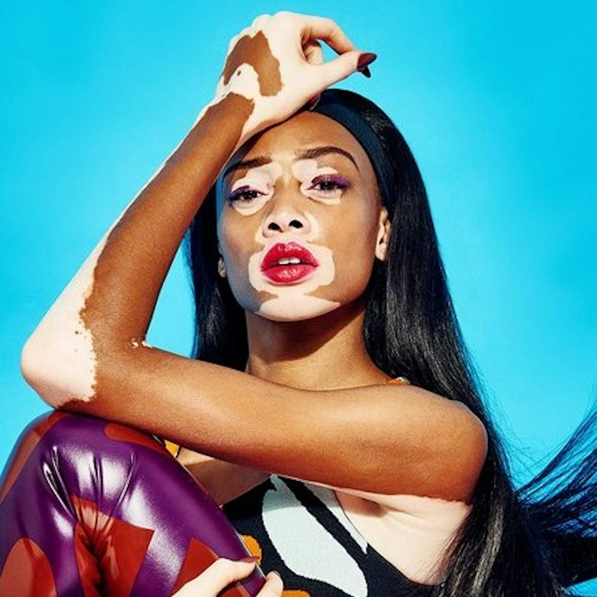
Harlow’s vitiligo is a skin condition that changes pigment; tattoo ink is placed under the skin with a needle. They can appear side by side in a photo, but they aren’t the same thing. A pale patch next to a dark dot isn’t proof that both are tattoos.
The image here is contextual, not close-up evidence of a tattoo. It shows Harlow’s skin as part of the portrait without making every mark a piece of body art.

Color, movement, and the way details disappear in photos

Winnie Harlow in a contextual photograph: Inline contextual photo; not tattoo evidence; not tattoo evidence

Bright clothes, jewelry, makeup and lighting can make a small tattoo hard to see. A wide fashion photo may capture the look but not show enough detail to identify a mark or judge its size.

For tattoo references, a close image is more useful than a dramatic full-body shot. If the mark isn’t clear, leave the description cautious rather than filling in what the photograph can’t show.

The reported name behind her ear

Coverage in 2023 reported a small “Kyle” tattoo behind Harlow’s right ear, referring to Kyle Kuzma. Fans noticed the lettering in a social-media photo dump. The image doesn’t give enough detail to identify its font, size or artist.

Behind the ear, a short word can disappear under hair and show in a side profile. That placement is more private than the finger, which appears whenever Harlow’s hand is in view.

Swimwear, close-ups, and the difference between styling and skin

Winnie Harlow in a contextual photograph: Inline contextual photo; not tattoo evidence; not tattoo evidence

This portrait is included for context, not as proof of a tattoo. Harlow’s clothes, pose and lighting shape the image; her ink is only one small part of it.

The two reported placements behave differently: finger ink stays in view during everyday gestures, while hair can cover a tattoo behind the ear. Think about that difference before choosing a place for your own design.

What small details say about scale

The seven dots show that a tattoo doesn’t have to cover much skin to be recognizable. A small design still needs deliberate spacing and an artist who can place it cleanly.

Dots on fingers may fade or soften over time. Ask what size will hold up and whether a touch-up is likely. The answer depends on the design, the skin and the placement.

The stories people project onto her image

Winnie Harlow in a contextual photograph: Inline contextual photo; not tattoo evidence; not tattoo evidence

Harlow’s public image often invites people to assign meaning to her skin, clothes and tattoos. The dots may have a family meaning, as some profiles report, but that isn’t the same as a direct explanation from Harlow. A small tattoo can remain personal even when people notice it.

A public love story without forcing the evidence

Winnie Harlow in a contextual photograph: Inline contextual photo; not tattoo evidence; not tattoo evidence

Harlow and Kuzma have shared photos around their relationship and engagement. Those images help explain the reporting about the name tattoo, but a couple’s portrait doesn’t prove that the lettering is visible. Keep context photos separate from images that actually show the tattoo.

The clearest view remains the close-up of the seven dots on Harlow’s middle finger. The other images add context, not certainty about what the ink looks like.

Final take on Winnie Harlow’s style

The seven dots are the clearest documented tattoo in Harlow’s collection. The “Kyle” lettering behind her ear has been reported, but the available photo leaves its details uncertain. Her vitiligo is separate from both.

If you’re looking for a reference, focus on the placement, scale and spacing. Small designs can work well, but they still need a clear image and a careful artist.

Lorde Tattoo: The Red Hand Line She Got for Her Dog Pearl

Lorde has spoken about one tattoo: a thin red line on the back of her left hand. A scratch from her dog Pearl left a scar. When the middle began to fade, she asked tattoo artist Alma Proença to “connect it.” Lorde shared the story with New Zealand magazine Metro in 2021.

The design follows an existing mark instead of adding a new symbol. Its loose shape is part of the point.

The red line on her hand

Lorde tattoos: Inline tattoo evidence

The photo shows one red line running diagonally across the back of Lorde’s left hand. There’s no border, lettering or extra image around it. It resembles the scar she wanted to keep, rather than a conventional tattoo design.

The red pigment also keeps the line close to the original mark. A crisp black stripe would have given it a different look.

A mark that keeps a scar from disappearing

The tattoo follows the parts of the scar that remained as its center faded. That makes the design a continuation of the mark, not a replacement for it.

Hands are washed, flexed and rubbed often, and they get plenty of sun. Fine lines can soften, while red ink may change as it heals. Anyone considering a similar piece should ask an experienced tattooer about placement, aftercare and the chance of needing a touch-up.

Lorde’s visual style is built for details

Lorde in a contextual photograph: Inline contextual photo; not tattoo evidence; not tattoo evidence

Lorde moves between understated portraits, theatrical stage clothes, futuristic album imagery and everyday outfits. The hand line doesn’t require one particular look; it can sit beside rings, bracelets or a bare wrist without taking over.

Its shape shifts as her hand opens and curls. That makes the mark feel more like a line following the skin than a graphic placed on top of it.

Alma Proença and the artist behind the line

Lorde told Metro she had known of Proença and followed her work since they were teenagers. The request was specific: keep the shape of the scar and join the sections that were still visible.

Proença’s work often draws on natural forms, animals and plants. Here, the loose line keeps the uneven quality of the original mark. Making it perfectly straight would have changed the idea.

A video world with a physical edge

Lorde in a contextual photograph: Inline contextual photo; not tattoo evidence; not tattoo evidence

In the 2025 “Hammer” video, Proença appears behind the needle while Lorde is shown getting tattooed outdoors. That scene is part of the video’s imagery; it doesn’t establish a second permanent tattoo or identify a finished design.

Music videos can use temporary ink, makeup or body paint. The hand line remains the tattoo Lorde has explained in her own account; the “Hammer” scene is context, not proof of another piece.

Small marks disappear in big photographs

Lorde in a contextual photograph: Inline contextual photo; not tattoo evidence; not tattoo evidence

A microphone, sleeve, low light or the angle of a performance shot can hide Lorde’s hand. In a wide photo, the red line may look like a crease or stray mark.

A clear close-up and Lorde’s explanation are better evidence than a blurry image. When a mark isn’t legible, it’s fair to leave the details open rather than guess.

The value of an ordinary memory

Lorde in a contextual photograph: Inline contextual photo; not tattoo evidence; not tattoo evidence

The design doesn’t turn the story into a portrait of Pearl or a paw print. It keeps the shape of the original scratch. That’s one way to build a tattoo around a real memory without spelling out the whole story in the image.

If you’re starting from a scar or another mark, decide whether you want to follow it, frame it or leave it as it is. The simplest version may be the one that keeps the original detail intact.

A restrained visual language

Lorde in a contextual photograph: Inline contextual photo; not tattoo evidence; not tattoo evidence

Lorde’s tattoo collection doesn’t need to be large for this piece to stay recognizable. The line is visible when the camera gets close, but it doesn’t have to lead every photograph or outfit.

If the design appeals to you, work out whether it’s the red color, the hand placement, the irregular line or the connection to a memory that matters. A custom idea based on your own life will fit better than asking an artist to copy Lorde’s exact mark.

Closing thought on a quiet mark

Lorde’s red line follows a fading scar left by Pearl and was shaped with Alma Proença’s help. Its small scale suits the story: she wanted to keep a mark that was already hers.

The video below shows the “Hammer” visual world around tattooing:

More musician tattoo guides