Musicians

Grimes finally made the face tattoo she had been thinking about for years

Grimes has never used tattoos as simple decoration. Her body art is closer to world-building: a line can look like circuitry, white ink can resemble an alien scar, and a tiny symbol can carry a private joke for years. Her newest piece makes that approach especially clear. In 2025, she revealed a large purple-ish ring tattoo around her left eye, a delicate face tattoo she said she had been thinking about for about a decade.

The design appeared around the time of her “Artificial Angels” visuals, which may be why many people missed it at first. Grimes said she had spent “like 10 years emotionally working up to a face tattoo,” but had drawn on her face so often that literally no one noticed, not even my parents. It’s a very Grimes detail: a major permanent decision hidden in plain sight.

The face tattoo took years to arrive

Grimes left eye face tattoo
The new design curves around the outer corners of Grimes’ left eye in a rounded, almost orbital shape. It looks purple or reddish depending on the light, and the fine lines feel more like a drawn halo than a bold black tattoo. Reports called it circular, while close-up photos show how it frames the eye without covering the brow or cheek.

That placement changes the effect. Face tattoos often read as a loud statement, but this one can blend into makeup, styling, or a grainy video frame, then stand out in a bare-faced selfie. Grimes has called it her favourite tattoo, and her comments suggest she values its subtle, innovative design as much as its shock value.

She credited Gylophomancer, a Los Angeles artist associated with cybersigilism, for the work. Grimes described the artist’s approach to face tattoos as “truly novel and innovative.” Cybersigilism is a loose contemporary style that blends ancient-looking symbols with futuristic, cyberpunk, and ornamental shapes. Her eye ring fits that feel without becoming a dense emblem.

Her full-back white-ink piece looks like alien scars

Grimes white ink alien scars back tattoo
Years before the eye tattoo, Grimes shared one of pop culture’s more unusual large-scale tattoo reveals. In 2021, she showed a nearly full-back design in white ink and called it “beautiful alien scars.” The lines stretch across her shoulders, follow her spine, and continue toward her lower back. In photos, the tattoo looks pale and raised rather than like a standard dark outline.

The design came together through a hybrid process. Tattooist Tweakt drew the initial foundation, then digital artist Nusi Quero expanded the forms with ideas from 3D rendering before the work was tattooed. That combination gives the piece a symmetrical, almost grown-not-drawn look. It suggests biology, a futuristic interface, and a scarification fantasy all at once.

Grimes has also talked about the pain and healing. White ink can be difficult to photograph, particularly when the skin is red or swollen, so the first photos didn’t show the finished contrast as clearly as later ones. The result is deliberately understated. You often see the design only when the light catches it, which fits her preference for tattoos that reveal themselves slowly.

White ink continues across her shoulders and chest

Grimes white ink shoulder and back tattoo
The back tattoo is part of a broader experiment. Grimes has described her shoulders, chest, and back as heavily covered in white ink, although public photos don’t make it easy to count the separate pieces. Some marks only show from certain angles, and some may belong to larger connected designs rather than standalone tattoos.

That uncertainty is worth keeping. Tattoo roundups can turn a few photos into a confident map of someone’s whole body, but Grimes’ work doesn’t fit neatly into one. What can be seen is a wider white-ink style: thin lines, futuristic marks, and shapes that look more like scars or luminous body paint than conventional flash.

In 2025, she also showed a smaller white, hand-poked design across the back of her right shoulder and trapezius. Reports link it to Gylophomancer and describe it as another “white scar.” It seems to extend the alien-scar idea of the larger back tattoo, but in a more contained area.

The ear tattoo is small but easy to miss

Grimes ear and face tattoos
One of Grimes’ older documented tattoos sits behind her right ear. It consists of a few fine lines and can disappear beneath her hair. That placement suits her collection: personal, a little cryptic, and not necessarily meant to be noticed from across a room.

The ear tattoo also shows how her body art developed over time. The face ring might look like a sudden change, but Grimes was already comfortable placing ink where it only appears with a certain haircut, pose, or close-up. The newer piece is easier to see, but it keeps that same sense of choosing when to reveal it.

Hand, knee, and small symbol tattoos add the private details

Grimes white ink tattoo detail
Older tattoo records also point to a few smaller pieces. Grimes has shown rough-looking marks she did herself on her hands. She has also been associated with a small “ФАЙ” tattoo above her right knee. The Cyrillic letters have appeared in tattoo lists for years, but the personal meaning hasn’t been explained clearly enough to claim more than the public record supports.

The words “GINO” and “NANO” behind her knees have been described as party or dare tattoos. Grimes once joked that she was lucky the person tied to the story turned out to be good. It gives the collection a little messiness: not every tattoo is a major art statement; some are just traces of friendship, impulsiveness, and a funny night that went on longer than expected.

There are also reports of small hand and finger symbols, including a pinkish hand-poked design mentioned in fan-maintained records. Those sources can help point to marks visible in newer photos, but they don’t settle every placement or meaning. The safest read is that her hand tattoos have changed over time, with some older designs faded, altered, or perhaps being removed.

Why Grimes’ tattoo style feels different

Grimes white ink shoulder and back tattoo detail
Across the documented pieces, the common thread isn’t a single symbol. It’s the contrast between futuristic design and skin that looks almost fragile. The eye tattoo forms a small orbit; the back piece resembles alien scarring; the shoulder work carries on the white-ink experiment. Even the hidden lines behind her ear and rough marks on her hands feel like fragments of a larger visual language.

Grimes also gravitates toward tattoos that complicate the idea of permanence. White ink can fade into the skin. Fine lines can disappear under hair or makeup. A face tattoo can sound dramatic but look almost invisible in a music video. That tension between being seen and staying private may be the most consistent idea in her collection.

It’s tempting to count every mark, assign it a meaning, and make a tidy list. Grimes’ tattoos don’t quite work that way. Some have clear stories, like the Triforce design she has been associated with since childhood gaming memories. Others are reported without explanation. The clearest account comes from visible details and timing: the full-back alien scars, the newer white shoulder design, the hidden ear tattoo, the knee lettering, and the eye ring that turned a long-discussed plan into reality.

Grimes’ tattoos keep evolving

Grimes alien scars back tattoo reveal

Grimes white ink alien scars tattoo

The new face tattoo doesn’t replace the older pieces; it gives the collection a new focal point. A subtle ring around her eye now sits alongside near-invisible white ink, rough hand-poked marks, and a back design that looks like it came from a science-fiction anatomy book.

That’s why the face piece landed so strongly. It isn’t just a celebrity getting a face tattoo for attention. It continues a decade-long habit of making her body look a little unfamiliar. Grimes waited until the idea felt right, chose an artist whose work suited her interests, and got a tattoo that can be unmistakable and surprisingly easy to miss at the same time.

The simple truth is that her tattoos aren’t a finished checklist. They’re an ongoing visual experiment. New work might clarify an old idea, cover older marks, or blend into the pale futuristic texture she has been building for years.

The collection also blurs the line between serious art and casual marks. The same person who sat through a long white-ink back session can keep a tiny dare tattoo behind a knee. That contrast makes the inventory feel human. Photos from different years may show a different mix of faded ink, new work, makeup, and deliberate concealment. Reading the tattoos as a timeline rather than a fixed list gives the clearest picture of how Grimes keeps changing the visual rules around her body.

Watch Grimes’ face tattoo appear in “Artificial Angels”

YG carries Bompton, family and hard lessons in his tattoos

YG’s tattoos have the same bold energy as his music, but they aren’t random. Over the years, the Compton rapper has used his skin to record family, faith, his neighbourhood, loss, and lessons from growing up in Los Angeles. Some designs are easy to read; others sit in a dense mix of script, portraits, crosses, and symbols.

There’s no fully reliable public count, and the collection has changed over time. Interviews and photo shoots do document several recurring pieces: a cross on his chest, “Trust Nobody,” the Pushaz forearm tattoo, references to Bompton, a Virgin Mary on his scalp, a large side seal, family names, and tributes to people close to him.

The chest cross started with family

YG shirtless chest cross and family tattoos
One of YG’s most important tattoos is the cross on his chest. He has said his first tattoo was a cross with his parents’ names and the word “forever”. He got it at 16, making it less a fashion choice than the starting point for the collection that followed.

That detail changes how the rest of his chest reads. The religious imagery isn’t there just to look tough. It sits alongside family names and personal history, keeping the people who raised him close as his public life has grown.

Later photos show the chest filling in with more script, crosses, and symbols. Some lettering is hard to make out because designs overlap, but the pattern is clear: YG puts the things he wants close on his torso, from his parents and faith to reminders of where he came from.

“Trust Nobody” is one of his clearest messages

YG Trust Nobody tattoo
In older photos, the words “Trust Nobody” run across YG’s upper body. Without context, it might look like familiar rap-era lettering, but his comments about the life around him give the phrase more weight. His tattoos often hold both ambition and caution, and this one reads almost like a personal rule.

YG has spoken about feeling like a “lost angel” and learning to move through a world where loyalty can be complicated. The tattoo is direct and a little guarded, carrying the hard-earned perspective that comes through in his music.

It also sits naturally beside his religious tattoos. A cross next to a warning about trust suggests someone trying to hold onto belief while staying alert. Together, the designs make his skin feel like a personal archive rather than a collection built around one visual theme.

The Pushaz forearm tattoo marks his clique

YG Pushaz forearm tattoo
In a Highsnobiety interview, YG identified the “Pushaz” tattoo on his forearm as a mark of his clique. It’s one of his clearest explanations: the design is about his affiliation, the people around him, and the world that was there before his records took off.

The placement works in practice as well as meaning. It shows when he performs, poses, or reaches for a microphone, so the word stays visible without him having to point it out. It sits among other lettering and symbols, but the name itself is clear enough to become part of his public image.

YG’s explanations are most useful when he spells out what a tattoo means. “Pushaz” isn’t offered as a vague aesthetic; he connects it directly to his group. That helps explain why some pieces remain central while others blend into the larger design over time.

Bompton appears as a place and a state of mind

YG Bompton All Stars side tattoo
Compton appears again and again in YG’s tattoos. The city is part of his life and public identity, but he often uses the word “Bompton” to make the reference more specific to his own world.

The Fader has documented a large “Bompton All Stars” seal along his side, designed like the five-point logo of Converse. Its placement turns a familiar neighbourhood reference into something like a sports emblem. It signals pride, while carrying the weight of the place that shaped him.

Photos also show “Thank God” and “In YG We Trust” among the script across his chest and neck. It isn’t always easy to see where one tattoo ends and another begins, but the ideas keep returning: gratitude, self-belief, and hometown identity all share the same visual space.

The Virgin Mary on his scalp is hard to miss

YG Virgin Mary scalp tattoo close-up
One of YG’s most striking tattoos is a large Virgin Mary on his scalp. It can’t hide under a short haircut and adds to the religious imagery already visible on his chest.

The scalp piece changes the outline of his look. A shirt can cover his torso, but the tattoo stays visible in close-up photos and performances. It also shows how his willingness to wear visible ink developed over time rather than appearing all at once.

There’s no need to assign it one definite meaning. The Virgin Mary could represent faith, protection, family, or simply an image that matters to him. The design and placement are documented; his personal explanation is less clear. That distinction matters when describing someone else’s body art.

Memorial tattoos keep friends close

YG Slim 400 memorial calf tattoo
YG’s tattoos also include tributes. Inked has noted a Slim 400 portrait on his left leg, done by tattoo artist Tat2Nene. It serves a different purpose from the louder “Trust Nobody” and “Bompton” designs: it’s about remembrance.

Portrait tattoos take technical skill, but the emotional weight is just as clear. A memorial portrait doesn’t only aim to look like someone; it keeps their face present in future rooms, tours, and years. YG’s collection returns often to the idea of carrying people with him.

Other names and tributes appear in photos, though not every detail is clear enough to catalogue confidently. The most reliable inventory sticks to pieces that have been discussed directly or photographed clearly instead of treating every blurred line as a confirmed memorial.

His tattoos mix faith with street language

YG shirtless chest and faith tattoos
What sets YG’s collection apart is how many different kinds of language share the same skin. Religious symbols sit next to neighbourhood slogans; family names sit beside warnings. A scalp portrait can appear alongside a side seal and a forearm mark for his clique.

Those pieces don’t have to contradict one another. Most people build a tattoo collection one moment, influence, friendship, or hard year at a time. What emerges is rarely a neat brand identity; it’s a stack of memories that gradually becomes a style.

The collection feels lived in rather than staged. Even in polished photos, the tattoos look like they came from different artists and different periods, with different levels of explanation. Some are deeply personal, some are declarations, and some have simply become part of the story.

The timeline matters more than a perfect count

YG full tattoo collection portrait
YG started getting tattoos young, and his interviews show that the process continued as his life changed. The first cross gives the collection a family-centred starting point. The forearm lettering and Compton references connect him to his circle and hometown, while later portraits and larger designs carry the weight of success, grief, and public life.

A number alone can’t explain YG’s tattoos. A count might tell you how much skin is covered, but not why certain words remain visible, why a memorial portrait matters, or why a neighbourhood emblem can feel as personal as a family name.

YG wears his history in layers. His ink is bold, sometimes blunt, and often easy to read from a stage. Under the large lettering are themes he returns to in conversation: family first, faith close, loyalty tested, and a lasting connection to the place that made him.

Some smaller details are harder to make out in photos. A haircut changes how the scalp tattoo looks, shirts cover chest lettering, and different lenses can flatten the side seal into the rest of his torso. That’s part of following a collection that’s grown over time: the tattoos aren’t one big reveal, and one caption can’t explain every meaning. The clearest picture comes from combining YG’s own explanations with photos that show where each piece sits.

Seen together, the collection is less about adding tattoos than keeping certain truths visible. The designs overlap, but the through-line is clear: YG keeps connecting public success to private history. That’s why the most memorable piece isn’t always the largest; sometimes a family name or a short phrase carries the most weight.

Watch YG explain the stories behind his tattoos

Baschi’s tattoos read like a life story, from his mother’s drawings to Endstation

Baschi talks about his tattoos as chapters in a life, not just decoration. The Swiss singer has said that every piece should carry a story: a person he wants to remember, an earlier version of himself, or something his future self might need. That gives the collection a warm, slightly old-school feel.

Rather than one large image, the tattoos make a loose autobiography across his arms, forearm, feet, and other small spots. The best-documented pieces include tattoos drawn by his mother, a sailing ship, a family name, his first tattoo in memory of his father, and the messages “Endstation.” and “Glück.” on his feet.

His mother drew the tattoos on his upper arms

One of the most personal parts of Baschi’s collection is the work his mother designed. On SRF’s Inked, he explained that the tattoos on his upper arms were drawn by her. That changes how the designs feel: they aren’t simply studio flash or a trend picked from a wall, but family artwork he carries with him.

Baschi has said that his tattoos have meaning, and this may be the clearest example. A parent’s drawing can be rougher and more intimate than a polished studio design. It carries the maker’s presence, even when the original sketch is no longer around.

The upper arm is a fitting place for family art. A sleeve can cover the designs when he wants privacy, but they’re easy to show in a tattoo interview or onstage in a sleeveless shirt. His family ink isn’t hidden for good; he gets to decide when it shows.

The griffin was his first tattoo and a tribute to his father

Baschi first griffin tattoo
Baschi’s first tattoo was a griffin, a mythical creature that also connects to his name. He has said he got it at 18, when he wanted something bold and rebellious. It also became a tribute to his father, who had died a couple of years earlier, and includes his father’s initials.

That blend of teenage energy and grief makes the piece memorable. It wasn’t conceived as a traditional memorial; it started with the excitement of a first tattoo and took on a deeper family meaning.

The griffin can also read as a kind of self-portrait. It’s a fantastical creature that suggests strength and protection, while the initials anchor it to someone real. It’s a big image with a very personal reason behind it.

The microphone marks the moment music became serious

Baschi microphone tattoo
Another early tattoo is an old-school microphone. Baschi has said he was 18 or 19, had moved to Los Angeles, and was beginning to commit to singing when he spotted the design in an artist’s book. His girlfriend at the time suggested another tattoo, and he chose the microphone.

It’s a simple image, but the timing gives it more meaning. The microphone marks the point when music shifted from an interest to a direction. The griffin looks back toward family; the microphone looks ahead. It became a permanent reminder of his ambitions before his music career had fully taken off.

Microphones are easy-to-read symbols for musicians, but Baschi’s is tied to a specific moment: deciding whether he could build a life around singing. It captures that ambition before the records, stages, and years of touring arrived.

The Sly and the Family Stone lyrics stay close to his ribs

Baschi rib lyric tattoo
Baschi has a lyric tattoo on his ribs from Sly and the Family Stone’s “Everybody Is a Star.” It includes the words “I love you for who you are,” followed by the idea that you don’t have to become someone else to be loved. He has said the song’s honesty reached him while he was working at his aunt’s deli in Potrero Hill and listening closely to older records.

Rib tattoos can be difficult to sit through, and the placement gives this one a private feel. The lyric stays close to his body instead of being displayed for everyone to read. That suits it: it’s a thought he wanted to keep with him, not a slogan for a crowd.

He has admitted he might not choose the same tattoo today, while still calling the sentiment beautiful. That honesty makes it more interesting. A tattoo can preserve an earlier belief without freezing someone in time; this one records what Baschi needed to hear then.

“Only the Poets” connects the collection to his first album

Baschi Only the Poets chest tattoo
Baschi has “Only the Poets” tattooed across his chest as a tribute to his first album and to James Baldwin. In a speech, Baldwin said, “Only the poets know the truth about us,” a line that stayed with Baschi long enough to become part of his body.

It’s one of his most visible music tattoos, but it means more than the album title. It brings together an early career milestone and a literary influence. The phrase can keep taking on meaning, whether it’s about songwriting, honesty, observation, or the challenge of making private feelings public.

Across his chest, it reads like a personal banner. It signals what kind of artist he wants to be without naming a genre. The words point less to fame than to his belief in what art can do. That idea can stay with him as his music and life move into new chapters.

The sailing ship is about an earlier life

Baschi sailing ship forearm tattoo
Baschi has a sailing ship on his forearm. Asked about it, he gave an unexpected answer: he said he had been a sailor in a previous life. Whether someone takes that literally, spiritually, or as part of his humour, the tattoo lets him talk about adventure and uncertainty.

A ship feels natural for a musician who moves between cities and stages. It suggests changing weather, a route you can’t fully control, and carrying on when the destination isn’t in sight. Baschi has linked it with adventure and life’s unpredictability, which is more useful than pretending the image has one fixed dictionary meaning.

The forearm placement means the ship can come up in everyday conversation. It shows when he rolls up a sleeve, reaches for a microphone, or gestures in an interview. Like the microphone, it belongs to a particular time but can gather new meaning as his life changes.

“Endstation” and “Glück” look toward the end of life

Baschi tattooed arm detail from the Inked interview
One of Baschi’s most striking ideas is the pair of words on his feet. “Endstation.” is on one foot and “Glück.” on the other. The first means “final stop” or “terminus”; the second means “luck” or “happiness.” Together, they make a message he wants to see at the end of his life.

He has said that, on his deathbed, he wants to look down and see that he reached the end and that things turned out well. It’s a rare tattoo that looks ahead to a final moment instead of marking something that has already happened.

Foot tattoos are easy to cover and easy to forget about until you need them. That feels intentional here. The words are for Baschi first, not for an audience, like a small signpost waiting at the bottom of his body.

His partner’s name is deliberately discreet

Baschi forearm tattoos in a studio interview
Baschi has a small “Alana” tattoo on his forearm for his wife, Alana Netzer. He has said he chose a discreet spot because it was meant for her, not as a large public declaration.

That contrasts with “Only the Poets.” One tattoo speaks across his chest; the other is easy to miss among the larger designs. Both are about relationships, but in different ways: the album phrase is a public statement about art, while the name is a private promise carried in plain sight.

Baschi has said the name tattoo matters because it’s permanent. That simple thought explains why a small piece can mean so much. It isn’t trying to compete with the larger work; it’s meant to stay close and personal.

Baschi’s collection is a timeline, not a matching set

Baschi tattoo collection portrait
Together, the tattoos form a loose timeline. The griffin brings him back to his father; the microphone marks his commitment to music. The Sly and the Family Stone lyric preserves a younger emotional truth. “Only the Poets” records his first album and connection to Baldwin. The ship speaks to adventure, while “Endstation” and “Glück” imagine the last thing he might see.

The pieces don’t have to match, and that’s part of their appeal. Some are large, some are discreet, and some came from family drawings rather than a professional portfolio. They look collected over time, not planned in one sitting.
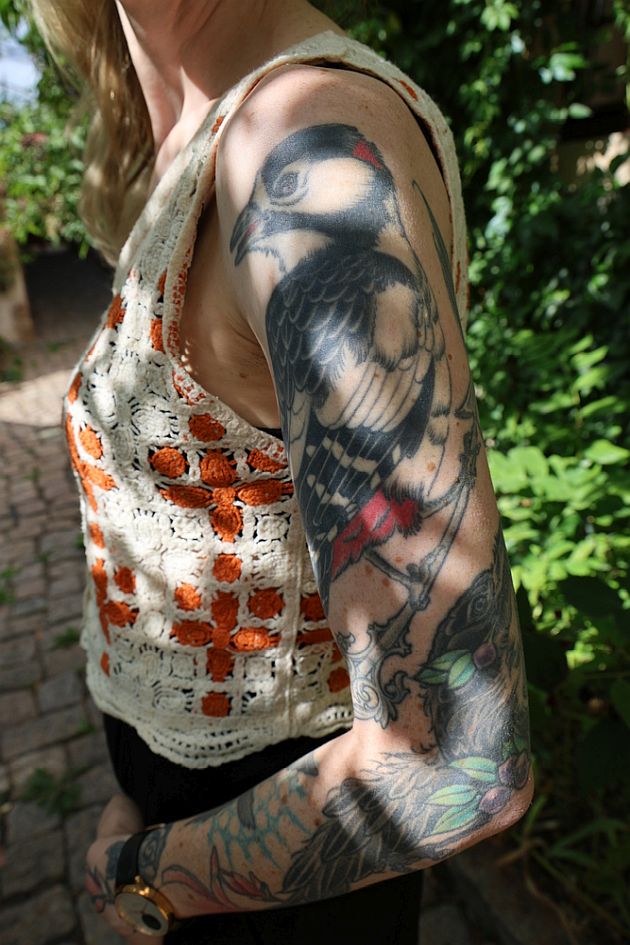
That also helps explain why Baschi is thoughtful about meaning. He isn’t saying every tattoo has to be profound; he says each one should have a reason. Sometimes it’s grief, sometimes a song, a relationship, a joke about a past life, or a reminder of who he hoped to become.

His tattoos are personal without being precious. They can be sentimental and funny at once, bold onstage but intended for one person. That balance makes the collection worth following: every piece has a story, but they’re told in the way a real person might tell them.

Watch Baschi explain the stories behind his tattoos

Matt Heafy’s Japanese Tattoo Story Keeps Growing

Matt Heafy’s tattoos have developed alongside Trivium rather than appearing as one finished statement. What began as visible work on his arms grew into a much larger Japanese-inspired project across his back, arms, legs, and lower body. He has spoken openly about the stories behind the designs, which makes the collection easier to follow than much rock-star ink. The photos change from year to year, but the same ideas keep returning: Japanese mythology, demons, gods, creatures, and family symbolism.

Heafy’s own tattoo-tour video is the best place to hear the stories in his words. Earlier interviews and reports help fill in the timeline, including the sessions with Kahlil Rintye at Tattoo City and later work by David Bruehl. Some meanings remain personal, so this guide separates what Heafy has identified from what can only be seen in live photos.

The Japanese body suit started with a much bigger idea

Matt Heafy arm tattoos at Nova Rock
Heafy has described the plan as a connected Japanese suit, not a random collection of separate pieces. The background is designed to carry across larger areas of skin and help each figure stand out. Photos from the Nova Rock period show dense colour and linework already on his arms; later work on his back makes the overall scale easier to see.

That context matters. One close-up can make an arm look like a conventional sleeve, but Heafy has described a wider project connected by Japanese art and old stories. He says the narrative behind each figure matters as much as the image itself, whether it’s a dragon, demon, or something else.

His back piece is built around Japanese mythology

Matt Heafy colorful arm tattoos
The back is the largest documented part of Heafy’s tattoo project. Loudwire reported in 2015 that Kahlil Rintye’s work at Ed Hardy’s Tattoo City covered his back and arms. Later updates show it continuing over time rather than being finished in a single session. Photos can’t explain every symbol, but they show a deliberate composition that uses the whole back as its canvas.

Heafy has pointed to ancient Japanese stories as the key to understanding the work. Calling it only a “dragon tattoo” misses the larger idea: the creatures belong to a visual language, and the background helps make the story feel complete. He has also discussed demons, sometimes as frightening figures and sometimes as a way to explore the difference between real and imagined threats.

Raijin and Fujin brought the newer color to his torso

Matt Heafy colorful shoulder and arm tattoos
A more recent chapter added Raijin and Fujin, the Japanese gods of thunder and wind. Reports and Heafy’s own social posts identify the pieces as work by David Bruehl. They fit the larger suit because they come from the mythology Heafy has explored for years, while bringing a vivid, colour-heavy focus to newer sections of his body.

Heafy has called it a front-suit piece, which helps explain why its placement shifted in progress photos. A tattoo project this large takes a series of sessions. One photo may show it looking unfinished; the next can look much fuller. The process becomes part of the story alongside the finished art.

The arm sleeves show the older layers of the collection

Matt Heafy arm sleeve tattoos onstage
His arms are the easiest place to see how the collection has developed. Concert photos show both packed with images, bright colour, bold outlines, and background work reaching toward the shoulders. The sleeves don’t hide that the tattoos were added over time. Different periods sit together, with the Japanese influence giving them a shared feel.

In earlier interviews, Heafy has talked about drawing on Japanese art and specific stories. The arm work is more than stage decoration; it reflects a long-running interest. Photos also show why he has kept extending the suit: once a large section is finished, the empty edges become part of the design to solve.

The wedding-band tattoo is small but unusually personal

Matt Heafy hand and arm tattoos at Hellfest
Not every important tattoo is a giant back panel. Blabbermouth’s coverage notes a Japanese Ensō wedding-band tattoo on his left hand. The Ensō is an existential circle associated with Zen ideas, and Heafy has said he uses it as his wedding band. That gives the small mark a different weight from the larger mythology pieces.

It’s a reminder that the collection moves between public spectacle and private shorthand. A back piece might be photographed for a magazine, while a hand tattoo can carry a direct family meaning every day. The contrast makes the inventory feel more personal. Heafy’s ink is not only about looking intense onstage; it also records relationships and personal philosophy.

It’s tempting to reduce his tattoo history to “full body suit,” but the photos show a more interesting process. The collection has a clear structure and still leaves room for small marks and shifts in emphasis. His arms are busy because they make the first impression onstage. The back can look quiet from a distance, then become dense when the camera moves closer. Newer front-suit work turns open space around older tattoos into part of the composition.

The artists help explain how the look has changed. Kahlil Rintye’s work is associated with the early large-scale back and arm sessions reported by Loudwire. David Bruehl’s later Raijin and Fujin designs bring another burst of colour and a direct link to Japanese gods. Heafy has also credited other artists over the years, so it would be inaccurate to assign every line to one person.

Heafy’s explanations also keep the guide grounded. When he talks about old stories, demons, and the meaning of the Ensō, he gives viewers a way into the designs without turning every symbol into a guess. The wedding-band Ensō is especially useful evidence because its meaning is explicit: it’s a personal symbol on his hand, not just another dramatic image in the suit.

Together, the tattoos record how Heafy thinks about music, family, mythology, and identity. The collection is theatrical enough for a festival stage, but the stories underneath it are patient and specific. He has returned to the work over several years, lived through the awkward in-between stages, and kept adding context as new sessions happen. That’s why a tattoo tour suits the project: you can see the art, hear the explanation, and understand that a full-body design keeps growing.

When comparing photos, it’s safer to follow the placement than to invent a complete catalogue. Concert pictures show strong continuous colour on the upper arms and shoulders. The older Tattoo City report and Heafy’s later updates help trace the back piece. The newer gods belong to the front-suit chapter, while the Ensō remains a small but meaningful mark on his hand. This leaves room for future sessions without pretending that every detail has already been named.

Heafy is still adding to the story in public, one session at a time.

His progress photos also make the project unusually easy to date. They let readers compare the early arm colour, the developing back, and the newer front work without mistaking one old concert photo for the final version of his tattoos.

What the collection says about Matt Heafy’s timeline

The clearest way to read Heafy’s tattoos is as a timeline. Early arm work established his interest in dense Japanese-inspired imagery. Kahlil Rintye’s sessions expanded it across his back and arms. Later, David Bruehl’s Raijin and Fujin designs brought more mythology and colour to the front of his body.

That timeline is why the collection looks different in photos from one tour to another: the work is still being built. A 2024 tattoo tour can explain a design that was only partly visible in a 2014 concert photo, while the 2015 report on his back piece fills in part of the gap. The unfinished stages belong to the story; they aren’t mistakes to hide.

There’s also a clear line between documented details and fan guesses. Heafy has named the artists, discussed the Ensō, and identified the Raijin and Fujin project. Other shapes are visible but not always named. A careful guide leaves those meanings open unless he has explained them publicly.

Watch the story behind Matt Heafy’s tattoos

Heafy’s own tattoo-tour video is the best companion to these photos because it lets him tell the stories in his own voice.

Henry Rollins Keeps His History in Black Ink

Henry Rollins has never used tattoos as decoration. On him, the ink feels like a personal map of the music, friends, and ideas that stayed with him as life changed. The mostly black-and-grey designs are blunt and direct, much like the voice he developed through Black Flag, Rollins Band, spoken-word tours, and years of writing. This guide sticks to tattoos that are clearly visible or have been discussed in interviews and fan archives, rather than guessing at every blurred mark in a concert photo.

The clearest pieces include the Black Flag bars, the Misfits Crimson Ghost, an Einstürzende Neubauten logo, a portrait of his grandfather, a heart marked “Jamia,” and the larger back piece associated with tattoo artist Rick Spellman. Rollins has described his tattoos as products of a particular era and identity, so the story is as much about memory and time as it is about placement.

The Black Flag Bars Are the Starting Point

Henry Rollins Bronson arm tattoos
The Black Flag bars are the tattoo most closely tied to Rollins’s public image. Raymond Pettibon’s design became one of punk’s most recognisable symbols, and Rollins carried it from his years in the band into the rest of his life. It sits near the back of his neck, where it can disappear in an ordinary portrait but show clearly when he turns toward the camera or leans forward onstage. It’s a compact design with a long history behind it.

Rollins has talked about getting the bars after the band’s visual language had become part of his world. The tattoo doesn’t claim that he created the artwork; it connects him to the band, a period, and the community around it. In that sense, the bars work almost like a signature. It looks blunt because the memory itself is blunt.

The Misfits Skull Connects Him to Horror Punk

Henry Rollins Bronson sleeve tattoos
Another often identified design is the Crimson Ghost, the skull mascot of the Misfits. It sits naturally alongside Rollins’s other punk references, with the same mix of menace, theatre, and underground shorthand. It’s also easy to recognise from a stage, which is why it appears so often when fans compare older and newer photos.

The Misfits tattoo isn’t tied to one lyric or album as much as a shared visual language. Horror imagery, stark lines, and a little rebellion all come together in the skull. Rollins’s tattoos aren’t one conventional, colour-filled sleeve; they’re separate statements gathered over decades.

The Einstürzende Neubauten Mark Adds an Industrial Edge

Henry Rollins Wacken arm tattoos
Rollins has also been identified with an Einstürzende Neubauten logo. It fits his interest in noise, industrial music, and artists who push against familiar forms. The mark is usually described as an arm tattoo, adding a different musical reference to a collection otherwise known for American hardcore and punk.

A band logo can be a souvenir, but it can also keep a creative influence close. For Rollins, it points to a broader listening life. Its placement helps, too: arm tattoos show up naturally in performance photos, without every image needing to be staged as a tattoo reveal.

His Grandfather’s Portrait Makes the Collection Personal

Among the most intimate designs is a portrait of Rollins’s grandfather, reported on his left bicep. Portrait tattoos can be hard to identify from a distance, especially under harsh stage lights, but the family connection has been reported often enough to make this one of the stronger entries in the inventory.

The portrait shifts the mood of the collection. Black Flag, the Misfits, and Neubauten are public cultural references; a grandfather is a private relationship carried into public view. It also shows why counting only logos misses the point. Rollins’s tattoos hold music history and family history side by side, without needing to match stylistically.

The Jamia Heart Sits in Plain Sight

Henry Rollins Portland tattoos
A heart bearing the name Jamia has been identified on Rollins’s right hand. Hand tattoos are direct: they show during conversation, writing, and performances. This one is small next to his back piece, but its placement gives it a strong presence. It’s a name rather than a band symbol, making it one of the collection’s more openly affectionate details.

There’s no need to invent a dramatic backstory. The documented detail is the heart and the name; anything beyond that is speculation. That caution matters because photos can tempt people to fill in gaps. A reliable inventory separates what Rollins has shown from what viewers only think they can make out.

The Large Back Piece Is the Biggest Visual Statement

Henry Rollins 1987 session tattoos
Rollins’s back is often described as a large black-and-grey piece, with a bold sun and the words Search and Destroy appearing in accounts of his tattoos. The work is associated with Rick Spellman, whose style helped shape it. The back is harder to document than an arm because it usually appears only when Rollins is shirtless or turns away from the camera, so different photos show different parts.

The sun gives the piece a central image visible from a distance; the lettering makes it more specific. “Search and Destroy” carries punk’s confrontational energy, but it can also sound like a personal rule: keep moving, keep questioning, don’t settle. The back piece feels like the closest thing Rollins has to a manifesto on skin.

Early and Later Photos Show the Collection Growing

Henry Rollins 1987 session tattoos two
Photos from the 1980s through the 2010s help tell the story because Rollins’s tattoos developed over time instead of arriving as one finished look. Early images show fewer visible marks; later portraits and performances reveal more established work on his arms and back. The change is gradual, as you’d expect from a collection built across a long career.

Concert photography also affects what can be confirmed. A sleeveless stage photo may show the arm logos but hide the back. A spoken-word portrait might show his neck and shoulders while leaving his hands out of frame. That’s why several photos and interviews give stronger evidence than one supposedly definitive image.

What Can Be Confirmed and What Still Needs Caution

Henry Rollins 1987 session tattoos three
The clearest inventory includes the Black Flag bars, Misfits skull, Einstürzende Neubauten logo, grandfather portrait, Jamia heart, and a substantial back piece often described with a sun and “Search and Destroy.” Smaller marks may appear in photos, but they shouldn’t be listed as fact unless Rollins or a reliable source identifies them.

That balance is part of what makes the collection interesting. Rollins doesn’t seem to treat tattoos as a constantly changing fashion project. They record loyalties, family, influences, and a particular sense of self. The designs are mostly monochrome, a little rough around the edges, and tied to the life he actually lived. For fans, the ink feels like an archive worn on the body.

The record is uneven in a very human way. Some designs are easy to name, some appear only briefly, and some have been explained by Rollins while others remain private. The most useful approach is to keep the confirmed pieces together without turning every shadow in a photograph into another tattoo. That leaves room for the collection to change and still gives readers a grounded account of what can be seen.

When comparing photos, repeated appearances matter more than any one pose. The Black Flag bars and Misfits skull are the clearest punk markers, while the Neubauten symbol and family portrait point beyond the band history. Older images help show how the tattoos sat on his arms before later coverage made the larger work easier to see. A bent arm, flat light, or stage angle can change how a design looks, so this guide sticks to details that can be matched across available photos. The back piece is described carefully for the same reason: it’s a major part of the collection, but not every detail is equally legible in public images. The strongest evidence comes from designs that appear clearly more than once.

That care matters on a tattoo site. Clear placements and details that can be matched across photos are more useful than guesses about blurred shapes.

Watch Henry Rollins Talk About His Tattoos

Ronnie Radke’s Ink Has a Past Before the Blackout

Ronnie Radke’s tattoos have never faded into the background. They have been part of his look since the early Falling In Reverse years, then became a bigger topic when he blacked out large areas of his collection. Newer work is now showing across his chest, back, side and legs, so the story is not simply that he covered his tattoos. He closed one chapter and began building another.

That change is what makes his ink worth a closer look. Some older pieces still show up in interviews and live footage; others can only be seen in photos from before the blackout. The newer designs feel darker and more deliberate, with larger areas intended to work together instead of reading as separate souvenirs.

This guide sticks to tattoos shown in interviews, video clips, updates or clear photos. If Radke has not confirmed a meaning, it stays unconfirmed rather than being presented as fact.

The first tattoo stories started with smaller pieces

Ronnie Radke octopus shark and old tattoos

In an older Audacy interview, Radke talks through some of his favourite tattoos from before the collection was reworked. He points out an octopus and a shark tattoo, two pieces that show how varied his early ink was.

Those designs belong to a different period from the more connected chest and back work he has now. They look like tattoos collected over time, with different ideas from different parts of his life sitting side by side. That is common for someone who started getting tattooed young, but Radke’s public profile made each change more visible.

He has also talked about favourite pieces in a way that makes the collection feel personal, rather than planned to look perfectly matched. A tattoo can matter because of the memory behind it, even if it is not the most technically elaborate design. That seems to be the feeling behind the older pieces he chose to show in the interview.

The teardrop under his eye became one of his most recognised marks

Ronnie Radke side tattoo update

One of Radke’s most recognisable tattoos is the teardrop under his left eye. It has appeared in photos and performances for years, becoming one of the details fans use to identify him. Teardrop tattoos invite assumptions, so it helps to separate what can be seen from guesses about what it means.

There is no solid basis for attaching the usual prison-tattoo explanation to Radke’s face. Online comments may give it a fixed meaning, but those are not the same as an explanation from him. The mark is visible; its backstory is much less certain.

That uncertainty is part of why face tattoos attract so much attention. A tiny mark can stand out more than a large arm piece because it appears in every interview and close-up. Radke’s teardrop has had that effect even as the rest of his collection has changed.

His face ink sits alongside the forehead lettering and blackout work

Ronnie Radke chest and armpit tattoos

Radke’s face and head have also had lettering and other marks that are hard to read consistently in photos. Short clips show him answering questions about his forehead tattoos, but screenshots and fan captions sometimes identify the design more confidently than the original video does.

The useful point is where the ink sits, not an invented translation. Face and forehead ink helped define Radke’s earlier look, while the blackout changed how much of that work remains visible. Some details still show depending on the light, camera angle and how much of the area was reworked.

This is where the blackout matters. It can cover older lettering, small symbols or filler that used to be easy to see. That does not mean the earlier tattoos never existed. They are part of the history underneath the newer work, and older photos may be the only way to see them.

The blackout was a reset rather than a small cover-up

Ronnie Radke new chest and back tattoos

Radke has been associated with blacking out much of his older collection as part of a personal change. In interviews and discussion around the transformation, he has said he was tired of people focusing on the tattoos first. That sounds like more than covering up one design he regretted; it affected a large part of his body.

A blackout takes time and patience, and it changes the body’s overall silhouette. When broad areas are filled in, small pieces can disappear, open skin closes up, and future work has to fit around large fields of black ink.

Before-and-after photos help tell the story. Older pictures show a busier collection of separate designs; newer ones show a darker base with larger pieces over or beside it. The change is clear even when every individual tattoo cannot be named, which explains why old fan lists may not match what people see today.

New chest work has a much bigger scale

Recent tattoo updates show large designs spreading across both sides of Radke’s chest and into the armpit area. Clips and search results connect tattoo artist Kamil Mocet with some of the newer work, while the videos show the designs without giving a full written inventory of every line.

The main difference is scale. This is not a tiny symbol added between older tattoos; it is a major area of skin, meant to fit into the broader blackout and new-ink plan. The chest gives the artist room to build contrast, pairing dark backgrounds with lighter highlights and detailed figures.

The work may still be developing. A tattoo seen halfway through a session can look different once the shading, highlights and surrounding filler are finished. For now, it is safest to call it new chest and side work, rather than claim to know every figure or symbol from a short clip.

The upper back and side pieces connect the newer look

The newer work also travels around the body. Clips show ink running from the side of Radke’s torso toward his back, making the collection feel more connected than the earlier patchwork arrangement. A side tattoo can look very different with his arm lowered, his body turned or stage lights hitting it.

The recent designs seem to favour dramatic black-and-grey imagery, strong outlines and large shapes that read from a distance. That describes how they are drawn, not what every detail means. As a whole, the newer work has a more unified look than the separate small pieces he showed earlier in his career.

When comparing reference photos, it helps to look at both a straight-on image and a side view. The same tattoo can look like a narrow strip in one shot and a much larger composition in another. Placement changes how a tattoo reads, especially when it wraps around the body.

His leg tattoo adds a separate heavy piece

Ronnie Radke leg tattoo

Radke’s leg gives the collection another surface to work with. Recent footage and social posts show a large leg tattoo by Kamil Mocet, alongside pieces by other artists. It uses the strong contrast of the newer work, with an image that can hold its shape while he moves onstage.

Leg tattoos are often hidden in everyday appearances, then show up in shorts, backstage clips or performances. A piece can be there for a while before fans get a clear look. Radke’s leg work fits the wider shift toward larger, more deliberate compositions.

It is best to describe the documented placement and visible design without assigning it a meaning. The updates support the artist, location and shape; a symbolic explanation would need to come from Radke or the artist.

The old octopus and shark show what changed

Looking back at the octopus and shark helps explain the difference between Radke’s earlier and newer tattoo eras. Those pieces have their own identities. The chest, back and leg work feels more like a visual system, especially after the blackout changed the background.

That does not make the older designs unimportant. They help explain why a reset might have appealed to him. When a collection has accumulated many separate pieces, a large blackout can give an artist a new structure to build on and more control over the overall shape.

Tattoo galleries online often mix pictures from different years. A photo of the octopus or shark may show an earlier version of Radke’s arm, while a newer image may show the same area after blackout work. Check the date before treating two photos as a contradiction.

What is confirmed and what is still fan guesswork

At a broad level, the documented collection includes a teardrop under the left eye, older octopus and shark tattoos shown in coverage, extensive blackout work, newer chest and armpit pieces, side and upper-back additions, and a large leg tattoo. Older photos also show other face and body ink, but not every design has a reliable name or confirmed meaning.

With a collection that changes this much, visibility is not the same as confirmation. A fan may identify a shape in a photo, but that does not prove what it represents. A video title might call something new without showing enough detail to catalogue it.

Radke’s collection is more interesting when the gaps are left open. The blackout is documented, as are the newer placements. The exact meaning of every older symbol is not. Keeping those things separate makes the article more useful for people looking for real tattoo references instead of recycled fan theories.

Why Ronnie Radke’s tattoo story keeps changing

The short version is that Radke had many tattoos, blacked out large areas, then started adding new work. The fuller story has several stages: smaller early pieces, recognisable face ink, a period when tattoos were part of his public image, a major blackout and now more large-scale designs.

That timeline explains why photos from different years can look so different. Tattoo coverage does not stand still. Designs get covered, extended or placed beside new work, and the balance can shift again as the chest and back pieces develop.

For now, the clearest documented themes are change, scale and control over his own image. The earlier tattoos were part of his public look, and the blackout changed how the collection reads from a distance. The newer pieces are giving it another identity.

Watch Ronnie explain his favourite tattoos

The interview below is the most useful companion because Radke talks through favourite pieces while showing the older collection. It helps fill in details that still photos can miss, especially when a tattoo wraps around the arm or sits in a hard-to-see spot.

KATSEYE’s Ink Is Growing Fast and Lara Is Leading the Way

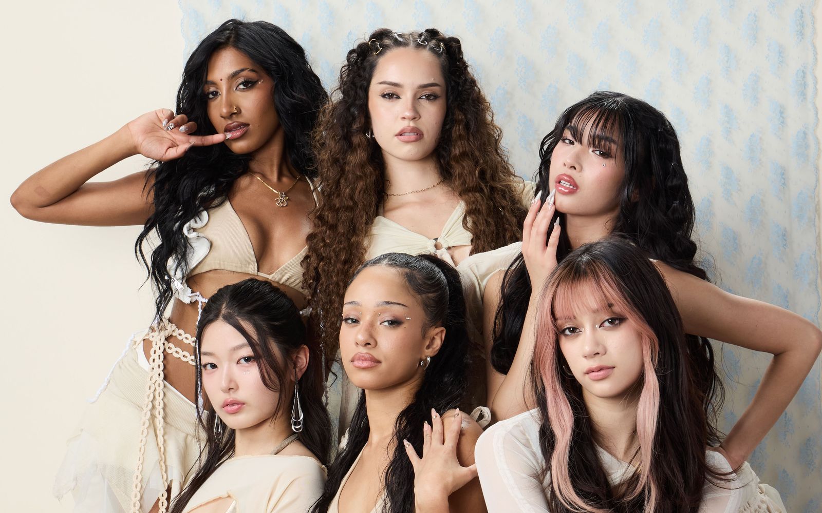
KATSEYE’s tattoo story is already more varied than you might expect. The group is still young, but the members’ ink is moving in three different directions: Lara Raj’s family-focused collection, Manon Bannerman’s playful lettering and hand designs, and Megan Skiendiel’s detailed fine-line and cybersigilism work.

This guide sticks to tattoos documented in interviews, published photos, member posts and performances. That matters with a group whose styling changes so often. A tattoo may be hidden by a costume, mistaken for body art or too small to identify in a fan photo. The most useful way to read KATSEYE’s ink is as a documented snapshot, not a promise that the count will stay the same.

Lara is the clearest place to start. Her designs connect family, music, astrology and tiny symbols worth a closer look. Manon’s tattoos are more mischievous, with phrases and little marks that feel like private jokes made visible. Megan’s collection is newer, but already has a strong look built around stars, heritage and ornate blackwork.

Lara’s chest tattoos carry family and heritage

KATSEYE Lara Raj Tamil chest tattoo and face portrait

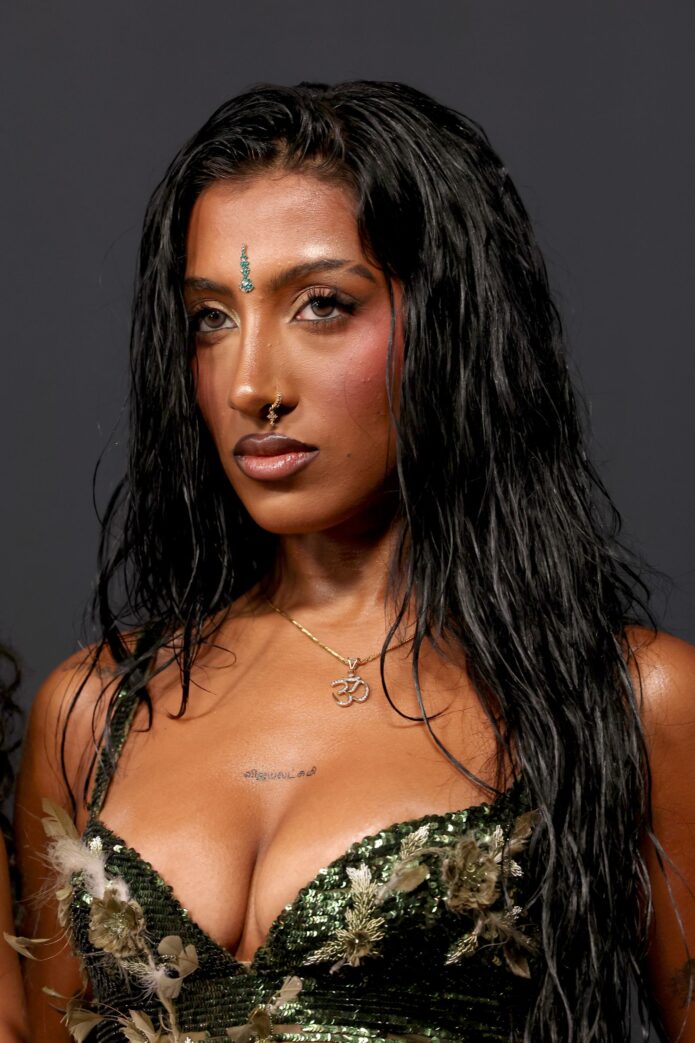
A high-resolution Teen Vogue portrait shows Lara’s chest tattoo clearly. One of her most personal pieces is her name in Tamil, விஜயலட்சுமி, or Vijayalakshmi. She said she placed it over her sternum in January 2026, and it appeared publicly around Spotify’s Best New Artist events before the Grammys. The placement is simple, but the script makes it feel rooted in identity rather than decoration.

The tattoo sits alongside an older family reference on her upper forearm. “Habibi” is a matching tattoo she shares with family members. The word is affectionate; the shared design is what makes it collective.

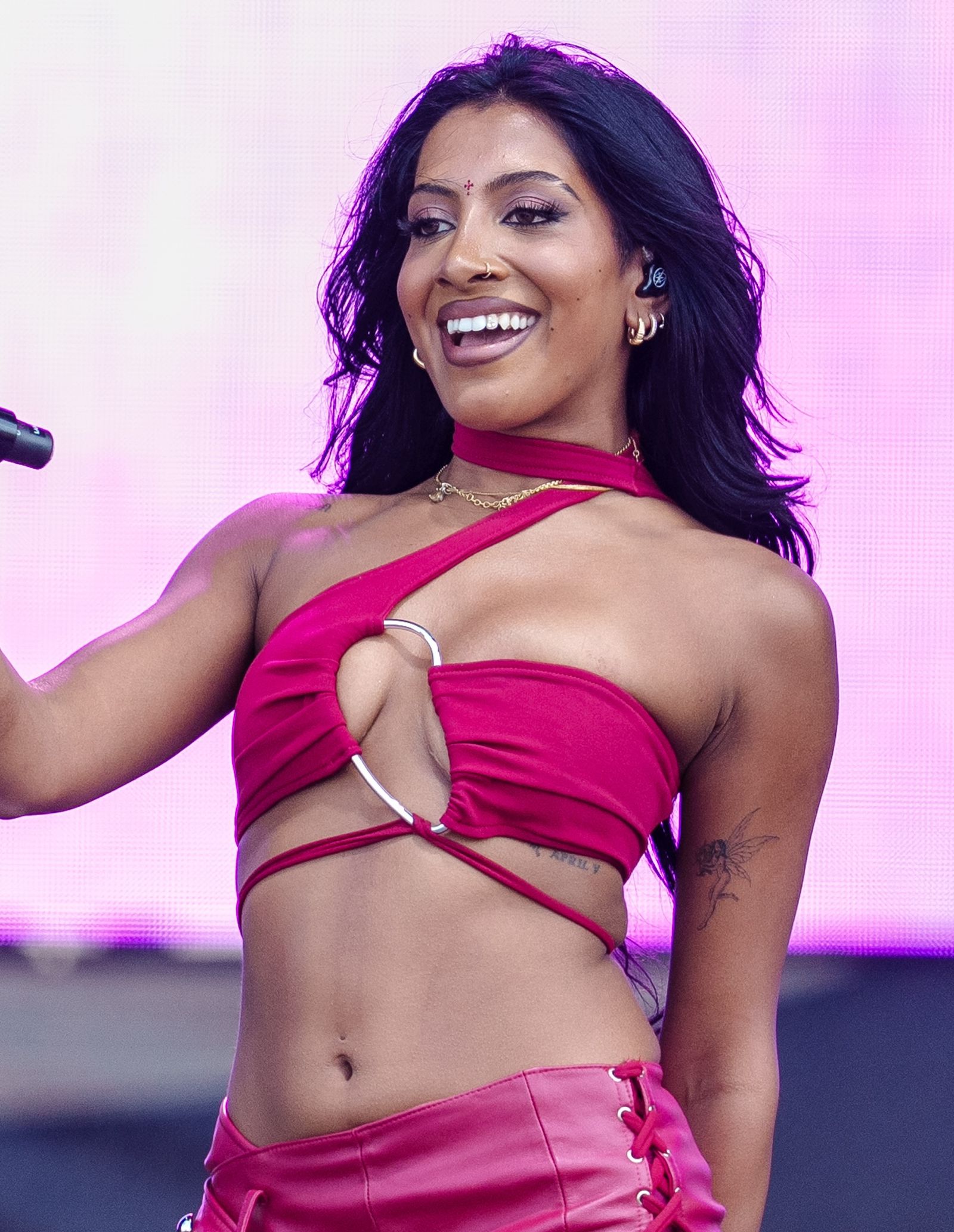
On her shoulder, Lara has “Paranji”, her thatha’s name—Tamil for grandfather. Her ribs hold two more personal designs: a Scorpio symbol for her star sign and APRIL V in Roman-numeral styling, marking her older sister Rhea Raj’s birthday on April 5. The symbols and date keep their message quiet, like notes she can carry without explaining each time she is photographed.

Lara also has a small scorpion behind her ear, another reference to her zodiac sign. The repeated image is interesting: Scorpio is not a one-off idea but a thread that appears in more than one place.

In the same family-and-friends orbit is the wrist phrase “Love is life and life is free”. It comes from Erykah Badu’s 2000 song “Didn’t Cha Know,” one of Lara’s favourites, and the lettering follows the handwriting of two of her best friends. On skin, it reads like a lyric; with the backstory, it also becomes a small archive of the people she trusts.

The fairy and angel details give Lara’s collection a softer edge

KATSEYE Lara Raj fairy tattoo on inner bicep

Alongside the family names and zodiac marks, Lara has more delicate images. A dainty fairy on her inner bicep was done by Los Angeles artist Tyler Dillon at The Fig Leaf Tattoo. She showed fans the fresh piece in 2025, and it has since appeared in performance photos. It is small beside the stories carried by her lettering, but it changes the balance of the collection—lighter, more whimsical, and easy to hide beneath a sleeve or bring into a stage look.

Her left hand has another newer detail: “angel” in Gothic-style lettering. It is more visible than the fairy, especially in selfies and beauty campaigns. Lara already has stars across her hand, so the word joins a larger constellation rather than sitting by itself.

The multiple stars on her hand are arranged to resemble the Taurus constellation. Lara has described them as a tribute to her late grandmother. They are more than generic celestial decoration; their arrangement connects to a person and a specific memory.

That is a recurring pattern in Lara’s tattoos: even a small mark tends to connect to a name, date, song or family member. The fairy, Gothic lettering and stars move between fine linework, script, symbols and tiny illustrations while staying easy to read. They show up in music videos, disappear under costumes or catch the eye when she lifts her hand during a performance.

Lara’s hand and forearm ink makes the details easy to spot

KATSEYE Lara Raj stars and script tattoos on her hand and forearm

Lara’s hand and forearm tattoos are a useful place to start when identifying her ink in current photos. The stars, Gothic “angel” and fine script along her arm may appear together, but they come from different stories: her grandmother, a newer style choice, and friendship and music.

Her ring finger also carries “ZZZ”, a tribute to her three cats. It is tiny, but it is a clear example of how she uses a small design to mark something specific in her life. Around the same hand, the stars add detail without turning into a full sleeve.

The public record also includes Lara’s Scorpio sign on her ribs, the April 5 date, the name on her shoulder, the family “Habibi,” the wrist lyric and the Tamil name on her chest. Taken together, the collection reads less like random flash and more like a timeline. Some pieces point to relatives, some to friends and others to the parts of herself she wants close while she works.

What makes Lara’s ink memorable is how often the explanation is more intimate than the design looks. A small set of stars becomes a grandmother tribute; a short word becomes a matching family tattoo; a lyric carries the handwriting of friends. The pieces do not need to be large to feel specific.

Manon’s collection takes a more playful route. She has dots on three middle fingers, a fine-line design on one finger ring and delicate motifs down her left hand. She also has “Ham” on her inner bicep, a joke she has said is there because she is hot; each letter is written in a friend’s handwriting. It has a very different feel from Lara’s family names, while still using handwriting to keep relationships close.

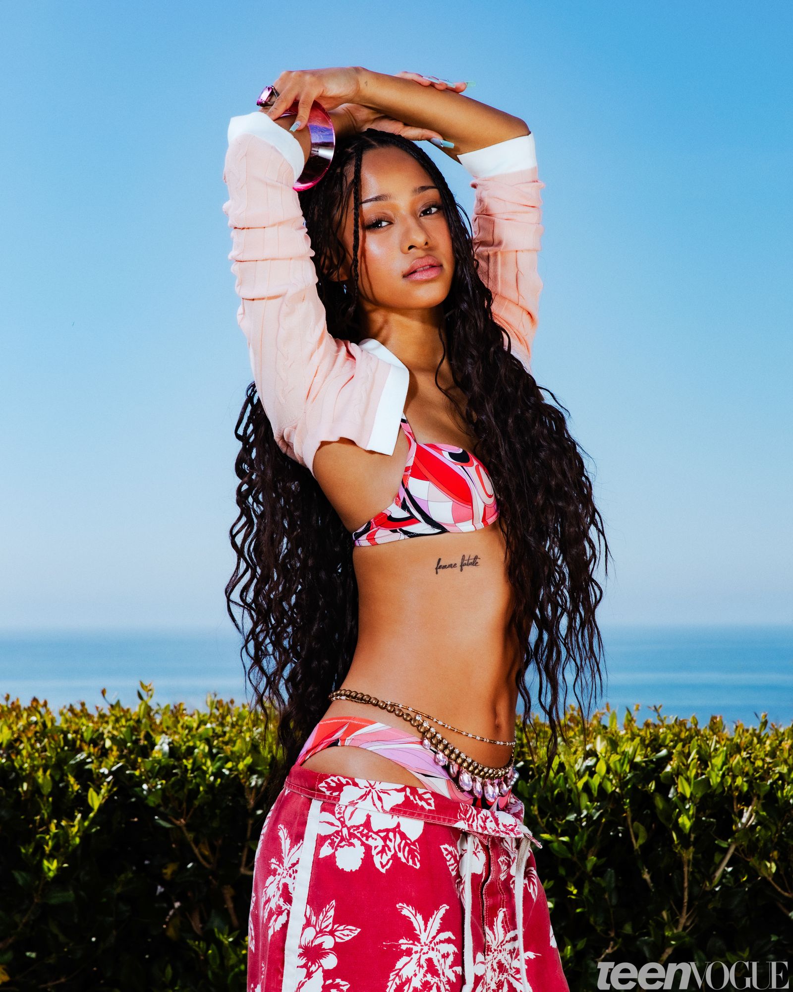
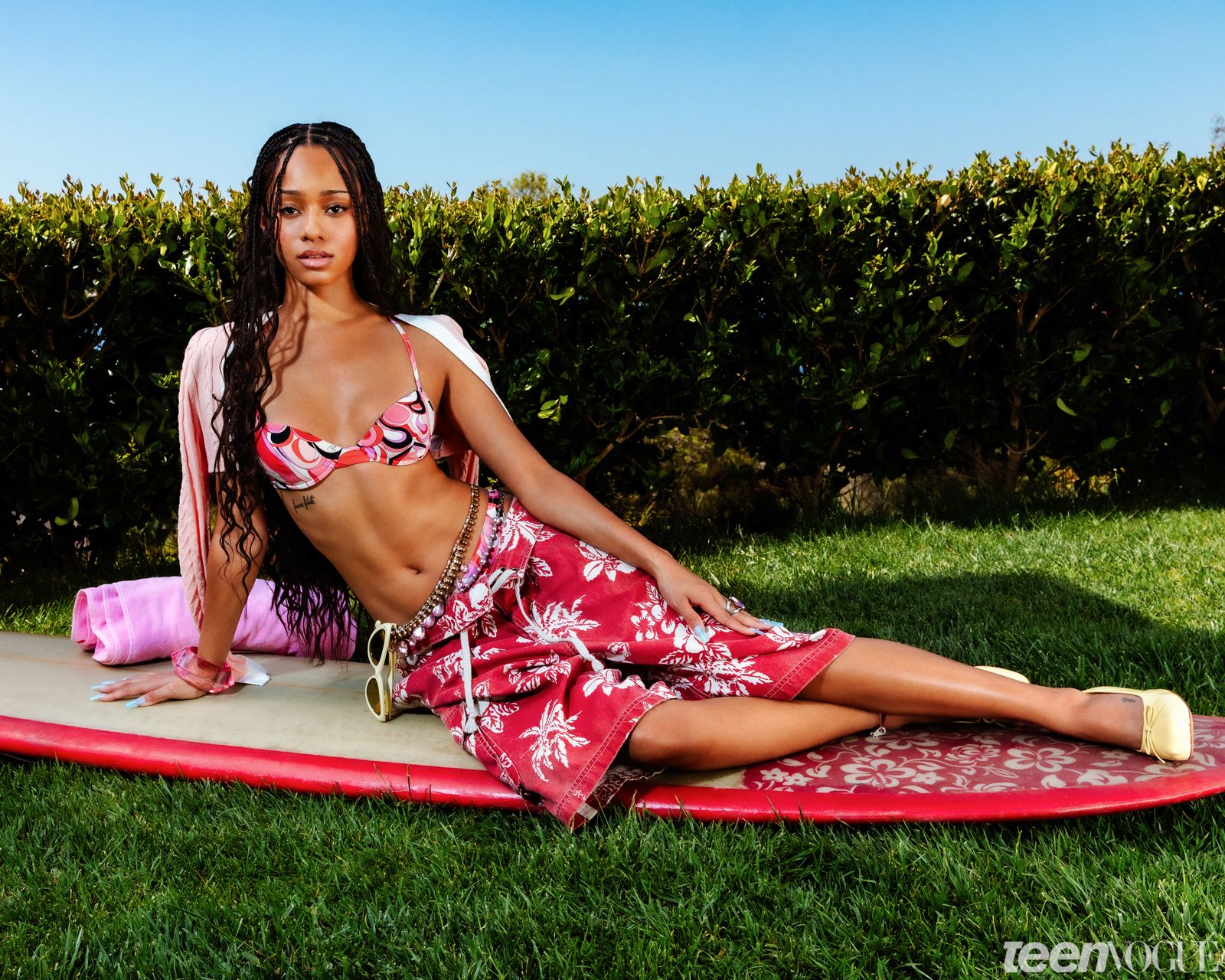
Manon’s other documented pieces include “Femme fatale” on her ribs, a fine script on the side of her left instep believed to say “Sophie,” “Bliss” above her elbow, and “Rockstar” on her hip. She also has matching stars on her hand with friends. She has mentioned tattoos on her legs that have not all been shown clearly, so the public “10+” count should be treated as an estimate that may change, not a final inventory.

The best way to read Manon’s tattoos is as phrases, jokes and small marks that move with her style. They appear in close-up fashion photos or a tattoo tour, then can disappear when she changes costumes. Her collection is less about one centerpiece than a growing set of little statements.

Megan’s tattoos have a more structured look. Her documented pieces include a star outline on her ribs, her first tattoo, which she got because she loves stars; the Qi, or Chi, symbol in Chinese behind her left ear, a nod to her heritage and a symbol connected with receiving its energy; and “Love Love” on the back of her arm, in her mother’s handwriting, based on a phrase shared by her mom and grandmother.

She also has a cherry blossom branch behind her right ear, done by Tyler Dillon, and a large cybersigilism-style moth on her back in honour of her grandmother. The moth is the most visually dramatic piece currently documented for Megan.

More recent additions include a looping script or monogram on her middle finger, two cybersigilism swirls with dotted shading around her right hand by Emily Monet, and an abstract dragon-like design in the cybersigilism style on the instep of her left foot. That creates a strong contrast: family pieces alongside futuristic blackwork. The star, Qi symbol, cherry blossom, moth, hand swirls and foot design do not look like they came from one template. The collection is taking shape in real time, with different artists and visual ideas joining it.

Yoonchae, Daniela and Sophia are currently documented as having no tattoos. That may change; the group has discussed the possibility of matching tattoos in the future. For now, the public picture is three members with tattoos and three without publicly documented ink.

KATSEYE’s tattoos are still developing, which is part of what makes the collection interesting to follow. Lara has the deepest archive, connecting astrology, family, friends, music and heritage. Manon’s pieces feel spontaneous and phrase-driven. Megan is building a darker visual language around stars, family and cybersigilism. Together, the members show different reasons to get tattooed: to remember someone, keep a joke alive or make a style choice permanent.

Watch the tattoo tour below for a closer look at the group’s documented ink.

Tyga’s Ink Tells the Story of His Life

Tyga has been getting tattooed since he was a teenager, and the collection still reads like a timeline. Some pieces are carefully finished; others come from a younger, more impulsive period. His chest, arms, stomach, neck, hands, and face hold different chapters, from family and faith to his Vietnamese background and the years when he wanted as much ink as possible.

In his GQ tattoo tour, Tyga said he got his first tattoo at 14 and sometimes returned to the shop twice a week between 14 and 17. He also admits that “ghetto tattoos” sit beside more detailed work. That candour makes the collection easier to understand: it isn’t built around one perfect style, but around memories and ideas that stayed with him.

His chest is built around “Fear None But God”

Tyga Fear None But God chest tattoo

The largest piece across Tyga’s chest reads “Fear None But God.” The script stretches across his pectorals and stands out whenever he’s shirtless. Heavy shading and surrounding imagery make it feel like a full chest composition rather than a single line of text.

The religious phrase gives the chest a clear centre amid the more decorative work. It also sits alongside Jesus imagery lower on his torso and other faith references on his arms. The front of his body feels layered, not designed as one matching sleeve.

The old-school pieces show where he started

Tyga chest and upper arm tattoos

Tyga’s early work helps give the collection its lived-in feel. In the GQ tour, he points to an arm tattoo of the Lord’s Prayer with John 3:16, one of his first designs. He says he was 14 and excited to get tattooed without his parents’ permission.

He also has lettering from his teenage years tied to his crew and ambitions, including GED, which he explained as “getting every dollar, getting educated daily.” Those pieces aren’t as polished as his later work, but they show an earlier Tyga before the large chest projects, Asian-inspired imagery, and longer sessions.

Vietnam and family history shaped the later work

Tyga Vietnam inspired torso tattoos

One of Tyga’s most personal designs is a Vietnam tattoo he discusses in the GQ video. He says it connects to his mother, who was born in Vietnam during the war, and to his own interest in his Asian background. The piece marks a shift from choosing whatever looked good that week to using tattoos to explore family and identity.

He has described later work as Asian-inspired, including a dragon and related designs. These sit beside earlier tattoos rather than replacing them, giving his torso a mixed feel: religious words, clouds, traditional imagery, and dark sections all share the space. It can look busy, but it also reflects how his interests changed.

Jesus, clouds and the eye of Horus fill out his stomach

Tyga Jesus and stomach tattoos

Tyga’s stomach features some of the collection’s strongest religious and Egyptian imagery. Below the chest lettering is a Jesus tattoo surrounded by clouds and a large winged design. He also points out the eye of Horus, a symbol he connects to a period when he was studying Egyptian culture.

His process helps explain the variety. Tyga has said he brings an idea to the artist, then lets them develop their own version first. He prefers a collaboration to copying a drawing exactly as he imagined it. Scripture, religious portraits, Egyptian symbols, and later Asian influences all end up sharing the same body.

Jack from The Nightmare Before Christmas is one of the fun pieces

Tyga Jack Skellington tattoo

Not every Tyga tattoo is about faith, family, or ambition. He also has Jack Skellington from The Nightmare Before Christmas, one of his favourite movies growing up. He got it when he was around 16.

There’s a funny detail to the story: after seeing the tattoo upside down for years, he’s used to it that way. It makes the piece feel more personal than an entry on a celebrity tattoo list. He liked the film, got the character tattooed, and kept it; it doesn’t need a bigger public message.

The neck, hands and face carry the loudest details

Tyga neck and hand tattoos

Tyga’s neck and hands are among the hardest areas to hide. He has roses on the side of his neck, lettering around it, and small face tattoos he says he barely notices now. He has also shown hand tattoos with the words “Pay Me Dollars.” These pieces make the collection feel close to full-body coverage.

He once considered a larger face tattoo but held back because he didn’t want to change his appearance too much. That restraint can be easy to miss when so much else is covered. The face tattoos stay small, while the neck, hands, and arms do most of the visual work and give his photos a familiar outline.

What Tyga’s tattoos say as a whole

Tyga’s ink makes the most sense as a timeline. He started young, got hooked on the process, and went through stretches when he was getting tattooed constantly. Some designs came from family history; others from films, religion, music, friends, or whatever he was exploring at the time.

That variety is why the work doesn’t look uniform. Early lettering sits beside large chest script, religious portraits, clouds, Egyptian symbols, roses, Asian-inspired designs, and small face tattoos. Tyga hasn’t tried to make every piece look like it came from the same artist or flash sheet. The collection feels personal more than coordinated.

He has advised people to choose something that will still mean something years later, whether that’s family, children, or an idea they care about. His own body shows both sides: thoughtful pieces beside quick choices he made as a teenager. Together, they make the tattoos feel honest.

There’s also a practical side to the placement. The ink shows in photos, onstage, and in videos, while filling gaps between larger pieces. Small marks around his face and neck connect the chest work to his jawline; the hands make even a simple outfit look heavily tattooed. A T-shirt may cover some stomach designs, but the visible neck and hand ink still shape the whole look.

The collection traces different tattoo phases. Early religious lettering is direct; later designs use more images, from clouds and dragons to roses, figures, and cultural references. The earlier tattoos haven’t stopped mattering. They remain the base layer, with newer work growing around them, so you can see the years accumulate rather than one design replacing another.

Tyga’s approach to working with artists may be one reason the styles vary. He has said he brings a rough idea and lets the tattooer create a first version. That leaves room for the artist’s line work and composition, and helps his body avoid looking like one giant sticker sheet.

You can see a related mix of personal history and changing style in Young M.A’s tattoos. Tyga’s collection is busier and more spread out, but the ink shifts as the person does.

There may not be one neat answer to what all the tattoos mean. The chest phrase gives the collection an anchor, while the Lord’s Prayer, John 3:16, Vietnam design, Jack Skellington, eye of Horus, Jesus, roses, and hand lettering each point to a different moment. Together, they read more like a scrapbook on skin than a single logo.

The variety keeps the tattoos interesting. In one photo you might notice the old scripture; in another, a small face mark, a neck rose, or the heavier work across the ribs. The collection adds chapters instead of trying to erase earlier ones.

That timeline also comes through in candid photos. The ink isn’t just one polished chest piece; it reaches into the areas people notice first, giving the collection a connected look from different angles.

The tiger on his shoulder stands out on its own

Tyga tiger shoulder and chest tattoo

A closer look at Tyga’s shoulder brings out the tiger imagery. It sits among the darker chest and upper-arm work and gives that area a sharper focal point. Describing every tattoo as part of one huge torso design can make a piece like this easy to miss.

Roses and hand ink push the collection outward

Tyga hand and rose tattoos

A closer portrait makes the hand and rose tattoos easier to see. They extend the story beyond the chest and stomach, keeping the ink visible when Tyga is dressed. The roses also soften some of the darker lettering and religious imagery nearby.

A poolside shot shows how much skin is covered

Tyga poolside torso tattoos

The poolside photo offers another view of the coverage. Separate designs run across Tyga’s chest, stomach, and arms, and remain visible in a casual setting. It’s a reminder that the collection reaches well beyond a few close-up pieces.
The neck and chest work read clearly in tour photos

Tyga neck and chest tattoos on tour

In a tour-era portrait, Tyga’s neck ink appears above his shirt, with chest lettering and shoulder designs below it. The less formal photo makes it easier to see how the placement works in everyday life.

Watch Tyga explain his tattoos

Tyga talks through his first tattoo, the Lord’s Prayer, Jack Skellington, the Vietnam design, his Egyptian influences, and the way he works with tattoo artists in this GQ tour.

Young M.A’s Tattoos Tell a Brooklyn Story

Young M.A’s tattoos stand out, but their stories give the collection its character. Ink covers her neck, face, hands, arms, and chest, with designs tied to Brooklyn, her late brother, her music, and the people close to her.

She’s open that not every piece began as a carefully planned design. Some were early ideas, some have been covered, and others only make sense once she explains them. The collection feels personal before it feels polished.

In her GQ tattoo tour, she talks about the first piece she got for her brother, the block where she grew up, her microphone tattoo, and the face ink she had thought about for years.

The first tattoo is a tribute to her late brother

Young M.A has said her first tattoo was connected to her late brother. That piece gives the collection its emotional starting point: it wasn’t just a design she liked, but a way to keep someone close while living a very public life.

She has described the tattoo as meaningful as soon as she saw it. Her later work is larger and more detailed, but that first piece still matters. It set a direction for the rest of the collection: use tattoos to hold on to names, memories, and places.

Her brother is also connected to the broken-heart tattoo on the right side of her face. She has said she wanted it as a lasting reminder of him. The placement is bold, but the reason is personal.

For Young M.A, the face tattoo isn’t there to shock people. It’s there because grief doesn’t disappear just because someone is famous.

God’s Gift sits across the neck

Young M.A God’s Gift neck tattoo

“God’s Gift” is lettered across the front of Young M.A’s neck. It’s one of her best-known pieces and changes the feel of a portrait. Whether she’s wearing a tank top, cap, or open jacket, the tattoo has become part of her everyday image.

The lettering is direct, without a lot of decoration, which suits her style. She wears it with the same relaxed confidence she brings to her music; it makes its point without needing a long explanation.

Photos show the neck tattoo alongside smaller hand pieces and heavier work on her arms. “God’s Gift” may be the headline design, but it sits within a larger collection that runs from the collar to the wrists.

Older reports also mention “Good Lyf” lettering around her neck. The appearance varies across photos, and some pieces may have been reworked. It’s best to describe what each image shows instead of treating every old picture as a perfect record of the current version.

Her hand tattoos keep the lettering close

Young M.A Pray hand tattoo

Young M.A has small hand tattoos, including lettering that has been read as “Pray” and other short words. Hand ink is difficult to keep private, especially for a performer whose hands are always in view onstage, in photos, and in music videos.

The designs aren’t large, and that’s part of their appeal. The words sit close to her fingers and knuckles, visible without turning the whole arm into a solid block of ink. Jewellery or the way she holds her hands can hide some of the letters, so close-up portraits give the clearest view.

The hand work also breaks up the heavier arm tattoos. Instead of one uninterrupted sleeve, there are gaps, lettering, and smaller marks that make the collection feel like it grew over time. That stop-and-start look feels more like real tattooing than a matching catalogue sleeve.

Short words can be personal without needing a long explanation. Young M.A’s hand ink works that way: visible, simple, and in keeping with the attitude she brings to her music.

The microphone tattoo matches her life as an artist

Young M.A arm and chest tattoos

A larger tattoo on Young M.A’s left upper arm and shoulder shows a microphone surrounded by flames. It’s a direct image for a rapper, but it connects to the work she has built her life around.

The flames add movement and help the design stand out in photos where part of her arm is covered. This isn’t a tiny microphone tucked near the wrist; it takes up space and anchors that part of the collection.

Her arm also has other shapes, script, and cover-up work. In the GQ video, she discusses one arm still being in the middle of a cover-up. It’s a reminder that tattoos aren’t always finished once they’re first done; they can be changed or reshaped as someone leaves an older idea behind.

That makes the microphone a strong marker of who she is now, surrounded by earlier pieces that show how she got there.

Brooklyn and the 92nd Street connection

Young M.A script neck tattoo

Young M.A’s Brooklyn roots appear in tattoos connected to her block and neighbourhood. The 92nd Street reference is often mentioned in coverage of her ink. It connects the public artist to where she grew up and keeps the story specific.

That hometown connection matters because her music has always carried a strong sense of place. The tattoo brings the same idea to her skin, showing where the energy came from and why Brooklyn remains part of how she presents herself.

Her collection also includes a crown and lettering tied to the Kween Foundation, an organization she started with her mother to support people dealing with grief and loss. The connection between her tattoos, family, and community comes up repeatedly.

The ink isn’t only about looking tough. Some of it is about belonging: the face tattoo remembers her brother, the neck lettering makes a statement, and the Brooklyn work keeps her roots visible. Together, those choices give the collection a strong sense of identity.

The face tattoo is small but carries the most weight.

The broken-heart tattoo on the right side of Young M.A’s face is one of the smallest pieces, but it may be the one people ask about most. She has tied it to her late brother, giving a simple shape a lot of emotional meaning.
She has said she wanted face ink before getting it, so it wasn’t a spur-of-the-moment decision. The heart sits near her eye and cheek, making it visible in close-ups without covering her features.

Photos show other small face and hand details, but the broken heart is the tattoo with the clearest public explanation. It’s easy to attach a dramatic meaning to every little mark; a good guide sticks to what the artist has actually said.

The best way to understand Young M.A’s face ink is as a memorial that happens to be impossible to miss. It isn’t her largest tattoo, but it is one of her most personal.

Young M.A’s collection keeps changing

Young M.A has enough tattoos that the collection keeps shifting as older pieces are covered, new work is added, and photographs show different angles. That’s normal for arm and neck tattoos built up over several years.

The subjects remain consistent. Her brother, Brooklyn, family, music, and foundation all appear in some form. Even the boldest pieces connect to a real part of her life.

The designs don’t all serve the same purpose. Some are memorials, some mark her hometown, and some were simply pieces she wanted at the time. Together, they feel lived-in rather than staged.

Smaller marks appear in close portraits or when she wears a different top, so one red-carpet photo can’t show the whole collection. The neck words, hand lettering, and arm pieces overlap visually, but they are still separate choices made at different points in her life. The collection makes the most sense when the details are given room to breathe.

Watch Young M.A explain her tattoos

Arabic Script, NASA and the Tattoos Bazzi Is Still Building

Bazzi’s tattoos are still growing, and that’s part of the idea. In his GQ tour, he said he planned to keep adding to them but didn’t want to rush into designs everyone else already had. He waited until an idea felt like his.

The collection now mixes Arabic writing from his family, space imagery, music, symmetry, and a few pieces he chose because he liked how they looked. Not every tattoo needs a big life story; Bazzi’s make room for both personal meaning and a design that simply looks good.

Here’s what he has explained so far, from the first words his dad wrote out for him to an arm piece that took more than half a day.

Three Arabic affirmations came from Bazzi’s dad

Bazzi sleeve and hand tattoos

Bazzi’s first tattoos are three short affirmations in Arabic. His dad wrote out the words, making the lettering more personal than a translation he picked from a book or an online design. Bazzi is Lebanese, and the script connects the tattoos directly to his family background.

The lines say he is a child of the universe and infinitely creative; that he’ll live to bring understanding and beauty into the world; and that he won’t live in the past or future, but stay present. They’re big ideas in clean, simple lettering, which fits the way Bazzi describes his taste.

His dad didn’t want him getting tattoos, so Bazzi used the first one as a kind of bargain: if his father wrote the words, maybe he’d be more comfortable with the tattoo. Bazzi jokes that after that, it was a lost cause. The story adds a family layer to the Arabic ink: the meaning matters, but so does the person who first put the words on paper.

The affirmations also help explain why Bazzi talks about balance when discussing his tattoos. He likes simple shapes, even spacing, and designs that sit comfortably beside each other. The writing is meaningful without being loud or overworked.

His NASA mission patch is a proper space fan tattoo

Bazzi Arabic script and music tattoos

Another major piece is a NASA mission patch. Bazzi has described himself as a big space fan, so the design makes sense. While on tour, he visited NASA and stood on the floor in mission control. He compared the experience to being a kid in a candy store.

NASA reportedly even told people in space that Bazzi had turned the patch into a tattoo. He said they were excited, and connected the story to his first album, Cosmic. The tattoo is both a souvenir from a memorable visit and an extension of the space theme he was exploring in his music.

It feels different from the Arabic affirmations. Those are about how he wants to live; the mission patch is about a place, a fascination, and an experience that made a strong impression. The collection works because the pieces don’t all try to say the same thing.
Bazzi has also pointed out smaller arrows and marks that don’t have a deep explanation. He just liked how they looked. That honesty is useful: sometimes a tattoo honours your family or beliefs, and sometimes you see a clean design and think it looks good.

The Vitruvian Man took more than twelve hours

Bazzi shoulder and arm tattoos

Bazzi’s biggest arm tattoo is based on Leonardo da Vinci’s Vitruvian Man. The full concept came from an artist named Bulloss. Bazzi trusted his eye, let him develop the design, and wanted it as soon as he saw the finished idea.

The figure remains inside the famous circle and square, with extra details around it. Bazzi points out a palm featuring Mercury, Apollo, and Jupiter, along with other elements. He likes that da Vinci was centuries ahead of his time, which fits his interest in ideas that move beyond one period or style.

The work took about 12 to 14 hours. Rather than letting that put him off, Bazzi got excited and asked the artist to start another piece the same day. He had waited for ideas that felt right, but once he found an artist he trusted, he was ready to keep going.
The Vitruvian Man also fits his love of symmetry. Bazzi wants the tattoos to feel balanced and move together at a natural pace, almost like parts of a song. The design has its own structure, giving the arm a centre without needing a huge block of dark shading.
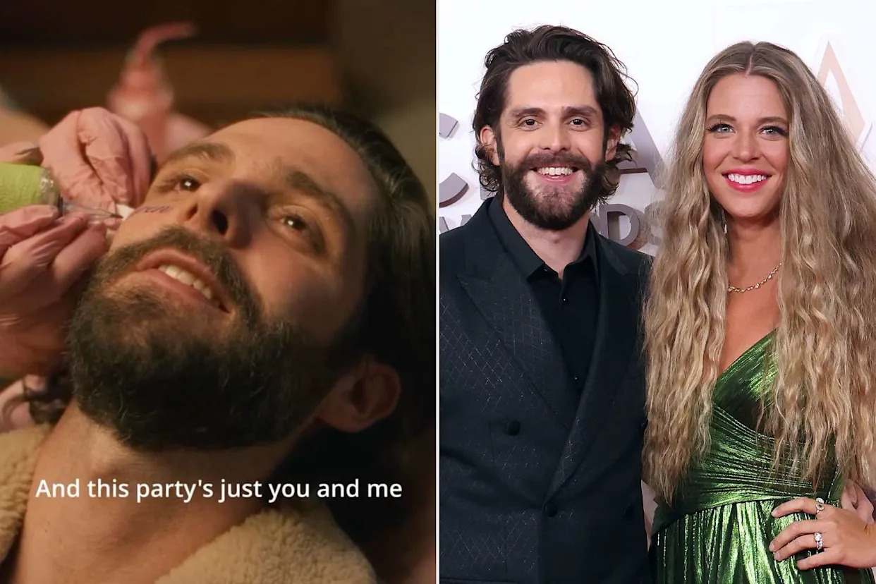
There’s a similar interest in tattoos as a record of creative life in Trevor Jackson’s tattoo collection, though the two artists choose very different images. Jackson leans into characters, portraits, and family symbols; Bazzi returns to proportion, space, and movement.

Music, butterflies and stars sit on his arm

Bazzi musical note arm tattoos

One of Bazzi’s most recognizable tattoos is a flowing music design with butterflies and stars in place of ordinary notes. He got it while doing charity work in Bali, where he knew of an artist whose style suited the idea.

Bazzi doesn’t think music has to be perfectly technical. For him, it’s a way to create and give feeling a place to go. The wavy lines keep the design moving, while the butterflies and stars make it feel less like sheet music and more like a melody drawn out visually.

He has said he may not read every note or draw a realistic face, but he can put passion and intensity into what he makes. The tattoo reflects that: it isn’t meant to look like a textbook diagram, but to feel free and a little dreamy.

Smaller musical marks and script also appear on his arm, easier to see in close-up photos than in a full red-carpet shot. The different views help: one shows how the tattoos sit on his body, another reveals the writing, lines, and symbols.

The sun, moon and yin-yang design is about balance

Bazzi Arabic and musical arm tattoos

Bazzi has a design built around the sun, moon and yin-yang. He describes the sun and moon as coming from different worlds and meeting in the middle. The image reflects his belief that life needs both sides: light and darkness, happiness and sadness, the grounded part of him and the creative part.

The Arabic affirmations belong to that same foundation. They represent his roots and the way he tries to live, while the moon points toward music, magic, and imagination. The yin-yang brings those ideas together in one connected design.

This is where the collection’s symmetry becomes clear. Bazzi isn’t just collecting unrelated images and hoping they match. He likes the way one side can answer the other, and pays attention to how smaller pieces move around his arm.

During the GQ tour, he was still considering adding much more ink, possibly toward his neck. He wasn’t ready to get a face tattoo. Those were future ideas, not finished work, but they show how he saw his arm as a starting point.

Some tattoos connect closely to his family or beliefs. Others recall NASA, music, or the balance he wants in life. And then there are the arrows he simply liked. That mix keeps the collection from feeling stiff: it’s thoughtful without pretending every small mark needs a grand explanation.

The overall shape is easy to see. The Arabic lines provide a family and values base, the NASA patch captures his curiosity, and the Vitruvian Man gives the arm a centre grounded in art and science. The music design loosens the composition with movement and imagination. Even the marks he calls meaningless fit his taste for clean, simple forms. The pieces feel connected without all looking like copies of one idea.

Watch Bazzi talk through the ideas, artists, and stories behind his tattoos: