Musicians

Omarion’s tattoos carry family, music and a little Maybach history

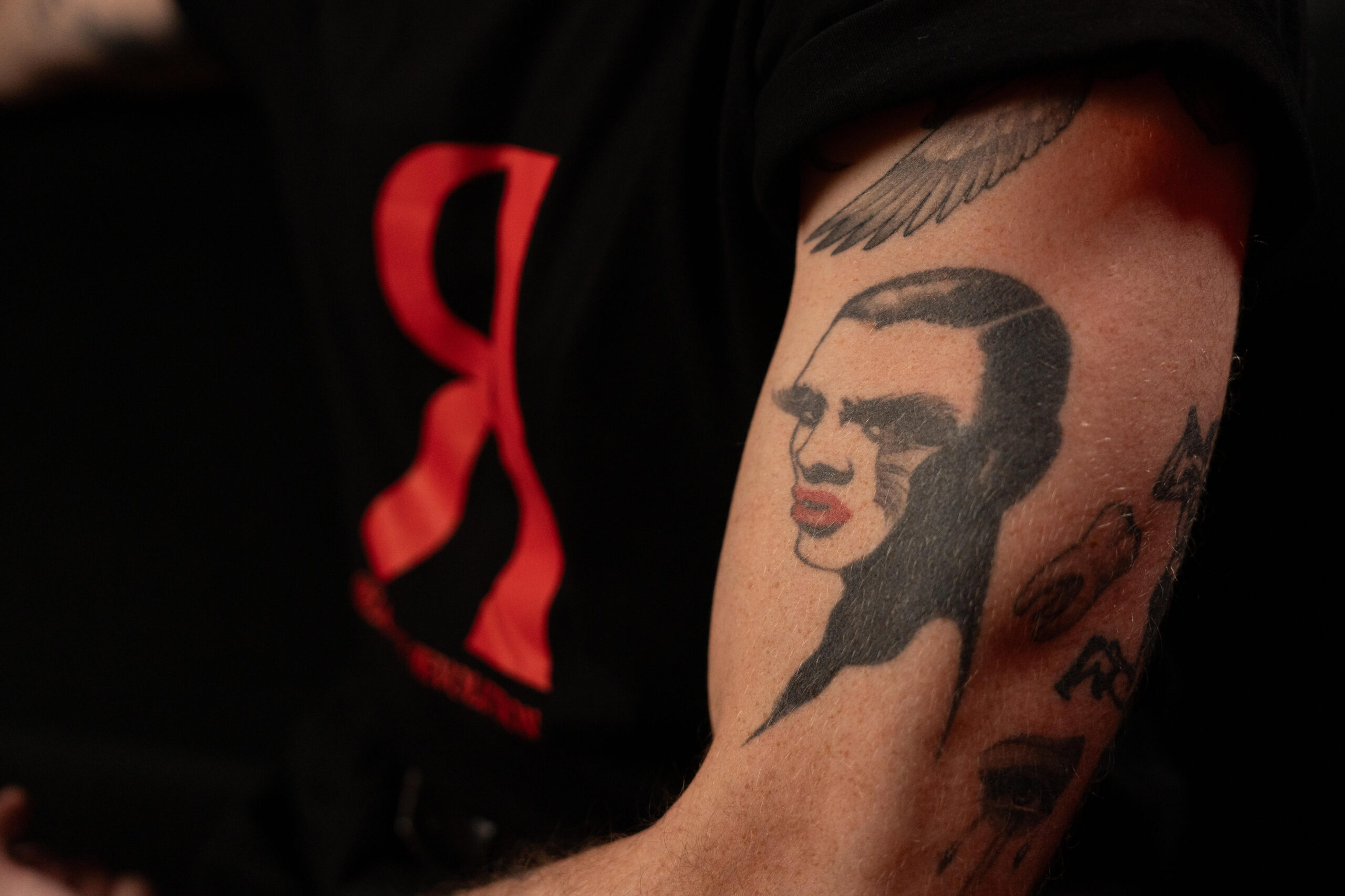
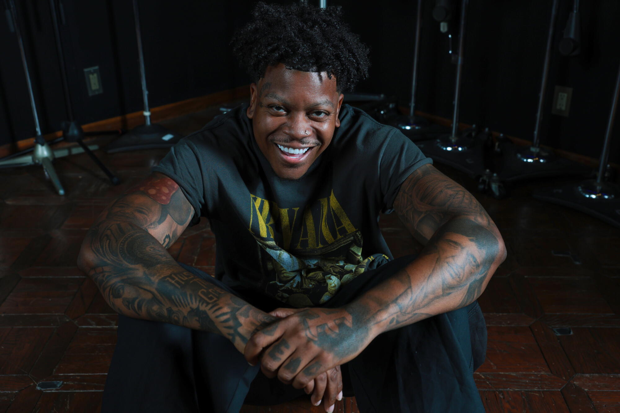
Omarion’s tattoos each have their own story. The huge “Forgive Me” chest piece makes a bold first impression, while a portrait of a young Michael Jackson points to one of his musical influences. The Maybach O on his hand marks a chapter in his career. Tribal-inspired patterns, script and layers of dark ink bring the rest of the collection together.

He has explained several of the designs himself. In an iHeart tattoo interview, he linked the lion on his forearm to his son’s Leo sign, described the rose beside it as a symbol of love, and talked about the Maybach O on his hand. He has also discussed the Michael Jackson tribute and tattoos connected to his name, music and family. Here’s a closer look at the pieces with clear stories behind them.

The lion and rose on Omarion’s forearm

Omarion lion and rose forearm tattoo

The lion and rose on Omarion’s forearm carry one of the collection’s clearest family stories. The lion represents his son, who was born under Leo. Its face is set in deep black shading, and the mane stretches in sweeping lines around the arm. It feels personal without relying on a name or birth date.

Omarion has said the rose stands for love. Together, the flower and lion give the piece a balance of softness and strength. From across the room, the big cat catches your eye; closer up, the rose and finer details come into focus.

Artist Jun Cha gave the lion a portrait-like finish, with careful shading that suits the design’s meaning. This is a family tribute with enough presence to hold its own onstage. The personal reason and the bold look meet in the same tattoo.

“Forgive Me” sits across his chest

Omarion Forgive Me chest tattoo

Across Omarion’s upper chest, large script spells out “Forgive Me.” Dense ornamental patterns frame the words and connect them to a wider chest piece. In close-up photos, the lettering stands out against the curls, shading and symmetrical details around it.

Omarion hasn’t attached one definitive explanation to the phrase, so there’s no reason to assign it one. It could be a private reminder, a spiritual appeal, or simply words that mattered to him when he chose them. They sit plainly in the middle of his chest, open to view rather than tucked beneath a sleeve.

The script anchors the design, while the surrounding patterns stretch across both sides of his upper body. A little color appears near the shoulder, but the piece is mostly black and gray. That restrained palette keeps the words clear despite all the detail around them.

His neck is covered in layered symbols and script

Omarion neck eagle and script tattoo

Omarion’s neck tattoos remain visible whether he’s in a shirt or onstage. The close-up shows an eagle-like design, dark ornamental shapes along the side of his neck, and script reaching toward the base of his throat. The pieces follow the angle of his neck instead of sitting in a single, tidy frame.

That placement makes the neck work feel different from the chest piece, which can be covered whenever he wants. This ink is part of his look in interviews and performances. It also seems to link the designs around his collarbone with the ones closer to his jaw.

Some of the smaller lettering is difficult to make out in photos, so its meaning isn’t clear. The eagle, dark shapes and script are visible; the story behind every tiny mark hasn’t been shared publicly. Here, the placement is part of what makes the tattoo noticeable.

The Maybach O tattoo on his hand

Omarion Maybach O hand tattoo

The mark on Omarion’s hand is commonly called the “Maybach O.” It recalls his time with Maybach Music Group. A 2013 interview with The FADER described it as a tattoo he got soon after signing with the label, and he also showed it in a video interview with Karen Civil.

A hand tattoo is hard to keep out of sight, and this one appears in the middle of Omarion’s everyday gestures. It became part of his public image while marking a specific moment in his music career.

The close-up shows additional ink around his hand and wrist. The lines have softened over time, as tattoos do, but that only adds to the sense of history. What began as a fresh mark tied to a label deal now belongs to a much longer career story.

Omarion’s name appears through several O designs

Omarion signature O upper arm tattoo

The letter O appears more than once in Omarion’s collection. BET’s Tatt’d Up Spotlight showed a large, stylised O on his upper arm. It’s shaped like a personal emblem, and its link to his stage name is easy to see.

The upper-arm design and the Maybach mark have different connections. The hand tattoo points to a chapter in his music business career; the O on his arm refers back to Omarion himself. He has said people recognise him by the tattoos around his neck, and the name-based designs add to that signature look.

Repeating a letter helps tie together a large collection that includes portraits, patterns and script. The O works as a name reference and a simple visual thread among the more detailed pieces.

The Michael Jackson tribute on his arm

Omarion chest and arm tattoos portrait

One of Omarion’s most personal designs is a portrait of young Michael Jackson on his left arm. It shows Jackson during his Jackson 5 years, a fitting tribute from an artist who grew up paying attention to performance, dance and pop history. The portrait points to an influence, not just admiration for a famous musician.

The image sits among Omarion’s other tattoos rather than inside a separate frame. Patterns and shading run around it, making the portrait part of a larger, developing sleeve. That mix of personal references and decorative work gives the collection the feel of a visual diary.

A wider chest-and-arm photo shows how much territory the tattoos cover. Script, geometric panels, chest lettering and arm designs overlap, with smaller pieces filling the spaces between. The close-ups can make them seem separate; seen together, they trace influences and different points in his career.

What the collection says about Omarion’s style

Omarion chest and hand tattoos

Across the photos, Omarion’s style relies on strong black lines, ornamental patterns, script and portraits. There aren’t many minimalist pieces designed to disappear. Even the smaller tattoos fit into a larger look built around bold shapes and dark shading.

Some designs point to his career, like the Maybach O, while the Michael Jackson portrait marks an artistic influence. The lion and rose turn toward family and love. The O designs make his own name part of the collection, and “Forgive Me” leaves its meaning open.

That range keeps the tattoos from reading like one big exercise in branding. Some mark his roots, some reflect the people he loves or the artist he wanted to become, and others have become part of the image he brings to performances and interviews. The collection feels personal while still being made to be seen in motion.

There isn’t one neat story connecting every tattoo. Different chapters sit side by side: a portrait, a bold letter, a family symbol, a phrase and patterns that fit the body. Together they bring R&B history, family, career milestones and heavy black ink into one recognisable collection.

Omarion on camera

Omarion has talked about the Maybach O in interviews. In the clip below, he explains the career moment behind it.

Avicii built a dark sleeve from Banksy, myth and memory

Avicii’s tattoos weren’t a handful of flash pieces picked up between shows. Tim Bergling began with one carefully planned design, then met tattoo artist Jun Cha and built a detailed black-and-grey sleeve over two long sessions. The work brings together a Banksy-inspired image, a roaring gorilla, three bandaged women and a figure drawn from Greek sculpture.

He talked through the stories behind the ink in an iHeart tattoo interview. The first sleeve session lasted about 12 hours and the second around 18. Avicii also said he wanted to keep adding graphic, slightly strange imagery to his arm. Here’s what his comments and the photographs tell us about the designs.

The Banksy-inspired tattoo was his first

Avicii Banksy inspired right forearm tattoo

Avicii waited until his early twenties to get his first tattoo. He’d wanted one for a long time but wasn’t sure what to choose. Eventually, he worked with Jun Cha on a Banksy-inspired design for his right forearm, taking time to plan it instead of choosing something on impulse.

The choice suited his taste. Banksy’s work often turns a simple image or small visual joke into an idea that sticks. Avicii wanted a design connected to that world, shaped to fit his arm. He and Cha talked through the layout, and he waited until he felt sure before getting it done.

At first, Avicii thought this might be his only tattoo. In hindsight, that’s a telling detail: the collection grew far beyond one piece. But the Banksy-inspired design stayed on the opposite arm, separate from the later sleeve, giving his tattoos a point of contrast.

One tattoo turned into a full left arm sleeve

Avicii left arm tattoo sleeve wide view

Six months after the Banksy piece, Avicii returned to Jun Cha and began what became his left arm sleeve. In the wide photo, the designs travel from the upper arm to the forearm, with the main images fitting closely together.

The work took two long sittings: about 12 hours for the first and around 18 for the second. Avicii said friends kept him company, while Cha stayed intensely focused on the work. This was a major project, not a quick appointment for one small symbol.

Black and grey set the tone, with realistic faces, deep shadows and theatrical expressions. The sleeve feels closer to a wall of old illustrations than a typical musician’s tattoo collection. Rather than relying on bright colour, it uses skin breaks, dark fabric and carefully shaded faces to create contrast.

The sleeve feels planned without looking rigid. Each section has its own subject, while the shading and linework make the arm read as one piece. That balance came from the conversations between Avicii and Cha before the tattooing began.

The gorilla brings the loudest energy

Avicii gorilla and three women tattoo

The most dramatic image is a roaring gorilla near the top of Avicii’s left arm. Its mouth is open, its teeth show, and the fur is shaded in fine detail. The expression hits you first, making it the part of the sleeve many people notice right away.

Avicii linked the larger design to the three wise monkeys: hear no evil, see no evil, speak no evil. He’d liked the idea since childhood but didn’t want the obvious version of three ordinary monkeys on his arm.

Cha suggested another way to work with the reference. The gorilla became the focal point, with three figures below it carrying the familiar idea in a more unsettling form. That shift gave the tattoo its own character instead of making it a direct copy of a traditional symbol.

The gorilla shows how Cha’s realism can take on a surreal edge. It looks less like a straightforward animal portrait and more like a figure in a darker story. Avicii said he liked having room for strange or even evil-looking imagery, and this design captures that mood.

Three bandaged women replace the usual monkeys

Avicii tattoo sleeve detail with three bandaged women

Below the gorilla are three women wrapped in bandages: one covers her eyes, another her ears, and the third her mouth. The familiar pose is easy to recognise, but the detailed figures feel more human than the usual cartoon monkeys.

Avicii said Cha proposed using the women and pairing them with the gorilla. They discussed the idea and exchanged images before he decided it felt right. The extra thought kept the design from becoming too literal: the reference remains, but the final tattoo has a more serious, almost mythic mood.

In the close-up, the bandages form clear horizontal lines across the faces and bodies, helping the figures stand out within a busy sleeve. Similar wrapped shapes appear elsewhere on the arm, giving the images a visual link even when you focus on one detail.

The idea behind the tattoo is familiar, but the mood is darker than a playful proverb reference. It feels like a reminder of what people choose to ignore. That slight unease is part of what gives it such presence.

The Greek sculpture sits lower on the forearm

Avicii Greek sculpture forearm tattoo

Lower on Avicii’s left arm is a portrait of an older man inspired by Greek mythology. He has a long beard, deep lines across his face and the stillness of a classical sculpture. After the gorilla, this image feels quieter; its detail comes through texture and shading rather than an explosive expression.

Avicii said he already admired the sculpture tattoos Cha was known for, so he came in with a sense of the style he wanted. Cha showed him several options and talked through their stories before they settled on a design that suited the arm.

The figure gives the sleeve a moment to slow down. Its expression is thoughtful rather than aggressive, offering a change of pace after the gorilla and bandaged women. That contrast keeps the full design from feeling like one long shout.

Composition mattered as much as the image itself. The sculpture had to fit the shape of the arm, sit comfortably beside the other figures and help the eye travel from shoulder to wrist.

The finished sleeve reads like one dark visual story

Avicii tattoo sleeve face visible portrait

From a distance, Avicii’s sleeve can look like one large black-and-grey mural. Up close, separate images emerge: the gorilla, the bandaged women, the sculpture, the folds of fabric and smaller marks that connect them. The full-arm photo makes the overall composition easier to see.

His right arm provides a counterpoint. The Banksy-inspired tattoo is more graphic and playful; the left sleeve leans into classical figures and darker drama. Avicii talked about adding more Banksy-style work on the right and continuing the more gripping imagery on the left, treating the two arms as different sides of one collection.

It’s tempting to treat every tattoo as a confession, but Avicii’s own explanations were more grounded. He talked about images he remembered from childhood, artists he admired and designs that fitted the arm. Some have a clear idea behind them; others also came down to what looked right beside the rest.

That keeps the sleeve from feeling like a secret code where every line needs decoding. The Banksy piece marks his first commitment to tattoos; the gorilla and three women reshape a childhood symbol; and the sculpture reflects his interest in Cha’s work. Together, they show how the sleeve took shape over several long sessions.

When he spoke about the tattoos, the work was still evolving. Avicii was considering stranger, more graphic images for the left arm and more Banksy-inspired ideas for the right. The collection wasn’t a finished costume; it was something he was still building. The existing pieces already bring together the music, art and imagery that caught his attention.

Watch Avicii get his tattoos done

Footage from the studio gives a closer sense of the work behind the finished sleeve. The clip below shows Avicii getting tattooed and adds context to the long sessions he described.

Adam Lambert’s tattoos pull together Queen, symbols and old-world detail

Adam Lambert’s tattoos feel like a collection gathered over time: Egyptian symbolism, old-style lettering, geometric patterns, a Queen tribute and a lyric from one of his own songs. They don’t look as if he planned a matching sleeve from the start. Instead, one idea led to another, and later designs grew around the earlier ones.

That mix makes the collection fun to explore. One piece is about protection, another reflects the energy of performing, and others caught his eye as artwork. Adam has also shared the stories behind many of them, so there’s plenty to say beyond the black-and-grey detail. Here’s a closer look at the best-documented tattoos and how they sit together.

The Eye of Horus was Adam’s first tattoo

Adam Lambert Eye of Horus forearm tattoo

Adam has said his first tattoo was an Egyptian Eye of Horus on his forearm, done before he started American Idol. He was about 27. Part of the choice was practical and part of it was a joke: he wanted an eye of protection before millions of people watched him on camera.

He was already interested in Egypt, so the symbol wasn’t a random lucky charm. The Eye of Horus has long been linked with protection, healing and watchfulness. For Adam, it became a small shield for a major turning point. It’s a very Adam kind of origin story, mixing genuine belief with a wink at the drama of the moment.

“Musica Delenit Bestiam Feram” runs down his forearm

Adam Lambert Musica Delenit Bestiam Feram forearm tattoo

One of Adam’s clearest text tattoos is the Latin phrase “Musica Delenit Bestiam Feram.” It’s often translated as “music soothes the savage beast.” Written in tall, old-style lettering along his arm, it looks more like an inscription from an antique book than a modern slogan.

Adam has talked about how music can shift a mood: it can ease stress, make a workout feel doable or change the atmosphere entirely. He mentioned everything from relaxing music to a night out. The tattoo isn’t only about music as his profession; it’s also about the way music can reset how you feel.

The lettering creates a strong vertical line against the shapes and shading around it. It gives the sleeve a clear focal point without interrupting its theatrical style.

The key came from a friend’s artwork

Adam Lambert infinity and key forearm tattoos

Adam’s old-fashioned key tattoo sits on his left forearm. He said the design came from a piece of art he bought from a friend named Hans. The artwork included a key, and Adam liked that element enough to have it tattooed.

There’s no grand explanation attached to it: he liked the shape and wanted it on his arm. The key has a vintage look, with a decorative top and a long shaft that sits neatly beside the nearby infinity symbol.

It’s a good example of how personal history and visual taste share space in Adam’s collection. Some tattoos carry a clear message; others belong because the design simply felt right.

The infinity symbol is about the energy of performing

Adam Lambert baroque arm sleeve tattoo

Near the key is Adam’s infinity tattoo. He connected it to the exchange between performer and audience: he sends out energy, the crowd returns it, and the feeling keeps moving between them.

That’s more specific than the usual “forever” meaning. Adam wasn’t talking about an endless relationship or an abstract promise. He meant the give-and-take of a live show, where the singer and audience shape the atmosphere together.

The small loop also gives the busier forearm a simple visual pause. It’s easy to pick out in close-up photos without competing with the lettering or the key. Together, the three designs suggest a small vocabulary of performance: music, connection and the opening of a door.

A Greek god and Baroque ideas fill the upper arm

Adam Lambert Greek god arm sleeve tattoo

The larger tattoo on Adam’s upper arm has a more theatrical feel. He has described its central figure as something like Dionysus, the Greek god associated with wine, parties, art and creativity. It isn’t meant as a strict textbook illustration: Adam has noted that Dionysus can be interpreted in ways that feel both feminine and masculine.

He got this part of the tattoo in Hong Kong. Later, an artist named Kim in Los Angeles expanded the design around it. Adam was drawn to Baroque imagery, including carved stone, architecture and the kind of dramatic ornament he noticed while walking around Paris.

Curls, faces, ornamental shading and shifts from light to dark make this a dense black-and-grey section. It took several sittings, allowing the skin to heal before the artist returned to build up the shadows and highlights. That gradual work gives the sleeve depth instead of leaving it as a flat wash of ink.

The mosaic and upside-down triangle make a statement

Adam Lambert mosaic and upside-down triangle arm tattoos

Another section of Adam’s arm has a mosaic-style pattern made from repeated shapes and dark patches. It gives the sleeve an architectural feel. Adam has said he liked the pattern and chose it because it looked cool, which is refreshingly straightforward.

Beside it is an upside-down triangle, a symbol Adam has said represents gay identity. It works as decoration and as a visible statement; he hasn’t described it as a hidden reference. Even among the more intricate sleeve work, the simple shape is easy to recognise.

The contrast gives this part of the arm its punch. The mosaic is textured and asks you to look closer, while the triangle makes its point at a glance.

The Queen tattoo marks a huge chapter in his career

Adam Lambert Queen diamond geometric tattoo

After he began touring with Queen, Adam added a “Q” for Queen. It’s an obvious career reference, but the letter stands for more than a band logo: working with Queen became one of the defining chapters of his life onstage.

He has also talked about a more intricate diamond-shaped tattoo he designed with Maxime from Sang Bleu in London. They began with line work in Adobe Illustrator, worked through the shape together, then transferred it to his skin and shaded it by hand.

The Queen-related tattoos bring two sides of Adam’s taste together: a letter you can recognise instantly and a more abstract design built from geometry, shadow and custom detail.

“Chasing the Original High” sits on his collarbone

Adam Lambert Chasing the Original High collarbone tattoo

Adam’s “Chasing the Original High” tattoo sits across his collarbone. The words come from the chorus of one of his songs, and he described them as especially relevant to him when he got the piece. Unlike some of the older arm tattoos, this one points straight to a particular period in his own music.

The placement suits the phrase. It shows with an open shirt or stage outfit, then disappears under a fully buttoned shirt. It reads like a personal headline rather than a large chest piece, and the simple lettering keeps the words in focus.

It also makes a direct link between his body art and his music. The arm tattoos often use symbols and images to say something about performing; this one states the thought in plain words.

How the collection fits together

As a whole, Adam’s tattoos feel less like one planned sleeve and more like a conversation that has kept growing. The Eye of Horus came before American Idol and offered protection. The Latin phrase speaks to what music can do. The key came from a friend’s artwork, and the infinity symbol captures the back-and-forth of a live show.

Other pieces bring a more theatrical mood. Dionysus and the Baroque shading add old-world drama; the mosaic adds pattern, while the triangle represents identity. The Queen tattoos mark a major professional chapter, and the collarbone lyric points back to his own songs. A moon tattoo adds a lighter note among all the serious symbolism.

Adam once said he liked abstract tattoos that didn’t have to mean something specific, as long as they looked cool. That might be the best guide to the collection. Some pieces are deeply personal, but they don’t all need to be declarations. Some are memories, some are symbols, and some are artwork he simply wanted to live with.

He has also talked about possibly extending the work onto his chest or back while leaving one arm freer. Whether he adds more or leaves it as it is, the existing tattoos share a few threads: music, performance, visual drama and a willingness to let very different ideas sit side by side.

The interview clip

Adam has explained the stories behind several of these pieces, including the Eye of Horus, infinity symbol, key, Latin phrase and Queen tattoo. In the clip below, he talks through those ideas in his own relaxed way, adding a little context to the photos.

Chris Carrabba’s ink grew one story at a time

Chris Carrabba’s tattoos feel as if they’ve grown alongside his music. Japanese koi and dragons share space with a traditional rose, stars, arrows and a timepiece linked to a tour night that went a little wrong. There’s also a patch of black ink covering a first tattoo that didn’t go to plan. The collection is colourful, but it still feels personal rather than carefully branded.

Chris has talked about the stories behind many of the pieces, and the details are easy to relate to. Some designs were planned for years; others came from a band or a tour. One began with a teenager, a mail-order tattoo machine and a very wobbly armband. Here’s the story of the tattoos he’s discussed, piece by piece.

His first tattoo became a solid black cover-up

Chris Carrabba blacked-out arm band tattoo

Chris got his first tattoo when he was 15 years old. He wanted a simple armband made of three bold lines. Instead, they came out wavy and raised: the artist was another 15-year-old who had just ordered a tattoo machine through the mail.

He hid the tattoo for about 20 years, though he’s joked that his grandmother knew about it from the day it happened. It’s a funny story now, but the experience was a surprise: Chris had never planned on getting tattooed and had no idea what a normal session was supposed to feel like.

Eventually, Chris covered the original design with solid black ink. He has said he might add a white design over it one day. He also admitted he missed the old, terrible tattoo once it was gone. Even a bad tattoo can become part of your history. The blackout marks both a cover-up and the odd beginning of his collection.

Koi fish and dragons bring Japanese mythology into the sleeves

Chris Carrabba koi fish and dragon sleeve tattoos

The most recognisable work on Chris’s arms features colourful koi fish and dragons. He has connected them to Japanese mythology, where the koi transforms into a dragon. In his collection, the dragon also carries a sense of protection, giving the sleeve an emotional thread as well as striking imagery.

Chris was drawn to Japanese art because it felt older and less predictable than the American traditional and tribal designs that were popular when he began getting more tattoos. He wasn’t chasing a trend; he wanted images with history and a layout that worked on his body.

The arms aren’t identical, but they play off each other. Chris has described wanting a mirror image of fire and water, using movement, colour and opposing shapes to create balance. The koi bring motion, while the dragons add weight and a protective feel.

Meaning came first, but he also cared about how the pieces fit together. That mix helps the sleeves feel considered without turning them into a set of matching flash designs.

The chest rose marks a fresh start

Chris Carrabba traditional chest rose tattoo

Chris’s large traditional rose stretches across his chest. He got it after learning the release date for Dashboard Confessional’s album Crooked Shadows. To him, the rose meant a fresh start: after a long gap between records, things were coming back into bloom.

The timing gave the tattoo a very specific meaning. It wasn’t just a rose he liked; the record was finished, the release date was set and a new chapter was finally real. Chris wanted to remember that hopeful moment whenever he saw the tattoo.

He joked about the risk of tattooing a band name or a partner’s name. The rose let him mark the moment without trying to predict what would happen next. It could remain meaningful even if the album didn’t perform as expected.

That’s one of the strongest ideas in the collection. The album doesn’t have to stay famous for the rose to matter. It holds the feeling of beginning again, and that meaning can shift as life moves on.

The star and wrist details connect to his bands

Chris Carrabba koi fish and star wrist tattoos

Chris has a star tattoo on his wrist, which he has linked to stars in the artwork around Dashboard Confessional and New Found Glory. He doesn’t remember exactly who suggested getting stars, and that’s part of the appeal: not every band-related tattoo starts with a formal plan.

The star is much simpler than the koi and dragon work nearby. That contrast gives the sleeve a little breathing room. The small, solid shape catches the eye before it returns to the colour and detail of the larger designs.

Chris has called it the closest thing he has to a straightforward band tattoo. He has also joked that he hasn’t put out a Twin Forks record since getting the arrows linked to that project, so perhaps the tattoos jinxed things.

Whether he really believes that or not, the pieces show how music appears in his ink without always spelling out a band name. A star or an arrow can hold a whole stretch of his career without looking like merchandise.

The arrows on his legs point back to Twin Forks

Chris Carrabba Twin Forks arrow leg tattoos

Chris also has arrows on his legs, tied to Twin Forks, the other band he has been part of. Arrows became a recurring part of that project’s visual identity. Their long, direct lines feel quite different from the round koi and flowers on his arms.

For a musician, arrows suggest movement without pinning a tattoo to one lyric or date. Twin Forks gives the design a clear starting point, while the image can still carry the broader idea of moving forward.

The placement keeps them in their own space. They disappear under trousers and show clearly in shorts or onstage, without competing with the rose or crowding the sleeves. They add another music-related thread to the collection.

A timepiece and nautical compass mark an important moment

Chris Carrabba timepiece and nautical compass shoulder tattoo

On Chris’s right shoulder, a timepiece joined to a nautical compass marks a moment from a Twin Forks tour with Lucero. He got the tattoo in Dallas on a night when the band had only a short set, leaving him time for a bigger appointment.

The clock is set to an hour that matters to Chris, though he has kept the reason private. The face is visible; the story behind the time belongs to him.

The tattoo session became a story of its own. Chris said he played the show with fresh ink bleeding through his white shirt. He thought the crowd was staring because he was giving the performance of his life, then realised they were probably reacting to the blood. It’s an unglamorous tour memory, which makes it hard to forget.

The compass sits naturally beside the clock. Together they suggest time, travel and the routes between shows, while the memory underneath remains a very specific night on tour.

Why Chris takes his time with the collection

Chris has been tattooed in different parts of the country, but much of his work was done by Janos in South Florida. They built a relationship through long sessions, and Chris has described him as both a brilliant artist and a close friend.

Chris isn’t trying to finish a sleeve as quickly as possible. He has pushed back on bands touring for a week and filling an entire arm in that time. He’d rather add work gradually, let it heal and allow the collection to grow alongside his life.

You can see that slower pace in the finished tattoos. They don’t look like one design placed on his body all at once. Different dates, styles and moods sit together: bright koi near a dark blackout, a traditional rose beside a detailed timepiece. The variety feels natural because the work was allowed to develop over years.

Chris has called the collection an ongoing process, and that still fits. He could add white ink over the blackout, keep building the sleeves or leave some space open. The tattoos don’t need a final version.

How the tattoos fit together

Chris Carrabba’s ink loosely maps his life. The first armband records a teenage decision gone wrong. The koi and dragons reflect Japanese mythology and protection. The rose recalls a new record and a fresh start. Stars and arrows connect to the bands that shaped his work outside Dashboard Confessional.

The shoulder clock holds a private memory from a Twin Forks tour, while the compass gives it a sense of direction. The funny details count too: the bloody shirt, the disastrous first tattoo and the fear of jinxing a band all make this feel like a collection a real person built over time.

No single style rule holds everything together. The common thread is that each tattoo arrived with a reason, even when that reason was simply liking the image. The sleeves are colourful and dramatic, but their stories bring them back to music, friendship, touring and the ordinary mess of growing older.

The interview clip

Chris has talked through his first tattoo, the koi and dragons, the chest rose, stars, arrows and timepiece. The video below adds his humour and his own explanations to the stories behind the photos.

Cazzu lets every tattoo keep its own secret

Cazzu’s tattoos reward a closer look. There are words along her neck, flames across her hands and small details around her face, alongside a Hello Kitty and larger designs on her torso. She has said she lost count of them; one Spanish-language roundup puts the number above 50. Either way, there is no single theme tying every piece together.

That variety is part of the appeal. Some tattoos are playful, others connect to music, family or a turning point in her career. Cazzu has explained a few in interviews, while others are best left as what they are: visible designs whose meaning she has not spelled out.

The face heart marks the moment music became real

Cazzu face heart and cheek tattoo

The small heart on Cazzu’s cheek is often the first tattoo people notice. In GQ Mexico’s tattoo tour, she said she got it after receiving her first payment from music. She was about 22, and the work she had been pursuing was finally paying her bills.

For Cazzu, the heart marked a turning point. There was still plenty she could not know about the future, but music had become a real way to support herself. It is a small design in a very visible place, so the reminder was never tucked away from view.

She has other tiny details around her face and lips in some photos, but this is the one with the clearest story. It marks the first time her career gave her tangible proof that the life she wanted was possible.

Her neck and hand tattoos bring the stage persona into focus

Cazzu arm and torso tattoos

Text and graphic designs cover parts of Cazzu’s neck, often peeking out above a choker or collar. Tattoo coverage has identified the words “Fe” and “Error”; “Frágil” appears lower on her body. They are brief, pointed words, and they sit neatly alongside the contrast in her public image: a tough exterior with room for vulnerability.

The flames on her hands have a connection to performing. With a microphone in her grip, they can look as if fire is rising from it, turning a hand gesture into part of the show. That makes them work as both tattoos and a recurring detail in her stage presence.

The words and flames are easy to describe, but not every smaller symbol has a confirmed explanation. Leaving those meanings open is more honest than assigning each one a story.

Hello Kitty adds a playful note to the darker ink

Cazzu Hello Kitty and new stage tattoos

A Hello Kitty tattoo on Cazzu’s arm brings a lighter note to the collection. It can be easy to miss in the low light of a performance, where the bigger shapes tend to stand out. Once you notice it, the cartoon shifts the mood of the surrounding ink.

Cazzu often appears in heavy boots, dark leather, sharp makeup and elaborate stagewear. Hello Kitty gives that look a playful counterpoint. It does not need a grand explanation; sometimes a tattoo is there because its owner likes the character or the bit of fun it adds.

That change in tone runs through the collection. A delicate heart, bold lettering, flames and a cartoon do not have to match to feel personal. They leave room for different sides of Cazzu to show up at once.

The anime piece on her abdomen is a newer chapter

Cazzu anime-inspired abdomen tattoo

In 2025, Cazzu shared a new anime-inspired tattoo on her abdomen after visiting a favorite studio during the Nena Trampa era. Photos show a colorful design with fine lines running down the center of her stomach toward her pelvis. It is a bold placement, worn with the same ease she brings to her music.

Coverage does not consistently identify the exact character or reference, so “anime-inspired” is the clearest description. The style stands apart from her older text tattoos, with more color and movement across the front of her body.

New ink can shift the way an older collection reads. Before this piece, the words and face tattoo did much of the talking. The abdomen design adds another layer, making the collection feel more like a collage than a finished set.

“Inseguridad” and the spider carry a sharper edge

Cazzu Inseguridad chest and spider shoulder tattoo

Photos show the word “INSEGURIDAD” across Cazzu’s chest and a spider on her shoulder. “Inseguridad” means “insecurity” in Spanish, a stark word to put in such a visible spot. It takes a feeling many people keep private and makes it part of the image.

The spider brings a different kind of tension. It is a familiar tattoo motif, and its placement fits the darker, theatrical side of Cazzu’s styling. Without a direct explanation from her, there is no need to settle on one meaning.

These tattoos also change with their setting. Beside jewelry and stage clothes, or under concert lights, a design can read differently than it does in a still portrait. The marks are part of a larger image built through movement as much as through ink.

Her torso and arm work make the collection feel like a map

Cazzu stage arm tattoos

Concert and rehearsal photos reveal tattoos across Cazzu’s arms and torso. Some lettering and shapes can be picked out from a distance; others only show when she raises an arm, turns or wears a cropped top. Together they include words, small symbols, outlines and larger graphic pieces.

The idea of a map fits the collection. Cazzu has spoken about life in motion and becoming a collage of places and experiences. Her tattoos have a similar feel: they do not look like one matching sleeve planned all at once, but like pieces gathered as her work and life have changed.

Placement matters onstage, too. The hand and arm designs move with the microphone; tattoos on her chest and stomach appear with certain costumes, while the heart changes the balance of a close-up. Cazzu performs with her whole image, and the ink moves with it.

The tattoos connected to family are still being written

Cazzu live tattoos across her arms and torso

Cazzu has spoken openly about becoming a mother, but she has been thoughtful about what she might tattoo for her daughter, Inti. During the GQ tattoo tour, she said she had not found the right design yet. She does not seem interested in choosing a symbol simply because people expect a motherhood tattoo.

That leaves the story open. A future tattoo might connect to Inti, but Cazzu has said it needs to feel right to her. Until she shares more, it is best to leave that chapter unwritten.

The way she talks about her tattoos feels grounded: she knows which ones she wants to explain, which ones are just for fun, and which stories she is keeping to herself. Not every piece has to come with a public explanation.

Her collection also does not have to stay fixed to make sense. A small heart can sit beside a blunt word; Hello Kitty can share space with a spider; an anime design can arrive without replacing what came before. The newer pieces show that the person wearing the older ones is still changing.

The most honest way to read Cazzu’s tattoos may be to notice what she explains, respect what she keeps private and accept that some designs only flash into view onstage. The collection feels personal in part because it leaves a few questions unanswered.

Watch Cazzu explain the tattoos herself

GQ Mexico’s tattoo tour is the best place to hear Cazzu talk about the cheek heart and the thinking behind some of her most personal pieces.

Kalan.FrFr’s ink tells the story in chapters

Kalan.FrFr has around 25 tattoos, and he has said most of them mean something to him. Inked has photographed designs across his chest, forearms, hands and shoulders. Some relate to family, others to music, and some record what was on his mind when he got them.

He has also been open about regretting a few. Tattoos connected to people can feel different when those relationships change, especially when the name is still there. Kalan.FrFr does not pretend those pieces never happened; they belong to a particular chapter, which can matter even if he would not make the same choice now.

The clearest record comes from an Inked interview and close-up photos of his chest, arms and stomach. They show the large No Hard Feelings lettering, Arabic script about faith and fear, a tribute to his grandmother and plenty of smaller designs. Here is what he has explained.

No Hard Feelings is the tattoo he wanted everyone to understand

Kalan.FrFr No Hard Feelings abdominal tattoo and forearm tattoos

The biggest piece in the photos is No Hard Feelings, lettered across Kalan.FrFr’s upper abdomen. The decorative text is hard to miss, and it connects to the project he was working on at the time, which was also called No Hard Feelings.

For him, the phrase is more than a title. He described it as a way of moving through everything happening around him: losing friends and relationships, and dealing with things outside his control. If he cannot change something, he does not want it to keep him from moving forward.

The placement was deliberate. Kalan.FrFr said the stomach is one of the more painful areas to tattoo, but he chose it so the message would be seen. It is not hidden under a sleeve or reduced to tiny lettering; it sits across his middle as a statement he is willing to stand behind.

He also connects the phrase to confidence. Showing pride in his work does not make him arrogant, he has said. The tattoo gives him room to acknowledge how far he has come without apologising for it or downplaying his accomplishments to make other people more comfortable.

The surrounding arm and chest ink makes the photos look like a glimpse of a much larger collection. Smaller marks run along his forearms and hands, with other designs around his jewellery. He has not explained each one, so it is better to see the image as a map of his tattoos than to guess at every symbol.

His Arabic tattoo puts faith ahead of fear

Kalan.FrFr chest Arabic tattoo and No Hard Feelings tattoo

One of Kalan.FrFr’s clearest explanations is for the Arabic writing on his body. He says it means “your faith has to be greater than your fear.” He called the message self-explanatory, but those words still tell us why the design matters to him.

The script sits among the chest and stomach tattoos, close to other lettering and small designs. It is not a separate religious sleeve or a formal quote piece; it is one thought woven into the rest of his life and work.

The phrase fits the way he has talked about his career. Kalan.FrFr has described coming up in South Central Los Angeles, finding his voice and refusing to act like someone else for the music industry. In that context, putting faith ahead of fear is a practical reminder in a career full of uncertainty.

Placement adds to the collection’s rhythm. The chest script shows when he is shirtless, while the arm tattoos appear in short sleeves. The designs vary in size and lettering instead of following one perfectly matched pattern.

That mix gives the tattoos their character. They do not look as though they were planned in one sitting. They have gathered at different times, with the Arabic phrase among the clearest statements.

The arm and hand tattoos carry years of smaller stories

Kalan.FrFr arm chest hand and forearm tattoos
Kalan.FrFr arm and chest tattoos

Photos show tattoos on both arms, his hands and upper chest. Kalan.FrFr has not shared a meaning for every mark, but he has said each tattoo connects to something in his life. The collection mixes script, small symbols and larger shaded designs.

His first tattoo has a clear family story. He got it in a trap house in Compton, trading his PlayStation 3 to pay for it. His mother was angry when he came home, but the tattoo honoured his grandmother, which changed the conversation.

That is a revealing place to start. Kalan.FrFr’s first tattoo was not a polished celebrity appointment; it was improvised, local and tied to someone he loved. His process may have become more professional as his career grew, but the personal reason stayed.

His arms show how quickly the collection has grown. Ink runs along his forearms and toward his shoulders, with smaller details on his hands. From a distance it can look like one sleeve; close up, the designs feel more uneven and personal, with separate moments across different areas.

Music has influenced what he notices, too. Asked about iconic music tattoos, Kalan.FrFr mentioned Nipsey Hussle’s The Marathon Continues pieces and Michael Jackson tattoos. That does not mean every image on his own arms is a tribute to either artist, but it shows the kind of tattoo history he follows. Music, memory and identity meet in the collection.

He has also admitted to making some mistakes. His advice is to be careful with names: a relationship may be temporary, while the ink is not. That kind of honesty makes the collection more believable. It does not have to be a highlight reel where every design is presented as perfect.

Why a cover-up is the next chapter

Kalan.FrFr No Hard Feelings tattoo close-up

Kalan.FrFr has joked that a cover-up will be his next tattoo. After hearing him talk about regret, the line lands differently. He knows some designs are tied to people or moments that have changed, and he is comfortable admitting that living with permanent ink can be complicated.

A cover-up does not erase the old tattoo’s history. It is closer to editing a page while remembering what was underneath. That suits someone who sees tattoos as snapshots of different stages: the meaning may change, but the experience of getting the piece still happened.

The No hard feelings idea fits here too. It is about accepting what you cannot control and moving on without letting it decide your next step. If one of the older tattoos gets a new life under a cover-up, that would be another version of the same thought.

There is no complete public inventory of all 25 tattoos, and the available photos do not make every small design readable. The documented pieces include the tribute to his grandmother, the Arabic message about faith and fear, and the lettering on his stomach. The rest are best described by placement and appearance unless he has explained them himself.

That restraint makes the known stories stronger. No invented meanings are needed: there is a family tribute, a statement about faith and fear, a project title turned into a painful stomach tattoo, and a collection that holds both pride and regret.

There is a balance between the public and private sides of the ink. The stomach lettering is meant to be seen, especially when Kalan.FrFr is promoting a project or performing. The tribute to his grandmother began as something personal, even if it now appears in photos. The smaller arm and hand tattoos fall somewhere between the two: visible up close, but not explained to everyone.

That keeps the collection from feeling like one long advertisement. Some pieces belong to music; others belong to home, family, fear or old decisions. Even the cover-up he has joked about is part of the story, and it leaves room for the collection to change as he does.

Kalan.FrFr’s ink looks like a running diary: bold when it needs to be, imperfect when life gets messy, and honest about both.

Allie Colleen lets her tattoos grow with the music

Allie Colleen’s tattoos can change the first impression you get of her. Onstage, her country voice and big personality come first. Then the sleeves show, the dragonfly at her chest catches the light, and the ink becomes part of the picture she makes with the music.

She has said she has more than 30 tattoos, though she does not keep a public tally. They are not a matching set drawn up all at once. Flowers, animals, small personal symbols and larger sleeve work sit alongside pieces she got simply because she liked them.

In interviews, Colleen has talked about her first elephant tattoo, how her ink marks different versions of herself and how some pieces are just cool. Photos also show a pocket watch, a rose and succulents, a dragonfly tattoo sits at the centre of her chest, and bright floral work across both arms. Here is what can be seen clearly and what she has explained.

The sleeves are the centre of Allie Colleen’s tattoo look

Allie Colleen dragonfly chest tattoo and floral sleeve tattoos

The floral work across Colleen’s arms is the biggest visual feature of her collection. Bright colours, leaves and dark outlines fill both sleeves from the upper arms toward her wrists. They read as full pieces, even though the tattoos were added over time.

In the same photo, a dragonfly sits at the centre of her chest. It is small beside the sleeves, but gives the look a focal point. Set above the neckline, it can show up in portraits and stage photos without a dramatic pose.

Colleen talks about the tattoos as pieces of her story rather than one big statement. The sleeves reflect that: not a single logo, but a group of images and memories that have found room beside each other.

They have also become part of her everyday style. A simple black top leaves the arms visible; a hat or country stage outfit changes how the colours read. The tattoos are not just for a certain kind of photo. They are part of what makes Colleen recognizable.
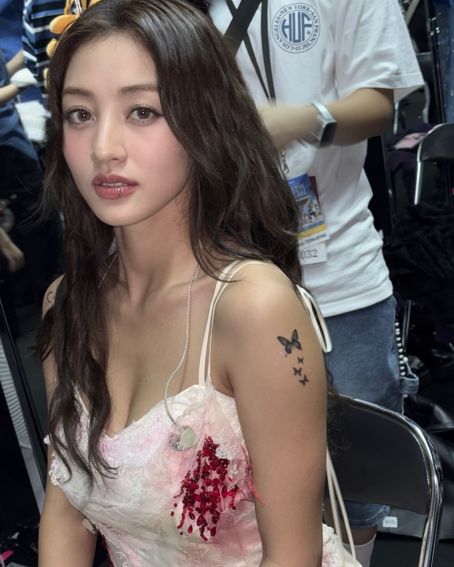
She has described getting tattoos as a personal choice she did not need to clear with her famous family. That attitude comes through in the finished sleeves: confident, but not overly calculated.
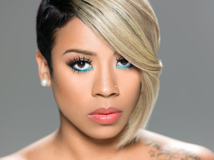
The pocket watch and rose pieces bring a softer side to the ink

Allie Colleen pocket watch and rose tattoos on her arms

One clear photo of Colleen’s arms shows a pocket watch tattoo on one forearm and a rose with succulents on the other. The watch has an old-fashioned look, with a round face and detailed casing. Its mood differs from the bright flowers around it.
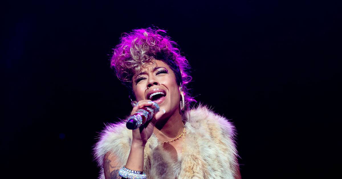
The rose and succulents bring a more organic feel. Leaves and blossoms spread over the arm, with colour layered beside darker lines. It looks less like one flower set in an empty patch and more like a garden that has kept growing.

Colleen has not given a fixed meaning for the watch or each flower, so there is no need to turn them into an invented timeline. What is clear is her taste for images with personality: a watch with some age to it, and plants that are soft but still hold their own beside the heavier sleeve work.

The darker outlines and larger shaded areas keep so many flowers from making the collection feel too sweet. The watch adds a vintage note; the plants make the sleeves feel alive instead of like a flat block of colour.

Those details work in motion, too. The watch can show when Colleen holds a microphone or guitar, and the flowers move with her arms instead of disappearing in a distant stage photo. A sleeve has to work beyond the close-up, while its wearer is doing something.

Her first elephant tattoo started the personal collection

Allie Colleen shoulder tattoo and arm ink

When asked about her first tattoo, Colleen named an elephant. She mentioned it while discussing the more than 30 pieces she has collected. It is a simple starting point, before the sleeves, flowers and later portraits.

She has also said tattoos can mark who she was at the time and who she is now. That helps explain the smaller pieces near her shoulders and upper arms. Not every design has to be a grand tribute; it can hold a feeling, a stage of life or an image she wanted to keep.

The shoulder photo shows smaller designs beside the more developed sleeve. Different line weights and shapes appear rather than one perfectly uniform pattern. With a collection this large, some areas will be more finished than others, and that unevenness makes the ink feel lived in.

Colleen has said some tattoos are simply cool. That belongs in the story too. The elephant may have a personal meaning, while another piece might just have looked right in the moment. Both can sit in the same collection.

She has also said she never felt the need to ask her parents what they thought about her body. The tattoos are choices she made for herself, not a performance for someone else.

Music and the tattoos sit comfortably side by side

Allie Colleen floral sleeve tattoos while playing guitar

A photo of Colleen playing guitar shows how naturally the tattoos fit into her working life. Both arms are visible, and the colourful sleeves become part of the scene without taking over the instrument or performance.

Her ink is part of how people recognize her as a country singer, but the music still leads. She can wear a plain black top, pick up a guitar and let the sleeves show without needing a special pose.

Colleen has talked about writing a song called Tattoos, which she described as a sexy pop song rather than a serious inventory of everything on her body. It is another hint at her attitude: ink can matter, but it can also be fun, stylish and playful.

The guitar photo shows the practical side of a sleeve. Parts of the design disappear behind the instrument or come into view depending on how she holds it. A portrait might highlight the roses; a performance shot catches more colour and movement. More than one photo gives a fuller sense of the work.

Not every tattoo has been explained, and public photos do not show every area equally well. That is normal for a collection this size. The safest inventory sticks to the elephant she has named, the floral sleeves, the watch, rose and succulents, the dragonfly and other clearly visible pieces.
She has two tattoos of herself

One of the more unusual things Colleen has shared is that she has two tattoos of herself. She said they represent where she was when she got them and who she is now. There is a bit of humour in it, but also a real idea: the tattoos hold different versions of her story.

Most people get a tattoo to remember someone else, a place or an event. Colleen’s self-portraits turn the focus inward. She joked that she did not know who else would get an Allie Colleen leg sleeve, which is a pretty good reason to do it herself.

The leg work is harder to see in available photos than the arms, but it adds another layer to the collection. Her tattoos are not limited to what appears in a waist-up portrait; the legs carry their own memories and designs.

That self-referential streak fits what she has said elsewhere. Colleen has not framed the tattoos as a way to meet someone else’s expectations. She got them because they mattered, looked good or marked a moment she wanted to keep.

Allie Colleen’s tattoos feel like a scrapbook with colour in the margins. They hold family and personal stories alongside pieces that simply looked cool, with floral sleeves that have grown over time. The collection remains recognizable even when the meaning of a small tattoo stays private.

The elephant gives the story a starting point; the watch, rose, succulents and dragonfly add detail. The sleeves show years of adding and changing, while the self-portraits make the collection a little more playful.

Colleen does not need every tattoo to come with a speech. Some mark a big moment, some are tied to a person, and some are there because she liked the design. Together they tell the relaxed story of a singer whose body art has grown alongside her music.

Tom Holland’s tattoos are small but full of Spider-Man history

Tom Holland’s tattoo collection is smaller than those of many actors and musicians, but that leaves room to look closely at each piece. The best known is the Spider-Man emblem on the sole of his left foot, a playful nod to the role that changed his career. More recently, reports have linked him and Zendaya to matching initial tattoos, adding a quieter relationship detail.

It helps to separate what has been shown from what fans infer from blurry photos. Holland’s foot tattoo has appeared in interviews and been covered by multiple outlets. The matching couple’s ink has also been discussed by the tattoo artist and entertainment press. Other photos can be misleading, especially when makeup, props or film effects are involved. This is a short collection, so the details matter more than filling the list with guesses.

The Spider-Man emblem sits on the sole of his foot

Tom Holland the spider-man emblem sits on the sole of his foot

Holland’s best-known design is a black Spider-Man symbol on the sole of his left foot. The placement is funny, uncomfortable and closely tied to his public image. As the actor who plays Peter Parker, he does not need a long explanation for choosing it. It links him to the character, but a shoe keeps it out of view most of the time. That makes the reveal feel mischievous rather than grand. He got it at Bang Bang in New York, a studio known for celebrity clients and high-profile work.

The placement is central to the story. A tattoo means something different when it is hidden under a shoe, shown in a close-up or shared as a matching mark. Holland does not have a sprawling catalogue, and there is no need to pretend otherwise. Each piece can stand on its own, connecting his work, humour and personal life without turning the article into a list of rumours. A small tattoo can say a lot when the reason for getting it is clear.

He revealed the tattoo during a press interview

Tom Holland he revealed the tattoo during a press interview

The first widely shared reveal came during a TV interview. Holland lifted his foot toward the camera and showed the emblem in an everyday moment, not a dramatic photoshoot. The black symbol is easy to recognise, and seeing it on the sole gives the shot an unexpected punch. It became a memorable bit of Spider-Man publicity without looking like a costume detail approved by the studio.

The on-camera reveal made the location part of the story. The tattoo had been easy to keep private until Holland chose to show it. That quick glimpse is why people remember the moment: it connects his role to the design while keeping the tone casual. A small tattoo can say a lot when the reason for getting it is clear.

Why the unusual placement works for the joke

Tom Holland why the unusual placement works for the joke

The sole is not an easy place to maintain a tattoo. It takes pressure, friction and constant movement, so the ink can fade and need attention over time. That practical drawback only adds to the joke. Holland picked an awkward spot for a symbol tied to a character known for climbing walls and moving through the city. It turns a familiar superhero image into a private gag. Most people will not see it unless he decides to show them, so it balances fandom with privacy.

That hidden spot gives the tattoo its playful edge. Holland controls when the symbol appears, and a familiar design becomes a personal joke instead of a constant display. It is a small piece, but the placement makes the choice memorable. A small tattoo can say a lot when the reason for getting it is clear.

The matching initial tattoo with Zendaya

Tom Holland the matching initial tattoo with zendaya

The matching initial tattoos reported for Holland and Zendaya are more discreet. Accounts say they got each other’s initials at Boston Tattoo Company before their engagement became public. Holland’s is generally described as a Z, while Zendaya has shown a T. Both designs are small, which suits the couple’s low-key approach to their relationship. They chose a simple mark that needs to make sense only to the two people wearing it, rather than a portrait or date. The artist called them lovely and said the session was fun, but the pair have kept most details private.

The initials tell a different story from the foot tattoo. They are a matching gesture between two people, rather than a reference to Holland’s most famous role. The designs are easy to miss, and that seems fitting for a personal detail the couple has not made into a public announcement. A small tattoo can say a lot when the reason for getting it is clear.

His tattoo collection is deliberately restrained

Compared with actors who have sleeves, chest panels and extensive lettering, Holland has kept his ink limited. That may be part of its appeal. The Spider-Man emblem is easy to recognise, while the initial tattoo is deliberately discreet. Together, they show two sides of his public image: the playful performer who will put his foot in front of a camera, and the private person who keeps meaningful gestures small.

A celebrity tattoo guide should not mistake what is visible for the whole story. New ink could appear later, and a photo can hide a piece that has never been discussed. For now, the available evidence points to a compact collection centred on one memorable superhero tribute and one matching relationship tattoo. There is no reason to invent a longer list.

Holland’s tattoos are a reminder that a small collection can still say something. The Spider-Man symbol celebrates the role that made him famous, while its position on the sole keeps it playful and personal. The initial tattoo marks something different: a relationship, without making it the headline. One is easy for fans to recognise; the other stays understated.

There is something refreshing about a famous actor having a tattoo that is both obvious and oddly hidden. Holland could have placed the emblem on an arm where red-carpet photographers would catch it. Instead, it appears only when he chooses to show it. It feels more like a joke shared with fans than a permanent advertisement, which suits his warm, slightly mischievous interview style.

The initials have a different rhythm. They are about Holland’s life outside the suit and the franchise. Keeping them small helps the gesture feel personal rather than performative. An initial can matter without becoming a public announcement every time he wears a short sleeve. There is no need to turn a private symbol into a full visual campaign.

For anyone trying to put together a reliable record, the confirmed Spider-Man tattoo is on Holland’s foot, and the matching initial with Zendaya has been documented. Photos show those pieces from different angles. Other marks can show up in low-resolution or promotional images, but they need clearer evidence before they are called confirmed tattoos. With a compact collection, a careful account is more useful than an exaggerated one.

That restraint keeps attention on the two pieces we can explain: one tied to a career-defining character, the other to a relationship. The result is not a wall of ink but a short visual story, from the public reveal to a quieter detail he still carries.

That small detail keeps the whole story grounded in real life.

Watch Tom Holland reveal the Spider-Man tattoo

The clearest video evidence is the interview where Holland shows the emblem on his foot. The moving image makes its placement and scale easier to see than a cropped still, and it captures the relaxed tone that is part of the tattoo’s appeal.

Riff Raff wears his whole story on his skin

Riff Raff has never used tattoos as background decoration. His ink is loud, funny, unmistakably personal, and sometimes ridiculous in a way that feels intentional. A neck logo sits alongside a Simpsons character, a basketball joke, a Houston shout-out, and designs that seem to be there simply because he liked the idea.

That variety is the point. His tattoos feel less like a carefully planned sleeve and more like a running scrapbook of the Jody Highroller persona. Some are logos tied to the media world that helped put him on the map; others are phrases about where he comes from or images that match his bright, over-the-top image. A few have changed over the years, too, so it helps to separate what is documented from what may have been covered.

Here’s the clearest account based on his tattoo interviews, profile photos, and designs he has shown publicly.

The MTV neck tattoo became part of the character

Riff Raff MTV neck tattoo

The most obvious piece is the MTV logo on the right side of Riff Raff’s neck. It’s large, colourful, and hard to miss. The lettering became tied to the persona he was building around the time he appeared on From G’s to Gents in 2009.

The logo works both as a reference to television and as self-branding. Once people started calling him MTV Riff Raff, it became more than a neck tattoo: it was part of the name they remembered. Close-up photos also make the colours and shape easy to see, unlike some smaller designs that blur together in performance shots.

It would be easy to treat it as a straightforward career tribute, but the joke is part of the appeal. Riff Raff has always blended real ambition with performance. The placement is the message: this isn’t a private symbol waiting to be discovered years later.

Bart Simpson carries the Freestyle Scientist idea

Riff Raff Bart Simpson chest tattoo

On the left side of his chest, Riff Raff has a large Bart Simpson tattoo paired with the words “The Freestyle Scientist.” The design includes scientific imagery. He has explained the title in his own loose, sideways way: Bart rhymes with “heart,” so the character sits close to his heart, while the scientist idea reflects how he makes songs and freestyles.

It’s one of the better-documented designs because it has appeared in interviews and shirtless portraits over the years. Bart is instantly recognisable, but the surrounding idea makes the tattoo personal rather than just a cartoon image. It turns a familiar character into a description of Riff Raff himself.

The chest suits a design that works like a logo: it’s easy to see from a distance, photographs well, and sits near the centre of the body. The playful image also keeps it from feeling like a formal mission statement. It’s a self-portrait with a punchline built in.

BET and WorldStarHipHop mark the media brands

Riff Raff neck and chest tattoos

Photos have also shown BET and WorldStarHipHop logos among Riff Raff’s tattoos. The BET design was reported on the front of his right shoulder, then later described as covered by a tattoo of his dog, Jody Husky. That’s a useful reminder that older photos may show a version of his tattoos that has since changed.

The WorldStarHipHop piece came from the same early internet-and-music era. According to the accounts of it, he got the logo after connecting with the site and treated it as another part of the public image he was building. These designs aren’t family tributes or traditional memorial pieces; they’re more like calling cards and souvenirs from places where his name was circulating.

That’s why the collection can look chaotic and still have a theme. Riff Raff tattoos the platforms around him. MTV, BET, and WorldStarHipHop all belong to the media landscape that helped make his persona recognisable. Even a covered logo can mark a particular point in that timeline.

The H-Town shoulder piece starts with home

Riff Raff H Town shoulder tattoos

In a Complex tattoo interview, Riff Raff said his first tattoo was on his right shoulder and triceps. It reads “The City of H-Town,” followed by “It’s Understood It Ain’t All Good.” He connected the phrase to money and motives: when money is involved, people can act differently, so you have to understand what’s really going on.

This is probably the most direct hometown tribute in the group. Houston is more than a setting in his story; it’s part of how he introduces himself. The H-Town wording feels like an opening chapter, while the longer line adds the blunt, streetwise commentary that also comes through in his lyrics and interviews.

The money symbol adds another layer without turning the tattoo into a mystery. Riff Raff has never aimed for minimal, understated symbolism; he likes the words to be visible and the explanation to be part of the fun. The shoulder design is a hometown shout-out with a warning attached, which feels very much in character.

NBA becomes the National Baller’s Association

Riff Raff NBA National Ballers Association arm tattoo

On the other arm, Riff Raff has a tattoo for the National Baller’s Association. He has clarified that it means something different from the National Basketball Association. Here, “balling” is about living large, looking sharp, and carrying yourself with confidence.

He has also described a “7 Time All Star” tattoo on the right side of his stomach. In his telling, the seven years referred to his own idea of balling; it isn’t an actual sports record. It’s part of the made-up mythology of Jody Highroller, where everyday details become an exaggerated legend.

The two designs work together: the association creates the world, and “7 Time All Star” gives him a title in it. The humour is clear, but they also reflect how basketball shaped his self-image before music became his main stage. He’s making his own league and giving himself the trophy, not claiming official stats.

Texas Raized and the map that went sideways

Riff Raff Texas Raized forearm tattoos

Across his forearms, Riff Raff has “Texas Raized”, deliberately spelled with a Z. He has joked that people read it as “Texas Raisin,” a misunderstanding he seems to enjoy. Brickwork behind the letters gives the phrase the look of writing on a wall and makes it more substantial than plain script.

He has also talked about a map-shaped tattoo that was meant to combine Mars or Australia with another idea, but the drawing didn’t turn out as planned. He said it ended up looking like Texas and decided that worked just fine. His tattoos aren’t always presented as polished designs with one official interpretation.

The forearm lettering is easier to read than the map story, but both turn geography into personality. Houston, Texas, and the larger fantasy version of himself all show up in the collection. The spelling, brickwork, and accidental outline make it feel more like personal graffiti than a formal state emblem.

Hands, ribs and arms fill in the smaller pieces

Riff Raff hand arm and rib tattoos

The logos and chest pieces draw the eye, but Riff Raff has also described several smaller tattoos. On his hands, he mentioned “Codine Phene” and “Dream Team.” The first phrase has been transcribed with different spellings, so it’s best to use the version reported while acknowledging that uncertainty.

On his arms, he has “Aces Only,” which he linked to having tricks up his sleeve. On his left ribs, he identified “Kokayne Dawkins,” one of his names. These tattoos are less about a single image than the vocabulary of his persona: aliases, slogans, and phrases that could come straight from a freestyle.

Hands, forearms, and ribs are hard to compare across photos because the angle, lighting, and clothing vary so much. An accurate inventory should distinguish what he has named himself from what only seems visible in a blurry shot. The documented phrases are enough to show the pattern, without treating every shadow as a tattoo.

What the whole collection says

Riff Raff iHeart portrait tattoos

Riff Raff’s tattoos make more sense when you stop looking for one consistent style. They combine Houston pride, media logos, basketball language, cartoon imagery, invented titles, and stage names. Some point back to where he came from; others belong to the public character he was creating. A few are so direct they read like captions.

There’s a timeline in the ink, too. The early MTV design connects to the television appearance that helped define his public identity. BET and WorldStarHipHop reflect the media spaces around him, while the H-Town and Texas tattoos keep geography in view. Bart and the Freestyle Scientist idea turn a favourite cartoon into a creative self-image. The NBA language turns his love of basketball into a fantasy league where he’s always an all star.

That’s why the pieces don’t have to match. They aren’t meant to look like one perfectly planned collection. They’re more like stickers on a suitcase collected over different stages of a career. Loud, personal, commercial, silly, and occasionally sincere can all sit side by side. For Riff Raff, that mix is the look.

Watch Riff Raff talk and let the tattoos do their thing

There’s no reliable full tattoo tour that covers every design, but the interview below gives you a sense of Riff Raff’s loose, unpredictable way of talking. It’s a useful companion to the tattoo interviews and profile photos mentioned above.

Olivia Rodrigo’s tiny tattoos hold big tour memories

Olivia Rodrigo’s tattoo history is smaller than the internet sometimes suggests. The permanent pieces most clearly documented are tied to friendship and live-music memories: a tiny heart on her pinky, matching stars connected with the end of the GUTS World Tour, and a few small marks that come and go in photos. Around those real tattoos is a much bigger mix of temporary tour designs, fan-made stickers, and stage styling.

That distinction matters. Rodrigo has worn temporary tattoos during the GUTS era, and she has also shown permanent designs that are intentionally tiny. A clear guide separates them instead of counting every purple sticker or concert design as lifelong ink. Her permanent collection is intimate; her temporary tattoo language is much louder.

Olivia Rodrigo matching pinky heart tattoo

The matching pinky heart tattoo

In March 2022, Olivia Rodrigo got a matching tattoo with Charli D’Amelio, Iris Apatow, and Avani Gregg. Rodrigo and Apatow chose delicate heart outlines on their pinkies, while D’Amelio and Gregg got small smiley faces on their index fingers. The group went together, turning a simple tattoo appointment into a keepsake of their friendship.

The heart is tiny, but its social meaning is clear. It was done with friends rather than as a symbol for a solo career. Rodrigo was already becoming a major pop star, but the photo is about four friends putting their fingers together to show their matching designs.

Finger tattoos often fade because the skin is washed, rubbed, and constantly moving. Later photos showed the heart looking softer and more worn, almost like a faint marker line. That doesn’t make it any less real; it means the tattoo changed as the friendship marker settled into life on the body.

Olivia Rodrigo faded friendship heart tattoo

Why the heart matters more than its size

Rodrigo’s pinky heart isn’t tied to a song title or album logo, and it isn’t branded as part of the SOUR or GUTS eras. That makes it feel personal rather than promotional. It marks a relationship with friends at a particular moment, even as Rodrigo’s career was becoming very public.

There’s something honest in the way the tattoo has softened. Tiny hand and finger tattoos rarely stay as crisp as they look on the day they’re done. The lines can blur or fade, and Rodrigo’s heart became a reminder that body art isn’t a frozen graphic. It ages along with the person wearing it.

Small doesn’t mean disposable. The faint heart can still hold the memory of the appointment, the friends who were there, and the version of Rodrigo who was choosing a permanent mark while her life was changing quickly.

The matching star tattoos from the GUTS tour

After the GUTS World Tour, Rodrigo showed matching star tattoos with members of her touring circle. Teen Vogue described them as a way to remember the end of the tour, and Rodrigo joked that one of her hand tattoos was already beginning to fade. The stars suited the tour’s cosmic imagery, glitter, and the feeling of finishing a long run of shows.

The stars were described as real tattoos, separate from the temporary designs fans could buy or wear at concerts. They connect Rodrigo with the people who shared the tour, much like the pinky heart does with her friends: a small permanent mark holding a group memory.

Public coverage hasn’t always listed the exact placement or everyone who got a matching star. It’s safest to describe them as star tattoos connected to the tour rather than guessing which dancer has one on which hand. The larger meaning is clear: they mark the end of a demanding shared experience.

Olivia Rodrigo matching tattoo group

Her temporary tattoo world is a separate thing

The GUTS era also built a whole language around temporary tattoos. Fans could wear purple designs tied to lyrics, butterflies, stars, and the words “spill ur guts.” Makers created hand-drawn sets inspired by Rodrigo’s songs and logo, and Rodrigo herself wore temporary pieces for the Daisy Chain Fields festival partnership in 2026.

Those designs shouldn’t be added to the permanent tattoo list. Temporary ink can be part of styling, fan participation, or an event, and still matter culturally. But it doesn’t mean Rodrigo permanently tattooed the same phrase or logo.

It’s easy to see how people mix the two up. Temporary designs can look polished and photograph clearly against the skin. A purple “OR” logo or lyric sticker may look just like a real tattoo in a concert selfie. Context helps: tour merchandise, sticker sets, and festival collaborations point to temporary wear unless Rodrigo says otherwise.

Olivia Rodrigo GUTS star finger tattoo

The stars suit Rodrigo’s music without being album branding

Stars are a familiar image for pop tours, but Rodrigo’s matching tattoos have a more personal meaning because she shared them with people around her. They mark the end of months of travel, rehearsals, performances, and backstage routines. The design can echo the GUTS era without turning into merchandise.

That distinction matters in celebrity tattoo coverage. A musician can have a real tattoo that fits a tour’s look without it being a marketing decision. Rodrigo’s stars sit between personal memory and stage imagery: they belong to the people who got them, even if fans recognise the visual style.

The stars also feel like a chapter marker, while the heart records a friendship outside the touring world. One marks the shared work of making a large show happen; the other captures a moment between friends. Both are small, but they hold different kinds of closeness.

What is actually documented

The clearest record includes the matching pinky heart, the tour stars, and other small marks that have appeared in photos. The heart has the clearest origin story because the group appointment was widely photographed. The stars have a documented connection to the end of the GUTS Tour, although public accounts don’t always name everyone involved or give the exact placements.

Temporary GUTS stickers, fan-made lyric designs, festival collaborations, and stage makeup shouldn’t be counted as permanent tattoos. Rodrigo’s visual style is consistent enough that temporary and permanent designs can look alike, but the difference matters for anyone looking for a factual inventory rather than inspiration-board guesses.

Rodrigo hasn’t shared a reliable official total. Tiny designs can show clearly in one photo and disappear in the next, so it’s more accurate to give a documented minimum than pretend there’s a final number.

How the tattoos fit her quieter public style

Rodrigo’s songs are emotionally direct, but her tattoos are generally understated. She doesn’t need a large back piece to make a point. A pinky heart or a star shared with the people who finished a tour can keep a memory close without explaining it to everyone.

That contrast is part of the appeal. The permanent tattoos feel like souvenirs from relationships and shared work, while temporary designs let her play with a bigger visual language when the moment calls for it. One is intimate; the other is theatrical.

It also fits the way Rodrigo moves between settings: maximalist onstage, casual offstage. A tattoo can be an emotional anchor in one context and a colourful accessory in another. The small permanent pieces stay close while the temporary ones do the shouting.

Olivia Rodrigo tattoo checklist

  • Pinky: a tiny heart outline matching Iris Apatow’s tattoo from the 2022 group appointment.
  • Hand or finger: matching star tattoos connected to the end of the GUTS World Tour.
  • Other small marks: additional details appear in photos, but there is no complete official list.
  • Temporary designs: GUTS lyrics, logos, butterflies, stars, and festival pieces aren’t permanent tattoos.
  • Public total: no fully confirmed number is available; the matching heart and tour stars are the best-documented pieces.

Olivia Rodrigo’s tattoos tell a compact story about friendship and memory. The heart marks her friends, and the stars mark the people who shared a demanding tour. Temporary designs let Rodrigo and her fans build a bigger, brighter world for a night. The permanent ink stays small because the memories still have plenty of room.

Watch Olivia Rodrigo talk about her new era

This Zane Lowe interview isn’t a tattoo tour, but it offers context on the era and the relationships reflected in Rodrigo’s 2026 music.