Musicians

Rag’n’Bone Man’s Ink Runs from His Face to His Fingertips

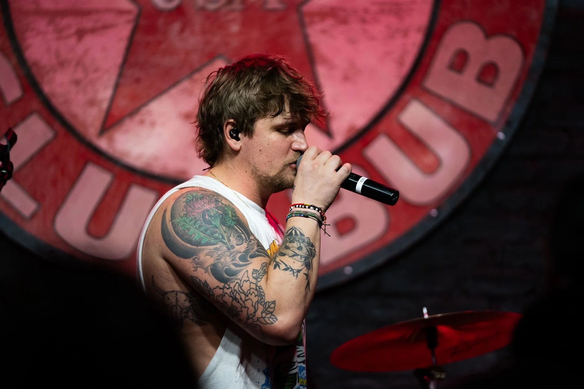
Rag’n’Bone Man’s tattoos have spread across his neck, face, hands, and arms. Music runs through much of the collection: microphones, notes, instruments, lettering, skulls, and old-school flash sit together in a dense, slightly unruly mix.

Some pieces show clearly onstage; others only appear when he lifts a hand or turns his head. The singer has explained the meaning behind a few designs, especially the words on his fingers. There’s more here than random decoration, with plenty of details to notice from different angles.

This guide sticks to tattoos that can be seen and documented. Where Rag’n’Bone Man has talked about a piece, that context helps explain it. Where the story isn’t clear, it’s better to leave it that way than turn a guess into fact.

The microphone and rose on his neck

Rag’n’Bone Man neck microphone and rose tattoo

The neck tattoo is one of the quickest ways to recognize Rag’n’Bone Man from the side. A microphone and rose sit below and behind his ear, with the design trailing down his neck. The pairing suits him: the microphone connects to his work, while the rose softens the look.

It can appear different from one photo to another. In bright light, the outlines and darker sections show clearly; under stage lighting, they can blend into the beard and shadow near his ear. The placement gives him a distinct profile, so even a quick performance shot tends to catch part of it.

The neck piece feels like an anchor for the collection. It’s close to his face and difficult to hide, and more personal-looking than a generic star or number. The rose also contrasts with the heavy black linework elsewhere on his arms.

Face tattoos that sit close to the eye and jaw

Rag’n’Bone Man face and forearm tattoos

Rag’n’Bone Man has several small facial tattoos that can disappear behind his beard or in a distant photo. There’s a dark mark and graffiti-like work around the jaw, lettering above his eyebrow often read as “MNO,” and a small line or halo-like mark near his cheek and eye.

These aren’t large portrait tattoos covering his face. They’re small bits of writing and symbols placed around the shape of his eye, brow, and jaw. They can be difficult to read in a concert shot, but a close portrait brings out the details.

The face work echoes the rougher, more hand-drawn style of the tribal shapes, lettering, and old-school images on his arms. It gives his face the same scruffy, lived-in feeling as the rest of his ink.

Words, a purple bomb and a portrait on the forearm

Rag’n’Bone Man forearm words bomb and portrait tattoos

The right forearm gathers several very different designs in one place. “ME & THE DEVIL” runs across the arm beside a purple bomb and a woman’s portrait. The words catch the eye first; the portrait adds a human element, while the bomb has a rough, almost cartoonish feel.

There’s no need to force them into one big story. The lettering reads like a personal phrase, while the bomb and portrait look like separate flash-style choices picked up over time. Together, they make the arm feel like a scrapbook rather than a planned sleeve.

The phrase can also look different as he moves. An elbow or shadow may break up the letters when his arm is bent. When he reaches toward the crowd, the forearm opens up and the designs are easier to distinguish.

Guitars, instruments and the music theme

Rag’n’Bone Man instrument and arm tattoos live

Music is one of the strongest themes in Rag’n’Bone Man’s tattoos. His arms include a guitar, another instrument, a harmonica, music notes, and a red Indian figure. A circular arrangement of notes also wraps around his right wrist.

The instruments help connect the sleeve without making every design match. A guitar has a familiar outline and long straight edges; a harmonica takes up less space. Notes fill the gaps and bring the separate images together when you see the arm from a distance.

The wrist design works as a useful visual break. It circles a small area like a badge instead of filling the whole forearm. Details like that keep the sleeve from becoming a solid wall of black ink.

His arm tattoos also look different when he’s holding a microphone. One arm may be raised toward the camera while the other hangs lower, revealing different images. Several views help show the collection more fairly.

Tribal shapes, HIGH FOCUS and the forearm lettering

Rag’n’Bone Man tribal sleeve and forearm lettering tattoos

Some of the boldest blackwork is on Rag’n’Bone Man’s left forearm. Close-up photos show tribal-style shapes, an eye, lettering that reads “RUM COM,” and another design marked “HIGH FOCUS.” There’s also an “HF” connected to those words.

The smaller lettering can be hard to make out in performance shots, so it’s best to stick with what’s visible. Thick tribal curves sit beside block letters, a small eye, and other symbols.

A microphone appears lower on his left forearm as well. It links the arm to his music, but it’s separate from the microphone on his neck. Here, the image sits among text and dark shapes, adding another piece to the patchwork.

“SOUL” and “FUNK” came from his childhood fascination with biker knuckle tattoos. That backstory helps explain why the lettering is bold and compact rather than delicate. It’s meant to be read up close, especially when his hands wrap around a microphone.

Hands, candy skulls and the SOUL and FUNK fingers

Rag’n’Bone Man candy skull hand tattoos and SOUL FUNK fingers

The hand tattoos are hard to miss. Rag’n’Bone Man has candy skulls across both hands, with “SOUL” and “FUNK” spelled across his fingers. One hand reads “Rhythm” and the other “Blues,” extending the musical theme.

Finger tattoos are small but change the whole look because they stay visible while he holds a mic, waves, or points. “SOUL” and “FUNK” feel like two sides of the same musical identity, while “Rhythm” and “Blues” are direct nods to the music he loves.

The candy skulls add colour and a more traditional tattoo feel. They’re not tiny filler designs; the bold hand pieces draw the eye before the lettering does. In some photos their details are clear, while in others a microphone or his fingers cover part of the image.

His hands show why one hero shot isn’t enough for a tattoo article. A wide portrait reveals how heavily tattooed they are, but close stage photos let readers make out the skulls, letters, and smaller marks.

The collection keeps growing in a rough, musical style

Rag’n’Bone Man detailed right arm tattoo collection

Taken together, Rag’n’Bone Man’s tattoos have a clear mood without following one neat style guide. The neck microphone and rose sit beside face lettering; his arms mix instruments, tribal work, portraits, words, notes, and small symbols. Candy skulls and musical phrases carry through to his hands.

That crowded look is part of the appeal. The tattoos seem collected over time instead of designed in one afternoon. Some are serious, some playful, and some simply suited the space. It’s more like building a set list than designing a logo.

He joins plenty of performers who have made tattoos part of their stage image. Like Tyler Posey, he mixes personal references with easy-to-spot designs, though Rag’n’Bone Man’s arm and hand work is much heavier.

Smaller marks may not appear in every public photo, so this guide sticks with pieces that can be identified. Even with that cautious approach, there’s plenty to see: music symbols, instruments, skulls, words, portraits, tribal lines, and facial tattoos. The more angles you find, the easier it is to separate the details.

Inside Lil Xan’s Face Ink and the Stories Behind It

Lil Xan’s face tattoos are hard to miss, but they’re only one part of a much larger collection across his neck, hands, arms, and chest.

Some designs connect to his music and the Xanarchy name; others are about family, friends, grief, or the way he felt when he got them. He has also said a few small marks don’t have a deep meaning. That mix gives the collection more to it than a list of words on his face.

ZZZ, LOVER and Candy are the face tattoos everyone notices first

Lil Xan Xanarchy face tattoos

The most recognizable group sits around Lil Xan’s eyes and cheeks. ZZZ is below one eye, with the larger LOVER lettering beneath it. On the other cheek, Candy refers to his mother’s name.

He has said the ZZZ tattoo is one of the few pieces without a major meaning. In one interview, he called it the only tattoo he would describe as meaningless. That’s useful context: not every small mark needs a dramatic backstory.

The LOVER lettering replaced an earlier “LOW” tattoo. The change shows how his face ink has developed over time; it wasn’t always a fixed design, and a cover-up can change how it looks in photos.

Small drips and symbols also appear around his eyes, nose, and forehead. They can be easier or harder to see depending on the light, his hair, or makeup. Those details are best treated carefully instead of counted as new tattoos whenever another photo reveals a line.

The style is blunt by design. These aren’t fine-line portraits hidden near an ear; the lettering is meant to be read, which is why his face looks different even in ordinary photos where most of his body is covered.

XANARCHY appears on his arms and above his eyebrow

Lil Xan Xanarchy forearm tattoo

XANARCHY connects Lil Xan’s tattoos to his stage identity. The word appears on his forearm and has also been seen above his eyebrow, making his name highly visible.

The Xanarchy movement grew from his experiences with Xanax and his decision to talk more openly about addiction and recovery. The tattoo isn’t subtle, but that suits the name: it represents a music identity as well as a part of his life he has discussed publicly.

The forearm lettering is large enough to read from a distance. It often stands out in live photos, even when his face is turned away. Smaller, mixed designs surround it, so the word gives the area a clear focal point.

His arms also have doodles, numbers, symbols, and darker work that can look different from one photograph to another. The tattoos came together quickly, and not every piece seems planned to match the next. There are gaps, overlaps, and different lettering styles.

Some people like that uneven look; others don’t. Either way, it’s personal to his image. A clean sleeve would tell a different story. These arms feel like a record of different phases.

The neck and chest carry dates, numbers and a hummingbird

Lil Xan 32 neck and DEC 3 chest tattoos

The number 32 and other small lettering appear on Lil Xan’s neck, while DEC 3 is on his chest. The date has been linked to an important birthday, adding a timeline to the upper-body ink.

A hummingbird also appears on his chest beneath the lettering. It brings a softer image to an area otherwise dominated by numbers and dark symbols. It can disappear under a shirt, but shirtless photos show how it fits into the layout.

Other chest designs include darker shapes and small writing near his collarbone. Some are hard to read in older photos or are partly covered by chains and clothes.

The neck work affects the overall look. Face tattoos can be covered with makeup or hair, but throat ink remains visible in most outfits. The number and lettering also link the face to the chest, so the tattoos don’t stop at one obvious boundary.

It helps to separate what’s visible from what’s confirmed. Lil Xan has explained some dates and phrases, but hasn’t publicly given a backstory for every symbol on his neck. A careful guide names the readable pieces and leaves the rest open.

His hands are covered in small words and symbols

Lil Xan Baby Girl hand tattoo

Lil Xan’s hands are often on display when he holds a microphone, phone, or cigarette. One of the clearest designs is BABYGIRL, written down the hand in bold letters.

Another hand design includes “supreme april 96,” along with small marks, numbers, and doodles. The phrase has been discussed as a personal reference, and 1996 is also his birth year. Its exact arrangement can be hard to make out as his fingers bend or the hand is partly hidden.

Tiny symbols appear around the fingers and wrist, from simple sketches to darker shapes that blend into the line work. Hand tattoos often fade faster than upper-arm designs, so older photos may make them look heavier than newer ones.

The hands fit his overall approach. He doesn’t seem interested in keeping the ink easy to hide. Even when his face is out of frame, the lettering can give away who’s in the photo.

They also make the collection feel less polished. The large face words get attention first, but the small hand marks show the everyday messiness of tattoos added at different moments rather than in one planned session.

Memento mori became a tribute to Mac Miller

Lil Xan Lover live performance tattoos

One of the more serious pieces in Lil Xan’s collection is “memento mori”, a Latin phrase meaning “remember that you will die.” He got the face tattoo after Mac Miller died, calling it a tribute and a reminder of mortality.

Placement changes the effect. The phrase could have gone on an arm or chest, but above his eye it becomes part of his public identity in every photo. It sits alongside ZZZ, LOVER, and the dripping-eye designs, mixing a serious idea with more playful or chaotic imagery.

Here the tattoos connect clearly to grief and the wider rap community. Lil Xan has his own history with addiction and has spoken about moving away from it. The tribute doesn’t explain his whole life, but it gives one piece of face ink a clear reason and moment.

He has also had a tattoo inspired by A Clockwork Orange, with a dripping design around his eye. It’s more stylized than the lettering and shows that his face tattoos aren’t all words and numbers.

Some of these designs have changed, faded, or appeared at different stages in photographs. That’s why a timeline helps. A close-up from 2018 might show fresh lettering or a version that looks slightly different years later.

Photos also frame the collection in different ways. Face and hand tattoos appear in a standard portrait, while the chest and arms may be hidden. Wider shots fill in that missing context and help separate earlier designs from newer ones, especially where face lettering has changed or been covered.

Lil Xan’s tattoos tell a messy, very visible story. The face ink carries his name, jokes about sleep, love, family, and grief. Xanarchy appears on the arms, small hand marks add personal notes, and the neck and chest fill in the rest.

Not every tattoo needs a grand explanation. Some marks are there because he liked the look; others came from a particular moment, and some have meanings he hasn’t shared. The useful thing is to keep confirmed stories separate from guesses.

Taken together, the collection is less about one perfect style than a changing identity. The words are bold, the symbols are often small, and the face remains the first thing people notice. That combination makes the tattoos stand out even when he’s fully dressed.

Alex Terrible’s Tattoo Suit: Winged Skulls, Snakes and a Past He’s Had to Explain

Alex Terrible’s tattoos often make an impression before he starts singing. The Slaughter To Prevail frontman has dark, colourful, densely shaded work across his chest, neck, arms, hands, and stomach.

A large winged skull anchors the collection, surrounded by rays, creatures, and ornamental black-and-grey designs. Snakes, flowers, faces, bones, and smaller hand tattoos appear around it. There’s also a difficult part of the story to address: some earlier symbols were connected to far-right imagery, and he has since covered one.

The winged skull that dominates Alex Terrible’s chest

Alex Terrible winged skull chest and arm tattoos

The main chest design is a large skull with wings spread across his pectorals. The skull sits in the centre and its wings reach toward both shoulders. Red highlights break through the dark shading, adding colour to an otherwise gothic piece.

Below the skull, skeletal and demonic shapes continue down his torso. Above it, the neck and upper-chest tattoos help the whole front read as one composition rather than a lone skull surrounded by bare skin.

It’s the image most people recognize when Terrible performs shirtless. Concert lights bring out the red sections; in studio photos, the grey shading and smaller lines around the wings are easier to see.

There’s no need to assign one grand meaning to every part. The design suits his deathcore image, but that alone doesn’t tell us what each skull, wing, or ray means to him. What’s clear is that the chest is built around a dark central figure, with surrounding work extending across the torso.

Neck tattoos, roses and the details around his shoulders

Alex Terrible chest and neck tattoos

The tattoos continue above the collarbone. Terrible’s neck is covered in detailed black-and-grey work, including a large bird-like or winged design beneath his beard and smaller shapes running toward the sides.

Flowers and leaves fill the shoulder area. They add a slightly traditional tattoo feel beside the darker, more monstrous figures across his chest. Petals, curling lines, and shaded sections appear around the larger images.

That mix keeps the upper body from reading as one solid block of black. Some areas have heavy fill; others leave enough skin visible for the outlines to breathe. In a close portrait, the shoulder details are easier to make out than during a fast concert.

Smaller marks around the collar and upper chest are harder to identify from a distance. Rather than name every dark patch as a separate symbol, it’s fair to treat them as part of the larger neck-and-shoulder work unless Terrible has explained a particular detail.

The arm sleeves are packed with skulls, snakes and colour

Alex Terrible full torso tattoos

Both arms are covered from the shoulders toward the hands. They aren’t exact mirror images, but share the same dark, gothic mood as the chest.

Skulls, bones, and animal shapes appear across the sleeves, with snakes winding through darker sections. The linework is busy, and colour arrives in smaller flashes rather than big blocks. Reds, greens, and muted orange tones sit among the black and grey.

Faces and ornamental shapes are easier to see in a mirror or posed portrait. Onstage, low light and dense designs cause the arms to blend with the chest. A well-lit photo reveals much more.

His forearms and hands also carry smaller tattoos, including lettering and dark shapes without a clear public explanation. They add to the full-suit effect, but one photograph isn’t enough to invent a story for every mark.

The stomach and lower torso turn the chest piece into a full suit

Alex Terrible bathroom mirror tattoos

One reason Terrible’s tattoos look so dramatic is that the artwork continues below his chest. The stomach has another large dark design, with sharp forms and shading that connect to the winged skull above.

Mirror photos show how much of the lower torso is covered. Faces, curved ornamental lines, and heavy shading fill the ribs and stomach. The result is closer to a bodysuit than a chest tattoo paired with a couple of sleeves.

The stomach work changes the balance of the overall design. Without it, the winged skull would be the natural stopping point. With the abdomen filled, the eye moves from the neck and chest down across the body and out through both arms.

The tattoos were added over time, so not every section has the same colour or age. Some areas look brighter and sharper; older pieces have softened into the surrounding shading. That’s normal in a collection this large and doesn’t mean every difference is a new design.

What the tattoos say about his metal image — and what they don’t

Alex Terrible winged skull stage tattoos

The connection to Terrible’s role as a deathcore frontman is obvious. Skulls, wings, horns, snakes, and dark figures fit the visual language of extreme metal. They also hold up under harsh stage lights, where a fine-line design might disappear.

But the tattoos aren’t just a costume. Terrible has talked about getting ink when he was young and wanting to look like the musicians he admired. That early influence shows in how much space the designs cover: a youthful fascination with heavy music became a lasting visual identity.

He has said the tattoos became part of his character. A shirtless performance turns them into part of the show, but they still belong to the person beneath the stage persona. It helps to distinguish what the imagery looks like from claims about what each design means.

The full suit is dramatic, but not completely uniform. Some areas are colourful, others nearly all black and grey, and some smaller tattoos feel like separate ideas added between larger sessions. That unevenness makes the work feel lived-in rather than digitally arranged.

The Black Sun tattoo was covered, and the history matters

Alex Terrible full tattoo suit mirror

One part of Terrible’s tattoo history needs clear context. He once had a Black Sun, also known as a Sonnenrad. The symbol has older historical roots, but Nazi and white-supremacist movements appropriated it, and it is widely recognized in that context today.

Terrible has said he got it when he was younger, during a period when he was drawn to far-right people and ideas. He has denied being a Nazi and called the tattoo a poor decision from that stage of his life. The visible point is that he later covered the Black Sun, so older photos may show a symbol that isn’t visible in more recent ones.

Reports have also linked him to an Othala rune tattoo on his foot. That symbol has been appropriated by white-supremacist groups, while also having older, pre-Nazi meanings. It’s safest to explain that history and the controversy without treating a photo as proof of what Terrible believes today.

That context is part of the tattoo story, not something to hide behind the skulls and colour. A tattoo can have a private intention and still carry a public history that other people recognize. Covering one design changed what is visible, but it didn’t erase why people continue to ask about it.

Outside that controversy, the rest of the tattoos read as a large metal-inspired body project. The chest skull, wings, snakes, roses, bones, and dark sleeve work make a recognizable look that has followed him from small venues to bigger stages.

Alex Terrible’s tattoos are a full visual identity

Terrible’s tattoos aren’t subtle, and they were never meant to be. The winged-skull chest, packed sleeves, neck work, and filled stomach make a look closely tied to his music.

The clearest details are the central skull, wings, red accents, animals, roses, and dense arm work. Smaller pieces deserve a closer photo before anyone tries to name them or assign a meaning.

There’s a timeline in the collection. Early tattoos helped build his metal image, later sessions filled in more of his body, and covering the Black Sun changed what appears in newer photos. Different images may reflect changes to the tattoos, rather than one photo being false.

Put simply, Terrible has a dark full-body tattoo suit with a lot of detail. It stands out under concert lights, in a bathroom mirror, and in a studio portrait. The images are loud, but a closer look rewards attention—as long as confirmed details stay separate from guesses.

Teyana Taylor’s Tattoos Run From Banksy Butterflies to G.O.O.D. Music Ink

Teyana Taylor’s tattoos can be easy to miss when she’s fully dressed, then hard to ignore when an outfit reveals her sides, stomach, or legs. She has bold black designs, old-school lettering, small pops of colour, and larger pieces that cross different parts of her body.

There’s no single style holding everything together. A hip portrait sits beside tribal work across her stomach; a small diamond and “shine on you crazy diamond” appear on her upper arm, while a G.O.O.D. Music logo marks a chapter in her career. She also has playful designs, including gummy bears in Pan-African colours and the Rolling Stones tongue.

Taylor’s tattoos aren’t just background decoration. Many connect to music, friendship, identity, or how she wants to present herself. Others seem to have been chosen because they suited the moment and looked good. That variety is part of what makes the collection fun.

The portrait on her hip turns the tribal work into a bigger piece

Teyana Taylor tribal hip tattoo

One of Taylor’s most striking designs is the portrait of a woman with an afro on her left hip. It extends a larger tribal pattern that travels from her hip toward her waist. This isn’t a small flash tattoo hidden in a corner; the portrait is a focal point that changes how the surrounding lines read.

The face is stylized rather than a straightforward celebrity portrait. That graphic quality lets it sit alongside the nearby tribal shapes. From a distance, the section looks like one flowing design; up close, the face becomes the detail that makes it feel distinctive.

Most outfits cover a hip tattoo, so this one tends to appear in swimwear, stage costumes, or a dress with a dramatic cut-out. That’s why older photos can make it seem as though Taylor has fewer tattoos than she does. The ink is there; it just isn’t always on display.

The design follows the curve of her waist instead of sitting like a sticker on open skin. That makes it bold while still working with the placement, and helps explain why it photographs so well when visible.

The tribal stomach design is one of her hardest pieces to catch clearly

Teyana Taylor tattooed forearms portrait

Taylor also has a large tribal design across her lower stomach. Public photos often show only part of it, especially when clothes cover the centre. Cropped images and partial views circulate online, so it’s better to describe the placement carefully instead of claiming every line can be identified from one photo.

The visible sections have the thick, sweeping look associated with tribal work. They form a strong border around the stomach and lower waist, unlike the finer lettering on her arm. The focus is shape and coverage rather than a written message.

Taylor has revealed portions of the design in high-cut outfits and runway looks. Those images show that the tattoo extends beyond the small edge that may appear with everyday clothes. But the full piece still isn’t visible in every photo: a side angle can show the hip while hiding the centre, and a front view may do the reverse.

It’s best not to merge this work with the hip portrait as if the two were one tattoo. They’re close together, but the portrait has its own face and placement, while the stomach design is about movement and coverage.

Her hip lettering and Roman numerals add a quieter layer

Teyana Taylor hand and forearm tattoos

Not all of Taylor’s tattoos are meant to dominate a photo. Smaller marks and Roman-numeral details appear around her hip, within or near the larger black design. They’re easy to overlook beside the busier tribal lines.

That contrast adds variety. A large tattoo can make a collection seem to be all about scale, but the smaller lettering gives Taylor’s ink a different rhythm. Heavy shapes, open skin, fine lines, and close-up details all have a place.

Some numerals have been described as personal dates, although sources don’t consistently confirm a specific meaning. It’s tempting to fill in the blank, especially when the numbers sit in a private area. The careful description is simply that the Roman numerals are visible and their exact story hasn’t been fully explained.

The uncertainty doesn’t make the design less interesting. Line work and placement can be worth noticing even when the person wearing the tattoo hasn’t given a full explanation.

The Rolling Stones tongue tattoo brings a flash of colour

Teyana Taylor rose neck tattoo

Taylor’s Rolling Stones tongue tattoo is one of the most recognizable designs in the collection. The red-and-black image refers to the band’s famous logo; the bright colour makes it stand out among the black tribal work.

The tattoo is on her left butt cheek, a playful choice that isn’t meant to be visible at every public appearance. When an outfit reveals it, the design becomes part of her look rather than something she needs to explain in an interview.

That logo contrasts with the G.O.O.D. Music tattoo on her arm. The Stones reference points outward to a band and music history; the G.O.O.D. design points back to Taylor’s career and the people she worked with. Both are music tattoos, but they do different things.

Colour changes the effect, too. Red draws the eye, while the black outline keeps the logo from looking like a temporary sticker. Its simple, graphic quality is exactly what makes it work.

The gummy bears use colour to make a personal flag

Teyana Taylor spine tattoo portrait

Another playful design is a group of three gummy bears in red, yellow and green. The colours refer to the Guinean flag, giving this small tattoo a link to identity and heritage. It has a very different mood from the tribal designs and more serious lettering.

The bears are simple shapes, but the colour choice gives them a clear purpose. They aren’t random sweets dropped into an otherwise black-and-grey collection. Together they work as a small flag, placed in a way that feels personal rather than designed for every event.

This tattoo can disappear in a wide photograph. A close-up is needed to distinguish each bear and see how the colours sit beside one another. A full-body shot shows that Taylor has plenty of ink, but can’t capture a small coloured image clearly.

Alongside the Rolling Stones tongue, the gummy bears show Taylor’s ease with humour and colour. Her collection can move from dark tribal work to a bright character tattoo without every design needing to match.

The G.O.O.D. Music tattoo marks an important career chapter

Teyana Taylor performance forearm tattoo

One of the clearest career tattoos in Taylor’s collection sits on the inside of her left forearm. It shows the G.O.O.D. Music logo with an angel above the words “getting out our dreams.” She got it while signed to the label, making it a record of a career chapter as well as a logo and lettering design.

The forearm placement makes it easier to see than her hip and butt tattoos. It appears in interviews, music videos, and event photos whenever her sleeve shifts. Jewellery and movement can still hide some of the words, so a close-up gives a better sense of the layout.

The angel above the logo softens what might otherwise look like a company mark. The wording adds another layer: “getting out our dreams” connects the tattoo to the idea of building a career and making something happen.

Taylor’s work has moved through music, dance, acting, and fashion. The G.O.O.D. Music design belongs to an earlier chapter, but remains part of the larger story. It preserves a place, people, and a moment that mattered as she grew into the artist she is today.

The neck and spine work make the back of her ink feel deliberate

Teyana Taylor neck and spine tattoos red carpet

Recent red-carpet photos have drawn attention to Taylor’s neck and spine tattoos. The long central design shows when she wears an open-back dress, giving her back a strong vertical line. It has a different effect from the sideways flow of the hip tattoos.

Spine designs can be tricky to photograph because posture changes how the lines look. A straight-on view may show the main path, while a turned shoulder can make it appear broken into separate pieces. Taylor’s fashion choices reveal the tattoo in some shots and cover it in others, so several views help.

The neck design adds another focal point above it. Together, the neck and spine pieces make the back feel deliberate, even though the rest of Taylor’s tattoos come from different periods and styles. The front is busy and varied; the back has a cleaner central structure.

As a whole, Taylor’s tattoos mix music references, body-shaped blackwork, small colour jokes, and designs tied to her life. It’s easiest to read them piece by piece. The portrait, tribal work, G.O.O.D. Music lettering, Rolling Stones tongue, gummy bears, and spine ink each have their own visual role without needing one forced meaning.

Nicky Jam’s Ink Runs from a Colombian Owl to Family Portraits

Nicky Jam has been getting tattoos since childhood, and the collection shows it. It doesn’t follow one tidy style or form one giant sleeve. Family names, religious images, music references, cartoon characters, and pieces from different stages of his life all have a place.

In his GQ tattoo tour, he said his first mark came at ten: a letter for his brother, which his father later covered after discovering it. By fifteen, Nicky had moved on to a tribal design. He kept adding ink over the years, so the result feels collected rather than planned as one project.

Here’s a closer look at the designs that are easiest to identify, from the large neck owl to his daughters’ names. Where Nicky has explained a meaning, that context is included; where a photo only shows a mark, the description stays with what can be seen.

The spread-winged owl takes over Nicky Jam’s neck

Nicky Jam owl neck tattoo

The spread-winged owl on Nicky Jam’s neck is likely the first tattoo people notice. It sits high and stretches to both sides of his neck. In some older photos, the dark shape almost looks like a scarf; Nicky has talked about changing and extending it after the initial session.

He told GQ the tattoo was done in Colombia and that he disliked the first version. He said the black ink made it look as if he were wearing a scarf. Later, he had white ink worked through it and added more underneath, turning the heavy block into a fuller design.

Nicky connects the owl with recovery and learning to take better care of himself. That doesn’t mean it’s only a “recovery tattoo.” It is also a dramatic neck piece, and the changes made to it are part of its story. The final design has more layers and movement across the neck.

His mother’s portrait is one of his most personal pieces

Nicky Jam mother portrait forearm tattoo

On his left forearm, Nicky has a portrait of his mother, with “Familia” above it and “Te Amo Mamá” below. The traditional framed layout lets the words and portrait work together instead of looking like three separate tattoos.

It’s one of the designs he has explained most clearly. In his GQ tour, he said the portrait was made to honour his mother and described their long separation. “Te Amo Mamá” means “I love you, Mom,” while “Familia” keeps the message focused on family as a whole.

Alex Chiong of Alex Chiong Tattoo Studio in North Miami did the tattoo. Its placement makes it easy to show in interviews, which is why it appears in many photos. Nicky has called it one of his favourites, along with the man climbing stairs on his other forearm.

The Puerto Rican sun and Luciana sit across his chest

Nicky Jam Luciana chest tattoo

Nicky’s chest has a Taino sun god design with the name Luciana underneath. Two birds sit higher on either side, loosely framing the central sun. The broad placement gives the design room, unlike the smaller lettering and symbols on his arms.

The sun connects to Nicky’s Puerto Rican roots. He has described it as a symbolic Indigenous sun, while Luciana is one of his daughters. The birds add movement, but there’s no need to invent a private meaning for every feather or line. The family reference is clear in the name, and the cultural reference comes from the sun.

Nicky has said the chest hurt more than his neck because the needle was working near bone. The piece is not a small name tucked under a shirt; it’s a broad chest tattoo worked carefully across a sensitive area.

Music notes, three dots and a cross mark out his face

Nicky Jam three dots face tattoo

Nicky began his face tattoos with small musical notes. He later added three dots beside his left eye and a cross near his left eyebrow. Other small music-related marks appear around his face and behind his ear. Though compact, these tattoos change his look because they’re placed where people notice them.

He said the music notes came first and he continued from there. The three dots and cross are separate designs rather than one large image. In older photos, facial hair and lighting can make one mark disappear while another stands out.

Nicky has always liked tattoos in places others might avoid. He has talked about enjoying the contrast between a clean-cut face and rougher body art. The small face pieces show how a few marks can make his look more recognizable and harder-edged.

The climbing man and time-machine idea fill his forearm

Nicky Jam stairs time machine forearm tattoo

One of Nicky’s favourites is the man climbing stairs toward a time machine on his right forearm. It tells more of a story than many of his names and symbols. Rather than a word or logo, the image suggests movement, effort, and a destination.

Nicky has mentioned this piece when asked which tattoos mean the most to him, but hasn’t given it a long public explanation. The figure climbs upward, and the time machine brings in a touch of science fiction without making it look like a simple cartoon.

The forearm gives the design space to run along the arm. It’s visible in short sleeves but sits among his other writing and symbols, so close-ups show far more than distant red-carpet photos.

Marvin the Martian brings a comic-book streak to his leg

Nicky Jam Marvin the Martian leg tattoo

The Marvin the Martian tattoo on Nicky’s left lower leg is one of the collection’s more playful pieces. It stands apart from family portraits, religious imagery, and music lettering, which is part of why it catches the eye.

Tattoo artist Samu Rico is credited with the Marvin design and a Daffy Duck tattoo on Nicky’s opposite lower leg. The pair gives his legs a different mood from his upper body. The owl and mother portrait invite a look at their personal stories; Marvin is more direct, a cartoon character he chose for the image.

Leg tattoos can be difficult to judge in performance photos because trousers and shoes hide them. A clear close-up helps distinguish the character from the darker designs around the lower leg. The image shows why the tattoo deserves its own space instead of being lost in a generic list of small pieces.

The tiger gives one forearm a sharper look

Nicky Jam tiger forearm tattoo

A tiger face on Nicky’s right forearm adds a more aggressive animal image. The bold central face and heavy shading anchor that part of the arm, with smaller marks around it.

Nicky hasn’t given the tiger a detailed public explanation like he has for his mother’s portrait or his daughters’ names. It’s more accurate to describe the image and placement than to assign a meaning. Animal tattoos can mean many things; there isn’t enough here to say this one represents strength, danger, or anything else.

The tiger also shows how varied Nicky’s choices are. One arm can hold a realistic animal, a daughter’s name, music references, and abstract marks. The collection is busy, but the pieces can still be understood separately when the photos are clear.

An eye and Celtic crosses add a heavier religious edge

Nicky Jam eye elbow tattoo

Nicky has an eye tattoo on his left elbow and Celtic cross designs on his arm and the back of his neck. The elbow eye is a small focal point that can disappear under clothing but stands out in a close-up.

The cross by his eyebrow is separate from the Celtic crosses, so they shouldn’t be treated as one large religious design. Nicky has other spiritual imagery, too, but the collection doesn’t need one theme. Some pieces relate to faith, some to family, and others are designs he liked.

Elbow skin bends, and photos can flatten the shape, so a wide portrait may not show the eye clearly. A close view makes its placement easier to see without claiming more than the image shows.

Arabic writing and an old astral band show how early he started

Nicky Jam Arabic upper arm tattoo

His upper arms include an Arabic phrase and an astral band. The writing needs a sharp photo before anyone tries to identify the exact words. It sits among other tattoos, so distant shots can reduce it to a dark strip.

Body Art Guru records it as the first tattoo Nicky got at around ten years old. His GQ interview adds another detail: the first mark was a letter for his brother, later covered by his father. The accounts suggest his tattoo history developed over time; they don’t mean every early design is still visible today.

Nicky has said he got tattoos year after year and eventually ran out of room. That helps explain the mix of tribal work, newer lettering, and detailed portraits. The collection grew as different ideas and memories mattered to him.

Names, logos and small pieces fill in the gaps

Nicky Jam astral band upper arm tattoo

Smaller tattoos fill the spaces around the larger designs: Yarimar and Isabel on his forearm, ALYSSA on his neck, “Love” across his knuckles, music symbols on his hand, a Japanese character he says means “warrior,” and an NJ logo on his wrist. He also has a guitar on his neck, more music notes behind his ear, and words across parts of his abdomen and chest that are not clearly identified.

Nicky has explained some details himself. Yarimar is his daughter’s name, the NJ symbol is his brand, and he says the Japanese character means warrior. Other marks are visible in photos but don’t have a clear explanation. It’s better to keep that distinction than give every line a dramatic backstory.

His lower legs also have Daffy Duck on the right and Marvin the Martian on the left. The available high-resolution material shows Marvin more clearly, so this article uses that photo rather than a tiny or blurry image for Daffy. The design has been reported, but the photograph needs to be clear enough for readers to see it.

Nicky Jam’s tattoos are a timeline as much as a style

Nicky Jam guitar neck tattoo

Seen together, Nicky Jam’s tattoos trace a loose timeline: early tribal influence, face designs he added later, a family portrait and names, the Puerto Rican sun, an owl connected to recovery, and cartoon characters that keep the collection from feeling too serious.

His own explanations give the clearest context: “Te Amo Mamá” honours his mother, Luciana and Yarimar are his daughters’ names, the NJ mark connects to his brand, and the owl belongs to a period when he was trying to take better care of himself. Other pieces can be enjoyed as part of a packed, lived-in collection built over decades.

That’s the appeal of Nicky Jam’s tattoos. They don’t look like a showroom set planned in one day. They feel personal, sometimes messy, occasionally playful, and closely tied to the places, people, and music that have followed him through life.

YBN Nahmir’s Ink Runs From 90s Baby Nostalgia to Neck Symbols

YBN Nahmir’s tattoos are more than filler. He has described them as drawings and memories tied to growing up in Birmingham, and the GQ Tattoo Tour gives him room to explain what some of the pieces mean. That makes it easier to separate his own comments from guesses based on a photograph.

His first tattoo was his mother’s name. Since then, the collection has grown to include cartoon and sports references, family tributes, religious imagery and neighbourhood details. Nahmir has also said he thinks about how the pieces fit together: each arm has its own feel, and the neck helps carry the design across the body.

The 90s Baby arm piece carries his cartoon and sports influences

YBN Nahmir chest tattoo portrait showing the large woman design

The neck work mixes protection with Birmingham details

YBN Nahmir shirtless showing arm and neck tattoos

The tattoos on Nahmir’s neck form a close group. He identifies an angel, an Eye of Providence, Converse imagery and numbers linked to his block and street. GQ’s close-up shows why these designs are easier to describe from nearby: hair, chains and clothes can hide their edges, while a straight-on concert shot may turn them into dark shapes.

Nahmir describes the neck work as protective. He says the angel and Eye of Providence represent something watching over him when he is outside, on the block, making music or going about his day. Some of the numbers and street references are personal, too. The symbols can be named without guessing at every association behind them.

The Converse mark brings an everyday object into the group. Nahmir does not present it as an isolated shoe design; he names it alongside the block numbers and street references. Those details share the same visual language: familiar objects and local markers tied to where he grew up.

Why the neck works as a connector. Nahmir says the neck helps bring the two arms together. He talks about placing a reference from one side beside something from the other, so the tattoos flow toward the middle of his body. That explains the layout without claiming he planned every piece at the same time.

Nahmir credits tattoo artist Hershel with the work on his neck and arms. He says Hershel is the only artist he lets tattoo him, and mentions that he has also worked on Blueface and Lil Skies. The artist’s line work gives the collection a common feel even though the subjects vary.

Nahmir says he does not regret the tattoos. He says he got them at the right times and in the right places, and there is no name he wants covered. He wants future work to connect through the centre of his neck but has ruled out tattooing his face. The collection is still developing, with childhood references on the arms, protection and neighbourhood details at the neck, and family ties running through it.

Family names and arm pieces keep the personal side close

YBN Nahmir seated with both tattooed forearms visible

Nahmir’s own explanations make the collection easier to follow. The 90s Baby design holds cartoon and sports memories; Saint Mary, his mother’s name and geisha imagery bring family into the arm work. The angel, eye, Converse mark and block references give the neck its own set of local and personal details. His comments add context without asking readers to invent stories he has not told.

Nahmir’s tattoos lean into quick, graphic shapes. The 90s Baby piece brings a childhood reference onto his arm, while the neck work shifts toward symbols and small marks that are clearer in a close-up. A tour photo can establish placement, but lighting may hide fine lines, so a sharp image is the better guide.

The angel and Eye of Providence are easy to recognise by sight, but the designs alone do not establish every personal meaning. The article can name the symbols and their locations while keeping the interpretation measured. The Converse mark adds a pop-culture touch without needing to connect it to every other tattoo.

The collection is best seen as a changing set of references, not one composition planned all at once. Different photos reveal different pieces, and dates matter when newer neck or arm work appears beside older lettering.

Dated photos also help with the smaller neck marks. A symbol that looks separate in one Tattoo Tour frame may sit beside newer lettering in a later portrait. Makeup and lighting can hide a fine outline, so it helps to say which image shows which design instead of treating every photo as proof of the same moment.

Nahmir’s tattoos are more interesting as a mix than as one big statement. Cartoon memories, sports details and spiritual imagery appear beside lettering. Some designs are easy to identify, while their personal meanings are less certain. Keeping that distinction clear gives the collection room to be varied without overstating what is known.

The most useful descriptions stay close to the photos. A sharp arm image can support a design name and its placement; a softer neck photo may only confirm that a mark is there. That kind of care stops a guessed translation or assumed meaning from being repeated as fact. There is already plenty of variety in the tattoos Nahmir has discussed.

Reading the neck details in dated photographs

The neck marks are easiest to misread in stage lighting. A close portrait shows more than a distant performance shot, and later images may reveal additions that were not there before. Keeping those dates separate makes the visual record easier to follow.

How the arm and neck pieces read together

YBN Nahmir on stage with his tattooed forearm visible

Nahmir’s arm and neck tattoos are easier to understand when they are kept in their own groups. The arm work holds the cartoon and sports references; the neck sits closer to his face and changes how a portrait reads. A close-up can identify a symbol, but it cannot supply its meaning by itself.

Different eras also explain why online lists do not always match. New lettering may appear beside an older design, while a soft concert photo can hide a line that is clear in a later portrait. That is not necessarily a contradiction; it is a reason to date each image and avoid claiming a permanent count.

The collection does not need invented backstories to be interesting. Cartoon memories, Birmingham identity and spiritual-looking symbols share the same overall layout, but not every piece has an equally clear explanation. Showing what is known and what is uncertain makes the guide more useful.

Small neck designs can disappear or stand out depending on hair, lighting and the angle of his head. The clearest description gives the reader the location and the best available photograph, then stops where the evidence stops.

YBN Nahmir performing with visible forearm tattoos

Nahmir’s tattoos have a collected feel. Cartoon references sit beside sports imagery, lettering and symbols from different parts of his life. That looks more believable than saying every design was planned as one sleeve. The strongest descriptions focus on pieces that can be named and shown, leaving unclear marks labelled as uncertain.

The images should stay close to the sections they support. That way, readers can see an arm, neck or wrist detail as they read about it instead of searching through an unrelated gallery.

The 90s Baby piece also captures Nahmir’s age and influences when it was made. It is a different kind of statement from the neck lettering or eye symbol. Keeping those ideas separate helps readers see the difference between a named phrase, a graphic mark and a design whose meaning has not been discussed publicly.

Show photos can confirm that a tattoo exists, but they often do a poor job of showing its detail. Coloured lights flatten black ink, motion blurs thin lines and a microphone can cover the wrist. The closer images give the article a better visual reference than a generic portrait.

Nahmir’s collection reads as memories and references gathered over time. The cartoon work, sports details and neck symbols do not need one grand theory. They are interesting because they are different, and the guide gives each confirmed group its own space.

The phrase “90s Baby” can be read directly from the design, while the meaning of some smaller symbols remains less certain. Keeping those different levels of certainty visible helps the reader know what is clear and what is not.

Cara Delevingne’s Tattoos: Lions, “Made in England” and the Ink You Actually See

Cara Delevingne’s tattoos are easy to spot, but they are a varied collection: a small lion on her finger, lettering on her feet, fine-line animals, friendship pieces and little marks that only show in the right photo. Some stories behind them are public; others are visible without a confirmed meaning, and that is where the description should stop.

She started getting tattooed early in her modelling career. The designs never look like one sleeve planned in advance; they range from quick ideas to personal references made with artists she trusted. Keith “Bang Bang” McCurdy worked on many of the best-known pieces, while Dr. Woo made the fine-line elephant on her inner forearm and Daniel Tucci is credited with the Roman numerals on her side.

The useful way to read Cara’s tattoos is design by design. A clear photo can show the placement and what a tattoo looks like, but it cannot tell us automatically what every mark means, when it was done or who made it. The sections below stick to pieces that have been shown clearly or discussed.

The hand tattoos that started the collection

Cara Delevingne showing tattoos on her hand

The lion on Cara’s index finger is the tattoo many people think of first. It was her first, and she got it while she was still a teenager. The design sits along the side of her finger, so it is small and exposed but surprisingly tricky to photograph well. A wide red-carpet image may show ink on her hand; a close-up is needed to make out the lion’s face and shading.

Cara has connected the lion to her Leo star sign. It is a clear explanation without giving the tattoo more weight than she has. It also makes sense as a first piece: the image is bold enough to catch the eye, while the finger placement keeps it compact.

Bang Bang is associated with the lion tattoo, and he made many of Cara’s other designs as well. That does not mean he created every tattoo she has. It places the lion in a period when she was returning to the same New York artist for several pieces.

In some photographs the lion looks darker; in others it appears softer. Lighting, age, editing and the angle of her finger can all change how it reads. Those differences do not prove that the tattoo was redone. The clearest description remains a small lion on her index finger, widely reported as her first tattoo and linked by Cara to Leo.

Feet, family and the tattoos that fill in the story

Cara Delevingne Made in England tattoo on her foot

Cara’s hands carry more than the lion. The initials “CJD”, for Cara Jocelyn Delevingne, sit along the side of one hand. It is a personal mark in a visible spot, but the design itself is plain lettering rather than a large image. That simple piece shows how much the style can change from one tattoo to another.

She has also been photographed with white-ink designs, including a dove on a finger and other pale marks that almost disappear in ordinary light. White ink is difficult to document: in one photo it can look like a highlight, and in another it may vanish. It takes a sharp image to identify the design confidently.

Tiny stars and a diamond sit around one ear. Hair, jewellery and the edge of the face can make them easy to miss. They are small additions, not parts of one large composition, and they work better as separate details in Cara’s collection.

On her inner wrist, she has the word “silence”. Cara explained it with the phrase “silence speaks when words can’t,” making it one of the clearer examples of a tattoo with a public meaning. The short explanation is enough; there is no need to build a larger theory around it.

Old photos can be hard to read. A ring, sleeve or shadow may cover part of a letter, and a low-resolution crop can make one mark resemble another. If a source does not show the detail clearly, it is better to say the tattoo is visible but not fully identifiable.

The words “Made in England” are on the sole of Cara’s left foot. She has explained the tattoo herself. During her modelling years, she sometimes felt less like a person than an object being moved around for other people to use.

In interviews, she compared that feeling to being a puppet or mannequin and described the phrase as a way to put the frustration on her body. That context comes directly from Cara, so it is more useful than assigning a new meaning based on appearance.

There is humour in the placement, too. The blunt label sits on the bottom of her foot, hidden until she decides to show it. The block lettering keeps the design simple; the joke is in the words and where she put them.

Photos of the tattoo vary. Close-ups make the phrase easy to read, while angled shots may show only part of it. The best images are the ones that actually show the lettering; a fashion portrait with her foot covered adds little.

Cara Delevingne Bacon tattoo on the sole of her foot

The “Bacon” foot tattoo is exactly as silly as it sounds.

Cara also has “Bacon…” on the sole of her other foot. It is a much lighter piece than “Made in England,” and the contrast is part of the fun: one records a frustration from work, while the other is a breakfast joke. The two do not need to share some grand meaning.

The punctuation is usually shown as part of the tattoo, though the exact number of dots is hard to make out in every picture. Older or angled photos can blur the detail, and the sole is rarely photographed in ideal conditions.

The design is often linked to Bang Bang and dates from a period when Cara was collecting small, playful tattoos. It belongs in the same broad category as the toe smileys she got with Margot Robbie: casual, a little ridiculous and tied to a person or moment rather than a formal plan.

This is one of the tattoos where the image should do most of the work. Readers need to see the lettering and where it sits. A nice portrait of Cara will not help if the tattoo is the subject; the photo has to show enough of her foot for the words to be read.

Cara Delevingne fine-line elephant tattoo on her inner forearm

The elephant on her inner forearm.

Cara’s fine-line elephant sits on the inside of her right forearm. Dr. Woo made it in a delicate “half-needle” style, with thin lines and soft shading. It is much more detailed than the small lettering on her feet, and compression can quickly wash out the elephant’s sketch-like features.

Cara has said this is the tattoo with the most personal weight for her because she got it in memory of her late grandmother. That makes it one of the clearest family tributes in the collection; the meaning comes from her own explanation, not a fan-made list.

The forearm gives the elephant more room than the lion on her finger, but keeps it close to the body rather than turning it into a huge statement piece. When Cara turns her arm away, the design can be hard to see. In a close-up, its face, ears and trunk come through.

Dr. Woo’s work also shows that Bang Bang was not the only artist she went to. Many of Cara’s familiar pieces are linked to him, but the elephant has a distinct line quality and a different artist behind it. A large enough image makes that detail easier to appreciate.
Roman numerals, “breathe deep” and the side tattoos.

One small design on Cara’s side is “XII” in Roman numerals. Tattoo guides usually place it there and credit Daniel Tucci. The number is often described as lucky for Cara, although the personal reason for choosing twelve is not explained as clearly as the stories behind the lion or elephant.

She has also been photographed with the white-ink words “breathe deep” on her side. It is easy to read in one image and almost invisible in another. White ink reflects light differently, and both skin tone and distance affect how the letters show up in a photo.

Another phrase reported in the same area is “don’t worry, be happy.” It is a short piece of text among several small images and sayings. The exact lettering should remain labelled as reported unless a clear close-up or direct explanation confirms it.

The side is difficult to photograph because clothes cover it most of the time. A cropped fashion image may show a few lines without establishing the whole design. A useful guide needs a clear view and, where possible, the date of the image instead of stretching one blurry photo into a complete inventory.

Cara Delevingne eyes tattoo on the back of her neck

Eyes, sak yant and the tattoos around her neck.

Keith “Bang Bang” McCurdy made the pair of eyes on the back of Cara’s neck. They sit above an older tattoo on her nape, giving the area a layered look. The eyes show clearly in close-ups; in wider portraits, hair and shadow often obscure the detail.

Below them is a sak yant-style tattoo. Sak yant refers to a traditional Southeast Asian tattooing practice. It is safer to describe the visible script and its placement than to translate every line without a reliable source for the wording.

The eyes look different from the small stars and wrist lettering elsewhere in Cara’s collection: they are direct and figurative. Public information about why she chose them is limited, though. The artist and design are better supported than any broad claim about what the eyes represent.

Neck tattoos attract interpretation because they are visible in portraits, but visibility does not establish a private meaning. The photo shows the eyes, and Bang Bang is linked to the work. Anything beyond that should be described as uncertain.
Pandora, friendship ink and the smaller stories.

The name “Pandora” appears on Cara’s upper arm and is generally described as a tribute to her mother. It is simple script with personal context. Clear photos show the spelling and location, although the lettering can look different as her arm turns.

Cara has also shared friendship tattoos with people close to her. The best-known example is the set of smiley faces on her toes with Margot Robbie during the Suicide Squad period. Cara called them “toemojis”; the two friends gave each other little smiley faces on their toes.

Reports describe smiley faces on several of Cara’s toes, but the exact number can be confusing because many photos show only one foot. A picture from the original moment confirms the friendship tattoo; it does not automatically provide a full count of every toe design she has now.

That playful side belongs in the story too. Cara’s tattoos are not all animals, memorials or career statements. Some came from a joke shared with a friend. A fine-line elephant can sit alongside a silly food word without either design needing to explain the other.

Taken together, the documented tattoos range from the lion finger tattoo and initials on her hand to the phrases on her feet, the elephant on her forearm, the eyes on her neck and the family name on her arm. The strongest details are the placements, the artists and the meanings Cara has actually shared. The rest is best left as a visual record, not dressed up as certainty.

There is no final public list that can prove a permanent tattoo count. New work can appear, older ink can fade and clothing can hide designs. What the photos and interviews do show is a deliberately mixed collection: fine-line animals, short phrases, family references, jokes and small symbols in different places.

That’s the real appeal of her tattoo history. It is not one carefully planned project, but a running collection of ideas, memories and jokes added over time and captured in separate moments.

Big Boi’s Ink Tells the Story in Pieces

Big Boi’s tattoos are tied to the names and places that have shaped his life: his Southern roots, OutKast and the Dungeon Family, his family, faith and personal memories. He has talked about several designs himself, which makes their stories easier to follow than a list built from blurry photographs.

The collection mixes lettering, a heart banner, a lion, handcuffs, crew references, family names, religious wording, cherubs and a portrait of his first pit bull, Carlito. The tattoos do not look like one giant sleeve planned in advance. They appear to have grown alongside his life and career.

The first tattoo was a heart banner built around “Twan”

Big Boi Dirty South and forearm tattoos

Big Boi has said his first tattoo arrived when he was 17. It is a heart-and-banner design with the name “Twan”, the nickname he used at the time. Unlike the pieces he added later, after music became his full-time world, it began as a personal name rather than a branding idea.

The heart gives the lettering a familiar old-school frame. The name remains the focus, but the banner gives the design more weight than plain script would have on its own.

A lion followed the first tattoo, bringing an animal image into the early collection. It marks a shift from a name toward larger symbols. A lion can invite speculation about strength or status, but Big Boi has not attached an elaborate theory to every design. The useful timeline is simpler: the heart banner came first, and the lion arrived after it.

That order matters. The tattoos were not all created in one polished session. Smaller pieces were already there before the larger work appeared. In photographs, they can look like parts of a finished plan, but Big Boi’s account suggests a more natural process: he added designs as different parts of his life became important.

The banner also shows how the collection can feel personal and public at once. A nickname carries private meaning, while its placement makes it visible to anyone looking closely. That balance returns throughout the tattoos: some speak to music or home, others to people and beliefs he wanted close.

There is no need to turn the first tattoo into a hidden code. “Twan” is the name, the heart is the frame, and the design marks the beginning of the tattoo story. The lion adds a stronger image, but the original piece keeps its personal feel.

Southern pride and the Dungeon Family sit close to the music

Big Boi Dungeon Family tattoos across his forearms

The words “Dirty South” make one of the clearest links between Big Boi’s tattoos and where he comes from. The phrase gives the collection a regional stamp, but it is not detached from the rest of his story. It sits alongside Atlanta music, OutKast and the Dungeon Family circle that shaped his career.

The lettering is direct; it does not need a mystery attached to it. “Dirty South” is a plain statement of identity, pointing to the culture and sound Big Boi helped bring to a much wider audience while keeping the phrase tied to its Southern home.

Open handcuffs appear among the designs, adding a harder visual note than the heart banner or family lettering. They can look like a symbol of release, but the photograph only confirms what they look like. Without a clear explanation from Big Boi, the broader meaning can stay open.

The Dungeon Family tattoo points to a more specific musical connection. The collective brought together OutKast and other Atlanta artists, so the mark recalls the people and environment around the records. It says something different from “Dirty South”: one is about a region and its culture, the other about a particular creative circle.

That distinction is worth keeping. The Southern lettering can stand for home, the Dungeon Family design for collaborators, and the handcuffs can remain a striking image without a definite explanation. Not every tattoo needs to fit one theme.

Good photographs help with small lettering and symbols. Compressed images can blur a word or hide a mark beside it. A clear close-up lets readers see the lines, spacing and placement instead of relying on a vague description.

These designs sit between the personal and the public. They show where Big Boi comes from and who he worked with, while also carrying parts of his own history. That makes the collection feel lived-in rather than carefully branded.

Carlito gives the collection its most personal portrait

Big Boi showing a forearm tattoo

The portrait of Carlito, Big Boi’s first pit bull, brings a personal memory into the collection. It is not just an animal chosen for its looks. Carlito was part of his life, and the tattoo gives the portrait a memorial quality distinct from the music-related designs.

Animal portraits can lose detail in a distant photo. A stage image may show only the outline; a close-up brings out the expression and shading. The portrait deserves to be shown on its own rather than treated as a small detail in a generic photo of Big Boi.

It also adds a quieter note. “Dirty South” and the Dungeon Family mark speak to public identity; Carlito points to a relationship away from the stage and music business. That contrast makes the collection feel more personal.
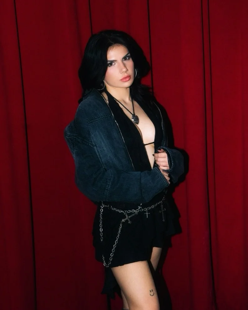
Other symbols, including the handcuffs and smaller arm tattoos, appear around it. They should not be folded into the portrait or assigned meanings Big Boi has not given them. The portrait is Carlito’s tattoo, and its strongest supported story is the connection to his first pit bull.

Different photos can change the way the piece looks. Lighting shifts the contrast, and the curve of the arm can make the portrait seem flatter or darker from one angle. That does not mean the tattoo changed; the camera is showing a rounded surface differently.

This is easy to miss when people try to count tattoos from red-carpet photos. A jacket, chain or shirt can cover part of a design, while a tattoo-tour close-up may show much more. The clearest view is the best evidence; one image cannot prove the entire collection.

Carlito’s portrait sits naturally beside the family names and faith lettering, though each group says something different. The dog represents a memory, the names represent family, and the scripture is a statement of belief and protection. Keeping them distinct gives each piece room to make sense.

Family names bring the focus back home

Big Boi tattooed forearms during a GQ tattoo tour

Big Boi’s children’s names add another layer to the neck and chest tattoos. The names do not need an elaborate explanation, but a clear image matters: the spelling, direction and exact placement can be hard to see when a collar or chain gets in the way.

Family lettering differs from the Dungeon Family mark, even though both refer to people. One points to a creative circle and shared music history; the other to the people closest to him at home. Keeping that distinction prevents every name from being flattened into the same broad idea of “family.”

The neck tattoos can look inconsistent across photos from different years. Big Boi may have a different collar on, stand at another angle or show only one side. A later picture may reveal more than an earlier one without indicating that a new tattoo was added. Sometimes the view is simply better.

Cherub or angel imagery also appears among the larger collection, adding a softer note beside darker symbols and strong lettering. It can be described as part of the visible work, but a specific private meaning should not be attached unless Big Boi has explained it.

The names bring the focus away from the stage and back toward the people Big Boi wanted to carry with him. Clothing can still hide part of the design, so more than one photo helps show how the names sit on his body.

The timeline offers another way to read the pieces. The heart banner and lion belong to the early years; the Southern and Dungeon Family tattoos connect to his music career; the children’s names show the collection continuing as his life changed. The designs need not form a perfect chronology for that progression to be clear.

A guide should also say when it cannot read a detail. If fabric covers a letter or a low-resolution image blurs it, describing the visible placement is better than guessing. That keeps the family section accurate without leaving it empty.

Isaiah 54:17 is the clearest protective statement

Big Boi forearm tattoo close-up during a GQ tattoo tour

The Isaiah 54:17 tattoo is one of the clearest pieces to explain because Big Boi has shared both the reference and its purpose. The verse is associated with “no weapon formed against me shall prosper”, and he has described the tattoo as a form of protection.

Here the words carry the meaning. Placement and lettering still matter, but the scripture is the heart of the design. It sits beside the personal banner, music references and family names while making a direct statement of faith.

The verse also marks how the collection has changed over time. It began with a nickname, then expanded to Southern identity, collaborators, children and belief. Isaiah 54:17 feels like a tattoo about protection, not performance, even though it is part of a very visible collection.

Big Boi has also spoken about facial tattoos and how they can affect his appearance and work. It is easy to over-name small marks in distant portraits, so the safer list is the set of designs that can be seen and discussed: the heart banner, lion, “Dirty South,” handcuffs, Dungeon Family mark, Carlito, his children’s names, cherubs and the Isaiah verse.

Together, the tattoos tell a pretty straightforward story: a first nickname, Southern identity, a music family, a much-loved dog, his children and a verse he sees as protection. The details are enough without a grand theory.

The photos need to appear beside the sections they support. One image cannot show the lettering clearly, give the dog portrait room, establish where family names sit and reveal the full verse all at once. Each section needs its own visual evidence.

That is the clearest way to read Big Boi’s tattoos: start with what the photo shows, add meanings he has actually shared and leave uncertain details open. It gives the collection its full story without turning it into a legend.

Kane Brown’s Tattoos Tell Stories About Faith, Family and the Road

Kane Brown’s tattoo story goes well beyond that old Batman photo. His collection includes Bible lettering, angel wings, family names, a Chinese character, a wolf, three skulls, Georgia script, microphone and guitar designs, a gorilla, and a chest cover-up that is still changing. Brown has explained some pieces himself; others are best described by what the photos show.

The tattoos have changed over the years. His first chest piece came before the larger Batman design, the wolf was made with members of his touring crew, and the Batman image has since become a hawk. Following that timeline keeps an older photo from being mistaken for the latest version.

The Chinese symbol for love connects Brown to his family

Kane Brown Chinese love tattoo on his neck

The black Chinese character on Brown’s neck means love, according to an iHeart tattoo interview. He got it to match his mother’s, which gives the small design a personal story beyond its size. It sits behind his jaw, so it shows in profile and can disappear when he faces a camera straight on.

This is one of the family tattoos with a meaning Brown has actually discussed. The translation did not come from a gallery guessing at the symbol afterward. Brown and the interview identify the idea, and the matching tattoo with his mother explains the connection. The character is easy to spot, but the family story is what makes it worth its own section.

Other small marks show up around Brown’s neck and shoulders, but they should not be confused with the Chinese character. A close portrait can show one tattoo while cropping out the skin around it. The clearest account sticks to the character, where it sits, and the family connection Brown has described.

Angel wings spread across the shoulders and upper arms

Kane Brown angel wings shoulder tattoos

The large angel wings across Brown’s shoulders help give his upper body its heavily tattooed look, even from a distance. Their feathers extend over the shoulders and upper arms, creating a broad shape around the chest rather than a small, separate emblem.

Wings are tricky to photograph because the design wraps around his body. A straight-on portrait may show the centre while hiding the outer feathers; from the side, one wing can look larger than the other. A wide shot gives a sense of scale, but it does not prove that every feather or nearby mark has been identified.

The wings sit close to other chest tattoos, including the Bible verse and the Batman-to-hawk cover-up. That overlap can make older pictures hard to read. The upper body may look like one large composition, but the tattoos were added at different times and carry separate stories.

The wolf represents Brown’s touring pack

Brown has described a wolf on his left forearm as a matching design for members of his touring team. He said the crew worked like a wolf pack, staying together through shows and travel. That gives the tattoo a specific meaning tied to his work, rather than a general message about being tough or wild.

The wolf uses black-and-grey shading and a compact outline. It is clearer in a close-up of his forearm; in a concert shot, it may look like a dark patch under his sleeve. Its meaning comes through a group bond, rather than a family tribute.

Brown’s explanation separates the wolf from his family ink. The Chinese symbol for love connects him to his mother and grandmother; the wolf represents the people who tour with him. Both are matching tattoos, but they mark different relationships. Keeping that distinction makes the collection feel more personal and specific.

Three skulls turn the three wise monkeys into a darker forearm design

Kane Brown three skulls forearm tattoo

One forearm tattoo uses three skulls and roses to revisit the “see no evil, hear no evil, speak no evil” idea. The skulls are arranged so flowers cover or frame the eyes, ears and mouth. It is a darker take than the familiar three-monkey image, but the reference remains clear.

The roses soften the design without making it cheerful. Their rounded petals balance the heavier skull imagery, while the shading ties the three figures together. A large photo helps here; small versions can lose the detail around the eyes and mouth.

The tattoo also shows Brown reworking a familiar image in his own style. Instead of copying three monkeys from a flash sheet, he chose skulls and flowers. That choice suits the darker side of his collection while leaving the original proverb easy to recognise.

Georgia, the microphone and guitar marks keep music close to the skin

Kane Brown Georgia forearm tattoo

The word Georgia runs in script along Brown’s forearm. It is a simple place marker, but it carries more than a random state name: Georgia is part of his background and identity. The flowing lettering makes it feel like a personal inscription.

His arms also carry music imagery, including a microphone and guitar details. Those designs fit his career, but each should still be treated as its own tattoo. A microphone is a visual reference; it does not tell us which song, tour or moment inspired it.

Together, the script and music objects give the forearm a different feel from the wolf and skulls. Georgia points to home, the instruments to his work, and the wolf to the people who travel with him. They sit side by side without becoming one oversized music slogan.

The gorilla and headdress add a heavier piece to the arm

Kane Brown gorilla forearm tattoo

Brown later added a snarling gorilla with a headdress worked into the larger arm design. Tattoo artist Bubba Irwin made the piece, which sits among the wolf, microphone, guitar and wing imagery. It gives the sleeve a heavier focal point than the smaller lettering.

Brown has linked his gorilla and hawk tattoos to his Cherokee heritage, but they are separate designs. The gorilla is an animal image on his arm; the hawk is part of the chest cover-up. Their stories connect through Brown’s comments, while their locations and timelines remain distinct.

A stage photo shows the gorilla in context, while a close-up is better for its details. The scale, teeth, head shape and headdress can disappear in a small thumbnail. A clear reference image helps show what makes this tattoo distinct from a generic portrait.

John 3:16 came first, before the Batman-to-hawk chest cover-up

Kane Brown Batman hawk chest cover-up tattoo

Brown has said his first tattoo was John 3:16 on his chest. He called the Bible verse one of his favourite passages, so its place in his tattoo timeline is well established. It is not an identification based only on a distant photo; Brown has talked about the design himself.

The large Batman tattoo came later, when Brown was about 18. He liked the effect of the symbol breaking through his chest, but eventually regretted the design. He has described the cover-up as difficult and painful.

The replacement is a hawk, built through a lengthy cover-up. Brown has said it is still unfinished, with feathers meant to continue down toward his stomach. The chest tattoo therefore needs a date: older photos show Batman or an earlier cover-up stage, while more recent shirtless images may reveal more of the bird.

The chest story is more than a simple before-and-after. John 3:16 reflects an early choice rooted in faith; Batman captures a teenage pop-culture moment; and the hawk is an adult effort to change a design he no longer wanted. Each version belongs in the timeline.

Family names such as Katelyn and the children’s ink keep the collection personal

Kane Brown Katelyn hand tattoo

Brown has put family names on his hands, too. Katelyn was tattooed after he married Katelyn Jae, and later family ink included names connected to his daughters. A hand tattoo is difficult to hide, so it appears in ordinary photos as well as shirtless pictures.

Reports on the newer family tattoos describe shared or matching designs connected with the children, including KODI, added after Kodi Jane was born. These pieces came after the original John 3:16 and Batman tattoos, so they belong later in the timeline.

The hand photo also shows why names need a close look. From across a room, lettering can resemble a decorative flourish, especially next to a larger outline or a ring. A clear image makes the word readable and connects the family story to the tattoo that carries it.

Brown’s tattoos range from bold images to small reminders. The chest holds the dramatic changes, the hands carry names, the neck shows the family love symbol, and the arms collect the wolf, skulls, Georgia script, music designs and gorilla. There is a lot of ink, but the separate pieces make the map easier to follow.

There is no need to force every design into one theme. Faith, family, touring, music, pop culture and heritage all appear, but each tattoo came with its own reason. A clear description gives the design, its placement and its place in the timeline, then stops where the evidence does.

That is also why a couple of old photos never told the whole story. The chest cover-up is one chapter; the wolf, wings, skulls, Georgia script, gorilla, Chinese love symbol and family names each add another. Seen together, the photographs show a collection that has changed over time.

The stories behind Cardi B’s peacock, family names and matching ink

Cardi B’s tattoos resist a single look. There is a huge, brightly coloured peacock stretching across her thigh, hip and backside, along with small names in fine script, a wedding date on her hand and a face tattoo that arrived later in her family story. The collection is colourful, but its timeline matters just as much.

Cardi and reliable sources have explained some of the designs; others are easier to describe than to interpret. This guide stays with what the photographs actually show and adds reported meanings where they are supported, without turning every flower into a private symbol.

The peacock is Cardi B’s biggest and most recognisable tattoo

Cardi B tattoos: Cardi B peacock thigh tattoo

Cardi’s peacock thigh tattoo stretches from the side of her thigh toward her hip and buttock. The bird is surrounded by flowers and a butterfly, with blue and green feathers fanning out around it. It is a large composition that changes shape as it crosses different parts of her body, not a small standalone emblem.

The tattoo became even more familiar after Cardi had it refreshed in 2020. Reports linked the seven-day session to Los Angeles artist Schene, and Cardi spoke about how painful it was. The refresh gives the design a clear timeline: the earlier colour work was reworked and strengthened after years on the skin, rather than replaced by a new peacock overnight.

The newer version shows stronger blues, greens and pinks in many photos. Individual feathers are easier to make out, and the flowers have more contrast. Images taken before the session can therefore make the same broad design look different; lighting, camera distance and the condition of the older ink all affect how it reads.

There is no need to assign a private meaning to every feather. Cardi has spoken about the tattoo’s size, pain and refresh, but reports do not give a personal explanation for each colour. The reliable details are the peacock, its thigh-to-hip placement and the 2020 rework.

The back work continues the peacock’s flowers and bird imagery

Cardi B tattoos: Cardi B peacock back tattoo with flowers

The back carries the same colourful mix. In photos, the bird appears among red, orange and pink flowers, with the composition spreading across the back rather than stopping at a neat rectangle. It makes more sense to describe it as connected bird-and-flower work than as a string of unrelated blossoms.

A close image shows how the design follows the body. The blue bird draws the eye first, with flowers filling the spaces around it. A butterfly adds another small winged detail without competing with the peacock. These features are visible even when no separate personal meaning has been reported for each one.

Reports have connected the work to tattoo artist Jamie Schene, but an artist credit should stay attached to the pieces the source actually discusses. It does not establish that Schene created every tattoo Cardi has shown. The careful attribution is to the colourful peacock and botanical work.

Back photographs also show why a general red-carpet portrait is weak evidence for this design. Clothes, hair and camera angles can hide most of the composition. A useful image needs to show enough skin to establish the bird, the flowers and how the upper and lower parts connect.

Wave is Cardi’s small face tattoo for her son

Cardi B tattoos: Cardi B Wave face tattoo

Cardi’s Wave face tattoo is much smaller than the peacock, and its meaning is more direct. The name is written in cursive along her jaw, and reports connect it to her son Wave. It sits close enough to the face that an ordinary event photo may make it look like a shadow; a closer portrait is needed to read it.

The family connection is well supported because Cardi has publicly linked the name to her son. That is stronger than a fan caption trying to identify a tiny mark. The name, placement and family explanation tell the story without an added theory.

Wave also shows how different the scales are across Cardi’s collection. The peacock fills a broad area and relies on colour; Wave is a narrow line of text whose meaning is personal. Together they make the collection feel like a record of different moments, rather than one fixed style.
Kulture’s name adds another family marker on the arm

Cardi B tattoos: Cardi B Kulture bicep tattoo

The Kulture bicep tattoo deserves its own place in the list. It is associated with Cardi’s daughter and should not be grouped with the Wave lettering just because both are names. They are in different places, giving each child a separate spot in the collection.

Small names can be hard to document. A photo of the bicep may show only part of the lettering, while hair, clothing and the angle of her arm can obscure the rest. The safest description names the reported design and its placement, while acknowledging that some images do not show every character.

The lettering also contrasts with the bright peacock palette without being any less important. Cardi uses ink in different ways: large colour for a statement composition and fine script for family references. These designs do not need to match in style to belong to the same history.

The 9.20.17 tattoo records a shared date with Offset

Cardi B tattoos: Cardi B and Offset matching 9.20.17 hand tattoos

Cardi and Offset tattooed 9.20.17 on each other’s hands as a wedding-date gesture. Allure reported the session and named tattoo artist Nikko Hurtado. Because the date is literal, it is easier to catalogue than a symbol whose meaning has to be guessed from its shape.

Hand tattoos are visible in daily life but can be surprisingly difficult to photograph clearly. Fingers bend, rings interrupt the view, and small numbers disappear when a hand turns. A sharp close-up can show the digits, while a distant shot cannot confirm that every line still looks the same years later.

The date records a moment in their relationship, but a tattoo and a relationship do not follow the same timeline. The ink can show when they made the gesture without telling readers how Cardi feels about that period now. Keeping those ideas separate avoids turning a dated design into a claim about the present.

The peacock tattoo refresh changed how the whole collection reads

Cardi B tattoos: Cardi B peacock tattoo refresh

The 2020 refresh shifted the way the whole collection looks. Before the session, the peacock appears softer and more faded in older images. Afterward, the feathers look brighter and the flowers have sharper edges. It was still the same recognisable design, but the stronger colour made it read as a bigger statement.

Large tattoos change with time. Skin, sun, camera processing and the age of the ink all affect colour. A guide that compares older and newer photos should label when they were taken instead of treating one image as the permanent version. Cardi’s tattoo history is not a single still frame.

The same care applies to smaller designs. Wave and Kulture can disappear in a wide portrait, while jewellery or a hand pose can hide 9.20.17. A good catalogue pairs each tattoo with a picture that actually shows it. A striking celebrity photo may look good on the page but cannot prove a letter or placement.

Taken together, Cardi B’s tattoos move across three clear ideas. The peacock and its flowers form the large visual centre. Wave and Kulture put family names in visible places, while the matching date records a shared event in small numbers. The collection is colourful, but each tattoo has its own story.

The most useful reading is also the most grounded: Cardi has a major design she has maintained and refreshed, alongside smaller tattoos tied to people and moments. Some details come from her own explanations; others are visible in close photos. Where the sources end, the description should end too. That leaves a clear map instead of a story built from guesses.

The smaller tattoos deserve attention alongside the famous peacock. A name on the jaw, another on the arm and a date on the hand can be more specific than a broad symbol. They also let readers follow changes in design, placement and time without claiming a private meaning Cardi has not shared.