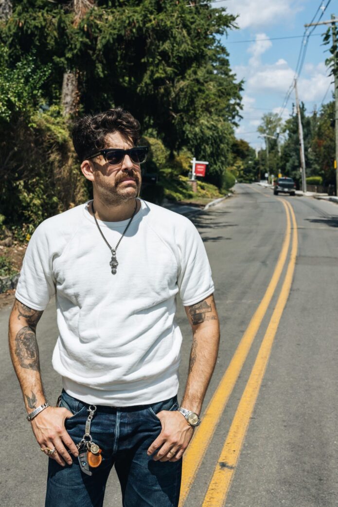
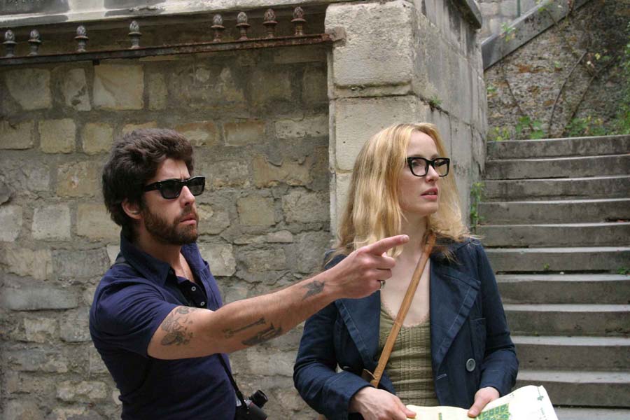
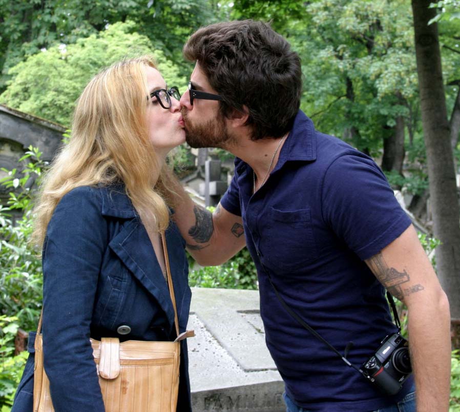
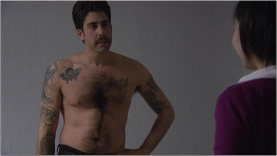
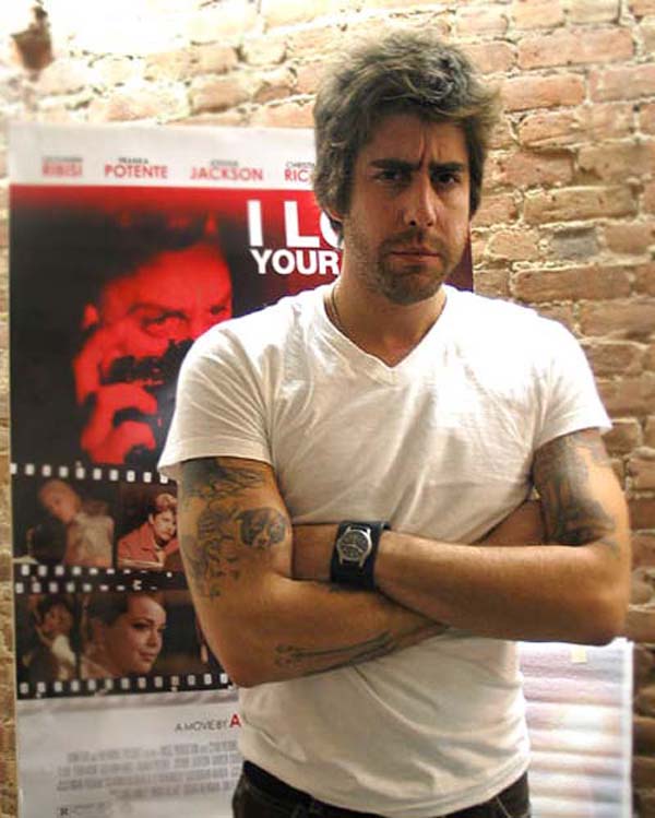
Adam Goldberg has described himself as a tattoo collector. His arms and shoulders carry a mix of jazz references, quotes, portraits and drawings. He has said that not every design needs a dramatic explanation.
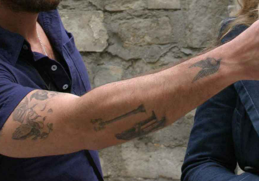
His arm tattoos are packed with jazz references, including Waltz for Debby
Goldberg’s best-known tattoo stories are on his arms. He has quotes connected to Art Pepper, Billie Holiday and Chet Baker, musicians whose work mattered to him. As a teenager, he was also absorbed in John Coltrane, David Bowie and Elvis Costello.
The lettering comes from music he listened to, rather than a single matching design. In that sense, the tattoos work like personal liner notes spread across his arms.
The collection grew out of a real love of music
Goldberg has called himself a jazz fan and told a story about listening to Art Tatum records late into the night before taking the SATs. He joked that the music didn’t help his score.
That background helps explain why the jazz references feel personal. They’re tied to music he loved long before his acting career, not a look he adopted for a role.
Mark Mahoney has been a big part of his tattoo story
Goldberg has written about tattoo artist Mark Mahoney and worked with him at Shamrock Social Club in Hollywood. He has described Mahoney as the reason he ended up with so much ink, and the two have remained friends.
The collection appears to have grown over time, with different references and ideas added along the way. The designs don’t look like one coordinated sleeve.
His tattoos are easy to spot even when he is fully dressed
Goldberg’s arms are often the clearest sign of his tattoos in photos. He once joked that his young son recognized him by the ink.
In newer pictures, shirts can cover parts of the designs. On The Equalizer, where Goldberg played Harry Keshegian, the tattoos also helped viewers recognize him outside the usual suit-and-office look.
Not every tattoo needs a confirmed meaning
Goldberg has confirmed the jazz quotes and spoken about his love of music and his connection with Mahoney. Smaller designs aren’t all explained publicly, so there’s no need to assign a backstory to each line.
Some pieces may mark a person, record or moment that only Goldberg can identify. The collection doesn’t need a neat explanation for every tattoo.
Why Adam Goldberg’s tattoos feel different from typical celebrity ink
Goldberg’s tattoos aren’t built around one large image or matching sleeve. They connect to jazz, film, art and people he admires, and the collection has grown with him.
This panel is about Goldberg’s screen work, not a tattoo tour, but it offers another look at his career:
The clearest stories tie the jazz quotes to records and musicians Goldberg listened to for years. Other designs remain private, and don’t need an invented backstory.
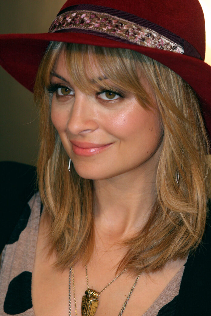
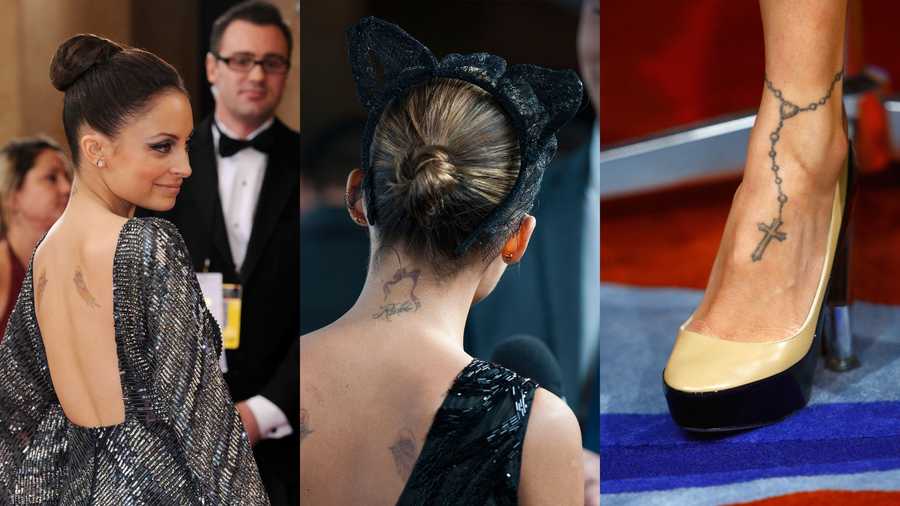
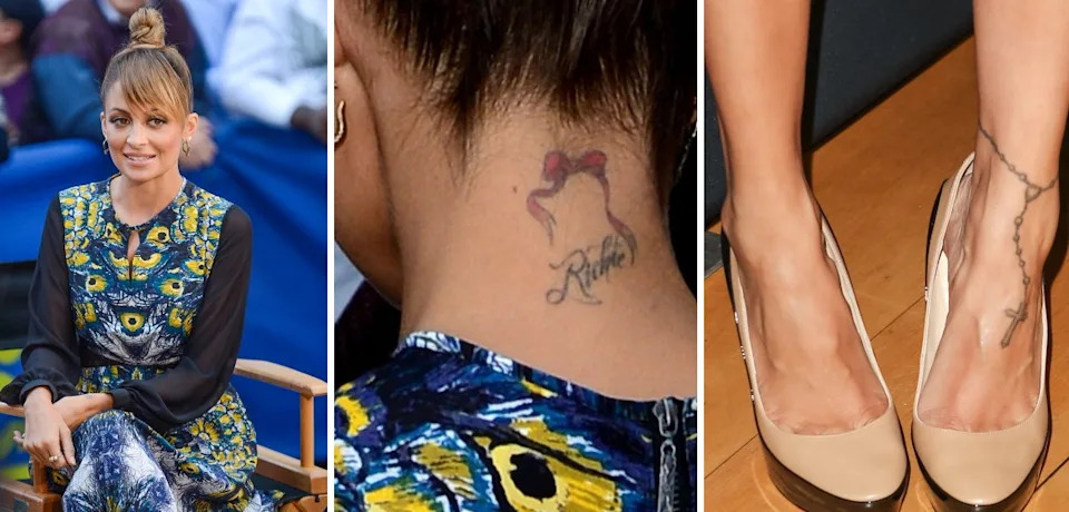
Nicole Richie’s tattoos include angel wings, an ankle rosary, ballet slippers, a shooting star and the “Richie” name at the back of her neck. Some pieces connect to family and friends; others are reminders of choices she made when she was younger.
She has talked about getting tattoos early and about feeling differently about some of them later. That gives the collection a personal timeline, from designs she still wears to one she once joked about removing.
The angel wings on Nicole Richie’s back
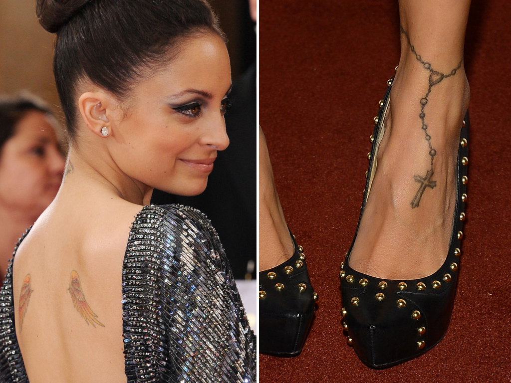
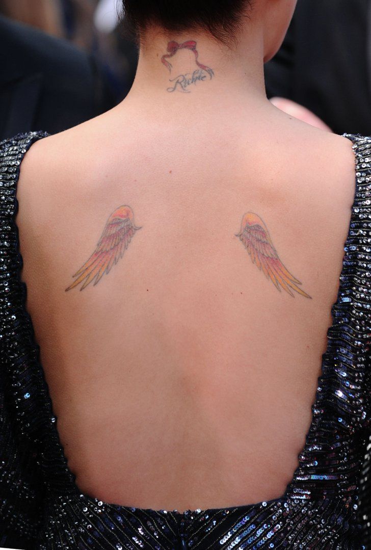
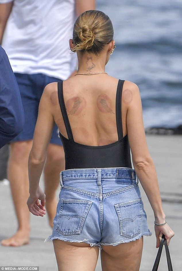
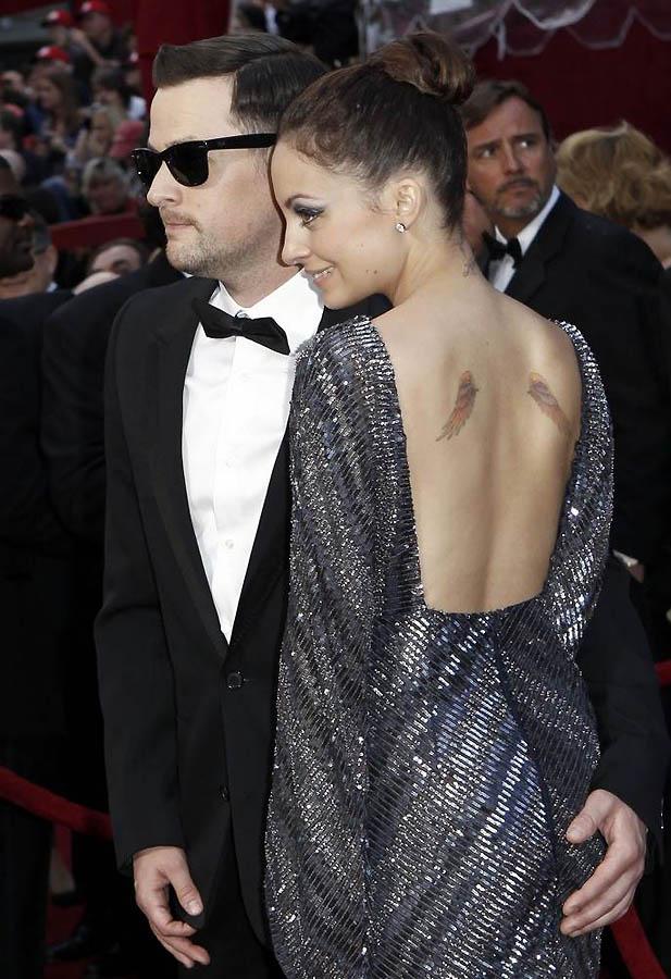
The best-known pieces are two small colored wings on Nicole’s shoulder blades. They sit on either side of her upper back and are easy to see in backless outfits and older red-carpet photos.
Wings can carry different meanings, but Nicole hasn’t attached a specific story to these in the source material. The design became part of her public look. Her daughter Kate later showed a similar pair, giving the wings a family connection as well.
The wings are small, but their placement makes them recognizable in photos.
Her rosary tattoo wraps around the ankle
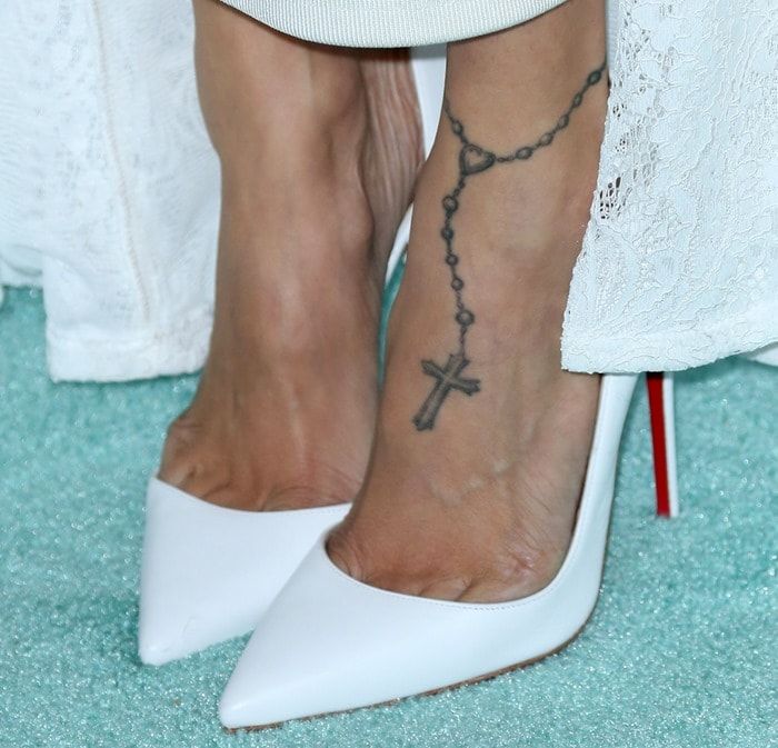
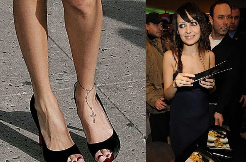
Nicole’s rosary tattoo circles her ankle and continues toward her foot. Small beads form the chain, which ends in a cross; from a distance, the piece can look like an anklet.
It shows more clearly in sandals, heels and other open shoes. Older photos often pair it with bright red nail polish, which helped make the design familiar to fans.
The rosary has remained one of the tattoos most closely associated with her style.
The “virgin” wrist tattoo
One of Nicole’s wrist tattoos reads “virgin.” The word relates to her Virgo sign, represented by the maiden. She later said she felt awkward about having it on her wrist.
That’s a straightforward story: she liked the idea when she was young and her opinion changed. The lettering is small, but its position means it can show even when her other tattoos are covered.
Some celebrity tattoo stories are hard to verify. Here, Nicole has spoken about how she came to feel about the design.
Ballet slippers for Lionel Richie’s song
Nicole has ballet slippers tattooed as a tribute to her father, Lionel Richie. He wrote “Ballerina Girl,” and she has explained the connection herself.
The slippers aren’t as easy to spot as the wings or ankle rosary, but their meaning is clear. They link the tattoo to her father and his music.
The design is one example of how her collection moves between family references and more decorative pieces.
The cross on her lower back
Nicole has a cross low on her back. She later joked about it as a “tramp stamp” and, on Candidly Nicole, talked about looking into having it removed.
The dark cross is often covered by clothing, though older beach and red-carpet photos show it. Nicole’s comments make clear that she views the placement differently now than she did when she got it.
A tattoo can remain part of someone’s history even after it stops being a favorite.
The shooting star on her wrist
Nicole has described a red shooting star on her wrist as a shared tattoo connected to close friends, including Kidada Jones and the late singer Aaliyah.
The red ink stands out in older photos. The design is small, but the connection to those friendships is part of the story Nicole has shared.
It sits alongside more serious family designs in a collection that also includes playful, colorful pieces.
The tiara tattoo on her hip
Nicole’s tiara tattoo sits on her hip and dates from the earlier part of her tattoo years. The placement lets her keep it covered when she chooses.
She hasn’t given it a confirmed meaning in the source material. It may simply be a design she liked at the time, alongside other pieces that capture different stages of her style.
The Richie tattoo behind her neck
“Richie” is written on the back of Nicole’s neck beneath a small bow. The lettering shows when her hair is up and disappears under it when her hair is down.
The surname is direct, while the bow adds a small decorative detail. Together they read almost like a signature at the nape of her neck.
What Nicole’s tattoos say about her
Nicole’s collection brings together family, friendship, astrology and music, along with a few decisions she now sees differently. The wings and rosary became familiar parts of her look; the ballet slippers connect to her father, and the shooting star to friends.
She can laugh about the cross on her lower back while still treating it as part of her past. Some pieces remain favorites; others remind her of a younger version of herself.
Watch Nicole Richie talk about a tattoo
Nicole’s Candidly Nicole series included a segment about tattoo removal and the cross on her lower back.
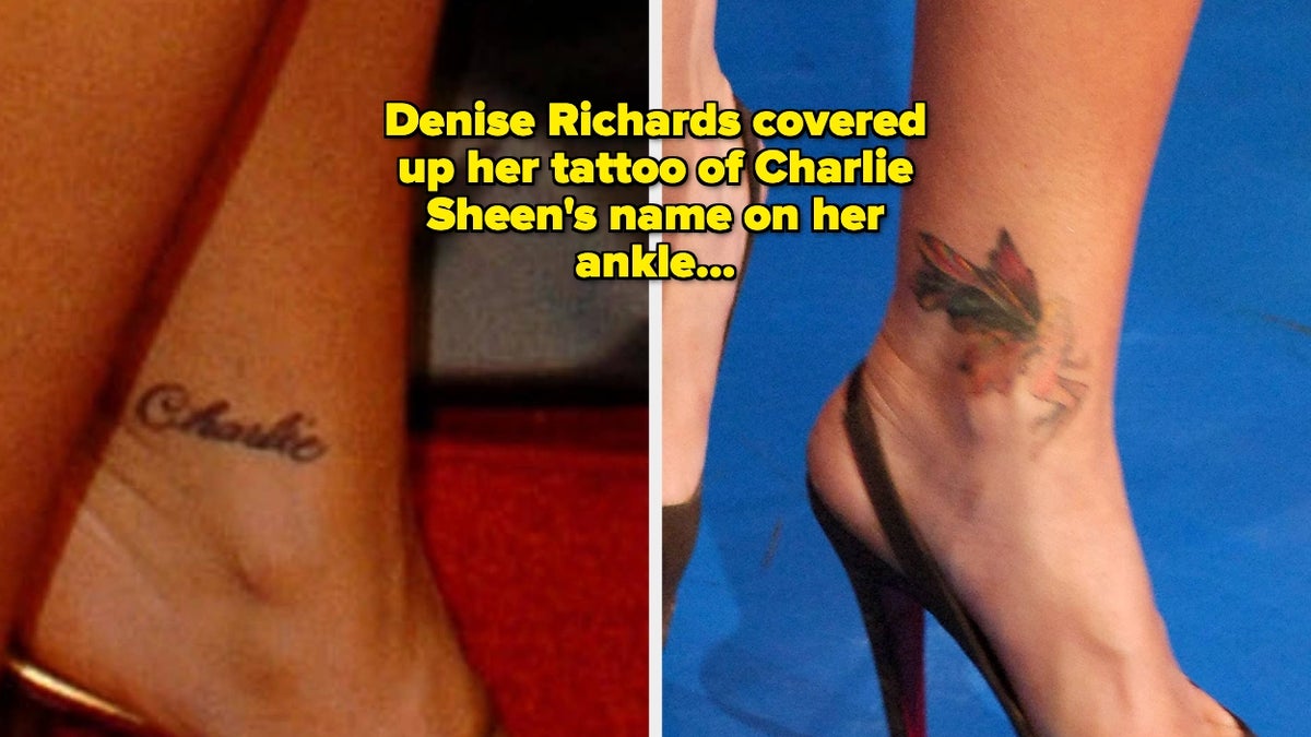
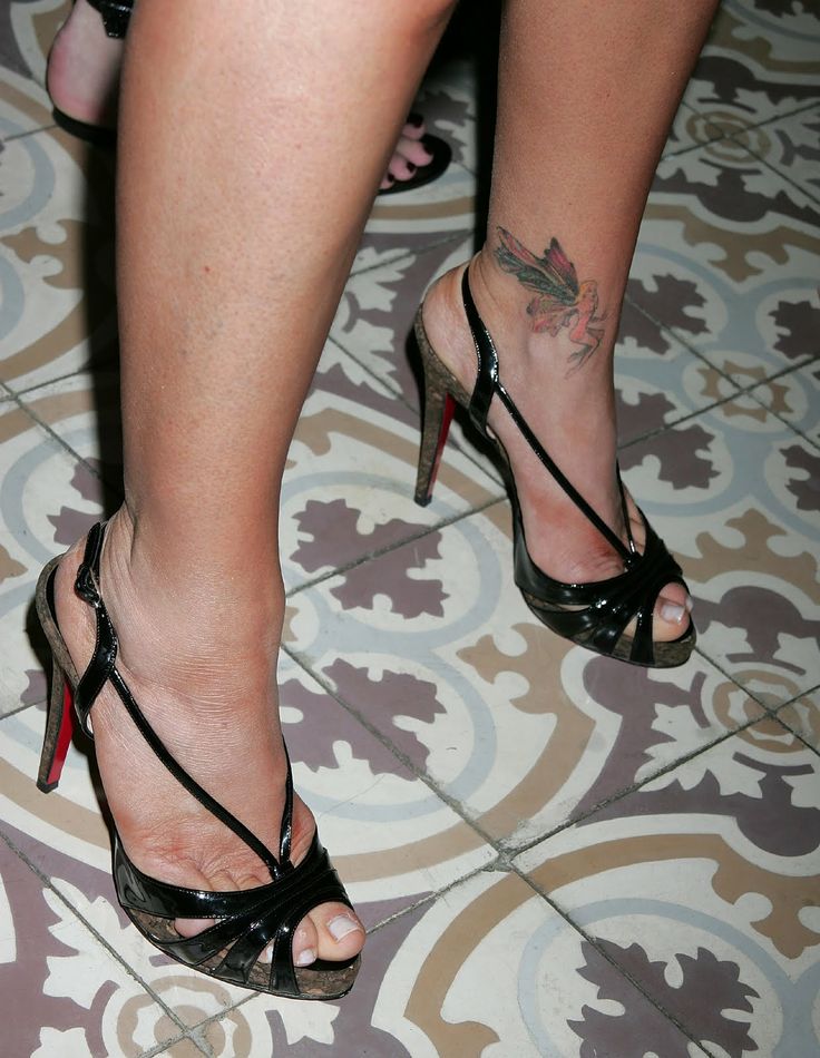
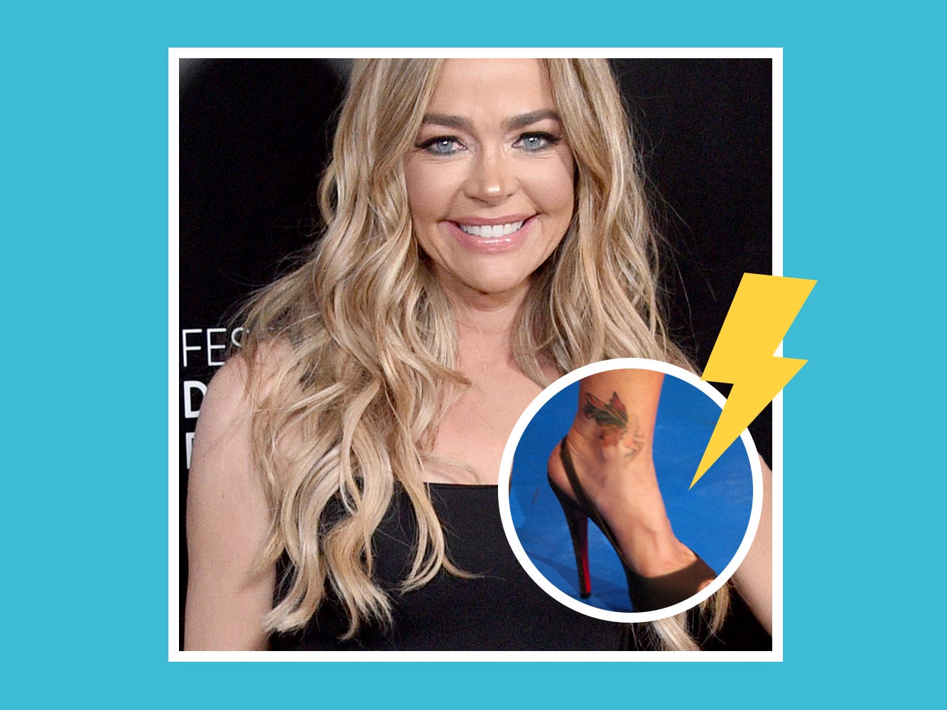
Denise Richards tattoos are best known for one change: the cursive “Charlie” at her ankle became a colorful fairy after her marriage to Charlie Sheen ended. That before-and-after is the clearest part of the public story. Some sites list more tattoos, but the available photos and coverage return to the ankle design. This guide sticks with what can be tied to Richards: the original name, the cover-up and the way the fairy looks in later public appearances.
The original Charlie tattoo on Denise Richards’ ankle
Before the fairy, “Charlie” was written in cursive above Denise’s ankle. She got it for Charlie Sheen; they married in 2002. The small script was easy to see with sandals or red-carpet shoes. The old lettering matters because it explains the design over it: the fairy was made as a cover-up, not as a separate tattoo with no connection to the name.
The colorful fairy cover-up
Richards replaced the name with a colorful fairy. The wings and wider shape cover the script, and the color makes the new design stand out from what was underneath. It’s a sharp change from the plain cursive word. The fairy is now the tattoo most people associate with Richards; it appears in gallery photos and red-carpet close-ups of her ankle.
Why the ankle placement made sense
An ankle tattoo is easy to show in sandals or heels and easy to cover with trousers or boots. The fairy is visible in some red-carpet photos and hidden in others, depending on Richards’s shoes and clothes. In clearer pictures, it reads as a finished design rather than a faded patch. A cover-up has two jobs: hide the old ink and leave a new image that looks complete on its own.
The cover-up became a fresh-start story
Richards’s tattoo change is often read as a way to move on from the relationship, though she hasn’t given the fairy one definitive public meaning. The timeline is clear: the Charlie script came first, and the fairy replaced it after the marriage ended. People with a partner’s name tattooed may keep it, remove it or cover it; Richards chose the last of those. The new design changed what people saw first, but it didn’t erase the history underneath. That’s part of what makes a cover-up more than a simple replacement.
What is confirmed and what is not
Richards has one widely documented tattoo story, not a public catalog with a confirmed meaning for every design. Some sites list other tattoos, but photos can be hard to read: an apparent mark may be a shadow or temporary ink. The Charlie script and the fairy are the pieces that can be tied clearly to Richards and to the cover-up. A short account based on those two is more useful than a longer list built on guesses. The ankle tattoo is small, but the before-and-after is easy to recognize.
Watch a tattoo cover-up video
The video below discusses lower-back tattoos often called “tramp stamps,” the kind of old tattoo Richards has joked about moving past.
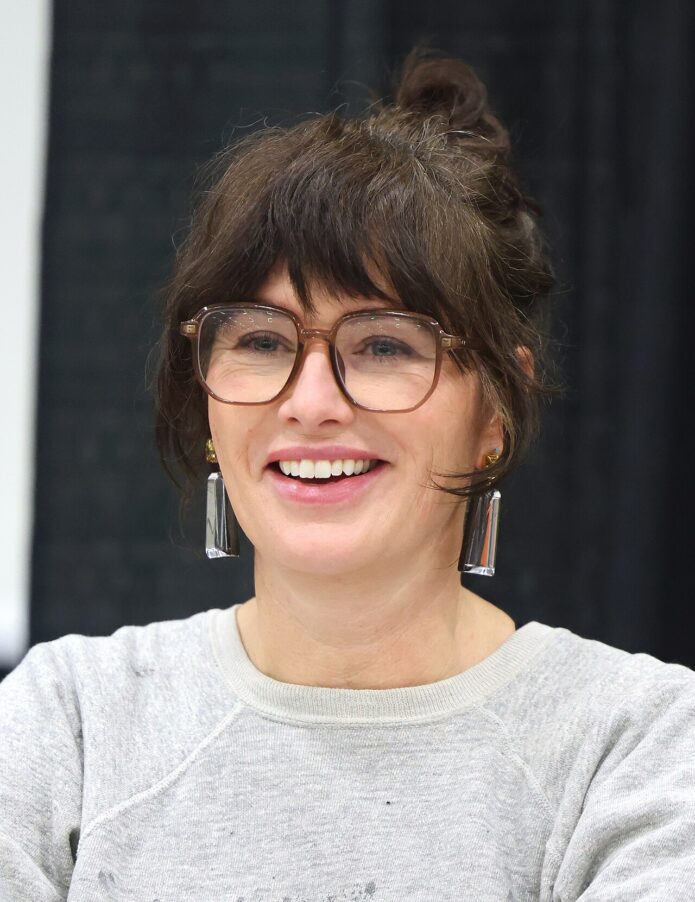
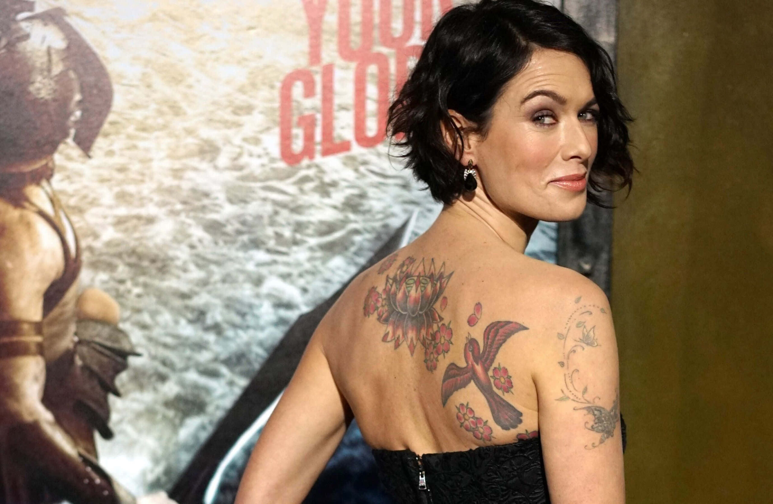
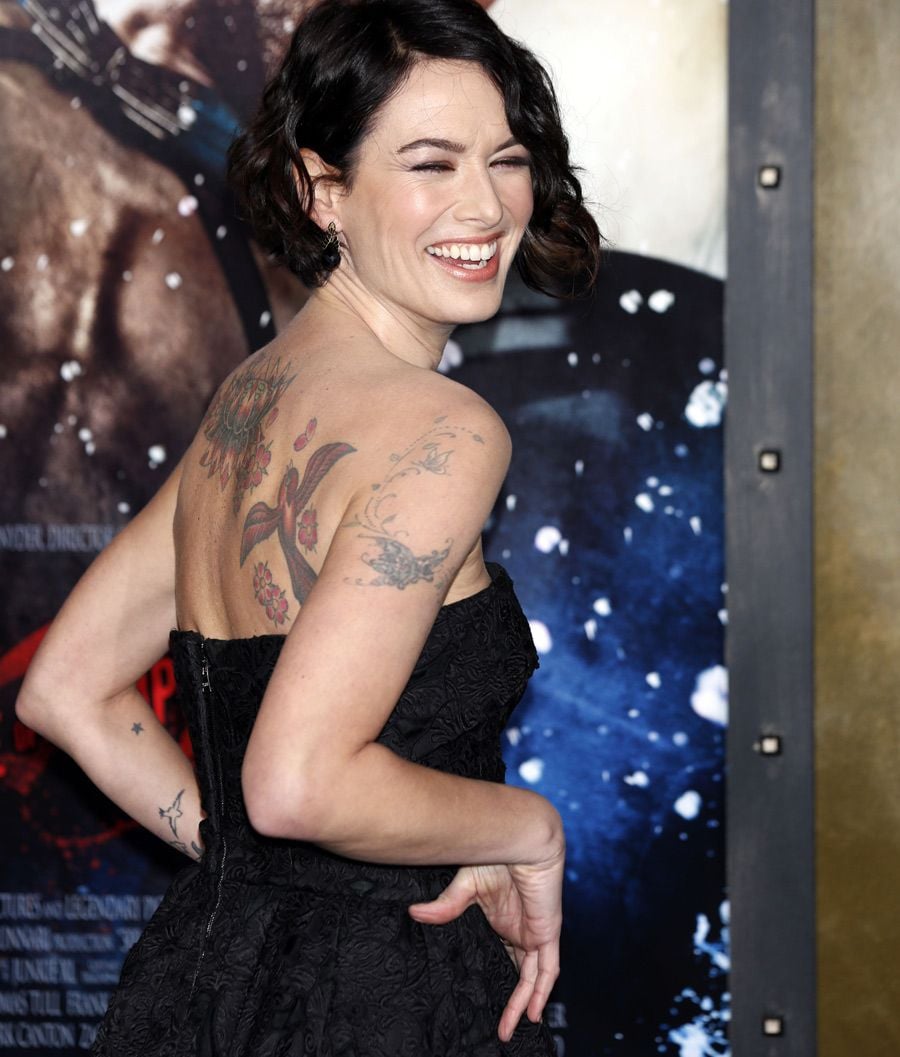
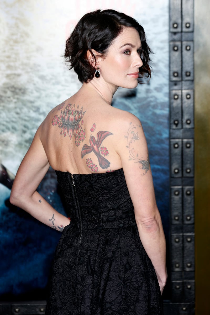
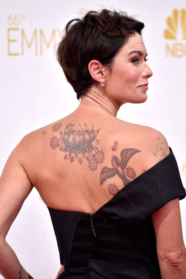
Lena Headey’s tattoos usually show up in flashes: a bird on her arm, the large back piece in an open dress, or a smaller design in a close-up. Across the available photos, birds, flowers and other nature imagery recur. Some designs are easy to identify; others appear only in older event pictures or tattoo galleries, where details are less certain. This guide sticks to what the images support and leaves unclear pieces open.
Lena Headey’s lotus tattoo covers much of her back
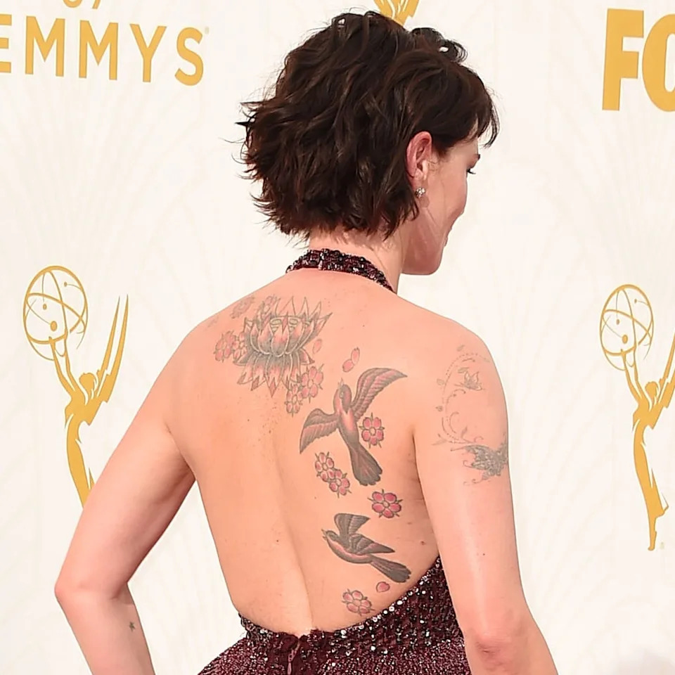
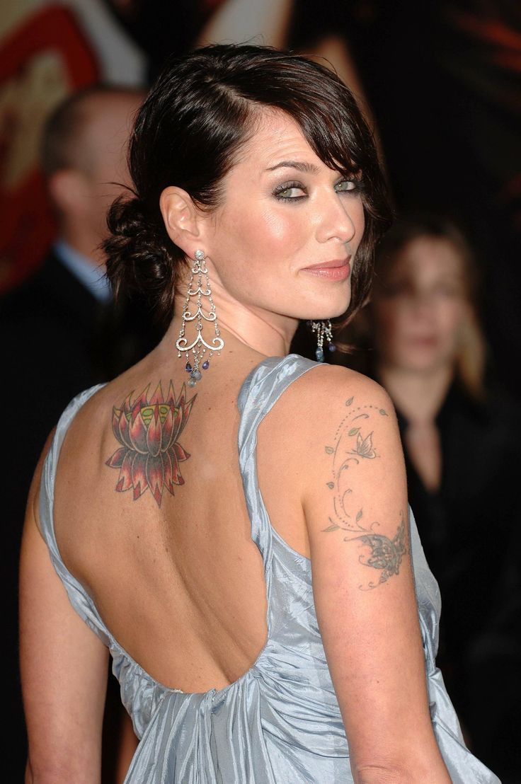
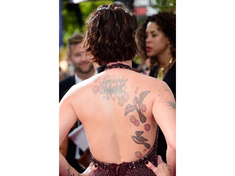
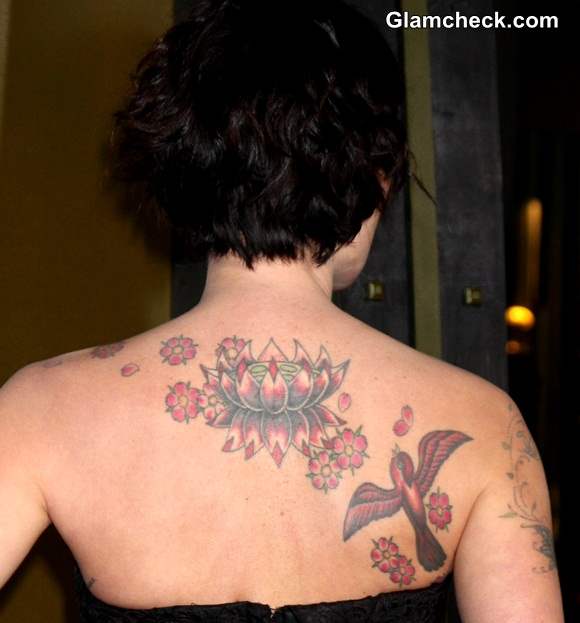
The largest tattoo in Headey’s collection is a lotus-style design high on her back. It spreads outward in petals and fine lines, so it reads more like an illustration than a solid patch of ink. The piece is visible in open-back dresses and is one of the easiest tattoos to identify across photos. Lotuses are often given meanings around growth or change, but Headey hasn’t publicly assigned this design a specific one. The image can be described without supplying a private story for it. The back piece is the clearest large design in the collection. Birds and flowers appear around it too, connecting smaller details to the same composition.
Birds and blossoms add movement to the back tattoo
The birds and blossoms sit within the same back piece as the lotus. In a close-up, one bird may look like its own tattoo; a wider photo shows how it fits into the larger composition. Branches and smaller flowers soften the outlines. Photos don’t tell us whether each part was added at the same time, so it’s more accurate to describe them together than to claim separate sittings. Fine lines and open skin keep the design from reading as one solid block. Similar natural shapes appear on her arms too.
Her arm tattoos include birds and a birdcage
Headey has bird-themed ink on her arm, including a design described as an open or upside-down birdcage with the bird outside it. Other bird and flower details appear in arm photos, though their placement can look different with the angle and light. Birds are the motif that’s easiest to follow from one image to the next. The open-cage design is often read as a symbol of freedom, but Headey hasn’t confirmed that meaning. It’s a possible reading of the image, not something to attribute to the actor.
A butterfly and flower tattoo bring in softer details
Tattoo coverage also identifies a butterfly and flower design on Headey’s arm. It looks smaller and lighter than the back tattoo, with the butterfly as its focal point and flower shapes around it. In photos, the line work and placement sit naturally with the other arm ink. There is no confirmed story behind the design in the public accounts here; it can be described without assigning it one.
A Ganesha tattoo adds another arm detail
Older coverage shows a Ganesha figure on Headey’s upper arm. Photos also show a script-style tattoo on her side, though it’s easy to miss under event clothing. The central figure can be identified in the available images; the reason she chose it hasn’t been publicly explained. Both details are less likely to appear in a roundup focused on her visible back piece.
There is a small tattoo on her foot
The foot tattoo is harder to track than the back piece. It tends to show up in sandal or holiday photos and close-up tattoo features, since shoes cover it at most events. The design looks small and fine-lined in the available images; coverage describes it as nature-inspired, but doesn’t establish an official meaning. The curve of the foot can also make photos less clear, so the exact shape is best left open unless the image shows it plainly. It’s a smaller piece alongside the larger work on her back and arms.
How Lena Headey’s tattoos fit together
Taken together, the tattoos share an interest in nature: lotus, birds, branches, flowers, butterflies and a small foot design. They don’t read like one planned sleeve or bodysuit. The collection appears to have grown over time, and the smaller arm and foot pieces keep the back tattoo from telling the whole story. Tattoo galleries sometimes repeat interpretations without a direct statement from Headey, so it helps to separate what is visible from what is guessed. The clearest description is visual: a large lotus and birds across her back, more bird imagery on her arms, a butterfly and flower design, and a smaller foot tattoo.
What is confirmed and what is still unclear
The back piece and repeated bird imagery are the easiest to confirm in photos. The butterfly and flower design and the foot tattoo also appear in tattoo references, while smaller marks and partial views are harder to identify. Headey may have more tattoos than this guide covers; it leaves out designs that aren’t clear enough to name. For more profiles, browse the actor tattoo section. Headey’s collection stands on its own; it doesn’t need a forced connection to someone else’s.
Watch Lena Headey interviews and tattoo coverage
The player below is a YouTube search embed for Lena Headey interviews and tattoo coverage. It can show how the arm designs sit when she moves, though the available results may change over time.
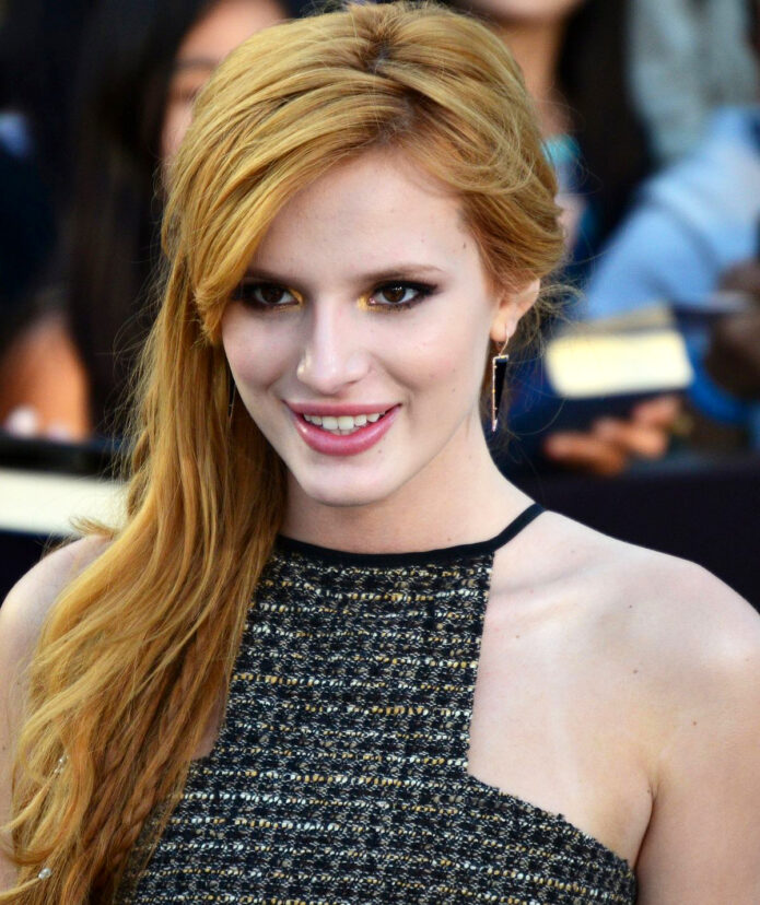
Bella Thorne’s tattoos show up in different places and sizes: a number on her forearm, words on her calves, cats, hearts, and smaller marks on her hands and feet. Some have a story Thorne has shared herself; others are easier to describe than to explain. This guide sticks to designs shown clearly or discussed in public, and leaves uncertain meanings open.
Bella Thorne’s 93 tattoo sits on her forearm
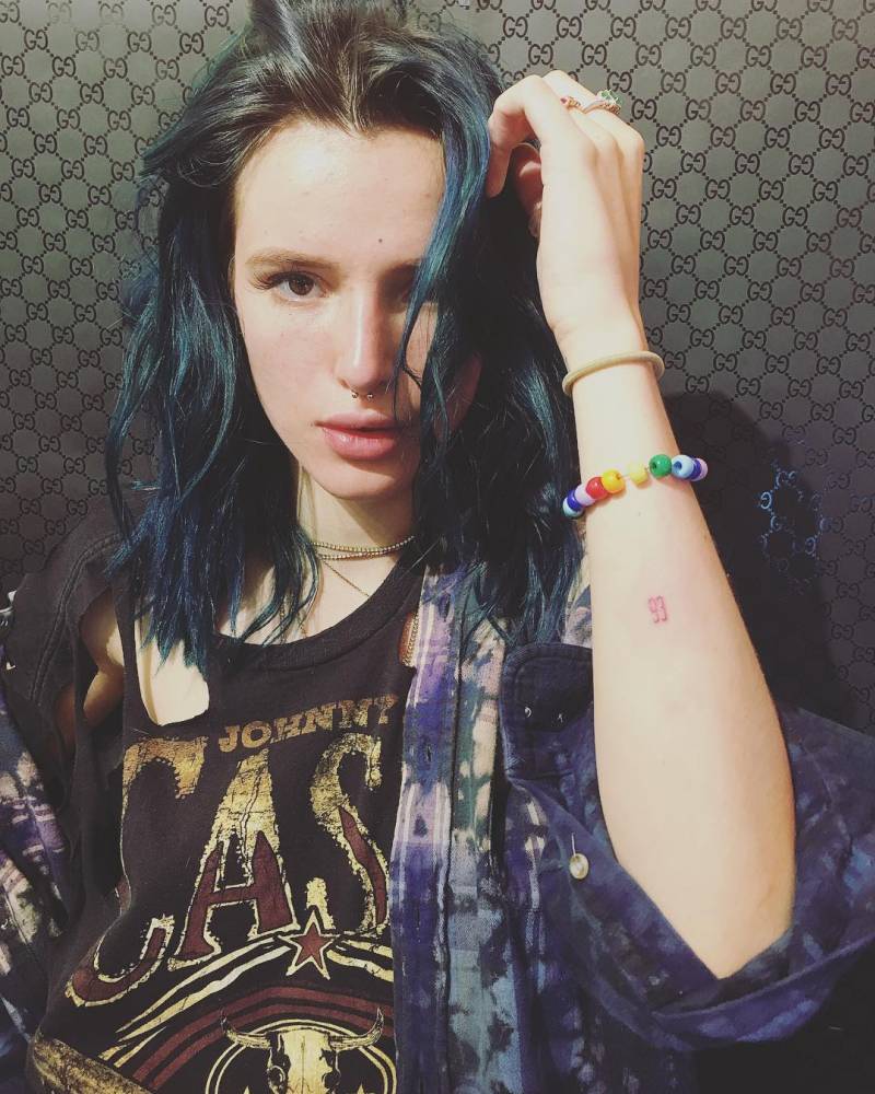
The number 93 is on Thorne’s forearm. It isn’t her birth year; she was born in 1997. Early coverage suggested the number might refer to her sister Dani, born in 1993, but Thorne hasn’t confirmed that. In sleeveless photos, the small lettering is easy to spot. The number is one of the easier designs to identify. Its exact meaning is less certain than its placement.
The “Wild Kitty” lettering sits on both calves
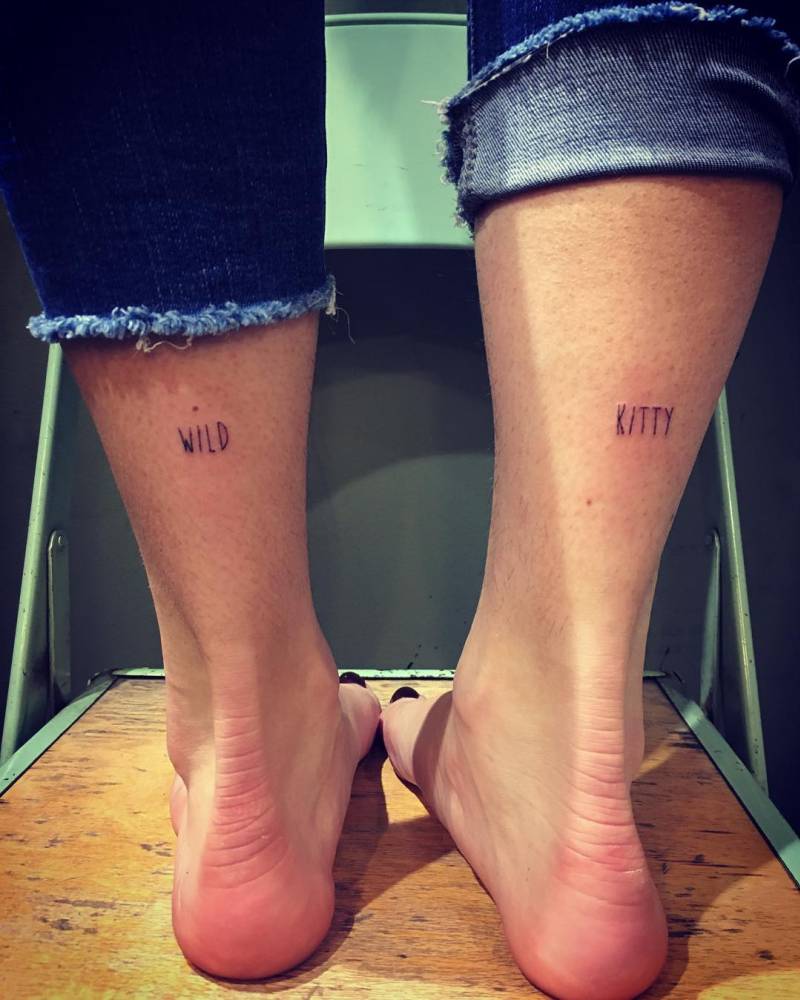
“WILD” and “KITTY” are written on the backs of Thorne’s calves, one word on each. They are lettering tattoos, not an image of a cat. The words are easier to see when her legs are bare, and they fit with the cat imagery elsewhere in her collection. Thorne didn’t give an explanation for choosing them when she first shared the tattoos.
Bella has whiskers on a finger
Thorne also has cat whiskers on her index finger; some close-ups show a small nose beside them. The fine lines can disappear in a regular event photo and look different depending on the angle. She hasn’t given a reliable public explanation for the design, so the clearest account is what it looks like.
The heart on Bella Thorne’s palm
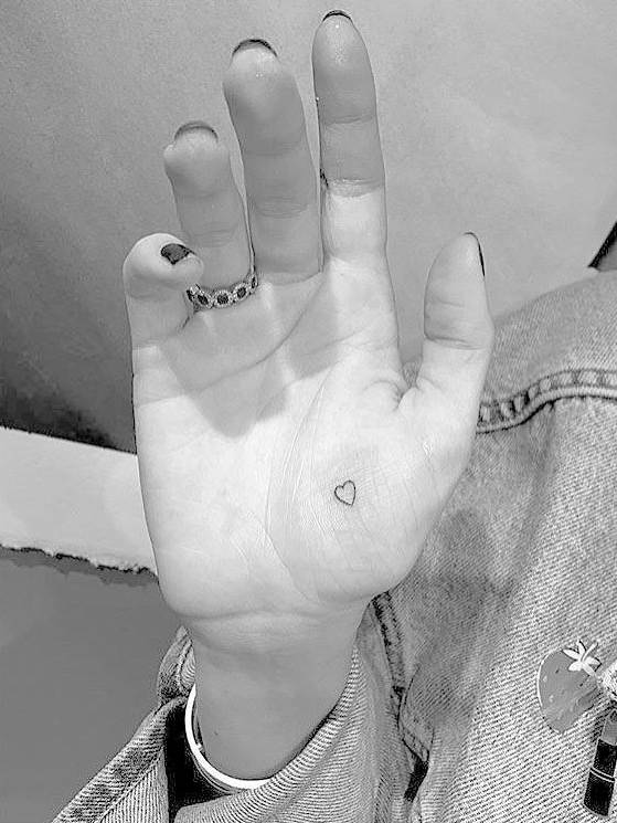
Thorne has talked about the heart tattoo on her palm, including the need to retouch it and cover it for camera work. That gives this design a firmer public record than pieces identified only in fan photos. A small outline on the palm can soften with time and everyday use; the heart is still recognizable in the available images.
There is another heart on her chest or shoulder area
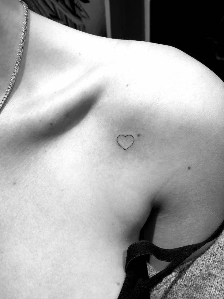
Thorne has also described a small heart on her shoulder as a design she found on Tumblr. Photos don’t always make its exact position clear, so coverage places it around the chest or shoulder. Its origin is casual: she liked the image and got it tattooed. The shape echoes the heart on her palm, though the two tattoos sit in different places.
Her B2 wrist tattoo is a personal mark
The B2 tattoo is on the inside of Thorne’s wrist. She has said it matches a tattoo worn by her best friend Bella Pendergast. The design is small and easy to cover with a sleeve or bracelet, but its connection is clear from Thorne’s own account.
The star tattoo is for her sister
Thorne has a small star tattoo on her foot and has said it is for her sister. Shoes and socks often hide it; when it appears in a photo, the outline is simple and light. It is one of the collection’s smaller pieces, with a personal connection Thorne has explained.
The cat behind her ear is easy to miss
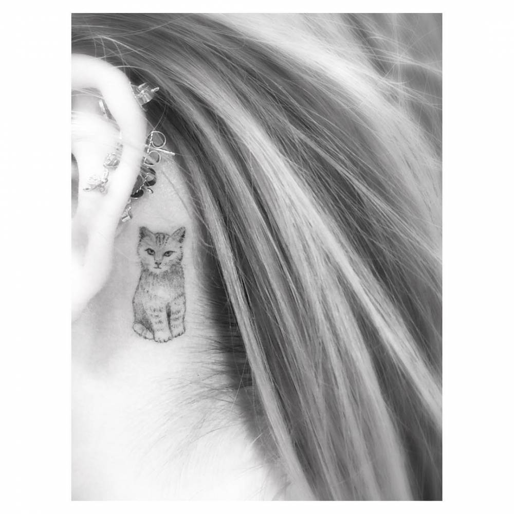
A small cat tattoo sits behind Thorne’s ear. Hair down can hide it completely; when her hair is pulled back, the placement shows. She has said she got cats because she loves them, and that she added another one later. The ear tattoo and the words on her calves are different designs, but both sit within the cat motif that appears in her collection.
Why Bella’s style feels so varied
The collection moves between a number, calf lettering, cats, hearts, a star and tiny hand details. It doesn’t follow one strict style. Some pieces have a story Thorne has shared, like the heart she found on Tumblr or the star for her sister; others are only clearly visible in photos. When an image is blurry, shadow, makeup or jewelry can be mistaken for ink, so this account stays with tattoos that have been shown clearly or discussed publicly. For more profiles of actors with visible tattoos, browse the site’s actor tattoo section.
Watch Bella talk about her style and tattoos
In WIRED’s interview, Thorne answers questions about herself and mentions having a tattoo gun. It isn’t a full tattoo tour, but it offers a little context for how she talks about tattoos and personal style.
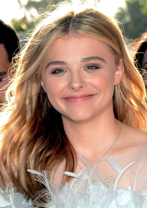
Chloë Grace Moretz has said most of her tattoos are hidden, partly because covering them can add hours to a shoot day. In a WIRED interview, she talked about the time it takes to cover her ink on set. That is why many pieces surface only in a red-carpet photo, a tattoo artist’s post, or a casual holiday picture. The tattoos she has shown point to family and friendship, with a cross-country drive and a hopeful phrase in the mix. These are the pieces with the clearest public record.
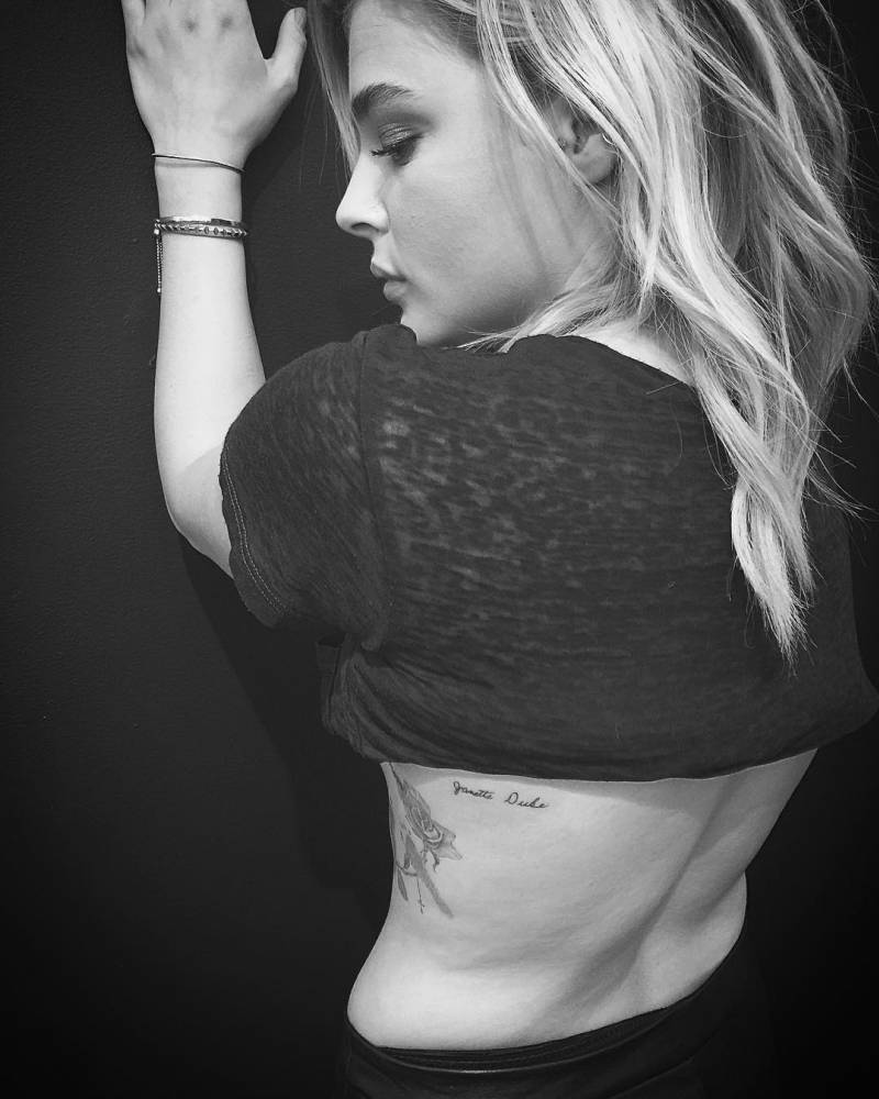
Chloë Moretz’s “Janette Duke” tattoo
A fine-script “Janette Duke” runs along Moretz’s back. It is a tribute to her maternal grandmother, and tattoo artist Jon Boy did the work. Moretz has spoken about how close they were; the tattoo gives her a small way to keep that connection with her. The back placement lets her cover it for a role and show it when she chooses. The photo has a casual feel, with none of the staging of a formal reveal.
The rose, tiny feet and “Memom” tribute
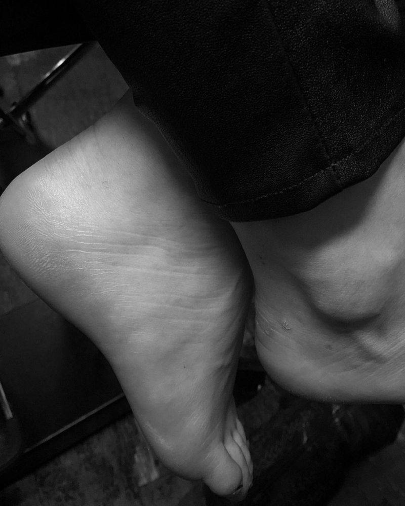
On Moretz’s side, a larger design brings together a rose, small footprints, and the word “Memom”. The name refers to her grandmother. The footprints are connected to her baby sister Kathleen Janette, who died shortly after she was born. In photos, the design can read as a rose on its own or as a grandmother tribute, depending on the angle. Both descriptions point to the same piece, which also includes the tiny footprints.
Her 4,419 tattoo marks a big change
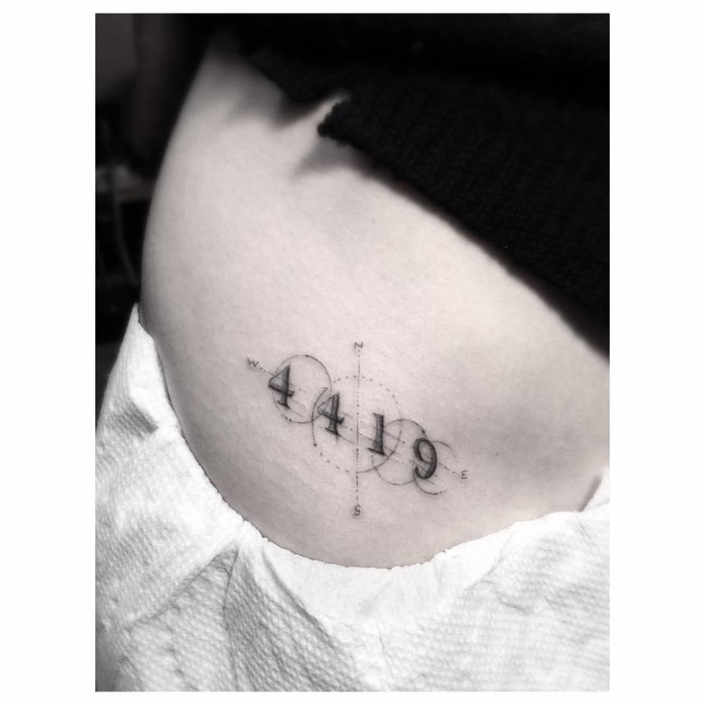
At 18, Moretz drove 4,419 miles across the country, and the number became the center of a tattoo on her hip. Circles, dotted lines, and compass-like points give it the look of a small map. Dr. Woo did the tattoo; the fine lines and neat details fit his single-needle style. Without the story, the number might look abstract. Knowing it marks a cross-country drive gives the design a clear point of reference.
The family initials on her thigh
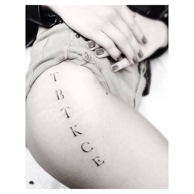
The letters “TBTKCE” run vertically along Moretz’s upper thigh. They stand for members of her family, including her siblings, her mother, and her late sister. The serif letters have a worn, dotted finish and are spaced like a private list rather than a slogan. The placement also makes the tattoo easy to cover. Family keeps coming up in the designs Moretz has explained, and this one puts the names into initials.
“It gets better than this” under her right breast
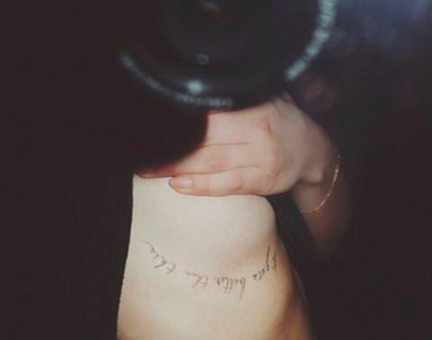
Under her right breast, Moretz has the phrase “it gets better than this”. It leaves room for a hard moment without treating that moment as permanent. The lettering is simple and keeps the focus on the words. Because of its placement, the tattoo is easy to miss; it usually appears only in an open neckline or a close-up she chooses to share.
Small matching ink and the tattoos she keeps private
Moretz has also gotten small matching tattoos with friends. One documented example is a white-ink ankle tattoo connected to her friend Kathryn Gallagher. White ink can be difficult to see in photographs and may fade into the skin as it heals, so the design does not show clearly in every picture. Moretz has said she has many tattoos and that most are hidden. That makes an exact count hard to pin down: some lists identify six, while fan records suggest there are more. The clearest record comes from pieces she has shown or an artist has described. Those include family memories, a long drive, and a small mark of friendship. She has not made the full collection easy to see.
What Chloë Moretz’s tattoos have in common
The designs do not share one look. Many are small or fine-lined, and several link back to people or events in Moretz’s life. Her grandmother and sister appear in family tributes; the 4,419 piece marks a drive she made at 18; the matching ankle tattoo is tied to a friendship. Hidden placement has a practical side too: Moretz has said that covering tattoos can add hours to filming. Some pieces stay personal while she takes roles that call for them to be covered. For more actor ink, see the actors tattoos section.
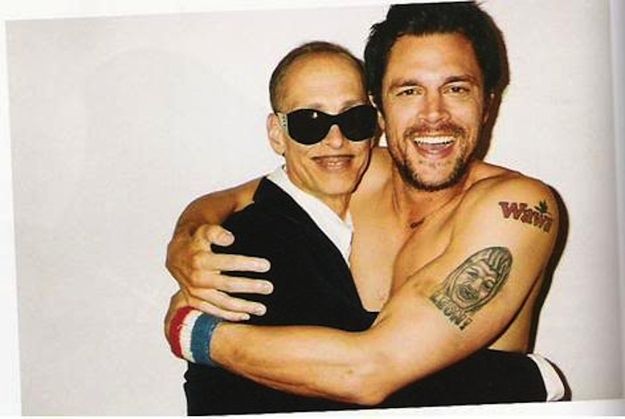
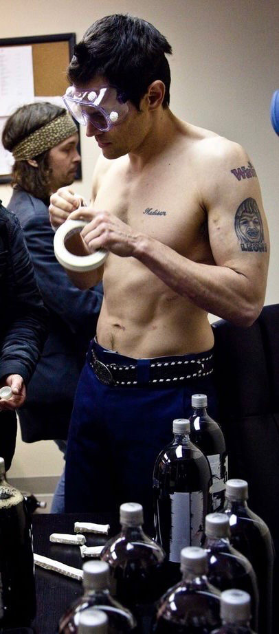
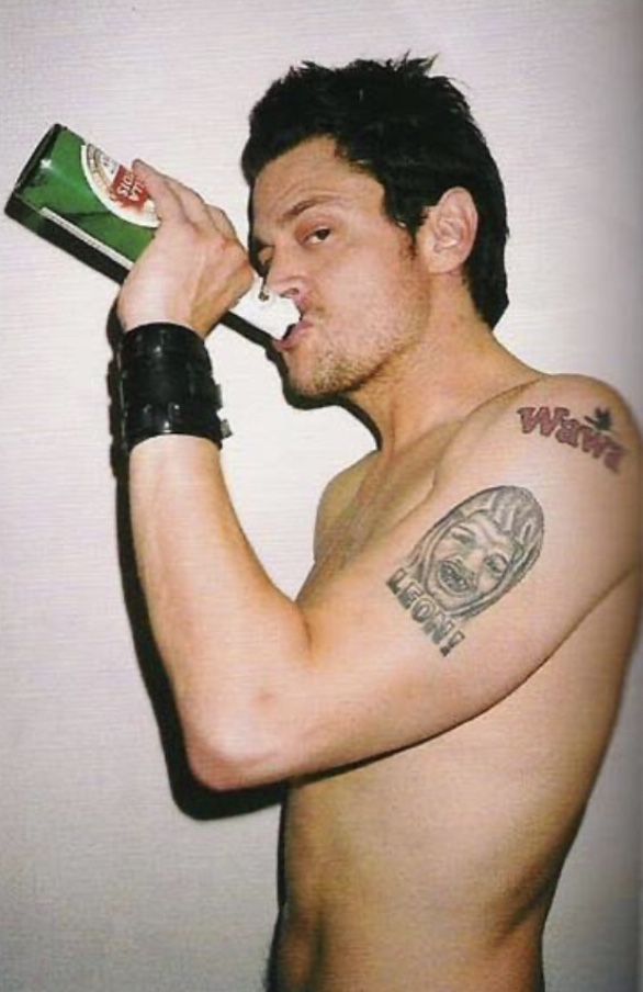
Johnny Knoxville’s tattoos share the offbeat humour of Jackass, but the collection includes family pieces as well as jokes. Documented designs include a blue cursive “Madison” across his left chest, a Wawa logo on his shoulder, a globe with three stars on his inner right wrist, and a small tattoo based on a drawing by his son Jack.
Older references also mention tattoos on his back and right shoulder, along with a “Leon” design that may have been removed. Photos don’t always show those marks clearly, so it helps to keep the well-documented pieces separate from the uncertain ones.
Madison is the most personal name in Knoxville’s collection
The clearest family tattoo in Knoxville’s collection is the blue cursive name “Madison” across his left chest. Public tattoo references link it to his daughter, Madison Clapp, who was born in 1996. The name is simple, but its placement keeps it close rather than tucked away on a wrist or ankle.
There’s no complicated story needed for a name tattoo: it marks a relationship. Knoxville is known for the reckless stunts and dry humour of Jackass, while the Madison tattoo shows a family dedication. Both sides of his public life are on the same body.
The script is usually described as blue and cursive, which distinguishes it from the smaller symbols elsewhere in the collection. Clothes and body position can partly hide it in photos, but the name is consistently identified.
It also shows that Knoxville’s tattoos aren’t all stunts or jokes. One of his most visible pieces honours his daughter; the humour in other designs doesn’t make them meaningless.
He wears his daughter’s name in blue ink across his chest.
The Wawa shoulder tattoo is exactly as strange as it sounds
Knoxville is also known for a Wawa logo on his shoulder. The convenience-store tattoo became part of Jackass lore because it turns an everyday brand into permanent body art. It has been linked to the crew’s time filming in West Chester, Pennsylvania. One tattoo artist’s post says he did the piece roughly 24 years earlier.
The logo is funny, but it also recalls a place and a period in the crew’s life. Knoxville made a passing joke into a tattoo and kept the memory on his shoulder.
Brand tattoos can look different as the years pass. The Wawa logo is memorable partly because it sits outside Knoxville’s other public work, and partly because it fits his willingness to commit to a bit.
Not every tattoo needs a deep explanation. This one is specific: a convenience-store logo from a time and place associated with the crew.
It’s visible without dominating the collection. Madison’s name is on his chest; Wawa is on his shoulder.
The globe and three stars sit on his inner right wrist
Older tattoo references describe a globe with three stars on Knoxville’s inner right wrist. It’s smaller and more graphic than the Madison name or Wawa logo. A watch or sleeve can cover the wrist, which may help explain why the design appears less often in photos.
The globe is easy to identify, but the public descriptions don’t give a confirmed meaning. It may relate to travel, a worldview or simply an image Knoxville liked. Sources place the three stars alongside it but don’t establish every detail of the design.
That uncertainty is worth keeping. Without Knoxville’s explanation, it’s safest to describe a globe and three stars without assigning them a story.
The wrist placement is less showy than the Wawa tattoo. A shoulder logo can be shown as a punchline; the wrist piece is easier to keep out of view.
Alongside Madison’s name, the globe shows the range in Knoxville’s collection: one tattoo names a person, another uses a small image and stars.
A drawing by his son Jack became another family tattoo
Another documented piece on Knoxville’s upper left arm is based on a drawing by his son Jack. Reports say the tattoo was done at Southside Tattoo in Austin. Its importance comes from who drew it, rather than from the image being a familiar symbol.
Photos don’t always show the design clearly. What’s been reported is that Jack’s drawing became permanent ink on his father’s upper left arm. The story behind the image is clearer than the image itself.
Madison’s name and Jack’s drawing are two different ways Knoxville has put family into his tattoos: one is lettering, the other a child’s artwork.
A child’s drawing can be uneven or unexpected. The tattoo keeps it that way instead of turning it into a polished emblem.
It’s a small piece, but the connection is easy to understand. It came from his son.
The other shoulder and back marks are harder to date
Older galleries and fan discussions mention other tattoos on Knoxville’s back and right shoulder. They suggest his collection extends beyond the Madison name, Wawa logo, globe and stars, and Jack’s drawing. Many of the photos are cropped, blurry or undated, so they don’t support a complete inventory.
One tattoo-tour discussion mentions a “Leon” design and suggests it may have been removed. That remains uncertain without a clear current photo or Knoxville’s own account. Older images can be hard to compare after fading or removal.
Some small marks on the right shoulder could be separate tattoos or parts of a larger design. The available photos don’t make that clear, and there are already several confirmed pieces to describe.
Because Jackass is known for spontaneous stunts, it’s easy to assume every tattoo was a dare. The Madison name and Jack’s drawing show that family is part of the collection too. Some pieces are jokes; others have a more personal source.
What Knoxville’s tattoos say about the Jackass years
The Wawa logo is a small time capsule. It connects Knoxville to a place, the Jackass crew and a particular joke. The story helps explain why he chose an ordinary store logo.
The family tattoos tell a different story. Madison’s name and Jack’s drawing make clear that Knoxville’s ink isn’t one long prank. The collection moves between jokes and family.
The globe and stars add a design whose meaning hasn’t been explained, and the “Leon” tattoo may have been removed. Tattoos can fade, be covered or disappear from view under clothing, so old photos don’t always show what’s there now.
There isn’t one signature style to Knoxville’s collection. It includes his daughter’s name, a Wawa logo, a globe and stars, a child’s drawing and other marks that are harder to document. It reads more like a record of family and jokes than a coordinated portfolio.
Watch the Johnny Knoxville and Steve-O tattoo story
This clip features Knoxville and Steve-O in the Jackass world behind many of the stories connected to his tattoos.
Dakota Johnson’s tattoos tend to appear in glimpses: an open-back dress, a raised arm or bare feet in a close-up photo. There is fine script, three birds on her upper back, a few tiny symbols, a flower and several small pieces on her feet. Together, they have become part of her red-carpet look.
Johnson has said she has around 11 or 12 tattoos, though older guides have counted more depending on how they group the smallest designs. The collection stays low-key, but it touches on family, love, books and art. Here is what the clearest photos and interviews reveal.
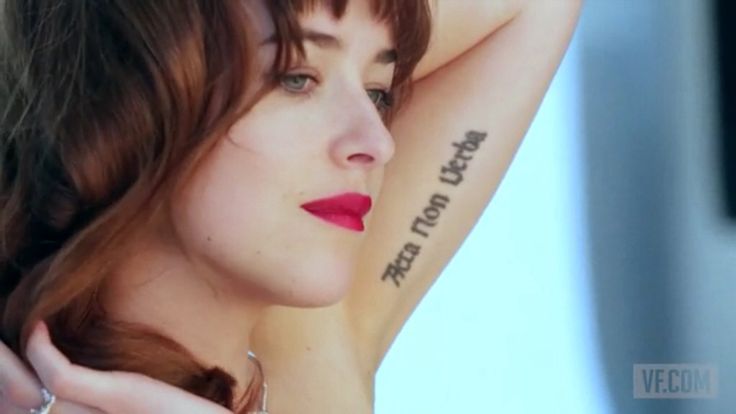
Acta Non Verba was her first big piece
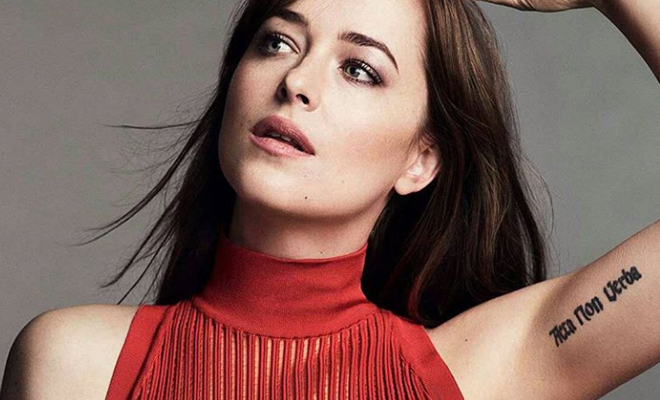
One of Johnson’s most recognisable tattoos is the “Acta Non Verba” lettering on her left inner bicep. The Latin phrase means “deeds, not words.” She has said it was her first tattoo and that the words mattered to her father, Don Johnson. It is a bold choice for a first piece, and much easier to spot than most of her smaller ink.
There is a little regret in the story too. Johnson has since admitted she is not entirely happy with the tattoo, partly because it is so visible and partly because the lettering has not aged exactly as she hoped. That does not erase its meaning. It just gives the piece a recognisably Dakota mix of polish and imperfection.
The placement suits the way she wears her tattoos. A sleeve can hide it, then a raised arm brings it into view. That quiet reveal runs through much of her collection; the designs can stay private until she chooses to show them.
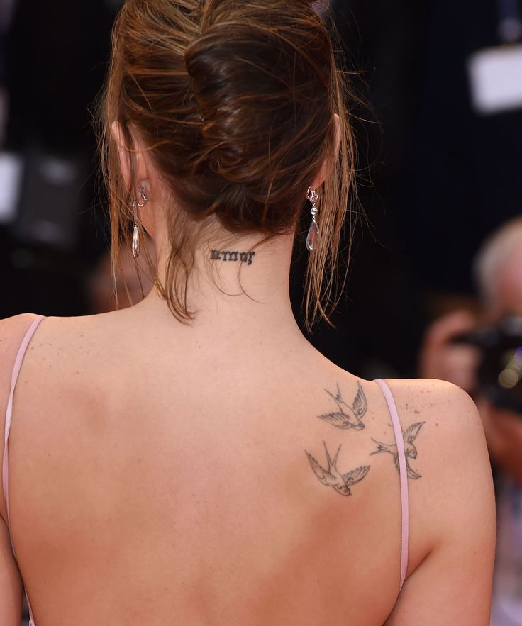
The three birds on her back are her most recognizable design
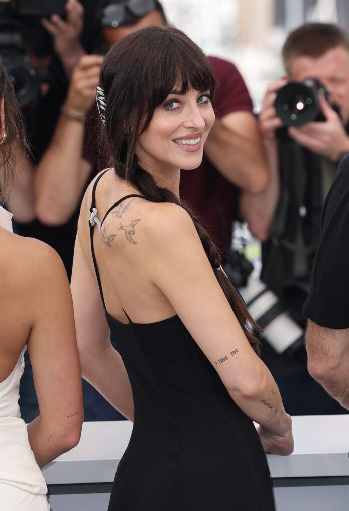
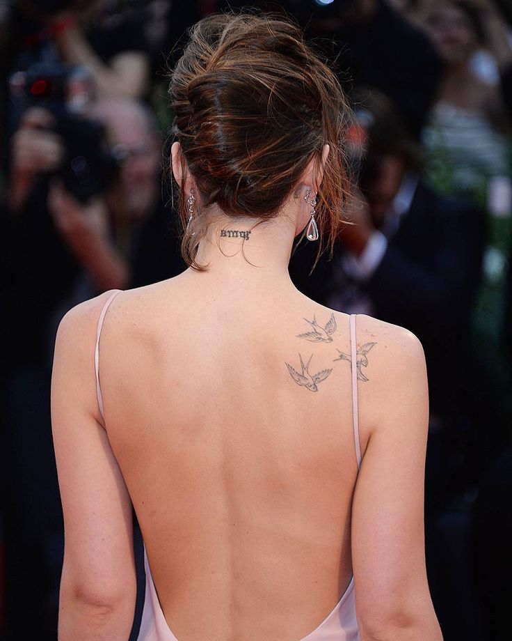
The three small birds near Johnson’s shoulder blade are probably the tattoos fans spot first. They look like swallows in flight, drawn in fine lines rather than heavy shading. The simple shapes work especially well with open-back dresses and thin straps. From across a room, they read as a light decorative detail; up close, each bird has its own outline.
The design is often linked to Johnson’s grandmother Tippi Hedren, who starred in Alfred Hitchcock’s The Birds. That connection is widely reported, though Johnson has not offered a long explanation every time the tattoo appears. The family link makes sense, and the placement lets photographers catch the birds without making them take over the look.
The birds capture a favourite mood in Johnson’s collection: personal without being loud. Hair or clothing can cover them, while a backless gown makes the fine-line work the detail people notice.
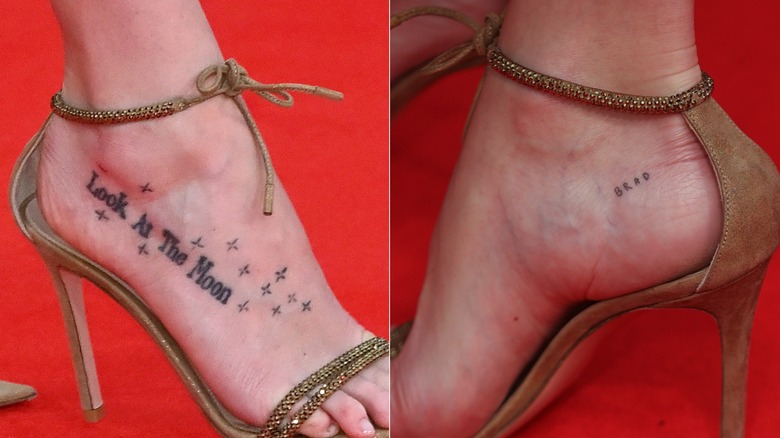
Her foot carries two tiny pieces, including Look at the Moon
Johnson’s feet hold two of her most playful tattoos. The best known is “Look at the Moon”, written across the top of her right foot with little stars around it. It appears only when shoes and camera angle allow, which is why red-carpet photos seem to rediscover it every so often.
Near her heel is a tiny Brad tattoo. The letters show clearly in close-ups, but Johnson has not confirmed the reason behind the name. There is no need to fill in that gap; not every tattoo comes with a public explanation, and she seems content to leave some details private.
“Look at the Moon” feels dreamy, while “Brad” is spare and direct. Putting them on her feet gives the collection a playful note, and both can stay hidden when she wants a clean look for a role or event.
Amor matches the tattoo her mother has
Johnson has “amor”, the Spanish word for “love,” inked at the back of her neck. It matches a tattoo worn by her mother, Melanie Griffith, making this one of the clearest family connections in her collection. The short word is easy to read and sits at the nape.
The tattoo changes with her hairstyle. With her hair down, it can disappear; an updo puts it in clear view. The three birds sit nearby, so the two designs often appear together in photos, creating a small family-themed group without crowding her back.
While some of Johnson’s other script feels like a private note, “amor” is warm and direct. The lowercase lettering fits the fine-line style that runs through her arms, feet and shoulders.
The placement helps the small design stand out. The nape gives it a natural frame: hair can conceal it for a role or daytime appearance, while an updo gives photographers a glimpse.
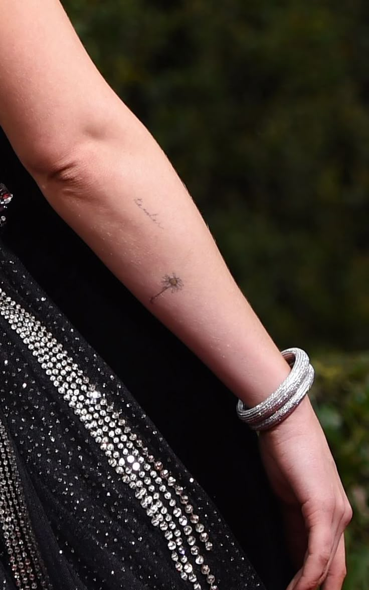
Her imperfect flower tattoo was inspired by Egon Schiele
Johnson also has a delicate flower on her forearm. Tattoo artist Dr. Woo has said the design took inspiration from Austrian artist Egon Schiele. It is not a rounded, picture-perfect bloom; the slightly bent shape is why it is often called a withering flower.
That rough edge is part of the appeal. The lines feel fragile and almost sketchbook-like, rather than like a generic pretty flower. Johnson’s tattoos often sit between elegant and a little unusual, and this one looks simple at first, then more thoughtful once you notice its deliberate imperfection.
The forearm gives the flower enough room to breathe. It can stand alone instead of disappearing into a busy sleeve, and in close-up it looks more like a small art reference than standard flash.
Non mi uccida and other small script tattoos keep things personal
Another phrase associated with Johnson’s ink is “Non mi uccida,” Italian for roughly “do not kill me.” The small script on her arm has appeared in older photos and a Vanity Fair shoot. Like “Acta Non Verba,” it adds a hint of literary drama, but its size keeps it from feeling like a slogan.
Photos have also shown an infinity symbol and an “I love you” tattoo on her arm. The infinity design has been associated with Chris Martin, though the story behind every small mark is not confirmed. It is safest to record what has been seen without inventing the missing details.
That privacy is part of the collection’s appeal. Johnson does not explain every tattoo, and a new close-up can still reveal a small design. The pieces feel like notes from different chapters rather than one large project with a formal beginning and end.
Watch Dakota talk about her tattoo regrets
Johnson has talked about her tattoos in interviews, including a late-night conversation where she joked about regretting some of them. It is a useful reminder that celebrity ink does not always need a perfectly meaningful story. Sometimes the choice was quick, the lettering aged differently than expected or the person simply changed their mind.
Taken together, Johnson’s tattoos are understated without being dull. The birds, “amor,” “Acta Non Verba,” foot phrases and imperfect flower all have different moods. Some point to family, some to love and art, and a few remain private. She does not seem to be trying to prove anything with her ink; she keeps a handful of ideas she likes and lets them show when they show.
Danny Trejo’s tattoos were part of his look well before Hollywood made him one of the screen’s most recognisable tough guys. The films made the ink famous, but they did not give it to him. The chest design, family lettering and older arm work came from an earlier part of his life, including time in prison, and that history still shows in the lines.
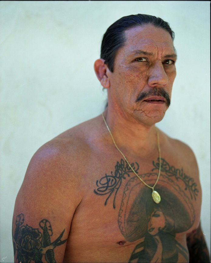
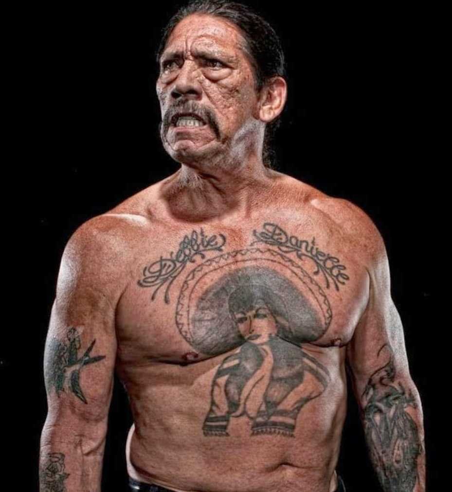
The collection is centred on the woman in a sombrero across his chest. Roses and heavy black lines surround her, while names above the figure bring the design back to family. His arms hold an older, rougher mix of prison-made ink and smaller symbols. It is a busy set of tattoos, but each piece is easier to follow when it gets its own image and description.
Accounts have sometimes called the woman Mexican, a charra or a figure inspired by the Virgin of Guadalupe. The labels vary. The clearest starting point is what photos show and what Trejo himself has said. That gives the tattoos a real history without assigning a meaning to every rose, line or shadow.
The sombrero woman is still Danny Trejo’s signature chest tattoo
The sombrero woman is the tattoo people usually recognise first. She spans Trejo’s chest, wearing a wide hat, with roses worked around her. The bold lines and slightly rough, old-school finish look unlike a polished new studio piece.
Trejo has said the tattoo began in prison and was completed over time. One account says it was worked on in three different penitentiaries with Indian ink and a needle. He has also connected it to a friend he had known since he was fourteen. Those details explain why the piece feels built in stages rather than planned for one appointment.
Some sources describe the woman as a Virgin of Guadalupe, but the label is not consistent. There is a difference between saying a design has been described that way and claiming Trejo gave one definitive explanation. The photo clearly shows a woman in a sombrero and roses, with a Mexican-American visual feel. More specific claims should be tied to a direct comment.
The tattoo became part of Trejo’s screen identity, too. Directors could show it in a scene, and audiences understood that his tough appearance was not just wardrobe or makeup. He did not need a temporary tattoo to play a hard character; the chest piece, moustache, scars and lived-in look were already there.
That is what makes the design more than a typical celebrity chest tattoo. It was not chosen to match a role; the roles later borrowed from a look he already had. The woman reads clearly from a distance, while the roses and finer lines come through in a closer photo.
Salma Hayek has told the funny story that the woman looks like her. The coincidence became a well-known detail, especially after the two actors worked together. It is memorable, but it should not displace the older story: the prison-made process and Trejo’s connection to the friend who worked on it are the better-supported parts.
The prison-made process gives the chest piece its rough edge
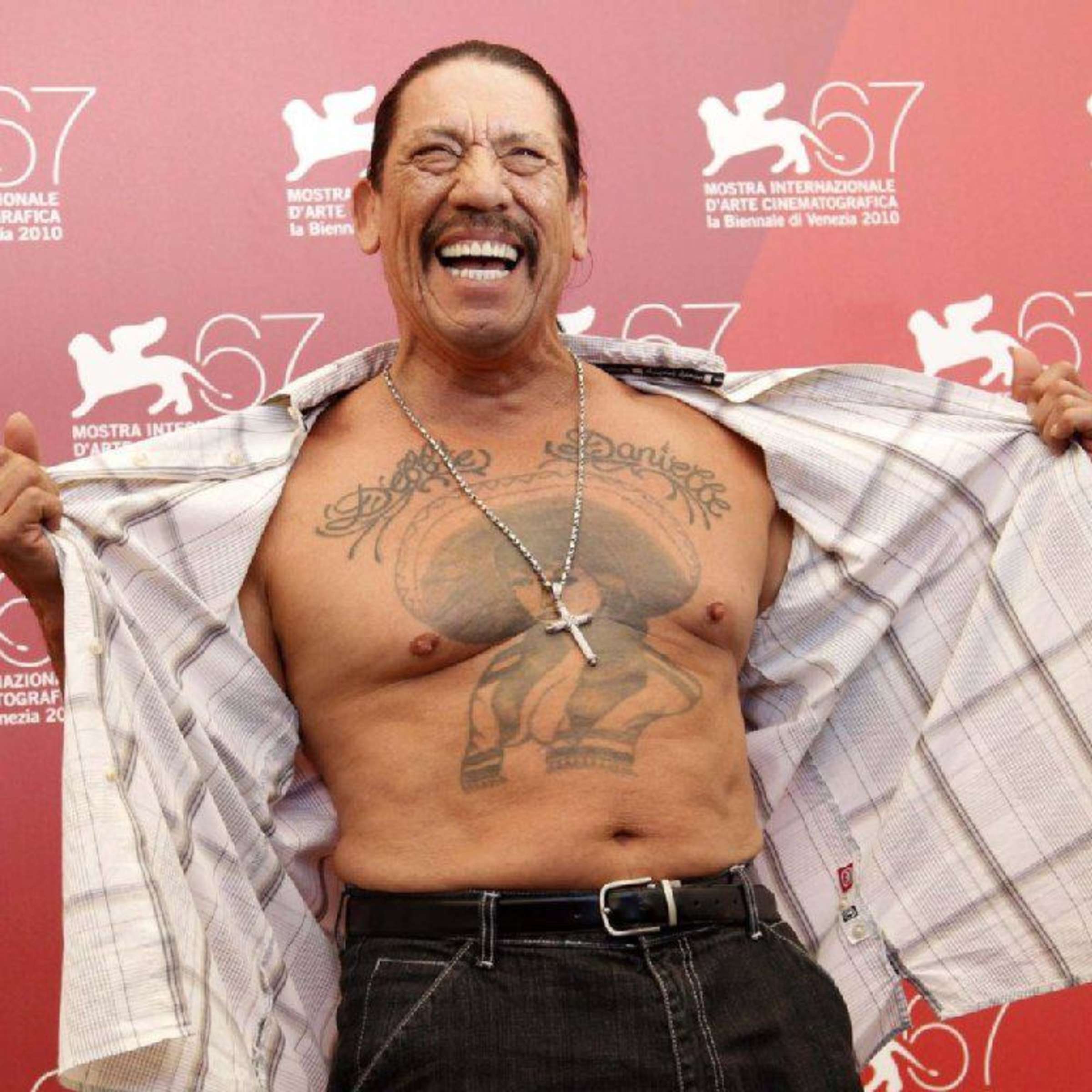
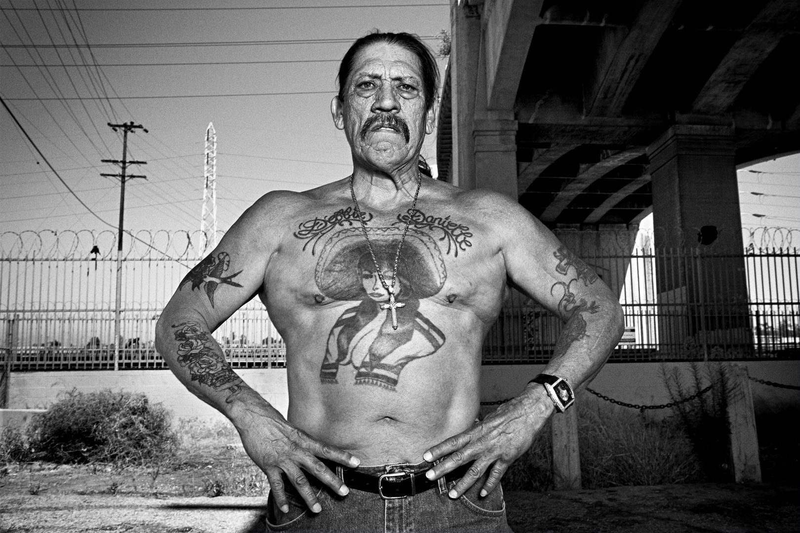
A wider Venice photo shows just how much of Trejo’s chest the design covers. It also brings out the texture: lines of different weights, darker patches and roses without the even finish of a new studio piece.
Trejo has described working with Indian ink and a needle. The setup was basic: no comfortable studio chair, controlled lighting or modern machines. The tattoo came together in difficult conditions and across separate periods, and the marks of that process remain visible. They are part of the piece’s history, not flaws that need to be hidden.
The design was apparently added to as Trejo moved through different prisons. That helps explain why the chest can look a little different from one photo to the next. Lighting changes the contrast between ink and skin, while the angle can make one side of the woman or a rose seem heavier. A picture from one year is not a perfect record of every line added later.
The same image can look like a costume detail in a film, telling the audience Trejo’s character is dangerous. Outside a role, it belongs to a longer timeline: the tattoo was there before the famous parts and stayed with him as his career changed.
There is no need to romanticise the prison history. The straightforward account is already striking: a friend worked on the tattoo, the piece developed over time, and the tools were simple. The rougher lines are evidence of the process, not proof of some hidden meaning.
The Venice shot is useful because it gives the design room. You can see the woman, the roses and how the ink spreads across Trejo’s chest instead of looking at one dark patch in isolation. That wider view also helps explain why the tattoo became such a strong part of his public image.
Debbie and Danielle bring the family story into the design
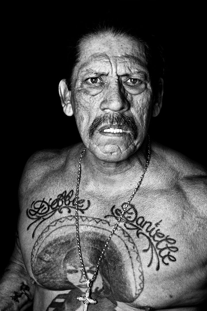
Above the central figure are the names “Debbie” and “Danielle”. They are generally identified as Trejo’s wife and daughter, making them among the clearest personal details in the collection. The lettering is smaller than the woman and roses, but it changes the feel of the whole chest piece: this is not only a dramatic image built around a tough screen persona.
The names are easiest to read in a close portrait with even lighting. In a film still, a dark interview image or a photo taken from an angle, they can blend into the black lines around the figure. A wider photo shows where the lettering sits; a closer one makes the actual names legible.
The family lettering brings a quiet, direct note to an image associated with violence and hard characters. There is no need to attach an elaborate story to the names. They read as a dedication, and descriptions of the tattoo identify the people they refer to.
Their placement matters. The names sit above the woman, rather than hidden on a shoulder or forearm. They are part of what people see when Trejo’s shirt comes off, even if the central figure still draws most of the attention. It makes the chest design more personal without taking away its impact.
Photos from different years can make the letters look darker, lighter or less clear. Film lighting, camera quality and angle all affect the image. A change in how the lettering looks is not proof that it was replaced; a clear photo is simply needed to describe it confidently.
The names are a good reason not to reduce the tattoo to one big symbol. The woman is the headline image, but Debbie and Danielle give it its clearest family connection. They can be missed in a crowded photograph and still deserve their own visual focus.
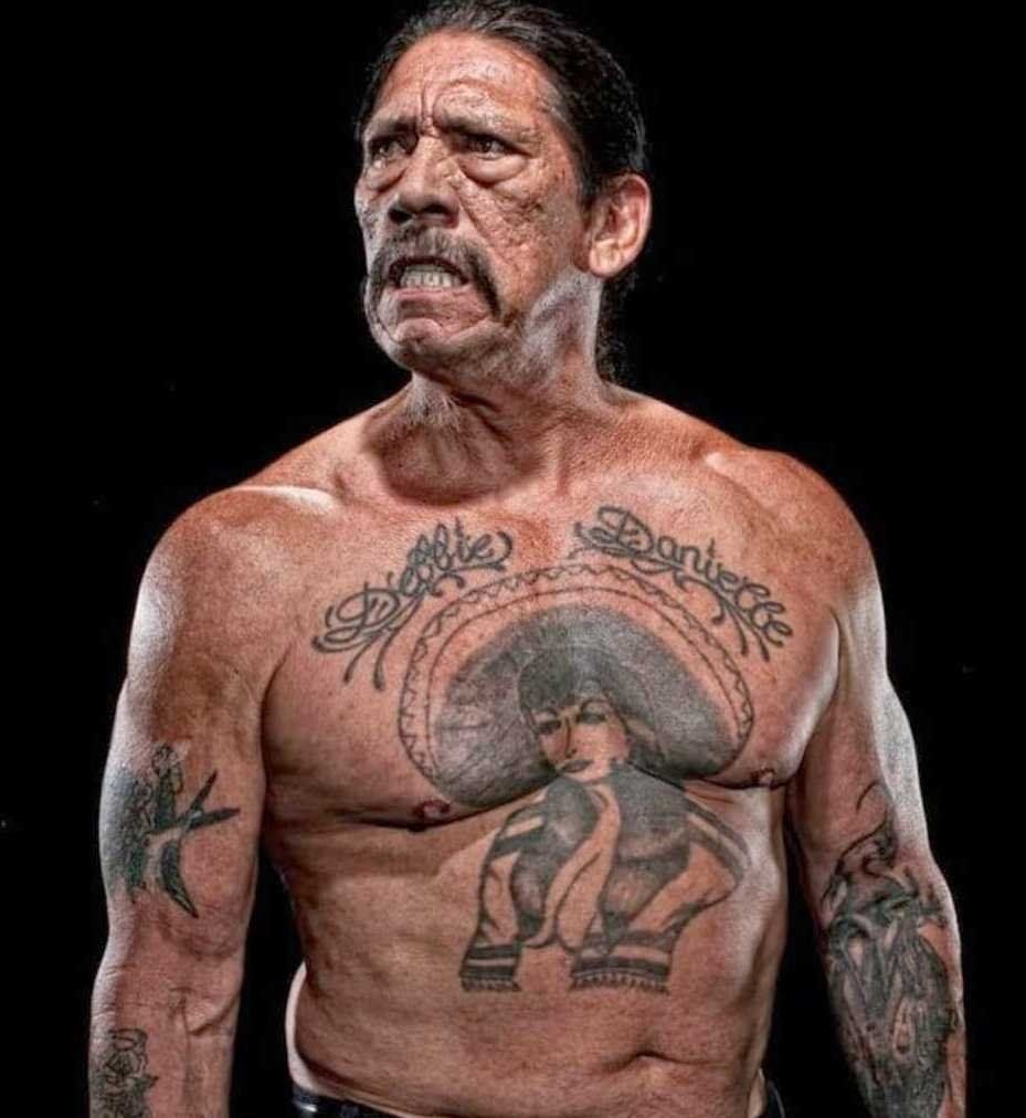
A second chest portrait shows how the ink changes with light and angle
This second chest portrait fills in details the wider Venice shot does not show as clearly. The design is the same, but light falls differently across the woman, roses and lettering. With older black ink, that can change the whole impression: one photo may read as a solid dark piece, while another separates the parts.
The woman remains the centre, and the roses frame her rather than letting the tattoo become one flat block. The piece is busy, but its main shapes are easy to follow. A sharper image brings out the smaller lines.
This is also where the Salma Hayek story often comes up. Hayek has said she recognised her own face in the tattoo, and the coincidence became part of the public conversation around it. It is a fun detail, but it does not establish that Trejo had her in mind when the tattoo was made. The timeline points to an earlier piece.
The tattoo already had a place in Trejo’s life before it became familiar to film audiences. Movies made it more visible and gave people a story to repeat, but they did not create the chest work. That distinction keeps the article grounded in Trejo’s own history.
It is also risky to label every dark area as a separate tattoo. Some are part of the roses or the outline of the woman; smaller marks may be present, but a photo does not always show enough to name them. The main design is clear, and less certain details should stay general.
Used with the other chest photos, this image is not just a duplicate. The framing and light are different, and each view answers a different question. One shows the full design in context; this one makes the relationship between the woman, roses and lettering easier to see.
The arm tattoos carry a rougher, older feel
The chest piece gets most of the attention, but Trejo has more ink across his arms, hands and torso. The arm work is harder to catalogue because it appears in different settings and may be partly hidden by clothing, film wardrobe or the angle of a photograph. It is clear, though, that the collection is not one matching sleeve; it has grown over many years.
Trejo has discussed hand tattoos made with simple equipment, including the Indian-ink-and-needle method associated with older work. That helps explain why some marks look rougher than a modern studio tattoo. Uneven edges may reflect the original process and age, rather than damage or a poor photo.
Some pictures show smaller symbols, lettering and a peacock-like design around the arms. These details call for care. A clear image can confirm more ink on the forearm or hand, but a soft one may not be sharp enough to identify a particular bird, flower or symbol. It is better to name what is visible and leave the rest open.
The arms also show the collection building in layers. A name, rose or small symbol can sit beside older prison work without matching it. That mix is part of the look: the pieces were added over time, and they carry different ages and levels of detail.
Film roles introduced Trejo’s tattoos to a huge audience, but the ink has a history outside the movies. The woman connects to prison, friendship and family; the arms show a rougher, smaller side of the collection. Together, they help explain why he could enter a scene already looking like the character a director wanted.
That is why the article uses several photos. A chest close-up shows the names, a wider frame shows the whole figure, and an arm image reveals work that can disappear under a jacket. Each view has its own job; none has to show everything at once.
Trejo’s tattoos make the most sense as a mix of survival, family and visual identity. The sombrero woman is the unmistakable centre; Debbie and Danielle keep the chest piece tied to family, while the arms carry older marks from earlier years. The strongest account stays with those clear details rather than turning every blurry line into a mystery.
There is no need to make the collection neater than it is. The tattoos vary in texture, size and how much their history is known. That is part of why they feel lived-in. They were not designed to look like a matching catalogue page; they grew with Trejo, and the photographs still show those layers.
To take in the full collection, start with the chest woman, look up to the family names, then move out to the arms. The central image carries the biggest story, while the smaller pieces make the look personal. They are not just decoration for a movie character; they were part of Trejo before the cameras rolled.
Jay Baruchel’s tattoos do not need a long list padded with designs no one has confirmed. The pieces he has described are few and personal: a red maple leaf over his heart, Rodell on his right forearm, and a Celtic cross on his upper right arm. They look different, but each connects to something close to him: Canada, his mother’s family and his Irish roots.
That is what makes Baruchel’s ink worth a closer look. He has explained the tattoos himself, and their stories are refreshingly direct. The maple leaf came from missing home while he was working in California; Rodell is his mother’s maiden name; and the cross recognises the Irish side of his family. There is enough here for a useful guide without filling gaps with speculation.
The maple leaf, Rodell and Celtic cross tell one family story
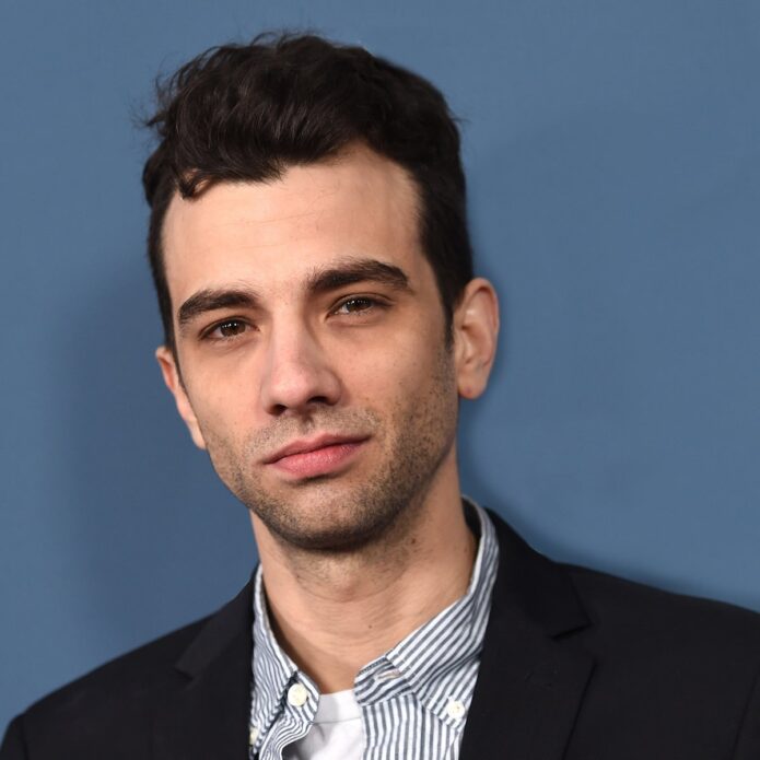
The most recognisable piece is the red maple leaf on his left pectoral, just over his heart. Some viewers thought it was a film prop when it appeared in movies such as Knocked Up. Baruchel later said it was real and that he got it in California during a stretch when he was especially homesick. That detail gives the tattoo its meaning: it is a reminder of Canada he kept close while working away from home.
Its placement makes the simple design feel personal. A maple leaf on the chest could read as a bold patriotic display, but over the heart it comes across as something more private. There is no date or banner around it, and nothing else competes with the leaf. The red ink stands out when his chest is visible, while the small scale keeps it from becoming a full chest piece.
Baruchel’s own account is more useful than a symbolic guess. He has not said that every part of the leaf stands for a different memory, so there is no reason to assign it one. The straightforward story is enough: he missed Canada, was in California, and chose to put the leaf over his heart. The design, placement and explanation all fit.
The tattoo also has an amusing screen history. People first noticed it in film scenes, where it was easy to assume the production had added it for a character. In fact, the movie had simply revealed a tattoo Baruchel already had. That mix-up helped keep the maple leaf in interviews and profiles.
The next confirmed piece is the forearm lettering, “Rodell”. Baruchel told CinemaBlend that it is his mother’s maiden name. She is one of eight siblings, most of them daughters, and he wanted to honour the family line tied to his grandfather’s surname. It is a direct tribute: a family name on his arm, with no hidden code to decode.
Rodell is a family tribute first and lettering second. The style matters to how it looks, but Baruchel’s reason for choosing the name is what gives it weight. He wanted that side of the family to remain present. He described it as a tribute, rather than a surname he chose simply because he liked its appearance.
The right forearm is a practical spot for lettering like this. A sleeve can cover it, but it shows when he wears a short-sleeved shirt or gestures in an interview. That also explains why some photos catch only part of the word: a turned wrist, bent arm or sleeve can hide it. It is best to stick to the name Baruchel identified instead of claiming every image shows the lettering clearly.
He has also joked that his mother was not always pleased when he got another tattoo. It adds a little humour without changing what this one means. Rodell is a family tribute, but not a grand public monument; the story feels affectionate, slightly cheeky and grounded in a real family connection.
The third documented design is the Celtic cross on his upper right arm. Baruchel said it represents his mother’s Irish family. It sits naturally alongside Rodell, since he discussed the two tattoos together: one keeps a family name close, while the other points to the Irish branch of that family.
There is no need to push his explanation further. The cross can be called a heritage tattoo, but the interview does not turn it into a full statement about religion or belief. Baruchel has described himself publicly as probably agnostic; the clearest account is the one he gave, that the cross honours his mother’s Irish family. That connection stands on its own.
The cross is harder to document in photos than the maple leaf because it sits high on the arm. A jacket or T-shirt sleeve can cover it, and a front-facing image may show only part of the area. That makes his interview especially useful: a photograph helps place the tattoo, while his own words explain the family link.
Taken together, the three tattoos make a small family map. The maple leaf stands for Canada and home; Rodell keeps his mother’s family name on his forearm; and the Celtic cross recognises the Irish side of that same family. The designs differ, but the shared themes are place, parents and ancestry.
That does not mean every photo will show all three. Clothing can hide tattoos, old images can blur their details, and designs can change over time. Nor should every rumoured mark be added to the list. There is a difference between a tattoo Baruchel has named and a shape someone thinks they can make out in a distant photograph.
The maple leaf is the easiest tattoo to identify visually because it has been photographed clearly and Baruchel has explained it himself. The arm pieces are documented more through his interview and descriptions of where they sit. Those are different kinds of evidence, and keeping that distinction clear makes the account more dependable.
His collection makes more sense as a set of personal markers than as a showy catalogue. The chest piece recalls home, the forearm lettering keeps a family name in view, and the upper-arm cross points to his Irish roots. None needs an elaborate invented backstory; the explanations he has given are specific enough.
The maple leaf is more visible than the quieter arm tattoos. Films brought it into view and made it part of his screen image, while Rodell and the cross usually take a closer photo or an interview to spot. That difference affects how often each tattoo comes up, but it does not change what they mean.
For a list of Jay Baruchel’s confirmed tattoos, start with the three he has discussed: the red maple leaf over his heart, Rodell on his right forearm and the Celtic cross on his upper right arm. Together, they connect Canada, family and Irish heritage through a few simple designs. The collection is small, but the details behind it are personal.
Keeping the list focused also helps avoid a common problem with celebrity tattoo pages: mistaking a shadow, crease or bit of costume ink for a confirmed design. In Baruchel’s case, the strongest sources name the pieces directly. He has explained the maple leaf, identified Rodell while discussing his forearm, and tied the cross to his mother’s family. That is a firmer basis than a gallery of uncertain screenshots.
Timing matters, too. The interviews that explain these tattoos came while Baruchel was promoting films and speaking about how much Canada meant to him. A later photo with different clothes, lighting or body position does not show that the tattoos have vanished. Without clear evidence of removal or a cover-up, it is safest to say these are the designs he has publicly described.
For anyone checking older movie stills, the maple leaf is the easiest place to start. Look on the left side of his chest, bearing in mind that a camera can reverse the image. The forearm lettering needs a closer look because a turned wrist can make the word seem shorter, and the upper-arm cross is often hidden by sleeves. Those details help separate a reliable identification from a guess.
What stands out is how closely Baruchel’s tattoos follow people and places he already cared about. They do not read as a shock-value collection or a passing fashion phase. They are quiet reminders that come into view in the right photo or interview, which is all the more reason to describe the three confirmed designs carefully instead of inflating the count.