codex

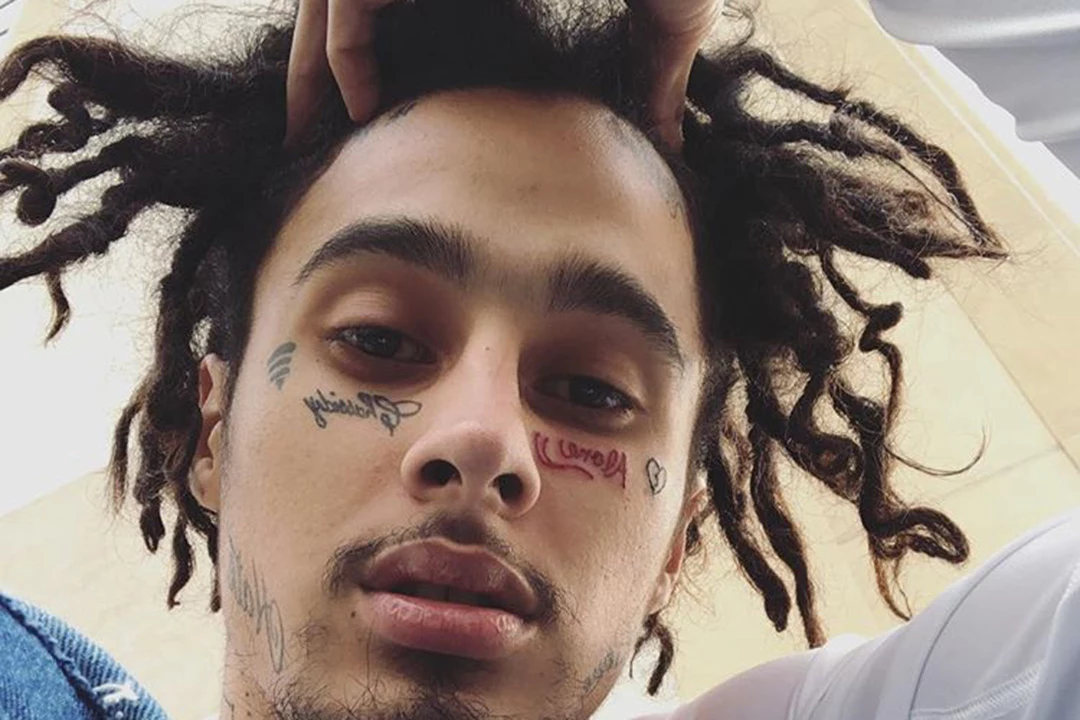
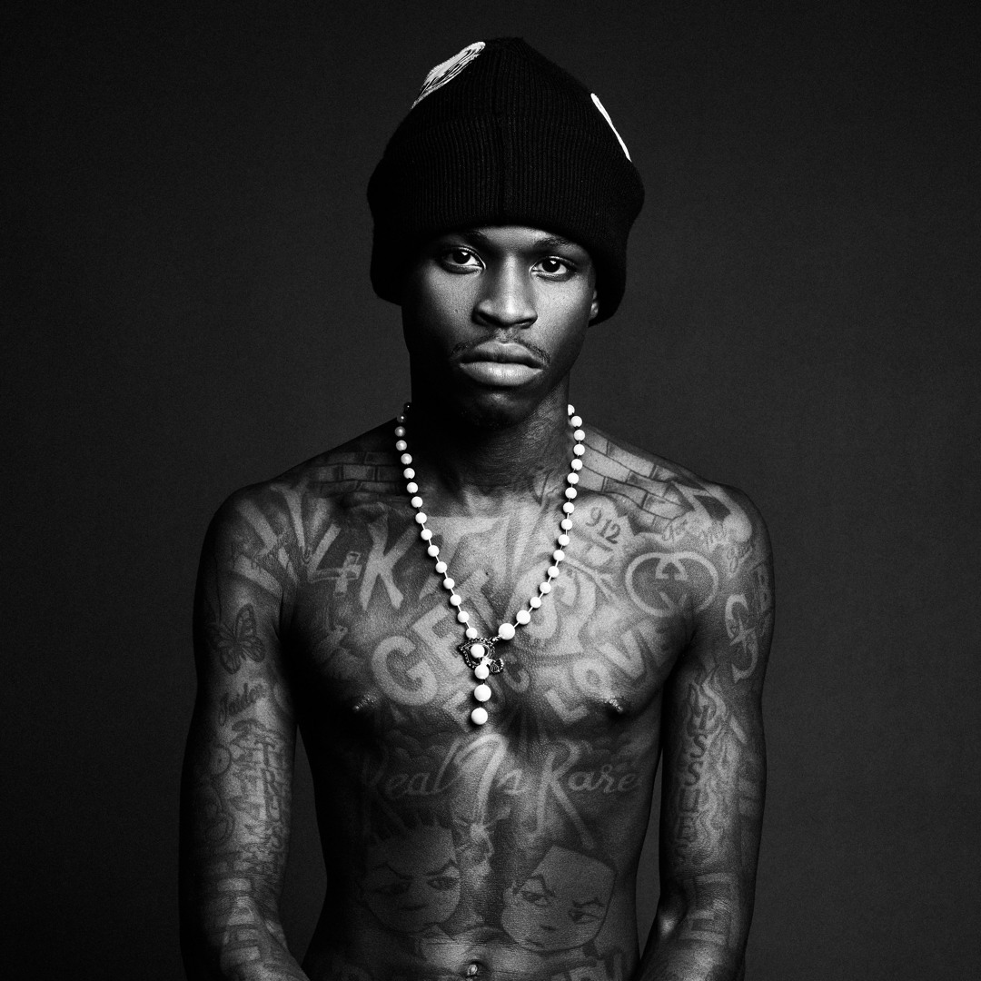
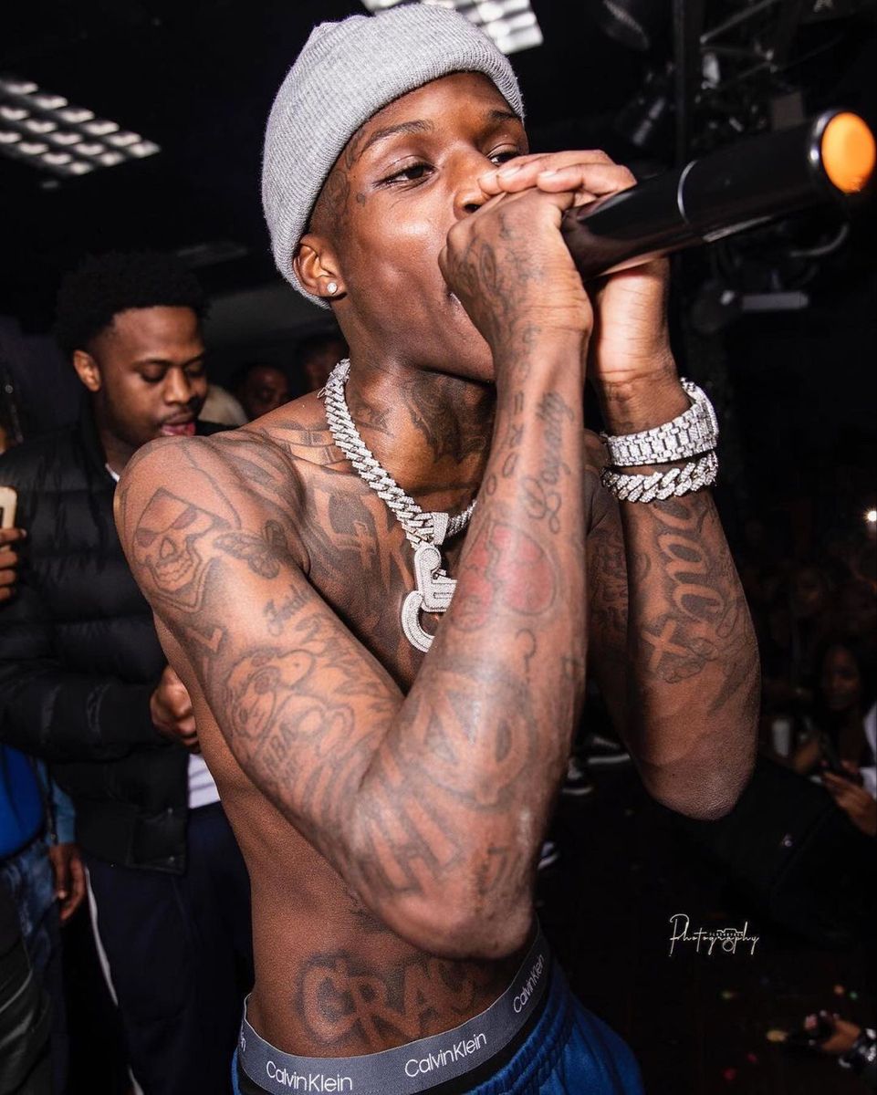
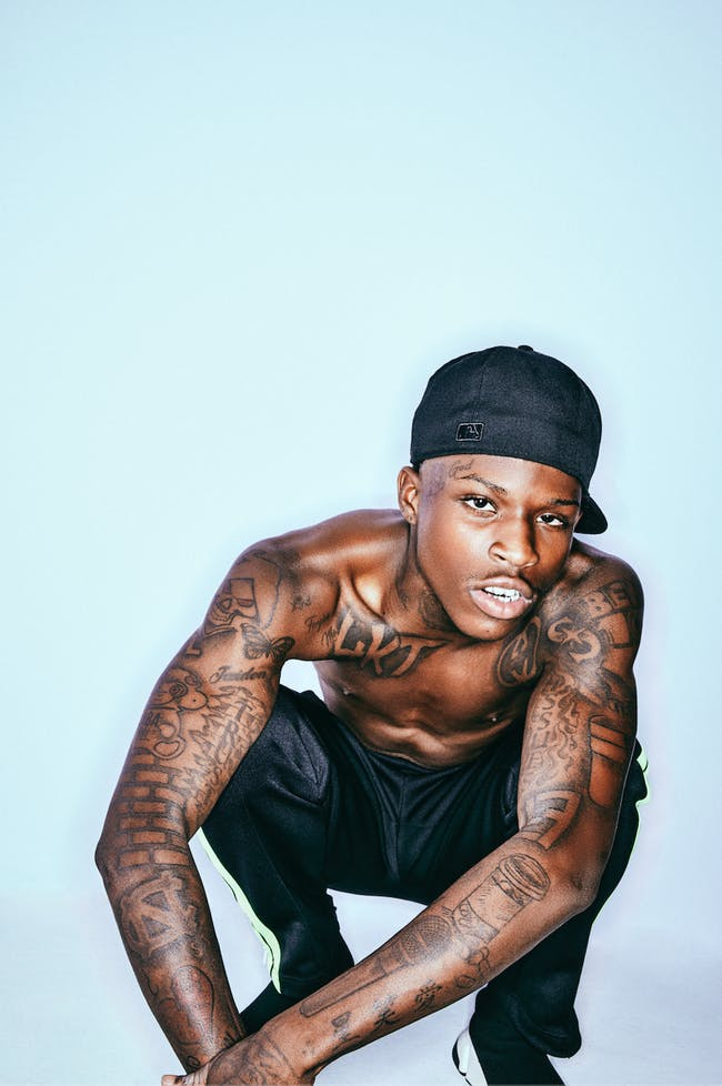
YoungBoy Never Broke Again Tattoos: Face, Chest and Arms

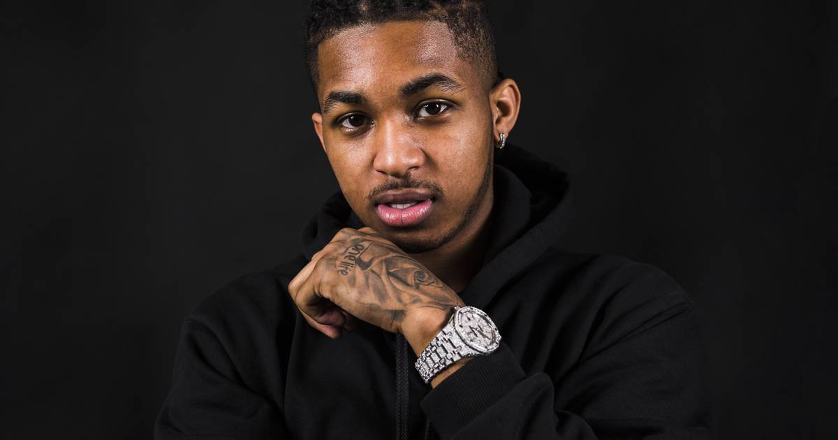
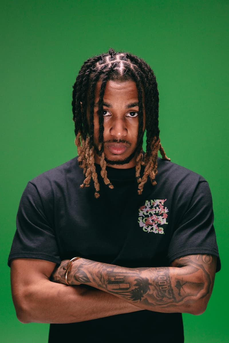
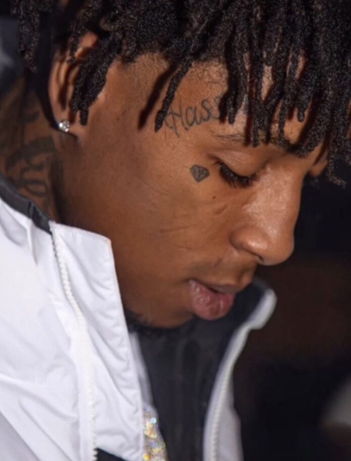
YoungBoy Never Broke Again’s tattoos are easy to recognize in photos. His ink covers his chest, shoulders, arms, neck and face, with portraits, lettering, symbols and larger shaded shapes. There’s a lot of it, but the bigger designs still give the eye somewhere to land.

The tattoos aren’t confined to one area. A front-facing photo shows the chest, while a close portrait or turned shoulder brings other pieces into view. His placement changes what you notice from one pose to the next.

The large NBA lettering across his lower chest and the portraits on his upper chest are visible from a distance. Smaller marks on his face, neck and forearms need a closer look. The contrast between those scales makes the collection read from far away and up close.

It helps to look at the tattoos by area: chest, arms, then neck and face. Some earlier photos show more open skin; later ones show ink across more of the visible areas. As the collection grew, individual portraits and lettering became part of a denser layout, with the eye moving from face to torso.

Chest tattoos give YoungBoy Never Broke Again a clear center
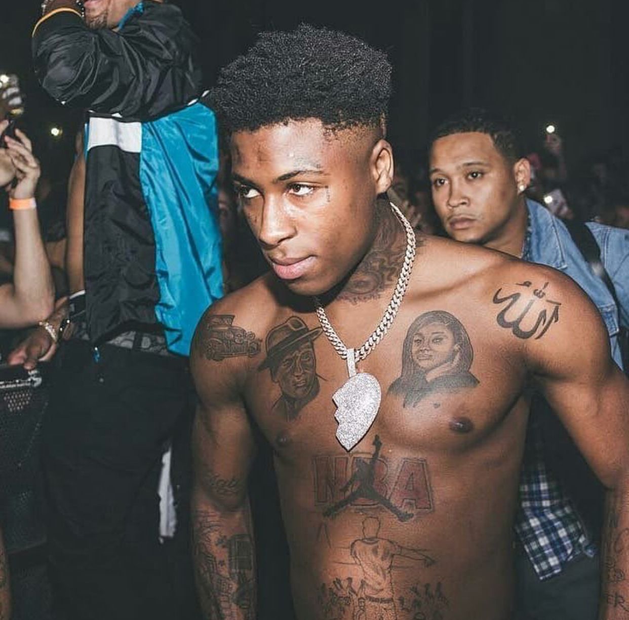
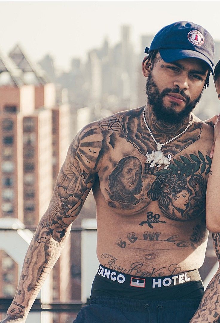
YoungBoy Never Broke Again tattoos: clear shirtless portrait showing chest portraits, NBA lettering, neck ink and both arms

The chest is the center of many YoungBoy photos. Bold lettering across the lower torso and portrait work over the pectorals are among the largest shapes. From the front, you can take in several pieces at once instead of losing them around a joint.

The chest portraits add fine detail beside the heavier lettering and outlines. The larger words or shapes catch the eye first; the faces are easier to study up close.

Spacing helps each part stay legible. The portraits have some open skin around them, while darker ink near the ribs and shoulders fills the edges. The coverage is dense, but the middle still has a clear focus.

If you are planning a chest piece, decide which element should lead before adding supporting work. A portrait, phrase or symbol can set the direction. Smaller images can follow the ribs and shoulders once you’ve chosen the main focus.

His arm tattoos keep the collection moving
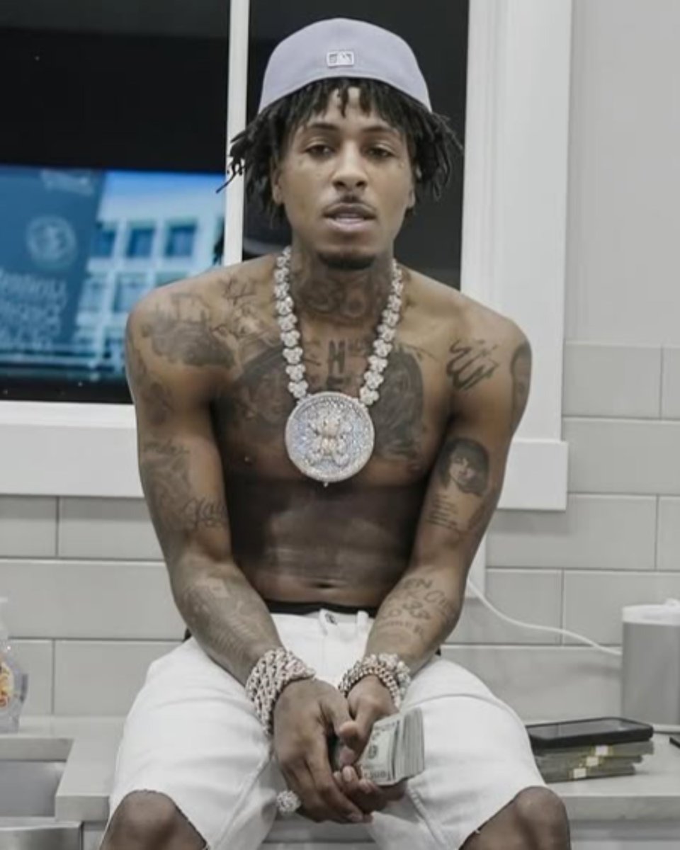
YoungBoy Never Broke Again tattoos: high-resolution seated portrait showing chest, shoulder, neck and forearm tattoos

Lettering, symbols and shaded sections cover much of YoungBoy’s visible upper arms and forearms. In shirtless photos, these pieces connect back to the chest and carry the ink past the front of the torso.

The view changes when he bends an elbow or turns a wrist. A relaxed arm shows more of the outside; crossing the arms brings the inner forearm into view. Those angles matter when a sleeve is being planned.

The two arms don’t have to match exactly to feel connected. Different designs can work together when their line weight, shading and spacing feel related. YoungBoy’s photos show a varied mix across the arms.

Ask for front, side and relaxed-arm views before committing to a sleeve. A design that looks clear from one angle may be hidden from another. Checking how it sits while the arm moves helps with placement.

Face and neck tattoos make the portraits unmistakable
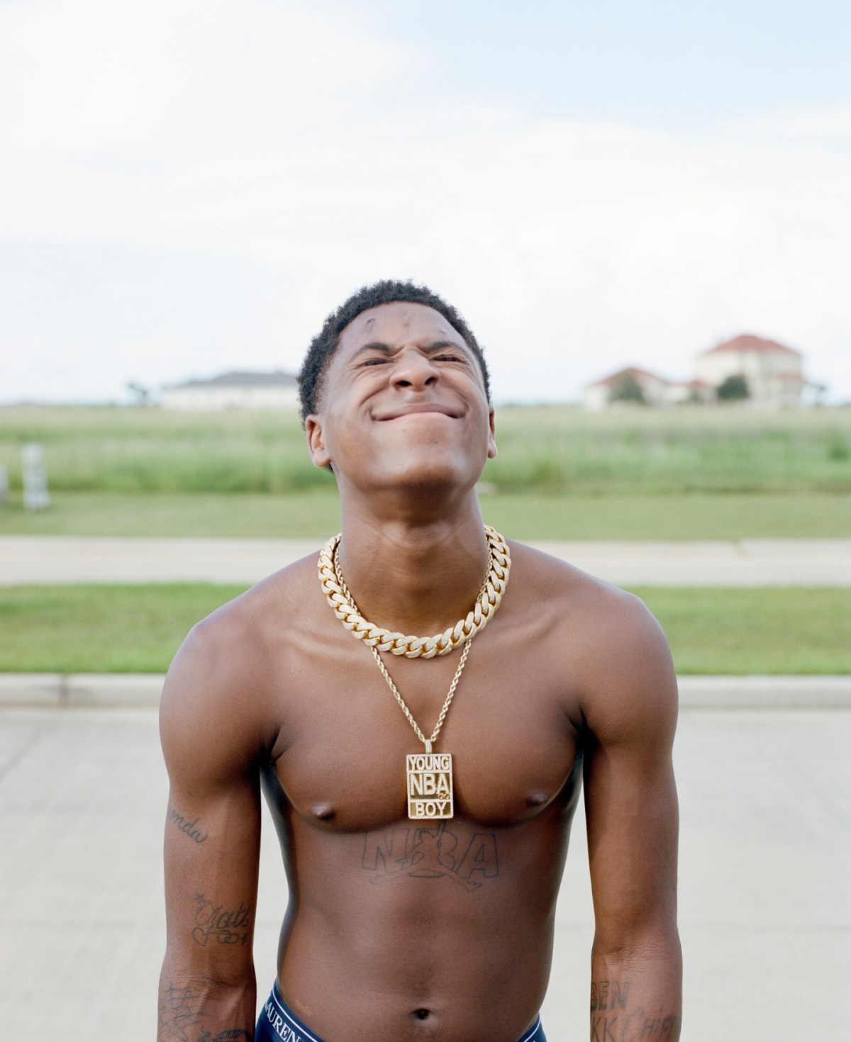
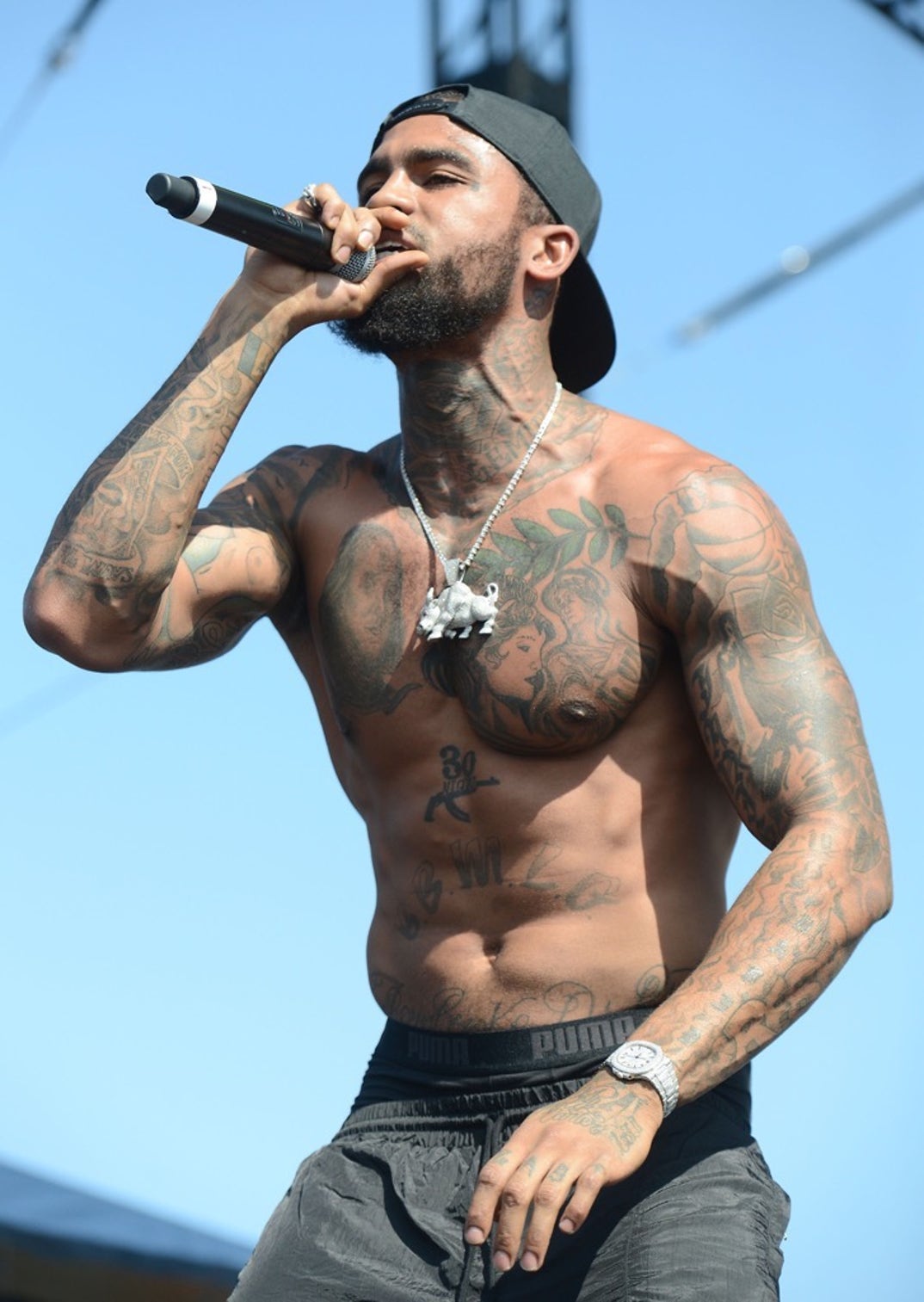
YoungBoy Never Broke Again tattoos: high-resolution outdoor portrait showing chest lettering, arm work and the Young NBA Boy pendant

The face and neck tattoos shape the first impression in YoungBoy’s portraits. Small marks around the eyes and cheeks, script near the hairline and darker neck work sit close together. Even when his chest is covered, these tattoos remain visible.

Face ink is viewed at close range. People see the overall pattern first, then the separate marks. With less room between designs, scale and spacing can make a big difference to how clearly each piece reads.

The neck connects the face to the torso. Its ink fills the area under the jaw and shows above a collar. In close photos, that creates a continuous frame from the head toward the chest.

Use face tattoo references to study placement and proportion, not to copy the exact marks. A small symbol near the eye draws attention quickly. If you want visible ink with more room to adjust later, the neck, behind the ear or upper arm are other options.

The torso shows how lettering and portraits sit together
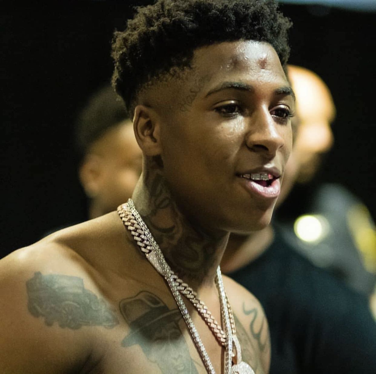
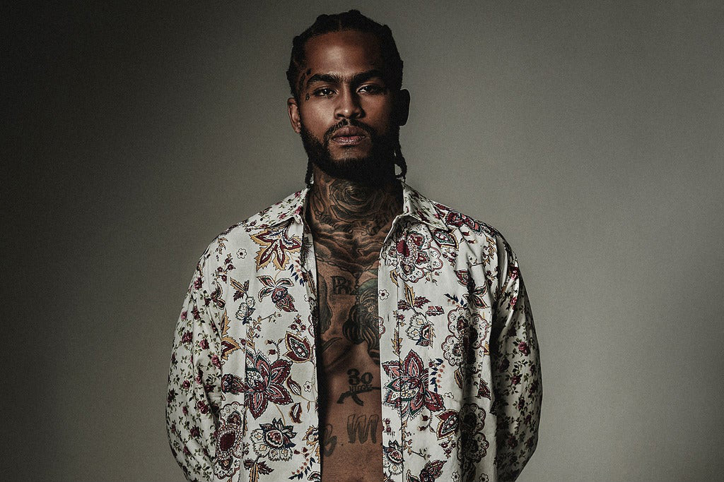
YoungBoy Never Broke Again tattoos: high-resolution backstage portrait showing face, neck, chest and shoulder tattoos

A wider photo shows how the chest lettering, portraits and arms relate. The lettering gives the torso a strong horizontal line; the portraits add detail above and below it. His arms frame the body, carrying the darker ink toward the shoulders.

That layering can be useful when planning a tattoo. Simple lettering can sit beside a detailed portrait if each has enough space. It also helps to see a large design with the arms relaxed, lifted and crossed.

Ink below the chest changes the proportions of the front of the body. When designs run from the pectorals toward the stomach, the collection reads as one larger composition instead of a few separate pieces.

Take photos in the same poses you normally use before you choose a large front-facing layout. A design can look balanced when you stand still and feel crowded when you sit, bend or lift your arms. Check it in the positions you use every day.

How to use the YoungBoy tattoo layout for ideas
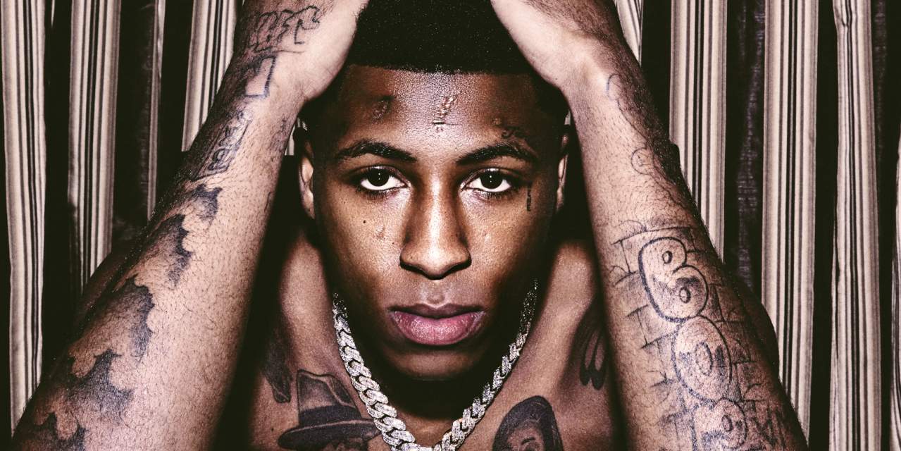
YoungBoy Never Broke Again tattoos: high-resolution portrait showing raised-arm tattoos, facial ink and chest lettering

YoungBoy’s tattoos have a clear order: the face and chest draw attention first, the neck connects them, and the arms extend the coverage outward. You can use that layout with different designs and still make the pieces feel connected.

Pick one area to lead. If you want a strong front-facing design, the chest can be the anchor. If you’d rather keep more of the ink covered, start with the upper arm or shoulder and let smaller pieces continue toward the forearm.

A mix of sizes helps, too. A large portrait or word can sit beside smaller symbols, but not every piece needs the same amount of shading or detail. Contrast gives the eye a way through the design and leaves room to add more later.

Think about how the design will look in motion, under clothes and in ordinary photos. YoungBoy’s tattoos cover areas that are often visible: the face, neck, arms and upper torso. Choose placement that suits your life, then make the artwork your own.

YoungBoy Never Broke Again’s collection spans his chest, arms, face and neck. The chest carries the largest shapes, the arms add coverage, and the face and neck make his portraits easy to recognize. The sections are bold, but they still have a clear visual order.

If you are using YoungBoy Never Broke Again tattoos for ideas, compare a wide torso photo with a close face portrait. Notice the main focal point, how the arms sit around it and where smaller details remain visible. That planning can give your own design a stronger starting point.

The main thing to consider is balance. Let the largest pieces lead, use smaller designs to guide the eye and connect the face, neck and torso through placement. That gives a collection space to grow while keeping new work in step with the body.

Here’s a video about YoungBoy’s tattoos:
More musician tattoo guides

Dave East Tattoos: Chest, Arms, Neck and Face

Dave East’s tattoos look like a collection built piece by piece. The ink covers his chest, stomach, arms, neck and face, mixing portraits, lettering, flowers, symbols and dark shading. Different designs sit together across his body, following its shape.

Photos show the collection from different angles. A rooftop portrait catches the chest and sleeves in bright light; a stage shot brings the arms and forearms forward; a close crop shows smaller marks on his face. Each view reveals something the others miss.

The chest holds the largest portraits, the arms carry broad areas of darker ink and the neck leads toward the face. Smaller script fills gaps without taking attention from the main images.

Looking at the tattoos by placement makes the layout easier to follow. Start with the chest, then look at the sleeves and the work on his face and neck. The photos also show how the ink has filled in over time: earlier images leave more skin open, while later ones show more connected coverage.

Different settings help with different details. A shirtless rooftop photo shows the portraits and stomach lettering together. A performance photo shows the designs as he lifts his arms, while a close-up brings out finer lines. Taken together, they give a better sense of how the tattoos sit on his body.

Dave East’s chest tattoos do most of the storytelling

Dave East tattoos: high-resolution shirtless rooftop portrait showing chest portraits, stomach lettering and arm coverage

The chest is one of the first areas people notice. Several large portraits sit across the pectorals, with dark outlines and shading that keep the faces clear in wider photos. Their size gives the torso a center without letting smaller script take over.

The designs vary. A portrait sits near floral shapes, chain-like work or short lettering. That mix moves the eye between detailed faces, open skin and darker areas instead of reading as one solid patch.

Lower on the torso, smaller lettering, names, phrases and symbols follow the stomach and ribs. Those placements carry the design downward while leaving the larger portraits room to stand out.

If you want a chest layout with this kind of weight, choose the largest image first. Once the main portrait or symbol is placed, supporting pieces can follow the ribs and shoulders. Filling empty spots first can leave the central design squeezed for space.

His arm tattoos turn the sleeves into a continuous canvas

Dave East tattoos: high-resolution stage photograph showing the chest, shoulders, neck and forearm tattoos

Dave East’s upper arms and forearms carry portraits, lettering, linework and shaded pieces. In performance photos, the arm raised toward the microphone shows how the designs follow his muscles as they move.

The sleeves vary in density. Some areas are dark and packed; others leave more skin visible around individual designs. That change keeps one section from blending into the next.

A relaxed arm shows the outside of the sleeve. Bend the elbow or turn the wrist, and the inner forearm and lettering near the wrist come into view. A sleeve has to make sense from each of those angles, with the hand down, raised or crossed over the chest.

Ask your artist to map the arm while it is relaxed and while it is bent. That can help keep a portrait clear of a crease or script visible when the elbow moves. The designs need to work with the arm in motion.

Neck and face tattoos keep the portraits sharp

Dave East tattoos: high-resolution open-shirt portrait showing the chest, neck and stomach designs

The neck tattoos frame Dave East’s face and chest. Close portraits show ink under the jaw and along the sides of the neck, even with his shirt buttoned. That placement also keeps the tattoos visible in photos that don’t show his torso.

The face tattoos are smaller than the chest portraits, but they change the look of a portrait. Script near the temple and marks around the eye follow the natural lines of his face. They draw attention because there’s little open space around them.

The neck links the face and upper chest, so the tattoos don’t read as two separate panels. Curved lines and darker shading are easier to see when he turns his head; a side view can reveal details a straight-on photo misses.

Use face and neck references to study scale before you choose a visible placement. Small lettering needs space and careful linework. If facial ink feels like too much, the side of the neck, collarbone or upper shoulder gives you more room.

The smaller lettering adds a personal layer

Dave East tattoos: high-resolution studio portrait showing the chest and neck tattoos through an open shirt

Short words and script sit between the larger chest portraits and arm tattoos. They fill narrower areas around the stomach, ribs and lower forearms where a full image might feel too heavy.

From a distance, the lettering can blend into the darker sections. Up close, the words become easier to make out. That shift gives the collection more than one level of detail.

The amount of text matters less than where it sits. A short phrase can follow the collarbone or sit below a portrait. A name can stay clear if it has space away from heavier shading. Dave East’s photos show different sizes of work sharing the same area.

Keep small script simple and leave room for the letters to age. Tiny detail can blur when it is packed tightly. A little open skin helps the words stay readable, especially around the stomach, ribs and hands.

How to borrow the Dave East tattoo layout

Dave East tattoos: high-resolution outdoor portrait showing the torso, arms and hand tattoos from the side

The tattoos move from one area to the next: the chest is the anchor, the arms add width, and the neck draws the eye back toward the face. You can use that layout with other artwork and still create a connected look.

Start with the area that matters most to you. The chest gives room for a portrait or large symbol. A sleeve can grow over time. A neck or shoulder piece can frame a smaller collection without covering as much skin.

Then decide how the large and small designs will sit together. One or two portraits can carry the detail, with script and symbols in the narrower spaces. Some lighter areas make it easier to see the main work and leave room to add more later.

Plan the collection around your real movements, clothes and comfort level. Dave East’s tattoos show in photos because they cover visible areas, but every piece doesn’t need to be exposed. Choose the parts you want to lead and let the rest support them.

Dave East’s collection combines large portraits on the chest with dark sleeve work and smaller tattoos around the face and neck. The chest sets the scale; the arms carry the coverage; close photos reveal the lettering and finer marks.

If you’re using Dave East tattoos for ideas, look at how each placement connects instead of copying one design. Notice how portraits sit beside script, how the sleeves follow the arms and how the neck links the face to the chest. That can help you plan a collection with its own shape.

Together, the large images and smaller reminders give the collection room for different kinds of work.

Here’s a Dave East video filmed around new ink:

More musician tattoo guides

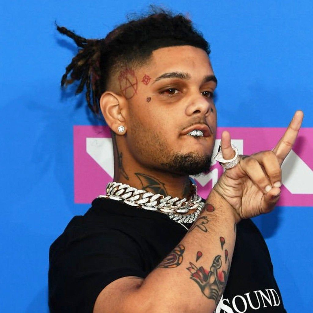
Smokepurpp Tattoos: Face, Neck, Arms and Chest

Smokepurpp’s tattoos look spontaneous rather than carefully matched. He has ink on his face, neck, arms and torso, including small marks, bold lettering, cartoon-style images and darker designs. Different pieces sit side by side without following one uniform style.

That mix makes Smokepurpp tattoos useful to study if you prefer personal-looking ink over a tidy, coordinated set. A tiny star near the eye can sit beside a larger arm tattoo; neck lettering shares space with jewelry and piercings. The contrast is part of the look.

Smokepurpp has said he got some tattoos on impulse, and a few designs connect with ideas around his music. A star on his face is associated with the DEADSTAR era; words, symbols and playful images appear on his neck and body. He hasn’t publicly explained every piece, so placement and scale are easier to read than the meaning of each tattoo.

The photos show different parts of the collection. A shirtless shot brings out the chest and arms, a close portrait shows the eye and neck tattoos, and stage lighting can make the same ink look darker. Looking at more than one type of image gives a fuller view.

You don’t need to copy every mark to use the same approach. The collection mixes a few bold areas with smaller details. Choose a placement you care about, then decide what should sit around it. That leaves room for a personal mix without filling every space at once.

The chest and stomach pieces give Smokepurpp’s look its edge

Smokepurpp tattoos: high-resolution shirtless portrait showing the chest, upper arms and forearm tattoos

The chest and stomach tattoos give Smokepurpp’s collection much of its attitude. Larger images sit beside short words and symbols, more like separate sketches than one mural. The styles vary, and those changes keep the torso from reading as one solid design.

One recognizable piece is the baby bottle tattoo on his stomach. It’s a playful, unexpected subject, different from a standard portrait or religious symbol. A small object like that can stand out without covering the whole torso.

Open skin gives each design some room. When every gap is filled, the smaller pieces can blur together. In Smokepurpp’s photos, you can still pick out a face, bottle, word or symbol in a wider shot.

Pick one unusual focal idea before you add filler. It could be an object, cartoon or symbol that matters to you. Once it’s placed, smaller marks can follow its shape. A personal centerpiece gives the rest of the collection somewhere to start.

His arm tattoos add movement without needing a full matching sleeve

Smokepurpp tattoos: high-resolution portrait showing tattooed arms and visible neck ink at a media appearance

The arm tattoos bring movement to Smokepurpp’s look. Some photos show ink across the forearms; other pieces sit higher on the arms and shoulders. The tattoos don’t form one neat sleeve. Individual sections stand on their own while adding to the overall coverage.

Clothes change how much of the work you see. A short sleeve may show the forearm and cover the upper arm. A shirtless performance photo reveals more at once, with chains, watches and rings adding to the frame.

The tattoos also vary in mood. A snake or cartoon has a playful feel; darker lettering gives a different impression. That mix leaves room for future pieces without requiring every tattoo to match.

Use the arm as a moving canvas, not a flat rectangle. Check the design with the elbow bent and wrist turned. A line on the outside may disappear on the inside, so leave enough space around the main images for them to read from different angles.

Face tattoos keep the small details close to the expression

Smokepurpp tattoos: high-resolution portrait showing the face and neck tattoos beside a city window

The face tattoos are small, but they change the mood of a portrait. A star under the eye, a heart or a short mark near the brow can draw attention quickly because there is little open skin around it. Smokepurpp’s face designs use simple shapes that are easy to pick out.

The star is especially clear in close photos. It has been associated with the DEADSTAR name and also works as a simple graphic shape. It doesn’t need much shading or fine detail; its placement near the eye is what makes it noticeable.

Lighting and expression affect what you can see. A dark stage may hide a small line, while a bright portrait brings it out. Smiling, squinting or turning the head also changes the skin around a mark. Check different photos before settling on a size.

Keep a face tattoo simple enough to survive distance and time. Tiny detail can blur, especially near the eye. If you like the placement but want more room, the upper cheek, temple or side of the neck are other options.

Neck tattoos connect the face to the rest of the collection

Smokepurpp tattoos: high-resolution stage profile showing the face and neck tattoos under colored lights

The neck tattoos connect the face and torso. Words and small symbols there remain visible when a shirt covers the chest, but still lead into the larger designs below. In portraits, the neck adds another layer without taking over the frame.

The angle changes how neck lettering reads. A straight-on photo shows its central shape; a profile shows how the ink curves toward the jaw. The design has to follow the neck rather than sit across it like a sticker.

A short word or symbol can also fill the space between tattoos on the chest and arms without competing with a larger image. The open skin around it gives the eye a break before it moves back to the face or shoulder.

Test neck lettering with the head turned and the shoulders relaxed. A design centered in a forward-facing pose may shift when the wearer looks to the side. Check that it follows the curve of the neck and reads from more than one angle.

How to use the Smokepurpp tattoo layout for your own ideas

Smokepurpp tattoos: high-resolution event portrait showing the face, neck and upper chest tattoo placement

One part of Smokepurpp’s style you can borrow is the mix of serious and playful designs. A dark word can sit near a cartoon; a small face tattoo can share attention with a bold forearm piece. The differences keep the collection from looking like one template.

Choose the area you want people to notice first. If it’s the face, keep nearby neck work lighter. If it’s the chest, the arms can carry smaller designs while the collarbone stays more open. One clear focal area helps the other pieces fall into place.

Leave room for the collection to grow. The open gaps in Smokepurpp’s tattoos let newer pieces sit beside older ones. There’s no need to fill everything in at one appointment; time can help the next design fit.

Choose symbols that still make sense when the trend passes. You can keep the loose placement and contrast while choosing images that mean something to you. The tattoo will last longer than a fashion cycle.

Smokepurpp’s tattoos look collected over time. The chest and stomach carry larger statements, the arms add coverage, and the face and neck make the style easy to recognize in close portraits. Stars, words and smaller symbols give the collection its variety.

If you’re using Smokepurpp tattoos for ideas, study how the smaller and larger pieces share space instead of copying one mark. Notice how a face tattoo sits beside an arm design, or how neck lettering links the face to the chest. That kind of planning can help your own tattoos fit together.

Here’s a Smokepurpp interview where he talks about his music and tattoos:

More musician tattoo guides

Destroy Lonely Tattoos: Chest, Arms, Hands and Neck

Destroy Lonely’s tattoos share the dark, fashion-focused feel of his music and visuals. The ink covers his chest, arms, hands and neck, with large black areas alongside thin symbols and short lettering. Some pieces are bold; others leave more of the skin visible.

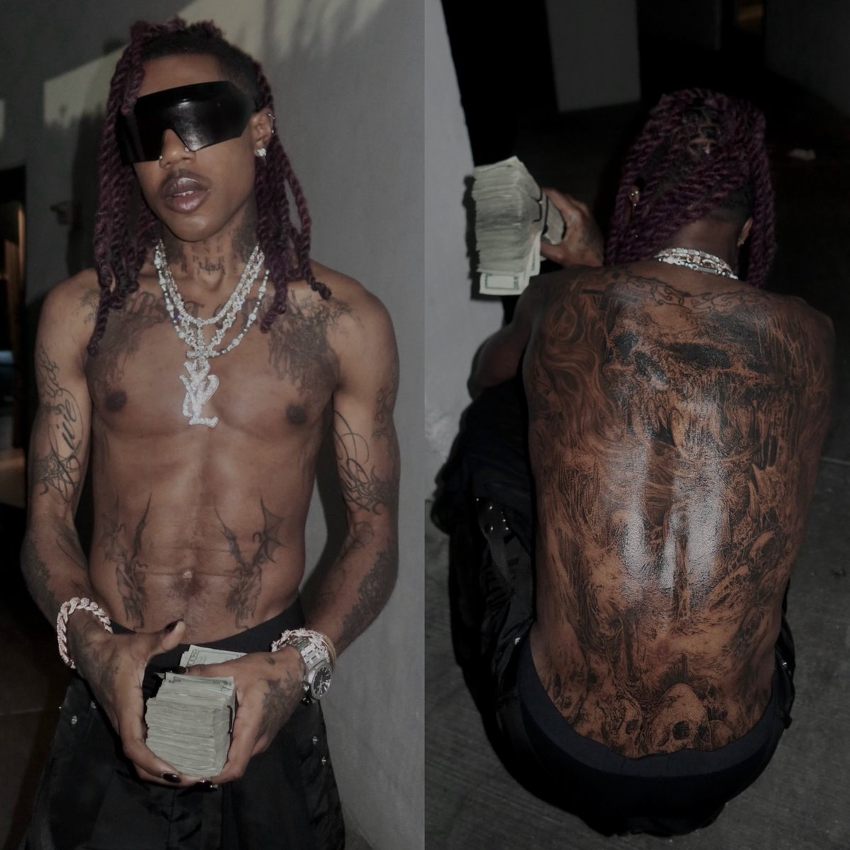
That mix makes Destroy Lonely tattoos useful to look at if you’re drawn to gothic, cyber-sigil or underground-inspired designs. A full-body photo shows the scale of his torso and back work. A close shot reveals the hand script, while a profile puts the neck tattoos in focus.

His style also plays with contrast. Dark clothes and bright jewelry frame black ink against lighter skin. From a distance, some pieces look simple; close up, the lines and smaller symbols become easier to see.

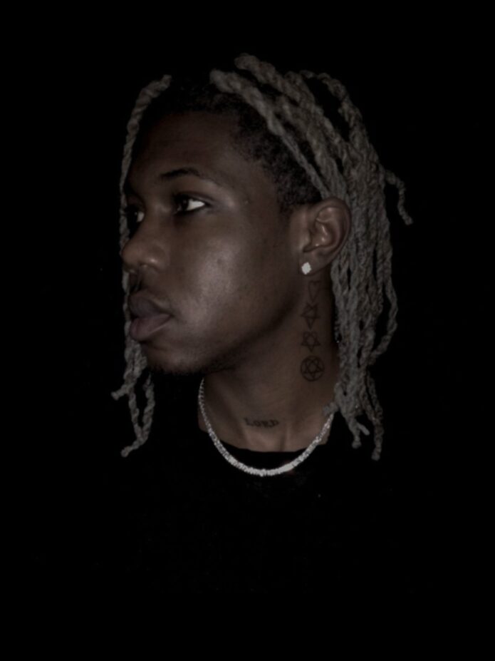
The neck marks are especially recognizable. Symbols run up the side of the neck, and “LORD” sits near the collarbone. His arms and hands have more flowing lines, giving the collection a clear center with movement around it.

Clothing changes what stands out. A sleeveless top shows the shoulders and arms; a hoodie hides much of that work and draws attention to the neck. A shirtless photo shows how the pieces line up across the body. Consider all those views when planning tattoos of your own.

The chest and back work make Destroy Lonely’s tattoos feel cinematic

Destroy Lonely tattoos: high-resolution shirtless portrait showing the chest, arms and full back tattoo coverage

The chest and back give Destroy Lonely’s collection its broadest coverage. In a shirtless portrait, the ink spreads across the front and continues around the shoulders. The back piece is much denser than the small neck symbols, so it reads as one large area.

From the front, the eye moves across the chest and stomach toward the arms. From behind, the darker work creates a strong outline. The designs look different from each side, but the bold shapes tie them together across the body.

Large torso tattoos also move with the body. The chest expands, the shoulders turn and the stomach bends; a design can look different once the wearer moves. His photos show why it’s useful to check placement from more than one pose.

Use one large torso piece as the visual anchor if you want this kind of impact. It doesn’t have to cover the full chest or back at once. A central design can leave room for later work around it.

His forearm tattoos lean into sharp, futuristic linework

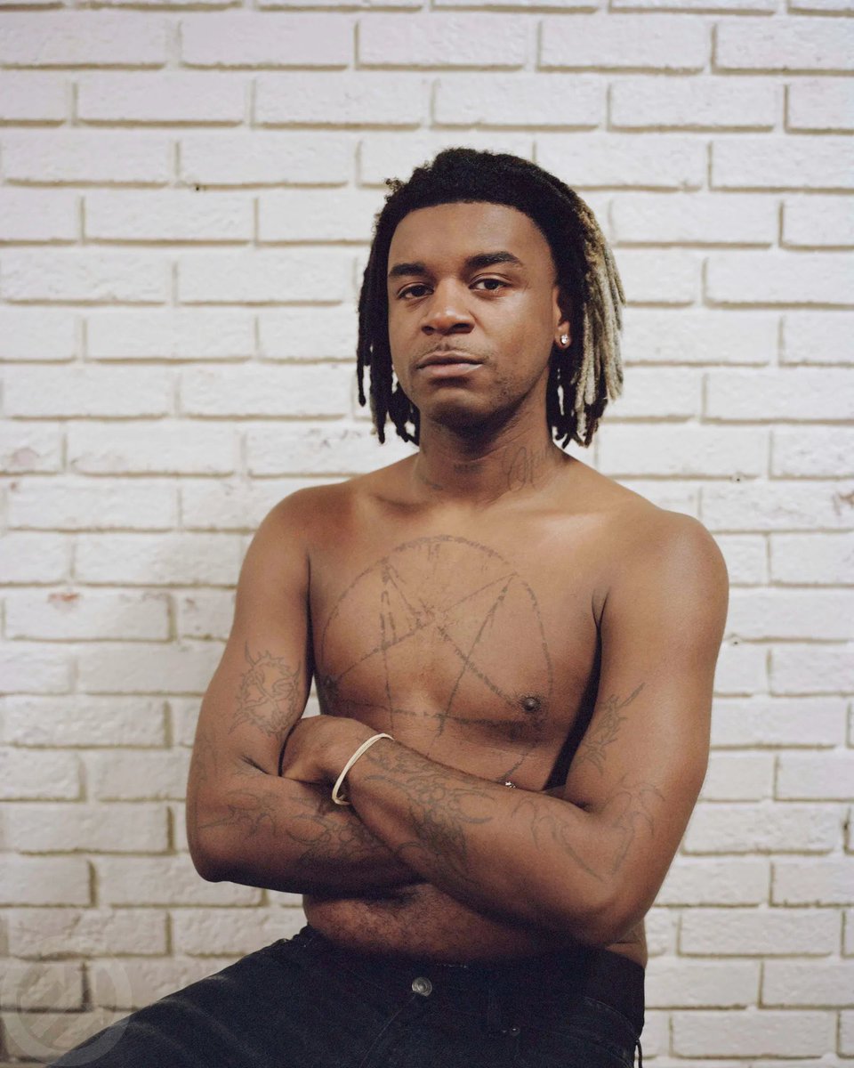
Destroy Lonely tattoos: high-resolution shirtless portrait showing the chest pentagram and arm tattoos

The forearm tattoos bring a sharper rhythm to the collection. Long, narrow shapes and pointed ends follow the arms, with thin lines that give some pieces an illustrated look. The forearm’s length naturally draws the eye from elbow to wrist.

The designs use fine linework alongside darker patches, so they look detailed without relying on heavy shading. In a black sleeveless shirt, the contrast between skin and ink makes the arm tattoos especially clear.

Related designs on both arms can create balance without being exact mirror images. One side might have a longer piece, the other a smaller symbol or word. Similar linework can make them feel connected.

Ask your artist to check the forearm from the front, side and palm-up positions. The skin turns when the wrist moves, and a thin design can disappear into a crease if it’s placed without testing. A little open skin can help the lines remain clear from different angles.

Hand tattoos add a personal detail to the darker styling

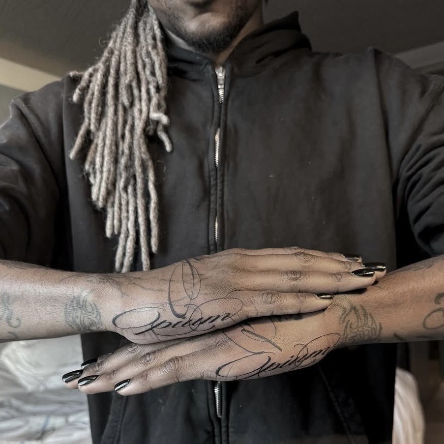
Destroy Lonely tattoos: high-resolution close-up showing the script tattoos across both hands

Script across the backs of Destroy Lonely’s hands is among the collection’s more personal-looking work. The letters follow the fingers and tendons, so they shift when his hands cross or rest near his chest.

The hand script softens the darker torso tattoos. The chest and back carry a heavier look; the flowing letters add movement. It’s a small detail, but it changes the collection when his hands are in view.

Hands get a lot of wear, so fine lines there may need more care or touch-ups than tattoos on the upper arm. The lettering should be clear enough to age well, with enough space between the words.

Keep hand lettering short, clean and easy to read. One word can have more impact than a crowded sentence. If you like the look but want a less exposed placement, the wrist or lower forearm offers more room.

Neck tattoos keep the face and body connected

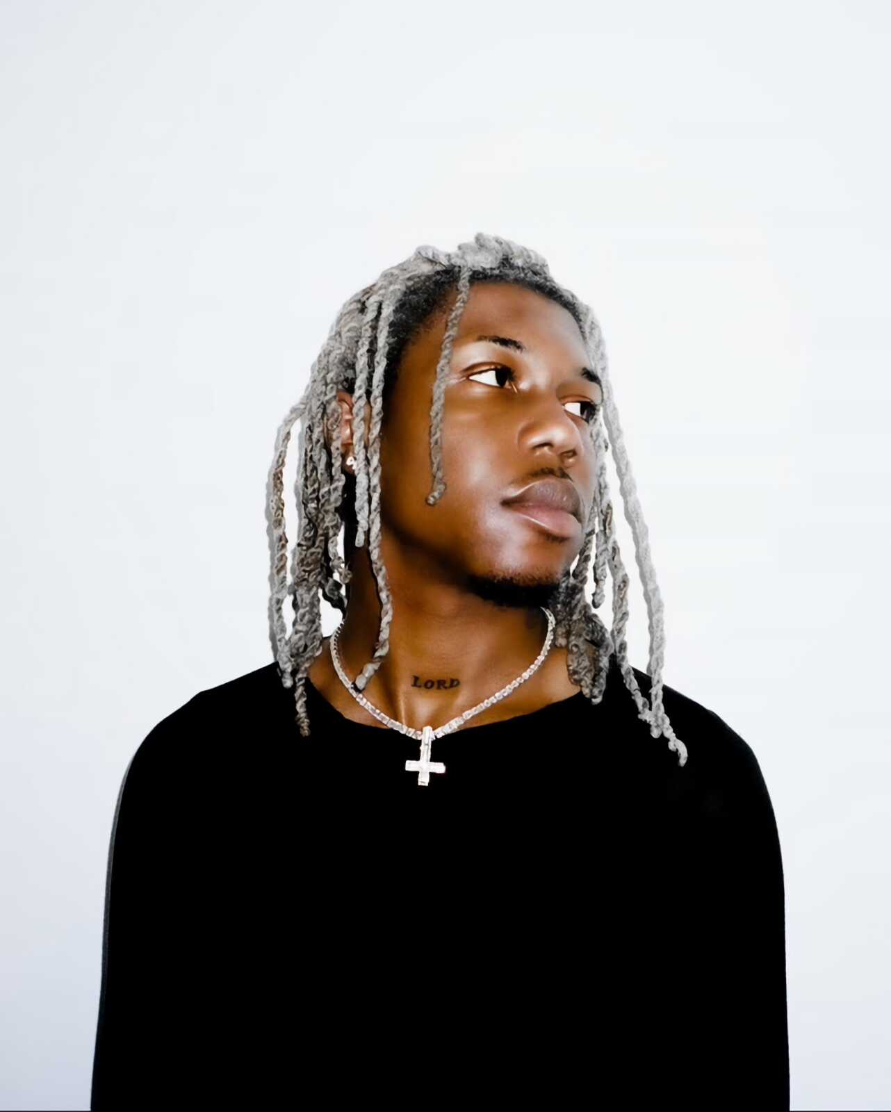
Destroy Lonely tattoos: high-resolution portrait showing the LORD neck tattoo and face-visible styling

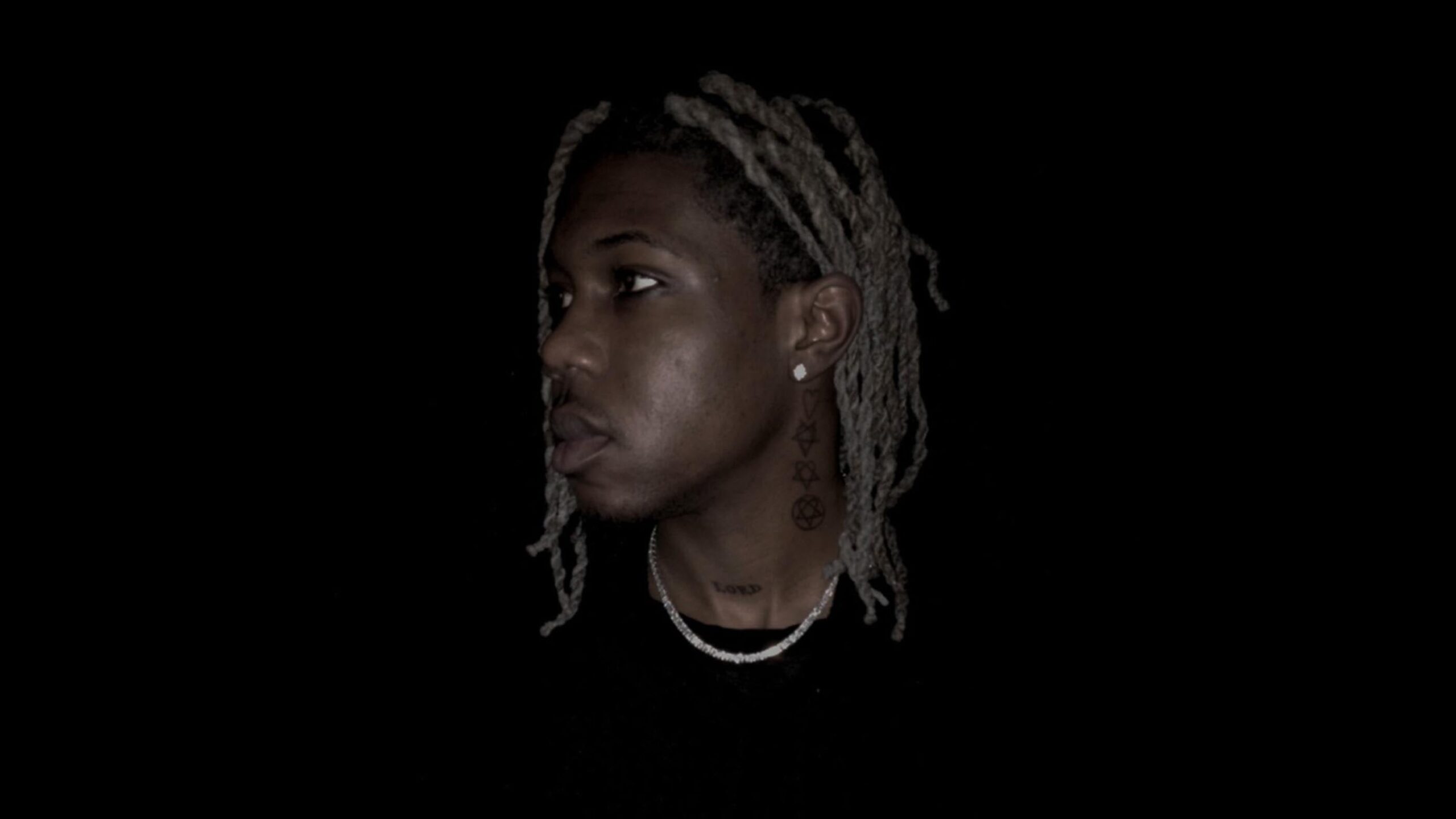
The neck tattoos connect Destroy Lonely’s face to the rest of his body art. A vertical row of small symbols sits along one side of the neck, while “LORD” is placed near the collarbone. The close spacing makes a clear column that remains visible when his chest is covered.

The hearts, stars and pentagram-like shapes form a simple sequence that’s easy to follow in profile photos. They add a graphic edge without turning the neck into one solid dark panel.

The placement changes how the tattoos read in a portrait. A turned head brings the vertical row into view and pulls the eye toward the neck; from the front, the word near the collarbone looks more like a small signature.

Place neck symbols with the head relaxed before you decide on the final height. The skin shifts when the jaw turns, which can change where lettering appears. A clear stencil and room between the marks help the design stay legible.

How to use the Destroy Lonely tattoo layout in your own plan

Destroy Lonely tattoos: high-resolution profile showing the neck symbols and collarbone lettering

One idea to take from Destroy Lonely’s layout is the contrast between large and delicate work. Let one area carry the biggest image, then use thin symbols, script or short lettering nearby. The body gets a clear focal point without every tattoo needing to be dark.

His tattoos also move in vertical lines. The neck symbols point toward the collarbone; a long forearm design leads toward the hand; the hand lettering gives that line an endpoint. Different designs can still feel related when their placement carries the eye across the body.

Clothes change which tattoos are visible. A hoodie can hide the arms and bring the neck to the front; a sleeveless shirt shows the shoulders and forearms. Plan for the way you dress most days as well as for a dramatic photo.

Leave space for the collection to evolve. New linework can sit beside older symbols without filling every patch of skin. Open areas keep the strongest designs visible and give future work somewhere to go.

Destroy Lonely’s collection pairs large, dark areas across the chest and back with smaller designs that show up in close shots. The forearms add sharp linework, the hands carry script, and the neck ties the face to the rest of the tattoos.

If you’re using Destroy Lonely tattoos for ideas, follow the way the pieces connect instead of copying one symbol. Notice how the neck row, long arm designs and hand script carry the eye in different directions while sharing a similar visual style. You can use that kind of planning to shape your own collection.

Here’s a Destroy Lonely interview that fits the mood around his music and visual style:

More musician tattoo guides

Juice WRLD Tattoos: 999, Hands, Arms and Chest

Juice WRLD’s tattoos have the same rough-edged feeling as his music. Ink covers his hands, fingers, forearms, shoulders and chest, mixing bold symbols with loose lettering. Some pieces look raw by design; others use heavy outlines and color that stand out from a distance.

The 999 skull is easy to recognize, but it’s only one part of the collection. His hands carry words and symbols, his arms hold larger drawings, and the chest pieces give the layout more weight. Each area has its own character, so the tattoos feel connected without merging into one dark block.

Placement gives familiar ideas a personal feel. Letters run across the fingers instead of sitting in a tidy line on the forearm. A skull sits on the hand, where it shows during a performance. Darker work on the arms balances the open skin around his neck and face. Taken together, the pieces look built up over time.

The photos show different sides of the work. A studio portrait makes the chest and arms easier to read; close-ups bring out the hand lettering. A live shot shows how the ink looks in motion and under changing light. Those views give a fuller reference than one cropped image.

The chest and arms carry the biggest Juice WRLD tattoo ideas

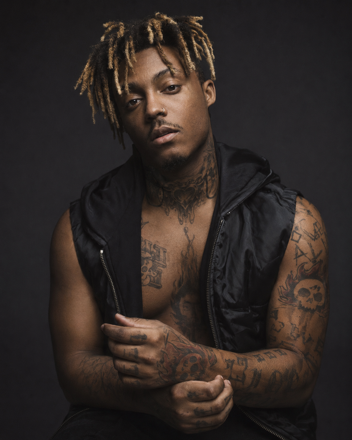
Juice WRLD tattoos: high-resolution studio portrait showing the chest, arms and hand tattoos

The chest and upper arms give Juice WRLD’s collection its scale. In a sleeveless portrait, the ink runs from the shoulders down the arms and across the chest. The designs are separate, but they sit close enough to read as a connected field. Dark outlines keep them visible in low light.

The chest also shows how a large layout can stay loose. The pieces point in different directions, and the skin between them keeps the area from looking flat. That space lets the eye move from one design to the next and leaves room if someone wants to add more work later.

The arm designs read more clearly as the elbow and forearm turn toward the camera. Their lines follow the length of the limb. An artist planning a similar placement can check the flow with the arm relaxed, bent and turned; a line that looks straight from one angle may shift when the joint moves.

Use the chest as an anchor if you want a similar look. Start with one image or short word that matters to you, then plan the arm pieces around it. A little space around the main design helps it stay visible and keeps smaller tattoos from running together.

His hands turn lettering and symbols into the main focus

Juice WRLD tattoos: high-resolution portrait showing the hand and finger lettering

The hands are where Juice WRLD’s tattoos read most clearly as a group. Letters cross the fingers, while symbols sit on the backs of the hands and stay visible when he gestures or performs. The placement is direct, with a rough edge that suits the emotional tone of his music.

Hands change shape as the fingers move. That can give simple lettering some life, but spacing matters: letters that look separate with a flat hand may touch when the fingers curl. The clearest designs account for both positions.

The hand work also contrasts with the larger pieces on the arms. A forearm has room for shading and layers of detail; a hand calls for shorter marks and bolder shapes, with less space and more everyday wear. Juice’s tattoos use both approaches: the arm work has more weight, while the fingers add quick flashes of personality.

Keep hand lettering short and give every letter enough room. If you like the look but want a less visible placement, the wrist or lower forearm offers a little more space. Check the design against the way you normally hold your hand before settling on the stencil.

The 999 skull is the piece people notice first

Juice WRLD tattoos: high-resolution portrait showing the hand symbols and 999-era ink

The flaming 999 skull is the tattoo most people associate with Juice WRLD. The number sits inside the skull, and the flames extend the design so it reads from a distance. A familiar symbol, dark shapes and warm color give it a clear focal point.

Juice WRLD described 999 as a way to turn a bad situation into something positive. That explanation gives the number meaning beyond its role in the design. It became a visual reminder of his outlook, and fans still recognize it in different drawings and tribute pieces.

The skull works as a tattoo because its outline is easy to read. The eyes, teeth, flames and numbers each have a clear place, so the image does not depend on tiny details. Strong outlines carry most of the design; the color adds energy without filling every bit of skin.

Build a symbol around one clear silhouette if you want a similar effect. A central mark can feel more personal with flames, leaves, stars or another shape that fits your story. The surrounding detail should support the main idea and leave it easy to see.

Small finger tattoos give the larger work a personal edge

Juice WRLD tattoos: high-resolution portrait showing the finger lettering and hand marks

The smaller finger tattoos keep the hands from repeating the same design. Words such as “LOVE” and “LIFE” sit beside symbols and short marks, so the fingers read like a series of quick statements. The lettering is uneven, which gives it a less formal feel.

Finger tattoos leave little room, so short words tend to work better than long quotes. Each letter has to hold its shape as the skin moves and takes the wear of washing, gripping and daily contact. Bold, simple lettering is easier to read in a narrow space than fine script.

These pieces also link the main hand tattoo to the forearm. Your eye can follow the marks from the fingertips toward the wrist and up the arm. That connection is less obvious when each tattoo is viewed alone, but it helps the full layout feel considered.

Choose a word you would still want to see years from now. Finger tattoos are hard to hide and may need touch-ups, so it helps to choose for lasting meaning rather than a passing trend. If the placement feels too permanent, put the word on the wrist or choose a small symbol that stands on its own.

How to build a Juice WRLD inspired tattoo layout

Juice WRLD tattoos: high-resolution live portrait showing the hands and arm tattoos in performance

One useful idea in Juice WRLD’s layout is the way different sizes work together. A larger chest or arm image can set the tone, while smaller hand and finger pieces add detail. The tattoos do not all need the same style; a shared feeling, color or line weight can tie them together.

Think about visibility before choosing a placement. Hand tattoos stay on show, chest designs appear when a shirt is open or off, and arm tattoos can move between those settings. Your usual clothes can help decide which idea belongs in the most visible spot.

The balance of rough and clean work is another option to borrow. A distressed word can sit beside a crisp outline without looking out of place. Give the artist a clear overall direction, then let the smaller details fit the shape of your body.

Leave open skin between the strongest pieces. Space makes the main tattoos easier to read and leaves options for later. A collection built over time can feel more personal than a sleeve planned all at once. Begin with the design that means the most, then let the rest take shape around it.

Juice WRLD’s tattoos bring personal symbols together in a loose, heavily tattooed look. The chest and arms set the larger shape, the 999 skull is the signature image, and the words on his hands and fingers keep the collection direct.

If you’re using Juice WRLD tattoos for ideas, look at how the designs share space instead of copying the drawings. Notice how a bold hand tattoo sits beside smaller letters, how open skin keeps the chest readable, and how one repeated number can carry a larger idea. Those choices can help your own tattoos feel connected without looking generic.

Here’s the interview where Juice WRLD talks about the meaning behind some of his tattoos:
More musician tattoo guides

Wifisfuneral Tattoos: Face, Neck, Hands and Meanings

You notice Wifisfuneral’s tattoos before the rest of his outfit. Face lettering, small symbols, neck work and ink on his hands are all in view. The collection has a rough, restless look, but the marks return to a few personal themes: identity, family, loneliness and the people around him.

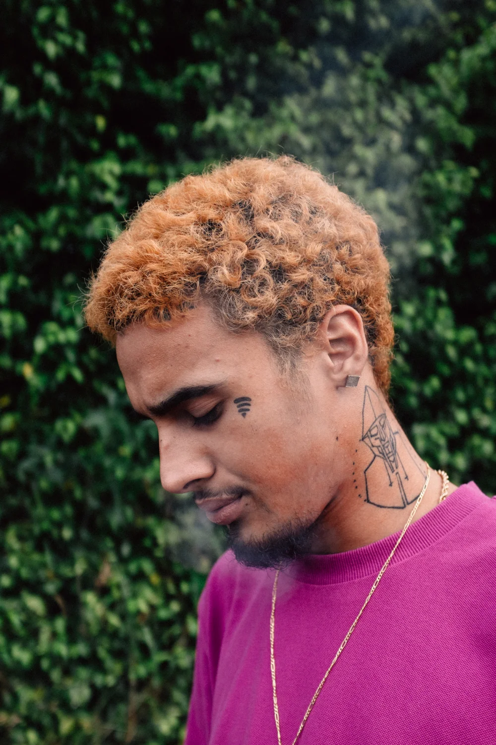
The Wi-Fi symbol is an obvious place to start. It sits alongside words near the eyes, marks by the brows, a scythe and the name of his movement. Some tattoos are small and blunt; others use the curve of the neck or the broad surface of the hand. Together they feel personal, even if the pieces weren’t planned as one neat set.

Placement changes how each tattoo reads. A word beside the eye feels more direct than the same word on an arm. Neck ink becomes part of the profile, while hand tattoos shift as the fingers open and close. When you look at his work for ideas, those choices can tell you as much as the drawings.

The photos offer more than one close-up. One shows the Wi-Fi mark with the lines on his neck; another makes the face lettering easier to see. The later shots bring out the hand tattoos, the broken-heart tribute and the smaller marks that run across his head and neck.

The Wi-Fi symbol is the starting point for Wifisfuneral tattoo style

Wifisfuneral tattoos: a clear Wi-Fi face symbol, geometric neck work and side profile
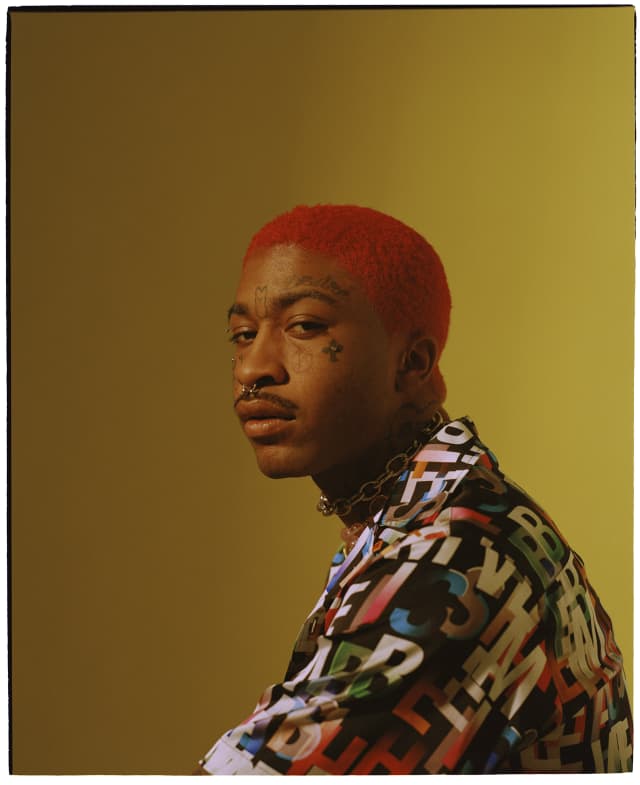
The Wi-Fi bars on Wifisfuneral’s face are the clearest marker of his identity. The small symbol sits near the side of his face, and its shape reads right away. It relies on the curved bars and open gaps, not shading or extra detail, so it remains easy to spot in a busy portrait.

That simplicity is useful when several tattoos share a small area. The Wi-Fi lines have room around them and don’t run into the eye tattoo, cheek marks or neck work. Each stays distinct, keeping the face from becoming one dark patch. Spacing matters even more when you plan several pieces close together.

The placement also links the face to the rest of the portrait. Orange hair and bright clothing catch your eye first, while the Wi-Fi symbol gives you a clear point to return to. From there, the nearby lines lead down toward the neck. It works as a personal mark and as part of a larger layout.

Start with a symbol that can be understood in one second if you want a similar effect. It could be a signal, star, tool or shape tied to your own story. Keep the outline clear and decide how much open skin to leave around it. A simple design can stay readable where a tiny, crowded drawing may not.

Face lettering makes the collection impossible to miss

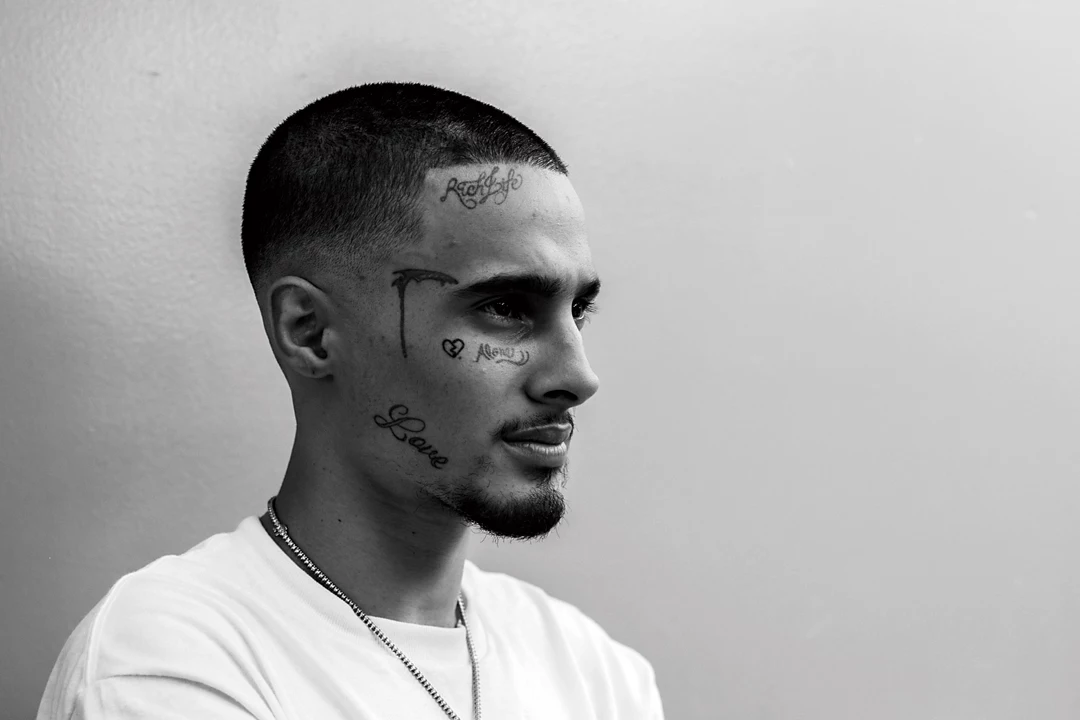
Wifisfuneral tattoos: readable love, hate, brow and cheek face lettering
Wifisfuneral’s face lettering gives the tattoos their sharpest edge. “Love” and “hate” sit around his eyes and cheeks, with family names and shorter marks nearby. The words don’t look like formal signage. They read as direct statements placed close to the person they describe.

Words on the face change the expression around them. Even when the face is relaxed, the marks give the eyes a certain mood. A short word can draw more attention than a larger tattoo on the shoulder because people read the ink and the expression together.

Spacing is especially important in this area. Skin around the eyes and cheeks moves, and there isn’t much room for a long phrase. Check a stencil from the front and at a three-quarter angle. Lettering that looks balanced on a flat drawing can crowd when it follows the curve of the face.

Keep the phrase short enough that the shape stays clear. If the sentence you have in mind is too long, one word or a pair of initials may carry it better. The hand, wrist or upper arm can hold the same direct lettering if you’d rather not put it on your face.

The neck piece gives the profile a strong outline

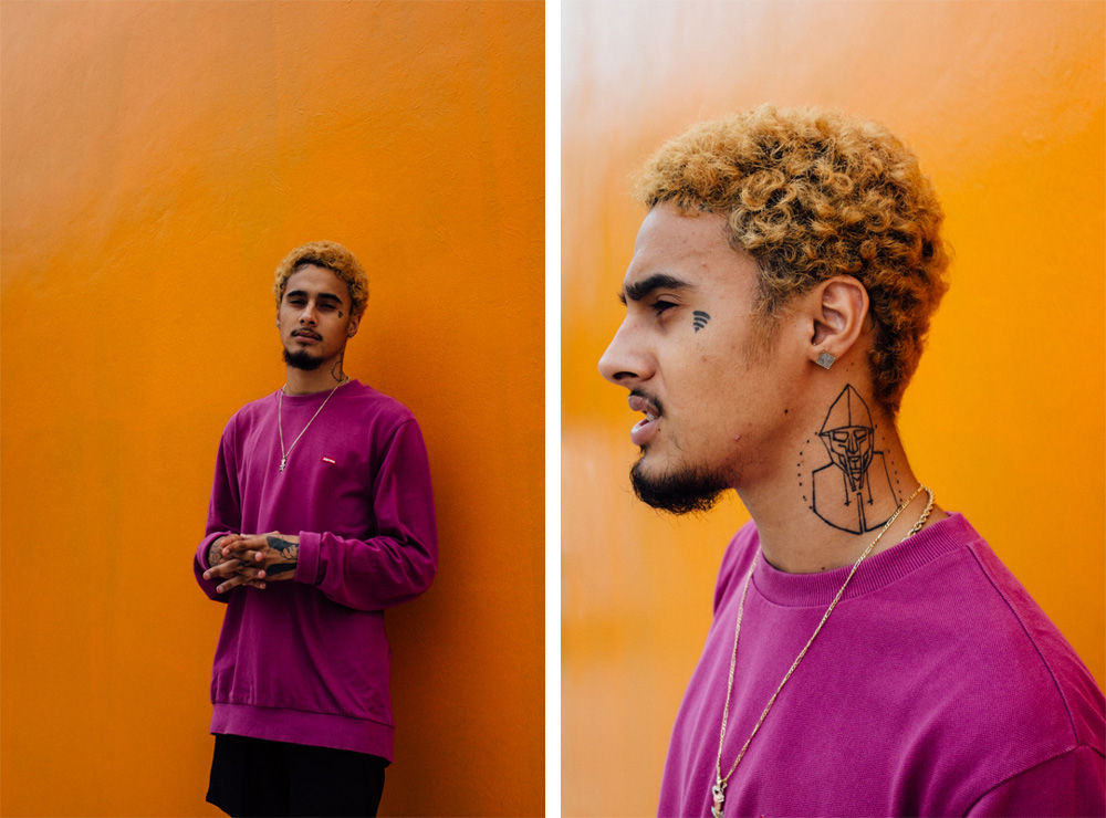
Wifisfuneral tattoos: a collage portrait with neck, face and hand tattoo details
The neck tattoos give Wifisfuneral’s profile a clear outline. In the collage, dark lines and small symbols continue below the jaw along the side of his neck. It’s easy to focus on the face and miss this area, but the neck work carries the layout down toward the shoulders.

A neck tattoo looks different from the front and in profile. You see it when the jaw turns or a shirt collar drops, and the design can seem narrow head-on but much wider from the side. Planning for those views helps the lines follow the shape instead of sitting on it like a flat panel.

The dark marks also balance the orange wall and clothing in the photo. They give the lower part of the portrait enough weight to sit alongside the hair and face, while the open gaps keep the neck from reading as one solid black shape.

If you’re planning neck work, take photos facing forward and turning both ways. Ask the artist to check where a shirt collar falls, too. You may want the design to disappear beneath a normal shirt; a mark closer to the throat will be much more exposed.

The Alone and broken heart tribute adds a personal layer

Wifisfuneral tattoos: the Alone lettering, broken heart and other close face tattoos
The word “Alone” and the broken-heart tribute give Wifisfuneral’s face tattoos a more personal tone. These marks do more than fill a gap; they bring feelings and personal history into a collection that already has a strong visual style.

A broken heart is a familiar image, but the reason for choosing it is personal. On the face, even a small outline becomes part of the expression. Its placement keeps it visible, and the simple shape makes it easy to read without a frame or heavy shading.

“Alone” works in a similarly direct way. The word is plain, but on the face it reads almost like a caption for a feeling. That openness is part of the appeal for people drawn to emotionally direct tattoos. The idea comes through without a long explanation or elaborate image.

Use personal meaning before visual trend when choosing a tribute. Ask whether it will still describe your life if the moment around it changes. A small symbol, date or private reference can mean as much as a word others can read. If you choose lettering, check it at the final size so it stays clear.

How to plan a Wifisfuneral inspired face tattoo

Wifisfuneral tattoos: tattooed hands and fingers shown clearly around a phone
The close-up of Wifisfuneral’s hand tattoos shows details that can disappear in a regular portrait. The fingers and backs of the hands carry their own marks. With his hands around the phone, the ink becomes part of the pose and changes the way the image reads.

Hands are always moving and doing work, so a design needs to stay clear in more than one position. Look at it with the hand flat, curled and held naturally. Small gaps can disappear as the fingers bend; short words and strong symbols tend to be easier to read than fine scenes squeezed into the space.

You can take the same approach to placement without copying each tattoo. Choose one area to draw the eye, then decide which design deserves the strongest contrast. The face might carry the main symbol, the hands might hold it, or the neck might frame both. What matters is how the placements work together.

Plan the collection as a set of separate decisions. Begin with the tattoo that means the most and leave room for anything that comes later. Face, neck and hand tattoos are hard to hide, so try temporary versions and wear them through a normal day. That gives you a better sense of whether the placement feels right outside a reference photo.

Wifisfuneral’s tattoos pair simple symbols with direct words in highly visible places. The Wi-Fi mark gives the collection a recognizable starting point. Face lettering sets the tone, neck work extends the outline, the broken-heart tribute adds a personal note, and the hand tattoos move with him.

If you’re using Wifisfuneral tattoos for inspiration, pay attention to how the pieces share space instead of tracing the drawings. The symbols stay readable, the neck work follows the face, and the smaller marks carry their own meaning. Those choices can help your collection feel connected without copying his.

Here’s the interview where Wifisfuneral talks about his face tattoos and how he approaches imperfect work:

More musician tattoo guides

Lil Tracy Tattoos: Face, Neck, Hands and Meanings
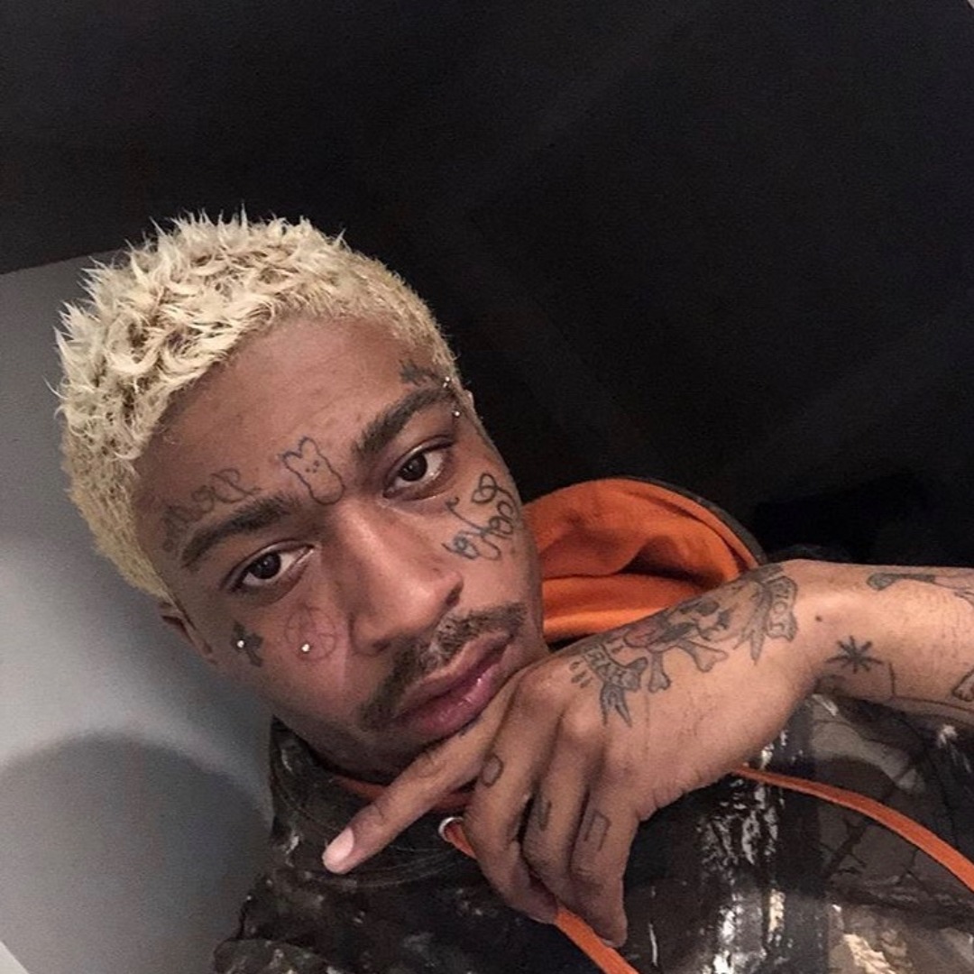
Lil Tracy’s tattoos are hard to miss. Small symbols and lettering sit on his face, while looser drawings continue over the neck, hands, chest and stomach. Some pieces look playful; others are darker or more personal. The collection has room for both moods instead of making everything match.

The candy- or bear-like mark on his forehead draws the eye first, but it’s one detail among many. Crosses, script, cheek symbols, hand marks and larger body tattoos all have their own scale. They don’t need to share one style to feel like parts of the same look.

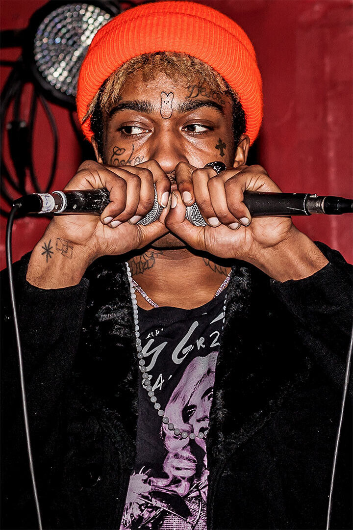
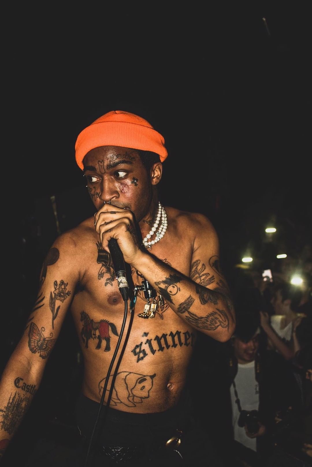
Placement matters as much as the drawings. A mark above the brow changes the expression; a hand tattoo shifts when he grips a microphone. The large “sinner” lettering across his stomach follows the outline of his body, and the neck pieces fill the space between his face and torso. Those relationships make better reference points than copying a single tattoo.

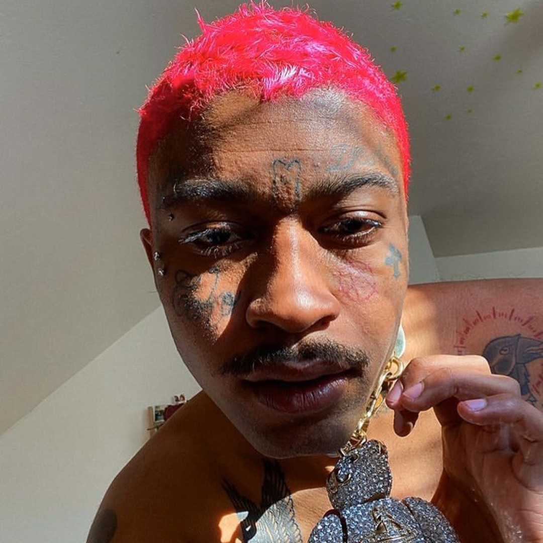
The photos show the work from different distances. Close-ups make the forehead and cheek pieces easier to see, while a performance shot shows how the chest and arm tattoos move with him. A portrait with bright hair also brings out the small symbols around the eyes and the shape of the neck ink.

The Peep candy tattoo gives Lil Tracy face ink its signature look

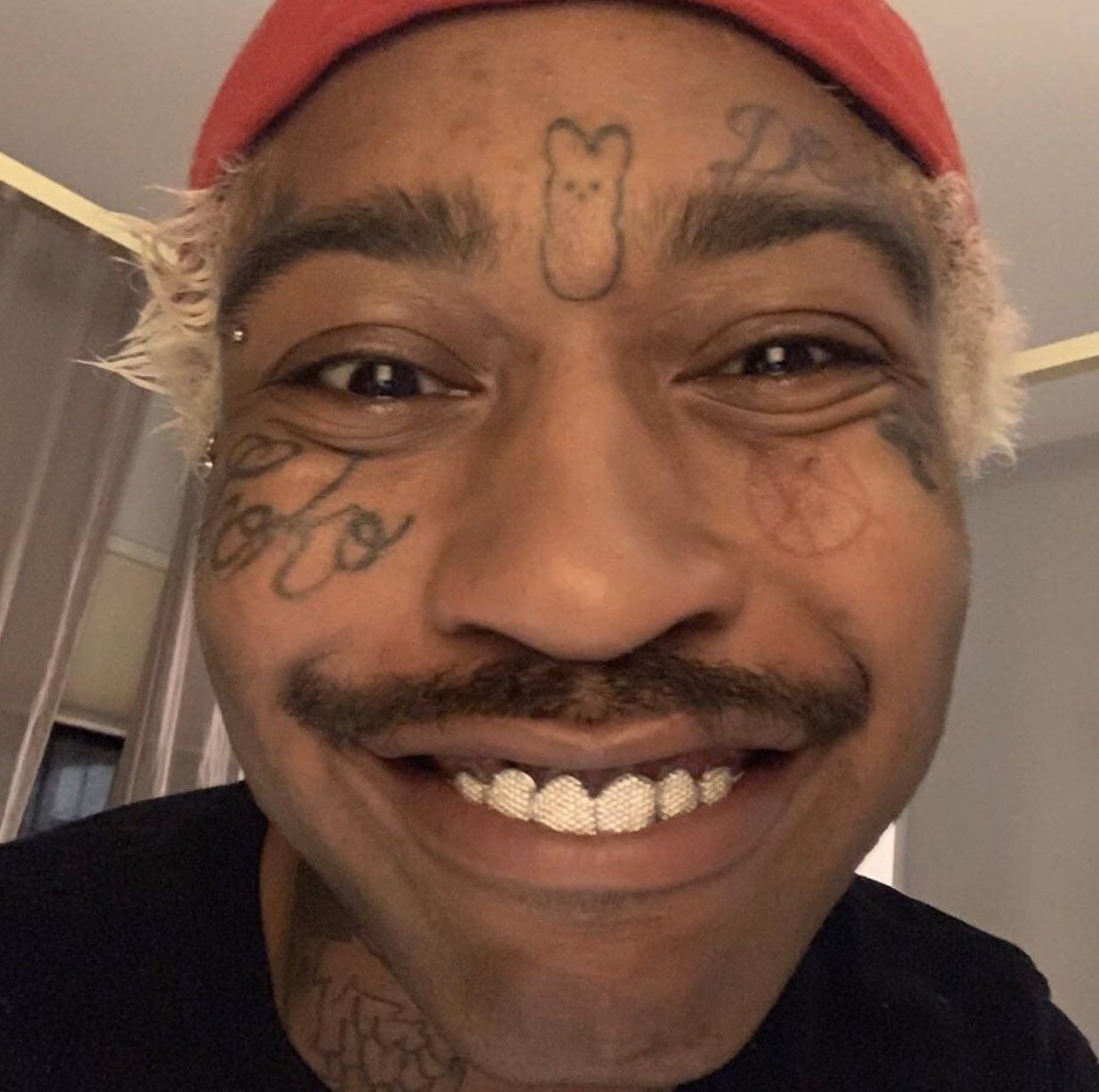
Lil Tracy tattoos: a clear forehead symbol, cheek script, eye marks and tattooed forearm

The small candy-style design on Lil Tracy’s forehead is one of the tattoos people spot right away. Its simple, almost cartoon-like outline gives his face a playful focal point. Set between the brows, it tends to catch the eye before the other marks.

A symbol this small needs a clear silhouette more than fine shading or texture. The outline stays readable in a close selfie, under stage lights and from an angle. Packing too much detail into the same space could make it harder to see.

The position affects the expression, too. Anything between or above the brows becomes part of the face; when the eyebrows move, the tattoo seems to move with them. That can give the mark a lively look, but it makes careful stencil placement important. A small tilt can change how the face reads.

Choose the smallest area that can still hold the idea if you like this kind of bold symbol. A tiny character, star, fruit or charm can have more personality than a detailed picture that turns muddy from a few feet away. Keep the outline strong and leave skin around it so the design doesn’t disappear into nearby ink.

Face symbols and lettering make every close-up feel personal

Lil Tracy tattoos: face symbols, cheek lettering, neck ink and arm tattoos in a close portrait
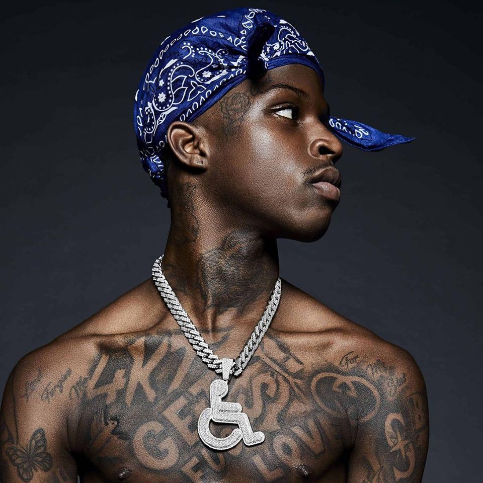
In close portraits, Lil Tracy’s face tattoos look like a handful of quick notes: script around the cheeks, marks near the eyes, a cross and symbols above the brows. They vary in size, which keeps the arrangement from feeling too uniform.
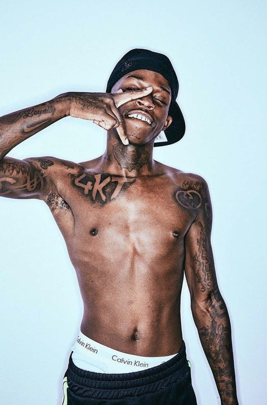
Face tattoos sit beside features that already express a lot. Ink around the eyes can sharpen a stare; a word on the cheek can change the balance of a smile. The placement has to work when the face is relaxed, laughing, singing or turned away. A design that reads well in one still photo may look different in motion.

If you want to take a similar approach, start with the meaning and then reduce it to a shape that fits close placement. One letter, a small emblem or a short word may be enough. Long quotes can compete with the natural lines of the face and get harder to read when the skin folds or the light changes.

Test the design at the size you would actually wear it. A phone photo with a temporary mark can show whether it looks balanced from a normal distance. If the face feels too exposed, the same symbol could go on the wrist, hand or upper arm instead.

The chest and stomach tattoos bring a bigger scale

Lil Tracy tattoos: bright red hair, face symbols, chest ink and a large pendant

The chest and stomach tattoos work on a larger scale. In the performance portrait, “sinner” stretches across the stomach beside drawings that run up the chest and arms. Seen together, the pieces read more clearly than they would as separate flash designs.

Even a large tattoo needs a clear point of focus. The stomach lettering acts as an anchor, with the other drawings placed around it. Without one main feature, a heavily tattooed torso can look busy from every angle.

Open skin helps the larger figures and dark lines stay distinct. The gaps make the outlines easier to see under concert lighting and keep separate tattoos from running together. They also leave room for future work if the collection grows.

For a similar layout, think of the body as a map. Decide whether the main piece belongs on the chest, ribs or stomach, then consider how the arms and shoulders move. Let the body lines guide the direction of the tattoo instead of making every design face straight forward.

Hand and neck pieces keep the layout moving

Lil Tracy tattoos: face, hand and wrist tattoos visible while holding two microphones

The hand and neck tattoos carry the layout between Lil Tracy’s face and torso. His hand marks show when he lifts a microphone or brings his fingers near his mouth. Neck symbols can appear or disappear with his collar, hair and head position. They change with the way he moves, unlike tattoos hidden under clothing.

Hand tattoos need clear shapes. Fingers bend, knuckles crease and the backs of the hands take daily friction. Fine gaps can blur over time. Lil Tracy’s marks are mostly short symbols and compact drawings, which suit the space.

The neck curves from the jaw to the collarbone, so a stencil needs to work from the front and in profile. A small piece can seem much larger on the side of the neck. Its place on the silhouette may matter more than how much ink it uses.

Check hand and neck designs while your body is moving. Look at the piece with your fingers relaxed, curled and gripping something. Turn your head and try on a normal shirt to see what disappears. That helps you decide how much visibility and flexibility you want.

How to plan a Lil Tracy inspired tattoo collection

Lil Tracy tattoos: the sinner stomach lettering, chest drawings and extensive arm tattoos

A Lil Tracy-inspired collection can borrow the contrast without copying every face mark or body drawing. Playful symbols sit beside serious lettering in his look. A cartoon-like forehead piece can share space with a cross, dark animal, script or tribute without making the whole arrangement feel confused.

Start with the tattoo that means the most to you. It might be a small character, a word tied to your past or a drawing connected to a friend. Once you have an anchor, choose a few supporting pieces with a related line weight. They can differ in style and still feel like they belong together.

Think about visibility before choosing the face, hands or neck. Those areas show with most outfits and in most photos. Chest and stomach tattoos are easier to cover, while the arms sit somewhere in between. You don’t have to put your most personal ideas in the most visible spots.

Leave room for the collection to change. Lil Tracy’s tattoos span different areas rather than reading like one planned set. Open skin leaves space for new ideas and means the first tattoo doesn’t have to explain everything about you.

The contrast is what makes Lil Tracy’s tattoos easy to recognize. The forehead symbol is playful, the face lettering is direct, the stomach work is bold, and the hand and neck pieces stay visible as he moves. The overall look feels personal without needing every tattoo to use the same style.

If you’re using Lil Tracy tattoos for inspiration, look at how the small symbols work with the larger body pieces. A simple outline can lead a close portrait, while a larger word anchors the torso. Those choices can help you build a connected collection without turning it into a copy of someone else’s.

Here’s the interview where Lil Tracy talks about the meanings behind some of his tattoos:

More musician tattoo guides

Quando Rondo Tattoos: Chest Lettering, Sleeves and Neck Ink

Quando Rondo’s tattoos are part of the first impression. Letters, portraits, small symbols and dark shading run from his neck down both arms. Some pieces are easy to make out; others overlap as the collection fills in. The result looks built up over time, not arranged to match a catalogue.

There’s a difference between what the photos show and what anyone can say about the stories behind each mark. The chest lettering is visible in older portraits, and the neck ink appears in close-ups. Hand and wrist tattoos show up in performance shots, though a microphone, jewelry or movement can hide them. It’s better to look at placement and repeated visual themes than assign a meaning to every shape.

This guide sticks to the visible work: the chest lettering, neck and face area, arm coverage, hand details and recognizable phrases. If you’re looking at rap tattoos for ideas, Quando’s collection is useful for seeing how large text can sit beside smaller, more detailed pieces.

Quando Rondo’s neck and face tattoos set the tone

Quando Rondo tattoos: neck and face tattoos in a close portrait

The neck frames Quando Rondo’s face in nearly every portrait, so it’s a natural place to start. Dark shapes and lettering fill the area under his jaw. In a close crop, the ink can read almost like a shadow or a high collar. Even a small mark feels bold there because it can’t be hidden by a sleeve.

The overall weight matters more than one neat logo. Lines have to follow a curved surface, and the darker shading gives the neck a fuller look from a distance. For a similar piece, it helps to settle on a clear silhouette before adding small details. Fine lettering can disappear when the head turns or the light changes; a solid outline is easier to follow.

The face and temple marks use a similar visual language. They sit closer to the eyes and mouth than the chest pieces, so they affect the expression more. Placement changes the feel of a word: near the eyebrow it reads differently than it would on the upper arm. These photos are useful if you’re considering how a small piece might change the face without covering it.

The large chest lettering keeps the message front and center

Quando Rondo tattoos: large chest lettering and upper-torso ink

The largest designs sit across the chest. Block letters stretch from one side of the torso to the other, with other marks around them. They’re broad and easy to see, turning the chest into a strong graphic shape when his shirt is open or off.

Big text is quick to read, which helps in a stage photo where a face, chain and microphone may all be in motion. The spacing still needs care. Letters that look comfortable on a stencil can crowd once they wrap over the ribs or sternum. In these portraits, heavy outlines and wide gaps help the words hold their shape.

The chest puts personal words beside marks tied to music. A phrase might be emotional, aspirational or connected to a crew; it can make its point without a long explanation. If you like this approach, settle on the words before choosing a font. A shorter line usually leaves more room to breathe. Check that the baseline stays steady and the lettering still works when the body bends.

His arm sleeves mix names, symbols and dense shading

Quando Rondo tattoos: dense arm sleeve lettering and symbols

Quando’s sleeves combine dark areas with smaller drawings, names and symbols. The eye keeps moving instead of settling on one centerpiece. The effect is closer to a personal scrapbook than a sleeve built around a single theme. New pieces sit beside older marks, giving the arms a collected look.

The upper-arm designs are large enough to read from across a room. Farther down, they get smaller and more layered. If you want to build a sleeve over time, one anchor piece can give you a starting point. Leave space around it, then connect later work through similar line weight or shading. The symbols don’t all need to match.

Lighting and camera distance change how black ink looks. A bright studio portrait makes the edges easier to follow; in a club shot, the same work may look like a darker mass. When you gather references, use more than one kind of photo. A close-up shows the details, while a performance shot shows how the tattoo reads in motion.

Hand and wrist ink adds detail around the microphone

Quando Rondo tattoos: hand and wrist tattoos visible while performing

The hand and wrist marks are smaller, but they keep showing up in photos. Quando holds a microphone close to his face, bringing the ink on his fingers and hands into the gesture. Short words, outlines and symbols peek around the mic or jewelry. Even a small tattoo can change an image when it moves with the body.

Hands are a demanding place for ink. The skin bends, fingers rub together and the lines get constant exposure. Very fine work can soften; overly dense work can turn into a dark patch. The examples here favor bold marks and clear shapes, which remain easier to read beside the heavier arm work.

Wrist pieces can connect the sleeve to the hand. That strip of skin can hold a word, number or symbol that points toward the larger design above it. If you want a similar layout, plan the path from knuckles to forearm before booking separate sessions. Related spacing can tie the pieces together even when they don’t match.

The GET $ FUC LOVE chest tattoo is a clear focal point

Quando Rondo tattoos: GET $ FUC LOVE chest lettering

GET $ FUC LOVE is one of the clearest phrases across Quando Rondo’s chest. Heavy capital letters spread over the upper torso, with enough space between the words to read in a single frame. The line is rough-edged and direct. It works as typography even without knowing the story behind it.

The letters share a similar weight, and the dollar sign breaks up the phrase with a simple shape. That gives the eye a pause between words and a clear point of focus. A small symbol can help a text tattoo read as a design instead of one long line.

The placement leaves other chest and shoulder work room to grow around it. Keeping the phrase open makes it easier to read as more tattoos are added nearby. If the wording matters, give the letters open skin to sit against as well as dark ink to define them.

Quando Rondo’s tattoos span several styles: neck and face marks, wide chest lettering, packed sleeves and smaller hand details. Some read like declarations; others may be reminders or visual texture. Together they make a recognizable collection without one single logo or color carrying the whole look.

For a similar tattoo, begin with placement. Decide which part of the body you want people to notice first, then choose a design that works with how that area moves. Keep large words legible, use lines that suit high-wear areas, and leave space if you plan to add more later. One well-placed phrase or symbol can carry the idea on its own.

Good ink does not need a mystery attached to every line. Sometimes the appeal is simply how it sits on the body, catches the light and becomes part of someone’s everyday expression. That’s the feel of Quando Rondo’s tattoo style: personal, visible and meant to be seen.

Neck ink, chest lettering, arm coverage, hand details and clear spacing are the main lessons to take from this collection.

More musician tattoo guides

Rod Wave Tattoos: Hard Times Forearm Ink Explained

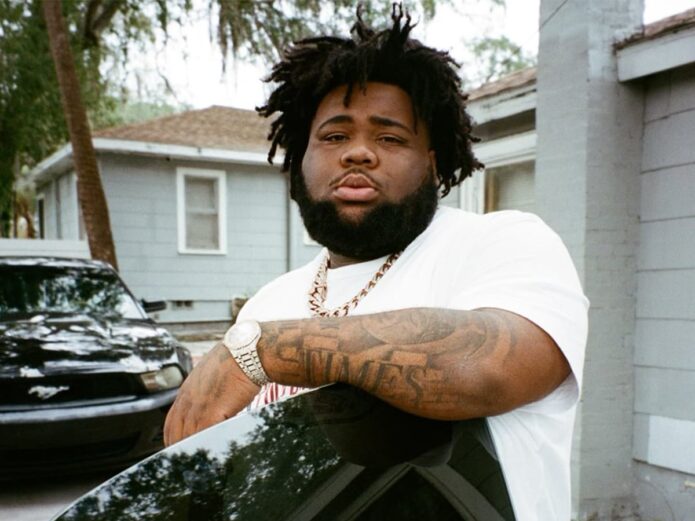
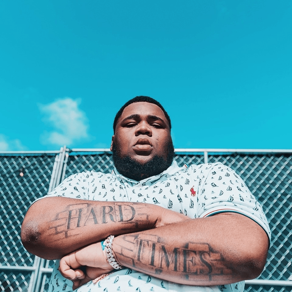
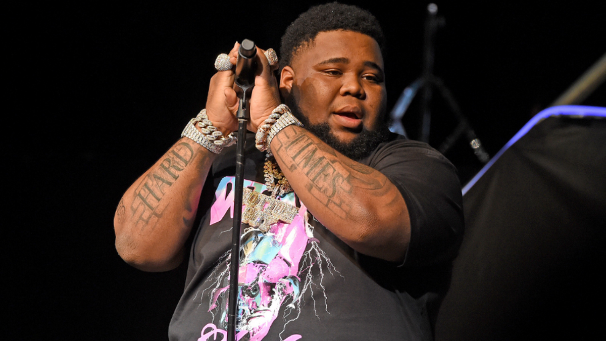
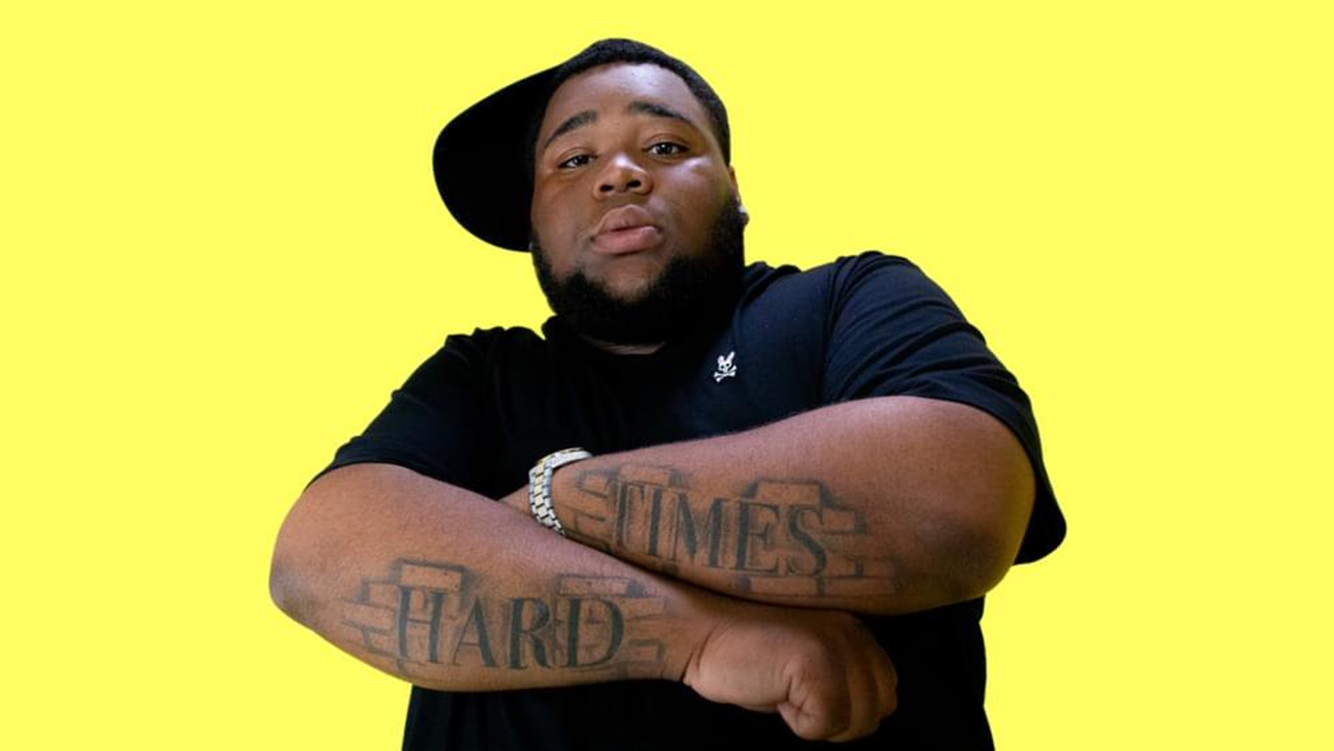
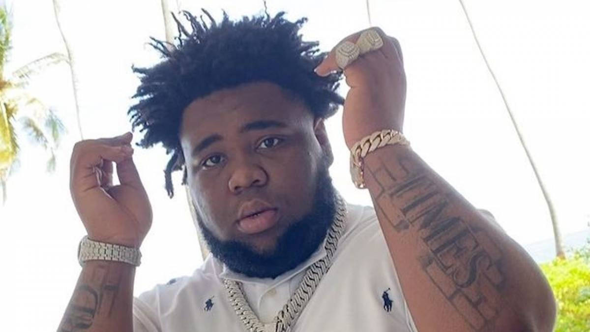
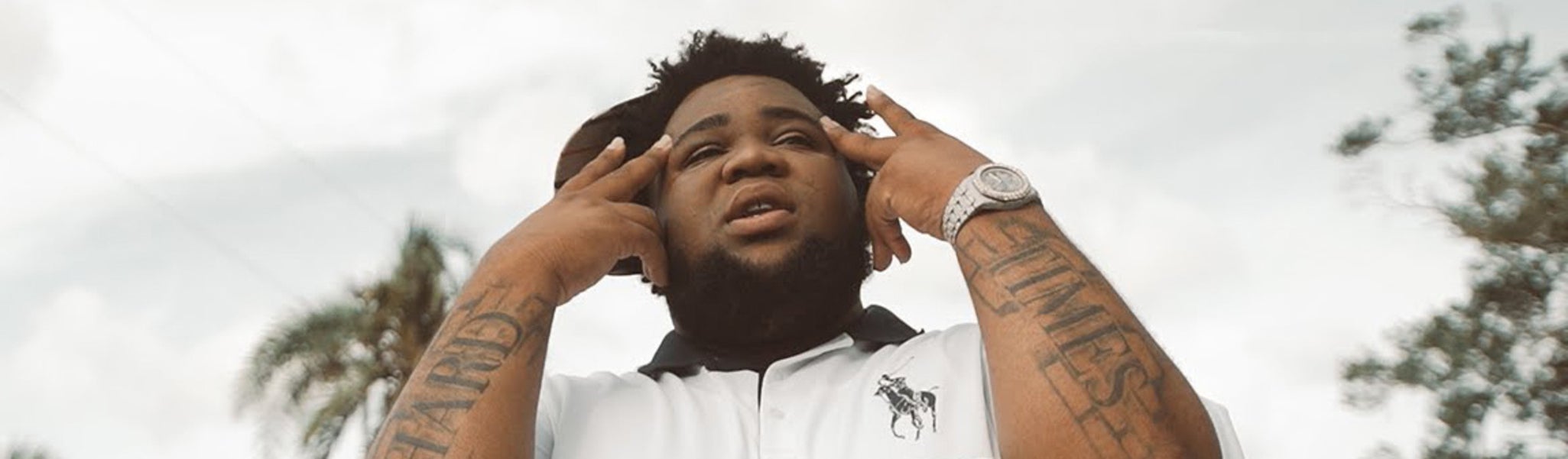
Rod Wave’s forearm tattoos are hard to miss. “Hard Times” stretches across both arms in large, weathered letters, clear in photos, onstage and in music videos. The words sit alongside themes he writes about: struggle, survival, love and the effort to keep going when life feels heavy.

The design keeps things simple. There’s no crowded sleeve or complicated symbol competing with the words. Each forearm carries part of the phrase; when he crosses his arms, the two words meet, and when he performs, each side can be seen on its own.

The details discussed here come from photos and videos. Rod Wave hasn’t publicly explained every part of the tattoo, so the focus is on the lettering, placement and what can be seen rather than a guessed private meaning.

Rod Wave’s Hard Times forearm tattoos set the tone

Rod Wave tattoos: the crossed forearms and matching Hard Times lettering

The letters are large enough to read from a few steps away. They run along his forearms rather than sitting in a small patch by the wrist, giving the phrase room without covering the whole arm. Bare skin around the lettering keeps the design from becoming a solid black sleeve.

The lettering is heavy and worn-looking, not fine script or polished calligraphy. The words themselves are plain, and the thick strokes give them a firm presence. The style is direct without looking unfinished.

Two words are easy to take in at a glance. A longer quote might read well on paper but can get crowded as it wraps around an arm. Here, each word has space to stay bold, and there’s no need to decipher a longer line.

The forearm moves whenever Rod Wave bends or turns his arms, so the letters shift with it. That gives the phrase some depth in photos and keeps it tied to the shape of his arm instead of making it look like a flat label.

The block lettering makes the message impossible to miss

Rod Wave tattoos: the forearm lettering during a live performance

Thick block letters help the words stay readable in performance photos. Stage lights can fade fine lines, and a quick shot may catch an arm for only a moment. Rod Wave’s tattoo relies on its lettering and contrast rather than delicate shading, so the phrase still comes through.

If you want a phrase people can read across a room, clear edges and enough space between letters matter. For smaller, more private text, fine script or a less visible spot may suit better. It depends on how and when you want the words to be seen.

Hard and Times each have their own space, yet read as one phrase. A tattoo artist can adjust the letters’ height, width and curve to fit the forearm. If the words are squeezed together, they may blur; if they sit too far apart, their connection gets weaker.

Hard Times is a plain phrase, which leaves room for people to bring their own meaning to it. Someone might connect it to a difficult period, a family experience, a career setback or a reminder that circumstances can change. The wording doesn’t depend on a trend.

Before settling on a two-word design, compare a few fonts at the size you plan to use. Tape a printout to the spot and check it with your arm relaxed, bent and turned. That can reveal cramped letters or odd gaps before the stencil goes on.

Rod Wave’s arm placement keeps the words in motion

Rod Wave tattoos: the yellow-background portrait showing both words clearly

Onstage, Rod Wave grips a microphone, reaches toward the crowd, crosses his wrists and lifts his hands while singing. The forearm lettering moves through those gestures, so it appears as part of the performance rather than only in close-up photos.

The outer forearm is easy to show in short sleeves and photograph without an unusual pose. It also gets sun and everyday rubbing. Large, dark letters suit a place where fine details could be harder to see in photos, though aftercare still matters.

The phrase is split between the arms, but each side has a word that reads on its own. That layout can work for a phrase spread across both arms or wrists, or across two sides of the chest, as long as each half feels complete and the words make sense together.

Forearms suit a visible tattoo for someone who wants the option to cover it with sleeves. Rod Wave’s photos show both sides of that choice: the phrase is easy to see in short sleeves or onstage, but it can stay out of view when the wearer wants.

Forearms are washed, rubbed and exposed to sun, so lines can soften over time. Bold letters don’t remove the need to care for the skin while the tattoo heals. The aim is to choose a design that still looks considered as it ages, not to copy the weathered look in a photo.

How the tattoo looks different on stage and in portraits

Rod Wave tattoos: the raised-arm view of the large forearm lettering

In an outdoor portrait, Rod Wave’s crossed arms put the words squarely in front of the camera, giving them an almost conversational feel. In a stage shot, the same lettering can look more forceful beside the microphone, jewelry and lights. The ink is unchanged; the setting changes how it reads.

One photo rarely shows the full tattoo clearly. Light, angle, skin tone and the position of the arms can make the same ink look darker or softer. Some pictures bring out Hard, others Times. Compare several clear views before settling on a design.

Clothing changes the contrast too. In a white polo, dark letters stand out in a daytime portrait; against a black stage shirt, they sit beside the skin, chains and microphone. They don’t need bright color to remain visible.

Crossed arms bring the two words closer together; when an arm is straight, the lettering has more space and its length on the forearm is easier to see. If you’re considering large lettering, look at both positions, not only the pose used to show it off.

The phrase sounds heavy, while some photos show Rod Wave smiling, dressed casually or performing with energy. Those images leave room for more than one mood. The tattoo can name a hard period without defining every moment around it.

The Hard Times forearm ink fits Rod Wave’s music and image

Rod Wave tattoos: the wide portrait with both forearms raised near the face

Rod Wave often writes about pressure, loss, ambition, faith and trying to improve things. “Hard Times” sits alongside those subjects, which can make the tattoo feel connected to his public voice. He hasn’t given a detailed public explanation of the lettering, though, so that connection should stay an observation, not a claim about his private intent.

His music and personality are broader than the sadness listeners sometimes associate with his work. The phrase might mark a time in his life, hold a private memory or remind him of what he has made it through, but those are possibilities. It doesn’t have to describe how he feels every day.

The simple lettering doesn’t show what happened or spell out a backstory; it gives viewers two words to read. That leaves the meaning open. Fans can recognize the phrase and connect it to their own experiences without knowing what it means to Rod Wave.

If you’re thinking about a message tattoo, choose words you’ll still want after the current moment has passed. Consider whether they feel right in your own voice, apart from any celebrity who wears them. The design should belong to you first, even if the inspiration came from an artist or a song.

There is also a balance here between a visible placement and a restrained design. Rod Wave’s forearms draw attention to the phrase, while the short wording and dark lettering keep it simple. Extra frames or symbols aren’t necessary when the words already carry the idea.

Making the phrase yours

Start with the words, not the font. Write down the phrase, family saying, place or reminder you want to keep. Then decide whether strangers should be able to read it or whether it’s mainly for you. That answer will shape the size and placement.

Try a paper copy or simple mockup against the body. Look at it from the front, side and a relaxed angle, then bend your arm. If the words are split across two spots, check each part alone and together. A layout that only works in a posed photo may not suit everyday movement.

Find a tattooer who draws lettering well and knows how words sit on a curved surface. Ask to see healed work as well as fresh tattoos: fresh ink looks dark and sharp, while healed examples show the spacing and line weight over time. That matters on forearms, which get sun and friction.

Let the final design be yours. Rod Wave’s Hard Times lettering is memorable because it sits naturally with his public image, but you don’t need to copy his font or placement. Choose words that fit your life and a spot that still feels right once the excitement passes.

The appeal of Rod Wave’s tattoos is their clarity: two words spread across visible forearms, easy to read at a glance. The design is simple, but it leaves room for a personal meaning. That combination is what makes the lettering recognizable.

Hard Times shows how a few words can carry a story without explaining every part of it.

More musician tattoo guides

DDG Tattoos: 248, Family Names, Rose and Chest Ink

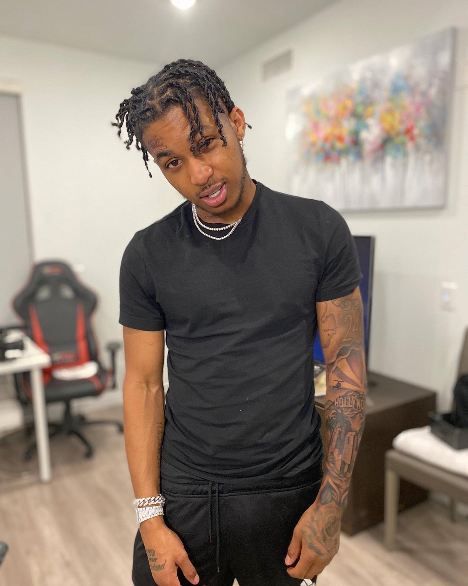
DDG’s tattoos mix large, easy-to-spot pieces with small details that show up only when he turns a hand, lifts a sleeve or leans toward a camera. Together, they touch on family, Pontiac, faith and short reminders he keeps close. The collection feels like a record of ideas added over time, rather than one design planned all at once.

If you like tattoos with stories but don’t want every inch of skin covered, DDG’s mix is worth a look. It moves between black-and-gray work, lettering, Roman numerals and small symbols. The pieces vary in size and style, but they don’t all need to match.

This guide focuses on designs that show clearly in photos and interviews. DDG has explained some of them; others are harder to identify. Where the details are uncertain, it’s better to describe what can be seen and leave the meaning open.

DDG’s arm sleeve is built around numbers and movement

DDG tattoos: the forearm sleeve, face tattoo and 248 imagery

His arm tattoos make the strongest first impression. Clear photos show ink running across the forearms, with numbers, shaded shapes and lettering leading from one design to the next. No single image takes over the whole arm, so the sleeve still has movement when he gestures or holds a microphone.

Black ink carries most of the weight, and the gaps between designs keep the arm from reading as one dark block. If you’re planning a sleeve, open skin can let the main pieces stand out while the arm still feels filled.

Text sits beside more graphic work. The lettering gives the eye something to read, and the shading around it ties the words into the shape of the arm. If a phrase crosses an elbow or wrist, check how it looks when the joint bends; a flat-screen mockup won’t show that.

The pieces also show why it helps to think beyond the next tattoo. Smaller designs can build into a sleeve over time, but planning their placement early leaves room for a piece that needs space, especially on the forearm where it’s easy to see.

The 248 tattoo gives the collection a hometown anchor

DDG tattoos: the visible forearms and hometown number in a studio portrait

The number 248 is one of the easiest parts of DDG’s ink to recognize. It points back to Pontiac, Michigan, and gives the collection a hometown reference. A few digits can carry a place or a starting point without needing a picture of it.

A location tattoo doesn’t have to be a map or street sign. An area code, transit number or neighborhood abbreviation can make the same kind of reference in a compact design. It’s easy to wear and easy to read without a long explanation.

DDG has described the Roman numerals on his arm as a birthday reference. That gives them a personal purpose beyond decoration. A tattoo can look simple to someone else and still be specific to the person who wears it.

For a number tattoo, the font changes the feel. Roman numerals look traditional and ordered; block numbers are more direct, while a handwritten style can feel softer. When the number already carries meaning, a simple treatment can be enough.

Placement matters too. An outer forearm keeps the number in view; a date near the ribs, chest or upper arm can feel more private. Check how the digits read with your arm relaxed and bent. A small change in spacing can make the tattoo look clear or crowded once it heals.

DDG’s family-name tattoo scroll is the most personal piece

DDG tattoos: the close view of DDG’s tattooed hand and lettering

DDG has said his first tattoo was a scroll of family names, which he got at eighteen. That history gives the design a purpose beyond decoration: it keeps the names of relatives close. It remains one of the more personal pieces in his collection for that reason.

A scroll gives a list a clear shape. The words can follow the curve of the body, while the rolled ends add detail around the names. It’s a familiar format, but the story behind this one makes it specific to DDG.

The hometown number tells viewers where he’s from; the scroll names the family members he chose to include. Both ideas are easy to read, though the list invites a closer look. They give the collection more than one kind of story.

If you’re considering names, check the lettering at the size it will be tattooed. A typeface that looks elegant in a large mockup may lose its thin lines on skin. Leave enough room between names, and confirm their order and spelling before the appointment.

The family scroll doesn’t have to be the biggest tattoo to matter most. It can sit among larger pieces and still be the personal center of a collection. A scroll, banner or framed list gives names a structure without needing extra decoration.

The hand tattoos add small messages and strong contrast

DDG tattoos: the hand messages and rose beside DDG’s face

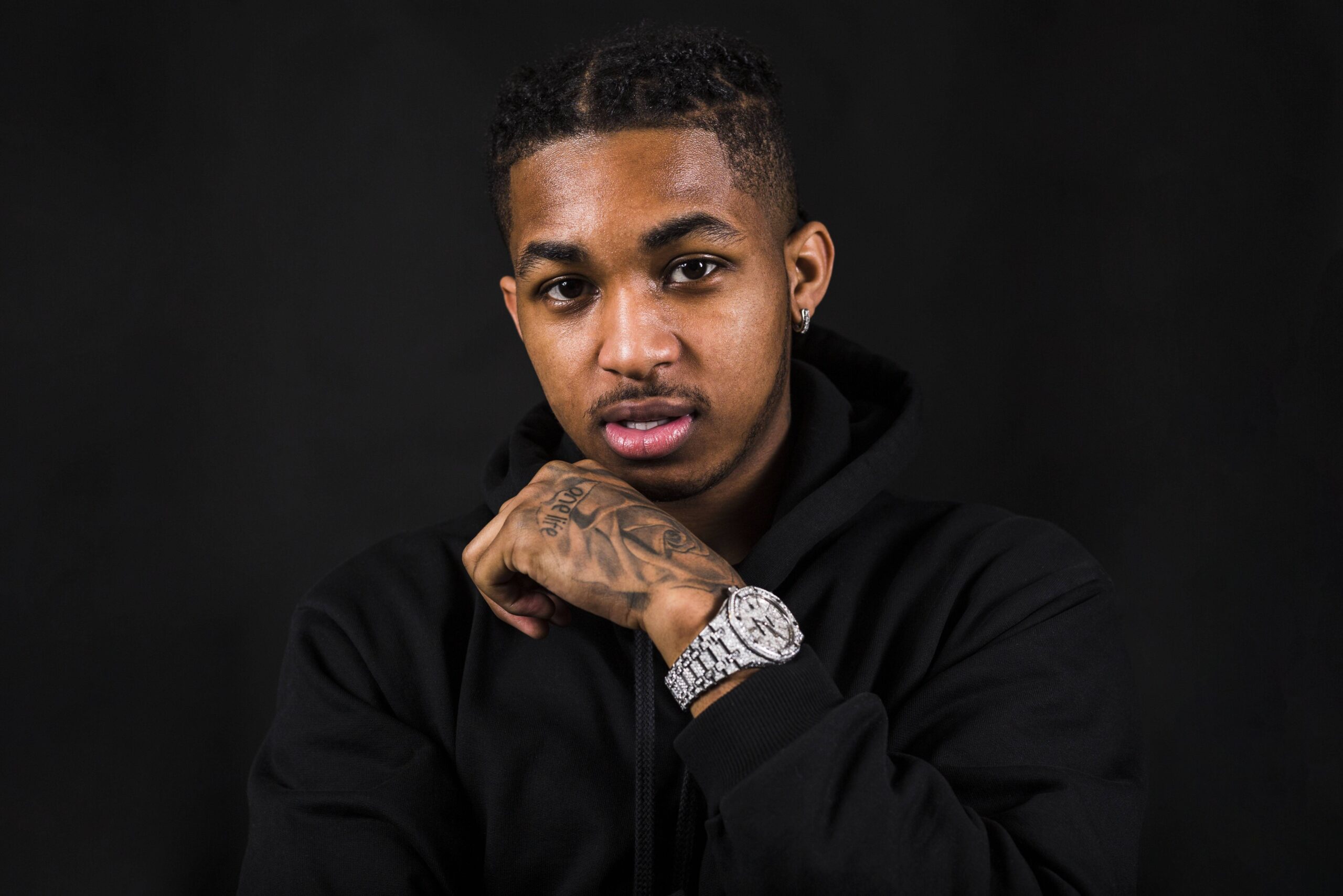
The hand ink sits close to the face in many portraits, so even a small word or symbol can catch the eye. DDG’s hand tattoos include short messages such as “one life” and “tomorrow is never promised”, along with a rose that has been described as a symbol of balance. The phrases are brief, but they give the designs a personal note.

Short lettering works on the hand because it can be read quickly. There isn’t much room for a long quote, so the idea has to be pared back to a few words. If you like the look, try several versions of the phrase before choosing one. The clearest option may be the one with the least text.

The rose brings a different shape to the hand. The words are direct; the flower can carry different associations, depending on the wearer. In DDG’s collection, it has been described as a symbol of balance and keeps the hand work from being all lettering.

Hands move constantly, and small lines can fade or blur sooner there than on less active skin. That doesn’t make a hand tattoo a bad choice, but the design needs enough weight to stay readable. Clear lettering, good spacing and an artist who knows the placement all matter.

“One life” and “tomorrow is never promised” both point to time and urgency. The birthday numerals and hometown number carry identity in a different way. Together, the details make the collection feel more considered than a set of unrelated symbols.

The chest and neck ink finish the DDG look

DDG tattoos: the tattooed forearms and upper-body placement

DDG’s chest tattoo is associated with Philippians 4:13, a Bible verse often linked with strength through faith. The words sit close to the center of his body, giving the tattoo a more personal feel even when it’s visible in an open shirt or stage outfit.

The neck tattoo reads DDG. It’s direct and hard to hide, unlike a family scroll or date. Instead of pointing to a memory or belief, the lettering puts his name in a prominent place. The chest and neck show different sides of the collection: a verse kept close and a name plainly on view.

Placement does much of the work here. Chest lettering can stay private until the wearer chooses to show it; neck ink is visible with most outfits. If you’re choosing between those areas, think about how often you want the tattoo seen. A neck piece changes the look of everyday clothes, while a chest tattoo can be covered.

These tattoos give the collection different roles. The arms have movement and detail; the hands carry short reminders; the chest holds a faith reference and the neck carries his name. With each area doing something distinct, the pieces can sit together without competing, even if they were added years apart.

Putting the ideas together for your own collection

The useful idea in DDG’s tattoos isn’t one design to copy. It’s the way family, hometown, faith, time and identity appear in different sizes and places. The full mix is recognizably his, but the approach can work with stories of your own.

Write down the things you actually want to carry with you: a family name, a place, a date, a short phrase or a symbol. Then decide which ideas you’re comfortable showing and which you’d rather keep closer to the body. That makes placement a real choice instead of an afterthought.

Pick a visual style that can connect the tattoos without making them all look alike. DDG’s collection uses black ink, lettering, numbers and familiar symbols. You might prefer fine lines, traditional color or geometric shapes. A shared line weight, spacing or type style can tie the pieces together while each one keeps its own meaning.

Think carefully about highly visible spots. Hands and neck are on display most days; the chest and upper arm give you more control. Consider your work, family and comfort before choosing a tattoo that’s hard to cover. Planning is simply making sure the design still fits your life after the photos are taken.

DDG’s collection brings several ideas together: a scroll of family names, the 248 for Pontiac, a rose beside the hand lettering and a verse on the chest. Each piece has its own place, and the tattoos feel connected without needing to match exactly.

More musician tattoo guides