
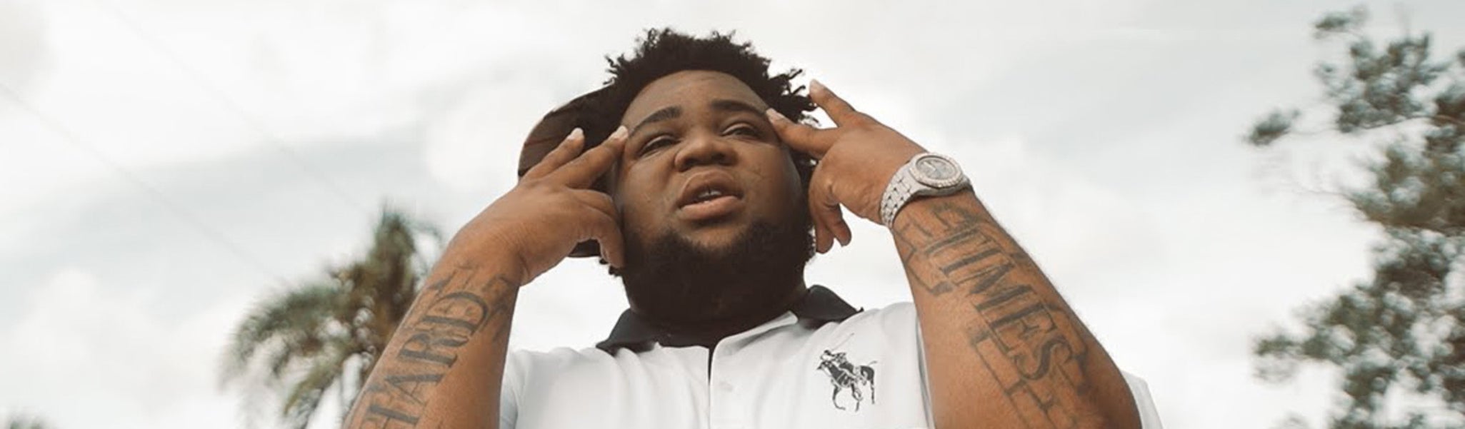
Rod Wave’s forearm tattoos are hard to miss. “Hard Times” stretches across both arms in large, weathered letters, clear in photos, onstage and in music videos. The words sit alongside themes he writes about: struggle, survival, love and the effort to keep going when life feels heavy.
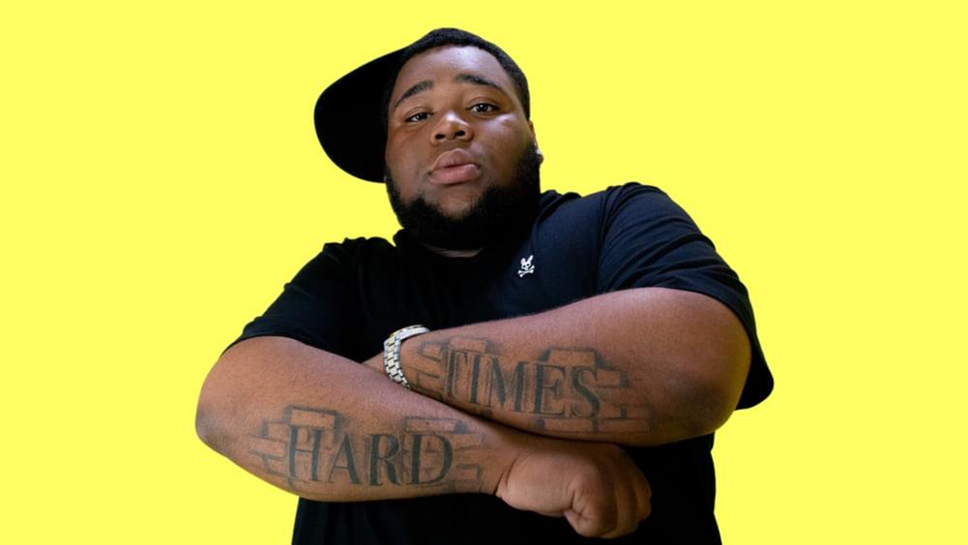
The design keeps things simple. There’s no crowded sleeve or complicated symbol competing with the words. Each forearm carries part of the phrase; when he crosses his arms, the two words meet, and when he performs, each side can be seen on its own.
The details discussed here come from photos and videos. Rod Wave hasn’t publicly explained every part of the tattoo, so the focus is on the lettering, placement and what can be seen rather than a guessed private meaning.
Rod Wave’s Hard Times forearm tattoos set the tone
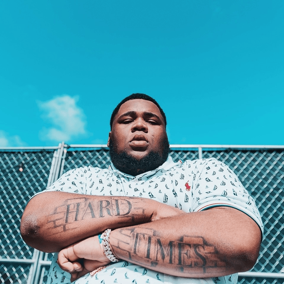
The letters are large enough to read from a few steps away. They run along his forearms rather than sitting in a small patch by the wrist, giving the phrase room without covering the whole arm. Bare skin around the lettering keeps the design from becoming a solid black sleeve.
The lettering is heavy and worn-looking, not fine script or polished calligraphy. The words themselves are plain, and the thick strokes give them a firm presence. The style is direct without looking unfinished.
Two words are easy to take in at a glance. A longer quote might read well on paper but can get crowded as it wraps around an arm. Here, each word has space to stay bold, and there’s no need to decipher a longer line.
The forearm moves whenever Rod Wave bends or turns his arms, so the letters shift with it. That gives the phrase some depth in photos and keeps it tied to the shape of his arm instead of making it look like a flat label.
The block lettering makes the message impossible to miss
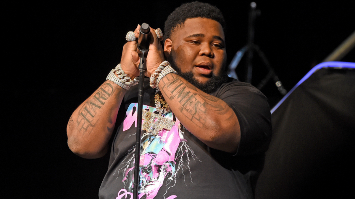
Thick block letters help the words stay readable in performance photos. Stage lights can fade fine lines, and a quick shot may catch an arm for only a moment. Rod Wave’s tattoo relies on its lettering and contrast rather than delicate shading, so the phrase still comes through.
If you want a phrase people can read across a room, clear edges and enough space between letters matter. For smaller, more private text, fine script or a less visible spot may suit better. It depends on how and when you want the words to be seen.
Hard and Times each have their own space, yet read as one phrase. A tattoo artist can adjust the letters’ height, width and curve to fit the forearm. If the words are squeezed together, they may blur; if they sit too far apart, their connection gets weaker.
Hard Times is a plain phrase, which leaves room for people to bring their own meaning to it. Someone might connect it to a difficult period, a family experience, a career setback or a reminder that circumstances can change. The wording doesn’t depend on a trend.
Before settling on a two-word design, compare a few fonts at the size you plan to use. Tape a printout to the spot and check it with your arm relaxed, bent and turned. That can reveal cramped letters or odd gaps before the stencil goes on.
Rod Wave’s arm placement keeps the words in motion
Onstage, Rod Wave grips a microphone, reaches toward the crowd, crosses his wrists and lifts his hands while singing. The forearm lettering moves through those gestures, so it appears as part of the performance rather than only in close-up photos.
The outer forearm is easy to show in short sleeves and photograph without an unusual pose. It also gets sun and everyday rubbing. Large, dark letters suit a place where fine details could be harder to see in photos, though aftercare still matters.
The phrase is split between the arms, but each side has a word that reads on its own. That layout can work for a phrase spread across both arms or wrists, or across two sides of the chest, as long as each half feels complete and the words make sense together.
Forearms suit a visible tattoo for someone who wants the option to cover it with sleeves. Rod Wave’s photos show both sides of that choice: the phrase is easy to see in short sleeves or onstage, but it can stay out of view when the wearer wants.
Forearms are washed, rubbed and exposed to sun, so lines can soften over time. Bold letters don’t remove the need to care for the skin while the tattoo heals. The aim is to choose a design that still looks considered as it ages, not to copy the weathered look in a photo.
How the tattoo looks different on stage and in portraits
In an outdoor portrait, Rod Wave’s crossed arms put the words squarely in front of the camera, giving them an almost conversational feel. In a stage shot, the same lettering can look more forceful beside the microphone, jewelry and lights. The ink is unchanged; the setting changes how it reads.
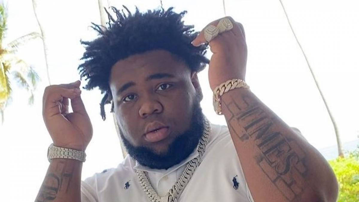
One photo rarely shows the full tattoo clearly. Light, angle, skin tone and the position of the arms can make the same ink look darker or softer. Some pictures bring out Hard, others Times. Compare several clear views before settling on a design.
Clothing changes the contrast too. In a white polo, dark letters stand out in a daytime portrait; against a black stage shirt, they sit beside the skin, chains and microphone. They don’t need bright color to remain visible.
Crossed arms bring the two words closer together; when an arm is straight, the lettering has more space and its length on the forearm is easier to see. If you’re considering large lettering, look at both positions, not only the pose used to show it off.
The phrase sounds heavy, while some photos show Rod Wave smiling, dressed casually or performing with energy. Those images leave room for more than one mood. The tattoo can name a hard period without defining every moment around it.
The Hard Times forearm ink fits Rod Wave’s music and image
Rod Wave often writes about pressure, loss, ambition, faith and trying to improve things. “Hard Times” sits alongside those subjects, which can make the tattoo feel connected to his public voice. He hasn’t given a detailed public explanation of the lettering, though, so that connection should stay an observation, not a claim about his private intent.
His music and personality are broader than the sadness listeners sometimes associate with his work. The phrase might mark a time in his life, hold a private memory or remind him of what he has made it through, but those are possibilities. It doesn’t have to describe how he feels every day.
The simple lettering doesn’t show what happened or spell out a backstory; it gives viewers two words to read. That leaves the meaning open. Fans can recognize the phrase and connect it to their own experiences without knowing what it means to Rod Wave.
If you’re thinking about a message tattoo, choose words you’ll still want after the current moment has passed. Consider whether they feel right in your own voice, apart from any celebrity who wears them. The design should belong to you first, even if the inspiration came from an artist or a song.
There is also a balance here between a visible placement and a restrained design. Rod Wave’s forearms draw attention to the phrase, while the short wording and dark lettering keep it simple. Extra frames or symbols aren’t necessary when the words already carry the idea.
Making the phrase yours
Start with the words, not the font. Write down the phrase, family saying, place or reminder you want to keep. Then decide whether strangers should be able to read it or whether it’s mainly for you. That answer will shape the size and placement.
Try a paper copy or simple mockup against the body. Look at it from the front, side and a relaxed angle, then bend your arm. If the words are split across two spots, check each part alone and together. A layout that only works in a posed photo may not suit everyday movement.
Find a tattooer who draws lettering well and knows how words sit on a curved surface. Ask to see healed work as well as fresh tattoos: fresh ink looks dark and sharp, while healed examples show the spacing and line weight over time. That matters on forearms, which get sun and friction.
Let the final design be yours. Rod Wave’s Hard Times lettering is memorable because it sits naturally with his public image, but you don’t need to copy his font or placement. Choose words that fit your life and a spot that still feels right once the excitement passes.
The appeal of Rod Wave’s tattoos is their clarity: two words spread across visible forearms, easy to read at a glance. The design is simple, but it leaves room for a personal meaning. That combination is what makes the lettering recognizable.
Hard Times shows how a few words can carry a story without explaining every part of it.