
Quando Rondo’s tattoos are part of the first impression. Letters, portraits, small symbols and dark shading run from his neck down both arms. Some pieces are easy to make out; others overlap as the collection fills in. The result looks built up over time, not arranged to match a catalogue.
There’s a difference between what the photos show and what anyone can say about the stories behind each mark. The chest lettering is visible in older portraits, and the neck ink appears in close-ups. Hand and wrist tattoos show up in performance shots, though a microphone, jewelry or movement can hide them. It’s better to look at placement and repeated visual themes than assign a meaning to every shape.
This guide sticks to the visible work: the chest lettering, neck and face area, arm coverage, hand details and recognizable phrases. If you’re looking at rap tattoos for ideas, Quando’s collection is useful for seeing how large text can sit beside smaller, more detailed pieces.
Quando Rondo’s neck and face tattoos set the tone
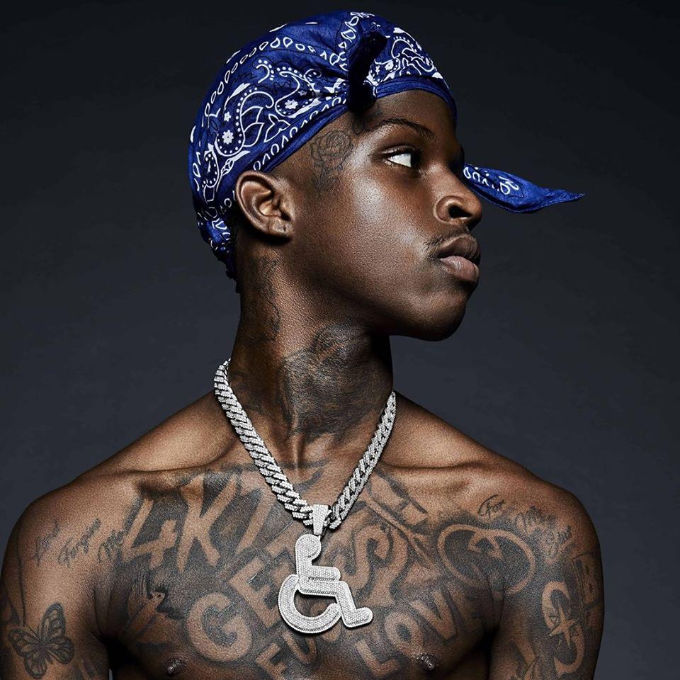
The neck frames Quando Rondo’s face in nearly every portrait, so it’s a natural place to start. Dark shapes and lettering fill the area under his jaw. In a close crop, the ink can read almost like a shadow or a high collar. Even a small mark feels bold there because it can’t be hidden by a sleeve.
The overall weight matters more than one neat logo. Lines have to follow a curved surface, and the darker shading gives the neck a fuller look from a distance. For a similar piece, it helps to settle on a clear silhouette before adding small details. Fine lettering can disappear when the head turns or the light changes; a solid outline is easier to follow.
The face and temple marks use a similar visual language. They sit closer to the eyes and mouth than the chest pieces, so they affect the expression more. Placement changes the feel of a word: near the eyebrow it reads differently than it would on the upper arm. These photos are useful if you’re considering how a small piece might change the face without covering it.
The large chest lettering keeps the message front and center
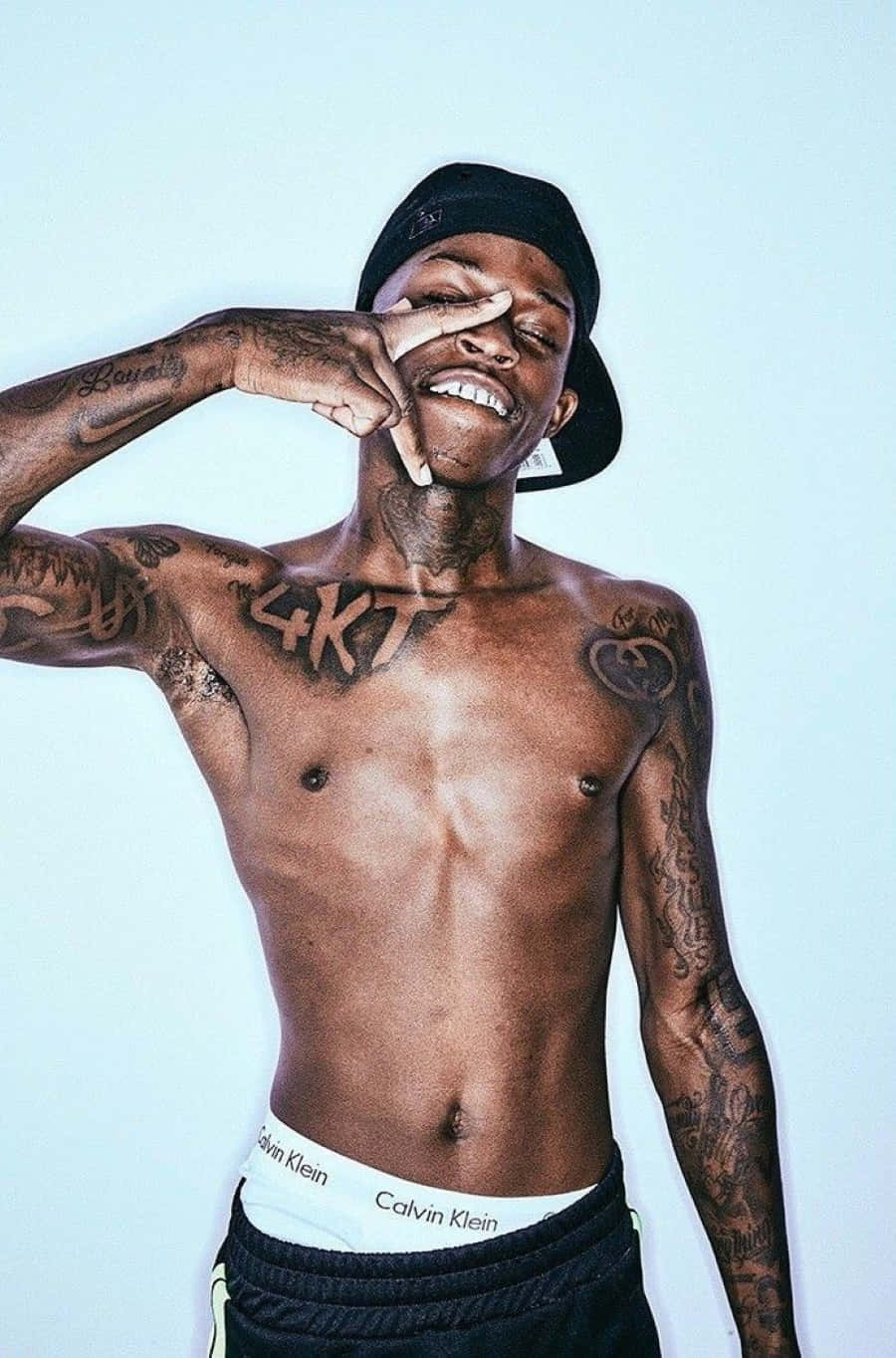
The largest designs sit across the chest. Block letters stretch from one side of the torso to the other, with other marks around them. They’re broad and easy to see, turning the chest into a strong graphic shape when his shirt is open or off.
Big text is quick to read, which helps in a stage photo where a face, chain and microphone may all be in motion. The spacing still needs care. Letters that look comfortable on a stencil can crowd once they wrap over the ribs or sternum. In these portraits, heavy outlines and wide gaps help the words hold their shape.
The chest puts personal words beside marks tied to music. A phrase might be emotional, aspirational or connected to a crew; it can make its point without a long explanation. If you like this approach, settle on the words before choosing a font. A shorter line usually leaves more room to breathe. Check that the baseline stays steady and the lettering still works when the body bends.
His arm sleeves mix names, symbols and dense shading
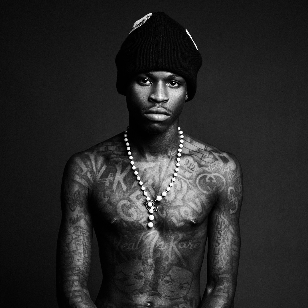
Quando’s sleeves combine dark areas with smaller drawings, names and symbols. The eye keeps moving instead of settling on one centerpiece. The effect is closer to a personal scrapbook than a sleeve built around a single theme. New pieces sit beside older marks, giving the arms a collected look.
The upper-arm designs are large enough to read from across a room. Farther down, they get smaller and more layered. If you want to build a sleeve over time, one anchor piece can give you a starting point. Leave space around it, then connect later work through similar line weight or shading. The symbols don’t all need to match.
Lighting and camera distance change how black ink looks. A bright studio portrait makes the edges easier to follow; in a club shot, the same work may look like a darker mass. When you gather references, use more than one kind of photo. A close-up shows the details, while a performance shot shows how the tattoo reads in motion.
Hand and wrist ink adds detail around the microphone

The hand and wrist marks are smaller, but they keep showing up in photos. Quando holds a microphone close to his face, bringing the ink on his fingers and hands into the gesture. Short words, outlines and symbols peek around the mic or jewelry. Even a small tattoo can change an image when it moves with the body.
Hands are a demanding place for ink. The skin bends, fingers rub together and the lines get constant exposure. Very fine work can soften; overly dense work can turn into a dark patch. The examples here favor bold marks and clear shapes, which remain easier to read beside the heavier arm work.
Wrist pieces can connect the sleeve to the hand. That strip of skin can hold a word, number or symbol that points toward the larger design above it. If you want a similar layout, plan the path from knuckles to forearm before booking separate sessions. Related spacing can tie the pieces together even when they don’t match.
The GET $ FUC LOVE chest tattoo is a clear focal point
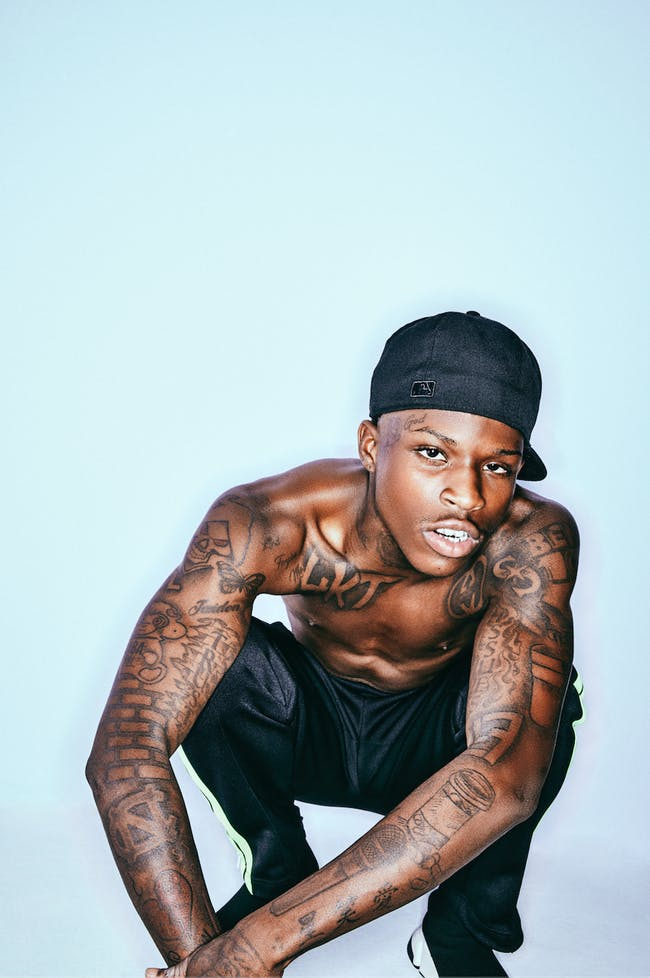
GET $ FUC LOVE is one of the clearest phrases across Quando Rondo’s chest. Heavy capital letters spread over the upper torso, with enough space between the words to read in a single frame. The line is rough-edged and direct. It works as typography even without knowing the story behind it.
The letters share a similar weight, and the dollar sign breaks up the phrase with a simple shape. That gives the eye a pause between words and a clear point of focus. A small symbol can help a text tattoo read as a design instead of one long line.
The placement leaves other chest and shoulder work room to grow around it. Keeping the phrase open makes it easier to read as more tattoos are added nearby. If the wording matters, give the letters open skin to sit against as well as dark ink to define them.
Quando Rondo’s tattoos span several styles: neck and face marks, wide chest lettering, packed sleeves and smaller hand details. Some read like declarations; others may be reminders or visual texture. Together they make a recognizable collection without one single logo or color carrying the whole look.
For a similar tattoo, begin with placement. Decide which part of the body you want people to notice first, then choose a design that works with how that area moves. Keep large words legible, use lines that suit high-wear areas, and leave space if you plan to add more later. One well-placed phrase or symbol can carry the idea on its own.
Good ink does not need a mystery attached to every line. Sometimes the appeal is simply how it sits on the body, catches the light and becomes part of someone’s everyday expression. That’s the feel of Quando Rondo’s tattoo style: personal, visible and meant to be seen.
Neck ink, chest lettering, arm coverage, hand details and clear spacing are the main lessons to take from this collection.