admin

Evan Rachel Wood Tattoos: Poe, Music and the Ink She Kept

Evan Rachel Wood has a handful of tattoos that are easy to recognise: Poe’s words across her upper back, a heart split by a lightning bolt on her thigh, a diamond cover-up on her right ankle, a J on her left, and the number 15 behind her ear. Most are black ink, placed where they show with certain clothes or from a particular angle.

This account sticks to tattoos shown in photographs or described by Wood and tattoo references. Dates matter: the thigh heart and ankle design have both been discussed as changing over time, so a photo from 2009 can’t tell us exactly what remains today.

The Poe quote across her upper back
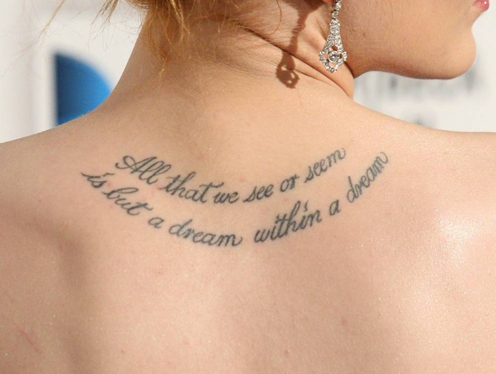
Evan Rachel Wood Edgar Allan Poe back tattoo
Evan Rachel Wood’s Poe quote tattoo sits high across her back.

The cursive quote across Wood’s shoulder blades is her most recognisable tattoo. It reads “All that we see or seem is but a dream within a dream.” The line is from Edgar Allan Poe’s poem A Dream Within a Dream. It follows the curve of her upper back, running from one shoulder across to the other.

The script is long, but the fine lettering doesn’t make it look heavy. From a distance it becomes a narrow band; up close, you can see the breaks and flourishes. A straight-on portrait hides it, while a backless gown lets the full line show.
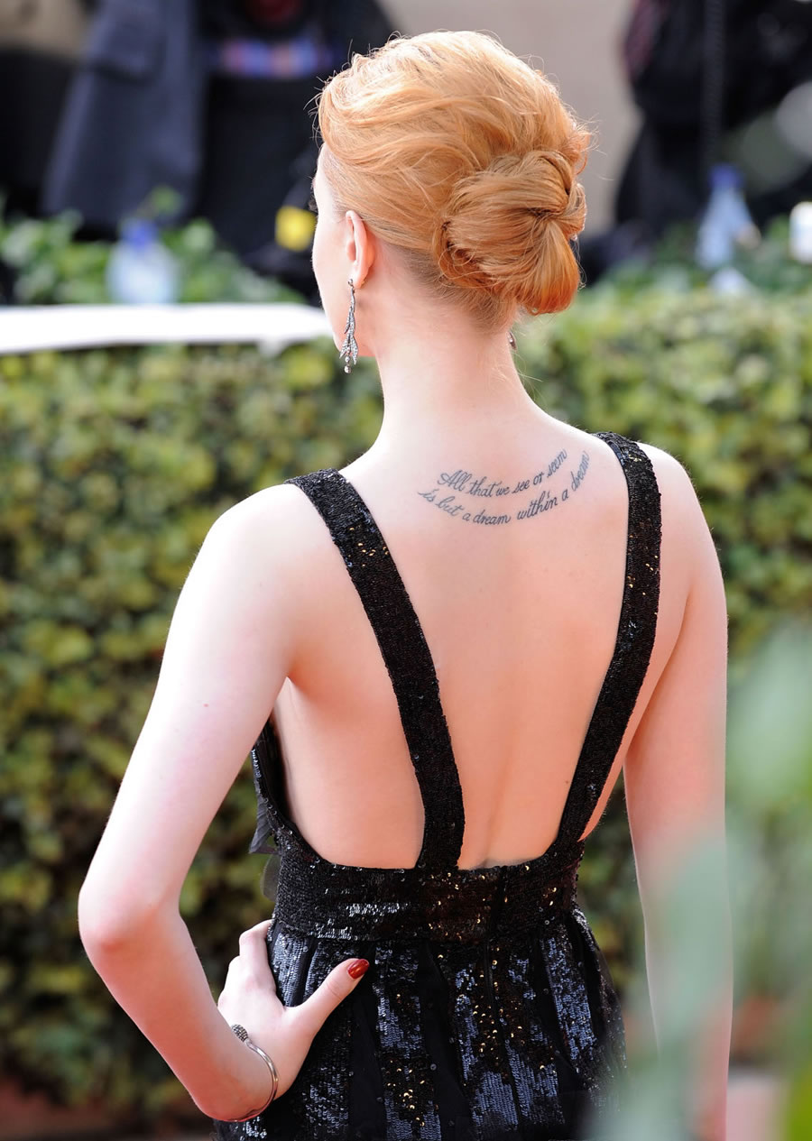
Evan Rachel Wood Poe back tattoo red carpet
A red-carpet view shows how the script follows the line of her shoulders.

The quote carries the design without an added illustration. Its placement is part of the effect: across her back, the words move with her shoulders and take up more space than they would on a forearm.
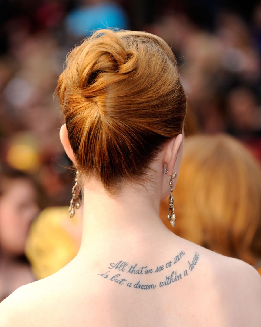
Evan Rachel Wood Poe back tattoo photographed from behind
Another clear photograph catches the full Poe passage from behind.

Some coverage shortens the quote, but the full line matters. Steal Her Style’s Evan Rachel Wood tattoo guide identifies Poe as the source, and older photographs show how the script sits across her back.

The thigh heart and lightning bolt
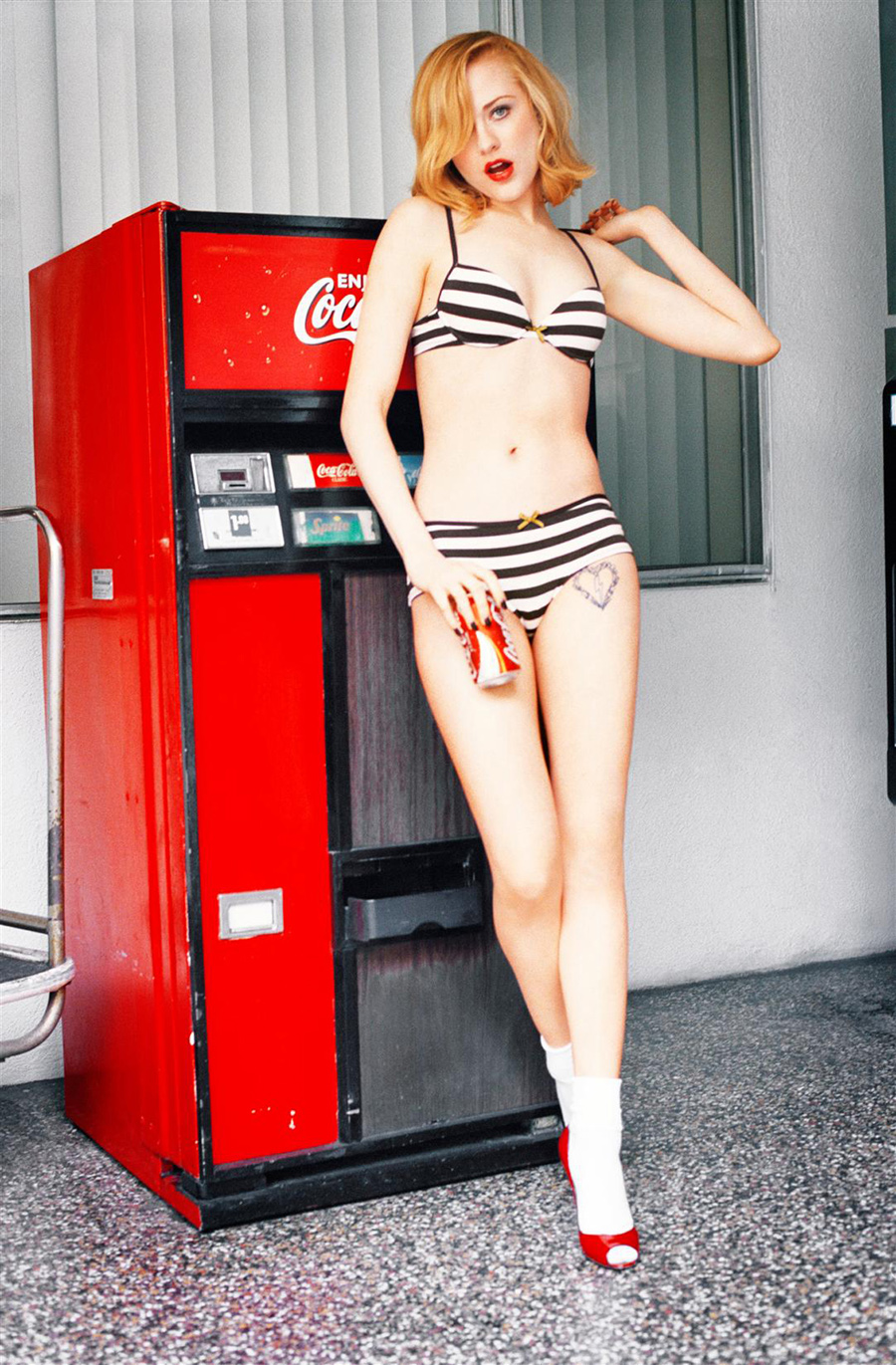
Evan Rachel Wood thigh heart tattoo
Wood’s black heart and lightning bolt tattoo sits high on her thigh.

Wood’s thigh tattoo is a black heart split by a lightning bolt. She has linked the heart to Marilyn Manson and the bolt to David Bowie, whose work she has said she admired from a young age. Those explanations are the clearest guide to the two parts of the design.

The tattoo sits high on her thigh, so everyday clothes can cover it, while a short skirt, swimwear, or a photo shoot may show it. The heart is compact; the bolt cuts sharply through its outline.
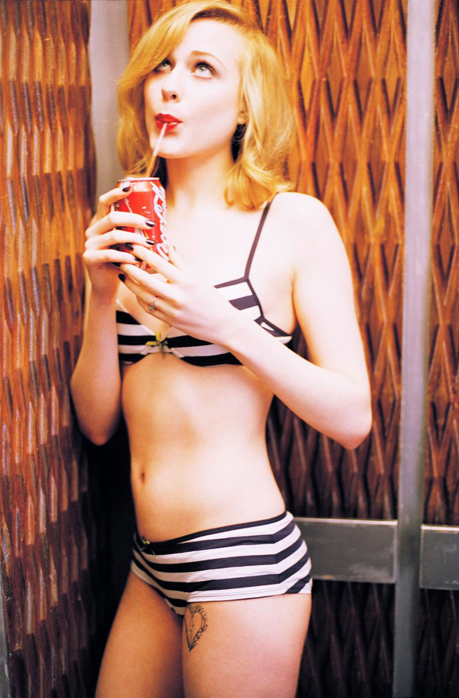
Evan Rachel Wood thigh heart tattoo close-up
A closer view makes the heart outline and lightning bolt easier to inspect.

Older reports call it matching ink, and later coverage has said Wood began removing or reconsidering it because of the associations attached to it. The design is clear in earlier photos, but those dated images don’t establish how it looks now.

The heart can be confused with a related mark Manson used in his own artwork. Wood’s tattoo is on her thigh, and the lightning bolt is the Bowie reference. Keeping those details separate avoids blending the relationship, Manson’s artwork, and Bowie into one story.
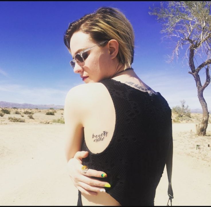
Evan Rachel Wood Desert Child tattoo
The words “desert child” appear on the inside of Wood’s upper arm.

The words “desert child” sit in plain lowercase lettering on the inside of Wood’s upper arm. It’s a small design, quite different from the script across her back and the bolder symbol on her thigh. A sleeveless top can show it without making it the focus of the look.

The diamond ankle cover-up

Wood’s right ankle once had a small Beatles-inspired design with a strawberry, a bird, and a diamond. She got it after working on Across the Universe, where she played Lucy and sang Beatles songs. She later explained that the original was too detailed for its size and people had trouble making it out.

The cover-up simplified the design to a diamond with curved lines around it. The images have been linked to “Lucy in the Sky with Diamonds” and Pink Floyd’s “Shine On You Crazy Diamond.” The revision kept the music references while making the shape easier to read on her ankle.

Body Art Guru’s overview and the older Vanishing Tattoo archive both describe the ankle design as a cover-up. They differ on some small details, so “diamond and swirls” is a safer description than a claim about the exact outline in every photo.

The J tattoo on her left ankle

Wood has a J on her left ankle, connected to Jamie Bell. The two got matching initials while they were together. She later said she didn’t regret keeping hers because it marked a meaningful time in her life. The relationship ended; the memory behind the tattoo remained important to her.

A single initial is small and easy to miss when her foot is covered, but clear when the ankle is visible. It has a different feel from the Poe passage across her back and the diamond cover-up on the other ankle.

The number 15 behind her ear

Wood also has the number 15 behind her ear, described as matching ink from her time with Marilyn Manson. Older interviews and tattoo galleries connect it to their relationship and a song reference. Accounts of the deeper meaning vary, so the clearest description is simply a small number behind her ear with a personal history.

Hair can hide the number completely, and most red-carpet pictures show Wood from the front. It may appear in a side-profile photo when her hair is pulled back; a distant image isn’t enough to confirm it.

The other small pieces

Older tattoo roundups also mention a small heart- or infinity-style mark behind her other ear and an inner-lip tattoo she has kept private. These are harder to confirm in photographs than the back quote, ankle designs, or thigh heart, so they remain reported details.

A picture may show that there’s a mark without making its shape, wording, or meaning clear. When a tattoo is usually hidden, it’s better to leave the uncertain parts open than to fill them in from a blurry image.

What makes Evan Rachel Wood’s tattoos stand out

Wood’s tattoos don’t share one visual style. The Poe passage is literary; the ankle diamond and thigh heart draw on music and particular moments in her life; the J and 15 came from relationships. Even the cover-up belongs to that history: the design changed, but the reasons behind it didn’t simply vanish.

Clothing also affects what a photo can show. The Poe quote needs an open back; the thigh heart tends to appear in swimwear or fashion shots; the ankle designs show with sandals or a shorter hem. Each view reveals a different part of the collection.

For tattoo inspiration, the placement is as useful as the subject. A long quote needs enough room for the script to stay readable. Small symbols need room too, and the ankle cover-up shows how simplifying a crowded idea can make it clearer.
Watch a tattoo tour

https://www.youtube.com/watch?v=pnSYgo5piyA

Coi Leray’s Flower Tattoos Keep Growing Across Her Shoulders

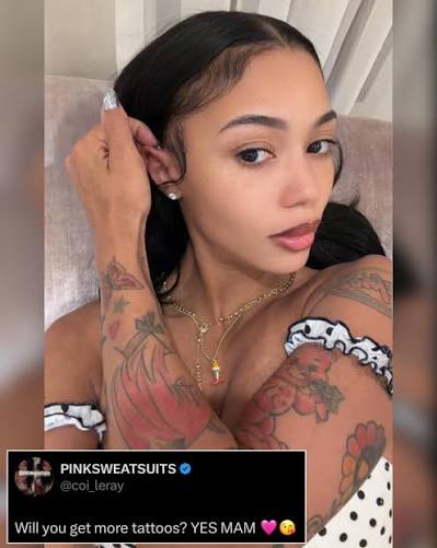
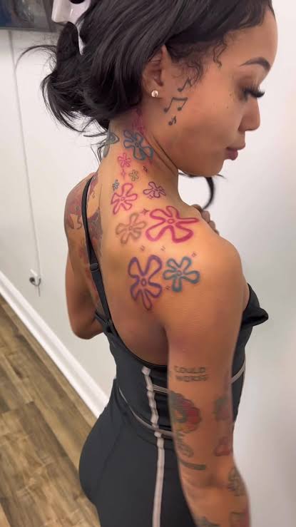
Coi Leray’s tattoos don’t look like one large sleeve planned all at once. They’re more like a scrapbook that’s grown over time: bright flowers over her shoulder and neck, smaller marks on her arm and near her ear, and lettering that’s easy to read. The collection has changed in public, too. She once teased on social media that she was getting more tattoos, and later photos showed the work continuing.

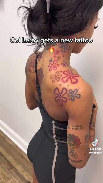
The newest attention-grabber is the group of colorful flowers climbing from her upper back toward her neck and shoulder. They have a loose, playful feel, a long way from the black-and-gray look of a traditional sleeve. Leray has also shown a koi tattoo and Powerpuff Girls ink, so the collection moves between personal lettering and cartoon color.

Leray hasn’t walked through every tattoo and its story in one official tour, so it’s best to describe some pieces by what’s visible. A flower may seem self-explanatory in a close-up, but its story could be private. A word tattoo is easy to read even when its backstory isn’t. It helps to keep what we can see separate from what we’d only be guessing.

The flower work is the collection’s loudest signature

Coi Leray koi and flower tattoos

The flowers across Leray’s shoulder and upper back are the pieces people notice first. Their outlines use several colors, with pink, purple, blue, and red across separate blooms. They don’t form a tightly packed sleeve. Each flower sits at its own angle and scale, with space around it so it can be seen on its own.

Placement is part of the effect. The design starts around her shoulder and reaches toward the side of her neck, so it shows with a tank top, a stage outfit, or an open-back look. A small musical note near her face and neck adds another detail in the same area. Together, the flowers and note draw the eye to that side of her body.

A recent post names Dave Tattz as the artist behind the flower work and says he also did Leray’s koi and Powerpuff Girls tattoos. That connects the newer flowers to pieces already in her collection; they weren’t a one-off image from an unrelated session.

The flowers have rounded petals and simple outlines, with color that looks closer to marker or cartoon shading than realism. That playful finish sits comfortably beside Leray’s other bright pieces. It also leaves the shoulder open to more additions.

Her shoulder and upper arm hold a mix of old and new ink

Coi Leray tattoo collection

A wider photo of Leray’s arm shows how the pieces sit beside one another. Larger colored work covers the shoulder, while smaller designs and lettering appear farther down the arm. It isn’t one continuous tattoo with every line made to match. The collection looks as if it came together over time, one piece at a time.

That also explains why the tattoos can look different from photo to photo. A fashion shoot may show the shoulder clearly and hide her lower arm; a close-up video may do the reverse. The flowers shift in view when she turns. The tattoos haven’t changed—the camera just doesn’t show all of them at once.

Near her upper arm is the phrase “FEAR COULD BE WORSE”. It’s short and blunt, with a dry bit of humor. The words don’t claim she never feels afraid; they put fear in perspective. That direct message has a different feel from the flowers around it.

The lettering is plain, without a banner or heavy gothic styling to compete with the words. It looks like a phrase Leray wanted to keep visible. There’s no clear public account tying it to a particular point in her career, so the words can stand on their own.

The koi tattoo brings a different kind of energy

Coi Leray new flower tattoo

Leray’s koi tattoo is another piece associated with Dave Tattz. Koi designs are common in tattooing, and people often connect them with movement or persistence. Leray hasn’t given a full explanation of her own design, though, so it’s better to describe the image than assign it a personal meaning.

The koi brings a more familiar illustrative tattoo style beside the loose, colorful flowers. Its recognizable shape gives the collection a different kind of movement, while the flowers keep things light. The contrast adds variety without turning the whole collection serious.

The koi also sits naturally with the flowers and cartoon references: each design has a clear shape that reads from a distance, with details to notice up close. They work in photos, but they don’t depend on the camera to make sense.

Cartoon references keep the collection playful

Coi Leray forearm tattoos

One of the more distinctive pieces linked to Leray is her Powerpuff Girls ink. It fits with the color in the rest of the collection and brings a little nostalgia and humor. It’s also a sign that she isn’t limiting herself to tattoos meant to look tough or solemn.

A cartoon tattoo might connect to childhood, a favorite show, or simply a character someone likes. Leray hasn’t explained each figure in detail, so there’s no need to fill in a story for her. The reference works alongside the flowers and bright styling on its own.

The cartoon ink changes the mood of the shoulder and arm pieces. It keeps the collection from looking too polished or locked into one trend. The designs feel like choices that can sit together even though they don’t share one subject.

Small face and neck details do a lot of work

Coi Leray face-visible and leg tattoos

Not all of Leray’s recognizable ink is large. A small musical-note tattoo near her ear and neck can disappear in a full-body photo, then show up clearly in profile. It nods to her work as a musician without spelling it out with a microphone or a lyric.

Because it sits close to her face, even a small note becomes part of her public look. It’s a modest mark rather than a full face tattoo, but it shows in photos and videos when her hair is pulled back.

The note also draws the eye from her neck to the flower work. The tattoos don’t stop cleanly at the shoulder: color and linework continue upward, with the note adding a separate detail nearby.

Her forearm lettering is direct and easy to read

Coi Leray seated arm tattoos

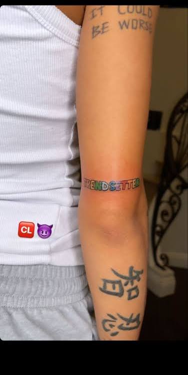
Another easy-to-spot piece is “TRENDSETTER” wrapped around her forearm. The colored lettering gives it a different look from standard black script. It’s a word Leray seems comfortable wearing, given how often her music and fashion shift between strong visual choices.

The forearm makes lettering easy to show or cover. Short sleeves put the words in view; a longer outfit can hide them. The flowers at her neck are harder to conceal, so they’re a more constant part of her public look.

There are other symbols and characters near the lettering. Some are small marks rather than full pictures, and their meanings haven’t all been confirmed. They belong in a description of what’s visible, but there’s no reason to turn them into a story Leray hasn’t told.

What the collection says about her style

Coi Leray back and shoulder tattoos

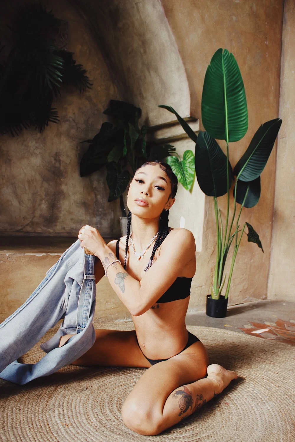
There isn’t one symbol that ties the collection together. Leray has flowers, a koi, cartoon references, a music note, forearm lettering, and smaller marks, all side by side without being forced into one theme. That mix is the theme.

That variety matches how she moves between music and fashion. Her look can be colorful, cheeky, glamorous, or understated. The tattoos follow the same range: some stand out across a room, while others only appear when the camera catches the right angle.

The collection may keep growing. Leray has said she wants more tattoos, and the flowers show how much one new session can change the overall picture. More work around her shoulder or arm wouldn’t have to match every older design; part of the appeal is seeing the pieces accumulate.

Bright color does recur across the collection. The subjects change from flowers to cartoon characters to lettering, but the designs keep coming back to clear shapes and playful contrast. Color is the closest thing Leray has to a tattoo signature.

A simple guide to the documented pieces

Coi Leray full body tattoos

These are the pieces that can be identified in the photos and posts:

  • Flower group: colorful flowers across the shoulder, upper back, and neck area.
  • Koi: a koi design associated with the same tattoo artist who worked on newer pieces.
  • Powerpuff Girls: cartoon-related ink that adds a bright, nostalgic note.
  • Fear Could Be Worse: straightforward lettering on the upper arm.
  • Trendsetter: colored lettering wrapped around the forearm.
  • Musical note: a small mark near the ear and neck area.
  • Other arm symbols: smaller designs and characters visible in close-up photos, with meanings not publicly confirmed.

The list sticks to what’s identifiable instead of assigning private stories to designs. Tattoos can be covered or added between appearances, so this is a snapshot of the documented work, not a final count.

Watch Coi Leray talk about her tattoos

In the interview below, Leray talks about her tattoos in her own words.

More musician tattoo guides

Cody Rhodes Built His Family Story Into Three Very Different Tattoos

Cody Rhodes went a long time without tattoos. Then, over a few years, he added a small family design on his finger, a tribute on his chest and the large neck piece that became part of the American Nightmare look. The tattoos are few, but each connects to family, legacy or a character he created.

The publicly documented pieces are easy to distinguish: a quiet symbol, a word close to his heart and a bold design everyone can see. Rhodes has also said he might approach the neck tattoo differently now. Here is what has been reported about the three, without filling in gaps from blurry ring photos.

The small finger tattoo came first

Cody Rhodes geometric family tattoo on left ring finger

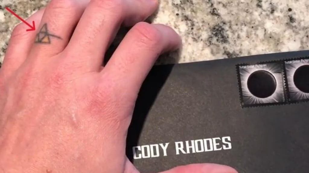
Rhodes was tattoo-free through much of his early wrestling career. Sportskeeda’s tattoo breakdown dates his first piece to around 2015 or 2016: a small geometric design on his left ring finger. It is an inverted triangle inside another triangle, crossed by a horizontal line.

The design represents his family rather than a wrestling logo. The two upright sections stand for Cody and Brandi Rhodes, with the line between them representing their daughter. It is a small image of two parents and the child they share, a very different mood from the neck tattoo that came later.

Finger tattoos face plenty of wear from washing, friction and movement, so they can soften sooner than ink on the chest or arm. The mark is easy to miss in some photos, but clear when his hand is close to the camera. It feels like a personal symbol that happens to be visible, rather than a design meant to dominate his look.

The quietest tattoo is also the one that gives the rest some context. Before the branding and character work, there was a small mark about the people closest to him.

“Dream” keeps Dusty Rhodes close

Cody Rhodes Dream chest tattoo

Rhodes’ second documented tattoo is the word “Dream” on the right side of his chest. He got it in 2016, after his father Dusty Rhodes died. Dusty was known as “The American Dream,” so one word carries the tribute without needing a larger illustration.

The tattoo sits close to Cody’s heart. It is not a portrait or a long quote; it comes from the name his father carried in wrestling. Cody has spoken about wanting to finish work Dusty never got to complete, including becoming a world champion in WWE.

That makes the word both a memorial and a reminder. Cody left WWE, rebuilt his reputation elsewhere and returned with a clearer idea of who he wanted to be. “Dream” stayed connected to Dusty, while also becoming part of Cody’s own motivation.

There is no need to add a secret meaning. The reported story is already strong: a son carried one word from his father’s wrestling identity while pursuing a goal important to them both.

The skull and wings made the American Nightmare impossible to miss

Cody Rhodes skull and wings neck tattoo

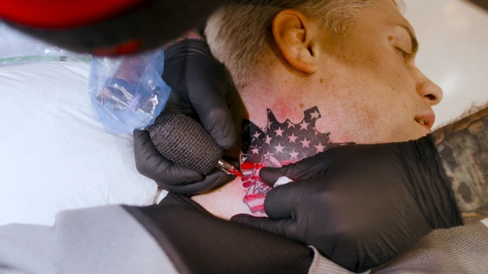
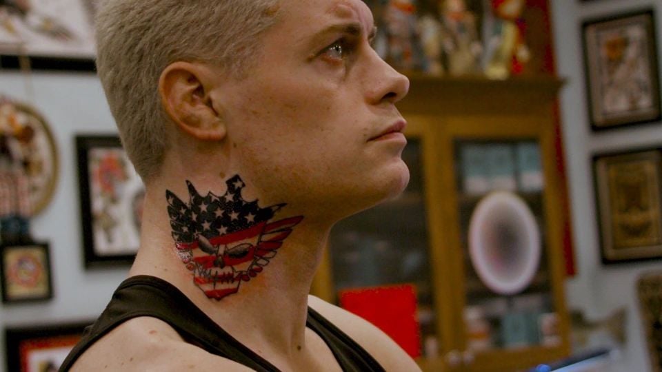
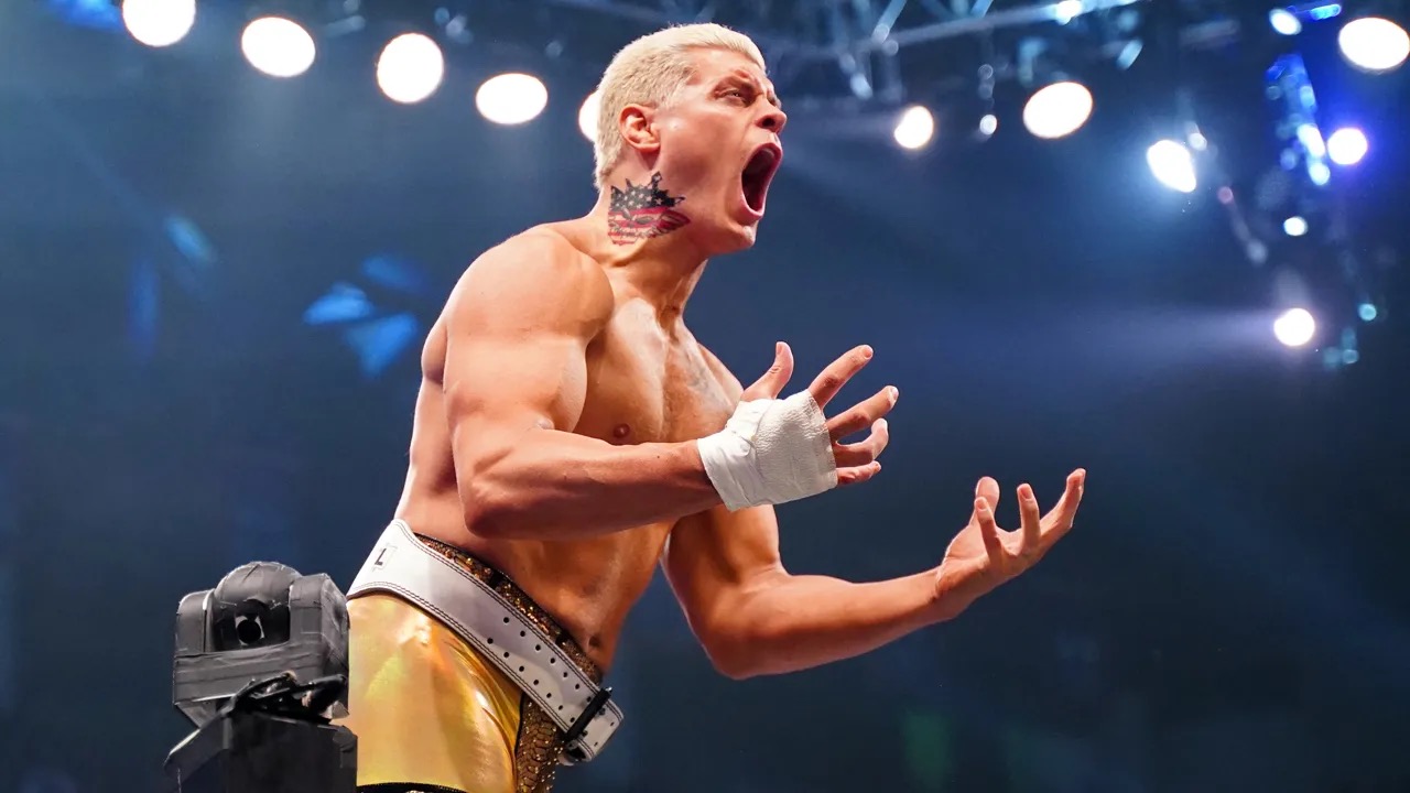
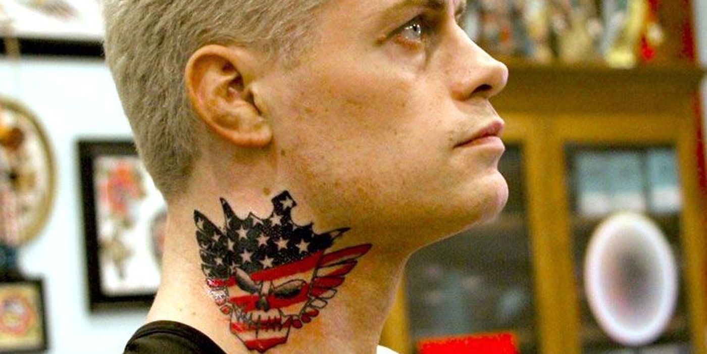
In 2020, while working for All Elite Wrestling, Rhodes got the tattoo that changed his overall look: a skull with wings and a crown on his neck, with red, white and blue details. It is meant to be seen. Even under ring gear, part of it shows; in close-up interviews, it is usually the first thing people notice.

The imagery fits the name American Nightmare. Cody was the son of “The American Dream,” but he was not trying to copy Dusty. The skull, wings and crown gave him a sharper, more theatrical identity—almost a wrestling emblem made permanent on his skin.

The colors suggest American imagery, while the skull keeps it from reading as a straightforward patriotic design. It has the scale of a wrestling entrance, which is part of why fans reacted so strongly. The tattoo announces itself before Cody has said a word.

Rhodes has since said he might have approached the neck piece differently. He has joked about and expressed regret over its size and placement. That is part of the story now: the tattoo marked the American Nightmare’s rise, but it also captures a point when the character, ambition and person were moving quickly together.

Subtlety was never the aim. The design helped turn “American Nightmare” from a nickname into a visual identity, where a silhouette and colors can matter as much as a name.

What the three tattoos say together

Cody Rhodes American Nightmare neck tattoo in the ringCody Rhodes American Nightmare neck tattoo close up

Seen together, the tattoos mark three parts of Rhodes’ life. The geometric finger design is about his immediate family. The “Dream” chest tattoo points to Dusty and the legacy he carries. The skull-and-wings neck tattoo represents the public character he built for a new stage of his career.

They were not all planned as a single composition. The finger tattoo came first; the chest tribute followed for a different reason; and the neck piece arrived as his career and presentation changed. The styles do not match because the tattoos were added in real time.

Their placements differ too. The family symbol is easy to miss. A shirt can cover “Dream.” The neck design appears in interviews, entrances and close-up photos. A personal idea became part of a public image.

That visibility is why the neck tattoo draws more commentary. People can debate its size or color without searching for it, and Cody has made the conversation more interesting by saying he might not choose the same design today.

The documented Cody Rhodes tattoo list

The publicly reported pieces are:

  • Left ring finger: a geometric triangle design representing Cody, Brandi and their daughter.
  • Right chest: “Dream,” a tribute to Dusty Rhodes and his American Dream identity.
  • Neck: a crowned skull with wings and red, white and blue details connected to the American Nightmare persona.

That is the list supported by tattoo-specific coverage. Fans sometimes point to other marks in old wrestling photos, but shadows, temporary designs and ring gear are not enough to confirm another permanent tattoo. There is no need to pad the inventory with guesses.

One tattoo is about home, one about where Cody came from, and one about the identity he wanted the world to see. The collection moves from small and personal to unmistakably loud.

The scale changes with the placement. The finger mark can stay mostly private; the chest tribute appears when his shirt is off; the neck piece follows him into every interview and entrance. It works as a tattoo, a logo and a reminder of the American Nightmare era.

Watch Cody Rhodes talk about the neck tattoo

The video below covers the story and reaction around Rhodes’ neck tattoo and its connection to the American Nightmare character.

More athlete tattoo guides

Dero Goi Tattoos: The Fractal Blackwork Project Behind His Ink

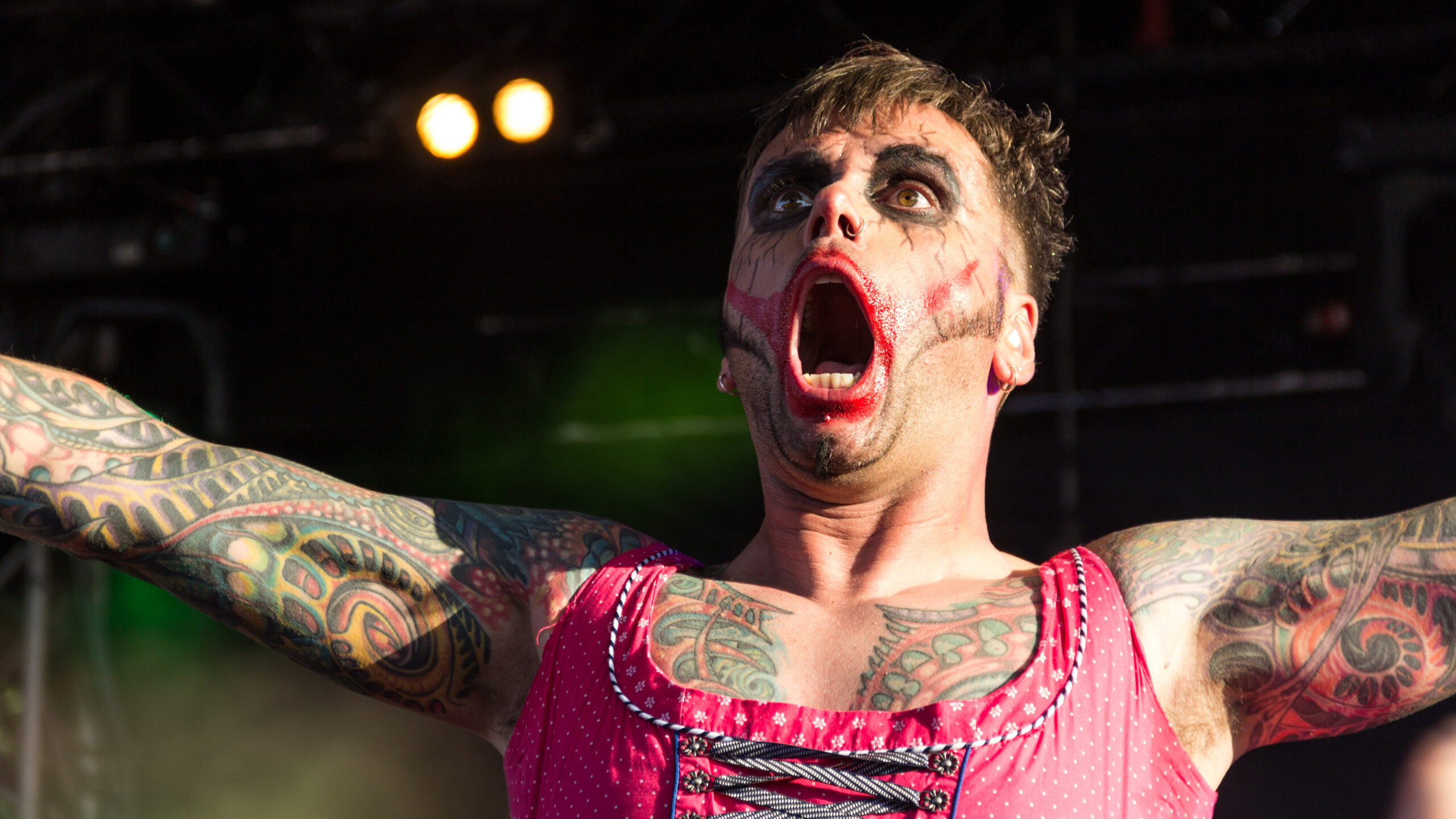
Dero Goi has described his tattoos as one integral piece, not a set of separate flash designs. That phrase is a useful guide to the blackwork across his arms, chest and back: photographs show different sections, but he has said they were meant to connect as one composition.

In an interview about the work, he traced it back to his first tattoo in 1991. He also named the artists who influenced its fractal and biomechanical direction, the Wolfsburg studio and artist who made it, and how his views on pain and changing taste shaped the project.

The interview doesn’t identify each small shape or give every one a separate meaning. Where Dero hasn’t named a symbol, this article leaves it as part of the larger design.

The first tattoo arrived in 1991

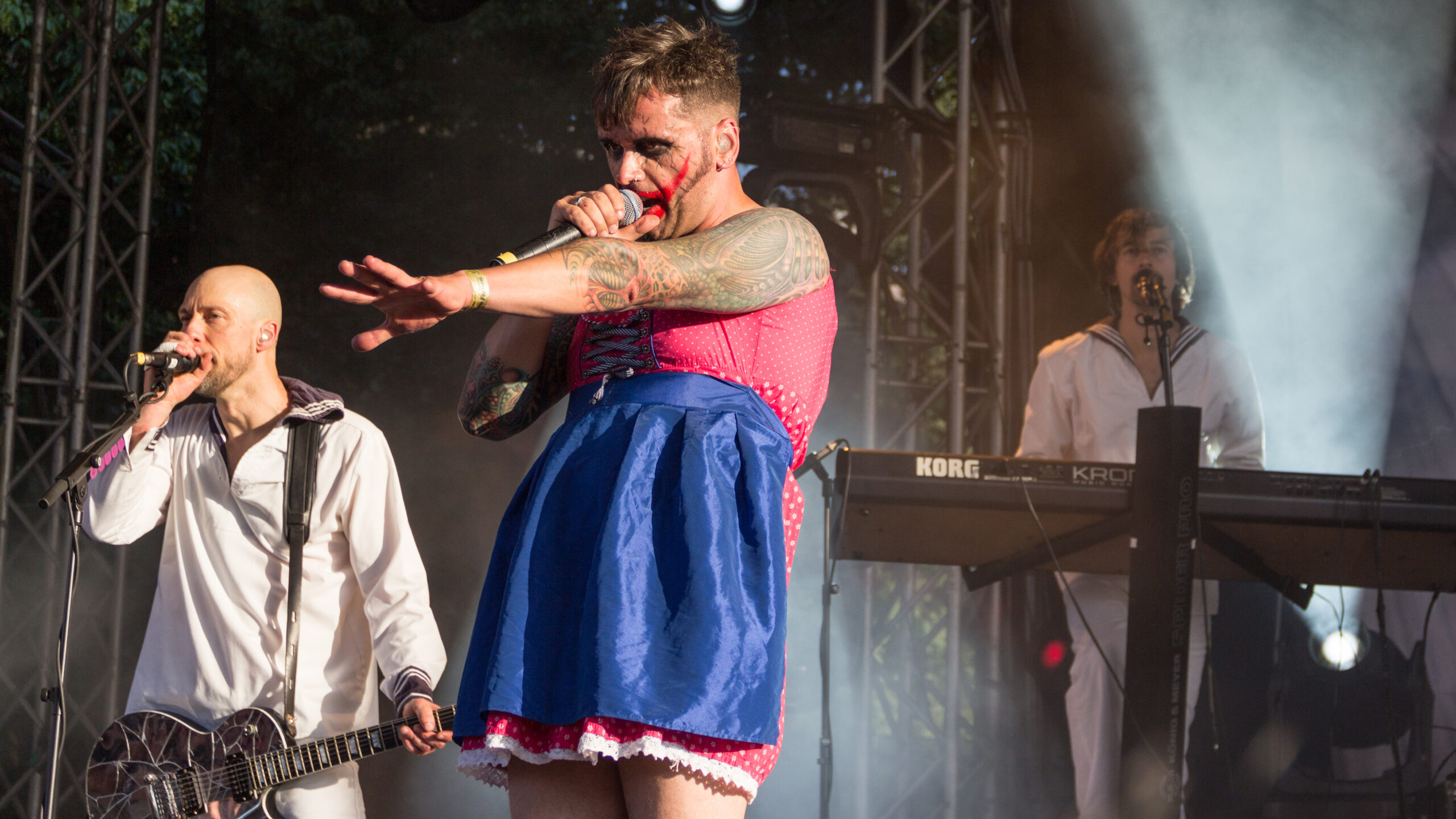
Dero Goi tattoos across both arms and chest during an Oomph! performance.
Dero Goi tattoos across both arms and chest during an Oomph! performance. Wikimedia Commons.

Dero says he got his first tattoo in 1991, after thinking it over for a while. He was drawn to black work then, and the first piece was entirely black. He later covered it when his taste changed.

The tattoos people see now didn’t all come from one sitting or one original plan. The early work was more exploratory; the larger project came later and was more deliberate. That first black tattoo is still part of the story, even though the newer design covers it.

It also belongs to an earlier point in Oomph!’s history, before the band’s later visual identity had fully taken shape. The expanded work came as Dero’s ideas about how the tattoos should fit together became clearer.
The collection is inspired by fractal and biomechanical tattooing

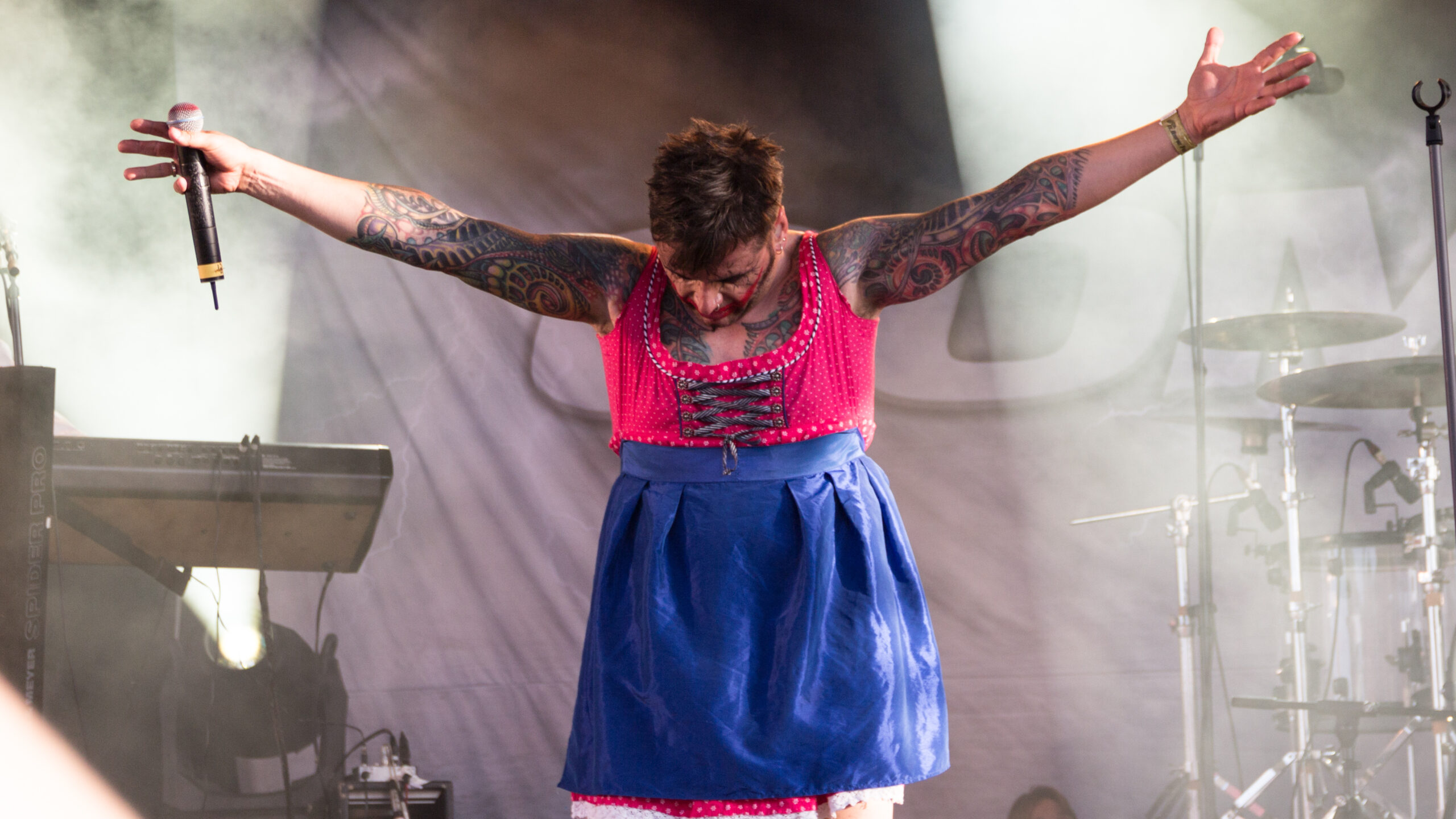
Dero Goi left arm tattoo detail in a high-resolution live photograph.
Dero Goi left arm tattoo detail in a high-resolution live photograph. Wikimedia Commons.

Dero has named Aaron Cain and Guy Aitchison as influences on the current direction. He points to fractal and biomechanical tattooing: patterns that branch or repeat, and layered textures that can follow the body’s lines. Those references help explain the connected look without turning every dark patch into a named object.

He wanted the design to feel original. Dero and the artist settled on the motif together, then developed it freehand and refined it with the needle. It wasn’t copied from a book. The interview doesn’t give each section a separate public meaning, so the clearest description is the overall style and how it moves across the body.

Olli at Culture Shocks made the project in Wolfsburg

Dero Goi full arm tattoo project shown during a live performance.
Dero Goi full arm tattoo project shown during a live performance. Wikimedia Commons.

The work was done at Culture Shocks in Wolfsburg. Dero identifies Olli, the studio’s boss, as the artist. He said he looked through many artists’ portfolios, folders and shop displays before settling on the studio.

Dero and Olli chose the motif together. It was drawn freehand and then refined with the needle, rather than copied from a ready-made design. Having one main artist work across the arms, chest and back helped the composition keep a consistent direction as it grew.

His arms became the most visible part of the work

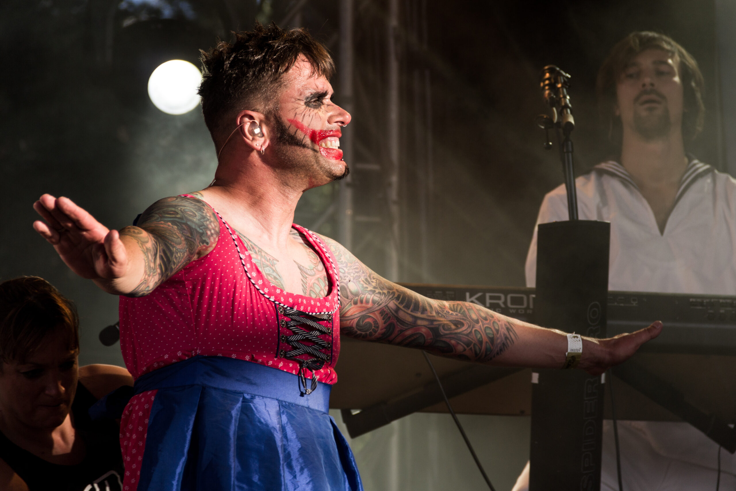
Dero Goi sleeve and chest tattoos, showing how the blackwork flows across his upper body.
Dero Goi sleeve and chest tattoos, showing how the blackwork flows across his upper body. Wikimedia Commons.

For years, Dero performed fully clothed, so most of his tattoos stayed out of view. That changed when he began wearing outfits that showed more skin. A vest at a Moscow performance made his arms visible, and photos from that period showed people the work wasn’t a new experiment.

He also points to the Supernova video, where part of the upper arm is already tattooed. The project spread from there over time. An older clip shows an earlier stage; later photographs show more of the work.

Dero describes the arms as part of the same piece, not as sleeves with separate themes. A close-up can show one section clearly, but it doesn’t tell the whole story of how the design connects across the body.

The chest and half-back carry the project beyond the sleeves

Close view of Dero Goi right arm tattoos and connected chest work.
Close view of Dero Goi right arm tattoos and connected chest work. Wikimedia Commons.

Dero says the work covers both arms, the chest and half of his back. The back carries it beyond a pair of sleeves and around the torso, into an area that isn’t usually visible from the stage.

At the time of the interview, a few small spaces were still to be filled, though the project was nearly complete. The chest photographs show broad areas of connected work rather than one emblem in the centre. Stage lighting and studio portraits bring out different details, and neither offers a full map of the tattoos.

Pain is part of what the tattoos mean to him

Dero says the chest and other sensitive areas hurt a lot. He doesn’t describe that pain as something separate from the finished tattoo; for him, it’s part of the experience and the physical commitment of changing his body.

He connects it with overcoming yourself and with pain traditions in different cultures and religions. His practical advice is that anyone who can’t accept the pain should think carefully before getting tattooed.

The project also took shape over many sessions. Each one added to the same composition, and the time between sessions let the work grow across his body in stages.

Changing taste led to a cover-up and a firm stopping point

Dero says his taste changed enough that he covered his first tattoo. If he wants to alter something again, he would rather rework or refresh existing ink than add a completely new design. He isn’t trying to keep adding separate motifs.

He also has limits on the imagery he’d choose. Tattoos that go against his political, moral or ethical principles aren’t for him. He accepts that other people make different choices, but those boundaries guide his own collection.

At the time of the interview, he was nearly finished and didn’t want to add something unrelated just to fill space. The project already had a direction, an artist and a point where he was ready to stop.

What the documented inventory can safely claim

The record supports a connected project across both arms, the chest and half the back. It began with a black tattoo in 1991, which Dero later covered. The current work was made by Olli at Culture Shocks in Wolfsburg, developed freehand and refined with the needle. Dero has linked its direction to fractal and biomechanical tattooing and named Aaron Cain and Guy Aitchison as influences.

Photographs show dense blackwork, layered textures and branching or repeated forms. The interview says the work grew beyond the upper arm and that a few small areas still needed filling at the time. It doesn’t provide a precise list of every shape, a separate meaning for each section or a complete timeline of every session.

Watch Dero talk about his tattoo project

This interview covers Dero’s influences, the Wolfsburg studio, the pain of the sessions and how the work spread across his body.

More musician tattoo guides

Josh Hutcherson’s three tattoos still tell a very specific story

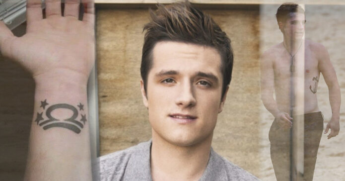
Josh Hutcherson’s documented tattoos number three: a Libra symbol on his wrist, a large anchor on his side, and a ship sailing into a sunset across his back. The wrist piece was his first; the two larger designs reflect his fondness for classic sailor-style imagery.

Those tattoos have also meant extra work on film sets. Hutcherson played Peeta Mellark in The Hunger Games films, where some scenes called for bare shoulders or a shirtless look. He has said the makeup team could spend about an hour and a half covering his tattoos. They are his real ink, even when a film needed them hidden.

Here is what can be documented about the three designs, without guessing at meanings he has not shared.

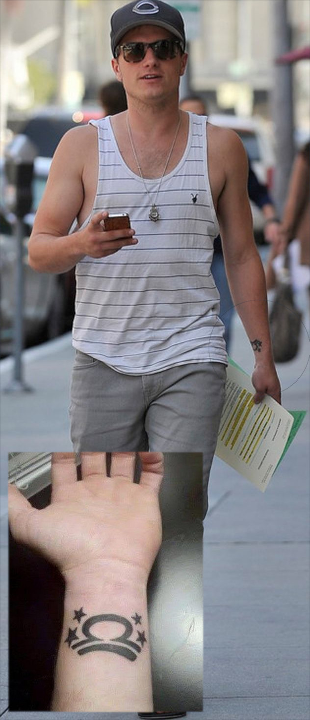
Josh Hutcherson’s Libra wrist tattoo

Josh Hutcherson Libra wrist tattoo

Hutcherson has a Libra symbol on his wrist. He has said he got his first tattoo as a teenager while filming Red Dawn in Detroit, with his mother there. Some older coverage says he was 16; Hutcherson has said 17, so the safest summary is that he was a teenager.

He has called his mother “a very cool mom” for sharing that first appointment with him. The simple black symbol is tied to more than his birth sign: it also marks a family memory and a permanent choice he made while young.

It is a compact design, not a large zodiac scene. The wrist can be covered for a role, but it also shows in candid photos, which is how many people first noticed that Hutcherson had tattoos.

There is no confirmed meaning beyond its connection to Libra and the story of his first tattoo. A symbol does not need an extra theory to be worth describing.

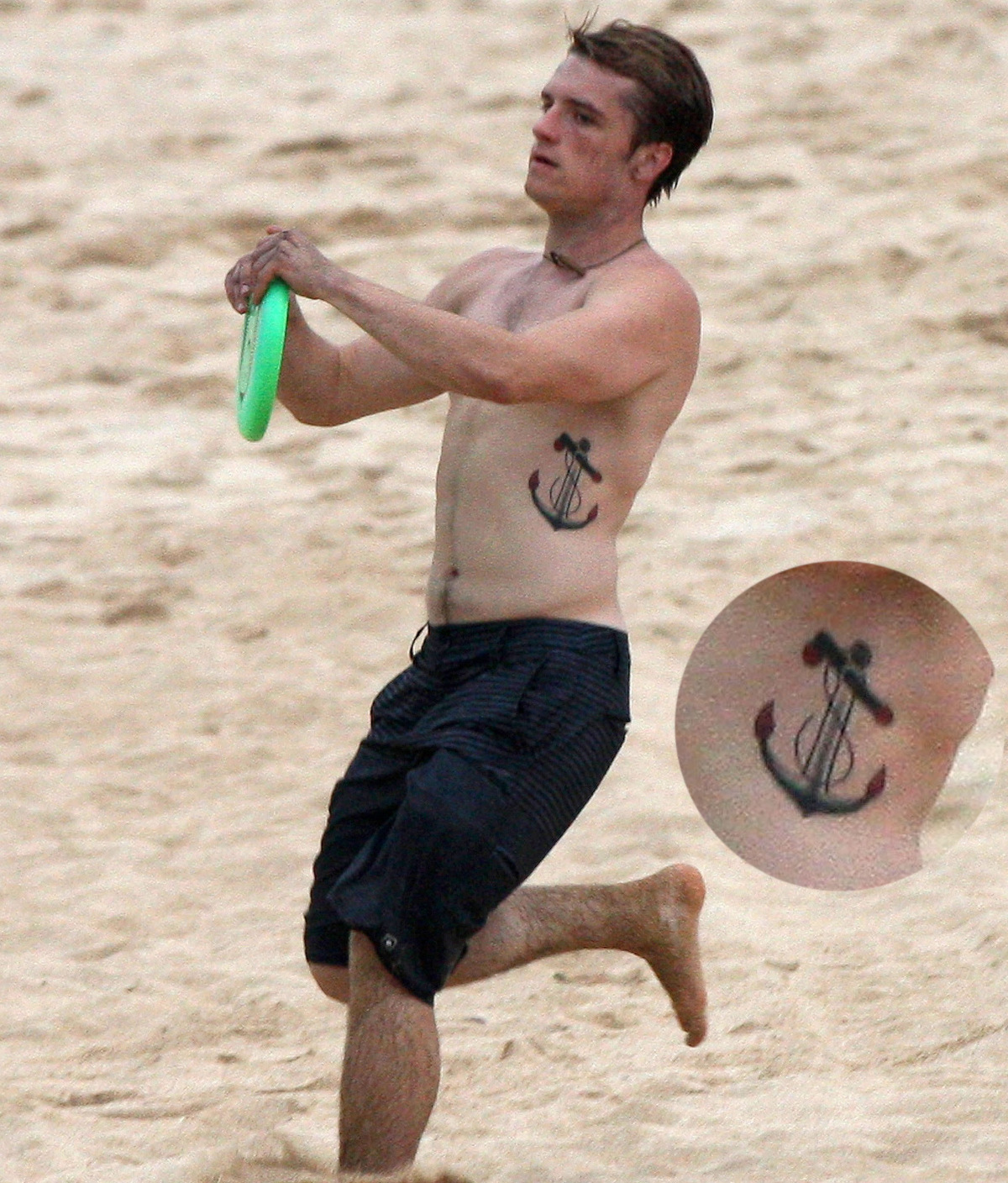
The giant anchor on Hutcherson’s side

Josh Hutcherson anchor tattoo on his side

The second documented design is much larger: a black anchor with red tips on the side of his torso. Hutcherson has said he likes old-school sailor tattoos, and the anchor follows that familiar style with a bold outline and a clear shape.

Basketball photos brought the tattoo into view in 2012. A sleeveless top exposed part of it, showing that his ink went beyond the small wrist symbol. The anchor sits along his side near the waist, where a shirt can cover it when needed.

That placement also makes film cover-ups more involved. Hiding a large, dark design on the torso takes more work than covering the wrist. In a scene where Hutcherson had to take his shirt off, the makeup team needed to conceal it so the character’s world would not suddenly include a modern tattoo.

Hutcherson has not given the anchor an elaborate personal story. He has said he likes the classic sailor look. Anchors can carry general associations such as stability, travel or endurance, but those are not confirmed meanings in his case.

The design is large enough to stand out in a candid photo, but it does not define his public image. It can be covered for a scene and seen again when he is off set.

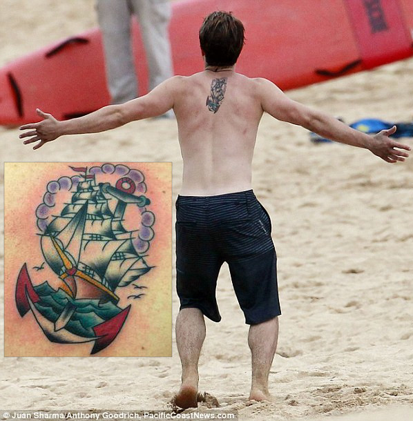
Josh Hutcherson’s ship sailing into a sunset

Josh Hutcherson ship sailing into a sunset back tattoo

His third tattoo sits across his back, between the shoulder blades: a ship sailing into a sunset, with birds and lavender clouds around it. Hutcherson has grouped it with the anchor as part of his interest in old-school sailor imagery. The two designs share a maritime feel without being identical.

The ship makes this piece read as a scene rather than a single emblem. The sunset, birds and clouds fill out the background and give the image more atmosphere across the back.

Hutcherson has not offered a detailed explanation for every element. A ship might suggest travel, escape or a new chapter, but those are possible readings, not his confirmed reasons. What he has said is that he likes the traditional sailor style and has kept the tattoo despite the extra cover-up work for film scenes.

The back is usually hidden by everyday clothes, but it matters on screen when a character is shirtless, at the beach or shown from behind. Hutcherson’s comments about makeup time give the tattoo a practical history as well as a visual one.

The anchor and ship make the collection feel connected. The Libra symbol was his first, personal design; the other two are larger choices from the sailor tradition. Together they form a small but consistent group.

Why Hutcherson stopped at three tattoos

Hutcherson has said he does not plan to keep adding tattoos, largely because covering them for movies is a hassle. That does not mean he dislikes the three he has. It is a practical comment about acting: a tattoo can matter to him and still add around 90 minutes of makeup before a scene.

The documented collection is straightforward: Libra on the wrist, an anchor on his side, and a ship with a sunset on his back. There is no well-supported record of a sleeve, neck tattoo or hidden fourth piece. Those claims need confirmation from Hutcherson or a reliable interview.

He chose a zodiac symbol as a teenager, then added two images he liked in the old-school sailor style. He has decided that is enough. The Libra tattoo carries the memory of his first appointment with his mother; the anchor and ship show his taste; the cover-up stories explain how the ink fits into his career.

Josh Hutcherson’s tattoo style in one look

Hutcherson’s designs lean traditional. The Libra sign is the simplest, while the anchor and ship use familiar sailor motifs, bold outlines and blocks of color. They are not a matching set or a single public campaign. The collection grew from a first tattoo into two images he genuinely liked.

We know the placements, the broad designs, the story of the first tattoo and his preference for sailor-style imagery. We do not know every private thought behind the sunset or the details of each appointment. Keeping that distinction clear makes the account more accurate.

The three photos show different scales: a small wrist symbol, the bold side anchor and the ship scene across the back. Together they explain why Hutcherson can look tattoo-free in a film and clearly inked in a candid photo from the same period.

Watch Josh Hutcherson talk about tattoos

In this Us Weekly interview, Hutcherson talks about tattoo regrets and the choices behind his body art. It adds his own perspective to the reporting about the Libra symbol, anchor and ship.

More actor tattoo guides

Lajon Witherspoon Tattoos: Family, Faith and a Full Arm Story

Lajon Witherspoon’s tattoos have been part of the Sevendust singer’s life for decades. He got a tribal band on his right arm at 17; later additions include family designs, religious imagery and a chest piece. A well-known cover-up replaced an older mermaid tattoo.

The collection has changed with him. Some tattoos mark where he started; others connect to his wife, children or faith. In an interview with Loudwire, he explained the religious cover-up. He also discussed his artists and family tattoos with Maytherockbewithyou. Those interviews help separate what he has said from what a concert photo can show.

The photos are useful for placement, but they do not identify every mark. A Rock Ink interview gives a closer look in his own voice.

His first tattoo was a tribal band on the right arm

Witherspoon has said his first tattoo was a tribal band around his right arm, done when he was 17. He remembered the point of making the choice: once it was inked, it was not coming out.

The band came before the family and religious designs that later became part of his collection. It is simple beside the larger pieces, but it set a starting point: every later tattoo would sit alongside that first mark.

Lajon Witherspoon tribal arm tattoo
Witherspoon performs with the tattooed right arm visible. Photo: Wikimedia Commons.

A band wraps around the arm, so it remains part of the picture when he raises a microphone or reaches across the stage. It also shows up in older Sevendust photos even when a shirt or dark lighting hides the rest of his ink.

The arm work is easiest to see when he performs

Most public photos show Witherspoon singing rather than sitting still for a tattoo portrait. That makes live shots useful for scale, though the angle can change from one frame to the next.

Sharper stage photos show extensive work on both arms. They do not offer a reliable inventory of every symbol, especially where shadows cover the skin. They do make the overall coverage clear: the tattoos are a visible part of his stage presence.

Lajon Witherspoon tattooed arms on stage
A wide stage photo shows the coverage across Witherspoon’s arms. Photo: Wikimedia Commons.

A face-focused publicity portrait may work as a featured photo, but it tells readers little about the tattoos. The useful images leave the arms, upper chest or shoulders visible long enough to show where the ink sits.

Clothing and light change what can be seen. A sleeveless top exposes more of the upper arm; a T-shirt can cover the chest. Daylight brings out linework, while a dark stage can make black ink blend into the background. Several views give a more honest account than one dramatic shot.

Family ink and the chest piece add a personal layer

In an interview with Maytherockbewithyou, Witherspoon said he had tattoos connected with his wife and children. He named Philip Lewis of New Zealand, Tony Levis in Miami, and Stu from Fort Wayne among the artists involved. Lewis worked on his chest piece; the newest tattoo at the time was for his wife and newborn child, placed on his arm.

Those comments add a timeline without asking a concert photo to supply names or dates. The family pieces connect the ink to people close to him rather than simply filling space.

Lajon Witherspoon Sevendust arm tattoos
His arm tattoos remain visible during a Sevendust performance. Photo: Wikimedia Commons.

A family tattoo can matter even when a crowd cannot see it clearly. The public photos confirm that Witherspoon has talked about family-related designs; they do not let us assign a specific name or date to a blurred section of skin.

The chest piece is harder to document because a shirt hides it in most performance photos. The visible arms and neck may tell only part of the story, while interviews provide details the camera cannot show.

Religious tattoos cover an older mermaid image

The best-documented cover-up is on Witherspoon’s left forearm. Loudwire reported that portraits of Jesus and Mother Mary now cover an older mermaid tattoo. Witherspoon described the earlier image directly.

He said his life had changed: he was older, married and raising children, and no longer wanted the mermaid on his arm. The religious portraits gave the area a new meaning.

Lajon Witherspoon chest and arm tattoos
A performance photo shows the scale of Witherspoon’s upper-body ink. Photo: Wikimedia Commons.

A cover-up changes what is visible, but it does not erase the older tattoo from someone’s history. In this case, the portraits mark a different point in Witherspoon’s life; the placement holds both chapters, even though only the newer design can be seen.

That context matters as much as the image itself. The forearm has religious art, but the story is also about why he chose to replace the mermaid. It is a change in priorities, not proof the earlier choice never happened.

Older photos show how the collection developed

Older Sevendust performances and appearances show the arm work at different angles. A close frame can make it look dense; a wider photo shows how the tattoos sit across his body.

Lajon Witherspoon arm tattoos during a Sevendust visit
An older photo shows tattoo coverage on both arms. Photo: Wikimedia Commons.

Photos from a Sevendust visit to Afghanistan are useful for placement: the arms are uncovered, the light is more even than in a dark club, and the images show how much of the visible skin is tattooed. They still do not identify every design, but they are better references than a cropped thumbnail or a publicity portrait.

For tattoo inspiration, the useful parts are the scale, placement and personal history. The first tribal band sits beside later family designs; religious portraits cover an image he no longer wanted. A cover-up changes the look of an arm without removing the earlier chapter from his story.

What the public record confirms

The main details Witherspoon has discussed or that are visible in the photographs are:

  • His first tattoo was a tribal band around his right arm, received at 17.
  • He has discussed tattoos connected with his wife and children.
  • He has talked about a chest piece and named Philip Lewis, Tony Levis and Stu among the artists connected with his work.
  • Portraits of Jesus and Mother Mary cover an older mermaid tattoo on his left forearm.
  • His arm tattoos are extensive, but public photos do not provide a complete inventory of every design.

What remains uncertain matters too. A fan caption cannot identify a family member, and a dark stage photo cannot confirm a symbol that only looks familiar from a distance. The interviews establish the stories he has told; the photos show placement without filling in the gaps.

That approach lets readers see where the tattoos sit and which details Witherspoon has actually shared. For more documented ink from bands and artists, visit the musicians section.

Watch Lajon Witherspoon talk about his tattoos

The Rock Ink segment lets Witherspoon discuss the pieces himself and shows how the tattoos move with him. It is a useful companion to the interviews and photographs above.

Sources: Loudwire’s interview about the religious cover-up, Witherspoon’s artist and family tattoo comments, Tattoo the Earth interview, and Wikimedia Commons photographs.

More musician tattoo guides

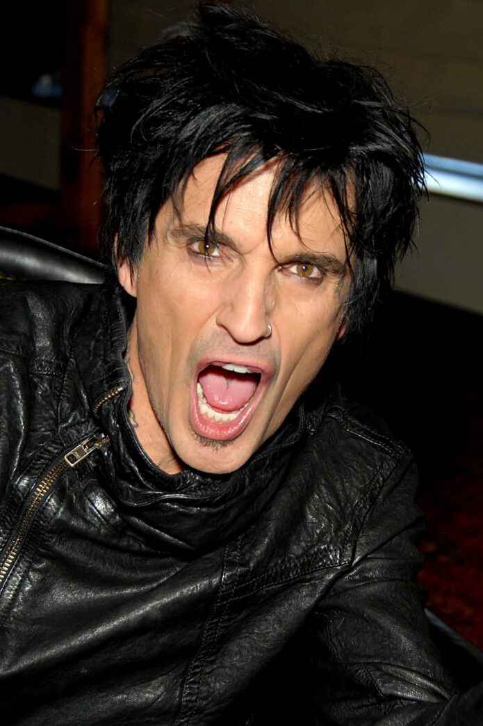
Tommy Lee Tattoos: Sleeves, Chest Ink, Face Tattoos and More

Tommy Lee’s tattoos have grown over several decades: large pieces, family names, band references and newer face ink. Some belong to his Mötley Crüe years; others mark family, friends or different points in his life. Interviews help fill in the story because Lee has talked about specific designs rather than leaving every meaning to guesswork.

This guide focuses on details that are supported by interviews and clear photos: the large back piece, Loaded logo, his sons’ names, the star near his eye and more recent face tattoos. Some smaller marks are visible only in certain shots, so they are described cautiously.

The huge back piece that started the conversation

Tommy Lee full body tattoos
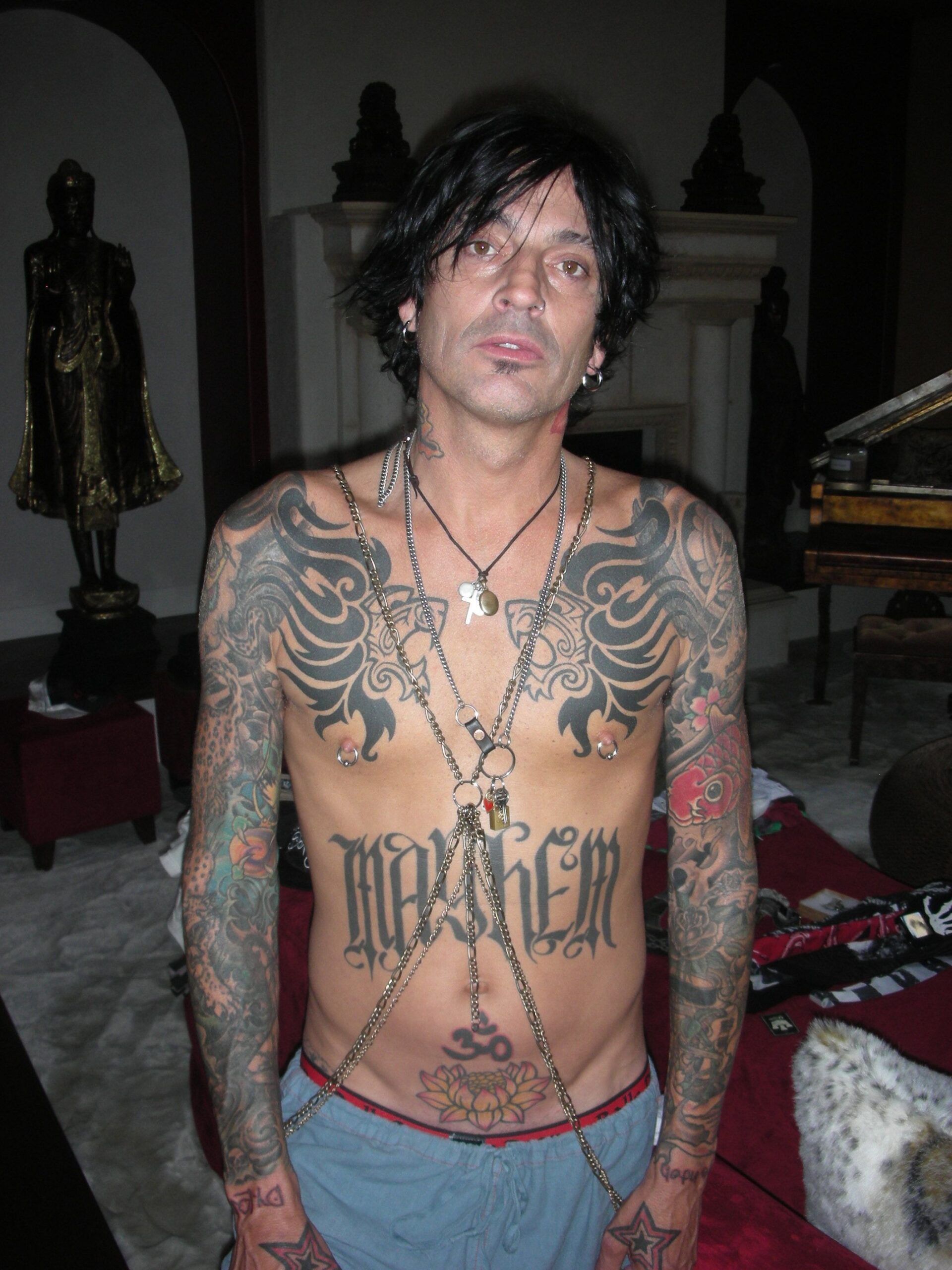
A full-body view shows how the arm, chest, stomach and hand tattoos work together.

Lee has described his large back tattoo as a major project by Leo Zulueta in the 1990s. It is usually hidden under clothes, so it can disappear from a stage photo and then fill the frame when he turns around in a shirtless portrait.

The piece matters for its scale and the period it represents. Lee was deep into the Mötley Crüe years, when large black-and-grey back tattoos were becoming part of rock’s visual language. It is more accurate to call it a full-back composition tied to his 1990s tattoo history than to reduce it to a single symbol.

Photos of the back are less common than arm and face shots. Lists sometimes describe it more precisely than the available images allow, but the broad facts are clear: it is substantial, associated with Zulueta and central to Lee’s own account of his tattoos.

Family names and the tattoos closest to his hands

Tommy Lee face and hand tattoos
The face and hand tattoos are easy to spot in this close public portrait.

Lee has his sons’ names around his wrists. They are visible when he plays, but they also read as personal reminders rather than stage decoration.

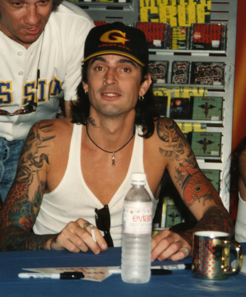
Smaller marks on his hands and fingers come and go depending on the photo. A star is visible near his eye in some portraits, and other images show finger and knuckle tattoos. Since the count changes as he adds new work, a careful summary is wrist lettering for his sons, smaller hand designs and a star near the eye, rather than a list of shapes that cannot be clearly seen.

The scale changes from one part of the collection to another. The back piece required planning and long sessions; a finger tattoo could be a quick decision or a small joke. Both kinds of choices sit together without looking as if they came from the same appointment.

The Loaded logo and the band-related ink

Tommy Lee full arm tattoos
His arm coverage mixes colour, black work, lettering and smaller symbols.

In a Las Vegas Weekly interview, Lee pointed out the Loaded logo on his forearm and said it had just been done. The design ties his ink to Loaded, his band outside Mötley Crüe, and marks a particular stretch of his career.

His arms show more than the logo. Photos capture sleeve-like coverage, color and smaller symbols running toward the wrists. The pieces are not perfectly uniform: a band mark can sit beside a portrait, a family name or an image chosen for its look.

That is why it is better not to label every tattoo as Mötley Crüe-related. Some designs clearly connect to bands, while others belong to different parts of Lee’s life. Music runs through the collection even where the image is not a literal logo.

Face tattoos, neck ink and the newest changes

Tommy Lee stage chest tattoos
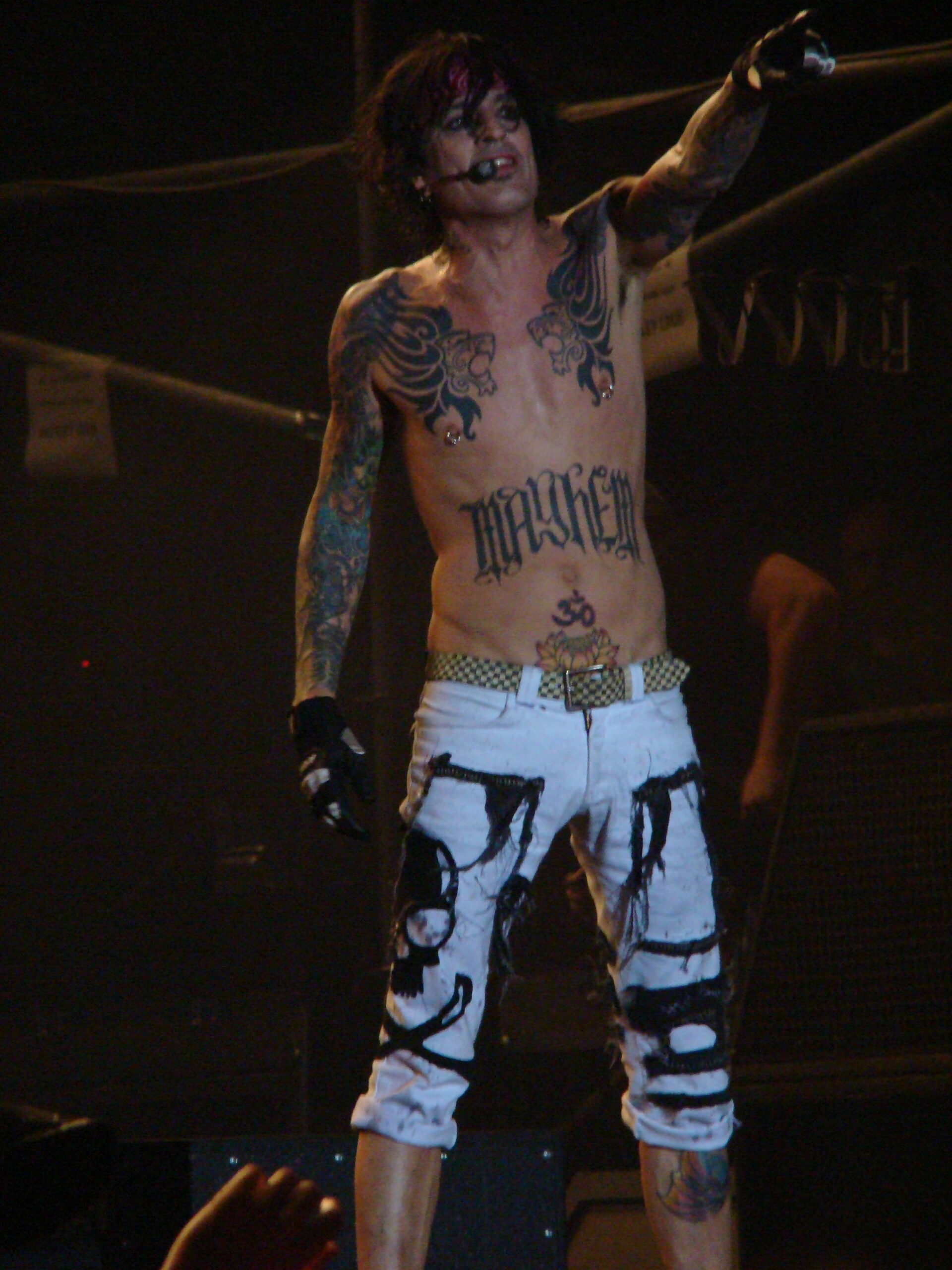
Stage lighting catches the large chest lettering and older arm work.

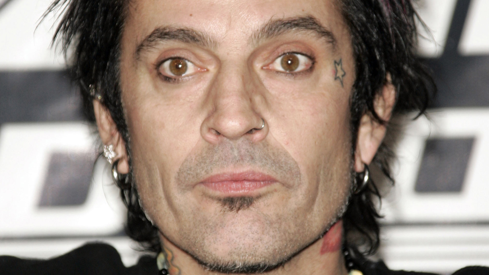
Newer face tattoos shift the focus of the collection. Older photos emphasize his arms, wrists and hidden back piece; recent close-ups bring the cheek and area near the eye forward. The face work is hard to treat as background detail because it is often the first thing people notice.

One clear image shows vertical black lettering along the side of his face, with more ink at the neck and near the ear. It is a sharper, more graphic look than the color seen in older sleeve photos. Dates matter here: putting a 1990s picture beside a recent close-up without context can make the collection look inconsistent when it has changed over time.

Lee has talked about tattoos in a relaxed, sometimes mischievous way. The face pieces do not need an invented mythology to be interesting. They mark a newer chapter, with bolder placement and less effort to keep every tattoo easy to hide.

The chest lions and the Mayhem lettering

Tommy Lee chest and stomach tattoos
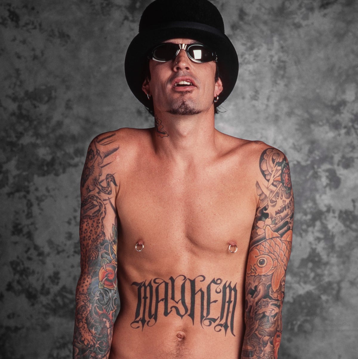
The chest and stomach view shows the paired lion designs, Mayhem lettering and lower-abdomen ink.

Large animal heads sit on either side of Lee’s chest, with heavy Mayhem lettering across the upper stomach. Lower down, a lotus and the number 30 add more focal points. The designs are visible in a full portrait, while a closer crop gives the linework and color more room.

The torso also shows how Lee’s tattoo eras differ. The chest has a strong tribal and traditional-rock feel; the newer face and neck marks are more direct black lettering. They do not look like one planned suit. They look like separate decisions added over time.

Close-up sleeve work shows the smaller designs

Tommy Lee shoulder tattoo close up
A shoulder close-up reveals the smaller images packed into the sleeve.

A wide photo can make a sleeve look like a single dark block. This close view separates the flowers, animals, outlines and shaded sections. Some designs overlap; others leave a little skin between them. Those gaps help the arm remain readable instead of turning into one flat patch.

The chest work in performance photos

Tommy Lee Mayhem chest tattoos
Another chest portrait makes the Mayhem lettering and mirrored chest work easy to compare.

Backstage and performance photos show Lee moving and playing, with the tattoos inside the rock image rather than posed apart from it. This is useful for the sleeves and chest lettering, which can look different under stage lights than in a neutral room.

What the photographs reveal about his overall style

A few patterns repeat across the photos. Lee favors designs that read from a distance: a large back piece, bold arm coverage, a logo or clear face lettering. He mixes black-and-grey work with brighter color, moves between sentimental and playful subjects, and does not make every area match.

The collection looks lived-in, not showroom-perfect. A wrist name can sit partly under a watch; stage light can change how a sleeve reads; face ink may look sharper in one year’s portrait than another’s. Those differences are part of the record and show how the tattoos were added and maintained.

It also takes several kinds of photos to document a drummer’s tattoos. His arms are always moving onstage, so a performance shot freezes only one angle. A studio portrait may show the hands but hide the torso; a red-carpet photo can show the face and neck while covering the back. No single picture tells the full story.

A careful inventory of Tommy Lee’s documented tattoos

Interviews and clear photos support this outline: a large back piece associated with Leo Zulueta; the Loaded logo on his forearm; his sons’ names around the wrists; a star near the eye; smaller hand and finger designs; extensive arm and sleeve work; neck tattoos; and newer face lettering. Other pieces may be there, but they need a sharper photo or a direct explanation before being given a precise name or meaning.

The stories behind those designs are enough. The back piece marks a major 1990s project; the Loaded logo connects his ink to a band outside Mötley Crüe; the wrist lettering keeps family close; and the newer face work shows that Lee continues to change the look of his tattoos. There is plenty of history here without guessing at the gaps.

The photos also suggest a timeline. Older shots focus on the arms and back; later close-ups draw attention to the cheek, eye and neck. Some years of the collection are easy to see, while others are known mainly from Lee’s comments.

That is why tattoo lists can disagree. A 2000s portrait will not show the later face work; a recent social photo may show a new symbol but hide the back piece. Lee’s collection is best read as something that has changed, with certain chapters visible and others filled in by his own words.

For tattoo fans, the placements create an interesting contrast: a large back piece gives him a private canvas; wrist names and face lettering keep details close at hand and in view; the star and logo add smaller points of focus. The choices sit together without cancelling one another out.

Sources and image notes

The tattoo details are checked against Tommy Lee’s short interview with Las Vegas Weekly, face-tattoo coverage from British GQ, and the inventory at Body Art Guru. The photos use separate attachments for full-body, arm, chest, shoulder, face and stage views. For more musician tattoo guides, see the musician tattoo archive.

Watch Tommy Lee talk tattoos

This tattoo-focused video gives Lee a chance to talk about the designs himself. It adds context to the photos and lets his own voice fill in what the pictures cannot.

https://www.youtube.com/watch?v=cZup6ng6AuU

More musician tattoo guides

Tatiana Shmayluk Never Needed a Deep Meaning for Her Ink

Tatiana Shmayluk has not described her tattoos as a list of symbols with one explanation for each. In interviews, she has talked more plainly: she likes certain images, lives with the result and sometimes a design simply stays with her. That makes her collection interesting, though it also means a careful account should distinguish her comments from guesses based on stage photos.

Tattoo Life, Metal Hammer and Louder have all discussed parts of her ink. A dedicated Tattoo.com interview with Jinjer also includes a section on the band’s tattoos. Taken together, the interviews suggest a useful starting point: an image can matter to her without needing a grand public meaning.

Her look changes from one era to another, and stage lighting can alter how a tattoo appears. Black-and-white photos hide color; a magazine close-up may show one area and crop out another. The sections below stick to designs that she has discussed or that are clear in published photos.

The throat tattoo is the collection’s most recognisable landmark

Tatiana Shmayluk throat tattoo

Tatiana’s Quetzalcoatl, or feathered-serpent, throat tattoo is among the best-documented pieces. In a Tattoo Life interview, she identified the design and said an artist at Barma Tattoo Studio in Kyiv, Ukraine, did the work. That gives the tattoo a named motif, placement and studio context.

She has pushed back on the idea that every tattoo needs a special meaning. The serpent can be described without treating it as a secret code. Its placement is bold and easy to see in portraits and performance photos, especially when her hair is tied back or her neck is uncovered.

A design can matter to someone without a public explanation attached. The motif and placement are documented because Tatiana has discussed them; any more specific private meaning should be left to her.

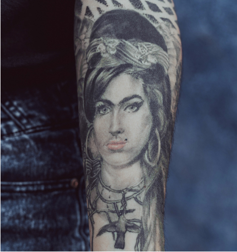
Frida Kahlo and Amy Winehouse appear among her portrait-inspired ink

Tatiana Shmayluk tattoo profile

Tatiana has mentioned tattoos connected with Frida Kahlo and Amy Winehouse when talking about images that mean something to her. The interviews document those references, though every detail is not visible in every photograph.

Kahlo’s work fits the wider visual interests Tatiana has discussed: art, strong faces and images that do not feel polished for their own sake. Winehouse brings a different musical reference. Tatiana has not reduced either to a slogan, so it is better to call them portrait or tribute references than invent a precise backstory.

Her comments also leave room for a simpler reason: sometimes a design just feels right. That is less dramatic than a rehearsed origin story, but it says something about how the tattoos belong to her life as an artist without turning each one into public mythology.

Her early tattoos began with a friend at home

Tatiana Shmayluk early tattoo

In a Metal Hammer interview, Tatiana said her first tattoo was done when she was 17. A friend who had studied art with her was just beginning to tattoo and worked on her at his home, where he was tattooing some of his first customers. It was a very different start from booking a famous studio for a planned sleeve.

She has said she sometimes regrets much of her tattoo work because she is not fully satisfied with how it was executed. That is a comment about the result, not necessarily the decision to get tattooed. A design can matter while the linework or technique still disappoints her.

She has also linked her interest in tattoos to rock music and to temporary tattoos and painted hands she liked as a child. The story runs from play and drawing on skin to permanent images. It is a more grounded account than assuming each tattoo arrived with a single fixed meaning.

Some tattoos are self-made or deliberately imperfect

Tatiana Shmayluk self-made tattoo

In another interview, Tatiana pointed to small tattoos on her wrist and ankle and said she had done some herself. Those marks show a different side of the collection from the throat design and portrait references: experimenting with images and accepting a rougher result.

She spoke about the wrist and ankle pieces matter-of-factly. The placements are reported, but the available photos do not always make the individual designs clear enough to name them precisely.

Tatiana has also said prison-style imagery is not for her. That is a useful boundary: her collection is selective, not an attempt to adopt every traditional tattoo motif. Her comments about regret and imperfect execution make the same point from another angle. The tattoos record choices, not a flawless display.

What the stage photographs can and cannot prove

Tatiana Shmayluk tattoo detail

Jinjer’s performances produce plenty of images, but a concert photo is not automatically a good tattoo reference. Microphones, shadows, hair, gloves, mesh, color and movement can hide or distort linework. Interviews and close portraits are more helpful when trying to identify a design.

The documented outline includes the Quetzalcoatl throat tattoo, references to Frida Kahlo and Amy Winehouse, small wrist and ankle marks she has said she did herself, and her first tattoo at 17 by an artist friend. Other pieces appear in photos, but the sources do not consistently identify their designs. Tatiana has also said that she does not give every tattoo a special meaning.

The interviews do not support exact dates for every piece, a complete list of symbols or unverified claims about tattoo artists she has not named. Her own comments give the collection more detail, not less: she likes images, has experimented, remembers the people around her first tattoos and is candid when the execution did not meet her hopes.

Visibility is not the same as a full explanation. Tatiana’s interviews identify the designs she has chosen to discuss; photos show where they sit at particular moments. That is enough for a useful record without claiming that every part of her skin has been catalogued.

Her stage presence is vivid, but the story also rests on quieter details: a throat design she identified by name, portrait references she has discussed, small marks from early experiments and her admission that not every tattoo feels perfect. Those details let the collection change over time, as she adds work or explains another piece.

Watch the Jinjer tattoo interview

This dedicated Jinjer Tattoo.com interview includes a segment on the band’s tattoo collection and gives Tatiana’s style more context. It follows the written guide so the documented details are clear before the video.

Rumer Willis’s ink keeps a whole family album in miniature

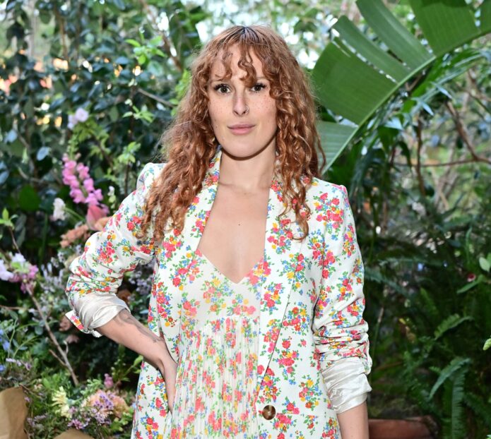
Rumer Willis has had more than 20 tattoos, from tiny marks on her fingers to a lion on her shoulder. The pieces include a Carl Sagan quote, a family nickname, and a Dancing With the Stars design she later chose to remove. Some are easy to connect to people in her life; others are small symbols whose meaning she has kept to herself.

Her tattoos have changed over time, so the record is a mix of work she still wears and designs that are gone or made to fade. The photos and interviews give a fairly detailed view of what has been reported, though they do not explain every mark. Taken together, the pieces move between short phrases, family references, portraits and simple shapes.

Words, symbols and the tattoos people notice first

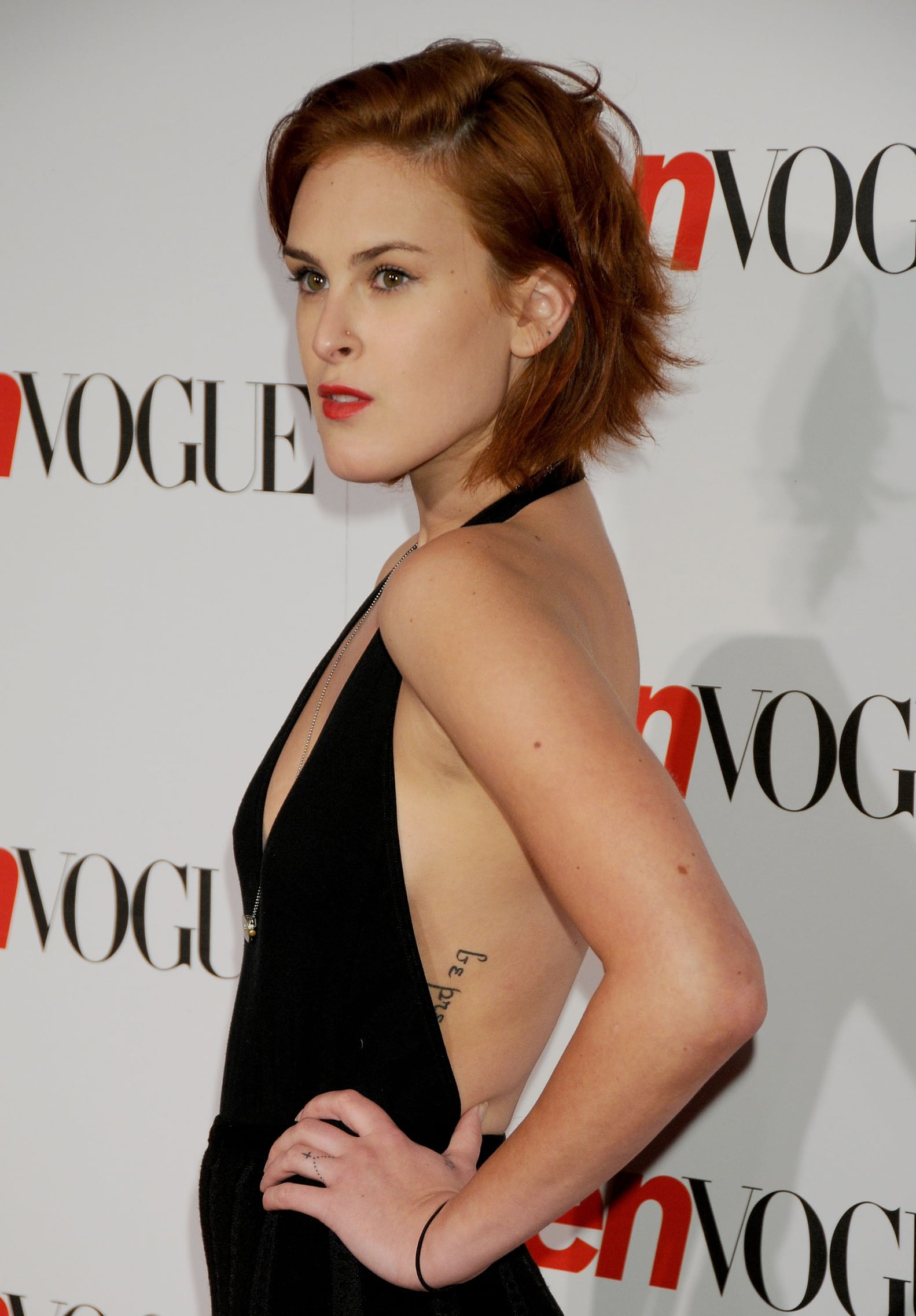
Rumer Willis be present side tattoo

One of Willis’s most direct tattoos is the lowercase phrase “be present” on her side. It sits beneath clothing most of the time and reads like a private reminder rather than a statement meant for an audience.

Her fingers have several small designs dating to around 2009: a cross on her ring finger, a black skull on her pointer finger, and a black star near her thumb. They are easy to overlook in wider photos, but the cross and skull show up when her hands are visible.

Rumer Willis cross finger tattoo

On her foot, the words “who are you?” are written in small lettering. There is also script on her inner hip, but available coverage has not clearly identified the words. It is better to leave that one unread than guess from a blurry image.

Rumer Willis dots wrist tattoo

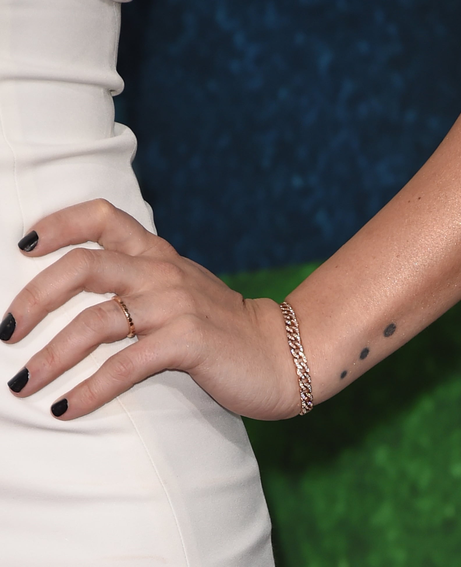
Three black dots sit on her wrist. Their placement is visible, but Willis has not publicly explained what they mean. Sometimes the record only tells us what a tattoo looks like.

Rumer Willis’s literary script and back pieces

Rumer Willis Carl Sagan forearm tattoo

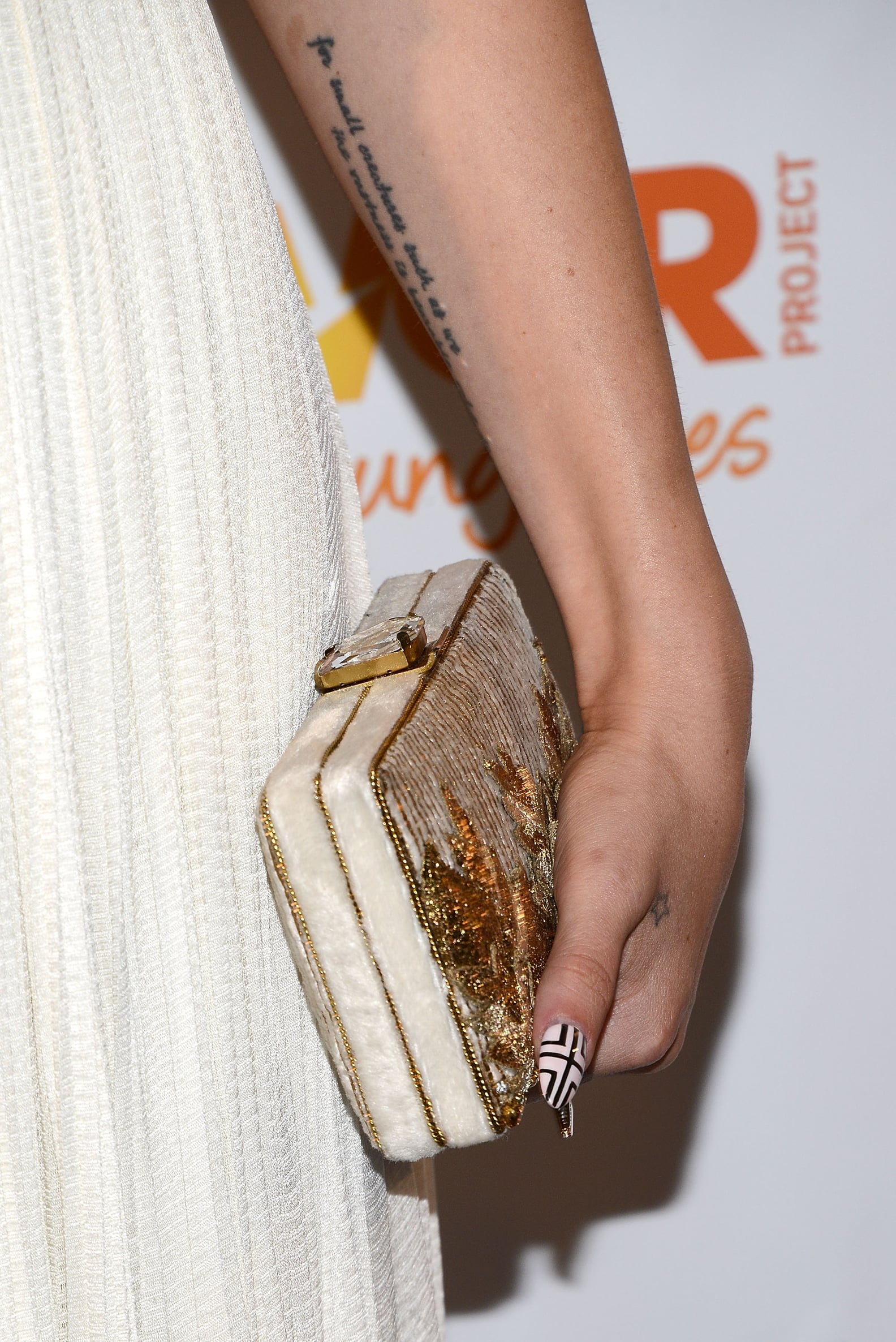
The longest text is on her inner left forearm: “For small creatures such as we the vastness is bearable only through love,” a line by Carl Sagan. The quote takes up more room than the short phrases on her foot and hand, and it reads as a full passage rather than a quick symbol.

In photos, the lettering can look like a dark block before the words come into focus. Once readable, it brings a thought about love and scale into a collection otherwise filled with small images and short reminders.

Rumer Willis bird back tattoo

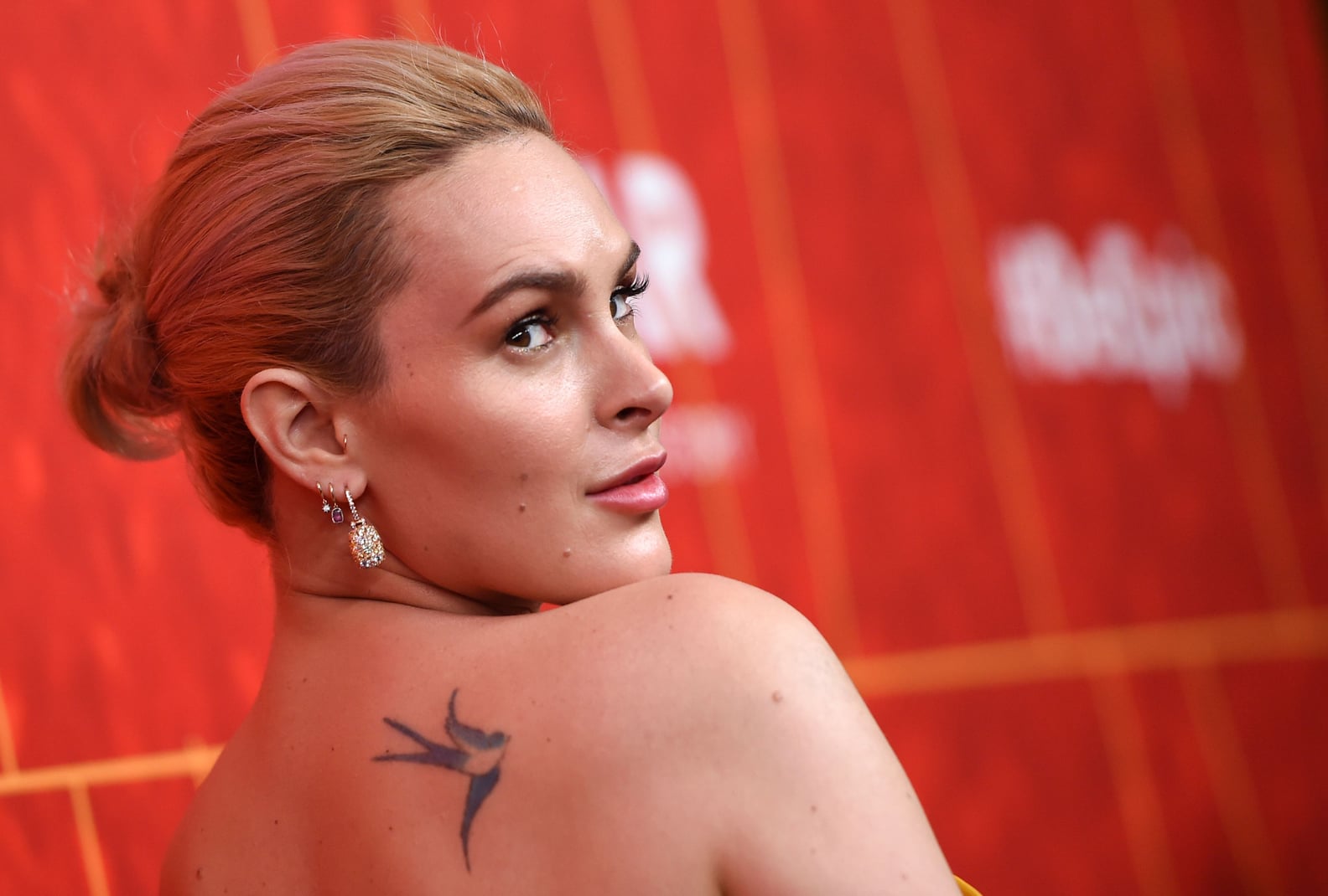
A bird sits high on Willis’s right shoulder, a piece dated to around 2013. It can disappear beneath a strap or sleeve. It is separate from the larger shoulder work that came later, rather than part of one combined bird-and-lion design.

Photos can make it hard to count or distinguish the pieces. One outfit may show the bird, a wrist tattoo and a forearm portrait, while hiding ink on her side, foot or hip. Her designs are spread across different parts of her body, not arranged as a single sleeve.

Family ink, portraits and the larger shoulder work

Rumer Willis lion shoulder tattoo

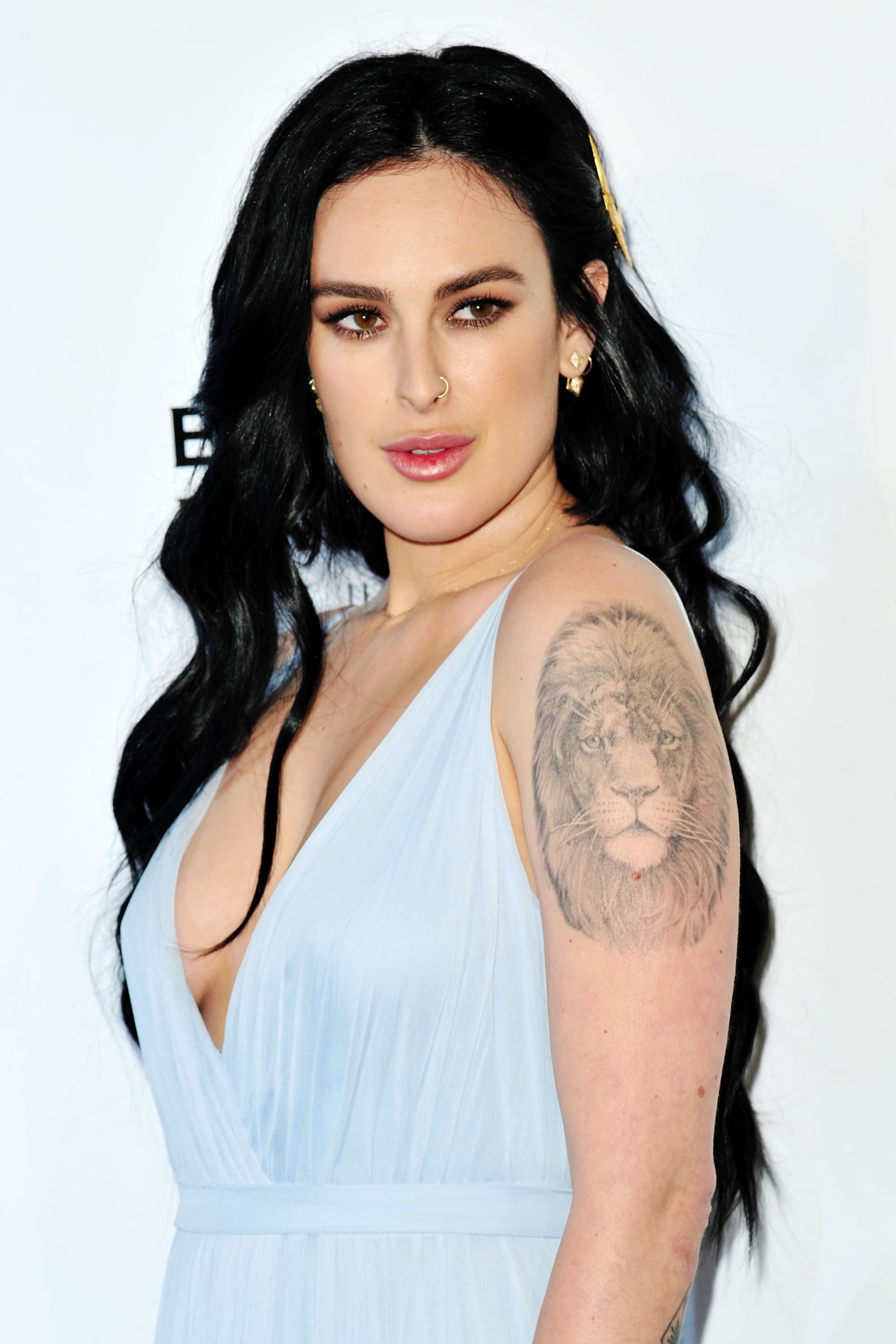
The lion’s head on her shoulder is among the largest and most visible designs. Its dark mane gives it a stronger presence than the small marks on her hands, especially in sleeveless photos.

Rumer Willis Sauce hand tattoo

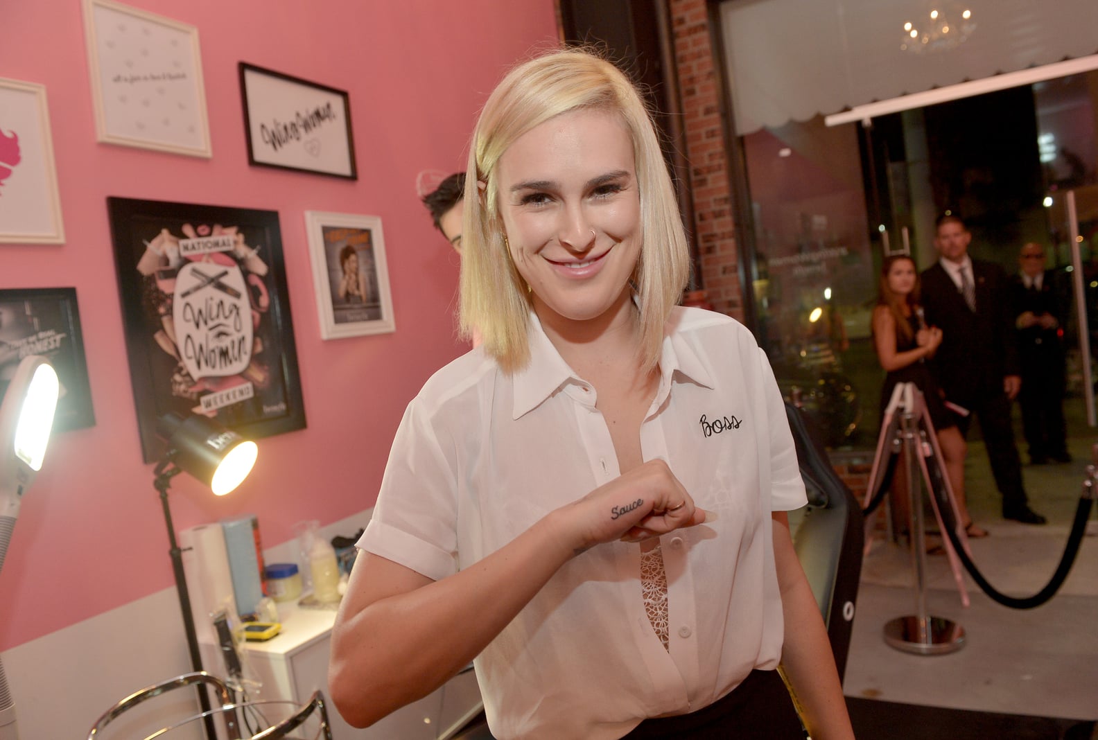
Willis has “Sauce” on the side of her hand. She got the word in 2014 for her younger sister, who uses it as a nickname. The lettering is exposed enough to be seen quickly, and its reason is one of the clearest family stories attached to any of her tattoos.

Peacock feathers have also been reported on her shoulder. On the backs of both arms are geometric designs built around a diamond with an arrow inside. Those shapes sit apart from the portraits and script, giving the collection a more graphic look.

Rumer Willis moon phases wrist tattoo

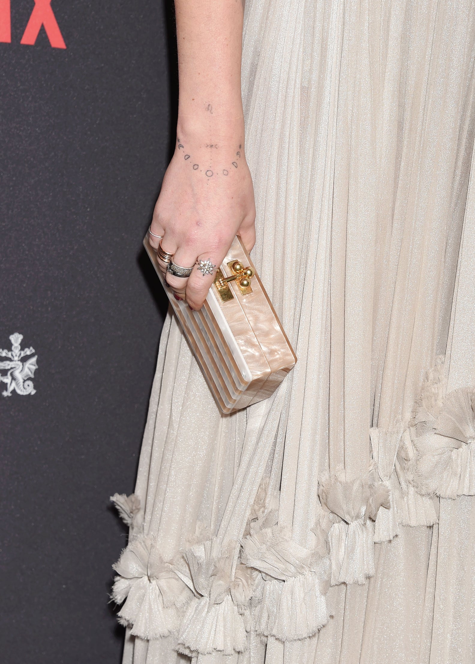
Her right wrist has the phases of the moon and the Leo zodiac sign. Other reported pieces include a grayscale portrait of a nude figure on her inner right forearm and a black shape above her elbow that looks like a horseshoe.

In 2016, celebrity tattoo artist Dr. Woo made a portrait of Picasso on her upper right arm. It is another kind of reference from the family nickname or the lion: a portrait of an artist among symbols, words and personal reminders.

The Dancing With the Stars tattoo and why it changed

After winning Dancing With the Stars in 2015, Willis got a bicep design showing two dancers with a mystical, star-like figure. Later reports said she had it removed with a laser after her relationship with show veteran Val Chmerkovskiy ended. The tattoo marked a real moment in her life, even though she eventually no longer wanted it.

In 2022, Willis also got made-to-fade tattoos from New York artist JonBoy: a tiny bee above her right knee and a sparkle on her right ring finger. They were described as ephemeral tattoos, expected to last about nine to 15 months. They offered a way to wear a design for a while without keeping it permanently.

What the collection says without overexplaining it

There is no single style running through Willis’s tattoos. Fine script sits beside small black symbols, portraits, geometric arm designs, a lion, moon phases and a family nickname. Some pieces have a public explanation; the three dots and hip script, for example, do not. Leaving those gaps open is part of an accurate account of the collection.

The timeline matters as much as the designs. Early hand and wrist marks sit alongside the Carl Sagan quote, Picasso portrait and Dancing With the Stars tattoo. Some pieces were removed; others were made to fade. The collection includes what stayed and what she later chose to change.

Reported designs include “be present” on her side; the cross, skull and star on her fingers; “who are you?” on her foot; the unidentified hip script; three wrist dots; the bird on her back; the Sagan quote; “Sauce”; peacock feathers; the Dancing With the Stars dancers; the Picasso portrait; the lion; geometric diamonds and arrows; moon phases and the Leo symbol; a grayscale forearm portrait; the horseshoe; and the temporary bee and sparkle tattoos.

Watch Rumer Willis talk about tattoo removal

The clip below focuses on Willis removing the Dancing With the Stars tattoo, adding context to one design that is no longer part of her collection.

That history makes her tattoos read less like a fixed catalogue and more like a record of choices. Some are still visible, some have faded or been removed, and others were never explained publicly. The collection has room to change as her life does.

In short: Willis’s ink ranges from family references and small symbols to a lion, portraits and a long Sagan quote. Some pieces are still there; others were temporary or removed. The record tells a fuller story when it includes those changes.

More actor tattoo guides

Carlos Tevez Tattoos: The Sistine Chapel Back Piece and More

Carlos Tevez’s tattoos are hard to miss, but the large back piece draws the eye first. The former Argentina and Juventus striker has a black-and-grey scene across most of his back, inspired by Michelangelo’s Resurrection of the Dead. It reaches from his shoulders toward his waist and joins the ink on his right arm.

Tevez has shown it in match photos, interviews and social posts. The images below give a few different views; one close crop can’t show how the whole design sits across his back and shoulder.

The huge back tattoo

Reports about the tattoo say Tevez became interested in the image after seeing Michelangelo’s work in the Sistine Chapel during a visit to the Vatican. He bought a book about it and later took the idea to Polish tattoo artist Piotrek Taton.

The finished piece packs figures, shadows and architectural details into one scene. Near the neck is a brighter, sun-like area; below it, bodies and other shapes fill the back. From a distance it reads as one dark mural. Closer up, the separate figures and lines come into view.

Carlos Tevez Renaissance back tattoo on football pitch

The wide pitch-side view shows the tattoo filling Tevez’s back rather than sitting in a small panel.

Why the Sistine Chapel connection matters

The Sistine Chapel reference gives the tattoo a clear starting point. The scene is associated with resurrection, judgment and a crowd of figures in motion; Tevez’s back piece has that same busy, upward movement. It isn’t a set of unrelated angels or symbols.

The scale matters too. Tevez’s back has room for a full composition, closer to a mural than a group of small flash designs. A full-back photograph makes the layout easier to read than a tight crop.

Carlos Tevez giant back tattoo with tattoo artist

This close view shows the scale: the artist stands beside a piece that covers almost all of Tevez’s back and reaches toward his arm.

The arm sleeve and the sun near his neck

The ink continues past the spine. Dark shading and tribal-style lines run over Tevez’s right shoulder and onto his arm, so the back doesn’t end at a neat edge or read as an isolated panel.

A large sun-like shape sits near the base of his neck. In the photos it catches the eye first, before the crowded figures below it.

Carlos Tevez full-back Resurrection of the Dead tattoo

This view shows the bright area near the neck and the shading through the centre.

Carlos Tevez side view of giant back tattoo

The side angle shows the ink wrapping over his shoulder instead of stopping at the edge of his back.

Close views of the arm tattoo

The arm carries dense lines and dark shading of its own, in the same bold style as the back. It can be easy to miss in match photos, where his arm is moving or partly covered by a sleeve.

Carlos Tevez tattooed forearm during football match

The forearm has its own detail. Its darker shapes carry the larger design down toward the elbow.

Carlos Tevez detailed arm tattoo

This second crop shows the linework and shading more closely. It is another view of the documented tattoo work, not evidence of a separate design.

What makes Carlos Tevez’s ink stand out

The back piece follows one large visual idea, with a clear reference and a named artist. The right arm continues the dark shading, tying the work together rather than competing with it.

It looks different from the small names and dates common in celebrity tattoo galleries. This is large black-and-grey body art built around classical figures and strong contrast. The size gives the artist room to arrange a full scene around the shape of the back.

For another footballer’s collection, see David Beckham’s tattoos. Beckham’s ink is spread across many smaller pieces; Tevez’s is darker and closer to a single mural.

See the tattoo story

This video focuses on the large tattoo across Tevez’s back.

The full-back tattoo is the main event

The scene covers nearly all of Tevez’s back, from high across the shoulders toward the waist. Figures, clouds, drapery and heavy shading make it read as a scene rather than one emblem. At a glance it looks dense; closer up, the figures begin to separate.

The width of his back gave Taton room to build around the shoulders and spine. Darker areas set off lighter faces and bodies, and the composition shifts as Tevez moves. That’s why natural photos can show the layout better than a stiff, flattened pose.

Where the Sistine Chapel idea comes in

The design is commonly linked to Michelangelo’s Resurrection of the Dead in the Sistine Chapel. Tevez has spoken about finding the inspiration after a Vatican visit. The crowded figures and upward movement give the tattoo its classical, religious feel, though the finished work is adapted to his back rather than copied as a small section of the original.

A back tattoo bends with the wearer. The artist had to work around the shoulder blades and the curve of the lower back while keeping the figures readable. Photos where Tevez stands naturally show how the design follows that shape.
The right arm is part of the same picture

Photos of the back show darker work continuing over the right shoulder and onto the arm. That connection keeps the design from ending abruptly at the back’s edge. The shading carries the composition across the upper body.

Match and training photos also catch the forearm, but the angle and light don’t always show each mark clearly. The full-back scene is well documented; smaller details are better described by how they look and where they sit unless Tevez or a reliable source has explained them.

Why the tattoo works so well in football photos

In a match photo, the kit and the movement usually take over. When Tevez turns, raises his arms or lifts his shirt, the back piece becomes another large shape in the frame: black and grey against a bright jersey or the green pitch.
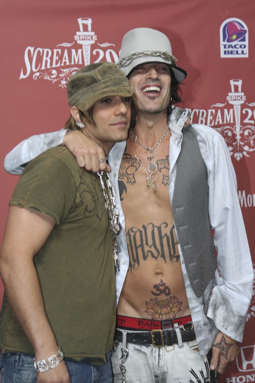
The classical figures make the scene easy to recognise, and the size gives them room. It draws attention because of its scale, but the reference and layout keep it from feeling like a patchwork of unrelated logos.

What to look for in the best reference photos

Full-back photos with good light show the figures across the back and how the ink reaches the right arm. A tight match crop may catch a shoulder or forearm, but it won’t explain the whole layout. Look for the sun-like shape near the neck, the group of figures through the centre and the way the shading continues across the shoulder.
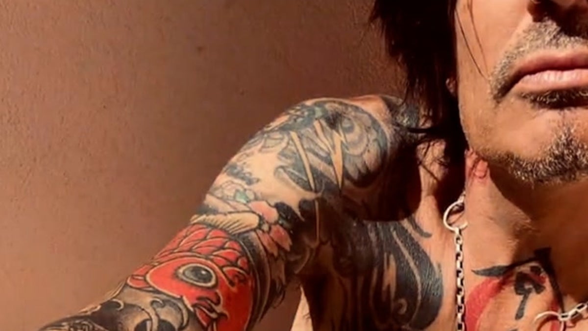
For this article, the useful images are the ones that show the tattoo clearly, keep Tevez recognisable and give enough room to see its scale. A generic football photo can’t do that on its own.