Actors

Tattoo guides for actors, with photographs of their real tattoos and clear distinctions between personal ink and designs created for screen roles.

Matt Damon Tattoos: The Family Names, Lucy Tribute, and Heath Ledger Line

Matt Damon’s best-documented tattoos are on his right arm: his wife’s nickname, his four daughters’ names and a small line that a tattoo directory attributes to Heath Ledger. The lettering is easy to miss under a sleeve. Reports about tattoos seen during The Odyssey’s production are less conclusive, so they don’t belong on a permanent-tattoo list without confirmation.

What Damon’s collection actually includes

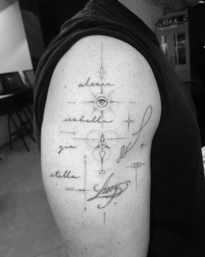
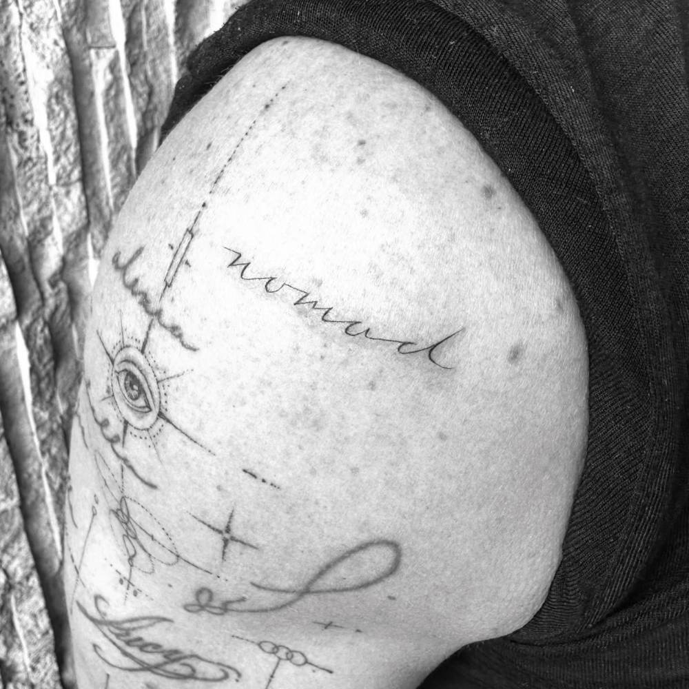
The clearest report covers the family lettering Damon got in 2019: “Lucy,” his nickname for Luciana Barroso, beside the names of their four daughters. A separate tattoo directory identifies a thin, irregular line on his right arm as a tribute to Heath Ledger, near sparse geometric marks and a circular eye-like shape. Damon hasn’t publicly explained the line’s exact design.

In 2026, The Odyssey coverage also discussed bicep tattoos as Damon prepared to play Odysseus. Those could be costume or temporary designs; the reports don’t establish that they’re new permanent ink.

The family-name bicep tattoo
Matt Damon tattoos: Matt Damon's family-name bicep tattoo

The names Alexia, Isabella, Gia and Stella run down Damon’s right upper arm in fine cursive. Each sits on its own line, with enough space to read without turning the group into a large panel.

“Lucy” sits nearby in larger, looser lettering. Together, the words make one family piece without dates, portraits or extra symbols. A T-shirt sleeve can cover most of the tattoo when he wants it out of view.

Why the lettering still looks clean
Matt Damon tattoos: Matt Damon's family lettering and Lucy tattoo close-up

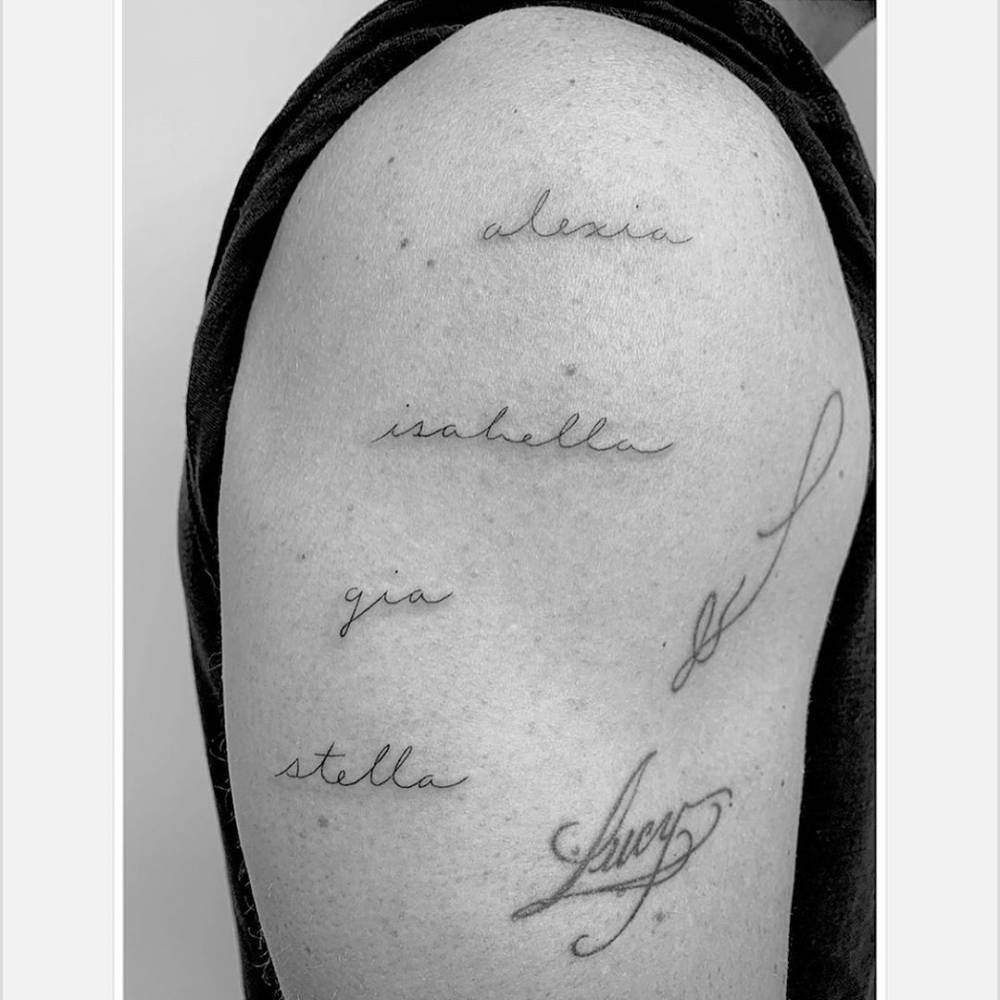
Los Angeles artist Daniel Stone, known professionally as Winter Stone, did the family tattoo. The 2019 photos show light strokes and open spacing. The names don’t need heavy shading to stay distinct.

Script on a moving arm should be checked in a relaxed position as well as when the muscle bends. The lines follow the bicep without wrapping sharply around it, which keeps the words readable in a close view.

The Lucy tattoo beside the names
Matt Damon tattoos: Matt Damon's Heath Ledger tribute line

Damon had “Lucy” tattooed for Luciana before the four daughter names were added beside it. The arm grew into a family tribute over time rather than being designed as one large piece from the start. The different lettering gives it a little movement while keeping the words connected.

If you expect a tattoo to grow later, leave room in the layout. Adding names to a crowded gap can make script hard to read.

The Heath Ledger arm tattoo tribute
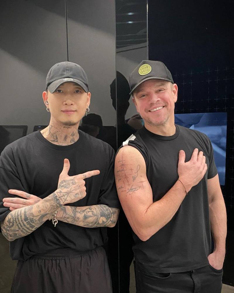
Matt Damon tattoos: Matt Damon tattoo artist session photo

Tattoofilter describes an irregular line on Damon’s right arm as a tribute to Heath Ledger. The close-up shows it above a small circular eye motif and thin geometric marks. The listing gives the Ledger connection, but not a detailed account from Damon about the line’s shape.

A small mark can carry a private tribute without spelling out the whole relationship. Here, the attribution is all the available source supports; there’s no reason to add a story he hasn’t shared.

What the Odyssey reports do and don’t prove

Damon’s arms drew attention in 2026 while he promoted The Odyssey. Reports mentioned bicep tattoos during his preparation for the role, but a design seen during production may be makeup or character ink.
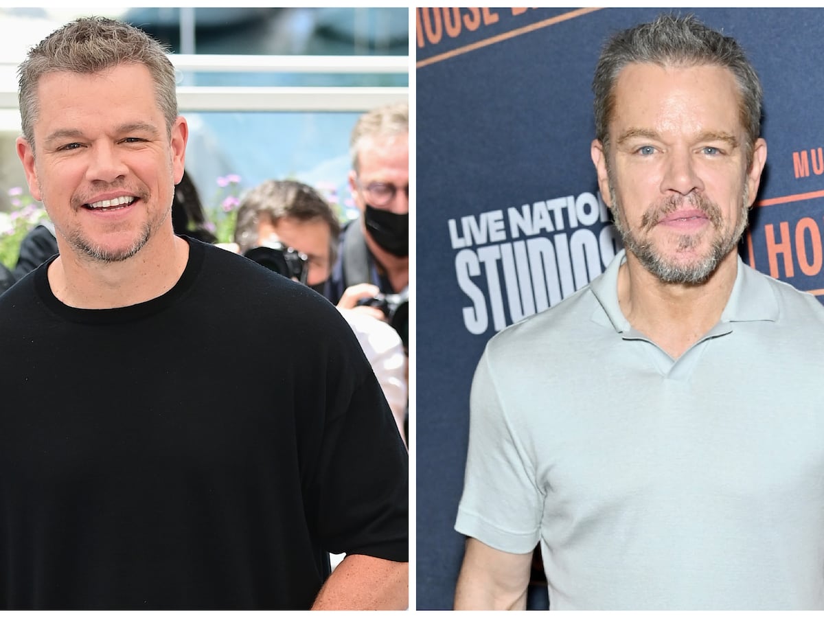
Matt Damon in a contextual photograph: Matt Damon role context, not tattoo evidence; not tattoo evidence

This image provides film context, not evidence of another permanent tattoo. His family lettering and the Ledger line are documented in older photos; the role-related images shouldn’t be mixed into that collection without a statement from Damon or the production team.

Why Damon keeps his collection low-key

Damon’s pieces use thin lettering and small linework. They’re visible in short sleeves and easy to cover for a role or a formal event. This portrait is contextual and doesn’t show the tattoos.
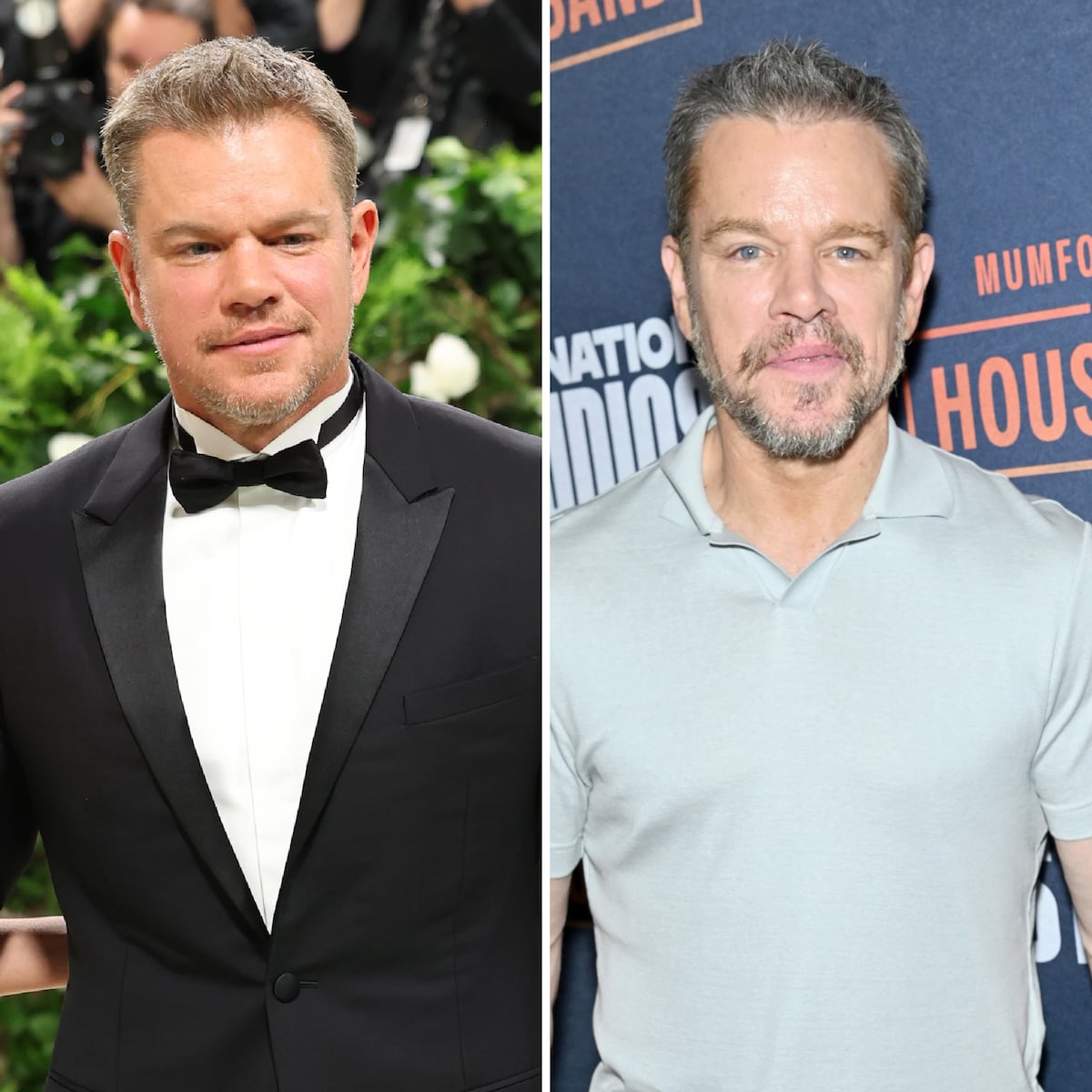
Matt Damon in a contextual photograph: Matt Damon public-image context, not tattoo evidence; not tattoo evidence

That limited scale leaves the family names and the Ledger tribute distinct without turning his arm into one continuous design.

Ideas worth stealing from Damon’s approach

For family lettering, decide how many names you may want to add and give each one enough space. A tattooer can draw the lines to follow your arm and keep them legible when it bends.

The Ledger tribute is a reminder that a memorial mark can be a small private reference. And if a tattoo appears during a film shoot, wait for confirmation before treating it as part of the actor’s permanent collection.
More actor tattoo guides

Kit Connor’s Tattoo: The Story Behind His Call On Me Ink

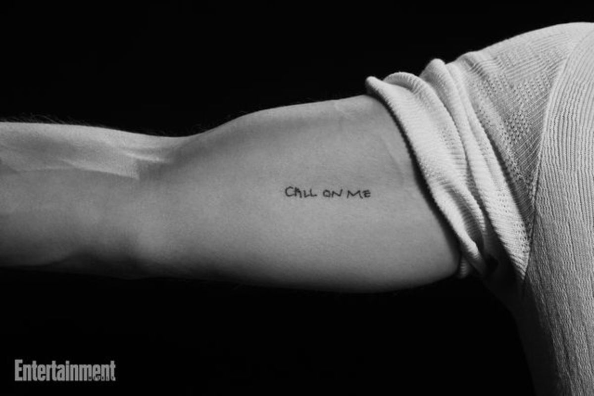
Kit Connor’s best-documented tattoo is the phrase “CALL ON ME” on his bicep. The available reporting ties it to Warfare; no second tattoo is clearly confirmed.

Kit Connor’s Call On Me bicep tattoo

Kit Connor tattoos: Genuine tattoo evidence for the documented Call On Me bicep tattoo.

A close-up shared by Entertainment Weekly shows the words running horizontally across Connor’s upper arm. The narrow uppercase letters look hand-drawn, with small differences between them rather than the even lines of a block font.

Connor confirmed the placement in a British Vogue interview with D’Pharaoh Woon-A-Tai. Connor pointed to his bicep; Woon-A-Tai said his version was on his upper thigh. The cast shared the phrase, but not one placement.

Short lettering still needs enough space to read clearly. “CALL ON ME” is eight letters, and Connor’s version leaves small gaps between them. An artist can advise on line weight and size so a phrase doesn’t close up as it heals.

Life inside the cast’s boot camp

Kit Connor in a contextual photograph: Contextual Warfare film still; not tattoo evidence.; not tattoo evidence

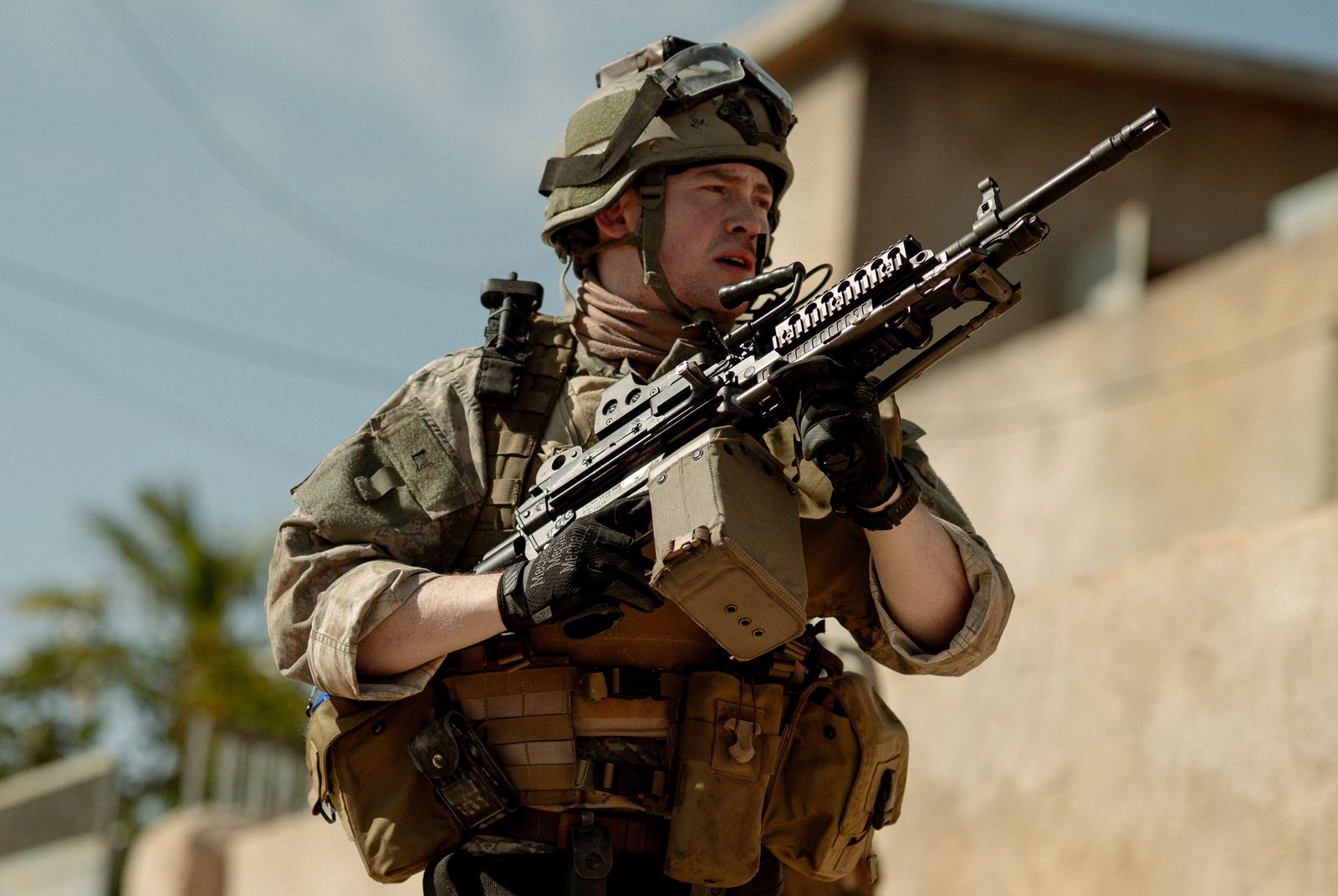
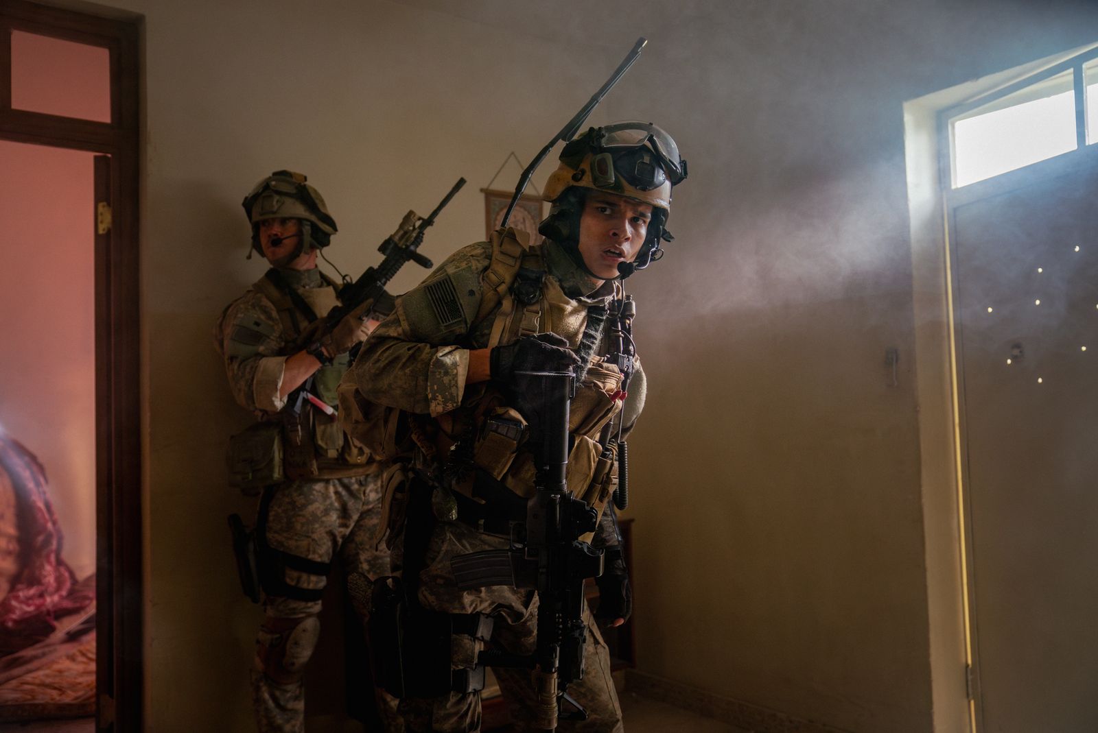
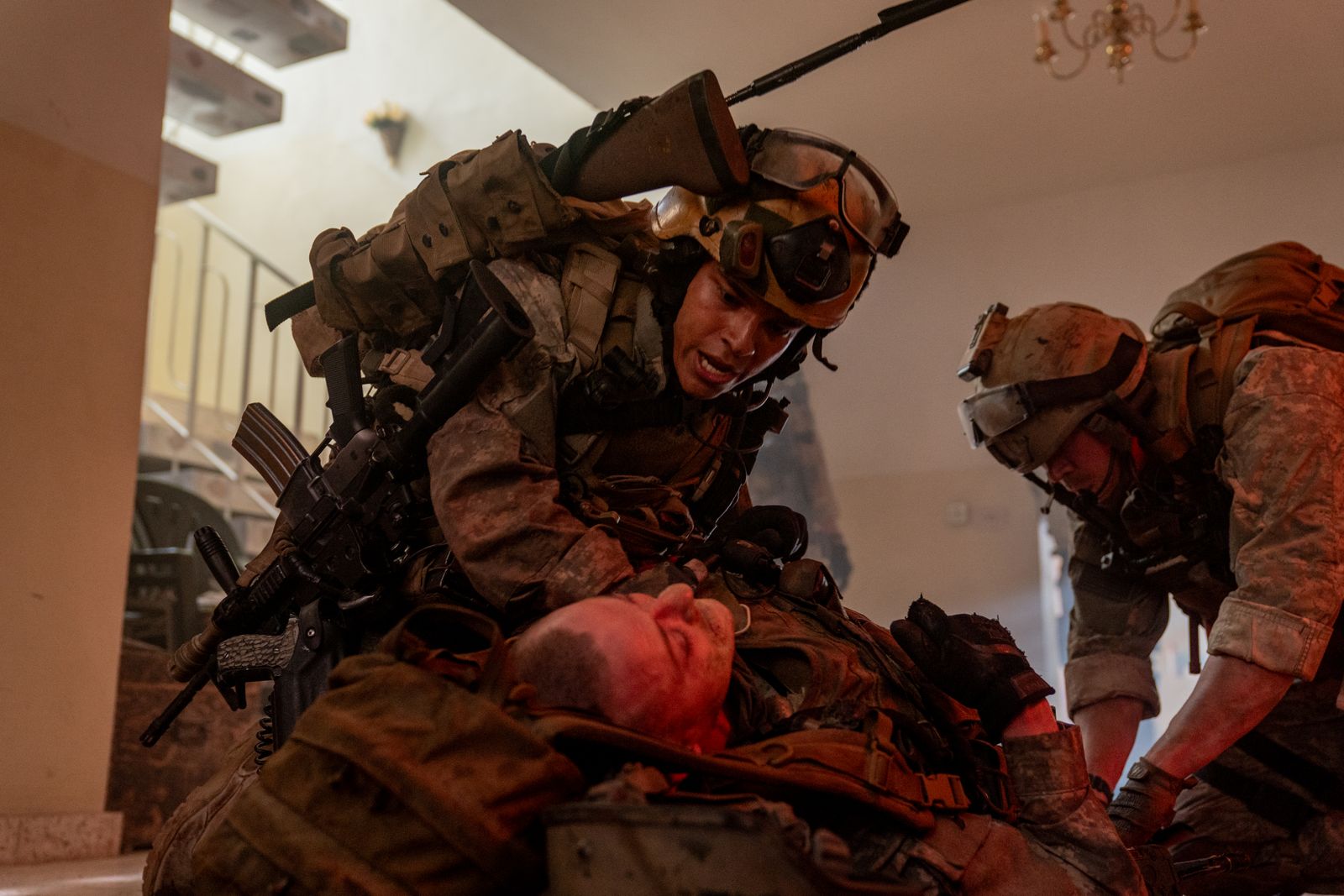
Warfare, directed by Alex Garland and Ray Mendoza, follows Navy SEALs during the Iraq War. Before filming, the cast went through a demanding training period focused on how to move and communicate as a group.

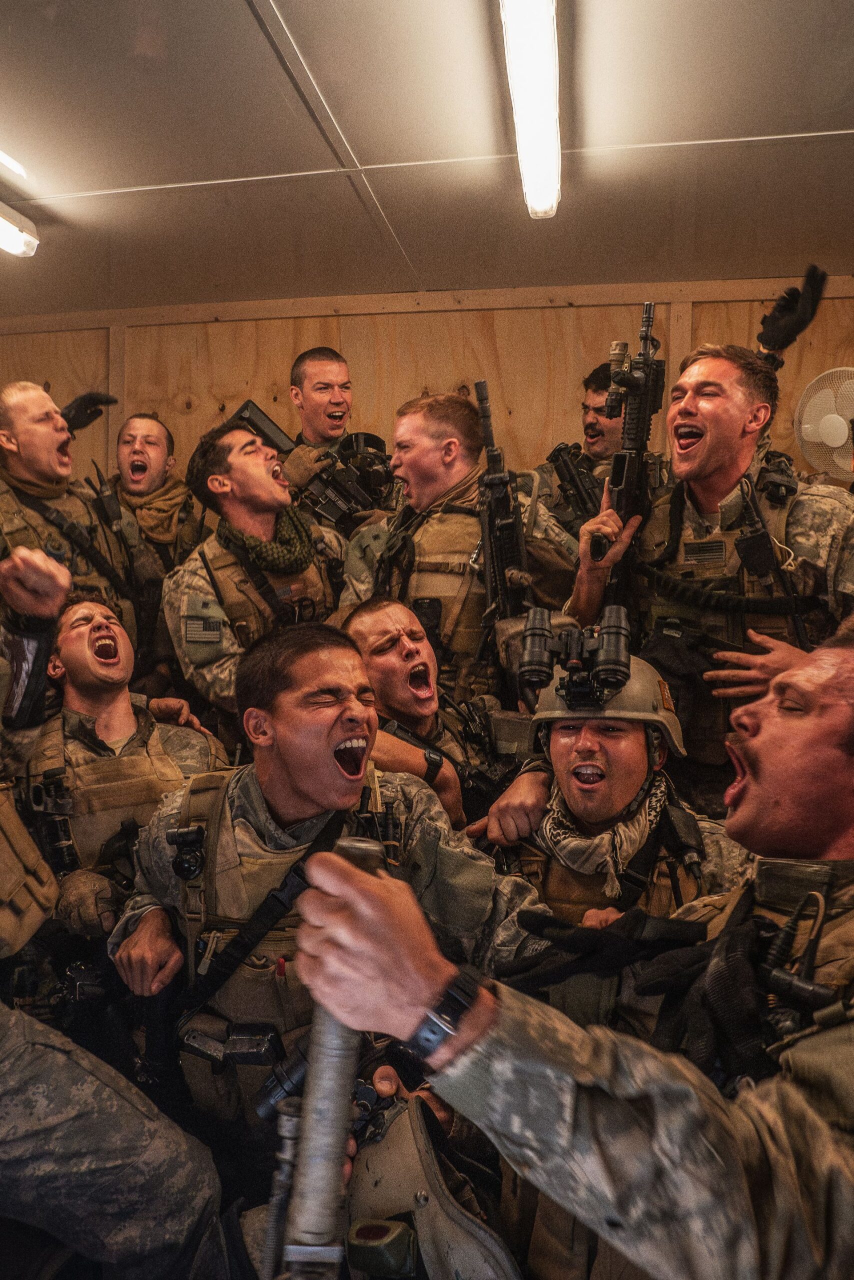
Charles Melton has described how closely the actors bonded during that preparation. He said the group shaved their heads and got matching tattoos. The ink followed months of training and time together; it was a small reminder of the people they had learned to rely on.

Why “Call On Me” became the right phrase

Kit Connor in a contextual photograph: Contextual Warfare film still; not tattoo evidence.; not tattoo evidence

The phrase comes from the opening of Warfare, where the SEALs watch the video for Eric Prydz’s 2004 song “Call on Me.” That gave the cast a reference from the film and words they could use among themselves.

Woon-A-Tai explained that “Call On Me” meant they could reach out to each other after the project. He acknowledged the promise could sound cheesy, but the phrase fit what the group wanted to remember: they would still be there for one another after filming ended.

A small phrase with a big cast connection

Kit Connor in a contextual photograph: Contextual Warfare film still; not tattoo evidence.; not tattoo evidence

Connor’s lettering has no film logo or military imagery around it. The design is just the phrase, so its connection to the movie and the cast comes from the story behind it.

His bicep placement lets him cover the line under a T-shirt or show it when his sleeve moves. The words don’t explain themselves to someone who sees them; the meaning belongs to the people who shared the training.

What to borrow from the idea

Kit Connor in a contextual photograph: Contextual cast image; group shot used only as context and explicitly not tattoo evidence.; not tattoo evidence

If you want a short phrase tattoo, make sure the words still mean something once they are out of their original context. Connor’s works because the cast had trained and worked together, and the phrase carries that memory for them.

For a matching tattoo, agree on the words and what they mean to the group, then let each person choose a size or location that fits. The shared part can stay the same without making everyone wear an identical design.

Luke Evans Tattoos: The Family Heartbeat Band and the Bird on His Thigh

Luke Evans has a thin line tattoo around his right forearm and a bird design on his thigh. The family band has a documented explanation; a distant beach photograph shows the bird but not enough detail to identify it.

The family heartbeat tattoo

Luke Evans tattoos: Family heartbeat band tattoo evidence

A thin black line circles Evans’s right forearm in the shape of a heartbeat trace. He says the peaks hide the initials D, Y and L for his parents, David and Yvonne, and himself, Luke. It was his first tattoo, made when he was around 39 or 40.

From a distance, it reads as a simple band; up close, the peaks become lettering. The wraparound line needs consistent spacing where it passes over the curve of the arm.

Why the line feels more personal than decorative

The design stays narrow, with no frame or extra imagery around the initials. The lettering is worked into the heartbeat line, so the tattoo does not need names or dates written beside it.

The bird tattoo on his thigh

Luke Evans tattoos: Bird thigh tattoo evidence

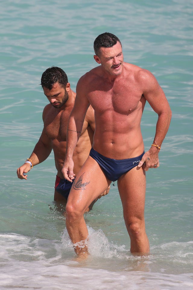
A beach photograph shows a bird, possibly a swallow, on Evans’s upper thigh. It looks like a dark, traditional-style silhouette with its wings spread. The image is taken from a distance, so the exact species and any smaller details are hard to confirm.

The upper thigh gives the tattoo room for the wings and keeps it covered in most everyday clothes. A bird silhouette needs enough open space around the wings to stay readable at the chosen size.

Two pieces, two different kinds of privacy

The forearm line can show in short sleeves; the thigh bird is more likely to appear in swimwear or shorter shorts. Evans got the heartbeat band first, and the bird was added later.

The person behind the story

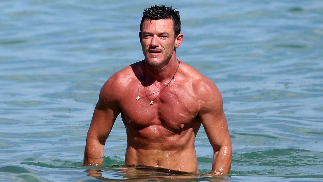
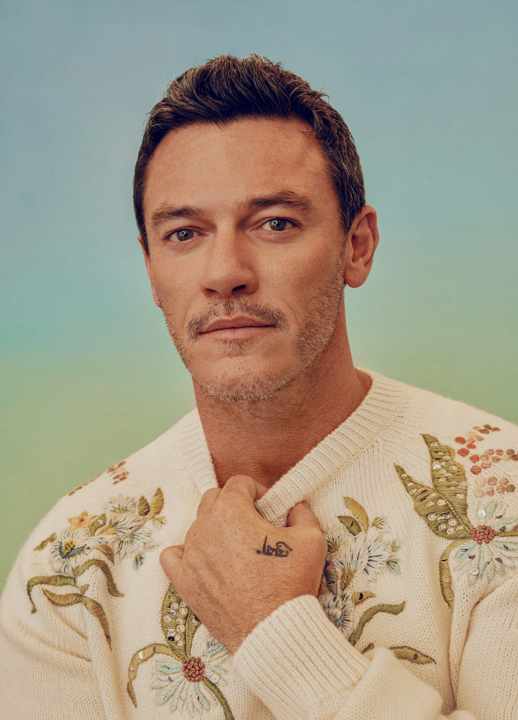
Luke Evans in a contextual photograph: Contextual portrait; explicitly not tattoo evidence; not tattoo evidence

This campaign portrait shows Evans’s face and raised arm, but it does not clearly identify another tattoo.

Luke Evans in a contextual photograph: Contextual beach portrait; explicitly not tattoo evidence; not tattoo evidence

The beach portrait shows more skin, but it is not a close view of his tattoos.

Luke Evans in a contextual photograph: Contextual beach photograph; explicitly not tattoo evidence; not tattoo evidence

In this wider image, the landscape and full-body view take up more space than any tattoo detail. The tattoo-specific photos are better references for the designs themselves.

What his choices suggest

The close-up images show line work; the wider photos show where each tattoo sits and how much of it is usually visible. If you are using them as references, take those details to an artist to redraw for your own arm or thigh rather than tracing the photo.

More actor tattoo guides

Mandy Moore Tattoos: The Sperm Tattoo, Mountain Ink and Tiny Personal Details

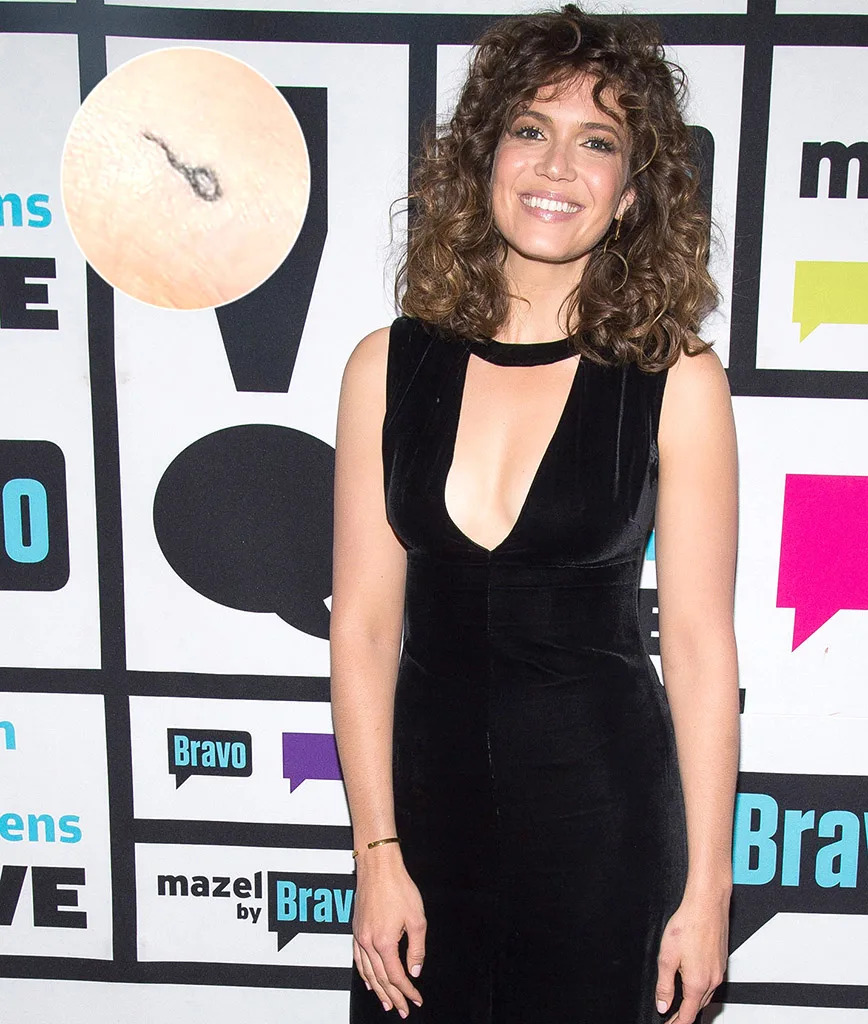
Mandy Moore’s best-known tattoos include three small pieces with distinct stories: a sperm design on her left foot, a mountain outline from her Mount Kilimanjaro climb, and a tiny initial she shares with her husband, Taylor Goldsmith. Two are on her feet, and all three can be easy to miss in a regular photo.

The tattoo story that started with a tour joke

Mandy Moore tattoos: genuine sperm tattoo evidence in the opening tattoo section

Moore’s tiny sperm tattoo sits on the inside of her left foot near the heel. She told the story during an appearance with Seth Meyers. Years earlier, while she was touring with her band, Moore was the only woman in the group and had a separate day room and shower; the male musicians shared theirs.

The band joked about not wanting “Babies on My Feet,” then turned the phrase into a song they performed onstage. The joke eventually became a matching tattoo idea, and Moore joined in. The small black outline is simple enough to read, but its story is what makes it unusual.

At this size, a clean, open shape is easier to make out than a lot of tiny detail. The design keeps to a small head and curved tail, with room around the line.

Why a foot placement can feel more private

Shoes and socks usually cover the tattoo; it can show in a barefoot photo, at the beach or during a pedicure. Foot skin also gets friction and movement, which can affect fine lines as they heal and age. Anyone considering a similar placement should talk with an artist about where shoes rub and how much detail will remain readable.

The mountain memory behind the climb

Moore added a fine-line mountain profile after climbing Mount Kilimanjaro in Tanzania with Goldsmith and friends. The climb had been a long-held goal, and she said she wanted a permanent reminder of it.

The tattoo uses a few peaks without a frame or a block of text. That keeps the design focused on the mountain’s outline rather than trying to fit the whole trip into a small tattoo. Moore’s choice of a foot placement ties the mark to the climb without needing a larger scene.

The smaller stories around it

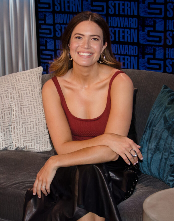
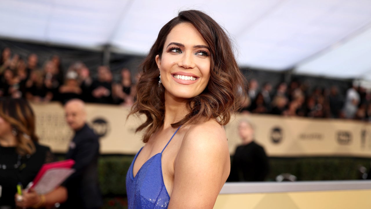
Mandy Moore in a contextual photograph: contextual event portrait for the initials section; not tattoo evidence; not tattoo evidence

Moore has a tiny “T” for Goldsmith, and he has an “M” for Mandy. The letters are understated and easy to overlook. They work as a paired reference without spelling out the relationship in a larger design.

A single letter leaves little room to hide an uneven line, so the font and placement matter. The event portrait above provides context, not a clear view of the tattoo.

Moore’s Kilimanjaro chapter, in pictures

Mandy Moore in a contextual photograph: contextual hiking photograph for the climb section; not tattoo evidence; not tattoo evidence

Photos from the climb show Moore in cold-weather gear with a pack. They document the trip, not the tattoo itself.

Mandy Moore in a contextual photograph: contextual landscape photograph for the climb section; not tattoo evidence; not tattoo evidence

The landscape gives a sense of the place behind the mountain outline. The photo does not show the ink closely.

Mandy Moore in a contextual photograph: contextual summit photograph for the climb section; not tattoo evidence; not tattoo evidence

This summit image adds another view of the climb, but it does not show the tattoo. The mountain outline itself is the clearest reference for the design.

What Mandy Moore’s choices reveal about personal meaning

For a tattoo based on a memory, decide which single detail will bring it back to you. The design can keep that detail without trying to explain the whole event.

Kate Madden Tattoos: Fine-Line Angel Wings Inspired by Her Mom

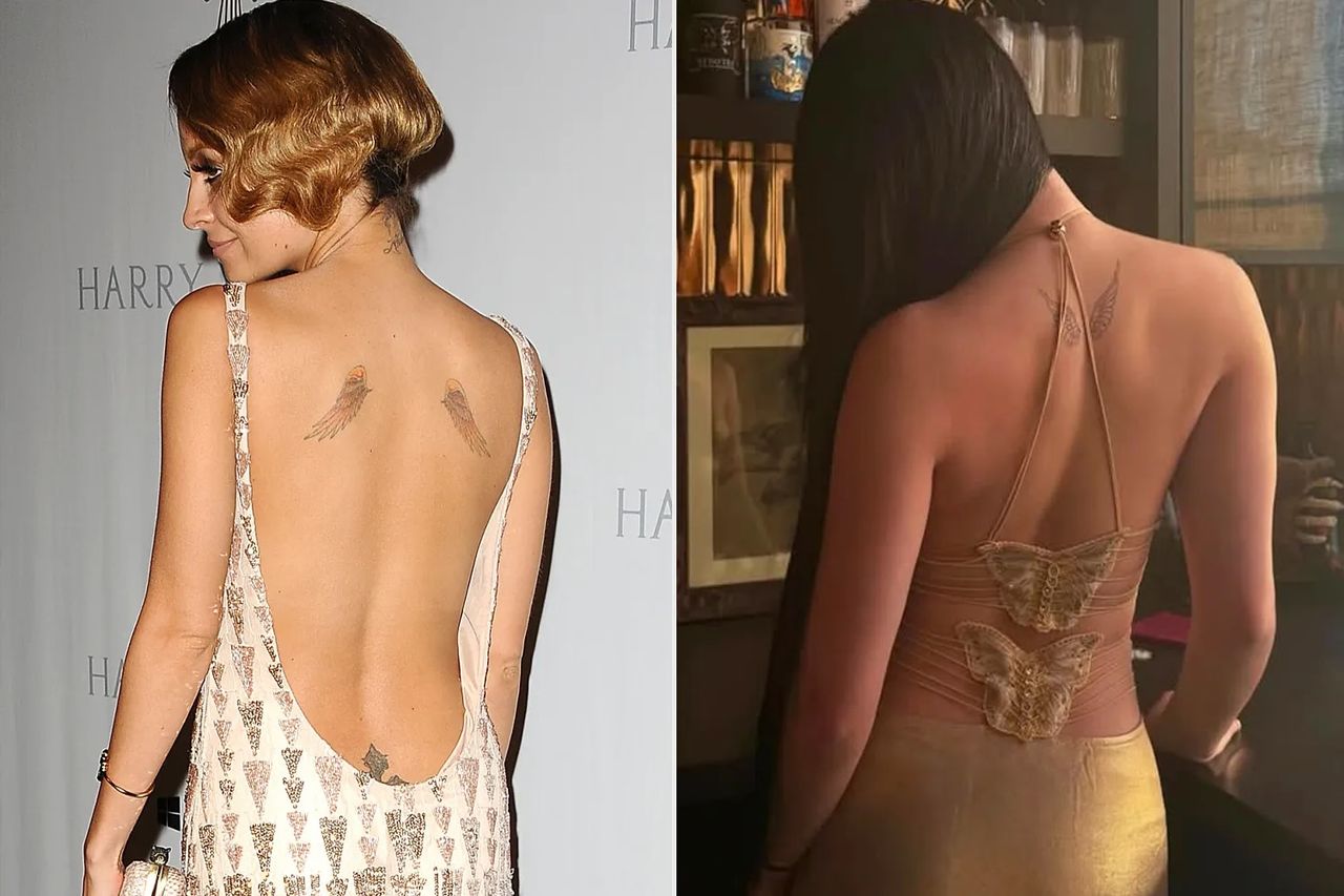
Kate Madden’s tattoo is a small pair of fine-line angel wings high on her back, a personal nod to her mother, Nicole Richie. Kate showed the design in an Instagram carousel in February 2026, captioned with a single angel-wing emoji. Nicole’s own upper-back wings are more colorful; Kate’s are lighter and more restrained.

What Kate Madden’s angel-wings tattoo looks like

The wings sit between Kate’s shoulder blades, close to the spine. A light outline and a few feather marks keep the shape simple, with enough open skin around it to make the design easy to read.

Kate Madden tattoos: Kate Madden fine-line angel-wings upper-back tattoo reference

This two-panel reference shows Kate’s tattoo on the right and Nicole Richie’s wings on the left. They’re separate images, so the left panel isn’t another view of Kate’s back. Kate’s photo shows the placement and scale: the wings are small, with clear space between the design and her shoulders.

Fine lines can blur if too many details are squeezed into a small tattoo. Here, the feather marks remain part of a clear wing shape instead of crowding the outline.

The Instagram reveal kept it simple

Kate posted a carousel: the first image shows her face, and the next turns to the tattoo. The angel-wing emoji was her only caption. The reveal itself was simple, and the design didn’t need a long explanation to make the family connection visible.

There’s no confirmed account from Kate that assigns the wings another meaning. The reporting connects them to Nicole’s tattoo; anything beyond that would be guesswork. Kate may also have liked the fine-line style, but she hasn’t said so publicly.

The upper-back placement lets Kate show the wings with a low-backed dress or strappy top and cover them with an ordinary shirt. It’s a private design she can reveal when she chooses.

Kate’s style around the reveal

Kate’s public looks have included black leather, long dark hair and makeup with a rock-and-roll edge. The small wings add a softer detail without turning her back into a larger display piece.

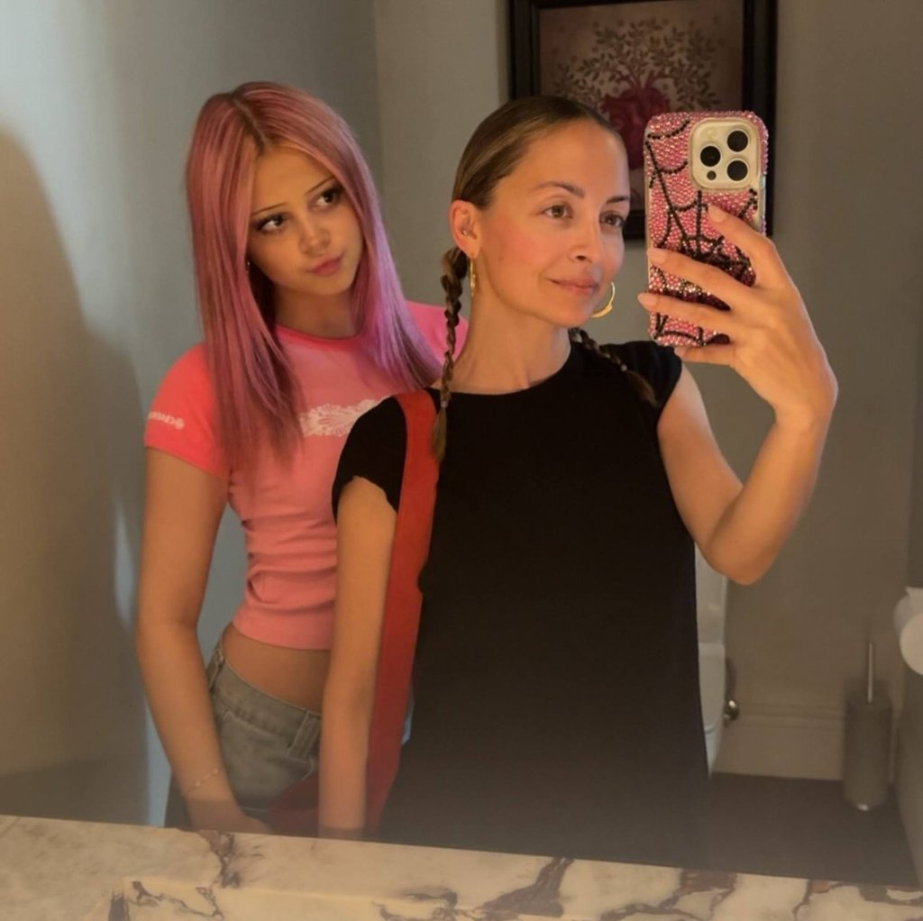
Kate Madden in a contextual photograph: Kate Madden and Nicole Richie mirror selfie; not tattoo evidence

This mirror selfie with Nicole Richie gives a casual look at Kate away from the red carpet. The wings aren’t visible, so the photo offers style context rather than evidence of the tattoo.

Angel wings can be ornate or heavily shaded. Kate’s are much quieter. For someone drawn to the idea but not a decorative look, a light outline and a few feather lines can keep the design understated.

The family reference stays personal

Nicole’s wings are more colorful and prominent; Kate’s are smaller, mostly black and almost sketch-like. The tattoos share an image, but they aren’t exact matches. Kate kept the family reference and chose a different treatment.

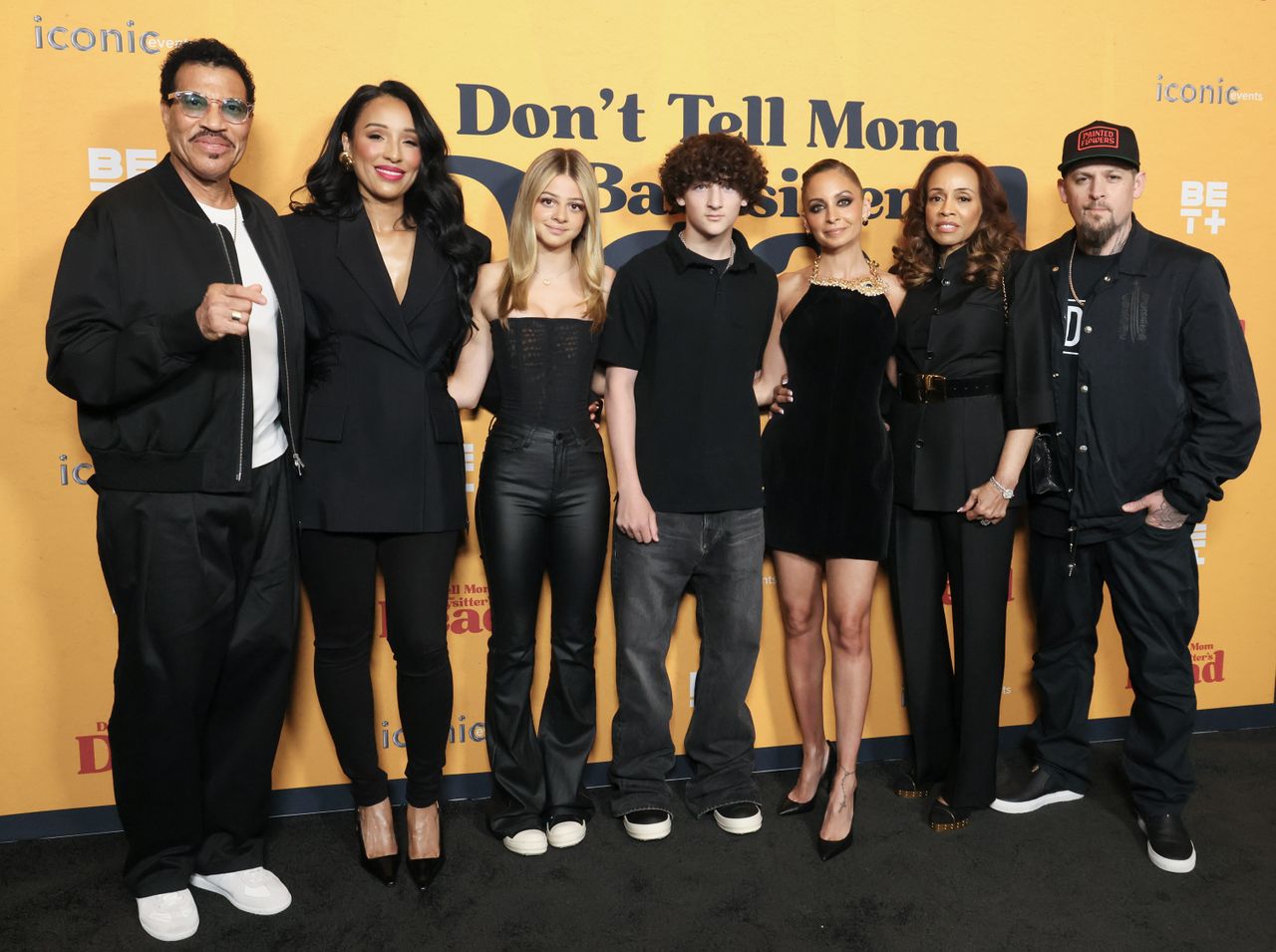
Kate Madden in a contextual photograph: Kate Madden family red-carpet photograph; not tattoo evidence

The red-carpet photo places Kate with her family, but the tattoos in it can’t be reliably read. The private reference behind her wings is clearer than anything this image shows.

For a family tattoo, people can start with the same idea and still choose different designs. One person might want color, another black ink, or someone else a small symbol. The connection doesn’t depend on identical tattoos.

Why the placement works

Wings suit the upper back because the center line gives them an anchor and the shoulder blades leave room to spread. The design can stay small and still follow the shape of the body.

The location is also easy to cover while a new tattoo heals, which can help limit sun and clothing friction. The artist’s aftercare instructions still matter. Placement gives the wearer some choice over when the tattoo is visible.

Kate Madden in a contextual photograph: Kate Madden at Coachella; not tattoo evidence

Kate’s Coachella photo doesn’t show the wings; it’s included as a glimpse of her public style. For a similar placement, ask your artist to check the stencil with your shoulders relaxed and again as you move. Small changes to the width or feather direction can make the shape sit more naturally.

How to borrow the idea without making it too obvious

If you like the idea but don’t want a direct copy, the design could use a single outline wing, two short feather shapes or a pair of curved marks that suggest wings together. Keep the image readable at the size you want.

The family reference can stay private. Kate’s tattoo reads as wings even if someone doesn’t know the Nicole Richie connection. That balance can work for a tribute to a parent, sibling, friend or chosen family member: the image can be simple while its meaning stays personal.

Kate Madden in a contextual photograph: Kate Madden outdoor portrait; not tattoo evidence

This outdoor portrait shows Kate in another setting, with the wings out of view. An upper-back design can stay out of sight in everyday clothes and appear when a neckline or pose reveals it.

Fine lines may soften as a tattoo heals and ages, especially when many details are packed together. An artist can simplify the feathers so the wings keep a clear shape. More detail isn’t always better; leaving open space helps the design read.

The family idea can stay small

Kate’s wings connect her to Nicole Richie, but the design remains her own: small, fine-line and easy to reveal or cover. It doesn’t need lettering or extra shading to carry that reference.

The tattoo stands on its own, whether or not Kate adds more ink later. For a similar tribute, choose the part of the story that matters and let the design stop there.

Justin Theroux Tattoos: His Giant Back Piece and Smaller Ink

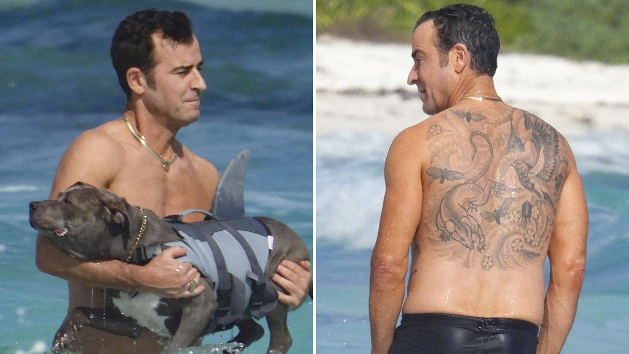
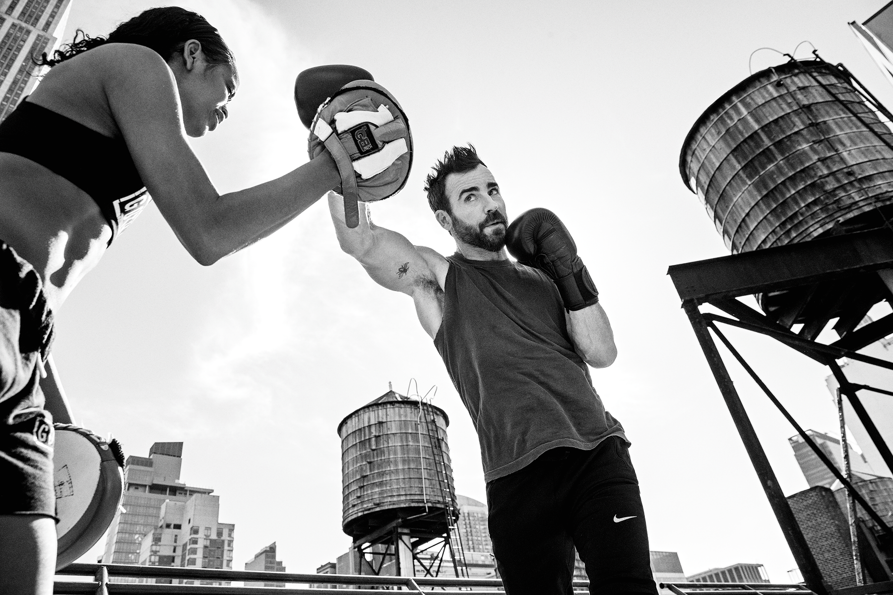
When asked how many tattoos he has, Justin Theroux answered, “More than ten.” The large piece across his back is dedicated to his two rescue pit bulls. Smaller designs appear on his arms, legs, wrists, ankles and feet; he has described most of his ink as being on his back and legs. Theroux has said he often gives tattoo artist Scott Campbell a few rough ideas and lets him draw. Campbell did most of the tattoos, including the back piece.

For more examples, browse the celebrity tattoo archive.

Justin Theroux’s giant back tattoo

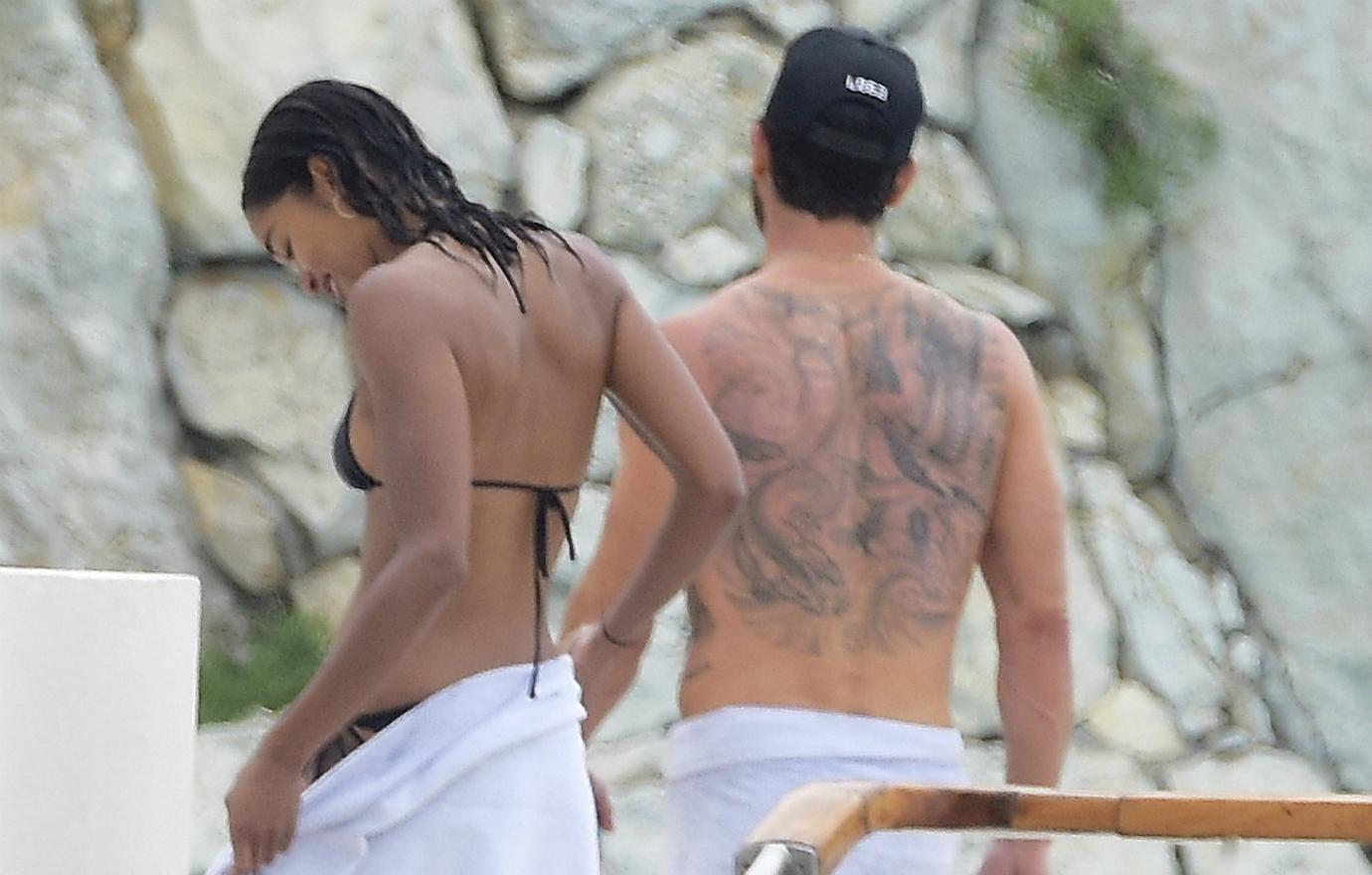
Justin Theroux tattoos: Genuine high-resolution paparazzi photograph showing the large back tattoo from behind.

Theroux’s back piece includes a rat and a New York pigeon. In a live interview, he said he dedicated half of his back to each of his two rescue pit bulls after they died. One of the dogs used to kill rats in Washington Square Park; the pigeon refers to another part of their life in the city. The two animals make an unusual memorial, but the connection is personal and specific.

The tattoo spans a broad area across his back. Theroux has said Campbell designed it and that he trusted the artist’s eye.

The smaller tattoos around his arms and legs

Justin Theroux tattoos: Distinct high-resolution TMZ photograph/composite showing a rear view of the same back tattoo in a different setting and composition.

This second rear-view photograph shows the back piece from another distance. Theroux’s smaller tattoos include scissors, an X on his ankle, swallows on his feet, a grim reaper on his shin, lettering near his knee and other small symbols. A Men’s Health photograph also shows a mark near his underarm, though it isn’t a full catalog of his ink. He has said there are enough little tattoos that he can lose track of them when counting.

Why the back tattoo stands out more than the rest

Justin Theroux tattoos: Genuine high-resolution Men's Health editorial photograph with a small tattoo visible near the underarm.

The dog story gives the back tattoo a meaning that is easier to recognize than the smaller designs, which show up only in closer photos. The underarm mark in this image is easy to miss beside the larger piece.

Theroux’s punk-influenced editorial look

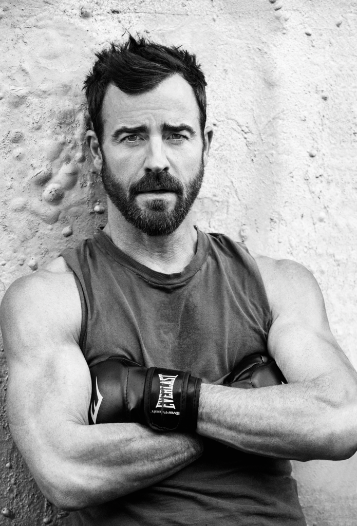
Justin Theroux in a contextual photograph: Contextual editorial portrait only; tattoo details are not visible.; not tattoo evidence

Theroux has talked about getting into punk as a teenager and making homemade tattoos for friends. This Men’s Health portrait gives a sense of his editorial style—dark clothes and a rougher edge—but no tattoo detail is visible. It adds context to his look; it should not be used to identify a design.

A collection that doesn’t need to match

Justin Theroux in a contextual photograph: Contextual editorial portrait only; tattoo details are not visible.; not tattoo evidence

The second portrait has no tattoo detail either. The collection puts a large memorial beside small marks; if you’re looking for a reference, use the close tattoo photos to judge design and placement.

More actor tattoo guides

Josh Brolin Tattoos: Lighthouse Back Tattoo, Waves and Mermaid Ink

Josh Brolin’s tattoo history includes the “jailhouse” ink he described from his younger years, tattoos for film roles, and a shoulder tattoo he later had removed. In late 2025, photos from Santa Barbara showed him surfing with a large new design across his back.

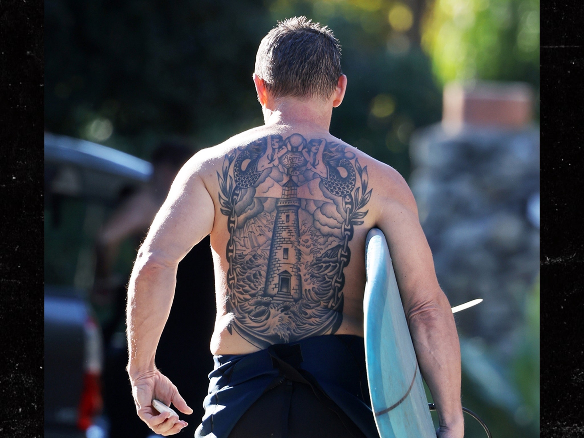
A lighthouse rises from rough water at the center, with two mermaids at the sides and the word aretê between his shoulder blades. The back-facing photos show a black-and-gray piece with a lot of linework. Brolin hasn’t publicly explained the personal meaning of the word.

Josh Brolin’s lighthouse back tattoo

Josh Brolin tattoos: inline

The clearest photo shows the lighthouse running down the middle of Brolin’s back, with waves filling the lower section and mermaids extending the scene across his shoulders. The figures blend into the surrounding lines, so they read as part of one composition. Open skin breaks up the darker shading.

Look closer at the layout

With a surfboard tucked under one arm, Brolin faces away from the camera. The tower narrows as it follows the center of his back, while the water gets darker and busier below. Windows, ledges and the beam give the lighthouse some architectural detail; the curved waves set it apart from the straight lines of the tower.

There’s enough open skin between the shapes to keep the black ink from becoming a solid panel. The mermaids sit outside the tower’s center line, filling the wider parts of the back without crowding the lighthouse.

A small detail

The word between Brolin’s shoulder blades is aretê, a Greek term translated as excellence, virtue or fulfillment. TMZ described it in terms of fulfillment and virtue. It’s a small inscription above the main image, but its purpose beyond that isn’t public: Brolin hasn’t said why he chose it.

The front photo sets the scene

Josh Brolin in a contextual photograph: inline; not tattoo evidence

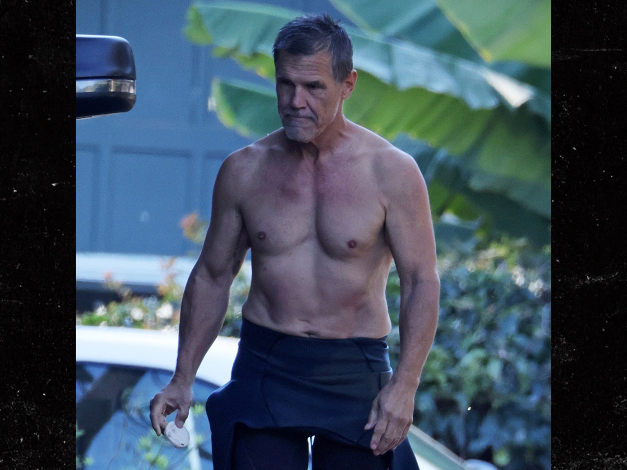
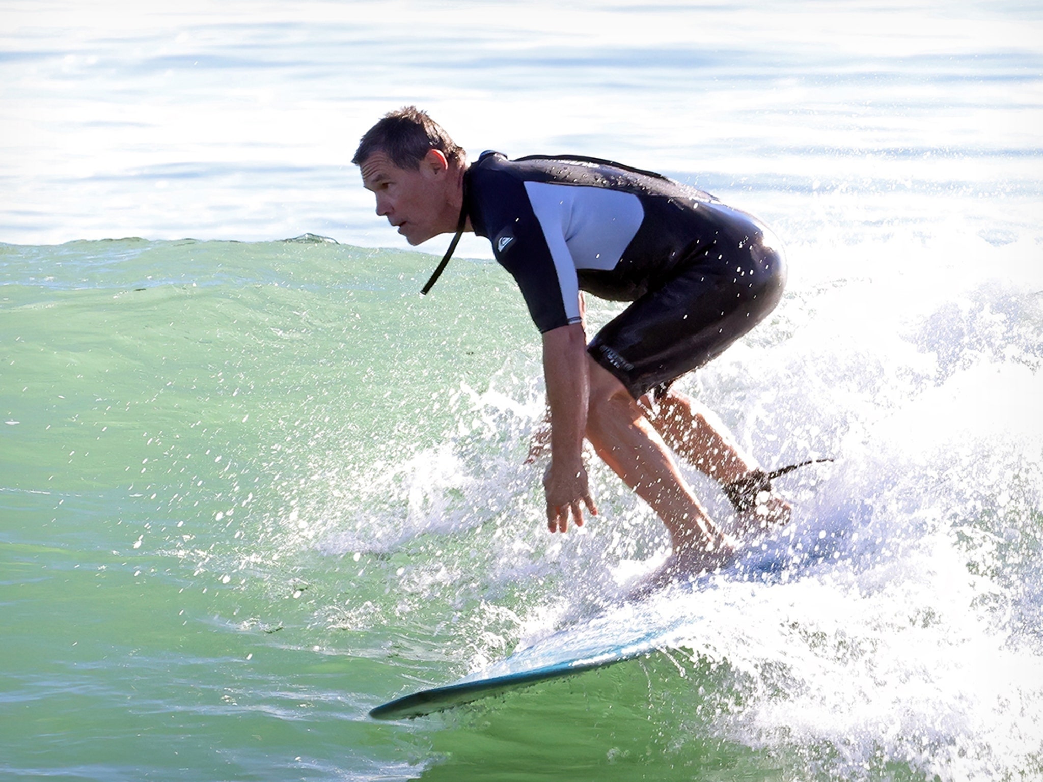
This surf-day photo shows Brolin from the front with his back turned away. It helps place the tattoo sighting in context, but it doesn’t show the lighthouse design. The back-facing TMZ photo is the one that documents the ink.

Shape and contrast

The tower gives the scene a vertical center, while the water and side figures spread it across the back. Straight architectural lines meet curved waves, and the gaps of open skin keep the darker areas readable. For a smaller version, a lighthouse, short horizon and a few waves would keep the main silhouette without the full scene.

The sea photos add context

Josh Brolin in a contextual photograph: inline; not tattoo evidence

These two images show Brolin around the water; one is from a profile that pictures him on a boat with a surfboard. They fit the article’s setting, but neither is a view of the back tattoo. Their nautical feel shouldn’t be treated as evidence of what inspired the design.

A separate timeline

Josh Brolin in a contextual photograph: inline; not tattoo evidence

In a 2014 Guardian interview, Brolin said he no longer had tattoos and recalled having “jailhouse tattoos” when he was younger. He also described people reacting to them in business meetings. Photos from the Whalefall period show nautical designs made for his character, including ships; those were makeup, not part of his personal collection.
ComicBook reported in 2021 that Brolin got a personal tattoo connected to Dr. Woo and a child’s drawing. He also discussed having a shoulder tattoo removed before the new back piece appeared. These are separate points in his tattoo history, not explanations he has given for the lighthouse.

Keep the timeline straight

Josh Brolin in a contextual photograph: inline; not tattoo evidence

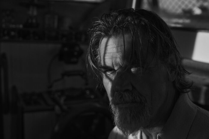
This black-and-white portrait is an editorial image, not a clear view of Brolin’s current personal tattoos. The marks visible in photos from that period were tied to a character role. Of the images here, the back-facing TMZ shot is the one that shows the lighthouse; the others provide surfing or editorial context.

Ideas to take to your artist

If you like the composition, start with the shape and placement: a central image that follows the back, with details that spread toward the shoulders. A smaller piece could keep the lighthouse and water; a larger one has room for side figures and lettering. Use a coastline, figures or word that mean something to you instead of copying Brolin’s scene.

Brolin discussed the back tattoo on Jimmy Kimmel Live in this late-2025 segment.

More actor tattoo guides

Macaulay Culkin Tattoos: The Story Behind His One Spoon Tattoo

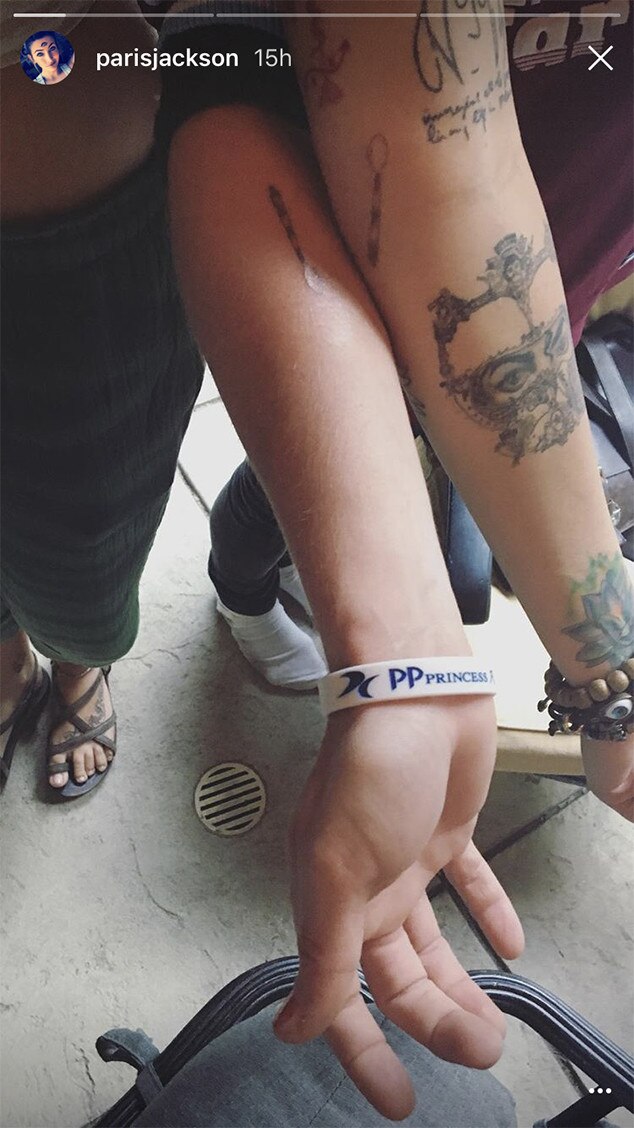
Macaulay Culkin has one clearly documented tattoo: a small striped spoon on his right inner forearm. His goddaughter Paris Jackson has a matching design.

Macaulay Culkin’s single spoon tattoo

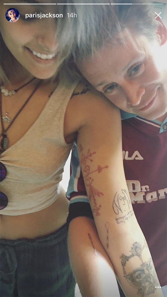
Macaulay Culkin and Paris Jackson showing their matching spoon tattoos in a close-up tattoo photo
Macaulay Culkin and Paris Jackson with their matching spoon tattoos visible on their forearms

Culkin’s spoon is fine black linework, with narrow stripes across the bowl and handle. It stays an outline rather than trying to look like a realistic utensil.

Culkin and Jackson got the tattoos in July 2017 at Tattoo Mania in West Hollywood, and Jackson shared photos afterward. The story behind the pieces is that Culkin used to take her spoon during meals, so they turned the habit into a matching design.

Jackson’s version is on her inner forearm too, making the match easy to see when they compare arms.

This is the one tattoo clearly documented for Culkin. Photos of his face, clothes or surroundings don’t establish a larger collection.
A public afternoon with Paris

Photos from that period place them together in a casual street setting, away from a formal tattoo reveal. Culkin became famous as a child actor and later stepped back from the usual publicity cycle; these pictures show a quieter moment with Jackson.

That kind of ordinary setting can help when you’re looking for a personal tattoo idea. A routine, nickname or running joke may matter because of who shared it, even if it sounds small to anyone else.

The low-key style of the day

Culkin’s look in the photos is understated, so the small forearm tattoo stays a detail rather than taking over the frame.

Fine-line work at this scale leaves little room for crowded details. The bowl, handle and stripes need enough space to stay distinct, especially as the tattoo settles.

A friendship built on odd little rituals

The spoon gives their matching design a particular story. It recalls a shared joke, not a broad statement about how close two people are.

He is Jackson’s godfather, and the tattoo keeps the tone of their joke instead of making a grand declaration.

A heart can stand for many things. This spoon points to one particular story, which is why it feels personal.

The most relaxed kind of celebrity photo

Celebrities’ clothes and gestures can invite more interpretation than a photo supports. Here, the matching spoons and the story shared about them give the images enough context.

For someone choosing a first tattoo, a small inner-forearm design can be shown or covered without building an entire look around it. Culkin’s piece stays modest in the photos and easy to recognize up close.

Why the tiny spoon works

The spoon works because its outline is familiar and the stripes add detail without obscuring the shape. It’s still recognizable at a glance.

If you want a similarly personal reference, look for an everyday object tied to someone or a routine in your own life. It can hold a story you explain, or keep to yourself.

Keeping the idea small

If Culkin’s tattoo appeals to you, borrow the idea behind it rather than copying the spoon. Keep the image simple, give it enough room, and choose a reference that means something to you.

Ask the artist how fine lines and narrow gaps are likely to heal. Healed examples can show how much detail will remain clear, and the artist can size the design to suit your skin.

Matching tattoos don’t need identical measurements or mirrored placement. The shared decision matters more than making the two arms look like a set.

Dominic Purcell Tattoos: His RIFF Back Tattoo and Australian Ink

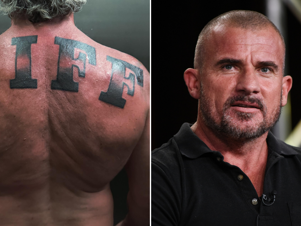
Dominic Purcell’s collection mixes bold lettering with smaller symbols and family references. The latest addition is a large “RIFF” across his upper back, tied to Penrith, the Western Sydney suburb where he spent much of his childhood.

The RIFF back tattoo is pure Penrith pride

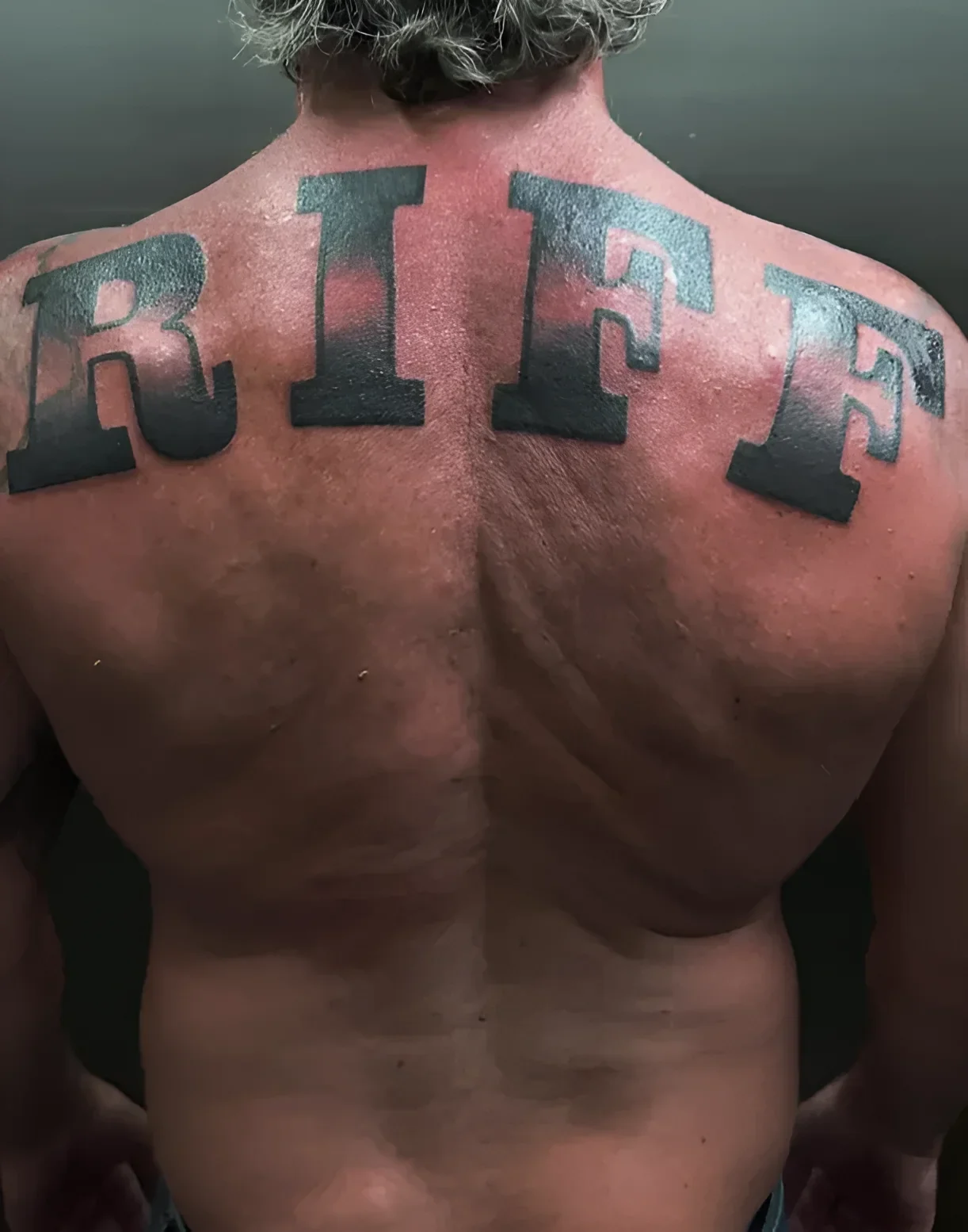
Dominic Purcell tattoos: genuine RIFF back tattoo evidence

The RIFF letters run across the shoulder blades in a broad, dark type style. Their simple shape keeps the word readable from a distance, without extra decoration around it.

Purcell shared the tattoo with a caption about Penrith, New South Wales, the 1970s and 1980s, and his pride in where he came from. “Riff” is a local nickname; read without that context, it could sound like a music reference.

7NEWS and The Nightly identify Los Angeles tattoo artist Jamie Gene Lopez as the artist. The piece was done at Joy Studio in downtown Los Angeles.

The newer chest work leans into Australian symbols

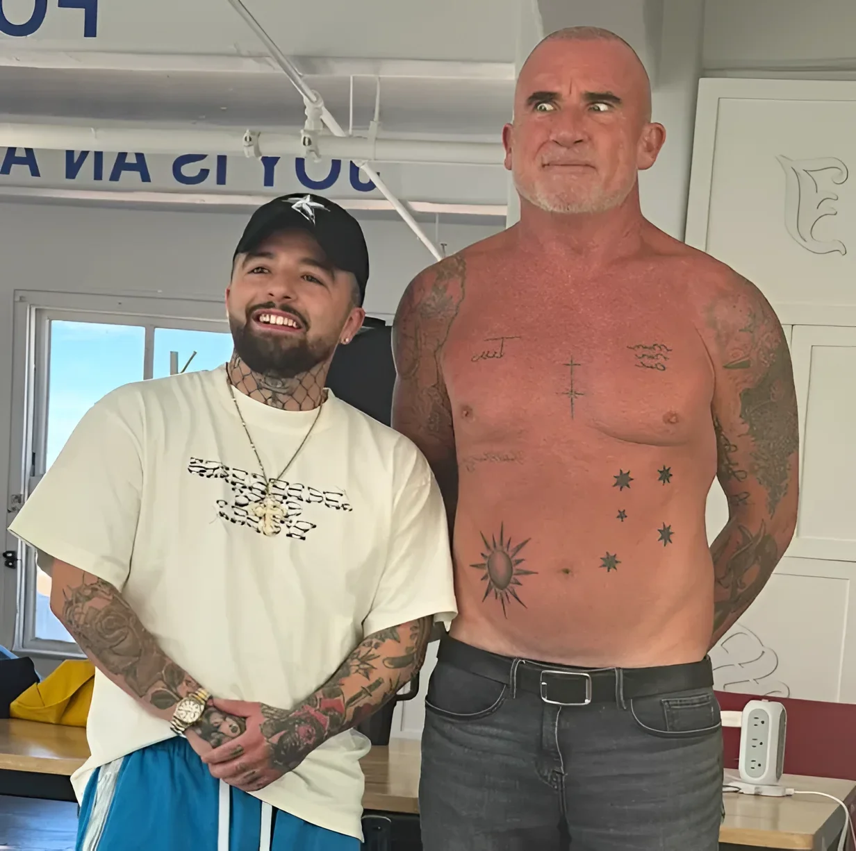
Dominic Purcell tattoos: genuine Australian-themed chest tattoo evidence

The chest and abdomen work takes a different approach. Instead of one large word, the newer Australian-themed tattoos are smaller symbols spaced across the body: cross shapes, star-like forms associated with the Southern Cross, and a radiating sun.

The open spacing leaves each mark visible as its own design rather than combining them into one mural. The symbols suggest an Australian theme without using a flag or a literal map.

Tatufoto’s September 2026 report links the new pieces to the country where Purcell grew up and identifies Jamie Gene Lopez in its accompanying coverage.

A shared subject can connect separate designs even when their sizes and outlines differ.

The Fail Better quote keeps the arm lettering direct

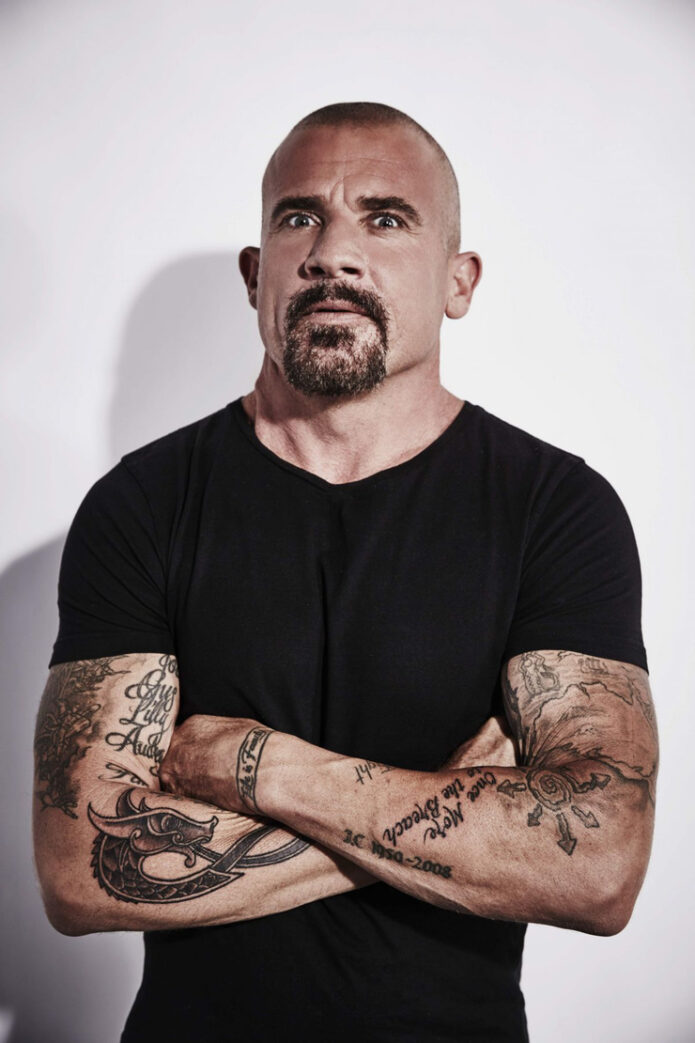
Dominic Purcell tattoos: genuine tattoo photograph showing the arm lettering

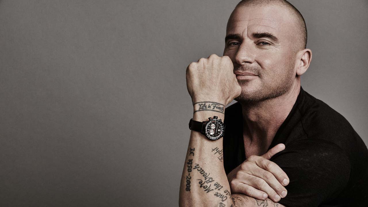
Older photos show Purcell’s arm lettering, including the line from Samuel Beckett’s Worstward Ho! often shortened to “Fail Better.” The full quote reads: “Ever tried. Ever failed. No matter. Try again. Fail again. Fail better.” On his arm, the script is stacked and follows the limb’s shape.

The letters have a loose, lived-in look rather than a polished logo finish. It stands apart from the block lettering on his back, but the dark ink ties the pieces together.

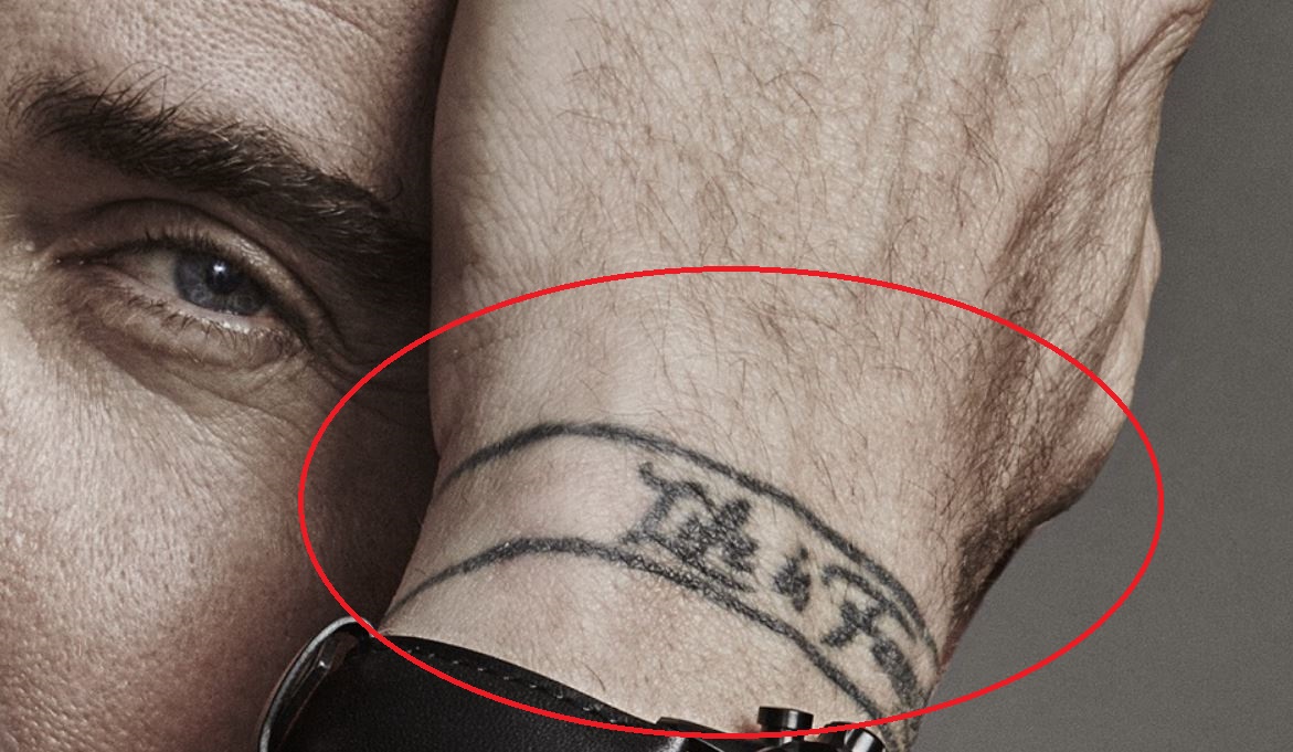
Life is Forever wraps around the wrist

Dominic Purcell tattoos: genuine Life is Forever wrist tattoo evidence

On Purcell’s wrist, a band-like tattoo reads “Life is Forever.” The hand-lettered words circle the wrist like a bracelet, and their short length makes them easy to catch in a photo.

Wrist tattoos bend and disappear under a watch or sleeve. This phrase is bold enough to remain legible as the arm moves, while the placement lets him cover it when he wants.

Near the arm lettering is an outlined anchor with a clear shape and an open interior. Anchor tattoos are often associated with stability, loyalty or home, but Purcell hasn’t publicly explained his own meaning, so those readings shouldn’t be assigned to him.

Other reported pieces include family names and dates, plus a large compass-style tattoo on his shoulder. Body Art Guru describes initials connected with his children at the compass points, with dates around it; other lettering is described as a tribute to his father.

What makes Dominic Purcell’s tattoos work

Dominic Purcell tattoos: genuine RIFF tattoo overview within the collection analysis

The collection is easy to read because each tattoo has a clear shape and place. RIFF needs room across the back; the wrist phrase circles the wrist; the anchor sits near the arm lettering without getting lost.

Purcell’s tattoos have accumulated over time, and they don’t all share one style. That leaves family names, script, symbols and large lettering with their own character.

Several newer pieces point to Australia, while the older compass and family tattoos add other references. A collection can carry a common thread without repeating the same image.

Final take

RIFF is the clearest reference to Purcell’s hometown. His chest symbols, Beckett quote, wrist phrase and reported family tattoos add other parts of the story without needing to match.

More actor tattoo guides

Jeffrey Dean Morgan Tattoos: Lucille, Matching Ink and the Stories Behind His Designs

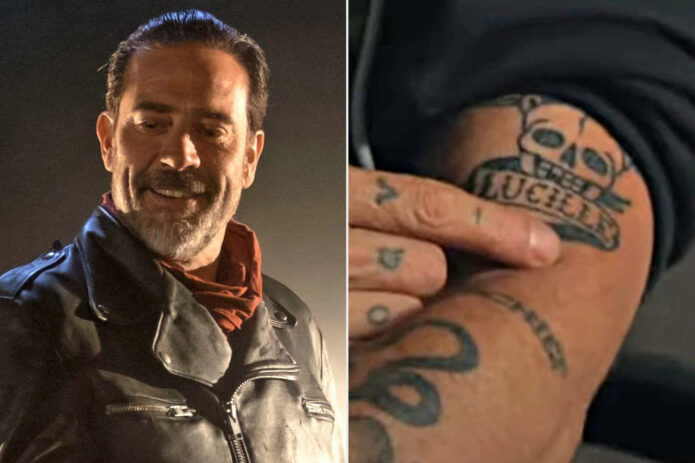
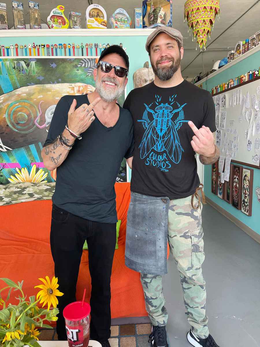
Most of Jeffrey Dean Morgan’s tattoos are black ink, and they don’t form one large sleeve. The best-known is “Lucille,” a nod to Negan’s barbed-wire bat in The Walking Dead. Photos also show smaller designs on his hands and forearms, including “Bisou,” which public tattoo coverage links to a personal loss, and ink shared with friends.

The forearm pieces may peek out from a rolled sleeve, while hand tattoos are harder to hide. A character reference also reads differently from a private word.

The “Lucille” tattoo has a very specific connection

The script “Lucille” is the clearest character reference in Morgan’s collection. It points to Negan’s barbed-wire baseball bat in The Walking Dead. In the close-up, the lettering sits beside a skull and barbed wire, so the reference reads without a portrait or the show’s title.
That’s a practical way to handle a role tattoo: one recognisable name, supported by a few related details. The lettering has a relaxed, slightly old-school look that suits the rough imagery. If you’re drawing from a character or object, a couple of clear cues can carry the idea without crowding the skin with tiny scene details.

His hand and forearm ink has a looser feel

Jeffrey Dean Morgan tattoos: His hand and forearm ink has a looser feel

Studio photos show script and small illustrative marks across Morgan’s fingers, hand and lower arm. They don’t form one continuous panel; each piece has its own space.

Hands get washed, exposed to sun and rubbed against things every day. Small letters and fine lines can soften, and too many details can blur together. Simple shapes with room around them are easier to read. Placement changes with movement too: ink may disappear when fingers curl, then show when the hand turns toward a camera.

The matching tattoo session with Jensen Ackles

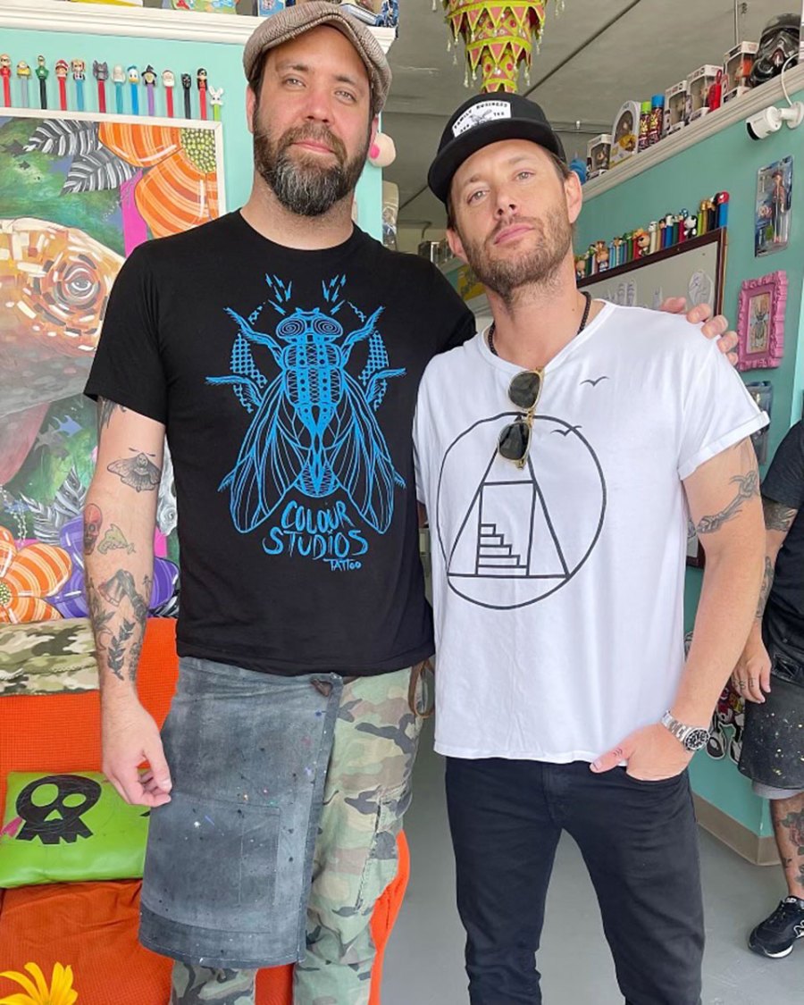
Jeffrey Dean Morgan tattoos: The matching tattoo session with Jensen Ackles

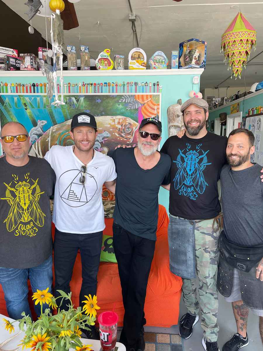
Morgan and Jensen Ackles worked together on Supernatural: Morgan played John Winchester and Ackles his son, Dean. Photos later showed them at a tattoo session at Colour Studios in Tulsa in June 2022.
The public images establish the session and who was there, but don’t clearly show every detail of the matching tattoos. There’s no need to fill those gaps with an invented meaning. An earlier tattoo outing around Morgan’s wedding period also involved Ackles and Jared Padalecki, with Mike Lucena of Flyrite Tattoo credited in reports.

Those pictures put the tattoos in the context of long-running friendships and shared time. If you’re getting matching ink, decide what you want to remember about the day as well as what the design should look like.

His forearm tattoos are easier to spot in event photos

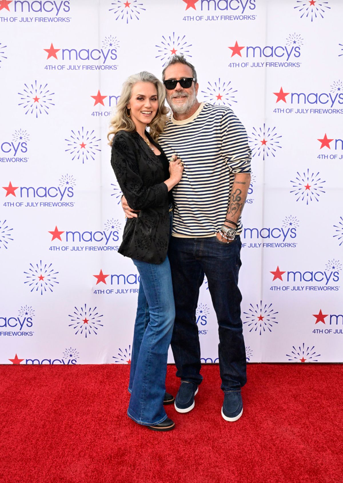
Jeffrey Dean Morgan tattoos: His forearm tattoos are easier to spot in event photos

At events, Morgan’s sleeves often cover most of his ink. A red-carpet photo with his shirt rolled up offers a clearer view of the forearm pieces. They look like separate tattoos that happen to share the same area, rather than one large statement design.

That placement is easy to show and easier to cover for a role, with wardrobe or makeup. It also lets the larger “Lucille” reference and smaller marks read in different ways; not every tattoo needs to follow one visual theme.

A quiet memory can carry a lot

The script “Bisou” on Morgan’s forearm is linked in public tattoo coverage to the loss of a pet. The French word means “kiss,” a simple choice with a softer tone than the imagery around Lucille. The reported connection gives the tattoo a personal note without needing a more elaborate design.

If you’re considering script for a memorial, make room for the lettering instead of shrinking a chosen font to fit. A tattooer can work from handwriting or another reference while adjusting the spacing so the word remains readable.

The room around the appointment matters too

Jeffrey Dean Morgan in a contextual photograph: The room around the appointment matters too; not tattoo evidence

A studio photo can preserve the people and place around an appointment, not just the finished tattoo. Other portraits show only the ink visible in that moment. Read each image for what it actually documents; a picture alone can’t explain why a design was chosen.

What to borrow from the placement

Think first about how visible you want the tattoo to be. Forearm ink is easy to show and can sit under a sleeve; hand tattoos are harder to conceal and become part of everyday appearance. A character reference, memorial word or friendship symbol may each feel right in a different spot.

Check the design while your wrist and fingers are moving, not only in a flat stencil photo. Hand and finger tattoos are washed, exposed and stretched often, so small lettering can lose crispness. Keep the shapes clear at the size they’ll actually be, and ask your artist how much detail can hold up there.

Making the idea your own

Borrow the approach, not the exact artwork. For a character reference, pick the detail that carries it. For a friendship tattoo, choose something that means the same thing to both people and can suit each person’s body. For a pet memorial, a word, small outline or familiar gesture may feel closer to your own memory than a generic symbol.

Set the size before the design gets crowded. Ask the artist which details will still read after healing, and let them adjust line weight, spacing and proportions. Different tattoos can have different moods; the reason behind them is enough to connect them.

What the collection gets right

Morgan’s tattoos bring together a role, friendships and a quieter personal memory without forcing them into one style. The collection feels like it grew over time rather than following a single visual plan.

The useful lesson is to start with a reference or memory that matters, then choose a design and placement that work at their real size. His ink feels collected, not arranged to match.

More actor tattoo guides