admin

Scary Terry wears his whole story in ink

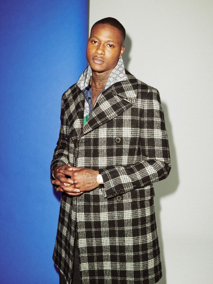
Terry Rozier has never treated tattoos as background decoration. The Miami guard has called himself the most tattooed player on his team, and it is easy to see why: his arms, chest, head and legs carry basketball, family, faith, grief, Tupac, horror and a few designs he simply liked.

That variety is what makes Terry Rozier’s tattoos interesting. They did not arrive as one carefully planned sleeve. The designs came in stages, often tied to a specific person or memory. Some were planned well ahead; others filled a gap when he let his artist improvise. The result is busy, personal and unmistakably his.

His first tattoo was a crown over a basketball
Terry Rozier blue-background arm tattoos

Rozier told GQ that he got his first tattoo at fourteen. It reads “Terry”, with a crown above a basketball. He jokes that it is exactly the kind of design a fourteen-year-old might choose, but the story goes back further: his friends were getting basketball tattoos in middle school, and he wanted one too.

Looking back, the tattoo almost seems like a prediction. Many of the people around him got basketball ink, but Rozier was the one who made it to the NBA. He has described that coincidence with both pride and disbelief. A name, crown and ball could sound overconfident on paper; on his skin, they became a reminder that the dream came true.

The design also hints at a larger pattern in his collection: ordinary symbols become personal receipts. The basketball is more than a sports image. It points back to where he came from and the path he kept taking.

Rosaries and family names sit close to the chest
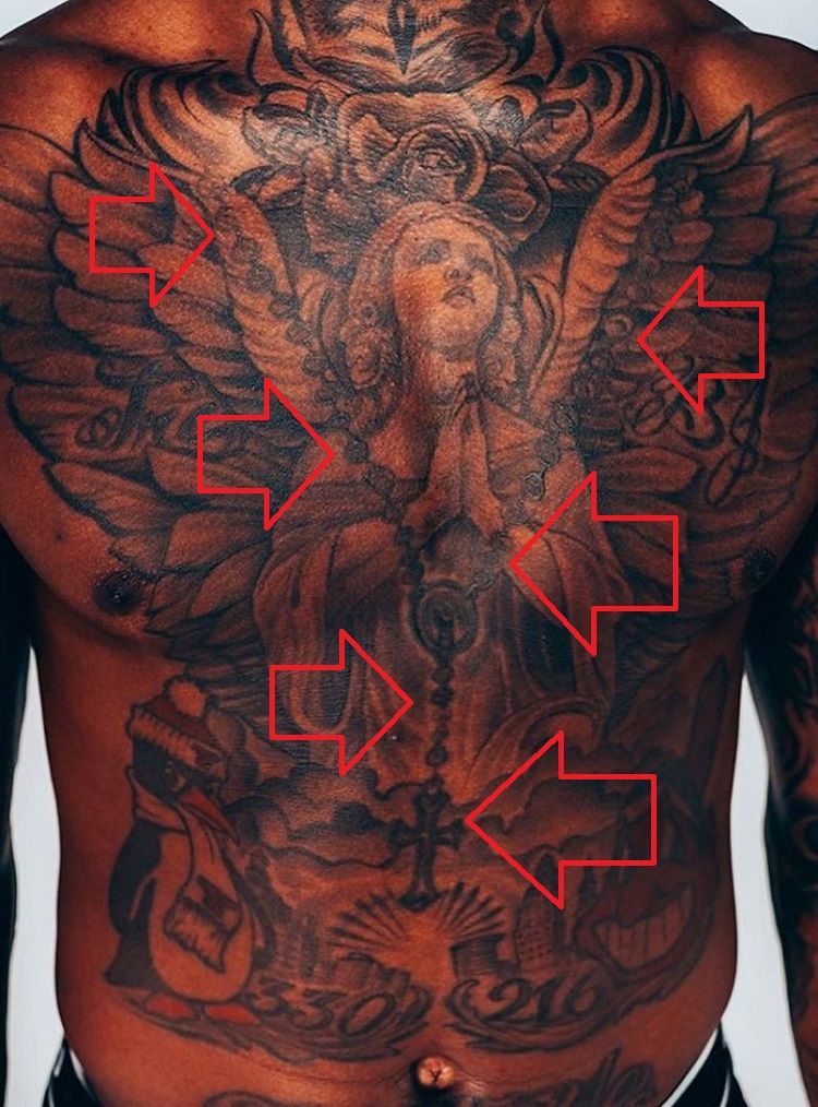
Terry Rozier rosary tattoo

One of Rozier’s clearest family tattoos is a rosary he got at fifteen. Around it are the names Tre and BJ, his sister and brother. He has said that he taps the left side of his chest at the free-throw line, a ritual he has kept since high school or perhaps even earlier.

That makes the placement part of the story. These names are not simply filling spare space; they sit where he reaches when settling himself before a shot. In a collection full of bold images, the family names are among the most direct and grounded pieces.

A large angel fills part of the same area. Rozier has said he sometimes leaves smaller filler designs to his artist, while the larger pieces usually begin as his own ideas. Together, the angel, rosary and names read like a group of protective symbols, not separate bits of flash.

The motivation arm carries the people who shaped him
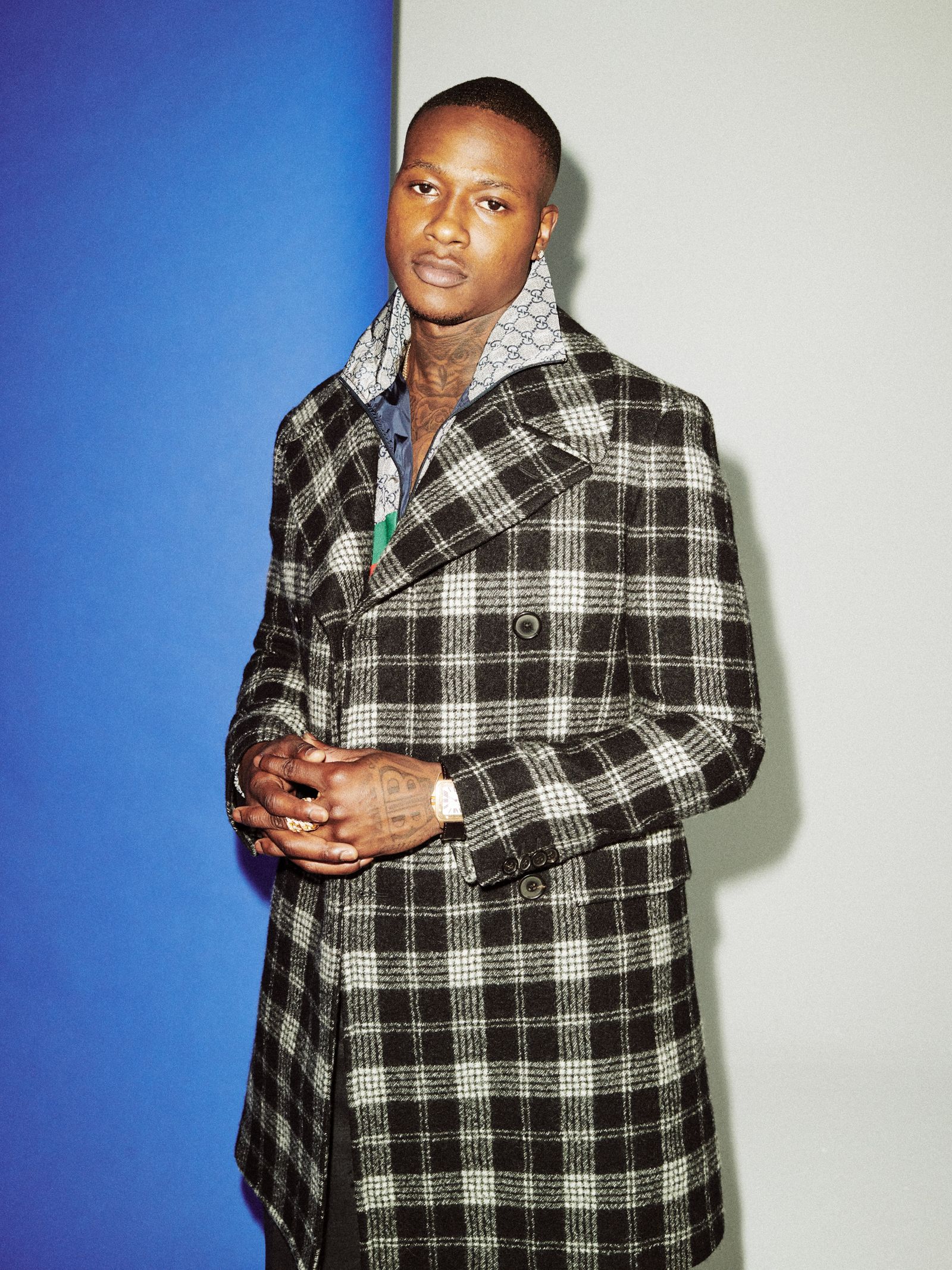
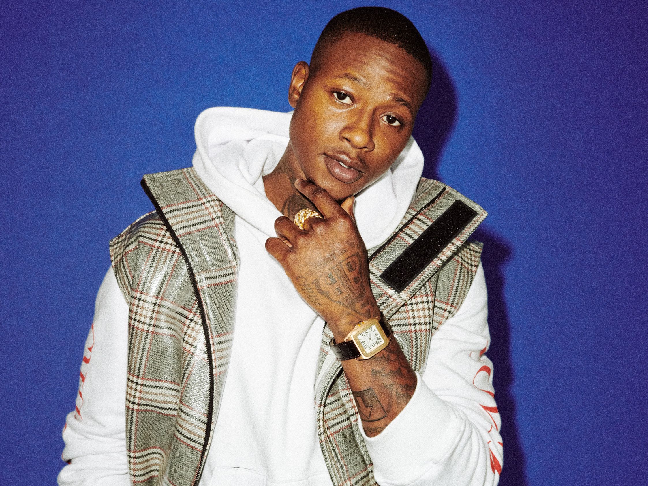
Terry Rozier plaid-jacket sleeve tattoos

Rozier calls one arm his “motivation arm.” It holds tributes to his father, his uncles and a childhood friend named Snoop, who died. The word “motivation” sits near the top, surrounded by pieces for people he wanted to keep close as his career moved forward.

He has said he prefers meaningful portraits and names to decoration for its own sake. That does not mean every tattoo has to be solemn. It means the larger designs tend to have a reason behind them, even when smaller marks are added later to fill a space.

Rozier talks about the arm without presenting it as a perfect memorial wall. He describes choosing the ideas, letting his artist work around gaps and making sure the finished tattoos still represent the people in his life. It feels less like a finished statement than a family album that keeps growing.

His other arm mixes faith, Tupac and Scary Terry
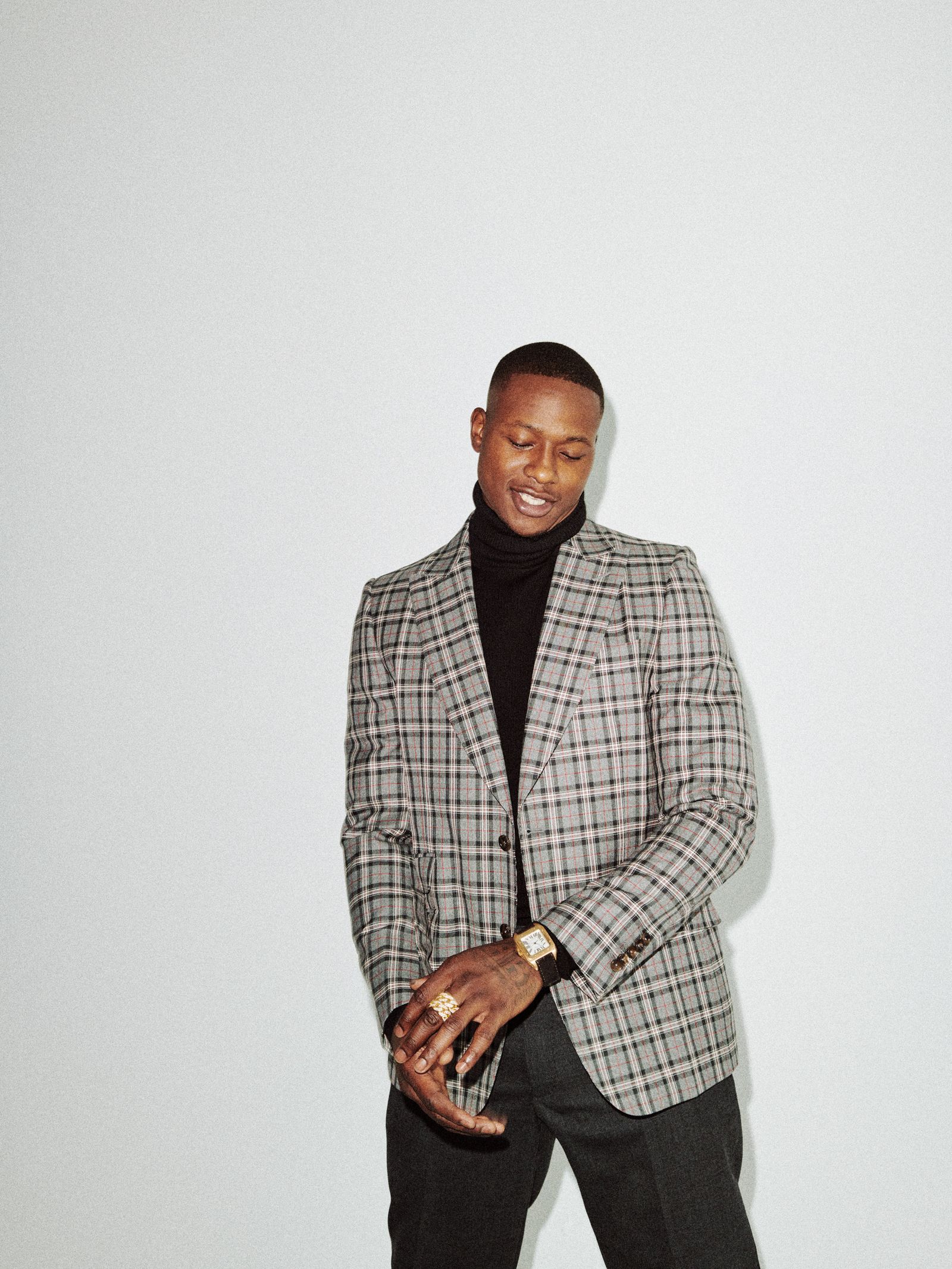
Terry Rozier suit neck tattoos

The other arm brings together several different subjects. Rozier has his grandmother’s name, the initials GMB, a cross on his thumb and a rose growing through concrete. He has traced the rose to Tupac’s idea in a poem about beauty and survival pushing through a harsh environment.

The image is easy to understand even without a long explanation: it is about coming from a difficult place and still finding room to grow. Rozier called it a one-in-a-million sight, because roses do not normally grow through concrete. The metaphor is simple, but it fits his journey from Youngstown through college basketball and on to the NBA.

He also has a Scream mask, which he got before the “Scary Terry” nickname became a big part of his public image. He has said the mask was already connected to his interests, rather than being added just to match the nickname. The small “real one” tattoo works in a similar way, as a daily reminder to stay authentic.

The owl is about power without showing your hand
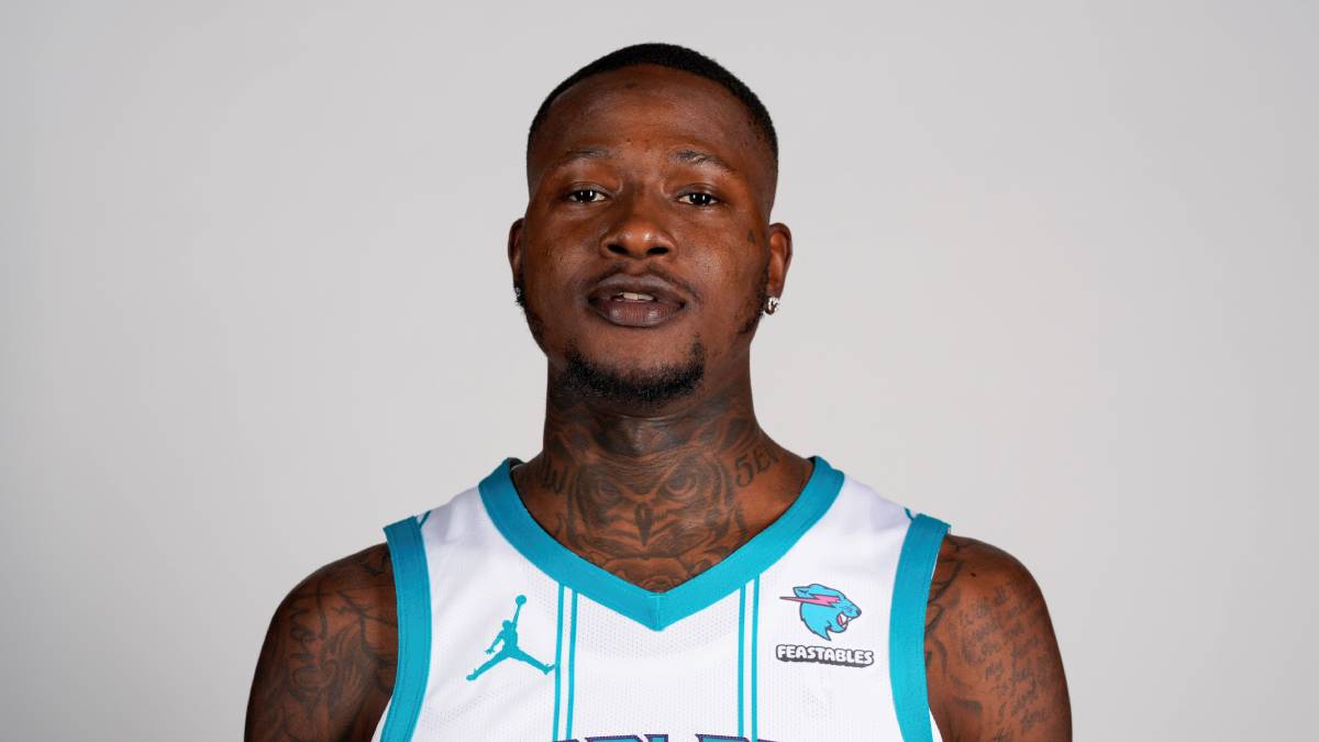
Terry Rozier face and neck tattoos

One of Rozier’s more thoughtful tattoos is an owl. He says it represents real power and the idea that power also means keeping your intentions to yourself. The owl can see what is happening while keeping its own plans hidden.

There is an interesting contrast in that explanation: professional basketball puts Rozier under bright lights, while the owl stands for the part of him that stays private. It is not only about looking mysterious. It is about holding on to a private centre while the public “Scary Terry” persona gets louder.

The owl fits beside the Scream mask and the “real one” tattoo. Together, the designs suggest alertness, confidence and a little controlled menace. Every tattoo does not have to be soft or sentimental to feel personal.

The 3:17 tattoo marks his birthday and a strange coincidence
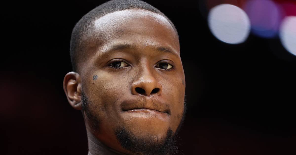
Terry Rozier courtside face tattoos

Rozier was born on March 17, so 3:17 already had a clear connection to his life. He has also said he kept noticing the time whenever it was exactly 3:17. Eventually, he had the number tattooed on his head.

The placement is visible, though it stops short of a full face tattoo. Rozier told GQ he was open to adding more as his fade changed, but did not want ink on his face. That gives a sense of his boundary: he likes bold tattoos while keeping some parts of his appearance recognisable.

Unlike the family names, 3:17 is not about another person. It brings together a birthday, a habit and a touch of superstition. It may not mean much to anyone else, which is part of why it works for him.

His legs are a catalogue of symbols and unfinished ideas
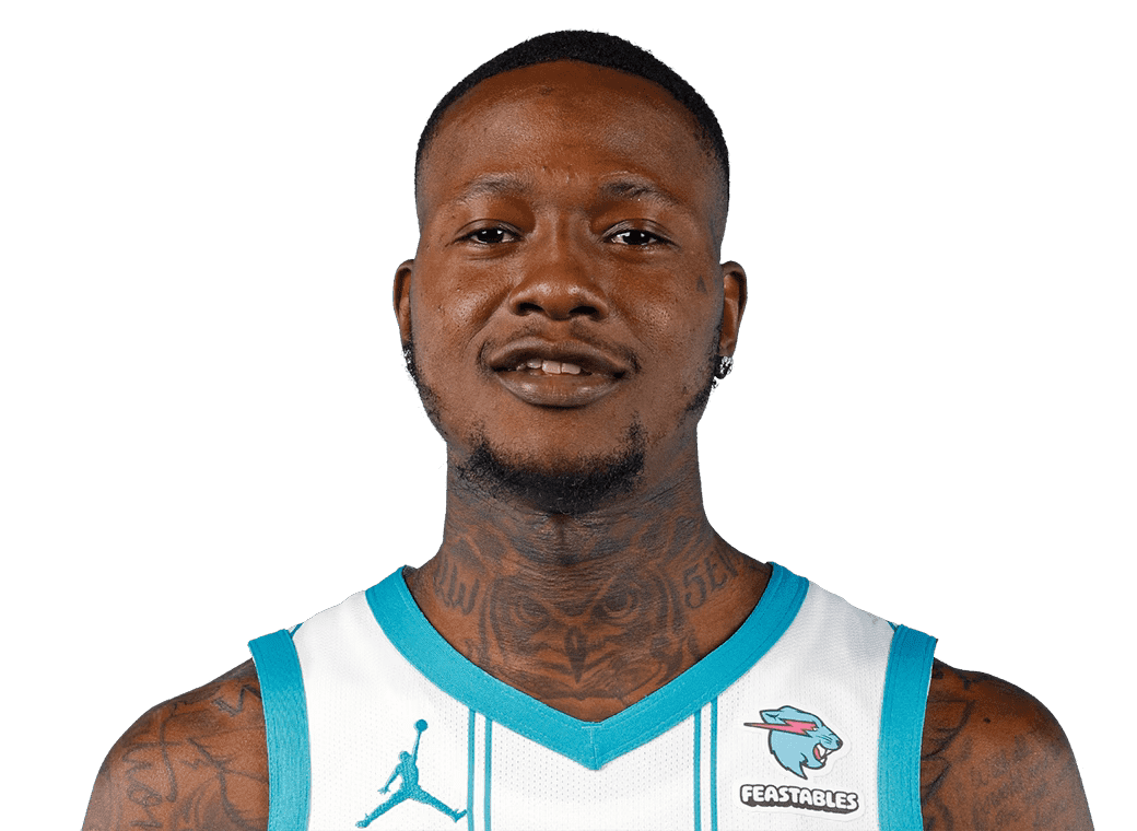
Terry Rozier tattoos portrait

Rozier’s legs show how his collection grew over separate sessions. He has talked about a pharaoh, an Eye of Horus, a crocodile and a shark within one leg design. The ankle was painful enough that some details were left unfinished, a very human footnote to an otherwise elaborate piece.

He also has a kangaroo, his favourite animal since childhood. Another tattoo shows his son Justin as a kind of king of the jungle, with a crown above his head. The designs move between old childhood favourites and the pride he feels as a father.

One line reads, “God protect me from my friends, because my enemies I can handle.” Rozier got it with his mother and both aunties. Matching tattoos can feel like a publicity stunt, but this one sounds more like a family tradition that happened to be documented on camera.

GMB became a family mark he partly tattooed himself
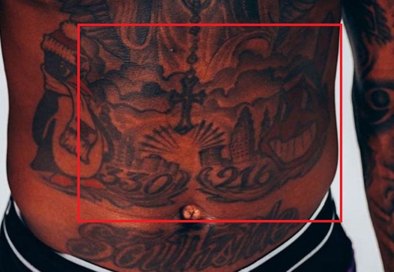
Terry Rozier abdominal tattoos

The initials GMB appear more than once in Rozier’s collection. He explained that he started one version himself after his artist encouraged him to try tattooing. The artist drew the design, Rozier began the “G,” and the professional took over when the letter started looking like something else.

The story captures the informal side of his ink. Not every tattoo is meant to look like a museum piece. Some designs keep the memory of a session, a joke or a family idea. A rougher beginning does not make a tattoo less meaningful; it gives it another story.

Rozier has also said he would rather tattoo a friend’s name on himself than a girlfriend’s. It is a blunt way to describe what matters to him, and it fits the collection’s recurring subjects: family, friends, mentors and the people who were there before the NBA money.

The three wise monkeys changed the scale of the collection
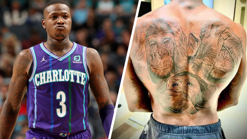
Terry Rozier three wise monkeys back tattoo

In 2022, Rozier added a large three wise monkeys tattoo across his back. The black-and-grey design reportedly runs about three feet from his shoulders toward his waist and represents “see no evil, hear no evil, speak no evil.” Mike Miller of Green Light Tattoos and Art Gallery worked on it in Miami over roughly fifteen hours across three days.

It is a much bigger project than the 3:17 number or the small family initials. The full-back piece is built to read as one composition. Reports at the time said it was part of a larger plan for self-expression, with more work expected on his wrist and forearm.

The monkeys also connect with Rozier’s interest in vision, secrecy and reading a room. His owl is about seeing without revealing his intentions; the monkeys turn a related idea into a large proverb. It is not subtle, but subtlety has never been the only aim of his tattoos.

What Terry Rozier’s tattoos say as a whole
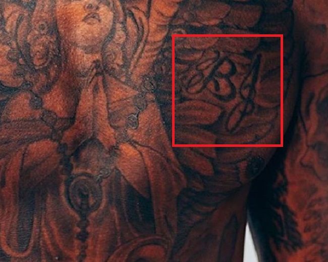
Terry Rozier chest tattoos

Look at the pieces one by one and it is a long list: a crown, basketball, rosary, angel, family names, rose, Scream mask, owl, 3:17, animals, initials and a large back design. Seen together, they make a fairly clear timeline.

The early basketball tattoo belongs to the kid who believed he could make it. The chest pieces keep family close to his game-day routine; the motivation arm remembers relatives and friends. The rose turns Tupac’s resilience into an image. The owl and Scream mask shape the “Scary Terry” persona, while the leg tattoos leave room for childhood favourites, faith and his son. The monkeys give his back a composition big enough to carry all that energy.

That is why the collection is more interesting than a simple list of NBA tattoos. Rozier is not trying to make every piece match; the body fills in as life changes. Some designs are polished, some unfinished, some deeply personal and some just fun. It feels like a working scrapbook rather than a brand guide.

Watch Terry Rozier explain his tattoos

Rozier’s GQ tattoo tour is worth watching because he tells the stories in his own laid-back voice. He talks about his first basketball tattoo, the names on his chest, the Tupac-inspired rose, the owl, 3:17 and the painful leg work. It is the clearest way to hear the context behind the designs.
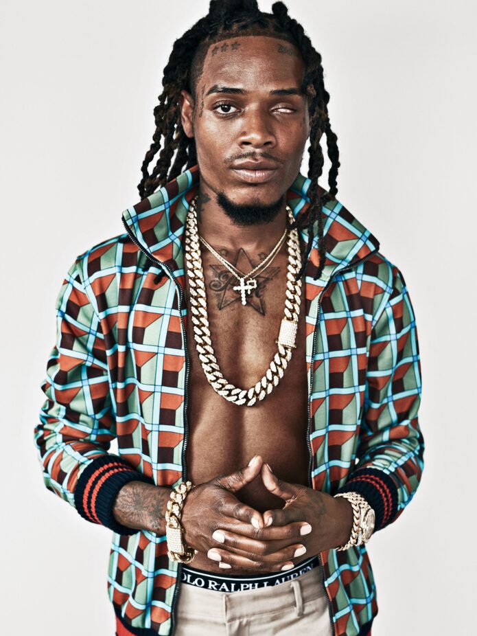
More athlete tattoo guides

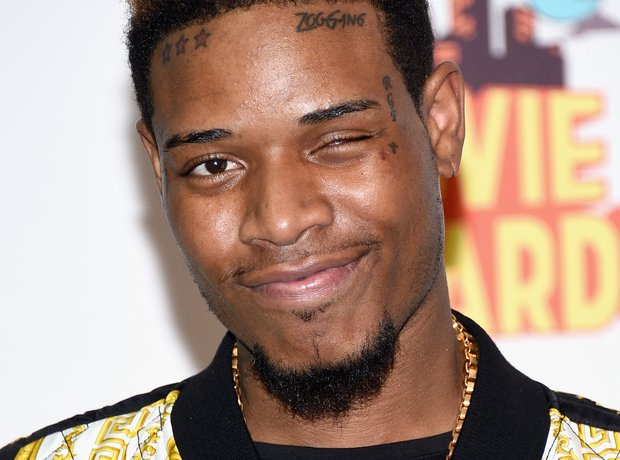
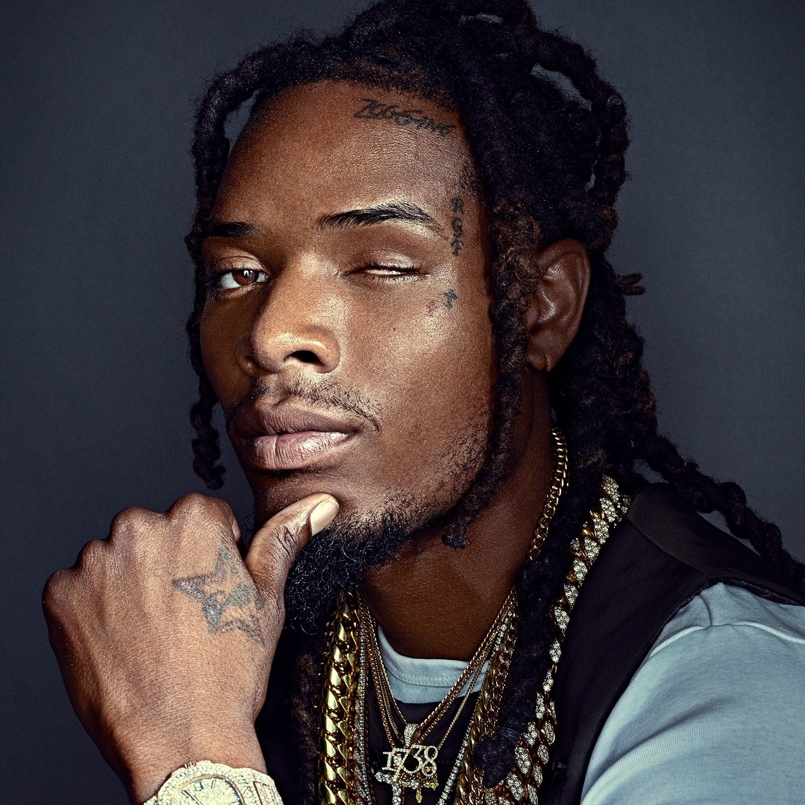
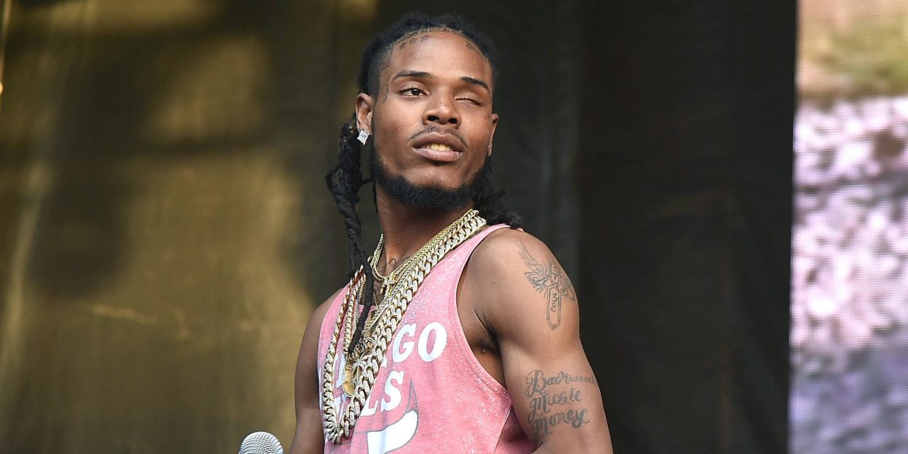
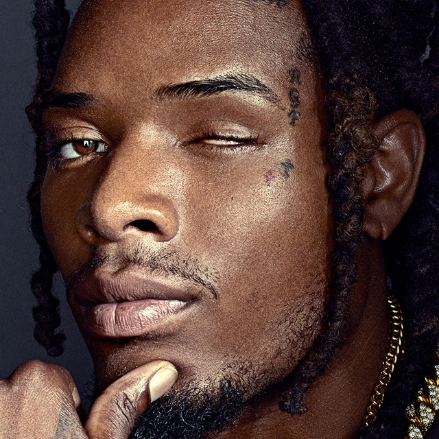
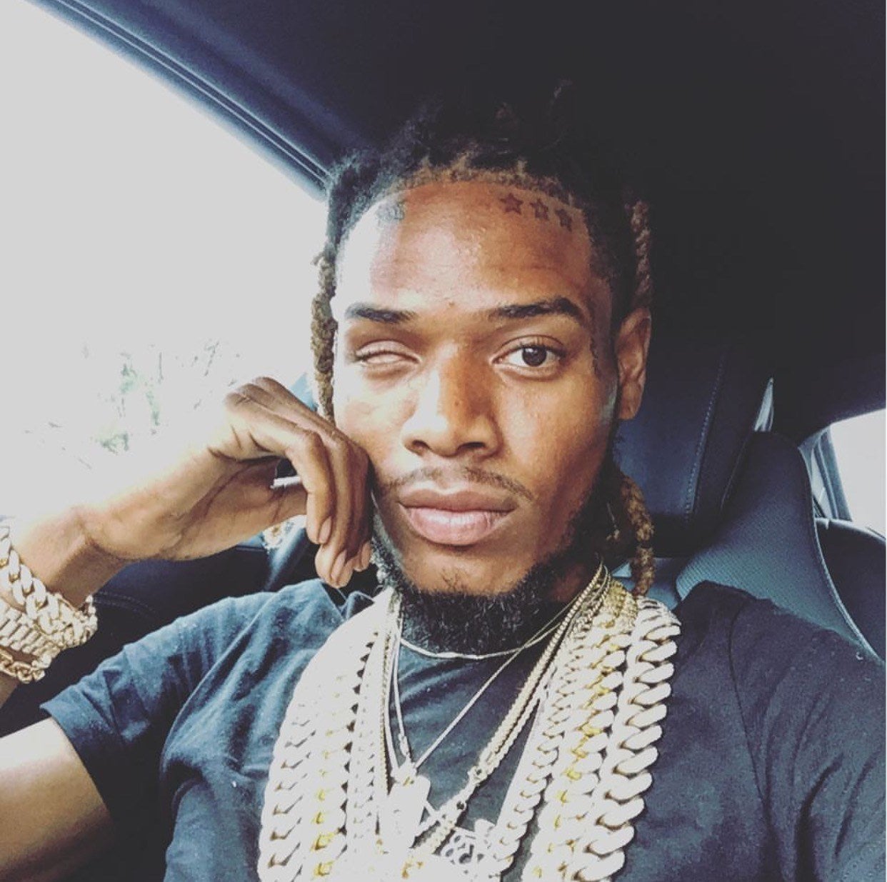
Fetty Wap’s ink never really sits still

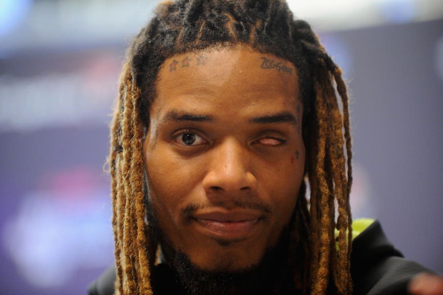
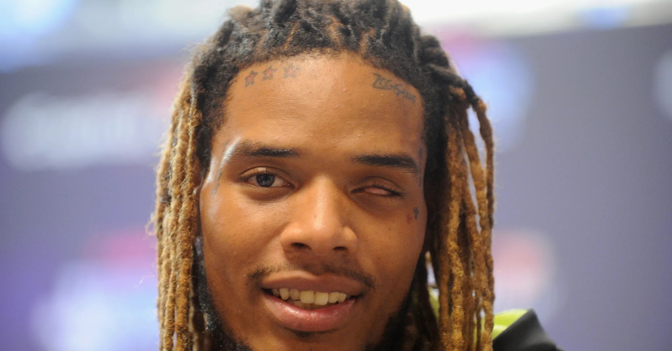
Fetty Wap’s tattoos came together at the same pace as his career: quickly, boldly and without much interest in playing it safe. The “Trap Queen” rapper has ink on his face, neck, hands, arms and chest. He has been candid that he does not enjoy the tattooing process very much; what he likes is seeing the finished work.

That contrast gives the collection its character. Some tattoos connect to family, crew, faith, basketball or people he has lost. Others were impulsive or simply looked good to him at the time. Fetty Wap’s tattoos feel less like a carefully planned image than a diary written in different chapters.

His first tattoo was a team family mark

Fetty Wap first team family tattoo

Fetty has said his first tattoo was “Team Fam,” short for team family. He got it very young, earlier than he now thinks he should have, and laughs about promising his mother he would never tell her.

He still calls it one of his favourites, despite the embarrassment. It was never touched up, so the original roughness remains. The story matters more than perfect lines: this was before the hits, the face tattoos and the gold chains became part of his look. Family was the first thing he put on his skin.
It is a scrappy beginning, but it says more about him than a polished cover-up might. The tattoo stayed because the memory did.

The black cross came next, after a long break

Fetty Wap black cross tattoo

Fetty says about seven years passed before he got another tattoo. That pause is easy to miss when looking at the collection today, but it shows that he did not always expect to become heavily tattooed. The next piece was a black cross, which he has connected to the religious side of his upbringing.

The cross became a visual anchor for the work that followed. Once he began adding tattoos again, they spread across his body rather than staying on one arm. Religious symbols, crew marks, portraits and playful designs all ended up together without looking like they belong to different people.

He has also been clear that pain is the part of tattooing he likes least. Fetty does not romanticise the needle. He puts up with the discomfort because he likes the finished look, and because some pieces matter enough to be worth it.

Family and crew names show up across the face and neck

Fetty Wap family and crew face tattoos

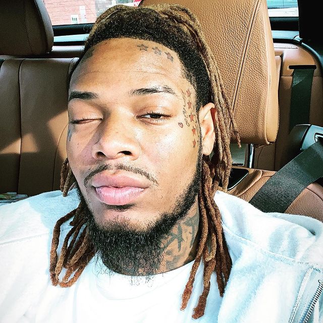
Some of Fetty’s most recognisable tattoos are tied to his circle. On the left side of his face is RGF, a reference to Remy Boyz and the world around his music. He also has small crosses for his grandfathers and his son Aydin’s name.

That helps explain why the face tattoos do not feel entirely random. From a distance, they can blur into one bold field of ink. Up close, they resolve into separate pieces of family history: a crew initial, memorial symbols and a child’s name. Together they make a statement before he has said a word.

This is also the area he has discussed with the most regret. Fetty has called some of the neck work the dumbest thing he has done. It sounds harsh, but it is an honest reaction to a permanent choice with a very public footprint. He can wish he had not got a piece and still understand why he chose it at the time.

The star tattoos are part of the Fetty Wap look

Fetty Wap three stars forehead tattoo

The stars on Fetty’s forehead helped make his look instantly recognisable during his first major run of success. They sit with small script and other symbols in a face tattoo layout that is easy to spot in photos and music videos.
Stars are a familiar design, but the forehead changes how they read. They are not hidden decoration; they become part of his stage presence, as noticeable as his two-tone dreads and jewellery. That is why people remember the stars even if they cannot name every tattoo.

There is a contrast between those outward-facing designs and the family pieces nearby. The stars help shape the image. The names and crosses are quieter in purpose, even though they sit in the same visible area.

His hand tattoo taught him a lesson about pain

Fetty Wap hand tattoo

Fetty has joked that he will never get another hand tattoo. The skin is thin, the area moves constantly and the pain is hard to ignore. Having many tattoos does not mean every placement feels equally manageable.

The hand piece also completes a chain of ink that helped make his style recognisable. The face and neck draw the eye first, then it moves down to his hands, arms and chest. The tattoo does not have to be large to contribute to the overall look.

His attitude toward it is easy to relate to. Plenty of tattoo collectors have a spot they would not repeat. Fetty seems to have found his: he likes the result, but he is not signing up for another round.

Forearm pieces carry the heavier stories

Fetty Wap right forearm tattoo

Fetty’s forearms make the collection feel more layered. Both arms carry a mix of names, faces, religious imagery and crew references. The placement gives artists space to work while keeping the tattoos visible in a short-sleeved shirt.

One arm includes a portrait-style tattoo associated with Michael Jordan. It fits the way Fetty talks about ink: the body can hold people and ideas that mattered to him, without every piece needing to fit into one matching sleeve.

The designs vary in weight. Some are dark and serious; others are small details added to fill a gap. That unevenness keeps the collection from looking like a catalogue page. It feels lived in, with older pieces beside newer ones and different artists leaving their own mark.

The inner forearm has the kind of ink you notice up close

Fetty Wap inner forearm tattoo

The tattoos on Fetty’s inner forearm can be easy to miss in a quick red-carpet photo, but they help make the overall collection feel complete. Smaller lettering and compact designs fit between the larger work on his chest and arms. The placement also means he sees them throughout the day, whether or not a camera does.

Not every piece needs to be a headline. Some tattoos are mainly for the person wearing them. The smaller forearm work balances the louder face ink and keeps the collection from being all spectacle.

The collection works best when you can see both sides: the public image and the private reminders underneath it.

Judas and the religious imagery add tension

Fetty Wap Judas arm tattoo

One of the more striking arm pieces is a Judas tattoo. Religious imagery appears elsewhere in Fetty’s collection, but Judas carries a different mood from a straightforward cross. It brings up betrayal, loyalty and the uneasy space between faith and human behaviour.

That tension suits the rest of his tattoos. They are rarely one-note statements. A memorial cross can sit beside a crew symbol; his son’s name can share space with something chosen because it looked cool. The collection leaves room for contradiction.

There is no need to force every symbol into one tidy explanation. Some tattoos tell you exactly what they mean; others create a mood. Judas stands out partly because it makes the arm feel darker and more complicated.

The left side of his face keeps the story visible

Fetty Wap left face tattoos

Fetty’s left-face tattoos bring together several threads: RGF, small crosses, family references and the stars around his forehead. The area has changed over time, and some designs have been covered or built around, but the overall look remains unmistakably his.

He has said he does not love every decision he made there. That reaction is part of the story, not a reason to ignore the tattoos. Face ink can capture a particular moment in an artist’s life, and Fetty’s face reflects a period when his music, crew and public image were all moving quickly.

The most personal pieces give the face work its weight. His son’s name and the memorial crosses sit alongside the visual rhythm of the stars and initials. Together, they make a group of separate marks into a look people recognise right away.

What Fetty Wap’s tattoos say as a collection

Fetty Wap Zoogang forehead tattoo

Fetty Wap’s ink was never meant to be a matching set. The first tattoo was about family; the cross added faith. Later designs across his face, neck, hands and arms followed his rise, his crew, his heroes and the people he wanted to remember.

There is a practical lesson running through the collection, too. He likes tattoos, but he knows they hurt. He likes how they look, but can admit when a placement was a bad idea. He can be sentimental about a rough first piece and critical of a more visible one. That honesty makes the collection more interesting than a perfect list of symbols and meanings.

The tattoos look loud because they are loud. But that look is built from small personal choices: Team Fam, his son’s name, a grandfather’s cross, a favourite athlete, a crew initial and designs that felt right at the time. It is messy in the same way real life is messy, and that is part of why it works.

Watch Fetty Wap explain his tattoos

Fetty’s GQ tattoo tour is the best place to hear the stories in his own voice. He talks about his first ink, the family and crew pieces, the face tattoos, the basketball tribute and the neck work he regrets. He also makes clear that liking tattoos and enjoying the process of getting them are two different things.

More musician tattoo guides

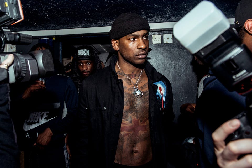
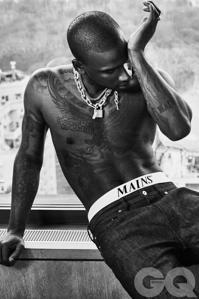
Skepta wears his London story on his skin

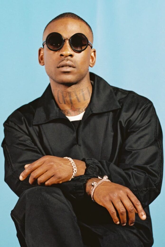
Skepta’s tattoos map where he comes from, who he has lost and the ideas he has carried through grime and beyond. They are not built around one colour or style. London landmarks, label identity, family, grief and ambition sit alongside a few designs that seem like private jokes until he explains them.

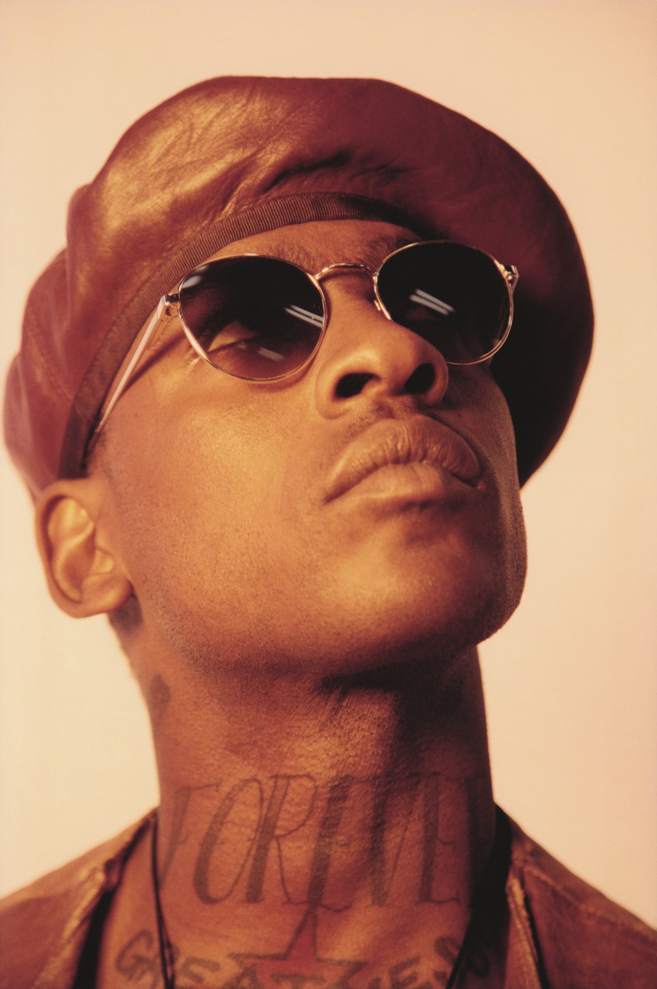
He has discussed his tattoos in interviews, and some of the details are unusually clear: FOREVER on his neck, London landmarks across his stomach, London and Boy Better Know imagery on his chest, and his stage name beside a lyric about seeing the bigger picture on his back. The overall feeling is proud, personal and rooted in South London.

FOREVER keeps the neck piece tied to No Fear Forever

Skepta Forever neck tattoo

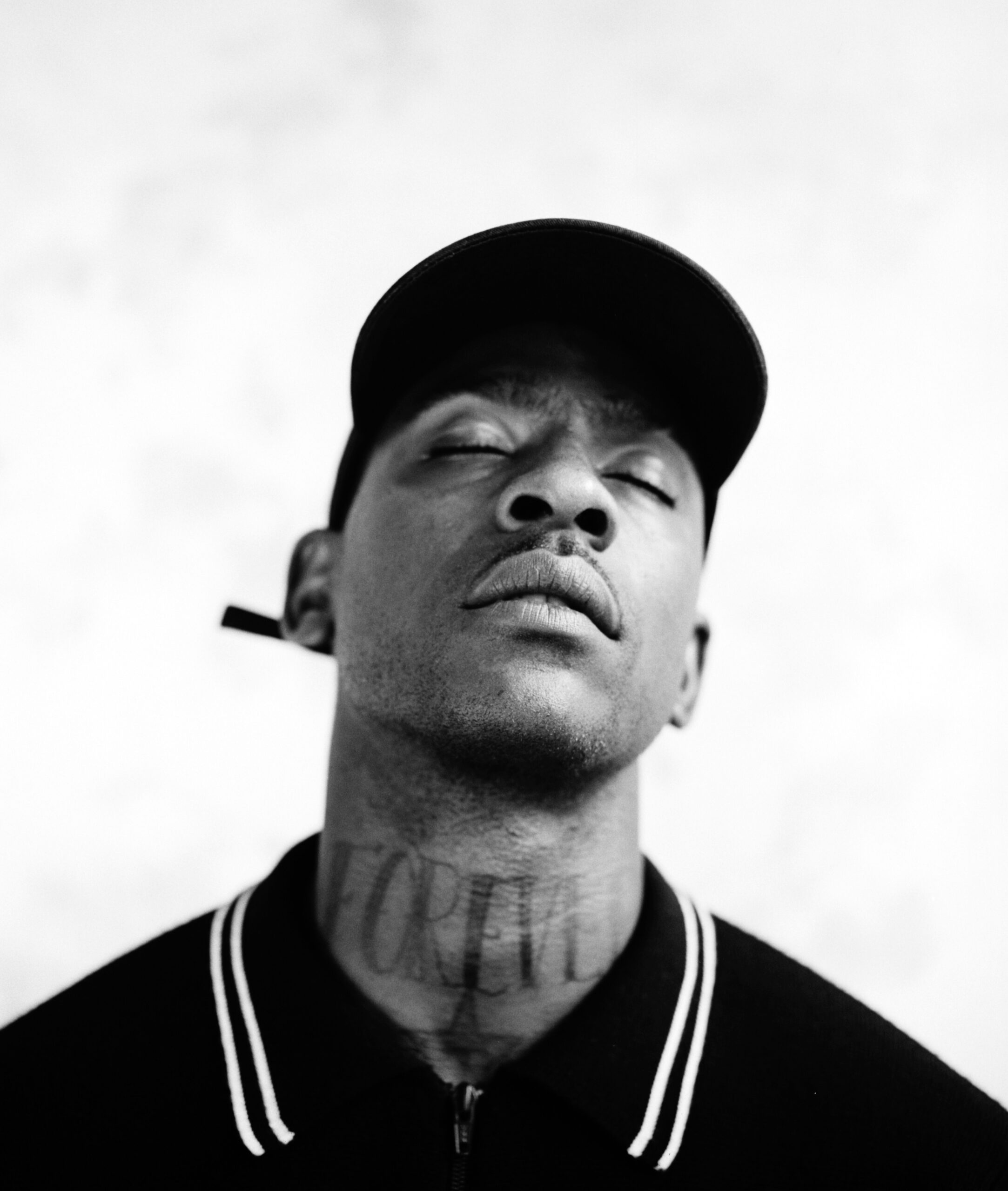
The word FOREVER runs across the front of Skepta’s neck. It was not chosen only because it looks strong in a photo; the tattoo connects to No Fear Forever, the clothing line associated with him. That turns a simple block of lettering into part of the world he has built beyond music.

Neck lettering is a confident choice because it is hard to hide under a T-shirt. It is there in interviews, onstage and in everyday conversation. For an artist who cares about a recognisable visual identity, the placement makes sense: the word becomes part of the first impression.

On its own, FOREVER could mean almost anything. With Skepta’s explanation, it points to a brand, a business and the idea of making something last. It is a piece of branding, but it still feels personal because that brand grew out of his creative life.

PAIN is a quieter mark on the wrist

Skepta Pain wrist tattoo

On the inside of Skepta’s left wrist is PAIN. Compared with the large London scenes and chest designs, it is a small, direct word. There is no long public explanation to rely on, so it is better not to invent one. It may read as a reminder of what he has survived and what ambition can cost.

The wrist is a practical place for it. Skepta can see the word while working, writing, driving or performing, but it does not dominate his appearance. It feels like a private note that happens to be visible to others, quite different from the neck tattoo’s immediate announcement.

Together, the two words hold a contrast: FOREVER points toward the future and what lasts; PAIN acknowledges the difficult parts underneath success. His collection does not pretend the journey was effortless. Even the shortest tattoos carry some tension.

Tower Bridge puts London across his stomach

Skepta Tower Bridge tattoo

One of Skepta’s largest city references is Tower Bridge on the left side of his stomach. The Thames and a small boat sit below the bridge, making it a compact London scene. It is easy to recognise, but it is more than a postcard.

Skepta has described the design as a way to show love for the city and country that shaped him. Tower Bridge connects north and south London, making it a fitting image for an artist whose music travelled far beyond the streets where grime developed. The tattoo carries both place and movement.

The stomach gives the scene room for its details. Unlike neck lettering, it is not designed to be read from across a room; the towers, water and boat can sit separately in a larger image. When it appears in photos, it reinforces a clear idea: London is not background decoration for Skepta. It is one of the main subjects.

That London thread continues with Big Ben on the other side of his stomach and an OVO owl above it. Drake tattooed Skepta’s Boy Better Know logo on his shoulder, and Skepta returned the gesture with the owl. It is a small, memorable exchange between two artists who recognised each other’s work.

The London flag sits at the centre of his chest

In the middle of Skepta’s chest is a red cross associated with London’s flag, with diagonal red lines that partly echo the UK flag. It makes another clear statement about place. The design is not subtle, and it does not need to be: the chest puts the symbol in a central, almost emblem-like position.

Beside Tower Bridge, the flag creates a visual conversation. One tattoo shows London through buildings and water; the other reduces the city to colour and shape. They point in the same direction without repeating each other. That connection becomes easier to see when the tattoos are considered together.

Skepta’s London references are tied to the music, language and creative community that shaped him. They recall the place that gave him a sound and a platform. They feel less like souvenirs and more like part of his identity.

LUKEY LIVES is a tribute rather than a slogan

Skepta Lukey Lives tribute tattoo

Below the left side of Skepta’s chest are the words LUKEY LIVES, a tribute to his friend Lukey Maxwell, who was fatally stabbed in North London. Skepta has explained that the phrase means Lukey remains in the hearts of the people who loved him.

This tattoo changes the mood. The London scenes are proud and the label references look ahead, while LUKEY LIVES is about remembering someone. The words acknowledge the loss without suggesting it did not happen; they insist that the person is not erased by it.

Its position keeps it near the other central chest imagery while giving it space of its own. People may ask about it, but the meaning belongs first to Skepta and those who knew Lukey. It is a tribute, not just another piece of lettering.

His mother’s portrait gives the right arm a personal centre

Skepta mother portrait tattoo

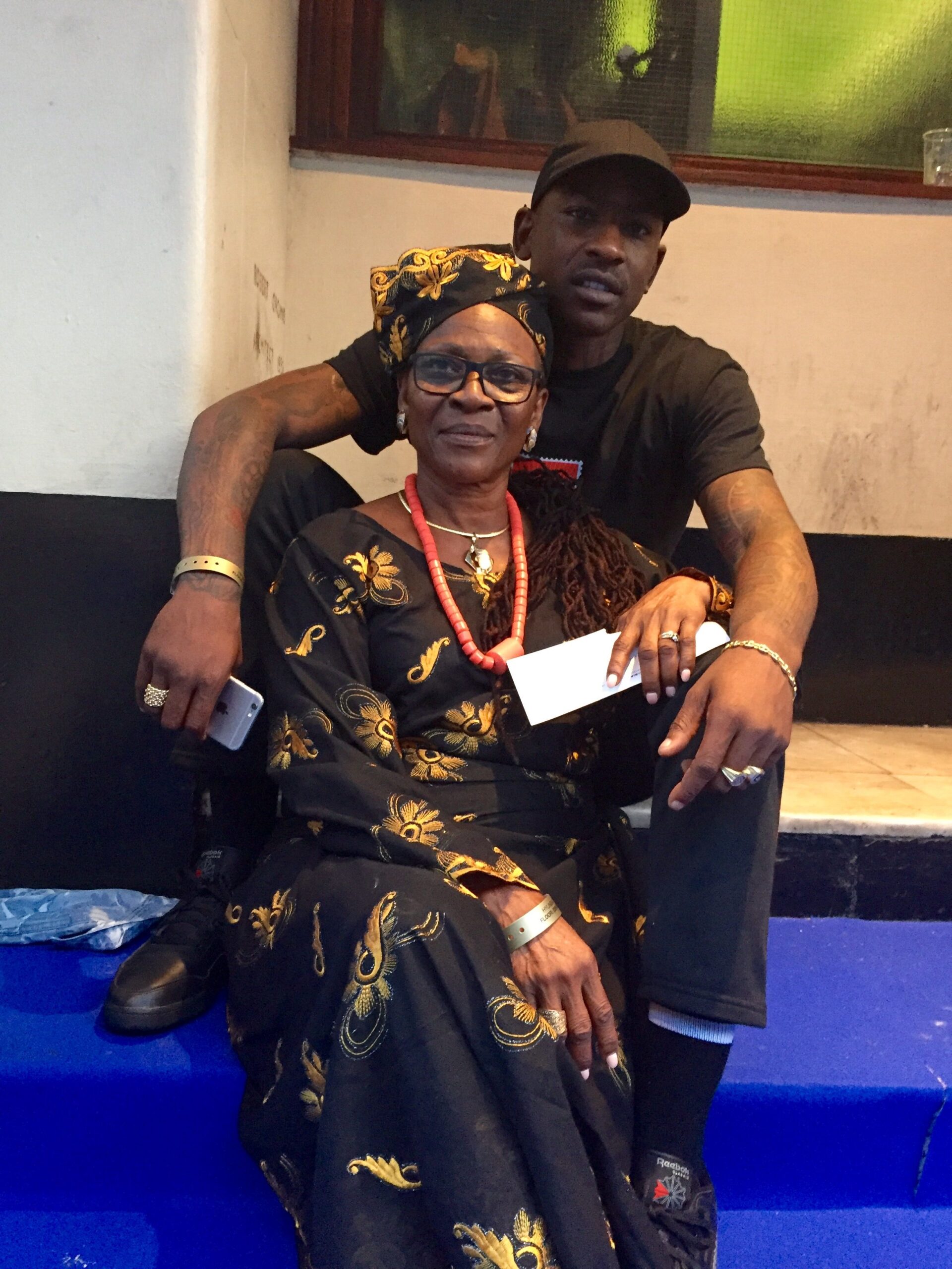
Skepta’s right arm carries a portrait of his mother, with two red roses underneath. Portrait tattoos can seem generic when the person is not identified, but here the meaning has been stated clearly: the design honours his mother and gives the arm an emotional centre.

The roses add colour to the black-and-grey portrait without forcing a sentimental feel. They also help it sit naturally among the rest of Skepta’s work, letting family share space with the louder symbols of career and London.

That balance matters. The neck and chest lettering can make the collection look bold from a distance, but the portrait shows there is more to it than image. Friends, relatives and losses are part of it. The public designs are attached to a private life.

Skepta’s tattoos are a London story in chapters

Skepta’s collection makes sense as a series of chapters. FOREVER and the label references belong to the world he created; Tower Bridge, Big Ben and the London flag place that world on a map. LUKEY LIVES and his mother’s portrait bring in the people who matter beyond the stage. PAIN, GREATNESS, GOOD and EVIL add an inner conversation.

Not every small tattoo has a detailed public explanation, and that is fine. The confirmed stories already say a lot without guessing at every mark. A careful guide should keep clear the difference between what Skepta has explained and what a photo merely shows.

There is a relaxed confidence to the collection. He is comfortable with large designs, visible lettering and images that make a statement before he speaks. Still, the tattoos do not form one polished corporate identity. They hold grief, humour, loyalty, pride and contradiction at the same time.

The strongest thread is place. London appears as a landmark, a flag, a memory, a music scene and a group of relationships. That is why the tattoos feel connected even when the designs look different: they point back to a life Skepta knows he built there.

Watch the story behind Skepta’s OVO owl

This short video covers the exchange behind Skepta’s OVO owl tattoo and the Boy Better Know tattoo Drake got in return.

Becca Teale keeps her tattoos close and personal

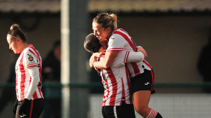
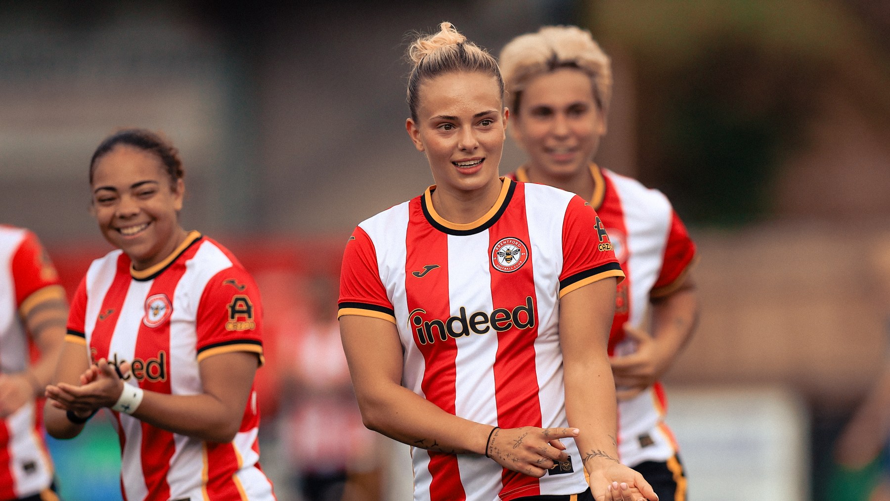
Becca Teale’s tattoos catch the eye, but her stories about them are what make the collection memorable. The Brentford Women defender has built a loose visual thread from vines, birds, small numbers and short reminders. Some designs mean a lot to her; others are simply fun to look at. She is candid about both.

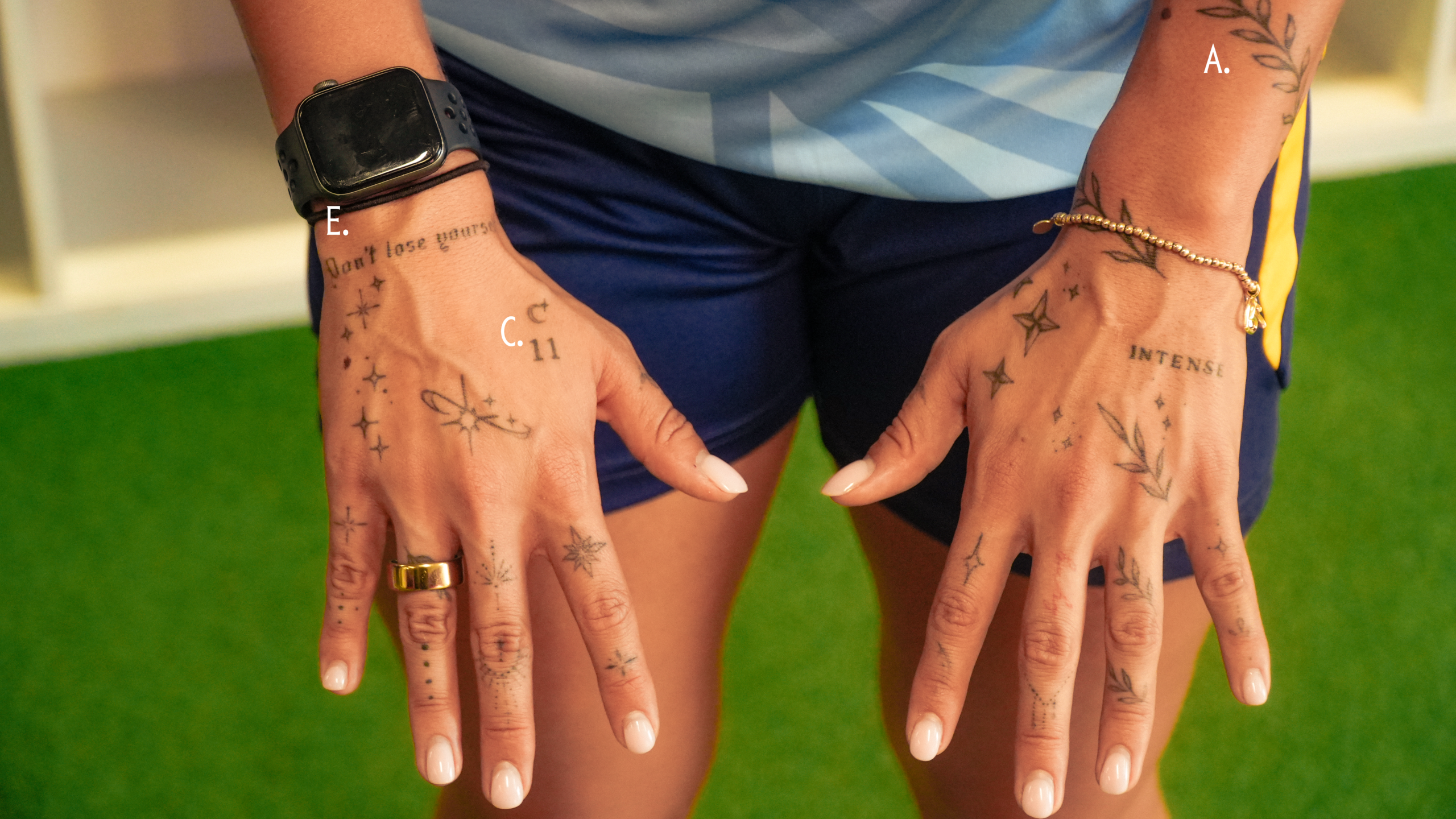
In her tattoo tour, she talks about the vines across her hands, birds with no dramatic backstory, the number 11 for a family dog, and the phrases “Balance” and “Don’t lose yourself.” There is also an “L” higher on her arm for Lola.

That mix gives the collection an easy, lived-in quality. It has meaning, but she does not ask every line to carry a life lesson. Teale calls the tattoos her “stickers” for working hard, and that may be the simplest way to understand them: she gathers designs that feel right when the moment comes.

Vines run across both hands

Becca Teale vine tattoos across both hands

Teale started with her hands. She got her right hand in one session, then quickly decided the left should have vines too. The main design has vines winding over both hands, in a place she knew would be visible every day. That was part of what she liked about it.

She had noticed other women with hand tattoos and thought the look was cool. Many people avoid the placement because it is hard to cover, but Teale liked that it stood out. The vines give her hands a softer, more organic look than a set of separate symbols would.

There is a practical fit to the design as well. Vines can move around fingers and knuckles without feeling boxed in, and the idea can be extended later. Teale has said she wants to carry the same theme over her collarbones. It gives the collection a thread without requiring every tattoo to match.

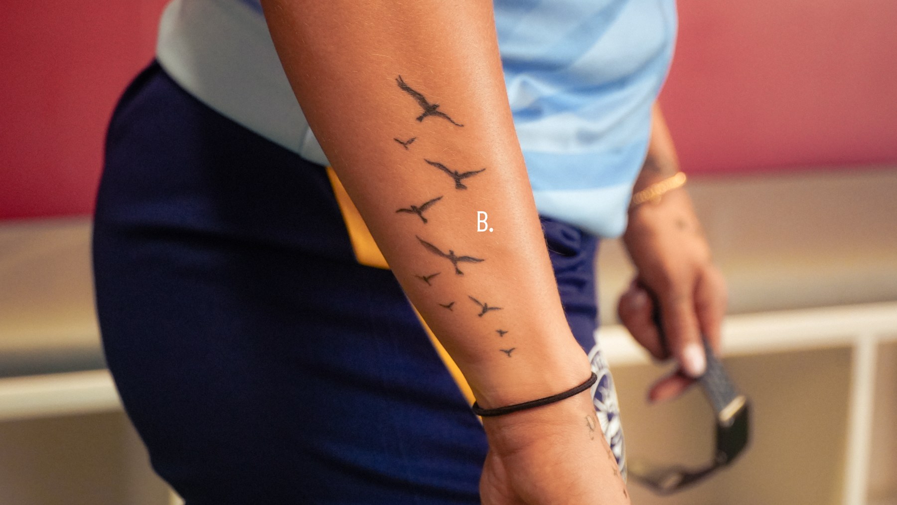
Birds sit on the side of her arm

Becca Teale birds tattoo on the side of her arm

Her favourite tattoo is a group of birds on the side of her arm. Teale is clear that it does not have a special meaning; she simply likes how it looks from different angles. A tattoo does not need a memorial, date or hidden message to deserve a place.

The birds shift as she moves her arm. From one angle they look like a small arrangement; from another, they join the flow of the rest of the arm. That movement works nicely beside the more structured vines on her hands.

There is something refreshing about calling it her favourite while saying it means nothing particular. The reason is visual, and that is enough. The collection has room for tattoos that are just enjoyable to look at.

The number 11 remembers Lola

Becca Teale number 11 hand tattoo for Lola

The tattoo with the most personal meaning is the number 11 on her right hand. It marks how old her first family dog, Lola, was when she died. Teale has said the loss was difficult for the whole family, so the number gives her a small, lasting way to keep Lola close.

The 11 is easy to miss beside a portrait or longer line of script. That helps the story feel personal: the tattoo does not explain itself to every person who sees it. Teale knows what it means, and people close to her may know too. It is a private marker in a visible place.

She also has a letter L higher up her arm, another reference to Lola. Together, the two tattoos make a quiet memorial across different parts of her body. One is right there on the hand; the other is a detail to spot further up.

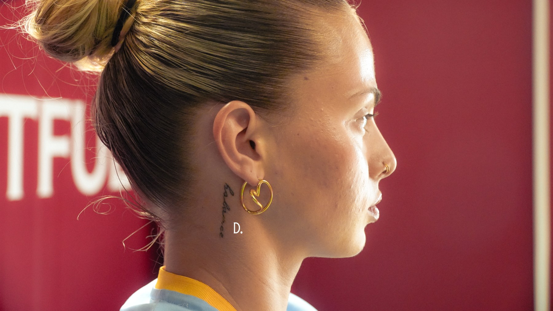
“Balance” sits on the right side of her neck

Becca Teale Balance neck tattoo

On the right side of her neck, Teale has “Balance”. She says the idea matters in relationships, football, work, food and most other parts of life. It is a broad word, which makes sense for a tattoo placed somewhere so visible.

Neck lettering can stand out even when the word is small. “Balance” avoids feeling like a slogan because Teale connects it to daily life rather than treating it as a grand statement. It is more like a checkpoint she can return to when football gets intense or work starts taking over.

The word also brings a clean text shape into a collection dominated by birds and vines. That contrast keeps the designs from blending together and gives the surrounding work a different rhythm.

“Don’t lose yourself” is a reminder for difficult days

Becca Teale Don't lose yourself tattoo

Teale has “Don’t lose yourself” on her right hand. She got it during a low period and describes it as a reminder to keep going when things get difficult. The words are direct, without sounding polished for effect. They feel like something a friend might say at the right moment.

She has also connected the phrase to football. It helps her leave what happens on the pitch at the pitch, instead of carrying it home. The hand is a fitting spot: she sees the words while working, training and dealing with the public, physical side of the game.

“Balance” is a broad principle; “Don’t lose yourself” feels more immediate. One is about keeping the parts of life in proportion, while the other is about holding onto yourself when a day gets heavy.

Her collection is meaningful without taking itself too seriously

Teale’s tattoos fall somewhere between a scrapbook and a uniform. The vines create a visual thread over both hands, while the birds are there because she likes them. The number 11 and the L remember Lola. The neck and hand lettering give her short reminders to carry through work and difficult stretches.

The mix is what makes the collection work. A family memory can sit next to a purely visual favourite; a motivational phrase can share space with a design chosen because it looks good. That balance between meaning and enjoyment is the most human thing about the whole set.

Teale says she is spontaneous about getting tattoos and does not regret any of them. Jack Callier is her artist, and at the time of her tattoo tour she already had another appointment booked. She wanted to extend the vine design across her collarbones, keeping the next piece fairly small.

That plan fits the rest of her approach. She is not mapping out a finished bodysuit in advance. She adds designs when they feel right and lets the collection grow, with a few visual links between the older and newer work.

What her tattoo tour says about her style

Teale’s ink is visible, but the way she talks about it is unshowy. She can explain the family tattoo in a sentence, say the birds have no deeper meaning and laugh about calling the designs stickers. That honesty keeps the collection from feeling over-written.

Her tattoos also make sense in motion. Footballers are always running, turning and reaching, so the same design can look different from one frame to the next. Vines break around the hands, birds shift with her arm, and short phrases appear or disappear as sleeves, tape and movement change the view.

There is a practical confidence in wearing art where people can see it. Teale knows the hand and neck pieces attract questions, and she has chosen designs she can explain in her own words. They do not need a guidebook to be attractive or a performance each time somebody notices them. They can simply be hers.

The placements feel intentional. She wanted the hands on display, and the neck word is visible because it works as a daily reminder. The more private details leave space for memories that do not need to be read by everyone else.

Her tattoos are still growing. The planned vines across her collarbones would extend an idea she already likes, but leave room for new pieces too. There is no final chapter yet, just another appointment and another design waiting for a spot.

Watch the Brentford Women profile and tattoo tour

There was no official video devoted just to Teale’s tattoos, so this Brentford Women profile is the closest available look at the player and her team context.

More athlete tattoo guides

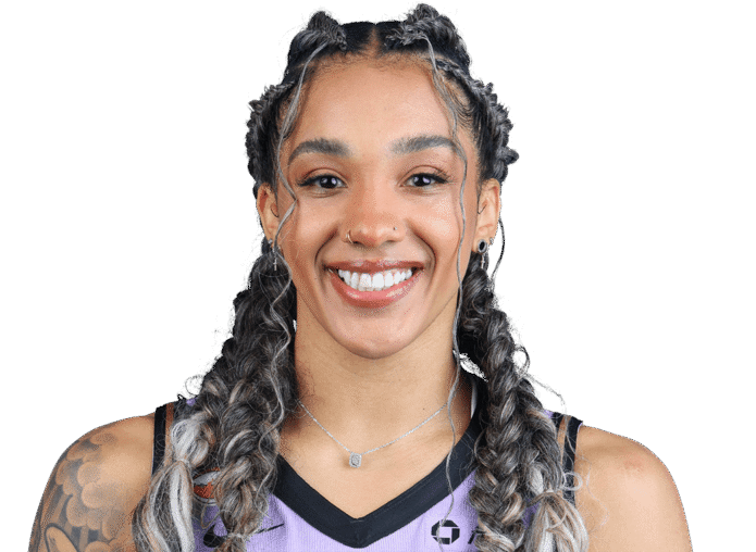
Gabby Williams carries her stories on her skin

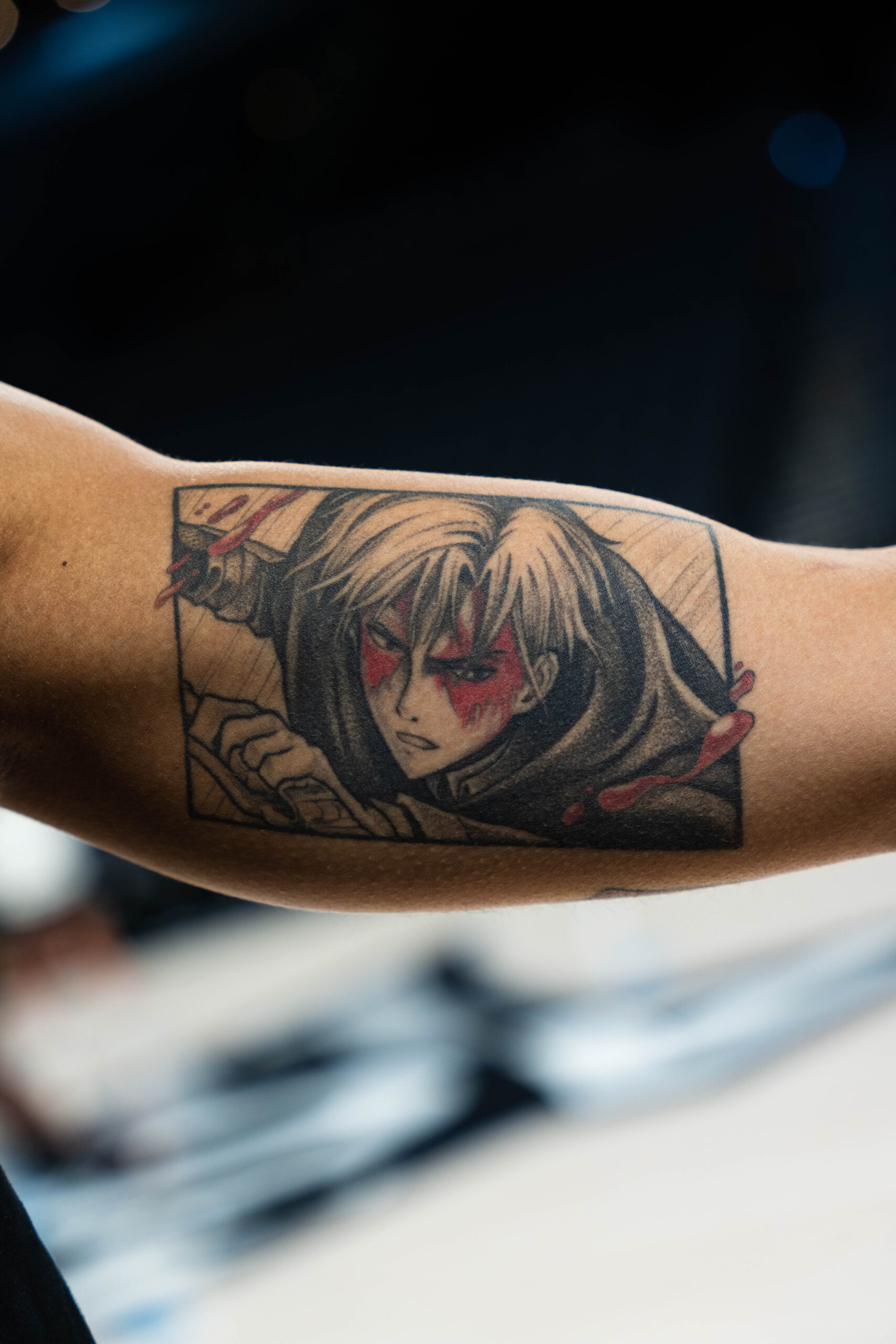
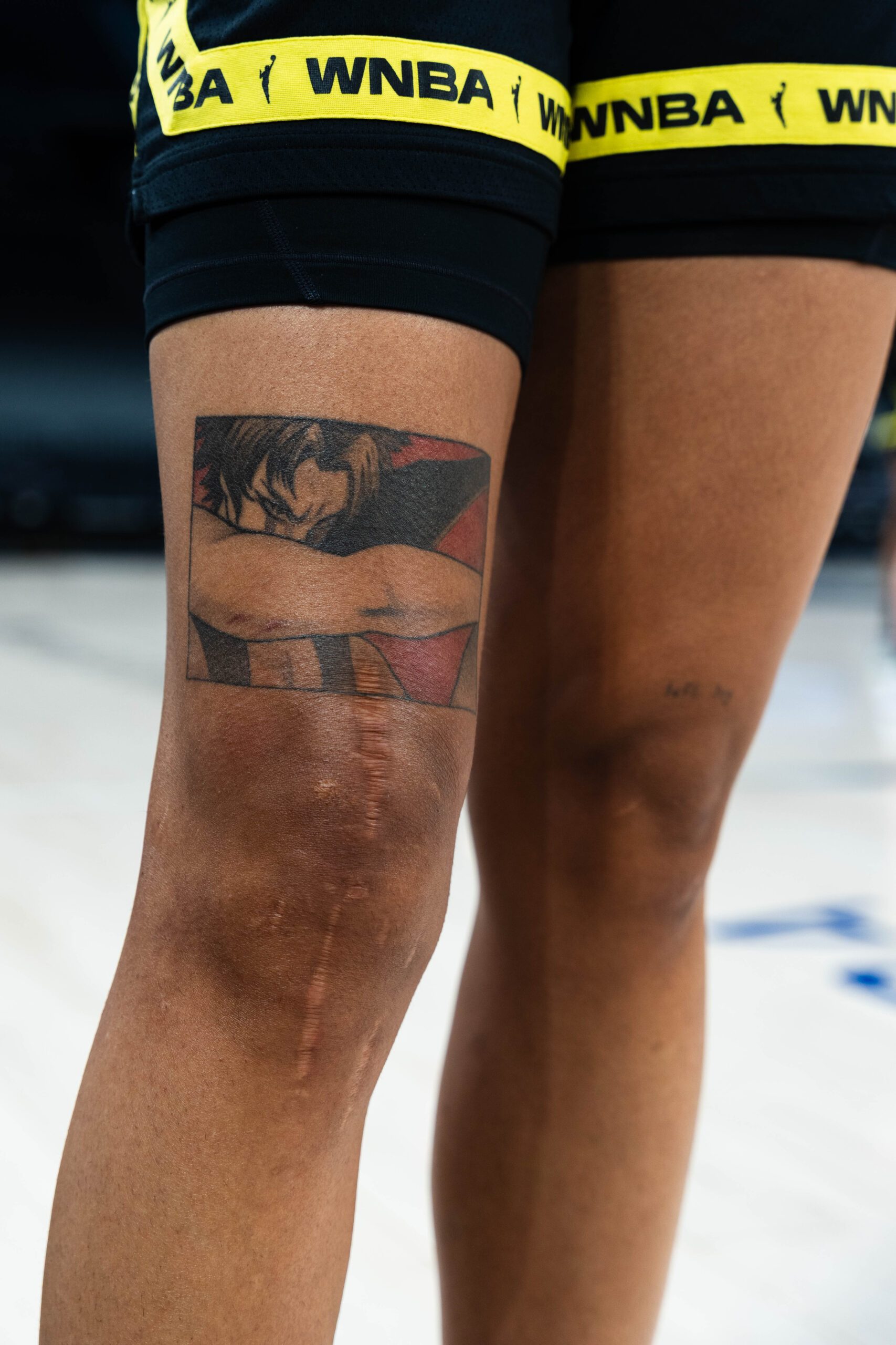
Gabby Williams’s tattoos feel more like a scrapbook than a costume. The Seattle Storm and French national-team star has designs linked to family, music, anime, basketball memories and people she has met. Some pieces are large and carefully built; others are tiny, funny or easy to miss until she turns her hand or lifts her shorts.

That variety fits Williams. She has said people can find it hard to put her in a box, and the tattoos make the same point without having to shout. A detailed black-and-grey sleeve sits beside an Olympic joke, rock music imagery and tattoos connected to friends and relatives. She has also been open about getting some designs young, sometimes in unplanned settings.

Here’s a closer look at the documented pieces and the stories she has shared, keeping the visible details separate so each tattoo has room to stand on its own.

Her black-and-gray arm sleeve is built like fine art

Gabby Williams black-and-gray arm sleeve tattoo

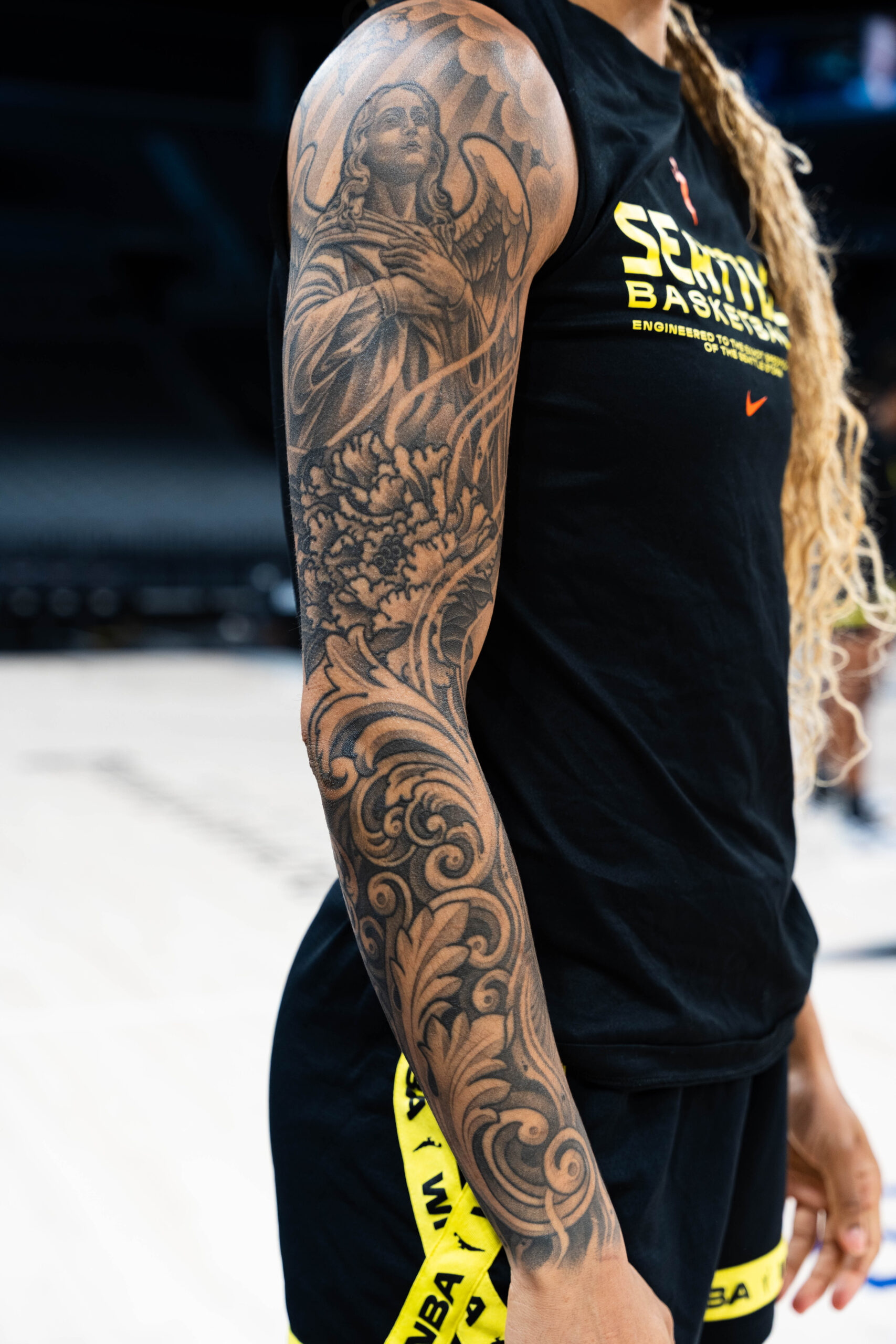
The biggest piece in Williams’s collection is the black-and-gray sleeve on her arm. It is not one symbol repeated across the skin. An angel, flowers, sculptural details and flowing shade come together in a composition with the feel of a classical illustration. Williams has credited French tattoo artist Lil’B and described it as a freestyled collaboration that took about six days.

Williams did not start with a rigid blueprint. She trusted the artist to shape a design around her arm, so it changes as you look from different angles. One view brings out the figure; another reveals more of the flowers and ornamental details. It feels like wearing a piece of art, not lining up separate stickers.

There is a calm confidence to the choice. Six days under the needle is a serious commitment, but the finished sleeve does not feel overly precious. It has movement, contrast and space to breathe. On court it is part of her look; off court it shows how much she enjoys the craft.

The Rolling Stones tongue connects her to the music she loves

Gabby Williams Rolling Stones tongue arm tattoo

One of the clearest pop-culture references is the Rolling Stones tongue logo on Williams’s arm. It is a small, instantly recognisable design, but it also says something about her taste. She has talked about rock music as an important part of her life, and the tattoo gives that interest a place beside the more decorative sleeve.

The design does not need a complicated explanation. The red tongue reads clearly from a distance, and its connection to the band gives it an obvious personal anchor. It also brings a little colour into a collection that otherwise leans heavily on black and grey.

It is useful to distinguish what Williams has said from what viewers might infer. The image is widely identified as the Rolling Stones logo, and her interest in music is part of the context. It is best understood as a direct tribute, not a hidden code. Sometimes a favourite band is reason enough.

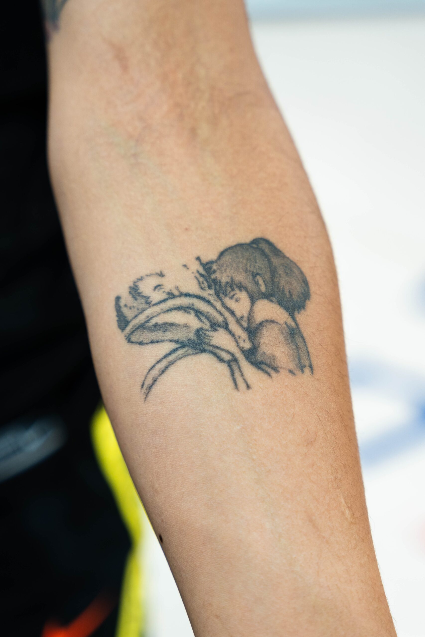
No-Face gives her anime fandom a permanent shape

Gabby Williams Studio Ghibli No Face anime tattoo

Williams’s Studio Ghibli No-Face tattoo is one she says gets a lot of compliments. The character is from Spirited Away, and the design brings a different mood from the portrait work and traditional symbols elsewhere on her body.

No-Face is quiet, strange and open to interpretation, which gives the tattoo a different feel from a team logo or a name. It hints at an imaginative side of Williams, who can enjoy a detailed animated world as much as a packed basketball arena.

Anime tattoos can look crowded when they compete with too many unrelated references. This one has a strong silhouette and an unmistakable face, so it stays readable. It is playful without feeling throwaway, and Williams has said it is a piece people often notice.

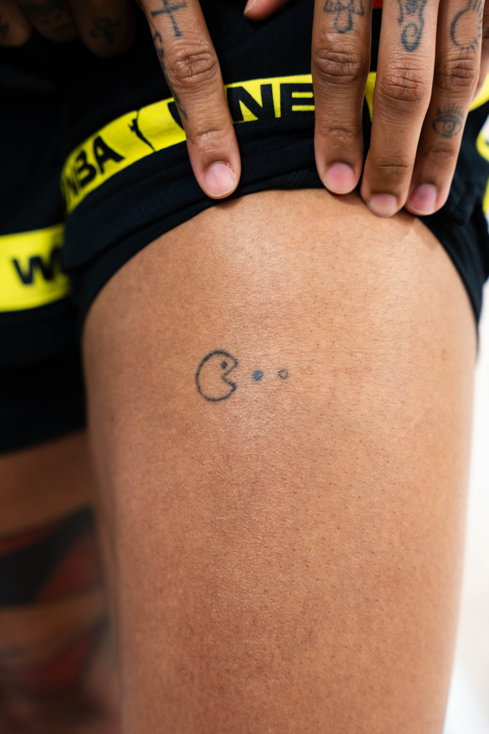
The Pac-Man tattoo remembers a medal and a bet

Gabby Williams Pac-Man tattoo on upper thigh

On her upper thigh, Williams has a small Pac-Man tattoo eating three dots in the French colors. The blue, white and red dots represent France. The tattoo also marks the French team’s bronze medal at the Tokyo Olympics, after Williams and teammate Marine Johannès made a bet about the result.

The design gets the tone just right. An Olympic tribute could have used rings, a date or a medal, but Williams chose an arcade character and let the national colors tell part of the story. It is a personal memory that still looks like something she picked because it made her laugh.

The upper-thigh placement gives it some privacy during games while leaving it easy to show when she wants to. It balances public identity with a private joke, marking a major sporting moment without turning it into a formal monument.

Her fingers carry smaller symbols and quick visual cues

Gabby Williams finger tattoos including Prince symbol and cross

Williams also has small finger tattoos, including a Prince symbol and a cross. They can disappear in a game-day photo and become clear in a close-up. Finger designs are more exposed than tattoos on a thigh or shoulder, so keeping certain symbols near her hands feels like a deliberate choice.

The Prince symbol brings a music reference into a smaller space than the Rolling Stones logo. The cross adds a separate spiritual note, though Williams has not described every detail as a grand statement. It is better to say what is visible and documented than to fit an entire biography onto a small mark.

The finger tattoos also break up the larger compositions. Her sleeve has room to spread, while these are compact and graphic. Together they make the collection feel lived in: she can have a six-day art project and a tiny hand symbol without pretending every piece came from one plan.

Family, friendship and the tattoos that started early

Gabby Williams family flower and triangle tattoo

Some of Williams’s most telling tattoo stories are about the way the ink began. When she was around twelve, her older sister Kayla had a Japanese character tattoo. Williams thought her sister was the coolest person in the world and wanted to copy her. Her own version was airbrushed, though, and eventually washed off. The joke still left a mark: tattoos became tied to family, imitation, style and a desire to step outside expectations.

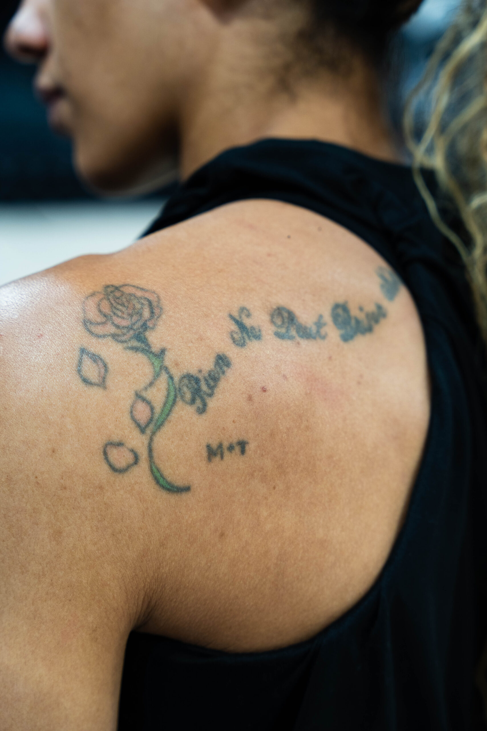
Williams has also said she got her first real tattoo at fourteen in a friend’s kitchen. While playing college basketball, she once hid a shoulder tattoo with tape because UConn had a policy about visible tattoos. It grounds the collection in everyday life. These were not all carefully staged celebrity choices; some came from friends, travel and youthful enthusiasm, then stayed part of her story.

Family connections appear elsewhere too, including a flower-and-triangle design linked to relatives. Not every detail is clearly visible in public photos, so it is best to leave the exact symbolism open rather than guess. What comes through is a recurring interest in people and experiences that make her feel connected.

Why the collection feels personal without being too serious

Together, Williams’s tattoos bring several visual languages into one collection. The sleeve is the most immersive piece. The Stones logo nods to music, No-Face brings in anime, and Pac-Man turns an Olympic memory into an inside joke. The finger designs keep a few small symbols close at hand.

The variety is the real theme. Williams does not seem interested in making every tattoo match. A classical-looking sleeve can sit beside an arcade character and a rock logo, just as a family story can sit beside a design she simply enjoys looking at. That is usually what makes a collection feel human: not perfect consistency, but a trail of different versions of the same person.

She has said she does not regret her tattoos, including the silly ones. That attitude comes through in the collection. Nothing has to be solemn all the time. A tattoo can honour a medal, celebrate a band, remember a friend, connect a family or make you smile when you see it in the mirror.

Watch Williams talk about the people and memories behind her ink

A fan-recorded basketball interview with Williams and her teammates includes a conversation about a tattoo she let Marine Johannès give her. It is a helpful companion to the stories above because it shows the easy, conversational side of how some of these pieces became part of her life.

More athlete tattoo guides

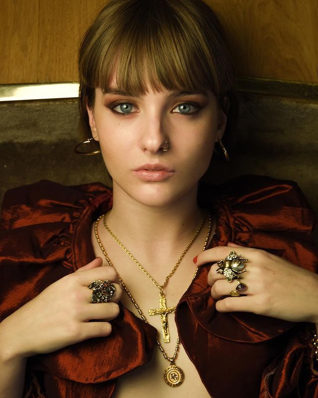
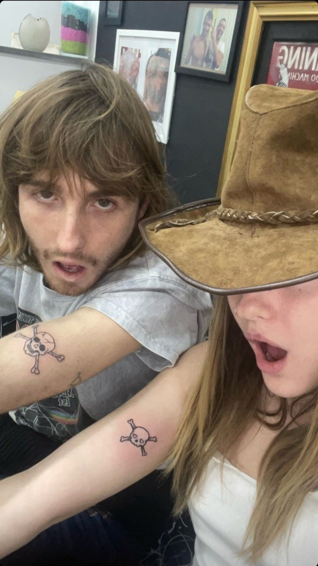
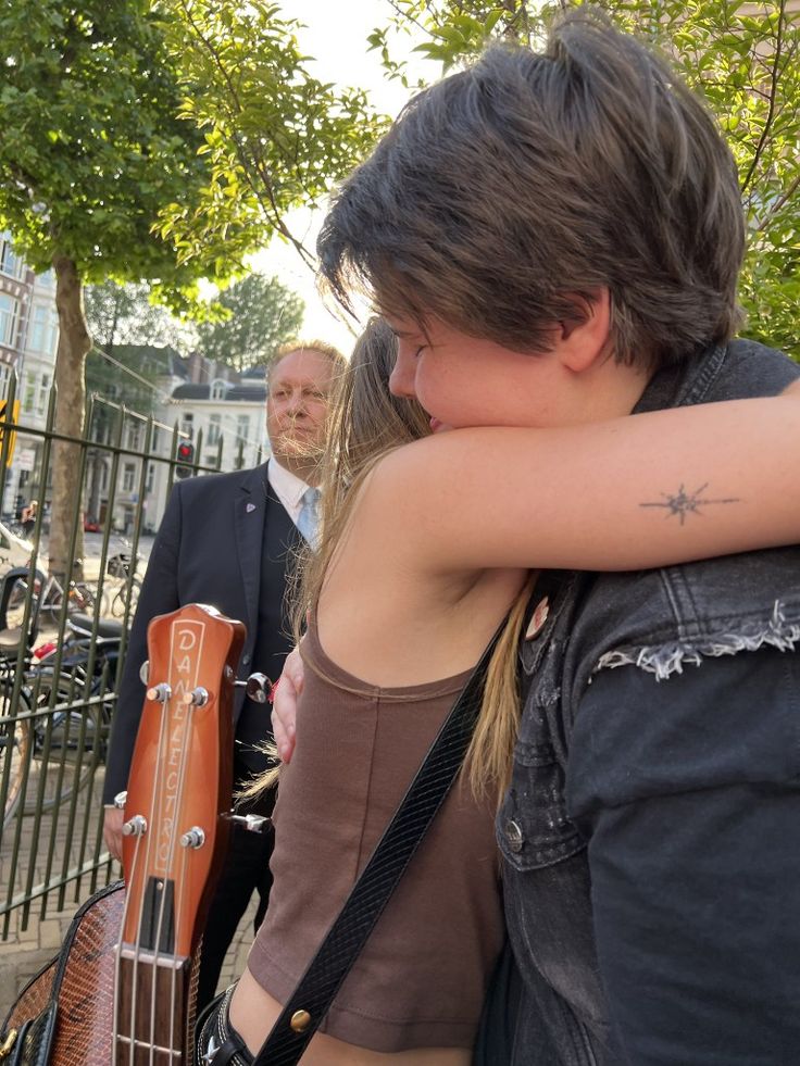
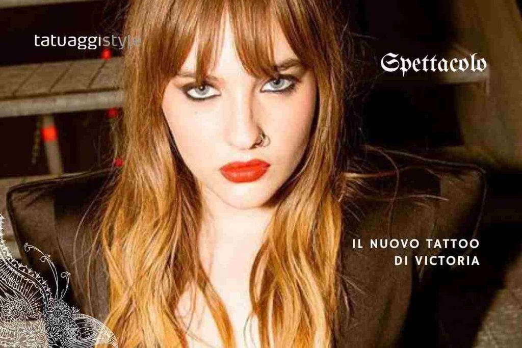
Victoria De Angelis keeps her tattoos close to the music

Victoria De Angelis has never treated tattoos like a checklist. The Måneskin bassist has small flashes of ink on her arms, ankle, spine and behind her ear, mixing the playfulness and attitude she brings to the stage. Some designs match with bandmates; others include a spine cross and newer pieces fans have followed through close-up photos.

There is no dependable public explanation for every mark, so confirmed details should stay separate from fan theories. Even so, the documented tattoos show a clear pattern: they are often compact, personal and easy to miss until Victoria turns or the camera catches the right angle.

Here is a closer look at the pieces identified in tattoo coverage and fan documentation.

The MÅ tattoo is a matching Måneskin mark

Victoria De Angelis matching MÅ tattoo and band tattoo

One of Victoria’s best-documented pieces is a small “MÅ” matching tattoo connected to Måneskin. Fan documentation places it on her right ankle and says it was done as a matching design with bandmates. The mark itself is simple, but that connection gives it more weight than a random pair of letters.

The spelling matters. It is not a generic monogram; it points to the group and the shared identity its members built before becoming an international touring act. An ankle is a natural spot for a matching tattoo: discreet, but always there when she looks down.

Matching tattoos can be treated too broadly as proof of friendship. In Victoria’s case, the clearest confirmed detail is the link to her bandmates. More specific claims about the moment or private meaning are not established. The small scale is part of the charm. It does not need to dominate her body to mark a relationship that has shaped her life.

An arrow through a heart links her to the band

Victoria De Angelis arrow heart tattoo

Another tattoo described as a match is an arrow heart on Victoria’s right arm. The compact design works as both a personal mark and a recognisable image in photos: an arrow passes through a heart, a familiar shape that feels different when shared between bandmates.

Some posts place it around her arm or wrist, and fan accounts have compared the members’ versions. The available photos do not always show the tattoos from the same angle, so it is safer to describe the design and its reported matching connection than to claim every detail is certain.

Visually, the arrow-heart balances the MÅ lettering. One points directly to the band name; the other suggests affection, loyalty or a shared joke without spelling out the story. Together, the tattoos feel personal rather than promotional.

There is something very Victoria about choosing a straightforward symbol and wearing it with confidence. Small ink can still carry a whole era of someone’s life.

The cross down her spine is one of the clearest large designs

Victoria De Angelis cross tattoo along her spine

Another widely shared tattoo is a clean cross along her spine. Unlike the matching ankle and arm designs, it creates a strong vertical line. The spine gives it a natural path, so even a relatively simple shape can look striking from behind.

“Cross” describes what is visible, but the meaning has not been clearly explained by a definitive source. It would be easy to assign a religious or spiritual story, but that would go beyond the record. The careful description is simply an elongated cross down her back.

The placement is part of the visual choice. A spine tattoo is usually hidden under everyday clothes and appears when Victoria wears an open-back outfit, turns away from the camera or shares a deliberate photo. That sets it apart from small hand or arm marks that can show during a performance.

The design adds a quieter note to tattoos otherwise associated with rock styling, stage energy and bold clothes. It is elegant without looking overly formal. That contrast is part of why fans return to the image when new photos show the piece more clearly.

The behind-ear tattoo stays easy to miss

Victoria De Angelis behind ear tattoo

Victoria has also been photographed with a small mark near or behind her ear. Hair can cover the placement, which may be why it prompts close-up discussion without a clear public explanation. The tattoo appears in selected portraits and fan-circulated images, but its exact design and origin are not consistently described.

Behind-ear tattoos have a different feel from a large back piece. They sit close to the face without announcing themselves straight away. The wearer can reveal one by moving her hair or turning her head, then hide it again without changing clothes. That suits Victoria’s approach to ink: expressive, but not a full costume.

Not every Pinterest caption should be treated as fact. The safest account is that photos show a small behind-ear tattoo, while the story behind it remains unclear. That is simply what the public record supports.

A newer tattoo appears in full-body and fashion photographs

Victoria De Angelis newer tattoo visible in full body photograph

Recent photographs show another tattoo in a lower, more intimate placement. The coverage is visual rather than explanatory: the design appears in a full-body image, but Victoria has not made a reliable public statement about its meaning or when she got it.

This kind of tattoo can be hard to identify because lighting, angle and photo quality all matter. A compressed social-media image may make a mark look like one shape; it can be difficult to read when enlarged. The useful fact is that the tattoo is visible, not a made-up account of every line.

It also shows that the collection is still changing. The MÅ and arrow-heart pieces are tied to Måneskin’s early shared history, while the newer tattoo belongs to a time when Victoria has a larger public life outside the band. The pieces do not need one theme to make sense together.

Some tattoos tell a story. Others are private choices that happen to appear in a photograph.

What the collection says without overexplaining it

Victoria De Angelis tattoos face visible portrait

Victoria De Angelis’s documented tattoos show that a collection does not need to cover every inch of skin to feel distinctive. The publicly identified pieces vary in placement: a matching ankle mark, a small arm design, a spine tattoo, a behind-ear piece and newer ink seen in later photos.

The matching designs are the clearest connection to Måneskin. The MÅ lettering and arrow-heart are associated with the band members, but they do not turn her body into merchandise. They work because they are small and personal. The spine cross creates a more dramatic line, while the harder-to-spot pieces keep the collection from feeling predictable.

It is tempting to write a full biography around every tattoo, but that often makes the account less accurate. The story that is already supported is enough: Victoria has chosen shared symbols, elegant placements and newer designs the public is still trying to identify.

Her tattoos feel casual, close to the body and deliberately hard to summarise. That suits a musician whose public image mixes sharp styling with a sense of freedom. Some marks connect her to the people she started with; others belong to Victoria alone.

For a wider look at Victoria and her bandmates, this Måneskin interview offers some context:

Visibility and importance are not the same thing in this collection. The spine cross is easy to see in a styled photo, while the MÅ letters may look like meaningless characters to someone who does not know the band. The behind-ear tattoo can disappear depending on her hair. That does not make one piece more serious than another; tattoos can sit in different parts of a person’s life.

For now, the most reliable inventory stays modest: matching Måneskin tattoos, the spine cross and newer pieces documented in photos. The meanings of some designs remain Victoria’s to explain if she chooses. Not every mystery needs an answer from the outside.

More musician tattoo guides

Two Chainz lets the ink do some talking

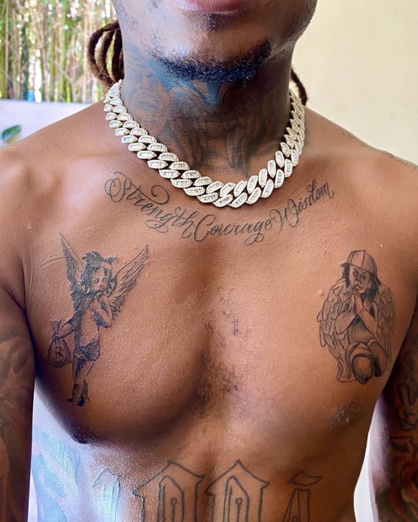
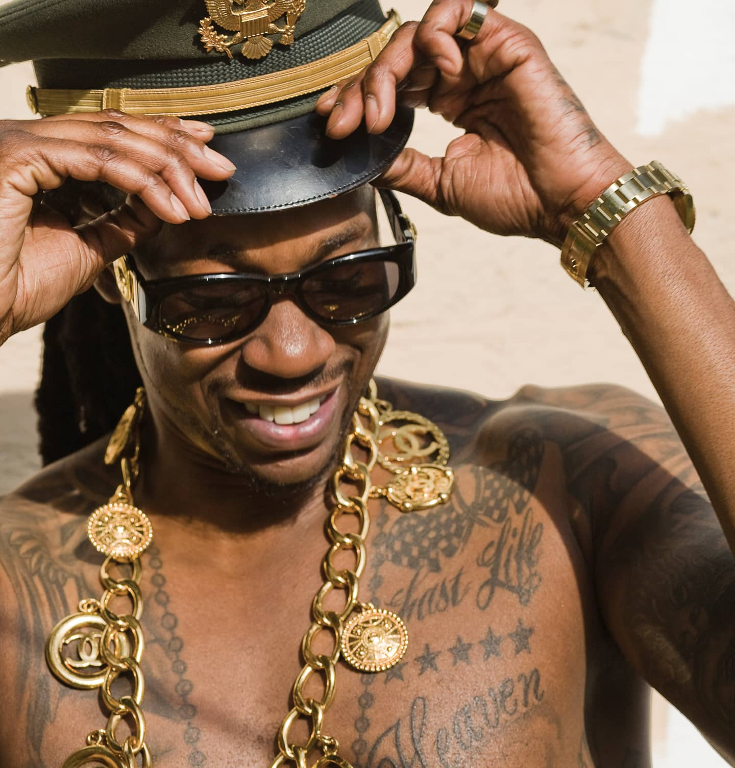
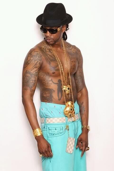
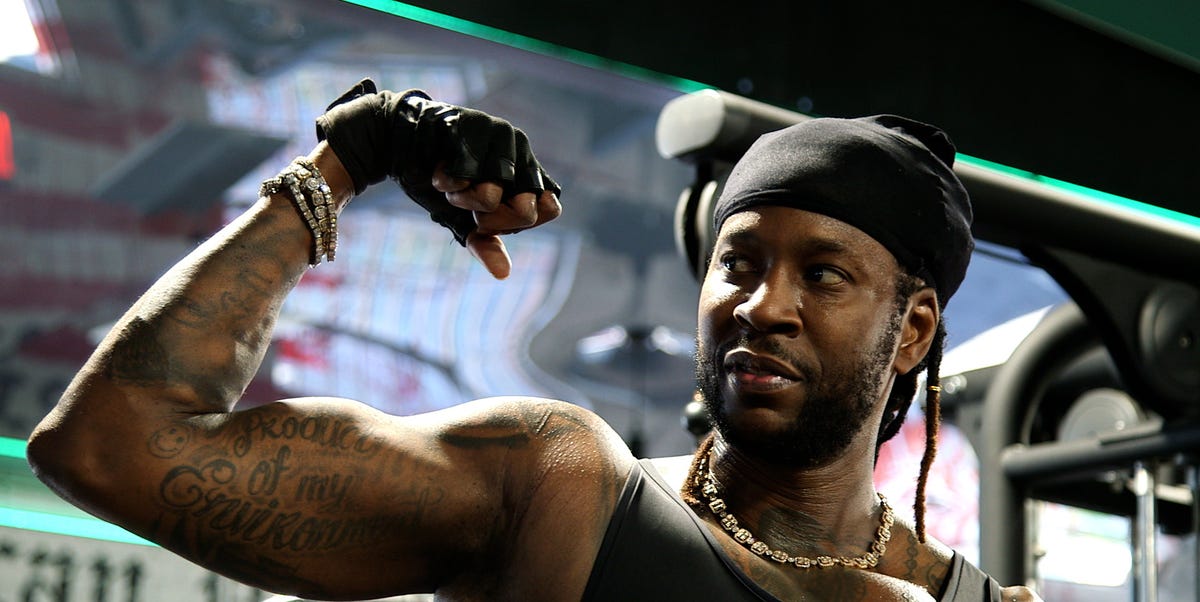
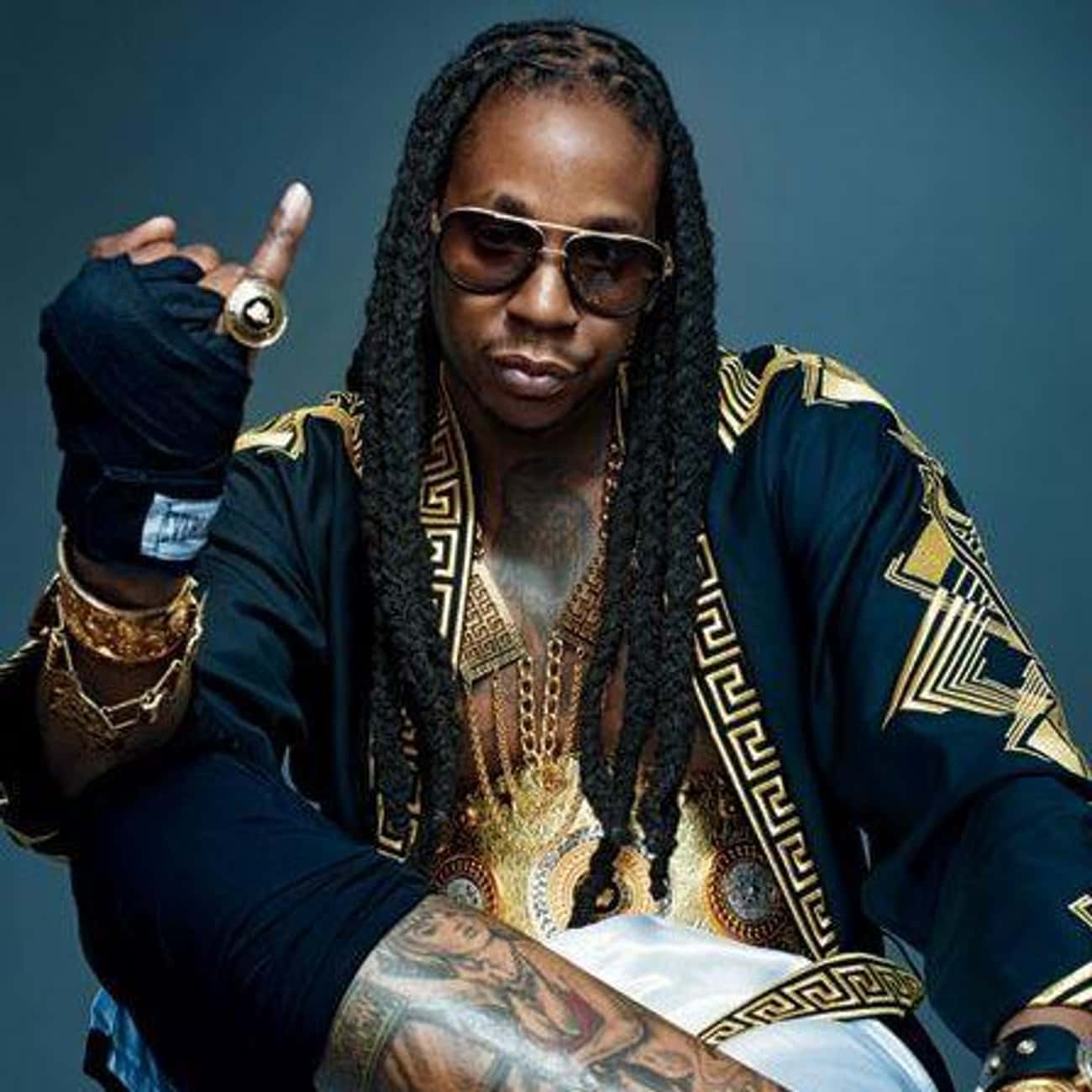
Two Chainz has never treated tattoos as a quiet hobby. Even in a sharp suit or behind dark glasses, his ink tends to find its way into the frame: a hand around a microphone, a neck design above a collar, a chest piece when his shirt comes off. The tattoos are part of his style, but they also hold details about the person behind the stage name.

In GQ’s tattoo tour, he talked through the early choices and the designs that still matter to him. His first tattoo came at seventeen: a heart with Twan inside a banner. A lion followed, tied to the idea of kingship. Later pieces brought in prayer, the South Side and people around him. The result feels like a series of chapters rather than a sleeve planned in a single afternoon.

That is part of the appeal. The tattoos are bold enough for his larger-than-life image, but their meanings tend to be direct. A name points to family, a lion to status and confidence, a prayer to words he wrote himself. The story is there if you know where to look.

The first tattoo put Twan on his skin

Two Chainz workout arm tattoos

Two Chainz has said he got his first tattoo at seventeen: a heart with “Twan” in a banner. It uses his real name, rather than the persona he later built around Two Chainz. The old-school design is simple: a name inside a heart, with a banner making the message easy to read.

There is more to that choice than might be obvious at first. Before the records, jewellery and oversized stage name, there was Tauheed K. Epps, the person his mother called Twan. His first tattoo began with home, not business.

He has also described the artist who did those early tattoos as someone known around Atlanta. That places the piece in a local scene, when tattooing was part of the culture around him rather than a carefully arranged celebrity appointment.

The heart is not meant to be mysterious. It is a straightforward marker of affection and identity, and that simplicity carries through some of his later tattoos too. Not every piece needs an elaborate theory; sometimes it means just what it shows.

The lion turned the collection toward kingship

Two Chainz neck and arm tattoos

The lion tattoo was Two Chainz’s second major piece. He has connected it to kingship, making it a natural step after the Twan heart: the first design says who he is, and the lion suggests how he wants to move through the world.

Lions are common in celebrity tattoos, but what matters is the meaning he gave his own. He did not describe it as just a fierce animal or something chosen only because it looked tough. He talked about being a king, which fits the confidence in his music and stage presence.

There is humour in the way he tells the story. Two Chainz can make a grand statement and then undercut it with a joke. That keeps the idea from sounding like a formal declaration. It feels more like a personal code: stand tall, know your worth and decide for yourself how seriously to take the world.

The lion also helped set the collection’s visual language. The tattoos could be large, symbolic and hard to miss, giving him another way to balance seriousness with style.

The chest carries the most direct phrases

Two Chainz chest tattoo detail

Some of Two Chainz’s tattoos read like short statements. One chest piece has “Last Life” above a row of stars. It sits where a logo might go, but the phrase feels reflective rather than promotional.

He has also named a South Side tattoo as one of his favourites. It ties him to Atlanta, its community and the part of the city that often runs through his music. It is more than a place label; it points back to the environment that shaped him before audiences knew his name.

Chest tattoos can stay under a shirt and then become part of the show when he chooses to reveal them. That makes them more flexible than face ink, which is visible in nearly every setting. Two Chainz is confident, but his most meaningful designs do not need to be on his face to make an impression.

The lettering also gives the collection a conversational feel. “Last Life” invites questions without needing a caption. The chest becomes a page in the middle of the story: enough room for a headline, with space for the rest to keep changing.

His prayer tattoo is personal because he wrote it

Two Chainz tattooed arms and gold chains

One of the most revealing pieces in the GQ tour is a prayer tattoo that Two Chainz wrote himself. His handwriting makes it different from lettering copied out of a font book. It adds a little vulnerability, even alongside an image usually built around control and confidence.

He has talked about the strength of the women in his family and how they raised the children around them. The prayer connects with that endurance. It is not a vague religious symbol; it is something he wrote and chose to keep on his skin because the words mattered to him.

Handwriting can look rougher than professionally lettered tattoos, and that can be part of its appeal. It preserves the shape of a real person’s writing instead of turning words into a perfect graphic. This prayer feels less like a sign on the wall and more like a note he did not want to lose.

That small bit of imperfection gives the tattoo its pull. A rapper known for polished videos and expensive styling still has a piece that looks deliberately human. It is a reminder that the collection is about more than image.

The T.R.U. connection sits inside the bigger identity

Two Chainz torso tattoo portrait

Two Chainz’s tattoos also reflect the people and crews around him. In GQ’s episode with T.R.U., the artists talked about the name’s meaning, The Real University, and the importance of individualism. That fits how Two Chainz wears his ink: connected to a community, while still clearly his own.

Group tattoos can look like branding from the outside. For the people who built a crew, though, a name or acronym can hold long nights, shared work and a time in life that might otherwise be hard to keep. The history behind it matters.

That is why every design does not need to match. The tattoos point to family, Atlanta, faith, ambition and his collaborators without being arranged like a corporate logo sheet. Their common thread is the attitude behind them.

Two Chainz has always left room for exaggeration. The nickname, glasses, chains and larger-than-life delivery are part of the fun. His tattoos carry that energy while still leaving space for quieter references.

There is room for style as well as meaning

It would be a mistake to treat every tattoo on Two Chainz as a solemn monument. Some pieces mean a lot; others were chosen because the design looked right at the time. He has spoken openly about getting tattoos for style, and that honesty makes the collection easier to follow.

The visual side is obvious. His ink sits alongside gold chains, rings, sunglasses and bright clothes. A tattoo can carry serious meaning and still be part of an outfit. That does not make it less genuine. People can hold family history on their skin and enjoy looking good.

Placement adds to that variety. Chest lettering reads clearly in a portrait. Smaller arm tattoos appear when he gestures, and neck designs give a formal outfit an edge. No single spot has to tell the whole story.

What holds the collection together is a mix of readable symbols and direct language. Hearts, lions, stars, prayer and place names speak quickly. You do not need to zoom in on every mark to feel the overall message: love, pride, ambition and a strong sense of where he came from.

Why the collection still feels like a timeline

Two Chainz’s tattoos make the most sense in order. The Twan heart is the teenage beginning. The lion brings in kingship. Chest phrases and the South Side reference connect the ink to place and ambition. The prayer in his own handwriting brings the story back to family and faith, while later crew references belong to the public life he built through music.

That progression is more interesting than a perfectly planned sleeve because it keeps the rough edges. The designs do not share one palette or style; they mark different moments, moods and reasons for getting tattooed.

His collection can be open and private at the same time. Two Chainz explains the pieces he chooses to explain; other marks remain visible but undefined. A clear photo can show where a tattoo sits, but it cannot tell us what he felt when he got it. That boundary is worth respecting.

In the end, the tattoos work like another form of autobiography. They carry his real name, his neighbourhood, his family’s influence and the confidence behind his stage identity. The ink does not replace the music; it gives it a little more context.

Watch Two Chainz talk through his tattoos

More musician tattoo guides

PnB Rock never pretended every tattoo was perfect

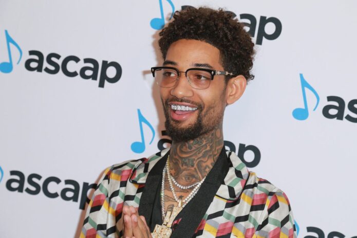
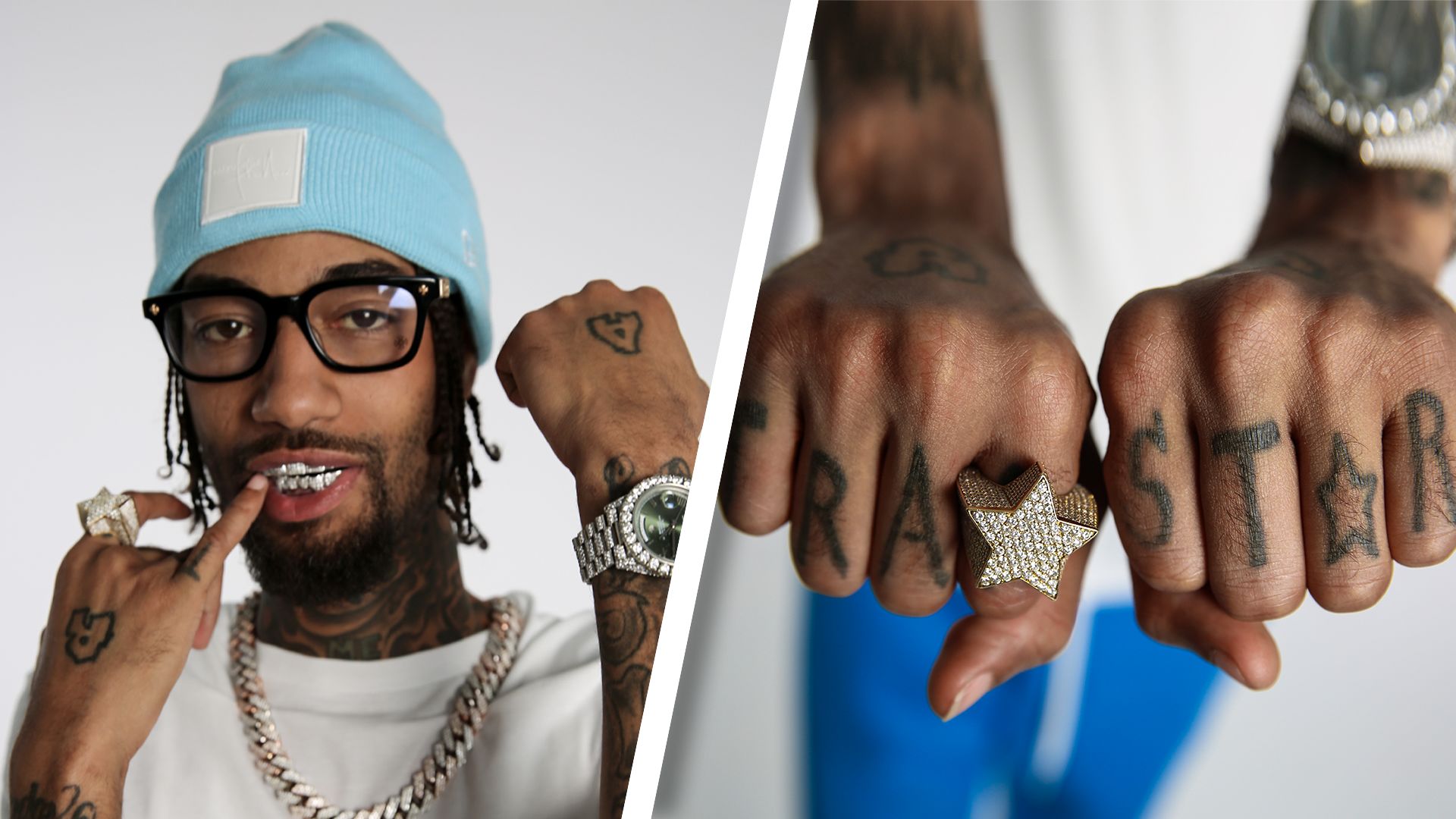
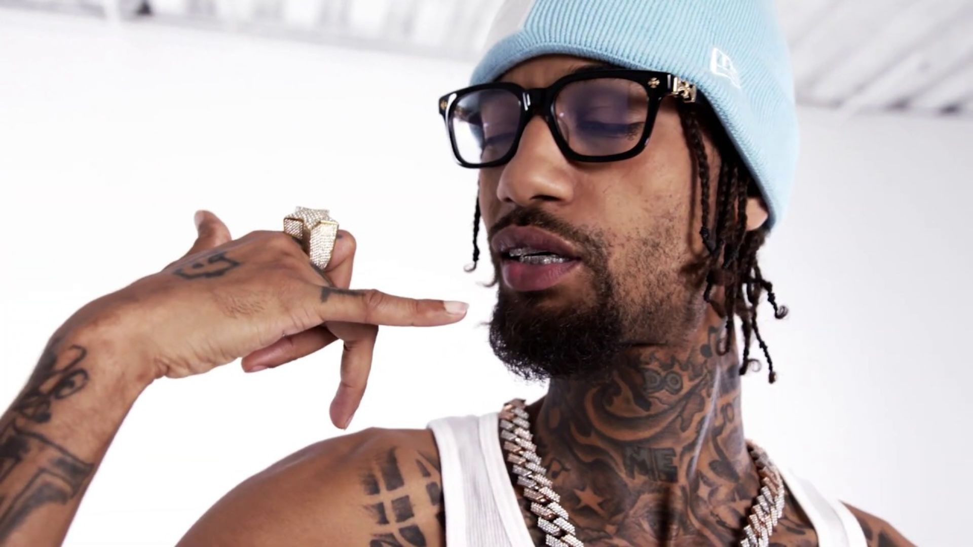
PnB Rock never tried to pass his tattoos off as flawless. In GQ’s tattoo tour, he jokes that some need touch-ups, admits there are pieces he regrets and says he would never tattoo his back because he is too skinny and soft for that kind of pain. That candour makes the collection more interesting than a perfect sleeve.

The Philadelphia rapper’s ink traces growing up, getting into trouble, making music and keeping his neighbourhood close. There are initials, a jail number, a rough Philadelphia skyline, a Nike-inspired neck design and “WB” for Walnut Lane and Baynton. PnB Rock’s tattoos can look messy, but their stories are unusually clear.

His first tattoo was for his little brother

PnB Rock GQ tattooed fists and knuckles

PnB Rock said his first tattoo was his initials, R.A., short for Rakim Allen. He and his younger brother chose the same idea when PnB was in sixth grade and his brother was in fifth. They had been kicked out of their mother’s house, and getting inked became a small act of rebellion while they were still very young.

He remembers getting punished when he came home. He also remembers feeling cool because he and his brother had done something permanent. That mix of fear, pride and teenage impulse is still part of the way he tells the story.

It was not a carefully planned identity tattoo; it was a kid making a choice with his brother and finding out how permanent it could feel. It remains one of the collection’s most important pieces, even if it is not the most polished.

The neck pieces show his early impulse to get inked

PnB Rock GQ tattoo concerns and hand ink

PnB talks about his neck tattoos with a sharp sense of humour. One started as a Nike swoosh with the phrase “Just Do Me,” a Philly idea he liked at the time. Later, he admitted he hated the design and took an opportunity at A Boogie’s house to have an artist change it.

The replacement was meant to suggest the Philadelphia skyline. PnB jokes that it looks more like a row of straight buildings with tiny squares. He does not pretend it is perfect, and the regret is part of why the story lands. Lots of people rush into tattoos and spend years defending them. PnB is willing to say it was a phase.

That openness gives the neck work some character. It does not have to be a masterpiece; it can simply show what felt cool at the time and what he later wished he had thought through.

His jail number became a permanent record

PnB Rock neck tattoo portrait

One of the most direct pieces in PnB Rock’s collection is the number 1033041. He has described it as his jail number and joked that it is basically his new Social Security number. The humour is dark, but the tattoo is a blunt piece of autobiography.

Instead of using an abstract symbol, he put the actual number on his skin. It reads less like decoration and more like a receipt from an earlier period, a reminder of where he was and the life he was trying to move beyond.

The number sits beside other tattoos tied to his neighbourhood and music career. Together, they show how closely his old life and new one overlap. The number stays with him even as the records change.

WB stands for Walnut Lane and Baynton

PnB Rock tattoos

PnB has WB tattooed on one side, for Walnut Lane and Baynton in Philadelphia. He has explained that the initials point to a particular part of his neighbourhood, not some random abbreviation. It is the kind of local reference that means everything to people who grew up around him and may need context for everyone else.

The tattoo gained an unexpected extra layer later. When he got it, he was not thinking about a future in music. After he signed with Warner, the letters began to look like accidental foreshadowing. What started as a neighbourhood marker picked up another meaning through his career.

That double reading is common in PnB’s ink. Tattoos are made for one moment, then life adds context. The initials did not have to change; the story around them did.

He thought tattoos were exciting before he thought they were permanent

PnB Rock tattooed live performance

PnB has admitted he went through a phase when tattoos just seemed exciting. People around him were getting them, and he wanted to fill space. Looking back, he can see he was making decisions faster than he was thinking about the long-term result.

That is why he says he regrets many of his tattoos. It is not an attack on tattoo culture; it is advice from someone who has made impulsive choices and has to live with them. He tells people to think through what they are getting because the design will still be there after the mood has passed.

It sounds simple, but it may be the most useful point he makes in the tour. His collection shows how quickly ink can grow beyond a person’s taste at the time.

His hand and knuckle ink is built for close-up photos

PnB Rock neck tattoos portrait

The hand and knuckle tattoos are especially noticeable in photos. A GQ still shows PnB lifting his fists, bringing the lettering into clear view. It has the details of his familiar look: jewellery, grills, a relaxed expression and ink made to be seen up close.

He has said some pieces need to be tightened or refreshed. Hand tattoos fade as the skin moves, gets washed and does its work. A design can still matter even when the lines look rough around the edges.

The knuckles also bring together different parts of his identity: the musician, the Philadelphia kid, the person who was locked up and the performer building a recognisable style. None of those sides cancels out the others.

The Philadelphia skyline is intentionally imperfect

PnB Rock stage neck tattoos

PnB has described another neck tattoo as an attempt at a Philadelphia skyline. He is quick to say it did not come out exactly as he imagined: the buildings are too straight, and the details are a bit too small. The idea still matters because the city is one of the strongest threads in his tattoos.

The skyline does not have to be technically perfect to work as a memory. Its roughness fits the way he talks about his early ink. He was still figuring out what he wanted to put on his body, and sometimes the message was simply, “This is where I’m from.”

That feels more honest than pretending every tattoo began as a carefully drawn plan. His collection includes mistakes, edits and designs that became something different over time.

Leaving the back blank

PnB Rock shoulder boombox tattoos

PnB Rock says he has no tattoos on his back and does not plan to rush into one. His reason is simple: he is skinny and soft, and expects it would hurt too much. He jokes that the needle might come through his chest.

There is a practical side to leaving it blank. He already has plenty of visible ink, so the open space gives the collection room to breathe. There is no need to fill every part of the body; the blank area becomes part of the look.

His reluctance is a good counterpoint to the usual celebrity tattoo story, where every new idea leads to another session. PnB knows the appeal, but he also knows his limits. The blank back is one of the few choices in his collection he sounds completely certain about.

Putting the pieces together

PnB Rock’s tattoos bring together loyalty, regret and place. The initials with his brother point back to childhood. The jail number records a difficult chapter. WB keeps Walnut Lane and Baynton close. The altered neck design shows how a tattoo can change as the person wearing it changes.

His ink is not a matching set, and he does not try to make it look like one. Some pieces are fading, some are jokes, and some came from choices he made too young. Others remember the people and streets that shaped him. The unevenness is part of the appeal.

It is human to admit you dislike parts of your own collection. PnB Rock’s tattoos are not a finished brand package; they are a timeline with the rough drafts still showing. That is why the stories stick. They sound like the truth, not a press release.

Watch PnB Rock explain his tattoos

PnB’s GQ tour is worth watching for the details behind his initials, Philadelphia skyline, jail number, WB and the reason he is leaving his back blank. He jokes about the bad decisions but is thoughtful about why permanent ink deserves more planning than a quick impulse.

More musician tattoo guides

Riff Raff wears his whole story on his skin

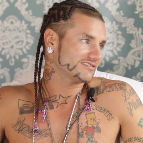
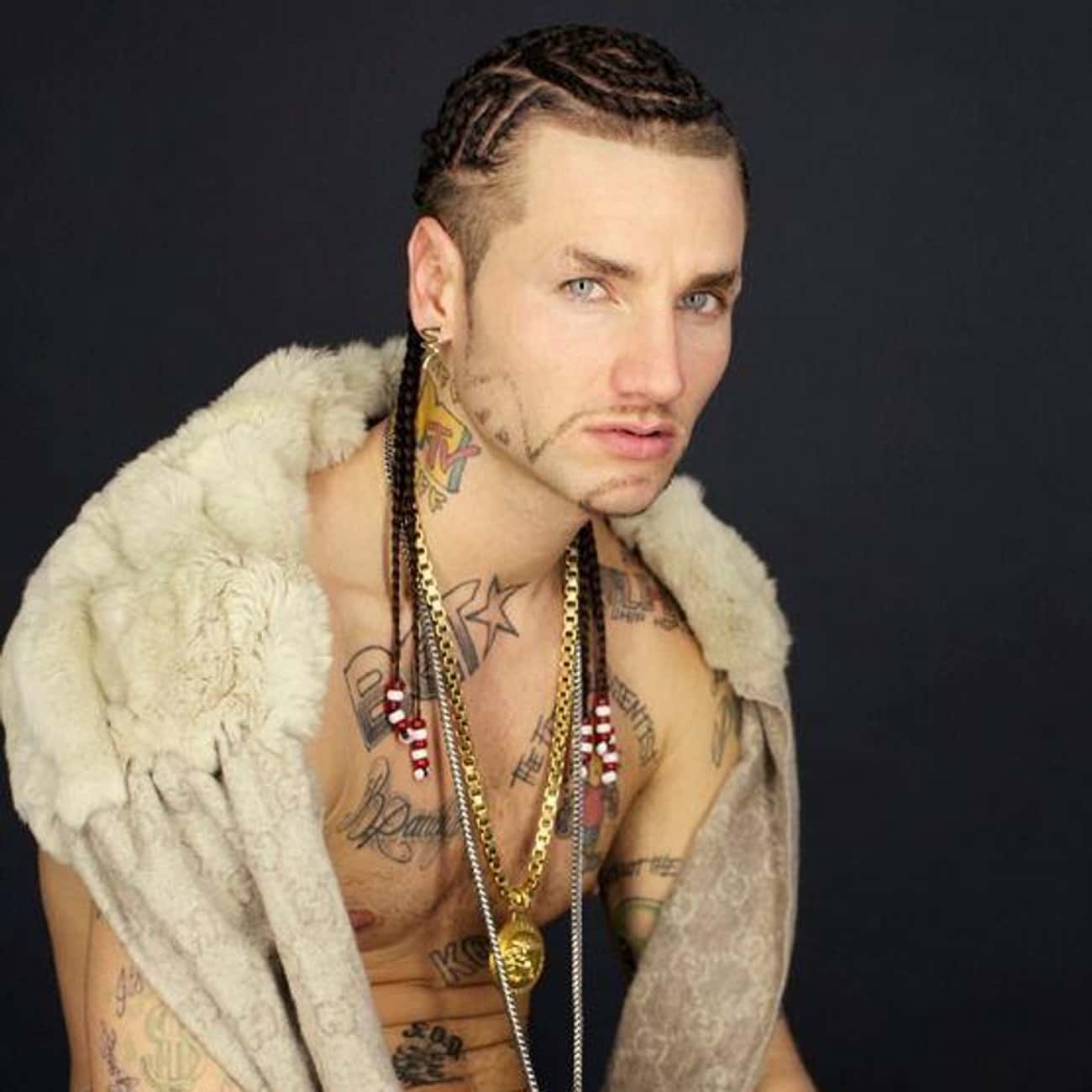
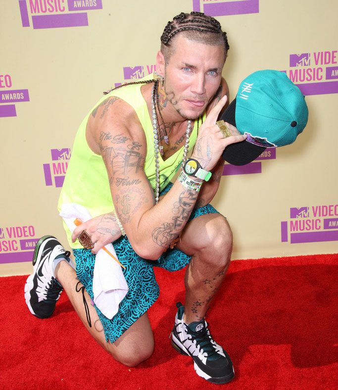
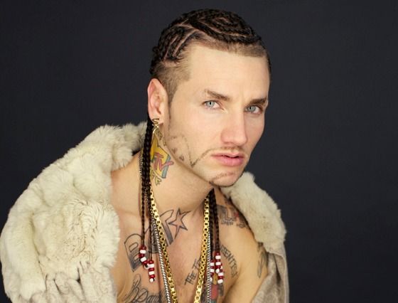
Riff Raff has never used tattoos as background decoration. His ink is loud, funny, unmistakably personal, and sometimes ridiculous in a way that feels intentional. A neck logo sits alongside a Simpsons character, a basketball joke, a Houston shout-out, and designs that seem to be there simply because he liked the idea.

That variety is the point. His tattoos feel less like a carefully planned sleeve and more like a running scrapbook of the Jody Highroller persona. Some are logos tied to the media world that helped put him on the map; others are phrases about where he comes from or images that match his bright, over-the-top image. A few have changed over the years, too, so it helps to separate what is documented from what may have been covered.

Here’s the clearest account based on his tattoo interviews, profile photos, and designs he has shown publicly.

The MTV neck tattoo became part of the character

Riff Raff MTV neck tattoo

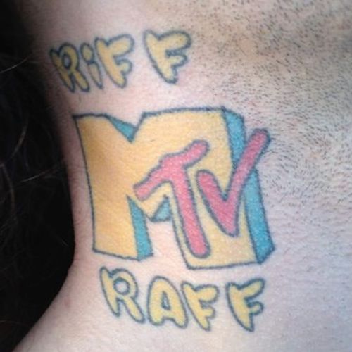
The most obvious piece is the MTV logo on the right side of Riff Raff’s neck. It’s large, colourful, and hard to miss. The lettering became tied to the persona he was building around the time he appeared on From G’s to Gents in 2009.

The logo works both as a reference to television and as self-branding. Once people started calling him MTV Riff Raff, it became more than a neck tattoo: it was part of the name they remembered. Close-up photos also make the colours and shape easy to see, unlike some smaller designs that blur together in performance shots.

It would be easy to treat it as a straightforward career tribute, but the joke is part of the appeal. Riff Raff has always blended real ambition with performance. The placement is the message: this isn’t a private symbol waiting to be discovered years later.

Bart Simpson carries the Freestyle Scientist idea

Riff Raff Bart Simpson chest tattoo

On the left side of his chest, Riff Raff has a large Bart Simpson tattoo paired with the words “The Freestyle Scientist.” The design includes scientific imagery. He has explained the title in his own loose, sideways way: Bart rhymes with “heart,” so the character sits close to his heart, while the scientist idea reflects how he makes songs and freestyles.

It’s one of the better-documented designs because it has appeared in interviews and shirtless portraits over the years. Bart is instantly recognisable, but the surrounding idea makes the tattoo personal rather than just a cartoon image. It turns a familiar character into a description of Riff Raff himself.

The chest suits a design that works like a logo: it’s easy to see from a distance, photographs well, and sits near the centre of the body. The playful image also keeps it from feeling like a formal mission statement. It’s a self-portrait with a punchline built in.

BET and WorldStarHipHop mark the media brands

Riff Raff neck and chest tattoos

Photos have also shown BET and WorldStarHipHop logos among Riff Raff’s tattoos. The BET design was reported on the front of his right shoulder, then later described as covered by a tattoo of his dog, Jody Husky. That’s a useful reminder that older photos may show a version of his tattoos that has since changed.

The WorldStarHipHop piece came from the same early internet-and-music era. According to the accounts of it, he got the logo after connecting with the site and treated it as another part of the public image he was building. These designs aren’t family tributes or traditional memorial pieces; they’re more like calling cards and souvenirs from places where his name was circulating.

That’s why the collection can look chaotic and still have a theme. Riff Raff tattoos the platforms around him. MTV, BET, and WorldStarHipHop all belong to the media landscape that helped make his persona recognisable. Even a covered logo can mark a particular point in that timeline.

The H-Town shoulder piece starts with home

Riff Raff H Town shoulder tattoos

In a Complex tattoo interview, Riff Raff said his first tattoo was on his right shoulder and triceps. It reads “The City of H-Town,” followed by “It’s Understood It Ain’t All Good.” He connected the phrase to money and motives: when money is involved, people can act differently, so you have to understand what’s really going on.

This is probably the most direct hometown tribute in the group. Houston is more than a setting in his story; it’s part of how he introduces himself. The H-Town wording feels like an opening chapter, while the longer line adds the blunt, streetwise commentary that also comes through in his lyrics and interviews.

The money symbol adds another layer without turning the tattoo into a mystery. Riff Raff has never aimed for minimal, understated symbolism; he likes the words to be visible and the explanation to be part of the fun. The shoulder design is a hometown shout-out with a warning attached, which feels very much in character.

NBA becomes the National Baller’s Association

Riff Raff NBA National Ballers Association arm tattoo

On the other arm, Riff Raff has a tattoo for the National Baller’s Association. He has clarified that it means something different from the National Basketball Association. Here, “balling” is about living large, looking sharp, and carrying yourself with confidence.

He has also described a “7 Time All Star” tattoo on the right side of his stomach. In his telling, the seven years referred to his own idea of balling; it isn’t an actual sports record. It’s part of the made-up mythology of Jody Highroller, where everyday details become an exaggerated legend.

The two designs work together: the association creates the world, and “7 Time All Star” gives him a title in it. The humour is clear, but they also reflect how basketball shaped his self-image before music became his main stage. He’s making his own league and giving himself the trophy, not claiming official stats.

Texas Raized and the map that went sideways

Riff Raff Texas Raized forearm tattoos

Across his forearms, Riff Raff has “Texas Raized”, deliberately spelled with a Z. He has joked that people read it as “Texas Raisin,” a misunderstanding he seems to enjoy. Brickwork behind the letters gives the phrase the look of writing on a wall and makes it more substantial than plain script.

He has also talked about a map-shaped tattoo that was meant to combine Mars or Australia with another idea, but the drawing didn’t turn out as planned. He said it ended up looking like Texas and decided that worked just fine. His tattoos aren’t always presented as polished designs with one official interpretation.

The forearm lettering is easier to read than the map story, but both turn geography into personality. Houston, Texas, and the larger fantasy version of himself all show up in the collection. The spelling, brickwork, and accidental outline make it feel more like personal graffiti than a formal state emblem.

Hands, ribs and arms fill in the smaller pieces

Riff Raff hand arm and rib tattoos

The logos and chest pieces draw the eye, but Riff Raff has also described several smaller tattoos. On his hands, he mentioned “Codine Phene” and “Dream Team.” The first phrase has been transcribed with different spellings, so it’s best to use the version reported while acknowledging that uncertainty.

On his arms, he has “Aces Only,” which he linked to having tricks up his sleeve. On his left ribs, he identified “Kokayne Dawkins,” one of his names. These tattoos are less about a single image than the vocabulary of his persona: aliases, slogans, and phrases that could come straight from a freestyle.

Hands, forearms, and ribs are hard to compare across photos because the angle, lighting, and clothing vary so much. An accurate inventory should distinguish what he has named himself from what only seems visible in a blurry shot. The documented phrases are enough to show the pattern, without treating every shadow as a tattoo.

What the whole collection says

Riff Raff iHeart portrait tattoos

Riff Raff’s tattoos make more sense when you stop looking for one consistent style. They combine Houston pride, media logos, basketball language, cartoon imagery, invented titles, and stage names. Some point back to where he came from; others belong to the public character he was creating. A few are so direct they read like captions.

There’s a timeline in the ink, too. The early MTV design connects to the television appearance that helped define his public identity. BET and WorldStarHipHop reflect the media spaces around him, while the H-Town and Texas tattoos keep geography in view. Bart and the Freestyle Scientist idea turn a favourite cartoon into a creative self-image. The NBA language turns his love of basketball into a fantasy league where he’s always an all star.

That’s why the pieces don’t have to match. They aren’t meant to look like one perfectly planned collection. They’re more like stickers on a suitcase collected over different stages of a career. Loud, personal, commercial, silly, and occasionally sincere can all sit side by side. For Riff Raff, that mix is the look.

Watch Riff Raff talk and let the tattoos do their thing

There’s no reliable full tattoo tour that covers every design, but the interview below gives you a sense of Riff Raff’s loose, unpredictable way of talking. It’s a useful companion to the tattoo interviews and profile photos mentioned above.

More musician tattoo guides

Dheeraj Dhoopar’s three tattoos each carry a different kind of love

Dheeraj Dhoopar has only a few tattoos, but each one carries its own meaning. The Indian television actor has spoken about three tattoos: a “Starboy” design below his ear, two arrows pointing in opposite directions, and a Christian cross. They can be easy to miss in photos, which is one reason a television appearance in 2026 brought them back into the conversation.

Viewers of Lock Upp: Sach Ya Sazaa noticed the Starboy tattoo and asked about it. Dhoopar said it represents the love and support he has received from fans, family, and those close to him. That explanation gives the collection a clear starting point. Together, the three designs speak to direction, belief, and the people who have supported him.

The Starboy tattoo beneath Dheeraj Dhoopar’s ear

Dheeraj Dhoopar Starboy tattoo under the ear

The best-known piece is the “Starboy” tattoo beneath Dhoopar’s ear. It’s visible from the right angle but small enough to disappear when he turns his head or his hair falls over it. The name might sound flashy, but the meaning he has given it is more personal than a nickname.

Dhoopar has said the tattoo stands for the love and support he has received from fans, family, and loved ones. So the star isn’t just about celebrity. It’s a thank-you. The word reflects the life he has built in public, while its place near his face keeps the sentiment close.

There’s a quiet contrast in the design. A star can suggest ambition, performance, or attention, but Dhoopar’s explanation turns the focus toward other people. It feels less like a victory lap than a reminder of who helped him along the way.

The two arrows and the idea of movement

Dheeraj Dhoopar opposite arrows tattoo on the hand

The second documented design is a pair of arrows pointing in opposite directions. The image is clearly described, but there isn’t a detailed public quote from Dhoopar explaining exactly what the arrows mean. Arrows can suggest many things: moving forward, choosing a path, remembering where you started, or accepting that life doesn’t move in a straight line.

The grounded description is simple: there are two arrows, and they point away from each other. More specific explanations should be treated as interpretation, not confirmed fact. The design might resonate with a career that has included long-running television roles, reality shows, and new challenges, but that story shouldn’t be attached to the tattoo without Dhoopar’s own explanation.

Visually, the pair creates a sense of balance. One arrow can feel like a direction to follow; two facing away from each other suggest a choice between paths. The design adds another layer to a small collection that already includes a tribute to the people around him.

The Christian cross

The third documented design is a Christian cross. Alongside the playful “Starboy” tattoo and the directional arrows, it brings a familiar spiritual symbol into the collection. A cross can represent faith, family influence, protection, or a personal reminder of values, without needing a long explanation.

There’s no reason to invent a dramatic backstory. The cross is recognisable, and available reporting identifies it as one of Dhoopar’s three tattoos. Unless he shares more, it shouldn’t be tied to a specific event or person. The tattoo is documented; its most personal meaning is his to explain.

Together with the other designs, the cross helps make the collection feel personal rather than trend-driven. One tattoo is tied to gratitude, another is a simple directional image, and the third is a widely understood religious symbol. The pieces are different, but each can serve as a compact reminder without taking up much space.

What the three tattoos say together

A small collection can still reveal a pattern. Dhoopar’s three tattoos touch on three kinds of connection: “Starboy” reflects the people who support him; the arrows suggest motion or choice, though their exact meaning is unconfirmed; and the cross brings faith or spirituality into the picture. It’s a short list, but it gives the collection an emotional shape.

The clearest explanation belongs to “Starboy,” which Dhoopar has connected to the love he receives from fans, family, and loved ones. It might be tempting to assign equally precise stories to the arrows and cross, but only one tattoo has a clear public explanation. The other two are documented designs whose private meanings remain open.

Keeping that distinction makes the story more accurate. Celebrity tattoo coverage can sound overly certain, especially when a design is small or only appears briefly in a video. The facts are enough: Dhoopar has three tattoos; the Starboy design sits below his ear; the arrows point in opposite directions; and a cross completes the group. Not every meaningful tattoo needs a public explanation attached to it.

How the tattoos fit Dhoopar’s public image

Dhoopar is known for a polished screen presence, and the tattoos add a quieter personal touch. They don’t create a full rebellious makeover. They’re compact and can be covered for a role or formal event, while the Starboy mark below his ear sometimes shows in photographs and adds a flash of personality.

His explanation about fans and family fits the way television careers work. Viewers may spend months or years watching an actor play the same character, which can make the relationship between actor and audience feel familiar. A tattoo acknowledging that support makes sense in that context without turning his body into an advertisement.

The collection’s timeline is less clear. Public reporting doesn’t establish when each tattoo was done, so there’s no basis for saying the arrows came first or that the cross marked a particular career milestone. The designs can be discussed together without inventing a chronology.

An earlier report also photographed a Loved tattoo

Dheeraj Dhoopar Loved tattoo shown in an earlier report

A 2017 Times of India report photographed an earlier version of Dhoopar’s tattoos and described a “Loved” tattoo alongside three arrows. A newer 2026 report lists Starboy, the arrows, and a Christian cross as his three tattoos, so the older image is included as a record of an earlier look rather than counted as a fourth current tattoo.

What is not confirmed

The best-supported count is three. Current reporting doesn’t confirm a fourth tattoo, a large hidden back piece, or a newer design beyond Starboy, the arrows, and the cross. It also doesn’t name a tattoo artist.

The arrows’ exact meaning is unknown, and Dhoopar hasn’t given a detailed public explanation of what the cross means to him. That’s a useful limit to keep in mind: the designs can be named and described where the reporting supports it, but the gaps shouldn’t be filled with invented personal history.

Photos also deserve care. A close-up or shirtless image may show skin clearly, but it doesn’t prove that every dark mark is permanent ink. Lighting, jewelry, body hair, and image quality can all cause confusion. The count here follows the published description of Dhoopar’s collection rather than guesses about marks in photos.

Dheeraj Dhoopar tattoo checklist

  • Under the ear: “Starboy,” a tribute to the love and support Dhoopar says he receives from fans, family, and loved ones.
  • Arrows: two arrows pointing in opposite directions; their exact personal meaning hasn’t been made public.
  • Cross: a Christian cross in the three-tattoo collection; the personal story behind it hasn’t been fully shared.
  • Total documented tattoos: three.
  • Publicly named tattoo artist: none confirmed in the available reporting.

That’s the clearest documented inventory. Dhoopar’s tattoos aren’t about collecting every popular design; they keep a few ideas close: gratitude, direction, and faith. The pieces are small and personal, but clear enough to suggest a story. The Starboy design may be the headline tattoo, but all three work best as a group.

There’s a practical lesson here, too. A tattoo guide is more useful when it separates what someone has shared from what viewers might assume. Dhoopar’s three tattoos are enough to tell a coherent story, and leaving uncertain details open respects the line between public style and private life.

Watch the tattoo discussion

This Hindi entertainment clip focuses on Dhoopar’s new “Starboy” tattoo and the attention it drew from viewers.

More actor tattoo guides