admin

Allie Colleen lets her tattoos grow with the music

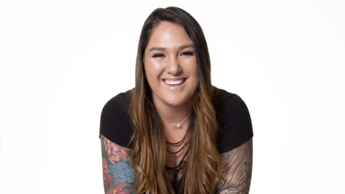
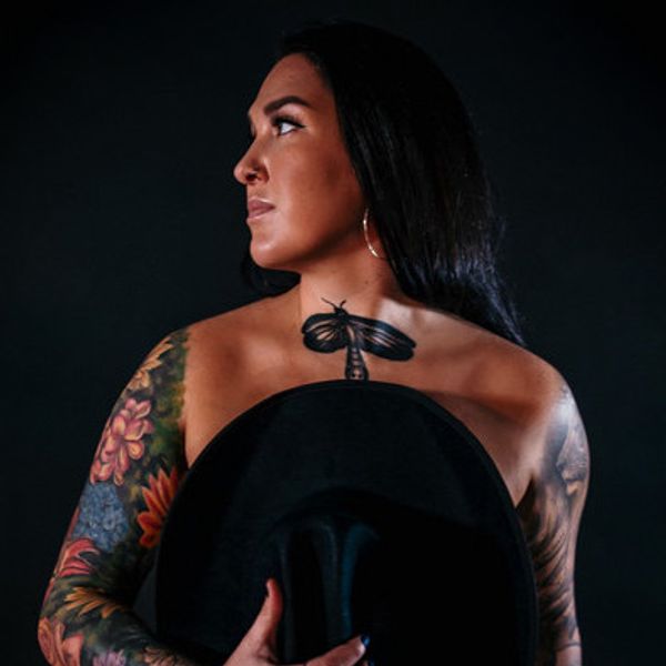
Allie Colleen’s tattoos can change the first impression you get of her. Onstage, her country voice and big personality come first. Then the sleeves show, the dragonfly at her chest catches the light, and the ink becomes part of the picture she makes with the music.

She has said she has more than 30 tattoos, though she does not keep a public tally. They are not a matching set drawn up all at once. Flowers, animals, small personal symbols and larger sleeve work sit alongside pieces she got simply because she liked them.

In interviews, Colleen has talked about her first elephant tattoo, how her ink marks different versions of herself and how some pieces are just cool. Photos also show a pocket watch, a rose and succulents, a dragonfly tattoo sits at the centre of her chest, and bright floral work across both arms. Here is what can be seen clearly and what she has explained.

The sleeves are the centre of Allie Colleen’s tattoo look
Allie Colleen dragonfly chest tattoo and floral sleeve tattoos

The floral work across Colleen’s arms is the biggest visual feature of her collection. Bright colours, leaves and dark outlines fill both sleeves from the upper arms toward her wrists. They read as full pieces, even though the tattoos were added over time.

In the same photo, a dragonfly sits at the centre of her chest. It is small beside the sleeves, but gives the look a focal point. Set above the neckline, it can show up in portraits and stage photos without a dramatic pose.

Colleen talks about the tattoos as pieces of her story rather than one big statement. The sleeves reflect that: not a single logo, but a group of images and memories that have found room beside each other.

They have also become part of her everyday style. A simple black top leaves the arms visible; a hat or country stage outfit changes how the colours read. The tattoos are not just for a certain kind of photo. They are part of what makes Colleen recognizable.

She has described getting tattoos as a personal choice she did not need to clear with her famous family. That attitude comes through in the finished sleeves: confident, but not overly calculated.

The pocket watch and rose pieces bring a softer side to the ink

Allie Colleen pocket watch and rose tattoos on her arms

One clear photo of Colleen’s arms shows a pocket watch tattoo on one forearm and a rose with succulents on the other. The watch has an old-fashioned look, with a round face and detailed casing. Its mood differs from the bright flowers around it.

The rose and succulents bring a more organic feel. Leaves and blossoms spread over the arm, with colour layered beside darker lines. It looks less like one flower set in an empty patch and more like a garden that has kept growing.

Colleen has not given a fixed meaning for the watch or each flower, so there is no need to turn them into an invented timeline. What is clear is her taste for images with personality: a watch with some age to it, and plants that are soft but still hold their own beside the heavier sleeve work.

The darker outlines and larger shaded areas keep so many flowers from making the collection feel too sweet. The watch adds a vintage note; the plants make the sleeves feel alive instead of like a flat block of colour.

Those details work in motion, too. The watch can show when Colleen holds a microphone or guitar, and the flowers move with her arms instead of disappearing in a distant stage photo. A sleeve has to work beyond the close-up, while its wearer is doing something.

Her first elephant tattoo started the personal collection
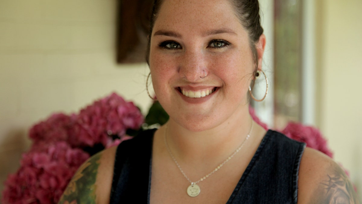
Allie Colleen shoulder tattoo and arm ink

When asked about her first tattoo, Colleen named an elephant. She mentioned it while discussing the more than 30 pieces she has collected. It is a simple starting point, before the sleeves, flowers and later portraits.

She has also said tattoos can mark who she was at the time and who she is now. That helps explain the smaller pieces near her shoulders and upper arms. Not every design has to be a grand tribute; it can hold a feeling, a stage of life or an image she wanted to keep.

The shoulder photo shows smaller designs beside the more developed sleeve. Different line weights and shapes appear rather than one perfectly uniform pattern. With a collection this large, some areas will be more finished than others, and that unevenness makes the ink feel lived in.

Colleen has said some tattoos are simply cool. That belongs in the story too. The elephant may have a personal meaning, while another piece might just have looked right in the moment. Both can sit in the same collection.

She has also said she never felt the need to ask her parents what they thought about her body. The tattoos are choices she made for herself, not a performance for someone else.

Music and the tattoos sit comfortably side by side
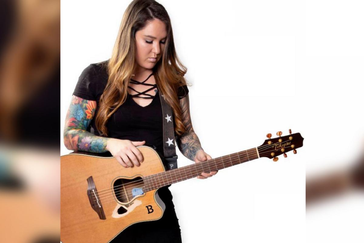
Allie Colleen floral sleeve tattoos while playing guitar

A photo of Colleen playing guitar shows how naturally the tattoos fit into her working life. Both arms are visible, and the colourful sleeves become part of the scene without taking over the instrument or performance.

Her ink is part of how people recognize her as a country singer, but the music still leads. She can wear a plain black top, pick up a guitar and let the sleeves show without needing a special pose.

Colleen has talked about writing a song called Tattoos, which she described as a sexy pop song rather than a serious inventory of everything on her body. It is another hint at her attitude: ink can matter, but it can also be fun, stylish and playful.

The guitar photo shows the practical side of a sleeve. Parts of the design disappear behind the instrument or come into view depending on how she holds it. A portrait might highlight the roses; a performance shot catches more colour and movement. More than one photo gives a fuller sense of the work.

Not every tattoo has been explained, and public photos do not show every area equally well. That is normal for a collection this size. The safest inventory sticks to the elephant she has named, the floral sleeves, the watch, rose and succulents, the dragonfly and other clearly visible pieces.
She has two tattoos of herself

One of the more unusual things Colleen has shared is that she has two tattoos of herself. She said they represent where she was when she got them and who she is now. There is a bit of humour in it, but also a real idea: the tattoos hold different versions of her story.

Most people get a tattoo to remember someone else, a place or an event. Colleen’s self-portraits turn the focus inward. She joked that she did not know who else would get an Allie Colleen leg sleeve, which is a pretty good reason to do it herself.

The leg work is harder to see in available photos than the arms, but it adds another layer to the collection. Her tattoos are not limited to what appears in a waist-up portrait; the legs carry their own memories and designs.

That self-referential streak fits what she has said elsewhere. Colleen has not framed the tattoos as a way to meet someone else’s expectations. She got them because they mattered, looked good or marked a moment she wanted to keep.

Allie Colleen’s tattoos feel like a scrapbook with colour in the margins. They hold family and personal stories alongside pieces that simply looked cool, with floral sleeves that have grown over time. The collection remains recognizable even when the meaning of a small tattoo stays private.

The elephant gives the story a starting point; the watch, rose, succulents and dragonfly add detail. The sleeves show years of adding and changing, while the self-portraits make the collection a little more playful.

Colleen does not need every tattoo to come with a speech. Some mark a big moment, some are tied to a person, and some are there because she liked the design. Together they tell the relaxed story of a singer whose body art has grown alongside her music.

More musician tattoo guides

Alexander Bublik’s tattoos carry the memories behind his wild tennis

Alexander Bublik does not play tennis like someone determined to stay within the lines. The Kazakh star serves hard, tries shots other players might not attempt and seems comfortable when a match gets strange. His tattoos have a similar feel: bold, visible and tied to different moments rather than one polished theme.

Bublik has spoken openly about his ink. He says much of it was done between the ages of 16 and 20, and that he is probably finished adding to the collection. The tattoos are more than decoration; they remind him of who he was, what he felt and what he was working through at the time.

Here is a closer look at the designs that show up most clearly in match photos, from the long forearm quote to the Roman numerals and the skeleton he links to the demands of professional tennis.

The long forearm quote is one of Bublik’s clearest tattoos

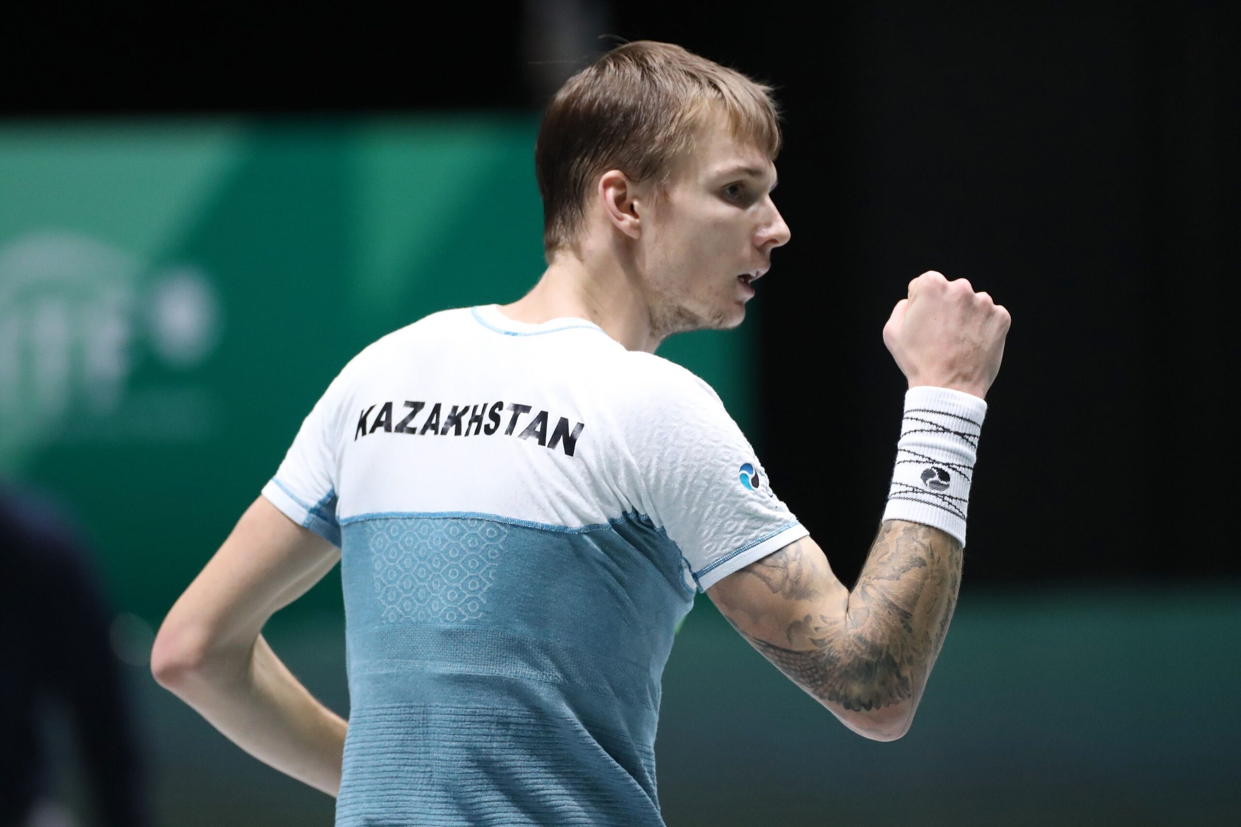
Alexander Bublik forearm quote tattoo

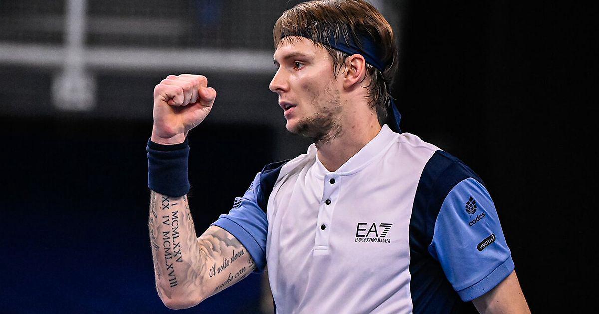
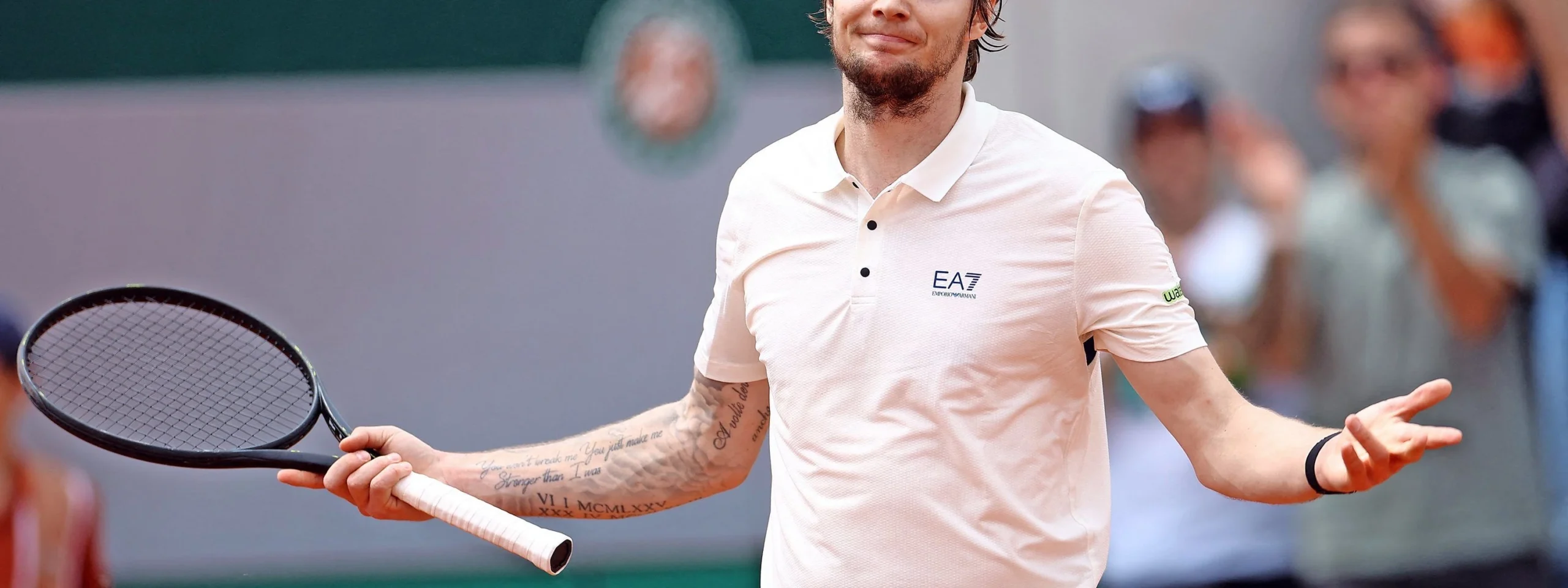
The tattoo that stands out in wide photos runs along Bublik’s right forearm. Several lines of writing include the phrase “You just make me stronger than I was,” visible in the clearest shots. It can be easier or harder to read depending on the light, angle and how far he extends his arm.

Bublik is rarely still on court. He is serving, raising his hands, celebrating or setting up one of his improvised shots. The lettering moves with him, so fans often catch part of the sentence rather than one flat block. The photo above shows the words clearly, while darker shading around them gives the forearm a fuller sleeve effect.

The quote fits the way Bublik talks about his career. He has had big wins, long losing runs, changes in ranking and plenty to say about how tiring the tour can be. The tattoo does not have to predict his results; it can be a private line that became public because he put it somewhere visible.

It also shows why the collection feels accumulated rather than planned as one project. The words are personal and readable, while the surrounding work is darker and more graphic.

Roman numerals cover the lower part of his forearm

Alexander Bublik Roman numeral tattoos

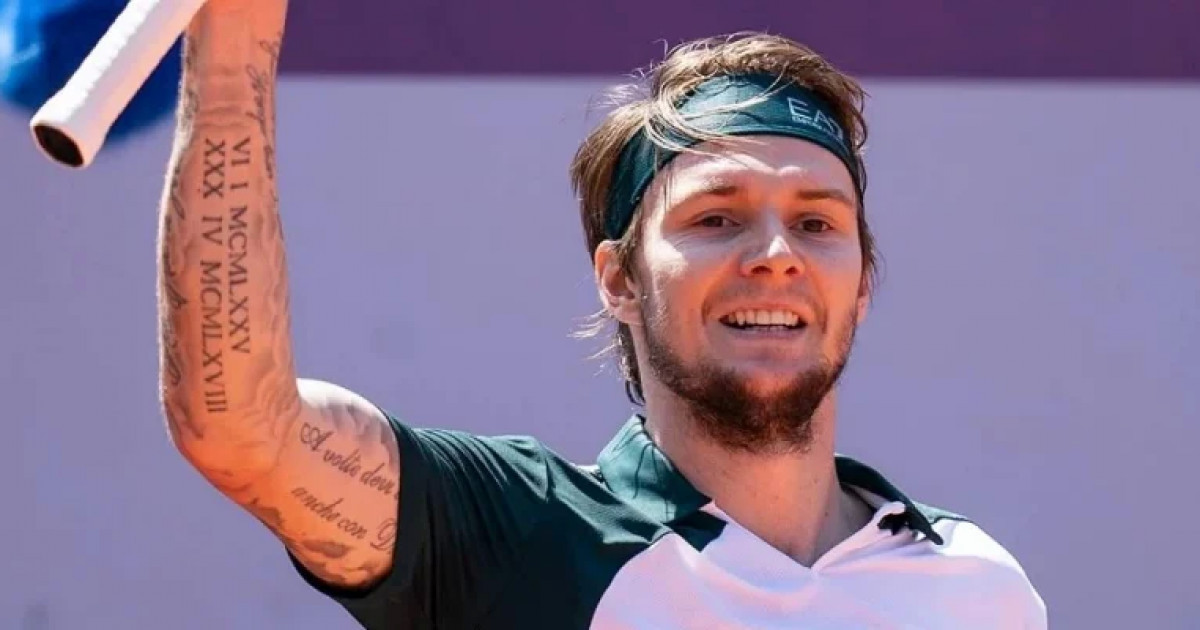
Rows of Roman numerals sit across the lower part of Bublik’s forearm near his wrist. They stand out when he raises his fist after a point. The lettering is clean and spaced out, giving this part of the sleeve a more structured feel than the softer script above it.

Several groupings are visible from different angles, including dates or date-like combinations. It is tempting to decode each line, but Bublik has not publicly explained them one by one. The safest description is that they belong to the personal side of the collection, rather than a sponsor or fashion choice.

The repeated marks give the forearm a strong visual rhythm. They contrast with the longer handwritten phrases beside them, so the sleeve remains readable despite all the different elements. The eye catches the numbers, then moves to the writing and shading around them.

Tennis keeps a player’s forearm in view during serves and fist pumps. Bublik’s numerals become part of those familiar gestures, almost like a signature that appears when he celebrates.

An Italian phrase runs through the sleeve

Alexander Bublik Roman numerals and script tattoos

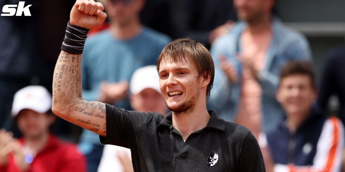
Closer court photos show another line of writing curving through the sleeve. The Italian phrase is usually read as “A volte dove andrà con Dio.” It sits beside the Roman numerals and has a different look from the longer quote: compact, curved and fitted around the other pieces.

Bublik has mentioned having Italian ink, and this line helps the sleeve feel personal rather than generic. It is not a sports slogan or equipment-themed design, but a phrase associated with a particular stretch of his life.

Tattoo collections often turn into visual timelines: one idea added beside another until the body holds a history that would be hard to plan as a single design. That seems to be the case here.

The script shifts along his arm when he serves or points toward the crowd. It is not hidden ink; the line is part of how the sleeve looks in motion.

The sleeve mixes lettering with darker shaded work

Alexander Bublik sleeve tattoo

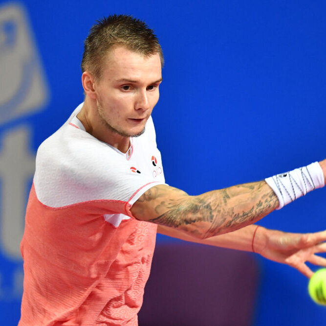
Bublik’s right arm is not all words and numbers. Dark shading, small figures and textured blackwork fill the spaces between the script. In action shots, some areas look like one dark panel; close-up photos reveal separate pieces sitting beside each other.

That patchwork quality suits a player known for changing direction at the last second. Solid black areas, fine lines and softer grey sections make the arm look different as the light changes.

The sleeve also shows how separate tattoos can build into a fuller look over time. Text, dates and images do not need to be added in one sitting, and the open spaces help keep the arm from becoming one solid wall of black.

Because Bublik plays in short sleeves, the work is visible without a special pose. It is part of his public image, even though each piece still feels like a private choice.

His forearm lettering feels more personal than decorative

Alexander Bublik forearm lettering tattoo

Some of the smaller words sit around the main quote. They are not always sharp enough to read in a broadcast photo, but the placement is clear: script runs along both the inner and outer forearm, with different lettering styles close together.

Bublik has said much of his ink came when he was a teenager or in his early twenties, while emotions ran high and life changed quickly. He described the tattoos as reminders of difficult and happy periods alike. He does not treat them as mistakes he needs to erase just because he might choose differently now.

That is a forgiving way to look at old tattoos. The pieces belong to the version of Bublik who chose them, and he respects that person even as he changes.

The small writing follows the same idea. It does not have to be famous or instantly legible; it can mark a feeling that mattered enough to keep.

The sleeve reflects a career built on ups and downs

Alexander Bublik arm tattoos

Bublik’s tennis career has not moved in a straight line. He has reached the top 20, slipped down the rankings, won major matches, lost early and kept showing up with the same unpredictable style. Tennis.com noted that many tattoos came from difficult or happy moments in his younger years, making the sleeve feel like a record of change.

The quote, dates and denser artwork all deal with time in different ways. The numerals mark something specific; the words hold on to a thought; the shading shows how the collection has grown around earlier decisions.

Bublik has said tennis does not determine his value as a person. Whether he is ranked high or low, he is still the same family member and friend. The tattoos belong to his life, but they are not a scoreboard. They hold memories without having to prove anything.

That is what makes the collection more interesting than a generic athlete tattoo gallery. The choices feel emotional, a little messy and completely his own.

The skeleton tattoo connects to what tennis demands

Alexander Bublik tattooed arm

One of the clearest meanings Bublik has attached to his tattoos is the skeleton, which he said represents what he has to endure in tennis. It gives the collection a darker edge and shows why he sees the ink as more than decoration.

Professional tennis means constant travel, playing through fatigue, managing rankings and enduring long stretches of uncertainty. Bublik often talks about the grind with a mix of candour and sarcasm. The skeleton works as a reminder of the pressure and the parts of the sport that wear a player down.

It fits the rest of the sleeve, too. The arm is not only cheerful messages or neat dates; there is room for the difficult parts. Bublik’s public personality can be funny and relaxed, while his career still asks for discipline.

One of the clearest meanings attached to Bublik’s tattoos is the skeleton, one of the designs he has explained. Other images can matter without a public explanation, but this is a piece where he has given fans a clear way into the story.
Why Bublik says he is probably done getting tattoos

In a 2025 Tennis.com interview, Bublik said he thought a chapter of his life had ended and that he was probably done getting tattoos. He tied the collection to his 16-to-20-year-old self: someone who went through hard and happy periods while making permanent choices as life changed.

That does not mean he dislikes the tattoos. He said he has to respect the person he was when he got them. He might make different choices now, but those pieces still belong to his history.

It is a thoughtful way to stop adding new ink. Rather than chasing a bigger sleeve or the next trend, Bublik seems content to let the existing work stand and age with him.

For fans, that shifts the focus to the tattoos already there and the moments they hold, rather than guessing about his next addition. The collection belongs to an unusual athlete who wears it in full view whenever he steps onto court.
Watch Bublik talk about his tattoos and the ranking rollercoaster in this interview:

Alexander Bublik’s tattoos are a lot like his tennis: emotional, unpredictable, and completely his own.

More athlete tattoo guides

Ederson Moraes’ tattoos tell the story of faith, family and football

Ederson Moraes is recognizable before he reaches the ball: the shaved head, the fearless passing and a lot of visible ink. The Manchester City and Brazil goalkeeper’s tattoos feel more like a personal scrapbook than a matching set. Some stand out immediately; others show only when he turns, lifts his shirt or celebrates with his gloves in the air.

More than 30 tattoos have been reported, and Ederson has said he started young and kept adding pieces as his career moved forward. Faith, family, football, animals and flashes of humour all turn up across his skin. The collection reads like a series of chapters rather than one planned theme.

Here is a closer look at the pieces that appear most clearly in photos and at the stories Ederson has shared. Some meanings are confirmed by his interviews; others are visual readings, and I’ll keep that distinction clear.

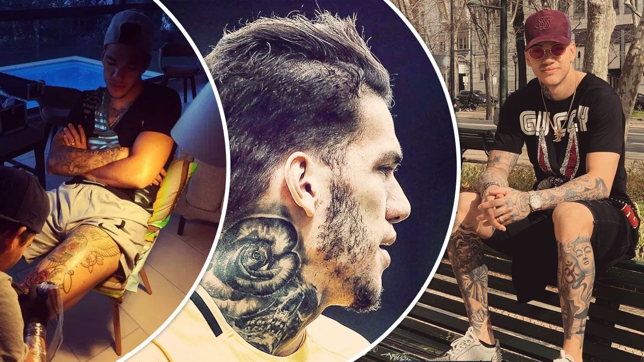
Ederson’s rose-and-skull neck tattoo sets the tone

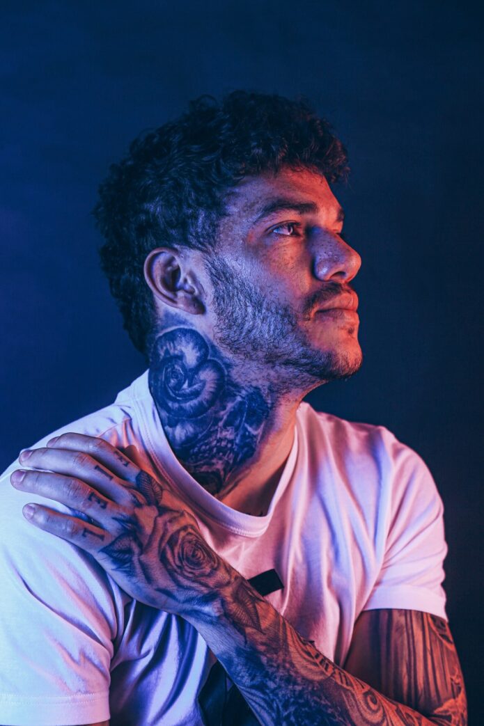
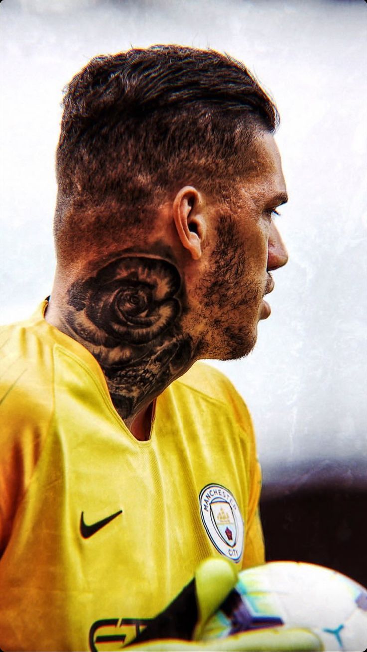
Ederson Moraes rose and skull neck tattoo

The rose and skull on Ederson’s neck are probably the first tattoos most people notice. They sit high enough to show above a football shirt, and the dark shading gives the design an old-school feel. The rose can suggest beauty or love; the skull adds a tougher edge. Together, they make a personal-looking piece without needing a caption.

The placement is a confident choice. A goalkeeper spends matches calling instructions and standing in front of a crowd, and a neck tattoo is hard to hide. It has become part of Ederson’s profile, as recognizable as his gloves or bright kits.

Photos from different angles can make the same neck work look like several tattoos. The rose sits above the skull, with the lower image worked into the darker section. It is one rose-and-skull piece, not a second version of it.

The yellow smiley face is a surprisingly simple piece

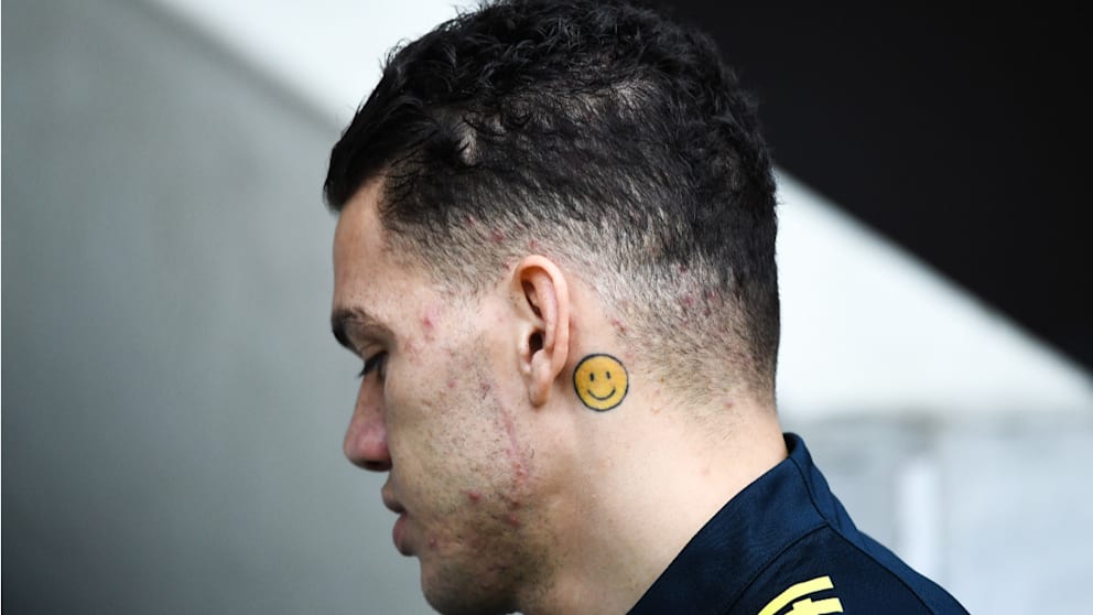
Ederson Moraes smiley face tattoo behind ear

Behind Ederson’s ear is a small yellow smiley face, a playful contrast to the darker work on his neck, arms, chest and back. Its simple cartoon shape and bright colour make it stand out when he turns his head.

Ederson has said the emoji is about happiness. There may not be more to it than that, and the simplicity is part of its charm. Many football tattoos focus on trophies, dates or fierce animals; this one is a reminder to enjoy the moment.

Manchester City’s interview is one of the clearest sources for the smiley’s meaning. The video below also touches on his family and faith tattoos. Hearing Ederson explain them helps separate his own account from guesses based on a cropped match photo.

His chest tattoos put faith and family front and centre

Ederson Moraes chest faith and family tattoos

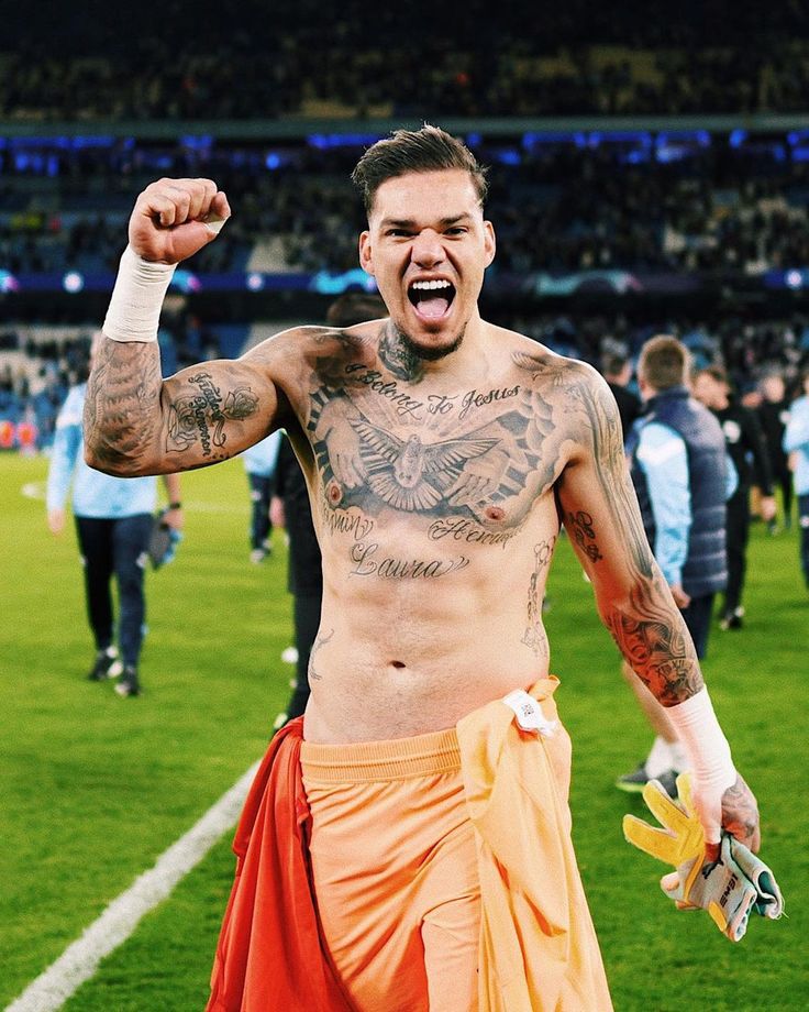
Across Ederson’s chest, the words “I belong to Jesus” sit below a large dove. It is a direct statement of Christian faith. The dove softens the composition, while the lettering gives it a clear centre.

Names and script around his chest and shoulders bring family into the same area. Interviews and photo coverage have linked some of those marks to his children and family life, though not every small detail is easy to identify. The layout looks like it grew over time, with names and personal touches added around the central message.

The chest designs also connect to the work on his arms, as lines and shading extend out from the centre. Ederson has spoken about family support as his career took him from Brazil to Portugal and then to Manchester City. In that light, the chest ink feels less like a football graphic and more like a thank-you he carries with him.

The back piece turns football into a full tattoo scene

Ederson Moraes back tattoo with lion eagle and cross

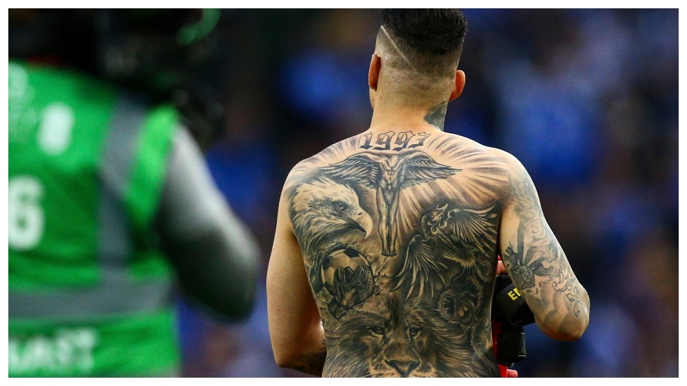
Ederson’s back is the largest canvas in his collection. The scene brings together a central religious figure with wings, a crucifix, an eagle, a lion and football details. The number 1993 near the top marks his birth year. There is a lot to take in, but the composition gives the different images a clear order.

The cross and central figure continue the faith theme from his chest. The eagle adds movement; the lion gives the design a watchful, tougher feel. Football and goalkeeper gloves are the most direct references to his job. Instead of using a club badge, Ederson has folded the sport into a larger scene about belief, identity and ambition.

Back tattoos can be hard to judge in casual photos, where the angle hides part of the design. This image shows the full piece at once, from the shoulders down across the back. The details are busy, but the larger shapes keep them from becoming a blur.

That is why the collection looks so different in a match photo and a shirtless celebration. The back is usually covered; when it is visible, it changes the scale of the story. Ederson has more than a scattering of small designs—there is a full scene made to be seen as a whole.

The lion, ball and gloves design fits his goalkeeper style

Ederson Moraes football gloves lion and back tattoos

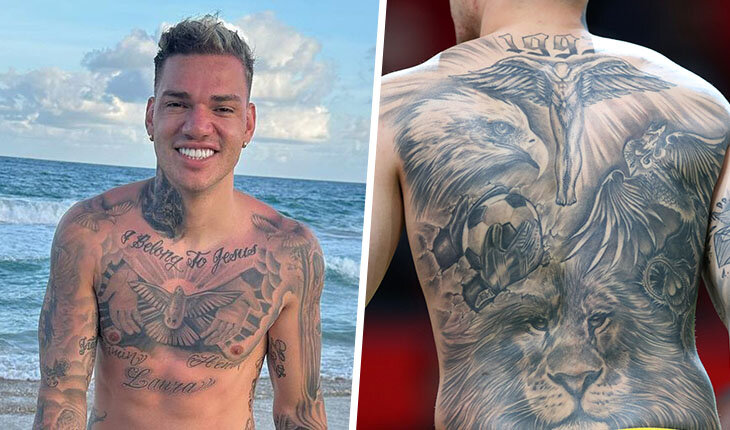
One of the most football-specific combinations in Ederson’s ink is a lion, a ball and goalkeeper gloves. Interview coverage has described the lion as a symbol of focus and the instinct to chase the next challenge. The ball and gloves are more literal, but the pieces work together: they show both his position and the tools of his career.

That combination suits Ederson. He is not a goalkeeper who waits on his line; he comes out, takes risks and uses his feet like an outfield player. The lion and gloves capture those two sides—the aggressive mindset and the technical work.

This is a split view rather than a substitute for the full-back photo above. It offers another angle on the front and rear pieces together, and shows how football imagery fits into a collection that is also about faith, family and identity.

His arms and hands are packed with smaller details

Ederson Moraes arm and hand tattoos

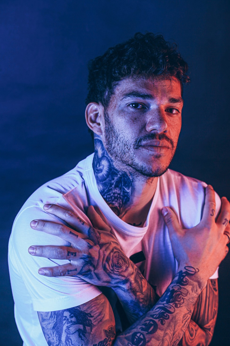
The arms and hands show just how much ink Ederson has. Portraits, lettering, symbols, dark shading and smaller marks run down toward his fingers. From a distance it can read as one sleeve; closer up, the styles vary and sit beside each other.

Some pieces are soft and realistic, others bold enough to read in a match. The hands remain visible even with gloves on, since the gloves cover only part of them, so those tattoos are part of his everyday look.

Counting every piece is difficult. One large area may hold several designs, while a small symbol can belong to a larger portrait or stretch of lettering. Saying Ederson has more than 30 tattoos gives a sense of scale, but not of how varied the collection is.

The leg work shows how his collection keeps growing

Ederson Moraes leg tattoo session

Ederson’s legs add another chapter. Session photos and older football features show larger designs across his thighs and lower legs, including floral shapes, skulls, religious details and portraits. These pieces are easy to miss in match photos, where his legs are usually covered.

A session photo shows the process still underway. Ederson continues to add work; this is not a collection completed years ago. The chair, artist and unfinished areas make that more obvious than a polished portrait. There is always another section that could be extended or filled in.

The range of styles makes sense in a collection built over years. A religious image can sit beside a family tribute, then a football reference or a design he simply liked. The common thread is not one look, but the people, beliefs, memories and sides of Ederson that the tattoos mark.

Why Ederson’s tattoos feel more like a timeline than a trend

Ederson Moraes tattoo collection portrait

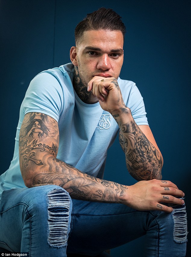
Ederson’s collection feels tied to his life rather than to one fashion moment. The smiley face is about happiness; the chest lettering brings faith and family together; the back piece joins religious imagery with football. The rose and skull give him a strong visual signature, while his arms and legs hold smaller details that are easier to miss.

That is why the tattoos look like they belong to him. Some are serious, some playful, some are simply details he has kept for years. Even the bold pieces leave room for something as uncomplicated as a yellow emoji.

Clear photos and Ederson’s own explanations give the fullest picture. The confirmed meanings matter, as does the pattern: faith, family, football and happiness return in different forms. Together, the tattoos make a visual biography of the goalkeeper.
Watch Ederson explain his tattoos

If you want to hear the stories in his own words, this short interview covers the bull, family and faith designs, as well as the smiley behind his ear.

More athlete tattoo guides

Virat Kohli’s tattoos: the numbers, family ink and spiritual sleeve

Virat Kohli’s tattoos are not a random collection of decoration. Family names, spiritual symbols, cricket numbers and a few pieces chosen because they look good all sit across his arms and body. He has added to them over the years, so the ink reads more like a timeline than one sleeve planned all at once.

That is part of the appeal. One design points back to his parents, another marks his place in Indian cricket, and others reflect faith and ideas he keeps close. Some are easy to spot during a match; others only appear in training photos or when he sits for a new session.

Here is a closer look at the main designs, their reported meanings and how they have become part of Kohli’s off-field image as well.

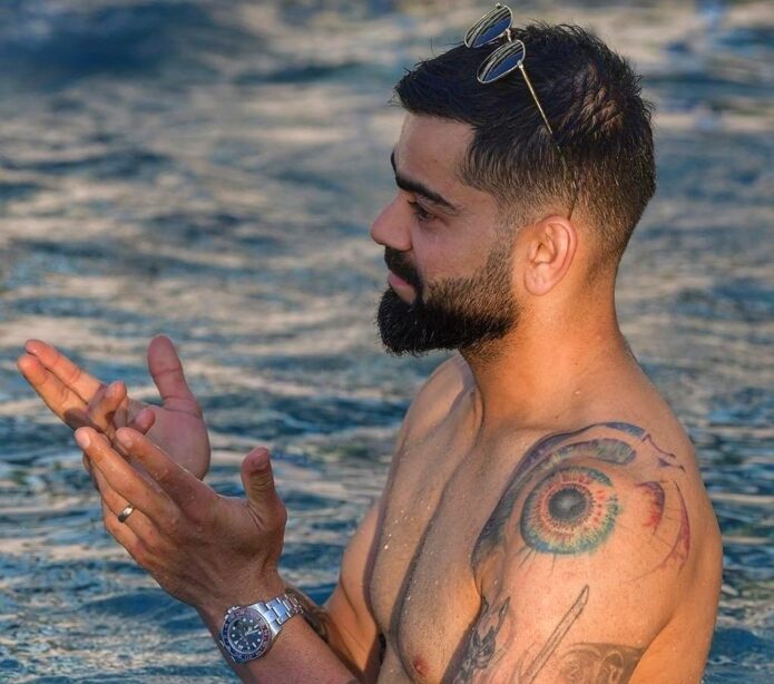
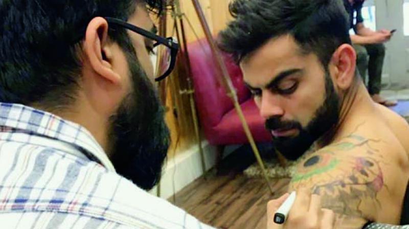
Virat Kohli’s God’s eye tattoo watches over his shoulder

Virat Kohli God’s eye tattoo

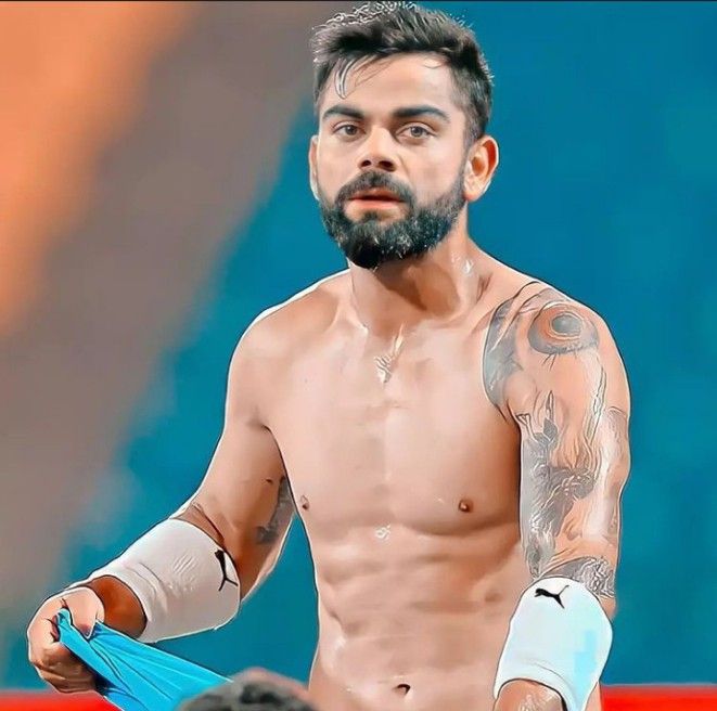
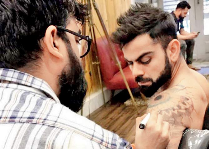
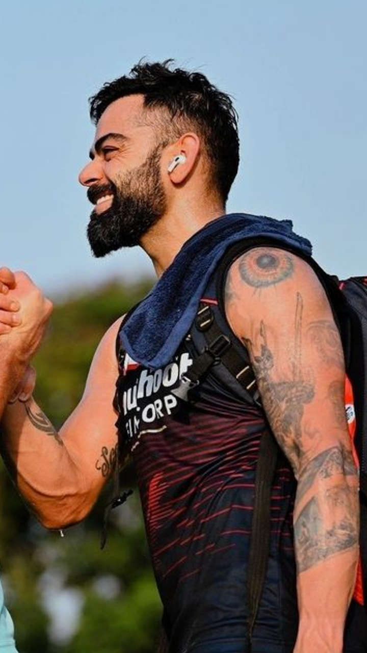
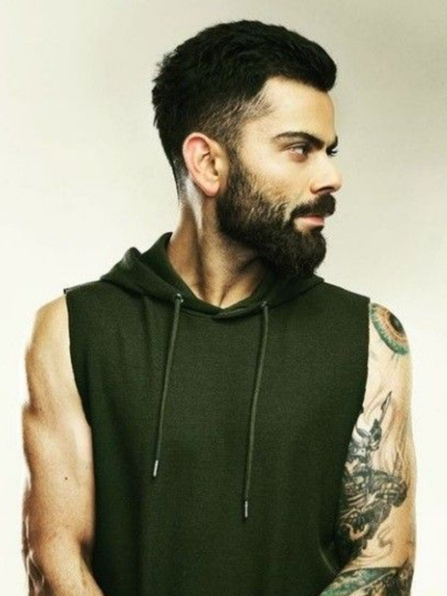
The large eye on Kohli’s left shoulder is one of his most noticeable tattoos. It sits inside a bright circular design, with lines radiating outward. In interviews, he has said it reminds him that everything in the universe is being watched and counted.

The placement gives the idea extra weight. A sleeveless training top can reveal the shoulder, while his cricket shirt covers it. The tattoo can travel with him onto the field and stay less visible when he prefers.

The 175 tattoo marks Virat Kohli’s ODI beginning

Virat Kohli 175 tattoo

Kohli’s number tattoos are simple, but they carry a lot of cricket history. The 175 refers to his One Day International cap number. He made his ODI debut for India in 2008, so the number marks the start of that part of his career.

It is a personal milestone rather than a general lucky number. When the tattoo appears in a close-up, it points back to the first step of a career that would grow far beyond that moment.

His 269 ink records his Test cricket cap number

Virat Kohli 269 tattoo

The other cricket number often noted in discussions of Kohli’s ink is 269, his Test cap number. It sits alongside 175, linking two major parts of his international career.

These tattoos show that not every meaningful piece needs to be large or elaborate. A small number can hold as much history as a detailed sleeve. For Kohli, both numbers connect the player he was when he entered international cricket to the one he became.

Virat’s samurai tattoo brings a tougher edge to the sleeve

Virat Kohli samurai sleeve tattoo

The samurai gives Kohli’s arm a different feel from the clean number tattoos. It is a detailed black-and-grey design, with the helmet, face and armour worked into a larger sleeve. In photos, it reads as a character rather than a small symbol.

Samurai imagery is often associated with discipline, courage and a personal code, and those themes fit Kohli’s public image as a competitor. Still, it is useful to separate common associations from a confirmed account: the design is clear, but he has not publicly explained every part of its personal meaning.

Shiva and the Om symbol show Virat’s spiritual side

Virat Kohli Shiva tattoo

Kohli’s arm also carries tattoos associated with Hindu belief, including Shiva and the Om symbol. At a distance, the pieces can blend into the denser sleeve around them.

Om is commonly associated with the sound and idea of ultimate reality in Hinduism, while Shiva has a distinct religious and cultural place. Kohli has spoken about faith and spirituality in his life, so these designs fit the personal side of the collection: reminders as much as visual flourishes.

The names of his parents are some of his most personal tattoos

Virat Kohli family name tattoos

Among the images and numbers, Kohli’s parents’ names are some of the most direct tattoos. His mother Saroj’s name is on his left triceps, while his late father Prem is represented on the other arm. There is not much to decode.

Kohli’s father died while he was still building his career. A parent’s name can be a quiet way to keep someone close, especially for a player who spends so much time travelling. These may not be the loudest designs, but they carry a strong personal pull.

Virat’s first tattoo story was much less serious than the later ink

Virat Kohli first tattoo story

Kohli has told a lighter story about his first tattoo: an F-shaped design. When people began asking what the letter meant, he later joked that it stood for faith. The real origin was more casual than that.

It makes the rest of his collection feel more human. Not every tattoo begins with a grand plan; some start as a spur-of-the-moment choice and become part of a person’s history. Later, Kohli became more deliberate, choosing designs connected to family, belief and his career.

The new lotus tattoo adds another layer to his changing sleeve

Virat Kohli lotus tattoo

More recent coverage has focused on a lotus tattoo by Aliens Tattoo India. Lotuses are often associated with growth, calm and rising above difficult surroundings. On Kohli’s arm, the flower joins an existing group of religious and symbolic designs rather than standing on its own.

New ink can change the balance of an older collection: lines meet, empty spaces close and a sleeve begins to feel more connected. Kohli has treated his body art as an ongoing project, adding a piece when a symbol or idea feels right.

His back tattoos connect cricket milestones with memory

Virat Kohli back achievement tattoo

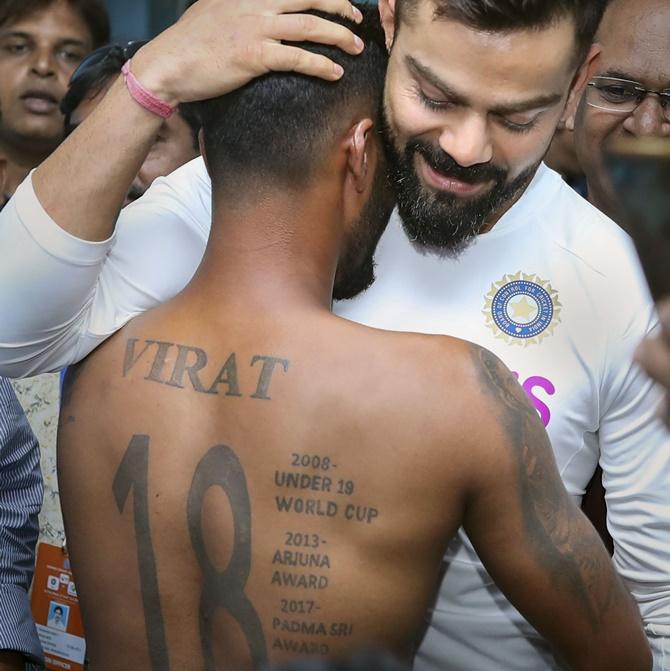
Kohli’s back tattoo is harder to see in ordinary cricket coverage, but it has a clear place in his story. Large lettering and milestone references include the Under-19 World Cup, the Arjuna Award and the Padma Shri: achievements that marked important shifts in how Indian cricket saw him.

A back piece gives a large design room while keeping it out of view day to day. When Kohli reveals it, the work reads like a personal record. His arm tattoos are more visible and decorative; the back feels closer to a page in a scrapbook.

Why Virat Kohli’s tattoos still feel personal

Virat Kohli inked arm portrait

It is easy to treat a famous athlete’s tattoos as a checklist: the eye, the numbers, family names, the samurai and religious symbols. But Kohli’s collection makes more sense as a record of different versions of him.

Some pieces belong to a young player just starting out; others mark milestones or hold on to family and faith, things that matter whatever the scoreboard says. That mix keeps the tattoos from looking too polished or too planned.

Separate pieces have accumulated side by side over time. A shoulder design becomes part of the sleeve, a number gets surrounded by shading, and a small family tribute can be overlooked beside a larger image. One clear training photo can show more than a dozen cropped match shots.

That change over time is part of the appeal. Kohli has kept moving, and older designs are no longer the whole story. They do not have to match perfectly; the collection carries its early choices, serious milestones and later additions together.

For anyone planning a meaningful sleeve, the idea is simple: start with memories you truly want to keep, then let the style grow around them. Numbers, names and symbols can share space when each has a reason to be there.

If you like tattoo stories tied to real milestones, you might also enjoy our guide to Brad Pitt’s tattoos. Kohli’s collection is louder and more athletic, but both show how personal ink can become part of a public image.
Watch Virat Kohli talk about his tattoos:

More athlete tattoo guides

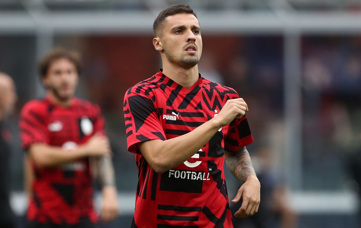
Rade Krunić’s tattoos: the family, faith and Bosnia stories on his sleeve

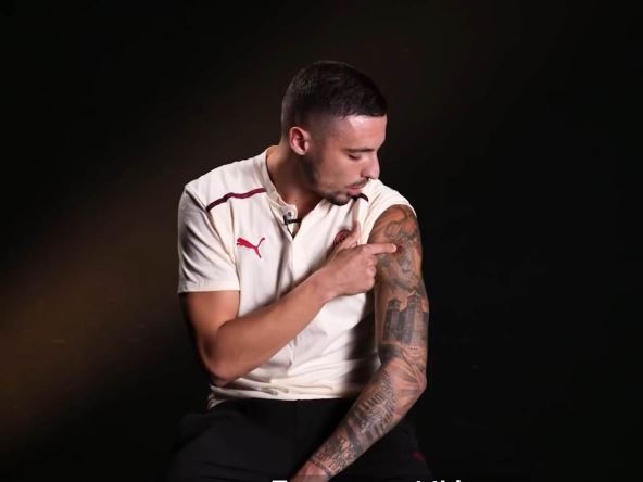
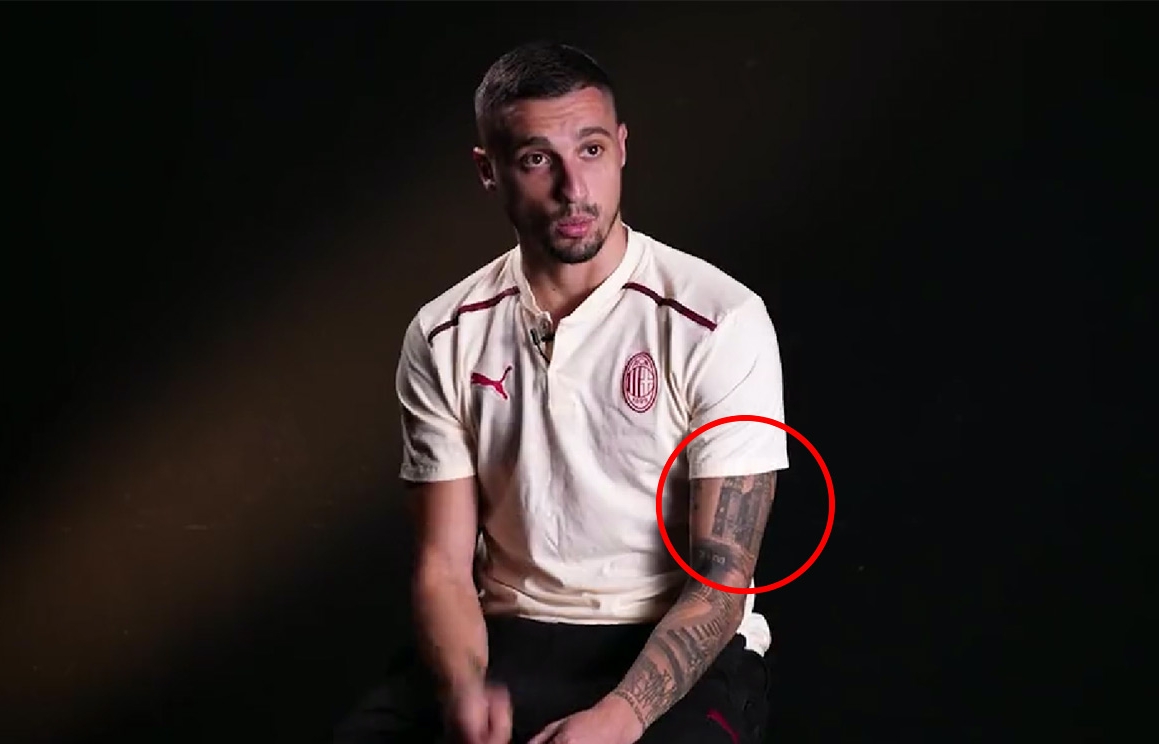
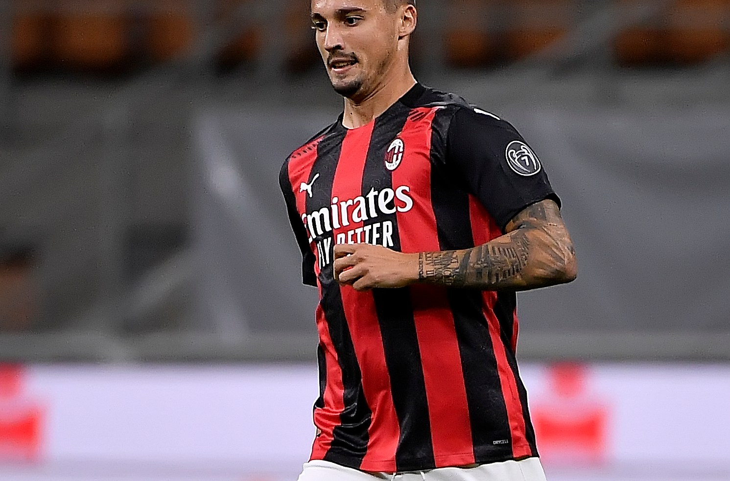
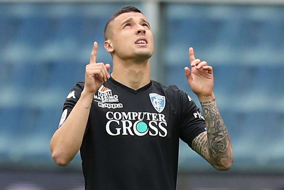
Rade Krunić’s tattoos are more personal than they might first appear. The Bosnia and Herzegovina midfielder has a full-looking right arm, but the pieces do not seem to be there just to fill space. Initials for his sisters, a prayer in Cyrillic, a church from his hometown, a warrior before a cross, family dates, a compass and a Joker all have a place.

That mix says a lot about what matters to him: family, faith, Bosnia and a few ideas he likes. Krunić has explained several designs in Milan TV’s Under My Skin feature, which offers more than the guesses people make from a single match photo.

As a kid, he admired tattooed footballers, especially David Beckham. His parents did not want him getting tattoos, so he waited until he had moved out. Once he started, he added pieces gradually instead of trying to complete the sleeve in one session.

Rade Krunić’s sisters’ initials were his first truly important tattoos

Rade Krunić warrior cross tattoo

Krunić has said he got his sisters’ initials, Aleksandra and Milica, when he was 20. He calls those tattoos especially important because his sisters are the most important people in his life. They give the sleeve a deeply personal starting point.

Initials can be easy to miss beside a large image, but they may carry more weight than a dramatic picture. For Krunić, they are a direct tribute to the people he grew up with and help explain why the sleeve is not just a collection of designs he thought looked good.

His parents did not have tattoos, and he has said his father worried he might go too far. That family connection still shapes the finished work. Even from a distance, the sleeve is built around people and memories rather than a passing style.

The Lord’s Prayer in Cyrillic is one of Krunić’s most painful pieces

Rade Krunić arm sleeve tattoo

One of the largest text designs on Krunić’s arm is the Lord’s Prayer, written in Cyrillic, his own language and script. He has said it was one of his most painful tattoos and took close to three hours. A long stretch of lettering on the arm sounds like a tough session.

The prayer is more than a visual centrepiece. Krunić has spoken about being an Orthodox Christian, which links the words to both faith and identity. Keeping the prayer in Cyrillic makes it personal to home; the script itself is part of the choice.

Text tattoos depend on spacing and clear lines, especially beside darker sleeve work. In photographs, the prayer breaks up the surrounding images and gives the arm a line for the eye to follow.

His warrior kneeling before a cross is about Bosnia and suffering

Rade Krunić forearm tattoo

Krunić has given one of the clearest explanations for the warrior design. He says it represents what happened to his country and the suffering people went through. The figure kneels in front of a cross, bringing strength and faith into the same image.

It would be easy to read a warrior tattoo as a simple sign of toughness, but Krunić’s explanation carries a heavier history. The figure is not only fighting; he has paused to pray and remember what came before.

The artwork can be hard to pick out among the other dark designs in match photos. Close-ups show the arm more clearly, and make the kneeling pose and cross—rather than just another patch of black and grey—easier to see.

The church tattoo is a link to Krunić’s hometown Foča

Rade Krunić family tattoo

Another meaningful piece is a church from Krunić’s hometown, Foča. His parents still live there, so the building is not just a general religious image. It connects the tattoo to home, family and the part of Bosnia where his story began.

That can be grounding for a player who has spent years moving between clubs and countries. Krunić has played in Bosnia, Italy and Serbia, while the church holds one particular place close. It works like a small landmark on his arm.

Seen with the warrior and prayer, the pieces form a connected story: hardship, faith and a return to his hometown. They do not need to be separated to make sense.

Dates, a compass and a clover fill out the family side of his sleeve

Rade Krunić calf tattoo

Krunić has also talked about family birth dates in Roman numerals. The dates belong to his parents and sisters, continuing the family theme begun by their initials. They are quieter designs, but add a private layer to the larger sleeve.

Nearby are a four-leaf clover and a compass. The clover is an obvious nod to luck, while the compass can suggest direction and steadiness. Krunić has connected this group more broadly to faith, football, family and friends.

He has said his family is his life and that they made sacrifices to help him reach professional football. That gives the dates extra weight: they are not numbers to fill space, but reminders of the people who helped him go from Foča to the biggest stages in Europe.

Krunić’s Joker tattoo is the playful part of the collection

Rade Krunić Milan tattoo

The Joker is the design Krunić says falls outside his usual style. He got it because he liked the character and the way the Joker thinks. His short version of the message is simple: you live once, so do not spend too much time worrying about what other people think.

It gives the sleeve a lighter moment. Many of the other pieces tie directly to family, faith, hardship or personal history; the Joker is more about attitude. It adds a little mischief to a collection that could otherwise feel very serious.

Krunić has compared getting tattoos to an addiction: the sessions hurt, but he enjoys seeing the finished work. The Joker seems to be a choice made for the pleasure of it, while still carrying an idea he relates to.
The word “Trust” comes with a warning about people

Another design Krunić has discussed pairs the word “Trust” with an image of two hands. One hand has a snake where a finger would normally be, turning what might look like a friendship slogan into a more cautious message.

He says you have to be careful with people and cannot be friends with everyone. It is practical advice from someone who has spent a career in competitive dressing rooms and changing football environments. The tattoo is not telling him to trust blindly; it is a reminder to think before letting someone close.

The hand and snake also add a different texture to the sleeve. The design is more symbolic than the church, less direct than the Roman numerals. Together, the tattoos make the arm feel like a personal notebook, with each image holding a different lesson.
Why Rade Krunić’s tattoos stand out

Krunić can explain the story behind much of his ink. His sisters’ initials honour family; the prayer and church connect faith with home; the warrior carries a memory of Bosnia; and the dates mark the people who supported him. The compass, clover and “Trust” design add smaller ideas, while the Joker keeps the collection from becoming too heavy.

There is no one style holding every tattoo together, and that is part of the appeal. The sleeve grew over about five years, one piece at a time. It feels like a record of things Krunić wanted close, not a design planned in one afternoon.

That gradual pace gives each new tattoo room to keep its own story.

If you like footballers whose tattoos have a clear story behind them, see our guide to Virat Kohli’s tattoos. Kohli’s collection leans into cricket, family and spirituality; Krunić’s is rooted in Bosnia, his sisters and the places that shaped him.
Watch Rade Krunić explain his tattoos:

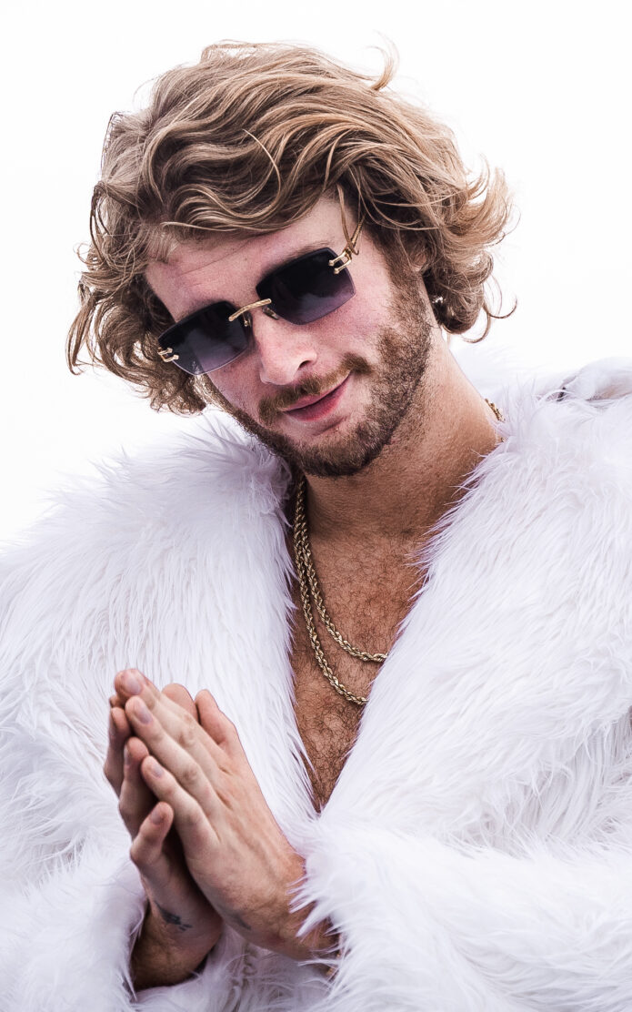
Yung Gravy turns his tattoos into the punchline and the keepsake

Yung Gravy’s tattoos share the offbeat, easygoing humour that runs through his music. They are not a carefully planned catalogue, and that loose quality is part of the appeal. Some came out of a joke, others out of friendship, and a few seem to have happened because the opportunity showed up while he was on the road. The public record is spread across interviews, short clips and photos, so it helps to separate what is confirmed from what is only suggested.
Yung Gravy dove and Cry Baby tattoo on the abdomen

The clearest story is the matching tattoo he got with T-Pain. Search results for an interview clip identify it as a Keith Haring Jordan tattoo, bringing Haring’s lively line drawings together with a familiar basketball reference. The shared design makes the moment memorable, though the available material does not pin down its exact placement.

The Haring influence gives the group a visual thread without making it feel like one large, single-theme piece. His figures use movement, repetition and bold outlines; the Jordan reference carries that energy into sports culture. Matching tattoos also say something about the friendship behind them. That is the kind of tattoo story Gravy seems to enjoy most: a laugh first, an explanation second.

Yung Gravy paper airplane tattoo on the wrist

Gravy has also been tattooed in laid-back settings. Search results describe a pre-show session filmed backstage, while another clip shows Steve-O tattooing a Jackass logo on him. That second piece is especially well documented: the video is on Gravy’s own YouTube channel. The Jackass logo is tied to a particular artist, meeting and very public bit of chaos, rather than being an unexplained mark.

Yung Gravy tattoo visible on the shoulder

That Steve-O session shows why a list of designs can miss part of the story. A logo may be small beside a portrait or a sleeve, but the circumstances give it weight: it captures a collaboration and the kind of spontaneous pop-culture moment Gravy likes to share. The joke is part of the keepsake; it is what makes the keepsake memorable.

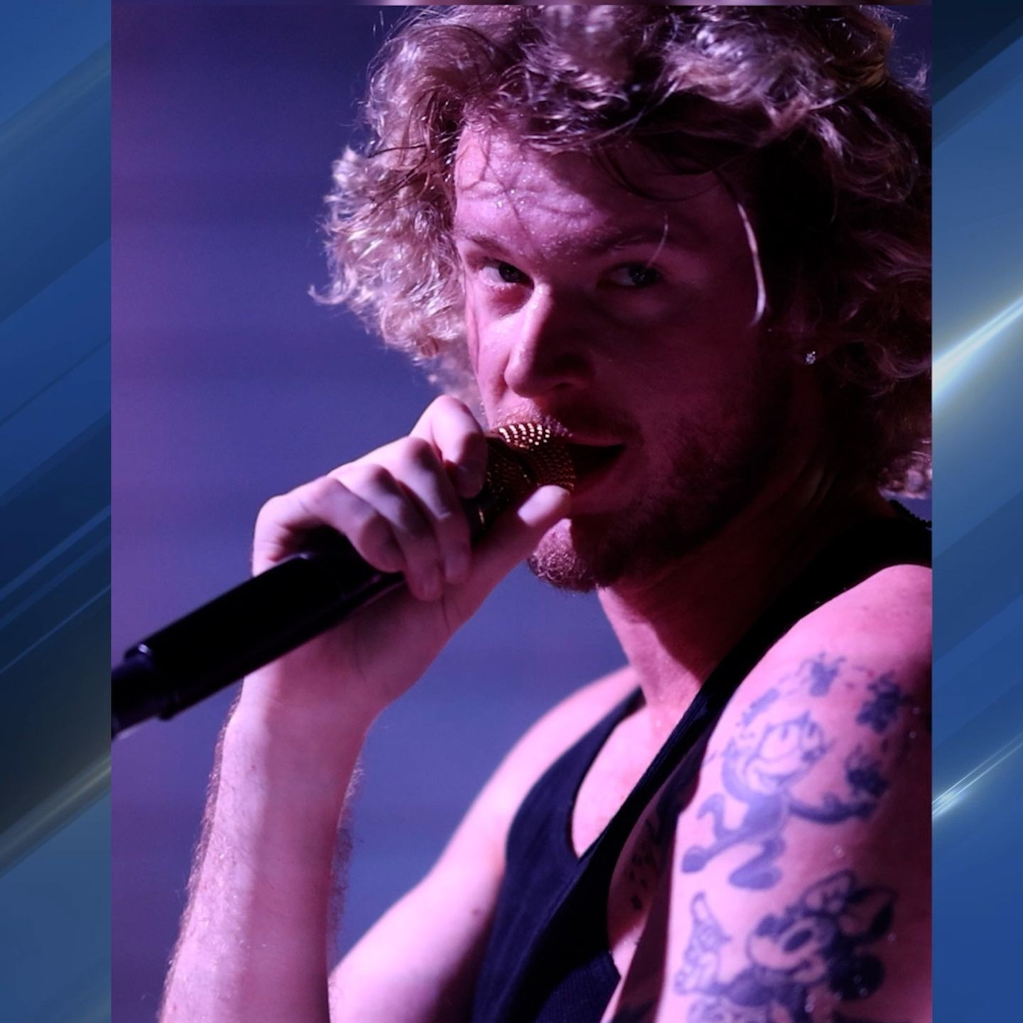
Yung Gravy cartoon tattoo on the arm during a live performance

Photos from red carpets, performances and informal video clips show the tattoos across different periods and settings. Taken together, they make clear that this is a changing collection, not just a look from one photo shoot. They also show why placement should be described with care: lighting, clothing and a tight crop can hide a detail in one image and reveal it in another.

There is a noticeable difference between the polished Icebox-era portrait and the rougher backstage footage. In the portrait, the tattoos are part of a styled appearance; in the video, they are simply there while he sits down with an artist before a show. Both views help explain the appeal. Gravy’s tattoos feel more like a running scrapbook than a brand identity.

People have also shared claims about hand tattoos and tributes, but a social-media caption alone may not establish who did a piece, when it was done or what it means. A careful guide should not turn a comment into a confirmed fact. The strongest documented details remain the Keith Haring Jordan tattoo with T-Pain, the Jackass logo session with Steve-O, and the other pieces seen around shows and interviews.

That care does not make the collection less interesting. It gives the confirmed stories room to stand out. The Keith Haring design is about a shared reference and a decision to get matching ink; the Jackass logo turns a performance into a souvenir; and the backstage clip captures the access and trust involved in letting someone tattoo you. Each story gives the ink a different reason to be there.

Gravy’s public persona leaves plenty of room for exaggeration, but the tattoo stories work best when the details stay grounded. Not every piece needs a grand statement. Sometimes one is a punchline, sometimes it comes from a friend, and sometimes it simply made sense in the room. That relaxed approach is why the visible collection feels connected even when its pieces look different.

It is hard to put the collection in chronological order because the public photos are not a complete archive. A portrait from one tour may show different marks from a later clip, and a jacket or shirt can cover the very spot readers want to identify. The Keith Haring Jordan design with T-Pain and the Jackass logo done by Steve-O have clearer accounts. For other tattoos, the public record leaves open when they appeared or what they mean.

The humour is useful context, not just decoration. Gravy’s public image can feel like a character, but the people in these tattoo sessions are real collaborators. A matching design records a choice shared by two people. A backstage session captures the short, strange stretch of time before a show. The Jackass logo carries the story of that meeting with Steve-O.

There is no need to give a funny design a solemn explanation. A pop-culture tattoo can matter because it marks a friendship, a shared reference or a particular time. The Keith Haring Jordan pairing is playful and specific: it points to an artist, a visual style and a matching decision. The Jackass logo has its own story because of how and where it was done.

For anyone trying to identify a particular tattoo, the approach is straightforward: start with a clear photo, compare it across appearances, and look for a direct interview or a named artist. Treat anything else as visible but undocumented until stronger evidence turns up. A little caution keeps a tattoo guide useful and avoids presenting a guess as fact.

Gravy’s ink sits somewhere between costume and diary. It helps create the wider visual world around him, but it is more than a wall of logos made for instant recognition. The pieces hold jokes, friendships and odd little moments. A short clip can explain more than a long list of guessed symbols, because the story is part of the ink’s history.

The photos also show a performer at ease with contrast. A carefully styled look can sit beside a deliberately silly tattoo story without either one cancelling out the other. The pieces do not have to match to feel connected; they share a willingness to let friendship, timing and everyday life leave a mark.

The clearest accounts are the ones with names attached: T-Pain, Keith Haring, Steve-O and Jackass. Those details give readers something concrete to follow. Other explanations can wait until Gravy or an artist speaks about them directly.

The collection is still growing. New sessions may reveal more about the placement of existing tattoos or add another chapter, while older photos may provide context for designs already seen. For now, the confirmed stories show how Gravy uses ink to remember people, places and ridiculous moments he wants to keep.

The documented tattoo inventory

The best-supported public record includes the matching Keith Haring Jordan design associated with T-Pain and the Jackass logo tattooed by Steve-O. Other tattoos are visible across his public appearances, but their names, dates or meanings are not consistently documented. A reliable inventory can note what is visible while leaving those details open until there is a clearer source.

Why the stories matter as much as the designs

For Gravy, a tattoo’s social story is part of the design. The matching piece links him to T-Pain; the Jackass logo connects him to Steve-O; and a pre-show session ties the ink to touring and the loose world around a concert. That gives us plenty to say without inventing symbolism. These tattoos work as souvenirs of collaborations, jokes and moments that might otherwise pass quickly. The story is part of the tattoo’s history.

Watch the tattoo conversation

The interview clip below is a useful companion to the documented stories, especially the matching Keith Haring Jordan tattoo.

More musician tattoo guides

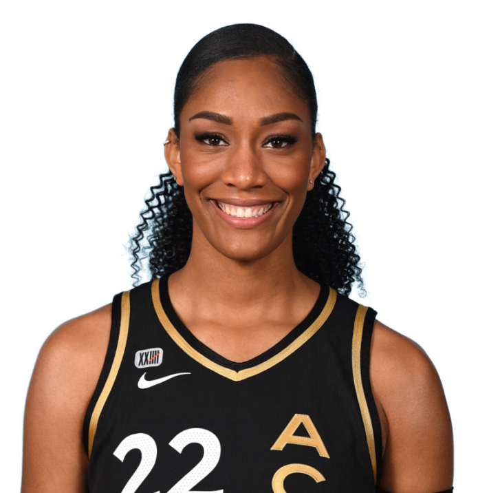
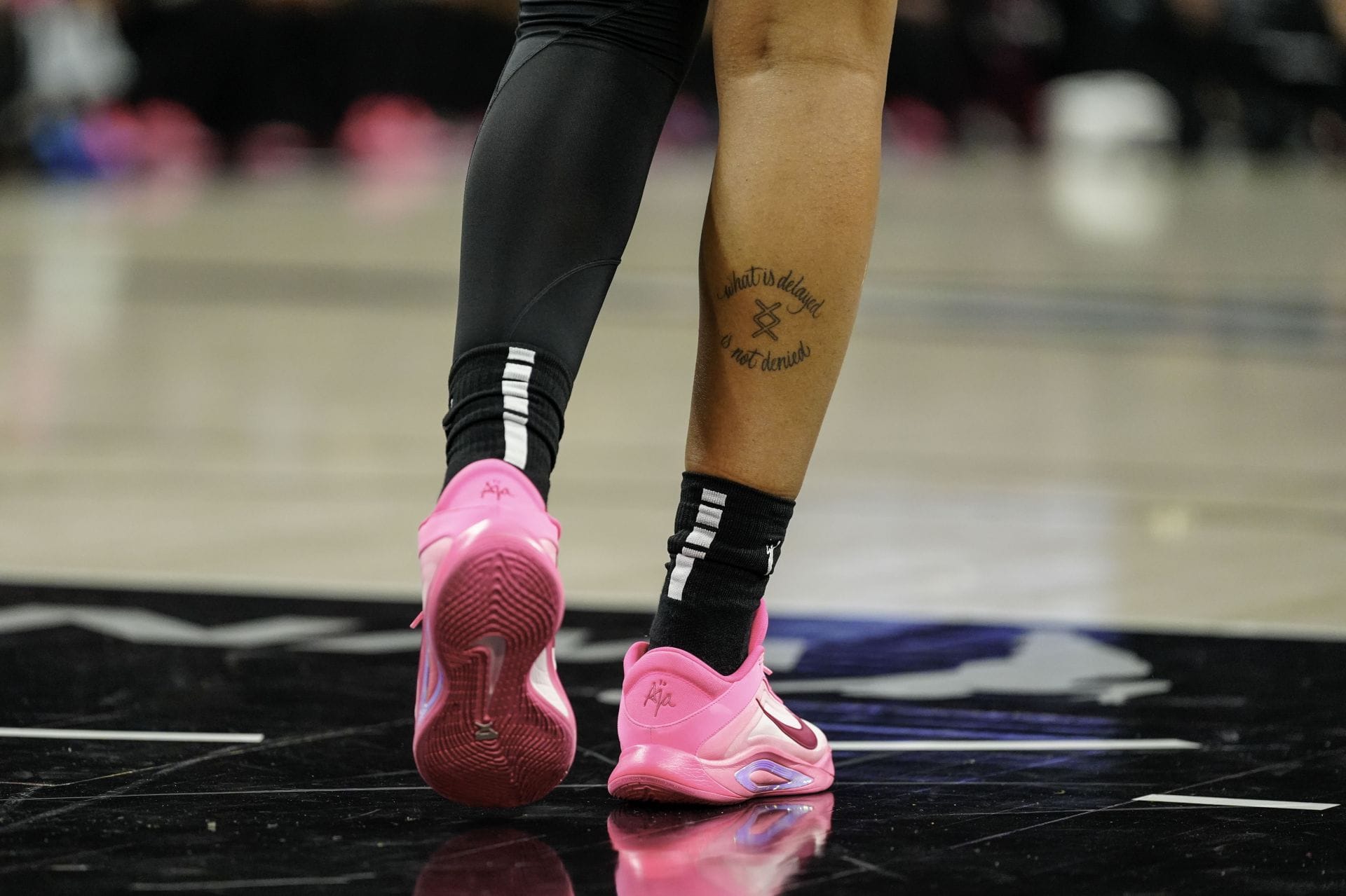
A’ja Wilson’s tattoos carry more than one message

A’ja Wilson’s tattoos are easy to miss during a game, but each one carries an idea that matters to her. The Las Vegas Aces star has ink on her arms, legs, chest and back, with messages about hard work, setbacks, faith and family. There is no single sleeve or grand design tying it all together. The pieces feel more like personal reminders gathered around the values she returns to.

From a distance, much of the collection disappears beneath a jersey or compression sleeve. In closer photos, the pieces begin to tell a fuller story. A’ja has spoken about tattoos for her parents and late grandmother, and details from her signature Nike shoes offer more context for the messages she carries.

“Hustle hard” is written across A’ja’s thigh

A’ja Wilson hustle hard thigh tattoo

One of A’ja’s most recognisable phrases is “hustle hard”, tattooed on her thigh. The lettering is plain and to the point, much like the way she talks about basketball. Its message is clear: keep putting in the work, and don’t expect success to come without effort.

The words show in some fashion and portrait photos when a slit in her shorts reveals them. During games, her uniform usually covers the tattoo, so a close-up can feel like a rare glimpse of something personal. It is neither a team logo nor a date. It is a reminder of the work she carries into every season.

There is something fitting about how everyday the phrase sounds. “Hustle hard” isn’t a polished quote; it’s language that feels natural to her confident, funny, competitive public persona, while still pointing to the effort behind the highlights.

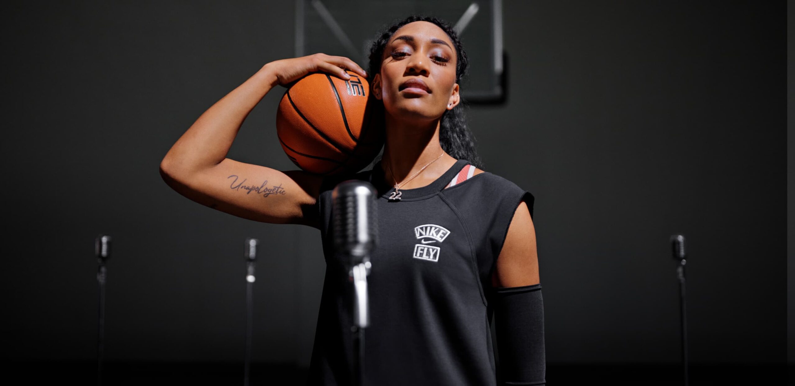
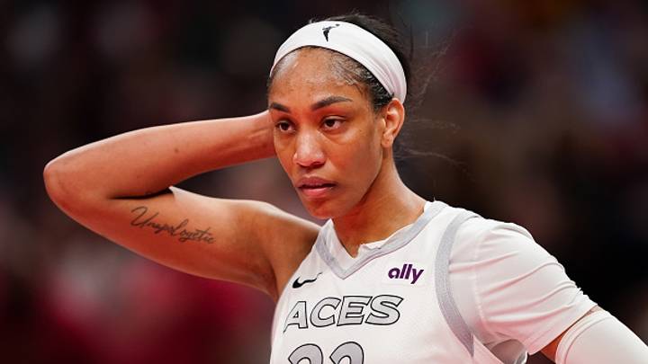
“Unapologetic” sits on her arm

A’ja Wilson Unapologetic arm tattoo

A’ja also wears “Unapologetic” on her arm. The word can be seen in game photos when she is shooting or has her arms raised, though the angle and her jersey sleeve can change how much of it is visible.

For an athlete whose career unfolds in public, it is a pointed choice. The word suggests she will not make herself smaller to put other people at ease. It does not mean she gets every decision right or wins every game; it means she owns the person she has worked to become.

Its placement is practical, too. The tattoo may show during a game or disappear under a uniform or warm-up layer. As with much of her ink, it feels personal before it feels public. People may spot it, but she does not owe anyone a full explanation.

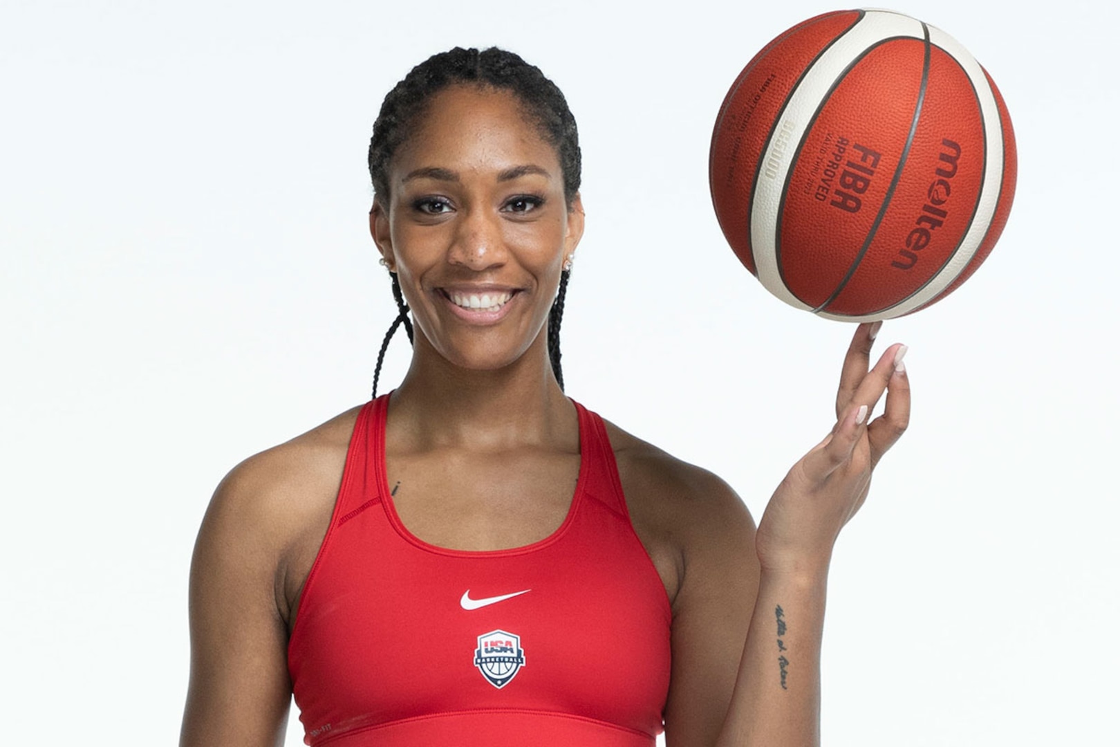
Her parents’ symbols inspired the tattoos inside her Nike shoes

A’ja Wilson wrist tattoo representing her parents

Among A’ja’s best-explained tattoos are the Celtic symbols representing her mother and father. She has said that the designs on the backs of her arms honour Eva and Roscoe Wilson and the sacrifices they made for her. She also brought those symbols into the tongues of her A’One signature shoes, where fans can see them when they open the shoes.

That choice says a lot about how she uses tattoos. Instead of a general word about family or a large portrait, she chose symbols she could keep close, then carried them into something she wears for work. The family reference became part of the shoe design without taking over its look.

A’ja has called her parents her guardians and credited them with shaping who she is. The shoe detail makes that connection easy to picture: the symbols are on her arms, and their smaller versions travel with her on court. It is a tribute she can carry without having to announce it.

She carries her grandmother’s words and memory too

A’ja Wilson chest tattoo and family tribute

A’ja’s collection also holds a tribute to her late grandmother. Coverage of her personal style and Nike shoes has connected her tattoos to the family sayings and encouragement that stayed with her. Her grandmother’s words, “the best is yet to come,” appear in the design language around the A’One, while other family references remain on A’ja herself.

A single photograph may not show the full lettering or exact placement, so it is better not to claim more than the images support. What is clear is that family is central to the collection, not an afterthought. It is one reason she returns to words, symbols and small reminders.

That connection carries into the shoes. Signature sneakers usually put performance first, but A’ja added personal references in places fans might not notice right away. The same idea runs through her tattoos: some of their most meaningful details stay tucked away until she chooses to show them.

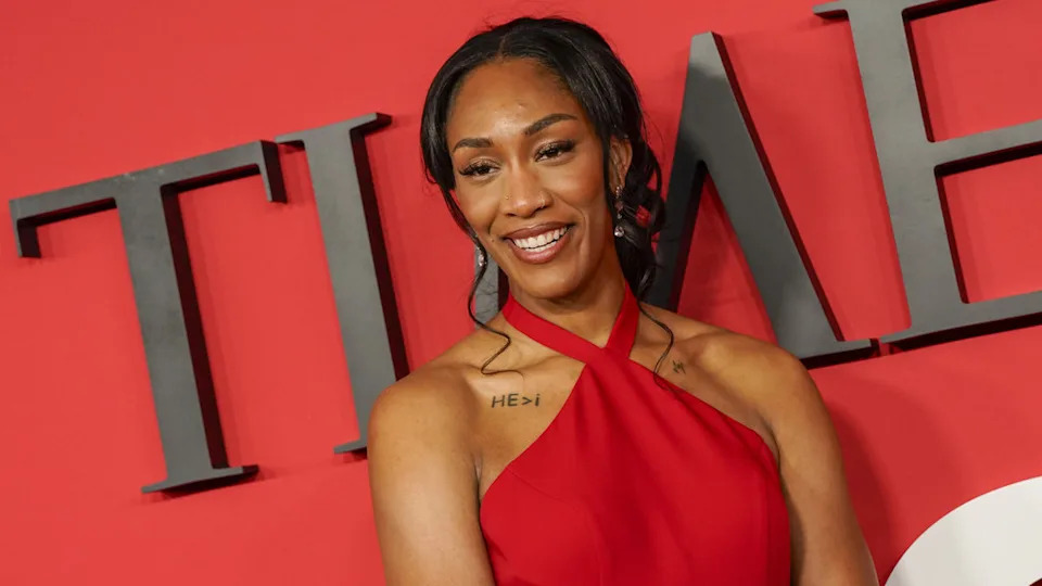
The same mix of family and faith helps explain the small “HE>i” tattoo near her upper chest. It is commonly read as a statement of faith, placing “He” above the individual. That interpretation fits what A’ja has said publicly about faith and giving God credit, though the tattoo itself is small.

The placement makes it easy to miss beneath a jersey or neckline. It feels like a personal reminder rather than a design meant to dominate a red-carpet look or draw attention in a game photo, sitting close to the centre of her body.

The “face setbacks to move forward” message is part of her design language

A’ja Wilson forearm tattoo about facing setbacks

Another tattoo carries the line “You have to face setbacks in order to move forward.” The words appeared in the tongue of a newer A’One shoe and have been described as one of A’ja’s tattoos. It is a longer message than “hustle hard” or “Unapologetic,” but just as straightforward.

For an elite athlete, the phrase acknowledges that setbacks come with the job. Injuries, losses and dips in confidence are part of the experience. The point is not to celebrate failure; it is to face it instead of shaping your life around avoiding it.

The shoe is another way A’ja has extended her tattoo story. The message lives on her skin and travels onto the court with fans who wear the design, turning a personal reminder into something others can carry too.

Her tattoos work as a set of reminders, not a single sleeve

A’ja’s collection does not need a map to make sense. The pieces sit across her arms, legs, chest and back, with space between them. They feel like notes from different points in her life rather than one large project planned all at once.

Even as the designs change, the themes hold together. Celtic symbols represent her parents; her grandmother is present in family memories and words. “Hustle hard” is about effort, “Unapologetic” is about standing by herself, and “Beautifully flawed” makes room for the parts of life that do not fit a perfect public image.

Other small tattoos appear in photos but are not consistently identified by reliable sources. A clear image can show what a design looks like without telling us why she chose it, and it is better not to invent an explanation. A’ja’s confirmed stories already offer plenty of insight.

Her tattoos feel like a quiet support system she carries into loud rooms. They do not stand in for her game, her family or her faith. They give those parts of her life a place to stay.

Watch A’ja Wilson talk about her style and personal messages

More athlete tattoo guides

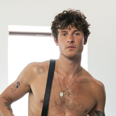
Shawn Mendes lets his tattoos tell the story

Shawn Mendes’ tattoos have come together over time, rather than arriving as one big statement. The early designs point back to home, family and music. Later ones are more playful and varied: a butterfly, a light bulb, tiny elephants, bits of script and, in newer photos, a large eagle across his chest. As a group, they read less like a checklist than a fine-line diary.
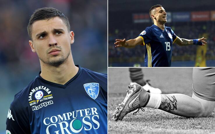
Tattoo coverage counts close to twenty pieces, but Mendes has not personally explained the meaning behind every design. Some stories come from his interviews or from the artists who worked with him; others are fan interpretations. It is useful to keep those apart as we look at the tattoos that have been photographed and described.

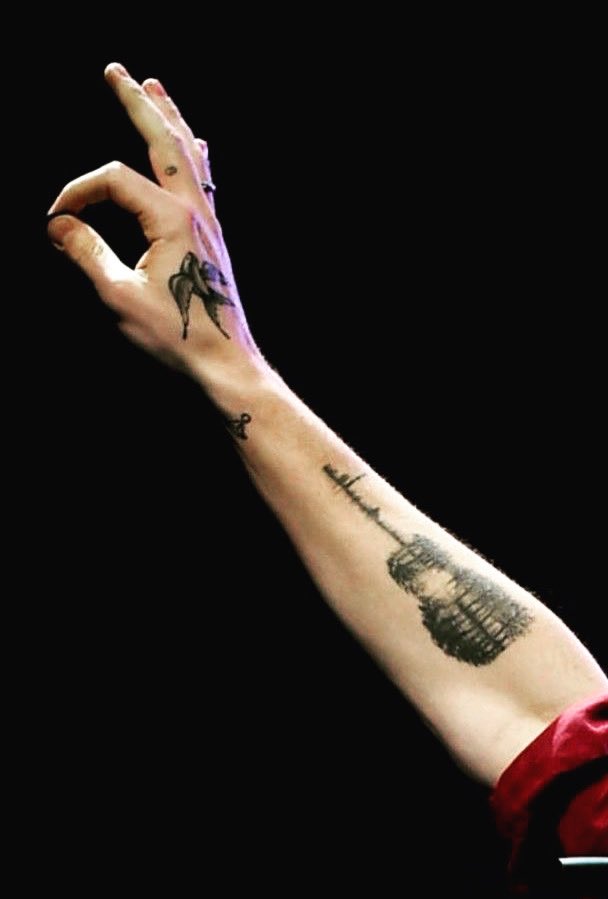
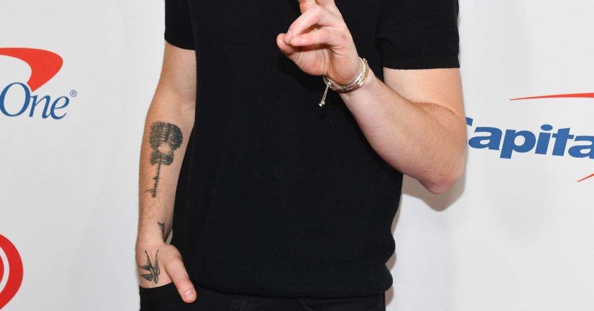
The guitar on his right forearm started the whole collection

Shawn Mendes guitar tattoo on the forearm

Mendes got his first tattoo in 2016: a guitar-shaped design on his right forearm. Look closely and it is much more than an outline. Trees reflected on water fill the guitar’s body, and the CN Tower runs through its neck, tying the design to Toronto, where he grew up. A sound wave also records his parents and younger sister saying “I love you.”

It brings music and family together in one piece. The guitar links his career to home, while the waveform makes a private message part of the image. Mendes had spent a long time working out the idea before he got it. It is a fitting first chapter for a collection where nearly every tattoo has a story behind it.

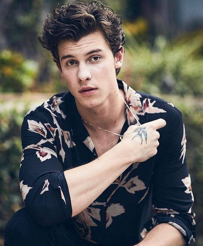
A small sparrow sits on his right hand

Shawn Mendes sparrow tattoo on the hand

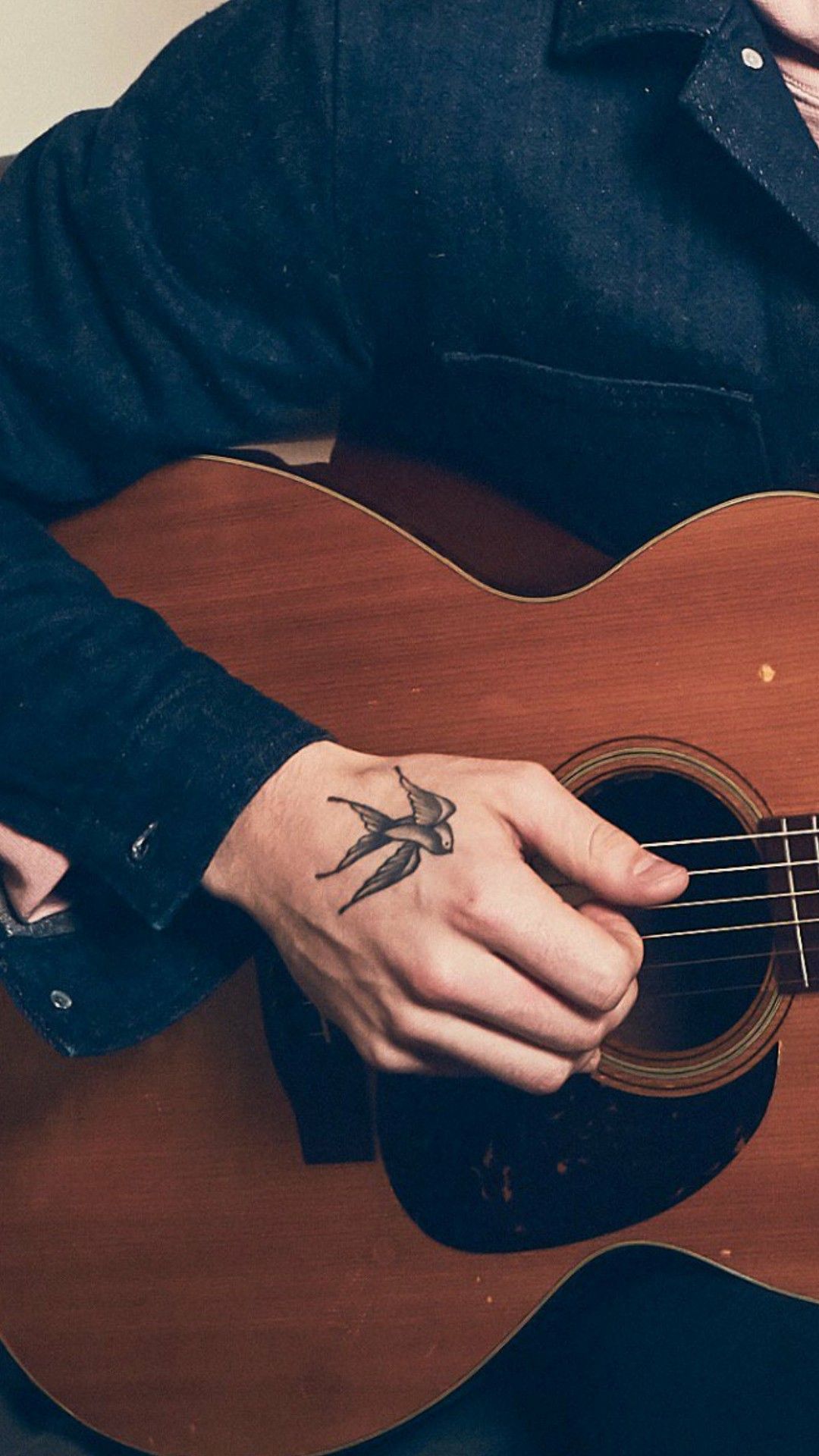
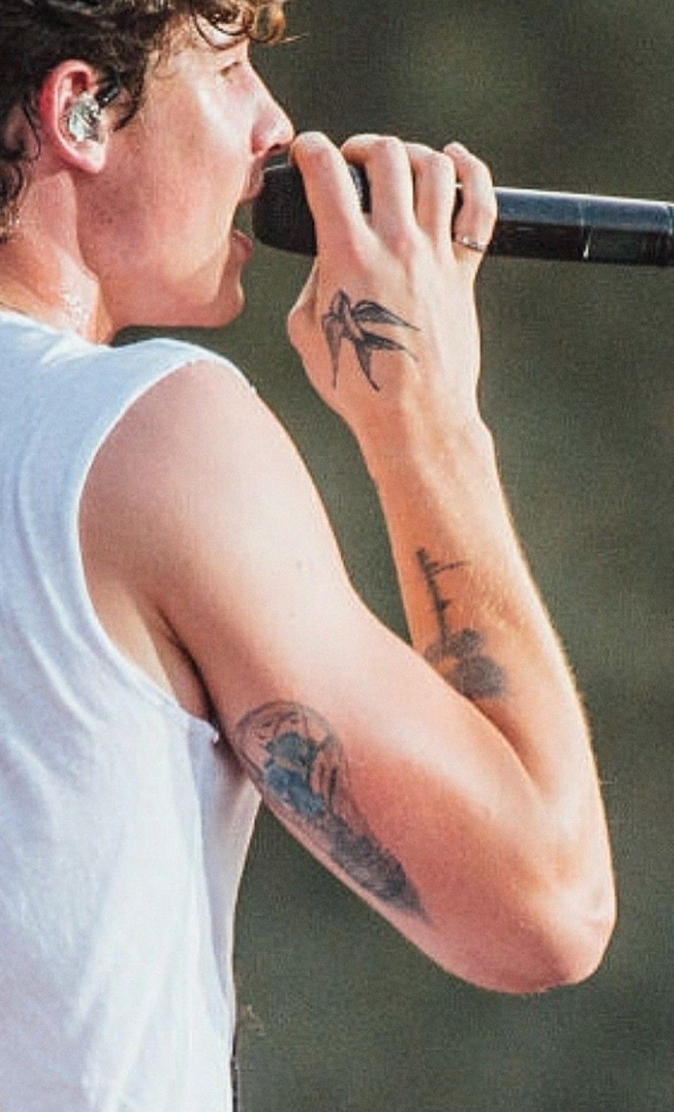
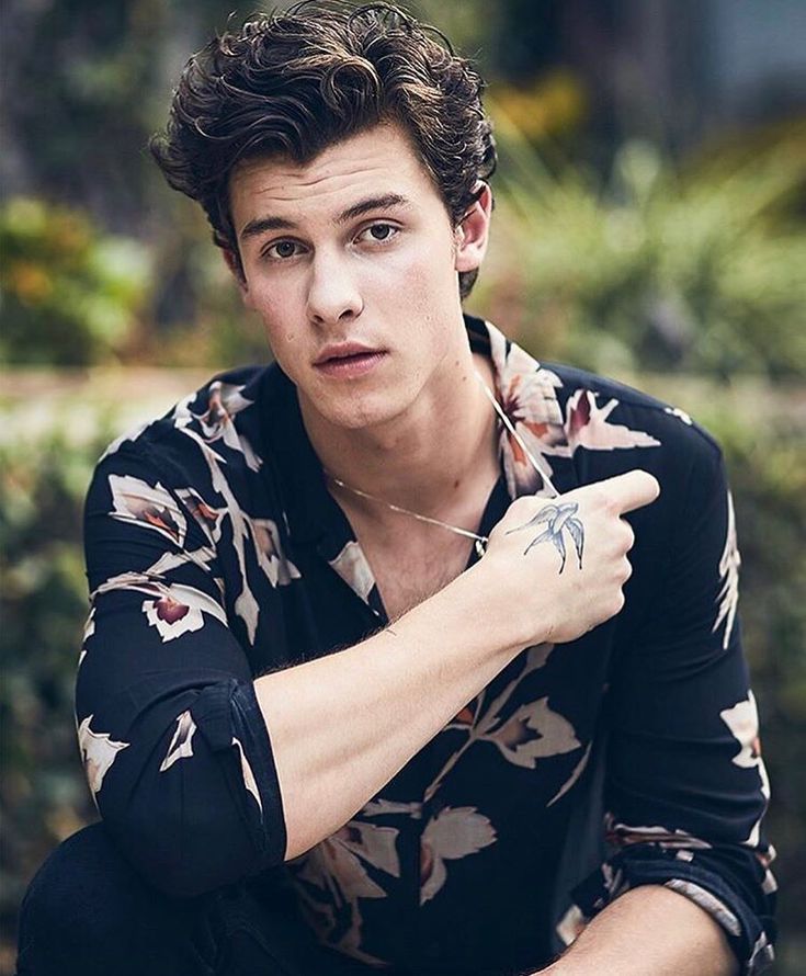
Mendes has a small sparrow on his right hand. It is delicate and can be hard to spot in performance photos, especially when he is moving his hands or holding a microphone. The bird adds a lighter image to the collection, though Mendes has not publicly given it one settled meaning.

Bird tattoos often get broad interpretations, from freedom to travel, but those ideas should not be put in Mendes’ mouth. What can be said with confidence is that the sparrow is on his hand and is among the smaller pieces he collected over the years, rather than part of one planned sleeve.

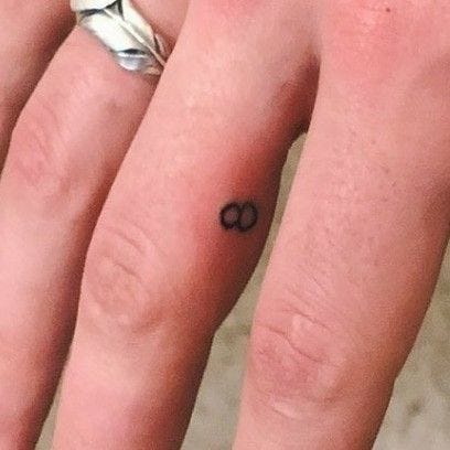
The number 8 marks his birthday

Shawn Mendes number eight tattoo on the finger

Mendes also has an 8 on his right middle finger. He was born on August 8, making it a simple birthday reference: a personal detail that takes up very little space.

The finger placement keeps it visible, unlike tattoos on his ribs or back, but it remains a small accent rather than the focus. It fits the everyday feel of several pieces in his collection. There is no need to read a larger philosophy into it; it is a number with a clear connection to his life.

The Illuminate light bulb has roots and an orchid

Shawn Mendes lightbulb tattoo on the arm

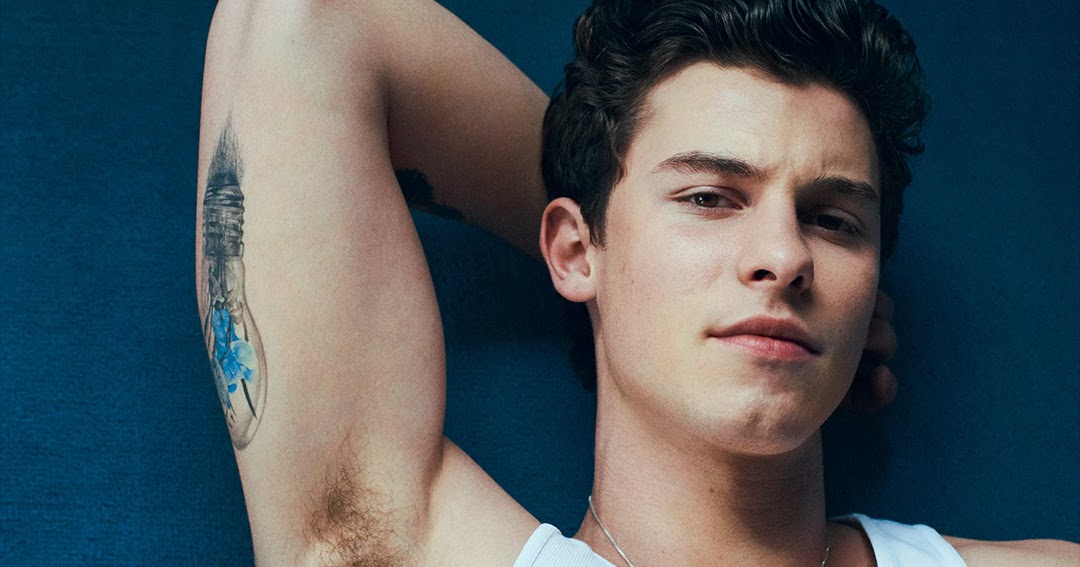
On the back of his right arm, Mendes has a light bulb tied to the Illuminate era. It is more detailed than a plain bulb: roots grow from its base, and a blue orchid sits in the design. In an interview with British GQ, he said the roots were about staying grounded as success grew, while the orchid is his mother Karen’s favourite flower.

This is one of the collection’s clearest explanations. The design links an album to family and to a reminder about keeping perspective. From a distance the lines can look simple; up close, the roots and flower give it more to take in.

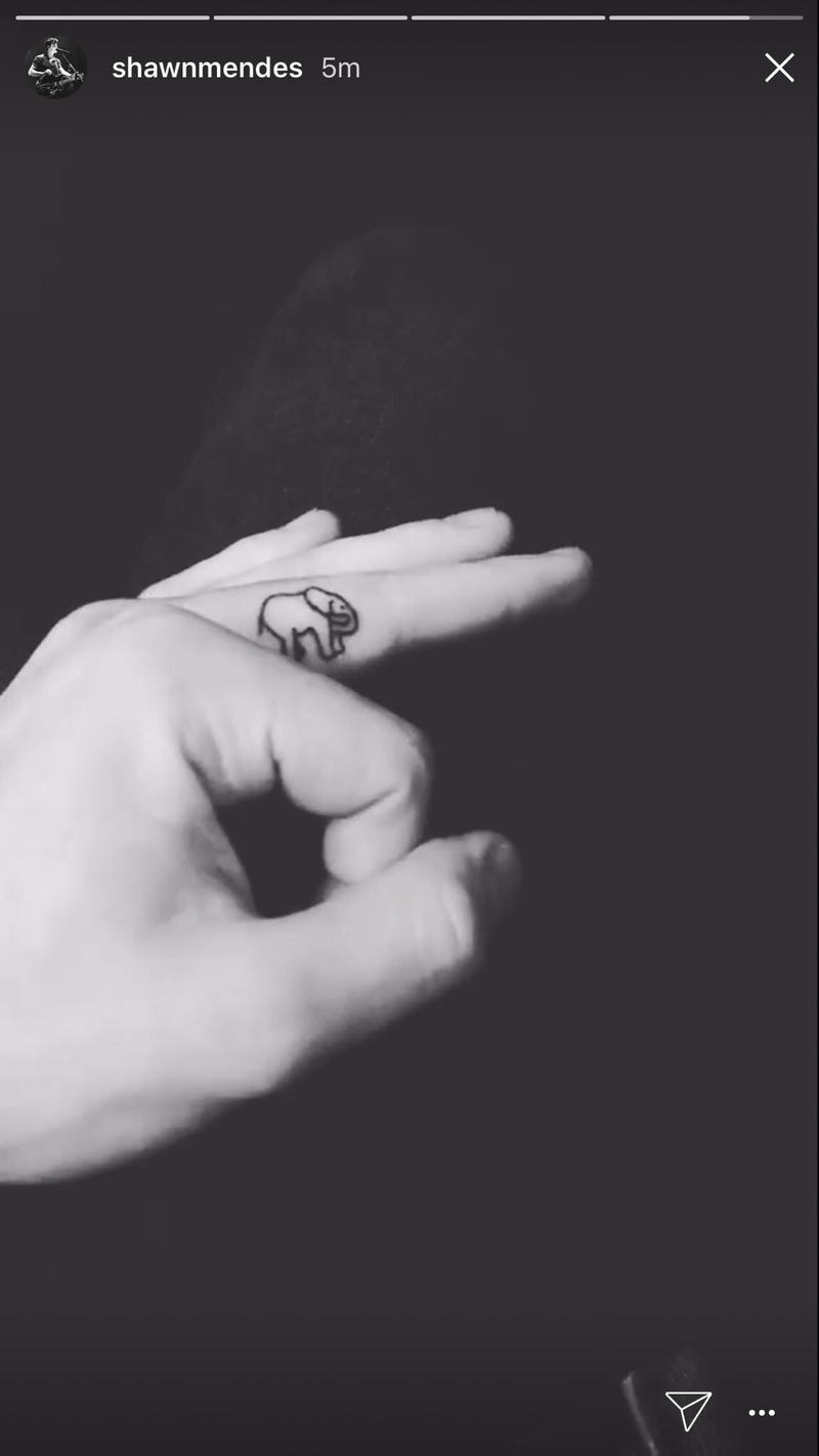
Matching elephant tattoos connect Shawn to his mother

Shawn Mendes elephant tattoo on the finger

Mendes and his mother, Karen, share matching tiny elephant tattoos on their fingers. The matching detail is deliberately small. It feels like a quiet sign of their relationship, rather than a large tribute meant for everyone to see.

A close-up can catch the elephants, but they are easy to miss in everyday photos and do not change the overall look of his arms. They sit naturally alongside the number 8 and the sparrow: small designs with their own histories. The family connection is documented; broader ideas about what elephants symbolize are interpretations, not a meaning Mendes has stated.

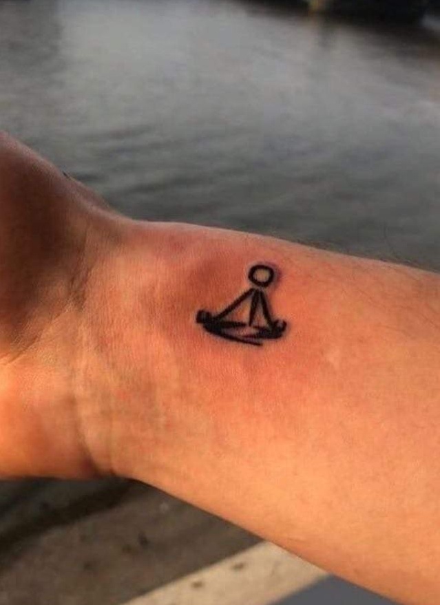
The meditating figure is a nod to mindfulness

Shawn Mendes meditating figure wrist tattoo

A small meditating figure sits on Mendes’ right wrist, close to the hand. It often appears when he is playing guitar or holding something. The simple image has a calmer feel than some of his more decorative tattoos.

Coverage has connected it to Mendes’ use of meditation during periods of anxiety and pressure. That context helps explain the subject, though it should not turn every part of his mental health into tattoo lore. The figure feels like a small pause in the middle of a busy collection.

The butterfly began as a fan drawing

Shawn Mendes butterfly tattoo on the bicep

One of Mendes’ best-known pieces is the butterfly on his left bicep. One wing looks like a butterfly’s; the other opens into flowers, giving the design a half-transformed, almost surreal look. The idea began outside a tattoo studio: a fan posted a photoshopped drawing, Mendes liked it and asked for the artwork. He later brought it to Toronto tattoo artist Livia Tsang.

That backstory makes the butterfly unusual in his collection. It began with a fan’s imagination and became a permanent design with Mendes’ blessing. The finished tattoo keeps the contrast between insect and flower, even after moving from an online edit onto skin. It is a vivid example of fan art becoming part of a real tattoo story.

“Aaliyah Maria” sits across his left collarbone

Shawn Mendes Aaliyah tattoo across the collarbone

Across his left collarbone, Mendes has the script “Aaliyah Maria”, a tribute to his younger sister, Aaliyah Mendes. He also has a small A behind his right ear. They are connected by the family reference, but they are separate tattoos: her full name in one place, a single initial in another.

The collarbone gives the name a clean horizontal line; it can show with an open shirt or disappear beneath a T-shirt. The A behind his ear is more discreet still. Together, the pieces let the tribute move between what is easy to see and what tends to show only in a close-up.

“Wonder” records an album era on his arm

Shawn Mendes Wonder tattoo on the arm

Around the release period of his fourth album, Mendes added “Wonder” in script on his right arm. A tattoo tied to an album can look like branding, but it can also mark a time in someone’s life. Here, the word joins other designs that connect his music to his body without turning everything into a logo.

The lettering is understated and does not compete with the guitar or light bulb. There is no widely confirmed explanation beyond the album connection, so it is best to leave it there. The tattoo marks an era; any further meaning is Mendes’ to share.

“Good Luck” faces people walking behind him

Shawn Mendes Good Luck tattoo on the arm

On the back of his left arm, Mendes has “Good Luck” in script. He has explained that he wanted people walking behind him to be able to read it. That gives the placement a lovely bit of purpose: it is a wish directed at other people, not just a message for himself.

The simple lettering suits the sentiment. Many tattoos are meant to feel private, while this one seems almost like a small sign offered to whoever happens to see it. There is nothing to decode; the words say what they mean.

What the wider tattoo timeline adds

Beyond the ten pieces pictured above, current guides mention a “Fe” tattoo on his shoulder, a small sunflower on his ribs, “good boy” on his inner arm, initials, an angel wing on his right shoulder, a red vertical line at the back of his neck, and a 2024 drawing of two figures embracing on his arm. In 2025, Mendes showed a new eagle across his upper chest. Artist Kane Navasard described the design as “soaring to new heights.”

The dates give the collection a loose timeline. The guitar came first in 2016, then the sparrow and other small symbols. The butterfly and “Good Luck” appeared in 2019, with family script and smaller motifs following in 2020 and 2021. The embracing figures arrived in 2024, and the eagle became the major recent addition. Much of the newer work is associated with Navasard’s fine-line style; Livia Tsang and Guanina Cotto also have important roles in the butterfly and embracing-figures stories.

Some explanations remain uncertain. The sunflower is sometimes linked to Camila Cabello, while fans have connected “good boy” to Mendes’ dog Tarzan. Those readings should stay labelled as speculation. Leaving a little room for uncertainty makes the confirmed stories stronger, not weaker. The eagle may suggest something beyond the artist’s “new heights” caption, but there is no confirmed meaning to add.

Taken together, the tattoos trace family, music, anxiety, luck and the people around Mendes. They are not designed to look tough or perfectly coordinated. Some are sweet, some are detailed, and several have a story that only becomes clear once you look closer. Each has its own place, while the collection still feels like something he built gradually.

Watch Shawn explain the tattoo that started it

This TODAY interview focuses on the meaning behind Shawn Mendes’ unusual first tattoo, making it a good companion to the story above.

More musician tattoo guides

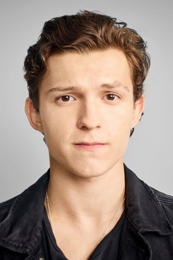
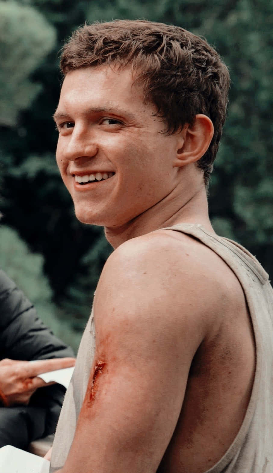
Tom Holland’s tattoos are small but full of Spider-Man history

Tom Holland’s tattoo collection is smaller than those of many actors and musicians, but that leaves room to look closely at each piece. The best known is the Spider-Man emblem on the sole of his left foot, a playful nod to the role that changed his career. More recently, reports have linked him and Zendaya to matching initial tattoos, adding a quieter relationship detail.

It helps to separate what has been shown from what fans infer from blurry photos. Holland’s foot tattoo has appeared in interviews and been covered by multiple outlets. The matching couple’s ink has also been discussed by the tattoo artist and entertainment press. Other photos can be misleading, especially when makeup, props or film effects are involved. This is a short collection, so the details matter more than filling the list with guesses.

The Spider-Man emblem sits on the sole of his foot

Tom Holland the spider-man emblem sits on the sole of his foot

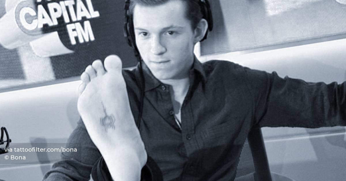
Holland’s best-known design is a black Spider-Man symbol on the sole of his left foot. The placement is funny, uncomfortable and closely tied to his public image. As the actor who plays Peter Parker, he does not need a long explanation for choosing it. It links him to the character, but a shoe keeps it out of view most of the time. That makes the reveal feel mischievous rather than grand. He got it at Bang Bang in New York, a studio known for celebrity clients and high-profile work.

The placement is central to the story. A tattoo means something different when it is hidden under a shoe, shown in a close-up or shared as a matching mark. Holland does not have a sprawling catalogue, and there is no need to pretend otherwise. Each piece can stand on its own, connecting his work, humour and personal life without turning the article into a list of rumours. A small tattoo can say a lot when the reason for getting it is clear.

He revealed the tattoo during a press interview

Tom Holland he revealed the tattoo during a press interview

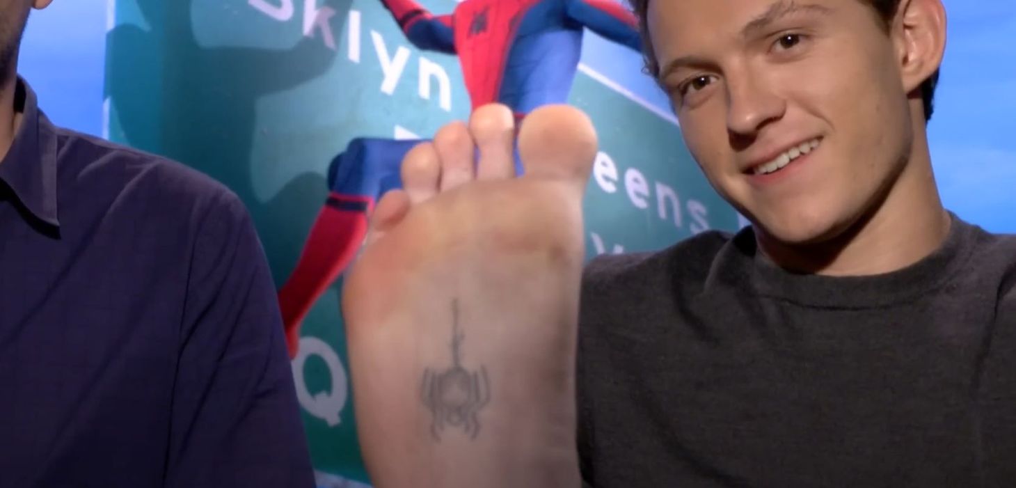
The first widely shared reveal came during a TV interview. Holland lifted his foot toward the camera and showed the emblem in an everyday moment, not a dramatic photoshoot. The black symbol is easy to recognise, and seeing it on the sole gives the shot an unexpected punch. It became a memorable bit of Spider-Man publicity without looking like a costume detail approved by the studio.

The on-camera reveal made the location part of the story. The tattoo had been easy to keep private until Holland chose to show it. That quick glimpse is why people remember the moment: it connects his role to the design while keeping the tone casual. A small tattoo can say a lot when the reason for getting it is clear.

Why the unusual placement works for the joke

Tom Holland why the unusual placement works for the joke

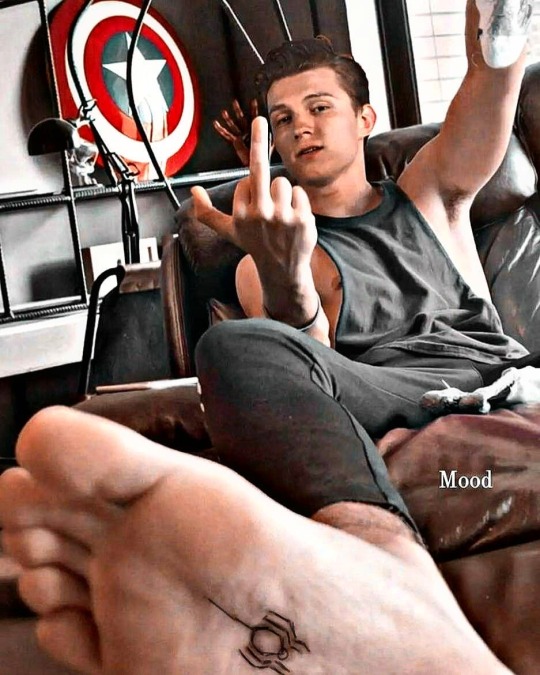
The sole is not an easy place to maintain a tattoo. It takes pressure, friction and constant movement, so the ink can fade and need attention over time. That practical drawback only adds to the joke. Holland picked an awkward spot for a symbol tied to a character known for climbing walls and moving through the city. It turns a familiar superhero image into a private gag. Most people will not see it unless he decides to show them, so it balances fandom with privacy.

That hidden spot gives the tattoo its playful edge. Holland controls when the symbol appears, and a familiar design becomes a personal joke instead of a constant display. It is a small piece, but the placement makes the choice memorable. A small tattoo can say a lot when the reason for getting it is clear.

The matching initial tattoo with Zendaya

Tom Holland the matching initial tattoo with zendaya

The matching initial tattoos reported for Holland and Zendaya are more discreet. Accounts say they got each other’s initials at Boston Tattoo Company before their engagement became public. Holland’s is generally described as a Z, while Zendaya has shown a T. Both designs are small, which suits the couple’s low-key approach to their relationship. They chose a simple mark that needs to make sense only to the two people wearing it, rather than a portrait or date. The artist called them lovely and said the session was fun, but the pair have kept most details private.

The initials tell a different story from the foot tattoo. They are a matching gesture between two people, rather than a reference to Holland’s most famous role. The designs are easy to miss, and that seems fitting for a personal detail the couple has not made into a public announcement. A small tattoo can say a lot when the reason for getting it is clear.

His tattoo collection is deliberately restrained

Compared with actors who have sleeves, chest panels and extensive lettering, Holland has kept his ink limited. That may be part of its appeal. The Spider-Man emblem is easy to recognise, while the initial tattoo is deliberately discreet. Together, they show two sides of his public image: the playful performer who will put his foot in front of a camera, and the private person who keeps meaningful gestures small.

A celebrity tattoo guide should not mistake what is visible for the whole story. New ink could appear later, and a photo can hide a piece that has never been discussed. For now, the available evidence points to a compact collection centred on one memorable superhero tribute and one matching relationship tattoo. There is no reason to invent a longer list.

Holland’s tattoos are a reminder that a small collection can still say something. The Spider-Man symbol celebrates the role that made him famous, while its position on the sole keeps it playful and personal. The initial tattoo marks something different: a relationship, without making it the headline. One is easy for fans to recognise; the other stays understated.

There is something refreshing about a famous actor having a tattoo that is both obvious and oddly hidden. Holland could have placed the emblem on an arm where red-carpet photographers would catch it. Instead, it appears only when he chooses to show it. It feels more like a joke shared with fans than a permanent advertisement, which suits his warm, slightly mischievous interview style.

The initials have a different rhythm. They are about Holland’s life outside the suit and the franchise. Keeping them small helps the gesture feel personal rather than performative. An initial can matter without becoming a public announcement every time he wears a short sleeve. There is no need to turn a private symbol into a full visual campaign.

For anyone trying to put together a reliable record, the confirmed Spider-Man tattoo is on Holland’s foot, and the matching initial with Zendaya has been documented. Photos show those pieces from different angles. Other marks can show up in low-resolution or promotional images, but they need clearer evidence before they are called confirmed tattoos. With a compact collection, a careful account is more useful than an exaggerated one.

That restraint keeps attention on the two pieces we can explain: one tied to a career-defining character, the other to a relationship. The result is not a wall of ink but a short visual story, from the public reveal to a quieter detail he still carries.

That small detail keeps the whole story grounded in real life.

Watch Tom Holland reveal the Spider-Man tattoo

The clearest video evidence is the interview where Holland shows the emblem on his foot. The moving image makes its placement and scale easier to see than a cropped still, and it captures the relaxed tone that is part of the tattoo’s appeal.

Slim Jxmmi wears Rae Sremmurd history on his skin

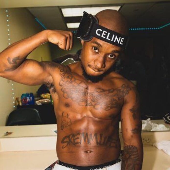
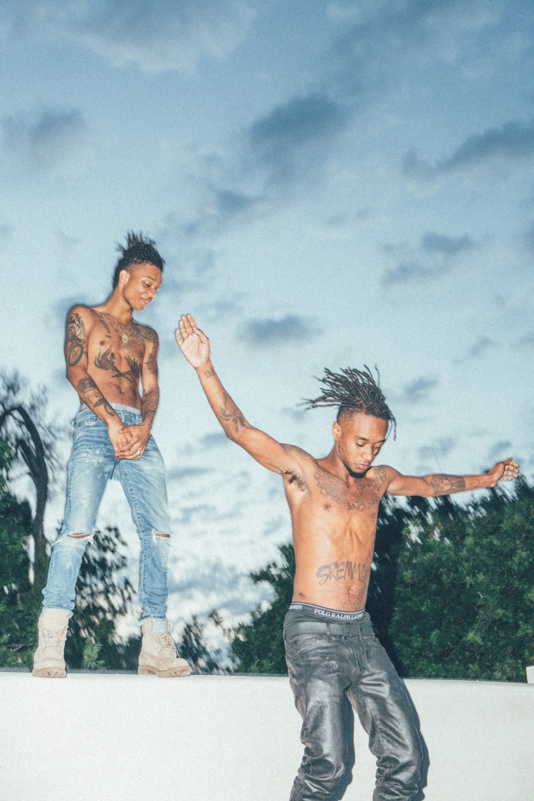
Slim Jxmmi’s tattoos echo the things that helped shape Rae Sremmurd: family, hotel rooms, noisy shows and a strong sense of identity. He and Swae Lee have never tried to look like interchangeable brothers. They share a duo, but they are two people moving in the same direction. Their ink makes the differences easy to see.

The clearest account comes from the brothers’ GQ tattoo tour. They recalled getting their first tattoos in a hotel room as teenagers, with the loose, slightly chaotic tone of brothers looking back on youthful choices. That history helps explain why Slim’s collection does not look like one carefully planned sleeve. It feels lived in. Some pieces show from the stage; others appear only when he is shirtless or turns toward the camera.

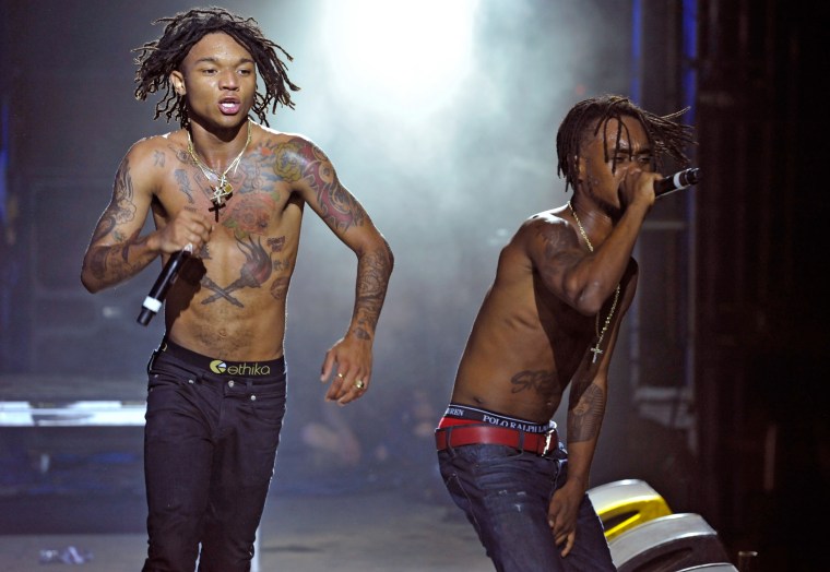
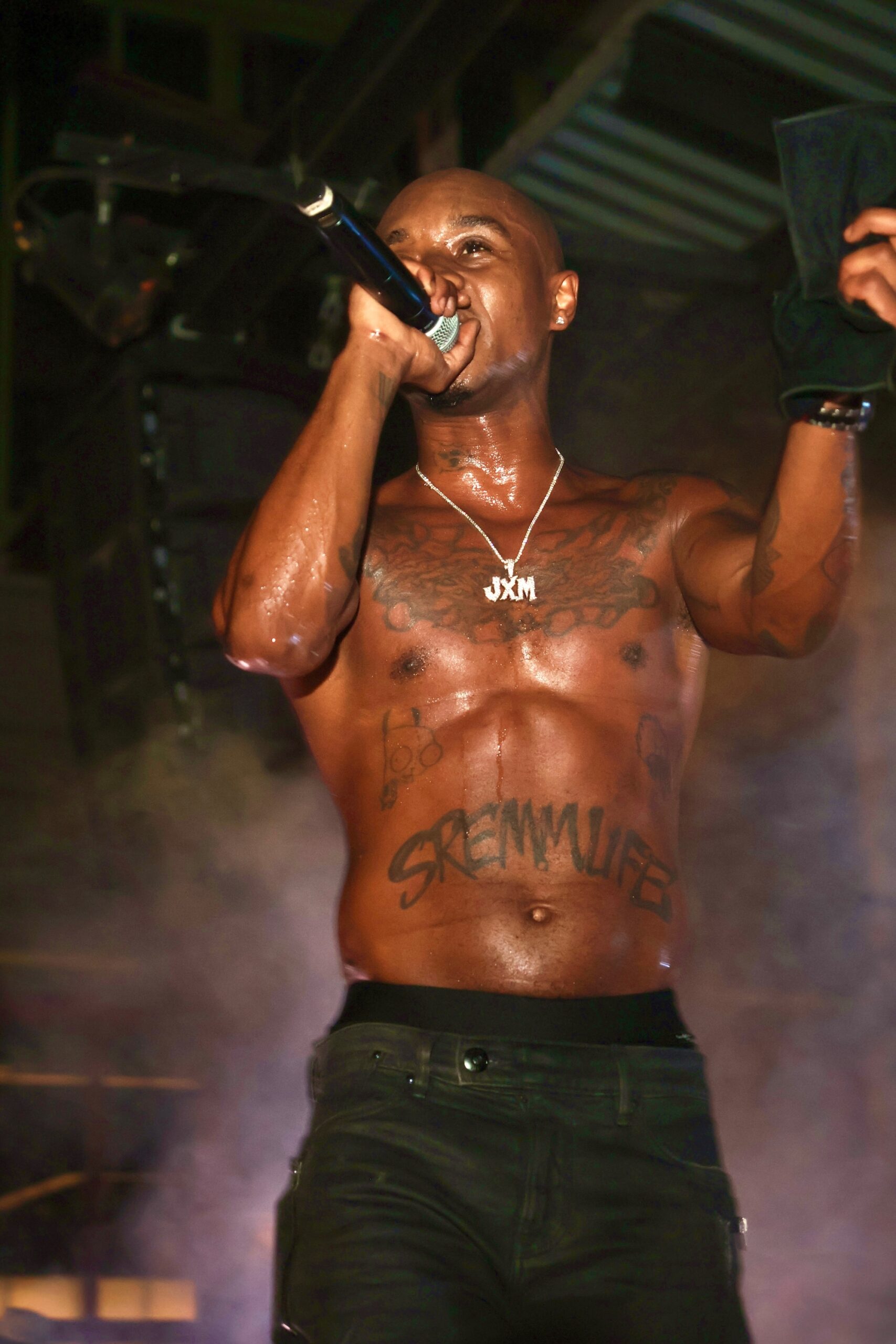
One piece is hard to miss: “SremmLife” across his chest. It links him to the group that made him known, but it feels more like a marker of a life chapter than merchandise. Around it, the designs across his chest, stomach and arms form a patchwork, not one perfectly matched composition.

The first tattoo started in a hotel room

Slim Jxmmi festival chest tattoos

The first-tattoo story is less glamorous than the photos. In their GQ conversation, Slim Jxmmi and Swae Lee said they got their first ink in a hotel room at about fourteen. They were young and curious, without the long-range plan people sometimes describe after building a larger collection.

That detail gives the rest of Slim’s tattoos some context. They did not begin as one grand statement. The early choices sit alongside later pieces tied to Rae Sremmurd, touring and personal style. When an older tattoo shows through beside newer work, it becomes part of the timeline rather than something to cover up.

The festival photo shows how well his tattoos read in motion. Even in a quick performance shot, the chest lettering and darker marks across his upper body are clear. They are not fine details that vanish under the lights; the visible ink moves with the sweat, microphone and energy of a live set.

Slim has never turned the hotel-room memory into a neat origin story. It sounds like something he can laugh about now, which makes it feel all the more believable. Plenty of people get a first tattoo because the moment presents itself and only later work out how it fits with the rest.

“SremmLife” is the collection’s loudest anchor

Slim Jxmmi World Cafe chest tattoos

The SremmLife chest tattoo is the clearest link to Slim’s public identity. Rae Sremmurd’s early years turned the name into a whole world of music, clothes, late nights and Southern swagger. Across his chest, the connection is hard to miss, especially when he performs shirtless.

It also shows how Slim approaches being part of a group. The tattoo does not suggest that he is Rae Sremmurd on his own; it marks the life he shares with Swae Lee. Their stage name comes from “Ear Drummers” written backwards, and the duo has always depended on the brothers being recognised together. The lettering gives that shared history a place on the body.

He wears the design with an easy confidence and does not need to explain it each time it appears. Fans know what it refers to, and even a first-time viewer can tell it connects to music rather than being a random decorative phrase.

Slim has discussed the tattoo in the GQ tour, but there is no need to invent a deeper private meaning. It marks the life he built with his brother, right where everyone can see it.

His torso ink sits somewhere between branding and memory

Slim Jxmmi SremmLife torso tattoo

Photos from the Rae Sremmurd years show more than a single chest design. Slim’s torso has a scattered mix of lettering and darker shapes around the larger group reference. Some angles make the designs seem joined up; others show clear space between them. Calling it a traditional full chest piece would overstate it. It is better seen as a collection still taking shape.

The torso patchwork suits the way Slim dresses and performs. His style leaves room for contrast: bright colours, heavy jewellery, bare skin, sportswear and whatever else feels right that day. The tattoos follow the same loose logic. They do not all tell one visual story, which keeps the collection from looking too carefully managed.

Lighting changes what the viewer can see. A studio or backstage portrait may show a smaller mark beside the main lettering; onstage, that same piece can disappear into shadow while the chest text stays clear. The ink feels active rather than fixed because each photo captures a slightly different version of the same body.

The tattoos also hold onto the group’s early years. A design can outlast an album cycle, a fashion phase or a tour. Even as the music moves on, the lettering remains as a reminder of where Slim came from.

The arm tattoos make the collection feel less formal

Slim Jxmmi stage chest and arm tattoos

The arms add a more improvised feel to Slim’s collection. In a performance photo, the chest usually catches the eye first, but smaller arm tattoos keep the overall look from becoming one big logo. They break up the area around his shoulders and make the body art feel assembled over time.

Not every shape in the photos has a confirmed explanation. Tattoo galleries can turn a blurry mark into a confident claim, but the evidence here supports a simpler inventory: multiple arm and shoulder tattoos, a prominent chest inscription and other pieces visible in different photos. Slim has not publicly explained the meaning of every small mark.

That uncertainty does not make the images less useful. People can talk openly about a few major pieces and keep the rest to themselves. A camera can record a tattoo, but it cannot automatically record why someone chose it.

The arm placement also leaves room to add designs without changing the whole composition. New ink can sit beside the existing work without having to match it exactly. That is part of why the collection looks like a timeline: the main public statement sits alongside smaller choices made later.

Rae Sremmurd is part of the visual language

Slim Jxmmi portrait with visible tattoos

Slim’s tattoos make more sense alongside Rae Sremmurd’s shared visual world. The brothers have always had a high-energy, slightly unruly style. They came from Tupelo, Mississippi, built their sound around the Ear Drummers connection and turned that history into a brand without losing their individual personalities.

That is why the group-related ink does not make Slim look like one half of a matching set. His SremmLife lettering belongs to the duo, but the rest of the collection belongs to him. The scale, placement and mix of pieces differ from Swae Lee’s choices. Even when they appear together, their tattoos do not make them look like mirror images.

Putting the shared reference on his chest is practical, too. It shows in performance photos, music videos and quick backstage clips. Slim does not have to cover every inch of skin with the group’s name; one strong design carries the connection.

The tattoos sit between personal history and public image. They help fans recognise him while holding memories of the years the brothers built a life around music. That balance is more interesting than calling the ink either entirely private or purely promotional.
The newer photographs leave some designs open to interpretation

Slim Jxmmi live torso tattoos

Recent performance photos show Slim wearing the tattoos as part of the full look: bare torso, jewellery, movement and plenty of attitude. They are useful because they show the ink outside a controlled tattoo-tour setup. Some designs are sharp enough to identify, while others become dark fragments as the lighting changes.

A careful inventory sticks to what sources support: the chest SremmLife tattoo, the early tattoo story, visible chest and torso pieces, and the arm and shoulder work around the larger lettering. Small marks can look different from one image to the next, so their meanings should not be invented.

This is where the collection feels especially human. Someone may remember the story behind a major tattoo and forget the date of a smaller one. A design can start as an impulse and stay on the body long enough to feel as if it has always been there.

Slim also seems comfortable with tattoos that do not need a press release. The collection is visible without being presented as a checklist. Some pieces may be there because he liked the design or the moment, or wanted to keep a memory without making it public.
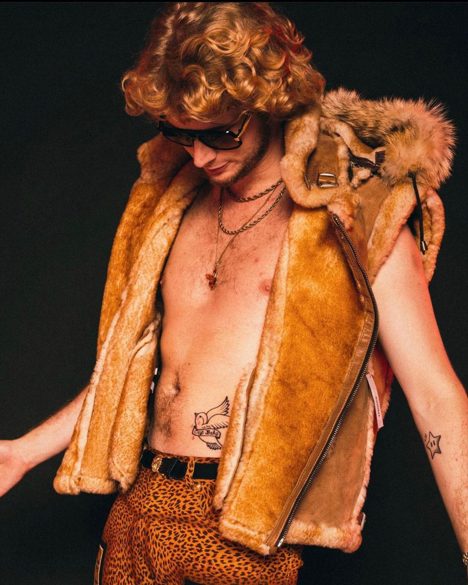
Why Slim Jxmmi’s ink feels like a timeline

Slim Jxmmi’s tattoos tell a story without looking like a storyboard. The first hotel-room tattoo points back to adolescence. The chest lettering marks Rae Sremmurd and the SremmLife era. The other torso and arm pieces record the years the duo moved through tours, videos, changes in style and bigger stages.

That mix feels more convincing than a perfectly coordinated sleeve because it has the rough edges of real life. Some marks can be read from the crowd; others appear only in a close photo. Some meanings are documented and others are not public. Keeping those separate makes the tattoos easier to understand, not less interesting.
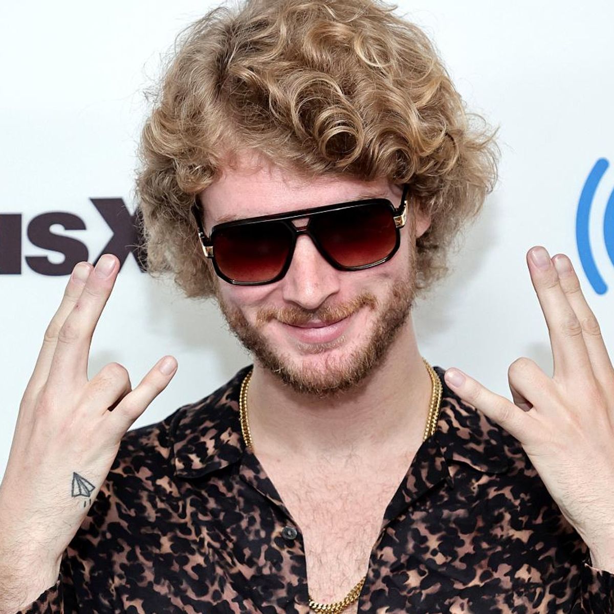
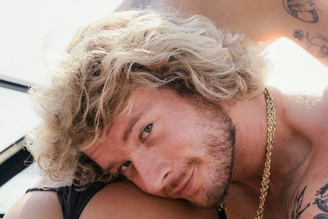
The overall effect is relaxed but committed. Slim does not wear the ink to prove how tough he is. It moves with the same loose, restless energy as his music and style, and it looks different depending on the angle.

In the end, the simplest design may be the one that ties everything together. SremmLife is the headline, while the scattered work around it is the diary. The tattoos keep the group close while leaving the rest of the collection room to grow in its own direction.

Watch the Rae Sremmurd tattoo tour