Public Figures

Tattoo guides for models, presenters, creators and other public figures, with photographs and the stories behind their designs.

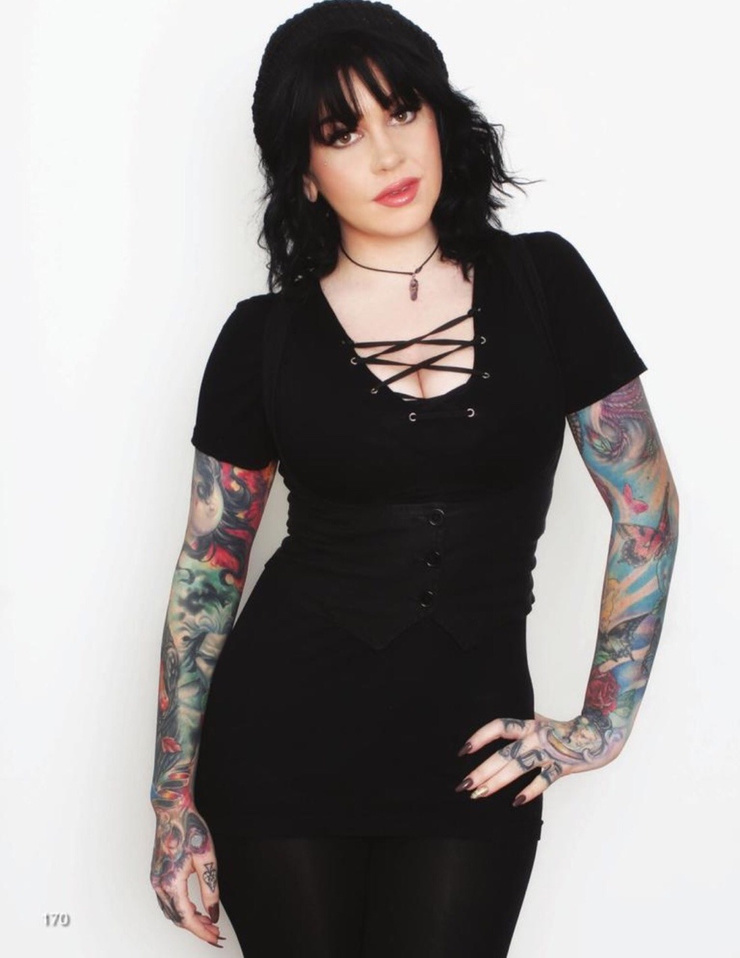
Alysha Nett Tattoos: Sleeves, Spiders, Forearms and Back Ink

Alysha Nett’s tattoos combine dark outlines, fine details, and old-school shapes across her hands, arms, shoulders, back, and chest. Some pieces stand out right away; others show more clearly when she turns or lifts an arm.

The photos capture different angles of the collection. They also show how an image changes on the body: a design that looks clear on a flat reference may shift when the elbow bends or shoulder turns.

Alysha Nett full color sleeve tattoos

A full-color arm photo shows larger designs surrounded by smaller marks. Color adds another layer, but clear outlines and open skin keep the sleeve from becoming hard to read.

Choose the image you want people to notice first. Once its size and direction are set, smaller pieces can sit around it rather than compete with it.

The outside of the arm and inner forearm have different curves. A stencil checked from the front, side, and back, with the arm relaxed and bent, shows how the design will sit in more than one position. A sleeve should still make sense when the arm hangs naturally.
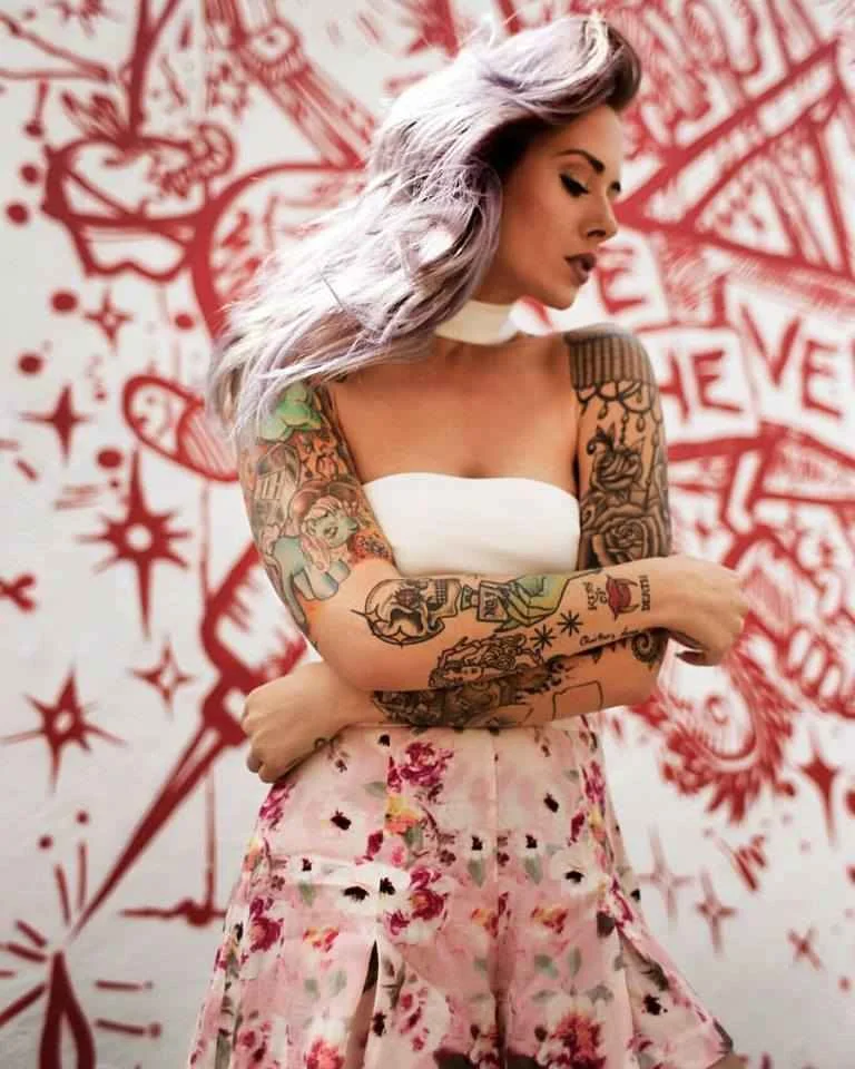
Alysha Nett tattoos: color portrait showing Alysha Nett's upper-arm and forearm sleeve work, with several separate designs visible at useful size

Alysha Nett mechanical forearm tattoos

A mechanical-looking design runs down the forearm, adding a hard-edged contrast to the color work around it. Its vertical shape draws the eye from wrist toward elbow and links the separate pieces along the arm.

Forearm placement is visible in everyday life. A stencil viewed with the wrist relaxed and turned can show whether a line sits where you expect it to.

The design uses hard edges, but gaps around the main shapes keep the fine lines from running together. The darker sections stand out because they aren’t packed with detail everywhere.
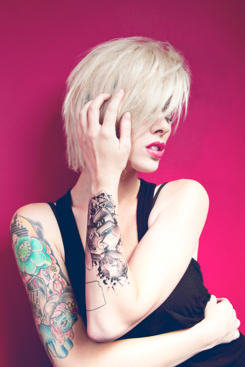
Alysha Nett tattoos: sharp color view of the arm with a large mechanical-looking forearm design, smaller linework and a visible hand mark

Alysha Nett spider and upper arm tattoos

The spider has a clear silhouette that remains recognizable at a smaller size. The surrounding arm work gives it context without taking away from the shape.

Upper-arm placement can face outward, where it’s easy to see, or toward the inside for a more private position. Checking the design with the arm down, raised, and folded across the body shows how it changes with the pose.

The spider’s legs need enough room to stay distinct. If a reference has too much detail for the available space, simplifying it can keep the design readable. Clear lines matter more than squeezing every detail into a small area.

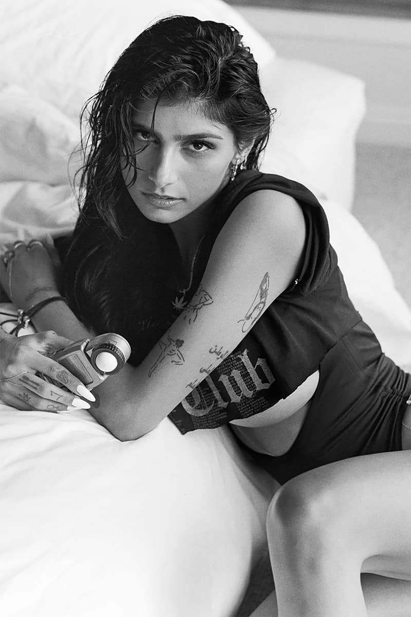
Alysha Nett tattoos: black-and-white face-visible portrait showing the upper-arm piece, mechanical forearm detail and small spider tattoo

Alysha Nett monochrome portrait tattoos

Without color, the monochrome portrait depends on line weight, shadow, and the skin left open around it. Lighter areas keep the image from reading as a flat dark shape.

A portrait reference needs a clear expression and lighting that shows where the shadows fall, especially around the eyes and mouth. The artist can use those details to work out the image in black and grey.

Placement changes how often the portrait is seen. An upper-arm piece is less visible day to day than one on the forearm. It’s also worth checking the image at its actual tattoo size; tiny details that look impressive when enlarged may be hard to see after healing.
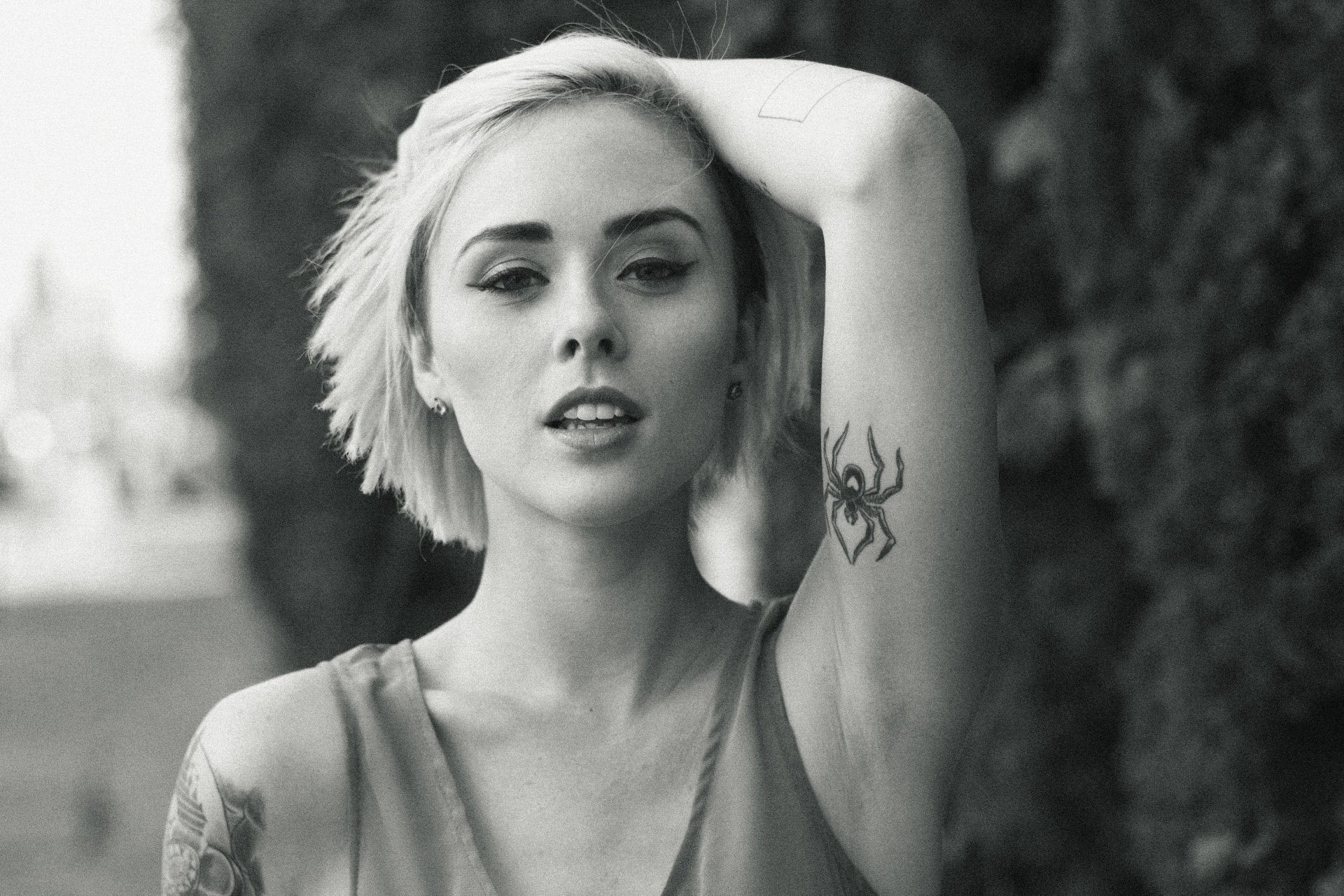
Alysha Nett tattoos: high-resolution monochrome portrait where the spider and arm composition can be read clearly without cropping away the tattoo placement

Alysha Nett shoulder and back tattoos

The shoulder and back photo shows the collection across a broader area. A shoulder design shifts as the body turns; the back gives more room for a scene or a group of connected images.

Clothing and movement affect what stays visible. Raise the arms, twist, or sit and check how the skin folds around the shoulder blade and where straps or seams fall. A small placement adjustment can keep an important detail visible.

The whole area doesn’t need to be filled in one session. A central design can be placed first, with room left for pieces that may be added later. Open skin can keep the main image easy to see.
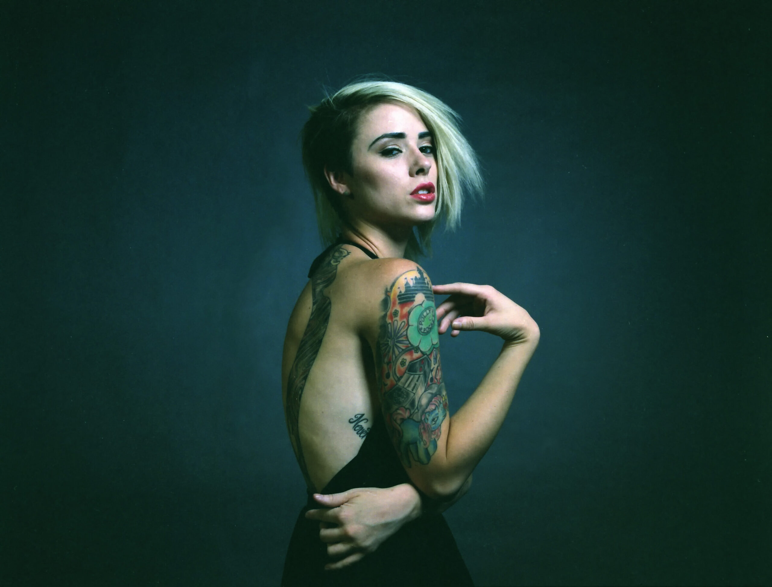
Alysha Nett tattoos: large full-back and shoulder portrait showing the colorful shoulder work and the way the collection sits across a broad canvas

How to make a collection feel like your own

Nett’s tattoos share a point of view without repeating the same design. Heavy outlines, shading, color, and open gaps recur across the collection. Those choices can connect different subjects without making them identical.

Start with the subjects you expect to care about for a long time. Then decide which deserve a larger placement and which should stay as smaller details. Visible hands and forearms show more of the collection; shoulder and back pieces offer more control over when they’re seen.

Take time with the stencil. Move the joint, sit down, and view the design in ordinary light from several steps away. Check healed examples from an artist who works in the style you want, and talk through the size and placement before the session.

A collection can grow over time. An open area isn’t automatically unfinished; leaving room can make existing designs easier to read and give future work a place to go. Follow the artist’s aftercare instructions and judge the tattoo after it heals, not from the fresh photo.
More celebrity tattoo guides

Ricki Hall Tattoos: Chest, Hands, Neck and Old-School Ink

Ricki Hall’s tattoos cover his chest, arms, neck, hands, and more. The collection mixes traditional designs, lettering, personal symbols, and heavy blackwork. It looks like it grew over time rather than being planned as one matching set.

Bold outlines make the larger images stand out; smaller words and details are easier to see up close. The photos below show the collection from different angles.

Ricki Hall chest and torso tattoos

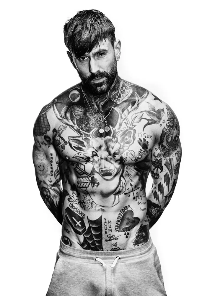
A large central image anchors the chest, with script, small symbols, and darker shapes around it. The main form is still easy to pick out within the broader coverage.

The chest moves with the shoulders and sternum, so a design should be checked while standing normally and with the arms raised. A centered stencil on paper can look different on the body.

The portrait and lettering use different kinds of detail. Leaving some skin between them helps each part remain distinct; filling every gap could make the whole chest read as one dark area.

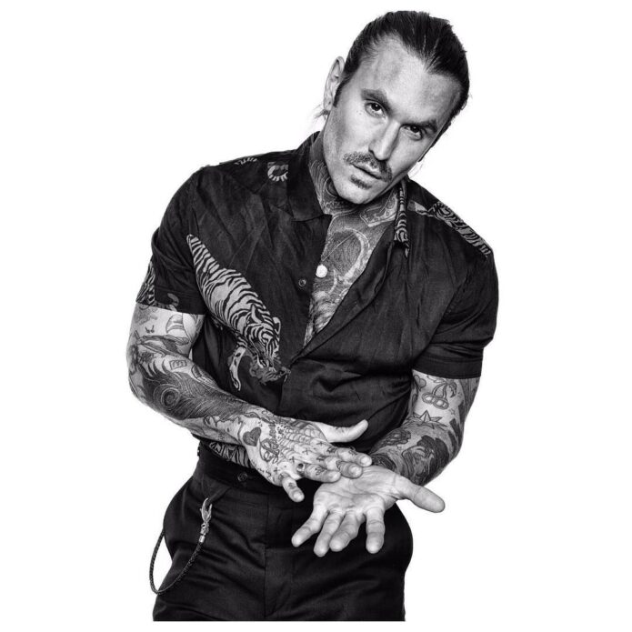
Ricki Hall tattoos: high-resolution monochrome portrait showing Ricki Hall face-on with the full chest, neck and forearm coverage visible

Ricki Hall hand and finger tattoos

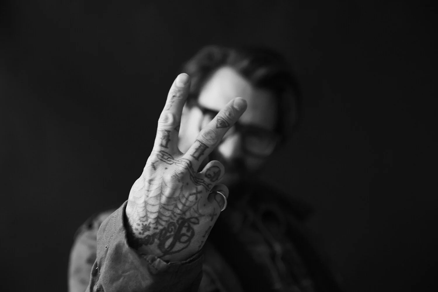
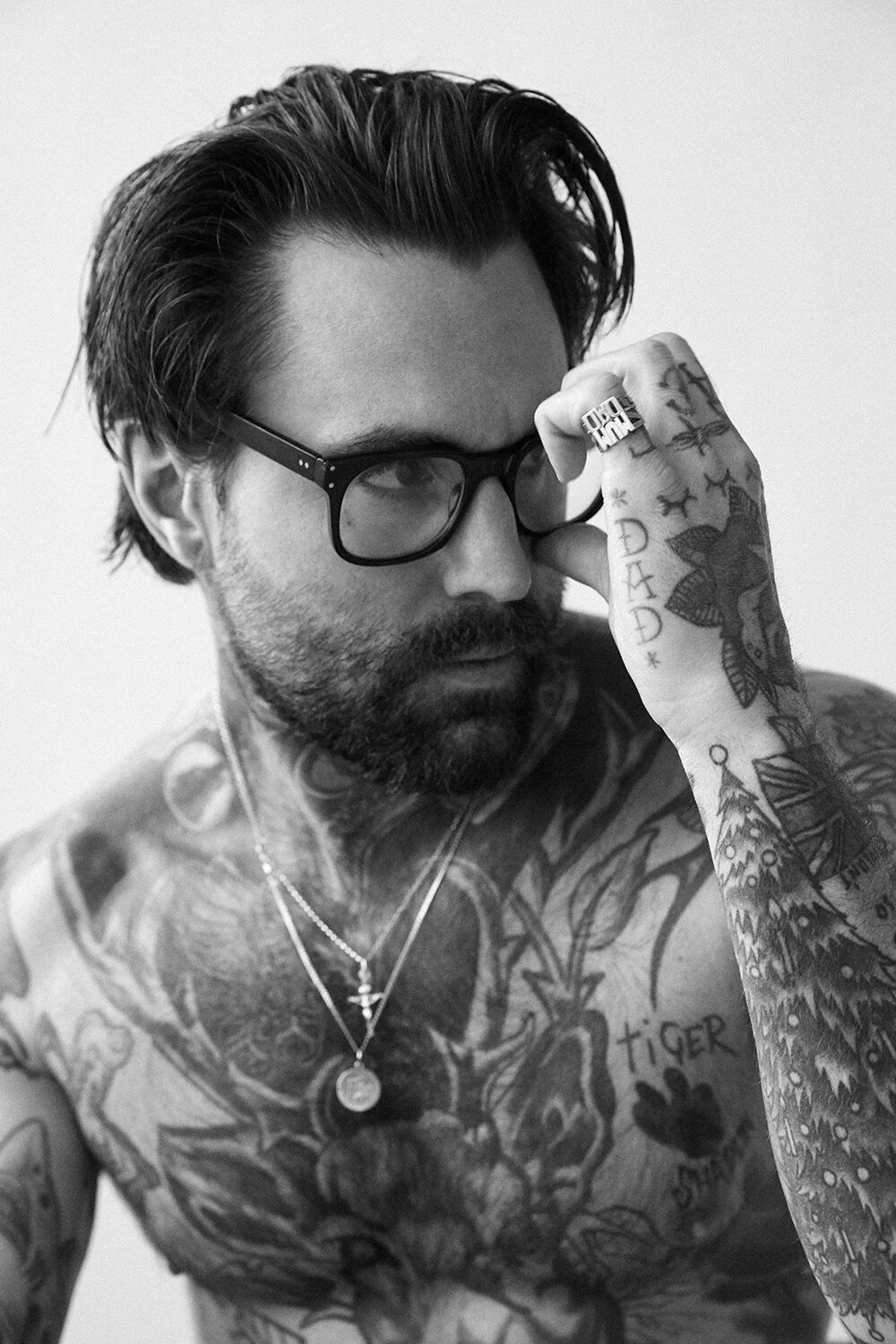
The close hand photo shows lettering and marks across the fingers, knuckles, palm, and wrist. Those areas move whenever the hand does, so even small designs become part of a gesture.

Hand and finger tattoos are washed, bent, and exposed to the sun often. Fine details may soften faster there than on the upper arm. A design that uses simpler shapes has a better chance of staying readable.

A mark on the side of a finger is less obvious than lettering across a knuckle. Decide how visible you want the tattoo to be before choosing the placement.

Ricki Hall tattoos: close hand portrait where the finger lettering, palm marks and wrist designs are the clear subject

Ricki Hall neck and face tattoos

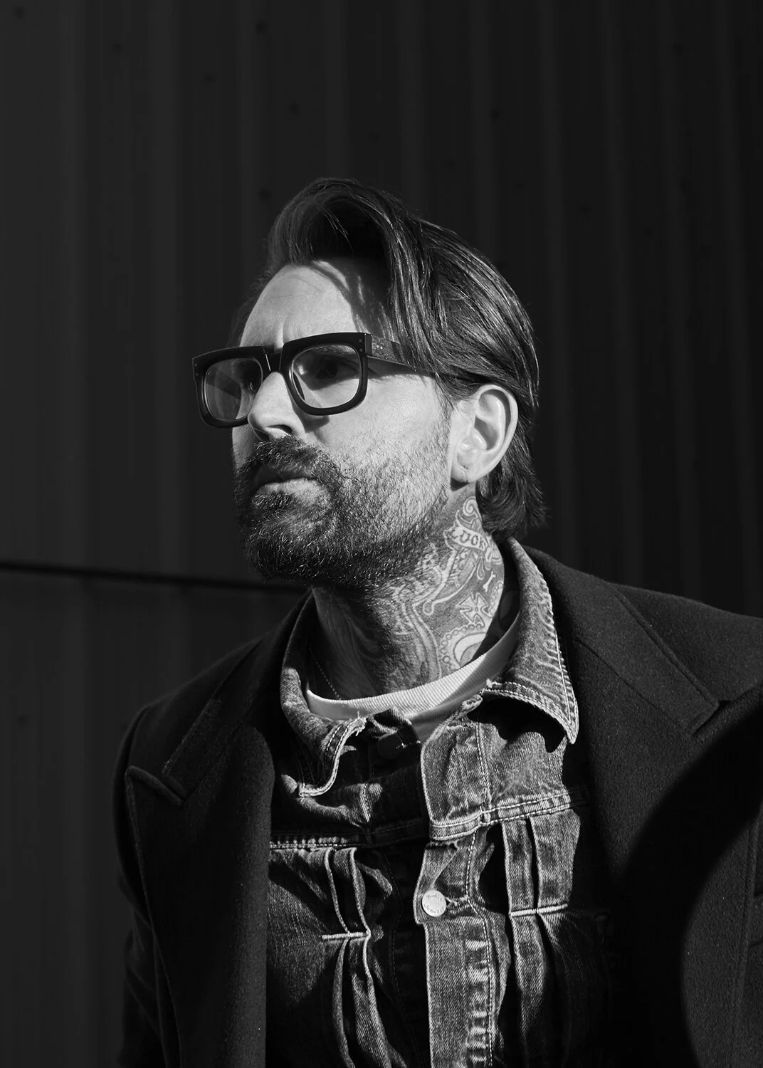
The neck photo shows dense ornament and lettering following the curve of the throat. It can look simple from the front, but the design wraps around a surface that turns with the head.

A stencil checked with the chin raised and lowered shows how the marks sit in different positions. Hair, collars, and shadows can also change how much of the design is visible.

Hall has spoken about changing his face tattoos as his look evolved. Face ink is visible in nearly every photo, so it is a choice to live with in many settings. It’s worth considering how comfortable you’d be seeing the design every day and explaining it when people ask.

Ricki Hall tattoos: sharp portrait focused on the layered neck work and the way lettering and ornamental marks wrap around the throat

Ricki Hall full-body tattoo layout

A full-body studio photo shows the collection across the torso. A central image anchors the chest, with lettering, arrows, flowers, and smaller traditional designs around it. The pieces are separate, but bold outlines recur throughout.

The front, sides, and back can show different relationships between tattoos. A shoulder piece may connect to the arm in one view and disappear from another; a chest design shifts when the body turns.

New work doesn’t have to copy everything already there. Size, color, line weight, or a repeated subject can help it sit with the rest. A visual link can matter more than matching every style.

Ricki Hall tattoos: clean full-body studio portrait showing the complete front layout, large central image and smaller lettering around it

Ricki Hall traditional sleeve tattoos

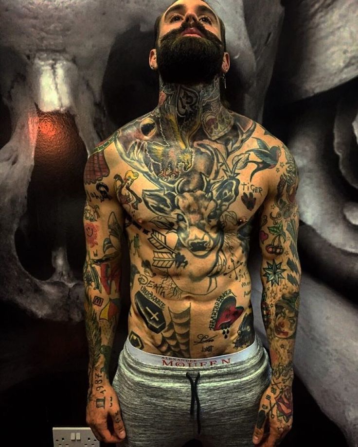
The color portrait shows the traditional side of Hall’s collection: strong outlines, familiar shapes, and compact areas of color. Each piece can stand alone while sharing a similar style with the others.

A sleeve can follow a theme or share a consistent feel. Mixing one larger image with smaller designs creates more movement than lining up pieces at the same size.

The elbow and wrist bend, so details placed in the creases can be hard to see. The main shapes should stay readable as the arm moves; smaller elements can carry the design around the joints.

Ricki Hall tattoos: color portrait showing the old-school chest, arm and hand pieces clearly against a dark skull mural

How to choose a look that still feels like you

Hall’s collection includes bold designs, personal details, and playful marks. They don’t all make the same statement, which is part of how the collection feels individual.

Start with subjects that matter to you when no one else is looking. Then decide which belong on a larger area and which can stay small. Chest and back tattoos can be covered; hand, neck, and face pieces are visible more often.

Take time with placement. Move naturally, sit down, and check the stencil in ordinary light from more than one angle. The design should work when the body is relaxed, not only in a posed photo.
Choose an artist whose healed work matches the style you want, whether that is traditional color, lettering, or portraiture. Talk through the size and how the lines might age. Empty skin can keep larger images separate and give a collection room to grow.

More celebrity tattoo guides

Jenna Jameson Tattoos: Colorful Sleeves, Back Quotes and More

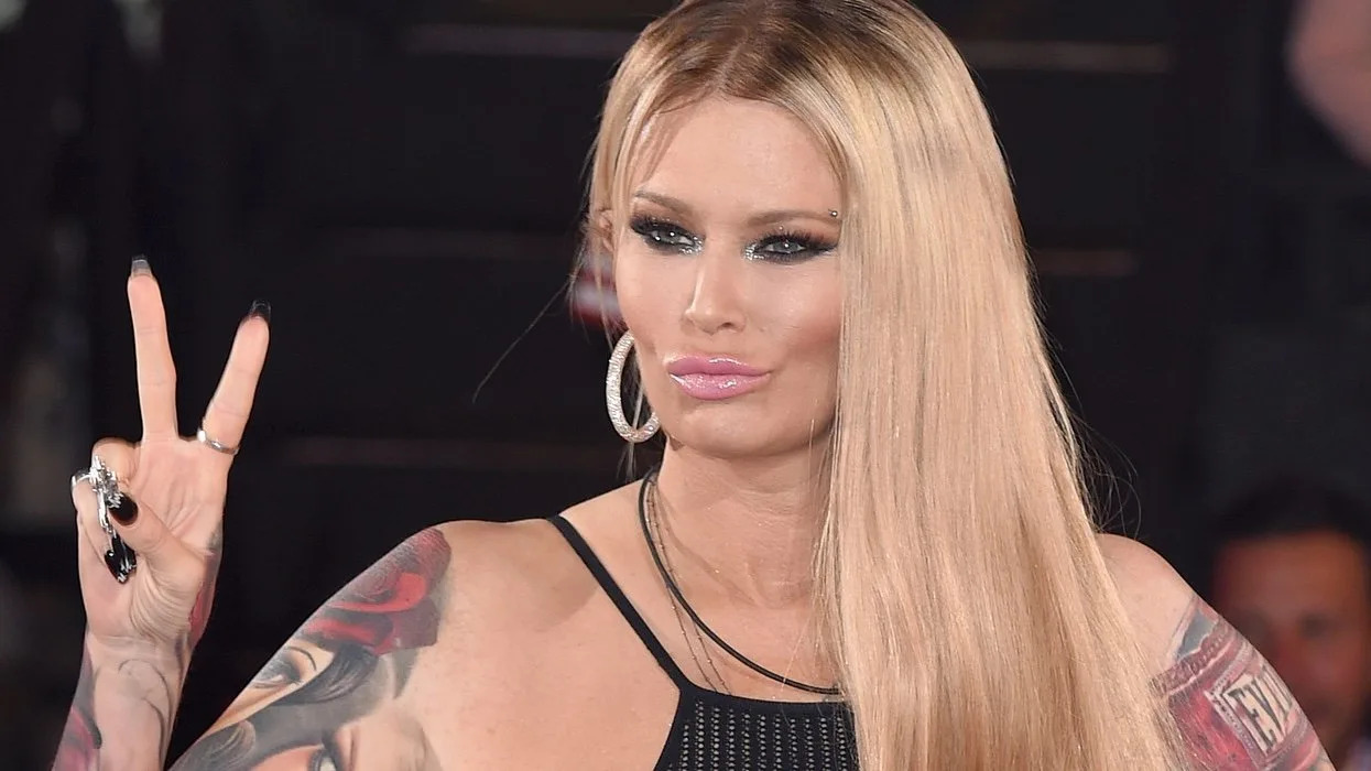
Jenna Jameson’s tattoos include colorful portraits, roses, lettering, and smaller symbols across her arms, hands, shoulders, and back. The sleeves are the most visible part of the collection, and older photos show how they filled in over time.

Some designs have a story attached to them. Her “Heartbreaker” tattoo came from a nickname her father used, while a Joan of Arc quote adds lettering to the collection. Other pieces are best described by their colors and placement.

Jenna Jameson’s colorful portrait and rose sleeves set the tone

Jenna Jameson tattoos: colorful portrait and rose sleeve tattoos on both arms

Color is one of the first things that stands out in a clear portrait. The sleeves mix reds, blues, greens, and dark outlines to separate portraits from flowers and other shapes. A large face anchors one arm, with roses and ornamental details around it.

The portrait gives the eye a main point; the flowers bring curves around it. The different sizes keep the sleeve from reading as one flat image. Skin breaks also help the colors and outlines stay distinct.

For a similar arrangement, start with the image you want to lead, then choose smaller pieces that sit around it. A portrait can share an arm with flowers, lettering, or symbols when the scale and colors work together.

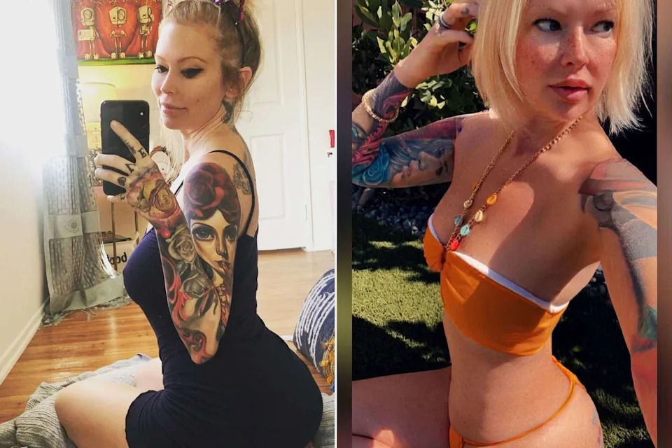
Her arm and hand tattoos show how the color travels downward

Jenna Jameson tattoos: colorful arm, shoulder and hand tattoo details in natural light

In selfies, the color and linework continue from Jameson’s shoulder down toward the elbow, forearm, and hand. The lower arm doesn’t look separate from the sleeve; the shapes and darker areas connect across it.

A bent elbow changes how those designs line up. Flowers wrap around the arm, and a different part comes forward as the hand turns. The hand ink is visible when she holds a phone or raises her arm, alongside rings and long nails.

Hand tattoos move often and compete with jewelry for space. Clear shapes and spacing make small pieces easier to distinguish.

Older event photos show the shoulder work before the sleeves filled out

Jenna Jameson tattoos: shoulder, upper-arm and side tattoo placement in a high-resolution event portrait

An older event photo shows the tattoos around Jameson’s shoulder and upper arm before the later sleeve coverage. Comparing it with newer portraits makes the changes in placement and density easier to see.

The shoulder has room for a portrait or a cluster of flowers, and the design can continue toward the bicep and forearm over time. The earlier tattoos remain visible among later additions rather than disappearing into one solid field.

Photos from different years show how the collection developed. They also help distinguish an older view of the arm from its more recent appearance.

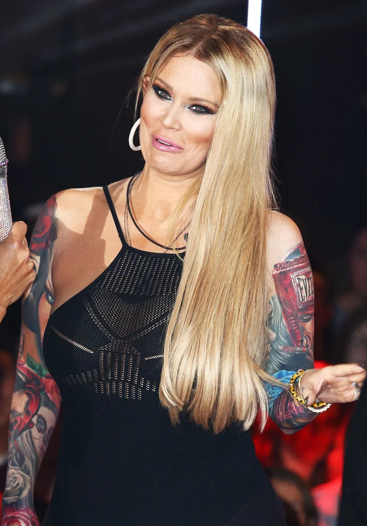
A public appearance makes the sleeve layout easy to read

Jenna Jameson tattoos: both sleeves, shoulder transitions and saturated color blocks

With both arms visible, the two sleeves can be compared. They use color and strong outlines, but the designs are not mirror images. One side draws attention to a portrait and red flowers; the other has different shapes and broader color areas.

The shared outlines and saturated colors give the arms a similar feel without repeating the same image. Larger shapes read first in a wider photo; smaller faces, petals, and textures become clearer up close.

The tattoos extend over the shoulders and show in sleeveless clothes. The placement changes what is visible beside a neckline or strap, as well as how the collection looks from the front.

The later public portrait shows how the whole collection works together

Jenna Jameson tattoos: both colorful sleeves and hand details in a clear evening portrait

This later portrait shows the sleeves, shoulder transitions, and hand details in one frame. The designs are easier to compare as a whole than in a close crop of a single tattoo.

The back lettering and “Heartbreaker” design sit outside the main sleeve work. Jameson has said that her father called her “Heartbreaker” when she was young. The Joan of Arc quote on her back reads, I am not afraid. I was born to do this.

The quote uses plain lettering alongside the larger, colorful arm designs. Together, the tattoos vary in scale and style without relying on a single subject.

Jameson’s tattoos have changed over time, but the sleeves remain easy to recognize for their portraits, bright flowers, and color. The older and newer photos show how those pieces developed across her arms.

More celebrity tattoo guides

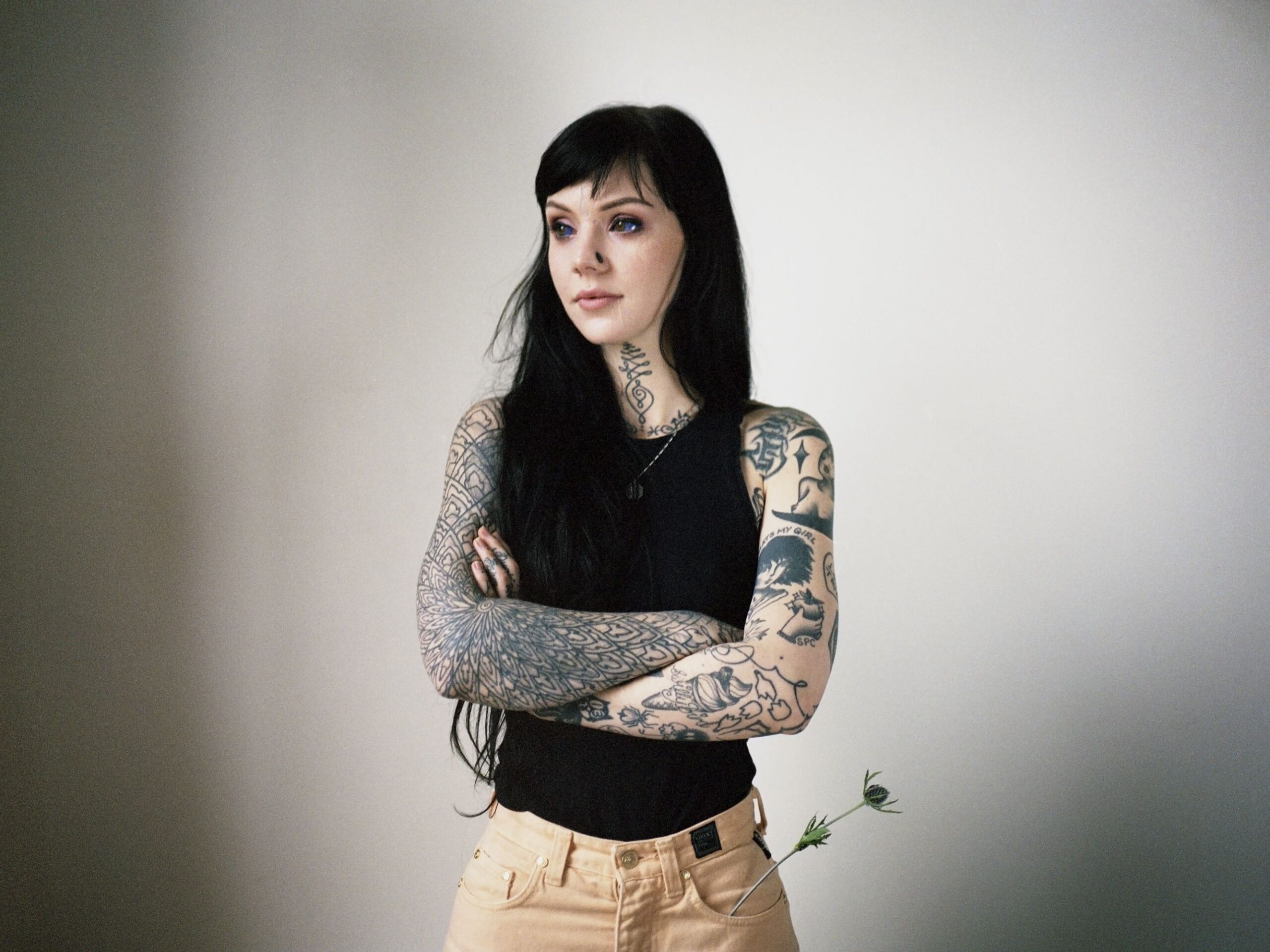
Grace Neutral Tattoos: Bold Face Ink, Geometric Arms and Handwork

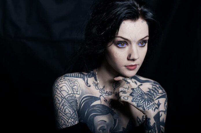
Grace Neutral’s tattoos form a visual language of their own. Face markings, heavily inked arms, dark neck details, and hand tattoos belong together, but each area has its own look. The collection combines geometry, loose lettering, bold black shapes, and small details that hold up to a closer look.

If you’re drawn to Grace’s style, the useful part to study is how she repeats ideas: black linework, ornamental patterns, unusual placements, and small marks beside larger work. You don’t need to copy a face tattoo or an entire sleeve to use those ideas. The result feels personal, graphic, and a little strange.

The sections below look at the different design choices, where the tattoos sit, and what helps each one read clearly.

Grace Neutral face tattoos and forehead markings

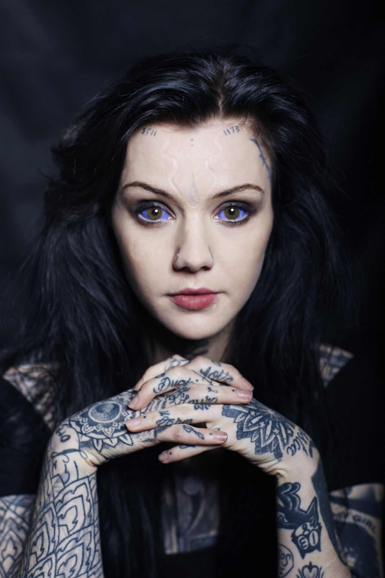
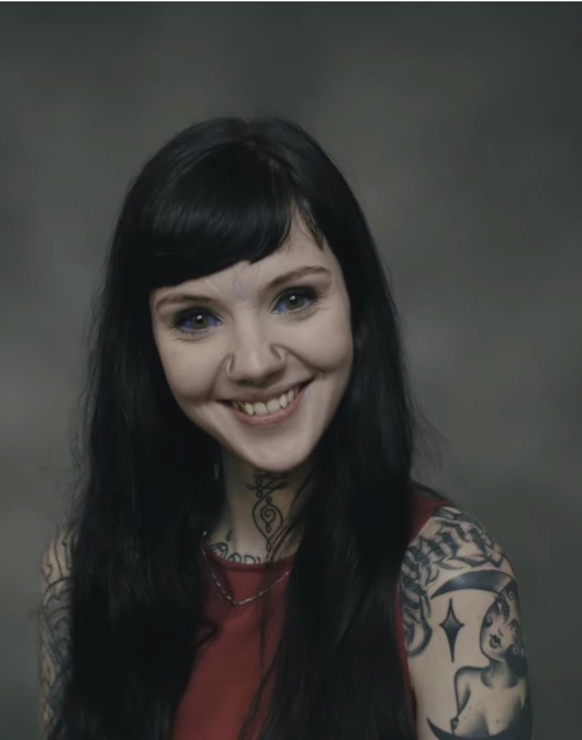
Grace Neutral tattoos: Face, hand and forearm tattoo details

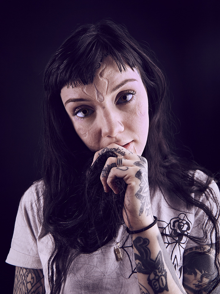
The face is the first place people notice Grace Neutral’s tattoos, so the small marks on her forehead and cheek carry a lot of weight. They’re fine-lined rather than heavily shaded, and follow the natural structure of her face. That keeps them from looking pasted on. For a face tattoo, scale, spacing, and line weight matter as much as the symbol.

The forehead marks show how a small design can become a signature. Their central placement makes them memorable, while the simple shapes leave room to age. If you want a visible symbol with a less prominent placement, you could discuss the temple, hairline, or area behind the ear with an artist. Keep the image compact and leave open space around it.

Face tattoos can’t be covered with clothing, so take time to consider how they work with your expressions, hair, and existing tattoos. Neutral’s marks feel connected to the rest of her collection rather than scattered across her face. A minimal design can still make a strong impression when it’s placed with care.

Grace Neutral neck tattoos and collar ornament

Grace Neutral tattoos: Hand lettering and forearm tattoo details

The neck work links the lighter facial marks to the heavier coverage below. Dark, curling ornaments follow the front and sides of Neutral’s neck, continuing toward the collarbone and upper chest. The placement stays visible without taking over an outfit, and creates a visual line between the head and shoulder tattoos.

The designs follow the center of the body. A throat tattoo can feel especially balanced when it’s symmetrical or close to it. A pendant-like emblem, mirrored leaves, a decorative knot, or a short line of script could use the same idea. Leave some room around the middle of the throat so the shapes don’t crowd one another.

For a lighter version, use thinner outlines and more open skin; for a heavier one, a solid black panel or compact blackwork motif can blend toward the shoulders. Neutral’s collection shows both weights. The transition matters: a neck tattoo should relate to the chest, jawline, or hair, not float on its own.

Grace Neutral geometric arm tattoos and sleeves

Grace Neutral tattoos: Geometric arm coverage and neck tattoo details

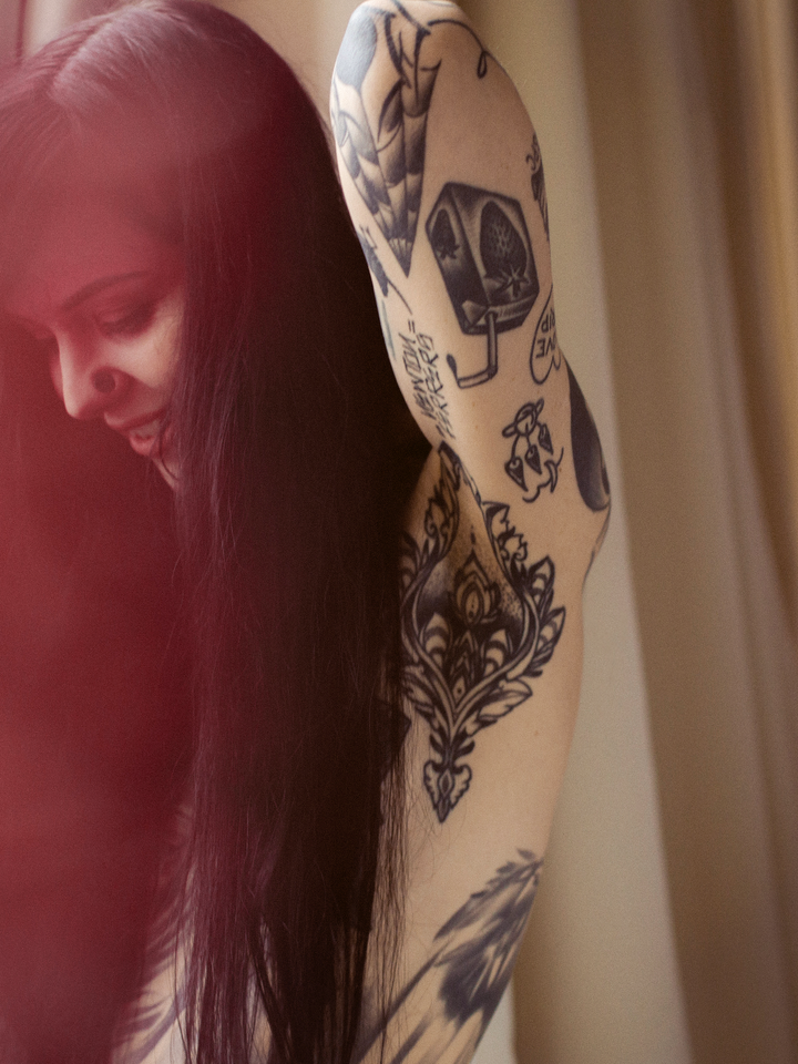
The arms show Neutral’s geometric approach especially clearly. Lines, bands, angles, and ornaments cover large areas without making them look flat. The patterns follow the arm, changing as the elbow bends or the wrist turns. That movement is worth considering before committing to a sleeve; a pattern that works on a straight arm may break across a joint.

Geometric work doesn’t have to mean perfect circles or rigid mandalas. Repeating wedges, curved panels, checkerboard blocks, small stars, sharp leaves, or architectural lines can all give a sleeve structure. Choose a few shapes and let them recur rather than filling every section with the same pattern.

Contrast helps keep a dense sleeve readable. Some sections have close linework; others use heavier black or open skin. Those changes let the eye move around the arm. If every inch has the same amount of detail, the tattoo can feel noisy. Ask the artist to plan focal points and calmer areas together.

Grace Neutral hand tattoos, lettering and small symbols

Grace Neutral tattoos: Shoulder, upper-arm and side tattoo details

Neutral’s hands combine lettering, small symbols, and compact drawings. Hand tattoos draw the eye because hands are always moving. Small differences matter: a word may fit on one finger but look cramped on another; an icon might read on the back of the hand and disappear along a finger.

Her hand ink feels collected rather than matched. If you like that approach, start with a word, number, star, or simple symbol that reads at a glance. Leave some room around it for future additions. That spacing helps a hand look lively instead of crowded, especially when the fingers, knuckles, and wrist all have tattoos.

Neutral’s loose script keeps the lettering from looking like a logo. Bring an artist examples of the lettering rhythm you like, then have them redraw it for your hand. Check the size and direction carefully; a word that reads easily to you might look reversed or awkward to other people.

Grace Neutral illustrative blackwork tattoo and body flow

Grace Neutral tattoos: Side, back and ornamental tattoo coverage

Larger illustrative pieces bring a darker edge to the geometric work. Neutral has bold figures, solid black shapes, ornamental panels, and drawings across her shoulders, arms, and torso. They vary in scale but share confident outlines and use of black, so the images stay clear across different poses and lighting.

Blackwork suits ideas that need a distinct silhouette. Animals, small characters, plants, antique objects, or surreal faces can all work without being photorealistic. A clear outline, controlled shadows, and a considered crop can carry the image without loading it with tiny details.

Body flow is the main thing to study. A shoulder design can point toward the chest; an arm panel can turn with the bicep; a dark shape can anchor lighter lines nearby. Before booking, photograph the area from several angles and ask the artist to show how the design might sit on your body. That makes it easier to judge the placement beyond a flat reference image.

Neutral’s tattoos feel lived in because the collection has different weights and textures. Thin lines sit alongside solid black; personal marks share space with ornaments. If you’re planning your own pieces, choose a visual idea you can return to and let each tattoo keep its own character. That idea might be black ink, unusual placement, mirrored shapes, hand-drawn lettering, or open skin.

The placement is part of what gives the collection its confidence. Face, neck, and hand tattoos need to fit your everyday life as well as the reference photo. Start with an area you’re sure about, look for healed work by the artist, and make sure the design is drawn for your body. A strong collection comes from considered choices, not simply adding more images.
Start with one clear visual rule and let the collection grow at its own pace. Talk through placement, size, healing, future additions, and how new work will sit beside older tattoos. Give yourself time before making a permanent choice; a reference can look striking on a screen and still need changes for you.

The embedded video offers another view of Neutral’s tattoos. Use it alongside the close-up images when deciding which details you want to discuss with an artist.

More celebrity tattoo guides

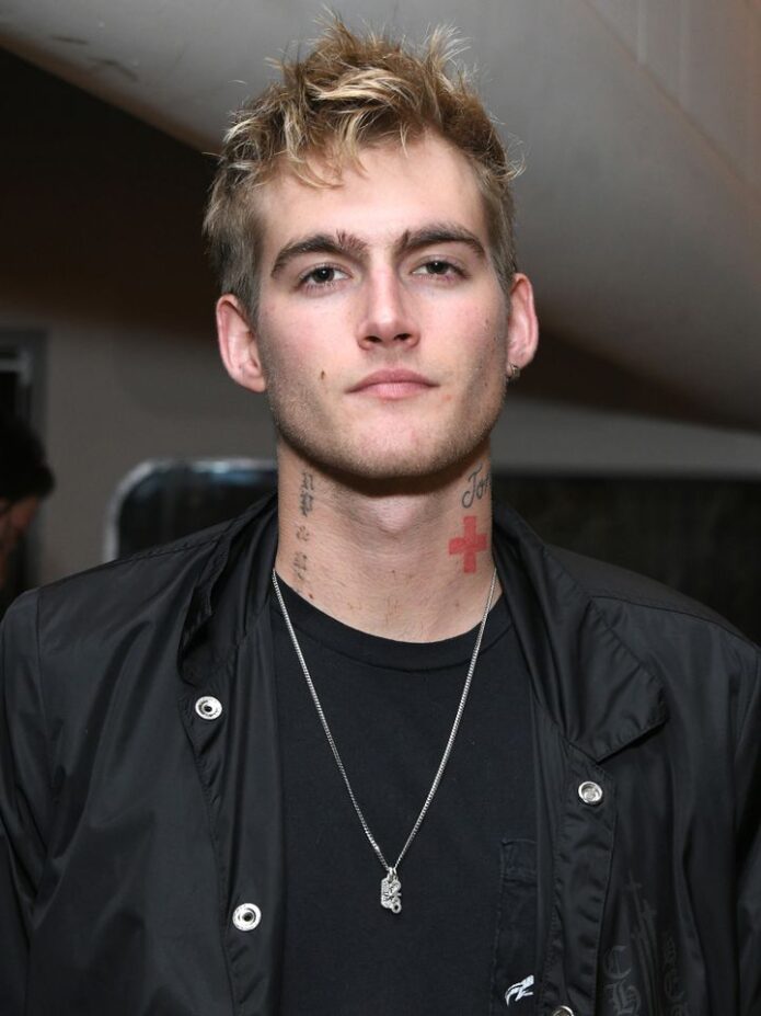
Presley Gerber Tattoos: Face Ink, Neck Script and More

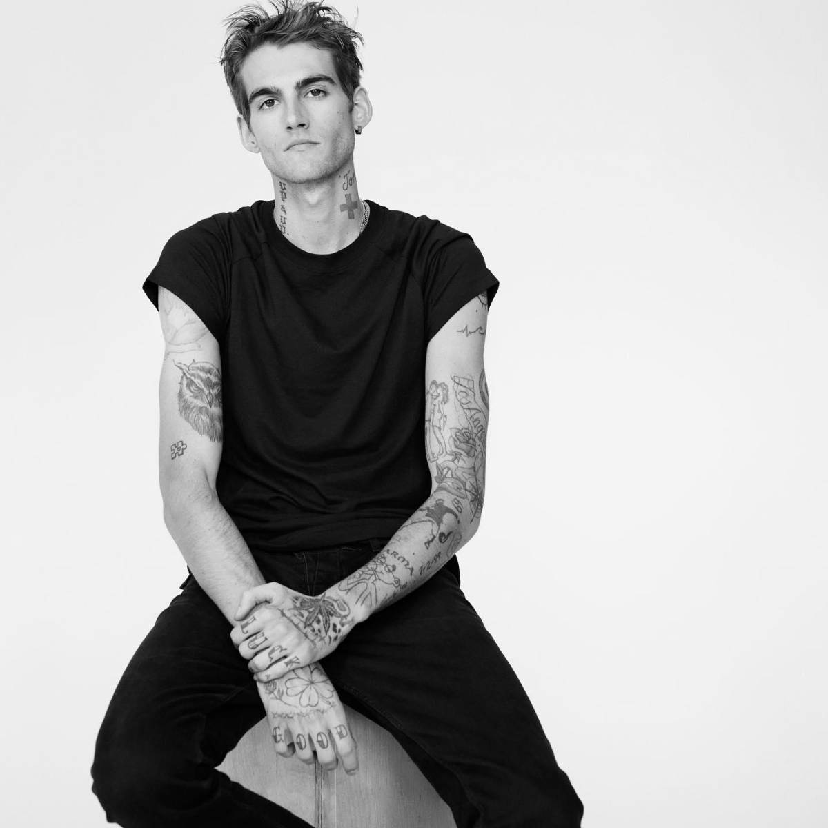
Presley Gerber’s tattoos have long been part of his fashion image, but the photos show more than one look. There’s small lettering on his face, script and a cross on his neck, loose linework on his arms, and smaller marks on his hands. Some images are polished editorial shots; others are casual.

The collection doesn’t follow one theme or one perfect sleeve. Lettering, symbols, cartoon-like art, and sketchy blackwork vary in size and mood, with black ink giving them a loose connection. Meanings are discussed here only when they’ve been publicly explained; the focus is on visible placement and design.

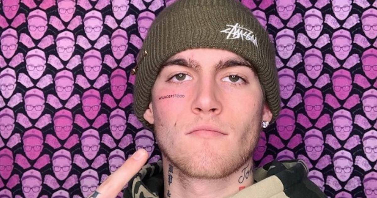
The misunderstood face tattoo and hand lettering set the tone

Presley Gerber tattoos: face-visible portrait with neck, arm, and hand tattoos

The small “misunderstood” tattoo beneath Gerber’s eye became the design most people associate with him. It’s plain lettering, but the placement makes it conspicuous. A short word near the eye can catch attention before a larger tattoo on the arm simply because people look at the face first.

The letters are compact and clean, without a frame or heavy shading. That restraint suits a face tattoo; extra flourishes could crowd the area quickly. At this size, the word reads as a statement without taking over his cheek.

The hand tattoos are visible in a different way. Fingers and hands move through ordinary gestures, so even simple marks seem animated. They sit beside rings, sleeves, and the things people handle every day; the ink becomes part of those gestures, not just a detail in a photo. Small hand tattoos can carry a lot of character when the lines stay clear.
Face and hand tattoos stay visible. Before choosing either placement, think about how permanent visibility fits your life. Check the lettering at its actual size and look at it from a normal speaking distance; a large phone mock-up can give a misleading impression.

The neck script sits beside loose torso and hand designs

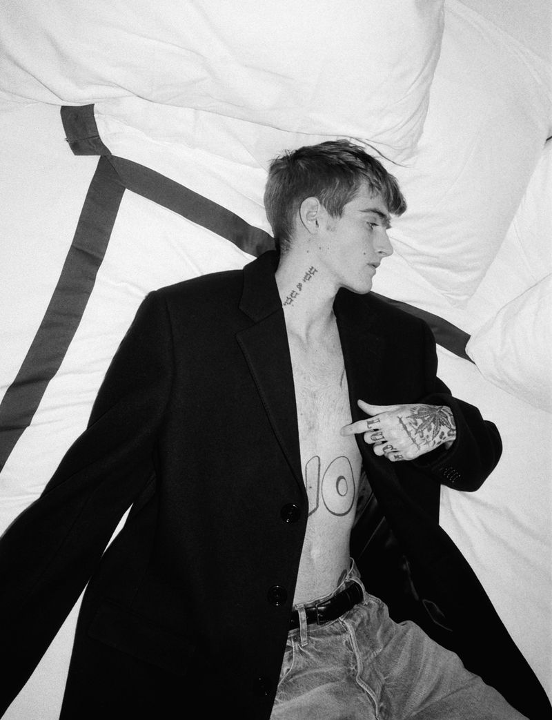
Presley Gerber tattoos: neck script, torso symbols, and hand tattoos

The neck is where Gerber’s tattoos start to layer together. Script runs along its side, with a cross and smaller marks nearby. They sit close enough to make one area, but the shapes aren’t identical, so they don’t blend into one patch.

Neck lettering needs room because the skin turns with the head. A word that looks balanced from the front may bunch up from the side. Here, the script follows the length of the neck and leaves space around the cross, keeping the shapes separate.

The torso marks add detail without competing with the face. They’re lighter and more open than the stronger neck work. Negative space matters when small tattoos sit close together. Leaving some skin visible helps each mark stay clear.

A collection can grow one tattoo at a time. A neck design doesn’t need to predict every later piece. You can add a small symbol, then decide whether it needs a partner on the chest or shoulder. A loose plan helps the tattoos relate; open areas keep you from locking in every detail at once.

The shoulder and forearm tattoos make the collection feel lived in

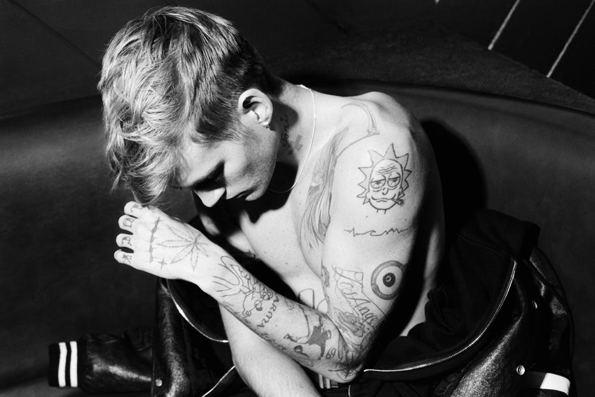
Presley Gerber tattoos: shoulder cartoon, arm lines, and forearm tattoos

Gerber’s shoulder and forearm photos show some of the more expressive designs. A cartoon-style tattoo sits on the shoulder beside looser lines, while sketches and shading run along the forearm. They look less like a matching set than pieces gathered at different times.

The shoulder can hold a bold image without forcing it into a narrow strip, and it connects naturally with the upper arm. The forearm extends the composition downward. As the arm bends, the shapes change with it.

Some outlines are graphic and confident; others have a sketchbook feel, with lighter strokes and open skin. Different levels of finish can sit together when the placements give each tattoo room. They don’t all need to be equally polished.

When sharing references with your artist, show both the close-up details and the whole limb. A cropped shoulder tattoo might look fine by itself but awkward next to the chest or upper arm. Check it from several angles before settling on the design.

The neck cross and arm details change the balance of the look

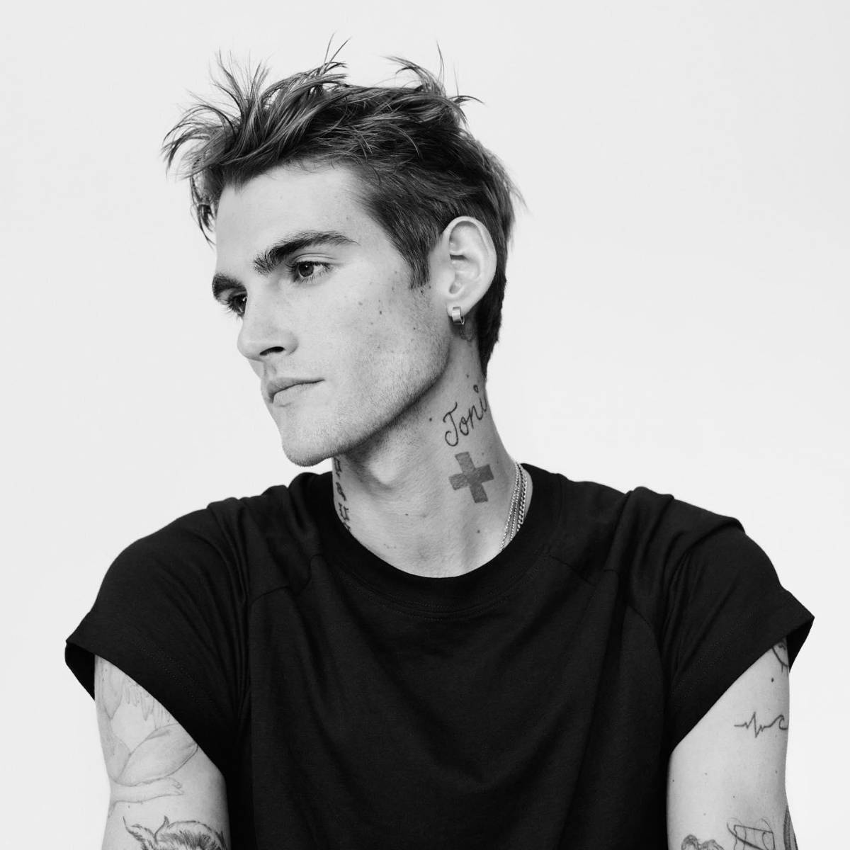
Presley Gerber tattoos: neck cross, script, and arm tattoo details

The cross on Gerber’s neck is one of the clearest shapes in these photos. Its simple outline stays visible when the rest of the image is busy. Script and smaller arm tattoos make the area denser, but the cross gives the eye a place to land.

A small symbol still takes care to place. A cross, star, or icon has to sit well on a body that moves; on the neck, even a slight change in angle can affect the balance. Nearby script helps the cross feel part of the collection rather than isolated.

The arm tattoos add texture without demanding the same attention. Smaller pieces can make an area feel complete without forcing every design into one theme. Repeated black ink and consistent spacing can connect different ideas without making them identical.

It helps to choose one focal point for each area: a cross at the neck, a flower on the shoulder, or a word on the forearm. Smaller tattoos can support it while leaving space around it. That order keeps a busy area legible.

The face lettering is small, direct, and impossible to miss

Presley Gerber tattoos: face lettering with neck and hand tattoos

The close-up shows how the face lettering works. The word is small, but its position makes it part of Gerber’s expression. Text of the same size would have a very different effect on an arm or rib.

In the full portrait, the eye moves from the lettering to the script and cross on the neck, then to the hand tattoos. Those placements create a vertical line. The marks have different sizes but share a dark palette.

That sequence is useful if you want a bold look without relying on one huge black shape. Placement can matter as much as size. A small tattoo near the eye can be more noticeable than a larger design under a sleeve. Neck script can link face and chest; hand tattoos show when the arms move.

Gerber’s collection doesn’t need to look perfectly matched. Give each tattoo a reason to be where it is, then check how it sits beside the next one. Keep the choices personal, leave useful space, and have the artist adapt the design to your body rather than tracing a photo.
The video below adds context to the first tattoo story and the response it drew.

More celebrity tattoo guides

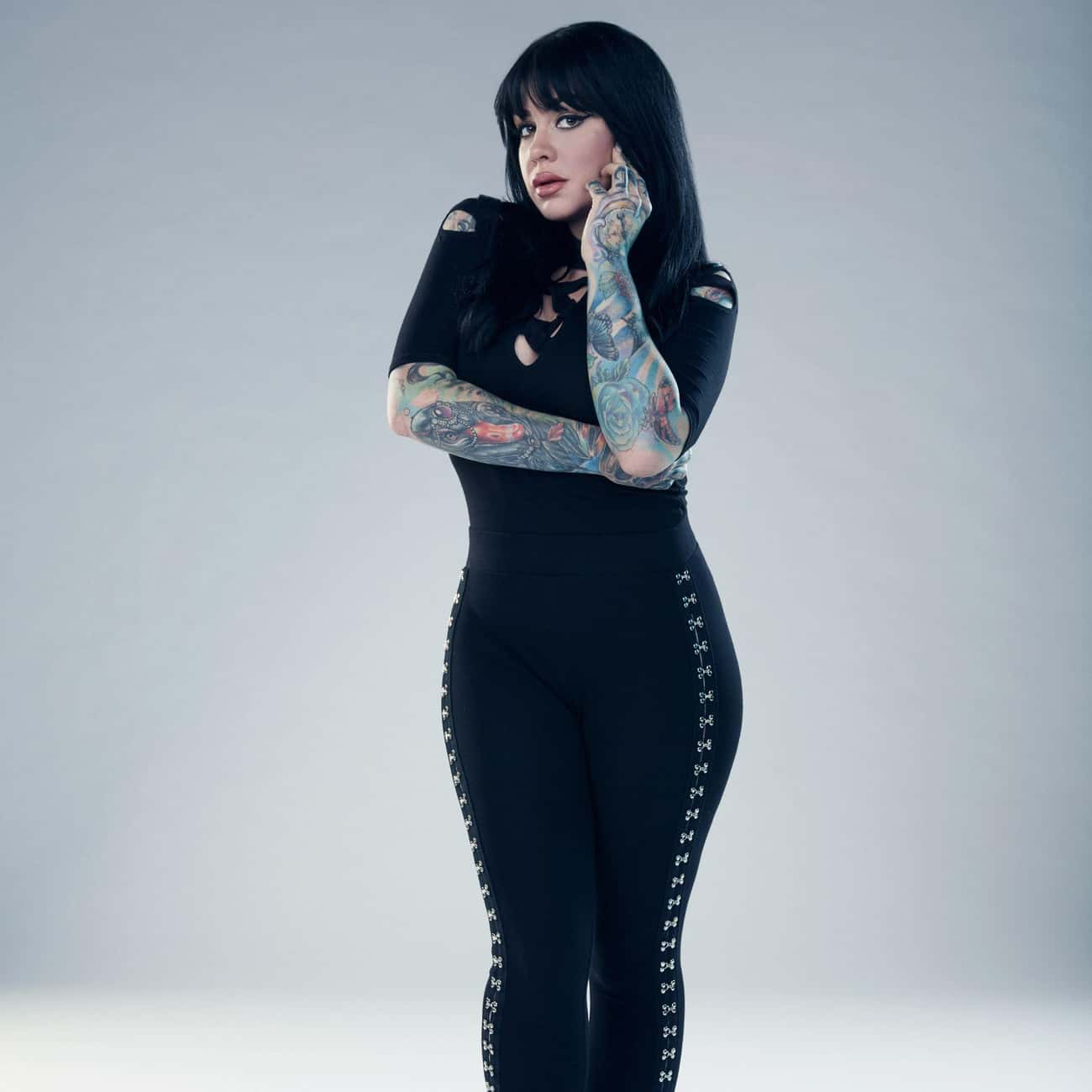
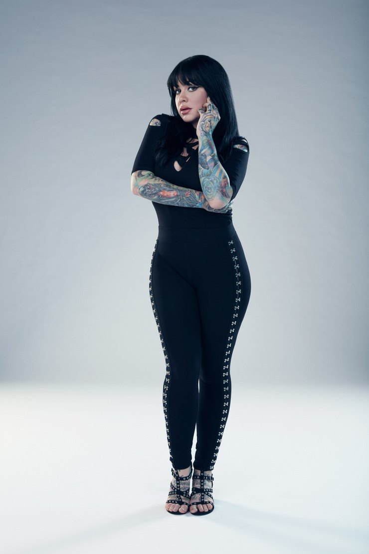
Nikki Simpson Tattoos: Colourful Sleeves, Neck Ink and Hand Details

Nikki Simpson’s tattoos are hard to miss. Her arms are covered in bright colour and bold outlines, with illustrated scenes that reveal more detail up close. The ink runs from her fingers and hands through both sleeves, then reaches her neck and chest. Nikki Simpson tattoos make a useful reference if you like colour and want a collection with a clear point of view.

The designs include flowers, faces, ornamental lines, dark framing, and smaller details within the sleeves. Simpson often wears clothes that show much of the work, and she is a tattoo artist herself. The photographs give a sense of how the pieces fit together across her body.

This guide focuses on what can be seen in the photos: colour, placement, line weight, and how the tattoos flow. Their personal meanings aren’t always clear from an image, so there’s no need to guess. You can build a bold collection without making every tattoo look identical. A shared palette and thoughtful placement can connect different subjects.

Nikki Simpson’s colourful sleeves work as full-body compositions

Nikki Simpson tattoos: full-resolution face-visible portrait showing both colourful sleeves from shoulders through the hands

Simpson’s sleeves cover a lot of skin, but they’re not solid blocks of colour. Lighter patches, black outlines, softer washes, and small accents break up the designs. That gives the eye places to rest and keeps individual shapes visible.

The two arms have different colour palettes. One leans on deep reds and greens with darker framing; the other uses cooler blues and brighter highlights. The contrast lets each sleeve have its own feel instead of making them mirror images.

The designs follow the shape of her muscles. A face turns around the biceps, a flower opens across the forearm, and leaves and shading carry the eye toward the wrist. The ink moves with her arms in both portraits and everyday photos.

If you want a full sleeve, choose an anchor design first: perhaps a portrait, flower, animal, or ornamental shape. Let later pieces work around it. A sleeve looks calmer when the empty skin and the dark areas are planned together, instead of filling every gap just because it’s there.

Her forearm work mixes portrait details with strong colour

Nikki Simpson tattoos: face-visible portrait showing Nikki's forearm colour, sleeve flow, and hand coverage clearly

The forearm photos make Simpson’s illustrative style easy to see. Faces, flowers, and layered shapes sit close together, but their outlines keep them distinct. From a little farther away, the contrast holds; up close, there are details in the eyes, petals, and decorative edges.

A portrait needs enough space for its features to read. Simpson’s forearm designs use the length of the arm, rather than squeezing a face into a small patch. That gives the colours room and keeps the features clear.

Some of the ink continues over the wrist onto the back of the hand, so the sleeve doesn’t stop at a hard line. That transition takes planning: the artist has to consider how the design looks with the palm open, the wrist bent, and the fingers moving.

For a forearm portrait, decide which expression or feature should lead. Let the surrounding shapes add texture. Readable contrast will usually do more for a tattoo than extra tiny texture. Colour can make the image feel full without trying to reproduce every detail of a photograph.

The hand and finger tattoos make the sleeves feel personal

Nikki Simpson tattoos: face-visible portrait with both hands and colourful sleeve details visible against a clean background

The hands change the feel of the collection. The sleeves are the larger statements, but hand tattoos show up in everyday gestures: when Simpson holds a tattoo machine, rests a hand on her hip, or touches her hair. They move with her instead of appearing only in a posed photo.
Hands are hard on tattoos. Washing, friction, sunlight, and bending can soften fine lines. Simpson’s visible handwork uses graphic shapes that suit the smaller area; the fingers add accents without trying to hold an entire scene.

The details also link the colourful forearm to the hand. A repeated colour or curved line can carry through without making the designs identical. Sometimes one small echo is enough.

If you’re considering hand ink, check the placement with your hand relaxed, not only held flat. Leave space between the marks and choose an artist who understands how the skin moves. Small tattoos need room just as much as big ones do, especially beside an existing sleeve.

Her neck and chest tattoos soften the heavy arm coverage

Nikki Simpson tattoos: face-visible close portrait where Nikki's neck tattoos, chest area, and upper-arm ink are easy to inspect

The neck and chest give the eye a break from the colourful sleeves. The ink near Simpson’s face looks lighter and more open in the photos. That change keeps the upper body from turning into one dense field of colour and leaves room for her face to stand out.

Neck placement has to work around the jaw, collarbones, and hair. A design that looks balanced in a straight-on portrait can shift when the head turns. Simpson’s visible neck work follows the lines of the area and sits naturally beside her other ink.

The chest gives an artist more room, but spacing still matters. Fine lines can sit against open skin; darker areas can echo the sleeves’ black outlines. The pieces don’t need to match exactly to feel related.

A collection can include full sleeves and still leave some areas quieter. Sometimes the smartest way to make colour pop is to give it a calmer neighbour.

The black linework designs give everything structure

Nikki Simpson tattoos: face-visible portrait showing the contrast between Nikki's black outlines, colour fields, and sleeve details

In wider portraits, the black linework does more than outline the colour. It separates flowers, faces, and other shapes so the sleeves don’t blur into one wash. The colour catches your eye first; the darker lines keep the designs organised.

Repeated line weight and similar shading can also connect different subjects. A flower, a portrait, and an ornamental design may not seem related on their own, but they can sit together when they share those visual choices. Simpson’s sleeves show that kind of connection.

The chest and shoulders use the same idea. Darker marks carry the eye from the upper arm toward the collarbone, while open skin keeps lighter details visible. The design moves with the body instead of following a strict geometric grid.

Before starting a colourful collection, ask your artist how the lines may age, how much open skin to leave, and where a new piece would sit beside older work. A strong outline is not just decoration. It is the framework that lets the colour stay readable.

Why Nikki Simpson’s collection feels so connected

Simpson’s tattoos share a style more than a single subject. They’re colourful, illustrative, and comfortable taking up space. The faces, flowers, symbols, and textures vary, but the overall collection still feels connected.

If you’re adding tattoos over time, you don’t have to repeat the same subject. Think about the feeling you want the collection to have: bright and playful, dark and ornamental, or realistic faces with bold colour around them. A shared mood can bring different designs together.

Placement helps too. Simpson’s arms carry most of the visual weight; the hands, neck, and chest add smaller details. That gives the collection a clear rhythm. If every area had the same amount of detail, it would be harder to know where to look.

Ask your artist to adapt the drawing to your body. A sleeve has to work around the elbow, wrist, shoulder, and hand, not just look good on a flat page. Those joints and curves can help the design feel natural.

Nikki Simpson’s tattoos look personal without being precious about matching every piece. They’re bright and built to move with her. If you like that approach, choose an image you care about, give it room, and let the rest of the collection grow around it.

Nikki Simpson and the Angels

Her Ink Master Angels interviews offer a look at Simpson as an artist and at the illustrative style seen in her tattoos.

More celebrity tattoo guides

Peaches Geldof Tattoos: Daisy Chain, Lyric Back Piece and Script

Peaches Geldof’s tattoos were part of her everyday style. The bluebirds, script, hearts, and long daisy chain showed up in photos alongside her clothes and movement. Her collection looked gathered over time, with different designs sharing the same body rather than following one plan.

That is what makes Peaches Geldof tattoos worth a closer look: they combine fine colour, flowing script, small symbols, and larger pieces that move across the body. Some photos isolate one tattoo; others show how several sit together. There isn’t a single theme tying every piece to the next.

This guide sticks to visible details and documented designs. A tattoo’s meaning belongs to the person wearing it, so the focus here is on placement, linework, and how different ideas share the skin. If you like a collection that grows over time, Geldof’s offers a few useful ideas.

Peaches Geldof’s daisy chain turns one tattoo into a moving line

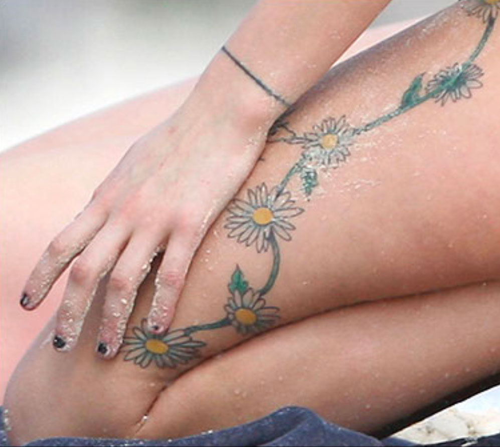
Peaches Geldof tattoos: high-resolution close view of the daisy chain flowers, vine, and hand placement across the leg

The daisy chain gives this part of the collection its shape. In close photos, the flowers curve along Geldof’s thigh and continue up the side of her body. The vine links them, and the yellow centres and pale petals stand out against the skin.

A chain like this can follow the body’s curves. The thigh, hip, and ribs don’t form a flat surface; the vine bends as the body moves. The open skin around it is part of the design too.

The flowers change in size. Some are clear at a glance, while the fine stem and small leaves show up when you look closer. A repeating motif does not need to be perfectly identical to feel connected. Slight differences give a hand-drawn piece a looser feel.

For a floral chain, decide where you want the eye to land. A larger bloom can anchor the thigh or hip, with smaller flowers tapering toward the knee or ribs. Leave room for the skin to move; packing the whole area can make the line harder to follow.

Her red-carpet portraits show arm ink in context

Peaches Geldof tattoos: high-resolution face-visible portrait showing multiple arm tattoos and small symbols in context

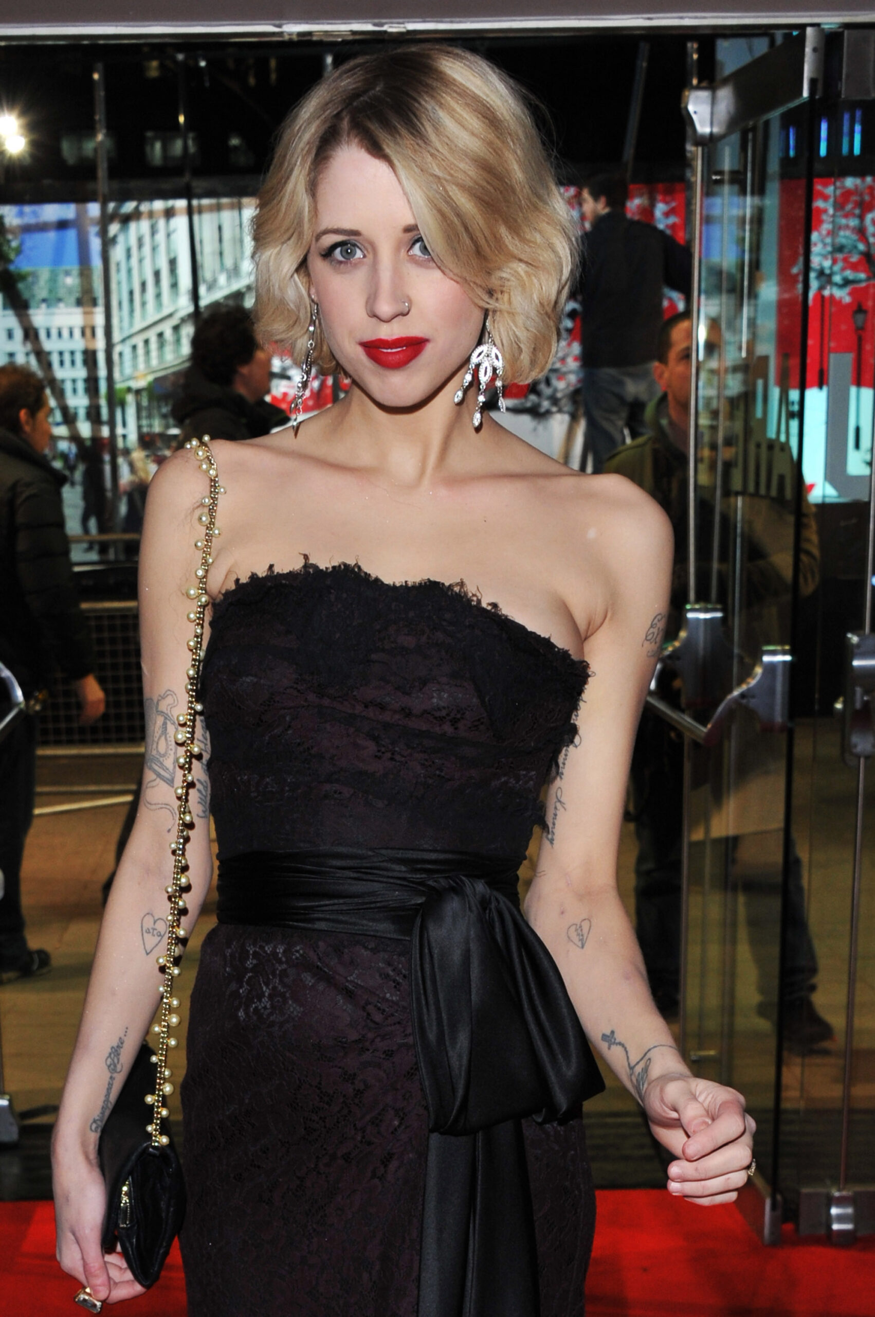
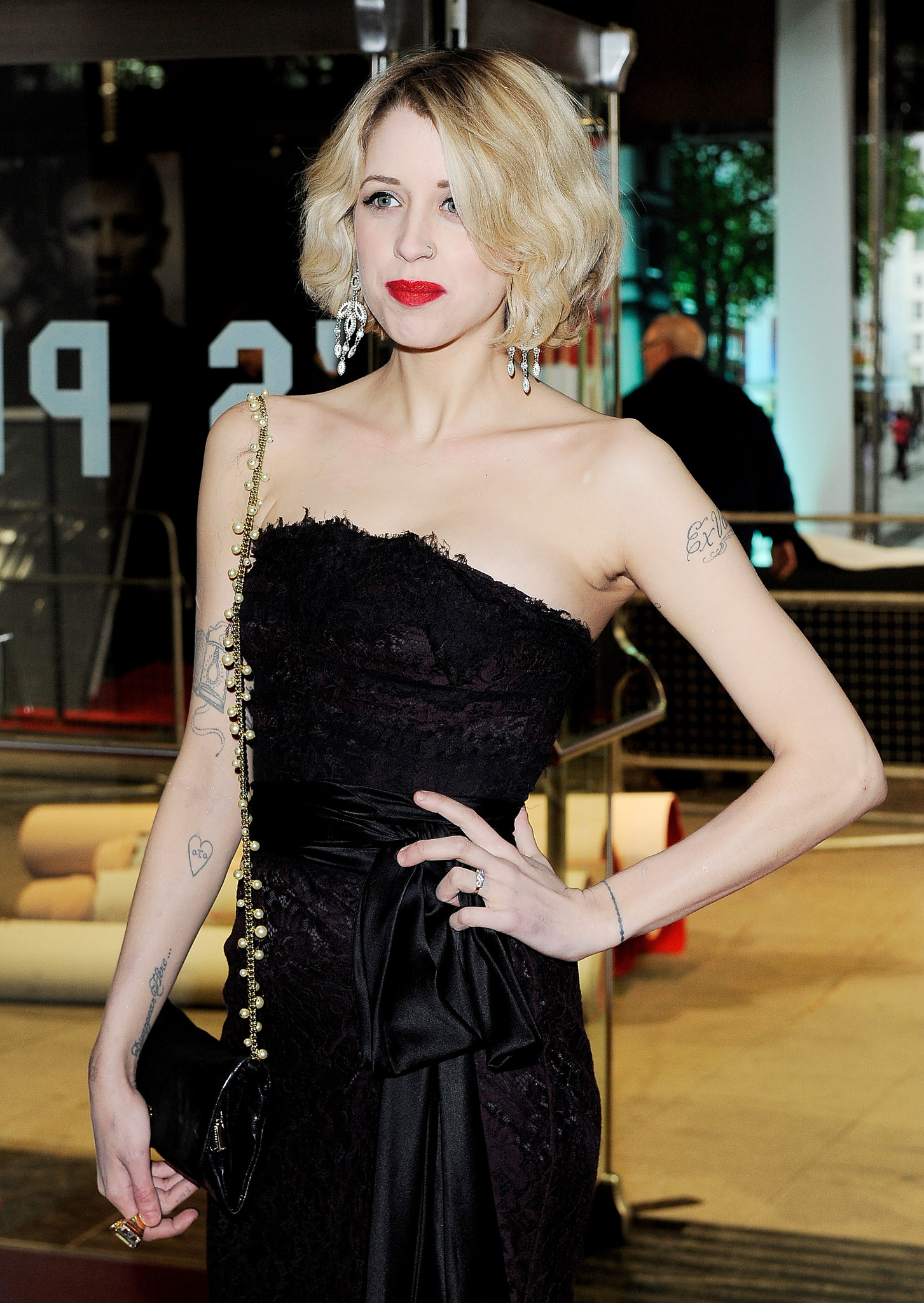
Event portraits show how Geldof’s arm tattoos sat with her clothes and posture. Script appears against bare skin, with smaller marks lower down near the wrist. In photos where she’s standing, turning, or holding a bag, the ink looks like part of her everyday style rather than a display arranged for the camera.

The arm combines clean lettering with lighter decorative lines. That leaves space around the words. A short phrase can hold attention while a heart or bird nearby adds another detail without filling the whole arm.

Placement changes what a tattoo feels like. Clothing can cover an upper-arm piece, while wrist and forearm ink shows during ordinary gestures. Geldof’s photos include both: some designs are immediately visible, others take a closer look.

If you’re planning script on your arm, check how it looks from different angles and with your arm hanging naturally. Think about how sleeves, straps, and movement will frame it. Good placement lets a small tattoo feel intentional without asking it to fill the whole limb.

The arm script makes personal names part of the everyday look

Peaches Geldof tattoos: high-resolution close portrait showing the upper-arm script tattoo and additional visible ink

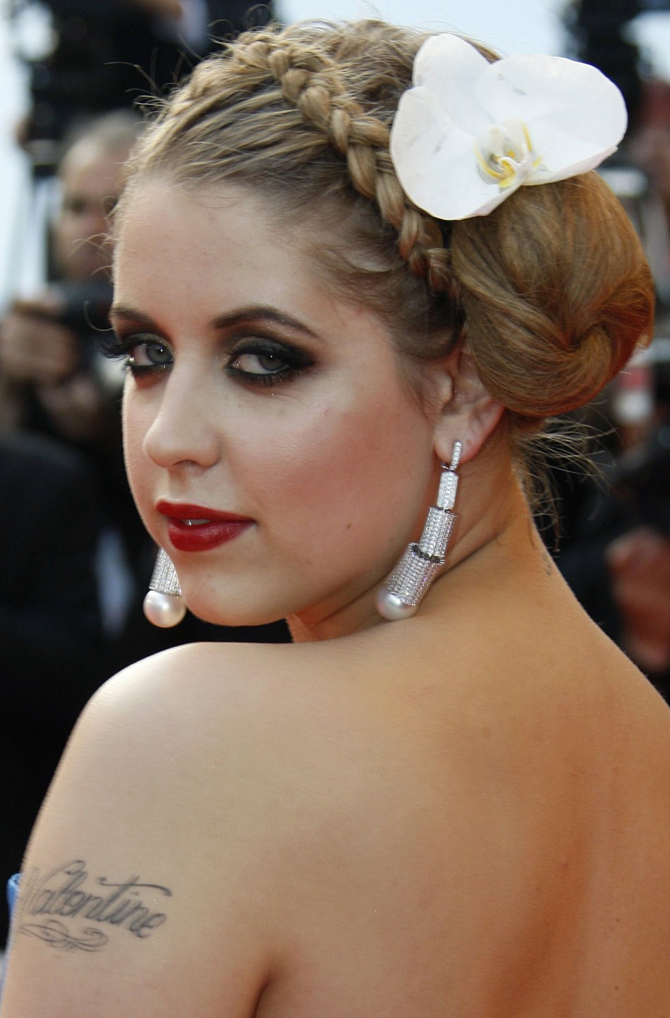
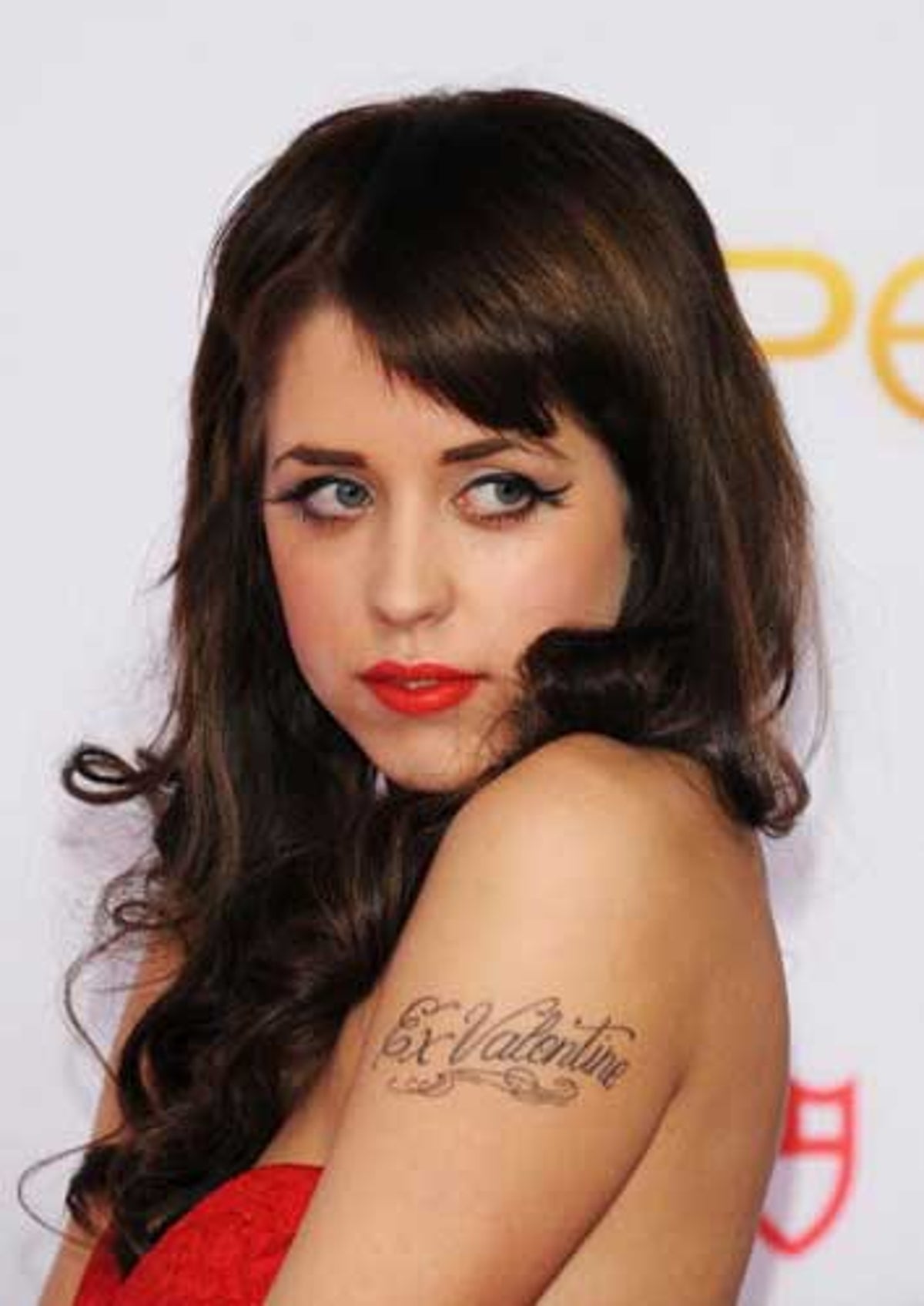
Geldof had several script tattoos on her arms, visible in event photographs. They show up when she raises a hand, reaches for a bag, or turns toward a camera. Arm lettering is hard to keep private; it becomes part of the way a person presents themselves.

The letters are modest in scale, with flourishes that extend beyond the words. Those curves add movement, but the lettering still needs to be easy to read. Near a shoulder, elbow, or wrist, a few details can finish the design; too many can crowd it.

The script sits between the mood of the floral chain and the larger back piece: direct enough to read, with a decorative style that fits beside symbols and flowers.

If you’re considering a name tattoo, check it when your arm is relaxed, bent, and turned away. Placement can make a simple word feel private or prominent. Placement can make a simple word feel either intimate or loud.

Small hearts and symbols give the collection its lighter notes

Peaches Geldof tattoos: high-resolution event portrait showing the heart, arm script, and placement around the shoulders

The small hearts and symbols are easy to miss in a full portrait, but they give the collection a lighter touch. A heart on the arm, a bird near the script, or a mark at the wrist works like a small pause between the larger designs.

Small tattoos depend on clean lines and placement more than a large silhouette. Geldof’s visible marks are simple enough to read quickly: a heart looks like a heart, a bird like a bird. They don’t need close-up detail to make sense.

They also break up the longer designs. The lyric piece across her back asks for a longer look, and the daisy chain draws the eye along her body. A small symbol gives the eye somewhere else to land.

A small tattoo can mark a moment without becoming a major project. Keep the design clear, give it enough room, and choose a spot that won’t be constantly rubbed. Little tattoos can carry a lot of personality when they are allowed to stay little.

Peaches’ floral and script tattoos work because the contrast is honest

Peaches Geldof tattoos: high-resolution face-visible portrait showing the delicate shoulder script and surrounding styling

In full-body photos, the pieces differ in style: the daisy chain is light and colourful, the script is dark and flowing, and the smaller symbols read quickly. They don’t have to look alike. Their differences make the collection feel like it grew with her interests.

Placement gives each piece its own space. Flowers follow the thigh; words sit across the back; arm tattoos show up with movement; a small heart can be more private. The design choices create a sense of order without needing one master plan.

If you’re building a collection over time, you can repeat a style without repeating a subject. Maybe the connection is fine linework, soft colour, or hand-drawn lettering. The tattoos can still mark different parts of your life. A personal collection does not need a logo. It needs a point of view.

Clothing changes how tattoos read. A design under a strap may look delicate, then feel bolder against bare skin. The same piece can be private in one outfit and more visible in another. That’s part of how tattoos become part of someone’s everyday style.

Why Peaches Geldof’s collection still feels personal

Geldof’s tattoos don’t look like a matching set. They include names, lyrics, flowers, birds, hearts, and smaller marks that suggest different chapters. The mix is what gives the collection its character.

The point isn’t to copy a daisy or a line of script. Choose designs that matter to you, think about how their placement will work together, and don’t rule out a small piece because it won’t dominate a photograph. A quieter detail may be the one you notice most.

Not every tattoo needs a grand explanation. It can be meaningful, decorative, impulsive, or some mix of the three. Geldof’s collection shows how one body can hold different stories at once.

Peaches Geldof in conversation

This interview offers a glimpse of Geldof’s voice and public style during her lifetime.

More celebrity tattoo guides

Megan Massacre Tattoos: Colorful Sleeves, Chest Ink and Creepy-Cute Details

Megan Massacre’s tattoos have always felt like part of the outfit, but they’re much more than decoration. The artist, model and TV personality wears a dense mix of color, black linework, portraits, animals and little symbols that all seem to come from the same slightly spooky, slightly playful world. Her ink is bold without looking stiff, and it has plenty of personality even when the details are small.

That’s what makes Megan Massacre tattoos so useful for inspiration. The collection isn’t built around one trend or one neat sleeve template. It looks like it grew over time, with different artists and ideas joining the party as her style changed. The common thread is attitude: bright color, strong outlines and images that feel a little weird in the best possible way.

Some designs are easy to identify from photographs, while the story behind individual pieces isn’t always public. So this guide sticks to the ink that can actually be seen and focuses on the practical design lessons: how to build a colorful sleeve, mix cute and creepy imagery, handle hand tattoos and keep a busy collection from turning into visual noise.

Her chest tattoos set the colorful, neo-traditional mood

Megan Massacre tattoos: high-resolution chest and arm view showing colorful illustrative tattoos

The chest is the first place to study if you like Megan’s style. Her upper-body work uses large, readable shapes rather than hiding every inch under tiny detail. Flowers, faces, leaves, dark outlines and bright fills sit beside each other, creating the feeling of a full illustration even when the designs were added at different times.

A chest piece like this needs a clear anchor. Megan’s work often has a strong central image or a dark line that gives the eye somewhere to land. Around it, smaller designs can move toward the shoulders and collarbones without making the whole area look like a sticker sheet. That’s a smart approach for anyone planning a first large tattoo because it leaves room for future additions.

The color choices matter just as much as the subject matter. Warm reds, greens, yellows and muted blues give the collection a vintage flash feel, while heavy black outlines stop the palette from becoming too soft. “Creepy but cute” is a useful shorthand for the balance, but the real trick is contrast. A sweet flower looks more interesting beside a skull, bat or strange little character than it does surrounded by more flowers.

If you’re planning chest work, start with the shape of your body instead of picking five unrelated flash drawings. Ask your artist where the sternum, collarbone and pectoral curve will pull the lines. Megan’s chest ink shows how separate motifs can still read as one composition when the scale and spacing are planned before the appointment.

The sleeves mix portraits, animals and bright illustrative linework

Megan Massacre tattoos: full-body view showing the colorful sleeves, legs and placement choices

Megan’s arms are where the collection gets busiest. The sleeves combine portrait-style faces, animals, florals and graphic shapes with enough open skin to keep the designs readable. From a distance, the arms look like a strong block of color. Up close, there are lots of small decisions in the line weight, background texture and way each figure turns around the arm.

Portraits are especially useful in a sleeve because they create a visual pause. A face has a natural focal point, so it can hold one section of the arm while smaller images fill the space above and below. The same idea works with a favorite animal, a doll or a character if realistic portrait work isn’t your thing.

One reason this style ages well is that the main silhouettes are clear. Even when color softens, you can still tell where the face, wing, flower or creature begins. Good sleeve planning is less about squeezing in more art and more about giving every major image a readable outline. The gaps are doing useful work too. They stop all the dark marks from merging into one muddy band.

For a Megan-inspired sleeve, pick one mood before you pick the exact images. Do you want old-school candy colors, darker horror references or a blend of both? Once that choice is made, your artist can repeat the same line weight and background treatment across pieces that are different in subject. That’s how a mixed sleeve starts to feel intentional.

Hand and finger tattoos bring the details right into the frame

Megan Massacre tattoos: close portrait showing hand, finger, neck and chest tattoos

Hand tattoos show up constantly in Megan’s photos because they’re impossible to hide when she’s working, posing or holding a tattoo machine. The fingers carry tiny lettering and symbols, while the backs of the hands connect into the heavier work on the wrists and forearms. It’s a high-visibility area, but the designs still feel playful rather than overly serious.

Small finger tattoos need a different kind of planning from a chest piece. There isn’t much room for detail, and the skin gets washed, bent and exposed every day. Megan’s hand work leans into simple shapes and compact marks that can still read when the fingers are moving. That’s a better reference than copying a delicate image that only looks good in a tightly cropped studio photo.

The hand designs also help the sleeves feel finished. When a tattoo stops suddenly at the wrist, it can look like an unfinished border. Small marks on the fingers and hand create a softer transition into the arm. That little bit of visual echo is enough to make a scattered collection feel connected.

There’s no need to rush into hand ink just because it looks cool on an artist whose career is built around tattoos. Think about work, sun exposure and how much you care about perfect lines. Finger tattoos often fade or need touching up. If you like the idea but want less commitment, try the same symbol on the wrist or the side of the forearm first.

Animal tattoos and darker motifs keep the collection from feeling too sweet

Megan Massacre tattoos: bright portrait showing the colorful chest and illustrative arm work

The darker side of Megan’s tattoos keeps the colorful pieces from becoming overly polished. Bats, skulls, spider imagery, snakes and other gothic shapes appear alongside flowers and cartoon-like details. The result is lively instead of gloomy because the color palette keeps the horror references from taking over.

Animal tattoos are a good way to build that kind of contrast. A raven, cat, bat or snake can act as a strong black shape, then smaller flowers or decorative marks can soften the edges. Megan’s collection shows that a dark image doesn’t need to be rendered in solid black to feel bold. Sometimes the attitude comes from the eyes, the pose or the way the shape cuts across the body.

The same idea works for a cover-up. A busy, illustrative subject gives an artist more options than a tiny fine-line flower. When an old tattoo needs to disappear, look for a design with movement, strong shadow and enough color to carry the new shape. Don’t force a cover-up to be smaller than the tattoo underneath it. The better design usually wins by being larger and more confident.

If you like the creepy-cute mix, make a short list of subjects you’d still enjoy after the novelty wears off. A smiling skull, a pretty moth or a cartoon animal can hold both moods at once. Keep the main silhouette simple, then let the color and small details do the personality work.

Full-body tattoos and placement make the collection feel like a living sketchbook

Megan Massacre tattoos: face-visible portrait showing hand tattoos and the dense sleeve texture

Megan’s tattoos don’t stop at the chest and arms. Photos show ink moving down the legs and across smaller areas of the body, which gives the collection a less formal, more sketchbook-like feel. A full-body set doesn’t need every section to match. It just needs repeated choices in color, outline and attitude.

This is where her collection offers a useful lesson for people who don’t want a traditional full suit. You can build a body map slowly. Start with the areas you most want to see every day, then use smaller pieces to connect the visual language later. A leg can carry a larger standalone image while the ankle or knee gets something compact and graphic.

Busy collections also benefit from a few quiet areas. Leaving skin open around a large tattoo makes the piece feel bigger and gives the eye a break. If every inch is filled at once, even beautiful work can lose its impact. Space isn’t empty when it helps the next tattoo stand out.

The best takeaway from Megan Massacre’s tattoos is that consistency doesn’t mean repetition. Her pieces can be cute, macabre, realistic, decorative or a little silly, yet they still belong together because the linework stays confident and the colors feel chosen. Build around your own strange mix instead of chasing someone else’s exact sleeve. Pick images that make you smile, give the important pieces enough room and let the collection grow at a pace you can actually live with.

Before you book a large project, bring your artist a few references and explain what you want the finished set to feel like. Talk about color, contrast, healing and how much empty skin you want to keep. Megan’s tattoos look spontaneous, but the strongest parts still have enough structure to age well. A little planning gives the weird ideas room to stay weird without losing their shape.

More celebrity tattoo guides

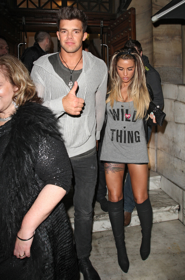
Katie Price Tattoos: Her Back Wings, Floral Ink and Leg Designs

Katie Price’s tattoos cover her back, arms, stomach, thighs and wrists. The collection includes wide feathered wings, floral work, script, bracelets and designs tied to people and moments in her life. Some pieces cover a large area; others are small details. The overall look is bold, busy, and very personal.

Price often chooses designs that read from a distance, then adds smaller details around them. The angel wings across her back change its whole shape, while a horse, flowers and feathered forms make a separate composition over her stomach and thighs.

Her tattoos have changed over time, too. The phrase “tattoo transformation” suits a collection where names and relationship tattoos have been covered, altered or built over. The ink reflects more than one moment in her life. Here are the pieces that stand out in the clearest photos.

Katie Price’s giant angel-wing back tattoo is the main statement

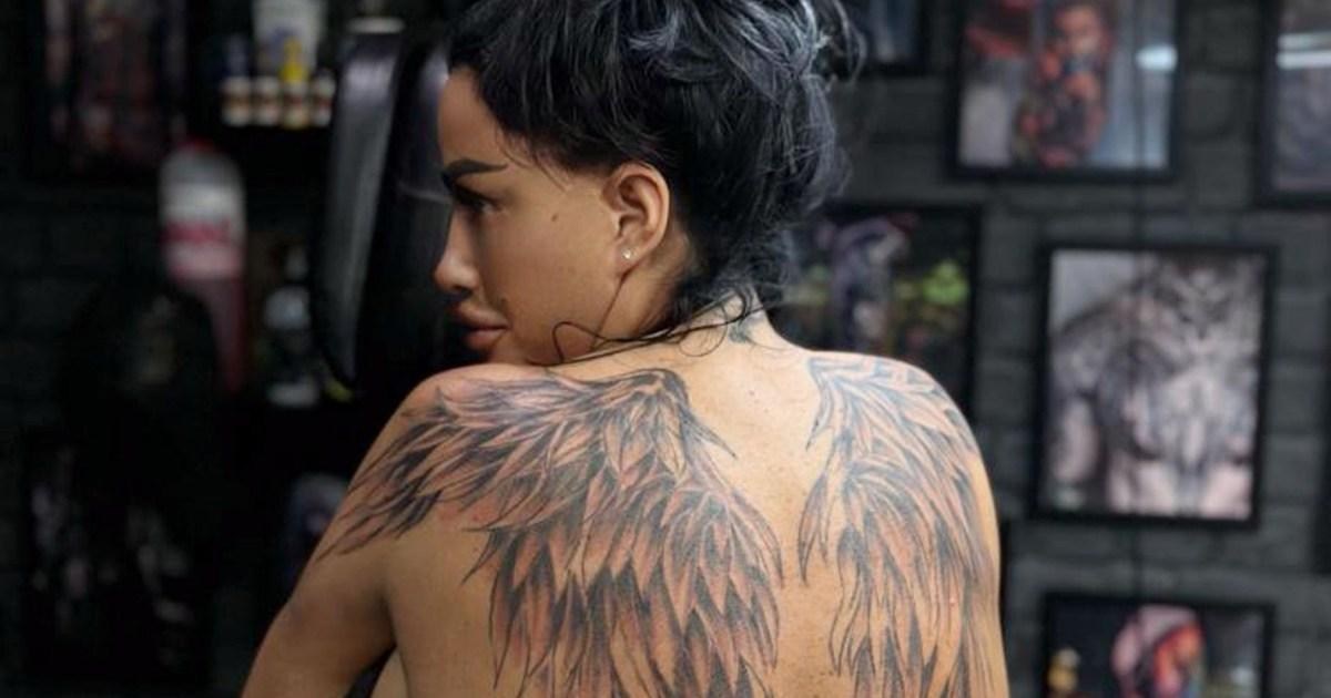
Katie Price tattoos: large angel-wing back tattoo across the shoulder blades

The newest and most dramatic part of Katie Price’s tattoos is the large pair of angel wings across her back. The feathers start high on the shoulders, spread across the shoulder blades and narrow as they reach toward the waist. In photos, the outer edges look soft, while darker shading through the middle gives the wings depth.

At this size, the tattoo sets the shape of the back. It widens across the shoulders and draws the eye toward the spine. Under an open-backed dress or crop top, it becomes the main detail rather than a small mark among others.

Price has shown the work while it was still fresh, when the ink appeared darker and the skin was settling. Those photos make the feather structure easy to see. Each feather points in its own direction, but the overlapping sections hold the two wings together. The design gets its scale from many smaller strokes rather than a thick outline.

Angel wings are a familiar subject; the full-back placement is what makes this version striking. A design that spans the shoulders, spine and lower back needs an artist to keep both sides balanced. At this scale, even a small difference between the wings will show.

Her older back and shoulder ink shows a layered layout

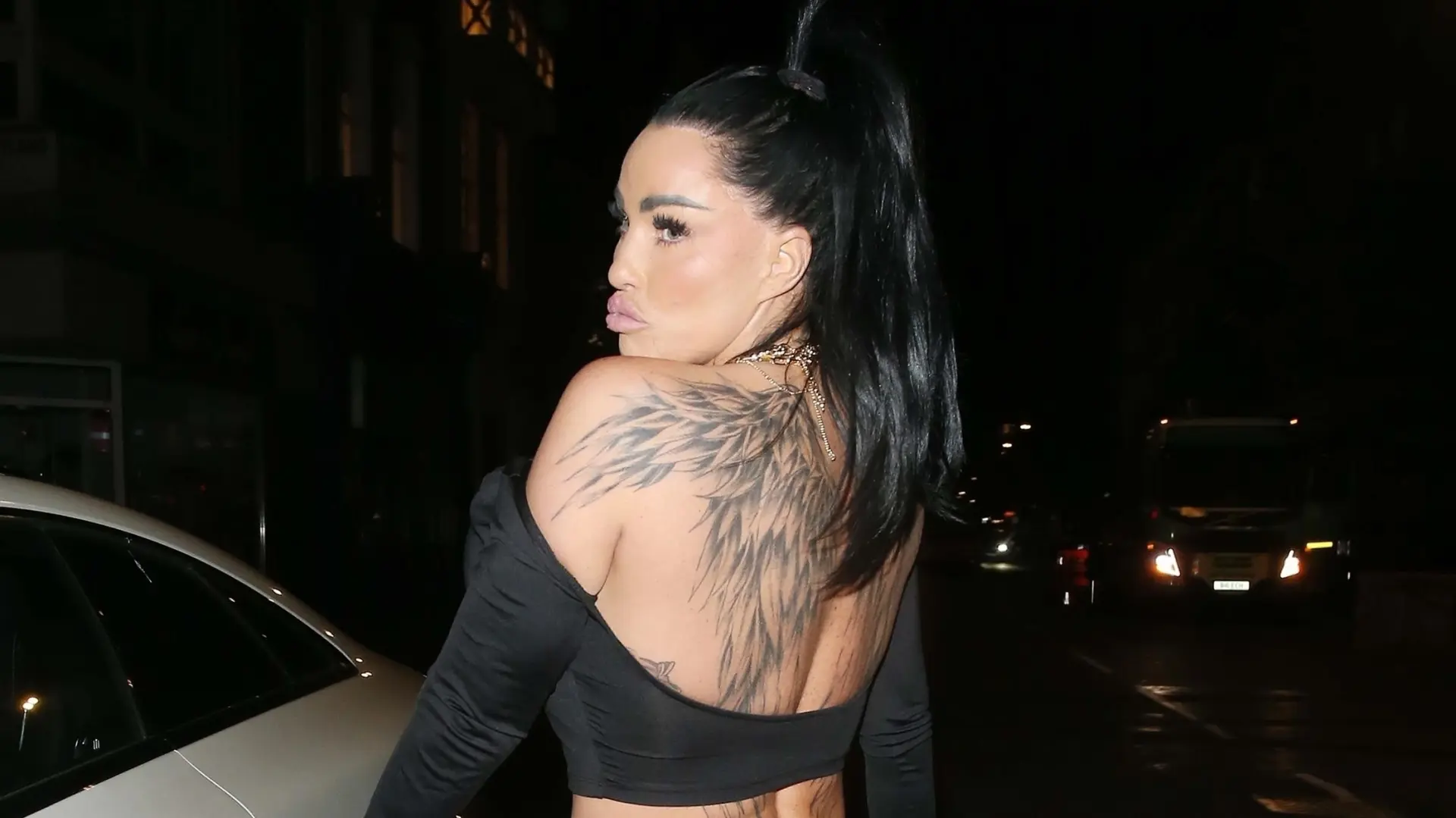
Katie Price tattoos: second angle showing layered feather and shoulder placement

A second photo shows the wings from another angle. The feathers curve around the shoulders rather than forming a strict mirror image, and some skin remains open through the center. That keeps the back from looking like one solid panel.

The view also makes the older tattoos around her shoulders easier to pick out. They have their own line weights and shapes, and the newer wings sit around them instead of replacing every detail. The result has more than one layer.

Price’s back is an example of how a tattoo collection can grow gradually. A larger piece can give earlier designs a frame, as long as there is room for each to remain visible. The lines and shading don’t all have to match.

Clothing changes how much of the back work people see. A low neckline can reveal the upper feathers; a shirt can cover the whole design. The placement can make a large tattoo feel private one day and central to an outfit the next.

Floral and horse tattoos bring movement to her stomach and thighs

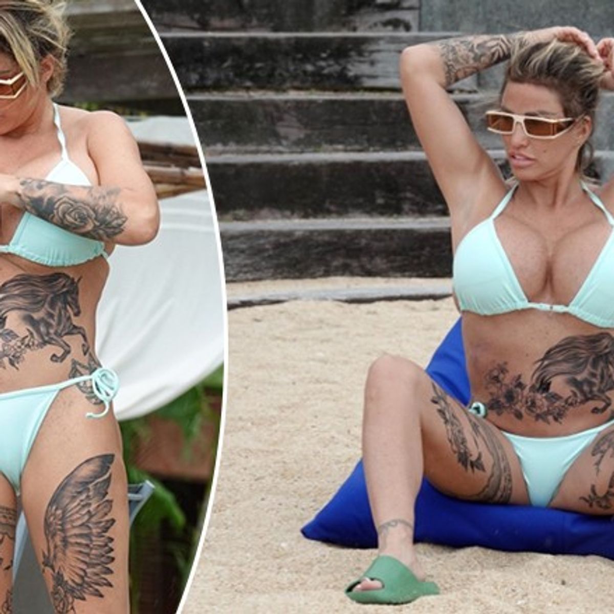
Katie Price tattoos: horse, flowers, and feathered thigh tattoo composition

The stomach and thigh work looks different from the wings on Price’s back. In beach photos, a detailed horse stretches across her stomach, surrounded by flowers and leaves. Related feather shapes continue down her thighs and follow the line of her legs.

The horse gives the composition a clear focal point. Its head and mane are easy to recognise, while the flowers soften the edges. The feathered forms on the thighs point downward, carrying the eye toward the legs rather than stopping at the hips.

These designs sit on parts of the body that bend and move. The stomach changes shape when someone sits or stretches, and the thighs shift as the legs turn. The open space between the horse, flowers and feathers helps keep the details distinct in different poses.

Flowers also appear elsewhere in Price’s collection, though they don’t all use the same design. Some are lighter; others sit inside darker shading. Repeating a subject without repeating the exact image can help a large collection feel connected.

The garter tattoo on her thigh is a very different kind of design

Katie Price tattoos: black and pink garter-style thigh tattoo

One of Price’s older thigh tattoos is a black-and-pink garter. It sits high on her leg. In photos with a short dress and tall boots, the band almost reads as part of the outfit. Its shape wraps around the thigh, with a decorative, lingerie-inspired look.

This piece is smaller and more graphic than the feathered back work. The garter shape is clear without taking up a large area. It can stay under everyday clothes, then show with a skirt, shorts or swimwear.

A garter design has to follow the leg without appearing to slide up or down. The band needs a clean line, and its details need enough room to stay distinct as the thigh changes shape. The simple outline here does the work without crowding the narrow space.

Not every tattoo in a collection has to share the mood of its largest pieces. A bold back tattoo can sit alongside something playful, bright or fashion-inspired on the leg. That contrast gives the collection more range.

Katie Price’s arm sleeve mixes flowers with darker shading

Katie Price tattoos: full floral arm sleeve with dark shading

The floral work on Price’s arm is easy to spot in close portraits. The sleeve runs from her wrist toward her upper arm, layering flowers and leaves with darker shaded sections. The full floral arm sleeve has enough contrast to show clearly even in a night-time photo.

Unlike the repeated feather shapes on her back, the sleeve combines several textures. Some petals are outlined and left open; other areas use heavier black or gray shading. The difference gives the flowers room to stand out.

Price has described floral work connected to her mum. Flowers can carry that personal meaning without a line of script or a portrait, and the design can be extended later with more leaves, stems or shading.

An arm sleeve is visible in everyday gestures. A hand near the face, a folded arm or a short-sleeved top can bring a different part of the design into view.

What ties the whole look together

Price’s tattoos share a confidence about scale. The wings take over much of her back, and other designs cover large sections of her legs and arms. Smaller script, bands and wrist details break up the larger pieces, giving the collection different weights.

Several designs use familiar symbols with personal associations. Wings can suggest protection or change; flowers have a family connection; and the horse reflects Price’s long-running interest in horses. The garter brings a fashion reference into the mix. The exact meaning of every piece isn’t clear from the photos, but the subjects recur across the collection.

If you’re using Katie Price’s tattoos for ideas, think about placement before settling on a subject. Wings need enough room to spread across the back; a flower sleeve has to wrap around the arm; and a band must follow the thigh. The same design can look quite different in another spot.

Her tattoos have also changed over the years. Names and relationship designs can be covered or reworked as a person’s life changes. The different stages remain visible in the collection, giving it a history rather than a single finished look.

Price wears much of her ink where clothes can reveal or cover it. A backless dress shows the wings; sleeves hide them. That combination of large placement, personal motifs and changing work gives the collection its distinctive look.

More celebrity tattoo guides

Mia Khalifa Tattoos: Her Arabic Script, Cross and Hand Ink

Mia Khalifa’s tattoos range across her arms, wrists, hands and the side of her body. Her collection runs across both arms, from Arabic lettering and small symbols to simple line drawings and darker pieces. Some are easy to cover with a sleeve; others show when she raises a hand or turns toward a camera.

The designs don’t follow one style. Arabic script sits near a bold red cross, tiny finger marks beside larger arm drawings. The variety makes the collection feel assembled over time rather than designed as a matching set.

Some of Khalifa’s tattoos have changed. The red cross on her wrist became part of a public conversation about Lebanon, and she later spoke about replacing it with another design. It’s helpful to view the photos as snapshots from different points in her life, not as one final version of the collection.

Mia Khalifa’s Arabic forearm script is one of her clearest tattoos

Mia Khalifa tattoos: Arabic forearm script in a clear close portrait

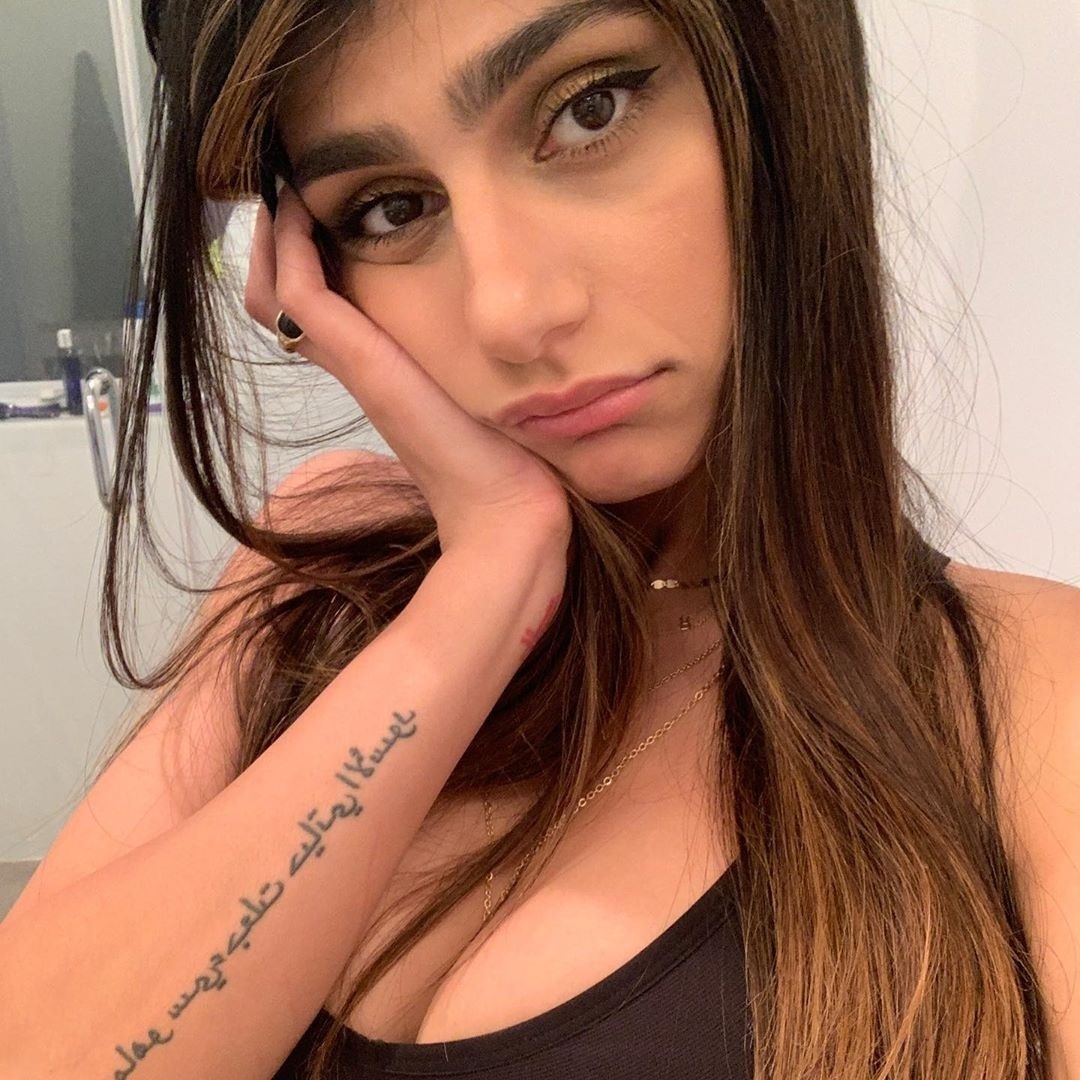
The long Arabic script on Khalifa’s forearm is one of her most recognisable tattoos. It runs in several lines along the arm, giving it a strong vertical shape. The lettering is dark and open enough to read clearly in close photos.

Spacing matters with script. When the lines sit too close together, they can blur into a dark block as the tattoo heals. Here, there is room between them, and the rounded Arabic forms give the lettering its own rhythm.

The forearm suits the design’s length. A bent arm brings the writing toward the camera; when relaxed, it follows the line of the limb. Longer phrases need more room than they might seem to on a screen.

If you’re considering Arabic script, have the text checked by a fluent reader before it is tattooed. A simple design still depends on the wording and lettering being right.

The red cross on her wrist carries a complicated chapter

Mia Khalifa tattoos: red wrist cross and tiny hand symbols

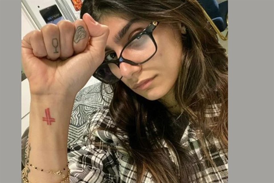
The red cross on Khalifa’s wrist stands out in close-up portraits. Its colour separates it from the black lettering nearby, and its small size keeps it from taking over the arm. When she raises her fist, it is often the first tattoo people notice.

Khalifa has linked the design to her Lebanese background and her father’s political views. After the Beirut explosion, she said she wanted to replace it with a map of Lebanon and use the change to support relief work. The tattoo is part of a larger personal and public story, not just a red symbol.

The wrist moves constantly and rubs against clothing, so it can be a demanding place for fine detail. A compact mark works there because its shape can stay clear without much shading. The red ink also gives this small design weight.

Her discussion of changing the tattoo is a reminder that the meaning of a design can shift over time. A cover-up or replacement becomes part of the story of the collection, too.

Her hand tattoos include tiny symbols and a wine glass

Mia Khalifa tattoos: multiple arm and hand tattoos in a clear raised-arm photograph

Khalifa’s hand tattoos are small but easy to spot in a selfie. A tiny wine-glass outline sits on one finger, and another finger has a rounded symbol. Compared with the larger arm pieces, these marks are light and sit alongside her jewellery and manicure.

Finger tattoos move with the hand. They can disappear when a fist closes or look wider from a different angle. A fine outline may spread as the finger bends, which is one reason simple shapes tend to work well there.

The designs also bring a lighter note to the collection. The Arabic lettering carries a message; the wine glass feels more casual. Both can sit together without making the whole hand look formal.

Hands get frequent washing, sun and friction, and fine lines may need touch-ups sooner than ink on the upper arm. Small symbols like these work best when their outlines are clean and uncomplicated.

The arm collection mixes line drawings with bolder black ink

Mia Khalifa tattoos: line drawings and bolder black ink across the arms

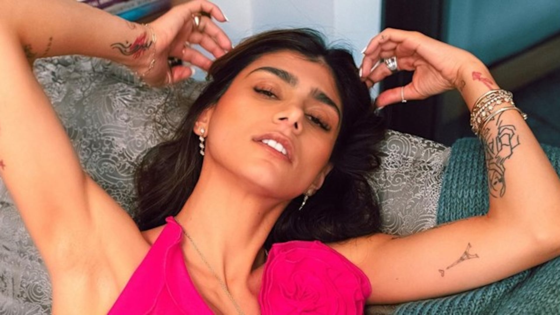
A black-and-white portrait shows how the arm collection has grown. Line drawings sit along the upper arm and forearm, alongside Arabic script, small figures and darker outlines. The designs don’t form one solid sleeve; open skin separates them and lets each piece hold its own shape.

Those gaps guide the eye from one design to the next. Darker sections act as anchors, while the open areas keep details from competing. The arm holds a lot of ink without feeling packed from end to end.

The line drawings vary in weight and angle. Some are delicate, others more solid. They don’t look like parts of one polished illustration, and that variation gives the collection a more personal feel. A new tattoo can join without having to match a finished sleeve.

If you’re planning several pieces, leave some space around the ones you already have. Blank skin doesn’t need to be filled just because it’s there. The clear gaps on Khalifa’s arms help the separate designs remain legible.

A close look at the map and star-style designs

Mia Khalifa tattoos: map, stars, and small graphic marks on the arm

Other photos show small graphic marks on Khalifa’s arms and the side of her body. A map-style outline, stars and short symbols sit near the larger lettering. They are simple shapes, but they add another texture to the collection.

A small symbol can be personal without becoming the focus of an entire look. A map may point to a place or family connection; stars might mark a memory or be a shape the wearer likes. The photos don’t tell us what every design means, and there’s no need to guess.

The smaller pieces sit apart from the script, so the two don’t compete. One may be visible in a close portrait, while another appears when she changes clothes or raises an arm. They work as separate details rather than one large composition.

The designs share clear outlines that read well in ordinary photos. A map, star or short line of script doesn’t need to be large or heavily shaded to have a place in the collection.

Why this mix works

Khalifa’s tattoos move between different scales and moods. The Arabic forearm script is deliberate; the red wrist cross is bright and easy to spot; the finger symbols are tiny; and the arm drawings add texture. The map and stars keep the overall look from feeling too heavy.

Placement helps organize the mix. The forearms carry the longest writing and larger drawings. The wrists and fingers hold smaller marks, while the upper arms and side of the body give the broader designs more room. The styles don’t have to match exactly.

If you’re using Khalifa’s tattoos for ideas, decide which design needs the most space. A sentence needs a different plan from a small symbol. Hand ink needs more upkeep than an upper-arm tattoo, and a bright colour like red will draw the eye sooner than a soft black outline.

The collection also shows how tattoos can record change. Some pieces have family or national meaning; others are small marks chosen for their shape. A design may be covered or reworked later. That doesn’t erase the earlier chapter; it adds to the history visible in the photos.

Mia Khalifa’s tattoos feel personal because the designs aren’t over-organised. Lettering, a cross, hand symbols, maps, stars and line drawings sit together with room around them. The result is easy to recognise, with details that emerge in different photos.

More celebrity tattoo guides