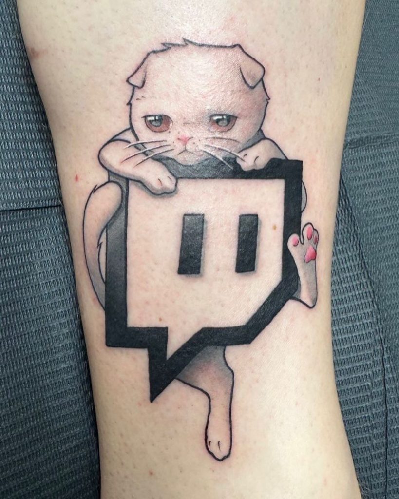
On Ludwig Ahgren’s lower leg, a cartoon of his cat Coots sprawls over the Twitch logo. The platform mark is familiar; the cat’s folded pose turns it into a specific image from a charity-stream dare.
The Coots and Twitch logo tattoo on his leg
The close-up shows Coots draped across the logo’s heavy black border. The cat has a round head, folded ears, a pink nose, wide eyes and fine whiskers. Its front paws rest on the top edge, while one loose leg hangs beside the pointed logo. Small pink pads add color to the otherwise dark design.
The finished drawing keeps the joke readable
The challenge initially involved a tattoo on Ahgren’s palm, but the finished piece is on his lower leg. A stencil image from the process is only an outline; the final photo shows the color and shading. Those are different stages of the same design, not two separate tattoos.
How a charity promise became a group decision
During a late-2022 charity subathon, Ahgren promised to get a tattoo based on donor suggestions. Valkyrae’s $15,000 donation gave her the chance to suggest one, and she picked the Twitch logo. It was a joke at his expense: he had already moved his livestreams to YouTube.
The audience poll included Coots, and xQc encouraged viewers to vote for Twitch. The result brought the two ideas together.
The charity stream explains the setting
The challenge settled the subject matter, but the stream poll wasn’t the finished design. The tattoo is a single drawing that brings the two selected references together.
The platform joke became part of his streaming history
Ahgren moved from Twitch to YouTube in late 2021. The tattoo followed in 2022, tying the logo to a particular bit of streaming history; it doesn’t by itself make a statement about every later career decision.
The YouTube joke behind the reaction
When Ahgren shared the tattoo process in December 2022, he joked about getting the “enemy” tattooed on himself and tagged YouTube’s then-chief executive, Susan Wojcicki. She replied with an eyes emoji. Ahgren played along and offered to get a matching YouTube tattoo with her.
The exchange was playful; it isn’t evidence of a workplace dispute or a second tattoo appointment. The public post records the joke, while the finished photo shows the ink that was actually completed.
Why the audience relationship matters
In a WIRED autocomplete interview, Ahgren described an earlier tattoo promise tied to reaching 1,000 Twitch subscribers. That gives the later charity-stream challenge some context: letting viewers influence a tattoo was something he had done before. It doesn’t mean every suggestion from chat becomes permanent.
The Coots detail outlasts the original dare
The poll explains how the design was chosen; Coots ties it to Ahgren himself. That part remains legible even if you forget who won the vote.
The cat changes the logo’s visual tone
The logo is angular and heavily outlined; Coots is drawn with rounded shapes and lighter shading. The cat overlaps the mark instead of sitting beside it, so both parts remain recognizable while the image reads as one scene.
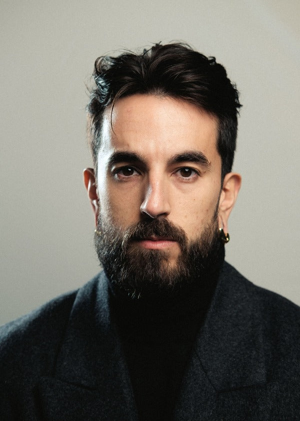
René ZZ is a Spanish YouTuber whose tattoos cover much of his body. Photos show a mix of black-and-gray work, color and dense coverage, built over years rather than in one go. The available images don’t show every area, so this is a look at the parts he has discussed or that can be seen.
In a recent interview, René also spoke about the cost and personal reasons behind the work. His collection is as much a record of changing choices as a catalogue of designs.
René ZZ’s full-body tattoo project
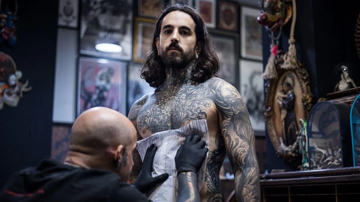
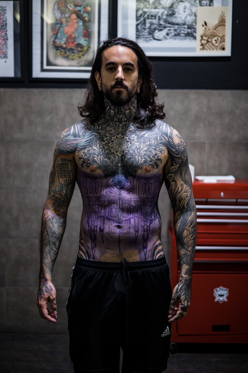
René has described his coverage as something that grew gradually. Earlier color tattoos sit alongside later black work, and the overall composition has changed with his taste. A session photo shows the practical side: stencil placement and the need to build large areas over time.
Reports on his recent interview put the total investment at about €80,000. That figure reflects years of work and isn’t a price guide for anyone else. Large coverage also takes time to heal and maintain, so the commitment goes beyond the appointment cost.
The chest and torso work
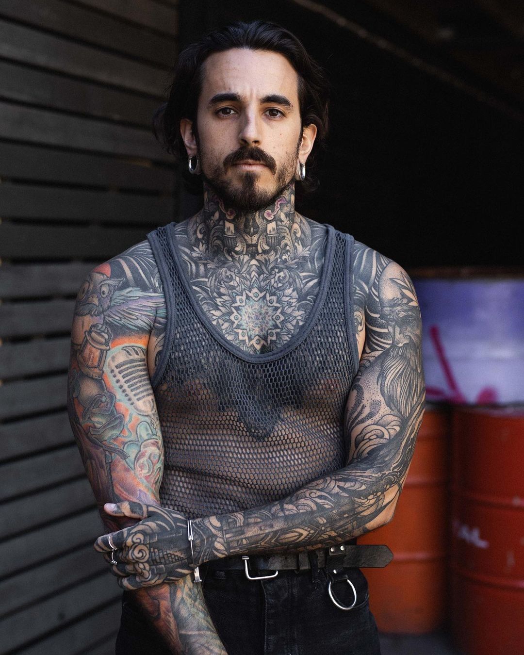
A shirtless portrait shows dense black-and-gray patterns across René’s chest and neck. The ornamental shapes form a continuous visual field rather than a set of isolated symbols, with heavier areas balanced by finer marks.
Ink rising above the collarbone makes the chest piece part of his outline. It’s difficult to hide under a T-shirt and changes how the tattoos read in portraits and interviews. That visibility is one of the clearest choices in the collection.
Black-and-gray tattoo patterns, color, and contrast
Public photographs show black-and-gray work alongside colorful and more graphic sections. Color draws the eye; darker shading gives the overall coverage a quieter base. The pieces don’t have to match exactly to share a visual language.
Large designs also follow the shape of the shoulders, ribs and arms rather than sitting like flat images on the skin. That flow helps the dense areas stay readable as the body moves.
The meaning behind the ink
René has connected his tattoos with memory, identity and a need to be seen. In a recent interview, he was asked whether covering his body helped him hide something or reinforce himself. His answer wasn’t one or the other: he described the tattoos as aesthetic and personal, but also tied to emotional needs.
He has also spoken about a later spiritual change. That doesn’t turn the earlier tattoos into symbols of regret; it adds another chapter to the story. A person’s beliefs can change while old ink remains part of the life they were living when they chose it.
Hands, arms, and the details that change the silhouette
René’s hands, arms and neck are often visible in photographs, so they shape his silhouette as much as the chest work. Hand tattoos are hard to keep private, and constant movement, washing and sun exposure can wear on fine detail.
His arm coverage was built over time. Working in stages leaves room to see how earlier pieces heal before extending a sleeve, rather than filling every gap at once. With tattoos this visible, placement is a decision that follows you into work and everyday life.
What this collection says about long-term choices
The coverage is the result of decisions made across different periods, not a single before-and-after transformation. René has described the pull of adding more ink, while also talking about how the reasons behind a choice can shift. The body keeps both the design and the memory of when it was chosen.
How the sessions shape the result
René’s project shows how a collection can change with its owner. The interviews move between art, cost, memory and faith; none of those threads explains every tattoo, but together they give more context than appearance alone.
If his work inspires you, use it to start a conversation with an artist about density, contrast and how designs wrap around the body. Look at healed work, discuss placement and future changes, and give yourself time between sessions. René’s photos can suggest a direction; they can’t predict how the same design will fit another person’s skin or life.
Ayesha Curry’s tattoos are small and mostly fine-line, placed across her arms, wrist, thumb and ankle. They include family references, faith, her cooking work and matching pieces with Stephen Curry.
The designs range from a tiny kitchen whisk to forearm lettering and geometric symbols. Each points to a different part of her life, without filling the skin with large illustrations.
The willow tree on Ayesha Curry’s arm
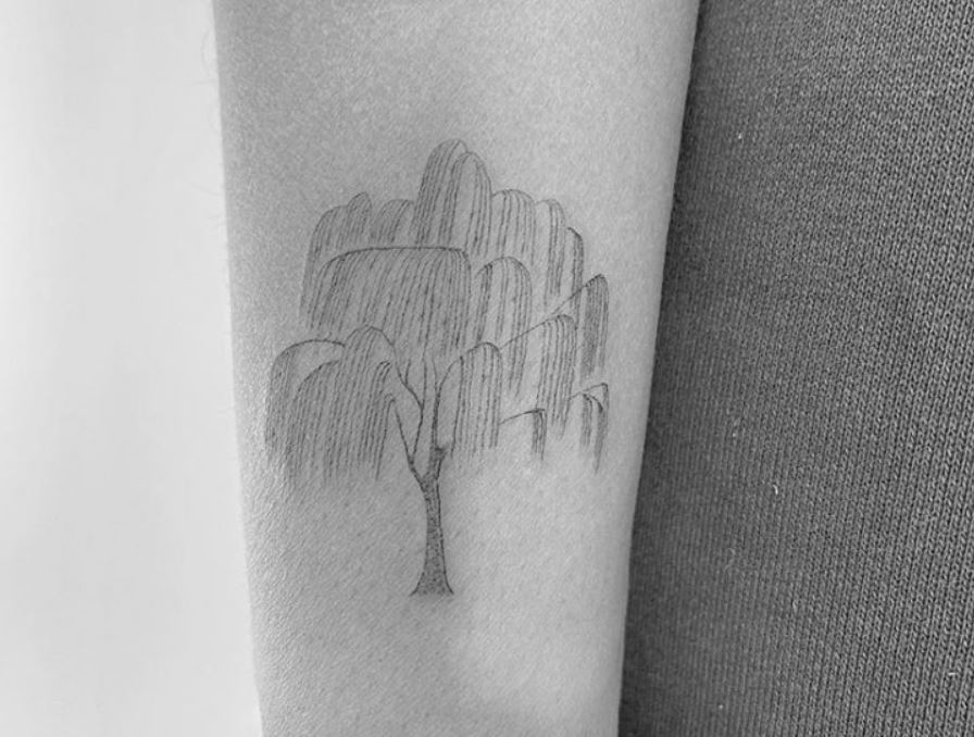
The willow is one of the more detailed pieces: a narrow trunk, spreading branches and loose leaves, drawn in soft lines on her arm.
Winter Stone shared the tattoo. Tags around the post referred to strength, love and family; the image itself stays understated, more like a small emblem than a large statement.
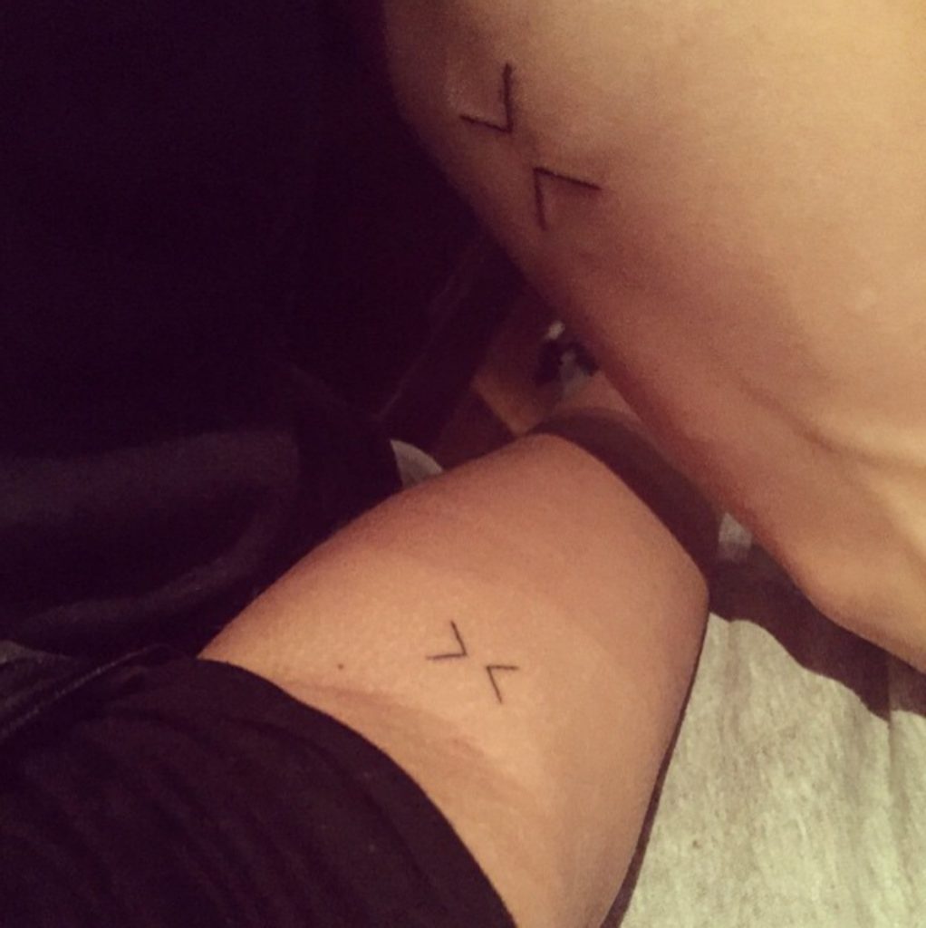
The matching greater-than and less-than symbols
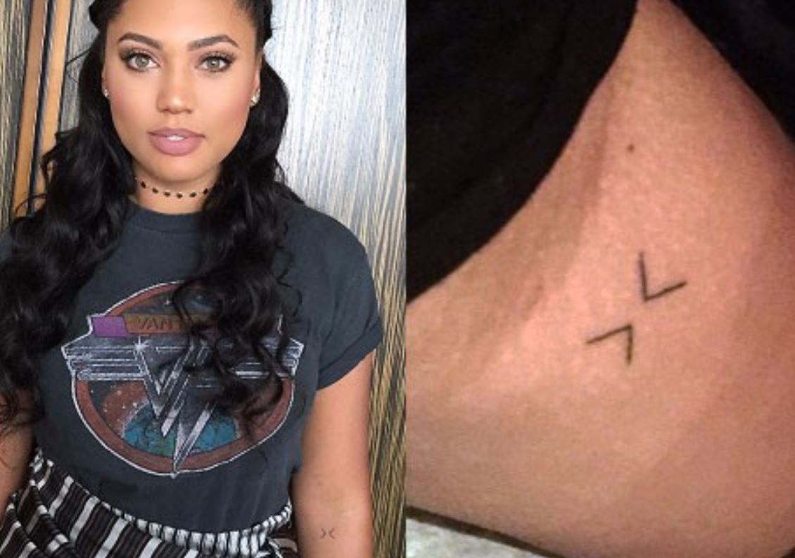
Ayesha and Stephen have matching greater-than and less-than symbols, turned toward each other. The idea is to stay with the present rather than get pulled into the past or future.
Stephen has described touching or slapping the matching tattoos before games. The small design is part of a shared pregame routine as well as a reminder.
For matching ink, simple symbols can keep the layout open and readable. The important choice is what the marks mean to the people wearing them.
Her “faithfully” forearm tattoo
Ayesha wears “faithfully” in slim cursive along her forearm. The script follows the arm, with a light loop at the start and an open final stroke.
Jon Boy tattooed the word at West 4 Tattoo in 2016. Ayesha said it reflects giving glory to God and trying to live with grace and passion; she described it as a personal cue rather than decoration.
The letters need room to stay distinct. With small script, spacing matters as much as the font, especially as the ink settles and ages.
The three family symbols
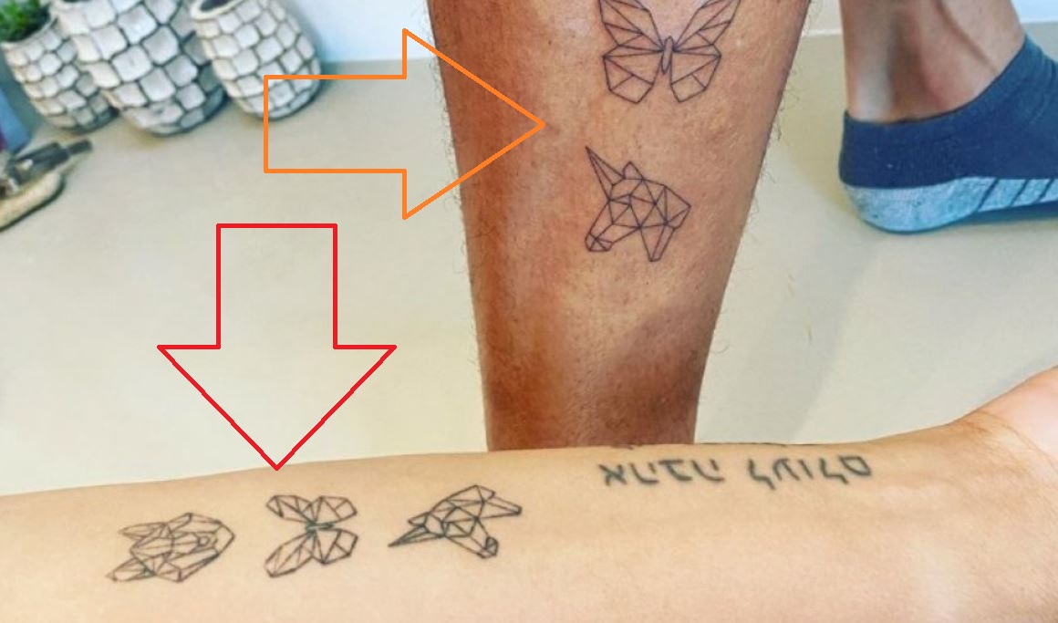
Ayesha’s three geometric designs represent her children, Canon, Ryan and Riley: a young wolf for Canon, a butterfly for Ryan and a horse or unicorn for Riley’s free spirit.
The thin angular lines give the three animals a shared look without making them identical. The butterfly is open, the wolf compact, and the horse-like figure has a more moving outline.
Winter Stone made the family tattoos. Ayesha shared them with a caption about each child; the animal symbols carry that meaning without using names or portrait likenesses.
The tiny whisk on her thumb
The small whisk near Ayesha’s thumb or knuckle is a direct nod to her work with food. Close up, its fine line reads as a kitchen whisk; at a glance it becomes a simple mark.
Jon Boy did it in 2016, around the time Ayesha was expanding into food television, cookbooks and Gather. The tool says more about that work than a larger chef-themed image would.
Small hand tattoos can soften with friction and movement. The whisk works as a simple outline; extra crossbars could make such a tiny design harder to read.
The Hebrew lettering she shares with Stephen
Ayesha and Stephen also have matching Hebrew lettering along the forearm. Tattoo coverage translates the phrase as “love never fails to be”; that translation is how it has been reported.
The Hebrew text is language, while the greater-than and less-than symbols are abstract. Both are matching pieces the couple can see and share.
If you choose lettering in a language you don’t read, check it with a fluent speaker and a tattooer who can reproduce it accurately. Confirm direction as well as spelling before the appointment.
The pineapple at her ankle
Ayesha’s small black pineapple outline sits on the inside of her right ankle. Its leafy top and rounded body give it a lighter feel than the family and faith designs on her arms.
The pineapple is associated with a Curry family tattoo gathering after Golden State won the 2017 NBA championship. Nino Lapid tattooed several family members. It’s often linked to the celebration and the Warriors, while pineapple imagery can also suggest welcome and hospitality.
The ankle keeps a small design visible with sandals and covered by most shoes. It’s an easy place for a personal mark that doesn’t dominate the collection.
The outlined heart on her wrist
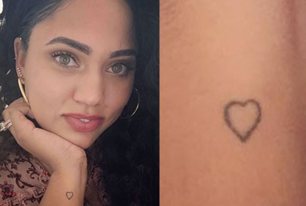
The small wrist heart is an open outline, not a filled shape. Its slightly hand-drawn edge keeps the design simple beside her more geometric symbols and lettering.
The heart sits close to the hand, where it appears in ordinary gestures. There’s no need to add extra shading or decoration to make it readable.
Putting the collection together
Scale is one thread across Ayesha’s collection. Even the willow stays light, and the smaller pieces leave room for other designs without competing for attention.
Family runs through the tree, the children’s animal symbols and the matching tattoos with Stephen. “Faithfully” reflects her stated faith; the whisk points to her food work; and the pineapple is tied to a family gathering.
For inspiration, start with a detail from your own life rather than copying the willow or family animals. A tool, symbol or word can carry a personal reference without a long caption.
Ayesha’s designs stay small, but their references are specific: her children, faith, cooking and a pregame ritual with Stephen. The photographs show the ink; her own explanations give several of the pieces their context.
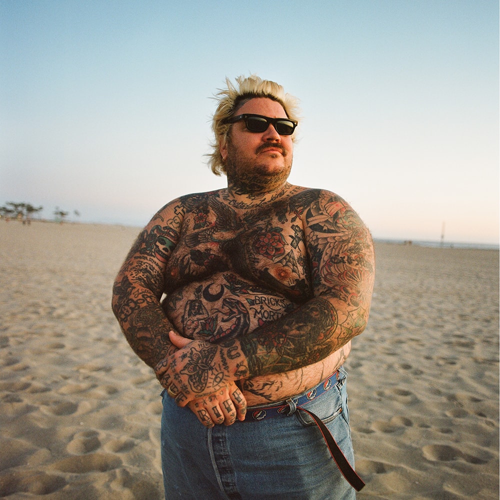
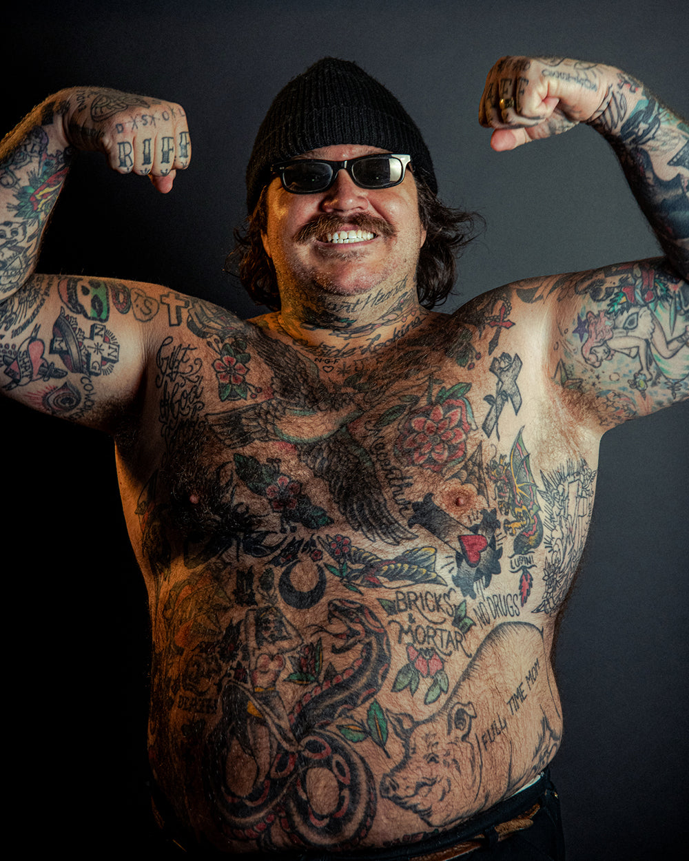
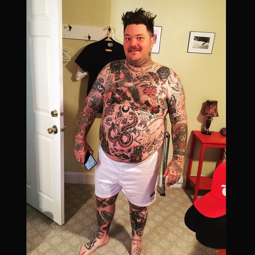
Matty Matheson’s tattoos cover much of his body: eagles, flowers, crosses, lettering, portraits, animals and smaller oddities. The pieces don’t follow one matching style; they’ve accumulated over time.
His sleeves are dense, and a close photo won’t always show how each tattoo sits in the larger collection. This guide describes visible details and keeps reported meanings separate from what can be seen.
Matheson is known for food and television, and he also plays in the hardcore band Pig Pen. Revolver has written about the band and his tattooed sleeves alongside his work in music, cooking and clothes.
The right shoulder and upper arm hold an eagle, a nearby mask and snake, and a growling face below. Above the snake is a cross with the letters “TS” inside a heart.
The eagle spreads across the rounded shoulder; the mask and snake make a tighter cluster below it, and the darker face adds weight at the bottom. Each image has its own outline, so the arm reads as several connected pieces.
The shoulder and elbow turn as he moves, which changes what a photo can show. One angle gives only part of the composition.
The arm work and chest lettering
Another right-arm piece combines an intricate cross, a red eye and a daggered heart. The cross carries the letters “NNG”; a banner around the heart reads “SHAT”, according to the documented inventory.
The eye, heart, cross and dagger each pull the design in a different direction: a focal point, a curved shape, a vertical line and a sharp edge.
A daggered heart has familiar associations, but that doesn’t establish Matheson’s personal reason for getting it. The image confirms the shapes and placement, not a private story.
The rounded bicep gives the design a clear surface from the front. When the elbow bends, part of the image turns away.
The roses and script around his neck
On Matheson’s right forearm, an eagle sits above a rose, with chain detail and the letters “JS” inside it. The eagle and rose form the larger shapes; the chain closes the lower part of the design.
The forearm moves into view during ordinary gestures, so the piece is visible without needing to be shown off.
Eagles appear more than once in the documented collection, but their scale and surrounding details change from one placement to another. The repeated subject doesn’t read like a single logo.
Busy doesn’t have to mean cramped. Around this forearm piece, the skin between motifs gives the eagle, rose, chain and letters room to read.
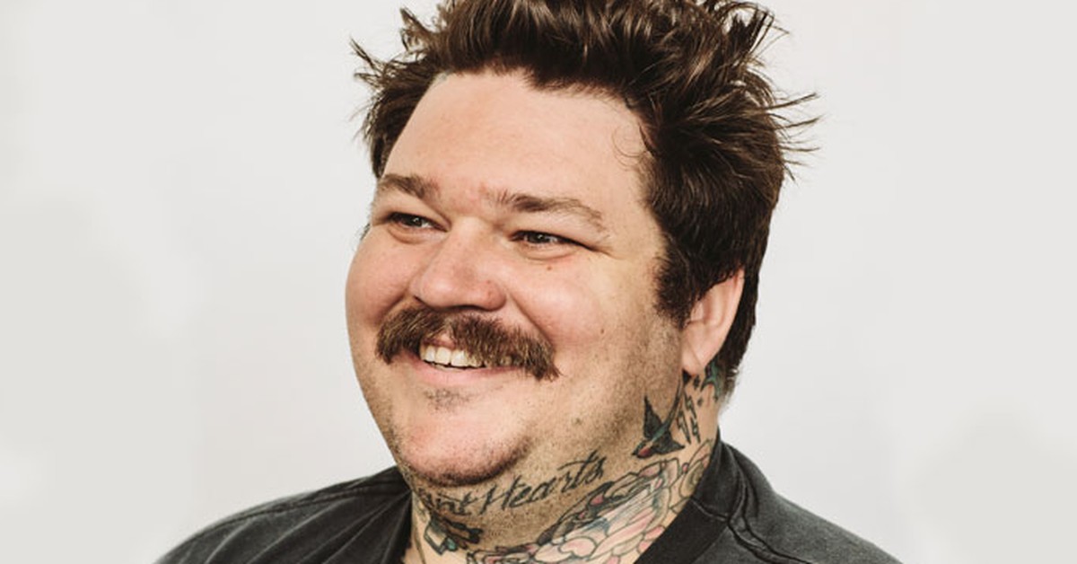
The wide portrait of his upper-body ink
Matheson’s hands carry a butterfly on the left, small knuckle marks and finger lettering: “RIFF” on one hand, “RAFF” on the other. The documented inventory also includes “ENDLESS LOVE” and other letters and symbols.
The words break across separate fingers and come together when the hand opens. As the fingers bend, the lettering shifts with them.
The butterfly adds a lighter outline to the same area, beside the blockier finger lettering.
Hands are exposed to washing, friction, sunlight and constant movement. Small lines can soften, and a design that crosses knuckles may be difficult to touch up.
The full-body tattoo coverage
A Jesus portrait sits on Matheson’s upper arm, with red flowers beneath it. The face carries most of the attention; the flowers add color and follow the shape of the arm.
The upper arm gives the portrait room for its features, while the flowers soften its lower edge. Small changes to a face can alter its expression, so the reference drawing matters.
The portrait sits beside crosses and other faith-related imagery in the collection. The visible subject is clear, but the image alone doesn’t explain Matheson’s personal reason for choosing it.
The red flowers are the strongest color in an otherwise mostly black-and-gray group of tattoos.
Closing thoughts
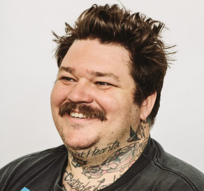
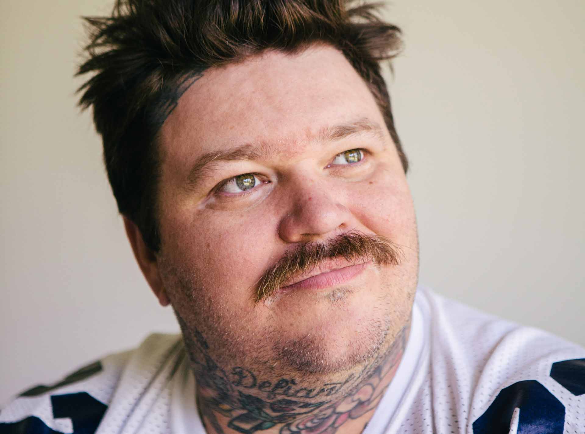
On Matheson’s neck are the words “Defiant Hearts” and “The Outside Looking,” alongside a small cross, a heart and floral details around the throat.
Neck lettering is hard to miss: the words sit close to the face and can be more or less visible depending on a collar or open shirt.
The artist also has to account for how the skin turns when the head tilts. A phrase that looks balanced in a stencil may feel crowded once the neck moves.
The placement makes the words public, but it doesn’t tell us whether they are a private reminder, a statement or simply lettering Matheson liked.
A collection built for movement
Across Matheson’s arms, hands, neck and torso, the collection uses different styles and scales. It reads as a group of separate scenes rather than one continuous sleeve.
His work has moved through restaurants, television, cookbooks, online videos and music. The tattoos can sit alongside those different chapters without needing to represent just one job.
A close photo helps identify one design; a wider portrait shows how it sits beside the rest. The shoulder eagle, for example, reads differently once the neck and chest tattoos enter the frame.
A large collection doesn’t have to be finished in one style. Traditional portraiture, lettering and small hand pieces can coexist, with the wearer’s taste providing the connection.
How to borrow the useful parts
Matheson’s tattoos are useful as references for scale and placement, not as a list to copy. Look at how each image fits its part of the body and how much skin is left around it.
Decide how visible a tattoo should be before settling on the detail. A hand stays in view through daily tasks; a back piece is easier to keep private.
For lettering, keep reported readings qualified. One inventory links the hand design to “RIFF RAFF”, while not every photo makes each letter equally clear.
A final look at Matheson’s style
There isn’t one motif tying every piece together. The collection leaves room for traditional images, religious references, lettering and jokes to keep their own character.
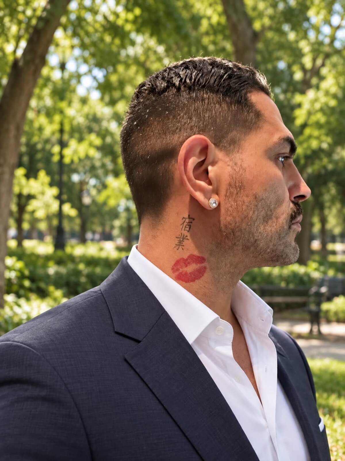
Sarper Güven’s neck tattoo was hard to miss on 90 Day Fiancé: a large set of red lips linked to his relationship with Shekinah. He later said he wanted the tattoo gone, though he wanted to keep the memories from that time.
That leaves two separate questions: what he thinks about the relationship, and whether he still wants this particular design on his neck.
The red lips tattoo on Sarper’s neck
The large pair of red lips sits on Sarper’s neck. Inked reported that the design was modeled after Shekinah, making it personal before it reads as decoration.
Sarper connected the red with lips, love and passion. He also joked that red can signal danger, giving the bright color a second edge.
He said he chose his neck because he wanted people to see the commitment. On an upper arm, the same image could be more private; on the neck, it became part of his public image.
The bold shape and strong color help the design read quickly. Its placement also means it moves with his jaw and sits among beard lines, shadows and clothing.
Why the placement mattered so much
Neck placement brings attention, but it leaves the wearer less control over when others see the tattoo. That was part of Sarper’s choice at the time.
After the relationship changed, the same visibility began to tell a different story. A tattoo that once showed a commitment can become a reminder of the past, and a prompt for questions from people who know nothing else about the wearer.
If you’re considering a neck tattoo, check the design in a mirror at real size and with the clothes you wear most. If it’s tied to another person, ask yourself whether you’d still want it if the relationship changed.
That doesn’t make relationship tattoos a bad idea. Dates, initials, names and shared symbols can mark a moment that matters. A visible placement simply makes a private feeling public.
A relationship story made public
Sarper and Shekinah’s relationship played out on 90 Day Fiancé, where arguments, reunions and romantic gestures became part of the show. A neck tattoo from that relationship was never likely to stay a private keepsake.
Viewers saw the design alongside the relationship story, so its meaning in public changed as their story changed. The tattoo artist may have focused on line, color and placement; the audience also saw the person it represented.
Sarper has said he doesn’t regret loving Shekinah, while also wishing the tattoo had been smaller. Those can both be true: he can value the relationship and decide the bright neck design no longer suits him.
Removal, cover-up, or leaving it alone?
Sarper has talked about looking for specialists who can treat the red ink. The pigment, saturation, age and location all matter, so an experienced removal professional can assess the tattoo better than a social-media before-and-after.
He has also resisted rushing into a cover-up. The original tattoo is already large and visible; another heavy design might hide the lips but create a different problem. Red ink can also affect which colors or shapes will work. A cover-up is a redesign, not a quick way to erase the past.
Keeping the tattoo is another option. Some people come to see old relationship ink as a timestamp: “This happened,” not “This is still my life.” Sarper’s comments suggest he’s weighing the memory separately from the design.
If you’re facing the same choice, give yourself time before booking anything. Get a removal consultation and ask a tattoo artist what a cover-up would involve, then decide whether to remove, redesign or leave it.
Sarper’s next chapter
Sarper is known from reality television, but he has also presented himself as a fitness figure and stand-up comedian. That newer work gives the tattoo a different setting from the relationship that first made it famous.
He has said he wants audiences to see another side of him. The lips can now become a joke, a question or an awkward reminder of a decision he is still carrying.
The design itself is simple, but its impact comes from the red color, scale, placement and timing. Change any one of those and the tattoo would read differently.
For an artist, the practical question is what the client wants the tattoo to do: draw attention, stay under clothing, or work mainly as a personal image. Sarper’s choice was made to be seen.
A practical takeaway
A lips design can be adapted without copying Sarper’s neck piece. Smaller lips on an arm, shoulder, hip or chest would be less exposed; fine lines would feel lighter than a bold outline and packed color.
Choose placement to match how public you want the tattoo to be. If the design refers to another person, a shared color or object can keep the memory without making a portrait the only possible meaning.
Sarper’s tattoo shows that a sincere choice can become complicated later. That’s a reason to be clear about the size and visibility you want, not to avoid meaningful ink altogether.
The red lips remain one of Sarper Güven’s best-known tattoos. Whether he removes, reworks or keeps them, they have already made a private commitment visible.
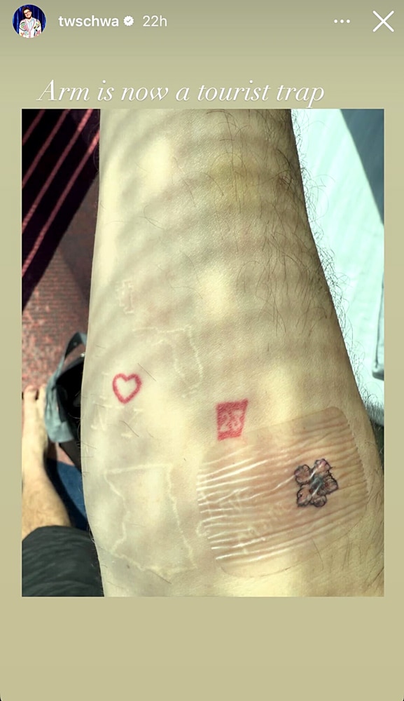
Tom Schwartz has joked that his arm is a “tourist trap,” packed with little pieces that reward a closer look. The collection has grown by addition, not around one planned sleeve.
There’s no single style tying it together: pale outlines, red lettering, script and small symbols sit side by side. Schwartz has explained some of these tattoos himself; for the rest, the photos only confirm what they show.
Bravo has documented several designs, and Schwartz has discussed others on the show and in interviews. The images don’t show every mark clearly, so this guide sticks to those sources.
Tom Schwartz’s “tourist trap” arm
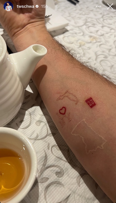
A close-up of Schwartz’s forearm shows an “I” and heart-style New York reference, white outlines of Minnesota and Florida, the red number 23, a faint red heart and a darker mark near the wrist. The red marks pull the eye first.
The pale outlines almost disappear in ordinary light, while the red stays visible. Together they give the arm a patchwork look without every tattoo competing for attention.
Schwartz is from Minnesota and has a connection to Florida; Bravo has tied the two state outlines to his life. Their simple shapes sit among the smaller lettering and symbols without taking over the arm.
The New York and number 23 details
A second forearm photo, taken beside a teapot, shows the New York mark, red 23 and pale state outline at a more natural angle. It also shows how the older tattoos have settled into the skin.
Bravo says the meaning of 23 is unknown. Schwartz hasn’t explained it publicly, so the number is best described without guessing at a date or lucky meaning.
The forearm bends and creases, so the same small designs shift with the viewing angle. That’s one reason a real placement photo can tell you more than a flat digital mock-up.
The “Bubba” tattoo stayed put
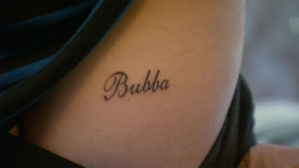
Schwartz got “Bubba” in script on his right butt cheek while he and Katie Maloney were together. It was the nickname they used for each other, and the placement made the gesture funny, private and a little ridiculous.
After their divorce, he said he kept the tattoo and had no plan to remove it. Keeping the word doesn’t mean the relationship stayed the same; it marks a chapter he chose to carry with him.
The design is simple, dark script with no frame or extra symbol. The story gives the nickname its meaning; the tattoo doesn’t need to spell it out.
Its hidden placement also lets Schwartz decide when to share it. A private tattoo can matter just as much as one that’s visible every day.
The red “LVP” tattoo
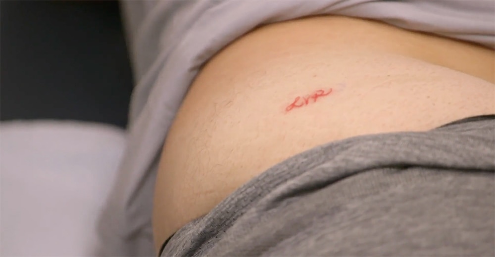
His other well-known butt tattoo reads “LVP,” Lisa Vanderpump’s initials. Bravo reported that Schwartz got the red lettering after losing a ping-pong bet with her.
The red ink makes the small letters easy to spot. There’s no portrait or crest: three letters and the bet behind them are enough.
The story explains why those initials are on him; without it, the letters alone wouldn’t tell us much.
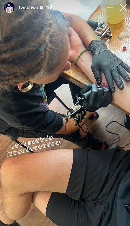
A work-in-progress photo
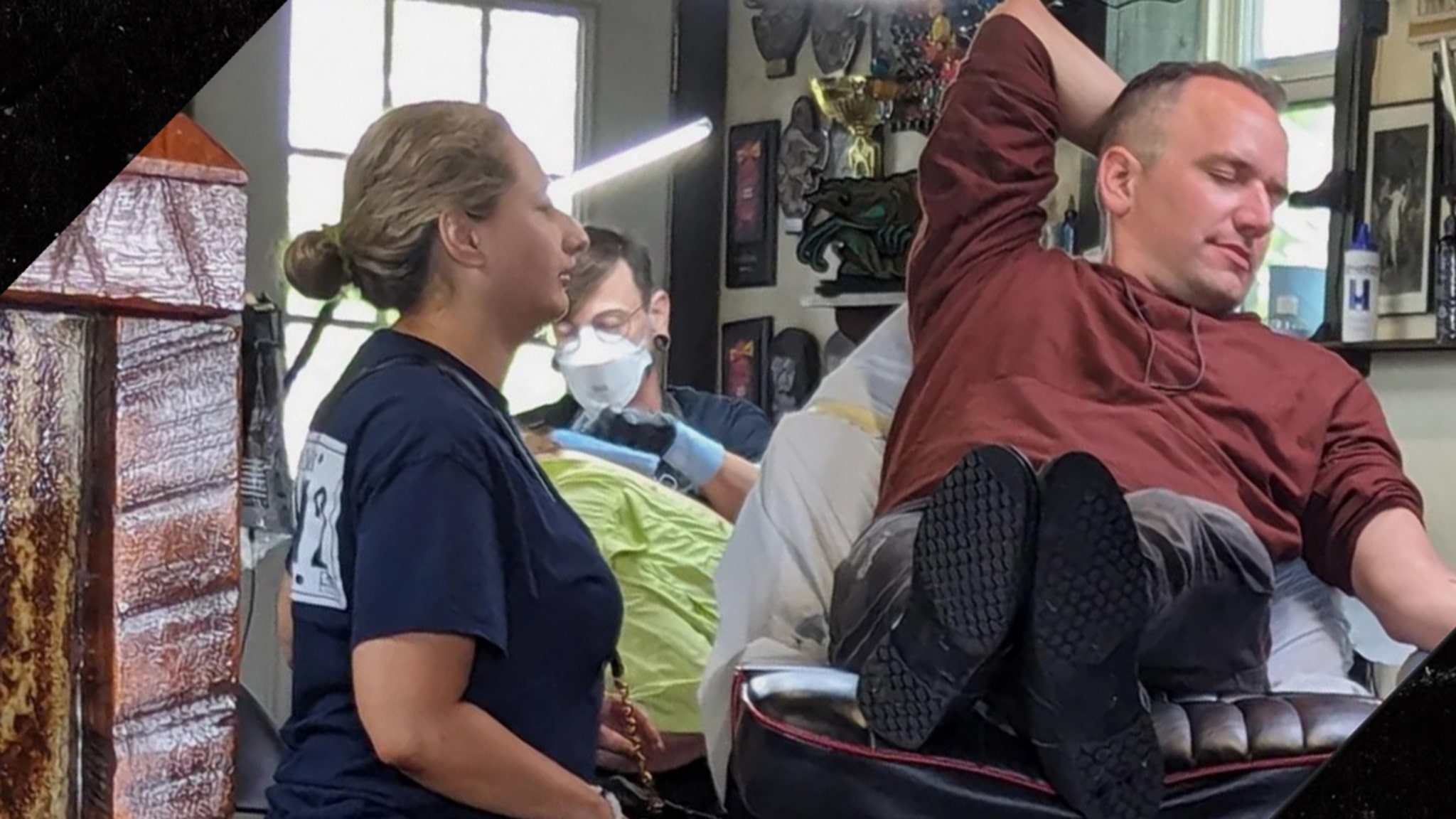
This photo shows Schwartz at a tattoo appointment, with the artist working on his arm. It documents the process and placement, not a finished design.
Bravo later reported another small piece: a lemon tattoo honoring his girlfriend, Kiana Carroll. It fits the collection’s habit of turning a person or moment into a direct, playful image.
What makes the collection feel like Schwartz
Schwartz’s tattoos move between place outlines, small numbers, pale ink, script, relationship tributes and jokes. They don’t share one polished aesthetic; most are small enough to sit beside each other as separate references.
Minnesota, New York, Florida, “Bubba,” “LVP” and the lemon point to different people, places and moments. The links between them come from his life, not a repeated visual formula.
If you’re building a collection, start with the memory and then choose an image. Decide whether you want a tattoo you see every day or a private detail, and leave some skin open instead of filling every gap.
Some of Schwartz’s pieces began in relationships that have since changed, but he has chosen to keep them. His collection reads like a record of those chapters rather than a set that has to stay perfectly coordinated.
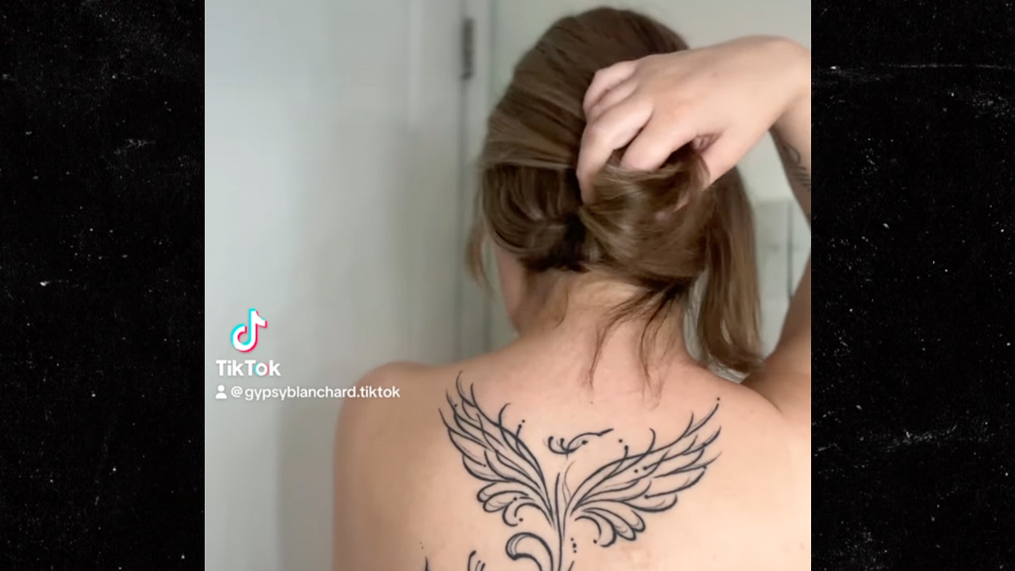
Gypsy Rose Blanchard has a large phoenix across her upper back, alongside smaller pieces such as vertical forearm script and relationship ink. The designs vary in size and visibility.
They appeared at different points in her life, not as one planned set. Photos show the ink, while interviews and coverage supply some of the context; the two shouldn’t be confused.
Gypsy Rose Blanchard’s phoenix back tattoo
The phoenix is the clearest centerpiece. It spans her upper back, with wings spreading from a central body and a long, curling tail below. Fine black lines shape the feathers.
The drawing relies on contour and symmetry instead of dense shading. The wings register first in a quick photo; the curls and small dots take a closer look. Open skin keeps the image light.
Phoenixes are often associated with rebuilding or starting over, but that general symbolism doesn’t confirm Gypsy’s own reason for choosing this one. The design is specific in its wings, tail and ornamental lines.
The upper back gives the wings room to spread around a centerline. The gaps between the feather lines help keep the large image readable and give it space to age.
The smaller forearm tattoo
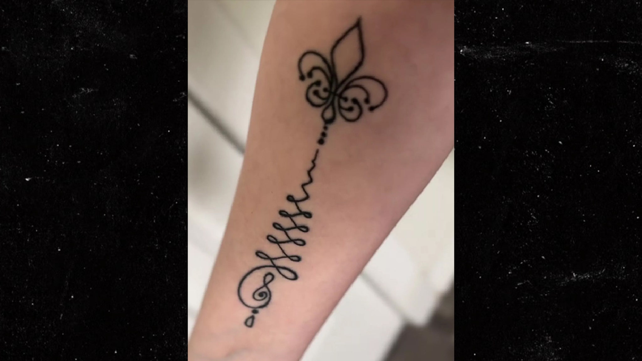
Her forearm tattoo is a narrow column of black script with a small outlined flower near the top. The lettering runs along the arm, and the flower breaks up the line of text.
The looping strokes make the script softer than block lettering. Spacing and line weight matter here as much as the words, though the text itself isn’t clear enough in the available photos to quote.
The phoenix reads as an image from a distance; the smaller forearm piece asks you to look closer. It’s visible, but its scale gives it a more personal feel.
The design follows the length of the forearm and doesn’t need much width. Inner or outer placement would change how often it appears in view.
Life outside the frame
Coverage has also reported that Gypsy got a matching husky tattoo with Ken Urker. Their relationship later changed, but the tattoo can still mark a real period of her life.
The photo here shows a tattoo session, not a finished design. It confirms the studio visit, not which tattoo was being done.
Before getting a matching tattoo, ask whether you’d still want it if you were the only one wearing it. That question doesn’t predict what will happen; it helps make sure the design has meaning for you on its own.
A shared animal, flower or object can carry a connection without using a name or portrait. It leaves room for the wearer to decide what the tattoo means later.
A collection that changed in public
Gypsy has discussed her tattoos as her public life changed after prison. Photos, interviews and relationship updates became part of how people read the designs.
The phoenix and forearm script are visible in the available images, and coverage has described the husky as a matching relationship tattoo. A blurry frame or a guess isn’t enough to assign another meaning.
A back tattoo can stay covered until the wearer chooses to show it. Forearm ink is part of everyday gestures, so the two placements make different demands on the person wearing them.
The placement is part of the point
The phoenix uses the width of the upper back; the script runs down the forearm. Each placement suits a different scale, and the collection doesn’t need one style to make those choices feel personal.
The collection mixes fine-line imagery, script and relationship designs. It feels connected through Gypsy’s choices, not one repeated style.
Before choosing a design, consider how visible it should be, whether you want it read from a distance or up close, and how its shape will sit on the body. Those questions matter more than copying a screenshot.
What to take to a consultation
A consultation can start with the detail you actually like: the open linework in the phoenix, the vertical script or the use of an animal to mark a relationship. Bring that reference and let the artist fit it to your body and preferred style.
For a phoenix, discuss how much feather detail and shading can remain clear at the size you want. For script, view the lettering at actual scale and on the chosen part of the arm; a screen mock-up can hide crowding.
A matching design should work on each person by itself. That might mean using the same subject in different placements or adjusting the drawing to suit each body.
Gypsy’s visible tattoos range from a broad phoenix to forearm script and relationship ink. Their placement and timing give each piece a different role in the collection.
For years, Kim Kardashian said tattoos weren’t for her, once comparing one to a bumper sticker on a Bentley. In October 2021 she made an exception: a tiny black infinity symbol inside her lower lip.
That keeps the exception out of sight most of the time.
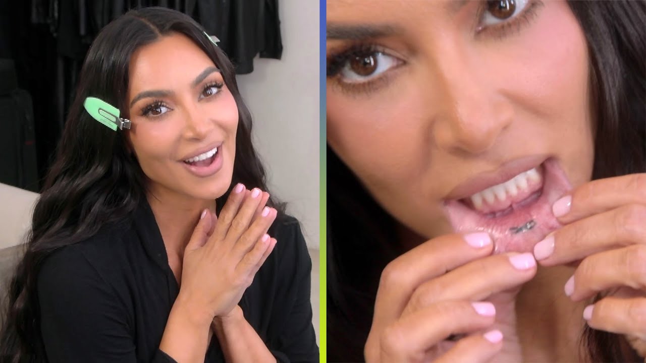
She got it after hosting Saturday Night Live. Friends were getting matching infinity tattoos on their hands, but Kim didn’t want visible ink. The inside of her lip let her join them while keeping the design mostly out of sight.
Kim Kardashian’s hidden inner-lip tattoo
The tattoo is a small black infinity symbol inside her lower lip. In the reveal footage, Kim pulls the lip down so the mark can be seen.
There are no dates, initials or flourishes around it. The simple, dark shape is easy to recognize once you know where to look.
On a wrist, an infinity sign would be familiar and visible. Inside the lip, it stays private unless Kim decides to show it.
She has said she sometimes forgets the tattoo is there, and once noticed it while flossing. It isn’t in her everyday line of sight.
That doesn’t make the ink less permanent; it changes how she lives with it. The mark can hold the memory of that night without becoming part of every outfit or introduction.
A private choice in a public life
Kim’s public life happens in front of cameras, but this is a piece she controls. She can reveal it on a show, mention it in an interview or keep it to herself.
Placement can determine who sees a tattoo. A hand or neck piece is hard to miss; an inner-lip tattoo appears only in a very specific moment.
The inside of the mouth heals differently from arm skin. Anyone considering that spot should discuss healing, aftercare and how long the ink is likely to last with an experienced tattoo artist.
The compact infinity sign fits the small area. A larger or more detailed image would be harder to read as the lip moves; here the design follows the limits of the placement.
The day it became part of the story
Most celebrity tattoos are visible in photos. This one became a story partly because it usually isn’t: it’s a keepsake from the night Kim hosted SNL and joined friends in getting matching ink.
The symbol is shared, but the placement is hers. That let Kim take part in the group tattoo without choosing the same visible location as her friends.
The hidden location adds a little humor: she got a tattoo most people wouldn’t see unless she chose to show it.
The meaning is in the choice
Kim has linked the infinity sign to the matching tattoos she and her friends got after SNL. The symbol can suggest continuity or friendship, but she hasn’t needed to attach a grander story to it.
Sometimes the reason is simple: friends are doing something together, and you want to join them in a way that feels right for you.
If you’re borrowing anything from her choice, think about how public you want the design to be and whether the symbol still works at that size. That’s more useful than choosing an infinity sign because it’s familiar.
One exception to the rule
Kim got one small tattoo; she didn’t turn it into a new personal style. A single piece can stand on its own without committing you to a collection.
You still need to choose the specific design and placement carefully, but you don’t have to decide whether you’ll want more ink later.
What makes this tattoo memorable is the contrast: someone who had said she wouldn’t get ink found a way to join her friends while keeping the mark mostly private.
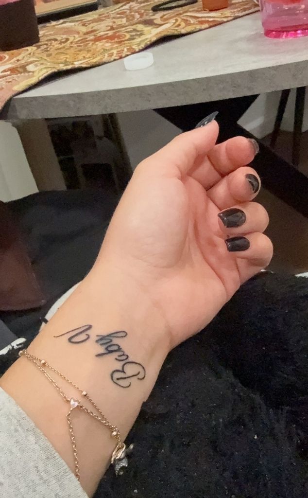
The small script on Milania Giudice’s inner wrist reads “Baby V”, a tribute to her late friend Victoria Zardoya. Its handwritten look keeps the message close and personal without a frame or extra ornament.
Small lettering leaves little room for error. The spacing, letter shapes, line weight and placement all affect readability. Milania’s wrist photo shows how a short phrase can fit while leaving enough open space around it.
The Baby V wrist piece
The tattoo sits on the inside of her wrist and uses loose, handwritten script rather than formal calligraphy. The words aren’t stretched across the arm, and nothing decorative competes with them.
Milania shared the image after Victoria’s death. Reports describe Victoria as a longtime friend and identify the wrist tattoo as a memorial; Milania captioned the reveal, “Always my baby V.” That context explains why the phrase carries the tribute without a date, portrait or longer quote.
As a reference, the useful detail is the scale: a short name or nickname can fit on the wrist if the lettering stays clear and has room around it.
The friendship behind the words
Memorial tattoos can become hard to read when names, dates, symbols, flowers, initials and long phrases all compete for space. Milania’s piece keeps the message short and lets the friendship supply its meaning.
A small tribute can still show personality through the handwriting. Rounded letters, a slightly uneven line or the choice of the inner wrist can make it feel like a note. The placement keeps it in view for Milania while making it easy to cover when she wants privacy.
“Baby V” is short enough to read at a glance. With small script, the artist needs to leave enough space between letters so they remain legible as the tattoo heals and ages.
A collection built around small placements
Bravo reported that Milania has an inner-lip tattoo reading “F–k off” and an ankle tattoo reading “I love you” with a heart, after a friend wrote out the message for her. The same report described a matching rib tattoo shared with her sisters.
The reported designs use different locations: the inner lip is hidden, the ankle message can stay discreet, and the rib tattoo is shared with her sisters. The new wrist lettering is easier to see, but remains small.
Placement changes how a tattoo feels. Before choosing a spot, consider whether you want the design mostly for yourself, easy to show, or shared with someone else. The artwork doesn’t need to be large to make that choice matter.
Copying a celebrity tattoo word for word can miss what makes it personal. “Baby V” has a specific connection to Milania’s life. Someone else might choose different words, a symbol or another placement that reflects their own relationship.
Public-style reference photos
The public photos show Milania in dressed-up, casual and relaxed settings. A small wrist tattoo can sit alongside jewelry without becoming the focus of every look.
Fine script may disappear beneath stacked bracelets and show again when the wrist is bare. That makes it easy to wear with a watch or rings without building every outfit around the tattoo.
A regular event photo doesn’t confirm a small tattoo when the wrist is out of frame or obscured by clothing, jewelry, lighting or angle. A close-up is more useful for studying the lettering.
What makes the lettering work
The letters move naturally but still have space around them. That matters on a wrist, where the skin curves and the hand is often moving. The phrase reads as one thought, with the words carrying the weight.
If you like this style, write your phrase by hand a few times. Try a fine pen and a softer marker, then notice how the letters connect. An artist can refine your draft into a stencil while keeping its personal feel.
Check the smallest letters before settling on a size. An uppercase initial can dominate a short phrase, while lowercase script may need extra room for its loops and joins. The right scale depends on the words, your skin and how visible you want the tattoo to be.
Think about how the phrase will read from different angles. It can face you when your arm is down or face outward for others to see; the choice depends on whether it’s mainly a private reminder.
Choosing a personal tribute without overloading it
Milania’s short phrase identifies Victoria in a way their friends would understand. Adding symbols just to fill the space could make the design busier without making it more personal.
A tribute might use an initial, a small flower, a familiar object or a date tucked into the lettering. Someone else may prefer a full name or a small drawing. Let the relationship guide the choice rather than trying to make the tattoo look impressive in a photograph.
A memorial tattoo doesn’t have to look somber. A bright color, familiar nickname or playful handwriting can hold affection and grief together. It can reflect how someone is remembered, not only that they’re gone. Meaning comes before decoration.
Before booking, tell the artist what the words mean to you and what feeling you want the lettering to have. That context can guide whether it should look gentle, bold, private or direct.
Placement, aging, and the practical side
Wrist lettering needs room to stay readable. The area is washed, rubbed, exposed to sun and moved often; very fine lines can soften, and tiny gaps may close. An artist may recommend a larger size or simpler lettering.
Follow the artist’s aftercare instructions: keep the fresh tattoo clean, don’t pick at the skin, and limit friction while it heals. The first few days can include redness, swelling and peeling, so wait until the tattoo settles before judging the final lines.
Once healed, protect the tattoo from prolonged sun exposure if you want the fine lines to stay clear. An artist may also recommend a slightly heavier line than the fresh reference appears to show.
The simple idea worth taking away
Milania’s “Baby V” tattoo keeps the words close, gives the script room to read and leaves the emotional meaning in the phrase. Her other reported pieces also use personal placements rather than one large, coordinated design.
If you’re planning a meaningful tattoo, start with the memory, words or symbol you want to keep close. Then choose a style and placement that support that idea; a simple design can still matter deeply.
Use the details that make the idea yours: the wording, handwriting, space around the letters and how the placement feels in daily life. Those choices are a better starting point than copying someone else’s tribute.
Kelly Rizzo’s latest tattoos are small, fine-line designs that show more clearly when she turns her arm. One is tied to her family background; the other is a skull she has not publicly explained in detail.
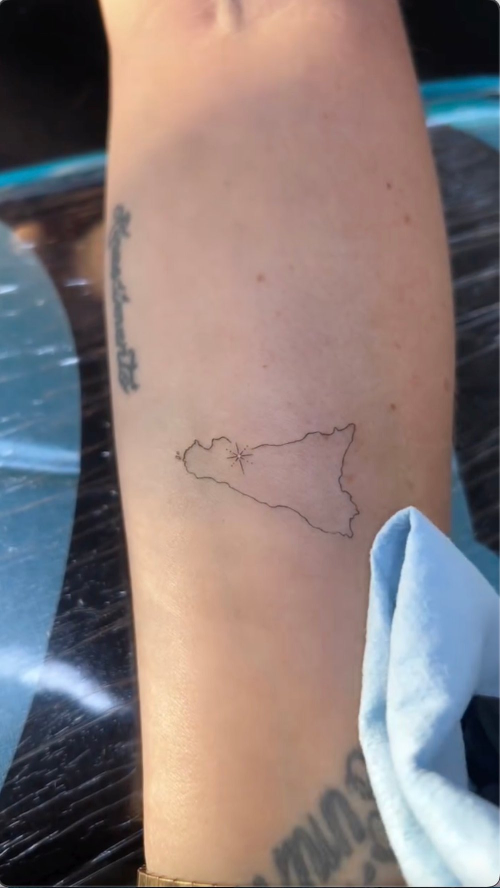
Rizzo shared the appointment in a short reel from a 46th-birthday getaway with Breckin Meyer. The new pieces were an outline of Sicily and a delicate skull. She said she’d wanted both for a long time, so the trip brought two existing ideas together rather than introducing a last-minute theme.
The public account makes a useful distinction: Rizzo explained the Sicily tattoo’s family connection, while she hasn’t given the skull the same personal context.
Kelly Rizzo’s Sicily tattoo has a family tie
The Sicily outline follows the island’s shape in a light, unfilled line. A small star-like mark sits inside it. It reads as a map without added labels or a dense travel scene.
When a commenter asked why she chose Sicily, Rizzo said she is Sicilian and her father was born there. That gives the outline a direct family connection. The spare linework keeps the design from becoming a crest or a larger memorial piece.
A small mark inside the outline gives the eye one place to land, but its exact location isn’t explained in the report. Leaving it at that keeps the description with what the image shows.
For a place tattoo, a recognizable silhouette can do most of the work. Start with the outline, then add one detail that matters to you rather than crowding the map with labels or coordinates.
The arm is a practical place for a small map: Rizzo can see it, but it doesn’t take over every photo.
The delicate skull tattoo keeps the pair from feeling too sweet
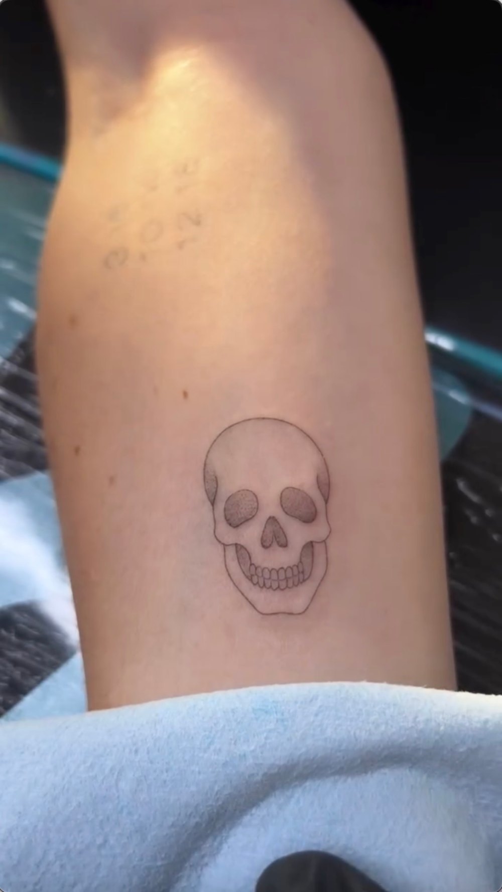
The second tattoo is a small skull, drawn with fine outlines and light shading. The eye sockets are softly filled, the nose is darker, and the teeth are picked out individually. Its tidy shape avoids cracks, flames or crossbones.
A skull can carry many meanings, but Rizzo hasn’t assigned this one a specific story in the birthday coverage. It is safer to describe the design and leave its private meaning open.
Both tattoos use fine linework, but the Sicily outline is wider and horizontal while the skull is more compact. There’s no report that they were intended as a matching set; they simply share a light treatment.
The shading gives the skull a face without turning it into a dark patch. With a small design, too much fill can swallow detail; too little can flatten the features.
If you like a skull tattoo, decide first how you want it to read—playful, gothic, understated or anatomical—and show the artist references for that mood.
A very good birthday setting
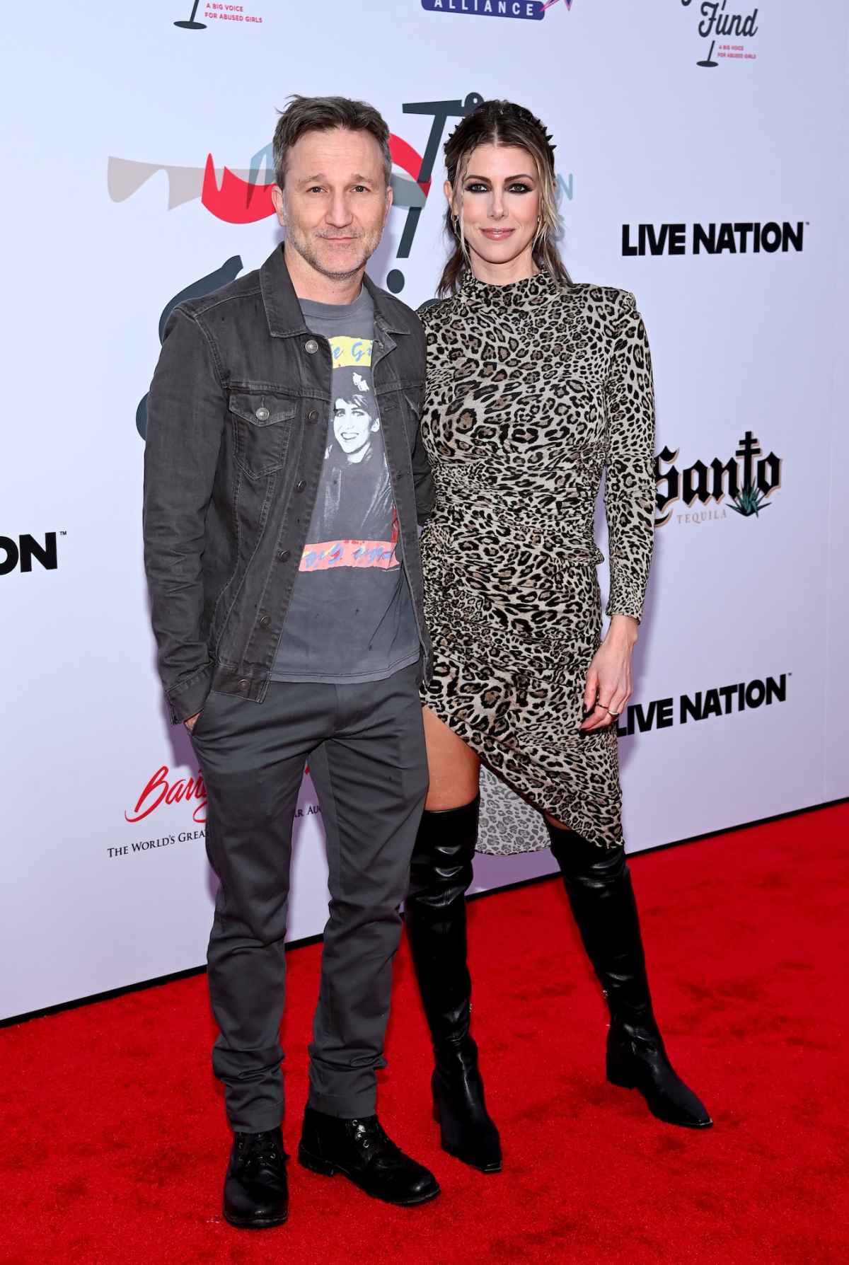
This image shows Rizzo and Meyer at an event, not either finished tattoo. The birthday reel provides the close-up evidence for the new designs; this photo only gives a sense of their public style.
The report places the appointment on a birthday trip near the ocean. Rizzo’s caption mentioned tattoos, beaches, boats, food and gratitude. The private studio was near the water, and tattoo artist Rick Coury worked on the pieces.
The tattoos mark the trip without trying to illustrate it. The Sicily outline carries a family connection, while the skull was an idea Rizzo had wanted for years. Neither needs a wave, palm tree or birthday number beside it.
A red-carpet photo and a tattoo appointment show different sides of the same person. One is styled for a camera; the other is an artist working close to the skin. The new pieces can belong to both settings without being designed to perform in either.
Context photos can show the occasion, but they don’t confirm a tattoo unless the mark is clear. The Sicily close-up does that; a couple portrait does not.
Kelly Rizzo has a strong Italian thread
Rizzo has discussed other Italian references in a Women’s Health Body Scan interview, including an Italian flag, Italian wording and a flight path between Palermo, Chicago and Los Angeles. She also said her father was born in Schiavi di Abruzzo. That earlier interview adds background to the new Sicily outline; it doesn’t establish a meaning for the skull.
Her older tattoos include words, symbols and a travel reference rather than one repeated design. The new map can sit with them without looking like it was added to complete a planned sleeve.
A heritage tattoo doesn’t have to be a map. It might be a family name, a food, a flower from a hometown or an object tied to a relative. The most useful detail is one you can explain plainly, as Rizzo did when she said she is Sicilian.
A map’s outline has to remain recognizable on curved, moving skin, so an artist may simplify small coastline details. Rizzo’s version stays light and open.
Kelly Rizzo off camera
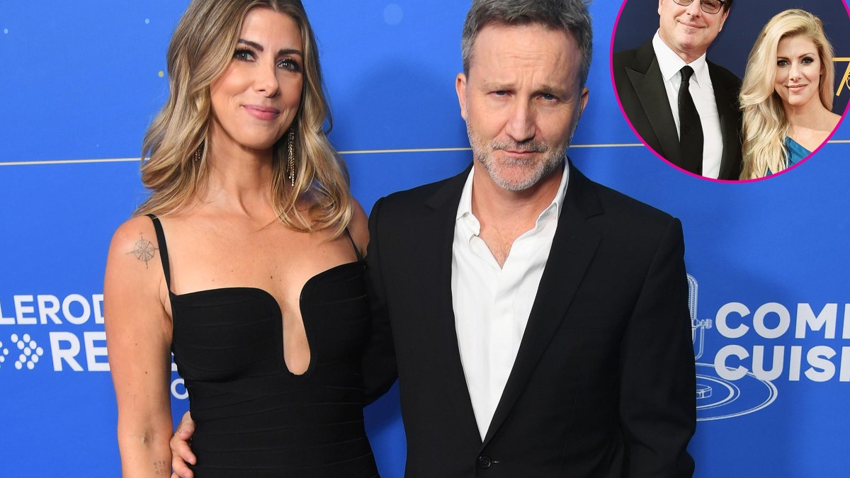
This older event image shows Rizzo and Meyer before the birthday appointment. Their relationship became public in 2024, after they had been dating since 2022; that timeline gives background to the later birthday reel.
Rizzo’s public work spans food, travel, lifestyle and personal stories. A tattoo linked to Sicily fits topics she already discusses, but the design itself is a small family reference rather than a statement about her whole public image.
The skull doesn’t need to share the same backstory. Rizzo said she had wanted it for years, and that may be the full explanation. People can choose one tattoo for family and another simply because they keep returning to the image.
The personal context around Kelly Rizzo’s latest pieces
This event photo supplies personal context, not evidence of the new tattoos. It shows Rizzo and Meyer together; it should not be used to identify the Sicily outline or skull. Rizzo has also spoken publicly about love, loss and moving forward, but the image doesn’t prove a specific meaning for either design.
A heritage tattoo can carry family history without requiring the wearer to tell the whole story. The visible design is only part of it; sometimes the simplest description is the most respectful.
The Sicily outline has a public explanation and a clear shape. The skull is visible, but its personal meaning remains open. Together they look considered without needing a shared theme.
If you’re drawing from the pair, choose a place that matters to you or a symbol you’ve wanted for a while. Keep the lines open and let the artist fit the design to your arm; the goal is a tattoo that still feels personal after the trip or trend has passed.
For more context on Rizzo’s earlier Italian and tribute tattoos, the Women’s Health Body Scan interview walks through pieces she has discussed on camera.