Meagan Good’s tattoo coverage spans different years. A BET photograph shows small forearm lettering; other reports describe a phrase she revealed in 2023 and two pieces she showed during a 2025 radio interview. The dates and wording should stay separate.
The forearm verse
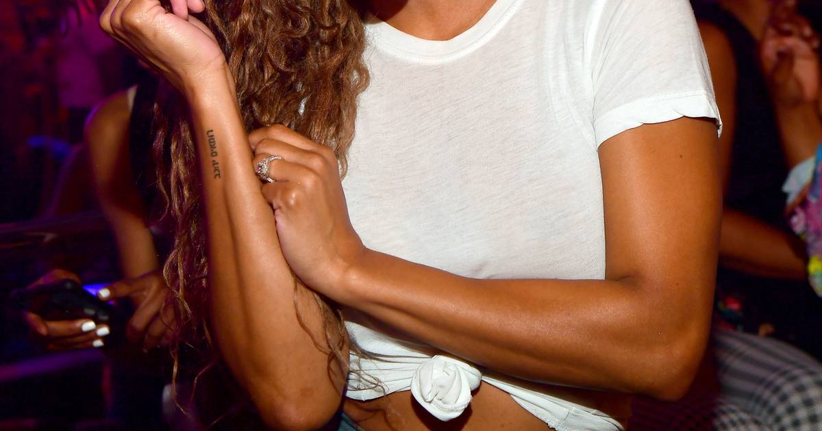
The inscription runs along Good’s forearm in small lettering. The accompanying report identifies it as “Luba 4:24,” but this image isn’t sharp enough to check every letter. It also doesn’t explain why she chose it.
If you’re considering a verse or quote, check the wording and punctuation, then view the stencil at its actual size with your arm relaxed and bent. That gives you a better sense of how the lettering will sit on skin.
What recent coverage reports
Good shared a video of a new tattoo the day after her birthday in August 2023. MadameNoire and Hot 97 reported the phrase as “Love her but leave her wild.” In August 2025, she discussed two newer pieces during an interview with LA’s 92.3. One uses Jonathan Majors’ handwriting and reads “lover, believer, wild”; the other says “Johnny’s Girl,” with coverage placing it below her bra line. These are separate tattoos revealed at different times.
BET’s account of the 2025 interview also mentions a tribute to Good’s godfather, a Bible verse and two tattoos connected with her Leo sign. It doesn’t spell out the design or meaning of each one.
Meagan Good at public appearances
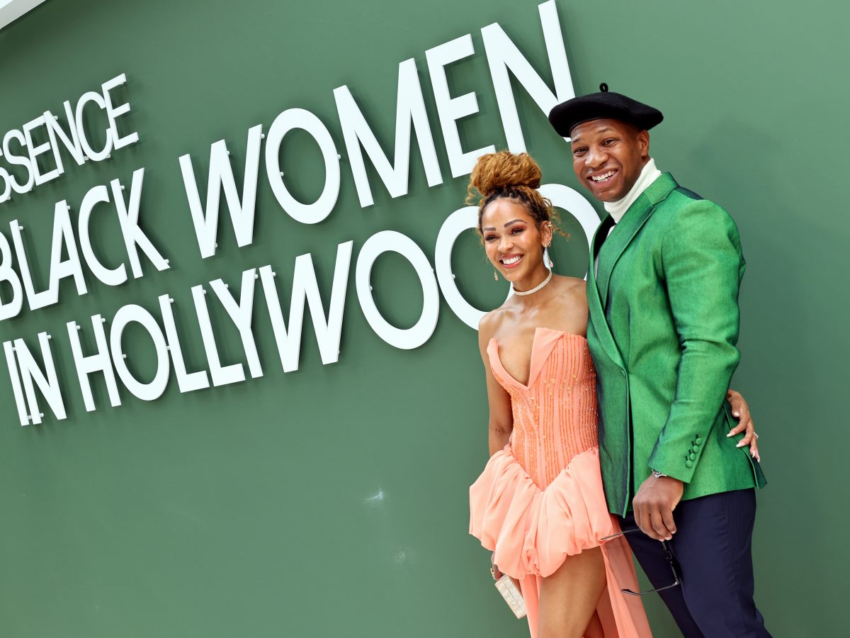
Good appeared with Jonathan Majors at the 2025 Essence Black Women in Hollywood event.
Film work and red-carpet style
Good has worked in film and television since she was young, with roles in comedy, drama, action and romance. The image below is from a screening of Magazine Dreams.
A red-carpet moment from 2016
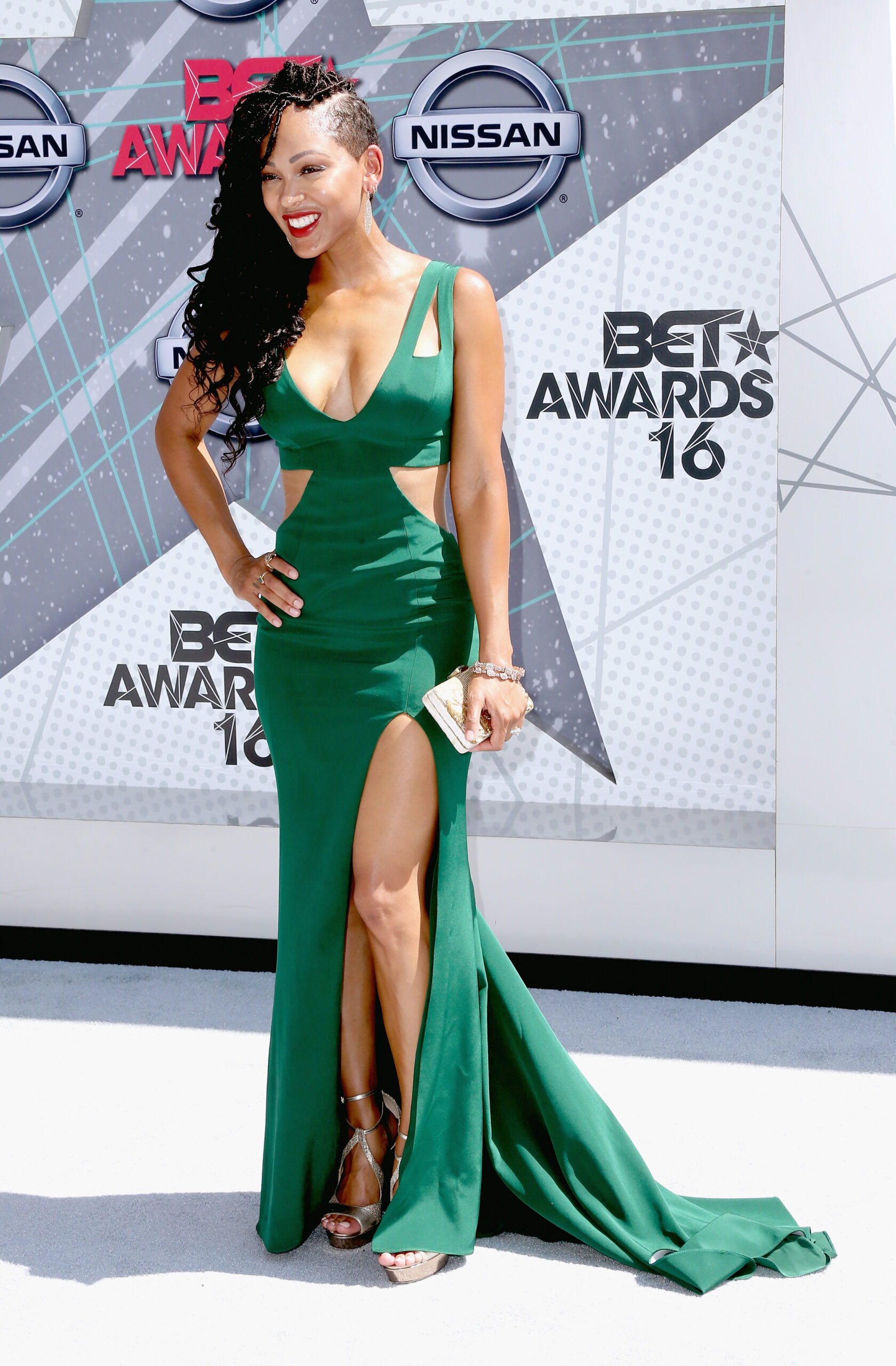
This full-length portrait was taken at the 2016 BET Awards.
Her film career in photos
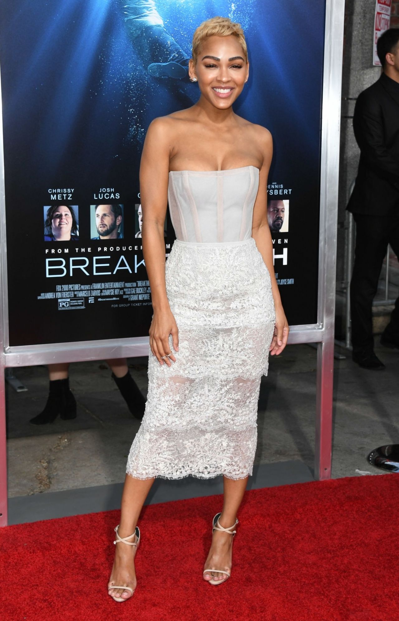
At the Los Angeles premiere of Breakthrough in 2019, Good posed for photographers.
What the photos can and cannot tell us
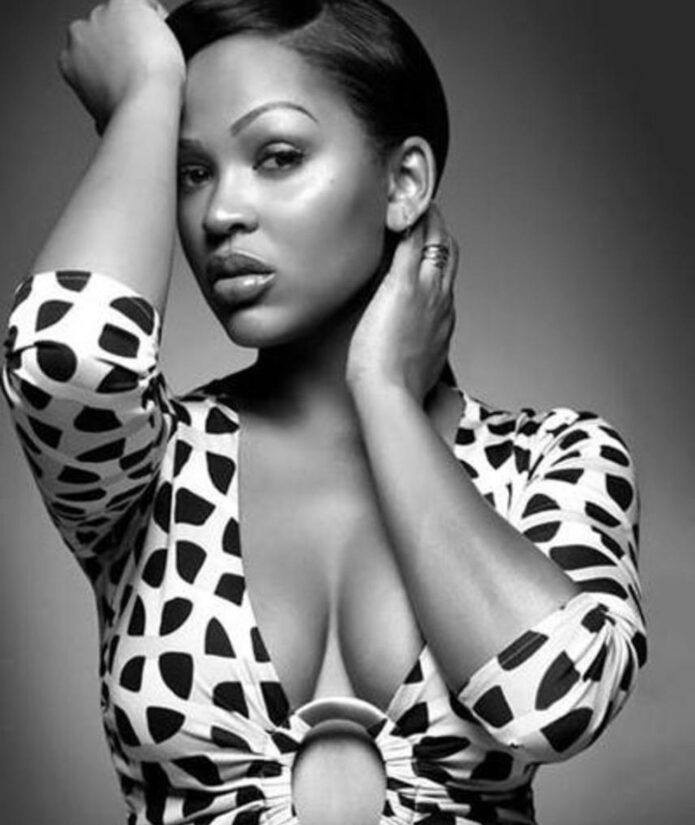
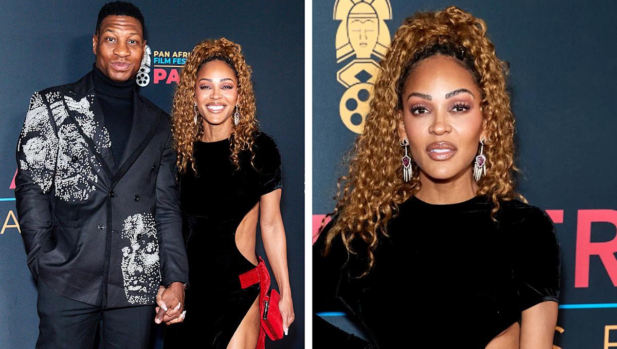
The reports identify several designs and the dates they surfaced, but they don’t give a full tattoo inventory or explain every meaning. Only the first image is a tattoo close-up; the four event portraits provide career context and can’t establish whether small ink was visible at the time.
Jennifer Love Hewitt’s tattoos include a tiny Halloween character, a rotary phone marked “9-1-1,” and family drawings she keeps close.
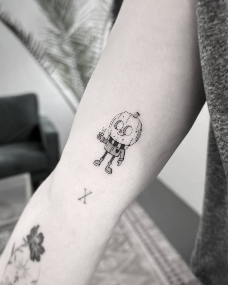
The little Halloween character on her arm
The small figure has a carved-pumpkin head, a jacket, scarf and boots, and a steaming cup. Hewitt placed it on the inside of her upper arm, above the elbow crease, near an older X and flower tattoo. Its fine black-and-gray lines hold a surprising amount of detail.
Tattoo artist Victoria Do shared the piece in 2024 and credited the original illustration to John Brhel of Spooky Shake Studios. Hewitt has often shared her enthusiasm for Halloween; the character gives that favorite season a small place on her arm.
The 9-1-1 phone tattoo that marks a role
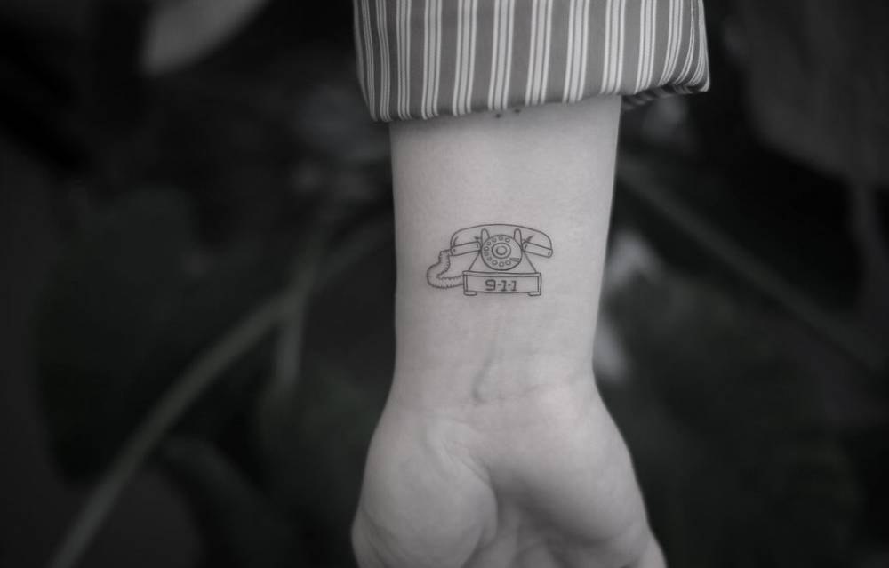
Hewitt’s wrist tattoo is a rotary phone with “9-1-1” on the base, a reference to Maddie Buckley, the dispatcher she plays on the series. She got the same design with co-star Debra Christofferson, who plays dispatch supervisor Sue Blevins; Christofferson’s tattoo is behind her shoulder.
Hewitt called the job special and hoped viewers would spot the tattoo in upcoming episodes. The phone is a direct link to her role, while its matching version connects it to a co-star.
Family, work, and the stories outside the close-up
In 2023, Hewitt showed three butterflies on her arm and small designs on her middle and ring fingers. Tattoo artist Victoria Do described the butterflies as being for her children and called the finger pieces adornments; reports noted leaf outlines and a sun among them. In February 2026, Hewitt shared four little hearts on the back of her wrist, drawn by her husband and children so she could see their drawings every day.
Her forearm script reads “the universe always provides,” which she has described as a daily reminder tied to her belief in the universe. An angel wing on her left wrist honors her mother. She also has a queen bee on her right forearm and a hummingbird on her torso; her husband uses “hummingbird” as a nickname because she is always moving around.
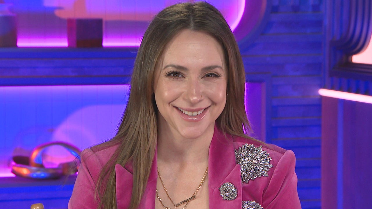
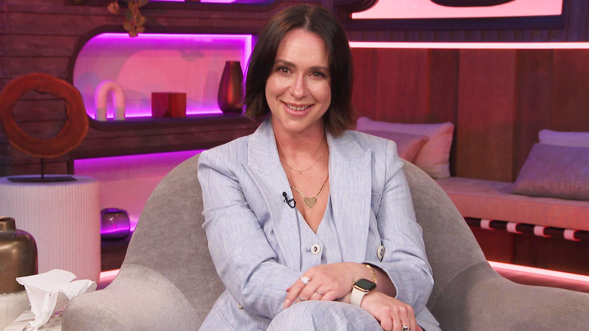
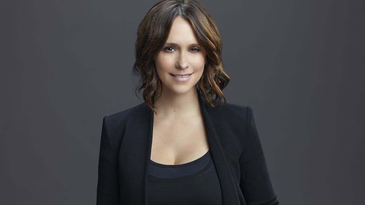
The remaining photos show Hewitt at interviews and public events, not close-ups of her tattoos.
Kelly Ripa’s small flower on her inner left ankle began with an afternoon in San Antonio and a suggestion from a limousine driver. She was 19 at the time. Years later, she called it her “symbol of youthful stupidity.”
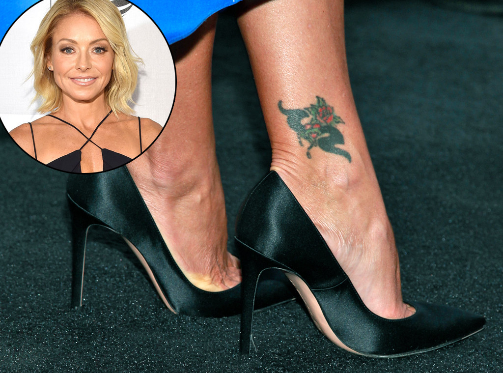
The flower she got at 19
In a 2001 Los Angeles Times interview, Ripa said she was in San Antonio for her first All My Children appearance and had two hours to kill. The driver suggested a tattoo; she went along and told the tattooist to choose the flower. She described it as about four inches long, on the inside of her left ankle.
An older photo shows the flower as it was fading, with blue-green lines and a reddish center. It isn’t a current view of her ankle. In 2016, E! reported that the tattoo seemed to be disappearing, likely after laser treatment. A 2024 San Antonio report said it appeared to be gone, but neither report gives a confirmed date or account of the removal.
Ripa hasn’t claimed a hidden meaning for the flower. The story she tells is enough: a spur-of-the-moment choice she later regretted. If you’re considering a small tattoo, decide on the design yourself and give it more thought than she did that afternoon.
Kelly Ripa in the television space
Ripa told the story while profiles were covering her move from All My Children to daytime television with Regis Philbin. The flower was a small personal detail in a much larger career story, and not something viewers would necessarily see on the set.
A host away from the morning set
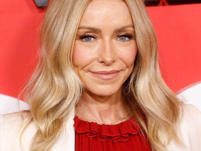
At the 2025 Academy Awards, Ripa arrived with her husband, Mark Consuelos, wearing a coral gown and a high ponytail. The red-carpet photo shows the couple at a formal event; her ankle is not visible.
Outside the studio
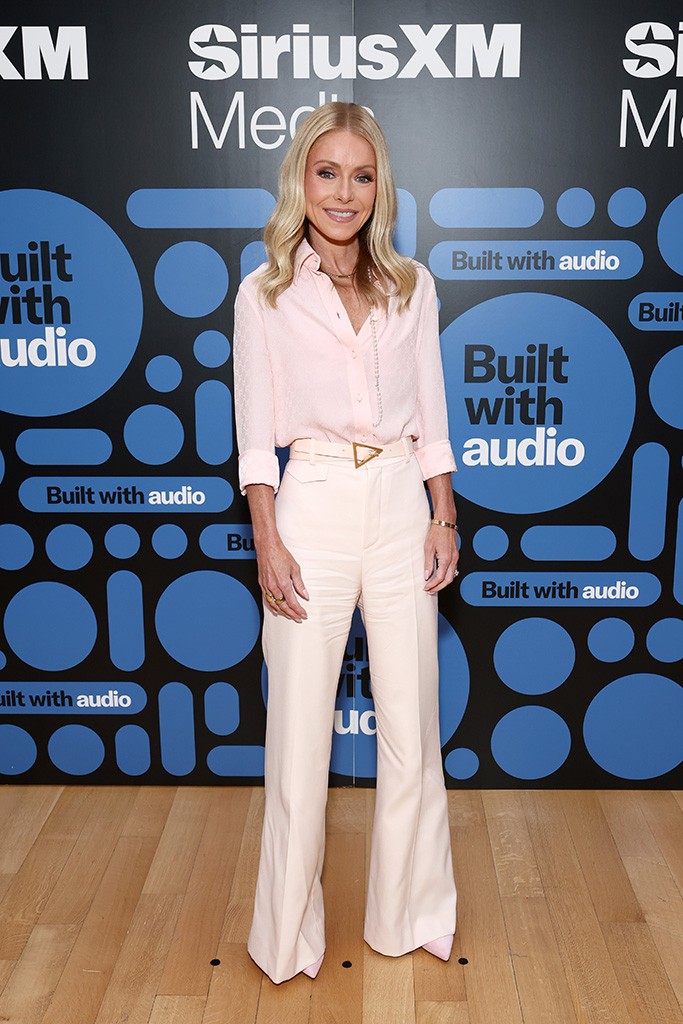
At a SiriusXM media event in New York, Ripa wore a pale pink blouse and white trousers. The relaxed outfit is a contrast with the Oscars gown, but this photo, too, is context rather than evidence about the ankle tattoo.
A long career, and a personal memory
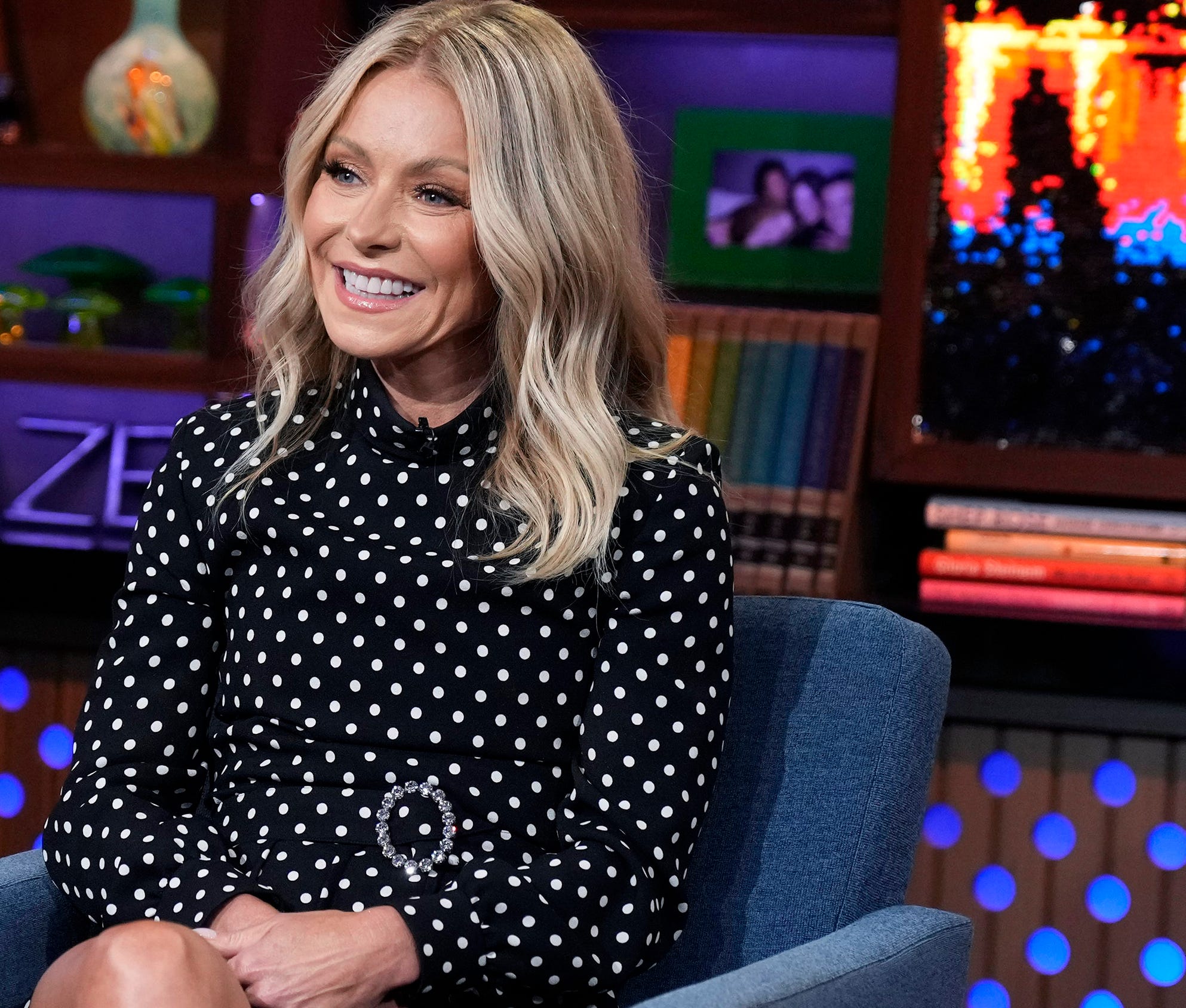
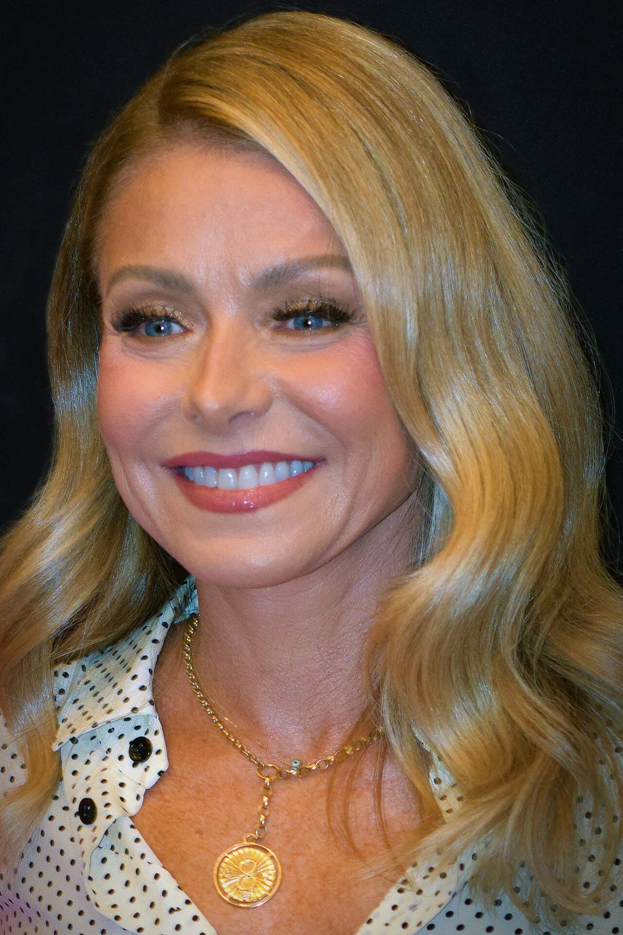
Ripa appeared in a polka-dot blouse at the 2023 PaleyFest opening. That event image shows another public appearance, not the tattoo; the clearest record of the ankle flower remains the older photo and Ripa’s own account of how she got it.
In the clip below, Ripa and Consuelos talk with ABC News about the Oscars.
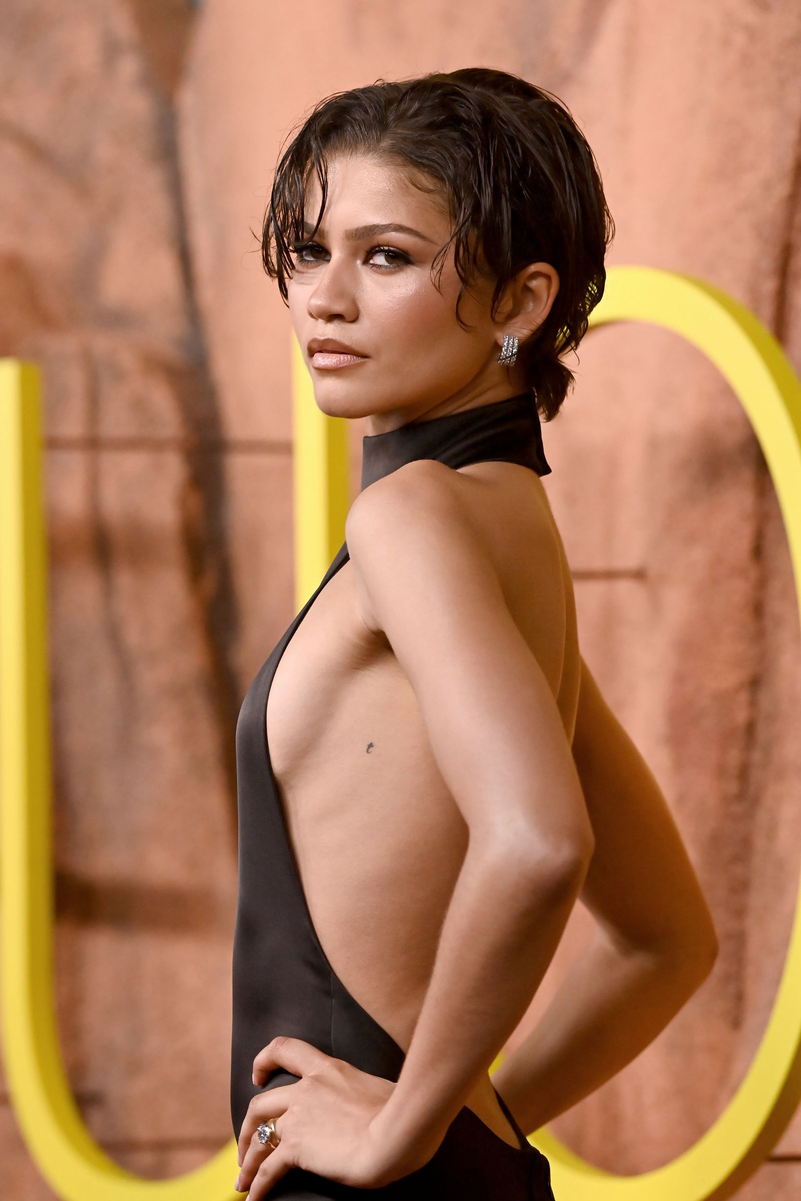
Zendaya has one confirmed tattoo: a tiny lowercase t high on her left ribcage. Tattoo artist Lily Jarnryd says it was part of a pair of custom initials she and Tom Holland got in 2024.
The small lowercase t beneath Zendaya’s arm
Her black t sits just under her left arm. It’s easy to miss in event photos; a clear picture from the Euphoria season three premiere shows the letter without a crop or annotation. Most tops or dress panels cover the spot, while a cutout or strapless neckline can expose it.
A matching initial, kept personal
Jarnryd told People that the tattoos were done on November 27, 2024, at Boston Tattoo Company on Newbury Street. Zendaya chose a lowercase t; Holland got a lowercase z. Each carries the other’s initial, so the designs pair together without being identical.
That supports reading them as a reference to one another, but neither has explained a deeper meaning. Anything beyond the matching initials would be speculation.
Zendaya’s public style keeps personal details personal
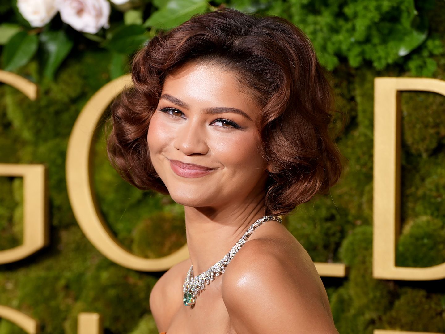
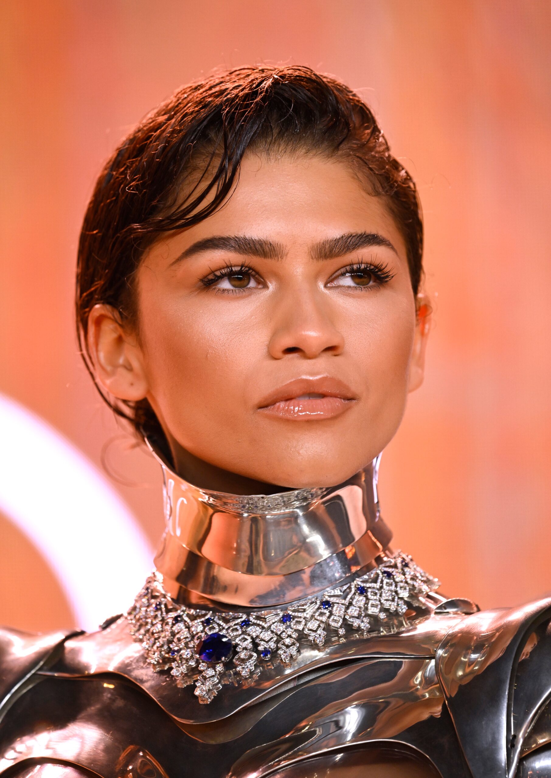
At the 2025 Golden Globes, Zendaya wore a strapless burnt-orange Louis Vuitton gown. As she turned, the dress briefly revealed the tiny letter. It caught attention in photos because most of her clothes cover that side of her ribs. The Dune: Part Two portrait here is contextual and doesn’t show the tattoo.
Understated choices, on and off the carpet
The letter has no date or surrounding decoration. Its small scale lets it sit quietly beside more elaborate styling.
Reading the pictures fairly
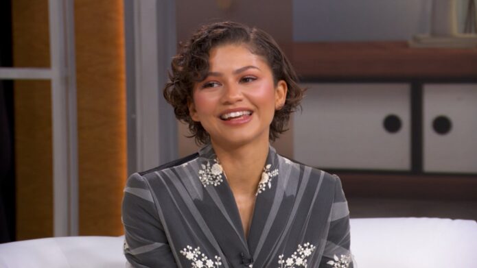
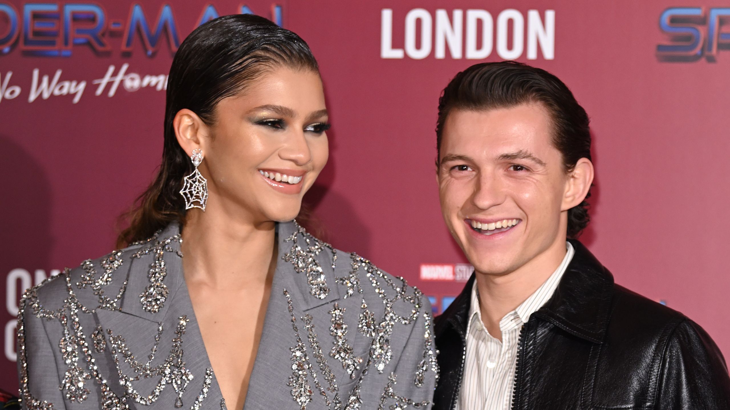
The first image clearly shows the letter. The other portraits are contextual: they show Zendaya at public appearances and interviews, but not the tattoo. The Spider-Man photocall includes Holland, though it isn’t evidence of the matching designs.
For anyone considering a similar initial, placement, size and legibility all matter. A mark high beneath the arm can stay covered, but it may only show with certain clothes or movements. Check the stencil in a mirror and see how it sits when you lift your arm. A celebrity photo can offer a reference point; the final placement should suit the person getting the tattoo.
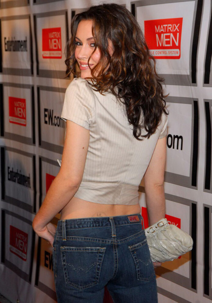
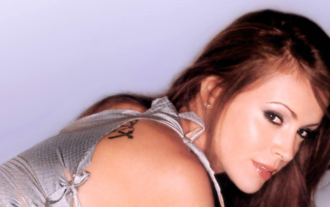
Alyssa Milano’s tattoos are spread across her shoulders, back, wrists, ankles and lower back. The collection includes a rosary, a small neck symbol, floral designs, a bird and a Sacred Heart-style piece. Photographs show different angles and moments, so placement is clearer than the private meaning of every design.
Alyssa Milano’s rosary tattoo is her most recognisable piece
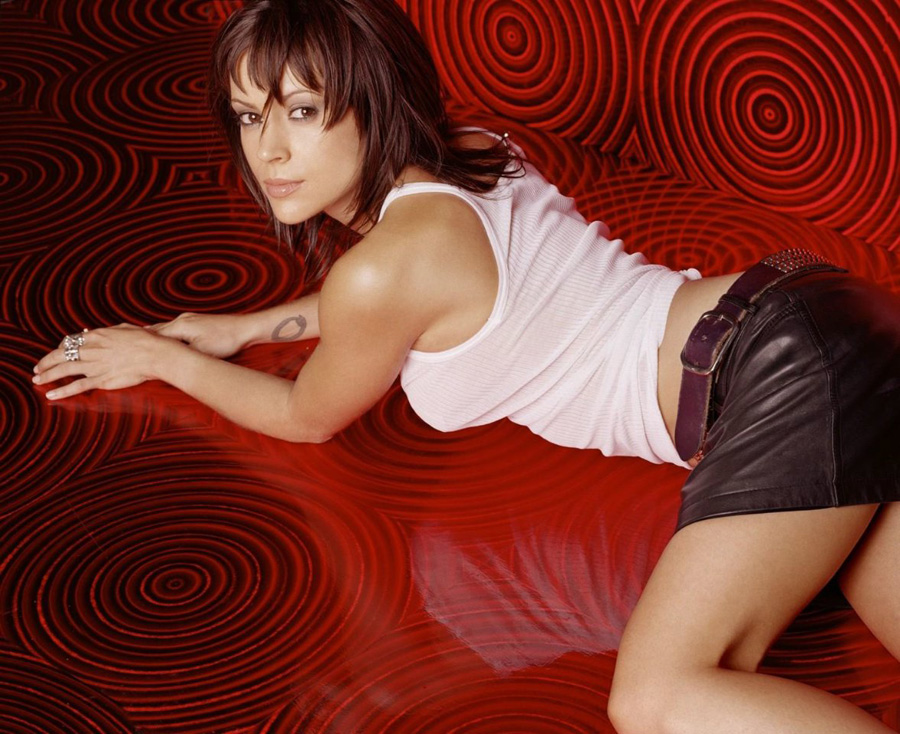
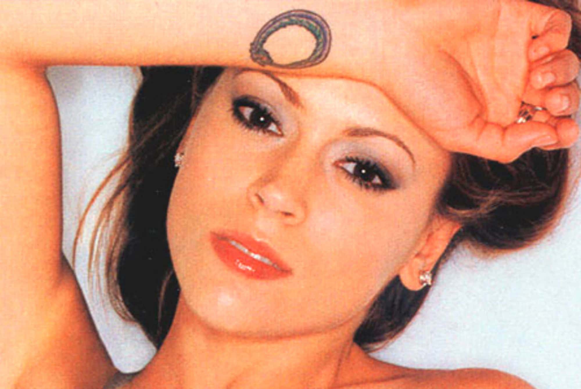
The rosary on Milano’s upper back and shoulder is the piece most often associated with her. Descriptions place beads leading to a cross along the curve of her shoulder blade. Its appearance changes as she turns or raises an arm, and a strapless or low-backed outfit exposes more of it. The close-up under this heading is labeled as a small wrist/forearm ouroboros, so it documents a different tattoo. The rosary is a religious design, though coverage does not give one consistent account of its specific story.
For a similar piece, the beads and cross need enough space to remain distinct as the line follows the shoulder. The placement can keep it visible in some clothes and covered in others.
The small neck symbol adds a quiet focal point
Coverage describes a small mark at the base of Milano’s neck as heart-like or Aum-inspired, depending on the source and photograph. The image under this heading is labeled as a wrist ouroboros, so it doesn’t settle which neck-symbol identification is right. The mark can show when her hair is pulled back and disappear under hair or a collar.
Small designs need simple lines and room around their details. If a symbol is reduced too far, it can become hard to recognise over time.
Her ankle tattoos mix flowers with a lighter, more playful feel
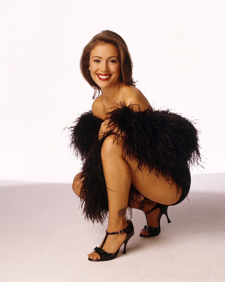
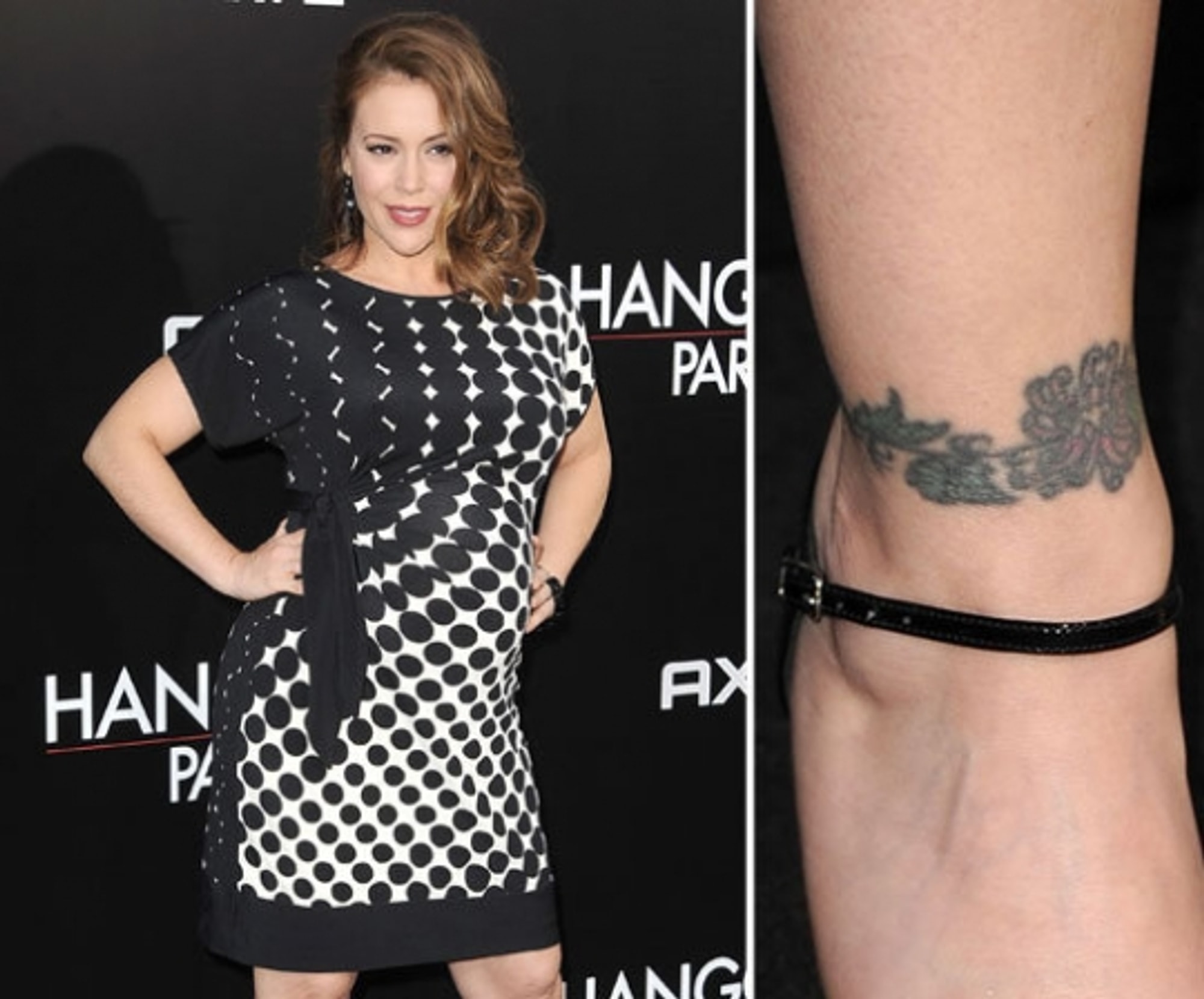
Photos show a rose or floral band around Milano’s ankle, along with a small bird or other delicate motif near the lower leg. The designs sit close to shoes and dress hems, so they are visible in some outfits and easy to cover in others. A wraparound band needs careful placement so the pattern meets evenly around the ankle bone.
A second ankle photograph shows how placement changes the design
A side view makes the ankle band look more compact and shows how it sits beside a shoe strap. Socks and shoes can rub this area, and it gets sun when uncovered, so size, aftercare and sunscreen matter if you choose a similar placement.
The shoulder and upper-back photographs reveal the collection in motion
A turning shoulder photograph shows how Milano’s upper-back ink follows her posture. The beads shift with the skin rather than sitting in a rigid line. When testing a design in this area, check the stencil while standing, sitting and turning; that helps show how it will look as the body moves.
One more idea for the collection
Coverage also mentions a Sacred Heart-style design on Milano’s lower back. The specific meaning isn’t clearly documented. That image can be drawn in different ways, from traditional colour to fine black linework; decide what you want the design to express before settling its size and detail.
Putting the choices together
The collection mixes religious imagery, a small neck mark, flowers and ankle designs. These pieces don’t need to match to sit together. Their placements also vary in visibility: a nape mark can hide under hair, while ankle ink appears with some shoes and hems.
Making the idea your own
Use Milano’s tattoos as references for placement and scale, not as designs to copy. Bring an artist clear examples and discuss line weight, size, healing and how the image may age. A custom drawing can keep the part of an idea you like while fitting your own body.
Final thoughts on Alyssa Milano’s tattoos
The photographs show how a shoulder design moves, how the ankle work wraps around the leg and how a small neck mark can be covered. They help with visual reference, but they don’t explain every personal meaning. Keep those distinctions in mind when taking inspiration from the collection.
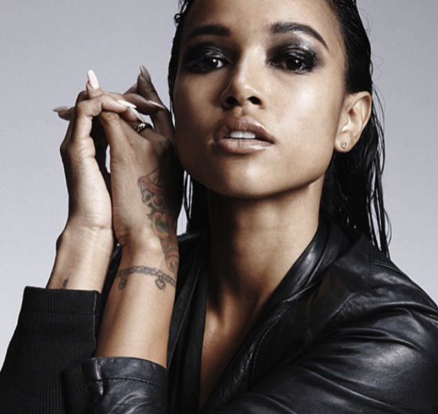
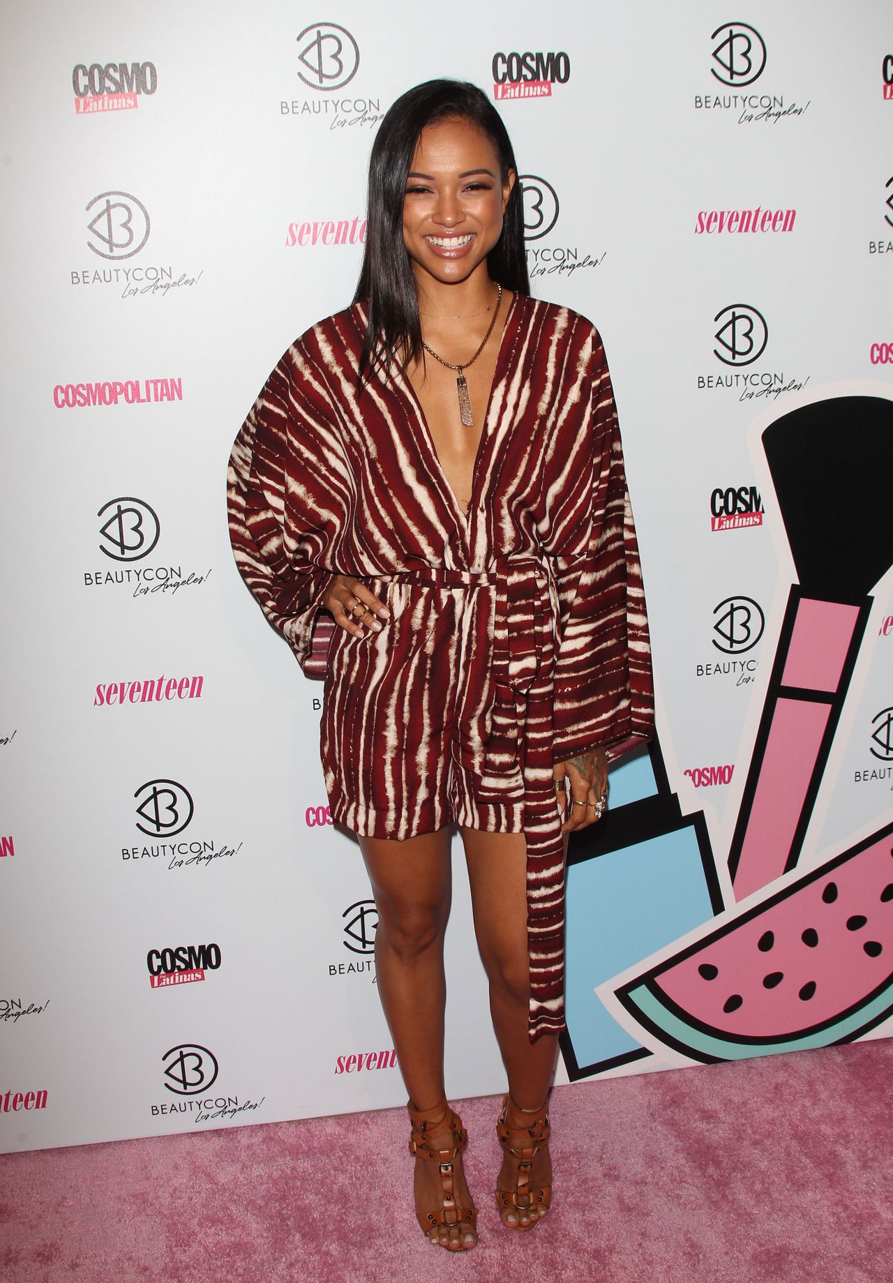
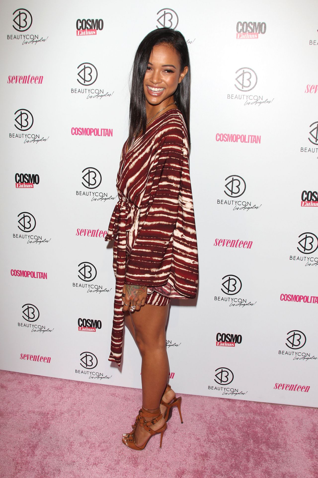
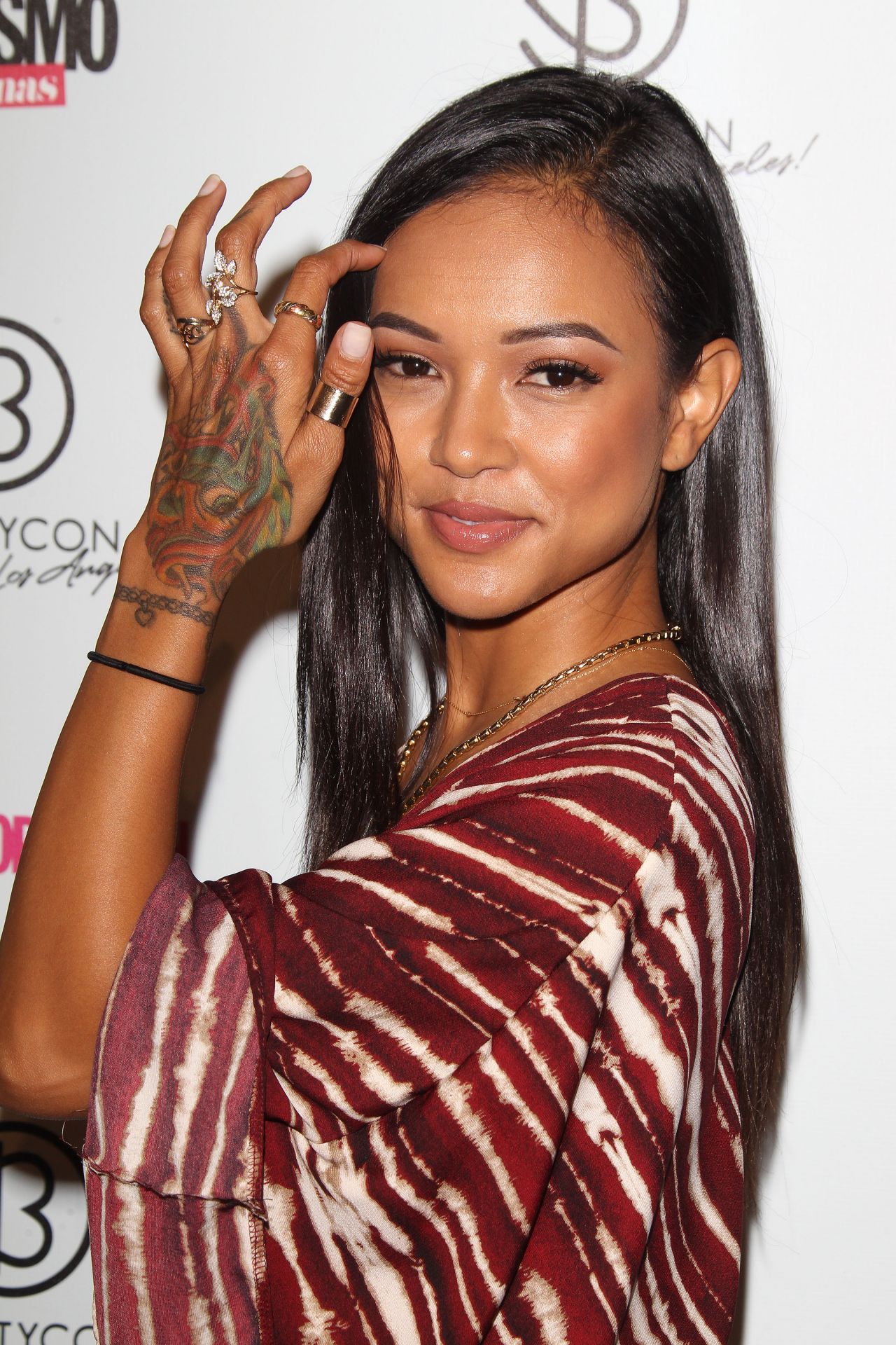
Karrueche Tran’s tattoos are best known for the colorful dragon across her left hand. The rest of the collection includes fine lettering, a bracelet-like mark at the wrist, and larger pieces visible in more open outfits. Some designs stand out immediately; others come into view from a different angle.
The mix gives her tattoos personality while leaving room for clothing and movement. A bold hand piece can sit beside fine script, and a slim wrist design can frame the arm without turning it into a sleeve. If you’re looking at her ink for ideas, notice how one strong image leads while the smaller pieces stay quieter.
This guide looks at the visible designs, how they read on the body, and what to consider if you’re planning something of your own.
Karrueche Tran colorful hand tattoo
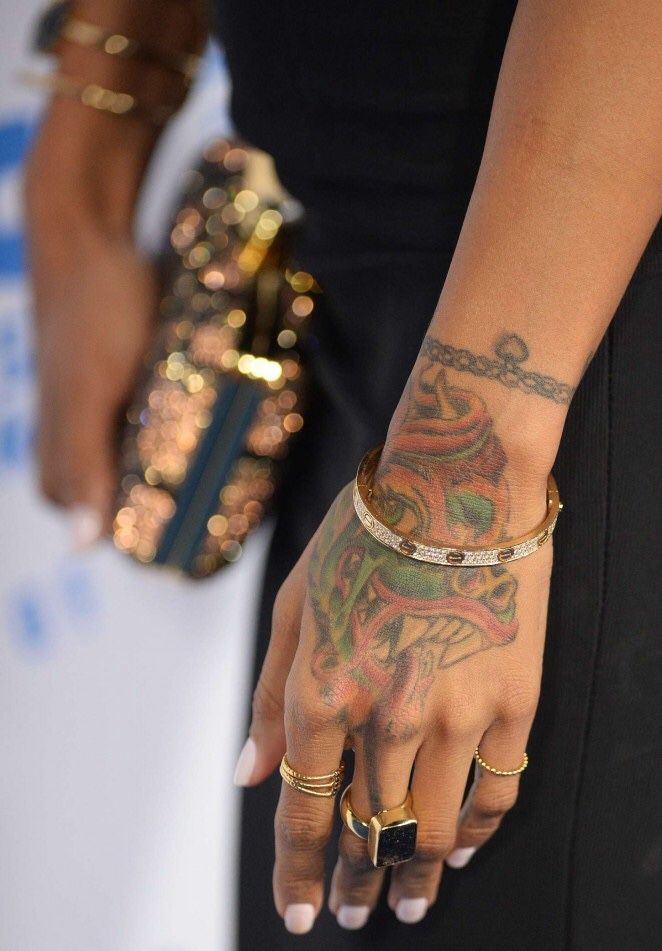
The colorful dragon on Tran’s hand is the piece most people associate with her. Bright tones and a lively outline spread across the back of her hand toward the wrist. There’s enough detail to feel illustrative, but the main shape remains easy to see as the hand moves. That’s especially useful on a placement where the fingers bend and the skin creases.
Tran has said the dragon connects to her Chinese and Vietnamese background and her Chinese zodiac sign. That gives the image a personal reason to be there as well as a strong shape. If you’re considering a statement tattoo on your hand, decide what the image means to you, then think about how much of the hand you want it to cover.
Color changes the mood. Black and gray might make a dragon feel darker and more traditional; saturated color makes this one feel almost like jewelry or nail art. Ask your artist how the palette will sit with your skin tone and how much detail will remain clear after healing. On a hand, strong shapes and contrast matter more than tiny scales.
Karrueche Tran wrist chain and bracelet tattoo
At Tran’s wrist, a fine chain-like tattoo sits like a permanent bracelet. It’s noticeable without taking over the forearm. The repeated links give it a steady pattern, and from a distance it adds a finished edge to a simple outfit.
A bracelet tattoo can take many forms: linked circles, small leaves, beads, a charm, script, or a line that leaves patches of skin open. The design should follow the wrist instead of sitting like a stiff stripe. Show the artist the wrist from the front, side, and top so the pattern can wrap evenly. A paper or digital stencil can help catch a line that sits too high or twists near the thumb.
The chain also supports the larger hand tattoo without competing with it. If you already have one bold design, a quieter band can connect the collection. Keep the line weight distinct enough for both tattoos to stand on their own.
Karrueche Tran finger and knuckle tattoos
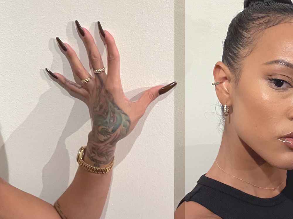
From farther back, the small marks around Tran’s fingers and knuckles become part of the overall look. The hand feels like an area that has developed over time, rather than one isolated tattoo. That’s a useful reference if you like patchwork ink: start with a larger design and add smaller pieces later, or let a few little symbols build into something over time.
Finger tattoos need realistic expectations. Hands see a lot of wear, and fine details may soften or need touching up. Choose a clear shape and look for an artist with healed examples. A star, cross, letter, or number is usually easier to read at that size than a detailed portrait. Check the stencil with your hand relaxed, curled, and hanging at your side.
Spacing matters more than quantity. Too many small marks around the knuckles can turn into visual noise. Tran’s colorful dragon remains the main feature, while the smaller designs add texture. Leave some skin open and let one image lead.
Karrueche Tran forearm script tattoo
The script in Tran’s collection softens the brighter hand tattoo. In interviews, she has discussed quote tattoos, including Arabic lettering down her spine and a Spanish proverb on her side. Other profiles have shown a phrase on her arm connected with the idea that the past is practice. These pieces give the collection a reflective note alongside its fashion and beauty imagery.
Lettering still needs careful planning. Check the spelling, translation, and accents with more than one trusted person before the stencil is applied. Then look at the words as a shape, not just as a sentence. A long phrase needs space; a shorter one can follow the forearm, while vertical lettering may feel more private and graphic. The right size depends on the text, the direction of the arm, and how far away you want it to read.
Fine script can sit beside a colorful tattoo because the styles do different things. The dragon brings color and movement; the words offer a pause. Different designs can feel at ease together when their scale and placement are considered.
Karrueche Tran tattoo styling and placement
Tran’s tattoos sit naturally within her everyday styling. In a close-up, the hand tattoo reads like a bright accessory; against a clean sleeve, rings, or a simple manicure, it can feel sharper. The same design changes mood depending on what’s around it.
Think about your own clothes and routines when choosing a visible placement. Look at your hand while holding a phone, wearing a watch, carrying a bag, or resting on a table. Check your forearm with short and long sleeves. Those ordinary positions help you see whether a design fits daily life as well as a saved photo.
Tran’s collection pairs color with black linework, a bold hand with quieter script, and statement pieces with areas of bare skin. That space lets the tattoos breathe. If you want the same balance, don’t rush to fill every gap; add another piece when you know why you want it there.
The best idea to borrow from Tran is to let one tattoo lead. Start with the design you’d like to see every day, then consider how the rest could sit around it. A dragon, bracelet, phrase, or small symbol can all work if the placement suits your body and routine. Talk with your artist about healing, touch-ups, future additions, and jewelry or older tattoos nearby.
Take a few days to live with a visible design before booking, especially when it will stay in view every day.
Give hand and wrist tattoos time and thought. Look at healed work from the artist, confirm every word in a quote, and check that the placement works when you move. The goal isn’t to copy Tran’s tattoos; it’s to make one clear choice and give it room to sit alongside whatever comes next.
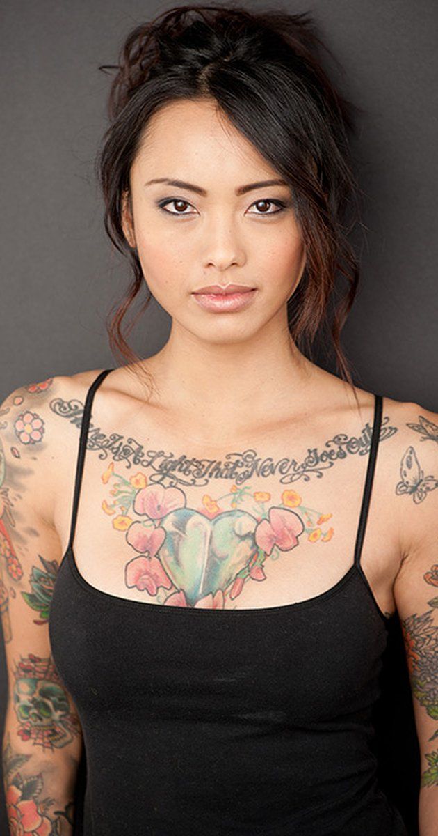
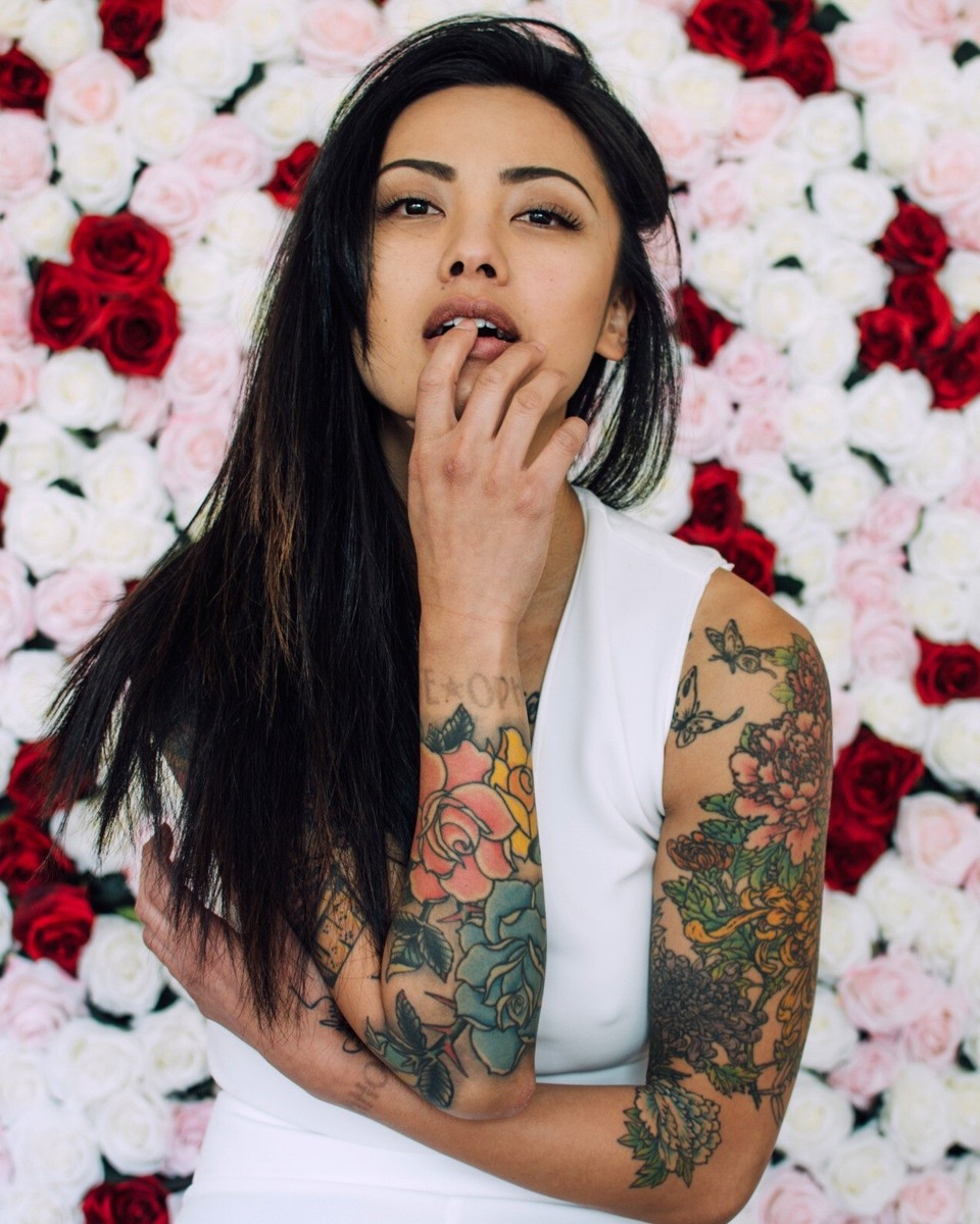
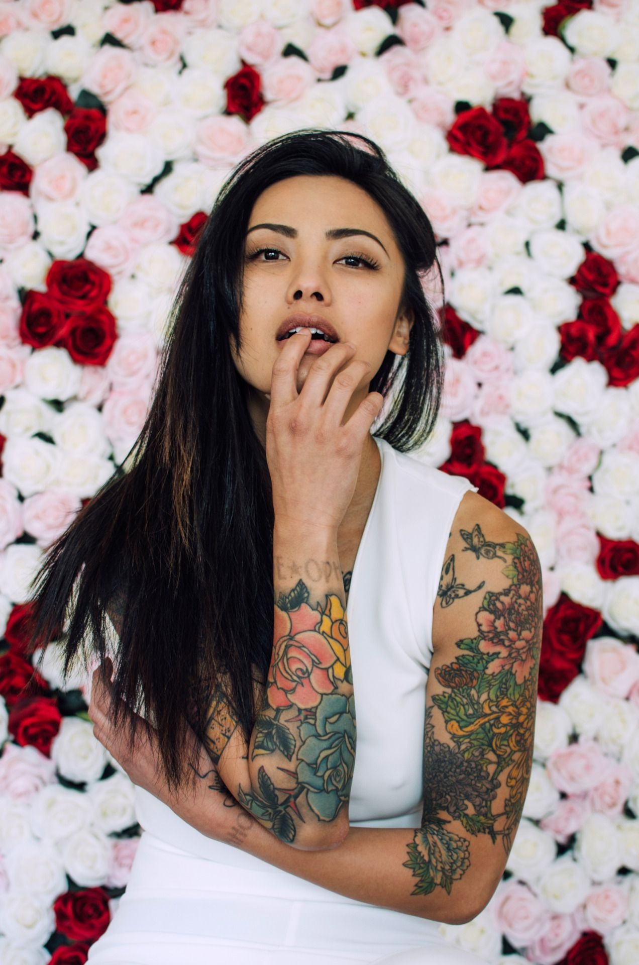
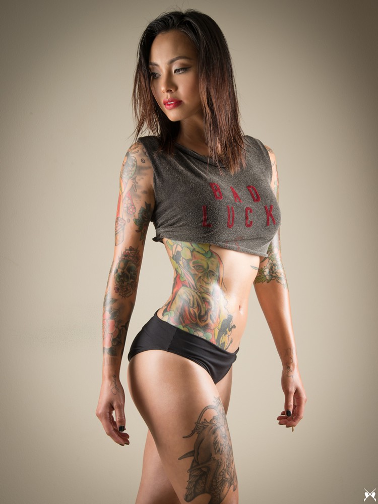
Levy Tran’s tattoos cover a range of styles. Her arms have bright flowers and traditional designs, her chest has a heart surrounded by flowers and script, and a darker illustrated piece runs along her side. She’s also talked about stars on her back, tattoos on both ribs and legs, and a zombie design she particularly likes. The collection looks large and well worn-in.
If you’re looking for ideas, there are different things to notice: color, how the designs move with the body, and the transition from one arm style to another. You don’t need a full bodysuit to use the same thinking. Even a floral sleeve or small chest design can feel considered when you think about what might sit nearby later.
The sections below look at visible tattoos, their placement, and details you can discuss with an artist without copying Tran’s exact designs.
Levy Tran floral arm sleeve tattoos
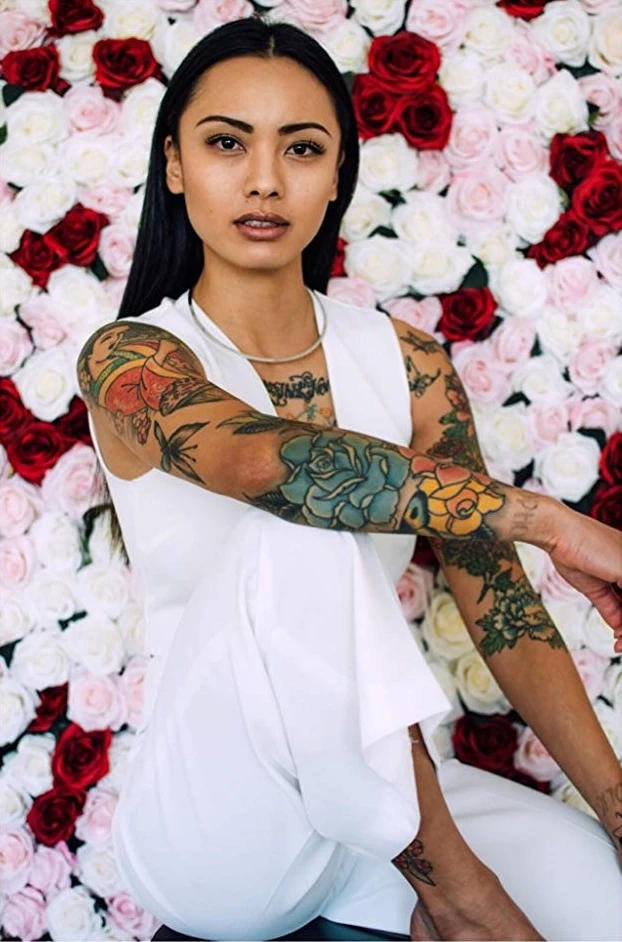
Tran’s floral sleeves are a good place to start. Roses, leaves, and traditional shapes run along her arms in bold colors. Reds, blues, yellows, and greens make the designs lively; dark outlines keep the flowers distinct. Bright color still needs structure underneath it.
Tran has described her left upper arm as an Oriental Japanese-style sleeve and her right upper arm as an Americana-style design. The sleeves don’t have to mirror each other. One can use flowing flowers and curved leaves; the other can lean on bolder panels and traditional flash shapes. Their different styles still feel balanced because both are confident and colorful.
If you’re planning a floral sleeve, choose the main image and its placement first. Then build the surrounding flowers around it. Check how the design looks with your arm hanging, bent, and raised. It needs to move with you, not just look good in a straight-on photo.
Levy Tran heart chest tattoo and script
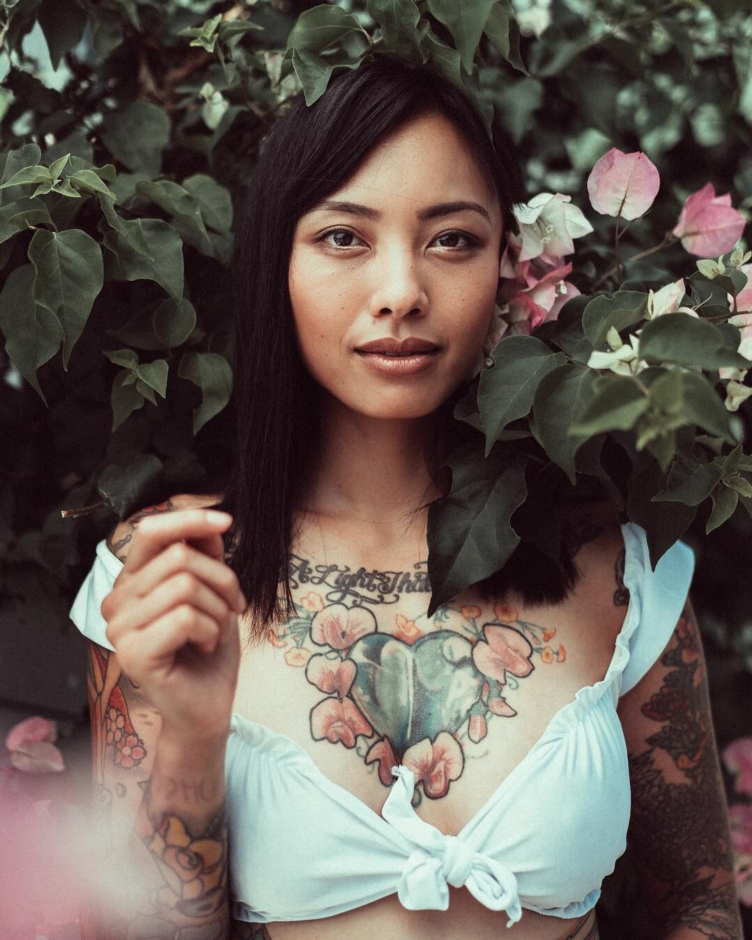
The heart on Tran’s chest gives the collection a clear center. Flowers surround the design beneath ornate lettering across her upper chest, making it read as a single composition rather than a small emblem. Leaves and petals give the heart more shape, while the overall piece keeps the bold feel of the rest of her ink.
The phrase above it is commonly reported as There Is A Light That Never Goes Out. Script across the collarbone needs to follow the body’s curve, and the phrase has to fit the chest rather than a straight line on paper. The artist can adjust the spacing, arc, and thickness so the words follow the body.
A chest tattoo can link two sleeves. Flowers at the shoulders can lead into the arms, while a central design gives the eye a place to pause. For a smaller version, a heart, lock, sun, or plant with a short word above it could work. Leave some skin around the main image so future additions don’t crowd it.
Levy Tran chest and arm tattoo contrast
The chest and arms have different weights. The heart and flowers feel softer; the arm tattoos use heavier outlines, darker patches, and a broader mix of motifs. That contrast keeps the designs from repeating the same pattern.
Tran’s floral work has both decorative and tougher elements. Leaves soften the shapes, while the black outlines and darker sections keep them grounded. If you like that balance, try combining one gentle detail with a harder edge: roses beside a skull, fine script next to a heavy border, or bright flowers against dark shading.
Placement matters as much as the drawing. The upper arm has room for detail, while the more visible forearm benefits from a clear outline. Save the smaller marks for areas where they can be seen and let larger shapes spread across the body’s broader areas. Tran’s photos show how the tattoos change in a close portrait, a seated pose, and a full-body view.
Levy Tran arm wrist and leg tattoos
The tattoos continue beyond Tran’s shoulders. Wider portraits show ink on her arms and wrists, as well as around her knees and legs. Some areas are dense and colorful; others use smaller marks or leave more skin open. Those changes keep the collection from reading as one unbroken wall of ink.
Small symbols can work well beside larger pieces. Stars on the back, a little wrist design, or a compact knee tattoo can add a mark without carrying the same weight as a sleeve. It may simply fit the space or record a moment.
Legs give an artist different options for scale. A thigh can hold a large figure, animal, or flower, while the shin suits a longer vertical design. Tran has mentioned both legs as part of her collection, and later profiles note tattoos on the thigh, knee, and shin. For a leg piece, look at the area from the front, side, and back; the curves around a knee and calf can change the composition.
Levy Tran zombie side tattoo and body flow
The zombie on Tran’s right side is the collection’s darkest focal point. She has called it one of her favorite tattoos because of the artwork. It sits between her ribs, abdomen, and hip, giving the torso a strong illustrated shape. Its mood is a long way from the floral chest piece, but the color and confident outlines tie it to the rest of her ink.
The side is a good spot for a tall design with movement. A figure, snake, sword, or plant can follow the ribs and turn toward the hip. Because the area shifts when you breathe, sit, or twist, check the stencil while standing and relaxed. A design centered on a flat board may need to move once it is on the body.
The larger tattoos guide the eye around Tran’s body rather than stopping at one edge. A chest design can lead into an arm, a side piece can draw attention toward a leg, and a small wrist tattoo can finish a sleeve. Choose a few main pieces first, then let smaller tattoos support them.
Tran’s collection has room for different moods. Flowers, script, traditional designs, black shading, and darker illustration all sit together. If you want a similar range, choose one idea to repeat—perhaps bright color, bold outlines, or shapes that follow the body—without making each tattoo identical.
Start with one area you want to live with and find an artist whose healed work has the feel you’re after. Talk about size, touch-ups, future additions, and how the tattoo will look from different angles. A full celebrity collection can be exciting to browse; your own choices should fit your daily life.
Before committing to a large design, try the placement in ordinary clothes and take a few photos sitting and standing. Ask how the ink may soften over time, particularly on areas that move a lot, such as hands, knees, and ribs. A little planning helps the artwork feel right in more than one carefully posed photo.
Lily Collins keeps her tattoos small and easy to miss. A phrase sits high on her back; a shaded rose and a line of writing run over her foot; a butterfly rests near her wrist. Most are fine-line pieces, with no large sleeve or single theme tying them together.
The back tattoo pairs lettering with a small figure and floral detail. Her foot piece has more room but still looks delicate, while the butterfly is closer to a quick sketch. The Peter Pan figure adds a storybook note. Taken together, the tattoos feel like separate ideas that found their place over time.
Photographs show the designs and where Collins wears them, but they don’t tell us what every piece means to her. The visible ink is romantic and understated. If you like small tattoos, these designs show how a clear shape and a little open skin can keep one from feeling crowded.
Lily Collins’s back script tattoo pairs a phrase with a delicate figure
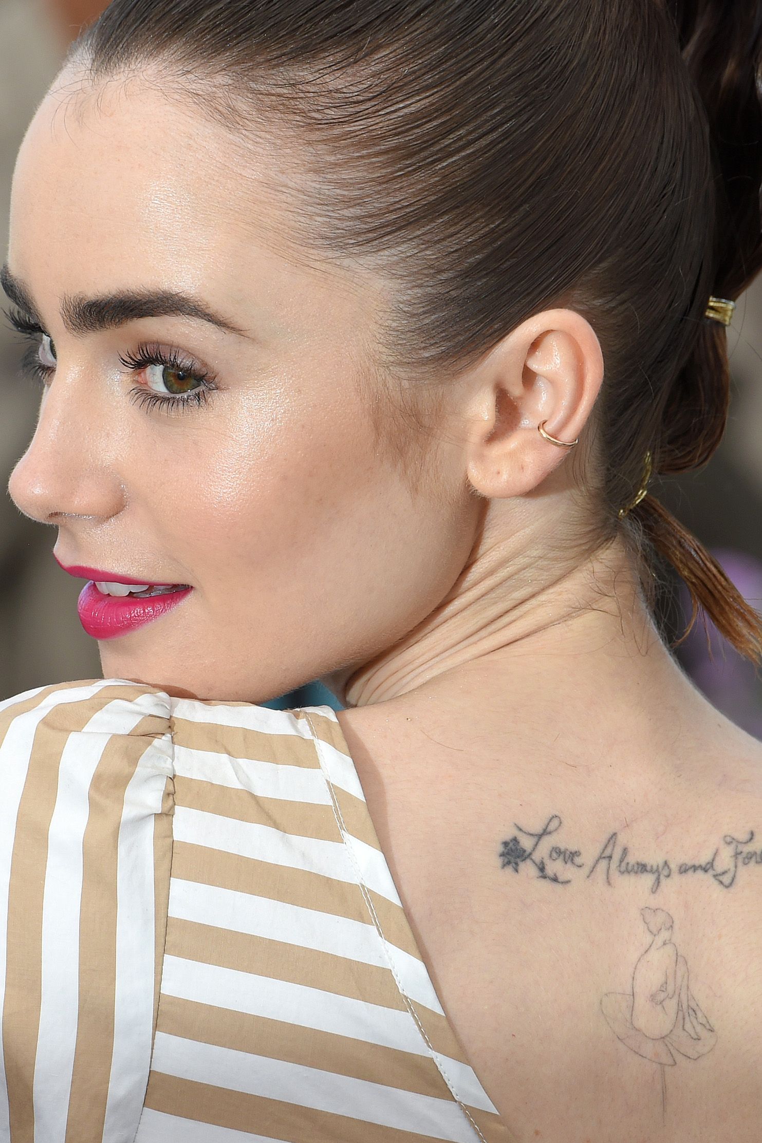
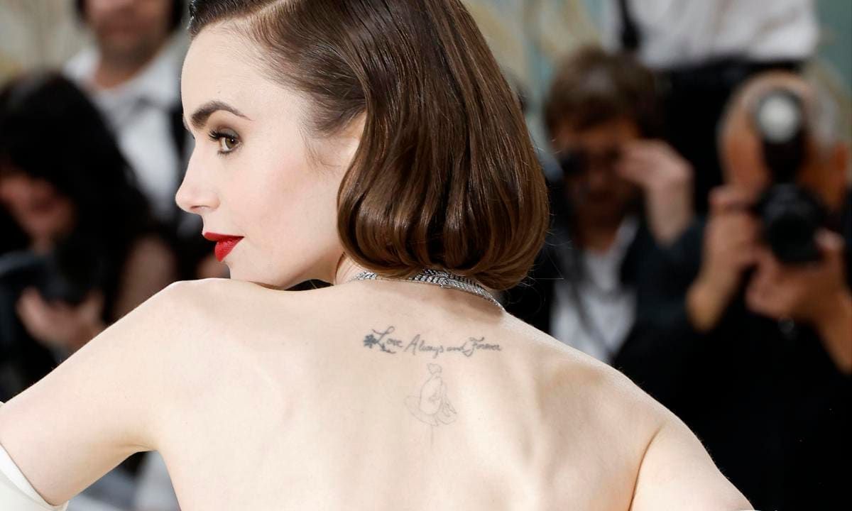
Her best-known back piece sits high, just below the neck. A small floral mark leads into cursive lettering that reads “Love Always and Forever.” Beneath the words, a fine-line figure sits on a lily pad, giving the script a second focal point.
From a distance, the tattoo reads as a slim line across the upper back. Up close, the loose lettering and the figure below it create more movement. The design stays within the space between the shoulder blades instead of spreading across the whole back, so it works with open backs, straps and one-shoulder tops without taking over the look.
The phrase is plainly romantic. The flower and lily-pad figure turn it into more than a sentence on skin. If you’re considering script, a small illustration can give the words a visual anchor. It also helps to test the lettering at its intended size: a line that looks delicate on paper may need more height to stay legible over time.
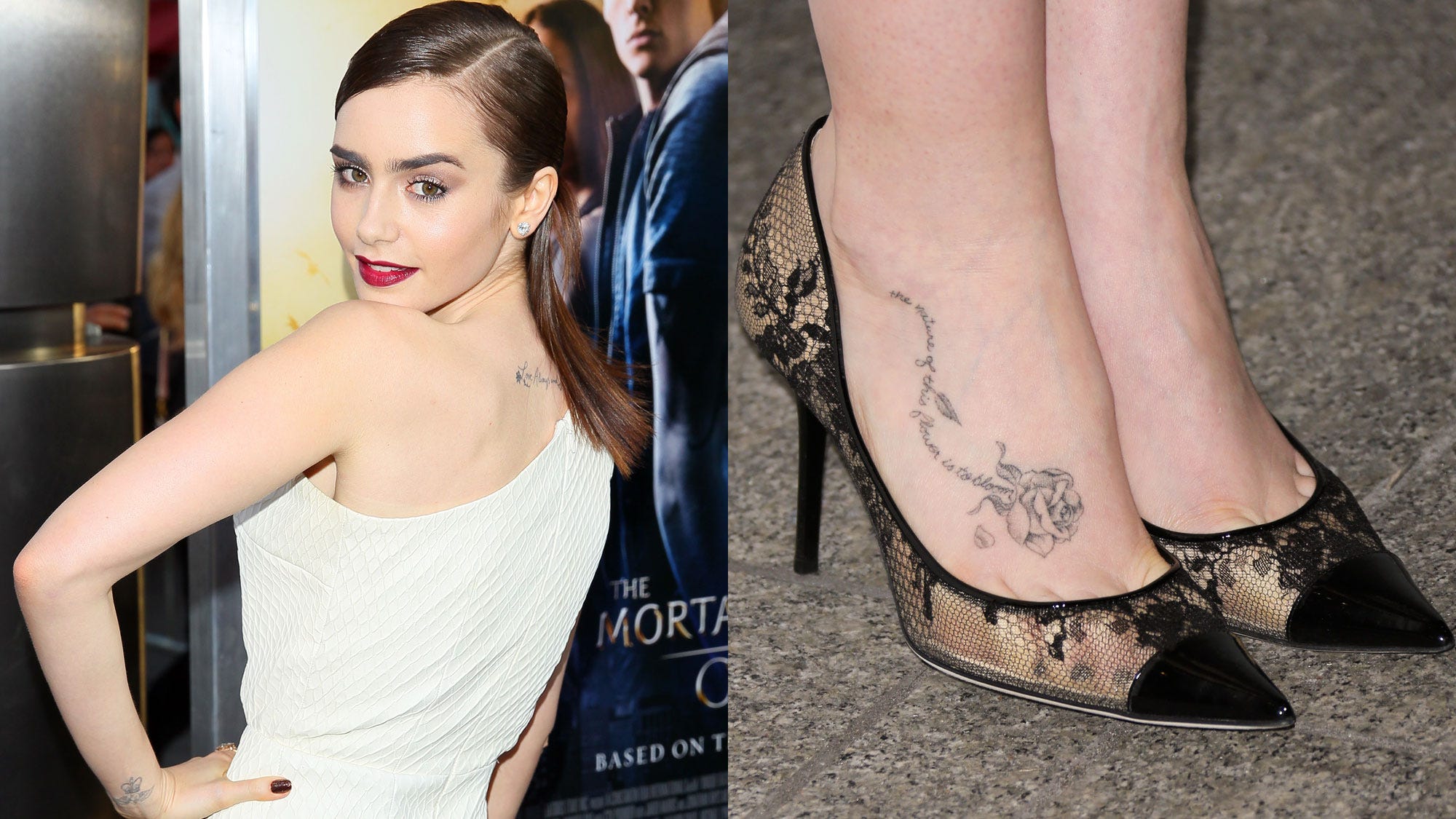
The high placement means the tattoo appears in some red-carpet poses and disappears under a jacket or higher neckline. A turn of the shoulder can reveal it gradually. There’s enough room around the fine lines for the design to stay light rather than becoming a dark patch.
The back piece works because the lettering has room to breathe. Bring a few type references to your artist and check how the phrase follows the curve of your back. The right size matters more than making the words as small as possible.
The rose on Lily Collins’s foot tattoo works with a longer line of script
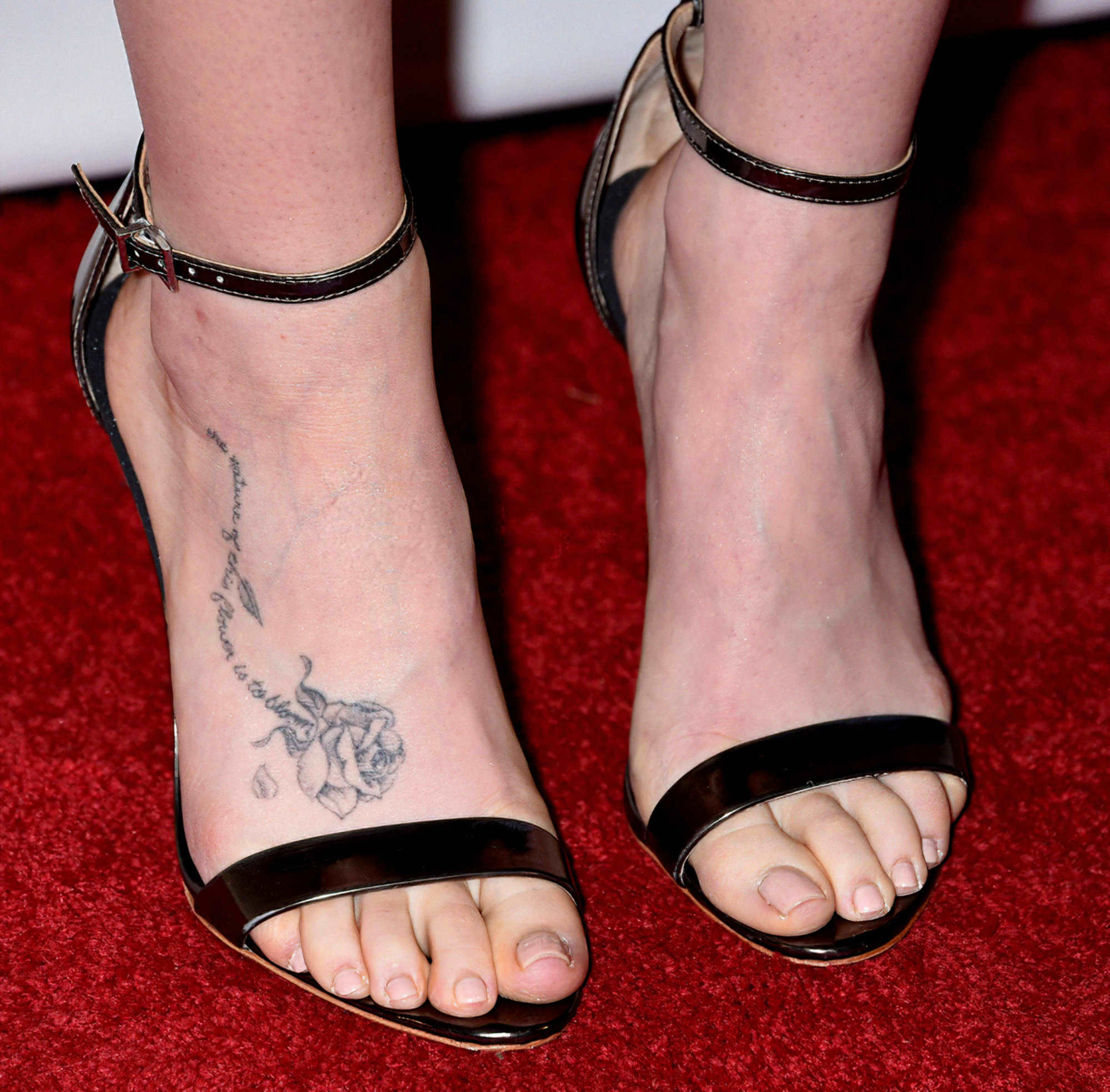
A shaded rose spreads across the top of Collins’s foot, with leaves and petals following the shape of the skin. Cursive writing runs alongside the flower. The rose gives the fine lettering enough visual weight to remain visible with open shoes.
Foot tattoos are hard to judge from many photos. Shoe straps can hide part of the design, and the angle or lighting can flatten the details. In clearer views, the rose’s outline and soft gray shading are easier to see, as is the way the script curves beneath it. The light shading gives the piece a softer, less formal look.
The phrase is associated with the idea that a flower’s nature is to bloom. It fits the rose, which is shown with a stem and leaves rather than as a stand-alone symbol. The image suggests growth without needing a large floral piece. A small tattoo can carry the same idea when its shape has direction and the lettering has enough space.
The rose sits where shoe straps can frame it. In some photos, the black straps become part of the composition; in others, footwear will cover it. That’s worth thinking about with any foot tattoo, since shoes and accessories will sit beside the ink every day.
The petals stay open, and the writing isn’t squeezed into every gap. That separation helps the design remain readable as the foot bends. If you’re planning something similar, ask your artist to show how it will look when you stand and move, not only in a flat drawing.
A second foot view shows the rose’s placement more clearly
A closer photograph shows the same rose from another angle. It sits on the upper foot, while the script follows the arch toward the ankle. Without a full-body pose, the placement is easier to read: the rose and lettering form one composition across the foot.
The petals use fine gray shading instead of solid black, and the narrow script keeps the piece light. A small falling petal adds movement. The style is romantic, but it doesn’t feel overly formal.
Pairing the flower with a quote gives each element a job. The rose carries the image; the words add a personal note. The foot piece is large enough to keep those parts distinct. That matters on a spot where friction from socks and shoes can soften fine lines over time.
Let the flower and the lettering have their own space. The rose should read clearly before someone tries to make out the words, and the script shouldn’t run through the petals. That spacing keeps the design from becoming muddled as it heals and ages.
The butterfly near Lily Collins’s wrist ink feels like a private little sketch
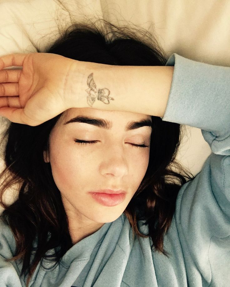
The butterfly is smaller and more casual than the back and foot tattoos. In one relaxed photo, Collins rests her forearm across her face and the fine-line shape appears near her wrist. Its simple outline suits the small scale.
The wings are clear without being filled with tiny details. That keeps the butterfly from competing with rings, sleeves or the movement of the hand. It reads more like a small emblem than a miniature natural-history drawing.
A wrist tattoo is easy for the wearer to see and easy to cover with a watch or cuff. The placement makes this one feel personal even when it shows in a photograph. It also has a different mood from the carefully posed back piece: both are delicate, but one feels formal and the other everyday.
For a small wrist design, a clean silhouette usually holds up better than dense shading. A little open skin and enough size for the outline to remain clear can matter more than adding detail.
The Peter Pan design gives the collection a playful storybook edge
Collins also has a small Peter Pan figure on her upper back, near the script and floral details. Its fine-line treatment fits the rest of the area, while the character brings a playful storybook reference into the collection.
The figure is easy to miss because it isn’t a solid black silhouette. It sits in open skin and becomes clearer when hair or clothing moves away. That makes it feel tucked into the back piece rather than stamped on as a separate graphic.
Peter Pan’s flying pose carries the reference without needing a full scene around it. A few lines and one recognisable figure can say enough at this size. The nearby script and floral mark also show how a small design can be added to an existing area when the scale and line weight work together.
At this size, the pose matters more than tiny details. A clear outline gives the figure a chance to stay recognisable if some fine lines soften with time. The same approach works for a favourite character from a book or film.
Why the collection feels balanced even though the pieces are small
The tattoos share a light line quality, but they don’t repeat one design. The back and foot pieces use script and floral imagery; the butterfly is a simple wrist mark; Peter Pan adds a character. Each has enough open skin around it to remain easy to read.
Placement helps the pieces sit together. The back tattoos stay high and near the body’s centre. The rose follows the long line of the foot, while the butterfly sits close to the hand. None of the designs needs to fill its area.
Some pieces are easier to show than others. A red-carpet pose can reveal the upper-back phrase, while a jacket covers it. Sandals expose the rose; closed shoes hide it. The wrist butterfly appears in ordinary gestures but remains small.
A tattoo collection can grow one idea at a time. The pieces don’t have to match exactly; a shared scale and line quality can be enough to make them feel at home beside one another.
Small tattoos leave less room for clutter. A phrase, rose, butterfly or storybook figure can be distinct without filling the surrounding skin. Here, the placement gives each idea its own space.
Planning a small idea with the same calm feeling
Start with the idea you want to keep: a phrase, flower, symbol or character. Then choose a spot based on how often you want to see it. A wrist tattoo stays in view during the day; a back piece can be covered; a foot tattoo changes with your shoes.
Use reference photos that show the design on skin and at a realistic size. Fine lettering can look elegant on a screen and become hard to read when reduced. A rose may also need more room between its petals than the drawing first suggests. Your artist can adjust the design before it is inked.
You don’t have to plan every future tattoo at once. Collins’s back shows how a small illustration can sit near older lettering without crowding it. Leave room for ideas to change, and make sure the first piece works on its own.
Fine-line work still needs care. Sun, friction, shoes and moving joints can affect how it settles. The delicate look depends on clear shapes and realistic sizing, along with thoughtful placement and aftercare.
Watch Lily Collins talk about her style and creative work
Collins answers fan mail about Emily in Paris in this interview.
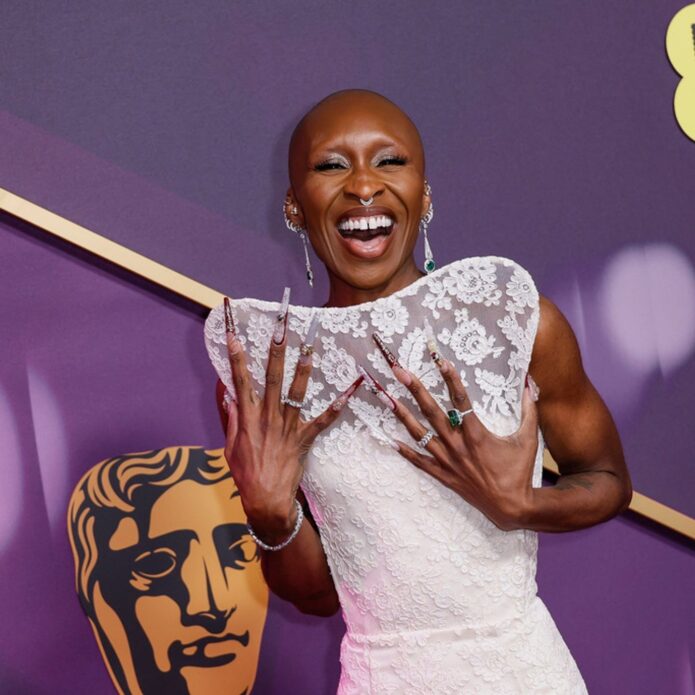
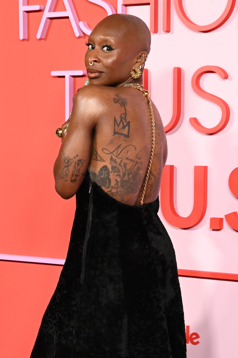
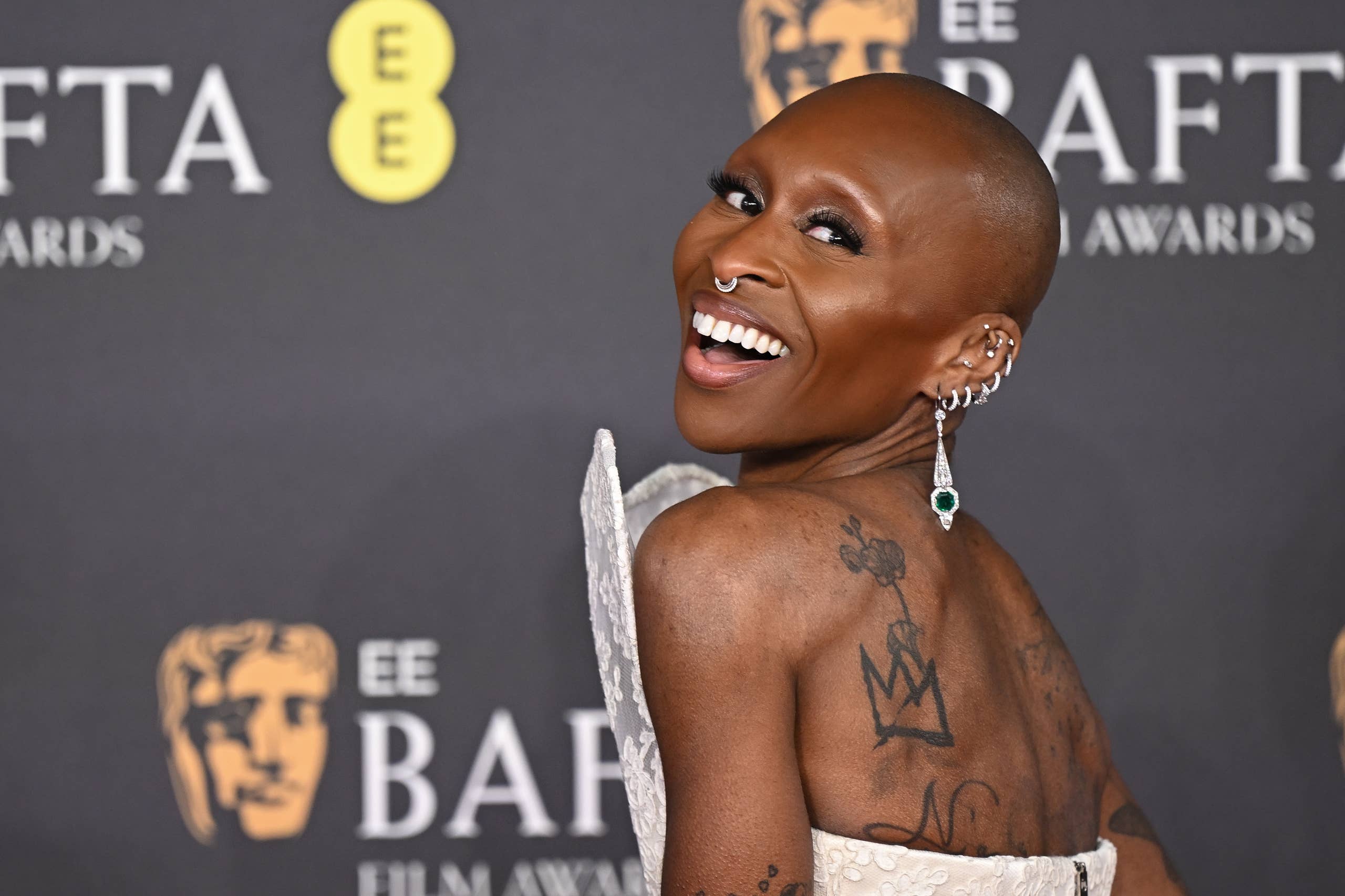
Cynthia Erivo’s tattoos often appear in red-carpet photos, especially when a gown leaves her back or arms bare. Her collection ranges from three small hearts and fine-line flowers to larger shaded pieces across her back and arms. There’s no single style tying everything together.
The back work gathers portraits, symbols and loose shading in one area. Her forearms carry denser lines, while the three hearts down her chest are much simpler. Matching hand tattoos with Ariana Grande add a Wicked connection.
Erivo has spoken about tattoos linked to people and experiences that matter to her. The poppies refer to the poppy fields in Wicked, and the words “For Good” connect the hand ink to the story’s friendship. These pieces sit alongside older work associated with music and family.
Cynthia Erivo’s back tattoo collection is packed with layered line work
The back is the clearest place to see how much ink Erivo has. Several designs share the space: a large shaded composition runs down the middle, with smaller marks around it and toward her ribs. It reads as a group of pieces, not one central picture.
Some of the shading has a soft, portrait-like look. Nearby marks are more graphic, with firm outlines and darker areas. That shift from light to heavy gives the back work depth; your eye moves between the open patches and the denser ink.
The placement also changes how the tattoos appear. A shirt can cover them completely, while a backless gown brings them into view. In red-carpet photos, the ink becomes part of the outfit rather than a small detail at the edge of it.
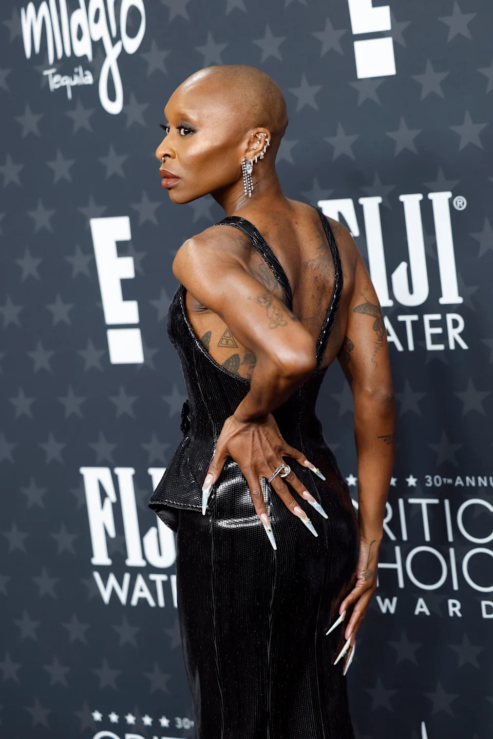
Her shoulder and upper-arm tattoos mix flowers with personal symbols
This angle shows how the back work meets the shoulders and upper arms. One shoulder has a small outlined symbol above a larger, flowing design. Farther down, bands, shapes and shading use a different line weight from the softer marks on her back. The pieces don’t match exactly, which makes the area feel as if it grew one tattoo at a time.
The upper-arm placement lets clothing reveal only part of the collection. A sleeveless top shows the shoulders and arms without opening up the whole back; a halter dress can expose the shoulder line and cover the rest.
The ink leaves some skin open around the individual shapes. Those gaps keep the symbols distinct and stop the area from becoming one solid patch. If you want a tattooed shoulder without a blackout effect, that spacing is one detail to bring to your artist.
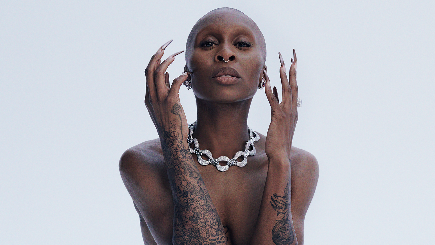
The forearm tattoos show Erivo’s most detailed fine-line work
Close-up portraits show flowers, leaves, circles and fine outlines across one forearm. The pattern has a botanical feel, though the shading changes from one part to another: some areas are tightly worked, while others leave more skin around the lines. That uneven rhythm keeps it from looking like a repeated pattern.
The other forearm uses darker shapes and more solid areas. Together, the arms balance delicate, illustrative work with a bolder graphic look. They’re among the most detailed parts of Erivo’s collection.
The tattoos also show clearly when she gestures or poses with her hands near her face and shoulders. In those photos, the lines travel with the movement of her arms rather than sitting apart from it.
Some accounts have linked parts of Erivo’s body art to musical influences, including Billie Holiday and Nina Simone. Exact identifications can be hard to make from a photo, so it’s better not to name a portrait unless the image makes it clear. What is visible is a mix of portraits, flowers and symbols.
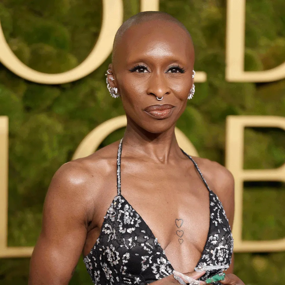
Three small heart tattoos sit in the center of her chest
The three heart tattoos on Cynthia Erivo’s chest are much smaller than the work on her back and arms. They form a vertical row down the center of her chest, with each heart a little smaller than the one above it. The outlines are light and simple.
Instead of one large heart or a tiny mark near the collarbone, the three shapes make a narrow line that follows the center of the body. It shows with a deep neckline without dominating the outfit.
The design gets its character from that small change in scale. There’s no heavy shading or extra decoration. Repeating one clear shape is enough to make the row feel considered.
A second red-carpet angle shows how her back tattoos flow into the shoulders
From this angle, the back and shoulder tattoos read as one larger arrangement. The lines travel across the shoulder blades and toward the arms instead of stopping at the edge of one body area. The piece changes as Erivo turns: from behind, the center of her back stands out; from the side, the shoulder and upper-arm marks come forward.
Her matching hand tattoos with Ariana Grande add a Wicked chapter to the collection. The poppies refer to the story’s fields, and For Good links the words to the friendship at its center. These designs are smaller and more direct than the older back work, but they have a clear place in the mix.
Hands move constantly and are exposed to daily wear, so fine lines there may need more upkeep than ink in a covered spot. Anyone considering hand tattoos should talk with an artist about how the design may heal and age, as well as how visible it will be day to day.
Why her mix of styles works so well
The collection moves between large and small pieces, soft floral lines and darker shapes, covered areas and visible ones. That variety keeps the tattoos from reading as one continuous trend.
Each placement has its own feel. The back gives larger designs space; the arms carry denser work that shows in close portraits; the hearts make a small center point; and the hand tattoos mark a shared Wicked memory. The pieces don’t have to use one style to sit comfortably together.
If you’re taking ideas from Erivo’s tattoos, choose the part that suits you. It might be the three hearts, the open spacing around her shoulder work or the fine-line flowers on her forearms. There’s no need to copy the whole collection.
In photographs, some tattoos appear only when her clothes reveal them, while others are visible in close-up gestures. That change in visibility gives the collection room to feel both personal and expressive.
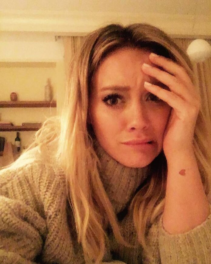
Hilary Duff’s tattoos are small enough that you often see them one at a time: a wrist beneath a cuff, an arm turned toward the camera, a little mark on a hand. The collection includes family names, small drawings, old friends, music and a few playful ideas. It feels more like a scrapbook built over time than one large plan.
Many of the earlier pieces use fine lines. Some of the newer designs have cleaner geometry, darker ink and simple shapes that still read at a small size. The best Hilary Duff tattoo ideas are quiet but easy to recognise: a swallow, a word, a tiny planet, a rose or a simple symbol with a personal meaning.
The photos here show the pieces that are clearest to identify. They make it easier to compare their placement, size and line weight. Duff’s tattoos are especially useful reference for anyone who likes small designs that can stand alone or sit beside other marks.
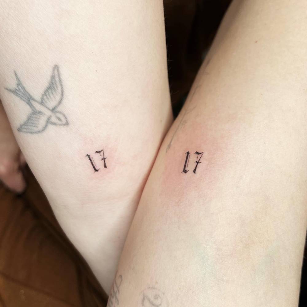
Hilary Duff’s swallow and number tattoos keep her wrists personal
The swallow on Duff’s inner forearm is one of the clearest pieces in the collection. Its wings are open, the body is compact, and the single-needle outline stays light. It doesn’t try to fill the skin around it.
Nearby, a pair of small numbers has a different feel. The type is clean with a slightly old-fashioned touch, almost like a private code. The bird has a sense of movement; the numbers are still and graphic. A wrist tattoo can feel specific without a complicated drawing.
If you like the swallow, keep its outline simple and give it room. Fine lines and a little shading make it softer; a compact black silhouette gives it more weight. For numbers, the font matters. Test the lettering at its final size, since tiny serifs and narrow gaps may blur as a tattoo ages.
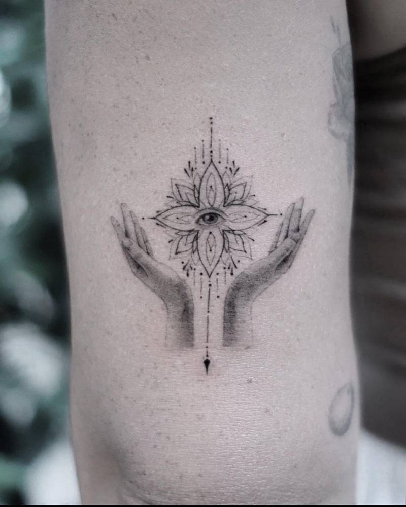
The lotus and evil-eye arm tattoo is one of her boldest pieces
The lotus and eye on Duff’s arm is more detailed than her smaller tattoos. An eye sits at the centre, framed by layered petals, small rays and two hands below. The fine marks give the piece its character; it reads as a complete image rather than a quick symbol.
The arm gives it a clear vertical shape. The hands lead upward, the lotus widens in the middle, and the eye anchors the centre. That structure keeps the detail from feeling crowded. The linework and open skin do more here than heavy shading would.
For a simpler version, the design could be reduced to the eye, petals and hands. Thin lines and soft gray shading keep the same gentle look. The forearm, upper arm or calf can all give a vertical design room to flow.
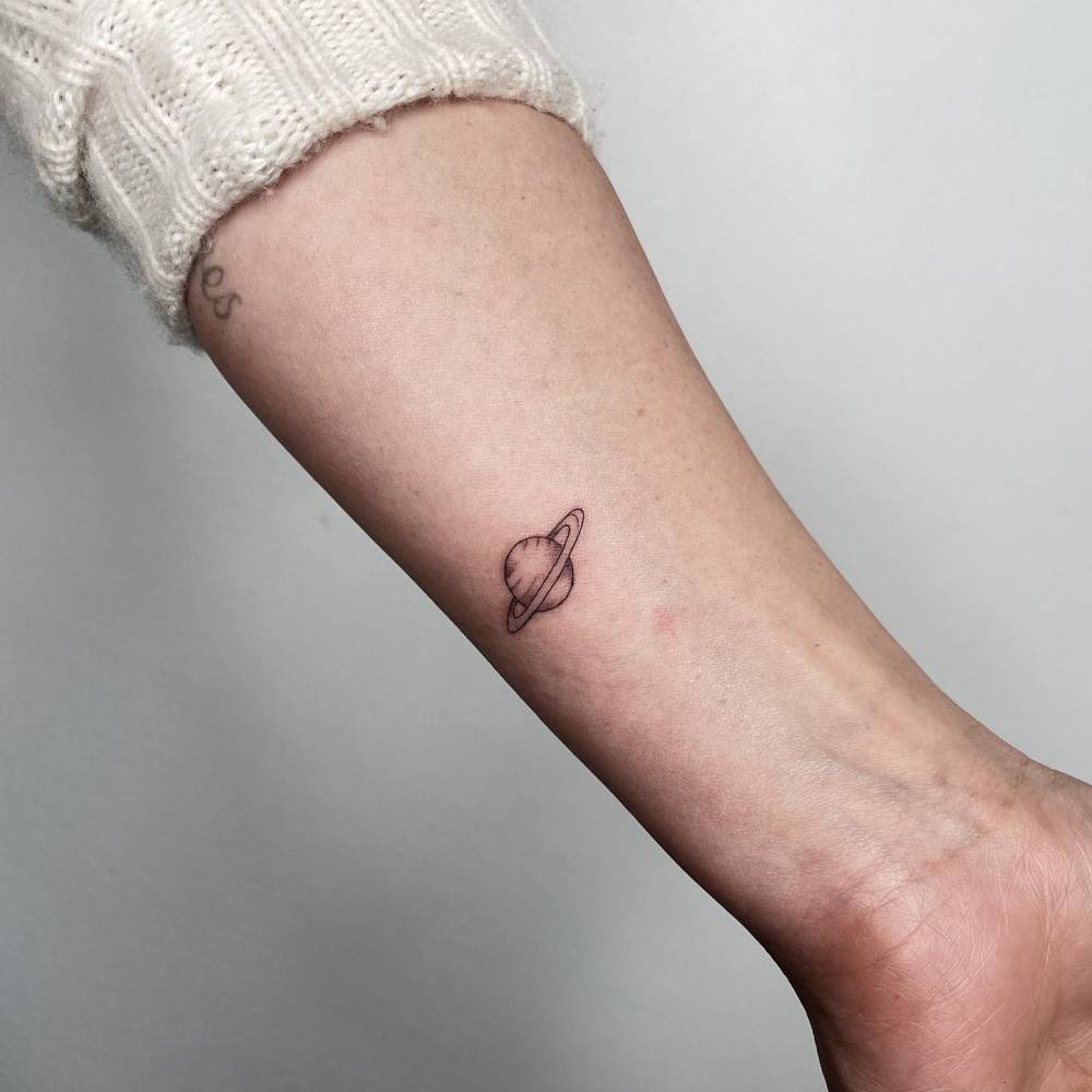
Her tiny Saturn tattoo keeps the space theme simple
Duff’s small Saturn tattoo uses a clean outline and a ring to make the planet recognisable. There is no dark background or constellation around it. The design sticks to one clear shape.
A planet can suggest an interest in space or a personal association, though the photos don’t tell us what Saturn means to Duff. Her version has a loose, almost doodled quality and sits beside other small marks without competing with them.
Keep the ring open. Leave enough space between it and the planet so the lines don’t close together as the tattoo ages. A slightly larger design can hold its shape better, especially if you want to add texture. It can stay black or include a little muted colour and still remain compact.
The Matthew name tattoo is a quiet family tribute
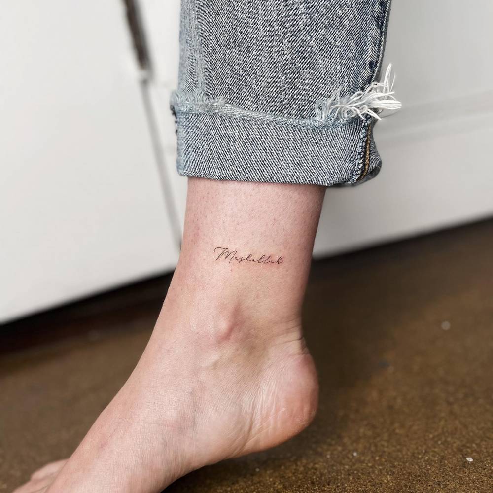
The fine script name on Duff’s wrist reads as a family tribute. It sits close to the pulse, and the lettering is thin and slightly loose. It feels more like handwriting than a display font.
Small name tattoos depend on letters that remain clear at the chosen size. Here, a little irregularity gives the line a personal feel; it doesn’t look stamped on. When the name carries the meaning, a simple handwritten line may be enough.
If you’re considering a name or word, bring handwriting samples to your artist: a note, a quick signature and a slower version with more loops. The stencil can keep some of that character while leaving each letter open. The wrist, inner arm, ribs or collarbone can work, depending on the size.
Her mother lettering and Take Fountain script show the softer side of her ink
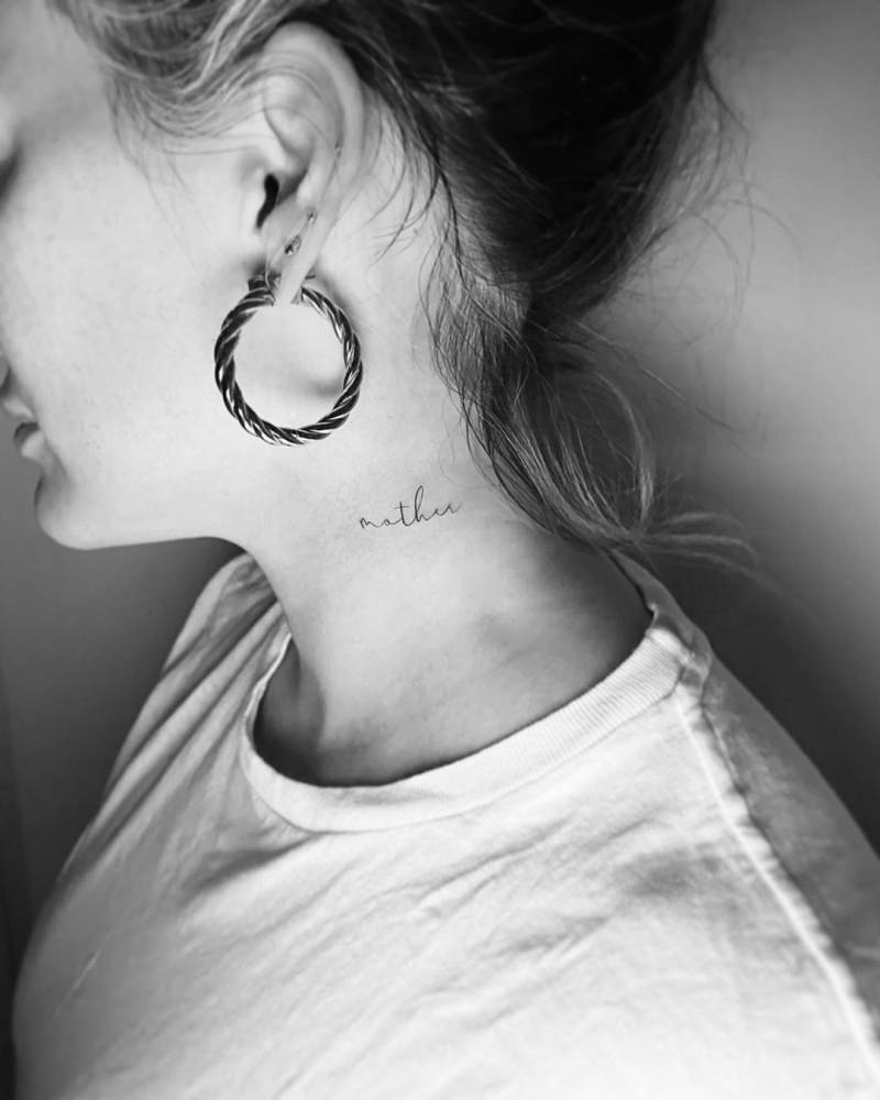
The small word “mother” near Duff’s neck is placed close to her face and hairline. Hair and a neckline can hide it or bring it into view. The light, uncomplicated script suits the small space.
Her Take Fountain tattoo uses a longer line of flowing script on the arm. The phrase is associated with Bette Davis’s advice about finding a shortcut, giving it a Hollywood reference without a large illustration. It has the feel of a private reference that has become part of Duff’s public style.
Short words can fit behind the ear, at the side of the neck or on the wrist. A longer phrase needs more space and a font that won’t blur into one line. Leave gaps between letters and give the words room.
How her collection fits together
Duff’s tattoos share a light feel without sticking to one subject. Family names sit beside birds, roses, a planet, numbers and graphic symbols. Each new piece can find its own place without copying the style of the others.
Placement helps. The wrists and inner arms carry words and small symbols; the lotus and eye have more room to read; the neck lettering stays close to the face. Open skin separates the pieces. Spacing is the quiet trick behind the whole look.
For a patchwork collection, start with the designs that matter most. Decide which ones you want to see often and which can stay private. One or two larger pieces can give the set a different weight, while smaller marks make it feel collected. The symbols don’t have to be the same ones Duff chose.
Simple ideas you can borrow from her style
There are several ideas here that can work for a first or second tattoo: a single-line swallow, a tiny Saturn, a family name in real handwriting or a short word near the neck. The lotus and eye could also be simplified into a smaller black-and-gray design.
First decide whether you want an image, a word or a symbol with meaning just for you. A picture may need more space; lettering needs room for each character; and a simple symbol can feel generic without a personal reason behind it. The strongest small tattoos usually have one clear idea and no extra decoration.
Think about how the tattoo will look years from now. Fine lines can soften, and tiny lettering can become harder to read. An experienced artist can adjust the scale, line weight and placement to help the design hold its shape. If a little more space will help, take that advice seriously.
Why her collection still feels current
Duff’s tattoos feel personal before they feel fashionable. Some use styles that have come in and out of trend, but the collection doesn’t look like a mood board. A name belongs to someone; a rose, swallow or planet can hold a memory or a bit of personality.
Most pieces are small enough to sit easily with everyday clothes. The lighter linework leaves her arms open, and the more detailed lotus has space around it. That balance makes her tattoos useful reference for anyone who wants ink that feels collected, not overplanned.
Take the same approach with your own ideas. Start with a few designs that matter and let the collection grow at its own pace. A small tattoo can stand on its own; a larger one can anchor the group when you’re ready for it. You don’t need to copy a celebrity’s body map.
Final take on Duff’s style
Duff’s collection shows how varied small tattoos can be without looking random. The swallow, numbers, Saturn, family lettering, roses and detailed lotus and eye each have a different feel. Light lines and thoughtful placement help them sit together.
When looking for ideas, notice the open spacing, simple outlines and handwriting that still looks natural. A small tattoo can mark a person, place, song or moment without needing an explanation. It can be quiet and still matter.