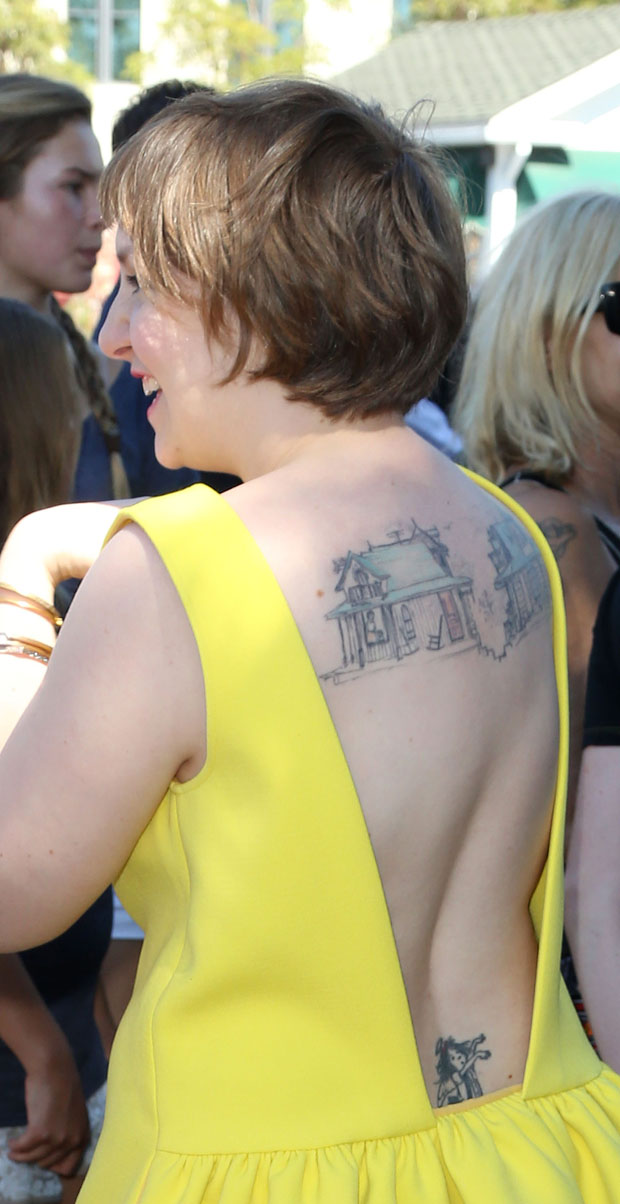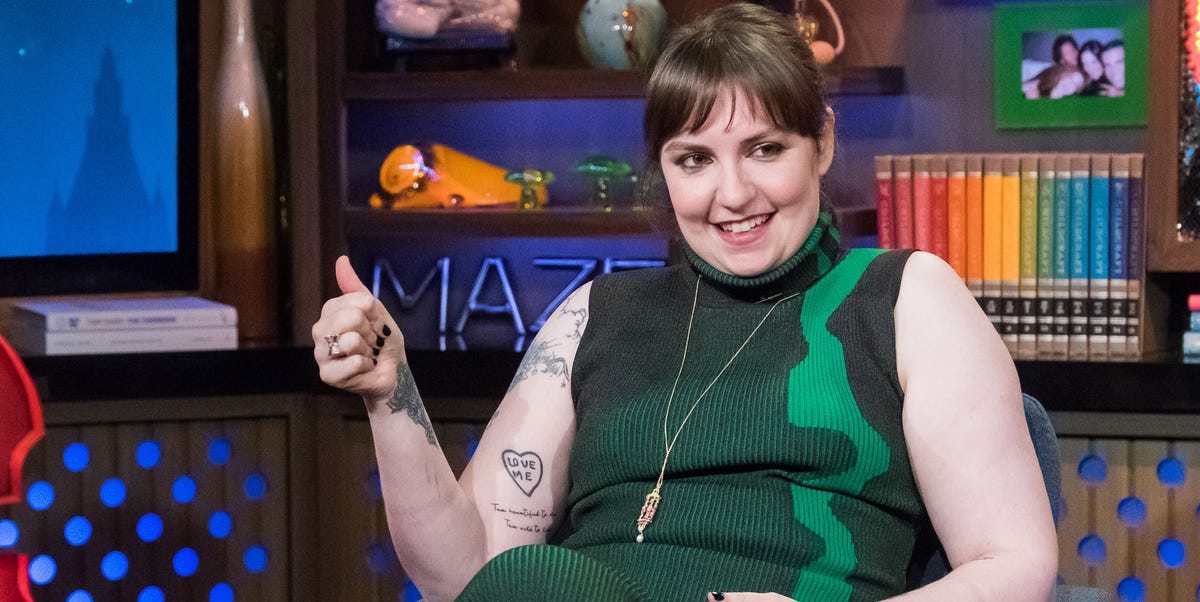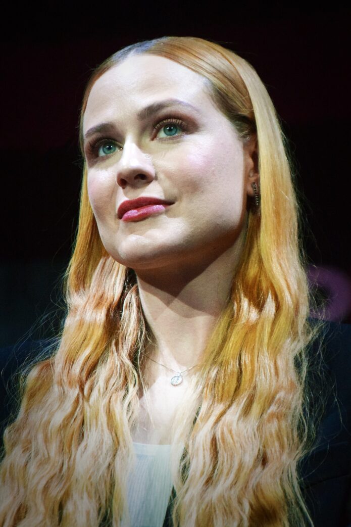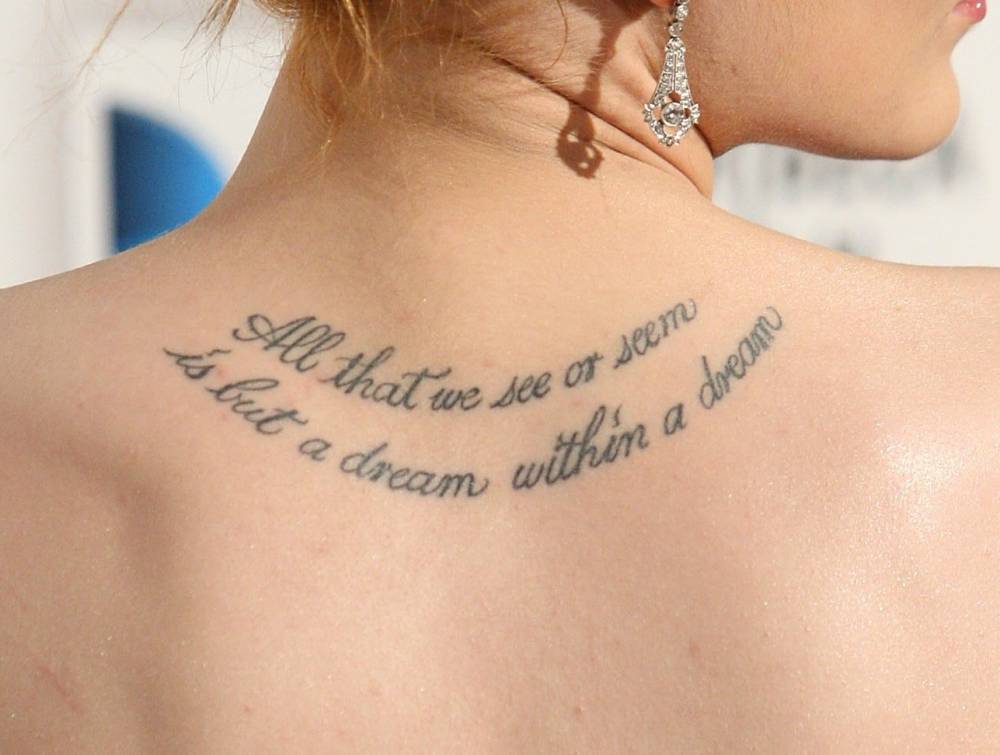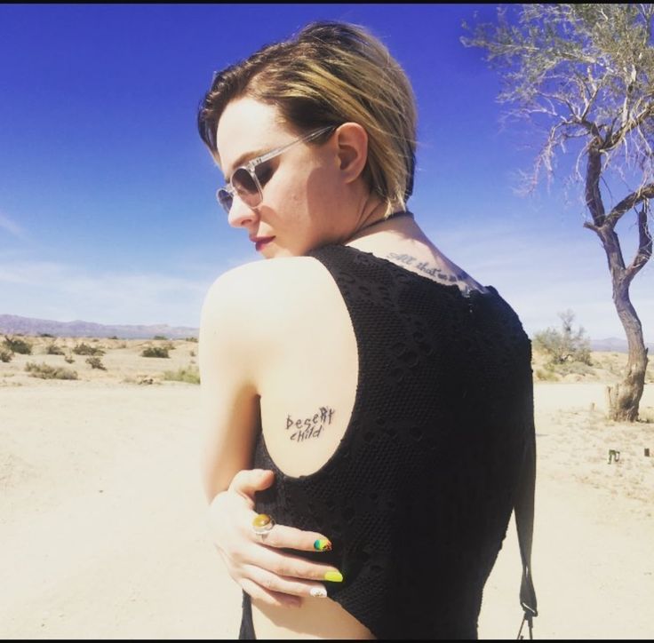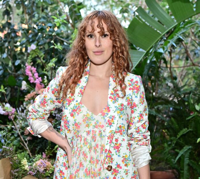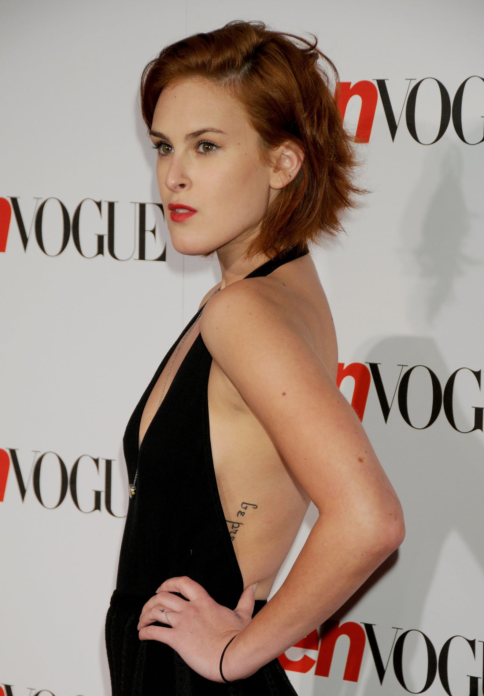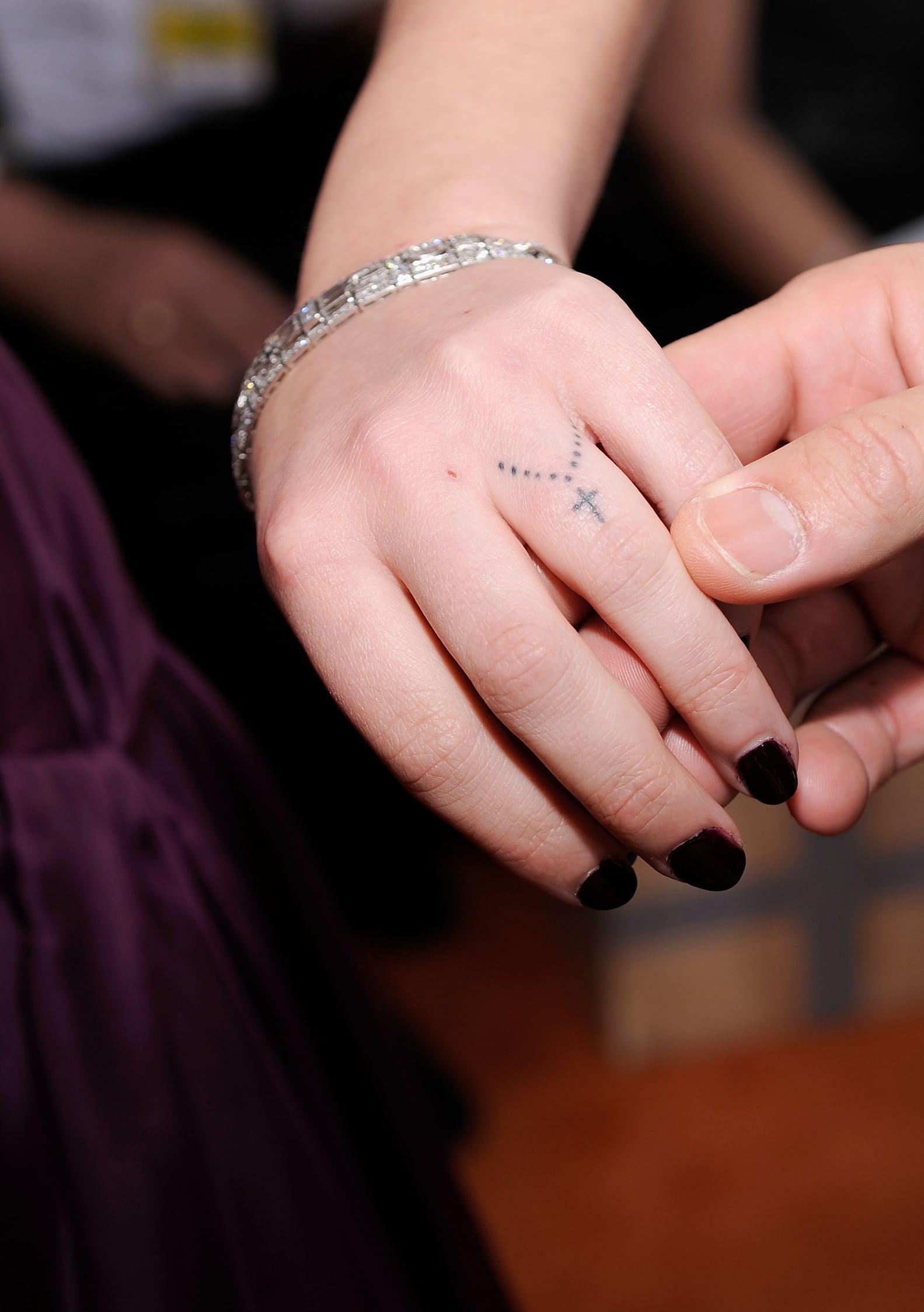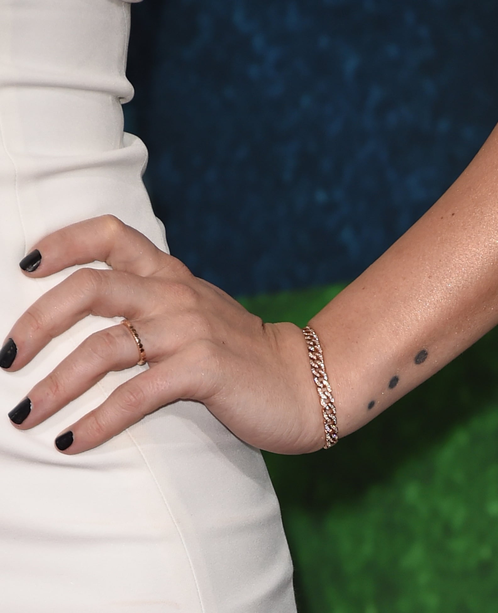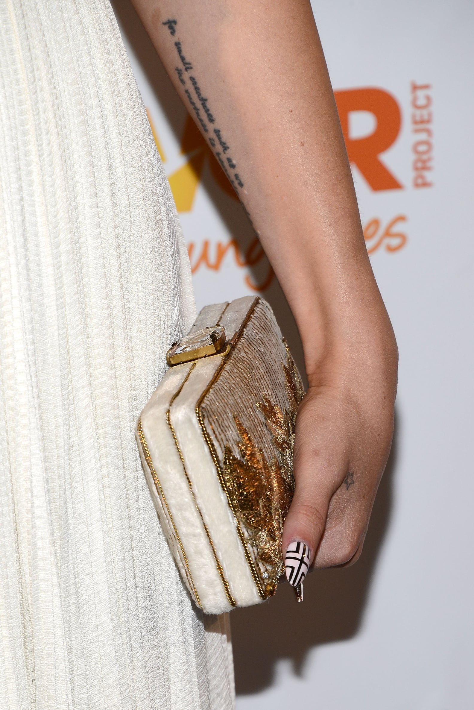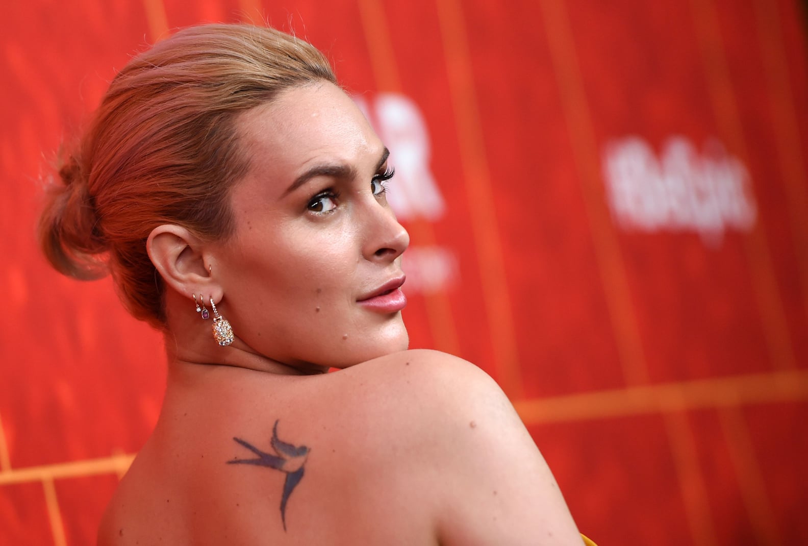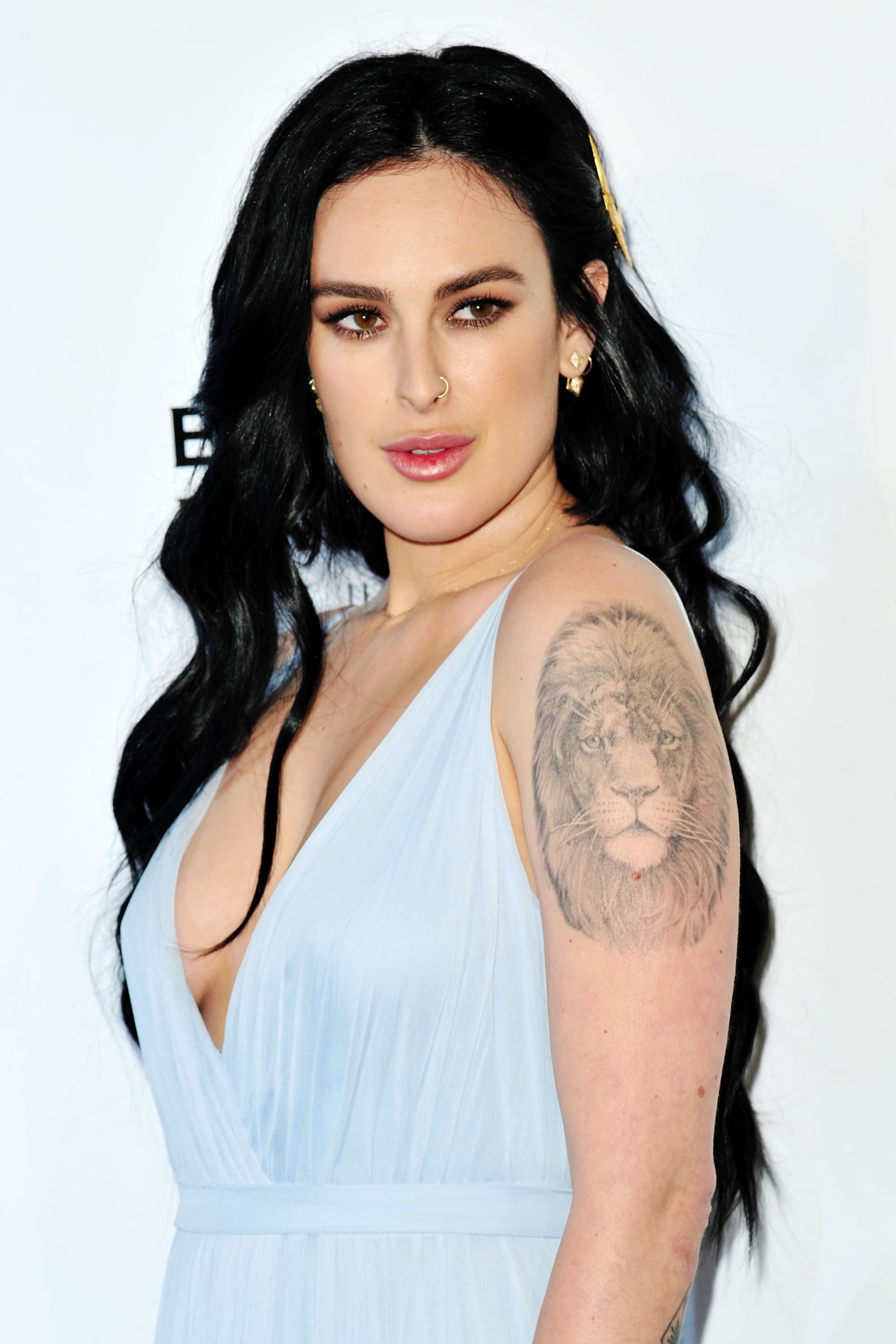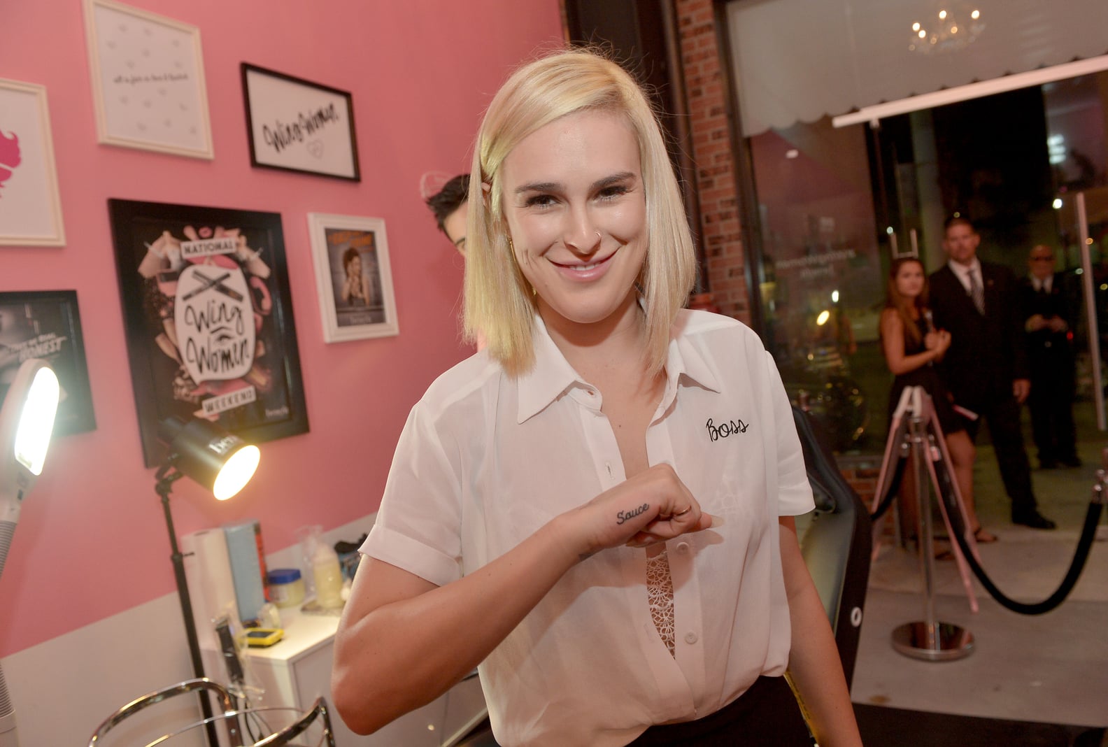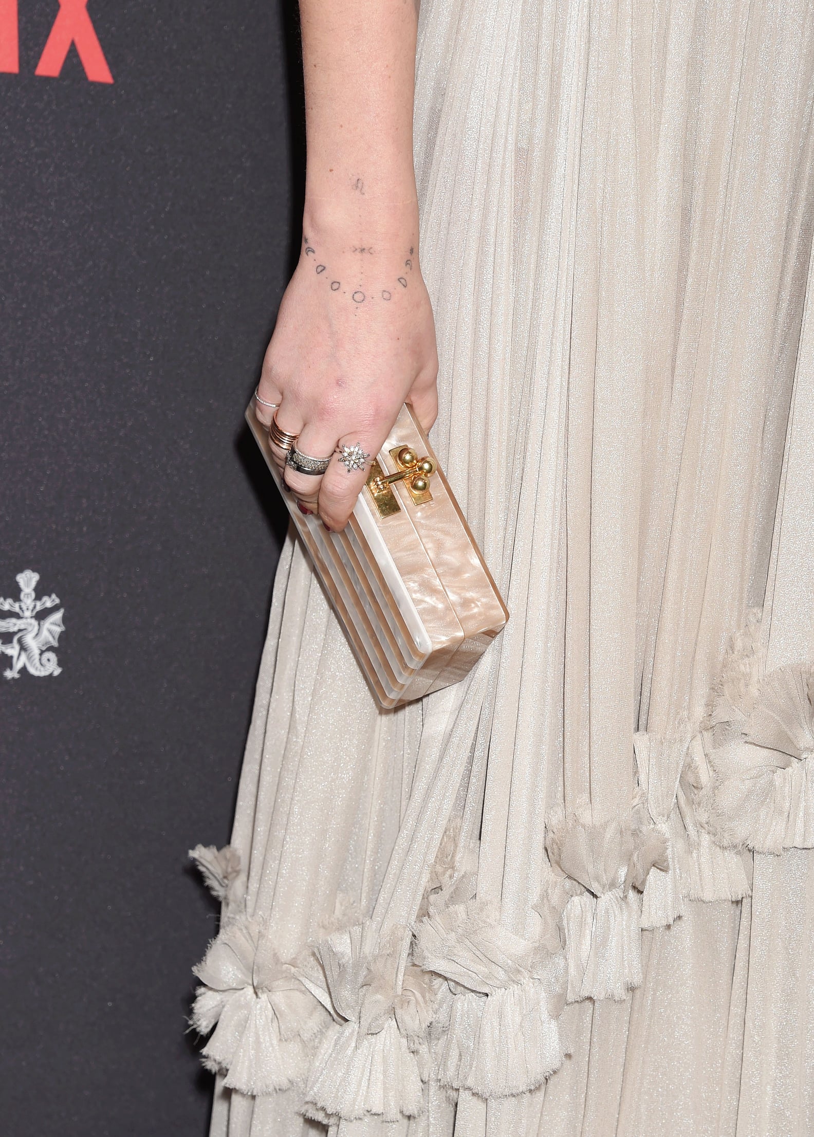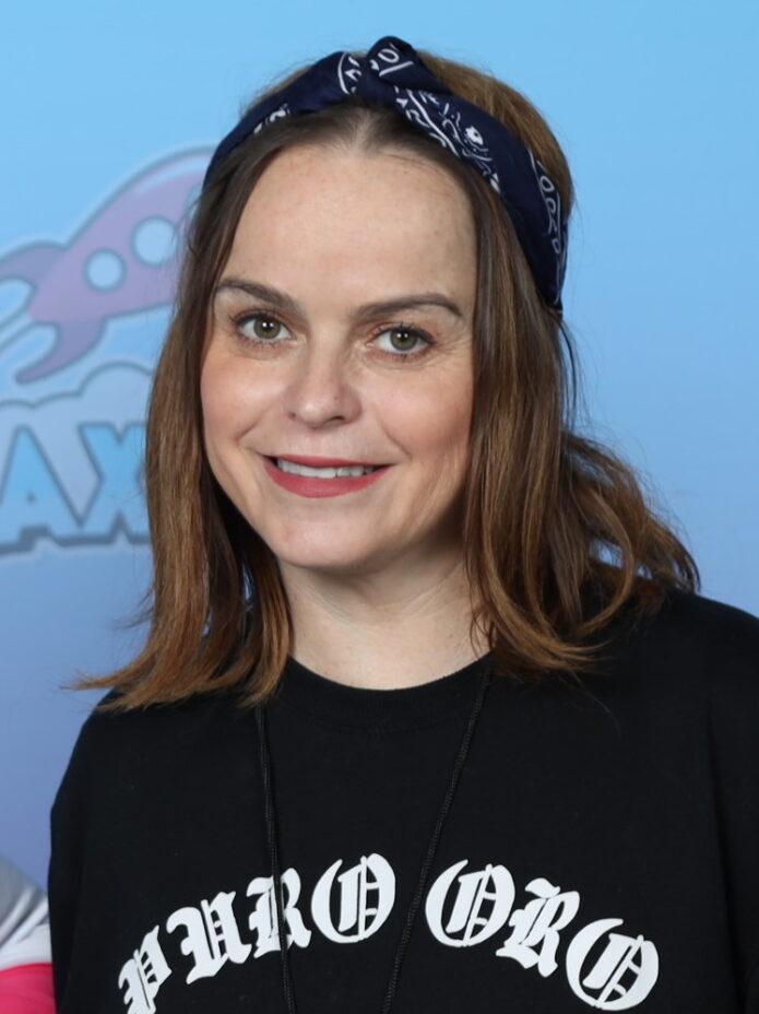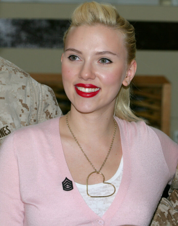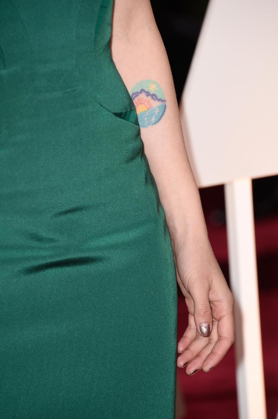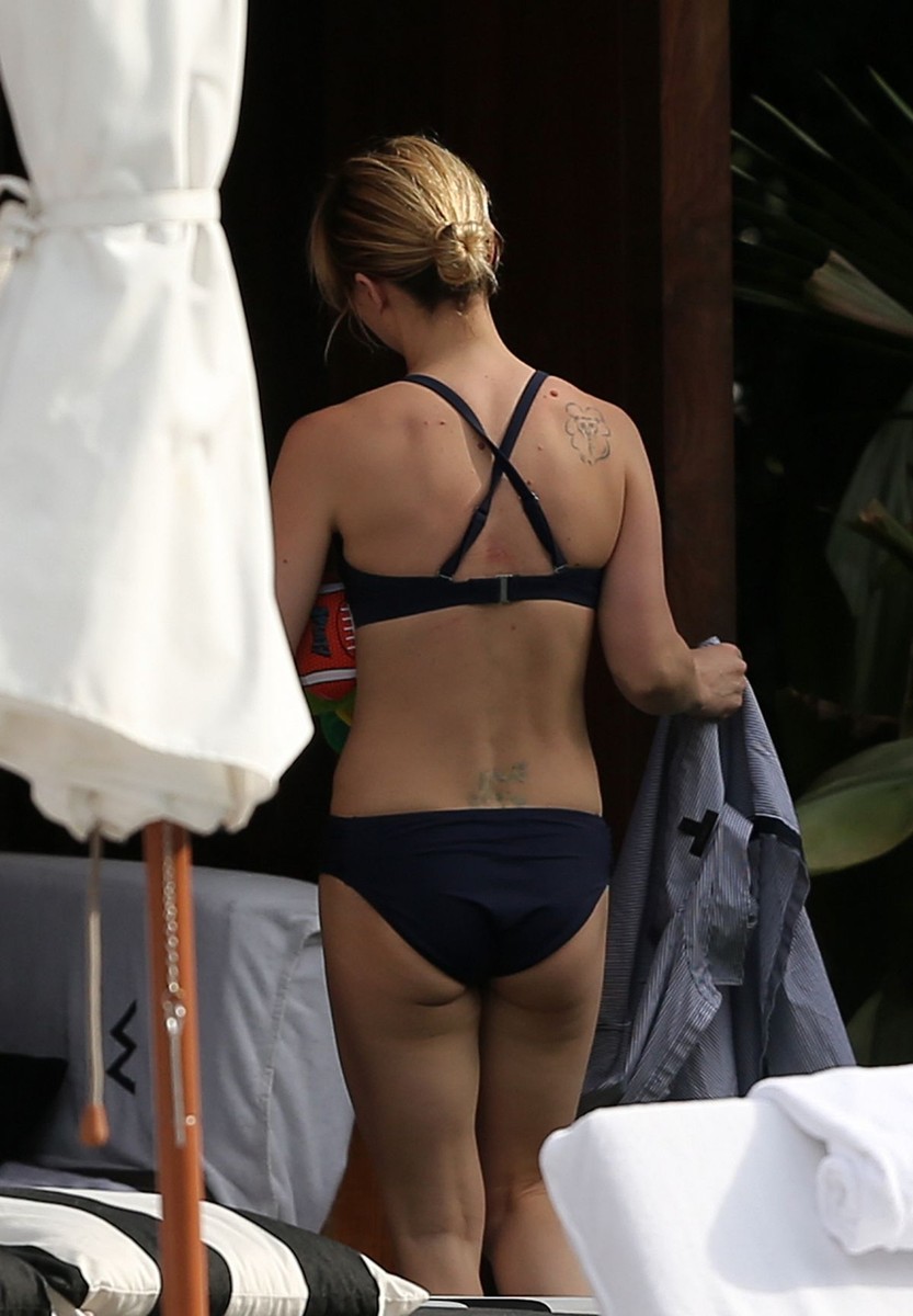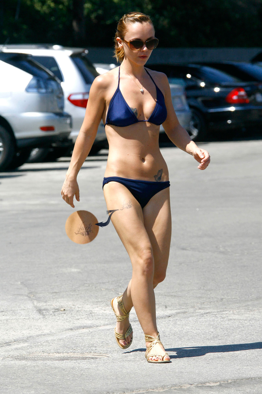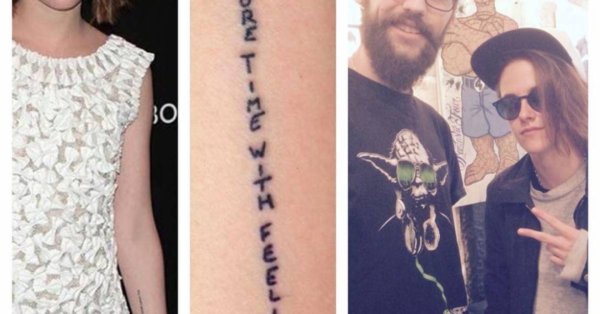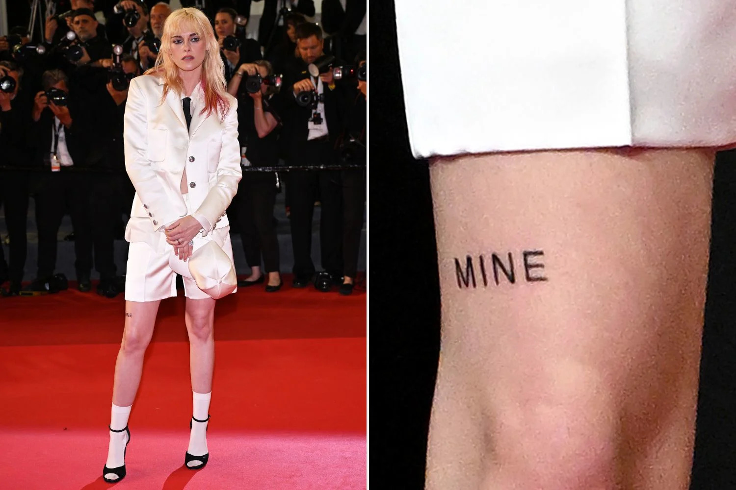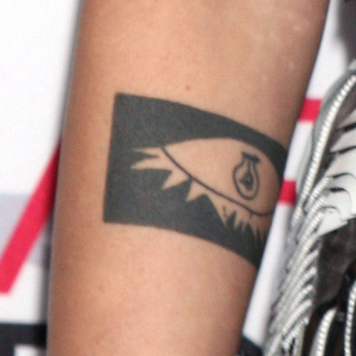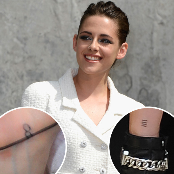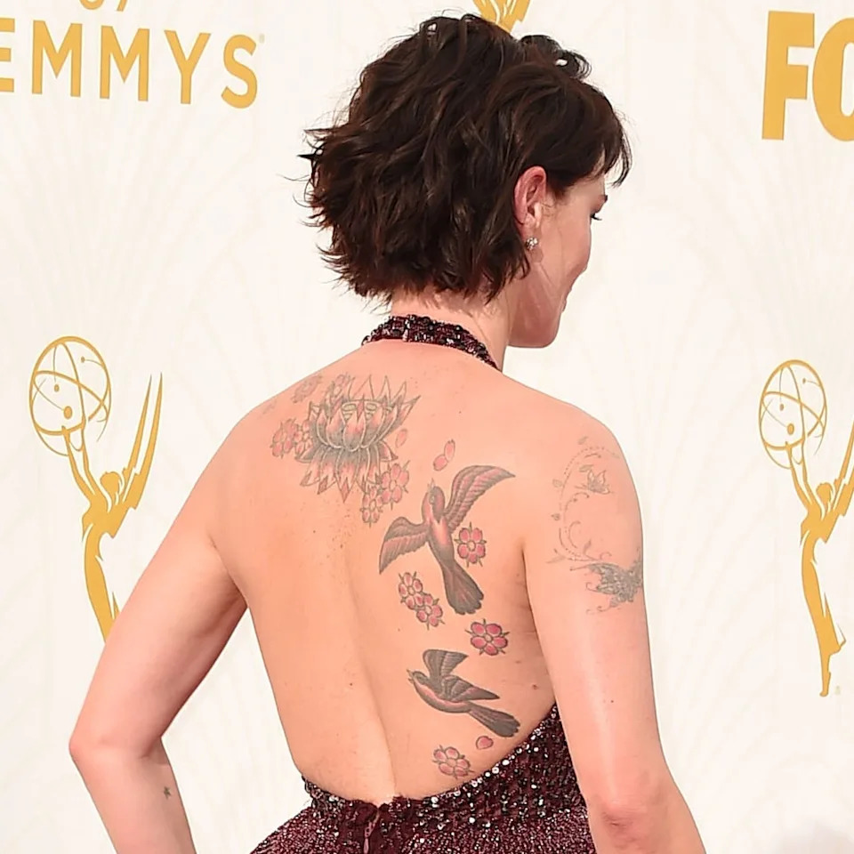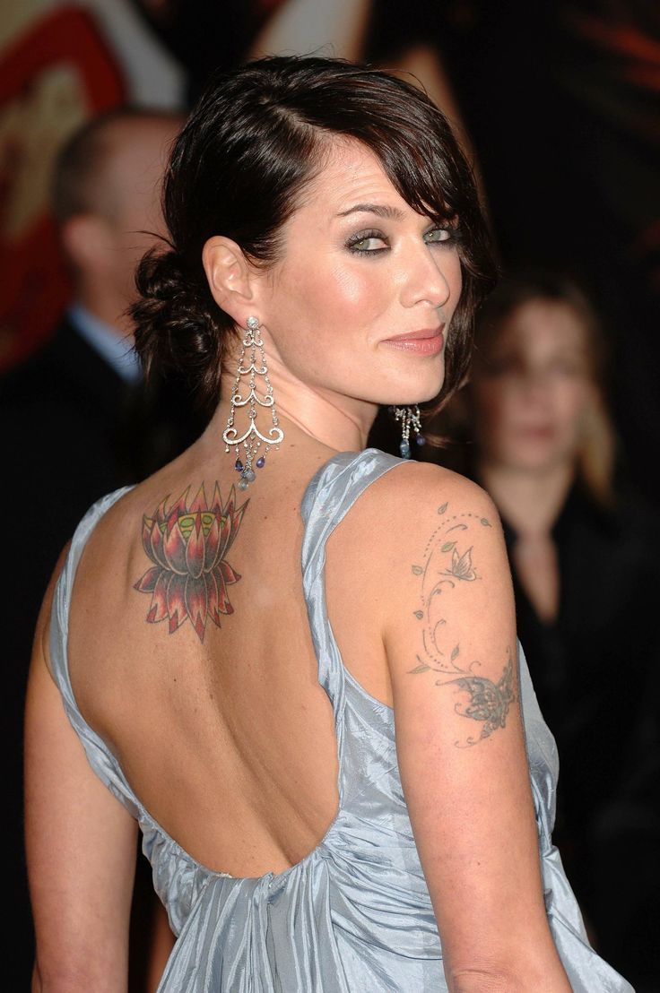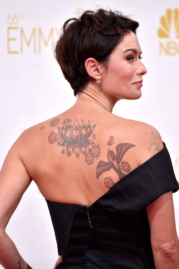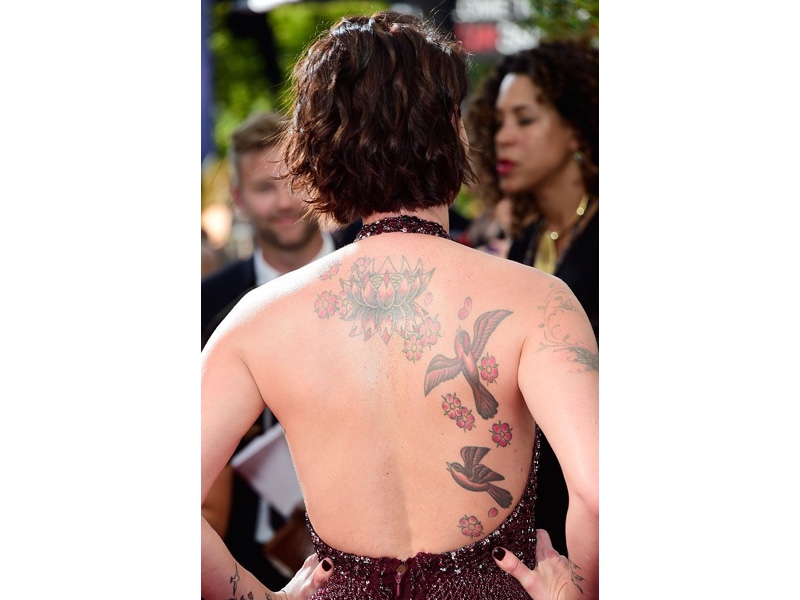
Janel Parrish’s tattoos read like small pieces of her life gathered over time. There are fine-line symbols, short bits of script, letters linked to her family and castmates, and images tied to memories. Some sit on her fingers or feet; others show at the nape of her neck or along an arm. The collection is personal, but it doesn’t look like every piece had to match the others.
Parrish has said that many of the tattoos have a specific meaning. They point to Hawaii, family, music, her Pretty Little Liars character, and people she has lost. That mix gives the work a lived-in feel. Her collection is a reminder that a small tattoo can hold a story without needing to explain it to everyone.
The close-ups below make it easier to see the tattoos themselves and how they’re placed. A crescent with flowers needs different spacing from a word on the bicep, and a deer at the nape has to fit the curve of the neck. If you like delicate tattoos with a personal connection, Parrish’s pieces offer ideas you can adapt to your own life.
Janel Parrish’s moon tattoo turns a family memory into a fine-line piece
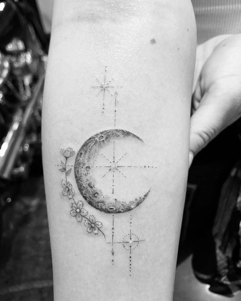
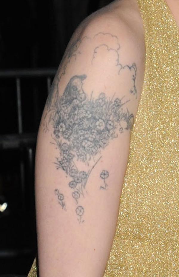
The crescent on Parrish’s forearm is one of the most detailed pieces in her collection. Flowers and fine geometric marks gather around its textured edge, giving the small design more to look at than a bare outline. It stays light, though: the details don’t crowd the moon or turn it into a solid patch of ink.
Parrish has explained that the moon refers to her grandmother’s middle name and nickname. The personal connection gives it the feel of a memorial, while the flowers keep the image gentle. There’s also enough open skin around the crescent to let each part read clearly. It’s a quiet way to remember someone without spelling out the whole story in the design.
If you have a memory you’d like to carry, begin with the object or shape that connects you to it. That might be a moon, a plant, a star, or something less obvious. Add detail only where it helps the image feel like yours. Here, the flowers frame the crescent instead of fighting for attention. The forearm leaves room for crisp lines, though the idea could be simplified for a wrist or moved to the upper arm.
The deer tattoo at her nape is small but impossible to miss
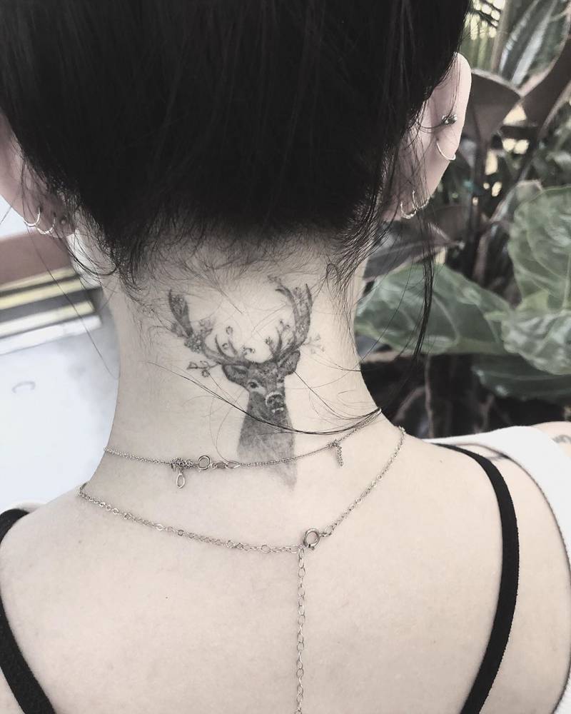
The deer at the back of Parrish’s neck has a more striking look than the moon. It’s a compact black-and-grey head with antlers, sitting just below the hairline. Hair can cover it, but when she wears her hair up, the tattoo becomes the first thing you notice. The narrow space at the nape suits a design with a clear, compact outline.
The deer looks alert without feeling harsh. Shading gives the face depth, while the antlers keep its shape recognizable. At the nape, the overall silhouette has to work before the small details do. You should be able to make out the animal from a few steps away; closer up, the fine shading can bring it to life.
For an animal tattoo in this spot, show your artist references for both the shape and the level of detail you want. Check how the stencil follows the neck when you turn your head. Leaving some space around the antlers can help keep the design from feeling crowded as it settles. If you want more room for detail, the upper back is another option.
Her Pretty Little Liars finger tattoos keep the meaning close at hand
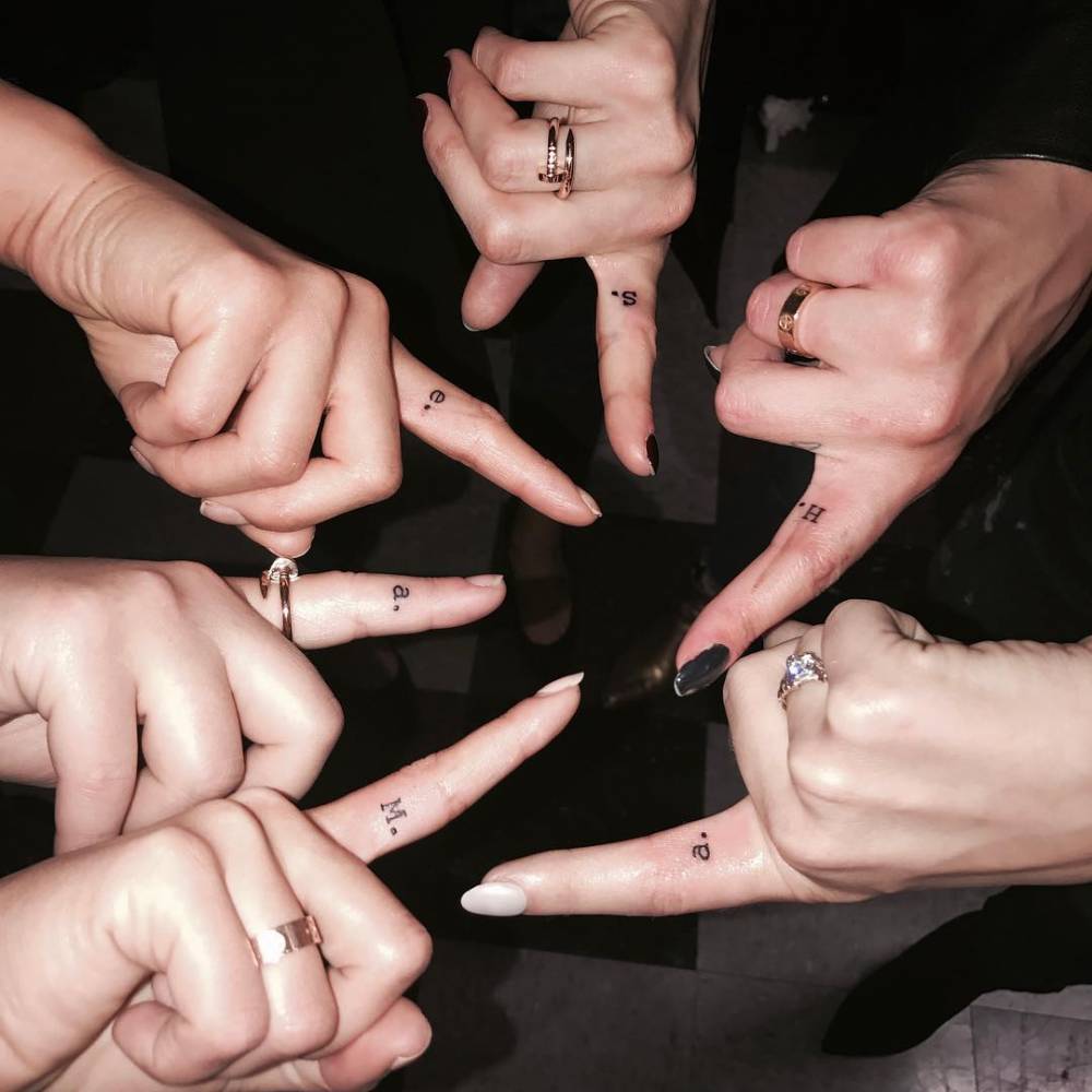
Parrish’s finger tattoo comes from a shared moment on Pretty Little Liars. The cast had their characters’ initials placed on the inside of the index finger, a nod to the shushing gesture in the show’s opening. Parrish got an M for Mona. The letters are tiny, but the group connection gives them a meaning beyond the characters themselves.
Finger tattoos are easy to see and hard to keep pristine. Hands move, rub against things, and get washed often, so simple lettering is usually a better fit than a detailed image. In the close-up, the letters stay compact and legible. There isn’t much reason to decorate them further; the story is already there.
If you’re thinking about an initial on your finger, decide which way you want it to face before the stencil is applied. It can face you or other people, or sit at an angle that follows your hand. Ink on fingers can soften or fade sooner than ink on the forearm, so choose a size that has some breathing room and be prepared for a touch-up later.
The butterfly tattoo shows how tiny symbols stay light
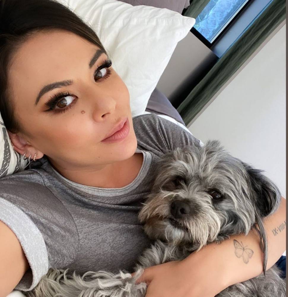
The butterfly on Parrish’s forearm is quieter than the deer at her nape. In the portrait, it looks like a fine outline with just enough detail to define the wings. It sits low on the arm, where a sleeve can cover it and a turn of the wrist can bring it into view.
Butterflies are a familiar choice, but an open shape and considered placement can make one feel individual. Parrish’s design leaves plenty of skin visible inside the wings. That space keeps the small outline from closing up into a dark blur. A butterfly can stand for change, freedom, or a memory, depending on what it means to the person wearing it.
When choosing a small butterfly, look closely at the wing shape before settling on a size. Fine details need enough room to stay distinct, especially in an area that sees sun. A wrist, forearm, shoulder, or ankle could all work; ask your artist what level of detail will remain clear at the size you have in mind.
A wider look at the deer tattoo shows why placement matters
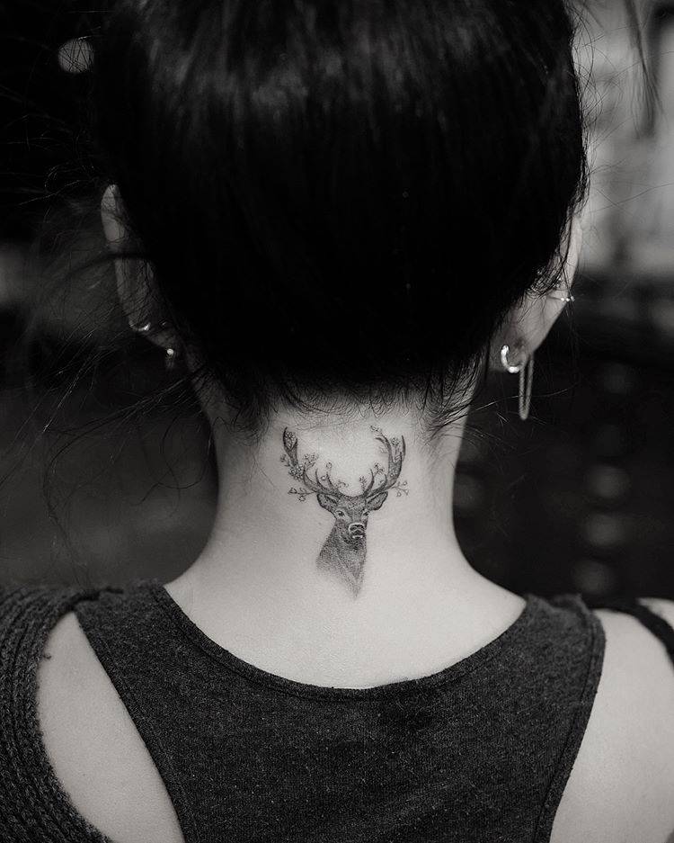
This wider view shows the deer sitting just below Parrish’s hairline. Its antlers follow the curve of her neck, and the head is centred above her shoulders. The close-up shows the linework; this angle makes it easier to see how the placement works when the tattoo is part of the whole silhouette.
The design doesn’t need a background to stand out. The deer already has a distinct outline, and her dark hair gives it contrast. Sometimes the placement gives an image all the framing it needs. Extra leaves, stars, or shading could make this small piece feel crowded.
If you’re planning a tattoo in the same area, look at the stencil from more than one angle. Turn your head and relax your shoulders to see how it shifts with your posture. Consider how it will look when your hair is up, when you’re moving, and with the clothes you usually wear.
How the collection hangs together
Parrish’s tattoos cover different subjects, yet they don’t feel like a random assortment. Their connection is personal: the moon recalls family, the deer marks a chapter in her life, and the finger initial ties back to her castmates. A phrase can serve as a reminder, while the balloon and its later cover-up show that a tattoo’s story can change.
Fine lines and selective darker shading give the collection a loose visual connection. The designs don’t have to match exactly. The lettering stays lettering; the moon and deer have enough shape to read as images. That shared light touch lets the tattoos feel collected over time rather than planned as a matching set.
To build a collection of your own, think first about what you’d actually like to remember. Some ideas may work better as words, others as symbols or larger images. There’s no need to decide on every piece at once. Adding tattoos gradually gives each one room to mean something on its own.
Simple ideas you can borrow from her style
Parrish’s choices offer a few useful ideas. Let a meaningful symbol stand on its own. Give lettering enough space to stay readable. The nape offers the option of covering an image with your hair or showing it when you want to. Keep finger designs simple, since that skin takes a lot of wear. None of these choices needs to be showy to work well.
The same design can feel different depending on where it sits. A moon on the wrist is easy to see; on the ribs, it’s more private. A deer at the nape draws attention, while a small animal on the ankle may stay mostly for you. Think about when you want to see the tattoo yourself, as well as when other people might notice it.
It’s also worth taking time with the practical decisions. Double-check any spelling, ask how the lines may age, and look at healed work from the artist. Make sure the image has enough room and that you’ll be comfortable with its placement day to day. Those choices help keep a meaningful tattoo clear over time.
Why her choices feel personal
Parrish’s tattoos feel connected to the life around them, not to a single trend or visual theme. They touch on family, friendship, Hawaii, music, work, memory, and reminders to herself. Even a tiny initial has a reason behind it.
That gives the collection a warm, approachable quality. You might like the moon without copying its flowers, or use an initial that belongs to someone in your own life. A deer, a phrase, or a small balloon can be a starting point if it means something to you. The useful part isn’t copying Parrish’s tattoos; it’s seeing how a personal detail can become a clear design.
The close-up photos help because they show the tattoos as they are: small, distinct, and placed with care. They also show that a collection can change. An old design might be softened, covered, or joined by something new. The story doesn’t have to stop when the tattoo is finished.
Final thoughts
Janel Parrish’s tattoos share a thoughtful feel, but each one has its own story. The moon and flowers refer to family, the deer gives the nape a strong focal point, and the Pretty Little Liars initial keeps a cast connection close. The French phrase serves as a reminder, while the balloon shows how a tattoo can take on a new form over time.
If you’re collecting references, notice what makes each piece readable: a clear shape, open space, lettering that isn’t squeezed in, and a placement that suits the design. A tattoo doesn’t need to be large or elaborate to matter. A letter, a crescent, or a few well-chosen words can be enough.