codex

Karan Aujla Tattoos: Family Tributes, Punjabi Lettering and His Memorial Sleeve

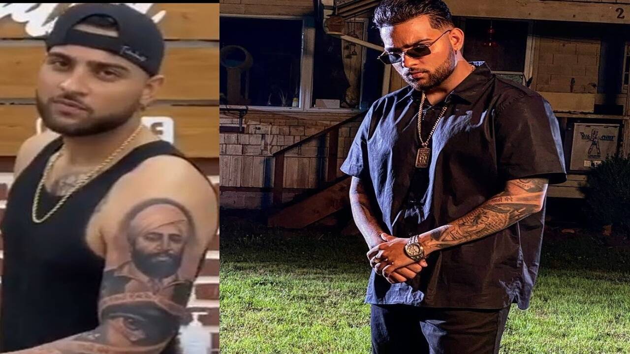
Karan Aujla’s tattoos include black-and-grey portraits, Punjabi lettering, a large eye, wolves and a clock. The clearest reported story is his tribute to Bhagat Singh and Udham Singh; other accounts connect pieces to family. Photos show the designs, but not every story behind them.

Karan Aujla’s tattoo collection at a glance
Karan Aujla tattoos: Memorial sleeve close view

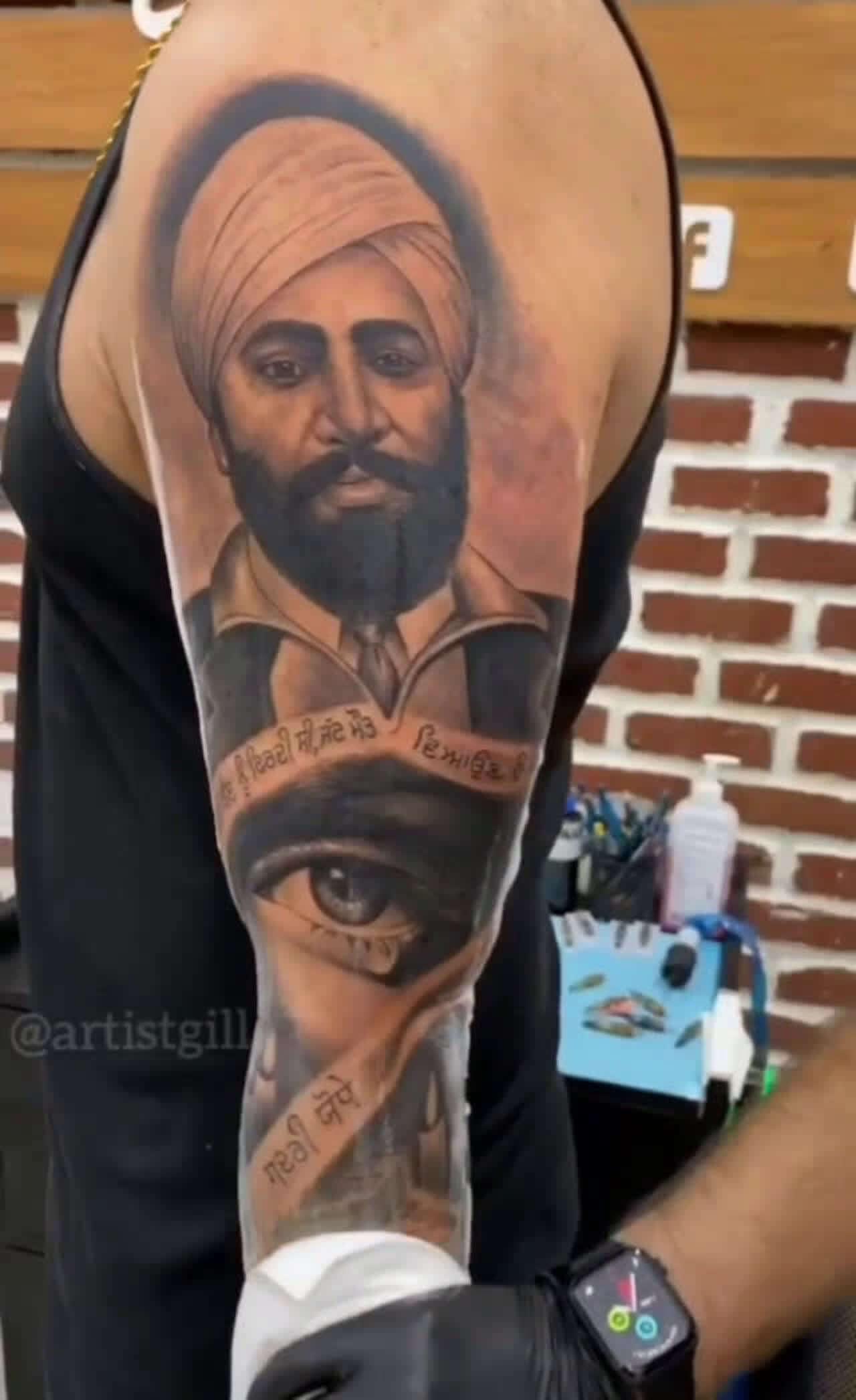
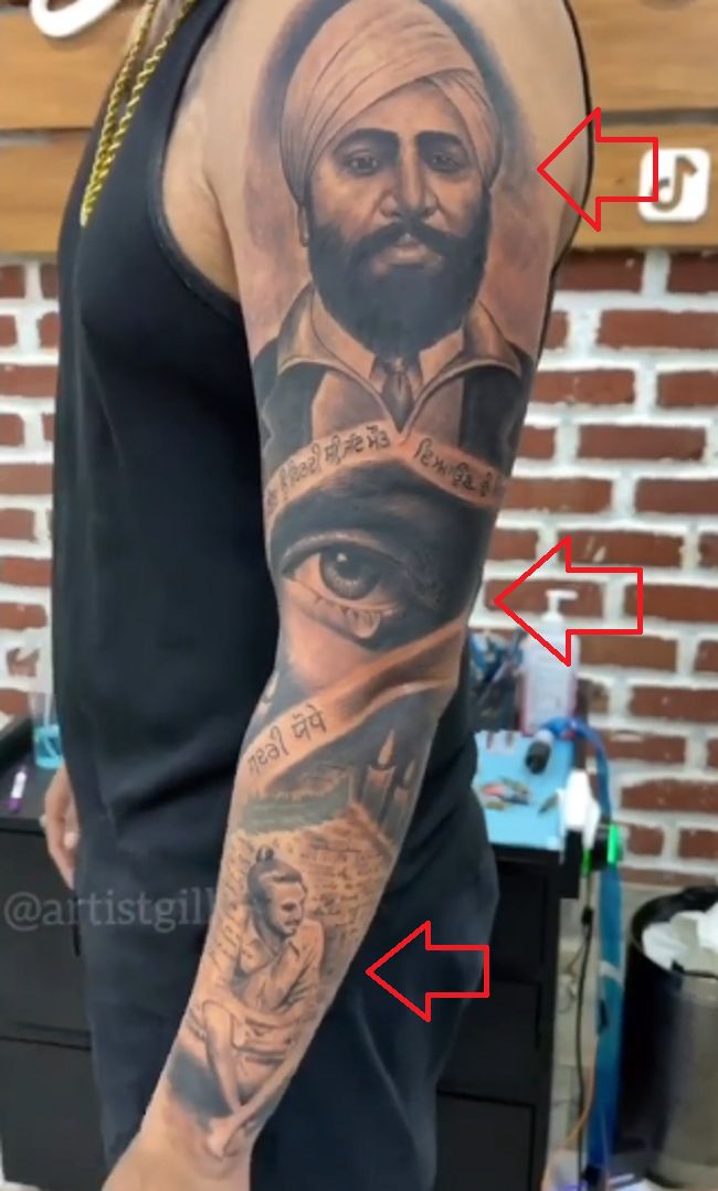
One forearm composition starts with a turbaned portrait and a large eye, then continues into Punjabi script and shaded imagery. It reads as a connected arm piece rather than a single tattoo set apart from the rest.

Other reported pieces include family portraits and Punjabi names, wolf designs and a clock. The sections below separate what published accounts say about them from what photos show.

The Bhagat Singh and Udham Singh memorial tattoo
Karan Aujla tattoos: Longer sleeve view

The Times of India reported that Aujla got a black-and-grey tribute to Bhagat Singh and Udham Singh ahead of Shaheed Diwas, an observance connected to the martyrdom of Bhagat Singh, Sukhdev and Rajguru. The report gives the timing and subjects; photos show portraiture, shading and Punjabi text.

In the close view, a turbaned, bearded portrait sits above a large eye; Punjabi script crosses the arm, and shaded imagery continues below. The photograph doesn’t make every lower detail clear enough to identify.

Looking closely at the main composition

Changes in shading and open skin link the parts of the sleeve. The portrait leads, the eye and lettering break up the dark areas, and further forms continue below. Each detail remains distinct within the larger piece.

The same design looks different as the arm turns. Close-ups show the detail; wider views reveal how the image wraps around the forearm.

Lighter passages inside the portraits and open areas around the lettering help separate the elements. That spacing keeps the dense work legible in both close-ups and wider portraits.

Family pieces carry a quieter mood

Tattoo coverage identifies a portrait of Aujla’s mother on one arm and her name, Rajinder Kaur, written in Punjabi on his chest. Published descriptions connect the pieces to family, though they don’t explain every private detail behind them.

Their placements give the tattoos different kinds of visibility. The chest lettering may be covered by everyday clothes; the arm portrait is easier to see in short sleeves. One can be kept close, while the other often appears in public photographs.

Wolves, the clock and the smaller details

Body Art Guru describes wolf designs on Aujla’s arm and links them to family: one tattoo shows a wolf, while another uses two wolves to represent his sisters. That is the reported connection; the designs don’t need an extra meaning added to them.

A clock near the wrist carries another reported memory. Aujla has said it relates to the time his mother passed away. It sits among the larger arm pieces without taking over the whole sleeve.

Why that moment matters
Karan Aujla in a contextual photograph: Public portrait context; not tattoo evidence
Karan Aujla in a contextual photograph: Promotional context; not tattoo evidence

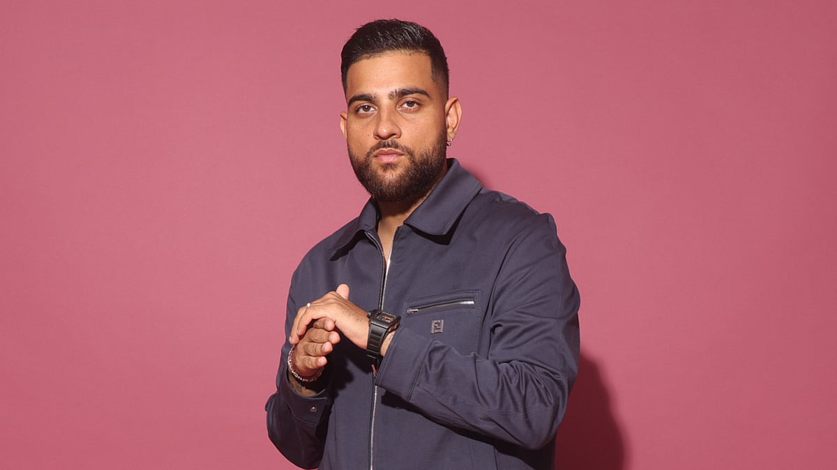
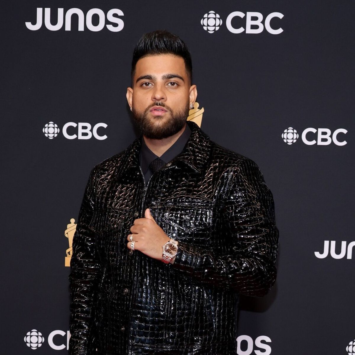
These red-carpet and promotional portraits place Aujla in public settings, but jackets cover his arms. They add career and fashion context; they don’t establish where a tattoo sits or what it depicts.

A short-sleeve performance photo may reveal part of a forearm piece, while a relaxed pose can hide the inner arm. Close tattoo photos show linework and placement more clearly. Each kind of image answers a different question.
Karan Aujla in a contextual photograph: Career context; not tattoo evidence

Black-and-grey realism and strong contrast

Across the visible pieces, black-and-grey shading ties together portraits, the eye, Punjabi script and wolf imagery. Dark shadows anchor the designs; lighter passages keep the faces and lettering distinct.

The subjects vary: a family portrait, historical figures and animals. A shared palette lets them sit on the same arm, though the photos don’t show that every tattoo was planned as one sleeve.

Fine facial detail can soften over time, while stronger shadows and space between elements help the designs remain readable. An artist can show how a sleeve will look from several angles and at its actual placement.

The difference between documented meaning and visual reading
Karan Aujla in a contextual photograph: Article context; not tattoo evidence

Published accounts tie the memorial portraits to Shaheed Diwas and connect family pieces, wolves and the clock to personal stories. The remaining marks can be described by appearance and placement; a photograph alone doesn’t tell us why he chose them.

What to take from Karan Aujla’s visual choices

Start with a subject that matters to you and a reason you can explain. Aujla’s best-documented piece honours historical figures; if you’re considering a portrait, choose the person before settling on the reference image.

A sleeve can grow in stages. A portrait may anchor it, with script or smaller designs linking later pieces. Leave enough space and contrast for each element to read on its own.

Placement changes who sees a tattoo. Chest lettering may stay covered; arm ink appears more often, and a wrist design shows when your hands are out. Decide which pieces you want to keep private and which you’re comfortable showing.

Ask the artist to plan around the arm in motion. A forearm curves and turns, so check the stencil from several angles before the work begins.

The bottom line

Aujla’s tattoos bring family and Punjabi history into a black-and-grey arm collection. The Bhagat Singh and Udham Singh tribute is the best-documented piece; his mother’s portrait and name, wolves linked to his sisters, and the clock near his wrist add other reported stories. Photos show the placement and shading, while some details remain his to explain.

Brian Schottenheimer Tattoos: Jireh, Grit, Faith and Family Ink

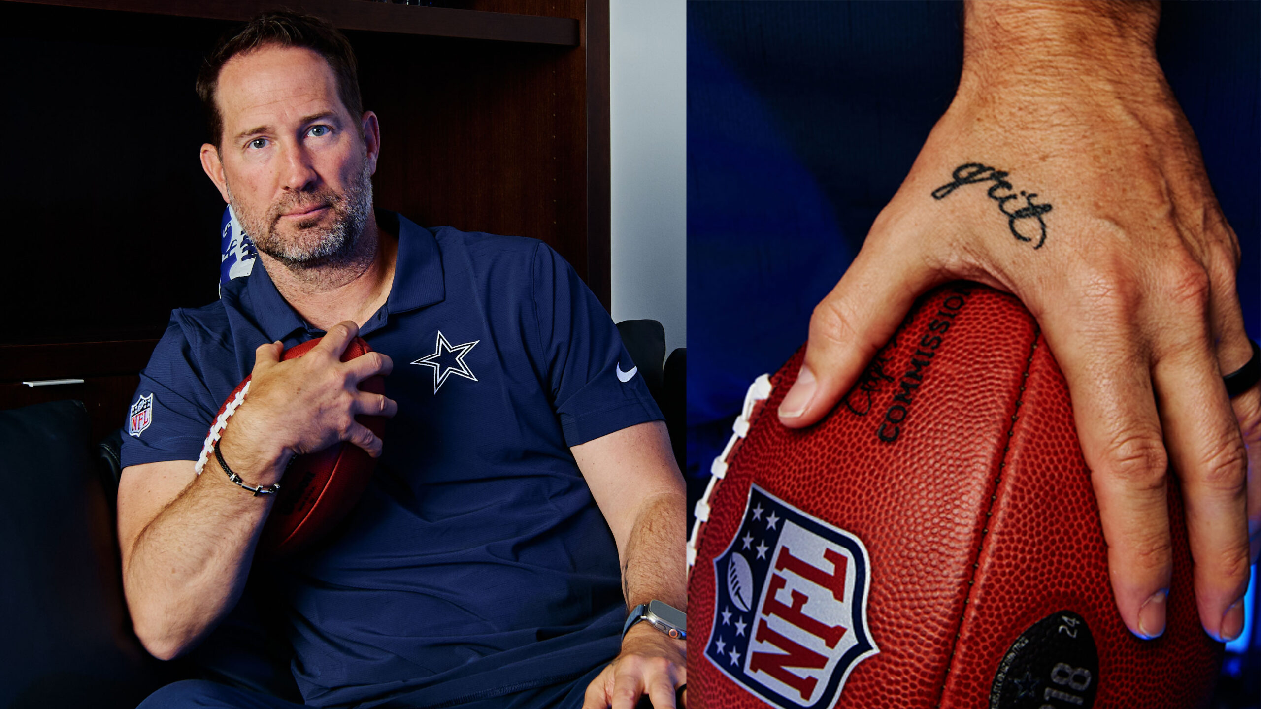
Brian Schottenheimer told ESPN he has five tattoos, all added since 2022. Four are visible on his left arm and hand, with another on the opposite side of his left forearm. He treats them as reminders of faith, family, Tennessee and the attitude he wants to bring to football.

Brian Schottenheimer’s collection starts with meaning

The pieces are small: words, numbers and a cross made from three nails. The close ESPN image shows the hand tattoo as Schottenheimer holds a football; the other press portraits provide context, not close evidence of the ink. The visible designs use mostly black lettering and simple linework, without forming a continuous sleeve.

Brian Schottenheimer tattoos: Brian Schottenheimer tattoo close-up

Faith keeps the first note simple

Below his left elbow, the word “Jireh” comes from Hebrew and means “The Lord will provide.” Schottenheimer linked it to the Maverick City Music song “Jireh,” which he listens to in good and difficult moments. He described the tattoo as part of his Christian faith and spiritual journey.

The three ideas fit in one line

Cursive lettering on the outside of his left forearm reads “faith family football.” Schottenheimer calls these his three “whys,” the priorities beneath his work and identity. A Cowboys press portrait accompanies this section but doesn’t show the tattoo close up.

Brian Schottenheimer in a contextual photograph: Brian Schottenheimer contextual portrait; not tattoo evidence

A code that stays personal

On the inside of his left wrist is “TN” followed by 17, 27 and 19. He calls it a “life license plate”: TN stands for Tennessee, 17 is his wife Gemmi’s birthday, 27 his son Sutton’s and 19 his daughter Savannah’s. It sits just above his watchband, easy to see and easy to cover.

Brian Schottenheimer in a contextual photograph: Brian Schottenheimer contextual Cowboys interview photo; not tattoo evidence

A daily checkpoint

The word “grit” is tied to Schottenheimer’s friend, songwriter Jason Ingram, who has “Hope” between his forefinger and thumb. Schottenheimer chose a word of his own for the attitude he tries to bring to coaching and life. He says grit means working harder, fighting longer and staying steady through highs and lows, including as a husband, father and friend.

Brian Schottenheimer in a contextual photograph: Brian Schottenheimer contextual portrait; not tattoo evidence

The last idea stays concise

The newest confirmed tattoo is a three-nail cross below “Jireh,” closer to his left elbow. Schottenheimer said it represents the nails from the crucifixion and reminds him of Jesus’ suffering and sacrifice. He estimated it took 25 minutes to tattoo, compared with 15 to 18 minutes for the other pieces.

Why the open space matters

Schottenheimer has left the top of his forearm open for a possible Cowboys tattoo, perhaps a Lombardi Trophy or Super Bowl ring if the team reaches that point. He wants the design to mark a specific achievement, so he’s waiting to decide. The accompanying introductory portrait is contextual, not a close view of the blank area.

Brian Schottenheimer in a contextual photograph: Brian Schottenheimer contextual introductory portrait; not tattoo evidence

What makes the collection work

His five tattoos are compact, but each has a reason Schottenheimer shared with ESPN: faith, family, Tennessee, grit and a Christian symbol. The unused space is the one part he has left for a future team milestone. Press portraits add context; his interview supplies the meanings behind the marks.

Gracyanne Barbosa Tattoos: Carnival Stars, Lower-Back Ink and Placement Ideas

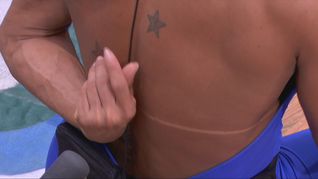
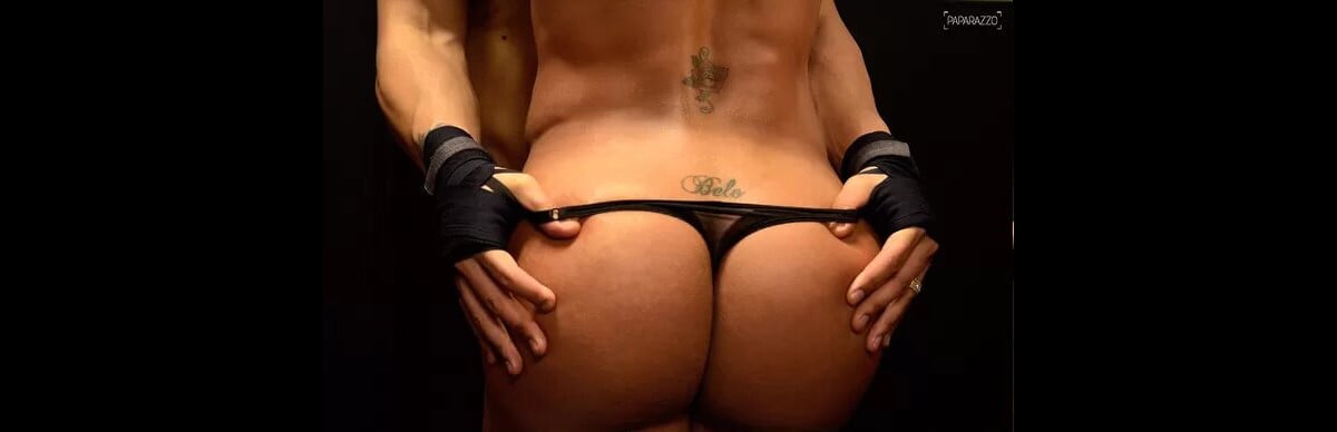
Gracyanne Barbosa is a Brazilian fitness model, dancer, television personality and longtime Carnival figure. Photographs show stars across her upper chest and the name Belo across her lower back, a tribute to the singer and her former husband. A smaller mark sits above the lettering, but the available close-up doesn’t make its design clear.

What Gracyanne Barbosa has actually said about her Carnival life

Gshow reported Gracyanne’s conversation with Daniele Hypolito about costume friction. Tight material can rub against sweaty skin and leave dark patches, scars or small burns. Gracyanne said she had tattoos placed over some of those marks, and that the tattoo on her calf also relates to Carnival.

That’s the clearest account of what ties the collection together: the work she does and the costumes she wears. She hasn’t named the meaning or artist behind every visible design, so Carnival is the shared context rather than a confirmed explanation for each one.

The stars across her upper chest

Gracyanne Barbosa upper-chest star tattoos: verified tattoo photograph

A Gshow still shows two dark, softly shaded stars across Gracyanne’s upper chest and shoulder. The close crop makes their shape and placement easier to see, though it doesn’t show the rest of her collection. They sit where a neckline or Carnival costume can reveal them or cover them.

The stars are compact, but their darker shading keeps their outlines visible in a moving performance setting. For a similar placement, consider how much line weight the design needs to read from a distance and alongside costume details.

The lower-back Belo tattoo

Gracyanne Barbosa lower-back Belo tattoo: verified tattoo photograph

The name Belo is written across Gracyanne’s lower back, just above the bikini line. The tattoo was made as a tribute to the singer, her former husband, and has appeared in public photographs for years. Swimwear and Carnival costumes can reveal it; ordinary clothing can cover it.

The available reporting doesn’t explain how she feels about the tattoo now, and its visibility doesn’t make that a public obligation. The same close photo shows a smaller, darker design higher on her torso, but the crop and lighting don’t establish exactly what it depicts.

Spacing the smaller pieces

A small design at the centre of the torso shifts with breathing, posture and movement. A tattoo that looks centred while standing may sit differently when someone bends or twists.

If you’re considering several small designs in that area, leave enough space for each to read on its own. Crowding separate pieces together can make them look like one dark patch as they age.

The wider performance context

Gracyanne’s tattoos are seen in a working setting: rehearsals, parades, fitness appearances and costumes worn for long stretches. Sweat, straps and fabric can rub against the skin, which gives her account of covering costume marks a practical context.

The designs don’t need to match to feel connected. Carnival and performance link the stars, the reported calf tattoo and the marks she chose to cover. Photos also catch them differently as she moves or changes costumes.

Formal event styling changes the read

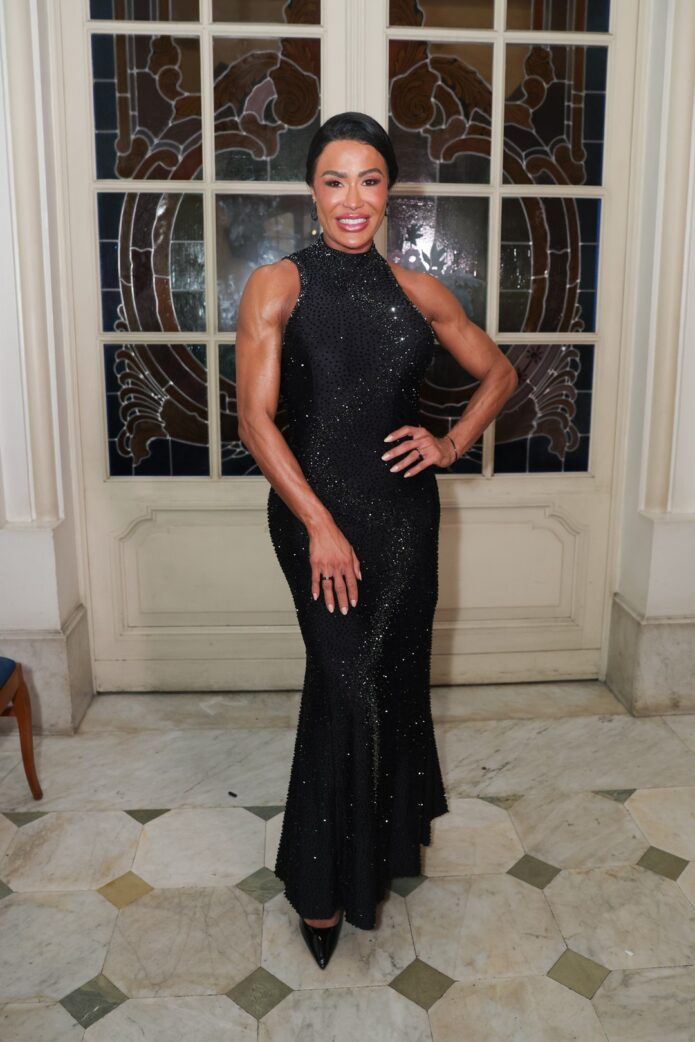
In formal photographs, including one in a black evening dress, fabric and jewellery frame the visible skin and make the tattoos less prominent. The same piece can stand out in swimwear, show through a stage costume or disappear beneath an evening outfit.

Each kind of photo has limits. A full-length image can show where ink sits but may not reveal a small design; a close crop can show detail without explaining how the tattoo fits the rest of the collection.

Practical notes for moving skin

Gracyanne mentioned her calf tattoo but the reporting doesn’t provide a clear close-up of it. She said it relates to Carnival, and that tattoos helped cover marks left by costumes; the design itself is still unknown. “Todas as minhas tatuagens têm alguma coisa de Carnaval.”

The same account raises a practical point about covering scars or burns: scar tissue may take ink differently from surrounding skin. Anyone considering a cover-up should talk with an experienced tattooer who can assess the area and set realistic expectations.
A balanced visual rhythm

The documented pieces vary in scale and form: a readable name, chest stars and smaller torso marks. They don’t form a single sleeve or matching set, and the photographs don’t show enough to map the whole collection.
In performance, costumes, lighting and movement sit alongside the ink. That context helps explain why small designs can still register without taking over the image.
Making the idea your own

If Gracyanne’s tattoos appeal to you, pinpoint what you like: the shaded stars, the placement, or the idea of covering a mark with chosen artwork. Use that as a starting point for your own design instead of asking an artist to copy hers.

Check how a design looks while standing, sitting and moving. Think about whether the lettering will stay legible and whether you’ll still be comfortable showing the tattoo years from now.

The final read on Gracyanne Barbosa’s style

Taken together, her comments and the available photographs show tattoos shaped by Carnival work: some are visible designs, and others cover marks left by costumes. The collection’s full story remains private, but her public account gives a clear link between the ink and performance.

René ZZ Tattoos: The Story Behind His Full-Body Ink

René ZZ is a Spanish YouTuber whose tattoos cover much of his body. Photos show a mix of black-and-gray work, color and dense coverage, built over years rather than in one go. The available images don’t show every area, so this is a look at the parts he has discussed or that can be seen.

In a recent interview, René also spoke about the cost and personal reasons behind the work. His collection is as much a record of changing choices as a catalogue of designs.

René ZZ’s full-body tattoo project

René ZZ full-body tattoo project: verified tattoo-studio photograph

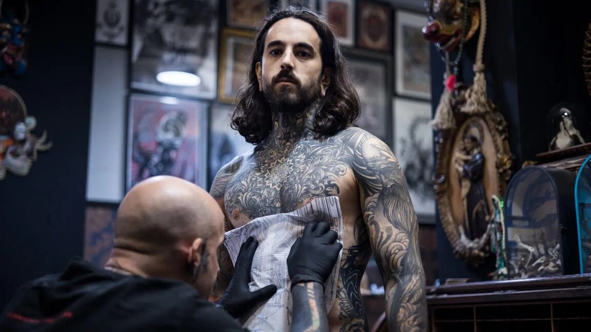
René has described his coverage as something that grew gradually. Earlier color tattoos sit alongside later black work, and the overall composition has changed with his taste. A session photo shows the practical side: stencil placement and the need to build large areas over time.

Reports on his recent interview put the total investment at about €80,000. That figure reflects years of work and isn’t a price guide for anyone else. Large coverage also takes time to heal and maintain, so the commitment goes beyond the appointment cost.

The chest and torso work

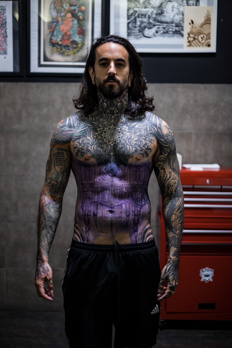
A shirtless portrait shows dense black-and-gray patterns across René’s chest and neck. The ornamental shapes form a continuous visual field rather than a set of isolated symbols, with heavier areas balanced by finer marks.

Ink rising above the collarbone makes the chest piece part of his outline. It’s difficult to hide under a T-shirt and changes how the tattoos read in portraits and interviews. That visibility is one of the clearest choices in the collection.

Black-and-gray tattoo patterns, color, and contrast

Public photographs show black-and-gray work alongside colorful and more graphic sections. Color draws the eye; darker shading gives the overall coverage a quieter base. The pieces don’t have to match exactly to share a visual language.

Large designs also follow the shape of the shoulders, ribs and arms rather than sitting like flat images on the skin. That flow helps the dense areas stay readable as the body moves.

The meaning behind the ink

René ZZ chest, abdomen, and arm tattoos: verified studio photograph

René has connected his tattoos with memory, identity and a need to be seen. In a recent interview, he was asked whether covering his body helped him hide something or reinforce himself. His answer wasn’t one or the other: he described the tattoos as aesthetic and personal, but also tied to emotional needs.

He has also spoken about a later spiritual change. That doesn’t turn the earlier tattoos into symbols of regret; it adds another chapter to the story. A person’s beliefs can change while old ink remains part of the life they were living when they chose it.

Hands, arms, and the details that change the silhouette

René ZZ hands, arms, and torso tattoos: verified editorial photograph

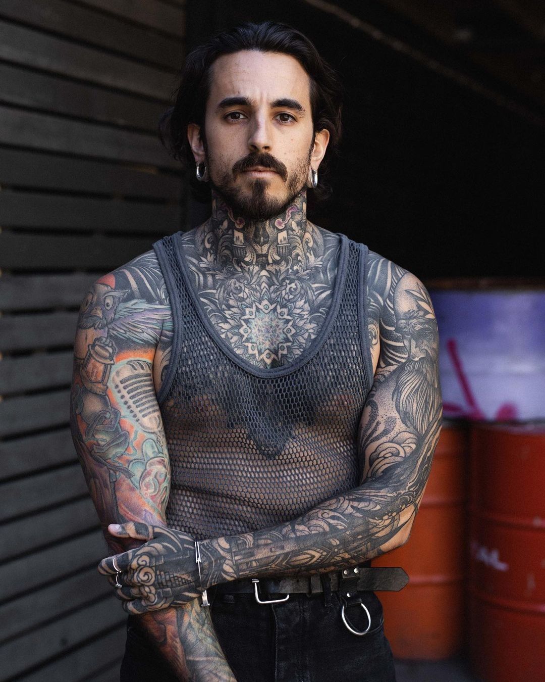
René’s hands, arms and neck are often visible in photographs, so they shape his silhouette as much as the chest work. Hand tattoos are hard to keep private, and constant movement, washing and sun exposure can wear on fine detail.

His arm coverage was built over time. Working in stages leaves room to see how earlier pieces heal before extending a sleeve, rather than filling every gap at once. With tattoos this visible, placement is a decision that follows you into work and everyday life.

What this collection says about long-term choices

The coverage is the result of decisions made across different periods, not a single before-and-after transformation. René has described the pull of adding more ink, while also talking about how the reasons behind a choice can shift. The body keeps both the design and the memory of when it was chosen.

How the sessions shape the result

René’s project shows how a collection can change with its owner. The interviews move between art, cost, memory and faith; none of those threads explains every tattoo, but together they give more context than appearance alone.

If his work inspires you, use it to start a conversation with an artist about density, contrast and how designs wrap around the body. Look at healed work, discuss placement and future changes, and give yourself time between sessions. René’s photos can suggest a direction; they can’t predict how the same design will fit another person’s skin or life.

Tiwa Savage Tattoos: Full Sleeve, Underbust Ink and Blackwork Style

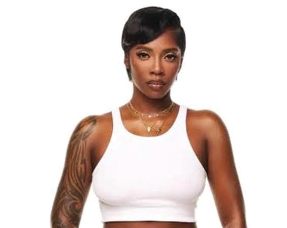
Tiwa Savage is a Nigerian singer whose visible tattoos include a dense blackwork sleeve that runs up her arm toward her neck, and a separate, finer design across her upper body. The two pieces use different styles: curved black bands and open skin on the arm, lighter ornamental lines across the torso.

Tiwa Savage’s blackwork sleeve tattoo

Tiwa Savage tattoos: Genuine editorial photograph clearly showing Tiwa Savage’s dense blackwork sleeve and neck ink.

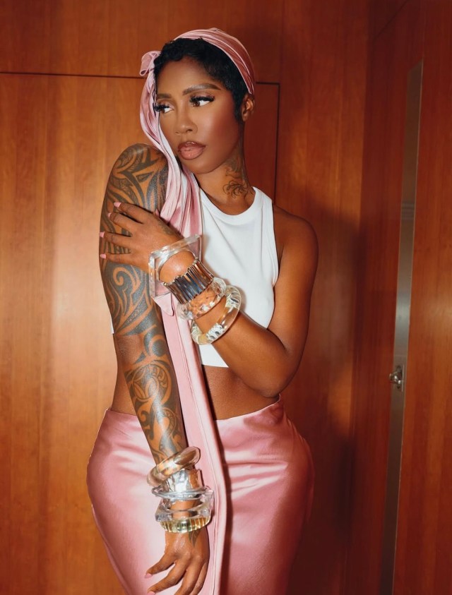
The sleeve combines heavy black shapes with narrow lines and patches of open skin. Its curves follow the arm, so the design shifts as she bends it. The coverage reaches toward the shoulder and neck, giving the pieces a connected look rather than the feel of separate flash tattoos.

The contrast keeps the sleeve from reading as a solid blackout. Dark areas carry the pattern from a distance, while the lighter gaps and fine marks show more detail up close. At this scale, spacing is part of what keeps the shapes distinct.

Curved bands across the upper-arm tattoo

Tiwa Savage tattoos: Genuine close view of the sweeping curved bands and shading across Tiwa Savage’s upper-arm sleeve.

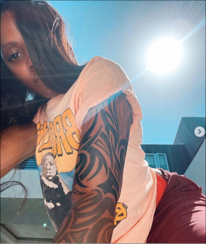
This closer photograph shows the bands turning around the upper arm instead of sitting in straight rows. Darker sections alternate with thinner curves and negative space, following the shape of the muscle.

From across a room, the sleeve reads as a bold silhouette; up close, the changes in line weight are easier to see. The pattern wraps with the arm rather than forming a rectangle on top of it.

The full-sleeve tattoo session

Tiwa Savage tattoos: Genuine published tattoo-session photograph showing the artist working on Tiwa Savage’s arm.

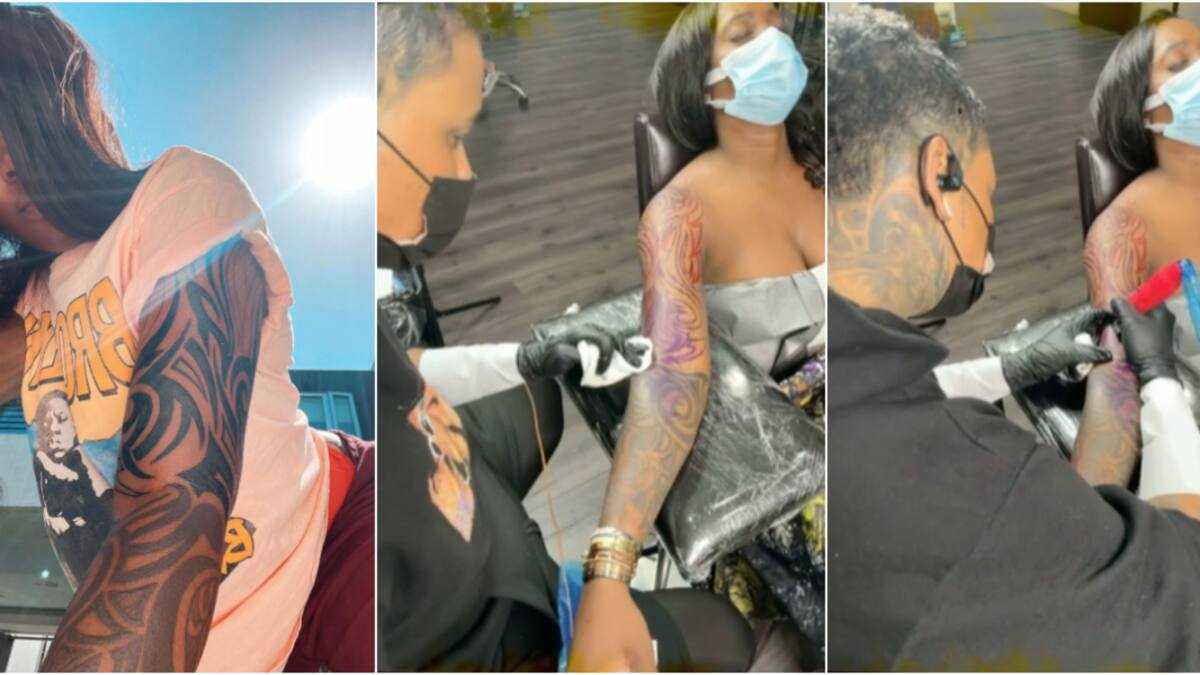
A session photograph shows an artist working on Tiwa’s arm. It gives a direct view of the placement and scale, though it doesn’t show every finished detail. The arm’s position and the lighting also help explain why the blackwork can look different from one photograph to another.

The sleeve’s shoulder-to-forearm coverage

Tiwa Savage tattoos: Genuine high-resolution photograph showing the sleeve from shoulder through forearm.

In this more relaxed view, the upper part of the sleeve looks dense and dark, while the lower edge opens into curved forms. The design remains visible with a simple outfit, and lifting or resting the arm changes which parts of the pattern show.

The shoulder area appears to connect visually with the neck ink. The shapes share a blackwork direction, though that doesn’t establish whether every section was done in one sitting.

A front-facing view of the arm sleeve

Tiwa Savage tattoos: Genuine high-resolution portrait showing the sleeve clearly along the exposed arm.

The mirror photo shows the sleeve at a casual angle, with darker areas around the upper arm and the pattern continuing below. It also makes the open skin easier to see; the coverage is heavy, but not solid from edge to edge.

A separate tattoo crosses Tiwa’s upper body. It’s usually described as an underbust or upper-chest design, with fine, lace-like lines that spread horizontally. That lighter, more symmetrical work contrasts with the arm’s dense black shapes.

The photos show the placement and overall line, but don’t provide a full account of the design’s meaning. Its position follows the curve of the torso, while the sleeve wraps around a limb.

Why the collection feels balanced

The sleeve and the upper-body piece don’t use the same technique, yet they occupy different areas and hold their own. One creates a strong outline around the arm; the other follows a finer line across the torso.

That difference is what gives the visible collection balance. The designs can share a confident, high-contrast look without repeating the same pattern everywhere.

At the appointment

If you’re drawn to Tiwa’s sleeve, show an artist how the curves wrap around the arm and decide how much black coverage you want. Discuss the design with your arm relaxed, bent and raised; those positions change how the pattern sits.

Large blackwork takes planning and may need more than one session. Choose an artist with healed examples of similar work, and adapt the reference to your own anatomy instead of shrinking or tracing one fragment.

The practical takeaway

Tiwa’s visible tattoos have two distinct anchors: a sweeping blackwork sleeve that reaches toward the shoulder and neck, and a finer underbust or upper-chest design. The sleeve’s curved bands, dark areas and open skin give it a clear shape from different angles; the torso piece brings a lighter, horizontal line.

The useful reference is how each design works with its placement. The exact artwork is hers; the contrast, flow and scale are details to discuss with an artist.

Riccardo Calafiori Tattoos: Red Sun, Sleeves and Black-and-Grey Ink

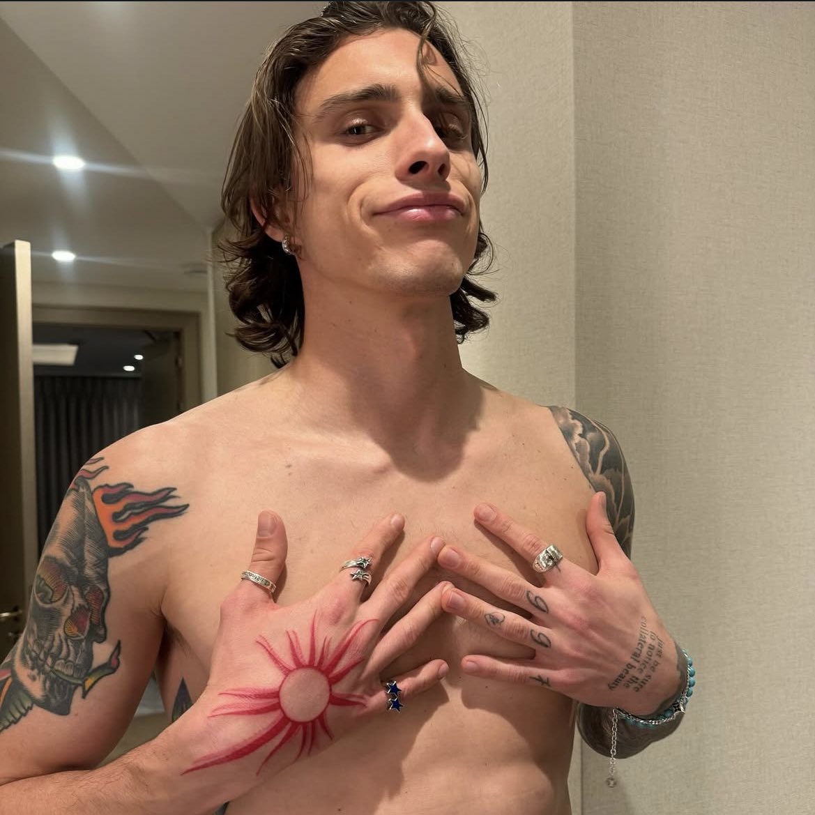
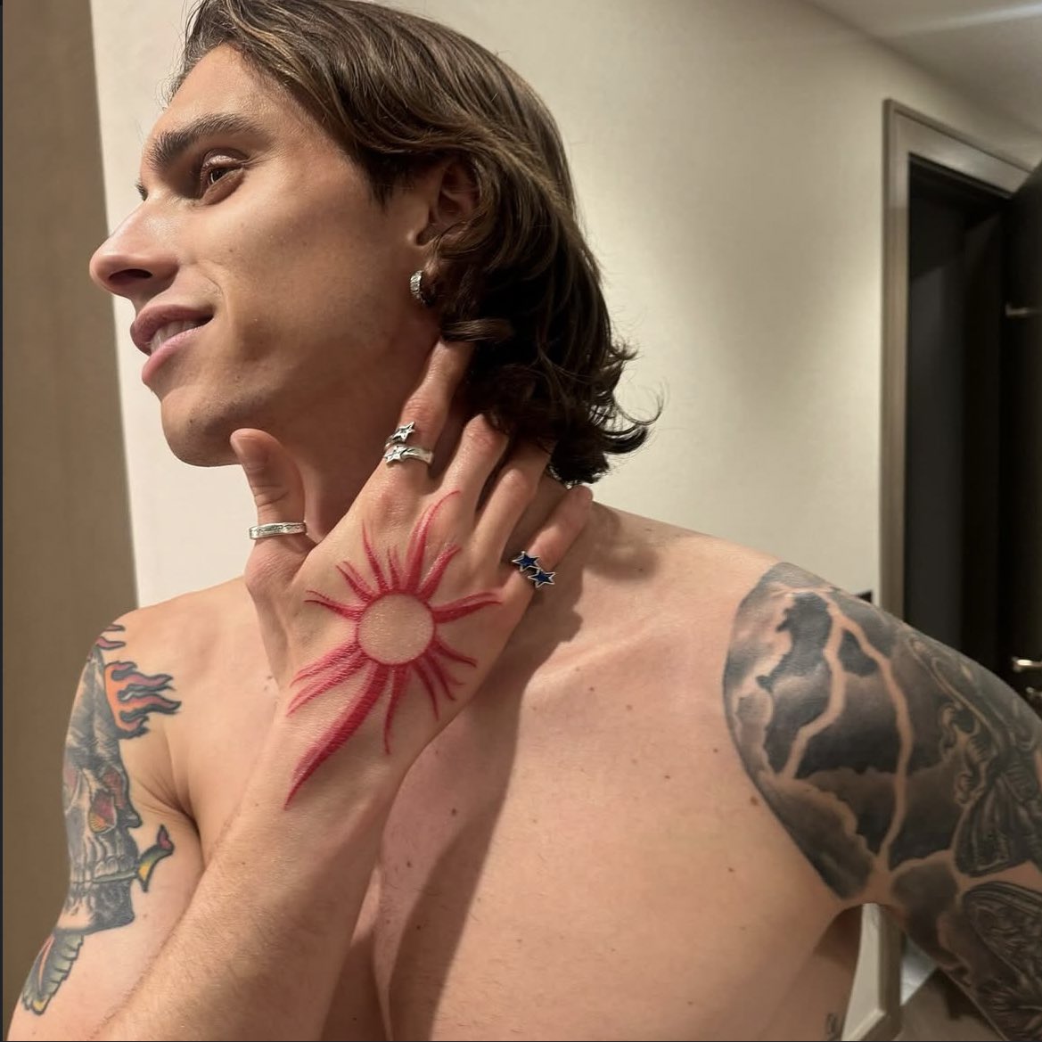
Riccardo Calafiori’s tattoos cover both arms and parts of his chest, mixing black-and-grey shading, script and color. The red sun in the centre of his chest stands apart from the darker sleeve work. Photos also show a reported “never give up” phrase on his arm; the meaning of every other image or line of script hasn’t been confirmed.

Riccardo Calafiori’s red sun chest tattoo

Riccardo Calafiori tattoos: Genuine tattoo photograph used beside the section about riccardo calafiori’s red sun chest tattoo.

The sun sits low in the centre of Calafiori’s chest. Its round red centre and long, uneven rays look hand-drawn rather than like a precise compass or logo. Against the darker tattoos on his arms, it becomes the clearest point of color.

A football shirt can hide the design during a match, while shirtless photos show it at once. Calafiori hasn’t publicly explained its meaning, so the image supports a description of its shape and placement, not a claim about what it symbolizes.

The full arm sleeve and its darker imagery

Riccardo Calafiori tattoos: Genuine tattoo photograph used beside the section about the full arm sleeve and its darker imagery.

In a shirtless match photo, one upper arm shows a skull-like image, curved black shapes and red accents. The other arm is also heavily shaded, with smaller elements continuing toward the forearm. Together the designs run from shoulder toward wrist.

The sleeves combine recognizable images with softer shadows, so they read as connected work rather than separate flash designs. Skin breaks and changes in scale keep the darker areas from forming one solid block.

What the match photos reveal about the sleeve

Riccardo Calafiori tattoos: Genuine tattoo photograph used beside the section about what the match photos reveal about the sleeve.

Match and celebration photos show the tattoos while Calafiori is moving. Stadium lights, sweat and the angle of his arms change which details stand out; a social-media crop can’t provide a complete inventory.

The arm work is visually dense, while the chest remains more open around the red sun and smaller marks. That gives the sun room to stand out against the sleeves.

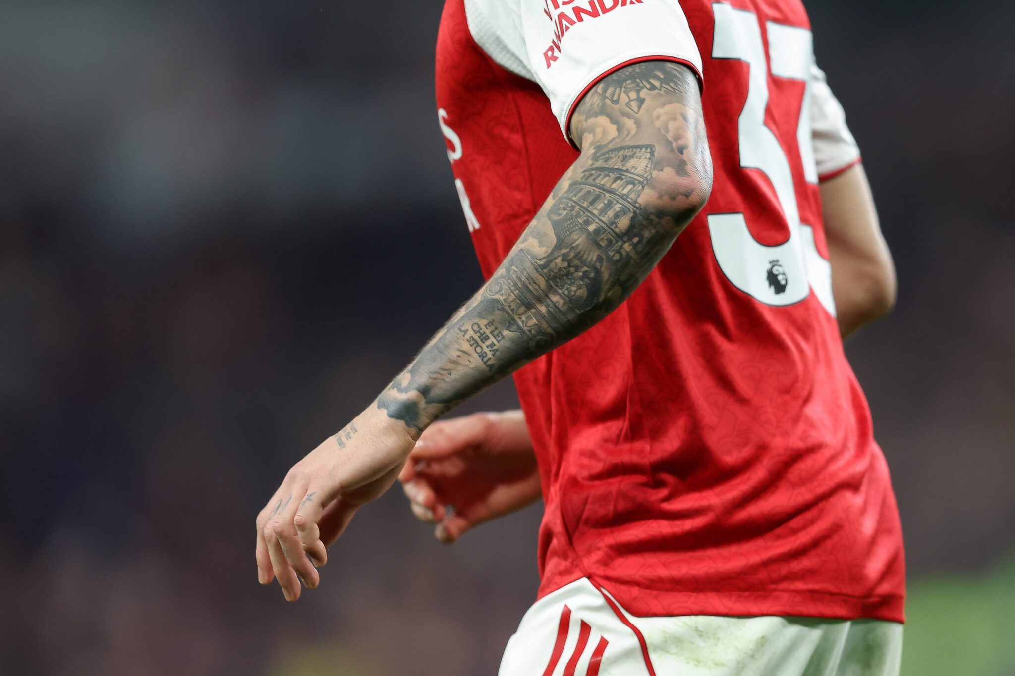
The architectural black-and-grey work on his arm

Riccardo Calafiori tattoos: Genuine tattoo photograph used beside the section about the architectural black-and-grey work on his arm.

A closer sports photograph shows layered black-and-grey work, including what appears to be building-like detail, curved forms and blocks of script near the wrist. The image isn’t clear enough to identify every object or read all the lettering.

Soft shading and lighter areas break up the darker outline around the elbow and forearm. The sleeve has a textured, realism-style look, but the small marks are best left undescribed where the photograph doesn’t show them clearly.

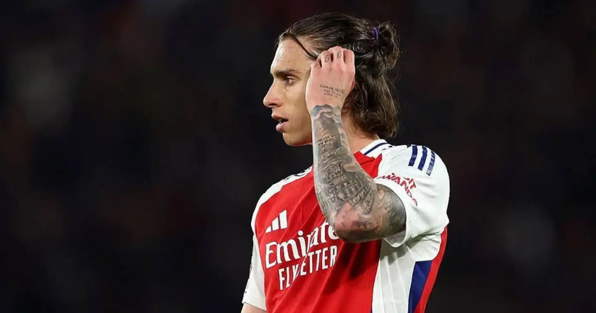
The “never give up” arm tattoo message

Riccardo Calafiori tattoos: Genuine tattoo photograph used beside the section about the “never give up” arm tattoo message.

The phrase “never give up” has been reported on Calafiori’s arm. A football report connected it with his recovery from a serious knee injury when he was younger, which threatened to interrupt his career. It’s one of the few tattoos in his collection that has a reported link to a specific event in his life.

The short line of text sits within a sleeve already filled with images. It offers a clear point of context, while the meaning of the other designs remains unconfirmed.

How his style works with his football image

Calafiori is photographed in motion, under stadium lights and with different parts of his body covered by his kit or tape. Dark sleeves can remain visible in short sleeves; the red chest sun is more often seen in shirtless or personal photos.

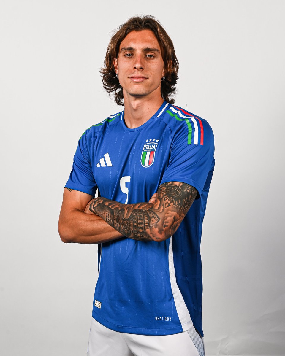
Away from football, his longer hair, earrings, rings and tattoos form part of a broader personal style. They help explain why the ink gets noticed, but they don’t tell us what each piece means.

Why the collection feels built over time

The tattoos don’t share one uniform style. The red sun is simple and bright; the sleeves are darker and more layered, and the lettering uses a different scale. The contrast suggests work added in stages rather than one matching session.

Some areas are dense, others leave more skin visible, and the images don’t all use the same palette. That gives the collection a lived-in quality while the sun brings a distinct burst of color to the chest.

The practical takeaway

Calafiori’s visible collection centres on the red chest sun, shaded arm sleeves and the reported “never give up” phrase. The photographs show how black-and-grey work, lettering and a bright color accent can sit in one evolving collection.

If you’re using the photos as reference, focus on the way the designs follow the arm and leave room around the chest piece. Keep any words or symbols personal, and don’t assign a meaning to a design just because it looks familiar.

Jhon Álex Castaño Tattoos: The Amparo Grisales Lips Tattoo and Visible Ink

Jhon Álex Castaño’s most recognisable tattoo is a pair of lips on his neck, inspired by a magazine photo of Amparo Grisales. The story has been told with a laugh, but the tattoo is real: Castaño has explained the reference, and Grisales later recognised the image as hers.

Photos show more ink across his chest, shoulders and arms. They help show where the tattoos sit, but they don’t explain every design. Here’s what has a public account—and what remains visible without a confirmed meaning.

The neck tattoo is a pair of Amparo Grisales’ lips

Jhon Álex Castaño tattoos: Face-visible close portrait with visible chest tattoo coverage; the source supports the tattoo subject and the image is used for visible upper-body ink, not as a claim that the neck lips are visible in this frame.

The red lips tattoo is reported to sit on the back or side of Castaño’s neck. Colombian television and music coverage says he chose a magazine image of Grisales. When the story came up around Yo Me Llamo, Grisales recognised the lips as hers. The photo here shows chest ink, not the neck design.

A straight-on portrait can hide the tattoo, while a turn of the head or an open collar may reveal it. That’s why the placement looks clearer in some photos than others.

Why the lips tattoo became part of his public image

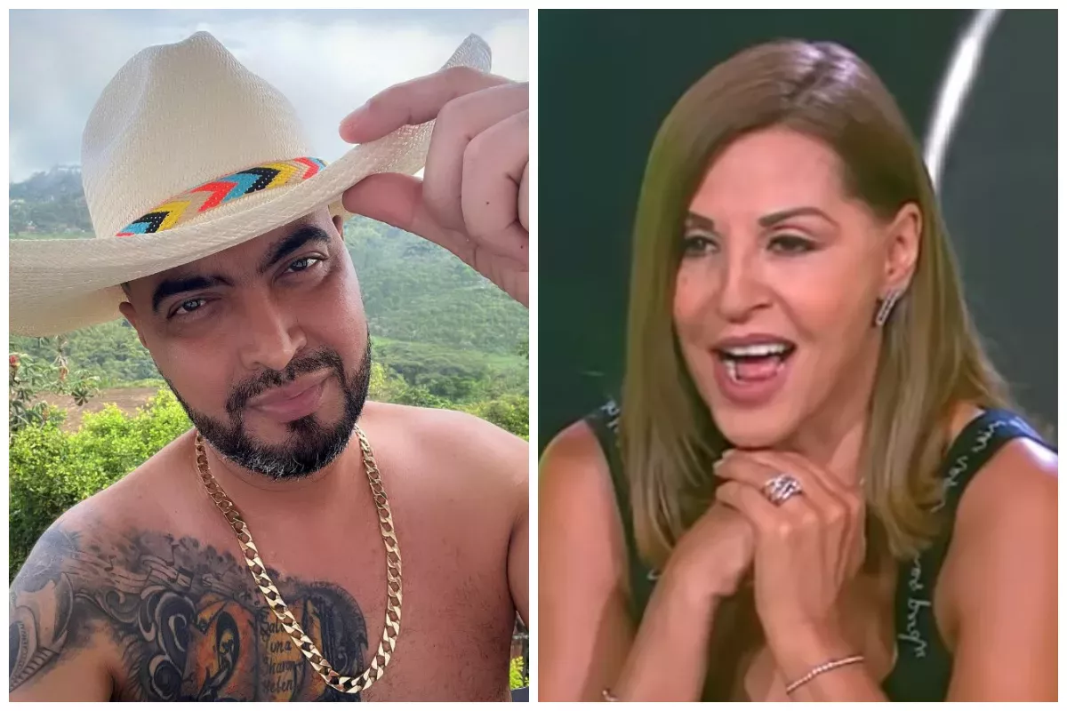
Jhon Álex Castaño tattoos: Published composite showing Castaño shirtless with chest and arm tattoos alongside the Amparo Grisales context; used for visible tattoo coverage and context, not for a second neck-tattoo claim.

Castaño has said the image came from a magazine, and later reports described the choice as a tribute to Grisales. There’s no need to add a romantic story the reporting doesn’t establish. The tattoo is memorable because the subject is clear and the story is usually told with humour.

Interviews and videos have treated the mark playfully, with people around Castaño teasing him about it. The explanation doesn’t need to be solemn to be personal.

His chest and shoulder work reads as a larger black-and-grey collection

Jhon Álex Castaño tattoos: Separate public portrait with a clear tattooed hand and partial chest coverage; genuine visible tattoo evidence, without claiming undocumented motifs.

Photos show heavier black-and-grey coverage across Castaño’s chest and shoulder, with some ink continuing toward his upper arm. Lighting changes what stands out: softer indoor shots bring out the shading, while bright photos make the dark outlines more prominent.

Published reports don’t consistently identify the individual motifs. It’s more accurate to describe the visible coverage than to assign a story to every shape.

A second tattoo view shows why angle matters

Jhon Álex Castaño tattoos: Separate published composite showing Castaño's visible chest and shoulder tattoo coverage alongside the Amparo Grisales reference image.

In a wider portrait, the chest and arm ink can blend into the styling—the open shirt, chain and beard. A closer photo makes the shading and the way the shoulder pieces follow his body easier to see. The neck lips also read more clearly when a camera catches the side or back of his head.

The available photos don’t show the full edges of his arm work, so they aren’t enough to call it a finished sleeve. Some sections are clear; others are covered or outside the frame.

Jhon Álex Castaño in public photos

Jhon Álex Castaño in a contextual photograph: Distinct contextual press portrait used for career and identity setting; explicitly not tattoo evidence.; not tattoo evidence

This press portrait gives readers a clear look at Castaño’s face and styling, but it isn’t evidence of a tattoo. It provides career and identity context; the closer images show the ink.

The lead photo sets the scene

The lead portrait has a different job from the tattoo photos. It helps identify Castaño, while the closer shots show the placements being discussed. Keeping those roles separate avoids treating a design outside the frame as visible proof.

What the documented story tells us, and what it doesn’t

The lips have the clearest public account: Castaño linked them to Grisales, and reports say he used a magazine image as his reference. The other marks are visible in photos, but the coverage reviewed here doesn’t confirm what each one depicts or means.

A fan may recognise a face or lettering in a picture, but recognition alone isn’t confirmation. Where the details aren’t documented, it’s better to describe what can be seen and leave the meaning open.

How his style fits his music

The bright red lips are a small focal point against the darker chest and arm coverage. In photos of the Colombian singer, the contrast gives the neck design a distinct place in a broader, more heavily tattooed look. That visual effect doesn’t tell us that the other tattoos refer to his songs.

Placement ideas readers can take from the collection

The neck and chest show two different scales: the lips are compact and easy to recognise, while the upper-body ink takes up more space. Photos also show how collars and camera angles can hide or reveal neck work, and how shoulder pieces can sit alongside one another.

If you’re planning a larger area, look at how the ink reads when the arm is relaxed as well as when someone poses. Castaño’s photos show placement and visibility, not a confirmed plan for future additions.

Why the visual record stays useful

One tattoo has a documented story; the other photos add a sense of the coverage around it. That’s enough to make the collection interesting without turning unclear details into a made-up inventory.

The short version

Jhon Álex Castaño’s neck tattoo is a pair of lips linked to Amparo Grisales and a magazine image she later recognised. Photos also show ink across his chest, shoulders and arms, though public accounts don’t confirm the meaning of every mark.

Sébastien Thill Tattoos: The Dream Tattoo Behind His Real Madrid Shock

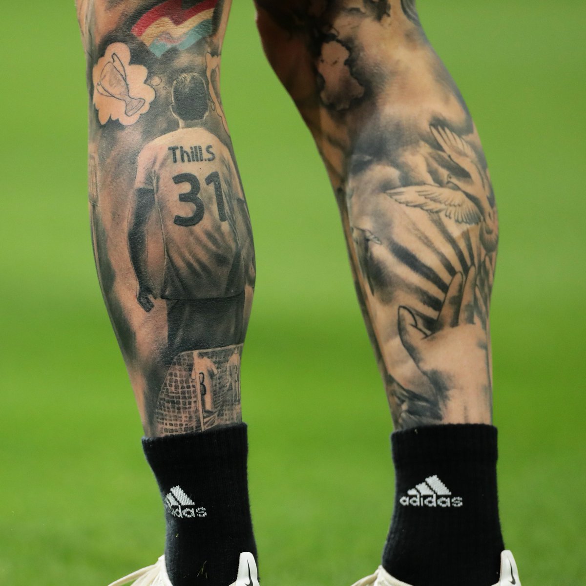
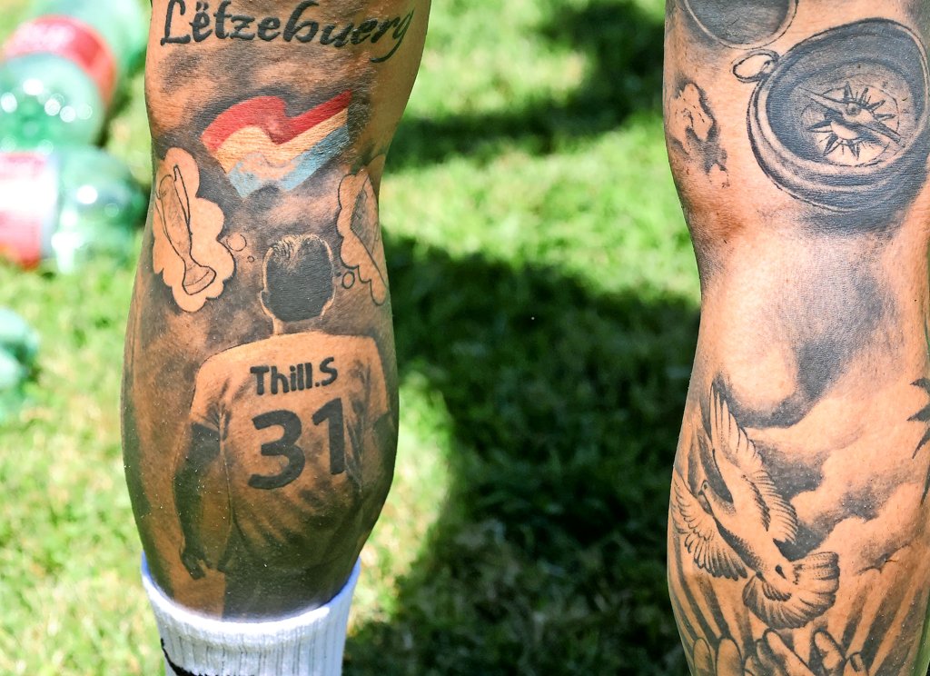
Sébastien Thill’s left-calf tattoo shows a footballer looking toward a Champions League cup, with his number 31 and Luxembourg imagery in the design. He had it made before Sheriff Tiraspol’s famous win over Real Madrid, and has described it as a picture of his ambitions in football.

Photos also show extensive ink on both forearms and his other calf. The left-calf scene has the clearest explanation; the smaller marks are easier to describe than to interpret.

The left-calf tattoo is a football dream in ink

Sébastien Thill tattoos: Genuine tattoo close-up showing the dream tattoo and surrounding calf ink.

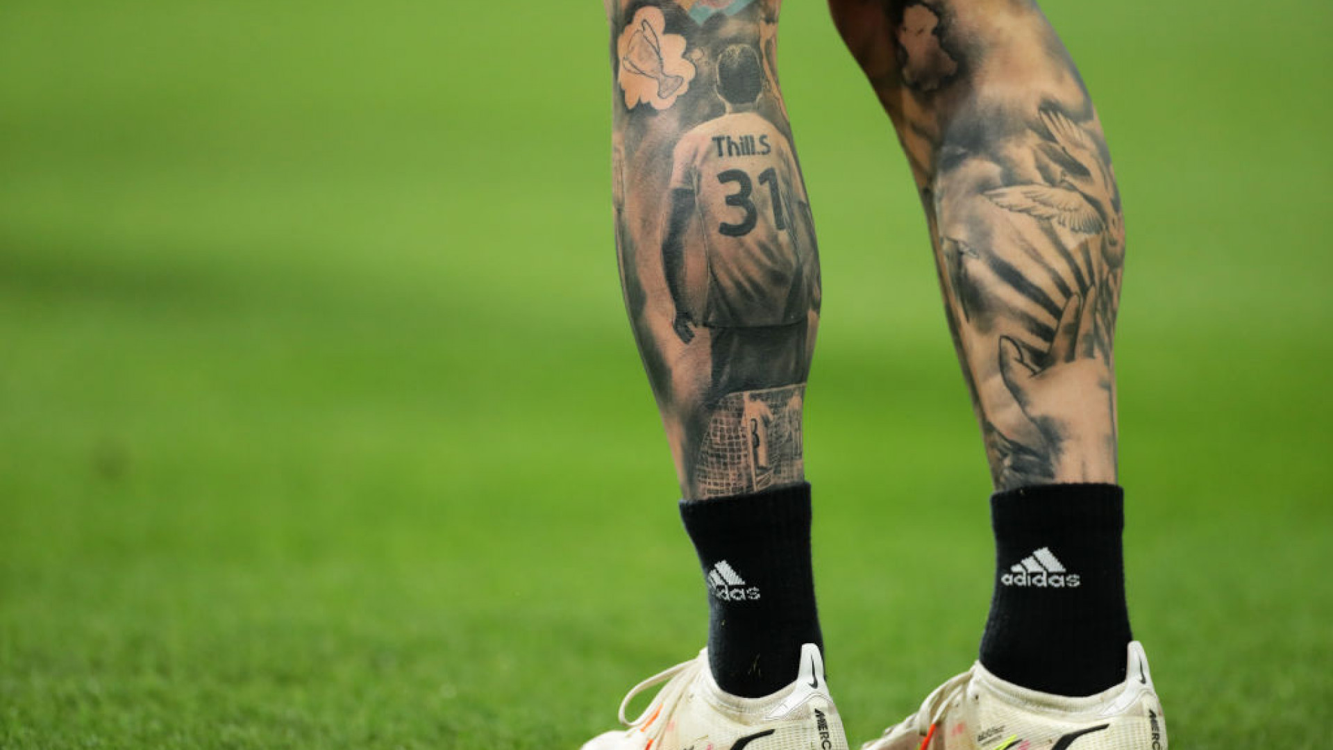
The most clearly documented tattoo is on Thill’s left calf. It shows a footballer from behind in shirt number 31, looking toward a cup set in a dream-like scene. The Luxembourg flag appears alongside it.

In interviews, Thill has said the design reflects his goals: playing at the highest level, winning titles and helping Luxembourg reach major tournaments. He had the tattoo done in Tiraspol a couple of months before Sheriff travelled to the Bernabéu. When he later scored the winner against Real Madrid, the timing made the image look uncanny. It was an ambition he had put on his skin, not a prediction.

What the number 31 means in the design

Sébastien Thill tattoos: Distinct genuine calf-tattoo close-up used for lettering, flag and surrounding linework.

The figure wears the number 31, the shirt number Thill wore for Sheriff. It turns a general football scene into a self-portrait from behind. The figure, number and cup give the calf piece a clear direction: he is looking toward a goal that had not yet happened when the tattoo was made.

The cup is its most obvious feature, but the other details matter too. The number identifies the player, while the Luxembourg flag connects the dream to his country.

The Luxembourg flag in the tattoo adds a second meaning

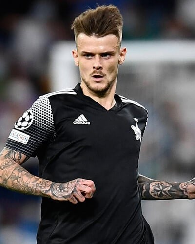
Sébastien Thill tattoos: Genuine public photograph with both tattooed arms visible; used for arm coverage only.

The flag detail links Thill’s personal ambitions to Luxembourg, not just to a club or competition. Transfers change the shirt a player wears; the national colours remain part of the story he described in interviews.

This photograph shows his tattooed arms rather than the calf flag. Close-up images also show lettering around the calf scene, though the sources used here do not explain every small detail.

His right-calf tattoo carries a different visual rhythm

Sébastien Thill tattoos: Distinct match-action photograph showing tattooed forearms and upper-leg ink; genuine tattoo evidence.

Photos of Thill’s other calf show darker line work, lettering and a bird- or wing-like shape. It looks more like several separate motifs than a second football scene. Their personal meanings haven’t been confirmed in the interviews cited here, so the visible details are as far as we can go.

The arm tattoos make more sense in match photographs

Sébastien Thill tattoos: Separate published calf-tattoo image used for the documented dream-design context; the copy avoids treating it as a second design.

The image here gives another view of the calf piece; match photos provide the better look at Thill’s forearms. Both arms carry dark line work, but the available shots don’t show enough detail to name each motif.

The arm tattoos make the collection broader than the single football story. The calf design is readable at a glance; the forearms add more coverage without a published explanation for every shape.

A match-night story adds a strange twist

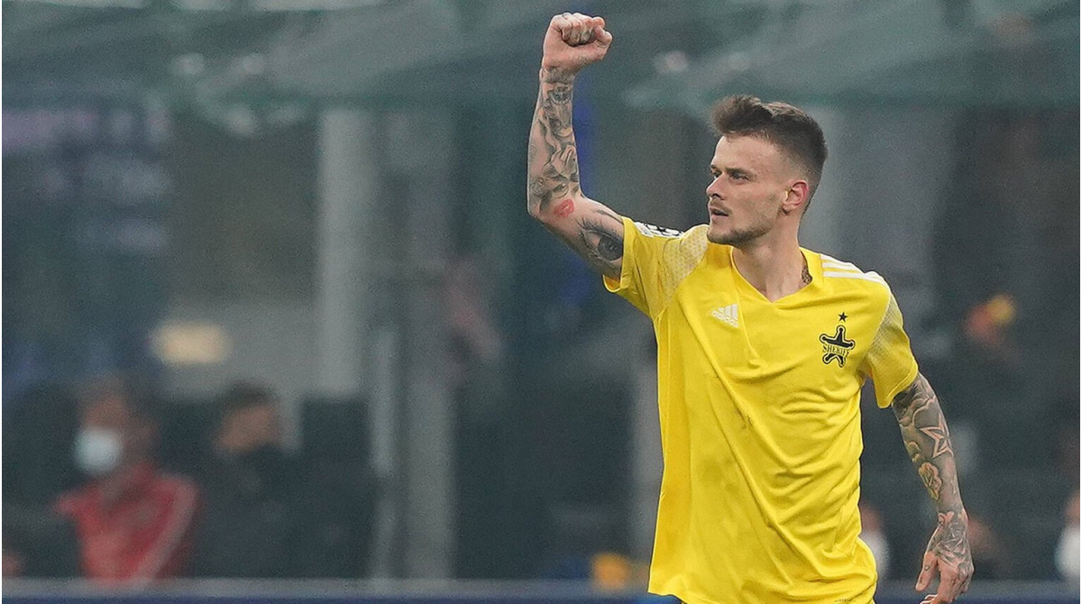
On September 28, 2021, Sheriff Tiraspol beat Real Madrid 2–1 at the Santiago Bernabéu. Thill scored the late winner with a left-footed strike from outside the box. It was the first Champions League group-stage goal by a player from Luxembourg.

The tattoo was already there. Its timing made the design feel like a prediction after the result, but Thill had described an ambition, not a forecast. The real sequence is striking enough: first the dream on his calf, then the goal in Madrid.

The bigger idea is chasing a goal

Thill’s account of the tattoo goes beyond the Champions League cup. He has spoken about winning titles and helping Luxembourg reach a major tournament. The flag and the football scene give that larger aim a place in the design, even as clubs and seasons change.

A footballer’s public image in photographs

In match photos, Thill’s number 31 appears on his shirt and on the figure in the calf tattoo. That small link ties the design to the player without requiring a guess about the meaning of his other ink.

His forearms and other calf have a looser mix of dark designs. The contrast gives the collection a clear focal piece alongside tattoos whose stories remain private.

Borrowing the visual hierarchy

A calf has room for a vertical scene: one main figure, a symbol above it and smaller details around the edges. Thill’s number, cup and flag stay connected because each part supports the same football ambition.

If you’re using the layout as inspiration, the useful idea is to choose a central image first and let the surrounding details add context. The exact meaning of Thill’s smaller marks is not established by these photos.

The line between a photograph and a biography

Photos show tattoos on both forearms and across the other calf, but only the left-calf dream design has a clear explanation in the sources used here. A bird-like shape, lettering and dark arm work can be described; their private stories can’t be filled in from appearance alone.

The short version

Thill’s left-calf tattoo shows a number 31 footballer, a cup and Luxembourg imagery. He had it before Sheriff’s 2021 win over Real Madrid and has described it as a picture of his football ambitions. Photos also show ink on his other calf and forearms, with no confirmed meaning for every design.

Angry Anderson Tattoos: The Roses Behind the Rose Tattoo Frontman’s Sleeves

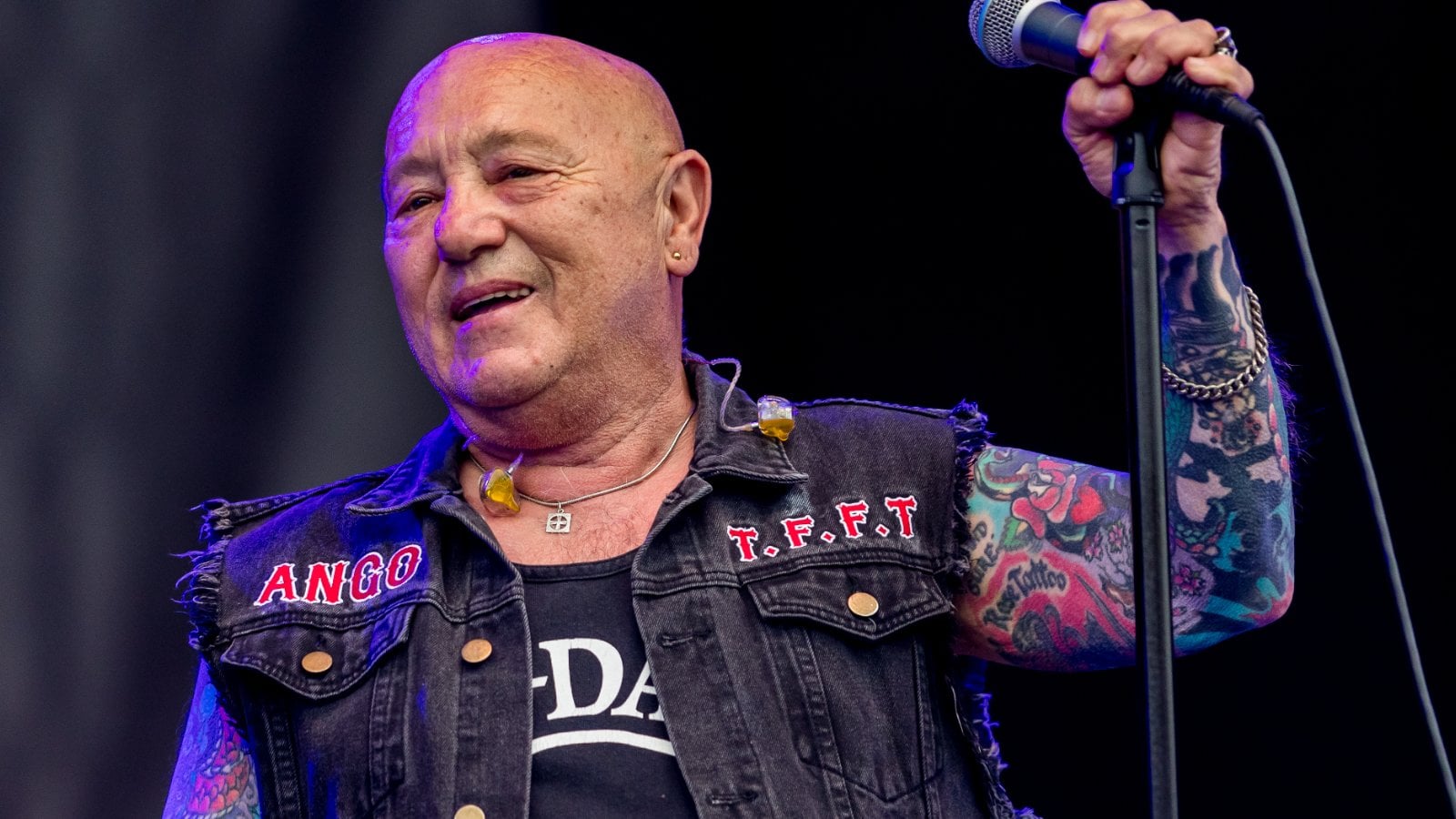
Angry Anderson’s tattoos became part of his public image, but the story starts before the stage look. Born Gary Stephen Anderson, he fronted Rose Tattoo from its formation in 1976; that connection lasted five decades. In an interview with The Rockpit, he said his mother was named Rose DeMay and that his first two tattoos were roses.

Anderson, born Gary Stephen Anderson, died in September 2026 at 79. Photos from across his career show colorful sleeves, though they don’t identify every design. The roses have the clearest story; the rest is best described by what the pictures show.

The first Angry Anderson tattoos were roses

Angry Anderson tattoos: Genuine subject-matched tattoo photograph used in the matching article section.

Anderson told The Rockpit that his mother’s name, Rose DeMay, meant “Rose of May” to him, and that his first two tattoos were roses. He later sang in a band called Rose Tattoo. The name came years after the first ink, but it gave the roses a second connection once the band became part of his life.

He also told ABC that his mother tried to scrub off his first tattoo. Her reaction was a sign of how personal that choice felt at home. Anderson kept the tattoo, and it became the start of a collection he continued to wear in public.

Rose Tattoo turned the ink into a full stage identity

Angry Anderson tattoos: Genuine subject-matched tattoo photograph used in the matching article section.

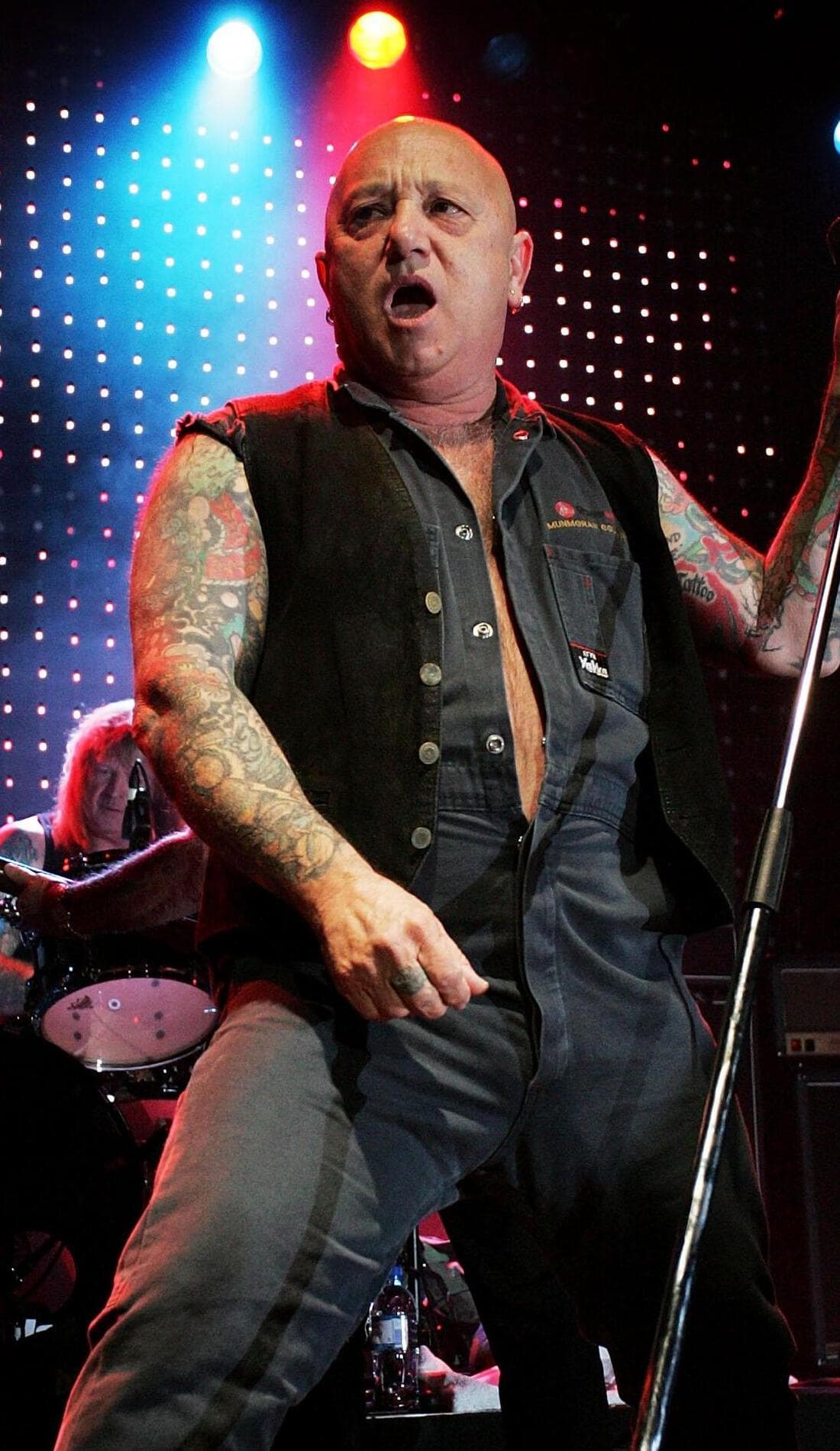
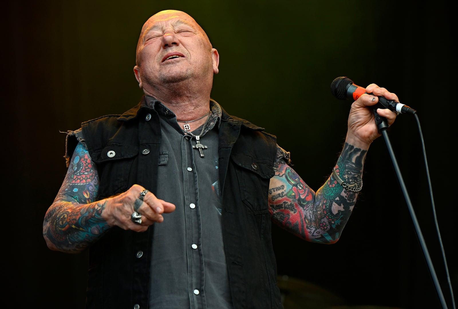
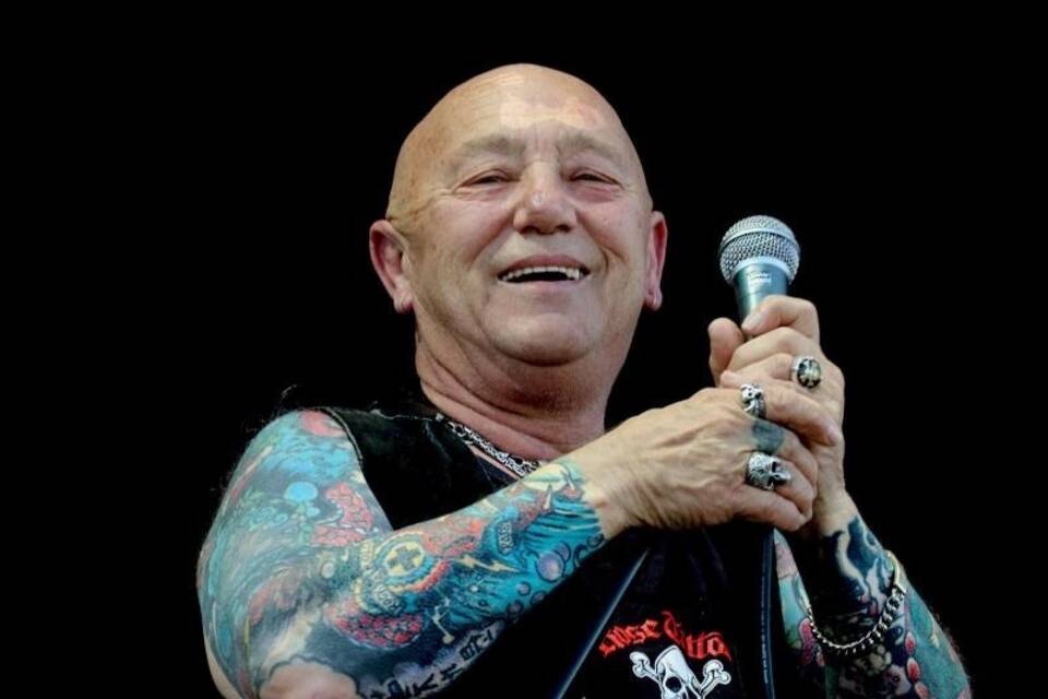
Sleeveless shirts and open vests often left Anderson’s arms visible onstage, so the tattoos became part of the image audiences knew. They weren’t stage makeup he could take off after a show; the ink appeared in interviews and ordinary photographs too.

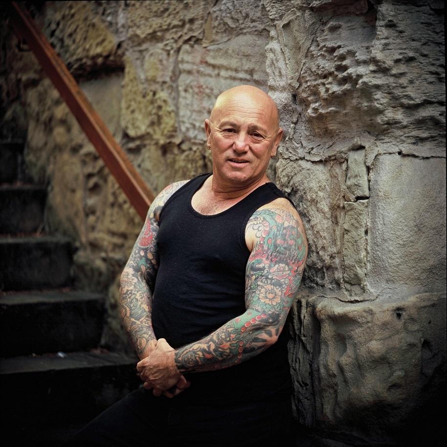
The sleeves look accumulated rather than designed as one matched piece. Some sections are dense and bright, while others are harder to make out in older concert photos. That unevenness is visible in the pictures, but it doesn’t tell us why any individual tattoo was chosen.

What the sleeves actually look like in photographs

Angry Anderson tattoos: Genuine subject-matched tattoo photograph used in the matching article section.

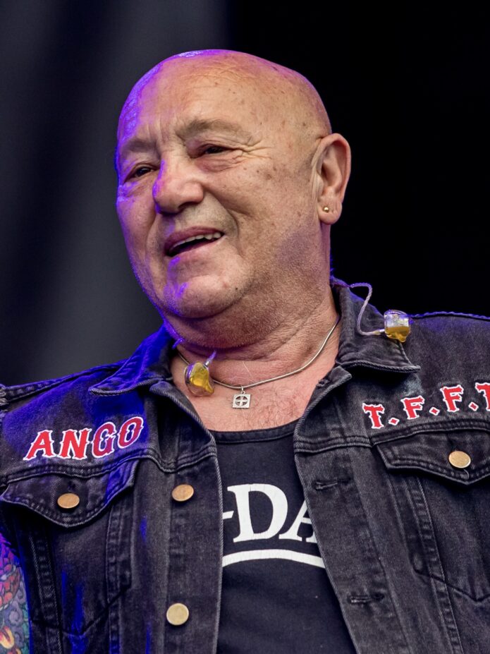
Clearer photos show colorful, heavily tattooed arms. A Rockpit portrait has Anderson crossing both arms over his chest; an RNZ photo shows him in a black tank top. Concert lighting changes the colors and hides small details, so the broad description—bright, dense sleeve work—is more dependable than naming blurred shapes.

The tattoos also look different when Anderson is moving. A portrait holds the arms still; onstage, the ink bends with his elbows as he leans toward the microphone. The same sleeve can read as one field of color in a still photo and as separate pieces during a performance.

The roses carry a family connection

Angry Anderson tattoos: Genuine subject-matched tattoo photograph used in the matching article section.

Anderson tied the first roses to his mother, Rose DeMay. The later Rose Tattoo connection adds another layer, but it doesn’t replace that family story. The flowers weren’t just part of a rock image; they were among the first designs he chose.

Roses are common tattoo subjects. Here, the specific connection—to his mother and the timing of those first tattoos—is what gives them a personal history. His mother’s attempt to scrub one away also shows that the decision meant something beyond the design itself.

Why the old-school rock look still works

Anderson’s tattoos were usually seen alongside the clothes he wore: an open or sleeveless top, often dark or denim. That let the bright ink stand out, while the rest of his look stayed simple. The effect built up through years of concerts and appearances rather than one carefully staged reveal.

If you’re taking a practical idea from the photos, look at how clothing and movement affect visibility. A sleeve can read differently with the arm relaxed, bent or raised. The pictures show Anderson’s finished look, not a plan he described for each tattoo.

How the look holds up across decades

Angry Anderson tattoos: Genuine subject-matched tattoo photograph used in the matching article section.

Early Rose Tattoo photos and later portraits don’t show the sleeves equally well. Some are grainy or lit by red and blue stage lights; sharper later images reveal more color. A change in how a tattoo looks across photos may come from the camera or lighting, not a new design.

Like any long-worn ink, the tattoos also appear in the context of age and time. The pictures show a collection across decades, rather than a fresh portfolio shot. Open skin remains visible between some designs, though there’s no evidence that every gap was planned.

What to take from Anderson’s story

The documented story is simple: Anderson’s first two tattoos were roses linked to his mother, and the colorful sleeves became familiar through Rose Tattoo and years of public appearances. Photos show their scale and changing visibility, but they don’t provide a reliable inventory of every motif.

For someone drawn to the look, the useful point is to think about the whole arm and how it moves and sits with clothing. Anderson’s collection didn’t need perfectly matched borders to feel like his own.

Joe Manganiello Tattoos: The Dragon, Armenian Script and the Stories Behind His Ink

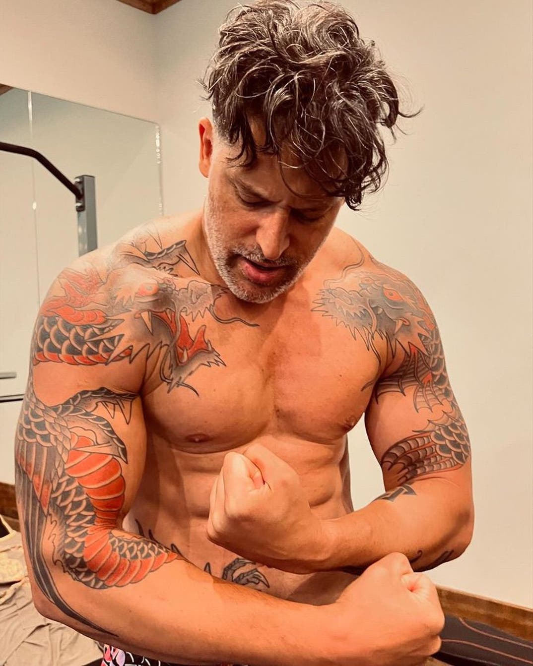
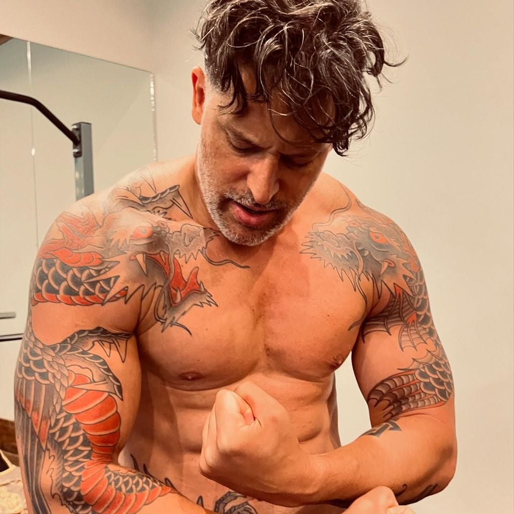
Joe Manganiello’s tattoos range from colorful dragon work across his shoulders and arms to a new, roughly three-foot dragon down his right side. He said the latest piece covers surgery scars and draws on a story from his memoir, Bloodlines.

The photos show large scales, lettering and shapes that follow his body. Some pieces have a clear personal account; others are easier to describe than to interpret.

The huge dragon tattoo on Joe Manganiello’s right side

Joe Manganiello tattoos: The huge dragon tattoo on Joe Manganiello’s right side

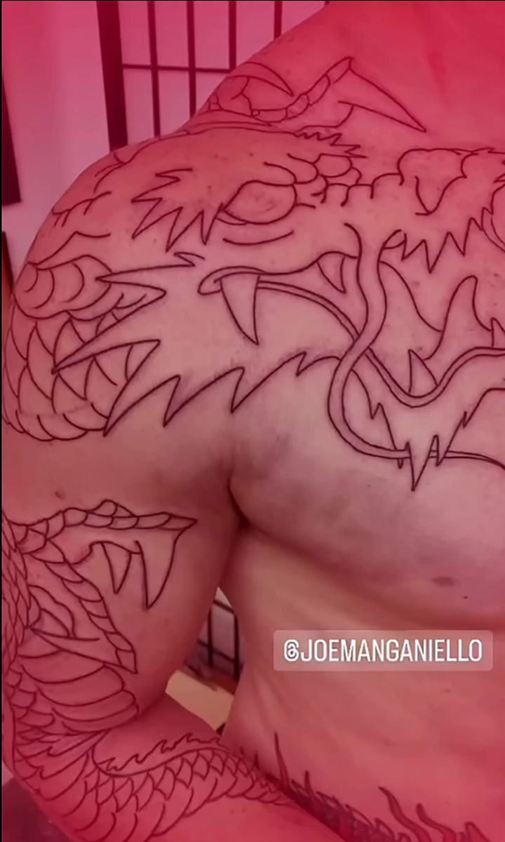
The red-and-black dragon runs from near Manganiello’s navel toward the top of his knee. He described it as about three feet long. Its size lets the image cover a broad area along his right side rather than sit as a small emblem.

In Bloodlines, Manganiello wrote about imagining his body sending knights to fight a western dragon that wasn’t there. When they found no enemy, they punched holes through him. He connected the tattoo to that image, but described the eastern dragon as himself. The design turns the metaphor around: the dragon over the scars is no longer an outside enemy.

The dragon work across his shoulders and arms

Joe Manganiello tattoos: The dragon work across his shoulders and arms

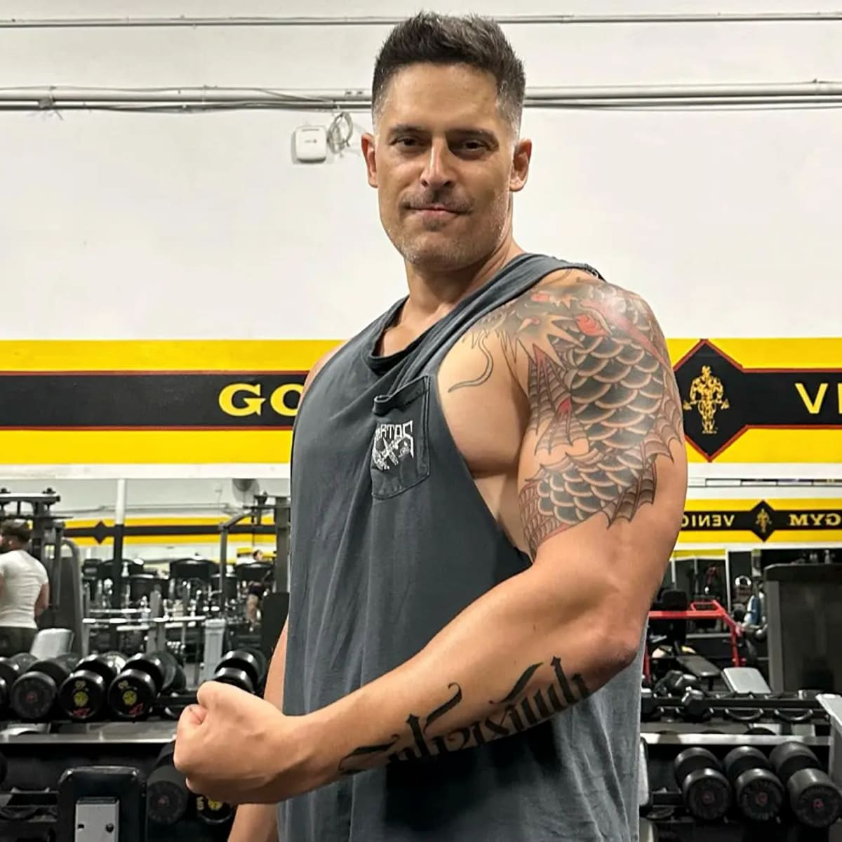
The newer dragon isn’t his first. Older photos show colorful creature designs across his shoulders, upper arms and chest, with rounded scales, warm red sections, dark outlines, layered shading and bold lettering.

The patterns curve over the shoulder and down the arms, so they shift when he bends or turns. Some lines continue across the upper torso, making the collection read as connected work rather than separate pieces placed side by side.

How the sleeves read in a real-world photo

Joe Manganiello tattoos: How the sleeves read in a real-world photo

A public gym or street photo gives a less controlled view than a posed reveal. Clothing hides parts of the design, and the angle changes what can be seen. The red sections and dark scale patterns still give the arms a clear outline.

Several photos of the same sleeve don’t mean several different tattoos. The ink stays in place; distance, clothing and the position of his arm change how much of it the camera catches.

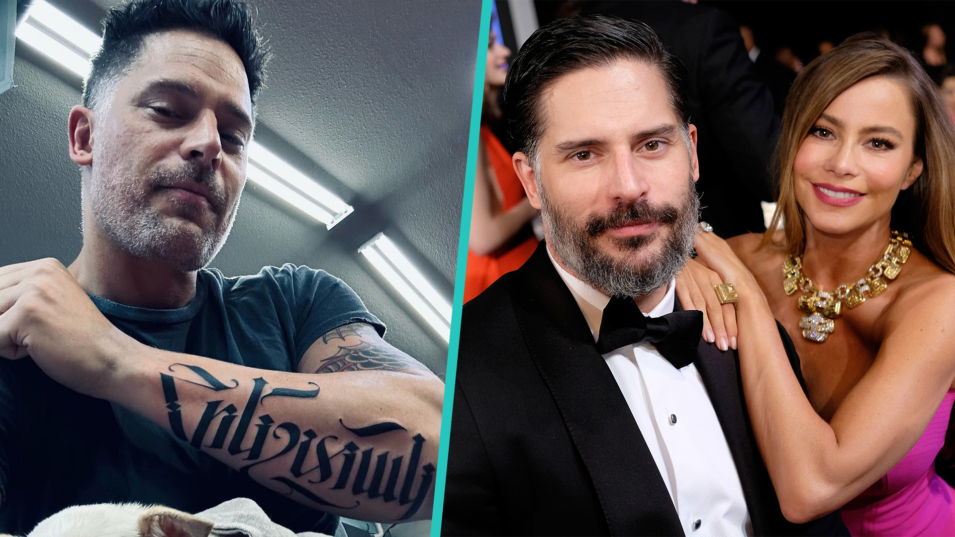
The Armenian script on his forearm

Joe Manganiello tattoos: The Armenian script on his forearm

A forearm tattoo in Armenian script has been reported as the word “angel.” Coverage links it to Manganiello’s maternal Armenian heritage and the family history he has discussed publicly.

The lettering is quieter than the dragons: dark characters along the forearm, without the larger illustrated shapes or color. If you’re considering a tattoo in a language you don’t read, check the wording and letter forms with a fluent speaker before it goes on your skin.

The personal context behind the new dragon

Joe Manganiello in a contextual photograph: The personal context behind the new dragon; not tattoo evidence

Manganiello has described collapsing on a film set in 2016, emergency surgery, long stretches of pain and a difficult search for a diagnosis. This portrait provides context, not evidence of the tattoo itself. The dragon story comes from his account of the scars and the illness behind them.

He has framed the tattoo as a way to reclaim some control after a period when his body felt beyond his control. Covering the scars changes how the area looks; it doesn’t erase what happened. The size follows the area he wanted covered and gives the image room to read as one composition.

A collection that changes with the wearer

Joe Manganiello in a contextual photograph: A collection that changes with the wearer; not tattoo evidence

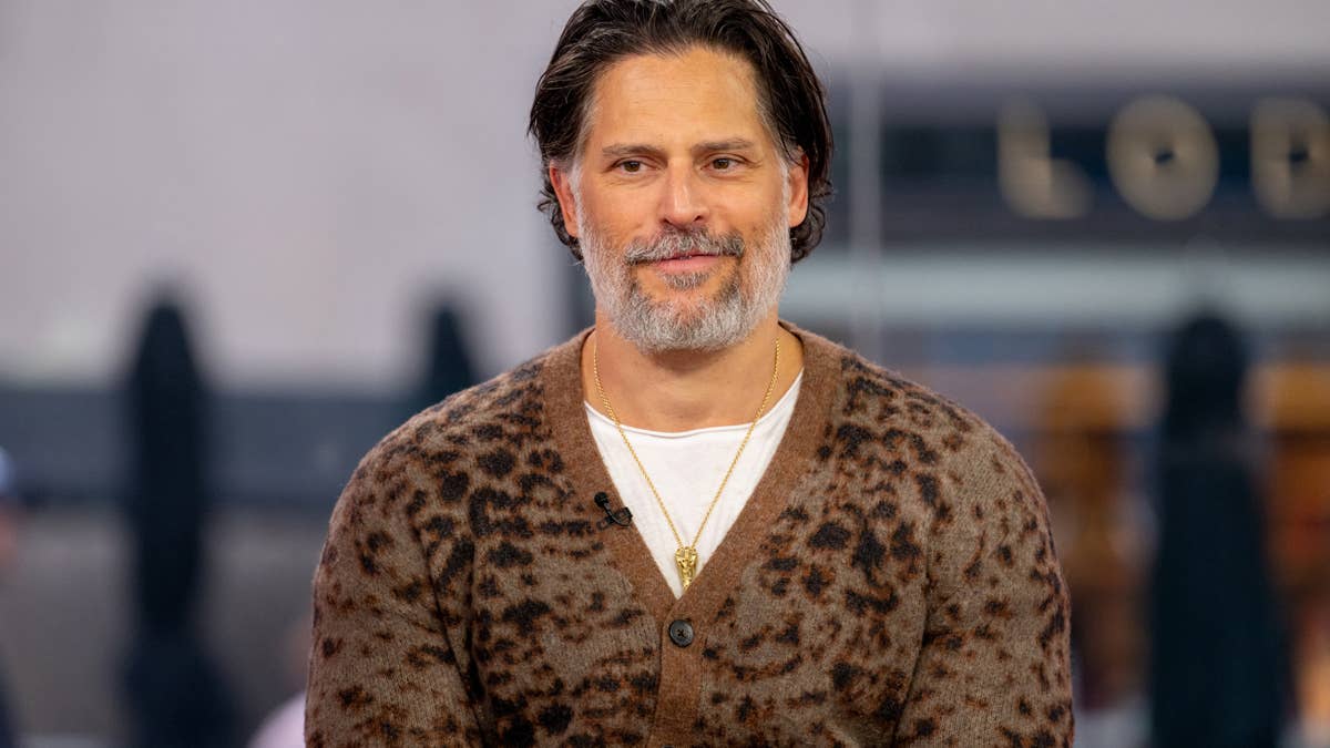
In portraits, shirts and jackets often cover Manganiello’s tattoos. At the gym, more of the sleeves may be visible. The same collection can be prominent or mostly private, depending on what he wears and where he is.

His large pieces follow the shoulders, arms and torso instead of sitting on flat patches of skin. That’s worth considering when planning body art: the design will shift as you move, and clothing can hide or reveal parts of it.

What to take from Joe Manganiello’s tattoo style

Joe Manganiello tattoos: What to take from Joe Manganiello’s tattoo style

Repeated reds, dark outlines and dragon imagery help the shoulder and arm work feel connected without making every tattoo identical. The Armenian lettering provides a quieter contrast to the larger illustrations.

Manganiello’s story also shows why the meaning belongs to the wearer. A dragon doesn’t automatically stand for recovery, and Armenian script doesn’t carry the same family connection for everyone. The documented explanation is what makes these specific tattoos personal.

Why the story matters more than the spectacle

His Dungeons & Dragons interests sit alongside two more personal stories: the Armenian word linked to family heritage and a side dragon he connected to illness and surgery scars. The tattoos don’t need one theme to make sense as a collection.

The short version

Manganiello’s older tattoos include colorful dragon work across his shoulders, chest and arms, plus Armenian script reported as “angel.” His newest piece is a red-and-black dragon along his right side, covering surgery scars and drawing on his account of a serious illness.