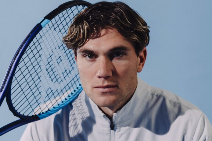
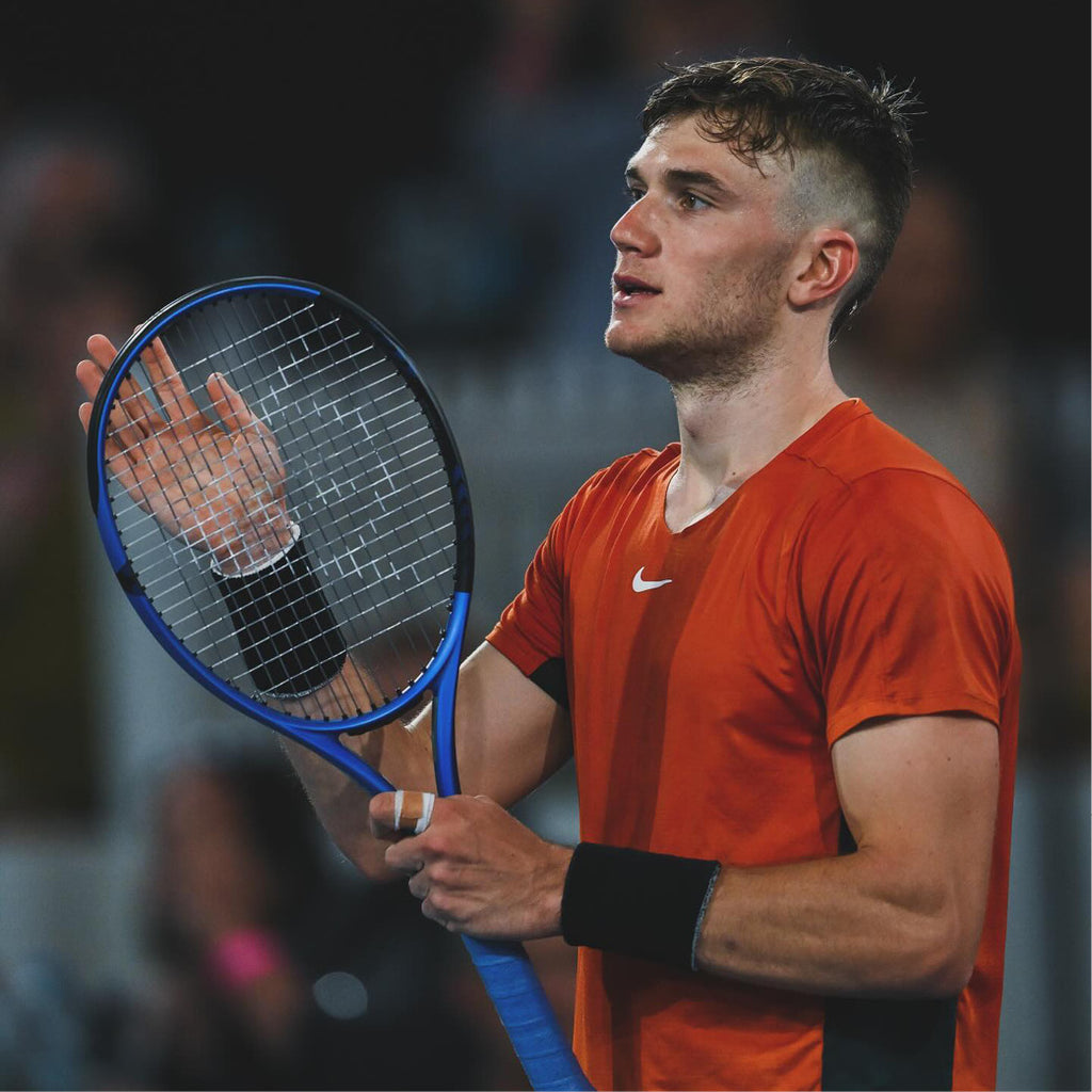
Jack Draper has discussed a lightning-bolt tattoo on his left upper arm. He got it at 19 and has said it represented being bold. Years later, he connected the shape with the lightning-bolt trophy from his 2023 UTS win. He has also said the ink has faded and that he might remove it.
His interviews explain the bolt. Photos show it in different settings, but they don’t confirm other tattoos or reveal private reasons.
The lightning-bolt tattoo is the documented centerpiece
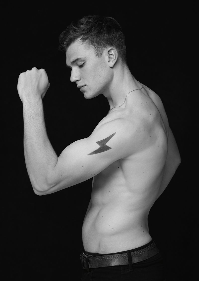
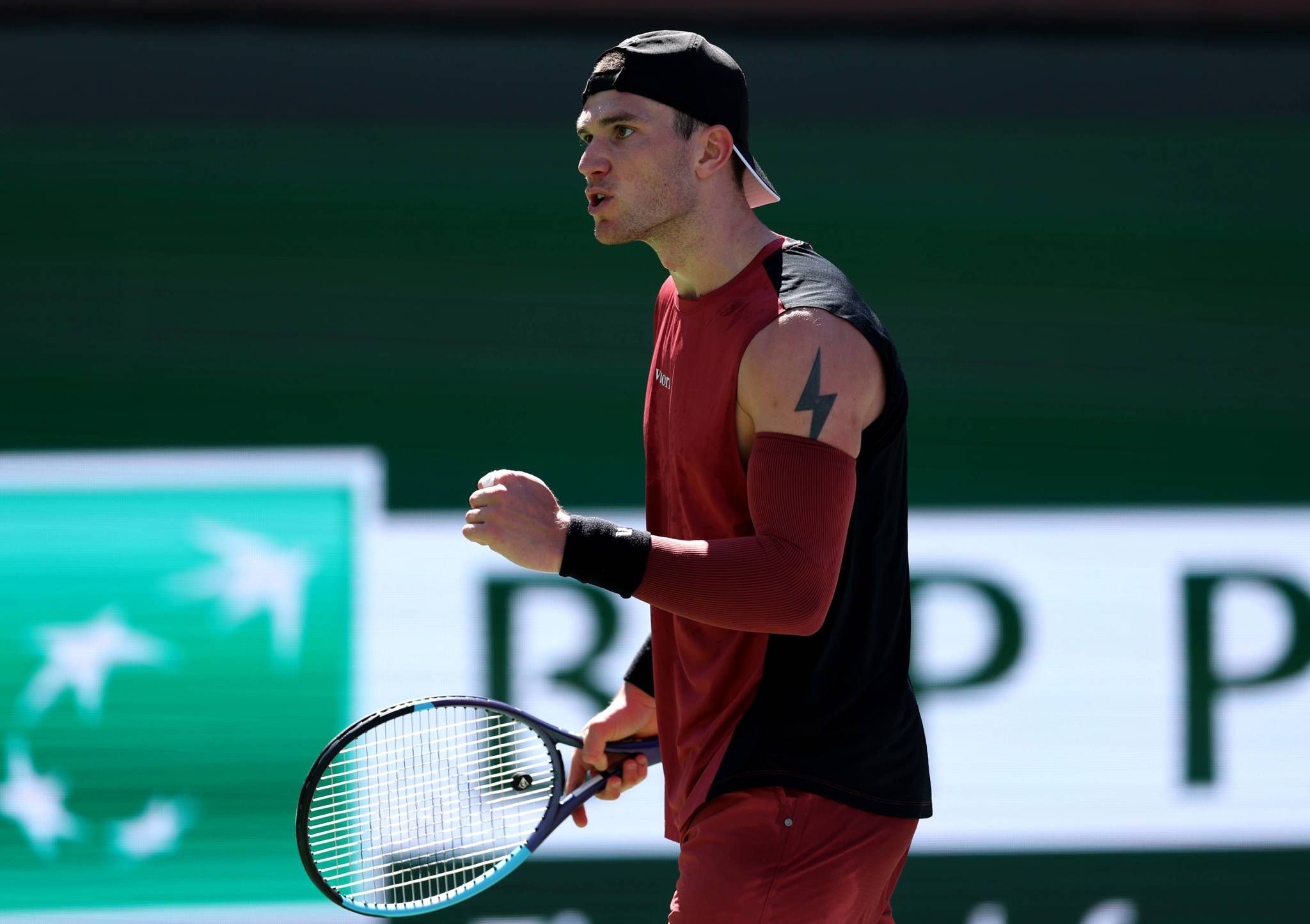
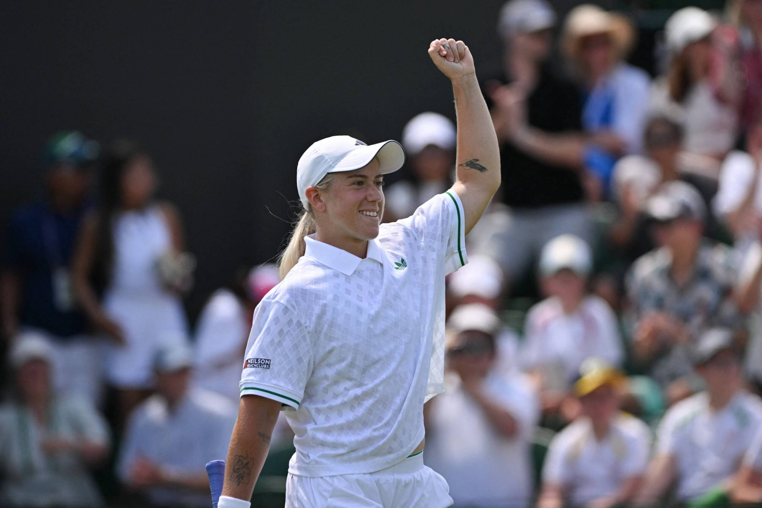
The clearest documented piece sits high on Draper’s left arm near the shoulder. It is a dark zigzag with a compact, filled-in shape, easy to recognize even in a wide shot.
Speaking to Vogue, Draper said the tattoo was not about being left-handed or about his tennis. He chose it to represent being bold. The upper-arm placement leaves room around the shape: a sleeve can cover it, while a vest makes it visible.
The UTS-connected tattoo adds a second layer
Draper later connected the bolt with UTS, the short-format tennis competition he won in 2023. After the win, he kept its lightning-bolt trophy at his mum’s house, on top of his bedroom cabinet. In a Tennis Majors interview, he said the trophy reminded him of his tattoo. That gives the shape another association; he has not presented it as a tennis logo or a symbol for every part of his career.
What the photographs actually confirm
The bolt looks different across photographs. Bright court light can make its dark fill seem grey, while a high-contrast portrait makes it look heavier. Other marks that seem to appear in some pictures are not confirmed; shadows, fabric folds and photo grain can be mistaken for tattoos. The bolt is the design with a clear public account.
Career and movement
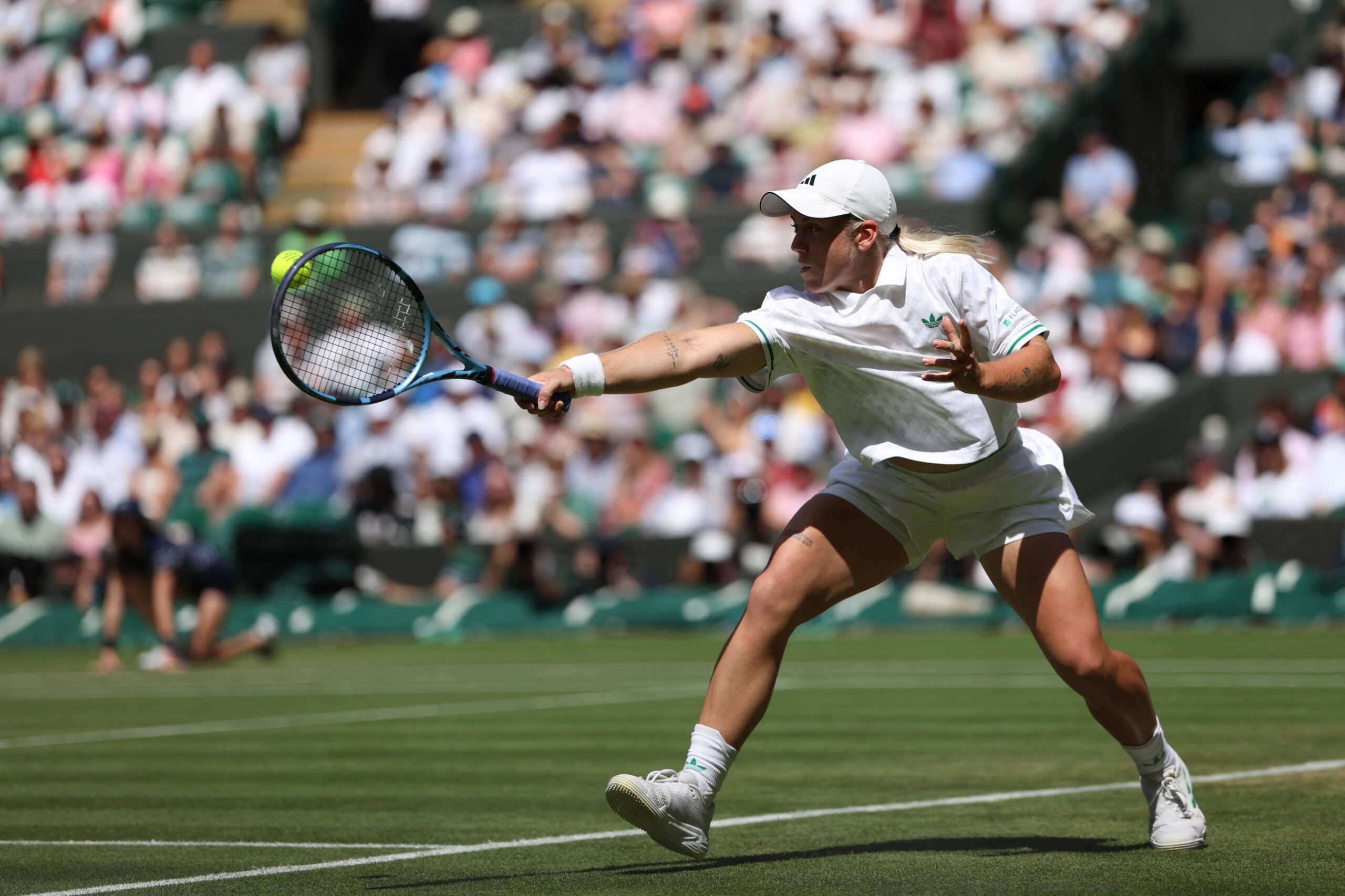
On court, Draper’s left arm is relaxed in some frames and raised or bent in others. A serve turns the shoulder; tracking a ball changes the arm’s position. These pictures show the tattoo in motion, not as a posed close-up.
Off-court styling
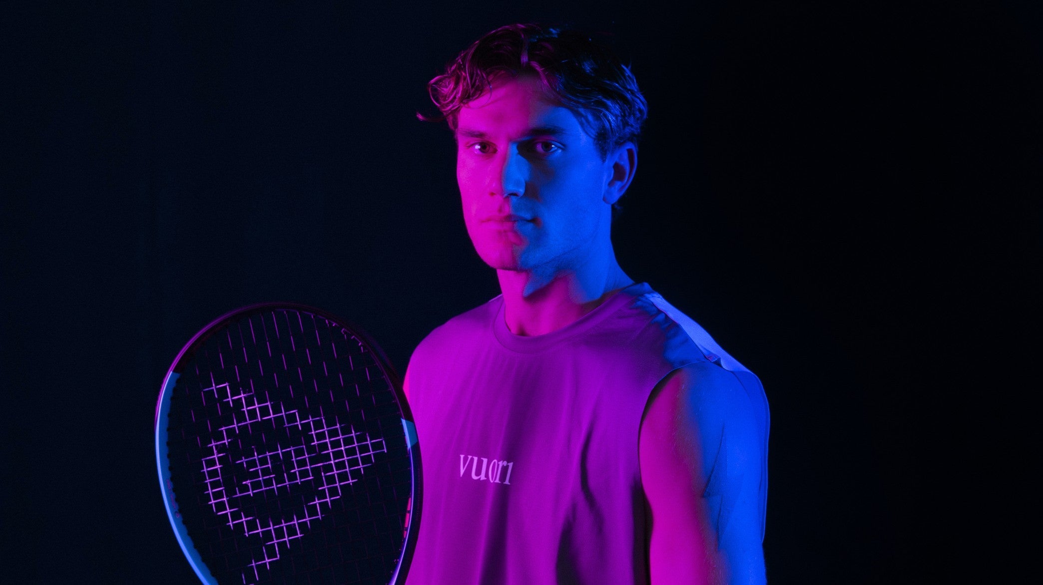
Off court, Draper appears in both sharp editorial looks and simple sportswear. Without a scoreboard or racket swing, the photos rely on expression, posture and clothes; the same bold shape can feel more like part of his everyday style.
Match-day setting
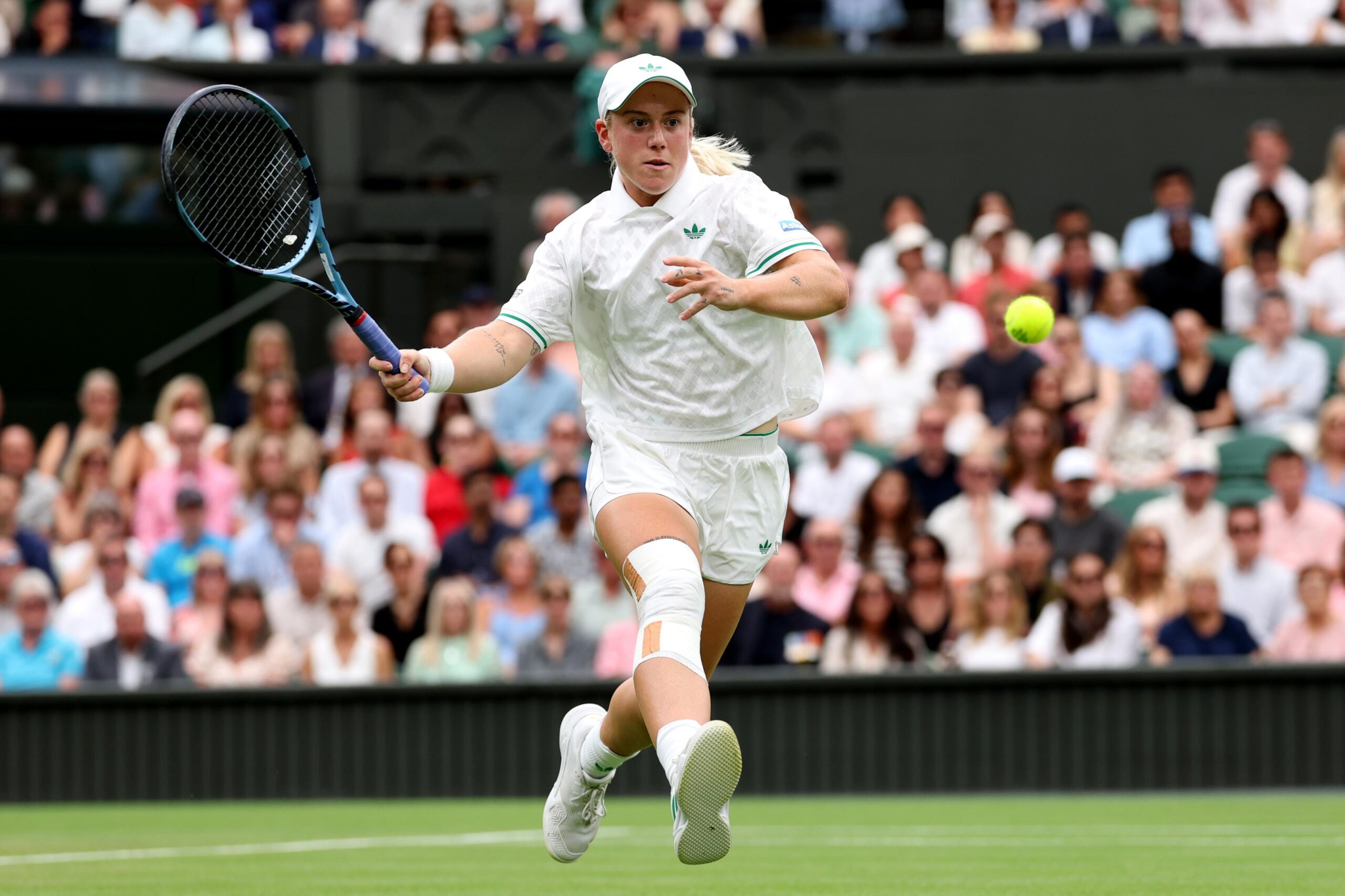
Match photos put Draper alongside a racket, a court and the concentration of a point in progress. Compared with a studio portrait, the moment is less controlled and more about the match.
How to borrow the idea without copying it
Start with what you like about Draper’s tattoo: the lightning shape, the dark fill or the upper-arm placement. Use that as a guide for your own symbol instead of copying the same bolt. A spark, storm mark or abstract flash can carry a similar sharp outline; keep the sketch simple enough to read at a glance.
Try a stencil at a few sizes and look at it with your arm relaxed, raised and turned sideways. Draper’s design is big enough to read without taking over his arm, but the same proportions will not suit everyone. Ask the artist to show you how it sits on your body rather than judging it from a phone image.
Think about visibility too. The upper arm is easy to show in a vest and cover with a long sleeve. An outer thigh or upper back offers more privacy; the forearm is longer and more visible, so a design there needs to work with that shape.
A tattoo can change with time, and your feelings about it may change too. Choose something you want now and follow the artist’s aftercare advice.
A quick recap
Confirmed piece: a dark lightning bolt high on Draper’s left upper arm.
Meaning he has discussed: being bold; later, the same shape reminded him of the lightning-bolt trophy from his 2023 UTS win.
Timing and changes: he got the tattoo at 19, has said it faded and may remove it.
Visual style: a simple graphic mark that appears in training and match photographs.
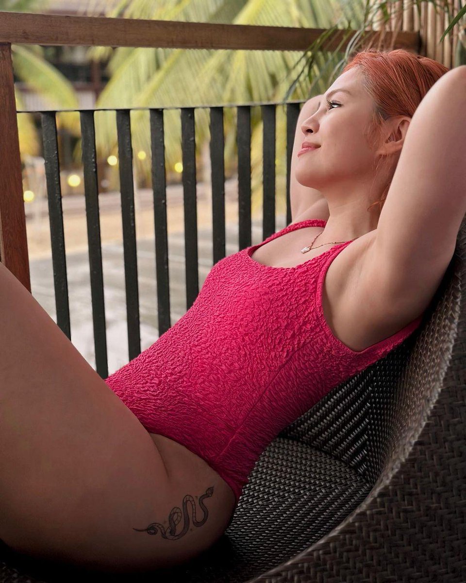
Janella Salvador has said she got a tattoo for her son, Jude. A public photo also shows a fine-line snake on her upper thigh. The two pieces have different stories: she hasn’t publicly explained the snake, while the Jude tattoo is tied to her son.
A relaxed, sunny photo shows Salvador reclining outdoors in a bright pink swimsuit. It isn’t a formal tattoo reveal; the Jude tattoo comes from a separate interview.
Janella Salvador’s snake tattoo
The snake is the clearest piece to identify. Its thin, winding body follows the curve of Salvador’s upper thigh, with a small head and a simple outline. It is much lighter than a traditional snake design with thick borders and dense shading.
Salvador hasn’t explained what the snake means to her, so there’s no reason to assign it a story. If you like the shape, you can use its movement as a starting point: an artist might curve a different serpent along the hip, ankle or ribs without copying this exact design.
Family, privacy, and meaning
ABS-CBN reported on a separate tattoo Salvador called “my Jude tattoo,” linking it to her son. The public explanation doesn’t specify every detail of the design. A name, initial, date or small symbol can hold a family memory without spelling it out to everyone who sees it.
Some people choose a child’s handwriting, a birth flower or a symbol from a shared memory. Others prefer a mark that looks ordinary to everyone else. The meaning can stay private; it doesn’t need to turn into a list of birthdays and milestones.
Making room for a small piece
The upper thigh offers room for a small design and lets the wearer choose when it shows. That can suit a family tattoo, or simply someone who doesn’t want ink visible in every photo or conversation.
Before settling on a spot, try the stencil while standing and sitting. See how the lines shift when your hip bends, and decide whether the design should face forward, wrap toward the side or sit flat on the thigh. Those changes can affect the shape more than a phone preview suggests.
Simple shapes with personality
For a fine-line snake, a loose curve can look more natural than a perfectly symmetrical coil. A tiny eye, forked tongue or a few scales can add character, but too many small details may crowd the outline. A small flower or sprig of leaves gives the design a softer look.
A Jude-inspired idea can be just as personal without repeating Salvador’s tattoo. An initial inside a simple shape, a birth-month flower or a small star can stand on its own. If you want lettering, leave enough room for the words to remain clear as they age.
Keeping fine lines clear
Fine lines need space between them. Details that look separate when fresh can blur together over time, so an artist may need to simplify a reference instead of squeezing in every mark. Sun exposure and friction from clothing can also affect how the tattoo holds its contrast.
Follow the artist’s aftercare instructions, keep the area clean while it heals and avoid picking at peeling skin. Once healed, sunscreen helps protect the lines, especially if you often swim or spend time outdoors. Ask to see healed work as well as fresh photos; it gives you a better sense of how the artist’s line weight settles.
Why quiet choices last
The contrast is in how much is public: the snake can be seen, but its meaning is hers to keep. Salvador chose to explain the Jude tattoo through the relationship it marks.
Before choosing a similar piece
Before taking a reference photo to an artist, decide whether you’re drawn to the snake’s shape, the thigh placement, the fine lines or the private family meaning. Those are separate choices. Ask the artist to adjust the size and spacing for your body instead of tracing the photo. The reference can guide the conversation without dictating the result.
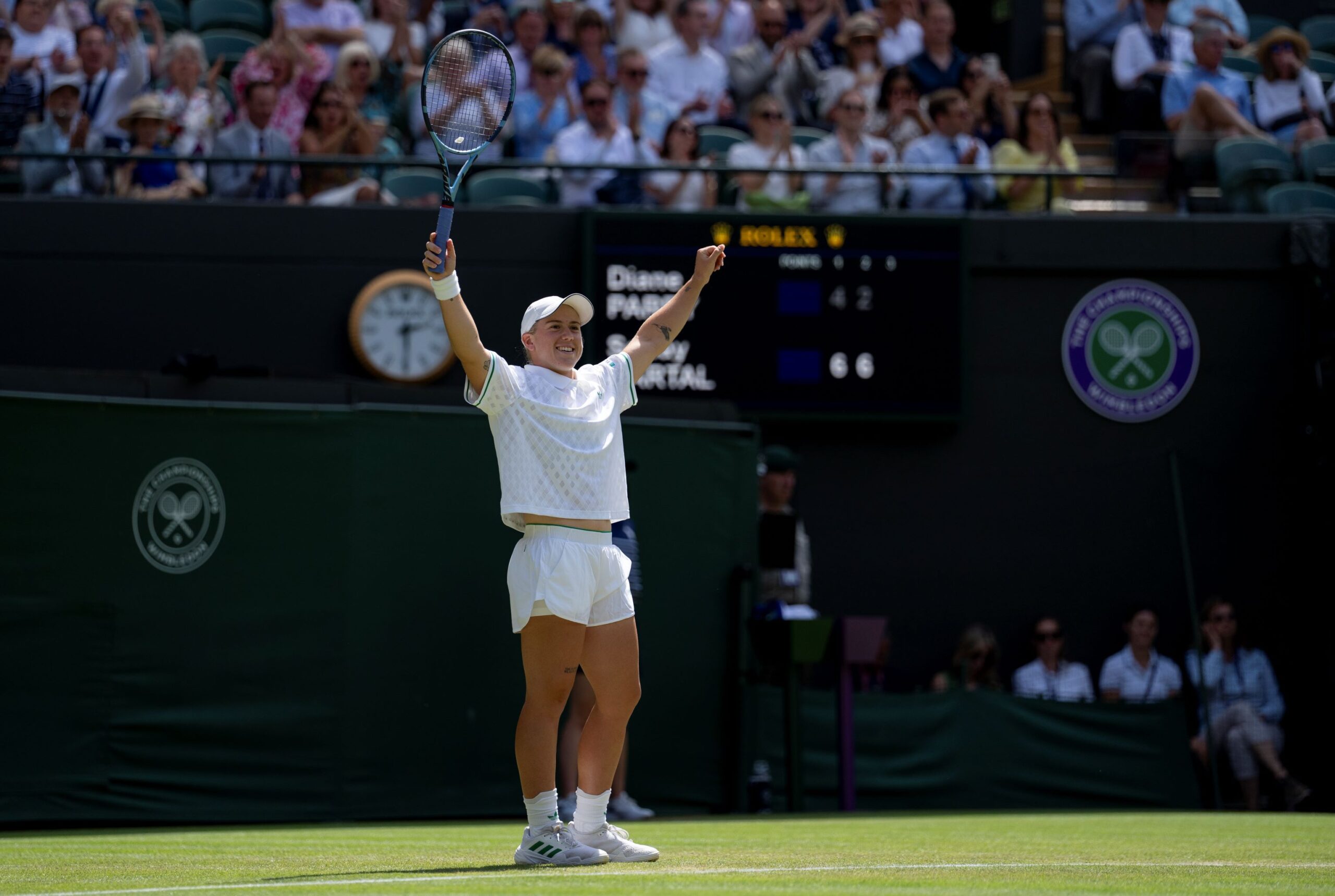
Sonay Kartal’s thunder tattoo is tied to a moment on Centre Court during her 2025 Wimbledon run. She has other visible arm pieces too, but public photos don’t show enough detail to identify them confidently.
Small tattoos appear on her arms in public photos, but most are too distant to identify confidently. The thunder piece has a direct account and an official reveal behind it.
Sonay Kartal’s thunder tattoo reveal
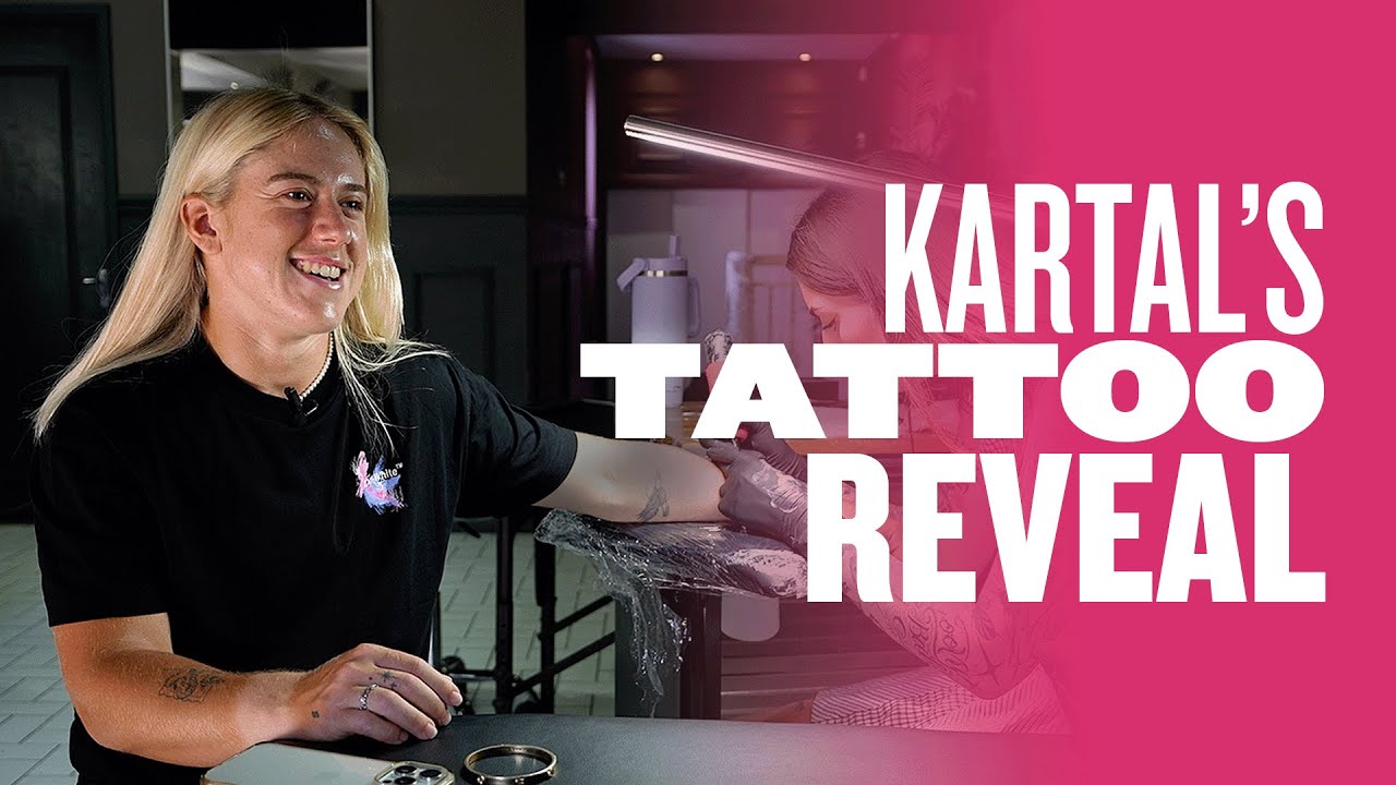
After losing to Anastasia Pavlyuchenkova at Wimbledon, Kartal told the media she would get another tattoo to mark the tournament. The LTA followed her to a local parlour as she chose her latest additions. Its video, titled “Sticking to my word!”, shows her following through. The thunder design recalls the Wimbledon run, while the appointment also marks her Billie Jean King Cup debut for Great Britain.
Why thunder fits a tennis memory
For Kartal, the thunder is tied to a particular moment on Centre Court, during a week when she reached a new stage in her career. The sound gives her a specific way back to that tournament. Other people may see a weather symbol or a sharp graphic; the memory behind it belongs to her.
The Wimbledon run behind the idea
Kartal beat Jelena Ostapenko in the opening round and then Diane Parry to reach the fourth round at Wimbledon for the first time. She lost there to Pavlyuchenkova. That run put the tattoo promise in context: this was a milestone week for the British player, not just another stop on tour.
The match photos show the tournament setting, but they are not the source for the tattoo’s meaning. The LTA’s report and reveal are what document the thunder connection.
What the sources actually confirm
The LTA says the latest work was inspired by thunder Kartal heard at Wimbledon and connects the appointment with her Wimbledon run and Billie Jean King Cup debut. The reveal video shows the visit to the parlour. Other coverage describes Kartal as a tattoo fan and notes small pieces on her arms, but it doesn’t identify every design or explain what each one means.
A distant match photo can make a small mark hard to read. Light, angle and a racket crossing the frame all change what the camera captures. Unless Kartal or a reliable source has identified a piece, it’s better to leave it as visible ink.
How the collection fits her routine
Tennis brings the arms into view as a player serves, reaches for a ball or lifts a racket. Sleeves can cover tattoos, while a sleeveless kit reveals them. Kartal’s arm pieces appear in that movement rather than as a posed display, and the public images don’t establish a complete list.
A memory worth keeping
Kartal said she would mark the Wimbledon tournament with another tattoo, then followed through after the run. The thunder is a small detail from that week, but it points back to a clear memory without needing a scoreline or a full Centre Court scene.
If you want to remember a milestone, start with the detail you still recall: a sound, a place or something someone said. A simple mark can hold that memory without explaining the whole event to anyone else.
Take the idea, make it yours
Write down what happened and which part you want the tattoo to bring back. That gives an artist a more useful starting point than a generic search for a symbol. You can borrow the idea of a personal marker without copying Kartal’s thunder design.
Keep the shape simple enough to stay clear at the size you want. Fine lines and tiny details can soften over time; an experienced artist can help with spacing, placement and how the design will look from different angles. If you build a collection gradually, each tattoo can mark something different without matching the others.
The simple takeaway
Kartal’s thunder tattoo recalls a Centre Court moment during her 2025 Wimbledon breakthrough. The LTA’s reveal also connects the appointment to her Billie Jean King Cup debut. Her other visible tattoos remain hard to identify from public photos, so the documented story is the one to stick with.
Kaila Estrada’s tattoos range from small line drawings and lettering to a larger carnation design with a woman’s face. She has explained the meaning of several pieces, including the carnation, a matching family tattoo and a Bible verse. For the rest, it’s best to stick to what the photos show.
The airplane on her arm
One of Estrada’s clearest small tattoos is a fine-line airplane near her elbow. A Cosmopolitan Philippines photo shows the simple silhouette on her arm. It reads as a travel image, though Estrada has not publicly tied it to a particular trip.
The design is small and leaves plenty of space around it. It is easier to see when she raises or turns her arm, and it does not compete with the larger pieces elsewhere in her collection.
The lavender flower on her ribs
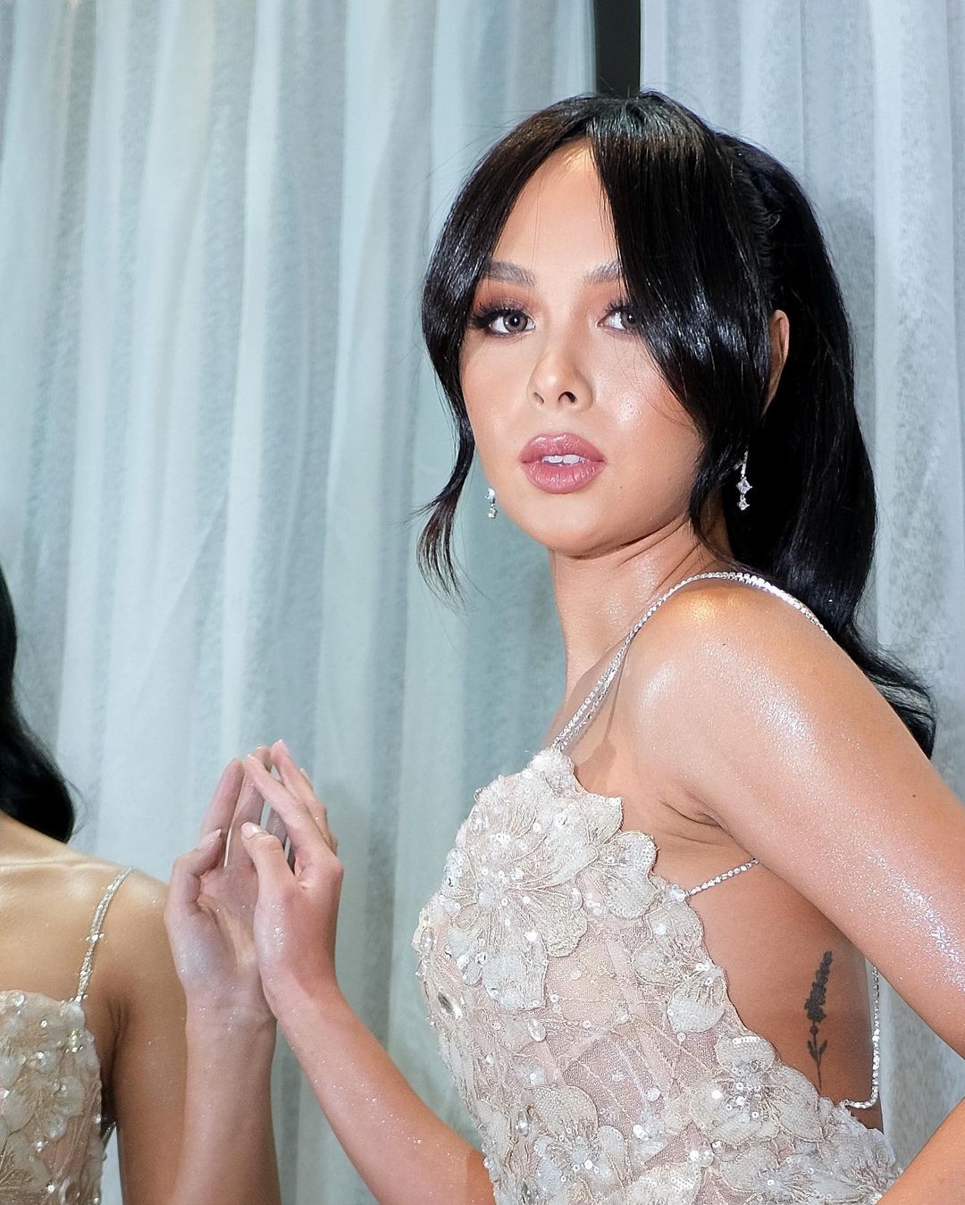
A slender lavender stem runs vertically along Estrada’s ribs. The leaves and flower clusters give it a clear botanical shape. Clothing and pose can hide part of the design.
“444” and “que sera, sera”
Estrada has red “444” numbers near her hip and the phrase “que sera, sera” elsewhere. The Spanish words mean “whatever will be, will be.” The red numerals are a compact graphic; the phrase reads more like a sentence kept close to the body. No specific explanation for either piece is included in the public account.
The carnation and woman’s face
The carnation with a woman’s face is Estrada’s largest documented tattoo. It sits across her back near the ribs. She has said the carnations stand for gratitude, while the face represents herself. Together, they reflect gratitude for her life and the woman she is becoming.
The design needs more space than her smaller marks: the petals form the outer shape and the face gives the centre its focus. It can be partly hidden in a front-facing portrait and becomes easier to see when she turns.
Blossom is a family tattoo
Estrada has Blossom from The Powerpuff Girls tattooed on a finger. Her sisters Danielle and Inah have Bubbles and Buttercup, turning the three characters into a matching family set. Blossom is bright and playful, and the finger placement makes it visible in everyday gestures.
The Bible verse on her arm
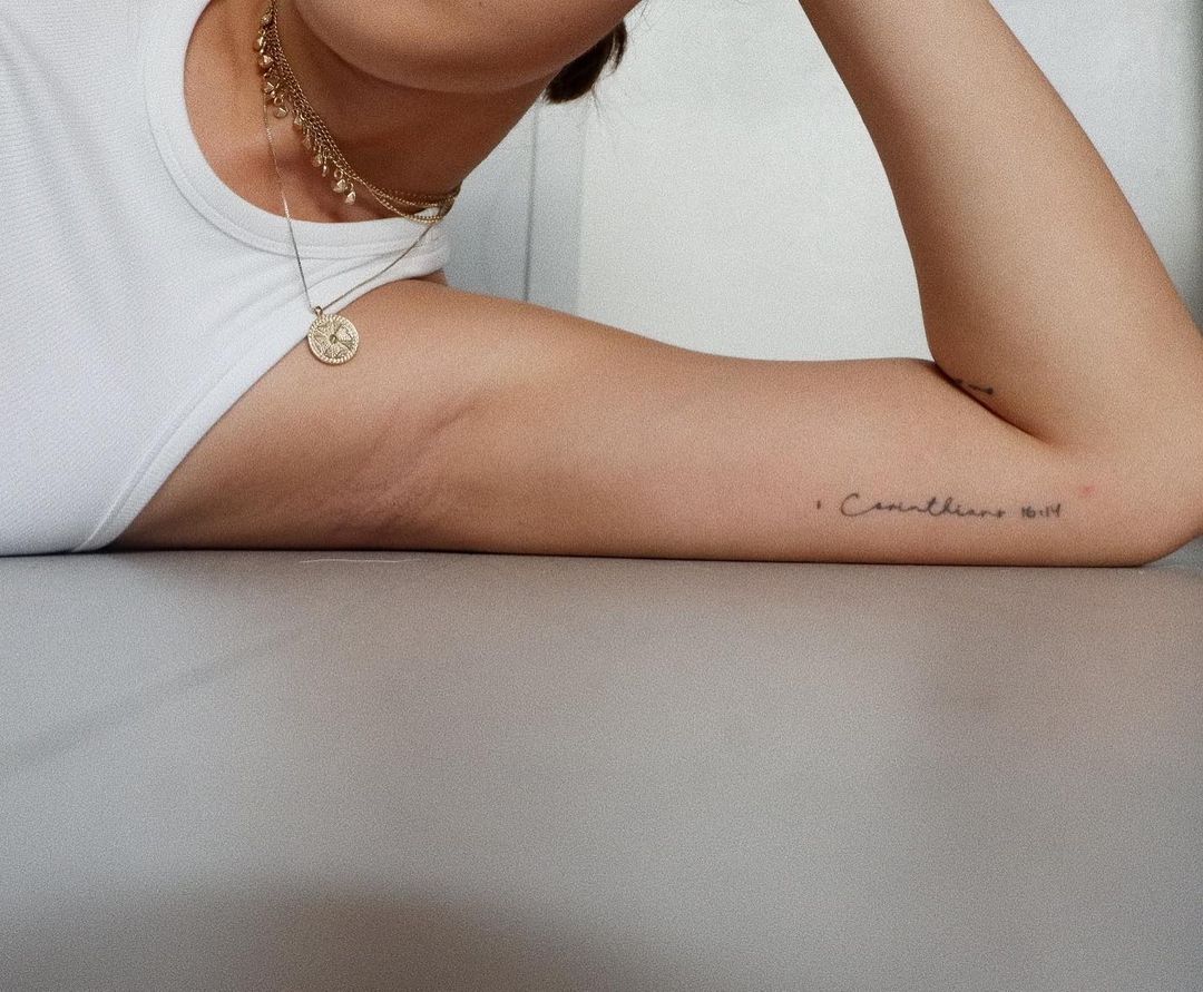
Estrada’s arm carries a line from 1 Corinthians 16:14: “Let everything be done with love.” She has described it as a reminder to love her work and approach it with an open heart. The fine script sits alongside the airplane, but the verse reads as a statement rather than a picture.
A few smaller details in the collection
A tiny wave near Estrada’s ankle or foot is easy to miss in a full-body photo. It is a simple curved mark. The “444” and the wave are smaller than the carnation, and some images show them only when the angle is right.
Fine lines, colour and changing scale
Estrada’s collection does not follow one strict style. The airplane, wave and script use light lines; the carnation has more shading and a larger shape. Blossom adds colour, while the red “444” gives the smaller pieces a separate accent.
Photos can make the same tattoo look different. A dress may cover part of the rib flower, a hand pose can hide Blossom, and an arm piece may disappear in a wider portrait. Those changes come from clothing and framing, not a different design.
The collection in context
Estrada worked as a model and content creator before acting. Her tattoos appear across fashion photos, television work, interviews and casual images, but they remain a personal mix rather than one coordinated sleeve. Her comments explain the pieces she has chosen to discuss; the rest can be described from the photos without guessing.
The collection in one look
Estrada’s documented tattoos include an airplane near her elbow, a lavender flower on her ribs, red “444” numbers, “que sera, sera” lettering, a carnation with a woman’s face, Blossom on a finger, a Bible verse on her arm and a small wave near her ankle.
The carnation represents gratitude and her own growth. Blossom is shared with her sisters, and the Bible verse is a reminder about her work. Other pieces have no public explanation, so there is no need to fill in the gaps.
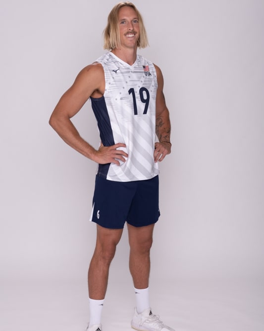
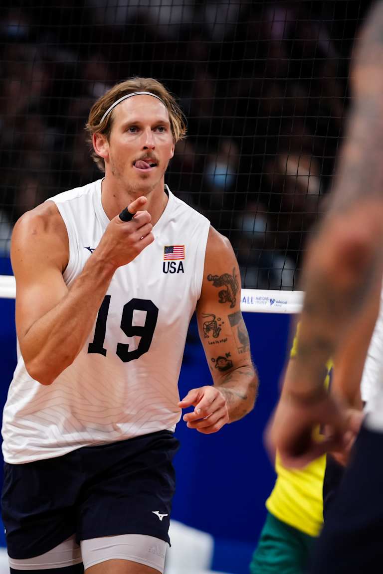
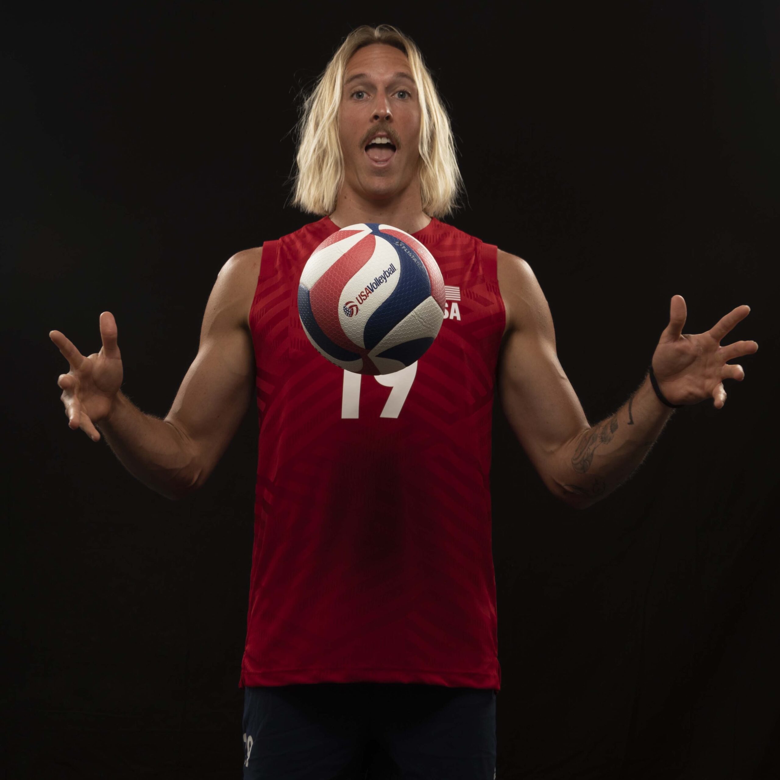
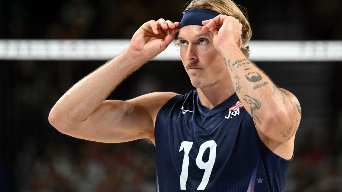
Taylor Averill is a USA Volleyball middle blocker whose arms are covered with small drawings and phrases. The collection includes a shrimp playing saxophone, a tiger, a chili pepper and the words “existing is enough” on his hand. In a GQ interview, Averill talked about both the silly designs and the serious story behind the hand tattoo.
The shrimp tattoo playing saxophone
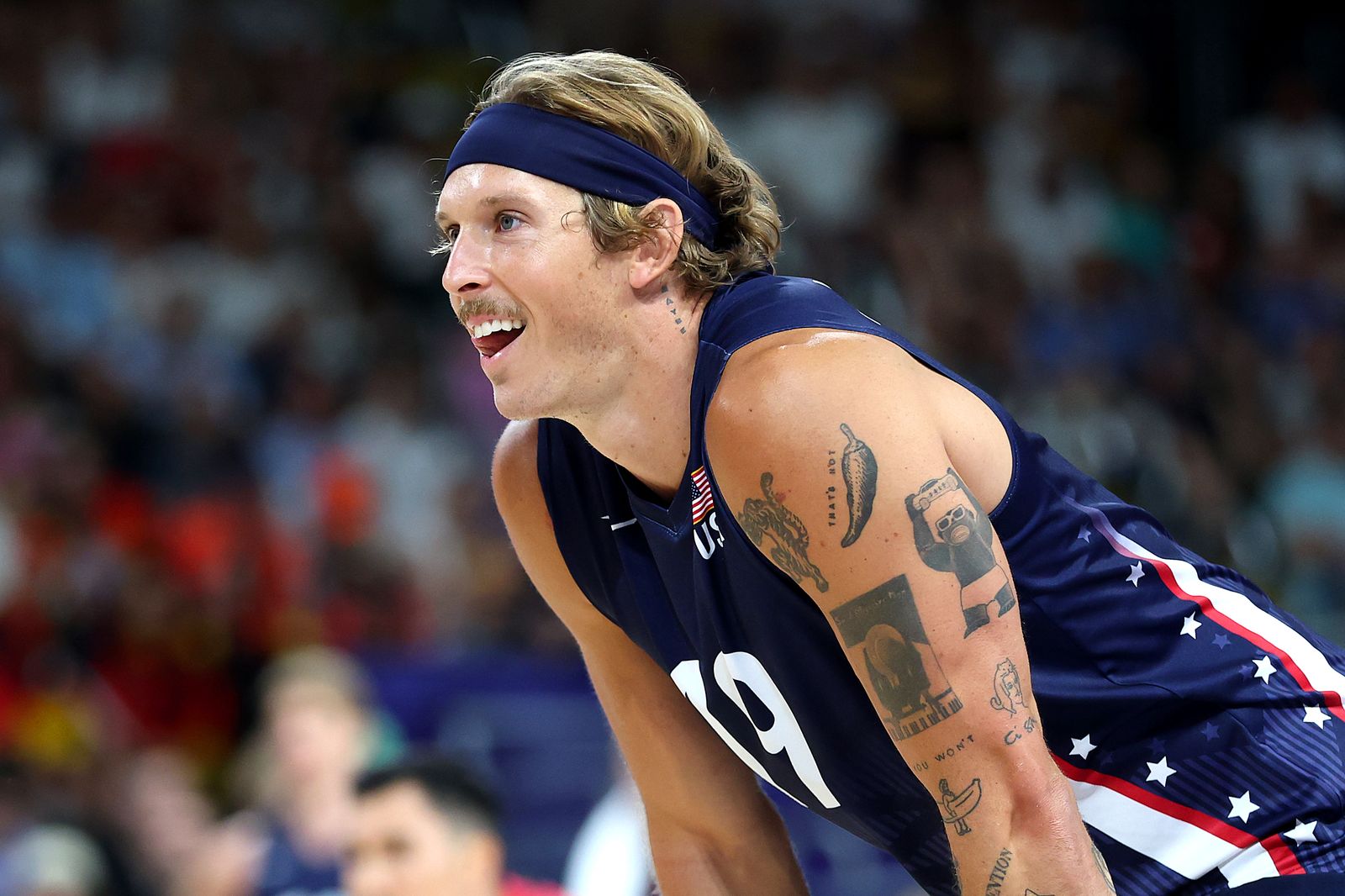
Averill said he found the saxophone-playing shrimp while scrolling online and decided to “let it rip.” He liked the image and got it; he hasn’t attached a larger story to it. In match photos, it sits among other drawings on his arm, where the joke is easy to see.
“Existing is enough” on his hand
The hand phrase carries a different meaning. Averill has said it is one of his most personal tattoos and connected it to the first time he cried in therapy. He was trying to understand himself beyond volleyball and the pressure to perform.
He had spent years tying his worth to selection, results and the chance of making an Olympic team. “Existing is enough” marks the idea that his value is there before the next match or roster. The words are plain, and their meaning is direct.
The tiger and chili pepper tattoos
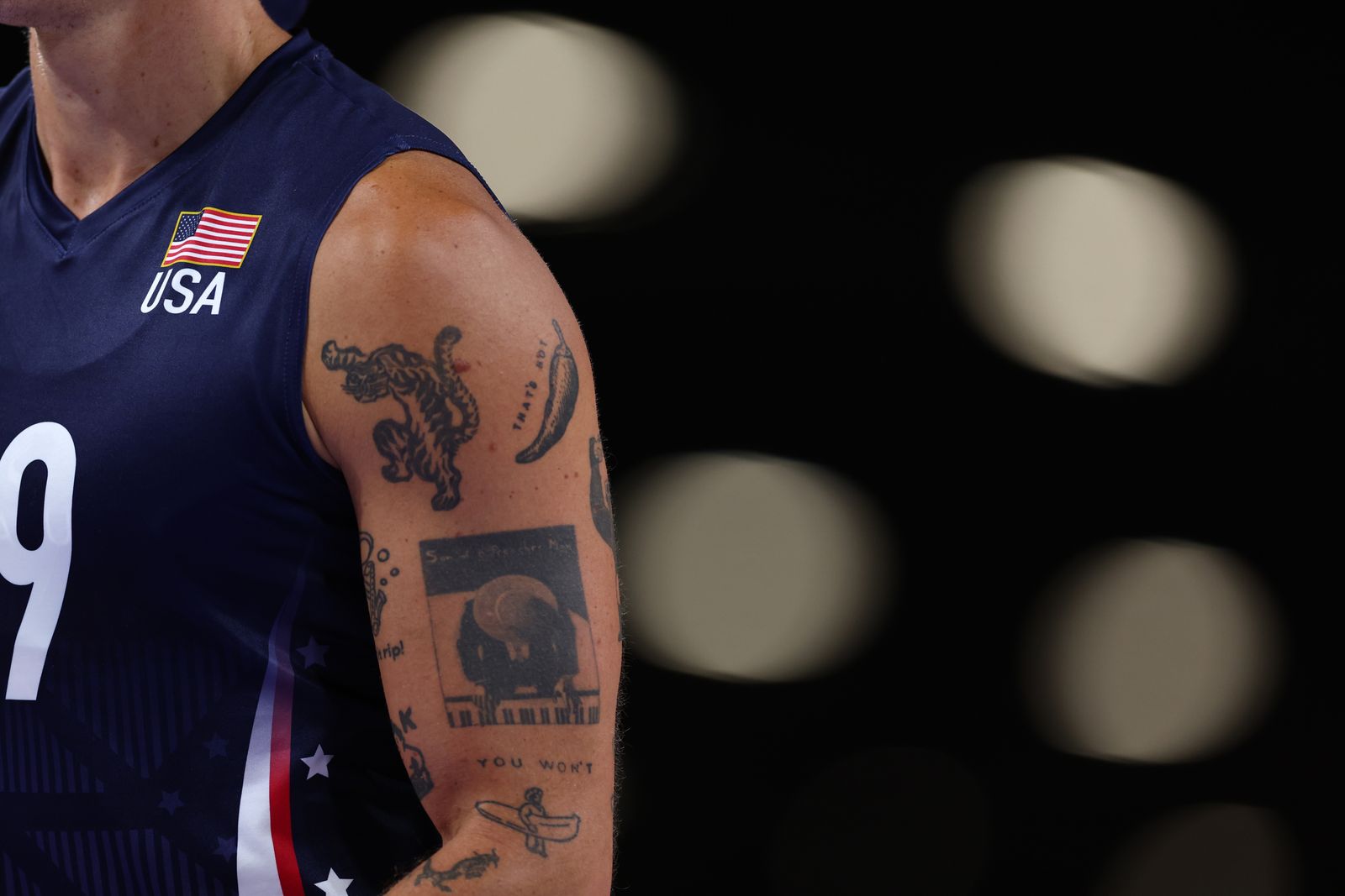
A tiger sits near Averill’s upper arm, while a chili pepper nearby carries the words “THAT’S HOT.” The tiger has a bold outline; the pepper is an obvious visual joke. Neither needs to match the shrimp or the hand lettering.
That mix follows the tone of the collection: some tattoos are there because he liked the picture, while others carry a personal story. The jokes stay jokes.
The piano-playing figure and the arm collage
Close-up photos also show a piano-playing figure, cartoon-like drawings and darker areas of shading. Some images are clear; others disappear under a jersey or are partly hidden by the angle of his arm. The designs sit as separate pieces, with gaps and different line weights, rather than one continuous sleeve.
During a match, the pictures shift as Averill raises an arm to block or reach across the net. The photos show how the pieces sit together while he plays, but they do not explain what each one means.
Lettering, small marks and the lower arm
More lettering and small drawings appear lower on his arm. The interview gives a story for the hand phrase and the shrimp, but not for every mark. A photo can show where a design sits without telling us why he chose it.
Some parts are readable at a glance; others remain small details. The collection does not need a backstory for every line to be worth looking at.
The collection changes with the sport
Volleyball kit covers parts of Averill’s arms, then reveals them when he dives, blocks or reaches for the ball. The movement and arena light make the tattoos look different from a posed portrait. Against the Team USA uniform, the drawings and lettering also stand out from the clean navy, white and red kit.
Why the serious pieces don’t cancel the jokes
Averill’s GQ interview lets the hand phrase and the shrimp stay in separate emotional lanes. One is tied to therapy and self-acceptance; the other was an image he found funny. Neither needs to be dressed up to make it belong on the same arm.
He also described learning that he could be enough even if he didn’t make the Olympic team, then reaching Paris and winning a bronze medal. The hand tattoo gives that work a quiet marker, while the shrimp and pepper keep the collection playful.
The interview’s main point
There isn’t one theme connecting every tattoo. The arm is a collage: dark shapes, little figures, lettering and jokes. The pieces remain distinct in photos, and Averill has not tried to turn them into one polished design.
What the interview actually documents
Averill told GQ that he chose the shrimp after seeing the image online and that “existing is enough” is tied to a major moment in therapy. GQ’s photos also show the tiger, pepper, piano-playing figure and other drawings. Their exact meanings are not all explained, so they should stay visual details rather than guessed tributes or symbols.
The quick look
Averill’s arms show a saxophone-playing shrimp, a tiger, a “THAT’S HOT” chili pepper, a piano-playing figure and other small drawings and lettering. On his hand, “existing is enough” is the phrase he has connected to therapy and self-worth. Together, the tattoos read as a loose collage with room for both jokes and serious reminders.
Bely Basarte has explained several tattoos through specific memories: an elephant connected to a South African sanctuary visit, a hand holding lavender for home, and a blindfolded girl that represents trust in the people she loves. Photos show a wider collection, including owls and colourful neotraditional designs, but not every piece has a public explanation.
Bely Basarte’s elephant tattoo
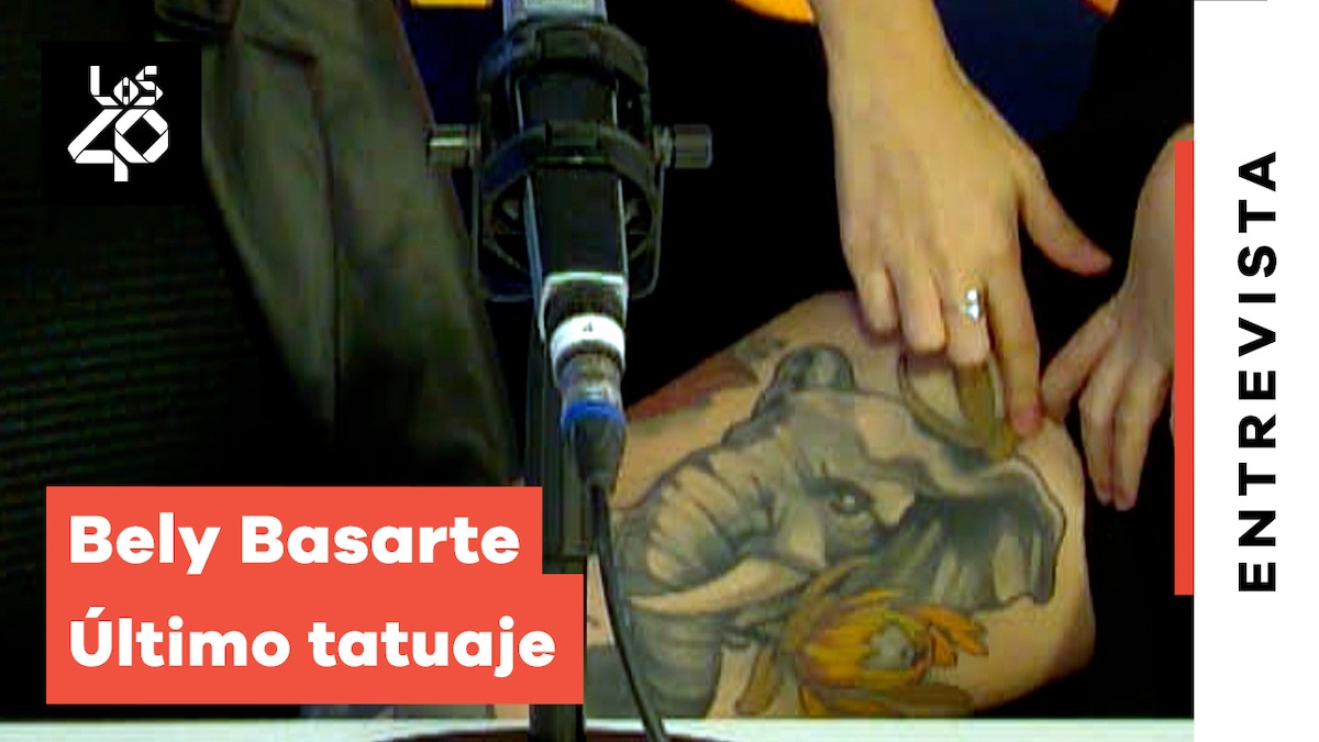
In a LOS40 interview, Basarte showed a large elephant tattoo on her leg. She spoke about her long-standing affection for elephants, her love of Dumbo and a visit to an elephant orphanage in South Africa. She was moved by seeing orphaned elephants form a group and accept one another. The tattoo holds that memory, rather than a general symbol of strength.
Why the elephant means so much
The design gives that story room: it is large enough to show the elephant’s head and ears, with warm colour and a clear outline. Basarte has described the animal’s care for one another as part of what matters to her. The trip and the Dumbo connection make the image personal in a way a generic elephant tattoo would not be.
The stories behind the collection
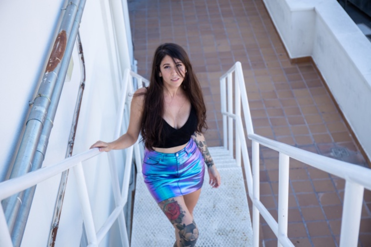
RTVE Playz’s Tintas episode gives a wider view of Basarte’s collection, including owls and colourful neotraditional work across much of her body. The styles vary. The photos can show how the tattoos look together, but they do not identify every design or explain what each means.
Basarte’s interviews supply the meaning where she has chosen to share it. The rest can stay as visible details rather than guesses based on a partial image.
A quieter personal memory
In a LOS40 Q&A, Basarte said a hand holding a lavender branch represents home. She also described a blindfolded girl as a reminder to trust the people she loves. One image points to a place or feeling; the other to relationships she relies on.
The elephant is the largest and easiest to spot. The lavender branch and blindfolded figure carry their meaning in smaller, more personal images. They do not need to share a style to belong to the same collection.
How the images fit together
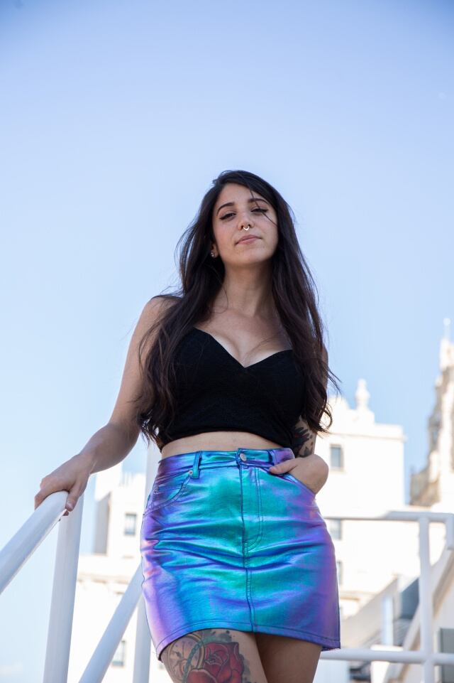
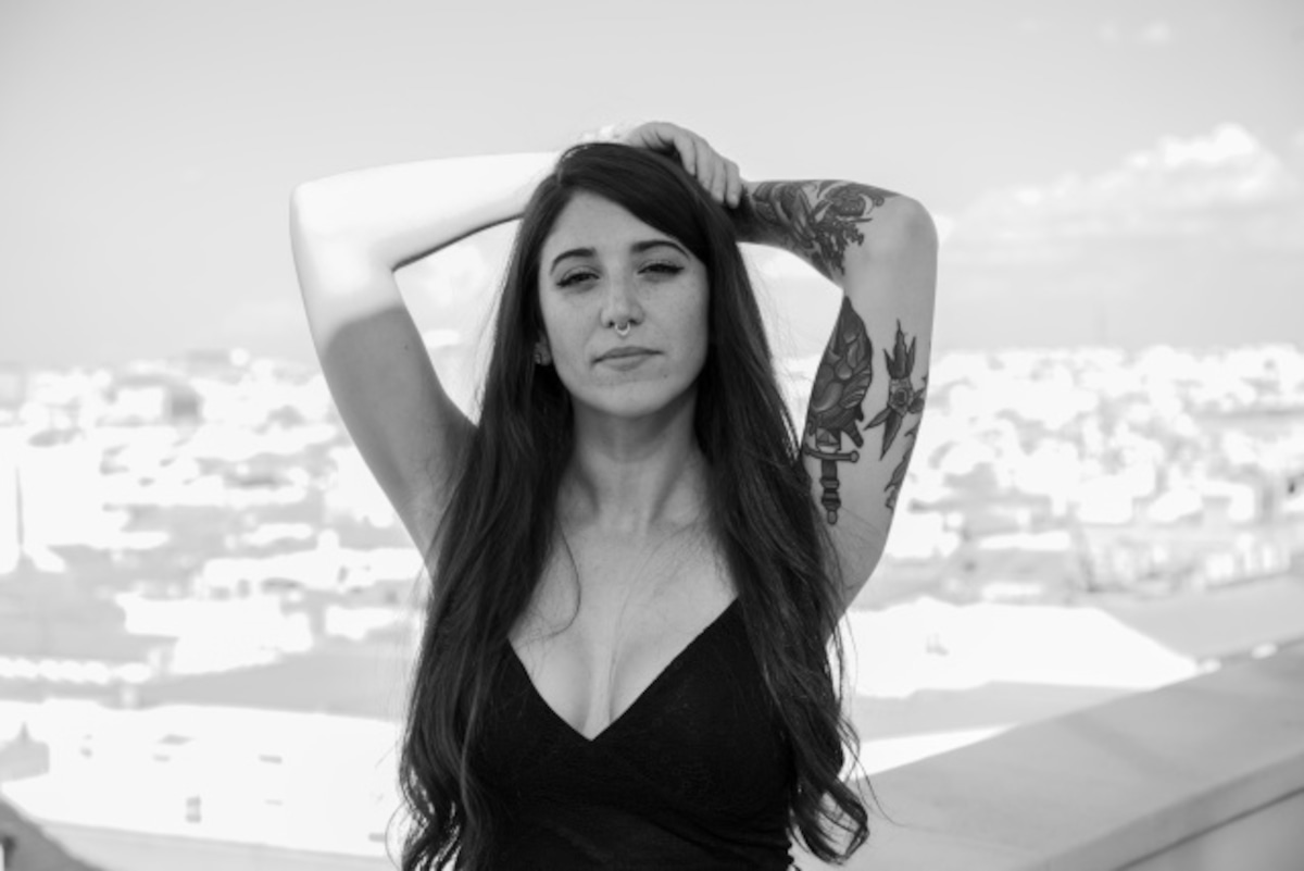
The photos provide context for the placement and scale of Basarte’s tattoos. A close-up shows the elephant; wider portraits show how the leg and arm work sit alongside other pieces. Angle, clothing and distance can hide details, so the pictures should not be treated as a complete catalogue.
LOS40 and RTVE Playz show Basarte discussing her tattoos, while the photographs show what the designs look like. That distinction keeps the known stories separate from details the sources do not explain.
What to borrow from Bely’s approach
Start with a memory, person or place that still matters to you, then look for an image that fits it. Basarte’s elephant came from her affection for the animal and a specific visit; the lavender branch reflects home. A small design can carry a strong connection without spelling out the whole story.
Choose a size and placement that suit your day-to-day life, and let an artist adapt the image to your body. There is no need to plan every future tattoo as one matching set. A collection can change as your interests and memories change.
The short version
Basarte’s large elephant tattoo connects her love of elephants and Dumbo with a visit to an orphanage in South Africa. A hand holding lavender represents home, and a blindfolded girl stands for trust in people she loves. RTVE Playz has also shown owls and colourful neotraditional work in her broader collection.
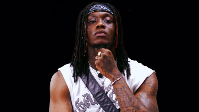
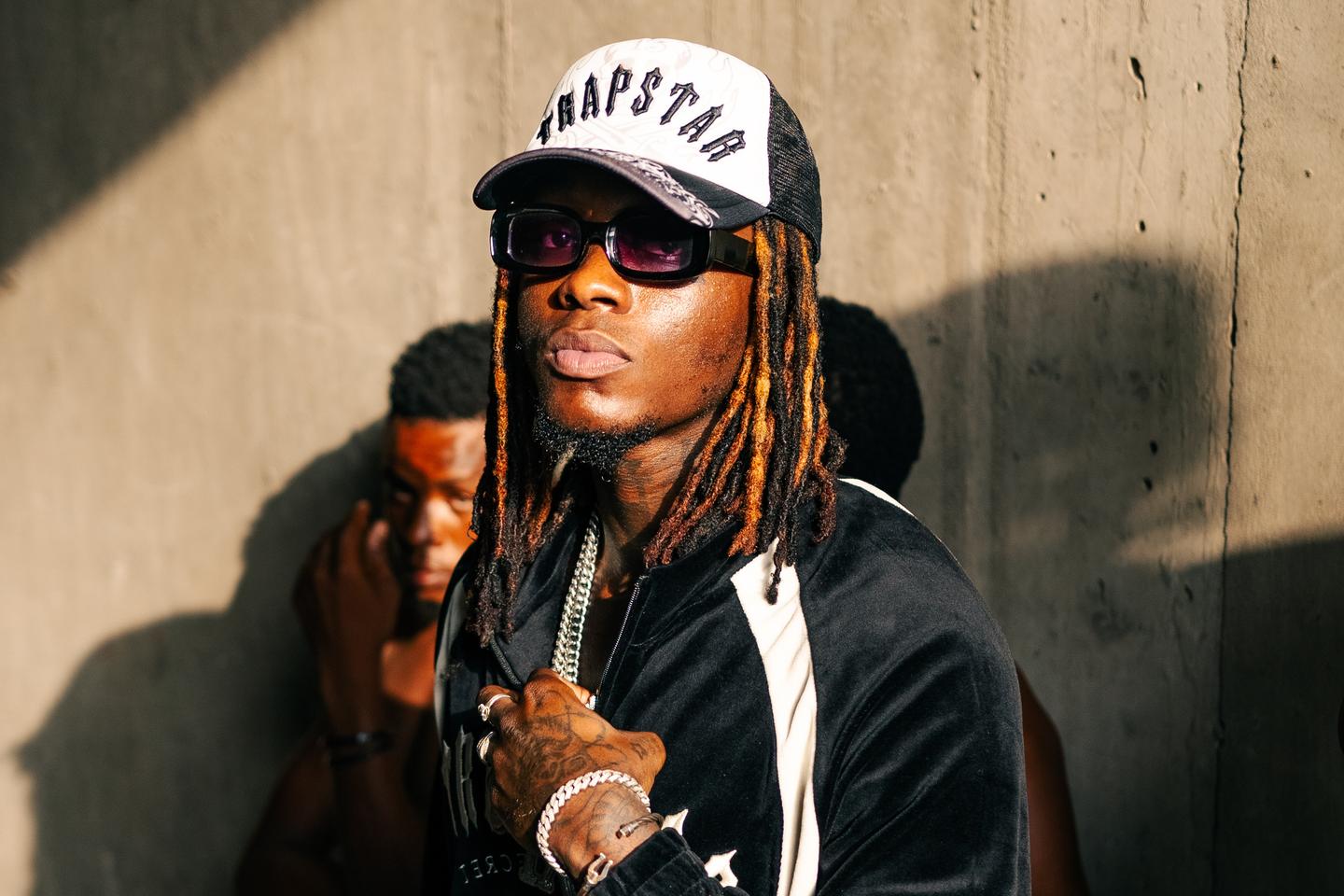
Himra’s tattoos are visible across his hands, neck and arms, and they’re part of the image he brings to portraits and performances. Photos show dense black-and-grey work alongside his dreadlocks, chains and sharp styling; they don’t explain the meaning of every design.
Himra, whose real name is Abdul Rahim Souleymane Bakayoko, came out of Côte d’Ivoire’s rap scene with a sound shaped by American drill and rooted in Abidjan. The pictures catch his tattoos from different angles, including close views of his hands and wider shots of his arms, neck and chest.
Himra’s visible hand and forearm tattoos
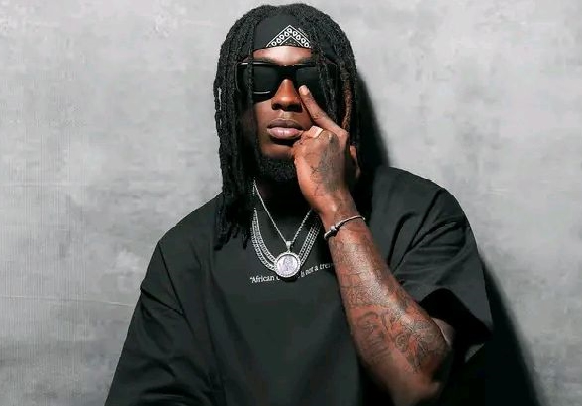
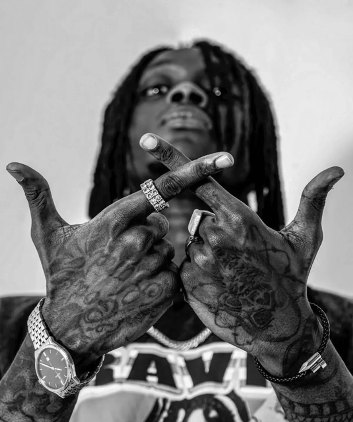
The clearest hand view is a black-and-white portrait with Himra’s fingers crossed in front of his face. Dark shapes and lettering cover the backs of his hands and run across his fingers, packed close together.
Rings, a watch and chains frame the pose, but the ink still holds the eye: the tattooed hands are part of the picture, not just in the background. Hand tattoos stay exposed and move constantly, so the placement takes regular upkeep as well as a willingness to keep the designs in view.
Reading the sleeve coverage
A wider portrait shows tattoos across both forearms and up the upper arms. Dark shading, linework and larger forms overlap to create sleeve-like coverage; the arm reads as one busy but controlled field rather than a single focal piece.
Cropped photos can make one patch look separate from the rest, while a wider view shows more of the coverage at once. The photos don’t identify an artist, dates or individual design names, so the description can go only as far as the visible black-and-grey work, illustrative shapes and lettering-like details.
What the neck ink adds
In an outdoor portrait, Himra’s dreadlocks fall away from the side of his neck, leaving dark ink visible above his T-shirt collar. His arm work fills more of the frame, but the neck tattoos extend the collection beyond the sleeves.
The neck stays part of his outline in portraits, unlike an arm that can disappear under a jacket. The design itself is hard to make out, and the photo doesn’t explain its meaning; what it shows is the placement and how it sits beside his hair and collar.
Black-and-grey texture across both arms
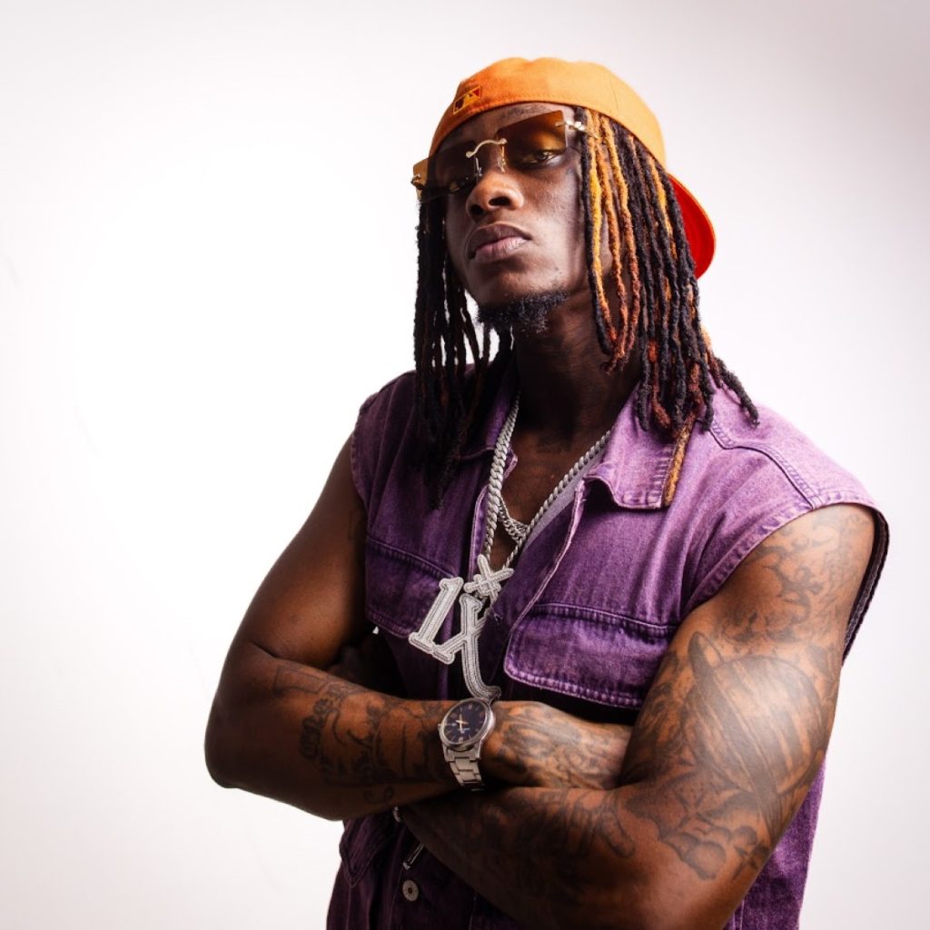
A portrait in a sleeveless purple vest exposes both arms, with silver chains and an orange cap adding colour around the mostly dark ink. The tattoos vary in scale: some look illustrative, while others resemble lettering or small symbols.
There’s little blank space on the visible arms, but small breaks of skin and changes in line weight keep the coverage from looking flat. The dark shapes remain legible against the brighter clothes and jewellery, and the pose gives a view from shoulder to forearm.
Hands, jewellery and the performance image
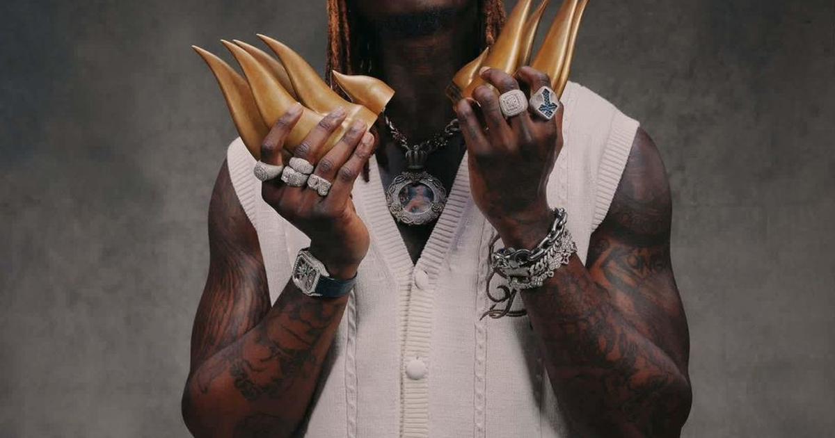
In an award portrait, Himra holds two gold trophies while wearing rings and layered jewellery. The tattoos remain visible across his hands and arms, even in a more formal setting, alongside the clothes and accessories that shape the image.
Other photos bring his hands close to his face; this one puts them near the trophies. Together, the poses show how placement changes what people notice when he moves or holds something, without requiring a separate explanation for each design.
Why the collection feels so complete
The visible tattoos reach across the hands, neck, forearms and upper arms, areas that define a portrait even when Himra wears a simple T-shirt. His dreadlocks, sunglasses, chains and poses add to that outline.
The pieces don’t all have to match to sit together. The hands, neck and arms have different shapes and textures, and tattoos added over time can vary in line weight, scale and mood. Shared shading or spacing can link them if you’re planning a sleeve.
How to borrow the energy without copying the image
Start with the placement you’re prepared to live with. Hand tattoos stay on view; even a small neck design changes a portrait, while a larger one may draw the eye first. A sleeve can be dense or leave more open skin. Think about how your clothes and daily movement will change what people see.
If you’re planning a sleeve, you might place a larger design near the shoulder, medium pieces through the upper arm and smaller marks toward the forearm. Leave space for each part to read and for the collection to grow over time.
The short version
Photos show Himra with dark hand tattoos, dense arm coverage and ink on his neck. They support a description of the collection’s placement and black-and-grey look, but don’t establish the private meaning of each design.
The practical idea is to choose placement and designs that suit your own life, then build at a pace that gives each piece room. Himra’s photos show the effect of a collection worn as part of his public style.
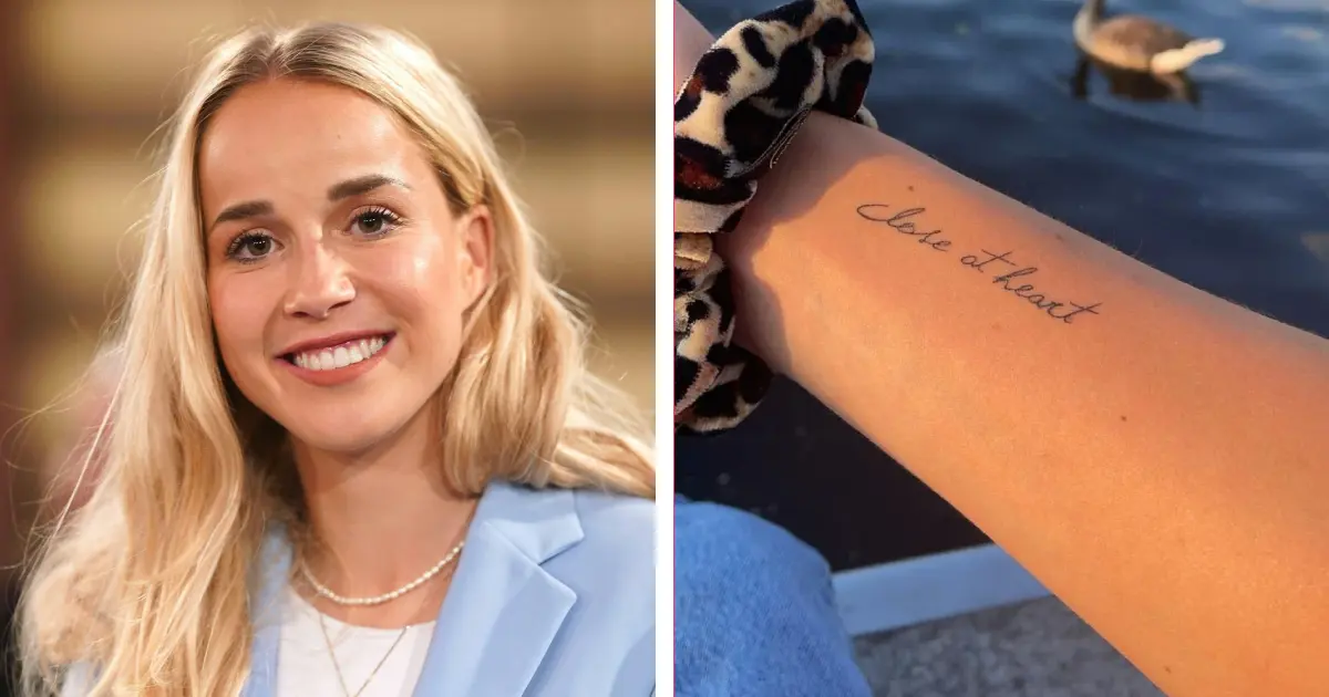
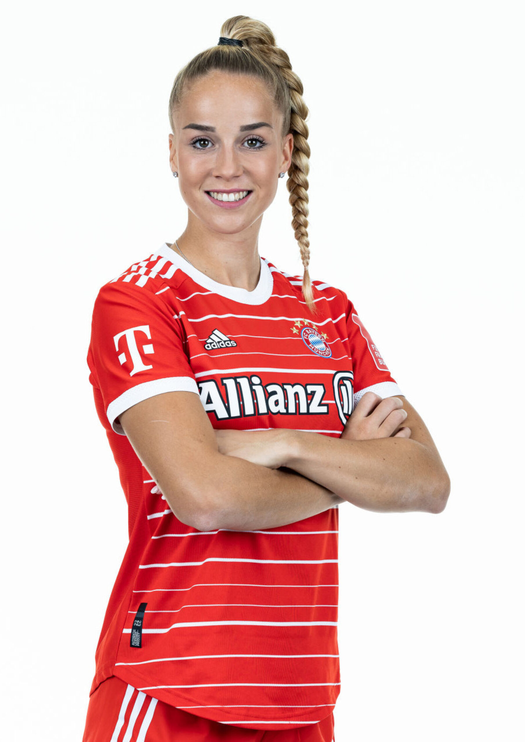
Giulia Gwinn’s tattoos stay close to the skin and can be easy to miss in match photos. The Bayern Munich and Germany defender’s clearest visible design is a fine-line phrase on her inner forearm: “Close at heart.”
A second phrase is connected to “Write your own story,” a line that later became the title of her book.
Giulia Gwinn’s “Close at heart” tattoo
The phrase sits horizontally on the inner forearm, just above the wrist, in thin, loose cursive. The first letter loops gently, and the connected words look handwritten rather than set in a typeface.
Reports connect “Close at heart” to Gwinn’s grandparents, whom she remembers before matches. The short line doesn’t explain more than that, and the available account gives no reason to assign it another meaning.
Before the match
Before a match, Gwinn remembers her grandparents and kisses the words on her arm. The inner forearm lets her turn the phrase toward herself with a small gesture, even in a stadium.
The photos show the lettering and its placement; interviews and profile pieces provide the match-day ritual. For a memorial or family tattoo, that distinction is useful: a spot can matter because it fits a private habit, even if it isn’t prominent in pictures.
“Write your own story” and the ideas around it
Gwinn has another tattoo connected to “Write your own story.” She said the words came from a message she wrote on a football for a young girl. The line later became the title of her book, and she has said it fits the way she sees her life.
She has also recalled writing down her dream of becoming a footballer at six and finding the note years later. Her career has included major injuries, long recoveries and a return to the top level. Those details give the phrase a specific history beyond a general motivational slogan.
If you’re drawn to a short phrase, handwriting or a simple script can keep it personal. The design doesn’t need extra symbols around every word.
Giulia Gwinn on the pitch
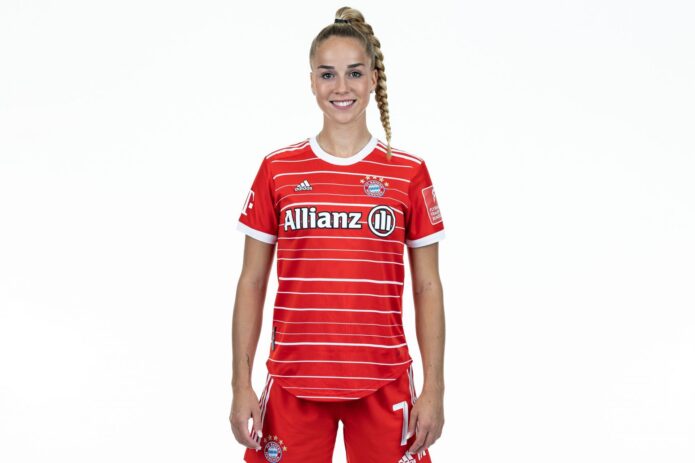
Gwinn is often photographed in Bayern Munich or Germany kit, with braided hair and her arms in motion. Her fine-line tattoos are small beside the shirt, badge and action, and tend to show in closer views.
The image here is contextual, not evidence of another tattoo. Match photos can show how ink appears with a kit or in motion, but they don’t establish a design that isn’t visible.
Giulia’s public look
If “Close at heart” appeals to you, start with a phrase that belongs to your own life. A family member’s handwriting can give a few words a distinct shape; copying the same line would leave out the history that matters to Gwinn.
An inner-forearm placement is easy for the wearer to see and simple to cover. A tattooer can help angle the words along the arm and leave enough space between letters for the script to stay legible.
A short tattoo can carry the cue without fitting the whole story into the design. The memory behind it can be longer than the words.
A quieter kind of presence
Small tattoos can show up in ordinary routines: washing your hands, pulling on a shirt or taping a wrist for training. The wearer sees them often, even when they’re not the first thing other people notice.
Gwinn’s visible lettering is delicate and tied to family and football. Its meaning comes from the life around it, not from size or decoration.
A useful final check
Fine-line lettering can soften as it heals and ages. Keep enough space between letters and contrast in the strokes. A consultation should cover the size, direction and how the phrase reads with the arm relaxed.
Gwinn’s ink gives a public glimpse of a private reminder. The accompanying portrait is contextual, not tattoo evidence.
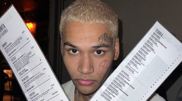
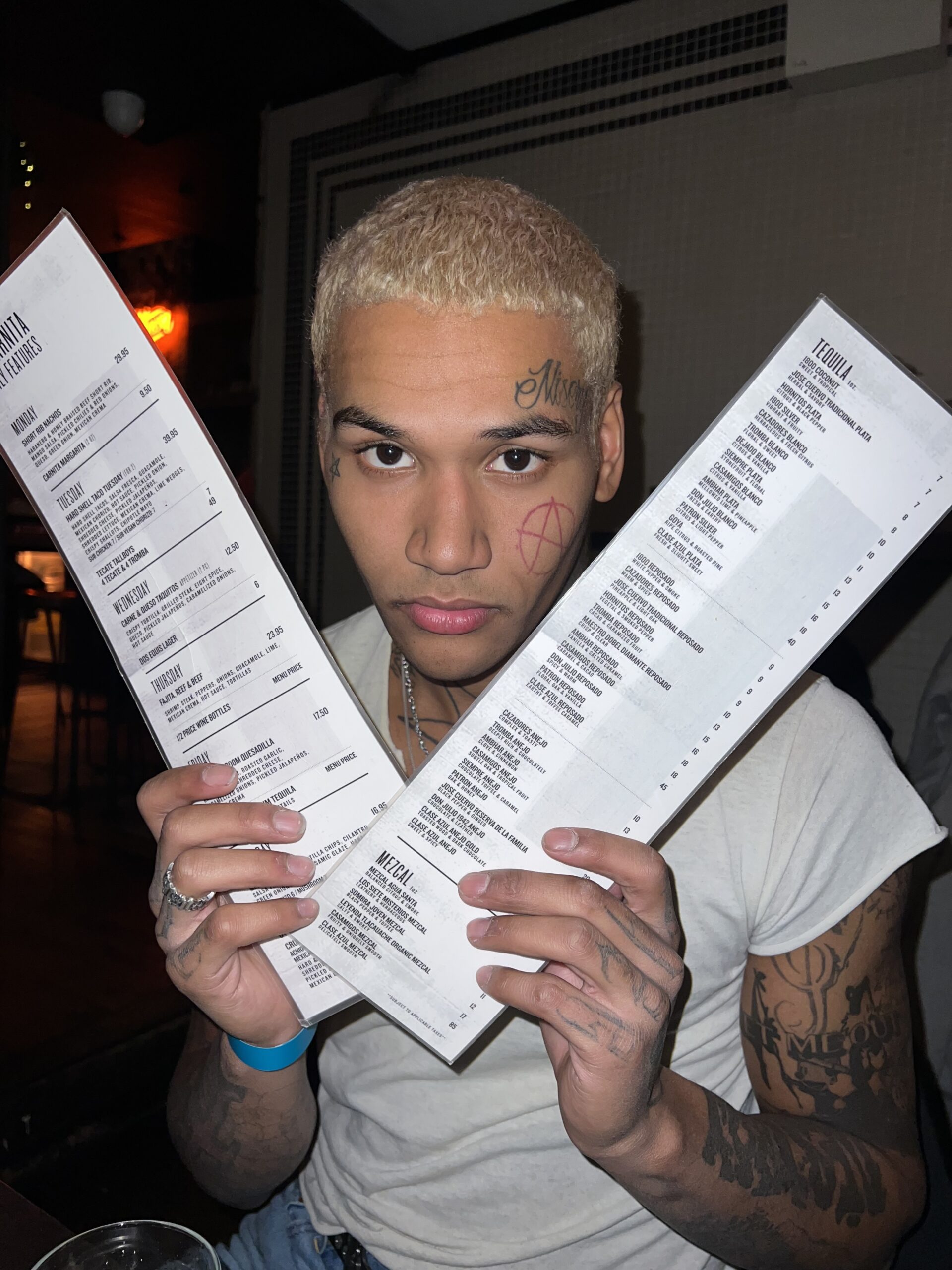
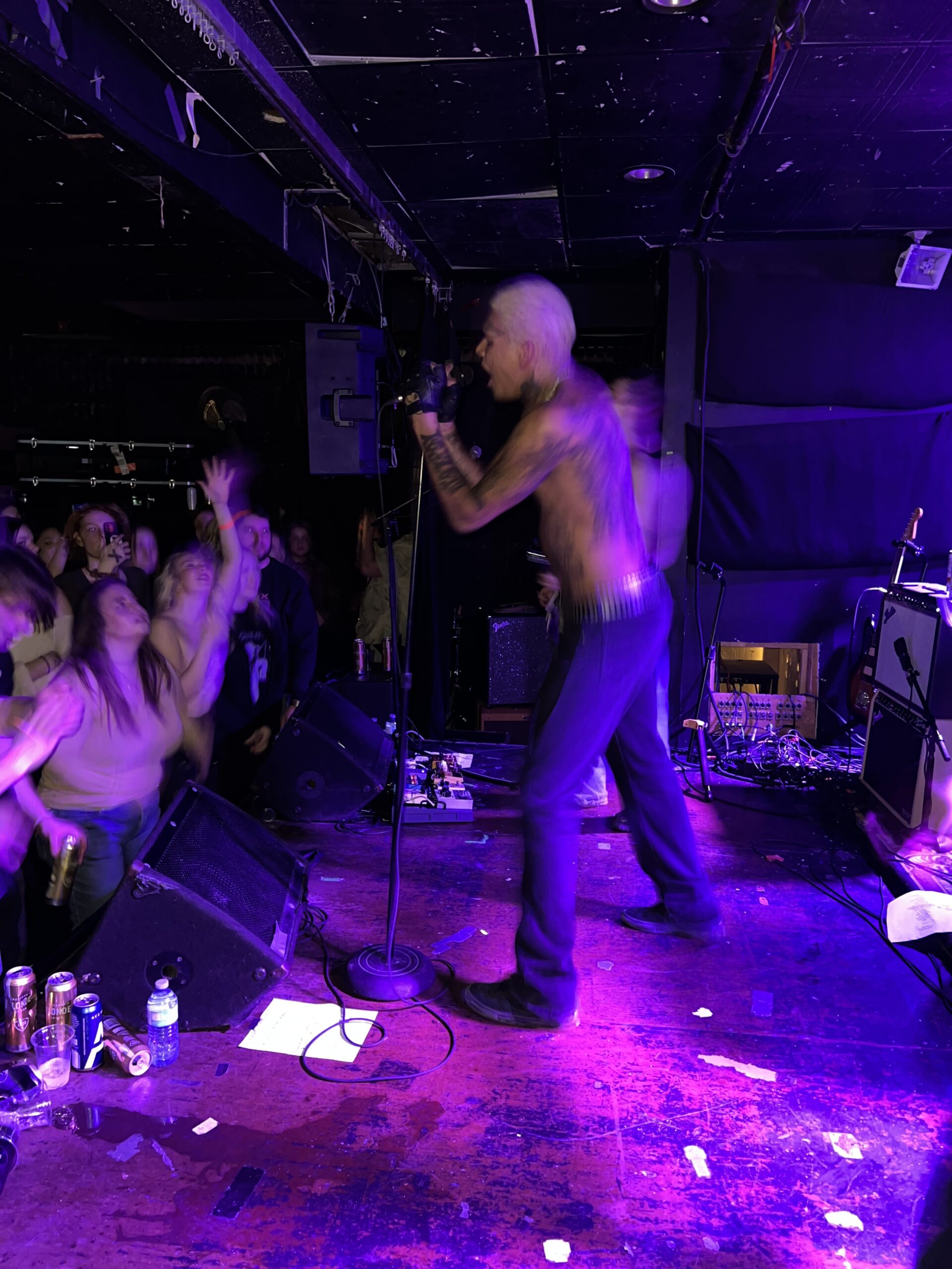
EKKSTACY started getting tattoos at 17, beginning with his face. The Canadian singer-songwriter’s ink now covers his face, arms, chest, back, neck and hands. Some marks are easy to read; others sit in layered blackwork or appear only briefly in live photos.
The collection doesn’t read as a matching set; its pieces came together over time, including tours, trips through Europe and sessions he chose in the moment.
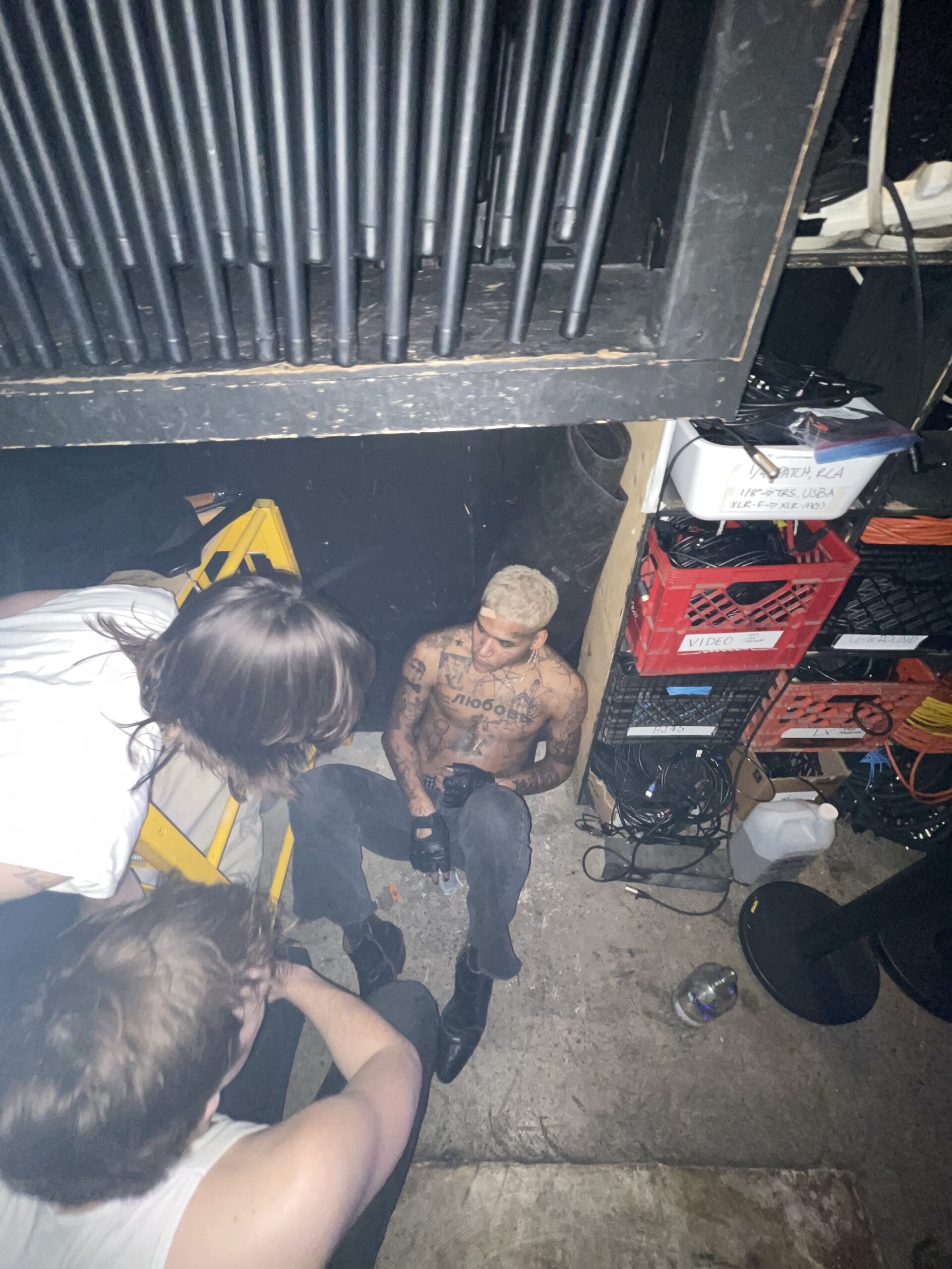
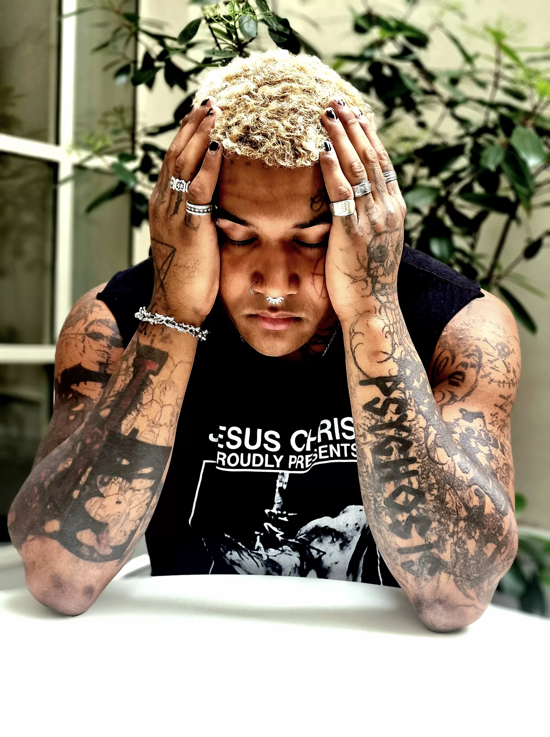
The best-documented pieces are the cheek pentagram, the Russian word for love across his chest, the German AUSGANG on his hand, Forever and a large unfinished Jesus design on his back, and a star on his neck. Smaller marks can be hard to identify in stage photos, so the details below stick to what he and named publications have reported.
The face tattoos and cheek pentagram
In a Rock Sound interview, EKKSTACY said his first tattoos were done on the same day when he was 17, and that they were on his face. It was an unusually visible place to start.
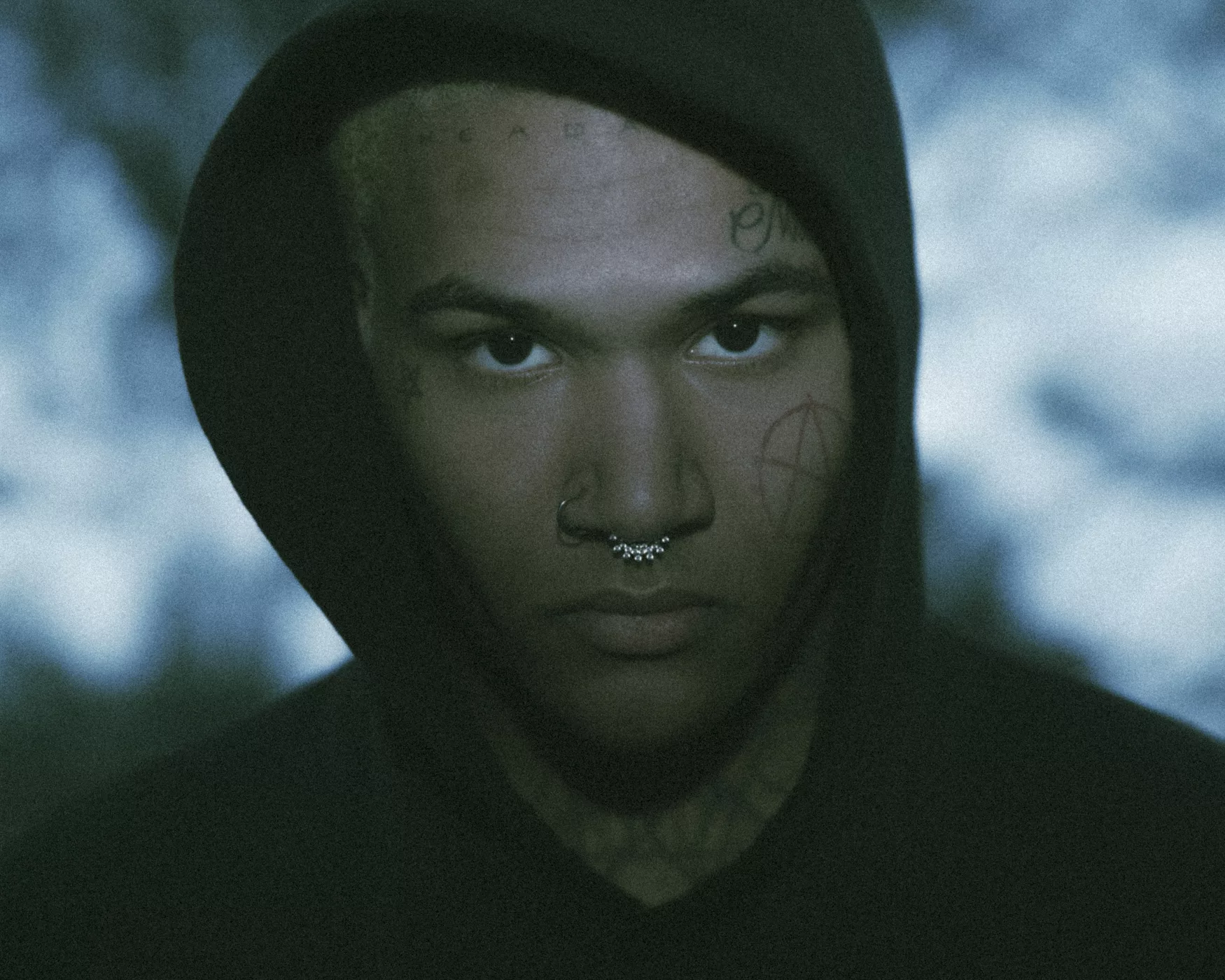
Rolling Stone Australia highlighted the pentagram on his cheek. Close portraits show it among smaller symbols and lettering, part of a patchwork of heavy shapes and fine lines rather than a single isolated design.
He hasn’t given a confirmed public meaning for the pentagram. Its shape and placement are clear; anything beyond that would be a guess. The uneven sizes and spacing also keep the face tattoos from looking mirrored or planned as one set.
A cheek tattoo draws attention because it sits where people look while you speak. If you’re considering one, scale and placement deserve careful thought; a small mark can change the whole face.
The Russian LOVE tattoo across his chest
In an AltPress interview, EKKSTACY said the Russian word for “love” across his chest was inspired by a girl, though they were never together. He said romantic love was what he craved most and that he put the word on his body to attract it.
The large Cyrillic lettering runs across his upper chest. Its broad strokes stand out against the denser blackwork around it, so a vulnerable word sits beside darker, rougher designs without making the collection feel polished or soft.
A quick personal detail
EKKSTACY has described tattooing as a physical diary. The chest piece is one entry he has explained in public: the word is easy to read, but its backstory belongs to him. If you’re considering text, choose something you’ll still want after the feeling that inspired it has changed; check the language and lettering before settling on size and placement.
The back work, Forever, and the unfinished Jesus design
Rock Sound reported that EKKSTACY got Forever on his back after his first face tattoos. He also described a large Jesus design that was unfinished at the time and said he planned to add a cross. He liked having his back tattoos visible on the cover of his Forever album.
The back gives a large design room across the shoulders and down the spine, but its curve changes how the work reads as the body moves. EKKSTACY’s unfinished piece was discussed as a work in progress, not a final image.
Tour photos show how quickly the collection changes
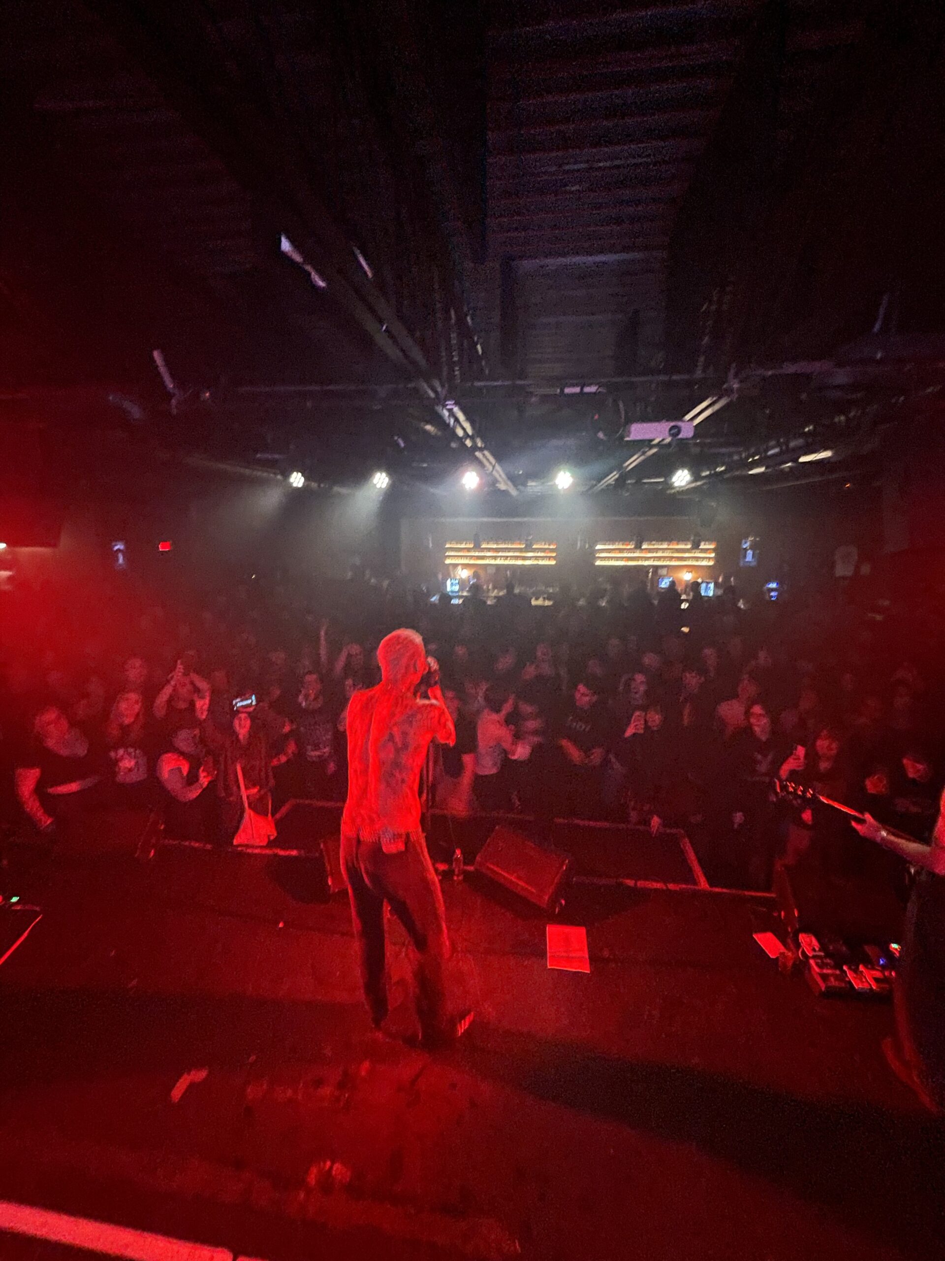
Most available photos show EKKSTACY on tour, not posed for a tattoo shoot. Movement, shadows and stage lighting can obscure a design. A photo may show that ink is there without making every line or smaller mark legible.
For marks on his fingers, arms or neck that aren’t named in an interview or clear image, it’s better to describe only what can be seen. The cheek pentagram, chest lettering, back work and neck star have firmer support from published interviews and reports.
The hand tattoo that says AUSGANG
PAPER reported AUSGANG, the German word for “exit,” tattooed on EKKSTACY’s hand. It is a short, graphic word, alongside the Russian lettering on his chest among the collection’s language-based pieces.
Hand tattoos move and rub against things through the day. Short, sturdy lettering may be easier to read there than fine script, but can fade with sun, washing and friction.
A little room matters here
For a hand tattoo, check a translation with a fluent speaker and look at how the letters sit across the knuckles or back of the hand. Leave enough space for the lines to age, and ask the artist what touch-ups might be needed.
Where everyday movement shows up
The artist should check the stencil while the hand bends and account for rings and nearby tattoos. A word across the top of the hand reads differently from lettering on fingers or knuckles.
The star on his neck and the smaller pieces around it
Rock Sound also noted a star on EKKSTACY’s neck. It is a simple shape beside heavier work, though the publication did not assign it a meaning. Close views show smaller symbols nearby, but not all have been identified.
The neck curves as the body turns, and the tattoo is difficult to cover. A star stays recognizable on that surface, but the placement is still a visible commitment.
Why the whole collection feels coherent
The collection can look scattered: letters, symbols and large black areas were added at different times. Mostly black ink and direct shapes give the patchwork a consistent visual feel, even when the pieces don’t form one planned composition.
EKKSTACY’s music moves among post-punk, alternative pop and darker internet-born styles; the tattoos have a similar refusal to sit in one category. For design inspiration, the contrast between small symbols and larger areas of coverage is more useful than copying the density.
The useful part of the style
Face, neck and hand tattoos are hard to hide and affect how people read you at work and in everyday conversations. EKKSTACY’s bold placements fit the public style he has chosen, but the same choices won’t suit everyone.
For your own collection, keep words legible and leave space for a piece to sit beside future work. A tattoo can mark a particular time or simply be something you like looking at; it doesn’t need a grand explanation.
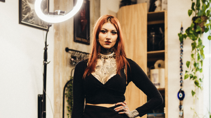
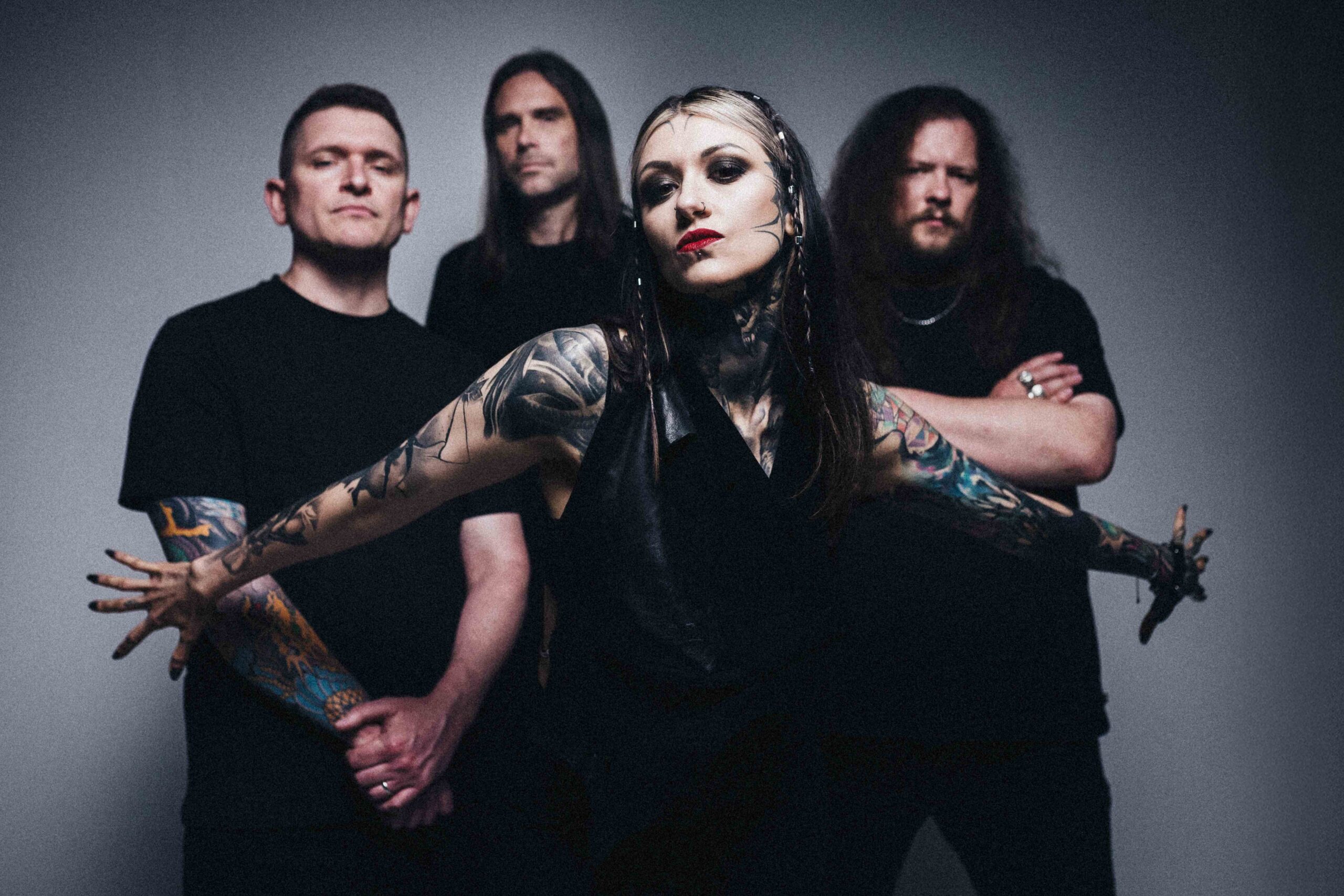
Rachel Aspe’s tattoos are hard to miss. Dense blackwork runs from her neck across her chest and shoulders, with larger pieces on her arms and smaller marks on her hands and face. In photos, the shapes have a rough, graphic edge that suits Cage Fight’s sound, though the collection isn’t just a stage look.
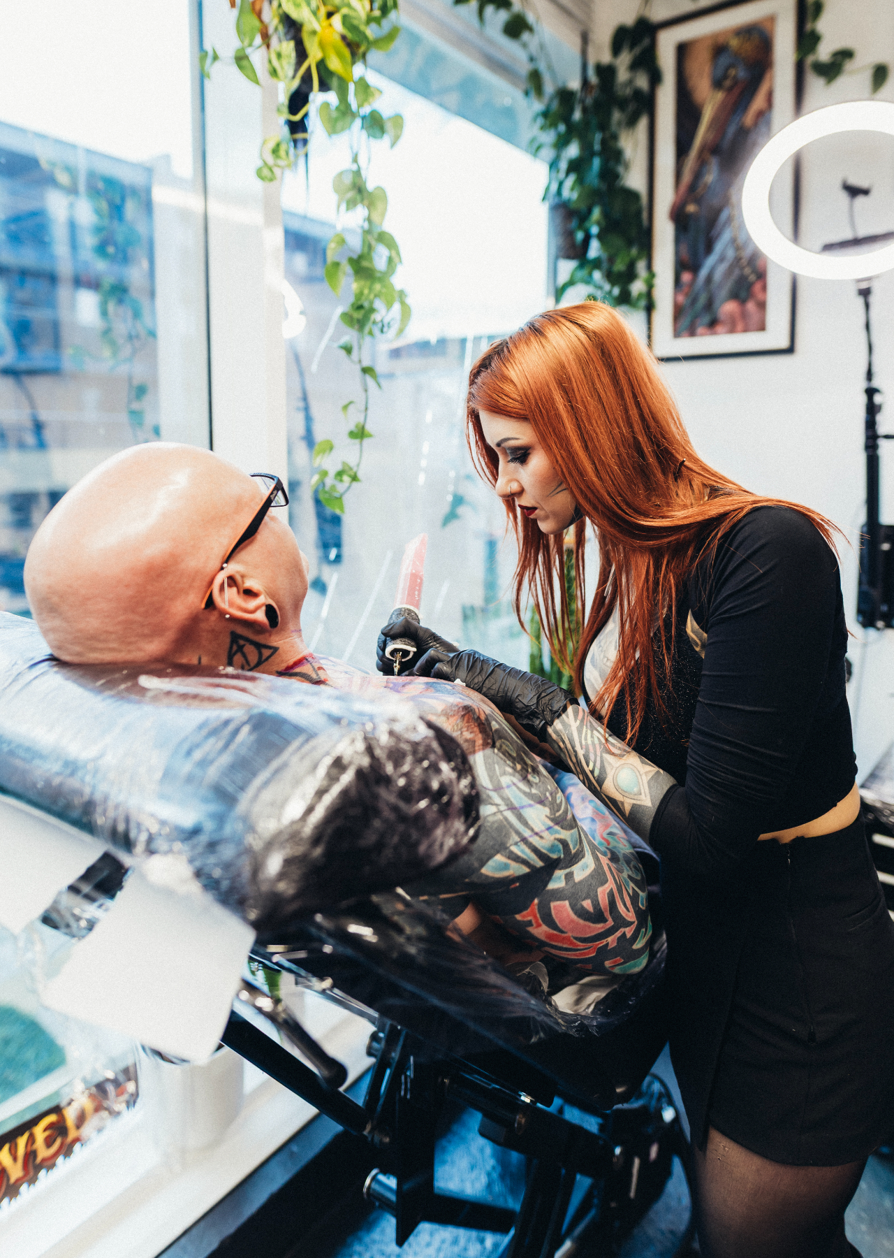
Aspe is also a tattoo artist in London. In a 2026 interview, she spoke about working freely instead of forcing every design into a tidy structure; the photos showed her tattooing a client. Her own ink has that same sense of movement, with heavy shading and open skin sharing space.
The clearest views show the neck-to-chest work, packed sleeves and smaller hand and face tattoos. She has also described a piece for her grandparents: a quail with a pipe, tied to the names and memories associated with them. That family detail sits comfortably beside the darker imagery.
The sections below stick to what can be seen or what Aspe has discussed publicly. They also look at how the placement and contrast work, without treating every visible mark as if its meaning were known.
The blackwork neck and chest piece
The largest visible piece climbs from beneath Aspe’s jaw, spreads across her neck and shoulders, then reaches over the upper chest. Its dark areas give it weight, while the edges shift between body surfaces instead of stopping at the neckline. From a distance, the coverage can read like armour; closer photos show more variation in the shading.
Louder described the blackwork as arching high up the neck, over the shoulders and down across the chest. That gives a sense of its scale: it crosses several planes, so its outline changes when Aspe turns her head or moves her shoulders.
The design also links areas that could otherwise feel separate. The neck gives it a starting point, while the chest and shoulders carry the forms outward. The available photographs show the overall reach more clearly than every small line.
For a neck-to-chest piece, the useful question is how it sits when you move. Ask the artist where the dark areas should end, where skin can stay open and how the work will meet the shoulder or sternum. A stencil viewed only with the head straight won’t show the whole composition.
Her sleeves mix dark shapes with lighter detail
Aspe’s sleeves combine bold outlines and black-and-grey shading with lighter gaps. The photos show larger forms from shoulder toward forearm and hand, but not every detail is clear enough to name. The overall effect comes from texture and contrast more than one central image.
That contrast helps the work read in band photos. Coloured lights, motion and distance can swallow fine lines; larger shapes still register from the crowd, while close views reveal softer shading. The arms have both.
Blackwork covers more than solid black fill. It can use linework, abstract or ornamental shapes and negative space, too. Aspe’s sleeves mix those approaches, letting darker patches anchor the design without turning the whole arm into one flat area.
If you’re planning a sleeve, decide where you want the strongest darks and where the eye needs room to rest. That gives later pieces a place to fit. It matters more than making every tattoo depict the same subject.
Face tattoos and sharp little details
Small marks around Aspe’s eyes, cheek and the side of her face are less prominent than the neck piece, but they carry the same graphic feel. They don’t form a mirrored arrangement, and photos don’t make every symbol equally clear.
The images establish that she has face tattoos; they don’t provide a public explanation for each one. There’s no need to assign a meaning to a mark just because it’s visible. Unless Aspe has explained it, its story remains hers.
Scale does a lot of the work here. The smaller marks sit between the face and the larger neck coverage without competing with it. A small tattoo can create a pause between larger areas, but only if its size and placement suit the person’s features.
Face ink is difficult to hide and will sit alongside glasses, makeup, facial hair or future changes in style. Anyone considering it should look at the placement on their own face first, then decide whether the reference still makes sense there.
Band photos show how the tattoos move
Band photos show the tattoos on a moving body. The neck work shifts with Aspe’s posture, arm pieces bend at the elbows and the hand marks appear as she gestures. That view adds context a straight-on portrait can’t provide.
The same tattoo can look different across photographs. Lighting changes how the black and grey read; a vest may cover the centre of the chest, while a sleeveless top shows more of the shoulder. One image can foreground her face and neck, another the sleeves.
That’s useful when planning a large tattoo. Think about how it will look while walking, reaching or performing, not only when the arm is held still. A design that follows the body can change naturally with it.
Wide photos are best for seeing placement and how pieces relate; close-ups help with texture. Neither view confirms every detail. Aspe’s collection can be understood as a whole even where a small mark is too blurred to identify.
The hand and finger ink
The tattoos on Aspe’s hands extend the coverage past the sleeves. They’re smaller than the arm pieces, but the dark, direct shapes keep the same visual character. Hands are exposed in daily life and constantly move, so simple forms tend to read more clearly than intricate ones.
The hand work also helps the arm coverage continue toward the fingers instead of ending in a hard line at the wrist. Photos show the placement, though they don’t clearly identify every small design.
Finger and hand tattoos can soften with time and friction. If you’re considering one, ask the artist how the lines are likely to age and whether the design will remain legible at that size. A clear silhouette has more room to hold up than a tiny, crowded drawing.
Leaving some skin open can help, too. The goal doesn’t have to be filling every gap. Negative space can separate the marks and keep a small area from turning into one dark patch.
The artist behind the look
Aspe’s work as a tattoo artist gives another angle on her collection. She has described tattooing as one of her creative outlets alongside music, drawing and sport. Her own tattoos show an interest in shape and movement, but that doesn’t mean each one was planned as part of a single composition.
In an interview about Cage Fight, she said she turns down tattoo work when she isn’t behind the design. It offers context for how she approaches the job: the client’s idea and the artist’s own judgment both matter.
One tattoo she has discussed is a quail with a pipe, made for her grandparents and connected to the names and memories she associates with them. It’s a personal, slightly playful image, a different register from the heavy blackwork around it.
That contrast says more than a simple genre label would. Aspe’s collection includes dark and abstract work, but also a family tribute with a specific story. Not every tattoo has to match the mood of the others.
Why the collection feels so cohesive
The collection spans music, tattooing and family, and the photographs show pieces added across different areas of her body. What links them visually is a repeated use of black ink, heavy shapes and open skin—not evidence that every design was planned together.
Placement helps the separate areas relate. The neck and chest hold the centre, the sleeves extend outward and the hand tattoos carry the coverage toward the fingers. The face pieces draw attention back upward, though each tattoo can still be read on its own.
There’s a difference between a collection that shares a visual language and one built from a single plan. Aspe’s photos suggest the former: contrast and blackwork recur, while the designs and their personal contexts vary.
If you want several tattoos to sit well together, choose a few preferences you can explain—such as mostly black ink or a particular balance of filled and open areas. You don’t need to decide every future design now; a clear starting point gives an artist room to work.
What to borrow from Rachel Aspe’s style
Aspe’s style is less about one image to copy than about how she uses placement and contrast. The neck, hands and face are prominent choices, while varied shapes keep the dense coverage from reading as a single block.
Start with what you actually want on your own body. If you like blackwork, decide whether you prefer solid fills, abstract lines, ornamental forms or a mix. If the personal detail matters most, look for a symbol tied to your own life instead of borrowing the quail or another person’s memorial design.
Choose an artist whose portfolio shows the kind of work you want. Someone skilled in portraits may not specialize in abstract blackwork, and a fine-line artist may not be the right fit for a large neck-to-chest piece. Ask to see healed work in the same style before committing.
Aspe’s tattoos show how dark coverage can hold personal details and different kinds of imagery at once. The family piece has its own story; the rest don’t need an explanation added where she hasn’t given one.