admin

Jay Alvarrez Tattoos: Quotes, Skull and Travel-Inspired Ink

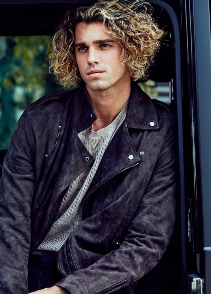
Jay Alvarrez’s tattoos are easy to spot. They’re a mix of black lettering, symbols and larger images, with plenty of short reminders about how he wants to live. Some are spare, others have more detail, and the travel theme fits the public image he has built around beaches, boards and airports.

This guide focuses on Jay Alvarrez tattoos that show clearly in photos: the phrases associated with him, the skull on his thigh, and travel-minded designs on his arms and legs. The focus is on the tattoos themselves, not pictures where a sleeve hides them.

The overall style of Jay Alvarrez tattoos

Jay’s collection relies on blackwork and lettering. Many of the words sit on his forearms, wrists, ankles and lower legs, like notes he has left for himself. Palm trees, bands, eyes, figures and larger images fill out the collection, with some pieces borrowing from traditional flash. The mix feels loose, rather than planned to look like one polished set.

Much of the work people recognize is associated with Konstantin Nossachev, who also goes by Noskos. The lines are often crisp, with open skin around each design. That helps when the tattoos are photographed outdoors, in motion or from a distance; they still have a clear shape without a studio close-up.

“Let’s Live” on the lower lip

One of Jay’s earliest and best-known tattoos is “Let’s Live” on the inside of his lower lip. The placement is tiny, but the phrase has attitude. It isn’t visible in every photo, though it stands out when he pulls his lip down.
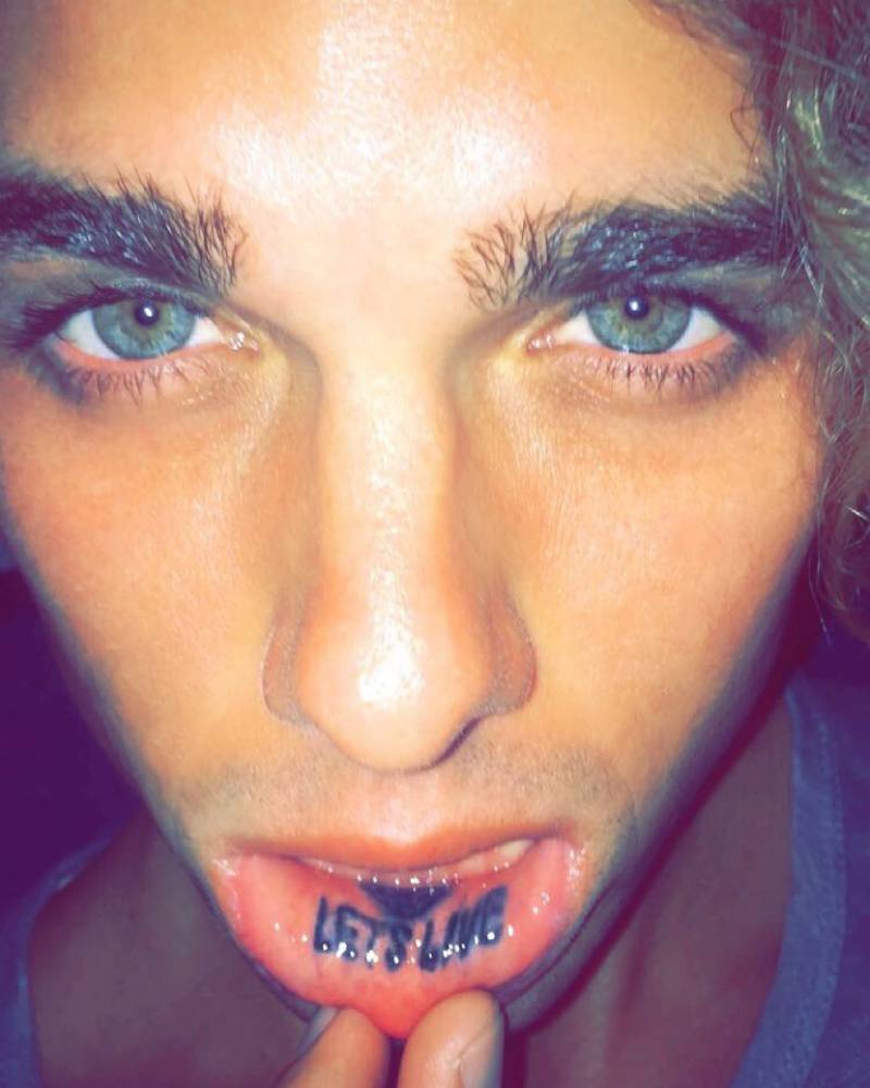
Jay Alvarrez lower lip Let's Live tattoo

The words fit the image Jay has built around travel, surfing, skydiving and chasing experiences. That makes it feel more like a personal motto than a stray inspirational quote. Lip tattoos can fade or soften faster than tattoos on an arm, so a clear close-up is useful here.

“Fantasy > Reality” on the forearm

“Fantasy > Reality” is one of Jay’s clearest examples of text used as a personal rule. The phrase sits on his inner forearm in a simple serif font. There is no heavy shading or ornament around it; the words carry the design.
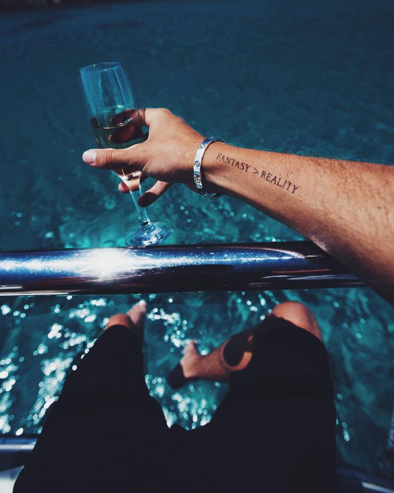
Jay Alvarrez Fantasy greater than Reality forearm tattoo

The inner forearm gives the lettering room to breathe, and the phrase stays readable with his arm relaxed or extended. It also has a little tension to it. Jay’s photos move between polished fantasy and everyday travel, so the tattoo can read as a comment on the image he has built.

The Dream World, palm tree, and Isle group

On the other forearm, Jay has a few related details: “Dream World,” a palm tree, a fine line and “Isle” near the wrist. Together they read as a small composition, not four separate ideas. The palm tree connects with his Hawaiian background and beach imagery; the words make the arm feel like a map to an imagined place.

This is one of the quieter parts of the collection. The lettering is relaxed, and the palm tree has none of the heavy look of traditional flash. The narrow shapes follow the forearm. Fine lines like these also need careful healing and, at times, touch-ups.

The In Voluptas Mors inspired skull on his thigh

Jay’s thigh skull is a big change from the small text tattoos. It takes its cue from the famous “In Voluptas Mors” image associated with Salvador Dalí and photographer Philippe Halsman, in which bodies form a skull. Jay keeps that basic idea but gives it darker, more illustrative shading than his cleaner quote tattoos.
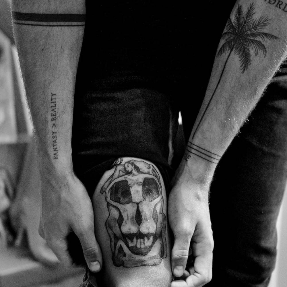
Jay Alvarrez In Voluptas Mors inspired skull thigh tattoo

The larger area gives the shadows and facial details room, so the image doesn’t collapse into a dark patch. This piece also shows the range of Jay’s ink: alongside the short phrases and travel symbols, he has tattoos built around a much larger image.

“Never Be Insecure of Your Creativity”

Jay has the words “Never Be Insecure of Your Creativity” on his lower leg near the ankle. It sounds like advice from a friend, but the placement makes it feel personal rather than like a slogan for other people. He can see it himself without putting it across his chest.
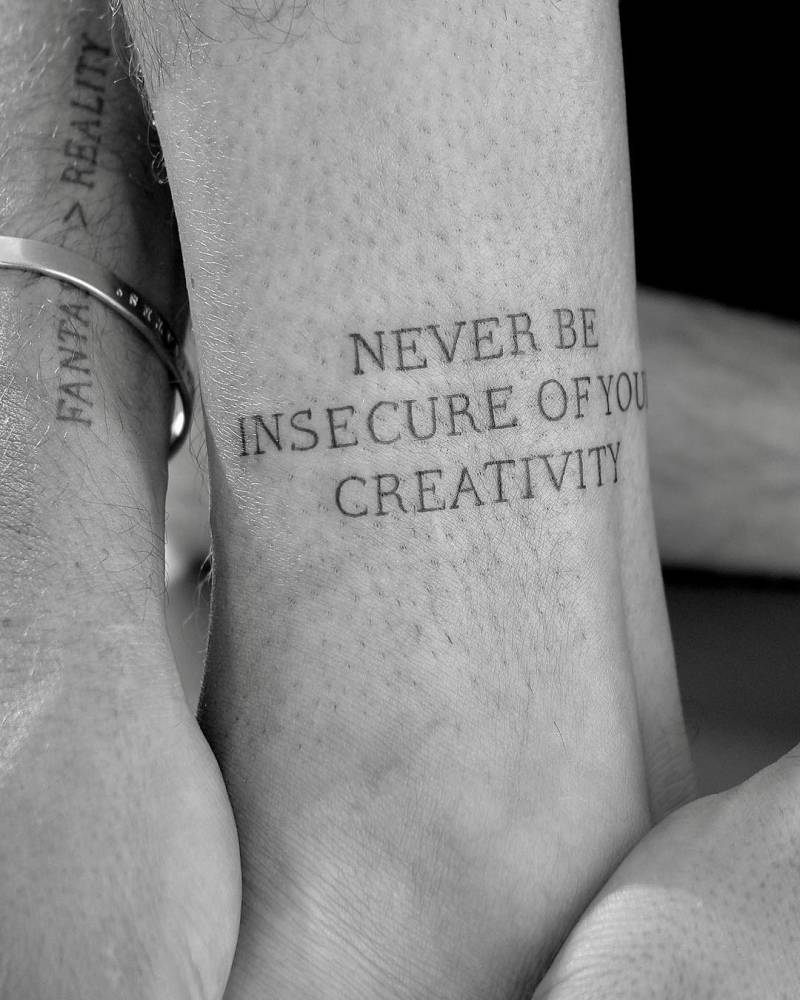
Jay Alvarrez Never Be Insecure of Your Creativity ankle tattoo

The lettering is compact but readable. Long phrases can get cramped on curved, moving skin like the ankle; this one keeps a steady line and some space between the words. If you like motivational lettering but want it to stay private, the placement is one to consider.

“They Say I’m Crazy…” on the other forearm

Another forearm quote reads, “They Say I’m Crazy But It Keeps Me From Going Insane.” It runs along the inner arm, with bands around it. The line has a joke in it, but it also speaks to a mind that doesn’t always follow the usual route.
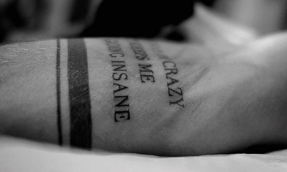
Jay Alvarrez They Say I'm Crazy forearm tattoo

Long text takes planning. The letters need to stay clear without turning the forearm into a solid block. Jay’s version stays narrow, and the bands break up the phrase with a simple graphic detail.

Travel, circles, and the rest of the arm work

Jay also has simple bands and lines around his wrists and forearms. One armband has been described as representing the circle of life. These quieter details link the larger tattoos: a band can frame an area, while a fine line can lead from a quote toward a palm tree or another symbol.
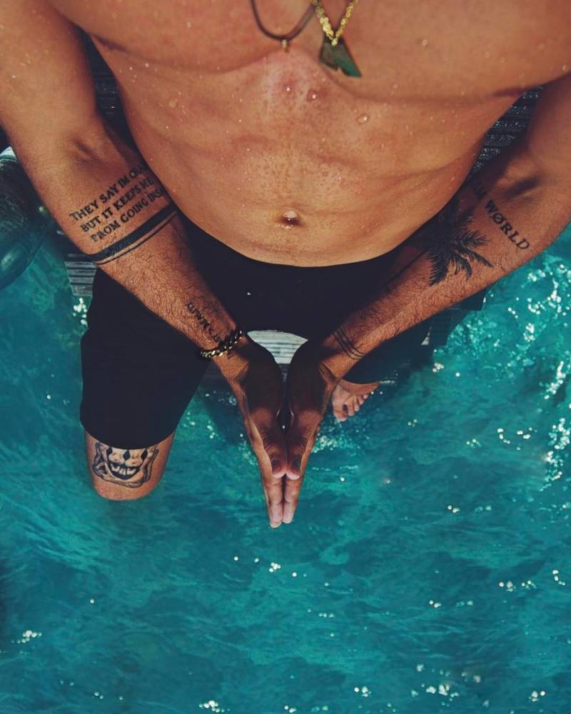
Jay Alvarrez multiple arm tattoos and forearm lettering

Wider photos show more phrases, another palm tree, bands and designs running down his legs. Some are easier to identify than others. It’s better to leave an unclear mark unnamed than to assign it a story; a visible shape doesn’t confirm its meaning.

What makes his collection work

Jay’s tattoos move between clean lettering and larger images. The skull adds shade and texture, while the palm tree and island references carry the travel theme. Even the more abstract marks fit the same interest in movement and independence.

Placement does a lot of work here. A long quote needs enough length; a detailed image needs enough skin for its lines; small tattoos work best when they stay simple. Jay’s clearer designs respect those limits, so they remain readable in close-ups and regular travel photos. For another musician whose tattoos mix portraits, symbols and family pieces, see our Corey Taylor tattoos guide. Our Danny Trejo tattoos article shows a very different style built around bold blackwork.

Could Jay Alvarrez tattoos work as inspiration?

Yes, but it’s better to borrow the idea behind a design than the exact words. A small island, coordinates, wave or palm tree can give a tattoo a travel feel without turning your body into someone else’s scrapbook. If you like Jay’s lettering, choose a phrase that matters to you and leave it enough room to age well.

Think about sun exposure too. Jay spends a lot of time outdoors, and sunlight can soften fine lines faster. An artist can talk through line weight, placement and aftercare before you decide. The point is to choose a tattoo that still feels like yours after the holiday photos are gone, not to copy one of his forearms.

Quick questions about Jay Alvarrez’s ink

Who tattoos Jay Alvarrez?

Much of his collection is associated with Konstantin Nossachev, also known as Noskos. Jay has spoken about their close friendship and the trust between them.

What does “Fantasy > Reality” mean?

The phrase reads like a reminder to value imagination over a fixed idea of ordinary life. Jay hasn’t formally explained every tattoo, so the words themselves are the safest guide.

What is the biggest Jay Alvarrez tattoo?

The skull-inspired thigh piece is one of the most noticeable designs because it uses a large area and detailed shading. He also has larger compositions on his legs and arms.

Does Jay Alvarrez have mostly small tattoos?

No. He has small lettering and linework as well as a large skull, leg designs, illustrative figures and longer phrases. The collection varies in scale.

Watch Jay Alvarrez talk through his tattoo story

Here is a related video from Jay’s own channel, alongside the tattoo photos and the wider visual style he shares:
Mario Balotelli Tattoos: Black Power, Lion and MB459 Ink

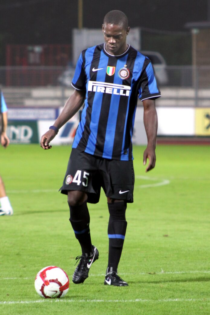
Mario Balotelli rarely fades into the background on a football pitch, and his tattoos are just as visible. The collection brings together lettering on his face, dark neck pieces, a well-known chest quote and smaller marks that feel personal rather than matched. Some are easy to spot in a single photo; others need a close-up.

This guide focuses on the tattoos that appear clearly in documented photos: what can be read and how the pieces fit together. There is a lot going on, but the styles don’t all try to match. The collection feels personal, loud and hard to miss, much like Balotelli’s public image.

What stands out about Mario Balotelli’s tattoos

Balotelli’s tattoos sit in places people see. His face and neck ink shows in match photos, stadium arrivals and interviews. Larger pieces cover his chest and upper body, so the collection looks different depending on what he is wearing.

The lettering above his eye is often the first detail people notice, along with small marks on the side of his face. His neck carries darker shapes and shaded artwork; the chest quote has a more dramatic feel. Together, the tattoos read as expressive choices, not decoration alone.

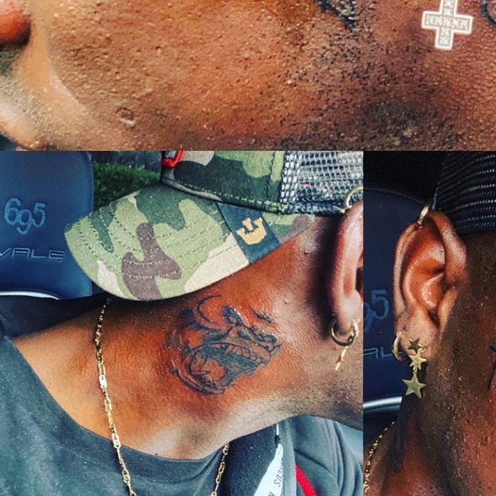
Mario Balotelli lion neck tattoo

The lion on his neck

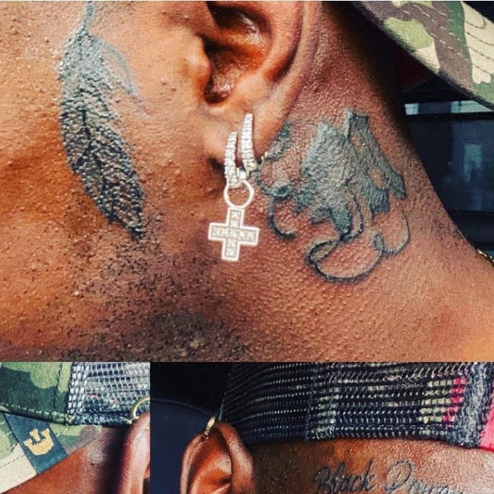
The lion on the side of Balotelli’s neck is one of his best-known tattoos. In close-up photos, its face looks watchful. Dark shading gives it contrast, and the placement frames his jaw and neck.

A lion can suggest strength, pride or independence. Those readings fit the confident look Balotelli has brought to the pitch, though the design’s personal meaning is his to explain. This is no small symbol hidden by a collar; it’s a portrait-style tattoo meant to be seen.

The neck moves constantly, so detailed work here can be tricky. The skin curves around the throat and jaw, and a design can look uneven if the lines don’t follow those shapes. The lion’s heavy outline and dark areas help it stay clear from a distance.

A second illustrated neck tattoo

The lion isn’t the only piece on Balotelli’s neck. Close-up photos show another dark illustration lower down, with rougher graphic shapes instead of a minimal outline.

Mario Balotelli neck tattoo

A shirt collar or shadow can hide this tattoo in a match photo. In a close view, the design is much easier to see. It adds weight to the neck pieces and looks less polished than the small face lettering.

That difference helps explain the mix in Balotelli’s collection. He has neat letters and symbols on his face, alongside neck tattoos that use a more traditional black-and-grey look. The larger pieces have real visual weight.

“Black Power” above the eye

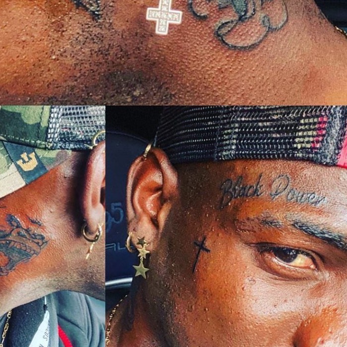
The words Black Power above Balotelli’s eyebrow are among his most discussed tattoos. The letters are direct, and the short phrase takes up little space. But placed so close to the eye, it becomes a defining part of his face.

This reads as a statement about identity, pride and self-belief, not a random line of script. Balotelli has spoken publicly about racism and belonging during his career. The placement makes the words especially visible; he put them where people are likely to see them.

Mario Balotelli Black Power face tattoo

A small cross nearby adds another mark to the same area. In photos, it sits close to the lettering, so the two details read as a group rather than an isolated phrase. The whole section is easy to recognize.

The “MB459” face tattoo

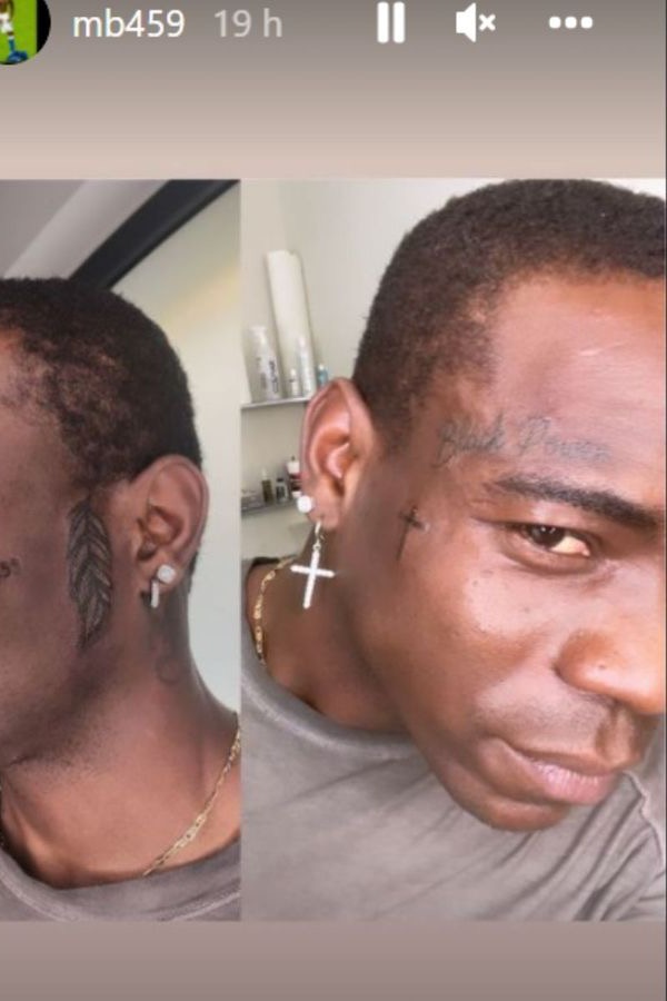
Another small but distinctive mark is MB459 on the side of Balotelli’s face. The letters and numbers are compact, but they stand out against the surrounding skin. It has the feel of a personal code, even if its meaning isn’t obvious to anyone looking from the outside.

The number 459 has been linked to Balotelli’s identity and personal references, though accounts of its exact meaning aren’t consistent. It’s safest to leave room for that uncertainty. The tattoo doesn’t need a long quote to be noticed.

Mario Balotelli MB459 face tattoo

Face tattoos can become part of a public image. The MB459 mark sits beside the Black Power lettering and other small details, so people tend to notice the group of tattoos together. It’s a small design with plenty of visual presence.

The chest quote: “I am the punishment of God”

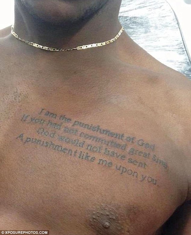
Balotelli has a much larger quote across his chest, commonly read as “I am the punishment of God.” The chest gives the wording room to spread instead of squeezing it into a narrow space.

The line is often linked with a story in which a journalist asked if Balotelli was a football genius or a bad boy. He replied, “I am not a bad boy,” and the exchange became part of his public mythology. The tattoo has a similar theatrical quality and is hard to miss.

Mario Balotelli chest quote tattoo

The large letters remain readable in photos, and the lines follow the width of his upper body. It’s a different choice from the small marks on his face. One feels like a personal code; the other is an open declaration.

How the collection changed over time

Balotelli’s tattoos appear to have been added in stages. Earlier photos show a cleaner face and fewer visible pieces; later ones include face lettering, neck portraits and more body work. That helps explain why not every tattoo shares the same style.

Some are simple black letters; others rely on deep shading and portrait detail. That variety is common in collections built over years, as people change their tastes or work with different artists. Balotelli’s ink looks more like a record of those changes than a matching sleeve planned from the start.

Football photos can hide details. A collar may cover a tattoo, a camera angle may miss it, and image quality can blur fine lines. Close-ups of the face and neck show the clearest view.

What Mario’s ink says about his style

Balotelli has made confident choices with his most visible tattoos: the words above his eye, the lion on his neck and the quote across his chest. They aren’t easy to miss in a quick photo.

The tattoos also move between public statements and more private references. Black Power speaks directly to identity and pride. MB459 feels more coded; the lion suggests strength, while the chest quote brings a theatrical edge. Together, they fit the bold public persona people have seen on and off the pitch.

For football tattoo ideas, Balotelli’s collection shows how much placement changes a design. A small phrase on an arm may feel casual; above the eye, it becomes a permanent statement. A neck portrait also changes the face and silhouette. Visibility is worth thinking through before choosing a design.

How his tattoos compare with other football stars

Balotelli’s face and neck ink gives him a different look from players who keep most of their tattoos on their arms and legs. For another football collection with a different approach, see Zlatan Ibrahimovic tattoos. His designs are personal too, but their scale and placement tell another story.

You can also compare Balotelli’s work with the family-focused collection in David Beckham tattoos. Beckham’s ink includes names, dates and symbols, while Balotelli’s most visible pieces lean toward statements and bold imagery.

Frequently asked questions

What does Mario Balotelli have tattooed above his eye?

He has the words Black Power above his eye. It’s one of his most visible tattoos.

What does MB459 mean?

MB459 is a personal-looking mark on the side of Balotelli’s face. Its exact meaning isn’t consistently documented, so it’s better to treat it as a private reference than guess at one explanation.

Does Mario Balotelli have a lion tattoo?

Yes. The lion is on the side of his neck and is one of the clearest portrait-style designs in the collection.

What is written on his chest?

The wording is commonly read as “I am the punishment of God.” It’s a large script tattoo and one of his most dramatic pieces.

Watch Mario talk about tattoos

Balotelli has discussed tattoos, women and food in interviews. The video below gives a little more context about the person behind the collection.

XXXTentacion Tattoos: Alone, 17, Bad Vibes and More

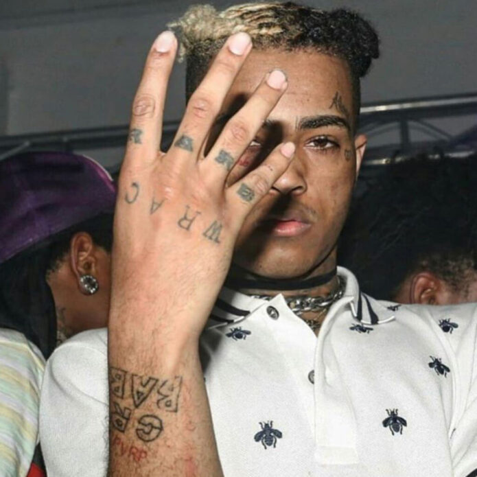
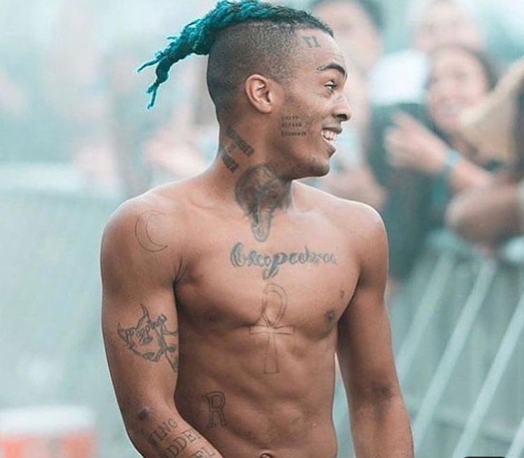
XXXTentacion’s tattoos were hard to miss. Ink across his face, neck, chest, arms and hands became part of how people remembered him, but the designs carry different tones. Some are small and personal; others make a direct statement from the middle of his face.

This guide sticks to pieces documented in tattoo coverage. Where a meaning is uncertain, I’ll keep that uncertainty instead of pretending a photo tells the whole story. A tattoo can look clear from the outside and still mean something private to its wearer.

What stands out about XXXTentacion’s tattoo style

The mix is the first thing you notice. Fine script sits beside heavy lettering; small symbols beside larger blackwork. Some tattoos feel sentimental, others confrontational. The collection grew over time, so it reads more like a visual diary than one sleeve planned all at once.

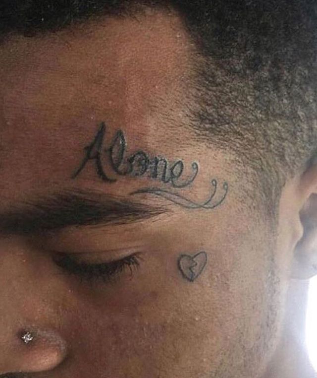
The contrast shows up even in the words. Alone has a soft, curved script, while Death Before Dishonor uses blunt block letters. The face tattoos can seem small in an ordinary photo, then take over the image in a close-up.

Alone and the small heart near his eye

The word Alone sits above XXXTentacion’s eyebrow, with a small heart below his eye. The two marks are among the most recognizable parts of his face tattoos. Their placement feels personal, and even small details can change the mood of a face.

XXXTentacion Alone forehead tattoo
XXXTentacion’s Alone script and small heart tattoo.

It’s tempting to treat “Alone” as a summary of his life, but the public record doesn’t establish that. The word suggests solitude; the heart adds a softer note beside it.

Death Before Dishonor on the cheek

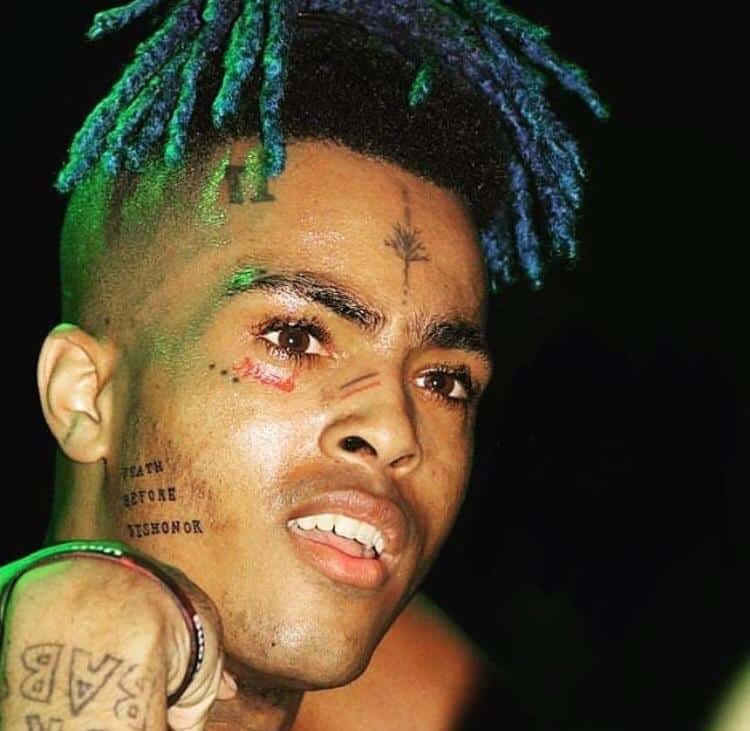
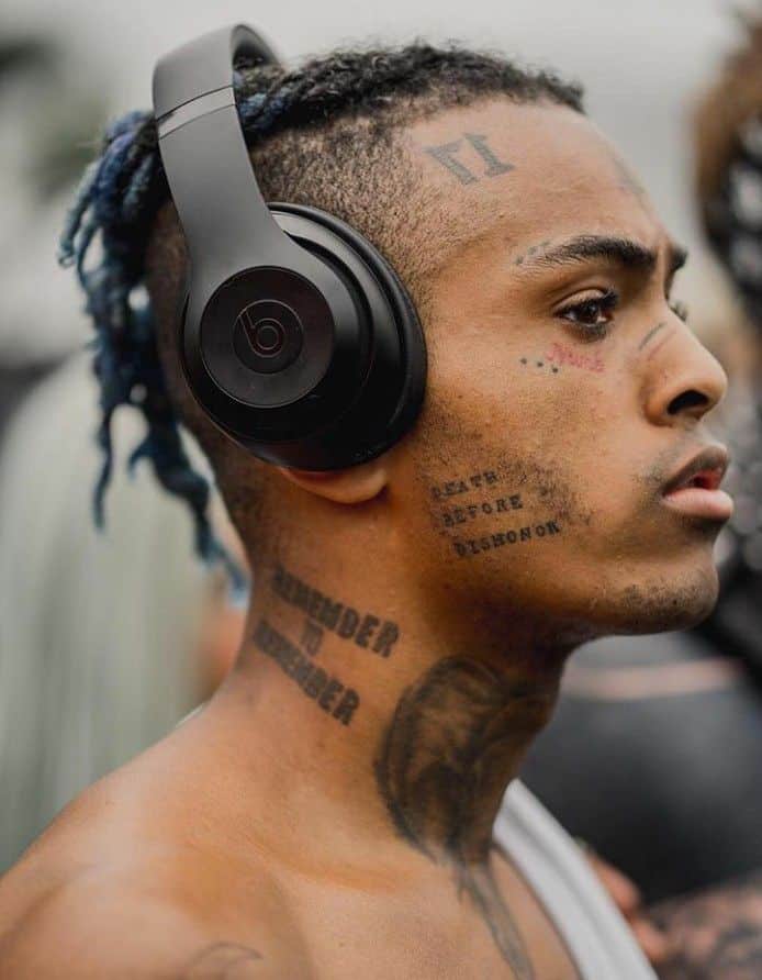
The stacked Death Before Dishonor lettering on his cheek is much more direct. It is easy to read in photos, and the phrase has an old-school feel of loyalty and pride. It also fits his use of short words and slogans across his face.

XXXTentacion Death Before Dishonor tattoo
Death Before Dishonor lettering on XXXTentacion’s cheek.

The vertical layout is a useful design detail. The compact letters follow the curve of his cheek without stretching across the side of his face. Anyone considering a short phrase in a small area can see why the layout matters.

Three dots, nose lines, and other tiny face marks

Other small marks on XXXTentacion’s face included three dots around the eye, lines and a star on the nose, and a small leafless tree on his forehead. They’re easy to miss under hair, changing light and facial piercings, but clear in close-up photos.

XXXTentacion three dots tattoo
Close view of XXXTentacion’s three-dot face tattoo.

The three dots show why it’s useful to separate what a photo confirms from what people assume. Dot tattoos are often given fixed meanings, but the design alone doesn’t prove one. If you like the look, pay attention to spacing and placement instead of borrowing a meaning that may not be yours.

Theater masks on the arm

On XXXTentacion’s right bicep, a happy and sad theater-mask tattoo puts two expressions side by side. The contrast is immediate and echoes the shifts in mood found in his lyrics and public image.

XXXTentacion theater mask tattoo
Happy and sad theater masks on XXXTentacion’s arm.

The idea reads from a distance, and the faces don’t need extra explanation. The arm gives the expressions room for shading, which is harder to manage on a small area like a wrist or finger.

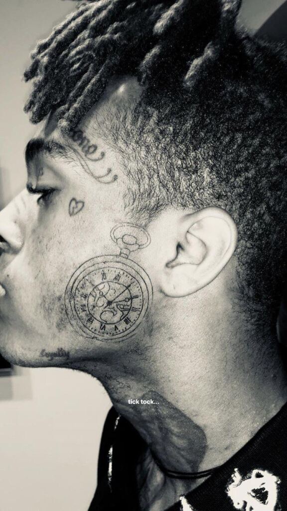
The clock tattoo on his face

A clock runs along the side of XXXTentacion’s head, bringing a more detailed, mechanical shape to a face already marked with script and symbols. Clocks are often read as references to time, memory, pressure or how quickly life moves. Those are common interpretations, not a confirmed explanation from XXXTentacion.

XXXTentacion clock tattoo
The clock tattoo placed along XXXTentacion’s face and temple.

The design also makes use of a narrow, vertical area. The round clock face gives the eye a focal point, and the surrounding lines follow the side of his head. Anyone adapting the idea would need an artist who can work with the shape and movement of the face.

The 17 tattoo and the ankh cross

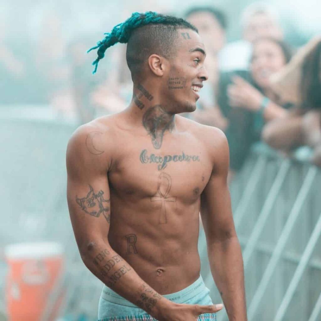
The number 17 appears in mirrored form on XXXTentacion’s forehead, and an ankh cross is documented on his stomach. Compared with the clock and theater masks, both designs are simple. Their placement, and how often they appear in photos, gives them presence.

The number 17 is often connected with his album 17, making it one of the easier tattoos to link to his music. The ankh is an ancient symbol often associated with life and continuity. That broad meaning is well known, but his personal reason for choosing it is his to explain.

XXXTentacion ankh cross tattoo
The ankh cross tattoo documented on XXXTentacion’s stomach.

These two pieces show different sides of the collection. The number points toward his music; the ankh is an older symbol with meanings that vary from person to person. Both make clear that simple tattoos can carry very different kinds of meaning.

Bad Vibes, Cry Baby, and the rest of the collection

The face tattoos went beyond the ones shown above. Bad Vibes crossed his eyelids, and NUMB sat below his left eye. He also had Cry Baby on his forearm, Remember to Remember on his neck, Loyalty along his jaw, and other letters and symbols on his hands and wrists.

Some of these marks are hard to photograph clearly: faces move, the lettering is small, and older images vary in quality. One photo won’t show every detail well enough to identify it. The larger themes are easier to see, but a close-up still matters before copying a design.

He also had larger images: an elephant on his neck, a crescent moon on his shoulder, an angel wing near the elbow, and the happy and sad masks on his bicep. The collection shifts between words, numbers, symbols and figures instead of settling into one style.

What makes these tattoos useful for inspiration

Placement changes how even a simple tattoo reads. A small word above the eyebrow feels more intense than the same word on an upper arm. Contrast also helps a heavily tattooed look keep its shape: fine script, block letters, symbols and shaded images each give the eye something different to follow.

The strongest ideas are personal. You don’t need to copy a face tattoo or a phrase to borrow its mood. A small symbol, album number or pair of contrasting expressions could be adapted to fit your own story and comfort level.

For more musicians whose tattoos connect with their work and lives, compare this collection with our Lil Peep tattoos guide and our look at Young Thug tattoos. Their visual styles take different directions.

Final take

XXXTentacion’s tattoos put words, symbols and images beside one another, each with its own mood. The Alone script, Death Before Dishonor lettering, three dots, theater masks, clock, 17 and ankh are among the most recognizable. Some meanings are documented; others remain personal details we can only read from the outside.

The useful lesson isn’t to copy the most extreme placement. Look at how the designs fit together. Small marks can carry a lot of personality, and a simple symbol can feel strong when its placement is deliberate.

Watch a visual breakdown of XXXTentacion’s tattoos below.

G Herbo Tattoos: 773, Diane, DreamTeam and More

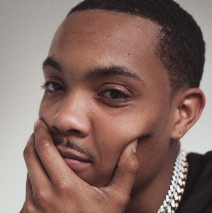
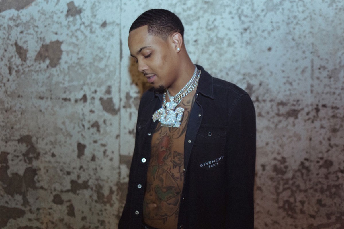
G Herbo’s tattoos look more like a map of his life than a set of unrelated designs. They cover his chest, stomach, neck, arms and shoulders, and the full picture comes together across several photos.

Chicago and the 773 area code appear alongside references to friends, family, music and people he remembers. Some designs are easy to identify; only some have been explained publicly. This guide sticks to what the photos show and to meanings Herbo or reliable tattoo coverage have connected to the ink.

The 773 and earth tattoo

One of the most recognizable designs crosses the center of G Herbo’s torso. It pairs an image of the earth with the number 773, a direct reference to Chicago. The piece ties his body art to the city and area code that have followed his music from the start.

G Herbo chest tattoos

In an interview with Inked, Herbo said the 773 tattoo represents Chicago, blood money and what he has been through. That gives the number a more personal context. In photos with his shirt open, the earth design sits among smaller lettering and marks across his torso. It’s one of the clearest examples of the collection drawing on his life.

150 DreamTeam and NLMB ink

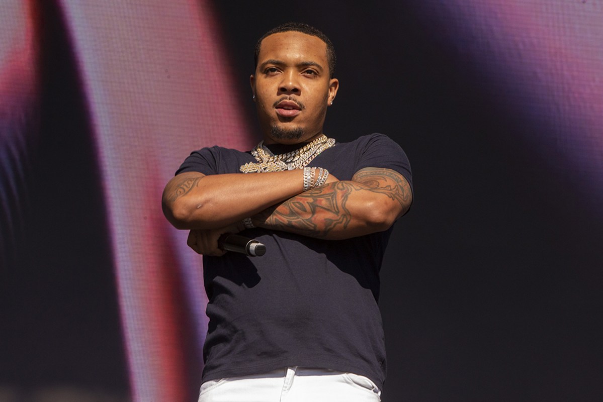
Herbo’s upper arm carries several references to his crew and music. The 150 DreamTeam and NLMB lettering are among the pieces most often mentioned. NLMB is commonly expanded as Never Leave My Brothers, a phrase that fits the loyalty and memorial themes elsewhere in the collection.

The lettering shows up in performance photos, but it sits alongside portraits, symbols, numbers and shaded work. That gives his arms a layered look instead of one matching sleeve. The tattoos seem to have accumulated over time, with each piece adding a new reference.

G Herbo forearm tattoos

You can see that layering in live shots. From a distance the arm can look like one dark sleeve; closer up, the different sizes and styles separate into letters, shading, numbers and portraits.

Diane, the guardian angel, and protective imagery

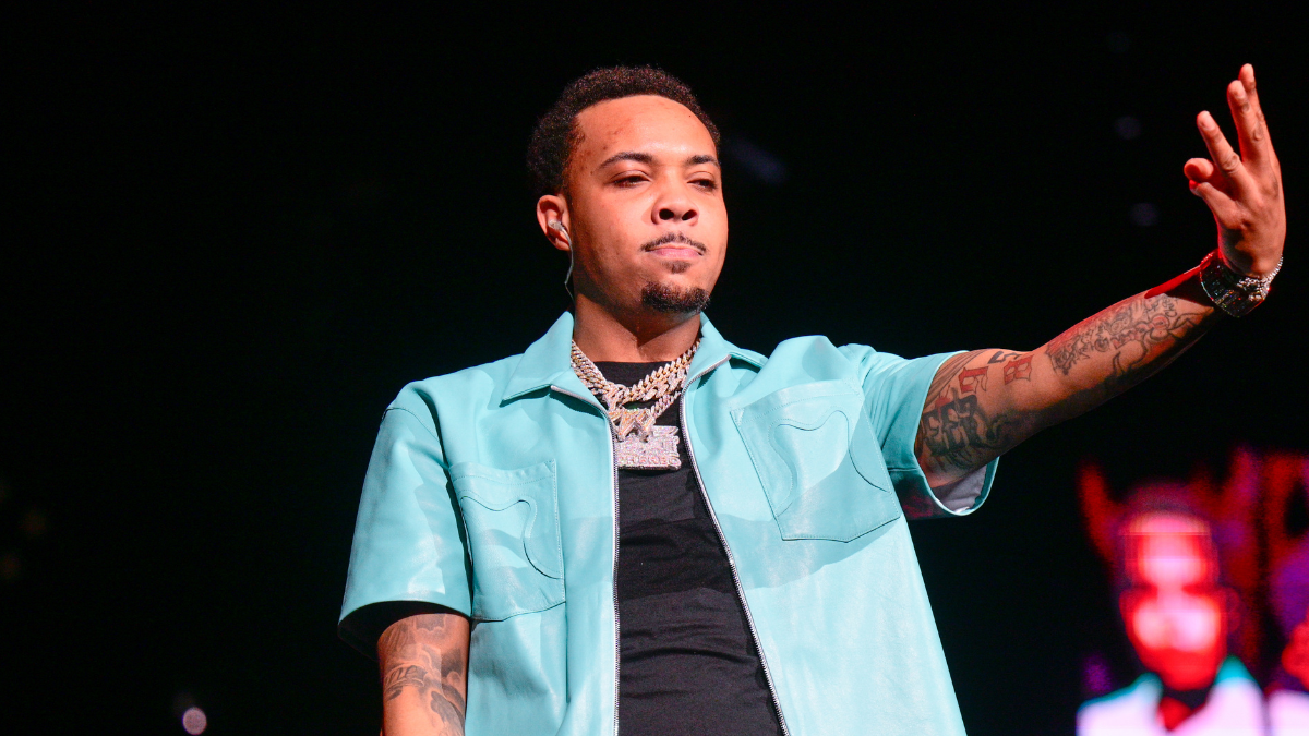
A guardian angel design connected with the name Diane is another important part of Herbo’s tattoos. Public tattoo guides describe the angel, stairs and dove as a tribute linked to his mother and to protection. The exact layout changes with the camera angle, but the theme is visible in clear photos.

G Herbo arm tattoos

The name gives this angel design a personal reference beyond familiar religious imagery. Surrounded by his other arm tattoos, it reads as part of a larger memorial piece rather than a standalone flash design.

Herbo has talked about loss and the people who shaped him, which gives context to the memorial themes. Still, a photo can show an angel, a dove, stairs and a name; it can’t confirm every part of the story unless Herbo has explained it.

His mother’s portrait and tribute dates

Public coverage has identified a portrait on Herbo’s arm as his mother’s. Portrait tattoos are demanding: a small change in the eyes, mouth or shading can change the likeness. In clear photos, the face sits among dark lettering and other memorial marks.

Dates appear in several parts of his collection. They act as small markers inside the larger work, adding a personal timeline across his arms and chest. Names, faces and dates give the tattoos an autobiographical feel. Some dates are hard to read in a stage photo, but the lettering shows that each one marks a specific occasion.

The Rain 2 quote

One tattoo linked to Herbo’s music is a line from “Rain 2,” a song from his Humble Beast era. It’s on his arm among the other text tattoos. Here, a lyric and his body art meet: he has ink tied to names and places as well as lines from the music that helped tell his story.

Text can be hard to read in a low-quality screenshot, so it’s safer to connect the piece to “Rain 2” without claiming every letter is clear in every photo. The broader idea is plain: it brings his writing onto his skin and makes a song reference permanent.

Yosohn, family, and the smaller details

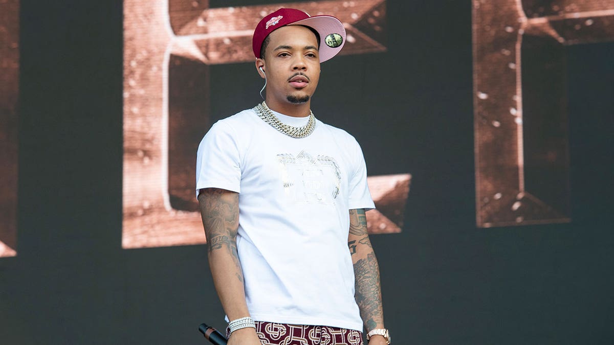
Herbo’s chest also has the name Yosohn and a heart with a date reported as April 11, 2017. These family details are smaller than the 773 earth piece, but they matter just as much to the collection. They can disappear under a shirt or in stage lighting, especially beside the larger tattoos.

G Herbo tattooed arms

That difference in scale is part of Herbo’s style. Some tattoos are visible across a room; others need a closer look. The names and heart date feel more intimate, while the large torso and arm designs shape the first impression.

Sun, 79th, 9/5/8, skulls, and graffiti-style pieces

The collection includes other designs too: a sun, the numbers 79th, 9/5/8, skulls and rough graffiti-style marks across his arms and torso. Public tattoo coverage connects 79th with 79th Street and South Essex Avenue in Chicago.

Not every small tattoo has a confirmed public meaning. The design is still worth documenting, and leaving unclear details as observations helps separate what is visible from what is guessed. On a busy arm, one blurry photo can make a mark look like something else.

G Herbo sleeve tattoos

This portrait shows how far the tattoos extend. The ink covers both arms and reaches toward his shoulders, while the chest work fills the space below his neck. The main tattooed areas have a dense, high-contrast look, with little blank skin left.

What the photos show about his tattoo style

Herbo’s collection mixes lettering, black-and-gray portraits, numbers, memorial imagery and Chicago references. There isn’t one consistent style, which is part of what makes it recognizable. A portrait can sit beside graffiti lettering, and a date beside a shaded image.

His torso makes a central story; the arms read like separate pages of people, places and phrases. The neck and upper chest help connect the sections, even though the tattoos were added at different times.

Photos can make the collection look different from one shot to another. Lighting, clothing and camera angle affect how much ink shows. A dark sleeve may look almost solid in one image, then break into separate tattoos in another. Full-size photos make those details easier to see.

Why G Herbo’s tattoos stand out

Herbo’s tattoos put public identity beside private memory. The 773 and Chicago references are easy for fans to recognize; names, portraits, dates and family pieces add a quieter layer. The ink shows the rapper fans see onstage as well as people and places he keeps close away from the microphone.

Compare the visual weight of this collection with another musician whose tattoos carry a lot of visual weight. For a different approach, Jayson Tatum’s tattoos use numbers, names and faith in a cleaner layout.

Quick takeaway: Herbo’s tattoos cover Chicago identity, loyalty, family, grief, music and personal milestones. The clearest pieces include the 773 earth design, DreamTeam and NLMB lettering, the Diane guardian angel tribute, family names and dates, and the Rain 2 quote. Smaller skulls, suns, numbers and graffiti marks fill in the rest.

Watch G Herbo talk about his tattoos

This interview shows Herbo’s stomach and arm tattoos up close while he explains what some of them mean.

Kellin Quinn Tattoos: Sleeves, Chest Script and Sleeping With Sirens Ink

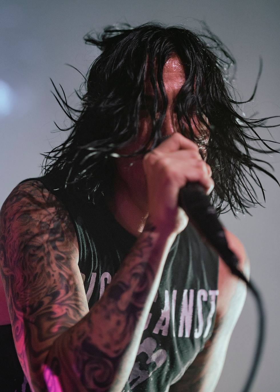
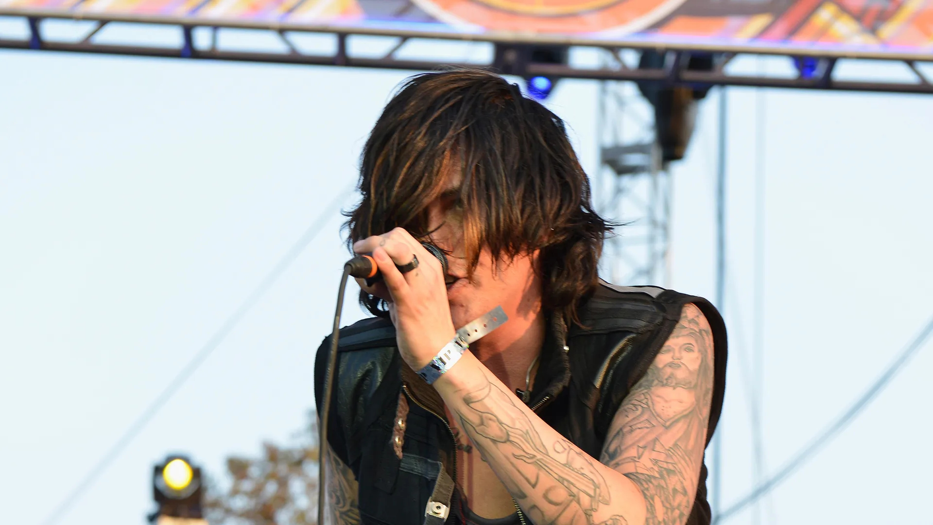
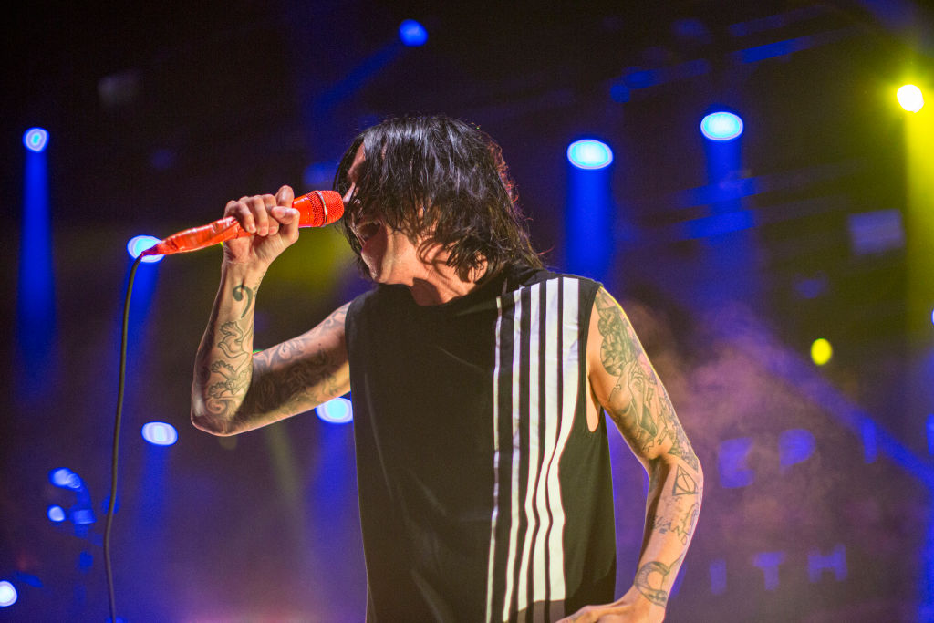
Kellin Quinn’s tattoos can look different depending on what he wears. Under a jacket, most of them disappear. In a tank top under stage lights, you see the full spread: packed sleeves, chest lettering, hand details and bold pieces reaching toward his shoulders.

As Sleeping With Sirens frontman, he has been photographed with the same core Kellin Quinn tattoos across years of performances, backstage portraits and band pictures. That makes it easier to separate his tattoos from temporary styling or unrelated images that circulate online. Here’s a closer look at what is visible, what has been reported and what is best left as a visual observation.

Kellin Quinn blue stage tattoos

The chest script is the first thing you notice

The clearest tattoo on Quinn’s upper body is cursive writing across his chest. Shirts and microphones hide parts of it in some photos, but the lettering is unmistakable in a close-up. It sits high and follows his collarbones, so it can show above a low-cut shirt.

The thin, open script gives the rest of his collection a different feel. His arms carry darker outlines and busier images, while the chest piece leaves more space around the letters. It comes across as personal without needing a huge block of text. You recognize the style even when you can’t read every word.

Older performance photos show more of the tattoo when Quinn is shirtless; later portraits often catch only the top. The placement has stayed the same over the years. It is permanent ink, not a necklace or shirt graphic.

Kellin Quinn chest script tattoo

His arms are covered in full sleeves

Quinn’s sleeves are the most extensive part of his personal and unmistakable collection. Both arms are covered from the upper arm toward the wrists. Heavy outlines, shaded patches, ornamental curves and small symbols fit together across the sleeves instead of sitting in separate boxes.

The left and right arms aren’t identical. One often looks darker and more packed; the other leaves more skin between the designs. High-resolution concert photos make that difference easier to see, especially when stage lights catch the lines.

The forearms have smaller details too: lettering, music-related marks and traditional shapes, though some are too soft in photos to identify. An image can show that an area is tattooed without telling you what a mark means. That matters with a collection this dense.

Kellin Quinn sleeve tattoos live

The sleeves mix linework and darker shading

The sleeves use more than one style. Fine lines and curved decoration sit beside heavier black-and-gray shading that gives parts of the arm a traditional rock-tattoo feel. The change in texture keeps the ink from looking like one flat wall.

In sharp live photos, larger illustrations tend to show on the upper arms, with smaller marks lower down. A microphone can cover the wrist, so each angle reveals a different section. One photo may show the outer sleeve, another the inner forearm, and another how the chest and shoulder connect.

The tattoos also work with Quinn’s stage clothes. Vests, sleeveless shirts and rolled sleeves leave enough ink visible to read from a distance. Even under colored lights, the main outlines hold their shape, making the tattoos part of his performance look.

Kellin Quinn arm tattoos on stage

Face, neck and smaller visible marks

Quinn doesn’t have the extensive face ink associated with some rap and metal performers. Most of his recognizable tattoos are on his arms, chest and upper body. A small tattoo near his neck stands out in close stage photos because the placement is unusual beside the larger sleeves.

Some photos also show smaller marks on his hands and wrists. A microphone, bracelets or the movement of a performance can cover them. When a picture is sharp, you can see that the ink continues below the forearm; when it isn’t, it’s better to describe visible wrist or hand tattoos than guess at the exact design.

That is one reason the collection can look different from one era to another. Hair, clothing, light and camera distance change what draws the eye. A close portrait brings out the chest script; a live shot often makes the sleeves the main feature.

The Deathly Hallows tattoo

A Deathly Hallows symbol is regularly linked with Quinn’s tattoos. It fits the broader mix of music and pop-culture references in the collection. The triangle, circle and line are simple enough to recognize even when the photo isn’t a close-up.

The emblem is a change from the larger sleeves: compact and graphic, with less texture or shading. A small symbol also breaks up larger designs when you look at the collection as a whole.

Not every tattoo needs a long explanation. The symbol points to a familiar reference; Quinn’s personal reason for choosing it is his to explain.

How the tattoos look onstage

Quinn’s live photos show how the collection moves with him. He moves around the stage, holds a microphone close and wears sleeveless clothes that leave both arms exposed. As he turns, the tattoos come in and out of view rather than sitting in one posed frame.

The larger outlines stay readable from a distance, and the smaller marks fill in around them. Black-and-white photos make the shading look heavier. Blue or yellow stage lights soften it, but the main shapes remain clear.

The chest script can show even when a shirt covers most of it. A few letters above the shirt line are often enough to recognize the tattoo. In a shirtless or low-cut performance photo, the whole phrase becomes part of the image. Fans often focus on it alongside the sleeves.

Kellin Quinn tattooed arms concert

What is confirmed and what is just visible

Interviews and fan reference pages repeatedly identify the chest lettering, full sleeves, lock-and-key imagery linked with his relationship, and the Deathly Hallows symbol. Other details are visible only in photos. It’s fair to describe what appears there, but not to give every shape a deep meaning without Quinn’s own explanation.

Older fan photos can help, but their captions aren’t always reliable. A caption may name a design after the person who posted it, not after Quinn. The safer approach is to look for the same tattoo in several clear pictures, then describe its placement and appearance.

Quinn has also talked about tattoos from a fan’s point of view. In interviews about fans getting band-related ink, he joked that people should be sure they want the lyrics they choose. That advice suits his own collection: the strongest pieces seem tied to memories, beliefs or parts of culture, not added just to fill space.

Why his tattoo style works so well for a rock frontman

The tattoos give Quinn a clear stage silhouette. The sleeves frame his arms when he lifts the microphone; the chest script sits between his hair and shirt. Dark outlines show under concert lights and still read in a quiet backstage portrait.

There is a mix of clean and worn-looking work. Some pieces have careful lines; others look older, softer or more heavily shaded. The collection feels like it has grown over time instead of being chosen all at once from matching flash designs.

For another musician’s mix of personal writing and full sleeves, see G Herbo’s tattoos. For a more symbolic, face-focused collection, compare it with Lil Peep’s tattoos. Both show how body art can become part of an artist’s public identity, in very different ways.

The quick take

Quinn’s collection is built around two big features: cursive writing across the chest and full sleeves on both arms. The Deathly Hallows symbol, smaller neck and hand tattoos, and relationship imagery add to a look that feels personal without being too tidy or predictable.
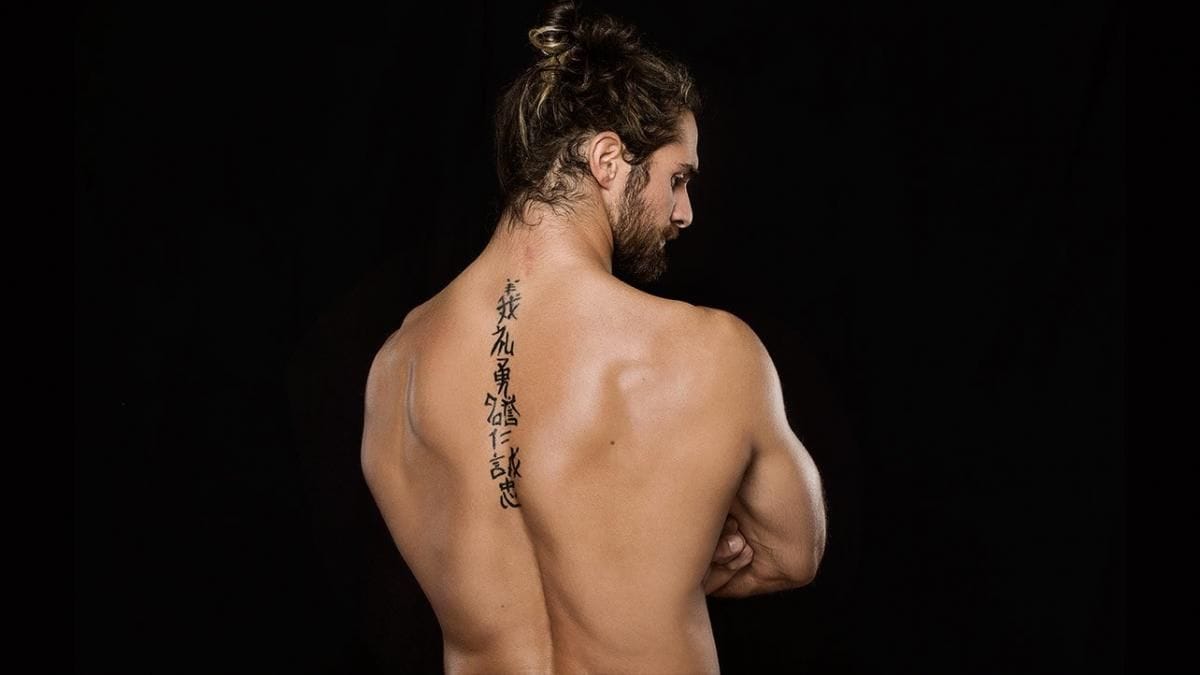
Different photos show different parts of the collection. A portrait brings out the chest lettering; a sleeveless backstage shot shows the arm coverage; a concert photo catches the ink moving with him. Together, those angles give a fuller picture than one cropped headshot.

Watch a Kellin Quinn tattoo review

This video takes a closer look at Quinn’s tattoos and follows the designs beyond the still photos.

Travis Mills Tattoos: Apple Palm, Medusa Neck Ink and More
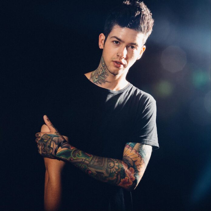
Travis Mills’ tattoos are tied to music, family, fear, old mistakes and the people and places that have shaped him. Some are bright and playful; others are small black marks that feel like private notes. Together, they look collected over time rather than planned as one set.

The mix is what makes Travis Mills tattoos interesting to look through: a colorful sleeve with cartoon-like shapes, a green Medusa on his neck, lettering on his hands and small family pieces near his ankles. Even some rough-looking marks have a story behind them. Here are the designs that stand out.
A colorful sleeve built around his interests

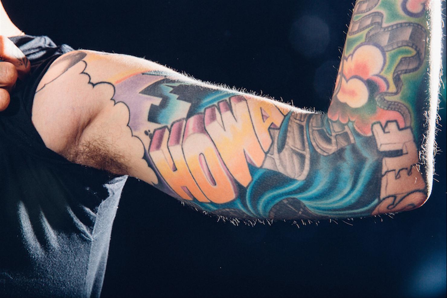
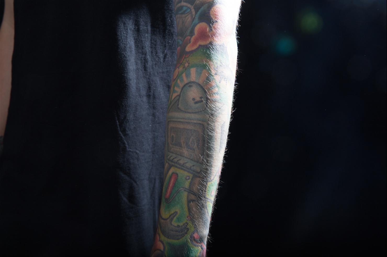
A large, colorful design runs down Mills’ arm. It isn’t one picture with a clean border; it feels more like a scrapbook, with bright blocks, characters, lettering and smaller pieces filling the gaps. The bold outlines and colors stay clear in photos and suit the energy of his music and artwork.

Mills has said the sleeve draws on his interests. One section has a cassette player and a robot, which fit his connection to music and DIY work. He has also linked parts of the sleeve to paintings by Riverside artist Jeff Soto. The mix comes from things he likes, not just a random set of flash designs.

The ideas sit next to each other without needing to match exactly. That gives the sleeve a collected feel. If you like color but not a hyper-realistic mural, the outlines, repeated colors and shared shapes offer a useful example of how separate ideas can work together.

Travis Mills colorful robot and cassette sleeve tattoo

The bitten apple on his palm

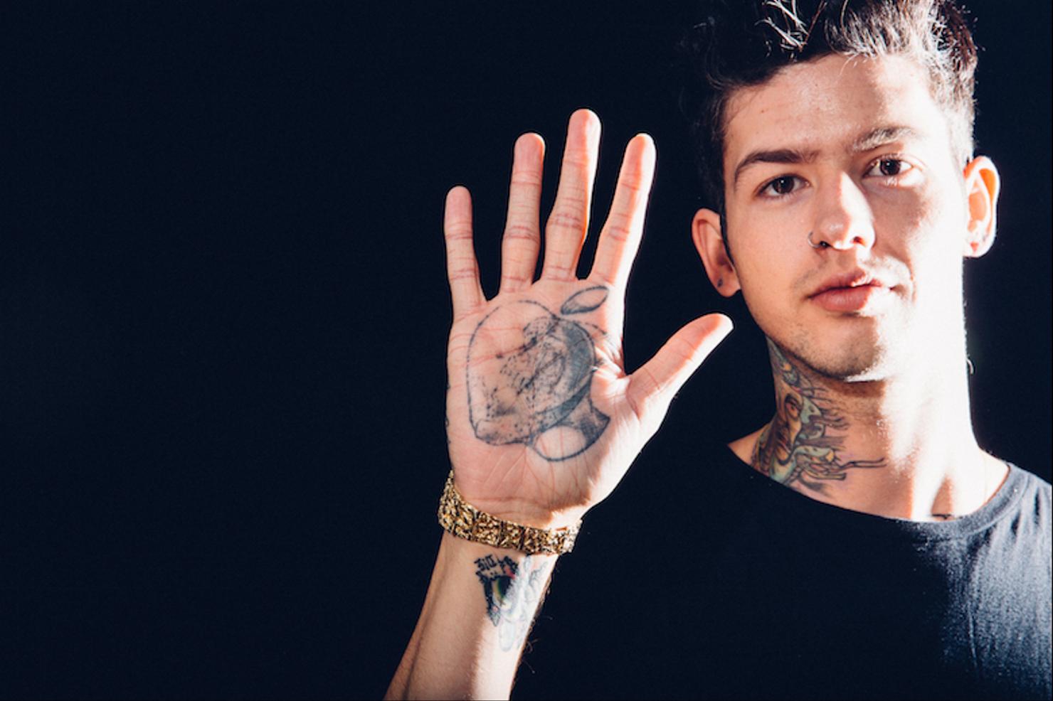
The black bitten apple on Mills’ palm is hard to hide. It covers an older half-heart tattoo tied to an impulsive Las Vegas moment, as he has explained. A cover-up can hold both parts of a story: what was there before and the decision to change it.

Palms get a lot of movement, washing and friction, so ink there can soften with time. The apple’s simple black shape helps it stay readable. It stands apart from the smaller tattoos on his hands without needing much detail.

If you’re thinking about palm ink, a clear silhouette is more likely to hold up than a tiny, detailed picture. Fading and touch-ups are part of the commitment. The placement is the appeal, but it’s also what makes this spot different.

Travis Mills black bitten apple palm tattoo and hand tattoos

The green Medusa on his neck

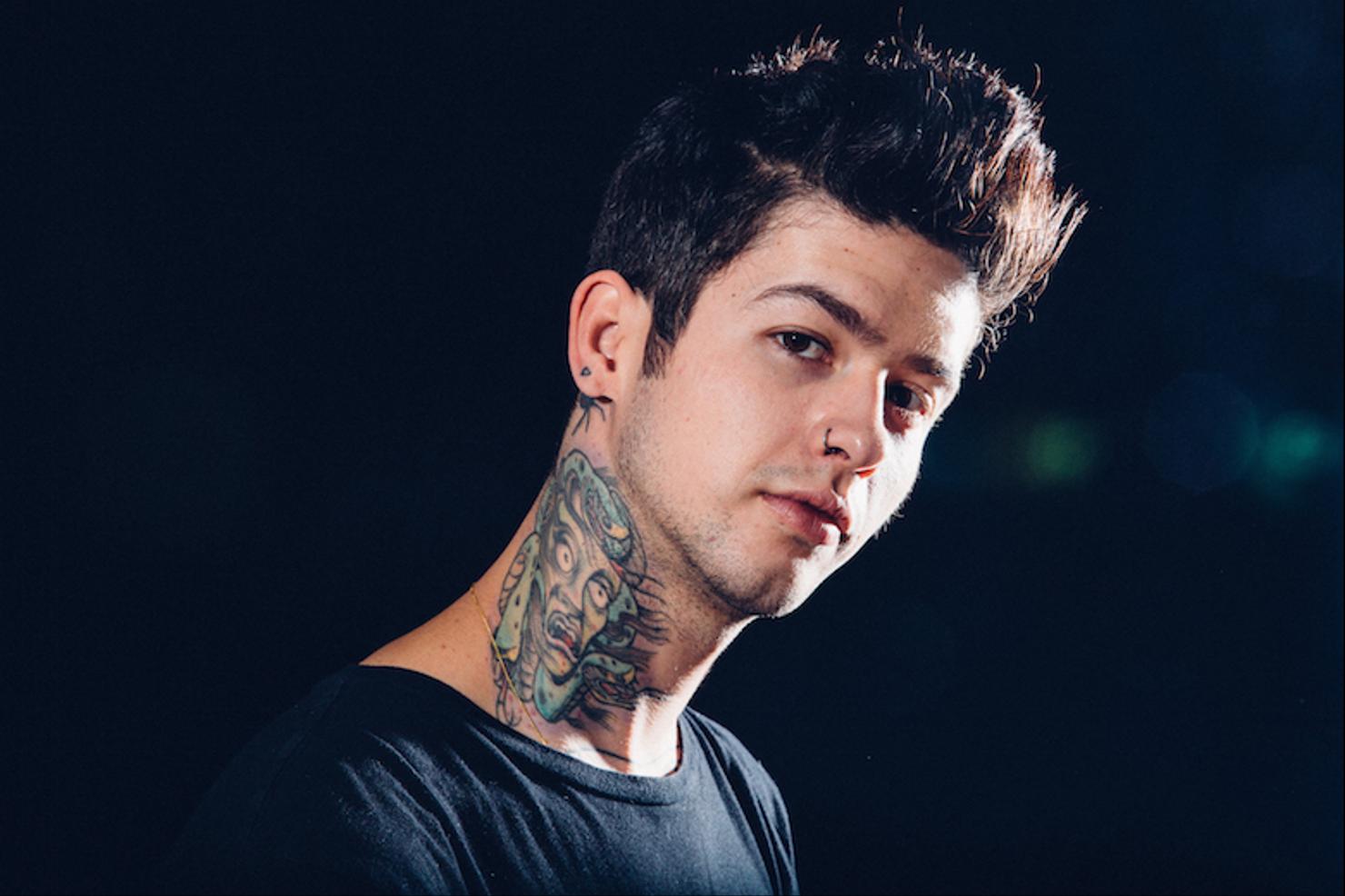
The green Medusa on Mills’ neck is one of his boldest tattoos. It spreads beneath the jaw toward the collar, with the face and snakes packed into a colorful design. The green stands out, but the placement gives the piece much of its impact: neck ink changes the shape of a portrait.

Mills has connected the image to Greek mythology. Medusa can suggest danger, protection, power or a warning to keep your distance, leaving room for a personal reading. Small symbols around his neck and behind his ear make the main design feel connected to a wider group of tattoos.

A neck design has to work from more than one angle. This one follows the side of Mills’ neck instead of sitting like a flat rectangle. If you’re considering neck ink, bring references that show the placement from the front and side; it needs to look right when you turn your head too.

Travis Mills green Medusa neck tattoo

The spider behind his ear

Mills also has a small spider behind his right ear. It’s easy to miss in a full-body photo, but clear in a close-up. He has described it as a way to confront fear. Compared with the bright sleeve, it’s a quiet reminder in a spot he knows is there.

Behind-the-ear tattoos are tricky: the skin curves, the space is small, and hair can hide the design. A compact creature or symbol usually fits better there than a line of tiny text. The spider shows how a small tattoo can still carry a clear idea.

Travis Mills colorful upper arm tattoo lettering

Hand tattoos, knuckles, and the word Patience

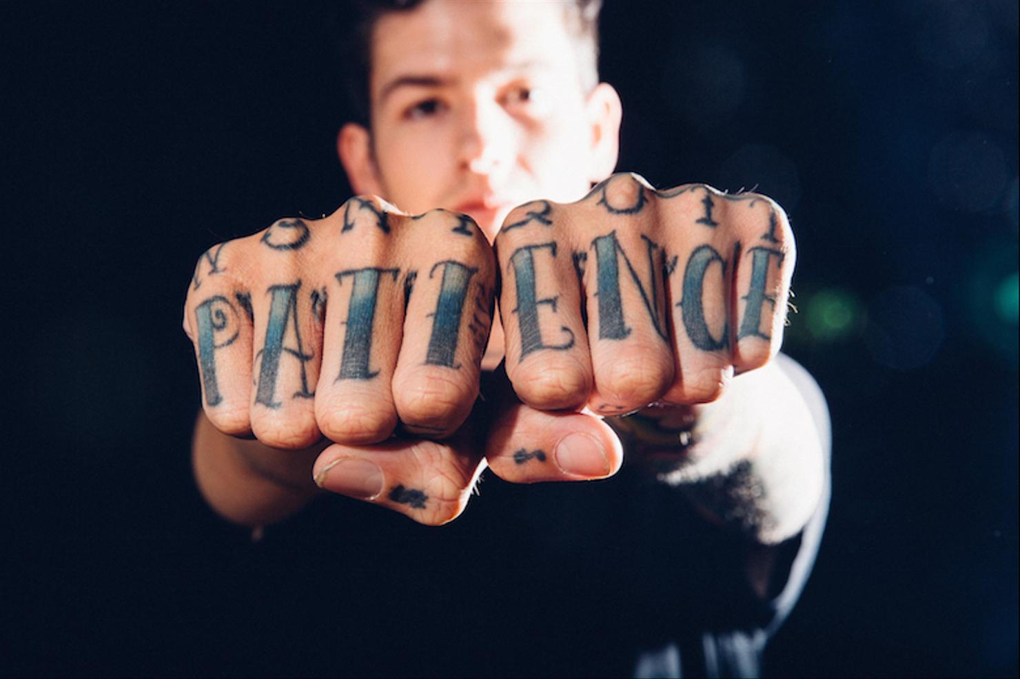
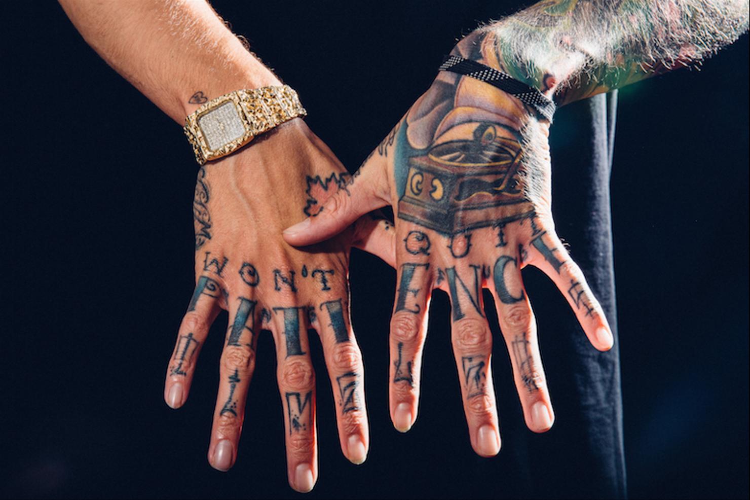
Mills’ hands carry much of the smaller lettering and symbolism. The knuckles have bold letters, while marks on his fingers and the backs of his hands show up when he turns them toward the camera. One of the better-known details is “Patience” across his knuckles.

Hand tattoos get sun and friction every day. Lines soften and ink can drop out. Mills’ hand work has a worn look that fits a collection built over years, rather than one finished in a single sitting.

The photos show why scale matters here. Block letters stay legible, and tiny symbols work as accents. If you want hand lettering, choose a style that can handle movement and fading. A tattooer can also tell you when the design needs more room than your fingers allow.

Travis Mills tattooed knuckles with Patience lettering

Travis Mills hand tattoos and lettering across both hands

Music, family, and the tattoos he keeps close

Some of Mills’ tattoos connect directly to music. He has a “Changes” tattoo on his left thumb, linked to his favorite Tupac song. The cassette player in his sleeve points to the same interest from another angle. Music here is more than a job; the tattoos tie it to different parts of his life.

His family tattoos are quieter. “Mom” is on his right ankle and “Dad” on his left, placements he can cover or carry with him every day. The words need no large design around them.

A heart with the Roman numeral 13 sits on his right wrist. It is a matching piece connected to a girlfriend and a Friday the 13th decision. Small triangles on his ears represent balance. A tiny family word and a bright sleeve can matter in different ways, and both have room in the same collection.

Travis Mills colorful forearm and hand tattoos

Travis Mills colorful tattoo sleeve close-up

What his tattoo style says about placement

Mills uses visible areas like his neck, hands and arms for tattoos people will notice. Smaller pieces sit in places he can cover when he wants. That lets him make a statement without asking every tattoo to compete for attention.

The collection doesn’t need one style to feel connected. Bright color appears in several places, the lettering stays bold, and small symbols sit where they matter to him. Even the rougher black marks belong because they come from different moments in his life.

If you want a similar personal feel, start with the story behind a tattoo rather than a picture to copy. Think about the music, people, artists and reminders you’d still care about years from now. Then choose a placement to match how visible you want those memories to be. One small tattoo with a real reason behind it can be enough.

How to take inspiration from Travis Mills tattoos

The practical ideas are easy to borrow. Try one strong color with black outlines if you like the sleeve, keep small symbols simple, and give hand or palm tattoos room. For a neck design, check that it follows the shape of the neck from the side and front. If you’re planning a cover-up, show the artist what’s already there.

Leave some space too. Mills’ collection is busy, but not every inch has to be filled at once. Holding a spot for a future tattoo can keep the project from feeling rushed and let each important piece stand out.

For other musicians with very different tattoo styles, compare this collection with NLE Choppa tattoos, Trippie Redd tattoos and Jay Park tattoos. The point isn’t to copy a celebrity; it’s to notice how color, placement and personal history change the feel of a collection.

Small tattoos can carry a big story when the placement and meaning are right.

Watch Travis Mills talk about his tattoos

In this interview, Mills talks about his first tattoo and the designs on his hands and arms:

Seth Rollins Tattoos

Seth Rollins has a short list of clearly documented tattoos. The Japanese characters down his spine get most of the attention, but a smaller phrase on his wrist has its own story. Both designs are restrained, and they connect to ideas Rollins has discussed: discipline, hard work and the people who shaped him.

His WWE Superstar Ink interview explains the spine piece. The wrist phrase is easy to read, though Rollins hasn’t shared every personal detail behind it.

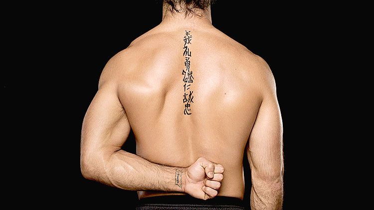
The Bushido tattoo running down Seth Rollins’ spine

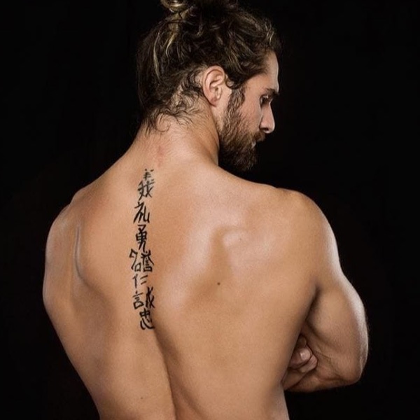
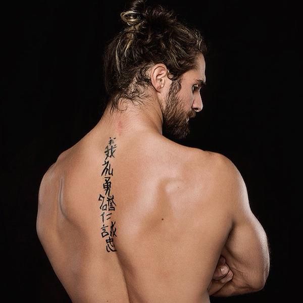
A vertical row of Japanese characters runs down the center of Rollins’ upper back. It appears in older photos and in the WWE Superstar Ink interview, where he explains why he chose it.

Rollins says the characters stand for the seven virtues of Bushido: integrity, respect, courage, honor, compassion, honesty and loyalty. Bushido is commonly described as the moral code associated with samurai. The tattoo puts those seven principles in a narrow column down his spine.

The characters start high on his back and stay close to the center. The design can disappear under a shirt or wrestling vest, then show clearly when he turns around.

Seth Rollins vertical Bushido tattoo down his back

What the seven words say about his wrestling identity

Rollins has built his wrestling character around drive, stubbornness and risk-taking. The Bushido tattoo fits that image, though its meaning reaches beyond wrestling: the virtues are standards he can carry with him when the cameras are off.

There’s a contrast between the quiet lettering and the way he performs. In the ring, Rollins is loud, theatrical and unpredictable. The tattoo is plain black writing, without color, shading or extra decoration. The words carry the message on their own.

His gear and hair have changed over the years, but the seven characters remain easy to recognize. It’s a restrained tattoo with a direct message.

Seth Rollins Bushido spine tattoo from behind

The tattoo’s connection to the last samurai idea

Rollins has talked about Bushido in terms of the kind of person he wants to be. In the WWE interview, he explains the characters and the ideas behind them, so the meaning doesn’t have to be pieced together from photos.

The samurai reference also fits with the word “warrior,” which Rollins has used when discussing wrestling. The tattoo isn’t a literal battle symbol; its focus is discipline, loyalty and doing the right thing when a choice is difficult.

Translations online don’t always use the same order or English wording. The clearest account is Rollins’ own: the characters represent the seven virtues of Bushido. More detailed versions should be treated as interpretations unless he confirms them.

Seth Rollins Japanese character Bushido back tattoo from an angled view

The “remnants of a burning page” wrist tattoo

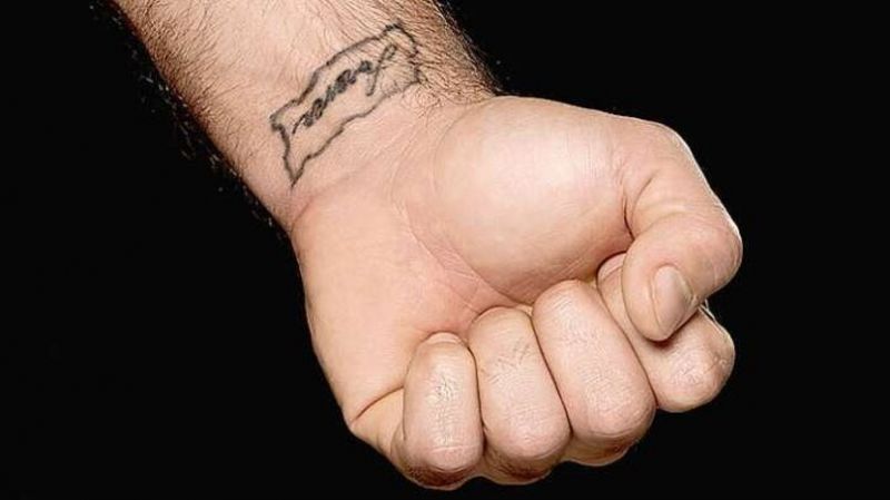
Rollins has a smaller wrist tattoo that reads “remnants of a burning page.” It’s written in a rough, handwritten style inside an outline that looks like torn or burning paper.

The phrase can suggest a memory that survived something destructive. A page might stand for a story, a chapter or part of someone’s past. Even after it burns, something remains. That reading gives the tattoo a sense of carrying the past forward, though Rollins hasn’t explained exactly what the image means.

This piece is easy to miss unless there’s a close photo or Rollins is holding his arm near his face. The outline can also look heavier or lighter from one angle to another.

The wording is documented, but Rollins hasn’t shared every personal detail behind it. The phrase is clear; a specific story about the page would be guesswork.

Seth Rollins forever wrist tattoo in clear close view

How the back tattoo looks in photos

The Bushido tattoo turns up in so many Seth Rollins photos partly because of its placement. Cameras catch him from behind during entrances, celebrations and post-match interviews. He also wrestles with his back uncovered, so the characters are easy to compare across different years.

From a distance, the design looks like one dark line. Up close, each character has its own shape and spacing. The narrow column stays centered on his back instead of spreading toward a shoulder.

Some older photos make the ink look worn, but that doesn’t mean the tattoo has changed. Lighting, sweat and ringside photo quality can all soften or sharpen black ink. There’s no solid evidence that the Bushido characters have been covered up.

Seth Rollins Bushido back tattoo detail with Japanese characters

Why Seth Rollins’ tattoos still stand out

Rollins isn’t covered in visible tattoos, which makes these pieces easy to pick out. The back tattoo has a strong shape and a stated meaning; the wrist phrase feels more private, like a line from a story whose details he hasn’t shared. Neither needs a large portrait or a cluster of symbols to get noticed.

Many wrestlers have full sleeves, chest tattoos or large back pieces. Rollins went with smaller designs, and the Bushido characters have become part of the visual record of his WWE career.

For another take on wrestling ink, see our article on Rhea Ripley’s tattoos. Her tattoos use size, color and placement in a very different way.

The confirmed list is short: seven Bushido virtues down his spine and “remnants of a burning page” on his wrist. Blurry ringside photos aren’t enough to identify other marks with confidence.

Watch Seth explain the tattoos himself

Rollins discusses the Bushido characters and the burning-page tattoo in this WWE interview.

Busta Rhymes Tattoos: Tribal Sleeves, Back Ink and More

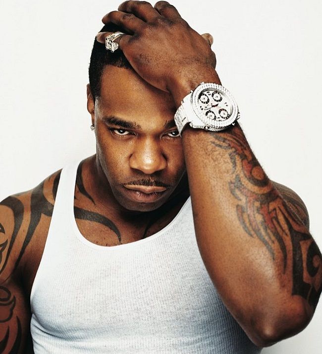
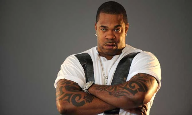
Busta Rhymes’ tattoos are as hard to miss as the artist himself. The visible work leans on heavy black shapes, tribal lines and large pieces that read from the stage. Most of it stretches across his arms, shoulders, chest and back, giving the collection a bold, busy look.

This guide sticks to what can be seen in clear photos. Smaller marks can be hard to identify, so it avoids guessing at private meanings. The common thread is the blackwork that connects the larger pieces.

His tribal arm tattoos are the main event

The dark coverage on both arms stands out first. Busta has had versions of these pieces for years, and together they give his arms a sleeve-like look. Thick black curves, hooks, points and bands sit close together, leaving little bare skin around the main shapes.

Busta Rhymes tattooed arms portrait

From a distance, the sleeves can look like armor. Closer photos show the breaks of bare skin, the solid black areas and the sharper edges. That contrast keeps the design from reading as one flat block. It also suits the scale of Busta’s performances, which have always been big and dramatic.

Blackwork shapes give the sleeves their weight

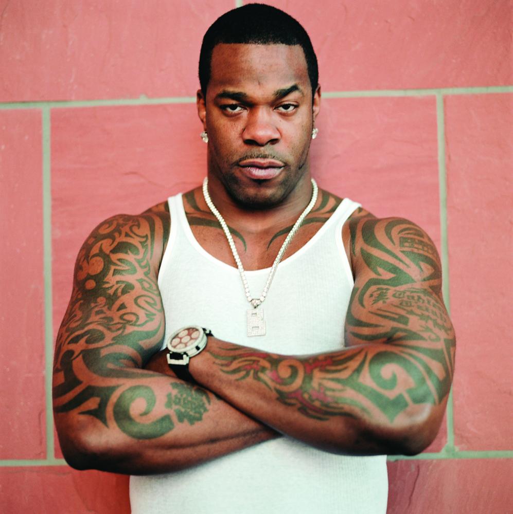
The arm work has a repeated rhythm. One section curves around the upper arm, another runs toward the elbow, and smaller shapes connect the design down the forearm. Photos from different years make the boundaries hard to trace, but the look stays consistent: blackwork, tribal movement and a similar balance from one arm to the other.

Busta Rhymes tribal arm tattoos

The sleeves can be a reference if you like designs that rely on black instead of color. Their thick shapes are built to stay visible on stage and in photos. If you borrow the general feel, work with an artist on an original layout instead of copying Busta’s exact designs.

The back piece is much larger than the arm work

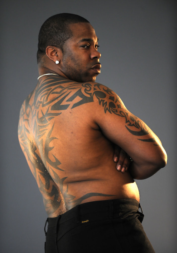
Busta’s back tattoo changes the scale. Clear photos show a large dark pattern spreading across his upper back and shoulder area. It uses the same tribal direction as the arms, but the extra space lets it read as a full piece rather than a small emblem.

Busta Rhymes back tattoo

The design follows the shoulder line and upper back, so it sits with the shape of his frame. The dark sections also keep the outline readable in wider photos.

Public tattoo references commonly credit Los Angeles artist Paul Timman with the back piece. That credit is useful background; the personal meaning of each shape is less clear. The safest description is that it belongs to Busta’s broader use of tribal and neo-tribal designs.

Chest and shoulder ink tie everything together

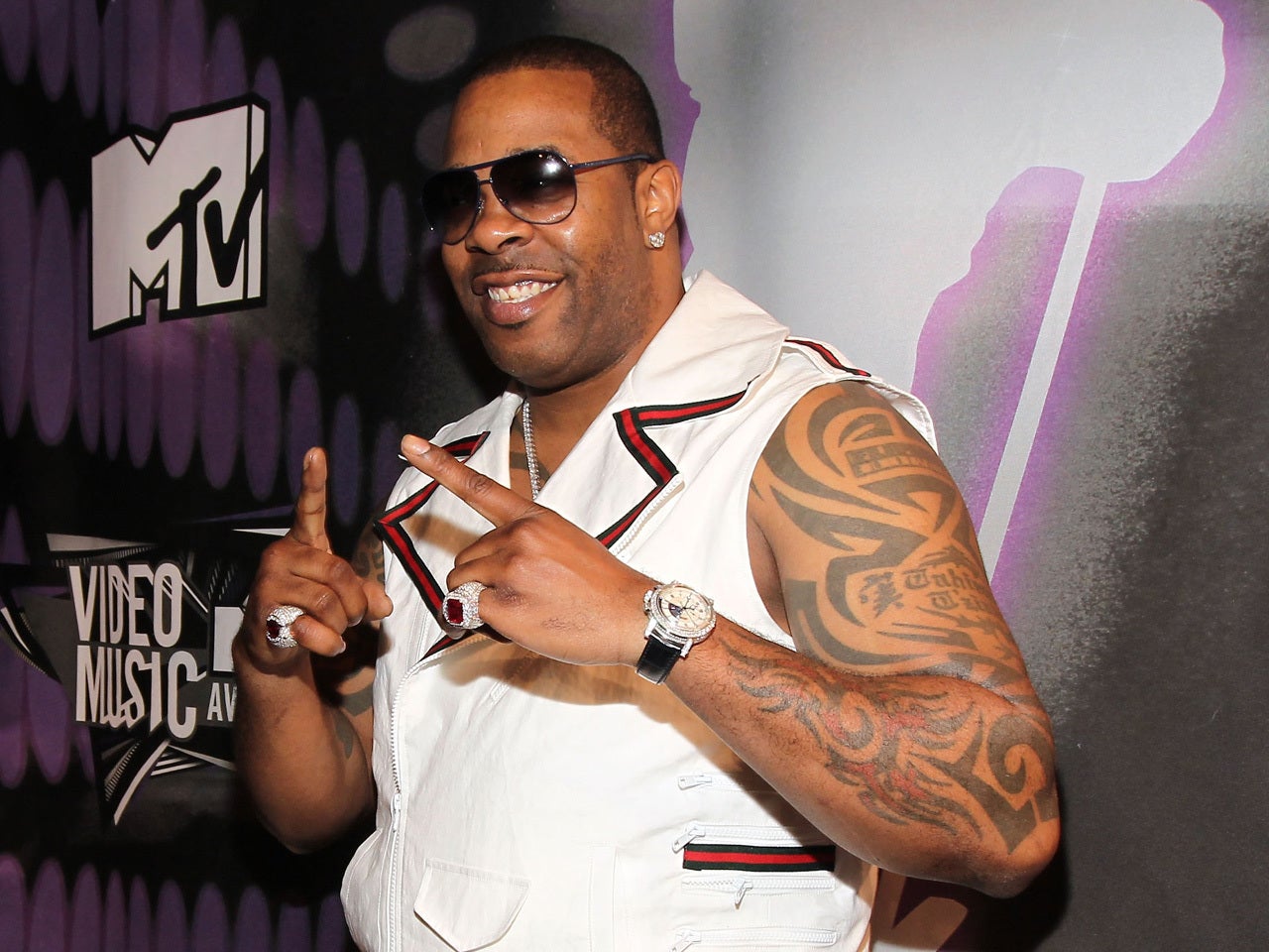
When Busta wears a vest or an open shirt, more of the connected work shows around his shoulders and upper chest. The dark shapes carry across his upper body, linking the arm tattoos and back piece as part of a larger collection.

Photos show different parts of that collection. A front view emphasizes the sleeves and chest, a side angle brings out the shoulder shapes, and a back shot centers the large upper-back piece. The tattoos aren’t changing between photos; the camera is showing another section.

Busta Rhymes stage arm tattoos

How the tattoos fit Busta Rhymes’ image

The scale of the tattoos matches the way Busta presents himself in hip-hop. His music, videos and live shows have a larger-than-life feel, and the ink adds to that visually. The sleeves frame his arms when he performs; the back piece makes a bigger impression when he turns away from the camera.

There’s a practical side to the style too. Broad black shapes hold up from a distance, where fine lines can disappear amid movement and stage lights. That doesn’t make the designs simple. Their contrast and layout still matter in a close-up.

A closer look at the arm coverage

Another clear photo shows how the coverage is made from connected sections, not one solid sleeve. The upper arm has denser shapes, while open gaps and directional lines break up the forearm. The tattoos look full without covering every patch of skin.

Busta Rhymes crossed arm tattoos

If you’re using these pieces for inspiration, look at the balance between thick and thin areas. The impact comes from that relationship, not just from filling space. A tattoo artist can map a design around your muscles, leave some room and build the sleeve to suit you.

What is known and what is still unclear

Photos clearly show the large tribal arm tattoos and the back piece. Smaller symbols, script and chest details are harder to identify because clothing can hide them and stage lighting can blur the lines. A photo can show that a mark exists without telling us who designed it, when it was done or what it means.

The public record supports a simple summary: Busta Rhymes is known for extensive tribal and blackwork tattoos, especially across both arms and his back. The collection has a consistent look, but not every mark has a public story attached to it. It’s better to describe what the photos show than turn a guess into a fact.

Why fans keep coming back to Busta’s ink

The tattoos have become part of Busta’s silhouette. The arm coverage is recognizable even in a wide photo, and the back piece adds another distinct part of the look. The designs stand out without needing an explanation for every line.

For more hip-hop tattoo coverage, see our articles on Snoop Dogg’s tattoos and Ice Spice’s tattoos. Snoop’s ink offers another heavily tattooed look, while Ice Spice’s is lighter and more delicate. The contrast helps show how different those styles can be.

Across the sleeves, shoulders and back, the black shapes pull in the same direction. The result is loud, graphic work that reads clearly from the stage.

Watch a tattoo conversation connected to Busta Rhymes

The video below discusses Busta Rhymes and heavily tattooed artists in hip-hop:

Ozzy Osbourne Tattoos: OZZY Knuckles, Dragon and Sharon Rose

Ozzy Osbourne’s tattoos have been part of his public look for decades. The OZZY knuckles, the bright chest dragon and the rose for Sharon are easy to recognize; his arms carry older pieces with a rougher, less uniform look.

Some details are easy to confirm in years of photos. Others disappear beneath his hair, jewelry or a microphone. This article sticks to what the pictures show and to stories Ozzy has discussed, leaving unclear marks unidentified.

Ozzy’s tattoos started with the OZZY knuckles

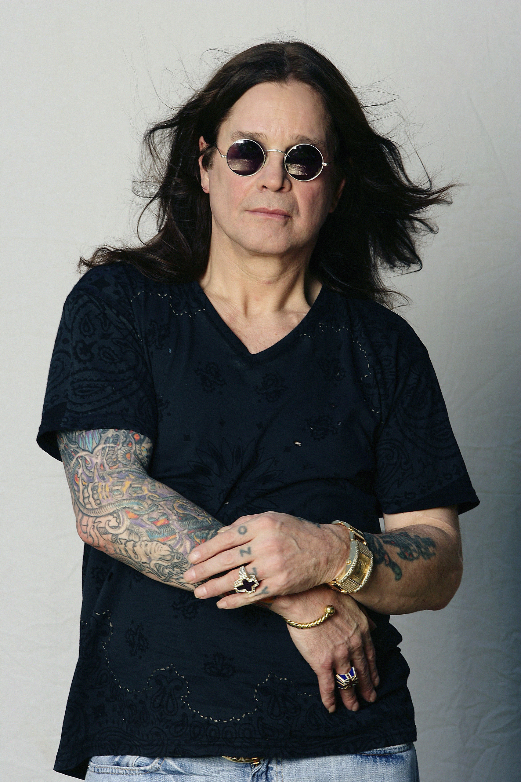
The letters OZZY across his knuckles are probably Ozzy’s best-known tattoo. He has said he got them when he was young with a needle and pencil lead, not in a polished studio. That rough start is a long way from the carefully planned sleeves many rock stars have now.

The letters are plain and direct, and impossible to miss when he raises a hand onstage. Old photos show how the knuckles became part of his public look. They read like a quick choice that stayed with him through his career.

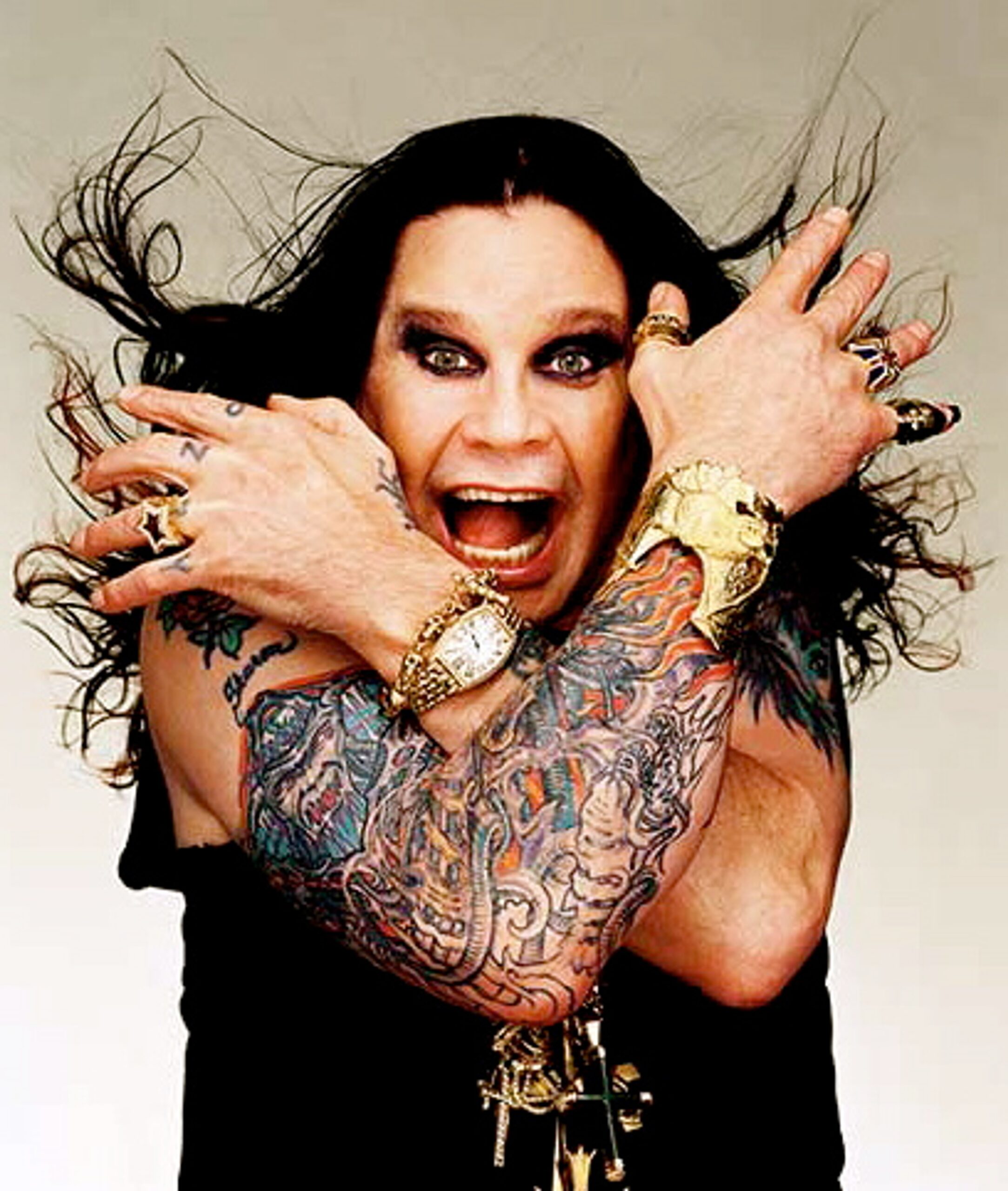
Ozzy Osbourne dragon, flames and claw sleeve tattoo visible in a portrait

The dragon and claw chest work is the big visual anchor

The large dragon on Ozzy’s chest usually draws the eye first. It has blue and red color, a fierce face and flame-like shapes that spread across the upper chest and shoulder. In some photos, it reads more like one painted panel than a group of small tattoos.

The lines can look different from one photo to another. The year, lighting and setting all affect what’s visible, especially under stage lights. The clearest description is a bold dragon-and-claw design across the chest and shoulder; some smaller details are hard to make out.

The colorful piece sits beside older black-and-gray tattoos. Faded outlines, lettering and smaller symbols share the same area, so the overall effect feels like a collection built over time rather than a matching set. That mix is part of its appeal.

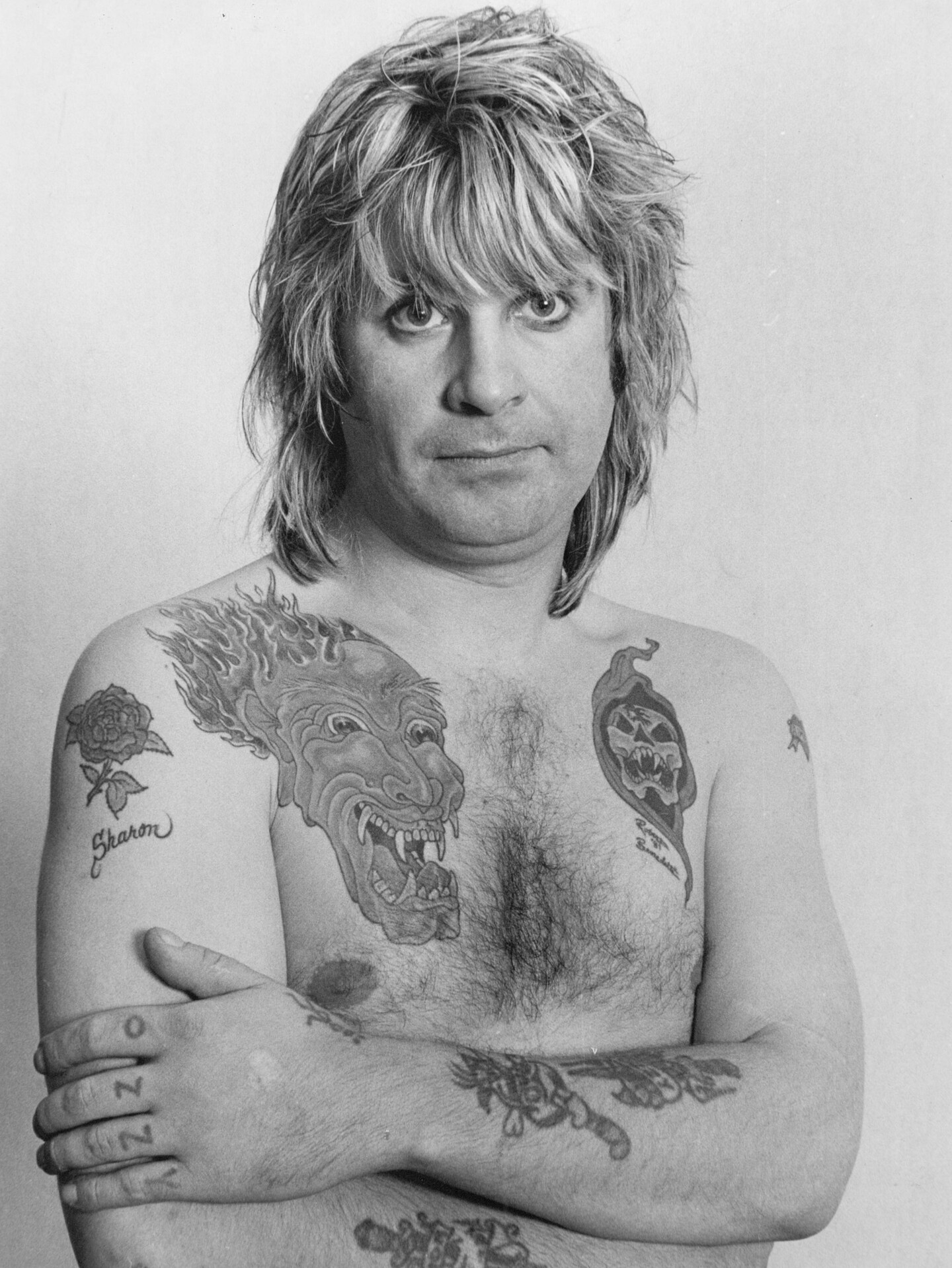
Ozzy Osbourne chest and arm tattoos visible in a black and white portrait

The black and white photos show how much ink is on his arms

A clear black-and-white portrait shows several pieces at once: a flower and the name Sharon on one shoulder, the dragon across his chest, a darker design on the other side, and line work on his forearms that’s easy to miss in a live photo.

Without colored lights or a moving microphone, the arm tattoos are easier to see. They don’t form one tidy sleeve. There are gaps, older outlines and overlapping designs, giving the collection the uneven look of 1980s rock rather than a modern studio set.

The portraits also show how the ink has aged. Tattoos fade and skin changes; a sharp magazine photo can look softer decades later. The difference gives the collection a sense of time.

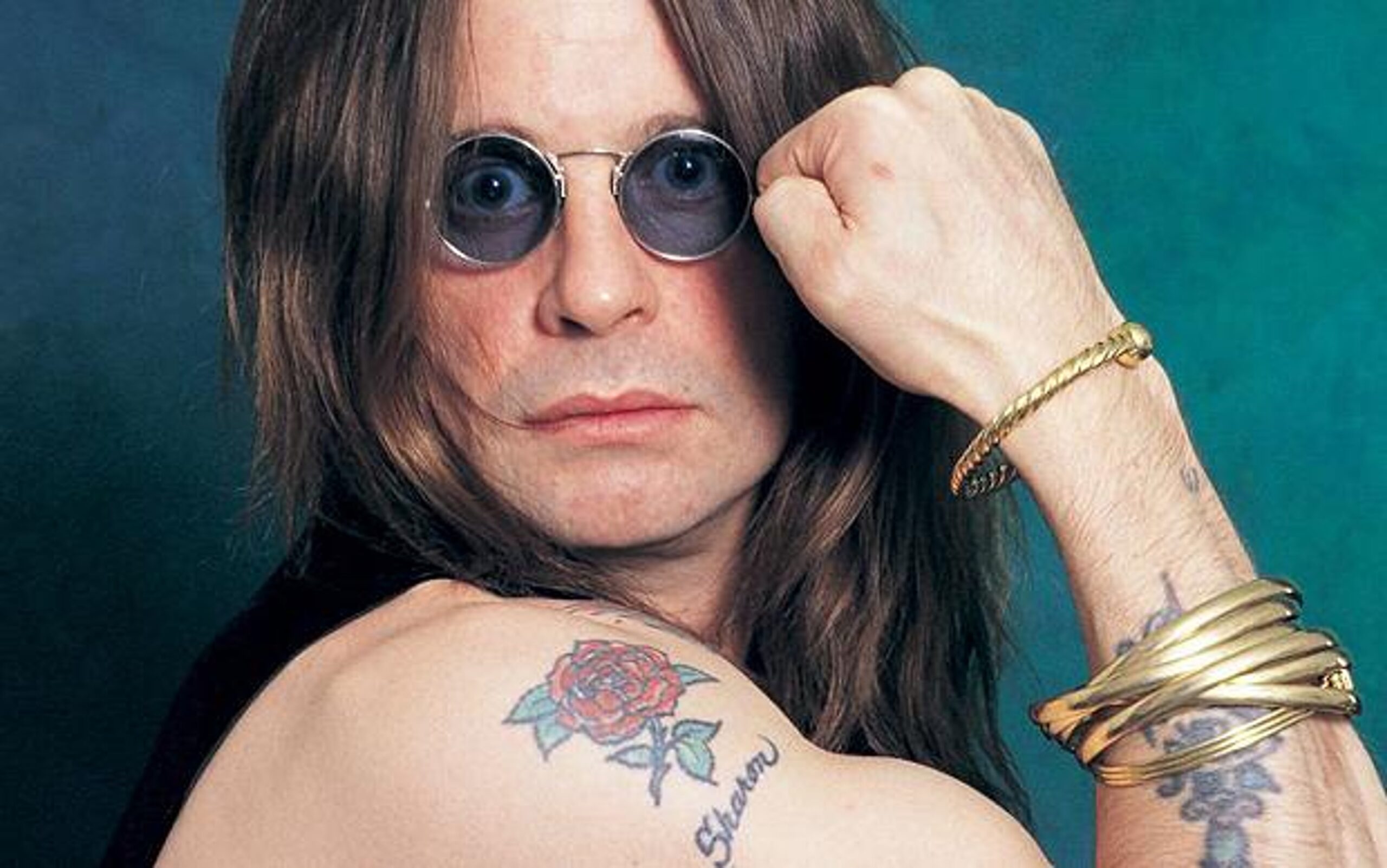
The Sharon rose is one of the clearest personal tattoos

The rose and Sharon lettering on Ozzy’s upper arm are among his easiest tattoos to identify. The flower appears in several portraits, and the name beside it makes the tribute clear. It honors Sharon, who has been beside him through his Black Sabbath years, solo career and family life.

Next to monsters and dragons, the rose is a simple, sentimental design. The flower keeps the tribute easy to read, while the surrounding ink gives it a darker rock-and-roll frame.

Ozzy Osbourne Sharon rose shoulder tattoo and forearm ink

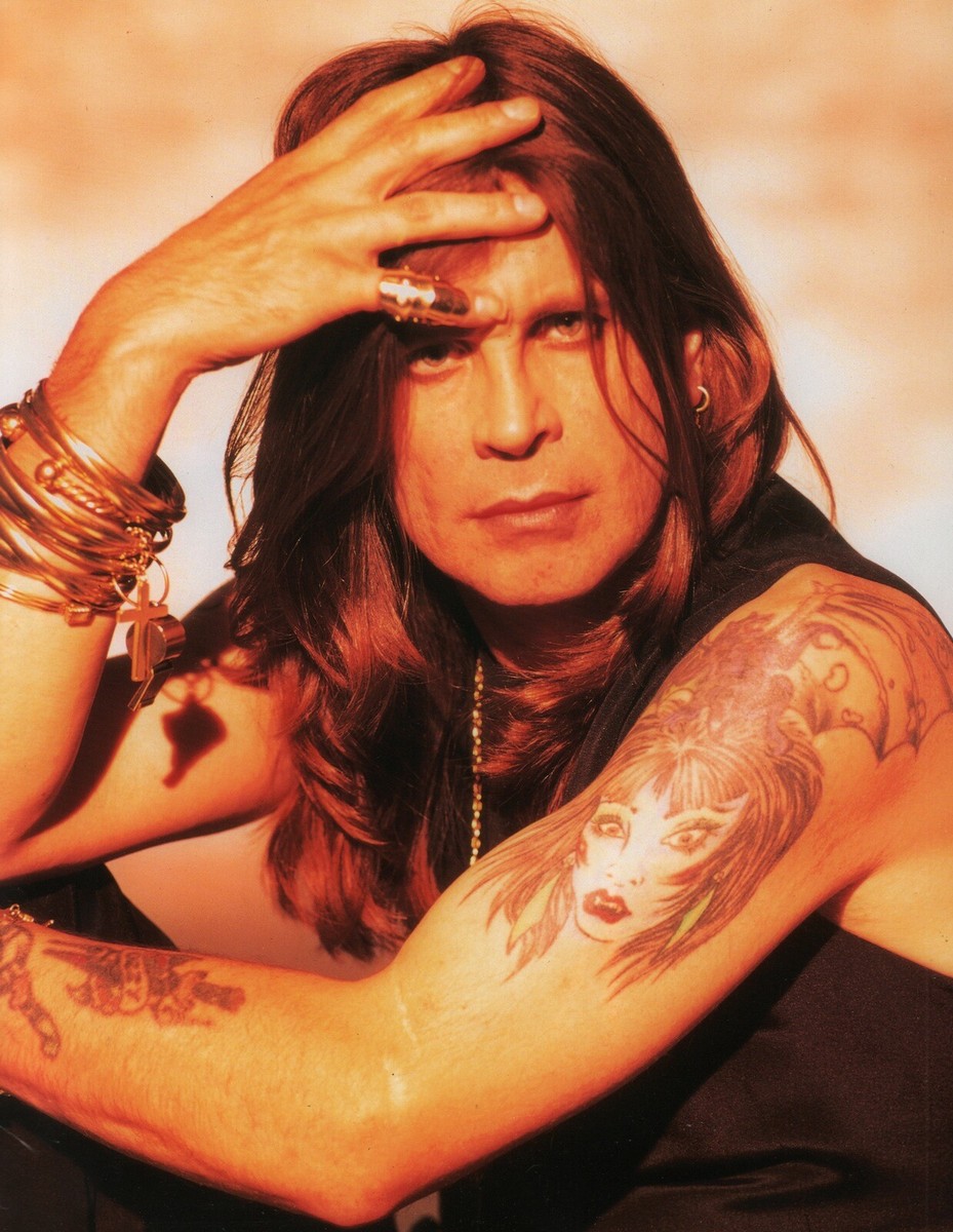
His older portraits reveal the arm pieces more clearly

A useful photo from the 1990s shows Ozzy seated with both arms in view. It captures a large portrait-style design on his forearm, flowers and lettering higher up, and more ink running toward the wrist. The placement is easier to see here than in a recent crop showing only one shoulder.

The different styles are visible in the same shot: some pieces use careful shading, while others are simple black outlines. They weren’t planned as one coordinated design. Ozzy added them at different times, and the arms hold traces of those eras.

Ozzy Osbourne tattooed arms and hand ink visible in a 1995 portrait

Ozzy’s tattoos are not just about the chest piece

The dragon gets the attention, but it isn’t the whole collection. The OZZY lettering is on his hands; the upper arms have flowers, names and older designs; the forearms carry denser work, including a portrait and smaller symbols. Depending on the photo, more lines show around the wrists and lower arms.

Calling the collection a full sleeve can be misleading. With his arms crossed over his chest, some photos make them look almost completely covered. Other views show open skin and separate pieces. Both are accurate: the tattoos built up over decades.

Ozzy Osbourne colorful arm tattoos and sleeve work visible in a portrait

What can we actually confirm about the meanings?

The story behind the OZZY knuckles is well established because Ozzy has told it publicly. The rose and Sharon lettering are easy to read as a tribute. The dragon and claw are clear visual motifs, but their exact meanings haven’t been consistently explained.

A tattoo can be worth looking at even when its owner hasn’t explained every detail. Ozzy’s pieces carry an old-school rock look: names, dramatic creatures and bold color, left to age rather than redesigned for a fresh social media photo.

For more heavy-music ink, see Rob Zombie’s horror-inspired tattoos, Lemmy Kilmister’s Ace of Spades ink or Zakk Wylde’s bat hand tattoo. Each has a different feel, but all three connect body art with stage identity.

Why Ozzy’s tattoo style still feels like him

Ozzy’s tattoos don’t look like they were chosen to follow one trend. Some are bright, others rough; the rose is sentimental, and the dragon and knuckle letters are dramatic. The chest piece gives him a signature image, the rose honors Sharon, and OZZY is written where everyone can see it when he raises a hand.

Together, the tattoos feel lived in rather than planned as a matching set. They appear in photos from different years, added at different points in his life. That age and variety are part of the appeal for anyone who likes body art with some history.

In short

Ozzy Osbourne’s best-known tattoos include the hand-poked OZZY knuckles, the colorful dragon-and-claw chest work, the Sharon rose and older arm pieces. The photos show how the ink grew alongside his career. Some designs are easy to identify; others are visible but don’t have a confirmed explanation.

The short video below shows Ozzy talking about tattoos. The larger pieces are easy to spot in the photos; the smaller marks are harder to pin down.

Dak Prescott Tattoos: His Leg Sleeve, Lion and Family Tributes

Dak Prescott’s tattoos read like a personal record. The lion on his shoulder, the family tributes and the large sleeve on his right leg point to people and places he has talked about.

The designs connect to his mother, his brother Jace, his Louisiana childhood, his faith and the athletes he admired. Even the playful details have a story behind them.

Here are the tattoos that show clearly in photos, along with the meanings Prescott has shared.

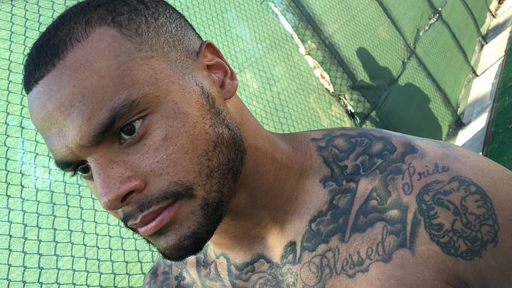
Dak Prescott’s lion and Blessed chest tattoo

One of Prescott’s earlier tattoos pairs a lion on his shoulder with the word Blessed across his upper chest. He has said his mother drew the lion. The idea of a group of lions being called a pride gave the design a family connection.

The drawing makes this one of his more personal tattoos. The lion is bold and easy to see, while the word Blessed adds the idea that Prescott feels fortunate to have reached this point in his life.

It also shows how the collection grew. The shoulder piece is built around one image and a little lettering; the later work on his leg brings together many separate references.

Dak Prescott lion shoulder tattoo and Blessed chest lettering

The huge right leg tattoo sleeve

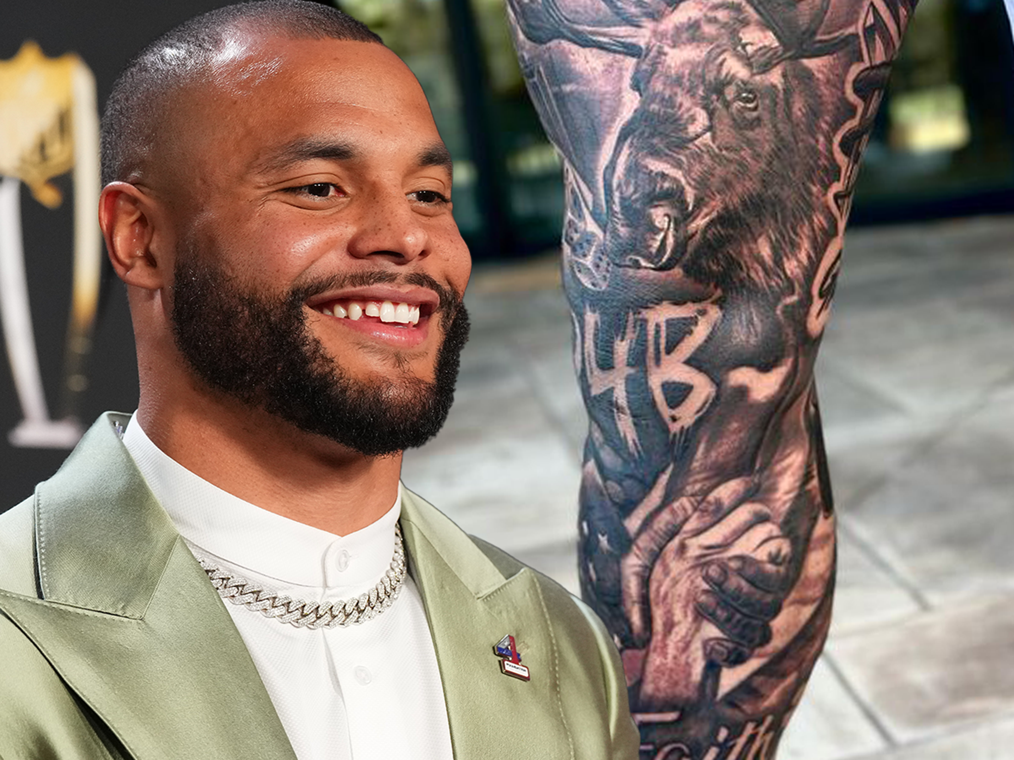
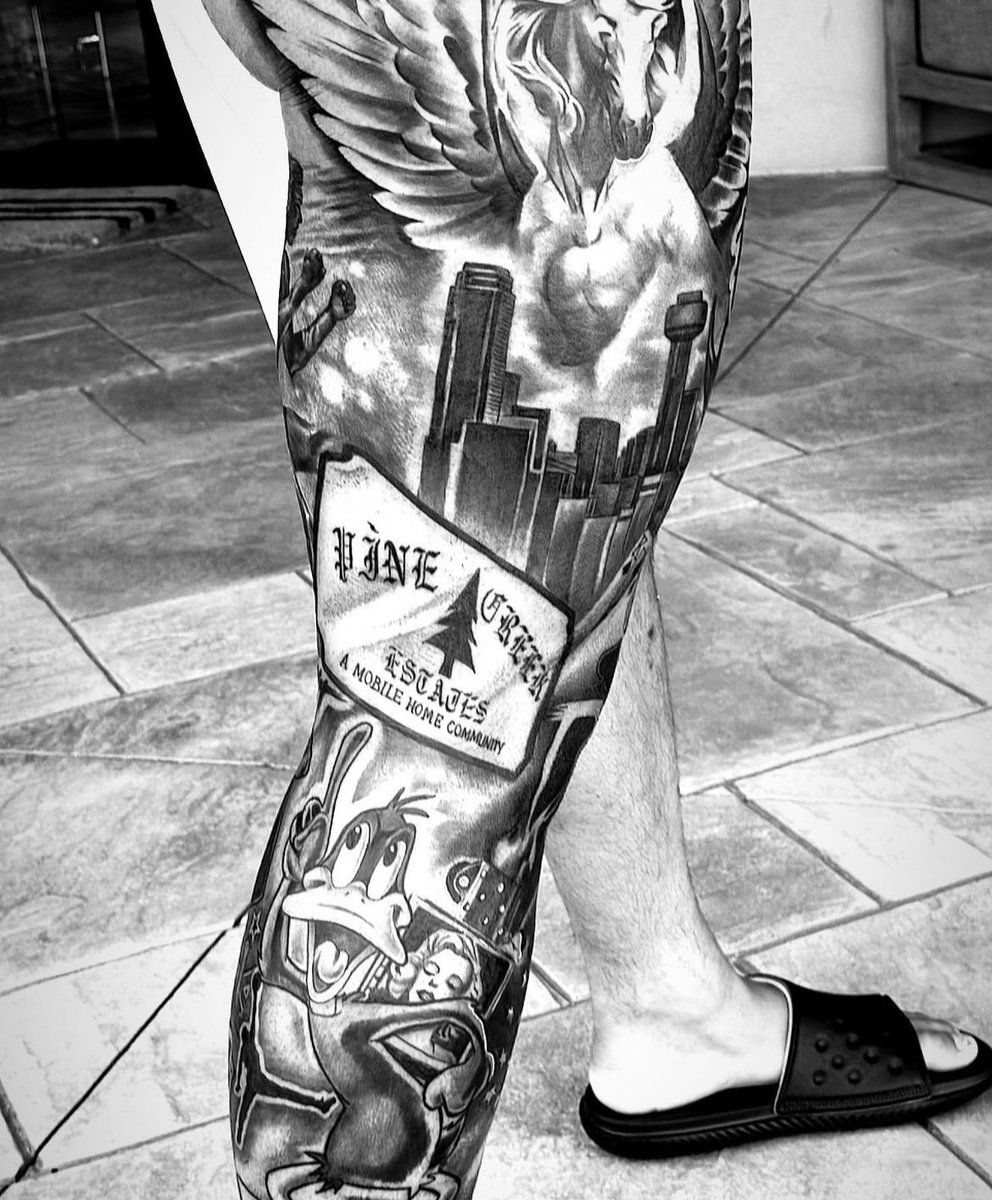
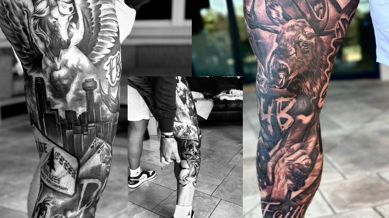
Prescott’s largest tattoo is a black-and-gray sleeve covering most of his right leg. It brings together a city skyline, animals, cartoon details, lettering and sports references.

The piece runs from high on his leg toward the ankle, so different parts show depending on what he’s wearing. Close-up photos show darker shading joining the separate scenes and keeping the sleeve from looking like stickers set side by side.

The Pine Creek Estates sign refers to the Louisiana mobile-home community where Prescott grew up. It might look like an unusual detail at first, but it makes the design specific to his life rather than a general football tattoo.

Dak Prescott leg tattoo showing family and hometown tributes

Moose, Pegasus, Kobe and the people he carries with him

Some of the smaller images on the sleeve point to family. A moose honors Prescott’s late brother Jace, while a Pegasus is tied to his late mother Peggy. Those tributes give the large tattoo a personal focus beyond its size.

Prescott also included athletes he admired: Kobe Bryant, Michael Jordan and Muhammad Ali. Their references sit among the other images instead of reading as a row of names. The sleeve feels more like a visual diary than a shrine.

There’s a lot to notice in the design. The skyline may catch your eye first, then the Pine Creek Estates sign, a cartoon character or a sports reference. Taken together, the details read like a record of the people and places that shaped him.

Dak Prescott full leg tattoo sleeve with skyline and Daffy Duck

The Faith lettering near his ankle

The word Faith sits near the bottom of Prescott’s leg, close to his ankle. It’s easy to miss among the larger pictures, but it gives the sleeve a clear point of focus.

Prescott has talked about faith as a steady part of his life. The short word fits among the family and hometown references, and it’s easier to read than another portrait or character would be.

That small piece gives the leg sleeve a quieter moment between the larger scenes.

Dak Prescott leg tattoo showing the Faith lettering and sleeve details

Why the tattoo session became a story of its own

The size of the leg tattoo drew attention, as did the session itself. The work took around ten or eleven hours, and Prescott was sedated. That’s a long appointment, especially for a piece covering so much of his leg.

Photos from the process show Prescott with the artist before the sleeve was finished. Some also show his older arm tattoos beside the new leg work, giving a sense of how the design came together. It took planning; it wasn’t a quick choice from a flash sheet.

People around the Cowboys were surprised by the finished piece. Prescott arrived with a swollen leg and a large new tattoo, and even those close to the team hadn’t expected it to be so big. The number of specific references suggests he had a clear idea of what he wanted.

Dak Prescott during the process of getting his leg tattoo

Dak Prescott’s tattoos keep the family story in view

The lion connects to Prescott’s mother. The leg sleeve brings in his brother, his mother, his childhood home, his faith and the athletes who inspired him. Even the playful Daffy Duck detail has a link to his football identity and the touchdown celebration fans recognize.

The pieces range from realistic shading to cartoon art and lettering, but the personal references give them a shared thread. The sleeve is busy because it holds a lot of separate memories.

If you like athlete tattoos with personal stories, Rhea Ripley’s tattoos are another example of body art that grew alongside a career. Prescott’s work is less symmetrical and more like a collage, while both collections mark different chapters.

Prescott’s tattoos are large, busy and personal. The leg sleeve gets most of the attention, but the lion, the lettering and the family tributes give the collection its meaning.