
FLETCHER has never looked like someone who needs a costume to sell a song. The clothes can change, the hair can change, and the lighting can get as dramatic as a music video wants, but there’s usually something direct about the way Cari Fletcher walks into a room. Her tattoos fit that same mood. They’re visible without being the whole outfit, and they look lived-in rather than placed there for one photo call.
She isn’t the kind of celebrity with a neat public list of every tattoo, every date, and every meaning. That’s actually useful here. The clearest photos show the work on her arms, but they don’t come with a tidy museum label for each piece. So the fair way to read them is by what the images really show: line, scale, placement, and how the designs move when she’s holding a mic or a guitar.
FLETCHER’s public image has always leaned emotional and unfiltered. Her interviews talk openly about music, relationships, identity, touring, and the strange pressure that comes with turning real life into pop songs. The tattoos sit inside that world without needing to be translated into a fake backstory. You can look at the ink, notice the choices, and leave the parts she hasn’t explained alone.
FLETCHER’s Arm Tattoos Are the Main Event
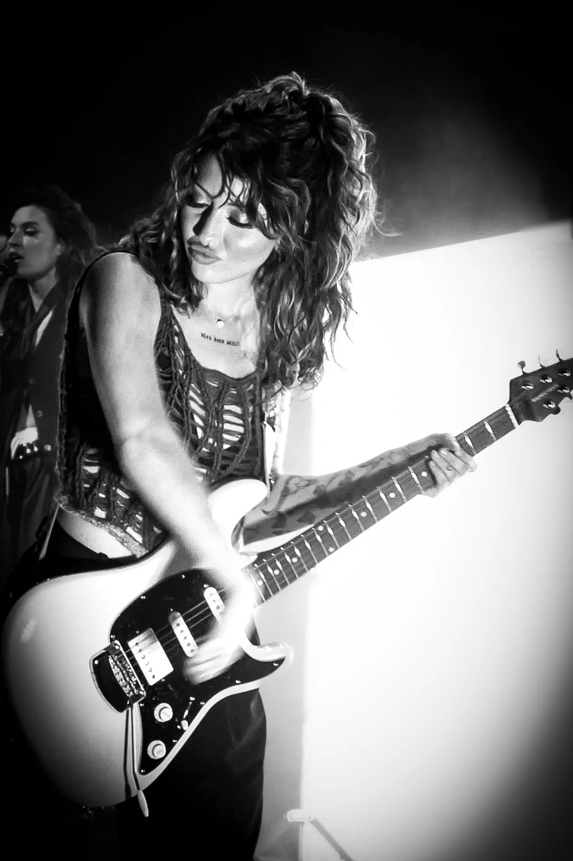
In performance photos, the first thing that stands out is the amount of work carried on FLETCHER’s arms. A sleeveless top or a loose vest lets the pieces appear in flashes as she moves, then the microphone, guitar, or stage shadow covers them again. That movement is part of why the tattoos look so good in photographs. They aren’t frozen on a flat sheet of paper. They bend around the arm and break up whenever she reaches for an instrument.
The close black-and-white concert frame above shows more than one area of ink at once. There’s a larger piece around the upper arm, darker marks down the lower arm, and smaller details that are harder to isolate without turning the image into a guessing game. The overall effect feels patchwork rather than like one planned sleeve. The tattoos have room between them, and the open skin keeps the arm from becoming a single heavy block.
That balance matters if you’re looking at FLETCHER for ideas. A collection doesn’t have to start with one giant centerpiece. A person can build around small pieces, let a few designs sit apart for a while, and decide later whether the empty space still feels right. The photos suggest that’s the lane her ink occupies: separate marks that share an attitude, not a rigid theme.
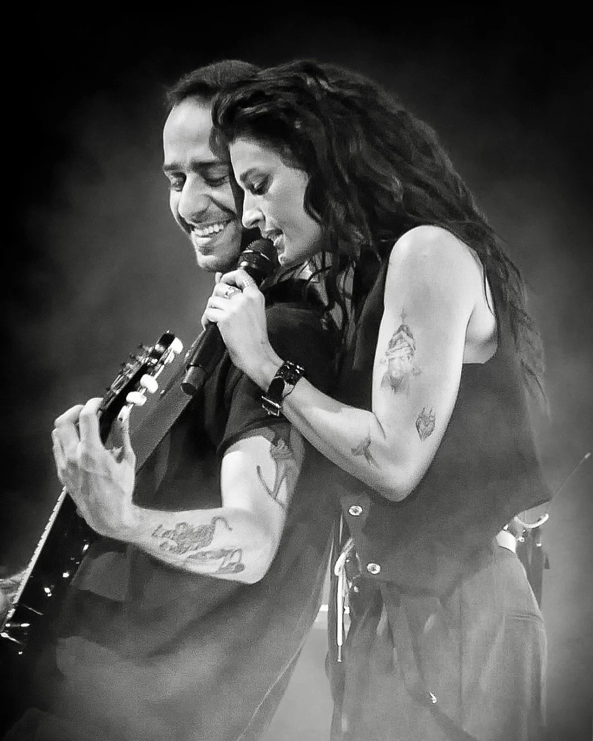
This second performance photograph gives a better look at how the designs sit together. The upper arm piece reads clearly, while the lower arm has its own smaller shapes and linework. The image is grainy because it comes from a live setting, but the tattoos still hold their edges. That’s a good reminder that strong tattoo work doesn’t only look good in a bright studio close-up. It should still have a clear rhythm when the light is messy and the body is moving.
There’s also a nice contrast between the softness of the black-and-white image and the toughness people often attach to rock-show styling. The tattoos aren’t shouting for attention. They’re part of the frame, like the guitar strap or the rings on her fingers. When the design is placed well, it can support the whole look without turning every photo into a tattoo reveal.
Close Views of FLETCHER’s Upper-Arm Ink
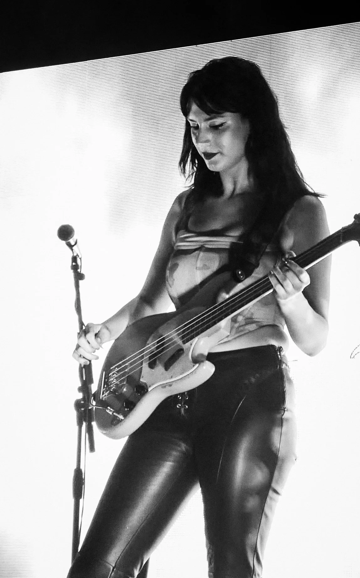
A closer photo makes the upper-arm work easier to read. The piece has a softer, illustrative feel, with dark areas sitting inside a larger outline instead of a wall of solid black. It follows the rounded part of the arm and leaves enough space around it that the shape doesn’t disappear when she bends her elbow.
That placement is practical as well as visual. The upper arm gives an artist room to draw something with a little breathing space, but it can still be hidden under a short sleeve when needed. It’s a forgiving spot for a design that might grow later, too. If someone wants to add another small tattoo nearby, there’s a natural way to build outward without forcing every line to touch.
The photo doesn’t prove a meaning, and there’s no reason to invent one. Fans often want a quick explanation for every celebrity tattoo, but ink doesn’t work like a press release. Sometimes the design was a milestone. Sometimes it was an idea that looked good. Sometimes the owner simply liked the drawing. Unless FLETCHER gives a piece a public story, the honest description is the visual one: an upper-arm tattoo with a detailed, sketch-like shape and enough contrast to remain readable from a distance.
If you like this kind of work, show your tattooer the way the design uses negative space rather than asking for an exact copy. Bring a few references that have the same looseness, then let the artist draw something that fits your arm. The best result will follow your own shape instead of looking like a decal borrowed from somebody else.
The Smaller Pieces Around Her Forearm
In another frame, FLETCHER’s forearm tattoos come through more clearly. There’s a smaller dark design below the main upper-arm piece, plus marks that sit closer to the elbow and wrist. They don’t all appear with the same weight. Some lines are light, some areas are shaded, and a few details almost vanish into the stage lighting.
That mix is what keeps the arm from feeling over-designed. Perfectly matching tattoos can look polished, but a group of pieces with different sizes and textures often feels more personal. It shows how somebody actually collects tattoos over time. One design gets added, then another one lands in a different mood, and the arm slowly develops its own visual language.
Forearm placement changes the way a tattoo is seen. A design on the outside of the arm faces the room when you hold a microphone. A design on the inner arm turns private until you move your hand. On stage, those angles keep changing. The same tattoo may be obvious in one song and completely hidden in the next, which gives the collection a little movement instead of presenting it like a fixed gallery wall.
It’s also a useful spot for people who want ink they can see themselves. You don’t have to twist around in a mirror to check a forearm tattoo. You can watch it heal, notice how the lines settle, and decide whether the next piece should sit near it or somewhere completely different. FLETCHER’s photos show how much personality can come from a few separate designs without filling every inch.
Why FLETCHER’s Tattoos Work on Stage

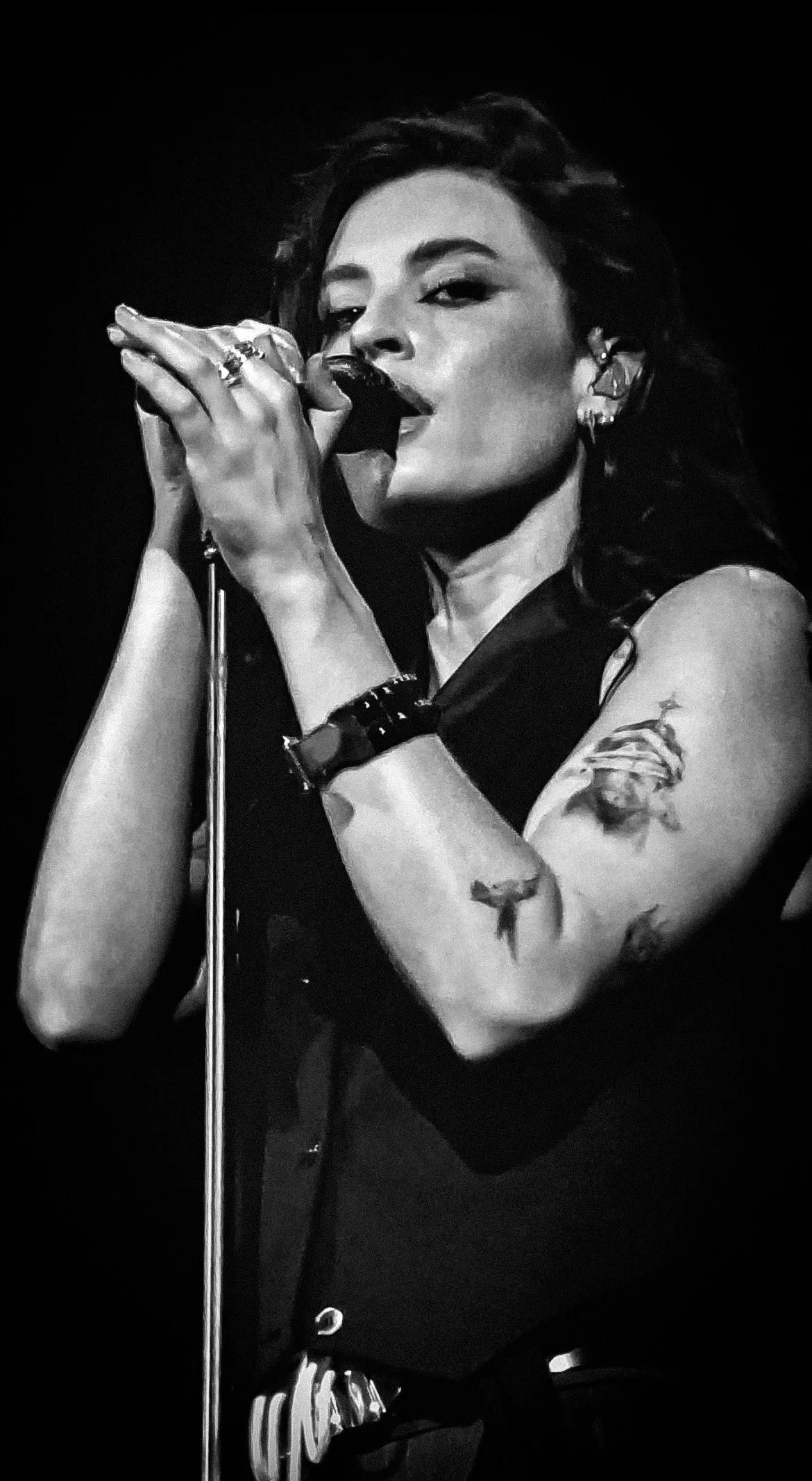
This close performance shot is a good example of why tattoo placement matters as much as the drawing. FLETCHER is singing into a microphone with one arm lifted, so the upper-arm tattoo faces the camera almost by accident. The piece reads because the arm is doing something natural. It isn’t posed in the stiff way people often hold themselves for a tattoo photo.
That kind of image can tell you more about placement than a perfectly cropped close-up. You get the relationship between the tattoo and the body: where the design disappears under a sleeve, how it wraps toward the back, and which parts show when the elbow bends. If you’re planning your own tattoo, those details are worth paying attention to. A design that looks perfect while your arm is straight may need a different angle once you’re moving.
The upper arm also works with FLETCHER’s stage clothes. Vests, sleeveless tops, and open jackets let the ink show without making it the only thing people see. That’s a flexible choice for somebody who performs often. The tattoos can be part of the look, but they don’t lock every outfit into the same visual idea.
Her arm tattoos also sit comfortably beside the other details she wears: rings, bracelets, dark fabrics, and instruments. Nothing has to match perfectly. The ink adds texture to the styling, and the styling gives the ink different surroundings. Black-and-white photos make the pieces feel moody and graphic. A brighter portrait makes the same tattoos look softer. The artwork hasn’t changed; the setting has.
There’s No Need to Force a Meaning Onto Every Piece
FLETCHER’s music is personal enough that people naturally want to connect the tattoos to specific songs or chapters of her life. That can be a fun way for a fan to read the images, but it shouldn’t be presented as fact. Public photos confirm where the tattoos are and what the visible designs look like. They don’t automatically confirm why she got them.
That distinction is important when you’re designing your own ink. A tattoo can matter to you without having a clean sentence attached to it. You might like the shape, remember a place, mark a change, or simply want something that looks good on your body. Meaning can be private, unfinished, or even a little unclear. The design doesn’t become less real because it can’t be explained in an interview.
FLETCHER’s collection also shows why small pieces don’t have to be treated as filler. A smaller tattoo can hold its own when it has a smart position and enough space around it. The main mistake is usually shrinking a design until the lines have nowhere to go. If you want a little piece on the forearm, talk to the artist about the size it needs to age well, not just the size that looks tiny in a screenshot.
How to Borrow the Feel Without Copying FLETCHER
Start with the attitude, not a screenshot. FLETCHER’s tattoos feel collected, slightly rough around the edges, and comfortable next to a busy life. You can get that feeling with different subjects. Try a small drawing with visible line variation, a shape that leaves some skin open, or a piece that follows the curve of your arm instead of sitting like a sticker.
Bring your tattooer the photos for placement reference. Show how an upper-arm design wraps, how a forearm mark sits below the elbow, or how much space you like between pieces. Then ask for a fresh drawing. An artist can keep the loose feeling while adjusting the size and angle for your anatomy. That step is what turns inspiration into a tattoo that actually belongs to you.
Think about how your arm moves before you book. Hold a phone, lift a glass, bend your elbow, and turn your wrist. A design that follows the arm in those positions will feel more natural than one chosen from a flat mock-up. FLETCHER’s performance photos make that point over and over: the tattoos look convincing because they move with her.
Finally, leave some space. You don’t have to fill the whole arm in one session. A little breathing room makes each piece easier to see and gives you options later. If you decide you want another tattoo, you can build around the existing marks. If you don’t, the collection still looks finished instead of crowded.
The Bigger Picture
FLETCHER’s tattoos work because they feel like part of her everyday visual language. They show up in concert photos, interviews, portraits, and candid moments without demanding a full explanation every time. The main lesson isn’t that everybody needs the same arm work. It’s that a tattoo collection can stay personal when the designs are chosen for how they feel on the body, not just how they look in a saved image.
If you’re into arm tattoos with a little texture and a lot of movement, her photos are worth studying. Look at the spacing. Notice how the pieces appear when her elbow bends. Pay attention to which lines stay readable under stage light. Then take those ideas to an artist and make something that fits your own life.