Wrestlers

Amy Dumas Tattoos: Lita’s Colourful Arm and Sleeve Ink

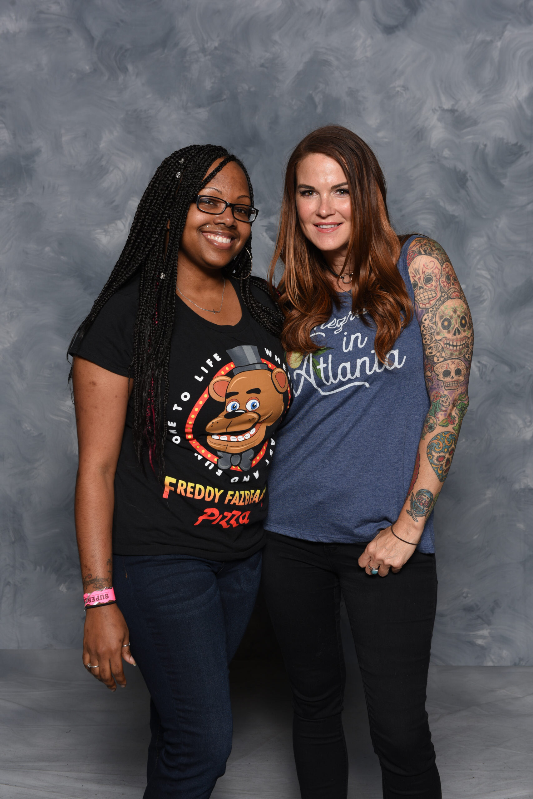
Amy Dumas is better known to wrestling fans as Lita, but her tattoos have always been part of the look rather than a small extra detail. Her arm work is bright, busy and easy to recognise, with skull imagery, rounded shapes, darker outlines and splashes of colour that travel from the shoulder toward the forearm. The collection feels built over time, which is why different photos bring out different parts of it.

There is also a useful difference between what can be seen and what has actually been explained. Some designs are widely identified in tattoo references, while the personal story behind every small mark is not public. Amy Dumas tattoos are best read visually: start with the large shoulder piece, follow the sleeve down the arm, then look for the smaller details that keep the whole thing from feeling like one flat block of ink.

Her own interviews add a little context too. Dumas has spoken about getting her first tattoo and about the gap between Amy and the Lita character. That makes the collection interesting without needing to invent a meaning for every line. The photographs below focus on the designs that are actually clear enough to study.

Amy Dumas’s colourful arm tattoos are the best place to start
Amy Dumas Colourful Arm Tattoos

The first thing you notice is colour. Dumas’s arm is not built around plain black fill alone. The larger shapes use green, red, yellow and warm flesh tones, while darker outlines keep the busy artwork readable from a distance. That colour gives her tattoos a lively, almost illustrated feel, which fits the energy of her wrestling persona without making the designs look like costume graphics.

The arm also shows why a good photo matters. A quick stage shot can make the sleeve look like one dark shape, but a close, well-lit frame separates the outlines and lets you see the smaller pieces around the main artwork. Her shoulder and upper arm carry most of the visual weight, while the forearm gives the colour room to stretch and change.

If you like tattoo ideas that feel personal instead of perfectly matched, this is a strong example. The designs do not need identical borders or one strict theme. They work because the palette and line weight create a loose connection across the whole arm.

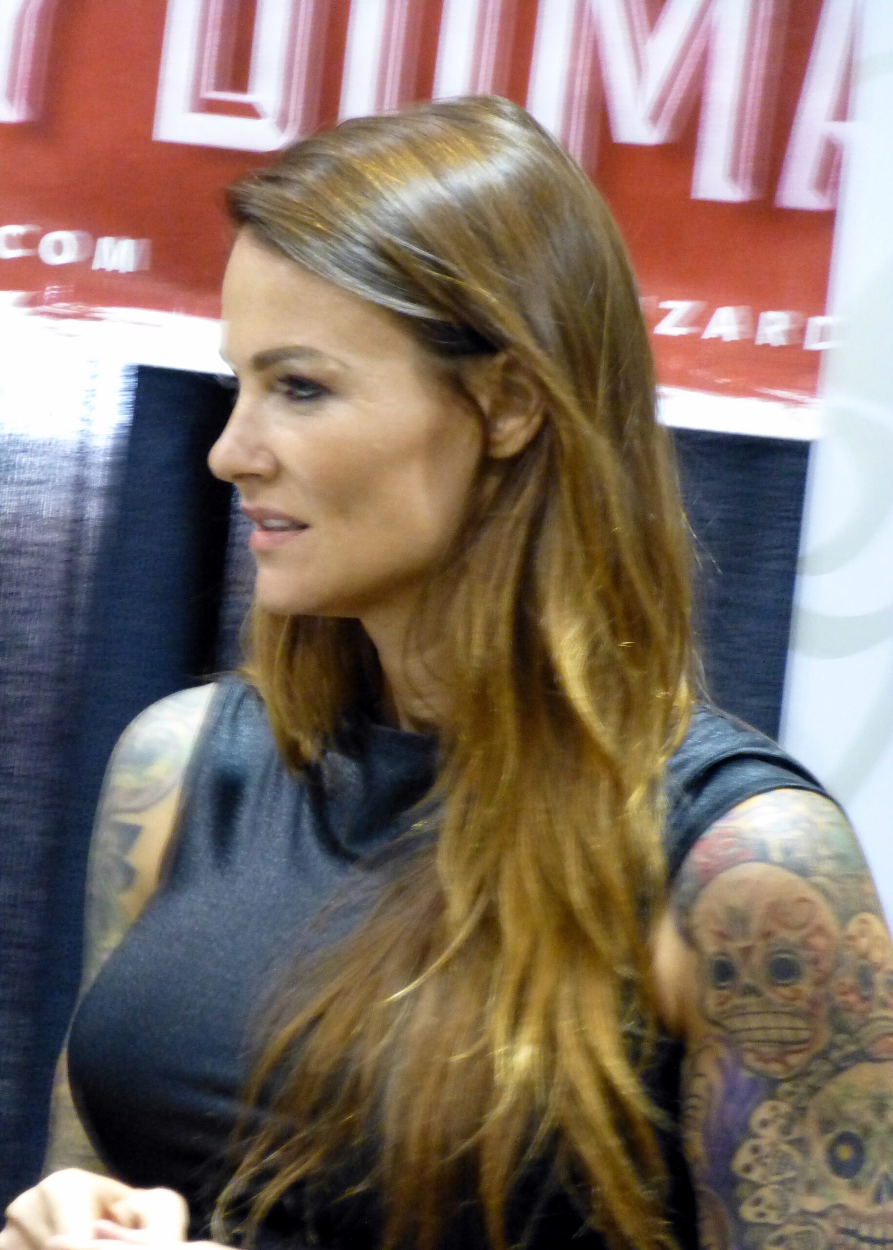
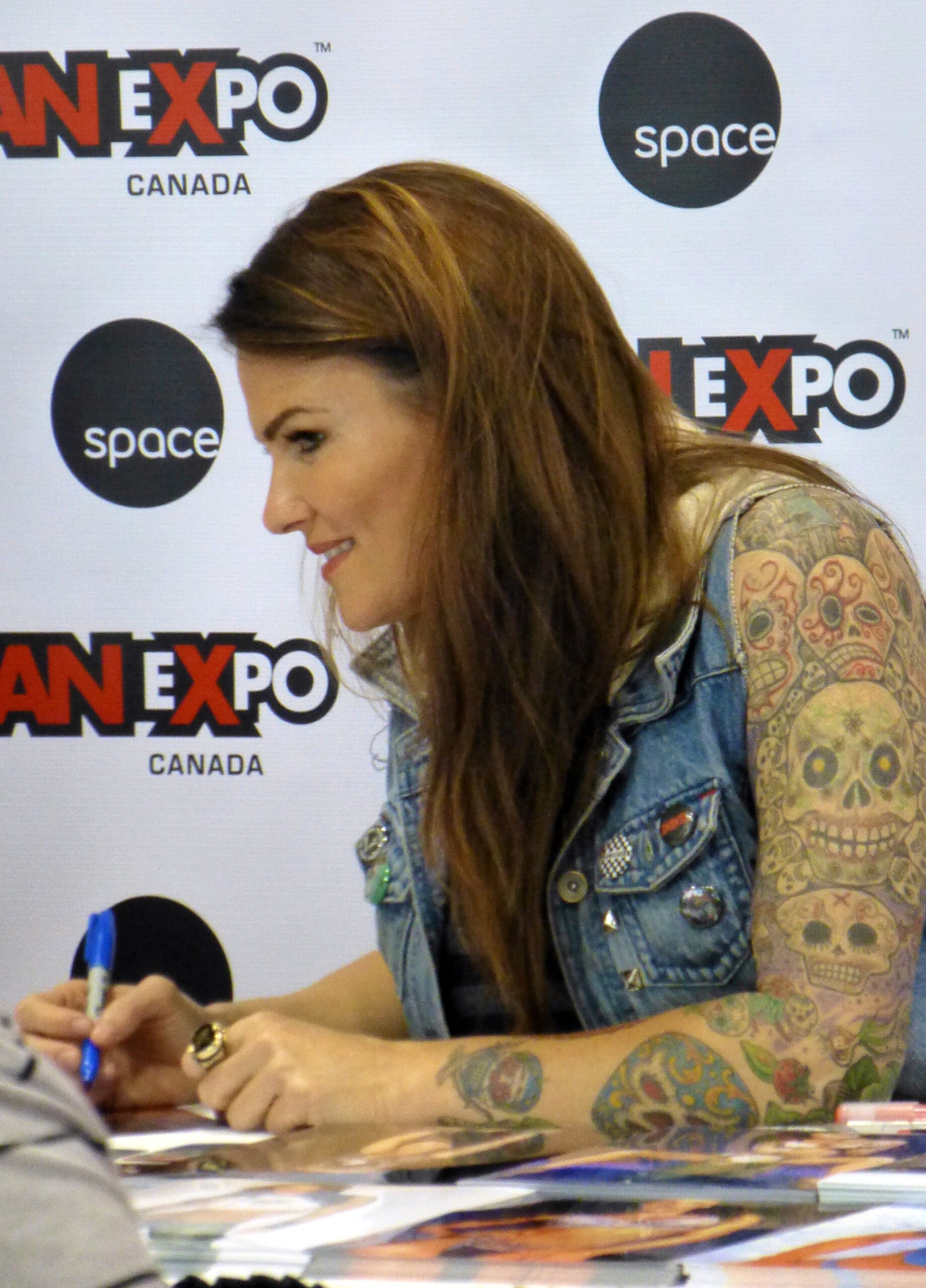
The left arm sleeve is packed with colour and rounded shapes
Amy Dumas Left Arm Sleeve Tattoos

A side view brings out the way the sleeve wraps around the arm. The shoulder sits high and rounded, then the artwork drops into the upper arm instead of stopping at a clean horizontal edge. You can see separate shapes touching and overlapping, which makes the collection feel more like a real sleeve built over years than a single piece planned in one sitting.

The rounded forms are important to the overall look. Skulls, curved faces and shaded shapes soften the transition between larger designs. There are hard edges in the outlines, but the colour keeps the mood from becoming too severe. That balance is one reason Lita’s tattoo style still stands out in old wrestling photos.

Placement-wise, the upper arm gives the boldest statement while still being easy to cover with a shirt. The design becomes visible as soon as the sleeve lifts, which is a practical choice for anyone who wants a large tattoo without putting it on the hands or face.

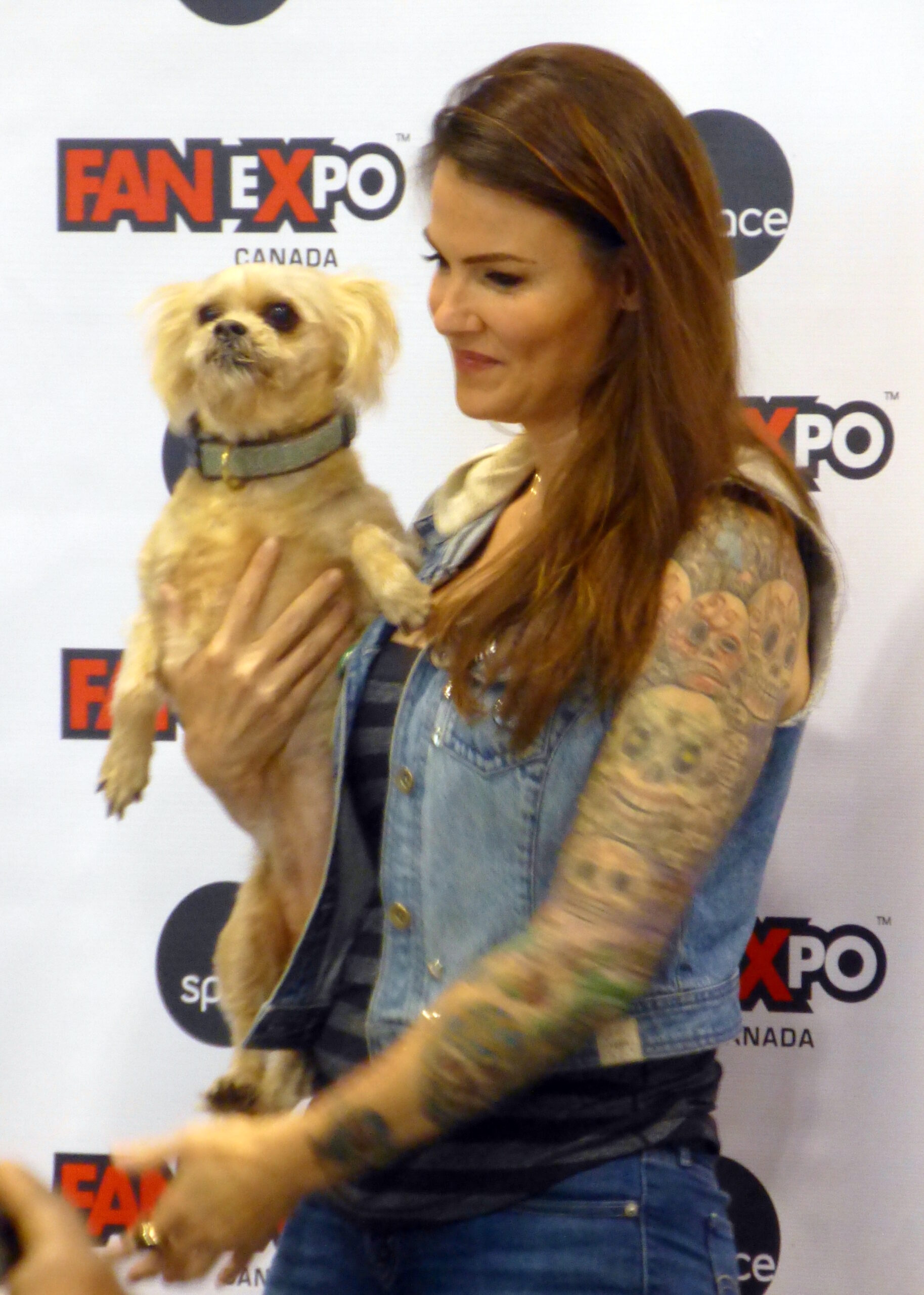
The skull sleeve gives Amy Dumas’s ink its signature edge
Amy Dumas Skull Sleeve Tattoo Detail

Skulls are the part of the collection most people remember, but they are not all presented in the same way. Some are larger and easier to read, while others sit inside the wider colour field. The repeated skull shapes give the sleeve a clear identity, yet the different expressions and levels of shading stop it from looking like a row of copied flash designs.

The close view also shows how the artwork uses negative space. Small gaps between lines let the skin breathe, and the darker borders help each skull hold its shape when the arm bends. That matters on a working arm because a tattoo is constantly moving. A design that looks clear when the arm is straight still needs enough structure to survive changing angles.

There is a punk feel to the imagery, but it is not just shock value. The colour, cartoon-like faces and layered placement make the sleeve playful as well as dark. That mix is a big part of why Lita’s arm tattoos remain so recognisable.

The three-eyed shoulder tattoo is the visual anchor
Amy Dumas Shoulder Gargoyle Tattoo

The shoulder piece acts like the opening scene for the rest of the sleeve. It is larger, more central and easier to spot than the small forearm details. The eye-like feature gives the design a strong focal point, while the surrounding shapes pull it down toward the upper arm. From the side, the tattoo follows the curve of the shoulder instead of sitting like a flat sticker.

That placement is doing a lot of work. A shoulder design can be shown when the wearer is in a vest, but it can disappear under a regular T-shirt. It also gives the tattoo a natural frame: the round muscle creates an edge at the top, and the rest of the sleeve can grow below it.

Descriptions of Dumas’s tattoos often call this a three-eyed demon or gargoyle-style piece. The exact label matters less than the visual effect. It is a high-contrast character design that makes the whole arm feel intentional, even though other pieces are smaller and more varied.

Her forearm tattoos keep the colour moving down the arm

Amy Dumas Forearm Colour Tattoos

The forearm is where the collection becomes more detailed. It carries smaller shapes, colour changes and pieces that are easier to miss when the camera stays on the shoulder. The strawberry and climbing-plant design is one of the named details connected with her forearm, and the close photos show why this area deserves its own look.

Forearm tattoos are naturally more exposed than upper-arm work. They appear when the sleeves are short, during a wrist lock or even when the arm rests on a table. Dumas’s designs use that visibility well. The artwork is colourful enough to catch attention, but the lines still give it structure when seen from a few steps away.

This is also the section to study if you are planning a sleeve gradually. A forearm does not need to copy the shoulder. It can carry smaller motifs, use a different balance of colour and still connect through outlines and repeated shapes. That approach leaves room to add later without forcing every tattoo into the same size.

The full arm layout shows how the separate tattoos work together

Amy Dumas Full Arm Tattoo Layout

Step back from the details and the collection makes more sense as one long route from the shoulder to the wrist. The upper arm has the biggest visual anchor, the middle section carries the skull-heavy density, and the forearm adds smaller colour notes. None of those areas needs to be identical for the arm to look complete.

That is the main lesson in Amy Dumas’s tattoo layout. It has a clear personality, but it does not look over-designed. The artwork has room for old pieces, new additions and changes in scale. The result is busy in a good way: there is always another line or colour patch to notice, but the main shapes do not disappear.

Photos from different years also remind you that tattoos are snapshots. Ink can soften, colours can age and clothing can hide a whole section. The safest descriptions stick to what the image shows. In Dumas’s case, that is more than enough: a memorable shoulder design, a colourful skull sleeve, detailed forearm work and a collection that became part of Lita’s identity.

At the bottom of the article, the interview clip gives a little more of Dumas’s own voice. It is a useful companion to the images because tattoo photos show the artwork, while her words explain the person behind the character.

The collection also works because it has different levels of distance. From across a room, the shoulder and skull shapes create the first impression. Up close, the smaller colour patches, fine outlines and separate forearm motifs make the arm feel much more personal. That is a useful way to look at any sleeve: notice the silhouette first, then study the details that give it character.

The photos show why a tattoo guide should use more than one angle. A front-facing portrait can hide the outer shoulder, while a side view may show the full wrap but lose the hand or wrist. Dumas’s set gives both kinds of information. One frame explains the main composition, another shows the three-eyed focal point, and the closer arm views make the smaller designs easier to separate.

The shoulder is the anchor, the skulls are the repeated rhythm, and the forearm colour keeps the design moving. That simple structure stops the sleeve from becoming visual noise. It also leaves a little breathing room between the largest pieces, so each tattoo can keep its own personality.

There is a practical lesson here too. If you want a bold upper-arm tattoo but still need flexibility, the shoulder and sleeve route gives you options. You can show it in a vest, cover most of it with a short sleeve, or build it gradually as your taste changes. Dumas’s arm does not look like a catalogue of identical designs, and that is exactly what makes it useful inspiration.
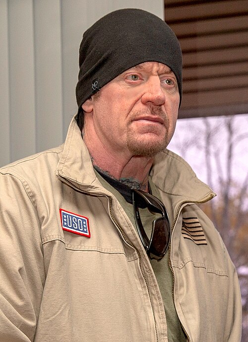
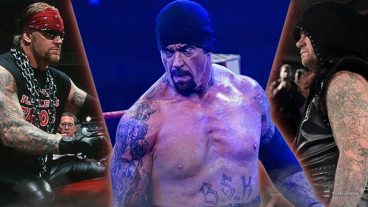
The Undertaker’s Tattoos Carry the Marks of a Life in Wrestling

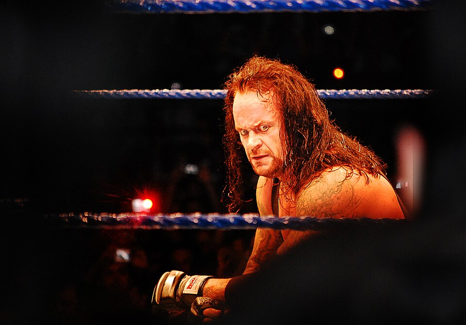
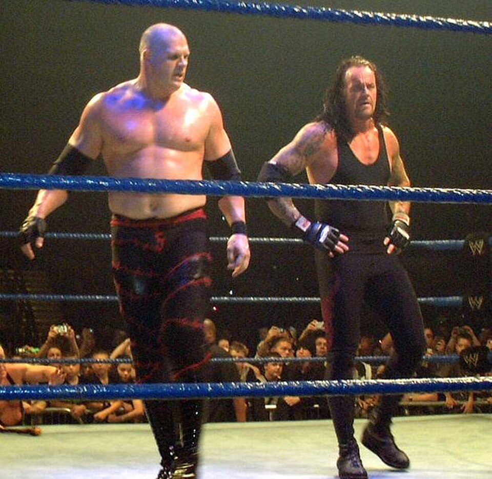
Mark Calaway built The Undertaker around mystery, ritual and a very specific kind of physical presence. His tattoos tell a quieter version of that story. The pieces sit across his arms, chest, neck and knees, and they have changed as his life moved from young wrestler to veteran performer and then to the retired figure fans still call The Deadman.

Some of the designs are famous enough to have become part of his silhouette. Others are easier to miss because they sit beneath ring gear or disappear under a beard and collar. This guide sticks to the tattoos that have been documented in close-up photographs and tattoo-history coverage, separating clear designs from online guesses. The biggest through-line is simple: Calaway’s ink is old-school, personal and tied to the people and eras that shaped him.

The long-running arm sleeves

The Undertaker chest and arm tattoos

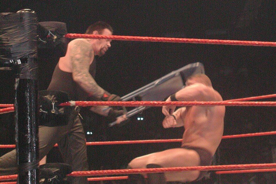
The first thing most fans notice is the dense work on both arms. The Undertaker’s sleeves are built from several traditional images rather than one modern blackout composition. Skulls, lettering, shaded shapes and larger figures sit close together, giving the arms a heavy, lived-in look. The designs read especially clearly when he is shirtless or wearing a sleeveless vest.

They also make sense in the context of his career. Calaway’s wrestling character relied on a dark, almost gothic visual language, and the tattoos reinforce that without looking like a costume accessory. The pieces are not neat matching bands. They feel collected over years, with different weights of line and shading showing that the work happened across different moments.

Photographs from his later career show how much the ink has settled into his overall appearance. The arm work is not a fresh reveal or a single recent project. It is part of the body fans remember from WrestleMania entrances, long interviews and behind-the-scenes footage. The tattoos look less like decoration than a record of time spent becoming The Undertaker.

The dragon on the upper chest

The Undertaker shoulder tattoo

One of the most recognisable pieces in the documented inventory is a large dragon on the upper-right chest. Tattoo-history coverage describes it as a blue, flame-like dragon, and older ringside photographs show the design spreading across the upper chest and toward the shoulder. It has the exaggerated movement of traditional tattoo art: a strong body, curling lines and a shape that stays readable from a distance.

The dragon is a useful example of why placement matters. On The Undertaker, the chest pieces sit above the neckline of his ring gear and become visible whenever he wrestles without a shirt. That made them part of the visual language of his most famous years. They were not hidden personal marks; they became part of the image fans associated with the character.

It is tempting to give the dragon a single symbolic meaning, but Calaway has not offered a universally accepted explanation that covers every detail. The solid fact is the design itself and its location. The upper-right chest dragon is one of the anchor points of his tattoo collection, especially when viewed beside the darker portraits and lettering on the other side.

The chest portraits and darker figures

The Undertaker arm sleeve

Alongside the dragon, The Undertaker has chest imagery that has often been described as a hooded skull or a darker portrait. The shapes are harder to identify in every photograph because lighting, body angle and age change the way the shading reads. Still, the chest is clearly more than a single dragon. There are separate dark forms on both sides of the upper torso.

These designs fit the visual world of the early Undertaker without needing to be treated as literal props. Skulls and shadowed faces were common in the tattoo language of the period, but on Calaway they also connect with the character’s funeral imagery, gothic entrances and long-running association with mortality. The tattoos are a visual bridge between the man and the persona, even when the man himself is speaking plainly.

The chest work is also where low-quality photographs cause the most confusion. A shadow can make a skull look like a cloak, and a cropped image can remove the part of a design that explains its shape. That is why the clearest descriptions stay broad: dragon, skull-like and hooded imagery, and heavy traditional shading are supported; highly specific names for every figure are not.

The Sara tattoo on his neck

The Undertaker face and neck tattoos

The neck tattoo is among the most personal pieces in the collection. It reads “Sara”, a reference to his former wife Sara Chirie Frank. The lettering sits low on the neck and is especially visible in close portraits where his collar is open. It is a small design compared with the sleeves and chest, but it carries more direct biographical information than the larger gothic imagery.

The tattoo has also become part of the public record of his life because it was later covered or altered after the relationship ended. That history is important. Old photographs show the name more plainly, while later images can make the area look darker or less legible. It is not useful to pretend every era shows exactly the same tattoo.

What remains consistent is the placement and the original dedication. Neck lettering is difficult to hide completely, so the piece was always going to be visible during interviews and ring entrances. It is a reminder that even a larger-than-life character can carry very ordinary, very personal history on his skin.

The BSK lettering and the wrestling circle around him

The Undertaker first tattoo

Another well-known mark is BSK, lettering associated with the backstage wrestling group sometimes called the Bone Street Krew. The initials connect The Undertaker to a circle of performers and friends from the era when wrestling locker rooms were built around strong personal alliances. The tattoo is not simply a random abbreviation; it points to the community behind the character.

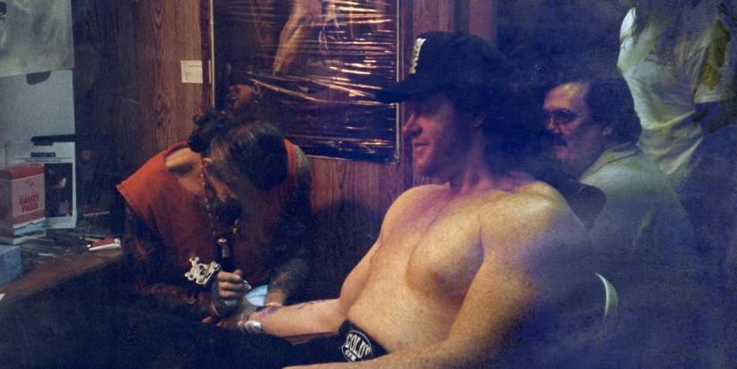
Photographs from tattoo sessions and older interviews are useful here because they show how the design came into his life. The first-tattoo image is not a clean studio close-up, but it helps place the ink within his timeline. The piece belongs to a period when tattoos were being added as markers of friendship, loyalty and shared experience rather than as carefully branded social-media moments.

The lettering is also a reminder that The Undertaker’s tattoos are not all about horror imagery. The collection includes names, initials and group references alongside dragons and skulls. BSK adds a human, behind-the-scenes layer to an otherwise intimidating visual style.

The happy faces on his knees

The Undertaker forearm tattoo

Among the more surprising entries in the documented list are happy-face tattoos on both knees. They are small, playful and almost deliberately out of step with the grim reputation of The Deadman. That contrast is part of the appeal. The same wrestler known for funeral bells and dark chest art also has simple smiling faces placed where they could appear during a match.

The knee pieces are not always visible in photographs because trunks, pants and kneepads cover them. When they do appear, they soften the assumption that every tattoo on Calaway must carry a sinister meaning. A tattoo collection can hold jokes and private bits of fun alongside serious memorials and personal names.

Because the designs are simple, they are also easy to overdescribe. The reliable point is their placement and basic happy-face motif. There is no need to turn them into an elaborate character backstory. Sometimes a small smile is just a small smile, even on the knees of The Undertaker.

How the pieces changed across his career

The Undertaker shoulder and arm ink

The Undertaker’s tattoos look different depending on the era. Early images show a younger Calaway with a comparatively open upper body and clearer individual designs. Later photographs show more settled shading across the arms, a fuller visual mass and changes around the neck. Ring gear also affects what fans think is new. A vest can reveal the outer arm while hiding the chest, and a bare-armed entrance can make an old tattoo look newly discovered.

There is a useful timeline in those changes. Personal lettering appears alongside the traditional imagery, and the arms gradually become the most visually complete part of the collection. The tattoos are not a neat chronological chart, but their age and placement suggest additions made over decades rather than one coordinated session.

That slow build is part of why the ink suits him. The character itself evolved from a silent funeral figure into a more layered veteran presence, and the tattoos carry a similar history. The collection has accumulated rather than been designed all at once. Its rough edges are part of the story.

What is confirmed and what remains guesswork

The Undertaker full arm ink

The strongest documented details are the arm sleeves, the upper-right chest dragon, the darker chest figures, the Sara neck tattoo in its earlier form, the BSK initials and the happy faces on the knees. Those pieces appear across close photographs, wrestling coverage and tattoo-history reporting. They can be discussed without relying on fan art or game-model recreations.

Less certain are the exact identities of every chest figure, the dates of each addition and the full story behind every symbol. Public articles sometimes repeat different names for the same shaded design. A careful inventory should acknowledge that uncertainty. Clear placement is stronger evidence than a confident-sounding interpretation.

Seen together, The Undertaker’s tattoos are a map of his working life: dark imagery for the persona, lettering for relationships, and small details that reveal a sense of humor beneath the seriousness. They are old-school pieces with enough personal history to keep fans looking long after the entrance music stops.

Watch The Undertaker’s tattoo story

This tattoo-focused video from Paul Booth’s Last Rites discusses tattooing The Undertaker with a demonic portrait, making it the most relevant visual companion for the collection’s darker imagery.

Malakai Black Tattoos: Dark Chest, Arm and Back Ink

Malakai Black’s tattoos extend well beyond his arms. Wrestling photos show large pieces across his back, chest, shoulders and thighs, with smaller details on his hands. Black also wrestled under the name Aleister Black, so older images use that name for the same person.

The clearest references are the shots where the ink can actually be seen. A distant entrance photo may show who’s in the ring, but it won’t tell you much about tattoo detail. The five images here focus on his arms, chest, back or legs. The featured image is a separate portrait and doesn’t appear again in the article.

Some coverage of Black’s tattoos links them to dark, surreal and mythological ideas. That doesn’t establish the meaning of every symbol, though. Here, I’ll stick to visible placement, colour, scale and style rather than fill in a private story.

Malakai Black’s back piece carries the heaviest coverage

Malakai Black tattoos: high-resolution wrestling photograph showing Malakai Black's large back tattoo and upper-arm coverage from behind

The back is a useful place to start. In this rear view, the tattooing covers most of Black’s upper back and reaches across both shoulders. It takes up far more space than a small mark between the shoulder blades. Dark outlines and lighter gaps break up the larger shapes as they continue toward the arms.

That angle fills in what a front portrait can’t show. Black’s chest and arms are usually more visible in the ring, but the back adds another large area of work. From a distance, the pieces read as a connected field. Closer in, you can make out separate faces, curves and shaded sections.

We can describe the coverage without assigning each figure a meaning. Some tattoo coverage discusses dark, surreal imagery, but this photograph doesn’t establish what every part represents. It does show broad back coverage, substantial shading and artwork that follows the shoulders instead of ending in a neat rectangle.

The chest and legs make the collection feel connected

Malakai Black tattoos: large vertical ring photograph showing the chest, arms, legs and neck tattoos in one clear front-facing view

This front-facing ring photo shows how far the tattoos extend below the neckline. Ink crosses Black’s chest and shoulders, runs down both arms and appears again on his thighs. The pieces vary in scale: some are compact and detailed, while larger dark shapes remain easy to see from across the ring.

The thigh work can disappear in tighter photos of the upper body. Here, the ring gear leaves more of it visible around the thighs and knees. It gives the collection a more complete outline and shows how much a head-and-shoulders portrait leaves out.

Look at how the pieces are placed. The chest anchors the front, the arms hold a dense mix of details and the thighs have their own larger panels. The layout moves from small marks around the hands to bigger forms across the back, torso and legs.

The arm work mixes flowers, symbols and dense shading

Malakai Black tattoos: close high-resolution ring photograph showing floral, geometric and shaded tattoo work across both arms and chest

This closer ring shot makes the arm work easier to read than a wide entrance photo. Floral forms sit beside dark outlines, small symbols and shading that wraps around the biceps and forearms. There’s a lot on each arm, but the variation in scale keeps it from becoming one solid dark area.

The details shift as Black turns his arm. Larger images stand out on the outer biceps; lines and grey shading are more noticeable inside the arm and farther down the forearm. Smaller marks appear around the hands and wrists when he sits or leans toward the camera.

The ring is still in the frame, but this photo lets you study the ink. The ropes and vest belong to the scene; they don’t obscure the tattoos. That’s a more useful view for detail than a distant entrance shot, where the same work would be hard to distinguish.

Black-and-white photos show how the ink works with his entrance look

Malakai Black tattoos: high-resolution black-and-white stage photograph showing the tattooed arms, hands and legs beneath the House of Black costume

Black’s House of Black entrances often use dark clothing, smoke and low light. In this black-and-white event photo, the tattoos take on a more graphic look. The exposed arms and legs stand apart from the costume, and pale highlights help separate some of the ink from the deeper shadows.

That makes the photo useful for seeing contrast. Dark clothes can hide an arm, but where the skin is exposed, lighter areas and outlines still help define the designs. The tattoos complement the costume; they aren’t the same thing. They remain on Black’s body when the hood, vest or face paint changes between appearances.

Contrast keeps the larger designs visible from a distance. The outlines and shifts in tone hold up under difficult lighting. Anyone planning a large dark tattoo would still need to consider skin tone, spacing and how the ink may age, but these images show why clear edges help.

Older Aleister Black photos reveal the shoulder and thigh layout

Malakai Black tattoos: clear action photograph showing the shoulder, arm and thigh tattoos around the wrestling gear

Older photos from Black’s Aleister Black years show plenty of body art before the House of Black presentation. In this action shot, the shoulder and arm work is visible, along with tattoos on the thighs below the trunks. The photo records the layout without later hooded entrance gear covering the same areas.

In this light, the work looks more colourful and open than in some of the later black-and-white images. Larger figures sit beside smaller script and linework. The arm pieces cross the rounded shoulder rather than stopping at the sleeve edge, and the thighs have separate designs of their own.

The older and newer images are useful for comparing placement, not guessing intent. Black’s ring name and presentation changed, but the photographs show the same broad approach: large areas, strong outlines, mixed shading and designs that follow the body.

Across the clearest photos, black and grey form much of the base, with colour in several of the larger pieces. Broad areas cover the back and chest. The arms have the widest mix of small and large marks, including flowers, symbols, faces and shading. The thigh pieces add coverage below the waist.

The placement also has to work in motion. Black’s shoulders roll as he wrestles, his elbows bend and his wrists turn as he grabs an opponent. A piece can look flat in a posed photo, then wrap around the arm in an action shot. Comparing angles makes the layout easier to understand.

Lighting changes the mood, but the basic placement stays put. Bright ring light brings out colour and fine lines. Smoke, shadows and dark clothing make the same tattoos look heavier. Both kinds of photograph help: one brings out detail, the other shows how the designs read from farther away.

Older Aleister Black photos also help separate the body art from the character styling. His name, entrance gear and face paint can change; the tattoos remain on the same shoulders, arms, chest and legs. Those earlier shots are especially useful where a newer hood or vest hides part of the body.

The main zones are distinct. The back piece is broad and dense. Chest and shoulders anchor the front. The arms carry the most varied detail, while separate thigh pieces appear when the ring gear leaves them uncovered. Smaller marks on the hands and neck are easiest to spot in close shots.

For tattoo ideas, the layout offers more than a set of designs to copy. Large pieces need room, especially where the shoulder meets the ribs. Smaller symbols can bridge gaps if they still have space to read when the skin bends. An artist can plan the flow across those surfaces before settling on the final artwork.

The overall look has a dark, surreal feel, but a photo doesn’t need a guessed explanation. A face, flower, geometric mark or shaded figure can be described by what it looks like. If Black hasn’t confirmed a particular meaning, it’s better to leave that part open.

The tattoos are visible even as Black’s wrestling presentation changes. He may appear shirtless or wear a vest, hood and face paint; the ink still sits alongside the character look. That’s one reason brief entrance shots draw the eye, even when they don’t reveal every detail.

The clearest record comes from several views together: the back photograph shows the large rear piece, a front-facing ring shot shows the chest and arms, and a closer pose reveals smaller forearm and hand details. The black-and-white entrance photo shows how the contrast reads on stage, while the older Aleister Black image adds the thighs and shows the coverage over time.

For more real celebrity and wrestler tattoo articles, visit the site’s wrestler tattoo section. Use photos that clearly show the person and the ink, keep the featured portrait separate and describe only what the image supports.

Brody King Tattoos: Colourful Chest, Sleeve and Leg Ink

Brody King’s tattoos cover his chest, arms, back and legs. Bright colour sits alongside dark outlines and dense shading. King is an AEW wrestler and the vocalist of God’s Hate; photos from both settings show the same extensive body art, not just a generic wrestling portrait.

The five body images here show different parts of the work. One brings the chest and sleeves into close view, another shows the thighs, and a stage photo catches the forearms in motion. A rear view shows the back tattoo. The featured image is a separate portrait and doesn’t appear in the article body.

There’s also video of King getting a demonic leg tattoo from Paul Booth. It’s embedded at the end. The photos and video show the placement, colour, scale and linework; they don’t establish a private meaning for each design.

Brody King’s chest and sleeves carry the brightest colour

Brody King tattoos: high-resolution action photograph showing the chest panel, both sleeves and a large thigh piece without a generic portrait crop

In this 2018 photo, a large design sits at the centre of King’s chest while ink runs from both shoulders down the arms. Red, yellow and blue remain visible alongside the dark shading; the arena lights haven’t washed them out.

The arms read as sleeves, but the skin isn’t filled with one uninterrupted block of black. Separate faces and shapes sit beside small open spaces, with the outlines helping each piece stand apart. Your eye can follow the designs from shoulder to wrist without losing track of the individual images.

Contrast is what holds the pieces together. Larger colour areas sit beside smaller black-and-grey details. The thigh has its own design, so the lower body draws attention in its own right rather than looking like a continuation of one pattern.

The chest design gives the collection a clear centre

Brody King tattoos: large ring photograph showing the chest design, forearm coverage and thigh tattoos in a clear full-body view

This full-body ring shot shows the chest work below King’s beard and above his waist. The central image is large enough to read from a distance, and smaller marks fill the surrounding torso. Ropes, belts, lights and another wrestler are in the frame, but the chest piece still stands out.

The same photo catches the forearms and thighs, so you can see how those areas relate to the chest. The ink doesn’t stop at the torso: it continues across the arms and down toward the knees.

The placement gives the collection its order. The chest catches your eye first, the sleeves carry the design across the shoulders and the thigh pieces extend it below the ring gear. That layout stays visible during matches, when King’s torso and arms are often exposed.

The forearms stay visible even in a moving entrance

Brody King tattoos: high-resolution stage photograph showing the dense forearms and chest ink as King walks beside the ring

In this stage photo, King walks with the House of Black. His forearms are close to the camera, making the coverage easy to see even though he’s in the middle of an entrance. The opening in his shirt reveals part of the chest design; his hands and wrists come in and out of shadow as he moves.

A photograph doesn’t need to be posed in a studio to show how the ink sits. Here, you can see the elbows bend and the wrists turn as King walks. The scene also shows which areas remain visible while he’s moving, speaking or carrying a belt.

The ring setting is part of what makes this reference useful. The lights and crowd show how the colours and outlines look in the places fans usually see King, rather than in an isolated crop of his face.

The back tattoo reads as a large single field from a distance

Brody King tattoos: high-resolution event photograph showing the large back tattoo from behind during the House of Black entrance

This rear view shows a large tattoo across King’s upper back and shoulders. From farther away, the ink reads as one broad, connected area. The wide photo doesn’t make every small shape easy to distinguish, but the scale is unmistakable.

Back pieces rarely appear in front-facing wrestling photos, which makes this angle useful. The design spreads across the body rather than sitting in a small patch between the shoulders. The shoulders and upper arms frame it, while the densest ink sits across the back.

This photo shows the coverage, not the private meaning. We can describe the size, direction and density without claiming to know the story behind every symbol. That’s also the most useful information here for anyone studying how the piece is placed.

The leg tattoo designs add a separate layer below the ring gear

Brody King tattoos: studio-quality photograph showing colourful arm and leg pieces with the face clearly visible while keeping the tattoo work readable

King’s legs have large pieces of their own. In this studio photo, a colourful tattoo covers part of the thigh, with more ink visible below the shorts. The 2018 ring image shows another leg design: a face-like figure surrounded by smaller marks and red accents.

Long trousers, ring gear or a championship belt can hide this work. With more of the leg exposed, its scale is easier to judge. These aren’t small additions; the designs have room to read as King’s knee bends and he moves across the mat.

The thigh pieces balance the work above the waist. The chest and sleeves usually get the first look, but the leg tattoos extend the composition below the ring gear. They also show King uses more than one body area for large, colourful designs.

Colour is a defining part of King’s tattoo style. Reds, yellows, blues and warm orange appear across the chest and arms, with black outlines keeping the images distinct. The mix stays legible under arena lights, even when the rest of the scene is dim or crowded.

The sleeves are dense, but the pieces are still separated. Larger images occupy the upper arms; smaller marks fill spaces around the elbows and forearms. That gives each design room to read when the arm bends, instead of turning the whole sleeve into a blurred band.

The chest anchors the collection. Its central design is broad enough to show through an open shirt, vest or entrance jacket. The shoulder and arm pieces carry that visual weight outward. In the 2018 image, the chest, sleeves and part of the thighs all appear in one frame.

The back adds another large surface. From behind, it forms a darker field across the upper back and shoulders. The wider event photo doesn’t reveal every small detail, but it shows how much skin the piece covers. A closer rear portrait would show more linework; this shot makes the overall scale clear.

The leg tattoos can be hidden by ring gear and then become a focus when King’s thighs are exposed. The photos show large designs with colour and heavy outlines, giving the lower body a visual weight that matches the chest and arms.

The moving entrance shot is a useful reference for how the ink looks outside a posed photo. King is walking, his arms are down and the lighting changes, yet the forearm tattoos remain visible. It shows more than a close face crop would: the ink in the setting where many fans see him.

The Paul Booth video offers another view of the collection. Booth is known for dark, surreal and black-and-grey work, and the clip shows him tattooing King’s leg. It documents that session; it doesn’t tell us the story behind every other design.

It’s tempting to supply a meaning for every monster, skull, face or symbol in a wrestler’s photos. We don’t need to. The images already show King’s preference for large areas, strong outlines, repeated colour and dense arm coverage.

For inspiration, pay attention to how the designs flow. A large chest or shoulder piece affects how a sleeve travels around the biceps and elbow. Ring gear and straps can cover some areas, so placement matters too. An artist can map the larger shapes first, then decide whether smaller marks fit around them. The thigh or calf can be a separate project if the upper body is already full.

No single dramatic entrance photo captures the whole collection. The 2018 close-up shows colour and linework; the full-body ring shot connects chest, arms and thighs; the stage image catches the forearms in motion; the rear view records the back. The studio portrait gives a clean face-visible image for the featured photo.

For more real celebrity and wrestler tattoo articles, visit the site’s wrestler tattoo section. Use clear photos of the person and the ink, keep the featured portrait separate and describe only what the photograph supports.

Booker T Tattoos: Shoulder Flames, Sun Ink and WWE Style

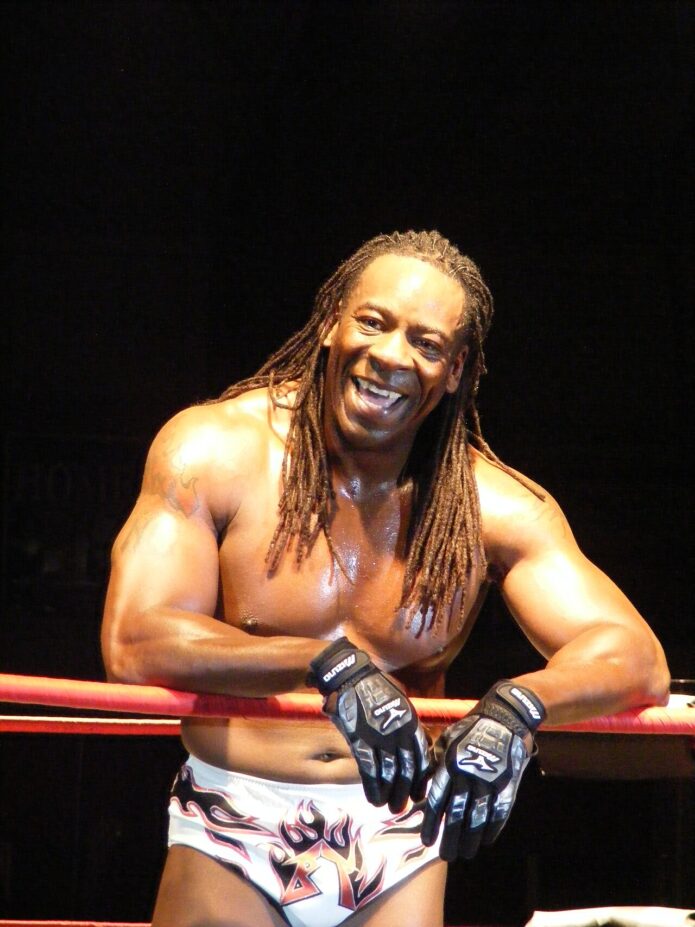
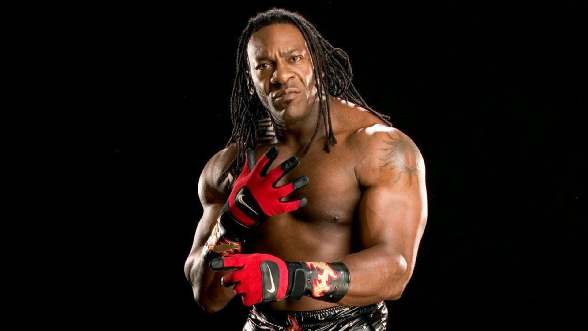
Booker T’s tattoos are easiest to see in shirtless wrestling photos. A sun-shaped design sits on one shoulder, flames cover the other, and darker linework reaches along his upper arms. The broad placement makes the shapes visible from several angles.

There’s a strong old-school wrestling feel to the collection. The tattoos use large dark forms, but enough skin stays open for each design to read clearly beside his muscles.

What tattoos does Booker T have?

The clearest designs are the sun on one shoulder and a patch of flames on the other, with more ink around the upper arms. Tattoo references often list three main pieces, and also mention an unidentified design on his back. The shoulder tattoos are easier to check in public photos; it takes more than one angle to see how the arm work connects.

Most of the ink is black and grey, with heavy outlines. Fine lettering and tiny motifs aren’t a big part of the look. The shoulder pieces read from a distance, while the linework continues down the arms.

The shoulder sun tattoo

The sun is the easiest piece to spot in shirtless photos. It sits high on Booker T’s shoulder, with curved rays spreading around the rounded muscle. Arena lights and older cameras can soften the shading, but the outline is clear in other shots.

Booker T shoulder sun tattoo, clear shirtless wrestling portrait

The shoulder gives the design a clear centre. From the front, side or a three-quarter angle, you can see how the rays follow the muscle. It is a large symbol that stays visible without extending into a full sleeve.

The flame tattoo on the opposite shoulder

The other shoulder has a larger flame-style design. Its jagged lines point in a different direction from the sun’s rounded rays, so the two sides do not look like mirror images. Together they balance the upper body while keeping distinct shapes.

Booker T blue-background portrait showing both shoulder tattoos

The sun and flames share a dark, traditional weight, but their edges and movement differ. That keeps a two-shoulder pairing from looking too neat or repetitive.

Upper-arm and tribal-style linework

Photos of Booker T’s arms show more ink below the main shoulder designs. Dark, curved lines continue onto the upper arms. In some older images, shading can be hard to separate from shadow, but other angles show the marks clearly on his skin.

Booker T flames and shoulder tattoos at a wrestling event

The arm work connects the shoulder pieces to the bicep, so they read as a larger composition instead of isolated symbols. A little flow down the arm also changes how the shapes look when the muscle flexes.

A closer look at the darker shoulder details

From another angle, the darker ink bends around the shoulder instead of sitting as a flat block. That contour keeps its shape when Booker T turns. In older photos, lighting can make black-and-grey work look softer or harder than it does in person.

Booker T shoulder tattoos with face paint, wrestling portrait

A strong outer edge helps a shoulder design stay readable from a distance. Fine shading may disappear in a dark venue, but the main outline still follows the curve of the muscle. Booker T’s larger shapes are easy to make out in the clearer portraits.

The tattoo beside the championship belt

One older portrait shows the shoulder tattoo beside Booker T’s championship belt, without his gloves blocking the view. The ink is visible in the same frame as his face and the title, but it does not take over the image. It sits within the larger look he wore in the ring.

Booker T shoulder tattoo beside the championship belt

A shoulder tattoo can be hidden by a T-shirt, shown in a tank top or framed by ring gear. The placement leaves those options open without making the design too small to read.

What about Booker T’s back tattoo?

Some tattoo references mention an unidentified design between his shoulder blades. Public photos do not show enough detail to describe its shape with confidence. The sun, flames and upper-arm work are much clearer across multiple images.

Celebrity tattoo pages sometimes repeat an uncertain detail until it sounds confirmed. Here, the back design may be real, but the available photographs do not show what it is. The shoulder pieces and arm linework are the parts that can be described clearly.

Why Booker T’s tattoo style still works

The shoulder pieces fit the broad muscles beneath them. The sun and flames have enough room to spread out, and the dark linework reads from a distance. Curved placement follows the body, which keeps the tattoos from looking like flat stickers.

Booker T’s ring gear, gloves and championship belts already bring color and drama. His mostly black-and-grey ink adds texture without competing with all of it. That balance can be useful if you like large tattoos but want to keep the palette simple.

For other athlete tattoos, see Michael Phelps tattoos and Jayson Tatum tattoos. Dennis Rodman tattoo guide gives a more statement-heavy example with different placements.

Booker T tattoos: the quick takeaway

The best-documented Booker T tattoos are the sun on one shoulder and flames on the other, with dark linework extending along the upper arms. The large forms stay legible in portraits and ring photos, even when smaller details fade in the lighting.

Placement does much of the work: broad shoulder shapes with lines that follow the muscles. A few large designs are enough to give the collection a clear look without covering every part of the arm.

Watch Booker T talk wrestling and his career

This interview gives more of Booker T’s voice and wrestling stories.

Damian Priest Tattoos: Sleeves, Bat Cover-Up and Rhea Ripley’s Scale

Damian Priest’s tattoos are a big part of his wrestling look. His arms and chest carry the most visible pieces, and several stories connect directly to wrestling. The collection includes a Japanese-inspired sleeve, Latin lettering, a bat cover-up of an Undertaker tribute, and a small scale symbol linked to Rhea Ripley.

Why Damian Priest’s tattoos stand out

Priest wrestles with a mix of size and speed, plus a theatrical edge. His tattoos suit that look, but they grew over time rather than appearing as one planned design. Some pieces are colorful and busy, others are black and gray, and a few are easy to miss until he takes his shirt off.

His real name is Luis Martínez. He is a Puerto Rican American wrestler known in WWE as Damian Priest, and the company has called his character The Archer of Infamy. Some of the artwork fits that hard-edged image, while the stories behind the tattoos are personal. A tribute can be covered later; an idea from a trip can stay with someone for years.

Damian Priest Japanese inspired sleeve tattoo

The Japanese-inspired sleeve on his left arm

The largest, easiest-to-spot section is the Japanese-inspired work across much of Priest’s left arm. Photos show flowing waves, a dragon-like figure and cherry blossoms layered through the sleeve. From a distance, the shapes read as one composition; closer in, the smaller details separate.

The waves wrap around the arm, while the blossoms break up the heavier shading. That gives the sleeve movement and keeps it from reading as one solid dark block. The color also gives the larger piece some contrast.

If you’re planning a full sleeve over several sessions, this is a useful approach to study. Let a few large shapes guide the eye, then use smaller details to fill the spaces around them. The individual subjects can stay recognizable while the arm still feels connected.

Damian Priest left arm tattoo detail

A closer look at the arm detail

Stage photos do not show every part of the sleeve. In close views, the upper arm has the strongest focal point, with dark outlines and warm color around it. Smaller shapes and texture continue through the rest of the design. That is why the arm can look like one illustration in one photo and several separate tattoos in another.

Lighting makes a difference. Dark ink can disappear against black clothing or in an arena shot, while a clear portrait shows the edges, shading and color changes. The sleeve has a direction, and the smaller parts still hold their own.

Chest tattoos with a different feel

Priest’s chest pieces use rounder, more graphic shapes than the sleeves. One of the easiest to recognize sits high on his chest and has a bold, mask-like look. Other designs sit near the shoulders and connect visually with the arms, making the front feel balanced without matching side to side.

A bird and other smaller shapes sit around the upper chest; lettering and darker lines add weight toward the center. Priest often wears black on television, so these pieces show more clearly in WWE portrait photos.

The chest work leaves the arms as the most detailed area. It gives the front a few clear points to look at without copying the sleeve’s style. If you’re collecting tattoo references, it shows how chest pieces can sit alongside a full arm.

Damian Priest chest tattoos

Latin lettering and personal symbols

Not every tattoo is a large image. Priest also has Latin phrases and smaller symbols among the larger work. A close-up may make the lettering legible, but it cannot tell us the private meaning behind each word.

The lettering adds another layer to the collection. Images and movement give the sleeves their shape; words may point to a belief, a memory or a line that mattered to him. Priest has not explained every small mark, so it is safer to describe what is visible than to guess.

Damian Priest right side tattoos

The Undertaker tribute that became a bat cover-up

One of Priest’s best-known tattoo stories involves The Undertaker. He once had Undertaker’s symbol inside a skull as a tribute to the wrestler who helped spark his interest in wrestling. When Priest began working the independent circuit, a promoter warned him that carrying another wrestler’s logo could cause problems. He covered it with a bat.

The original came from respect; the cover-up followed a career decision. Priest has said he later regretted changing it because, after reaching WWE himself, the tribute would have been a piece of wrestling history to keep.

The bat marks that chapter in his career. The cover-up changed the image, but the story behind it stayed with the tattoo.

Damian Priest chest ink closeup

The small scale tattoo connected to Rhea Ripley

Priest has a small scale symbol on his right leg, connected to Rhea Ripley, who has a similar mark under her eyes. He has said Ripley drew the symbol on paper and a tattoo artist traced it onto his leg during their trip to Puerto Rico for Backlash 2023.

This is a different kind of story from the sleeve and the Undertaker tribute. It is a small shared symbol from a trip with a close WWE friend, not a large statement piece. The story gives it context that its size alone would not.

Ripley’s own tattoos make a useful comparison. See our look at Rhea Ripley’s tattoos. The two collections have their own styles, while the scale symbol links them.

Damian Priest shoulder tattoo

How the tattoos fit his wrestling image

The tattoos give Priest’s wrestling look a sense of history. The sleeves add weight to his silhouette, and the chest pieces show in close-up. Darker designs suit the mood of The Judgment Day era; the color and older pieces show that the collection developed over time.

Clear photos make it possible to separate the dragon, waves, blossoms, lettering, chest symbols and shading. A general portrait can show what Priest looks like; a useful tattoo photo lets you see the designs themselves.

Other athletes build their collections with a similar mix of larger pieces and smaller personal marks. Cody Garbrandt’s story is different, but the balance is worth comparing. See Cody Garbrandt’s tattoo collection for another example.

Which Damian Priest tattoo is the most interesting?

The Undertaker cover-up has the clearest story because the tattoo changed as Priest’s career changed. The Japanese-inspired sleeve is the largest visual piece, especially in good light. The small scale symbol may be the most personal because it connects Priest and Ripley through a shared mark.

Each one shows a different reason for getting tattooed: style, an influence, or a moment with a friend. Together they give the collection more history than a perfectly planned catalog would.

Watch Damian Priest explain the Undertaker cover-up

Priest has talked about the original tribute, the cover-up and how he feels about it now. In the WWE interview below, he explains the story in his own words.

Final take

Damian Priest’s tattoos grew through different parts of his life and wrestling career. The Japanese-inspired sleeve brings the most color and detail; the chest pieces give the front a clear layout; the Latin lettering is harder to interpret from photos. The bat cover-up carries a story about The Undertaker, and the scale connects him with Ripley.

The collection is bold enough to show from the arena, but clearer photos reveal the smaller choices. Where a photo leaves a detail uncertain, it is better to leave the meaning open than guess.

Dominik Mysterio Tattoos: Aztec Gods, Lucha Ink and Rhea Ripley’s Tribute

Dominik Mysterio’s tattoos are hard to miss. Both arms are densely worked, smaller marks cover his hands, and the leg pieces show when he wears shorts. The collection moves between lucha libre, family and horror imagery, with some designs also tied to his “Dirty” Dominik persona.

WWE’s tattoo feature points to Aztec gods, Bela Lugosi and a Judgment Day piece designed by Rhea Ripley. Dominik has also talked about lucha legends such as La Parka and Psicosis. Those references link his tattoos to the wrestling world around his family and the characters he has played.

What makes Dominik Mysterio’s tattoos stand out?

The amount of detail is the first thing you see. His visible ink includes faces, monsters, masks and ornamental linework. From across the arena, the arms look like dark sleeves; in a close photo, you can separate the individual designs.

That coverage gives him a strong silhouette in a vest, T-shirt or no shirt. A close-up shows the hands, wrists and forearms, while a wider portrait puts the leg pieces beside the rest of his look.

Not every design has a confirmed public explanation. A tattoo can be easy to identify without knowing why he chose it. I’ll stick to the pieces Dominik or WWE have connected to a person or story, and describe the rest by what the photos show.

Dominik Mysterio arm tattoos

The arm tattoos carry the main story

Dominik’s arms hold most of the collection. The designs run from the upper arms across the elbows, forearms and hands, leaving little blank space. Photos show faces, skull-like shapes, ornamental lines and symbols with a traditional tattoo feel.

The two arms are not mirror images. One has larger dark shapes; the other leaves more open areas around the symbols. The difference gives the sleeves a patchwork feel, as if the pieces were added at different times instead of planned as one drawing.

The tattoos also look different depending on his pose. Folded arms bring the forearms forward; hands held out show the wrist and finger ink; a raised arm shows more of the upper sleeve. More than one angle helps you follow the layout.

Dominik Mysterio forearm tattoos

Forearm details, hands and finger ink

Close photos show how tightly the forearm designs sit together. Faces and shapes share a dark, old-school look, while smaller marks on the hands fill the space near the wrists.

If you’re planning a sleeve, the largest design does not have to cover every inch from the start. Smaller pieces can be added later. Dominik’s arms show how different sizes can sit together when the black-and-gray shading gives them a common look.

Some hand tattoos are quick to read; the forearm work takes longer. The smaller marks give the eye a place to pause before it moves back to the larger faces and textures.

Lucha libre is a huge part of the theme

Dominik grew up around lucha libre. His father, Rey Mysterio, is one of its best-known masked wrestlers, so masks and wrestling images connect to family and the culture around his career.

In WWE’s tattoo interview, Dominik talks about tributes to La Parka and Psicosis. Those names reach beyond his immediate family to the performers who shaped his view of wrestling. The tattoos make a kind of map of that world.

Lucha libre gives these masks and faces a specific context. A wrestler’s character and look matter alongside the match itself. Dominik’s tattoos carry some of that theatrical style into his everyday appearance.

Dominik Mysterio full body tattoos

The leg tattoos add a darker edge

The arms get most of the attention, but the leg tattoos show in wider portraits. Large portrait-style pieces sit across his legs; ring gear can cover them, while shorts bring them into view.

The leg work shifts the balance of the collection beyond the sleeves and hands. The portraits have a heavier, traditional look that fits the horror and older wrestling references mentioned in WWE’s feature.

The pieces are large enough to stand on their own, but the darker linework connects them visually to the rest of the collection.

Aztec imagery and the family connection

WWE describes Aztec gods among Dominik’s tattoo subjects. Those symbols add mythology to the collection, alongside the lucha libre references and family imagery.

Dominik has also shown a large neck tattoo tied to an Aztec calendar and a Mysterio family mask. It puts the family connection in a place that is hard to hide and adds another visible piece to an already inked-up look.

The neck design brings the tattoos closer to his face. Before it, the arms drew most of the attention; now the neck changes his outline even in a distant photo.

Dominik Mysterio arm symbols tattoo

Bela Lugosi and the horror influence

WWE’s feature also mentions Bela Lugosi, best known for playing Dracula. The reference brings classic horror into a collection otherwise full of wrestling imagery, and it suits the darker mood of Dominik’s current character.

Portrait tattoos depend on the expression, shadows and eyes staying legible. In Dominik’s collection, the face sits beside busier sleeve work and gives the eye a place to rest. It can feel dramatic without bright color.

The subjects come from different places: lucha and family, horror films, and his current Judgment Day chapter. The shared dark, theatrical look ties them together.

Rhea Ripley’s Judgment Day tribute

WWE says Rhea Ripley designed one of Dominik’s tribute tattoos. The two are part of the Judgment Day story on screen, and the design links the tattoo to the people and group around his WWE run. It has a specific connection beyond a logo.

The strong blackwork fits with the rest of the collection. Some tattoos look back to the wrestling world Dominik grew up around; this one points to the people and storylines he joined as his career developed.

For another tattoo story from the same WWE circle, see Damian Priest’s tattoos. Priest’s collection looks different, but both include ink tied to wrestling history.

Dominik Mysterio crossed arm tattoos

Why the black-and-gray style works

Most of Dominik’s tattoos are dark and detailed, built around linework rather than large blocks of bright color. Masks, faces, monsters, symbols and lettering give the sleeves a lot to hold, while the shared shading keeps the pieces from feeling scattered.

Strong outlines and shading show up well under arena lights. In a low-quality photo, the whole arm can blur into one dark patch. Clear, close images show the designs themselves.

Studio portraits make it easier to see where one piece ends and another begins, and how the work wraps around the arm. Those views are useful if you’re studying sleeve layout or planning a collection that will grow over several sessions.

How the collection fits his “Dirty” Dominik character

The tattoos are part of the character, but they also draw on Dominik’s history. His on-screen persona has a rebellious edge, and the dark sleeves reinforce it at a glance. The monsters, masks and old-school faces give the look a story before he says a word.

The family and lucha references keep it from reading as generic villain ink. They point back to Rey Mysterio, masked wrestling and the performers Dominik watched and respected. That history gives the collection more than a row of skulls.

For your own collection, choose subjects that connect to something real for you, then use a consistent style to bring them together. Dominik’s tattoos are not identical, but the shared mood and personal references make them feel related.

Dominik Mysterio sleeve tattoos

Which Dominik Mysterio tattoo has the best story?

The Rhea Ripley design has the clearest WWE-era story. The lucha libre pieces reach furthest into his family and wrestling background. Aztec imagery brings mythology into the mix, while Bela Lugosi adds a film reference.

The sleeves hold the most designs, so they are the main visual focus. The family and lucha references have the strongest connection to his background; they show how his career sits within the wrestling culture he grew up around.

The collection can keep changing as he adds or covers work. For now, the existing pieces already give him a recognizable look.

Watch Dominik explain his tattoos

In the WWE interview below, Dominik talks about old-school monsters, lucha libre tributes and the Judgment Day design linked to Rhea Ripley. He gives some of the personal context that a still photo can’t.

Final take

Dominik Mysterio’s tattoos bring together family, wrestling, horror and character. The sleeves hold the most individual designs, the leg portraits extend the work down his body, the Aztec and lucha references tie it to his background, and the Judgment Day tribute connects it to his WWE run.

From a distance, the sleeves read as dark blocks. In close photos, you can pick out the masks, faces, horror references, hand ink and smaller symbols. The detail is what makes the collection worth a closer look.

Shotzi Tattoos: Her Killer Klown, Pinhead, Tiger and More Ink

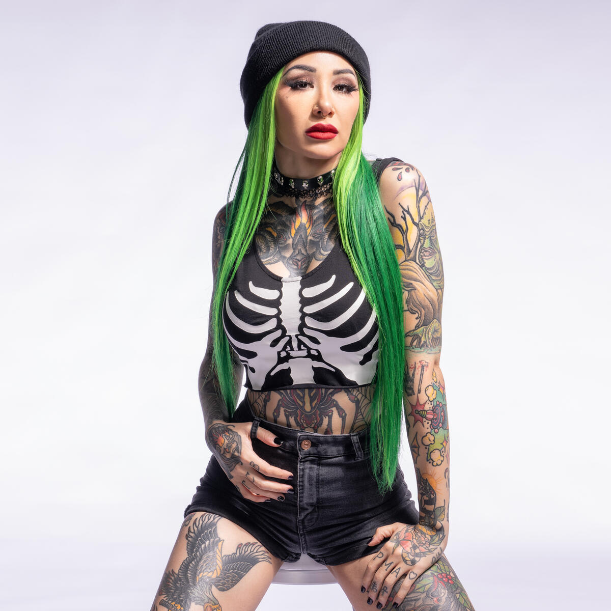
Shotzi’s tattoos are easy to spot. The WWE star’s ink mixes horror characters, comic-book imagery, animals, flowers, lettering and traditional-style color. It reads like a running scrapbook of the films, people and stories she likes.

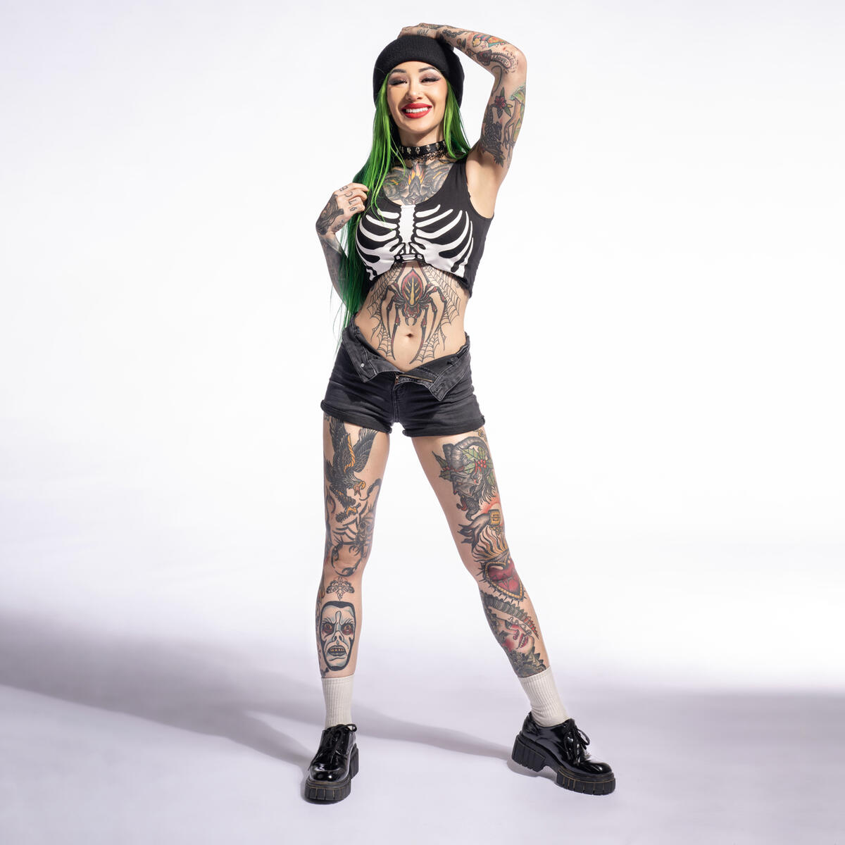
WWE’s Shotzi tattoo gallery points to a Killer Klown ray gun, Pinhead, a ram’s head and a Bengal tiger. Photos show more: packed sleeves, a chest piece, a spider-centered stomach design, bright thigh tattoos, hand ink and smaller details.

Shotzi’s tattoo style at a glance

Her collection moves between playful, colorful images and darker horror designs. The color reads from a distance, with black-and-gray shading beneath it to hold the different pieces together.

Her arms and legs follow the shape of her body, so the designs shift when she wrestles, poses or raises an arm. That is useful to notice if you’re studying her look for tattoo inspiration: placement helps the images work with the body, not just on it.

Shotzi full body showing sleeve and leg tattoos
A full-body view shows how the sleeves, chest piece, stomach tattoo and leg work sit together.

The horror-inspired tattoos

Shotzi’s love of horror shows up in several pieces. WWE’s gallery calls out Pinhead from Hellraiser and a Killer Klown ray gun. Those subjects fit the strange, loud edge of her wrestling character.

The horror designs sit among roses, monsters, skull-like faces and shaded figures, so the theme is broader than one film reference. If you like spooky tattoos, color can keep the subject playful, more like a comic panel or vintage poster than a scene of gore.

Her left arm has a layered sleeve with several characters and textures close together. Strong outlines and blocks of shading help each piece stay readable. It is busy, but the designs do not blur into one flat image.

The ram, tiger, and animal imagery

WWE also identifies a large ram’s head and a Bengal tiger. The ram looks heavier and more imposing; the tiger brings stripes, warm color and a sense of motion.

Animal tattoos can feel disconnected when each one has a different style. Shotzi’s bold outlines tie the pieces together. The tiger reads clearly on her leg, and the surrounding color helps it sit with the other designs.

Shotzi front torso and leg tattoos
The front view makes the tiger, stomach design, chest tattoo and leg pieces easy to compare.

When using a large animal image, pay attention to its direction. A tiger that follows the line of the thigh has room to read; a cramped angle can work against the body’s shape. The same applies to a ram or portrait.

Shotzi’s chest and stomach tattoos

The chest and stomach show how Shotzi combines a central image with smaller details around it. The chest piece sits high and draws the eye; below it, the spider-centered stomach design forms a darker, symmetrical shape.

A cropped top or open neckline reveals the tattoos without a close-up, making the ink part of her silhouette. The stomach piece changes as she twists or moves, so the artist has to account for how lines cross the skin.

Her chest also has enough dark shading to stand out against clothing, hair and stage lights. Here, contrast carries more of the effect than size alone.

The color work on her arms

Shotzi’s arms are full of ink, but the color gives them a clear rhythm. Yellow, red, green and warm orange appear in patches, with black outlines tying the pieces together. Some look playful; others have a harsher horror edge.

Shotzi colorful arm tattoos
Bright color, heavy outlines and layered characters give Shotzi’s arm tattoos a comic-book feel.

The color comes in pockets; not every inch needs bright pigment. A few strong areas can lead the eye through a mostly black-and-gray sleeve and leave room for later additions.

Small lettering and symbols on the forearms and hands sit beside the larger images. That gives the sleeves a collected-over-time feel. You can start with one image you like and build around it later.

Leg tattoos with a lot of character

Shotzi’s legs carry some of the largest and most colorful designs in the gallery. The thighs give big images room; the lower legs have characters and bold shapes that show in shorts or ring gear. The pieces shift with her movement in photos and video.

Shotzi shoulder and thigh tattoos
The shoulder and thigh show how darker portraits sit beside brighter color pieces.

The main images have room to read, while smaller details fill in around them. That balance can help if you want a large leg tattoo without turning the whole area into one block of ink.

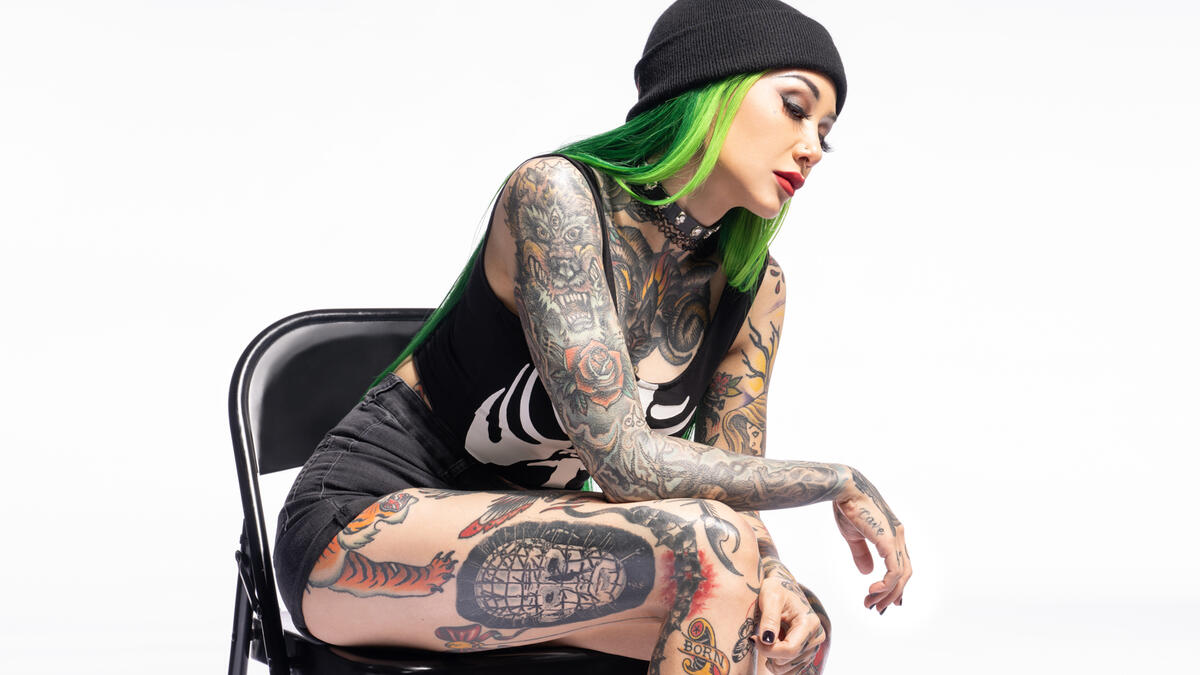
Shotzi seated leg tattoos
In this seated pose, the thigh and lower-leg tattoos show from another angle.

A design down the front of the thigh can look like a vertical panel when she stands, then open into a wider shape when she sits. Placement changes with the pose, so it helps to think about how the design will look in motion.

Hand, finger, and forearm details

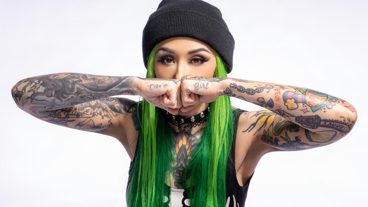
The small tattoos can be easy to miss beside the sleeves. Shotzi has lettering on her fingers and compact images on the backs of her hands and forearms, filling spaces around the larger designs. They give the collection a personal, journal-like feel.

Shotzi forearm and hand tattoos
A close view shows the smaller lettering and filler tattoos on Shotzi’s forearms and hands.

Hand tattoos become part of a person’s gestures. When Shotzi raises a hand, the ink moves with the pose. That’s worth thinking about before choosing a spot that stays visible through work, conversation and performance.

Her small pieces mix readable lettering with compact images. Each needs enough space around it; too much detail in a tiny area can blur together over time.

What Shotzi’s ink says about her personality

In a WWE video, Shotzi says she is obsessed with tattooing even though she doesn’t enjoy getting tattooed. The finished work is expressive and colorful; the process is something she puts up with to get the result.

The video also covers her Bray Wyatt tribute. That piece adds a personal note beside the horror references and comic-book characters. Some tattoos are about style; others are there to remember a person or story.

Her taste is what brings the different images together: strange characters, bright color and tattoos with a story behind them. The individual designs do not need to match for the collection to feel like hers.

Shotzi tattoo ideas worth borrowing

If you like Shotzi’s look, start with its ingredients rather than copying a specific tattoo: horror art, animal portraits, traditional color, strong outlines and small lettering. A sleeve could begin with a favorite film character, then add flowers, animals or symbols in a related style.

For a smaller design, give one creature or character enough room on the thigh, upper arm or calf. A meaningful tribute can sit beside lighter images; a collection does not have to be serious from head to toe.

Plan the open space too. Shotzi’s tattoos are dense, but skin between the pieces keeps the larger images separate. Leave room around faces, lettering and animal eyes. An artist can map those gaps before starting.

For wrestler tattoos with a different mix of portraits and placement, compare Shotzi’s collection with Rhea Ripley’s tattoos. Damian Priest’s tattoos offer darker, larger-scale work, while Dominik Mysterio’s tattoos show a more compact mix.

Watch Shotzi talk about her tattoos

In WWE’s Shotzi’s Bray Wyatt tattoo tribute and more stories behind her ink, she talks about her interest in tattoos, the ideas behind several designs and the tribute she carries.

Penta Tattoos: Dragons, Skulls, Lucha Bros Ink and More

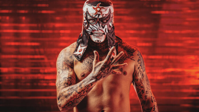
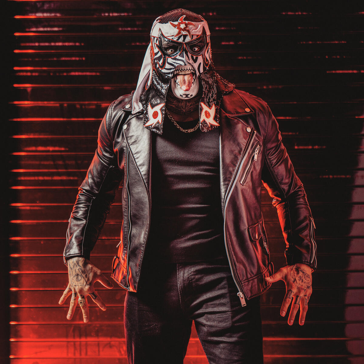
Penta’s tattoos are part of the look before he even steps into the ring. Dragons, skulls, lettering and dark shading cover his chest, arms, neck and hands. They sit naturally beside the mask and its Cero Miedo attitude; the ink has the same blunt, dramatic feel.

WWE’s Penta tattoo gallery points to dragons and skulls, while its tattoo video connects the designs to the Lucha Bros and dueling dragons. The photos show how much more there is: separate areas of the body carry their own images and textures.

Penta’s tattoo style at a glance

Penta’s tattoos use dense detail and heavy shading, but they don’t read as a blur. Faces, scales, teeth and small lines give the designs texture. Some pieces sit close together; others have enough open skin around them to stand on their own.

The arms read as sleeves, and the chest works like a center panel. Neck tattoos fill the space between the mask and the rest of the ink, tying the upper body together. If you’re looking at Penta’s tattoos for ideas, notice how the drama stays consistent even as the subjects change.

Penta full body tattoo collection
The full-body view shows how Penta’s chest, arms, neck and hands fit together.

The dragon tattoos on Penta’s chest

The dragon is the centerpiece of Penta’s chest. In the studio photos, its head, eyes and teeth draw attention first, with the body and curved lines carrying the design across the area. It fills the chest without crowding the tattoos around it.

WWE’s video refers to dueling dragons, which fits the way the chest and shoulder designs appear together. A dragon’s long shape can follow the body: its head can sit near the center while scales and curves move toward the shoulder, collarbone or upper arm.

Penta dragon chest and arm tattoos
The chest dragon and nearby arm tattoos show how large, curved shapes fill a tight layout.

The dragon’s curves stand apart from the more geometric lines beside it. That gives the eye a main image to follow, then smaller marks to find around it.

Skulls and the darker neck work

Skulls appear in several parts of Penta’s collection. The cluster around his neck and upper chest is especially noticeable. Dark shading gives the images a rougher feel than a clean logo or a simple flash design.

A neck tattoo has to work with a part of the body that is always moving. Penta’s design follows the throat and spreads toward the chest and shoulders, so it still connects when he turns his head or leans into a pose.

Penta chest and neck skull tattoos
The close-up shows the skulls and shading that link Penta’s chest and neck tattoos.

The darker neck work also gives the collection a visual anchor. Even in photos focused on his arms or hands, it helps the tattoos read as parts of one overall look. If you like darker designs, repetition in mood can tie a collection together without repeating the same image.

Chest lettering and geometric details

The dragons aren’t the only designs on Penta’s chest. Lettering and geometric lines sit alongside the larger images. Some lettering crosses the chest in script; denser marks gather near the sternum and collarbone.

Those changes in texture keep the chest from reading as one large illustration. A dragon can sit beside words, symbols and abstract lines, with fine marks in one area and heavier shading in another.
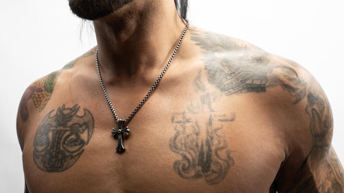
For a chest piece, spacing matters. Larger designs need room around their edges, while smaller lettering can fill gaps without competing with the main image. Penta’s chest shows both at once.

Penta skull and chest tattoos
The close-up brings out the skull, lettering, geometric lines and dragon details on Penta’s chest.

The sleeve tattoos and arm layout

Penta’s arms are densely tattooed, with different details on the upper arms, forearms and hands. Heavy outlines, shaded figures and smaller marks help carry the designs along each arm. You can pick out individual images while still seeing a connected sleeve.

An arm is visible from several angles. A design that reads from the front may disappear when the arm turns, so it helps to plan for the outer arm, inner arm, elbow and wrist separately.

The red studio lighting makes the black-and-gray work look darker, but the outlines remain clear. Penta’s sleeves rely on large shapes and defined edges, which keep them readable beyond the dramatic lighting in the photos.

Penta arm and finger tattoos
Penta’s arm and finger tattoos pair dense sleeve work with smaller details that reach toward the hands.

Hand and finger tattoos

The hand tattoos give Penta’s collection a sharper finish. Bold lettering and block shapes run across his fingers, while the back of the hand joins the forearm work. These are visible pieces, part of every gesture.

Hands are a tricky place for small designs. The skin moves, gets plenty of wear, and fine lines can soften over time. In the close-ups, Penta’s lettering stays readable, with enough room for each finger to carry its own mark.

Penta hand tattoo details
The close-up shows lettering on Penta’s fingers and dense line work continuing onto his forearm.

If you’re considering finger ink, keep the shape simple and bold. A short word, symbol or compact design is more likely to stay clear than a miniature scene.

How the tattoos fit Penta’s mask and wrestling look

Penta’s mask has a strong black, white and red palette; the tattoos extend its dark, textured look across his neck, chest, arms and hands. The mask frames his eyes and mouth, while the ink fills in the rest of the silhouette.

The tattoos don’t need to match the mask exactly. Dragons and skulls carry the same intensity, while lettering adds another layer and the hand pieces make the look feel worn in. Placement and mood tie the collection together more than a strict color scheme.

If you want a personal style to feel connected, choose a few traits to carry across the designs, such as heavy outlines, dark shading or dramatic subjects. The images can still have different stories.

What the Lucha Bros connection adds

WWE’s tattoo video links Penta’s ink to the Lucha Bros and the dragon imagery. That brings a wrestling history into the designs, alongside their horror and comic-book feel. A team or shared career can matter to a tattoo even when the finished image stands on its own.

A viewer may see a detailed dragon; Penta and the people close to him may also connect it with a team, a particular chapter in his career or a shared identity. That meaning can stay personal while the design remains striking.

For wrestling tattoos with a different feel, compare Penta’s dragons and skulls with Shotzi’s colorful horror-inspired tattoos. Rhea Ripley’s tattoos offer another bold approach to sleeves and larger pieces.

Penta tattoo ideas worth borrowing

You don’t have to copy Penta’s dragon or skull designs to take ideas from the collection. A large chest piece can anchor other tattoos, with smaller lettering and symbols around it. An arm sleeve can carry the same line weight without repeating the same subject.
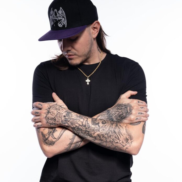
A dragon can follow the chest, shoulder or upper back, where it has room to curve. Skulls suit the neck, upper arm or forearm when you want a darker focal point. Hand lettering is visible every day, so give the placement extra thought.

Bring reference images to an experienced tattoo artist and plan the placement before booking a full session. That gives the separate pieces a chance to work together as they age. Penta’s strongest effect comes from the way the large images, small lettering and body movement work together.
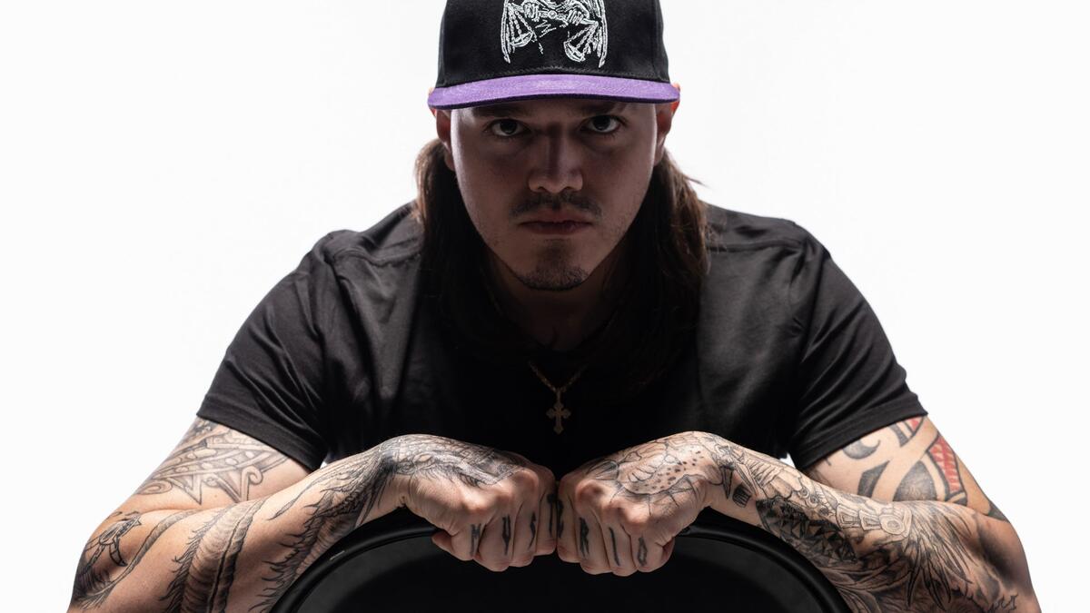
Watch Penta talk about his tattoos

In WWE’s Penta shows off his tattoos | Lucha Bros and dueling dragons, he talks about the designs and the ideas behind them. The video also shows how the ink moves with him.

Jey Uso Tattoos: Samoan Sleeves, Backpiece and Proverbs 17:17

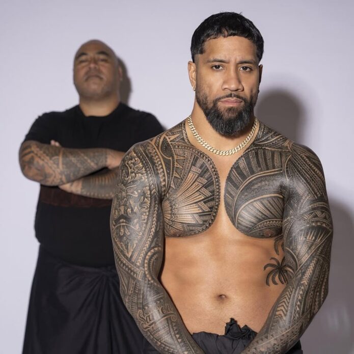
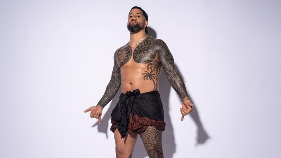
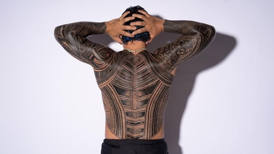
Jey Uso’s tattoos cover his chest, arms, back, neck and legs, but the patterns make the collection feel connected. When he turns, the large Samoan-style backpiece comes into view; from the front, the chest and neck work flows into his sleeves. The designs return to family, faith, Samoan heritage and his years in WWE.

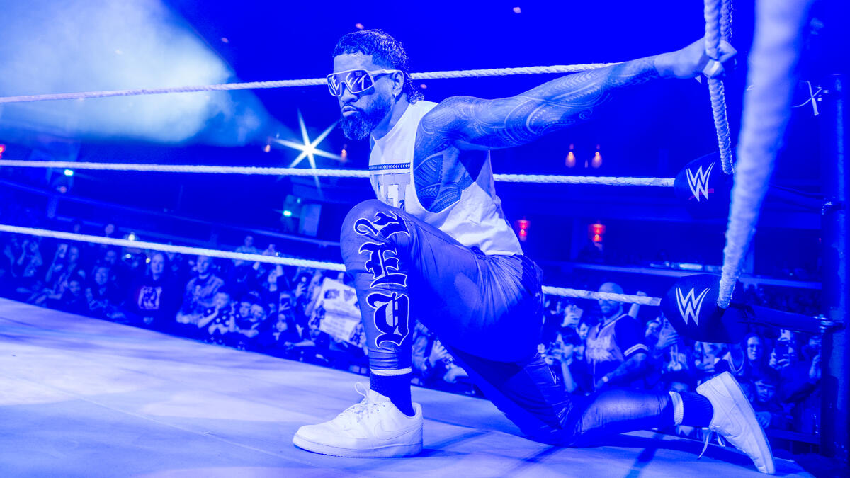
Jey Uso full-body Samoan tattoos
From the front, Jey’s chest, arm and leg tattoos read as parts of the same collection.
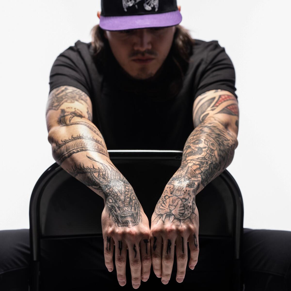
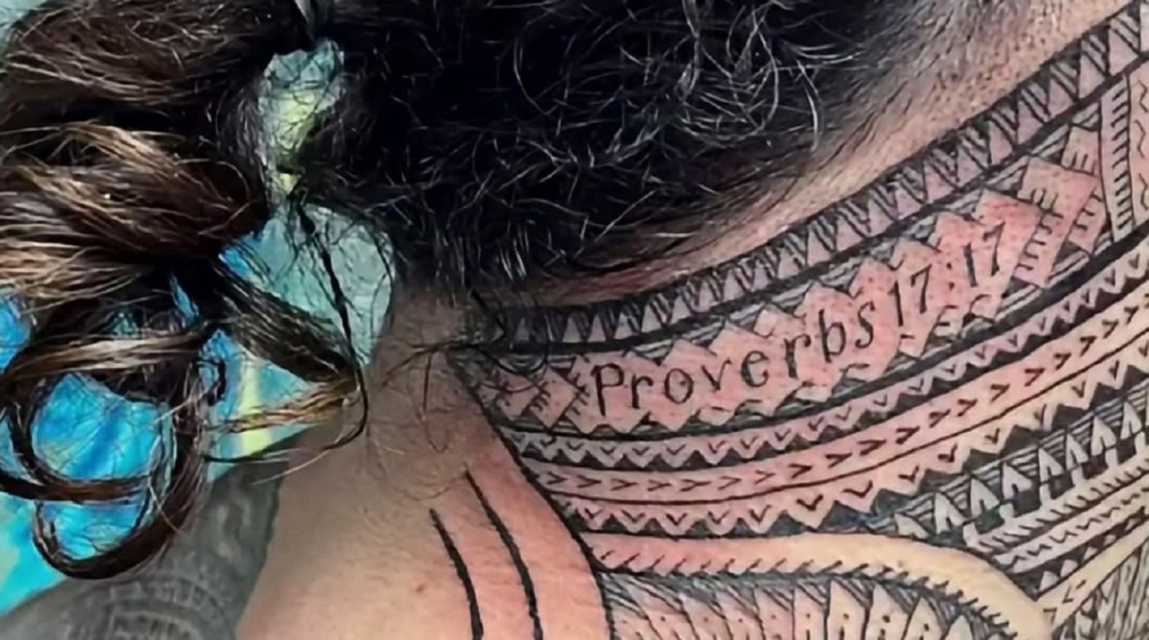
A closer look shows the Samoan patterns on his arms, the backpiece, the newer neck tattoo and tributes to people close to him. Some details are visible in photos; others make more sense in the context of his family and culture.

The main idea behind Jey Uso tattoos

Jey’s collection draws on traditional Samoan tatau. Strong black shapes, repeated geometry and bands follow the lines of his body. You can see those repeated shapes across his chest, shoulders, sleeves, back and legs.

Samoan tatau has cultural meaning. It can carry ideas about family, service, identity, protection and belonging; it’s more than a pattern chosen for its look. Jey has spoken about his Samoan roots and family, which is part of how fans understand the cultural context of his ink.

The short version: Jey’s tattoos are personal body art with a strong connection to family and heritage. Their tough look is only one part of the story.

Jey Uso’s front chest and sleeve work

Blackwork covers the front of Jey’s body. Broad shapes cross his chest and shoulders, while tighter lines continue down his arms. Open skin breaks up the darker areas, so the patterns remain readable from a distance.

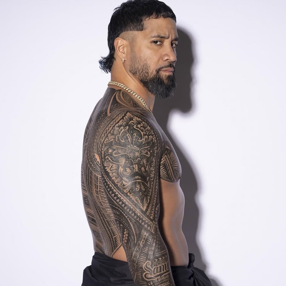
Jey Uso shoulder and arm Samoan tattoos
The side view makes the patterns around Jey’s shoulder and upper arm easier to see.

The sleeve follows the arm instead of sitting on top like a sticker. Its bands wrap around the muscle and carry the eye from shoulder toward forearm.

Lettering and symbols sit within the larger patterns. Not every mark has a public explanation; in the photos, what’s clear is how the pieces were arranged to work together.

The large Samoan backpiece

The backpiece spreads across Jey’s upper back and shoulders. From behind, it gives the shoulder line a strong outline, especially when his arms are out and the patterns meet across his back.

Jey Uso Samoan backpiece tattoo
The backpiece is the largest single field of pattern in Jey’s collection.
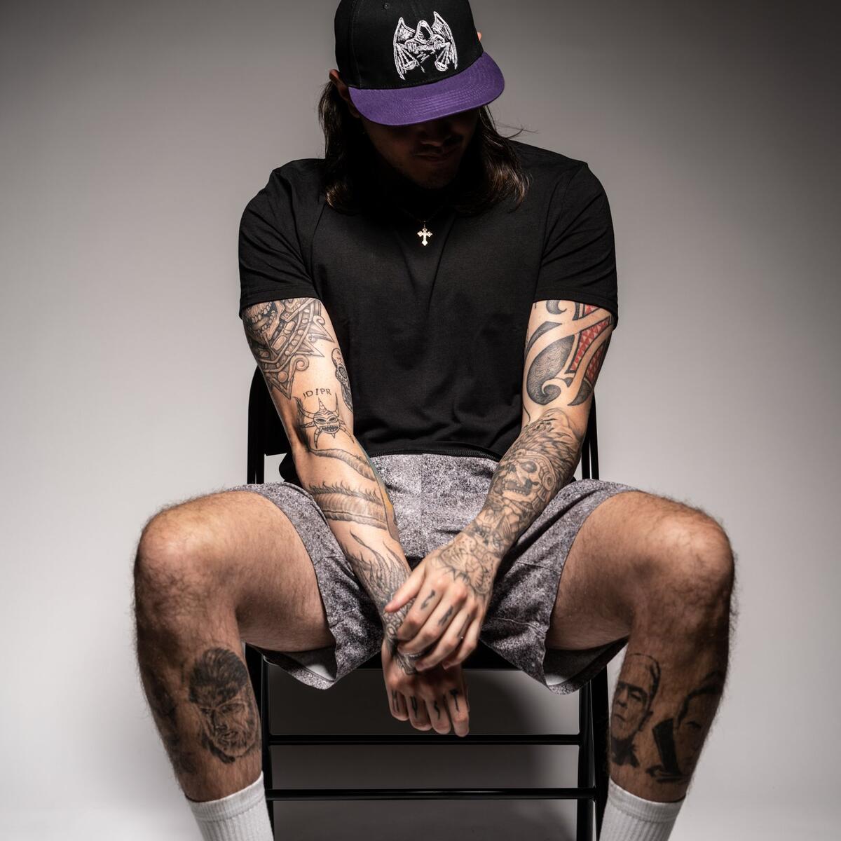
Inside the larger design are repeated triangles, bands, hooks and open spaces. A full-size photo brings those details out; a thumbnail can make them look like one dark blur.
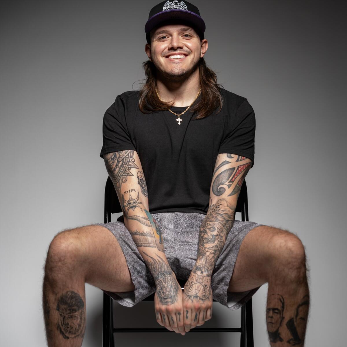
The shoulder edges lead into the sleeves, so the backpiece connects with the arm work from more than one angle. That planning is easy to miss in a front-facing portrait.

The Proverbs 17:17 neck tattoo

One of Jey’s more recent pieces is the neck tattoo linked to Proverbs 17:17. The verse is often read as a message about a friend’s steady love and a brother’s support in hard times. Fans also connect that idea with Jey’s relationship with Jimmy Uso and their wider Anoa’i family.

Jey Uso Proverbs 17:17 neck tattoo
The newer neck tattoo pairs a readable Proverbs 17:17 reference with Samoan patterning.

The lettering sits within patterns that continue over his shoulders and upper back. It doesn’t look like a separate quote placed on an empty space; it follows the lines already there.

The verse gives fans a clear phrase to recognize, while the tatau around it keeps the piece connected to the rest of his ink.

The family connection in Jey’s ink

Jey’s tattoos are closely tied to the people around him. His work with Jimmy Uso, his father Rikishi, his cousins and the wider wrestling family known as the Bloodline are all part of the story fans bring to his ink.

Reports about the collection have also pointed to tribute designs for his late uncle Umaga, including work on Jey’s calf. Those pieces are there to remember family, not just to change his look on television.

That context helps make sense of the collection. You don’t need a public explanation for every line to see its bigger thread: family, heritage and the people Jey wants to remember.

What the leg tattoos add

Jey’s leg tattoos make the collection more than an upper-body story. The calf and lower leg carry bold patterns and tribute work, though boots, knee pads and trunks often cover them in wrestling photos.

When the legs are visible, you can see how the same black shapes and open spaces continue down his body. A quick front-facing photo doesn’t show the full extent of the work.

A sharp look at the arm ink

A clear close-up of Jey’s arm shows how the pattern changes around the elbow and moves with the muscle. It’s easier to follow the lines in that view than in a full-body shot.

Jey Uso ring-side arm tattoo
The arena lighting is blue, but the direction of the large arm pattern is still easy to see.

The tattoo remains readable under the arena lights. You can see how much of the upper arm it covers and how the shapes sit below the shoulder. For anyone planning a Polynesian-inspired sleeve, this angle shows placement more clearly than a standard portrait.

Smaller details sit inside the larger fields of ink. Some fans point to words such as Samoa; others notice the cross and the bands. Those marks are part of a much broader design.

Who did Jey Uso’s tattoos?

Jey’s traditional tatau work has been linked to tattoo artist Mike Fatutoa, known online as Samoan Mike. The repeated patterns across different parts of his body give the collection a consistent look, as if the pieces were planned together over time.

Large coverage across the back, chest, arms, neck and legs takes planning and repeated sessions. The design has to develop with the body; it’s a long project, not a single appointment.

How Jey Uso tattoos compare with other wrestling ink

Wrestlers use tattoos to mark character changes, titles or favorite symbols. Jey’s work puts more focus on Samoan heritage and family. Compare it with the darker, character-driven pieces in our Shotzi tattoos guide or the more graphic designs in our Penta tattoos article.

Fans also compare Jey’s tattoos with Roman Reigns’ because both men wear large Polynesian-inspired designs and tie their public image to family identity. The patterns differ, but heritage, body art and wrestling presentation connect them.

Final thoughts on Jey Uso’s tattoos

Jey’s tattoos are bold, but the separate areas feel connected. The sleeves, chest, backpiece, neck verse and leg work all return to family, faith, heritage and pride in where he comes from.

Look for full-size photos that show his back and shoulders, not just a ringside portrait. The smaller patterns are easier to follow there; they turn the larger dark shapes into detailed Samoan-inspired body art.

Watch Jey talk about his traditional Samoan tattoos: