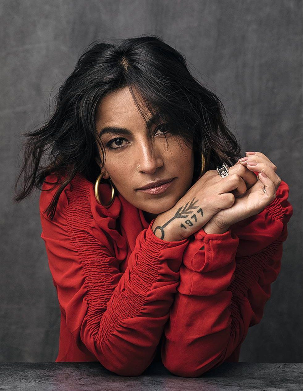
Ana Tijoux’s tattoos have the same energy as her music: direct, personal, and tied to where she comes from. The easiest one to spot is the 1977 on her wrist or forearm. It isn’t a random number. It’s the year she was born, the title of her breakthrough solo album, and the name of one of her best-known songs.
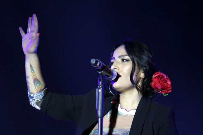
Then there is the colourful chevron-style tattoo running up her forearm. In photos it can look like a simple geometric piece, but reporting around Tijoux connects it with the Whipala and with her wider Latin American identity. That matters because her work has never been separated from place, language, history, or politics.
There are other marks too: small hand designs, linework, and symbols that appear differently depending on the light and the angle. This is one of those tattoo collections where a good photograph tells you more than a long list. Some details are documented. Others are visible but not explained, and it is better to leave them that way than invent a story.
Who Is Ana Tijoux?
Ana Tijoux is a French-born Chilean rapper and singer who first became known through the hip-hop group Makiza before building a solo career. Her records move between sharp rap writing, warm Latin American rhythms, electronic production, and songs that deal openly with power and inequality. She can sound intimate on one track and ready to start a march on the next.
That mix is useful context for reading her tattoos. They are not just decorative pieces photographed on a famous person. The date on her arm points to her own life and music, while the colours and symbols around her other tattoos sit inside a much bigger conversation about Chile and Latin America. Even when the designs are small, the ideas around them are not.
It is also worth keeping the visual evidence separate from the biography. A photo can confirm that a mark is there and give us a good look at its shape. It cannot automatically explain who designed it, when it was done, or what it means. For Ana Tijoux’s ink, the strongest details come from the interviews, while the photographs help us see how the pieces actually look on skin.
The 1977 Wrist Tattoo
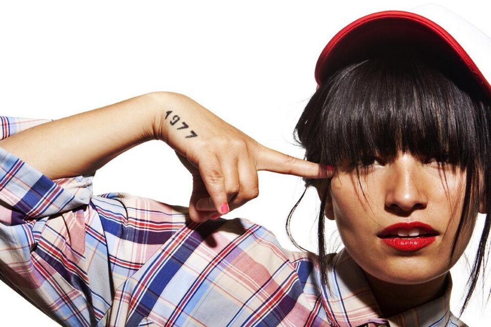
The number 1977 is the clearest piece in Ana Tijoux’s tattoo collection. It sits across the wrist or lower forearm in a plain, easy-to-read style. The placement makes sense: it is visible when she performs, talks, or lifts a hand, but it still feels like a personal mark rather than a huge statement piece.
The meaning has more than one layer. Tijoux was born in 1977, so the number works as a compact signature. It is also the title of her 2010 solo album and the song that helped introduce her music to a much wider audience. One small tattoo ends up connecting her body, her birthday, and a major part of her career.
The lettering is simple enough that the number stays readable in almost every photograph. That is a good reminder that a tattoo does not need a complicated drawing to carry weight. A date can be just as personal as a portrait, especially when it is also tied to a record that changed the direction of someone’s career.
In the close-up photos, the 1977 ink has a slightly handmade feel. It is not trying to look like a luxury logo. The small scale and straightforward numbers give it the feel of something chosen because the reference mattered, not because the design needed to impress anyone.
The Colourful Whipala-Style Forearm Tattoo
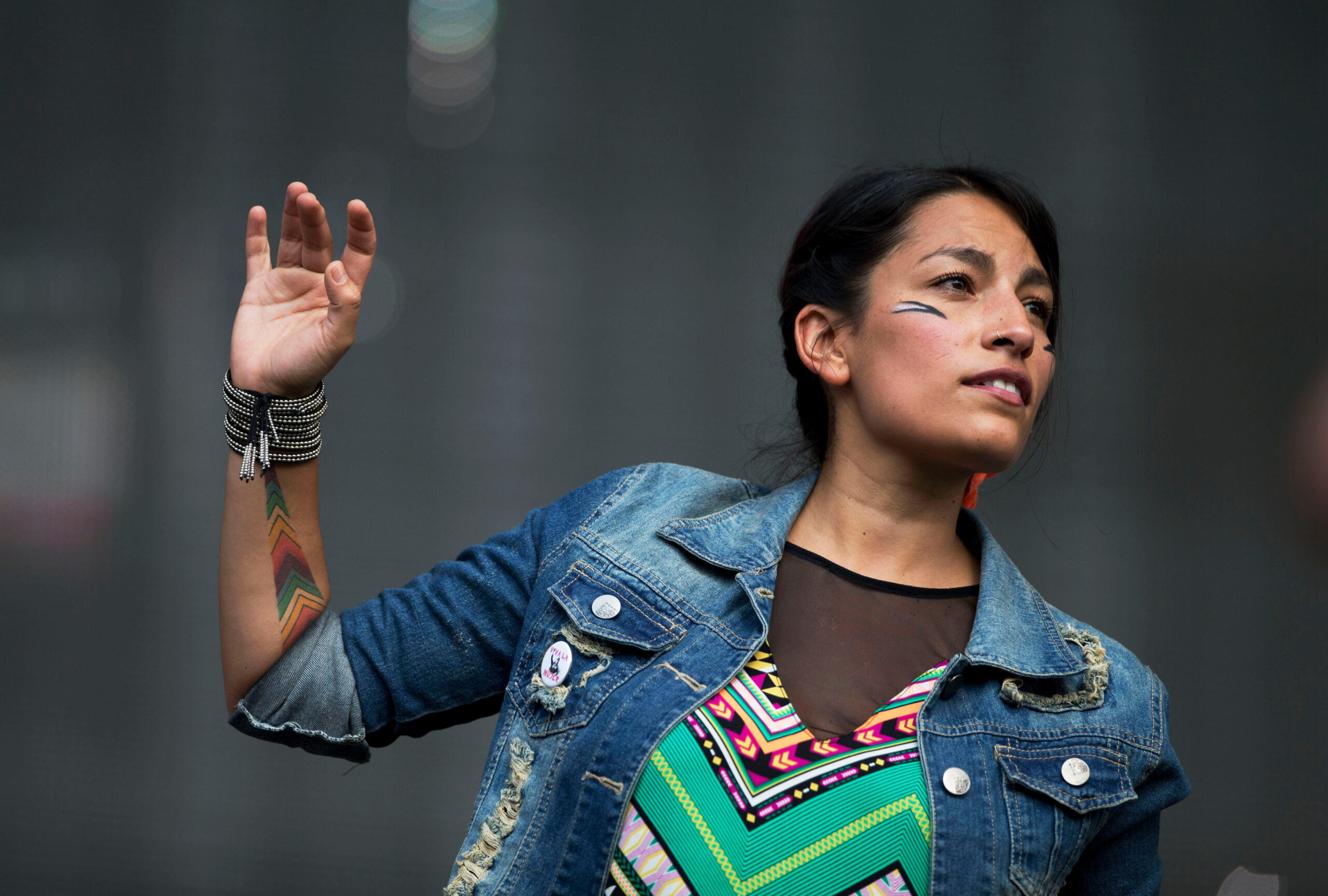
The second tattoo that really stands out is the colourful geometric piece on Tijoux’s forearm. It is built from stacked chevrons and blocks of colour, with reds, greens, yellows, and darker lines creating a pattern that reads clearly even from a distance.
Several published photographs catch it from different angles. In one, the design is partly covered by a sleeve. In another, the whole forearm is raised and the colours are much easier to see. That difference is useful because it shows how much a tattoo can change when the skin bends or the light shifts. The shape stays the same, but the mood changes.
Rolling Stone Canada’s reporting connects this tattoo with the Whipala, the square, multicoloured flag associated with Indigenous peoples of the Andes. That gives the design a much stronger context than simply calling it a colourful geometric tattoo. It sits alongside Tijoux’s public connection to Latin American identity and her habit of bringing those ideas into her music.
The piece also works well as tattoo design on its own. The repeated chevrons create movement, and the colours keep the pattern from feeling flat. It is the kind of forearm tattoo that can be read from across a room but still rewards a closer look at the smaller blocks and edges.
Hand Tattoos and Smaller Symbols

Profiles of Ana Tijoux mention tattoos on her hands, and photographs show smaller marks around her hands and arms. The details are not always sharp enough to identify every symbol, especially in concert images, so the sensible approach is to describe what can actually be seen.
Some shots pick up a thin line or a small symbol near the hand. Others make the 1977 number the focus and leave the rest in shadow. That is normal with hand tattoos. They are constantly moving, often partly hidden by microphones, jewellery, sleeves, or the way someone holds their fingers.
There is a nice contrast between these smaller pieces and the louder forearm colour. The tiny marks feel more private, while the geometric tattoo has a clear visual punch. Together they make the collection feel lived-in rather than designed all at once.
Unless Tijoux explains one of those small tattoos directly, there is no reason to attach a made-up meaning to it. Good tattoo writing can leave a little space around the unknown. The fact that a symbol looks interesting is enough. Not every piece needs a dramatic backstory.
A Reported Future Project
One AFP report said Tijoux planned a large tattoo of Latin America on her leg. That is a detail worth mentioning, but it needs careful wording. The report describes an intention, not a photograph proving that the finished tattoo exists.
That distinction matters because celebrity tattoo coverage often turns a plan into a fact after the original interview gets copied around. Here, the idea fits the rest of Tijoux’s work: a map or outline of Latin America would sit naturally beside the themes of migration, belonging, resistance, and regional identity that run through her songs.
Still, a plan is not the same as completed ink. There is no need to add a fake image or describe a finished leg piece without solid evidence. If she eventually got the tattoo, a later interview or a clear photograph would be the right place to confirm it.
Tattoo Details to Notice

Tijoux’s tattoos do not seem built around one strict style. There is clean number lettering, bright geometric colour, small hand work, and symbolic linework. That mix is part of what makes the collection interesting.
The 1977 piece is minimal and readable. The forearm pattern is louder and more graphic. The smaller tattoos sit somewhere between the two, giving the eye little details to find without taking over the whole look. If you like tattoos that mix personal references with strong shape and colour, there is plenty here to borrow without copying the designs outright.
The placement is practical too. Wrist and forearm tattoos are easy to see, easy to photograph, and easy to keep connected to everyday life. They can appear on stage or in a conversation without needing a special reveal. That suits an artist whose work is often immediate and conversational.
The main lesson is not that every tattoo needs a hidden political meaning. It is that a simple design can hold a lot when it is attached to something real. A birth year, a record, a flag, or a place can be enough to make a small tattoo feel specific and lasting.
Using These Ideas
If you like the 1977 tattoo, start with the idea behind it rather than copying the exact numbers. A year can mark a birth, a move, a record, a family event, or the beginning of something that changed you. A clean date in a familiar font is simple, but the reason behind it is what gives it character.
The colourful forearm piece is a better reference for someone who wants movement. Repeated chevrons, stepped blocks, and limited bright colours can build a strong design without filling the whole arm. Ask your tattooer how the pattern will wrap when your wrist turns, because geometric work needs a little planning around the body’s curves.
And if the Whipala connection is what caught your eye, take the time to understand the symbol before using it. Cultural references deserve more care than grabbing a pattern because it looks good in a screenshot. Learn what the design means, think about your own connection to it, and talk it through with a tattooer who knows how to handle the reference respectfully.
Ana Tijoux’s tattoos are a good example of personal ink that does not need to be perfectly uniform. One piece is a number, another is a block of colour, and the smaller marks fill in the spaces. The result feels like a real collection built over time, which is usually more interesting than a body covered in matching designs.
Final Take
The 1977 tattoo is the anchor. It is easy to spot, properly documented, and tied to both Ana Tijoux’s birth year and her music. The colourful forearm tattoo adds a wider Latin American reference, while the hand tattoos and smaller symbols keep the collection from feeling too neat or predictable.
There are still details we cannot confirm from the available photographs, and that is fine. The strongest parts of the story are already enough: a date that became a musical identity, a colourful design linked to cultural roots, and a set of smaller marks that make the collection feel personal. Keep the confirmed details, skip the invented lore, and let the tattoos look like tattoos. Good ink does not need a fake legend attached to it. Clear photos and honest descriptions do the job.